Fixed Income

Highlights The first quarter is in the books, … : Risk may have been out in the fourth quarter, but it is squarely back in fashion so far this year, with equities and high yield posting gaudy first-quarter returns. … and events have compelled us to modify our high-conviction Fed call, … : There may yet be another four or more rate hikes, but they’re not going to occur this year. … but we’re still confident in our asset-allocation recommendations, … : The Fed may no longer be a menacing presence, but that doesn’t mean Treasuries and longer-maturity bonds are going to have it easy from here. … which should benefit from a more accommodative monetary policy outlook: Conditions remain favorable for equities and spread product, and unfavorable for Treasuries, even if the underlying drivers have shifted. Feature Table 1Whipsaw
Where We Stand Now
Where We Stand Now
Newton’s Third Law holds that for every action there is an equal and opposite reaction. Markets have been busy supporting the theorem, as the fourth quarter’s sharp selloff has been nearly erased by the potent first-quarter rally (Table 1). Risk assets have been on a rollercoaster ride, though our economic outlook has been more or less unchanged. We chalked up the fourth quarter’s selloff to fears that the Fed was threatening the expansion. Conversely, the first quarter’s snapback likely owed quite a bit to the Fed’s pivot. By shifting its emphasis from trying to prevent inflation from getting away on the upside to trying to keep inflation expectations from falling too far, the Fed has gone from removing the punch bowl to promising to keep it full. In financial markets, risk assets should be the biggest relative beneficiaries. The Fed’s turn thwarted our more-hikes-than-expected call, at least in the near term. That surprise has been compounded by the administration’s seeming intent to pack the board of governors with nominees chosen solely on the basis of their uber-dovishness, and has inspired us to reflect on our calls. We like to share our reflections, as well as the internal BCA discussions and the client questions that shed light on our views. This week’s report examines some of the most important issues on our minds, and the minds of our colleagues and clients. Q: What does the Fed do from here?
Chart 1
The quarterly summary of economic projections compiles FOMC meeting participants’ expectations for the likely path of key economic indicators (real GDP growth, unemployment and inflation) and monetary policy. The latest release revealed that Fed governors and regional presidents sharply dialed back their rate hike expectations between the December meeting and the March meeting (Chart 1). The median participant lopped 50 basis points (“bps”) off of his/her year-end 2019 and terminal fed funds rate projections, calling for no hikes in 2019 and just one more for the current cycle, in 2020. The rationale is a bit of a mystery, as the median participant’s estimates of GDP and inflation only came down modestly, and his/her unemployment rate estimates only rose modestly. It made sense for the Fed to turn away from the gradual pace of hikes it pursued in 2017 and 2018 in response to the sharp tightening in financial conditions brought on by the fourth-quarter selloff. The ensuing rallies in equities and high-yield bonds have undone much of that tightening, however. From a data perspective, it seems the Fed is mostly holding off to see how the outlook for the rest of the world evolves. The minutes of the March meeting, released last week, suggested that there may be more nuance to the Fed’s embrace of patience than markets initially perceived. The money markets had been calling for a 25-bps cut in the fed funds rate, to 2.25%, by the end of 2020; following the March meeting, they swiftly moved to price in a high likelihood of a second cut, to 2% (Chart 2). That outlook does not exactly accord with the committee’s more measured take: “Several participants observed that the [‘patient’] characterization … would need to be reviewed regularly[.] … A couple of participants noted that the ‘patient’ characterization should not be seen as limiting the Committee’s options[.] … Several participants noted that their views of the appropriate target range for the federal funds rate could shift in either direction[.] … Some participants indicated that if the economy evolved as they currently expected, … they would likely judge it appropriate to raise the target range … modestly later this year[.]” Chart 2... To Keeping It Full
... To Keeping It Full
... To Keeping It Full
We continue to believe that the Phillips Curve is alive and well inside the Fed’s policy framework. The inverse relationship between inflation and unemployment is embedded in its macroeconomic models, and will compel the Fed to tighten policy in response to an unemployment rate that is nosing around 50-year lows (Chart 3). With the committee seemingly willing to let inflation get a bit of a head start before it tightens policy, it may well have to hike faster, and establish a higher terminal rate, than it otherwise would have if it had continued to follow a steady course. We believe the tightening cycle has been postponed rather than truncated, contrary to the money market’s view. Chart 3Sixties Flashback
Sixties Flashback
Sixties Flashback
Bottom Line: The Fed is not going to take the fed funds rate to 3.25 - 3.5% by year end, as we expected late last year. We still believe the terminal rate is in that neighborhood, however, and the longer the Fed cools its heels, the greater the potential that it could exceed our estimate. Q: What is the outlook for the rest of the world? The March minutes revealed that conditions in the rest of the world continue to influence the Fed’s policy decisions. The slowdown in China, the uncertain outcomes of ongoing trade talks and Britain’s separation from the EU shadow the outlook in emerging economies and the major non-U.S. developed economies. The outlook for China, other emerging markets, and Europe have been a spirited subject of discussion within BCA. With a majority of the managing editors perceiving the signs of some green shoots, we upgraded Chinese equities to overweight from equal weight, and European and EM equities to equal weight from underweight, at our monthly View Meeting last week. An end to China’s deleveraging campaign may be all the rest of the world needs to show a little more life. Chart 4As China Goes
As China Goes
As China Goes
China is a critical influence on our global view. We expect that policymakers have already begun de-emphasizing their deleveraging campaign, as suggested by March’s credit data, released Friday, and will encourage lenders to lend. No one at BCA expects a stimulus campaign on the order of the massive 2008 and 2016 efforts, but the general view is that policymakers can take steps to end the deceleration in China’s growth, since it was rooted in their deleveraging drive. The deceleration weighed on trade and manufacturing activity around the world (Chart 4), and may have been the catalyst for the global mini-slowdown. The rest of the world should benefit from the easing in financial conditions driven by the global equity rally. The decline in bond yields has also helped ease financial conditions, and the nearly unanimous dovishness of major-economy central banks may provide investors and consumers with additional comfort. The key issue for the U.S. economy, and U.S.-oriented investors, is whether or not the other major economies will slow enough to cool off the U.S. at a time when its fiscal impulse is slowing. We have a sense that China and Europe are beginning to turn, and we do not expect spillovers to drag on U.S. growth, but continued rallies in U.S. risk assets probably require some sort of revival beyond its shores. Q: How do corporate profits look? Is the consensus overly optimistic? The corporate profit outlook is getting less ambitious by the day. Over the last three months, consensus expectations for first quarter S&P 500 share-weighted earnings have fallen by 6.5%, as analysts downwardly revised their year-over-year growth projections from +3.5% to -2.2%. Management teams seek to under-promise and over-deliver, and do their best to guide analyst expectations to a level their companies can exceed. Since 1994, according to Thomson Reuters, about two-thirds of companies have reported earnings that beat estimates. On average over that stretch, companies have beaten estimates by a margin of 3.2%. We are therefore inclined to take the projected earnings contraction with a grain of salt. Corporations seem to have lowered the bar to a level they should be able to clear without too much trouble. Chart 5Wages Aren't Yet Pressuring Margins ...
Wages Aren't Yet Pressuring Margins ...
Wages Aren't Yet Pressuring Margins ...
We are further inclined to question the projected 2.2% contraction in earnings, given that revenues are projected to grow by 5% in the quarter. The disparity implies margin contraction of close to 7%. Compensation is the largest component of corporate expenses, with the remainder roughly split between interest expense and other input costs. The other meaningful input is the dollar, which should most often exhibit an inverse relationship with margins. Real unit labor costs is the compensation series that most directly impacts profit margins, and it has been contracting on a year-over-year basis, augmenting margins (Chart 5). It will continue to do so as long as nominal wage growth lags inflation and productivity gains. BBB-rated corporate yields were materially higher in the first quarter than they were a year ago, and may have taken a modest bite out of margins, but they’re now back to where they were then and cannot explain the projected 7-ppt margin haircut by themselves (Chart 6). Producer prices grew just 2.2% on a year-over-year basis, slightly ahead of consumer prices (Chart 7), suggesting that margins only slightly narrowed from the disparity between input costs and selling costs. Chart 6... And Interest Rates Aren't Anymore
... And Interest Rates Aren't Anymore
... And Interest Rates Aren't Anymore
Chart 7Input Costs Are Manageable
Input Costs Are Manageable
Input Costs Are Manageable
The broad trade-weighted dollar gained 6% from 1Q18 to 1Q19. Assuming corporations lower prices to defend market share against foreign competitors, profit margins should fall when the dollar rises. Dollar appreciation likely exerted some incremental pressure on margins, but the internal model we’ve previously referenced pegs the EPS impact of a 10% rise in the dollar at 2.5%, far too small for a 6% rise in the dollar to drive a 7-ppt fall in margins. If the revenue estimates are accurate, it seems to us that management must be sandbagging its earnings guidance to some degree. The 10-year Treasury yield will have a harder time falling further now that the Fed is already awfully dovish. Q: Are you having any second thoughts about your duration recommendation? Our below-benchmark duration call was largely founded on our expectation that the Fed was going to surprise complacent markets by hiking more than they expected. It instead surprised dovishly, and the OIS curve responded by pricing in an additional rate cut by the end of next year. The 10-year Treasury yield melted, in accordance with our U.S. Bond Strategy service’s golden rule1 (Chart 8). Chart 8The Golden Rule
The Golden Rule
The Golden Rule
The surest way to mess up a Fed call is to allow what one thinks the Fed should do to intrude on one’s assessment of what the Fed will do. We did not fall into that trap: our view that the Phillips Curve exerts considerable influence over the Fed and other central banks is founded in the observation that virtually every mainstream macroeconomic model incorporates an inverse relationship between inflation and unemployment. As noted above, we see the Fed’s hiking campaign as extended rather than ended. We believe pausing the hiking campaign will extend the expansion and allow the economy to build up more momentum. More momentum would merit higher real rates, and we also expect it would promote inflation pressures given that the output gap is already closed. We were admittedly on the wrong side as the 10-year Treasury yield fell from 3.25% to 2.4%, but still lower yields would be incompatible with our constructive view of the U.S. economy. With much of the drag on Treasury yields seeming to have come from overseas, it’s also important to note that lower major-economy yields would be incompatible with our house view that the global economy is on the cusp of rebounding (Chart 9). Chart 9Yields Rise When Green Shoots Appear
Yields Rise When Green Shoots Appear
Yields Rise When Green Shoots Appear
Bottom Line: We missed the slide in the 10-year Treasury yield because we failed to foresee the Fed’s pivot, and because we may have focused too much on U.S., rather than global, conditions. We do not see yields falling much further, however, now that the Fed’s capacity for dovish surprises is spent, and green shoots are starting to appear in China and Europe. Q: How was the Final Four? Fantastic, and we recommend gathering some old college friends and making the trip to cheer on your alma mater should it qualify. Bring your kids if they’re old enough. If your school wins it all, you’ll share lifelong memories of the sort the Virginia alumni who attended the games will cherish. We’ll always have Minneapolis. Go ‘Hoos! Doug Peta, CFA Chief U.S. Investment Strategist dougp@bcaresearch.com Footnotes 1 Treasuries beat cash when the Fed hikes less than the money market expects, and lag cash when it hikes more than expected. Please see the U.S. Bond Strategy Special Report, “The Golden Rule Of Bond Investing,” published July 24, 2018. Available at usbs.bcaresearch.com.
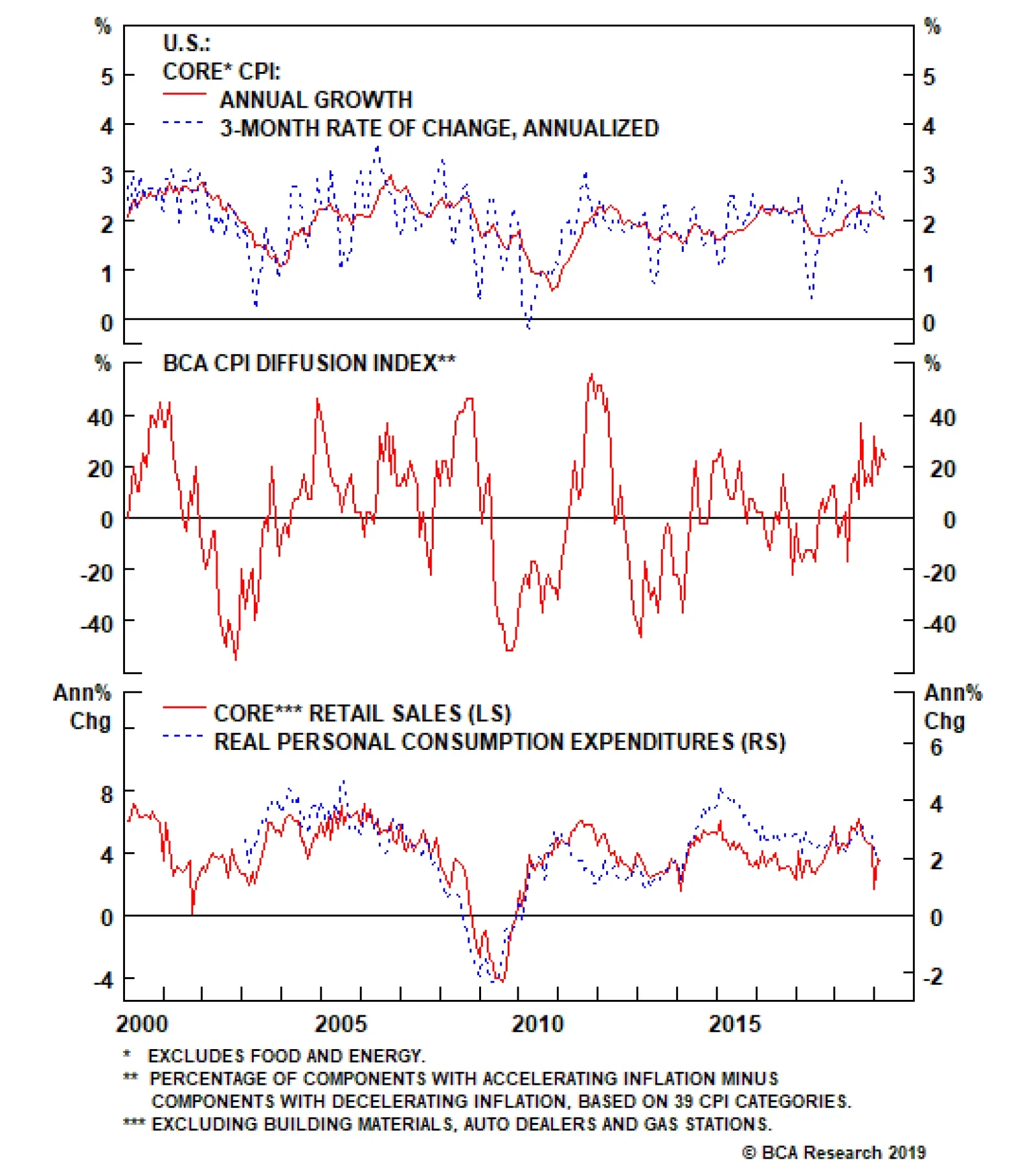
U.S. core CPI for March clocked in at a 2% annual rate. An adjustment to the calculation of the apparel's component contributed to the small disappointment in this inflation number. There was nothing in the report to change our assessment of the Fed going…
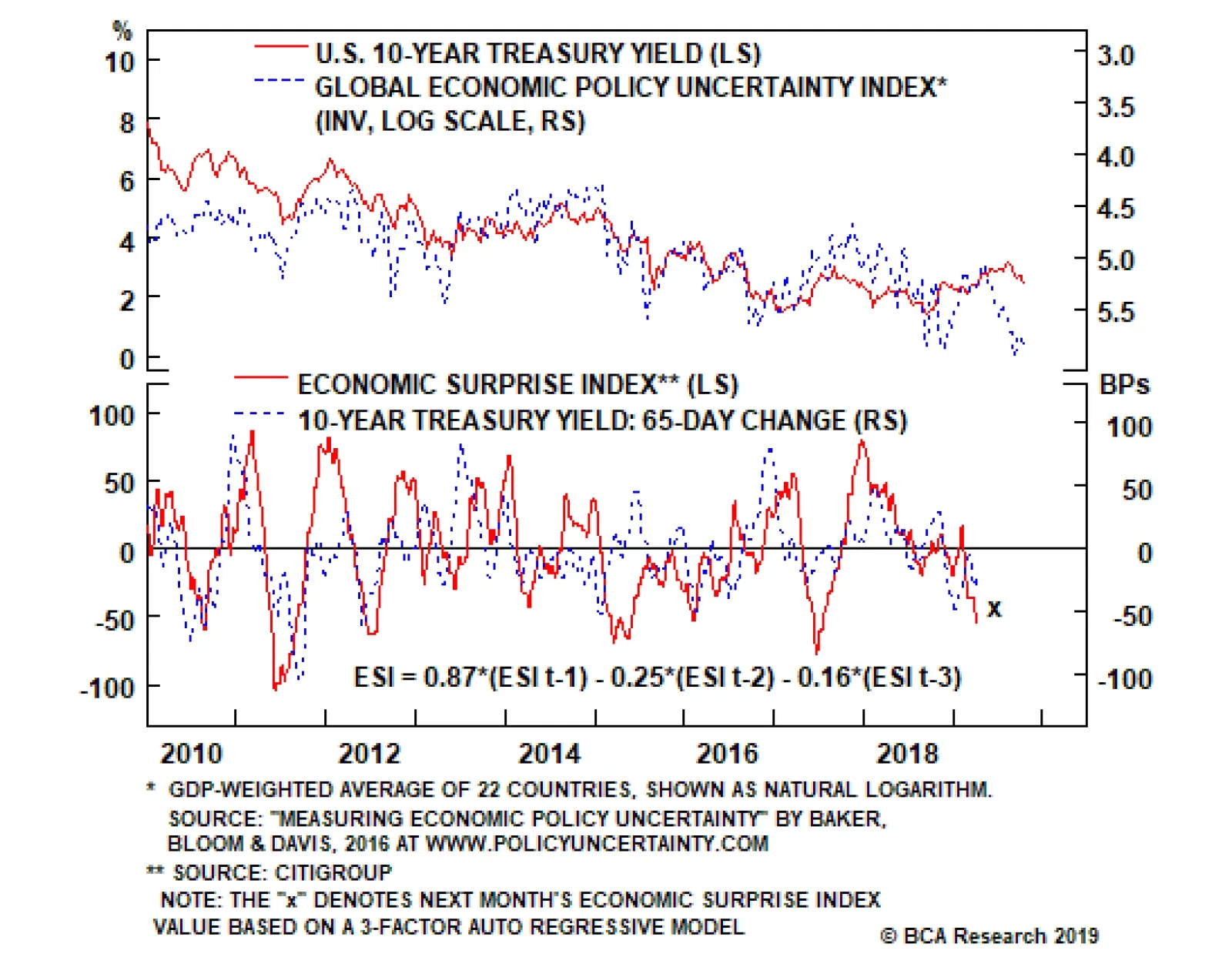
Ingredient #3: Policy Uncertainty The third ingredient we’ll add to our 10-year Treasury yield model is a measure of policy uncertainty. Specifically, the index of Global Economic Policy Uncertainty created by Baker, Bloom and Davis. Elevated political…
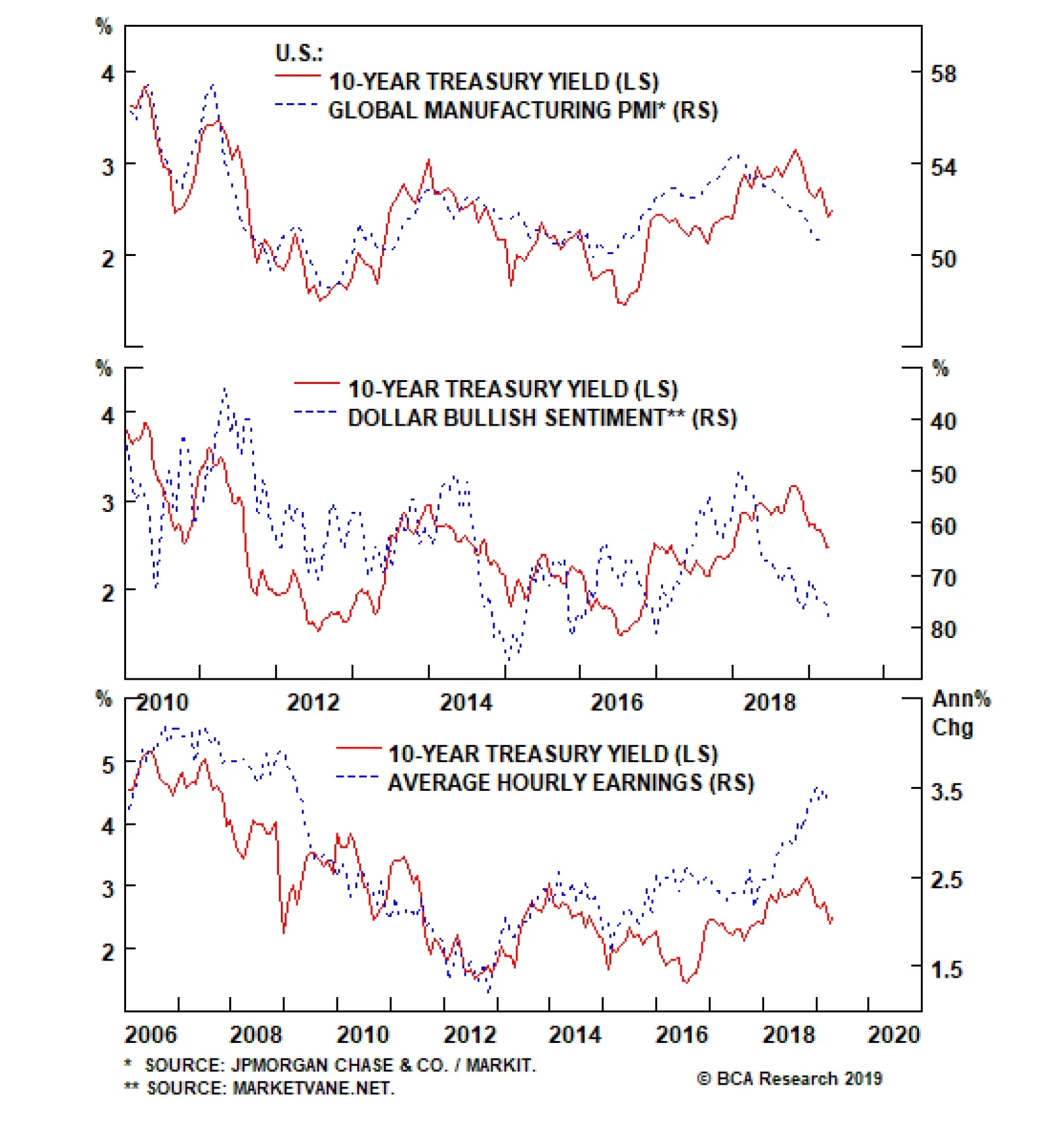
Ingredient #1: Growth Factors The first logical factor to include in any model of the 10-year Treasury yield is some measure of economic growth. Our U.S. Bond Strategy team has found that the Global Manufacturing PMI is often highly correlated with the…
The downward pressure on global government bond yields looks to be losing steam. The “inversion panic” in the U.S. Treasury market has subsided with the 10-year Treasury yield climbing back above 2.50% last week. Yields have bounced off their lows in the…
Highlights 10-Year Yield: In this week’s report we run through different macro factors that could be used to create a macroeconomic model of the 10-year Treasury yield, and describe the current outlook for each one. On balance, the indicators suggest that the 10-year Treasury yield is near its floor. Global Growth: Leading indicators have hooked up recently, suggesting that the Global Manufacturing PMI – a key driver of the 10-year Treasury yield – may rise in the coming months. Wages: Average hourly earnings softened in March, but survey measures suggest that wage growth remains in an uptrend. We show that rising wages have put considerable upward pressure on the 10-year yield in recent years, and should continue to do so going forward. Sentiment: The depressed Economic Surprise Index suggests that investor economic sentiment is downbeat. This means that the bar for positive data surprises (and higher bond yields) is relatively low. Feature Chart 1CRB/Gold Ratio On The Rise
CRB/Gold Ratio On The Rise
CRB/Gold Ratio On The Rise
Treasury yields stabilized during the past week, and investors are trying to figure out whether the next big move will be higher or lower. We’re on the record as predicting that yields will eventually head higher, and have flagged the CRB Raw Industrials / Gold ratio as an important indicator to watch to time the next big move.1 Encouragingly, this indicator has risen during the past few weeks (Chart 1). Though the message from the CRB/Gold index is promising, the outlook for the 10-year Treasury yield remains uncertain. To shed some light on this important investment question, in this week’s report we run through different macroeconomic indicators that could be used to create a model of the 10-year Treasury yield. By performing this exercise out in the open, our goal is to present readers with a good way to think about the linkages between the economy and the 10-year Treasury yield. Recipe For A 10-Year Treasury Yield Model Ingredient #1: Growth Factors The first logical factor to include in any model of the 10-year Treasury yield is some measure of economic growth. We have found that the Global Manufacturing PMI is often highly correlated with the 10-year yield (Chart 2). Interestingly, the manufacturing PMI correlates more strongly with the 10-year yield than do the services or composite (manufacturing + services) PMIs. The Global PMI also correlates more strongly with the U.S. 10-year yield than does the U.S. PMI. It only takes a quick glance at the Global Manufacturing PMI to see why the 10-year Treasury yield fell this year. The Global PMI has been in a sharp downtrend for some time, driven mostly by the Euro Area and China. U.S. PMIs have also weakened in recent months, though they remain above levels seen in Europe and China. Another global growth indicator that correlates tightly with the 10-year Treasury yield is investor sentiment toward the U.S. dollar (Chart 3). Since the dollar is a countercyclical currency that appreciates when global growth slows and depreciates when it quickens, we observe that the 10-year Treasury yield tends to be lower when investors are extremely bullish on the U.S. dollar and higher when they are more bearish on the dollar. Chart 2Growth Factor Ingredient 1: Global Manufacturing PMI
Growth Factor Ingredient 1: Global Manufacturing PMI
Growth Factor Ingredient 1: Global Manufacturing PMI
Chart 3Growth Factor Ingredient 2: Dollar Bullish Sentiment
Growth Factor Ingredient 2: Dollar Bullish Sentiment
Growth Factor Ingredient 2: Dollar Bullish Sentiment
Notice in Charts 2 and 3 that the Global Manufacturing PMI and dollar bullish sentiment are both close to levels seen near the 10-year yield’s mid-2016 trough. At 50.6, the PMI is only slightly above its 2016 low of 49.9. Meanwhile, dollar bullish sentiment is currently 79%. It maxed out at 82% in 2016. Interestingly, despite the fact that our economic growth indicators paint a similar growth back-drop as 2016, the 10-year yield remains well above its mid-2016 low of 1.37%. Logically, we must conclude that some other “non-growth” factor is propping yields up (more on this below). The 10-year Treasury yield tends to be lower when investors are extremely bullish on the U.S. dollar and higher when they are more bearish on the dollar. Looking ahead, we remain optimistic that the most important global growth indicators (Global Manufacturing PMI and dollar bullish sentiment) will soon reverse course, as some leading global growth indicators have recently turned a corner. We already saw that the CRB Raw Industrials index has broken out (Chart 1). Additionally: Chart 4The Worst Is Behind Us?
The Worst Is Behind Us?
The Worst Is Behind Us?
The Global ZEW Economic Sentiment index has risen in two consecutive months (Chart 4, top panel). Our Global LEI Diffusion Index shows that more than half of the countries in our sample now have improving leading economic indicators (Chart 4, panel 2). Our BCA Boom/Bust Indicator – an indicator based on the CRB index, Global Metals equities and U.S. unemployment claims – has also jumped (Chart 4, bottom panel). Ingredient #2: Output Gap As noted above, the 10-year Treasury yield looks too high relative to our preferred economic growth indicators. This could be because yields haven’t yet caught up to the deteriorating global economy, but more likely it is because our bond model is still missing some key ingredients. The next most obvious factor to incorporate into our model is some measure of the output gap. If an economy is operating at very close to its peak capacity, with a small output gap, then it doesn’t take much additional growth to spark inflation. Conversely, even rapid economic growth will not be inflationary if the output gap is large. As long as the central bank is expected to lean against rising inflation with higher interest rates, then some measure of the output gap should be included in our bond model. Unfortunately, appropriate output gap measures are difficult to find. We could rely on the CBO or IMF’s output gap estimates, but those are often subject to large ex-post revisions – not ideal if we want to create a bond model that is useful in real time. Since the Fed tends to lift rates when the output gap closes, another option would be to include the fed funds rate as an independent variable in our model. However, this is also not ideal since we would expect the macroeconomic data and the 10-year yield to lead changes in the policy rate. Some measure of inflation might be the best factor to include. However, we find that the correlation between different price inflation measures and the 10-year Treasury yield is incredibly unstable over time. This is likely because the Fed targets price inflation explicitly, making its correlation with bond yields less empirically apparent. Wage growth is the best “output gap” measure to include in a 10-year Treasury yield model. In fact, our analysis reveals that wage growth is the best “output gap” measure to include in a 10-year Treasury yield model. Specifically, average hourly earnings from the monthly employment report. Not only does the fed funds rate respond – with a lag – to changes in average hourly earnings, but average hourly earnings also line up reasonably well with the 10-year yield over time (Chart 5). Looking at Chart 5, we can now clearly see why the 10-year yield is above its mid-2016 low, despite the poor readings from our growth indicators. Wages have risen sharply since mid-2016, indicating that the output gap has closed, and the Fed has hiked rates 8 times as a result. The obvious conclusion is that in the present situation, with a much smaller output gap than in 2016, it would require a Global Manufacturing PMI well below 50 to produce a 10-year yield near 2% or below. Going forward, we see the uptrend in wage growth continuing for some time. The proportion of workers quitting their jobs each month, a signal of worker bargaining power, remains very high relative to history. Meanwhile, many more households continue to describe jobs as “plentiful” as opposed to “hard to get” (Chart 6). Chart 5Output Gap Ingredient: Average Hourly Earnings
Output Gap Ingredient: Average Hourly Earnings
Output Gap Ingredient: Average Hourly Earnings
Chart 6More Room For Wages To Grow
More Room For Wages To Grow
More Room For Wages To Grow
Ingredient #3: Policy Uncertainty The third ingredient we’ll add to our 10-year Treasury yield model is a measure of policy uncertainty. Specifically, the index of Global Economic Policy Uncertainty created by Baker, Bloom and Davis.2 Investors often flock to the safety of U.S. Treasuries in times of economic distress. But Treasuries can also benefit from flight-to-quality flows during periods of stable economic growth but heightened political turmoil. In other words, elevated political uncertainty can make investors fear a downturn in the future, and drive a flight into the safety of U.S. Treasuries. The Global Economic Policy Uncertainty index also shows a relatively strong correlation with the 10-year Treasury yield over time (Chart 7). Chart 7Policy Uncertainty Ingredient: Global Economic Policy Uncertainty Index
Policy Uncertainty Ingredient: Global Economic Policy Uncertainty Index
Policy Uncertainty Ingredient: Global Economic Policy Uncertainty Index
Looking more closely at Chart 7, we see that global policy uncertainty is currently as high as it was in mid-2016, when the 10-year Treasury yield hit its cycle low. This lines up pretty well with intuition, since investors are understandably quite nervous about the state of Brexit negotiations and U.S./China trade relations. In that context, it is reasonable to expect that some geopolitical risk premium is currently priced into the 10-year Treasury yield, though a smaller output gap than in 2016 is preventing the 10-year yield from reaching mid-2016 levels. Going forward, though political uncertainty will probably stay elevated compared to history. It seems increasingly likely that a “hard Brexit” will be avoided and that President Trump will seek some sort of agreement with China in advance of the 2020 U.S. election.3 The political risk premium in 10-year notes could unwind somewhat in the coming months. Ingredient #4: Sentiment The fourth and final ingredient we’ll add to our 10-year Treasury yield model is a component related to investor sentiment. Our favorite being the U.S. Economic Surprise Index. Chart 8Sentiment Ingredient: Economic Surprise Index
Sentiment Ingredient: Economic Surprise Index
Sentiment Ingredient: Economic Surprise Index
Investors don’t often think of the Surprise index as a sentiment indicator, but in fact that’s exactly what it is. It measures whether the economic data exceeded or fell short of expectations during the past 30 days, a measurement that is heavily influenced by whether investor expectations are optimistic or pessimistic. When economic expectations are extremely downbeat it doesn’t take much good news to generate a positive surprise, and vice-versa. Also, investor expectations are influenced in one direction or the other by whether the recent economic data are positive or negative. This behavioral dynamic causes the Economic Surprise Index to be a mean-reverting series, one that we can even describe with a simple auto-regressive model, as shown in Chart 8. More importantly, we have found that the Economic Surprise Index is tightly correlated with the change in the 10-year Treasury yield. A given month that ends with the Surprise index above zero is usually a month when the 10-year Treasury yield increased, and vice-versa (Chart 9). This correlation also holds relatively well over 3-month and 6-month horizons (Charts 10 & 11), but breaks down beyond that.4
Chart 9
Chart 10
Chart 11
The U.S. data surprise index is deeply negative at present, and has been for several weeks. But the longer the data continue to disappoint, the more downbeat investor expectations become and the more likely it is that the surprise index will rise in the future. Right now, our simple auto-regressive model projects that the surprise index will be slightly higher in one month’s time, though still deeply negative. Nevertheless, the Surprise index suggests we are approaching a turning point in investor sentiment. Mix Well, Cover, Stir Occasionally We’ve now presented what, in our view, is a fairly complete list of factors that should be included in a macroeconomic model of the 10-year Treasury yield. Importantly, each factor complements the other ones in the sense that they each capture a different element of the economic landscape. At this stage, it would be nice to weight all of the factors together and arrive at a fair value estimate for the 10-year yield. Unfortunately, we won’t be performing that exercise in this report (we may do so in the future). The key challenge in combining all of the indicators together is that the sensitivity of the 10-year yield to each of the above factors changes over time. For example, there are periods when policy uncertainty appears to be a very significant driver of the 10-year yield, and other times when it appears to not matter much at all. The macro indicators listed in this report generally signal that the 10-year yield is near its trough. While it is often useful to boil all of the important drivers down into a point estimate of the 10-year yield, such an exercise can also create problems if it causes us to zero-in on the model’s output and avoid thinking critically about what the different macro inputs are telling us. As of today, we think the macro indicators listed above generally signal that the 10-year yield is near its trough. Leading global growth indicators have hooked up, suggesting that the Global Manufacturing PMI will improve during the next few months and that bullish dollar sentiment could soften. Survey indicators suggest that the labor market remains tight, and that wage growth will stay in an uptrend. Policy uncertainty will probably continue to apply some downward pressure to yields, but a long Brexit extension and/or trade agreement between the U.S. and China could cause that impact to wane in the next few months. Economic sentiment is likely quite depressed, meaning that the bar for positive surprises is low. All in all, our investment strategy is unchanged. We recommend that investors maintain below-benchmark duration in U.S. bond portfolios, while focusing short positions on the 5-year and 7-year maturities. Ryan Swift, U.S. Bond Strategist rswift@bcaresearch.com Footnotes 1 The rationale for tracking the CRB/Gold ratio can be found in U.S. Bond Strategy Weekly Report, “The Search For Aaa Spread”, dated March 12, 2019, available at usbs.bcaresearch.com 2 www.policyuncertainty.com 3 Please see Global Investment Strategy Quarterly Outlook, “From Dead Zone To End Zone”, dated March 29, 2019, available at gis.bcaresearch.com 4 Please see U.S. Bond Strategy Weekly Report, “How Much Higher For Yields?”, dated October 31, 2017, available at usbs.bcaresearch.com Fixed Income Sector Performance Recommended Portfolio Specification
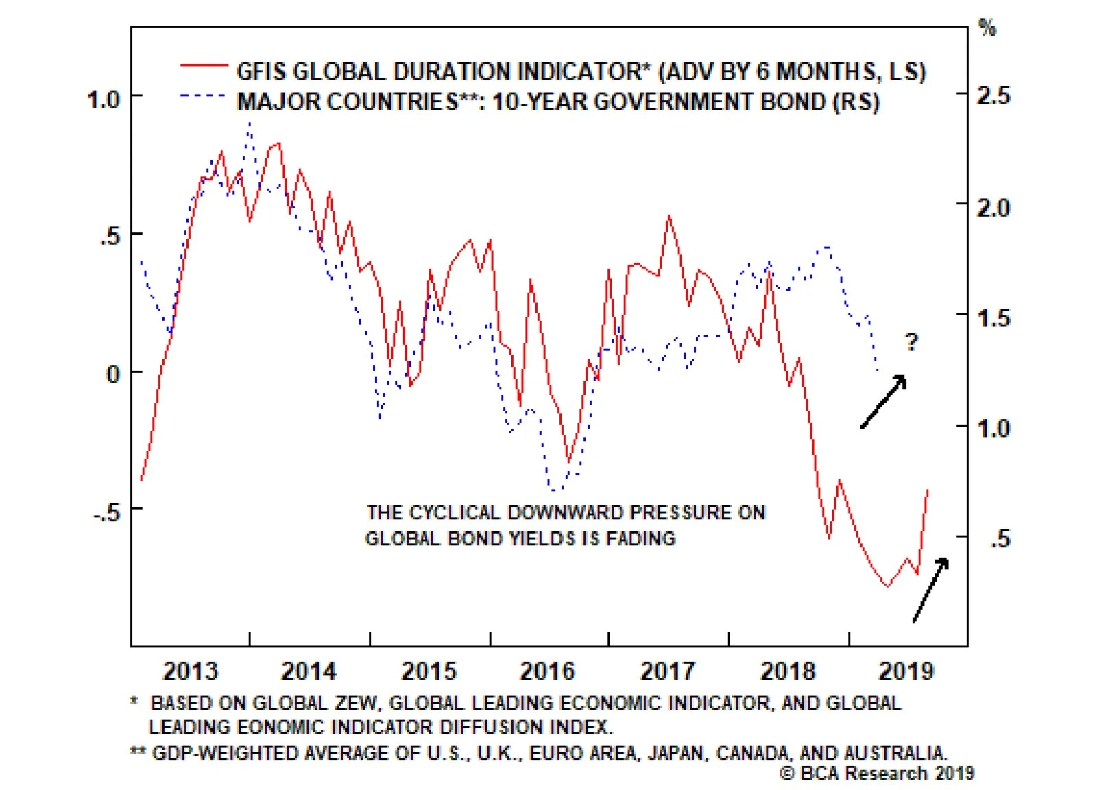
Highlights Duration: A growing list of leading global growth indicators are either climbing or are in the process of bottoming. This is putting a floor under global bond yields, as signaled by our new GFIS Duration Indicator. Maintain a below-benchmark overall duration stance in global bond portfolios. New Zealand: The RBNZ has signaled that the next move in policy rates is down in New Zealand, a move that would be justified by slowing domestic growth and below-target inflation. Stay long New Zealand 5-year government bonds versus equivalent maturity U.S. Treasuries and German debt, but set fairly tight stops to protect profits given how far spreads have already compressed. Feature A New Duration Indicator … But No Change In Our Duration Stance The downward pressure on global government bond yields looks to be losing steam. The “inversion panic” in the U.S. Treasury market has subsided with the 10-year Treasury yield climbing back above 2.50% last week. Yields have bounced well off the lows in the major markets, as well, including the 10-year German Bund which is no longer in negative yield territory. Some tentative signs of stabilization in global growth indicators has helped stem the flow of bond-bullish news, coming alongside a pickup in commodity prices. The new rising trend in our GFIS Duration Indicator suggests that investors should maintain a strategic below-benchmark overall duration stance in global bond portfolios. We have combined some of those growth indicators, which have been reliably correlated with global bond yields over the past several years, into our new Global Fixed Income Strategy (GFIS) Duration Indicator (Chart of the Week). This indicator is a combination of the standardized levels of our global leading economic indicator (LEI), our global LEI diffusion index (the relative share of countries in our global LEI where the LEI is rising versus where it is falling) and the global ZEW economic expectations index (a combination of the individual country indices produced by the German ZEW Institute). Chart of the WeekOur New GFIS Global Duration Indicator Has Bottomed Out
Our New GFIS Global Duration Indicator Has Bottomed Out
Our New GFIS Global Duration Indicator Has Bottomed Out
Chart 2Early Signs Of A Global Growth Recovery
Early Signs Of A Global Growth Recovery
Early Signs Of A Global Growth Recovery
The GFIS Duration Indicator has provided a reliable directional signal for global bond yields since 2012, with a lead of six months. The indicator bottomed back in October 2018 and, with that six month lead, signals that global bond yields should be bottoming now (April 2019). Two of the three components of the GFIS Duration Indicator – the global LEI diffusion index and the global ZEW expectations index – have both clearly bottomed and are the main reason why the Indicator has started to move higher (Chart 2). The global LEI has stopped falling, as well, and is no longer putting downward pressure on the Indicator. Combined with the readings on price momentum for global government bonds (very overbought) and duration positioning among bond investors (well above-benchmark), it is no surprise that bond yields have finally had a chance to stabilize. Looking at the individual country components of these indicators, it is clear that the pickup in sentiment seen in the U.S., euro area, Japan and the U.K. has not been matched by a pickup in their individual LEIs (Chart 3). Interestingly, there are signs of life in some of the individual emerging market (EM) LEIs in places like Mexico.1 The biggest country to watch for improvement, of course, is China and, even here, the sharp deceleration of the OECD LEI appears to be losing steam. The new rising trend in our GFIS Duration Indicator suggests that investors should maintain a strategic below-benchmark overall duration stance in global bond portfolios. Yields may not come roaring back quickly until there is more decisive evidence of improving global growth. On a risk/reward basis, though, betting on higher bond yields from current levels appears prudent. Our new GFIS Duration Indicator may also prove to be useful in guiding fixed income allocation between government bonds and corporate debt in the future. In Chart 4, we show the performance of global government bond yields, corporate bond spreads and corporate excess returns (over duration-matched government debt) since the start of 2018. The shaded region represents the time frame when we moved to a more cautious stance on global corporates versus governments (from June 26, 2018 to Jan 15, 2019). Chart 3Could EM Lead DM Out Of The Slump?
Could EM Lead DM Out Of The Slump?
Could EM Lead DM Out Of The Slump?
Chart 4Our Duration Indicator Can Help With Asset Allocation
Our Duration Indicator Can Help With Asset Allocation
Our Duration Indicator Can Help With Asset Allocation
Our decision to downgrade corporates was based on our concern that slowing global growth, tighter U.S. monetary policy and growing U.S.-China trade tensions would result in a risk-off pullback in global risk assets like corporate bonds and equities. Yet we could have made a similar decision when looking at only the GFIS Duration Indicator. The most recent peak in the Indicator occurred in October 2017, occurring about one full year before the blowout in credit spreads. In a future report, we will investigate the potential links and optimal lead/lag relationships between the GFIS Duration Indicator and fixed income allocation. Bottom Line: A growing list of leading global growth indicators are either climbing or are in the process of bottoming. This is putting a floor under global bond yields, as signaled by our new GFIS Duration Indicator. New Zealand Spread Trade Update – Too Soon To Take Profits Chart 5Impressive Outperformance From NZ Bonds
Impressive Outperformance From NZ Bonds
Impressive Outperformance From NZ Bonds
One of our more successful calls over the past two years has been to go long New Zealand (NZ) government bonds versus U.S. Treasuries and German sovereign debt. Since we initiated that recommendation back on May 30, 2017, the 5-year NZ-US spread has tightened from +74bps to -74bps, while the 5-year NZ-Germany yield differential has narrowed from +289bps to +213bps (Chart 5). Relative to the Bloomberg Barclays Global Treasury index (on a duration-matched basis, hedged into U.S. dollars), NZ government bonds have outperformed by +413bps, compared to +289bps for euro area debt and -269bps for U.S. debt. Our original thesis was that market expectations for the Reserve Bank of New Zealand (RBNZ) were too hawkish relative to decelerating NZ economic growth and inflation persistently coming in below the central bank’s 2% target. Any rate hikes discounted in the NZ yield curve were unlikely to be delivered against that backdrop, keeping NZ bond yields contained. We preferred to position this benign view on NZ rates as a bond spread trade versus the U.S., where the Fed was in a tightening cycle, and versus Germany where a cyclical growth upswing was shifting the ECB in a less-dovish direction. The returns on our NZ recommendation have far exceeded our expectations, with the benchmark 10-year NZ bond yield having fallen -82bps since we initiated the position. The more recent part of that decline has come from the markets moving to price in RBNZ rate cuts over the next year. The bigger driver of the yield move, however, has been due to markets discounting a lower medium-term neutral level of the RBNZ’s policy rate, the Official Cash Rate (OCR). Our proxy for the market expectation of the real terminal rate (the inflation-adjusted level of interest rates derived from forward pricing in the NZ overnight index swap (OIS) curve and medium-term inflation expectations taken from inflation-linked bonds) has fallen from 2.2% in May 2017 to 1.4% today (Chart 6). This is in sharp contrast to the pricing of the real terminal rate in the U.S. and core Europe, which has remained in a narrow range near 0% over the same period. As we discussed in a recent Weekly Report, there has been a trend in recent years towards convergence of real terminal rate expectations across most developed economies – a move driven by a narrowing of differentials in medium-term labor productivity and inflation.2 In the case of NZ, however, the sharp downward adjustment of interest rate expectations also had a cyclical component. Investors are seeing a steady deceleration of NZ growth, even with the RBNZ keeping policy rates at historically-low levels. The result: a reduction of expectations for the terminal (or “neutral”) interest rate. One of our more successful calls over the past two years has been to go long New Zealand (NZ) government bonds versus U.S. Treasuries and German sovereign debt. The economy has faced a broad-based deceleration since the middle of 2016 and is now growing at a below-trend pace of 0.9%. A slower global economy has hit NZ exporters hard, with the annual pace of export growth having slowed from 20% to 4% since last December. The NZ manufacturing PMI has also fallen over the same period, but at 54 remains above the boom/bust 50 level (Chart 7). The RBNZ’s own business surveys show huge declines in confidence, capacity utilization and the outlook for export demand. Chart 6A Big Convergence Of Interest Rate Expectations
A Big Convergence Of Interest Rate Expectations
A Big Convergence Of Interest Rate Expectations
Chart 7Slowing Global Growth Has Hit NZ Hard
Slowing Global Growth Has Hit NZ Hard
Slowing Global Growth Has Hit NZ Hard
Monetary conditions had to become easier to help mitigate the external shock to NZ growth. This did happen through a weaker New Zealand dollar (NZD) – which fell -8% on a trade-weighted basis from the most recent peak in March 2014 – but not through interest rates, as the RBNZ has kept the OCR steady at 1.75% since November 2016. Looking across the NZ economy, a case can be made for introducing additional monetary stimulus. Could the next move to ease monetary conditions be actual rate cuts from the RBNZ? There are now -40bps of cuts over the next twelve months discounted in the NZ OIS curve. RBNZ Governor Adrian Orr stated last month that, given weaker global growth with reduced momentum in domestic spending and core inflation remaining below target, the next move for the OCR is likely down. Looking across the NZ economy, a case can be made for introducing additional monetary stimulus: Chart 8NZ Growth Has Slowed A Lot From The 2015/16 Boom
NZ Growth Has Slowed A Lot From The 2015/16 Boom
NZ Growth Has Slowed A Lot From The 2015/16 Boom
Growth: Real consumer spending has decelerated sharply from the 2015/16 boom years, with the annual growth falling from a peak of 6.1% in 2016 to 3.5% in Q4/2018 (Chart 8). A weaker housing market, fueled by slower inflows of new immigrants, has been an important factor underlying the softer pace of consumer spending. Capital spending by NZ companies has also slowed substantially from the robust 2015/16 pace, a consequence of weaker global demand (both from China and Australia, the most important export markets for NZ) and stagnant prices for important NZ commodities like dairy products. Importantly, the broad-based deceleration of NZ economic growth appears to have stabilized, although there is little sign of an imminent reacceleration in domestic demand. Labor Markets & Inflation: NZ’s labor market has been very strong. The unemployment rate of 4.3% sits well below both the RBNZ and OECD estimates of full employment. The labor force participation rate has climbed a full three percentage points since 2015 and is now stable around 71% (Chart 9). Job vacancies were up 7.2% on a year-over-year basis in Q4 2018, with full-time employment growth holding stable at 3.1% even as part-time employment growth has been contracting. This all suggests that the pool of available workers has become tight enough to allow part-time workers to find full-time work and wages to accelerate. Yet despite +3% wage growth persisting over the past year, both headline and core CPI inflation has remained stubbornly below 2% (the midpoint of the RBNZ 1-3% target band) since the end of 2014. Chart 9Tight NZ Labor Markets, But Where's The Inflation?
Tight NZ Labor Markets, But Where's The Inflation?
Tight NZ Labor Markets, But Where's The Inflation?
Against this backdrop of slowing growth but underwhelming inflation, the RBNZ would be justified in delivering a rate cut or two to provide a boost to the economy. The RBNZ’s latest set of economic forecasts are not overly pessimistic with real GDP expected to grow at a 3% pace in 2019 and 2020. Governor Orr has noted, however, that the weakness in consumer spending is the biggest downside threat to the central bank’s growth forecasts. More importantly, despite forecasting that the NZ labor market will remain tight (i.e. beyond full employment), and the output gap will remain above zero (i.e. no spare capacity), the central bank does not expect inflation to return to the 2% target until 2021. Pricing in inflation-linked NZ government bonds is even more pessimistic, with longer-term inflation breakevens now sitting below 1%. Adding to the dovish bias of the RBNZ is the revised mandate for the central bank from the NZ government. The RBNZ now has a dual mandate similar to the U.S. Federal Reserve, targeting both stable inflation and maximum sustainable employment. The central bank has also moved away from having the RBNZ Governor solely make decisions, with a new seven-person monetary policy committee now voting on policy changes.3 Governor Orr stated last week that the RBNZ’s new dovish bias introduced in March will be “the starting point” for deliberations by the enlarged monetary policy committee. Such a candid statement suggests that the committee’s first formal policy meeting on May 8 will be dedicated to discussing the need for a rate cut. Yet even if the RBNZ does ease in May, the markets are already priced for such an outcome. The NZ OIS curve discounts -32bps of cuts within the next six months, and -18bps of cuts in the next three months. So what does this all mean for our NZ spread trades? In Charts 10 & 11, we present a “fair value” regression model for the 5-year NZ-US and 5-year NZ-Germany bond spreads. The independent variables in the model are based on relative monetary policy, relative growth and relative inflation between NZ and the U.S. and Germany. The logic is that the bond spread should be a function of the differentials between policy interest rates, unemployment rates and inflation rates. Chart 10Our NZ-US 5-Year Spread Model
Our NZ-US 5-Year Spread Model
Our NZ-US 5-Year Spread Model
Chart 11Our NZ-Germany 5-Year Spread Model
Our NZ-Germany 5-Year Spread Model
Our NZ-Germany 5-Year Spread Model
The model is indicating that the NZ-US spread is far too tight, although this is not unusual when looking at the very wide spreads between U.S. Treasury yields and bonds from other countries which are also historical extremes (i.e. Germany, Australia and the U.K.). As discussed earlier, the market pricing of NZ neutral real interest rates has converged substantially towards the lower levels seen in other developed countries. This suggests that the unusually narrow spreads reflect a structurally lower interest rate environment in NZ, which has historically been a country with some of the highest nominal rates and bond yields in the developed world. Adding it all up, we think that the conditions for a widening of NZ-US and NZ-German spreads is not yet in place. Thus, we are sticking with our recommended spread trades. Our model for the NZ-Germany spread also suggests that the spread is getting too tight, although it is still within the normal ranges (+/- 1 standard deviation) of fair value. So on the basis of valuation, the period of NZ bond outperformance looks stretched. In terms of what is discounted in NZ money markets, it is unlikely that the RBNZ will deliver on the -39bps of rate cuts currently discounted in the OIS curve over the next year without a sharper downleg in both growth and inflation (that also pushes up unemployment). Yet at the same time, the backdrop for global bond yields is shifting due to bottoming global growth that is likely to put more upward pressure on U.S. and German yields than NZ yields, which have already fallen substantially. Adding it all up, we think that the conditions for a widening of NZ-US and NZ-German spreads is not yet in place. Thus, we are sticking with our recommended spread trades. Given the overvaluation signals from our new fair value models, however, we do recommend setting a stop on these spread positions to protect profits. For the 5-year NZ-US spread, which is currently at -74bps, we are setting a fairly tight stop at -60bps given how overvalued that spread looks in our model. For 5-year NZ-Germany, which is currently at +207bps, we are setting a slightly wider stop at +230bps. Bottom Line: The RBNZ has signaled that the next move in policy rates is down in New Zealand, a move that would be justified by slowing domestic growth and below-target inflation. Stay long New Zealand 5-year government bonds versus equivalent maturity U.S. Treasuries and German debt, but set fairly tight stops to protect profits given how far spreads have already compressed. Robert Robis, CFA, Chief Fixed Income Strategist rrobis@bcaresearch.com Ray Park, CFA, Research Analyst ray@bcaresearch.com Footnotes 1 Note that we are using the OECD set of leading economic indicators in this analysis. 2 Please see BCA Global Fixed Income Strategy Weekly Report, “Pervasive Uncertainty, Persuasive Central Banks”, dated March 12th 2019, available at gfis.bcaresearch.com. 3 A lengthy but detailed Monetary Policy Handbook, highlighting the philosophy and new policy framework for the Reserve Bank of New Zealand, can be found here. https://www.rbnz.govt.nz/monetary-policy/about-monetary-policy/monetary-policy-handbook Recommendations The GFIS Recommended Portfolio Vs. The Custom Benchmark Index
A Sustainable Bottom In Global Bond Yields
A Sustainable Bottom In Global Bond Yields
Duration Regional Allocation Spread Product Tactical Trades Yields & Returns Global Bond Yields Historical Returns
Feature This week, instead of our regular Weekly Report, we will answer clients’ most frequently asked questions (FAQs) from our recent marketing trip to the old continent. Table 1 lists these questions and below we will attempt to weave a cohesive piece and answer all of these interesting questions. Clients inquiring about “how is everyone else positioned” or the related “what is the general investor sentiment like” is by far the most FAQ we always get from the road and we purposefully omit it from Table 1. Table 1Most FAQs From The Road
10 Most FAQs From The Road
10 Most FAQs From The Road
During our last three developed markets (DM) trips, while we cannot comment on the positioning question, with regard to general investor sentiment, Australia and New Zealand are off the charts bullish. On the opposite end of the spectrum, Europe is extremely bearish, especially continental Europe. The U.S. is somewhere in the middle. Chart 1Fed’s Pivot On Display
Fed’s Pivot On Display
Fed’s Pivot On Display
With that out of the way, the recent broadening out of the U.S. yield curve inversion to the 10/fed funds rate took center stage in our client interactions, especially the implications of the inversion for sector positioning and the duration of the business cycle. To set the record straight, a yield curve inversion does not forecast recession. Instead, it explicitly signals that the market expects the Fed’s next move to be an interest rate cut (top panel, Chart 1). In that context, the yield curve has never had a false-positive reading. Even in May 1998, it accurately forecast that the Fed would decrease the fed funds rate as it actually did in the fallout of the LTCM meltdown later that year (bottom panel, Chart 1). As equity investors, what consumes us is the SPX’s performance following the yield curve inversion. On that front, mid-December last year we showed the results of our research and made a simple observation that the yield curve inversion almost always takes place prior to the S&P peak (Table 2, Charts 2 & 3). Table 2Yield Curve Inversions And S&P 500 Peaks
10 Most FAQs From The Road
10 Most FAQs From The Road
Chart 2
Chart 3…And Then The SPX Peaks
…And Then The SPX Peaks
…And Then The SPX Peaks
In addition, today we show the S&P 500’s return and the sector returns from the time the 10/2 yield curve slope inverts until the S&P peaks, and we summarize the results in Table 3. Table 3Sector Returns From Y/C Inversion To SPX Peak
10 Most FAQs From The Road
10 Most FAQs From The Road
While every cycle is different, clearly it pays to have energy exposure more often than not. In contrast, high-yielding defensive sectors like utilities and telecom services fare poorly in these late-cycle iterations. Meanwhile, Table 4 highlights sector performance from the SPX peak until the U.S. recession hits. We first showed these results on May 22, 2018, and we are on track to publish a Special Report on May 5 on how to position portfolios at the onset of a Fed easing cycle, so stay tuned. Table 4Defensive Stocks Beat Late
10 Most FAQs From The Road
10 Most FAQs From The Road
Investors remain infatuated with the recession signal that the yield curve inversion emits. Moreover, recent news of an onslaught of Unicorn IPOs that would bring stock supply to the equity market, near the $100bn mark on an annualized basis according to some estimates, have also brought forward recession fears, as smart money is cashing in on their investments. Chart 4 shows that $100bn per annum in IPOs has coincided with the SPX peak in the previous two cycles. Our long-held view remains that either a mega M&A deal in the tech or biotech space or Uber’s IPO at a stratospheric valuation could serve as the anecdote that confirms the current cycle’s peak. On the yield curve front specifically, the top panel of Chart 5 shows that the most important yield curve, the 10/2, has not yet inverted. Moreover, the 30/10 and the 30/5 slopes are steepening. True, we are late cycle, but we need all the slopes to invert to get a confirmation that the recession is a foregone conclusion. Chart 4Mind The Excess Supply
Mind The Excess Supply
Mind The Excess Supply
Chart 510/2 Y/C Has Yet To Invert
10/2 Y/C Has Yet To Invert
10/2 Y/C Has Yet To Invert
The Fed’s tightening cycle has not only inverted most parts of the yield curve starting early last December, but has inflicted some damage on profit margins. Following up from our recent profit margin work highlighting nil corporate pricing power at a time when wage costs are perking up, BCA’s Monetary Indicator signals more SPX margin pain in the coming months (Chart 6). In fact, sell-side estimates call for another three consecutive quarters of a year-over-year contraction in profit margins. Chart 6Margin Trouble
Margin Trouble
Margin Trouble
In more detail, the earnings deceleration that commenced in Q4 2018 and is gaining steam is disconcerting. As a reminder, Q4 included the lower corporate tax rate and the Q/Q deceleration is not solely due to the tech sector profit warnings. Eight out of the 11 GICS1 sectors sharply decelerated, two modestly accelerated and only industrials steeply accelerated to a cyclical EPS peak growth rate (Table 5). This EPS breadth deterioration is eerily reminiscent of early-2015 (Chart 7) and is disquieting. Short-term caution is also warranted given the increase in investor complacency. The one sided positioning in the VIX futures market is worrisome. As a reminder, net speculative positions are now at a lower low than the February 2018 level when the VIX snapped to over 50 and caused a massive tremor in the equity market (net speculative positions shown inverted, Chart 8). Table 5Historical/Current/Future Earnings Growth Rates
10 Most FAQs From The Road
10 Most FAQs From The Road
Chart 7Bad Breadth
Bad Breadth
Bad Breadth
Chart 8Too Complacent
Too Complacent
Too Complacent
But, before getting overly bearish there are some growth green shoots that suggest that Q2-to-Q3 will likely mark the trough in EPS/EBITDA growth and margins (Chart 9). Beyond these positive leading profit indicators, a resolution to the U.S./China trade tussle and China’s trifecta of policy easing measures will also aid in turning profit growth around and really power up U.S. cyclicals’ EPS growth rates. Following up from the January Fed meeting, on February 4 we penned a report titled “Don’t Fight The PBoC” and it is now clear with the recent manufacturing PMI release that China’s easing on all three fronts – credit (Chart 10), monetary (Chart 11) and fiscal (Chart 12) – is starting to pay some dividends. In that light, the U.S. cyclicals vs. U.S. defensives recent outperformance has more room to run. Chart 9Growth Green Shoots
Growth Green Shoots
Growth Green Shoots
Chart 10Chineasing…
Chineasing…
Chineasing…
Chart 11...On All…
...On All…
...On All…
Chart 12…Fronts
…Fronts
…Fronts
Deep cyclicals have another major advantage this cycle compared with defensives. While at this stage of the business cycle one would expect capital intensive businesses to become debt saddled, cyclicals are still de-levering from the depths of the late-2015/early-2016 manufacturing recession, i.e. paying down debt and increasing cash flow. Defensives, however, are doing the exact opposite with relative cash flow growth problems and piling on debt. Thus, on a relative basis Chart 13 shows that the indebtedness profile clearly favors deep cyclicals vs. defensives. From a bigger picture perspective, while the U.S. has not really purged any debt and it has just shifted it around from the financial and household sectors to the non-financial business and government sectors (Chart 14), the near all-time high in non-financial business sector credit as a share of GDP is disconcerting (top panel, Chart 14). Clearly the excesses are in this segment of U.S. debt and it is unsurprising that debt saddled stocks have been underperforming equities with pristine balance sheets since the 2016 presidential elections (top panel, Chart 15). Such outperformance has staying power, especially given that we are late in the cycle and the Fed has raised interest rates to the point where parts of the yield curve are inverted and a default cycle looms large (bottom panel, Chart 15). Chart 13Cyclicals Have The Upper Hand
Cyclicals Have The Upper Hand
Cyclicals Have The Upper Hand
Chart 14U.S. Debt Profile Breakdown
U.S. Debt Profile Breakdown
U.S. Debt Profile Breakdown
One sub-sector that epitomizes the current cycle’s excesses is commercial real estate (CRE). CRE prices have overshot the historical time trend by almost two standard deviations and it has already been three and a half years since they surpassed the previous all-time high (Chart 16). The recent pullback in the 10-year Treasury yield has pushed cap rates even lower and the bubble in CRE is further inflated. Looking back at the late-1980s pricking of that CRE bubble is instructive and when this cycle ends a big deflationary impulse will likely deal a blow to the CRE market. Chart 15Hide In Pristine Balance Sheets
Hide In Pristine Balance Sheets
Hide In Pristine Balance Sheets
Chart 16CRE Excesses Are A Yellow Flag
CRE Excesses Are A Yellow Flag
CRE Excesses Are A Yellow Flag
Speaking of bubbles, the biggest bubble we currently see is not in equities, but in bonds. Table 6 shows that red is taking over and is reminiscent of mid-year 2016 when the 10-year U.S. Treasury yield troughed a hair above 1.3%. Globally, negative yielding debt is near all-time highs (Chart 17) and the excesses are even larger in the EM sovereign space and in select DM corporates. Mexico raising century debt in U.S. dollars, in cable and in euros is perplexing, as Mexico was at the epicenter of the 1982 LatAm crisis and again in 1994 with the Tequila crisis. Argentina also raising century debt recently in hard currency speaks to the magnitude of the current bond bubble. On the corporate side, Sanofi and LVMH placing negative yielding debt is beyond our understanding, or Total issuing a perpetual bond with a 1.75% coupon. Table 6Red Takes Over
10 Most FAQs From The Road
10 Most FAQs From The Road
Chart 17Bonds Are In A Bubble
Bonds Are In A Bubble
Bonds Are In A Bubble
All of this is likely linked to the unintended consequences of global QE where fixed income investors are pushed out the risk spectrum and are forced into buying riskier credit. When this bond bubble gets pricked it will end in tears as it always does and the catalyst will likely be the next U.S. recession that will cause a global recession. While our cyclical 9-to-12 month equity market view is constructive and we believe the U.S. will avoid recession, our structural 1-to-3 year view is negative. Nevertheless, we constantly challenge our thesis and the biggest pushback to the negative structural view is the following: What if the Fed can engineer a soft landing in the U.S. as it did twice in the mid-1990s, and the business cycle runs hot for another 5 years (Chart 18)? What if the starting point of low interest rates with the real fed funds rates still close to zero is very stimulative for the U.S. economy as no recession has ever started with a fed funds rate perched near zero (Chart 19)? Finally, what if the late-2015/early-2016 manufacturing recession was actually an economic recession despite the fact that the NBER did not designate it as such and the business cycle got reignited, especially with President Trump’s election that lifted animal spirits? As a reminder, while S&P profits have contracted outside of an economic recession twice before, SPX sales had never achieved that feat, until late-2015/early-2016 (Chart 20). In other words, the revenue recession we had was unprecedented and felt like an economic recession. Chart 18The Fed Has Engineered A Soft Landing
The Fed Has Engineered A Soft Landing
The Fed Has Engineered A Soft Landing
Chart 19Stimulative Real Rates
Stimulative Real Rates
Stimulative Real Rates
Chart 20There Is Always A First Time
There Is Always A First Time
There Is Always A First Time
If that were the case and the cycle were to extend into the 2020s, then the risk is that SPX EPS vault to $200 and valuations overshoot, i.e. the forward P/E multiple spikes to a 20 handle and the SPX catapults to 4,000. In that case, we would leave 1,000 points on the table and our SPX 3,000 view would be way offside. While this is a risk to our negative structural view, there are two sectors we really like for the long-term as we deem them secular growth plays and should do exceptionally well on a 10-year horizon: software and defense stocks. Three key drivers underpin our bullish view on software: galloping higher private and public sector software outlays, a structurally enticing software demand backdrop and ongoing industry M&A (Chart 21). Most importantly, the move to cloud computing and SaaS, the proliferation of AI, machine learning and augmented reality are not fads but enjoy a secular growth profile, and signal that capital outlays on software are in a structural uptrend. With regard to defense stocks, the three key pillars we highlighted in our “Brothers In Arms” Special Report on October 31, 2016 remain intact: the global rearmament is still gaining steam, a space race with manned missions to the moon now includes the U.S., China and India, and cybersecurity is a real threat for governments around the world (Chart 22). On all three fronts, defense stocks stand to benefit as they have beefed up their offerings to provide governments with a one-stop shop solution covering most of these needs. Chart 21Buy The Software Breakout
Buy The Software Breakout
Buy The Software Breakout
Chart 22Defense Stocks Remain A Long-term Buy
Defense Stocks Remain A Long-term Buy
Defense Stocks Remain A Long-term Buy
Anastasios Avgeriou, U.S. Equity Strategist anastasios@bcaresearch.com
Highlights Chart 1What’s The Downside?
What’s The Downside?
What’s The Downside?
How low can it go? This is the question most investors are asking these days about the 10-year Treasury yield. Our answer is that it can’t go much lower unless the U.S. economy falls into recession, an event we don’t anticipate in 2019. Considering the main macro drivers of the 10-year Treasury yield, we find that the Global Manufacturing PMI (Chart 1), U.S. dollar bullish sentiment (not shown) and Global Economic Policy Uncertainty (not shown) are all close to mid-2016 levels. In other words, the economic growth and policy environment is almost identical to the one that produced a 1.37% 10-year Treasury yield in mid-2016. What’s preventing a return to mid-2016 yield levels is that the Fed has delivered nine rate hikes since then, and rising wage growth confirms that the output gap has closed considerably (bottom panel). In other words, with short-maturity yields much higher than three years ago, we would need to see a much more pronounced growth slowdown, i.e. PMIs well below 50, to re-produce a sub-2% 10-year Treasury yield. If 2019 continues to follow the 2016 roadmap and the Global PMI bottoms-out around 50, then the 10-year Treasury yield has probably already found its floor. Feature Investment Grade: Overweight Investment grade corporate bonds outperformed the duration-equivalent Treasury index by 24 basis points in March, bringing year-to-date excess returns up to +268 bps. The Federal Reserve’s pause opens a window for corporate spreads to tighten during the next few months. We recommend overweight positions in corporate bonds for now, but will be quick to reduce exposure once spreads reach our near-term targets. Aaa spreads are already below target levels and we recommend avoiding that credit tier. Other credit tiers still have room to tighten, though Aa and A-rated bonds are only 3 bps and 5 bps above target, respectively (Chart 2).1 Once spreads reach more reasonable levels for this phase of the cycle, we will be quick to reduce corporate bond exposure because some indicators of corporate default risk are already sending warning signals.2 Most notably, corporate profits grew only 4.0% (annualized) in Q4 2018 while corporate debt rose 5.3% (annualized). The result is that our measure of gross leverage ticked higher for the first time since Q3 2017 (bottom panel). Going forward, with corporate profit growth likely to stabilize in the mid-single digit range, gross leverage will probably stay close to its current level. That would be consistent with a 3% speculative grade default rate, significantly above the 1.7% rate currently projected by Moody’s. Chart 2Investment Grade Market Overview
Investment Grade Market Overview
Investment Grade Market Overview
Chart
Chart
High-Yield: Overweight High-Yield underperformed the duration-equivalent Treasury index by 23 basis points in March, dragging year-to-date excess returns down to +566 bps. Junk spreads for all credit tiers remain above our near-term spread targets.3 At present, the Ba-rated option-adjusted spread is 235 bps, 55 bps above our target. The B-rated spread is 285 bps, 102 bps above our target. The Caa-rated spread is 802 bps, 244 bps above our target (Chart 3). Chart 3High-Yield Market Overview
High-Yield Market Overview
High-Yield Market Overview
Elevated spreads mean that investors are currently well compensated for default risk, but that could change later in the year. In a recent report we showed that some leading default indicators – gross leverage, C&I lending standards and job cut announcements (bottom panel) – are showing signs of deterioration.4 Specifically, our model suggests that the speculative grade default rate could be 3% or higher during the next 12 months. Moody’s currently forecasts 1.7%. If the Moody’s forecast is correct, the high-yield default adjusted spread is 306 bps. If the Moody’s forecast turns out to be correct, then investors will take home a default-adjusted spread of 306 bps, well above the historical average of 250 bps. If our 3% forecast is correct, then the default-adjusted spread falls to 230 bps, slightly below the historical average (panel 4). In either case, investors are reasonably well compensated for bearing default risk, but that will change when spreads reach our near-term targets. We will be quick to cut exposure at that time. MBS: Neutral Mortgage-Backed Securities underperformed the duration-equivalent Treasury index by 11 basis points in March, dragging year-to-date excess returns down to +27 bps. The conventional 30-year zero-volatility spread widened 3 bps on the month, driven entirely by an increase in the compensation for prepayment risk (option cost). The option-adjusted spread (OAS) held flat at 40 bps. Falling mortgage rates since the beginning of the year have caused an increase in refinancing activity, leading to some widening in nominal MBS spreads (Chart 4). However, the tepid pace of new issuance in recent years means that the existing mortgage stock is not very exposed to refinancing risk. Consider that, despite an 80 bps drop in the 30-year mortgage rate, the MBA Refinance index has only risen to 1290. The Refi index’s historical average is 1824. Chart 4MBS Market Overview
MBS Market Overview
MBS Market Overview
Further, housing starts and new home sales appear to have stabilized, meaning that there is probably not much further downside for mortgage rates. As a consequence, we don’t see much more scope for MBS spread widening. While MBS spreads appear relatively safe, the sector does not offer attractive expected returns compared to the investment alternatives. For example, the index option-adjusted spread for conventional 30-year MBS is well below its average historical level (panel 3) and the sector offers less compensation than normal compared to corporate bonds (panel 4). MBS also offer a poor risk/reward trade-off compared to other Aaa-rated spread products, as we showed in a recent report.5 Government-Related: Underweight The Government-Related index outperformed the duration-equivalent Treasury index by 23 basis points in March, bringing year-to-date excess returns up to +115 bps. Sovereign debt outperformed duration-equivalent Treasuries by 13 bps on the month, bringing year-to-date excess returns up to +334 bps. Local Authorities outperformed the Treasury benchmark by 53 bps and Foreign Agencies outperformed by 42 bps, bringing year-to-date excess returns up to +139 bps and +151 bps, respectively. Domestic Agencies outperformed by 11 bps in March, bringing year-to-date excess returns up to +20 bps. Supranationals outperformed by 4 bps, bringing year-to-date excess returns up to +16 bps. The USD-denominated sovereign debt of most countries continues to look expensive relative to equivalently-rated U.S. corporate credit. However, in a recent report we highlighted that Mexican sovereign debt is an exception (Chart 5).6 Chart 5Government-Related Market Overview
Government-Related Market Overview
Government-Related Market Overview
Not only is Mexican sovereign debt cheap relative to U.S. corporates, but our Emerging Markets Strategy service has shown that the Mexican peso is cheap.7 The prospect of a stronger peso versus the U.S. dollar makes the spread on offer from Mexican sovereign debt look even more attractive. Municipal Bonds: Overweight Municipal bonds underperformed the duration-equivalent Treasury index by 39 basis points in March, dragging year-to-date excess returns down to +52 bps (before adjusting for the tax advantage). The average Aaa-rated Municipal / Treasury yield ratio rose 1% in March, and currently sits at 82% (Chart 6). This is more than one standard deviation below its post-crisis mean and right around the average of 81% that prevailed in the late stages of the previous cycle, between mid-2006 and mid-2007. Chart 6Municipal Market Overview
Municipal Market Overview
Municipal Market Overview
The Municipal / Treasury yield ratio for short maturities (2-year and 5-year) remains well below the yield ratio for longer maturities (10-year, 20-year and 30-year). In other words, the best value in the municipal bond space is at the long-end of the curve, and we continue to recommend that investors favor those maturities. Recently released data from the Bureau of Economic Analysis shows that state & local government revenue growth declined in Q4 2018, for the first time since Q2 2017. As a result, our measure of state & local government interest coverage fell from a lofty 17 all the way down to 5 (bottom panel). Positive interest coverage means that state & local governments are still generating sufficient revenue to cover current expenditures and interest payments, and we therefore don’t anticipate a surge in muni ratings downgrades any time soon. We also continue to note that municipal bonds tend to perform better in the middle-to-late phases of the economic cycle, while corporate credit delivers its best returns early in the recovery.8 Investors should maintain an overweight allocation to municipal debt. Treasury Curve: Adopt A Barbell Curve Positioning Treasury yields fell dramatically in March, as the Fed surprised markets with a larger-than-expected downward revision to its interest rate projections. The result is that the overnight index swap curve is now priced for 34 basis points of rate cuts over the next 12 months (Chart 7). Chart 7Treasury Yield Curve Overview
Treasury Yield Curve Overview
Treasury Yield Curve Overview
The 2/10 Treasury slope flattened 7 bps to end the month at 14 bps. The 5/30 slope steepened 1 bp to end the month at 58 bps. In recent reports we urged investors to adopt barbell positions along the yield curve. In particular, investors should avoid the 5-year and 7-year maturities and instead focus their allocations at the very short and long ends of the curve.9 There are three main reasons to prefer a barbell positioning. First, the 5-year and 7-year yields are most sensitive to changes in our 12-month discounter. In other words, those yields fall the most when the market prices in rate cuts and rise the most when it prices in rate hikes. As long as recession is avoided, the market will eventually price rate hikes back into the curve. Favor the 2/30 barbell over the 7-year bullet. Second, barbells currently offer a yield pick-up relative to bullets. The duration-matched 2/10 barbell offers 10 bps more yield than the 5-year bullet (panel 4), and the duration-matched 2/30 barbell offers 9 bps more yield than the 7-year bullet. This means that investors will earn positive carry in barbell positions while they wait for rate hikes to get priced back in. Finally, all barbell combinations look cheap according to our yield curve fair value models (see Appendix B). TIPS: Overweight TIPS underperformed the duration-equivalent nominal Treasury index by 44 basis points in March, dragging year-to-date excess returns down to +76 bps. The 10-year TIPS breakeven inflation rate fell 7 bps to end the month at 1.88% (Chart 8). The 5-year/5-year forward TIPS breakeven inflation rate fell 8 bps to end the month at 1.98%. Both rates remain below the 2.3% - 2.5% range that has historically been consistent with inflation expectations that are well-anchored around the Fed’s target. Chart 8Inflation Compensation
Inflation Compensation
Inflation Compensation
As we noted in last week’s report, with financial conditions no longer excessively easy, the Fed has pivoted to a more dovish stance in an effort to re-anchor inflation expectations at levels more consistent with its 2% target.10 This change should support wider TIPS breakevens, though investors will also need to see evidence of firming realized inflation before meaningful upside materializes. So far, such evidence is in short supply. Note that trimmed mean PCE inflation has rolled over again after having just touched 2% (bottom panel). Trimmed mean PCE is running at 1.84% year-over-year. Nevertheless, we would maintain an overweight allocation to TIPS versus nominal Treasuries. First, our commodity strategists see further upside in the price of oil (panel 2), and second, the 10-year TIPS breakeven inflation rate is 6 bps too low relative to the fair value from our Adaptive Expectations model (panel 4).11 ABS: Underweight Asset-Backed Securities outperformed the duration-equivalent Treasury index by 2 basis points in March, bringing year-to-date excess returns up to +40 bps. The index option-adjusted spread for Aaa-rated ABS widened 2 bps on the month and currently sits at 34 bps, exactly equal to its pre-crisis low (Chart 9). Chart 9ABS Market Overview
ABS Market Overview
ABS Market Overview
We showed in a recent report that Aaa-rated consumer ABS offer a relatively poor risk/reward trade-off compared to other U.S. fixed income sectors, a result that is echoed by the Excess Return Bond Map in Appendix C.12 This should not be surprising given that Aaa ABS spreads are close to all-time lows. What is surprising is that ABS spreads are so tight while the consumer delinquency rate is rising (panel 3). Although the delinquency rate remains well below pre-crisis levels, it will likely continue to rise going forward. Household interest payments are rising quickly as a share of disposable income (panel 3) and banks are tightening lending standards for both credit cards and auto loans (bottom panel). We recommend an underweight allocation to consumer ABS, preferring to take Aaa spread risk in MBS and CMBS. Non-Agency CMBS: Neutral Non-Agency Commercial Mortgage-Backed Securities outperformed the duration-equivalent Treasury index by 5 basis points in March, bringing year-to-date excess returns up to +146 bps. The index option-adjusted spread for non-agency Aaa-rated CMBS widened 2 bps to end the month at 73 bps, below its average pre-crisis level but somewhat higher than recent tights (Chart 10). Chart 10CMBS Market Overview
CMBS Market Overview
CMBS Market Overview
In a recent report we noted that non-agency CMBS offer the best risk/reward trade-off of any Aaa-rated U.S. spread product.13 While we remain cautious on the macro outlook for commercial real estate, noting that prices are decelerating (panel 3) and banks are tightening lending standards (panel 4) amidst falling demand (bottom panel), we view elevated CMBS spreads as providing reasonable compensation for this risk for the time being. Agency CMBS: Overweight Agency CMBS underperformed the duration-equivalent Treasury index by 2 basis points in March, dragging year-to-date excess returns down to +74 bps. The index option-adjusted spread widened 2 bps on the month and currently sits at 50 bps. The Excess Return Bond Map in Appendix C shows that Agency CMBS offer high potential return compared to other low-risk spread products. An overweight allocation to this defensive sector remains appropriate. Appendix A - The Golden Rule Of Bond Investing We follow a two-step process to formulate recommendations for bond portfolio duration. First, we determine the change in the federal funds rate that is priced into the yield curve for the next 12 months. Second, we decide – based on our assessments of the economy and Fed policy – whether the change in the fed funds rate will exceed or fall short of what is priced into the curve. Most of the time, a correct answer to this question leads to the appropriate duration call. We call this framework the Golden Rule Of Bond Investing, and we demonstrated its effectiveness in the U.S. Bond Strategy Special Report, “The Golden Rule Of Bond Investing”, dated July 24, 2018, available at usbs.bcaresearch.com. Chart 11 illustrates the Golden Rule’s track record by showing that the Bloomberg Barclays Treasury Master Index tends to outperform cash when rate hikes fall short of 12-month expectations, and vice-versa. At present, the market is priced for 34 basis points of cuts during the next 12 months. We do not anticipate any rate cuts during this timeframe, and therefore recommend that investors maintain below-benchmark portfolio duration. Chart 11The Golden Rule's Track Record
The Golden Rule's Track Record
The Golden Rule's Track Record
We can also use our Golden Rule framework to make 12-month total return and excess return forecasts for the Bloomberg Barclays Treasury index under different scenarios for the fed funds rate. Excess returns are relative to the Bloomberg Barclays Cash index. To forecast total returns we first calculate the 12-month fed funds rate surprise in each scenario by comparing the assumed change in the fed funds rate to the current value of our 12-month discounter. This rate hike surprise is then mapped to an expected change in the Treasury index yield using a regression based on the historical relationship between those two variables. Finally, we apply the expected change in index yield to the current characteristics (yield, duration and convexity) of the Treasury index to estimate total returns on a 12-month horizon. The below tables present those results, along with 95% confidence intervals. Excess returns are calculated by subtracting assumed cash returns in each scenario from our total return projections.
Image
Image
Appendix B - Butterfly Strategy Valuation The following tables present the current read-outs from our butterfly spread models. We use these models to identify opportunities to take duration-neutral positions across the Treasury curve. The following two Special Reports explain the models in more detail: U.S. Bond Strategy Special Report, “Bullets, Barbells And Butterflies”, dated July 25, 2017, available at usbs.bcaresearch.com U.S. Bond Strategy Special Report, “More Bullets, Barbells And Butterflies”, dated May 15, 2018, available at usbs.bcaresearch.com Table 4 shows the raw residuals from each model. A positive value indicates that the bullet is cheap relative to the duration-matched barbell. A negative value indicates that the barbell is cheap relative to the bullet. Table 5 scales the raw residuals in Table 4 by their historical means and standard deviations. This facilitates comparison between the different butterfly spreads. Table 6 flips the models on their heads. It shows the change in the slope between the two barbell maturities that must be realized during the next six months to make returns between the bullet and barbell equal. For example, a reading of +53 bps in the 5 over 2/10 cell means that we would only expect the 5-year to outperform the 2/10 if the 2/10 slope steepens by more than 53 bps during the next six months. Otherwise, we would expect the 2/10 barbell to outperform the 5-year bullet. Table 4Butterfly Strategy Valuation: Raw Residuals In Basis Points (As of March 29, 2019)
Finding The Floor
Finding The Floor
Table 5Butterfly Strategy Valuation: Standardized Residuals (As of March 29, 2019)
Finding The Floor
Finding The Floor
Table 6Discounted Slope Change During Next 6 Months (BPs)
Finding The Floor
Finding The Floor
Appendix C - Excess Return Bond Map The Excess Return Bond Map is used to assess the relative risk/reward trade-off between different sectors of the U.S. fixed income market. The Map employs volatility-adjusted breakeven spread analysis to show how likely it is that a given sector will earn/lose money during the subsequent 12 months. The Map does not incorporate any macroeconomic view. The horizontal axis of the Map shows the number of days of average spread widening required for each sector to lose 100 bps versus a position in duration-matched Treasuries. Sectors plotting further to the left require more days of average spread widening and are therefore less likely to see losses. The vertical axis shows the number of days of average spread tightening required for each sector to earn 100 bps in excess of duration-matched Treasuries. Sectors plotting further toward the top require fewer days of spread tightening and are therefore more likely to earn 100 bps of excess return.
Chart 12
Ryan Swift, U.S. Bond Strategist rswift@bcaresearch.com Jeremie Peloso, Research Analyst jeremiep@bcaresearch.com Footnotes 1 For further details on how we arrive at those spread targets please see U.S. Bond Strategy Weekly Report, “Paid To Wait”, dated February 26, 2019, available at usbs.bcaresearch.com 2 Please see U.S. Bond Strategy Special Report, “Assessing Corporate Default Risk”, dated March 19, 2019, available at usbs.bcaresearch.com 3 For further details on how we arrive at our spread targets please see U.S. Bond Strategy Weekly Report, “Paid To Wait”, dated February 26, 2019, available at usbs.bcaresearch.com 4 Please see U.S. Bond Strategy Special Report, “Assessing Corporate Default Risk”, dated March 19, 2019, available at usbs.bcaresearch.com 5 Please see U.S. Bond Strategy Weekly Report, “The Search For Aaa Spread”, dated March 12, 2019, available at usbs.bcaresearch.com 6 Please see U.S. Bond Strategy Weekly Report, “The Value In Corporate Bonds”, dated February 19, 2019, available at usbs.bcaresearch.com 7 Please see Emerging Markets Strategy Weekly Report, “Dissecting China’s Stimulus”, dated January 17, 2019, available at ems.bcaresearch.com 8 Please see U.S. Bond Strategy Special Report, “2019 Key Views: Implications For U.S. Fixed Income”, dated December 11, 2018, available at usbs.bcaresearch.com 9 Please see U.S. Bond Strategy Weekly Report, “Paid To Wait”, dated February 26, 2019, available at usbs.bcaresearch.com 10 Please see U.S. Bond Strategy Weekly Report, “The New Battleground For Monetary Policy”, dated March 26, 2019, available at usbs.bcaresearch.com 11 For further details on the model please see U.S. Bond Strategy Weekly Report, “Adaptive Expectations In The TIPS Market”, dated November 20, 2018, available at usbs.bcaresearch.com 12 Please see U.S. Bond Strategy Weekly Report, “The Search For Aaa Spread”, dated March 12, 2019, available at usbs.bcaresearch.com 13 Please see U.S. Bond Strategy Weekly Report, “The Search For Aaa Spread”, dated March 12, 2019, available at usbs.bcaresearch.com Fixed Income Sector Performance Recommended Portfolio Specification Corporate Sector Relative Valuation And Recommended Allocation

At its best, an inverted yield curve is a signal from the bond market that the Fed has tightened monetary policy too much, heralding future rate cuts and a sharp slowdown. Anything affecting yields at the long end, however, has the potential to skew the…