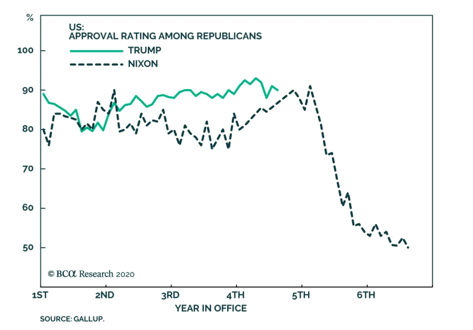
United States
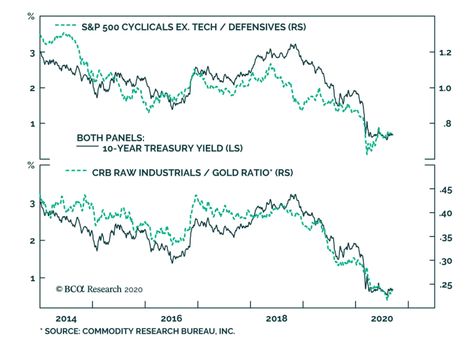
BCA Research's US Bond Strategy service assess the tech stock sell off and its implications on bonds. Bond yields correlate most strongly with: The performance of cyclical equities over defensive equities. The ratio of CRB Raw Industrials over…
Many commentators have quipped that we are not in a V-shaped, nor a U-shaped or W-shaped recovery but a K-shaped one where a few winners are reaping large gains while considerable segments of the economy are under extreme duress. Paradoxically, strong…
In response to the production shutdowns and decreased run rates that have plagued the US and global economy since March, US inventories contracted at their quickest three-month rate since the depth of the Great Financial Crisis. Yet, as the economy re-opens…
August's retail sales print came in weaker than expected at 0.6% month over month, missing expectations of 1% and down from July's revised print of 0.9%. Meanwhile, the retail sales control group actually contracted by 0.1% and failed to meet expectations of…

Materials Are On Fire
Materials Are On Fire
Overweight We reiterate our recent upgrade to overweight in the S&P materials sector. Since the late-July inception, materials stocks have been steadily climbing and also propelling our cyclicals/defensives portfolio bent. Given the rosy macro outlook more gains are in store. Materials stocks are hyper-sensitive to the global reflation cycle and China’s aggressive stimulus is reverberating across the Pacific. Namely the Chinese are opening up the fiscal and credit taps at a breakneck pace (bottom panel). Already, the economy is responding and has likely returned to the trend growth trajectory observed prior to the pandemic. The Chinese bond and stock markets are heeding the message of the authorities and corroborate that the economic recovery is gaining steam (top panel). All of this suggests that global trade is on the mend and the commodity-laden S&P materials sector remains in the driver’s seat. Bottom Line: Stay overweight the S&P materials index.
BCA Research's Geopolitical Strategy service analyzes the potential consequences of a contested election. The constitutional power to count the Electoral College votes, and to determine the election if the college is indecisive, lies with Congress (and/or…
BCA Research's US Bond Strategy service concludes that without additional household income support from Congress of $500 to $800 billion, consumer spending will massively disappoint expectations over the next 6-12 months. The CARES act played an essential…
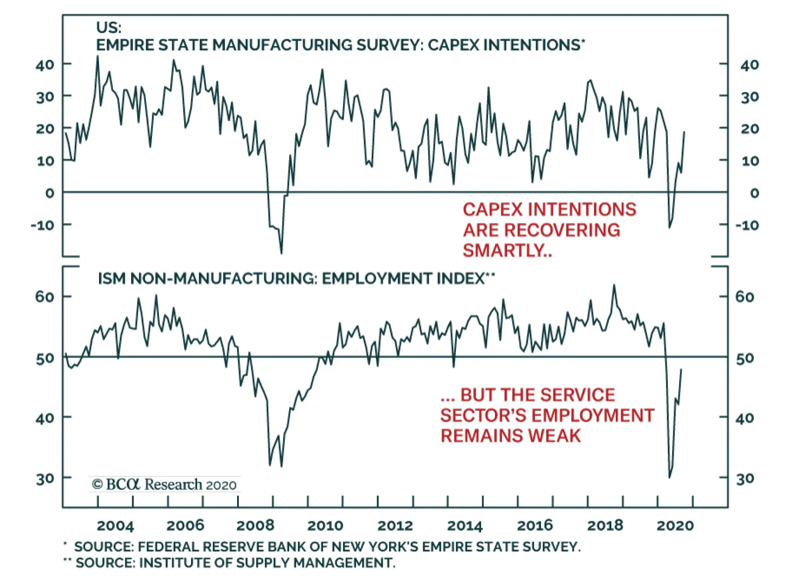
An intriguing dichotomy is taking shape in the US economy, one increasingly repeated around the world. The manufacturing sector is recovering smartly from the depth of the COVID-19 recession, but the service sector is having a tougher time healing. This…

Equities started the week off with a jolt on the back of a flurry of M&A deal as “Merger Mondays” is making a comeback, but we remain skeptical that the correction is over and caution investors to resist the temptation to bottom fish. While COVID-19-related uncertainty is dissipating, the quickly approaching election will make sure that volatility remains elevated. Importantly, market internals also suggest that there is likely more downside in the near-term. Trying to quantify the drawdown, we turn over to CBOE’s equity put/call (EPC) ratio. The EPC ratio is nowhere near recent extreme readings. SPX pullbacks since the early-2018 “Volmageddon” have corresponded to significantly higher EPC ratio readings. In the past 10 such iterations, the median EPC ratio has been 0.86, the mean 0.93, with a range of 0.77 to 1.28 (see table on the right). Currently, the EPC ratio is hovering near 0.67 suggesting that downside risks persist (EPC ratio shown inverted, see chart below). Table 1
Speculative Fervor
Speculative Fervor
Bottom Line: Stay patient and refrain from deploying fresh capital in the broad equity market. A better entry point will likely materialize between now and the end of the year.
Speculative Fervor
Speculative Fervor
This report contains an error in the section related to consumer spending and fiscal policy. That error somewhat changes the conclusions from the report, and it particularly impacts Chart 3, Table 2 and Table 3. The attached note explains the mistake and includes corrected versions of Chart 3, Table 2 and Table 3. Highlights Duration: A re-rating of Tech stock valuations is likely not a near-term catalyst for significantly lower bond yields. Congress’ continued failure to pass a follow-up to the CARES act is a greater near-term risk for bond bears. We continue to recommend an “at benchmark” portfolio duration stance alongside duration-neutral yield curve steepeners. Fiscal Policy: Without additional household income support from Congress, at least on the order of $500 - $800 billion, consumer spending will massively disappoint expectations during the next 6-12 months. Inflation: Inflation will continue its rapid ascent between now and the end of the year, but it is likely to level-off in 2021. We recommend staying long TIPS versus nominal Treasuries for the time being, but we will be looking to take profits on that position later this year. Feature Bond Implications Of A Tech Stock Sell-Off Risk-off sentiment reigned in equity and credit markets during the past two weeks. The S&P 500 fell 7% between September 2nd and 8th and the average junk spread widened from 471 bps to 499 bps. This represents the largest sell-off since June when the equity market saw a similar 7% decline and the junk spread widened from 536 bps to 620 bps (Chart 1). Chart 1Two Equity Sell-Offs, Two Different Bond Market Reactions
Two Equity Sell-Offs, Two Different Bond Market Reactions
Two Equity Sell-Offs, Two Different Bond Market Reactions
A comparison between the September and June episodes is particularly interesting for bond investors because Treasuries behaved very differently in each case. In June, bonds benefited from a flight to quality out of equities and the 10-year Treasury yield fell 22 bps. But this month, Treasuries actually delivered negative returns and the 10-year Treasury yield rose 3 bps (Chart 1, bottom panel). Table 1Selected Asset Class Performance During Last Two Equity Sell-Offs
More Stimulus Needed
More Stimulus Needed
Why would Treasuries perform so well in June but fail in their role as a diversifier of equity risk in September? The answer lies in the underlying drivers of the stock market’s decline, which are easily identified when we look at the performance of different equity sectors. Table 1 shows the performance of different equity sectors in both the June and September sell-offs. In June, it was the cyclical equity sectors – Industrials, Energy and Materials – that led the decline. These sectors tend to be the most sensitive to global economic growth. This month’s equity drawdown was led by Tech stocks, while cyclical and defensive sectors saw much smaller drops. Table 1 also shows that a broad measure of commodity prices – the CRB Raw Industrials index – rose by 0.79% during the September equity sell-off, significantly outpacing gains in the gold price. In June, the CRB index still rose but it lagged gold by a wide margin. The underlying drivers of the stock market’s decline explain why Treasuries performed well in June and underperformed in September. We bring up the performance of different equity sectors, commodity prices and gold because bond yields correlate most strongly with: The performance of cyclical equities over defensive equities (Chart 2, top panel). The ratio of CRB Raw Industrials over gold (Chart 2, bottom panel). Chart 2High-Frequency Bond Indicators
High-Frequency Bond Indicators
High-Frequency Bond Indicators
These correlations explain why bond yields fell a lot in June but not in September. June’s equity sell-off was more like a traditional risk-off event that saw investors questioning the sustainability of the global economic recovery. The cyclical equity sectors that are most exposed to the global economic cycle experienced the worst losses and demand for safe-haven gold far outpaced the demand for growth-sensitive industrial commodities. In contrast, this month’s sell-off was driven by a re-rating of Tech stock valuations, not so much expectations for a negative economic shock. Technology now makes up such a large portion of the equity index’s market cap that this sort of move can cause the entire stock market to fall, but the pass-through to bonds will be much smaller for any equity sell-off that isn’t prompted by a negative economic shock and led by cyclical equity sectors. Implications For Bond Investors Even after this month’s drop, there remains a legitimate concern about extreme Tech stock valuations. The fact that many of the larger Tech names, like Microsoft and Apple, have benefited from the pandemic only makes it more likely that their stock prices will suffer as the world slowly returns to normal. From a bond investor’s perspective, we doubt that even a large drop in Tech stock prices would lead to significantly lower bond yields, especially if that drop occurs in the context of an economy that continues to recover. Bond yields will only turn down if the market starts to question the sustainability of the economic recovery, an event that would be negative for cyclical equity sectors but much less so for the big Tech names. With that in mind, our base case outlook calls for continued economic recovery during the next 6-12 months, but we do see a significant risk that the failure to pass a follow-up to the CARES act will lead to just such a deflationary shock during the next couple of months. We therefore recommend keeping portfolio duration close to benchmark, while positioning for continued economic recovery via less risky duration-neutral yield curve steepeners. The Outlook For Consumer Spending And The Necessity Of Fiscal Stimulus After plunging during the lock-down months of March and April, consumer spending has rebounded strongly during the past few months. But can this strong rebound continue? Our view is that it cannot. That is, unless Congress delivers more income support to households. Even a large drop in Tech stock prices is unlikely to lead to significantly lower bond yields, especially if that drop occurs in the context of an economy that continues to recover. In this section we consider several different economic scenarios and estimate the amount of further income support that is necessary to sustain an adequate level of consumer spending. First off, to make forecasts for consumer spending we need to consider two main parameters: household income and the personal savings rate (Chart 3). More income leads to more spending in most cases. The only exception would be if cautious households decide to increase the amount they save relative to the amount they spend. Chart 3Consumer Spending Driven By Income & The Savings Rate
Consumer Spending Driven By Income & The Savings Rate
Consumer Spending Driven By Income & The Savings Rate
We’ve actually seen that exception play out somewhat during the past five months. The CARES act provided households with an income windfall, but the savings rate also shot higher. This suggests that households had enough income to spend even more during the past few months but have been much more cautious than usual. We cannot overstate the role the CARES act has played in supporting household incomes since March. Disposable income has grown 7.4% during the past five months compared to the five months prior to COVID, and the CARES act’s provisions pressured income 10.3% higher during that period (Chart 4). The CARES act’s one-time $1200 stimulus checks and expanded $600 weekly unemployment benefits were the two most important provisions in this regard. Together, they pushed disposable income higher by 7.5%. Chart 4Disposable Personal Income Growth And Its Drivers
More Stimulus Needed
More Stimulus Needed
This presents an obvious problem. The income support from the CARES act is now expired and Congress has yet to pass a follow-up stimulus bill. How vital is it that we get a new bill? And how large does it need to be? To answer these questions, we first need to set a target for adequate consumer spending growth. The second panel of Chart 3 shows 12-month over 12-month consumer spending growth. That is, it looks at total consumer spending during the last 12 months and shows how much it has increased (or decreased) compared to the previous 12 months. Notice that the worst 12-month period during the 2008 Great Financial Crisis (GFC) saw 12-month over 12-month consumer spending growth of -3%. During the economic recovery that followed, consumer spending growth fluctuated between +2% and +6%. Exercise 1: The March 2020 To February 2021 Period Chart 5Three Scenarios For Income And Savings
Three Scenarios For Income And Savings
Three Scenarios For Income And Savings
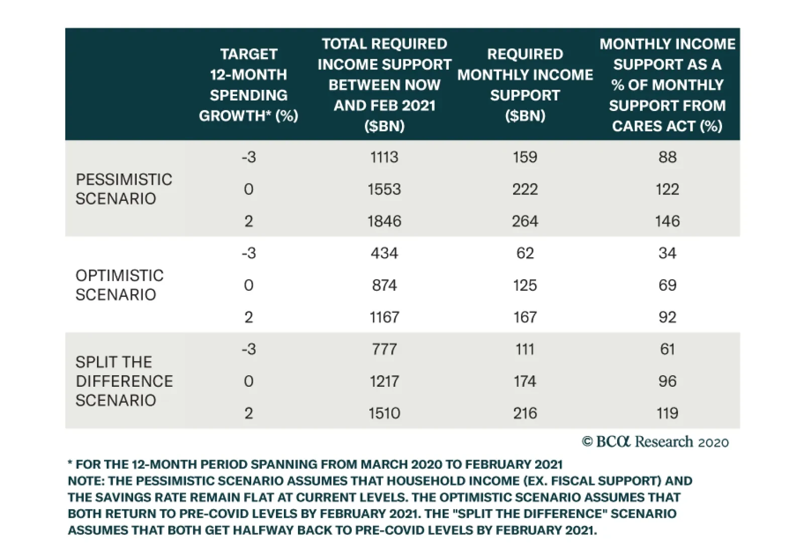
In our first exercise, we consider the 12-month period starting at the very beginning of the COVID recession in March 2020 and ending in February 2021. As a bare minimum, we target consumer spending growth of -3% for this 12-month period on the presumption that 12-month spending growth equal to the worst 12 months seen during the GFC is the bare minimum that markets might tolerate. We also consider somewhat rosier scenarios of 0% and 2% spending growth. In addition to consumer spending targets, we also make assumptions for household income and the savings rate. We consider income coming from all sources including automatic government stabilizers, but without assuming any additional fiscal support from the government. We consider three scenarios (Chart 5): A pessimistic scenario where both income and the savings rate hold steady at current levels. An optimistic scenario where both income and the savings rate return to pre-COVID levels by February 2021. A “split the difference” scenario where both income and the savings rate get halfway back to pre-COVID levels by next February. Table 2 shows how much additional income support from the government is needed between now and February to achieve each of our consumer spending growth targets in each of our three scenarios. For example, in the optimistic scenario the government will need to provide $434 billion of additional income support between now and February for consumer spending to hit our minimum -3% threshold. In the more realistic “split the difference” scenario, households will require another $777 billion of stimulus. Table 2 also shows that stimulus on a monthly basis and compares the monthly rate of stimulus to the rate provided by the CARES act. For example, an additional $777 billion of income doled out between August and February works out to $111 billion per month, 61% of the amount of monthly stimulus provided by the CARES act between April and July. Table 2Without More Stimulus COVID's Impact On Consumer Spending Will Be Worse Than The GFC
More Stimulus Needed
More Stimulus Needed
Two main conclusions jump out from this analysis. The first is that more income support from Congress is absolutely required. Otherwise, consumer spending will come in worse during the March 2020 to February 2021 period than it did during the worst 12 months of the GFC. Second, unless we assume a truly dire economic scenario, the follow-up stimulus does not need to be as large as the CARES act. In our most realistic “split the difference” scenario, that $777 billion of required stimulus is only 61% of what the CARES act doled out on a monthly basis. In that same scenario, a follow-up bill that delivered the same monthly stimulus as the CARES act would lead to positive 12-month consumer spending growth. Exercise 2: The August 2020 To July 2021 Period Chart 6One More Scenario
One More Scenario
One More Scenario
One potential problem with our last exercise is that our target was for total consumer spending between March 2020 and February 2021. This period includes five months for which we already have data and the exercise is therefore partially backward-looking. A more relevant analysis might target consumer spending on a purely forward-looking basis from August 2020 to July 2021. We therefore perform our calculations again for the August 2020 to July 2021 period. This time, we consider only one economic scenario where income and the savings rate both return to pre-COVID levels by July 2021 (Chart 6). This scenario works out to be slightly more optimistic than the “split the difference” scenario we considered earlier. Also, since our target 12-month spending growth period no longer contains the downtrodden months of March and April, we require a more ambitious target than -3% growth. A return to the post-GFC range of 2% to 6% represents a target that is likely more representative of market expectations. Table 3 shows the results of this second analysis. Once again, we see that some additional government stimulus is necessary to meet our spending targets. Even to achieve 0% spending growth over the next 12 months will require another $249 billion from the government, and that outcome would almost certainly disappoint markets. We calculate that an additional $534 billion is required to achieve 2% spending growth during the August 2020 to July 2021 timeframe. This result is consistent with the $777 billion we calculated in Table 2, though it has come down a bit because we have made slightly more optimistic economic assumptions. Table 3At Least Half A Trillion More Government Income Support Is Needed
More Stimulus Needed
More Stimulus Needed
Bottom Line: Our analysis suggests that further stimulus is needed to sustain the recovery in consumer spending. A new stimulus package doesn’t need to be as large as the CARES act on a monthly basis, but it should provide at least $500 - $800 billion of additional income support to households. With Congress still dithering on this issue, financial markets appear overly complacent in the near-term. While the economic constraints suggest that a deal should be reached soon, policymakers may need to see a spate of negative economic data and/or poor market performance before being spurred into action. In acknowledgement of this significant near-term risk to the economic outlook, bond investors should refrain from getting too bearish, and keep portfolio duration close to benchmark for the time being. Inflation’s Snapback Phase Chart 7Inflation Coming In Hot
Inflation Coming In Hot
Inflation Coming In Hot
The core Consumer Price Index rose 0.4% in August, the third large monthly increase in a row (Chart 7). We see inflation continuing to come in hot between now and the end of the year, before tapering off in 2021. As of now, we would describe inflation as being in a snapback phase. That is, back in March and April, when lock-down measures were widespread across the country, the sectors that were most affected by the shutdowns experienced massive price declines. However, notice that core inflation fell by much more than median or trimmed mean inflation during this period (Chart 7, panels 2 & 3). The median sector’s price didn’t fall that much, but the overall inflation number moved down because of deeply negative prints in a few sectors. Now that the economy is re-opening, many of the sectors that were most beaten down in March and April are coming back to life. As a result, those massive price declines are turning into massive price increases. Once again, the median and trimmed mean inflation figures have been much more stable. This “snapback” dynamic is illustrated very clearly in Chart 8 which shows the distribution of monthly price changes for 41 different sectors in April and in August. Notice that while the middle of the distribution hasn’t changed that much, April’s massive left tail has morphed into August’s massive right tail. Chart 8Distribution Of CPI Expenditure Categories
More Stimulus Needed
More Stimulus Needed
The continued wide divergence between core inflation and the median and trimmed mean measures suggests that this snapback phase has further to run. In other words, we will likely continue to see strong inflation prints for a few more months as the sectors that were most downbeat in March and April continue their rebounds. However, once core catches back up to the median and trimmed mean inflation measures, this snapback phase will come to an end and inflation’s uptrend will probably level-off. The continued wide divergence between core inflation and the median and trimmed mean measures suggests that this inflation’s snapback phase has further to run. We recommend that bond investors continue to favor TIPS over nominal Treasuries during this snapback phase, but we will be looking for an opportunity to go underweight TIPS versus nominal Treasuries later this year, once core inflation moves closer to the median and trimmed mean measures and the snapback phase ends. Appendix A: Buy What The Fed Is Buying The Fed rolled out a number of aggressive lending facilities on March 23. These facilities focused on different specific sectors of the US bond market. The fact that the Fed has decided to support some parts of the market and not others has caused some traditional bond market correlations to break down. It has also led us to adopt of a strategy of “Buy What The Fed Is Buying”. That is, we favor those sectors that offer attractive spreads and that benefit from Fed support. The below Table tracks the performance of different bond sectors since the March 23 announcement. We will use this to monitor bond market correlations and evaluate our strategy’s success. Table 4Performance Since March 23 Announcement Of Emergency Fed Facilities
More Stimulus Needed
More Stimulus Needed
Ryan Swift US Bond Strategist rswift@bcaresearch.com Fixed Income Sector Performance Recommended Portfolio Specification