United States
BCA Research's US Equity Strategy service remains cyclically and structurally constructive; as a fresh bull market has commenced. However, despite their cyclical upbeat view, our US equity strategists remain cautious on a near-term basis. The SPX…

Highlights In a world with low expected returns from various asset classes and still-elevated target returns among largely underfunded pension funds, asset allocators may have to consider the use of leverage to meet liability requirements. Canadian pension funds have been more open to using leverage than their US counterparts, but even the very conservative Japanese Government Pension Investment Fund (GPIF) has an allocation to levered asset classes such as private equity, albeit at a very low weight. Retail investors do not have access to low-cost financing as institutional investors do. Still, they too can add leverage via ETFs and Liquid Alts mutual funds. When leverage is used at the asset-class level such as in alternative asset classes, financing costs play an important role in investment decisions. For pension funds with access to low-cost financing, “direct investing” in alternative assets is more advantageous than indirect investment via alternative funds. When leverage is used at the portfolio level, such as via a risk-parity structure, the financing cost impacts mostly just the return, but the leverage constraints impact both return and volatility. Risk-parity strategy is more advantageous when it’s used as one of the strategies in a total portfolio, rather than at the total-fund level because usually a sub-portfolio can have a much higher leverage ratio than the total fund. Leverage should be managed in a centralized risk-management system at the total-fund level, together with all other risk exposures. 1. Why Should Leverage Be Considered? In a Global Asset Allocation Special Report on long-term return assumptions,1 the key conclusion was that, for the next decade, investors would not be able to achieve the kind of return targets they were used to over the previous two decades because all asset classes would see much lower returns going forward, with the largest reductions coming from fixed-income and alternative assets such as farmland, REITs, and commodities. This is bad news for investors, especially pension fund investors with long-term liabilities to match. For example, according to Wilshire Consulting,2 at the end of 2018, the aggregate funded ratio (defined as the fund assets as a percentage of the fund obligations) of 134 US state retirement systems was 72.2%, which is better than the low at the end of 2016 (Chart 1). However, as shown in Chart 2, there were still about 11% of the funds with assets at less than 50% of liabilities. Chart 1US Pensions' Funded Status*
Can Asset Allocators Afford Not To Use Leverage?
Can Asset Allocators Afford Not To Use Leverage?
Chart 2US Pensions' Funded Ratio Distribution*
Can Asset Allocators Afford Not To Use Leverage?
Can Asset Allocators Afford Not To Use Leverage?
Over the past two decades, the risk-return profile of traditional assets like equities and government bonds has already been much less attractive than historical averages, as shown in Chart 3, but investors have diversified into credit and alternative asset classes (which contain embedded leverage) to enhance their portfolios’ risk-return profile. Chart 3Future Risk-Return Profiles Less Attractive Than Historical Averages
Can Asset Allocators Afford Not To Use Leverage?
Can Asset Allocators Afford Not To Use Leverage?
According to the above-mentioned Global Asset Allocation Special Report, with a conventional 50/30/20 (equities/bonds/alts) allocation, a US investor could comfortably achieve a 7% annual return over the past two decades. Now, alternative asset classes have become mainstream, likely producing a much lower future return. The same 50/30/20 portfolio would currently generate only about 4.9% annually, much less than what’s required to match liabilities. In fact, alternatives’ future return expectations have been cut to 6.1% from their past 20-year average of 15.1% annually, meaning that even if 100% of assets are fully invested in alternatives, the expected return will still be lower than the 7% that’s still assumed by some US state pension funds.3 Not to mention that at the end of 2018, over 34% of US retirement pension funds had long-term rate-of-return expectations higher than 7.5%, as shown in Chart 4. Chart 4Challenging Long-Term Return Expectations
Can Asset Allocators Afford Not To Use Leverage?
Can Asset Allocators Afford Not To Use Leverage?
Chart 5Why Should Leverage Be Considered?
Can Asset Allocators Afford Not To Use Leverage?
Can Asset Allocators Afford Not To Use Leverage?
According to Modern Portfolio Theory, to achieve a higher return investors can take higher risk in three different ways, as shown in Chart 5: 1) Allocating more funds to higher-return/higher-risk assets, i.e. moving upwards to the right along the efficient frontier (red line) – for example, a 60-40 equity/bond portfolio is well to the upper-right side of the “optimal” allocation; 2) Levering up one or more assets to alter the shape of the frontier (grey line) – for instance, incorporating private-equity and infrastructure funds that contain embedded leverage; and 3) Levering up the “optimal” (in terms of return per unit of risk) risky portfolio with funds borrowed at the total-fund level (green line). Risk parity is a close proximation. For more detail about the basics of leverage, please see Appendix 1 on pages 21-22. Chart 5 illustrates three different frontiers based on the assumed risk-return forecast for US equities, US Treasurys, and alternative assets.4 We can observe the following: When the target return is low (at target 1), leverage does not provide significant benefit no matter which form is used; As the return target moves up relative to what the underlying assets can provide (target 2), direct leverage produces a better return/risk profile than embedded leverage, which in turn is better than the portfolio without any leverage; When the target return is higher than what any efficient combination from the available asset classes can achieve (target 3), investors must consider the use of direct leverage. In theory, investors should always prefer to use leverage at the total-fund level to lever up the “optimal” portfolio. In reality, however, some investors are constrained from borrowing. In addition, some investors do not have the expertise or infrastructure to manage the additional complexity that results from the use of direct leverage. In fact, direct leverage has typically been considered dangerous by many investors. Misuse of leverage was attributed to some high-profile failures, such as Long-Term Capital Management in 1998 and Lehman Brothers in 2008. So how has leverage been used by asset allocators? What are the key factors that determine if and how leverage should be used? What are the key risks associated with the use of leverage, and how should leverage be managed? In the sections below, we first review how some pension funds and retail investors have been using leverage (we ignore hedge funds, even though they are the most obvious users of leverage, because they are a part of the “alternative” asset class with embedded leverage). From there, we attempt to address, 1) How does financing cost impact leverage at the asset-class level? and 2) How does financing cost impact the decision to use leverage at the portfolio level if investors are constrained by the amount of leverage that can be used? Finally, we suggest a centralized leverage management framework to monitor and manage leverage at the total-portfolio level. 2. Use of Leverage By Pension Funds Leverage can be applied in many different ways. In general, the use of leverage by pension funds can be grouped into four categories: First, with a focus on return-seeking. This is achieved mainly by using alternative asset funds such as private-equity funds, hedge funds, real-estate funds, and infrastructure funds. These funds have embedded leverage, but with much higher costs. They provide diversification and higher risk-adjusted returns, partly because of their embedded leverage and lock-up advantages. Large pension funds, especially the Canadian pension funds which all have excellent credit ratings and strong in-house talent, have also taken advantage of their solid balance sheets to acquire low-cost financing to invest directly in alternatives. For example, the first bond issued by the Ontario Teachers’ Pension Plan (OTPP) in 2001 was $600 million at 5.7%, while the Canada Public Pension Investment Board (CPPIB) even issued euro-denominated bonds in both 2017 (2 billion euros, 7-year, 0.375% coupon) and 2018 (1 billion euros, 15-year, 1.5% coupon).5 Proceeds from these bond issues have mostly been used to invest in alternative assets, which now account for a large proportion of the major Canadian pension funds’ assets under management (Table 1). Table 1“Alternatives” Have Become Mainstream For The Canadians
Can Asset Allocators Afford Not To Use Leverage?
Can Asset Allocators Afford Not To Use Leverage?
Most US state pension funds are more conservative than their Canadian peers. They too have been gradually adding exposure to alternatives with embedded leverage such as private equity, real estate, and hedge funds, as shown in Chart 6. Even Japan’s Government Pension Investment Fund (GPIF), the very conservative Japanese sovereign wealth fund, in its current operating guideline has a 5% allocation to alternatives such as private equity, real estate, and infrastructure.6 That’s an impressive amount considering its first investment in the space was in 2013, as shown in Chart 7. Chart 6The Americans Are Catching Up On Alternatives
Can Asset Allocators Afford Not To Use Leverage?
Can Asset Allocators Afford Not To Use Leverage?
Chart 7GPIF’s Push Into Alternatives*
Can Asset Allocators Afford Not To Use Leverage?
Can Asset Allocators Afford Not To Use Leverage?
However, the push into alternative asset classes by large pension funds has made it increasingly difficult to allocate funds to alternative assets. For example, CalPERS has only an 8% allocation to private equity,7 yet its most recent exposure as of June 2019 stood at only 7.1% – because it could not find enough suitable private-equity investments to build the asset class to the desired scale.8 Second, with a focus on liability matching. Pension funds who follow the liability-driven investing (LDI) approach often construct two portfolios. One is the liability-matching portfolio and the other is the active portfolio. The former matches the liabilities, while the latter generates alpha to cover management fees and to provide a cushion for estimation errors. Since most pension liabilities are indexed to inflation, liabilities are often modelled as a combination of nominal bonds and inflation-linked bonds with leverage. The leverage ratio can often be higher than two or three times because of the ultra-long duration of the liabilities versus the available bond instruments. For example, the Healthcare of Ontario Pension Plan (HOOPP) uses an LDI approach, which is why its leverage ratio is much higher than some other pension plans, as shown in Chart 8. Chart 8Use Of Leverage By Some Pension Funds
Can Asset Allocators Afford Not To Use Leverage?
Can Asset Allocators Afford Not To Use Leverage?
Third, with a focus on risk diversification. Risk-based strategies such as risk parity generate a more diversified portfolio with lower absolute returns compared to a conventional 60/40 equity/bond portfolio, but in general have a much higher Sharpe ratio, and therefore require leverage to achieve the required return/risk objective.9 Even though most risk-parity believers dedicate a portion of their assets to risk-parity strategies (either internally with direct leverage or externally with embedded leverage), some pension funds have adopted such a risk-diversification approach at the total-fund level. Danish pension fund ATP and the Missouri State Employees Retirement System (MOSERS) are two examples. As shown in Chart 8, as of June 2019, MOSERS’ leverage was about 50%,10 a lot higher than CalPERS’ newly augmented total-fund leverage limit of 20% (from 5% previously),11 because CalPERS does not use the same approach to apply leverage. Fourth, with a focus on more tactical moves, such as tail-risk hedging, revenue generation, and opportunistic strategies to take advantage of short-term dislocations in the marketplace. These tactics are achieved mostly using derivatives such as futures, options, and swaps. For example, equity and bond futures or swaps are often used to tactically adjust asset allocation at the total-fund level without impacting the underlying asset-class management. 3. Use of Leverage By Retail Investors Retail investors do not enjoy low-cost financing as large institutions do. They can use lines of credit or margin accounts to invest, and they can also use derivatives if they are qualified to do so. For those who are not qualified or not comfortable using leverage themselves, there are two types of retail products with embedded leverage: Levered or inverse ETFs and “Liquid Alts” mutual funds or ETFs. Levered or Inverse ETFs: These products are rebalanced daily to a fixed leverage multiple, often -3X, -2X, -1X, 2X, and 3X of the underlying assets. As such, only daily performance matches the intended performance objective. Because of the daily realization of gain and loss, they are not suitable for long-term buy-and-hold investors because the longer the holding period, the larger the drift due to the compounding effect. For example, Chart 9 shows the Nasdaq-100 ETF (QQQ) and the associated levered ETFs. It’s interesting to note that in several annual periods ending in 2011, 2016, 2018 and 2019, QQQ’s one-year return was slightly positive, yet 3X ETF’s corresponding returns were negative! This is due to the “negative diversification return” effect as defined by Qian.12 Chart 9NASDAQ-100 Linked ETF Performances*
NASDAQ-100 Linked ETF Performances*
NASDAQ-100 Linked ETF Performances*
Liquid Alternative Mutual Funds/ETFs: These are the “liquid” version of alternative investment strategies aimed at retail investors. They are easy to buy and sell. In Canada, since National Instrument 81-102 became effective in January 2019, retail investors who do not have the sophistication to directly invest in alternatives now have access to such investments via mutual funds and ETFs. As shown in Table 2,13 these funds can utilize leverage up to 3X based on gross aggregate exposure by borrowing or short-selling. In the US, liquid alts have been available to retail investors since 2013, and the market has grown rapidly to over US$225 billion.14 Now there are signs emerging that even some institutional investors are starting to look into liquid alts ETFs.15 Table 2Canadian Regulation On Liquid Alts Mutual Funds
Can Asset Allocators Afford Not To Use Leverage?
Can Asset Allocators Afford Not To Use Leverage?
4. Leverage At Asset-Class Level Alternative funds, such as funds that invest in private equity, private debt, and infrastructure, typically use leverage. These funds carry a high cost because 1) investors in these funds must pay a premium for not managing leverage, and 2) these funds often have much higher financing costs. For example, the average financing cost for leveraged buyouts in 2014 was more than 5%,16 while the average risk-free rate in 2014 was 0.03%. Research has shown that private-asset performance can be proxied by using leverage and the corresponding public asset. In Table 3, the base case is based on the forecast for US equities and Treasurys without leverage, and a risk-free rate of 2.6%.17 Then equities are leveraged by 1.5 times to proximate private equity. The low-cost case has a financing cost of 1.57% (which is what the average 3-month T-Bill rate was in 2019), while the high-cost case with a financing cost of 3.92%, which is 2.5 times the low-cost rate. Table 3Assumed Returns/Risks*
Can Asset Allocators Afford Not To Use Leverage?
Can Asset Allocators Afford Not To Use Leverage?
Chart 10Financing-Cost Impact On The Use Of Embedded Leverage
Can Asset Allocators Afford Not To Use Leverage?
Can Asset Allocators Afford Not To Use Leverage?
Chart 10 shows the corresponding frontiers of the three cases. It’s clear that leverage expands the frontier to the right, meaning that leverage helps to achieve a higher return with better diversification, albeit with higher volatility. However, the financing cost plays a very important role in the feasibility of the leverage decision. When the financing cost is low, leverage is better than the base case at any return-target level. When the financing cost is high, however, leverage is worse – so long as the return target is lower than what the underlying assets can achieve without leverage. This supports the shift to “direct investing” by some institutional investors with access to lower financing when investing in alternative asset classes. 5. Leverage At Portfolio Level Risk parity is an obvious example of using leverage at the portfolio level. As shown in our previous report on risk parity, there are different approaches to implementing risk parity, and they can generate different results – especially when there are more than two assets.18 To analyze the impact of leverage constraints and financing costs, we use a two-asset (US equity/Treasury) risk-parity portfolio as the basis of our analysis. One definitive conclusion we arrived at in our previous report was that risk-parity approach historically always outperforms in recessions. This conclusion has passed the real-time test in the most recent pandemic-induced recession. As shown in Chart 11A, risk-parity portfolios that target the same volatility as a 60/40 US equity/Treasury portfolio have outperformed the latter significantly. The same holds true for the portfolios that target the same volatility as an equity portfolio (Chart 11B). Chart 11AUS Risk Parity With Same Vol As US 60/40
US Risk Parity With Same Vol As US 60/40
US Risk Parity With Same Vol As US 60/40
Chart 11BUS Risk Parity With Same Vol As US Stocks
US Risk Parity With Same Vol As US Stocks
US Risk Parity With Same Vol As US Stocks
However, as described in the previous Special Report on risk parity, we did not impose any cap on the use ofleverage. As such, some strategies that use a relatively short lookback period to calculate historical statistics required very high leverage ratios at some time periods in our back-tests. What would happen if we set a cap on the leverage ratio? And what if the financing cost is higher than the 3-month T-bill rate assumed in most academic research, and also in our previous report? Chart 12A and Chart 12B show the results when leverage is capped at three times and the financing cost is Libor +25 basis points. It’s clear that Chart 12A looks the same as Chart 11A because the leverage cap is higher than the required leverage employed, while the cost impact is negligible for such a short period. But Chart 12B shows that, even though the risk-parity portfolio still outperformed, the outperformance has been much less so far this year because the required leverage was a lot higher than three times. Chart 12AImpact Of Financing Cost And Leverage Constraint On Low-Vol Target Risk-Parity
Impact Of Financing Cost And Leverage Constraint On Low-Vol Target Risk-Parity
Impact Of Financing Cost And Leverage Constraint On Low-Vol Target Risk-Parity
Chart 12BImpact Of Financing Cost And Leverage Constraint On High-Vol Target Risk-Parity
Impact Of Financing Cost And Leverage Constraint On High-Vol Target Risk-Parity
Impact Of Financing Cost And Leverage Constraint On High-Vol Target Risk-Parity
The impact of financing costs in Chart 12A is barely seen because the time period was short and the interest rate was low. What is the long-run impact of leverage restrictions and financing costs then? Chart 13A and Chart 13B show the long-run statistics from April 1945 to July 2020 based on a 180-month look-back period for two portfolios: RPL1, the risk-parity portfolio with the same volatility target as a 60/40 US equity/Treasury portfolio; and RPL2, the risk-parity portfolio with the same volatility as MSCI US equity index. Chart 13C shows the risk-adjusted returns for three portfolios with constant volatility targets at 10%, 12%, and 15%, respectively. Chart 13ALong-Term Impact Of Financing Cost And Leverage Constraint On Risk-Parity With Low Vol Target*
Can Asset Allocators Afford Not To Use Leverage?
Can Asset Allocators Afford Not To Use Leverage?
Chart 13BLong-Term Impact Of Financing Cost And Leverage Constraint On Risk-Parity With High Vol Target*
Can Asset Allocators Afford Not To Use Leverage?
Can Asset Allocators Afford Not To Use Leverage?
Chart 13CLong-Tem Impact Of Financing Cost And Leverage Constraint On Risk-Parity Portfolio*
Can Asset Allocators Afford Not To Use Leverage?
Can Asset Allocators Afford Not To Use Leverage?
Some observations are worth highlighting: Financing costs mainly impact average return, but have very little impact on volatility. As such, higher financing costs reduce risk-adjusted returns. When there is no financing cost, all risk-parity portfolios with different volatility targets should have the same risk-adjusted return as the underlying unlevered risk-parity portfolio. When financing costs are present, however, this is no longer the case. Leverage constraints impact both returns and volatility in the same direction – i.e., stricter constraints on leverage reduce both return and volatility, and vice versa. The magnitude of the impact from leverage constraints, however, varies because the target volatility of the portfolio plays a key role in the required leverage. For a constant-volatility target, a tighter control on leverage will reduce volatility more than return, resulting in a higher risk-adjusted return (Chart 13C); for a variable-volatility target such as RPL1 and RPL2, however, the same conclusion cannot be drawn (Charts 13A and 13B) Long-run statistics do not tell the full story because they really depend on the period chosen. Chart 14A shows the dynamic impact of financing when there were no constraints on leverage, and Chart 14B shows the dynamic impact of leverage when there were no additional financing costs. Chart 15 shows the combined impact when leverage is capped at three times and the financing cost at Libor+25 basis points. They are for five different risk-parity portfolios with different volatility targets with a lookback window length of 180 months. (For different lookback window, please see Appendix 2 on pages 23-25). Chart 14ADynamic Impact Of Financing On Risk Parity Without Leverage Constraint*
Dynamic Impact Of Financing On Risk Parity Without Leverage Constraint*
Dynamic Impact Of Financing On Risk Parity Without Leverage Constraint*
Chart14BDynamic Impact Of Leverage Cap On Risk Parity Without Extra Financing *
Dynamic Impact Of Leverage Cap On Risk Parity Without Extra Financing *
Dynamic Impact Of Leverage Cap On Risk Parity Without Extra Financing *
Chart 15Dynamic Impact Of Financing On Risk Parity With Leverage Being Capped At 3X
Dynamic Impact Of Financing On Risk Parity With Leverage Being Capped At 3X
Dynamic Impact Of Financing On Risk Parity With Leverage Being Capped At 3X
It is interesting to note the following: When there is no restriction on leverage, additional financing cost eats away cumulative total return in a much more significant way when an risk parity portfolio has a higher-volatility target than a lower-volatility target (Chart 14A). This is simply because a higher-volatility target requires higher leverage. When there was no additional cost of financing, constraint on leverage ate away total returns – mostly in the early years of the back-test when required leverage was often very high. In recent years, the impact was significant only when the leverage cap dropped to three times or lower. Also, the higher the volatility target, the more reduction in return risk-parity portfolio would suffer compared to its base case (Chart 14B). When the lookback window length is changed, the impact of leverage and financing cost also changes. The shorter the window length, the larger the impact (Charts in Appendix 2). A 180-month lookback period was the preferred choice in our previous report, and it is still more appropriate to use than 36 months or 360 months. Since additional cost and restriction on leverage eat away total return so much, is it really worthwhile to even consider using a risk-parity approach at all? Charts 16A and 16B show that overall total returns were worse during the entire period from April 1945 to July 2020, when additional cost and leverage constraints are applied. Since the burst of the tech bubble, however, risk-parity portfolios with the same volatility target as US 60/40 and also MSCI US have generated higher total returns than US 60/40 and MSCI US, respectively. Chart16ADoes Risk-Parity With Same Vol As US 60/40 Outperform US 60/40?
Does Risk-Parity With Same Vol As US 60/40 Outperforms US 60/40?
Does Risk-Parity With Same Vol As US 60/40 Outperforms US 60/40?
Chart 16BDoes Risk-Parity With Same Vol As MSCI USI Outperform MSCI US?
Does Risk-Parity With Same Vol As MSCI US Outperforms MSCI US?
Does Risk-Parity With Same Vol As MSCI US Outperforms MSCI US?
We are in a low interest-rate environment, and rates may stay low for a long time to come. In addition, when futures contracts are used to implement leverage, the implied cost is very close to 3-month T-Bills; Libor or Libor + may be present mostly when swaps are used due to factors such as supply/demand and counterparty risk. As such, financing costs will likely play less of a role than leverage constraints until interest rates rise significantly. Given that total-fund leverage is much lower than individual strategy/portfolio leverage, the implication is that risk-parity is more advantageous when it is used as a strategy in a sub-portfolio other than at the total fund level. 6. Suggestion For Leverage Management In a low-return environment, asset allocators face more challenges to meet return targets than in the past. Unless return targets are lowered to what the underlying assets can reasonably provide, asset allocators may have to consider the use of leverage to beef up overall portfolio returns. However, leverage is also a double-edged sword because it also increases portfolio volatility. As such, we suggest a centralized risk-management system to monitor and manage all risks, including risks associated with leverage, in line with our suggestion on currency hedging outlined in our 2017 Special Report. Appendix 1: Leverage Basics Leverage is an investment strategy of using borrowed money – specifically, the use of various financial instruments or borrowed capital – to increase the potential return of an investment. It also amplifies the loss potential if the levered investment does not work out as expected. This is why it is also often called a “double-edged sword.” Leverage has many different forms and is used in many different places. For example, residential home mortgages are a form of leverage that the general public understands very well, yet the leverage embedded in a futures contract may sound alien to some retail investors. For asset allocators, the most important decision on leverage is whether to apply leverage directly at the total-portfolio level or use assets with embedded leverage. For example, issuing bonds to lever up a diversified portfolio (a mean-variance optimal portfolio or a suboptimal risk-parity portfolio) is an example of the former. On the other hand, investing in a private equity fund is an example of the latter. Research has shown that for large pension funds with excellent credit ratings, the latter is less efficient than the former due to the much higher cost of financing.1 For example, in 2014, the average cost of financing for leveraged buyouts was in excess of 5% when the short-term interest rate was close to zero.2 It’s not surprising that pension investors have formed joint ventures to invest in alternative assets directly instead of relying on specialty funds. In terms of financing, there is on-balance-sheet leverage and off-balance-sheet leverage. On-balance-sheet leverage raises liabilities, such as via bond issuance. Off-balance-sheet leverage uses the balance sheet of a counterparty, such as OTC financial derivatives. A repo agreement is a repurchase agreement that involves selling a security (often a government bond) to a counterparty (a lender) with the promise of buying it back after a pre-defined period at a pre-defined price. It’s often used for short-term liquidity management. Depending on the form of financing, the measurement of leverage differs. Accounting leverage or balance-sheet leverage is calculated as total assets divided by net assets. This measurement is accurate only if on-balance-sheet leverage is used for long-only investments. When off-balance-sheet leverage is used or when shorting is involved, then accounting leverage severely understates the actual leverage. For example, Appendix Table A1 below is a snapshot from the 2018 annual report of Healthcare of Ontario Pension Plan (HOOPP). The notional value of its derivatives was $333 billion, which is over 10 times the fair value of these instruments, and over four times the fund’s net asset value. Appendix Table A1HOOPP's Use Of Derivatives*
Can Asset Allocators Afford Not To Use Leverage?
Can Asset Allocators Afford Not To Use Leverage?
So, when derivatives are used, accounting leverage is often adjusted for derivative exposure by taking the delta-adjusted notional value of derivative contracts.3 When there are short positions, leverage can be measured as Gross and Net Leverage after derivatives exposure is delta-adjusted. Gross Leverage is defined as the total exposure of long and short positions divided by net assets. This is accurate when the long and short positions are totally separate active bets. Net Leverage, is defined as the net exposure between long and short positions, divided by net assets. This is an accurate measure of leverage when the long and short positions are taken as hedges for one another. 1 Dr. Serguei Zernov, “Leverage to Meet the Pension Promise,” Global Risk Institute, Jan 24, 2019. 2 L’her, J.F., Stoyanova, R., Shaw, K., Scott, W. and Lai, C, “A bottom-up approach to the risk-adjusted performance of the buyout fund market”, Financial Analysts Journal, July/August 2016. 3 Andrew Ang, Sergiy Gorovyy and Gregoty B. van Inwegen, “Hedge Fund Leverage,” Journal of Financial Economics, January 25, 2011. Appendix 2: Impact Of Leverage Caps And Financing Costs With Different Lookback Window Lengths In Section 5, Chart 14A, Chart 14B and Chart 15 were presented using a lookback window of 180 months, a prefered window length based on our previous research on risk parity. However, practioners have been using different lookback windows. Below are the corresponding charts showing lookback windows of 360 months and 36 months, respectively. It’s easy to see that, the shorter the lookback window, the more significant the impact of both financing costs and leverage constraints. The reason is simple: a shorter lookback window generates much higher leverage compared to a longer lookback window. APPENDIX 2 Chart 1AImpact Of Financing With 360-Month Lookback
Can Asset Allocators Afford Not To Use Leverage?
Can Asset Allocators Afford Not To Use Leverage?
APPENDIX 2 Chart 1BImpact Of Financing With 36-Month Lookback
Can Asset Allocators Afford Not To Use Leverage?
Can Asset Allocators Afford Not To Use Leverage?
APPENDIX 2 Chart 2AImpact Of Leverage Cap With 360-Month Lookback
Can Asset Allocators Afford Not To Use Leverage?
Can Asset Allocators Afford Not To Use Leverage?
APPENDIX 2 Chart 2BImpact Of Leverage Cap with 36-Month Lookback
Can Asset Allocators Afford Not To Use Leverage?
Can Asset Allocators Afford Not To Use Leverage?
APPENDIX 2 Chart 3AImpact Of Financing When Leverage Capped At 3X With 360-Month Lookback
Can Asset Allocators Afford Not To Use Leverage?
Can Asset Allocators Afford Not To Use Leverage?
APPENDIX 2 Chart 3BImpact Of Financing When Leverage Capped At 3X With 36-Month Lookback
Can Asset Allocators Afford Not To Use Leverage?
Can Asset Allocators Afford Not To Use Leverage?
Xiaoli Tang Associate Vice President xiaoliT@bcaresearch.com Footnotes 1 Please see Global Asset Allocation Special Report, “Return Assumptions – Refreshed And Refined,” dated June 25, 2019. 2 Ned McGuire and Brice Shirimbere, "2019 Wilshire Consulting Report on State Retirement Systems: Funding Levels and Asset Allocation," Wilshire Associates, March 2019. 3 “State Pension Funds adjust to ‘New Normal’ of Lower Returns,” Chief Investment Officer, January 2, 2020, 4 Please see Global Asset Allocation Special Report, “Return Assumptions – Refreshed And Refined,” dated June 25, 2019. 5 Martha Porado, “A look at how Canadian pension funds are using leverage,” dated Aug 10, 2018. 6GPIF (Government Pension Investment Fund) 2018 annual report. 7 "2017-18 Comprehensive Annual Financial Report,"CalPERS. p106, 2018 annual report. 8 "CalPERS Falling Short of Private Equity Goals," dated November 18, 2019. 9 Please see Global Asset Allocation Special Report, "Demystifying Risk Parity," dated May 8, 2019. 10 https://www.mosers.org/funding/annual-reports 11 Arleen Jacobius, "CalPERS shifts $150 billion as part of new strategic asset allocation," Pensions And Investments, dated August 20, 2019. 12 Edward Qian, “Rebalance and Diversification Returns of Leveraged Portfolios,” Investment Insight, Panagora, December 2011. 13https://www.mackenzieinvestments.com/content/dam/mackenzie/en/2019/03/mm-investing-in-liquid-alternatives-en.pdf 14 https://perspectives.scotiabank.com/wp-content/uploads/2018/10/Liquid-A… 15 "5 Use Cases for Liquid Alt ETFs," Institutional Investor dated November 18, 2019. 16 L’ her et al, “A bottom-up approach to the risk-adjusted performance of the buyout fund market,” Financial Analysts Journal, 72(4), 2016. 17 Please see Global Asset Allocation Special Report, “Return Assumptions – Refreshed And Refined,” dated June 25, 2019. 18 Please see Global Asset Allocation Special Report, Demystifying Risk Parity," dated May 8, 2019.
Highlights Overweighting the SIFI banks is our highest-conviction call, … : Our enthusiasm for the four banks deemed to be systemically important financial institutions is founded on the view that generous monetary and fiscal policy will lead to considerably smaller credit losses than the SIFIs’ depressed valuations imply. … but investors are none too sure of it, inside and outside of BCA: The SIFIs have underperformed the broad market since we overweighted them in late April, and they will likely run in place until our mild-credit-loss thesis can be borne out. Banks’ fortunes are not tied to the slope of the yield curve … : Banks do not borrow short to lend long and the widespread belief that their stocks are hostage to the yield curve has no empirical support. … and the US banking industry is not in structural decline: US banks have experienced steady growth in real loans, net interest income and net income. Their businesses have yet to be disrupted by new entrants; so far, technology has increased profitability and we expect that the pandemic will point the way to future efficiency improvements. Feature In response to ongoing client questions and a lively internal debate, we are devoting this week’s report to reviewing our highest-conviction call: overweighting the SIFI banks.1 After restating our thesis and what it would take to get us to abandon it, we challenge two arguments that have been cited in support of a bearish view. We hold fast to our underlying rationale, though we concede that it will likely take more time for the call to pan out. We always recommended it for investors with a time frame of at least a year, and it may take until first quarter 2021 earnings to start generating alpha, but we still believe it will. A Feature, Not A Bug Our entire editorial staff gathers every month to define the consensus view on all the major asset classes, which becomes the BCA House View until we revisit it the next month (or sooner, if need be). The House View is not a party line that we all parrot; any individual managing editor is free to express an opposing view, provided s/he clearly states that s/he is departing from the House View and, ideally, explains why. Although this policy does not always lead to neatly packaged views, it affords clients a window on our internal debates, allowing them to evaluate the merits of opposing points of view for themselves. It also helps us attract and retain the informed, opinionated researchers we seek. Banking On Washington The pandemic, and the lockdown measures imposed to limit its spread, tore a huge hole in the economy. Policymakers swiftly mobilized to build a bridge across the hole until the virus could be contained. Before March was out, the Fed had soothed the Treasury market, prized open the corporate bond market and had set bond spreads on a path to tighten. Congress passed measures providing nearly $3 trillion of aid, highlighted by the massive CARES Act. Although another significant round of federal aid is not assured, it would be in the House's, the Senate's and the White House's interest, so we expect it will eventually materialize. Thanks to the CARES Act’s copious household support, personal income reversed its March slide and comfortably exceeded February's pre-pandemic level in April, May, June and July (Chart 1). With much of the economy still in suspended animation, absent another round of direct payments to households, unemployment insurance benefit supplements, support for badly disrupted businesses and aid to state and local governments facing severe revenue shortfalls, potentially dire economic consequences loom. With even run-of-the-mill recessions dooming incumbent administrations’ election prospects, it is in the White House’s best interests to advocate for more spending to hold back the flood. Republican control of the Senate also lies in the balance. Chart 1Fiscal Transfers Have Kept Households Afloat
Fiscal Transfers Have Kept Households Afloat
Fiscal Transfers Have Kept Households Afloat
With the Democrats seeking to demonstrate that bigger government is the solution, House, Senate and White House interests all align with the passage of a major new aid package ahead of the election. Despite the worsening climate, we expect that elected officials’ self-interest will carry the day. All creditors stand to benefit, since fiscal transfers have been vital to limiting bankruptcies and defaults, and the SIFIs would get a major boost as we attribute their dreadful year-to-date performance to market fears of credit losses well in excess of the loan loss reserves they’ve already set aside. The key to our pro-SIFIs call is that we see them as the foremost beneficiary of continued fiscal largesse. Just The SIFIs, Please We are not enamored of the entire banking industry. Low rates are likely to undermine net interest margins for an extended period and weakening loan growth, a function of borrower and lender caution, will hurt lending volumes. Banks that principally take deposits and make loans to the households and businesses within their geographic footprint will suffer. Several community banks face stiff headwinds as do some regionals. The SIFIs have quite a few earnings streams, though, and only get around half of their revenues from net interest income. They are hybrids that combine investment banks boasting bulge-bracket underwriting, top-tier sales and trading, and formidable wealth management businesses with a nationwide commercial banking footprint. These companies do not live and die by loan volumes and interest rate spreads, as much of their loan originations are securitized and their loan books are not bound to the intrinsic risk of their local economies. The SIFIs trade slightly below book value and only slightly above tangible book value (Table 1, left panel). This would be cold comfort if their book values were at risk of falling because of optimistic carrying values for their assets or impending reserve builds that would eat away at retained earnings. We are not at all worried about bad marks, however – post-GFC regulation kept the SIFIs from getting out over their skis in the just-concluded expansion – and we think that they are adequately reserved in the aggregate. Assuming that the virus will be contained by the end of the year, we stick to our initial projection that they would need to build sizable loan loss reserves only through this year's first three quarters. Table 1SIFI Book Values
Defending The SIFIs
Defending The SIFIs
On their second quarter earnings calls, the SIFIs were of the view that their reserve building was nearly complete. National infection rates have remained high, however, and the supplemental federal unemployment insurance benefit has since lapsed. We expect that the rollback of re-opening measures and the interruption of CARES Act relief provisions will force the SIFIs to add to their reserves this quarter in amounts approaching first and second quarter levels, but if Congress does provide another round of meaningful aid this month or next, we think that will be the end of the big builds. Equity investors do not seem to have recognized that the SIFIs’ earnings power has allowed them to take their sizable reserve builds in stride. Book values didn’t budge in the first two quarters (Table 1, right panel), and if they continue to hold their ground, the selling in their stocks is way overdone. We are quite happy to find a group that’s so inexpensive against a backdrop in which nearly every public security is trading at elevated levels relative to history, especially when that group will be a clear winner from continuing fiscal support. If further aid on a meaningful scale is not forthcoming, however, we will exit our SIFI overweight. We are not irresolute, but we close out positions when their underlying rationale no longer applies. Psst. The Yield Curve Doesn’t Matter Old superstitions die hard. US Investment Strategy has been presenting evidence for ten years that the yield curve does not drive bank earnings.2 Although the intuition behind the view is logical, it fails to acknowledge that banks do not borrow short to lend long. As the gargantuan interest rate swap market and the FDIC’s Quarterly Banking Profile demonstrate, all but the smallest community banks rigorously match the duration of their assets and liabilities. We typically show line charts overlaying the slope of the yield curve (the 10-year Treasury yield less the 3-month T-bill rate) with aggregate net interest income or net income, showing that there has been no consistent relationship between the two series. We’ve even shown that the yield curve is largely uncorrelated with bank net interest margins. Alas, one may as well try to convince a native New Yorker that s/he is not the most important element of the universe, or an English soccer fan that his/her side is not among the favorites to capture the next World Cup. Fiscal aid has held defaults way below levels that would typically be associated with such a severe economic shock and another hearty round of it would position SIFI credit losses to come in way below the market's worst fears. This time around, we present over 60 years of monthly data in one scatterplot after another that takes the shape of an amorphous blob. They demonstrate that there is no coincident relationship between the level of the slope of the yield curve and bank stocks’ performance relative to the S&P 500 (Chart 2), or the change in the slope of the yield curve and bank stocks’ relative performance (Chart 3). They also show that there is no leading relationship over six- (Chart 4A) or twelve-month periods (Chart 4B) between the level of the slope of the yield curve and bank stocks’ relative performance. The change in the slope of the yield curve also comes a cropper with six- (Chart 5A) and twelve-month lead times (Chart 5B). With every one of the six regressions generating r-squareds below 1%, we conclude that neither the level of the slope of the yield curve, nor its direction, explains any element of relative bank stock performance. Chart 2The Steepness Of The Yield Curve Does Not Influence Bank Stocks' Relative Performance
Defending The SIFIs
Defending The SIFIs
Chart 3The Change In The Steepness Of The Yield Curve Does Not Influence Bank Stocks' Relative Performance
Defending The SIFIs
Defending The SIFIs
Chart 4AThe Steepness Of The Yield Curve Does Not Lead Bank Stocks' Relative Performance Over 6 Months
Defending The SIFIs
Defending The SIFIs
Chart 4BThe Steepness Of The Yield Curve Does Not Lead Bank Stocks' Relative Performance Over 12 Months
Defending The SIFIs
Defending The SIFIs
Chart 5AChanges In Yield Curve Steepness Do Not Lead Bank Stocks' Relative Performance Over 6 Months
Defending The SIFIs
Defending The SIFIs
Chart 5BChanges In Yield Curve Steepness Do Not Lead Bank Stocks' Relative Performance Over 12 Months
Defending The SIFIs
Defending The SIFIs
Rumors Of The Banks’ Structural Decline Have Been Greatly Exaggerated We submit that US banks are not in the throes of a structural decline. Adjusted for inflation, growth in their core lending business has been steady, except during recessions and their aftermath, for 70 years (Chart 6). Despite a persistent trend toward increasing non-bank intermediation that has reduced the industry’s market share, loan volumes continue to expand. Chart 6Real Bank Loan Balances Have Steadily Grown For 70 Years
Real Bank Loan Balances Have Steadily Grown For 70 Years
Real Bank Loan Balances Have Steadily Grown For 70 Years
Industry viability is not only about sales volume, however. Participants in a declining industry could retain or even grow volumes, only to see their profits shrink in the face of competition from incumbents or new entrants. Real net interest income has continued to grow, however, more or less in line with real loan growth (Chart 7), demonstrating that margins have not eroded. Real net income, which includes credit costs and fees and other non-interest items that are more sensitive to the business cycle, is much more volatile, but has also followed a broad upward trend (Chart 8). Chart 7Real Net Interest Income Growth Has Decelerated, But It's Still Positive ...
Real Net Interest Income Growth Has Decelerated, But It's Still Positive ...
Real Net Interest Income Growth Has Decelerated, But It's Still Positive ...
Chart 8... While Real Net Income Quickly Surpassed Its Pre-GFC Peak
... While Real Net Income Quickly Surpassed Its Pre-GFC Peak
... While Real Net Income Quickly Surpassed Its Pre-GFC Peak
Futurists see fintech and cryptocurrencies as looming disruptive threats to the banking industry, but they have yet to make a significant dent in its volumes or its profits. To this point (Chart 9), technological advances have done more to reduce the industry’s operating costs than they have to undermine its moat. One would expect that a meaningful downward move in the efficiency ratio might be in store, based on what the banks have learned from the pandemic about optimizing human inputs, virtual applications and their costly branch footprints. The data do not support the claim that the industry is in the midst of a structural decline and an efficiency tailwind is likely in the offing once the acute phase of the pandemic passes. Chart 9Banks' Non-Interest Expenses Relative To Revenue Are Structurally Declining
Banks' Non-Interest Expenses Relative To Revenue Are Structurally Declining
Banks' Non-Interest Expenses Relative To Revenue Are Structurally Declining
Concluding Thoughts Stocks that are oversold can become even more oversold and cheap does not necessarily mean valuable. It is entirely possible that the SIFI banks are a value trap; our call has underperformed since the late May/early June backup in long yields was summarily unwound (Chart 10). Something seems off, however, when the SIFIs are performing nearly as badly year-to-date as office and retail REITs. The latter face a structural shrinking of their businesses while banks are looking at nothing more than a cyclical ebb. Chart 10A Marathon, Not A Sprint
A Marathon, Not A Sprint
A Marathon, Not A Sprint
Fiscal policymakers demonstrated their ability to counter the cyclical drag over the spring and summer; if they recover their willingness to do so, the SIFIs' outlook is far less grim than markets are currently discounting. Given our view that both the administration’s re-election prospects and Republican control of the Senate depend on staving off severe adverse economic consequences from the pandemic, we think that Congress will rediscover its resolve. If it doesn’t, we will have to close our position and potentially seek a better entry point after the new session of Congress convenes in January. It won't be all hearts and rainbows for the SIFIs over the next year, but concerns about the yield curve and the banking industry's trend earnings and revenue growth are misplaced. They are positioned to climb a wall of worry as soon as the pandemic begins to loosen its grip. Under our base-case policy scenario, the selling in the SIFIs has gone way too far. With policymakers squarely in the SIFIs’ corner, we’re thrilled to have a chance to take a shot at them from the long side below book value. The market is right to recognize that the banks will not have smooth sailing even if Congress eventually comes through, but we think it has failed to consider how much more protected the SIFIs are than their smaller brethren. If it’s holding them down because of yield curve concerns, or the idea that the banking industry is in the midst of a long-run decline, it simply has its facts wrong and we’re confident that they will rise over the next six to nine months. Doug Peta, CFA Chief US Investment Strategist dougp@bcaresearch.com Footnotes 1 JPM, BAC, C and WFC are the commercial/universal banks that regulators have deemed systemically important. 2 Please see the February 28, 2011 US Investment Strategy Special Report, “Banks And The Yield Curve,” available at usis.bcaresearch.com.
As economies are reopening, stocks that have struggled during the lockdown phase of the pandemic now present an attractive investment opportunity. Our US Equity Strategy (USES) service has recently highlighted this opportunity in a weekly report published on…
BCA Research's Global Investment Strategy service concludes that despite near-term concerns, global equities will rise higher in 12 months’ time. At least one of the nine vaccine candidates currently in Phase 3 trials is likely to produce a viable formula.…
Although the Republican skinny bill failed last week, BCA Research's Geopolitical Strategy service believes that additional stimulus would ultimately pass. The key constraints are the following: House Democrats face an election and want to deliver…
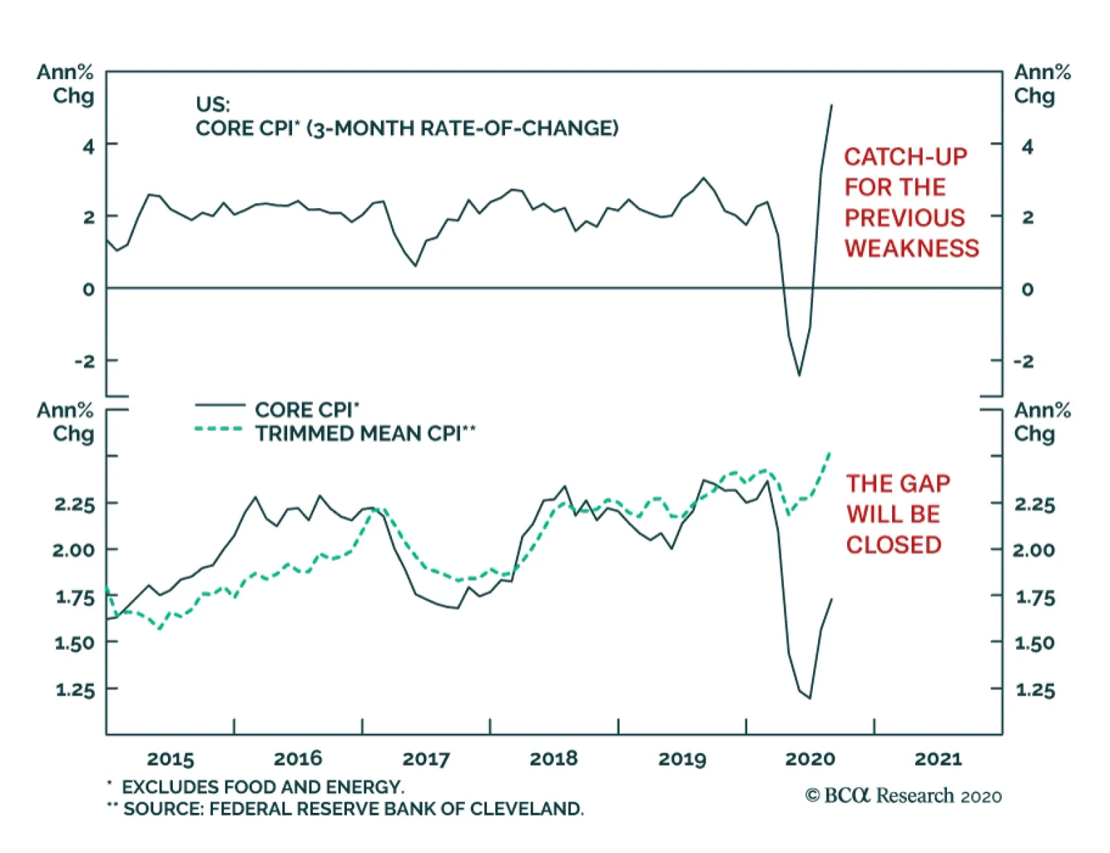
In August, US core CPI continued to firm up, reaching 1.7% annually. This number understates the speed of the recovery in inflation. On a 3-month annualized basis, core CPI is up 5.1% or its fastest pace since 1991. Are we on the verge of an inflationary…
Highlights We remain bearish on the US dollar over the next 12 months. The best vehicle to express this view continues to be the Scandinavian currencies (NOK and SEK). Precious metals remain a buy so long as the dollar faces downside. However, we remain more bullish on silver than gold. Go short the gold/silver ratio (GSR) again at 75. At the crosses, our favorite trade is short NZD against other cyclical currency pairs. These include the CAD, AUD, and SEK. Sterling is selling off as we anticipated, but our timing was offside. That said, the pound is cheap. We will go long cable if it falls below 1.25. Short EUR/GBP at current levels. The Swiss franc will continue to appreciate versus the USD, but will lag behind the euro. EUR/CHF will touch 1.15. We prefer the JPY to the CHF as a currency portfolio hedge. We argued last week that Prime Minster Shinzo Abe’s resignation does not change the yen’s outlook. Feature Our trade basket this year has been centered on a dollar-bearish theme. Since the top in the DXY index on March 19th, we have been expressing this view via various vehicles, most of which have been very profitable. Our favorites have been the Scandinavian currencies, silver, and the AUD, either at the crosses or against the US dollar. So far, these are among the best-performing trades in the G10 currency world (Chart I-1). Chart I-1A Currency Report Card
Revisiting Our High-Conviction Trades
Revisiting Our High-Conviction Trades
Going into the final leg of 2020, the key question is which currency pairs will provide the most upside. In this report, we revisit the rationale behind our high-conviction trades. The Case For Scandinavian Currencies A review of Q2 GDP across the G10 reveals which countries have been doing relatively better during the pandemic. Norway emerges as the economy that had the best quarter-on-quarter annualized growth (Chart I-2). Swedish growth held up very well in Q1 and even the drop in Q2 still puts it well ahead of the US, the euro area, and the UK. As small, open economies which are very sensitive to global growth conditions, this is a very impressive feat for Sweden and Norway. Part of the reason for this is that over the years, the drop in their currencies, both against the US dollar and euro, has made them very competitive. Chart I-2A Currency Report Card
A Currency Report Card
A Currency Report Card
Norway benefited from a few things during the pandemic. First, as a major oil exporter, the sharp fall in the NOK helped cushion the domestic economy against the crash in crude prices. Second, the handling of the pandemic was swift and rigorous, and this has almost completely purged the number of new infections in Norway. Third, aggressive monetary and fiscal stimulus (zero rates, quantitative easing, and the first budget deficit in 40 years) has set the economy on a recovery path. As a result, consumption is rebounding smartly and the Norges Bank expects mainland GDP to touch pre-crisis levels by 2023. Already, real retail sales have exploded higher (Chart I-3). Should global growth continue to rebound, a reversal in pessimism towards energy stocks (and value stocks in general) could see investors reprice the Norwegian stock market (and krone) sharply higher (Chart I-4). Chart I-3Norwegian Consumption Has##br##Recovered
Norwegian Consumption Has Recovered
Norwegian Consumption Has Recovered
Chart I-4A Bounce In Oil & Gas Stocks Will Help The Krone
A Bounce In Oil & Gas Stocks Will Help The Krone
A Bounce In Oil & Gas Stocks Will Help The Krone
In the case of Sweden, the sharp rebound in the manufacturing PMI also suggests the industrial base is recovering. This will also coincide with a solid bounce in exports, cementing Sweden’s rise in relative competitiveness and its exit from the pandemic-induced recession (Chart I-5). The Riksbank’s resource utilization indicator has stabilized, suggesting deflationary pressures are abating. Meanwhile, home prices are on the cusp of a recovery, which should help boost consumer confidence and support consumption. With our models showing the Swedish krona as undervalued by 19% versus the USD, there is much room for currency appreciation before financial conditions tighten significantly. Should global growth continue to rebound, a reversal in pessimism towards energy stocks could see investors reprice the Norwegian stock market (and krone) sharply higher. The bottom line is that both Norway and Sweden are well poised to benefit from a global economic recovery, with much undervalued currencies that will bolster their basic balances. We expect both the SEK and NOK to be the best performers versus the USD in the coming year (Chart I-6). Chart I-5The Swedish Economy Is On The Mend
The Swedish Economy Is On The Mend
The Swedish Economy Is On The Mend
Chart I-6The Scandinavian Currencies Remain Cheap
The Scandinavian Currencies Remain Cheap
The Scandinavian Currencies Remain Cheap
Stay Long Precious Metals, Especially Silver In a world of ample liquidity and a falling US dollar, gold and precious metals are bound to benefit. This is especially the case on the back of a central bank that is trying to asymmetrically generate inflation. Gold has a long-standing relationship with negative interest rates, though the correlation has shifted over time. The intuition behind falling real rates and rising gold prices is that low rates reduce the opportunity cost of holding non-income-generating assets such as gold. But more importantly, the correlation is between the rise in gold prices and the level of real interest rates, meaning as long as the latter stays negative, it is sufficient to sustain the gold bull market (Chart I-7). Gold tends to be a “Giffen good,” meaning demand increases as prices rise. This can be seen in the tight correlation between our financial demand indicator (proxied by open futures interest on the Comex and ETF holdings, Chart I-8) and gold prices. The conclusion is that, just like the US dollar, gold tends to be a momentum asset, where higher prices beget more demand – at least until the catalyst of easy money and negative rates vanishes Chart I-7Gold Prices And Real Yields
Gold Prices And Real Yields
Gold Prices And Real Yields
Chart I-8Gold Is A Giffen Good
Gold Is A Giffen Good
Gold Is A Giffen Good
There is reason to believe that the bull market in gold might be sustained for longer this time around. The reason is that central banks have become important (and price-insensitive) buyers. Foreign central banks have been amassing almost all of the gold annual output in recent years. It is remarkable that for most of the dollar bull market this past decade, the world’s major central banks (and biggest holders of US Treasurys) have seen rather stable exchange rates relative to the gold price (Chart I-9). This suggests that gold price risks could be asymmetric to the upside. A fall in prices encourages accumulation by EM central banks as a way to diversify out of their dollar reserves, while a rise in prices encourages financial demand and boosts the value of gold foreign exchange reserves. While we like gold, more value can be found in silver (and even platinum) prices, which have lagged the run up in gold. While we like gold, more value can be found in silver (and even platinum) prices, which have lagged the run up in gold. During precious metals bull markets, prices tend to move in sequence, starting with gold, then silver. Meanwhile, the gold/silver ratio (GSR) tends to track the US dollar (Chart I-10), since silver tends to rise and fall more explosively than gold. Part of the reason is that the silver market is thinner and more volatile. Silver’s rising industrial use has also led to competition with investment demand in recent years. Chart I-9Central Banks Will Put A Floor Under Gold Prices
Central Banks Will Put A Floor Under Gold Prices
Central Banks Will Put A Floor Under Gold Prices
Chart I-10Silver Should Outperform Gold As The Dollar Falls
Silver Should Outperform Gold As The Dollar Falls
Silver Should Outperform Gold As The Dollar Falls
The next important technical level for silver will be the 2012 highs near $35/oz. After this, silver could take out its 2011 highs that were close to $50/oz, just as gold did. Globally, the world produces much more gold than silver, with a supply ratio that is 7:1. Meanwhile, the price ratio between gold and silver is near 70:1. Back in the 1800s, Isaac Newton concluded that the appropriate ratio was 15.5:1. We initially shorted the GSR at 100 and eventually took 25% profits when our rolling stop was triggered. We recommend putting a limit sell at 75. More speculative investors can buy silver outright. Stay Short NZD At The Crosses, Especially Versus The CAD Chart I-11Stay Long CAD/NZD
Stay Long CAD/NZD
Stay Long CAD/NZD
In our currency portfolio, trades at the crosses are equally important as versus the USD in terms of adding alpha. Over the past year, we have successfully been playing the short side of the kiwi trade. We closed our long SEK/NZD trade for a profit of 7.8% on March 20, and our long AUD/NZD trade for a profit of 5.2% on June 26. Today, we remain bullish on the CAD/NZD as an exploitable trading opportunity. First, the New Zealand stock market is the most defensive in the G10, while Canadian bourses are heavy in cyclical stocks. Should value start to outperform growth, this will favor the CAD/NZD cross. Second, immigration was an important source of labor for New Zealand, and COVID-19 has eaten into this dividend for the economy. As such, the neutral rate of interest is bound to head lower. And finally, in the commodity space, our bias is that energy will fare better than agriculture, boosting Canada’s relative terms of trade. At the Bank of Canada’s meeting this past Wednesday, the tone was slightly optimistic as it kept rates on hold. Recent data has been rather strong in Canada, especially in housing and goods consumption. This allows for the possibility of the BoC tapering asset purchases faster than the market expects, as argued by my colleague Mathieu Savary. This arbitrage is already being reflected in real interest rates, where they offer a premium of 180 basis points in Canada relative to New Zealand (Chart I-11). What To Do About Sterling? Trade negotiations between the UK and EU are once again hitting a brick wall. The key issue is around Northern Ireland. Ireland wants to remain bound to the EU’s customs and trade regime. The UK is seeking an amendment to be able to intervene, if there is “inconsistency or incompatibility with international or domestic law.” In short, it allows for UK discretion in the movement of goods to and from Northern Ireland, as well as state aid to Northern Ireland. The EU argues this is a clear breach of the treaty agreed to last year. We remain bullish on the CAD/NZD as an exploitable trading opportunity. As negotiations go on, our base case is that a deal will eventually be reached. This is because neither side wants the worst-case scenario, namely, a no-deal Brexit. Should no deal be reached, the sharp rise in the trade-weighted euro will be exacerbated by a drop in the pound. This is deflationary for the euro area. And while the drop in the pound could be beneficial to the UK in the longer term, it will be very destabilizing since the UK is highly dependent on capital flows. Our roadmap for sterling is as follows: Historically, odds of a “hard” Brexit have usually been associated with cable near 1.20. This occurred after the UK referendum in 2016 and after Prime Minister Boris Johnson was elected with a mandate to take the UK out of the EU (Chart I-12). Intuitively, this suggests that maximum pessimism on the pound, driven by Brexit fears, pins cable at around 1.20. A “weak” deal cobbled together at the eleventh hour will still benefit cable. Depending on the details, 1.35-1.40 for cable will be within striking distance. In the case where both the UK and EU come to a “perfect” agreement, the pound could be 20%-25% higher. The real effective exchange rate for the pound is now lower than where it was after the UK exited the ERM in 1992, with a drawdown that has been similar in size. A good deal should cause the pound to overshoot the mid-point of its historical real effective exchange rate range (Chart I-13). Chart I-12GBP Has Historically Bottomed At 1.20
GBP Has Historically Bottomed At 1.20
GBP Has Historically Bottomed At 1.20
Chart I-13The Pound Is Cheap
The Pound Is Cheap
The Pound Is Cheap
The pound is also cheap versus the euro, and we expect the EUR/GBP to start facing significant headwinds near 0.92. It is remarkable that UK data continues to outperform both the US and euro area (Chart I-14). As such, cable should be bought on weakness. Tactically, we would be buyers of the pound in the 1.24-1.25 zone, and our limit sell on EUR/GBP was triggered yesterday at 0.92. Chart I-14The UK Economy Is Improving
The UK Economy Is Improving
The UK Economy Is Improving
Thoughts On The ECB The main takeaways from the European Central Bank (ECB) conference were threefold. First, data in the euro area was better than the ECB expected. Second, the ECB did not give any hints on its policy review or extend forward guidance. Keeping policy easy until inflation is up to, but still below, 2% appears more hawkish than the Federal Reserve, which is now trying to asymmetrically generate inflation. And finally, the ECB said they are monitoring the exchange rate, but fell short of providing any hints that they will actively lean against the currency. The euro took off, both against the dollar and other European currencies. We outlined in last week’s report why we do not believe the euro can fall much from current levels. These include the common currency being cheap and having a large share of exports in the eurozone. A Few Words On The CHF Finally, a few clients have asked what happens to the Swiss franc in an environment where the euro is rising (and the dollar is falling). Our bias is that the Swiss National Bank lets a rising EUR/CHF ease financial conditions in Switzerland, and even leans into it. The Swiss National Bank has been stepping up its pace of intervention since EUR/CHF touched 1.05 this year and will continue to do so (Chart I-15). Unfortunately, there is not much it can do about a falling USD/CHF. This suggests the franc will fall against the euro, but not so much against the dollar. In a world where global yields eventually converge to zero, holding the Swiss franc is an attractive hedge. Chart I-15USD Weakness Will Be A Headache For The SNB
USD Weakness Will Be A Headache For The SNB
USD Weakness Will Be A Headache For The SNB
Chester Ntonifor Foreign Exchange Strategist chestern@bcaresearch.com Currencies U.S. Dollar Chart II-1USD Technicals 1
USD Technicals 1
USD Technicals 1
Chart II-2USD Technicals 2
USD Technicals 2
USD Technicals 2
Recent data from the US have been positive: On the labor market front, nonfarm payrolls fell to 1371K from 1734K in August. The average hourly earnings increased by 4.7% year-on-year. The unemployment rate declined from 10.2% to 8.4%. Initial jobless claims increased by 884K for the week ending on September 4th. Finally, the NFIB business optimism index increased from 98.8 to 100.2 in August. The DXY index initially rose to a 4-week high of 93.6 earlier this week with positive data releases, then fell back to 93. Our bias is that while the dollar has been rebounding since the beginning of the month, the rally could prove to be a healthy counter-trend move in the long-term dollar bear market. Report Links: Addressing Client Questions - September 4, 2020 A Simple Framework For Currencies - July 17, 2020 DXY: False Breakdown Or Cyclical Bear Market? - June 5, 2020 The Euro Chart II-3EUR Technicals 1
EUR Technicals 1
EUR Technicals 1
Chart II-4EUR Technicals 2
EUR Technicals 2
EUR Technicals 2
Recent data from the euro area have been mixed: The Sentix investor confidence increased from -13.4 to -8 in September. GDP plunged by 11.8% quarter-on-quarter in Q1, or 14.7% year-on-year. The euro declined by 0.5% against the US dollar this week. The ECB decided to keep its interest rate and PEPP program unchanged on this Thursday. President Christine Lagarde sounded quite hawkish in the press conference, saying that incoming data since the last monetary policy meeting suggest “a strong rebound in activity broadly in line with previous expectations.” We continue to favor the euro against the US dollar. Report Links: Addressing Client Questions - September 4, 2020 On The DXY Breakout, Euro, And Swiss Franc - February 21, 2020 Updating Our Balance Of Payments Monitor - November 29, 2019 Japanese Yen Chart II-5JPY Technicals 1
JPY Technicals 1
JPY Technicals 1
Chart II-6JPY Technicals 2
JPY Technicals 2
JPY Technicals 2
Recent data from Japan have been mixed: The coincident index increased from 74.4 to 76.2 in July. The leading economic index also climbed up from 83.8 to 86.9 in July. The current account balance widened from ¥167 billion to ¥1,468 billion in July. GDP plunged by 7.9% quarter-on-quarter in Q2, or 28.1% on an annualized basis. Preliminary machine tool orders continued to fall by 23.3% year-on-year in August. Overall household spending contracted by 7.6% year-on-year in July. The Japanese yen appreciated by 0.2% against the US dollar this week. The expansion in Japan’s current account balance is mainly driven by the decline in domestic demand. Exports fell by 19.2% year-on-year in July while imports slumped at a faster pace by 22.3%. This suggests that deflationary forces are returning to Japan, which will boost real rates and buffet the yen. Report Links: The Near-Term Bull Case For The Dollar - February 28, 2020 Building A Protector Currency Portfolio - February 7, 2020 Currency Market Signals From Gold, Equities And Flows - January 31, 2020 British Pound Chart II-7GBP Technicals 1
GBP Technicals 1
GBP Technicals 1
Chart II-8GBP Technicals 2
GBP Technicals 2
GBP Technicals 2
Recent data from the UK have been mostly positive: Retail sales continued to increase, rising by 4.7% year-on-year in August, following a 4.3% increase the previous month. Halifax house prices increased by 5.2% year-on-year for the 3 months to August. The Markit construction PMI declined from 58.1 to 54.6 in August. The British pound extended its sell-off this week, depreciating by 2.5% against the US dollar, making it the worst-performing G10 currency. Under ongoing trade negotiations, the possibility of a no-deal Brexit is now putting more downward pressure on the pound after the summer rally. Report Links: Updating Our Balance Of Payments Monitor - November 29, 2019 A Few Trade Ideas - Sept. 27, 2019 United Kingdom: Cyclical Slowdown Or Structural Malaise? - Sept. 20, 2019 Australian Dollar Chart II-9AUD Technicals 1
AUD Technicals 1
AUD Technicals 1
Chart II-10AUD Technicals 2
AUD Technicals 2
AUD Technicals 2
Recent data from Australia have been mixed: The AiG services performance index fell from 44 to 42.5 in August. The NAB business confidence increased from -14 to -8 in August while the business conditions index fell from 0 to -6. The Australian dollar appreciated by 0.4% against the US dollar this week. Spending fell sharply during the pandemic, pushing Australia’s savings rate to 19.8% from 6%. Until consumer spending returns in earnest, the RBA is unlikely to raise rates, which puts a cap on how far the AUD can rise. The good news is that household balance sheets are being mended, which reduces macroeconomic risk. Report Links: On AUD And CNY - January 17, 2020 Updating Our Balance Of Payments Monitor - November 29, 2019 A Contrarian View On The Australian Dollar - May 24, 2019 New Zealand Dollar Chart II-11NZD Technicals 1
NZD Technicals 1
NZD Technicals 1
Chart II-12NZD Technicals 2
NZD Technicals 2
NZD Technicals 2
Recent data from New Zealand have been mixed: Manufacturing sales plunged by 12.2% quarter-on-quarter in Q2. The preliminary ANZ business confidence index increased from -41.8% to -26% in September. The ANZ activity outlook index also ticked up from -17.5% to -9.9%. The New Zealand dollar fell initially against the US dollar, then recovered, returning flat this week. The ANZ New Zealand Business Outlook shows that most activity indicators have increased to the highest levels since the beginning of the pandemic but are still well below pre-COVID-19 levels. We like the New Zealand dollar against the US dollar but believe that it will underperform against other pro-cyclical currencies including the Australian dollar and the Canadian dollar. Report Links: Currencies And The Value-Versus-Growth Debate - July 10, 2020 Updating Our Balance Of Payments Monitor - November 29, 2019 Place A Limit Sell On DXY At 100 - November 15, 2019 Canadian Dollar Chart II-13CAD Technicals 1
CAD Technicals 1
CAD Technicals 1
Chart II-14CAD Technicals 2
CAD Technicals 2
CAD Technicals 2
Recent data from Canada have been positive: On the labor market front, the unemployment rate declined from 10.9% to 10.2% in August. The participation rate increased from 64.3% to 64.6%. Average hourly wages surged by 6% year-on-year in August. Housing starts increased by 6.9% month-on-month to 262.4K in August, the highest reading since 2007. The Canadian dollar depreciated by 0.3% against the US dollar this week. The Bank of Canada maintained its target rate at 0.25% on Wednesday. It is also continuing large-scale asset purchases of at least C$5 billion per week of government bonds. Moreover, the Bank suggested that the bounce-back in activity in Q3 was better than expected, which bodes well for the loonie. Report Links: Currencies And The Value-Versus-Growth Debate - July 10, 2020 More On Competitive Devaluations, The CAD And The SEK - May 1, 2020 A New Paradigm For Petrocurrencies - April 10, 2020 Swiss Franc Chart II-15CHF Technicals 1
CHF Technicals 1
CHF Technicals 1
Chart II-16CHF Technicals 2
CHF Technicals 2
CHF Technicals 2
Recent data from Switzerland have been mixed: FX reserves continued to increase from CHF 847 billion to CHF 848 billion in August. The unemployment rate remained unchanged at 3.4% in August. The Swiss franc appreciated by 1% against the US dollar this week. The SNB Chairman Thomas Jordan said that “stronger currency market interventions relieve over-valuation pressure on the Swiss franc and protect the Swiss economy”. Recent dollar weakness could be another headache for the SNB, accelerating SNB’s currency intervention. While we like the franc as a safe-haven hedge with high real rates, the upside potential is likely to be more gradual as the SNB leans against it. Report Links: On The DXY Breakout, Euro, And Swiss Franc - February 21, 2020 Currency Market Signals From Gold, Equities And Flows - January 31, 2020 Portfolio Tweaks Before The Chinese New Year - January 24, 2020 Norwegian Krone Chart II-17NOK Technicals 1
NOK Technicals 1
NOK Technicals 1
Chart II-18NOK Technicals 2
NOK Technicals 2
NOK Technicals 2
Recent data from Norway have been positive: Manufacturing output increased by 1.8% month-on-month in July. Headline consumer price inflation ticked up from 1.3% to 1.7% year-on-year in August. Core inflation continued rising to 3.7% year-on-year from 3.5% the previous month. The Norwegian krone depreciated by 0.5% against the US dollar this week. The increase in headline inflation was mainly driven by furnishings and household equipment (10%), communications (4.9%) and food (3.7%). However, the Norwegian krone is still tremendously undervalued against the US dollar according to our models. Report Links: A New Paradigm For Petrocurrencies - April 10, 2020 Building A Protector Currency Portfolio - February 7, 2020 On Oil, Growth And The Dollar - January 10, 2020 Swedish Krona Chart II-19SEK Technicals 1
SEK Technicals 1
SEK Technicals 1
Chart II-20SEK Technicals 2
SEK Technicals 2
SEK Technicals 2
Recent data from Sweden have been mostly positive: The current account surplus fell to SEK 63.2 billion in Q2 from SEK 75.5 billion in Q1. However, this compares favorably to a surplus of SEK 34.7 billion the same quarter last year. Manufacturing new orders continued to fall by 6.4% year-on-year in July. This is an improvement compared to the 13.1% contraction the previous month. Headline consumer prices inflation increased from 0.5% to 0.8% year-on-year in August. Core inflation also climbed up from 0.5% to 0.7% year-on-year. The Swedish krona appreciated by 0.5% against the US dollar this week. We continue to favor the Swedish krona amid global economy recovery. Moreover, our PPP model shows that the krona is still undervalued by 19% against the US dollar. Report Links: Updating Our Balance Of Payments Monitor - November 29, 2019 Where To Next For The US Dollar? - June 7, 2019 Balance Of Payments Across The G10 - February 15, 2019 Trades & Forecasts Forecast Summary Core Portfolio Tactical Trades Limit Orders Closed Trades
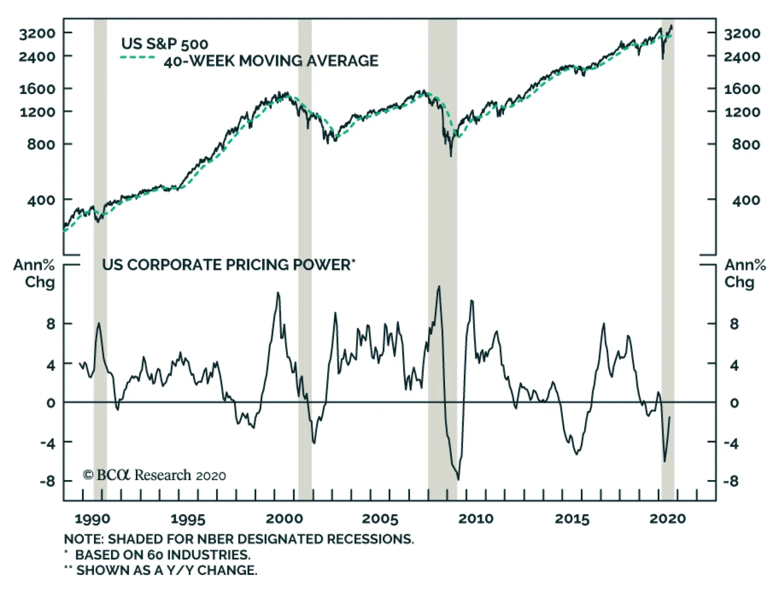
This week we introduced a structurally constructive US equity view with an SPX 7000 target for the year 2028 on the back of peak cycle EPS of $310 and peak cycle P/E multiple of 23. The Fed’s explicit acceptance that it is ready to incur inflation risk, cementing the fed funds rate near the zero-lower bound for as long as the eye can see, underpins this bullish view. Since the late-1920s, EPS have grown by 7.5%/annum on average, effectively doubling every decade. More recently, using I/B/E/S data, there have been four distinct EPS growth periods over the past four decades with different durations. From trough-to-peak, EPS have enjoyed an average CAGR of over 10%. The current trough in forward EPS stands just shy of $140. Applying the average CAGR until 2028 results in a $310 EPS figure. Assigning the current forward multiple equates to an SPX terminal value of over 7000. Bottom Line: Our new structurally bullish view calls for SPX 7000 by the year 2028. For more reasons underpinning this view, please refer to our most recent Weekly Report.
SPX 7000
SPX 7000
Highlights Stocks face near-term downside risks from further delays in passing a new US fiscal stimulus package, a potentially slower-than-expected rollout of a Covid-19 vaccine, and the unwinding of speculative call option positions in large-cap US tech companies. Nevertheless, we continue to favor equities over bonds over a 12-month horizon. One key reason is that the global equity risk premium – proxied by the difference between the stock market earnings yield and the real government bond yield – remains quite large. Many observers argue that the bond yield component of the equity risk premium is distorted by central bank manipulation. They also contend that low bond yields reflect poor economic prospects and that structurally low borrowing costs could lead to malinvestment down the road. In this report, we push back against these views. We argue that today’s low bond yields do, in fact, provide a reliable estimate of the risk-free component of the discount rate; that the drop in yields over the past year mainly reflects higher private-sector savings and easier monetary policy rather than pessimism about growth and earnings; and that instead of leading to overinvestment, the main effect of falling interest rates, at least so far, has been to inflate the rents earned by companies with monopoly power. All of this means that lower interest rates really do justify higher market valuations. The Correction Is Not Over, But We Are Sticking With Our Bullish 12-Month View On Stocks Chart 1Tech Stocks At Greatest Risk Of A Pullback
Tech Stocks At Greatest Risk Of A Pullback
Tech Stocks At Greatest Risk Of A Pullback
After recouping some of their losses on Wednesday, stocks stumbled again on Thursday. Since reaching new highs last week, global equities have dropped by 5.3%. US equities have taken the brunt of the beating. They are down 7% from last week’s top, compared to 3% for non-US stocks (Chart 1). The tech-heavy Nasdaq remains 9.4% off its record high. We continue to see near-term downside risks to global stocks, particularly US equities. It has now been six weeks since emergency US federal unemployment benefits lapsed. The US economy is set to rebound at a brisk pace in the third quarter – the Atlanta Fed’s GDPNow model projects that output will grow 30% at an annualized pace – but GDP is rising from a very low base. In the absence of a new fiscal package, US growth could slow sharply in the fourth quarter and beyond, causing more workers to become permanently unemployed. Concern over the safety of the vaccines being developed to fight Covid-19 could also unsettle investors. On Wednesday, AstraZeneca announced that it had temporarily paused the Phase 3 trial of its vaccine co-developed with the University of Oxford after a patient suffered a severe reaction. Such delays are normal in the conduct of vaccine testing, but they do raise memories of the 1976 debacle with the Swine flu vaccine, which caused 450 Americans to come down with Guillain-Barré syndrome, a life-threatening neurological disorder.1 Chart 2Nasdaq Volatility Declined Even As Share Prices Tumbled
Stock Prices And Interest Rates: Can We Trust TINA?
Stock Prices And Interest Rates: Can We Trust TINA?
These worries come on the heels of a six-month rally in tech stocks – one that was dangerously amplified by speculative call option purchases by retail investors. The preference among retail investors for short-dated calls allowed them to gain control of large swathes of shares at relatively little cost. Market makers and other counterparties who sold the calls were forced to buy the underlying stock to hedge their exposure. This created a self-reinforcing feedback loop where rising call option prices generated more purchases of the underlying stock, leading to even higher call prices. Starting last week, the process began to go in reverse. It is noteworthy that Nasdaq implied volatility actually fell on both Monday and Wednesday as tech stocks imploded, a possible sign that nervous investors were liquidating their call positions (Chart 2). It is difficult to know how much further this process has to run, but our guess is that a capitulation point has not yet been reached. This suggests that the correction is not yet over. TINA’s Siren Song Despite our near-term concerns, we expect global equities to be higher in 12 months’ time. At least one of the nine vaccine candidates currently in Phase 3 trials is likely to produce a viable formula. Policymakers are also liable to heed the will of voters and maintain generous fiscal stimulus measures. All this should allow global growth to pick up. Stocks usually do well when global growth is accelerating (Chart 3). And then there is TINA. TINA — There Is No Alternative — has become a popular adage on Wall Street. As the argument goes, no matter how expensive stocks seem to get, bonds and cash are even less attractive. There is some logic to this view. Today, the dividend yield on the S&P 500 stands at 1.6%. While this dividend yield is well below its historic average of 4.3%, it is still higher than the 0.68% yield on the 10-year Treasury note (Chart 4). Chart 3Stocks Usually Do Well When Global Growth Is Accelerating
Stocks Usually Do Well When Global Growth Is Accelerating
Stocks Usually Do Well When Global Growth Is Accelerating
Chart 4Bond Yields Have Fallen Below Dividend Yields
Bond Yields Have Fallen Below Dividend Yields
Bond Yields Have Fallen Below Dividend Yields
Imagine an investor having to decide whether to place their money in an S&P 500 index fund or a 10-year Treasury note. Dividends-per-share paid by S&P 500 companies have almost always increased over time. However, even if we make the pessimistic assumption that dividends-per-share remain unchanged for the next ten years, the value of the S&P 500 would still have to fall by 9% over the next decade to equal the return on the 10-year note. Assuming that inflation averages 2% over this period, the real value of the S&P 500 would need to drop by 25%. The picture is even more dramatic outside the US. In the euro area, the index would have to fall by over 30% in real terms for investors to make more money in bonds than stocks. In the UK, it would need to fall by over 50%. Elevated Equity Risk Premia Granted, stocks are riskier than bonds. However, based on a comparison of dividend yields with bond yields, stocks today are significantly cheaper than usual (Chart 5). Chart 5AStocks Would Need To Fall A Lot For Equities To Underperform Bonds
Stocks Would Need To Fall A Lot For Equities To Underperform Bonds
Stocks Would Need To Fall A Lot For Equities To Underperform Bonds
Chart 5BStocks Would Need To Fall A Lot For Equities To Underperform Bonds
Stocks Would Need To Fall A Lot For Equities To Underperform Bonds
Stocks Would Need To Fall A Lot For Equities To Underperform Bonds
The relative attractiveness of stocks can also be inferred by subtracting the real bond yield from the cyclically-adjusted earnings yield on stocks in order to get an implied equity risk premium (ERP)2 (Chart 6). Outside the US, the ERP is high both because earnings yields are elevated and because real bond yields are depressed. In the US, which accounts for 56% of global stock market capitalization, the earnings yield is below its long-term average. Nevertheless, the US ERP is still quite high because real bond yields reside deep in negative territory. In fact, the US ERP has barely fallen since March because the decline in real yields has largely offset the rise in stock prices (Chart 7). Chart 6Equity Risk Premia Are Elevated
Equity Risk Premia Are Elevated
Equity Risk Premia Are Elevated
Chart 7The Decline In US Real Yields Since March Has Largely Offset The Rise In Stock Prices
The Decline In US Real Yields Since March Has Largely Offset The Rise In Stock Prices
The Decline In US Real Yields Since March Has Largely Offset The Rise In Stock Prices
Are Bond Yields Fake News? Stock market bears will argue that the ERP is overstated by the abnormally low level of bond yields. Their argument typically centers on three points: Quantitative easing, forward guidance, NIRP and ZIRP have distorted bond yields to such an extent that we can no longer use them as a reliable measure of the risk-free component of the discount rate. Even if one accepts the premise that current bond yields are a valid proxy for the risk-free rate, the fact that yields are so low is hardly a cause for celebration. This is because today’s low yields reflect dismal economic prospects, which justifies a higher-than-normal equity risk premium. Low bond yields are incentivizing all sorts of malinvestment. With time, this will depress the rate of return on capital, leading to lower stock prices. Let’s examine all three arguments in turn. Are Bond Yields Being Manipulated? The term financial repression gets bandied around quite often these days. There is no doubt that central banks would like to keep yields low, but how much higher would yields be in the absence of any unorthodox monetary measures? Our guess is not much higher. The simplest test of whether bond yields are above or below their equilibrium level is to look at whether growth is above or below trend. The recovery following the financial crisis was anemic, suggesting that monetary policy was only modestly accommodative. If anything, one can argue that in much of the world, bond yields would be even lower today were it not for the fact that nominal interest rates cannot go much below zero. Do Low Bond Yields Reflect Bad News? Bond yields can decline for many reasons. Some of these reasons are positive for equity investors, while others are negative. If yields fall on the expectation of weaker economic growth, that is clearly bad for stocks. On the flipside, if yields drop because monetary policy has turned more dovish, that is good for stocks. The impact on equities from other factors influencing bond yields can be ambiguous. For example, consider the case of an increase in private-sector savings. All things equal, higher savings will lead to less spending. A decline in spending is likely to result in lower output and diminished corporate profits. That is bad for stocks. However, if governments absorb the excess private-sector savings by running larger budget deficits, there may end up being no net loss in aggregate demand. In that case, stock prices may not fall. Indeed, one can very easily envision a scenario where an adverse shock to private-sector spending leads to an increase in equity valuations. To see this point, consider a standard dividend discount model. Suppose something happens that leads the private sector to spend less at any given interest rate. Let us also suppose that the central bank reacts to this shock by cutting interest rates all the way down to zero, at which point governments, taking advantage of cheaper borrowing costs, step in and increase fiscal stimulus. The upshot could be a lower interest rate but at the same level of aggregate spending (See Box 1 for a formal economic discussion of how this process works). If aggregate demand – and by extension, corporate earnings and dividends — drop temporarily, while interest rates fall permanently (or at least semi-permanently), the present value of cash flows will rise. As far-fetched as this scenario may seem, something along these lines appears to have happened over the past six months. Chart 8 shows that analysts expect global profits to contract by 19% in 2020, but then rebound by 29% in 2021 and rise a further 16% the following year, leaving 2022 profits 21% above 2019 levels. Like everywhere else, analysts expect US profits to return to their long-term trend over the next few years. Meanwhile, the 30-year TIPS yield – a proxy for the risk-free component of the discount rate – has fallen by 94 basis points since the start of the year. Even if one assumes, contrary to the optimistic forecasts of analysts, that the level of US EPS does not return to its pre-pandemic trend until 2030, this would still leave the fair value of the S&P 500 17.5% higher than it was at the start of the year (Chart 9). Chart 8Analysts Expect Global Profits To Contract This Year Before Rebounding
Stock Prices And Interest Rates: Can We Trust TINA?
Stock Prices And Interest Rates: Can We Trust TINA?
Chart 9The Present Value Of Earnings: A Scenario Analysis
Stock Prices And Interest Rates: Can We Trust TINA?
Stock Prices And Interest Rates: Can We Trust TINA?
Will Low Interest Rates Lead To Malinvestment? A drop in interest rates may seem like a free lunch for shareholders: It increases the present value of future cash flows without reducing the cash flows themselves. In fact, one could argue that lower rates actually increase future cash flows by shrinking net interest payments on outstanding debt. That might be all fine and dandy, but what about the effect of low interest rates on future investment decisions? To the extent that lower rates increase the market value of a firm’s capital stock relative to its replacement cost – the so-called Tobin’s Q ratio – lower rates could spur more investment. Higher investment, in turn, could drive down the rate of return on capital, leading to lower profits (Box 2 illustrates this point with a simple example featuring a lemonade stand). While there is some truth to this logic, it is less compelling than it once was. This is because much of the capital stock of listed companies today takes the form of intangible capital – which is often difficult to reproduce – rather than physical capital. Such intangible capital may include patents and trademarks as well as monopoly power. In particular, internet companies have gained significant monopoly power from network effects: The more people use their service, the more valuable their service becomes. This is a key reason why falling interest rates have helped the tech giants more than other companies. The Path Ahead The section above argued that today’s low bond yields do, in fact, provide a reliable estimate of the risk-free component of the discount rate; that the drop in yields over the past year mainly reflects higher private-sector savings and easier monetary policy rather than pessimism about growth and earnings; and that instead of leading to overinvestment, the main effect of falling interest rates, at least so far, has been to inflate the rents earned by companies with monopoly power. All this means that lower interest rates really do justify higher market valuations. Looking out, while bond yields are unlikely to rise significantly over the next two years in the absence of any meaningful inflationary pressures, yields are unlikely to fall either given how low they already are. This is not necessarily bad news for stocks. As mentioned above, the equity risk premium is quite high, which means that stocks can rise even if bond yields do edge somewhat higher. The more interesting action is likely to occur beneath the broad indices. If bond yields stabilize, this will remove a major headwind to bank shares (Chart 10). On the flipside, the reopening of economies will benefit companies that were crushed by lockdown measures. Money will shift from “pandemic plays” to “recovery plays.” Chart 10Stabilization In Bond Yields Would Remove A Major Headwind To Bank Shares
Stabilization In Bond Yields Would Remove A Major Headwind To Bank Shares
Stabilization In Bond Yields Would Remove A Major Headwind To Bank Shares
Chart 11US Stocks Are More Expensive
Stock Prices And Interest Rates: Can We Trust TINA?
Stock Prices And Interest Rates: Can We Trust TINA?
As we predicted three weeks ago in a report titled “The Return Of Nasdog,” tech and health care stocks will go from leaders to laggards. The US has a higher concentration of tech and health care stocks than most other regions. US stocks are also quite expensive based on standard valuation measures, including the Tobin's Q ratio discussed above (Chart 11). The bottom line is that investors should remain overweight global equities over a 12-month horizon, while pivoting towards value stocks and non-US markets. Peter Berezin Chief Global Strategist peterb@bcaresearch.com Box 1The Role Of Monetary And Fiscal Policy Following Savings Shocks
Stock Prices And Interest Rates: Can We Trust TINA?
Stock Prices And Interest Rates: Can We Trust TINA?
Box 2Fancy Some Lemonade? An Example Of Tobin’s Q
Stock Prices And Interest Rates: Can We Trust TINA?
Stock Prices And Interest Rates: Can We Trust TINA?
Footnotes 1 Rick Perlstein, “Gerald Ford Rushed Out a Vaccine. It Was a Fiasco,” The New York Times, September 2, 2020. 2 It is necessary to subtract the real bond yield, rather than the nominal bond yield, from the earnings yield because the earnings yield provides an estimate of the real total expected return to shareholders. For further discussion on this, please see Appendix A of the Global Investment Strategy Special Report, “TINA To The Rescue?” dated August 23, 2019. Global Investment Strategy View Matrix
Stock Prices And Interest Rates: Can We Trust TINA?
Stock Prices And Interest Rates: Can We Trust TINA?
Current MacroQuant Model Scores
Stock Prices And Interest Rates: Can We Trust TINA?
Stock Prices And Interest Rates: Can We Trust TINA?