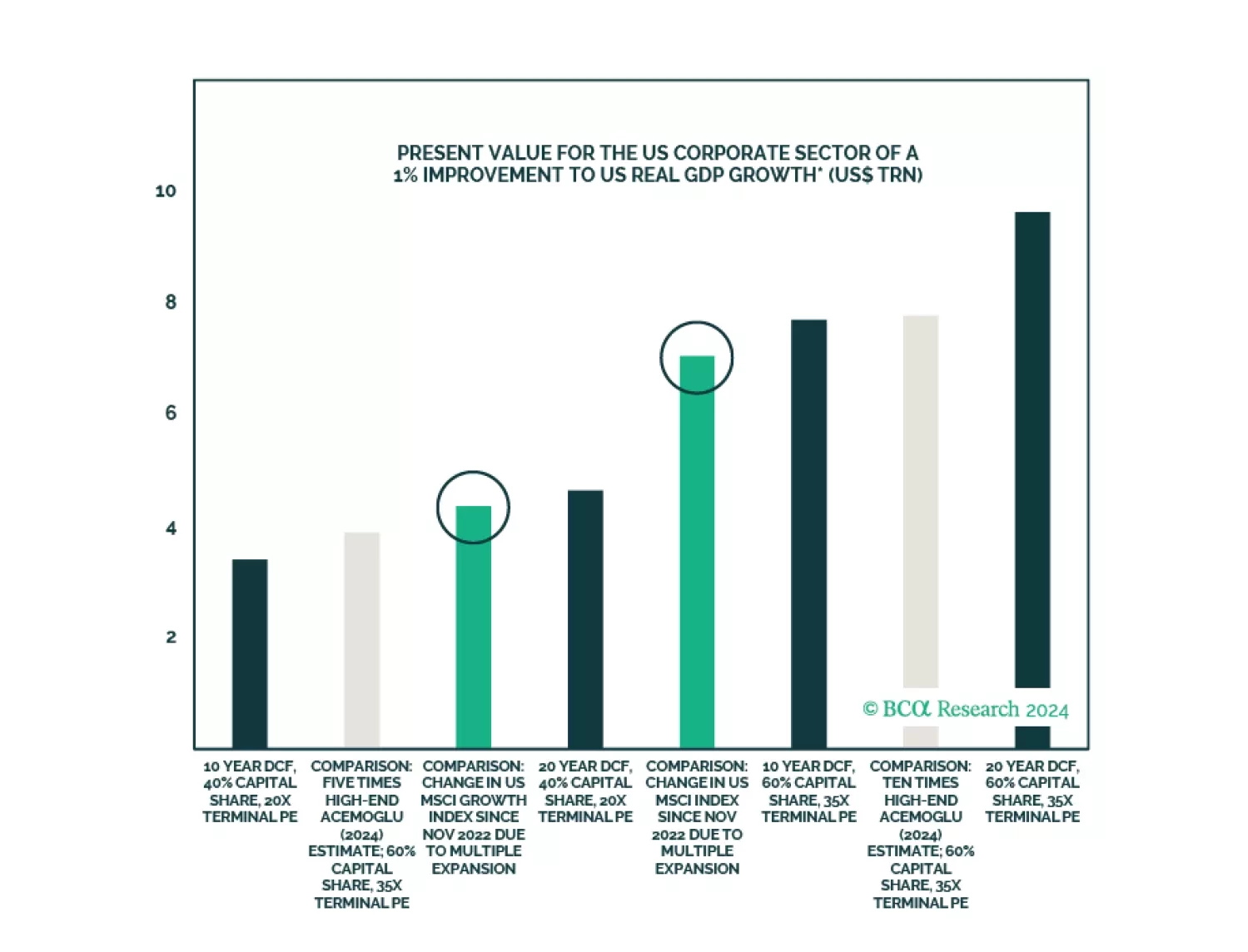
Sorry, you need to enable JavaScript to visit this website.
Skip to main content

Bubbles

Outperformance of Growth sectors most likely has run its course. It is time to shift Growth vs. Value allocation to neutral, downgrade Semis, and upgrade Energy to overweight.

In Section I, we audit the market’s “soft landing” narrative in response to a meaningful challenge to our cautious stance from recent financial market developments. We acknowledge that US economic growth was stronger in the first half of the year than many investors expected, but we are unmoved by the recent uptick in “soft landing” hopes. A “soft landing” outcome very likely necessitates interest rate cuts before recessionary dynamics emerge, and it is far from clear that rate cuts or (especially) an easy monetary policy stance are likely to materialize over the coming year. As such, we continue to believe that conservative portfolio positioning is appropriate. In Section II, we discuss some simple approaches that we use when valuing the major asset classes that we cover. We conclude that global ex-US equities and ex-US developed market currencies are the main assets that can be considered “cheap” today.

Cyclically-speaking, the risk of global indebtedness does not appear to be acute. There are several pockets of sizeable private sector debt risk, and it is possible that the next US/global recession will cause a more pronounced economic downturn in some of these countries. Over the next one-to-three years, these risks are likely to be idiosyncratic. With the possible exception of France’s corporate sector, private sector debt risks appear to be manageable in the US, euro area, and China, the main drivers of global economic activity. However, over the longer-term, there are several problems with global indebtedness that will eventually “come home to roost.” US government debt is now excessive, and we expect meaningful net interest pressure for the US government in three-to-four years, even if the US does not experience elevated structural inflation. In China, the government’s strong desire to avoid aggravating structural imbalances will lead to the limited and finely balanced use of fiscal and monetary policy to boost growth, which is not good news for China-related financial assets. On balance, our conclusions are generally consistent with a structural bear market in the US dollar that is likely to begin after the next US recession. It also speaks to the possible structural outperformance of euro area stocks within a global equity portfolio, and possibly a continuation of the structural bull market in gold – which would benefit mightily from the development of any fiscal risk premia in US assets. The global financial crisis of 2008-2009, as well as the subpar economic recovery that followed, demonstrated to global investors the threat posed by elevated private sector and government debt. There has been a substantial improvement in the risk of indebtedness in some sectors of some countries over the past 15 years, but the risks of excessive indebtedness have increased in other areas of the global economy. In this special report, we check in on the indebtedness risk of a list of major economies using the BIS’ credit to the nonfinancial sector database and examine whether these risks exist primarily in the household, non-financial corporate, or government sectors. We contextualize the indebtedness data from the BIS into a risk score using several risk factors (by sector and by country), based on how elevated a given sector’s risk factor is relative not only to its own history but also the history of other countries. The sector risk scores are presented on pages 24 to 29, and we present a synthesis of our analysis below.1 We conclude that, while there are limited cyclical implications of recent trends in global indebtedness, there are several problems that will eventually “come home to roost” – particularly in the US and China. This would be consistent with a structural bear market in the dollar and a long-term uptrend in the price of gold, and could point to structural euro area outperformance within a global equity portfolio. A Global Indebtedness Report Card Table II-1 presents the aggregate risk score for each country by sector that we examined in our report. Several themes are evident from Table II-1 and the tables shown on pages 24 to 29. Table II-1A Summary Of Our Debt Risk Scores By Country/Region And Sector May 2023 May 2023 Shifting Household Sector Indebtedness Risk Chart II-1Shifting Household Sector Indebtedness Shifting Household Sector Indebtedness Shifting Household Sector Indebtedness The risk of household sector indebtedness has rotated from countries like the US and Spain to several other countries/regions, including Hong Kong SAR, Australia, Canada, and Sweden (Chart II-1). These are relatively smaller countries/regions and thus theoretically pose less of a risk to global financial stability than excessive household sector debt in the US and select euro area economies did in 2008. Mainland China remains one important wildcard for investors to watch. Ostensibly, the risk of China’s household sector indebtedness is only moderate according to our risk score methodology, given that its household debt-to-GDP ratio is lower than in many other countries. However, it has grown at a very significant rate over the past decade. In addition, household disposable income is lower as a share of GDP in China than in most advanced economies, and China’s housing sector has experienced a significant shock over the past two years. The fact that interest rates in China are likely to remain comparatively low versus the pace of economic growth, and that China’s property market is stabilizing, suggest that a major debt crisis in China’s household sector is unlikely over the coming year. The recent property market crisis, however, serves as a reminder of the potential structural vulnerability posed by Chinese household sector debt, which would almost certainly cause a global recession were a major deleveraging event to occur. Chart II-2Elevated Corporate Sector Indebtedness In Hong Kong SAR, China, Sweden, And France Elevated Corporate Sector Indebtedness In Hong Kong SAR, China, Sweden, And France Elevated Corporate Sector Indebtedness In Hong Kong SAR, China, Sweden, And France Some Surprises From The Trend In Corporate Debt Some countries with elevated nonfinancial corporate sector debt risk scores will not be surprising to investors. Chart II-2 highlights that Hong Kong's corporate sector indebtedness is massive and that mainland China's nonfinancial corporate sector debt risk is also very elevated. Mainland China's corporate sector debt risk is concentrated in state-owned enterprises, reflecting the significant quasi-fiscal spending (mainly in the form of infrastructure investment) that has occurred over the past decade in support of economic stability. However, Sweden and France also have very elevated nonfinancial corporate sector debt risk, whose corporate sector scores closely mirror their risk scores from the shadow banking sector. “Shadow credit” references credit that is not provided by domestic banks. A rise in shadow credit appears to be the source of the increase in nonfinancial corporate sector indebtedness in both Sweden and France. Shadow credit poses a risk to financial stability because credit availability from nonbank entities could tighten rapidly in a crisis; it thus points to potentially outsized economic weakness in Sweden and France in a bad economic scenario. Based on the IMF’s stress test results, we continue to regard Sweden’s nonfinancial private sector as one of the riskiest in the developed world. Real Long-Term Risks From US Government Indebtedness Investor concerns about the rise in US government debt have prevailed for over a decade following the surge in the debt-to-GDP ratio that occurred following the global financial crisis. However, with interest rates having fallen to extremely low levels during the last economic expansion, the debt servicing burden of US government debt was minimal. The COVID-19 pandemic changed that reality in two ways. First, the fiscal response to the pandemic resulted in another surge in the debt-to-GDP ratio. Second, the surge in inflation that occurred in the latter half of the pandemic has caused both short-term interest rates and expectations for future interest rates to rise. We expect interest rates to fall meaningfully during the next US recession, so a US government debt crisis is not imminent. However, we doubt that the fed funds rate over the coming decade will be as low as it has been over the past ten years. Higher average interest rates point to net interest costs exceeding their early-1990s levels later this decade (Chart II-3), which could cause financial market participants to force fiscal adjustment via a crisis. Chart II-3The US Will Likely Face A Fiscal Reckoning By The End Of The Decade The US Will Likely Face A Fiscal Reckoning By The End Of The Decade The US Will Likely Face A Fiscal Reckoning By The End Of The Decade The US is not the only country with elevated government debt risks. China, the euro area (excluding Germany) and the UK also rank highly according to our aggregate risk score methodology, as does Canada – although this reflects our use of gross rather than net debt to facilitate international comparability (see page 27 for details). The recent mini fiscal crisis in the UK is a preview of what may occur in the US and other countries on a grander scale in three-to-four years, given our view that the next US recession is likely to be mild and that the neutral rate of interest in the US and euro area is not as low as many investors believed prior to the pandemic. China’s relatively elevated government debt risk score reflects a significant rise in local rather than central government debt over the past decade, but that too carries risks for China’s economy given the way Chinese economic policy is carried out. Admittedly, these risks are much more likely to pertain to the risk of economic stagnation rather than an acute crisis. The Presence of Fiscal Space As A Buffer Against Private Sector Indebtedness In several of the countries identified with excessive indebtedness, the debt is concentrated in either the private nonfinancial or the government sector. For example, in the case of Sweden, its very concerning private sector debt load is somewhat offset by a very low government debt risk score, suggesting the presence of fiscal space in Sweden that could allow its government to respond to any private sector deleveraging event. However, in a few countries/regions, debt appears to be elevated in both the private and public sector: chiefly in Hong Kong, mainland China, and France (Chart II-4). France is a core member of the euro area; a corporate sector debt crisis in France would have a meaningful impact on European economic activity, but China’s very sizeable debt load is obviously more concerning given the importance of China as one of the three pillars of the global economy. Chart II-4Less Fiscal Space In Hong Kong SAR And Mainland China Than Before Less Fiscal Space In Hong Kong SAR And Mainland China Than Before Less Fiscal Space In Hong Kong SAR And Mainland China Than Before Investment Conclusions There are no real cyclical investment conclusions to be drawn from our analysis of global indebtedness. There are several pockets of sizeable private sector debt risk, and it is possible that the next US/global recession will cause a more pronounced economic downturn in some of these countries. However, with the possible exception of France’s corporate sector, private sector debt risks appear to be manageable in the US, euro area, and China, the main drivers of global economic activity. China’s nonfinancial corporate sector is indeed extremely leveraged, but much of this debt resides on the balance sheet of state-owned enterprises and thus is unlikely to pose a cyclical economic risk due to government support – especially given recent incremental easing in China. Tight monetary policy in the US and euro area is a much more proximate risk to the business cycle and, as described in Section I of our report, we expect a recession in the US to begin at some point over the coming six-to-twelve months. However, our analysis of global indebtedness highlights several problems that will eventually “come home to roost”. US government debt is now excessive. The likely future path for interest rates implies meaningful net interest pressure on the government in three-to-four years, even if the US does not experience elevated structural inflation. And in China, the government’s strong desire to avoid aggravating structural imbalances will lead to the limited and finely balanced use of fiscal and monetary policy to boost growth. As we noted in last month’s report,2 that is not good news for China-related financial assets, as it implies that Chinese policymakers will remain reactive and that China will become a more insular economy with even broader state influence or control. The Xi administration’s paradigm shift implies a very different China than many investors became accustomed to between 2008 and 2014, and one that is far less likely to stimulate global economic growth. In short, this is not, and likely will not be, the China that you have been hoping for. On balance, these conclusions are generally consistent with a structural bear market in the US dollar that is likely to begin following the next US recession. It also speaks to the possible structural outperformance of euro area stocks within a global equity portfolio, and possibly a continuation of a structural bull market in gold – which would benefit mightily from the development of any fiscal risk premia in US assets. Finally, once the next US administration is in place and a new high in the servicing costs of US government debt is within sight, investors should structurally monitor the spread between 10- and 30-year US Treasury yields for signs of an abnormally steep curve. An aggressive shift into short-duration positions will be warranted in response to any true signs of a budding fiscal crisis in the US. Jonathan LaBerge, CFA Vice President The Bank Credit Analyst Private Nonfinancial Sector The countries/regions most at risk from elevated private non-financial sector debt are Hong Kong SAR, Sweden, mainland China, France, Canada, and the Netherlands (Table II-2). Across all of the metrics shown in Table II-2 that measure the risk of indebtedness, Hong Kong consistently ranks as the riskiest market. This is particularly true based on debt service measures, which show an extremely large amount of income “lost” to repaying debt. Unlike the case of mainland China, Hong Kong’s sharp rise in private sector indebtedness over the past two decades (and especially since 2009) has not occurred due to government efforts to stabilize economic activity. Hong Kong’s pegged exchange rate effectively imports US monetary policy, which has been extraordinarily easy since the global financial crisis – particularly for an economy that did not suffer the same shock to household balance sheets that occurred in the US. The source of the risk from Sweden’s indebtedness is somewhat different than is the case in Hong Kong. Sweden’s private sector debt-to-GDP level is meaningfully below Hong Kong’s, although that is mainly indicative of how extreme the latter is. More importantly, the pace of leveraging in Sweden’s private sector indebtedness has been somewhat slower than in Hong Kong and indeed a few other countries/regions (such as Japan, France, and mainland China); it ranks third after Canada based on the first of our two debt service proxies. However, based on our second DSR that uses a measure of equilibrium interest rates, Sweden appears to be much riskier. Table II-2High Private Nonfinancial Sector Debt Risk In Hong Kong SAR, Sweden, China, France, And Canada May 2023 May 2023 The Household Sector The countries/regions most at risk from elevated household sector debt are Hong Kong SAR, Australia, Canada, Sweden, and the Netherlands (Table II-3). Relative to Hong Kong’s total private sector debt, the household sector is not the dominant contributor. When compared across countries/regions, however, Hong Kong’s household sector debt-to-GDP ratio is among the most extreme. Australia, Canada, and the Netherlands rank worse than Hong Kong in terms of household sector debt-to-GDP, but both economies have recently seen meaningfully slower household debt growth than has occurred in Hong Kong. Aside from the Netherlands, euro area economies rank quite low on the list of household sector indebtedness risk and nontrivially lower than in the UK. The risk of indebtedness posed by the household sector in mainland China may be understated in Table II-3. This is because China’s household disposable income is smaller as a share of GDP than most of the other countries/regions shown in the table, which causes artificially lower debt ratios when scaled relative to GDP. Relative to developed market economies, Chinese interest rates are meaningfully below the prevailing pace of income or GDP growth, so we still suspect that China’s household sector debt service ratio is not extremely high. Investors should acknowledge, however, that the risk posed by China’s household sector leverage is probably larger than conventional debt-to-GDP measures would indicate. Table II-3High Household Debt Risk In Hong Kong SAR, Australia, Canada, Sweden, And The Netherlands May 2023 May 2023 The Nonfinancial Corporate Sector The countries/regions most at risk from elevated nonfinancial corporate sector debt are Hong Kong SAR, Sweden, France, mainland China, and Canada (Table II-4). Unlike in mainland China, where most nonfinancial corporate sector debt is held on the balance sheets of state-owned enterprises, Hong Kong’s corporate debt does not have the same defacto state backing and is enormously concentrated in the real estate and financial sectors. Hong Kong’s real estate sector does enjoy significant structural policy support from the government. It is also true that the region has been highly indebted for some time. But Table II-4 highlights that Hong Kong’s nonfinancial corporate sector is massively leveraged and is thus vulnerable to a permanent rise in US policy rates and/or a property market crisis in the region. Commercial Real Estate (CRE) debt constitutes a large portion of Sweden’s corporate debt. IMF stress tests of Sweden’s CRE sector show that the median interest rate coverage would drop below one in a severe scenario, resulting in 75% of firms with debt-at-risk.3 We continue to regard Sweden’s nonfinancial private sector as one of the riskiest in the developed world. France ranks surprisingly high on the list of nonfinancial corporate sector indebtedness, the result of an M&A boom in the years prior to the COVID-19 pandemic. Our debt service ratio calculations suggest that the servicing burden of this debt may be lower than the BIS’ DSR would suggest, but it is still elevated even based on our measures. This suggests that the French nonfinancial corporate sector should be closely watched over the coming year, especially if the ECB were to keep its policy rate in restrictive territory. Table II-4High Corporate Sector Debt Risk In Hong Kong SAR, Sweden, France, China, And Canada May 2023 May 2023 The Government Sector The countries/regions most at risk from elevated government sector debt based on the BIS’ gross government debt data are Italy, the US, Canada, the UK, and Spain (Table II-5). If Canada were removed from the list, China would be the fifth most vulnerable country according to our methodology. We show gross debt-to-GDP in Table II-5 because of the lack of reliable net debt measures for China, but gross debt measures have many drawbacks. Canada is an example, as its gross debt-to-GDP ratio suffers from two international comparability problems. First, Canadian general government debt statistics include sizeable accounts payable (20% of GDP). In addition, the Canadian government holds significant financial assets; Canada’s net debt is very low compared to other developed economies. The gross/net debt issue also impacts the government indebtedness risk score for Japan, although Japan’s net government debt is still extremely elevated (160% of GDP). Very elevated debt levels in Italy, especially in net debt terms, underscore why the effective neutral rate of interest is likely lower in the euro area than would be the case if the euro area was one political and economic entity. The extraordinary US fiscal response to the COVID-19 pandemic underscores that the US will likely face a fiscal reckoning in the latter half of the decade as net interest costs eventually exceed their early-1990 levels. It is impossible to come up with a precise estimate of when the US will face market pressure for fiscal reform, but our best guess is that it will occur at the tail end of the next US administration. Table II-5High Government Debt Risk In Italy, The US, The UK, And Spain May 2023 May 2023 The Total Nonfinancial Sector (Private Plus Government) The countries/regions most at risk from total nonfinancial sector debt (private plus government) are Hong Kong SAR, mainland China, Sweden, Canada, and France (Table II-6). As noted above, Canada’s rank in Table II-6 is likely overstated due to the country’s much lower net debt ratio, although it would still rank relatively high given very elevated private nonfinancial sector debt. We agree that private sector debt is typically more of an economic risk than public sector debt. It is important to examine total debt, however, as it reflects the combined risk of a private sector deleveraging event that the government of that country will struggle to respond to because of a lack of fiscal space. The fact that Hong Kong and mainland China top this list underscores the risk of long-term economic stagnation in the region, and partially explains why the Xi administration is focused on improving China’s financial resiliency. Sweden’s government debt risk score is extremely low, but the country’s very elevated private nonfinancial sector debt is large enough for total nonfinancial sector debt to show up at an elevated level (similar to Canada). France’s comparatively high levels of government debt, even when measured in net debt terms, underscore the economic risks to the country were its highly leveraged nonfinancial corporate sector to experience a crisis following a period of meaningfully tight euro area monetary policy. Table II-6High Total Debt Risk In Hong Kong SAR, China, Sweden, Canada, And France May 2023 May 2023 Non-Domestic Bank Credit To The Private Nonfinancial Sector The countries/regions most at risk from excessive non-domestic bank credit (“shadow banking”) are Sweden, Hong Kong SAR, France, Japan, and Canada (Table II-7). The risk posed by shadow credit is that debt provided by non-bank entities is very rarely amortized, meaning that it needs to be periodically rolled over. The other risk is that lending standards or credit availability from these entities is more discretionary than is the case for banks and thus could tighten rapidly during a crisis. Combined with non-amortized loans/bonds that need to be rolled over, high levels of credit provided by the “shadow banking” sector could result in larger or more frequent credit “crunches.” Generally speaking, the list of countries with high shadow banking risk matches those that show up as high risk for the private nonfinancial sector. Japan is an exception. Global investors should be attuned to any potential credit availability issues that arise in Japan should JGB yields eventually rise, potentially in response to the end of the BOJ’s yield curve control policy. Table II-7High Shadow Bank Risk In Sweden, Hong Kong SAR, France, Japan, And Canada May 2023 May 2023 Appendix: Debt Risk Measures Our debt risk score tables present five measures of debt risk for three individual sectors and two aggregate sectors over fourteen countries/regions. The five sectors include: Households Nonfinancial corporations Government The private nonfinancial sector (aggregate of households and nonfinancial corporations) The total nonfinancial sector (aggregate of households, nonfinancial corporations, and the government) We also examine the private nonfinancial sector focusing on debt that is not provided by domestic banks (“shadow banking”). Our methodology scales each measure of debt vulnerability for each country across the matrix of histories of all fourteen[1] countries/regions for that debt vulnerability measure using a percentile rank. In that way, we compare each country’s measure to a range of country histories, rather than only its own history. We scale these measures as scores from 0 (best / lest vulnerable) to 10 (worst / most vulnerable) and present the most recent observations in the tables included in this report. Our five measures include: The BIS[2] Credit-to-GDP Ratio: Ratio of total credit provided to the sector to GDP The BIS Debt Service Ratio: Ratio of debt payment estimate to gross disposable income (GDI). This measure is not available for the government sector, the overall nonfinancial sector, as well as for nonfinancial corporations for China and Hong Kong SAR. The BCA Credit-to-GDP Gap: Measure of Credit-to-GDP relative to its 10-year moving average The BCA Debt Service Ratio (Proxy 1): Ratio of debt payment estimate 1 to gross domestic product (GDP) The BCA Debt Service Ratio (Proxy 2): Ratio of debt payment estimate 2 to gross domestic product (GDP) We also include an Aggregate Debt Risk Score, which aggregates the scores of all debt vulnerability measures available by sector for each country using an equal weight approach. Our BCA Debt Service Ratios are calculated in the following manner: We estimate principal payment schedules of 18 years for households and of 10 years for nonfinancial corporations. We then estimate a principal payment component of the total debt payment by dividing the stock of debt by the debt maturity. We do not consider a principal payment in cases where debt is exclusively not amortized, such as government debt. We then compute the measure of debt interest payment by multiplying the overall stock of debt by an interest rate proxy. For our DSR proxy 1, we use the 10-year government bond yield as a measure of effective interest rate plus a spread of 1.75% for household sector debt and 1% for nonfinancial corporate sector debt. One exception applies to Hong Kong SAR, where we use US 10-year Treasury yields given Hong Kong’s pegged exchange rate. For our DSR proxy 2, we use an estimate of the equilibrium interest rate instead of 10-year government bond yields with the same household/corporate sector spread estimates. Our estimate considers the median 10-year nominal GDP growth rate as the equilibrium interest rate, with exceptions for euro area members, Hong Kong SAR, and mainland China. For euro area economies, we use euro area GDP rather than the individual country GDPs due to the commonality of monetary policy. For Hong Kong SAR we use US GDP rather than Hong Kong GDP given its pegged exchange rate and its importation of US monetary policy. For mainland China we use half of the estimated equilibrium interest rate, given that China has consistently maintained a large gap between domestic interest rates and the prevailing rate of nominal GDP growth. We then add the interest payment estimate to the principal payment estimate (when applicable) to obtain total debt payment. We then express these debt payments as a percent of GDP. Gabriel Di Lullo Research Analyst   Footnotes 1 Please see the appendix on pages 30 and 31 for a description of our debt score methodology. 2 Please see The Bank Credit Analyst "April 2023," dated March 30, 2023, available at bca.bcaresearch.com 3 Sweden’s Corporate Vulnerabilities: A Focus on Commercial Real Estate, IMF Working Paper, Selected Issues Paper No. 2023/024, March 21, 2023

Innovative Tech will face macroeconomic headwinds in a new “higher for longer” interest regime. Yet, the long-term opportunity of the cohort is tremendous. Investors need to be judicious with the timing of adding new capital to these themes to bolster long-term returns.

Global investors should sell Chinese assets on strength this year and diversify into other emerging markets. American investors should limit China exposure. Short CNY-USD.

While the housing downturn will be fairly mild in the US, it will be more severe abroad. Continue to favor bonds of countries whose housing fundamentals will limit rate hikes.

Web 3.0 plays will boom in the coming decade. Play this through a diversified exposure to today’s main blockchain tokens. But the Web 2.0 oligopolies, like Amazon and Meta, are in big trouble.

What is the outlook for the European housing market amid rising mortgage rates and the energy crisis? Does housing represent a systemic risk? Can households weather the storm? And what are the opportunities, if any?

Executive Summary For the first time in a decade, it is much less attractive to buy than to rent a home. In both the UK and US, the mortgage rate is now almost double the average rental yield. To reset the equilibrium between buying and renting a home, either mortgage rates must come down by around 150 bps, or house prices must suffer a large double-digit correction. Or some combination, such as mortgage rates down 100 bps and house prices down 10 percent. In the US, a 10-year upcycle in housing investment has resulted in overinvestment relative to the number of households.  Falling house prices coming hot on the heels of a combined stock and bond market crash will unleash a deflationary impulse in 2023, which will return economies to 2 percent inflation. This reiterates our ‘2022-23 = 1981-82’ template for the markets. A coordinated global recession will cause bond prices to enter a sustained rally in 2023, in which the 30-year T-bond yield will fall to sub-2.5 percent. Meanwhile, the S&P 500 will test 3500, or even 3200, before a strong rally will lift it through 5000 later in 2023. It Now Costs Twice As Much To Buy Than To Rent A UK Home! It Now Costs Twice As Much To Buy Than To Rent A UK Home! It Now Costs Twice As Much To Buy Than To Rent A UK Home! Bottom Line: Falling house prices coming hot on the heels of a combined stock and bond market crash will unleash a deflationary impulse in 2023, which will return economies to 2 percent inflation. Feature Mortgage rates around the world have skyrocketed. The UK 5-year fixed mortgage rate which started the year at under 2 percent has more than doubled to over 5 percent. And the US 30-year mortgage rate, which began the year at 3 percent, now stands at an eyewatering 7 percent, its highest level since the US housing bubble burst in 2008. This raises a worrying spectre. Is the recent surge in mortgage rates about to trigger another housing crash? (Chart I-1 and Chart I-2). Chart I-1UK Mortgage Rate Has Doubled UK Mortgage Rate Has Doubled UK Mortgage Rate Has Doubled Chart I-2US Mortgage Rate Has Doubled US Mortgage Rate Has Doubled US Mortgage Rate Has Doubled A good way to answer the question is to compare the cashflow costs of buying versus renting a home. This is because home prices are set by the volume of homebuyers versus home-sellers. If would-be homebuyers decide to rent rather than to buy – because renting gets them ‘more house’ – then it will drag down home prices. Here’s the concern. For the first time in a decade, it is much less attractive to buy than to rent a home. In both the UK and US, the mortgage rate is now almost double the average rental yield. Put another way, whatever your monthly housing budget, you can now rent a home worth twice as much as you can buy (Chart I-3 and Chart I-4). Chart I-3It Now Costs Twice As Much To Buy Than To Rent A UK Home! It Now Costs Twice As Much To Buy Than To Rent A UK Home! It Now Costs Twice As Much To Buy Than To Rent A UK Home! Chart I-4It Now Costs Twice As Much To Buy Than To Rent A US Home! It Now Costs Twice As Much To Buy Than To Rent A US Home! It Now Costs Twice As Much To Buy Than To Rent A US Home! The Universal Theory Of House Prices Buying and renting a home are not the same thing, so the head-to-head comparison between the mortgage rate and rental yield is a simplification. Buying and renting are similar in that they both provide you with somewhere to live, a roof over your head or, in economic jargon, the consumption service called ‘shelter’. But there are two big differences. First, unlike renting, buying a home also provides you with an investment whose value you expect to increase in the long run. Second, unlike renting, buying a home incurs you the costs of maintaining it and keeping it up-to-date. Studies show that the annual cost averages around 2 percent of the value of the home.1 So, versus renting, buying a home provides you with an expected capital appreciation, but incurs you a ‘depreciation’ cost of around 2 percent a year. Which results in the following equilibrium between buying and renting: Mortgage rate = Rental yield + Expected house price appreciation - 2 But we can simplify this. In the long run, the price of any asset must trend in line with its income stream. Therefore, expected house price appreciation equates to expected rental growth. Also, rents move in lockstep with wages (Chart I-5). Understandably so, because rents must be paid from wages. And wage growth itself just equals consumer price inflation plus productivity growth, which averages around 1 percent (Chart I-6). Pulling all of this together, the equilibrium simplifies to: Chart I-5Rents Track Wages Rents Track Wages Rents Track Wages Chart I-6Rent Inflation = Wage Inflation = Consumer Price Inflation + 1 Rent Inflation = Wage Inflation = Consumer Price Inflation + 1 Rent Inflation = Wage Inflation = Consumer Price Inflation + 1 Mortgage rate = Rental yield + Expected consumer price inflation - 1 So, here’s our first conclusion. Assuming central banks achieve their long-term inflation target of 2 percent, the equilibrium becomes: Mortgage rate = Rental yield + 1 Under this assumption, to justify the current UK rental yield of 3 percent, the UK mortgage rate must plunge to 4 percent. But given that the government has just triggered an incipient balance of payments and currency crisis, the mortgage rate is likely to head even higher. In which case the rental yield must rise to at least 4 percent. Meaning either house prices falling 25 percent, or rents rising 33 percent. Meanwhile, to justify the current US rental yield of 3.7 percent, the US mortgage rate must plunge to 4.7 percent. Alternatively, to justify the current mortgage rate of 7 percent, the rental yield must surge to 6 percent. Meaning either house prices crashing 40 percent, or rents surging 60 percent. More likely though, all variables will correct. The equilibrium between buying and renting will be re-established by some combination of lower mortgage rates, lower house prices, and higher rents. The Housing Investment Cycle Is Turning Down The relationship between buying and renting a home raises an obvious counterargument. What if central banks cannot achieve their goal of price stability? In this case, expected inflation in the equilibrium would be considerably higher than 2 percent. This would justify a much higher mortgage rate for a given rental yield. Put differently, it would justify rental yields to stay structurally low (house prices to stay structurally high), even if mortgage rates marched higher. In an inflationary environment, houses would become the perfect foils against inflation. In an inflationary environment, houses would become the perfect foils against inflation because expected rental growth would track inflation – allowing rental yields to stay depressed versus much higher mortgage rates. This is precisely what happened in the 1970s. When the US mortgage rate peaked at 18 percent in 1981, the US rental yield barely got above 6 percent (Chart I-7). Chart I-7In The Inflationary 70s, The Rental Yield Remained Well Below The Mortgage Rate... In The Inflationary 70s, The Rental Yield Remained Well Below The Mortgage Rate... In The Inflationary 70s, The Rental Yield Remained Well Below The Mortgage Rate... If the market fears another such inflationary episode, would it make the housing market a good investment? In the near term, the answer is still no, for two reasons. First, even if rental yields do not track mortgage rates higher point for point, the yields do tend to move in the same direction – especially when mortgage rates surge as they did in the 1970s (Chart I-8). Some of this increase in rental yields might come from higher rents, but some of it might also come from lower house prices. Chart I-8...But Even In The 70s, The Rental Yield And Mortgage Rate Moved Directionally Together ...But Even In The 70s, The Rental Yield And Mortgage Rate Moved Directionally Together ...But Even In The 70s, The Rental Yield And Mortgage Rate Moved Directionally Together Second, based on the US, it is a bad time in the housing investment cycle. Theoretically and empirically, residential fixed investment tracks the number of households in the economy. But there are perpetual cycles of underinvestment and overinvestment – the most spectacular being the overinvestment boom that preceded the 2007-08 housing crisis. US housing investment has just experienced a 10-year upcycle in which it has overshot its relationship with the number of households. Therefore, contrary to the popular perception, there is not an undersupply of homes, but a marked oversupply relative to the number of households. (Chart I-9). This is important because, as the cycle turns down now – as it did in 1973, 1979, 1990, and 2007 – the preceding overinvestment always weighs down housing valuations (Chart I-10). Chart I-9The US Housing Investment Cycle Has Moved Into Overinvestment The US Housing Investment Cycle Has Moved Into Overinvestment The US Housing Investment Cycle Has Moved Into Overinvestment Chart I-10A Housing Investment Downcycle Always Weighs On Housing Valuations A Housing Investment Downcycle Always Weighs On Housing Valuations A Housing Investment Downcycle Always Weighs On Housing Valuations The Investment Conclusions Let’s sum up. If the market believes that economies will return to price stability, then to reset the equilibrium between buying and renting a home, either mortgage rates must come down by around 150 bps, or house prices must suffer a large double-digit correction. Or some combination, such as mortgage rates down 100 bps and house prices down 10 percent. If the market believes that economies will not return to price stability, then house prices are still near-term vulnerable to rising mortgage rates – especially in the US, as a 10-year upcycle in housing investment has resulted in overinvestment relative to the number of households.  US housing investment has just experienced a 10-year upcycle in which it has overshot its relationship with the number of households. Falling house prices coming hot on the heels of a combined stock and bond market crash will unleash a deflationary impulse in 2023, which will return economies to 2 percent inflation – even if the markets do not believe it now. This reiterates our ‘2022-23 = 1981-82’ template for the markets, as recently explained in Markets Still Echoing 1981-82, So Here’s What Happens Next. In summary, a coordinated global recession will cause bond prices to enter a sustained rally in 2023, in which the 30-year T-bond yield will fall to sub-2.5 percent. Meanwhile, the S&P 500 will test 3500, or even 3200, before a strong rally will lift it through 5000 later in 2023. Analysing The Pound’s Crash Through A Fractal Lens Finally, the incipient balance of payments and sterling crisis triggered by the UK government’s unfunded tax cuts has collapsed the 65-day fractal structure of the pound (Chart I-11). This would be justified if the Bank of England does not lean against the fiscal laxness with a compensating tighter monetary policy. But if, as we expect, monetary policy adjusts as a short-term counterbalance, then sterling will experience a temporary, but playable, countertrend bounce. Chart I-11The Pound Usually Turns When Its Fractal Structure Has Collapsed The Pound Usually Turns When Its Fractal Structure Has Collapsed The Pound Usually Turns When Its Fractal Structure Has Collapsed On this assumption, a recommended tactical trade, with a maximum holding period of 65 days, is to go long GBP/CHF, setting a profit target and symmetrical stop-loss at 4 percent. Chart 1Hungarian Bonds Are Oversold Hungarian Bonds Are Oversold Hungarian Bonds Are Oversold Chart 2Copper's Tactical Rebound Maybe Over Copper's Tactical Rebound Maybe Over Copper's Tactical Rebound Maybe Over Chart 3US REITS Are Oversold Versus Utilities US REITS Are Oversold Versus Utilities US REITS Are Oversold Versus Utilities Chart 4FTSE100 Outperformance Vs. Euro Stoxx 50 Is Vulnerable FTSE100 Outperformance Vs. Euro Stoxx 50 Is Vulnerable FTSE100 Outperformance Vs. Euro Stoxx 50 Is Vulnerable Chart 5Netherlands' Underperformance Vs. Switzerland Has Ended Netherlands' Underperformance Vs. Switzerland Has Ended Netherlands' Underperformance Vs. Switzerland Has Ended Chart 6The Sell-Off In The 30-Year T-Bond At Fractal Fragility The Sell-Off In The 30-Year T-Bond At Fractal Fragility The Sell-Off In The 30-Year T-Bond At Fractal Fragility Chart 7Food And Beverage Outperformance Is Exhausted Food And Beverage Outperformance Is Exhausted Food And Beverage Outperformance Is Exhausted Chart 8German Telecom Outperformance Has Started Is Fragile German Telecom Outperformance Has Started Is Fragile German Telecom Outperformance Has Started Is Fragile Chart 9Japanese Telecom Outperformance Vulnerable To Reversal Japanese Telecom Outperformance Vulnerable To Reversal Japanese Telecom Outperformance Vulnerable To Reversal Chart 10The Strong Trend In The 18-Month-Out US Interest Rate Future Is Fragile The Strong Trend In The 18-Month-Out US Interest Rate Future Is Fragile The Strong Trend In The 18-Month-Out US Interest Rate Future Is Fragile Chart 11The Strong Downtrend In The 3 Year T-Bond Is Fragile The Strong Downtrend In The 3 Year T-Bond Is Fragile The Strong Downtrend In The 3 Year T-Bond Is Fragile Chart 12The Outperformance Of Tobacco Vs. Cannabis Is Fragile The Outperformance Of Tobacco Vs. Cannabis Is Fragile The Outperformance Of Tobacco Vs. Cannabis Is Fragile Chart 13Biotech Is A Major Buy Biotech Is A Major Buy Biotech Is A Major Buy Chart 14Norway's Outperformance Has Ended Norway's Outperformance Has Ended Norway's Outperformance Has Ended Chart 15Cotton Versus Platinum Has Reversed Cotton Versus Platinum Has Reversed Cotton Versus Platinum Has Reversed Chart 16Switzerland's Outperformance Vs. Germany Is Exhausted Switzerland's Outperformance Vs. Germany Is Exhausted Switzerland's Outperformance Vs. Germany Is Exhausted Chart 17USD/EUR Is Vulnerable To Reversal USD/EUR Is Vulnerable To Reversal USD/EUR Is Vulnerable To Reversal Chart 18The Outperformance Of MSCI Hong Kong Versus China Has Ended The Outperformance Of MSCI Hong Kong Versus China Has Ended The Outperformance Of MSCI Hong Kong Versus China Has Ended Chart 19US Utilities Outperformance Vulnerable To Reversal US Utilities Outperformance Vulnerable To Reversal US Utilities Outperformance Vulnerable To Reversal Chart 20The Outperformance Of Oil Versus Banks Is Exhausted The Outperformance Of Oil Versus Banks Is Exhausted The Outperformance Of Oil Versus Banks Is Exhausted Dhaval Joshi Chief Strategist dhaval@bcaresearch.com Footnotes 1 The Rate of Return on Everything, 1870–2015 (frbsf.org) Fractal Trading System Fractal Trades Will Surging Mortgage Rates Crash House Prices? Will Surging Mortgage Rates Crash House Prices? Will Surging Mortgage Rates Crash House Prices? Will Surging Mortgage Rates Crash House Prices? 6-12 Month Recommendations 6-12 MONTH RECOMMENDATIONS EXPIRE AFTER 15 MONTHS, IF NOT CLOSED EARLIER. Structural Recommendations Closed Fractal Trades Indicators To Watch - Bond Yields Chart II-1Indicators To Watch - Bond Yields - Euro Area Indicators To Watch - Bond Yields - Euro Area Indicators To Watch - Bond Yields - Euro Area Chart II-2Indicators To Watch - Bond Yields - Europe Ex Euro Area Indicators To Watch - Bond Yields - Europe Ex Euro Area Indicators To Watch - Bond Yields - Europe Ex Euro Area Chart II-3Indicators To Watch - Bond Yields - Asia Indicators To Watch - Bond Yields - Asia Indicators To Watch - Bond Yields - Asia Chart II-4Indicators To Watch - Bond Yields - Other Developed Indicators To Watch - Bond Yields - Other Developed Indicators To Watch - Bond Yields - Other Developed   Indicators To Watch - Interest Rate Expectations Chart II-5Indicators To Watch - Interest Rate Expectations Indicators To Watch - Interest Rate Expectations Indicators To Watch - Interest Rate Expectations Chart II-6Indicators To Watch - Interest Rate Expectations Indicators To Watch - Interest Rate Expectations Indicators To Watch - Interest Rate Expectations Chart II-7Indicators To Watch - Interest Rate Expectations Indicators To Watch - Interest Rate Expectations Indicators To Watch - Interest Rate Expectations Chart II-8Indicators To Watch - Interest Rate Expectations Indicators To Watch - Interest Rate Expectations Indicators To Watch - Interest Rate Expectations  
Highlights The buildup of excessive household debt in Canada over the past two decades has occurred because of outsized demand for housing, not because of the impact of constrained housing supply on house prices. Outsized demand for housing has occurred because interest rates have been persistently too low, pointing to the need for the Bank of Canada to tighten monetary policy in order to prevent even further leveraging. The burden of Canada’s household sector debt may exceed its pre-pandemic level next year given current market expectations for the path of rate hikes. This implies that the prior peak in the Canadian policy rate (1.75%) likely reflects a high-end estimate of the neutral rate of interest in Canada. Regulatory changes have occurred in recognition of Canada’s extreme levels of household debt. Although a massive decline in Canadian house prices would cause a very severe recession, it would not likely precipitate a Lehman-style collapse of the Canadian financial system. Over the next twelve months, investors should position favorably toward CAD-USD. As the Canadian policy rate approaches our estimate of the neutral rate, a short CAD position and an overweight stance towards long-maturity Canadian bonds versus US Treasurys will likely be warranted. Within a global equity portfolio, exposure to relatively high-yielding Canadian banks should not be reduced until hard evidence of a significant slowdown in the housing market emerges. Feature The outlook for monetary policy in advanced economies has shifted rapidly in a hawkish direction over the past few months. While we believe that the Fed and other central banks will end up raising interest rates this year fewer times than investors currently expect, it is clear that monetary policy will tighten in the DM world over the coming 12-18 months. This has raised the question of how high policy rates may rise before monetary policy begins to restrict economic activity. Some investors have specifically focused this question on countries like Canada, which has a highly indebted household sector and has seen house prices rise at a 7% average annual pace for the past 20 years. In this report, we explore the root cause of Canada’s extreme household debt and argue against the constrained housing supply view. Instead, we conclude that persistently low interest rates have fueled excessive housing demand and that the prior peak in the Canadian policy rate (1.75%) probably reflects a high-end estimate of the neutral rate of interest in Canada – in contrast with that of the US. Finally, we note that the regulatory changes that have occurred in recognition of the risk from excessive household debt suggest that a massive decline in Canadian house prices would not likely precipitate a Lehman-style collapse of the Canadian financial system – it would, however, clearly cause a severe recession. Over the next twelve months, investors should position favorably toward CAD-USD. As the Canadian policy rate approaches our estimate of the neutral rate, a short CAD position and an overweight stance towards long-maturity Canadian bonds versus US Treasurys will likely be warranted. Within a global equity portfolio, exposure to relatively high-yielding Canadian banks should not be reduced until hard evidence of a significant slowdown in the housing market emerges. The Root Cause Of Canada’s Extreme Household Debt Chart II-1Canadian Households Are Massively Indebted Canadian Households Are Massively Indebted Canadian Households Are Massively Indebted Relative to disposable income, Canadian household debt has risen substantially over the past two decades. Chart II-1 highlights that Canada’s household debt to disposable income ratio has risen by 180% since 2000, and is currently over 50 percentage points higher than that in the US, even when nonfinancial noncorporate debt is included in the latter.1 Rising Canadian household indebtedness is a problem that is well known to investors, policymakers, regulators, banks, and consumers themselves. Organizations such as the IMF have repeatedly warned that excess household debt poses a potential economic stability risk. In the years prior to the pandemic, policymakers have responded with a series of macroprudential measures designed to limit speculation and foreign ownership in the housing market and to reduce the incremental risk to the economy posed by new borrowers. When asked why Canadian households have leveraged themselves so significantly over the past 20 years, most market commentators in Canada point to insufficient housing supply as the main driver of excessive house prices. Given normal ongoing demand for housing, they argue, persistent supply-side pressure on housing prices will naturally lead to a rising stock of debt relative to income. According to this narrative, the solution to Canada’s housing crisis is centered squarely on incentives to build more homes. Raising interest rates to cool mortgage demand will simply exacerbate the housing affordability problem, while simultaneously discouraging additional residential investment needed to decrease home prices structurally. Chart II-2The Supply Of Non-Apartment Dwellings Has Indeed Declined Over Time... The Supply Of Non-Apartment Dwellings Has Indeed Declined Over Time... The Supply Of Non-Apartment Dwellings Has Indeed Declined Over Time... We hold a different perspective. We do agree that there are some limitations on the supply side that likely are unduly boosting prices of certain dwelling types. For example, the Greenbelt that surrounds Ontario’s Golden Horseshoe region - a permanently protected area of land - has likely constrained some housing activity, and Chart II-2 highlights that single detached, semi-detached, and row/townhouses have fallen significantly as a share of overall housing completions. Apartments and other dwellings now account for a clear majority of new housing construction in Canada. However, there is a great deal of evidence positioned against the view that supply-side factors are the primary cause of outsized housing inflation and, by extension, a massive increase in Canadian household debt to GDP: Based on real residential investment, the pace of housing construction in Canada has not fallen relative to GDP or the population. Chart II-3 highlights that, compared with the US, residential investment has trended higher over the past 20 years. Based on Canadian housing completion data, Chart II-4 highlights that the number of completions has generally kept pace with half of the change in Canada’s population, a ratio that is easily consistent with two or more people per household. In addition, the chart highlights that the periods when houses were completed at a below-average rate relative to population growth have not been the same as when Canadian household debt has increased relative to disposable income. Chart II-3...But Overall Real Residential Investment Has Kept Pace With Canada's GDP And Population ...But Overall Real Residential Investment Has Kept Pace With Canada's GDP And Population ...But Overall Real Residential Investment Has Kept Pace With Canada's GDP And Population Chart II-4Housing Supply Has Not Been The Main Driver Of Rising Canadian Indebtedness Housing Supply Has Not Been The Main Driver Of Rising Canadian Indebtedness Housing Supply Has Not Been The Main Driver Of Rising Canadian Indebtedness Chart II-5Prices For All Canadian Property Types Have Surged Over The Past Two Decades Prices For All Canadian Property Types Have Surged Over The Past Two Decades Prices For All Canadian Property Types Have Surged Over The Past Two Decades If the rise in Canadian household indebtedness has been caused by the increasing scarcity of single-detached, semi-detached, and row/townhouses, then we would expect to see a persistent and growing divergence between overall Canadian house prices and those of apartment/condominiums. Chart II-5 highlights that this is not the case: while apartment/condo prices have at times grown at a slower rate than overall home prices over the past 15 years (as in the period from 2011 to 2016), they have also at times grown at a faster rate. The chart clearly highlights that the Canadian housing market is driven by a common factor, and that average house price gains have not been significantly different across property types over time. Similarly, if a scarcity of housing supply was the main driver of rising house prices and household debt, we would not expect to see a significant increase in the homeownership rate. Chart II-6 highlights that the Canadian homeownership rate did rise substantially from the mid-1990s to 2016 (the last available datapoint). While it is not clear what the sustainable or “equilibrium” homeownership rate is, it is notable that the most recent datapoint was not significantly lower than the peak rate reached in the US following that country’s massive housing bubble. Finally, Chart II-7 reiterates a point we made in our June 2021 Special Report: in several economies (including Canada), interest rates have remained well below levels that macroeconomic theory would traditionally consider to be in equilibrium over the past two decades. This has occurred alongside significant household sector leveraging. Chart II-7Too-Low Interest Rates Have Fueled Rising Household Indebtedness In Canada (And Other DM Economies) Too-Low Interest Rates Have Fueled Rising Household Indebtedness In Canada (And Other DM Economies) Too-Low Interest Rates Have Fueled Rising Household Indebtedness In Canada (And Other DM Economies) Chart II-6The Canadian Homeownership Rate Has Risen Significantly, Pointing To Excess Housing Demand March 2022 March 2022     These factors strongly point to rising household debt levels as being driven by demand-side rather than supply-side factors – demand that has been fueled by persistently low interest rates. How High Can The Bank Of Canada Raise Interest Rates? Over the next 12 months, investors expect the Bank of Canada (BoC) to raise interest rates by 180 basis points, in line with the Fed (Chart II-8). Over the longer term, the BoC believes that interest rates will average between 1.75% and 2.75%. In the US, the 2/10 yield curve has flattened significantly in response to the Fed’s hawkish shift, and neither the explosion in headline consumer price inflation nor the Fed’s about face have significantly raised the market’s longer-term expectations for interest rates (which are even below the Fed’s estimates). In Canada, investors expect essentially the same long-term interest rate outlook, as evidenced by 5-year / 5-year forward government bond yields (Chart II-9). Chart II-8Investors Expect A Similar Magnitude Of Tightening In Canada And The US Over The Next Year... Investors Expect A Similar Magnitude Of Tightening In Canada And The US Over The Next Year... Investors Expect A Similar Magnitude Of Tightening In Canada And The US Over The Next Year... Chart II-9...And A Similar Average Interest Rate Over The Longer Term ...And A Similar Average Interest Rate Over The Longer Term ...And A Similar Average Interest Rate Over The Longer Term As in the case in the US, the hawkish shift among major central banks has left investors asking how high the BoC can raise interest rates, and what implications that might have for Canadian assets – especially the CAD and long-maturity Canadian government bonds. In our view, the best way for investors to assess the impact of rising interest rates on the private sector – especially a highly indebted one – is to project the impact that an increase in interest rates will have on the debt service ratio (DSR). The burden of servicing debt, rather than the stock of debt relative to income, is the right way to measure the impact of shifting monetary policy because it considers the combined effect of changes in leverage, income, and interest rates. The primary drawback of debt service ratio analysis is that the question of sustainability must be answered empirically. In countries experiencing an ever-rising debt service ratio, it can be difficult for investors to judge where the breaking point will be. Cross-country comparisons may sometimes be helpful in this respect, but Chart II-10 highlights that BIS estimates for household debt service ratios vary widely even among advanced economies. However, in Canada, the 2017-2019 tightening cycle provides a useful framework. As we anticipated in a 2017 Special Report,2 the rise in Canadian interest rates during that period caused the household debt service ratio to exceed the level reached in 2007, which contributed to a collapse in Canadian house price appreciation to its lowest level since the global financial crisis (Chart II-11). The decline in house prices during this period was also caused by the introduction of new macroprudential measures (particularly the introduction of a minimum qualifying rate for mortgages, more commonly referred to as a mortgage “stress test” rule), but the impact of higher interest rates was likely significant. Chart II-11The Last Tightening Cycle In Canada Contributed Significantly To A Major Slowdown In Canadian House Prices The Last Tightening Cycle In Canada Contributed Significantly To A Major Slowdown In Canadian House Prices The Last Tightening Cycle In Canada Contributed Significantly To A Major Slowdown In Canadian House Prices Chart II-10Private Sector Debt Service Ratios Vary Significantly Across DM Countries Private Sector Debt Service Ratios Vary Significantly Across DM Countries Private Sector Debt Service Ratios Vary Significantly Across DM Countries   Chart II-11 highlights that the Canadian household debt service ratio collapsed during the pandemic, which seems to suggest that the Bank of Canada has ample room to raise interest rates. However, the decline in the DSR occurred not only because of falling interest rates, but also because of the significant excess savings amassed as a result of the pandemic. As in the US, excess savings in Canada were the result of reduced spending on services and the generation of significant excess income from government transfers (see Chart I-20 from Section 1 of this month’s report). These fiscal transfers will eventually disappear, implying that the Canadian household DSR is artificially low. Chart II-12 shows our estimate of the evolution of the overall Canadian household sector DSR based on the following assumptions: Mortgage rates rise in line with market expectations for the change in the policy rate Government transfers fall back to their pre-pandemic trend Disposable income growth ex-transfers grows in line with consensus expectations for nominal GDP growth The overall debt-to-disposable income ratio, using our estimate for total disposable income, remains flat. The chart highlights that the Canadian household sector DSR may exceed its pre-pandemic level next year, and that a 1.75% policy rate is the threshold at which the DSR will hit a new high. The implication of our projection is that the re-acceleration in household sector debt that has occurred during the pandemic, shown in Chart II-13, will again contribute to a significant slowdown in the Canadian housing market as the BoC begins to raise interest rates as in 2018/2019. It also implies that the prior peak in the Canadian policy rate probably reflects a high-end estimate of the neutral rate of interest in Canada. Chart II-12Market Expectations For The Canadian Policy Rate Imply A Record High Debt Burden Market Expectations For The Canadian Policy Rate Imply A Record High Debt Burden Market Expectations For The Canadian Policy Rate Imply A Record High Debt Burden Chart II-13Canadian Household Loan Growth Has Reaccelerated During The Pandemic Canadian Household Loan Growth Has Reaccelerated During The Pandemic Canadian Household Loan Growth Has Reaccelerated During The Pandemic   As we discuss below, this is likely to lead to significant implications for CAD-USD and an allocation to long-maturity Canadian government bonds, once investors begin to upwardly revise their expectations for the US neutral rate. Extreme Household Debt And Canadian Financial Stability The question of financial stability is often posed by investors when discussing Canada’s extreme household debt burden. Some investors view the US subprime financial crisis as the likely template for the Canadian economy, given the fact that the US credit bubble also focused on the housing market. Despite our pessimistic assessment of the capacity of the Canadian economy to tolerate higher interest rates (unlike the US today), we do not share the view that the Canadian financial system faces a potential insolvency risk, like the US banking system did in 2008. We see two potential arguments in favor of the instability view. The first is related to the sheer concentration of debt in Canada relative to other countries. Chart II-14 highlights that the median debt-to-income ratio of indebted Canadian households is currently the second highest in the world (after Norway) among the 29 countries that the OECD tracks. This concentration measure has worsened considerably since we published our 2017 Special Report. The combination of a very high average level of debt and extremely high leverage among those who are indebted suggests that Canadian banks may be exposed to significant credit losses in the event of a serious housing market crash. Chart II-14The Degree Of Concentration In Canadian Household Debt Is A Potential Financial Stability Risk March 2022 March 2022 Chart II-15A Decline In The CMHC's Footprint In The Mortgage Insurance Market Is Also Concerning A Decline In The CMHC's Footprint In The Mortgage Insurance Market Is Also Concerning A Decline In The CMHC's Footprint In The Mortgage Insurance Market Is Also Concerning The second argument relates to the declining share of mortgages insured by the Canada Mortgage and Housing Corporation (CMHC). The CMHC is a Crown corporation that provides mortgage-default insurance to Canadian banks. Banks must purchase such insurance when a borrower’s loan-to-value ratio exceeds 80%. The CMHC has seen increased competition from two private mortgage insurers, and Chart II-15 highlights that the number of mortgages with CHMC insurance has been steadily falling over time. In order for the CMHC to be able to reduce systemic risk during a crisis, it must be present enough in the mortgage market to be able to replace private insurers in the event of a shock that causes them to leave the market. In effect, the CMHC should be able to act as a ballast to prevent a sharp tightening in Canadian mortgage lending standards and credit provision, which could occur if banks find themselves unable to purchase mortgage insurance to cover borrowers with relatively small down payments. In this respect, the reduced footprint of the CMHC is concerning. However, these risks have to be weighed against two key structural changes that legitimately lower the systemic risk facing the Canadian banking system (or lower the impact of a major adverse housing event). The first of these changes is the introduction of the minimum qualifying rate for mortgages in Canada (the mortgage stress test), which we regard as one of the most important macroprudential policies that Canada has enacted to reduce the systemic risk of rising household debt. The stress test rules – which apply to all borrowers – force mortgage borrowers to pass the CMHC’s gross debt and total debt service ratio thresholds under the assumption of higher interest rates than borrowers will actually pay: either the contracted mortgage rate plus 2 percentage points, or 5.65% – whichever is higher. Given prevailing mortgage rates in Canada, this effectively means that new borrowers will not exceed the CMHC’s debt service thresholds until the Bank of Canada’s policy rate exceeds 2.5%. That is positive from a financial stability perspective, although it does not rule out the slowdown in household spending that we would expect if the aggregate household debt service ratio hits a new high next year in response to BoC tightening. The second important risk-reducing structural change is a significant improvement in Canadian bank capital levels. Chart II-16 highlights that Tier 1 capital has risen significantly relative to risk-weighted assets for Canadian depository institutions, and is now on par with US levels (in contrast to a typically lower level over the past decade). The IMF stress tested Canadian banks in 2019, when capital levels were lower than they are today. They found that most Canadian banks would run down conservation capital buffers in the adverse economic scenario that they modeled, subjecting them to dividend restrictions for a period of time following the adverse event. However, Canadian banks would not breach their minimum capital requirements in the scenario modeled by the IMF, which involved a 40% decline in house prices and a 2% cumulative decline in Canadian real GDP over a two year period – which is essentially what occurred in the US and Canada in 2008 and 2009 (Chart II-17). Chart II-16Canadian Bank Capital Appears Sufficient To Weather A Storm Canadian Bank Capital Appears Sufficient To Weather A Storm Canadian Bank Capital Appears Sufficient To Weather A Storm Chart II-17The IMF's Stress Tests Modeled A Repeat Of The 2008/2009 Crisis The IMF's Stress Tests Modeled A Repeat Of The 2008/2009 Crisis The IMF's Stress Tests Modeled A Repeat Of The 2008/2009 Crisis To conclude on the question of financial stability, it is clear that the magnitude and concentration of household debt implies that the impact of a serious housing market crash on the Canadian economy would be severe. But the fact that regulatory changes have occurred in recognition of this risk suggests that although a massive decline in Canadian house prices would cause a very severe recession, it would not likely precipitate a Lehman-style collapse of the Canadian financial system. Investment Conclusions Three conclusions emerge from our report. First, when considering the total experience of the past two decades, it is clear that the buildup of excessive household debt in Canada has occurred because of outsized demand for housing, not because of the impact of constrained housing supply on house prices. Outsized demand for housing has occurred because interest rates have been persistently below what traditional monetary policy rules such as the Taylor Rule would prescribe, pointing to the need for the Bank of Canada to tighten monetary policy in order to prevent even further leveraging. While US interest rates were also below what the Taylor Rule would have suggested for several years following the global financial crisis, the US household sector did not leverage itself significantly during that period because of the multi-year impact of the 2008/2009 financial crisis on US household balance sheets (Chart II-18). Canadian households did not suffer the same type of balance sheet impairment, and yet the Bank of Canada wrongly imported hyper-accommodative US monetary policy in an attempt to prevent a significant further increase in the exchange rate (which was still persistently strong for several years following the crisis). Through its actions, the Bank of Canada succeeded in staving off “Dutch Disease”, but at the cost of fueling a substantial housing and credit market bubble. Second, the fact that the Bank of Canada is likely to struggle to raise interest rates above 1.75% implies that a sizeable divergence may emerge between Canadian and US monetary policy over the coming few years if we are correct in our view that the US neutral rate is higher than the Fed currently expects. While such a divergence is not likely to occur over the coming year, Chart II-19 highlights that a 125 basis point policy rate spread – consistent with a nominal neutral rate of 1.75% in Canada and 3% in the US – last occurred in the mid-to-late 1990s, when CAD-USD ultimately declined to 0.65. Chart II-18The Bank Of Canada Staved Off "Dutch Disease", At The Cost Of Fueling A Major Housing And Credit Bubble The Bank Of Canada Staved Off "Dutch Disease", At The Cost Of Fueling A Major Housing And Credit Bubble The Bank Of Canada Staved Off "Dutch Disease", At The Cost Of Fueling A Major Housing And Credit Bubble Chart II-19Some Potentially Large Downside For CAD If US Neutral Rate Expectations Move Higher Some Potentially Large Downside For CAD If US Neutral Rate Expectations Move Higher Some Potentially Large Downside For CAD If US Neutral Rate Expectations Move Higher Over the coming year, we expect Canadian dollar strength rather than weakness: we are generally bearish toward the US dollar on the expectation of above-trend global growth, and our fundamental intermediate-term model suggests that CAD should strengthen. Thus, while it is too early to short the Canadian dollar, we would be inclined to turn bearish in response to rising long-term US interest rate expectations. We would draw similar conclusions for Canadian government bonds: investors should raise exposure to long-dated Canadian government bonds versus similar maturity US Treasurys as the Bank of Canada raises its policy rate toward our estimate of the neutral rate. Chart II-20Relative ROE Justifies A Valuation Premium For Canadian Banks Relative ROE Justifies A Valuation Premium For Canadian Banks Relative ROE Justifies A Valuation Premium For Canadian Banks Finally, the improvements that have been made over the past several years to dampen the impact of a housing market crash on the Canadian financial system suggests that exposure to Canadian banks should not be reduced until hard evidence of a significant slowdown in the housing market emerges. Chart II-20 highlights that the valuation premium of Canadian banks appears to be supported by a sizeable ROE advantage relative to global banks. Panel 2 highlights how composite relative valuation indicator for Canadian banks suggests that they have been persistently expensive for some time, but not extremely so. Canadian banks would certainly underperform their global peers should the adverse scenario modeled by the IMF’s 2019 stress test of the banking system to occur, especially if it implied that Canadian banks would be forced to restrict dividends for a time to bolster capital adequacy. However, we would advise investors against shorting relatively high-yielding Canadian banks as Canadian interest rates rise, until they see clear signs of Canada-specific slowdown in housing demand in response to higher rates. Jonathan LaBerge, CFA Vice President The Bank Credit Analyst Gabriel Di Lullo Research Associate   Footnotes 1 For an explanation of why we add US nonfinancial noncorporate debt to the numerator of the US household sector debt to disposable income ratio when comparing Canada to the US, please see: “Reconciling Canadian-U.S. measures of household disposable income and household debt: Update”. 2 Please see Global Investment Strategy "Canada: A (Probably) Happy Moment In An Otherwise Sad Story," dated July 14, 2017, available at gis.bcaresearch.com