China

Highlights Macro outlook: Global growth will continue to decelerate into early next year on the back of brewing EM stresses and an underwhelming policy response from China. Equities: Stay neutral for now, while underweighting EM relative to DM stocks. Within DM, overweight the U.S. in dollar terms. Bonds: Global bond yields may dip in the near term, but the longer-term path is firmly higher. Currencies: The dollar is working off overbought conditions, but will rebound into year-end. EM currencies will suffer the most. Commodities: Favor oil over industrial metals. Precious metals will also remain under pressure until the dollar peaks next year, before beginning a major bull run as inflation accelerates. Feature I. Economic Outlook The Fed Can Hike A Lot More If 2017 was the year of a synchronized global growth recovery, 2018 is turning out to be a year where desynchronization is once again the name of the game. The U.S. economy continues to fire on all cylinders, while much of the rest of the world is struggling to stay afloat. The divergence in economic outcomes has been mirrored in central bank policy. The Fed is now hiking rates once per quarter whereas most other major central banks are still sitting on their hands. How high can U.S. rates go? The answer is a lot higher than investors anticipate. Market participants currently expect the Fed funds rate to rise to 2.37% by the end of this year and 2.84% by the end of 2019. No rate hikes are priced in for 2020 and beyond. The Fed dots are somewhat higher than market expectations (Chart I-1). The median dot rises to about 3.4% in 2020-21, but then falls back to 3% over the Fed's longer-run horizon. Both investors and the Fed have apparently bought into Larry Summers' secular stagnation thesis. They seem convinced that rates will not be able to rise above 3% without triggering a recession. While we have a lot of sympathy for Summers' thesis, it must be acknowledged that it is a theory about the long-term determinants of the neutral rate of interest. Over a shorter-term cyclical horizon, many factors can influence the neutral rate. Critically, most of these factors are pushing it higher: Fiscal policy is extremely stimulative. The IMF estimates that the U.S. cyclically-adjusted budget deficit will reach 6.8% of GDP in 2019. In contrast, the euro area is projected to run a deficit of only 0.8% of GDP (Chart I-2). The relatively more expansionary nature of U.S. fiscal policy is one key reason why the Fed can raise rates while the ECB cannot. Chart I-1Markets Expect No Fed Hikes Beyond Next Year
October 2018
October 2018
Chart I-2Fiscal Policy Is More Expansionary In ##br##The U.S. Than In The Euro Area
Fiscal Policy Is More Expansionary In The U.S. Than In The Euro Area
Fiscal Policy Is More Expansionary In The U.S. Than In The Euro Area
Credit growth has picked up. After a prolonged deleveraging cycle, private-sector nonfinancial debt is increasing faster than GDP (Chart I-3). The recent easing in The Conference Board's Leading Credit Index suggests that this trend will continue (Chart I-4). Chart I-3U.S. Private-Sector Nonfinancial Debt Is ##br##Rising At Close To Its Historic Trend
U.S. Private-Sector Nonfinancial Debt Is Rising At Close To Its Historic Trend
U.S. Private-Sector Nonfinancial Debt Is Rising At Close To Its Historic Trend
Chart I-4U.S. Credit Growth Will Remain Strong
U.S. Credit Growth Will Remain Strong
U.S. Credit Growth Will Remain Strong
Wage growth is accelerating. Average hourly earnings surprised on the upside in August, with the year-over-year change rising to a cycle high of 2.9%. This followed a stronger reading in the Employment Cost Index in the second quarter. A simple correlation with the quits rate suggests that there is plenty of upside for wage growth (Chart I-5). Faster wage growth will put more money into workers' pockets who will then spend it. The savings rate has scope to fall. The personal savings rate currently stands at 6.7%, more than two percentage points higher than what one would expect based on the current level of household net worth (Chart I-6). If the savings rate were to fall by two points over the next two years, it would add 1.5% of GDP to aggregate demand. Chart I-5The Quits Rate Is Signaling Upside For Wage Growth
The Quits Rate Is Signaling Upside For Wage Growth
The Quits Rate Is Signaling Upside For Wage Growth
Chart I-6The Personal Savings Rate Has Room To Fall
October 2018
October 2018
A back-of-the-envelope calculation suggests that these cyclical factors will permit the Fed to raise rates to 5% by 2020, almost double what the market is discounting.1 An Absence Of Major Financial Imbalances Will Allow The Fed To Keep Raising Rates The past three recessions were all caused by financial market overheating rather than economic overheating. The 1991 recession was mainly the consequence of the Savings and Loan crisis, compounded by the spike in oil prices leading up to the Gulf War. The 2001 recession stemmed from the dotcom bust. The Great Recession was triggered by the housing bust. Today, it is difficult to point to any clear imbalances in the economy. True, housing activity has been weak for much of the year. However, unlike in 2006, the home vacancy rate stands near record-low levels (Chart I-7). Tight supply will limit downside risks to both construction and home prices. On the demand side, low unemployment, high consumer confidence, and a rebound in the rate of new household formation should help the sector. Despite elevated home prices in some markets, the average monthly payment that homeowners must make to service their mortgage is quite low by historic standards (Chart I-8). The quality of mortgage lending has also been very high over the past decade, which reduces the risk of a sudden credit crunch (Chart I-9). Chart I-7Low Housing Inventories Will Support ##br##Home Prices And Construction
Low Housing Inventories Will Support Home Prices And Construction
Low Housing Inventories Will Support Home Prices And Construction
Chart I-8Housing Affordabiity Is Not Yet Stretched
Housing Affordabiity Is Not Yet Stretched
Housing Affordabiity Is Not Yet Stretched
Chart I-9Mortgage Lenders Are Being Prudent
Mortgage Lenders Are Being Prudent
Mortgage Lenders Are Being Prudent
Unlike housing debt, there are more reasons to be concerned about corporate debt. The ratio of corporate debt-to-GDP has risen to record-high levels. So-called "covenant-lite" loans now make up the bulk of corporate leveraged loan issuance. While there is no doubt that the corporate debt market is the weakest link in the U.S. financial sector, some perspective is in order. U.S. corporate debt levels are quite low by global standards. Corporate debt in the euro area is more than 30 points higher as a percent of GDP than in the United States (Chart I-10). Moreover, the interest coverage ratio - EBIT divided by interest expense - for U.S. corporates is still above its historic average (Chart I-11). While this ratio will fall as interest rates rise, this will not happen very quickly. Most U.S. corporate debt is at fixed rates and average maturities have been rising. This reduces both rollover risk and the sensitivity of debt-servicing costs to higher short-term rates. Chart I-10U.S. Corporate Debt Not That High By Global Standards
U.S. Corporate Debt Not That High By Global Standards
U.S. Corporate Debt Not That High By Global Standards
Chart I-11Interest Coverage Ratio Is Above Its Historic Average
Interest Coverage Ratio Is Above Its Historic Average
Interest Coverage Ratio Is Above Its Historic Average
An increasing share of U.S. corporate debt is held by non-leveraged investors. Bank loans account for only 18% of nonfinancial corporate sector debt, down from 40% in 1980 (Chart I-12). This is important, because what makes a spike in corporate defaults so damaging is not the direct impact this has on the economy, but the second-round effects rising defaults have on financial sector stability. In any case, we already had a dress rehearsal for what a corporate debt scare might look like. Credit spreads spiked in 2015. Default rates rose, but the knock-on effects to the financial system were minimal. This suggests that corporate America could handle a fair bit of monetary tightening without buckling under the pressure. The Fed And The Dollar If the Fed is able to raise rates substantially more than the market is discounting while most central banks cannot, the short-term interest rate spread between the U.S. and its trading partners is likely to widen. History suggests that this will produce a stronger dollar (Chart I-13). Chart I-12Banks Have Been Reducing Their ##br##Exposure To The Corporate Sector
Banks Have Been Reducing Their Exposure To The Corporate Sector
Banks Have Been Reducing Their Exposure To The Corporate Sector
Chart I-13Historically, The Dollar Has Moved ##br##In Line With Interest Rate Differentials
Historically, The Dollar Has Moved In Line With Interest Rate Differentials
Historically, The Dollar Has Moved In Line With Interest Rate Differentials
Some have speculated that the Trump administration will intervene in the foreign-exchange market in order to drive down the value of the greenback. We doubt this will happen, but even if such interventions were to occur, they would not be successful. Presumably, currency interventions would take the form of purchases of foreign exchange, financed through the issuance of Treasurys. The purchase of foreign currency would release U.S. dollars into the financial system, but the sale of Treasury securities would suck those dollars back out of the system. The net result would be no change in the volume of U.S. dollars in circulation - what economists call a "sterilized" intervention. Both economic theory and years of history show that sterilized interventions do not have lasting effects on currency values. The Fed could, of course, provide funding for the Treasury's purchases of foreign exchange, leading to an increase in the monetary base. This would be tantamount to an unsterilized intervention. However, such a deliberate attempt to weaken the dollar by expanding the money supply would fly in the face of the Fed's efforts to cool growth by tightening financial conditions. We highly doubt the Fed's current leadership would go along with this. Emerging Markets In The Crosshairs The combination of rising U.S. rates and a stronger dollar is bad news for emerging markets. Eighty percent of EM foreign-currency debt is denominated in dollars. Outside of China, EM dollar debt is now back to late-1990s levels, both as a share of GDP and exports (Chart I-14). The wave of EM local-currency debt issued in recent years only complicates matters. If EM central banks raise rates to defend their currencies, this could imperil economic growth and make it difficult for local-currency borrowers to pay back their loans. Rather than hiking rates, some EM central banks may simply choose to inflate away debt. Consider the case of Brazil. The fiscal deficit stands at nearly 8% of GDP and government debt has soared from 60% of GDP in 2013 to 84% of GDP at present (Chart I-15). Ninety percent of Brazilian sovereign debt is denominated in reais. The Brazilian government won't default on its debt per se. However, if push comes to shove, Brazil's central bank can always step in to buy government bonds, effectively monetizing the fiscal deficit. This could cause the real to weaken much more than it already has. Chart I-14EM Dollar Debt Is High
EM Dollar Debt Is High
EM Dollar Debt Is High
Chart I-15Brazil's Perilous Fiscal Position
Brazil's Perilous Fiscal Position
Brazil's Perilous Fiscal Position
Chinese Stimulus To The Rescue? When emerging markets last succumbed to pressure in 2015, China saved the day by stepping in with massive stimulus. Fiscal spending and credit growth accelerated to over 15% year-over-year. The government's actions boosted demand for all sorts of industrial commodities. The stimulus measures in 2015 followed an even greater wave of stimulus in 2009. While these stimulus measures invigorated China's economy and helped put a floor under global growth, they came at a price: China's debt-to-GDP ratio has swollen from 140% in 2008 to over 250% at present, which has endangered financial stability (Chart I-16). Excess capacity has also increased. This can be seen in the dramatic rise in the capital-to-output ratio. It can also be seen in the fact that the rate of return on assets within the Chinese state-owned enterprise sector, which has been the main source of rising corporate leverage, has fallen below borrowing costs (Chart I-17). Chart I-16China: Debt And Capital ##br##Accumulation Went Hand In Hand
China: Debt And Capital Accumulation Went Hand In Hand
China: Debt And Capital Accumulation Went Hand In Hand
Chart I-17China: Rate Of Return On Assets ##br##Below Borrowing Costs For SOEs
China: Rate Of Return On Assets Below Borrowing Costs For SOEs
China: Rate Of Return On Assets Below Borrowing Costs For SOEs
Chinese banks are being told that they must lend more money to support the economy, while ensuring that their loans do not turn sour. Unfortunately, that is becoming an impossible feat. Chart I-18China Saves A Lot
China Saves A Lot
China Saves A Lot
The Chinese economy produces too much and spends too little. The result is excess savings, epitomized most clearly in a national savings rate of 46% (Chart I-18). As a matter of arithmetic, national savings must be transformed either into domestic investment or exported abroad via a current account surplus. Now that the former strategy has run into diminishing returns, the Chinese authorities will need to concentrate on the latter. This will require a larger current account surplus which, in turn, will necessitate a relatively cheap currency. Above-average productivity growth has pushed up the fair value of China's real exchange rate over time. However, the currency still looks expensive relative to its long-term trend line (Chart I-19). Pushing down the value of the yuan against the dollar will not be that difficult. Chart I-20 shows that USD/CNY has moved broadly in line with the one-year swap spread between the U.S. and China. The spread was about 3% earlier this year. Today, it stands at only 0.6%. As the Fed continues to raise rates, the spread will narrow further, taking the yuan down with it. Chart I-19The RMB Is Still Quite Strong
The RMB Is Still Quite Strong
The RMB Is Still Quite Strong
Chart I-20USD/CNY Has Tracked China-U.S. Interest Rate Differentials
USD/CNY Has Tracked China-U.S. Interest Rate Differentials
USD/CNY Has Tracked China-U.S. Interest Rate Differentials
Unlike standard Chinese fiscal/credit easing, a stimulus strategy focused on weakening the yuan would hurt other emerging markets by undermining their competitiveness in relation to China. A weaker yuan would also make it more expensive for Chinese companies to import natural resources, thus putting downward pressure on commodity prices. The Euro Area: Back In The Slow Lane After putting in a strong performance in 2017, the economy in the euro area has struggled to maintain momentum this year. Growth is still above trend, but the overall tone of the data has been lackluster at best, with the risks to growth increasingly tilted to the downside. Weaker growth in China and other emerging markets certainly has not helped. However, much of the problem lies closer to home. Bank credit remains the lifeblood of the euro area economy. The 12-month credit impulse - defined as the change in credit growth from one 12-month period to the next - tends to track GDP growth (Chart I-21).2 Euro area credit growth accelerated over the course of 2017, but has been broadly stable this year. As a result, the credit impulse has fallen, taking GDP growth down with it. It will be difficult for euro area GDP growth to increase unless credit growth starts rising again. So far, there is little sign that this is about to happen. According to the latest euro area bank lending survey, while banks continue to ease standards for business loans, they are doing so at a slower pace than in the past. A net 3% of banks eased lending standards in the second quarter, compared to 8% in the first quarter. Loan demand growth has been fairly stable. This suggests that loan growth will remain positive, but is unlikely to increase much from current levels. Worries about the health of European banks will further constrain credit growth. European banks in general, and Spanish banks in particular, have significant exposure to the most vulnerable emerging markets (Chart I-22). Chart I-21Euro Area Credit Growth Has Flatlined
Euro Area Credit Growth Has Flatlined
Euro Area Credit Growth Has Flatlined
Chart I-22Spain Most Exposed To Vulnerable EMs
October 2018
October 2018
Concerns about the ability of the Italian government to service its debt obligations will also restrain bank lending. Investors breathed a sigh of relief last month when the Italian government signaled a greater willingness to pare back next year's proposed budget deficit, in accordance with the dictates of the European Commission. Tensions remain, however, as evidenced by the fact that the ten-year spread between BTPs and German bunds is still 120 basis points higher than in April (Chart I-23). The European political establishment is terrified of the rise in populism across the region and would love nothing more than to see Italy's populist parties implode. This means that any help from the ECB and the European Commission will only arrive once a full-fledged crisis is underway. Anyway, it is far from clear that a smaller budget deficit would actually translate into a lower government debt-to-GDP ratio. Like China, Italy also has a private sector that saves too much and spends too little. A shrinking population has reduced the need for firms to invest in new capacity. The prior government's pension cuts have also incentivized people to save more for their retirement. The result is a private sector savings-investment surplus that stood at 5% of GDP in 2017 compared to close to breakeven a decade ago (Chart I-24). Chart I-23Italian/Bund Spreads Signal Lingering Fiscal Strain
Italian/Bund Spreads Signal Lingering Fiscal Strain
Italian/Bund Spreads Signal Lingering Fiscal Strain
Chart I-24Italy: Private Sector Saves Too Much And Spends Too Little
Italy: Private Sector Saves Too Much And Spends Too Little
Italy: Private Sector Saves Too Much And Spends Too Little
Unlike Germany, Italy cannot export its excess production because it does not have a hypercompetitive economy. Nor does it have the ability to devalue its currency to gain a quick competitiveness boost. This means that the Italian government has to absorb excess private-sector savings with its own dissavings - a fancy way of saying that it has to run a large budget deficit. This has effectively been Japan's strategy for over two decades. However, unlike Japan, Italy does not have a lender of last resort that can unconditionally buy government debt. This raises the risk that Italy's debt woes will resurface, either because the government abandons austerity measures, or because the lack of fiscal support causes nominal GDP to stagnate, making it all but impossible for the country to outgrow its debt burden. Receding Policy Puts The discussion above suggests that many of the "policy puts" that investors have relied on are in the process of having their strike price marked down to deeper out-of-the-money levels. Yes, the Fed will ease off on rate hikes if U.S. growth is at risk of stalling out completely. However, now that the labor market has reached full employment, the Fed will welcome modestly slower growth. Remember that there has never been a case in the post-war era where the three-month average of the unemployment rate has risen by more than a third of a percentage point without a recession taking place (Chart I-25). The further the unemployment rate falls below NAIRU, the more difficult it will be for the Fed to achieve the proverbial soft landing. Chart I-25Even A Small Uptick In The Unemployment Rate Is Bad News For The Business Cycle
Even A Small Uptick In The Unemployment Rate Is Bad News For The Business Cycle
Even A Small Uptick In The Unemployment Rate Is Bad News For The Business Cycle
Likewise, the "China stimulus put" - the presumption that most investors have that the Chinese authorities will launch a barrage of fiscal and credit easing at the first sign of slower growth - has become less reliable in light of the government's competing objectives namely reducing debt growth and excess capacity. The same goes for the "ECB put." Yes, the ECB will bail out Italy if the entire European project appears at risk. But spreads may need to blow out before the cavalry arrives. Meanwhile, just as the aforementioned policy puts are receding, new policy risks are rising to the fore, chief among them protectionism. We expect the trade war to heat up, with the Trump administration increasingly directing its ire at China. Trump's macroeconomic policies are completely at odds with his trade agenda. Fiscal stimulus will boost aggregate demand, which will suck in more imports. An overheated economy will prompt the Fed to raise rates more aggressively than it otherwise would, leading to a stronger dollar. All this will result in a wider trade deficit. What will Trump tell voters two years from now when he is campaigning in Michigan and Ohio about why the trade deficit has widened rather than narrowed under his watch? Will he blame himself or Beijing? No trophy for getting that answer right. II. Financial Markets Global Equities The combination of slower global growth, rising economic vulnerabilities outside the U.S., and a more challenging policy environment caused us to downgrade our view on global equities from overweight to neutral in June,3 while reiterating our preference for developed market equities relative to EM stocks. For now, we are comfortable with our bearish view towards emerging market stocks. While EM equities have cheapened, they are not yet at washed out levels (Chart I-26). Bottom fishers still abound, as evidenced by the fact that the number of shares outstanding in the MSCI iShares Turkish ETF has almost tripled since early April (Chart I-27). Chart I-26EM Assets: Valuations Not Yet At Washed Out Levels
EM Assets: Valuations Not Yet At Washed Out Levels
EM Assets: Valuations Not Yet At Washed Out Levels
Chart I-27EM Bottom Fishers Still Abound
EM Bottom Fishers Still Abound
EM Bottom Fishers Still Abound
At some point - probably in the first half of next year - investors will liquidate their remaining bullish EM bets. At that point, EM stocks will rebound. European and Japanese equities should also start to outperform the U.S., given their more cyclical nature. As far as the absolute direction of the S&P 500 is concerned, the next few months could be challenging. U.S. stocks have been able to decouple from those in the rest of the world, but this state of affairs may not last. Recall that the S&P 500 fell by 22% peak-to-trough between July 20 and October 8, 1998, in what otherwise was a massive bull market. We do not know if there is another Long-Term Capital Management lurking around the corner, but if there is, a temporary selloff in U.S. stocks may be hard to avoid. Such a selloff would present a buying opportunity over a horizon of 12-to-18 months. If we are correct that cyclical forces have lifted the neutral rate of interest, it will take a while for monetary policy to reach restrictive territory. This means that both fiscal and monetary policy will stay accommodative at least for the next 18 months. As such, the S&P 500 may not peak until 2020. Appendix A - Chart I presents a stylized diagram of where we think global equities are going. It incapsulates three phases: 1) a challenging period over the next six months, driven by EM weakness; 2) a blow-off rally in equities starting in the middle of next year; 3) and finally, a recession-induced bear market beginning in late-2020. Appendix B also presents our valuation charts, which highlight that long-term return prospects are better outside the United States. Fixed Income After advocating for a long duration strategy for much of the post-crisis recovery, BCA declared "The End Of The 35-Year Bond Bull Market" on July 5, 2016, the very same day that the 10-year U.S. Treasury yield hit a record closing low of 1.37%. Cyclically and structurally, we continue to expect U.S. bond yields to rise more than the market is discounting. As noted above, the Fed is underestimating how high rates will need to go before they reach restrictive territory. This means that the Fed will end up behind the curve in normalizing monetary policy, causing the economy to overheat and inflation to rise above the Fed's comfort zone. Granted, the Fed is willing to tolerate a modest inflation overshoot. However, a core PCE reading above 2.3%, which is at the top end of the range of the Fed's own forecast, would prompt the Fed to expedite the pace of rate hikes. A bear flattening of the yield curve - a situation where long-term yields rise, but short-term rates go up even more - would be highly likely in that environment. Over a shorter-term horizon spanning the next six months, the outlook for yields is more benign. The combination of a stronger dollar, slower global growth, and flight-to-quality flows into the Treasury market from vulnerable emerging markets can cap yields. Add to this the fact that sentiment towards bonds is currently extremely bearish (Chart I-28), and a temporary countertrend decline in yields becomes quite probable. Chart I-28Bond Sentiment Is Extremely Bearish
Bond Sentiment Is Extremely Bearish
Bond Sentiment Is Extremely Bearish
Developed market bond yields in general are likely to follow the direction of U.S. yields, both on the upside and the downside, but in a more muted manner. Outside the periphery, euro area yields have less scope to fall in the near term given that they are already so low. European yields also have less room to rise once global growth bottoms next year because the neutral rate of interest is much lower in the euro area than in the United States. Ironically, a more dovish ECB would help reduce Italian bond yields, as higher inflation is critical for increasing Italian nominal GDP. Since labor market slack is still elevated in Italy, continued monetary stimulus would also lift wages in core Europe more than in Italy, helping to boost Italy's competitiveness relative to the rest of the euro area. Japanese yields have plenty of scope to rise over the long haul. An aging population is pushing more people into retirement, which will cause the national savings rate to fall further. A decline in the savings pool will increase the neutral rate of interest in Japan. Instead of raising the policy rate, the Japanese authorities will let the economy overheat, generating inflation in the process. This will cause the yield curve to steepen, particularly at the very long end (e.g., beyond 10 years) which is the part of the yield curve that is the least susceptible to the BoJ's yield curve control regime. Appendix A - Chart II shows our expectations for the major government bond markets over the coming years. Turning to credit markets, high-yield credit typically underperforms in the latter innings of business-cycle expansions, a period when the Fed is raising rates. Thus, while we do not think that U.S. corporate debt levels will be a major source of systemic financial risk for the broader economy, this is hardly a reason to be overweight spread-product. A more cautious stance towards credit outside the U.S. is also warranted. Currencies And Commodities The dollar is working off overbought conditions, but will rebound into year-end, as EM tensions intensify and hopes of a massive credit/fiscal-fueled Chinese stimulus package fizzle. EM currencies will weaken the most against the dollar over the next three-to-six months, but the euro and, to a lesser extent, the yen, will also come under pressure. Granted, the dollar is no longer a cheap currency, but if long-term interest rate differentials stay anywhere close to current levels, the greenback will remain well supported. Consider the dollar's value against the euro. Thirty-year U.S. Treasurys currently yield 3.20% while 30-year German bunds yield 1.12%, a difference of 208 basis points. Even if one allows for the fact that investors expect euro area inflation to be lower than in the U.S. over the next 30 years, EUR/USD would need to trade at a measly 82 cents today in order to compensate German bund holders for the inferior yield they will receive.4 We do not expect EUR/USD to get down to that level, but a descent into the $1.10-to-$1.12 range over the next six months is probable. Sterling will remain hostage to Brexit negotiations. It is impossible to know how talks will evolve, but our bias is to take a somewhat pound-positive view. The main reason is that support for Brexit has faded (Chart I-29). Opinion polls suggest that if a referendum were held again, the "bremain" side would almost certainly prevail. Lacking public support for leaving the EU, it is unlikely that British negotiators could simply walk away from the table. This reduces the odds of a "hard Brexit" outcome. Indeed, a second referendum that leads to a "no-Brexit" verdict remains a distinct possibility. The combination of slower global growth and a resurgent dollar is likely to hurt commodity prices. Industrial metals are more vulnerable than oil. China consumes around half of all the copper, nickel, aluminum, zinc, and iron ore produced around the world (Chart I-30). In contrast, China represents less than 15% of global oil demand. Chart I-29When Bremorse Sets In
When Bremorse Sets In
When Bremorse Sets In
Chart I-30China Is A More Dominant Consumer Of Metals Than Oil
China Is A More Dominant Consumer Of Metals Than Oil
China Is A More Dominant Consumer Of Metals Than Oil
The supply backdrop for oil is also more favorable than for metals. Not only are Saudi Arabia and Russia maintaining production discipline, but U.S. sanctions against Iran threaten to weigh on global crude supply. Further reduction in Venezuela's oil output, as well as potential disruptions to Libyan or Iraqi exports, could also boost oil prices. The superior outlook for oil over metals means we prefer the Canadian dollar relative to the Aussie dollar. While AUD/CAD has weakened in recent months, the Aussie dollar is still somewhat expensive against the loonie based on our long-term valuation model (Chart I-31). We also see an increasing chance that Canada will negotiate a revamped trade deal with the U.S., as Trump focuses his attention more on China. Should this happen, it will remove the NAFTA break-up risk discount embedded in the Canadian dollar. Finally, a few words on precious metals. Precious metals typically struggle during periods when the dollar is appreciating (Chart I-32). Consequently, we would not be eager buyers of gold or other precious metals until the dollar peaks, most likely around the middle of next year. As inflation starts to accelerate in late-2019 and in 2020, gold will finally move decisively higher. Chart I-31Canadian Dollar Still Somewhat ##br##Cheap Versus The Aussie Dollar
Canadian Dollar Still Somewhat Cheap Versus The Aussie Dollar
Canadian Dollar Still Somewhat Cheap Versus The Aussie Dollar
Chart I-32Gold Won't Shine Until The Dollar Peaks
Gold Won't Shine Until The Dollar Peaks
Gold Won't Shine Until The Dollar Peaks
Appendix A - Chart III and Chart IV present an illustration of where the major currencies and commodities are heading. Peter Berezin Chief Global Strategist Global Investment Strategy September 28, 2018 Next Report: October 25, 2018 1 Depending on which specification of the Taylor rule one uses, a one percent of GDP increase in aggregate demand will increase the neutral rate of interest by half a point (John Taylor's original specification) or by a full point (Janet Yellen's preferred specification). Fiscal policy is currently about 3% of GDP too stimulative compared to a baseline where government debt-to-GDP is stable over time. Assuming a fiscal multiplier of 0.5, fiscal policy is thus boosting aggregate demand by 1.5% of GDP. Nonfinancial private credit has increased by an average of 1.5 percentage points of GDP per year since 2016. Assuming that every additional one dollar of credit increases aggregate demand by 50 cents, the revival in credit growth is raising aggregate demand by 0.75% of GDP, compared to a baseline where credit-to-GDP is flat. The labor share of income has increased by 1.25% of GDP from its lows in 2015. Assuming that every one dollar shift in income from capital to labor boosts overall spending on net by 20 cents, this would have raised aggregate demand by 0.25% of GDP. Lastly, if the personal savings rate falls by two points over the next two years, this would raise aggregate demand by 1.5% of GDP. Taken together, these factors are boosting the neutral rate by anywhere from 2% (Taylor's specification) to 4% (Yellen's specification). This is obviously a lot, and easily overwhelms other factors such as a stronger dollar that may be weighing on the neutral rate. 2 Recall that GDP is a flow variable (how much production takes place every period), whereas credit is a stock variable (how much debt there is outstanding). By definition, a flow is a change in a stock. Thus, credit growth affects GDP and the change in credit growth affects GDP growth. Euro area private-sector credit growth accelerated from -2.6% in May 2014 to 3.1% in March 2017, but has been broadly flat ever since. Hence, the credit impulse has dropped. 3 Please see Global Investment Strategy Special Report, "Three Policy Puts Go Kaput: Downgrade Global Equities To Neutral," dated June 20, 2018. 4 For this calculation, we assume that the fair value for EUR/USD is 1.32, which is close to the IMF's Purchasing Power Parity (PPP) estimate. The annual inflation differential of 0.47% is based on 30-year CPI swaps. This implies that the fair value for EUR/USD will rise to 1.52 after 30 years. If one assumes that the euro reaches that level by then, the common currency would need to trade at 1.52/(1.0208)^30=0.82 today. APPENDIX A APPENDIX A CHART IMarket Outlook: Equities
October 2018
October 2018
APPENDIX A CHART IIMarket Outlook: Bonds
October 2018
October 2018
APPENDIX A CHART IIIMarket Outlook: Currencies
October 2018
October 2018
APPENDIX A CHART IVMarket Outlook: Commodities
October 2018
October 2018
APPENDIX B Long-Term Return Prospects Are Slightly Better Outside The U.S.
October 2018
October 2018
Long-Term Return Prospects Are Slightly Better Outside The U.S.
October 2018
October 2018
Long-Term Return Prospects Are Slightly Better Outside The U.S.
October 2018
October 2018
Long-Term Return Prospects Are Slightly Better Outside The U.S.
October 2018
October 2018
II. Is It Time To Buy Value Stocks? Per the most commonly referenced growth and value indexes, growth has been outperforming value for over 11 years, the longest stretch in the history of the series. Growth's extended winning streak has split investors into two camps: those who believe that value is finished because of overexposure and shortened investor timeframes, and those who are trying to identify the point at which reversion to the mean will ensue. In this Special Report, we argue that the traditional off-the-shelf indexes are poor proxies for true value. Their methodology strays quite far from the principles enumerated by Benjamin Graham, the father of value investing, and Fama and French, the researchers who demonstrated that lower-priced stocks have outperformed over time. The headline S&P 500 indexes currently differentiate between growth and value stocks using simplistic metrics that introduce considerable sector bias, reducing the difference between growth and value to a binary choice between Tech and Financials. Using tools developed by BCA's Equity Trading Strategy service, we create sector-neutral U.S. value and growth indexes that correct for the off-the-shelf indexes' flaws, and broaden the range of metrics Fama and French employed to make style distinctions. The ETS-derived indexes appear to better distinguish between value and growth stocks. The ETS value-versus-growth portfolio beat its Fama and French counterpart by four percentage points annually over its 22-year life. We join our custom value and growth indexes to Fama and French's to study the impact of macro variables on relative style performance over time for the purpose of gaining insight into the most opportune points to shift between styles. Relative style performance has not corresponded consistently or robustly enough with the business cycle, inflation, interest rates, or broad market direction to support reliable style-decision rules. We find that monetary policy settings, as defined by our stylized fed funds rate cycle, are a consistently reliable predictor of relative style performance. Per the fed funds rate cycle, tight policy is most conducive to value outperformance. From this perspective, value's decade-long slump is not a surprise, given that the ultra-accommodative tide has been lifting all boats. There is no rush to increase value exposure while policy remains easy, but investors should look to load up on value once policy becomes tight, using the metrics in our ETS model to identify true value stocks. We expect that the policy inflection will occur sometime in the second half of 2019, or the first half of 2020. Growth stocks have been on a tear for the longest stretch in the history of the series, based on the most commonly referenced growth and value indexes, even if their gains haven't yet matched the magnitude of the 1990s (Chart II-1). It is no surprise, then, that growth stocks are as expensive as they have ever been, outside of the tech-bubble era in the late 1990s. Many investors are thus wondering if the next "big trade" is to bet on an extended reversion to the mean during which value regains the ground it has given up. Chart II-1A Lost Decade For Value Stocks
A Lost Decade For Value Stocks
A Lost Decade For Value Stocks
In this Special Report, we argue that the traditional off-the-shelf indexes are not very good at differentiating growth from value stocks. Trends in relative performance have much more to do with sector performance than intrinsic value, making the indexes a poor proxy for investors who are truly interested in selecting stocks based on their value and growth profiles. We create U.S. value and growth indexes that are unaffected by sector performance, using stock selection software provided by BCA's Equity Trading Strategy service. The results will surprise readers who are used to dealing with canned measures of value and growth. What Is Value Investing? Value investing principles have been around at least since the days when Benjamin Graham was a money manager himself. Style investing has been a part of the asset-management lexicon for four decades. Yet there is no universally agreed-upon definition of a value stock versus a growth stock. Based on our reading of Graham's Intelligent Investor, we submit that an essential element of value investing is the identification of stocks that are temporarily trading below their intrinsic value. The temporary drag may persist for a while - stock markets can remain oblivious to fundamentals for extended stretches - but it is ultimately expected to dissipate. Value investing is a play on negative overreaction or neglect, and dedicated value investors have to be contrarians, not to mention contrarians with strong stomachs. The temporary nature of undervaluation is a recurring theme in Graham's book. The stock market's ever-present proclivity toward overreaction ensures a steady supply of value opportunities: "The market is always making mountains out of molehills and exaggerating ordinary vicissitudes into major setbacks.1" "[W]hen an individual company ... begins to lose ground in the economy, Wall Street is quick to assume that its future is entirely hopeless and it should be avoided at any price.2" "[T]he outstanding characteristic of the stock market is its tendency to react excessively to favorable and unfavorable influences.3" Graham viewed security analysis as the comparison of an issue's market price to its intrinsic value. He advised buying stocks only when they trade at a discount to intrinsic value, offering an investor a "margin of safety" that should guard against significant declines. His favorite measure for assessing intrinsic value was a sober, objective estimate of average future earnings, grossed-up by an appropriate multiple. A low price-to-average-earnings ratio was the linchpin of his margin-of-safety mantra. Decades after Graham's heyday, University of Chicago professors Eugene Fama and Kenneth French bestowed the academy's seal of approval on value investing. Their landmark 1992 paper found that low price-to-book ("P/B") stocks consistently and convincingly outperformed high P/B stocks.4 Several "growth" and "value" indexes have been developed over the years, but they bear no more than a passing resemblance to Graham's, and Fama and French's, work. It is important to realize that the off-the-shelf indexes are far from an ideal proxy for the value factor that Fama & French tried to isolate. Traditional Growth And Value Indexes Are Wanting The off-the-shelf growth and value indexes shown in Chart II-1 all share similar cyclical profiles, with only small differences in long-term returns. Given the similarity of the indexes, we will focus on Standard & Poor's/Citigroup methodology for the purposes of this report.5 The headline S&P 500 indexes currently differentiate between growth and value stocks using the following metrics: 3-year growth rates in EPS, 3-year growth rates in sales-per-share, and 12-month price momentum; along with valuation yardsticks including price-to-book, price-to-earnings, and price-to-sales. Companies with higher growth rates in earnings and sales, and better price momentum, are classified as growth stocks, while those with lower valuation multiples are considered value stocks. Several stocks are cross-listed in both indexes, which is baffling and counterproductive for an investor seeking to implement a rigorous style tilt.6 Table II-1 contains a summary of the current sector breakdowns for the S&P 500 Growth and Value indexes. Table II-2 sheds light on each index's aggregate geographical and U.S. business cycle exposure, the former of which is based on our U.S. Equity Strategy service's judgment. Table II-1Current S&P 500 Style Index Exposures
October 2018
October 2018
Table II-2The Value Index Has Less Global ##br##And Late Cyclical Exposure
October 2018
October 2018
Growth is currently heavily weighted in Health Care, Technology and Consumer Discretionary sectors, while value has a high concentration of Financials, Energy and Consumer Staples (Table II-1). Table II-2 shows that the growth index has a clear current bias toward sectors with global economic exposure that typically outperform the broad equity market late in the business cycle. The value benchmark flips growth's global/domestic exposure, and has slightly more exposure to defensive sectors, while splitting its cyclical exposure evenly between early and late cyclicals. Sector Dominance Unfortunately, the reigning methodology creates a major problem - shifts in the relative performance of growth and value indexes are dominated by sector performance. Financials' higher debt loads, and banks' low-margin operations, depress their multiples relative to nonfinancial firms. Thus, Financials hold permanent residency in the off-the-shelf value indexes. Conversely, Tech stocks perennially account for an outsized proportion of most growth indexes' market cap. Value-versus-growth boils down to a binary choice between Financials and Tech.7 The growth/value price ratio has closely tracked the Technology/Financials price ratio since the late 1990s (Chart II-2, top panel). The correlation was much less evident before 1995, when Tech stocks accounted for a much smaller share of market capitalization. Chart II-3 demonstrates that the positive correlation between growth/value and Tech has steadily climbed over the decades to almost 1, while the correlation with Financials has become increasingly negative (currently at -0.75). Chart II-2The S&P 500 Style Indexes Merely Mimic Relative Sector Performance
The S&P 500 Style Indexes Merely Mimic Relative Sector Performance
The S&P 500 Style Indexes Merely Mimic Relative Sector Performance
Chart II-3Style Capture
Style Capture
Style Capture
In contrast, the Fama/French approach, which focuses exclusively on price-to-book while ensuring equal representation for large- and small-market-cap stocks, appears much less affected by sector skews; the growth/value index created from their data has not tracked the Tech/Financials ratio, even after 1995 (Chart II-2, second panel). Moreover, note that the extended downward trend in the Fama/French growth/value ratio is consistent with other academic research that shows that value stocks outperform growth over the long-term. The off-the-shelf indexes show the opposite, but that is because they are merely tracking the long-term outperformance of Tech relative to Financials. The bottom line is that the standard indexes incorporate flawed measures of growth and value that limit their usefulness for true style investing. Conventional Wisdom With respect to style investing and the economic cycle, the prevailing conventional wisdom holds that: Inflation - Growth stocks perform best during times of disinflation and persistently low inflation, whereas value stocks perform best during periods of accelerating inflation; Interest Rates - Periods of high and rising interest rates favor value stocks at the expense of growth; and Business Cycle - It is believed that growth stocks outperform value during recessions, because the latter tend to be more highly leveraged to the economic cycle than their growth counterparts. According to the conventional view, value stocks shine in the early and middle phases of a business cycle expansion. Growth stocks return to favor again in the late states of an expansion, when investors begin to worry about the pending end to the business cycle and are looking for reliable and consistent earnings growth. Do the traditional measures of growth and value corroborate this conventional wisdom? Chart II-4 shows that the S&P value/growth index and headline CPI inflation have both trended lower since the early 1980s, but there has been no tendency for value to outperform when inflation rises. Value has shown some tendency to outperform during rising-rate phases since the mid-1980s, but the relationship with the level of the fed funds rate is stronger than its direction, as we discuss below. The growth-over-value relationship with the business cycle is complicated by the tech bubble in the late 1990s, which heavily distorted relative sector performance. The Citigroup measure of growth began to outperform very late in the cycle and through the subsequent recession in some business cycles (1979-1981, 1989-1991, and 2007-2009; Chart II-5). The early and middle parts of the cycles, however, were a mixed bag. Chart II-4Spiting The Conventional Wisdom
Spiting The Conventional Wisdom
Spiting The Conventional Wisdom
Chart II-5No Consistent Relationship With The Business Cycle
No Consistent Relationship With The Business Cycle
No Consistent Relationship With The Business Cycle
The bottom line is that there appears to be some rough correspondence between the Citigroup index and the interest rate and growth cycles, but it is too variable to point to reliable rules for shifting between styles. Ultimately, determining the direction of the growth and value indexes is more about forecasting relative Tech and Financials performance than it is about identifying cheap stocks. A Better Value Approach We identify four broad shortcomings of off-the-shelf value indexes: They exclusively use trailing multiples, a rear-view mirror metric. They rely on simple price-to-book multiples, which flatter serial acquirers. They rely entirely on reported earnings, which are an imperfect proxy for cash flow. A share of stock ultimately represents a claim on its issuer's future cash flows. They make no attempt to place relative metrics into historical context. Without a mechanism to compare a particular segment's valuation relative to its history, structurally low-multiple stocks will be over-represented and structurally high-multiple stocks will be under-represented. BCA's Equity Trading Strategy (ETS) platform provides a way of differentiating value from growth stocks that avoids these problems. The web-based platform uses 24 quantitative factors to rank approximately 10,000 individual stocks in 23 countries. Users can rank and score individual equities to support a broad set of investment strategies and apply macro and sector views to single-name investments. The ETS approach has an impressive track record. Historically, the top decile of stocks ranked using the "BCA Score" methodology has outperformed stocks in the bottom decile by over 25% a year. The overall BCA Score includes all 24 factors when ranking stocks, but to develop our custom value index, we use only the five valuation measures in the ETS database: trailing P/E, forward P/E, price-to-tangible-book, price-to-sales and price-to-cash flow. Every quarter we rank the stocks within each of the 11 sectors based on an equally-weighted composite of the five valuation measures. Note that we are using the data to rank stocks only against other stocks in the same sector. We calculate the total return from owning the top 30% of stocks by value in each sector. We do the same with the bottom 30% and refer to this as our "growth" index.8 We then compute an equally-weighted average of the total returns for the growth indexes across the 11 sectors. We do the same for the value indexes. By comparing stock valuation only to other stocks in the same sector, this approach avoids the sector composition problem suffered by the off-the-shelf measures. Chart II-6 compares the ETS value/growth total return index to the Fama/French value/growth index. Data limitations preclude comparing the two measures before 1996, but the ETS index confirms the Fama/French result that value trumps growth over the long term. The ETS index follows a similar cyclical profile to the Fama/French index from 1997 to 2009, rising and falling in tandem. The two series subsequently diverge: per the criteria ETS uses to identify value and construct an index, lower-priced stocks have outperformed higher-priced ones for most of this expansion, while the Fama/French methodology suggests the reverse. Chart II-6The ETS Model Builds On Fama And French's Work
The ETS Model Builds On Fama And French's Work
The ETS Model Builds On Fama And French's Work
By avoiding sector composition problems and using a wider variety of value measures, the ETS approach appears to be a superior measure of value. An investor that consistently over-weighted value stocks according to the ETS approach would have outperformed someone who did the same using the Fama methodology by an annual average of four percentage points from 1996 to 2018. The history of our ETS index only covers two recessions, limiting our ability to gauge its performance vis-Ã -vis a variety of macro factors, so we extend the ETS index back to 1926 using the Fama/French index. While joining two indexes with different methodologies is less than ideal, we feel the drawbacks are outweighed by the benefit of observing growth and value relative performance across more business cycles. The top panel of Chart II-7 shows U.S. real GDP growth, shaded for recessions. The bottom panel presents our extended ETS value/growth index, shaded for declines of more than 10%. The shaded periods overlap in many, but not all, cycles (indicated by circles in the chart). That is, growth stocks have tended to outperform during economic downturns, although this is not a hard-and-fast rule. Chart II-7No Hard-And-Fast Relationship With The Business Cycle...
No Hard-And-Fast Relationship With The Business Cycle...
No Hard-And-Fast Relationship With The Business Cycle...
Value-over-growth relative returns exhibit some directionality with the overall equity market when looking at corrections (peak-to-trough declines of at least 10%, as shaded in the top panel of Chart II-8), though it should be noted that it is nearly impossible to flag a correction in advance. The relationship weakens when considering bear markets, i.e. peak-to-trough declines of at least 20%, which can be forecast with at least some reliability.9 The bottom panel is the same as in Chart II-7; the extended ETS index, shaded for periods of significant value stock underperformance. The correspondence between the shaded periods is hardly perfect, and there does not appear to be a practical style exposure message, even if an investor could call corrections in advance. Chart II-8...And Market Directionality Has Been An Imperfect Guide Over The Last 50 Years
...And Market Directionality Has Been An Imperfect Guide Over The Last 50 Years
...And Market Directionality Has Been An Imperfect Guide Over The Last 50 Years
Valuation Relative valuation also provides some useful information on positioning, though it is not always timely. Chart II-9 presents an aggregate valuation measure for the stocks in our value index relative to that of the stocks in our growth index. Value stocks are expensive relative to growth when the valuation indicator is above +1 standard deviation, and value is cheap when the indicator is less than -1 standard deviation. Historically, investors would have profited if they had over-weighted value stocks when the valuation indicator reached the threshold of undervaluation, although subsequent outperformance was delayed by as much as a year in two episodes. In contrast, the valuation indicator is not useful as a 'sell' signal for value stocks because they can remain overvalued for long periods. Value was overvalued relative to growth for much of the time between 2009 and 2016. Value stocks have cheapened since then, although they have yet to reach the undervaluation threshold. The Fed Funds Rate Cycle While relative style performance may generally lean in one direction or another in conjunction with the business cycle, inflation, interest rates, or broad equity-market performance, there are no hard-and-fast rules. It is difficult to formulate any sort of rotation view between styles, and history does not inspire confidence that any such rule would generate material outperformance. The monetary policy backdrop offers a path forward. We have found the fed funds rate cycle offers a consistent guide to equity and bond returns in other contexts, and our Global ETF Strategy service has found a robust link between the policy cycle and equity factor performance.10 We segment the fed funds rate cycle into four phases, based on whether or not the Fed is hiking or cutting rates, and whether policy is accommodative or restrictive (Chart II-10). Our judgment of the state of policy is derived from comparing the fed funds rate to our estimate of the equilibrium fed funds rate, the policy rate that neither encourages nor discourages economic activity. Chart II-9Sizeable Undervaluation Flags Turning ##br##Points, But You May Have To Wait A While
Sizeable Undervaluation Flags Turning Points, But You May Have To Wait A While
Sizeable Undervaluation Flags Turning Points, But You May Have To Wait A While
Chart II-10The Fed Funds Rate Cycle
October 2018
October 2018
As defined by Fama and French, value stocks outperform growth stocks by a considerable margin when monetary policy is restrictive (Table II-3 and Chart II-11, top panel). Considering value and growth stocks separately, both perform extremely well when policy is easy (Chart II-11, second panel), but growth stocks barely advance when policy is tight, falling far behind their value counterparts. A strategy for generalist investors may be to seek out value exposure when policy is tight, while investing without regard to styles when it is easy. Table II-3The State Of Monetary Policy Is The ##br##Best Guide To Style Performance
October 2018
October 2018
Chart II-11The State Of Monetary Policy Drives Style Performance
The State Of Monetary Policy Drives Style Performance
The State Of Monetary Policy Drives Style Performance
Investment Conclusions: U.S. equity sectors that have traditionally been considered "growth" have outperformed value sectors for an extended period. The long slump has led some investors to argue that value investing is finished, killed by a combination of overexposure and short-term performance imperatives. Other investors see value's long drought as an anomaly, and are looking for the opportune time to bet on a reversal. We are in the latter camp. The difficulty lies in finding an indicator that reliably leads value stocks' outperformance. Most macro measures are unhelpful, though broad market direction offers some insight, as stocks with low price-to-book multiples have outperformed their high-priced peers by a wide margin during bear markets. Bear markets aren't the most useful timing guide, however, because one only knows in retrospect when they begin and end. The monetary policy backdrop holds the most promise as a practical guide. Although our determination of easy or tight policy turns on the modeled estimate of a concept and should not be looked to for absolute precision, it has provided a timely, reliable guide to value outperformance. We expect the relationship will persist because of the cushion provided by less demanding multiples. Earnings and multiples surge when policy is easy, lifting all boats. It is only when policy is tight, and the tide is going out, that the margin of safety offered by lower-priced stocks yields the greatest benefit. Per our estimate of the equilibrium fed funds rate, we are still firmly ensconced within Phase I of the policy rate cycle, and expect that we will remain there until sometime in the second half of 2019. We therefore expect that value, in Fama and French terms, will continue to underperform growth for another year. The clock is ticking for growth, though, as the expansion is in its latter stages and building inflation pressures will likely force the Fed to take a fairly hard line in this rate-hiking cycle. Once monetary policy turns restrictive, investors should hunt for value candidates using a range of valuation metrics, and combine them in a sector-neutral way, as we have via our Equity Trading Strategy service's model. Mark McClellan Senior Vice President The Bank Credit Analyst Doug Peta Senior Vice President U.S. Investment Strategy 1 Graham, Benjamin, The Intelligent Investor, Harper Collins: New York, 2005, p. 97. 2 Ibid, p. 15. 3 Ibid, p. 189. 4 Fama, Eugene F. and French, Kenneth R., "The Cross-Section of Expected Stock Market Returns," The Journal of Finance, Volume 47, Issue 2 (June 1992), pp. 427-465. 5 S&P currently brands its Growth and Value Indexes as S&P 500 Dow Jones Indexes, but Citigroup has the longest history of compiling S&P 500 Growth and Value Indexes, beginning in 1975, so we join the Citigroup S&P 500 style indexes to the Standard & Poor's series to obtain the maximum style-index history. We use the terms Citigroup and S&P interchangeably. 6 The Pure Value and Pure Growth indexes include only the top quartile of value and growth stocks, respectively, with no overlap between indexes, and are therefore better gauges of true style investing. 7 The Tech-versus-Financials cast of the indexes endures because all of the other sectors, ex-regulated Telecoms and Utilities, which account for too little market cap to make a difference, regularly move between the indexes as their fundamental fortunes, and investor appetites, wax and wane. The current Early Cyclical/Late Cyclical/Defensive profiles are not etched in stone and should be expected to shift, perhaps considerably, over time. 8 We created a second growth index by taking the top 30% of stocks ranked by earnings momentum. However, it made little difference to the results, so we will use the bottom 30% of stocks by value as our measure of "growth" for the purposes of this report, consistent with Fama/French methodology. 9 Please see The Bank Credit Analyst. September 2017, available on bca.bcaresearch.com 10 Please see the May 17, 2017 Global ETF Strategy Special Report, "Equity Factors And The Fed Funds Rate Cycle," available at getf.bcaresearch.com. III. Indicators And Reference Charts Our equity indicators continue to signal that caution is warranted, but U.S. profits remain potent enough to drown out scattered negative messages. Our Monetary Indicator remains at the low end of a multi-year range, suggesting that liquidity conditions have tightened. Our Composite Technical Indicator is in no-man's land, not far above the zero line that marks a sell signal, but coming close to issuing a buy signal by crossing above its 9-month moving average. Our Composite Sentiment Indicator is in a healthy position that suggests that the current level of investor optimism is sustainable. On the other hand, not one of our Willingness-to-Pay (WTP) Indicators is moving in the right direction. The U.S. version is still weak and slowly getting weaker; the European one has flat-lined; and our Japanese WTP extended its decline, albeit from a high level. Our Revealed Preference Indicator (RPI) for stocks continues to issue a sell signal. The RPI combines the idea of market momentum with valuation and policy measures. It provides a powerful bullish signal if positive market momentum lines up with constructive signals from the policy and valuation measures. Conversely, if constructive market momentum is not supported by valuation and policy, investors should lean against the market trend. Momentum remains out of sync with valuation and policy, underlining the idea that caution is warranted. On balance, our indicators continue to suggest that the underlying supports of the U.S. equity bull market are eroding. Surging U.S. profits are papering over the cracks, and may still have some legs. Earnings surprises are at an all-time high, and the net revisions ratio remains elevated. The 10-year Treasury yield's march higher is due to run out of steam. Valuation (slightly cheap) and technicals (oversold by almost 2 standard deviations) imply that a countertrend pullback is not too far around the corner. Beyond a near-term correction, though, complacency about inflation and the Fed's ability to hike rates to at least the level of the FOMC voters' median projection points to looming capital losses. The dollar is quite expensive on a purchasing power parity basis, and its long-term outlook is not constructive, but policy and growth divergences with other major economies will likely keep the wind at its back in the near term. EQUITIES: Chart III-1U.S. Equity Indicators
U.S. Equity Indicators
U.S. Equity Indicators
Chart III-2Willingness To Pay For Risk
Willingness To Pay For Risk
Willingness To Pay For Risk
Chart III-3U.S. Equity Sentiment Indicators
U.S. Equity Sentiment Indicators
U.S. Equity Sentiment Indicators
Chart III-4Revealed Preference Indicator
Revealed Preference Indicator
Revealed Preference Indicator
Chart III-5U.S. Stock Market Valuation
U.S. Stock Market Valuation
U.S. Stock Market Valuation
Chart III-6U.S. Earnings
U.S. Earnings
U.S. Earnings
Chart III-7Global Stock Market And Earnings: ##br##Relative Performance
Global Stock Market And Earnings: Relative Performance
Global Stock Market And Earnings: Relative Performance
Chart III-8Global Stock Market And Earnings: ##br##Relative Performance
Global Stock Market And Earnings: Relative Performance
Global Stock Market And Earnings: Relative Performance
FIXED INCOME: Chart III-9U.S. Treasurys And Valuations
U.S. Treasurys And Valuations
U.S. Treasurys And Valuations
Chart III-10Yield Curve Slopes
Yield Curve Slopes
Yield Curve Slopes
Chart III-11Selected U.S. Bond Yields
Selected U.S. Bond Yields
Selected U.S. Bond Yields
Chart III-1210-Year Treasury Yield Components
10-Year Treasury Yield Components
10-Year Treasury Yield Components
Chart III-13U.S. Corporate Bonds And Health Monitor
U.S. Corporate Bonds And Health Monitor
U.S. Corporate Bonds And Health Monitor
Chart III-14Global Bonds: Developed Markets
Global Bonds: Developed Markets
Global Bonds: Developed Markets
Chart III-15Global Bonds: Emerging Markets
Global Bonds: Emerging Markets
Global Bonds: Emerging Markets
CURRENCIES: Chart III-16U.S. Dollar And PPP
U.S. Dollar And PPP
U.S. Dollar And PPP
Chart III-17U.S. Dollar And Indicator
U.S. Dollar And Indicator
U.S. Dollar And Indicator
Chart III-18U.S. Dollar Fundamentals
U.S. Dollar Fundamentals
U.S. Dollar Fundamentals
Chart III-19Japanese Yen Technicals
Japanese Yen Technicals
Japanese Yen Technicals
Chart III-20Euro Technicals
Euro Technicals
Euro Technicals
Chart III-21Euro/Yen Technicals
Euro/Yen Technicals
Euro/Yen Technicals
Chart III-22Euro/Pound Technicals
Euro/Pound Technicals
Euro/Pound Technicals
COMMODITIES: Chart III-23Broad Commodity Indicators
Broad Commodity Indicators
Broad Commodity Indicators
Chart III-24Commodity Prices
Commodity Prices
Commodity Prices
Chart III-25Commodity Prices
Commodity Prices
Commodity Prices
Chart III-26Commodity Sentiment
Commodity Sentiment
Commodity Sentiment
Chart III-27Speculative Positioning
Speculative Positioning
Speculative Positioning
ECONOMY: Chart III-28U.S. And Global Macro Backdrop
U.S. And Global Macro Backdrop
U.S. And Global Macro Backdrop
Chart III-29U.S. Macro Snapshot
U.S. Macro Snapshot
U.S. Macro Snapshot
Chart III-30U.S. Growth Outlook
U.S. Growth Outlook
U.S. Growth Outlook
Chart III-31U.S. Cyclical Spending
U.S. Cyclical Spending
U.S. Cyclical Spending
Chart III-32U.S. Labor Market
U.S. Labor Market
U.S. Labor Market
Chart III-33U.S. Consumption
U.S. Consumption
U.S. Consumption
Chart III-34U.S. Housing
U.S. Housing
U.S. Housing
Chart III-35U.S. Debt And Deleveraging
U.S. Debt And Deleveraging
U.S. Debt And Deleveraging
Chart III-36U.S. Financial Conditions
U.S. Financial Conditions
U.S. Financial Conditions
Chart III-37Global Economic Snapshot: Europe
Global Economic Snapshot: Europe
Global Economic Snapshot: Europe
Chart III-38Global Economic Snapshot: China
Global Economic Snapshot: China
Global Economic Snapshot: China
Doug Peta Senior Vice President U.S. Investment Strategy
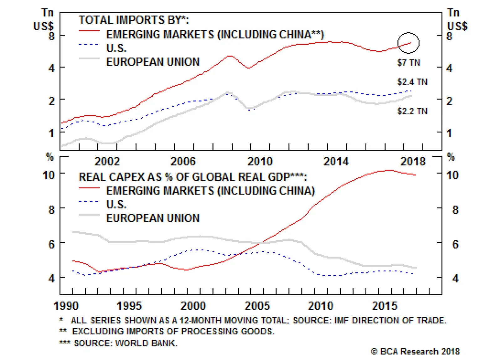
Aggregate investment expenditures in developing countries including China are as large as those of the U.S. and EU together. China itself accounts for half of EM investment expenditures. Chinese imports are much more leveraged to the country’s capital…
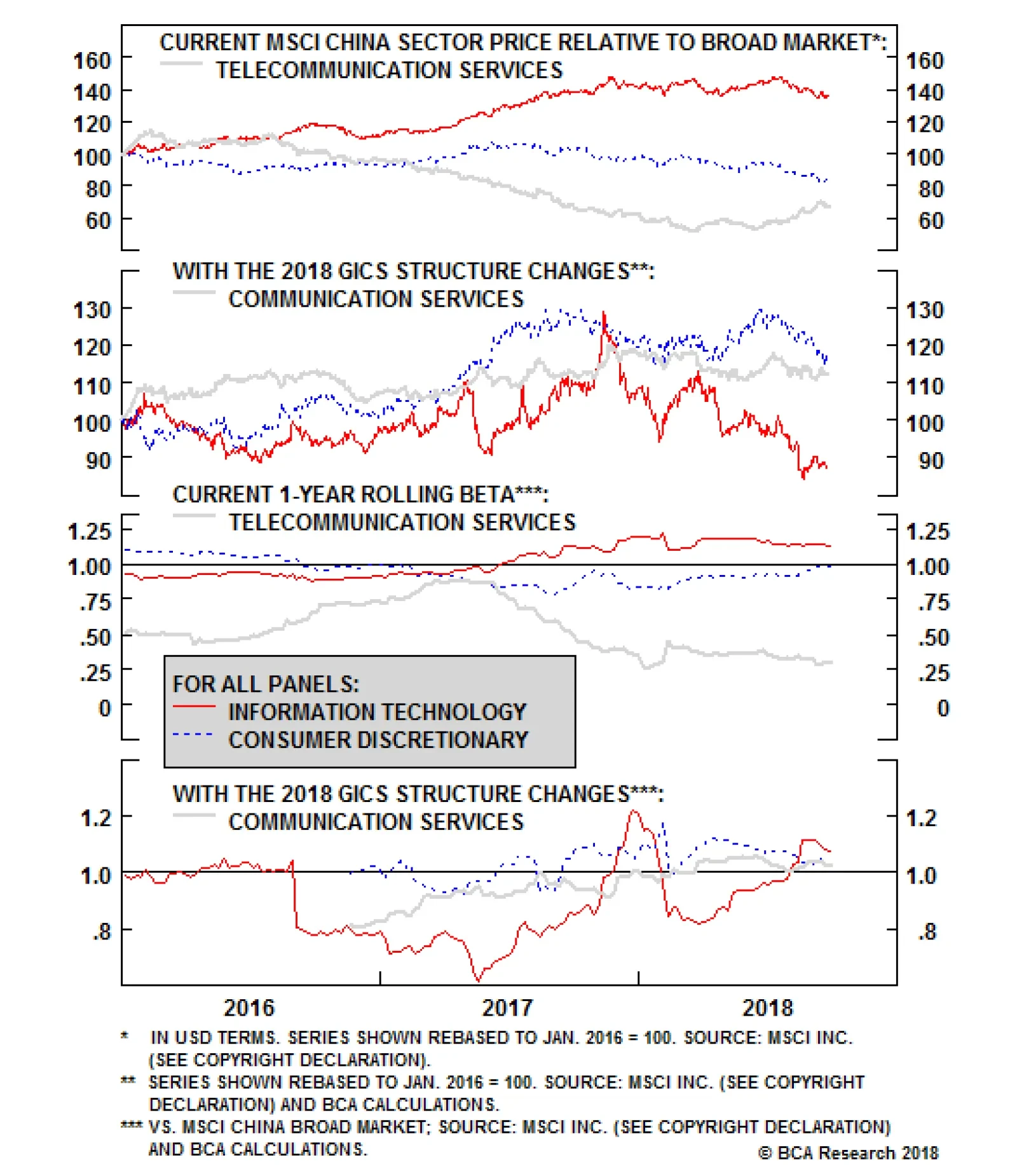
The chart above shows the performance of the following sectors if the new GICS classifications had prevailed since 2016: information technology, consumer discretionary, telecommunications serves, and communication services. Applying the new classification…
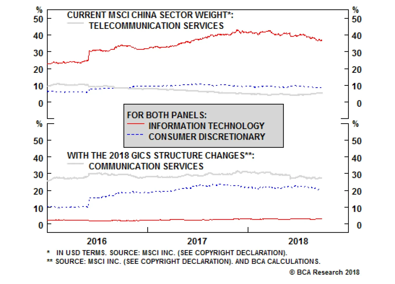
Recent changes to the GICS structure will largely impact three sectors in the MSCI China Index, which is the main investable equity benchmark for China: information technology, consumer discretionary, and telecommunication services: The telecommunication…
Highlights We have deciphered global trade linkages to determine which countries are most at risk from a slowdown in EM/China imports. Our analysis takes into account not only the destinations of shipments but also the types of goods. Peru, Chile, Korea, Malaysia and Thailand are the most vulnerable to a slowdown in industrial sectors in EM and China. The least vulnerable emerging economies to this theme are Mexico, Turkey, Colombia, India and Russia. Feature The growth desynchronization1 currently taking place between developing and advanced economies warrants a detailed analysis of trade flows by countries as well as types of goods to assess the vulnerability of various economies to the global trade slowdown. This report's objective is to reveal which countries are most vulnerable to a slowdown in domestic demand in emerging markets, including China. Our main macro theme remains a considerable slowdown in EM/China capital spending, and a moderate slowdown in their consumer spending. We used these macro assumptions to produce a vulnerability ranking for both developing and developed countries. Why Do China And EM Matter? Annual imports by emerging markets including China stand at a combined $7 trillion. This overshadows both U.S. and EU imports, which collectively stand at $4.6 trillion, and underscores the importance of EM and China in global trade (Chart I-1). Chinese imports excluding processing trade - inputs that are imported, then processed and re-exported - make up $1.6 trillion, i.e., constituting 23% of the $7 trillion total of EM plus China imports. Furthermore, the most vulnerable part of the EM/Chinese economies are capital expenditures. The latter represent a significant portion of the global economy (Chart I-2). Aggregate investment expenditures in developing countries including China are as large as those of the U.S. and EU together. China itself accounts for half of EM investment expenditures. Moreover, capital spending is the largest component of the Chinese economy, constituting 42% of GDP. By comparison, Chinese exports to the U.S. and EU together account for only 7% of GDP. Chinese shipments to the U.S. constitute a mere 3.6% of mainland GDP (Chart I-3). Chart I-1EM/China Imports Are Much Larger ##br##Than U.S.'s And EU's Combined
EM/China Imports Are Much Larger Than U.S.'s And EU's Combined
EM/China Imports Are Much Larger Than U.S.'s And EU's Combined
Chart I-2EM/China Capex Is As Large ##br##As U.S.'s And EU's Combined
EM/China Capex Is As Large As U.S.'s And EU's Combined
EM/China Capex Is As Large As U.S.'s And EU's Combined
Chart I-3Structure Of Chinese##br## Economy
Structure Of Chinese Economy
Structure Of Chinese Economy
In turn, Chinese imports are much more leveraged to the country's capital spending than to household expenditures. Table I-1 shows that imports of consumer goods excluding autos account for a mere 15% of total Chinese foreign goods intake. Table I-1Import Composition Of Chinese Imports
Deciphering Global Trade Linkages
Deciphering Global Trade Linkages
With construction and infrastructure spending being a substantial part of mainland capital expenditures, China's investment cycle is very sensitive to the money/credit cycle. This is because no construction or infrastructure investment can be undertaken without credit (loans, bonds and other types of financing). Therefore, China's credit cycle - which drives its domestic capex cycle - is a key predictor of Chinese imports and many commodity prices (Chart I-4). Despite the latest liquidity easing in China, the cumulative effect of previous liquidity tightening as well as the ongoing regulatory clampdown on the financial system are still working their way through the banking and shadow banking systems. Our assessment is that it will take some time before the cumulative effect from the recent liquidity easing takes hold and helps growth recover. China accounts for a significant portion of total EM exports (Chart I-5). Shipments to China constitute 18% of emerging Asia's and 22% of South America's total exports. As the mainland's capex cycle and imports continue to decelerate, EM ex-China exports will slump. This will not only generate a negative income shock in EM economies but will also result in currency depreciation, which will push up local interest rates and tighten banking system liquidity (Chart I-6). Overall, a major downturn in the EM ex-China capex cycle and a moderate slowdown in household consumption will ensue. Chart I-4Chinese Imports ##br##To Decelerate
Chinese Imports To Decelerate
Chinese Imports To Decelerate
Chart I-5Importance China For Emerging Asia ##br##And South America
Importance Of China For Emerging Asia And South America
Importance Of China For Emerging Asia And South America
Chart I-6EM Ex-China: Currency Depreciation##br## = Higher Local Rates
EM Ex-China: Currency Depreciation = Higher Local Rates
EM Ex-China: Currency Depreciation = Higher Local Rates
How are different countries exposed to these forces? Methodology The global marketplace for goods is a complex system. Modern trade is dominated by the exchange of intermediate goods within different supply chains.2 Furthermore, trade flows between countries are dependent on the types of goods that are traded (industrial versus consumption goods, for instance). Our objective is to compute each country's exposure to China and the rest of the EM industrial sectors that are at the epicenter of a slowdown, as we elaborated above. We have developed the following methodology, summing up the following three parameters3 for each major economy in the world: 1) Exports to China that are used for industrial purposes (Table I-2). Table I-2Vulnerability Ranking Of Exports To China
Deciphering Global Trade Linkages
Deciphering Global Trade Linkages
In order to adjust for the sensitivity a certain export has to China's industrial sector, we assigned three coefficients to them: 0, 0.5 and 1. Agricultural commodities and non-durable consumer goods are assigned a coefficient of 0, and are therefore omitted from this aggregation. The basis for this is that agricultural goods are not sensitive to the industrial sector, and we do not expect a slump in China's consumption of non-durable goods. A coefficient of 0.5 is assigned to industrial fuels and semi-durable goods. This entails a moderate slowdown in these imports by China. Our rationale is that demand for industrial fuels is somewhat sensitive to the industrial sector, but not significantly as they are also consumed by the consumer sector. Industrial metals, capital goods and durable consumer goods are assigned a coefficient of 1, meaning maximum vulnerability. The former two are directly tied to the industrial sector, (construction and infrastructure, in particular) while the latter one will suffer as discretionary big-ticket item spending will weaken in the wake of a potential decline in financial assets and real estate values. We also have made an adjustment to account for goods that are exported to China and then re-exported to developed markets for final consumption. We assume these goods are not vulnerable, as we are not negative on U.S. and EU final domestic demand. Based on our estimates, around 30% of intermediate manufacturing goods shipments to China from Japan, Korea, Malaysia, the Philippines and Thailand are actually re-exported from China to developed markets for final consumption. We therefore removed this amount from the aggregation to properly reflect the vulnerable portion of their exports. 2) Exports to EM ex-China that are used for industrial purposes (Table I-3). Table I-3Vulnerability Ranking Of Exports To EM Ex-China
Deciphering Global Trade Linkages
Deciphering Global Trade Linkages
In order to adjust for the sensitivity of certain exports to the EM ex-China industrial sector, we assigned the same coefficients as above. The reason is that agricultural goods and non-durable consumer goods (a coefficient of zero) will not be sensitive to a slowdown in EM ex-China industrial sectors. Industrial metals, capital goods and durable goods, on the other hand, will be very vulnerable (a coefficient of one). Industrial fuels and semi-durable goods will be modestly affected (a coefficient of 0.5). 3) Exports to complex economies4 (i.e. Germany, Japan, Korea, Sweden and Switzerland) that are susceptible of being re-exported to emerging markets. We estimate that 30% of intermediate exports that are shipped to these very advanced economies end up being re-exported to EM and China. So, 30% of any country's intermediate goods exports to the complex economies is considered vulnerable. Vulnerability Ranking Chart I-7 sums up the three variables introduced above - total amount of vulnerable exports - and ranks countries based on their exports that are susceptible to an EM/China industrial slowdown as a share of total imports. Chart I-7Vulnerable Exports To China And EM As A Share Of Total Exports
Deciphering Global Trade Linkages
Deciphering Global Trade Linkages
Chart I-8 lists countries based on the size of their vulnerable exports as a share of their GDP from highest to lowest. Chart I-8Vulnerable Exports To China And EM As A Share Of GDP
Deciphering Global Trade Linkages
Deciphering Global Trade Linkages
Chart I-9 presents our ultimate trade vulnerability ranking which combines both parameters - vulnerable exports as a share of total exports and GDP. Peru, Chile, Korea, Malaysia and Thailand are the most vulnerable to a slowdown in industrial sectors in EM and China. The least vulnerable emerging economies are Mexico, Turkey, Colombia, India and Russia. Chart I-9Overall Vulnerability Assessment
Deciphering Global Trade Linkages
Deciphering Global Trade Linkages
These macro themes and rankings constitute an important but not sole part of our country view formation. There are many other factors - both global and domestic - that enter the formulation of our country views. That is why this ranking is not entirely consistent with our country recommendations. The lists of our overweights and underweights across EM equities, fixed-income, credit and currencies as well as specific trades that we recommend can be found on pages 9-10. Stephan Gabillard, Senior Analyst stephang@bcaresearch.com 1 Pease see Emerging Markets Strategy Weekly Report "Desynchronization Compels Currency Adjustments", dated September 20, 2018, available at ems.bcaresearch.com 2https://unctad.org/en/pages/PublicationWebflyer.aspx?publicationid=2109 3 All values are measured in US$ and are measured as % of total exports. The data is from the United Nations and dated as of December 31, 2017. 4https://www.media.mit.edu/projects/oec-new/overview/ Equity Recommendations Fixed-Income, Credit And Currency Recommendations
Highlights The upcoming changes to the Global Industry Classification Standard will substantially alter the sector composition of the MSCI China Investable index, by hollowing out the information technology sector (to the benefit of consumer discretionary and the new communication services sector). The new communication services sector will become a market-neutral (but barbelled) sector from the perspective of cyclicality, with high- and low-beta components. The inclusion of Alibaba in the consumer discretionary sector warrants the closure of our most successful trade over the past year: long consumer staples / short discretionary. Feature S&P Dow Jones and MSCI Inc. will be implementing major structural changes to the Global Industry Classification Standard (GICS), effective after the market close on September 28, 2018. The changes are among the most significant since the GICS was launched in 1999, and there are meaningful implications for investors. In this brief special report, we summarize the key changes as they pertain to the Chinese investable equity benchmark, and provide a counterfactual simulation of historical performance had the upcoming changes been in effect over the past three years.1 For the MSCI China index, the main investable equity benchmark, the changes to the GICS structure will largely impact three sectors: information technology, consumer discretionary, and telecommunication services: The telecommunication services sector will be renamed to "communication services", and this new level 1 sector will be much broader in scope. Communication services will include companies that facilitate transformation in the way of communication, entertainment, and information seeking. In addition to the companies currently classified within telecommunication services, communication services will include media stocks formerly in the consumer discretionary sector, including advertising, broadcasting, cable & satellite, publishing, movies & entertainment sub-sectors. In addition, home entertainment software and some internet software & services companies, currently classified under the information technology sector, will also move to communication services. These include prominent stocks like Baidu, Tencent, Sina, and Sohu. The consumer discretionary sector will include online retailers, such as Alibaba, from information technology sector under its internet & direct marketing retail sub-sector. Chart 1 shows that these changes will have a very substantial impact on the sector composition of the MSCI China index. The weight of the information technology sector will drop dramatically from 37% to 3% after the GICS changes occur, because all three of the BAT stocks (Baidu, Alibaba, and Tencent) will move to other sectors. The weight of consumer discretionary is set to rise from 8% to 20%, as the inclusion of Alibaba offsets the removal of media (Alibaba alone will account for 60% of the consumer discretionary sector after the GICS changes). Relative to the current weight of telecommunication services, the new communication services sector weight will be substantially higher, at 27% (versus its 5% current weight). Chart 2 provides both factual and counterfactual perspectives on what relative performance for these three sectors would have looked like since 2016, had the upcoming changes been in effect. The chart shows that the relative performance of consumer discretionary and communication services sector would have been considerably stronger, while the tech sector would have underperformed (in sharp contrast to what has actually occurred). Chart 3 provides some perspective on the cyclicality of China's new communication services sector. The telecommunication services sector is clearly a defensive sector, and has exhibited a beta less than 0.5 over the past year. However, the chart shows that communication services (had it existed), would have basically been a market-neutral sector in terms of market beta because of the offsetting impact of both including high-beta internet software & services companies and low-beta telecommunication services. In effect, the new communication services will become a barbelled sector from the perspective of cyclicality, with high- and low-beta components. Chart 1A Hollowing Out Of The Information Technology Sector
A Hollowing Out Of The Information Technology Sector
A Hollowing Out Of The Information Technology Sector
Chart 2CD And Comm Services Would Have Outperformed Over The Past Three Years
CD And Comm Services Would Have Outperformed Over The Past Three Years
CD And Comm Services Would Have Outperformed Over The Past Three Years
Chart 3Comm Services: A Market-Neutral, Barbelled Sector
Comm Services: A Market-Neutral, Barbelled Sector
Comm Services: A Market-Neutral, Barbelled Sector
Finally, the beta of consumer discretionary sector would have been higher over the past two years in our counterfactual scenario, thanks to the inclusion of Alibaba. Consumer discretionary stocks have fared poorly in response to a trade war with the U.S., but the imminent inclusion of Alibaba in the discretionary sector will substantially alter the character of its future performance. As such, we have decided to close our long MSCI China Consumer Staples / short MSCI China Consumer Discretionary trade at a fantastic return of 47.6%. Qingyun Xu, Senior Analyst qingyunx@bcaresearch.com 1 For China, we proxy the upcoming changes to the GICS structure using a simple set of rules that aims to capture an overwhelming majority (but not all) of the upcoming changes. As such, investors should view our methodology as an approximation, rather than an exact application of the firm-by-firm changes that MSCI will make. Clients who are interested in a similar exercise for the global IMI benchmark should refer to Neeraj Dabake, Craig Feldman. (September, 2018) The New GICS Communication Services Sector. MSCI Research Paper, Retrieved from https://www.msci.com/www/research-paper/the-new-gics-communication/01107886967. Cyclical Investment Stance Equity Sector Recommendations
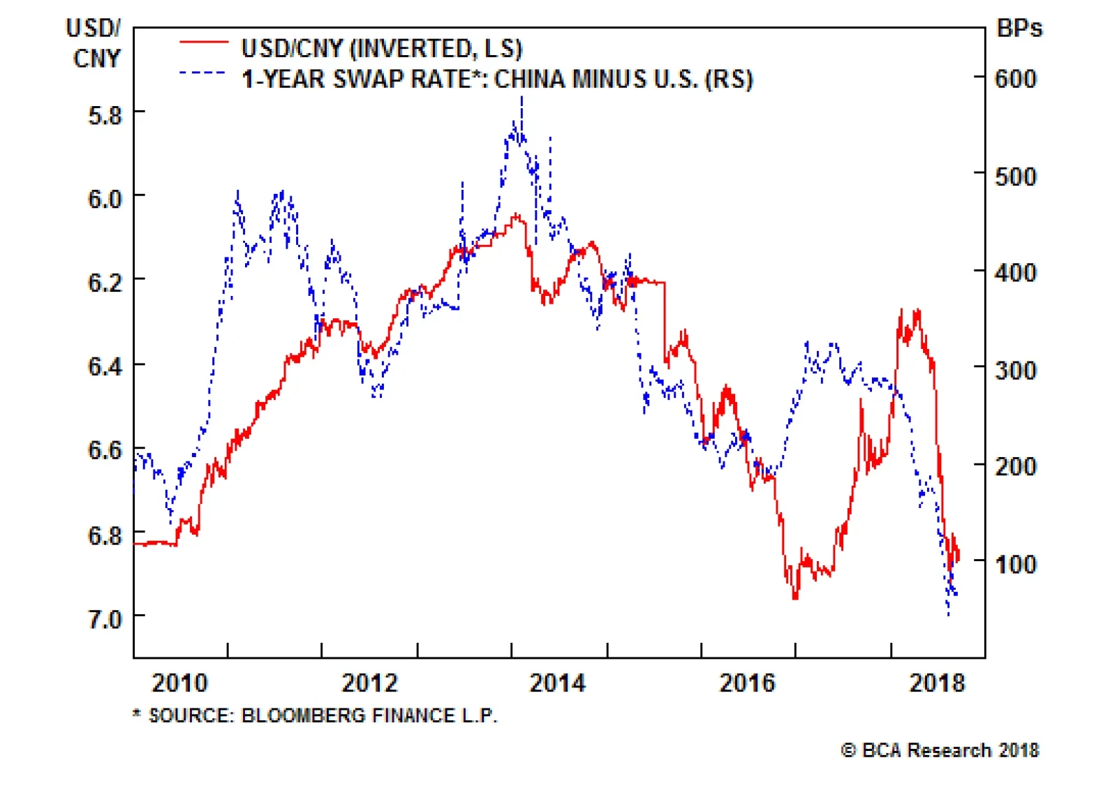
China’s economy is slowing, which has prompted the government to inject liquidity into the financial system. The spread in one-year swap rates between the U.S. and China has fallen from about 3% earlier this year to 0.6% at present, taking the yuan down with…
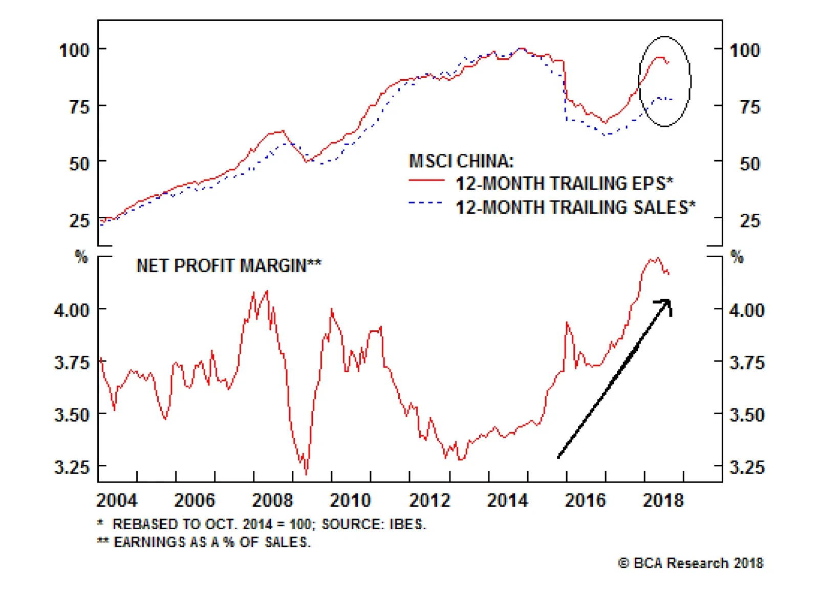
Chinese stocks have caught a bid in recent days, up for three sessions and higher by more than 3%. Signs that policymakers in Beijing are expanding their stimulus to support the economy could certainly push this beaten-down asset higher. We are tracking the…
Investor expectations for Chinese stimulus to reverse the selloff on China-related assets might be premature. As our China strategists have noted, China’s industrial sector was weak before the U.S.-China trade war became a conspicuous problem. Furthermore,…
As we noted in today’s previous Insights, trade tensions with the U.S. are unlikely to ease very much in the coming months. Since our bias is tilted toward expecting more conflict on trade between the U.S. and China over the next year, our bias is also titled…