Corporate

Highlights The first quarter is in the books, … : Risk may have been out in the fourth quarter, but it is squarely back in fashion so far this year, with equities and high yield posting gaudy first-quarter returns. … and events have compelled us to modify our high-conviction Fed call, … : There may yet be another four or more rate hikes, but they’re not going to occur this year. … but we’re still confident in our asset-allocation recommendations, … : The Fed may no longer be a menacing presence, but that doesn’t mean Treasuries and longer-maturity bonds are going to have it easy from here. … which should benefit from a more accommodative monetary policy outlook: Conditions remain favorable for equities and spread product, and unfavorable for Treasuries, even if the underlying drivers have shifted. Feature Table 1Whipsaw
Where We Stand Now
Where We Stand Now
Newton’s Third Law holds that for every action there is an equal and opposite reaction. Markets have been busy supporting the theorem, as the fourth quarter’s sharp selloff has been nearly erased by the potent first-quarter rally (Table 1). Risk assets have been on a rollercoaster ride, though our economic outlook has been more or less unchanged. We chalked up the fourth quarter’s selloff to fears that the Fed was threatening the expansion. Conversely, the first quarter’s snapback likely owed quite a bit to the Fed’s pivot. By shifting its emphasis from trying to prevent inflation from getting away on the upside to trying to keep inflation expectations from falling too far, the Fed has gone from removing the punch bowl to promising to keep it full. In financial markets, risk assets should be the biggest relative beneficiaries. The Fed’s turn thwarted our more-hikes-than-expected call, at least in the near term. That surprise has been compounded by the administration’s seeming intent to pack the board of governors with nominees chosen solely on the basis of their uber-dovishness, and has inspired us to reflect on our calls. We like to share our reflections, as well as the internal BCA discussions and the client questions that shed light on our views. This week’s report examines some of the most important issues on our minds, and the minds of our colleagues and clients. Q: What does the Fed do from here?
Chart 1
The quarterly summary of economic projections compiles FOMC meeting participants’ expectations for the likely path of key economic indicators (real GDP growth, unemployment and inflation) and monetary policy. The latest release revealed that Fed governors and regional presidents sharply dialed back their rate hike expectations between the December meeting and the March meeting (Chart 1). The median participant lopped 50 basis points (“bps”) off of his/her year-end 2019 and terminal fed funds rate projections, calling for no hikes in 2019 and just one more for the current cycle, in 2020. The rationale is a bit of a mystery, as the median participant’s estimates of GDP and inflation only came down modestly, and his/her unemployment rate estimates only rose modestly. It made sense for the Fed to turn away from the gradual pace of hikes it pursued in 2017 and 2018 in response to the sharp tightening in financial conditions brought on by the fourth-quarter selloff. The ensuing rallies in equities and high-yield bonds have undone much of that tightening, however. From a data perspective, it seems the Fed is mostly holding off to see how the outlook for the rest of the world evolves. The minutes of the March meeting, released last week, suggested that there may be more nuance to the Fed’s embrace of patience than markets initially perceived. The money markets had been calling for a 25-bps cut in the fed funds rate, to 2.25%, by the end of 2020; following the March meeting, they swiftly moved to price in a high likelihood of a second cut, to 2% (Chart 2). That outlook does not exactly accord with the committee’s more measured take: “Several participants observed that the [‘patient’] characterization … would need to be reviewed regularly[.] … A couple of participants noted that the ‘patient’ characterization should not be seen as limiting the Committee’s options[.] … Several participants noted that their views of the appropriate target range for the federal funds rate could shift in either direction[.] … Some participants indicated that if the economy evolved as they currently expected, … they would likely judge it appropriate to raise the target range … modestly later this year[.]” Chart 2... To Keeping It Full
... To Keeping It Full
... To Keeping It Full
We continue to believe that the Phillips Curve is alive and well inside the Fed’s policy framework. The inverse relationship between inflation and unemployment is embedded in its macroeconomic models, and will compel the Fed to tighten policy in response to an unemployment rate that is nosing around 50-year lows (Chart 3). With the committee seemingly willing to let inflation get a bit of a head start before it tightens policy, it may well have to hike faster, and establish a higher terminal rate, than it otherwise would have if it had continued to follow a steady course. We believe the tightening cycle has been postponed rather than truncated, contrary to the money market’s view. Chart 3Sixties Flashback
Sixties Flashback
Sixties Flashback
Bottom Line: The Fed is not going to take the fed funds rate to 3.25 - 3.5% by year end, as we expected late last year. We still believe the terminal rate is in that neighborhood, however, and the longer the Fed cools its heels, the greater the potential that it could exceed our estimate. Q: What is the outlook for the rest of the world? The March minutes revealed that conditions in the rest of the world continue to influence the Fed’s policy decisions. The slowdown in China, the uncertain outcomes of ongoing trade talks and Britain’s separation from the EU shadow the outlook in emerging economies and the major non-U.S. developed economies. The outlook for China, other emerging markets, and Europe have been a spirited subject of discussion within BCA. With a majority of the managing editors perceiving the signs of some green shoots, we upgraded Chinese equities to overweight from equal weight, and European and EM equities to equal weight from underweight, at our monthly View Meeting last week. An end to China’s deleveraging campaign may be all the rest of the world needs to show a little more life. Chart 4As China Goes
As China Goes
As China Goes
China is a critical influence on our global view. We expect that policymakers have already begun de-emphasizing their deleveraging campaign, as suggested by March’s credit data, released Friday, and will encourage lenders to lend. No one at BCA expects a stimulus campaign on the order of the massive 2008 and 2016 efforts, but the general view is that policymakers can take steps to end the deceleration in China’s growth, since it was rooted in their deleveraging drive. The deceleration weighed on trade and manufacturing activity around the world (Chart 4), and may have been the catalyst for the global mini-slowdown. The rest of the world should benefit from the easing in financial conditions driven by the global equity rally. The decline in bond yields has also helped ease financial conditions, and the nearly unanimous dovishness of major-economy central banks may provide investors and consumers with additional comfort. The key issue for the U.S. economy, and U.S.-oriented investors, is whether or not the other major economies will slow enough to cool off the U.S. at a time when its fiscal impulse is slowing. We have a sense that China and Europe are beginning to turn, and we do not expect spillovers to drag on U.S. growth, but continued rallies in U.S. risk assets probably require some sort of revival beyond its shores. Q: How do corporate profits look? Is the consensus overly optimistic? The corporate profit outlook is getting less ambitious by the day. Over the last three months, consensus expectations for first quarter S&P 500 share-weighted earnings have fallen by 6.5%, as analysts downwardly revised their year-over-year growth projections from +3.5% to -2.2%. Management teams seek to under-promise and over-deliver, and do their best to guide analyst expectations to a level their companies can exceed. Since 1994, according to Thomson Reuters, about two-thirds of companies have reported earnings that beat estimates. On average over that stretch, companies have beaten estimates by a margin of 3.2%. We are therefore inclined to take the projected earnings contraction with a grain of salt. Corporations seem to have lowered the bar to a level they should be able to clear without too much trouble. Chart 5Wages Aren't Yet Pressuring Margins ...
Wages Aren't Yet Pressuring Margins ...
Wages Aren't Yet Pressuring Margins ...
We are further inclined to question the projected 2.2% contraction in earnings, given that revenues are projected to grow by 5% in the quarter. The disparity implies margin contraction of close to 7%. Compensation is the largest component of corporate expenses, with the remainder roughly split between interest expense and other input costs. The other meaningful input is the dollar, which should most often exhibit an inverse relationship with margins. Real unit labor costs is the compensation series that most directly impacts profit margins, and it has been contracting on a year-over-year basis, augmenting margins (Chart 5). It will continue to do so as long as nominal wage growth lags inflation and productivity gains. BBB-rated corporate yields were materially higher in the first quarter than they were a year ago, and may have taken a modest bite out of margins, but they’re now back to where they were then and cannot explain the projected 7-ppt margin haircut by themselves (Chart 6). Producer prices grew just 2.2% on a year-over-year basis, slightly ahead of consumer prices (Chart 7), suggesting that margins only slightly narrowed from the disparity between input costs and selling costs. Chart 6... And Interest Rates Aren't Anymore
... And Interest Rates Aren't Anymore
... And Interest Rates Aren't Anymore
Chart 7Input Costs Are Manageable
Input Costs Are Manageable
Input Costs Are Manageable
The broad trade-weighted dollar gained 6% from 1Q18 to 1Q19. Assuming corporations lower prices to defend market share against foreign competitors, profit margins should fall when the dollar rises. Dollar appreciation likely exerted some incremental pressure on margins, but the internal model we’ve previously referenced pegs the EPS impact of a 10% rise in the dollar at 2.5%, far too small for a 6% rise in the dollar to drive a 7-ppt fall in margins. If the revenue estimates are accurate, it seems to us that management must be sandbagging its earnings guidance to some degree. The 10-year Treasury yield will have a harder time falling further now that the Fed is already awfully dovish. Q: Are you having any second thoughts about your duration recommendation? Our below-benchmark duration call was largely founded on our expectation that the Fed was going to surprise complacent markets by hiking more than they expected. It instead surprised dovishly, and the OIS curve responded by pricing in an additional rate cut by the end of next year. The 10-year Treasury yield melted, in accordance with our U.S. Bond Strategy service’s golden rule1 (Chart 8). Chart 8The Golden Rule
The Golden Rule
The Golden Rule
The surest way to mess up a Fed call is to allow what one thinks the Fed should do to intrude on one’s assessment of what the Fed will do. We did not fall into that trap: our view that the Phillips Curve exerts considerable influence over the Fed and other central banks is founded in the observation that virtually every mainstream macroeconomic model incorporates an inverse relationship between inflation and unemployment. As noted above, we see the Fed’s hiking campaign as extended rather than ended. We believe pausing the hiking campaign will extend the expansion and allow the economy to build up more momentum. More momentum would merit higher real rates, and we also expect it would promote inflation pressures given that the output gap is already closed. We were admittedly on the wrong side as the 10-year Treasury yield fell from 3.25% to 2.4%, but still lower yields would be incompatible with our constructive view of the U.S. economy. With much of the drag on Treasury yields seeming to have come from overseas, it’s also important to note that lower major-economy yields would be incompatible with our house view that the global economy is on the cusp of rebounding (Chart 9). Chart 9Yields Rise When Green Shoots Appear
Yields Rise When Green Shoots Appear
Yields Rise When Green Shoots Appear
Bottom Line: We missed the slide in the 10-year Treasury yield because we failed to foresee the Fed’s pivot, and because we may have focused too much on U.S., rather than global, conditions. We do not see yields falling much further, however, now that the Fed’s capacity for dovish surprises is spent, and green shoots are starting to appear in China and Europe. Q: How was the Final Four? Fantastic, and we recommend gathering some old college friends and making the trip to cheer on your alma mater should it qualify. Bring your kids if they’re old enough. If your school wins it all, you’ll share lifelong memories of the sort the Virginia alumni who attended the games will cherish. We’ll always have Minneapolis. Go ‘Hoos! Doug Peta, CFA Chief U.S. Investment Strategist dougp@bcaresearch.com Footnotes 1 Treasuries beat cash when the Fed hikes less than the money market expects, and lag cash when it hikes more than expected. Please see the U.S. Bond Strategy Special Report, “The Golden Rule Of Bond Investing,” published July 24, 2018. Available at usbs.bcaresearch.com.
Feature This week, instead of our regular Weekly Report, we will answer clients’ most frequently asked questions (FAQs) from our recent marketing trip to the old continent. Table 1 lists these questions and below we will attempt to weave a cohesive piece and answer all of these interesting questions. Clients inquiring about “how is everyone else positioned” or the related “what is the general investor sentiment like” is by far the most FAQ we always get from the road and we purposefully omit it from Table 1. Table 1Most FAQs From The Road
10 Most FAQs From The Road
10 Most FAQs From The Road
During our last three developed markets (DM) trips, while we cannot comment on the positioning question, with regard to general investor sentiment, Australia and New Zealand are off the charts bullish. On the opposite end of the spectrum, Europe is extremely bearish, especially continental Europe. The U.S. is somewhere in the middle. Chart 1Fed’s Pivot On Display
Fed’s Pivot On Display
Fed’s Pivot On Display
With that out of the way, the recent broadening out of the U.S. yield curve inversion to the 10/fed funds rate took center stage in our client interactions, especially the implications of the inversion for sector positioning and the duration of the business cycle. To set the record straight, a yield curve inversion does not forecast recession. Instead, it explicitly signals that the market expects the Fed’s next move to be an interest rate cut (top panel, Chart 1). In that context, the yield curve has never had a false-positive reading. Even in May 1998, it accurately forecast that the Fed would decrease the fed funds rate as it actually did in the fallout of the LTCM meltdown later that year (bottom panel, Chart 1). As equity investors, what consumes us is the SPX’s performance following the yield curve inversion. On that front, mid-December last year we showed the results of our research and made a simple observation that the yield curve inversion almost always takes place prior to the S&P peak (Table 2, Charts 2 & 3). Table 2Yield Curve Inversions And S&P 500 Peaks
10 Most FAQs From The Road
10 Most FAQs From The Road
Chart 2
Chart 3…And Then The SPX Peaks
…And Then The SPX Peaks
…And Then The SPX Peaks
In addition, today we show the S&P 500’s return and the sector returns from the time the 10/2 yield curve slope inverts until the S&P peaks, and we summarize the results in Table 3. Table 3Sector Returns From Y/C Inversion To SPX Peak
10 Most FAQs From The Road
10 Most FAQs From The Road
While every cycle is different, clearly it pays to have energy exposure more often than not. In contrast, high-yielding defensive sectors like utilities and telecom services fare poorly in these late-cycle iterations. Meanwhile, Table 4 highlights sector performance from the SPX peak until the U.S. recession hits. We first showed these results on May 22, 2018, and we are on track to publish a Special Report on May 5 on how to position portfolios at the onset of a Fed easing cycle, so stay tuned. Table 4Defensive Stocks Beat Late
10 Most FAQs From The Road
10 Most FAQs From The Road
Investors remain infatuated with the recession signal that the yield curve inversion emits. Moreover, recent news of an onslaught of Unicorn IPOs that would bring stock supply to the equity market, near the $100bn mark on an annualized basis according to some estimates, have also brought forward recession fears, as smart money is cashing in on their investments. Chart 4 shows that $100bn per annum in IPOs has coincided with the SPX peak in the previous two cycles. Our long-held view remains that either a mega M&A deal in the tech or biotech space or Uber’s IPO at a stratospheric valuation could serve as the anecdote that confirms the current cycle’s peak. On the yield curve front specifically, the top panel of Chart 5 shows that the most important yield curve, the 10/2, has not yet inverted. Moreover, the 30/10 and the 30/5 slopes are steepening. True, we are late cycle, but we need all the slopes to invert to get a confirmation that the recession is a foregone conclusion. Chart 4Mind The Excess Supply
Mind The Excess Supply
Mind The Excess Supply
Chart 510/2 Y/C Has Yet To Invert
10/2 Y/C Has Yet To Invert
10/2 Y/C Has Yet To Invert
The Fed’s tightening cycle has not only inverted most parts of the yield curve starting early last December, but has inflicted some damage on profit margins. Following up from our recent profit margin work highlighting nil corporate pricing power at a time when wage costs are perking up, BCA’s Monetary Indicator signals more SPX margin pain in the coming months (Chart 6). In fact, sell-side estimates call for another three consecutive quarters of a year-over-year contraction in profit margins. Chart 6Margin Trouble
Margin Trouble
Margin Trouble
In more detail, the earnings deceleration that commenced in Q4 2018 and is gaining steam is disconcerting. As a reminder, Q4 included the lower corporate tax rate and the Q/Q deceleration is not solely due to the tech sector profit warnings. Eight out of the 11 GICS1 sectors sharply decelerated, two modestly accelerated and only industrials steeply accelerated to a cyclical EPS peak growth rate (Table 5). This EPS breadth deterioration is eerily reminiscent of early-2015 (Chart 7) and is disquieting. Short-term caution is also warranted given the increase in investor complacency. The one sided positioning in the VIX futures market is worrisome. As a reminder, net speculative positions are now at a lower low than the February 2018 level when the VIX snapped to over 50 and caused a massive tremor in the equity market (net speculative positions shown inverted, Chart 8). Table 5Historical/Current/Future Earnings Growth Rates
10 Most FAQs From The Road
10 Most FAQs From The Road
Chart 7Bad Breadth
Bad Breadth
Bad Breadth
Chart 8Too Complacent
Too Complacent
Too Complacent
But, before getting overly bearish there are some growth green shoots that suggest that Q2-to-Q3 will likely mark the trough in EPS/EBITDA growth and margins (Chart 9). Beyond these positive leading profit indicators, a resolution to the U.S./China trade tussle and China’s trifecta of policy easing measures will also aid in turning profit growth around and really power up U.S. cyclicals’ EPS growth rates. Following up from the January Fed meeting, on February 4 we penned a report titled “Don’t Fight The PBoC” and it is now clear with the recent manufacturing PMI release that China’s easing on all three fronts – credit (Chart 10), monetary (Chart 11) and fiscal (Chart 12) – is starting to pay some dividends. In that light, the U.S. cyclicals vs. U.S. defensives recent outperformance has more room to run. Chart 9Growth Green Shoots
Growth Green Shoots
Growth Green Shoots
Chart 10Chineasing…
Chineasing…
Chineasing…
Chart 11...On All…
...On All…
...On All…
Chart 12…Fronts
…Fronts
…Fronts
Deep cyclicals have another major advantage this cycle compared with defensives. While at this stage of the business cycle one would expect capital intensive businesses to become debt saddled, cyclicals are still de-levering from the depths of the late-2015/early-2016 manufacturing recession, i.e. paying down debt and increasing cash flow. Defensives, however, are doing the exact opposite with relative cash flow growth problems and piling on debt. Thus, on a relative basis Chart 13 shows that the indebtedness profile clearly favors deep cyclicals vs. defensives. From a bigger picture perspective, while the U.S. has not really purged any debt and it has just shifted it around from the financial and household sectors to the non-financial business and government sectors (Chart 14), the near all-time high in non-financial business sector credit as a share of GDP is disconcerting (top panel, Chart 14). Clearly the excesses are in this segment of U.S. debt and it is unsurprising that debt saddled stocks have been underperforming equities with pristine balance sheets since the 2016 presidential elections (top panel, Chart 15). Such outperformance has staying power, especially given that we are late in the cycle and the Fed has raised interest rates to the point where parts of the yield curve are inverted and a default cycle looms large (bottom panel, Chart 15). Chart 13Cyclicals Have The Upper Hand
Cyclicals Have The Upper Hand
Cyclicals Have The Upper Hand
Chart 14U.S. Debt Profile Breakdown
U.S. Debt Profile Breakdown
U.S. Debt Profile Breakdown
One sub-sector that epitomizes the current cycle’s excesses is commercial real estate (CRE). CRE prices have overshot the historical time trend by almost two standard deviations and it has already been three and a half years since they surpassed the previous all-time high (Chart 16). The recent pullback in the 10-year Treasury yield has pushed cap rates even lower and the bubble in CRE is further inflated. Looking back at the late-1980s pricking of that CRE bubble is instructive and when this cycle ends a big deflationary impulse will likely deal a blow to the CRE market. Chart 15Hide In Pristine Balance Sheets
Hide In Pristine Balance Sheets
Hide In Pristine Balance Sheets
Chart 16CRE Excesses Are A Yellow Flag
CRE Excesses Are A Yellow Flag
CRE Excesses Are A Yellow Flag
Speaking of bubbles, the biggest bubble we currently see is not in equities, but in bonds. Table 6 shows that red is taking over and is reminiscent of mid-year 2016 when the 10-year U.S. Treasury yield troughed a hair above 1.3%. Globally, negative yielding debt is near all-time highs (Chart 17) and the excesses are even larger in the EM sovereign space and in select DM corporates. Mexico raising century debt in U.S. dollars, in cable and in euros is perplexing, as Mexico was at the epicenter of the 1982 LatAm crisis and again in 1994 with the Tequila crisis. Argentina also raising century debt recently in hard currency speaks to the magnitude of the current bond bubble. On the corporate side, Sanofi and LVMH placing negative yielding debt is beyond our understanding, or Total issuing a perpetual bond with a 1.75% coupon. Table 6Red Takes Over
10 Most FAQs From The Road
10 Most FAQs From The Road
Chart 17Bonds Are In A Bubble
Bonds Are In A Bubble
Bonds Are In A Bubble
All of this is likely linked to the unintended consequences of global QE where fixed income investors are pushed out the risk spectrum and are forced into buying riskier credit. When this bond bubble gets pricked it will end in tears as it always does and the catalyst will likely be the next U.S. recession that will cause a global recession. While our cyclical 9-to-12 month equity market view is constructive and we believe the U.S. will avoid recession, our structural 1-to-3 year view is negative. Nevertheless, we constantly challenge our thesis and the biggest pushback to the negative structural view is the following: What if the Fed can engineer a soft landing in the U.S. as it did twice in the mid-1990s, and the business cycle runs hot for another 5 years (Chart 18)? What if the starting point of low interest rates with the real fed funds rates still close to zero is very stimulative for the U.S. economy as no recession has ever started with a fed funds rate perched near zero (Chart 19)? Finally, what if the late-2015/early-2016 manufacturing recession was actually an economic recession despite the fact that the NBER did not designate it as such and the business cycle got reignited, especially with President Trump’s election that lifted animal spirits? As a reminder, while S&P profits have contracted outside of an economic recession twice before, SPX sales had never achieved that feat, until late-2015/early-2016 (Chart 20). In other words, the revenue recession we had was unprecedented and felt like an economic recession. Chart 18The Fed Has Engineered A Soft Landing
The Fed Has Engineered A Soft Landing
The Fed Has Engineered A Soft Landing
Chart 19Stimulative Real Rates
Stimulative Real Rates
Stimulative Real Rates
Chart 20There Is Always A First Time
There Is Always A First Time
There Is Always A First Time
If that were the case and the cycle were to extend into the 2020s, then the risk is that SPX EPS vault to $200 and valuations overshoot, i.e. the forward P/E multiple spikes to a 20 handle and the SPX catapults to 4,000. In that case, we would leave 1,000 points on the table and our SPX 3,000 view would be way offside. While this is a risk to our negative structural view, there are two sectors we really like for the long-term as we deem them secular growth plays and should do exceptionally well on a 10-year horizon: software and defense stocks. Three key drivers underpin our bullish view on software: galloping higher private and public sector software outlays, a structurally enticing software demand backdrop and ongoing industry M&A (Chart 21). Most importantly, the move to cloud computing and SaaS, the proliferation of AI, machine learning and augmented reality are not fads but enjoy a secular growth profile, and signal that capital outlays on software are in a structural uptrend. With regard to defense stocks, the three key pillars we highlighted in our “Brothers In Arms” Special Report on October 31, 2016 remain intact: the global rearmament is still gaining steam, a space race with manned missions to the moon now includes the U.S., China and India, and cybersecurity is a real threat for governments around the world (Chart 22). On all three fronts, defense stocks stand to benefit as they have beefed up their offerings to provide governments with a one-stop shop solution covering most of these needs. Chart 21Buy The Software Breakout
Buy The Software Breakout
Buy The Software Breakout
Chart 22Defense Stocks Remain A Long-term Buy
Defense Stocks Remain A Long-term Buy
Defense Stocks Remain A Long-term Buy
Anastasios Avgeriou, U.S. Equity Strategist anastasios@bcaresearch.com
Highlights We remain constructive on the U.S. economy, …: It was another uneven week, but conditions remain broadly favorable for the U.S., and the expansion is intact. … and things seem to be perking up in the rest of the world, in line with BCA’s house view, …: China’s PMI data gave global markets a boost and European PMIs hinted at the potential for green shoots on the continent. … but money managers get paid to worry for their clients, and we get paid to worry for the managers, …: We would be remiss if we didn’t explore alternative scenarios, especially around an unobservable variable like the equilibrium fed funds rate. … so we’re always looking for the ways that we could be getting it wrong: This week’s report explores how the landscape would look from the perspective of consumption, investment, and government spending if a recession were at hand. Feature Chart 1Selloff, What Selloff?
Selloff, What Selloff?
Selloff, What Selloff?
Last week’s data were mixed, but there is no doubt, as we’ve acknowledged throughout 2019, that the U.S. economy is decelerating. The deceleration has fanned recession fears, and the yield curve’s fleeting inversion two weeks ago added fuel to the fire.1 The sell-off in financial markets in the fourth quarter seemed largely to have been animated by concerns that the Fed was pushing the fed funds rate into restrictive territory. The sharp decline in equities, and the sharp rise in corporate bond yields, amounted to a material tightening in financial conditions that threatened to become a self-fulfilling prophecy. What a difference a quarter makes. The potent first-quarter rally has reversed much of the fourth quarter’s tightening of financial conditions (Chart 1), while the FOMC’s March meeting indicated that the Fed has pivoted from defending against inflation overshoots to trying to correct its extended post-crisis undershoot. The threat that the Fed would follow the typical path of tightening into a recession has now receded, at least for the rest of 2019. As long as inflation doesn’t suddenly flare up, the expansion should remain intact, provided that the Fed hasn’t already lifted short rates into restrictive territory. We have contended that it hasn’t, as the fed funds rate is comfortably below our current estimate of the equilibrium rate, and is even further below our year-end equilibrium projection. We are well aware that the equilibrium rate cannot be directly observed, and that our estimate may be off the mark. We therefore devote this week’s report to considering what the building blocks of GDP might look like if a recession were about to begin. We particularly focus on consumption, which accounts for the lion’s share of U.S. activity, and indirectly affects both investment and government spending.2 Is Consumption On A Recession Path? Retail sales contracted month-over-month in February, though upward revisions to the January data made the release something of a wash. Year to date, though, retail sales growth has not been strong enough to erase the disappointment from December’s lousy print. From a longer-term perspective, real retail sales don’t suggest anything definitive about the business cycle: although they’re in a mini downtrend, previous pre-recession slides have been steeper and/or longer (Chart 2, top panel). Growth in real personal consumption expenditures (PCE), the consumption input to GDP, has been trendless for the last three years, but is not in the extended slide that preceded other recessions, nor has it yet become stretched in this cycle (Chart 2, bottom panel). Chart 2Neither Here Nor There
Neither Here Nor There
Neither Here Nor There
Chart 3Steady As She Goes
Steady As She Goes
Steady As She Goes
We find that consumption fundamentals are sending a clearer message than the retail sales or PCE series themselves. We segment the fundamentals into three components: ongoing demand for workers, the prospects for wage increases, and households’ capacity to borrow to support spending. The labor market is currently quite strong and net payroll growth has been remarkably steady for the last four years (Chart 3). Our payrolls model, which incorporates initial unemployment claims, temporary workers and NFIB small business hiring plans, projects no more than modest slowing (Chart 4). Chart 4No More Than Mild Deceleration Ahead
No More Than Mild Deceleration Ahead
No More Than Mild Deceleration Ahead
Prices rise when demand outpaces supply, and the excess of job openings over unemployed workers (Chart 5) bodes well for wage growth. The elevated rate of employees quitting their jobs is also a positive sign (Chart 6). A worker doesn’t quit one job unless s/he has a higher-paying one lined up. We therefore read the elevated quits rate as an indication that the competition to attract employees is fierce, and that workers have regained some measure of bargaining power. Chart 5More Jobs Than Candidates ...
More Jobs Than Candidates ...
More Jobs Than Candidates ...
Chart 6... Makes For A Johnny Paycheck Labor Market ...
... Makes For A Johnny Paycheck Labor Market ...
... Makes For A Johnny Paycheck Labor Market ...
The combination of rising household income and a light debt-servicing burden augurs well for consumption. A negative unemployment gap (an unemployment rate below the estimated natural rate of unemployment) also tends to be good for compensation growth. Over the last 30 years, annualized average hourly earnings (AHE) have grown one-and-a-half times faster when the unemployment gap is negative than when it is positive, and the earnings growth rates have been remarkably consistent (Chart 7). Household income will have a solid tailwind behind it if AHE gains can catch up to the nearly 4% level consistent with negative gaps in the late ‘80s, late ‘90s and mid-aughts. Chart 7... Where Employers Have To Keep Employees Happy
... Where Employers Have To Keep Employees Happy
... Where Employers Have To Keep Employees Happy
Employment and wage gains suggest that rising household incomes will support spending, but the support would be undermined if households chose to use the income gains to pay down debt. Households have been shoring up their balance sheets ever since the crisis, more than tripling the savings rate from its summer 2005 low (Chart 8, top panel), and have now unwound nearly all of the debt (as a share of GDP) they took on in the ’01-’07 expansion (Chart 8, second panel). They may not yet be done, but the pace at which they’ve been deleveraging has slowed considerably over the last few years. With today’s still-low interest rates, servicing households’ debt burden is easier than it has been at any time in the last 40 years (Chart 8, bottom panel). Households are positioned to take on more debt if they so choose. Chart 8Low Rates Make For A Light Burden
Low Rates Make For A Light Burden
Low Rates Make For A Light Burden
Bottom Line: Prospects for continued payroll expansion and wage gains are good, and households have the capacity to borrow to augment spending. We therefore expect that consumption is not on a recessionary path. The fundamentals underlying the U.S. economy’s largest pillar are solid. Could Investment Tip The Economy Into A Recession? Consumption is clearly the 800-pound gorilla of the U.S. economy. It accounted for close to 70% of GDP in the fourth quarter, and when it sneezes, the overall economy catches a cold. It has been a relatively stable series over time, however, and its infrequent contractions tend to be pretty modest. The story is quite different for private domestic investment, which routinely makes wild swings, and tends to seize up during recessions (Chart 9). Even though investment and government spending each account for just a quarter of consumption’s weight, it’s statistically easiest for investment to negate 2% growth in the rest of the economy (Table 1). Chart 9Consumption May Be Larger, But Investment Punches Harder
Consumption May Be Larger, But Investment Punches Harder
Consumption May Be Larger, But Investment Punches Harder
Table 1The Road To Recession
If We Were Wrong
If We Were Wrong
We have previously demonstrated that consumption leads capex. It turns out that fixed investment is the opposite of the if-you-build-it-they-will-come “Field of Dreams” mantra; corporations will only build if the customers have already come (Chart 10). Consumption is gently slowing right now, which suggests that corporate investment is not about to boom. To induce a recession, though, fixed private investment would have to crater, and nothing in consumption’s current trend, the employment outlook, the compensation outlook, or households’ borrowing capacity suggests that consumption is at risk of plunging. Chart 10Consumption Drives Capex
Consumption Drives Capex
Consumption Drives Capex
Surveys asking corporations about their investment plans have been decent coincident indicators of corporate fixed investment. The dip in capital spending plans from the NFIB survey suggests that demand for non-defense capital goods is headed lower (Chart 11, top panel), as does the decline in capex plans in the regional Fed surveys (Chart 11, bottom panel). Neither implies the sharp decline that would be required to offset trend growth in the rest of the economy, however. The corporate tax cut does not appear to have inflated 2018 capex, so 2019 investment should not be at risk of suddenly unwinding. Chart 11Capex May Soften, But It's Not About To Melt
Capex May Soften, But It's Not About To Melt
Capex May Soften, But It's Not About To Melt
Residential investment accounts for around a fifth of private domestic investment. We have written about housing at length over the last several months and will not rehash the discussion here, other than to note that permits and starts remain in a broad uptrend (Chart 12, top panel), as do new and existing home sales (Chart 12, middle panel). Affordability has revived with the decline in mortgage rates, and is once again above its pre-crisis peaks. The inventory of homes for sale is also at multi-year lows (Chart 12, bottom panel). With the Fed sidelined for an extended period, housing demand appears as if it will hold up, and there’s nothing to worry about from a supply perspective. Chart 12The Housing Market Is Fine
The Housing Market Is Fine
The Housing Market Is Fine
Bottom Line: The investment component of GDP does not appear as if it is about to contract in a significant way. It is unlikely to be the source of a cyclical inflection. Government Spending By virtue of its modest size and muted volatility relative to consumption and investment, government spending is the least likely component of GDP to extinguish the expansion. The prospects for a negative-two-standard-deviation event that could trigger a recession look especially slim. With employment and household incomes rising, and home values still appreciating, state and local tax receipts should be well supported. Pro-cyclical federal fiscal policy is an anomaly (Chart 13), but we see no signs that the current administration will reverse course with a presidential election on the horizon. Although defense has accounted for a shrinking share of federal spending ever since the end of the Cold War, it still accounts for 60% of federal spending (Chart 14, bottom panel), and a quarter of aggregate government spending. Consistent with CBO projections, we expect defense spending will continue to expand through 2020, as it remains a Republican priority. Federal entitlements were a sacred cow in the 2016 Trump campaign and will remain so in the 2020 campaign, given their importance to the administration’s aging rural base. Chart 13Fiscal Policy Has Turned Pro-Cyclical
Fiscal Policy Has Turned Pro-Cyclical
Fiscal Policy Has Turned Pro-Cyclical
State and local spending account for the majority of aggregate government spending (Chart 14, top panel). Healthcare and education are the biggest line items in state budgets, and healthcare reforms have the potential to alter budget composition, but aggregate spending moves in lockstep with aggregate revenues, as many states are constitutionally mandated to maintain balanced budgets. The main sources of state revenues are income taxes and sales taxes. Municipalities rely heavily on property taxes. Chart 14State Spending Matters ...
State Spending Matters ...
State Spending Matters ...
State income tax receipts are clearly a function of employment, though the link has come and gone this cycle as the expansion has matured (Chart 15, top panel). Sales tax receipts move with employment as well, because consumption is tied to income (Chart 15, second panel). Property taxes are a function of appraised property values, for which home prices are a solid proxy (Chart 15, third panel). If demand for labor remains robust, wages face upward pressure, and home prices don’t contract, state and local government spending is unlikely to dry up anytime soon. Chart 15... And It's Tied To Income, Consumption, And Property Prices
... And It's Tied To Income, Consumption, And Property Prices
... And It's Tied To Income, Consumption, And Property Prices
As long as the expansion remains intact (and valuations don’t get silly), risk-friendly positioning remains appropriate. Bottom Line: Nothing points to a sudden decline in government expenditures on the order of the negative-two-standard-deviation move which would be required to induce a recession. Weakness in employment and wage growth would hurt state tax revenues, reinforcing a slowdown in consumption, but that is not our base-case scenario for 2019. Investment Implications Investors should stay the course and remain overweight equities, given that a recession is not imminent. Although we think the Fed’s largesse will ultimately be reversed in potentially heavy-handed fashion, its implicit pledge to remain on the sidelines into the second half of this year extends the runway for risk asset outperformance. We are not in love with the S&P 500 at current levels, and will be surprised if it continues to appreciate at its current pace, but the policy climate – monetary and fiscal – is conducive to outperforming cash and high-quality fixed income. We would hold some capital in reserve to deploy in the event of a pullback, but continue to advocate a risk-friendly portfolio tilt. Doug Peta, CFA Chief U.S. Investment Strategist dougp@bcaresearch.com Jennifer Lacombe Senior Analyst, Global ETF Strategy jenniferl@bcaresearch.com Footnotes 1 With the yield curve clawing its way back to positive territory by March 29’s close, it actually has yet to invert on a monthly basis. We have heard its downbeat growth message loud and clear, however, and are on alert for further potential weakness. 2 We leave net exports out of our analysis, as they’re not consequential to the comparatively closed U.S. economy.
Highlights Odds are that the recent improvement in Chinese manufacturing PMIs could be due to inventory re-stocking rather than a decisive turnaround in final demand. “Hard” data have not shown meaningful improvements in China’s final demand. Weighing the pros and cons, we are instituting a stop-buy on our EM strategy: We will turn tactically positive on EM risk assets if the MSCI EM equity index breaks above 1125, which is 4% above its current level. Keep Malaysia on an upgrade watch list. Downgrade Brazil to underweight. Feature The strong Chinese PMI prints released this week have challenged our negative view on EM assets and China plays. This week we take a deeper look at the underlying reasons behind the recent improvement in China’s PMI data. In addition, we elaborate on what it would take for us to alter our current strategy on EM risk assets. A Manufacturing Upturn The upturn in China’s manufacturing PMIs in March has been validated by improvement in Taiwanese PMI’s export orders (Chart I-1, top panel). The latter’s amelioration has been broad-based across all sectors: electronics and optical, electrical machinery and equipment, basic materials, and chemical/biological/medical (Chart I-1, bottom panel). China accounts for 30% of Taiwanese exports, making Taiwan’s manufacturing sector heavily exposed to China’s business cycle. Does this improvement in manufacturing PMIs reflect a final demand revival in China? Looking For Final Demand Revival China’s domestic and overseas orders remain weak, as exhibited in Chart I-2. These indicators give us the primary trajectory of the Chinese business cycle, while the PMI indexes exhibit considerable short-term volatility. Chart I-1One-Month Surge In China's And Taiwan's PMIs
One-Month Surge In China's And Taiwan's PMIs
One-Month Surge In China's And Taiwan's PMIs
Chart I-2Noise And Business Cycle Trajectory
Noise And Business Cycle Trajectory
Noise And Business Cycle Trajectory
The domestic demand and overseas orders reflect quarterly data from 5,000 enterprises. The latest datapoints are from Q1 2019 and were released on March 22. To be sure, we are not suggesting an absence of bright spots, but at the moment “hard” data do not corroborate broad-based improvement in final demand. Consumer spending: There has been no improvement in households’ propensity to spend. Our proxy for households’ marginal propensity to spend has not turned up (Chart I-3). Consistently, China’s smartphone sales and passenger car sales are contracting at double-digit rates, while the growth rate in online sales of services has not improved (Chart I-4, top three panels). Chart I-3Chinese Consumers' Propensity To Spend
Chinese Consumers' Propensity To Spend
Chinese Consumers' Propensity To Spend
Chart I-4China: No Improvement In "Hard" Data
China: No Improvement In "Hard" Data
China: No Improvement In "Hard" Data
The bottom panel of Chart I-4 demonstrates the retail sales of consumer goods during the Chinese New Year compared with the previous year’s spring festival. It is evident that as of mid-February, when this year’s spring festival took place, there was no improvement in Chinese consumer demand. Business spending / investment: Our proxy for enterprises’ propensity to spend continues to decline (Chart I-5). Companies’ propensity to spend has historically led the cyclical trajectory in industrial metals prices. Crucially, this has not corroborated the rebound in base metals prices over the past three months. Besides, China’s imports of capital goods, its total imports from Korea and its machinery and machine tool imports from Japan are all still contracting at a double-digit rate (Chart I-6). Chart I-5China: Enterprises' Propensity To Spend And Metals
China: Enterprises' Propensity To Spend And Metals
China: Enterprises' Propensity To Spend And Metals
Chart I-6Contracting At A Double Digit Rate
Contracting At A Double Digit Rate
Contracting At A Double Digit Rate
China’s fixed asset investment in infrastructure has picked up of late and will continue to improve. However, this may not be sufficient to revive the mainland’s economy. China’s growth decelerated in 2014-2015 and industrial commodities prices dwindled, despite robust growth in infrastructure investment at the time (Chart I-7). The culprit was the decline in property construction in 2014-2015. As to the property market, the People’s Bank of China’s (PBoC) Pledged Supplementary Lending (PSL) financing points to further weakness in property demand in the coming months (Chart I-8). Chart I-7China's Infrastructure Investment And Base Metals Prices
China's Infrastructure Investment And Base Metals Prices
China's Infrastructure Investment And Base Metals Prices
Chart I-8China: The Outlook For Residential Property Demand
China: The Outlook For Residential Property Demand
China: The Outlook For Residential Property Demand
Moreover, property starts have been surging, yet their completions have been tumbling. This suggests a ballooning amount of work-in-progress on real estate developers’ balance sheets. To be sure, we are not suggesting an absence of bright spots, but at the moment “hard” data do not corroborate broad-based improvement in final demand. It may well be that property developers do not have financing to complete work or that they are reluctant to bring new units to the market amid tame demand. Whatever the case, the mediocre pace of construction activity is negative for suppliers to the construction industry. Government spending: Aggregate government spending in China – including central and local government as well as government-managed funds (GMF) – has been very robust in the past year (Chart I-9). Hence, government spending has not been the reason behind the economic slowdown. Chart I-9China's Aggregate Fiscal Spending
China's Aggregate Fiscal Spending
China's Aggregate Fiscal Spending
For 2019, overall government spending is projected to expand by 11% in nominal terms from a year ago, down from 17% in 2018. The key fiscal risk is shrinking land sales, which account for 86% of GMF revenues. The latter have substantially increased in size and now makeup 27% of aggregate fiscal spending. Local and central government expenditures account for 62% and 11% of aggregate fiscal spending, respectively. If land revenues undershoot, GMF and local governments will not be able to meet their expenditure targets without Beijing altering the former’s borrowing quotas. In brief, fiscal policy may be involuntarily tightened due to a shortfall in land sales revenues before the central government permits local governments to borrow more. Exports: Chinese shipments to the U.S. will recover as China and the U.S. finalize their trade deal. The media is extremely focused on the trade negotiations, and markets have been trading off the headlines. Nevertheless, it is essential to realize that China’s exports to the U.S. make up only 3.6% of the country’s total GDP (Chart I-10). This contrasts with capital spending that accounts for 42% of the mainland’s GDP. Consequently, we believe the credit cycle that drives construction and capital spending is more important to China’s growth than its shipments to the U.S. Global ex-China Demand: The areas of global final demand that weighed on global growth last year remain depressed. Global semiconductors and auto sales have been shrinking at a rapid pace and have so far not experienced a reversal (Chart I-11). Chart I-10China Is Not Reliant On Exports To The U.S.
China Is Not Reliant On Exports To The U.S.
China Is Not Reliant On Exports To The U.S.
Chart I-11Global "Hard" Data Are Still Bad
Global "Hard" Data Are Still Bad
Global "Hard" Data Are Still Bad
Bottom Line: There is a lack of pertinent “hard” business cycle data in China that have improved. What Does It All Mean Having reviewed final demand conditions in China, it is reasonable to argue that the improvement in the Chinese and Taiwanese manufacturing PMIs could be due to inventory re-stocking. Unfortunately, in China, there is limited reliable data that quantifies inventory levels well in various industries. Having reviewed final demand conditions in China, it is reasonable to argue that the improvement in the Chinese and Taiwanese manufacturing PMIs could be due to inventory re-stocking. The consensus view in the investment community is that China’s credit stimulus has boosted the economy since the beginning of this year. Business conditions have certainly improved. The rally in Chinese stocks has in turn mirrored this improvement. Yet it is not clear that this revival in the business cycle is due to the credit stimulus. Chart I-12 plots the credit impulse, including local government general and special bonds issuance, with the three typical business cycle variables: manufacturing PMI and nominal manufacturing production growth. Chart I-12China: Credit Impulse Leads "Hard" Data
China: Credit Impulse Leads "Hard" Data
China: Credit Impulse Leads "Hard" Data
As can be seen from the chart, the manufacturing PMI is very volatile. In the short term, there is little correlation between it and the credit impulse (Chart I-12, top panel). Meanwhile, the credit impulse leads nominal manufacturing output growth by nine months (Chart I-12, bottom panel). Based on the past time lag relationships, the mainland’s business cycle should not have bottomed until the third quarter of this year. Hence, the bottom in the manufacturing PMIs in January does not fit the historical pattern of the relationship between the credit impulse and the mainland’s business cycle. Bottom Line: Presently, it is hard to make a definite conclusion on the reasons behind the pick-up in Chinese manufacturing. That said, business cycles do not always evolve in a common-sense manner that can be both rationalized and forecast by indicators. Therefore, it is essential for investors, to have confirmation signals from financial markets on the direction of the business cycle. Financial Markets As A Litmus Test We continuously monitor numerous financial markets that are sensitive to both the global and Chinese business cycles. These financial market-based indicators are often coincident with EM asset prices. Hence, they can be used to confirm or refute EM market direction. Our Risk-On-to-Safe-Haven (ROSH) currency ratio has recently softened, flashing a warning signal for EM share prices (Chart I-13). Chart I-13Currency Markets Are Flashing Amber For EM Stocks
bca.ems_wr_2019_04_04_s1_c13
bca.ems_wr_2019_04_04_s1_c13
The ROSH ratio is the relative total return (including carry) of six commodities currencies (AUD, NZD, CAD, CLP, BRL and ZAR) versus two safe-haven currencies: the yen and Swiss franc. Hence, this currency ratio is agnostic to U.S. dollar trends, making its signals especially valuable. Our Reflation Confirming Indicator has retreated, also signaling a pullback in the EM equity index (Chart I-14). This indicator is composed of an equal-weighted average of industrial metals prices (a play on Chinese growth), platinum prices (a play on global reflation) and U.S. lumber prices (a proxy play on U.S. growth). Chart I-14Commodities Markets Are Flashing Amber For EM Stocks
Commodities Markets Are Flashing Amber For EM Stocks
Commodities Markets Are Flashing Amber For EM Stocks
Within EM credit markets, corporate investment-grade spreads have begun narrowing versus high-yield spreads (Chart I-15). This typically coincides with lower EM share prices. Finally, EM share prices have been underperforming DM since late December. Relative performance of EM ex-China stocks against the global equity index has been even more underwhelming. In short, these markets are at a critical juncture. A decisive breakout will entail a lasting rally, while a failure to break out will signal imminent downside risk. Bottom Line: These financial market signals are not consistent with a durable China-led recovery in the global business cycle. Investment Strategy A number of financial markets are currently at a critical juncture. These markets will either break out or break down, with subsequently significant moves. The broad U.S. trade-weighted dollar has been flattish in the past nine months despite falling interest rate expectations in the U.S. and the risk-on market environment. We read this as a sign of underlying strength. The trade-weighted dollar is presently sitting on its 200-day moving average (Chart I-16). Consistent with a flattish trend in the greenback, the U.S. dollar volatility has dropped to very low levels. Exchange rates usually do not trade sideways much longer than that. Hence, the dollar is about to break out or break down and any move will be lasting and large. Chart I-15A Message From EM Corporate Credit Market
A Message From EM Corporate Credit Market
A Message From EM Corporate Credit Market
Chart I-16The U.S. Dollar Is About To Make A Big Move
The U.S. Dollar Is About To Make A Big Move
The U.S. Dollar Is About To Make A Big Move
The Korean won has been forming a tapering wedge pattern from both short-term and long-term perspectives (Chart I-17, top and middle panels). Its volatility has also plunged to a record low (Chart I-17, bottom panel). Chart I-17The Korean Won Is At Crossroads
The Korean Won Is At Crossroads
The Korean Won Is At Crossroads
Chart I-18A Stop-Buy On EM Stocks
A Stop-Buy On EM Stocks
A Stop-Buy On EM Stocks
Finally, emerging Asian equities’ relative performance to global stocks is facing an important technical resistance as are copper and oil prices. In short, these markets are at a critical juncture. A decisive breakout will entail a lasting rally, while a failure to break out will signal imminent downside risk. Consistently, China’s “soft” data that has improved markedly yet there is no “hard” data confirmation. Moreover, there is some evidence to suggest that the pickup in the soft data may simply reflect inventory building. Weighing the pros and cons, we are instituting a stop-buy on our EM strategy: We will turn tactically positive on EM risk assets if the MSCI EM equity index in U.S. dollar terms breaks above 1125, which is 4% above its current level (Chart I-18). Arthur Budaghyan Chief Emerging Markets Strategist arthurb@bcaresearch.com Malaysia: Keep On Upgrade Watch List Malaysian equities have been underperforming their EM counterparts since 2013 and are now resting around their 2017 lows (Chart II-1). The odds are high that this market’s underperformance is late. Chart II-1Malaysian Stocks Relative to EM
Malaysian Stocks Relative to EM
Malaysian Stocks Relative to EM
Investors should keep Malaysian equities on an upgrade watch list. We upgraded the Malaysian bourse from underweight to neutral in December 2018. In a Special Report published at that time, we argued that the structural outlook for Malaysia had improved, yet the cyclical downturn would persist. The latter did not warrant moving the bourse to overweight. This view is still at play. Economic Slowdown Is Advanced The Malaysian economy has been digesting credit and property market excesses. Property sector: Property sales have declined by 37% since 2010, and prices for some property segments are beginning to deflate (Chart II-2). Similarly, housing construction approvals have slumped severely since 2012. Consumers: Passenger vehicle sales have been falling since 2012 along with households' declining marginal propensity to consume, and retail trade has been very weak (Chart II-3). Chart II-2Property Sector Is Depressed
Property Sector Is Depressed
Property Sector Is Depressed
Chart II-3Consumer Sector Is Weak
Consumer Sector Is Weak
Consumer Sector Is Weak
An ongoing purge of excesses by companies entails lower wage growth and weaker employment, resulting in subdued household income growth. The latter could extend the consumer slump. Business sector: Capital spending growth in real terms has decelerated and may contract. Both profit margins and return-on-equity (ROE) for non-financial publicly listed companies have slumped and are currently resting below their 2008 levels (Chart II-4). This warrants cost-cutting and reduced corporate spending/capital expenditures for now. Chart II-4Corporate Restructuring On The Way?
Corporate Restructuring On The Way?
Corporate Restructuring On The Way?
Reduced employment and weak wage growth are negative dynamics for households but positive for companies’ profit margins. Commercial Banks: Malaysian banks remain unhealthy. At 1.5%, their NPLs remain low relative to the credit boom that occurred over the past decade. Moreover, Malaysian banks have been lowering their provisions levels to boost profits. This is an unsustainable strategy. Provided economic growth will remain weak, both NPLs and provisions will rise, hurting banks’ profits and share prices. Banks hold a very large market-cap weighting in this bourse, and the negative outlook for banks’ profits deters us from upgrading this equity market. Purging Excesses: Implications For The Exchange Rate Purging of economic excesses is painful in the short- and medium-term, as it instills deflation. A currency often depreciates during this phase to mitigate the deflationary forces in the economy. However, purging excesses, deleveraging and corporate restructuring are ultimately structurally bullish for a currency. First, corporate restructuring and improved capital allocation lift productivity growth in the long run. The Malaysian economy has been digesting credit and property market excesses. Second, low inflation or outright deflation allow the currency to depreciate in real terms. The Malaysian ringgit is already cheap based on the real effective exchange rate (Chart II-5). Finally, amid deflation and in the absence of widespread bailout of debtors funded by bank loans or excessive government borrowing, cash becomes “king”. Hence, deleveraging is ultimately currency positive. In contrast, pervasive bailouts funded by money creation – i.e., mushrooming money growth – usually undermine residents’ and foreigners’ willingness to hold the currency. A capital flight ensues and the currency plunges. Malaysia in 2015 was the latter case, with the ringgit plummeting as residents converted their ringgits to U.S. dollars (Chart II-6, top panel). Chart II-5The Ringgit Is Cheap
The Ringgit Is Cheap
The Ringgit Is Cheap
Chart II-6Malaysia: 2015 Vs. Now
Malaysia: 2015 Vs. Now
Malaysia: 2015 Vs. Now
Presently, the opposite dynamics are at play. The central bank is reducing commercial banks’ excess reserves, domestic private credit growth is weak and residents are not fleeing the ringgit (Chart II-6). In addition, the structural reorientation of the economy from commodities to semiconductors/technology is beginning to bear fruit. As a result, overall trade balance has significantly improved, despite weak commodities prices. This is also positive for the currency. Finally, a more stable (i.e., modestly weaker) exchange rate amid both a global and domestic downturn will allow Malaysia’s central bank to reduce interest rates and smooth the growth slump. This is in contrast to 2015 when capital outflows and the plunging currency did not allow the central bank to reduce borrowing costs. Investment Conclusions We recommend keeping Malaysian stocks on an upgrade watch list for now. We recommend upgrading Malaysian sovereign credit and local currency government bonds from underweight to neutral relative to their respective EM benchmarks A relatively stable ringgit will benefit Malaysia’s local and U.S. dollar bonds. Furthermore, foreign ownership of local bonds has fallen meaningfully, diminishing the risk of future outflows. Ayman Kawtharani, Associate Editor ayman@bcaresearch.com Arthur Budaghyan Chief Emerging Markets Strategist arthurb@bcaresearch.com Downgrading Brazil: The Honeymoon Is Over In our October 9 report, we upgraded Brazil following the outcome of the first round of presidential elections. We, like the market, gave a benefit of the doubt to the new president. However, the honeymoon is over for President Bolsonaro. The markets are becoming increasingly pessimistic because of the lack of progress on the social security reforms front. It is no secret that Brazil needs bold pension reform to make its public debt sustainable. As things stand now, the public debt dynamic in Brazil is precarious. Two prerequisites for public debt sustainability are (1) for interest rates to be below nominal GDP growth or (2) continuous robust primary fiscal surpluses. Hence, a government can stabilize its debt-to-GDP ratio by either having nominal GDP above its borrowing costs, or by running persistent and sizable primary fiscal surpluses. Neither of these two stipulations are presently satisfied in Brazil. The gap between government local currency bond yields and nominal GDP growth is still very wide (Chart III-1). Meanwhile, the primary fiscal deficit is 1.5% of GDP (Chart III-2). Chart III-1Brazil: An Unsustainable Gap
Brazil: An Unsustainable Gap
Brazil: An Unsustainable Gap
Chart III-2Brazil: Public Debt Dynamics Are Precarious
Brazil: Public Debt Dynamics Are Precarious
Brazil: Public Debt Dynamics Are Precarious
In the early 2000s, the government stabilized its public debt dynamics by running persistent primary surpluses of about 4% of GDP (Chart III-2, top panel). Will Brazil achieve primary fiscal surpluses in the coming years assuming some form of the pension reform is adopted? It is doubtful. According to the government’s own forecasts, the submitted draft of social security reforms, including the one for the army, will save only BRL190 billion in next four years or 0.7% of GDP per year. The current primary deficit is 1.5% of GDP (Chart III-2). Unless nominal GDP growth and government revenue growth shoot up, the primary deficit will not be eliminated or the primary surplus will be very small. Overall, it seems unlikely that the government’s proposed pension reforms will be sufficient to turn around Brazil’s public debt dynamics in the next several years - barring very strong economic growth that will fill in government coffers. Bottom Line: We are downgrading Brazil from overweight to underweight within EM equity, local currency bonds and sovereign credit benchmarks. Andrija Vesic, Research Analyst andrijav@bcaresearch.com Footnotes Equity Recommendations Fixed-Income, Credit And Currency Recommendations
Two weeks ago, we highlighted that S&P 500 profit margins have likely peaked for the cycle and that our margin proxy, weighed down by mounting concerns over wage growth and nil pricing power, was pointing to a further decline (top panel). We are updating this today to show BCA’s Monetary Indicator (MI) and its confirming negative signal for SPX margins (MI shown inverted, second panel) These profit headwinds have been likely reflected in sell-side estimates that have forward EPS growth rates trailing forward revenue growth rates according to IBES data, implying contracting margins through the first nine months of the year. Including the slight year over year margin contraction in Q4/18, this means a full calendar year of falling margins. Grinding lower margins are a cause for short-term concern. Nevertheless, from a cyclical perspective we reiterate two important points: first, unit labor costs – the best measure of wage growth – remain muted as productivity growth has ramped up recently. Second, using empirical evidence dating back to the 1960s, the ultimate SPX profit margin mean reversion occurs during recessions, when EPS suffer a major setback; as a reminder, BCA’s review remains that the U.S. will avoid recession in the next 12 months. Thus, despite a near-term margin soft patch, we expect a mid-year margin inflection point courtesy of EPS growth green-shoots (please refer to Chart 3 from the March 18th Weekly Report).
Dont Fear Peak S&P 500 Margins
Dont Fear Peak S&P 500 Margins
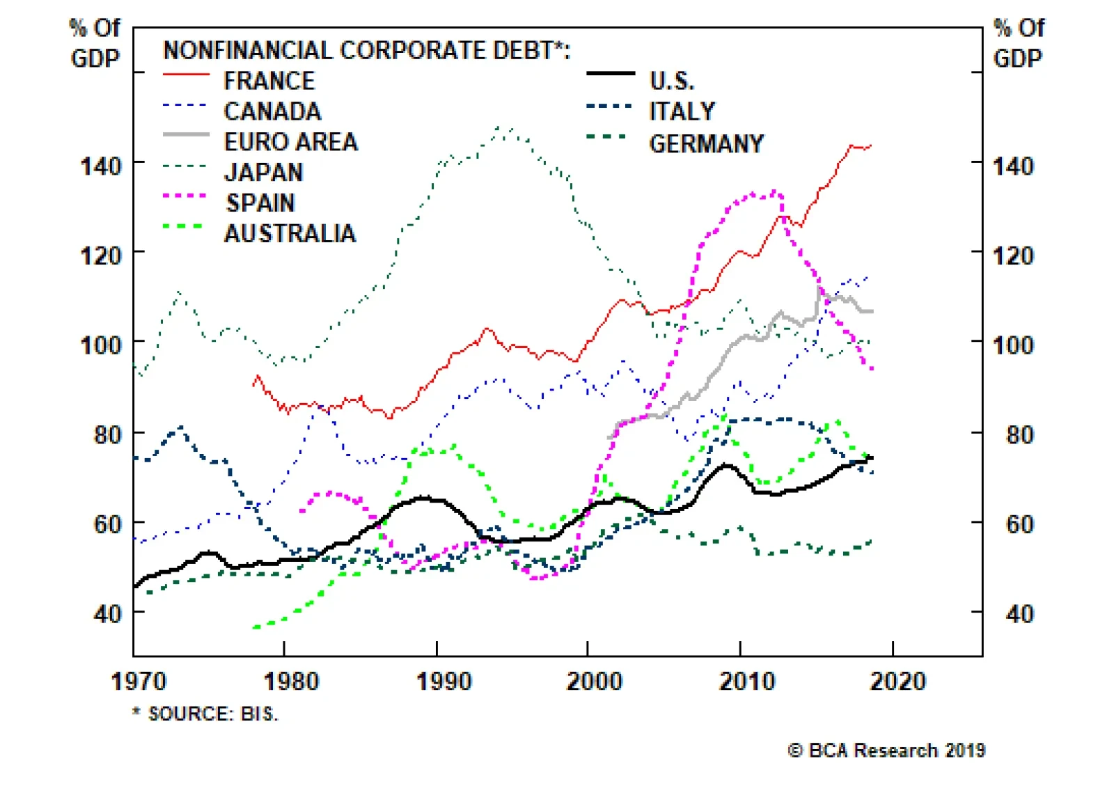
Relative to other countries, U.S. corporate debt is quite low. At 143% of GDP, corporate debt in France is twice that of the United States. This is not to suggest that everything is fine in the French corporate sector; but the fact is that France has not had…
Highlights Portfolio Strategy Corporate sector selling price inflation is nil while leading wage inflation indicators signal additional labor cost increases in the coming months. The risk is that profit margins have already peaked for the cycle. We reiterate our tactically cautious overall equity market view. Galloping higher private and public sector software outlays, a structurally enticing software demand backdrop and ongoing industry M&A all signal that it still pays to be bullish software stocks Recent Changes Last Thursday we downgraded the S&P railroads index to underweight. Also last Thursday we trimmed the S&P air freight & logistics index to neutral. Table 1
Have SPX Margins Peaked?
Have SPX Margins Peaked?
Feature The SPX stalled last week, digesting the now-complete Fed pivot. Our sense is that the Fed’s dovish turn is now fully reflected in equities. Importantly, the longer and wider the dichotomy between stocks and bonds gets, the more painful the ramifications from the eventual snap will be, likely with equities yielding to the bond market (Chart 1). As we first posited on March 4, short-term equity market caution is still warranted.1 Chart 1Time To Get Back Together
Time To Get Back Together
Time To Get Back Together
While the Fed meeting and sharp decline in Treasury yields dominated headlines last week, it was the NFIB’s latest release that really caught our attention. Importantly, it revealed that taxes and big government are no longer the biggest problems facing small and medium business owners, but labor is: “Twenty-two percent of owners cited the difficulty of finding qualified workers as their Single Most Important Business Problem, only 3 points below the record high. Ten percent of owners find labor costs as their biggest problem, a record high for the 45-year survey.”2 Historically, such extreme tightness in the SME labor market is a precursor of a yield curve inversion (NFIB cost of labor shown inverted, Chart 2). The link is clearer if we show this same NFIB series with the Labor Department’s average hourly earnings monthly release that is currently running at a 3.4%/annum clip (Chart 3). In other words, a tight labor market is conducive to corporations bidding up the price of labor which in turn causes the Fed to raise interest rates, eventually inverting the yield curve. Chart 2Cycle Is Long In The Tooth
Cycle Is Long In The Tooth
Cycle Is Long In The Tooth
Chart 3Wage Growth...
Wage Growth...
Wage Growth...
This macro backdrop is slightly unnerving and our biggest concern is the S&P 500’s profit margins (Chart 4). Q3/2018 marked the all-time peak in SPX quarterly margins according to Standard & Poor’s,3 and in Q4/2018 margins have deflated from a high mark of 12.13% to 10.11%, or a 16.7% q/q drop. Chart 4...Denting Margins
...Denting Margins
...Denting Margins
Undoubtedly, last year’s fiscal easing-induced all-time highs in SPX margins is unsustainable, and a tight labor market is a warning shot. Using the same NFIB series on cost of labor being the most important problem SMEs face and subtracting it from our corporate pricing power proxy, we constructed an equity market margin proxy, shown as a Z-score in Chart 5. Historically, the y/y change in SPX profit margins move in lockstep with our margin proxy and the current message is grim (Chart 5). Chart 5Margin Trouble Ahead
Margin Trouble Ahead
Margin Trouble Ahead
Before getting too bearish though, we want to make three salient points: First, while the NFIB survey’s labor related indicators are disconcerting, unit labor costs – the best measure of wage growth – remain muted as productivity growth has ramped up recently. Second, using empirical evidence dating back to the 1960s, the ultimate SPX profit margin mean reversion occurs during recessions, when EPS suffer a major setback. The implication is that margins can move sideways or grind lower in the coming year. As a reminder, BCA’s review remains that the U.S. will avoid recession in the next 12 months. Third, the most important yield curve slope, the 10/2, has not yet inverted, and even when it does invert, investors will have time to start positioning defensively; we have shown in recent research that the S&P peaks after the yield curve inverts.4 On a related note, we use this opportunity to update our corporate pricing power proxy, and Table 2 summarizes the sectorial results. Table 2Industry Group Pricing Power
Have SPX Margins Peaked?
Have SPX Margins Peaked?
Corporate sector selling price inflation has ground to a halt at a time when wage inflation is rearing its ugly head. Worrisomely, our pricing power diffusion index’s breadth sunk below the 50% line, whereas our wage growth diffusion index spiked higher; 70% of the 44 industries we track are struggling with rising wages (second & third panels, Chart 6). Taken together, there is evidence that broad-based profit margin pressures are escalating, the mirror image of what our gauges were signaling in our last update late-last year.5 Chart 6Margins Have Likely Peaked
Margins Have Likely Peaked
Margins Have Likely Peaked
Digging beneath the surface of our corporate pricing power proxy is revealing. As a reminder, we calculate industry group pricing power from the relevant CPI, PPI, PCE and commodity growth rates for each of the 60 industry groups we track. Table 2 also highlights shorter term pricing power trends and each industry's spread to overall inflation. 57% of the industries we cover are lifting selling prices, but only 27% are raising prices at a faster clip than overall inflation. Both figures are lower than our early-November report. Outright deflating sectors increased by eight to twenty four since our last update, fifteen of which are deflating at 1%/annum pace or lower. One third of the industries we cover are experiencing a downtrend in selling price inflation, representing a 43% increase since our most recent report (Table 2). Deep cyclicals/commodity-related industries (ex-oil) continue to dominate the top ranks, occupying the top six slots (Table 2). Despite the ongoing global manufacturing deceleration and still unresolved U.S./China trade tussle, the commodity complex's ability to increase prices remains resilient. On the flip side, energy-related industries occupy the bottom of the ranks as WTI crude oil is still 22% lower than the most recent peak in October 2018. In sum, business sector selling price inflation is nil while leading wage inflation indicators signal additional labor cost increases in the coming months. The risk is that profit margins have already peaked for the cycle. We reiterate our tactically cautious overall equity market view. This week we update a high-conviction overweight tech subgroup and recap our transportation subsurface moves from last Thursday. Buy The Software Breakout Software stocks are on fire and leading profit indicators suggest that more gains are in store in the coming months. Last week, we published a table ranking all the sectors and subsectors by 12-month forward profit growth estimates (please refer to Table 2 from the March 18 Weekly Report). While the broad tech sector is on an even keel with the SPX, software EPS are racing at twice the speed of the broad market, roughly 14%. Keep in mind, when growth gets scarce, investors flock to industries with accelerating profit prospects. The software profit juggernaut is intact and we reiterate our high-conviction overweight recommendation. Sustained capital outlays on software are a key driver of industry profits (bottom panel, Chart 7). In an otherwise muted Q4 GDP release, rising non-residential fixed investment in general and surging investment in software in particular suggest that our bullish software capex thesis is alive and kicking (middle panel, Chart 7). Chart 7Software On A Tear
Software On A Tear
Software On A Tear
The move to cloud computing and SaaS, the proliferation of AI, machine learning and augmented reality are not fads but enjoy a secular growth profile, and signal that capital outlays on software are also in a structural uptrend. Not only private sector software capex is near all-time highs as a share of total outlays, but also government investment in software is reaccelerating at the fastest pace since the tech bubble. When productivity gains are anemic, both the business and government sectors resort to software upgrades in order to boost productivity. Cyber security is another more recent source of software related demand as governments are taking such risks extremely seriously the world over (second panel, Chart 8). Chart 8Earnings Led Advance
Earnings Led Advance
Earnings Led Advance
Meanwhile, fear of missing out has rekindled industry M&A and both the dollar amount and number of deals are sky high, with acquirers bidding up premia to the stratosphere (Chart 9). This supply reduction is bullish for industry pricing power. Chart 9M&A Frenzy
M&A Frenzy
M&A Frenzy
Granted the M&A frenzy has pushed relative valuations on the expensive side especially on a forward P/E basis, but on EV/EBITDA software stocks are trading below the historical mean and still significantly lower than the late-1990s peak valuation (bottom panel, Chart 8). If our bullish software profit thesis continues to pan out, then software stocks will grow into their pricey valuations. Finally, shareholder friendly activities are ongoing in this key tech subsector and buybacks in particular provide an added layer of artificial EPS growth (bottom panel, Chart 9). Adding it up, galloping higher private and public sector software outlays, a structurally enticing software demand backdrop and ongoing industry M&A, all signal that it still pays to be bullish software stocks. Bottom Line: Buy the software breakout. The S&P software index remains a high-conviction overweight. The ticker symbols for the stocks in this index are: BLBG: S5SOFT – MSFT, ORCL, ADBE, CRM, INTU, ADSK, RHT, CDNS, SNPS, ANSS, SYMC, CTXS, FTNT. Tweaking Transport Subgroup Positioning The S&P transports index’s recovery rally has stalled recently and is a cause for concern for the overall market. In more detail, the recent gulf between relative share prices and the SPX has widened and warns that the overall market is at a risk of suffering a pullback (Chart 10). Chart 10Engine Trouble
Engine Trouble
Engine Trouble
Thus on Thursday last week, we made two subsurface transport changes, downgrading a subgroup to underweight that commands lofty valuations at a time when leading profit indicators are flashing red, and also downgrading to neutral a globally exposed transport sub-index. Get Off The Rails In our downgrade of the S&P railroads index late last year to a benchmark allocation, we highlighted that two of our key industry Indicators, the Railroad Indicator and our Rail Shipment Diffusion Indicator, had turned negative.6 These indicators have continued to deteriorate, including total rail shipments which have now started to contract for the first time since the 2015-16 manufacturing recession (third panel, Chart 11). Intermodal shipments in particular have nosedived, likely a result of weak retail sales, as we highlighted earlier this month.7 Chart 11Downgrade Rails To...
Downgrade Rails To...
Downgrade Rails To...
This contraction would be far less concerning were it not for the rapid degradation of industry balance sheets as firms have sought to increase relatively cheap leverage in order to retire equity. Railroads are now significantly more indebted than the broad market which itself has not shown an aversion to adding leverage (bottom panel, Chart 11). Such a change in railroad capital structure has kept EPS growth rates artificially high while simultaneously adding an extra measure of equity risk premium that does not yet appear fully reflected in relative share prices. Moreover, when we downgraded the S&P railroads index to neutral last year, deteriorating Indicators were offset by exceptionally healthy pricing power.8 After a multi-year expansion, selling price inflation has now rolled over (second panel, Chart 12), taking away the remaining pillar supporting a neutral view which compelled us to move to an underweight allocation last week. Chart 12...Underweight
...Underweight
...Underweight
Pricing power is one of the key determinants in our earnings model that, when combined with the previously noted contracting volumes, is indicating the end to the industry’s above-trend earnings growth is nigh (third panel, Chart 12). With relative earnings growth slowing and rising leverage adding incremental risk, the S&P railroads index’s premium valuation multiple looks increasingly dicey (bottom panel, Chart 12). Bottom Line: Broad based declines in traffic volumes, falling pricing power and high leverage suggest that earnings will underwhelm. Accordingly, last Thursday we moved to an underweight recommendation on the S&P railroads index as we expect a de-rating phase to materialize. The ticker symbols for the stocks in this index are: BLBG: S5RAIL - UNP, CSX, NSC, KSU. Air Freight Had Its Wings Clipped We have been offside on the high-conviction overweight call on the S&P air freight & logistics index and the recent FedEx warning suggests that profits will come under pressure for this index for the rest of the year and will trail the SPX. As such, we trimmed exposure to neutral late-last week and removed it from the high-conviction overweight list for a loss of 14%. Chart 13 shows that all the profit drivers we had identified in early December last year have taken a sharp turn for the worse. Energy costs are no longer in deflation as oil prices have jumped from $42/bbl to near $60/bbl. Not only is global growth still decelerating, but also U.S. growth is in a softpatch: the manufacturing shipments-to-inventory ratio is on the verge of contraction, warning that delivery services’ selling prices are in for a turbulent ride (second panel, Chart 13). In addition, definitive news of Amazon becoming a formidable competitor in courier delivery services is structurally negative for the industry. Chart 13Air Freight: Move To The Sidelines
Air Freight: Move To The Sidelines
Air Freight: Move To The Sidelines
Nevertheless, we refrain from turning outright bearish as air freight stocks are technically oversold and valuations are trading at the steepest discount to the broad market since mid-2002. Bottom Line: Last Thursday we downgraded the S&P air freight & logistics index to neutral and also removed it from the high-conviction overweight list. The ticker symbols for the stocks in this index are: BLBG: S5AIRF - UPS, FDX, CHRW, EXPD. Anastasios Avgeriou, U.S. Equity Strategist anastasios@bcaresearch.com Footnotes 1 Please see BCA U.S. Equity Strategy Weekly Report, “The Good, The Bad And The Ugly” dated March 4, 2019, available at uses.bcaresearch.com. 2https://www.nfib.com/assets/jobs0219hwwd.pdf 3https://ca.spindices.com/documents/additional-material/sp-500-eps-est.xlsx?force_download=true 4 Please see BCA U.S. Equity Strategy Weekly Report, “Signal Vs. Noise” dated December 17, 2018, available at uses.bcaresearch.com. 5 Please see BCA U.S. Equity Strategy Weekly Report, “Recuperating” dated November 5, 2018, available at uses.bcaresearch.com. 6 Please see BCA U.S. Equity Strategy Weekly Report, “Critical Reset“, dated October 29, 2018, available at uses.bcaresearch.com. 7 Please see BCA U.S. Equity Strategy Weekly Report, “The Good, The Bad And The Ugly“, dated March 4, 2019, available at uses.bcaresearch.com. 8 Please see BCA U.S. Equity Strategy Weekly Report, “Critical Reset“, dated October 29, 2018, available at uses.bcaresearch.com. Current Recommendations Current Trades Size And Style Views Favor value over growth Favor large over small caps
Highlights Corporate Default Rate: The trailing 12-month corporate default rate is too low according to our macro model. Further, the likely trajectories for corporate profit and debt growth suggest that the default rate is more likely to rise than fall during the next 12 months. We expect the corporate default rate to be above 3% during the next 12 months, higher than the Moody’s baseline forecast of 1.7%. Corporate Bond Valuation: Corporate bond investors are still adequately compensated for default risk, even under our more pessimistic scenario. However, some junk spread widening later this year is possible if market default rate expectations converge with our more pessimistic forecast. Investment Strategy: Corporate spreads have room to tighten in the near-term, due to accommodative Fed policy and a budding improvement in global growth. However, tighter Fed policy and a higher-than-expected corporate default rate could pressure spreads wider in the second half of 2019. We will be quick to back off our overweight corporate bond stance when our near-term spread targets are met. Feature Investors should remain overweight corporate bonds within U.S. fixed income portfolios, but be conscious that the window for outperformance may close quickly. While the Fed’s dovish turn and signs of global growth stabilization will allow spreads to tighten during the next few months, corporate default risk is rising in the background. This week’s report focuses on corporate default risk. We assess where the default rate is headed during the next 12 months and discuss the implications for investment strategy. Default Rate Near A Bottom Chart 1 shows that the trailing 12-month speculative grade default rate has been steadily falling since early 2017. However, it also shows that the fair value reading from our macro-driven default rate model has not fallen as much. The actual trailing 12-month default rate came in at 2.7% in February, the fair value reading from our model stands at a loftier 3.6%. Chart 1Corporate Default Rate Near A Bottom?
Corporate Default Rate Near A Bottom?
Corporate Default Rate Near A Bottom?
Our default rate model is based on two factors, Commercial & Industrial bank lending standards and gross corporate leverage. The latter is defined as total nonfinancial corporate debt divided by pre-tax profits. With that in mind, our model provides a framework for assessing where the default rate is headed under different scenarios for corporate profit and debt growth. We consider each of these two factors in turn. Corporate Profit Growth Will Moderate Nonfinancial corporate pre-tax profits grew an astonishing 17% during the four quarters ending in Q3 2018, but all leading indicators point to deceleration in Q4 2018 and beyond. On the revenue side of the ledger, leading indicators are in universal agreement that growth is poised to slow (Chart 2): Chart 2Corporate Revenues Will Soften
Corporate Revenues Will Soften
Corporate Revenues Will Soften
The ISM Manufacturing index has fallen to 54.2 from a recent peak above 60. The year-over-year growth rate in total business sales came in at 2% in December, down from a recent peak of 8.4%. The year-over-year growth rate in industrial production fell to 3.5% in February, from a September peak of 5.7%. The year-over-year growth rate in the U.S. Leading Economic Indicator is down to 3.2% as of January, from a September peak of 6.8%. Clearly, the global growth slowdown has migrated to the U.S. and the impact is being seen in the leading U.S. economic data. Some slowdown in corporate revenue growth is all but assured. All leading indicators point to deceleration in corporate profit growth in Q4 2018 and beyond. Corporate profit growth and investment spending are tightly linked in the sense that firms are more likely to take on new projects when they feel better about their future cash flow prospects. The upshot is that we can infer trends in corporate profits by looking at data on investment spending and firms’ investment plans. That data paint a similar picture of widespread deceleration (Chart 3): Chart 3Investment Indicators
Investment Indicators
Investment Indicators
The year-over-year growth rate in core durable goods orders is down to 4% from a recent peak close to 9%. An average of firms’ capital spending plans as reported in regional Fed surveys remains elevated, but has declined markedly in recent months. Small business capital spending plans, as reported to the NFIB, have fallen sharply during the past few months. Periods of tightening lending standards coincide with decelerating corporate debt. Wage growth is another important driver of corporate profits. In particular, we can get a read on profit growth by looking at the difference between corporate selling prices and unit labor costs, aka our Profit Margin Proxy (Chart 4). Our Profit Margin Proxy remains at a high level because growth in unit labor costs has been tepid. Even though top-line wage growth has improved, this has been matched by an acceleration in productivity growth (Chart 4, bottom panel). The latter has kept unit labor costs low, even as nominal wages have risen. Chart 4Wage Growth A Drag On Profits
Wage Growth A Drag On Profits
Wage Growth A Drag On Profits
Extremely tight labor markets will lead to a continued acceleration in wage growth during the next few quarters.1 Meanwhile, the prospect for continued rapid productivity growth is much more uncertain. It seems reasonable to expect that corporate profits will come under some downward pressure from rising unit labor costs during 2019. Finally, we can get a sense of the corporate profit outlook by looking at equity analyst net earnings revisions (Chart 5). Analyst earnings per share (EPS) upgrades outpaced downgrades for most of 2018, but that trend reversed sharply near the end of last year. Analysts are once again lowering EPS forecasts more often than they are raising them. Chart 5More EPS Downgrades Than Updgrades
More EPS Downgrades Than Updgrades
More EPS Downgrades Than Updgrades
Debt Growth Should Also Slow Fortunately, some of the balance sheet impact from decelerating profits will likely be offset by slower debt growth during the next few quarters. Corporate debt growth has been robust and fairly stable since 2012, but C&I lending standards tightened slightly in the fourth quarter of last year. Typically, periods of tightening lending standards coincide with decelerating corporate debt (Chart 6). Chart 6Tighter Lending Standards Implies Slower Debt Growth
Tighter Lending Standards Implies Slower Debt Growth
Tighter Lending Standards Implies Slower Debt Growth
Anecdotally, several high profile firms have recently taken steps to curtail debt growth. Most notably, General Electric just announced a major asset divestment to pay down debt, and the stock market rewarded them for doing so. If our default rate forecast turns out to be correct and the Moody’s forecast is eventually revised higher, it will likely coincide with some junk spread widening. More broadly, we observe that firms with low debt/asset ratios have been outperforming firms with high debt/asset ratios, a dynamic that tends to occur when lending standards are tightening and corporate debt growth is falling (Chart 7). Chart 7Low Leverage Firms Are Outperforming
Low Leverage Firms Are Outperforming
Low Leverage Firms Are Outperforming
For a sense of scale, nonfinancial corporate debt grew 6.5% in the four quarters ending Q4 2018 and has averaged 6.3% since 2012. Some mild deceleration from these growth rates is likely during the next few quarters. Putting It All Together Table 1 shows that trailing 12-month profit growth of 17% and debt growth of 6.5% led to gross corporate leverage of 6.95, which translates to a fair value default rate of 3.6%. Table 1 also shows where the fair value default rate will head during the next 12 months based on different scenarios for profit and debt growth. Table 1Default Rate Scenarios
Assessing Corporate Default Risk
Assessing Corporate Default Risk
For example, if profits grow by 5% and debt growth is between 0% and 8%, then the fair value default rate will be between 3.5% and 4.1% one year from now. This seems like a reasonable scenario based on our macro forecast. A scenario that would result in a default rate that is much higher than the current Moody’s baseline forecast of 1.7%. And One More Thing Though they are not included in our model, job cut announcements are a fairly reliable coincident indicator of corporate defaults. Recently, job cut announcements have clearly bottomed even as the default rate has continued to fall (Chart 8). This is a clear warning sign that the default rate might head higher in the coming months. Chart 8Warning Sign From Job Cuts
Warning Sign From Job Cuts
Warning Sign From Job Cuts
Bottom Line: The trailing 12-month corporate default rate is too low according to our macro model. Further, the likely trajectories for corporate profit and debt growth suggest that the default rate is more likely to rise than fall during the next 12 months. We expect the corporate default rate to be above 3% during the next 12 months, higher than the Moody’s baseline forecast of 1.7%. It increasingly looks like the second half of 2019 will be more challenging for corporate credit. Are Investors Adequately Compensated For Default Risk? Forecasting the default rate is important, but it is only one side of the coin when it comes to corporate bond investing. The other relevant question is whether current spreads offer adequate compensation for expected defaults. At present, the average option-adjusted spread (OAS) on the Bloomberg Barclays High-Yield index is 388 bps. If we assume that defaults occur in line with the Moody’s baseline forecast during the next 12 months, then we would expect default losses of approximately 90 bps (assuming a 49% recovery rate).2 That translates to an excess junk spread of 298 bps, well above the historical average realized excess spread of 250 bps. In other words, investors should expect better than average excess junk returns if the Moody’s baseline default rate forecast turns out to be correct. However, our analysis suggests that the default will be significantly higher during the next 12 months. If we assume a 3.5% default rate, more in line with our macro forecast, and a slightly lower recovery rate of 45%, then the excess spread available in the high-yield index falls to 198 bps. This number is still positive, so unless there is significant spread widening investors should still earn a positive excess return versus Treasuries, but it is considerably below average historical levels. Another factor to consider is the historical correlation between junk spreads and the Moody’s baseline default rate forecast. We find that the average high-yield OAS has the strongest positive correlation with the 9-month forward Moody’s baseline default rate expectation (Chart 9). In other words, if our default rate forecast turns out to be correct and the Moody’s forecast is eventually revised higher, it will likely coincide with some junk spread widening. Chart 9Default Rate Revisions Will Lead To Wider Spreads
Default Rate Revisions Will Lead To Wider Spreads
Default Rate Revisions Will Lead To Wider Spreads
Bottom Line: Corporate bond investors are still adequately compensated for default risk, even under our more pessimistic scenario. However, some junk spread widening later this year is possible if market default rate expectations converge with our more pessimistic forecast. Investment Strategy While this report has focused on detecting early warning signs of default risk, that is not the only thing that matters for corporate spreads. We continue to believe that spreads have room to tighten in the near-term, due to accommodative Fed policy and a budding improvement in global growth.3 The purpose of this report is to stress that our current overweight stance on corporate bonds is unlikely to last through to the end of the year. First, if spreads tighten during the next few months leading to an easing in overall financial conditions, then the Fed will probably turn more hawkish in the second half of 2019 and monetary policy will shift from being a tailwind for corporate credit to a headwind. This shift could occur at around the same time that corporate defaults start to exceed current expectations. As a matter of strategy, we have published spread targets for each corporate credit tier based on average spread levels seen during similar stages of past economic cycles (Charts 10A & 10B).4 We will be quick to move off our overweight stance once these spread targets are achieved. Note that Aaa spreads are already below target. We recommend that investors avoid Aaa-rated corporate bonds. Chart 10AInvestment Grade Spread Targets
Investment Grade Spread Targets
Investment Grade Spread Targets
Chart 10BHigh-Yield Spread Targets
High-Yield Spread Targets
High-Yield Spread Targets
While the current environment remains positive, it increasingly looks like the second half of 2019 will be more challenging for corporate credit. Stay tuned. Ryan Swift, U.S. Bond Strategist rswift@bcaresearch.com Footnotes 1 For further details on the amount of labor market slack in the economy please see U.S. Bond Strategy Weekly Report, “The Search For Aaa Spread”, dated March 12, 2019, available at usbs.bcaresearch.com 2 We forecast the recovery rate based on its inverse historical relationship with the default rate. A higher default rate implies a lower recovery rate, and vice-versa. 3 Please see U.S. Bond Strategy Weekly Report, “The Search For Aaa Spread”, dated March 12, 2019, available at usbs.bcaresearch.com 4 For more details on our spread targets please see U.S. Bond Strategy Weekly Report, “Paid To Wait”, dated February 26, 2019, available at usbs.bcaresearch.com
Highlights Portfolio Strategy As growth becomes scarce, investors flock to sectors that are slated to outgrow the broad market and shy away from the ones that are forecast to trail the SPX’s growth rate. This week we rank sectors and subsectors by EPS growth in our universe of coverage, and identify sweet and trouble spots. Fired up crack spreads, firming refining industry operating metrics, reaccelerating exports along with washed out technicals and compelling valuations, all signal that the time is ripe to buy into refining weakness. The cable industry’s demand headwinds are reflected in depressed relative valuations at a time when industry pricing power is trying to stage a comeback and a drifting lower greenback may also provide positive profit offsets. Stick with a benchmark allocation. Recent Changes Boost the S&P Oil & Gas Refining & Marketing index to overweight all the way from underweight today, locking in relative profits of 21%. Table 1
Awaiting Validation
Awaiting Validation
Feature Equities broke out last week and surpassed the upper band of their recent trading range, despite economic data releases that continued to surprise to the downside. Two weeks ago, we cautioned investors not to put cash to work as a tactical indigestion period loomed, with the SPX facing stiff resistance near the 2,800 level. In addition, we posited that most of the good news related to the U.S./China trade spat front was reflected in the S&P 500’s V-shaped recovery (top panel, Chart 1). In relative terms, the bottom panel of Chart 1 confirms that the easy money has already been made on the assumption of a positive resolution to the U.S./China trade dispute. Chart 1Trade Deal Priced In
Trade Deal Priced In
Trade Deal Priced In
Going forward, the earnings juggernaut will have to remain in place in order for stocks to vault to fresh all-time highs, likely in the back half of the year. The Trump administration’s massive fiscal stimulus artificially fueled profit growth last year both by lowering the corporate tax rate and by encouraging overseas cash repatriation. The latter boosted share buybacks to an all-time record. Despite 24% EPS growth and $1tn in equity retirement, the SPX ended 2018 6% lower. Why? It became clear that EPS growth was headed lower. In order to gauge trend EPS growth we opt to use EBITDA, a cash flow proxy measure that strips out the direct impact of last year’s fiscal easing. Chart 2 clearly shows that trend growth took a step down following the positive base effects of the GFC-induced collapse and averaged close to 5%/annum from 2012 to 2014. Subsequently, the late-2015/early-2016 manufacturing recession sunk EBITDA into contraction, but the euphoria surrounding the newly elected President pushed trend EBITDA growth to near 10%/annum for two full years in 2017 and 2018. Chart 2Return To 5% Growth?
Return To 5% Growth?
Return To 5% Growth?
Since the late-2018 peak, 12-month forward EBITDA growth continues to drift lower and is now hovering just shy of 3%. Our sense is that 5% organic profit growth is consistent with nominal GDP printing 4%-4.5% at this stage of the business cycle, signaling that a return to the 2012-2014 growth backdrop is likely later in the year. As a reminder, positive profit growth in calendar 2019 remains one of the three pillars underpinning stocks that we have highlighted since the beginning of this year. Stocks have come full circle recovering all of last December’s losses, but in order to make fresh all-time highs, profits will have to deliver. We deem that an earnings validation phase is transpiring and there are early signs that profit growth will trough sometime in the first half of the year. Not only has EBITDA breadth put in a bottom (Chart 2), but also economically hypersensitive indicators suggest that forward EBITDA growth will soon tick higher. Namely, the ISM manufacturing new orders component has perked up on a year-over-year basis. The trough in lumber futures momentum corroborates this message, as does the tick higher in the U.S. boom/bust indicator (Chart 3). Chart 3Growth Green-shoots
Growth Green-shoots
Growth Green-shoots
Given the current macro backdrop and awaiting the profit validation, when growth becomes scarce investors flock to sectors that are outgrowing the broad market and shy away from ones that trail the SPX’s growth rate. Typically, in recessionary times that would equate to investors bidding up defensive sectors that command stable cash flow businesses and avoiding highly cyclical industries. But, BCA does not expect a recession in the coming year. Thus, in order to identify high growth sectors that should outperform during the current soft patch and growth laggards that should underperform, we compiled a table with the GICS1 sectors and all the subsectors we cover. First, we rank the GICS1 sectors and then within each sector we rank the subsectors, both times by absolute 12-month forward EPS growth using I/B/E/S/ data (see second columns, Table 2). We aim to reproduce this table once a quarter. Table 2Identifying S&P 500 Sector EPS Growth Leaders And Laggards
Awaiting Validation
Awaiting Validation
The third columns in Table 2 show the sector growth rate relative to the SPX. The final columns in Table 2 highlight the trend in relative growth. In more detail, they compare the current relative growth rate to that of three months ago: a positive sign indicates an upgrade in analysts’ relative estimates and a negative sign a downgrade in analysts’ relative estimates. Industrials and financials (we are overweight both) are leading the pack outpacing the broad market by 410bps and 350bps, respectively, and enjoy a rising profit trend. On the flip side, energy (overweight) and real estate (underweight) trail the broad market by 490bps and 1480bps, respectively, and showcase a deteriorating EPS trend. With regard to energy, we first identified that analysts are really punishing this sector in the January 22 Weekly Report and the sector’s 2019 EPS contribution was and remains negative.1 Our overweight call will be offside if oil prices suffer a new setback, but our Commodity & Energy strategy service remains bullish on oil, implying relative EPS outperformance in 2019. Year-to-date, energy has bested the SPX by 170bps. This week, we make an energy sector subsurface tweak, and also update a communication services subgroup. Light My Fire Last summer we took refiners down to a below benchmark allocation as all of the good news was perfectly reflected in soaring relative share prices (top panel, Chart 4), at a time when cracks were forming. Now we are compelled to book gains of 21% and boost exposure all the way to overweight. Chart 4Crack Spreads Are On Fire
Crack Spreads Are On Fire
Crack Spreads Are On Fire
Today, refiners paint a near exact opposite picture compared with last July. Relative share prices are no longer rising by 50%/annum. Instead, momentum has collapsed and is now contracting (middle panel, Chart 4). Sell-side analyst exuberance has turned into outright pessimism: refiners’ profits are expected to trail the broad market in the coming year. By comparison, last summer they were penciled in to beat the market by 30 percentage points (bottom panel, Chart 4). Granted M&A activity had also added fuel to the fire, but now all the hot air has come out of the refining industry, and then some. Refiners’ riches move in tandem with crack spreads. When refining margins widen, profits excel and vice versa. Now that refining margins are in a slingshot recovery, refining ills will turn into fortunes (bottom panel, Chart 4). Importantly, wide Brent-WTI spreads underpin crack spreads. Moreover, the crude oil versus refined product inventory backdrop currently reinforces a widening in refining margins. In absolute terms, gasoline stockpiles are being worked off (gasoline inventories shown inverted, bottom panel, Chart 5) and grinding higher demand for refined petroleum products (top panel, Chart 5) will further tighten the industry’s inventory outlook. Chart 5Healthy Supply/Demand Backdrop
Healthy Supply/Demand Backdrop
Healthy Supply/Demand Backdrop
One way domestic refiners are taking advantage of the still wide Brent-WTI differential is via the export markets. Net refined products exports are running at over 3mn barrels/day (bottom panel, Chart 6), and the softening greenback since November will further boost profits with a slight lag as U.S. refining exports will grab an even larger slice of the global pie (U.S. dollar shown inverted and advanced, middle panel, Chart 6). Chart 6U.S. Dollar Softness Is A Boon To Refining Profits
U.S. Dollar Softness Is A Boon To Refining Profits
U.S. Dollar Softness Is A Boon To Refining Profits
On the valuation front, both the relative forward P/E and P/S have undershot their respective historical means and EPS breadth is as bad as it gets, offering investors an excellent entry point in the pure-play oil & gas refining industry (Chart 7). Chart 7Extreme Analyst Pessimism Reigns
Extreme Analyst Pessimism Reigns
Extreme Analyst Pessimism Reigns
In sum, fired up crack spreads, firming refining industry operating metrics, reaccelerating exports along with washed out technicals and compelling valuations, all signal that the time is ripe to buy into refining weakness. Bottom Line: Lift the S&P oil & gas refining & marketing index to overweight all the way from a below benchmark allocation, crystalizing 21% in relative profits since last summer’s inception. The ticker symbols for the stocks in this index are: BLBG: S5OILR – PSX, MPC, VLO, HFC. Cable’s Down But Not Out Cable & satellite stocks had been in an uninterrupted run from the depths of the Great Recession until the peak in relative share prices in August 2017. Since then, cord cutting news and the proliferation of on demand streaming services have wreaked havoc on the industry and cable stocks have trailed the market by over 33% from peak to the most recent trough (top panel, Chart 8). Chart 8Cable Signals Are…
Cable Signals Are…
Cable Signals Are…
This deteriorating demand backdrop more than offset the industry’s reaction function, which has been intra and inter-industry M&A. Now that the M&A dust has settled, what is next in store for the industry? We reckon that leading profit indicators are a mixed bag and we continue to recommend a benchmark allocation in this niche communications services subgroup. The top panel of Chart 8 shows that relative outlays on cable are on a slippery slope, and will continue to weigh heavily on relative share prices for the coming quarters. Nevertheless, the ISM services survey ticked higher recently and is on the cusp of making fresh recovery highs, unlike its sibling the ISM manufacturing survey. This is encouraging news for cable executives and suggests that demand for cable services may not be as moribund as the PCE release is projecting (second panel, Chart 9). Chart 9..A Mixed…
..A Mixed…
..A Mixed…
While the cable demand backdrop is unclear, industry pricing power has managed to exit deflation. Cable selling prices have been positive for the better part of the past decade, but starting in late-2017 they collapsed by roughly 600bps relative to overall inflation. True, this deflationary impulse dented profit margins, but currently the industry’s selling prices – and to a much lesser extent profit margins – are in a V-shaped recovery mostly courtesy of base effects (middle & bottom panels, Chart 8). Absent a sustained hook up in cable demand, selling price inflation will prove fleeting and the recent margin expansion phase will also lose steam. Meanwhile, cable stocks and the U.S. dollar enjoy a positive correlation as most of the constituents’ earnings are derived domestically (Chart 10). The recent U.S. dollar softness will, at the margin, weigh on relative profits and thus relative share prices, especially if the Fed stays pat and refrains from raising rates for the rest of the year as the bond market currently expects. Chart 10…Bag
…Bag
…Bag
Finally, earnings breadth continues to fall, but relative valuations are still well below the historical mean (third & bottom panels, Chart 9). Netting it all out, cable’s demand headwinds are well reflected in depressed relative valuations at a time when industry pricing power is trying to stage a comeback and a drifting lower greenback may both provide positive profit offsets. Bottom Line: Remain on the sidelines in the S&P cable & satellite index. The ticker symbols for the stocks in this index are: BLBG: S5CBST – CMCSA, CHTR, DISH. Anastasios Avgeriou, U.S. Equity Strategist anastasios@bcaresearch.com Footnotes 1 Please see BCA U.S. Equity Strategy Weekly Report, “Dissecting 2019 Earnings” dated January 22, 2019, available at uses.bcaresearch.com. Current Recommendations Current Trades Size And Style Views Favor value over growth Favor large over small caps
Highlights Trade talks have been the primary driver of the rally in Chinese stocks and China-related assets over the past five months. While trade is important to China’s economy, Chinese domestic demand is the primary driver of China-related asset fundamentals, meaning that the recent equity rally has occurred on the back of a largely false narrative. The January surge in credit has brought the first concrete sign that Chinese domestic demand will eventually bottom, but the current pace of money & credit growth suggests that investable earnings are facing a “catch up” period of potentially material weakness. The need for a stabilization in the outlook for earnings argues against an immediate shift to overweight, but we agree that investors should put Chinese investable stocks on upgrade watch for the coming few months. Feature Chart 1 reviews the recent performance of the Chinese investable equity market, and highlights two important facts: Chinese equity performance bottomed in both absolute and relative terms at the end of October, and The relative performance trend versus global stocks has now retraced roughly 40% of the decline that occurred in 2018 Chart 1A Sizeable Retracement, Based On A (Largely) False Narrative
A Sizeable Retracement, Based On A (Largely) False Narrative
A Sizeable Retracement, Based On A (Largely) False Narrative
For investors looking for an appropriate allocation to Chinese stocks and China-related assets more generally over the coming 6-12 months, it is important to understand what has driven this post-October outperformance. In our view, it is only the January surge in credit growth that has brought the first concrete sign that Chinese domestic demand will eventually bottom, meaning that China plays have been rallying for the past five months on a largely false narrative. This significantly complicates the cyclical investment outlook, even under the assumption of an imminent trade deal with the U.S. As we will detail below, several factors argue against an immediate shift to overweight, but we agree that investors should put Chinese investable stocks on upgrade watch. We will be watching closely over the next few months for confirmation that above-average credit growth will be sustained, and that the outlook for Chinese earnings is stabilizing. Dissecting The Rally: Mostly Driven By Trade Optimism, Not Easing During the week of October 29th, the equity market was buoyed somewhat by a statement emerging from the late-October politburo meeting. The statement cited the need for the government to take “more timely steps” to counter increasing downward pressure on the economy, which catalyzed a 6% bounce in investable stocks (3% for the domestic market) by Thursday, November 1st. However, to most investors, news of a much more significant event came on Friday, November 2nd: President Trump was looking to make a deal with China at the late-November G20 meeting in Argentina, and had asked key officials to begin drafting potential terms.1 The investable market rallied over 3% on the day in response to the news, and continued to rise until Monday December 3rd, the day after the 3-month trade talk agreement was struck. Chart 1 shows that while investible stocks nearly hit a new 2018 low in December, this was due to a significant sell off in global stocks: relative performance was flat during this period, and resumed its uptrend once global stocks began to rise. Chart 2 provides confirmation that trade talks have been the primary driver behind the rally in China-related assets as well. The chart shows the BCA Market-Based China Growth Indicator alongside a diffusion index of its 17 components, with the vertical line denoting the point where the prospect of a deal became public. The Fed’s shift to a more dovish posture following its December rate hike has certainly helped propel the global rally in risky assets, but Chart 2 makes it clear that a shift in the outlook for trade between the U.S. and China has been the more important factor driving the prices of China-related assets over the past few months. Chart 2Trump's Desire For A Deal Was The Turning Point For The Market
Trump's Desire For A Deal Was The Turning Point For The Market
Trump's Desire For A Deal Was The Turning Point For The Market
In terms of its relative importance for the Chinese economy, the focus of investors on trade is mostly wrongheaded. Trade is important to China’s economy, but the domestic demand trend is a far more important driver for the fundamental performance of China-related assets. We have highlighted over the past year that investor attention has been focused on the wrong factor, underscoring the rally in Chinese stock prices over the past few months has been driven by a largely false narrative. From Trade, To Credit Chart 3 compares our leading indicator for the Chinese economy with a measure of coincident economic activity, and highlights that the sharp slowdown in growth that has occurred over the past few months represents a reversion to a level that would be more consistent with that of our leading indicator (which has been pointing to weaker economic activity for the better part of the past 18 months). In fact, Chart 3 implies that actual growth is still stronger than what monetary conditions, money, and credit growth would imply, meaning that a further slowdown should be expected over the coming several months. Chart 3Economic Activity Is Recoupling With Our Leading Indicator
Economic Activity Is Recoupling With Our Leading Indicator
Economic Activity Is Recoupling With Our Leading Indicator
However, judging by January’s credit release, this further slowdown in growth may occur against the backdrop of a durable uptrend in our leading indicator. Our calculation of adjusted total social financing grew by nearly 5 trillion RMB in January, a very substantial rise that has seldom occurred over the past few years (Chart 4). Legitimate questions about the seasonal effects of the Lunar New Year remain, but Chart 5 shows that the January data was large enough to cause a visible tick higher in the YoY growth rate, caused a sharp rise in our ratio of new credit to GDP, and occurred alongside an easing in the contraction of shadow credit as a percent of total credit. These are clear signs that reluctant policymakers are responding to the need to stabilize a weak economy. Chart 4A Very Strong Surge In January Credit...
A Very Strong Surge In January Credit...
A Very Strong Surge In January Credit...
Chart 5...Has Led To A Visible Uptick In Annual Growth
...Has Led To A Visible Uptick In Annual Growth
...Has Led To A Visible Uptick In Annual Growth
The magnitude of the January surge suggests that there is now a legitimate basis to forecast an eventual bottom in Chinese domestic demand. Our December 5 Weekly Report outlined our key views for 2019,2 and in it we noted that “our base case view is that growth will modestly firm in the second half of 2019, which would provide a somewhat stronger demand backdrop for commodities and emerging economies that sell goods to China”. The odds of a firming in growth have certainly gone up as a result of January’s data, although it remains unclear how strong the upturn in credit growth will ultimately be over the course of 2019. This, along with the desynchronizing effect of trade front-running and a truce-driven rally in Chinese stocks, significantly muddles the 6-12 month investment strategy outlook. From Credit, To Investment Strategy We noted in our December key views report that a tactical overweight stance towards Chinese stocks was probably warranted over the coming three months, in recognition of the fact that investors could bid up the market in the lead-up to a possible trade deal with the U.S. We argued that the conditions for a cyclical overweight stance (6-12 months) were not yet present but could emerge sometime this year, particularly if money & credit growth begin to pick up. Is the January surge in adjusted total social financing a sign that investors should increase their allocation to Chinese equities today? We agree that investors should put Chinese investable stocks on upgrade watch for the next few months, but three factors continue to argue against an immediate shift: Investors appear to have bid up Chinese stocks assuming not only that the trade deal with the U.S. will occur, but that it will result in a durable resolution to the dispute (including, presumably, the rolling back of all tariffs that have been imposed). Even under the assumption that a deal does occur, it may be less comprehensive than investors are assuming and could still cause some lasting negative implications for global trade. While the odds of a credit overshoot have legitimately risen,3 January’s credit number is only one data point and the month-over-month change in credit is always abnormally strong in the first month of the year. At a minimum, investors should wait until the February credit data is released in mid-March to judge whether a higher pace of credit growth will be sustained over the course of the year. The recent quarrel between Premier Li Keqiang and the PBOC over whether the January credit spike represented “flood irrigation-style” stimulus suggests that policymakers are still somewhat reluctant to significantly boost credit,4 underscoring the need to monitor whether the recent pace of growth will be sustained. As first highlighted in Chart 3 above, the inflection point in credit growth implies that economic activity will improve at some point in the months ahead, but the current pace of money & credit growth suggests that both activity and, crucially, the level of earnings are facing a “catch up” period of potentially material weakness before they durably bottom. Chart 6 illustrates this potential weakness by comparing the current circumstance of our leading economic indicator, our measure of coincident economic activity, and the level of forward earnings to the 2015/2016 episode. The chart shows that by comparison to today, the 2015/2016 episode had clearer sequencing: our leading indicator fell, coincident activity followed, and stock prices bottomed only once forward earnings had contracted materially. Chart 6In 2015/2016, Our Leading Indicator Led Activity, Earnings, And Relative Stock Performance
In 2015/2016, Our Leading Indicator Led Activity, Earnings, And Relative Stock Performance
In 2015/2016, Our Leading Indicator Led Activity, Earnings, And Relative Stock Performance
This time around, our leading indicator peaked in Q1 2017, but activity remained stronger than our indicator would have suggested even though it peaked relatively soon afterwards. Incoming data over the past three months suggest that economic activity is now catching up to the downside, and forward earnings remain elevated. Chart 7 shows that Chinese net earnings revisions remain firmly in negative territory, at levels that have been historically been associated with contracting forward earnings growth. Chart 7Earnings Weakness Looks Set To Continue
Earnings Weakness Looks Set To Continue
Earnings Weakness Looks Set To Continue
Panel 4 of Chart 6 is emblematic of the fact that the recent rally in Chinese relative performance, driven largely by a false narrative, has significantly complicated the cyclical investment outlook. If the January improvement in credit had instead come in late October when Chinese relative performance was near its low, it would have been much easier for us to recommend that investors move to an overweight stance in response to a legitimate fundamental improvement and to take the risk of being somewhat too early. Now, a razor sharp focus on the earnings outlook is necessary, and we are unlikely to recommend an increased allocation to Chinese stocks unless that outlook stabilizes. Table 1 presents one of the tools that we will be using to judge the outlook for earnings, based on a model that we presented in two recent reports.5 The table shows a series of earnings recession probabilities that are based on a variety of credit and exchange rate scenarios and conditional on a material improvement in Chinese exporter sentiment. Light colored cells represent an earnings recession probability of less than 1/3rd, and the circled cell shows roughly where we would be today if the new export order component of the NBS manufacturing PMI were to rise sharply back to its June 2018 level. Table 1Credit Needs To Rise Further And RMB Appreciation Needs To Slow For The Earnings Outlook To Stabilize
Dealing With A (Largely) False Narrative
Dealing With A (Largely) False Narrative
The table makes two key points. First, even given January’s surge, new credit will have to improve relative to GDP over the coming months in order to stabilize the earnings outlook. Second, the more that China’s currency appreciates in response to a trade deal with the U.S., the higher the hurdle rate for credit. Chart 8 shows that CNY-USD is already deviating quite significantly from the level implied by interest rate differentials, suggesting that significant further currency appreciation may not be in the cards. But the bottom line for investors is that a rising currency has the potential to negate some of the reflationary effects of stronger credit, and is a risk that must be monitored alongside the effort to gauge the sustainable rate of credit growth. Chart 8While Policymakers Or Rate Differentials Drive CNY-USD Over The Coming Year?
While Policymakers Or Rate Differentials Drive CNY-USD Over The Coming Year?
While Policymakers Or Rate Differentials Drive CNY-USD Over The Coming Year?
Stay tuned! Jonathan LaBerge, CFA, Vice President Special Reports jonathanl@bcaresearch.com Footnotes 1 Please see “Trump Said To Ask Cabinet To Draft Possible Trade Deal With Xi”, dated November 2, 2018, available at Bloomberg News 2 Please see China Investment Strategy Weekly Report “2019 Key Views: Four Themes For China In The Coming Year”, dated December 5, 2018, available at cis.bcaresearch.com. 3 Please see China Investment Strategy and Geopolitical Strategy Special Report “China: Stimulating Amid The Trade Talks”, dated February 20, 2019, available at cis.bcaresearch.com. 4 Please see “Chinese Premier In Rare Spat With Central Bank”, Financial Times. 5 Please see China Investment Strategy Special Report “Six Questions About Chinese Stocks”, dated January 16, 2019, and Weekly Report “A Gap In The Bridge”, dated January 30, 2019 available at cis.bcaresearch.com. Cyclical Investment Stance Equity Sector Recommendations