Corporate Bonds

Highlights Recommended Allocation
Quarterly Portfolio Outlook: Stay Bullish But Verify
Quarterly Portfolio Outlook: Stay Bullish But Verify
The global economy will continue to grow at an above-trend rate over the next 12 months and central banks will remove accommodation only slowly.But the second year of a bull market is often tricky: Growth slows after its initial rebound, and monetary policy starts to be tightened, amid rising inflation.Equities are likely to outperform bonds over the next 12 months, driven by improving earnings, but at a slower pace than over the past year and with higher volatility.We continue to recommend only a cautiously optimistic stance on equities, with an overweight in US equities, and underweight in Europe. Our sector overweights are a mix of cyclicals (Industrials), plays on higher rates (Financials), and selective defensives (Health Care).China is likely to announce a stimulus to cushion the impact from Evergrande, which might push up oversold Chinese stocks. We close our underweight on Chinese equities, but raise them only to neutral as the real estate sector looks vulnerable. That could be bad news for commodities and the rest of Emerging Markets, which we cut to underweight.The Fed is likely to announce tapering this quarter, and raise rates in December 2022. This is likely to push up 10-year Treasury yields to 2-2.25% by then, and so we remain underweight duration.Investment-grade credit is expensive, but B-rated high-yield bonds still look attractive as defaults continue to decline. EM corporate debt is riskier post-Evergrande, but higher-rated sovereign dollar debt offers a good spread pickup.OverviewThe second year of a bull market is often tricky. Growth starts to slow after its initial rebound, and central banks move towards tightening policy. This does not signal the end of the bull market, but equity returns in Year 2 are typically lacklustre (Table 1).That is exactly the situation markets face now. Growth has been surprising on the downside, and inflation on the upside over the past few months (Chart 1). Table 1Year 2 Of Bull Markets Often Has Only Weak Returns
Quarterly Portfolio Outlook: Stay Bullish But Verify
Quarterly Portfolio Outlook: Stay Bullish But Verify
Chart 1Growth Surprising On The Downside, Inflation On The Upside
Growth Surprising On The Downside, Inflation On The Upside
Growth Surprising On The Downside, Inflation On The Upside
Our basic investment stance remains that the global economy will continue to grow at an above-trend rate over the next 12 months (as the consensus forecasts – Chart 2), and that central banks will remove accommodation only slowly. We can see no signs of a recession on the 18-to-24-month horizon and, as Chart 3 shows, equities almost always outperform bonds except during and in the run-up to recessions. Chart 2But Growth Will Continue To Be Above Trend
But Growth Will Continue To Be Above Trend
But Growth Will Continue To Be Above Trend
Chart 3Equities Outpeform Bonds Except Around Recessions
Equities Outpeform Bonds Except Around Recessions
Equities Outpeform Bonds Except Around Recessions
This justifies a moderately pro-risk stance, with overweights in equities and (selectively) credit, and a big underweight in government bonds. But the risks to this sanguine view are rising, and the next few months could be choppy. Stay bullish, but keep a close eye on what could go wrong.The slowdown in growth is largely because manufacturing boomed last year and now simply the pace of growth is decelerating. Manufacturing PMIs are (mostly) still above 50, but have fallen from their peaks (Chart 4). Supply-chain bottlenecks have also dented production. And consumers will spend less on durables and more on services, as lockdowns are eased.We have emphasized that the $2.5 trillion of excess savings in the US will boost spending over coming quarters. But enhanced unemployment benefits have now ended and most of the savings left are with richer households who have a lower propensity to spend (see page 9 for more on this). Covid also remains a risk: Cases are stickily high in some countries and consumers are still not 100% confident about going out to dine and for entertainment (Chart 5). Chart 4PMIs Falling But Mostly Still Above 50
PMIs Falling But Mostly Still Above 50
PMIs Falling But Mostly Still Above 50
Chart 5Consumers Still A Bit Wary About Going Out
Consumers Still A Bit Wary About Going Out
Consumers Still A Bit Wary About Going Out
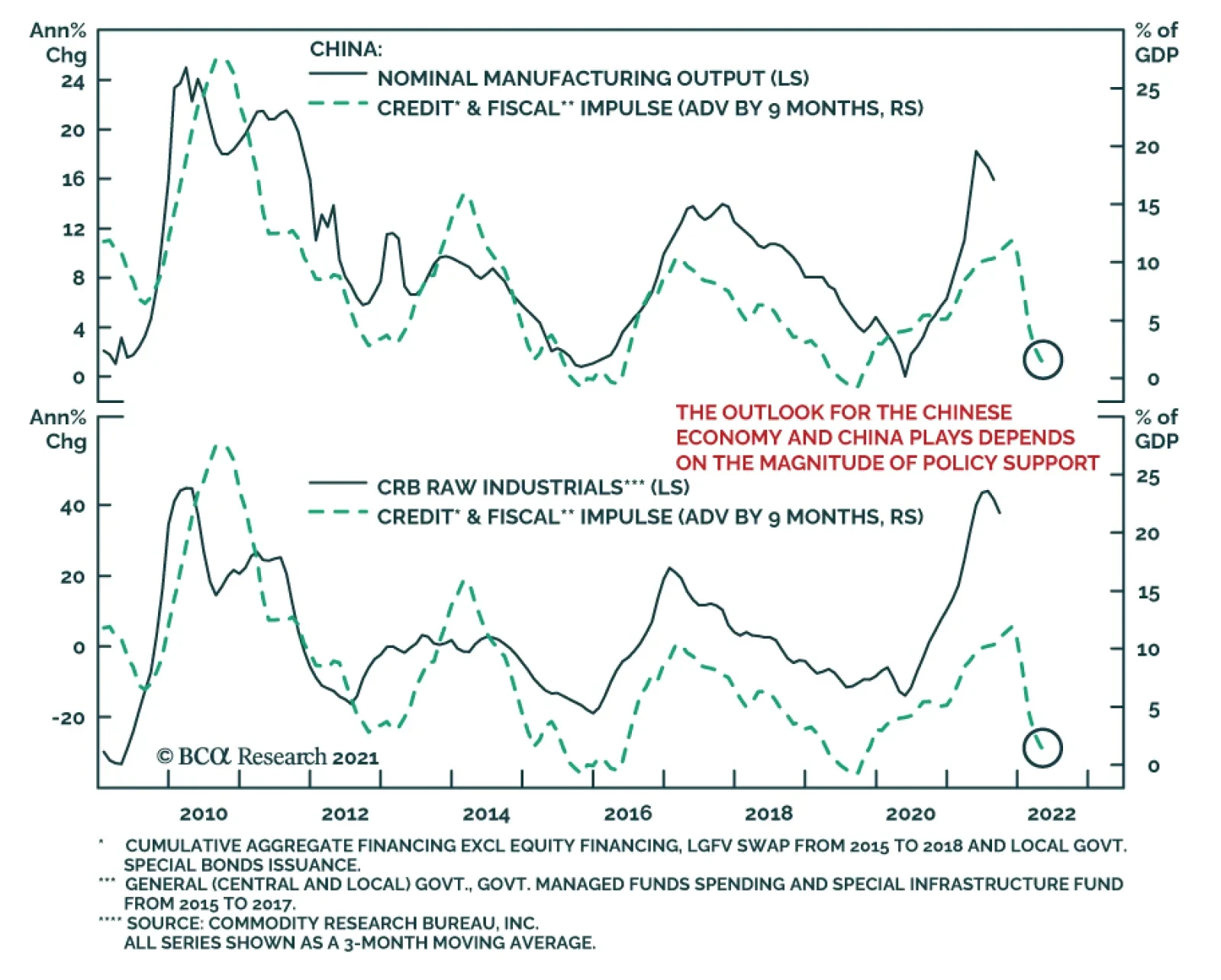
China is an increasing risk to growth. Its economy has been slowing all year as a result of monetary tightening (Chart 6) and this may be exacerbated by the fallout from Evergrande. The Chinese authorities are likely to announce a stimulus package to offset the slowdown (which is why we are neutralizing our underweight on Chinese equities). But the stimulus will probably be only moderate and targeted, and they will not allow a renewed boom in real estate (as we explain on page 11), which has been a significant driver of Chinese growth in recent years (Chart 7). This could hurt the economies of Emerging Markets and other commodity producers, which depend on Chinese demand. Chart 6China Has Been Slowing All Year
China Has Been Slowing All Year
China Has Been Slowing All Year
Chart 7Real Estate Has Been A Big Driver Of Chinese Growth
Real Estate Has Been A Big Driver Of Chinese Growth
Real Estate Has Been A Big Driver Of Chinese Growth
At the same time that growth is slowing, inflation is proving a little stickier and broader-based than was expected. Measures of underlying inflation pressure, such as trimmed-mean CPIs, suggest that it is no longer only pandemic-related prices that are rising in the US and some other countries (Chart 8). Rising shipping charges (container rates are up 228% this year) are pushing up the cost of imported goods. And the first signs are emerging that labor shortages, especially in restaurants and shops, are causing wage rises (Chart 9). Chart 8Inflation Is Broadening Out In Some Countries
Inflation Is Broadening Out In Some Countries
Inflation Is Broadening Out In Some Countries
Chart 9The First Signs Of Wage Rises?
The First Signs Of Wage Rises?
The First Signs Of Wage Rises?
Unsurprisingly, then, central banks are starting to wind down their asset purchases and even raise rates. Norges Bank was the first developed central bank to hike this cycle in September. New Zealand may follow in Q4. And the Fed has pretty clearly signaled that it, too, will announce tapering before year-end. And this is not to mention Emerging Market central banks, many of which have had to raise rates sharply in the face of soaring inflation (Chart 10).A shrinking of excess liquidity is another common phenomenon of the second stage of expansions, as monetary policy starts to be tightened and liquidity is directed more towards the real economy and less towards speculation. This, too, often caps the upside for risk assets, though it doesn’t usually cause them to collapse (Chart 11). Chart 10EM Central Banks Raising Rates Sharply
EM Central Banks Raising Rates Sharply
EM Central Banks Raising Rates Sharply
Chart 11Excess Liquidity Is Drying Up
Excess Liquidity Is Drying Up
Excess Liquidity Is Drying Up
Table 2Who Will Raise Rates When?
Quarterly Portfolio Outlook: Stay Bullish But Verify
Quarterly Portfolio Outlook: Stay Bullish But Verify
While there are many factors that might cause market jitters over the coming months, the underlying picture is that robust growth is likely to continue and central banks will remain cautious about tightening too quickly. Excess savings will propel consumption, companies will need to increase capex to fulfill that demand, and the impact of fiscal stimulus is still coming through (Chart 12). The big central banks won’t raise rates for some time: The Fed perhaps in late-2022, but the ECB and the Bank of Japan not over the forecast horizon (Table 2). Decent growth and easy policy remains a positive backdrop for risk assets over the 12-month horizon. Chart 12Fiscal Stimulus Is Still Coming Through
Quarterly Portfolio Outlook: Stay Bullish But Verify
Quarterly Portfolio Outlook: Stay Bullish But Verify
Garry Evans, Senior Vice PresidentChief Global Asset Allocation Strategistgarry@bcaresearch.comWhat Our Clients Are AskingHow Worried Should We Be About Inflation?Since the beginning of the year, we have argued that the current period of high inflation will be transitory. The market has adopted this view, with 5-year/5-year forward inflation expectations remaining at 2.2%. Chart 13Growing Signs That Inflation Might Not Be Transitory
Growing Signs That Inflation Might Not Be Transitory
Growing Signs That Inflation Might Not Be Transitory
However, we have grown worried about the possibility that inflation might be stickier at a higher level than we initially expected. Specifically, while it is true that prices of supply-constrained items – such as used cars – have started to ease, there are signs that higher inflation has began to broaden. Core CPI excluding pandemic-related items and cars has started to pick up, with its 6-month rate of change reaching its highest level in more than a decade (Chart 13, panel 1). Meanwhile 42% of the PCE basket grew at an annual rate of more than 5% in July, compared to just 24% in March.Currently, we are watching the behavior of prices in the housing and labor markets to check if our worries are justified. We pay particular attention to these sectors because price pressures in housing and labor can be self-sustaining, giving rise to inflationary spirals if left unchecked.What is happening to inflation in these areas? So far, the signals are mixed. Even though wage growth remains within the historical norm for now, any further advance in wages will take us to a decade high (Chart 13, panel 2). Likewise, annual growth of shelter cost remains low, though its 6-month change suggests that it will soon begin to rise to its pre-pandemic levels (Chart 13, panel 3).Our base case continues to be that high inflation is transitory. That being said, we have positioned our portfolio to hedge for the risk that this view is wrong. We have given an overweight to real estate in our alternatives portfolio and within equities. Will Consumers Really Spend All Those Savings? Chart 14Low-Income Households Did Not Save Much
Quarterly Portfolio Outlook: Stay Bullish But Verify
Quarterly Portfolio Outlook: Stay Bullish But Verify
Generous unemployment benefits and the year-long lockdown have pushed up US excess savings over the past 18 months to an estimated $2.5 trillion, and the household savings ratio to 9.6% (Chart 14, panel 1). The consensus is that these savings will bolster consumer spending and support broad economic growth over the coming quarters. However, this expectation is based on the assumption that all consumers have accumulated savings, whereas the reality is a bit different.Survey results from the US Census Bureau show that households earning under $75,000, which have the highest propensity to consume, have almost entirely spent their first stimulus checks and three-quarters of their second and third checks on expenses and paying off debt. Even for those earning over $75,000, only 50% of those stimulus receipts have gone into savings (Chart 14, panel 2).With the labor market still not back to full employment (albeit mostly because of labor supply issues), enhanced unemployment benefits coming to an end, fears of further Covid variants and lockdowns, and higher inflation, could precautionary savings rise? The years following the Global Financial Crisis suggest that they might: The savings rate rose from 3% at the onset of the GFC to 8% five years after it (Chart 14, panel 3). A similar attitude among consumers this time could put a dent in US growth, given that consumption makes up about 70% of GDP.This raises the risk that consumption might slow over the coming quarters. In our latest Monthly Portfolio Outlook, we highlighted that consumption is shifting away from goods towards services. While value added from manufacturing is only 11% of GDP, the effect on markets might be bigger, since goods producers make up about 40% of US market cap. What Is The Risk Of A Big Upside Surprise In US Employment?The recovery of the labor market remains at the center of investors’ and Fed officials’ attention. The reluctance to return to the workforce mostly reflects overly generous unemployment benefits and fears of getting infected. With the fourth wave of the pandemic showing signs of cresting and benefits expiring, the consensus is that the unemployment gap will soon shrink. We would, however, question whether the labor market can surprise significantly to the upside and recover faster than the market currently implies. A swift recovery would push up bond yields and bring forward the Fed’s liftoff date, which could hurt the outlook for risk assets. Chart 15The Labor Market Could Surprise To The Upside
The Labor Market Could Surprise To The Upside
The Labor Market Could Surprise To The Upside
The number of men not in the labor force but who want a job has fallen back to the pre-pandemic level (Chart 15, panel 1). The sharp decline in this indicator in August coincided with the expiration of unemployment benefits in some Republican states. The overall Federal pandemic benefits program expired in early September. This should push even more people to return to the workforce (Chart 15, panel 2).However, there are still close to 3.5 million women (almost half a million above the pre-pandemic level) who are not in the labor force but would like a job: Some of these are keen to return to the workplace once they deem it safe for their children to get vaccinated and return to school. With governments eager to speed up vaccination rollouts and Pfizer’s recent announcement showing positive results of its Covid vaccine in trials on children under the age of 12, more women should return to the workforce.It is also worth noting that some of the most hard-hit sectors – such as leisure & hospitality – have already recovered over 80% of the jobs lost since February 2020. For sectors yet to reach such a high recovery rate, for example education & health services, returning workers have room to choose from jobs. For every job lost since the onset of the pandemic, there are now 2.1 job openings (Chart 15, panel 3). What Is The Risk Of Contagion From Evergrande?In September, Chinese property developer Evergrande failed to make an interest payment on an overseas bond issue. What would be the consequences for the Chinese and global economy if it went bankrupt? Chart 16Chinese Companies Are Highly Indebted
Chinese Companies Are Highly Indebted
Chinese Companies Are Highly Indebted
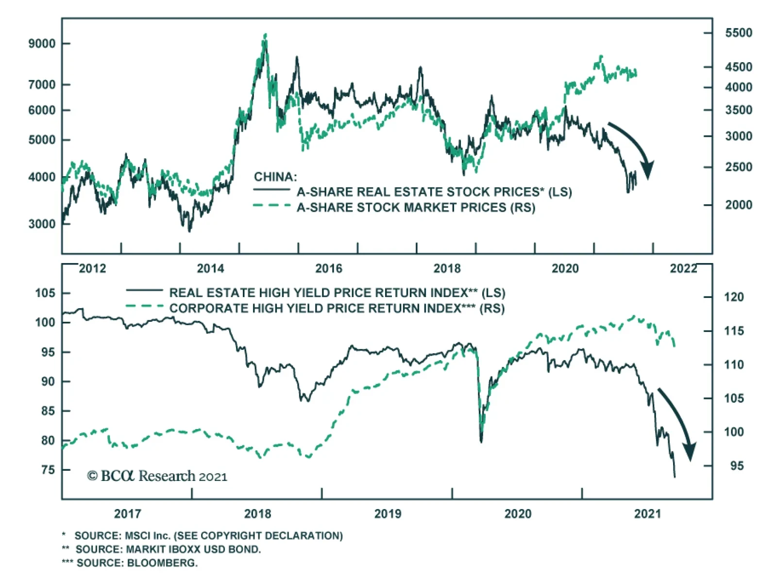
Evergrande is big. Its debts are $306 billion, 2% of Chinese GDP. It has yet to build 1 million units that have already been paid for. It employs 200,000 people. And the issue is bigger. For years, investors have worried about China’s corporate debt, which is 160% of GDP (Chart 16). Chinese companies have issued almost $1 trillion of bonds in foreign currencies. The property market plays an outsized role in the economy: It comprises 66% of household wealth (versus 24% in the US); real estate and related industries amount to some 30% of GDP.The government will likely rescue Evergrande. But it faces a dilemma: For years it has been trying to reduce bad debt and stabilize house prices. It cannot bail out Evergrande’s creditors without undermining those efforts.It will probably aid apartment buyers, who have paid upfront for Evergrande properties, and make arrangements for domestic banks to swap their debt for equity or land holdings. But it won’t bail out equity owners or foreign bond holders. It will also not ease real-estate market restrictions, such as the “three red line” rules on property companies’ leverage. Such a package could damage Chinese individuals’ confidence in property, and foreigners willingness to provide capital to the industry.China may also announce a stimulus package to bolster the economy. But local governments are dependent on land sales for around a third of their income (Chart 17). If the property market is weak, the transmission mechanism of stimulus may be damaged. Finally, Chinese housing sales are highly correlated to global commodities prices, which may fall as a result (Chart 18). Chart 17Local Governments Depend On Land Sales
Local Governments Depend On Land Sales
Local Governments Depend On Land Sales
Chart 18A Slowdown In Housing Would Hurt Commodities
A Slowdown In Housing Would Hurt Commodities
A Slowdown In Housing Would Hurt Commodities
BCA Research’s EM and China strategists do not see Evergrande as likely to trigger a systemic crisis or crash, but it will reinforce the chronic credit tightening that has been underway in China.1Is It Time To Overweight Japanese Equities?Japanese equities staged a strong rally in the third quarter, outperforming the MSCI global equity index by about 5% in US dollar total return terms. On an absolute basis, the MSCI Japan price index in USD is near its 1989 historical high, even though the local-currency index is still more than 30% below its 1989 all-time high.We have been underweight Japanese equities in our global equity portfolio since July 2019, mainly due to unfavorable structural forces such as the aging population and chronic deflationary pressures. Japanese equities have tended to stage counter-trend bounces, some of which were quite significant in magnitude (Chart 19, panel 1). We therefore recommend clients move to the sidelines to avoid the potentially short-lived but sharp upside risk, supported by the following two considerations:First, foreign investors play a significant role in the Japanese equity market. The fact that MSCI Japan in USD terms is near its all-time high could trigger more foreign buying, given the positive correlation between the price index and price momentum (Chart 19, panels 3 and 5).Second, Japanese equities are among the cheapest globally, trading at a large discount to the global index. Currently, the discount is larger than its 3-year moving average, making it risky to underweight Japan.So why not overweight Japanese equities?The Japanese equity index is dominated by Industrials. It should benefit from our favorable view on this sector. However, Japan’s machinery and machine tool industries have heavy reliance on Asia, especially China. Orders from China have already rolled over with the Chinese PMI now in contractionary territory. In the meantime, the rolling-over of the US and European PMIs also does not bode well for orders from the other two large regions (Chart 20). Chart 19Upgrade Japanese Equities To Neutral
Upgrade Japanese Equities To Neutral
Upgrade Japanese Equities To Neutral
Chart 20Japan's Heavy External Reliance
Japan's Heavy External Reliance
Japan's Heavy External Reliance
We expect that China will eventually inject stimulus into its economy in a measured fashion such that the negative spillover to Japan and Europe may be limited. That’s why we are also taking profit in our underweight position on China after the recent sharp selloff in the offshore Chinese equity index (see page 18).Global EconomyOverview: The developed world continues to see strong growth, albeit at a slower pace than nine months ago. This is causing a more persistent – and more broad-based – rise in inflation, especially in the US, than was previously expected. However, the Fed is unlikely to raise rates for at least another 12 months, and the ECB and BOJ not on the forecast horizon. The biggest risk to global economic growth is the slowdown in China and now the troubles at Evergrande. We assume that the Chinese government will launch a stimulus to cushion the slowdown, but it may be less effective than the market expects. Chart 21US Growth Has Slowed But Remains Above Trend
US Growth Has Slowed But Remains Above Trend
US Growth Has Slowed But Remains Above Trend
US: Growth has been slowing relative to expectations all year (Chart 21, panel 1). Nonetheless, it is still well above trend. The September Markit PMIs remained high at 60.5 for manufacturing and 54.4 for services. Although consumer confidence has fallen back a little because of the third Covid wave in some southern states, retail sales in August were still up 15% year-on-year and 1.8% (ex autos) month-on-month. Growth seems set to remain above trend, as consumers spend their $2.5 trillion of excess savings, companies increase capex to ease supply-chain bottlenecks, and the government rolls out more fiscal spending. The IMF forecasts 4.9% real GDP growth in 2022, after 7.0% this year. Euro Area growth also remains robust, with the manufacturing and services PMIs at 58.7 and 56.3 respectively in September. Vaccination levels have risen (more quickly than in the US) and, as a consequence, lockdowns and international travel restrictions have been largely eased. Inflation pressures remain more restrained than in the US, with core CPI at only 1.6% (mainly pushed up by pandemic-related shortages) and the trimmed-mean CPI barely above zero. The ECB persuaded the market that its tapering, announced in September, is very dovish, and it is certainly true that – with its new 2% symmetrical inflation target – the ECB is not set to raise rates any time soon. The IMF’s forecasts are for 4.6% real GDP growth this year, and 4.3% next.Japan has generally lagged the recovery in the rest of the world, due to its structural headwinds, but it is now seeing some more robust data. Industrial production is up 12% year-on-year and exports 26%, although the PMIs still remain somewhat depressed at 51.2 for manufacturing and 47.4 for services in September. Japan’s initial slow vaccine rollout has recently accelerated and the percent of double-vaccinated adults now exceeds the US. This suggests that sluggish consumption (with retail sales up only 2% year-on-year) might start to recover. Markets got excited about the prospects for fiscal stimulus ahead of the general election, which has to be held by the end of November. We do not see new LDP leader Fumio Kishida, who is likely to win that election, making any significant change in policy. Chart 22China Is The One Market Where Growth Is Slowing Sharply
China Is The One Market Where Growth Is Slowing Sharply
China Is The One Market Where Growth Is Slowing Sharply
Emerging Markets: China’s slowdown – and the government’s possible reaction to it with a large stimulus – dominate the outlook for Emerging Markets. Both China’s manufacturing and services PMIs are now below 50 (Chart 22, panel 3), and retail sales, industrial production and fixed-asset investment all surprised sharply on the downside last month. We expect an easing of policy, but only a moderate one. Elsewhere in Emerging Markets, central banks continue to struggle with the puzzle of whether they need to raise rates (as Russia, Brazil and Mexico have done) in the face of rising inflation and falling currencies, despite continuing underlying weakness in their economies. Interest Rates: US inflation looks stickier than believed three months ago, with a broadening of inflation away from just pandemic-affected items (see “How Worried Should We Be About Inflation?" on page 8). But inflation expectations are still well under control (Chart 22, panel 4) and so the Fed is likely to begin tapering only in December and not raise rates until end-2022. This will most likely cause a moderate rise in long-term rates with the 10-year US Treasury yield rising to 1.7% by year-end and 2-2.25% by the time of the first Fed rate hike. Inflation elsewhere in developed economies looks more subdued (except in the UK and Canada), and so long-term rates are likely to rise somewhat more slowly there.Global Equities Chart 23Watch Earning Revisions
Watch Earning Revisions
Watch Earning Revisions
Global equities ended the quarter more or less flat after a very strong performance in the first eight months of the year and a volatile September. Earnings growth continued its strong trend from the first half, powered by margin improvement in both the DM and EM universes. Consequently, the forward PE multiple contracted further (Chart 23).Going forward, despite worries about the potential spillover to the global economy and global financial markets from China’s Evergrande fiasco, the “earnings-driven” theme will likely continue. BCA’s global earnings model points to over 40% earnings growth for the next 12 months, and all sectors have positive forward earnings estimates. However, net revisions by analysts seem to be cresting as the global manufacturing PMI has rolled over from a very high level. Even though valuation is less stretched than at the beginning of the year, equities are still expensive by historical standards. In addition, central banks are preparing for an eventual withdrawal of their massive liquidity injections and there is still plenty of uncertainty concerning Covid variants. GAA has been cautiously optimistic so far this year with overweights on equities and cash relative to bonds, and overweight US equities relative to Japan, Europe and China. These positions have panned out well. After adjustments made in April and July, our sector portfolio has been well positioned by overweighting Industrials, Financials, Real Estate and Healthcare, underweighting Materials, Utilities and Consumer Staples, and being neutral on Tech, Consumer Discretionary and Communication Services. We have not made any changes to our sector recommendations this quarter.In accordance with our long-held belief of “taking risk where risk will likely be rewarded the most,” we make the following adjustments to our country allocations: close the underweights in China and Japan and the overweight in the UK; and initiate one new position: Underweight EM-ex-China. Overall, our country portfolio has a defensive tilt with an overweight in the US (defensive) and underweights in the euro area and EM-ex China (cyclical), while being neutral on the UK, Japan, Australia and Canada. Country Allocation: Upgrade MSCI China And Japan, Downgrade UK And EM-ex-China. We have been underweight MSCI China and overweight the UK since April 2021, and underweight Japan since July 2019.The China underweight generated outperformance of 23% and the UK overweight -2%, while the Japanese position produced an outperformance of 7%. Chart 24Favor China vs The Rest of The EM
Favor China vs The Rest of The EM
Favor China vs The Rest of The EM
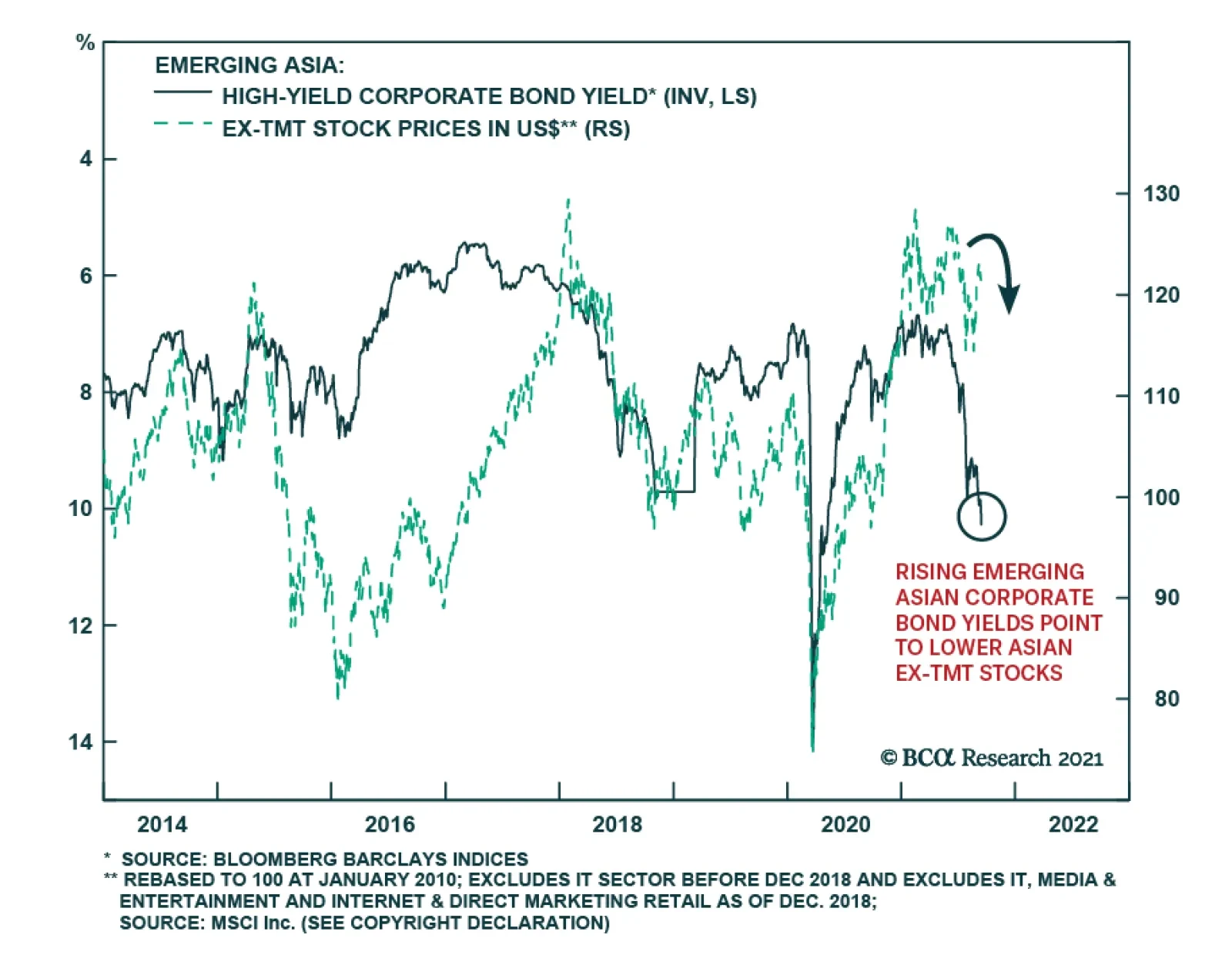
While the fate of Evergrande Group, China’s second largest property developer, remains uncertain, our view is that the government will come up with a restructuring plan to minimize damaging ripple effects on the Chinese economy. This view is supported by the behavior of the domestic A-share market and also the CNY/USD, which has diverged from the offshore equity market (Chart 24, Panel 5).BCA Research’s house view is that China will now stimulate its economy, but only at a measured pace. This means that further underperformance of MSCI China is likely to be limited relative to the global benchmark, as shown in Chart 24, panel 1. The ongoing deleveraging in the Chinese real estate sector, however, means that activity in the sector will probably slow further, reducing demand for construction materials. This may put a dent on the strength of metal prices, therefore negatively impacting the ex-China EM equity index, as shown in panel 2.Moreover, the relative performance of China vs non-China EM is approaching a very oversold level while the relative valuation measure is at an extreme (Chart 24, panels 3 and 4). As such, we switch our positioning by upgrading Chinese equities to neutral from underweight and downgrade EM ex China to underweight from neutral. This implies an overall underweight to Emerging Markets.We also close the UK overweight to support an upgrade in Japan (see more details on page 13). The UK overweight was largely based on a positive view of the GBP, which has now risen to fair value.Government Bonds Chart 25Watch Inflation In 2022
Watch Inflation in 2022
Watch Inflation in 2022
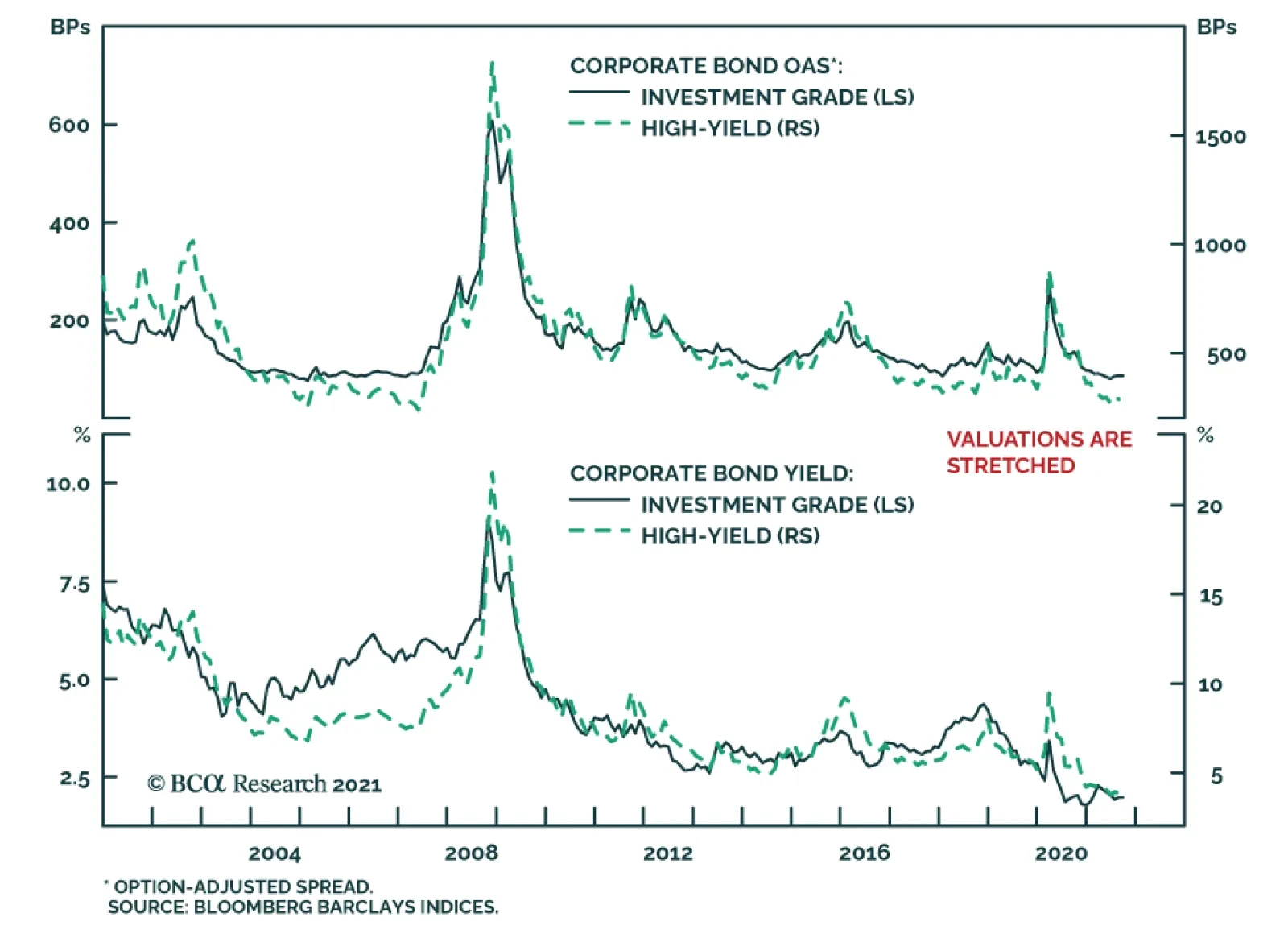
Maintain Below-Benchmark Duration. Global bond yields ignored the sharp rise in core inflation in Q3. The US 10-year Treasury yield actually declined in the first two months of the quarter in response to the muted inflation readings in non-Covid related segments of the economy. Even with the fast run-up in yields in September, the US 10-year yield finished the quarter at 1.52%, only about 5 bps higher than the level on June 30th (Chart 25).We have advised clients to focus on the jobs market to determine when the Fed will lift the Fed Funds Rate off its zero bound because of the Fed’s emphasis on “maximum employment” as a pre-condition for this. However, the Fed has not clearly defined what “maximum employment” means. According to calculations by our US bond strategists, the US unemployment rate will fall to 3.8%, with a 63% participation rate, by the end of 2022 if job creation averages a reasonably achievable 414,000 per month until then. Our bond strategists think that the Fed will be forced to clarify its definition of “maximum unemployment” over the coming months and, as we get close to it next year, the key indicator to watch will shift back to inflation. If inflation remains high, then the Fed will be quicker to declare that the labor market is at “maximum employment”, and vice versa.Currently, the overnight index swap curve indicates the first rate hike will be in January 2023 with a total rate increase of 123 bps by the end of 2024. BCA Research’s house view is that the Fed will announce its first hike in December 2022 and will hike at a faster pace than what is priced in by the market. This is based on our view that unemployment will likely reach 3.5% by end-2022 with inflation above the Fed’s target. This would suggest that long-term rates will rise too, and so bond investors should remain below benchmark duration.Corporate BondsSince the beginning of the year, investment-grade credit has provided roughly 200 basis points of excess return over duration-matched Treasurys, while high-yield bonds have generated almost 600 basis points. Chart 26Continue to Favor High-Yield Credit
Continue to Favor High-Yield Credit
Continue to Favor High-Yield Credit
We continue to have a neutral allocation to investment-grade credits within the fixed-income category. While supportive monetary policy should generally favor spread product, we believe there is much better value to be found outside investment-grade bonds, since these bonds are currently trading at historically high valuation levels (Chart 26, panel 1).We think valuations look much more attractive in the high-yield space, and as a result remain overweight within the fixed-income category. Our US Bond Strategy service expects the share of defaults in the space to fall to between 2.3% and 2.8% – below the default rate currently priced in by the market (Chart 26, panel 2). Within high yield, we prefer B-rated bonds since they offer the most attractive spread pickup on a risk-adjusted basis.What about EM debt? Currently we are cautious on EM corporate debt. The default of Chinese real estate developer Evergrande is likely to have ripple effects throughout EM credit markets and currencies. There are already signs of considerable strains, with EM corporate spreads starting to rise (Chart 26, panel 3). We recommend that investors focus on EM sovereign issuers such as Mexico, Russia, and Malaysia, given that they provide a significant yield pickup over US bonds with comparable credit ratings, and are less likely to default than their corporate counterparts.CommoditiesEnergy (Overweight): Oil prices are likely to remain close to current levels for the remainder of this year. However, recovering demand – particularly from Emerging Markets – and production discipline by the OPEC 2.0 coalition should support prices over the next two years. Given this backdrop, our Commodity & Energy strategists expect the price of Brent crude to average $75 and $80 per barrel in 2022 and 2023 respectively, with WTI trading $2-$4/bbl lower. Chart 27Limited Upside For Oil And Metals In The Short-Term
Limited Upside For Oil And Metals In The Short-Term
Limited Upside For Oil And Metals In The Short-Term
Industrial Metals (Neutral): Industrial metals’ prices have bifurcated. Those relating to alternative energy, such as copper, nickel and cobalt, continue to rise and are up 30% on average since the beginning of the year. Iron ore on the other hand has taken a colossal hit, falling over 53% from its May high. The knock-on effects of accelerating Chinese production cuts and softening economic activity, as well as Evergrande’s debt woes, will continue to put downward pressure on prices. In the short-term, we do not expect a significant rebound. However, in the longer-term, demand will recover – particularly if China implements significant stimulus – and supply will remain tight, which will help metal prices to recover.Precious Metals (Neutral): Gold prices did not react positively to the decline in US real rates over the past quarter. In fact, gold prices are slightly down, by ~1.5% since the start of July (Chart 27, panel 4). We expect real rates to rise as economic growth and the labor market recover and the Fed turns slightly more hawkish, while inflation moderates as base and pandemic effects abate. Rising real rates are a negative factor for the gold price. Nevertheless, inflation is likely to be a bit stickier than the market is currently pricing in, and we therefore maintain a neutral exposure to gold, since it is a good inflation hedge.CurrenciesUS Dollar Chart 28Do Not Underweight The Dollar Yet
Do Not Underweight The Dollar Yet
Do Not Underweight The Dollar Yet
Since we went from underweight to neutral on the dollar in April, the DXY has risen by only 1%. Our position remains the same for this quarter. On the one hand, momentum – one of the most reliable indicators for cyclical movements in the dollar – has turned firmly positive. Moreover, pain in the Chinese real-estate sector should weight on commodities and emerging markets – a development which historically has been bullish for the USD (Chart 28, panel 1). However, not all is good news for the greenback. Relative growth and inflation trends are starting to rebound in the rest of the world vis-à-vis the US (Chart 28, panel 2). Additionally, speculators are now firmly overweight the USD, and it remains expensive by 11% relative to PPP fair value. We believe that these forces could eventually be strong enough for the dollar bear market to resume. As a result, we are putting the US dollar on downgrade watch. Canadian DollarWe believe that there is upside to the Canadian dollar. Canada’s employment market is recovering faster than in the US, which should prompt the BoC to normalize interest rates before the Fed. Additionally, while many commodities are likely to suffer as China’s real estate market slows, oil should hold up relatively well since its demand is not as dependent on the Chinese economy. As a result, we are upgrading the CAD from neutral to overweight. Australian DollarWe remain underweight the AUD. While it is true that the AUD is now cheap on a PPP basis, weakness in iron ore from a slowing Chinese real-estate market should continue to weigh on the Aussie dollar. Chinese YuanWe are negative on the yuan on a cyclical basis. Interest-rate differentials should start moving against this currency (Chart 28, panel 3). While the Fed is likely to tighten policy as the labor market enters full employment, Chinese authorities will ease monetary policy to avert a full-blown crisis in their real-estate market.Alternatives Chart 29Outlook Remains Favorable For Private Equity And Real Estate
Quarterly Portfolio Outlook: Stay Bullish But Verify
Quarterly Portfolio Outlook: Stay Bullish But Verify
Return Enhancers: With public markets expensive and unlikely to provide investors with more than single-digit returns, the focus has shifted to alternative assets, particularly private equity (PE). Performance continues to be impressive, with an annualized return of 59% in Q4 2020 (Chart 29, panel 1). This supports our previous research that funds raised during recessions and early in expansions tend to outperform those raised late-cycle. Distributions from existing positions should allow limited partners (LPs – the investors who provide capital to PE funds) to commit to newer funds. Data from Preqin shows that more than $610 billion has been raised so far during 2021 (Chart 29, panel 2). We continue to favor Private Equity over Hedge Funds.Inflation Hedges: Last year’s inflationary pressures should moderate over the coming months as base effects and supply chain bottlenecks abate. Given this backdrop, we maintain our positive view on real estate versus commodity futures. Commodity prices have already shot up over the past 18 months and have limited upside from current levels: Energy prices are up by 61% since the beginning of the year, industrial metals 24%, and agriculture 17%. Over the past 15 years, REITs outperformed commodity futures when inflation was between 0% and 3% (Chart 29, panel 3). There are opportunities within the real-estate sector, despite our concerns about weaknesses in some segments of commercial real estate such as prime office property in major cities.Volatility Dampeners: We continue to favor farmland and timberland over structured products, particularly mortgage-backed securities (MBS). Farmland offers attractive yields and should continue to provide the best portfolio protection in the event of any market distress. MBS spreads, on the other hand, while wider than the pre-pandemic level, remain tight compared to the pace of mortgage refinancing (Chart 29, panel 4).Risks To Our ViewOur main scenario is based on a Goldilocks-like view of the world: That growth will be robust, but not so strong as to push up inflation further and cause central banks to turn hawkish. The risks, therefore, are that the environment turns out to be either too hot or too cold. Chart 30A Resurgence Of Covid
A Resurgence Of Covid
A Resurgence Of Covid
What could cause growth to slow? Covid remains the biggest risk. Cases are still high in many countries, and could rise again as people socialize indoors during the colder months (Chart 30). A more virulent strain is not inconceivable. Governments will be reluctant to impose lockdowns again, but consumers might become wary about going out.We have written elsewhere (see page 11) about the risks coming from a China slowdown and the aftermath of the Evergrande affair. A policy mistake is not improbable: The Chinese authorities want to stimulate the economy, but at the same time keep a lid on property prices. That will be a hard balance to achieve. Slower Chinese growth would hurt commodity producers and many Emerging Markets. Other risks to growth include fiscal tightening as employment-support schemes end and countries look to repair their budget positions (Chart 31), consumers building up precautionary savings and not spending their excess cash (see page 9), and problems caused by rising energy prices.Our view remains that the currently high inflation is transitory. But it is proving quite sticky and could remain high for a while. Inflation expectations are well anchored for the moment (Chart 32) but could rise above central banks’ comfort-zones if recorded core inflation in the US, for example, currently 3.6%, stays above 3% for another 12 months. This could bring forward the date of the first Fed rate hike (currently priced in for January 2023), raise long-term rates and, in turn, push up the dollar. A combination of rising US rates and a stronger dollar would have very negative consequences for heavily indebted Emerging Market economies. Chart 31Fiscal Drag
Fiscal Drag
Fiscal Drag
Chart 32Deanchoring Of Inflation Expectations
Deanchoring Of Inflation Expectations
Deanchoring Of Inflation Expectations
Footnotes1 Please see China Investment Strategy Report "The Evergrande Saga Continues," dated September 29, 2021 and Emerging Markets Strategy Report "On Chinese Internet Stocks, Real Estate And Overall EM," dated September 16, 2021, available at https://www.bcaresearch.com/GAA Asset Allocation
The performance of global risk assets improved somewhat on Tuesday following Monday’s tumble on the back of concerns about the potential implications of an Evergrande default. Nevertheless, risks remain elevated. A key unknown facing investors going forward…
BCA Research’s US Bond Strategy service expects corporate bonds to outperform Treasuries during the next 6-12 month. However, both excess returns and total returns will take a step down. Two broad factors must be considered when deciding whether to favor…
Highlights Investment Grade: Investment grade corporate bond total returns will be close to zero or negative during the next 12 months. The bonds are also likely to outperform duration-matched Treasuries during that period, but excess returns are probably capped at 85 bps. High-Yield: High-yield total returns will fall between -0.29% and +1.80% during the next 12 months, but with a much higher likelihood of being positive than investment grade corporates. Junk will outperform duration-matched Treasuries by between 0.94% and 1.84%, besting the excess returns earned in investment grade. Inflation & The Fed: The Fed will announce asset purchase tapering before the end of this year, and tapering will proceed at a pace that opens the door to a potential rate hike before the end of 2022. Ultimately, whether the Fed lifts rates in 2022 will depend on trends in core CPI excluding COVID-impacted services and autos, along with wage growth and inflation expectations. Feature Chart 1Valuations Are Stretched
Valuations Are Stretched
Valuations Are Stretched
There are two broad factors that must be considered when deciding whether to favor corporate bonds over Treasuries in a US bond portfolio: (i) The cyclical macroeconomic environment and (ii) valuation. The problem is that, as it stands today, these two factors are sending contrasting signals. The cyclical macroeconomic environment is consistent with strong positive excess returns for spread product versus Treasuries. However, corporate bond spreads and yields are extremely low relative to history (Chart 1). We view the slope of the yield curve as the single best indicator of the cyclical macro environment and have shown in prior research that corporate bonds tend to deliver positive excess returns versus Treasuries when the 3-year/10-year Treasury slope is above 50 bps, even when corporate spreads are tight.1 At present, the 3-year/10-year slope sits at 90 bps and our bias will be toward an overweight allocation to corporates until the slope breaks below 50 bps. A flatter yield curve is negative for corporate bond performance because it suggests that monetary conditions are less accommodative. It also makes it more likely that an unforeseen shock will lead to yield curve inversion, a highly reliable recession indicator. While the macro environment is consistent with continued corporate bond outperformance versus Treasuries, valuation suggests that we should anticipate lower returns than usual from corporate bonds. Table 1 shows annualized corporate bond excess returns during each of the past six cycles. Additionally, it splits each cycle into three phases based on the slope of the 3-year/10-year Treasury curve. Phase 1 of the cycle lasts from the end of the prior recession until the slope breaks below 50 bps. Phase 2 encompasses the period when the slope is between 0 bps and 50 bps. Phase 3 lasts from when the yield curve inverts until the start of the next recession. Table 1Corporate Bond Excess Returns In Different Phases Of The Cycle
Expected Returns In Corporate Bonds
Expected Returns In Corporate Bonds
The first conclusion to draw from Table 1 is that excess returns tend to be lower in Phase 2 than in Phase 1 and lower in Phase 3 than in Phase 2. Second, we see that investment grade corporates have returned an annualized 7.55% in excess of duration-matched Treasuries so far this cycle and high-yield corporates have delivered 15.15% of outperformance. These figures are well above even those seen in prior Phase 1 periods. Based on this, an expectation for lower – but still positive – excess corporate bond returns seems like a reasonable base case for the next 6-12 months. Table 2 is identical to Table 1 except that it shows total returns instead of excess returns. We observe that, so far this cycle, junk bond total returns have outpaced prior Phase 1 periods. Investment grade total returns have been slightly lower given the greater exposure to interest rate risk of those securities. Table 2Corporate Bond Total Returns In Different Phases Of The Cycle
Expected Returns In Corporate Bonds
Expected Returns In Corporate Bonds
As noted above, our expectation is that corporate bonds will outperform Treasuries during the next 6-12 months, but that both excess returns and total returns will take a step down. The next section of this report presents a scenario analysis that puts some more specific numbers on the sorts of excess and total corporate bond returns investors might expect to earn during the next year. Corporate Bond Returns: Scenario Analysis Methodology To run our scenario analysis for investment grade corporate bond returns we use the following equations: Excess Return = OAS0 – D0 (dOAS) Total Return = OAS0+ TSY0 – D0 (dOAS+dTSY) Where: Excess Return = The expected corporate index excess return versus duration-matched Treasuries during the next 12 months Total Return = The expected corporate index total return during the next 12 months OAS0 = Today’s average index option-adjusted spread D0 = Today’s average index duration TSY0 = Today’s Treasury yield that matches the duration of the corporate index dOAS = The expected change in the index option-adjusted spread during the next 12 months dTSY = The expected change in the duration-matched Treasury yield during the next 12 months These equations are obviously simplifications. For example, the impact of convexity is ignored. However, Chart 2 shows that our proxies track actual index returns very closely over time, assuming the estimated yield and spread changes are accurate. Chart 2Estimating IG Returns
Estimating IG Returns
Estimating IG Returns
We use similar equations for assessing high-yield corporate returns, with the additional complication that we must include an assumption for default losses. Excess Return= OAS0 – (DR × (1 - RR)) –D0(dOAS) Total Return= OAS0 + TSY0 – (DR × (1 – RR)) –D0 (dOAS + dTSY) In these equations: DR = The expected issuer-weighted default rate for the next 12 months RR = The expected average recovery rate on defaulted debt for the next 12 months Once again, though these equations are relatively simple, they do a good job of capturing actual returns over time (Chart 3). Chart 3Estimating HY Returns
Estimating HY Returns
Estimating HY Returns
Scenarios With the above equations in hand, we can easily make some educated guesses about future yields, spreads and default losses and translate those assumptions into expected return forecasts. Specifically, we test three different scenarios (bullish, neutral and bearish) for corporate spreads, Treasury yields and default losses. For corporate index spreads, both investment grade and high-yield, our bullish scenario assumes that spreads reach the all-time tight levels seen in the mid-1990s. For investment grade bonds this spread level is 58 bps, 27 bps below the current level. For high-yield bonds this spread level is 233 bps, 41 bps below the current level. Our neutral scenario assumes that index spreads remain at their current levels (85 bps for investment grade and 274 bps for junk). Finally, our bearish scenario assumes that spreads widen back to the average levels seen during the 2017-2019 period (112 bps for investment grade and 369 bps for junk), this implies 27 bps of widening for investment grade and 95 bps of widening for junk. Given our view that bond yields will rise as we approach the next Fed tightening cycle, none of our scenarios assume that Treasury yields will fall during the next 12 months. Our bullish Treasury yield scenario assumes that yields stay flat at current levels. Our neutral Treasury yield scenario assumes that yields follow the path implied by current forward rates, and our bearish Treasury yield scenario assumes that yields rise to levels consistent with fair value estimates assuming the market prices-in a December 2022 Fed liftoff followed by 100 bps of rate hikes per year until the fed funds rate levels-off at 2.08%.2 We use the 7-year and 6-year Treasury yields as our inputs for the investment grade and high-yield scenarios, respectively, as those yields most closely match the interest rate component embedded in the corporate indexes. For default losses, our bullish scenario assumes a 1.8% default rate – consistent with the rate at which defaults are tracking so far this year – and a recovery rate of 50%. Our neutral scenario assumes a 3% default rate and a 40% recovery rate. Our bearish scenario assumes a 4% default rate and 30% recovery rate. Investment Grade Results Table 3 shows the results of our scenario analysis for investment grade corporate bond returns. Table 3Investment Grade Corporate Bond Expected Return Scenarios
Expected Returns In Corporate Bonds
Expected Returns In Corporate Bonds
Starting with excess returns, we think it is most likely that spreads remain near current levels, or perhaps widen a bit, during the next 12 months. We think it’s extremely unlikely that spreads will tighten to the levels seen in the mid-1990s because the average duration of the index is much higher today than it was back then. All else equal, it’s generally true that securities with higher duration also have higher OAS. This means we expect investment grade corporate bond excess returns to be between -153 bps and +85 bps during the next 12 months, probably closer to +85 bps. Obviously, this represents a significant step down from the +550 bps earned during the past year. In fact, even the most bullish scenario where spreads tighten back to all-time lows only implies an excess return of +323 bps, well below the recent rate of outperformance. As for total returns, we estimate that a neutral scenario where the index spread holds steady and Treasury yields follow the forward curve will lead to total returns being close to zero during the next 12 months. In fact, our results suggest that it’s highly likely that investment grade corporate bonds will deliver negative total returns during the next 12 months. Yes, the index is expected to deliver a total return of 1.98% if both the index spread and duration-matched Treasury yield remain at their current levels, but an environment where growth is slow enough to keep Treasury yields flat is much more likely to coincide with spread widening than with steady corporate spreads. For some additional historical perspective, the columns labeled “Historical Percentile Rank” show how the returns in each scenario would rank relative to actual returns earned during the past 31 calendar years. For example, even the most bullish total return scenario of 4.36% ranks at the 27th percentile relative to history. This means that it would only be better than 27% of historical 12-month return observations for that index. High-Yield Results Tables 4A, 4B and 4C summarize the results of our high-yield scenario analysis. Table 4A assumes the bullish scenario for default losses, Table 4B assumes the neutral scenario for default losses and Table 4C assumes the bearish scenario for default losses. Table 4AHigh-Yield Corporate Bond Expected Return Scenarios: Bullish Default Loss Scenario*
Expected Returns In Corporate Bonds
Expected Returns In Corporate Bonds
Table 4BHigh-Yield Corporate Bond Expected Return Scenarios: Neutral Default Loss Scenario*
Expected Returns In Corporate Bonds
Expected Returns In Corporate Bonds
Table 4CHigh-Yield Corporate Bond Expected Return Scenarios: Bearish Default Loss Scenario*
Expected Returns In Corporate Bonds
Expected Returns In Corporate Bonds
Looking at excess returns, the first result that jumps out is that even the most bullish scenario leads to an expected 12-month excess return of +3.43%, this would be equivalent to the median return earned during the past 31 calendar years. In our view, it’s more likely that excess returns will be in the +0.94% to +1.84% range during the next 12 months. This is consistent with flat spreads and a range for default losses between our neutral and bullish scenarios. Our sense is that junk bonds are less likely to deliver negative total returns than investment grade bonds. Though even the most bullish scenario puts expected junk total returns at +4.54%, consistent with the 39th percentile relative to history. Investment Implications To summarize, our expectation is that investment grade corporate bond total returns will be close to zero or negative during the next 12 months. The bonds are also likely to outperform duration-matched Treasuries during that period, but excess returns are probably capped at 85 bps. Our best guess places high-yield total returns at between -0.29% and +1.80%, but with a much higher likelihood of earning positive total returns than a position in investment grade. We estimate that excess junk returns will fall between +0.94% and +1.84%, above returns earned in investment grade. In general, the message is that investors should remain overweight corporate bonds versus Treasuries, but should retain a preference for high-yield over investment grade and should expect to earn far lower returns than were earned during the past year. Given low expected returns, investors should also seek out creative ways of adding additional spread to a bond portfolio. We offered some suggestions in a recent report.3 CPI Update And FOMC Preview This week’s FOMC meeting could be significant for bond markets. First off, there is a possibility that the Fed will announce a timeline for tapering its asset purchases. Our sense is that last month’s weak employment report probably delays this announcement, but we still expect it to come before the end of the year. We expect that the actual tapering of purchases will start in January 2022 and that net Fed purchases will reach zero by Q3 of next year. More broadly, we continue to think that the market is already priced for a tapering announcement in 2021. In other words, any information about asset purchases probably won’t move bond yields that much. What will move bond yields is any hint about when the Fed thinks it may want to start lifting rates. Such news could come in the form of revisions to the Fed’s interest rate forecasts, or in any information that the Fed provides about the pace of asset purchase tapering. Because the Fed has indicated a strong preference for having net purchases at zero prior to liftoff, any pace of tapering that gets net purchases to zero by the middle of next year opens the door to a possible rate hike before the end of 2022. Of course, the economic data between now and the end of 2022 will have a lot to say about whether the Fed actually starts to hike. In particular, last week’s report made the case that next year’s inflation data will determine when rate hikes begin.4 With that in mind, last week’s CPI release showed a significant deceleration in core inflation, driven by the COVID-impacted service and auto sectors that had previously caused inflation to spike (Chart 4). Interestingly, core inflation excluding COVID-impacted services and autos jumped on the month (Chart 4, bottom panel). From the Fed’s perspective, it ignored the transitory rise of COVID-impacted service and auto inflation on the way up, it will also be inclined to ignore its descent. What will ultimately matter for monetary policy is whether underlying inflationary pressures start to build throughout 2022. It is therefore much more important for us to focus on trends in core inflation excluding the COVID-impacted services and autos, along with wage growth and inflation expectations. Our view is that underlying inflationary pressures will be strong enough for the Fed to lift rates before the end of 2022. This will, in large part, be due to an acceleration of shelter inflation (Chart 5). Owner’s Equivalent Rent and Rent of Primary Residence inflation have already jumped, and leading indicators of shelter inflation like the unemployment rate (Chart 5, panel 3) and the Apartment Market Tightness Index (Chart 5, bottom panel) are consistent with further acceleration. Chart 4Looking For Underlying Inflation
Looking For Underlying Inflation
Looking For Underlying Inflation
Chart 5Shelter Inflation Will Keep Rising
Shelter Inflation Will Keep Rising
Shelter Inflation Will Keep Rising
Bottom Line: The Fed will announce asset purchase tapering before the end of this year, and tapering will proceed at a pace that opens the door to a potential rate hike before the end of 2022. Ultimately, whether the Fed lifts rates in 2022 will depend on trends in core CPI excluding COVID-impacted services and autos, along with wage growth and inflation expectations. Ryan Swift US Bond Strategist rswift@bcaresearch.com Footnotes 1 Please see US Bond Strategy Weekly Report, “The Post-FOMC Credit Environment”, dated June 29, 2021. 2 Last week’s report provides more detail on this fair value analysis. Please see US Bond Strategy Weekly Report, “2022 Will Be All About Inflation”, dated September 14, 2021. 3 Please see US Bond Strategy Weekly Report, “The Collapsing Credit Risk Premium”, dated July 20, 2021. 4 Please see US Bond Strategy Weekly Report, “2022 Will Be All About Inflation”, dated September 14, 2021. Recommended Portfolio Specification Other Recommendations Treasury Index Returns Spread Product Returns
The possibility of Chinese real estate developer Evergrande’s collapse threatens the stability of the country’s economy and financial markets through multiple facets. The company accounts for an outsized share of outstanding high-yield dollar bonds and is…
BCA Research's Emerging Markets Strategy service expects Evergrande’s partial default to reinforce credit tightening in China. Evergrande will likely default on some of its liabilities but there will be a bailout or roll-over of its other debt. This raises…
Highlights Chart 1Employment Growth Will Rebound
Employment Growth Will Rebound
Employment Growth Will Rebound
August’s weak employment growth reflects the surge of Delta variant COVID cases in the United States. This is evidenced by the fact that Leisure & Hospitality sector payrolls held flat in August after having grown by 415k in July and 397k in June (Chart 1). While Delta could still be a drag on employment growth for another month or two, there is mounting evidence that the daily new case count is close to its peak. Leisure & Hospitality employment growth will regain its prior pace as new Delta cases trend down. This will lead to a resumption of strong monthly payroll reports (500k – 1000k) as we head into the new year. For monetary policy, we calculate that average monthly nonfarm payroll growth of 414k will be sufficient for the Fed to start rate hikes before the end of 2022 (bottom panel). We anticipate that this threshold will easily be met. The Treasury curve will bear-flatten as employment growth improves and the market prices-in an earlier start and quicker pace of Fed rate hikes. Investors should maintain below-benchmark portfolio duration and stay short the 5-year Treasury note versus a duration-matched 2/10 barbell. Feature Table 1Recommended Portfolio Specification
The Delta Drag
The Delta Drag
Table 2Fixed Income Sector Performance
The Delta Drag
The Delta Drag
Investment Grade: Neutral Chart 2Investment Grade Market Overview
Investment Grade Market Overview
Investment Grade Market Overview
Investment grade corporate bonds underperformed the duration-equivalent Treasury index by 5 basis points in August, dragging year-to-date excess returns down to +166 bps. The combination of above-trend economic growth and accommodative monetary policy supports continued positive excess returns for spread product versus Treasuries. At 91 bps, the 3-year/10-year Treasury slope remains steep. This is a strong signal that monetary conditions are accommodative. But despite the positive macro back-drop, investment grade valuations are extremely tight (Chart 2). A recent report looked at what different combinations of Treasury slope and corporate spreads have historically signaled for corporate bond excess returns.1 It shows that tight corporate spreads only correlate with negative excess returns once the 3-year/10-year Treasury slope is below 50 bps. Though we retain a positive view of spread product as a whole, better value can be found outside of the investment grade corporate sector. Specifically, we recommend that investors shift into high-yield corporates, municipal bonds and USD-denominated Emerging Market sovereigns and corporates. We also advise investors to favor long-maturity corporate bonds and those corporate sectors with elevated Duration-Times-Spread.2 Table 3ACorporate Sector Relative Valuation And Recommended Allocation*
The Delta Drag
The Delta Drag
Table 3BCorporate Sector Risk Vs. Reward*
The Delta Drag
The Delta Drag
High-Yield: Overweight Chart 3High-Yield Market Overview
High-Yield Market Overview
High-Yield Market Overview
High-Yield outperformed the duration-equivalent Treasury index by 66 basis points in August, bringing year-to-date excess returns up to +502 bps. A recent report looked at the default expectations that are currently priced into the junk index and considered whether they are likely to be met.3 If we demand an excess spread of 100 bps and assume a 40% recovery rate on defaulted debt, then the High-Yield index embeds an expected default rate of 3.0% (Chart 3). Using a model of the 12-month trailing speculative grade default rate that is based on gross corporate leverage (pre-tax profits over total debt) and C&I lending standards, we estimate that the 12-month default rate will fall to between 2.3% and 2.8%, below what the market currently discounts. Notably, the corporate default rate is tracking at an annualized rate of roughly 1.7% through the first seven months of the year, well below the estimate generated by our macro model. Another recent report looked at the incremental spread pick-up investors can earn by moving out of investment grade corporates and into junk.4 It concluded that the extra spread available in high-yield is worth grabbing and that B-rated bonds look particularly attractive in risk-adjusted terms. MBS: Underweight Chart 4MBS Market Overview
MBS Market Overview
MBS Market Overview
Mortgage-Backed Securities underperformed the duration-equivalent Treasury index by 3 basis points in August, dragging year-to-date excess returns down to -67 bps. The nominal spread between conventional 30-year MBS and equivalent-duration Treasuries tightened 4 bps in August. The spread is wide compared to recent history, but it remains tight compared to the pace of mortgage refinancings (Chart 4). The conventional 30-year MBS option-adjusted spread (OAS) widened 2 bps in August (panel 2), and it is now starting to look attractive compared to other similarly risky spread sectors. The conventional 30-year MBS OAS sits at 38 bps, below the 56 bps offered by Aa-rated corporate bonds but above the 20 bps offered by Aaa-rated consumer ABS and the 35 bps offered by Agency CMBS. In a recent report we looked at MBS performance and valuation across the coupon stack.5 We noted that the higher convexity of high-coupon MBS makes them likely to outperform lower-coupon MBS in a rising yield environment. Higher coupon MBS also have greater OAS than lower coupons. This makes the high-coupon MBS more likely to outperform in a flat bond yield environment as well. Given our view that bond yields will be higher in 6-12 months, we recommend favoring high coupons (4%, 4.5%) over low coupons (2%, 2.5%, 3%) within an overall underweight allocation to Agency MBS. Government-Related: Neutral Chart 5Government-Related Market Overview
Government-Related Market Overview
Government-Related Market Overview
The Government-Related index outperformed the duration-equivalent Treasury index by 27 basis points in August, bringing year-to-date excess returns up to +84 bps (Chart 5). Sovereign debt outperformed duration-equivalent Treasuries by 122 bps in August, bringing year-to-date excess returns up to +7 bps. Foreign Agencies outperformed the Treasury benchmark by 8 bps on the month, bringing year-to-date excess returns up to +44 bps. Local Authority bonds outperformed by 9 bps in August, bringing year-to-date excess returns up to +382 bps. Domestic Agency bonds outperformed by 3 bps, bringing year-to-date excess returns up to +30 bps. Supranationals outperformed by 5 bps, bringing year-to-date excess returns up to +31 bps. USD-denominated Emerging Market (EM) Sovereign bonds outperformed US corporates in August and relative valuation between the two sectors is starting to equalize (panel 4). That said, we retain a preference for EM sovereigns over US corporates, particularly the bonds of Russia, Mexico, Saudi Arabia, UAE and Qatar where value remains attractive. A recent report looked at valuation within the investment grade USD-denominated EM corporate space.6 It found that EM corporates are attractively priced relative to US corporate bonds across the entire investment grade credit spectrum. It also found that EM corporates are attractive relative to EM sovereigns within the A and Baa credit tiers. EM sovereigns have the edge in the Aa credit tier. Municipal Bonds: Overweight Chart 6Municipal Market Overview
Municipal Market Overview
Municipal Market Overview
Municipal bonds underperformed the duration-equivalent Treasury index by 9 basis points in August, dragging year-to-date excess returns down to +262 bps (before adjusting for the tax advantage). The economic and policy back-drop remains favorable for municipal bond performance. Trailing 4-quarter net state & local government savings were already positive through the end of Q1 2021 and they received another significant boost in Q2 as funds from the American Rescue Plan were doled out (Chart 6). With state & local government balance sheets in such good shape, we are comfortable moving down in quality within municipal bonds. A move down in quality is especially compelling because of tight Aaa muni valuations relative to Treasuries (top panel). Valuation is more compelling in the lower investment grade credit tiers, especially at the long-end of the curve.7 GO munis in the 12-17 year maturity bucket offer a 5% breakeven tax rate versus corporates with the same credit rating and duration. 12-17 year Revenue munis actually offer a before-tax yield pick-up (panel 2). Finally, high-yield muni spreads are reasonably attractive relative to high-yield corporates, offering a breakeven tax rate of 23% (panel 4). But despite the attractive spread, we recommend only a neutral allocation to high-yield munis versus high-yield corporates as the deep negative convexity of high-yield munis makes them susceptible to extension risk if bond yields rise. Treasury Curve: Buy 2/10 Barbell Versus 5-Year Bullet Chart 7Treasury Yield Curve Overview
Treasury Yield Curve Overview
Treasury Yield Curve Overview
Treasury yields moved higher in August, with the 5-year and 7-year maturities bearing the brunt of the sell-off. The 2-year/10-year Treasury slope steepened 5 bps to end the month at 110 bps. The 5-year/30-year slope flattened 5 bps to end the month at 115 bps. We expect bond yields to be higher in 6-12 months, but we also anticipate that the next significant move higher in bond yields will coincide with curve flattening, not steepening. At 1.93%, the 5-year/5-year forward Treasury yield is not that far below our target fair value range of 2% - 2.25%. In a recent report, we demonstrated that yield curve steepening only occurs when either the Fed is cutting rates or the 5-year/5-year forward yield rises.8 This means that the 2/10 Treasury curve is more likely to flatten than steepen during the next 6-12 months, even as bond yields move higher. Similarly, we observe that the overnight index swap (OIS) curve is priced for the fed funds rate to be 0.21% in one year’s time and 1.47% in five years (Chart 7). The latter rate has 146 bps of upside if it converges all the way back to its 2018 high, but this pales in comparison to the 265 bps of upside in the 12-month forward rate. The yield curve will flatten as the 12-month forward OIS rate converges with the 5-year forward rate (panel 3). Investors should position in yield curve flatteners on a 6-12 month horizon. Specifically, we recommend shorting the 5-year bullet versus a duration-matched 2/10 barbell. TIPS: Neutral Chart 8TIPS Market Overview
TIPS Market Overview
TIPS Market Overview
TIPS performed in line with the duration-equivalent nominal Treasury index in August, leaving year-to-date excess returns unchanged at +578 bps. The 10-year and 5-year/5-year forward TIPS breakeven inflation rates both fell by 7 bps in August. At 2.37%, the 10-year TIPS breakeven inflation rate is near the middle of the 2.3% to 2.5% range that is consistent with inflation expectations being well anchored around the Fed’s target (Chart 8). Meanwhile, at 2.21%, the 5-year/5-year forward TIPS breakeven inflation rate is only just below target (panel 3). With long-dated inflation expectations close to the Fed’s target levels, we see limited upside on a 6-12 month investment horizon. We also see the cost of short-maturity inflation protection falling during the next few months as realized inflation continues to moderate from its current extremely high level. This will lead to some modest steepening of the inflation curve (bottom panel). While the inflation curve has some room to steepen, we don’t see it returning to positive territory. An inverted inflation curve is simply more consistent with the Fed’s Average Inflation Target than a positively sloped one. This is because the Fed’s new framework calls for it to attack its inflation target from above rather than from below. ABS: Overweight Chart 9ABS Market Overview
ABS Market Overview
ABS Market Overview
Asset-Backed Securities outperformed the duration-equivalent Treasury index by 3 basis points in August, bringing year-to-date excess returns up to +40 bps. Aaa-rated ABS outperformed by 2 bps on the month, bringing year-to-date excess returns up to +30 bps. Non-Aaa ABS outperformed by 4 bps, bringing year-to-date excess returns up to +92 bps. The stimulus from last year’s CARES Act led to a significant increase in household savings when individual checks were mailed in April 2020. That excess savings has still not been spent and the most recent round of stimulus checks has only added to the stockpile (Chart 9). The extraordinarily large stock of household savings means that the collateral quality of consumer ABS is also extraordinarily high. Indeed, many households have been using their windfalls to pay down consumer debt (bottom panel). Investors should remain overweight consumer ABS and should also take advantage of the high quality of household balance sheets by moving down the quality spectrum. Non-Agency CMBS: Neutral Chart 10CMBS Market Overview
CMBS Market Overview
CMBS Market Overview
Non-Agency Commercial Mortgage-Backed Securities outperformed the duration-equivalent Treasury index by 6 basis points in August, bringing year-to-date excess returns up to +193 bps. Aaa Non-Agency CMBS outperformed Treasuries by 10 bps in August, bringing year-to-date excess returns up to +92 bps. Non-Aaa Non-Agency CMBS underperformed Treasuries by 9 bps on the month, dragging year-to-date excess returns down to +529 bps (Chart 10). Though returns have been strong and spreads remain attractive, particularly for lower-rated CMBS, we continue to recommend only a neutral allocation to the sector because of the structurally challenging environment for commercial real estate. Agency CMBS: Overweight Agency CMBS outperformed the duration-equivalent Treasury index by 4 basis points in August, bringing year-to-date excess returns up to +91 bps. The average index option-adjusted spread held flat on the month. It currently sits at 35 bps (bottom panel). Though Agency CMBS spreads have recovered to well below pre-COVID levels, they still look attractive compared to other similarly risky spread products. Stay overweight. Ryan Swift US Bond Strategist rswift@bcaresearch.com Appendix A: Butterfly Strategy Valuations The following tables present the current read-outs from our butterfly spread models. We use these models to identify opportunities to take duration-neutral positions across the Treasury curve. The following two Special Reports explain the models in more detail: US Bond Strategy Special Report, “Bullets, Barbells And Butterflies”, dated July 25, 2017, available at usbs.bcaresearch.com US Bond Strategy Special Report, “More Bullets, Barbells And Butterflies”, dated May 15, 2018, available at usbs.bcaresearch.com Table 4 shows the raw residuals from each model. A positive value indicates that the bullet is cheap relative to the duration-matched barbell. A negative value indicates that the barbell is cheap relative to the bullet. Table 4Butterfly Strategy Valuation: Raw Residuals In Basis Points (As Of August 31st, 2021)
The Delta Drag
The Delta Drag
Table 5 scales the raw residuals in Table 4 by their historical means and standard deviations. This facilitates comparison between the different butterfly spreads. Table 5Butterfly Strategy Valuation: Standardized Residuals (As Of August 31st, 2021)
The Delta Drag
The Delta Drag
Table 6 flips the models on their heads. It shows the change in the slope between the two barbell maturities that must be realized during the next six months to make returns between the bullet and barbell equal. For example, a reading of 12 bps in the 5 over 2/10 cell means that we would only expect the 5-year to outperform the 2/10 if the 2/10 slope steepens by more than 12 bps during the next six months. Otherwise, we would expect the 2/10 barbell to outperform the 5-year bullet. Table 6Discounted Slope Change During Next 6 Months (BPs)
The Delta Drag
The Delta Drag
Appendix B: Excess Return Bond Map The Excess Return Bond Map is used to assess the relative risk/reward trade-off between different sectors of the US bond market. It is a purely computational exercise and does not impose any macroeconomic view. The Map’s vertical axis shows 12-month expected excess returns. These are proxied by each sector’s option-adjusted spread. Sectors plotting further toward the top of the Map have higher expected returns and vice-versa. Our novel risk measure called the “Risk Of Losing 100 bps” is shown on the Map’s horizontal axis. To calculate it, we first compute the spread widening required on a 12-month horizon for each sector to lose 100 bps or more relative to a duration-matched position in Treasury securities. Then, we divide that amount of spread widening by each sector’s historical spread volatility. The end result is the number of standard deviations of 12-month spread widening required for each sector to lose 100 bps or more versus a position in Treasuries. Lower risk sectors plot further to the right of the Map, and higher risk sectors plot further to the left. Chart 11Excess Return Bond Map (As Of August 31st, 2021)
The Delta Drag
The Delta Drag
Footnotes 1 Please see US Bond Strategy Weekly Report, “The Post-FOMC Credit Environment”, dated June 29, 2021. 2 For ideas on how to increase the average spread of a US bond portfolio please see US Bond Strategy Weekly Report, “The Collapsing Credit Risk Premium”, dated July 20, 2021. 3 Please see US Bond Strategy Weekly Report, “The Post-FOMC Credit Environment”, dated June 29, 2021. 4 Please see US Bond Strategy Weekly Report, “The Collapsing Credit Risk Premium”, dated July 20, 2021. 5 Please see US Bond Strategy Weekly Report, “A New Conundrum”, dated April 20, 2021. 6 Please see US Bond Strategy Weekly Report, “The Post-FOMC Credit Environment”, dated June 29, 2021. 7 Please see US Bond Strategy Weekly Report, “The Collapsing Credit Risk Premium”, dated July 20, 2021. 8 Please see US Bond Strategy / Global Fixed Income Strategy Weekly Report, “A Bump On The Road To Recovery”, dated July 27, 2021.
Highlights A trio of ECB hawks raised the prospect of an ECB taper. In the past, the current set of economic conditions in the Euro Area would have prompted the ECB to tighten policy. A potential economic deceleration this fall, the transitory nature of the Eurozone’s inflation spike, and the level of inflation expectation in the region limit the ECB’s ability to taper this week. We expect a one-off return to the pre-Q2 2021 level of asset purchases couched in a very dovish forward guidance. Peripheral bonds and European corporate bonds will outperform German and other core European paper. Stay long European curve steepeners, while buying US curve flatteners. Overweight German Bunds versus US Treasury Notes, on a USD-hedged basis. European productivity will remain structurally hampered compared to that of the US. US real bond yields will rise relative to Europe. Feature Last week, a chorus of ECB Governing Council members raised the idea among investors that the central bank may soon begin to taper its asset purchases, which prompted Bund yields to hit -0.35% on Wednesday. Robert Holzmann of Austria, Klaas Knot of the Netherlands, and Jens Weidmann of Germany all suggested that monetary conditions were too accommodative for the Eurozone and that the ECB needed to remedy this problem. The complaints of this hawkish trio reflect the current environment. In August, the Eurozone HICP reached a 3% annual rate while the preliminary estimate for core CPI clicked in at 1.6%. Meanwhile, July PPI rose to 12.1%. Such robust inflation readings are at odds with the low level of interest rates in the Eurozone, where the yields on European IG credit and 10-year Italian BTPs average a paltry 0.45% (Chart 1). Beyond the level of inflation, its broad geographic nature is an additional source of concern. Headline CPI is accelerating across all the bloc’s nations, and it stands above 2% in 82% of the members’ states. Historically, this kind of inflationary backdrop resulted in either higher interest rates or some tapering of asset purchases, especially when economic activity was also improving in the Eurozone (Chart 2). Chart 1A Gap For The Hawks
A Gap For The Hawks
A Gap For The Hawks
Chart 2In The Past, The ECB Would Have Tightened
In The Past, The ECB Would Have Tightened
In The Past, The ECB Would Have Tightened
Will the ECB listen to its most hawkish members and follow its past script? We do not believe that the Governing Council is about to start a sustained period of decreased bond buying, even if a return to the pre-Q2 2021 pace of buying is likely this fall. Thus, a dovish taper is the most likely outcome of this week’s meeting. The ECB’s Three Constraints The outlook for growth, the temporary nature of the current spike in European inflation, and the low-level of Euro Area inflation expectations limit the ECB’s ability to remove monetary accommodation. First, European economic growth is at its apex and will decelerate over the next six months. Currently, domestic activity as approximated by the Services PMI stands at near a 15-year high of almost 60. Moreover, despite the spike in COVD-19 cases linked to the Delta variant, mobility remains very robust. If anything, the decline in cases in Spain and France should lead to further improvement in mobility (Chart 3). Nonetheless, the recent fall in consumer confidence and the recent US experience, which the European economy usually follows, point to a deceleration in the Services PMI. The case for a decline in manufacturing activity is more pronounced. The European manufacturing sector responds strongly to the fluctuation of the global industrial sector. US consumer spending on durable goods is 21% above its pre-pandemic trend and is beginning to weaken as pent-up demand for such products has been satiated and households shift their spending back toward services. Moreover, the Chinese credit cycle, which leads the Eurozone Manufacturing PMI by nine months, indicates a greater deceleration in the coming quarters, because European exports to China will slow (Chart 4, top and middle panels). In response to these two forces, Europe will not diverge from the deterioration in our Global Activity Nowcast (Chart 4, bottom panel). Chart 3So Far, No Delta Impact
So Far, No Delta Impact
So Far, No Delta Impact
Chart 4The Coming Manufacturing Slowdown
The Coming Manufacturing Slowdown
The Coming Manufacturing Slowdown
Chart 5Abnormal Goods Inflation
Abnormal Goods Inflation
Abnormal Goods Inflation
Second, most evidence still suggests that the current inflation increase will be temporary, despite its violence. To begin with, the spike in inflation remains consigned to the goods sectors, while services inflation stands at 1.1%, in line with the experience of the past 10 years (Chart 5). Even within goods prices, the spike in CPI is limited to sectors facing bottlenecks or linked closely to commodity and shipping prices. As Chart 6 illustrates, the categories experiencing abnormal inflation are directly related to higher energy prices, cars, complex machinery, hotels, and fresh food. Meanwhile, underlying inflation as estimated by our trimmed-mean CPI measure is bottoming, but remains at a very low 0.2% annual rate (Chart 7). Chart 6Inflation Remains A Commodity and Bottleneck Story
The ECB Taper Dilemma
The ECB Taper Dilemma
In the same vein, the surge in Selling Price Expectations of the European Commission Business Survey is a function of commodity inflation (Chart 8). In other words, companies feel they can increase their selling prices, because natural resource prices have spiked. However, inflation across many commodities is currently peaking, which suggests that Selling Price Expectations will soon do so as well. Moreover, this process indicates that headline inflation should hit its summit by year end, because Selling Price Expectations are a coincident indicator of inflation (Chart 8, bottom panel). Chart 7Narrow Inflation
Narrow Inflation
Narrow Inflation
Chart 8Rising Selling Prices And Commodities
Rising Selling Prices And Commodities
Rising Selling Prices And Commodities
A wage-inflation spiral also remains far away. Historically, rapidly accelerating wage growth marked periods of elevated inflation. Despite current fears, such a development is not taking place in the Eurozone. For the whole bloc, negotiated wages are growing at a modest 1.7% annual rate (Chart 9). Even in Germany, negotiated wages are only increasing at the same rate. While some labor shortages have been reported, total hours worked remain below the equilibrium level based on the Euro Area demographic profile (Chart 9, bottom panel). Furthermore, the past ten years reveal that labor shortages only caused stronger salary growth with a multi-year delay. Third, the market doubts the credibility of the ECB when it comes to achieving a 2% inflation target. So far, survey-based inflation expectations remain below 2% at all tenors (Chart 10, top panel). The same is true of market-based measures, which are still lower than the levels that prevailed before the sovereign debt crisis of the past decade (Chart 10, bottom panel). Chart 9No Wages/Inflation Spiral
No Wages/Inflation Spiral
No Wages/Inflation Spiral
Chart 10The ECB's Inflation Mandate Is Not Yet Credible
The ECB's Inflation Mandate Is Not Yet Credible
The ECB's Inflation Mandate Is Not Yet Credible
Bottom Line: Risks to growth over the winter, the transitory nature of the recent inflation shock, and inflation expectations that remain significantly below target are constraints limitating the ability of the ECB to announce a true tapering of its asset purchases this Thursday. A Dovish Taper? Considering the current set of conditions prevailing in the Eurozone, we expect the ECB to announce a return to the pace of asset purchases that existed prior to Q2 2021. However, the Governing Council (GC) will go out of its way to issue clear forward guidance that strongly indicates this is not the beginning of a taper campaign. Instead, the GC will hint at the transmutation of a large proportion of the PEPP monthly buying into the PSPP after March 2022. The inflation target change enacted at the conclusion of the ECB’s strategy review in July limits the central bank’s ability to go back to its old rule book and tighten policy at the first hint of inflation. First, the ECB must believe that inflation will overshoot 2% on a durable basis, which will necessitate an upgrade to its long-term inflation forecast above the target. Too many members of the GC do not share this view, which makes it unlikely that inflation forecasts will rise this much this week. Moreover, inflation expectations are also too low to warn of a meaningful change in the behavior of European economic agents, especially if the current spike in inflation proves to be transitory. Another problem for the ECB is the Fed. If the ECB were to announce a durable tapering of its asset purchase this week, it would be doing so ahead of the Fed. The GC fears that this action would put considerable upward pressure on EUR/USD, which would create a grave deflationary tendency in the Eurozone (Chart 11). Despite these shackles, the ECB will also acknowledge that the current emergency pace of asset purchases is no longer warranted. Starting Q2 2021, the ECB increased its average monthly purchase from EUR80 billion in the August 2020 to March 2021 period, to EUR95 billion since April 2021 (Chart 12). However, these increased purchases followed a 0.1% GDP contraction in Q1 in the wake of a spike in COVID-19 cases and deaths, which prompted a large reduction in mobility. Moreover, the larger bond buying also followed large increases in bond yields across the main economies of the continent, a rise which, if it had been left unchecked, would have exacerbated the economic malaise. Chart 11The ECB Fears A Strong Euro
The ECB Fears A Strong Euro
The ECB Fears A Strong Euro
Chart 12Normalizing Purchases
The ECB Taper Dilemma
The ECB Taper Dilemma
None of these factors are still present. The increasing level of vaccination has dulled the economic impact of the third wave of infection. The economy is expanding robustly and, even if it slows in the months ahead, growth will remain well above trend. Crucially, financial conditions are much more generous than in the first half of the year, with a euro that trades 4% below its January peak and with yields in the bloc’s four largest economies 25 to 45 basis points below their spring peaks. Bottom Line: In response to the aforementioned crosscurrents, we anticipate the ECB to announce a return of its monthly asset purchases to the level that prevailed in the August 2020 to March 2021 period. However, the GC will also clearly indicate, as it did last March, that this policy shift is a one-off, and that investors must not anticipate any further curtailment of asset purchases over the next six months. To reinforce this guidance, we expect the ECB’s inflation forecast to show a return of HICP below 2% by the end of 2023. The GC might also hint at the roll-over of the PEPP program into the PSPP after March 2022. Investment Implications An ECB that conducts a dovish taper on Thursday will support our main fixed-income themes in Europe. First, it will remain a tailwind behind an overweight position in peripheral government bonds versus German bonds. The combination of continued purchases of EUR80 billion a month of bonds over the foreseeable future, above-trend growth, and the fiscal risk mutualization from the NGEU and REACT EU programs means that investors can continue to safely pocket the yield premium offered by BTPs and BONOs. Moreover, our geopolitical strategists expect a left-wing coalition to govern Germany after the September 26 election, which will limit the pressures to tighten budgets in the periphery over the coming years. Chart 13European Corporates Remain Attractive
European Corporates Remain Attractive
European Corporates Remain Attractive
Second, continued liquidity injections by the ECB are also consistent with a preference for European corporate credit over government securities, especially in Germany, France, and the Netherlands. European breakeven spreads for IG and high-yield debts are in the 18th and 13th percentile rank, respectively (Chart 13). Easy monetary conditions and above-trend growth will facilitate further yield-seeking behavior in the Eurozone. This process will allow these securities to offer continued excess returns over at least the next six months. Third, we hold on to our box trade of being long Eurozone curve steepeners and long US curve flatteners. In our base case scenario, the Fed will soon indicate the beginning of its tapering campaign and will be on track to raise rates by early 2023, while the ECB will still conduct a very easy monetary policy. In this context, the US yield curve will flatten relative to the European one, driven by a more rapid increase at the short end of the curve. Chart 14Still Favor Bunds Over T-Notes
The ECB Taper Dilemma
The ECB Taper Dilemma
Finally, in a global bond portfolio, it still makes sense to overweight German Bunds (hedged into USD) relative to US Treasury Notes. Bunds display a significantly lower yield beta than their US counterparts, which creates an attractive defensive feature in an environment in which global yields are likely to rise. Moreover, as the model in Chart 14 highlights, the US/German 10-year yield spread is roughly 50bps below an equilibrium estimate based on relative inflation, unemployment and policy rates, and the size of the Fed and ECB balance sheets. US inflation is likely to remain perkier than that of Europe over the coming quarters, and the US unemployment rate will decline faster as well. Additionally, in the unlikely scenario that the Fed declines to taper its purchases this year, but the ECB does, inflation expectations will rise in the US relative to the Euro Area, which will put upward pressure on yield spreads. Bottom Line: A dovish ECB taper, whereby the GC executes a one-off adjustment in asset purchases with an easy forward guidance, will support our overweight in peripheral government bonds relative to bunds, our preference for European corporate credit relative to government paper, our Europe / US box trade, and BCA’s underweight in Treasurys relative to Bunds. Europe’s Productivity Deficit Is Not Over Compared to the US, GDP growth in the Eurozone has been trending lower since the introduction of the euro in 1999. While a weaker demographic profile has hurt Europe, so has slower productivity growth. Going forward, the gap between European and US productivity growth will somewhat narrow compared to last decade, but it will still favor the US. The cross-Atlantic gap in output per hour growth between has a cyclical and a structural component. The cyclical element is set to ebb. Last decade, the Eurozone suffered a double-dip recession, as the European sovereign debt crisis raged. As a result, capex and debt accumulation in Europe lagged that of the US, which hurt demand and, thus, output-per-hour worked (Chart 15, top panel). Going forward, the European debt crisis has been addressed, the ECB has demonstrated its willingness to do “whatever it takes” to support the monetary union and both the European Commission and the German government have thrown their full weight behind the integrity of Europe, even if it means bailing out their profligate southern neighbors. Despite this positive, some structural headwinds will continue to handicap European productivity. Since 2000, total factor productivity in the major Euro Area economies has lagged that of the US (Chart 15, bottom panel). Many factors suggest this will not change: Chart 15Europe’s Productivity Deficit
The ECB Taper Dilemma
The ECB Taper Dilemma
The Eurozone’s big four economies continue to linger well behind the US in terms of ICT investment, which in recent decades has been a crucial driver of productivity. R&D represents a significantly lower share of GDP in the Eurozone than it does in the US (Chart 16). More investment in intangible assets has been linked to higher productivity growth. Additionally, Ortega-Argilés et al. have shown that EU companies do not convert R&D into productivity gains as well as US businesses do, because they generate lower return on investments.1 Confirming this insight, an empirical study using microdata on R&D spending for EU and US firms highlights that both R&D intensity and productivity are lower for EU firms than for their US counterparts.2 For a 10% increase in R&D intensity, US businesses generated a 2.7% increase in productivity, while EU firms enjoyed a much smaller 1% gain. The gap is larger for high-tech companies, where the same rise in R&D intensity produced a 3.3% productivity gain in the US, but only a 1.2% one in the EU. The European economy remains much more fragmented than that of the US, and the greater prevalence of small firms in the Euro Area results in a less efficient use of the human and capital stocks. Finally, the low rate of investments in recent years has caused the European capital stock to age faster than that of the US. An older pool of assets is further away from the technological frontier and thus weighs on TFP and overall labor productivity (Chart 17). Chart 16Lagging European R&D
The ECB Taper Dilemma
The ECB Taper Dilemma
Chart 17The Ageing European Capital Stock
The Ageing European Capital Stock
The Ageing European Capital Stock
Notwithstanding cyclical fluctuations related to the global debt cycle, the Eurozone profit margins and RoEs will not converge meaningfully toward US levels on a structural basis because of this productivity problem. Europe’s lower industry concentration ratios, lower markups, and greater share of output absorbed by wages will only accentuate this problem. Chart 18TIPS Yields Vs Real Bunds
TIPS Yields Vs Real Bunds
TIPS Yields Vs Real Bunds
As a result of the lower trend growth rate caused by lower productivity and its inferior return on invested capital, Europe’s R-Star is unlikely to catch up meaningfully to US levels. Consequently, the gap between US and Germany real rates will remain wide and will drive the increase in US yields relative to those of Germany, as the Fed begins to tighten policy while the ECB stands pat (Chart 18). Bottom Line: Europe’s productivity deficit is not the only consequence of last decade’s sovereign debt crisis. Thus, the Euro Area’s potential GDP growth and return on invested capital will lingers behind those of the US. As a corollary, the Eurozone’s R-star is well below that of the US. Hence, we expect higher real rates to drive the increase in US yields over Germany as the Fed tightens policy ahead of the ECB. Mathieu Savary, Chief European Strategist Mathieu@bcaresearch.com Footnotes 1R. Ortega-Argilés, M. Piva, and M. Vivarelli, “The Transatlantic Productivity Gap: Is R&D the Main Culprit?,” Canadian Journal of Economics 47.4 (2014), pp. 1342-71. 2D. Castellani, M. Piva, T. Schubert, and M. Vivarelli, “The Productivity Impact of R&D Investment: A Comparison between the EU and the US,” IZA Discussion Papers 9937 (2016). Tactical Recommendations
The ECB Taper Dilemma
The ECB Taper Dilemma
Cyclical Recommendations
The ECB Taper Dilemma
The ECB Taper Dilemma
Structural Recommendations
The ECB Taper Dilemma
The ECB Taper Dilemma
Closed Trades
The ECB Taper Dilemma
The ECB Taper Dilemma
Currency Performance Fixed Income Performance Equity Performance
Highlights We are reviewing our recommendations. We are also introducing recommendation tables to monitor these positions. Overall, our main recommendations have generated alpha and have a positive batting average. Feature The end of the month of August offers an opportunity to review the positions recommended in this publication. We introduce three tables corresponding to three investment horizons—tactical, cyclical, and structural—which summarize our main views. Each table is subdivided by asset class, namely equities, fixed income, and currencies. The tables can be found on page 12 and 13 and will be available at the end of future strategy reports. Tactical Recommendations Short Equity Leaders / Long Laggards This position is down 1.4% since inception. The idea behind this bet was that the easy money in the market had been made, and investors needed to become more discerning, although the big-picture economic backdrop continued to favor a pro-cyclical, pro-risk bias in a portfolio. To achieve this goal, we opted to buy cyclicals sectors that had lagged the broad market and to sell the ones that had already overtaken their pre-COVID highs, in the hope of creating a portfolio hedge. Practically, this meant buying sectors such as Industrials, Banks and Energy, while selling sectors such as Capital goods, Autos and Consumer services (Chart 1). This position has not worked out well as yields fell. Chart 1Leaders vs Laggards
The Road So Far
The Road So Far
UK Mid-Cap And Small-Cap To Outperform This position is up 3.4% since inception. We initially favored the more domestically-oriented mid- and small-cap indices in the UK as a bet on the re-opening trade, following the lead taken by the UK in the global vaccination campaign. A faster re-opening would not only boost the ability of smaller domestic firms to generate cash flows, it would also elevate the pound, which would hurt the profit translation of the multinational dominating the UK large-cap indices. By mid-May, we opted to move small cap back to neutral, as the positive story was well discounted and we expected the GBP to correct, which would help large-cap stocks. Favor European Banks Relative To US Ones This position is up 4.1% since inception. It is mainly a value trade. The European economy has lagged behind that of the US, and European yields remain well below US ones. As a result, European financials have greatly underperformed their US counterparts. However, this performance differential has left European banks trading at an enormous discount relative to their US peers. Hence, as continental European economies were catching up to the US on the vaccination front, we expected European banks to regain some ground. This trade has further to go, as valuation differentials remain excessive, especially since European banks are not as risky as they once were. Underweight / Short Norway As Hedge To Swedish Stocks This position is down 1% since inception. We have a cyclical overweight on the Swedish equity market (see page 9), which is extremely sensitive to the global industrial cycle. Thus, we were concerned by the potential near-term impact of the Chinese credit slowdown on this position. Selling Norway remains an appropriate hedge, because this market massively overweight materials stocks, which are even more exposed to the Chinese credit cycle than industrials are. Positive European Small-Cap Stocks This position is up 0.2% since inception. This was a bet on the economic re-opening taking place in the wake of the accelerating pace of vaccination in Europe. However, the weakness in the Euro since May has caused the large-cap European stocks to perform almost as well as their more-domestically focused counterparts. Neutral Stance On Cyclicals Relative To Defensives Chart 2The Cause Of Our Cautious Tactical Stance
The Cause Of Our Cautious Tactical Stance
The Cause Of Our Cautious Tactical Stance
This trade is up 2.3% since inception. While we like cyclical plays on an eighteen to twenty-four months basis, we became concerned this spring about a tactical pullback. Globally, cyclical stocks had become extremely expensive and overbought relative to defensive sectors (Chart 2). Moreover, the rapid deceleration of the Chinese credit impulse pointed toward a period of negative economic surprises and was historically consistent with a period of underperformance of cyclical names. Now that China is stepping off the brake pedal, this trade is becoming long in the tooth. Neutral Stance On Europe Relative To The Rest of The World This trade is down 0.3% since its inception. This position is a corollary to the neutral view on cyclicals, as European equities possess a high beta. This bet did not pan out; European equities did underperform US stocks, but weaknesses in China and EM undid this benefit. Favoring Industrials Over Materials This trade is up 0.6% since inception. Industrial equities are less exposed to the Chinese credit slowdown than materials, but are more direct beneficiaries of the large infrastructure spending packages being rolled out across advanced economies. Industrials are also a direct bet on a capex recovery, which we expect to intensify over the next two years as companies address supply side issues. The tactical element of this trade may soon dissipate as China’s policy tightening ends, which would warrant booking profits. However, the industrials versus materials theme remains attractive as a cyclical bets on capex. Financials Over Other Cyclicals This trade is down 1.6% since inception. This was another trade aiming to keep some cyclical exposure on the book (long financials), while diminishing the exposure to the Chinese credit slowdown. The fall in yields and the weakness in the euro prevented this trade from working out. We now close this position. Long / Short Basket Based On Combined Mechanical Valuation Indicator This trade is flat since inception. This market-neutral trade uses the methodology developed in our May 31st Special Report in which we introduced our Combined Mechanical Valuation Indicator (CMVI). We bought the most undervalued sectors and sold the most overvalued. We will look to rebalance this portfolio in the coming months. Short Euro Area Energy Stocks / Long UK Energy Stocks Chart 3UK Energy Stocks As A Bargain
UK Energy Stocks As A Bargain
UK Energy Stocks As A Bargain
This trade is up 7.5% since inception. This market neutral trade was fully based on the results from our CMVI (Chart 3). We are taking profits today. Short Consumer Discretionary / Long Telecommunication In Europe This trade is up 10.6% since inception. It is our favored way to express our tactical worries toward cyclical equities and the resulting preference for defensive stocks. Moreover, this trade is attractive from a valuation perspective, as the CMVI gap between discretionary and telecommunication equities is at a record high despite the higher RoE offered by telecom equities (Chart 4). Short Tech / Long Healthcare In Europe This trade is up 9.3% since inception. It is a low-octane version of the short discretionary / long telecommunications position. While it is a short cyclicals / long defensive trade, it does not have the long value / short growth overlay as its higher-octane cousin. However, it is also supported by attractive valuation differentials (Chart 5). Chart 4An Extreme Version Of Short Cyclicals / Long Defensives...
An Extreme Version Of Short Cyclicals / Long Defensives...
An Extreme Version Of Short Cyclicals / Long Defensives...
Chart 5...and A Lower Octane Expression
...and A Lower Octane Expression
...and A Lower Octane Expression
Favor Spain Over France This trade is down 2% since inception. Based on sectoral composition, the Spanish market is more defensive than that of France, which was an appealing characteristic considering our tactical worries for cyclical bets. Moreover, Spanish equities were more attractively priced. However, the Spanish economy has proven less resilient to the Delta variant than that of France. As a result, Spanish financials, which represent a large share of the national benchmark, have suffered. Underweight French Consumer Discretionary Equities Relative To Global Peers This trade is up 0.6% since inception. French discretionary stocks, led by beauty and luxury names, remain attractive structural plays. However, they have become expensive and risk temporarily underperforming their foreign competitors. Buy Swiss Equities / Sell Eurozone Defensive This trade is up 0.5% since inception. Due to their sectoral bias toward consumer staples and healthcare, Swiss equities are extremely defensive. However, they often outperform their Euro Area counterparts when Swiss yields rise relative to those of Germany. We do expect such widening to take place over the coming months. The ECB will continue to expand its balance sheet, which will force the SNB to become increasingly active about putting a floor under EUR/CHF. Historically, these processes boost Swiss stocks relative to Eurozone defensives. Buy European Momentum Stocks / Sell European Growth Stocks Chart 6The Recovery In Momentum Stocks Can Run Further
The Recovery In Momentum Stocks Can Run Further
The Recovery In Momentum Stocks Can Run Further
This trade is up 1.7% since inception. In Europe, momentum stocks are exceptionally oversold relative to growth stocks (Chart 6). As yields stabilize, momentum stocks are well placed to outperform growth equities. Moreover, this trade is a careful attempt to begin to move away from our defensive tactical stance as China backs away from policy tightening. More Value Left In European IG This trade is up 0.9% so far. European IG bonds have low spreads, but their breakeven spreads may narrow further as policy remains extremely accommodative and European growth continues to recover, even in the face of the Delta variant. In this context, we see the modest yield pick-up offered by these products as attractive, especially compared to the meagre yields generated by European safe-haven securities. Despite the modest success of the overall recommendation, the country implication did not work out as well. Overweight Italian And Spanish Bonds In Balance Portfolios This trade is up 0.2% since inception. Italian and Spanish government bonds are expensive in absolute terms, but compare well relative to French, Dutch, or German bonds. In a backdrop in which the ECB continues to purchase these instruments, where the NGEU funds create an embryo of fiscal risk-sharing within the EU and where growth is recovering, risk premia in the European periphery have room to decline further. Buy European Steepeners And US Flatteners As A Box Trade Chart 7Buy European Steepeners and US Flatteners
Buy European Steepeners and US Flatteners
Buy European Steepeners and US Flatteners
This trade is up 63 bps since inception. The ECB will lag behind the Fed, but market pricing already reflects this future. Meanwhile, the terminal policy rate proxy embedded in the EONIA and US OIS curves overstates how high the neutral rate is in the US compared to that of Europe (Chart 7). Thus, as the Fed begins to remove accommodation in the US, the US yield curve should flatten compared to that of Europe. Favor The GBP Over The EUR This trade is up 0.6% since inception. The pound is cheaper than the euro, and the domestic UK economy is well supported by the more advanced re-opening process. This combination will continue to hurt EUR/GBP. Sell EUR/NOK This trade is down 2.6% since inception. The NOK is cheaper than the EUR, and the Norges Bank will lead DM central banks in raising interest rates. Moreover, higher oil prices create a positive term of trade shock in favor of Norway. However, this trade has not worked out so far. Among G-10 currencies, the NOK (along with the SEK) is the most sensitive to the USD’s fluctuations. The rebound in the Greenback since March has therefore hurt this position significantly. Cyclical Recommendations Overweight Stocks Vs Bonds This position is up 7% since inception. European equities follow the global business cycle; while we warned a slowdown would take shape, growth is slated to remain above trend for the foreseeable future. Consequently, while we may adjust tactical positioning to take advantage of these gyrations in growth relative to expectations, our core cyclical view remains to overweight stocks within European balanced portfolios. Overweight Bank Equities Chart 8Euro Area Banks Are Not As Risky Anymore
Euro Area Banks Are Not As Risky Anymore
Euro Area Banks Are Not As Risky Anymore
This position is up 2.4% since inception. We have espoused the near-term decline in yields, but our big picture cyclical view remains that yields have more upside globally. An environment in which yields increase is one in which bank profit margins expand, which will in turn boost the relative return of cheap financial equities. Even though the long-term growth rate of bank cash flows warrants a discount, these firms’ valuations also reflect the perception that they carry elevated risks. However, if European NPLs have greatly improved, capital buffers have expanded significantly (Chart 8), and the ECB is unwilling to precipitate a crisis as it did ten years ago. In this context, the risk premia embedded in European bank valuations have room to decrease, which will boost the relative performance of these equities. Bullish German Equities (Absolute) This position is up 3.9% since inception. German stocks are a direct bet on the global economy, as a result of their heavy weighting in industrials and consumer discretionary stocks. Moreover, the German economy continues to fare well, boosted by a cheap euro and a low policy rate. Finally, we expect German fiscal policy to remain accommodative after the upcoming federal election weakens the power of the CDU. This combination will allow German stocks to generate further upside over the coming years. Favor Swedish Equites Over Eurozone And US Benchmarks Since inception, this position is up 0.9% on its European leg and is up 0.3% on its US leg. Sweden is a particularly appealing market despite its demanding valuations. The Swedish benchmark overweighs industrials and financials, two of our favorite sectors for the coming eighteen months. Moreover, the Swedish corporate sector’s operating metrics are robust, with wide profit margins, elevated RoEs, and comparatively healthy levels of leverage. Finally, the SEK is one of our favored currencies on a twenty-four-month basis, because it has a strong beta to the USD, which BCA expects to depreciate on a cyclical time frame. Buying Sweden versus the Eurozone has worked out, but selling the US market has not, because yields experienced a countertrend decline. Once global yields begin to rise anew and Chinese credit growth begins to recover, Swedish equities should also beat their US peers. Long Swedish Industrials / Short Eurozone And US Industrials Chart 9Favor Swedish Industrials
Favor Swedish Industrials
Favor Swedish Industrials
This position is up 3% on its European leg and 8.5% on its US one. This market neutral position narrows in on the very reason to favor Swedish equities: industrials. As is the case for the overall market, Swedish industrials offer stronger operating metrics than their counterparts in both the Eurozone and the US (Chart 9). Additionally, the early positioning of Sweden in global supply chains adds some operating leverage to these firms, which gives them an advantage in an environment of continued inventory rebuilding, infrastructure spending, and capex plans around the world. Underweight German Bunds Within European Fixed-Income Portfolios German bund yields have declined 15bps since inception. German Bunds suffer from their extremely demanding valuations versus other European fixed-income securities. As long as global and European growth remains above trend, German yields should underperform other European fixed-income assets, even if the ECB stands pat for the foreseeable future (which would force greater spread compression across European markets). Weakness In EUR/USD Creates Long-Term Buying Opportunities Earlier this spring, we expected the dollar to experience a counter-trend bounce as a result of skewed positioning and the potential for a decline in global growth surprises. However, BCA’s cyclical view calls for a weaker USD because of the US balance of payments deficit, the greater tolerance of the Fed for higher inflation, and the overvaluation of the Greenback. Based on these diverging forces, we continue to recommend investors use the current episode of weakness in EUR/USD as an opportunity to garner more exposure to the euro. Short EUR/SEK This position is down 0.6% since inception. The SEK is even more sensitive to the dollar’s gyration than the euro. Moreover, beyond some near-term disappointment in global economic activity, we expect global growth to remain generally robust over the coming eighteen months. This combination will allow the SEK to appreciate versus the EUR, especially when Sweden’s domestic economic activity and asset markets are stronger than that of the Eurozone. Structural Recommendations A Structural Underweight On European Financial Chart 10Too Much Capital
Too Much Capital
Too Much Capital
This long-term position is at odds with our near-term optimism about the sector. However, Europe has an excessively large capital stock, which, relative to GDP, dwarves that of the US or China (Chart 10). This phenomenon hurts rate of returns across the region and will remain a long-term structural handicap for the financial industry. Hence, investors with long investment horizons should use the expected rebound in European financials over the next year or two to diminish further their exposure to that sector. Norwegian Equities Remain Challenged As Long-Term Holdings Norwegian stocks overweight the financials, materials, and energy sectors. While materials face a bright future as electricity becomes an even more important component of the global energy mix, financials and energy face deep structural headwinds. Moreover, the krone faces its own structural challenges (see below). This combination augurs poorly for the long-term rates of return of Norwegian stocks. Overweight French Industrials Relative To German Ones This position is a bet on the continuation of the reform efforts of the French economy. BCA expects Emmanuel Macron to win a second mandate next year, which should result in additional reforms to the French economy. As a result, the French unit labor costs should remain contained relative to those of Germany. This process will help the profit margins of French industrial firms relative to that of their competitors across the Rhine. Overweight French Tech Equities Relative To European Ones French tech stocks will benefit from the greater R&D subsidies and budgets promoted by the French government. The Euro Will Underperform Pro-Cyclical European Currencies The Swedish krona and the British pound are particularly attractive versus the euro on a long-term basis. They benefit not only from their cheaper valuations, but also from the fact that the Riksbank and the Bank of England will tighten policy considerably ahead of the ECB. Additionally, the SEK and the GBP are now both more pro-cyclical than the euro. The Norwegian Krone Faces Structural Challenges The NOK is cheap and may even benefit in the coming month from its historical pro-cyclicality. However, Norway suffers from declining productivity relative to that of its trading partners, which creates a strong long-term handicap for its currency. As a result, long-term investors should withdraw from the NOK. Mathieu Savary, Chief European Strategist Mathieu@bcaresearch.com Tactical Recommendations
The Road So Far
The Road So Far
Cyclical Recommendations
The Road So Far
The Road So Far
Structural Recommendations
The Road So Far
The Road So Far
Currency Performance Fixed Income Performance Equity Performance
Dear Client, This week, the US Bond Strategy service is hosting its Quarterly Webcast (August 17 at 10:00 AM EDT, 15:00 PM BST, 16:00 PM CEST and August 18 at 9:00 HKT, 11:00 AEST). In addition, we are sending this Quarterly Chartpack that provides a recap of our key recommendations and some charts related to those recommendations and other areas of interest for US bond investors. Please tune in to the Webcast and browse the Chartpack at your leisure, and do let us know if you have any questions or other feedback. To view the Quarterly Chartpack PDF please click here. Scheduling Note: There will be no US Bond Strategy report next week. The following week (August 31), clients will receive a report written by our Global Fixed Income Strategist Rob Robis. The regular US Bond Strategy publication schedule will resume on September 8 with the publication of September’s Portfolio Allocation Summary. Best regards, Ryan Swift, US Bond Strategist