Corporate Bonds

Highlights Chart 1How Long Until Full Employment?
How Long Until Full Employment?
How Long Until Full Employment?
It’s official. The vaccination roll-out is successfully suppressing the spread of COVID-19 throughout the United States and the associated economic re-opening is leading to a surge in activity. Not only did March’s ISM Manufacturing PMI come in at 64.7, its highest reading since 1983, but the economy also added 916 thousand jobs during the month. Interestingly, the 10-year Treasury yield was relatively stable last week despite the eye-catching economic data. This is likely because the Treasury curve already discounted a significant rebound in economic activity and last week’s data merely confirmed the market’s expectations. At present, the Treasury curve is priced for Fed liftoff in September 2022 and a total of five rate hikes by the end of 2023. By our calculations, the Fed will be ready to lift rates by the end of 2022 if monthly employment growth averages at least 410k between now and then (Chart 1). If payroll growth can somehow stay above 701k per month, then the Fed will hit its “maximum employment” target by the end of this year. While a lot of good news is already priced in the Treasury curve, the greatest near-term risk is that the data continue to beat expectations. Maintain below-benchmark portfolio duration. Feature Table 1Recommended Portfolio Specification
It’s A Boom!
It’s A Boom!
Table 2Fixed Income Sector Performance
It’s A Boom!
It’s A Boom!
Investment Grade: Neutral Chart 2Investment Grade Market Overview
Investment Grade Market Overview
Investment Grade Market Overview
Investment grade corporate bonds outperformed the duration-equivalent Treasury index by 29 basis points in March, bringing year-to-date excess returns up to +98 bps. The combination of above-trend economic growth and accommodative monetary policy supports positive excess returns for spread product versus Treasuries. Though Treasury yields have risen, this does not yet pose a risk for credit spreads. The 5-year/5-year forward TIPS breakeven inflation rate remains below the Fed’s target range of 2.3% to 2.5%. We won’t be concerned about restrictive monetary policy pushing spreads wider until inflation expectations are well-anchored around the Fed’s target. Despite the positive macro back-drop, investment grade corporate valuations are extremely tight. The investment grade corporate index’s 12-month breakeven spread is down to its 2nd percentile (Chart 2). This means that the breakeven spread has only been tighter 2% of the time since 1995. The same measure shows that Baa-rated bonds have also only been more expensive 2% of the time (panel 3). We don’t anticipate material underperformance versus Treasuries, but we see better value outside of the investment grade corporate space.1 Specifically, we advise investors to favor tax-exempt municipal bonds over investment grade corporates with the same credit rating and duration. We also prefer USD-denominated Emerging Market Sovereign bonds over investment grade corporates with the same credit rating and duration. Finally, the supportive macro environment means we are comfortable adding credit risk to a portfolio. With that in mind, we encourage investors to pick up the additional spread offered by high-yield corporates. Table 3ACorporate Sector Relative Valuation And Recommended Allocation*
It’s A Boom!
It’s A Boom!
Table 3BCorporate Sector Risk Vs. Reward*
It’s A Boom!
It’s A Boom!
High-Yield: Overweight Chart 3High-Yield Market Overview
High-Yield Market Overview
High-Yield Market Overview
High-Yield outperformed the duration-equivalent Treasury index by 83 basis points in March, bringing year-to-date excess returns up to +263 bps. In last week’s report we looked at the default expectations that are currently priced into the junk index and considered whether they are likely to be met.2 If we demand an excess spread of 100 bps and assume a 40% recovery rate on defaulted debt, then the High-Yield index embeds an expected default rate of 3.4% (Chart 3). Using a model of the speculative grade default rate that is based on gross corporate leverage (aka pre-tax profits over debt) and C&I lending standards, we can estimate a likely default rate for the next 12 months using assumptions for profit and debt growth. The median FOMC forecast of 6.5% real GDP growth in 2021 is consistent with 31% corporate profit growth. We also assume that last year’s debt binge will be followed by relatively weak corporate debt growth in 2021. According to our model, 30% profit growth and 2% debt growth is consistent with a default rate of 3.4% for the next 12 months, exactly matching what is priced into junk spreads. Given that the Fed’s 6.5% real GDP growth forecast looks conservative given the large amount of fiscal stimulus coming down the pike, and the fact that the combination of strong economic growth and accommodative monetary policy could easily cause valuations to overshoot in the near-term, we are inclined to maintain an overweight allocation to High-Yield bonds. MBS: Underweight Chart 4MBS Market Overview
MBS Market Overview
MBS Market Overview
Mortgage-Backed Securities outperformed the duration-equivalent Treasury index by 17 basis points in March, bringing year-to-date excess returns up to +15 bps. The nominal spread between conventional 30-year MBS and equivalent-duration Treasuries tightened 12 bps in March. This spread remains wide compared to levels seen during the past few years, but it is still tight compared to the recent pace of mortgage refinancings (Chart 4). The MBS option-adjusted spread (OAS) currently sits at 19 bps. This is considerably below the 52 bps offered by Aa-rated corporate bonds, the 38 bps offered by Agency CMBS and the 27 bps offered by Aaa-rated consumer ABS. All in all, the value in MBS is not appealing compared to other similarly risky sectors. The plummeting primary mortgage spread was a key reason for the elevated refi activity seen during the past year. However, the spread has now recovered back to more typical levels (bottom panel). The implication is that further increases in Treasury yields will likely be matched by higher mortgage rates, meaning that mortgage refinancings have probably peaked. The coming drop in refi activity will be positive for MBS returns, but we aren’t yet ready to turn bullish on the sector. First, as mentioned above, value is poor compared to other similarly risky sectors. Second, the gap between the nominal MBS spread and the MBA Refinance Index remains wide (panel 2) and we could still see spreads adjust higher. Government-Related: Neutral Chart 5Government-Related Market Overview
Government-Related Market Overview
Government-Related Market Overview
The Government-Related index outperformed the duration-equivalent Treasury index by 45 basis points in March, bringing year-to-date excess returns up to +66 bps (Chart 5). Sovereign debt outperformed duration-equivalent Treasuries by 157 bps in March, bringing year-to-date excess returns up to +40 bps. Foreign Agencies outperformed the Treasury benchmark by 8 bps on the month, bringing year-to-date excess returns up to +33 bps. Local Authority bonds outperformed by 81 bps in March, bringing year-to-date excess returns up to +286 bps. Domestic Agency bonds underperformed by 2 bps, dragging year-to-date excess returns down to +14 bps. Supranationals outperformed by 7 bps, bringing year-to-date excess returns up to +13 bps. We recently took a detailed look at valuation for USD-denominated Emerging Market (EM) Sovereigns.3 We found that, on an equivalent-duration basis, EM Sovereigns offer a spread advantage over investment grade US corporates. Attractive countries include: Qatar, UAE, Mexico, Russia and Colombia We prefer US corporates over EM Sovereigns in the high-yield space. Ba-rated high-yield US corporates offer a spread advantage over Ba-rated EM Sovereigns and the lower EM credit tiers are dominated by distressed credits like Turkey and Argentina. Municipal Bonds: Overweight Chart 6Municipal Market Overview
Municipal Market Overview
Municipal Market Overview
Municipal bonds outperformed the duration-equivalent Treasury index by 187 basis points in March, bringing year-to-date excess returns up to +291 bps (before adjusting for the tax advantage). Municipal bond spreads have tightened dramatically during the past few months and Aaa-rated Munis now look expensive compared to Treasuries, with the exception of the short-end of the curve (Chart 6). That said, if we match the duration and credit rating between the Bloomberg Barclays Municipal bond indexes and the US Credit index, we find that both General Obligation (GO) and Revenue Munis appear attractive compared to US investment grade Credit, with the possible exception of some short-maturity GO bonds. Revenue Munis offer a before-tax yield pick-up relative to US Credit for maturities above 12 years (bottom panel). Revenue bonds in the 8-12 year maturity bucket offer an after-tax yield pick-up versus Credit for investors with an effective tax rate above 13% (panel 3). Revenue bonds in the 6-8 year maturity bucket offer an after-tax yield pick-up versus Credit for investors with an effective tax rate above 24%. GO Munis with 17+ years to maturity offer an after-tax yield pick-up relative to Credit for investors with an effective tax rate above 1%. This breakeven effective tax rate rises to 6% for the 12-17 year maturity bucket, 23% for the 8-12 year maturity bucket (panel 3) and 32% for the 6-8 year maturity bucket. All in all, municipal bond value has deteriorated markedly in recent months and we downgraded our recommended allocation from “maximum overweight” to “overweight” in January. However, investors should still prefer municipal bonds over investment grade corporate bonds with the same credit rating and duration. Treasury Curve: Buy 5-Year Bullet Versus 2/10 Barbell Chart 7Treasury Yield Curve Overview
Treasury Yield Curve Overview
Treasury Yield Curve Overview
Treasury yields moved up dramatically in March, with the curve steepening out to the 10-year maturity point and flattening thereafter. The 2/10 Treasury slope steepened 28 bps to end the month at 158 bps. The 5/30 slope steepened 7 bps to end the month at 149 bps (Chart 7). As we showed in a recent report, the Treasury curve continues to trade directionally with yields out to the 10-year maturity point.4 Beyond 10 years, the curve has transitioned into a bear flattening/bull steepening regime where higher yields coincide with a flatter curve and vice-versa (bottom panel). For now, we are content to stick with our recommended steepener: long the 5-year bullet and short a duration-matched 2/10 barbell. However, we will eventually be close enough to an expected Fed liftoff date that the 5/10 slope will follow the 10/30 slope and transition into a bear-flattening/bull-steepening regime. When that happens, it will make more sense to either position for a steepener at the front-end of the curve (long 3-year bullet / short 2/5 barbell) or a flattener at the long-end of the curve (long 5/30 barbell / short 10-year bullet). We don’t yet see sufficient evidence of 5/10 bear-flattening to shift out of our current recommended position and into these new ones, and so we stay the course for now. TIPS: Overweight Chart 8TIPS Market Overview
TIPS Market Overview
TIPS Market Overview
TIPS outperformed the duration-equivalent nominal Treasury index by 155 basis points in March, bringing year-to-date excess returns up to +341 bps. The 10-year TIPS breakeven inflation rate rose 22 bps on the month and it currently sits at 2.38%. The 5-year/5-year forward TIPS breakeven inflation rate rose 30 bps in March and it currently sits at 2.15%. Despite last month’s sharp move higher, the 5-year/5-year forward breakeven rate is still below the Fed’s target range of 2.3% to 2.5% (Chart 8). This means that the rising cost of inflation protection is not yet a concern for the Fed, and in fact, the Fed would like to encourage it to rise further still. Our recommended positions in inflation curve flatteners and real curve steepeners continued to perform well last month. The 5/10 TIPS breakeven inflation slope was relatively stable, but the 2/10 CPI swap slope flattened 8 bps (panel 4). The 2/10 real yield curve steepened 31 bps in March to reach 169 bps (bottom panel). An inverted inflation curve has been an unusual occurrence during the past few years, but we think it will be the normal state of affairs going forward. The Fed’s new strategy involves allowing inflation to rise above 2% so that it can attack its inflation target from above rather than from below. This new monetary environment is much more consistent with an inverted inflation curve than an upward sloping one, and we would resist the temptation to put on an inflation curve steepener. ABS: Overweight Chart 9ABS Market Overview
ABS Market Overview
ABS Market Overview
Asset-Backed Securities underperformed the duration-equivalent Treasury index by 4 basis points in March, dragging year-to-date excess returns down to +16 bps. Aaa-rated ABS underperformed by 5 bps on the month, dragging year-to-date excess returns down to +8 bps. Non-Aaa ABS underperformed by 2 bps, dragging year-to-date excess returns down to +56 bps. The stimulus from last year’s CARES act led to a significant increase in household savings when individual checks were mailed last April. This excess savings has still not been spent and now another round of checks is poised to push the savings rate higher again (Chart 9). The large stock of household savings means that the collateral quality of consumer ABS is very high, with many households using their windfall to pay down debt (bottom panel). Investors should remain overweight consumer ABS and take advantage of strong collateral performance by moving down in credit quality. The Treasury department’s decision to let the Term Asset-Backed Loan Facility (TALF) expire at the end of 2020 does not alter our recommendation. Spreads are already well below the borrowing cost that was offered by TALF, and these tight spread levels are justified by strong household balance sheets. Non-Agency CMBS: Neutral Chart 10CMBS Market Overview
CMBS Market Overview
CMBS Market Overview
Non-Agency Commercial Mortgage-Backed Securities underperformed the duration-equivalent Treasury index by 10 basis points in March, dragging year-to-date excess returns down to +77 bps. Aaa Non-Agency CMBS underperformed Treasuries by 23 bps in March, dragging year-to-date excess returns down to +14 bps. Meanwhile, non-Aaa Non-Agency CMBS outperformed by 30 bps, bringing year-to-date excess returns up to +293 bps (Chart 10). We continue to recommend an overweight allocation to Aaa-rated Non-Agency CMBS and an underweight allocation to non-Aaa CMBS. Even with the expiry of TALF, Aaa CMBS spreads are already well below the cost of borrowing through TALF and thus won’t be negatively impacted. Meanwhile, the structurally challenging environment for commercial real estate could lead to problems for lower-rated CMBS (panels 3 & 4). Agency CMBS: Overweight Agency CMBS outperformed the duration-equivalent Treasury index by 10 basis points in March, bringing year-to-date excess returns up to +49 bps. The average index option-adjusted spread tightened 5 bps on the month and it currently sits at 38 bps (bottom panel). Though Agency CMBS spreads have completely recovered back to their pre-COVID lows, they still look attractive compared to other similarly risky spread products. Stay overweight. Appendix A: Butterfly Strategy Valuations The following tables present the current read-outs from our butterfly spread models. We use these models to identify opportunities to take duration-neutral positions across the Treasury curve. The following two Special Reports explain the models in more detail: US Bond Strategy Special Report, “Bullets, Barbells And Butterflies”, dated July 25, 2017, available at usbs.bcaresearch.com US Bond Strategy Special Report, “More Bullets, Barbells And Butterflies”, dated May 15, 2018, available at usbs.bcaresearch.com Table 4 shows the raw residuals from each model. A positive value indicates that the bullet is cheap relative to the duration-matched barbell. A negative value indicates that the barbell is cheap relative to the bullet. Table 4Butterfly Strategy Valuation: Raw Residuals In Basis Points (As Of March 31ST, 2021)
It’s A Boom!
It’s A Boom!
Table 5 scales the raw residuals in Table 4 by their historical means and standard deviations. This facilitates comparison between the different butterfly spreads. Table 5Butterfly Strategy Valuation: Standardized Residuals (As Of March 31ST, 2021)
It’s A Boom!
It’s A Boom!
Table 6 flips the models on their heads. It shows the change in the slope between the two barbell maturities that must be realized during the next six months to make returns between the bullet and barbell equal. For example, a reading of 43 bps in the 5 over 2/10 cell means that we would only expect the 5-year to outperform the 2/10 if the 2/10 slope steepens by more than 43 bps during the next six months. Otherwise, we would expect the 2/10 barbell to outperform the 5-year bullet. Table 6Discounted Slope Change During Next 6 Months (BPs)
It’s A Boom!
It’s A Boom!
Appendix B: Excess Return Bond Map The Excess Return Bond Map is used to assess the relative risk/reward trade-off between different sectors of the US bond market. It is a purely computational exercise and does not impose any macroeconomic view. The Map’s vertical axis shows 12-month expected excess returns. These are proxied by each sector’s option-adjusted spread. Sectors plotting further toward the top of the Map have higher expected returns and vice-versa. Our novel risk measure called the “Risk Of Losing 100 bps” is shown on the Map’s horizontal axis. To calculate it, we first compute the spread widening required on a 12-month horizon for each sector to lose 100 bps or more relative to a duration-matched position in Treasury securities. Then, we divide that amount of spread widening by each sector’s historical spread volatility. The end result is the number of standard deviations of 12-month spread widening required for each sector to lose 100 bps or more versus a position in Treasuries. Lower risk sectors plot further to the right of the Map, and higher risk sectors plot further to the left. Chart 11Excess Return Bond Map (As Of March 31st, 2021)
It’s A Boom!
It’s A Boom!
Footnotes 1 For a look at alternatives to investment grade corporates please see US Bond Strategy Weekly Report, “Searching For Value In Spread Product”, dated January 26, 2021, available at usbs.bcaresearch.com 2 Please see US Bond Strategy Weekly Report, “That Uneasy Feeling”, dated March 30, 2021, available at usbs.bcaresearch.com 3 Please see US Bond Strategy Weekly Report, “Searching For Value In Spread Product”, dated January 26, 2021, available at usbs.bcaresearch.com 4 Please see US Bond Strategy Weekly Report, “The Fed Looks Backward While Markets Look Forward”, dated March 23, 2021, available at usbs.bcaresearch.com Ryan Swift US Bond Strategist rswift@bcaresearch.com Fixed Income Sector Performance
The BCA Research Global Asset Allocation (GAA) Forum will take place online on May 18th. We have put together a great lineup of speakers to discuss issues of importance to CIOs and asset allocators. These include the latest thinking on portfolio construction, factor investing, alternatives, and ESG. Our keynote speaker will be Keith Ambachtsheer, founder of KPA Advisory and author of many books on investment management including "The Future of Pension Management: Integrating Design, Governance and Investing" (2016). His presentation will be followed by a panel discussion of top CIOs including Maxime Aucoin of CDPQ, James Davis of OPTrust, and Catherine Ulozas of the Drexel University Endowment. The event is complimentary for all GAA subscribers, who can see a full agenda and register here. Others can sign up here. We hope you can join us on May 18th for what should be a stimulating and informative day of ideas and discussion. Highlights Recommended Allocation
Quarterly Portfolio Outlook: What Higher Rates Mean For Asset Allocation
Quarterly Portfolio Outlook: What Higher Rates Mean For Asset Allocation
Global growth will rebound later this year, fueled by an end of lockdowns and generous fiscal stimulus. Despite that, central banks will not move towards tightening until 2023 at the earliest. This remains a very positive environment for risk assets like equities, though the upside is inevitably limited given stretched valuations. We continue to recommend a risk-on position, with overweights in equities and higher-risk corporate bonds. It is unlikely that long-term rates will rise much further over the coming months. But there is a risk that they could, and so we become more wary on interest-sensitive assets. Accordingly, we cut our overweight on the IT sector to neutral, and go overweight Financials. We continue to prefer cyclical sectors, and stay overweight Industrials and Energy. Chinese growth is slowing and so we cut our recommendation on Chinese equities to underweight. Some Emerging Markets will suffer from tighter US financial conditions, so we would be selective in our positions in both EM equity and debt. We stay firmly underweight government bonds, and recommend an underweight on duration, and favor linkers. Within alternatives, we raise Private Equity to overweight. The return to normality will give PE funds a wider range of opportunities, and allow them to pick up distressed assets at attractive valuations. Overview What Higher Rates Mean For Asset Allocation The past few months have seen a sharp rise in long-term interest rates everywhere (Chart 1). These have reflected better growth prospects, but also a greater appreciation of the risk of inflation over the next few years (Chart 2). Our main message in this Quarterly Portfolio Outlook is that we do not expect long-term rates to rise much further over the coming months, but that there is a risk that they could. This would be unlikely to undermine the positive case for risk assets overall, but it would affect asset allocation towards interest-rate sensitive assets such as growth stocks and Emerging Markets, and could have an impact on the US dollar. Chart 1Rates Are Rising Everywhere
Rates Are Rising Everywhere
Rates Are Rising Everywhere
Chart 2...Because Of Both Growth And Inflation Expectations
Quarterly Portfolio Outlook: What Higher Rates Mean For Asset Allocation
Quarterly Portfolio Outlook: What Higher Rates Mean For Asset Allocation
We accordingly keep our recommendation for an overweight on equities and riskier corporate credit on the 12-month investment horizon, but are tweaking some of our other allocation recommendations. The macro environment for the rest of the year continues to look favorable. Pent-up consumer demand will be released once lockdowns end. In the US, this should be mid-July by when, at the current rate, the US will have vaccinated enough people to achieve herd immunity (Chart 3). Excess household savings in the major developed economies have reached almost $3 trillion (Chart 4). At least a part of that will be spent when consumers can go out for entertainment and travel again. Chart 3US On Track To Hit Herd Immunity By July
US On Track To Hit Herd Immunity By July
US On Track To Hit Herd Immunity By July
Chart 4Global Excess Savings Total Trillion
Global Excess Savings Total $3 Trillion
Global Excess Savings Total $3 Trillion
Fiscal stimulus remains generous, especially in the US after the passing of the $1.9 trillion package in March (with another $2 trillion dedicated towards infrastructure spending likely to be approved within the next six months). The OECD estimates that the recent US stimulus alone will boost US GDP growth by almost 3 percentage points in the first full year and have a significant knock-on effect on other economies (Chart 5). Central banks, too, remain wary of the uneven and fragile nature of the recovery and so will not move towards tightening in the next 12 months. The Fed is not signalling a rate hike before 2024 – and it is likely to be the first major central bank to raise rates. In this environment, it is not surprising that long-term rates have risen. We showed in March’s Monthly Portfolio Update that, since 1990, equities have almost always performed strongly when rates are rising. This is likely to continue unless there is either (1) an inflation scare, or (2) the Fed turns more hawkish than the market believes is appropriate. Inflation could spike temporarily over the coming months, which might spook markets (see What Our Clients Are Asking on page 9 for more discussion of this). But sustained inflation is improbable until the labor market recovers to a level where significant wage increases come through (Chart 6). This is unlikely before 2023 at the earliest. Chart 5US Fiscal Stimulus Will Help Everyone
Quarterly Portfolio Outlook: What Higher Rates Mean For Asset Allocation
Quarterly Portfolio Outlook: What Higher Rates Mean For Asset Allocation
Chart 6Labor Market Still Well Away From Full Employment
Labor Market Still Well Away From Full Employment
Labor Market Still Well Away From Full Employment
BCA Research’s fixed-income strategists do not see the US 10-year Treasury yield rising much above 1.8% this year.1 Inflation expectations should settle down around the current level (shown in Chart 2, panel 2) which is consistent with the Fed achieving its 2% PCE inflation target on average over the cycle. Treasury yields are largely driven by whether the Fed turns out to be more or less hawkish than the market expects (Chart 7). The market is already pricing in the first Fed rate hike in Q3 2022 (Chart 8). We think it unlikely that the market will start to price in an earlier hike than that. Chart 7The Fed Unlikely To Hike Ahead Of What Market Expects...
The Fed Unlikely To Hike Ahead Of What Market Expects...
The Fed Unlikely To Hike Ahead Of What Market Expects...
Chart 8...Since This Is As Early As Q3 2022
...Since This Is As Early As Q3 2021
...Since This Is As Early As Q3 2021
How much would a further rise in rates hurt the economy and stock market? Rates are still well below a level that would trigger problems. First, long-term rates are considerably below trend nominal GDP growth, which is around 3.5% (Chart 9). Second, short-term real rates are well below r* – hard though that is to measure at the moment given the volatility of the economy in the past 12 months (Chart 10). Finally, one of the best indicators of economic pressure is a decline in cyclical sectors (consumer spending on durables, corporate capex, and residential investment) as a percentage of GDP (Chart 11). This is because these are the most interest-rate sensitive parts of the economy. But, at the moment, consumers are so cashed up they do not need to borrow to spend. The same is true of corporates, which raised huge amounts of cash last year. The only potential problem is real estate, buoyed last year by low rates which are now reversing (Chart 12). But mortgage rates are still very low and this is not a big enough sector to derail the broader economy. Chart 9Long-Term Rates Well Below Damaging Levels...
Long-Term Rates Well Below Damaging Levels...
Long-Term Rates Well Below Damaging Levels...
Chart 10...Such As The R-Star
Fed Still Below Neutral ...Such As The R-Star
Fed Still Below Neutral ...Such As The R-Star
Chart 11Interest-Rate Sensitive Sectors Are Robust...
Interest-Rate Sensitive Sectors Are Robust...
Interest-Rate Sensitive Sectors Are Robust...
Chart 12...With The Possible Exception Of Housing
...With The Possible Exception Of Housing
...With The Possible Exception Of Housing
Chart 13Debt Levels Are High In Emerging Markets...
Debt Levels Are High In Emerging Markets...
Debt Levels Are High In Emerging Markets...
Chart 14...Which Makes Them Vulnerable To Tightening Financial Conditions
...Which Makes Them Vulnerable To Tightening Financial Conditions
...Which Makes Them Vulnerable To Tightening Financial Conditions
This sanguine view may not apply to Emerging Markets, however. Given the amount of foreign-currency debt they have built up in the past decade (Chart 13), they are very sensitive to US financial conditions, particularly a rise in rates and an appreciation of the US dollar (Chart 14). Accordingly, we have become more cautious on the outlook for both EM equity and debt over the next 6-12 months. Garry Evans, Senior Vice President Chief Global Asset Allocation Strategist garry@bcaresearch.com What Our Clients Are Asking What will happen to inflation? How can we tell if it is trending up? Chart 15Watch The Trimmed Mean Inflation Measure
Watch The Trimmed Mean Inflation Measure
Watch The Trimmed Mean Inflation Measure
How much inflation rises will be a key driver of asset performance over the next 12-18 months. Too much inflation will push up long-term rates and undermine the case for risk assets. But the picture is likely to be complicated. US inflation will rise sharply in year-on-year terms in March and April because of the base effect (comparison with the worst period of the pandemic in 2020), pricier gasoline, rising import prices due to the weaker dollar, and supply-chain bottlenecks that are pushing up manufacturing costs. Core PCE inflation could get close to 2.5% year-on-year (Chart 15, panel 1). In the second half, too, an end to lockdowns could push up service-sector inflation – which has unsurprisingly been weak in the past nine months – as consumers rush out to restaurants and on vacation (panel 3). The Fed has signalled that it will view these as temporary effects. But they may spook the market for a while. Next year, however, it would be surprising to see strong underlying inflation unless employment makes a miraculous recovery. Payrolls would have to increase by 420,000 a month to get back to “maximum employment” by end-2022.2 Absent that, wage growth is likely to stay muted. Conventional inflation gauges may not be very useful at indicating underlying inflation pressures, in a world where consumers switch their spending depending on what is currently allowed under pandemic regulations. The Dallas Fed’s Trimmed Mean Inflation indicator (which excludes the 31% of the 178 items in the consumer basket with the highest price rises each month, and the 24% with the lowest) may be the best true measure. Research shows that historically it has been closer to trend headline PCE inflation in the long run than the core inflation measure, and predicts future inflation better (panel 4). Currently it is at 1.6% year-on-year and trending down. Investors should focus on this measure to see whether rising inflation is becoming a risk. How can investors best protect against rising inflation? In May 2019 we released a report describing how to best to hedge against inflation.3 In that report, we analyzed every period of rising inflation dating back to the 1970s. Our conclusions were the following: The level of inflation will determine how rising inflation affects assets. When inflation goes from 1% to 2%, the macro environment is entirely different from when it goes from 5% to 6%. Thus, inflation hedging should not be thought of as a static exercise but a dynamic one (Table 1). Table 1Winners During Different Inflationary Regimes
Quarterly Portfolio Outlook: What Higher Rates Mean For Asset Allocation
Quarterly Portfolio Outlook: What Higher Rates Mean For Asset Allocation
As long as the annual inflation rate is below about 3%, equities tend to be the best performing asset during high inflation periods, surpassing even commodities. This is because monetary policy tends to stay accommodative and cost pressures remain benign for most companies. However, as inflation passes this threshold, things start to change. Central banks start to become restrictive as they seek to curb inflation. This rise in policy rates starts to choke off the bull market. Meanwhile cost pressures become more significant and, as a result, equities begin to suffer. It is at this time when commodities – particularly oil and industrial metals – and US TIPS become a much better asset to hold. Finally, if the central bank fails to quash inflation, inflation expectations become unanchored, creating a toxic cocktail of rising prices and poor growth. During such periods, the best strategy is to hold the most defensive securities in each asset class, such as Health Care or Utilities within the equity market, or gold within commodities. Can the shift to renewables drive a new commodities supercycle? Chart 16The Shift To Renewables Is Likely To Be A Tailwind For Metal Prices...
The Shift To Renewables Is Likely To Be A Tailwind For Metal Prices...
The Shift To Renewables Is Likely To Be A Tailwind For Metal Prices...
The rise in commodity prices in H2 2020 has made investors ask whether we are on the verge of a new commodities “supercycle” (Chart 16). Our Commodity & Energy strategists argue that the fundamental drivers of each commodities segment differ. Here we focus on industrial metals – particularly those pertaining to renewable energy and transport electrification. Prices of metals used in electric vehicles (EVs) have risen by an average 53% since July 2020, reflecting strong demand that is outstripping supply (Chart 16). In the short-term, metals markets are likely to be in deficit, especially as demand recovers after the pandemic. Modelling longer-term demand is tricky since it relies on assumptions for the emergence of new technologies, metals’ efficiency, recycling rates, and the share of renewables. A study by the Institute for Sustainable Futures showed that, in the most positive scenarios, demand for some metals will exceed available resources and reserves (Table 2).4 The most pessimistic scenarios – which, for example, assume no major electrification of the transport system – show demand at approximately half of available resources. It is likely that demand will lay somewhere between those scenarios. Table 2...As Future Demand Exceeds Supply
Quarterly Portfolio Outlook: What Higher Rates Mean For Asset Allocation
Quarterly Portfolio Outlook: What Higher Rates Mean For Asset Allocation
Supply is concentrated in a handful of countries: For example, the DR Congo is responsible for more than 65% of cobalt production and 50% of the world’s reserves;5 Australia supplies almost 50% of the world’s lithium and has 22% of its reserves.6 Production bottlenecks could therefore put significant upside pressures on prices. Factoring in supply/demand dynamics, as well as an assessment of future technological advancements, we conclude that industrial metals might be posed for a bull market over the upcoming years. How can we add alpha in the bond bear market? Chart 17Government Bond Yield Sensitivities To USTs
Government Bond Yield Sensitivities To USTs
Government Bond Yield Sensitivities To USTs
For a portfolio benchmarked to the global Treasury index, one way to add alpha is through country allocation. BCA’s Fixed Income Strategy recommends overweighting low yield-beta countries (Germany, France, and Japan) and underweighting high yield-beta countries (Canada, Australia, and the UK).7 The yield beta is defined as the sensitivity of a country’s yield change to changes in the US 10-year Treasury yield, as shown in Chart 17. BCA’s view is that the Fed will be the first major central bank to lift interest rate, therefore investors' underweights should be concentrated in the US Treasury index. It’s worth noting, however, that yield beta is influenced by many factors, and can change over time. When applying this approach, it’s important to pay attention to key factors in each country, especially those that are critical to central bank policy decisions (Table 3). Table 3A Watch List For Bond Investors
Quarterly Portfolio Outlook: What Higher Rates Mean For Asset Allocation
Quarterly Portfolio Outlook: What Higher Rates Mean For Asset Allocation
Global Economy Chart 18US Growth Already Looks Strong...
US Growth Already Looks Strong...
US Growth Already Looks Strong...
Overview: Growth continues to recover from the pandemic, although the pace varies. Manufacturing has rebounded strongly, as consumers spend their fiscal handouts on computer and household equipment, but services remain very weak, especially in Europe and Japan. Successful vaccination programs and the end of lockdowns in many countries should lead to strong growth in H2, as consumers spend their accumulated savings and companies increase capex to meet this demand. Perhaps the biggest risk to growth is premature tightening in China, but the authorities there are very aware of this risk and so it is unlikely to drag much on global growth. US: Although the big upside surprises to economic growth are over (Chart 18, panel 1), the US continues to expand more strongly than other major economies, due to its relatively limited lockdowns and large fiscal stimulus (which last year and this combined reached 25% of GDP, with another $2 trillion package in the works). Fed NowCasts suggest that Q1 GDP will come in at around 5-6% quarter-on-quarter annualized, with the OECD’s full-year GDP growth forecast as high as 6.5%. Nonetheless, there is still some way to go: Consumer expenditure and capex remain weak by historical standards, and new jobless claims in March still averaged 727,000 a week. Euro Area: More stringent pandemic regulations and slow vaccine rollout mean that the European service sector has been slow to recover. The services PMI in March was still only 48.4, though manufacturing has rebounded strongly to 64.2 (Chart 19, panel 1). Fiscal stimulus is also much smaller than in the US, with the EUR750 billion approved in December to be spent mostly on infrastructure over a period of years. Growth should rebound in H2 if lockdowns end and the vaccination program accelerates. But the OECD forecasts full-year GDP growth of only 3.9%. Chart 19...But Chinese Growth Has Probably Peaked
...But Chinese Growth Has Probably Peaked
...But Chinese Growth Has Probably Peaked
Japan has seen the weakest rebound among the major economies, slightly puzzlingly so given its heavy weight in manufacturing and large exposure to the Chinese economy. Industrial production still shrank 3% year-on-year in February (Chart 19, panel 2), exports were down 4.5% YoY in February, and the manufacturing PMI is barely above 50. The main culprit remains domestic consumption, with confidence very weak and wages still declining, leading to a 2.4% YoY decline in retail sales in January. The OECD full-year GDP growth forecast is just 2.4%. Emerging Markets: The Chinese authorities have been moderately tightening policy for six months and this is starting to impact growth. Both the manufacturing and services PMIs have peaked, though they remain above 50 (panel 3). The policy tightening is likely to be only moderate and so growth this year should not slow drastically. Nonetheless, there remains the risk of a policy mistake. Elsewhere, many EM central banks are struggling with the dilemma of whether to cut rates to boost growth, or raise rates to defend a weakening currency. Real policy rates range from over 2% in Indonesia to below -2% in Brazil and the Philippines. This will add to volatility in the EM universe. Interest Rates: Policy rates in developed economies will not rise any time soon. The Fed is signalling no rise until 2024 (although the futures are now pricing in the first hike in Q3 2022). Other major central banks are likely to wait even longer. A crucial question is whether long-term rates will rise further, after the jump in the US 10-year Treasury yield to a high of 1.73%, from 0.92% at the start of the year. We see only limited upside in yields over the next nine months, as underlying inflation pressures should remain weak and central banks will remain highly reluctant to bring forward the pace of monetary policy normalization. Global Equities Chart 20Has The Equity Market Priced In All The Earnings Growth?
Has The Equity Market Priced In All The Earnings Growth?
Has The Equity Market Priced In All The Earnings Growth?
The global equities index eked out a 4% gain in Q1 2021, completely driven by a rebound in the profit outlook, since the forward PE multiple slightly contracted by 4%. Forward EPS has now recovered to the pre-pandemic level, while both the index level and PE multiple are 52% and 43% higher than at the end of March 2020 (Chart 20). While BCA’s global earnings model points to nearly 20% earnings growth over the next 12 months and analysts are still revising up earnings forecasts, the key question in our mind is whether the equity market has priced in all the earnings growth. Equity valuations are still not cheap by historical standards despite the small contraction in PEs in Q1. In addition, the VIX index has come down to 19.6, right at its historical average since January 1990, and profit margins in both EM and DM have come under pressure. As an asset class, however, stocks are still attractively valued compared to bonds (panel 5). Given our long-held approach of taking risk where risk will most likely be rewarded, we remain overweight equities versus bonds at the asset-class level, but we are taking some risk off the table in our country and sector allocations by downgrading China to underweight (from overweight) and upgrading the UK to overweight (from neutral), and by taking profits in our Tech overweight and upgrading Financials to overweight (see next two pages). To sum up, we are overweight the US and UK, underweight Japan, the euro area, and China, while neutral on Canada, Australia, and non-China EM. Sector-wise, we are overweight Industrials, Financials, Energy, and Health Care; underweight Consumer Staples, Utilities, and Real Estate; and neutral on Tech, Consumer Discretionary, Communication Services, and Materials. Country Allocation: Downgrade China To Underweight From Overweight Chart 21China Is Risking Overtightening
China Is Risking Overtightening
China Is Risking Overtightening
We started to separate the overall EM into China and Other EM in the January Monthly Portfolio Update this year. We initiated China with an Overweight and “Other EM” with a Neutral weighting in the global equity portfolio. The key rationale was that Chinese growth would remain strong in H1 2021 due to its earlier stimulus, while some EM countries would benefit from Chinese growth but others were still suffering from structural issues. In Q1, China underperformed the global benchmark by 4.5%, while the other EM markets underperformed slightly. China’s National People’s Congress (NPC) indicated that Chinese policymakers will gradually pull back policy support this year. BCA’s China Investment Strategists think that fiscal thrust will be neutral in 2021 while credit expansion will be at a lower rate compared to 2020. The Chinese economy should remain strong in H1 but will slow to a benign and managed growth rate afterwards. Therefore, the risk of policy overtightening is not trivial and could threaten China’s economic growth and corporate profit outlook. The outperformance of Chinese stocks since the end of 2019 has been largely driven by multiple expansion (Chart 21, panel 1), but the slowdown in the credit impulse implies that the recent underperformance of Chinese equities has not run its course because multiple contraction will likely have to catch up and will therefore put more downward pressure on price (panels 2 and 3). We remain neutral on the non-China EM countries, implying an underweight for the overall EM universe. We use the proceeds to fund an upgrade of the UK to Overweight from Neutral because the UK index is comprised largely of globally exposed companies and because we have upgraded GBP to overweight (see page 21). Sector Allocation: Upgrade Financials To Overweight By Downgrading Tech To Neutral Chart 22Financials And Tech: Trading Places
Financials And Tech: Trading Places
Financials And Tech: Trading Places
One year ago, we upgraded Tech to overweight and downgraded Financials to neutral given our views on the impact of the pandemic and interest rates.8 This position has netted out an alpha of 1123 basis points in one year. BCA Research’s House View now calls for somewhat higher global interest rates and steeper yield curves (especially in the US) over the next 9-12 months. Accordingly, we are downgrading Tech to neutral and upgrading Financials to overweight. Financials have outperformed the broad market by about 20% since September 2020 after global yields bottomed in July 2020. We do not expect yields to rise significantly from the current level, nor do we expect Tech earnings growth to slow significantly (Chart 22, panel 5). So why do we make such shift between Financials and Tech? There are three key reasons: First, the Tech sector is a long-duration asset with high sensitivity to changes in the discount rate. In contrast, Financials’ earnings benefit from steepening yield curves. If history is any guide, we should see more aggressive analyst earnings revisions going forward in favor of Financials (Chart 22, panel 3). Second, the performance of Financials relative to Tech has been on a long-term structural downtrend since the Global Financial Crisis. A countertrend rebound to the neutral zone from the currently very oversold level would imply further upside (Chart 22, panel 1). Last, Financials are trading at an extremely large discount to the Tech sector (Chart 22, panel 2). In an environment where overall equity valuations are stretched by historical standards, it is prudent to rotate into an extremely cheap sector from an extremely expensive sector. Government Bonds Chart 23Policy Mix Is Bond-Bearish
Policy Mix Is Bond-Bearish
Policy Mix Is Bond-Bearish
Maintain Below-Benchmark Duration. Global bond yields have climbed sharply in Q1, supported by strong economic growth, mostly smooth rollout of vaccination and the Biden Administration’s very stimulative fiscal package of USD1.9 trillion. The US stimulus package changes the trajectory of the 2021 US fiscal impulse from a $0.8 trillion contraction to a $0.3 trillion expansion, according to estimates from the US Committee for a Responsible Federal Budget. Going forward, the path of least resistance for global yields is still up, though the upside will be limited given the resolve of central banks to maintain accommodative monetary policies (Chart 23). Chart 24Stay Long TIPS
Stay Long TIPS
Stay Long TIPS
Still Favor Linkers Vs. Nominal Bonds. Our overweight position in inflation-linked bonds relative to nominal bonds has panned out well so far this year, as has our positioning for a flattening inflation-protection curve. Even though inflation expectations have run up quickly, the 5 year-5 year forward inflation breakeven rate is still below 2.3-2.5%, the range that is consistent with core PCE reaching the Fed’s 2% target in a sustainable fashion (Chart 24). The US TIPS 5/10-year curve is inverted already, but our fixed income strategists are still reluctant to exit the curve-flattening position for two key reasons: 1) The Fed has indicated that it will tolerate core PCE overshooting the 2% target because it will try to hit the target from above rather than from below; and 2) the short end of the inflation expectation curve is more sensitive to actual inflation than the long end. There are signs (core producer prices, prices paid in the ISM manufacturing survey, and NFIB reported prices are all rising) that core PCE will reach 2% in the next 12 months. Corporate Bonds Chart 25High-Yield Offers Best Value In Fixed Income
Quarterly Portfolio Outlook: What Higher Rates Mean For Asset Allocation
Quarterly Portfolio Outlook: What Higher Rates Mean For Asset Allocation
Since the beginning of the year, investment-grade bonds have outperformed duration-matched Treasurys by 62 basis points, while high-yield bonds have outperformed duration-marched Treasurys by 232 basis points. In the current reflationary environment, we believe that the best strategy within fixed-income portfolios is to overweight low-duration assets and maximize credit exposure where the spread makes a large portion of the yield. Thus, we remain overweight high-yield bonds. We believe that high yield offers much better value than higher quality credits. Currently spreads for high-yield bonds are in the middle of their historical distribution – a stark contrast from their investment-grade counterparts, which are trading at very expensive levels (Chart 25, panel 1). Moreover, the reopening of the economy should help the more cyclical sectors of the bond market, where the lower credit qualities are concentrated. But could a rise in yields start hurting sub-investment-grade companies and increase their borrowing costs? We do not think this is likely for now. Most of the bonds in the US high-yield index mature in more than three years, which means that high-risk corporates will not have to finance themselves with higher rates yet (Chart 25, panel 2). On the other hand, we remain underweight investment-grade credit. Not only are these bonds expensive, but they offer very little upside in any scenario. On the one hand, these bonds should underperform further if raise continue to rise – a result of their high duration. On the other hand, if a severe recession were to hit, spreads would most likely widen, which will also result in underperformance. Commodities Chart 26Limited Upside For Oil From Here
Limited Upside For Oil From Here
Limited Upside For Oil From Here
Energy (Overweight): Despite the recent mid-March selloff, which was most likely triggered by profit taking, oil prices are still up 25% since the beginning of the year. This happened on the back of the restoration of some economic activity, the OPEC 2.0 coalition maintaining production discipline and therefore keeping supply in check, and the recovery in crude demand drawing down inventory. However, earlier forecasts of the 2021 oil demand recovery were a bit too optimistic amid continuing pandemic uncertainty. There is now, therefore, only limited upside for the oil price, at least this year. Our Commodity & Energy strategists expect the Brent crude price to average $65/bbl this year (Chart 26, panels 1 & 2). Industrial Metals (Neutral): We have previously highlighted that Chinese restocking activity in 2020 was a big factor behind the rally in industrial metals prices. As this eases, and Chinese growth slows, commodity prices might correct somewhat in the short term. However, fundamental changes in demand for alternative energy makes us ask whether we are now entering a new commodities “supercycle” for certain metals (for more analysis of this, see What Our Clients Are Asking on page 11). If history is any guide, however, the commodities bear market may have a little longer to run. Historically, commodity bear cycles lasted 17 years on average and we are only 10 years into this one (panel 3). On balance, therefore, we remain neutral on industrial metals for now. Precious Metals (Neutral): After peaking last August, the gold price has continued to tumble, down almost 19% since and 11% since the beginning of the year. We have been wary of the metal’s lofty valuation – the real price of gold remains near a historical high. The recent rise in real rates put more downside pressure on gold. However, the pullback in prices should provide investors who see gold as a long-term inflation hedge and do not buy the metal with a view to strong absolute performance over the next 12 months, with an attractive entry point. We maintain a slight overweight position to hedge against inflation and unexpected tail risks (panel 4). Currencies US Dollar Chart 27Vaccinations will help USD and GBP in 2021
Vaccinations will help USD and GBP in 2021
Vaccinations will help USD and GBP in 2021
While we still believe that the dollar is in a major bear market, the current environment could see a significant dollar countertrend. Thanks to its gargantuan fiscal stimulus as well as its relatively fast vaccination campaign, the US is likely to grow faster than the rest of the world during 2021 (Chart 27, panel 1). This dynamic should put further upward pressure on US real rates relative to the rest of the world, helping the dollar in the process. To hedge this risk, we are upgrading the US dollar from underweight to neutral in our currency portfolio. Euro The euro should experience a temporary pullback. Economic activity in Europe, particularly in the service sector is lagging the US – a consequence of Europe’s slow vaccination campaign. This sluggishness in economic activity will translate into a worse real rate differential vis-a-vis the US, dragging the euro lower in the process. Thus, we are downgrading the euro from overweight to neutral. British Pound One currency that might perform well in this environment is the British pound. Consumer spending in the UK was particularly hard hit during the pandemic, since such a high share of it is geared towards social activities like restaurants and hotels (Chart 27, panel 2). However, thanks to Britain’s successful vaccination campaign, UK consumption is likely to experience a sharp snapback. As growth expectations improve, real rates should grind higher vis-à-vis the rest of the world, pushing the pound higher. Moreover, valuations for this currency are attractive: The pound currently trades at a 10% discount to purchasing power parity fair value. As a result, we are upgrading the GBP from neutral to overweight. Alternatives Chart 28Turning More Positive On Private Equity
Turning More Positive On Private Equity
Turning More Positive On Private Equity
Return Enhancers: In last October’s Quarterly Outlook, we advised investors to prepare for new opportunities in Private Equity (PE) as fund managers look to deploy record high dry power. A gradual return to normality is likely to provide PE funds with a wider range of opportunities, while still allowing them to pick up distressed assets at attractive valuations. This is illustrated by the annualized quarterly returns of PE funds in Q2 and Q3 2020, which reached 43% and 56% respectively. PE funds raised in recession and early-cycle years tend to have a higher median net IRR than those raised in the latter stages of bull markets. This suggests that returns from the 2020 and 2021 vintages should be strong. In recent years, capital flows have increasingly gone to the longer established and larger funds, which tend to have better access to the most attractive deals and therefore record the strongest returns. This trend is likely to continue. Given the time it takes to shift allocations in private assets, we increase our recommended allocation in PE to overweight. Inflation Hedges: It is not clear that inflation will come roaring back in the next couple of years. But what is certain is that market participants are concerned about this risk, which should give a boost to inflation-hedge assets. Given this backdrop, we continue to favor commodity futures (Chart 28, panel 2). In other circumstances, real estate would also have been a beneficiary in this environment. But the slowdown in commercial real estate, as many corporate tenants review whether they need expensive city-center space, makes us remain cautious on real estate. Volatility Dampeners: We continue to favor farmland and timberland over structured products, particularly mortgage-backed securities (MBS). Farmland offers attractive yields and should continue to provide the best portfolio protection in the event of any market distress (Chart 28, panel 3). Risks To Our View The main risks to our central view are to the downside. Because global equities have risen by 55% over the past 12 months, and with the forward PE of the MSCI ACWI index at 19.5x (Chart 29), the room for price appreciation over the next 12 months is inevitably limited. There are several things that could undermine the economic recovery and equity bull market. The COVID-19 pandemic remains the greatest unknown. The vaccination rollout has been very uneven (Chart 30). New strains, especially the one first identified in Brazil, are highly contagious and people who previously had COVID-19 do not seem to have immunity against them. Behavior once COVID cases decline is also hard to predict. Will people be happy again to fly, attend events in large stadiums, and socialize in crowded bars, or will many remain wary for years? This would undermine the case for a strong rebound in consumption. Chart 29Is Perfection Priced In?
Is Perfection Priced In?
Is Perfection Priced In?
Chart 30Vaccination Has Been Spotty Vaccination Has Been Spotty
Vaccination Has Been Spotty Vaccination Has Been Spotty
Vaccination Has Been Spotty Vaccination Has Been Spotty
Chart 31China Slowing Again?
China Slowing Again?
China Slowing Again?
As often, a slowdown in China is a risk. The authorities there have signalled a pullback in stimulus, and the credit impulse has begun to slow (Chart 31). Our China strategists think the authorities will be careful not to tighten too drastically (with the fiscal thrust expected to be neutral this year), and that growth will slow only to a benign and moderate rate in the second half.9 But there is a lot of room for policy error. Finally, inflation. As we argue elsewhere in this Quarterly, it will inevitably pick up for technical reasons in March and April, and then again in late 2021 as renewed consumer demand for services (especially travel and entertainment) pushes up prices. The Fed has emphasized that these phenomena are temporary and that underlying inflation will not emerge until the economy returns to full employment. But the market might get spooked for a while when inflation jumps, pushing up long-term interest rates and triggering an equity market correction. Footnotes 1 Please see US Bond Strategy Report, “The Fed Looks Backward While Markets Look Forward,” dated March 23, 2021. 2 Please see US Bond Strategy Report, “The Fed Looks Backward While Markets Look Forward,” dated March 23, 2021, 3 Please see Global Asset Allocation Special Report, “Investors’ Guide To Inflation Hedging: How To Invest When Inflation Rises,” dated May 22, 2019. 4 Dominish, E., Florin, N. and Teske, S., 2019, Responsible Minerals Sourcing for Renewable Energy. Report prepared for Earthworks by the Institute for Sustainable Futures, University of Technology Sydney. The optimistic scenario is referred to as “total metals demand” scenario, which assumed current materials intensity and market share continues into the future without recycling or efficiency improvements. This study is based on 2018 production levels and therefore expansion of future production may vary results. 5US Geological Survey, Mineral Commodity Summaries 2021. 6 Chile is estimated to have the largest reserve of lithium. 7 Please see Global Fixed Income Strategy Report, “Harder, Better, Faster, Stronger,” dated March 16, 2021. 8 Please see Global Asset Allocation, “Quarterly Portfolio Outlook: Playing The Optionality,” dated April 1, 2020. 9 Please see China Investment Strategy Report, “National People’s Congress Sets Tone For 2021 Growth,” dated March 17, 2021. GAA Asset Allocation
Highlights Duration: The Treasury market has moved quickly to price-in expectations of a strong economic recovery, while the Fed has been more cautious about moving its own rate forecasts. We think that the market’s expectations are well founded and that the Fed will eventually move its dots higher. Stick with below-benchmark portfolio duration. Corporate Bonds: Junk spreads already embed a significant decline in the default rate during the next 12 months, but reasonable assumptions for corporate debt growth and profit growth suggest that this outcome will be achieved. Investors should continue to favor spread product over Treasuries and continue to hold a down-in-quality bias within corporate credit. Economy: Disposable personal income fell in February compared to January, but it has risen massively since last year’s passage of the CARES act. The large pool of accumulated household savings will help drive economic growth as the pandemic recedes. Feature There is widespread anticipation that the economic recovery is about to kick into high gear. To us, this anticipation seems rather well founded. The United States’ vaccination roll-out is proceeding quickly and the federal government is pitching in with a tsunami of fiscal support. But it’s important to acknowledge that this positive outlook is still a forecast, one that has not yet been validated by hard economic data. The risk for investors is obvious. Market prices have already moved to price-in a significant amount of economic optimism and they are vulnerable in a situation where that optimism doesn’t pan out. In this week’s report we look at how much economic optimism is already discounted in both the Treasury and corporate bond markets. We conclude that the most likely scenario is one where the economic data are strong enough to validate current pricing in both markets. Investors should keep portfolio duration below-benchmark and continue to favor spread product over Treasuries, with a down-in-quality bias. Optimism In The Treasury Market The most obvious way to illustrate the economic optimism currently embedded in Treasury securities is to look at the rate hike expectations priced into the yield curve relative to the Fed’s own projections (Chart 1). The market is currently looking for four 25 basis point rate hikes by the end of 2023 while only seven out of 18 FOMC participants expect any hikes at all by then. Chart 1Market More Hawkish Than Fed
Market More Hawkish Than Fed
Market More Hawkish Than Fed
We addressed the wide divergence between market and FOMC expectations in last week’s report.1 We noted that the main reason for the divergence is that while the market is focused on expectations for rapid economic growth the Fed is making a concerted effort to rely only on hard economic data. This sentiment was echoed by Fed Governor Lael Brainard in a speech last week:2 The focus on achieved outcomes rather than the anticipated outlook is central to the Committee’s guidance regarding both asset purchases and the policy rate. The emphasis on outcomes rather than the outlook corresponds to the shift in our monetary policy approach that suggests policy should be patient rather than preemptive at this stage in the recovery. The upshot of the Fed’s excessively cautious approach is that its interest rate projections will move toward the market’s as the hard economic data strengthen during the next 6-12 months, keeping the bond bear market intact. As evidence for this view, consider that the US Economic Surprise Index remains at an extremely high level, consistent with a rising 10-year Treasury yield (Chart 2). Further, 12-month core inflation rates are poised to jump significantly during the next two months as the weak monthly prints from March and April 2020 fall out of the 12-month sample (Chart 3). Then, pipeline pressures in both the goods and service sectors will ensure that inflation remains relatively high for the balance of the year (Chart 3, bottom panel).3 Chart 2Data Surprises Remain Positive
Data Surprises Remain Positive
Data Surprises Remain Positive
Chart 3Inflation About To Jump
Inflation About To Jump
Inflation About To Jump
Finally, the hard economic data still do not reflect the truly massive amount of fiscal stimulus that is about to hit the US economy. Chart 4 illustrates how large last year’s fiscal stimulus was compared to what was seen during recent recessions, and this chart does not yet incorporate the recently passed $1.9 trillion American Rescue Plan (~8.7% of GDP) or the second infrastructure focused reconciliation bill that is likely to pass this fall. Our political strategists expect 2021’s second budget bill to be similar in size to the American Rescue Plan though tax hikes will also be included and, due to the infrastructure-focused nature of the bill, the spending will be more spread out over a number of years.4 Chart 4The Era Of Big Government Is Back
That Uneasy Feeling
That Uneasy Feeling
Bottom Line: The Treasury market has moved quickly to price-in expectations of a strong economic recovery, while the Fed has been more cautious about moving its own rate forecasts. We think that the market’s expectations are well founded and that the Fed will eventually move its dots higher. Stick with below-benchmark portfolio duration. Optimism In The Corporate Bond Market Chart 5What's Priced In Junk Spreads?
What's Priced In Junk Spreads?
What's Priced In Junk Spreads?
The way we assess the amount of economic optimism baked into the corporate bond market is to calculate the 12-month default rate that is implied by the current High-Yield Index spread (Chart 5). We need to make a few assumptions to do this. First, we assume that investors require an excess spread of at least 100 bps from the index after subtracting 12-month default losses. In past research, we’ve noted that High-Yield has a strong track record of outperforming duration-matched Treasuries when the realized excess spread is above 100 bps. High-Yield underperforms Treasuries more often than it outperforms when the realized excess spread is below 100 bps.5 Second, we must assume a recovery rate for defaulted bonds. The 12-month recovery rate tends to fluctuate between 20% and 60%, with higher levels seen when the default rate is low and lower levels when the default rate is high (Chart 5, bottom panel). For this week’s analysis, we assume a range of recovery rates, from 20% to 50%, though we expect the recovery rate to be closer to the top-end of that range during the next 12 months, given our expectations for a rapid economic recovery. With these assumptions in mind, we calculate that the High-Yield Index is fairly priced for a default rate between 2.8% and 4.5% for the next 12 months (Chart 5, panel 2). If the default rate falls into that range, or below, then we would expect High-Yield bonds (and corporate credit more generally) to outperform a duration-matched position in Treasuries. If the default rate comes in above 4.5%, then we would expect Treasuries to beat High-Yield. To figure out whether the default rate will meet the market’s expectations, we turn to a simple model of the 12-month speculative grade default rate that is based on nonfinancial corporate sector gross leverage (aka total debt over pre-tax profits) and C&I lending standards (Chart 6). If we make forecasts for nonfinancial corporate 12-month debt growth and pre-tax profit growth, we can let the model tell us what default rate to anticipate. Chart 6Default Rate Model
Default Rate Model
Default Rate Model
Debt Growth Expectations We expect corporate debt growth to be quite weak during the next 12 months (Chart 7). This is mainly because firms raised a huge amount of debt last spring when the Fed and federal government made it very attractive to do so. Now, we are emerging from a recession and the nonfinancial corporate sector already holds an elevated cash balance (Chart 7, bottom panel). Debt growth was also essentially zero during the past six months, and very low (or even negative) debt growth is a common occurrence right after a peak in the default rate (Chart 7, top 2 panels). It is true that the nonfinancial corporate sector’s Financing Gap – the difference between capital expenditures and retained earnings – is no longer negative (Chart 7, panel 3). But it is also not high enough to suggest that firms need to significantly add debt. Chart 7Debt Growth Will Be Slow
Debt Growth Will Be Slow
Debt Growth Will Be Slow
For our default rate calculations, we assume that corporate debt growth will be between 0% and 8% during the next 12 months. However, our sense is that it will be closer to 0% than to 8%. Profit Growth Expectations Chart 8Profit Growth Will Surge
Profit Growth Will Surge
Profit Growth Will Surge
Our expectation is that profit growth will surge during the next 12 months, as is the typical pattern when the economy emerges from recession. Year-over-year profit growth peaked at 62% in 2002 following the 2001 recession, and it peaked at 51% in 2010 coming out of the Global Financial Crisis (Chart 8). More specifically, if we model nonfinancial corporate sector pre-tax profit growth on real GDP and then assume 6.5% real GDP growth in 2021, in line with the Fed’s median forecast, then we get a forecast for 31% profit growth in 2021. If we use a higher real GDP growth forecast of 10%, in line with our US Political Strategy service's "maximum impact" scenario, then our model forecasts pre-tax profit growth of 40% for 2021.6 Default Rate Expectations Table 1 puts together different estimates for profit growth and debt growth and maps them to a range of 12-month default rate outcomes, as implied by our Default Rate Model. For example, profit growth of 30% and debt growth between 0% and 8% in 2021 maps to a 12-month default rate of between 3.2% and 3.8%. This falls comfortably within the range of 2.8% to 4.5% that is consistent with current market pricing. Table 1Default Rate Scenarios
That Uneasy Feeling
That Uneasy Feeling
In fact, for our model to output a default rate range that is higher than what is priced into junk spreads, we need to assume 2021 profit growth of 20% or less. This is quite far below the estimates we made above based on reasonable forecasts for real GDP. Bottom Line: Junk spreads already embed a significant decline in the default rate during the next 12 months, but reasonable assumptions for corporate debt growth and profit growth suggest that this outcome will be achieved. Investors should continue to favor spread product over Treasuries and continue to hold a down-in-quality bias within corporate credit. Economy: Household Income Update Last week’s personal income and spending report showed that disposable household income was lower in February than in January, a decline that is entirely attributable to the fact that the $600 checks to individuals that were part of the December stimulus bill were mostly delivered in January. These “Economic Impact Payments” totaled $138 billion in January and only $8 billion in February. This drop-off of $130 billion almost exactly matches the $128 billion monthly decline seen in disposable personal income. Consumer spending also fell in February compared to January, a result that likely owes a lot to February’s bad weather conditions, particularly the winter storm that caused much of Texas to lose power. Though spending has recovered a lot from last year’s lows, it remains significantly below its pre-COVID trend (Chart 9). In contrast to spending, disposable income has skyrocketed since the pandemic started last March. Chart 10 shows that disposable personal income has increased 8% in the 12 months since COVID struck compared to the 12 months prior. Moreover, it shows that the increase is entirely attributable to fiscal relief. Chart 9Households Have Excess ##br##Savings
Households Have Excess Savings
Households Have Excess Savings
Chart 10Disposable Personal Income Growth And Its Drivers
That Uneasy Feeling
That Uneasy Feeling
The result of below-trend spending and a surge in income is a big jump in the savings rate. The personal savings rate was 13.6% in February, well above its average pre-COVID level (Chart 9, panel 3), as it has been since the pandemic began. This consistently elevated savings rate has led to US households building up a $1.9 trillion buffer of excess savings compared to a pre-pandemic baseline (Chart 9, bottom panel). Perhaps the biggest question for economic growth is whether households will deploy this large pool of savings as the economy re-opens or whether they will continue to hoard it. In this regard, the individual checks that were part of last year’s CARES act are the most likely to be hoarded, as these checks were distributed to all Americans making less than $99,000. The income support provisions in this month’s American Rescue Plan are much more targeted. Only individuals making below $75,000 will receive a $1,400 check and the bill also includes expanded unemployment benefits and a large amount of aid for state & local governments. All in all, we anticipate that a substantial amount of household excess savings will be spent once the vaccination effort has made enough progress that people feel safe venturing out. This will lead to strong economic growth and higher inflation in the second half of 2021. Ryan Swift US Bond Strategist rswift@bcaresearch.com Footnotes 1 Please see US Bond Strategy Weekly Report, “The Fed Looks Backward While Markets Look Forward”, dated March 23, 2021, available at usbs.bcaresearch.com 2 https://www.federalreserve.gov/newsevents/speech/brainard20210323b.htm 3 For more details on our outlook for core inflation in 2021 please see US Bond Strategy Weekly Report, “Limit Rate Risk, Load Up On Credit”, dated March 16, 2021, available at usbs.bcaresearch.com 4 Please see US Political Strategy Second Quarter Outlook 2021, “From Stimulus To Structural Reform”, dated March 24, 2021, available at usps.bcaresearch.com 5 For more details on this excess spread analysis please see US Bond Strategy / Global Fixed Income Strategy Special Report, “Trading The US Corporate Bond Market In A Time Of Crisis”, dated March 31, 2020, available at usbs.bcaresearch.com 6 The "maximum impact" scenario assumes that the full amount of authorized outlays from the American Rescue Plan will be spent, with 60% of the outlays spent in FY2021. For more details see US Political Strategy Second Quarter Outlook 2021, “From Stimulus To Structural Reform”, dated March 24, 2021, available at usps.bcaresearch.com Fixed Income Sector Performance Recommended Portfolio Specification
Dear client, Next week, in lieu of our weekly report, I will be hosting a webcast on Thursday, March 25 at 10:00 am EDT and Friday March 26 at 9:00 am HKT. I look forward to your comments and questions during the webcast. Best regards, Chester Highlights During bear markets, counter-trend rallies in the dollar are capped around 4%. This time should be no different. Meanwhile, unless the Fed tightens policy to stem the increase in aggregate demand, inflation will rise and real short rates will drop. The relative equity performance of the US is critical for the dollar. Reserve diversification out of dollars has also started to place a natural ceiling against other developed market currencies. An attractive opportunity is emerging to short the AUD/CAD cross. Feature The 1.7% rise in the US dollar this year is reinvigorating the bull case. When presenting our key views last year, we highlighted that the DXY index was at risk of a 2-4% bounce.1 We reaffirmed this view in our January report: Sizing A Potential Dollar Bounce. At the time, the DXY index was at the 90 level, suggesting the rally should fizzle around 94. Therefore, the key question is whether the nascent rise in the DXY will punch through this level, or fade as we originally expected. The short-term case for the dollar remains bullish. The currency is much oversold. Meanwhile, real interest rates are moving in favor of the US, vis-à-vis a few countries. Third and interrelated, economic momentum in the US is quite strong, compared to other G10 countries. With the rising specter of a market correction, the dollar could also benefit from safe haven flows towards the US. The Federal Reserve’s meeting yesterday certainly reaffirmed that short-term rates will remain anchored near zero, at least until 2023. The Fed does not see inflation much above 2% a couple of years out. Nevertheless, a lot can change in the coming months. Cycles, Positioning And Interest Rates The dollar tends to move in long cycles, with the latest bull and bear markets lasting about a decade or so. In other words, the dollar is a momentum currency. As such, determining which regime you are in is critical to assessing the magnitude of any rally. This is certainly the case when sentiment remains overly dollar bearish, as now. During bear markets, counter-trend rallies in the dollar are capped around 4-6%. This was what happened in the early 2000s. In bull markets, such as after the financial crisis, the dollar achieves escape velocity, with more durable rallies well into the teens (Chart I-1). So far, the current rise still fits within the narrative of a healthy reset in a longer-term bear market. Chart I-1The Dollar Rally Is Still Benign
The Dollar Rally Is Still Benign
The Dollar Rally Is Still Benign
Long interest rates have also been moving in favor of the dollar, especially relative to the euro area, Japan, and even Sweden. Currencies are driven by real interest rate differentials, and higher US yields are bullish. With the Fed giving no indication it will prevent the curve from steepening further, US interest rates could keep gaping higher. However, currencies are about relative rate differentials, and the rise in US interest rates has not been in isolation. Rates in the UK, Australia and New Zealand, countries that have managed the COVID-19 crisis pretty well, are beginning to rise faster than in the US (Chart I-2). Chart I-2A Synchronized Rise In Global Yields
A Synchronized Rise In Global Yields
A Synchronized Rise In Global Yields
US Versus World Growth The rise in US interest rates has been justified by better economic performance. Whether looking at purchasing managers’ indices, economic surprise indices, or even GDP growth expectations, the US has had the upper hand (Chart I-3). The Fed expects US growth to hit 6.5% this year. This is well above what other central banks expect for their domestic economies. The ECB expects 4%, the BoJ expects 3.9%, and the BoC expects 4.6% (Table I-1). Chart I-3AThe US Leads In Growth This Year
The US Leads In Growth This Year
The US Leads In Growth This Year
Chart I-3BThe US Leads In Growth This Year
The US Leads In Growth This Year
The US Leads In Growth This Year
Table I-1The US Leads In Growth And Inflation This Year
Arbitrating Between Dollar Bulls And Bears
Arbitrating Between Dollar Bulls And Bears
However, economic dominance can be transient, especially in a world of flexible exchange rates. For one, a higher dollar will sap US growth via the export channel. This is especially the case since the starting point is an expensive currency. On a real effective exchange rate basis, the dollar is above its long-term mean (Chart I-4). Meanwhile, we expect the rest of the world to perform better as economies reopen. The services PMI in the US is already close to a cyclical high, similar to Sweden (Chart I-5). These are among the countries with the least stringent COVID-19 measures in the western hemisphere. This suggests that other economies, even manufacturing-centric ones, could see a coiled-spring rebound in growth as we put this pandemic behind us. Chart I-4The Dollar Is Expensive
The Dollar Is Expensive
The Dollar Is Expensive
Chart I-5The US Service PMI Is At A Cyclical High
The US Service PMI Is At A Cyclical High
The US Service PMI Is At A Cyclical High
The sweet spot for most economies is when growth is rising but inflation is low, allowing the resident central bank to keep policy dovish. However, it is an open question if the US can continue to boost spending, without a commensurate rise in inflation. The OECD estimates that the US output gap will close by 2022, with the $1.9-trillion fiscal package. This will put the US well ahead of any G10 country (Chart I-6). Unless the Fed tightens policy to stem the increase in aggregate demand, inflation will rise and real rates will drop (Chart I-7). Rising nominal rates and falling real yields will be anathema to the dollar. Chart I-6The US Output Gap Will Soon Close
The US Output Gap Will Soon Close
The US Output Gap Will Soon Close
Chart I-7Wages And Inflation Should Inch Higher
Wages And Inflation Should Inch Higher
Wages And Inflation Should Inch Higher
Equity Rotation And The Dollar A currency manager once noted that the most important variable to pay attention to when making FX allocations is relative equity performance. This might seem bizarre at first blush, but stands at the center of what an exchange rate is – a mechanism that equalizes rates of return across countries. As such while bond flows are important for exchange rates, equity flows matter as well. The relative equity performance of the US is critical for two reasons. First, the US equity market tends to do relatively better during bear markets. This was the case last year and during the 2008 crisis. Second, the outperformance of the US over the last decade has dovetailed with a dollar bull market (Chart I-8). It is rare to find a currency that has performed well both during equity bull and bear markets. If past is prologue, the near-term risks for the dollar are to the upside, especially if the market rally encounters turbulence as yields rise. The put/call ratio in the US is at a 5-year nadir. A move towards parity could violently pull up the DXY index (Chart I-9). However, a garden-variety 5-10% correction in the SPX should correspond to a shallow bounce in the DXY. This will also fit the pattern of bear market USD rallies, as we already highlighted in Chart I-1. Chart I-8US Equity Relative Performance And The Dollar
US Equity Relative Performance And The Dollar
US Equity Relative Performance And The Dollar
Chart I-9The Dollar Could Rise In ##br##A Market Reset
The Dollar Could Rise In A Market Reset
The Dollar Could Rise In A Market Reset
At the same time, any correction could usher in a violent rotation from cyclicals to defensives, especially if underpinned by higher interest rates. The performance of energy and financials are a leap ahead of other sectors in the S&P 500 this year. Importantly, they also massively outperformed during the February drawdown. Meanwhile, valuations are heavily elevated in the US compared to the rest of the world. This is true for growth sectors compared to value, and cyclicals compared to defensives. Throughout history, both exchange rates and valuations have tended to mean revert. Long-Term Dollar Outlook The 2020 pandemic was a one-in-a-hundred-year event. Coordinated fiscal and monetary stimuli have ushered in a new economic cycle. As a counter-cyclical currency, the dollar tends to do poorly (Chart I-10). This is because monetary stimulus provides more torque to economies levered to the global cycle. Once growth achieves escape velocity, the currencies of these more pro-cyclical economies benefit. The IMF projects that non-US growth should outpace US growth after 2021. Meanwhile, it is an open question that any rally in the dollar will be durable. The key driver behind the dollar increase in 2020 was a global shortage. Not only has the Fed extended its liquidity provisions to foreign central banks until September this year, the share of offshore US dollar debt issuance has fallen by a full 9 percentage points (Chart I-11). Simply put, the Fed is flooding the system with dollar liquidity at the same time that foreign entities are weaning themselves off it Chart I-10The IMF Expects Faster Growth Outside The US After 2021
The IMF Expects Faster Growth Outside The US After 2021
The IMF Expects Faster Growth Outside The US After 2021
Chart I-11Share Of US Dollar Debt ##br##Rolling Over
Arbitrating Between Dollar Bulls And Bears
Arbitrating Between Dollar Bulls And Bears
The reason behind this is balance-of-payment dynamics. The market has realized that ballooning twin deficits in the US come at a cost. For foreign issuers, it is the prospect of rolling over US-denominated debt at a much higher coupon rate. For bond investors, it is currency depreciation, especially if fiscal largesse becomes too “sticky,” and stokes inflation. As such, bond investors continue to avoid the US, despite rising rates (Chart I-12). Finally, reserve diversification out of dollars has started to place a natural ceiling on the US dollar, especially against other developed market currencies. Ever since the trend began to accelerate in 2015, the DXY has been unable to sustainably punch through the 100 level (Chart I-13). This will place a durable floor under developed market currencies in general and gold in particular. The Chinese RMB has also been gaining traction in global FX reserves. Chart I-12Little Appetite For US ##br##Treasurys
Little Appetite For US Treasurys
Little Appetite For US Treasurys
Chart I-13Reserve Diversification Has Been A Headwind For The Dollar
Reserve Diversification Has Been A Headwind For The Dollar
Reserve Diversification Has Been A Headwind For The Dollar
More specifically, the role of the USD/CNY exchange rate as a key anchor for emerging market currencies will rise, especially if the RMB remains structurally strong.2 The People’s Bank of China has massive foreign exchange reserves, worth about US$3.2 trillion. This means it can provide swap agreements that will almost cover the totality of EM foreign dollar debt. Swap agreements entail no exchange of currency, but are about confidence. The PBoC can instill this confidence in countries that have low and/or falling foreign exchange reserves. The dollar will remain the global reserve currency for years to come. However, a slow pivot towards reserve diversification will act as a structural headwind for the dollar. Housekeeping Chart I-14AUD/CAD Is Correlated To The VIX
Arbitrating Between Dollar Bulls And Bears
Arbitrating Between Dollar Bulls And Bears
We were stopped out of our CAD/NOK trade for a profit of 3.1%. The resilience of the US economy is benefiting the CAD more than the NOK for now. However, the Norges Bank confirmed it might be one of the first central banks to lift rates, as early as this year. We are both short USD/NOK and EUR/NOK and recommend sticking with these positions. Second, the growing spat between the EU and the UK could lead to more volatility in our short EUR/GBP position. Our target remains 0.8, but we are tightening stops to 0.865 to protect profits. The BoE left interest rates unchanged, but struck a constructive tone. This will bode well for cable, beyond near-term volatility. Third, our short USD/JPY position was stopped out amid the dollar rally. We are standing aside for now, but will reopen this trade later. Finally, a rise in volatility will boost the dollar, but also benefit short AUD/CAD positions. We are already short the AUD/MXN, but short AUD/CAD could be more profitable should market turmoil persist (Chart I-14). Chester Ntonifor Foreign Exchange Strategist chestern@bcaresearch.com Footnotes 1 Please see the Foreign Exchange Strategy Special Report, titled “2021 Key Views: Tradeable Themes,” dated December 4, 2020. 2 Please see Foreign Exchange Strategy Currency In-Depth Report, titled “Will The RMB Continue To Appreciate?,” dated February 26, 2021. Currencies U.S. Dollar Chart II-1USD Technicals 1
USD Technicals 1
USD Technicals 1
Chart II-2USD Technicals 2
USD Technicals 2
USD Technicals 2
Most data out of the US has been robust: Both PPI, import and export prices were in line with expectations for February. The PPI ex food and energy came in at 2.5% year-on-year. Empire manufacturing was robust at 17.4 in March, versus 12.1 last month. Housing starts and building permits came in a nudge below expectations in February, at 1421K and 1682K. The one disappointment was retail sales, which fell 3.3% year-on-year in February. The DXY index rose slightly this week. The FOMC remained dovish, without any revision to its median path of interest rate hikes. The markets disliked its reticence on rising long-bond yields. As such, equities are rolling over as yields continue to creep higher. Report Links: The Dollar Bull Case Will Soon Fade - March 5, 2021 Are Rising Bond Yields Bullish For The Dollar? - February 19, 2021 Portfolio And Model Review - February 5, 2021 The Euro Chart II-3EUR Technicals 1
EUR Technicals 1
EUR Technicals 1
Chart II-4EUR Technicals 2
EUR Technicals 2
EUR Technicals 2
Recent data from the euro area are mending: The ZEW expectations survey rose to 74 in March, from 69.6. For Germany, the improvement was better at 76.6 from 71.2. The trade balance remained at a healthy €24.2bn euro surplus in January. The euro fell by 0.6% amidst broad dollar strength. With the ECB committed to cap the rise in yields and rise in peripheral spreads, relative interest rates will move against the euro. Sentiment remains elevated, and so a healthy reset is necessary to wash out stale longs. Report Links: Portfolio And Model Review - February 5, 2021 On Japanese Inflation And The Yen - January 29, 2021 The Dollar Conundrum And Protection - November 6, 2020 The Japanese Yen Chart II-5JPY Technicals 1
JPY Technicals 1
JPY Technicals 1
Chart II-6JPY Technicals 2
JPY Technicals 2
JPY Technicals 2
Recent data from Japan has been mixed: Core machinery orders grew 1.5% year-on-year in January. Exports fell by 4.5% in January, while imports rose by 11.8%. This has shifted the adjusted trade balance to a deficit of ¥38.7bn yen. The Japanese yen fell by 0.4% against the US dollar this week, and remains the weakest G10 currency this year. Rising yields have seen Japanese investors stampede into overseas markets such as the UK, while pushing down the yen. We remain yen bulls, but will stand aside for now since it could still go lower in the short term. Report Links: The Dollar Bull Case Will Soon Fade - March 5, 2021 On Japanese Inflation And The Yen - January 29, 2021 The Dollar Conundrum And Protection - November 6, 2020 British Pound Chart II-7GBP Technicals 1
GBP Technicals 1
GBP Technicals 1
Chart II-8GBP Technicals 2
GBP Technicals 2
GBP Technicals 2
Recent data out of the UK have been weak: Industrial production and construction output fell by 4.9% and 3% year-on-year in January. Monthly GDP growth fell by 2.9% in January. Rightmove house prices rose 2.7% year-on-year in March. The pound fell by 0.4% against the dollar this week. It however remains the best performing currency this year. The BoE kept monetary policy on hold, but struck a hawkish tone as vaccination progresses, giving way to higher mobility in the summer. We remain long sterling via the euro. Report Links: Portfolio And Model Review - February 5, 2021 The Dollar Conundrum And Protection - November 6, 2020 Revisiting Our High-Conviction Trades - September 11, 2020 Australian Dollar Chart II-9AUD Technicals 1
AUD Technicals 1
AUD Technicals 1
Chart II-10AUD Technicals 2
AUD Technicals 2
AUD Technicals 2
Recent data in Australia was robust: Home prices rose by 3.6% in the fourth quarter. Modest home appreciation is welcome news by the RBA, given high-flying prices in its antipodean neighbor. The employment report was solid. There were 88.7K new jobs in February, all full-time. This pushed down the unemployment rate to 5.8% from 6.4%. The Aussie fell by 0.4% this week. The Australian recovery is fast approaching escape velocity, forcing the RBA to contain a more pronounced rise in long-bond yields. We remain long AUD/NZD. In the very near term, a market shakeout could pull the Aussie lower, favoring short AUD/CAD positions. Report Links: The Dollar Bull Case Will Soon Fade - March 5, 2021 Portfolio And Model Review - February 5, 2021 Australia: Regime Change For Bond Yields & The Currency? - January 20, 2021 New Zealand Dollar Chart II-11NZD Technicals 1
NZD Technicals 1
NZD Technicals 1
Chart II-12NZD Technicals 2
NZD Technicals 2
NZD Technicals 2
Recent data out of New Zealand was weak: Credit card spending fell by 10.6% year-on-year in January. Q4 GDP contracted by 1% both year-on-year and quarter-on-quarter. The current account remains in deficit at NZ$-2.7bn for Q4. The New Zealand dollar fell by 0.9% against the US dollar this week. The new rule to include house prices in setting monetary policy will be a logistical nightmare for the RBNZ. In trying to achieve financial stability, the RBNZ will have to forego some economic stability, especially if the country still requires accommodative settings. Confused messaging could also introduce currency volatility. Report Links: Portfolio And Model Review - February 5, 2021 Currencies And The Value-Versus-Growth Debate - July 10, 2020 Updating Our Balance Of Payments Monitor - November 29, 2019 Canadian Dollar Chart II-13CAD Technicals 1
CAD Technicals 1
CAD Technicals 1
Chart II-14CAD Technicals 2
CAD Technicals 2
CAD Technicals 2
There was a data dump in Canada this week: The economy added 259.2K jobs in February. This pushed down the unemployment rate from 9.4% to 8.2%. Wages also increased by 4.3% in February. The Nanos confidence index rose from 60.5 to 62.7 in the week of March 12. Housing starts rose by 246K in February, as expected. The BoC’s preferred measures of CPI came in close to the 2% target. Headline CPI was weaker at 1.1% in February. The Canadian dollar rose by 0.3% against the US dollar this week. The correction in oil prices could set the tone for the near-term performance of the loonie, despite robust domestic conditions. However, at the crosses, CAD should have upside. We took profits on our short CAD/NOK position this week. Report Links: Will The Canadian Recovery Lead Or Lag The Global Cycle? - February 12, 2021 Currencies And The Value-Versus-Growth Debate - July 10, 2020 More On Competitive Devaluations, The CAD And The SEK - May 1, 2020 Swiss Franc Chart II-15CHF Technicals 1
CHF Technicals 1
CHF Technicals 1
Chart II-16CHF Technicals 2
CHF Technicals 2
CHF Technicals 2
There was scant data out of Switzerland this week: Producer and import prices fell by 1.1% year-on-year in February. February CPI releases also suggest the economy remains in deflation. The Swiss franc fell by 0.4% against the US dollar this week. Safe-haven currencies continue to be sold as yields rise, making the Swiss franc the worst performing currency this year after the yen. This is welcome news for the SNB. We have been long EUR/CHF on this expectation, and recommend investors to stick with this trade. Report Links: Portfolio And Model Review - February 5, 2021 The Dollar Conundrum And Protection - November 6, 2020 On The DXY Breakout, Euro, And Swiss Franc - February 21, 2020 Norwegian Krone Chart II-17NOK Technicals 1
NOK Technicals 1
NOK Technicals 1
Chart II-18NOK Technicals 2
NOK Technicals 2
NOK Technicals 2
There was scant data out of Norway this week: The trade balance remained in surplus of NOK 25.1bn in February. The Norges bank kept interest rates on hold at 0%. The NOK fell by 1.2% against the dollar this week. The trigger was the selloff in oil prices. However, with the Norges bank signaling a rate hike later this year, placing it ahead of its G10 peers, there is little scope for the NOK to fall durably. Inflation in Norway is above target, and higher mobility later this year will benefit oil-rich Norway. We are long the Norwegian krone as a high-conviction bet against both the dollar and the euro. Report Links: Portfolio And Model Review - February 5, 2021 Revisiting Our High-Conviction Trades - September 11, 2020 A New Paradigm For Petrocurrencies - April 10, 2020 Swedish Krona Chart II-19SEK Technicals 1
SEK Technicals 1
SEK Technicals 1
Chart II-20SEK Technicals 2
SEK Technicals 2
SEK Technicals 2
Swedish data releases were a slight miss: Headline CPI came in at 1.4% in February. Core CPI came in at 1.2%. The unemployment rate remained at 8.9% in February. The Swedish krona fell by 0.8% against US dollar this week. Sweden is struggling to contain another wave of the pandemic and this has weighed on the currency this year. The saving grace for the economy has been a global manufacturing cycle that continues humming. Until Sweden is able to get past the pandemic, the currency will continue trading in a stop-and-go pattern. We remain long the SEK on cheap valuations and as a play on the global industrial cycle. Report Links: Revisiting Our High-Conviction Trades - September 11, 2020 Updating Our Balance Of Payments Monitor - November 29, 2019 Where To Next For The US Dollar? - June 7, 2019 Trades & Forecasts Forecast Summary Core Portfolio Tactical Trades Limit Orders Closed Trades
Highlights Duration: The Fed will revise up its interest rate forecasts at this week’s meeting, but the new forecasts will remain dovish compared to current market pricing. This could pressure bond yields down in the near-term. However, any downside in yields could prove temporary given that economic growth continues to beat expectations. Corporates: The macro environment of strong economic growth and accommodative monetary policy will persist for some time yet. In this environment, bond portfolio managers should minimize exposure to interest rate risk and maximize exposure to credit risk. In particular, a strategy of favoring high-yield corporate bonds over investment grade corporate bonds makes a lot of sense. Inflation & TIPS: Core inflation will be relatively strong during the remainder of 2021, with 12-month core PCE likely ending the year close to the Fed’s 2% target. Investors should remain overweight TIPS versus nominal Treasuries and continue to hold inflation curve flatteners and real yield curve steepeners. Expect Some Pushback From The Fed The continuing bond market selloff will be the top item on the agenda at this week’s FOMC meeting. Meeting participants will debate whether the sharp rise in long-maturity bond yields represents a threat to the economic recovery and Chair Powell will no doubt be peppered with questions on the topic at his post-meeting press conference, as he was when he sat down with a Wall Street Journal reporter two weeks ago.1 But for our part, we’ll be focused more on the front-end of the yield curve this week. Specifically, we’ll be looking to see whether the Fed revises up its funds rate forecasts by enough to justify current market pricing or whether it uses its forecasts to push back against the bond bears. The market’s fed funds rate expectations have moved a lot since the Fed last published its own forecasts in December (Chart 1on page 1). In December, the market was priced for fed funds liftoff in December 2023 and then only one more 25 basis point rate hike through the end of 2024. Now, the market is looking for liftoff in January 2023, followed by two more rate hikes before the end of that year. Chart 1Market Priced For 3 Rate Hikes Before The End Of 2023
Market Priced For 3 Rate Hikes Before The End Of 2023
Market Priced For 3 Rate Hikes Before The End Of 2023
As for the Fed, at last December’s meeting only 5 out of 17 FOMC participants anticipated raising rates before the end of 2023. It’s logical to expect the Fed to increase its rate expectations this week as the economic outlook is much brighter than it was at the time of the December FOMC meeting. Back in December, we still didn’t know whether the Democrats would win control of the Senate, enabling passage of President Biden’s $1.9 trillion stimulus bill. Doubts also remained about how quickly COVID vaccination would occur. Chart 2The Data Can't Disappoint
The Data Can't Disappoint
The Data Can't Disappoint
The Fed will probably respond to these pro-growth developments by revising up its interest rate expectations, but we doubt that these revisions will bridge all of the gap with the market. Employment and inflation both remain far from where the Fed would like them to be, and the Fed will want to send the message that its policy stance remains highly accommodative. We could see the Fed’s median fed funds rate forecast shifting to call for one rate hike by the end of 2023, but not the three currently priced into the yield curve. In this scenario, the Fed’s pushback could prompt some near-term downside in bond yields. The question is how long the Fed’s messaging will impact the market in the current environment of surging economic growth. The Economic Surprise Index shows that the economic data can’t even manage to disappoint expectations, a development that usually coincides with rising yields (Chart 2). Bottom Line: The Fed will revise up its interest rate forecasts at this week’s meeting, but the new forecasts will remain dovish compared to current market pricing. This could pressure bond yields down in the near-term. However, any downside in yields could prove temporary given that economic growth continues to surpass expectations. We maintain below-benchmark portfolio duration and we will continue to use our Checklist (see last week’s report)2 to determine an appropriate time to increase duration. The Spread Buffer In Corporate Credit Treasury yields troughed last August, and since then returns have been hard to come by in the US bond market. This is not too surprising. Fixed income is hardly the ideal asset class for a reflationary economic environment. However, there are steps a bond portfolio manager can take to maximize profits in an economic environment that is characterized by (i) rapid economic growth, (ii) rising inflation expectations and (iii) monetary policy that remains accommodative. Specifically, bond investors should minimize their exposure to interest rate risk (i.e. duration) and maximize exposure to credit risk. That is, shy away from long duration assets with little-to-no credit spread and favor shorter duration assets where the credit spread makes up a large proportion of the yield. This sort of strategy has worked well since the August trough in Treasury yields. The Investment Grade Corporate Bond Index – an index with relatively long duration and a small credit spread – is down 4.08% since August 4th (Chart 3). Notably the worst returns have come from the highest rated credit tiers where the credit spread makes up a smaller proportion of the yield. Notice that Aaa-rated Corporates have lost 9% while Baa-rated bonds are only down 2.52% (Table 1). In contrast, total returns from the High-Yield Index – an index with lower duration where the credit spread makes up a much larger proportion of the yield – have held up nicely. The overall index has returned 6.65% since August 4th with the lowest credit tiers once again performing best. Chart 3Move Down In ##br##Quality
Move Down In Quality
Move Down In Quality
Table 1Corporate Bond Returns Since The Aug. 4 2020 Trough In Treasury Yields
Limit Rate Risk, Load Up On Credit
Limit Rate Risk, Load Up On Credit
Performance for both the Investment Grade and High-Yield indexes improves if we look at excess returns relative to a duration-matched position in Treasury securities. That is, if we hedge out the interest rate risk and focus purely on spread movements. Though even here, we find that the lowest rated credits with the widest spreads deliver the best returns. If we assume that this reflationary economic environment persists for the next 12 months, can we expect the same low rate risk/high credit risk strategy to succeed? One way to investigate this question is to look at the 12-month breakeven yields and spreads for different segments of the corporate bond market (Table 2). The 12-month breakeven yield is the yield increase that the index can tolerate over the next 12 months before it delivers negative total returns. Similarly, the 12-month breakeven spread is the spread widening that an index can tolerate over the next 12 months before it delivers negative excess returns (where excess returns are measured versus a duration-matched position in Treasury securities). Table 2Corporate Bond 12-Month Breakeven Yields And Spreads
Limit Rate Risk, Load Up On Credit
Limit Rate Risk, Load Up On Credit
The overall Investment Grade Corporate Index, for example, has an average maturity of 12 years and a 12-month breakeven yield of 27 bps. This means that, if we assume that the investment grade corporate bond spread holds steady, then the odds of the index delivering negative total returns over the next 12 months are the same as the odds of a 12-year Treasury yield rising by more than 27 bps. An assumption of flat investment grade corporate bond spreads seems reasonable given that spreads are already historically tight (Chart 4). Moving down in quality within investment grade helps a bit, the Baa credit tier has a 12-month breakeven yield of 30 bps compared to a 12-month breakeven yield of 21 bps for the Aa credit tier. A similar benefit is observed if we look at the 12-month breakeven spread: 14 bps for Baa and only 6 bps for Aa. However, the real improvement comes when we move out of investment grade entirely and into high-yield. To calculate fair breakeven yields and spreads for high-yield bonds we need to incorporate default loss expectations. The current macro environment of strong growth and accommodative monetary policy should lead to relatively low default losses. That being the case, we assume a base case of a 2.5% default rate and 40% recovery rate for the next 12 months. Using this assumption, we calculate a 12-month breakeven yield of 75 bps for the High-Yield Index and a 12-month breakeven spread of 46 bps. This represents a significant extra buffer compared to what is offered by even the lowest investment grade credit tier. Not only that, but the 75 bps 12-month breakeven yield from the High-Yield Index looks even better when we consider that high-yield spreads are not as overvalued relative to history as investment grade spreads, and have more room to tighten as the economic recovery progresses (Chart 5). Chart 4Investment Grade Valuation
Investment Grade Valuation
Investment Grade Valuation
Chart 5High-Yield Valuation
High-Yield Valuation
High-Yield Valuation
Table 2 also presents two other default loss scenarios, and it shows that we need fairly pessimistic default loss expectations to make high-yield breakeven yields and spreads comparable to what is offered by investment grade bonds. Even if we assume a 4.5% default rate and 30% recovery rate for the next 12 months, we still get a 32 bps breakeven yield from the High-Yield Index, comparable to what we get from the Baa credit tier. Bottom Line: The macro environment of strong economic growth and accommodative monetary policy will persist for some time yet. In this environment, bond portfolio managers should minimize exposure to interest rate risk and maximize exposure to credit risk. In particular, a strategy of favoring high-yield corporate bonds over investment grade corporate bonds makes a lot of sense. Inflation & The Inverted TIPS Curve Chart 6Inflation Will Peak In April
Inflation Will Peak In April
Inflation Will Peak In April
February’s Consumer Price Index was released last week, and it showed that core CPI managed only a 0.1% increase on the month. This caught some off guard given that “rising inflation” has become a popular market narrative during the past few months. Our view is that core inflation will rise significantly between now and the end of the year, and that 12-month core PCE inflation will end the year close to the Fed’s 2% target. We arrive at this view for three reasons. First, base effects will lead to a large jump in 12-month inflation measures in March and April. Chart 6 illustrates the paths for both 12-month core PCE and core CPI assuming modest 0.15% monthly gains between now and the end of the year. Because the severely negative inflation prints from last March and April are about to fall out of the rolling 12-month sample, 12-month core inflation is on the cusp of rising to levels considerably above the Fed’s target. This means that after 12-month inflation peaks in April, the question will be how much it declines during the remainder of the year. One reason why we think it might not fall that dramatically is that bottlenecks are already emerging in both the goods and services sectors, and prices will come under upward pressure as the economy re-opens and consumers are encouraged to deploy some of the excess savings they’ve built up during the pandemic. Producer prices are currently surging, as are survey responses about price pressures from the NFIB Small Business Survey and the ISM Manufacturing and Non-Manufacturing Surveys (Chart 7). Finally, shelter is the largest component of core inflation (accounting for almost 40% of core CPI). It would be difficult for overall core inflation to rise significantly without at least some participation from shelter. With that in mind, we now see evidence that shelter inflation will soon put in a trough (Chart 8). Chart 7Price Pressures Are Building
Price Pressures Are Building
Price Pressures Are Building
Chart 8Shelter Inflation About To Bottom
Shelter Inflation About To Bottom
Shelter Inflation About To Bottom
The permanent unemployment rate and Apartment Market Tightness Index are both tightly correlated with shelter inflation. The permanent unemployment rate has stopped climbing and will move lower during the next few months as increased vaccination rates allow for more of the economy to re-open (Chart 8, panel 2). The Apartment Market Tightness Index is also well off its lows, and it will soon jump above the 50 line, joining the Sales Volume Index (Chart 8, panel 3). Consumers are also increasingly seeing signs of rental inflation. A question from the New York Fed’s Survey of Consumer Expectations showed a very sharp increase in expected rents in February (Chart 8, bottom panel). Chart 9Stay Long TIPS
Stay Long TIPS
Stay Long TIPS
As for TIPS strategy, we are hesitant to back away from our overweight TIPS/underweight nominal Treasuries position with inflation on the cusp of a such a significant move higher, especially with the 5-year/5-year forward TIPS breakeven inflation rate still below where the Fed would like it to be (Chart 9). We are also not yet willing to exit the inflation curve flattening and real yield curve steepening positions that we have been recommending since last April, even though the 5/10 TIPS breakeven inflation slope has become inverted (Chart 9, bottom panel).3 With the Fed targeting an overshoot of its 2% inflation target, an inverted inflation curve is more natural than a positively sloped one. This is because the Fed will be trying to hit its inflation target from above, rather than from below. Further, the short-end of the inflation curve is more sensitive to the actual inflation data than the long-end. This means that the curve could flatten even more as inflation rises in the coming months. Bottom Line: Core inflation will be relatively strong during the remainder of 2021, with 12-month core PCE likely ending the year close to the Fed’s 2% target. Investors should remain overweight TIPS versus nominal Treasuries and continue to hold inflation curve flatteners and real yield curve steepeners. Ryan Swift US Bond Strategist rswift@bcaresearch.com Footnotes 1 For more details on the implications of what Powell said in this interview please see US Bond Strategy Weekly Report, “No Panic From Powell”, dated March 9, 2021, available at usbs.bcaresearch.com 2 Please see US Bond Strategy Weekly Report, “No Panic From Powell”, dated March 9, 2021, available at usbs.bcaresearch.com 3 Please see US Bond Strategy Weekly Report, “Negative Oil, The Zero Lower Bound And The Fisher Equation”, dated April 28, 2020, available at usbs.bcaresearch.com Fixed Income Sector Performance Recommended Portfolio Specification
Highlights China’s economic recovery is in a later stage than the US. A rebound in US Treasury yields is unlikely to trigger upward pressure on government bond yields in China. Imported inflation through mounting commodity and oil prices should be transitory and does not pose enough risk for Chinese authorities to further tighten policies. Historically, Chinese stocks have little correlation with changes in US Treasury yields; Chinese equity prices are primarily driven by the country’s domestic credit growth and economic conditions. We maintain our tactical (0 to 3 months) neutral position on Chinese stocks, in both absolute and relative terms. However, the near-term pullbacks are taking some air out of Chinese equities' frothy valuations, providing room for a cyclical upswing. Chinese offshore stocks, which are highly concentrated in the tech sector, are facing multiple challenges. We are closing our long investable consumer discretionary/short investable consumer staples trade and we recommend long A-shares/short MSCI China Index. Feature Chinese stocks extended their February losses into the first week of March. Market participants fear that escalating real government bond yields in the US and elsewhere will have a sustained negative impact on Chinese risk assets, reinforced by ongoing policy normalization in China. Global equity prices have been buffeted by crosscurrents. An acceleration in the deployment of vaccines and increased economic reopenings provide a positive backdrop to the recovery of corporate profits. At the same time, optimism about global growth and broadening fiscal stimulus in the US has prompted investors to expect higher policy rates sooner. The US 10-year Treasury yield is up by 68bps so far this year, depressing US equity valuations and sending ripple effects across global bourses. In this report, we examine how rising US and global bond yields would affect China’s domestic monetary policy and risk-asset prices. Will Climbing US Treasury Yields Push Up Chinese Rates? Chart 1Chinese Gov Bond Yields Have Led The US Counterpart Since 2015
Chinese Gov Bond Yields Have Led The US Counterpart Since 2015
Chinese Gov Bond Yields Have Led The US Counterpart Since 2015
Increasing bond yields in the US will not necessarily lead to higher bond yields in China. Chart 1 shows that the direction of China’s 10-year government bond yield has a tight correlation with its US counterpart. It is not surprising because business cycles in these giant economies have become more synchronized. Interestingly, China’s 10-year Treasury bond yield has led the US one since 2015. This may be due to China’s growing importance in the world economy. China’s credit and domestic demand growth leads the prices of many industrial metals and in turn, business cycles in many economies. China’s rising long-duration government bond yields reflect expectations of an improving domestic economy, and these expectations often spill over to the rest of the world, including the US. Although the recent sharp rebound in the US Treasury yield is mainly driven by domestic factors, the rebound is unlikely to spill over to their Chinese peers, because the countries are in different stages of their business and policy cycles. America is still at its early stage of economic recovery and fresh stimulus measures are still being rolled out, whereas China has already normalized its policy rates back to pre-pandemic levels and its credit growth peaked in Q4 last year. Chinese fixed-income markets will soon start pricing in moderating growth momentum in the second half of this year, suppressing the long-end of China’s Treasury yield curve (Chart 2). Importantly, none of the optimism that has lifted US Treasury yields - a vaccine-led global growth recovery and a massive US fiscal stimulus – would warrant a better outlook for China. Reopening worldwide economies will likely unleash pent-up demand for services, such as travel and catering, rather than merchandise trade. Chart 3 shows that since the pandemic US spending on goods, which benefited Chinese exports, has soared relative to spending on services. The trend will probably reverse when the US and world economy fully opens, limiting the upside for China’s exports and its contribution to growth this year. Chart 2China And The US Are In Different Stages Of Their Economic Recoveries
China And The US Are In Different Stages Of Their Economic Recoveries
China And The US Are In Different Stages Of Their Economic Recoveries
Chart 3US Consumers Have Been Spending Much More On Goods Than Services During The Pandemic
US Consumers Have Been Spending Much More On Goods Than Services During The Pandemic
US Consumers Have Been Spending Much More On Goods Than Services During The Pandemic
Bottom Line: China’s waning growth momentum will insulate Chinese bond yields from higher US Treasury yields. Do Rising Inflation Expectations In The US Pose Risks Of Policy Tightening In China? Chart 4Imported Inflation Shouldnt Constrain The PBoC
Imported Inflation Shouldnt Constrain The PBoC
Imported Inflation Shouldnt Constrain The PBoC
While China’s monetary policymaking is not entirely insulated from exogenous shocks, it is primarily driven by domestic economic conditions and inflation dynamics. We are not complacent about the risk of a meaningful uptick in global inflation, but we do not consider imported inflation a major policy constraint for the PBoC this year (Chart 4). Furthermore, at last week’s National People’s Congress (NPC), China set the inflation target in 2021 at 3%, which is a high bar to breach. Mounting commodity prices, particularly crude oil prices, may put upward pressures on China’s producer prices, but their impact on China’s overall inflation will be limited for the following reasons: China accounts for a large portion of the world’s commodity demand. Given that the country’s credit impulse has already peaked, domestic demand in capital-intensive sectors (such as construction and infrastructure spending) will slow this year. Reinforced policy restrictions on the property sector will also restrain the upside price potential in industrial raw materials such as steel and cement (Chart 5). For producers, the main and sustained risk for imported inflation will be concentrated in crude oil. The PPI may spike in Q2 and Q3 this year due to advancing oil prices and the extremely low base factor from the same period last year. The PBoC will likely view a spike in the PPI as transitory. Moreover, the recent improvement in producer pricing power appears to be narrow. The output price for consumer goods, which accounts for 25% of the PPI price basket, remains subdued (Chart 6). Chart 5Chinas Demand For Raw Materials Will Slow
Chinas Demand For Raw Materials Will Slow
Chinas Demand For Raw Materials Will Slow
Chart 6Output Price For Consumer Goods Remains In Contraction
Output Price For Consumer Goods Remains In Contraction
Output Price For Consumer Goods Remains In Contraction
Importantly, when oil prices plummeted in the first half of 2020, China’s crude oil inventories showed the fastest upturn on record (Chart 7). It suggests that China’s inventory restocking from last year may help to partially offset the impact from elevated oil prices this year. For consumers, oil prices account for a much smaller percentage of China’s CPI basket than in the US (Chart 8). Food prices, particularly pork, drive China’s headline CPI and can be idiosyncratic. We expect food price increases to be well contained this year due to improved supplies and the high base effect from last year. Chart 7Massive Buildup in Chinas Crude Oil Inventory In 2020
Massive Buildup in Chinas Crude Oil Inventory In 2020
Massive Buildup in Chinas Crude Oil Inventory In 2020
Chart 8Oil Prices Account For A Small Portion In China's Consumer Spending
Oil Prices Account For A Small Portion In Chinas Consumer Spending
Oil Prices Account For A Small Portion In Chinas Consumer Spending
Importantly, China’s inflation expectations have not recovered to their pre-pandemic levels and consumer confidence on future income growth also remains below its end-2019 figure (Chart 9). If this trend holds, then it will be difficult for producers to pass through escalating input costs to end users. Although China’s economy has strengthened, it is far from overheating (Chart 10). Without a sustained above-trend growth rebound, it is difficult to expect genuine inflationary pressures. The pandemic has distorted the balance of global supply and demand, propping up demand and price tags attached to it. In China’s case, however, production capacity and capital expenditures rebounded faster than demand and consumer spending, constraining the upsides in inflation (Chart 11). Chart 9Consumer Inflation Expectations Have Not Fully Recovered
Consumer Inflation Expectations Have Not Fully Recovered
Consumer Inflation Expectations Have Not Fully Recovered
Chart 10Chinese Economy Is Not Yet Overheating
Chinese Economy Is Not Yet Overheating
Chinese Economy Is Not Yet Overheating
China’s CPI is at its lowest point since 2009, making China’s real yields much greater than in the US. Rising real US government bond yields could be mildly positive for China because they help to narrow the Sino-US interest rate differential and temper the pace of the RMB’s appreciation (Chart 12). A breather in the RMB’s gains would be a welcome reflationary force for Chinese exporters and we doubt that Chinese policymakers will spoil it with a rush to hike domestic rates. Chart 11And Production Has Recovered Faster Than Demand
And Production Has Recovered Faster Than Demand
And Production Has Recovered Faster Than Demand
Chart 12Narrowing Real Rate Differentials Helps To Tamper The RMB Appreciation
Narrowing Real Rate Differentials Helps To Tamper The RMB Appreciation
Narrowing Real Rate Differentials Helps To Tamper The RMB Appreciation
Bottom Line: It is premature to worry about an inflation overshoot in China. The current environment is characterized as easing deflation rather than rising inflation. Our base case remains that inflationary pressures will stay at bay this year. Are Higher US Treasury Yields Headwinds For Chinese Stocks? Historically, Chinese stocks have exhibited a loose cyclical correlation with US government bond yields, particularly in the onshore market (Chart 13). Equity prices in China are more closely correlated with domestic long-duration government bond yields, but the relationship is inconsistent (Chart 14). Chart 13Chinese Stocks Have Little Correlation With US Treasury Yields
Chinese Stocks Have Little Correlation With US Treasury Yields
Chinese Stocks Have Little Correlation With US Treasury Yields
Chart 14Correlations Between Chinese Stocks And Domestic Gov Bond Yields Are Inconsistent
Correlations Between Chinese Stocks And Domestic Gov Bond Yields Are Inconsistent
Correlations Between Chinese Stocks And Domestic Gov Bond Yields Are Inconsistent
Chinese stocks are much more sensitive to changes in the quantity of domestic money supply than the price of money. A sharp rebound in China’s 10-year government bond yield in the second half of last year did not stop Chinese stocks from rallying. The insensitivity of Chinese stocks to changes in the price of money is particularly prevalent during the early stage of an economic recovery. As we pointed out in a previous report, since 2015 the PBoC has shifted its policy to target interest rates instead of the quantity of money supply. Thus, credit growth, which propels China’s business cycle and corporate profits, can still trend higher even as bond yields pick up. This explains why domestic credit growth, rather than China’s real government bond yields, has been the primary driver of the forward P/E of Chinese stocks (Chart 15A and 15B). This contrasts with the S&P, in which the forward P/E ratio moves in lockstep with the inverted real yield in US Treasuries (Chart 16). Chart 15ACredit Growth Has Been Driving Up Chinese Stock Valuations
Credit Growth Has Been Driving Up Chinese Stock Valuations
Credit Growth Has Been Driving Up Chinese Stock Valuations
Chart 15BCredit Growth Has Been Driving Up Chinese Stock Valuations
Credit Growth Has Been Driving Up Chinese Stock Valuations
Credit Growth Has Been Driving Up Chinese Stock Valuations
Credit growth in China peaked in Q4 last year and the intensity of the economic recovery has started to moderate. Hence, regardless of the changes in bond yields, Chinese stocks will need to rely on profit growth in order to sustain an upward trend (Chart 17). Chart 16Falling Real Rates Were Propping Up US Equity Valuations
Falling Real Rates Were Propping Up US Equity Valuations
Falling Real Rates Were Propping Up US Equity Valuations
Chart 17Earnings Growth Needs To Accelerate To Support Chinese Stock Performance
Earnings Growth Needs To Accelerate To Support Chinese Stock Performance
Earnings Growth Needs To Accelerate To Support Chinese Stock Performance
The good news is that recent gyrations in the US equity market, coupled with concerns about further tightening in China’s domestic economic policy have triggered shakeouts in China’s equity markets. The pullback in stock prices has helped to shed some excesses in frothy Chinese valuations and has opened a door for more upsides in Chinese stock on a cyclical basis. Bottom Line: Rising Treasury yields in the US or China will not have a direct negative impact on Chinese equities. Last year’s massive credit expansion has lifted both earnings and multiples in Chinese stocks and an acceleration in earnings growth is now needed to support stock performance. Investment Implications The key message from last week’s NPC meetings suggests that policy tightening will be gradual this year. While the 6% growth target was lower than expected, it represents a floor rather than a suggested range and it will likely be exceeded. Bond yields and policy rates are already at their pre-pandemic levels, indicating that there is not much room for further monetary policy tightening this year. The announced objectives for the fiscal deficit and local government bond quotas are only modestly smaller than last year. The economic and policy-support targets support our view that policymakers will be cautious and not overdo tightening. We will elaborate on our takeaways from this year’s NPC in next week’s report. Chart 18Chinese Cyclicals Can Still Benefit From An Improving Global Economic Backdrop
Chinese Cyclicals Can Still Benefit From An Improving Global Economic Backdrop
Chinese Cyclicals Can Still Benefit From An Improving Global Economic Backdrop
Meanwhile, there is still some room for Chinese cyclical stocks to run higher relative to defensives, given the current Goldilocks backdrop of global economic recovery and accommodative monetary policy (Chart 18). We maintain a tactical (0 to 3 months) neutral position on Chinese stocks, in both absolute and relative terms. The market correction has not fully run its course. However, the near-term pullbacks are taking some air out of Chinese equities' frothy valuations, providing room for a cyclical upswing. We are closing our long investable consumer discretionary/short investable consumer staples trade. Instead, we recommend the following trade: long A-share stocks/short MSCI China Index. Investable consumer discretionary sector stocks, which are concentrated in China’s technology giants, face a confluence of challenges ranging from the ripple effects of falling stock prices in the US tech sector and tightened antitrust regulations in China (Chart 19). In contrast, the A-share index is heavily weighted in value stocks while the MSCI China investable index has a large proportion of expensive new economy stocks (Chart 20). The trade is in line with our view that the investment backdrop has shifted in favor of global value versus growth stocks due to a strong US expansion, rising US bond yields and a weaker US dollar. Chart 19Chinese Investable Tech Sector Is Facing Strong Headwinds
Chinese Investable Tech Sector Is Facing Strong Headwinds
Chinese Investable Tech Sector Is Facing Strong Headwinds
Chart 20Overweight A Shares Versus Chinese Investable Stocks
Overweight A Shares Versus Chinese Investable Stocks
Overweight A Shares Versus Chinese Investable Stocks
Jing Sima China Strategist jings@bcaresearch.com Cyclical Investment Stance Equity Sector Recommendations
Highlights Chart 1Back To Fair Value
Back To Fair Value
Back To Fair Value
February was a terrible month for the bond market. In fact, the Bloomberg Barclays Treasury Master Index returned -1.8%, its worst month since November 2016. The 5-year/5-year forward Treasury yield rose 37 bps. At 2.19%, it is now fairly valued for the first time since 2019, at least according to survey estimates of the long-run neutral fed funds rates (Chart 1). We outlined a checklist for increasing portfolio duration in our Webcast two weeks ago. So far, only two of the five items on our list have been checked. In particular, dollar sentiment and cyclical economic indicators continue to point toward higher yields, even though the market is now priced for a rate hike cycle that is slightly more hawkish than the Fed’s median forecast from December. We anxiously await this month’s revisions to the Fed’s interest rate forecasts. If the Fed’s forecasts remain unchanged from December, then we may get an opportunity to add some duration back into our recommended portfolio. Stay tuned. Feature Investment Grade: Neutral Chart 2Investment Grade Market Overview
Investment Grade Market Overview
Investment Grade Market Overview
Investment grade corporate bonds outperformed the duration-equivalent Treasury index by 65 basis points in February, bringing year-to-date excess returns up to +68 bps. The combination of above-trend economic growth and accommodative monetary policy supports positive excess returns for spread product versus Treasuries. Though Treasury yields have risen in recent weeks, this does not yet pose a risk for credit spreads. The 5-year/ 5-year forward TIPS breakeven inflation rate remains below 2%. We won’t be concerned about restrictive monetary policy pushing credit spreads wider until it reaches a range of 2.3% to 2.5%. Despite the positive macro backdrop, investment grade corporate valuations are extremely tight. The investment grade corporate index’s 12-month breakeven spread is down to its 2nd percentile (Chart 2). This means that the breakeven spread has only been tighter 2% of the time since 1995. The same measure shows that Baa-rated bonds have only been more expensive 3% of the time (panel 3). We don’t anticipate material underperformance versus Treasuries, but we see better value outside of the investment grade corporate space.1 Specifically, we advise investors to favor tax-exempt municipal bonds over investment grade corporates with the same credit rating and duration. We also prefer USD-denominated Emerging Market Sovereign bonds over investment grade corporates with the same credit rating and duration. Finally, the supportive macro environment means we are comfortable adding credit risk to a portfolio. With that in mind, we encourage investors to pick up the additional spread offered by high-yield corporates. Table 3ACorporate Sector Relative Valuation And Recommended Allocation*
Stay Bearish On Bonds
Stay Bearish On Bonds
Table 3BCorporate Sector Risk Vs. Reward*
Stay Bearish On Bonds
Stay Bearish On Bonds
High-Yield: Overweight Chart 3High-Yield Market Overview
High-Yield Market Overview
High-Yield Market Overview
High-Yield outperformed the duration-equivalent Treasury index by 115 basis points in February, bringing year-to-date excess returns up to +178 bps. Ba-rated credits outperformed duration-matched Treasuries by 111 bps on the month, besting B-rated bonds which outperformed by only 104 bps. The Caa-rated credit tier delivered 138 bps of outperformance versus duration-matched Treasuries. We view Ba-rated junk bonds as the sweet spot within the corporate credit space. The sector is relatively insulated from default risk and yet still offers a sizeable spread pick-up over investment grade corporates (Chart 3). We noted in our 2021 Key Views Special Report that the additional spread earned from moving down in quality below Ba is merely in line with historical averages.2 Assuming a 25% recovery rate on defaulted debt and a minimum required risk premium of 150 bps, we calculate that the junk index is priced for a default rate of 2.3% for the next 12 months (panel 3). This represents a steep drop from the 8.3% default rate observed during the most recent 12-month period. However, only 2 defaults occurred in January, down from a peak of 22 in July. Job cut announcements, an excellent indicator of the default rate, have also fallen dramatically (bottom panel). Overall, we see room for spread compression across all junk credit tiers in 2021 but believe that Ba-rated bonds offer the best opportunity in risk-adjusted terms. MBS: Underweight Chart 4MBS Market Overview
MBS Market Overview
MBS Market Overview
Mortgage-Backed Securities underperformed the duration-equivalent Treasury index by 26 basis points in February, dragging year-to-date excess returns down to -2 bps. The nominal spread between conventional 30-year MBS and equivalent-duration Treasuries widened 6 bps in February, but it remains low relative to the recent pace of mortgage refinancings (Chart 4). The MBS option-adjusted spread (OAS) tightened 1 bp on the month to 24 bps. This is considerably below the 57 bps offered by Aa-rated corporate bonds and the 42 bps offered by Agency CMBS. It is only slightly above the 22 bps offered by Aaa-rated consumer ABS. The plummeting primary mortgage spread was a key reason for the elevated refi activity seen during the past year. However, the spread has now recovered back to more typical levels (bottom panel). The implication is that further increases in Treasury yields will likely be matched by higher mortgage rates. This means that mortgage refinancings are likely close to a peak. A drop in refi activity would be a positive development for MBS returns, but we aren’t yet ready to turn bullish on the sector. First, relative OAS valuation favors Aa-rated corporates and Agency CMBS over MBS. Second, the gap between the nominal MBS spread and the MBA Refinance Index remains wide (panel 2) meaning that we could still see spreads adjust higher. Last year’s spike in the mortgage delinquency rate is alarming (panel 4), but it will have little impact on MBS returns. The increase was driven by household take-up of forbearance granted by the federal government. Our US Investment Strategy service has shown that a considerable majority of households will remain current on their loans once the forbearance period ends, causing the delinquency rate to fall back down.3 Government-Related: Neutral Chart 5Government-Related Market Overview
Government-Related Market Overview
Government-Related Market Overview
The Government-Related index underperformed the duration-equivalent Treasury index by 3 basis points in February, dragging year-to-date excess returns down to +21 bps (Chart 5). Sovereign debt underperformed duration-equivalent Treasuries by 95 bps in February, dragging year-to-date excess returns down to -116 bps. Foreign Agencies outperformed the Treasury benchmark by 31 bps on the month, bringing year-to-date excess returns up to +25 bps. Local Authority bonds outperformed by 63 bps in February, bringing year-to-date excess returns up to +203 bps. Domestic Agency bonds outperformed by 1 bp, bringing year-to-date excess returns up to +16 bps. Supranationals underperformed by 2 bps, dragging year-to-date excess returns down to +5 bps. We recently took a detailed look at valuation for USD-denominated Emerging Market (EM) Sovereigns.4 We found that, on an equivalent-duration basis, EM Sovereigns offer a spread advantage versus US corporates for all credit tiers except Ba. We recommend that investors take advantage of this spread pick-up by favoring investment grade EM Sovereigns over investment grade US corporates. Attractive countries include: Qatar, UAE, Saudi Arabia, Mexico, Russia and Colombia. We prefer US corporates over EM Sovereigns in the high-yield space. Ba-rated high-yield US corporates offer a spread advantage over EM Sovereigns and the extra spread available in B-rated and lower EMs comes from distressed credits in Turkey and Argentina. Municipal Bonds: Overweight Chart 6Municipal Market Overview
Municipal Market Overview
Municipal Market Overview
Municipal bonds underperformed the duration-equivalent Treasury index by 6 basis points in February, dragging year-to-date excess returns down to +102 bps (before adjusting for the tax advantage). Municipal bond spreads have tightened dramatically during the past few months and Aaa-rated Munis now look expensive compared to Treasuries, with the exception of the short-end of the curve (Chart 6). That said, if we match the duration and credit rating between the Bloomberg Barclays Municipal bond indexes and the US Credit index, we find that both General Obligation (GO) and Revenue Munis appear attractive compared to US investment grade Credit. Both GO and Revenue Munis offer a before-tax spread pick-up relative to US Credit for maturities above 12 years (bottom panel), the same goes for Revenue bonds in the 8-12 year maturity bucket (panel 3). Revenue bonds in the 6-8 year maturity bucket offer an after-tax yield pick-up versus Credit for investors with an effective tax rate above 0.3%. GO bonds in the 8-12 year and 6-8 year maturity buckets offer breakeven effective tax rates of 1% and 10%, respectively. All in all, municipal bond value has deteriorated markedly in recent months and we downgraded our recommended allocation from “maximum overweight” to “overweight” in January. However, investors should still prefer municipal bonds over investment grade corporate bonds with the same credit rating and duration. Treasury Curve: Buy 5-Year Bullet Versus 2/10 Barbell Chart 7Treasury Yield Curve Overview
Treasury Yield Curve Overview
Treasury Yield Curve Overview
Treasury yields moved up dramatically in February, with the curve steepening out to the 7-year maturity point and flattening thereafter. The 2/10 Treasury slope steepened 30 bps on the month to reach 130 bps. The 5/30 slope, meanwhile, held steady at 142 bps. Slopes across the entire yield curve traded directionally with yields for the bulk of February. That is, until last Thursday when a surge in bond yields occurred alongside flattening beyond the 5-year maturity point. As a result, the 2/5/10 butterfly spread spiked (Chart 7), moving into positive territory for the first time in a while (panel 4). This curve behavior raises an interesting question. Was last week’s sharp underperformance in the belly a one-off move driven by convexity selling and other technical factors, as many have suggested?5 Or, are we now close enough to a potential Fed liftoff date that we should expect some segments of the yield curve to flatten on days when yields rise? We will be watching the correlations between different yield curve segments and the overall level of yields closely during the next few weeks, but as of today, we think it’s premature to declare that the 5/10 slope has transitioned into a regime where it flattens on days when yields move higher. That being the case, we expect further increases in bond yields to coincide with a falling 2/5/10 butterfly spread, and we retain our recommended position long the 5-year bullet and short a duration-matched 2/10 barbell. TIPS: Overweight Chart 8TIPS Market Overview
TIPS Market Overview
TIPS Market Overview
TIPS outperformed the duration-equivalent nominal Treasury index by 39 basis points in February, bringing year-to-date excess returns up to +183 bps. The 10-year TIPS breakeven inflation rate rose 2 bps on the month to hit 2.17%. The 5-year/5-year forward TIPS breakeven inflation rate fell 15 bps in February to reach 1.91%. February’s TIPS outperformance was concentrated at the front-end of the curve, as investors started to price-in the possibility of higher inflation during the next year or two that eventually subsides. It’s interesting to note that, despite last month’s surge in bond yields, the 5-year/5-year forward TIPS breakeven inflation rate fell, moving further away from the Fed’s 2.3% to 2.5% target range in the process (Chart 8). The Fed will continue to strive for an accommodative policy stance at least until this target is met. Last month’s price action caused our recommended positions in inflation curve flatteners and real yield curve steepeners to perform very well, but we think further gains are possible in the coming months. The 2/10 CPI swap slope has only just dipped into negative territory (panel 4). With the Fed officially targeting a temporary overshoot of its 2% inflation target, this slope should remain inverted for some time yet. With the Fed also continuing to exert more control over short-dated nominal yields than over long-term ones, short-maturity real yields will continue to come under downward pressure relative to the long end (bottom panel). ABS: Overweight Chart 9ABS Market Overview
ABS Market Overview
ABS Market Overview
Asset-Backed Securities outperformed the duration-equivalent Treasury index by 3 basis points in February, bringing year-to-date excess returns up to +20 bps. Aaa-rated ABS outperformed by 2 bps on the month, bringing year-to-date excess returns up to +13 bps. Non-Aaa ABS outperformed by 9 bps on the month, bringing year-to-date excess returns up to +58 bps. The stimulus from last year’s CARES act led to a significant increase in household savings when individual checks were mailed last April. This excess savings has still not been spent, and now another round of checks is pushing the savings rate higher again (Chart 9). The large stock of household savings means that the collateral quality of consumer ABS is very high, with many households using their windfall to pay down debt (bottom panel). Investors should remain overweight consumer ABS and take advantage of strong collateral performance by moving down in credit quality. The Treasury department’s decision to let the Term Asset-Backed Loan Facility (TALF) expire at the end of 2020 does not alter our recommendation. Spreads are already well below the borrowing cost that was offered by TALF, and these tight spread levels are justified by strong household balance sheets. Non-Agency CMBS: Neutral Chart 10CMBS Market Overview
CMBS Market Overview
CMBS Market Overview
Non-Agency Commercial Mortgage-Backed Securities outperformed the duration-equivalent Treasury index by 12 basis points in February, bringing year-to-date excess returns up to +87 bps. Aaa Non-Agency CMBS underperformed Treasuries by 5 bps in February, dragging year-to-date excess returns down to +37 bps. Meanwhile, non-Aaa CMBS outperformed by 75 bps, bringing year-to-date excess returns up to +262 bps (Chart 10). We continue to recommend an overweight allocation to Aaa-rated Non-Agency CMBS and an underweight allocation to non-Aaa CMBS. Even with the expiry of TALF, Aaa CMBS spreads are already well below the cost of borrowing through TALF and thus won’t be negatively impacted. Meanwhile, the structurally challenging environment for commercial real estate could lead to problems for lower-rated CMBS (panels 3 & 4). Agency CMBS: Overweight Agency CMBS outperformed the duration-equivalent Treasury index by 11 basis points in February, bringing year-to-date excess returns up to +39 bps. The average index option-adjusted spread tightened 3 bps on the month to reach 42 bps (bottom panel). Though Agency CMBS spreads have completely recovered back to their pre-COVID lows, they still look attractive compared to other similarly risky spread products. This is especially true when you consider the Fed’s continued pledge to purchase as much Agency CMBS as “needed to sustain smooth market functioning”. Appendix A: Butterfly Strategy Valuations The following tables present the current read-outs from our butterfly spread models. We use these models to identify opportunities to take duration-neutral positions across the Treasury curve. The following two Special Reports explain the models in more detail: US Bond Strategy Special Report, “Bullets, Barbells And Butterflies”, dated July 25, 2017, available at usbs.bcaresearch.com US Bond Strategy Special Report, “More Bullets, Barbells And Butterflies”, dated May 15, 2018, available at usbs.bcaresearch.com Table 4 shows the raw residuals from each model. A positive value indicates that the bullet is cheap relative to the duration-matched barbell. A negative value indicates that the barbell is cheap relative to the bullet. Table 4Butterfly Strategy Valuation: Raw Residuals In Basis Points (As Of February 26TH, 2021)
Stay Bearish On Bonds
Stay Bearish On Bonds
Table 5 scales the raw residuals in Table 4 by their historical means and standard deviations. This facilitates comparison between the different butterfly spreads. Table 5Butterfly Strategy Valuation: Standardized Residuals (As Of February 26TH, 2021)
Stay Bearish On Bonds
Stay Bearish On Bonds
Table 6 flips the models on their heads. It shows the change in the slope between the two barbell maturities that must be realized during the next six months to make returns between the bullet and barbell equal. For example, a reading of 39 bps in the 5 over 2/10 cell means that we would only expect the 5-year to outperform the 2/10 if the 2/10 slope steepens by more than 39 bps during the next six months. Otherwise, we would expect the 2/10 barbell to outperform the 5-year bullet. Table 6Discounted Slope Change During Next 6 Months (BPs)
Stay Bearish On Bonds
Stay Bearish On Bonds
Appendix B: Excess Return Bond Map The Excess Return Bond Map is used to assess the relative risk/reward trade-off between different sectors of the US bond market. It is a purely computational exercise and does not impose any macroeconomic view. The Map’s vertical axis shows 12-month expected excess returns. These are proxied by each sector’s option-adjusted spread. Sectors plotting further toward the top of the Map have higher expected returns and vice-versa. Our novel risk measure called the “Risk Of Losing 100 bps” is shown on the Map’s horizontal axis. To calculate it, we first compute the spread widening required on a 12-month horizon for each sector to lose 100 bps or more relative to a duration-matched position in Treasury securities. Then, we divide that amount of spread widening by each sector’s historical spread volatility. The end result is the number of standard deviations of 12-month spread widening required for each sector to lose 100 bps or more versus a position in Treasuries. Lower risk sectors plot further to the right of the Map, and higher risk sectors plot further to the left. Chart 11Excess Return Bond Map (As Of February 26th, 2021)
Stay Bearish On Bonds
Stay Bearish On Bonds
Ryan Swift US Bond Strategist rswift@bcaresearch.com Footnotes 1 For a look at alternatives to investment grade corporates please see US Bond Strategy Weekly Report, “Searching For Value In Spread Product”, dated January 26, 2021, available at usbs.bcaresearch.com 2 Please see US Bond Strategy Special Report, “2021 Key Views: US Fixed Income”, dated December 15, 2020, available at usbs.bcaresearch.com 3 Please see US Investment Strategy Weekly Report, “The Big Bank Beige Book, January 2021”, dated January 25, 2021, available at usis.bcaresearch.com 4 Please see US Bond Strategy Weekly Report, “Searching For Value In Spread Product”, dated January 26, 2021, available at usbs.bcaresearch.com 5 https://www.bloomberg.com/news/articles/2021-02-25/convexity-hedging-haunts-markets-already-reeling-from-bond-rout?sref=Ij5V3tFi Fixed Income Sector Performance Recommended Portfolio Specification Corporate Sector Relative Valuation And Recommended Allocation
Dear Client, This week, the US Bond Strategy service is hosting its Quarterly Webcast (today at 10:00 AM EST, 3:00 PM GMT, 4:00 PM CET, 11:00 PM HKT). In addition, we are sending this Quarterly Chartpack that provides a recap of our key recommendations and some charts related to those recommendations and other areas of interest for US bond investors. Please tune in to the Webcast and browse the Chartpack at your leisure, and do let us know if you have any questions or other feedback. To view the Quarterly Chartpack PDF please click here. Best regards, Ryan Swift, US Bond Strategist
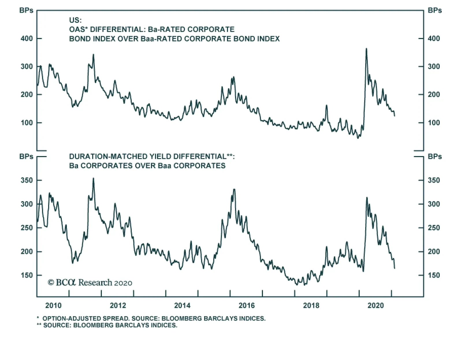
According to BCA Research’s US Bond Strategy service, the Ba credit tier still offers the most attractive risk-adjusted returns within corporate bonds. The difference between the average option-adjusted spread (OAS) of the Ba index and the average OAS of…
Highlights Duration: Long-maturity Treasury yields are closing in on our intermediate-term targets. On balance, cyclical and valuation indicators continue to support an outlook for higher yields, but a few are sending warning signs that the bearish bond move is due for a correction. We maintain our recommended below-benchmark 6-12 month duration stance for now, but are keeping a close eye on the indicators shown in this report. Ba Versus Baa Corporates: From a risk-adjusted perspective, the Ba credit tier still looks like the sweet spot for positioning within corporate bonds. Fallen Angels have performed exceptionally, but no longer look cheap compared to the Baa and Ba corporate indexes. Labor Market: If the current pace of monthly employment growth is maintained, it will be a very long time before the economy reaches full employment. Vaccine effectiveness and distribution rate are the two most important factors that will determine employment growth going forward. We are optimistic that we will see a 4.5% unemployment rate sometime in 2022. Feature Chart 1Uptrend Intact
Uptrend Intact
Uptrend Intact
Bond yields moved higher last week, maintaining their post-August uptrend despite a brief lull in the second half of January (Chart 1). The 30-year yield even touched 1.97%, its highest level since last February. Given the sharp up-move, the first section of this week’s report considers whether bond yields look stretched. More broadly, we discuss several factors that will help us decide when to increase portfolio duration. How Much Higher Can Yields Rise? We have maintained a recommended below-benchmark duration stance since October and have been targeting a range of 2% to 2.25% for the 5-year/5-year forward Treasury yield.1 That target range is based on median estimates of the long-run equilibrium fed funds rate from the New York Fed’s surveys of market participants and primary dealers (Chart 2). The rationale is that in an environment of global economic recovery where the Fed is expected to eventually lift the funds rate back to equilibrium, long-dated forward yields should reflect expectations of that long-run equilibrium. At present, the 5-year/5-year forward Treasury yield is 1.97% meaning that there is between 3 bps and 28 bps of upside before our target is met. Chart 2Almost At Target
Almost At Target
Almost At Target
A 5-year/5-year forward Treasury yield between 2% and 2.25% would not automatically trigger an increase in our recommended portfolio duration, but it would mean that further increases in yields would need to be justified by upward revisions to survey estimates of the long-run equilibrium fed funds rate. In a similar vein, the 5-year/5-year forward TIPS breakeven inflation rate has risen considerably in recent months, but at 2.15%, it remains below the 2.3% to 2.5% range that the Fed would consider “well anchored” (Chart 2, bottom panel). In other words, there is still some running room for reflationary economic outcomes to be priced into bond yields. Cyclical Growth Indicators Treasury yields may be encroaching on the lower bounds of our target ranges, but cyclical economic indicators suggest further increases ahead. The CRB Raw Industrials / Gold ratio remains in a solid uptrend, and encouragingly, it is being driven by a surging CRB index and not just a falling gold price (Chart 3). Separately, the outperformance of cyclical equity sectors over defensives has moderated in recent weeks, but not yet by enough to warrant reversing our duration call (Chart 3, bottom panel). Chart 3Cyclical Bond Indicators
Cyclical Bond Indicators
Cyclical Bond Indicators
Value Indicators Chart 4Bond Valuation Indicators
Bond Valuation Indicators
Bond Valuation Indicators
While cyclical indicators point to further bond weakness ahead, a couple valuation measures show yields starting to look stretched. Two survey-derived estimates of the 10-year zero-coupon term premium have moved up sharply. The estimate derived from the New York Fed’s Survey of Market Participants has jumped into positive territory and the estimate derived from the Survey of Primary Dealers is close behind (Chart 4). These surveys ask respondents to estimate what they think the fed funds rate will average over the next ten years. By comparing the median survey response to the current spot 10-year Treasury yield we get a measure of how much term premium the median investor expects to earn. These term premium estimates have typically been negative during the past few years, though they did rise to about +50 bps before Treasury yields peaked in 2018. In other words, a positive term premium estimate, on its own, is no reason to extend duration. All it tells us is that if the median investor is correct about the future path of the fed funds rate, then there is more money to be made at the long-end of the curve than in cash. This doesn’t rule out investors revising their funds rate expectations higher, or the term premium becoming even more stretched. Another related bond valuation indicator is the difference between the market’s expected path for the fed funds rate and the path projected by the FOMC (Chart 4, bottom panel). Here we see that, for the first time since 2014, the market is priced for a faster pace of tightening over the next two years than the median FOMC participant anticipates. Again, this is not a decisive signal to buy bonds. The FOMC could revise its funds rate projections higher when it meets next month. However, the longer that market pricing remains more hawkish than the Fed, the stronger the case to increase duration becomes. The Dollar Chart 5Dollar Still Supports Higher Yields
Dollar Still Supports Higher Yields
Dollar Still Supports Higher Yields
Finally, we should note that the trade-weighted dollar appreciated last week as bond yields rose (Chart 5). A stronger dollar certainly supports the case for extending duration, the only question is whether the dollar has strengthened enough to dent US economic growth and pull US yields back down. Our sense is that we haven’t reached that breaking point yet, but we could if US real yields continue to rise relative to real yields in the rest of the world (Chart 5, panels 2 & 3). We think of the relationship between US bond yields and the dollar as a feedback loop. A weaker dollar supports economic reflation, which eventually sends yields higher. However, once higher US yields de-couple too far from yields in the rest of the world, the dollar appreciates. A stronger dollar impairs the economic outlook and sends US yields back down, the dollar then depreciates and the cycle repeats. At present, we appear to be in the stage of the feedback loop where US yields are rising relative to the rest of the world, putting upward pressure on the dollar. However, we don’t think the dollar is yet strong enough to prevent US yields from climbing. Dollar bullish sentiment, for example, remains below 50% suggesting that most investors remain dollar bears. A sub-50 reading on this index also tends to coincide with rising US Treasury yields (Chart 5, bottom panel). A move above 50 in the dollar sentiment index would be another signal that the bond bear market is becoming stretched. Bottom Line: Long-maturity Treasury yields are closing-in on our intermediate-term targets. On balance, cyclical and valuation indicators continue to support an outlook for higher yields, but a few are sending warning signs that the bearish bond move is due for a correction. We maintain our recommended below-benchmark 6-12 month duration stance for now, but are keeping a close eye on the indicators shown in this report. Comparing Baa- And Ba-Rated Corporate Bonds Chart 6The Ba Index OAS Is Unusually High
The Ba Index OAS Is Unusually High
The Ba Index OAS Is Unusually High
We have previously written that the macro environment is extremely positive for credit risk and we recommend moving down in quality within corporate bonds. We have also pointed out that the incremental spread pick-up earned from moving out of Baa-rated bonds and into Ba-rated bonds is elevated compared to typical historical levels. As such, the Ba-rated credit tier looks like the sweet spot for corporate bond allocation from a risk/reward perspective.2 In this week’s report we delve a little deeper into the relative valuation between Baa- and Ba-rated bonds. First, we note the difference between the average option-adjusted spread (OAS) of the Ba index and the average OAS of the Baa index. The Ba index OAS is 126 bps above the Baa index OAS, a level that looks high compared to recent years (Chart 6). One problem with this simple comparison of index OAS is that the average duration of the Ba index is much lower than the average duration of the Baa index (Chart 6, bottom panel). However, after doing our best to match the duration between the two indexes, we still find that Ba offers an attractive yield advantage, particularly compared to levels seen in 2017 and 2018 (Chart 6, panel 2). Going back to our simple OAS differential, we conducted a small study looking at calendar year excess returns between 1989 and 2020. Our results show that the differential between the Default-Adjusted Ba OAS and the Baa OAS does a good job predicting relative excess returns between the two sectors (Table 1).3 The Default-Adjusted Ba OAS is the Ba index OAS at the beginning of the calendar year minus realized Ba default losses that occurred during the year in question. We also use the Baa index OAS from the beginning of the year, but don’t make any adjustments for Baa default losses. Table 1Annual Excess Return Differential & Relative Spreads: Ba Corporates Over Baa Corporates
Ba-Rated Bonds Look Best
Ba-Rated Bonds Look Best
Our results show that Ba excess returns outpaced Baa excess returns in every calendar year for which the Adjusted Ba/Baa OAS differential exceeds 100 bps. The raw Ba/Baa OAS differential is currently 126 bps. This means that we should be very confident that Ba-rated bonds will outperform Baa-rated bonds in 2021, as long as Ba default losses come in below 0.26%. This seems likely. For context, Ba default losses came in at 0.09% in 2020, despite the 12-month default rate spiking to almost 9%. Fallen Angels Another interesting issue to consider when looking at the intersection between the Baa and Ba credit tiers is the presence of fallen angels – bonds that were initially rated investment grade but have been downgraded to junk. The 2020 default cycle coincided with a huge spike in ratings downgrades and the number of outstanding fallen angels jumped dramatically (Chart 7). Not only that, but fallen angels also performed exceptionally well in 2020. Fallen angels outperformed duration-matched Treasuries by 800 bps in 2020 compared to 431 bps for the Ba-rated index, -10 bps for the Baa-rated index and -13 bps for the B-rated index (Chart 7, bottom panel). All that outperformance has compressed fallen angel valuations a lot. The incremental spread pick-up in fallen angels over duration-matched Baa-rated bonds is 201 bps, about one standard deviation below its post-2010 average (Chart 8). Fallen angels look even worse compared to the Ba index, offering only a 30 bps spread advantage (Chart 8, panel 2). Chart 7Fallen Angels Dominated In 2020
Fallen Angels Dominated In 2020
Fallen Angels Dominated In 2020
Chart 8Fallen Angels No Longer Look Cheap
Fallen Angels No Longer Look Cheap
Fallen Angels No Longer Look Cheap
Bottom Line: From a risk-adjusted perspective, the Ba credit tier still looks like the sweet spot for positioning within corporate bonds. Fallen Angels have performed exceptionally, but no longer look cheap compared to the Baa and Ba corporate indexes. Labor Market Update Chart 9Employment Growth Has Slowed
Employment Growth Has Slowed
Employment Growth Has Slowed
Last week’s January employment report was a disappointment with nonfarm payrolls growing only 49k after having contracted by 227k in December (Chart 9). Two weeks ago, we calculated the average monthly nonfarm payroll growth that will be required for the unemployment rate to reach 4.5% by certain future dates.4 In our view, an unemployment rate of 4.5% would meet the Fed’s definition of maximum employment, making it an important pre-condition for monetary tightening. Revising our calculations to incorporate January’s report, a 4.5% unemployment rate by the end of 2021 still looks like a long shot. Nonfarm payroll growth would have to average between +328k and +705k per month to meet that target, depending on the path of the participation rate (Table 2). That said, we still view a 4.5% unemployment rate by the end of 2022 as achievable. Table 2Average Monthly Nonfarm Payroll Growth Required For The Unemployment Rate To Reach 4.5% ##br##By The Given Date
Ba-Rated Bonds Look Best
Ba-Rated Bonds Look Best
Yes, even that will require average monthly payroll growth of between +210k and +411k, but we are likely to see a re-opening of certain shuttered sectors – Leisure & Hospitality, for example – during that timeframe. When it occurs, this re-opening will lead to a surge in employment growth that will push average monthly payroll growth dramatically higher. Notice that almost 40% of the 9.9 million drop in overall employment since February 2020 has come from the Leisure & Hospitality sector (Chart 10). Chart 10Waiting For The Post-COVID Snapback
Waiting For The Post-COVID Snapback
Waiting For The Post-COVID Snapback
Bottom Line: If the current pace of monthly employment growth is maintained, it will be a very long time before the economy reaches full employment. Vaccine effectiveness and distribution rate are the two most important factors that will determine employment growth going forward. We are optimistic that we will see a 4.5% unemployment rate sometime in 2022. Ryan Swift US Bond Strategist rswift@bcaresearch.com Footnotes 1 Please see US Bond Strategy / Global Fixed Income Strategy Special Report, “Beware The Bond-Bearish Blue Sweep”, dated October 20, 2020, available at usbs.bcaresearch.com 2 Please see US Bond Strategy Special Report, “2021 Key Views: US Fixed Income”, dated December 15, 2020, available at usbs.bcaresearch.com 3 Excess returns are calculated relative to duration-matched Treasury securities in all cases. 4 Please see US Bond Strategy Weekly Report, “Searching For Value In Spread Product”, dated January 26, 2021, available at usbs.bcaresearch.com Fixed Income Sector Performance Recommended Portfolio Specification