Covered Bonds
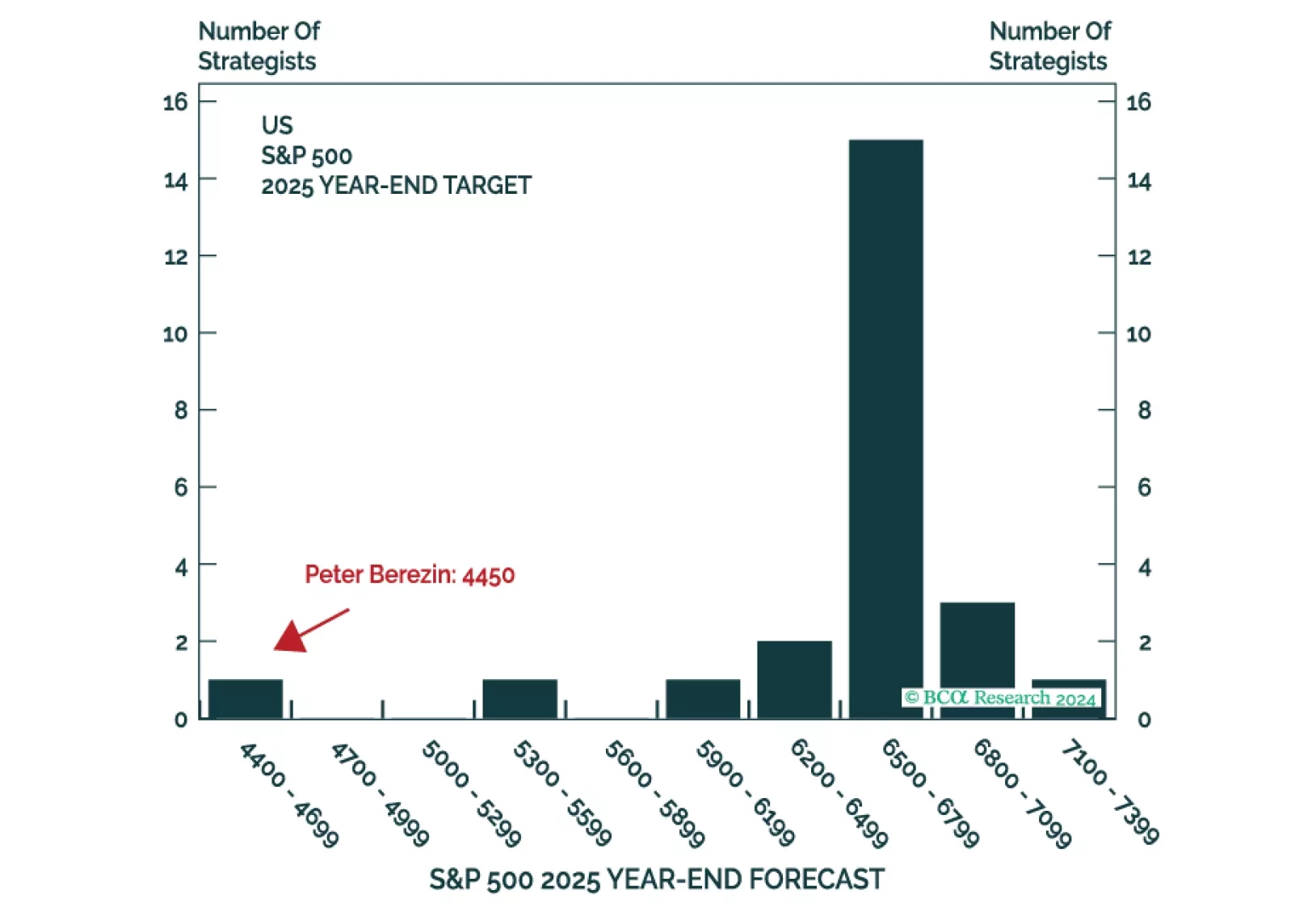
This is the time of the year when strategists are busy sending out their annual outlooks. Here on the Global Investment Strategy team, we decided to go one step further. Rather than pontificating about what could happen in 2025, we decided to harness the power of the multiverse to tell you what did happen (in at least one highly representative timeline).
Next week, please join me for a Webcast on Tuesday, December 17 at 10:30 AM EST (3:30 PM GMT, 4:30 PM CET) to discuss the economy and financial markets.
And with that, I will sign off for the year. I wish you and your loved ones a very happy and healthy 2025. We will be back in the first week of January with our MacroQuant Model Update.

Highlights Chart 1Tracking Nonfarm Payrolls With 12-month PCE inflation already above the Fed’s 2% target, it is progress toward the Fed’s “maximum employment” goal that will determine both the timing of Fed liftoff and whether bond yields rise or fall. On that note, the bond market is currently priced for Fed liftoff in early 2023. We also calculate that average monthly nonfarm payroll growth of between 378k and 462k is required to meet the Fed’s “maximum employment” goal by the end of 2022, in time for an early-2023 rate hike. It follows from this analysis that any monthly employment print above +462k should be considered bond-bearish and any print below +378k should be considered bond-bullish (Chart 1). In that light, May’s +559k print is bond-bearish, and we anticipate further bond-bearish employment reports in the coming months as COVID fears fade and people return to a labor market that is already awash with demand. Investors should maintain below-benchmark portfolio duration in US bond portfolios and also continue to favor spread product over duration-matched Treasuries. Feature Table 1Recommended Portfolio Specification Table 2Fixed Income Sector Performance Investment Grade: Neutral Chart 2Investment Grade Market Overview Investment grade corporate bonds outperformed the duration-equivalent Treasury index by 47 basis points in May, bringing year-to-date excess returns up to +159 bps. The combination of above-trend economic growth and accommodative monetary policy supports positive excess returns for spread product versus Treasuries. At 142 bps, the 2/10 Treasury slope is very steep and the 5-year/5-year forward TIPS breakeven inflation rate sits at 2.27% - almost, but not quite, within the 2.3% to 2.5% range that the Fed considers “well anchored”.1 The message from these two indicators is that the Fed is not yet ready for monetary conditions to turn restrictive. Despite the positive macro back-drop, investment grade corporate valuations are extremely tight. The investment grade corporate index’s 12-month breakeven spread is almost at its lowest since 1995 (Chart 2). Though we retain a positive view of spread product as a whole, tight valuations cause us to recommend only a neutral allocation to investment grade corporates. We prefer high-yield corporates, municipal bonds and USD-denominated Emerging Market Sovereigns. Last week, the Fed announced that it will wind down its corporate bond portfolio over the coming months. The corporate bond purchase facility has not been operational since December 2020, meaning that the corporate bond market has been functioning without an explicit Fed back-stop for all of 2021. The portfolio itself is also quite small compared to the size of the corporate bond market. As a result, we anticipate no material impact on spreads. Table 3ACorporate Sector Relative Valuation And Recommended Allocation* Table 3BCorporate Sector Risk Vs. Reward* High-Yield: Overweight Chart 3High-Yield Market Overview High-Yield outperformed the duration-equivalent Treasury index by 8 basis points in May, bringing year-to-date excess returns up to +343 bps. In a recent report, we looked at the default expectations that are currently priced into the junk index and considered whether they are likely to be met.2 If we demand an excess spread of 100 bps and assume a 40% recovery rate on defaulted debt, then the High-Yield index embeds an expected default rate of 3.3% (Chart 3). Using a model of the speculative grade default rate that is based on gross corporate leverage (pre-tax profits over total debt) and C&I lending standards, we can estimate a likely default rate for the next 12 months using assumptions for profit and debt growth. The median FOMC forecast of 6.5% real GDP growth in 2021 is consistent with 31% corporate profit growth. We also assume that last year’s corporate debt binge will moderate in 2021. According to our model, 30% profit growth and 2% debt growth is consistent with a default rate of 3.4%, very close to what is priced into junk spreads. Given that the large amount of fiscal stimulus coming down the pike makes the Fed’s 6.5% real GDP growth forecast look conservative, and the fact that the combination of strong economic growth and accommodative monetary policy could easily cause valuations to overshoot in the near-term, we are inclined to maintain an overweight allocation to High-Yield bonds. MBS: Underweight Chart 4MBS Market Overview Mortgage-Backed Securities underperformed the duration-equivalent Treasury index by 36 basis points in May, dragging year-to-date excess returns down to -9 bps. The nominal spread between conventional 30-year MBS and equivalent-duration Treasuries widened 7 bps in May. The spread remains wide compared to recent history, but it is still tight compared to the pace of mortgage refinancings (Chart 4). The conventional 30-year MBS option-adjusted spread (OAS) currently sits at 24 bps. This is considerably below the 51 bps offered by Aa-rated corporate bonds and the 27 bps offered by Agency CMBS. It is only slightly more than the 18 bps offered by Aaa-rated consumer ABS. All in all, value in MBS is not appealing compared to other similarly risky sectors. In a recent report, we looked at MBS performance and valuation across the coupon stack.3 We noted that the higher convexity of high-coupon MBS makes them likely to outperform lower-coupon MBS in a rising yield environment. Higher coupon MBS also have greater OAS than lower coupons. This makes the high-coupon MBS more likely to outperform in a flat bond yield environment as well. Given our view that bond yields will be flat-to-higher during the next 6-12 months, we recommend favoring high coupons over low coupons within an overall underweight allocation to Agency MBS. Government-Related: Neutral Chart 5Government-Related Market Overview The Government-Related index outperformed the duration-equivalent Treasury index by 15 basis points in May, bringing year-to-date excess returns up to +87 bps (Chart 5). Sovereign debt outperformed duration-equivalent Treasuries by 32 bps in May, bringing year-to-date excess returns up to +53 bps. Foreign Agencies outperformed the Treasury benchmark by 2 bps on the month, bringing year-to-date excess returns up to +37 bps. Local Authority bonds outperformed by 30 bps in May, bringing year-to-date excess returns up to +360 bps. Domestic Agency bonds and Supranationals both outperformed by 8 bps, bringing year-to-date excess returns up to +27 bps and +24 bps, respectively. We recently took a detailed look at USD-denominated Emerging Market (EM) Sovereign valuation.4 We found that, on an equivalent-duration basis, EM Sovereigns offer a spread advantage over investment grade US corporates. Attractive countries include: Qatar, UAE, Saudi Arabia, Indonesia, Mexico, Russia and Colombia. We prefer US corporates over EM Sovereigns in the high-yield space where there is still some value left in US corporate spreads and where the EM space is dominated by distressed credits like Turkey and Argentina. Municipal Bonds: Overweight Chart 6Municipal Market Overview Municipal bonds underperformed the duration-equivalent Treasury index by 21 basis points in May, dragging year-to-date excess returns down to +286 bps (before adjusting for the tax advantage). We took a detailed look at municipal bond performance and valuation in a recent report and came to the following conclusions.5 First, the economic and policy back-drop is favorable for municipal bond performance. The recently enacted American Rescue Plan includes $350 billion of funding for state & local governments, a bailout that comes after state & local government revenues already exceeded expenditures in 2020 (Chart 6). President Biden has also proposed increasing income tax rates. However, there may not be time to pass these tax hikes before the 2022 midterm elections. Second, Aaa-rated municipal bonds look expensive relative to Treasuries (top panel). Muni investors should move down in quality to pick up additional yield. Third, General Obligation (GO) and Revenue munis offer better value than investment grade corporates with the same credit rating and duration, particularly at the long-end of the curve. Revenue munis in the 12-17 year maturity bucket offer a before-tax yield pick-up versus corporates. GO munis offer a breakeven tax rate of just 7% (panel 2). Fourth, taxable munis offer a yield advantage over investment grade corporates that investors should take advantage of (panel 3). Finally, high-yield muni spreads are reasonably attractive relative to high-yield corporates, offering a breakeven tax rate of 22% (panel 4). But despite the attractive spread, we recommend only a neutral allocation to high-yield munis versus high-yield corporates as the deep negative convexity of high-yield munis makes them prone to extension risk if bond yields gap higher. Treasury Curve: Buy 5-Year Bullet Versus 2/30 Barbell Chart 7Treasury Yield Curve Overview Treasury yields fell in May, with the 5-10 year part of the curve benefiting the most. The 7-year yield fell 8 bps in May while the 5-year and 10-year yields both fell 7 bps. Yield declines were smaller for shorter (< 5-year) and longer (> 10-year) maturities. The 2/10 Treasury slope flattened 5 bps to end the month at 144 bps. The 5/30 Treasury slope steepened 3 bps to end the month at 147 bps (Chart 7). We recently changed our recommended yield curve position from a 5 over 2/10 butterfly to a 5 over 2/30 butterfly.6 In making the switch we noted that the slope of the Treasury curve has behaved differently since bond yields peaked in early April. Prior to April, the rise in bond yields was concentrated at the very long-end (10-year +) of the curve. During the past two months, the belly of the curve (5-7 years) has seen more volatility. We conclude that we are now close enough to an expected Fed liftoff date that further significant increases in yields will be met with a flatter curve beyond the 5-year maturity point and that the 5-year and 7-year notes are likely to benefit the most if bond yields dip. We also observe an exceptional yield pick-up of +33 bps in the 5-year bullet over a duration-matched 2/30 barbell. Given our view that bond yields will be flat-to-higher during the next 6-12 months, we recommend buying the 5-year bullet over a duration-matched 2/30 barbell to take advantage of the strong positive carry in a flat yield environment, and as a hedge against our below-benchmark portfolio duration stance. TIPS: Neutral Chart 8TIPS Market Overview TIPS outperformed the duration-equivalent nominal Treasury index by 86 basis points in May, bringing year-to-date excess returns up to +484 bps. The 10-year and 5-year/5-year forward TIPS breakeven inflation rates rose 1 bp and 2 bps on the month, respectively. At 2.42%, the 10-year TIPS breakeven inflation rate is near the top-end of the 2.3% to 2.5% range that is consistent with inflation expectations being well anchored around the Fed’s target (Chart 8). Meanwhile, at 2.27%, the 5-year/5-year forward TIPS breakeven inflation rate is just below the target band (panel 3). With long-maturity breakevens already consistent (or close to consistent) with the Fed’s target, they have limited upside going forward. The Fed has so far welcomed rising TIPS breakeven inflation rates, but it will have an increasing incentive to lean against them if they continue to move up. We also think that the market has priced-in an overly aggressive inflation outlook at the front-end of the curve. The 1-year and 2-year CPI swap rates stand at 3.76% and 3.12%, respectively. There is a good chance that these lofty inflation expectations will not be confirmed by the actual data. With all that in mind, investors should maintain a neutral allocation to TIPS versus nominal Treasuries and also a neutral posture towards the inflation curve (panel 4). The inflation curve could steepen somewhat in the near-term if short-maturity inflation expectations moderate, but we expect the curve to remain inverted for a long time yet. An inverted inflation curve is more consistent with the Fed’s Average Inflation Target than a positively sloped one, and it should be considered the natural state of affairs moving forward. ABS: Overweight Chart 9ABS Market Overview Asset-Backed Securities outperformed the duration-equivalent Treasury index by 13 basis points in May, bringing year-to-date excess returns up to +33 bps. Aaa-rated ABS outperformed by 13 bps on the month, bringing year-to-date excess returns up to +26 bps. Non-Aaa ABS outperformed by 12 bps on the month, bringing year-to-date excess returns up to +70 bps. The stimulus from last year’s CARES act led to a significant increase in household savings when individual checks were mailed in April 2020. This excess savings has still not been spent and, already, the most recent round of stimulus checks is pushing the savings rate higher again (Chart 9). The extraordinarily large stock of household savings means that the collateral quality of consumer ABS is also extraordinarily high. Indeed, many households have been using their windfalls to pay down consumer debt (bottom panel). Investors should remain overweight consumer ABS and should also take advantage of the high quality of household balance sheets by moving down the quality spectrum. Non-Agency CMBS: Neutral Chart 10CMBS Market Overview Non-Agency Commercial Mortgage-Backed Securities outperformed the duration-equivalent Treasury index by 41 basis points in May, bringing year-to-date excess returns up to +163 bps. Aaa Non-Agency CMBS outperformed Treasuries by 27 bps in May, bringing year-to-date excess returns up to +78 bps. Non-Aaa Non-Agency CMBS outperformed by 84 bps, bringing year-to-date excess returns up to +453 bps (Chart 10). Though returns have been strong and spreads remain attractive, particularly for lower-rated CMBS, we continue to recommend only a neutral allocation to the sector because of the structurally challenging environment for commercial real estate. Even with the economic recovery well underway, commercial real estate loan demand continues to weaken and banks are not making lending standards more accommodative (panels 3 & 4). Agency CMBS: Overweight Agency CMBS outperformed the duration-equivalent Treasury index by 37 basis points in May, bringing year-to-date excess returns up to +125 bps. The average index option-adjusted spread tightened 7 bps on the month and it currently sits at 27 bps (bottom panel). Though Agency CMBS spreads have completely recovered their pre-COVID levels, they still look attractive compared to other similarly risky spread products. Stay overweight. Appendix A: Butterfly Strategy Valuations The following tables present the current read-outs from our butterfly spread models. We use these models to identify opportunities to take duration-neutral positions across the Treasury curve. The following two Special Reports explain the models in more detail: US Bond Strategy Special Report, “Bullets, Barbells And Butterflies”, dated July 25, 2017, available at usbs.bcaresearch.com US Bond Strategy Special Report, “More Bullets, Barbells And Butterflies”, dated May 15, 2018, available at usbs.bcaresearch.com Table 4 shows the raw residuals from each model. A positive value indicates that the bullet is cheap relative to the duration-matched barbell. A negative value indicates that the barbell is cheap relative to the bullet. Table 4Butterfly Strategy Valuation: Raw Residuals In Basis Points (As Of May 28TH, 2021) Table 5 scales the raw residuals in Table 4 by their historical means and standard deviations. This facilitates comparison between the different butterfly spreads. Table 5Butterfly Strategy Valuation: Standardized Residuals (As Of May 28TH, 2021) Table 6 flips the models on their heads. It shows the change in the slope between the two barbell maturities that must be realized during the next six months to make returns between the bullet and barbell equal. For example, a reading of 57 bps in the 5 over 2/10 cell means that we would only expect the 5-year to outperform the 2/10 if the 2/10 slope steepens by more than 57 bps during the next six months. Otherwise, we would expect the 2/10 barbell to outperform the 5-year bullet. Table 6Discounted Slope Change During Next 6 Months (BPs) Appendix B: Excess Return Bond Map The Excess Return Bond Map is used to assess the relative risk/reward trade-off between different sectors of the US bond market. It is a purely computational exercise and does not impose any macroeconomic view. The Map’s vertical axis shows 12-month expected excess returns. These are proxied by each sector’s option-adjusted spread. Sectors plotting further toward the top of the Map have higher expected returns and vice-versa. Our novel risk measure called the “Risk Of Losing 100 bps” is shown on the Map’s horizontal axis. To calculate it, we first compute the spread widening required on a 12-month horizon for each sector to lose 100 bps or more relative to a duration-matched position in Treasury securities. Then, we divide that amount of spread widening by each sector’s historical spread volatility. The end result is the number of standard deviations of 12-month spread widening required for each sector to lose 100 bps or more versus a position in Treasuries. Lower risk sectors plot further to the right of the Map, and higher risk sectors plot further to the left. Chart 11Excess Return Bond Map (As Of May 28TH, 2021) Ryan Swift US Bond Strategist rswift@bcaresearch.com Footnotes 1 For further discussion of how we assess the state of monetary policy vis-à-vis spread product please see US Bond Strategy Weekly Report, “Lower For Longer, Then Faster Than You Think”, dated May 25, 2021. 2 Please see US Bond Strategy Weekly Report, “That Uneasy Feeling”, dated March 30, 2021. 3 Please see US Bond Strategy Weekly Report, “A New Conundrum”, dated April 20, 2021. 4 Please see US Bond Strategy Weekly Report, “Searching For Value In Spread Product”, dated January 26, 2021. 5 Please see US Bond Strategy Weekly Report, “Making Money In Municipal Bonds”, dated April 27, 2021. 6 Please see US Bond Strategy Weekly Report, “Entering A New Yield Curve Regime”, dated May 11, 2021.