Denmark

Stay constructive on European defense stocks and increase strategic exposure to industrial metals as geopolitical priorities reassert themselves. Following the capture of Venezuelan President Maduro, top US officials seem to confirm that President Trump is…
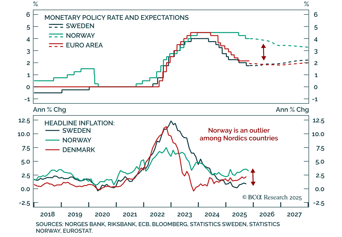
Our European strategists turn overweight Swedish equities and initiate a short NOK/SEK position as Nordic central banks pause but their economies diverge. Sweden’s recovery and stable inflation allow the Riksbank to join the “easing-cycle-complete” club,…
The Nordic central banks are now aligned in pause mode, but their economies are diverging. With Swedish prospects improving and Norwegian headwinds mounting, we are turning overweight on Swedish equities and shorting NOK/SEK.
Please join Chief Strategists Mathieu Savary and Jeremie Peloso for a Roundtable on Tuesday, June 25 at 3:00 PM CEST (2:00 PM BST, 9:00 AM EDT).

What is the outlook for the European housing market amid rising mortgage rates and the energy crisis? Does housing represent a systemic risk? Can households weather the storm? And what are the opportunities, if any?
Highlights The economic performance of Sweden, which did not have a lockdown, has been almost as bad as Denmark, which did have a lockdown. This proves that the current recession is not ‘man-made’, it is ‘pandemic-made’. While the pandemic remains in play, investors should maintain a defensive bias to their portfolios: favouring US T-bonds in bond portfolios, and technology and healthcare in equity portfolios. The technology sector has become defensive, largely because it has flipped from hardware dominance to software dominance. A new recommendation is to overweight technology-heavy Netherlands. Fractal trade: short AUD/CHF. Feature Chart I-IASweden: Avoiding A Lockdown Did Not Prevent A Slump In Consumption... Chart I-1B...But Led To Many More ##br##Infections Sweden and Denmark are neighbours. They speak near-identical languages and share a broadly similar culture and demographic. Yet the two countries have followed completely different strategies to halt the coronavirus pandemic. Sweden chose not to impose a lockdown. Instead, it opted for a ‘trust based’ approach, relying on its citizens to act sensibly and appropriately. Whereas Denmark imposed one of Europe’s earliest and most draconian lockdowns. The contrasting approaches of Sweden and neighbouring Denmark provide us with the closest thing to a controlled experiment on pandemic strategies. The Recession Is Not ‘Man-Made’, It Is ‘Pandemic-Made’ The surprising thing is that the economic performance of Sweden, which did not have a lockdown, has been almost as bad as Denmark, which did. This year, the unemployment rates in both economies have surged by 2 percentage points (albeit the latest data is for May in Sweden and April in Denmark). Furthermore, high-frequency measures of consumption show that Sweden suffered almost as severe a contraction as Denmark (Chart of the Week and Chart I-2). Chart I-2Unemployment Has Surged In Both No-Lockdown Sweden And Lockdown Denmark This surprising result challenges the popular view that this global recession is man-made. This view argues that without the government-imposed lockdowns, the global economy would not have entered a tailspin. But if this view is right, then why did consumption crash in Sweden? The simple answer is that in a pandemic, most people will change their behaviour to avoid catching the virus. The cautious behaviour is voluntary, irrespective of whether there is no lockdown, as in Sweden, or there is a lockdown, as in Denmark. People will shun public transport, shopping, and other crowded places, and even think twice about letting their children go to school. In a pandemic, the majority of people will change their behaviour even without a lockdown. But if the cautious behaviour is voluntary, then why impose a lockdown? The answer is that without a lockdown, the majority will behave sensibly to avoid catching the virus, but a minority will take a ‘devil may care’ attitude. In the pandemic, this is critical because less than 10 percent of infected people are responsible for creating 90 percent of all coronavirus infections. If this tiny minority of so-called ‘super-spreaders’ is left unchecked, then the pandemic will let rip. All of which brings us back to Sweden versus Denmark. As a result of not imposing a mandatory lockdown to rein in its super-spreaders, Sweden now has one of the world’s worst coronavirus infection and mortality rates, four times higher than Denmark (Chart I-3, Chart I-4, Chart I-5). Chart I-3No-Lockdown Sweden Has Suffered Many More Deaths Than Lockdown Denmark Chart I-4Avoiding A Lockdown Meant More Infections… Chart I-5…And More ##br##Deaths Put simply, containing the pandemic depends on reining in a minority of super-spreaders. Which explains why no-lockdown Sweden suffered a much worse outbreak of the disease than lockdown Denmark. In contrast, the economy depends on the behaviour of the majority. In a pandemic the majority will voluntarily exercise caution. Which explains why no-lockdown Sweden and lockdown Denmark suffered similar contractions in consumption. Looking ahead, will the widespread adoption of face masks and plexiglass screens change the public’s cautious behaviour? To a certain extent, yes – it will permit essential activities and let people take calculated risks. That said, if you are forced to wear a mask on public transport and in the shops, and you have to spread out in restaurants while being served by a masked waiter, then – rightly or wrongly – you are getting a strong signal: the danger is still out there. Meaning that many people will continue to shun discretionary activities and spending. The upshot is that while the pandemic remains in play, investors should maintain a defensive bias to their portfolios. Explaining Why Technology Is Now Defensive A defensive bias to your portfolio now requires an exposure to technology – because in 2020 the tech sector is behaving like a classic defensive. Its relative performance is correlating positively with the bond price, like other classic defensive sectors such as healthcare (Chart I-6 and Chart I-7). Chart I-6In 2020, Tech Is Behaving Like A Defensive... Chart I-7...Like Healthcare The behaviour of the technology sector in the current recession contrasts with its performance in the global financial crisis of 2008. Back then, it behaved like a classic cyclical – its relative performance correlated negatively with the bond price (Chart I-8). Begging the question: why has the tech sector’s behaviour flipped from cyclical to defensive? Chart I-8In 2008, Tech Behaved Like A Cyclical The main reason is that the tech sector’s composition has flipped from hardware dominance to software dominance. In 2008, the sector market cap had a 65:35 tilt to technology hardware. But today, it is the mirror-image: a 65:35 tilt to computer and software services (Chart I-9). Chart I-9Tech Is More Defensive Now Because It Is Dominated By Software Computer and software services have many defensive characteristics suited to the current environment: For many companies, enterprise software is now business critical. It is a must-have rather than a like-to-have. Computer and software services use a subscription-based revenue model, minimising the dependency on discretionary spending. Computer and software services are helping firms to cut costs through automation and back-office efficiencies as well as facilitating the boom in ‘working from home’. The sector is cash rich. Despite these defensive characteristics, there remains a lingering worry: is the tech sector overvalued? The Rally In Growth Defensives Is Not A Mania Some people fear that the recent run-up in stock markets does not make sense, other than as a ‘Robin Hood’ day-trader fuelled mania. After all, the pandemic is still very much in play, and so are other geopolitical risks, so how can some stock prices be near all-time highs? Yet the recent run-up in growth defensives such as tech and healthcare does make sense. Their valuations have moved in near-perfect lockstep with the bond yield, implying that the rally is based on fundamentals (Chart I-10). Chart I-10Tech And Healthcare Valuations Are Tracking The Bond Yield Simply put, if the 10-year T-bond is going to deliver a pitiful 0.7 percent a year over the next decade, then the prospective return from growth defensives must also compress. It would be absurd to expect these stocks to be priced for high single digit returns. Since late 2018, the decline in growth defensives’ forward earnings yield has broadly tracked the 250bps decline in the 10-year T-bond yield. Given that the forward earnings yield correlates well with the 10-year prospective return, the depressed bond yield is depressing the prospective return from growth defensives – as it should. Tech and healthcare valuations have moved in near-perfect lockstep with the bond yield. But with the pandemic and geopolitical risks menacing in the background, shouldn’t the gap between the prospective return on stocks and bonds – the equity risk premium – be larger? This is open to debate. When bond yields approach the lower bound, the appeal of owning bonds also diminishes because bond prices have limited upside. Nevertheless, the gap between the tech and healthcare forward earnings yield and the bond yield has gone up this year and is much larger than in 2018 (Chart I-11). This suggests that valuations are taking some account of the pandemic and other risks. Moreover, in a longer-term perspective the current gap between the tech and healthcare forward earnings yield and the bond yield, at +4 percent, hardly indicates a mania. In the true mania of 2000, the gap stood at -4 percent! (Chart I-12) Chart I-11The Equity Risk Premium Has Risen In 2020 Chart I-12Tech And Health Care Valuations Are Not In A Mania In summary, until the pandemic is conquered, investors should maintain a defensive bias to their portfolios. Bond investors should overweight US T-bonds versus core European bonds. Equity investors should overweight the growth defensives, technology and healthcare, which implies overweighting the technology-heavy US versus Europe. A new recommendation is to overweight technology-heavy Netherlands. Stay overweight healthcare-heavy Switzerland, and bank-light France and Germany (albeit expect a technical 5 percent underperformance of Germany versus the UK in the coming weeks). And stay underweight bank-heavy Austria. Fractal Trading System* The AUD is technically overbought and vulnerable to a tactical reversal. Accordingly, this week’s recommended trade is short AUD/CHF, with a profit target and symmetrical stop-loss set at 4.2 percent. The rolling 1-year win ratio now stands at 63 percent. Chart I-13AUD/CHF When the fractal dimension approaches the lower limit after an investment has been in an established trend it is a potential trigger for a liquidity-triggered trend reversal. Therefore, open a countertrend position. The profit target is a one-third reversal of the preceding 13-week move. Apply a symmetrical stop-loss. Close the position at the profit target or stop-loss. Otherwise close the position after 13 weeks. * For more details please see the European Investment Strategy Special Report “Fractals, Liquidity & A Trading Model,” dated December 11, 2014, available at eis.bcaresearch.com. Dhaval Joshi Chief European Investment Strategist dhaval@bcaresearch.com Fractal Trading System Cyclical Recommendations Structural Recommendations Closed Fractal Trades Trades Closed Trades Asset Performance Currency & Bond Equity Sector Country Equity Indicators Bond Yields Chart II-1Indicators To Watch - Bond Yields Chart II-2Indicators To Watch - Bond Yields Chart II-3Indicators To Watch - Bond Yields Chart II-4Indicators To Watch - Bond Yields Interest Rate Chart II-5Indicators To Watch - Interest Rate Expectations Chart II-6Indicators To Watch - Interest Rate Expectations Chart II-7Indicators To Watch - Interest Rate Expectations Chart II-8Indicators To Watch - Interest Rate Expectations
In a webcast this Friday I will be joined by our Chief US Equity Strategist, Anastasios Avgeriou to debate ‘Sectors To Own, And Sectors To Avoid In The Post-Covid World’. Today’s report preludes five of the points that we will debate. Please join us for the full discussion and conclusions on Friday, June 12, at 8:00 AM EDT (1:00 PM BST, 2:00 PM CEST, 8.00 PM HKT). Highlights Technology is behaving like a Defensive. Defensive versus Cyclical = Growth versus Value. Growth stocks are not a bubble if bond yields stay ultra-low. The post-Covid world will reinforce existing sector mega-trends. Sectors are driving regional and country relative performance. Fractal trade: Long ZAR/CLP. Chart of the WeekSector Defensiveness/Cyclicality = Positive/Negative Sensitivity To The Bond Price 1. Technology Is Behaving Like A Defensive How do we judge an equity sector’s sensitivity to the post-Covid economy, so that we can define it as cyclical or defensive? One approach is to compare the sector’s relative performance with the bond price. According to this approach, the more negatively sensitive to the bond price, the more cyclical is the sector. And the more positively sensitive to the bond price, the more defensive is the sector (Chart I-1). On this basis the most cyclical sectors in the post-Covid economy are, unsurprisingly: energy, banks, and materials. Healthcare is unsurprisingly defensive. Meanwhile, the industrials sector sits closest to neutral between cyclical and defensive, showing the least sensitivity to the bond price. The tech sector’s vulnerability to economic cyclicality appears to have greatly reduced. The big surprise is technology, whose high positive sensitivity to the bond price during the 2020 crisis qualifies it as even more defensive than healthcare. This contrasts sharply with its behaviour during the 2008 crisis. Back then, tech’s relative performance was negatively correlated with the bond price, defining it as classically cyclical. But over the past year, tech’s relative performance has been positively correlated with the bond price, defining it as classically defensive (Chart I-2 and Chart I-3). Chart I-2In 2008, Tech Behaved Like ##br##A Cyclical... Chart I-3...But In 2020, Tech Is Behaving Like A Defensive This is not to say that the big tech companies cannot suffer shocks. They can. For example, from new superior technologies, or from anti-oligopoly legislation. However, the tech sector’s vulnerability to economic cyclicality appears to have greatly reduced over the past decade. 2. Defensive Versus Cyclical = Growth Versus Value If we reclassify the tech sector as defensive in the 2020s economy, then the post mid-March rebound in stocks was first led by defensives. Cyclicals took over leadership of the rally only in May. Moreover, with the reclassification of tech as defensive, the two dominant defensive sectors become tech and healthcare. But tech and healthcare are also the dominant ‘growth’ sectors. The upshot is that growth versus value has now become precisely the same decision as defensive versus cyclical (Chart I-4). Chart I-4Defensive Versus Cyclical = Growth Versus Value 3. Growth Stocks Are Not A Bubble If Bond Yields Stay Ultra-Low Some people fear that growth stocks have become dangerously overvalued. There is even mention of the B-word. Let’s address these fears. Yes, valuations have become richer. For example, the forward earnings yield for healthcare is down to 5 percent; and for big tech it is down to just over 4 percent. This valuation starting point has proved to be an excellent guide to prospective 10-year returns, and now implies an expected annualised return from big tech in the mid-single digits. Yet this modest positive return is well above the extremes of the negative 10-year returns implied and delivered from the dot com bubble (Chart I-5). Chart I-5Big Tech Is Priced To Deliver A Positive Return, Unlike In 2000 Moreover, we must judge the implied returns from growth stocks against those available from competing long-duration assets – specifically, against the benchmark of high-quality government bond yields. If bond yields are ultra-low, then they must depress the implied returns on growth stocks too. Meaning higher absolute valuations (Chart I-6 and Chart I-7). Chart I-6Tech's Forward Earnings Yield Is Above The Bond Yield, Unlike In 2000 Chart I-7Healthcare's Forward Earnings Yield Is Above The Bond Yield, Unlike In 2000 In the real bubble of 2000, big tech was priced to return 12 percent (per annum) less than the 10-year T-bond. Whereas today, the implied return from big tech – though low in absolute terms – is above the ultra-low yield on the 10-year T-bond. If bond yields are ultra-low, then they must depress the implied returns on growth stocks too. The upshot is that high absolute valuations of growth stocks are contingent on bond yields remaining at ultra-low levels. And that the biggest threat to growth stock valuations would be a sustained rise in bond yields. 4. The Post-Covid World Will Reinforce Existing Sector Mega-Trends If a sector maintains a structural uptrend in sales and profits, then a big drop in the share price provides an excellent buying opportunity for long-term investors. This is because the lower share price stretches the elastic between the price and the up-trending profits, resulting in an eventual catch-up. However, if sales and profits are in terminal decline, then the sell-off is not a buying opportunity other than on a tactical basis. This is because the elastic will lose its tension as profits drift down towards the lower price. In fact, despite the sell-off, if the profit downtrend continues, the price may be forced ultimately to catch-down. This leads to a somewhat counterintuitive conclusion. After a big drop in the stock market, long-term investors should not buy everything that has dropped. And they should not buy the stocks and sectors that have dropped the most if their profits are in major downtrends. In this regard, the post-Covid world is likely to reinforce the existing mega-trends. The profits of oil and gas, and of European banks will remain in major structural downtrends (Chart I-8 and Chart I-9). Conversely, the profits of healthcare, and of European personal products will remain in major structural uptrends (Chart I-10 and Chart I-11). Chart I-8Oil And Gas Profits In A Major ##br##Downtrend Chart I-9Bank Profits In A Major ##br##Downtrend Chart I-10Healthcare Profits In A Major Uptrend Chart I-11Personal Products Profits In A Major Uptrend 5. Sectors Are Driving Regional And Country Relative Performance Finally, sector winners and losers determine regional and country equity market winners and losers. Nowadays, a stock market’s relative performance is predominantly a play on its distinguishing overweight and underweight ‘sector fingerprint’. This is because major stock markets are dominated by multinational corporations which are plays on their global sectors, rather than the region or country in which they have a stock market listing. It follows that when tech and healthcare outperform, the tech-heavy and healthcare-heavy US stock market must outperform, while healthcare-lite emerging markets (EM) must underperform. It also follows that the tech-heavy Netherlands and healthcare-heavy Denmark stock markets must outperform. Sector mega-trends will shape the mega-trends in regional and country relative performance. Equally, when energy and banks underperform, the energy-heavy Norway and bank-heavy Spain stock markets must underperform. (Chart I-12 and Chart I-13). These are just a few examples. Every stock market is defined by a sector fingerprint which drives its relative performance. Chart I-12Sector Relative Performance Drives... Chart I-13...Regional And Country Relative Performance If sector mega-trends continue, they will also shape the mega-trends in regional and country relative performance – favouring those stock markets that are heavy in growth stocks and light in old-fashioned cyclicals. Please join the webcast to hear the full debate and conclusions. Fractal Trading System* This week’s recommended trade is to go long the South African rand versus the Chilean peso. Set the profit target and symmetrical stop-loss at 5 percent. In other trades, long Spanish 10-year bonds versus New Zealand 10-year bonds achieved its 3.5 percent profit target at which it was closed. And long Australia versus New Zealand equities is approaching its 12 percent profit target. The rolling 1-year win ratio now stands at 63 percent. Chart I-14ZAR/CLP When the fractal dimension approaches the lower limit after an investment has been in an established trend it is a potential trigger for a liquidity-triggered trend reversal. Therefore, open a countertrend position. The profit target is a one-third reversal of the preceding 13-week move. Apply a symmetrical stop-loss. Close the position at the profit target or stop-loss. Otherwise close the position after 13 weeks. * For more details please see the European Investment Strategy Special Report “Fractals, Liquidity & A Trading Model,” dated December 11, 2014, available at eis.bcaresearch.com. Dhaval Joshi Chief European Investment Strategist dhaval@bcaresearch.com Fractal Trading System Cyclical Recommendations Structural Recommendations Closed Fractal Trades Trades Closed Trades Asset Performance Currency & Bond Equity Sector Country Equity Indicators Bond Yields Chart II-1Indicators To Watch - Bond Yields Chart II-2Indicators To Watch - Bond Yields Chart II-3Indicators To Watch - Bond Yields Chart II-4Indicators To Watch - Bond Yields Interest Rate Chart II-5Indicators To Watch - Interest Rate Expectations Chart II-6Indicators To Watch - Interest Rate Expectations Chart II-7Indicators To Watch - Interest Rate Expectations Chart II-8Indicators To Watch - Interest Rate Expectations
In lieu of the next weekly report I will be presenting the quarterly webcast ‘The Japanification Of Europe: Should We Fear It, Or Celebrate It?’ on Monday 4 November at 10.00AM EST, 3.00PM GMT, 4.00PM CET, 11.00PM HKT. As usual, the webcast will take a TED talk format lasting 18 minutes, after which I will take live questions. Be sure to tune in. Regards, Dhaval Joshi Highlights Global and European growth is experiencing a welcome rebound. Favour a cyclical investment stance, albeit tactical – as there is no visibility in the growth rebound beyond early 2020. Close the overweight to healthcare versus industrials at a small profit. Upgrade Sweden and Spain to overweight, and Norway to neutral. Downgrade Denmark to underweight, and Ireland to neutral. Expect heightened volatility in sterling in the build up to a highly ‘non-linear’ UK election. Fractal trades: 1. long oil and gas versus telecom; 2. long tin. Feature Global and European growth is experiencing a welcome rebound. This we can see from the best real-time indicators of activity, such as the ZEW sentiment, IFO expectations and of course the equity and bond markets (Chart of the Week). Nevertheless, investors make three very common mistakes in interpreting, predicting, and implementing such rebounds. This week’s report describes these three mistakes and the underlying realities. Chart of the WeekGrowth Is Experiencing A Welcome Rebound Mistake #1: Real-Time Indicators Do Not Lead The Market Reality #1: In the short term, markets move in lockstep with indicators such as the ZEW sentiment, IFO expectations, and PMIs (Chart I-2). Chart I-2Economic Indicators Do Not Lead The Markets... Having said that, the evolution of economic indicators can still provide a useful long-term investment signal. If an indicator – like IFO expectations – tends to revert to its mean, and is now near its historical lower bound, the scope for an eventual move up is greater than the scope for a further move down.1 Based on such a reversion to the mean, we are maintaining a structural overweight to the DAX versus the German long bund (Chart I-3). Chart I-3...But Depressed Performances Have Scope For Long-Term Upside But to reiterate, in the short term, the market moves in lockstep with the real-time economic indicators. Hence, to get a useful short-term investment signal, we need to predict where these indicators will be in the coming months – in other words, to predict whether growth will continue to accelerate. In the short term, the market moves in lockstep with real-time economic indicators. Which brings us neatly to the second mistake. Mistake #2: When Financial Conditions Ease, Growth Does Not Necessarily Accelerate Reality #2: It is not the change of financial conditions but rather its impulse – the change of the change – that causes growth to accelerate or decelerate. For example, a 0.5 percent decline in the bond yield decline will trigger new borrowing through, inter alia, an increase in the number of mortgage applications. The new borrowing will add to demand, meaning it will generate growth. But in the following period, a further 0.5 percent decline in the bond yield will generate the same additional new borrowing and thereby the same growth rate. The crucial point being that if the decline in the bond yield is the same in the two periods, growth will not accelerate. Growth will accelerate only if the first 0.5 percent bond yield decline is followed by a bigger, say 0.6 percent, decline – meaning a tailwind impulse. But growth will decelerate if the first 0.5 percent decline is followed by a smaller, say 0.4 percent, decline – meaning a headwind impulse. To repeat, the counterintuitive thing is that for a growth acceleration it is not the change in the bond yield that is important but rather its impulse. There are four impulses that matter for short-term growth: The bond yield 6-month impulse. The credit 6-month impulse. The oil price 6-month impulse (for oil importing economies like Germany). The geopolitical risk impulse. To be clear the geopolitical risk impulse is not an impulse in the technical sense, but it is a similar concept: is the number of potential geopolitical tail-events going up or down? In the fourth quarter, our subjective answer is down. The Brexit deadline has been pushed back to January 31 2020; the new coalition government in Italy has removed Italian politics as an imminent tail-event; and the US/China trade war and Middle East tensions are most likely to be in stasis. Turning to the other impulses, the credit 6-month impulse should briefly rebound in the fourth quarter following the rebound in the global bond yield 6-month impulse (Chart I-4). All of this favours a cyclical investment stance – albeit tactical, because there is no visibility in this growth rebound beyond early 2020. Chart I-4The Credit 6-Month Impulse Should Briefly Rebound Meanwhile, the recent evolution of the oil price 6-month impulse should provide an additional short-term tailwind for oil importing economies (Chart I-5). Justifying a near-term overweight stance to the cyclical heavy German stock market within a European or global equity portfolio. Chart I-5The Oil Price 6-Month Impulse Should Help Oil Importing Economies Which brings us to the third mistake. Mistake #3: Major Stock Markets Are Not Plays On Their Economies Of Domicile Reality #3: Major stock markets are dominated by multinational corporations, and such companies are plays on their global sectors, rather than the country in which they have a stock market listing. Hence, a stock market’s relative performance is predominantly a play on its distinguishing overweight and underweight ‘sector fingerprint’. What confuses matters is that sometimes the sector fingerprint happens to align with the tilt of the domicile economy. Germany has an exporter heavy stock market and an exporter heavy economy while Norway has an oil heavy stock market and an oil heavy economy, so in these cases there is a connection between the stock market and the economy. But in most instances, there is no alignment: the connection between the UK stock market and the UK economy is minimal, and the same is true in Spain, Denmark, Ireland, and most other countries. When bond yields were declining most sharply, and growth was decelerating, it weighed on cyclical sectors such as industrials and banks versus the more defensive sectors such as healthcare. Banks suffered doubly because the flattening (or inverting) yield curve also ate into their margins. But if the sharpest decline in bond yields has already happened, it suggests that cyclicals could experience a burst of outperformance, at least for a few months (Chart I-6). Hence, today we are closing our four month overweight to healthcare versus industrials at a small profit. Chart I-6If The Sharpest Decline In Bond Yields Is Over, Cyclicals Could Outperform Based on sector fingerprints, this also necessitates the following changes to our country allocation: Overweight banks versus healthcare means overweight Sweden versus Denmark (Chart I-7). Chart I-7Long Sweden Versus Denmark = Long Financials And Industrials Versus Biotech Overweight banks means overweight Spain (Chart I-8). Chart I-8Long Spain = Long Banks Meanwhile, removing our underweight to the cyclical oil sector means removing the successful underweight to Norway (Chart I-9). And indirectly, it means removing the equally successful overweight to Ireland, given its high weighting to Airlines (Chart I-10). Chart I-9Long Norway = Long Oil And Gas Chart I-10Long Ireland = Long Airlines Bonus Mistake: You Can Not Hit A Point Target In A Non-Linear System Boris Johnson said that he “would rather be dead in a ditch” than miss the October 31 deadline for delivering Brexit. Well Johnson had to ditch his ditch. Why? Because the UK’s parliamentary arithmetic has made Brexit an inherently non-linear system, and you cannot hit a point target in a non-linear system. Boris Johnson had to ditch his ditch. In a non-linear system a tiny change in an input might have no impact on the output, or it might have a huge impact on the output. The Brexit process is inherently non-linear because a tiny shift in parliamentary votes one way or another, or a tiny shift in the tabled amendments to laws one way or another has had a huge impact on the outcome. That’s why it proved impossible for Johnson to hit his point target of delivering Brexit by October 31. Attention now shifts to another non-linear system – the upcoming UK general election. The UK’s first past the post electoral system is designed for a head-to-head between two dominant parties. But right now, there are five parties in play – Labour, Liberal Democrat, Conservative, Brexit, plus the SNP in Scotland. Mathematically, this creates the possibility of ten types of swings, compared with the usual single swing between Labour and Conservative. Making the outcome of the election highly sensitive to a tiny shift in votes either way in ten different directions. The UK general election is a non-linear system. In The Pound Is A Long Term Buy (And So Are Homebuilders) we initiated a structural long position in the undervalued pound.2 Given that our overweight to the international focused FTSE100 versus the domestic focussed FTSE250 is effectively an inverse play on the pound, it is inconsistent with our long-term view on the currency (Chart I-11). Nevertheless, over the course of the election campaign we expect heightened volatility in sterling as the non-linearity of the election outcome becomes clear. Hence, we await an upcoming better opportunity to remove our overweight FTSE100 versus FTSE250 position. Chart I-11Long FTSE250 Versus FTSE100 = Long Pound Fractal Trading System* There are two recommended trades this week. The underperformance of US oil and gas versus telecom is ripe for a technical rebound based on its broken 130-day fractal structure. Go long US oil and gas versus telecom, setting a profit target and symmetrical stop-loss at 8 percent. The recent sell-off in tin is undergoing a similar technical bottoming process. Go long tin, setting a profit target and symmetrical stop-loss at 5 percent. For any investment, excessive trend following and groupthink can reach a natural point of instability, at which point the established trend is highly likely to break down with or without an external catalyst. An early warning sign is the investment’s fractal dimension approaching its natural lower bound. Encouragingly, this trigger has consistently identified countertrend moves of various magnitudes across all asset classes. Chart I-12US: Oil & Gas Vs. Telecom Chart I-13Tin The post-June 9, 2016 fractal trading model rules are: When the fractal dimension approaches the lower limit after an investment has been in an established trend it is a potential trigger for a liquidity-triggered trend reversal. Therefore, open a countertrend position. The profit target is a one-third reversal of the preceding 13-week move. Apply a symmetrical stop-loss. Close the position at the profit target or stop-loss. Otherwise close the position after 13 weeks. Use the position size multiple to control risk. The position size will be smaller for more risky positions. * For more details please see the European Investment Strategy Special Report “Fractals, Liquidity & A Trading Model,” dated December 11, 2014, available at eis.bcaresearch.com. Dhaval Joshi Chief European Investment Strategist dhaval@bcaresearch.com Footnotes 1 In technical terms, if the time-series is ‘stationary’, it must eventually rebound from its lower bound. 2 Please see the European Investment Strategy Weekly Report, "The Pound Is A Long-Term Buy (And So Are Homebuilders)," dated October 17, 2019 available at eis.bcaresearch.com Fractal Trading System Cyclical Recommendations Structural Recommendations Fractal Trades Trades Closed Trades Asset Performance Currency & Bond Equity Sector Country Equity Indicators Bond Yields Chart II-1Indicators To Watch - Bond Yields Chart II-2Indicators To Watch - Bond Yields Chart II-3Indicators To Watch - Bond Yields Chart II-4Indicators To Watch - Bond Yields Interest Rate Chart II-5Indicators To Watch - Interest Rate Expectations Chart II-6Indicators To Watch - Interest Rate Expectations Chart II-7Indicators To Watch - Interest Rate Expectations Chart II_8Indicators To Watch - Interest Rate Expectations
Highlights Open an equity market relative overweight to Europe versus China. Upgrade Denmark to neutral. Downgrade the Netherlands to underweight. Maintain Switzerland at overweight. With the Euro Stoxx 50 now up almost 20 percent from its January 3 low, the majority of this year’s absolute gains have already been made. Core euro area bond yields will edge modestly higher… …and EUR/USD will appreciate, as the backward-looking data on which the ECB depends catches up with the more perky real-time economic data. Feature Vertical charts scare us, as we contemplate falling over the edge. But they also excite us, as we contemplate a lucrative investment opportunity. Right now, the vertical chart that is causing us palpitations is technology versus healthcare (Chart of the Week). Chart of the WeekTechnology Versus Healthcare Has Gone Vertical! The technology versus healthcare sector pair is critical, because it looms large in several stock markets’ ‘fingerprint’ sector skews. Meaning that the technology versus healthcare relative performance has unavoidable consequences for regional and country stock market allocation (Chart I-2 and Chart I-3). The technology versus healthcare sector pair is critical, because it looms large in several stock markets’ ‘fingerprint’ sector skews. Chart I-2When Technology Underperforms Healthcare, Netherlands Underperforms Switzerland Chart I-3When Technology Underperforms Healthcare, China Underperforms Switzerland Specifically, from a European stock market perspective, the Netherlands is overweight technology while Switzerland and Denmark are both overweight healthcare. Further afield, the U.S. is overweight technology while China is both overweight technology and underweight healthcare. Explaining Verticality And The Subsequent Fall What creates vertical charts? To answer the question, let’s turn it on its head: what prevents vertical charts? The answer is: the presence of value investors. In a healthy market, a cohort of value investors will sit on the side lines and only transact with the marginal seller when the price falls to a semblance of value. In other words, the value sensitive investors help to set the price, preventing verticality. But if the value sensitive cohort switches out of character to join a strong uptrend, the cohort will suddenly become value insensitive. In this case, the marginal seller will set the price higher and the formerly uninterested value sensitive buyer will now buy at the higher price. The market has morphed into a trend-following market. As more of the value cohort switch sides, the process adds rocket fuel to the rally. Driven by the ‘fear of missing out’ the marginal buyer will buy at larger and larger price increments, and the chart becomes vertical. What triggers the subsequent fall? When all of the value cohort have joined the uptrend, the fuel has run out: the marginal seller will no longer find a willing marginal buyer at the elevated price. At this critical point, one of two things will happen. Either: a completely new cohort of even deeper value investors will switch out of character and provide new fuel to the trend, allowing it to continue. Or: the deep value investors will stay true to character and will only deal with the marginal seller when the price falls, perhaps sharply, to a semblance of deep value. Technology versus healthcare is now at this critical technical point at which the probability of trend-reversal has significantly increased. Both the theoretical and empirical evidence suggests that at this critical point, the probability of trend-continuation decreases to about a third and the probability of a trend-reversal increases to about two-thirds. Technology versus healthcare is now at this critical technical point at which the probability of trend-reversal has significantly increased (Chart I-4). Chart I-4Technology Versus Healthcare: The Probability Of A Trend-Reversal Is High Therefore, on a tactical horizon, it is now appropriate to underweight technology versus healthcare – which, to reiterate, carries unavoidable consequences for country and regional stock market allocation: Open an overweight to Europe versus China. Upgrade Denmark to neutral. Downgrade the Netherlands to underweight. Maintain Switzerland at overweight. Distinguishing Between Valuation And Growth Is Extremely Difficult There is another problem for value investors. Over short periods – meaning less than a year – it is very difficult, if not impossible, to decompose a price return into its two components: the component coming from the change in valuation and the component coming from the change in earnings growth expectations. A stock market’s actual earnings are highly sensitive to small changes in economic growth. This is universally the case but is especially true in Europe, because the European stock market’s skew towards growth-sensitive cyclicals gives it a very high operational leverage to GDP growth: a seemingly minor 0.5 percent change in economic growth translates into a major 25 percent change in stock market earnings growth (Chart I-5). The slightest improvement in economic growth expectations causes the market to upgrade its forecasts for earnings very sharply. Chart I-5A Minor Upgrade To Economic Growth = A Major Upgrade To Profits Growth Given this very high operational leverage, the slightest improvement in economic growth expectations causes the market to upgrade its forecasts for earnings very sharply. Which of course lifts the market’s price, P, very sharply. In contrast, equity analysts’ forecasts for earnings, which drive the market’s ‘official’ forward earnings, E, adjust much more slowly. As my colleague, Chris Bowes explains: “analysts get married to a view and usually require overwhelming evidence to materially change it.” The upshot is that the P rises very sharply but the official forward E does not, meaning that the official forward P/E also rises very sharply. This gives the impression that the move is mostly valuation driven, but the truth is that the move is mostly earnings growth driven. In a similar vein, when central banks guide interest rates lower, how much of the equity market’s move is due to a higher valuation, and how much is due to improved prospects for economic growth resulting from the central bank policy change? Over relatively short periods of time, it is extremely difficult to tell. All of which provides an important lesson: over short periods, do not focus on separately forecasting the valuation change and earnings growth change of a stock market. Much better to forecast the stock market price directly, by focussing on the two main things which will drive it: changes to central bank policy, and changes to short-term real-time economic growth. Focus On Central Banks And Short-Term Economic Growth Central bank policy now ‘depends’ on relatively longer-term changes (say, year-on-year) in backward-looking data, most notably the consumer price index. Whereas the stock market’s earnings growth expectations take their cue from shorter-term changes in real-time economic indicators (Chart I-6). Chart I-6Quarter-On-Quarter Growth Is Rebounding Hence, the ‘sweet spot’ for equity markets is when, in simple terms, year-on-year CPI inflation is decelerating, implying central banks will become more dovish, while quarter-on-quarter economic growth is accelerating, implying the market will upgrade earnings growth (Chart I-7). The stock market’s earnings growth expectations take their cue from shorter-term changes in real-time economic indicators. The ‘weak spot’ for equity markets is the exact opposite, when year-on-year CPI inflation is accelerating, implying central banks will become less dovish, while quarter-on-quarter economic growth is decelerating, implying the market will downgrade earnings growth. As 2019 progresses, our high-conviction prediction is that equity markets will move from a sweet spot to a weak spot. With the Euro Stoxx 50 now up almost 20 percent from its January 3 low, it implies that the majority of 2019’s gains have already been made in the first four months of the year – and the market is unlikely to be significantly higher at the end of the year. Compared to the equity market, the bond, interest rate, and currency markets are – almost by definition – much more dependent on central banks’ lagging reaction functions than on real-time growth. Which solves the mystery as to why bond yields are close to new lows while equity markets are close to new highs. It also solves the mystery as to why EUR/USD has lagged the very clear recovery in euro area real-time growth and in euro area stock markets (Chart I-8). Central banks are following lagging indicators. Chart I-7Stock Markets Take Their Cue from Real-Time Indicators Chart I-8Central Banks Are Following Lagging Indicators, Stock Markets Are Following Real-Time Indicators But as the backward-looking data, on which the ECB depends, catches up with the more perky real-time data, core euro area bond yields will edge modestly higher, and EUR/USD will gently appreciate. Next week, in lieu of the usual weekly report, I will be giving this quarter’s webcast titled ‘From Sweet Spot to Weak Spot?’ live on Wednesday May 8 at 10.00 AM EDT (3.00 PM BST, 4.00 PM CEST, 10.00 PM HKT). Through a series of key charts, the webcast will reveal the prospects and opportunities for all asset-classes through the remainder of 2019. At the end of the webcast, I will also unveil a brand new investment recommendation. So don’t miss it! Fractal Trading System* Supporting the arguments in the main body of this report, fractal analysis suggests that the recent rally in China’s stock market is at a technical point that has reliably signaled previous major reversals. Accordingly, this week’s recommended trade is a stock market pair trade, short China versus Japan. Set the profit target at 2.5 percent with a symmetrical stop-loss. We now have six open positions. For any investment, excessive trend following and groupthink can reach a natural point of instability, at which point the established trend is highly likely to break down with or without an external catalyst. An early warning sign is the investment’s fractal dimension approaching its natural lower bound. Encouragingly, this trigger has consistently identified countertrend moves of various magnitudes across all asset classes. Chart I-9Short China Vs. Japan The post-June 9, 2016 fractal trading model rules are: When the fractal dimension approaches the lower limit after an investment has been in an established trend it is a potential trigger for a liquidity-triggered trend reversal. Therefore, open a countertrend position. The profit target is a one-third reversal of the preceding 13-week move. Apply a symmetrical stop-loss. Close the position at the profit target or stop-loss. Otherwise close the position after 13 weeks. Use the position size multiple to control risk. The position size will be smaller for more risky positions. * For more details please see the European Investment Strategy Special Report “Fractals, Liquidity & A Trading Model,” dated December 11, 2014, available at eis.bcaresearch.com. Dhaval Joshi, Chief European Investment Strategist dhaval@bcaresearch.com Recommendations Asset Allocation Equity Regional and Country Allocation Equity Sector Allocation Bond and Interest Rate Allocation Currency and Other Allocation Closed Fractal Trades Trades Closed Trades Asset Performance Currency & Bond Equity Sector Country Equity Indicators Bond Yields Chart II-1Indicators To Watch - Bond Yields Chart II-2Indicators To Watch - Bond Yields Chart II-3Indicators To Watch - Bond Yields Chart II-4Indicators To Watch - Bond Yields Interest Rate Chart II-5Indicators To Watch - Interest Rate Expectations Chart II-6Indicators To Watch - Interest Rate Expectations Chart II-7Indicators To Watch - Interest Rate Expectations Chart II-8Indicators To Watch - Interest Rate Expectations