Developed Countries
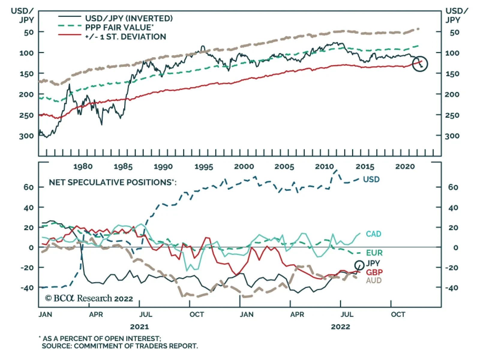
Recent data releases suggest that Japan’s domestic recovery remains lackluster. Japanese machine tool orders decelerated from 17.1% y/y to 5.5% y/y in July, prolonging the past years’ downtrend. The slowdown has been particularly pronounced among foreign…
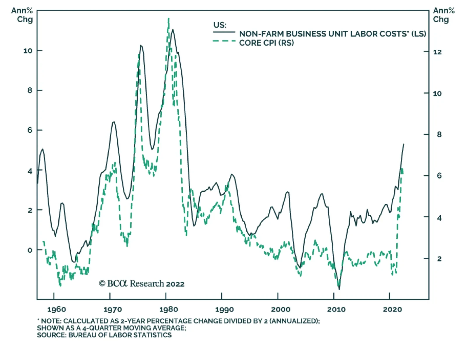
Nonfarm productivity contracted by 4.6% on an annualized q/q basis in Q2, following a downwardly revised 7.4% decline in the previous quarter, and marking the largest two-quarter contraction in productivity on record. Meanwhile, Unit Labor Costs (ULC) grew by…
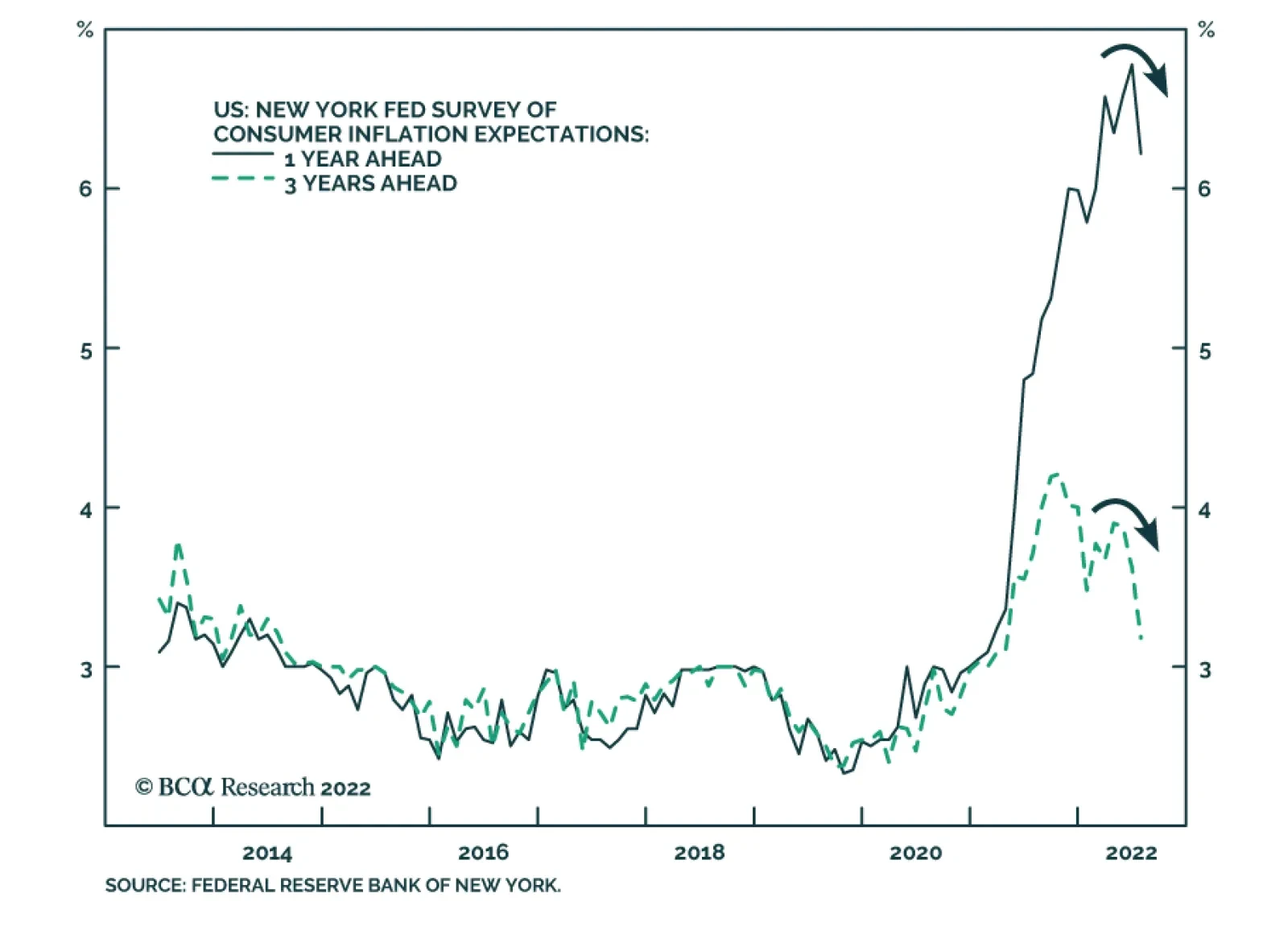
Results from the New York Fed’s latest Consumer Survey suggest that the Fed’s credibility is improving. Inflation expectations declined across the board. Median one- and three-year-ahead inflation expectations dropped 0.6 percentage points to 6.2% and 0.4…
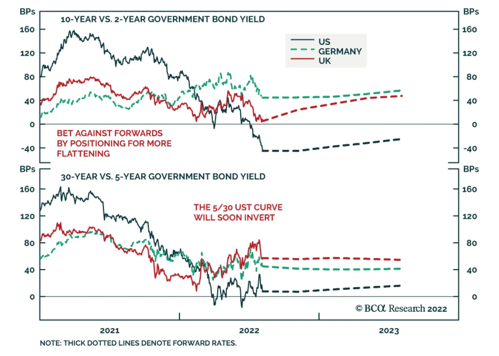
BCA Research’s Global Fixed Income Strategy service recommends increasing exposure to yield curve flattening in the US, UK, and core Europe (Germany and France). Bond markets were getting way ahead of themselves in pricing in aggressive rate cuts in 2023,…

Executive Summary High profile economists Larry Summers and Olivier Blanchard have recently cast doubt on the Federal Reserve’s claim that a soft landing is possible for the US economy. We explore the arguments from both sides of the debate and conclude that the economic data will likely support the Fed’s soft landing thesis during the next six months. However, the unemployment rate will rise more significantly as we move deeper into 2023 and the Fed continues to run a restrictive monetary policy. This report also provides an update on our recommended portfolio duration and high-yield positioning, and suggests a tweak to our recommended positioning across the Treasury curve. Specifically, we advise clients to enter a duration-matched position long the 5/30 barbell and short the 10-year bullet. The Beveridge Curve
Peak Fed Funds?
Peak Fed Funds?
Bottom Line: Investors should keep portfolio duration close to benchmark and maintain a neutral (3 out of 5) allocation to high-yield bonds. Investors should also exit positions long the 2-year bullet versus a duration-matched cash/5 barbell and enter a position long a 5/30 barbell versus the 10-year bullet. Feature This week’s report digs into a recent macro debate between two high profile economists – Larry Summers and Olivier Blanchard – and the Federal Reserve about whether a “soft landing” is possible for the US economy. We summarize the debate below and offer our own thoughts on its implications for investment strategy. But first, we provide a quick update on our recent thinking about US bond portfolio construction, including a change to our recommended yield curve positioning. Positioning Update Portfolio Duration In recent reports we have written that we would reduce our recommended portfolio duration stance from “at benchmark” to “below benchmark” if the 10-year Treasury yield falls to 2.5% or if core inflation converges to our 4%-5% estimate of its underlying trend (Chart 1).1 The 10-year yield came close to hitting our 2.5% trigger last week but then quickly reversed course. It moved even higher after Friday’s extremely strong employment report, and it now sits at 2.78%. We are sticking with our plan. Despite July’s blockbuster job gains, trends in both initial and continuing jobless claims suggest that the unemployment rate is more likely to rise than fall during the next few months (Chart 2). Supply chain indicators also point toward falling inflation (Chart 2, bottom panel). Against this backdrop, it wouldn’t be too surprising to see bond yields experience another downleg. Chart 1Stay Neutral For Now
Stay Neutral For Now
Stay Neutral For Now
Chart 2Unemployment Has Bottomed
Unemployment Has Bottomed
Unemployment Has Bottomed
High-Yield Turning to credit, we continue to recommend an underweight allocation to spread product (including investment grade corporate bonds) versus Treasuries, but with a slightly higher allocation (neutral) to high-yield. We think that high-yield spreads can tighten in the near-term as recession fears are allayed and inflation rolls over. However, the medium-to-long run macro environment is negative for spread product and we will be quick to reduce junk exposure if spreads reach their 2017-19 average (Chart 3) or if core inflation converges with our 4%-5% estimate of trend. Chart 3Tracking The Junk Rally
Tracking The Junk Rally
Tracking The Junk Rally
Treasury Curve Chart 4Buy A 5/30 Flattener
Buy A 5/30 Flattener
Buy A 5/30 Flattener
Finally, this week we tweak our recommended yield curve positioning by closing our prior recommendation: long 2-year bullet versus duration-matched cash/5 barbell, and by initiating a new trade: long 5/30 barbell versus a duration-matched 10-year bullet. We only initiated that 2 over cash/5 trade a couple weeks ago on the view that 2/5 Treasury curve inversions don’t tend to last very long.2 However, it has since become clear that our timing was premature. In fact, we probably shouldn’t anticipate a significant 2/5 steepening until the Fed’s tightening cycle is near its end, which we do not believe to be the case. Instead, we recommend that investors shift into a duration-matched position that is overweight a 5/30 barbell versus the 10-year bullet. This trade offers a positive yield differential of 16 bps (Chart 4) and will profit from a flattening of the 5-year/30-year Treasury slope. The 5/30 slope has steepened in recent weeks, but further steepening is only likely to occur near the end of a Fed tightening cycle. Given that we see significant further tightening ahead, it’s much more likely that the 5/30 slope will fall to zero or even turn negative (Chart 4, top panel). The Battle Of The Beveridge Curves Our battle begins with a speech from Fed Governor Christopher Waller that was given back in May.3 In that speech, Waller made the case for why the large number of job vacancies gave him “reason to hope that policy tightening in current circumstances can tame inflation without causing a sharp increase in unemployment.” Waller’s argument was based on the historical relationship between the job vacancy rate and the unemployment rate, a relationship known as the Beveridge Curve (Chart 5). In essence, Waller’s argument for a “soft landing” boils down to the observation that the Beveridge Curve shown in Chart 5 has shifted up since the pandemic. That is, since March 2020 we have consistently seen more job vacancies for any given unemployment rate. His contention is that, as economic activity slows, rather than moving to the right along the Beveridge Curve, the curve will shift down toward its pre-pandemic level. In other words, the job vacancy rate will decline significantly without a large uptick in the unemployment rate. Chart 5The Beveridge Curve
The Great Soft Landing Debate
The Great Soft Landing Debate
Objection! In a paper published this month, Olivier Blanchard, Alex Domash and Larry Summers (BDS) take issue with Waller’s claims from two different angles, a theoretical one and an empirical one.4 First, from a theoretical perspective, BDS describe three factors that lead to either movements along the Beveridge Curve or shifts in the curve itself. 1) Economic Activity. Stronger economic activity leads to more job vacancies and a lower unemployment rate. In other words, a shift to the left along the Beveridge Curve, illustrated as the journey from point A to point B in Chart 6. Chart 6An Illustrated Beveridge Curve
The Great Soft Landing Debate
The Great Soft Landing Debate
2) Matching Efficiency. If available jobs are a worse match for the skills of the unemployed labor force, then it will lead to a higher job vacancy rate for any given unemployment rate. In other words, a shift up in the Beveridge Curve from point B to point C in Chart 6. 3) Reallocation Intensity. If people switch jobs more frequently, then there will also tend to be more vacancies for any given level of unemployment. Again, this would shift the Beveridge Curve up from point B to point C in Chart 6. Using a model and data from the JOLTS survey, BDS attempt to decompose how much of these three factors have contributed to the current positioning of the Beveridge Curve. The authors estimate that economic activity has increased significantly since the end of 2019, but also that the labor market’s matching efficiency has declined, and that reallocation intensity has increased (Chart 7). Chart 7An Illustrated Beveridge Curve
An Illustrated Beveridge Curve
An Illustrated Beveridge Curve
While monetary tightening can weaken economic activity, it cannot change the labor market’s matching efficiency or its reallocation intensity. Therefore, the authors argue, unless matching efficiency and reallocation intensity naturally revert to their pre-COVID levels, weaker economic activity will manifest as a movement to the right along the post-2020 Beveridge Curve, leading to a higher unemployment rate. This, in our view, is the crux of the “soft landing” debate. Are the recent changes in labor market matching efficiency and reallocation intensity temporary or permanent? Next, we move to BDS’ empirical arguments. The authors construct a time series of the job vacancy rate going back to the 1950s and then examine changes in both the job vacancy rate and the unemployment rate following cyclical peaks in the vacancy rate. Their results show that a falling job vacancy rate almost always coincides with a rising unemployment rate (Table 1). In other words, if history is any guide, it is very unlikely that the Fed will be able to push the job vacancy rate down without seeing an increase in unemployment. Table 1Average Change In The Unemployment Rate And The Vacancy Rate After A Peak In The Vacancy Rate
The Great Soft Landing Debate
The Great Soft Landing Debate
That said, the authors’ results also reveal a dynamic known as the Beveridge Loop. Notice in Table 1 that a drop in the vacancy rate leads to a much smaller increase in the unemployment rate during the first six months following the vacancy rate peak than it does during the first 12 months or first 24 months. In other words, there is some empirical validity to Fed Governor Waller’s argument that the early impact of Fed tightening will be felt primarily through a falling job vacancy rate. The 2018/19 Example We can illustrate the Beveridge Loop with a recent example, one that interestingly was not included in BDS’ empirical analysis. The job vacancy rate peaked in November 2018 and then trended lower until the pandemic struck in early 2020. Interestingly, this 2018-19 drop in the job vacancy rate occurred alongside a modest decline in the unemployment rate. Chart 8 shows what the Beveridge Curve looked like during this period. Notice that, rather than moving back to its January 2018 point in a straight line, the Beveridge Curve formed a loop after peaking in November 2018. Chart 8The 2018/19 Beveridge Loop
The Great Soft Landing Debate
The Great Soft Landing Debate
What allowed the labor market to achieve this “soft landing” in 2018/19? The most likely answer is that labor force participation rose significantly during this period (Chart 9). The influx of workers into the labor force allowed the unemployment rate to keep falling even as continuing unemployment claims bottomed out. Chart 9The 2018/19 Soft Landing
The 2018/19 Soft Landing
The 2018/19 Soft Landing
The BCA Verdict Our view is that the incoming economic data will appear to validate the Fed’s “soft landing” view during the next six months, but that the unemployment rate will start to rise more significantly as we move deeper into 2023. As we have stated in prior reports, a significant increase in the unemployment rate will eventually be required to tame inflation, but that increase likely won’t occur as soon as many market participants expect.5 In essence, we anticipate a large Beveridge Loop. A loop that, in fact, appears to already be forming (Chart 5). We have shown that the empirical evidence supports the idea that a Beveridge Loop will occur during the early stages of a slowdown. Further, theory and empirical evidence demonstrate that the Beveridge Curve is convex. This suggests that the Beveridge Loop could be particularly large in this cycle given that the vacancy rate is starting from such a high level. Perhaps the bigger question, though, is whether the Beveridge Curve will re-converge with its pre-pandemic level during the next 6-12 months. On this question we side more with Blanchard, Domas and Summers. While we think that matching efficiency can continue to improve along its current trend (Chart 7, panel 2), the widespread adoption of work-from-home suggests that the labor market has probably experienced a permanent increase in reallocation intensity. On matching efficiency, the best evidence for continued improvement comes from a breakdown of employment by industry (Table 2). Notice that the three sectors (other than government) that have experienced the greatest job losses since the pandemic – Health Care, Leisure & Hospitality and Other Services – also have three of the highest job openings rates. This suggests that there shouldn’t be a permanent friction between matching those missing workers to available jobs. Table 2Employment By Industry
The Great Soft Landing Debate
The Great Soft Landing Debate
Finally, working from our 2018/19 example, we can assess the likelihood that an increase in labor force participation will cushion the upside in the unemployment rate. Here, we see some potential for the prime age participation rate to rise back to its pre-COVID level, but the re-entry of recently retired workers over the age of 55 is more in doubt. Overall, it’s highly unlikely that the overall participation rate will re-gain its pre-pandemic level (Chart 10). Chart 10Labor Force Participation
Labor Force Participation
Labor Force Participation
The bottom line is that the next six months will likely look more like a soft landing than a hard one. The job vacancy rate will fall quickly and the unemployment rate will stay relatively low, causing the Beveridge Curve to form a large loop. However, the Beveridge Curve will not revert to its pre-COVID level any time soon. As we move deeper into 2023, the Beveridge Curve will stop looping and the unemployment rate will rise significantly. Ryan Swift US Bond Strategist rswift@bcaresearch.com Footnotes 1 Please see US Bond Strategy Weekly Report, “Recession Now Or Recession Later?”, dated July 26, 2022. 2 Please see US Bond Strategy / Global Fixed Income Strategy Weekly Report, “A Low Conviction US Bond Market”, dated July 12, 2022. 3https://www.federalreserve.gov/newsevents/speech/files/waller20220530a.pdf 4https://www.piie.com/publications/policy-briefs/bad-news-fed-beveridge-space#:~:text=The%20Federal%20Reserve%20seeks%20to,together%20and%20remain%20unlikely%20now. 5 Please see US Bond Strategy Weekly Report, “Three Conjectures About The US Economy”, dated July 19, 2022. Recommended Portfolio Specification Other Recommendations Treasury Index Returns Spread Product Returns
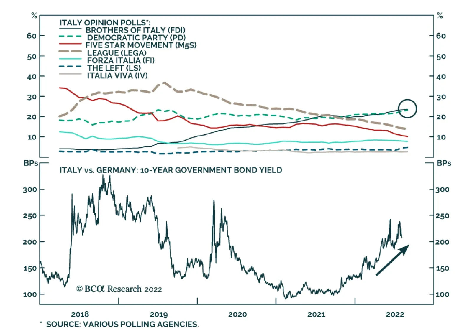
On Friday, Moody’s downgraded the outlook for Italian sovereign debt from stable to negative, citing (1) risks to the implementation of structural reforms stemming from the political environment (2) headwinds to the economy from energy supply issues and (3)…
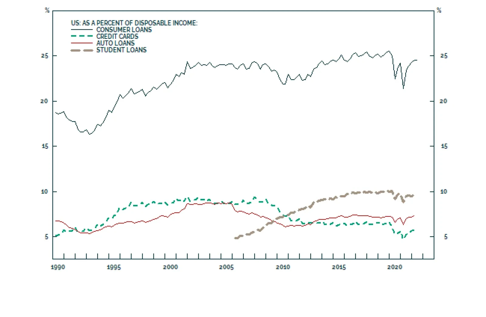
The latest data on consumer credit is a testament to the resilience of US consumption. Borrowing surged by $40.2 billion in June – significantly above the $27 billion increase anticipated and second only to March’s $47.1 billion increase. Both revolving…
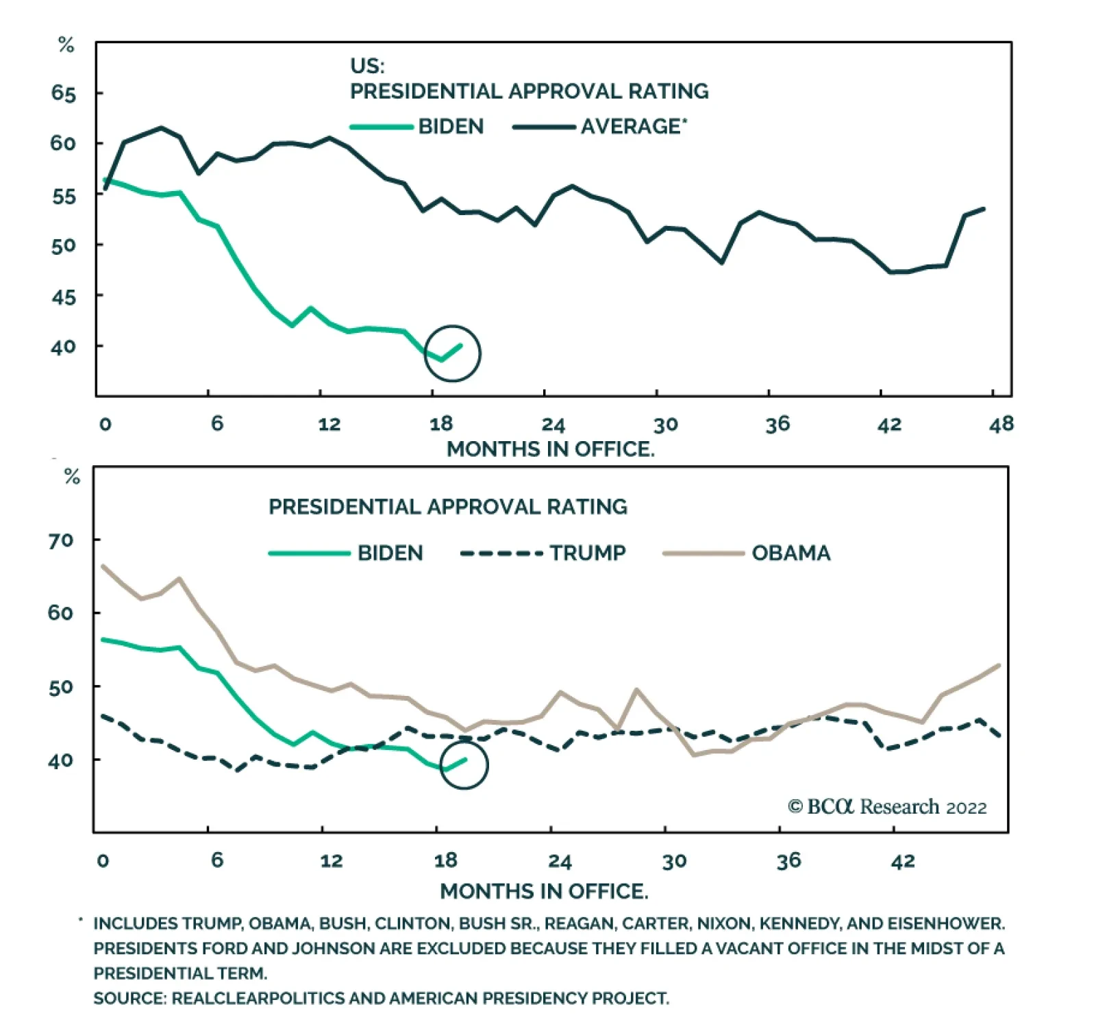
President Joe Biden’s average monthly approval rating appears to have stabilized, albeit at low levels. The Roe v Wade saga, the rally around the flag amid the Taiwan crisis, and the killing of al-Qaeda leader Ayman al-Zawahiri have all contributed to this…
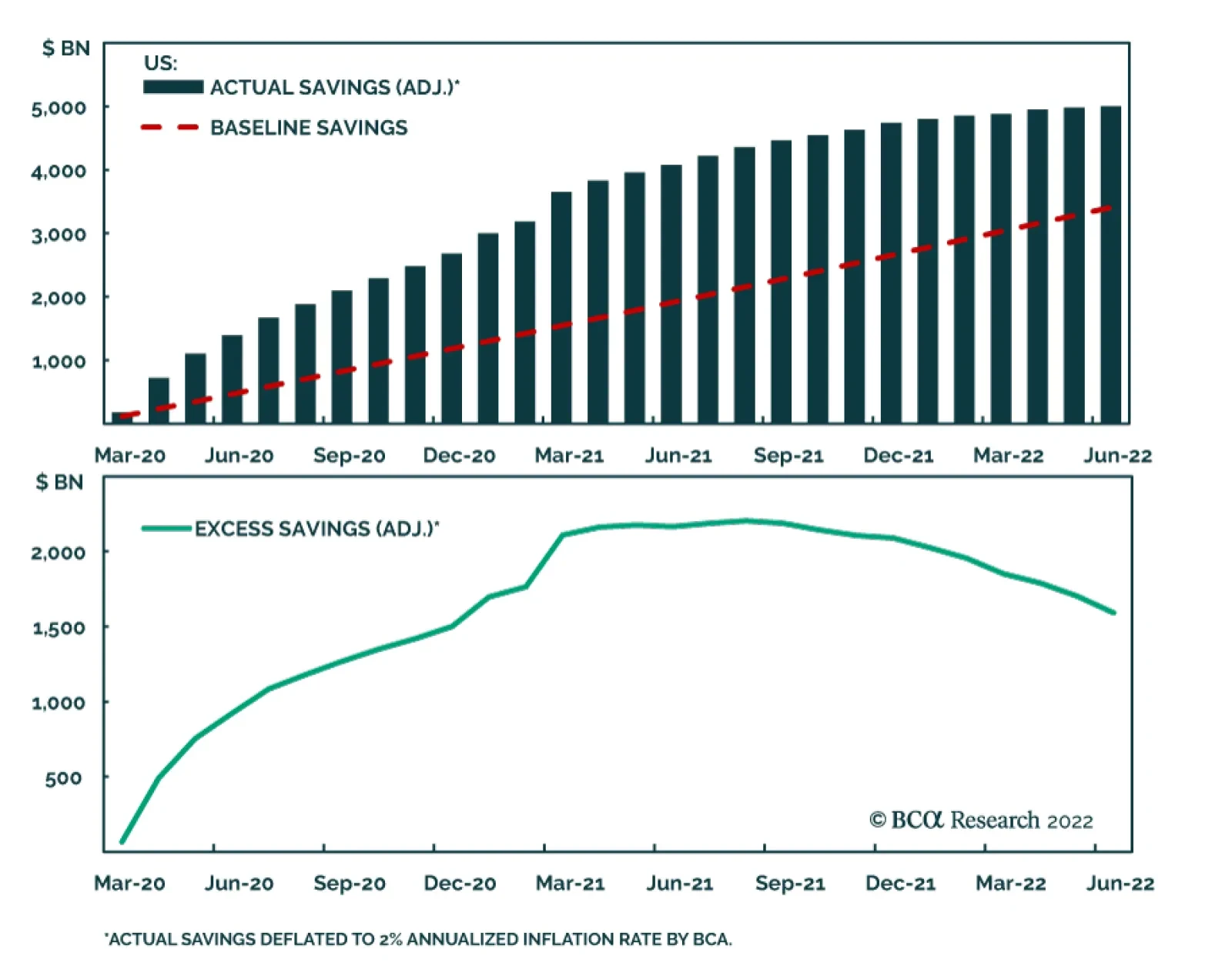
BCA Research’s US Investment Strategy service expects American households to continue to dip into savings to maintain trend consumption, but inflation has eaten up some of the dry powder. The savings rate has declined considerably so far in 2022,…
S&P 500 Chart 1Macroeconomic Backdrop
Macroeconomic Backdrop
Macroeconomic Backdrop
Chart 2Profitability
Profitability
Profitability
Chart 3Valuations And Technicals
Valuations And Technicals
Valuations And Technicals
Chart 4Uses Of Cash
Uses Of Cash
Uses Of Cash
Cyclicals Vs Defensives Chart 5Macroeconomic Backdrop
Macroeconomic Backdrop
Macroeconomic Backdrop
Chart 6Profitability
Profitability
Profitability
Chart 7Valuation And Technicals
Valuation And Technicals
Valuation And Technicals
Chart 8Uses Of Cash
Uses Of Cash
Uses Of Cash
Growth Vs Value Chart 9Macroeconomic Backdrop
Macroeconomic Backdrop
Macroeconomic Backdrop
Chart 10Profitability
Profitability
Profitability
Chart 11Valuations And Technicals
Valuations And Technicals
Valuations And Technicals
Chart 12Uses Of Cash
Uses Of Cash
Uses Of Cash
Small Vs Large Chart 13Macroeconomic Backdrop
Macroeconomic Backdrop
Macroeconomic Backdrop
Chart 14Profitability
Profitability
Profitability
Chart 15Valuations and Technicals
Valuations and Technicals
Valuations and Technicals
Chart 16Uses Of Cash
Uses Of Cash
Uses Of Cash
Table 1Performance
Chartbook: Style Chart Pack
Chartbook: Style Chart Pack
Table 2Valuations And Forward Earnings Growth
Chartbook: Style Chart Pack
Chartbook: Style Chart Pack
Recommended Allocation