Developed Countries

Executive Summary The Dollar And Volatility
The Dollar And Volatility
The Dollar And Volatility
The dollar continues to be bid, as volatility rises. The MOVE volatility index is making fresh cycle highs and has pushed the DXY index above our stop level of 107 (Feature Chart). The move in the dollar suggests that we are experiencing a classic breakout pattern. Historically, this means that flows into the USD will continue, until it becomes clear that drivers of USD strength have abated. These include inflation peaking and global growth bottoming. We are moving our recommended stance on USD to neutral. It is becoming clear that the market sees the risk of a nasty recession in Europe to be high. The euro could break below parity, as speculators short the currency en masse. The yen is becoming a winner in the current context. We are reopening our short EUR/JPY trade this week, in addition to our short CHF/JPY position initiated last week. Our long AUD/USD position was stopped out at 68 cents this week. Given our shift to a neutral view on the dollar, we recommend investors stand aside for now. Bottom Line: We were stopped out of our short DXY position at 107, for a loss of 2.34%. We are moving to a neutral stance on the greenback. While valuation and sentiment are at contrarian extremes, the current environment dictates that further gains in the greenback are likely in the near term. Feature The DXY index has staged a classic breakout and the next technical level is closer to the 2002 highs near 120. Year-to-date, the DXY has been one of the best performing currencies (Chart 1). In last week’s report, we presented a framework for managing currencies, suggesting that while the path of least resistance for the dollar was up, significant headwinds were also building. One of the closest correlations we have seen in recent trading days is with volatility. As Chart 2 shows, the dollar and the MOVE index have been the same line. As markets increasingly price in the probability of a recession, especially in Europe, the dollar will be bought. This puts central banks in a quandary: focusing on growth or inflation? As such bond volatility is shooting up and the dollar is commanding a hefty safety premium. In the next few sections, we go over the important data releases from our universe of G10 countries, and implications for currency strategy. Chart 1The Dollar Remains King
Month In Review: The Euro At Parity, What Next?
Month In Review: The Euro At Parity, What Next?
Chart 2The Dollar And Volatility
The Dollar And Volatility
The Dollar And Volatility
US Dollar: A Classic Breakout Chart 3A Clean Breakout In The DXY
A Clean Breakout In The DXY
A Clean Breakout In The DXY
The dollar DXY index is up 11.3% year-to-date. Over the last month, the DXY index is up 4.7%. Technical forces are still in favor of the greenback as a momentum currency, given the classic breakout pattern. Looking at incoming data from the US, the case for dollar strength remains in place in the near term. The May CPI print came in well above expectations, at 8.6% for headline, versus 8.3% expected. A few days later, the PPI print was also strong at 10.8% year on year. This is happening at a time when consumer confidence is rolling over. The University of Michigan current conditions index fell from 63.3 to 53.8 in May. The expectations component dropped from 55.2 to 47.5. The conference board measure fell from 103.2 to 98.7 in June. After this print, the Fed met on June 15 and increased interest rates by 75bps, a surprise to the market. The current account deficit widened to $291.4bn US, a record low since the end of the Bretton Woods system . Retail sales disappointed in May. Excluding automobile and gasoline, sales were up 0.1% month on month, versus a consensus expectation of a 0.4% rise. It was also flat for the control group, suggesting basket changes were not responsible for the deterioration. The numbers are on a nominal basis, which suggests that retail sales volumes are contracting meaningfully. The rise in interest rates is filtering into the housing market. Mortgage applications fell 5.4% during the week of July 1. Housing starts declined from 1,810K to 1,724K in May, a 14.4% drop. Building permits also fell 7% month on month, in line with the 3.4% drop in existing home sales. The ISM manufacturing index fell from 56.1 to 53 in June. US economic data is softening, which raises the odds that the US joins Europe and China in a classic slowdown. In such a configuration, the market is pricing in that the dollar will ultimately be the haven asset, as has been the case in recent history. We went short the DXY index at 104.8, with a stop-loss at 107, that was triggered overnight. We are moving to a neutral stance today and will revisit this position once global economic uncertainty subsides. The Euro: A European Hard Landing Chart 4The Euro Is Pricing In A Deep Recession
The Euro Is Pricing In A Deep Recession
The Euro Is Pricing In A Deep Recession
The euro is down 10.5% year-to-date. Over the last month, the euro is down 4.7%, and recent trading suggests we will probably breach parity versus the dollar in the coming weeks. Recent data from the eurozone continues to suggest it is trapped in stagflation. The preliminary CPI print for June came in at 8.6%, well above the previous 8.1% print. PPI in the euro area is at 36.3%. Meanwhile, consumer confidence (the European Commission’s measure) is approaching a record low. The Sentix investor confidence index peaked in July last year and has been falling ever since. With a mandate of bringing down inflation, the ECB may have no choice but to knock the eurozone economy to its knees. The proximate expression of this view has been via shorting the euro. Most of the incoming data for the euro area have been deteriorating. For example, on a seasonally adjusted basis, the trade deficit widened to -€31.7bn. This is a record since the creation of the euro. This has completely wiped the eurozone current account, meaning the euro is now becoming a borrower nation. The critical question for Europe lies in the adjustment mechanism towards a possible shut-off in natural gas supplies for the winter. European natural gas prices are soaring anew, though well below the peak this year. A cut-off of Russian supplies is becoming a very real possibility. The question then becomes how deep of a European recession the euro is pricing in. Back in 2020, the euro bottomed at 1.06. At the time, quarterly real GDP in the euro area fell 11.9% in the second quarter. That was worse than both during the global financial crisis, and anytime since the creation of the euro. This means that fundamentally, the euro has already priced in a nasty recession in Europe. If it occurs, the euro could undershoot but if it does not, the potential for a coiled spring rebound is immense. A hedged bet on the euro is to sell the EUR/JPY cross. In a risk-off environment, EUR/JPY will collapse. In a Goldilocks scenario, the yen has sold off much more that the euro, that the cross could move sideways. The Japanese Yen: Now A Safe Haven Chart 5The Yen Is Becoming An Attractive Safe Haven
The Yen Is Becoming An Attractive Safe Haven
The Yen Is Becoming An Attractive Safe Haven
The Japanese yen is down 15.4% year-to-date, the worst performing G10 currency. Over the last month, the yen is down 2.4%. Incoming data in Japan has been mixed with the domestic economy still showing some signs of weakness, while the external sector is faring relatively better. The Bank of Japan kept monetary policy on hold last month, despite a widely held view in markets that it would pivot, following the surprise hike by the Swiss National Bank. Inflation in Japan has been modest, with nationwide CPI at 2.5% in May. The Tokyo CPI release for June showed that inflation remains sticky around this level. Yet the BoJ views a large chunk of inflation in Japan to be transitory, due to rising energy costs, and base effects from the sharp drop in mobile phone prices last year. For inflation to pick up, ultimately wages need to rise. Labor cash earnings for May came in at 1%. For Japan, this is a healthy print compared to recent history, but still pins real cash earnings at -1.8%, suggesting little risk of a wage inflation spiral. The Tankan survey for the second quarter provided a glimmer of hope. While large manufacturers (mainly exporters) sensed a deterioration in the outlook, domestic concerns were more upbeat. The large non-manufacturing index improved from 9 to 13 in the second quarter. The small non-manufacturing index improved from -6 to -1. Notably, capex intentions rose 18.6%, the highest level since the late 80s. The drivers of the yen remain clear and absolute. First, rising global interest rates put selling pressure on the yen and vice versa. Second, energy prices sap the trade balance, which is also negative. Should these factors abate (as they are currently), the yen will benefit. This week, we are reopening our short EUR/JPY trade, in addition to being short CHF/JPY. From a contrarian perspective, the yen is the cheapest G10 currency according to our PPP models. It also happens to be one of the most heavily shorted currencies, according to CFTC data. British Pound: Sterling Breaks Below 1.20 Chart 6Politics Will Keep Cable Volatile
Politics Will Keep Cable Volatile
Politics Will Keep Cable Volatile
The pound is down 11.1% year-to-date. Over the last month, the pound is down by 4.5% as a combination of economic and political headwinds hit sterling. Politically, the resignation of Prime Minister Boris Johnson is fueling sterling volatility. According to our geopolitical strategists, investors’ focus should be on whether UK national policy will change. This will require an election that replaces the Conservative Party-led government, or at least removes its single-party majority. Boris Johnson’s approval rating had been collapsing in recent days on the back of a series of scandals, so a less unloved leader under the same party will at least assuage public opinion, while keeping existing policies largely the same. The next milestones to watch for are an early election (unlikely since the Conservative Party still has an interest in prolonging until 2025) and a Scottish referendum for independence next year. Labor will also continue to benefit from a tailwind of high inflation and the mishandling of the pandemic by the Tories that has left voters largely frustrated. Economically, data in the UK continues its whiff of stagflation. CPI came out at 9.1% in May, the RPI accelerated to 11.7%, and nationwide housing prices came in at 10.7% in June, while retail sales are tanking, falling 4.7% year on year in June, excluding auto and fuel costs. The GFK Consumer confidence indicator hit a record low of -41 in June. Our report on sterling suggested that headwinds remain likely in the near term, but the pound is becoming more and more attractive for longer-term investors. We are currently long EUR/GBP. This cross still heavily underprices the risks to the UK economy in the near term. However, if recession fears ease, our suspicion is that cable is poised for a coiled-spring rebound. Canadian Dollar: The BoC Will Stay Hawkish Chart 7The CAD Has Decoupled From Oil Prices
The CAD Has Decoupled From Oil Prices
The CAD Has Decoupled From Oil Prices
The CAD is down 2.5% year-to-date. Over the last month, it is down 3.4%. Incoming data continues to suggest there is little reason for the BoC to change course in tightening monetary policy. The employment market remains strong. In May, 40K new jobs were added, and the details below the surface were notable. 135K full time jobs were swapped for 96K part time roles. Hourly wages rose 4.5% and the unemployment rate dipped to 5.1%. This sort of data is carte blanche for the BoC to keep hiking, since it signals a soft landing in the economy. Housing has been a point of contention for higher rates in Canada (given indebted households), but the Teranet national house price index shows that home prices are still rising 18.3% year-on-year in Canada as of May. This is occurring within the context of widespread price gains. Headline CPI came in at 7.7% in May, with all measures of the BoC’s trimmed estimates (core-common, core-median, core-trim), well above target and expectations. It will be interesting to watch how the BoC calibrates monetary policy given that the closely watched Business Outlook Survey showed a large deterioration in participants’ outlook for the future. In a world where USD strength persists, CAD will trade on the weaker side, but we remain buyers of the CAD once recession fears ebb. Australian Dollar: A Contrarian Play Chart 8A Jumbo Hike By The RBA
A Jumbo Hike By The RBA
A Jumbo Hike By The RBA
The Australian dollar is down 5.8% year- to-date. Over the last month, the AUD is down 5.3% as the price of iron ore declined by over 10% and the Chinese economy remained on lockdown. The RBA raised its interest rate by 50bps for a second month in a row this week. This aggressively shifted market expectations for further rate increases, with pricing in the OIS curve one year out rising from 3.35 to 3.51% today. While the RBA admitted global supply chain issues have contributed to inflation, capacity constraints in certain sectors and a tight labor market are also helping fuel domestic inflation. Particularly, the May employment report was robust, with 69.4K full-time jobs added, and a healthy jump in the participation rate to 66.7%. Job vacancies continued to grow at 13.8%. Rising rates in Australia are having the desired effect. Home price inflation is cooling, especially in places like Sydney. Demand for housing and construction remains robust, suggesting the RBA is achieving a soft landing in the economy. For example, home loan values are growing 1.7% and building approvals are growing by 9.9%. Demand also appears strong as manufacturing PMI came out at 56.2 in June. We are bullish the AUD against the dollar; however, short-term headwinds from Chinese lockdowns do not currently make us buyers of the currency. We are exiting our long AUD/USD position after being stopped out at 0.68 for a loss of -5.67%. New Zealand Dollar: Least Preferred G10 Currency Chart 9Terms Of Trade Are Waning For NZD
Terms Of Trade Are Waning For NZD
Terms Of Trade Are Waning For NZD
The NZD is down 9.7% this year. Over the last month, it is down 4.7%. New Zealand has the highest policy rate in the G10, and that is beginning to take a toll on interest-rate sensitive parts of the economy. REINZ house sales fell 28.4% year on year in May. House price inflation is also rapidly cooling. In June, the ANZ consumer confidence index fell from 82.3 to 80.5. Business confidence deteriorated from -55.6 to -62.6. The external sector is no longer a tailwind for the NZ economy, as grain and meat prices cool off. The price of dairy, approximately 20% of New Zealand’s exports, continues to decline with a 10% drop in June. The 12-month trailing trade balance continues to plummet, hitting -9.5bn NZD in May. The current account for May came in at -6.14 billion NZD versus a consensus -5.5 billion NZD. China is an important economic partner for New Zealand, with circa 27% of Kiwi exports China bound. Restrictions seem to be easing as the latest non-manufacturing PMI from China data came in at 54.7 against a previous 48.4 reading. The number of days required to quarantine on arrival also dropped to 10 days from 21 days in June. If this trend continues, it will be positive for the NZD; however, China does not appear to have an exit strategy for their zero-case COVID-19 policy. Within the G10 currency space, many other currencies appear more attractive than the kiwi, though our view is that NZD will benefit when US dollar momentum rolls over. Swiss Franc: A Safe Haven Chart 10A U-Turn From The SNB
A U-Turn From The SNB
A U-Turn From The SNB
CHF is down 6.4% year-to-date and flat over the past month versus the dollar. Against the euro, the franc is up 4.7% year-to-date and 5.2% over the past month. Our special report on the franc was timely, given the surprise rate hike announcement from the SNB last month. Amidst currency market volatility, EUR/CHF broke below parity. The SNB views currency strength as a virtue in today’s paradigm. As such, it has halted currency interventions, evident through the decline in sight deposits. Markets are pricing in another 50bps hike in September. Inflation continued to accelerate above projections in June. Headline and core CPI were up 3.4% and 1.9% year on year respectively, lower than other G10 countries but high enough to keep the SNB on alert. Inflation remains largely driven by the prices of imported goods which strengthens the case for a strong franc. The labor market is also tight, with unemployment at 2.2% in May. The outlook for the Swiss economy remains positive for the rest of the year, albeit with some signs of slowing activity emerging. The manufacturing PMI at 59.1 and the KOF leading indicator at 96.8 were both down to multi-month lows in June. The trade surplus in May was down to CHF 2bn. The franc is undervalued against the dollar and can serve as a good hedge for spikes in global volatility. Norwegian Krone: Improving The Current Account Chart 11NOK Has Decoupled From Oil Prices
NOK Has Decoupled From Oil Prices
NOK Has Decoupled From Oil Prices
The NOK is down 13.2% YTD and down 6.2% over the last month. Against the euro, the NOK is down 2.4% YTD and 1.3% in over the past month. In June, the Norges Bank raised the policy rate from 0.75% to 1.25%, 25bps higher than broadly anticipated. The rate path was also revised sharply higher and now corresponds to a 25bps hike at each meeting until the rate steadies at around 3% next summer. Governor Ida Wolden Bache left the door open for more half-point hikes but also highlighted the potential risk of overtightening, suggesting a balanced approach. Inflation in Norway is surprising to the upside. In May, CPI came in at 5.7% and 3.4% for core, signaling that price increases are becoming more broad-based. The labor market remains tight. The unemployment rate dipped to 1.7% in June, the lowest reading since 2008. Wages are projected to grow 3.9% this year. Together with a positive output gap, and a weak currency, both domestic and imported inflation could remain sticky for a while. Economic activity remains healthy in Norway. The manufacturing PMI went up to 56.4 in June, private consumption is robust, and business investment is expected to increase around 8% this year. Petroleum investments are also expected to pick up markedly in the years ahead, spurred by elevated energy prices and tax incentives. Recent natural gas production hikes, approved by the government, will further contribute to the healthy trade surplus. The strike started by union workers this week threatened to halt a significant portion of Norway’s oil and natural gas output. However, a resolution was found rather quickly. Despite record energy prices, the krone is one of the worst-performing majors this year. Pronounced global risk-off sentiment in the first half weighed on the currency. Despite potential challenges in the near term, Norway’s trade balance will remain a major tailwind this year. Shorting EUR/NOK on rallies looks attractive. Swedish Krona: Tracking The Euro Lower Chart 12The SEK Is At Capitulation Lows
The SEK Is At Capitulation Lows
The SEK Is At Capitulation Lows
The SEK is down 14.2% year-to-date and 7.1% over the last month. Inflation is becoming a problem in Sweden. In May, the CPIF increased 7.2% year on year, while the core measure was up 5.4%. In response, the Riksbank raised the policy rate by 50bps to 0.75% at its June meeting. The Riksbank sees the policy rate at around 1.75% by year-end, implying 50bps hikes at the remaining two meetings this year. The bank also announced a faster run-off in its balance sheet. We had anticipated the hawkish pivot by the Riksbank in early June, but that has not helped the Swedish krona much. Like Europe, the Swedish economy is being held hostage by external shocks, the global slowdown and an energy crisis. Signs of economic slowdown are becoming more pronounced. The Riksbank’s GDP forecast for 2022 was revised down by 1% to 1.8% and cut in half to 0.7% for 2023. Industrial production and new order data also point to a cooling in economic activity. Manufacturing and services PMIs remain expansionary zone but are falling rapidly. Notably, export orders have been hovering around the 50 boom/bust line over the last few months. Housing market is also vulnerable, with the Riksbank projecting a more-than-10% decline in prices by next year. That said, the SEK is below the 2020 lows suggesting these risks are well priced in. We are buyers of SEK on weakness. Chester Ntonifor Foreign Exchange Strategist chestern@bcaresearch.com Artem Sakhbiev Research Associate artem.sakhbiev@bcaresearch.com Thierry Matin Research Associate thierry.matin@bcaresearch.com Trades & Forecasts Strategic View Cyclical Holdings (6-18 months) Tactical Holdings (0-6 months) Limit Orders Forecast Summary
While BCA Research’s Emerging Markets Strategy service is not entirely convinced that US tech stocks are a bubble waiting to burst, they view the odds of this happening as nontrivial. There are a lot of similarities between dynamics prevailing in US tech…
Executive Summary Global risk assets are oversold, and investor sentiment is downbeat. In this context, a technical equity rebound cannot be ruled out. However, we do not think it will be the beginning of a major cyclical rally. The Fed and the stock market remain on a collision course. An equity rally and easing financial conditions would make the Fed even more resolute to continue hiking interest rates. There are many similarities between dynamics that prevailed in US tech stocks and in previous bubbles. While it is not our baseline view, the odds of a protracted bear market are nontrivial. Resource prices and commodity plays have more downside. The History Of Financial Bubbles: Is This Time Different?
On A Bull Case, Bubbles And Commodity Prices
On A Bull Case, Bubbles And Commodity Prices
Bottom Line: The decline in commodity prices and the relentless US dollar rally will ensure that EM currencies, bonds and stocks continue to sell off even if the US equity market rebounds in the near term. Feature Among the most frequently discussed topics in recent client calls are the upside and downside risks to our baseline view. We elaborate on these risks in this report. To recap, our baseline view is as follows: EM and DM stocks have another 15% downside in USD terms, the US dollar will continue overshooting and commodity prices will fall. Global yields are topping out, and the US yield curve will soon invert. Hence, defensive positioning for absolute-return investors is still warranted, and global equity and fixed-income portfolios should continue to underweight EM. The rationale is that US and EU demand for goods ex-autos, and hence global trade, is about to contract while the Fed is straightjacketed by high and broad-based inflation. China’s economy will be struggling to recover. In EM ex-China, domestic demand will relapse. Chart 1Will The S&P 500's Technical Support Hold?
Will The S&P 500's Technical Support Hold?
Will The S&P 500's Technical Support Hold?
If one believes that the US equity bull market that began in 2009 is still alive (i.e. the March 2020 selloff is a short-lived red herring), odds are that the S&P 500 drawdown is over. The reasoning is that the S&P 500 is already down 23% from its 2021 peak, on par with the selloffs that occurred in 2011, 2015-16 and 2018 (Chart 1). However, if one believes that the structural bull market is over, the magnitude of the current equity selloff is likely to exceed the ones in 2011, 2015-16 and 2018. Hence, a bearish stance is still warranted. As we argue below, after a 12-year bull run, the excesses in the US equity market in general, and US tech stocks in particular, have become extreme. There are many signs of a bubble, or at least of a major top. Even though we risk overstaying in our negative view, our bias is that the global equity market rout is not yet over. A Bullish Scenario A (hypothetical) bullish case would look something like this: Weakening global and US growth and falling commodity prices bring down US inflation and Treasury yields. As US bond yields drop further, the S&P 500 rallies given their negative correlation of the past 18 months or so. As US inflation declines rapidly, the Fed makes a dovish pivot, reinforcing the risk asset rally and reversing the US dollar’s uptrend. Finally, Chinese stimulus produces a robust business cycle recovery in China that propels commodity prices higher and lifts the rest of EM out of the abyss. Chart 2Keep An Eye On Rising US Trimmed-Mean Inflation
Keep An Eye On Rising US Trimmed-Mean Inflation
Keep An Eye On Rising US Trimmed-Mean Inflation
In our opinion, this scenario has no more than a 25% chance of playing out. Even if there are apparent signs of a US/global slowdown, elevated US core inflation and accelerating wages and unit labor costs would keep the Fed from dialing down its hawkishness Critically, even though US core PCE inflation has rolled over and will likely decline further, its trimmed-mean PCE inflation is rising (Chart 2). The latter means that inflation is broadening even as some volatile items like food, energy and used-auto prices deflate. As we have written extensively, wages and inflation are lagging variables. Despite the ongoing slowdown in the US economy, it will take many months before the underlying core inflation rate drops below 3%. We maintain that the Fed and the stock market remain on a collision course. An equity rally and easing financial conditions would make the Fed even more resolute to hike interest rates. The basis is that even if core inflation falls in the coming months, it would still be well above the Fed’s target of 2%. Notably, the Fed has recently communicated that its commitment to bring down inflation to 2% is unconditional. Chart 3The Anatomy Of The US Equity Bear Market In 2000-2002
The Anatomy Of The US Equity Bear Market In 2000-2002
The Anatomy Of The US Equity Bear Market In 2000-2002
This policy stance represents a major departure from the past several decades when the Fed was very sensitive to any tightening in financial conditions and often eased preemptively. In short, with inflation still well above its target, the Fed will, for now, err on the side of hawkishness if financial conditions ease. Importantly, US corporate profits will likely contract even if US real GDP does not shrink. As US corporate top-line growth slows and unit labor costs accelerate, profit margins will shrink. For example, the 2001-2002 recession was very mild – consumer spending did not contract at all, and housing boomed (Chart 3, top two panels). Yet, the S&P 500 operating earnings dropped by 30%, and the S&P 500 fell by 50% (Chart 3, bottom two panels). In brief, a devastating bear market does not necessarily require a hard landing. Concerning China, the recovery will likely be U-shaped rather than V-shaped with risks skewed to the downside. Finally, contracting global trade and falling commodity prices will continue, which are negative for EM currencies and assets. Notably, industry data from Taiwan’s manufacturing PMI suggest that the slowdown in the Asian and global economies is widespread. Taiwan’s substantial trade linkages with mainland China signify that the slowdown is not limited to the US and the EU but includes China too. Taiwanese PMI export orders of both semiconductor and basic material producers have plunged to 40 and 30, respectively (Chart 4). Barring a quick turnaround, global semiconductor and basic materials stocks have more downside. Even as US Treasury yields drop, the dollar will continue firming versus EM currencies, including those of Emerging Asian countries. In such a scenario, EM stocks and bonds will weaken further (Chart 5). Chart 4A Broad-Based Contraction In Global Trade Is In The Cards
A Broad-Based Contraction In Global Trade Is In The Cards
A Broad-Based Contraction In Global Trade Is In The Cards
Chart 5A Free Fall In EM Ex-China Stocks And Currencies
A Free Fall In EM Ex-China Stocks And Currencies
A Free Fall In EM Ex-China Stocks And Currencies
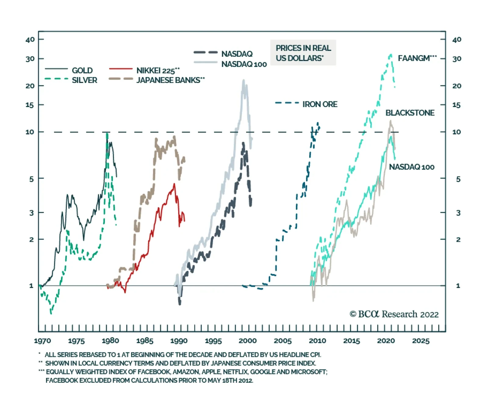
Bottom Line: The S&P 500 is oversold, and investor sentiment is downbeat. In this context, a technical equity rebound can occur at any moment. However, we do not think it will be the beginning of a major cyclical rally. A Bearish Case: Are US TMT Stocks A Bubble? What is a more bearish scenario than our baseline case? The bursting of bubbles or the unwinding of excesses would entail a more protracted and devastating bear market than the 15% drop in global share prices we currently expect. We can identify two major excesses in the global economy and financial system: In US TMT (Technology, Media & Entertainment and Internet & Catalog Retail) stocks and private equity In Chinese real estate. We have written extensively about property market excesses in China. Below we discuss the recent sharp selloff in commodities, which is partially linked to Chinese property construction. We also present the case for major excesses in US stocks. Chart 6 illustrates the history of bubbles of the past several decades: The Nifty-fifty (involving the 50 US large-cap stocks) bubble occurred in the 1960s and burst in the 1970s (not shown in the chart). The commodity bubble took place in the 1970s and burst in the 1980s. Japanese equity and property prices rose exponentially in the 1980s and deflated in the 1990s. The Nasdaq bubble occurred in the 1990s and was shattered in the early 2000s. Commodities/EM/China were the leaders of the 2000s, and they were devastated in the 2010s. We use iron ore in this chart because its price surged the most in the 2000s. FAANGM stocks, the Nasdaq 100 index and private equity were by far the biggest beneficiaries of the 2010s. No one can be certain about bubbles in real time because there are always superior fundamentals or persuasive stories that justify exponential price appreciation. That said, there are a lot of similarities between dynamics prevailing in US tech and private equity and in previous bubbles: In the past decade, FAANGM stocks, the Nasdaq 100 index and private equity companies registered gains comparable to the bubbles of the previous 60 years. Furthermore, as Chart 6 illustrates, the equal-weighted FAANGM index in inflation-adjusted terms rose 30-fold, much more than the bubbles of the previous decades. The Nasdaq 100 index and share prices of Blackstone, the largest private equity company, have risen by nearly 10-fold in real (inflation-adjusted terms) between 2010 and the end of 2021. Chart 6The History Of Financial Bubbles: Is This Time Different?
On A Bull Case, Bubbles And Commodity Prices
On A Bull Case, Bubbles And Commodity Prices
The final phase of bubbles is often characterized by growing retail investor participation. This is exactly what happened with US tech/new economy stocks. Chart 7US TMT Stocks: Exponential Growth Rarely Ends Well
US TMT Stocks: Exponential Growth Rarely Ends Well
US TMT Stocks: Exponential Growth Rarely Ends Well
Toward the end of the decade, not only retail but also institutional capital stampedes into the winners of the decade. This played out with US large-cap tech stocks as well as in private equity and private debt spaces. Inflows into private equity and private debt have been enormous. As a result of these inflows into US large-cap stocks, the market cap share of US TMT stocks as a percentage of total US market cap has surpassed 40%, its peak in 2000 (Chart 7). Bubbles often thrive during periods of low interest rates and crash when the cost of capital rises. This is exactly what has been happening in global financial markets since early 2019. The parameters of the overall US equity market were also excessive prior to this bear market. As of last year, the S&P 500 stock prices in real (inflation-adjusted) terms became as elevated relative to their long-term time trend as they were in the late 1960s and the late 1990s − the peaks of previous secular bull markets (Chart 8, top panel). Chart 8The S&P 500 and Operating Profits: A Long-Term Perspective
The S&P 500 and Operating Profits: A Long-Term Perspective
The S&P 500 and Operating Profits: A Long-Term Perspective
Chart 9Equity Issuance Marks Market Tops
Equity Issuance Marks Market Tops
Equity Issuance Marks Market Tops
The S&P 500’s operating earnings in real terms have surpassed two standard deviations above its time trend (Chart 8, bottom panel). Some sort of mean reversion to its long-term trend is in the cards. US corporate profits have benefited from fiscal/monetary stimulus, low labor costs and pricing power. All of these are now working against profits. Finally, new share issuance in the US mushroomed in 2021, another sign of a major top (Chart 9). Bottom Line: We are not entirely convinced that US TMT stocks are a bubble waiting to burst. Yet, the odds of this happening are nontrivial. This time might not be different. A Word On Commodities The selloff in the commodity space has been broad-based. Odds are that it will continue for the following reasons: A global business cycle downtrend is always bearish for commodity prices. In fact, oil prices are often lagging and are typically the last shoe to drop during global slowdowns. US sales of gasoline have started to contract. Besides, Saudi Arabia will likely increase its oil output and shipments following President Biden’s visit to the Kingdom next week. Chart 10Investors Have Been Long Commodity Futures
Investors Have Been Long Commodity Futures
Investors Have Been Long Commodity Futures
As we have argued in recent months, China’s demand for commodities was contracting and, in our opinion, the rally in resource prices over the past 12 months was supported by investment demand for commodities, i.e., financial inflows into the commodity space. Many portfolios have bought commodities as an inflation hedge. When a hedge becomes a consensus trade and crowded, it stops being a hedge. Chart 10 demonstrates that net long positions in 17 commodities have been very elevated. The speed at which liquidation is taking place corroborates our thesis that it is investors not producers or consumers who have been caught being long commodities. China’s business cycle recovery will be U-shaped at best. Domestic orders point to weaker import volumes in the months ahead (Chart 11, top panel). Corporate loan demand has plunged suggesting that liquidity provisions by the PBoC might fail to produce a meaningful recovery in credit growth (Chart 11, bottom panel). Finally, technicals bode ill for commodity prices. As Chart 12 illustrates, copper prices and global material stocks have probably formed medium-term tops, and risks are skewed to the downside. Chart 11China: The Economy Is Struggling To Gain Traction
China: The Economy Is Struggling To Gain Traction
China: The Economy Is Struggling To Gain Traction
Chart 12A Major Top In Commodity Prices?
A Major Top In Commodity Prices?
A Major Top In Commodity Prices?
Bottom Line: Commodity prices and their plays have more downside. Investment Strategy The decline in commodity prices and the relentless US dollar rally will ensure that EM currencies, bonds and stocks continue to sell off even if the US equity market rebounds in the near term driven by lower Treasury yields. Global equity and fixed-income portfolios should continue underweighting EM. We also continue to short the following currencies versus the USD: ZAR, COP, PEN, PLN, PHP and IDR; as well as HUF vs. CZK, and KRW vs. JPY. Arthur Budaghyan Chief Emerging Markets Strategist arthurb@bcaresearch.com Strategic Themes (18 Months And Beyond) Equities Cyclical Recommendations (6-18 Months) Cyclical Recommendations (6-18 Months)
Executive Summary Caught In Risk-Off Selling
Copper Testing Support
Copper Testing Support
Weak Chinese and European economies are suppressing copper demand and helping to temper prices in a market that remains fundamentally tight. Weaker US GDP growth could put the three largest economies in the world in or close to recession in 2H22/1H23, which would contribute to demand-side weakness in copper markets. The odds manufacturing and base-metals refining will be curtailed in Europe are rising. Although a strike in Norway has been averted by government intervention, maintenance on Russia’s Nord Stream 1 pipeline scheduled to begin next week likely will serve as a pretext for longer and deeper natgas supply cuts to the EU. Bottom Line: Despite fundamental tightness in global copper markets, prices are being restrained by fears weaker Chinese and European economic performance will lead to a global recession. Early reads of US GDP pointing to negative growth in 2Q22 stoke these fears. Heightened economic policy uncertainty globally exacerbates them. We remain fundamentally bullish copper and will re-establish our long SPDR S&P Metals & Mining ETF (XME) – down ~ 40% from its highs in April – at tonight’s close. In addition, we went long the XOP oil and gas ETF at Tuesday’s close, after prompt Brent breached the buy-trigger we set last week of $105/bbl during this week’s crude-oil sell-off. Feature Lower GDP growth expectations in China and the EU – along with a wobbly US economy being flagged by an Atlanta Fed GDPNow forecast pointing to negative growth in 2Q22 – are stoking fears of a global manufacturing and industrial recession. This prompted a rout in industrial commodities – base metals and oil – this week, which still has markets on edge. This slow-down in the world’s three largest economies – accounting for almost 50% of global GDP expressed in purchasing-power terms – is the only thing keeping the level of global copper demand close to supply at present (Chart 1).1 At least for the time being, this is keeping the threat of sharply higher copper prices, which would be more in line with the low levels of supplies and inventories globally, at bay (Chart 2). As of the week ended May 27th, global copper stocks stood at just above 562k tons, which is ~ 31% lower y/y. Chart 1World’s Biggest Economies Slowing
Copper Prices Decouple From Fundamentals
Copper Prices Decouple From Fundamentals
Chart 2Copper Prices Disconnect From Fundamentals
Copper Prices Disconnect From Fundamentals
Copper Prices Disconnect From Fundamentals
Uncertainty Weakens Copper Prices Energy and metals markets remain extremely tight on a fundamental supply-demand basis.2 The sharp sell-off this week in oil and metals prices is, in our view, evidence industrial-commodity prices have decoupled from fundamentals. This makes traders – hedgers and speculators – extremely risk-averse, which reduces liquidity and increases volatility. On the back of these concerns, markets exhibit the sort of volatility associated with economic collapse, despite still-strong underlying fundamentals. Chart 3Rising Global Policy Uncertainty
Copper Prices Decouple From Fundamentals
Copper Prices Decouple From Fundamentals
Volatility is on the rise due to increasing economic uncertainty in these markets. This makes it extremely difficult to assign probabilities to different price outcomes (i.e., true uncertainty). The BBD Global Economic Policy Uncertainty is approaching levels seen during the early pandemic (Chart 3). We put this rising uncertainty down to poor policy and communication from central banks and governments; a pig’s breakfast of energy policy globally that increasingly adds nothing but confusion to markets; and a muddled public-health policy in China, which produces random shut-downs in global supply chains as covid infections randomly crop up in important port cities. Lastly, the East and West are moving toward a new Cold War, which already is having profound effects on all markets, trade flows and capital availability in the short- and medium-term. This keeps markets on edge and forces them to parse every geopolitical development that hits the tape.3 Re-forging supply chains, re-building basic industrial infrastructure as the West moves away from outsourcing to China and other EM states will be costly and volatile, especially as embargoes and sanctions increase between these blocs. This political and economic evolution will require increased investment in base metals production and exploration, along with similar commitments to oil and gas. Low and volatile prices will not support this, as they disincentivize investment, and set markets up for continued shortage and scarcity going forward. In the metals markets, years of underinvestment by major mining companies will keep copper supplies and inventories tight going forward (Chart 4). This will hinder and delay the global renewable-energy transition, which cannot be realized without higher base-metals supplies. Chart 4Structural Underinvestment In Mining Fundamentally Bullish Copper
Copper Prices Decouple From Fundamentals
Copper Prices Decouple From Fundamentals
Recession Fears Haunt Metals Globally … The proximate causes of the persistent weakening of copper prices is the demand destruction arising from the lockdown in China, and an increasing concern over the economic prospects of the EU as it prepares for a possible shut-off of Russian natgas exports. Should Russian supplies be cut off, the EU will be pushed into recession as natural-gas rationing – and the attendant prioritization of human needs going into winter – will constrict economic activity, particularly in manufacturing. This leaves two of the three largest economies in the world either in recession or not growing at all. Added to this is the fear of a wobbly US economy, which has been slowed by higher energy prices and the Fed’s hawkish tightening of monetary policy. The Atlanta Fed’s GDPNow forecast for 2Q22 estimates a 2.1% contraction in US GDP. This would be the second consecutive quarter of negative growth and would meet a widely held rule-of-thumb indicator or recession.4 In our modelling, we estimate the income elasticity of copper demand in DM economies like the EU and US (1.39) and EM-ex-China (0.87) states is higher than that of China (0.37). This means that a 1% contraction in p.a. Chinese real GDP would translate to a 0.37% p.a. fall in copper demand, all else equal. A contraction of real incomes – i.e., real GDP – in the EU and EM-ex-China will cause a larger relative adjustment in copper demand than in China, even though the level of copper demand in China is far greater in absolute terms (Chart 5). A recession in the EU will reduce import demand for China’s manufactured output in these markets (Chart 6). As China’s trade volumes fall, Chinese manufacturing PMIs will contract. Similarly, exports to China from the EU will weaken as manufacturing weakens and real GDP moves lower. We believe this will put more pressure on the Chinese government to provide fiscal and monetary stimulus to counter such a downdraft. Chart 5Copper Demand Sensitive to Real GDP (Income)
Copper Demand Sensitive to Real GDP (Income)
Copper Demand Sensitive to Real GDP (Income)
Chart 6Trade Channel Effects Follow GDP Weakness
Trade Channel Effects Follow GDP Weakness
Trade Channel Effects Follow GDP Weakness
… But China Worries Dominate The Chinese economy is showing signs of further slowing.5 Weakness in credit levels, infrastructure investment, manufacturing, the property sector, and exports all indicate the covid-policy lockdowns, high commodity prices, and parsimonious credit and fiscal policies have produced a dramatic slowing in economic activity. In our modelling, we find evidence that each of these components exhibits a long-run inverse relationship with Chinese copper inventories, which in turn exhibits a long-run inverse relationship with COMEX copper prices. Roughly 10 days after the initial Shanghai lockdown, copper prices went into contango (Chart 7). This occurred despite continuous declines in Chinese copper inventories during the lockdown months (Chart 8). Such anomalous behavior – i.e., as inventories fall markets become more backwardated – makes it difficult to connect prices and supply-demand-inventory fundamentals. Chart 7Copper In Contango For Most Of China’s Lockdown
Copper In Contango For Most Of Chinas Lockdown
Copper In Contango For Most Of Chinas Lockdown
Chart 8Chinese Copper Inventories Continue To Draw In Lockdown
Chinese Copper Inventories Continue To Draw In Lockdown
Chinese Copper Inventories Continue To Draw In Lockdown
BCA’s China Investment Strategy expects a muted 2H22 recovery for the Chinese economy. Rolling lockdowns due to China’s COVID policy will reduce the potency of fiscal and monetary stimulus. The stop-start nature of economic activity will stymie growth in disposable income and job creation, which in turn will translate to weaker aggregate demand. The knock-on effect of weaker business activity due to the lockdown earlier this year has been a higher propensity to save by households (Chart 9). Household surveys conducted by the PBoC show that, since 2017, household savings have been increasing, suggesting a precautionary sentiment (Chart 10). Chart 9Chinese Economic Slowdown Reduced Credit Demand
Chinese Economic Slowdown Reduced Credit Demand
Chinese Economic Slowdown Reduced Credit Demand
Chart 10Rising Precautionary Savings...
Rising Precautionary Savings...
Rising Precautionary Savings...
Chart 11...Will Impact Domestic Property Market
...Will Impact Domestic Property Market
...Will Impact Domestic Property Market
We do not expect the property market to recover in a manner similar to what occurred following China’s re-opening after the first wave of the COVID-19 pandemic. Depressed household purchasing power will keep housing demand subdued, while the “three red lines” policy, which limits the amount property developers can borrow, will keep supply low (Chart 11).6 Housing accounts for ~ 30% of copper consumption in China, which means weak property markets will remain a drag on copper demand. Investment Implications Continued weakness in China’s economy and a potentially deep recession in the EU will continue to restrain demand for copper globally. In addition, with the US economy looking wobbly, the third global pillar of economic strength also will be weakening going into 2H22. These fundamental demand-side effects will lower pressure on tight copper inventories and keep prices subdued, in our view. This does not, however, signal an all-clear for copper supply or inventory tightness. Weaker demand is the only thing keeping prices from rising sharply, given the tight supply and inventory position of global copper markets. On the supply side, governance issues in copper-rich Latin American states, which are in the process of revising their social contracts with copper producers and consumers, will increase mining costs for companies, disincentivizing long-term and large-scale investments in new mines.7 These costs ultimately will be borne by consumers as supply shortages mount and the need to increase capex grows. Ultimately, this will feed into longer-term inflation and inflation expectations. Chart 12Caught In Risk-Off Selling
Copper Testing Support
Copper Testing Support
We remain long-term bullish copper, as fundamentals remain tight and will get tighter. That said, over the short term, aggregate-demand weakness in the three major economic pillars in the world makes us leery of getting long copper futures, particularly as prompt COMEX prices test support (Chart 12). Persistently weak copper prices will disincentivize the needed investment in new supply the world will need to effect a transition to renewable energy in coming decades. For this reason, we are comfortable re-establishing our long XME metals and mining ETF at tonight’s close, as copper prices are down 40% from their April highs. Robert P. Ryan Chief Commodity & Energy Strategist rryan@bcaresearch.com Ashwin Shyam Research Analyst Commodity & Energy Strategy ashwin.shyam@bcaresearch.com Paula Struk Research Associate Commodity & Energy Strategy paula.struk@bcaresearch.com Commodity Round-Up Energy: Bullish. A strike by Norwegian energy-sector workers that would have hit the natural gas market in Europe particularly hard was averted earlier this week.8 This still leaves the EU and UK (Europe) at risk of additional losses of Russian natgas exports beginning next week when Nord Stream 1 (NS1) maintenance is due to start. These threats have pushed Dutch Title Transfer Facility (TTF) natural gas prices up close to 93% since 1 June, and close to 400% y/y as of Tuesday. For the first five months of this year, Europe’s been importing just under 15 Bcf/d of LNG, with ~ 8.5 Bcf/d of those volumes coming from the US, based on EIA data. The EIA expects US LNG exports to average ~ 11.9 Bcf/d this year and 12 Bcf/d in 2023. Europe accounted for just under 75% of US exports in January – April of this year, and we expect that to continue going forward. The IEA expects Russia to supply 25% of EU demand this year, the lowest in 20 years. Last year, Russian imports covered ~ 40% (~ 7 TCF) of EU demand. Base Metals: Zinc stocks are depleted but prices are dropping on recession fears (Chart 13). Smelting operations were hit last year following the power-supply crunches in China and Europe. While China has recovered its energy security, Europe, which accounts for ~15% of global refined zinc supply, has not. Reduced natgas supply from Russia will make the smelting shortage in Europe even more acute, especially if power and fuel rationing occur. In April, China was a net exporter of zinc for the first time since 2014, as low demand in the state and low European zinc supply incentivized Chinese smelters to ship metal to the West despite high outbound tariffs. Precious Metals: Markets switched from inflation to growth fears, as central banks, notably the Fed began hiking interest rates aggressively to curb inflation. Investors have been flocking to the USD, which hit a 20-year high on recession fears this week (Chart 14). This has happened at the expense of the yellow metal, which, since breaking through the USD 1800/oz mark last week, has continued to drop, hitting an 8-month low as of yesterday's close. Chart 13Global Copper Inventories Remain Tight
Global Copper Inventories Remain Tight
Global Copper Inventories Remain Tight
Chart 14
Copper Prices Decouple From Fundamentals
Copper Prices Decouple From Fundamentals
Footnotes 1 Please see China, US and EU are the largest economies in the world, which was published by Eurostat 19 May 2020. 2 For additional discussion of oil-market fundamentals, please see Recession Unlikely To Batter Oil Prices, which covers our expectation for global oil balances and prices. It was published 16 June 2022. 3 Please see Hypo-Globalization (A GeoRisk Update) published by BCA Research’s Geopolitical Strategy 30 July 2021. See also Commodities' Watershed Moment, which we published 22 March 2022. 4 Please see GDPNow, published by the Federal Reserve Bank of Atlanta 1 July 2022. 5 Please see Third Quarter Geopolitical Outlook: Thunder And Lightning, published by BCA’s Geopolitical Strategy 24 June 2022. This report notes, “China’s political crackdown, struggle with Covid-19, waning exports, and deflating property market have led to an abrupt slowdown this year. The government is responding by easing monetary, fiscal, and regulatory policy, though so far with limited effect … . Economic policy will not be decisive in the third quarter unless a crash forces the administration to stimulate aggressively.” 6 In August 2020, the Ministry of Housing and Urban-Rural Development and the People’s Bank of China proposed to implement a policy which kept a ceiling on companies’ asset to liability ratio at 70%, net debt to equity ratio at 100%, and cash to short-term borrowings ratio at 1. Developers whose liabilities are within these requirements may increase their liabilities by less than 15%. These were known as the “three red lines.” Per that policy, if one or more of these ceilings are surpassed, maximum liabilities growth is capped at a lower percentage. 7 Please see Add Local Politics To Copper Supply Risks, which we published 25 November 2021. It is available at ces.bcaresearch.com. See also Chile sticks to plan for new mining profit tax up to 32% linked to copper price, published by reuters.com via mining.com 1 July 2022. 8 Please see Norway’s government halts oil and gas strike published by ft.com 5 July 2022. Investment Views and Themes Strategic Recommendations Tactical Trades Trades Closed In 2022
Executive Summary Our recommended model bond portfolio outperformed its custom benchmark index by +24bps in Q2/2022, improving the year-to-date outperformance to a solid +72bps. The Q2 outperformance came entirely from the credit side of the portfolio (+35bps), led by underweights to US investment grade corporates (+28bps) and EM hard currency debt (+24bps). The rates side of the portfolio was down slightly (-11bps), with gains from underweights in US and UK inflation-linked bonds (a combined +24bps) helping offset the hit from overweights to German and French government bonds (a combined -30bps). Looking ahead, we continue to see more defensive positioning in growth-sensitive credit sectors like US investment grade corporate bonds and EM hard currency debt, rather than duration management, as providing the better opportunity to generate alpha in bond portfolios over the latter half of 2022. GFIS Model Bond Portfolio Recommended Positioning For The Next Six Months
GFIS Model Bond Portfolio Q2/2022 Review & Outlook: Winning By Playing Defense
GFIS Model Bond Portfolio Q2/2022 Review & Outlook: Winning By Playing Defense
Bottom Line: In our model bond portfolio, we are maintaining an overall neutral duration stance and a moderate underweight of spread product versus developed market sovereign bonds. We are, however, reducing the recommended tilts in inflation-linked bonds by upgrading US TIPS to neutral and downgrading Canadian linkers to neutral. Feature Dear Client, We are about to take a mid-summer publishing break, as this humble bond strategist moves his family into a new home in a new city. Next week, you will be receiving a report written by BCA Research’s Chief US Bond Strategist, Ryan Swift. The following week, there will be no Global Fixed Income Strategy report published. Our next report will be published on July 26, 2022. Regards, Rob Robis Bond investors are running out of places to hide to avoid losses in 2022. The total return on the Bloomberg Global Aggregate index (hedged into USD) in the second quarter of this year was -4%, nearly matching the -6% loss seen in Q1. No sector, from government bonds to corporate debt to emerging market credit, could avoid the damage caused by hawkish central bankers belated responding to the worst bout of global inflation since the 1970s. Related Report Global Fixed Income StrategyGFIS Model Bond Portfolio Q1/2022 Review & Outlook: Trading The Consolidation Phase Global inflation rates will soon peak, led by slowing growth of goods prices and commodity prices. However, inflation will remain well above central bank targets across the bulk of the developed world, supported by more domestic sources like services prices, housing costs and wages. This will limit the ability for important central banks like the Fed and ECB to quickly pivot in a more dovish direction to support weakening growth – and bail out foundering bond markets. With that backdrop in mind, we present our quarterly review of the BCA Research Global Fixed Income Strategy (GFIS) model bond portfolio for the second quarter of 2022. We also present our recommended positioning for the portfolio for the next six months, as well as portfolio return expectations for our base case and alternative investment scenarios. As a reminder to existing readers (and to new clients), the model portfolio is a part of our service that complements the usual macro analysis of global fixed income markets. The portfolio is how we communicate our opinion on the relative attractiveness between government bond and spread product sectors. We do this by applying actual percentage weightings to each of our recommendations within a fully invested hypothetical bond portfolio. Q2/2022 Model Bond Portfolio Performance: All About Credit Chart 1Q2/2022 Performance: Gains From Defensive Credit Positioning
Q2/2022 Performance: Gains From Defensive Credit Positioning
Q2/2022 Performance: Gains From Defensive Credit Positioning
The total return for the GFIS model portfolio (hedged into US dollars) in the second quarter was -4.3%, outperforming the custom benchmark index by +24bps (Chart 1).1 In terms of the specific breakdown between the government bond and spread product allocations in our model portfolio, the former generated -11bps of underperformance versus our custom benchmark index while the latter outperformed by +35bps. In our previous quarterly portfolio performance review in April, we noted that the greater opportunities to generate outperformance for fixed income investors would come from more defensive allocations to spread product, rather than big directional moves in government bond yields. That forecast largely panned out, as global credit markets moved to price in the growing risk of a deep economic downturn. Declining nominal government bond yields provided some modest relief at the end of June, with markets modestly pricing out some of the rate hikes discounted over the next year amid deepening global recession fears. While we maintained a neutral stance on overall portfolio duration during the quarter, we did benefit from the fact that the decline in global bond yields in late June was concentrated more in lower inflation expectations than falling real yields. Thus, our underweight positioning in inflation-linked bonds, focused on the US and UK, helped add a combined +25bps of outperformance versus the benchmark (Table 1). Table 1GFIS Model Bond Portfolio Q2/2022 Overall Return Attribution
GFIS Model Bond Portfolio Q2/2022 Review & Outlook: Winning By Playing Defense
GFIS Model Bond Portfolio Q2/2022 Review & Outlook: Winning By Playing Defense
The bar charts showing the total and relative returns for each individual government bond market and spread product sector in our model portfolio are presented in Charts 2 & 3. Chart 2GFIS Model Bond Portfolio Q2/2022 Government Bond Performance Attribution
GFIS Model Bond Portfolio Q2/2022 Review & Outlook: Winning By Playing Defense
GFIS Model Bond Portfolio Q2/2022 Review & Outlook: Winning By Playing Defense
Chart 3GFIS Model Bond Portfolio Q2/2022 Spread Product Performance Attribution By Sector
GFIS Model Bond Portfolio Q2/2022 Review & Outlook: Winning By Playing Defense
GFIS Model Bond Portfolio Q2/2022 Review & Outlook: Winning By Playing Defense
Biggest Outperformers: Underweight US investment grade Industrials (+19bps) Underweight UK index-linked Gilts (+15bps) Underweight US TIPS (+9bps) Underweight US investment grade Financials (+7bps) Underweight US MBS (+6bps) Underweight US Treasuries with maturities beyond ten years (+6bps) Biggest Underperformers: Overweight euro area investment grade corporates (-19bps) Overweight German government bonds with maturities beyond ten years (-14bps) Overweight French government bonds with maturities beyond ten years (-8bps) Overweight UK Gilts with maturities beyond ten years (-6bps) Overweight US CMBS (-4bps) Chart 4 presents the ranked benchmark index returns of the individual countries and spread product sectors in the GFIS model bond portfolio for Q2/2022. Returns are hedged into US dollars (we do not take active currency risk in this portfolio) and adjusted to reflect duration differences between each country/sector and the overall custom benchmark index for the model portfolio. We have also color coded the bars in each chart to reflect our recommended investment stance for each market during Q2 (red for underweight, dark green for overweight, gray for neutral). Chart 4Ranking The Winners & Losers From The GFIS Model Bond Portfolio Universe In Q2/2022
GFIS Model Bond Portfolio Q2/2022 Review & Outlook: Winning By Playing Defense
GFIS Model Bond Portfolio Q2/2022 Review & Outlook: Winning By Playing Defense
Ideally, we would look to see more green bars on the left side of the chart where market returns are highest, and more red bars on the right side of the chart were returns are lowest. That pattern largely held true in Q2/2022, especially at the tail ends of the chart. During a quarter where all the major asset classes in our portfolio lost money on a hedged and duration-matched basis, we outperformed by selectively underweighting the worst performers within the credit side of the benchmark portfolio universe. Notably, we were underweight EM USD-denominated Sovereigns (-1099bps), EM USD-denominated corporates (-816bps) and US investment grade corporates (-686bps) on the extreme right side of the chart. Some of our key overweight positions did relatively well, led by overweights in US CMBS (-148bps), Australian government bonds (-288bps) and euro area investment grade corporates (-378bps), all of which were on the left side of Chart 4. One of our key recommendations throughout the first half of 2022 - overweighting German government bonds (-517bps) and French government bonds (-657bps) versus underweighting US Treasuries (-283bps) - performed poorly in Q2. This was due to investors rapidly pricing in a far more aggressive series of ECB rate hikes than we expected, resulting in some convergence of US-European bond yield differentials. Importantly, core European bond yields have pulled back substantially over the last month, and by much more than US yields have declined. Most notably, the 2-year German yield, which began Q2 at minus-7bps and hit a peak of 1.2% on June 14, has now fallen all the way back to 0.4% as this report went to press. The 2-year US-Germany yield differential has already widened by 35bps in the first week of July, suggesting that our overweight core Europe/underweight US allocation is already contributing positively to the model bond portfolio returns for Q3. Bottom Line: Our model bond portfolio outperformed its benchmark index in the second quarter of the year by +24bps – a positive result coming largely from underweight positions in US corporate bonds, EM spread product and inflation-linked bonds in the US and UK. Future Drivers Of Model Bond Portfolio Returns Just as in Q2/2022, the performance of the model bond portfolio in Q3/2022 will be driven more by relative allocations between countries and spread product sectors, rather than big directional moves in bond yields or credit spreads. Overall Duration Exposure Chart 5A More Stable Backdrop For Global Bond Yields
A More Stable Backdrop For Global Bond Yields
A More Stable Backdrop For Global Bond Yields
In terms of portfolio duration, we still see a stronger case for global bond yields to be more rangebound than trending, especially in the US. There has already been a major downward adjustment to global bond yields via lower inflation expectations and reduced rate hike expectations. A GDP-weighted average of major developed market 10-year inflation breakevens has already fallen from an April 2022 peak of 281bps to 216bps (Chart 5). That aggregate breakeven is now back to the levels that began 2022, before the Russian invasion of Ukraine that triggered a surge in global energy prices. We anticipate that additional declines in global inflation expectations – and the associated reductions in central bank rate hike expectations – will be harder to achieve over the latter half of 2022. “Stickier” inflation from services, housing costs and wages will remain strong enough to keep overall inflation rates above central bank targets, even as decelerating goods and commodity price inflation act to slow headline inflation rates. Our Global Duration Indicator, which is comprised of growth indicators like the ZEW expectations index for the US and Europe as well as our own global leading economic indicator, has fallen substantially and is signaling a decline in global bond yield momentum once realized inflation rates peak (Chart 6). Chart 6Our Duration Indicator Calling For Slowing Global Yield Momentum
Our Duration Indicator Calling For Slowing Global Yield Momentum
Our Duration Indicator Calling For Slowing Global Yield Momentum
Chart 7Overall Portfolio Duration: Stay Neutral
Overall Portfolio Duration: Stay Neutral
Overall Portfolio Duration: Stay Neutral
We see that as signaling more of a sideways action in bond yields over the next six months, rather than a big downward move, especially in the US. Thus, we are keeping the duration of the model bond portfolio close to that of the benchmark index (Chart 7). Government Bond Country Allocation We are sticking with our view that, for countries with active central banks (i.e. everyone but Japan), favoring markets where interest rate expectations are above plausible estimates of neutral policy rates should lead to outperformance from country allocation. In Chart 8, we show 10-year bond yields and 2-years-forward 1-month Overnight Index Swap (OIS) rates for the US, euro area, UK, Canada and Australia. The shaded regions in the chart represent estimates of the range of neutral policy rates. In the case of the US, rate expectations and Treasury yields are now below the upper level of the range of neutral fed funds rates estimates, between 2-3%, taken from the latest set of FOMC economic projections. Hence, we are sticking with an underweight stance on US Treasuries with yields offering less protection against the Fed following through on its current guidance and lifting the funds rate into restrictive territory above 3%. In the other countries, rate expectations are above the range of neutral rate estimates, which suggests that bond yields have a bit more protection against hawkish central bank actions. That leads us to stay overweight core Europe, the UK and Australia in the government bond portion of the model bond portfolio. We are only keeping Canada at neutral, however, as we suspect that the Bank of Canada is more willing than other central banks to follow the Fed’s lead on taking rates to a restrictive level to help bring down elevated Canadian inflation. For other countries, we are staying neutral on Italian government bond exposure, for now, and underweight Japan (Chart 9). Chart 8Favor Countries Where Markets Expect Above-Neutral Rates
Favor Countries Where Markets Expect Above-Neutral Rates
Favor Countries Where Markets Expect Above-Neutral Rates
Chart 9Underweight JGBs, Stay Neutral Italy (For Now)
Underweight JGBs, Stay Neutral Italy (For Now)
Underweight JGBs, Stay Neutral Italy (For Now)
For Italy, we await news from the July 21 ECB meeting on the details of a proposal to help support Italian bond markets in the event of additional yield increases or spread widening versus Germany. It is clear from the history of the past decade that Italian bond returns suffer when the ECB is either hiking rates or slowing the growth of its balance sheet (top panel). In other words, it is difficult to recommend overweighting Italian bonds without the support of easy ECB monetary policy. Chart 10Our Inflation-Linked Bond Country Allocations
Our Inflation-Linked Bond Country Allocations
Our Inflation-Linked Bond Country Allocations
For Japan, our recommendation is strictly related to our view on the move in overall global bond yields. The Bank of Japan is bucking the worldwide trend to tighten monetary policy because core Japanese inflation remains weak. This makes Japanese government bonds (JGBs) a good place for bond investors to “hide out” in when global bond yields are rising. Given our view that global bond yield momentum will slow – in line with the signal from our Global Duration Indicator – we do not see a strong cyclical case for overweighting low-yielding JGBs. On inflation-linked bonds, we are maintaining a cautious overall stance, with commodity prices decelerating, realized inflation momentum set to soon peak and central banks signaling more tightening ahead (Chart 10). This week, we are closing out our lone overweight recommendation on inflation-linked bonds in Canada, where we downgrading to neutral (3 out of 5, see the model bond portfolio table on page 24).2 At the same time, we are neutralizing our underweight stance on US TIPS, moving the allocation to neutral. We still see shorter-term TIPS breakevens as having downside from here, but longer-maturity breakevens have already made enough of a downward adjustment, in our view. Global Spread Product Turning to credit markets, we are maintaining our moderately cautious view on the overall allocation to credit versus government bonds. Slowing global growth momentum and tightening global monetary policy is not an environment where credit spreads can narrow, especially for growth-sensitive credit like corporate bonds and high-yield (Chart 11). Having said that – the spread widening seen in US and European corporate bond markets has introduced a better valuation cushion into spreads. Our preferred measure of spread product valuation – the historical percentile ranking of the 12-month breakeven spread – shows that investment grade spreads in the euro area are now in the top quartile (85%) of its history on a risk-adjusted basis (Chart 12). US investment grade spreads are now up into the second quartile (64%), which is a big improvement from the start of 2022 but not as much as seen in Europe. Chart 11Global Monetary Backdrop Turning More Negative For Credit
Global Monetary Backdrop Turning More Negative For Credit
Global Monetary Backdrop Turning More Negative For Credit
Chart 12Corporate Spread Valuations Have Improved In The US & Europe
Corporate Spread Valuations Have Improved In The US & Europe
Corporate Spread Valuations Have Improved In The US & Europe
European credit spreads likely need to be wide as a risk premium against the numerous risks the region is facing right now – slowing growth, an increasingly hawkish ECB, soaring energy prices and the lingering uncertainties stemming from the Ukraine war. However, a lot of bad news is now discounted in European spreads and, as a result, we are maintaining our overweight stance on European investment grade corporates, especially versus US investment grade where we remain underweight. High-yield spreads on both sides of the Atlantic look more attractive on a 12-month breakeven spread basis, but also on a default-adjusted spread basis (Chart 13). Assuming a moderate increase in the high-yield default rates in the US and Europe - consistent with a sharp slowing of economic growth but no deep recession - the current level of high-yield spreads net of expected default losses over the next year is above long-run averages. It is too soon to move to an overweight stance on high-yield, with the Fed and ECB set to tighten more amid ongoing growth uncertainty, but given the improved valuation cushion we see a neutral allocation to junk in both the US and Europe as appropriate in our model portfolio. Chart 13Junk Spreads Offer Value If Recession Can Be Avoided
Junk Spreads Offer Value If Recession Can Be Avoided
Junk Spreads Offer Value If Recession Can Be Avoided
Finally, we remain comfortably underweight emerging market USD-denominated sovereign and corporate debt. The backdrop is poor for emerging market bond returns, given slowing global growth, softening commodity prices, a tightening Fed and a strengthening US dollar (Chart 14). Chart 14Staying Cautious On EM Debt Exposure
Staying Cautious On EM Debt Exposure
Staying Cautious On EM Debt Exposure
Summing It All Up The full list of our recommended portfolio allocations can be seen in Table 2. The portfolio enters the second half of 2022 with the following high-level characteristics: Table 2GFIS Model Bond Portfolio Recommended Positioning For The Next Six Months
GFIS Model Bond Portfolio Q2/2022 Review & Outlook: Winning By Playing Defense
GFIS Model Bond Portfolio Q2/2022 Review & Outlook: Winning By Playing Defense
Chart 15Overall Portfolio Allocation: Underweight Spread Product Vs Governments
GFIS Model Bond Portfolio Q2/2022 Review & Outlook: Winning By Playing Defense
GFIS Model Bond Portfolio Q2/2022 Review & Outlook: Winning By Playing Defense
the overall duration exposure remains at-benchmark (i.e. neutral) the portfolio has an underweight allocation to overall spread products versus government bonds, equal to four percentage points of the portfolio (Chart 15) the tracking error of the portfolio, or its expected volatility in excess of that of the benchmark, is 77bps – below our self-imposed 100bps tracking error limit (Chart 16) the portfolio now has a yield below that of the custom benchmark index, equal to -31bps on a currency-unhedged basis but a more modest “carry gap” of -10bps on a USD-hedged basis given the gains from hedging into USD (Chart 17). Chart 16Overall Portfolio Risk: Moderate
Overall Portfolio Risk: Moderate
Overall Portfolio Risk: Moderate
Chart 17Overall Portfolio Yield: Below-Benchmark
Overall Portfolio Yield: Below-Benchmark
Overall Portfolio Yield: Below-Benchmark
Bottom Line: Looking ahead, our model bond portfolio performance will continue to be driven by the same factors in Q3/2022 as in the previous quarter: the relative performance of US bonds versus European equivalents for both government debt and corporate bonds, and the path for emerging market credit spreads. Portfolio Scenario Analysis For The Next Six Months After making the modest changes to our inflation-linked bond allocations in the US and Canada, which can be seen in the tables on pages 23-24, we now turn to our regularly quarterly scenario analysis to determine the return expectations for the portfolio for the next six months. On the credit side of the portfolio, we use risk-factor-based regression models to forecast future yield changes for global spread product sectors as a function of four major factors - the VIX, oil prices, the US dollar and the fed funds rate (Table 3A). For the government bond side of the portfolio, we avoid using regression models and instead use a yield-beta driven framework, taking forecasts for changes in US Treasury yields and translating those in changes in non-US bond yields by applying a historical yield beta (Table 3B). Table 3AFactor Regressions Used To Estimate Spread Product Yield Changes
GFIS Model Bond Portfolio Q2/2022 Review & Outlook: Winning By Playing Defense
GFIS Model Bond Portfolio Q2/2022 Review & Outlook: Winning By Playing Defense
Table 3BEstimated Government Bond Yield Betas To US Treasuries
GFIS Model Bond Portfolio Q2/2022 Review & Outlook: Winning By Playing Defense
GFIS Model Bond Portfolio Q2/2022 Review & Outlook: Winning By Playing Defense
For our scenario analysis over the next six months, we use a base case scenario plus two alternate “tail risk” scenarios. In the current environment, our scenarios center around the pace of global growth. Base Case (Slow Global Growth) Global growth momentum slows substantially, with firms cutting back on hiring and investing activity due to slowing corporate profit growth. An outright recession is avoided because softening energy prices help ease the drag on real spending power for consumers. China introduces more monetary and fiscal stimulus measures to boost growth. Global inflation peaks and eases on the back of slowing growth of goods prices and commodity prices, but the floor on inflation in the US and other developed markets is higher than central bank inflation targets due to sticky domestic price pressures. The Fed continues to hike at every policy meeting in H2/2022. There is a very mild bear flattening of the US Treasury curve, but with longer-term yields remain broadly unchanged over the full six month scenario period with the Fed not hiking by more than currently discounted. The Brent oil price retreats by -10%, the US dollar modestly appreciates by 2%, the VIX stays close to current levels at 28 and the fed funds rate reaches 3.25% by year-end. Resilient Growth Scenario Consumer spending surprises to the upside in the US and even Europe, as softer momentum of energy prices eases the relentless downward pressure on real incomes. Labor demand remains sold across the developed world, particularly with firms reluctant to do mass layoffs because of a perceived scarcity of quality labor. China enacts more policy stimulus with growth likely to fall below 2022 government targets. The Fed is forced to be more aggressive on rate hikes, given resilient US growth and inflation staying well above the Fed’s 2% target. The US Treasury curve bear-flattens into outright inversion, but with Treasury yields rising across the curve. The Brent oil price rises +20%, the VIX index climbs to 30, the US dollar appreciates by +3% thanks to a more aggressive Fed that lifts the funds rate to 3.75% by year-end. Recession Scenario A toxic combination of contracting corporate profits and negative real income growth drags the major developed economies into outright recession. Global inflation rates slow rapidly from current elevated levels, fueled by a rapid decline in commodity prices, but remain above central bank targets making it hard for the Fed and other major central banks to pivot dovishly to support growth. Chinese policymakers belatedly act to ease monetary and fiscal policy, but not by enough to offset the slow response from developed market policymakers. The Treasury curve moderately bull-steepens, although the absolute decline in nominal Treasury yields is relatively modest as the Fed will not pivot quickly to signaling policy easing with inflation still likely to remain above 2%. The Brent oil price falls -20%, the VIX index soars to 35, the US dollar depreciates by -3% (as lower US rates win out over slowing global growth) and the Fed pushes the funds rate to 2.75% before pausing after September. The excess return scenarios for the model bond portfolio, using the above inputs in our simple quantitative return forecast framework, are shown in Table 4A. The US Treasury yield assumptions are shown in Table 4B. For the more visually inclined, we present charts showing the model inputs and Treasury yield projections in Chart 18 and Chart 19, respectively. Table 4AGFIS Model Bond Portfolio Scenario Analysis For The Next Six Months
GFIS Model Bond Portfolio Q2/2022 Review & Outlook: Winning By Playing Defense
GFIS Model Bond Portfolio Q2/2022 Review & Outlook: Winning By Playing Defense
Table 4BUS Treasury Yield Assumptions For The 6-Month Forward Scenario Analysis
GFIS Model Bond Portfolio Q2/2022 Review & Outlook: Winning By Playing Defense
GFIS Model Bond Portfolio Q2/2022 Review & Outlook: Winning By Playing Defense
Chart 18Risk Factor Assumptions For The Scenario Analysis
Risk Factor Assumptions For The Scenario Analysis
Risk Factor Assumptions For The Scenario Analysis
Chart 19US Treasury Yield Assumptions For The Scenario Analysis
US Treasury Yield Assumptions For The Scenario Analysis
US Treasury Yield Assumptions For The Scenario Analysis
Given our neutral overall duration stance, the return scenarios will be driven by mostly by the credit side of the portfolio. In the recession scenario where Treasury yields decline, there is a modest projected outperformance from the rates side of the portfolio coming through the underweight to low-beta JGBs. In all scenarios, financial market volatility is expected to stay at, or above, current levels as central banks will be unable to ease policy, even in the event of an actual recession, because of lingering high inflation. Thus, the return on the credit side of the model portfolio will be the main driver of performance, delivering a range of excess return outcomes between +47bps and +60bps. Bottom Line: The model bond portfolio should benefit in H2/2022 from the ongoing cautious stance on global spread product, focused on underweights to US investment grade corporates and EM hard currency debt. Robert Robis, CFA Chief Fixed Income Strategist rrobis@bcaresearch.com Footnotes 1 The GFIS model bond portfolio custom benchmark index is the Bloomberg Barclays Global Aggregate Index, but with allocations to global high-yield corporate debt replacing very high-quality spread product (i.e. AA-rated). We believe this to be more indicative of the typical internal benchmark used by global multi-sector fixed income managers. 2 We are also closing out our Canadian breakeven widening trade in our Tactical Overlay portfolio. GFIS Model Bond Portfolio Recommended Positioning Active Duration Contribution: GFIS Recommended Portfolio Vs. Custom Performance Benchmark
GFIS Model Bond Portfolio Q2/2022 Review & Outlook: Winning By Playing Defense
GFIS Model Bond Portfolio Q2/2022 Review & Outlook: Winning By Playing Defense
The GFIS Recommended Portfolio Vs. The Custom Benchmark Index Global Fixed Income - Strategic Recommendations*
GFIS Model Bond Portfolio Q2/2022 Review & Outlook: Winning By Playing Defense
GFIS Model Bond Portfolio Q2/2022 Review & Outlook: Winning By Playing Defense
Executive Summary Buying a home is now more expensive than renting in many parts of the world. In the US and UK, disappearing homebuyers combined with a flood of home-sellers will weigh on home prices over the next 6-12 months. Falling employment and falling house prices risk becoming a self-reinforcing negative feedback loop that turns a mild recession into a severe recession. To stop such a vicious cycle running out of control, policymakers will eventually bring down mortgage rates. For this reason, on a time horizon of 6-12 months, overweight bonds. A collapse in Chinese property development and construction activity will have negative long-term implications for commodities, emerging Asia, and developing countries that produce raw materials. Structurally underweight. On the other hand, stay structurally overweight the China 30-year government bond. Fractal trading watchlist: US Biotech versus Utilities. Buying A Home Is Now More Expensive Than Renting!
Buying A Home Is Now More Expensive Than Renting!
Buying A Home Is Now More Expensive Than Renting!
Bottom Line: The decade-long global housing boom is over. Feature For the first time since 2018, the number of Brits wanting to buy a home is less than the number of Brits wanting to sell their home. The balance of homebuyers versus homes for sale is the main driver of any housing market. When multiple homebuyers are competing for a home for sale, the subsequent bidding war puts upward pressure on house prices. But when, multiple homes for sale are competing for a homebuyer, the subsequent discounting war puts downward pressure on house prices. The balance of homebuyers versus homes for sale is the main driver of any housing market. This makes the number of homebuyers versus homes for sale the best leading indicator of house prices. The recent collapse of this leading indicator in the UK warns that UK house prices are likely to soften through the remainder of 2022 and into 2023 (Chart I-1). Chart I-1With Fewer UK Homebuyers Than UK Home-Sellers, UK House Prices Are Set To Drop
With Fewer UK Homebuyers Than UK Home-Sellers, UK House Prices Are Set To Drop
With Fewer UK Homebuyers Than UK Home-Sellers, UK House Prices Are Set To Drop
Homebuyers Are Disappearing While Home-Sellers Are Flooding The Market Disappearing homebuyers combined with a flood of home-sellers is also evident in the US. According to Realtor.com: “Weary US homebuyers face not only sky-high home prices but also rising mortgage rates, and that financial double whammy is hitting homebuyers hard: Compared with just a year ago, the cost of financing 80 percent of a typical home rose 57.6 percent, amounting to an extra $745 per month.” Compared with just a year ago, the cost of financing 80 percent of a typical US home rose 57.6 percent, amounting to an extra $745 per month. Unsurprisingly, US mortgage applications for home purchase have recently plunged by a third (Chart I-2) and homebuyer demand has declined by 16 percent since last June.1 Meanwhile, the inventory of homes actively for sale on a typical day in June has increased by 19 percent, the largest increase in the data history. Chart I-2With The Cost Of Financing A US Home Purchase Surging, Mortgage Applications Have Collapsed
With The Cost Of Financing A US Home Purchase Surging, Mortgage Applications Have Collapsed
With The Cost Of Financing A US Home Purchase Surging, Mortgage Applications Have Collapsed
The flood of new homes on the market means that the dwindling pool of homebuyers will have more negotiating leverage on the asking price (Chart I-3 and Chart I-4). This will balance the highly lopsided negotiating dynamics in the raging seller’s market of the past two years. The shape of things to come can be seen in Austin, Texas, which was one of the hottest markets during the early pandemic real estate frenzy. Chart I-3US Homebuyers Are Disappearing...
US Homebuyers Are Disappearing...
US Homebuyers Are Disappearing...
Chart I-4...While US Home-Sellers Are Flooding The Market
...While US Home-Sellers Are Flooding The Market
...While US Home-Sellers Are Flooding The Market
“Prices are definitely starting to go down again… last Friday, an Austin home was listed at $825,000. The next day, at the open house, no one came. A few months ago, there would have been 20 or more buyers showing up. The sellers didn’t want to test the market, so on Sunday, they dropped it to $790,000. It sold for $760,000.” Buying A Home Is Now More Expensive Than Renting The nub of the problem for homebuyers is that the mortgage rate is higher than the rental yield. In simple terms, buying a home is now more expensive than renting (Chart I-5). The housing bulls counter that the high mortgage rate will force rental yields to adjust upwards by rents going up, but this argument is flawed. Chart I-5Buying A Home Is Now More Expensive Than Renting!
Buying A Home Is Now More Expensive Than Renting!
Buying A Home Is Now More Expensive Than Renting!
The most important driver of rent inflation is the unemployment rate (inversely). Because, to put it bluntly, you need a steady job to pay the rent! Today, the Federal Reserve’s inflation problem, in a nutshell, is that rent inflation is too high even versus the tight jobs market (Chart I-6). Chart I-6The Fed Needs To Push Up Unemployment To Pull Down Rent Inflation
The Fed Needs To Push Up Unemployment To Pull Down Rent Inflation
The Fed Needs To Push Up Unemployment To Pull Down Rent Inflation
Although the Fed cannot say this explicitly, its mechanism to bring down inflation is to push up unemployment, and thereby to pull down rent inflation, which constitutes almost half of the core inflation basket. In this case, the rental yield (rent divided by house price) would adjust upwards by the denominator – house prices – going down. The most important driver of rent inflation is the unemployment rate (inversely). Yet the housing bulls also argue that the housing boom is the result of a structural undersupply of homes. They claim that as this structural undersupply persists, it will underpin house prices. But this ‘housing shortage’ narrative is another myth, which we can debunk with two simple observations. Through the past decade, home prices have risen simultaneously and exponentially everywhere in the world. Now ask yourself, is it plausible that there could be a structural undersupply of homes everywhere in the world at the precisely the same time? If this doesn’t debunk the housing shortage narrative, then try this second observation. Through the past decade, gross rents have tracked nominal GDP. Theory says that gross rents should track nominal GDP, because the quality of the housing stock improves broadly in line with GDP, and therefore so too should rents. If there really was a structural undersupply of housing, then gross rents would be structurally outperforming nominal GDP. But that hasn’t happened in any major economy (Chart I-7). Chart I-7Rents Have Tracked GDP, So There Is No 'Structural Undersupply' Of Homes
Rents Have Tracked GDP, So There Is No 'Structural Undersupply' Of Homes
Rents Have Tracked GDP, So There Is No 'Structural Undersupply' Of Homes
As an aside, if rents track GDP, then why do they constitute almost half of the core inflation basket? The answer is that the rents included in inflation are ‘hedonically adjusted’, meaning that are supposedly deflated for quality improvements – though there is always a niggling doubt whether the statisticians do this adjustment correctly! Pulling all of this together, the synchronized global housing boom of the past decade was not the result of a structural undersupply. Instead, it was the result of a valuation boom – meaning, plummeting rental yields, which in turn were the result of plummeting mortgage rates, which in turn were the result of plummeting bond yields. But now that mortgage rates are much higher than rental yields, this ‘virtuous’ cycle risks turning vicious. Falling employment and falling house prices risk becoming a self-reinforcing negative feedback loop that turns a mild recession into a severe recession. To stop such a vicious cycle running out of control, policymakers will eventually have no other choice than to bring down mortgage rates. For this reason, on a time horizon of 6-12 months, overweight bonds. But The Prize For The Biggest Housing Boom Goes To… China The housing booms in the UK, US and other Western economies, extreme as they are, are small fry compared to the housing boom in China. Chinese real estate, now worth $100 trillion, is by far the largest asset-class in the world. And Chinese rental yields, at around 1 percent, are well below the yield on cash. Begging the question, how can Chinese real estate valuations be in such stratospheric territory, with a yield even less than that on ‘risk-free’ cash? The simple answer is that investors have been led to believe that Chinese real estate is a risk-free investment! Without a social safety net and with limited places to park their money, Chinese savers have for years been encouraged to buy homes, in the widespread belief that property is the safest investment, whose price is only supposed to go up (Chart I-8). Chart I-8Chinese Real Estate Is Perceived To Be A 'Risk Free' Investment
Chinese Real Estate Is Perceived To Be A 'Risk Free' Investment
Chinese Real Estate Is Perceived To Be A 'Risk Free' Investment
With the bulk of Chinese households’ wealth in property acting as a perceived economic safety net, even a 10 percent decline in house prices would constitute a major shock to the household sector’s hopes and expectations of what property is. In turn, the ensuing ‘negative wealth effect’ would be catastrophic for household spending in the world’s second largest economy. Therefore, in contrast to the US housing debacle in 2008, the Chinese government will ensure that its property market adjustment does not come from a collapse in home prices. Rather, it will come from a collapse in property development and construction activity, combined with keeping interest rates structurally low. This will have negative long-term implications for commodities, emerging Asia, and developing countries that produce raw materials. Structurally underweight. On the other hand, Chinese bonds are an excellent investment for those investors who can accept the capital control risks. Stay structurally overweight the China 30-year government bond. Fractal Trading Watchlist Biotech and Utilities are both defensive sectors, based on the insensitivity of theirs profits to economic fluctuations. But whereas Biotech is ‘long duration’, Utilities is ‘shorter duration’. Over the coming months, as the economy falters and bond yields back down, long duration defensives, such as Biotech, are likely to be the winners. This is supported by the recent underperformance reaching the point of fractal fragility that has indicated previous major turning points (Chart I-9). The recommended trade is long US Biotech versus Utilities, setting a profit target and symmetrical stop-loss at 20 percent. This replaces our long US Biotech versus Tech position, which achieved its 17.5 percent profit target, and is now closed. Chart I-9Biotech Is Set To Be A Big Winner
Biotech Is Set To Be A Big Winner
Biotech Is Set To Be A Big Winner
Chart 1CNY/USD Has Reversed
CNY/USD Has Reversed
CNY/USD Has Reversed
Chart 2US REITS Are Oversold Versus Utilities
US REITS Are Oversold Versus Utilities
US REITS Are Oversold Versus Utilities
Chart 3CAD/SEK Reversal Has Started
CAD/SEK Reversal Has Started
CAD/SEK Reversal Has Started
Chart 4Financials Versus Industrials To Reverse
Financials Versus Industrials To Reverse
Financials Versus Industrials To Reverse
Chart 5The Outperformance Of Resources Versus Biotech Has Started To Reverse
The Outperformance Of Resources Versus Biotech Has Started To Reverse
The Outperformance Of Resources Versus Biotech Has Started To Reverse
Chart 6The Outperformance Of Resources Versus Healthcare Is Vulnerable To Reversal
The Outperformance Of Resources Versus Healthcare Is Vulnerable To Reversal
The Outperformance Of Resources Versus Healthcare Is Vulnerable To Reversal
Chart 7FTSE100 Outperformance Vs. Euro Stoxx 50 Is Reversing
FTSE100 Outperformance Vs. Euro Stoxx 50 Is Reversing
FTSE100 Outperformance Vs. Euro Stoxx 50 Is Reversing
Chart 8Netherlands Underperformance Vs. Switzerland Has Been Exhausted
Netherlands Underperformance Vs. Switzerland Has Been Exhausted
Netherlands Underperformance Vs. Switzerland Has Been Exhausted
Chart 9The Sell-Off In The 30-Year T-Bond Is Approaching Fractal Fragility
The Sell-Off In The 30-Year T-Bond Is Approaching Fractal Fragility
The Sell-Off In The 30-Year T-Bond Is Approaching Fractal Fragility
Chart 10The Sell-Off In The NASDAQ Is Approaching Fractal Fragility
The Sell-Off In The NASDAQ Is Approaching Fractal Fragility
The Sell-Off In The NASDAQ Is Approaching Fractal Fragility
Chart 11Food And Beverage Outperformance Has Been Exhausted
Food And Beverage Outperformance Has Been Exhausted
Food And Beverage Outperformance Has Been Exhausted
Chart 12AT REVERSAL
AT REVERSAL
AT REVERSAL
Chart 13AT REVERSAL
AT REVERSAL
AT REVERSAL
Chart 14The Strong Trend In The 18-Month-Out US Interest Rate Future Is Fragile
The Strong Trend In The 18-Month-Out US Interest Rate Future Is Fragile
The Strong Trend In The 18-Month-Out US Interest Rate Future Is Fragile
Chart 15The Strong Trend In The 3 Year T-Bond Is Fragile
The Strong Trend In The 3 Year T-Bond Is Fragile
The Strong Trend In The 3 Year T-Bond Is Fragile
Chart 16A Potential Switching Point From Tobacco Into Cannabis
A Potential Switching Point From Tobacco Into Cannabis
A Potential Switching Point From Tobacco Into Cannabis
Chart 17Biotech Is A Major Buy
Biotech Is A Major Buy
Biotech Is A Major Buy
Chart 18Norway's Outperformance Could End
Norway's Outperformance Could End
Norway's Outperformance Could End
Chart 19Cotton's Outperformance Is Vulnerable To Reversal
Cotton's Outperformance Is Vulnerable To Reversal
Cotton's Outperformance Is Vulnerable To Reversal
Chart 20Fractal Trading Watch List
Fractal Trading Watch List
Fractal Trading Watch List
Chart 21The Rally In USD/EUR Could End
The Rally In USD/EUR Could End
The Rally In USD/EUR Could End
Chart 22The Outperformance Of MSCI Hong Kong Versus China Is Vulnerable To Reversal
The Outperformance Of MSCI Hong Kong Versus China Is Vulnerable To Reversal
The Outperformance Of MSCI Hong Kong Versus China Is Vulnerable To Reversal
Chart 23A Potential New Entry Point Into Petcare
A Potential New Entry Point Into Petcare
A Potential New Entry Point Into Petcare
Chart 24GBP/USD At A Turning Point
GBP/USD At A Turning Point
GBP/USD At A Turning Point
Chart 25Fractal Trading Watch List
Fractal Trading Watch List
Fractal Trading Watch List
Chart 26Fractal Trading Watch List
Fractal Trading Watch List
Fractal Trading Watch List
Dhaval Joshi Chief Strategist dhaval@bcaresearch.com Footnotes 1 Realtor.com gauge homebuyer demand by so-called ‘pending listings’, the number of listings that are at various stages of the selling process that are not yet sold. Fractal Trading System Fractal Trades
The Global Housing Boom Is Over, As Buying Becomes More Expensive Than Renting
The Global Housing Boom Is Over, As Buying Becomes More Expensive Than Renting
The Global Housing Boom Is Over, As Buying Becomes More Expensive Than Renting
The Global Housing Boom Is Over, As Buying Becomes More Expensive Than Renting
6-12 Month Recommendations Structural Recommendations Closed Fractal Trades Indicators To Watch - Bond Yields Chart II-1Indicators To Watch - Bond Yields - Euro Area
Indicators To Watch - Bond Yields - Euro Area
Indicators To Watch - Bond Yields - Euro Area
Chart II-2Indicators To Watch - Bond Yields - Europe Ex Euro Area
Indicators To Watch - Bond Yields - Europe Ex Euro Area
Indicators To Watch - Bond Yields - Europe Ex Euro Area
Chart II-3Indicators To Watch - Bond Yields - Asia
Indicators To Watch - Bond Yields - Asia
Indicators To Watch - Bond Yields - Asia
Chart II-4Indicators To Watch - Bond Yields - Other Developed
Indicators To Watch - Bond Yields - Other Developed
Indicators To Watch - Bond Yields - Other Developed
Indicators To Watch - Interest Rate Expectations Chart II-5Indicators To Watch - Interest Rate Expectations
Indicators To Watch - Interest Rate Expectations
Indicators To Watch - Interest Rate Expectations
Chart II-6Indicators To Watch - Interest Rate Expectations
Indicators To Watch - Interest Rate Expectations
Indicators To Watch - Interest Rate Expectations
Chart II-7Indicators To Watch - Interest Rate Expectations
Indicators To Watch - Interest Rate Expectations
Indicators To Watch - Interest Rate Expectations
Chart II-8Indicators To Watch - Interest Rate Expectations
Indicators To Watch - Interest Rate Expectations
Indicators To Watch - Interest Rate Expectations
Results from both the June ISM Services PMI and the JOLTS survey highlight that a non-recessionary outcome remains a viable scenario for the US economy. The ISM services PMI remains relatively resilient at 55.3 – slightly below 55.9 in May, but above…
Minutes of the FOMC’s June policy meeting underscore that for now, taming inflation and salvaging the central bank’s credibility remains the Fed’s top priority. Notably, “many participants judged that a significant risk now facing the Committee was that…
EUR/USD continues to sink lower and is on the cusp of parity. To a great extent, this weakness reflects broad-based dollar-strength. As we recently highlighted, the ADXY – a trade-weighted index of emerging Asia’s most actively traded currencies vis-à-vis the…
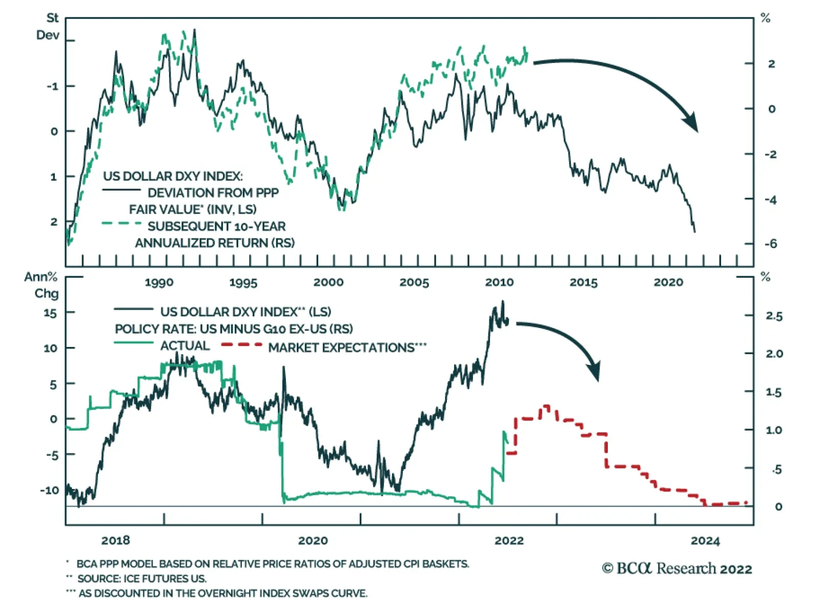
The dollar continues to post positive abnormal returns in June, powered by expectations of a relatively more hawkish Fed as well as safe haven portfolio flows. Year-to-date, the broad trade-weighted dollar and the DXY Index have returned 5.7% and 9.6%,…