Disasters/Disease

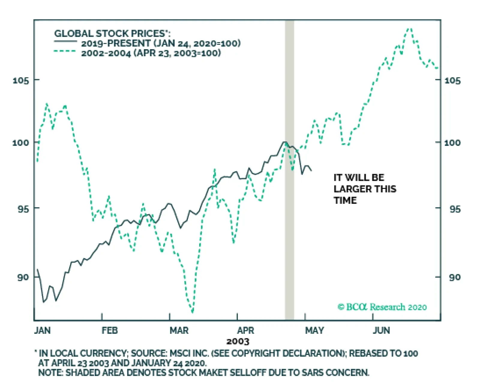
Highlights The SARS episode of 2003 suggests that the panic over the coronavirus will only subside when the number of new cases peaks. Although the latest data is somewhat encouraging, it is far from clear that we have reached that point. Provided the outbreak is contained, global equities should move higher over the course of the year. US companies remain net buyers of shares, implying that households and other holders have been net sellers. But against a backdrop of rising incomes, high savings, and improving confidence, households have also wanted to own more equities. How can households be net sellers of stocks while simultaneously increasing their equity exposure? There is only one answer: Share prices need to rise. The process will only stop once households decide they own enough stocks. In the US, while household equity holdings are on the high side as a share of household wealth, this is counterbalanced by the fact that the earnings yield on stocks is well above the yields on competing assets. Outside the US, household ownership of equities is quite low while the equity risk premium is still high. Going Viral We upgraded global equities after markets plunged in late 2018 and have remained overweight stocks on a 12-month horizon to this day. However, we indicated three weeks ago that equities had become technically overbought and would likely need to consolidate their gains. Thus, while we kept our 12-month views unchanged, we downgraded our tactical 3-month view on global stocks from overweight to neutral, while also advising clients with short horizons to boost exposure to cash and government bonds at the expense of riskier credit (our entire set of views can be found in the Global Investment Strategy View Matrix at the back of this report). Since then, the outbreak of the coronavirus has added another headwind to the near-term outlook for stocks. Many commentators have drawn comparisons between today’s outbreak and the SARS epidemic in 2003. The SARS episode imposed a significant but short-lived economic toll on the affected countries. While Chinese GDP growth fell to 3.4% in Q2 of 2003, it surged back to 15.7% in Q3, leaving the overall level of GDP down about 1% for the year as a whole relative to what would have transpired if the virus had never emerged.1 The broader Asia-Pacific region experienced a hit to growth of around 0.5%. In contrast, growth in developed economies was barely affected. Even in Canada, where 44 people died from SARS, the outbreak shaved only around 0.1% from the level of GDP in 2003, according to the Bank of Canada.2 The outbreak of the coronavirus has added another headwind to the near-term outlook for stocks. The obvious problem with the SARS analogy is that it is based on a sample of one. We do not know how this new strain of the virus compares to SARS or, for that matter, the Spanish flu, which killed 50-to-100 million people (3%-to-5% of the world’s population at the time). We do not even know if the full scope of the SARS outbreak was as fleeting as what we remember, since in a cosmic multiverse there will be a tendency to recall life-or-death outcomes more favorably than they actually were (I will have more to say about the financial implications of this in a future special report). Chart 1The Coronavirus Is Spreading Faster Than SARS Did
Buy The Dip, But Not Yet
Buy The Dip, But Not Yet
What we do know is that, to date, the coronavirus has spread more quickly than SARS (Chart 1). It is not clear if that is because of faster, more accurate reporting methods or because the virus is more communicable. The Chinese Minister of Health has said that this new virus, unlike SARS, can be transmitted while people are still asymptomatic. While others have cast doubt on this claim, if it turns out to be correct, the coronavirus may be much more difficult to control. Viruses often become less lethal as they mutate because a virus that kills its host is also a virus that kills itself. Unfortunately, in a world of mass travel, a virus can spread across the globe before it has time to lose potency. The typical seasonal flu kills less than 0.1% of those who contract it. Most estimates suggest that SARS killed 10%-15% of infected patients. The Spanish flu killed a similar percentage. The death rate from the coronavirus is currently tracking at 2%-to-3%. However, it is possible that this estimate will rise. The vast majority of the people who have contracted the coronavirus are still sick. In fact, more people have died from it than have fully recovered (Chart 2). Thus, an honest assessment would simply admit that we do not know how bad this potential pandemic will get. Chart 2How Will This End: Outbreak, Epidemic, Or Pandemic?
Buy The Dip, But Not Yet
Buy The Dip, But Not Yet
Chart 3Markets Bottomed As The SARS Infection Rate Was Peaking
Markets Bottomed As The SARS Infection Rate Was Peaking
Markets Bottomed As The SARS Infection Rate Was Peaking
What should investors do? The SARS experience suggests that risk assets will only bottom when the number of new cases peaks (Chart 3). It is not clear that we have reached this point yet. While the number of new cases reported by China’s National Health Commission has stabilized over the past two days, this could just be a temporary respite (Chart 4). Until the rate at which new cases are diagnosed begins a clear downward trend, a somewhat cautious stance towards risk assets is warranted. Global Growth Should Recover Provided the outbreak is contained during the coming weeks, global equities should move higher over the course of the year. This is partly because global growth should pick up thanks to the lagged effects of last year’s decline in bond yields, an improvement in the global manufacturing inventory cycle, and diminished Brexit and trade war risks. Continued fiscal/credit stimulus out of China should also help. China spends less on health care than almost all other countries (Chart 5). It is likely that the past few weeks will prompt the government to increase social spending. Chart 4The Number Of New Cases Has Stagnated Over The Past Two Days
Buy The Dip, But Not Yet
Buy The Dip, But Not Yet
Chart 5China: Public Spending On Health Care Has Room To Catch Up
Buy The Dip, But Not Yet
Buy The Dip, But Not Yet
Higher Equity Prices: Just A Matter Of Arithmetic? Chart 6There Is A Structural Decline In Listed Companies In The US
There Is A Structural Decline In Listed Companies In The US
There Is A Structural Decline In Listed Companies In The US
Chart 7The Supply Of US Stocks Has Been Drying Up
The Supply Of US Stocks Has Been Drying Up
The Supply Of US Stocks Has Been Drying Up
In addition to stronger global growth, there is another factor supporting stocks which receives insufficient attention and is worth highlighting in this week’s report: corporate buybacks. US companies have repurchased about 3% of their shares every year for the past decade. On the flipside, only 110 companies went public last year, less than a third of the number of new listings in 1996-99. In fact, the number of publicly traded domestic companies has fallen by over 40% since 1996 (Chart 6). The combination of copious buybacks and dearth of IPOs has caused the S&P divisor – a broad measure of the total number of split-adjusted shares outstanding – to decline by a cumulative 9% since 2011. Between 1990 and 2004, the divisor increased by 40% (Chart 7). If companies are net buyers of stocks, then households and other holders must be net sellers of stock. But this raises an obvious question: What if households also want to be net buyers of stocks? Chart 8Households Are Bullish
Households Are Bullish
Households Are Bullish
Chart 9High Equity Ownership By Households Translates Into Poor Long-Term Returns
High Equity Ownership By Households Translates Into Poor Long-Term Returns
High Equity Ownership By Households Translates Into Poor Long-Term Returns
This question is highly relevant in today’s environment, where unemployment is low, wage growth is accelerating, the household savings rate is high, consumer confidence is strong, and a higher-than-average percentage of people expect stocks to increase in the coming months (Chart 8). Arithmetically, there is only one way that households can be net sellers of stocks while simultaneously increasing their equity exposure: Share prices need to rise. At what point will share prices stop rising? That depends on two things: 1) How much stock market wealth households hold relative to other assets; and 2) The risk-adjusted rate of return that households expect from stocks compared to other assets. Stock returns are highest when equity holdings are low, but sentiment towards stocks is improving. Conversely, returns are lowest when equity holdings are high, but stock market sentiment is deteriorating (Chart 9 and Table 1). Table 1Equity Returns Tend To Suffer When Bulls Are Losing Conviction
Buy The Dip, But Not Yet
Buy The Dip, But Not Yet
The latter typically occurs during economic downturns when earnings are falling and risk aversion is rising. Thus, it is no surprise that recessions and equity bear markets tend to overlap (Chart 10). Chart 10Recessions And Bear Markets Tend To Overlap
Recessions And Bear Markets Tend To Overlap
Recessions And Bear Markets Tend To Overlap
Where Things Stand Today In the US, household equity holdings are on the high side. According to Fed data and our own estimates, households currently hold 33% of their financial assets in stocks (Chart 11). This is higher than in 2007, but still below the dotcom peak of 39%. Similarly, the monthly asset allocation survey conducted by the American Association of Individual Investors shows a somewhat elevated allocation to equities, although one that is still broadly on par with the 2003-2007 and post-2014 averages (Chart 12). Chart 11US Household Equity Holdings Are On The High Side (I)
US Household Equity Holdings Are On The High Side (I)
US Household Equity Holdings Are On The High Side (I)
Chart 12US Household Equity Holdings Are On The High Side (II)
US Household Equity Holdings Are On The High Side (II)
US Household Equity Holdings Are On The High Side (II)
Chart 13Relative Valuations Favor Stocks
Relative Valuations Favor Stocks
Relative Valuations Favor Stocks
One major difference with prior occasions when US equity allocations were elevated is that the earnings yield on stocks at present is still quite a bit higher than the yield on competing assets such as cash and bonds (Chart 13). While this is mainly because interest rates are so low, it does suggest that households may seek to further increase their equity allocations provided that the economy continues to perform well. Foreign companies have been less aggressive re-purchasers of their own shares than their US peers. That said, household equity ownership is significantly lower outside the US (Chart 14). The spread between equity earnings yields and bond yields is also higher abroad, reflecting the fact that both PE multiples and interest rates are generally lower outside the US. Given that investors tend to favor companies listed in their home country, efforts by non-US investors to increase their equity allocations will primarily benefit stock markets outside the US. In addition, stronger global growth tends to favor EM and European equities, largely because stock markets in those regions have more of a cyclical bent (Chart 15). Thus, on balance, we recommend that investors overweight non-US stocks this year. Chart 14Equity Ownership By Households Is Lower Outside The US
Buy The Dip, But Not Yet
Buy The Dip, But Not Yet
Chart 15Stronger Global Growth Tends To Favor A Cyclical Bias In Equity Allocation
Stronger Global Growth Tends To Favor A Cyclical Bias In Equity Allocation
Stronger Global Growth Tends To Favor A Cyclical Bias In Equity Allocation
Peter Berezin Chief Global Strategist peterb@bcaresearch.com Footnotes 1 Jong-Wha Lee and Warwick J. McKibbin, “Globalization and Disease: The Case of SARS,” Brookings Institution, dated February 2004. 2 Please see Monetary Policy Report, Bank of Canada, October 2003. Global Investment Strategy View Matrix
Buy The Dip, But Not Yet
Buy The Dip, But Not Yet
MacroQuant Model And Current Subjective Scores
Buy The Dip, But Not Yet
Buy The Dip, But Not Yet
Strategic Recommendations Closed Trades
It is tempting to compare the potential impact of the current coronavirus outbreak on the global economy and financial markets with that of SARS in the spring of 2003. The correction in global equities due to the SARS outbreak lasted only a couple of days…
The coronavirus scare is the catalyst for the recent correction. The true cause is that the stock market had reached a point of groupthink-triggered instability and therefore needed the slightest catalyst to correct. The bond yield 6-month impulse had…
Highlights Collective market signals suggest a low but non-negligible probability of a dollar spike due to the coronavirus. Stay long the yen as a portfolio hedge. Short CHF/JPY bets also make sense. Our limit sell on the gold/silver ratio was triggered at 90. Place a stop at 95, with an initial target of 80. Feature Chart I-1Watching Market Signals
Watching Market Signals
Watching Market Signals
Investors can generally be classified in two camps. There are those who are predisposed to being risk averse. As such, capital preservation trumps the desire for outsized returns. For such investors, defensive equities such as staples and utility stocks, fixed-income assets, or even gold tend to be the favored vehicles over time. At the opposite end of the spectrum are the investors who desire hopping on and riding the next growth unicorn. Their favored investment universe can include technology and biotech concerns, but can also span industries such as automotive and food. The key, however, is that their inherent disposition is to multiply returns rather than preserve capital. There is a crucial difference between this bias and a risk-on/risk-off environment. For example, in a risk-on environment, the more prudent investor might choose high-yielding government bonds, while the high flyer will be in the S&P 500 or private equity. In the currency world, the “preservationist” might choose the euro as an anti-dollar play despite negative yields, while the “high flyer” would rather be in the New Zealand dollar or the Norwegian krone. The oscillation between these two bipolar universes can be measured in various ways, but one that has been prescient in gauging the direction for currency markets is the ratio between the S&P 500 index and gold prices. In general, whenever the S&P 500 has been outperforming gold, the dollar has tended to soar, and vice versa (Chart I-1). As a closed economy, US markets are generally more defensive. So even in a risk-off environment, this ratio can capture the preference for capital preservation versus growth. The collective signals from financial markets suggest there is a low probability of a dollar spike. The SPX/Gold ratio hit a peak of 2.5 in the last quarter of 2018 and has since been exhibiting a bearish pattern of lower highs, with the latest rise peaking a nudge below 2.2. Our belief is that it is less a story of greed versus fear, and more an indication of a powerful underlying preference for investors being revealed in asset prices. Gauging FX Market Signals The coronavirus outbreak has been dominating market headlines in recent weeks. We are not infectious disease specialists, so cannot provide any insight on the potential impact on growth and/or the probability for the virus to become much more widespread. However, the collective signals from financial markets suggest there is a low probability of a dollar spike. The rise in the dollar has been relatively on par with the SARS experience of 2002 (Chart I-2A and Chart I-2B). Back then, the Chinese economy had a much smaller effect on global growth, and so far, the number of reported cases is outpacing the SARS experience. So, it is possible that given the dollar bull market of the last decade or so, there is a dearth of new buyers in the greenback. Chart I-2ARun Of The Mill Virus ? (1)
Run Of The Mill Virus ? (1)
Run Of The Mill Virus ? (1)
Chart I-2BRun Of The Mill Virus ? (2)
Run Of The Mill Virus ? (2)
Run Of The Mill Virus ? (2)
The most recent fall in the S&P 500 index versus gold is definitely a sign of risk aversion, but the much broader peak almost two years ago might be signaling an outright shift in the investment universe. In other words, capital preservation might now be best sought outside US bourses. If this is the case, cheap and unloved value stocks will provide better shelter compared to the growth champions of the last decade. It is interesting that emerging market cyclical stocks (where the epicenter of the crisis is) have not underperformed defensives in a meaningful way during the latest riot (Chart I-3). The typical narrative is that the dollar is now a high-yielding currency within the G10. That means it has now become the object of carry trades. Should the investment universe be shifting to one of prudence, it is plausible though not probable that the greenback will provide both functions. Chart I-3Mixed Message From Cyclicals Versus Defensives
Mixed Message From Cyclicals Versus Defensives
Mixed Message From Cyclicals Versus Defensives
Chart I-4Correlation Break Down Or Unsustainable Gap?
Correlation Break Down Or Unsustainable Gap?
Correlation Break Down Or Unsustainable Gap?
The absolute collapse in the gold-to-bond ratio further confirms that after almost a decade of underperformance, hard money might be coming back into favor versus yield plays (Chart I-4). Gold was a monetary aggregate for centuries, and continues to stand as a viable threat to dollar liabilities. This is not only visible in the rampant accumulation of gold by foreign central banks, notably Russia and China, but also by the breakout in gold in almost every currency, including safe-havens like the Swiss franc and the Japanese yen (Chart I-5). The absolute collapse in the gold-to-bond ratio further confirms that after almost a decade of underperformance, hard money might be coming back into favor. Data from the US Treasury confirms that foreign entities have been fleeing US bond markets at among the fastest pace in recent years. On a rolling 12-month total basis, the US saw an exodus of about US$250 billion in Treasurys from foreigners, one of the largest on record (Chart I-6). Foreign private investors are still net buyers of US Treasurys, but the downtrend in purchases in recent years is evident. In addition, this helps explain why gold has also outperformed Treasurys over this period. Chart I-5Soft Versus Hard ##br##Money
Soft Versus Hard Money
Soft Versus Hard Money
Chart I-6Official Data Shows Less Preference For Treasurys
Official Data Shows Less Preference For Treasurys
Official Data Shows Less Preference For Treasurys
The US dollar’s reserve status remains intact for now. But subtle shifts in this exorbitant privilege are worth monitoring. If balance-of-payment dynamics continue to head in the wrong direction, as they are now, this will favor hard money and non-US assets, while accelerating divestment out of US Treasurys. This is irrespective of whether we enter a risk-on versus risk-off environment. A good proxy for whether the US government was prudent or profligate over the past four decades can be measured by the gap between unemployment relative to NAIRU (the so-called unemployment gap) and the corresponding budget deficit. In simple terms, full employment should be accompanied by balanced budgets, while governments can step in during recessions to put a floor under aggregate demand. Not surprisingly, using this simple rule, sound fiscal policies in the US were usually accompanied by a strong dollar, and vice versa. Chart I-7The Risk To Long Dollar Positions
The Risk To Long Dollar Positions
The Risk To Long Dollar Positions
Over the next five years, the US Congressional Budget Office (CBO) estimates that the US budget deficit will swell to 4.6% of GDP. Assuming the current account deficit remains stable, this will pin the twin deficits at 7.2% of GDP. This assumes no recession, which would have the potential to boost the deficit even further. In the last forty years, there has not been any prolonged period where twin deficits in the US have been expanding while the dollar has been in a bull market (Chart I-7). In a nutshell, even though the coronavirus is dominating headlines, the lack of a more pronounced greenback strength can be pinpointed to a rising number of negative market signals. Our bias is that when this eventually rolls over and global growth picks up in earnest, dollar bulls may be forced to capitulate. Bottom Line: We are not downplaying the potential impact of the coronavirus, but are skeptical of its ability to catapult the dollar higher. We are short the DXY index, with a target of 90 and a stop at 100. Stick with it. Bullish Both Gold And Silver, But Go Short The GSR If we are right, then both gold and silver will tend to rise in an environment where the dollar is falling. That said, the gold/silver ratio (GSR) hit a three-decade high of 93.3 last summer, opening up an arbitrage opportunity. The history of these reversals is that they tend to be powerful, quick, and extremely volatile (Chart I-8). This not only paves the way for an excellent entry point to short gold versus silver, but provides important information on the battleground between easing financial conditions and a pick-up in economic (or manufacturing) activity. The ratio of the velocity of money between the US and China has tended to track both the gold/silver ratio and the dollar closely. Just like gold, silver benefits from low interest rates, plentiful liquidity, and the incentive for fiat money debasement. However, the gold/silver ratio is sitting near two standard deviations above its mean. Meanwhile, over the past century, the peak in GSR has been around 100. The gold/silver ratio tends to rally ahead of an economic slowdown, but then peaks when growth is still weak but liquidity conditions are plentiful enough to affect the outlook for future growth. This appears to be the case today. The simple reason is that silver has more industrial uses than gold (Chart I-9). Chart I-8GSR At A Speculative Extreme
GSR At A Speculative Extreme
GSR At A Speculative Extreme
Chart I-9No Recession = Buy Silver
No Recession = Buy Silver
No Recession = Buy Silver
The ratio of the velocity of money between the US and China has tended to track both the gold/silver ratio and the dollar closely (Chart I-10). A falling ratio signifies that the number of times money is changing hands in China is outpacing that number in the US. This also tends to coincide with a preference for US versus non-US assets, since animal spirits (as measured by money velocity) tend to be pronounced in places where returns on capital are higher. Silver is a more volatile metal than gold. Part of the reason is that the silver market is thinner, with future open interest that is about one-third that of gold. As such, silver tends to rise faster than gold during precious metal bull markets (Chart I-11). Chart I-10Falling GSR = Rising Manufacturing Activity
Falling GSR = Rising Manufacturing Activity
Falling GSR = Rising Manufacturing Activity
Chart I-11Silver Is More Volatile Than Gold
Silver Is More Volatile Than Gold
Silver Is More Volatile Than Gold
This brings us to the sweet spot for silver. Even if global growth remains tepid over the next few months, due to a rise in infections from the coronavirus, a lot of the bad news is already reflected in a high GSR. This means the potential for upside will have to be nothing short of a deep recession. Relative speculative positioning favors gold, which is positive from a contrarian standpoint. Ditto for relative sentiment. More often than not, a positive signal from both these indicators has been a good timing tool for a selloff in the GSR. If global growth bottoms, then the rise in silver prices could be explosive. Silver fabrication demand benefits from new industries such as solar and a flourishing “cloud” industry that are capturing the new manufacturing landscape. Meanwhile, we are also entering a window where any pickup in demand could lead to a sizeable increase in the physical silver deficit. Bottom Line: A falling GSR provides important information about the battleground between easing financial conditions and a pickup in economic activity. We remain bullish on both gold and silver, but a trading opportunity has opened up for a short GSR position. Housekeeping Chart I-12AUD Will Follow Asian Currencies
AUD Will Follow Asian Currencies
AUD Will Follow Asian Currencies
Our limit buy on the Australian dollar was triggered at 68 cents. We discussed the Aussie at length in our report dated January 17.1 Place an initial target at 0.75 cents and a tight stop at 0.66. The near-term risk to this trade is any escalation in virus infections that will collectively send Asian currencies into a tailspin (Chart I-12). Chester Ntonifor Foreign Exchange Strategist chestern@bcaresearch.com Footnotes 1 Please see Foreign Exchange Strategy Weekly Report, titled "On AUD And CNY," dated January 17, 2020, available at fes.bcaresearch.com Currencies U.S. Dollar Chart II-1USD Technicals 1
USD Technicals 1
USD Technicals 1
Chart II-2USD Technicals 2
USD Technicals 2
USD Technicals 2
Recent data in the US have been positive: The Markit manufacturing PMI fell to 51.7 while the services component increased to 53.2 in January. The Dallas Fed manufacturing index improved from -3.2 to -0.2 in January. Moreover, the Richmond Fed manufacturing index soared to 20 in January. Durable goods orders increased by 2.4% month-on-month in December. The trade deficit widened further to $68.3 billion from $63 billion in December. Annualized GDP growth was unchanged at 2.1% year-on-year in Q4. Initial jobless claims fell to 216K from 223K for the week ended January 24th. The DXY index appreciated by 0.1% this week. While the coronavirus spurred worries about a further slowdown in the global economy, the impact on the US remains to be seen. On Wednesday, the Fed committee voted unanimously to keep interest rates on hold at 1.75% and concluded that the current rate is appropriate to support sustained expansion of the US economy. Report Links: Portfolio Tweaks Before The Chinese New Year - January 24, 2020 On Oil, Growth And The Dollar - January 10, 2020 Updating Our Balance Of Payments Monitor - November 29, 2019 The Euro Chart II-3EUR Technicals 1
EUR Technicals 1
EUR Technicals 1
Chart II-4EUR Technicals 2
EUR Technicals 2
EUR Technicals 2
Recent data in the euro area have been mostly positive: The Markit manufacturing PMI jumped to 47.8 in January while the services PMI fell slightly to 52.2. The German IFO current assessment index increased to 99.1 from 98.8 in January, while expectations component fell to 92.9. The economic sentiment indicator increased to 102.8 from 101.3 in January. The unemployment rate fell further to 7.4% in December from 7.5% the prior month. The euro has been flat against the US dollar this week. Though the German IFO expectations component disappointed, the overall assessment has shown tentative signs of recovery. More importantly, changes in the manufacturing PMI indices, especially in Germany, are staging the V-shaped recovery we have been expecting. Report Links: Updating Our Balance Of Payments Monitor - November 29, 2019 On Money Velocity, EUR/USD And Silver - October 11, 2019 A Few Trade Ideas - Sept. 27, 2019 Japanese Yen Chart II-5JPY Technicals 1
JPY Technicals 1
JPY Technicals 1
Chart II-6JPY Technicals 2
JPY Technicals 2
JPY Technicals 2
Recent data in Japan have been positive: Consumer confidence was unchanged at 39.1 in January. Services PPI increased by 2.1% year-on-year in December. Headline inflation increased to 0.8% year-on-year from 0.5% in December. Both manufacturing and services PMIs increased to 49.3 and 52.1, respectively in January. The Japanese yen appreciated by 0.6% against the US dollar this week. The flare up in risk aversion was a very potent catalyst, given the yen had become unloved and under owned. Persistent global risks, including Mid East tensions, and more recently, the spread of coronavirus, all warrant holding the Japanese yen as a portfolio hedge. Our last weekly report discussed why we prefer the Japanese yen to the Swiss franc as portfolio insurance. Report Links: Portfolio Tweaks Before The Chinese New Year - January 24, 2020 Updating Our Balance Of Payments Monitor - November 29, 2019 Signposts For A Reversal In The Dollar Bull Market - November 1, 2019 British Pound Chart II-7GBP Technicals 1
GBP Technicals 1
GBP Technicals 1
Chart II-8GBP Technicals 2
GBP Technicals 2
GBP Technicals 2
Recent data in the UK have been solid: Both Markit manufacturing and services PMIs soared to 49.8 and 52.9 respectively in January. Nationwide housing prices increased by 1.9% year-on-year in January, compared with 1.4% the previous month. The saucer-shaped bottom in home prices is becoming more and more evident. The British pound has been flat against the US dollar this week. On Thursday, the BoE decided to leave interest rates unchanged at 0.75%. The fact that there were only two dissenters, in line with the previous month, suggests that rising bets for a rate cut were misplaced. The UK is due to leave the EU as of January 31st and enter a transition period that is supposed to last until December 31st 2020. The immediate aftermath of the exit will be business as usual. Trading strategy on the pound should be a buy on dips. We will continue to explore opportunities in GBP in upcoming reports. Report Links: Updating Our Balance Of Payments Monitor - November 29, 2019 A Few Trade Ideas - Sept. 27, 2019 United Kingdom: Cyclical Slowdown Or Structural Malaise? - Sept. 20, 2019 Australian Dollar Chart II-9AUD Technicals 1
AUD Technicals 1
AUD Technicals 1
Chart II-10AUD Technicals 2
AUD Technicals 2
AUD Technicals 2
Recent data in Australia have been mixed: The NAB business conditions index fell to 3 from 4 in December. Moreover, the business confidence index decreased to -2 from 0. Headline inflation increased to 1.8% year-on-year from 1.7% in the fourth quarter. Import prices increased by 0.7% quarter-on-quarter, while export prices plunged by 5.2% quarter-on-quarter in Q4. The Australian dollar fell by 2.1% against the US dollar this week, triggering our limit buy position at AUD/USD 0.68. Despite temporary challenges from the bushfires and the coronavirus, we continue to hold our base case view that global growth is likely to rebound in the next 12-to-18 months, which is bullish for the Aussie dollar. Report Links: On AUD And CNY - January 17, 2020 Updating Our Balance Of Payments Monitor - November 29, 2019 A Contrarian View On The Australian Dollar - May 24, 2019 New Zealand Dollar Chart II-11NZD Technicals 1
NZD Technicals 1
NZD Technicals 1
Chart II-12NZD Technicals 2
NZD Technicals 2
NZD Technicals 2
Recent data in New Zealand have been positive: Headline inflation increased to 1.9% year-on-year in Q4, compared with 1.5% the previous quarter. It also beat expectations of 1.8%. The trade balance shifted to a surplus of NZ$547 million in December. Goods exports rose by 4.8% year-on-year to NZ$5.5 billion, while imports fell by 5.4% year-on-year to NZ$5 billion. Shortly after the rise along with inflation data, the New Zealand dollar fell by more than 2% this week, amid growing risk aversion. New Zealand, as a chief exporter of agricultural products, bore a good brunt of speculative selling. Assuming infections peak in the coming weeks, we remain positive on the kiwi as the Chinese government is likely to inject more stimulus into the economy. Report Links: Updating Our Balance Of Payments Monitor - November 29, 2019 Place A Limit Sell On DXY At 100 - November 15, 2019 USD/CNY And Market Turbulence - August 9, 2019 Canadian Dollar Chart II-13CAD Technicals 1
CAD Technicals 1
CAD Technicals 1
Chart II-14CAD Technicals 2
CAD Technicals 2
CAD Technicals 2
Recent data in Canada have been mostly positive: Retail sales increased by 0.9% month-on-month in November. The Bloomberg Nanos confidence index rose to 56.5 from 56.1 for the week ended January 24th. The Canadian dollar fell by 0.6% against the US dollar this week. As a petrocurrency, the risk of much reduced travel hit the loonie. We have written at length in various reports about the loonie, but the bottom line is that Canada benefits less than other petrocurrencies in oil bull markets. Ergo, the underperformance of short CAD/NOK and long AUD/CAD positions this week is expected. In other news, Trump has signed the new USMCA bill into law this week, leaving Canada the only member of the trilateral deal that has yet to ratify the agreement. Report Links: The Loonie: Upside Versus The Dollar, But Downside At The Crosses Updating Our Balance Of Payments Monitor - November 29, 2019 Making Money With Petrocurrencies - November 8, 2019 Swiss Franc Chart II-15CHF Technicals 1
CHF Technicals 1
CHF Technicals 1
Chart II-16CHF Technicals 2
CHF Technicals 2
CHF Technicals 2
Recent data in Switzerland have been mixed: The trade surplus narrowed for a fourth consecutive month in December, falling to CHF 2 billion. Real exports decreased by 3.4% month-on-month while real imports grew by 0.2% month-on-month. The ZEW expectations index fell to 8.3 from 12.5 in January. The KOF leading indicator jumped to 100.1 from 96.2 in January. The Swiss franc has been more or less flat against the US dollar this week. The fall in exports of chemical and pharmaceutical production was the main driver behind the decrease in the Swiss trade balance in December. The SNB is walking a fine line. The improvement in the KOF leading indicator, along with rising inflation and PMI data is definitely a source of comfort, but the surge in EUR/CHF will hurt competitiveness and warrant stealth intervention. Buy EUR/CHF at 1.06. Report Links: Portfolio Tweaks Before The Chinese New Year - January 24, 2020 Updating Our Balance Of Payments Monitor - November 29, 2019 Notes On The SNB - October 4, 2019 Norwegian Krone Chart II-17NOK Technicals 1
NOK Technicals 1
NOK Technicals 1
Chart II-18NOK Technicals 2
NOK Technicals 2
NOK Technicals 2
Recent data in Norway have been negative: Retail sales fell by 2% month-on-month in December. The Norwegian krone fell by 1.9% against the US dollar this week. The WTI crude oil price plunged by 20% since the peak earlier this month, due to a combination of falling global travel demand, eased Iran tensions and a bearish EIA inventory report. That being said, our Commodity & Energy strategists continue to be bullish energy prices and expect the WTI crude oil price to reach $63/bbl in 2020, based on recovering global demand and supply constraints. This should eventually lift the Norwegian krone. OPEC is scheduled to meet early March, and plunging prices could be a catalyst for the cartel to cut production. Report Links: On Oil, Growth And The Dollar - January 10, 2020 Updating Our Balance Of Payments Monitor - November 29, 2019 Making Money With Petrocurrencies - November 8, 2019 Swedish Krona Chart II-19SEK Technicals 1
SEK Technicals 1
SEK Technicals 1
Chart II-20SEK Technicals 2
SEK Technicals 2
SEK Technicals 2
Recent data in Sweden have been mixed: Producer prices increased by 1.3% year-on-year in December. The trade surplus shrank to SEK 0.3 billion from SEK 2.7 billion in December. Retail sales grew by 3.4% year-on-year in December. Consumer confidence marginally fell to 92.6 from 94.7 in January, while business confidence jumped to 97.4 in January, the highest in seven months. The Swedish krona fell by 1.3% against the US dollar this week. Recent Swedish data has been disappointing given the steep decline during the trade war, but we are beginning to see second-derivative improvements. The trade surplus is rising on a year-on-year basis. Particularly noteworthy was the improvement in business confidence, which has historically led the Swedbank PMI index tick for tick. Report Links: Updating Our Balance Of Payments Monitor - November 29, 2019 Where To Next For The US Dollar? - June 7, 2019 Balance Of Payments Across The G10 - February 15, 2019 Trades & Forecasts Forecast Summary Core Portfolio Tactical Trades Limit Orders Closed Trades
Highlights China’s economic rebound in Q1 will be delayed due to the coronavirus, which will have a larger negative hit than SARS. New stimulus measures will assist a rebound in demand later this year. Europe remains a geopolitical opportunity rather than a risk. As long as global growth rebounds this year, European equities can outperform their richly valued American counterparts. Emerging markets face a new headwind from the coronavirus. Emerging market performance relative to developed markets will be a key test of whether endogenous growth trends are taking shape. Tactically – over a 12-month horizon – we remain long industrial commodities; long Korean equities versus Taiwanese; and long Malaysian equities relative to emerging markets. Feature Global equities will ultimately push through the coronavirus and the Democratic Party primary election, but risks are elevated and Q1 looks to bring significant volatility. Last week we shifted to a tactically neutral stance on risk assets but we remain cyclically bullish. In this report we update our market-based GeoRisk indicators, which are almost all set to rise from low levels in the coming months as developed market equities and emerging market currencies face higher risk premiums. China: The Year Of The Rat Chart 1Markets Will Rebound Once Toll Of Virus Peaks
Markets Will Rebound Once Toll Of Virus Peaks
Markets Will Rebound Once Toll Of Virus Peaks
The ink had hardly dried on our “Black Swan” report for 2020 when Chinese scientists confirmed human-to-human transmission of the Wuhan coronavirus (2019-nCoV), sending a wave of fear over China and the world. The number of new cases and new deaths is rising and economic activity will suffer as the Chinese New Year is extended, shoppers stay home, and international travel is canceled. The virus is likely to prove more troublesome than stock investors want to admit, at least in the short term. Too little is known to make confident assertions about promptly containing the virus or its impact on global economy and markets. The analogy with the SARS outbreak of 2003 is limited: it is not certain that this virus has a lower death rate, but it is certain that the Chinese economy is more vulnerable to disruption today than at that time – and much more influential on the global economy. The SARS episode is useful, however, in suggesting that the market will not rebound until the number of new cases and deaths turn down (Chart 1). Assuming the virus is ultimately contained – both in China and in neighboring Asian countries whose governments may not be as effective at quarantining the problem – regional consumption and production will bounce back. New stimulus measures will also take effect with a lag. Domestic political risk is structurally understated in China. Stimulus will indeed be the answer. First, the negative shock to consumer demand comes at a time when global trade is still relatively weak, thus presenting a two-pronged threat to China’s economy, which was only just stabilizing after the truce in the trade war. Second, China’s hundredth anniversary of the Communist Party, in 2021, will require the government to stabilize the economy now. The important political leadership reshuffle at the twentieth National Party Congress in 2022 is another imperative to avoid a deepening slump today (Chart 2). Chart 2China Will Stimulate To Avoid A Deepening Slump
China Will Stimulate To Avoid A Deepening Slump
China Will Stimulate To Avoid A Deepening Slump
Beyond 2020, the Wuhan virus highlights our theme that domestic political risk is structurally understated in China. At the centennial celebration, China’s leaders aim to show that the country is a “moderately prosperous society in all respects,” emphasis added. For decades China’s leaders have emphasized industrial production to the detriment of other social and economic goals, such as food safety and a clean and safe environment for households to live in. The emergence of the middle class, writ broadly, as a majority of the population is a persistent source of pressure on leaders, as the limited opinion polling available from China demonstrates (Chart 3). In other emerging markets, a large middle class has led to social and political change when the government failed to meet growing middle class demands (Chart 4). Chart 3Chinese Social And Economic Conditions Are Source Of Pressure
GeoRisk Update: The Year Of The Rat
GeoRisk Update: The Year Of The Rat
Chart 4Consumerism Encourages Democracy
Consumerism Encourages Democracy
Consumerism Encourages Democracy
Chart 5China’s Government Is Behind The Curve
GeoRisk Update: The Year Of The Rat
GeoRisk Update: The Year Of The Rat
Under General Secretary Xi Jinping, the government has cracked down on corruption and pollution as well as poverty, and has attempted to improve consumer safety and the health care system. The party officially aims to shift its policy focus from meeting the basic material needs of the population to improving quality of life. The problem is that China’s government is behind the curve (Chart 5). While it is making rapid progress – for instance, the communicable disease burden has dropped dramatically – and has unique authoritarian tools, acute problems of health, food safety, pollution, and public services will nevertheless persist. The government’s responses will inevitably fall short from time to time and heads will roll. Crisis events create the potential for the market to be surprised by the level of domestic political change or pushback, which will prove disruptive at times. Bottom Line: China’s economic rebound in Q1 will be delayed due to the coronavirus, which will have a larger negative hit than SARS. The SARS episode suggests that Chinese equities will be a tactical buy when the number of new cases and deaths begin falling. New stimulus measures will assist a rebound in demand later this year – underscoring our constructive cyclical view on Chinese and global growth. The episode highlights the challenges China faces in modernizing and improving regulations, health, and safety for the emerging middle class. Domestic political risk is understated. Europe: Political Risks Still Contained China’s near-term hit, and rebound later this year, will echo in Europe, where the economy and equity market are highly reliant on China’s credit cycle and import demand. Politically, however, Europe remains a geopolitical opportunity rather than a risk (Chart 6). Chart 6China's Hit Will Echo In Europe, But Political Risks Are Contained There
GeoRisk Update: The Year Of The Rat
GeoRisk Update: The Year Of The Rat
The final months of last year saw the biggest and most immediate political risk – a disorderly UK exit from the EU – removed. The Trump administration is not likely to slap large-scale tariffs – such as auto tariffs on a national security pretext – because Trump is constrained by the weak manufacturing sector in advance of his election. Meanwhile immigration and terrorism have declined since 2016, draining the fuel of Europe’s anti-establishment parties. Pound weakness during the Brexit transition period is an opportunity for investors to buy. Chart 7Immigration Is Ticking Up, But From Low Levels
Immigration Is Ticking Up, But From Low Levels
Immigration Is Ticking Up, But From Low Levels
Chart 8Refugees Will Favor Western Route Across The Mediterranean
Refugees Will Favor Western Route Across The Mediterranean
Refugees Will Favor Western Route Across The Mediterranean
Chart 9Government Gridlock, Catalonia, And Poor Reform Momentum Will Pull Up Spanish Risk
Government Gridlock, Catalonia, And Poor Reform Momentum Will Pull Up Spanish Risk
Government Gridlock, Catalonia, And Poor Reform Momentum Will Pull Up Spanish Risk
There are some signs of immigration numbers ticking up, but from very low levels (Chart 7). This uptick must be monitored for Spain (and France), as the renewed civil war in Libya is forcing refugees to shift to the western route across the Mediterranean (Chart 8). (Note that even peace in Libya opens the possibility of greater migrant flows as the country then becomes a viable transit route again). Our Spanish risk indicator is already ticking up due to government gridlock, the Catalonian conflict, and a declining commitment to structural economic reform (Chart 9). But this is not a major concern for global investors. The United Kingdom The UK will formally exit the European Union on January 31. The transition period – in which the UK remains fully integrated into the EU single market – expires on December 31, 2020. This is the official deadline for the two sides to negotiate a trade agreement – though it can, and likely will, be delayed. Chart 10British Political Risk Will Revive, But Not Dramatically
British Political Risk Will Revive, But Not Dramatically
British Political Risk Will Revive, But Not Dramatically
The trade agreement is intended to minimize the negative economic impact of Brexit while ensuring that the UK reclaims its sovereignty and the EU retains the integrity of the single market. As negotiations get under way, the pound will face a new round of volatility and British political risk will revive somewhat, but we do not expect a dramatic increase (Chart 10). Ultimately we see pound weakness as an opportunity for investors to buy. The twin risks of no-deal Brexit or a socialist Jeremy Corbyn government have been decisively cast off. The end-of-year deadline can be extended and the two sides can find technical ways to compromise over regulations, tariffs, and border checks. Challenges to global growth only make an amicable solution more obtainable. Italy Our Italian GeoRisk indicator is collapsing as political risks proved yet again to be overstated (Chart 11). Chart 11Italian GeoRisk Indicator Is Collapsing
Italian GeoRisk Indicator Is Collapsing
Italian GeoRisk Indicator Is Collapsing
The local election in Emilia-Romagna was hyped as a major populist risk, in which the chief anti-establishment players, Matteo Salvini and the League, would take power in a region viewed as the symbolic home of the Italian left wing. Instead, the League lost, the ruling Democratic Party won, and the current government coalition will survive. While the populists prevailed at another election in Calabria, this outcome was fully expected. The trend of recent provincial elections does not suggest a swell of Italian populism (Chart 12). Chart 12Recent Local Elections Do Not Suggest A Swell Of Italian Populism
GeoRisk Update: The Year Of The Rat
GeoRisk Update: The Year Of The Rat
Chart 13The Italian Coalition Will Not Rush To Elections
The Italian Coalition Will Not Rush To Elections
The Italian Coalition Will Not Rush To Elections
This local election is not the end of the coalition’s troubles. The left-wing, anti-establishment Five Star Movement is suffering in the polls as a result of its uninspiring, politically expedient pairing with the establishment Democrats. The Democrats may receive a boost from Emilia-Romagna but the Five Star’s leadership change – the resignation of party leader Luigi di Maio – will not be enough to revive its fortunes alone. A new Five Star leader will have to decide whether to collaborate more deeply with the Democrats or try to reclaim the party’s anti-establishment credentials. The latter would push the coalition toward an election before too long. But the Five Star’s weak polling – and the League’s persistent 10 percentage point lead over the Democratic Party in nationwide polling – suggests that the coalition will not rush to elections but will try to prepare by passing a new electoral law (Chart 13). What is clear is that the Five Star Movement will not court elections until they improve their polling. France In France, Emmanuel Macron and his ruling En Marche party have seen their popularity drop to new lows amid the historic labor strikes in opposition to Macron’s pension reforms (Chart 14). Macron’s current trajectory is dangerously close to that of his predecessor, Francois Hollande, and threatens to turn him into a lame duck. We doubt this is the case. Chart 14Macron’s Popularity Is On A Dangerous Trajectory
GeoRisk Update: The Year Of The Rat
GeoRisk Update: The Year Of The Rat
Diagram 1The ‘J-Curve’ Of Structural Reform
GeoRisk Update: The Year Of The Rat
GeoRisk Update: The Year Of The Rat
We view Macron’s decline as another example of the “J-Curve of Structural Reform,” in which a leader’s political capital drops amid controversial reforms (Diagram 1). If the leader avoids an election during the trough of the curve, the danger zone, then his or her political capital may well revive after the benefits of the structural reform are recognized. In this case, the reform is neutral for France’s budget deficit – a cyclical positive – but it encourages an improvement in pension sustainability by incentivizing workers to work longer and postpone retirement – a structural positive. Chart 15France's Economy Is Holding Up
France's Economy Is Holding Up
France's Economy Is Holding Up
Chart 16A Relatively Strong Economy Will Buffer Against Political Risk In France
A Relatively Strong Economy Will Buffer Against Political Risk In France
A Relatively Strong Economy Will Buffer Against Political Risk In France
Municipal elections in March will not go Macron’s way, but the presidential and legislative elections are not until 2022. France’s GDP growth is holding up better than that of its neighbors, wages are rising, and confidence did not collapse amid the Christmas labor strike (Chart 15). Hence we expect the increase in political risk to be manageable (Chart 16), a boon for French equities. Germany German political risk is set to rise from today’s depths (Chart 17). The country faces a major shift: globalization is structurally declining and Chancellor Angela Merkel is stepping down. Merkel’s heir-apparent, Annegret Kramp-Karrenbauer (AKK), is floundering in the opinion polls (Chart 18). Chart 17German Political Risk Will Rise
German Political Risk Will Rise
German Political Risk Will Rise
Chart 18Merkel's Heir-Apparent Is Floundering In The Opinion Polls
Merkel's Heir-Apparent Is Floundering In The Opinion Polls
Merkel's Heir-Apparent Is Floundering In The Opinion Polls
Thus intra-party struggle, and conceivably even a rare early election, could emerge. But the US-China trade ceasefire offers a temporary reprieve. Next year will be different, with elections looming in the fall and the potential for a Trump reelection to trigger a second round of the US-China trade war or to shift to trade war with the EU and tariffs on German cars. The overall political trend in Germany is centrist and pro-Europe, and most of the parties are becoming more willing to upgrade fiscal policy over time. South Korea’s economic problems are priced in, while the market is dismissing Taiwan’s immense political risk. Bottom Line: The US election cycle is the chief source of policy risk and geopolitical risk in 2020, a stark contrast with the EU. European political risk will spike with a full-fledged recession, but for now it is contained. In fact the risks are largely to the upside in the short term as the countries turn slightly more fiscally accommodative. As long as global growth rebounds this year, European equities can outperform their richly valued American counterparts. Emerging Markets: Can They Outperform? With volatility likely in the near-term, Arthur Budaghyan of BCA Research’s Emerging Markets Strategy argues that the key test for emerging markets equities is whether they outperform their developed market counterparts. If they do not, then it suggests that investors still do not see endogenous growth, capital spending and profitability in emerging markets and therefore that they will lag their DM counterparts in the eventual equity upswing. Our long Korea / short Taiwan trade exploded out of the gate but has since fallen back in the face of the new headwind from the coronavirus. We have a high conviction in this trade because the difference in equity valuations faces a looming catalyst in the market’s mispricing of relative geopolitical risk: South Korea’s risk indicator is in a broad upswing while Taiwan’s has collapsed, despite the persistence of the diplomatic track with North Korea and Taiwan’s resounding reelection of both a pro-independence president and legislature (Chart 19). Mainland China will send both risk indicators upward in the near term, but South Korea’s economic problems are priced in and Trump’s diplomacy with North Korea is grounded in well-established constraints on Washington, Beijing, Pyongyang, and Seoul. By contrast the market is entirely dismissing Taiwan’s immense political risk, which does not depend on the outcome of the US election. In the coming 1-3 years, Beijing, Taipei, and Washington are all more likely to take self-interested actions that test the constraints in the Taiwan Strait, upsetting the market, before those constraints are reconfirmed (assuming they are). Beijing is likely to impose economic sanctions as Taipei’s demand for greater freedom and alliance with the US will agitate Chinese leaders who will seek to get the Kuomintang back into power. Brazilian political risk has failed to reach new highs, as anticipated, suggesting that President Jair Bolsonaro’s many problems are not driving investors to sell the real amid underlying indications of rebounding global growth and at least attempts at pro-market reform (Chart 20). Chart 19Markets Are Mispricing Geopolitical Risks In South Korea And Taiwan
Markets Are Mispricing Geopolitical Risks In South Korea And Taiwan
Markets Are Mispricing Geopolitical Risks In South Korea And Taiwan
Chart 20Political Risks Remain Contained In Brazil
Political Risks Remain Contained In Brazil
Political Risks Remain Contained In Brazil
Turkey’s military intervention into Libya’s civil war is another example of the foreign adventurism that we see as an outgrowth of populism and the need to distract the public’s attention from domestic mismanagement. We expect the risk indicator to rise or be flat and would remain short Turkish currency and risk assets. Bottom Line: Emerging markets face a new headwind from the coronavirus. Not only will China’s growth rebound sputter but Asian EMs will be exposed to the virus and may be less capable than China of dealing with it rapidly and effectively. With volatility looming, emerging market performance relative to developed markets will be a key test of whether endogenous growth trends are taking shape. Investment Conclusions Tactically we are closing our long GBP/JPY trade and UK curve steepener for negligible gains. We are also closing our long Egyptian sovereign bond trade for a gain of 5.59%. We remain long industrial commodities; long Korean equities versus Taiwanese; and long Malaysian equities relative to emerging markets. We expect these trades to perform well over a 12-month horizon. Strategically several of our recommendations will benefit from heightened volatility in the near term but face challenges later in the year as growth rebounds and risk sentiment revives. Nevertheless our time horizon is three-to-five years. In that span we remain long gold, long euro, long defense, short US tech, and short CNY-USD. Matt Gertken Vice President Geopolitical Strategist mattg@bcaresearch.com Appendix Germany: GeoRisk Indicator
Germany: GeoRisk Indicator
Germany: GeoRisk Indicator
France: GeoRisk Indicator
France: GeoRisk Indicator
France: GeoRisk Indicator
Italy: GeoRisk Indicator
Italy: GeoRisk Indicator
Italy: GeoRisk Indicator
Spain: GeoRisk Indicator
Spain: GeoRisk Indicator
Spain: GeoRisk Indicator
UK: GeoRisk Indicator
UK: GeoRisk Indicator
UK: GeoRisk Indicator
Canada: GeoRisk Indicator
Canada: GeoRisk Indicator
Canada: GeoRisk Indicator
China: GeoRisk Indicator
China: GeoRisk Indicator
China: GeoRisk Indicator
Taiwan: GeoRisk Indicator
Taiwan: GeoRisk Indicator
Taiwan: GeoRisk Indicator
Korea: GeoRisk Indicator
Korea: GeoRisk Indicator
Korea: GeoRisk Indicator
Russia: GeoRisk Indicator
Russia: GeoRisk Indicator
Russia: GeoRisk Indicator
Brazil: GeoRisk Indicator
Brazil: GeoRisk Indicator
Brazil: GeoRisk Indicator
Turkey: GeoRisk Indicator
Turkey: GeoRisk Indicator
Turkey: GeoRisk Indicator
Section III: Geopolitical Calendar
Highlights The intense focus on the weakening of global oil demand expected in the wake of another coronavirus outbreak in China – dubbed 2019-nCoV – obscures likely supply-side responses by OPEC 2.0. The producer coalition likely will rebalance markets by extending production cuts from end-March to at least the end of June when it meets in Vienna March 5-6. OPEC 2.0 producers will be exquisitely sensitive to Asian refiner demand. They will use it as a gauge for how severe 2019-nCoV’s impact will be on EM demand, and adjust production and exports accordingly. On the demand side, it is difficult to analogue the 2019-nCoV outbreak to the 2003 SARS outbreak, given all the conflicting fundamentals at play at that time. Forward curves for the principal benchmark crude oils – Brent and WTI – remain backwardated, in spite of the 2019-nCoV-related sell-off. Longer-dated WTI (out to December 2023) traded below $50/bbl earlier in the week, roughly in line with shale-breakeven costs reported by the Dallas Fed earlier this month. This likely will continue to pressure capex in the US shales, keeping future supply growth constrained. Feature Forward curves for the principal benchmark crude oils – Brent and WTI – remain backwardated, in spite of the 2019-nCoV-related sell-off. Chart of the WeekChina's Oil Demand Drives Global Growth
China's Oil Demand Drives Global Growth
China's Oil Demand Drives Global Growth
Oil markets are rightly focused on the demand implications of the 2019-nCoV outbreak in China.1 Since 2000, China has accounted for 42% of annual oil-demand growth worldwide (Chart of the Week). China is second only to the US in oil demand, accounting for 14% of total global demand of 100.7mm b/d at the end of 2019; its oil imports averaged more than 10mm b/d last year, and are expected to remain strong as it continues to build out its refining sector. Chart 2Asian Air Travel Hit Hard By SARS
Expect OPEC 2.0 To Cut Supply In Response to Demand Shock
Expect OPEC 2.0 To Cut Supply In Response to Demand Shock
Historical analogues for 2019-nCoV are difficult. The immediate analogue is the SARS coronavirus outbreak identified in China in February 2003, which lasted six months and hit Asian air travel especially hard (Chart 2). During the height of the SARS outbreak in April 2003, air-travel passenger demand in Asia plunged 45%, according to the International Air Transport Association (IATA). This pushed jet fuel prices lower in Asia and in other key markets, along with distillate prices generally (Chart 3).2 Chart 3Fundamental Supply-Demand Balances Support Higher Crude Oil Prices
Fundamental Supply-Demand Balances Support Higher Crude Oil Prices
Fundamental Supply-Demand Balances Support Higher Crude Oil Prices
China now is an extremely large share of global jet fuel consumption. Chart 4BCA Models, Base Metals Prices Suggest SARS Effect Was Short-Lived
BCA Models, Base Metals Prices Suggest SARS Effect Was Short-Lived
BCA Models, Base Metals Prices Suggest SARS Effect Was Short-Lived
The industry now is more reliant on Chinese travelers. Since 2003, the number of annual air passengers has more than doubled, with China growing to become the world’s largest outbound travel market. In 2003, close to 7mm passengers from China traveled on international flights. By 2018, that number had grown close to 64mm people, according to China’s aviation authority. As Chart 2 demonstrates, China now is an extremely large share of global jet fuel consumption. Still, oil is a global market – the avoidance of China during the SARS outbreak in 2003 would have impacted global air travel, and, as a result, global jet-fuel prices. Our proprietary EM commodity-demand models and the behavior of base metals prices, which were and remain heavily influenced by China’s economy, suggest China’s GDP growth slowed in 2003 (mainly 1H03) because of the SARS outbreak (Chart 4). The LME’s base metals index fell 9% between February and July 2003, while copper prices fell 11%. By year-end, these markets had fully recovered. Oil-Supply Management Drives Price Evolution In the modern era of the oil market beginning roughly around 2000, there have been numerous demand shocks requiring a supply response from OPEC. During the SARS outbreak in 2003, oil-market fundamentals at the time were complicated by the sudden loss of Venezuelan output in December 2002 to a general strike, which lasted three months and removed more than 2mm b/d from the market, and the US invasion of Iraq on March 2003. Both of these supply-side shocks hit markets just as demand was being hit by SARS. This makes it difficult to extract a pure price response on the demand side to the SARS episode. In the modern era of the oil market beginning roughly around 2000, there have been numerous demand shocks requiring a supply response from OPEC. These including the 9/11 terror attacks in the US in 2001; the SARS outbreak in late 2002-03; the Global Financial Crisis in 2007-08; and the euro debt crisis in 2011-12 (Chart 5).3 Chart 5Demand Shocks Abound In 21st Century
Demand Shocks Abound In 21st Century
Demand Shocks Abound In 21st Century
Chart 6OPEC Lost Key Members' Output During SARS Outbreak
OPEC Lost Key Members' Output During SARS Outbreak
OPEC Lost Key Members' Output During SARS Outbreak
OPEC 2.0’s goal – similar to OPEC’s goal before it – is to avoid an unintended inventory accumulation. Importantly, these demand shocks were accompanied by supply shocks – Venezuela's general strike; the US invasion of Iraq continues to play havoc with global supply; the BP Macondo blowout in the Gulf of Mexico in 2010; the Arab Spring and the loss of Libyan output in 2011 – all of which complicated OPEC’s decision making (Chart 6). Much of OPEC’s adjustment then and now is made by the Kingdom of Saudi Arabia (KSA), which functions as the central bank of the global oil market increasing and decreasing production to balance markets (Chart 7). Chart 7KSA Primarily Balances Markets During Supply, Demand Shocks
Expect OPEC 2.0 To Cut Supply In Response to Demand Shock
Expect OPEC 2.0 To Cut Supply In Response to Demand Shock
OPEC 2.0’s goal – similar to OPEC’s goal before it – is to avoid an unintended inventory accumulation, which would push prices lower and severely alter the forward curves for the principal crude oil pricing benchmarks, WTI and Brent (Chart 8). Chart 8OPEC 2.0’s Goal: Avoid Unintended Inventory Accumulation
Expect OPEC 2.0 To Cut Supply In Response to Demand Shock
Expect OPEC 2.0 To Cut Supply In Response to Demand Shock
Navigating The 2019-nCoV Outbreak Oil prices – like all commodity prices – are a function of supply and demand, which clear the market instantaneously (here and now), and across time as buyers and sellers contract for forward delivery. The relentless focus on the demand-side consequences of the 2019-nCoV outbreak is not helpful in determining how oil prices will trade going forward. Oil prices – like all commodity prices – are a function of supply and demand, which clear the market instantaneously (here and now), and across time as buyers and sellers contract for forward delivery. The discussion above is meant to highlight this, by recalling OPEC’s production management during various demand shocks, not just the SARS outbreak in 2003. OPEC then, and OPEC 2.0 now, is not forced to produce oil and export regardless of the physical realities it confronts. It can adjust production and exports in response to direct demand indications from its refinery buyers and traders lifting its crude oil. Demand slowdowns, all else equal, typically will show up in falling crack-spread differentials between refined products and crude oil prices (Chart 9).4 Chart 9Crack Spreads Inform Crude Oil Production Decisions
Crack Spreads Inform Crude Oil Production Decisions
Crack Spreads Inform Crude Oil Production Decisions
It still is too early to gauge the extent of the fall-off in demand arising from 2019-nCoV, but it will become apparent in cracks and in OPEC 2.0 producers’ responses to lower refiner demand. Falling crack spreads inform crude oil producers they need to throttle back on production – refiners are not able to profitably run all the crude being made available to them and crude and product are backing up in inventory. It still is too early to gauge the extent of the fall-off in demand arising from 2019-nCoV, but it will become apparent in cracks and in OPEC 2.0 producers’ responses to lower refiner demand, which will determine how much production they need to cut in order to balance the market. This will be done against a backdrop of supply concerns that are not too dissimilar to those prevailing during the 2003 SARS crisis – e.g., instability in Iraq and Iran that could threaten production, and the loss of Venezuelan exports. Bottom Line: Markets still are in the process of assessing how damaging 2019-nCoV will be for industrial commodity demand – oil, bulks and base metals, in particular. As has been the case in all such demand shocks, OPEC’s supply response (and now OPEC 2.0’s) will determine how deeply and for how long prices are impacted. Robert P. Ryan Chief Commodity & Energy Strategist rryan@bcaresearch.com Hugo Bélanger Senior Analyst Commodity & Energy Strategy HugoB@bcaresearch.com Commodities Round-Up Energy: Overweight Brent prices fell 8% since last Monday amid the coronavirus outbreak in China. The number of confirmed cases is rapidly expanding, reaching more than 6,000 as of Wednesday which surpasses the trajectory of SARS in the first month of the outbreak in 2003. Nonetheless, the fatality rate remains below that of SARS, estimated at less than 3% vs. ~ 10% for SARS. Separately, the WCS discount to WTI averaged -$23/bbl this month. This is in line with our view that the discount would drop below -$20/bbl in 1Q20. This level is appropriate to incentivize additional rail transportation to the US. We expect the discount will remain close to current levels and for crude-by-rail volumes to pick up this year (Chart 10). Base Metals: Neutral Base metals have been severely impacted this week by the coronavirus outbreak – copper, aluminum, zinc, and lead are down 9%, 4%, 9%, and 5%. A prolonged slowdown in China’s economic activity – the driver of the global industrial activity recovery we expect – would plunge metals’ prices. China’s base metal consumption more than doubled since 2003. Thus, the potential impact of 2019-nCoV is much larger compared to SARS and market participants are pricing in the probability of damaging scenarios to global growth. This explains the pronounced decline in metals’ prices this year vs. 2003. Precious Metals: Neutral Gold was one of the few commodities in the green since last week. The yellow metal rose 1% since last Monday, supported by renewed safe-haven demand flows. Gold and the USD have been rising simultaneously amid the virus outbreak, which is typical of uncertain periods. The spectrum of possible outcomes is wide and negatively skewed. This warrants protection through safe-haven assets. We remain strategically long gold as a portfolio hedge. Our recommendation is up 28% since inception. Ags/Softs: Underweight Corn markets focused on USDA reports of rising exports, highlighted by the sale of 124,355 MT to Mexico. CBOT March corn futures were up 6% Tuesday, reversing earlier losses Monday. Beans remain under pressure, as traders await tangible evidence that China will go ahead with purchases announced in the so-called phase-one deal negotiated between the US and China (Chart 11). Chart 10WCS Discount Under Pressure
WCS Discount Under Pressure
WCS Discount Under Pressure
Chart 11Markets Waiting For China Demand
Expect OPEC 2.0 To Cut Supply In Response to Demand Shock
Expect OPEC 2.0 To Cut Supply In Response to Demand Shock
Footnotes 1 The US Centers for Disease Control and Prevention’s 2019-nCoV website highlights the marked differences between China’s response to the current coronavirus outbreak vs the 2003 SARS outbreak. One notable response by the Chinese government this time around – besides the rapid lockdown on travel – has been the alacrity with which officials posted the genome for the virus to a global research database, which allowed US researchers to quickly compare it to the strain they isolated. Separately, Reuters reported Australian researchers were able to grow the virus in a lab, which could accelerate development of a vaccine. 2 Distillates comprise the so-called middle of the refined barrel, and include jet fuel, diesel fuel and heating oil (also known as gasoil). These are primarily associated with industrial markets – mining and transportation, e.g. – and are key barometers of economic activity generally. 3 The "modern" era for oil began roughly in 2000, when oil prices became a random walk. WTI prices were mean-reverting from 1986 to roughly 2000, then became a random walk. Please see Helyette Geman, (2007), "Mean Reversion versus Random Walk in Oil and Natural Gas Prices," in Advances in Mathematical Finance, Birkhäuser, Boston; and Haidar, I. and C.R. Wolff, "Forecasting crude oil price (revisited)," The proceeding of the 30th USAEE Conference, Washington , D.C. USA. 9-12 October, 2011. 4 The “crack spread” is the USD/bbl difference between refined-product prices and crude-oil prices. It represents the gross margin of refiners. Investment Views and Themes Recommendations Strategic Recommendations Tactical Trades TRADE RECOMMENDATION PERFORMANCE IN 2019 Q4
Expect OPEC 2.0 To Cut Supply In Response to Demand Shock
Expect OPEC 2.0 To Cut Supply In Response to Demand Shock
Commodity Prices and Plays Reference Table Trades Closed in 2019 Summary of Closed Trades
Expect OPEC 2.0 To Cut Supply In Response to Demand Shock
Expect OPEC 2.0 To Cut Supply In Response to Demand Shock
An analysis on Hong Kong is available below. Highlights The correction in EM risk assets and currencies will be larger than during the SARS outbreak. A number of market indicators that are pertinent for EM assets are sending a disconcerting message. The trouble is that they have relapsed from already low levels. We are closing our long position in EM stocks to manage risk and continue recommending underweighting EM equities and credit versus their DM counterparts. Stay short EM currencies versus the US dollar. A new trade: Go short Hong Kong banks / long Taiwanese banks. Feature Chart I-1Global Equity Correction: SARS- And Coronavirus-Episodes
Global Equity Correction: SARS- And Coronavirus-Episodes
Global Equity Correction: SARS- And Coronavirus-Episodes
It is tempting to compare the potential impact of the current coronavirus outbreak on the global economy and financial markets with that of SARS in the spring of 2003. The correction in global equities due to the SARS outbreak lasted only a couple of days during April 2003, and global share prices sold off by only 2.5% (Chart I-1). During that period, the EM equity index dropped by 4% and emerging Asian bourses by 8% in US dollar terms (Chart I-2). Presently, the drawdowns in global stocks and EM share prices have been 2.5% and 4%, respectively. Thus, the magnitude of the current correction is on a par with what occurred during the 2003 SARS outbreak (Charts I-1 and I-2). Further, in 2003, share prices bottomed when the number of registered new SARS infections – on a rolling fortnight basis – declined (Chart I-3). This was true both worldwide and in the case of Hong Kong. Chart I-2EM And Asian Stock Corrections: SARS- And Coronavirus-Episodes
EM And Asian Stock Corrections: SARS- And Coronavirus-Episodes
EM And Asian Stock Corrections: SARS- And Coronavirus-Episodes
Chart I-3Number Of New Cases And Share Prices: Global And Hong Kong
Number Of New Cases And Share Prices: Global And Hong Kong
Number Of New Cases And Share Prices: Global And Hong Kong
However, such simplistic comparisons between SARS in 2003 and the current coronavirus outbreak are uninformative. There are striking economic differences between these two episodes. The impact on both the Chinese and global economies will be larger today compared with the effects of SARS. This is true even if the spread of the coronavirus is contained soon and the number of infections and deaths peaks earlier and at much lower levels compared to the SARS outbreak. The rationale behind the meaningful impact on Chinese and global growth is two-fold: The safety measures undertaken by the Chinese authorities, including the extension of the Lunar New Year holiday period and imposition of limits on travel – are much greater than their response in 2003. These efforts might contain the spread of the virus and save human lives, but they will likely dampen economic activity in the near term. The importance of the Chinese economy in the world and hence its impact have grown immensely since early 2003. Overall, the current correction in EM risk assets and currencies will be larger than the one during the SARS outbreak. China’s Share Of The Global Economy: Today Versus 2003 Table I-1China’s Importance Now And In 2003
Coronavirus Versus SARS: Mind The Economic Differences
Coronavirus Versus SARS: Mind The Economic Differences
China’s economy is much more important to global aggregate demand and growth today than it was in 2003 (Table I-1). Specifically: China’s GDP at purchasing power parity accounts for 19.3% of world GDP compared to 8.3% in 2002 before the SARS outbreak occurred. In nominal US dollar terms, the mainland currently accounts for 17% of global GDP versus 4.3% in 2002. We use 2002 because the SARS outbreak occurred in early 2003, so China’s share of world GDP in 2002 is the more accurate measure of the country’s importance in early 2003. Chinese imports of goods and services make up 13.5% of global trade at present, significantly greater than their 4.5% share in 2002. The mainland’s share of consumption of various industrial metals has surged, from between 10-20% in 2002 to 50-60% presently (Table I-1). For copper, it has soared from 18% in 2002 to its current share of 53%. China’s iron ore imports have risen from 21% of the global total in 2002 to 64% presently. The nation’s oil consumption presently accounts for 13.5% compared with 6.6% in 2002. Total semiconductor sales in China currently constitute 34.6% of global semiconductor sales versus 5% in 2002. Personal computer sales in China make up 20% of worldwide sales compared with 2.4% in 2002. Mobile phones sales in China constituted 11% of worldwide sales in 2002. Today, smartphone sales account for 29% of global sales. Finally, in the past 12 months, passenger car sales in China were 21.5 million units, or 34.5% of the global total. In 2002, China’s share in global passenger auto demand was only 7.3%. Other relevant differences between China’s economy then and now include: Chart I-4China's Leverage In 2003 And Now
China's Leverage In 2003 And Now
China's Leverage In 2003 And Now
First, leverage among companies and households was low in 2002 compared with the current debt bubble. Aggregate local currency indebtedness of companies, households and the various levels of government stood at 120% of GDP in 2002, compared with 260% currently (Chart I-4). Even a temporary reduction in cash flows of enterprises due to shutdowns and a plunge in demand will weigh on their ability to service debt. This could in turn temporarily curtail their appetite for new investments and hiring. Second, by 2003 China had just completed a major overhaul of its state-owned enterprises (SOEs) and banks. As a result, the nation was in the early stages of a structural economic boom driven by higher productivity growth. Presently, neither SOE reforms nor deleveraging are meaningfully advanced (Chart I-4, bottom panel). Consequently, China is still in a structural decline in terms of productivity growth. Third, China entered the World Trade Organization in late 2001, and by early 2003 it was enjoying an FDI inflow boom and was on the verge of rapidly increasing its market share in global trade (Chart I-5). Presently, both multinational and Chinese producers are moving their production and supply chains out of China in response to US trade protectionism. Chart I-5China's Global Export Market Share In 2003 And Now
China's Global Export Market Share In 2003 And Now
China's Global Export Market Share In 2003 And Now
Finally, enterprises and organizations were not forced to shut down because of the SARS virus in the spring of 2003. Consequently, the hit to economic activity in the spring of 2003 was mild, as shown in Chart I-6A and I-6B. In contrast, the government today has extended the Chinese New Year holidays by a few days, and some companies will be operating on a part-time basis for a couple of weeks. It is impossible to forecast the evolution of the outbreak, but the odds are that a hit to economic activity in China due to the coronavirus outbreak is likely to be worse than during the SARS episode. Chart I-6AChina: Cyclical Variables During SARS Outbreak
China: Cyclical Variables During SARS Outbreak
China: Cyclical Variables During SARS Outbreak
Chart I-6BChina: Cyclical Variables During SARS Outbreak
China: Cyclical Variables During SARS Outbreak
China: Cyclical Variables During SARS Outbreak
On a positive note, the Chinese authorities will certainly augment their stimulus, especially fiscal spending, to counteract the negative impact of the shutdowns on the economy. However, it remains to be seen how long it will take for these stimulus efforts to filter through the economy and offset the drag from poor sentiment. Market Signals Are Disconcerting There are several financial market signals that are often important in terms of gauging primary trends in EM risk assets and currencies: Chart I-7Industrial Metal Prices Are Back To Their Cyclical Lows
Industrial Metal Prices Are Back To Their Cyclical Lows
Industrial Metal Prices Are Back To Their Cyclical Lows
Base metal prices in general and copper prices in particular have relapsed to their cyclical lows (Chart I-7). In short, industrial metal prices are not confirming a durable recovery in global manufacturing and China/EM domestic demand. Industrial metal prices are leveraged to China’s growth as well as closely correlated with EM ex-China currencies (Chart I-8). This is a bearish signpost for EM exchange rates. Notably, Korea’s bond yields are drifting lower, casting doubt on the sustainability of the nation’s export growth (Chart I-9). The latter is a good barometer of global trade. EM assets are very sensitive to global trade and as such remain at risk. EM small-cap stocks have failed to enter a cyclical bull market, despite investor enthusiasm for EM financial markets following the US-China Phase One trade agreement. Their much-muted rebound is not confirming a broad-based recovery in EM/China growth and improvement in EM domestic fundamentals. Chart I-8EM Currencies: Rebound Has Faded
EM Currencies: Rebound Has Faded
EM Currencies: Rebound Has Faded
Chart I-9Korean Bond Yields And Global Manufacturing
Korean Bond Yields And Global Manufacturing
Korean Bond Yields And Global Manufacturing
Chart I-10EM Risks Are Tilted To The Downside
EM Risks Are Tilted To The Downside
EM Risks Are Tilted To The Downside
Similarly, the rebound in our Risk-On/Safe-Haven currency ratio has faded and this indicator has rolled over (Chart I-10). It correlates well with EM share prices, and presently heralds further downside in the latter. The disconcerting message from these market indicators is that they – unlike the S&P 500 - are not correcting from very overbought levels, but have relapsed and are gapping down from already low levels. Economic data from China and Asia in the coming months will be weak due to coronavirus-related disruptions. Therefore, investors cannot rely on economic data to gauge the direction of the business cycle, Instead, market signals and market-based indicators might become the predominant tools for gauging financial markets directions. Investment Strategy Last week we recommended investors consider going long EM volatility. The levels of EM and DM currencies’ implied volatility were at all-time lows (Chart I-11). We are reiterating this recommendation. Notably, the previous historical lows in EM and DM currencies’ implied volatility occurred just before major bear markets in EM share prices (Chart I-11). Hence, the odds of a major drawdown in EM share prices are considerable. We gave the benefit of the doubt to the market action and went long EM stocks on December 19, 2019. Given the latest market action, indicators and uncertainty over the Chinese/Asian business cycle, we are closing the open position in EM equities. This trade has been flat since its initiation. The EM equity index in US dollar terms is hovering above major technical support lines (Chart I-12). If this level is decisively broken, the downside could be substantial. Alternatively, if EM share prices find support around these levels, it would signal a budding major bull market. We will monitor market action and indicators and adjust our strategy accordingly. Chart I-11A Record Low Vol = A Major Top In Risk Assets
A Record Low Vol = A Major Top In Risk Assets
A Record Low Vol = A Major Top In Risk Assets
Chart I-12EM Stocks: Will Long-Term Technical Support Hold?
EM Stocks: Will Long-Term Technical Support Hold?
EM Stocks: Will Long-Term Technical Support Hold?
Although we upgraded our view on the absolute performance of EM stocks in December, we have continued recommending underweighting EM versus DM. In recent weeks, we have been arguing that we will upgrade EM stocks and credit from underweight to overweight relative to their DM peers if EM share prices and currencies demonstrate resilience amid a correction in global risk assets. So far, they have not been resilient – EM equities have sold off more than their DM peers (Chart I-13) and the weakness in EM currencies has been broad-based. For now, investors should continue underweighting EM equities and credit versus their DM counterparts. The odds of a breakdown in EM currencies are rising. Investors should continue shorting a basket of EM currencies versus the US dollar. Our favored shorts are BRL, CLP, COP, IDR, MYR, PHP, KRW and ZAR. Finally, EM local currency bond yields as well as sovereign and corporate credit spreads are either at record lows or at extremely low levels (Chart I-14). EM sovereign credit spreads appear elevated because the index includes de-facto defaulted sovereigns like Argentina, Venezuela, and others. EM currency trends hold the key for these asset classes. If EM currencies break down, as we expect, EM domestic bond yields will rise, and sovereign and credit spreads will widen. Chart I-13EM Equities Versus DM: New Lows Ahead?
EM Equities Versus DM: New Lows Ahead?
EM Equities Versus DM: New Lows Ahead?
Chart I-14Too Much Complacency In EM Local Bonds And Credit Markets
Too Much Complacency In EM Local Bonds And Credit Markets
Too Much Complacency In EM Local Bonds And Credit Markets
Arthur Budaghyan Chief Emerging Markets Strategist arthurb@bcaresearch.com Hong Kong: Into Uncharted Waters The Hong Kong economy is in recession and its equity prices – stocks domiciled in Hong Kong and included in the MSCI Hong Kong equity index – have underperformed considerably. Is it time to turn positive on Hong Kong equities? We continue to recommend underweighting Hong Kong-domiciled stocks, because the heavyweight sectors – financials and property – remain at risk. The basis is that Hong Kong’s interest rates will likely creep higher as capital outflows persist. Higher borrowing costs will weigh on this highly leveraged economy. Capital Flows And Interest Rates The currency board system mandates the Hong Kong Monetary Authority (HKMA) to maintain a pegged exchange rate with the US dollar. With an open capital account and a fixed exchange rate, the HKMA has little control over interest rates. Chart II-1Banks Excess Reserves AT HKMA And Interest Rates
Banks Excess Reserves AT HKMA And Interest Rates
Banks Excess Reserves AT HKMA And Interest Rates
Capital outflows exert depreciation pressure on the currency, forcing the monetary authorities to sell their foreign currency reserves to defend the exchange rate peg. This drains commercial banks’ excess reserves at the central bank, thereby tightening interbank liquidity and lifting interest rates (Chart II-1). In brief, interbank rates need to rise to inhibit capital flight. For now, we expect the heightened socio-political uncertainty in Hong Kong to linger. This will hurt economic growth, thereby depressing economic sentiment and return on capital. In turn, this will continue to spur capital outflows. The latter will exert upward pressure on interest rates. Overall, this could unleash a feedback loop of deteriorating growth conditions, capital outflows and higher interest rates. While it is doubtful that Hong Kong will experience a full-blown crisis, the most likely scenario is a slow leakage of capital out of the city and gradually rising interest rates. A mirror image of capital outflows from Hong Kong is foreign capital inflows in Singapore. In particular, foreigners’ Singapore dollar deposits rose by S$6.8 billion from May to November 2019, and foreign currency deposits in Singaporean banks increased by S$9 billion during the same period (Chart II-2). Chart II-2Non-Residents Deposits In Singapore Confirm Capital Flight Out Of HK
Non-Residents Deposits In Singapore Confirm Capital Flight Out Of HK
Non-Residents Deposits In Singapore Confirm Capital Flight Out Of HK
Real Estate Blues Hong Kong’s property market is under stress from both falling income/cash flow and slowly rising interest rates. Odds are that various segments of the Hong Kong property market – especially the retail, commercial and high-end residential – have entered an extended downturn. The protests and the coronavirus outbreak have all but halted tourism, especially from the mainland. Mainland Chinese visitors accounted for 75% of total arrivals a year ago, and their spending accounted for over 10% of personal consumption expenditures in Hong Kong. Tourists from the mainland are not expected to return soon due to both Hong Kong’s protests and the travel limitations due to the coronavirus outbreak. Hong Kong’s domestic demand is also anemic, and will stay so given poor business sentiment and a weakening labor market. In a nutshell, the value of retail sales in November plunged by a record 23.6% from a year earlier (Chart II-3). Contracting consumption has resulted in sharply rising vacancies and pushed retail property rents and prices off the cliff for the first time since 2008 (Chart II-4). Retail sector rents and prices have on average deflated by 10% from last year. Consistently, high-street rents have also fallen by about 18% in 2019. In short, rising vacancy rates of retail properties herald further rent decline. Chart II-3HK: Retail Sales Have Collapsed
HK: Retail Sales Have Collapsed
HK: Retail Sales Have Collapsed
Chart II-4HK Retail Properties: Vacancy, Rents And Prices
HK Retail Properties: Vacancy, Rents And Prices
HK Retail Properties: Vacancy, Rents And Prices
Hong Kong’s office market is also at risk, with vacancy rates climbing (Chart II-5). Office property prices have dropped by 8%, and prime grade A property prices have plunged a whopping 20% from a year earlier (Chart II-5, bottom panel). Multinational companies and financial firms have been relocating to reduce their rental costs. In the third quarter of this year, office vacancies in the center of Hong Kong reached 7.4%, their highest in 14 years. With respect to Hong Kong‘s residential market, it is a mixed bag. On average, home prices have so far declined by only 3% from their peak in 2019. (Chart II-6, top panel). That said, luxury residential prices have already plunged by 27% from a year ago (Chart II-6, second panel). The residential sector’s resilience in the middle- and low-ends can be explained by strong end-user demand and lack of speculative purchases over the past three years due to the government’s anti-speculative measures. For example, the number of residential transactions involving stamp duties – a proxy for foreign purchases – has fallen sharply since Q4 2016 due to tougher regulations. Chart II-5HK Offices: Vacancy, Rents And Prices
HK Offices: Vacancy, Rents And Prices
HK Offices: Vacancy, Rents And Prices
Chart II-6HK Residential Vacancy, Rents And Prices
HK Residential Vacancy, Rents And Prices
HK Residential Vacancy, Rents And Prices
Chart II-7HK: Retail Yields And Interest Rates
HK: Retail Yields And Interest Rates
HK: Retail Yields And Interest Rates
Even only marginally higher interest rates will be sufficient to hurt real estate. Rental yields on all types of properties are very low and close to borrowing costs (Chart II-7). There is not much of a valuation buffer if borrowing costs rise or rents deflate. In a nutshell, the high-end property market as well as commercial real estate are vulnerable. Importantly, the Hong Kong authorities cannot use lower interest rates to help the economy, leaving fiscal policy as the sole tool. The government has accumulated enormous fiscal surpluses, and it will ramp up spending to stimulate the economy. The authorities have so far announced three tiny fiscal stimulus packages amounting to only 0.8% of GDP in aggregate. This is clearly insufficient to jump start the business cycle amid lingering headwinds. Nevertheless, government expenditures account for only 10% of GDP, and any reasonable jump in spending in the coming months will not be sufficient to preclude a downtrend in the broader economy. Banks Holds The Key Chart II-8HK-Domiciled Banks: Profit Outlook Is Downbeat
HK-Domiciled Banks: Profit Outlook Is Downbeat
HK-Domiciled Banks: Profit Outlook Is Downbeat
Hong Kong-domiciled bank share prices are at risk from a deceleration in loan growth, rising non-performing loans (NPLs) and a drop in their net interest rate margins (Chart II-8). Banks’ domestic loans are concentrated in real estate: About 55% of domestic loans consist of lending to property developers and mortgages. Such a high concentration of real estate lending makes Hong Kong banks vulnerable to a property market correction. If banks begin tightening lending standards, the game will be over. At the moment, bankers might be relaxed as they are comparing the current episode with short-lived corrections in the property market and the economy in 2008, 2013 and 2015. However, odds are that this downturn will be more severe. As the economic stress heightens, banks might begin tightening lending standards. In such a case, property prices and construction activity will sink, feeding back into the economy. Notably, this process seems to have started, as evidenced by bank tightening of credit standards for small businesses (Chart II-9). Importantly, the debt service ratio for Hong Kong’s nonfinancial sectors is among the highest in the world (Chart II-10). Provided all outstanding mortgages are floating-rate, any rise in interest rates will increase borrowing costs. Coupled with shrinking nominal incomes, debtors – both households and companies – will struggle to service their debt. Chart II-9HK Banks Have Been Tightening Credit For Small Businesses
HK Banks Have Been Tightening Credit For Small Businesses
HK Banks Have Been Tightening Credit For Small Businesses
Chart II-10HK Private Sector: Debt-Service Ratio Is the Highest
HK Private Sector: Debt-Service Ratio Is the Highest
HK Private Sector: Debt-Service Ratio Is the Highest
Investment conclusions We continue to reiterate our underweight position in Hong Kong equities within emerging markets, global and Asian equity portfolios (Chart II-11). The Hong Kong currency peg will be maintained for now, even at the cost of rising interest rates and debt deflation in the real economy. We discussed the Hong Kong exchange rate outlook in a special report last June, and the main points of that analysis remain valid. The HKMA has an enormous amount of foreign exchange reserves to defend the currency peg. However, the cost of defending the exchange rate will be higher interest rates. The latter will hurt Hong Kong’s highly leveraged economy in general and its property market in particular. As a bet on property market travails, we continue to recommend being short Hong Kong property stocks and long Singapore real estate equities (Chart II-12). The macro justification for this trade is the ability of Singapore to drop interest rates and tolerate currency depreciation, and Hong Kong’s inability to do so. Finally, as a new trade, we recommend shorting Hong Kong-domiciled banks relative to Taiwanese banks. As discussed, Hong Kong banks are exposed to rising borrowing costs, weakening real estate and rising NPLs. Chart II-11Continue Underweighting HK Stocks
Continue Underweighting HK Stocks
Continue Underweighting HK Stocks
Chart II-12Stay Short HK Property / Long Singapore Property Stocks
Stay Short HK Property / Long Singapore Property Stocks
Stay Short HK Property / Long Singapore Property Stocks
We chose Taiwanese banks because they are defensive in nature – i.e., they will likely be a low-beta play within the Asia equity universe. Lin Xiang, CFA Research Analyst linx@bcaresearch.com Footnotes Equities Recommendations Currencies, Credit And Fixed-Income Recommendations
Highlights The coronavirus scare is the catalyst for the recent correction, not the cause. The true cause is that the stock market had reached a point of groupthink-triggered instability and therefore needed the slightest catalyst to correct. Bond yields will stay depressed for (at least) the first half of 2020. Long-term investors should use corrections to overweight equities versus bonds, provided bond yields stay near or below current levels. The pound and UK-exposed investments will come under near-term pressure as UK/EU trade deal tensions ratchet up. But ultimately, UK-exposed investments will enjoy a major leg up later this year if both the UK and EU blink. Feature Chart of the WeekThe Next Up-Leg In The Pound And UK-Exposed Investments Will Occur Later In 2020
The Next Up-Leg In The Pound And UK-Exposed Investments Will Occur Later in 2020
The Next Up-Leg In The Pound And UK-Exposed Investments Will Occur Later in 2020
Corrections, Catalysts, And Coronavirus Markets have suffered a correction, begging the question: what caused it? The question is a good one, because identifying the cause can help to inform our response. Yet the danger is that the knee-jerk narrative pinpoints the catalyst rather than the true cause. In which case our response will be wrong too. For example, consider the following two narratives: Tree foliage collapses because of 40 mph winds. Tree foliage collapses because it is autumn. The first narrative is exciting, satisfying, and headline grabbing, but it only pinpoints the catalyst for the foliage collapse: the puff of wind. The second explanation is dull and less newsworthy, but it pinpoints the true cause: in autumn, tree foliage is unstable. Likewise, the coronavirus scare is the catalyst for the recent correction. The true cause is that the stock market had reached a point of groupthink-triggered instability and therefore needed the slightest catalyst to correct. The catalyst could have come from anywhere at any time. If it hadn’t been the coronavirus scare, it would have been the next worry… or the one after that. On January 9 in Markets Are Fractally Fragile we warned that usually cautious value investors had become momentum traders – undermining market liquidity and stability. When this happens, there is a two in three chance of a tactical reversal (Chart I-2). Chart I-2When Markets Are Fractally Fragile, There Is A 2 In 3 Chance Of A Tactical Reversal
When Markets Are Fractally Fragile, There Is A 2 In 3 Chance Of A Tactical Reversal
When Markets Are Fractally Fragile, There Is A 2 In 3 Chance Of A Tactical Reversal
We also warned that the bond yield 6-month impulse – the change in the change – had recently become a severe 100 bps headwind to growth. At this severity of headwind, there is a nine in ten chance that bond yields have reached a near-term peak (Chart I-3). Chart I-3When The Bond Yield 6-Month Impulse Becomes A Severe Headwind, There Is A 9 In 10 Chance Of A Near-Term Peak In Yields
When The Bond Yield 6-Month Impulse Becomes A Severe Headwind, There Is A 9 In 10 Chance Of A Near-Term Peak In Yields
When The Bond Yield 6-Month Impulse Becomes A Severe Headwind, There Is A 9 In 10 Chance Of A Near-Term Peak In Yields
In combination, we warned that equities would underperform bonds by about 4 percent on a tactical horizon. Now that this anticipated correction has happened, what next? Long-term investors should use corrections to overweight equities versus bonds. First, irrespective of coronavirus – or any other catalyst – the recent severe headwind to growth from the bond yield impulse suggests that bond yields will stay depressed for (at least) the first half of 2020. Second, the good news is that the ultra-low bond yields justify and underpin the valuation of equities. Hence, at the current level of bond yields, long-term investors should use corrections to overweight equities versus bonds. Brexit Is “Done”. Or Is It? Rumour has it that Boris Johnson will banish the word Brexit from the UK government lexicon after January 31, because Brexit is now “done”. Good luck with that. When Britain wakes up bleary-eyed on Saturday February 1, what will have changed? Not a lot. The UK will have lost its voice and votes in the EU decision making institutions. Yet in practical terms nothing will have changed, because the UK and EU will enter an 11-month ‘standstill’ transition period in which existing arrangements will continue: the free movement of people, financial contributions, and full access to the single market without tariffs or customs checks. The Conservative government made a manifesto pledge not to extend the 11-month transition, so the more important question is: what will change when the standstill period ends on December 31? The answer depends on what sort of trade deal the UK and EU can negotiate in the limited space of 11 months. Or indeed whether they can negotiate a trade deal at all. Therein lies the problem. A free trade deal with the EU will require a mutual commitment to a ‘level playing field’. If the UK wants to diverge on food standards, environmental protection, labour rights, and state aid – as the Brexit purists yearn – then there is zero chance that the EU will agree to a free trade deal. This leaves two options, neither of which is appealing. The first is for the UK to end the 11-month standstill period without a trade deal. Technically, this would not be ‘no deal’ because the withdrawal agreement would still bind both sides on citizens’ rights, financial contributions, and arrangements for Northern Ireland. A free trade deal with the EU will require a mutual commitment to a ‘level playing field’. However, for UK companies, the option of ending the standstill period without a trade deal would constitute a painful dislocation from the single market involving tariffs and customs checks. It would also hurt the EU economies most exposed to the UK, notably Ireland and the Netherlands. Moreover, a full customs and tariff border in the Irish Sea would endanger the very existence of a ‘United’ Kingdom which included Northern Ireland. The second option is for the UK to accept a trade deal on EU terms, recognising that the EU is the larger and more economically powerful party in the negotiation. The EU will offer the UK a tariff-free and quota-free trade deal conditional on strict level playing field conditions where the UK chooses to diverge from EU standards, combined with a mechanism to adjudicate on any level playing field disputes. Though economically better than no trade deal at all, the Brexit purists would claim it isn’t Brexit. Meanwhile, even without tariffs and quotas, UK companies whose just-in-time supply chains depended on the EU would still suffer disruption, as the level playing field was policed at every border crossing. So this option would satisfy nobody in the UK. The bigger practical problem is a lack of time to leave the EU regulatory orbit smoothly. Nobody believes that eleven months is enough time to implement a system in Northern Ireland that prevent a hard border in the Irish Sea; or indeed to implement a new UK immigration system if free movement were to end at the end of 2020. So what’s the resolution? The answer is the same as it has always been for Brexit – a gradual ratcheting up of tension ahead of a hard deadline to focus minds and force progress. Followed by a ‘fudged resolution’ at the eleventh hour in which both sides blink – because neither side is prepared to go over the cliff-edge. Recall that to get the withdrawal agreement over the line, the UK blinked by allowing Northern Ireland to be treated differently; but the EU also blinked by allowing the withdrawal agreement to be reopened. And once this happened, the pound and UK-exposed investments enjoyed a major leg up (Chart I-1 and Chart I-4-Chart I-7). Chart I-4The FTSE 250 Is A UK-Exposed ##br##Investment
The FTSE 250 Is A UK-Exposed Investment
The FTSE 250 Is A UK-Exposed Investment
Chart I-5The FTSE 100 Is Not A UK-Exposed Investment
The FTSE 100 Is Not A UK-Exposed Investment
The FTSE 100 Is Not A UK-Exposed Investment
Chart I-6UK General Retail Is A UK-Exposed Investment
UK General Retail Is A UK-Exposed Investment
UK General Retail Is A UK-Exposed Investment
Chart I-7UK Clothing And Accessories Is Not A ##br##UK-Exposed Investment
UK Clothing And Accessories Is Not A UK-Exposed Investment
UK Clothing And Accessories Is Not A UK-Exposed Investment
In the next fudged resolution, the UK could blink by retaining full regulatory alignment with the EU in most areas for a little while longer, and where it doesn’t the EU could blink by becoming flexible in its interpretation of ‘level playing field’. Obviously, nobody would call this an extension to the transition, but the UK would, in most practical terms, still be in the single market on January 1 2021. UK-exposed investments will enjoy their next major leg up later this year In this playbook, the pound and UK-exposed investments will come under near-term pressure, as UK/EU trade deal tensions ratchet up. But ultimately, UK-exposed investments will enjoy their next major leg up later this year if both the UK and the EU blink (Chart I-8). Chart I-8The Pound Still Has A Brexit Discount
The Pound Still Has A Brexit Discount
The Pound Still Has A Brexit Discount
Fractal Trading System* There are no new trades this week. The rolling 1-year win ratio now stands at 62 percent. Chart I-9EUR/GBP
EUR/GBP
EUR/GBP
When the fractal dimension approaches the lower limit after an investment has been in an established trend it is a potential trigger for a liquidity-triggered trend reversal. Therefore, open a countertrend position. The profit target is a one-third reversal of the preceding 13-week move. Apply a symmetrical stop-loss. Close the position at the profit target or stop-loss. Otherwise close the position after 13 weeks. * For more details please see the European Investment Strategy Special Report “Fractals, Liquidity & A Trading Model,” dated December 11, 2014, available at eis.bcaresearch.com. Dhaval Joshi Chief European Investment Strategist dhaval@bcaresearch.com Fractal Trading System
Don't Mention The C-Word Or The B-Word
Don't Mention The C-Word Or The B-Word
Don't Mention The C-Word Or The B-Word
Don't Mention The C-Word Or The B-Word
Cyclical Recommendations Structural Recommendations
Don't Mention The C-Word Or The B-Word
Don't Mention The C-Word Or The B-Word
Don't Mention The C-Word Or The B-Word
Don't Mention The C-Word Or The B-Word
Don't Mention The C-Word Or The B-Word
Don't Mention The C-Word Or The B-Word
Don't Mention The C-Word Or The B-Word
Don't Mention The C-Word Or The B-Word
Trades Closed Trades Asset Performance Currency & Bond Equity Sector Country Equity Indicators Bond Yields Chart II-1Indicators To Watch - Bond Yields
Indicators To Watch - Bond Yields
Indicators To Watch - Bond Yields
Chart II-2Indicators To Watch - Bond Yields
Indicators To Watch - Bond Yields
Indicators To Watch - Bond Yields
Chart II-3Indicators To Watch - Bond Yields
Indicators To Watch - Bond Yields
Indicators To Watch - Bond Yields
Chart II-4Indicators To Watch - Bond Yields
Indicators To Watch - Bond Yields
Indicators To Watch - Bond Yields
Interest Rate Chart II-5Indicators To Watch - Interest Rate Expectations
Indicators To Watch - Interest Rate Expectations
Indicators To Watch - Interest Rate Expectations
Chart II-6Indicators To Watch - Interest Rate Expectations
Indicators To Watch - Interest Rate Expectations
Indicators To Watch - Interest Rate Expectations
Chart II-7Indicators To Watch - Interest Rate Expectations
Indicators To Watch - Interest Rate Expectations
Indicators To Watch - Interest Rate Expectations
Chart II-8Indicators To Watch - Interest Rate Expectations
Indicators To Watch - Interest Rate Expectations
Indicators To Watch - Interest Rate Expectations
Highlights Global growth is poised to accelerate this year, although the spread of the coronavirus could dampen spending in the very short term. History suggests that the likelihood of a recession rises when unemployment falls to very low levels. Three channels have been proposed to explain why that is: 1) Low unemployment can prompt households and businesses to overextend themselves, making the economy more fragile; 2) Faster wage growth stemming from a tight labor market can compress profit margins, leading to less capital spending and hiring; 3) Shrinking spare capacity can fuel inflation, forcing central banks to raise rates. The first channel is highly relevant for some smaller, developed economies where housing bubbles have formed and household debt has reached very high levels. However, it is not an immediate concern in the US, Japan, and most of the euro area. We would downplay the importance of the second channel, as faster wage growth is also likely to raise aggregate demand and incentivize firms to increase capital spending on labor-saving technologies. The third channel poses the greatest long-term risk, but is unlikely to be market-relevant this year. Investors should remain bullish on global equities over the next 12-to-18 months. A more prudent stance will be warranted starting in the second half of 2021. Global Equities: Sticking With Bullish Global equities are vulnerable to a short-term correction after having gained 16% since their August lows. Nevertheless, we continue to maintain a positive outlook on stocks for the next 12 months due to our expectation that global growth will gather steam over the course of the year. The latest data on global manufacturing activity has generally been supportive of our constructive thesis. The New York Fed Manufacturing PMI beat expectations, while the Philly Fed PMI jumped nearly 15 points to the highest level in eight months. The business outlook (six months ahead) component of the Philly Fed index rose to its best level since May 2018. European manufacturing should also improve this year. Growth expectations for Germany in the ZEW index surged in January, rising to the highest level since July 2015 (Chart 1). The Sentix and IFO indices have also moved higher. Encouragingly, euro area car registrations rose by 22% year-over-year in December. In the UK, business confidence in the CBI survey of manufacturers surged from -44 in Q3 of 2019 to +23 in Q4, the largest increase in the 62-year history of the survey. Fiscal stimulus and diminished risk of a disorderly Brexit should also bolster growth this year. Chart 1Some Green Shoots Emerging In The Euro Area
Some Green Shoots Emerging In The Euro Area
Some Green Shoots Emerging In The Euro Area
Chart 2EM Asia Is Rebounding
EM Asia Is Rebounding
EM Asia Is Rebounding
The manufacturing and trade data in Asia have been improving. Following last week’s better Chinese trade data, Korean exports recovered on a rate-of-change basis for a fourth month in a row. Japanese exports to China increased for the first time since last February. In Taiwan, industrial production increased by more than expected in December, as did export orders. Our EM Asia Economic Diffusion Index has risen to the highest level since October 2018 (Chart 2). Coronavirus: Nothing To Sneeze At? The outbreak of the coronavirus represents a potential short-term threat to the budding global economic recovery. Conceptually, outbreaks can affect the economy in two ways. One, they can reduce demand by curtailing spending on travel, entertainment, restaurants, or anything that requires close proximity to others. Two, they can reduce supply by causing people to avoid going to work. In practice, the first effect usually dominates the second. As a result, such outbreaks tend to have a deflationary impact. The Brookings Institution estimates that the 2003 SARS epidemic shaved about one percentage point from Chinese growth that year.1 The fact that this outbreak is happening during the Chinese New Year celebrations, when over 400 million people will be on the move, has the potential to exacerbate the transmission of the virus, and in the process, amplify the economic damage. That said, while it is from the same class of zoonotic viruses, early indications suggest that this particular strain is less lethal than SARS. In addition, the Chinese authorities have moved faster to address the risks than they did during the SARS outbreak. The government has effectively quarantined Wuhan, a city of 11 million people, where the virus appears to have originated. They have also sequenced the virus and shared the information with the global medical community. This has allowed the US Centers for Disease Control (CDC) to develop a test for the virus, which is likely to become available over the coming weeks. The Dark Side Of Low Unemployment Provided the coronavirus outbreak is contained, stronger global growth should continue to soak up lingering labor market slack. This raises the question of whether, at some point, declining unemployment could become counterproductive. The outbreak of the coronavirus represents a potential short-term threat to the budding global economic recovery. The unemployment rate in the OECD currently stands at 5.1%, below the low of 5.5% set in 2007 (Chart 3). In the US, the unemployment rate has dropped to a 50-year low. Chart 3Unemployment Rates Are Below Their Pre-Crisis Lows In Most Economies
Who’s Afraid Of Low Unemployment?
Who’s Afraid Of Low Unemployment?
No one would deny that the decline in unemployment since the financial crisis has been a welcome development. However, it does carry one major risk: Historically, the likelihood of a recession has risen when unemployment has fallen to very low levels (Chart 4). Chart 4Recessions Become More Likely When The Labor Market Begins To Overheat
Who’s Afraid Of Low Unemployment?
Who’s Afraid Of Low Unemployment?
Three channels have been proposed to explain this positive correlation: 1) Low unemployment can prompt households and businesses to overextend themselves, making the economy more fragile; 2) Faster wage growth stemming from a tight labor market can compress profit margins, leading to less capital spending and hiring; 3) Shrinking spare capacity can fuel inflation. This can force central banks to raise rates, choking off growth. Let’s examine each in turn. Unemployment And Irrational Exuberance Chart 5Growing Housing Imbalances In Some Economies
Growing Housing Imbalances In Some Economies
Growing Housing Imbalances In Some Economies
A strong economy promotes risk-taking. While some risk-taking is essential for capitalism, an excessive amount can lead to the buildup of imbalances, thereby setting the stage for an eventual downturn. In Australia, New Zealand, Canada, and the Scandinavian economies, the combination of low interest rates and strong economic growth has stoked debt-fueled housing bubbles (Chart 5, panel 3). As we discussed last week, higher interest rates in those economies could sow the seeds for economic distress.2 In most other countries, financial imbalances are not severe enough to trigger recessions. Chart 6 shows that the private-sector financial balance – the difference between what the private sector earns and spends – still stands at a healthy surplus of 3.4% of GDP in advanced economies. In 2007, the private-sector financial balance fell to 0.4% in advanced economies, reaching a deficit of 2% in the US. The private-sector balance also deteriorated sharply in the lead-up to the 2001 recession (Chart 7). Chart 6The Private Sector Spends Less Than It Earns In Most Economies
Who’s Afraid Of Low Unemployment?
Who’s Afraid Of Low Unemployment?
Chart 7The Private-Sector Surplus Is Larger Than It Was Before The End Of Previous Expansions
The Private-Sector Surplus Is Larger Than It Was Before The End Of Previous Expansions
The Private-Sector Surplus Is Larger Than It Was Before The End Of Previous Expansions
In the US, the personal savings rate has risen to nearly 8%, much higher than one would expect based on the level of household net worth (Chart 8). Despite growing at around 2.5% in 2018/19, real personal consumption has increased at a slower pace than predicted by the level of consumer confidence. This suggests that households have maintained a fairly prudent disposition. Consistent with this, the ratio of household debt-to-disposable income has declined by 32 percentage points since 2008. Chart 8Households Are Saving More Than One Would Expect
Households Are Saving More Than One Would Expect
Households Are Saving More Than One Would Expect
Granted, some credit categories have seen large increases (Chart 9). Student debt has risen to 9% of disposable income. Auto loans have moved back to their pre-recession highs. We would not worry too much about the former, as the vast majority of student debt is guaranteed by the government. Auto loans are more of a concern. However, it is important to keep in mind that the auto loan market is less than one-sixth as large as the mortgage market. Moreover, after loosening lending standards for vehicle loans between 2011 and 2016, banks have since tightened them. This adjustment appears to be largely complete. Lending standards did not tighten any further in the latest Senior Loan Officer Survey, while demand for auto loans rose at the fastest pace in two years. The share of auto loans falling into delinquency has been trending lower, which suggests that delinquency rates are peaking (Chart 10). Chart 9US Household Debt Levels Have Fallen, Despite Increases in Student And Auto Loans
US Household Debt Levels Have Fallen, Despite Increases in Student And Auto Loans
US Household Debt Levels Have Fallen, Despite Increases in Student And Auto Loans
Chart 10Auto Loans: Monitoring Trends In Credit Standards And Delinquency Rates
Auto Loans: Monitoring Trends In Credit Standards And Delinquency Rates
Auto Loans: Monitoring Trends In Credit Standards And Delinquency Rates
Lastly, we would point out that despite all the hoopla over the state of the auto market, auto loan asset-backed securities have performed well (Chart 11). While default rates have risen, lenders have generally set interest rates high enough to absorb incoming losses. Chart 11Securitized Auto Loans Have Performed Well
Securitized Auto Loans Have Performed Well
Securitized Auto Loans Have Performed Well
Will Falling Profit Margins Derail The Expansion? Profit margins usually peak a few years before the onset of a recessions (Chart 12, top panel). This has led some to speculate that falling margins could usher in a recession by curbing companies’ willingness to hire workers and invest in new capacity. Chart 12A Peak In Profit Margins: An Ominous Sign?
A Peak In Profit Margins: An Ominous Sign?
A Peak In Profit Margins: An Ominous Sign?
While it is an interesting theory, it does not stand up to closer scrutiny. Surveys of business sentiment clearly show that capital spending intentions are positively correlated with plans to raise wages (Chart 13, left panel). Far from cutting capital expenditures in response to rising wages, firms are more likely to boost capex if they are also planning to increase labor compensation. Chart 13AFaster Wage Growth, Increased Hiring, And More Capex Go Hand In Hand (I)
Faster Wage Growth, Increased Hiring, And More Capex Go Hand In Hand (I)
Faster Wage Growth, Increased Hiring, And More Capex Go Hand In Hand (I)
Chart 13BFaster Wage Growth, Increased Hiring, And More Capex Go Hand In Hand (II)
Faster Wage Growth, Increased Hiring, And More Capex Go Hand In Hand (II)
Faster Wage Growth, Increased Hiring, And More Capex Go Hand In Hand (II)
One reason for this is that rising wages make automation more attractive. By definition, automation requires more capital spending. However, that is not the entire story because firms also tend to hire more workers during periods when wage growth is rising (Chart 13, right panel). This implies that a third factor – strong economic growth – is responsible for both accelerating wages and rising hiring intentions. The fact that real business sales are strongly correlated with both employment growth and nonresidential investment is evidence for this claim (Chart 12, bottom panel). Falling Margins: A Symptom Of A Problem The discussion above suggests that faster wage growth is unlikely to dissuade firms from either hiring more workers or boosting capital spending. Indeed, the opposite is probably true: Since workers normally spend more of every dollar of income than firms do, an increase in the share of national income flowing to workers will lift aggregate demand. So why do profit margins usually peak before recessions? The answer is that declining labor market slack tends to push up unit labor costs, forcing central banks to hike interest rates in an effort to stave off rising inflation. Thus, falling margins are just a symptom of an underlying problem: economic overheating. Don’t blame lower margins for recessions. Blame central banks. Inflation Is Not A Threat... Yet For now, unit labor cost inflation remains reasonably well contained in the major economies (Chart 14). However, there is little evidence to suggest that the historic relationship between labor market slack and wage growth has broken down (Chart 15). Barring a major surge in productivity growth, inflation is likely to accelerate eventually as companies try to pass on higher labor costs to their customers. Chart 14AUnit Labor Costs Are Well Behaved For Now (I)
Unit Labor Costs Are Well Behaved For Now (I)
Unit Labor Costs Are Well Behaved For Now (I)
Chart 14BUnit Labor Costs Are Well Behaved For Now (II)
Unit Labor Costs Are Well Behaved For Now (II)
Unit Labor Costs Are Well Behaved For Now (II)
Chart 15Correlation Between Labor Market Slack And Wage Growth Remains Intact
Correlation Between Labor Market Slack And Wage Growth Remains Intact
Correlation Between Labor Market Slack And Wage Growth Remains Intact
We do not know exactly when such a price-wage spiral will emerge. Inflation is a notoriously lagging indicator (Chart 16). Our best guess is that inflation could become a serious risk for investors in late 2021 or 2022. Thus, investors should remain overweight global equities for the next 12-to-18 months, but be prepared to turn more cautious in the second half of 2021. Chart 16Inflation Is A Lagging Indicator
Who’s Afraid Of Low Unemployment?
Who’s Afraid Of Low Unemployment?
Peter Berezin Chief Global Strategist peterb@bcaresearch.com Footnotes 1 Jong-Wha Lee and Warwick J. McKibbin, “Globalization and Disease: The Case of SARS,” Brookings Institution, dated February 2004. 2 Please see Global Investment Strategy Weekly Report, “Bond Yields: How High Is Too High?” dated January 17, 2020. Global Investment Strategy View Matrix
Who’s Afraid Of Low Unemployment?
Who’s Afraid Of Low Unemployment?
MacroQuant Model And Current Subjective Scores
Who’s Afraid Of Low Unemployment?
Who’s Afraid Of Low Unemployment?
Strategic Recommendations Closed Trades
Highlights Given that rising crop yields have been the main vehicle through which global supply of agricultural commodities grew to meet expanding demand, the risks posed to yields due to climate change are non-trivial. The impact of climate change will manifest itself in the form of two simultaneous trends: the gradual rise in temperatures alongside more frequent and severe weather events. While the latter will threaten immediate supply, the former is a slower moving process, and its net negative impact is unlikely to manifest before 2030. The implications of climate change on agriculture producers are non-uniform. Low-latitude countries with economies that are highly dependent on the agriculture sector will suffer most. Expect greater volatility in agriculture prices as the frequency of weather events will raise uncertainty. Feature The steady expansion of global population and rising per-capita calorie consumption has directly translated to growing demand for agricultural products of all types. However, these demand-side pressures increasingly will be met with disruptions to global supply of agricultural commodities, as the impact of climate change raises uncertainty. In any given year, the aggregate decisions of farmers all over the world – i.e., the choice of which crops to plant and how much acreage to dedicate to each crop – determine the supply and market prices of ags. In this competitive market, each farmer attempts to maximize his or her welfare by planting the crops that are expected to yield the greatest profit. Chart 12010/11 Shock Highlights Ag Vulnerability To Weather
2010/11 Shock Highlights Ag Vulnerability To Weather
2010/11 Shock Highlights Ag Vulnerability To Weather
The collective action of these producers in reaction to perceived demand generally leads to stable prices, especially for staple commodities such as grains and oilseeds, which differ from industrial commodities in that they are not highly correlated with global business cycles. Demand trends are long-term and slow moving, and typically do not result in abrupt price pressures, as farmers have time to adjust and adapt to changing consumer preferences. Unforeseen, weather-induced supply-side shocks, therefore, are the main source of sudden price changes in ag markets. Such a shock was dramatically on display during the drought-induced crop failures in major grain and cereal producing regions in the most recent global food crisis of 2010/11. While this massive supply shock was not the first of its kind (Chart 1, on page 1), it highlighted the vulnerability of ag markets to weather risks and specifically the evolving environment under climate change. A 2019 study quantifies the impact of shifting weather patterns on the agricultural market, finding that year-to-year changes in climate factors during the growing season explain 20%-49% of change in corn, rice, soybean, and wheat yields, with climate extremes accounting for 18%-43% of this variation.1 In theory, the impact can manifest in several ways, sometimes contradictory: Extreme weather events: An increase in the frequency and intensity of droughts or floods which threaten to wipe out crops or reduce yields, creating unpredictable supply shocks. The gradual rise in temperature: Each crop has cardinal temperatures – defined by the minimum, maximum and optimum – that determine its boundaries for growth. Increases in temperatures induced by global warming may push the boundary, reducing yields in some regions. Changes in precipitation patterns: In many areas precipitation is projected to increase – both in short bursts and over longer periods. This will lead to greater soil erosion resulting in deterioration in the quality of soil. In other regions, precipitation will decrease, and drought is expected to become more frequent.2 Moreover, the interaction of these factors – along with other region-specific variables – will amplify the impact on crops: Rising temperatures and greater precipitation will result in greater amounts of water in the atmosphere, producing increased water vapor and greater cloud cover. This will reduce solar radiation, and will harm crop productivity. Elevated atmospheric carbon dioxide and CO2 fertilization: Greater CO2 concentrations brought on by continued growth in air pollution are positive for crops as they stimulate photosynthesis and plant growth. However, the impact differs across crops with plants such as soybeans, rice and wheat set to benefit relatively more than plants such as corn.3 Moreover, elevated atmospheric CO2 levels can help crops respond to environmental stresses and reduce yield losses due to ozone and crop water loss through partial stomatal closure and a reduction in ozone penetration into leaves. Temperature changes and the magnitude and intensity of precipitation impact soil moisture and surface runoff. Indirect effects of climate change – weeds, pests and pathogens – also present challenges as they require changes to management practices and may raise farming costs required. The impact of climate change on agriculture markets is already evident in increasing intensity and frequency of extreme weather events. The confluence of these factors, and the region- and crop-specific nature of these variables, makes it impossible to estimate the impact of evolving climate conditions on ag products with great accuracy. Nevertheless, our research suggests that the impact of climate change on ag markets will create opportunities in this evolving and highly uncertain market. Abrupt Shocks Amid Gradual Warming: The Long And Short View The impact of climate change on agriculture markets is already evident in the increasing intensity and frequency of extreme-weather events such as heatwaves, floods, and droughts. Charts 2A, 2B, and 2C, illustrate the impact of major weather events in crop-producing regions of the U.S. on yields, production and acreage for the crop year in which the events took place. Chart 2AExtreme Weather Events Reduce U.S. Corn Supplies …
Extreme Weather Events Reduce U.S. Corn Supplies
Extreme Weather Events Reduce U.S. Corn Supplies
Chart 2B… Soybean Supplies …
Extreme Weather Events Reduce U.S. Soybean Supplies
Extreme Weather Events Reduce U.S. Soybean Supplies
Chart 2C… And Wheat Supplies In A Big Way
Extreme Weather Events Reduce U.S. Wheat Supplies In A Big Way
Extreme Weather Events Reduce U.S. Wheat Supplies In A Big Way
Chart 3Climate-Induced U.S. Supply Shocks Associated With Price Spikes
Climate-Induced U.S. Supply Shocks Associated With Price Spikes
Climate-Induced U.S. Supply Shocks Associated With Price Spikes
While the individual losses are a function of the magnitude of the event, the events highlighted translate to a 16%, 10%, and 7% decline in corn, soybean, and wheat yields, respectively. These supply disruptions generally do not extend beyond the event year, as the new crop year offers farmers a clean slate to raise output and maximize profits. Given that the U.S. is a major global supplier of these crops, extreme weather events and the subsequent supply reductions lead to non-negligible price pressures (Chart 3). While crop conditions thus far have failed to deteriorate in trend (Chart 4), greater frequency and intensity of weather events raise the probability of a decline in overall crop and could lower supply. Chart 4Crop Conditions Have Generally Held Up
Climate Change Special Series: An Introduction
Climate Change Special Series: An Introduction
Expanding the analysis to other major crop-producing regions of the world, we find that once again, extreme-weather events are associated with a decline in yields and production in the corresponding crop year (Chart 5). This exercise also indicates that the impact of droughts is significantly more pronounced than the impact of floods.4 While the weather-induced supply shocks described above are unpredictable, abrupt, and have an immediate impact on output and prices, the gradual warming of temperatures is a slow-moving process. Consequently, the impact will manifest in the form of gradual changes that are difficult to capture and quantify, especially given the mitigating effect of CO2 fertilization – i.e., higher yields resulting from higher CO2 in the atmosphere. Nonetheless, rising temperatures will become a serious risk in crop-planting regions both in the U.S. and globally (Chart 6). While rising temperatures are expected to bring about increasingly more wide-ranging supply disruptions (Chart 7), the net impact over the coming decade is not a clear negative. Chart 5Weather Events, Especially Droughts, Hurt Global Supplies
Climate Change Special Series: An Introduction
Climate Change Special Series: An Introduction
Chart 6Rising Global Temperatures Will Pose A Serious Risk …
Climate Change Special Series: An Introduction
Climate Change Special Series: An Introduction
Chart 7… Especially Above The 2°C Mark
Climate Change Special Series: An Introduction
Climate Change Special Series: An Introduction
One study expects the positive impact of CO2 fertilization on yields to overwhelm the negative effect of rising temperatures over the coming decade (Table 1). Elsewhere, studies forecast different responses, with some predicting incremental yield gains over the coming decade before temperatures rise to levels that overwhelm the benefits of greater CO2. Similarly, according to the FAO’s assessment, the net negative impact of climate change on global crop yields will only become apparent with a high degree of certainty post-2030.5 Table 1Estimates For The Response Of Global Average Crop Yields To Warming And CO2 Changes Over The Next Decades
Climate Change Special Series: An Introduction
Climate Change Special Series: An Introduction
Bottom Line: Given that rising crop yields have been the main vehicle through which global ag supply grew to meet expanding demand, the risks posed to yields due to climate change are non-trivial. Supply disruptions generally do not extend beyond the event year, as the new crop year offers farmers a clean slate to raise output and maximize profits. The impact will manifest itself in the form of two simultaneous trends: the gradual rise in temperatures alongside more frequent and severe weather events. While the latter will threaten immediate supply, the former is a slower moving process, and its net negative impact is unlikely to manifest before 2030. The Winners … And Losers Rising temperatures are expected to result in a negligible impact on ag markets over the coming decade; yet this finding is not uniform across all regions. The FAO study cited above finds that by 2030, the projected impact on crop yields will be slightly net negative in developing countries. However, in developed countries, the effect will be net positive. In terms of global supply, the impact of climate change over the coming decade is expected to remain relatively contained, affecting certain regions at various times without causing major global disruptions. That said, as global warming and extreme weather persist, the ramifications will begin to extend beyond individual regions, and will cause supply shocks on a global scale. In part, this can be explained by a greater potential for net reductions in crop yields in warmer, low-latitude areas and semi-arid regions of the world.6 This non-uniform impact will create relative winners and losers. Producers located in temperate regions – where climate change does not yet pose as serious a threat – are set to profit from their increased role in global supply. Conversely, tropical regions are much more vulnerable to climate change. This is especially true for those whose economies are highly dependent on agriculture (Chart 8). Chart 8Agricultural Economies In Tropical Regions Are Most Vulnerable
Climate Change Special Series: An Introduction
Climate Change Special Series: An Introduction
On net, the overall economies of DM countries – which generally are not economically dependent on agriculture and are located in northern regions – will be relatively more insulated from the impact of climate change on the agriculture sector. Aside from the impact on producers, the implications on consumers are also region-dependent. Clearly the direct impact of climate change on global agriculture will be higher food prices, which directly impacts the food component of inflation generally. As a result, consumers who spend a large share of their income to food – generally consumers in lower income countries – will be hardest hit (Chart 9). Chart 9Higher Food Prices Disproportionately Hurt Consumers In Lower Income Countries
Climate Change Special Series: An Introduction
Climate Change Special Series: An Introduction
In theory, a food supply shock is transitory, and given that food is usually excluded from core inflation gauges targeted by central banks, monetary policy should not react to these price spikes. All the same, aside from this direct impact on inflation, food inflation can also pass-through into other components of the CPI basket, for example through wage pressures or inflation expectations. This would lead to a more persistent impact on core inflation, forcing policy makers to react to these transitory forces, complicating the monetary policy response function for these countries. Given that inflation expectations are less well-anchored in lower income economies and that food makes up a larger share of consumption expenditures in these economies, they are most vulnerable to weather-induced food shocks. Chart 10Subsidies Partially Insulate Against International Shocks
Climate Change Special Series: An Introduction
Climate Change Special Series: An Introduction
In countries where food prices are highly subsidized, the impact of higher global food prices will not immediately translate to higher domestic prices. This explains why there is no one-to-one relationship between global food prices and domestic food prices (Chart 10). Instead, the higher prices are absorbed by the governments, resulting in an expansion in government expenditures. This distorts the local food market, as it prevents demand from adjusting to the higher prices, and could potentially result in an undershoot in inventories that makes global markets even more vulnerable to further supply shocks. Bottom Line: The implications of climate change on ag producers are non-uniform. While higher-latitude regions are set to benefit, at least in the short-run, low-latitude countries with economies that are highly dependent on the agriculture sector will suffer most. On the consumer side, individuals who spend a large share of their income on food are set to suffer most. While consumers in countries that subsidize the crops will be protected from the immediate inflation risk, they may feel a delayed impact due to an increase in budget expenditures needed to cover the larger import bill. Mitigation Efforts While the potential impact of climate change on the agriculture sector can be large, it will be at least partially managed through adoption of mitigation policies (Diagram 1). Diagram 1Adaptation Reduces Vulnerability
Climate Change Special Series: An Introduction
Climate Change Special Series: An Introduction
A key question in determining the extent of this behavior is whether warming temperatures and the increased occurrence and intensity of extreme events will be sufficient to justify a major acceleration of investment in agriculture. These efforts would range from simple management changes on the part of farmers to technological advances that raise the productivity of farming or reduce the vulnerability of farmers to climate change. For example, farmers across the U.S. have been planting corn and soybeans earlier in the spring, resulting in an advancement in planting dates (Chart 11). The earlier planting has also been accompanied by a longer growing season with the average number of days in the season increasing. Farmers are also adapting by altering their decisions on which crops to plant. For example, since soybean and corn are planted in many of the same regions of the U.S., farmers often plant more soybeans than corn when experiencing weather shocks. Chart 11Weather Events, Especially Droughts, Hurt Global Supplies
Climate Change Special Series: An Introduction
Climate Change Special Series: An Introduction
The agriculture sector is also using more efficient machinery that can plant and harvest crops much faster as well as developing heartier seeds and more potent fertilizers. In turn, farmers will alter their decision making by selecting crop varieties or species that are more resistant to heat and drought. Or they will change fertilizer rates, amounts and timing of irrigation, along with other water-management techniques. Farmers also are making wider use of integrated pest and pathogen management techniques, in order to raise the effectiveness of pest, disease, and weed control. Given that the number of firms in the agriculture sector are fewer in developed markets than in the rest of the world, management decisions can be more easily implemented in the former. Farmers across the U.S. have been planting corn and soybeans earlier in the spring, resulting in an advancement in planting dates. On the other hand, emerging market countries where ag output is driven by numerous individual farmers will have a more difficult time implementing policies. Individual farms may not have the means to support themselves, which raises the potential impact of climate change. What is more, climate-change mitigation efforts may require projects, programs, or funds set aside by the government to support these efforts. This is more likely to occur in wealthier developed countries. Bottom Line: Adaptation and mitigation measures on the part of farmers have the potential to reduce the impact of climate change. That said, farmers in richer countries with the funds and institutions in place to support the ag sector likely will fare better. Investment Implications Over the coming decade, the ramifications of climate change are likely to be contained to a regional level. Although global supply will be vulnerable to regional disruptions, the impact will, in part, be mitigated by inventories, which have been rising for years. These stocks will create a buffer against unpredictable supply shocks (Chart 12). Chart 12Higher Inventories Needed To Buffer Against Unpredictable Shocks
Climate Change Special Series: An Introduction
Climate Change Special Series: An Introduction
However, given that the global soybean market resembles an oligopoly with Brazil, the U.S., and Argentina accounting for 81% of global supply, global soybean prices will be more vulnerable to supply events in these regions than other crops (Chart 13). Chart 13Soybeans Most Vulnerable To Shocks Affecting Major Producers
Climate Change Special Series: An Introduction
Climate Change Special Series: An Introduction
At the other end of the spectrum, global wheat markets will be relatively more insulated from isolated weather events impacting any one major producer as each of these regions contributes a relatively small share to global wheat output. This analysis also finds that yields and supply generally recover in the crop year following an extreme climate event. This implies that while the extent of damage from these events can be severe, they are not persistent unless the increasing frequency of extreme events leads to a secular change. Aside from the price impact, the weather and temperature changes will manifest in the form of greater volatility in supply, translating to greater price volatility. Options-implied volatilities for corn, wheat and soybeans have been on a general downtrend since the two major global food scares in 2007/08 and 2010/11 (Chart 14). We expect the trend to reverse going forward as the frequency of weather events will create greater price uncertainty. We summarize the findings of this report in Table 3 (Appendix, on page 16). Chart 14Volatility Will Go Up
Climate Change Special Series: An Introduction
Climate Change Special Series: An Introduction
Roukaya Ibrahim Editor/Strategist RoukayaI@bcaresearch.com Jeremie Peloso Research Analyst JeremieP@bcaresearch.com Amr Hanafy Research Associate AmrH@bcaresearch.com Hugo Bélanger Senior Analyst HugoB@bcaresearch.com Isabelle Dimyadi Research Associate Isabelled@bcaresearch.com Appendix Table 2Extreme Weather Events In The U.S.
Climate Change Special Series: An Introduction
Climate Change Special Series: An Introduction
Table 3Summary Table
Climate Change Special Series: An Introduction
Climate Change Special Series: An Introduction
Footnotes 1 Please see Vogel et al, The effects of climate extremes on global agricultural yields, Environ. Res. Lett 14 054010, 2019. 2 As a consequence of greenhouse gas emissions precipitation is expected to increase in high altitude regions such as much of the U.S. and decrease in subtropical regions such as the southwest U.S., Central America, southern Africa, and the Mediterranean basin. 3 Plants can be broken down into either C3 or C4 based on the way they assimilate atmospheric CO2 into different physiological components. While rising CO2 causes C3 plants to raise the rate of photosynthesis and reduce the respiration rate, C4 plants do not experience a rise in photosynthesis since photosynthesis is already saturated. For example, studies show that soybean yields increased 12%-15% under 550 ppm vs. 370 ppm CO2 concentrations while corn experienced negligible yield increases. 4 Please see Lesk C., P. Rowhani, and N. Ramankutty, Influence of extreme weather disasters on global crop production, Nature, 529(7584), 84-87, 2016. 5 Please see The State Of Food And Agriculture: Climate Change, Agriculture, And Food Security, Food and Agriculture Organization of the United Nations, 2016. 6 Please see Stevanovic et al., The impact of high-end climate change on agricultural welfare, Sci-Adv 2(8), 2016.