Economic Growth
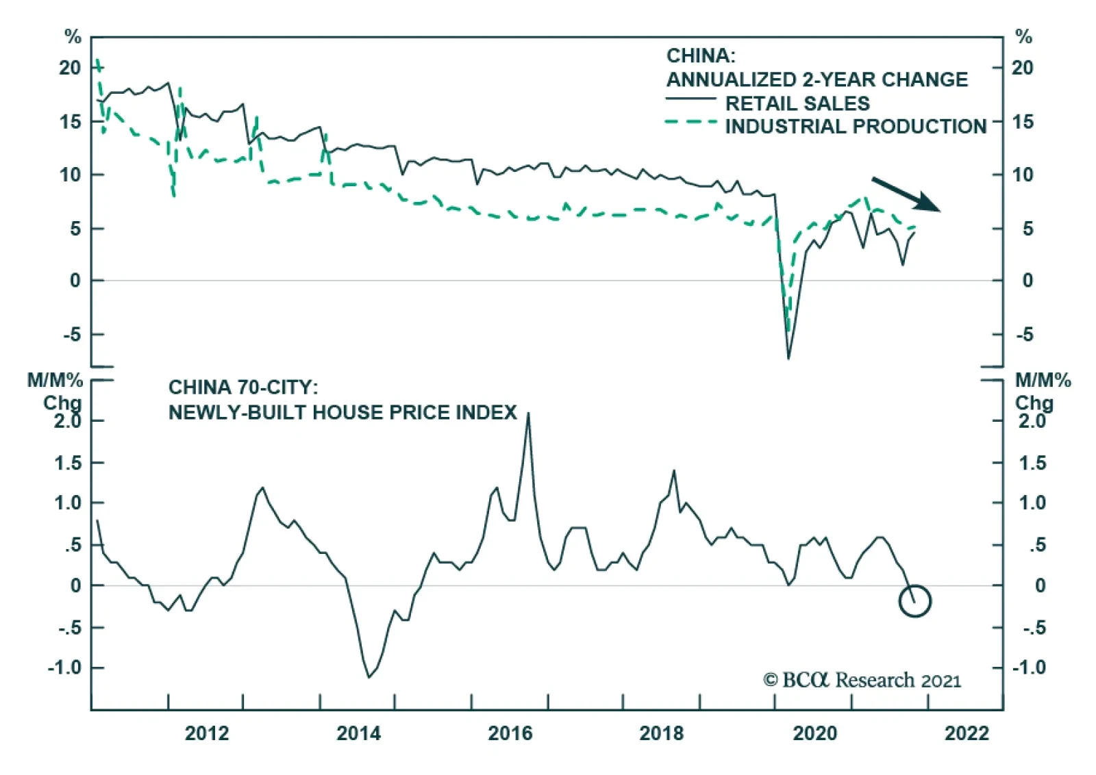
Chinese retail sales and industrial production data for October surprised to the upside. Retail sales growth accelerated slightly from 4.4% to 4.9% y/y and beat expectations of a slowdown to 3.7%. Similarly, industrial production expanded by 3.5% y/y versus…
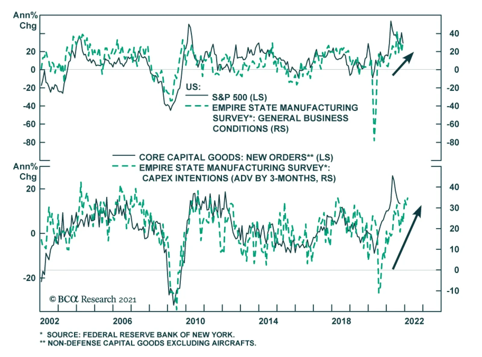
The November Empire State Manufacturing Survey sent a positive signal about the state of US manufacturing activity. The headline general business conditions index jumped 11 points to 30.9, beating expectations of a more muted 2.2 point rise. The improvement…
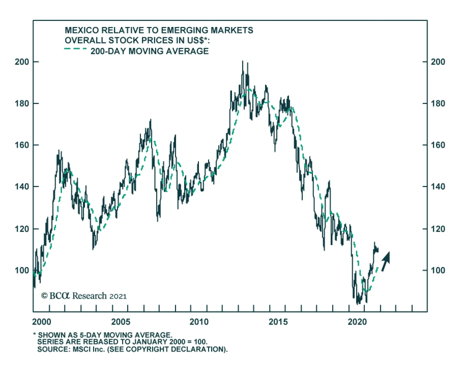
The Bank of Mexico raised rates by 25 bps on Thursday, marking the fourth consecutive rate increase this year and bringing the benchmark rate to 5%. These hikes come as the central bank attempts to temper rising inflation. At 6.24% y/y, CPI headline inflation…

Highlights Geopolitical conflicts point to energy price spikes and could add to inflation surprises in the near term. However, US fiscal drag and China’s economic slowdown are both disinflationary risks to be aware of. Specifically, energy-producers like Russia and Iran gain greater leverage amid energy shortages. Europe’s natural gas prices could spike again. Conflict in the Middle East could disrupt oil flows. President Biden’s $1.75 trillion social spending bill is a litmus test for fiscal fatigue in developed markets. It could fail, and even assuming it passes it will not prevent overall fiscal drag in 2022-23. However, it is inflationary over the long run. China’s slowdown poses the chief disinflationary risk. But we still think policy will ease to avoid an economic crash ahead of the fall 2022 national party congress. We are closing this year’s long value / short growth trade for a loss of 3.75%. Cyclical sectors ended up being a better way to play the reopening trade. Feature Equity markets rallied in recent weeks despite sharp upward moves in core inflation across the world (Chart 1). Inflation is fast becoming a popular concern and we see geopolitical risks that could drive headline inflation still higher in the short run. We also see underrated disinflationary factors, namely China’s property sector distress and economic slowdown. Several major developments have occurred in recent weeks that we will cover in this report. Our conclusions: Biden’s domestic agenda will pass but risks are high and macro impact is limited. Congress passed Biden’s infrastructure deal and will probably still pass his signature social spending bill, although inflation is creating pushback. Together these bills have little impact on the budget deficit outlook but they will add to inflationary pressures. Energy shortages embolden Russia and Iran. Winter weather is unpredictable, the energy crisis may not be over. But investors are underrating Russia’s aggressive posture toward the West. Any conflict with Iran could also cause oil disruptions in the near future. US-China relations may improve but not for long. A bilateral summit between Presidents Joe Biden and Xi Jinping will not reduce tensions for very long, if at all. Climate change cooperation is an insufficient basis to reverse the cold war-style confrontation over the long run. Chart 1Inflation Rattles Policymakers
Inflation Rattles Policymakers
Inflation Rattles Policymakers
The investment takeaway is that geopolitical tensions could push energy prices still higher in the short term. Iran and Russia need to be monitored. However, China’s economic slowdown will weigh on growth. China poses an underrated disinflationary risk to our views. US Congress: Bellwether For Fiscal Fatigue While inflation is starting to trouble households and voters, investors should bear in mind that the current set of politicians have long aimed to generate an inflation overshoot. They spent the previous decade in fear of deflation, since it generated anti-establishment or populist parties that threatened to disrupt the political system. They quietly built up an institutional consensus around more robust fiscal policy and monetary-fiscal coordination. Now they are seeing that agenda succeed but are facing the first major hurdle in the form of higher prices. They will not simply cut and run. Inflation is accompanied by rising wages, which today’s leaders want to see – almost all of them have promised households a greater share of the fruits of their labor, in keeping with the new, pro-worker, populist zeitgeist. Real wages are growing at 1.1% in the US and 0.9% across the G7 (Chart 2). Even more than central bankers, political leaders are focused on jobs and employment, i.e. voters. Yet the labor market still has considerable slack (Chart 3). Almost all of the major western governments have been politically recapitalized since the pandemic, either through elections or new coalitions. Almost all of them were elected on promises of robust public investment programs to “build back better,” i.e. create jobs, build infrastructure, revitalize industry, and decarbonize the energy economy. Thus while they are concerned about inflation, they will leave that to central banks, as they will be loathe to abandon their grand investment plans. Chart 2Higher Wages: Real Or Nominal?
Higher Wages: Real Or Nominal?
Higher Wages: Real Or Nominal?
Still, there will be a breaking point at which inflation forces governments to put their spending plans on hold. The US Congress is the immediate test of whether today’s inflation will trigger fiscal fatigue and force a course correction. Chart 3Policymakers Fear Populism, Focus On Employment
Policymakers Fear Populism, Focus On Employment
Policymakers Fear Populism, Focus On Employment
President Biden’s $550 billion infrastructure bill passed Congress last week and will be signed into law around November 15. Now he is worried that his signature $1.75 trillion social spending bill will falter due to inflation fears. He cannot spare a single vote in the Senate (and only three votes in the House of Representatives). Odds that the bill fails are about 35%. Democratic Party leaders will not abandon the cause due to recent inflation prints. They see a once-in-a-generation opportunity to expand the role of government, the social safety net, and the interests of their constituents. If they miss this chance due to inflation that ends up being transitory then they will lose the enthusiastic left wing of the party and suffer a devastating loss in next year’s midterm elections, in which they are already at a disadvantage. Biden’s social bill is also likely to pass because the budget reconciliation process necessary to pass the bill is the same process needed to raise the national debt limit by December 3. A linkage of the two by party leaders would ensure that both pass … and otherwise Democrats risk self-inflicting a national debt default. The reconciliation bill is more about long-term than short-term inflation risk. The bill does not look to have a substantial impact on the budget outlook: the new spending is partially offset by new taxes and spread out over ten years. The various legislative scenarios look virtually the same in our back-of-the-envelope budget projections (Chart 4).
Chart 4
However, given that the output gap is virtually closed, this bill combined with the infrastructure bill will add to inflationary pressures. The fiscal drag will diminish by 2024, not coincidentally the presidential election year 2024, not coincidentally the presidential election year. The deficit is not expected to increase or decrease substantially between 2023 and 2024. From then onward the budget deficit will expand. The increased government demand for goods and services and the increased disposable income for low-earning families will add to inflationary pressures. Other developed markets face a similar situation: inflation is picking up, but big spending has been promised and normalizing budgets will marginally weigh on growth in the next few years (Chart 5). True, growth should hold up since the private economy is rebounding in the wake of the pandemic. But politicians will not be inclined to renege on campaign promises of liberal spending in the face of fiscal drag. The current crop of leaders is primed to make major public investments. This is true of Germany, Japan, Canada, and Italy as well as the United States. It is partly true in France, where fiscal retrenchment has been put on hold given the presidential election in the spring. The effect will be inflationary, especially for the US where populist spending is more extravagant than elsewhere.
Chart 5
The long run will depend on structural factors and how much the new investments improve productivity. Bottom Line: A single vote in the US Senate could derail the president’s social spending bill, so the US is now the bellwether for fiscal fatigue in the developed world. Biden is likely to pass the bill, as global fiscal drag is disinflationary over the next 12 months. Yet inflation could stay elevated for other reasons. And this fiscal drag will dissipate later in the business cycle. Russia And Iran Gain Leverage Amid Energy Crunch The global energy price spike arose from a combination of structural factors – namely the pandemic and stimulus. It has abated in recent weeks but will remain a latent problem through the winter season, especially if La Niña makes temperatures unusually cold as expected. Rising energy prices feed into general producer prices, which are being passed onto consumers (Chart 6). They look to be moderating but the weather is unpredictable. There is another reason that near-term energy prices could spike or stay elevated: geopolitics. Tight global energy supply-demand balances mean that there is little margin of safety if unexpected supply disruptions occur. This gives greater leverage to energy producers, two of which are especially relevant at the moment: Russia and Iran. Russia’s long-running conflict with the West is heating up on several fronts, as expected. Russia may not have caused the European energy crisis but it is exacerbating shortages by restricting flows of natural gas for political reasons, as it is wont to do (Chart 7). Moscow always maintains plausible deniability but it is currently flexing its energy muscles in several areas: Chart 6Energy Price Depends On Winter ... And Russia/Iran!
Energy Price Depends On Winter ... And Russia/Iran!
Energy Price Depends On Winter ... And Russia/Iran!
Ukraine: Russia has avoided filling up and fully utilizing pipelines and storage facilities in Ukraine, where the US is now warning that Russia could stage a large military action in retaliation for Ukrainian drone strikes in the still-simmering Russia-Ukraine war. Belarus: Russia says it will not increase the gas flow through the major Yamal-Europe natural gas pipeline in 2022 even as Belarus threatens to halt the pipeline’s operation entirely. Belarus, backed by Russia, is locked in a conflict with Poland and the EU over Belarus’s funneling of migrants into their territory (Chart 8). The conflict could lead not only to energy supply disruptions but also to a broader closure of trade and a military standoff.1 Russia has flown two Tu-160 nuclear-armed bombers over Belarus and the border area in a sign of support. Moldova: Russia is withholding natural gas to pressure the new, pro-EU Moldovan government.
Chart 7
Chart 8
Russia’s main motive is obvious: it wants Germany and the EU to approve and certify the new Nord Stream II pipeline. Nord Stream II enables Germany and Russia to bypass Ukraine, where pipeline politics raise the risk of shortages and wars. Lame duck German Chancellor Angela Merkel worked with Russia to complete this pipeline before the end of her term, convincing the Biden administration to issue a waiver on congressional sanctions that could have halted its construction. However, two of the parties in the incoming German government, the Greens and the Free Democrats, oppose the pipeline. While these parties may not have been able to stop the pipeline from operating, Russia does not want to take any chances and is trying to force Germany’s and the EU’s hand. The energy crisis makes it more likely that the pipeline will be approved, since the European Commission will have to make its decision during a period when cold weather and shortages will make it politically acceptable to certify the pipeline.2 The decision will further drive a wedge between Germany and eastern EU members, which is what Russia wants. EU natural gas prices will likely subside sometime next year and will probably not derail the economic recovery, according to both our commodity and Europe strategists. A bigger and longer-lasting Russian energy squeeze would emerge if the Nord Stream II pipeline is not certified. This is a low risk at this point but the next six months could bring surprises. More broadly, the West’s conflict with Russia can easily escalate from here. First, President Vladimir Putin faces economic challenges and weak political support. He frequently diverts popular attention by staging aggressive moves abroad. There is no reason to believe his post-2004 strategy of restoring Russia’s sphere of influence in the former Soviet space has changed. High energy prices give him greater leverage even aside from pipeline coercion – so it is not surprising that Russia is moving troops to the Ukraine border again. Growing military support for Belarus, or an expanded conflict in Ukraine, are likely to create a crisis now or later. Second, the US-Germany agreement to allow Nord Stream II explicitly states that Russia must not weaponize natural gas supply. This statement has had zero effect so far. But when the energy shortage subsides, the EU could pursue retaliatory measures along with the United States. Of course, Russia has been able to weather sanctions. But tensions are already escalating significantly. After Russia, Iran also gains leverage during times of tight energy supplies. With global oil inventories drawing down, Iran is in the position to inflict “maximum pressure” on the US and its allies, a role reversal from the 2017-20 period in which large inventories enabled the US to impose crippling sanctions on Iran after pulling out of the 2015 nuclear deal (Chart 9). Iran is rapidly advancing on its nuclear program and a new round of diplomatic negotiations may only serve to buy time before it crosses the “breakout” threshold of uranium enrichment capability as early as this month or next. In a recent special report we argued that there is a 40% chance of a crisis over Iran in the Middle East. Such a crisis could ultimately lead to an oil shock in the Persian Gulf or Strait of Hormuz. Chart 9Now Iran Can Use 'Maximum Pressure'
Now Iran Can Use 'Maximum Pressure'
Now Iran Can Use 'Maximum Pressure'
Bottom Line: Russia’s natural gas coercion of Europe could keep European energy prices high through March or May. More broadly Russia’s renewed tensions with the West confirm our view that oil producers gain geopolitical leverage amid the current supply shortages. Iran also gains leverage and its conflict with the US could lead to global oil supply disruptions anytime over the next 12 months. Until Nord Stream II is certified and a new Iranian nuclear agreement is signed, there are two clear sources of potential energy shocks. Moreover in today’s inflationary context there is limited margin of safety for unexpected supply disruptions regardless of source. Xi’s Historical Rewrite China continues to be a major source of risk for the global economy and financial markets in the lead-up to the twentieth national party congress in fall 2022. While Chinese assets have sold off this year, global risk assets are still vulnerable to negative surprises from China. The five-year political reshuffle in 2022 is more important than usual since President Xi Jinping was originally supposed to step down but will instead stick around as leader for life, like China’s previous strongmen Mao Zedong and Deng Xiaoping.3 Xi’s rejection of term limits became clear in 2017 and is not really news. But Xi will fortify himself and his faction in 2022 against any opposition whatsoever. He is extremely vigilant about any threats that could disrupt this process, whether at home or abroad. The Communist Party’s sixth plenary session this week highlights both Xi’s success within the Communist Party and the sensitivity of the period. Xi produced a new “historical resolution,” or interpretation of the party’s history, which is only the third such resolution. A few remarks on this historical resolution are pertinent: Mao’s resolution: Chairman Mao wrote the first such resolution in 1945 to lay down his version of the party’s history and solidify his personal control. It is naturally a revolutionary leftist document. Deng’s revision of Mao: General Deng Xiaoping then produced a major revision in 1981, shortly after initiating China’s economic opening and reform. Deng’s interpretation aimed to hold Mao accountable for “gross mistakes” during the Cultural Revolution and yet to recognize the Communist Party’s positive achievements in founding the People’s Republic. His version gave credit to the party and collective leadership rather than Mao’s personal rule. Two 30-year periods: The implication was that the party’s history should be divided into two thirty-year periods: the period of foundations and conflict with Mao as the party’s core and the period of improvement and prosperity with Deng as the core. Jiang’s support of Deng: Deng’s telling came under scrutiny from new leftists in the wake of Tiananmen Square incident in 1989. But General Secretary Jiang Zemin largely held to Deng’s version of the story that the days of reform and opening were a far better example of the party’s leadership because they were so much more stable and prosperous.4 Xi’s reaction to Jiang and Deng: Since coming to power in 2012, Xi Jinping has shown an interest in revising the party’s official interpretation of its own history. The central claim of the revisionists is that China could never have achieved its economic success if not for Mao’s strongman rule. Mao’s rule and the Communist Party’s central control thus regain their centrality to modern China’s story. China’s prosperity owes its existence to these primary political conditions. The two periods cannot be separated. Xi’s synthesis of Deng and Mao: Now Xi has written himself into that history above all other figures – indeed the communique from the Sixth Plenum mentions Xi more often than Marx, Mao, or Deng (Chart 10). The implication is that Xi is the synthesis of Mao and Deng, as we argued back in 2017 at the end of the nineteenth national party congress. The synthesis consists of a strongman who nevertheless maintains a vibrant economy for strategic ends.
Chart 10
What are the practical policy implications of this history lesson? Higher Country Risk: China’s revival of personal rule, as opposed to consensus rule, marks a permanent increase in “country risk” and political risk for investors. Autocratic governments lack institutional guardrails (checks and balances) that prevent drastic policy mistakes. When Xi tries to step down there will probably be a succession crisis. Higher Macroeconomic Risk: China is more likely to get stuck in the “middle-income trap.” Liberal or pro-market economic reform is de-emphasized both in the new historical resolution and in the Xi administration’s broader program. Centralization is already suppressing animal spirits, entrepreneurship, and the private sector. Higher Geopolitical Risk: The return to autocracy and the withdrawal from economic liberalism also entail a conflict with the United States, which is still the world’s largest economy and most powerful military. The US is not what it once was but it will put pressure on China’s economy and build alliances aimed at strategic containment. Bottom Line: China is trying to escape the middle-income trap, like Taiwan, Japan, and South Korea, but it is trying to do so by means of autocracy, import substitution, and conflict with the United States. These other Asian economies improved productivity by democratizing, embracing globalization, and maintaining a special relationship with the United States. China’s odds of succeeding are low. China will focus on power consolidation through fall 2022 and this will lead to negative surprises for financial markets. China Slowdown: The Disinflationary Risk While it is very unlikely that Xi will face serious challenges to his rule, strange things can happen at critical junctures. Therefore the regime will be extremely alert for any threats, foreign or domestic, and will ultimately prioritize politics above all other things, which means investors will suffer negative surprises. The lingering pandemic still poses an inflationary risk for the rest of the world while the other main risk is disinflationary: Inflationary Risk – Zero COVID: The “Covid Zero” policy of attempting to stamp out any trace of the virus will still be relevant at least over the next 12 months (Chart 11). Clampdowns serve a dual purpose since the Xi administration wants to minimize foreign interference and domestic dissent before the party congress. Hence the global economy can suffer more negative supply shocks if ports or factories are closed. Inflationary Risk – Energy Closures: The government is rationing electricity amid energy shortages to prioritize household heating and essential services. This could hurt factory output over the winter if the weather is bad. Disinflationary Risk – Property Bust: The country is still flirting with overtightening monetary, fiscal, and regulatory policies. Throughout the year we have argued that authorities would avoid overtightening. But China is still very much in a danger zone in which policy mistakes could be made. Recent rumors suggest the government is trying to “correct the overcorrection” of regulatory policy. The government is reportedly mulling measures to relax the curbs on the property sector. We are inclined to agree but there is no sign yet that markets are responding, judging by corporate defaults and the crunch in financial conditions (Chart 12).
Chart 11
Chart 12China Has Not Contained Property Turmoil
China Has Not Contained Property Turmoil
China Has Not Contained Property Turmoil
Evergrande, the world’s most indebted property developer, is still hobbling along, but its troubles are not over. There are signs of contagion among other developers, including state-owned enterprises, that cannot meet the government’s “three red lines.” 5 Credit growth has now broken beneath the government’s target range of 12%, though money growth has bounced off the lower 8% limit set for this year (Chart 13). China is dangerously close to overtightening. China’s economic slowdown has not yet been fully felt in the global economy based on China’s import volumes, which are tightly linked to the combined credit-and-fiscal-spending impulse (Chart 14). The implication is that recent pullbacks in industrial metal prices and commodity indexes will continue. Chart 13China Tries To Avoid Over-Tightening
China Tries To Avoid Over-Tightening
China Tries To Avoid Over-Tightening
Chart 14China Slowdown Not Yet Fully Felt
China Slowdown Not Yet Fully Felt
China Slowdown Not Yet Fully Felt
Until China eases policy more substantially, it poses a disinflationary risk and a strong point in favor of the transitory view of global inflation. It is difficult for China to ease policy – let alone stimulate – when producer prices are so high (see Chart 6 above). The result is a dangerous quandary in which the government’s regulatory crackdowns are triggering a property bust yet the government is prevented from providing the usual policy support as the going gets tough. Asset prices and broader risk sentiment could go into free fall. However, the party has a powerful incentive to prevent a generalized crisis ahead of the party congress. So we are inclined to accept signs that property curbs and other policies will be eased. Bottom Line: The full disinflationary impact of China’s financial turmoil and economic slowdown has yet to be felt globally. Biden-Xi Summit Not A Game Changer As long as inflation prevents robust monetary and fiscal easing, Beijing is incentivized to improve sentiment in other ways. One way is to back away from the regulatory crackdown in other sectors, such as Big Tech. The other is to improve relations with the United States. A stabilization of US ties would be useful before the party congress since President Xi would prefer not to have the US interfering in China’s internal affairs during such a critical hour. No surprise that China is showing signs of trying to stabilize the relationship. The US is apparently reciprocating. Presidents Biden and Xi also agreed to hold a virtual bilateral summit next week, which could lead to a new series of talks. The US Trade Representative also plans to restart trade negotiations. The plan is to enforce the Phase One trade deal, issue waivers for tariffs that hurt US companies, and pursue new talks over outstanding structural disputes. The Phase One trade deal has fallen far short of its goals in general but on the energy front it is doing well. China will continue importing US commodities amid global shortages (Chart 15).
Chart 15
Chart 15
The summit alone will have a limited impact. Biden had a summit with Putin earlier this year but relations could deteriorate tomorrow over cyber-attacks, Ukraine, or Belarus. However, there is some basis for the US and China to cooperate next year: Iran. Xi is consolidating power at home in 2022 and probably wants to use negotiations to keep the Americans at bay. Biden is pivoting to foreign policy in 2022, since Congress will not get anything done, and will primarily focus on halting Iran’s nuclear program. If China assists the US with Iran, then there is a basis for a reduction in tensions. The problem is not only Iran itself but also that China will not jump to enforce sanctions on Iran amid energy shortages. And China is not about to make sweeping structural economic concessions to the US as the Xi administration doubles down on state-guided industrial policy. Meanwhile the US is pursuing a long-term policy of strategic containment and Biden will not want to be seen as appeasing China ahead of midterm elections, especially given Xi’s reversion to autocracy. What about cooperation on climate change? The US and China also delivered a surprise joint statement at the United Nations climate change conference in Scotland (COP26), confirming the widely held expectation that climate policy is an area of engagement. These powers and Europe have a strategic interest in reducing dependency on Middle Eastern oil (Chart 16). Climate talks will begin in the first half of next year. However, climate cooperation is not significant enough alone to outweigh the deeper conflicts between the US and China. Moreover climate policy itself is somewhat antagonistic, as the EU and US are looking at applying “carbon adjustment fees” to carbon-intensive imports, e.g. iron and steel exports from China and other high-polluting producers (Chart 17). While the EU and US are not on the same page yet, and these carbon tariffs are far from implementation, the emergence of green protectionism does not bode well for US-China relations even aside from their fundamental political and military disputes.
Chart 16
Bottom Line: Some short-term stabilization of US-China relations is possible but not guaranteed. Markets will cheer if it happens but the effect will be fleeting. Chinese assets are still extremely vulnerable to political and geopolitical risks.
Chart 17
Investment Takeaways Gold can still go higher. Financial markets are pricing higher inflation and weak real rates. Gold has been our chief trade to prepare both for higher inflation and geopolitical risk. We are closing our long value / growth equity trade for a loss of 3.75%. We are maintaining our long DM Europe / short EM Europe trade. This trade has performed poorly due to the rally in energy prices and hence Russian equities. But while energy prices may overshoot in the near term, investors will flee Russian equities as geopolitical risks materialize. We are maintaining our long Korea / short Taiwan trade despite its being deeply in the red. This trade is valid over a strategic or long-term time horizon, in which a major geopolitical crisis and/or war is likely. Our expectation that China will ease policy to stabilize the economy ahead of fall 2022 should support Korean equities. Matt Gertken Vice President Geopolitical Strategy mattg@bcaresearch.com Footnotes 1 Over the past year President Alexander Lukashenko’s repression of domestic unrest prompted the EU to impose sanctions. Lukashenko responded by organizing an immigration scheme in which Middle Eastern migrants are flown into Belarus and funneled into the EU via Poland. The EU is threatening to expand sanctions while Belarus is threatening to cut off the Yamal-Europe pipeline amid Europe’s energy crisis. See Pavel Felgenhauer, “Belarus as Latest Front in Acute East-West Standoff,” Jamestown Foundation, November 11, 2021, Jamestown.org. 2 Both Germany and the EU must approve of Nord Stream II for it to enter into operation. The German Federal Network Agency has until January 8, 2022 to certify the project. The Economy Ministry has already given the green light. Then the European Commission has two-to-four months to respond. The EU is supposed to consider whether the pipeline meets the EU’s requirement that gas transport be “unbundled” or separated from gas production and sales. This is a higher hurdle but Germany’s clout will be felt. Hence final approval could come by March 8 or May 8, 2022. The energy crisis will put pressure for an early certification but the EU Commission may take the full time to pretend that it is not being blackmailed. See Joseph Nasr and Christoph Steitz, “Certifying Nord Stream 2 poses no threat to gas supply to EU – Germany,” Reuters, October 26, 2021, reuters.com. 3 Xi is not serving for an “unprecedented third term,” as the mainstream media keeps reporting. China’s top office is not constant nor were term limits ever firmly established. Each leader’s reign should be measured by their effective control rather than technical terms in office. Mao reigned for 27 years (1949-76), Deng for 14 years or more (1978-92), Jiang Zemin for 10 years (1992-2002), and Hu Jintao for 10 years (2002-2012). 4 See Joseph Fewsmith, “Mao’s Shadow” Hoover Institution, China Leadership Monitor 43 (2014), and “The 19th Party Congress: Ringing In Xi Jinping’s New Age,” Hoover Institution, China Leadership Monitor 55 (2018), hoover.org. 5 Liability-to-asset ratios less than 70%, debt-to-equity less than 100%, and cash-to-short-term-debt ratios of more than 1.0x. Strategic View Open Tactical Positions (0-6 Months) Open Cyclical Recommendations (6-18 Months) Open Trades & Positions
Image
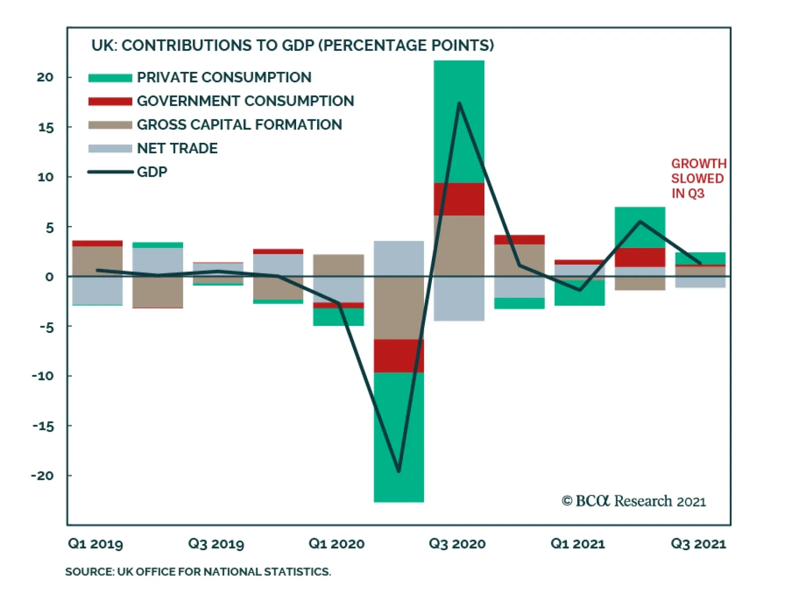
The UK economy decelerated in Q3 with the GDP print falling below expectations. Economic growth slowed from 5.5% to 1.3% q/q versus an anticipated 1.5% rate. Similarly, year-over-year growth moderated to 6.6% from 23.6%. However, the month-on-month momentum…
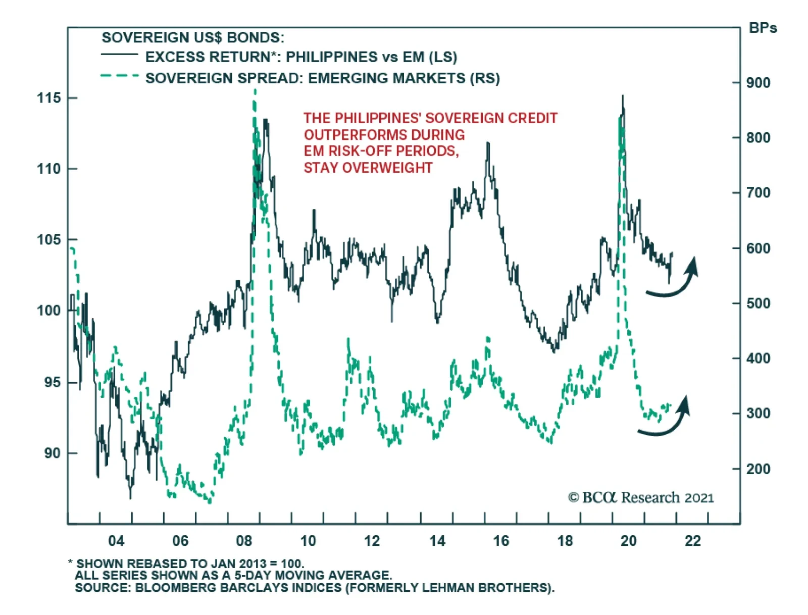
BCA Research’s Emerging Markets Strategy service expects Philippine sovereign credit to outperform its EM counterparts. A negative outlook on overall EM sovereign credit warrants overweighting Philippine sovereign credit relative to its EM brethren. The…
Image
The markets were deluged by a lot of information in late October. Several central banks made surprise moves towards tightening (the Bank of Canada, for example, ended asset purchases, and the Reserve Bank of Australia effectively abandoned its yield-curve control). Inflation continued to surprise on the upside (headline CPI in the US is now 5.4% year-on-year). But, at the same time, there were signs of faltering growth with, for example, US real GDP growth in Q3 coming in at only 2.0% quarter-on-quarter annualized, compared to 6.7% in Q2. This caused a flattening of the yield curve in many countries, as markets priced in faster monetary tightening but lower long-term growth (Chart 1). Nonetheless, equities shrugged off the barrage of news, with the S&P500 ending the month at a new high. All this highlights what we discussed in our latest Quarterly: That the second year of a bull market is often tricky, resulting in lower (but still positive) returns from equities and higher volatility. For risk assets to continue to outperform, our view of a Goldilocks environment needs to be “just right”: The economy must not be too hot or too cold. We think it will be – and so stay overweight equities versus bonds. But investors should be aware of the risks on either side. How too hot? Inflation is broadening out (at least in the US, UK, Australia and Canada, though not in the euro zone and Japan) and is no longer limited to items which saw unusually strong demand during the pandemic but where supply is constrained (Chart 2). Chart 1What Is The Message Of Flattening Yield Curves?
What Is The Message Of Flattening Yield Curves?
What Is The Message Of Flattening Yield Curves?
Chart 2Inflation Is Broadening Out In The US
Inflation Is Broadening Out In The US
Inflation Is Broadening Out In The US
There is a risk that this turns into a wage-price spiral as employees, amid a tight labor market, push for higher wages to offset rising prices. We find that wages tend to follow prices with a lag of 6-12 months (Chart 3). The Atlanta Fed Wage Tracker (good for gauging underlying wage pressures since it looks only at employees who have been in a job for 12 months or more) is already at 3.5% and looks set to rise further. On the back of these inflationary moves, the market has significantly pulled forward the date of central bank tightening. Futures now imply that the Fed will raise rates in both July and December next year (Chart 4) and that other major developed central banks will also raise multiple times over the next 14 months (Table 1). Breakeven inflation rates have also risen substantially (Chart 5). Chart 3Wages Tend To Rise After Prices Rise
Wages Tend To Rise After Prices Rise
Wages Tend To Rise After Prices Rise
Chart 4Will The Fed Really Hike This Soon?
Will The Fed Really Hike This Soon?
Will The Fed Really Hike This Soon?
Table 1Futures Implied Path Of Rate Hikes
Monthly Portfolio Update: The Risks To Goldilocks
Monthly Portfolio Update: The Risks To Goldilocks
Chart 5Breakevens Suggest Higher Inflation
Breakevens Suggest Higher Inflation
Breakevens Suggest Higher Inflation
We think these moves are a little excessive. There are several reasons why inflation might cool next year. Companies are rushing to increase capacity to unblock supply bottlenecks. For example, semiconductor production has already begun to increase, bringing down DRAM prices over the past few months (Chart 6). Another big contributor to broad-based inflation has been a 126% increase in container shipping costs since the start of the year (Chart 7). But currently the number of container ships on order is at a 10-year high; these new ships will be delivered over the next two years. Such deflationary forces should pull down core inflation next year (though we stick to our longstanding view that for multiple structural reasons – demographics, the end of globalization, central bank dovishness, the transition away from fossil fuels – inflation will trend up over the next five years). Chart 6DRAM Prices Falling As Production Ramps Up
DRAM Prices Falling As Production Ramps Up
DRAM Prices Falling As Production Ramps Up
Chart 7All Those Ships On Order Should Bring Down Shipping Costs
All Those Ships On Order Should Bring Down Shipping Costs
All Those Ships On Order Should Bring Down Shipping Costs
The Fed, therefore, will not be in a rush to raise rates. It does not see the labor market as anywhere close to “maximum employment” – it has not defined what it means by this, but we would see it as a 3.8% unemployment rate (the median FOMC dot for the equilibrium unemployment rate) and the prime-age participation rate back to its 2019 level (Chart 8). We continue to expect the first rate hike only in December next year. The Fed will feel the need to override its employment criterion only if long-term inflation expectations become unanchored – but the 5-year 5-year forward breakeven rate is only at 2.3%, within the Fed’s effective CPI target range of 2.3-2.5% (Chart 5). We remain comfortable with our view of only a moderate rise in long-term rates, with the US 10-year Treasury yield at 1.7% by end-2021, and reaching 2-2.25% at the time of the first Fed rate hike. It is also worth emphasizing that even a fairly sharp rise in long-term rates has historically almost always coincided with strong equity performance (Chart 9 and Table 2). This has again been evident in the past 12 months: When rates rose between August 2020 and March 2021, and then from July 2021, equities performed strongly. Chart 8We Are Not Back To "Maximum Employment"
We Are Not Back To "Maximum Employment"
We Are Not Back To "Maximum Employment"
Chart 9Rising Rates Are Usually Accompanied By A Rising Stock Market
Rising Rates Are Usually Accompanied By A Rising Stock Market
Rising Rates Are Usually Accompanied By A Rising Stock Market
Table 2Episodes Of Rising Long-Term Rates Since 1990
Monthly Portfolio Update: The Risks To Goldilocks
Monthly Portfolio Update: The Risks To Goldilocks
But could the economy get too cold? We would discount the weak US GDP reading: It was mostly due to production shortages, especially in autos, which pushed down consumption on durable goods by 26% QoQ annualized, and by some softness in spending on services due to the delta Covid variant, the impact of which is now fading. US growth should continue to be supported by a combination of the $2.5 trillion of excess household savings, strong capex as companies boost their production capacity, and a further 5% of GDP in fiscal stimulus that should be passed by Congress by year-end. Similar conditions apply in other developed economies. Chart 10Real Estate Is A Big Part Of Chinese GDP
Real Estate Is A Big Part Of Chinese GDP
Real Estate Is A Big Part Of Chinese GDP
We see three principal risks to this positive outlook: A new strain of Covid-19 that proves resistant to current vaccines – unlikely but not impossible. Our geopolitical strategists worry about Iran, which may have a nuclear bomb ready by December, prompting Israel to bomb the country. Iran would likely react by hampering oil supplies, even blocking the Strait of Hormuz, through which 25% of global oil flows. Chinese growth has been slowing and the impact from the problems at Evergrande is still unclear. Real estate is a major part of the Chinese economy, with residential investment comprising 10% of GDP (Chart 10) and, broadly defined to include construction and building materials, real estate overall perhaps as much as one-third. Our China strategists don’t expect the government to launch a major stimulus which would bail out the industry, since it is happy with the way that property-related lending has been shrinking in recent years (Chart 11). We expect the slowdown in Chinese credit growth to bottom out over the coming few months, but economic activity may have further to slow (Chart 12), and there is a risk that the authorities are unable to control the fallout from the property market. Chart 11Chinese Authorities Are Happy To See Slowing Property Lending
Chinese Authorities Are Happy To See Slowing Property Lending
Chinese Authorities Are Happy To See Slowing Property Lending
Chart 12When Will Credit Growth Bottom?
When Will Credit Growth Bottom?
When Will Credit Growth Bottom?
Fixed Income: Given the macro environment described above, we remain underweight bonds and short duration. If we assume 1) a Fed liftoff in December 2022, 2) 100 basis points of rate hikes over the following year, and 3) a terminal Fed Funds Rate of 2.08% (the median forecast from the New York Fed’s Survey of Market Participants), 10-year US Treasurys will return -0.2% over the next 12 months, and 2-year Treasurys +0.3%.1 TIPs have overshot fair value and, although we remain neutral since they a tail-risk hedge against high inflation over the next five years, we would especially avoid 2-year TIPS which look very overvalued. We see some pockets of selective value in lower-quality high-yield bonds, specifically US Ba- and Caa-rated issues, which are still trading at breakeven spreads around the 35th historical percentile, whereas higher-rated bonds look very expensive (Chart 13). For US tax-paying investors, municipal bonds look particularly attractive at the moment, with general-obligation (GO) munis trading at a duration-matched yield higher than Treasurys even before tax considerations (Chart 14). Our US bond strategists have recently gone maximum overweight.
Chart 13
Chart 14Muni Bonds Are A Steal
Muni Bonds Are A Steal
Muni Bonds Are A Steal
Equities: We retain our longstanding preference for US equities over other Developed Markets. US equities have outperformed this year, irrespective of whether rates were rising or falling, or how US growth was surprising relative to the rest of the world, emphasizing the much stronger fundamentals of the US market (Chart 15). Analysts’ forecasts for the next few quarters look quite cautious, and so earnings surprises can push US stock prices up further (Chart 16). We reiterate the neutral on China but underweight on Emerging Markets ex-China that we initiated in our latest Quarterly. Our sector overweights are a mixture of cyclicals (Industrials), rising-interest-rate plays (Financials), and defensives (Heath Care). Chart 15US Equites Outperformed This Year Whatever Happened
US Equites Outperformed This Year Whatever Happened
US Equites Outperformed This Year Whatever Happened
Chart 16Analysts Are Pessimistic About The Next Couple Of Quarters
Analysts Are Pessimistic About The Next Couple Of Quarters
Analysts Are Pessimistic About The Next Couple Of Quarters
Currencies: We continue to expect the US dollar to be stuck in its trading range and so stay neutral. Recent moves in prospective relative monetary policy bring us to change two of our currency recommendations. We close our underweight on the Australian dollar. The recent rise in Australian inflation (with both trimmed mean and 10-year breakevens now above 2% – Chart 17) has brought forward the timing of the first rate hike and should push up relative real rates (Chart 18). We lower our recommendation on the Japanese yen from overweight to neutral. The Bank of Japan will not raise rates any time soon, even when other central banks are tightening. This will push real-rate differentials against the yen (Chart 18, panel 2). Chart 17Australian Inflation Is Picking Up
Australian Inflation Is Picking Up
Australian Inflation Is Picking Up
Chart 18Real Rates Moving In Favor Of The AUD And Against The JPY
Real Rates Moving In Favor Of The AUD And Against The JPY
Real Rates Moving In Favor Of The AUD And Against The JPY
Chart 19Chinese-Related Metals' Prices Are Falling
Chinese-Related Metals' Prices Are Falling
Chinese-Related Metals' Prices Are Falling
Commodities: We remain cautious on those industrial metals which are most sensitive to slowing Chinese growth and its weakening property market. The fall in iron ore prices since July is now being followed by aluminum. However, metals which are increasingly driven by investment in alternative energy, notably copper, are likely to hold up better (Chart 19). We are underweight the equity Materials sector and neutral on the commodities asset class. The Brent crude oil price has broadly reached our energy strategists’ forecasts of $80/bbl on average in 2022 and $81 in 2023 (Chart 20). Although the forward curve is lower than this, with December-22 Brent at only $75/bbl, it is a misapprehension to characterize this as the market forecasting that the oil price will fall. Backwardation (where futures prices are lower than spot) is the usual state of affairs for structural reasons (for example, producers hedging production forward). The market typically moves to contango only when the oil price has fallen sharply and reserves are high (Chart 21). We remain neutral on the equities Energy sector. Chart 20Brent Has Reached Our 2022 And 2023 Forecast Level
Brent Has Reached Our 2022 And 2023 Forecast Level
Brent Has Reached Our 2022 And 2023 Forecast Level
Chart 21Lower Oil Futures Don't Mean Oil Price Is Forecast To Fall
Lower Oil Futures Don't Mean Oil Price Is Forecast To Fall
Lower Oil Futures Don't Mean Oil Price Is Forecast To Fall
Garry Evans, Senior Vice President Global Asset Allocation garry@bcaresearch.com GAA Asset Allocation
In this report we examine the risk of stagflation by comparing the current environment to that of the late-1960s and 1970s. Today, investors cannot rule out the possibility of a stagflationary outcome, for four reasons: long-term household inflation expectations have risen significantly over the past year; fiscal policy has been expansionary; monetary policy will remain expansionary at the Fed’s projected terminal Fed funds rate; and component shortages and price increases linked to energy market and supply chain disruptions may persist or worsen over the coming year. However, the strong demand-pull inflationary dynamics that existed in the late-1960s were mostly absent in the lead-up to the pandemic, supply-chain issues are in part due to strong goods demand and supply disruptions that will eventually dissipate, and economic agents do not expect severe price pressures to persist beyond the pandemic. On balance, this points to a stagflationary outcome over the coming 6-24 months as a risk, but not a likely event. Investors should use the Misery Index, which is the sum of the unemployment rate and headline PCE inflation, as a real-time stagflation indicator. The Misery Index underscores that the US economy is unlikely to experience true stagflation unless the unemployment rate rises. A portfolio of the US dollar, the Swiss Franc, and industrial commodities may serve as a useful hedge for investors who are concerned about absolute return prospects in a world in which long-maturity bond yields are rising and risks of stagflationary dynamics are present. Chart II-1The Misery Index Reflects The Risk Of Stagflation
The Misery Index Reflects The Risk Of Stagflation
The Misery Index Reflects The Risk Of Stagflation
Over the past several weeks, concerns about a possible return to 1970s-style stagflation have re-emerged significantly in the minds of many investors. These investors have pointed toward similarities between the current environment and that of the 1970s, including shortages limiting output, a snarled global trade and logistical system, and rising energy prices. Chart II-1 highlights that the US “Misery Index” – the sum of the unemployment rate and headline PCE inflation – rose again over the past several months to high single-digit territory, after having fallen dramatically from April 2020 to February of this year. Panel 2 of Chart II-1 highlights that last year's rise in the Misery Index was driven almost entirely by the unemployment rate, whereas the current level is due to a combination of a modestly elevated unemployment rate and a pronounced acceleration in inflation. The headline PCE deflator has risen above 4%, a level that has not been reached since 1991 during the First Gulf War. In this report, we examine the risk of stagflation by comparing the current environment to that of the late 1960s and 1970s. We conclude that while investors cannot rule out the possibility of a stagflationary outcome, there are important differences that point toward a stagflation outcome over the coming 6-24 months as a risk, not a likely event. We conclude by highlighting assets that may produce absolute returns in a world in which long-maturity bond yields are rising and risks of stagflationary dynamics are present. Revisiting The 1960s And 70s Chart II-2The 1960s Laid The Groundwork For Elevated Inflation
The 1960s Laid The Groundwork For Elevated Inflation
The 1960s Laid The Groundwork For Elevated Inflation
The first step in judging the risk of a return to 1970s-style stagflation is to review, in a detailed way, what caused those conditions. Investors are well aware of the role that two separate energy price shocks played in raising prices and damaging output during this period, but they are less cognizant of the impact that a persistent period of above-trend output and significant labor market tightness had in setting up the conditions for sharply higher inflation. This focus of investors on energy prices partially reflects the fact that the Misery Index increased most visibly in the 1970s and that policymakers in the 1960s may not have realized how extensively economic output was running above its potential. With the benefit of hindsight, Chart II-2 illustrates the extent to which inflationary pressures built up in the 1960s, well before the first oil price shock in 1973. The chart shows that the unemployment rate was below NAIRU – the non-accelerating inflation rate of unemployment – for 70% of the time during the 1960s, and that inflation had already responded to this in the latter half of the decade. Annual headline PCE inflation was running just shy of 5% at the onset of the 1970 recession; it fell to 3% in the aftermath of the recession, but had already begun to reaccelerate in the first half of 1973. Following the 1973/1974 recession, inflation did decelerate significantly, falling from 11-12% to 5% in headline terms, and from 10% to 6% in core terms. But the pace of price appreciation did not fall below 5-6% in the second half of the 1970s, despite a significant and sustained rise in the unemployment rate above its natural rate. The 1975 to 1978 period is especially important for investors to understand, because it is arguably the clearest period of true stagflation in the 1970s. The fact that the Misery Index rose sharply during two major oil price shocks is not particularly surprising in and of itself, given the direct impact of energy prices on headline consumer prices; it is the fact that the index remained so elevated between these shocks, the result of persistently high inflation in the face of significant labor market slack, that is most relevant to investors. There are two reasons that both inflation and unemployment remained high during this period. First, labor market slack was sizeable during these years because the US economy was more energy-intensive in the 1970s than it is today. Chart II-3 highlights that goods-producing employment lagged overall employment growth from late 1973 to late 1977, underscoring that the rise in oil prices significantly impacted jobs growth in energy-intensive industries.
Chart II-3
Second, it is clear that the combination of demand-pull inflation in the late 1960s and the predominantly cost-push inflation of the 1970s led to expectations of persistent inflation among households and firms. The original Phillips Curve, as formulated by New Zealand economist William Phillips in the late 1950s, described a negative relationship between the unemployment rate and the pace of wage growth. Given the close correlation between wage and overall price growth at the time, the Phillips Curve was soon extended and generalized to describe an inverse relationship between labor market slack and overall price inflation. But the experience of the 1970s highlighted that inflation expectations are also an important determinant of inflation, a realization that gave birth to the expectations-augmented (i.e. “modern-day”) Phillips Curve (more on this below). The Stagflation Era Versus Today
Chart II-
Table II-1 presents a stagflation “threat matrix,” representing the Bank Credit Analyst service’s assessment of the various factors that could potentially contribute to a stagflationary environment today, relative to what occurred in the 1960s and 1970s. While we acknowledge that there are some similarities today to what occurred five decades ago, the most threatening factors have been present for a shorter period of time and appear to have a smaller magnitude than what occurred during the stagflationary era. In addition, key factors, such as the visibility available to policymakers and investors about household inflation expectations and the potential output of the economy, would appear to reduce significantly the risk of a stagflationary outcome today. We discuss each of the factors presented in Table II-1 below: Fiscal & Monetary Policy Chart II-4Government Spending Last Cycle Looked Nothing Like The 1960s
Government Spending Last Cycle Looked Nothing Like The 1960s
Government Spending Last Cycle Looked Nothing Like The 1960s
The persistently tight labor market that contributed to the inflationary buildup in the 1960s occurred as a result of easy fiscal and monetary policy. Chart II-4 highlights that the contribution to real GDP growth from government expenditure and investment was very elevated in the 1960s. Chart II-5 shows that a positive output gap in the late 1960s and the first half of the 1970s is well explained by the fact that 10-year US government bond yields were persistently below nominal GDP growth. The relationship between the stance of monetary policy and the output gap only meaningfully diverged in the latter half of the 1970s, during the true stagflationary era that we noted above. Chart II-5Easy Monetary Policy Juiced Aggregate Demand In The 60s And Early 70s
Easy Monetary Policy Juiced Aggregate Demand In The 60s And Early 70s
Easy Monetary Policy Juiced Aggregate Demand In The 60s And Early 70s
Chart II-6Monetary Policy Today Is Extremely Easy
Monetary Policy Today Is Extremely Easy
Monetary Policy Today Is Extremely Easy
Today, it is clear that the stance of fiscal policy has recently been extraordinarily easy, and 10-year US government bond yields have remained well below nominal GDP growth for the better part of the last decade. Relative to estimates of potential nominal GDP growth, 10-year Treasury yields are the lowest they have been since the 1970s (Chart II-6). Ostensibly, this supports concerns that policy might contribute to a stagflationary outcome. These concerns were raised by Larry Summers in March, when he described the Biden administration’s fiscal policy as the “least responsible” that the US has experienced in four decades and warned of the potential inflationary consequences of overheating the economy.1 But there are two important counterpoints to these concerns. First, easy fiscal policy this cycle has followed a period during the last economic cycle in which government spending contributed to the most sustained drag on economic activity since the 1950s. Unlike the 1960s, the unemployment rate has been below NAIRU for only a third of the time over the past decade. In addition, Chart II-7 highlights that fiscal thrust will turn to fiscal drag next year, underscoring the temporary nature of the massive burst in fiscal spending that has occurred in response to the pandemic. Under normal circumstances, the fiscal drag implied by Chart II-7 would substantially raise the risks of a recession next year, but we have noted in previous reports that a significant amount of excess savings remain to support spending and employment. The net impact of these two factors results in a reasonable expectation that the US economy will return to maximum employment next year, but this is a far cry from the 1960s when the unemployment rate was below its natural rate for 70% of the decade.
Chart II-7
Based on conventional measures, US monetary policy has been easy for a decade, but easy monetary policy did not begin to contribute positively to a rise in household sector credit growth last cycle until 2014/2015. This underscores that the natural rate of interest (“R-star”) did fall during the early phase of the last economic expansion. However, we argued in an April report that R-star was likely rising in the latter half of the last expansion,2 and we believe that the terminal Fed funds rate is likely higher than what the Fed is currently projecting, barring any additional negative policy shocks. Thus, while we do not believe that the duration of easy monetary policy over the past decade has laid the groundwork for a major rise in prices, it is now clearly positively contributing to aggregate demand and does risk a future overshoot in prices if long maturity bond yields remain well below the pace of economic growth for a sustained period of time. The Impact Of Shortages Chart II-8Gasoline Shortages Plagued The US Economy In The 1970s
Gasoline Shortages Plagued The US Economy In The 1970s
Gasoline Shortages Plagued The US Economy In The 1970s
Gasoline shortages occurred during the oil shocks of the 1970s and are a key similarity that some investors point toward when comparing the situation today with the stagflationary era. Chart II-8 highlights that the annual growth in real personal consumption expenditures on energy goods and services fell into negative territory on six occasions in the 1970s, although it was most pronounced during the two oil price shocks and their resulting recessions. Today, the impact of shortages appears to be broader than what occurred in the 1970s, but less impactful and not likely to be as long-lasting. Chart II-9 highlights that the OPEC oil embargo of 1973 raised the global oil bill by 2.4% of global GDP and permanently raised the price of oil. The global oil bill will only be fractionally above its pre-pandemic level in 2022, with oil prices at $80/bbl, and, while it is true that US gasoline prices have risen significantly, they are not higher than they were from 2011-2014 (Chart II-10). Chart II-9$80/bbl Oil Is Not Onerous
$80/bbl Oil Is Not Onerous
$80/bbl Oil Is Not Onerous
Chart II-10US Gasoline Prices Are High, But They Have Been Higher
US Gasoline Prices Are High, But They Have Been Higher
US Gasoline Prices Are High, But They Have Been Higher
It is certainly true that global shipping costs have skyrocketed and that this is contributing to the increase in US consumer prices. We estimate, however, that this increase in shipping costs as a share of GDP is no more than a quarter of the impact of the 1973 increase in oil prices, without the attendant negative effects on US goods-producing employment that occurred in the 1970s. If anything, surging shipping costs create an incentive to re-shore manufacturing production, which would contribute positively to US goods-producing employment. We also do not expect the rise in shipping costs to be meaningfully permanent, i.e., shipping costs may ultimately settle at a higher level than they were in late-2019, but at a much lower level than what prevails today. Chart II-11A Tight Labor Market Is Causing Wage Growth To Pick Up
A Tight Labor Market Is Causing Wage Growth To Pick Up
A Tight Labor Market Is Causing Wage Growth To Pick Up
Semiconductor and labor shortages would appear to represent a more salient threat of stagflation in the US, as the domestic production of motor vehicles cannot occur without key inputs and a tight labor market is already contributing to an acceleration in wage growth (Chart II-11). As we noted in Section 1 of our report, auto production significantly impacted growth in the third quarter. However, Chart II-12 highlights that, for now, the breadth of impact of these shortages appears to be limited: the production component of the ISM manufacturing index remains in expansionary territory, industrial production of durable manufacturing excluding motor vehicles and parts has not broken down, and both housing starts and building permits remain above pre-pandemic levels despite this year’s downtrend in permits. Chart II-12Shortages Do Not Yet Seem To Be Broad-Based
Shortages Do Not Yet Seem To Be Broad-Based
Shortages Do Not Yet Seem To Be Broad-Based
A physical shortage of components is a less relevant factor for the services side of the economy, which appears to have re-accelerated meaningfully in October. The services sector is more considerably impacted by shortages in the labor market, which seem to be linked to a still-low labor force participation rate. We noted in our September report that the decline in the participation rate has significantly overshot what would be implied by the ongoing pace of retirements. Chart II-13 highlights that this has occurred not just because of a significant retirement effect, but also because of the shadow labor force (people who want a job but are not currently looking for work) and family responsibilities. We expect that the recent expiry of expanded unemployment insurance benefits, a steady rise in the immunity of the US population, an abating Delta wave of COVID-19, and a likely upcoming reduction in school/classroom closures once the Pfizer/BioNTech vaccine is approved for school-age children will likely ease the labor shortage issue over the coming several months.
Chart II-13
Output Gap Uncertainty It remains a debate among economists why policymakers maintained such easy monetary policy in the 1960s and 1970s, but Chart II-14 highlights that uncertainty about the size of the output gap may have contributed to too-low interest rates. The chart shows the unemployment rate compared with today's estimate of NAIRU, alongside a simple proxy for policymakers’ real time estimate of the natural rate of employment: the cumulative average unemployment rate in the post-war environment. To the extent that policymakers used past averages of the unemployment rate as their guide for NAIRU, Chart II-14 highlights how they may have underestimated the degree to which output was running above its potential level in the 1960s, and would not have even concluded that output was above potential in the early 1970s. Chart II-14Policymakers Overestimated Labor Market Slack In The 60s And 70s
Policymakers Overestimated Labor Market Slack In The 60s And 70s
Policymakers Overestimated Labor Market Slack In The 60s And 70s
Chart II-15Policymakers Know That NAIRU Is Likely At Or Below 4%
Policymakers Know That NAIRU Is Likely At Or Below 4%
Policymakers Know That NAIRU Is Likely At Or Below 4%
Today, the environment is quite different, because the acceleration in wage growth at the tail end of the last expansion gives policymakers and investors a good estimate of where NAIRU is. Chart II-15 highlights that wage growth accelerated in 2018/2019 in response to a sub-4% unemployment rate, which is consistent with both the Fed’s NAIRU estimate of 3.5-4.5% and Fed Vice Chair Richard Clarida’s expressed view that a 3.8% unemployment rate likely constitutes maximum employment (barring any issues with the breadth and inclusivity of the labor market recovery). It is possible that the pandemic has structurally lowered potential output, which could mean that policymakers may no longer rely on the wage growth / unemployment relationship that existed in the latter phase of the last expansion. However, we do not find any credible arguments that would support the notion of a structurally lower level of potential output: the pandemic is likely to end at some point in the not-too-distant future, the negative impact of working-from-home policies on office properties and employment in central business districts is not sizeable,3 and productivity may have permanently increased in some industries because of the likely stickiness of a hybrid work culture. The Behavior Of Inflation Expectations Chart II-16Rising Long-Term Expectations Have Merely Normalized (For Now)
Rising Long-Term Expectations Have Merely Normalized (For Now)
Rising Long-Term Expectations Have Merely Normalized (For Now)
One parallel to the argument that policymakers may have underestimated the degree of labor market tightness in the 1960s and early 1970s is the fact that they did not yet understand that inflation expectations are an important determinant of actual inflation, nor were they able to monitor them even if they did. Most credible surveys of inflation expectations began in the 1980s, and policymakers in the 1960s and 1970s were guided by the original Phillips Curve that solely related inflation to unemployment. Today, policymakers have the experience of the stagflationary episode to serve as a warning not to allow inflation expectations to get out of control, and both policymakers and investors have reliable measures of inflation expectations for households and market-participants. Chart II-16 highlights that households expect significant inflation over the coming year, but also expect prices over the longer term to rise at a pace that is almost exactly in line with their average from 2000-2014. The Rudd Controversy: (Adaptive) Inflation Expectations Do Matter One potential criticism of the idea that inflation expectations are signaling a low risk of higher future inflation has emerged through arguments made by Jeremy Rudd, a Federal Reserve economist. In a recent paper, Rudd questioned the view that households’ and firms’ expectations of future inflation are a key determinant of actual inflation; he suggested instead that relatively stable inflation since the mid-1990s might reflect a situation in which inflation simply does not enter workers’ employment decisions and expectations are irrelevant. Rudd’s paper was primarily addressed to policymakers who view inflation dynamics in a highly quantitative light. A full response to the paper would be mostly academic and thus not especially relevant to investors; however, we would like to highlight three points related to the Rudd piece that we feel are important.4 First, we disagree with Rudd’s argument that the trend in inflation has not responded to changes in economic conditions since the mid-1990s. Chart II-17 highlights that while the magnitude of the relationship has shifted, the trend in inflation relative to a measure of long-term expectations based on prior actual inflation has mimicked that of the output gap. The fact that inflation was (ironically) too high during the early phase of the last economic cycle provides some support for Rudd’s inflation responsiveness view, although we would still point toward the Fed’s strong record of maintaining low and stable inflation, its active communication with the public in the years following the global financial crisis, and the fact that a recovery began and the output gap began to (slowly) close as the best explanation for the avoidance of deflation during that period. Second, we agree with Rudd’s point that regime shifts in inflation’s responsiveness to economic conditions can occur, and that adaptive measures of inflation expectations, and even surveys of inflation, may not capture such a shift in real time. Chart II-18 shows that the 2014-2016 period was a good example of this, when adaptive expectations as well as household survey measures of long-term inflation expectations both lagged the actual decline in inflation that was caused by a collapse in the price of oil. Chart II-17The Trend In Inflation Continues To Respond To Economic Conditions
The Trend In Inflation Continues To Respond To Economic Conditions
The Trend In Inflation Continues To Respond To Economic Conditions
Chart II-18Surveyed Inflation Expectations Can Lag, But This Time They Led
Surveyed Inflation Expectations Can Lag, But This Time They Led
Surveyed Inflation Expectations Can Lag, But This Time They Led
But Chart II-18 also shows that long-term household survey measures of inflation led the rise in actual inflation (and thus our adaptive expectations measure) last year, underscoring that these measures are likely more reliable indicators today of whether a major regime shift is occurring. As noted above, long-term expectations have risen significantly relative to what prevailed prior to the pandemic, but this has merely raised expectations from extraordinarily depressed levels back to the average that prevailed prior to (and immediately after) the global financial crisis. Therefore, household expectations are not yet at dangerous levels. Chart II-19Unit Labor Costs Modestly Lead Inflation, But Are Far From Extreme
Unit Labor Costs Modestly Lead Inflation, But Are Far From Extreme
Unit Labor Costs Modestly Lead Inflation, But Are Far From Extreme
Third, one of the core observations in Rudd’s paper is that unit labor cost (ULC) growth leads the trend in inflation, which he argued was evidence against the idea that expectations of future inflation are a key determinant of actual inflation. Chart II-19 highlights that Rudd is correct that ULC growth modestly leads inflation (especially core inflation), but we disagree with his conclusion that it argues against the importance of expectations. As we noted in Section 2 of our January 2021 Bank Credit Analyst,5 one crucial aspect of the expectations-augmented, or “modern-day” Phillips Curve is that, if inflation expectations are largely formed based on the experience of past inflation, then inflation is ultimately determined by three dimensions of the output gap: whether it is rising or falling, whether it is above or below zero, and how long it has been above or below zero. Our view is that ULC growth is fundamentally linked to slack in the labor market, which is directly incorporated in output gap measures. As we noted above, investors currently have a good estimate of the magnitude of the output/employment gap, meaning that it is possible to track the inflationary consequences of prevailing aggregate demand. As a final point about ULC growth, Chart II-19 highlights that while the five-year CAGR of unit labor costs is currently running at its strongest pace since the global financial crisis, investors should note that it remains well below the levels that prevailed in the late-1960s when persistently above-potential output laid the groundwork for a massive inflationary overshoot. Conclusions And Investment Strategy Our review of the 1960s and 1970s highlights that stagflation is a phenomenon in which supply-side shocks raise prices of key inputs to production, which lowers output and raises unemployment. Energy price shocks in the 1970s occurred after a long period of policy-driven above-trend growth in the 1960s, meaning that both demand-pull and cost-push inflation contributed to stagflation in the 1970s. Today, investors cannot rule out the possibility of a stagflationary outcome, for four reasons: long-term household inflation expectations have risen significantly over the past year; fiscal policy has been very expansionary; monetary policy will remain expansionary at the Fed’s projected terminal Fed funds rate; and component shortages and price increases linked to energy market and supply chain disruptions may persist or worsen over the coming year. Chart II-20It Is Not Stagflation If The Unemployment Rate Continues To Fall
It Is Not Stagflation If The Unemployment Rate Continues To Fall
It Is Not Stagflation If The Unemployment Rate Continues To Fall
However, the strong demand-pull inflationary dynamics that existed in the late-1960s were mostly absent in the lead-up to the pandemic, supply-chain issues are in part the result of strong goods demand and disruptions that are clearly linked to the pandemic (and thus will eventually dissipate), and long-term inflation expectations are behaving differently than short-term expectations, signaling that economic agents do not expect severe price pressures to persist beyond the pandemic. Policymakers also have more visibility about the magnitude of economic / labor market slack than they did during the stagflationary era and better tools to track inflation expectations. On balance, this points to a stagflationary outcome over the coming 6-24 months as a risk, but not as a likely event. Using the Misery Index as real-time stagflation indicator, investors should note that the US economy is not likely experiencing true stagflation unless the unemployment rate rises. Chart II-20 highlights that there is no evidence yet of a contraction in goods-producing or service-producing jobs. Even if goods-producing employment slows meaningfully over the coming few months as a result of component shortages, the unemployment rate is still likely to fall if services spending normalizes, as it would imply that the gap in services-producing employment, which is currently 20% of the level of pre-pandemic goods-producing employment, will continue to close. Investors have been focused on the issue of stagflation because its occurrence would imply a sharply negative correlation between stock prices and bond yields. This is not our base case view, but we have highlighted that months with negative returns from both stocks and long-maturity bonds tend to be associated with periods of monetary policy tightening (or in anticipation of such periods). As we discussed in Section 1 of our report, we do expect the Fed to raise interest rates next year. We do not see a rise in bond yields to levels implied by the Fed’s interest rates projections as being seriously threatening to economic activity, corporate earnings growth, or equity multiples. But the adjustment to higher long-maturity bond yields may unnerve equity investors for a time, implying temporary periods of a negative stock price / bond yield correlation. Table II-2 highlights that, since 1980, commodities, the US dollar, and the Swiss franc have typically earned positive returns during non-recessionary months in which stock and long-maturity bond returns are negative. While the dollar is not likely to perform well in a stagflationary scenario, Chart II-21 highlights that CHF-USD and industrial commodities performed quite well in the late-1970s. As such, a portfolio of these three assets might serve as a useful hedge for investors who are concerned about absolute return prospects in a world in which long-maturity bond yields are rising and risks of stagflationary dynamics are present.
Chart II-
Chart II-21The Swiss Franc and Raw Industrials Did Well During The Stagflationary Era
The Swiss Franc and Raw Industrials Did Well During The Stagflationary Era
The Swiss Franc and Raw Industrials Did Well During The Stagflationary Era
Jonathan LaBerge, CFA Vice President The Bank Credit Analyst Footnotes 1 “Summers Sees ‘Least Responsible’ Fiscal Policy in 40 Years,” Bloomberg News, March 20, 2021. 2 Please see The Bank Credit Analyst “R-star, And The Structural Risk To Stocks,” dated March 31, 2021, available at bca.bcaresearch.com 3 Please see The Bank Credit Analyst “Work From Home “Stickiness” And The Outlook For Monetary Policy,” dated June 24, 2021, available at bca.bcaresearch.com 4 Rudd, Jeremy B. (2021). “Why Do We Think That Inflation Expectations Matter for Inflation? (And Should We?),” Finance and Economics Discussion Series 2021-062. Washington: Board of Governors of the Federal Reserve System. 5 Please see The Bank Credit Analyst “The Modern-Day Phillips Curve, Future Inflation, And What To Do About It,” dated December 18, 2021, available at bca.bcaresearch.com
Highlights The circumstances of the pandemic improved in October, but data highlighting the economic consequences of the Delta wave grew more severe. US economic activity slowed meaningfully in the third quarter, driven by lower car sales and a slowdown in services spending. The imminent vaccination of school-aged children, and signs that services activity and spending are increasing, will likely raise labor force participation, boost education employment, and hasten the return of real services spending back to pre-pandemic levels. Investors have the right bond view, but the wrong reason. Investors believe that the Fed will be forced to raise interest rates earlier than it currently expects to prevent an out-of-control rise in prices, whereas it will likely do so because of a quicker return to maximum employment. Bond yields are likely to move higher over the coming year, but this will be driven by real yields, not inflation expectations. Once the Fed begins to raise interest rates, investors should be on the lookout for signs that market expectations for the real natural rate of interest, or “R-star,” are rising. The Fed’s terminal rate projection is well below nominal potential GDP growth, and a gap between these two measures no longer makes sense. Stocks are likely to generate mid-single digit returns next year, which will beat the returns offered by bonds and cash. But stocks will generate much lower returns compared with those enjoyed by investors over the past year. A benign rise in long-maturity bond yields argues for the outperformance of value versus growth stocks over the coming year. Cyclical stocks are now becoming stretched versus defensives on an equally-weighted basis; stay overweight for now, but a downgrade to neutral may be in the cards at some point next year. Feature Chart I-1The Waning Impact Of Delta
The Waning Impact Of Delta
The Waning Impact Of Delta
Over the past month, the focus of investors has shifted from day-to-day developments to the consequences of the Delta wave of the pandemic. Chart I-1 highlights that, while an estimate of the COVID-19 reproduction rates in advanced economies has recently inched higher, it remains below one and hospitalizations continue to trend lower in most major economies. UK hospitalizations have increased over the course of the month, but remain at a level that is a quarter of their January peak – despite an elevated pace of confirmed cases. In the US, both these cases and hospitalizations continue to fall, trends that are likely to be reinforced by the vaccination of children over the coming weeks. A 50-60% vaccination rate for school-aged children would increase the US vaccination rate by 4-5 percentage points. Vaccinating all children at this rate would increase the total vaccination rate by 7-8 percentage points. In combination with a meaningful level of natural immunity, the vaccination of children is likely to bring the US very close to, if not above, the non-accelerating hospitalization rate of immunity (or “NAHRI”).1 The Delta Hangover While the circumstances of the pandemic improved in October, the economic consequences grew more severe. US economic activity slowed meaningfully in the third quarter, as highlighted by yesterday’s advance release. Chart I-2 highlights that durable goods spending subtracted almost three percentage points from Q3 growth, and that most other components of GDP contributed less to growth in Q3 than in Q2.
Chart I-2
The significant slowdown in Q3 growth is disappointing, but several factors point toward the conclusion that it is not likely to be sustained: Chart I-3Services PMIs Are Pointing To A Stronger Q4
Services PMIs Are Pointing To A Stronger Q4
Services PMIs Are Pointing To A Stronger Q4
The Delta wave very likely impacted services spending, which we have highlighted is likely to drive overall consumption over the coming year. Given the ongoing impact of semiconductor shortages on the availability of new cars, it is not surprising that a slowdown in services spending resulted in a significant slowdown in overall growth. After having declined significantly in Q3, Chart I-3 highlights that the US, UK, French, and Japanese October flash services PMI rose anew, underscoring that recent services weakness have been closely linked to the Delta variant of COVID-19 (whose impact is now waning). Chart I-3 also highlights that the US services PMI is currently at a level that has been historically consistent with solid real PCE growth. Finally, while it is true that manufacturing PMIs are being supported by supplier deliveries components, the October output component of the US Markit manufacturing index remained in expansionary territory, as was the case in Germany, Japan, and the UK (despite month-over-month declines in these components). Chart I-4 highlights that Q3’s real GDP reading was highly anomalous relative to the pace of jobs growth in the quarter, based on the relationship between the two since the global financial crisis. In quarters in which real GDP growth was 1% or less than implied by the trendline shown in Chart I-4, real GDP accelerated in the subsequent quarter 80% of the time. In conjunction with a pickup in services activity in October, this suggests that growth will be meaningfully stronger in Q4.
Chart I-4
Chart I-5Global Growth Is Peaking, But A Major Downturn Is Unlikely
Global Growth Is Peaking, But A Major Downturn Is Unlikely
Global Growth Is Peaking, But A Major Downturn Is Unlikely
Chart I-5 shows our global Nowcast indicator, alongside our global LEI. Our Nowcast indicator is a high-frequency measure of economic activity that is designed to predict global industrial production. The chart shows that both the Nowcast and global LEI are declining, but that this decline is occurring from an extremely elevated level. The global economy is at an inflection point in terms of the pace of growth, but Chart I-5 still points to above-trend growth – and certainly not a major cyclical downturn. The expectation of a slowdown in growth in Q3 has significantly raised concerns about a possible return to 1970s-style stagflation in the minds of many investors. We address this topic in depth in this month’s Special Report, and conclude that, while investors cannot rule out the possibility of stagflation, there are important differences that point toward a stagflationary outcome over the coming 6-24 months as a risk, not a likely event. We note in our report that the risk of stagflation can be monitored in real time by tracking the Misery Index, which is the sum of headline PCE inflation and the unemployment rate. Currently, the Misery Index is elevated relative to the average of the past 30 years, but it is meaningfully lower than it was during the latter half of the 1970s. This also underscores that true stagflation is only likely to occur if the unemployment rate rises, which means that the economic and financial market outlook over the coming year is strongly tied to the pace of jobs growth (even more so than usual). Table I-1 presents an industry breakdown of the jobs gap relative to pre-pandemic levels, sorted by industries with the largest gap. The table highlights that leisure and hospitality, government, and education and health services jobs continue to account for two-thirds of the five million jobs gap, with the latter two largely reflecting the same effect: 60% of the government jobs gap is accounted for by state and local government education-related employment.
Chart I-
Chart I-6Leisure And Hospitality Employment Tracks The Hotel Occupancy Rate
Leisure And Hospitality Employment Tracks The Hotel Occupancy Rate
Leisure And Hospitality Employment Tracks The Hotel Occupancy Rate
US education employment has been impacted by school and classroom closures, which we noted above are likely to end once school-aged children are vaccinated against the disease. Chart I-6 highlights that leisure and hospitality employment is clearly predicted by the US hotel occupancy rate, which wobbled over the past few months as a result of the Delta wave of the pandemic. Correspondingly, monthly growth in leisure and hospitality employment slowed in August and September. Taken together, the imminent vaccination of school-aged children and signs that services activity and spending are increasing will likely raise labor force participation, boost education employment, and hasten the return of real services spending back to pre-pandemic levels. The Bond Market Outlook Chart I-7The Market Now Agrees With Us About The Timing Of Fed Rate Hikes...
The Market Now Agrees With Us About The Timing Of Fed Rate Hikes...
The Market Now Agrees With Us About The Timing Of Fed Rate Hikes...
A continued normalization of the labor market over the coming 6-12 months argues in favor of Fed rate hikes next year, which is a view that we have maintained for several months. Recently, investors have come to agree with us, by moving forward their expectations for the Fed funds rate (Chart I-7). However, Chart I-8 highlights that investors have the right view for the wrong reason. The chart highlights that US government bond yields have risen entirely due to inflation expectations and that real yields have fallen. This means that investors believe that the Fed will be forced to raise interest rates earlier than it currently expects to prevent an out-of-control rise in prices, whereas we believe that they will do so because of a return to maximum employment. The implication for investors is that bond yields are still likely to rise over the coming year, but that higher yields are likely to occur alongside falling inflation expectations. This trend underscores that common hedges against inflation, such as precious metals and the relative performance of TIPS, are likely to underperform over the coming year. We have noted in previous reports that the fair value for long-maturity government bond yields implied by the Fed’s interest rate projections is not likely threatening for equity multiples, and certainly not for economic activity. A September 2022 rate hike, coupled with a pace of three hikes per year and a 2.5% terminal Fed funds rate, implies that 10-year Treasury yields will rise to 2.15% over the coming year, which would be only modestly higher than the level that prevailed prior to the pandemic (Chart I-9). Chart I-8...But For The Wrong Reason
...But For The Wrong Reason
...But For The Wrong Reason
Chart I-9Higher Bond Yields Are Unlikely To Be Restrictive Next Year
Higher Bond Yields Are Unlikely To Be Restrictive Next Year
Higher Bond Yields Are Unlikely To Be Restrictive Next Year
However, once the Fed begins to raise interest rates, investors should be on the lookout for signs that market expectations for the real natural rate of interest, or “R-star,” are rising. The Fed’s terminal rate projection is well below nominal potential GDP growth, and, while a gap between these two measures made sense in the years following the global financial crisis, this no longer appears to be the case. Chart I-10 highlights that real household mortgage liabilities began to contract sharply in 2006, and did not turn positive on a year-over-year basis until the end of 2016. It is likely that R-star was falling or weak during this period, but the correlation between the two series clearly shifted in the latter phase of the last economic cycle. Chart I-11 emphasizes this point by highlighting that the household debt service ratio is now the lowest it has been since the 1970s, underscoring the capacity that US consumers have to withstand higher interest rates. Chart I-10R-star Fell Post-GFC, For A Time
R-star Fell Post-GFC, For A Time
R-star Fell Post-GFC, For A Time
Chart I-11Today, US Households Have A Lot Of Capacity To Tolerate Higher Rates
Today, US Households Have A Lot Of Capacity To Tolerate Higher Rates
Today, US Households Have A Lot Of Capacity To Tolerate Higher Rates
We doubt that investor expectations for the terminal rate will rise significantly before the Fed begins to normalize monetary policy, but it may happen. In addition, the Fed may begin raising interest rates next year as soon as late in the summer or early in the fall, which would locate the liftoff date within our 6-12 month investment time horizon. As such, our base case view is that a rise in interest rates over the coming year will not be threatening to the equity market, but this view may change at some point next year. Equities: Expect Modest Returns In 2022 A benign increase in long-maturity bond yields in 2022 suggests that equity multiples will neither contribute to, nor subtract from, equity returns. As such, return expectations for equities should be centered around expected earnings growth.
Chart I-
Table I-2 presents consensus estimates for nominal GDP growth, S&P 500 revenue growth, and earnings growth for 2022. The table highlights that expectations for revenue growth estimates appear to be reasonable, given that bottom-up analysts continue to expect an expansion in profit margins next year. Chart I-12 highlights that margins have already risen back above their pre-pandemic high, and that this is true for both tech and ex-tech sectors. Chart I-12US Profit Margins Have Already Risen To Record Levels
US Profit Margins Have Already Risen To Record Levels
US Profit Margins Have Already Risen To Record Levels
We doubt that further increases in profit margins will be sustained next year. It is possible that margins will actually decline – a view that was recently espoused by our US Equity Strategy service.2 Risks to profit margins underscore that stocks are likely to generate mid-single digit returns next year, which will beat the returns offered by bonds and cash. But stocks will generate much lower returns compared with those enjoyed by investors over the past year. Within the equity market, we remain of the view that even a benign rise in long-maturity bond yields argues for the outperformance of value versus growth stocks over the coming year. Chart I-13 highlights that the rolling one-year correlation between relative global growth versus value stock prices and the US 10-year Treasury yield has become increasingly negative over time, which bodes well for value. We also continue to recommend that investors favor small over large caps and cyclicals over defensives, although cyclical stocks are now becoming stretched versus defensives on an equally-weighted basis as they are closing in on their 2018 highs (Chart I-14). We think it is too early to position against cyclicals, but a downgrade to neutral may be in the cards at some point next year. Chart I-13Growth Will Underperform Value If Long-Maturity Bond Yields Rise
Growth Will Underperform Value If Long-Maturity Bond Yields Rise
Growth Will Underperform Value If Long-Maturity Bond Yields Rise
Chart I-14Cyclicals Are Starting To Look Stretched Versus Defensives
Cyclicals Are Starting To Look Stretched Versus Defensives
Cyclicals Are Starting To Look Stretched Versus Defensives
Investment Conclusions Next month’s report will feature BCA’s 2022 outlook, as well as a transcript of our recently held annual discussion with Mr. X and his daughter Ms. X (who joined his family office a couple of years ago). Our annual outlook will provide a detailed walkthrough of our views for the upcoming year, as well as answers to sobering questions raised by Mr. X and Ms. X about the longer-term outlook. For now, we recommend that investors stick with a pro-cyclical view, favoring the following assets: Global stocks over bonds A short-duration position within a government bond portfolio Speculative-grade corporate bonds within a credit portfolio Global ex-US stocks vs US, focused on DM ex-US Global value versus growth stocks Cyclicals versus defensives, and small versus large caps Major currencies versus the US dollar Jonathan LaBerge, CFA Vice President The Bank Credit Analyst October 29, 2021 Next Report: November 30, 2021 II. Gauging The Risk Of Stagflation In this report we examine the risk of stagflation by comparing the current environment to that of the late-1960s and 1970s. Today, investors cannot rule out the possibility of a stagflationary outcome, for four reasons: long-term household inflation expectations have risen significantly over the past year; fiscal policy has been expansionary; monetary policy will remain expansionary at the Fed’s projected terminal Fed funds rate; and component shortages and price increases linked to energy market and supply chain disruptions may persist or worsen over the coming year. However, the strong demand-pull inflationary dynamics that existed in the late-1960s were mostly absent in the lead-up to the pandemic, supply-chain issues are in part due to strong goods demand and supply disruptions that will eventually dissipate, and economic agents do not expect severe price pressures to persist beyond the pandemic. On balance, this points to a stagflationary outcome over the coming 6-24 months as a risk, but not a likely event. Investors should use the Misery Index, which is the sum of the unemployment rate and headline PCE inflation, as a real-time stagflation indicator. The Misery Index underscores that the US economy is unlikely to experience true stagflation unless the unemployment rate rises. A portfolio of the US dollar, the Swiss Franc, and industrial commodities may serve as a useful hedge for investors who are concerned about absolute return prospects in a world in which long-maturity bond yields are rising and risks of stagflationary dynamics are present. Chart II-1The Misery Index Reflects The Risk Of Stagflation
The Misery Index Reflects The Risk Of Stagflation
The Misery Index Reflects The Risk Of Stagflation
Over the past several weeks, concerns about a possible return to 1970s-style stagflation have re-emerged significantly in the minds of many investors. These investors have pointed toward similarities between the current environment and that of the 1970s, including shortages limiting output, a snarled global trade and logistical system, and rising energy prices. Chart II-1 highlights that the US “Misery Index” – the sum of the unemployment rate and headline PCE inflation – rose again over the past several months to high single-digit territory, after having fallen dramatically from April 2020 to February of this year. Panel 2 of Chart II-1 highlights that last year's rise in the Misery Index was driven almost entirely by the unemployment rate, whereas the current level is due to a combination of a modestly elevated unemployment rate and a pronounced acceleration in inflation. The headline PCE deflator has risen above 4%, a level that has not been reached since 1991 during the First Gulf War. In this report, we examine the risk of stagflation by comparing the current environment to that of the late 1960s and 1970s. We conclude that while investors cannot rule out the possibility of a stagflationary outcome, there are important differences that point toward a stagflation outcome over the coming 6-24 months as a risk, not a likely event. We conclude by highlighting assets that may produce absolute returns in a world in which long-maturity bond yields are rising and risks of stagflationary dynamics are present. Revisiting The 1960s And 70s Chart II-2The 1960s Laid The Groundwork For Elevated Inflation
The 1960s Laid The Groundwork For Elevated Inflation
The 1960s Laid The Groundwork For Elevated Inflation
The first step in judging the risk of a return to 1970s-style stagflation is to review, in a detailed way, what caused those conditions. Investors are well aware of the role that two separate energy price shocks played in raising prices and damaging output during this period, but they are less cognizant of the impact that a persistent period of above-trend output and significant labor market tightness had in setting up the conditions for sharply higher inflation. This focus of investors on energy prices partially reflects the fact that the Misery Index increased most visibly in the 1970s and that policymakers in the 1960s may not have realized how extensively economic output was running above its potential. With the benefit of hindsight, Chart II-2 illustrates the extent to which inflationary pressures built up in the 1960s, well before the first oil price shock in 1973. The chart shows that the unemployment rate was below NAIRU – the non-accelerating inflation rate of unemployment – for 70% of the time during the 1960s, and that inflation had already responded to this in the latter half of the decade. Annual headline PCE inflation was running just shy of 5% at the onset of the 1970 recession; it fell to 3% in the aftermath of the recession, but had already begun to reaccelerate in the first half of 1973. Following the 1973/1974 recession, inflation did decelerate significantly, falling from 11-12% to 5% in headline terms, and from 10% to 6% in core terms. But the pace of price appreciation did not fall below 5-6% in the second half of the 1970s, despite a significant and sustained rise in the unemployment rate above its natural rate. The 1975 to 1978 period is especially important for investors to understand, because it is arguably the clearest period of true stagflation in the 1970s. The fact that the Misery Index rose sharply during two major oil price shocks is not particularly surprising in and of itself, given the direct impact of energy prices on headline consumer prices; it is the fact that the index remained so elevated between these shocks, the result of persistently high inflation in the face of significant labor market slack, that is most relevant to investors. There are two reasons that both inflation and unemployment remained high during this period. First, labor market slack was sizeable during these years because the US economy was more energy-intensive in the 1970s than it is today. Chart II-3 highlights that goods-producing employment lagged overall employment growth from late 1973 to late 1977, underscoring that the rise in oil prices significantly impacted jobs growth in energy-intensive industries.
Chart II-3
Second, it is clear that the combination of demand-pull inflation in the late 1960s and the predominantly cost-push inflation of the 1970s led to expectations of persistent inflation among households and firms. The original Phillips Curve, as formulated by New Zealand economist William Phillips in the late 1950s, described a negative relationship between the unemployment rate and the pace of wage growth. Given the close correlation between wage and overall price growth at the time, the Phillips Curve was soon extended and generalized to describe an inverse relationship between labor market slack and overall price inflation. But the experience of the 1970s highlighted that inflation expectations are also an important determinant of inflation, a realization that gave birth to the expectations-augmented (i.e. “modern-day”) Phillips Curve (more on this below). The Stagflation Era Versus Today
Chart II-
Table II-1 presents a stagflation “threat matrix,” representing the Bank Credit Analyst service’s assessment of the various factors that could potentially contribute to a stagflationary environment today, relative to what occurred in the 1960s and 1970s. While we acknowledge that there are some similarities today to what occurred five decades ago, the most threatening factors have been present for a shorter period of time and appear to have a smaller magnitude than what occurred during the stagflationary era. In addition, key factors, such as the visibility available to policymakers and investors about household inflation expectations and the potential output of the economy, would appear to reduce significantly the risk of a stagflationary outcome today. We discuss each of the factors presented in Table II-1 below: Fiscal & Monetary Policy Chart II-4Government Spending Last Cycle Looked Nothing Like The 1960s
Government Spending Last Cycle Looked Nothing Like The 1960s
Government Spending Last Cycle Looked Nothing Like The 1960s
The persistently tight labor market that contributed to the inflationary buildup in the 1960s occurred as a result of easy fiscal and monetary policy. Chart II-4 highlights that the contribution to real GDP growth from government expenditure and investment was very elevated in the 1960s. Chart II-5 shows that a positive output gap in the late 1960s and the first half of the 1970s is well explained by the fact that 10-year US government bond yields were persistently below nominal GDP growth. The relationship between the stance of monetary policy and the output gap only meaningfully diverged in the latter half of the 1970s, during the true stagflationary era that we noted above. Chart II-5Easy Monetary Policy Juiced Aggregate Demand In The 60s And Early 70s
Easy Monetary Policy Juiced Aggregate Demand In The 60s And Early 70s
Easy Monetary Policy Juiced Aggregate Demand In The 60s And Early 70s
Chart II-6Monetary Policy Today Is Extremely Easy
Monetary Policy Today Is Extremely Easy
Monetary Policy Today Is Extremely Easy
Today, it is clear that the stance of fiscal policy has recently been extraordinarily easy, and 10-year US government bond yields have remained well below nominal GDP growth for the better part of the last decade. Relative to estimates of potential nominal GDP growth, 10-year Treasury yields are the lowest they have been since the 1970s (Chart II-6). Ostensibly, this supports concerns that policy might contribute to a stagflationary outcome. These concerns were raised by Larry Summers in March, when he described the Biden administration’s fiscal policy as the “least responsible” that the US has experienced in four decades and warned of the potential inflationary consequences of overheating the economy.3 But there are two important counterpoints to these concerns. First, easy fiscal policy this cycle has followed a period during the last economic cycle in which government spending contributed to the most sustained drag on economic activity since the 1950s. Unlike the 1960s, the unemployment rate has been below NAIRU for only a third of the time over the past decade. In addition, Chart II-7 highlights that fiscal thrust will turn to fiscal drag next year, underscoring the temporary nature of the massive burst in fiscal spending that has occurred in response to the pandemic. Under normal circumstances, the fiscal drag implied by Chart II-7 would substantially raise the risks of a recession next year, but we have noted in previous reports that a significant amount of excess savings remain to support spending and employment. The net impact of these two factors results in a reasonable expectation that the US economy will return to maximum employment next year, but this is a far cry from the 1960s when the unemployment rate was below its natural rate for 70% of the decade.
Chart II-7
Based on conventional measures, US monetary policy has been easy for a decade, but easy monetary policy did not begin to contribute positively to a rise in household sector credit growth last cycle until 2014/2015. This underscores that the natural rate of interest (“R-star”) did fall during the early phase of the last economic expansion. However, we argued in an April report that R-star was likely rising in the latter half of the last expansion,4 and we believe that the terminal Fed funds rate is likely higher than what the Fed is currently projecting, barring any additional negative policy shocks. Thus, while we do not believe that the duration of easy monetary policy over the past decade has laid the groundwork for a major rise in prices, it is now clearly positively contributing to aggregate demand and does risk a future overshoot in prices if long maturity bond yields remain well below the pace of economic growth for a sustained period of time. The Impact Of Shortages Chart II-8Gasoline Shortages Plagued The US Economy In The 1970s
Gasoline Shortages Plagued The US Economy In The 1970s
Gasoline Shortages Plagued The US Economy In The 1970s
Gasoline shortages occurred during the oil shocks of the 1970s and are a key similarity that some investors point toward when comparing the situation today with the stagflationary era. Chart II-8 highlights that the annual growth in real personal consumption expenditures on energy goods and services fell into negative territory on six occasions in the 1970s, although it was most pronounced during the two oil price shocks and their resulting recessions. Today, the impact of shortages appears to be broader than what occurred in the 1970s, but less impactful and not likely to be as long-lasting. Chart II-9 highlights that the OPEC oil embargo of 1973 raised the global oil bill by 2.4% of global GDP and permanently raised the price of oil. The global oil bill will only be fractionally above its pre-pandemic level in 2022, with oil prices at $80/bbl, and, while it is true that US gasoline prices have risen significantly, they are not higher than they were from 2011-2014 (Chart II-10). Chart II-9$80/bbl Oil Is Not Onerous
$80/bbl Oil Is Not Onerous
$80/bbl Oil Is Not Onerous
Chart II-10US Gasoline Prices Are High, But They Have Been Higher
US Gasoline Prices Are High, But They Have Been Higher
US Gasoline Prices Are High, But They Have Been Higher
It is certainly true that global shipping costs have skyrocketed and that this is contributing to the increase in US consumer prices. We estimate, however, that this increase in shipping costs as a share of GDP is no more than a quarter of the impact of the 1973 increase in oil prices, without the attendant negative effects on US goods-producing employment that occurred in the 1970s. If anything, surging shipping costs create an incentive to re-shore manufacturing production, which would contribute positively to US goods-producing employment. We also do not expect the rise in shipping costs to be meaningfully permanent, i.e., shipping costs may ultimately settle at a higher level than they were in late-2019, but at a much lower level than what prevails today. Chart II-11A Tight Labor Market Is Causing Wage Growth To Pick Up
A Tight Labor Market Is Causing Wage Growth To Pick Up
A Tight Labor Market Is Causing Wage Growth To Pick Up
Semiconductor and labor shortages would appear to represent a more salient threat of stagflation in the US, as the domestic production of motor vehicles cannot occur without key inputs and a tight labor market is already contributing to an acceleration in wage growth (Chart II-11). As we noted in Section 1 of our report, auto production significantly impacted growth in the third quarter. However, Chart II-12 highlights that, for now, the breadth of impact of these shortages appears to be limited: the production component of the ISM manufacturing index remains in expansionary territory, industrial production of durable manufacturing excluding motor vehicles and parts has not broken down, and both housing starts and building permits remain above pre-pandemic levels despite this year’s downtrend in permits. Chart II-12Shortages Do Not Yet Seem To Be Broad-Based
Shortages Do Not Yet Seem To Be Broad-Based
Shortages Do Not Yet Seem To Be Broad-Based
A physical shortage of components is a less relevant factor for the services side of the economy, which appears to have re-accelerated meaningfully in October. The services sector is more considerably impacted by shortages in the labor market, which seem to be linked to a still-low labor force participation rate. We noted in our September report that the decline in the participation rate has significantly overshot what would be implied by the ongoing pace of retirements. Chart II-13 highlights that this has occurred not just because of a significant retirement effect, but also because of the shadow labor force (people who want a job but are not currently looking for work) and family responsibilities. We expect that the recent expiry of expanded unemployment insurance benefits, a steady rise in the immunity of the US population, an abating Delta wave of COVID-19, and a likely upcoming reduction in school/classroom closures once the Pfizer/BioNTech vaccine is approved for school-age children will likely ease the labor shortage issue over the coming several months.
Chart II-13
Output Gap Uncertainty It remains a debate among economists why policymakers maintained such easy monetary policy in the 1960s and 1970s, but Chart II-14 highlights that uncertainty about the size of the output gap may have contributed to too-low interest rates. The chart shows the unemployment rate compared with today's estimate of NAIRU, alongside a simple proxy for policymakers’ real time estimate of the natural rate of employment: the cumulative average unemployment rate in the post-war environment. To the extent that policymakers used past averages of the unemployment rate as their guide for NAIRU, Chart II-14 highlights how they may have underestimated the degree to which output was running above its potential level in the 1960s, and would not have even concluded that output was above potential in the early 1970s. Chart II-14Policymakers Overestimated Labor Market Slack In The 60s And 70s
Policymakers Overestimated Labor Market Slack In The 60s And 70s
Policymakers Overestimated Labor Market Slack In The 60s And 70s
Chart II-15Policymakers Know That NAIRU Is Likely At Or Below 4%
Policymakers Know That NAIRU Is Likely At Or Below 4%
Policymakers Know That NAIRU Is Likely At Or Below 4%
Today, the environment is quite different, because the acceleration in wage growth at the tail end of the last expansion gives policymakers and investors a good estimate of where NAIRU is. Chart II-15 highlights that wage growth accelerated in 2018/2019 in response to a sub-4% unemployment rate, which is consistent with both the Fed’s NAIRU estimate of 3.5-4.5% and Fed Vice Chair Richard Clarida’s expressed view that a 3.8% unemployment rate likely constitutes maximum employment (barring any issues with the breadth and inclusivity of the labor market recovery). It is possible that the pandemic has structurally lowered potential output, which could mean that policymakers may no longer rely on the wage growth / unemployment relationship that existed in the latter phase of the last expansion. However, we do not find any credible arguments that would support the notion of a structurally lower level of potential output: the pandemic is likely to end at some point in the not-too-distant future, the negative impact of working-from-home policies on office properties and employment in central business districts is not sizeable,5 and productivity may have permanently increased in some industries because of the likely stickiness of a hybrid work culture. The Behavior Of Inflation Expectations Chart II-16Rising Long-Term Expectations Have Merely Normalized (For Now)
Rising Long-Term Expectations Have Merely Normalized (For Now)
Rising Long-Term Expectations Have Merely Normalized (For Now)
One parallel to the argument that policymakers may have underestimated the degree of labor market tightness in the 1960s and early 1970s is the fact that they did not yet understand that inflation expectations are an important determinant of actual inflation, nor were they able to monitor them even if they did. Most credible surveys of inflation expectations began in the 1980s, and policymakers in the 1960s and 1970s were guided by the original Phillips Curve that solely related inflation to unemployment. Today, policymakers have the experience of the stagflationary episode to serve as a warning not to allow inflation expectations to get out of control, and both policymakers and investors have reliable measures of inflation expectations for households and market-participants. Chart II-16 highlights that households expect significant inflation over the coming year, but also expect prices over the longer term to rise at a pace that is almost exactly in line with their average from 2000-2014. The Rudd Controversy: (Adaptive) Inflation Expectations Do Matter One potential criticism of the idea that inflation expectations are signaling a low risk of higher future inflation has emerged through arguments made by Jeremy Rudd, a Federal Reserve economist. In a recent paper, Rudd questioned the view that households’ and firms’ expectations of future inflation are a key determinant of actual inflation; he suggested instead that relatively stable inflation since the mid-1990s might reflect a situation in which inflation simply does not enter workers’ employment decisions and expectations are irrelevant. Rudd’s paper was primarily addressed to policymakers who view inflation dynamics in a highly quantitative light. A full response to the paper would be mostly academic and thus not especially relevant to investors; however, we would like to highlight three points related to the Rudd piece that we feel are important.6 First, we disagree with Rudd’s argument that the trend in inflation has not responded to changes in economic conditions since the mid-1990s. Chart II-17 highlights that while the magnitude of the relationship has shifted, the trend in inflation relative to a measure of long-term expectations based on prior actual inflation has mimicked that of the output gap. The fact that inflation was (ironically) too high during the early phase of the last economic cycle provides some support for Rudd’s inflation responsiveness view, although we would still point toward the Fed’s strong record of maintaining low and stable inflation, its active communication with the public in the years following the global financial crisis, and the fact that a recovery began and the output gap began to (slowly) close as the best explanation for the avoidance of deflation during that period. Second, we agree with Rudd’s point that regime shifts in inflation’s responsiveness to economic conditions can occur, and that adaptive measures of inflation expectations, and even surveys of inflation, may not capture such a shift in real time. Chart II-18 shows that the 2014-2016 period was a good example of this, when adaptive expectations as well as household survey measures of long-term inflation expectations both lagged the actual decline in inflation that was caused by a collapse in the price of oil. Chart II-17The Trend In Inflation Continues To Respond To Economic Conditions
The Trend In Inflation Continues To Respond To Economic Conditions
The Trend In Inflation Continues To Respond To Economic Conditions
Chart II-18Surveyed Inflation Expectations Can Lag, But This Time They Led
Surveyed Inflation Expectations Can Lag, But This Time They Led
Surveyed Inflation Expectations Can Lag, But This Time They Led
But Chart II-18 also shows that long-term household survey measures of inflation led the rise in actual inflation (and thus our adaptive expectations measure) last year, underscoring that these measures are likely more reliable indicators today of whether a major regime shift is occurring. As noted above, long-term expectations have risen significantly relative to what prevailed prior to the pandemic, but this has merely raised expectations from extraordinarily depressed levels back to the average that prevailed prior to (and immediately after) the global financial crisis. Therefore, household expectations are not yet at dangerous levels. Chart II-19Unit Labor Costs Modestly Lead Inflation, But Are Far From Extreme
Unit Labor Costs Modestly Lead Inflation, But Are Far From Extreme
Unit Labor Costs Modestly Lead Inflation, But Are Far From Extreme
Third, one of the core observations in Rudd’s paper is that unit labor cost (ULC) growth leads the trend in inflation, which he argued was evidence against the idea that expectations of future inflation are a key determinant of actual inflation. Chart II-19 highlights that Rudd is correct that ULC growth modestly leads inflation (especially core inflation), but we disagree with his conclusion that it argues against the importance of expectations. As we noted in Section 2 of our January 2021 Bank Credit Analyst,7 one crucial aspect of the expectations-augmented, or “modern-day” Phillips Curve is that, if inflation expectations are largely formed based on the experience of past inflation, then inflation is ultimately determined by three dimensions of the output gap: whether it is rising or falling, whether it is above or below zero, and how long it has been above or below zero. Our view is that ULC growth is fundamentally linked to slack in the labor market, which is directly incorporated in output gap measures. As we noted above, investors currently have a good estimate of the magnitude of the output/employment gap, meaning that it is possible to track the inflationary consequences of prevailing aggregate demand. As a final point about ULC growth, Chart II-19 highlights that while the five-year CAGR of unit labor costs is currently running at its strongest pace since the global financial crisis, investors should note that it remains well below the levels that prevailed in the late-1960s when persistently above-potential output laid the groundwork for a massive inflationary overshoot. Conclusions And Investment Strategy Our review of the 1960s and 1970s highlights that stagflation is a phenomenon in which supply-side shocks raise prices of key inputs to production, which lowers output and raises unemployment. Energy price shocks in the 1970s occurred after a long period of policy-driven above-trend growth in the 1960s, meaning that both demand-pull and cost-push inflation contributed to stagflation in the 1970s. Today, investors cannot rule out the possibility of a stagflationary outcome, for four reasons: long-term household inflation expectations have risen significantly over the past year; fiscal policy has been very expansionary; monetary policy will remain expansionary at the Fed’s projected terminal Fed funds rate; and component shortages and price increases linked to energy market and supply chain disruptions may persist or worsen over the coming year. Chart II-20It Is Not Stagflation If The Unemployment Rate Continues To Fall
It Is Not Stagflation If The Unemployment Rate Continues To Fall
It Is Not Stagflation If The Unemployment Rate Continues To Fall
However, the strong demand-pull inflationary dynamics that existed in the late-1960s were mostly absent in the lead-up to the pandemic, supply-chain issues are in part the result of strong goods demand and disruptions that are clearly linked to the pandemic (and thus will eventually dissipate), and long-term inflation expectations are behaving differently than short-term expectations, signaling that economic agents do not expect severe price pressures to persist beyond the pandemic. Policymakers also have more visibility about the magnitude of economic / labor market slack than they did during the stagflationary era and better tools to track inflation expectations. On balance, this points to a stagflationary outcome over the coming 6-24 months as a risk, but not as a likely event. Using the Misery Index as real-time stagflation indicator, investors should note that the US economy is not likely experiencing true stagflation unless the unemployment rate rises. Chart II-20 highlights that there is no evidence yet of a contraction in goods-producing or service-producing jobs. Even if goods-producing employment slows meaningfully over the coming few months as a result of component shortages, the unemployment rate is still likely to fall if services spending normalizes, as it would imply that the gap in services-producing employment, which is currently 20% of the level of pre-pandemic goods-producing employment, will continue to close. Investors have been focused on the issue of stagflation because its occurrence would imply a sharply negative correlation between stock prices and bond yields. This is not our base case view, but we have highlighted that months with negative returns from both stocks and long-maturity bonds tend to be associated with periods of monetary policy tightening (or in anticipation of such periods). As we discussed in Section 1 of our report, we do expect the Fed to raise interest rates next year. We do not see a rise in bond yields to levels implied by the Fed’s interest rates projections as being seriously threatening to economic activity, corporate earnings growth, or equity multiples. But the adjustment to higher long-maturity bond yields may unnerve equity investors for a time, implying temporary periods of a negative stock price / bond yield correlation. Table II-2 highlights that, since 1980, commodities, the US dollar, and the Swiss franc have typically earned positive returns during non-recessionary months in which stock and long-maturity bond returns are negative. While the dollar is not likely to perform well in a stagflationary scenario, Chart II-21 highlights that CHF-USD and industrial commodities performed quite well in the late-1970s. As such, a portfolio of these three assets might serve as a useful hedge for investors who are concerned about absolute return prospects in a world in which long-maturity bond yields are rising and risks of stagflationary dynamics are present.
Chart II-
Chart II-21The Swiss Franc and Raw Industrials Did Well During The Stagflationary Era
The Swiss Franc and Raw Industrials Did Well During The Stagflationary Era
The Swiss Franc and Raw Industrials Did Well During The Stagflationary Era
Jonathan LaBerge, CFA Vice President The Bank Credit Analyst III. Indicators And Reference Charts BCA’s equity indicators highlight that the “easy” money from expectations of an eventual end to the pandemic have already been made. Our technical, valuation, and sentiment indicators remain very extended, highlighting that investors should expect positive but modest returns from stocks over the coming 6-12 months. Our monetary indicator has retreated below the boom/bust line, although this mostly reflects the use of producer prices to deflate money growth. In nominal terms, the supply of money continues to grow. Still, the retreat in the indicator over the past year highlights that the monetary policy stance is likely to shift in a tighter direction over the coming year. Forward equity earnings are pricing in a substantial further rise in earnings per share. Net earnings revisions and net positive earnings surprises appear to have peaked, but there is not yet any meaningful sign of waning forward earnings. Bottom-up analyst earning expectations remain too high, but stocks are likely to be supported by robust revenue growth over the coming year. Within a global equity portfolio, we would continue to recommend that investors position for the underperformance of financial assets that are negatively correlated with long-maturity government bond yield. The US 10-Year Treasury yield remains above its 200-day moving average after failing to break meaningfully below it. 10-Year Treasury Yields remain below the fair value implied by a late-2022 rate hike scenario, underscoring that a move higher over the coming year is likely. However, most of the recent move higher in government bond yields has occurred due to rising inflation expectations, whereas the increase in yields over the coming year will likely occur in real terms. Commodity prices remain elevated, and our composite technical indicator highlights that they are still overbought. An eventual slowdown in US goods spending, coupled with eventual supply-chain normalization and the absence of a significant reflationary impulse from Chinese policy, may weigh on commodity prices at some point over the coming 6-12 months. US and global LEIs remain very elevated but have started to roll over. Our global LEI diffusion index has declined very significantly, but this likely reflects the outsized impact of a few emerging market countries (whose vaccination progress is still lagging). Still-strong leading and coincident indicators underscore that the global demand for goods is robust, and that output is below pre-pandemic levels in most economies because of very weak services spending. The latter will recover significantly at some point over the coming year, as social distancing and other pandemic control measures disappear. EQUITIES: Chart III-1US Equity Indicators
US Equity Indicators
US Equity Indicators
Chart III-2Willingness To Pay For Risk
Willingness To Pay For Risk
Willingness To Pay For Risk
Chart III-3US Equity Sentiment Indicators
US Equity Sentiment Indicators
US Equity Sentiment Indicators
Chart III-4US Stock Market Breadth
US Stock Market Breadth
US Stock Market Breadth
Chart III-5US Stock Market Valuation
US Stock Market Valuation
US Stock Market Valuation
Chart III-6US Earnings
US Earnings
US Earnings
Chart III-7Global Stock Market And Earnings: Relative Performance
Global Stock Market And Earnings: Relative Performance
Global Stock Market And Earnings: Relative Performance
Chart III-8Global Stock Market And Earnings: Relative Performance
Global Stock Market And Earnings: Relative Performance
Global Stock Market And Earnings: Relative Performance
FIXED INCOME: Chart III-9US Treasurys And Valuations
US Treasurys And Valuations
US Treasurys And Valuations
Chart III-10Yield Curve Slopes
Yield Curve Slopes
Yield Curve Slopes
Chart III-11Selected US Bond Yields
Selected US Bond Yields
Selected US Bond Yields
Chart III-1210-Year Treasury Yield Components
10-Year Treasury Yield Components
10-Year Treasury Yield Components
Chart III-13US Corporate Bonds And Health Monitor
US Corporate Bonds And Health Monitor
US Corporate Bonds And Health Monitor
Chart III-14Global Bonds: Developed Markets
Global Bonds: Developed Markets
Global Bonds: Developed Markets
Chart III-15Global Bonds: Emerging Markets
Global Bonds: Emerging Markets
Global Bonds: Emerging Markets
CURRENCIES: Chart III-16US Dollar And PPP
US Dollar And PPP
US Dollar And PPP
Chart III-17US Dollar And Indicator
US Dollar And Indicator
US Dollar And Indicator
Chart III-18US Dollar Fundamentals
US Dollar Fundamentals
US Dollar Fundamentals
Chart III-19Japanese Yen Technicals
Japanese Yen Technicals
Japanese Yen Technicals
Chart III-20Euro Technicals
Euro Technicals
Euro Technicals
Chart III-21Euro/Yen Technicals
Euro/Yen Technicals
Euro/Yen Technicals
Chart III-22Euro/Pound Technicals
Euro/Pound Technicals
Euro/Pound Technicals
COMMODITIES: Chart III-23Broad Commodity Indicators
Broad Commodity Indicators
Broad Commodity Indicators
Chart III-24Commodity Prices
Commodity Prices
Commodity Prices
Chart III-25Commodity Prices
Commodity Prices
Commodity Prices
Chart III-26Commodity Sentiment
Commodity Sentiment
Commodity Sentiment
Chart III-27Speculative Positioning
Speculative Positioning
Speculative Positioning
ECONOMY: Chart III-28US And Global Macro Backdrop
US And Global Macro Backdrop
US And Global Macro Backdrop
Chart III-29US Macro Snapshot
US Macro Snapshot
US Macro Snapshot
Chart III-30US Growth Outlook
US Growth Outlook
US Growth Outlook
Chart III-31US Cyclical Spending
US Cyclical Spending
US Cyclical Spending
Chart III-32US Labor Market
US Labor Market
US Labor Market
Chart III-33US Consumption
US Consumption
US Consumption
Chart III-34US Housing
US Housing
US Housing
Chart III-35US Debt And Deleveraging
US Debt And Deleveraging
US Debt And Deleveraging
Chart III-36US Financial Conditions
US Financial Conditions
US Financial Conditions
Chart III-37Global Economic Snapshot: Europe
Global Economic Snapshot: Europe
Global Economic Snapshot: Europe
Chart III-38Global Economic Snapshot: China
Global Economic Snapshot: China
Global Economic Snapshot: China
Jonathan LaBerge, CFA Vice President The Bank Credit Analyst Footnotes 1 Please see Section 1 of the September 2021 Bank Credit Analyst for a detailed discussion of the US immunity level. 2 Please see US Equity Strategy "Marginally Worse," dated October 11, 2021, available at uses.bcaresearch.com 3 “Summers Sees ‘Least Responsible’ Fiscal Policy in 40 Years,” Bloomberg News, March 20, 2021. 4 Please see The Bank Credit Analyst “R-star, And The Structural Risk To Stocks,” dated March 31, 2021, available at bca.bcaresearch.com 5 Please see The Bank Credit Analyst “Work From Home “Stickiness” And The Outlook For Monetary Policy,” dated June 24, 2021, available at bca.bcaresearch.com 6 Rudd, Jeremy B. (2021). “Why Do We Think That Inflation Expectations Matter for Inflation? (And Should We?),” Finance and Economics Discussion Series 2021-062. Washington: Board of Governors of the Federal Reserve System. 7 Please see The Bank Credit Analyst “The Modern-Day Phillips Curve, Future Inflation, And What To Do About It,” dated December 18, 2021, available at bca.bcaresearch.com EQUITIES:FIXED INCOME:CURRENCIES:COMMODITIES:ECONOMY:
Highlights Increasing consumption should be a lot easier than increasing savings. After all, most people like to spend! It is getting them to work that should be challenging. Yet, the conventional wisdom is that deflation is a much tougher problem to overcome than inflation. It is true that the zero-bound constraint on interest rates makes it more difficult for central banks to react to deflationary forces. However, monetary policy is not the only game in town; fiscal policy becomes more effective as interest rates fall because governments can stimulate the economy without incurring onerous financing costs. When the borrowing rate is below the growth rate of the economy, the more profligate a government has been in the past, the more profligate it can be in the future, while still maintaining a stable debt-to-GDP ratio. The pandemic banished the bond vigilantes. Governments ran massive budget deficits, but bond yields still dropped. While budget deficits will decline from their highs, fiscal policy will remain structurally more accommodative in the post-pandemic period. The combination of easier fiscal policy, increased household net worth, and other factors has raised the neutral rate of interest in the US and most other economies. This means that monetary policy is currently much more stimulative than widely believed. This is good news for equities and other risk assets in the near term, even if it does produce a major hangover down the road. New trade: Short US consumer discretionary stocks relative to other cyclicals. Consumer durable goods spending will slow as services spending and capex continue to recover. A Paradoxical Problem Economic pundits like to say that deflation is a tougher problem to overcome than inflation. We hear this statement so often that we do not think twice about it. In many respects, it is a rather strange perspective. Inflation results from too much spending relative to output, whereas deflation results from too little spending. Yet, people like to spend! One would think it would be much easier to get people to consume than to get them to work. The claim that deflation is a bigger problem than inflation is really just a statement about the limits of monetary policy. If the economy is overheating, central banks can theoretically raise rates as high as they want. In contrast, if the economy is in a deflationary funk, the zero-bound constraint limits how far interest rates can fall. Fortunately, there are other ways of stimulating the economy when interest rates cannot be cut any further. Most notably, governments can utilize fiscal policy by cutting taxes, spending more on goods and services, or increasing transfer payments. Getting Paid To Eat Lunch When interest rates are very low, not only is fiscal stimulus a free lunch, but you actually get paid for eating more. If the borrowing rate is below the growth rate of the economy, the more profligate a government has been in the past, the more profligate it can be in the future, while still maintaining a stable debt-to-GDP ratio. This sounds so counterintuitive that it is worth thinking through a simple example. Suppose you currently earn $100,000 per year and expect your income to rise by 8% per year. You have $100,000 in debt, which incurs an interest rate of 3%, and want to keep your debt-to-income ratio constant at 100% over time. Next year, your income will be $108,000, so you should target a debt level of $108,000. Thus, this year, you can spend $105,000 on goods and services, make $3,000 in interest payments, and take on $8,000 in additional debt. Now, suppose you have been spendthrift in the past and have accumulated $200,000 in debt. You still want to keep your debt-to-income ratio constant, but this time at 200%. How much can you spend this year? The answer is $110,000. If you spend $110,000 and pay an additional $6,000 in interest, your cash outflows will exceed your income by $16,000, taking your debt to $216,000 — exactly twice next year’s income. Notice that by maintaining a higher debt balance, you can actually spend $5,000 more while still keeping your debt-to-income ratio constant. Appendix A proves this point mathematically. One might protest that the interest rate you face would be higher if you had more debt. Fair enough, although in our example, the interest rate would need to rise above 5.5% for spending to decline. The more important point is that unlike people, governments which issue debt in their own currencies get to choose whatever interest rate they want. Granted, if central banks set interest rates too low, the economy will overheat, leading to higher inflation. But this just reinforces the point we made at the outset, which is that inflation and not deflation is the real constraint to macroeconomic policy. A Blissful Outcome For Stocks We would not have waded through this theoretical discussion if it did not serve a practical purpose. In April of last year, we wrote a controversial report asking if, paradoxically, the pandemic could turn out to be good for stocks.
Chart 1
We noted that by combining monetary easing with fiscal stimulus, policymakers could steer equity markets towards a “blissful outcome” where the economy was operating at full capacity, yet interest rates were lower than they were before (Chart 1). If such a blissful state were reached, earnings would return to their pre-pandemic level, but the discount rate would remain below its pre-pandemic level, thus allowing stock prices to rise above their pre-pandemic peak. In the months following our report, the stock market played out this narrative. From Blissful To Blissless? Chart 2Both The Fed And Investors Have Lowered Their Estimate Of The Neutral Rate
Both The Fed And Investors Have Lowered Their Estimate Of The Neutral Rate
Both The Fed And Investors Have Lowered Their Estimate Of The Neutral Rate
More recently, bond yields have risen, stoking fears that we are moving towards less auspicious conditions for equities. There is no doubt that many central banks are looking to normalize monetary policy. That said, what central banks regard as normal today is very different from what they thought was normal in the past. Back in 2012, when the Fed began publishing its “dot plot,” the FOMC thought the neutral rate of interest was around 4.25%. Today, it thinks the neutral rate is only 2.5%. And based on the New York Fed’s survey of market participants and primary dealers, investors believe the neutral rate is even lower than the Fed’s estimate (Chart 2). Even if the Fed did not face political pressure to keep interest rates low, it probably would not want to raise them all that much anyway. The same applies to most other central banks. Why The Neutral Rate Is Higher Than The Fed Believes There are at least four reasons to think that the neutral rate of interest is higher than what the Fed believes: Reason #1: The drag on growth from the household deleveraging cycle is ending As a share of disposable income, US household debt has declined by nearly 40 percentage points since 2008. Debt-servicing costs are now at record low levels (Chart 3). The Fed’s Senior Loan Officer Survey points to an increasing willingness to lend (Chart 4). The Conference Board’s Leading Credit Index also remains in easing territory (Chart 5). Chart 3The Deleveraging Cycle Has Run Its Course
The Deleveraging Cycle Has Run Its Course
The Deleveraging Cycle Has Run Its Course
Real personal consumption increased by only 1.6% in Q3. However, this was largely driven by a 54% drop in auto spending on the back of the semiconductor shortage. While vehicle purchases normally account for only 4% of consumer spending, the sector still managed to shave 2.4 percentage points off GDP growth in Q3. Chart 4Banks Are Easing Credit Standards
Banks Are Easing Credit Standards
Banks Are Easing Credit Standards
Chart 5A Positive Signal For Credit Growth
A Positive Signal For Credit Growth
A Positive Signal For Credit Growth
Spending on services rose by 7.9%, an impressive feat considering the quarter saw the peak in the Delta variant wave. Reason #2: Fiscal policy is likely to remain accommodative in the post-pandemic period The combination of lower real rates and higher debt levels has increased the budget deficit consistent with a stable debt-to-GDP ratio in the US and most developed markets (Chart 6). This point has not been lost on governments. While the flow of red ink will abate, the IMF estimates that the US cyclically-adjusted primary budget deficit will be 3% of GDP larger in 2022-26 than it was in 2014-19. The IMF also expects most other advanced economies to run larger budget deficits (Chart 7).
Chart 6
Chart 7
Chart 8A Record Rise In Household Net Worth
A Record Rise In Household Net Worth
A Record Rise In Household Net Worth
Reason #3: Higher asset prices will bolster spending According to the Federal Reserve, US household net worth rose by over 113% of GDP between 2019Q4 and 2021Q2, the largest six-quarter increase on record (Chart 8). Empirical estimates of the wealth effect suggest that households spend about 5-to-8 cents on goods and services for every additional dollar of housing wealth, and 2-to-4 cents for every additional dollar of equity wealth. Based on the latest available data, we estimate that US homeowner equity has increased by $5 trillion since the start of 2020, while household equity holdings have increased by $15.8 trillion. Together, this would translate into 2.5%-to-4% of GDP in additional annual consumption. And this does not even include any spending arising from the $2.4 trillion in incremental bank deposits that households have amassed since the start of the pandemic. Chart 9Most Of The Deceleration In US Potential Real GDP Growth Has Already Occurred
Most Of The Deceleration In US Potential Real GDP Growth Has Already Occurred
Most Of The Deceleration In US Potential Real GDP Growth Has Already Occurred
Reason #4: Population aging will drain savings Aging populations can affect the neutral rate either by dragging down investment demand or reducing savings. The former would lead to a lower neutral rate, while the latter would lead to a higher rate. As Chart 9 shows, most of the decline in US potential GDP growth has already occurred. According to the Congressional Budget Office, real potential GDP growth fell from over 3% in the early 1980s to about 1.8% today, mainly due to slower labor force growth. The CBO expects potential growth to edge down to 1.5% over the next few decades. The average age of the US capital stock is now the highest on record (Chart 10). Whereas real business fixed investment is 6% below its pre-pandemic trend, core capital goods orders – a leading indicator for capex – are 17% above trend. Capex intentions remain near multi-year highs (Chart 11). All this suggests that investment spending is unlikely to fall much in the future. Chart 10The Average Age Of The US Capital Stock Is Now The Highest On Record
The Average Age Of The US Capital Stock Is Now The Highest On Record
The Average Age Of The US Capital Stock Is Now The Highest On Record
Chart 11Capex Intentions Remain At Lofty Levels
Capex Intentions Remain At Lofty Levels
Capex Intentions Remain At Lofty Levels
Chart 12
In contrast, the depletion of national savings from an aging population is just beginning. Baby boomers are leaving the labor force en masse. They hold over half of US household wealth, considerably more than younger generations (Chart 12). As baby boomers transition from net savers to net dissavers, national savings will fall. UnTaylored Monetary Policy The Taylor Rule prescribes the Fed to hike rates by between 50-to-100 bps for each percentage point that output rises relative to its potential. Over the past decade, the Fed has favored the higher output gap coefficient, meaning that a permanent one percentage-point increase in aggregate demand should translate, all things equal, into a one percentage-point increase in the neutral rate of interest. Taken at face value, the combination of increased household wealth and looser fiscal policy may have raised the neutral rate in the US by more than five percentage points since the pandemic. This estimate, however, does not consider feedback loops: A higher term structure for interest rates would depress asset prices, thus obviating some of the wealth effect. Higher rates would also reduce the incentive for governments to run large budget deficits. Taking these feedback loops into account, a reasonable estimate is that the neutral rate in the US is about 2% in real terms, or slightly over 4% in nominal terms based on current long-term inflation expectations. This is close to the historic average for real rates, although well above current market pricing. The implication for investors is that US monetary policy is currently more stimulative than widely believed. This is the good news. The bad news is that in the absence of fiscal tightening, the Fed will eventually be forced to raise rates by more than investors are discounting. Higher Inflation Won’t Force The Fed’s Hand… Just Yet When will the Fed be forced to move away from its baby-step approach to monetary policy normalization and adopt a more aggressive stance? Our guess is not for another two years. Last week, we argued that inflation in the US and many other countries is likely to follow a “two steps up, one step down” trajectory of higher highs and higher lows over the remainder of the decade. We are currently near the top of those two steps: Most of the recent increase in inflation has been driven by surging durable goods prices (Chart 13). Considering that durable goods prices usually fall over time, this is not a sustainable source of inflation. Chart 13ADurable Goods Spending Has Further To Fall (I)
Durable Goods Spending Has Further To Fall (I)
Durable Goods Spending Has Further To Fall (I)
Chart 13BDurable Goods Spending Has Further To Fall (II)
Durable Goods Spending Has Further To Fall (II)
Durable Goods Spending Has Further To Fall (II)
In modern service-based economies, structurally high inflation requires rapid wage growth. While US wage growth has picked up recently, most of the increase in wages has occurred at the bottom end of the income distribution (Chart 14). The Fed welcomes this development, given its expanded mandate to pursue “inclusive growth.” At some point in the future, long-term inflation expectations could become unmoored. However, that has not happened yet, whether one looks at market-based or survey-based expectations (Chart 15). Thus, for now, investors should remain constructive on stocks. Chart 14Wages At The Bottom End Of The Income Distribution Are Rising Briskly
Wages At The Bottom End Of The Income Distribution Are Rising Briskly
Wages At The Bottom End Of The Income Distribution Are Rising Briskly
Chart 15
New Trade: Short Consumer Discretionary Stocks Relative To Other Cyclicals We continue to favor cyclical stocks over defensives. Within the cyclical category, however, we are cautious on consumer discretionary names. Spending on consumer durable goods still has further to fall in order to return to trend. Durable goods prices will also come down, potentially squeezing profit margins. Go short the Consumer Discretionary Select Sector SPDR Fund (XLY) versus an S&P 500 sector-weighted basket of the Industrial Select Sector SPDR Fund (XLI), the Energy Select Sector SPDR Fund (XLE), and the Materials Select Sector SPDR Fund (XLB). Appendix A
Image
Peter Berezin Chief Global Strategist pberezin@bcaresearch.com View Matrix
Image
Special Trade Recommendations This table provides trade recommendations that may not be adequately represented in the matrix on the preceding page.
Image
Current MacroQuant Model Scores
Image