Economic Growth

Highlights The global fight against the Delta variant of COVID-19 continued to show progress in the month of September, but not without cost. Growth in services activity slowed meaningfully, which has likely delayed the return to potential output in the US until March of next year (at the earliest). However, even with this revised timeline, maximum employment remains a very possible outcome by next summer, barring a further extension of the pandemic in advanced economies. In this regard, the Fed’s likely decision at its next meeting to taper the rate of its asset purchases makes sense and is consistent with a first rate hike in the second half of 2022. The rise in long-maturity bond yields following this month’s Fed meeting is consistent with the view that 10-year Treasurys are overvalued and that yields will trend higher over the coming year. Fixed-income investors should stay short duration. The degree to which global shipping costs are being driven by the forces of supply versus demand will affect the Fed's criteria for liftoff next year, via changes in goods prices as well as consumer expectations for inflation. In our view, a detailed examination of shipping prices over the past 18 months points to a future pace of inflation that is not dangerously above-target, but does meet the Fed’s liftoff criteria. A mix-shift in consumer spending, away from goods and toward services, is not a threat to economic activity or S&P 500 earnings – so long as the decline in the former is not outsized relative to the rise in the latter. It will, however, disproportionately impact China, and could be the trigger for meaningful further easing by Chinese policymakers. In the interim, a catalyst for EM stocks may remain elusive. We continue to recommend an overweight stance toward value versus growth stocks and global ex-US versus the US, particularly in favor of developed markets ex-US. Investors should remain cyclically overweight stocks versus bonds, although it is possible that both assets will post negative returns for a short period at some point over the coming 12 months in response to higher long-maturity bond yields. Still, we expect both stock prices and the stock-to-bond ratio to be higher a year from today. Feature The global fight against the Delta variant of COVID-19 continued to show progress in the month of September. Chart I-1 highlights that an estimate of the reproduction rate of the disease in developed economies has fallen below one, and the weekly change in hospitalizations in both the US and UK – the two countries at the epicenter of the Delta wave that have not reintroduced widespread COVID-19 control measures – have fallen back into negative territory. In addition, we estimate that approximately 6% of the world’s population received vaccines against COVID-19 in September, with now 45% of the globe having received a first dose and 33% now fully vaccinated. Pfizer’s announcement last week that it has found a “favorable safety profile and robust neutralizing antibody responses” from its vaccine trial in children five to eleven years of age suggests that the FDA may grant emergency use authorization within weeks, which would likely raise the vaccination rate in the US (and ultimately other advanced economies) by at least 5 percentage points in fairly short order. This would also further reduce the impact of school/classroom closures on the labor market, via both an increased participation rate and increased hiring in the education sector. This fight, however, has not been without cost. US jobs growth slowed significantly in August, manufacturing and services PMIs continued to slow in September, and, as Chart I-2 highlights, the normalization in transportation use that was well underway in the first half of the year has clearly inflected in both the US and UK in response to the spread of Delta. Consensus market expectations for Q3 growth have been cut in the US, and to a lesser extent in the euro area, and the Fed reduced its forecast for 2021 real GDP growth from 7% to 5.9% following the September FOMC meeting. Chart I-1The Delta Wave Continues To Abate...
The Delta Wave Continues To Abate...
The Delta Wave Continues To Abate...
Chart I-2...But At A Cost To Economic Activity
...But At A Cost To Economic Activity
...But At A Cost To Economic Activity
The Path Toward Eventually Tighter Monetary Policy It has been surprising to some investors that the Fed has moved forward with their plans to taper the rate of its asset purchases against this backdrop of slowing near-term growth – an event that now seems likely to occur at its next meeting barring a disastrous September payroll report. In our view, this is not especially surprising, given that the Fed has expressed a desire for net purchases to reach zero before they raise interest rates for the first time. Chair Powell noted during last week’s press conference that FOMC participants felt a “gradual tapering process that concludes around the middle of next year is likely to be appropriate”, underscoring that the Fed wants the flexibility to raise interest rates in the second half of next year. The timing of the first Fed rate hike is entirely subject to the evolution of the economic data over the next year, and is not, in any way, calendar-based. But we presented in last month's Special Report why the Fed’s maximum employment criteria may be met as early as next summer,1 and the Fed’s projections for the pace of tapering are consistent with our analysis. Chart I-3Maximum Employment Remains A Very Possible Outcome By Next Summer
Maximum Employment Remains A Very Possible Outcome By Next Summer
Maximum Employment Remains A Very Possible Outcome By Next Summer
The Fed’s most recent Summary of Economic Projections (“SEP”) also seemingly confirmed Fed Vice Chair Richard Clarida’s view that a 3.8% unemployment rate is consistent with maximum employment, barring any issues with the “breadth and inclusivity” of the labor market recovery. We noted in last month’s report that these issues are unlikely in a scenario where jobs growth is sufficiently high to bring down the unemployment rate below 4%. Chart I-3 highlights that both the Fed’s forecast and Bloomberg consensus expectations imply a closed output gap by March, even after factoring in the near-term impact of the Delta variant. Consequently, maximum employment remains a very possible outcome by next summer, barring a further extension of the pandemic in advanced economies. Long-maturity bond yields rose following the Fed meeting, which is also not especially surprising given how low yields have fallen relative to the fair value implied by the Fed’s SEP forecasts even assuming a December 2022 initial rate hike. Chart I-4 highlights that the fair value of the 10-year Treasury yield today is roughly 2% using this approach, rising to 2.15% by next summer. Ironically, the September SEP update modestly lowered the fair value shown in Chart I-4 relative to what would otherwise have been the case, as it implied that the Fed is expecting to raise interest rates at a pace of approximately three hikes per year – rather than the four that prevailed prior to the pandemic. Investors should also note that the fair value for the 10-year yield is nontrivially lower based on market participant and primary dealer estimates of the terminal Fed funds rate (also shown in Chart I-4), although they still imply that long-maturity yields should trend higher over the coming year. Global Trade, Inflation, And The Fed A return to maximum employment will likely signal the onset of monetary policy tightening, as long as the Fed's inflation criteria for liftoff have been met. For now, inflation is signaling a green light for hikes next year, even after excluding the prices of COVID-impacted services and cars (Chart I-5). In fact, more recently, CPI ex-direct COVID effects has been pointing in the “non-transitory” direction, which continues to prompt questions from investors about whether the Fed will be forced to hike earlier than it currently expects for reasons other than a return to maximum employment. Chart I-4US Long-Maturity Bond Yields Are Set To Move Higher Over The Coming Year
US Long-Maturity Bond Yields Are Set To Move Higher Over The Coming Year
US Long-Maturity Bond Yields Are Set To Move Higher Over The Coming Year
Chart I-5For Now, Inflation Is Signaling A Green Light For Hikes Next Year
For Now, Inflation Is Signaling A Green Light For Hikes Next Year
For Now, Inflation Is Signaling A Green Light For Hikes Next Year
At least some portion of the current pace of increase in consumer goods prices is tied to surging import costs, which have run well in-excess of what would be predicted by the relationship with the US dollar (Chart I-6). This, in turn, is being driven by an explosion in shipping costs that has occurred since the onset of the pandemic, which is being driven both by demand and supply-side factors (Chart I-7). Chart I-6US CPI Is Being Affected By Surging Import Prices...
US CPI Is Being Affected By Surging Import Prices...
US CPI Is Being Affected By Surging Import Prices...
Chart I-7...Which Are Being Driven By An Explosion In Shipping Costs
...Which Are Being Driven By An Explosion In Shipping Costs
...Which Are Being Driven By An Explosion In Shipping Costs
The degree to which global shipping costs are being driven by the forces of supply versus demand will affect the Fed's criteria for liftoff next year, via changes in goods prices as well as consumer expectations for inflation. To the extent that demand side factors are mostly responsible, investors should have higher confidence that the recent surge in consumer prices is transitory, because a shift away from above-trend goods spending and toward below-trend services spending is likely over the coming year. If supply-side factors are mostly responsible, then it is conceivable that the global supply chain impact on consumer goods prices will persist for longer than would otherwise be the case, potentially raising the odds of a larger or more sustained rise in inflation expectations. In our view, a detailed examination of shipping prices over the past 18 months points to a mix of both demand and supply effects, even since the beginning of 2021. However, as we highlight below, several facts point toward the view that supply-side factors will be the dominant driver over the coming year, and that they are more likely to exert a disinflationary/deflationary rather than inflationary effect: Chart I-8 breaks down the cumulative change in the overall Freightos Baltic Index by route since December 2019. The chart makes it clear that shipping costs from China/East Asia to the West Coast of the US have risen far more than any other route, underscoring that US demand for goods has been an important part of the rise in shipping costs. Chart I-8US Demand For Goods Is An Important Part Of The Shipping Cost Story
October 2021
October 2021
Chart I-9US Goods Spending Has Clearly Been Boosted By US Fiscal Policy
US Goods Spending Has Clearly Been Boosted By US Fiscal Policy
US Goods Spending Has Clearly Been Boosted By US Fiscal Policy
Chart I-9 shows the level of real US personal consumption expenditures on goods relative to its pre-pandemic trendline, underscoring both that goods spending is currently well-above trend, and that there have been two distinct phases of rising goods spending: from May to October 2020 following the passage of the CARES act, and from January to March 2021 following the December 2020 extension of UI benefits and in anticipation of the passage of the American Rescue Plan. Since March, US real goods spending has trended lower, a pattern that we expect will continue over the coming year. Chart I-10 highlights that while the global supply chain struggled heavily last year in response to surging demand and the lagging effects of labor shortages and factory shutdowns during the earliest phase of the pandemic, there were some signs of supply-side normalization in the first half of 2021. The chart highlights that the number of ships at anchor at the Los Angeles and Long Beach ports declined meaningfully from February to June, and global shipping schedule reliability tentatively improved in March. The chart also shows that shipping costs from China/East Asia to the West Coast of the US continued to rise in Q2 seemingly as a lagged response to the Jan-Mar rise in goods spending, but they were still low at the end of June compared to today’s levels. Chart I-10Supply-Side Factors Seem To Have Driven A Majority Of This Year's Increase In Shipping Costs
Supply-Side Factors Seem To Have Driven A Majority Of This Year's Increase In Shipping Costs
Supply-Side Factors Seem To Have Driven A Majority Of This Year's Increase In Shipping Costs
In Q3, circumstances drastically changed. Shipping costs between China/East Asia to the West Coast of the US rapidly doubled, and the number of ships at anchor at the LA/LB ports exploded well past its peak in early February. This rise in China/US shipping costs since late-June has accounted for nearly 60% of the cumulative rise since the pandemic began, and cannot be attributed to increased demand. Instead, the increase in prices and the surge in port congestion in Q3 appears to have been caused by the one-month closure of the Port of Yantian that began in late-May, in response to an outbreak of COVID-19 in Guangdong province. Yantian is the fourth largest port in the world and exports a sizeable majority of global electronics given its close proximity to Shenzhen, underscoring the impact that its closure likely had on an already bottlenecked logistical system. There are two key points emanating from our analysis of global shipping costs. First, demand has been an important effect driving costs higher, but it does not appear to have driven most of the increase in shipping costs this year. Still, over the coming year, goods demand in advanced economies is likely to wane as consumer spending shifts from goods to services spending, which will help ease clogged global trade channels and lower shipping costs. Second, the (brief) evidence of supply-side normalization in the first half of 2021, when consumer demand was actually strengthening, suggests that the supply-side of the global trade system will turn disinflationary over the coming year if further COVID-related labor market shocks can be avoided. What does this mean for the Fed and the prospect of monetary policy tightening next year? In our view, the combination of a positive output gap, stable but normalized inflation expectations, and disinflation (or outright deflation) in COVID-related goods and services (including import prices) is likely to lead to a pace of inflation that meets the Fed’s liftoff criteria. Chart I-11 highlights that important longer-term inflation expectations measures have recently been well-behaved, despite a surge in actual inflation and shorter-term expectations for inflation. Aided by disinflation/deflation in certain high-profile COVID-related goods and services prices, this argues against meaningful upside risks to inflation. However, the current level of long-term expectations and the fact that the output gap is set to turn positive in the first half of next year argues against the notion that inflation will fall below target outside of COVID-related effects. As such, we continue to expect that the Fed will raise interest rates next year, potentially as early as next summer, driven by the progress towards maximum employment. Spending Shifts And The Equity Market We noted above, and in previous reports, that consumer spending in advanced economies is likely to continue to shift away from goods and toward services over the coming year. This raises the question of whether a contraction in goods spending will weigh disproportionately on the economy and equity earnings, given the close historical correlation between manufacturing activity and the business cycle. Chart I-12 illustrates this risk: in a hypothetical scenario in which real goods spending were to return to the trendline shown in Chart I-9 by March of next year, it would contract on the order of 10% on a year-over-year basis, on par with what occurred last year and vastly in excess of what even normally occurs during a recession. Chart I-11Longer-Term Inflation Expectations Remain Well-Behaved
Longer-Term Inflation Expectations Remain Well-Behaved
Longer-Term Inflation Expectations Remain Well-Behaved
Chart I-12A Contraction In Goods Spending Is Likely Over The Coming Year
A Contraction In Goods Spending Is Likely Over The Coming Year
A Contraction In Goods Spending Is Likely Over The Coming Year
Chart I-12 is a hypothetical scenario and not a forecast, as there is some evidence that consumers are currently deferring durable goods purchases on the expectation that prices will become more favorable. In addition, a positive output gap next year implies that goods spending may settle above its pre-pandemic trendline. Nevertheless, the prospect of a potentially significant slowdown in goods spending has unnerved some investors, even given the prospect of improved services spending. Chart I-13highlights that this fear is understandable given how the US economy normally behaves. The top panel of the chart shows the year-over-year contribution to real GDP growth from real goods and services spending, and the bottom panel shows these contributions in absolute terms to better illustrate their relative magnitudes. The chart makes it clear that goods spending is normally a more forceful driver of economic activity than is the case for services spending, which ostensibly supports concerns that a significant slowdown in the former may be destabilizing for overall activity. Chart I-13Normally, Goods Spending Predominantly Drives Activity. Not This Cycle.
Normally, Goods Spending Predominantly Drives Activity. Not This Cycle.
Normally, Goods Spending Predominantly Drives Activity. Not This Cycle.
However, Chart I-13 also highlights that the magnitude of the recent contribution to growth from services spending has been absolutely unprecedented in the post-WWII economic environment. This is not surprising given the nature of the COVID-19 pandemic, but it is important because it underscores that investors should not rely excessively on typical rules of thumb about how modern economies tend to function over the course of the business cycle. In terms of the impact on overall economic activity, investors should focus on the net impact of goods plus services spending. It is certainly possible that the former will slow at a pace that is not fully compensated by the latter, but our sense is that this is not likely to occur barring a further extension of the pandemic in advanced economies. Chart I-14Over The Past 5 Years, S&P 500 Sales Have Been More Correlated With Services Than Goods Spending
Over The Past 5 Years, S&P 500 Sales Have Been More Correlated With Services Than Goods Spending
Over The Past 5 Years, S&P 500 Sales Have Been More Correlated With Services Than Goods Spending
Chart I-14 presents a similar conclusion for the US equity market. The chart highlights the historical five-year correlation between the quarterly growth of nominal spending and S&P 500 sales per share. The chart shows that S&P 500 revenue was more sensitive to goods versus services spending prior to the 1990s, when the US was more manufacturing-oriented and goods were more likely to be produced domestically than is the case today. Another gap in the correlation emerged following the global financial crisis when the US household sector underwent several years of deleveraging. But over the past five years, Chart I-14 highlights that S&P 500 revenue growth has actually been more strongly correlated with US services spending than goods spending. Some of this increased correlation might reflect technology-related services spending which could suffer in a post-pandemic environment, but the bottom line from Chart I-14 is that there is not much empirical support for the view that US equity fundamentals will be disproportionately impacted by a slowdown in goods spending, so long as services spending rises in lockstep. China: Exacerbating An Underlying Trend Chart I-15China Will Be Disproportionately Affected By Slowing DM Goods Spending
China Will Be Disproportionately Affected By Slowing DM Goods Spending
China Will Be Disproportionately Affected By Slowing DM Goods Spending
China, on the other hand, will be disproportionately affected by slower goods spending in advanced economies, because its exports have disproportionately benefited from the surge in spending on goods over the past year. Chart I-15 highlights that Chinese export volume growth has exploded this year, and that current export growth is running at a pace of 10% in volume terms – significantly higher than has been the case on average over the past decade. Several problems in China have been in the headlines over the past few months: a regulatory crackdown by Chinese authorities on new economy companies, the situation with Evergrande and, more recently, power shortages that have forced factories in several key manufacturing hubs to curtail production as a result of China’s ban on coal imports from Australia (Chart I-16). However, the key point for investors is that these are not truly new risks to China’s growth outlook; rather, they are developments that have the potential to magnify the impact of an already established trend: the ongoing slowdown in China’s economy that has clearly been caused by a decline in its credit impulse (Chart I-17). In turn, China’s decelerating credit impulse has been caused by tighter regulatory and monetary policy. Chart I-16Power Outages: The Latest Negative Headline From China
Power Outages: The Latest Negative Headline From China
Power Outages: The Latest Negative Headline From China
Chart I-17China Is Slowing Because Policymakers Have Tightened
China Is Slowing Because Policymakers Have Tightened
China Is Slowing Because Policymakers Have Tightened
BCA’s China Investment Strategy service has provided a detailed analysis of the ongoing Evergrande saga.2 In short, our view is that the government will likely restructure Evergrande’s debt to prevent the company’s crisis from evolving into a systemic financial risk. As such, Beijing may rescue the stakeholders of Evergrande, but likely not its shareholders. However, in terms of stimulating the broader economy, it is still not clear that Chinese policymakers are willing to engage in more than gradual or piecemeal stimulus, given a higher pain threshold for a slower economy and a lower appetite for leverage. This may change once Chinese export growth slows in response to a shift in DM spending from goods to services, as policymakers will no longer be able to rely on the external sector for support. This potentially offsetting nature of eventual Chinese stimulus and global goods spending underscores both the importance of a normalization in DM services spending as an impulse for global growth, as well as the fact that a catalyst for EM stocks may remain elusive over the tactical horizon. Investment Conclusions In Section 2 of this month’s report, we explain why the performance of US stocks may be flat versus their global peers over a structural time horizon. We also highlighted that US stocks are likely to earn low annualized total returns over the coming 10 years (between 1.8 - 4.7%), which would fall well short of the absolute return goals of many investors. Chart I-18Losses From Both Stocks And Bonds Are Rare, But Are Linked To Higher Rates
Losses From Both Stocks And Bonds Are Rare, But Are Linked To Higher Rates
Losses From Both Stocks And Bonds Are Rare, But Are Linked To Higher Rates
Over the coming 6-12 month time horizon, we continue to recommend an overweight stance towards value vs. growth stocks and global ex-US vs. US, particularly in favor of developed markets ex-US. The relative performance of value vs. growth stocks is likely to benefit from the transition to a post-pandemic state and a rise in long-maturity bond yields, as monetary policy shifts towards the point of tightening. Regional equity trends have been closely correlated with style over the past two years, and the underperformance of growth strongly implies US equity underperformance. From an asset allocation perspective, investors should remain overweight stocks versus bonds over the coming year, although it is possible that both assets will post negative returns for a short period at some point over the coming 12 months. Chart I-18 highlights that outside of the context of recessions, months with negative returns from both stocks and long-maturity bonds are quite rare, but they tend to be associated with periods of monetary policy tightening (or in anticipation of such periods). Fundamentally, we do not see a rise in bond yields to any of the levels shown in Chart I-4 as being threatening to economic growth or necessarily implying lower equity market multiples. But the speed of adjustment in bond yields could unnerve equity investors, and there are open questions as to how far the equity risk premium can fall before T.I.N.A. – “There Is No Alternative” – becomes a less persuasive argument. As such, we would not rule out a brief correction in stocks at some point over the coming several months, but we expect both stock prices and the stock-to-bond ratio to be higher a year from today. Jonathan LaBerge, CFA Vice President The Bank Credit Analyst September 30, 2021 Next Report: October 28, 2021 II. The “Invincible” US Equity Market: The Longer-Term Outlook For US Stocks In Relative And Absolute Terms Since 2008, US equity outperformance versus global ex-US stocks has not been driven by stronger top-line growth. Instead, it has been caused by a narrowly-based increase in profit margins, the accretive impact of share buybacks on the EPS of US growth stocks, and an outsized expansion in equity multiples. To a lesser extent, the dollar has also boosted common currency relative performance. There are significant secular risks to these sources of US equity outperformance over the past 14 years. Elevated tech sector profit margins are likely to lead to increased competition and higher odds of regulatory action, leveraging has reduced the ability of US companies to continue to accrete EPS through changes to capital structure, relative multiples are not justified by relative ROE, and the US dollar is expensive and is likely to fall over a multi-year horizon. In absolute terms, we forecast that US stocks will earn annualized nominal total returns of between 1.8 - 4.7% over the coming decade, assuming 4-5% annual revenue growth, flat profit margins, a constant 2% dividend yield, and a constant equity risk premium. Long-maturity bond yields are below their equilibrium levels and are likely to rise in real terms over time, which will weigh on elevated equity multiples. Over the coming 6-12 months, our view that US 10-Year Treasury yields are likely to rise argues for an underweight stance toward growth versus value stocks. In turn, this implies that US stocks will underperform global stocks, especially versus developed markets ex-US. The risks that we have highlighted to the sources of US outperformance suggest that US stocks may be flat versus their global peers over the long-term, arguing for a neutral strategic allocation. It also suggests that investors should be prepared to accept more volatility in order to reduce the gap between expected and desired returns, and should look towards riskier investments and asset classes (such as real estate and alternative investments) as potential portfolio return enhancements. Chart II-1The US Has Massively Outperformed Other Equity Markets Since The Global Financial Crisis
The US Has Massively Outperformed Other Equity Markets Since The Global Financial Crisis
The US Has Massively Outperformed Other Equity Markets Since The Global Financial Crisis
The US equity market has vastly outperformed its peers since the 2008/2009 global financial crisis. Chart II-1 highlights that an investment in US stocks at the end of 2007 is now worth over 4 times the invested amount, versus approximately 1.6 times for global ex-US stocks (when measured in US dollar terms). The chart also shows that USD-denominated total returns have been roughly the same for developed markets ex-US as they have been for emerging markets, highlighting the exceptional nature of US equities. In this report we provide a deep examination of the sources of US equity performance, their likely sustainability, and what this implies for long-term investor return expectations. US stocks have not outperformed because of stronger top-line (i.e. revenue) growth, and instead have benefitted from a narrowly-based increase in profit margins, active changes to capital structure that have benefitted stockholders, an outsized expansion in equity multiples relative to global stocks, and a structural appreciation in the US dollar. We conclude that there are significant risks to all of these sources of outperformance, and that a neutral strategic allocation to US equities is now likely warranted. We also highlight that, while a strategic overweight stance is still warranted toward stocks versus bonds, investors should no longer count on US stocks to deliver returns that are in line with or above commonly-cited absolute return expectations. This argues for a greater tolerance of volatility, and the pursuit of riskier investments and asset classes (such as real estate and alternative investments) as potential portfolio return enhancements. A Deep Examination Of US Outperformance Since 2008 Breaking down historical total return performance is the first step in judging whether US equities are likely to outperform their global ex-US peers on a structural basis. Below we deconstruct US and global total return performance over the past 14 years into six different components, and analyze the impact of some of these components on a sector-by-sector basis. The six components presented are: Total revenue growth for each equity market, in local currency terms The change in profit margins The impact of changes in capital structure and index composition The change in the trailing P/E ratio The income return from dividends The impact of changes in foreign exchange The sum of the first three factors explains the total growth in earnings per share over the period, and the addition of the fourth factor explains each market’s local currency price return. Income returns are added to explain total return over the period, with the sixth factor then explaining common currency total return performance. The FX effect for US stocks is zero by construction, given that we measure common currency performance in US$ terms. Chart II-2Strong US Returns Have Not Been Due To Strong Top Line Growth
October 2021
October 2021
Chart II-2 presents the annualized absolute impact of these factors for the MSCI US index since 2008. The chart highlights that U.S. stock prices have earned roughly 11% per year in total return terms over the past 14 years, with significant contributions from revenue growth, multiple expansion, margins, and the return from dividends. Interestingly, however, Chart II-3 highlights that US equities have not significantly outperformed on the basis of the first factor, total local currency revenue growth, at least relative to overall global ex-US stocks (see Box II-1 for more details). DM ex-US stocks have experienced very weak revenue growth since 2008, but this has been compensated for by outsized EM revenue growth. It is also notable that US revenue growth has actually underperformed US GDP growth over the period, dispelling the notion that US equity outperformance has been due to strong top-line effects. Chart II-3The US Has Outperformed Due To Margins, Capital Structure, Multiples, And The Dollar
October 2021
October 2021
Box II-1 Proxying The Impact Of Changes In Shares Outstanding We proxy the impact of changes in shares outstanding (and thus the impact of equity dilution / accretion) by dividing each index’s market capitalization by its stock price. This measure is not a perfect proxy, as changes in index composition (such as the addition/deletion of index constituents) will change the index’s market capitalization but not its stock price. We also calculate total revenue for each market by multiplying local currency sales per share by the market cap / stock price ratio, meaning that the total revenue growth figures shown in Chart II-3 should best be viewed as estimates that in some cases reflect index composition effects. However, Chart II-B1 highlights that adjusting the market cap / stock price ratio for the number of firms in the index does not meaningfully change our overall conclusions. This approach would imply a larger dilution effect for DM ex-US than suggested in Chart II-3, and a smaller effect for emerging markets (due to a significant rise in the number of EM index constituents since 2008). In addition, global ex-US revenue growth is modestly lower than US revenue growth when using this approach. But this gap would account for a fraction of US equity outperformance over the period, underscoring that the US has massively outperformed global ex-US stocks due to margin, capital structure, and multiple expansion effects. Chart II-B1The US Has Not Meaningfully Outperformed Due To Revenue Growth, No Matter How You Slice It
October 2021
October 2021
Chart II-3 also highlights that global ex-US stocks have modestly outperformed the US in terms of the fifth factor, the income return from dividends. This has almost offset the negative FX return (the sixth factor) from a net rise in the US dollar over the period. What is clear from the chart is that the second, third, and fourth factors explain almost all of the difference in total return between US and global ex-US stocks since 2008. The US experienced a significant increase in profit margins versus a modest contraction for global ex-US, a modest fillip from changes in capital structure and index composition versus a substantial drag for ex-US stocks, and a sizable rise in equity multiples that has outpaced what has occurred around the globe in response to structurally lower interest rates. Chart II-4US Margin Outperformance Has Been Narrowly-Based
October 2021
October 2021
The significant rise in aggregate US profit margins over the past 14 years has often been attributed to the strong competitiveness of US companies, but Chart II-4 highlights that the aggregate change mostly reflects a narrow sector composition effect. The chart shows the change in US and global ex-US profit margins by level 1 GICS sector since 2008, and underscores that overall profit margins outside of the US have fallen mostly due to lower oil prices. Conversely, in the US, profit margins have substantially risen in only three out of ten sectors: health care, information technology, and communication services. Chart II-5 highlights that global ex-US equity multiples have risen in a majority of sectors since 2008, but not by the same magnitude as what has occurred in the US. De-rating in the resource sector partially explains the gap, but stronger US multiple expansion in the heavily-weighted consumer discretionary, information technology, and communication services sectors appears to explain most of the gap in multiple expansion. Chart II-5Multiples Have Risen Globally, But More So For Broadly-Defined US Tech Stocks
October 2021
October 2021
Finally, Charts II-6 & II-7 highlights that there has been a strong growth versus value dimension to the impact of changes in capital structure and index composition on regional equity performance. The charts show that equity dilution and other changes to index composition have caused a similar drag on the returns from value stocks in the US and outside the US. However, the charts also highlight that the more important effect has been the accretive impact of share buybacks on the EPS of US growth stocks, which has not been matched by growth stocks outside of the US. As noted in Box II-1, part of this gap may be explained by an increase in the number of companies included in the MSCI Emerging Markets index, but Chart II-8 highlights that the global ex-US ratio of market capitalization to stock price has still risen significantly over the past 14 years, in contrast to that of the US even after controlling for the number of index components. Chart II-6There Has Been A Strong Style Dimension…
There Has Been A Strong Style Dimension...
There Has Been A Strong Style Dimension...
Chart II-7…To The Impact Of Changes In Capital Structure And Index Composition
...To The Impact Of Changes In Capital Structure And Index Composition
...To The Impact Of Changes In Capital Structure And Index Composition
Chart II-8The Accretive Impact Of US Growth Stock Buybacks Has Not Been Matched Globally
The Accretive Impact Of US Growth Stock Buybacks Has Not Been Matched Globally
The Accretive Impact Of US Growth Stock Buybacks Has Not Been Matched Globally
The bottom line for investors is that there have been multiple factors contributing to US equity outperformance since 2008, but aggregate top-line growth has not been one of them. Broadly-defined technology companies (including media & entertainment and internet retail firms) have been responsible for nearly all of the relative rise in profit margins and most of the relative expansion in multiples over the past 14 years, and US growth stocks have benefitted from the accretive impact of share buybacks to a larger degree than what has occurred globally. The Relative Secular Return Outlook For US Stocks We present below several structural risks to the continued outperformance of US equities for the factors that have been most responsible for this performance over the past 14 years. In some cases, these risks speak to the potential for US outperformance to end, not necessarily that the US will underperform. But even the cessation of US outperformance along one or more of these factors would be significant, as it would imply a potential inflection point in the most consequential trend in regional equity performance since the 2008/2009 global financial crisis. Profit Margins Chart II-9 presents the 12-month trailing combined profit margin for the US consumer discretionary, information technology, and communication services sector versus that of the remaining sectors. The chart underscores the points made by Chart II-4 in time series form, namely that the net increase in overall US profit margins since 2008 has been narrowly based. Chart II-9The US Profit Margin Expansion Has Been Driven By Broadly-Defined Tech Stocks
The US Profit Margin Expansion Has Been Driven By Broadly-Defined Tech Stocks
The US Profit Margin Expansion Has Been Driven By Broadly-Defined Tech Stocks
Over a 6-12 month time horizon, the clear risk to US profit margins is an end to the COVID-19 pandemic. The profitability of broadly-defined tech stocks has surged during the pandemic, in response to a significant shift toward online goods purchases and elevated spending on tech equipment. A durable end to the pandemic is likely to reverse some of these spending patterns, which will likely weigh on margins for broadly-defined tech stocks. Chart II-10The Regulatory Risks Facing Big Tech Are Real
October 2021
October 2021
Over the longer term, the risk is that extremely elevated profit margins are likely to increase the odds of regulatory action from Washington and invite competition. On the former point, our US Political Strategy service has highlighted that a bipartisan consensus in public opinion holds that Big Tech needs tougher regulation (Chart II-10), and this consensus grew substantially over the controversial 2020 political cycle.3 This regulatory pressure is currently best described as a “slow boil,” as not all surveys show strong majorities in favor of regulation, and Republicans and Democrats disagree on the aims of regulation. But the bottom line is that Big Tech is likely to remain in the hot seat after the various controversies of the pandemic and 2016-2020 elections, just as big banks faced tougher regulation in the wake of the subprime mortgage crisis. This underscores that a “slow boil” may turn into a faster one at some point over the secular horizon, which would very likely weigh on profit margins. Elevated tech sector profit margins makes regulatory action more likely because policymakers will perceive a stronger ability for these firms to weather a “regulatory shock.” On the latter point about competition, it is true that broadly-defined tech stocks follow a “platform” business model that will be difficult to supplant. These companies benefit from powerful network effects that have taken years to accrue, suggesting that they will not be rapidly replaced by competitors. Still, the experience of Microsoft in the years following its meteoric rise in the second half of the 1990s provides a cautionary tale for broadly-defined tech stocks today. In the late-1990s, it was difficult for investors to envision how Microsoft’s near-total product dominance of the PC ecosystem could ever be displaced, but it eventually lost market share due to the rise of mobile devices and their competing operating systems. In addition, Microsoft’s fundamental performance suffered even before the rise of the modern-day smartphone & mobile device market. Chart II-11 highlights the annualized components of Microsoft’s price return from 1999-2007 versus the late-1990s period, which underscores that changes in margins, changes in multiples, and stock price returns may be persistently negative in a scenario in which revenue growth slows (even if revenue growth itself remains positive). Chart II-11Microsoft Offers A Cautionary Tale For Dominant Business Models
October 2021
October 2021
Some of the reversal of Microsoft’s fortunes during this period were self-inflicted, and the firm also suffered from an economy-wide slowdown in tech equipment spending as a result of the 2001 recession that persisted into the early years of the subsequent recovery. But the key point for investors is that company and sector dominance may wane, and the fact that broadly-defined tech sector profit margins are extremely elevated raises the risk that further increases may not materialize. Capital Structure And Index Composition As noted above, the beneficial impact from changes in capital structure and index composition for US equities has occurred due to the accretive impact of share buybacks on the EPS of US growth stocks, which has not been matched by growth stocks outside of the US. In our view, this accretive impact has occurred for two reasons. First, US growth stocks have taken advantage of historically low interest rates and leverage to shift their capital structure to be more debt-focused over the past 14 years. Second, this shift has been aided by the fact that US growth stocks have experienced stronger cash flows than their global peers, which have been used to service higher debt payments. However, Charts II-12 and II-13 suggest that this process may be in its late innings. Chart II-12 highlights that the US nonfinancial corporate sector debt service ratio (DSR) did indeed fall below that of the euro area following the global financial crisis, but that this reversed in 2016. At the onset of the pandemic, the US nonfinancial corporate sector DSR was rising sharply, and was approaching its early-2000 highs. During the pandemic, the corporate sector DSR has continued to rise in both regions, but this almost exclusively reflects a (temporary) decline in operating income, not a surge in corporate sector debt or a rise in interest rates. Not all of the pre-pandemic rise in the US corporate sector DSR was concentrated in broadly-defined tech stocks, but some of it likely was. The key point for investors is that the US nonfinancial corporate sector had a lower capacity to leverage itself relative to companies in the euro area at the onset of the pandemic, which implies a less accretive impact on relative earnings per share in the future. Chart II-13 reinforces this point by highlighting that the uptrend in relative cash flow for US growth stocks, versus global ex-US, appears to have ended in 2015. The uptrend has continued in per share terms, but this appears to be flattered by the impact of buybacks itself. Chart II-12Can The US Continue To Accrete EPS Through Stock Buybacks?
Can The US Continue To Accrete EPS Through Stock Buybacks?
Can The US Continue To Accrete EPS Through Stock Buybacks?
Chart II-13US Growth Companies Are No Longer Generating More Cash Than Their Global Peers
US Growth Companies Are No Longer Generating More Cash Than Their Global Peers
US Growth Companies Are No Longer Generating More Cash Than Their Global Peers
Admittedly, we see no basis to conclude that the persistent earnings dilution that has occurred in emerging markets over the past 14 years will end, or even slow, over the secular horizon. This underscores that emerging markets will need to generate stronger revenue growth to prevent the dilution effect from acting as a continued drag on EM vs. US equity performance, and it is an open question as to whether this will occur. Thus, for now, we have more conviction in the view that capital structure and index composition changes may contribute less to US equity outperformance versus developed markets ex-US over the coming several years. Equity Multiples There are three arguments against the idea that US equity multiples will continue to expand relative to those of global ex-US stocks. First, Chart II-14 highlights a point that we have made in previous Bank Credit Analyst reports, which is that aggressive multiple expansion in the US has now rendered US stocks to be the most dependent on low long-maturity bond yields than at any point since the global financial crisis. Chart II-14US Stocks Are The Most Dependent On Low Bond Yields In Over A Decade
US Stocks Are The Most Dependent On Low Bond Yields In Over A Decade
US Stocks Are The Most Dependent On Low Bond Yields In Over A Decade
Over the coming 6- to 12-months, we strongly doubt that US 10-year Treasury yields will rise outside of the range that would be consistent with the US equity risk premium from 2002 to 2007 (discussed in further detail in the next section). But the chart also shows that this range is now clearly below trend nominal GDP growth, suggesting that higher interest rates on a structural basis may cause outright multiple contraction for US stocks. This is particularly true for growth stocks, which have been responsible for a significant portion of US equity outperformance, given their comparatively long earnings duration. Chart II-15US Multiples Are Not Justified By Higher Return On Equity
US Multiples Are Not Justified By Higher Return On Equity
US Multiples Are Not Justified By Higher Return On Equity
Second, it has been often argued by some investors that a premium is warranted for US stocks given their comparatively high return on equity, but Chart II-15 highlights that this is not the case. The chart shows the relative price-to-book ratio for the US versus global and developed markets ex-US compared with regression-based predicted values based on relative return on equity. The chart clearly highlights that the US price-to-book ratio is meaningfully higher than it should be relative to global stocks, especially when compared to other developed markets. Versus DM ex-US, the only comparable period that saw a relative P/B – relative ROE deviation of this magnitude occurred in the late-1980s, when US stocks were meaningfully less expensive than relative ROE would have suggested. This relationship completely normalized in the years that followed, which would imply a substantial relative multiple contraction for US stocks over the coming several years were the gap shown in Chart II-15 to close. Third, Chart II-16 presents the share of US stock market capitalization accounted for by the largest 10% of stocks by size. The chart highlights that the concentration of US market capitalization has risen to an extreme level that has only been reached in two other cases over the past century. Historically, prior stock market concentration has been associated with future increases in the equity risk premium, underscoring that broadly-defined US tech sector concentration bodes poorly for future returns. Chart II-16The US Stock Market Is Now Extremely Concentrated
The US Stock Market Is Now Extremely Concentrated
The US Stock Market Is Now Extremely Concentrated
The Foreign Exchange Effect As a final point, Chart II-17 illustrates the degree to which US relative performance has meaningfully benefitted from a rise in the US dollar since 2008. The chart highlights that an equity market-weighted dollar index has risen 20% from its late-2007 level, which has boosted US common currency relative performance. The US dollar was arguably modestly undervalued just prior to the 2008/2009 global financial crisis, but Chart II-18 highlights that it is now meaningfully overvalued versus other major currencies. Over a multi-year horizon, this argues against further relative common currency gains for US stocks from the foreign exchange effect. Chart II-17The US Dollar Has Helped US Common Currency Performance...
The US Dollar Has Helped US Common Currency Performance...
The US Dollar Has Helped US Common Currency Performance...
Chart II-18…And Is Now Expensive
October 2021
October 2021
The Absolute Secular Return Outlook For US Stocks Over a secular horizon, the most common method for forecasting equity returns is to predict whether earnings are likely to grow faster or slower than nominal potential GDP growth, and whether equity multiples are likely to rise or fall. For the reasons described above, we have no plausible basis on which to forecast that US profit margins are inclined to rise further over time given how extended they have become. This suggests that a reasonable long-term earnings forecast should be closely linked to one’s forecast for revenue growth. Chart II-19S&P 500 Revenue Is Low Relative To US GDP, And May Rise Over The Next Decade
S&P 500 Revenue Is Low Relative To US GDP, And May Rise Over The Next Decade
S&P 500 Revenue Is Low Relative To US GDP, And May Rise Over The Next Decade
Chart II-19 presents S&P 500 revenue as a percent of nominal GDP, and underscores a fact that we noted above: revenue growth for US equities has underperformed US GDP since the global financial crisis. This undoubtedly has been linked to the fallout from the crisis and other exogenous shocks like the massive decline in energy prices in 2014/2015, which are unlikely to be repeated. Over the next ten years, the US Congressional Budget Office is forecasting nominal potential growth of roughly 4%; allowing for a potential rise in US equity revenue to GDP suggests that investors should expect earnings growth on the order of 4-5% per year over the coming decade, if extremely elevated profit margins are sustained. Chart II-20Multiples Seem To Predict Future Returns Well…
October 2021
October 2021
Unfortunately for equity investors, there are slim odds that US equity multiples will continue to rise or even stay at their current level. Equity valuation has been shown to have nearly zero ability to predict stock returns over a 6-12 month time horizon or even over the following 3-5 years, but 10-year regressions relating current valuations on future 10-year compound returns tend to be highly predictive (Chart II-20). Utilizing this approach, today’s 12-month forward P/E ratio would imply a 10-year future total return of just 2.9% (Chart II-21). That, in turn, would imply a annual drag of 3-4% from multiple contraction over the coming decade, given our 4-5% earnings growth forecast and a historically average dividend yield of roughly 2%. One problem with the method shown in Charts II-20 and II-21 is the fact that the relationship between today’s P/E ratio and 10-year future returns captures more than the impact of potentially mean-reverting multiples. It also includes any correlation between the starting point of valuation and subsequent earnings growth, which is likely to be spurious. This effect turns out to be important: we can see in Chart II-21 that the strong fit of the relationship is influenced by the fact that the global financial crisis occurred roughly 10-years after the equity market bubble of the late-1990s. Chart II-21...But That Depends Heavily On The Tech Bubble / GFC Relationship
...But That Depends Heavily On The Tech Bubble / GFC Relationship
...But That Depends Heavily On The Tech Bubble / GFC Relationship
Astute investors may infer a legitimate causal link between these two events, via too-easy monetary policy. But from the perspective of forecasting, predicting future returns based on prevailing equity multiples confusingly mixes together three effects: the relative timing of business cycles, the impact of changes in interest rates, and the potential mean-reverting nature of the equity risk premium. In order to disentangle these effects for the purposes of forecasting, we present a long-history estimate of the US equity risk premium based on Robert Shiller’s Irrational Exuberance dataset (Chart II-22). We define the equity risk premium as earnings per share (as reported) as a percent of the S&P 500, minus the real long-maturity interest rate. We calculate the real rate by subtracting the BCA adaptive inflation expectations model – essentially an exponentially smoothed version of actual inflation – from the nominal long-term bond yield. Chart II-22The US ERP Seems Normal Based On A Very Long Term History...
The US ERP Seems Normal Based On A Very Long Term History...
The US ERP Seems Normal Based On A Very Long Term History...
The chart highlights that this estimate of the ERP is currently exactly in line with its median value since 1872. Chart II-23 presents essentially the same conclusion, based on data since 1979, using the forward operating P/E ratio for the S&P 500 and the same definition for real bond yields. This implies that, if interest rates were at equilibrium levels, investors would have a reasonable basis to conclude that equity multiples would be unchanged over a secular investment horizon. However, as we have highlighted several times in previous reports, long-maturity government bond yields are likely well below equilibrium levels. Chart II-24 highlights that long-maturity US government bond yields have not been this low relative to trend growth since the late-1970s. Chart II-23...And Based On The Forward Earnings Yield Over The Past Four Decades
...And Based On The Forward Earnings Yield Over The Past Four Decades
...And Based On The Forward Earnings Yield Over The Past Four Decades
Chart II-24Interest Rates Are Well Below Equilibrium, And Are Likely To Rise Over Time
Interest Rates Are Well Below Equilibrium, And Are Likely To Rise Over Time
Interest Rates Are Well Below Equilibrium, And Are Likely To Rise Over Time
We presented in an April report why a gap between interest rates and trend rates of growth was indeed justified for a few years following the global financial crisis, but that a decline in the equilibrium real rate of interest (“r-star”) only appeared to be permanent due to persistent, non-monetary policy shocks to aggregate demand that occurred over the course of the last economic cycle.4 In a scenario where the US output gap turns positive, inflation rises modestly above target, and where permanent damage to the labor market from the pandemic is relatively limited over the coming 6-18 months, it seems reasonable to conclude that the narrative of secular stagnation may ultimately be challenged and that investor expectations for the neutral rate may converge toward trend rates of economic growth. This would weigh on equity multiples, and thus lower equity total returns from the 6-7% implied by our earnings forecast and income return assumption. Chart II-25US Stocks Are Likely To Earn Annual Total Returns Between 1.8-4.7% Over The Next Decade
October 2021
October 2021
Were real long-maturity bond yields to rise by 100-200bps over the coming decade, this would imply annualized total returns of between 1.8 - 4.7% from US stocks, assuming 4-5% annual revenue growth, flat profit margins, a constant 2% dividend yield, and a constant ERP (Chart II-25). While this would beat the returns offered by bonds, implying that investors should still be structurally overweight equities versus fixed-income assets, it would also fall meaningfully short of the average pension fund return objective (Chart II-26), as well as the absolute return goals of many investors. Chart II-26Future Returns From US Stocks Will Greatly Disappoint Investors
Future Returns From US Stocks Will Greatly Disappoint Investors
Future Returns From US Stocks Will Greatly Disappoint Investors
Investment Conclusions Chart II-27Over The Coming Year, Favor Value And Global Ex-US Stocks
Over The Coming Year, Favor Value And Global Ex-US Stocks
Over The Coming Year, Favor Value And Global Ex-US Stocks
Over the coming 6-12 months, our view that 10-year US Treasury yields are likely to rise supports an overweight stance toward value versus growth stocks. Chart II-27 highlights that the underperformance of growth argues for an underweight stance toward US stocks within a global equity portfolio, especially versus developed markets ex-US. Over a longer-term horizon, there are two key investment implications from our research. First, the risks that we have highlighted to the sources of US outperformance over the past 14 years suggests that investors should not bank on a continuation of this trend over the next decade. We have not made the case in this report for the outperformance of global ex-US stocks, merely that the continued outperformance of US stocks now rests on an unreliable foundation. This may suggest that US relative performance will be flat over the structural horizon, arguing for a neutral strategic allocation. But even the cessation of US outperformance would be a significant development, as it would end the most consequential trend in regional equity performance in the post-GFC era. Second, investors should expect meaningfully lower absolute returns from US stocks over the next decade than what they have earned since 2008/2009, barring a continued rise in the already stretched profit margins of broadly-defined tech stocks. A structurally overweight stance is still warranted toward equities versus fixed-income, but even a 100% equity allocation is unlikely to meet investor return expectations in the high single-digits. As a consequence, global investors should be prepared to accept more volatility in order to reduce the gap between expected and desired returns, and should look towards riskier investments and asset classes (such as real estate and alternative investments) as potential portfolio return enhancements. Jonathan LaBerge, CFA Vice President The Bank Credit Analyst III. Indicators And Reference Charts BCA’s equity indicators highlight that the “easy” money from expectations of an eventual end to the pandemic have already been made. Our technical, valuation, and sentiment indicators remain very extended, highlighting that investors should expect positive but modest returns from stocks over the coming 6-12 months. Our monetary indicator has retreated below the boom/bust line, although this mostly reflects the use of producer prices to deflate money growth. In nominal terms, the supply of money continues to grow. Still, the retreat in the indicator highlights that the monetary policy stance is likely to shift in a tighter direction over the coming year. Forward equity earnings are pricing in a substantial further rise in earnings per share, and there is no meaningful sign of waning forward earnings momentum as net revisions and positive earnings surprises remain near record highs. Bottom-up analyst earning expectations are now almost certainly too high, but stocks are likely to be supported by robust revenue growth over the coming year. Within a global equity portfolio, global ex-US equities have underperformed alongside cyclical sectors, banks, and value stocks more generally. On a 12-month time horizon, we would recommend that investors position for the underperformance of financial assets that are negatively correlated with long-maturity government bond yields. The US 10-Year Treasury yield has broken above its 200-day moving average, beginning its recovery after falling sharply since mid-March. After a decline initially caused by waning growth momentum and the impact of the Delta variant of SARS-COV-2, long-maturity bond yields appear to be responding to the interest rate guidance that the Fed has been providing. 10-Year Treasury Yields remain below the fair value implied by a late-2022 rate hike scenario, underscoring that 10-Year Yields are set to trend higher over the coming year. The extreme rise in some commodity prices over the past several months has eased. Lumber prices have almost fully normalized, whereas the pace of advance in industrial metals prices has eased. Global shipping costs have exploded due to supply-side constraints, but are likely to ease over the coming year if further COVID-related labor market shocks can be avoided. US and global LEIs remain very elevated but have started to roll over. Our global LEI diffusion index has declined very significantly, but this likely reflects the outsized impact of a few emerging market countries (whose vaccination progress is still lagging). Still-strong leading and coincident indicators underscore that the global demand for goods is robust, and that output is below pre-pandemic levels in most economies because of very weak services spending. The latter will recover significantly at some point over the coming year, as social distancing and other pandemic control measures disappear. EQUITIES: Chart III-1US Equity Indicators
US Equity Indicators
US Equity Indicators
Chart III-2Willingness To Pay For Risk
Willingness To Pay For Risk
Willingness To Pay For Risk
Chart III-3US Equity Sentiment Indicators
US Equity Sentiment Indicators
US Equity Sentiment Indicators
Chart III-4US Stock Market Breadth
US Stock Market Breadth
US Stock Market Breadth
Chart III-5US Stock Market Valuation
US Stock Market Valuation
US Stock Market Valuation
Chart III-6US Earnings
US Earnings
US Earnings
Chart III-7Global Stock Market And Earnings: Relative Performance
Global Stock Market And Earnings: Relative Performance
Global Stock Market And Earnings: Relative Performance
Chart III-8Global Stock Market And Earnings: Relative Performance
Global Stock Market And Earnings: Relative Performance
Global Stock Market And Earnings: Relative Performance
FIXED INCOME: Chart III-9US Treasurys And Valuations
US Treasurys And Valuations
US Treasurys And Valuations
Chart III-10Yield Curve Slopes
Yield Curve Slopes
Yield Curve Slopes
Chart III-11Selected US Bond Yields
Selected US Bond Yields
Selected US Bond Yields
Chart III-1210-Year Treasury Yield Components
10-Year Treasury Yield Components
10-Year Treasury Yield Components
Chart III-13US Corporate Bonds And Health Monitor
US Corporate Bonds And Health Monitor
US Corporate Bonds And Health Monitor
Chart III-14Global Bonds: Developed Markets
Global Bonds: Developed Markets
Global Bonds: Developed Markets
Chart III-15Global Bonds: Emerging Markets
Global Bonds: Emerging Markets
Global Bonds: Emerging Markets
CURRENCIES: Chart III-16US Dollar And PPP
US Dollar And PPP
US Dollar And PPP
Chart III-17US Dollar And Indicator
US Dollar And Indicator
US Dollar And Indicator
Chart III-18US Dollar Fundamentals
US Dollar Fundamentals
US Dollar Fundamentals
Chart III-19Japanese Yen Technicals
Japanese Yen Technicals
Japanese Yen Technicals
Chart III-20Euro Technicals
Euro Technicals
Euro Technicals
Chart III-21Euro/Yen Technicals
Euro/Yen Technicals
Euro/Yen Technicals
Chart III-22Euro/Pound Technicals
Euro/Pound Technicals
Euro/Pound Technicals
COMMODITIES: Chart III-23Broad Commodity Indicators
Broad Commodity Indicators
Broad Commodity Indicators
Chart III-24Commodity Prices
Commodity Prices
Commodity Prices
Chart III-25Commodity Prices
Commodity Prices
Commodity Prices
Chart III-26Commodity Sentiment
Commodity Sentiment
Commodity Sentiment
Chart III-27Speculative Positioning
Speculative Positioning
Speculative Positioning
ECONOMY: Chart III-28US And Global Macro Backdrop
US And Global Macro Backdrop
US And Global Macro Backdrop
Chart III-29US Macro Snapshot
US Macro Snapshot
US Macro Snapshot
Chart III-30US Growth Outlook
US Growth Outlook
US Growth Outlook
Chart III-31US Cyclical Spending
US Cyclical Spending
US Cyclical Spending
Chart III-32US Labor Market
US Labor Market
US Labor Market
Chart III-33US Consumption
US Consumption
US Consumption
Chart III-34US Housing
US Housing
US Housing
Chart III-35US Debt And Deleveraging
US Debt And Deleveraging
US Debt And Deleveraging
Chart III-36US Financial Conditions
US Financial Conditions
US Financial Conditions
Chart III-37Global Economic Snapshot: Europe
Global Economic Snapshot: Europe
Global Economic Snapshot: Europe
Chart III-38Global Economic Snapshot: China
Global Economic Snapshot: China
Global Economic Snapshot: China
Jonathan LaBerge, CFA Vice President The Bank Credit Analyst Footnotes 1 Please see The Bank Credit Analyst "The Return To Maximum Employment: It May Be Faster Than You Think," dated August 26, 2021, available at bca.bcaresearch.com 2 Please see China Investment Strategy "A Quick Take On Embattled Evergrande," dated September 21, 2021, and China Investment Strategy "The Evergrande Saga Continues," dated September 29, 2021, available at cis.bcaresearch.com 3 Please see US Political Strategy "Forget Biden's Budget," dated June 2, 2021, available at usps.bcaresearch.com 4 Please see The Bank Credit Analyst “R-star, And The Structural Risk To Stocks,” dated March 31, 2021, available at bca.bcaresearch.com
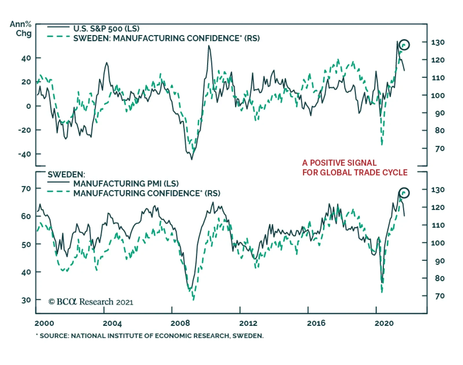
Results from Sweden’s September Economic Tendency survey were a minor disappointment. The headline indicator slipped 0.7 points to 119.9. The confidence indicators for both the manufacturing industry and consumer declined marginally. Despite the slight…
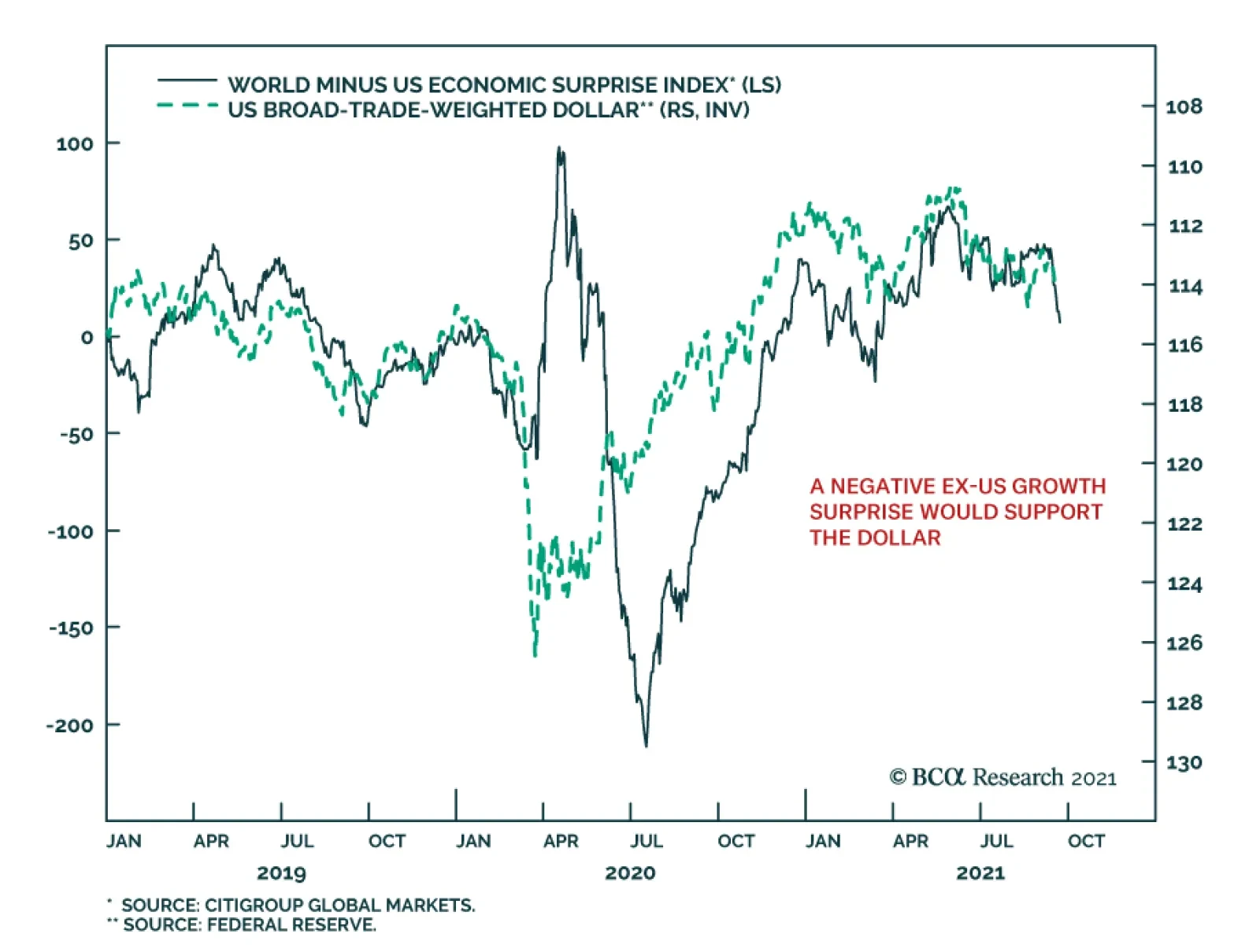
Although the US dollar has appreciated this year, our foreign exchange strategists highlight that from a big picture perspective, dynamics remain tilted against the dollar. True, the DXY is off its May low of 89.6. However, it has failed to break above 94,…
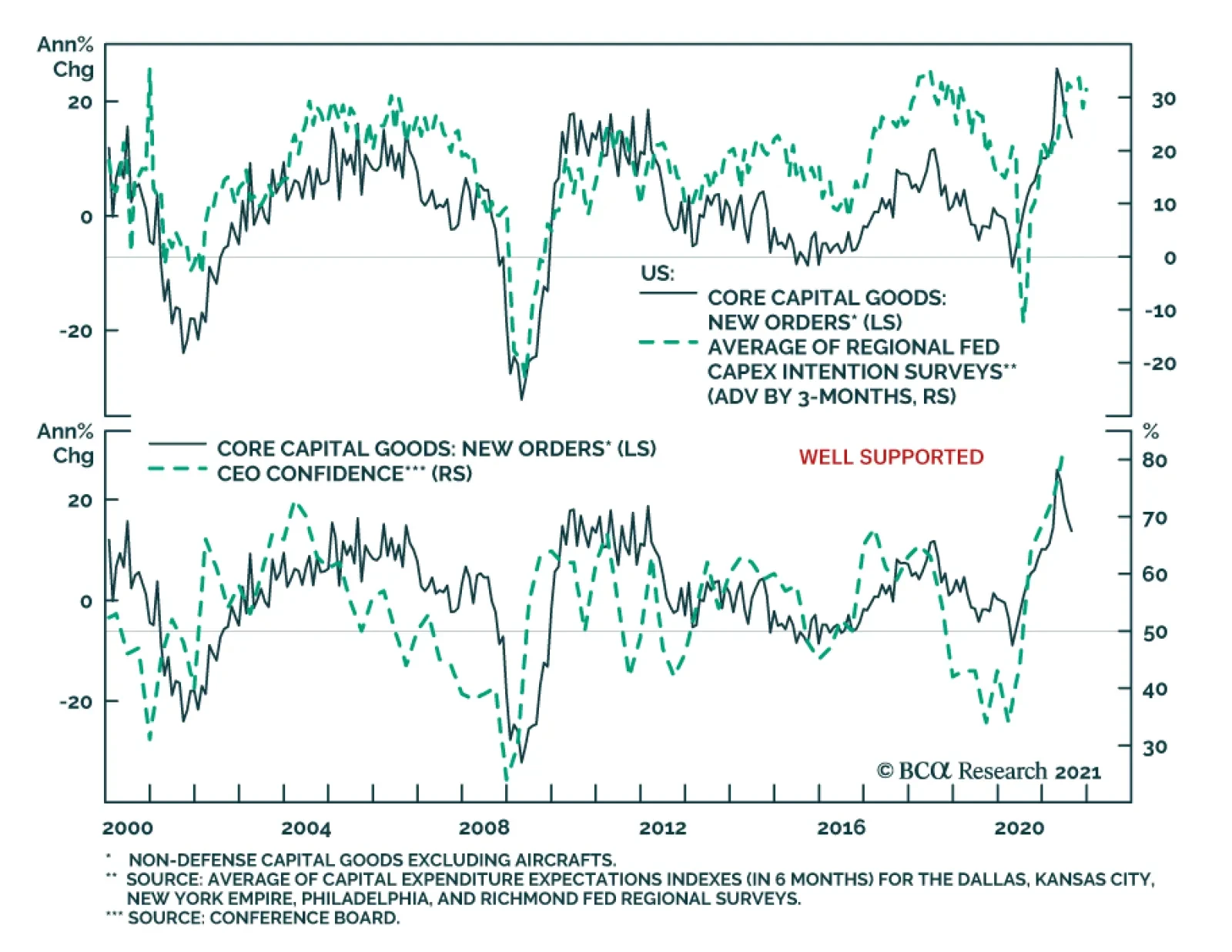
New orders for US durable goods grew 1.8% month-on-month to a record $263.5 billion in August. The increase follows an upwardly revised 0.5% and is more than double expectations of a 0.7% rise. However, a 5.5% month-on-month surge in transportation equipment…
Highlights Economy – We find the leading arguments for why households’ excess savings won’t be spent to be wanting: US households do not commonly demonstrate the detached foresight that Ricardian equivalence takes as given and the trauma-will-change-behavior thesis fails to account for the absence of widespread financial trauma. Markets – Public equities account for a record portion of household wealth, but their share gains are not a sign of a budding mania: Our analysis of the Fed’s Flow of Funds data argues that much of equities’ relative share gains have been driven by structural rather than cyclical factors. Strategy – It would be premature to shift to defensive asset allocation settings if monetary policy is going to remain accommodative for another three years: The rate hike progression envisioned by FOMC participants’ dot-plot projections suggests policy won’t become tight until late 2024 at the earliest. Feature The US Investment Strategy team has been at the more bullish end of the continuum within BCA, and among the broader strategist community, since the spring of 2020. Our view was premised on the idea that the fiscal and monetary policy responses to the pandemic were (and would continue to be) so large that they would overwhelm its adverse effects on the economy and markets. That view came to pass as Congress augmented the CARES Act’s fiscal largesse with two subsequent rounds of direct payments to households earning up to $100,000 per adult and a renewed federal supplement to unemployment insurance (UI) benefits. With the expiration of the UI benefit program at the beginning of the month and the Fed poised to end asset purchases by the middle of next year, clients have begun to ask if our underlying bullish premise still applies. We believe that it does, on the grounds that policy remains on an emergency footing even though the emergency has passed. The fiscal transfers may have ended, but their full effect has yet to be felt. They will support the economy on an ongoing basis as households direct their excess pandemic savings toward consumption. No one knows for sure how much of the excess savings will be spent or when, but the arguments citing Ricardian equivalence or consumer trauma as impediments to consumption are flawed. What If Today’s Income Is Taxed Tomorrow? British classical economist David Ricardo is best known to introductory economics students for comparative advantage, but he also posited that deficit spending may fail to boost aggregate demand because taxpayers, anticipating that they will be tapped in the future to repay state loans, may increase savings to cover future taxes. Despite its theoretical appeal, empirical data in support of Ricardian equivalence is elusive. Two centuries and an ocean removed from Ricardo’s England, we submit that Americans are not known for parsimony, studied caution or a tendency to see the glass as half-empty. Although American households began to rebuild savings after the global financial crisis, an additional dollar has tended to burn a hole in their pockets ever since the baby boomers began reaching adulthood (Chart 1). Chart 1The Searing Trauma Of The Depression Weighed On Consumption Decisions
The Searing Trauma Of The Depression Weighed On Consumption Decisions
The Searing Trauma Of The Depression Weighed On Consumption Decisions
Even if Americans were wont to consider future tax burdens, it may be rational for the households who received the fiscal transfers to assume they will largely escape them unless their relative income surges. Per the most recent adjusted gross income (AGI) distribution data (for tax year 2018), 70% of taxpayers earn $75,000 or less (Chart 2). Single taxpayers meeting that threshold (and married taxpayers earning $150,000 or less) received the full amount of the economic impact payments authorized by the CARES Act and subsequent legislation. That bottom 70% paid just 5.1% of AGI in federal taxes (Chart 3), and the current political climate points in the direction of an increasingly progressive tax system, so they may not have to worry about being called upon to cover the expanding deficit down the road. Chart 2The Income Distribution Is Top Heavy ...
Post-Traumatic Bliss
Post-Traumatic Bliss
Chart 3…But So Is The Tax Burden
Post-Traumatic Bliss
Post-Traumatic Bliss
The (Not So Traumatic) Economic Trauma Of COVID-19 While we are confident that Ricardian equivalence will not act as an impediment to consumption, the ultimate disposition of households’ excess pandemic savings is unknown. Our working assumption has been that half of the savings will be spent across 2021 and 2022. Though we do not have any close antecedents for what households might do with a savings windfall equivalent to 10% of a year’s GDP amassed over a thirteen-month span, we reject the notion that those who experienced COVID-19 will behave like the many shell-shocked survivors of the Great Depression who became lifelong precautionary savers. However terrible the human cost of COVID, it did not ravage American households’ financial position; as the Fed’s latest Flow of Funds report showed, their balance sheets flourished, allowing the vast majority of them to escape any sense of financial trauma. Per the Flow of Funds, American household wealth grew by nearly $6 trillion in the second quarter, extending the last five quarters’ gains to $31 trillion since financial markets cratered when the pandemic burst forth in the first quarter of 2020. The 22% annualized five-quarter gain is nearly four standard deviations above the mean and blows away 4Q03 through 4Q04’s 14% second-place mark by two full standard deviations (Chart 4, top panel). The current run sets a record even when it’s stretched to six quarters to include 1Q20, the worst quarter in series history, and the five- and six-quarter gains are also pacesetters after adjusting for inflation (Chart 4, bottom panel). Chart 4Recessions Aren't So Bad When Congress And The Fed Throw Everything They Have At Them
Recessions Aren't So Bad When Congress And The Fed Throw Everything They Have At Them
Recessions Aren't So Bad When Congress And The Fed Throw Everything They Have At Them
Changes in household net worth lead consumption growth with a two-quarter lag (Chart 5), though the four quarters before the most recent one (the red dots with negative consumption growth) were notable outliers. 2Q21 consumption was just a little more than a percentage point below the best-fit line, however, so it is closing in on its modeled value and we expect it will overshoot it in coming quarters upon the release of pent-up demand. We do not believe that the pandemic will dampen household spending simply because the broad mass of consumers did not experience financial trauma on a scale that would alter future behavior. As household wealth and income data have shown, this recession has been a boon for most Americans. Chart 5Consumption Overshoots Are On The Way
Post-Traumatic Bliss
Post-Traumatic Bliss
Chart 6Fiscal Shock And Awe
Post-Traumatic Bliss
Post-Traumatic Bliss
We additionally reject the notion that households have learned a lesson that will make them want to hold more savings. The financial lesson of the pandemic seems to be that policymakers will do their utmost to shelter them from calamity. Between the economic impact payments (Chart 6, top panel) and the UI benefit supplement (Chart 6, middle panel), Congress directly sent nearly $1.5 trillion to US households to offset $300 billion of lost wages (Chart 6, bottom panel). COVID-19 inflicted terrible distress on those who lost loved ones and witnessed or experienced near fatal suffering, but it boosted the lower three quartiles of households who received transfers and the top decile of households who reveled in the financial markets’ advance. Those who experienced it will not hoard their pennies and shun debt like many of the Depression’s survivors; they are more likely to have experienced post-traumatic bliss than stress when it comes to their financial outlook. Too Much Of A Good Thing? We periodically check in on the Flow of Funds for insight into the evolution of households’ asset allocations and the share of net worth accounted for by homes. Directly owned equities and mutual funds have taken share from the other major categories throughout the pandemic run (Chart 7) and now account for a record share of household financial assets after having surpassed their 2000 highs (Chart 8, top panel). It is sensible to approach any equity milestone that invokes the dot-com bubble with some trepidation, but structural factors go a long way toward explaining the new allocation peak. The financialization of the economy has steadily advanced since the Flow of Funds data began to be compiled in 1951, promoting public equity ownership, and consolidation has supported the transfer of commercial ownership from mom-and-pop operations to corporate interests, many of which are publicly traded. Overall equity in businesses as a share of household net worth is merely in line with its ‘50s levels (Chart 8, bottom panel). Chart 7The Running Of The Bulls
The Running Of The Bulls
The Running Of The Bulls
Chart 8From Mom And Pop To Broad And Wall
From Mom And Pop To Broad And Wall
From Mom And Pop To Broad And Wall
Home price appreciation has picked up, but it is not out of the ordinary (Chart 9). Home equity gains have outstripped home price gains, relative to each series’ history, testifying to prudent behavior on the part of borrowers and lenders. The low aggregate mortgage loan-to-value ratio (Chart 10) suggests that slowing home price appreciation, or even an outright decline, would not be a source of economic instability. Chart 9Home Price Gains Are Not Out Of The Ordinary ...
Home Price Gains Are Not Out Of The Ordinary ...
Home Price Gains Are Not Out Of The Ordinary ...
Chart 10... And Leverage Levels Are Not A Concern
... And Leverage Levels Are Not A Concern
... And Leverage Levels Are Not A Concern
The Fed Signals That Tapering Is Near Though the FOMC did not adjust the pace of its asset purchases last week, it indicated that tapering will most likely begin after its November meeting. Chair Powell noted that the economy has made substantial further progress toward reaching the committee’s inflation goal and expressed that “many” members feel that it has made substantial progress toward achieving its full employment objective as well, going so far as to volunteer his personal view that the employment test has been “all but met.” Per the committee’s discussions, the purchases will likely end around the middle of next year if the economy progresses in line with its expectations. The committee would not be talking about reducing the accommodation it’s providing the economy if it weren’t secure in the sense that it is on solid footing. Powell expressed satisfaction with the evolution of inflation expectations (Chart 11) and although the real GDP forecast for this year was lowered in the summary of economic projections (the “dots”), next year’s forecast was raised and slightly higher inflation expectations imply that nominal GDP growth will remain quite robust. A shift in two members’ fed funds rate projections brought the median member’s liftoff date to 2022 from 2023, in line with our view. Chart 11The Fed Has Succeeded In Firming Up Inflation Expectations
The Fed Has Succeeded In Firming Up Inflation Expectations
The Fed Has Succeeded In Firming Up Inflation Expectations
The chair reiterated that tapering – slowing the pace of accommodation – and hiking the fed funds rate – slowing the economy – are distinct actions subject to separate criteria. We see liftoff as a more significant action than tapering, but much will depend on the pace at which the committee lifts the fed funds rate. It is too soon to speculate on the pace, but we stress that the big move for financial markets will occur once the policy rate exceeds the neutral rate. If the latter is somewhere around 2%, the rate hike pace embedded in the dots suggests that it may take until the end of 2024 or early 2025 before monetary policy becomes restrictive. Investment Implications If monetary policy is not going to become tight for another three years, it is premature to shift a portfolio to more defensive settings, especially for anyone sharing our three-to-twelve-month cyclical timeframe. Growth will be robust in the near term, supported by the income boost that the lower three quartiles of taxpayers received from fiscal transfers and the way wealthier households cleaned up as financial asset prices soared. We expect that a hearty portion of the newly minted wealth will be spent, as Ricardian equivalence requires a longer attention span than Americans typically exhibit, and the pandemic was largely trauma-free for most households from a financial perspective. The clearest policy lesson that a citizen should have taken from COVID is that Congress and the Fed have his/her back in a big way. We are staying the course with our risk-friendly asset allocation recommendations. Doug Peta, CFA Chief US Investment Strategist dougp@bcaresearch.com
The German IFO’s Business Climate Index softened for the third consecutive month in September, falling to 98.8 from 99.6. The weakness was led by the Current Assessment number which lost 1-point versus expectations of a minor improvement. Meanwhile, the…
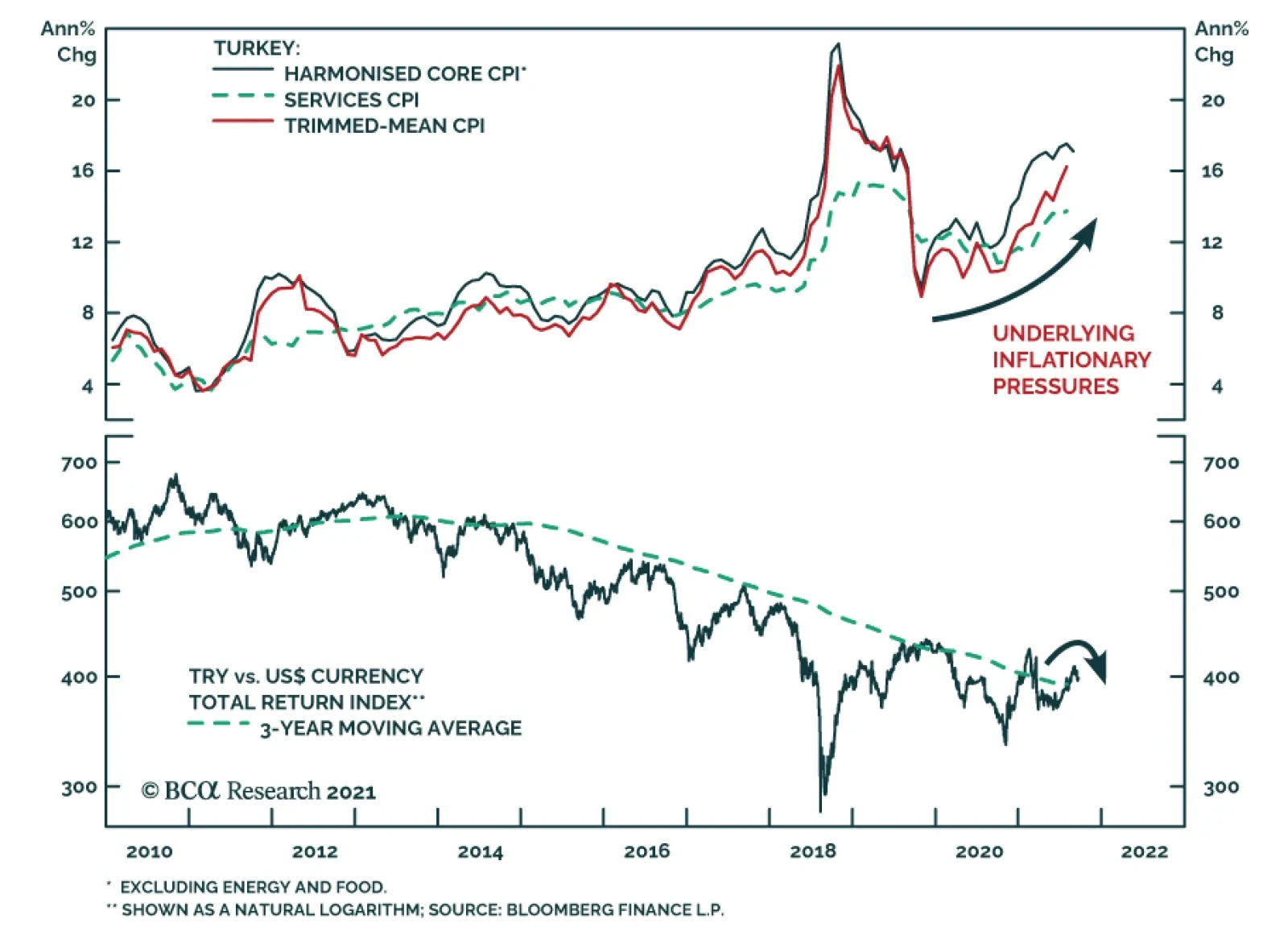
The Turkish central bank surprised investors with a 100-basis point rate cut on Thursday, bringing the one-week repo rate down to 18%. The decision comes despite rising inflation. Headline CPI has been steadily climbing since late-2019 and reached 19.25% in…
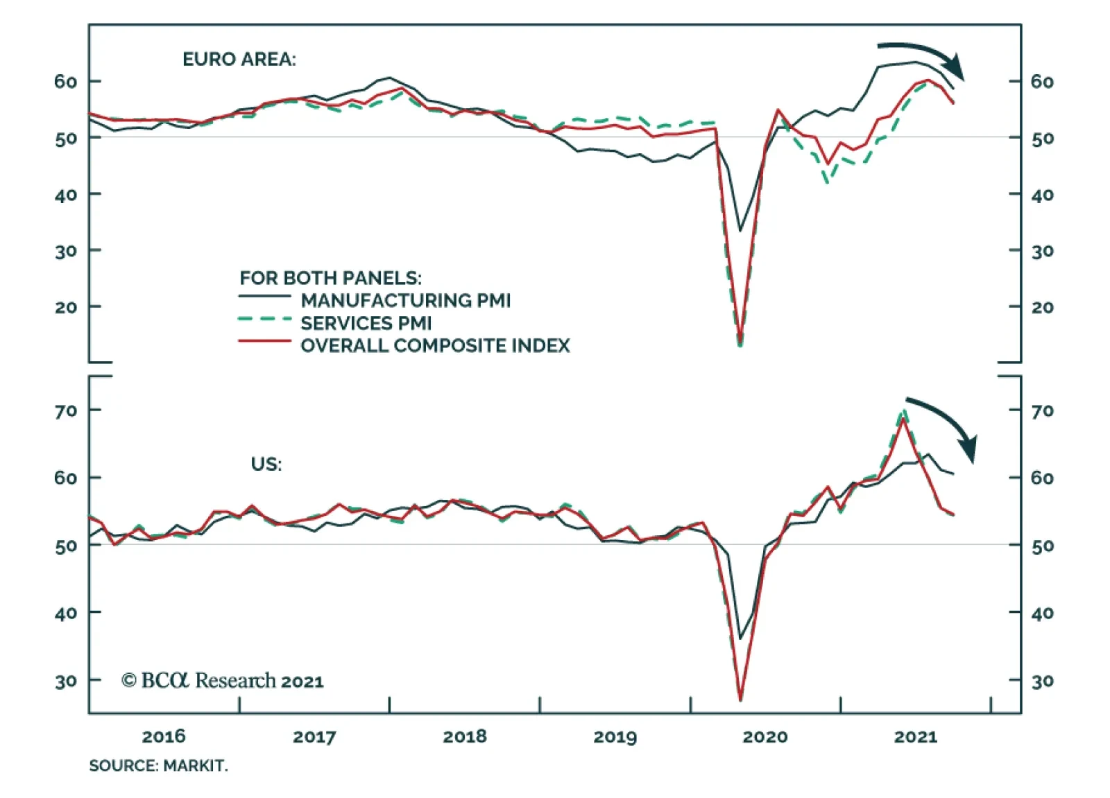
Manufacturing and service flash PMIs for September were weaker than expected. In the US, both service and manufacturing PMIs fell below expectations, bringing down the composite PMI by 0.9 points to 54.5. This dynamic was even more pronounced in the Euro…
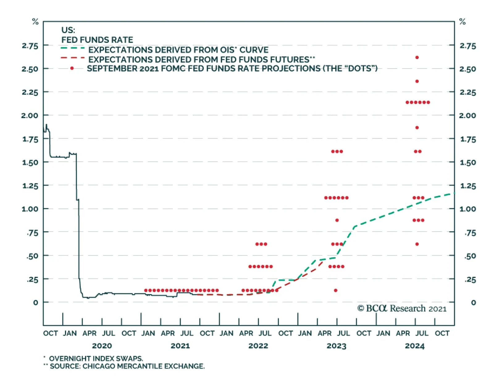
As expected, the FOMC did not make any changes to its policy rate or pace of asset purchases at its meeting on Wednesday. However, the Fed sent a strong signal that tapering is on the horizon. The statement indicated that “if progress continues broadly as…
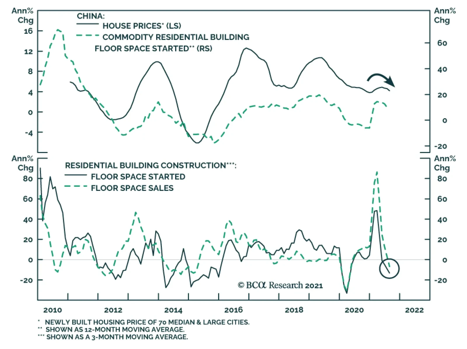
Chinese residential building starts and sales have been contracting since April and July, respectively. Similarly, the level of aggregate building construction activity appears to be rolling over. The Evergrande debacle presents an added downside risk to this…