Economic Growth
Much like how core measures of inflation strip out volatile food and energy prices to give a better sense of the underlying trend, we can also look at Real Final Sales To Domestic Purchasers (FSDP) to get a better sense of the underlying trend in economic…

Feature What Could Sour The Sweet Spot? This continues to look like a very benevolent environment for risk assets. Growth in the U.S. remains decent, with Q1 GDP growth beating expectations at 3.2% QoQ annualized (albeit somewhat distorted by rising inventories). Leading indicators point to U.S. GDP growth of around 2.5% for 2019. The rest of the world is showing the first “green shoots” of economic recovery. China continues to expand credit, and the effects of this are starting to stabilize growth in Europe, Japan, and the Emerging Markets (Chart 1). Recommended Allocation
Monthly Portfolio Update
Monthly Portfolio Update
Chart 1China Reflation Helping Growth To Bottom
China Reflation Helping Growth To Bottom
China Reflation Helping Growth To Bottom
At the same time, central banks everywhere have turned accommodative. Following the Fed’s dovish shift late last year, the market has priced in rate cuts by end-2019. The ECB is about to relaunch its TLTRO funding program, and is expected to keep rates in negative territory for at least another year (Chart 2) – though there are worries whether Mario Draghi’s successor as ECB president might be more hawkish. The Bank of Canada and Bank of Japan, among others, have recently reemphasized monetary caution. Chart 2No Rate Hikes Anywhere
No Rate Hikes Anywhere
No Rate Hikes Anywhere
Chart 3Term Premium Keeping Down Yields
Term Premium Keeping Down Yields
Term Premium Keeping Down Yields
This goes some way to explain the biggest puzzle in markets currently: why, despite global equities being less than 1% below a record high, long-term interest rates remain so low, with the 10-year U.S. Treasury yield at 2.5%, and yields in Germany and Japan hovering around zero. There are other explanations too. A decomposition of the U.S. 10-year yield shows that most of the downward pressure has come from a sharp drop in the term premium (Chart 3). This is partly because lousy growth in other developed economies, such as Germany and Japan, has pushed down yields in these countries and, given that spreads to the U.S. were at record highs, depressed U.S. rates too. It also reflects a lingering pessimism among investors who bought Treasuries at the end of last year to hedge against recession and who remain concerned about the economy. This is evidenced by continuing strong flows into bond funds in 2019 (Chart 4). A decomposition of the U.S. 10-year yield shows that most of the downward pressure has come from a sharp drop in the term premium. Chart 4Investors Buying Bonds, Not Equities
Investors Buying Bonds, Not Equities
Investors Buying Bonds, Not Equities
Chart 5Why Has Inflation Fallen?
Why Has Inflation Fallen?
Why Has Inflation Fallen?
A further explanation is the recent softness in inflation, with the Fed’s focus measure, core PCE inflation, slowing to an annual rate of only 0.7% over the past three months (Chart 5). This is probably mostly due to the economic slowdown late last year. But it may also have structural causes: the recent improvement in labor productivity can perhaps allow wages to rise without feeding through into consumer price inflation (Chart 6). Chart 6Maybe Because Of Better Productivity
Maybe Because Of Better Productivity
Maybe Because Of Better Productivity
Chart 7Indicators Suggest Inflation Will Still Trend Up
Indicators Suggest Inflation Will Still Trend Up
Indicators Suggest Inflation Will Still Trend Up
How is this all likely to pan out? We think it improbable that inflation will stay low for long if growth is as robust as we expect. Leading indicators of inflation continue to suggest prices will trend higher (Chart 7). The Fed may not rush to raise rates (not least since, with the lower inflation recently, the Fed Funds Rate in real terms is now at neutral according to the Laubach-Williams model, Chart 8). But we also find it inconceivable that the Fed will cut rates, if growth remains strong, stocks continue to rise, and global risks recede. By the end of this year, it should be able to make a renewed case for a further hike. But even if it doesn’t do that – and permits either inflation to overheat for a while, or asset bubbles to form – these scenarios should be more conducive to equity outperformance, than bond outperformance. Global equities have already risen by 22% since last December’s low and may struggle to make rapid progress over the next few months. The key to further upside for stocks will be earnings: since analysts have cut EPS forecasts for S&P 500 companies for this year to only 4%, those expectations should not be hard to beat. In the Q1 earnings season, for instance, 79% of companies have so far come in ahead of the consensus EPS forecast. For global asset allocators, the key decision is always at the asset-class level. Will equities outperform bonds over the coming 12 months? Equities should have further upside if our macro scenario proves correct. On the other hand, we find it hard to imagine that global bond yields will not rise moderately if global growth recovers, the Fed refrains from cutting rates, inflation rises somewhat, and investors turn less wary of equities. We continue, therefore, to expect the stock-to-bond ratio (Chart 9) to rise further over the next 12 months. We think it improbable that inflation will stay low for long if growth is as robust as we expect. Chart 8Is Fed Now At Neutral?
Is Fed Now At Neutral?
Is Fed Now At Neutral?
Chart 9Stock-To-Bond Ratio Can Rise Further
Stock-To-Bond Ratio Can Rise Further
Stock-To-Bond Ratio Can Rise Further
Chart 10Europe And EM Outperform Only Briefly
Europe And EM Outperform Only Briefly
Europe And EM Outperform Only Briefly
Equities: We remain overweight global equities, but are reluctant to take higher beta country exposure until there is greater clarity on the bottoming out of ex-U.S. growth. Moreover, the structural headwinds that have prevented anything more than short-term outperformance for eurozone stocks (banking sector weakness) and Emerging Markets (excess debt and poor productivity) since 2010 remain powerful negative factors (Chart 10). Our moderately pro-cyclical sector recommendations (overweight energy and industrials) should hedge us against upside risk emanating from a strong rebound in Chinese imports. Fixed Income: Over the past few years, periods where equities have decoupled from bond yields have been resolved with bond yields playing catch-up (Chart 11). We expect the same to happen over the next few months, with global government bond yields rising moderately. The risk-on environment continues to be positive for credit. We prefer credit to government bonds within fixed income, but are only neutral within our overall recommended portfolio. U.S. high-yield bonds in particular look attractively valued, as long as growth continues and default rates don’t start to rise too much (Chart 12). Chart 11When Bonds And Equities Diverge…
When Bonds And Equities Diverge...
When Bonds And Equities Diverge...
Chart 12Junk Bonds Attractively Valued
Junk Bonds Attractively Valued
Junk Bonds Attractively Valued
Currencies: A pick-up in global growth would be negative for the U.S. dollar, typically a counter-cyclical currency (Chart 13). BCA’s currency strategists have slowly been moving towards a more positive stance on some currencies versus the dollar, particularly the euro and Australian dollar. We would expect to see the trade-weighted dollar start to depreciate in H2 once global growth accelerates, fueled by the very skewed long-dollar positioning currently. However, this may be only a six- to 12-month move, since growth and interest-rate differentials suggest that the structural dollar bull market that began in 2012 has not yet fully run its course. Commodities: Oil remains dominated by supply-side dynamics. How much the ending of waivers on Iranian oil sanctions, plus troubles in Venezuela and Libya, push up oil prices will depend on whether President Trump can persuade Saudi Arabia and UAE to increase production. BCA’s energy team expects he will be only partially successful in doing so, and see Brent reaching $80 a barrel and WTI $77 (from $72 and $64 currently) during 2019. Industrial commodities prices will depend on the strength and nature of China’s reflation: our commodities strategists see copper, the most sensitive metal to Chinese demand, as the best way to play this.1 Garry Evans Chief Global Asset Allocation Strategist garry@bcaresearch.com Chart 13Stronger Growth Would Be Dollar Negative
Stronger Growth Would Be Dollar Negative
Stronger Growth Would Be Dollar Negative
Footnotes 1 Please see Commodity & Energy Strategy Weekly Report, “Copper Will Benefit Most From Chinese Stimulus,” dated April 25, 2019, available at ces.bcaresearch.com GAA Asset Allocation
Highlights Fed: Fed policymakers are sending a unified message that they want to keep rates on hold until they see a significant increase in inflation. However, our reading of their recent remarks suggests that they will be reluctant to actually cut rates unless GDP growth falls to below its estimated potential. Economy: If we strip out the volatile net exports, government and inventory components of growth, we see that economic activity slowed to below potential in the first quarter. However, the timeliest data on consumer spending, nonresidential investment and residential investment all suggest that Q1 will be the trough for the year. All in all, economic growth should be comfortably above potential in 2019, keeping rate cuts at bay. Investment Strategy: Investors should keep portfolio duration low, avoiding the 5-year/7-year part of the Treasury curve. Investors should also overweight spread product versus Treasuries, with a focus on Baa and junk rated corporate bonds. Feature Since January, Federal Reserve policymakers have sent a strikingly unified message: Policy should remain “patient” in an effort to re-anchor inflation expectations and demonstrate the symmetry of the Fed’s 2 percent inflation target. Take for example, two excerpts from recent speeches by Boston Fed President Eric Rosengren and Chicago Fed President Charles Evans. Rosengren:1 My own preference is for the Federal Reserve to adopt an inflation range that explicitly recognizes the challenge of the effective lower bound. We might be forced to accept below-2-percent inflation during recessions, but we would commit to achieving above-2-percent inflation in good times, so as to provide more policy space to counteract the next recession. Evans:2 I think the Fed must be willing to embrace inflation modestly above 2 percent 50 percent of the time. Indeed, I would communicate comfort with core inflation rates of 2-1/2 percent, as long as there is no obvious upward momentum and the path back toward 2 percent can be well managed. The consensus appears to be not only that higher inflation is necessary before the Fed lifts rates again, but also that the Fed should explicitly target an overshoot of its 2 percent target. With trailing 12-month core PCE inflation running at only 1.55% as of March, it will undoubtedly take some time before these inflation goals are met. We think the Fed’s commitment to keeping rates steady could waver if financial conditions ease sufficiently.3 But for now, with the market priced for 36 basis points of rate cuts over the next 12 months, the more pertinent question is: What will it take for the Fed to lower rates from current levels? Expecting A Rate Cut? Don’t Hold Your Breath Our Fed Monitor has an excellent track record calling turning points in monetary policy, and at present it is very close to zero, consistent with the Fed’s “on hold” stance (Chart 1). The Monitor is comprised of 44 indicators of economic growth, inflation and financial conditions. In other words, for the Monitor to recommend rate cuts going forward we will need to see some further deterioration in either economic growth, inflation or financial markets (Chart 2). This is roughly consistent with how Chicago Fed President Evans described his reaction function in his speech from two weeks ago: Chart 1"On Hold" Stance Justified
"On Hold" Stance Justified
"On Hold" Stance Justified
Chart 2Fed Monitor Components
Fed Monitor Components
Fed Monitor Components
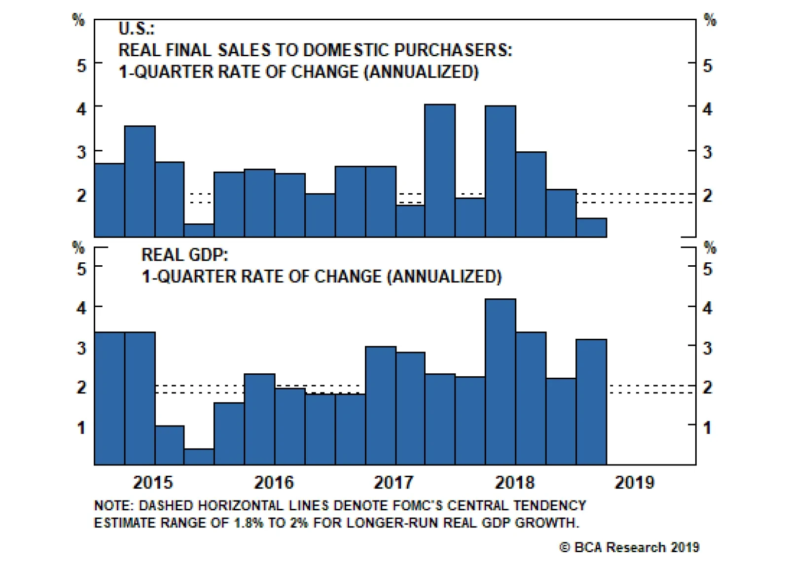
If growth runs close to or somewhat above its potential and inflation builds momentum, then some further rate increases may be appropriate over time… In contrast, if activity softens more than expected or if inflation and inflation expectations run too low, then policy may have to be left on hold – or perhaps even loosened – to provide the appropriate accommodation to obtain our objectives. Our interpretation of the Fed’s reaction function is that it wants to maintain an accommodative monetary policy to ensure that inflation and inflation expectations move higher over time. However, it will consider monetary policy to be accommodative as long as GDP growth stays close to, or above, estimates of its potential rate. In other words, while the Fed is in no rush to tighten, we probably need to see a significant period of below-potential GDP growth before rate cuts are on the table. In his speech, Evans indicates that his personal estimate of potential GDP growth is 1.75%. The March Summary of Economic Projections shows that the central tendency of FOMC participant estimates is 1.8% - 2%. Our view is that U.S. growth will easily surpass this threshold in 2019, keeping rate cuts at bay. Tracking U.S. Growth Markets were caught off guard last week when we learned that real GDP grew 3.17% in the first quarter, above consensus estimates and well above the 1.8% - 2% potential growth threshold. However, the headline Q1 figure was flattered by significant gains in a few volatile GDP components. Chart 3Underlying Growth Slowdown
Underlying Growth Slowdown
Underlying Growth Slowdown
Much like how core measures of inflation strip out volatile food and energy prices to give us a better sense of the underlying trend, we can also look at Real Final Sales To Domestic Purchasers (FSDP) to get a better sense of the underlying trend in economic growth. FSDP includes only consumer spending, nonresidential investment and residential investment. That is, it removes government spending, net exports and inventory investment from the overall number. Viewed this way, we see that the U.S. economy did experience a significant growth slowdown in the first quarter. Real FSDP grew only 1.45% in Q1, below the 1.8% - 2% potential growth threshold (Chart 3). Net Exports & Inventories Chart 4Net Exports & Inventories
Net Exports & Inventories
Net Exports & Inventories
First quarter GDP was boosted by a +1.03% contribution from net exports and a +0.65% contribution from inventory investment, neither of which is likely to be repeated in Q2 (Chart 4). The top panel of Chart 4 shows just how unusual it is to see such a large contribution from net exports, an event that becomes even less likely when you factor in the dollar’s recent appreciation (Chart 4, panel 2). Turning to inventories, a significant build was long overdue given the backlog of orders seen during the past two years. But the ISM Manufacturing Index’s backlog of orders component has now fallen back to a neutral level (Chart 4, bottom panel). This suggests that firms are comfortable with their current inventory stockpiles, and that no aggressive inventory increases are likely during the next few quarters. Interestingly, while net exports and inventories will almost certainly pressure GDP growth lower in Q2, back toward the growth rate in FSDP, the latter has probably already troughed for the year. Recent data on consumer spending, nonresidential investment and residential investment all appear to have turned a corner. Consumer Spending Consumer spending added a meager +0.8% to GDP in Q1, but core retail sales growth has recovered sharply after having plunged near the end of last year (Chart 5). What’s more, with consumer sentiment close to one standard deviation above its historical mean – whether we look at expectations or current conditions surveys – consumers don’t seem inclined to retrench in the months ahead (Chart 6). Chart 5Consumer Spending
Consumer Spending
Consumer Spending
Chart 6Buoyant Consumer Sentiment
Buoyant Consumer Sentiment
Buoyant Consumer Sentiment
Nonresidential Investment Chart 7Nonresidential Investment
Nonresidential Investment
Nonresidential Investment
We expected business investment to weaken in Q1, and its +0.4% growth contribution is low compared to recent readings. The decline was anticipated due to last year’s significant deterioration in global growth. Slower global growth necessarily causes firms to downgrade their profit expectations. Faced with lower expected profits, companies are much more inclined to curtail investment. However, considering the outlook heading into mid-year, we have already noticed signs of improvement in leading global growth indicators.4 More recently, we have even seen that improvement translate into stronger U.S. investment data. Core durable goods new orders grew +17% (annualized) in March, dragging the year-over-year rate up to +5.3% (Chart 7). Further, our BCA Composite New Orders Indicator – a weighted combination of ISM New Orders and NFIB Capital Spending Plans – has bounced during the past few months, returning close to its historical mean (Chart 7, panel 3). An average of Capital Spending Intentions from regional Fed surveys also remains close to one standard deviation above its historical average (Chart 7, bottom panel). Residential Investment Residential investment (aka Housing) has exerted a meaningful drag on GDP growth in each of the past five quarters, and it lowered GDP by -0.1% in Q1 (Chart 8). However, much like with consumer spending and nonresidential investment, the timely economic data suggest a turnaround is in the offing. Much like with consumer spending and nonresidential investment, the timely economic data suggest a turnaround is in the offing. Optimism has returned to housing since mortgage rates fell earlier this year. New home sales and mortgage purchase applications have jumped, and single-family housing starts are the only important housing-related data that haven’t yet rebounded. We expect that rebound to occur soon, as do homebuilders whose confidence has risen during the past few months. Homebuilder optimism surveys remain close to one standard deviation above their historical averages (Chart 9). Chart 8Residential Investment
Residential Investment
Residential Investment
Chart 9Buoyant Homebuilder Confidence
Buoyant Homebuilder Confidence
Buoyant Homebuilder Confidence
Bottom Line: Fed policymakers are sending a unified message that they want to keep rates on hold until they see a significant increase in inflation. However, our reading of their recent remarks suggests that they will be reluctant to actually cut rates unless GDP growth falls to below its estimated potential. Potential GDP growth is estimated to be in the 1.8% to 2% range. If we strip out the volatile net exports, government and inventory components of growth, we see that economic activity slowed to below potential in the first quarter. However, the timeliest data on consumer spending, nonresidential investment and residential investment all suggest that Q1 will be the trough for the year. All in all, economic growth should be comfortably above potential in 2019, keeping rate cuts at bay. Investment Implications To translate the above views on the economy and the Fed’s reaction function into a portfolio strategy, we first return to our Golden Rule of Bond Investing.5The Golden Rule states that if the Fed delivers more (fewer) rate hikes than are currently discounted in the market over the next 12 months, then the Treasury index will earn negative (positive) excess returns versus cash during that investment horizon (Chart 10). At present, this means that investors should only expect positive excess returns from taking duration risk in the event that the Fed cuts rates by more than 36 basis points during the next 12 months. Given our view that rate cuts are unlikely, investors should maintain below-benchmark portfolio duration. Chart 10The Golden Rule's Track Record
The Golden Rule's Track Record
The Golden Rule's Track Record
If we further assume that market expectations will shift to price-in fewer rate cuts, or even possibly some rate hikes, then we would expect 5-year and 7-year yields to rise the most (Chart 11). Investors should avoid those maturities and focus their Treasury exposure on the short and long ends of the curve. These barbell over bullet trades have the advantage of being positive carry, so they will earn money even if rate hike expectations are unchanged.6 Chart 11Avoid The 5- And 7-Year Maturities
Avoid The 5- And 7-Year Maturities
Avoid The 5- And 7-Year Maturities
Chart 12Investment Grade Spread Targets
Investment Grade Spread Targets
Investment Grade Spread Targets
Finally, the combination of above-potential GDP growth and a patient Fed is positive for spread product. Investors should remain overweight spread product versus Treasuries in bond portfolios, focusing on Baa and junk rated corporate bonds. Spreads for those credit tiers remain wide compared to historical median levels for this phase of the cycle (Charts 12 &13).7 Chart 13High-Yield Spread Targets
High-Yield Spread Targets
High-Yield Spread Targets
Ryan Swift, U.S. Bond Strategist rswift@bcaresearch.com Footnotes 1 https://www.bostonfed.org/news-and-events/speeches/2019/monetary-policymaking-in-todays-environment.aspx 2 https://www.chicagofed.org/publications/speeches/2019/risk-management-and-the-credibility-of-monetary-policy 3 Please see U.S. Bond Strategy Weekly Report, “The New Battleground For Monetary Policy”, dated March 26, 2019, available at usbs.bcaresearch.com 4 Please see U.S. Bond Strategy Weekly Report, “Bond Kitchen”, dated April 9, 2019, available at usbs.bcaresearch.com 5 Please see U.S. Bond Strategy Special Report, “The Golden Rule Of Bond Investing”, dated July 24, 2018, available at usbs.bcaresearch.com 6 Please see U.S. Bond Strategy Weekly Report, “Paid To Wait”, dated February 26, 2019, available at usbs.bcaresearch.com 7 For further details on how we calculate these spread targets please see U.S. Bond Strategy Weekly Report, “The Value In Corporate Bonds”, dated February 19, 2019, available at usbs.bcaresearch.com Fixed Income Sector Performance Recommended Portfolio Specification
Highlights Central bankers appear to be in a rush to boost inflation expectations before the next economic downturn. This in practice should be stimulative for the global economy. Historically, currencies of small, open economies are typically the first to benefit from rebounding global growth. Ditto for those whose output gaps have fully closed. However, there appears to be a shift in the behavior of certain currency pairs in the current cycle. For example, the U.S. dollar has tended to perform better in a low-volatility environment in recent years, a shift from the past. Correspondingly, its safe-haven status may have been marginally eroded. The U.S. decision not to extend waivers on Iranian oil exports beyond the May 2 deadline is bullish for petrocurrencies such as the RUB and NOK. The Bank of Canada kept rates on hold but will be hard pressed to meet its inflation mandate before the next downturn. This suggests standing aside on USD/CAD. Rising net short positioning on the yen and Swiss franc is making them attractive from a contrarian standpoint. Place a limit-buy on CHF/NZD at 1.45. Feature Chart I-1Volatility Is Due For A Bounce
Volatility Is Due For A Bounce
Volatility Is Due For A Bounce
The four most important financial variables that could give a near-complete snapshot of the world economy at any point in time are probably the level of the S&P 500, the U.S. 10-year Treasury yield, the trade-weighted dollar and a commodity bellwether, say, crude oil prices. Any permutation of these variables can identify what quadrant the world economy is operating in, with the two most important states being either boom or bust. Taking three of those variables today – the S&P 500 breaking to all-time highs, crude oil prices up 40% from their lows and U.S. 10-year Treasury yields off by almost 100 basis points from their October highs – it is hard to justify why the dollar has hardly budged, this week’s rally aside. Obviously, this is a very simplified view of an intricately complex world economy. But it highlights a point we have been making in recent bulletins: that extended periods of low currency volatility have been very unusual in the post-Bretton Woods world (Chart I-1). The typical narrative has been that as we enter a reflationary window, pro-cyclical currencies should outperform. The reason is simple enough: These economies are export-oriented and tied to the global cycle. So, a rising current account surplus as demand for their goods and services picks up provides underlying support for the currency. Should there be little slack in their domestic economies, this also raises the probability that the central bank tightens monetary policy to fend off future inflationary pressures. It does not hurt if these countries are also commodity producers, since rising terms of trade also provides an additional exchange-rate boost. The reality is that the world is not static, and some of these dynamics have been shifting. The evidence is in the counterfactual: At current levels, China’s credit injection should have lit a fire under pro-cyclical trades because they tend to work in real-time rather than with a lag. The foreign exchange market is one of the deepest and most liquid where new information tends to get digested and discounted instantaneously. As such, the lack of more pronounced strength in pro-cyclical currencies like the Australian, New Zealand and Canadian dollar exchange rates is genuine reason for concern and worth investigation. Why Is The Dollar Breaking Higher? Our Special Report1 on March 29th highlighted the fact that the dollar should be 5-10% higher simply based on measures of relative trends, and recent data corroborate this view. The growth differential between the U.S. and the rest of the world remains wide. Meanwhile, exports and industrial production from Southeast Asia continue to decelerate. Interbank rates in China are spiking higher, suggesting most of the monetary stimulus may have already been frontloaded. And on the earnings front, U.S. profit leadership also continues. It is unclear which of these catalysts was the actual trigger for dollar strength, since these have been in place for a while now, but confirmation from any and all of them was sufficient to reinvigorate the dollar bulls. That said, it is important to pay heed to shifting market forces, but it will be imprudent to change investment strategy on this week’s moves alone. Given these moves, a few observations are in order: Almost all currencies are already falling versus the U.S. dollar – a trend that has been in place for several months now (Chart I-2). This means most of the factors putting upward pressure on the dollar are well understood by the market. For example, global growth has been slowing for well over a year, based on the global PMI. Putting on fresh U.S. long positions is at risk of a washout from stale investors, just as it was back in 2015, a year after growth had peaked. Dollar technicals are also very unfavorable (Chart I-3). Speculators are holding near-record long positions, sentiment is stretched and our intermediate-term indicator is also flagging yellow. Over the past five years, confirmation from all three indicators has been followed by some period of U.S. dollar indigestion. This time should be no different. Chart I-2Is It Time To Initiate Fresh Dollar Longs?
Is It Time To Initiate Fresh Dollar Longs?
Is It Time To Initiate Fresh Dollar Longs?
Chart I-3Dollar Technicals Are Unfavourable
Dollar Technicals Are Unfavourable
Dollar Technicals Are Unfavourable
A breakout in the dollar along with rising equity markets suggests that the correlation is once again shifting. The dollar has tended to trade as a counter-cyclical currency for most of the time, with a negative correlation even to global equities (Chart I-4). Importantly, given current low levels of volatility and elevated equity market valuations, the dollar would have been a great insurance policy for any stock market correction. But with U.S. interest rates having risen significantly versus almost all G10 countries in recent years, the dollar has itself become the object of carry trades. This has also come with a good number of unhedged trades, as the rising exchange rate has lifted hedging costs (Table I-1). Chart I-4The Dollar Remains A 'Risk-Off' Currency
The Dollar Remains A 'Risk-Off' Currency
The Dollar Remains A 'Risk-Off' Currency
Chart I-
It will be difficult for the dollar to act as both a safe-haven and carry currency, because the forces that drive both move in opposite directions. For one, safe-haven assets tend to be lower-yielding but also during episodes of capital flight, investors choose to repatriate capital to pay down debt, with creditor nations having the upper hand. And given U.S. investors have already been repatriating close to $400 billion in assets over the past 12 months, it is unlikely this pace persists (Chart I-5). The bottom line is that investors who believe that the U.S. dollar has become a high-beta currency should be prepared to stampede out the door on any rise in volatility. Our bias remains that the U.S. dollar will ultimately weaken, given that the forces driving it higher are mostly behind us. Meanwhile, currencies such as the Japanese yen or even Swiss franc that have been used to fund carry trades are very ripe for short-covering flows. Putting everything together suggests at minimum building portfolio hedges. It will be difficult for the dollar to act as both a safe-haven and carry currency. One such hedge is going long CHF/NZD. This trade has a high negative carry, so we do not intend to hold it for longer than three months. But speculative positioning and relative economic trends also support this cross for the time being (Chart I-6). We are placing a limit-buy at 1.45. Chart I-5How Much More Will Repatriation Flows Help?
How Much More Will Repatriation Flows Help?
How Much More Will Repatriation Flows Help?
Chart I-6CHF/NZD Is An Attractive ##br##Hedge
CHF/NZD Is An Attractive Hedge
CHF/NZD Is An Attractive Hedge
A Shifting Landscape If the dollar eventually weakens, let’s consider the premise that the most export-dependent economies should benefit more from a rebound in global growth, and by extension, their currencies should appreciate the most. Within the G10 universe, this will be notably the European currencies led by the Swiss franc, the Swedish Krona, the euro and the pound (Chart I-7). However, from the trough in the global Purchasing Managers’ Index (PMI) in December 2008 until the peak in April 2010, it was the commodity currencies that outperformed. During that time frame, the Swiss franc actually fell. It is well known that Switzerland’s persistent trade surplus over the decades has been a key factor behind structural appreciation in the currency. However, at any point in time, other nuances such as whether the rebound is China or commodities driven, the starting point for valuations or even interest rate differentials take center stage in explaining currency moves. The lesson is that investors have to become nimble with currency investment strategy. The lesson is that investors have to become nimble with currency investment strategy. For pro-cyclical currencies, there have been dramatic shifts in the export share of GDP for various countries, according to World Bank data. Most euro area countries have massively expanded their export share of GDP as they have gained ground in value-added products and services. Meanwhile, the export share in Australian GDP has been stuck at 20% for many years, while that in Norway, New Zealand and Canada has seen a huge drop, even since 2009 (Chart I-8). At first blush, this suggests diminishing marginal returns to their currencies from global growth.
Chart I-7
Chart I-8A Shifting Export ##br##Landscape
A Shifting Export Landscape
A Shifting Export Landscape
Take the example of New Zealand, where commodities are over 75% of exports. Since the 2000s, the government has been actively trying to redistribute growth from net exports to domestic demand. This has been mainly via the skilled workers program. The result has been a collapse in the export share of GDP from 36% to about 26%. This means that the New Zealand dollar, which has typically been a higher-beta play on global growth, is giving way to other currencies such as the euro and the Swedish krone (Chart I-4). In addition to this, while global growth might eventually recover, part of the widespread deterioration since the global financial crisis may be structural. If the overarching theme over slowing global trade is a global economy that is trying to lift its precautionary savings and spend less, then the world may not see the high rates of trade growth registered in the 1990s anytime soon. This is because at a lower rate of potential GDP growth, trade elasticities also tend to fall.2 There are many reasons for this, including less willingness among creditor nations to finance current account deficits, the paradox of thrift or just outright saturation in the turnover of trade. All of this dampens marginal returns toward all pro-cyclical currency trades. Chart I-9Trade Volatility Has Fallen
Trade Volatility Has Fallen
Trade Volatility Has Fallen
The bottom line is that the overall magnitude and volatility of trade relative to GDP has fallen, at least until the recent China – U.S. trade spat (Chart I-9). This has had the effect of dampening the volatility of the corresponding mediums of trade exchanges. Part of this is clearly cyclical, but a part may be structural as well. If we embrace confirmation that the Chinese economy has bottomed, it will be important to monitor if this cycle plays out like those in the past. Notes On Petrocurrencies, And The BoC The U.S. has decided not to extend waivers on Iranian oil exports beyond the May 2 deadline. Supposedly, a coalition with both Saudi Arabia and the United Arab Emirates would ensure that oil markets remain adequately supplied, though Saudi Arabia has since signaled they are in no rush to raise production. Overall, this increases the bullish narrative for oil. First, the Iranian response to a shutoff in their exports could be unpredictable. The U.S. threat of driving Iranian oil exports to zero increases the geopolitical risk premium in prices, as full implementation pushes Iran to a wall, raising the odds of retaliation. Chart I-10Iran Is A Meaningful Oil Supplier
Iran Is A Meaningful Oil Supplier
Iran Is A Meaningful Oil Supplier
Second, oil production is being curtailed at a time when Venezuelan output is rapidly falling, conflict in Libya is reviving and OPEC spare capacity remains tight. This could nudge the oil market dangerously close to a negative supply shock (Chart I-10). Meanwhile, there is the non-negligible risk of unplanned outages which have been rising in 2019, which is another source of risk for oil supply Oil futures have responded positively to the news, with both Brent and WTI making fresh 2019 highs. However, while initially reacting favorably, petrocurrencies such as the Canadian dollar, Russian ruble and Norwegian krone are selling off amid dollar strength. We think Brent will continue to trade at a premium to WCS crude. This bodes well for currencies tied to North Sea production. Hold short CAD/NOK and long NOK/SEK positions, despite the selloff this week. As for Canada, we are neutral on the loonie both short and medium term. The dovish shift by the BoC and looser fiscal policy are likely to be growth tailwinds. So is the rise in oil prices. However, there appears to be a genuine slowdown in the Canadian economy that is not yet fully reflected in economic forecasts. The key drivers for the CAD/USD exchange rate are interest rate differentials with the U.S. (which we think will compress further) and energy prices (which we think Canada benefits less from due to the discount Canadian oil sells for, and persistent infrastructure problems). As such, we think domestic conditions will continue to knock down whatever benefit comes from rising oil prices (Chart I-11). Chart I-11CAD/USD Will Benefit From##br## Rising Terms Of Trade
CAD/USD Will Benefit From Rising Terms Of Trade
CAD/USD Will Benefit From Rising Terms Of Trade
Chart I-12Can The BoC Hike Given ##br##This Backdrop? (1)
Can The BoC Hike Given This Backdrop? (1)
Can The BoC Hike Given This Backdrop? (1)
On the consumer side, real retail sales are deflating at the worst pace since the financial crisis, and demand for housing loans is falling off (Chart I-12). This is unlikely to improve if house prices continue to roll over (Chart I-13). A study by the Reserve Bank of New Zealand shows that on average, the elasticity of consumption growth to house price changes is asymmetric with negative housing shocks, hurting consumption by more than the boost received from positive shocks. This asymmetry may be due to the fact that at very elevated debt levels, leveraged gains are used to pay down debt aggressively, whereas leveraged losses hit bottom lines directly. There appears to be a genuine slowdown in the Canadian economy that is not yet fully reflected in economic forecasts. On the corporate side of the equation, the latest Canadian Business Outlook Survey is very telling. Firms’ expectations for sales have softened significantly, as businesses in several sectors are less optimistic about demand. This is driven by uncertainty in the oil patch, weak housing and weak external conditions. This in turn, has led to a steep drop in plans to increase capex (Chart I-14). For external investors, the large stock of debt in the Canadian private sector and overvaluation in the housing market are likely to continue leading to equity outflows on a rate-of-change basis. Chart I-13Can The BoC Hike Given This Backdrop? (2)
Can The BoC Hike Given This Backdrop? (2)
Can The BoC Hike Given This Backdrop? (2)
Chart I-14Can The BoC Hike Given This Backdrop? (3)
Can The BoC Hike Given This Backdrop? (3)
Can The BoC Hike Given This Backdrop? (3)
Technically, USD/CAD failed to break below the upward sloping trendline drawn from its 2017 lows. The next resistance zone is the 1.36-1.38 level. Our bias is that this zone will prove to be formidable resistance. We continue to recommend investors short the CAD, mainly via the euro. Housekeeping Our limit-buy on AUD/USD was triggered at 0.70. Place tight stops at 0.68 until further evidence that global growth has bottomed. Our short USD/SEK position garnered losses this week. The RiksBank’s dovish shift surprised the market, and triggered panic selling as important technical levels were broken. With a manufacturing PMI at 52.8, inflation at 1.8% and wages growing near 3%, this is not exactly the symptoms of an economy that needs more stimulus. We recommend holding onto positions, but will respect our stop loss a few hundred pips away. Finally, the dovish shift by the Bank of Japan does not change our thinking on the yen. The resilience in the currency might indicate the pool of yen bears has been exhausted. Chester Ntonifor, Foreign Exchange Strategist chestern@bcaresearch.com Footnotes 1 Please see Foreign Exchange Strategy Special Report, titled “Tug Of War With Gold As Umpire,” dated March 29, 2019, available at fes.bcaresearch.com. 2 Cristina Constantinescu, Aaditya Mattoo, and Michele Ruta, “The Global Trade Slowdown: Cyclical Or Structural?” IMF working paper (2015). Currencies U.S. Dollar Chart II-1
USD Technicals 1
USD Technicals 1
Chart II-2
USD Technicals 2
USD Technicals 2
Recent data in the U.S. suggest a weaker housing market: In March, building permits contracted by 1.7% month-on-month, falling to 1.27 million; housing starts decreased by 0.3% month-on-month, coming in at 1.14 million. March new home sales grew by 4.5% month-on-month, coming in at 0.69 million. However, existing home sales contracted by 4.9% month-on-month, falling to 5.21 million. The house price index grew by 0.3% month-on-month in February, in line with expectations. MBA mortgage applications decreased by 7.3% in April. The Chicago Fed National Activity index fell to -0.15 in March, underperforming expectations. Durable goods orders increased by 2.7% in March, surprising to the upside. DXY index appreciated by 1% this week, hitting the highest level since June 2017. While a more accommodative monetary policy stance has been taken in China, global growth momentum remains weak, which is a cause for concern. Report Links: Beware Of Diminishing Marginal Returns - April 19, 2019 Not Out Of The Woods Yet - April 5, 2019 Tug OF War, With Gold As Umpire - March 29, 2019 The Euro Chart II-3
EUR Technicals 1
EUR Technicals 1
Chart II-4
EUR Technicals 2
EUR Technicals 2
Recent data in the euro area continue to soften: Italian business confidence and consumer confidence in March fell to 100.6 and 110.5, respectively. April preliminary consumer confidence in the euro area fell to -7.9, below expectations. German IFO business climate fell to 99.2 in April; expectations and current assessment fell to 95.2 and 103.3, respectively. French business confidence improved to 105, while business climate decreased to 101 in April. Italian trade balance came in at a larger surplus of 3.42 billion euro in April. EUR/USD depreciated by 1% this week. The incoming data from the euro area and globally have been weaker than expected. The recent ECB Economic Bulletin remains positive for the growth outlook going forward, stating that “the supportive financing conditions, favorable labor market dynamics and rising wage growth should continue to underpin the euro area expansion.” Report Links: Reading The Tea Leaves From China - April 12, 2019 Into A Transition Phase - March 8, 2019 A Contrarian Bet On The Euro - March 1, 2019 The Yen Chart II-5
JPY Technicals 1
JPY Technicals 1
Chart II-6
JPY Technicals 2
JPY Technicals 2
Recent data in Japan have been negative: Headline inflation and core inflation were unchanged at 0.5% and 0.4% year-on-year in March, respectively. Machine tool orders in March contracted by -28.5% year-on-year. All industry activity index fell by 0.2% month-on-month in February, in line with expectations. USD/JPY surged initially by 0.4% ahead of BoJ’s rate decision, then fell sharply, returning flat this week. The BoJ has decided to keep the interest rate on hold at -0.1%. The shift to a calendar-based form of forward guidance is unlikely to be a game-changer on its own. Moreover, the BoJ expects the Japanese economy to pick up through 2021 supported by highly accommodative financial conditions and government spending, despite the weakness of global growth and scheduled consumption tax hike. Report Links: Beware Of Diminishing Marginal Returns - April 19, 2019 Tug OF War, With Gold As Umpire - March 29, 2019 A Trader’s Guide To The Yen - March 15, 2019 British Pound Chart II-7
GBP Technicals 1
GBP Technicals 1
Chart II-8
GBP Technicals 2
GBP Technicals 2
Recent data in the U.K. have been positive: Public sector net borrowing increased to 0.84 billion pounds in March. In April, the CBI retailing reported sales increased to 13. The CBI business optimism came in at -16 in April, an improvement compared to the last reading of -23. GBP/USD fell by 1% this week, mostly affected by the U.S. dollar’s broad strength. The pound is likely to rebound once we see more signs confirming the strength in global growth, given Brexit has been kicked down the road. Report Links: Not Out Of The Woods Yet - April 5, 2019 A Trader’s Guide To The Yen - March 15, 2019 Balance Of Payments Across The G10 - February 15, 2019 Australian Dollar Chart II-9
AUD Technicals 1
AUD Technicals 1
Chart II-10
AUD Technicals 2
AUD Technicals 2
Recent data in Australia have been negative: Headline inflation fell to 1.3% year-on-year in Q1, missing expectations. Trimmed mean inflation in Q1 fell to 1.6% year-on-year. AUD/USD fell by 2.3% this week, which triggered our limit buy order at 0.7 on Wednesday. Inflation is a lagging indicator. While the Q1 inflation number missed expectations, the Australian dollar is likely to bottom as Chinese stimulus plays out and global growth starts to pick up. Report Links: Beware Of Diminishing Marginal Returns - April 19, 2019 Not Out Of The Woods Yet - April 5, 2019 Into A Transition Phase - March 8, 2019 New Zealand Dollar Chart II-11
NZD Technicals 1
NZD Technicals 1
Chart II-12
NZD Technicals 2
NZD Technicals 2
Recent data in New Zealand has been negative: Credit card spending contracted by 5.1% year-on-year in March, underperforming expectations. NZD/USD fell by 1.36% this week. We remain bearish on the New Zealand dollar due to the Achilles’ heel of an overvalued housing market. Moreover, the Kiwi is still expensive compared to its fair value. Report Links: Not Out Of The Woods Yet - April 5, 2019 Balance Of Payments Across The G10 - February 15, 2019 A Simple Attractiveness Ranking For Currencies - February 8, 2019 Canadian Dollar Chart II-13
CAD Technicals 1
CAD Technicals 1
Chart II-14
CAD Technicals 2
CAD Technicals 2
Recent data in Canada have been positive: Wholesale sales grew by 0.3% month-in-month in February, surprising to the upside. CFIB business barometer increased to 56.7 in April. USD/CAD surged by 0.95% this week. The Canadian dollar seems to be less responsive to the energy prices this week due to lots of concerns regarding the pipeline issue in Alberta. The Bank of Canada maintained its overnight interest rate target at 1.75% on Wednesday. In the April Monetary Policy Report, the BoC projects real GDP growth of 1.2% in 2019, and around 2% in 2020 and 2021. Given the current developments in household spending, energy investment, and trade conditions, a dovish stance by BoC is warranted. Report Links: A Shifting Landscape For Petrocurrencies - March 22, 2019 Into A Transition Phase - March 8, 2019 Balance Of Payments Across The G10 - February 15, 2019 Swiss Franc Chart II-15
CHF Technicals 1
CHF Technicals 1
Chart II-16
CHF Technicals 2
CHF Technicals 2
Recent data in Switzerland have been mostly positive: Money supply M3 grew by 3.5% year-on-year in March, same as last month. ZEW survey expectations increased to -7.7 from the previous reading of -26.9. USD/CHF increased by 0.66% this week. While global growth is set to rebound, the uncertainties regarding geopolitical risks, trade conditions, and oil prices will weigh on the growth pace. We remain neutral on the Swiss franc against U.S. dollar, but acknowledge that the large short positioning is attractive from a contrarian standpoint. Report Links: Beware Of Diminishing Marginal Returns - April 19, 2019 Balance Of Payments Across The G10 - February 15, 2019 A Simple Attractiveness Ranking For Currencies - February 8, 2019 Norwegian Krone Chart II-17
NOK Technicals 1
NOK Technicals 1
Chart II-18
NOK Technicals 2
NOK Technicals 2
There is no significant data from Norway this week. USD/NOK appreciated by 2.2% this week. We remain overweight the NOK based on our bullish outlook for oil. The Trump administration said they would not renew the waivers for Iranian oil exports, a move that roiled the energy market. The spike in oil prices will eventually benefit the Norwegian krone once global growth stabilizes. Report Links: A Shifting Landscape For Petrocurrencies - March 22, 2019 Balance Of Payments Across The G10 - February 15, 2019 A Simple Attractiveness Ranking For Currencies - February 8, 2019 Swedish Krona Chart II-19
SEK Technicals 1
SEK Technicals 1
Chart II-20
SEK Technicals 2
SEK Technicals 2
Recent data in Sweden suggest a more positive sentiment: Consumer confidence increased to 95.8 in April, surprising to the upside. Economic tendency survey increased to 102.7 in April. Moreover, the manufacturing confidence also improved to 108.4 in April. USD/SEK appreciated by 2.64% this week. The Riksbank has kept its interest rate unchanged at -0.25% this week, as widely expected. The dovish shift of central banks worldwide is likely to help the global economy, which will benefit the Swedish krona. Report Links: Balance Of Payments Across The G10 - February 15, 2019 A Simple Attractiveness Ranking For Currencies - February 8, 2019 Global Liquidity Trends Support The Dollar, But... - January 25, 2019 Trades & Forecasts Forecast Summary Core Portfolio Tactical Trades Closed Trades
Highlights An aging population, a banking sector in poor health, and a private sector focused on building up savings are the key factors undermining euro area growth on a structural basis. A large manufacturing sector makes the euro area vulnerable to EM competition. Unlike the U.S., the region’s tech sector is held back by regulatory burdens, taxes and heavy dependence on bank funding. The euro area growth faces decades of low growth and inflation. Euro area rates will stay depressed, but paradoxically, the euro can still experience structural appreciation. Euro area equities are cheap for a good reason, and banks will continue to weigh on performance. Feature Over the past 10 years, the euro area has gone through a sovereign debt crisis, a double-dip recession, persistent below-target inflation, and most recently, yet another major growth slowdown. Moreover, this economic malaise materialized despite highly stimulative monetary policy, including negative interest rates. The ongoing economic weakness has raised the specter that the euro area is the new Japan. Nearly three decades after the bursting of the Nikkei bubble, the Land of the Rising Sun remains mired in low growth and mild but persistent deflation. Consequently, charts showing that European policy rates or bond yields are tracking Japanese developments with a 17-year lag (Chart II-1) have not only become commonplace, they elicit fears that European growth, interest rates and asset valuations will lag the rest of the world for decades to come. Chart II-1Europe Is Following The Japanese Example
Europe Is Following The Japanese Example
Europe Is Following The Japanese Example
In this piece, we discuss the various forces that explain why the euro area economy has been so weak this decade, and why such low interest rates have had so little impact on growth. We also study what sets the U.S. and euro area apart, and whether or not Europe will follow the trail blazed by Japan nearly 30 years ago. The Three Headwinds Three ills have kept European growth particularly depressed this cycle and are likely to remain significant headwinds into the foreseeable future: demographics, the banking sector’s poor health, and nonfinancial private sector balance sheet cleansing. 1) Demographics This is the most well understood and acknowledged problem impacting Europe today. Since 2008, the European population has grown by 2%, or only 0.2% a year, with the working age population having peaked around that year. Going forward, the picture will only deteriorate: The UN expects Europe’s population to contract by 12% over the next 27 years, and the working age population to fall by 15%. This also means that the dependency ratio – the number of individuals aged less than 15 and above 65 per 100 working-age people – will approximately double over the coming 40 years. This is a clear parallel with Japan. As Chart II-2 illustrates, Europe’s population, the number of working-age individuals and the dependency ratio are all tracking Japan with a 17-year lag. Like Japan, Europe’s trend growth will thus only deteriorate further. Not only will Europe not be able to add as many workers as the U.S. to its total, but it will need to build even fewer schools, malls, office buildings or units of housing. Consequently, both the supply and demand sides of the economy will lag due to this factor alone. 2) Banking Sector Health The poor health of the euro area banking sector is well known. BCA’s Global Asset Allocation service published an in-depth analysis of the European banking sector last December.4 The piece demonstrated that European banks have been much slower to recognize non-performing loans, curtail credit and rebuild capital than their U.S. counterparts. U.S. bank loans to the private sector fell by 13% in the two years during the crisis, while in Europe, these same loans have only fallen by 2% since 2008. Euro area banks generally remain burdened with significant non-performing loans as a percentage of regulatory capital. Moreover, net interest margins are also dismal, implying that the income cushion against bad loans is thin. Consequently, outside of France, Finland and Germany, European banks have either not grown their loan books to the private sector or, as is the case with Spain, Portugal, and Ireland, these books are continuously shrinking (Chart II-3). Chart II-2Same Demography In Europe Now Than In Japan Then
Same Demography In Europe Now Than In Japan Then
Same Demography In Europe Now Than In Japan Then
Chart II-3Peripheral Banks Continue To Curtail Credit
Peripheral Banks Continue To Curtail Credit
Peripheral Banks Continue To Curtail Credit
The poor health of the European banking system is now constraining the supply of new credit to the rest of the economy. This is a much bigger problem than is the case in the U.S. given that in Europe, 72% of corporate funding comes from the banking system while 88% of household liabilities are also funded this way. In the U.S., the share of bank funding for these sectors is 32% and 29%, respectively (Chart II-4). A weak euro area banking system prevents the nonfinancial private sector from growing as robustly as it could.
Chart II-4
3) Nonfinancial Private Sector Balance Sheet Cleanse Another major drag on European growth has been the continued efforts of the European private sector to rebuild its balance sheet. To use the terminology developed by our upcoming conference speaker Richard Koo, the euro area has been in the thralls of a powerful balance sheet recession. Households in the euro area, Japan and the U.S. are all accumulating more financial assets than liabilities. However, only in the U.S. is the nonfinancial corporate sector building more liabilities than it is accumulating assets (Chart II-5). In Japan and Europe, the nonfinancial corporate sector is also a source of savings for the economy. Moreover, in Europe, the government runs a much smaller financial deficit. The current account balance tells this story vividly. A country’s current account is equal to the private sector’s savings minus investment and minus government deficits. As Italy, Spain, and other peripheral economies increased their aggregate savings after 2008, their large current account deficits vanished. Meanwhile, the governments of countries like Germany or the Netherlands, which sported healthy public finances, did not increase their spending in a commensurate way. This adjustment transformed an overall euro area current account deficit of 1.5% in 2008 into a surplus of 3.0% of GDP today, sending some of Europe’s excess savings abroad. This mimics the post-1990 Japanese experience. In the U.S., where the private sector savings did not rise as durably as in Europe, the current account stopped improving meaningfully in 2010 (Chart II-6). Chart II-5European Businesses Are Savers, Like In Japan
European Businesses Are Savers, Like In Japan
European Businesses Are Savers, Like In Japan
Chart II-6The Current Account Dynamics Epitomise The Savings Dynamics
The Current Account Dynamics Epitomise The Savings Dynamics
The Current Account Dynamics Epitomise The Savings Dynamics
A private sector squarely focused on rebuilding its balance sheet liquidity can lead to a liquidity trap. In this state, monetary policy can become ineffective as spending does not respond to lower interest rates. This is where Europe is currently stuck, explaining why the European Central Bank is finding that inflation and growth are not experiencing much lift, despite seemingly incredibly accommodative monetary conditions. Why Such An Urge To Save? The fact that the household sector is a net saver is not surprising, as this is a normal state of affairs across most economies. But why is the European nonfinancial corporate sector still trying to improve its balance sheet liquidity by accumulating more assets than liabilities? Like Japanese businesses 30 years ago, European firms have large debt loads. Another problem is the lack of capex opportunities in Europe. Why do we make this assertion? The return on assets in Europe has been at rock-bottom levels ever since the introduction of the euro (Chart II-7). In the decade from 1998 to 2008, this was a non-issue. Strong global growth flattered European sales, and easy access to credit meant that via rising leverage euro area-listed nonfinancial corporations were able to generate returns on equity comparable to U.S. firms (Chart II-8, top panel). Once European banks got cold feet and European nonfinancial businesses began focusing on deleveraging, the low level of return on assets became more apparent. Part of the problem is that European profit margins are much closer to Japanese than U.S. levels (Chart II-8, middle panel). Even more damning, asset turnover – how much sales are generated by a unit of assets – has been structurally lower in Europe than in both Japan and the U.S. for multiple decades (Chart II-8, bottom panel). Chart II-7Europe Suffers From A Lower RoA
Europe Suffers From A Lower RoA
Europe Suffers From A Lower RoA
Chart II-8DuPont's Decomposition Shows Why The Euro Area RoA Is Poor
DuPont's Decomposition Shows Why The Euro Area RoA Is Poor
DuPont's Decomposition Shows Why The Euro Area RoA Is Poor
The first factor weighing on the level of asset utilization and returns in Europe is the elevated level of capital stock. As Chart II-9 illustrates, the capital stock as a share of output in Italy, Spain and France dwarfs that of Japan, China or the U.S. Even Germany’s capital stock, which stands well below that of other large euro area economies, is nearly 100 percentage points of GDP larger than the U.S’s. Europe has too large a pool of assets to make any additional investments profitable, especially in light of its poor demographic profile.
Chart II-9
The second factor weighing on European asset utilization and returns is the poorer level of labor productivity. From the 1950s to the early 1980s, European GDP per worker rose relative to the U.S., albeit peaking at 92% of the levels across the Atlantic. Due to falling working hours in Europe relative to the U.S. since the 1980s, relative output per hour continued to rise until the mid-1990s, peaking at 105% of the U.S. level. However, since their respective zeniths, both relative productivity measures have collapsed (Chart II-10, top panel). Chart II-10Another Symptom Of Europe's Misallocation Of Capital In The 2000s
Another Symptom Of Europe's Misallocation Of Capital In The 2000s
Another Symptom Of Europe's Misallocation Of Capital In The 2000s
These collapses are in fact worse than Japan’s performance since its lost decades began. As the second panel of the chart shows, since the early 1990s, Japan’s relative output per hour and per worker have flattened – not declined – at around 65% and 72%, respectively, of U.S. levels. Instead, relative European productivity levels are currently converging toward Japanese levels (Chart II-10, third and fourth panels). The particularly poor level of European asset utilization and productivity principally reflects the duality between the peripheral as well as French economies on one side, and Germany as well as the Netherlands on the other side. The exceptionally large capital stock outside of Germany is a legacy of the years directly after the euro’s introduction. Back then, the ECB kept rates low to help Germany, the then-sick man of Europe. These rates were too low for the rest of Europe, encouraging large capital stock build-ups. Moreover, this capital was misallocated, as demonstrated by the tepid growth of output per hour and output per capita in Europe post 2000. Since funds were poorly allocated, the output-to-capital ratio in the periphery collapsed. In other words, the peripheral capital-stock-to-GDP ratios continued rising because the denominator, GDP, lagged. An additional problem for Europe’s asset utilization has been its large manufacturing sector. Even after declining, 20% of Europe’s GDP still comes from the secondary sector versus less than 12% in the U.S. (Chart II-11). This has two consequences for Europe’s asset utilization relative to the U.S. First, a large manufacturing sector requires a much larger asset base than a large service or tech sector. Second, the manufacturing sector is more exposed to competition from emerging markets than the tech sector, or than the domestically-focused service sector. Chart II-11Europe Is Left Exposed To EM Competition
Europe Is Left Exposed To EM Competition
Europe Is Left Exposed To EM Competition
In other words, not only has the U.S. experienced less capital misallocation than a large swath of the European economy, it has also re-aligned its economy to make it more robust in the face of competition from emerging economies, while Europe mostly has not. Consequently, hurt by foreign competition and unable or unwilling to re-invent itself, Europe has been left with dwindling relative productivity levels and poor degrees of asset utilization and returns. Why Did The U.S. Economy Transition Better than Europe To A Globalized World? There are many reasons why the U.S. has maintained higher RoAs and has been more successful at transitioning away from a manufacturing-led economy than the euro area. First, the level of product and service market regulation in Europe is highly punitive. As Chart II-12 illustrates, like Japan, most euro area countries fare poorly in the World Bank’s Ease of Doing Business survey. In fact, Italy scores even lower than China! Meanwhile, the U.S. ranks near the top, not far from Singapore. This means that starting new businesses, competing, and so on is easier in the U.S. than in Europe, helping foster a greater level of entrepreneurialism. Consequently, established businesses have been able to maintain the status quo longer in Europe than in the U.S., preventing creative destruction from purging the system of bad assets.
Chart II-12
Second, most large euro area economies are burdened by heavy taxes. As Chart II-13 shows, while the U.S. public sector extracts taxes equal to 27.1% of GDP, German, Italian and French taxes equal 37.5%, 42.4% and 46.2% of GDP, respectively, well above the OECD average of 34.2%. Such high levels of taxation disincentivize risk-taking. Lower levels of risk taking by individuals further prevented the degree of creative destruction necessary for Europe to better use its capital stock.
Chart II-13
Third, and linked to the previous point, government spending equals 34.9% of GDP in the U.S., compared to 48.2% and 56.0% in Italy or France, respectively. A large government has historically stifled innovation and favored the status quo. By no means does this implies that the U.S. system is free of imbalances, but it highlights that compared to two of the three largest European economies, the U.S. public sector has had a less deleterious impact on growth conditions and entrepreneurialism. Moreover, Italy and France have been in deep need of structural reforms that have been lacking. On this front, while the outlook is improving in France under Macron’s presidency, Italy remains mired in immobilism. Europe has too large a pool of assets to make any additional investments profitable, especially in light of its poor demographic profile. Fourth, the financing structure in the U.S. favors investing in new businesses and industries, especially when compared to the euro area. Equities represent 78% of the capital structure of nonfinancial corporations in the U.S. while they represent only 61% in the euro area. Moreover, within debt-financing, capital markets account for 68% of sourced funds in the U.S. compared to 28% in the euro area. In fact, junk bond market capitalization only accounts for 2.2% of GDP in Europe compared to 6.0% in the U.S. This suggests that financing risky ventures – and entrepreneurialism is inherently risky – is tougher in Europe than in the U.S. In fact, as a share of GDP, the European venture capital business is less than a sixth the size of the U.S.’s (Chart II-14), a gap that has existed for more than 30 years. Chart II-14U.S. Financing Allows For Greater Risk Taking
U.S. Financing Allows For Greater Risk Taking
U.S. Financing Allows For Greater Risk Taking
With all these hurdles, it is unsurprising that Europe has taken more time to make its economy more dynamic in the globalized economy of the 21st century. It also explains why Europe might be suffering more from EM competition than the U.S. Interestingly, this last point may be changing as U.S. voters seem to want to move back toward a larger manufacturing sector. This transition is unlikely to happen without more protectionism. This is a topic for another report. Is Europe Doomed To Japanification… Or Worse? It is easy to see why Europe cannot hope to grow as fast as the U.S., and therefore why the ECB will not be able to lift rates as high as the Fed and why bund yields are likely to lag Treasurys for years to come. Europe has a much more dire demographic profile than the U.S. It needs to purge its capital stock and invigorate its economy through reforms, a smaller public sector, and more diversified financing channels. But can the euro area fare better than Japan has over the past 30 years? On three fronts, the euro area looks better than Japan. First, as Chart II-15 shows, the overall European nonfinancial private sector entered its crisis in 2008 with lower leverage than Japan’s in the early 1990s. Additionally, European stocks were much cheaper in 2007 than the Nikkei was in 1989 (Chart II-16, top panel). Even Spanish real estate was more reasonably valued in 2007 than Japanese real estate in the early 1990s (Chart II-16, bottom panel). This combination means that now that the acute part of the crisis is over, the hole in the European private sector’s balance sheet is much smaller than the one Japan needed to plug 30 years ago. Thus, from a balance-sheet perspective, the need to rebuild savings is lower in Europe than Japan, and we could expect the current period of elevated savings to be shorter in the euro area than it has been in Japan.
Chart II-15
Chart II-16...And European Assets Were Not As Expensive As Japanese Ones At The Onset Of The Crisis
...And European Assets Were Not As Expensive As Japanese Ones At The Onset Of The Crisis
...And European Assets Were Not As Expensive As Japanese Ones At The Onset Of The Crisis
Second, despite former ECB President Jean-Claude Trichet’s policy mistake of raising interest rates in 2011, the ECB was much quicker to implement extreme easing policy measures than the Bank of Japan was in its day. It took 10 years for the BoJ to cut rates to zero after the Nikkei peaked in December 1989. It took one year for the ECB to do so after stock prices peaked in 2007. It took nine years for the BoJ to expand its balance sheet aggressively, but it took less than two years for the ECB to do so. One of the key benefits of this greater European proactivity has been to keep European inflation expectations much higher than in Japan, curtailing real interest rates in the process. Third, Europe purged economic excesses much more quickly than Japan. The Japanese unemployment rate increased from 2% to 6% between 1990 and 2010. In peripheral Europe, where the worst pre-crisis excesses existed, unemployment rose from 7.5% in 2008 to 18% in 2013 (Chart II-17, top panel). Meanwhile, real wages never adjusted in Japan, but fell 27.0% at their worst in Spain and 32.5% in Greece (Chart II-17, bottom panel). Moreover, the Rajoy reforms in Spain and the Macron reforms in France show that outside of Italy, European governments have been reforming their economies faster than Japan did after the bubble burst in 1990. Chart II-17Bigger Labor Market Purge In Europe Than Japan
Bigger Labor Market Purge In Europe Than Japan
Bigger Labor Market Purge In Europe Than Japan
However, on three fronts Europe is faring worse than Japan. First, up until the last 10 years, Japan benefited from a robust global economy where trade grew strongly. Europe is entering its second decade of low growth in an environment where global economic activity is much weaker, as potential U.S. GDP growth has slowed and China is not growing at a double-digit pace anymore. Moreover, budding protectionism in the U.S. is creating another hurdle for European economic output. Second, the excess capital stock in the European periphery is in fact greater than was the case in Japan in 1990. This suggests that the periphery needs to curtail investments by a greater margin than Japan did. Consequently, peripheral growth will continue to exert downward pressure on aggregate European activity for an extended period. Third, the European fiscal response will not match Japan’s. Investors often decry Japan’s large government debt of 238.2% of GDP as a sign of profligacy. It is not. It is mainly a mirror image of the private sector’s savings surplus. The Japanese government’s ability to run large deficits has prevented a larger fall in output – one that would have equaled the annual savings of the private sector. Without the government’s dissaving, the Japanese private sector would have found its debt load even more onerous to service, and the need to curtail spending would have been even greater as economy-wide cash flows would have been even smaller. Europe does not have a unified fiscal authority that can run such large-scale deficits. Instead, each nation’s government has a limited capacity to accumulate debt as investors worry that overly-indebted governments may very well redenominate what they have borrowed in much weaker currencies than the euro. This risk is made even greater by the fact that there is no euro-area wide deposit insurance scheme. Since Italian and Spanish banks hold large amounts of BTPs and Bonos, respectively, a so-called doom-loop exists that links the health of banks in those countries to the health of their governments, further limiting the public sector’s ability to act as a spender of last resort. This makes the efforts of the private sector in Italy, France, and Spain to increase its savings and bring down its excess capital stock more difficult, and thus, likely to last longer. Even if 10 years after the crisis first emerged, Europe has done more to purge its economy from its pre-crisis excesses than Japan had after its first lost decade, a lack of unified fiscal lever in Europe nullifies this positive. Thus, so long as the European integration efforts remain on the backburner, euro area growth, inflation, and interest rates will continue to look more like Japan’s have over the past 30 years than the U.S. This is likely to cause a big problem once the next recession emerges. Europe will enter that slowdown without any ammunition to reflate growth. Therefore, the next recession is likely to prove very deflationary and test the recent improvement in support for the euro seen across all euro area nations (Chart II-18). If the euro area survives this crisis, and we suspect it will, the probability of a fiscal union will only grow.2 After all, it has been through various crises that Europe has moved closer together, and the rise of a multipolar geopolitical environment dominated by large countries makes this imperative ever more vital. Chart II-18Support For The Euro Is Resilient
Support For The Euro Is Resilient
Support For The Euro Is Resilient
Bottom Line: We expect European growth and inflation to continue to lag well behind the U.S. for years to come if not a full decade. Ultimately, bringing down the expensive capital stock in the European periphery will be a slow process, especially if governments remain tight fisted. Investment Implications First, core euro area interest rates are likely to remain well below U.S. levels. As long as the European private sector pares back investments in order to normalize its capital stock-to-GDP ratio - a phenomenon that will be most pronounced in the periphery and France - European growth and inflation will lag behind the U.S. This also means that as long as European governments remain shy spenders and do not compensate for the lack of spending from the private sector, in the euro area periphery, European banks will suffer from depressed net interest margins and be structural underperformers. Second, the euro is likely to experience a structural upward drift. The euro is trading at a 10.5% discount to its purchasing power parity. Moreover, high private sector savings not only weigh on inflation, they will also push Europe’s net international investment position higher via an accumulated current account surplus. Both these factors are long-term bullish for the euro. Moreover, the fact that the euro area will soon become a net creditor nation, along with a lack of room to stimulate growth via monetary easing in times of recessions, means that the euro could increasingly become a counter-cyclical currency like the yen. So long as the European integration efforts remain on the backburner, euro area growth, inflation, and interest rates will continue to look more like Japan’s have over the past 30 years than the U.S. Third, European equities are trading at a discount to U.S. equities, but we do not think this guarantees long-term outperformance. European equities are cheap because European growth prospects are poor. If Japan is any guide, European stocks may be set to continue underperforming. This is especially true as financials are over-represented in European equity benchmarks, and banks stand at the epicenter of the European economic malaise. Fourth, European stocks will remain slaves to the global business cycle. Since the crisis, European growth has become hypersensitive to global growth, making European equities very responsive to the global business cycle. The same phenomenon happened in post-1990 Japan. In other words, the beta of European stocks is likely to continue to rise. This phenomenon could be exacerbated if the euro indeed does become a counter-cyclical currency, in which case the euro and European equities would become negatively correlated, like the yen and the Nikkei. Finally, the period from 1999 to 2005 showed how ECB policy targeted at supporting Germany resulted in imbalances that boosted real estate and equity returns in the periphery – in Spain and Ireland in particular. Today, the periphery is the worst offender when it comes to poor bank health and private sector balance sheet rebuilding. This means that the ECB is likely to keep monetary conditions too accommodative for Germany, where balance sheets are more robust and where the capital stock is not as excessive. As a result, financial market plays linked to German real estate are likely to continue outperforming other European domestic plays. They therefore warrant an overweight within European portfolios. Mathieu Savary Vice President The Bank Credit Analyst Footnotes 1 Please see Global Asset Allocation Special Report "Euro Area Banks: Value Play Or Value Trap?" dated December 14, 2018, available at gaa.bcaresearch.com 2 The European Commission Eurobarometer Surveys show that Europeans overwhelmingly see Europe as a peace project and as a way to maintain a voice in a world dominated by huge players like the U.S., China, or Russia, a world where France, Germany, or Italy individually are marginal players. In 2016, the U.K. population did not share this opinion. Moreover, even after what amounts to a depression, the support for the euro continues to rise in Greece, showing the growing commitment of Europeans to the euro, and the resilience of this commitment to economic shocks.
Highlights The recent dovish shift in tone from central banks around the world is here to stay this year, providing support for global growth. As a result, stock prices will benefit from a combination of easy policy and rebounding activity, while safe-haven yields will grind higher. The recent deterioration in profit margins is not due to rising costs but reflects weaknesses in pricing power. Pricing power is pro-cyclical: If global growth improves and the dollar weakens, margins should recover. Overweight financials and energy. We are upgrading European equities to neutral, and placing them on a further upgrade watch. Feature Easy Does It The global monetary environment has eased over the past four months. Some major central banks like the Federal Reserve and the Bank of Canada have backed away from tightening. Others, like the Bank of Japan, the Reserve Bank of Australia, the Reserve Bank of New Zealand and the Swedish Riksbank have provided very dovish forward guidance. And one major policy setting institution – the European Central Bank – has even eased policy outright by announcing a large-scale injection of liquidity in the banking sector through its TLTRO-III operation that will begin in September. This phenomenon is not limited to advanced economies. Important EM central banks are also targeting easier liquidity conditions. The Reserve Bank of India has cut interest rates by 50 basis points; the Monetary Authority of Singapore is now targeting a flat exchange rate; and the Bank of Korea has issued a somewhat dovish forward guidance. Most importantly, Chinese policymakers are once again forcing debt through the system, with total social financing flows amounting to RMB 2.9 trillion last quarter, more than the RMB 2.4 trillion pumped through the economy in the first quarter of 2016. These reflationary efforts will bear fruit. Policy easing, especially when it relies as largely on forward guidance as the current wave does, should result in lower forward interest rates. And as Chart I-1 illustrates, when a large proportion of global forward rates are falling, a rebound in global economic activity typically follows. This time will not be different. Chart I-1Monetary Guardians Are Coming To The Rescue
Monetary Guardians Are Coming To The Rescue
Monetary Guardians Are Coming To The Rescue
The S&P 500 and global equities have already rebounded by 18.9% and 17.2%, respectively since late December. Have markets already fully discounted the growth improvement that lies ahead, leaving them vulnerable to disappointments? Or do global stocks have more upside? While a rest may prove necessary, BCA anticipates that global equity prices have more upside over the coming 12 months. Are Central Banks About To Abandon Their Newfound Dovish Bias? We sincerely doubt it. Reversing the recent tone change soon would only hurt the battered credibility that central banks are fighting so hard to maintain. In the case of the U.S., the most recent FOMC minutes were clear: The Fed does not intend to tighten policy soon, even if growth remains decent. The minutes confirmed the idea we espoused last month, that FOMC members are focused on avoiding a Japan-like outcome for the U.S. where low expected inflation begets low realized inflation. Such an outcome would greatly increase the probability that an entrenched deflationary mindset develops in the U.S. in the next recession. As a result, we anticipate that the Fed will refrain from tightening policy until inflation expectations move back up toward their historical range (Chart I-2). Further justifying the Fed’s new stance, a small rebound in productivity is keeping unit labor costs at bay, despite a pick-up in wages. This is likely to put a lid on core inflation for now (Chart I-3). Chart I-2Inflation Expectations: Too Low For The FOMC's Comfort
Inflation Expectations: Too Low For The FOMC's Comfort
Inflation Expectations: Too Low For The FOMC's Comfort
Chart I-3A Whiff Of Disinflation
A Whiff Of Disinflation
A Whiff Of Disinflation
There is little reason for the ECB to adopt a more hawkish stance either. The euro area PMIs have stabilized but are still flirting with the boom/bust line. Realized core inflation is a paltry 0.8% and the ECB’s own forecast is inconsistent with its definition of price stability, which dictates that the inflation rate should be “below but close to 2% over the medium term.” Our ECB Monitor captures these dynamics, remaining in the neutral zone (Chart I-4). In China, the case for quickly removing credit accommodation is weak. Property developer stocks have rebounded 41% from their October lows, but sales of residential floor space remain soft, keeping real estate speculation in check. Meanwhile, our proxy for the marginal propensity to consume of Chinese households – based on the ratio of demand deposits to time deposits – continues to deteriorate (Chart I-5). The recent pick up in credit growth should put a floor under those trends, but it will take some time before these variables overheat enough to call for policy tightening. Chart I-4Our ECB Monitor Supports An ECB Standing Still
Our ECB Monitor Supports An ECB Standing Still
Our ECB Monitor Supports An ECB Standing Still
Chart I-5Key Domestic Variables Argue Against Tightening Policy In China
Key Domestic Variables Argue Against Tightening Policy In China
Key Domestic Variables Argue Against Tightening Policy In China
Bottom Line: The three most important policymakers in the world are not set to suddenly slam on the brake pedal. As a result, the global policy backdrop will remain accommodative for at least two to three quarters. The few economic green shoots observed around the world should therefore blossom into a full-fledge global growth pick-up. From Green Shoots To Green Gardens If central banks adopt an easier bias but global growth is slowing sharply without any end in sight, stock prices are unlikely to find a floor. After all, stock prices represent the discounted value of future cash flows. If those cash flows are expected to decline at a faster pace than the risk-free rate, then stock prices can fall – even if policy is becoming more accommodative. However, if economic activity is stabilizing, easier policy should generate substantial equity gains. Stimulative financial conditions will result in an improvement in global activity indicators, including emerging economies (Chart I-6, top panel). This is very important as emerging markets were at the epicenter of the slowdown in global trade, and because they historically lead global industrial activity (Chart I-6, bottom panel). The few economic green shoots observed around the world should therefore blossom into a full-fledge global growth pick-up. Policy easing in China is of particular significance. Our Chinese activity indicator is still slowing, but BCA’s Li-Keqiang Leading Indicator, which mostly tracks developments in the credit sector, has stabilized (Chart I-7, top panel). The rebound in the credit impulse also points to an acceleration in Chinese nominal manufacturing output (Chart I-7, bottom panel). This should lift Chinese imports, resulting in a positive growth impulse for the rest of the world. Chart I-6The Dance Of FCI And Activity
The Dance Of FCI And Activity
The Dance Of FCI And Activity
Chart I-7Chinese Industrial Activity Will Rebound Soon
Chinese Industrial Activity Will Rebound Soon
Chinese Industrial Activity Will Rebound Soon
At the moment, the euro area remains weak, but it will become a key beneficiary of improving growth. As the top panel of Chart I-8 illustrates, the Eurozone’s exports to China tend to follow the trend in the Chinese Adjusted Total Social Financing impulse. Moreover, European exports to the rest of the world are set to enjoy a recovery, as highlighted by the upturn in the diffusion index of our Global Leading Economic Indicator (Chart I-8, bottom panel). This external-sector improvement is happening as the euro area domestic credit impulse is rebounding, and as the region’s fiscal thrust increases from roughly zero to 0.4% of GDP. In the U.S., it is unlikely that 2019 growth will top that of 2018, but activity should nonetheless rebound from a lukewarm first quarter. Importantly, the fed funds rate is holding below its equilibrium (Chart I-9). Additionally, household fundamentals remain solid. A tight labor market means that wages have upside and household debt levels and debt servicing costs are all well behaved relative to disposable income (Chart I-10). Moreover, housing dynamics are generally stronger than reported by the press, as mortgage applications for purchases are making cyclical highs and the NAHB Homebuilder confidence index is rebounding (Chart I-11). Offsetting some of these positives, capex intentions – a robust forecaster of actual corporate investments – have rolled over from their heady mid-2018 levels. Even so, they remain consistent with positive capex growth. Also, U.S. fiscal policy is becoming increasingly less growth-friendly starting in mid-2019. Netting it all out, U.S. growth should remain above-trend, at about 2.5%. Chart I-8Europe Will Benefit From Stabilizing Growth Elsewhere
Europe Will Benefit From Stabilizing Growth Elsewhere
Europe Will Benefit From Stabilizing Growth Elsewhere
Chart I-9U.S. Policy Remains Accommodative
U.S. Policy Remains Accommodative
U.S. Policy Remains Accommodative
Chart I-10U.S. Households Are Doing Alright
U.S. Households Are Doing Alright
U.S. Households Are Doing Alright
Chart I-11Forward-Looking Housing Indicators Point To A Pick-Up
Forward-Looking Housing Indicators Point To A Pick-Up
Forward-Looking Housing Indicators Point To A Pick-Up
Bottom Line: While U.S. growth may be weaker than in 2018, it should not fall below trend. Meanwhile, Chinese credit trends suggest that growth there should clearly pick up in the coming months, which should also lead to stronger activity in Europe. In other words, exactly as central banks have removed policy constraints, global growth is set to re-accelerate. This is a positive backdrop for risk assets over the coming 12 months. What Does It Mean For Asset Prices? Simply put, a dovish shift in policy along with a tentative stabilization in growth should result in both higher stock prices and rising safe-haven bond yields. First, a rebound in global economic activity means that depressed profit growth expectations could easily be bested (Chart I-12, top panel). Bottom-up estimates point to EPS growth of 3.4% in the U.S. and 5.3% in the rest of the world in 2019, using MSCI data. However, profits are extremely pro-cyclical, and a combination of easy financial conditions and improving growth conditions in the second half of the year should result in better-than-expected earnings. Chart I-12Profit Expectations Are Low
Profit Expectations Are Low
Profit Expectations Are Low
Second, the Fed is extending its pause, as other global central banks are also adopting more accommodative policies. This implies that global real interest rates, both at the short- and long-end of the curve, will remain below equilibrium for longer than would have been the case if policy had remained on its previous path. Consequently, not only do lower real rates decrease the discount factor for stocks, they also imply a longer business cycle expansion. This should result in narrower risk premia for stocks and higher multiples. Since they offer cheaper valuations than those in the U.S., international equities may stand to benefit more from policy-led multiple expansion (Chart I-12, bottom panel). Third, the global duration indicator developed by BCA’s Global Fixed Income Strategy service is forming a bottom.1 This gauge – levered to global growth variables like the Global ZEW growth expectations survey, our Global Leading Economic Indicator and the Global LEI’s diffusion index – has perked up in response to green shoots around the globe. An upturn in global safe-haven yields is imminent (Chart I-13). Additionally, the global Policy Uncertainty Index is currently recording very high readings, congruent with depressed yields (Chart I-14). A benign resolution to the Sino-U.S. trade tensions along with the low likelihood of the implementation of a No-Deal Brexit should push this indicator down, lifting yields in the process. Chart I-13Global Dynamics Argue For Fading The Bond Rally
Global Dynamics Argue For Fading The Bond Rally
Global Dynamics Argue For Fading The Bond Rally
Chart I-14Policy Uncertanity Is At An Apex: Look The Other Way
Policy Uncertanity Is At An Apex: Look The Other Way
Policy Uncertanity Is At An Apex: Look The Other Way
Fourth, while we expect the Fed to stay on pause for the remainder of 2019 and probably through the lion’s share of 2020 as well, this is a more hawkish forecast than what the market is currently pricing in (Chart I-15). As we argued last month, a fed funds rate that turns out to be higher over the next year than what is currently discounted often results in the underperformance of Treasurys relative to cash. Finally, a rebound in global growth, even if the Fed proves more hawkish than the market anticipates, generally pushes the dollar lower (Chart I-16). Since speculators currently hold large net short bets on the euro, the AUD, the CAD, and so on, the probability is high that this historical pattern will assert itself. The recent period of dollar strength is unlikely to last more than a couple of weeks. A weak dollar, easy policy and rebounding growth should boost commodity prices, especially metals and oil. The latter should benefit most from this set up as the end of the waivers of U.S. sanctions on Iran will constrain the availability of crude in international markets.
Chart I-15
Chart I-16The Dollar Last Hurrah Will End Very Soon
The Dollar Last Hurrah Will End Very Soon
The Dollar Last Hurrah Will End Very Soon
Rebounding global growth should also allow equity prices to be resilient in the face of rising bond yields, up to a point. When yields and inflation expectations are low, multiples and equity prices tend to move in tandem. This is because in an environment where central banks are frightened by deflationary risks, monetary authorities do not lift rates as quickly as nominal activity would warrant. Thus, improving nominal growth lifts the growth component of equity multiples more than it raises yields. In other words, we expect yields and stocks to rise together because low but rising inflation expectations, but not surging real rates, will drive the upside in bond yields. Obviously, this cannot last forever. Once the Fed starts suggesting that rates will rise again, and the entire yield curve moves closer to neutral, higher yields will curtail equity advances. This is a constructive cyclical setup; but the tactical environment is murkier. The problem is that equity prices have already moved up significantly over the past four months. With volatility across asset classes having once again plunged toward historical lows, risk assets display a high degree of vulnerability to disappointing economic data. This means that unless growth rebounds strongly and quickly, stocks could experience a short-term correction in the coming months. While staying overweight equities, it is nonetheless prudent to buy some protection. Investors should also wait on the sidelines to deploy any excess cash. Rebounding global growth should also allow equity prices to be resilient in the face of rising bond yields, up to a point. Bottom Line: The current environment is favorable for risk assets on a cyclical basis. Low real rates will not only continue to nurture the nascent improvement in the global economy. They also imply lower discount rates. Meanwhile, improving economic activity and a decline in policy uncertainty will push safe-haven yields higher. Consequently, it remains sensible to be long stocks and underweight bonds for the remainder of the year, even if the risk of a short-term stock correction has risen. Within fixed-income portfolios, a below-benchmark duration makes sense, especially as oil prices are rising, Sino-U.S. trade negotiations should end in a benign outcome, and a No-Deal Brexit remains unlikely. Margins Are The Greatest Risk At the current juncture, the biggest risk for stocks is that profits fall short of depressed analysts’ estimates for 2019 – not because revenue growth disappoints, but because profit margins contract. Our U.S. Equity Sector Strategy service has recently highlighted that the S&P 500 operating earnings margin stands at 10.1% after having peaked at 12% in Q3 2018 (Chart I-17).2 Despite this decline, margins remain both elevated by historical standards and above their long-term upward-sloping trend. As Chart I-18 illustrates, the decline in margins is not an S&P 500-only phenomenon: It is an economy wide one as well, as the pattern is repeated using national accounts data. Chart I-17Will This Margin Deterioration Continue?
Will This Margin Deterioration Continue?
Will This Margin Deterioration Continue?
Chart I-18Margins: All About Labor Costs Versus Selling Prices
Margins: All About Labor Costs Versus Selling Prices
Margins: All About Labor Costs Versus Selling Prices
At first glance, the Fed’s current pause may undermine profit margins. As Chart I-19 shows, when the unemployment rate stands below NAIRU, on average, wages grow faster than when the labor market is not at full employment. Since the unemployment gap stands as -0.8% today, we are likely to see continued wage pressures in the U.S. economy. Chart I-19Wages Have Upside
Wages Have Upside
Wages Have Upside
The problem with this story is that productivity has been accelerating – from a -0.3% annual rate in the second quarter of 2016 to 1.8% in the fourth quarter of 2018. Because wage inflation did not experience as large a change, unit labor cost inflation is still growing at 1% annually, as they did in Q2 2016. In fact, real unit labor costs are currently contracting at a 0.4% pace. The pick-up in capex over the past three years suggests that productivity can continue to improve over the coming quarters. Consequently, as has been the case over the past two years, rising wages will only have a limited negative impact on margins. The key source of variance in profit margins has been, and will likely remain over the next year or so, corporate pricing power, which today stands at its lowest level since the deflationary episode of 2015-2016 (Chart I-20). As was the case back then, the slowdown in global growth has played a role, since it has resulted in falling global export prices. Not only do they affect foreign revenues for U.S. businesses, they also impact the price of goods sold at home, and thus have a broad impact on aggregate pricing power. Chart I-20Pricing Power Follows The Global Business Cycle
Pricing Power Follows The Global Business Cycle
Pricing Power Follows The Global Business Cycle
Last year’s dollar strength amplified those headwinds. A strengthening dollar affects profitability through four channels. First, it negatively impacts global growth by tightening financial conditions for foreign borrowers who fund themselves in USD. They are thus more financially constrained when the dollar appreciates. Second, a strong dollar hurts commodity prices and industrial goods prices. Third, a strong dollar negatively impacts the competitiveness of U.S. firms, forcing them to cut their prices to stay competitive. Finally, a strong dollar hurts the translation of overseas earnings back into USDs. As a result, a strong dollar weighs on earnings estimates (Chart I-21). Chart I-21The Dollar Amplified Margins Problems
The Dollar Amplified Margins Problems
The Dollar Amplified Margins Problems
Since we anticipate global growth to improve and the greenback to buckle, the current pricing power problem faced by corporate America should fade and profit margins should rebound in the second half of 2019. This suggests that for now, declining profit margins remain a risk that needs to be monitored – not a base case to embrace. Our U.S. Equity Sector Strategy service has highlighted that the tech sector has the poorest earnings outlook within the S&P 500. An economic upswing could counteract some of the recent declines in tech margins, but the much more pronounced rise in labor costs in Silicon Valley than in other sectors suggests that tech profits could lag behind other heavyweights like financials and energy. Consequently, BCA recommends a neutral allocation to tech stocks. We instead recommend overweighting financials and the energy sector. Financials will benefit from an easy monetary policy setting that should help credit growth. Moreover, net interest margins are at cycle highs of 3.5%, as banks have prevented interest costs on deposits from rising in line with short rates. Finally, buybacks by financial services firms are rising and will likely battle the tech sector’s buybacks for the pole position this year (Chart I-22).3 Chart I-22Why Are We Neutral On Tech?
Why Are We Neutral On Tech?
Why Are We Neutral On Tech?
Our positive stance on energy stems from undue pessimism surrounding the sector. Bottom-up analysts currently pencil in such a large contraction in earnings for this group that, according to their forecasts, energy will curtail 2019 S&P 500 earnings by 18%. With WTI prices back above $65/bbl, rising per-well productivity and easing financing costs, the hurdle to beat is already low. Moreover, the end of U.S. waivers on Iranian sanctions further supports oil prices. In this context, if global growth rebounds and the dollar depreciates, energy stocks could catch fire. Bottom Line: The biggest risk to our positive stance on equities is that earnings are dragged down by declining margins. While the recent softness in margins is concerning, it does not reflect an increase in labor costs. Instead, it is a consequence of eroding pricing power. Falling pricing power is itself a symptom of the slowdown in global growth and a stronger dollar. As both these ills pass, margins should recover in the second half of 2019. Within equities, we prefer financials and energy, as their earnings prospects outshine tech stocks. Upgrading European Equities To Neutral, And Looking For More For equity investors competing against a global benchmark, there is a simple way to express the view that global growth will rebound, safe-haven yields have upside, the dollar will weaken, and that profit margins are a risk to monitor. It is to abandon underweight allocations to European equities and overweight positions to U.S. stocks. This month, we are upgrading European equities to neutral and downgrading U.S. stocks to neutral. Even after this upgrade, we are putting European equities on a further upgrade watch. First, the euro area is much more sensitive than the U.S. to Chinese growth. This also has implication for equities. As Chart I-23 shows, when the ratio of M1 to M2 money supply in China perks up, as it is currently doing, European stocks end up outperforming their U.S. counterparts. This is because the M1-to-M2 ratio ultimately reflects the growth of demand deposits relative to savings deposits in the Chinese banking sector. It therefore informs how spending is likely to evolve. Currently, China’s reflationary efforts point toward a pickup in spending that should lift European exports, and European profits as well. Chart I-23Monetary Dynamics In China Favor Fading Euro Area Bearishness
Monetary Dynamics In China Favor Fading Euro Area Bearishness
Monetary Dynamics In China Favor Fading Euro Area Bearishness
Second, European exports have upside, and unsurprisingly, the bottoming in the BCA Boom/Bust indicator – which captures global growth dynamics beyond just China – is also flagging the end of European equity underperformance (Chart I-24, top panel). Moreover, if the global reflationary period is sustained, the decline in forward interest rates will reverse. This too is consistent with a period of outperformance for European equities (Chart I-24, bottom panel). Third, our overweight stance on financials relative to tech equates to European equities beating their U.S. counterparts. This simply reflects the fact that financials constitute 17.9% of the MSCI euro area index, while tech stocks account for 9.2%. The same sectors represent 12.9% and 26.8% of the U.S. market, respectively. Not only are European banks trading at 0.6-times book value compared to 1.2-times for U.S. lenders, but European banks stand to benefit more than U.S. banks from rising bond yields as they garner a larger share of their income from lending activity. Fourth, European profit margins are toward the bottom third of their distribution relative to U.S. profit margins. As Chart I-25 shows, European profit margins tend to rise when euro area unit labor costs lag U.S. ones. Since the euro area output gap is not as positive as that of the U.S., it is unlikely that European wages will outpace U.S. wages this year. Also, since European stocks are more heavily weighted toward industrials, materials and energy, the sectors that suffered the greatest loss of pricing power during the global economic slowdown, pricing power in Europe could rebound more strongly than in the U.S. This too should flatter European profit margins relative to the U.S. Chart I-24European Equities To Benefit From Rebounding Global Growth
European Equities To Benefit From Rebounding Global Growth
European Equities To Benefit From Rebounding Global Growth
Chart I-25European Profit Margins Can Experience A Further Cyclical Lift
European Profit Margins Can Experience A Further Cyclical Lift
European Profit Margins Can Experience A Further Cyclical Lift
Finally, even after adjusting for sectoral composition, European equities trade at a discount to U.S. stocks. On an equal-sector basis, the 12-month forward P/E ratio is 14.2, and the price-to-book ratio is 2.0. For the U.S., the same multiples stand at 20.7 and 4.0, respectively. This means that European stocks are not yet pricing in an improving outlook. Be warned: The positive outlook for European equities relative to the U.S. is a cyclical story. As Section II of this report argues, poor demographics and an excessively large capital stock suggest that European rates of return will continue to lag the U.S. As a result, the return from investing in European stocks is unlikely to beat that of the U.S. beyond 12 to 18 months. Bottom Line: Within a global equity portfolio, we are upgrading the euro area from underweight to neutral at the expense of the U.S., which moves to neutral. We are also putting European equities on a further upgrade watch. Mathieu Savary Vice President The Bank Credit Analyst April 25, 2019 Next Report: May 30, 2019 II. Europe: Here I Am, Stuck In A Liquidity Trap An aging population, a banking sector in poor health, and a private sector focused on building up savings are the key factors undermining euro area growth on a structural basis. A large manufacturing sector makes the euro area vulnerable to EM competition. Unlike the U.S., the region’s tech sector is held back by regulatory burdens, taxes and heavy dependence on bank funding. The euro area growth faces decades of low growth and inflation. Euro area rates will stay depressed, but paradoxically, the euro can still experience structural appreciation. Euro area equities are cheap for a good reason, and banks will continue to weigh on performance. Over the past 10 years, the euro area has gone through a sovereign debt crisis, a double-dip recession, persistent below-target inflation, and most recently, yet another major growth slowdown. Moreover, this economic malaise materialized despite highly stimulative monetary policy, including negative interest rates. The ongoing economic weakness has raised the specter that the euro area is the new Japan. Nearly three decades after the bursting of the Nikkei bubble, the Land of the Rising Sun remains mired in low growth and mild but persistent deflation. Consequently, charts showing that European policy rates or bond yields are tracking Japanese developments with a 17-year lag (Chart II-1) have not only become commonplace, they elicit fears that European growth, interest rates and asset valuations will lag the rest of the world for decades to come. Chart II-1Europe Is Following The Japanese Example
Europe Is Following The Japanese Example
Europe Is Following The Japanese Example
In this piece, we discuss the various forces that explain why the euro area economy has been so weak this decade, and why such low interest rates have had so little impact on growth. We also study what sets the U.S. and euro area apart, and whether or not Europe will follow the trail blazed by Japan nearly 30 years ago. The Three Headwinds Three ills have kept European growth particularly depressed this cycle and are likely to remain significant headwinds into the foreseeable future: demographics, the banking sector’s poor health, and nonfinancial private sector balance sheet cleansing. 1) Demographics This is the most well understood and acknowledged problem impacting Europe today. Since 2008, the European population has grown by 2%, or only 0.2% a year, with the working age population having peaked around that year. Going forward, the picture will only deteriorate: The UN expects Europe’s population to contract by 12% over the next 27 years, and the working age population to fall by 15%. This also means that the dependency ratio – the number of individuals aged less than 15 and above 65 per 100 working-age people – will approximately double over the coming 40 years. This is a clear parallel with Japan. As Chart II-2 illustrates, Europe’s population, the number of working-age individuals and the dependency ratio are all tracking Japan with a 17-year lag. Like Japan, Europe’s trend growth will thus only deteriorate further. Not only will Europe not be able to add as many workers as the U.S. to its total, but it will need to build even fewer schools, malls, office buildings or units of housing. Consequently, both the supply and demand sides of the economy will lag due to this factor alone. 2) Banking Sector Health The poor health of the euro area banking sector is well known. BCA’s Global Asset Allocation service published an in-depth analysis of the European banking sector last December.4 The piece demonstrated that European banks have been much slower to recognize non-performing loans, curtail credit and rebuild capital than their U.S. counterparts. U.S. bank loans to the private sector fell by 13% in the two years during the crisis, while in Europe, these same loans have only fallen by 2% since 2008. Euro area banks generally remain burdened with significant non-performing loans as a percentage of regulatory capital. Moreover, net interest margins are also dismal, implying that the income cushion against bad loans is thin. Consequently, outside of France, Finland and Germany, European banks have either not grown their loan books to the private sector or, as is the case with Spain, Portugal, and Ireland, these books are continuously shrinking (Chart II-3). Chart II-2Same Demography In Europe Now Than In Japan Then
Same Demography In Europe Now Than In Japan Then
Same Demography In Europe Now Than In Japan Then
Chart II-3Peripheral Banks Continue To Curtail Credit
Peripheral Banks Continue To Curtail Credit
Peripheral Banks Continue To Curtail Credit
The poor health of the European banking system is now constraining the supply of new credit to the rest of the economy. This is a much bigger problem than is the case in the U.S. given that in Europe, 72% of corporate funding comes from the banking system while 88% of household liabilities are also funded this way. In the U.S., the share of bank funding for these sectors is 32% and 29%, respectively (Chart II-4). A weak euro area banking system prevents the nonfinancial private sector from growing as robustly as it could.
Chart II-4
3) Nonfinancial Private Sector Balance Sheet Cleanse Another major drag on European growth has been the continued efforts of the European private sector to rebuild its balance sheet. To use the terminology developed by our upcoming conference speaker Richard Koo, the euro area has been in the thralls of a powerful balance sheet recession. Households in the euro area, Japan and the U.S. are all accumulating more financial assets than liabilities. However, only in the U.S. is the nonfinancial corporate sector building more liabilities than it is accumulating assets (Chart II-5). In Japan and Europe, the nonfinancial corporate sector is also a source of savings for the economy. Moreover, in Europe, the government runs a much smaller financial deficit. The current account balance tells this story vividly. A country’s current account is equal to the private sector’s savings minus investment and minus government deficits. As Italy, Spain, and other peripheral economies increased their aggregate savings after 2008, their large current account deficits vanished. Meanwhile, the governments of countries like Germany or the Netherlands, which sported healthy public finances, did not increase their spending in a commensurate way. This adjustment transformed an overall euro area current account deficit of 1.5% in 2008 into a surplus of 3.0% of GDP today, sending some of Europe’s excess savings abroad. This mimics the post-1990 Japanese experience. In the U.S., where the private sector savings did not rise as durably as in Europe, the current account stopped improving meaningfully in 2010 (Chart II-6). Chart II-5European Businesses Are Savers, Like In Japan
European Businesses Are Savers, Like In Japan
European Businesses Are Savers, Like In Japan
Chart II-6The Current Account Dynamics Epitomise The Savings Dynamics
The Current Account Dynamics Epitomise The Savings Dynamics
The Current Account Dynamics Epitomise The Savings Dynamics
A private sector squarely focused on rebuilding its balance sheet liquidity can lead to a liquidity trap. In this state, monetary policy can become ineffective as spending does not respond to lower interest rates. This is where Europe is currently stuck, explaining why the European Central Bank is finding that inflation and growth are not experiencing much lift, despite seemingly incredibly accommodative monetary conditions. Why Such An Urge To Save? The fact that the household sector is a net saver is not surprising, as this is a normal state of affairs across most economies. But why is the European nonfinancial corporate sector still trying to improve its balance sheet liquidity by accumulating more assets than liabilities? Like Japanese businesses 30 years ago, European firms have large debt loads. Another problem is the lack of capex opportunities in Europe. Why do we make this assertion? The return on assets in Europe has been at rock-bottom levels ever since the introduction of the euro (Chart II-7). In the decade from 1998 to 2008, this was a non-issue. Strong global growth flattered European sales, and easy access to credit meant that via rising leverage euro area-listed nonfinancial corporations were able to generate returns on equity comparable to U.S. firms (Chart II-8, top panel). Once European banks got cold feet and European nonfinancial businesses began focusing on deleveraging, the low level of return on assets became more apparent. Part of the problem is that European profit margins are much closer to Japanese than U.S. levels (Chart II-8, middle panel). Even more damning, asset turnover – how much sales are generated by a unit of assets – has been structurally lower in Europe than in both Japan and the U.S. for multiple decades (Chart II-8, bottom panel). Chart II-7Europe Suffers From A Lower RoA
Europe Suffers From A Lower RoA
Europe Suffers From A Lower RoA
Chart II-8DuPont's Decomposition Shows Why The Euro Area RoA Is Poor
DuPont's Decomposition Shows Why The Euro Area RoA Is Poor
DuPont's Decomposition Shows Why The Euro Area RoA Is Poor
The first factor weighing on the level of asset utilization and returns in Europe is the elevated level of capital stock. As Chart II-9 illustrates, the capital stock as a share of output in Italy, Spain and France dwarfs that of Japan, China or the U.S. Even Germany’s capital stock, which stands well below that of other large euro area economies, is nearly 100 percentage points of GDP larger than the U.S’s. Europe has too large a pool of assets to make any additional investments profitable, especially in light of its poor demographic profile.
Chart II-9
The second factor weighing on European asset utilization and returns is the poorer level of labor productivity. From the 1950s to the early 1980s, European GDP per worker rose relative to the U.S., albeit peaking at 92% of the levels across the Atlantic. Due to falling working hours in Europe relative to the U.S. since the 1980s, relative output per hour continued to rise until the mid-1990s, peaking at 105% of the U.S. level. However, since their respective zeniths, both relative productivity measures have collapsed (Chart II-10, top panel). Chart II-10Another Symptom Of Europe's Misallocation Of Capital In The 2000s
Another Symptom Of Europe's Misallocation Of Capital In The 2000s
Another Symptom Of Europe's Misallocation Of Capital In The 2000s
These collapses are in fact worse than Japan’s performance since its lost decades began. As the second panel of the chart shows, since the early 1990s, Japan’s relative output per hour and per worker have flattened – not declined – at around 65% and 72%, respectively, of U.S. levels. Instead, relative European productivity levels are currently converging toward Japanese levels (Chart II-10, third and fourth panels). The particularly poor level of European asset utilization and productivity principally reflects the duality between the peripheral as well as French economies on one side, and Germany as well as the Netherlands on the other side. The exceptionally large capital stock outside of Germany is a legacy of the years directly after the euro’s introduction. Back then, the ECB kept rates low to help Germany, the then-sick man of Europe. These rates were too low for the rest of Europe, encouraging large capital stock build-ups. Moreover, this capital was misallocated, as demonstrated by the tepid growth of output per hour and output per capita in Europe post 2000. Since funds were poorly allocated, the output-to-capital ratio in the periphery collapsed. In other words, the peripheral capital-stock-to-GDP ratios continued rising because the denominator, GDP, lagged. An additional problem for Europe’s asset utilization has been its large manufacturing sector. Even after declining, 20% of Europe’s GDP still comes from the secondary sector versus less than 12% in the U.S. (Chart II-11). This has two consequences for Europe’s asset utilization relative to the U.S. First, a large manufacturing sector requires a much larger asset base than a large service or tech sector. Second, the manufacturing sector is more exposed to competition from emerging markets than the tech sector, or than the domestically-focused service sector. Chart II-11Europe Is Left Exposed To EM Competition
Europe Is Left Exposed To EM Competition
Europe Is Left Exposed To EM Competition
In other words, not only has the U.S. experienced less capital misallocation than a large swath of the European economy, it has also re-aligned its economy to make it more robust in the face of competition from emerging economies, while Europe mostly has not. Consequently, hurt by foreign competition and unable or unwilling to re-invent itself, Europe has been left with dwindling relative productivity levels and poor degrees of asset utilization and returns. Why Did The U.S. Economy Transition Better than Europe To A Globalized World? There are many reasons why the U.S. has maintained higher RoAs and has been more successful at transitioning away from a manufacturing-led economy than the euro area. Europe has too large a pool of assets to make any additional investments profitable, especially in light of its poor demographic profile. First, the level of product and service market regulation in Europe is highly punitive. As Chart II-12 illustrates, like Japan, most euro area countries fare poorly in the World Bank’s Ease of Doing Business survey. In fact, Italy scores even lower than China! Meanwhile, the U.S. ranks near the top, not far from Singapore. This means that starting new businesses, competing, and so on is easier in the U.S. than in Europe, helping foster a greater level of entrepreneurialism. Consequently, established businesses have been able to maintain the status quo longer in Europe than in the U.S., preventing creative destruction from purging the system of bad assets.
Chart II-12
Second, most large euro area economies are burdened by heavy taxes. As Chart II-13 shows, while the U.S. public sector extracts taxes equal to 27.1% of GDP, German, Italian and French taxes equal 37.5%, 42.4% and 46.2% of GDP, respectively, well above the OECD average of 34.2%. Such high levels of taxation disincentivize risk-taking. Lower levels of risk taking by individuals further prevented the degree of creative destruction necessary for Europe to better use its capital stock.
Chart II-13
Third, and linked to the previous point, government spending equals 34.9% of GDP in the U.S., compared to 48.2% and 56.0% in Italy or France, respectively. A large government has historically stifled innovation and favored the status quo. By no means does this implies that the U.S. system is free of imbalances, but it highlights that compared to two of the three largest European economies, the U.S. public sector has had a less deleterious impact on growth conditions and entrepreneurialism. Moreover, Italy and France have been in deep need of structural reforms that have been lacking. On this front, while the outlook is improving in France under Macron’s presidency, Italy remains mired in immobilism. Fourth, the financing structure in the U.S. favors investing in new businesses and industries, especially when compared to the euro area. Equities represent 78% of the capital structure of nonfinancial corporations in the U.S. while they represent only 61% in the euro area. Moreover, within debt-financing, capital markets account for 68% of sourced funds in the U.S. compared to 28% in the euro area. In fact, junk bond market capitalization only accounts for 2.2% of GDP in Europe compared to 6.0% in the U.S. This suggests that financing risky ventures – and entrepreneurialism is inherently risky – is tougher in Europe than in the U.S. In fact, as a share of GDP, the European venture capital business is less than a sixth the size of the U.S.’s (Chart II-14), a gap that has existed for more than 30 years. Chart II-14U.S. Financing Allows For Greater Risk Taking
U.S. Financing Allows For Greater Risk Taking
U.S. Financing Allows For Greater Risk Taking
With all these hurdles, it is unsurprising that Europe has taken more time to make its economy more dynamic in the globalized economy of the 21st century. It also explains why Europe might be suffering more from EM competition than the U.S. Interestingly, this last point may be changing as U.S. voters seem to want to move back toward a larger manufacturing sector. This transition is unlikely to happen without more protectionism. This is a topic for another report. Is Europe Doomed To Japanification… Or Worse? It is easy to see why Europe cannot hope to grow as fast as the U.S., and therefore why the ECB will not be able to lift rates as high as the Fed and why bund yields are likely to lag Treasurys for years to come. Europe has a much more dire demographic profile than the U.S. It needs to purge its capital stock and invigorate its economy through reforms, a smaller public sector, and more diversified financing channels. But can the euro area fare better than Japan has over the past 30 years? On three fronts, the euro area looks better than Japan. First, as Chart II-15 shows, the overall European nonfinancial private sector entered its crisis in 2008 with lower leverage than Japan’s in the early 1990s. Additionally, European stocks were much cheaper in 2007 than the Nikkei was in 1989 (Chart II-16, top panel). Even Spanish real estate was more reasonably valued in 2007 than Japanese real estate in the early 1990s (Chart II-16, bottom panel). This combination means that now that the acute part of the crisis is over, the hole in the European private sector’s balance sheet is much smaller than the one Japan needed to plug 30 years ago. Thus, from a balance-sheet perspective, the need to rebuild savings is lower in Europe than Japan, and we could expect the current period of elevated savings to be shorter in the euro area than it has been in Japan.
Chart II-15
Chart II-16...And European Assets Were Not As Expensive As Japanese Ones At The Onset Of The Crisis
...And European Assets Were Not As Expensive As Japanese Ones At The Onset Of The Crisis
...And European Assets Were Not As Expensive As Japanese Ones At The Onset Of The Crisis
Second, despite former ECB President Jean-Claude Trichet’s policy mistake of raising interest rates in 2011, the ECB was much quicker to implement extreme easing policy measures than the Bank of Japan was in its day. It took 10 years for the BoJ to cut rates to zero after the Nikkei peaked in December 1989. It took one year for the ECB to do so after stock prices peaked in 2007. It took nine years for the BoJ to expand its balance sheet aggressively, but it took less than two years for the ECB to do so. One of the key benefits of this greater European proactivity has been to keep European inflation expectations much higher than in Japan, curtailing real interest rates in the process. Third, Europe purged economic excesses much more quickly than Japan. The Japanese unemployment rate increased from 2% to 6% between 1990 and 2010. In peripheral Europe, where the worst pre-crisis excesses existed, unemployment rose from 7.5% in 2008 to 18% in 2013 (Chart II-17, top panel). Meanwhile, real wages never adjusted in Japan, but fell 27.0% at their worst in Spain and 32.5% in Greece (Chart II-17, bottom panel). Moreover, the Rajoy reforms in Spain and the Macron reforms in France show that outside of Italy, European governments have been reforming their economies faster than Japan did after the bubble burst in 1990. Chart II-17Bigger Labor Market Purge In Europe Than Japan
Bigger Labor Market Purge In Europe Than Japan
Bigger Labor Market Purge In Europe Than Japan
However, on three fronts Europe is faring worse than Japan. First, up until the last 10 years, Japan benefited from a robust global economy where trade grew strongly. Europe is entering its second decade of low growth in an environment where global economic activity is much weaker, as potential U.S. GDP growth has slowed and China is not growing at a double-digit pace anymore. Moreover, budding protectionism in the U.S. is creating another hurdle for European economic output. Second, the excess capital stock in the European periphery is in fact greater than was the case in Japan in 1990. This suggests that the periphery needs to curtail investments by a greater margin than Japan did. Consequently, peripheral growth will continue to exert downward pressure on aggregate European activity for an extended period. Third, the European fiscal response will not match Japan’s. Investors often decry Japan’s large government debt of 238.2% of GDP as a sign of profligacy. It is not. It is mainly a mirror image of the private sector’s savings surplus. The Japanese government’s ability to run large deficits has prevented a larger fall in output – one that would have equaled the annual savings of the private sector. Without the government’s dissaving, the Japanese private sector would have found its debt load even more onerous to service, and the need to curtail spending would have been even greater as economy-wide cash flows would have been even smaller. Europe does not have a unified fiscal authority that can run such large-scale deficits. Instead, each nation’s government has a limited capacity to accumulate debt as investors worry that overly-indebted governments may very well redenominate what they have borrowed in much weaker currencies than the euro. This risk is made even greater by the fact that there is no euro-area wide deposit insurance scheme. Since Italian and Spanish banks hold large amounts of BTPs and Bonos, respectively, a so-called doom-loop exists that links the health of banks in those countries to the health of their governments, further limiting the public sector’s ability to act as a spender of last resort. This makes the efforts of the private sector in Italy, France, and Spain to increase its savings and bring down its excess capital stock more difficult, and thus, likely to last longer. Even if 10 years after the crisis first emerged, Europe has done more to purge its economy from its pre-crisis excesses than Japan had after its first lost decade, a lack of unified fiscal lever in Europe nullifies this positive. Thus, so long as the European integration efforts remain on the backburner, euro area growth, inflation, and interest rates will continue to look more like Japan’s have over the past 30 years than the U.S. This is likely to cause a big problem once the next recession emerges. Europe will enter that slowdown without any ammunition to reflate growth. Therefore, the next recession is likely to prove very deflationary and test the recent improvement in support for the euro seen across all euro area nations (Chart II-18). If the euro area survives this crisis, and we suspect it will, the probability of a fiscal union will only grow.2 After all, it has been through various crises that Europe has moved closer together, and the rise of a multipolar geopolitical environment dominated by large countries makes this imperative ever more vital. Chart II-18Support For The Euro Is Resilient
Support For The Euro Is Resilient
Support For The Euro Is Resilient
Bottom Line: We expect European growth and inflation to continue to lag well behind the U.S. for years to come if not a full decade. Ultimately, bringing down the expensive capital stock in the European periphery will be a slow process, especially if governments remain tight fisted. Investment Implications First, core euro area interest rates are likely to remain well below U.S. levels. As long as the European private sector pares back investments in order to normalize its capital stock-to-GDP ratio - a phenomenon that will be most pronounced in the periphery and France - European growth and inflation will lag behind the U.S. This also means that as long as European governments remain shy spenders and do not compensate for the lack of spending from the private sector, in the euro area periphery, European banks will suffer from depressed net interest margins and be structural underperformers. Second, the euro is likely to experience a structural upward drift. The euro is trading at a 10.5% discount to its purchasing power parity. Moreover, high private sector savings not only weigh on inflation, they will also push Europe’s net international investment position higher via an accumulated current account surplus. Both these factors are long-term bullish for the euro. Moreover, the fact that the euro area will soon become a net creditor nation, along with a lack of room to stimulate growth via monetary easing in times of recessions, means that the euro could increasingly become a counter-cyclical currency like the yen. So long as the European integration efforts remain on the backburner, euro area growth, inflation, and interest rates will continue to look more like Japan’s have over the past 30 years than the U.S. Third, European equities are trading at a discount to U.S. equities, but we do not think this guarantees long-term outperformance. European equities are cheap because European growth prospects are poor. If Japan is any guide, European stocks may be set to continue underperforming. This is especially true as financials are over-represented in European equity benchmarks, and banks stand at the epicenter of the European economic malaise. Fourth, European stocks will remain slaves to the global business cycle. Since the crisis, European growth has become hypersensitive to global growth, making European equities very responsive to the global business cycle. The same phenomenon happened in post-1990 Japan. In other words, the beta of European stocks is likely to continue to rise. This phenomenon could be exacerbated if the euro indeed does become a counter-cyclical currency, in which case the euro and European equities would become negatively correlated, like the yen and the Nikkei. Finally, the period from 1999 to 2005 showed how ECB policy targeted at supporting Germany resulted in imbalances that boosted real estate and equity returns in the periphery – in Spain and Ireland in particular. Today, the periphery is the worst offender when it comes to poor bank health and private sector balance sheet rebuilding. This means that the ECB is likely to keep monetary conditions too accommodative for Germany, where balance sheets are more robust and where the capital stock is not as excessive. As a result, financial market plays linked to German real estate are likely to continue outperforming other European domestic plays. They therefore warrant an overweight within European portfolios. Mathieu Savary Vice President The Bank Credit Analyst III. Indicators And Reference Charts The S&P 500 is retesting its all-time high made last fall. While our indicators suggest that U.S. equity have additional upside, the violence of the rally since December argues that a period of digestion may first be needed. Our Willingness-to-Pay (WTP) indicator for the U.S. and Japan continues to improve, while for the euro area, it is flat-lining after a tentative rebound. The WTP indicators track flows, and thus provide information on what investors are actually doing, as opposed to sentiment indexes that track how investors are feeling. The current readings in major advanced economies thus suggest that investors are still inclined to add to their stock holdings. Our Revealed Preference Indicator (RPI) is not echoing this message. The RPI combines the idea of market momentum with valuation and policy measures. It provides a powerful bullish signal if positive market momentum lines up with constructive signals from the policy and valuation measures. Conversely, if constructive market momentum is not supported by valuation and policy, investors should lean against the market trend. The pick-up in global growth remains too feeble for the RPI to validate the advance in stocks. This is why we worry that a correction is likely until economic activity around the globe confirms the rally in stocks. According to BCA’s composite valuation indicator, an amalgamation of 11 measures, the U.S. stock market remains slightly overvalued from a long-term perspective. Nonetheless, the S&P 500 is not at nosebleed valuation levels anymore. Hence, we are betting that once global growth picks up, stocks will be able to move even higher and any correction will prove temporary. Moreover, our Monetary Indicator remains into stimulative territory. The Fed has reiterated its dovish message and global central banks have all engaged in dovish talks, thus monetary conditions should stay supportive. As a result, our speculation indicator has also now fully moved out of the “speculative activity” zone. Our Composite Technical indicator for stocks had broken down in December, but it has now moved back above its 9-month moving average. This positive cyclical signal reinforces our confidence that any correction in stocks should prove tactical in nature, and that on a nine- to twelve-month basis equities have upside. According to our model, 10-year Treasurys are slightly expensive. However, we should not read too much into this. Essentially, yields are currently within their neutral range. Moreover, our technical indicator flags a similar picture. That being said, since BCA expects that over the next 24 months, the Fed will lift rates more than the OIS curve anticipates, and since the term premium is incredibly low, once green shoots for global growth fully bloom, bonds could suffer a violent selloff. Since our duration indicator has begun to deteriorate, it is probably a good time to begin moving out of safe-haven bonds. On a PPP basis, the U.S. dollar has only gotten more expensive. Additionally, our Composite Technical Indicator is becoming increasingly overbought. This combination suggests that the greenback could experience further downside this year. However, this downside will only materialize once global growth shows greater signs of strength. EQUITIES: Chart III-1U.S. Equity Indicators
U.S. Equity Indicators
U.S. Equity Indicators
Chart III-2Willingness To Pay For Risk
Willingness To Pay For Risk
Willingness To Pay For Risk
Chart III-3U.S. Equity Sentiment Indicators
U.S. Equity Sentiment Indicators
U.S. Equity Sentiment Indicators
Chart III-4Revealed Preference Indicator
Revealed Preference Indicator
Revealed Preference Indicator
Chart III-5U.S. Stock Market Valuation
U.S. Stock Market Valuation
U.S. Stock Market Valuation
Chart III-6U.S. Earnings
U.S. Earnings
U.S. Earnings
Chart III-7Global Stock Market And Earnings: Relative Performance
Global Stock Market And Earnings: Relative Performance
Global Stock Market And Earnings: Relative Performance
Chart III-8Global Stock Market And Earnings: Relative Performance
Global Stock Market And Earnings: Relative Performance
Global Stock Market And Earnings: Relative Performance
FIXED INCOME: Chart III-9U.S. Treasurys And Valuations
U.S. Treasurys And Valuations
U.S. Treasurys And Valuations
Chart III-10Yield Curve Slopes
Yield Curve Slopes
Yield Curve Slopes
Chart III-11Selected U.S. Bond Yields
Selected U.S. Bond Yields
Selected U.S. Bond Yields
Chart III-1210-Year Treasury Yield Components
10-Year Treasury Yield Components
10-Year Treasury Yield Components
Chart III-13U.S. Corporate Bonds And Health Monitor
U.S. Corporate Bonds And Health Monitor
U.S. Corporate Bonds And Health Monitor
Chart III-14Global Bonds: Developed Markets
Global Bonds: Developed Markets
Global Bonds: Developed Markets
Chart III-15Global Bonds: Emerging Markets
Global Bonds: Emerging Markets
Global Bonds: Emerging Markets
CURRENCIES: Chart III-16U.S. Dollar And PPP
U.S. Dollar And PPP
U.S. Dollar And PPP
Chart III-17U.S. Dollar And Indicator
U.S. Dollar And Indicator
U.S. Dollar And Indicator
Chart III-18U.S. Dollar Fundamentals
U.S. Dollar Fundamentals
U.S. Dollar Fundamentals
Chart III-19Japanese Yen Technicals
Japanese Yen Technicals
Japanese Yen Technicals
Chart III-20Euro Technicals
Euro Technicals
Euro Technicals
Chart III-21Euro/Yen Technicals
Euro/Yen Technicals
Euro/Yen Technicals
Chart III-22Euro/Pound Technicals
Euro/Pound Technicals
Euro/Pound Technicals
COMMODITIES: Chart III-23Broad Commodity Indicators
Broad Commodity Indicators
Broad Commodity Indicators
Chart III-24Commodity Prices
Commodity Prices
Commodity Prices
Chart III-25Commodity Prices
Commodity Prices
Commodity Prices
Chart III-26Commodity Sentiment
Commodity Sentiment
Commodity Sentiment
Chart III-27Speculative Positioning
Speculative Positioning
Speculative Positioning
ECONOMY: Chart III-28U.S. And Global Macro Backdrop
U.S. And Global Macro Backdrop
U.S. And Global Macro Backdrop
Chart III-29U.S. Macro Snapshot
U.S. Macro Snapshot
U.S. Macro Snapshot
Chart III-30U.S. Growth Outlook
U.S. Growth Outlook
U.S. Growth Outlook
Chart III-31U.S. Cyclical Spending
U.S. Cyclical Spending
U.S. Cyclical Spending
Chart III-32U.S. Labor Market
U.S. Labor Market
U.S. Labor Market
Chart III-33U.S. Consumption
U.S. Consumption
U.S. Consumption
Chart III-34U.S. Housing
U.S. Housing
U.S. Housing
Chart III-35U.S. Debt And Deleveraging
U.S. Debt And Deleveraging
U.S. Debt And Deleveraging
Chart III-36U.S. Financial Conditions
U.S. Financial Conditions
U.S. Financial Conditions
Chart III-37Global Economic Snapshot: Europe
Global Economic Snapshot: Europe
Global Economic Snapshot: Europe
Chart III-38Global Economic Snapshot: China
Global Economic Snapshot: China
Global Economic Snapshot: China
Mathieu Savary Vice President The Bank Credit Analyst Footnotes 1 Please see Global Fixed Income Strategy Weekly Report, “A Sustainable Bottom In Global Bond Yields,” dated April 9, 2019, available at gfis.bcaresearch.com 2 Please see U.S. Equity Strategy Weekly Report, “Have SPX Margins Peaked?” dated March 25, 2019, available at uses.bcaresearch.com 3 Please see U.S. Equity Strategy Weekly Report, “Mixed Signals,” dated April 22, 2019, available at uses.bcaresearch.com 4 Please see Global Asset Allocation Special Report "Euro Area Banks: Value Play Or Value Trap?" dated December 14, 2018, available at gaa.bcaresearch.com 5 The European Commission Eurobarometer Surveys show that Europeans overwhelmingly see Europe as a peace project and as a way to maintain a voice in a world dominated by huge players like the U.S., China, or Russia, a world where France, Germany, or Italy individually are marginal players. In 2016, the U.K. population did not share this opinion. Moreover, even after what amounts to a depression, the support for the euro continues to rise in Greece, showing the growing commitment of Europeans to the euro, and the resilience of this commitment to economic shocks. EQUITIES:FIXED INCOME:CURRENCIES:COMMODITIES:ECONOMY:
Highlights Chinese credit origination surpassed expectations in March. Credit growth is now clearly trending higher, and the latest data suggest that economic activity is rebounding. This bodes well for global growth. The conventional wisdom is that China’s releveraging efforts represent “short-term gain for long-term pain.” We disagree. For the most part, Chinese releveraging is inevitable, desirable, and sustainable. Credit growth is inevitable because rising debt is necessary for transforming the country’s copious savings into fixed-asset investment. It is desirable for ensuring that GDP growth stays close to trend. It is broadly sustainable because the interest rate at which the government and much of the private sector are able to borrow is well below the economy’s growth rate. In fact, under a plausible set of assumptions, faster credit growth in China could lead to a lower debt-to-GDP ratio. Stronger global growth later this year should weaken the U.S. dollar. We are closing our long DXY trade for a carry-adjusted gain of 16.4% and exiting our long USD/CNY trade for a loss of 3.1%. We are also taking profits on our short AUD/CAD, short EUR/CAD, and short EUR/RUB trades of 1.6%, 3.9%, and 8.6%, respectively, and initiating two new currency trades: short USD/RUB and long EUR/JPY. The combination of a weaker dollar and faster Chinese growth should benefit EM and European stocks. Gold hit our limit buy order of $1275/ounce and we are now long the yellow metal. Feature A Blockbuster Month For Chinese Credit Growth After turning cautious for about six months, we moved back to being bullish on global equities in late December. We also sold our put on the EEM ETF on January 3rd for a gain of 104% in anticipation of a wave of Chinese credit stimulus. Credit growth blew past expectations in January, but surprised on the downside in February. This made the March release particularly important. In the end, the March data did not disappoint those who were hoping for a solid reading. New CNY loans rose by RMB 1690 billion, above Bloomberg consensus estimates of RMB 1250 billion. Our adjusted aggregate financing measure, which excludes a number of items such as equity financing but includes local government bond issuance, rose by 12.3% year-over-year, up from 11.6% in February (Chart 1). China’s credit impulse leads the import component of its manufacturing PMI (Chart 2). The credit impulse bottomed in November 2018, which should feed into higher imports over the coming months. This week’s release of better-than-expected data on industrial production, retail sales, and housing activity all suggest that the rebound in Chinese growth is already afoot. Chart 1Chinese Credit Growth Is Rebounding...
Chinese Credit Growth Is Rebounding...
Chinese Credit Growth Is Rebounding...
Chart 2...Which Should Bode Well For Global Exports To China
...Which Should Bode Well For Global Exports To China
...Which Should Bode Well For Global Exports To China
Short-Term Gain For Long-Term Pain? At times like these, the bears are always ready with their standby argument: Sure, China may be stimulating, but all that credit growth will just make the debt bubble even bigger. Once the bubble bursts, there will be hell to pay. Long-term investors should steer clear of any growth-sensitive assets. It is a seductive argument. But it is wrong. Chinese releveraging is: 1) inevitable; 2) desirable; and 3) sustainable. The fundamental macroeconomic problem that China faces is that it consumes too little of what it produces. 1. Chinese Debt Growth Is Inevitable The fundamental macroeconomic problem that China faces is that it consumes too little of what it produces. The result is a national savings rate of 45%, by far the highest of any major economy (Chart 3). Chart 3China Still Saving A Lot
China Still Saving A Lot
China Still Saving A Lot
Chart 4From Exporting Savings To Investing Domestically And Building Up Debt
From Exporting Savings To Investing Domestically And Building Up Debt
From Exporting Savings To Investing Domestically And Building Up Debt
There was a time when China was able to export a large part of its excess production. Its current account surplus reached nearly 10% of GDP in 2007. As its economy has grown in relation to the rest of the world, running massive trade surpluses has become more difficult. This is especially true today, when the country is being targeted by the Trump administration and much of the international community for alleged unfair trade practices. As China’s ability to churn out large current account surpluses declined, the government moved to Plan B: propping up growth by recycling the country’s copious savings into fixed-asset investment. This process saw households park their savings in banks and other financial institutions which, in turn, lent the money out to companies and local governments in order to finance various investment projects. Not surprisingly, debt levels exploded higher (Chart 4). As China’s population ages and more workers leave the labor force, savings will decline. However, this is likely to be a slow process. In the meantime, further debt growth is inevitable. 2. Chinese Debt Growth Is Desirable In an ideal world, Chinese households would consume more of their incomes, leaving only enough savings to finance high-quality private and public investment projects. That is not the world we are living in. In a far-from-ideal world, we need to think about second-best solutions. Yes, a sizable share of Chinese investment spending goes towards projects of dubious value. Yet, the same could have been said about Japan’s fabled “bridges to nowhere.” One may regard the construction of a seldom-used bridge as a misallocation of capital. But what is the counterfactual? If the bridge had not been built, would the workers have found productive work? If not, then there also would have been a misallocation of capital – human capital – which is arguably a much more serious problem. In any case, keep in mind that the rate of return on private investment depends on the state of the economy. If an economy is suffering from chronic lack of demand, only the most worthwhile projects will be undertaken. As the economic outlook improves, the set of viable projects will expand. It is only when all excess private-sector savings have been depleted, and interest rates are rising, that public spending starts to crowd out private investment. 3. Chinese Debt Growth Is Sustainable Even if one accepts the proposition that China needs continued debt growth to maintain full employment, is it still possible that all this additional debt will push the economy into a full-blown debt crisis? Most self-professed “serious-minded” observers would say yes. But then again, many of these same observers were predicting that Japan was heading for a debt crisis when government debt reached 100% of GDP in the late 1990s. Today, Japan’s government debt-to-GDP ratio stands at about 240% of GDP, and yet interest rates remain at rock-bottom levels. China will avoid a debt crisis for the same reason Japan has been able to avoid one. Much of China’s debt stock is composed of state-owned enterprise, local government, and other forms of quasi-public sector debt. Credit policy in China is often indistinguishable from fiscal policy. Given the abundant supply of savings in the economy, most of this debt can be internally financed at fairly low interest rates. The standard equation for government debt dynamics says that the change in the debt-to-GDP ratio, D/Y, can be expressed as:1
Image
G - T is the primary budget deficit, r is the borrowing rate, and g is the growth rate of the economy (it is irrelevant whether r and g are defined in nominal or real terms, as long as they are both expressed the same way). China will avoid a debt crisis for the same reason Japan has been able to avoid one. The Chinese 10-year government bond yield is currently four percentage points below projected GDP growth over the next decade, which is one of the biggest gaps among the major economies (Chart 5). Arithmetically, this means that China can have as large a primary fiscal deficit as it wants. As long as r remains below g, the debt-to-GDP ratio will converge to a stable level. Chart 6 shows this point analytically.
Chart 5
Chart 6
In fact, it is possible that a permanently larger budget deficit could lead to a decline in the equilibrium debt-to-GDP ratio. How could that be? The answer is revealed by the equation above. If the debt-to-GDP ratio is fairly high to begin with and an increase in the primary budget deficit leads to higher inflation (and hence, lower real rates and/or faster nominal GDP growth), this could more than fully counteract the increase in the deficit. Chart 7Stronger Growth Coincided With Accelerating Inflation And Lower Real Rates
Stronger Growth Coincided With Accelerating Inflation And Lower Real Rates
Stronger Growth Coincided With Accelerating Inflation And Lower Real Rates
This is not just a theoretical curiosity. Historically, Chinese inflation has risen while real rates have fallen whenever GDP growth has accelerated (Chart 7). Given China’s high debt levels, even a modest amount of additional inflation could put significant downward pressure on the debt-to-GDP ratio.2 Of course, all this is predicated on the assumption that faster credit growth will not cause interest rates to rise above the growth rate of the economy. For the portion of China’s debt stock that is either directly or indirectly backstopped by the central government, this seems like a safe assumption. After all, if credit/fiscal stimulus is simply being undertaken in response to inadequate demand, there is no need for policymakers to hike rates. Things get trickier when we look at private debt. In the past, the government has encouraged state-owned banks to roll over souring loans for fear that a wave of defaults would undermine the economy and endanger social stability. More recently, however, policymakers have been backing away from this strategy due to the well-founded view that it encourages moral hazard. Faster growth in China in the second half of this year will lift Chinese imports. This will be welcome news for the rest of the world. We expect the authorities to continue taking steps to instill market discipline by allowing failing firms to, well, fail. Realistically, however, the transition to a full market-based economy will take quite a bit of time. In the interim, the government will keep cutting taxes and increasing on-budget spending in order to ensure that any decline in employment among failing firms is offset by employment growth elsewhere. In such an environment, neither a debt crisis nor a deep economic slowdown appear likely. Investment Conclusions Faster growth in China in the second half of this year will lift Chinese imports. This will be welcome news for the rest of the world.
Chart 8
Chart 9Germany Welcomes The Upturn In Chinese Credit Growth
Germany Welcomes The Upturn In Chinese Credit Growth
Germany Welcomes The Upturn In Chinese Credit Growth
While the U.S. will benefit from a revival in Chinese growth, Europe will gain even more (Chart 8). Germany, in particular, should see a pronounced acceleration in growth. China’s credit impulse leads Chinese automobile spending which, in turn, reliably leads euro area automobile exports, as well as overall exports (Chart 9). The recent rebound in the expectations component of the German ZEW index, as well as in the manufacturing output component of the April flash PMI, suggests that green shoots are starting to sprout (Chart 10). Italy should also benefit from the steep drop in bond yields since last October (Chart 11). Italian industrial production strongly surprised to the upside in February, suggesting that the euro area’s third biggest economy may have finally turned the corner. Chart 10Tentative Green Shoots Out Of Germany
Tentative Green Shoots Out Of Germany
Tentative Green Shoots Out Of Germany
Chart 11Italy: The Drop In Bond Yields Should Boost The Economy
Italy: The Drop In Bond Yields Should Boost The Economy
Italy: The Drop In Bond Yields Should Boost The Economy
The ECB will not hike rates this year even if growth shifts into higher gear, but the market will probably price in a bit more monetary tightening in 2020 and 2021. This should help lift the euro. We recommend that investors position themselves for this by going long EUR/JPY. Relatedly, we are closing our short EUR/CAD trade for a gain of 3.9%. The U.S. dollar tends to be a countercyclical currency, meaning that it moves in the opposite direction of the global business cycle (Chart 12). This countercyclicality stems from the fact that the U.S. is more geared towards services than manufacturing compared with most other economies (Chart 13). As such, when global growth accelerates, capital tends to flow from the U.S. to the rest of the world, translating into more demand for foreign currency and less demand for dollars. Chart 12The Dollar Is A Countercyclical Currency
The Dollar Is A Countercyclical Currency
The Dollar Is A Countercyclical Currency
Chart 13The U.S. Is A Low-Beta Play On Global Growth
The U.S. Is A Low-Beta Play On Global Growth
The U.S. Is A Low-Beta Play On Global Growth
A “patient” Fed and the prospect of stronger global growth in the second half of this year are bearish for the dollar. As such, we are closing our long DXY trade for a carry-adjusted gain of 16.4% and exiting our long USD/CNY trade for a loss of 3.1%. We are also closing our short AUD/CAD trade for a gain of 1.6%. Faster Chinese growth will boost metal prices, which is bullish for the Aussie dollar. Lastly, we are switching our short EUR/RUB trade (which is currently up 8.6%) into a short USD/RUB trade. A weaker greenback and stronger global growth will be manna from heaven for international stocks, especially when priced in U.S. dollars. Investors should prepare to move European and EM equities to overweight within a global equity portfolio during the coming weeks. A “patient” Fed and the prospect of stronger global growth in the second half of this year are bearish for the dollar. We are less keen on upgrading Japanese equities. While Japanese exporters will benefit from stronger Chinese growth, the domestic economy will be weighed down by the upcoming hike in the sales tax, which is slated to take place in October. Moreover, the yen is likely to experience headwinds as global bond yields rise in relation to JGB yields. Investors contemplating buying Japanese stocks should hedge any currency risk. Finally, the price of gold fell to $1275/ounce earlier this week, triggering our buy order. With the Fed on pause, the U.S. economy starting to overheat, and the dollar likely to trend lower, bullion could shine over the coming months. Peter Berezin, Chief Global Strategist Global Investment Strategy peterb@bcaresearch.com Footnotes 1 Please see Global Investment Strategy Weekly Report, “Is There Really Too Much Government Debt In The World?” dated February 22, 2019, for a fuller discussion of this debt sustainability equation.
Image
Strategy & Market Trends MacroQuant Model And Current Subjective Scores
Chart 14
Tactical Trades Strategic Recommendations Closed Trades
Highlights BCA’s China Investment Strategy team recommended that investors upgrade Chinese stocks to overweight (both investable and domestic) in a Special Alert last week. Investors had a legitimate macro fundamental basis to go overweight Chinese stocks as of February 15, but we hesitated to shift our stance due to several still-present risks and out of concern that the sheer magnitude of the spike in credit could cause a regulatory response that would constrain credit growth in future months. The March credit data has confirmed that Chinese policymakers have chosen to prioritize growth for now, but we are unconvinced that a shift back to controlling leverage is out of the question over the coming year. Investors should continue to monitor this and several other risks noted below. Despite having already rallied significantly this year, Chinese investable and domestic stocks have the potential to earn double-digit relative returns (12-15%) in an optimistic scenario in US$ terms versus global stocks over the coming year. Conservatively, we expect high single-digit relative returns (6-8%). Feature BCA’s China Investment Strategy team recommended that investors upgrade Chinese stocks to overweight (both investable and domestic) in a Special Alert last week.1 In this week’s report we address several issues concerning the outlook for the economy and for Chinese stocks in a Q&A format where we answer the questions of a hypothetical, representative investor. In particular, we will discuss how much relative equity upside investors can expect over the coming year, whether the recent pace of credit growth significantly increases the chance of another credit overshoot, and when investors should expect to see a pickup in actual economic activity. Q: First, a question about timing. Why did it take so long to recommend upgrading Chinese stocks? Haven’t Chinese equities been forecasting an economic recovery for several months? A: Prior to the release of the January total social financing data on February 15, investors had no legitimate macro fundamental basis to go overweight Chinese stocks and were instead responding to a relatively less important factor for the economy – the Sino/U.S. trade war. We placed Chinese stocks on upgrade watch in late-February, and waited for confirmation that the spike in credit was not a one-off surge to be reversed by policymakers dead set against “flood irrigation-style” stimulus. As investors are surely aware, no two economic or financial market cycles are exactly alike. This is particularly true in the case of China; its economy experienced a major structural shift a decade ago, and economic and financial market oscillations since then have been highly disparate. As part of our ongoing search to identify tools that reliably predict the Chinese economy, we presented detailed evidence in a November 2017 Special Report2 that suggested monetary conditions, money, and credit growth have been among the most reliable predictors of Chinese “investment-relevant economic activity” (Chart 1). Chinese activity, in turn, has reliably led investable equity earnings growth, and we have therefore followed this framework closely when judging the economic outlook and the attendant implications for investment strategy. Chart 1Monetary Conditions, Money, And Credit Growth Reliably Lead Chinese Economic Activity
Monetary Conditions, Money, And Credit Growth Reliably Lead Chinese Economic Activity
Monetary Conditions, Money, And Credit Growth Reliably Lead Chinese Economic Activity
Given that financial markets typically lead turning points in economic activity, many market participants have incorrectly suggested that the bottom in Chinese stocks in late-October reflected prescient expectations of a durable re-acceleration in Chinese credit growth. Rather, a detailed examination of the events of the past year highlights that the opposite is true: global investors, the most influential “buyer” of Chinese investable stocks, materially lagged or ignored important developments in leading economic indicators and focused instead on a relatively less important factor for the economy – the Sino/U.S. trade war. Two important pieces of evidence support this point: We prominently discussed the risk that a trade war would pose to China’s economy in the first-half of 2018,3 but we underscored numerous times that this risk was on top of an ongoing and much more concerning slowdown in leading indicators for China’s industrial sector. By June of last year our leading indicator for the Li Keqiang index had been in a downtrend for 16 months straight (Chart 2), and yet investors only sold Chinese investable stocks once President Trump began imposing tariffs against Chinese exports to the U.S. We placed Chinese stocks on downgrade watch at the end of March 2018,4 well in advance of the selloff versus global stocks, and deftly triggered the downgrade on June 20.5 Relative to the global benchmark, November 2018 represented the largest month of relative performance for Chinese investable stocks. At that time, there was zero credible evidence to suggest that a credit upturn was underway; in fact, money and credit growth weakened on a sequential basis for most of Q4. It is true that monetary policy eased significantly following the imposition of U.S. tariffs in June, but given the extent of the decline in interbank rates, this would have led to a bottom in relative performance in July or August if investors were willing to assume that China’s monetary transmission mechanism would work without impairment. November 2nd marks the clear inflection point for Chinese investable stocks and our BCA Market-Based China Growth Indicator (Chart 3), and in our view this proves beyond a doubt that investors have been solely focused on trade: on that day, news broke that President Trump wanted to make a deal with Xi Jinping at the G20 meeting in Argentina later that month, and had instructed aides to begin “drafting terms”.6 Chart 2Until Tariffs Arrived, Investors Completely Ignored The Decline In Leading Indicators
Until Tariffs Arrived, Investors Completely Ignored The Decline In Leading Indicators
Until Tariffs Arrived, Investors Completely Ignored The Decline In Leading Indicators
Chart 3It Was News Of A Trade Deal That Caused A Bottom In China-Related Assets
It Was News Of A Trade Deal That Caused A Bottom In China-Related Assets
It Was News Of A Trade Deal That Caused A Bottom In China-Related Assets
Besides recommending a tactical overweight stance on December 5,7 we generally failed to forecast and position for a meaningful détante in the trade war, and we acknowledge that this contributed to a period of missed potential outperformance. But our research suggests that a trade deal would have been irrelevant had the drivers of China’s relevant economic activity continued to deteriorate, and investors had no concrete signs to suggest otherwise prior to the release of the January total social financing data on February 15 (Chart 4). We conservatively forecast high single-digit relative returns versus global stocks, on the order of 6-8%. There is even more upside potential in an optimistic scenario. Chart 4Before February 15, There was No Basis To Confidently Project An Upturn In Credit
Before February 15, There was No Basis To Confidently Project An Upturn In Credit
Before February 15, There was No Basis To Confidently Project An Upturn In Credit
Starting on February 15, investors did have a legitimate macro fundamental basis to go overweight Chinese stocks. We responded to the January data by placing Chinese stocks on upgrade watch,8 but we hesitated to move to an outright cyclical overweight at that time due to several still-present risks (discussed below) and out of concern that the sheer magnitude of the spike in credit could cause a regulatory response, discreet or otherwise, that would constrain credit growth in future months. The public spat between Premier Li Keqiang and the PBOC over whether the January credit spike represented “flood irrigation-style” stimulus and the disappointing February credit data were both emblematic of these concerns, but ultimately the March credit data has confirmed that a significant credit expansion is underway. This has indeed raised the odds of a major credit overshoot, although we reiterate below why policymakers are likely to remain reluctant to allow one to occur. Q: Chinese investable stocks have already rallied 22% year-to-date in US$ terms; domestic stocks are up 37%. How much further upside can investors realistically expect? A: In an optimistic scenario, Chinese investable and domestic stocks have the potential to earn double-digit relative returns (12-15%) in US$ terms versus global stocks over the coming year. Conservatively, we expect high single-digit relative returns (6-8%). Chart 5 presents our earnings recession model for the MSCI China index. The recent improvement in credit, forward earnings momentum, and the new export orders component of the official manufacturing PMI have already caused the model probability to peak. The dotted line shows that the odds of a contraction in earnings over the coming year are set to fall very sharply if credit even just continues on a moderate expansion path, and assuming that the current values of the remaining model predictors stay constant. Chart 6 shows that while there has been an earnings “response” to the ongoing economic slowdown in China, the response has so far been less intense than what might be expected. While this raises a near-term risk for Chinese stocks if Q1 & Q2 earnings disappoint (see below), it also implies that the level of 12-month trailing earnings may not trend lower over the coming year. Chart 5The Odds Of An Earnings Decline Over The Next Year Have Peaked And Will Fall Further
The Odds Of An Earnings Decline Over The Next Year Have Peaked And Will Fall Further
The Odds Of An Earnings Decline Over The Next Year Have Peaked And Will Fall Further
Chart 6The 'Response' Of Earnings To A Slowing Economy Has Been Less Intense Than Expected
The 'Response' Of Earnings To A Slowing Economy Has Been Less Intense Than Expected
The 'Response' Of Earnings To A Slowing Economy Has Been Less Intense Than Expected
If Chinese earnings are largely stable over the next year, we think it is reasonable to expect that investable Chinese stock prices will re-approach or fully return to their early-2018 high. We noted in our March 27 Weekly Report that China’s potential to command a higher multiple than global stocks is probably capped barring a major structural improvement in earnings growth,9 but Chart 7 highlights that Chinese stocks were still cheaper than their global counterparts at their peak early last year. Chart 7Even At Their 2018 High, Chinese Stocks Were Cheaper Than Global Stocks
Even At Their 2018 High, Chinese Stocks Were Cheaper Than Global Stocks
Even At Their 2018 High, Chinese Stocks Were Cheaper Than Global Stocks
It is true that the multiple expansion that occurred for Chinese stocks in 2016 and 2017 was quite large, but in our view this was due to the index addition and growth of technology companies with potential structural growth stories (such as the “BAT” stocks) rather than due to a significant decline in the risk premium assigned to Chinese stocks. These firms are still present in the investable index, and we have no reason to believe that investors over the coming year will perceive their structural earnings potential to be any different than was the case early last year, which suggests that a forward P/E ratio of 14 to 14½ is again achievable. Domestic equities do not directly benefit from the “BAT effect”, but their realized earnings growth has been somewhat superior than the investable index over the past few years. In effect, we have no strong reasons to argue against a return of both domestic and investable forward multiples back to levels seen in early-2018. Chart 8 highlights that a return to these levels would imply a relative price return of about 12% for investable stocks and 14-15% for domestic stocks, in US$ terms. Several risks (highlighted below) underscore the possibility that Chinese stocks will trend higher but not fully return to their early-2018 levels over the coming year. Given this, we conservatively forecast high single-digit relative returns versus global stocks, on the order of 6-8%. As a final point, for investors focused on A-shares, we should note that our domestic equity call is based on the MSCI China A Onshore index, not the CSI 300 or the FTSE/Xinhua A50 index. While the former very closely tracks the latter two, Chart 9 highlights that the CSI 300 and the A50 have rebounded closer to their early-2018 highs than the MSCI China A Onshore index, suggesting that there is somewhat less upside potential for the former than the latter. Chart 8There Is Meaningful Further Upside Potential For Chinese Stocks Vs. Global
There Is Meaningful Further Upside Potential For Chinese Stocks Vs. Global
There Is Meaningful Further Upside Potential For Chinese Stocks Vs. Global
Chart 9A-Shares: Favor MSCI Indexes Over The CSI300 And The A50
A-Shares: Favor MSCI Indexes Over The CSI300 And The A50
A-Shares: Favor MSCI Indexes Over The CSI300 And The A50
Q: What specific trades would you recommend as a result of your change in stance towards Chinese stocks? A: We are making five changes to our trade book, four of which are directly linked to our upgrade recommendation. In addition, we are closing another trade related to iron ore, given that prices have risen to a multi-year high. We are opening the following new trades in response to our recommendation to upgrade Chinese stocks: Open long MSCI China Index / short MSCI All Country World Index (US$) Open long MSCI China A Onshore Index / short MSCI All Country World Index (US$) Open long MSCI China Growth Index / short MSCI All Country World Index (US$) Regarding the latter trade, we noted in a previous report that value stocks have been responsible for more of the rally in China’s investable market versus the global average than their growth peers, and Chart 10 highlights that a long China growth / short broad market trade is strongly correlated with China’s relative performance trend versus global stocks. This means that a long MSCI China Growth Index / short MSCI All Country World Index trade represents a higher octane version of our long MSCI China Index position, which we offer as a riskier trade for investors seeking maximum upside potential in response to a cyclical recovery in China’s economy. Chart 10China Growth: A High Octane Version Of The MSCI China Index
China Growth: A High Octane Version Of The MSCI China Index
China Growth: A High Octane Version Of The MSCI China Index
In addition to these new trades, we are closing the following two existing positions in our trade book: Long MSCI China Low-Beta Sectors / short MSCI China trade, initiated on June 27, 2018 and closed at a modest loss of 0.7% Long September 2019 iron ore futures / short September 2019 steel rebar futures trade initiated on October 17, 2018 and closed at a substantial gain of 22% We initiated our low-beta sectors position soon after we downgraded Chinese stocks in June of last year, which acted as a defensive trade for investors to play while waiting out a selloff in Chinese relative performance. The profit from the trade peaked at approximately 11% in early-October, but has since given back most of its gains. Lastly, we are closing our iron ore / steel rebar pair trade to lock in a healthy profit from the position. An improvement in Chinese economic growth would typically be bullish for iron ore prices, but they have recently surged to a multi-year high in response to supply restrictions. This implies that stronger demand over the coming 6-12 months may not necessarily be positive for prices if it is accompanied by easier supply-side conditions. Q: What are the risks facing Chinese relative equity performance over the coming year? A: A collapse in the trade talks or an underwhelming deal, a lagged and series decline in earnings per share, a sharp slowdown in credit growth after a trade deal is signed, and a meaningful lag between the upturn in credit and an improvement in Chinese “hard data”. There are four non-trivial risks to a bullish relative stance towards Chinese stocks over the coming year. In general, these scenarios pose a risk to the magnitude of an uptrend in Chinese relative performance, but in some cases could prevent Chinese relative performance from trending higher over the coming year (and thus bear monitoring). There are still four non-trivial risks to a bullish relative stance towards Chinese stocks over the coming year. The trade deal between the U.S. and China falls through or substantially underwhelms. Despite signs continuing to point to the likelihood of a deal, a meaningful breakdown in trade talks or an underwhelming deal clearly have the potential to derail an uptrend in Chinese relative performance given that global investors have (incorrectly) treated the conflict as the primary risk factor facing the Chinese economy. A full resumption of the trade war would definitely cause Chinese stocks to actively underperform until evidence presented itself that the inevitable policy response is stabilizing economic activity. An underwhelming deal would probably weigh on the magnitude of China’s outperformance, but would probably not constitute a threat on its own to an uptrend in relative performance unless the “deal” did not result in a significant removal of tariffs (which, to us, is the point of China participating in the negotiations in the first place). Chinese earnings per share decline significantly from current levels. We noted in Chart 6 on page 6 that the earnings “response” to the ongoing economic slowdown in China has been less intense than we expected. Our earnings recession model suggests that the odds of a contraction in earnings over the coming 12 months has fallen meaningfully, but that does not rule out further near-term weakness stemming from the slowdown in activity that has already occurred. Chart 11Any Further Weakness In EPS Growth Should Be Temporary
Any Further Weakness In EPS Growth Should Be Temporary
Any Further Weakness In EPS Growth Should Be Temporary
We noted earlier that Chinese economic and financial market oscillations have been highly disparate since 2010 (when the economy experienced a clear structural shift), and as such we are unable to confidently predict the magnitude of a decline in EPS in response to a given amount of weakness in China’s old economy. For now, the meaningful uptick in net earnings revisions as well as the stabilization in forward EPS momentum (Chart 11) suggests that any further weakness in EPS growth will be temporary, but a larger or more prolonged decline should be acknowledged as a serious risk to our stance. Chinese credit growth slows meaningfully after a U.S./China trade deal is signed. To the extent that Chinese policymakers are still serious about preventing significant further leveraging, it is possible that the recent pace of credit growth will slow following the signing of a trade deal. This could occur because of a shift to tighter monetary policy, or due to the use of informal “administrative controls” to limit the pace of further lending. Chart 12 highlights that the pace of credit growth in the first quarter, if sustained, would actually imply a credit overshoot; our recommendation to upgrade Chinese stocks was based on the assumption of a moderate credit expansion, and thus we would not be surprised (or worried) if the pace of credit growth slows somewhat. However, a more meaningful slowdown, particularly if coupled with signals from policymakers that a much slower pace of growth is desired, could pose a risk to our stance. A recovery in China’s “hard data”, i.e. its coincident activity measures, meaningfully lags the pickup in credit growth. The March credit data has made us sufficiently confident that a rebound in Chinese investment-relevant economic activity is forthcoming, but it is difficult to pinpoint exactly when the data will bottom and whether further near-term weakness is likely. On the latter point, we noted in our April 3 Weekly Report that coincident economic activity sharply converged in January and February with our leading indicator for China’s economy (shown in Chart 1 on page 2), as most if not all of the previously beneficial tariff front-running effect washed out of the data.10 This implies that future changes in activity measures are now more likely to reflect actual changes in underlying economic circumstances, but a lagged response may still occur and could weigh on investor sentiment towards Chinese stocks over the coming few months. Q: What is your best estimate as to when investors can expect to see a pickup in China’s “hard” economic data? A: China’s activity data is likely to bottom between now and the middle of the year, implying that activity will pickup in 2H2019. Chart 13 presents an average correlation profile of our BCA Li Keqiang leading indicator and its main credit component (adjusted total social financing, “TSF”, as a share of GDP) with four activity measures: 1) the Bloomberg Li Keqiang index, 2) nominal manufacturing output, 3) nominal total import growth in US$, and 4) nominal total import growth in RMB. Values to the left of the zero line show that the leading indicator / TSF as a share of GDP tend to lead the four activity measures, with the x-axis values showing by how many months. Chart 12Q1 Credit Growth, If Sustained, Would Lead To An Overshoot
Q1 Credit Growth, If Sustained, Would Lead To An Overshoot
Q1 Credit Growth, If Sustained, Would Lead To An Overshoot
Chart 13Our Indicators Tend To Lead Actual Economic Activity By 4-6 Months
Our Indicators Tend To Lead Actual Economic Activity By 4-6 Months
Our Indicators Tend To Lead Actual Economic Activity By 4-6 Months
China’s activity data is likely to bottom between now and the middle of the year. The chart suggests that our predictors tend to lead actual economic activity by 4-6 months on average, depending on the predictor and the activity measure in question. Our LKI leading indicator technically bottomed in June of last year, although the rise has since been narrowly-based and it has retreated since October. TSF as a share of GDP clearly bottomed in December, which implies that China’s activity data is likely to bottom between now and the middle of the year. This is consistent with our view that the global economy will improve in the second half of the year, as well as our recommendation to overweight Chinese stocks on a cyclical basis. The risk, as noted above, is that investors react negatively to any further weakness in China’s measures of economic activity before they durably bottom. Q: Final question – In your list of potential risks facing Chinese relative equity performance, you cited the issue of whether policymakers are serious about preventing significant further leveraging. It seems as if they are stepping away from that. Will they, and is this fundamentally justified? A: For now, Chinese policymakers have chosen to prioritize growth, out of fear that the economy will decelerate significantly and possibly spiral out of control. But we are unconvinced that a shift back to controlling leverage is out of the question over the coming year. Policymakers have good economic reasons to try and shift China’s economy away from extremely high rates of investment towards more consumption, and they are likely to see the act of restraining credit growth as furthering this goal. Arguably, this is one of the most important questions facing global investors over both cyclical and secular time horizons, and it is likely to feature prominently in our research over the coming year. The question of the sustainable growth rate of China’s debt is a controversial one, even among BCA strategists. While it is by no means a conclusive answer, we tackled the question in our October 31 Weekly Report,11 and came down on the side that China’s policymakers have good economic reasons to try and shift China’s economy away from extremely high rates of investment towards more consumption. To the extent that attempts to restrain credit growth further this goal, our sense is that it is more wisdom than folly. We noted three key points in our October report: First, while there is a strong empirical cross-country relationship between average rates of investment over the past half-century and the level of real per capita GDP today, that relationship also shows that China’s current rate of investment is nearly off the scale and thus probably cannot be sustained. Second, in 2014, based on the definition of the data from the Penn World Table (GDP share of gross capital formation at current purchasing power parity), China had maintained its investment share above 30% for 12 years. At first blush, there appears to be some precedent suggesting that China’s outsized investment run can go on for longer: among the 80 countries with data available since 1950, 14 of them have experienced a longer continuous run of investment as a share of GDP. However, Chart 14 shows that most of these concurrent experiences occurred in the 1960s and 1970s, when global exports as a share of GDP were rising from a very low base. This implies that historical examples of outsized investment runs have largely reflected export-driven catch-up stories, which bodes poorly for China’s ability to continue to invest at its recent massive scale given that global exports to GDP appear to have peaked. Chart 14High And Sustained Rates Of Investment Have Been Driven By Exports
High And Sustained Rates Of Investment Have Been Driven By Exports
High And Sustained Rates Of Investment Have Been Driven By Exports
Third, the historical relationship between investment and real per capita GDP captures the potential gains of profitable and rational investment (the accumulation of a “useful” stock of capital). But an unfortunate reality facing savers is that while one can certainly choose to save or invest, one cannot necessarily choose the accompanying rate of return. If China invests heavily at very low or negative rates of return, the idea that continued heavy investment will lead China out of the middle-income trap is very likely wrong. On the third point, there is good evidence to suggest that the marginal gains from investment in China have been falling. The private sector debt-to-GDP ratio features prominently in the case against profitable investment in China: despite a massive rise in investment and debt from 2002-2007, the ratio barely rose, because this debt was used to accumulate capital that verifiably delivered nominal GDP growth (Chart 15). Yet following 2010 the ratio rose sharply, implying that the returns from the investment that has taken place over the past decade have been (at least so far) considerably lower than those of the prior decade. Also, we noted in our August 29 Special Report that state-owned enterprises (SOEs) have accounted for a sizeable portion of the private sector leveraging that occurred after 2010,12 and that the marginal net return on borrowed funds for SOEs has become negative (Chart 16). A gap between the cost/return on borrowed funds strongly implies that the investment channeled through SOEs over the past several years does not represent, on balance, the accumulation of useful capital. Chart 15A Rise In Debt-To-GDP Inherently Implies That Investment Is Increasingly Unproductive
A Rise In Debt-To-GDP Inherently Implies That Investment Is Increasingly Unproductive
A Rise In Debt-To-GDP Inherently Implies That Investment Is Increasingly Unproductive
Chart 16Strong Evidence Against Productive SOE Investment
Strong Evidence Against Productive SOE Investment
Strong Evidence Against Productive SOE Investment
We believe that Chinese policymakers now understand the risks posed with extremely high and prolonged rates of investment. Whereas most modern central banks characterize their monetary policy decisions within the context of a trade-off between growth and inflation, Chinese policymakers now appear to face a trade-off between growth and leveraging. For now, they have chosen growth, out of fear that the economy will decelerate significantly and possibly spiral out of control. But we are unconvinced that a shift back to controlling leverage is out of the question over the coming year, particularly after a trade deal has been signed with the U.S. As noted above, this is a non-trivial risk to our recommendation to overweight Chinese stocks over the coming year, and thus bears monitoring To be continued! Jonathan LaBerge, CFA, Vice President Special Reports jonathanl@bcaresearch.com Footnotes 1 Please see China Investment Strategy Special Alert, “Upgade Chinese Stocks To Overweight”, dated April 12, 2019, available at cis.bcaresearch.com. 2 Please see China Investment Strategy Special Report, “The Data Lab: Testing The Predictability Of China’s Business Cycle”, dated November 30, 2017, available at cis.bcaresearch.com. 3 Please see China Investment Strategy Weekly Reports, “The Question That Won’t Go Away”, dated April 18, 2018, “China: A Low-Conviction Overweight”, dated May 2, 2018, “The Three Pillars Of China’s Economy”, dated May 16, 2018, and “A Shaky Ladder”, dated June 13, 2018, available at cis.bcaresearch.com. 4 Please see China Investment Strategy Weekly Report, “Chinese Stocks: Trade Frictions Make For A Tenuous Overweight”, dated March 28, 2018, available at cis.bcaresearch.com. 5 Please see China Investment Strategy Special Report, “Downgrade Chinese Stocks To Neutral”, dated June 20, 2018, available at cis.bcaresearch.com. 6 Please see “Trump Said To Ask Cabinet To Draft Possible Trade Deal With Xi”, Bloomberg News, November 2, 2018. 7 Please see China Investment Strategy Weekly Report, “2019 Key Views: Four Themes For China In The Coming Year”, dated December 5, 2018, available at cis.bcaresearch.com. 8 Please see China Investment Strategy Weekly Report, “Dealing With A (Largely) False Narrative”, dated February 27, 2019, available at cis.bcaresearch.com. 9 Please see China Investment Strategy Weekly Report, “Ready, Aim, But Don’t Fire (Yet)”, dated March 27, 2019, available at cis.bcaresearch.com. 10 Please see China Investment Strategy Weekly Report, “China Macro and Market Review”, dated April 3, 2019, available at cis.bcaresearch.com. 11 Please see China Investment Strategy Weekly Report, “Is China Making A Policy Mistake?”, dated October 31, 2018, available at cis.bcaresearch.com. 12 Please see China Investment Strategy Special Report “Chinese Policymakers: Facing A Trade-Off Between Growth And Leveraging”, dated August 29, 2018, available at cis.bcaresearch.com. Cyclical Investment Stance Equity Sector Recommendations
Highlights 10-Year Yield: In this week’s report we run through different macro factors that could be used to create a macroeconomic model of the 10-year Treasury yield, and describe the current outlook for each one. On balance, the indicators suggest that the 10-year Treasury yield is near its floor. Global Growth: Leading indicators have hooked up recently, suggesting that the Global Manufacturing PMI – a key driver of the 10-year Treasury yield – may rise in the coming months. Wages: Average hourly earnings softened in March, but survey measures suggest that wage growth remains in an uptrend. We show that rising wages have put considerable upward pressure on the 10-year yield in recent years, and should continue to do so going forward. Sentiment: The depressed Economic Surprise Index suggests that investor economic sentiment is downbeat. This means that the bar for positive data surprises (and higher bond yields) is relatively low. Feature Chart 1CRB/Gold Ratio On The Rise
CRB/Gold Ratio On The Rise
CRB/Gold Ratio On The Rise
Treasury yields stabilized during the past week, and investors are trying to figure out whether the next big move will be higher or lower. We’re on the record as predicting that yields will eventually head higher, and have flagged the CRB Raw Industrials / Gold ratio as an important indicator to watch to time the next big move.1 Encouragingly, this indicator has risen during the past few weeks (Chart 1). Though the message from the CRB/Gold index is promising, the outlook for the 10-year Treasury yield remains uncertain. To shed some light on this important investment question, in this week’s report we run through different macroeconomic indicators that could be used to create a model of the 10-year Treasury yield. By performing this exercise out in the open, our goal is to present readers with a good way to think about the linkages between the economy and the 10-year Treasury yield. Recipe For A 10-Year Treasury Yield Model Ingredient #1: Growth Factors The first logical factor to include in any model of the 10-year Treasury yield is some measure of economic growth. We have found that the Global Manufacturing PMI is often highly correlated with the 10-year yield (Chart 2). Interestingly, the manufacturing PMI correlates more strongly with the 10-year yield than do the services or composite (manufacturing + services) PMIs. The Global PMI also correlates more strongly with the U.S. 10-year yield than does the U.S. PMI. It only takes a quick glance at the Global Manufacturing PMI to see why the 10-year Treasury yield fell this year. The Global PMI has been in a sharp downtrend for some time, driven mostly by the Euro Area and China. U.S. PMIs have also weakened in recent months, though they remain above levels seen in Europe and China. Another global growth indicator that correlates tightly with the 10-year Treasury yield is investor sentiment toward the U.S. dollar (Chart 3). Since the dollar is a countercyclical currency that appreciates when global growth slows and depreciates when it quickens, we observe that the 10-year Treasury yield tends to be lower when investors are extremely bullish on the U.S. dollar and higher when they are more bearish on the dollar. Chart 2Growth Factor Ingredient 1: Global Manufacturing PMI
Growth Factor Ingredient 1: Global Manufacturing PMI
Growth Factor Ingredient 1: Global Manufacturing PMI
Chart 3Growth Factor Ingredient 2: Dollar Bullish Sentiment
Growth Factor Ingredient 2: Dollar Bullish Sentiment
Growth Factor Ingredient 2: Dollar Bullish Sentiment
Notice in Charts 2 and 3 that the Global Manufacturing PMI and dollar bullish sentiment are both close to levels seen near the 10-year yield’s mid-2016 trough. At 50.6, the PMI is only slightly above its 2016 low of 49.9. Meanwhile, dollar bullish sentiment is currently 79%. It maxed out at 82% in 2016. Interestingly, despite the fact that our economic growth indicators paint a similar growth back-drop as 2016, the 10-year yield remains well above its mid-2016 low of 1.37%. Logically, we must conclude that some other “non-growth” factor is propping yields up (more on this below). The 10-year Treasury yield tends to be lower when investors are extremely bullish on the U.S. dollar and higher when they are more bearish on the dollar. Looking ahead, we remain optimistic that the most important global growth indicators (Global Manufacturing PMI and dollar bullish sentiment) will soon reverse course, as some leading global growth indicators have recently turned a corner. We already saw that the CRB Raw Industrials index has broken out (Chart 1). Additionally: Chart 4The Worst Is Behind Us?
The Worst Is Behind Us?
The Worst Is Behind Us?
The Global ZEW Economic Sentiment index has risen in two consecutive months (Chart 4, top panel). Our Global LEI Diffusion Index shows that more than half of the countries in our sample now have improving leading economic indicators (Chart 4, panel 2). Our BCA Boom/Bust Indicator – an indicator based on the CRB index, Global Metals equities and U.S. unemployment claims – has also jumped (Chart 4, bottom panel). Ingredient #2: Output Gap As noted above, the 10-year Treasury yield looks too high relative to our preferred economic growth indicators. This could be because yields haven’t yet caught up to the deteriorating global economy, but more likely it is because our bond model is still missing some key ingredients. The next most obvious factor to incorporate into our model is some measure of the output gap. If an economy is operating at very close to its peak capacity, with a small output gap, then it doesn’t take much additional growth to spark inflation. Conversely, even rapid economic growth will not be inflationary if the output gap is large. As long as the central bank is expected to lean against rising inflation with higher interest rates, then some measure of the output gap should be included in our bond model. Unfortunately, appropriate output gap measures are difficult to find. We could rely on the CBO or IMF’s output gap estimates, but those are often subject to large ex-post revisions – not ideal if we want to create a bond model that is useful in real time. Since the Fed tends to lift rates when the output gap closes, another option would be to include the fed funds rate as an independent variable in our model. However, this is also not ideal since we would expect the macroeconomic data and the 10-year yield to lead changes in the policy rate. Some measure of inflation might be the best factor to include. However, we find that the correlation between different price inflation measures and the 10-year Treasury yield is incredibly unstable over time. This is likely because the Fed targets price inflation explicitly, making its correlation with bond yields less empirically apparent. Wage growth is the best “output gap” measure to include in a 10-year Treasury yield model. In fact, our analysis reveals that wage growth is the best “output gap” measure to include in a 10-year Treasury yield model. Specifically, average hourly earnings from the monthly employment report. Not only does the fed funds rate respond – with a lag – to changes in average hourly earnings, but average hourly earnings also line up reasonably well with the 10-year yield over time (Chart 5). Looking at Chart 5, we can now clearly see why the 10-year yield is above its mid-2016 low, despite the poor readings from our growth indicators. Wages have risen sharply since mid-2016, indicating that the output gap has closed, and the Fed has hiked rates 8 times as a result. The obvious conclusion is that in the present situation, with a much smaller output gap than in 2016, it would require a Global Manufacturing PMI well below 50 to produce a 10-year yield near 2% or below. Going forward, we see the uptrend in wage growth continuing for some time. The proportion of workers quitting their jobs each month, a signal of worker bargaining power, remains very high relative to history. Meanwhile, many more households continue to describe jobs as “plentiful” as opposed to “hard to get” (Chart 6). Chart 5Output Gap Ingredient: Average Hourly Earnings
Output Gap Ingredient: Average Hourly Earnings
Output Gap Ingredient: Average Hourly Earnings
Chart 6More Room For Wages To Grow
More Room For Wages To Grow
More Room For Wages To Grow
Ingredient #3: Policy Uncertainty The third ingredient we’ll add to our 10-year Treasury yield model is a measure of policy uncertainty. Specifically, the index of Global Economic Policy Uncertainty created by Baker, Bloom and Davis.2 Investors often flock to the safety of U.S. Treasuries in times of economic distress. But Treasuries can also benefit from flight-to-quality flows during periods of stable economic growth but heightened political turmoil. In other words, elevated political uncertainty can make investors fear a downturn in the future, and drive a flight into the safety of U.S. Treasuries. The Global Economic Policy Uncertainty index also shows a relatively strong correlation with the 10-year Treasury yield over time (Chart 7). Chart 7Policy Uncertainty Ingredient: Global Economic Policy Uncertainty Index
Policy Uncertainty Ingredient: Global Economic Policy Uncertainty Index
Policy Uncertainty Ingredient: Global Economic Policy Uncertainty Index
Looking more closely at Chart 7, we see that global policy uncertainty is currently as high as it was in mid-2016, when the 10-year Treasury yield hit its cycle low. This lines up pretty well with intuition, since investors are understandably quite nervous about the state of Brexit negotiations and U.S./China trade relations. In that context, it is reasonable to expect that some geopolitical risk premium is currently priced into the 10-year Treasury yield, though a smaller output gap than in 2016 is preventing the 10-year yield from reaching mid-2016 levels. Going forward, though political uncertainty will probably stay elevated compared to history. It seems increasingly likely that a “hard Brexit” will be avoided and that President Trump will seek some sort of agreement with China in advance of the 2020 U.S. election.3 The political risk premium in 10-year notes could unwind somewhat in the coming months. Ingredient #4: Sentiment The fourth and final ingredient we’ll add to our 10-year Treasury yield model is a component related to investor sentiment. Our favorite being the U.S. Economic Surprise Index. Chart 8Sentiment Ingredient: Economic Surprise Index
Sentiment Ingredient: Economic Surprise Index
Sentiment Ingredient: Economic Surprise Index
Investors don’t often think of the Surprise index as a sentiment indicator, but in fact that’s exactly what it is. It measures whether the economic data exceeded or fell short of expectations during the past 30 days, a measurement that is heavily influenced by whether investor expectations are optimistic or pessimistic. When economic expectations are extremely downbeat it doesn’t take much good news to generate a positive surprise, and vice-versa. Also, investor expectations are influenced in one direction or the other by whether the recent economic data are positive or negative. This behavioral dynamic causes the Economic Surprise Index to be a mean-reverting series, one that we can even describe with a simple auto-regressive model, as shown in Chart 8. More importantly, we have found that the Economic Surprise Index is tightly correlated with the change in the 10-year Treasury yield. A given month that ends with the Surprise index above zero is usually a month when the 10-year Treasury yield increased, and vice-versa (Chart 9). This correlation also holds relatively well over 3-month and 6-month horizons (Charts 10 & 11), but breaks down beyond that.4
Chart 9
Chart 10
Chart 11
The U.S. data surprise index is deeply negative at present, and has been for several weeks. But the longer the data continue to disappoint, the more downbeat investor expectations become and the more likely it is that the surprise index will rise in the future. Right now, our simple auto-regressive model projects that the surprise index will be slightly higher in one month’s time, though still deeply negative. Nevertheless, the Surprise index suggests we are approaching a turning point in investor sentiment. Mix Well, Cover, Stir Occasionally We’ve now presented what, in our view, is a fairly complete list of factors that should be included in a macroeconomic model of the 10-year Treasury yield. Importantly, each factor complements the other ones in the sense that they each capture a different element of the economic landscape. At this stage, it would be nice to weight all of the factors together and arrive at a fair value estimate for the 10-year yield. Unfortunately, we won’t be performing that exercise in this report (we may do so in the future). The key challenge in combining all of the indicators together is that the sensitivity of the 10-year yield to each of the above factors changes over time. For example, there are periods when policy uncertainty appears to be a very significant driver of the 10-year yield, and other times when it appears to not matter much at all. The macro indicators listed in this report generally signal that the 10-year yield is near its trough. While it is often useful to boil all of the important drivers down into a point estimate of the 10-year yield, such an exercise can also create problems if it causes us to zero-in on the model’s output and avoid thinking critically about what the different macro inputs are telling us. As of today, we think the macro indicators listed above generally signal that the 10-year yield is near its trough. Leading global growth indicators have hooked up, suggesting that the Global Manufacturing PMI will improve during the next few months and that bullish dollar sentiment could soften. Survey indicators suggest that the labor market remains tight, and that wage growth will stay in an uptrend. Policy uncertainty will probably continue to apply some downward pressure to yields, but a long Brexit extension and/or trade agreement between the U.S. and China could cause that impact to wane in the next few months. Economic sentiment is likely quite depressed, meaning that the bar for positive surprises is low. All in all, our investment strategy is unchanged. We recommend that investors maintain below-benchmark duration in U.S. bond portfolios, while focusing short positions on the 5-year and 7-year maturities. Ryan Swift, U.S. Bond Strategist rswift@bcaresearch.com Footnotes 1 The rationale for tracking the CRB/Gold ratio can be found in U.S. Bond Strategy Weekly Report, “The Search For Aaa Spread”, dated March 12, 2019, available at usbs.bcaresearch.com 2 www.policyuncertainty.com 3 Please see Global Investment Strategy Quarterly Outlook, “From Dead Zone To End Zone”, dated March 29, 2019, available at gis.bcaresearch.com 4 Please see U.S. Bond Strategy Weekly Report, “How Much Higher For Yields?”, dated October 31, 2017, available at usbs.bcaresearch.com Fixed Income Sector Performance Recommended Portfolio Specification
Highlights In this Weekly Report, we present our semi-annual chartbook of the BCA Central Bank Monitors. All of our country Monitors are now forecasting monetary policy on hold, apart from Australia and New Zealand where looser policy is warranted (Chart of the Week). However, with early leading indicators now flagging a trough in global growth, and with labor markets mostly tight, the Monitors may not signal a need for incremental easing since inflationary pressures have not decelerated much. Given how far global bond yields have fallen in response to the weaker growth backdrop over the past year, any sign of the Monitors finding a floor would herald a turnaround in overbought global government bond markets – most notably in the U.S. and core Europe, where a below-benchmark strategic duration stance is most appropriate. Feature Chart of the WeekA Synchronized Pullback In The BCA Central Bank Monitors
A Synchronized Pullback In The BCA Central Bank Monitors
A Synchronized Pullback In The BCA Central Bank Monitors
An Overview Of The BCA Central Bank Monitors Chart 2Bond Yields Have Fully Adjusted To Our CB Monitors
Bond Yields Have Fully Adjusted To Our CB Monitors
Bond Yields Have Fully Adjusted To Our CB Monitors
The BCA Central Bank Monitors are composite indicators designed to measure the cyclical growth and inflation pressures that can influence future monetary policy decisions. The economic data series used to construct the Monitors are not the same for every country, but the list of indicators generally measure the same things (i.e. manufacturing cycles, domestic demand strength, commodity prices, labor market conditions, exchange rates, etc). The data series are standardized and combined to form the Monitors. Readings above the zero line for each Monitor indicate pressures for central banks to raise interest rates, and vice versa. Through the nexus between growth, inflation, and market expectations of future interest rate changes, the Monitors do exhibit broad correlations to government bond yields in the Developed Markets (Chart 2). Our current recommended country allocations for global government bonds reflect the trends seen in the Central Bank Monitors, even as they have all shifted lower. We are favoring countries where the Monitors are falling (Australia, the U.K., Japan, New Zealand and Canada) relative to regions where the Monitors appear to be stabilizing (the U.S., core Europe). In each BCA Central Bank Monitor Chartbook, we include a new chart for each country that we have not shown previously. In this edition, we show the components of the Monitors, grouped into those focusing on economic growth and inflation, plotted against money market yields curves (the spread between 1-year government bond yields and central bank policy rates, to measure expected changes in interest rates). Fed Monitor: No Rate Cuts Needed Our Fed Monitor has drifted lower over the past several months and now sits just above the zero line (Chart 3A). That indicates no pressure to hike interest rates, which is consistent with the Fed’s recent dovish turn. Yet the Monitor is also not yet in the “easier money required” zone that would suggest a need for the Fed to lower the funds rate - even though that is an outcome now discounted in the U.S. yield curve. Markets have gotten ahead of themselves with the expectation of Fed rate cuts. Markets have gotten ahead of themselves with the expectation of Fed rate cuts. Yes, the U.S. has finally seen some negative impact from slower global growth and the late-2018 tightening of U.S. financial conditions. However, those factors are now starting to become less negative for growth – most notably the across-the-board rally in equity and credit markets in Q1 that has eased financial conditions. There is little danger of a shift to a sustained period of below-trend growth (i.e. less than 2%) in 2019 that would free up spare capacity, and ease inflation pressures, in the U.S. economy (Chart 3B). Chart 3AU.S. Treasury Rally Looks Overdone
U.S.: Fed Monitor
U.S.: Fed Monitor
Chart 3BA Big Pullback In U.S. Inflation Is Unlikely
A Big Pullback In U.S. Inflation Is Unlikely
A Big Pullback In U.S. Inflation Is Unlikely
Among the three sub-components of the Fed Monitor (growth, inflation and financial conditions), all are close to the zero lines (Chart 3C), suggesting that the current neutral signal from the Monitor is broad-based. The rally in the U.S. Treasury market now looks stretched, however, with the 10-year yield now lower than levels of a year ago – an outcome that, in that past, has usually coincided with the Fed Monitor falling well below zero (Chart 3D). A below-benchmark duration stance in the U.S. is appropriate, as the risk/reward profile favors higher Treasury yields from current depressed levels. Chart 3CFed Monitor Components All Near Zero, Validating Current Fed Pause
Fed Monitor Components All Near Zero, Validating Current Fed Pause
Fed Monitor Components All Near Zero, Validating Current Fed Pause
Chart 3DU.S. Treasury Rally Looks Overdone
U.S. Treasury Rally Looks Overdone
U.S. Treasury Rally Looks Overdone
BoE Monitor: The Window For A Rate Hike Has Closed Our Bank of England (BoE) Monitor, which had been in the “tighter money required” zone between 2016-18, has fallen back to the zero line (Chart 4A). The obvious culprit is the ongoing Brexit uncertainty, which has damaged confidence among both businesses and consumers. Overall economic growth has held in better than expected given the Brexit noise – for example, the manufacturing PMI now sits at 55.1, comfortably above the boom/bust 50 threshold. Yet leading economic indicators continue to deteriorate and growth is likely to remain under downward pressure in the coming months. Despite estimates showing a lack of spare capacity in the U.K. economy (a closed output gap, an unemployment rate well below NAIRU), both headline and core inflation have fallen back to the BoE’s 2% target (Chart 4B). The central bank has changed its policy bias as a result, with even the more hawkish members of the Monetary Policy Committee signaling that there is no longer any pressing need for rate hikes. Chart 4AU.K.: BoE Monitor
U.K.: BoE Monitor
U.K.: BoE Monitor
Chart 4BU.K. Inflation Back To BoE Target
U.K. Inflation Back To BoE Target
U.K. Inflation Back To BoE Target
When looking at the split between the growth and inflation components of our BoE Monitor, it is clear that the former has triggered the large fall in the Monitor (Chart 4C). Yet even the inflation component has fallen below the zero line. With no pressure from any corner to alter monetary policy, the BoE can continue to sit on its hands and wait for some clarity to develop on the Brexit front. Chart 4CHit To U.K. Economy From Brexit Uncertainty Keeping BoE On Hold
Hit To U.K. Economy From Brexit Uncertainty Keeping BoE On Hold
Hit To U.K. Economy From Brexit Uncertainty Keeping BoE On Hold
We continue to recommend overweighting U.K. Gilts within global government bond portfolios, given the weakening trend in U.K. leading economic indicators and persistent Brexit uncertainty (Chart 4D). Chart 4DA Deeper U.K. Growth Slowdown Needed To Drive Down Gilt Yields
A Deeper U.K. Growth Slowdown Needed To Drive Down Gilt Yields
A Deeper U.K. Growth Slowdown Needed To Drive Down Gilt Yields
ECB Monitor: Bund Yields Have Fallen Too Far Our European Central Bank (ECB) Monitor is slightly below the zero line, signaling no real need for any change to euro area monetary policy (Chart 5A). The sharp slowing of economic growth last year, driven primarily by plunging exports, is the main reason why the Monitor has stayed subdued. Despite the weaker growth momentum, however, there remains far less spare capacity in the euro area economy than at any time since before the 2009 global recession (Chart 5B). Chart 5AEuro Area: ECB Monitor
Euro Area: ECB Monitor
Euro Area: ECB Monitor
Chart 5BEuro Area Inflation More Stable At Full Employment
Euro Area Inflation More Stable At Full Employment
Euro Area Inflation More Stable At Full Employment
Nonetheless, the ECB has already back-pedaled on policy normalization announced last December. The central bank announced a new program of cheap funding for euro area banks (TLTRO3) to begin this September, replacing the expiring loans from the previous funding program. The backdrop is turning less bullish for core European bond markets, where yields have fallen much further than justified by our ECB Monitor. There are some tentative signs that euro area growth may be stabilizing, such as increases in the expectations component of the ZEW and IFO surveys. If this is the beginning of a true cyclical turnaround, then the downward pressure on our ECB Monitor from a weak economy will soon reverse (Chart 5C). Chart 5COffsetting Growth & Inflation Components In The ECB Monitor
Offsetting Growth & Inflation Components In The ECB Monitor
Offsetting Growth & Inflation Components In The ECB Monitor
The ECB is now signaling that it will keep policy rates unchanged until the end of the year, on top of the new TLTRO. In addition, faster global growth in the latter half of 2019 will provide a boost to the euro area economy via the export channel. The backdrop is turning less bullish for core European bond markets, where yields have fallen much further than justified by our ECB Monitor (Chart 5D). We recommend only a neutral allocation to core European government bonds, but our next move is likely a downgrade. Chart 5DBund Rally Looks Stretched Versus ECB Monitor
Bund Rally Looks Stretched Versus ECB Monitor
Bund Rally Looks Stretched Versus ECB Monitor
BoJ Monitor: No Inflation, No Change In Policy Our Bank of Japan (BoJ) Monitor has drifted back to the zero line after a brief cyclical stay in the “tighter money required” zone in 2017/18 (Chart 6A). Such is life in Japan, where even an unemployment rate of 2.3% – the lowest in decades – cannot generate inflation outcomes anywhere close to the BoJ’s 2% target (Chart 6B). Chart 6AJapan: BoJ Monitor
Japan: BoJ Monitor
Japan: BoJ Monitor
Chart 6BNo Spare Capacity In Japan, But Still No Inflation
No Spare Capacity In Japan, But Still No Inflation
No Spare Capacity In Japan, But Still No Inflation
The slowing of global trade activity and weakness in Chinese economic growth has hit the export-sensitive Japanese economy hard. Industrial production is now contracting, export volumes fell –6.8% year-over-year in January, and the widely-followed Tankan survey showed the biggest quarterly drop in business confidence among manufacturers in Q1/2019 since 2011. Household confidence has also taken a hit and retail sales growth has stagnated. Against such a weak economic backdrop, the soft growth component of our BoJ Monitor is fully offsetting the relative strength of the inflation component (Chart 6C). The latter is mostly related to the tightness of Japan’s labor market, which has pushed nominal wage inflation to 3.0% - the fastest pace since 1990. Core inflation at 0.4% has not followed suit, however. Chart 6CStill Not Enough Growth To Justify Any Reduction in BoJ Accommodation
Still Not Enough Growth To Justify Any Reduction in BoJ Accommodation
Still Not Enough Growth To Justify Any Reduction in BoJ Accommodation
We continue to recommend an overweight stance on JGBs, based on our view that the BoJ will maintain hyper-easy monetary policy settings – especially compared to the rest of the developed markets – until there is much higher realized core inflation in Japan. There is no chance of the BoJ moving any part of the Japanese yield curve it effectively controls (all interest rates with maturity of 10 years of less) until both growth and inflation move durably higher (Chart 6D). Chart 6DNo Pressure On JGB Yields To Rise
No Pressure On JGB Yields To Rise
No Pressure On JGB Yields To Rise
BoC Monitor: Neutral Across The Board Our Bank of Canada (BoC) Monitor has fallen sharply since mid-2018 and now sits right at the zero line, suggesting no pressure to change monetary policy (Chart 7A). The main cause is weakness in the Canadian economy, which has responded negatively to the combination of previous BoC rate hikes, diminished business confidence and slower global growth. The central bank was surprised by how rapidly the Canadian economy lost momentum at the end of last year, when real GDP expanded an anemic 0.4% annualized pace in Q4/2018. That prompted the BoC to signal a halt to the rate hikes, even with core inflation measures hovering close to the midpoint of the BoC’s 1-3% target band (Chart 7B). Chart 7ACanada: BoC Monitor
Canada: BoC Monitor
Canada: BoC Monitor
Chart 7BIs Economic Slack Underestimated In Canada?
Is Economic Slack Underestimated In Canada?
Is Economic Slack Underestimated In Canada?
Canadian money markets now discount -20bps of rate cuts over the next year. In the past, market pricing of BoC rate expectations has tended to be more correlated to the inflation component of our BoC Monitor (Chart 7C). The latest downturn in the Monitor, however, has been driven by declines in both the growth and inflation components. The BoC’s dovish turn is validated by broad-based weakness in the Canadian data. Chart 7CBoC Monitor Components Both Consistent With No Change In Interest Rates
BoC Monitor Components Both Consistent With No Change In Interest Rates
BoC Monitor Components Both Consistent With No Change In Interest Rates
We closed our long-standing underweight recommended allocation for Canadian government bonds on March 19.1 We are now at neutral weight, although we may shift to an overweight stance if the coming rebound in global growth that we expect does not carry over into the Canadian economy and trigger some stabilization in our BoC Monitor (Chart 7D). The BoC’s dovish turn is validated by broad-based weakness in the Canadian data. Chart 7DCanadian Yields Will Not Rise Again Without A Rebound In Growth
Canadian Yields Will Not Rise Again Without A Rebound In Growth
Canadian Yields Will Not Rise Again Without A Rebound In Growth
RBA Monitor: More Pressure To Cut Rates The Reserve Bank of Australia (RBA) Monitor has been below the zero line since September 2018, indicating a need for easier monetary policy (Chart 8A). A slumping economy has been weighed down by sluggish consumption, weak exports and falling house prices in the major cities. Combined with inflation stubbornly below the 2-3% RBA target band, this has driven Australian bond yields to new lows. -41bps of RBA rate cuts over the next year are now discounted in the Australian OIS curve. Delivering on those rate cut expectations, however, will likely require some weakening of the labor market (Chart 8B). Chart 8AAustralia: RBA Monitor
Australia: RBA Monitor
Australia: RBA Monitor
Chart 8BAustralia: RBA Monitor
Australia: RBA Monitor
Australia: RBA Monitor
As depicted in Chart 8C, both the growth and inflation components of our RBA Monitor have fallen below the zero line. Over the past quarter-century, when both components of the RBA Monitor were as far below zero as they are now, shorter-dated bond yields have ended up falling below the Cash Rate as markets move to price in an easing cycle. That 1-year/Cash Rate spread has not yet gone negative, suggesting there is more room for the entire Australian government yield curve to be dragged lower by the front-end if the economy does not soon improve. Chart 8CSoft Inflation Is Why Our RBA Monitor Is Calling For Cuts
Soft Inflation Is Why Our RBA Monitor Is Calling For Cuts
Soft Inflation Is Why Our RBA Monitor Is Calling For Cuts
The positive correlation between the RBA Monitor and changes in the 10-year Australian government bond yield suggests that downward pressure on yields will persist until economic growth or inflation begins to revive. The positive correlation between the RBA Monitor and changes in the 10-year Australian government bond yield suggests that downward pressure on yields will persist until economic growth or inflation begins to revive (Chart 8D). With Australia’s leading economic indicator still decelerating, and with any boost to exports not likely until later this year, we continue to recommend an overweight stance on Australian government bonds. Chart 8DStay Long Australian Bonds
Stay Long Australian Bonds
Stay Long Australian Bonds
RBNZ Monitor: Setting Up For A Rate Cut Our Reserve Bank of New Zealand (RBNZ) monitor has been below the zero line since September 2018, indicating that easier monetary policy is required. (Chart 9A). The central bank made a significant dovish shift in its forward guidance at the March meeting, noting that the balance of risks for the New Zealand (NZ) economy was now tilted to the downside and the next move is more likely to be a rate cut. That dovish turn is consistent with the underwhelming performance of NZ inflation (Chart 9B). The RBNZ does not expect inflation to hit 2% until the end of 2020, even with the unemployment rate at a ten-year low of 4.3% and wages growing at a 2.9% annual rate. Chart 9ANew Zealand: RBNZ Monitor
New Zealand: RBNZ Monitor
New Zealand: RBNZ Monitor
Chart 9BNZ Inflation Has Struggled To Breach 2%
NZ Inflation Has Struggled To Breach 2%
NZ Inflation Has Struggled To Breach 2%
Over the past two decades, market pricing of RBNZ rate moves has been more correlated to the growth component of our RBNZ Monitor. In the years since the Global Financial Crisis, however, the growth and inflation components have been highly correlated to each other and to expectations for interest rates (Chart 9C). With markets now discounting -45bps of rate cuts over the next year, the NZ yield curve appears appropriately priced relative to our RBNZ Monitor. Chart 9CBoth Inflation & Growth Components Of The RBNZ Monitor Signaling Rate Cuts
Both Inflation & Growth Components Of The RBNZ Monitor Signaling Rate Cuts
Both Inflation & Growth Components Of The RBNZ Monitor Signaling Rate Cuts
We have maintained a bullish recommendation on NZ government bonds versus both U.S. Treasuries and German Bunds since mid-2017, and we see no reason to close this highly profitable position, even if the RBNZ fails to fully deliver on discounted rate cuts. Both Treasuries and Bunds look overvalued amid signs of U.S. and European growth stabilizing, while the deterioration in our RBNZ Monitor suggests NZ yields have far less upside (Chart 9D). Chart 9DStay Long New Zealand Government Bonds
Stay Long New Zealand Government Bonds
Stay Long New Zealand Government Bonds
Riksbank Monitor: Rate Hikes Delayed, Rate Cuts Unlikely Our Riksbank Monitor is currently slightly below zero and market is now priced for -17bps of rate cuts over next year (Chart 10A). The market has judged that the recent bout of weaker Swedish economic data has effectively derailed the Riksbank’s plans to hike rates in the second half of 2019. However, given the dearth of spare capacity in the Swedish economy (Chart 10B), and with the policy rate still negative, rate cuts are unlikely to be delivered. At best, the central bank can delay rate hikes if growth continues to disappoint, which also supports easier monetary conditions via a weaker exchange rate (the krona is down -4.7% year-to-date). Chart 10ASweden: Riksbank Monitor
Sweden: Riksbank Monitor
Sweden: Riksbank Monitor
Chart 10BSweden Inflation Cooling Off A Bit
Sweden Inflation Cooling Off A Bit
Sweden Inflation Cooling Off A Bit
The Riksbank stated in its February Monetary Policy Report that low Swedish productivity growth is leading to cost pressures through higher unit labor costs. It also forecasts that faster wage growth over the next year will help keep inflation near the 2% Riksbank target. The implication is that it will take much weaker growth, and higher unemployment, before the central bank will completely abandon its quest to normalize Swedish interest rates. The relationship between the growth/inflation components of our Riksbank Monitor and the market’s interest rate expectations has been weak since the central bank cut rates below zero and introduced quantitative easing in late 2014 (Chart 10C). Prior to that, however, it was the growth component that was more correlated to short-term interest rate expectations. On that note, the rebound in global growth that we are expecting will help support the Swedish economy, which is highly geared to global economic activity, and put a floor under Swedish bond yields (Chart 10D). Chart 10CRiksbank Can Stay On Hold
Riksbank Can Stay On Hold
Riksbank Can Stay On Hold
Chart 10DNo Pressure For Higher Sweden Bond Yields
No Pressure For Higher Sweden Bond Yields
No Pressure For Higher Sweden Bond Yields
Robert Robis, CFA, Chief Fixed Income Strategist rrobis@bcaresearch.com Ray Park, CFA, Research Analyst ray@bcaresearch.com Footnotes 1 Please see Global Fixed Income Weekly Report “March Calmness,” published March 19, 2019. Available at gfis.bcaresearch.com. Recommendations The GFIS Recommended Portfolio Vs. The Custom Benchmark Index
BCA Central Bank Monitor Chartbook: Validating The Dovish Turn
BCA Central Bank Monitor Chartbook: Validating The Dovish Turn
Duration Regional Allocation Spread Product Tactical Trades Yields & Returns Global Bond Yields Historical Returns