Economic Growth

Highlights Await the U.K. parliament to coalesce a majority on a on a credible strategy for Brexit that is also acceptable to the EU27. At that point, buy the pound, the FTSE250, and U.K. homebuilder shares. An eerie calm has descended over developed economy currencies. But the Chinese yuan has rebounded sharply. Stay tactically overweight emerging market currencies, cyclical equity sectors, and equities versus bonds. But don’t expect these rallies to last beyond the summer. Feature Chart of the WeekAn Eerie Calm Has Descended Over The Currency Markets. Why?
An Eerie Calm Has Descended Over The Currency Markets. Why?
An Eerie Calm Has Descended Over The Currency Markets. Why?
End Of The Road For May From the moment almost three years ago that the U.K. voted to leave the EU, it was clear that a rational and measured Brexit would require the U.K. to remain in a customs union with the EU. Rational and measured because a customs union would protect the cross-border supply chains which are vital to so many U.K. businesses. Rational and measured because a customs union would avoid a hard customs border on the island of Ireland, and thereby prevent a break-up of the U.K. Rational and measured because a customs union would best deliver on the narrow 52:48 vote to leave the EU, which was driven by a desire to control migration and the supremacy of the European Court of Justice – both of which are compatible with remaining in a customs union – rather than a desire to strike independent trade deals – which is not. Yet Theresa May did not steer to this rational and measured Brexit, because she knew it would rip apart the Conservative party, a hard minority of which sees the sovereignty of trade policy as its Holy Grail. Beholden to this minority, May put her party interest above the national interest. But now, May has run out of road. Her Brexit deal has been rejected twice by huge parliamentary majorities. In the coming days, parliament, through a series of indicative votes, is likely to wrest control of the Brexit process from the government. So far, parliament has expressed what it is against (a no-deal Brexit), but it has yet to express what course of action it is for. We await the U.K. parliament to coalesce a majority on a credible strategy for Brexit that is also acceptable to the EU27. At that point, irrespective of the exact strategy, we will buy the pound, the FTSE250, and U.K. homebuilder shares. Important Message From The Currency Markets An unusually eerie calm has descended over the currency markets (Chart of the Week). For the past six months, GBP/USD has drifted within a tight 5 percent range, USD/JPY has also moved within a similarly narrow range, and EUR/USD has been trapped within an even tighter 3 percent range (Chart I-2 and Chart I-3). Chart I-2GBP/USD And EUR/USD Have Been Very Calm Recently
GBP/USD And EUR/USD Have Been Very Calm Recently
GBP/USD And EUR/USD Have Been Very Calm Recently
Chart I-3USD/JPY Has Also Been Very Calm Recently
USD/JPY Has Also Been Very Calm Recently
USD/JPY Has Also Been Very Calm Recently
The calm is eerie because Brexit tensions have actually intensified as the Article 50 clock has run down without a breakthrough; the Federal Reserve has made a dramatic volte-face from its sequential rate hikes; the ECB has pivoted back to dovish after the German economy narrowly avoided a technical recession; and the Japanese economy contracted sharply in the third quarter of 2018. Adding to the eeriness of the calm in currency markets, the equity and bond markets have experienced wild gyrations. Global equities plunged 20 percent before quickly recovering most of the losses, while long bond prices moved by close to 15 percent1 (Chart I-4 and Chart I-5).1 Chart I-4While Equities Have Been Turbulent, Currencies Have Been Calm
While Equities Have Been Turbulent, Currencies Have Been Calm
While Equities Have Been Turbulent, Currencies Have Been Calm
Chart I-5While Bonds Have Been Turbulent, Currencies Have Been Calm
While Bonds Have Been Turbulent, Currencies Have Been Calm
While Bonds Have Been Turbulent, Currencies Have Been Calm
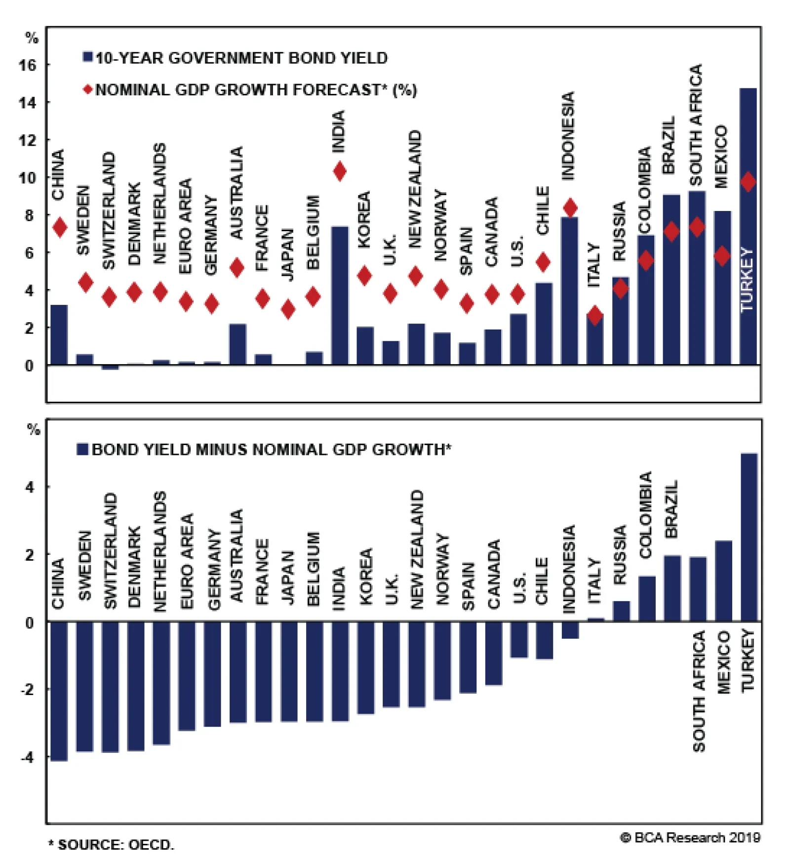
Given all of this turbulence, why have currency markets remained a relative oasis of calm? The simple answer is that exchange rates are, by definition, relative prices. And in the major economies, growth and inflation rates have moved in the same direction by the same amount at roughly the same time. In fact, looking at quarter-on-quarter growth rates, the major economies have all recently experienced identical 1.5 percent slowdowns: from 4 to 2.5 percent in the U.S.; and from 2.5 percent to around 1 percent in both the euro area and the U.K.2 (Chart I-6 - Chart I-8). Chart I-6U.S. GDP Growth Slowed By 1.5 Percent
U.S. GDP Growth Slowed By 1.5 Percent
U.S. GDP Growth Slowed By 1.5 Percent
Chart I-7Euro Area GDP Growth Slowed By 1.5 Percent
Euro Area GDP Growth Slowed By 1.5 Percent
Euro Area GDP Growth Slowed By 1.5 Percent
Chart I-8U.K. GDP Growth Slowed By 1.5 Percent
U.K. GDP Growth Slowed By 1.5 Percent
U.K. GDP Growth Slowed By 1.5 Percent
Markets do not care about the level of growth. They care much more about the change in growth. Financial markets are a discounting mechanism, and what matters most to the price is the change in the assumptions that are embedded within it. For example, if the price were discounting a major economy to grow at 4 percent and that rate of growth subsequently fell to 2.5 percent, then the seemingly benign outcome of respectable growth would cause interest rate expectations to decline. In another major economy, if growth slowed from 2.5 percent to 1 percent, it would precipitate a broadly similar decline in interest rate expectations. In this situation of synchronised and meaningful slowdowns across major economies, and the consequent policy responses, equity and bond absolute prices would experience wild gyrations. By contrast, currencies are relative prices. So if the decline in major economy growth rates and interest rate expectations were broadly similar, currency markets would remain a relative oasis of calm. Which perfectly describes the observation of the last six months. This observation of near-identical slowdowns in the major economies supports our thesis that their genesis came from outside the developed economies, which we expounded in A European Cycle ‘Made In China’. And now we present the smoking gun. While an eerie calm has descended over developed economy currencies, all the action has been in emerging economy currencies, especially the Chinese yuan which has rebounded sharply. The message from the currency markets reinforces our thesis: last year’s growth downswing and the current upswing were made in China (see final chart). Never Focus On Levels Of Economic Growth It is worth repeating that a head-to-head comparison of growth rates across different economies is a meaningless exercise. Here’s a simple way to grasp this crucial point: a 1.5 percent growth rate would be a very pleasing outcome for Europe, it would be a very unpleasing outcome for the U.S., and it would be a catastrophic outcome for China. The reason is that if a population is growing, the economy needs to generate real growth well in excess of the rate of population growth to improve (per person) living standards. That excess comes from productivity growth which lifts standards of living and wellbeing. In the case of Germany or Japan where the population is not growing, or is indeed shrinking, the GDP growth rate that is consistent with these rising standards of living is much lower than in those economies where the population is growing (Chart I-9 and Chart I-10). Chart I-9The Same Productivity Growth In The Euro Area And The U.S. ...
The Same Productivity Growth In The Euro Area And The U.S. ...
The Same Productivity Growth In The Euro Area And The U.S. ...
Chart I-10... Generates Different GDP Growth
... Generates Different GDP Growth
... Generates Different GDP Growth
Necessarily, an economy with weaker demographics – like Germany or Japan – will flirt with technical recessions much more often than one with population growth – like the U.S. or China. But this is just Arithmetic 101. It doesn’t mean that Germany or Japan are in a fundamentally worse shape when it comes to all-important productivity growth and improving wellbeing. Just as important for investors, earnings per share (eps) growth depends on productivity growth and not on GDP growth. Granted, higher GDP from an increasing population will boost a firm’s sales, but without increasing productivity, the firm will have to hire more staff to produce those sales. In essence, the firm will have to employ more capital – issue more shares – which means than earnings per share will not grow. To reemphasise, levels of GDP growth, in themselves, do not drive financial markets. The Perils Of Data-Dependency Recently, the world’s major central banks have become even more wedded to ‘data-dependency’, for two reasons: first, under ever increasing external scrutiny, objectivity to the economic data boosts the transparency and rationale of central bank policy; second, data-dependency acts as a foil to politicians who might want to influence or interfere with the independence of monetary policy. No names mentioned! We applaud the central banks for their good intentions. Yet enhanced data-dependency also carries perils, as it increases the amplitude of the ever-present and natural oscillations in economic growth. The reason is that the high-profile hard data on which monetary policy ‘depends’ such as CPI inflation and GDP growth record what happened in the past, and sometimes in the distant past. Meanwhile, a monetary policy shift today will act on the economy in the future due to the unavoidable lags in transmission. It follows that enhanced data-dependency is akin to a crop farmer who uses last season’s depressed price, from oversupply, to justify planting much less seed for next season. The inevitable undersupply at next season’s harvest will then cause the crop price to surge. Making the farmer plant much more for the following season, at which point the price will collapse again. And the oscillations will continue ad infinitum. Unfortunately, the more backward the data on which policy actions depend, the higher the amplitude of the price and output oscillations. Right now, growth sensitive investment positions are midway through exactly such an up-oscillation, justifying a near-term overweight in emerging market currencies, cyclical equity sectors, and equities versus bonds. But these rallies are highly unlikely to last beyond the summer (Chart I-11). Chart I-11The Recent Mini-Cycle Is ‘Made In China’
The Recent Mini-Cycle Is 'Made In China'
The Recent Mini-Cycle Is 'Made In China'
Stay tuned for the next turn. Fractal Trading System* We are pleased to report that long DAX versus the 30-year bund achieved its 2.5 percent profit target which is now crystallised and closed. This week we note that the sharp sell-off in AUD/CNY is close to the limit of tight liquidity that has signaled recent reversals in this cyclical currency cross. Accordingly, this week’s recommended trade is to go long AUD/CNY. Set a profit target of 1.5 percent with a symmetrical stop-loss. For any investment, excessive trend following and groupthink can reach a natural point of instability, at which point the established trend is highly likely to break down with or without an external catalyst. An early warning sign is the investment’s fractal dimension approaching its natural lower bound. Encouragingly, this trigger has consistently identified countertrend moves of various magnitudes across all asset classes. Chart I-12
Long AUD/CNY
Long AUD/CNY
The post-June 9, 2016 fractal trading model rules are: When the fractal dimension approaches the lower limit after an investment has been in an established trend it is a potential trigger for a liquidity-triggered trend reversal. Therefore, open a countertrend position. The profit target is a one-third reversal of the preceding 13-week move. Apply a symmetrical stop-loss. Close the position at the profit target or stop-loss. Otherwise close the position after 13 weeks. Use the position size multiple to control risk. The position size will be smaller for more risky positions. * For more details please see the European Investment Strategy Special Report “Fractals, Liquidity & A Trading Model,” dated December 11, 2014, available at eis.bcaresearch.com Dhaval Joshi, Chief European Investment Strategist dhaval@bcaresearch.com Footnote 1 The German 30-year bund. 2 Based on annualised quarter-on-quarter real GDP growth rates. Fractal Trading System Recommendations Asset Allocation Equity Regional and Country Allocation Equity Sector Allocation Bond and Interest Rate Allocation Currency and Other Allocation Closed Fractal Trades Trades Closed Trades Asset Performance Currency & Bond Equity Sector Country Equity Indicators Bond Yields Chart II-1Indicators To Watch - Bond Yields
Indicators To Watch - Bond Yields
Indicators To Watch - Bond Yields
Chart II-2Indicators To Watch - Bond Yields
Indicators To Watch - Bond Yields
Indicators To Watch - Bond Yields
Chart II-3Indicators To Watch - Bond Yields
Indicators To Watch - Bond Yields
Indicators To Watch - Bond Yields
Chart II-4Indicators To Watch - Bond Yields
Indicators To Watch - Bond Yields
Indicators To Watch - Bond Yields
Interest Rate Chart II-5Indicators To Watch - Interest Rate Expectations
Indicators To Watch - Interest Rate Expectations
Indicators To Watch - Interest Rate Expectations
Chart II-6Indicators To Watch - Interest Rate Expectations
Indicators To Watch - Interest Rate Expectations
Indicators To Watch - Interest Rate Expectations
Chart II-7Indicators To Watch - Interest Rate Expectations
Indicators To Watch - Interest Rate Expectations
Indicators To Watch - Interest Rate Expectations
Chart II-8Indicators To Watch - Interest Rate Expectations
Indicators To Watch - Interest Rate Expectations
Indicators To Watch - Interest Rate Expectations
Highlights Dovish Central Banks & Duration: Bond markets have shifted rapidly in recent weeks, pricing out any and all rate hikes expected over the next year in the major developed economies. With global growth likely to rebound in the latter half of the year, bond yields are now exposed to a hawkish repricing and recovery in inflation expectations, especially in the U.S. Stay below benchmark on overall portfolio duration on a medium-term basis. Model Bond Country Allocations: We are sticking with our current country tilts in our model bond portfolio, as the recent shift in central banker biases has done little to change the relative fundamental drivers between countries. Stay underweight the U.S., Canada & Italy, and overweight core Europe, Japan, the U.K., Spain & Australia, in currency-hedged global government bond portfolios. Feature Well, That Escalated Quickly With global growth remaining soggy, an increasing number of major central banks have been forced to rapidly shift in a more dovish direction. This past week alone, the European Central Bank (ECB), the Bank of Canada (BoC) and the Reserve Bank of Australia (RBA) all signaled that interest rates would be on hold for some time. The ECB went the extra step of announcing a new bank funding program (TLTRO-3), as we predicted last week, to prevent a deeper euro area growth downturn at a time of, as ECB President Mario Draghi described it, “pervasive uncertainty”. Government bond yields declined sharply in all three regions, as markets digested the dovish message from more cautious policymakers. Our Central Bank Monitors for the major developed economies are all decelerating, in line with the soft patch of global growth. Yet only the RBA Monitor has fallen to a level clearly signaling a need for easier monetary policy in Australia. For the other major countries, the Monitors are indicating that an unchanged monetary policy stance is appropriate, and all for the same reason – the loss of economic momentum has not been enough to loosen tight labor markets and drive core inflation rates lower. Government bond yields have already responded to a loss of global growth momentum by pricing out any rate hikes that were expected over the next year, most notably in the U.S. and Canada. Inflation expectations have also adjusted downwards in response to both diminished growth expectations and last year’s sharp plunge in global energy prices. We expect global growth to rebound in the latter half of 2019, alongside higher oil prices, leaving bond yields exposed to upside data surprises and a repricing of expectations for inflation and rate hikes (Chart of the Week). We continue to recommend a below-benchmark overall portfolio duration stance on a 6-12 month horizon, as government bond yields are likely to rise above the very flat forwards in most markets. Chart 1A Bottoming Out Process For Bond Yields
A Bottoming Out Process For Bond Yields
A Bottoming Out Process For Bond Yields
While maintaining a below-benchmark duration stance, the synchronized shift in central bank forward guidance justifies a review of the recommended country allocations in our model fixed income portfolio. Taking Stock Of Our Country Tilts In Our Model Bond Portfolio Global government bond yields peaked back in early November and have fallen in all of the major developed economies (Chart 2). Decomposing the move in benchmark 10-year yields into inflation expectations (using CPI swap rates) and real yields (the difference between nominal yields and CPI swap rates) shows that the bulk of that decline has come from lower real rates in the countries with positive policy rates (U.S., Canada, U.K. and Australia). For countries with zero or negative policy rates (core Europe, Japan), most of the yield decline has been due to falling inflation expectations. Yet the drivers of the decline in yields have changed from the latter two months of 2018 to the first few months of 2019. Generally speaking, the late-2018 bond market rally reflected falling inflation expectations, while recent changes have been a function of moves in real yields. Only in Australia have real yields and inflation expectations both declined steadily since the early November peak in global bond yields.
Chart 2
The greater influence of the real component of yields makes sense, as markets now discount fewer rate hikes and more accommodative monetary policy. Currently, our recommended country allocation in the Governments portion of our model bond portfolio includes underweights in the U.S., Canada and Italy and overweights in Australia, the U.K., Japan, Germany, France and Spain (the latter is a position versus Italy within an overall underweight stance on Peripheral European debt). In light of the more ubiquitously neutral/dovish global policy bias, we are reevaluating those country tilts per the following indicators: 1. Cyclical growth indicators: Both manufacturing purchasing managers indices (PMIs) and the leading economic indicators (LEIs) produced by the OECD are well off the cyclical peaks (Chart 3). In terms of levels, the PMIs are holding above the 50 threshold, suggesting expanding manufacturing activity, in the U.S., U.K., Canada and Australia, but are below 50 in the euro area and Japan. Chart 3Growth Has Lost Momentum Everywhere
Growth Has Lost Momentum Everywhere
Growth Has Lost Momentum Everywhere
2. Market-based inflation expectations: 10-year CPI swap rates have generally stabilized alongside energy prices, after the sharp drops seen in the latter months of 2018 (Chart 4). Australia is the lone exception where expectations continue to drift lower. The correlations between CPI swap rates and oil prices denominated in local currency are strongest in the U.S. and Canada and weakest in Australia. There is great diversity of the levels of CPI swap rates, however, from as low as 0.2% in Japan to as high as 3.5% in the U.K. Chart 4Inflation Expectations Are Stabilizing Outside Of Japan & Australia
Inflation Expectations Are Stabilizing Outside Of Japan & Australia
Inflation Expectations Are Stabilizing Outside Of Japan & Australia
3. Our Central Bank Monitors vs. our 12-month discounters: Except for Australia, our Monitors are all hovering very close to the zero line, indicating no pressure on policymakers to move policy rates (Chart 5). Our 12-month discounters, which measure the interest rate changes over the next year priced into Overnight Index Swap (OIS), are all close to zero, as well (again, with the exception of Australia, where a full 25bp rate cut is already priced). Chart 5Our Central Bank Monitors Are Calling For Stable Policy (ex Australia)
Our Central Bank Monitors Are Calling For Stable Policy (ex Australia)
Our Central Bank Monitors Are Calling For Stable Policy (ex Australia)
Just looking at these indicators, the ideal combination would be to underweight countries where yields are vulnerable to an upward repricing (PMIs still above 50, higher oil/CPI swaps correlations and no rate hikes priced) and to overweight countries where yields are less likely to rise (PMIs below 50, lower oil/CPI swaps correlations and where our 12-month discounters are not priced for rate cuts). Under these criteria, underweights in the U.S. and Canada are still justified, as are overweights in core Europe and Japan. The surprising firmness of the U.K. manufacturing PMI relative to the persistent downtrend in the U.K. LEI muddies the message a bit on Gilts, although the relatively high level of our 12-month discounter (still 13bps of hikes priced) is a bullish sign with our BoE Monitor now sitting right near zero. In Australia, the manufacturing PMI is also surprisingly firm but, the underlying weak momentum in overall Australian growth is leaving the door open to potential RBA rate cuts later this year. For all our country recommendations within our model bond portfolio framework, we always look at yields and returns on a currency-hedged basis in U.S. dollar terms. We do this to separate the fixed income component of global bond returns from the currency component. Yet when looking at the government bond yield curves in our model bond portfolio universe, hedged into USD, there is very little differentiation among those countries with the higher credit ratings (Chart 6). Only Spain (A-rated) and Italy (BBB-rated) have hedged yields that are outside the 2-3% range seen in the other major developed economies.
Chart 6
From a fundamental point of view, those narrow yield differentials among the higher-rated markets largely reflect the convergence of trend economic growth rates. In a recent Weekly Report, we looked at the long-run growth rates of potential GDP and labor productivity for the U.S., euro area and Japan and noted that the differences between them were fairly modest.1 This justified narrow currency-hedged yield differentials between U.S. Treasuries, German Bunds and Japanese government bonds (JGBs). When we add Canada, Australia and the U.K. to the mix (Chart 7), we can see similar convergence of potential GDP growth to rates between 1-2% and long-run productivity growth around 0.5% (using OECD data for both). Chart 7No Major Differences In Long-Run Growth Rates
No Major Differences In Long-Run Growth Rates
No Major Differences In Long-Run Growth Rates
The convergence is largely complete for all countries except Australia, where potential GDP growth is estimated to be 2.4%. Yet the long-run downtrend in potential growth is powerful and full convergence to the sub-2% levels seen in the other countries appears inevitable (and goes a long way in explaining the historically low level of Australian bond yields versus global peers). We can also see convergence in looking at the more recent history of the market pricing of the expected long-run neutral interest rate, using our real terminal rate proxy (the 5-year OIS rate, 5-years forward minus the 5-year CPI swap rate 5-years forward). Those measures for all of the major developed markets in our model bond portfolio are shown in Chart 8. The markets are pricing in real policy rate convergence, as well, with real rates expected to stay in a range between -0.5% (core Europe) and +0.5% (Canada). The U.K. is the one outlier, with the market pricing in a terminal real rate of -2%, although this likely reflects the markets discounting in the long-run effects of Brexit on the U.K. economy. Chart 8Markets Expect Near-Zero Real Terminal Rates (ex the U.K.)
Markets Expect Near-Zero Real Terminal Rates (ex the U.K.)
Markets Expect Near-Zero Real Terminal Rates (ex the U.K.)
So what does all this mean for our recommended country allocations in our model bond portfolio? In Chart 9, we show the relative performance of the each country, hedged into U.S. dollars and duration-matched) versus the Bloomberg Barclays Global Treasury Index. Our overweight tilts are in the top panel, while our underweight tilts are in the bottom panel. Chart 9Sticking With The Country Allocations In Our Model Bond Portfolio
Sticking With The Country Allocations In Our Model Bond Portfolio
Sticking With The Country Allocations In Our Model Bond Portfolio
Generally speaking, are recommendations have done well. Given our read on the indicators above, we see little reason to change the allocations. Our biggest concerns would be the underweights in Canada and Italy, given the sharp weakening of growth in both countries. For Italy, however, we view that as a negative given Italy’s high debt levels that require faster nominal growth to ensure debt sustainability. A more dovish ECB should help keep European bond volatility low, to the benefit of carry trades like Italian government bonds. However, we prefer to play that through our overweight in Spain while we await signs of stabilization in the Italian LEI before upgrading Italy in our model bond portfolio. As for Canada, we plan on doing a deeper dive on their economy and inflation trends in next week’s report before considering any changes to our allocation. Bottom Line: We are sticking with our current country tilts in our model bond portfolio, as the recent shift in central banker biases has done little to change the relative fundamental drivers between countries. Stay underweight the U.S., Canada & Italy, and overweight core Europe, Japan, the U.K., Spain & Australia, in currency-hedged global government bond portfolios. Robert Robis, CFA, Chief Fixed Income Strategist rrobis@bcaresearch.com 1 Please see BCA Global Fixed Income Strategy Weekly Report, “Europe & Japan: The Anchor Weighing On Global Bond Yields”, dated February 26, 2019, available at gfis.bcaresearch.com Recommendations The GFIS Recommended Portfolio Vs. The Custom Benchmark Index
Pervasive Uncertainty, Persuasive Central Banks
Pervasive Uncertainty, Persuasive Central Banks
Duration Regional Allocation Spread Product Tactical Trades Yields & Returns Global Bond Yields Historical Returns
Highlights Duration: With rate hikes more likely than cuts over the next 12 months, it makes sense to maintain below-benchmark duration in U.S. bond portfolios. However, timing the next up-move in Treasury yields is difficult. We recommend that investors initiate positive carry yield curve trades to boost returns while we wait for Treasury yields to bottom alongside the CRB/Gold ratio. Corporates: The Fed’s pause is leading to improvement in our global growth indicators. The end result is a window where corporate spreads will tighten during the next few months. Remain overweight corporate bonds, but be prepared to downgrade when spreads reach our targets. CMBS: We upgrade our allocation to non-agency CMBS from underweight to neutral, due to elevated spreads relative to other Aaa-rated sectors. While spreads are currently attractive, the macro back-drop is also fairly bleak. If spreads tighten to more reasonable levels or CMBS delinquencies start to rise we will be quick to downgrade. Feature Green Shoots For Global Growth Since 1994 the Global (ex. U.S.) Leading Economic Indicator (LEI) has contracted relative to its 12-month trend six times. In all six episodes it eventually dragged the U.S. LEI down with it (Chart 1). As we predicted last August, the U.S. economy cannot remain an oasis of prosperity when the rest of the world is in turmoil.1 However, to focus on the weakening U.S. data right now is to miss the bigger picture. Chart 1U.S. Follows The Rest Of The World
U.S. Follows The Rest Of The World
U.S. Follows The Rest Of The World
Corporate bond spreads already reacted to the global slowdown by widening near the end of last year. Then, the Federal Reserve reacted to tighter financial conditions by signaling a pause in its rate hike cycle. We took that opportunity to turn more bullish on spread product, and now, there are budding signs of improvement in the global growth outlook. While the Global LEI (including the U.S.) remains in a downtrend, our Global LEI Diffusion Index is well off its lows (Chart 2). Historically, the Diffusion Index has a good track record leading changes in the overall indicator. Chart 2Global LEI Diffusion Index Is Back Above 50%
Global LEI Diffusion Index Is Back Above 50%
Global LEI Diffusion Index Is Back Above 50%
Similarly, the timeliest indicators of global growth that called the early-2016 peak in credit spreads are starting to improve (Chart 3). The CRB Raw Industrials index is breaking out, the BCA Market-Based China Growth Indicator has recovered and Global Industrial Mining Stock prices are heading up. Chart 3Global Growth Checklist
Global Growth Checklist
Global Growth Checklist
All told, it appears that the Fed’s pause and related dollar weakness, along with less restrictive fiscal and monetary policies in China, are starting to pay dividends.2 The end result is a window where leading global growth indicators will improve and financial conditions will ease. We recommend that investors maintain an overweight allocation to corporate bonds during this supportive window, though we also note that the continued rapid pace of corporate re-leveraging is a cause for concern. We will be quick to downgrade our recommended allocation to corporate bonds when our near-term spread targets are hit. Our spread target for Aa-rated corporates is 57 bps, the current spread level is 61 bps. Our spread target for A-rated corporates is 85 bps, the current spread level is 92 bps. Our spread target for Baa-rated corporates is 128 bps, the current spread level is 159 bps. Our spread target for Ba-rated corporates is 188 bps, the current spread level is 243 bps. Our spread target for B-rated corporates is 297 bps, the current spread level is 400 bps. Our spread target for Caa-rated corporates is 573 bps, the current spread level is 827 bps. We recommend avoiding Aaa-rated corporate bonds, which already look expensive. We explore the universe of Aaa-rated spread product in more detail below. Implications For Treasury Yields The Fed’s pause and the nascent improvement in global growth are both obvious positives for corporate spreads. The impact on Treasury yields is somewhat less obvious. We contend that once financial conditions ease sufficiently, the market will start to price-in further Fed rate hikes and this will pressure Treasury yields higher at both the short and long ends of the curve. The ratio between the CRB Raw Industrials index and the gold price can help clarify this concept. Chart 4 shows that the 10-year Treasury yield tends to rise when the CRB index outpaces gold, and vice-versa. The rationale for this correlation is that the CRB index is a proxy for global growth and gold is a proxy for the stance of monetary policy. Chart 4Timing The Next Treasury Sell-Off
Timing The Next Treasury Sell-Off
Timing The Next Treasury Sell-Off
A rising gold price suggests that monetary policy is becoming increasingly accommodative. This eventually leads to an improvement in global growth and a rising CRB index. But Treasury yields do not rise alongside the CRB index. They only increase once the improvement in global growth is sufficient for the market to discount a tighter monetary policy. That moment occurs when the CRB index rises more quickly than the gold price. The bottom line is that with rate hikes more likely that cuts over the next 12 months it makes sense to maintain below-benchmark duration in U.S. bond portfolios. However, timing the next up-move in Treasury yields is difficult. We recommend that investors initiate positive carry yield curve trades to boost returns while we wait for Treasury yields to bottom alongside the CRB/Gold ratio.3 Checking In On The Labor Market Based on the number of emails we’ve received on the topic, the last two U.S. employment reports have stoked some confusion among investors. This is not surprising given the volatility in the headline numbers: Nonfarm payrolls increased +311k in January and only +20k in February. The U3 unemployment rate jumped to 4% in January, then fell back to 3.8% in February. The U6 unemployment rate jumped to 8.1% in January, then fell back to 7.3% in February. Much of the volatility is likely explained by data collection issues related to the partial government shutdown, which makes it useful to look through the noise and focus on a few important trends. Trend #1: Slow Growth In Q1 The employment data clearly point to a U.S. growth slowdown in the first quarter of 2019. Real GDP growth can be proxied by looking at the sum of the growth rate in aggregate hours worked and the growth rate in labor force productivity (Chart 5). The recent steep decline in hours worked suggests that first quarter growth is going to be weak. Chart 5Employment Data Point To Slow Growth In Q1
Employment Data Point To Slow Growth In Q1
Employment Data Point To Slow Growth In Q1
But as was noted in the first section of this report, weak Q1 GDP is the result of the global growth slowdown dragging the U.S. lower. Crucially, the market has already discounted this eventuality and the budding improvement in leading global growth indicators suggests that the U.S. slowdown will prove temporary. Trend #2: No More Slack A broad set of indicators now all point to the fact that the U.S. economy is at full employment (Chart 6). The implication is that we should expect wage growth to accelerate and payroll growth to decelerate as we move deeper into the cycle. Chart 6At Full Employment
At Full Employment
At Full Employment
Some investors may retain the belief that a rising labor force participation rate will keep wage growth capped, but even here the prospects are dim. The participation rate for people of prime working age (25-54) has risen rapidly during the past few years, but that has only led to a small bounce in overall participation (Chart 7). This is because the aging of the population has pushed more and more people out of that prime working age demographic bucket. Chart 7Labor Force Participation
Labor Force Participation
Labor Force Participation
The dashed line in the top panel of Chart 7 shows where the labor force participation rate would be, based on current demographics, if the participation rate for each narrow age cohort reverted to its July 2007 level. The message is that the scope for a further increase in labor force participation is limited. Trend #3: No Recession Risk Yet The full employment state of accelerating wage growth and decelerating employment growth can last for some time before a recession hits. In our research we have noted that, from a financial markets perspective, one of the best leading indicators is the change in initial jobless claims. Typically, a bottom in initial jobless claims coincides with an inflection point in Treasury excess returns (Chart 8). Chart 8Jobless Claims Have Called Troughs In Treasury Returns
Jobless Claims Have Called Troughs In Treasury Returns
Jobless Claims Have Called Troughs In Treasury Returns
Initial jobless claims have risen somewhat during the past few weeks, and while this trend is worth monitoring, it is premature to flag it as a concern. The 4-week moving average in claims has already fallen back to 226k from a recent high of 236k, and next week an elevated print of 239k will roll out of the 4-week average. Any initial claims print below 239k next week will cause the 4-week average to decline further. Bottom Line: The U.S. labor market has reached full employment. Going forward we should expect a continued acceleration in wage growth and deceleration in payroll growth. This situation can persist without causing a recession until initial jobless claims start to head higher. We see no evidence of this as of yet. Aaa-Rated Spread Products In this week’s report we consider the risk/reward trade-off on offer from the major Aaa-rated spread products. Specifically, we consider corporate bonds, agency and non-agency CMBS, conventional 30-year residential MBS and consumer ABS (both credit cards and auto loans). Focusing purely on expected returns, we find that non-agency CMBS offer the highest option-adjusted spread of 73 bps. This is followed by 65 bps from corporates, 50 bps from Agency CMBS, 41 bps from MBS, 35 bps from auto ABS and 31 bps from credit card ABS. But this is just one side of the equation. Chart 9 shows each sector’s spread relative to the likelihood that it will experience losses versus Treasuries. To measure the risk of losses we use our measure of Months-To-Breakeven. This is defined as the number of months of average spread widening that each sector requires before it starts to lose money relative to a duration-matched position in Treasury securities. Essentially, the Months-To-Breakeven measure is each sector’s 12-month breakeven spread adjusted by its spread volatility since 2014. We only calculate spread volatility since 2014 because that it is when data for Agency CMBS start.
Chart 9
Chart 9 shows that while Aaa corporate bonds offer elevated expected returns compared to the other sectors, they also offer a commensurate increase in risk. Similarly, consumer ABS offer lower expected returns than the other sectors but with considerably less risk. According to Chart 9, the only sector that offers an attractive risk/reward trade-off is non-agency CMBS. This warrants further investigation. Looking at spreads throughout history, we see that non-agency CMBS spreads also look relatively attractive. While Aaa-rated consumer ABS spreads are near all-time lows, non-agency CMBS spreads are still not quite one standard deviation below the pre-crisis mean (Chart 10). Chart 10CMBS Spreads Have Room To Narrow
CMBS Spreads Have Room To Narrow
CMBS Spreads Have Room To Narrow
We noted in last week’s report that consumer ABS look even worse when we incorporate the macro environment.4 All-time tight ABS spreads currently coincide with tightening consumer lending standards and a rising consumer credit delinquency rate. This is why we downgraded consumer ABS from neutral to underweight last week. The macro environment for CMBS is also fairly bleak (Chart 11). Commercial real estate lending standards are tightening, loan demand is waning and prices are decelerating. The one saving grace is that, so far, this has not translated into a rising CMBS delinquency rate (Chart 11, bottom panel). It is probably only a matter of time before CMBS delinquencies start to trend higher, but with spreads so attractive relative to the investment alternatives, the sector warrants better than an underweight allocation. Chart 11Delinquencies Biased Higher?
Delinquencies Biased Higher?
Delinquencies Biased Higher?
Bottom Line: We upgrade our allocation to non-agency CMBS from underweight to neutral. Spreads are currently attractive relative to other Aaa-rated sectors, but we will keep a close eye on the evolving macro backdrop. If spreads tighten to more reasonable levels or if CMBS delinquencies start to rise, we will be quick to downgrade. Ryan Swift, U.S. Bond Strategist rswift@bcaresearch.com Footnotes 1 Please see U.S. Bond Strategy Weekly Report, “An Oasis Of Prosperity”, dated August 21, 2018, available at usbs.bcaresearch.com 2 For further details on recent shifts in Chinese policy please see China Investment Strategy Weekly Report, “Dealing With A (Largely) False Narrative”, dated February 27, 2019, available at cis.bcaresearch.com 3 For more details on the attractiveness of positive carry yield curve trades please see U.S. Bond Strategy Weekly Report, “Paid To Wait”, dated February 26, 2019, available at usbs.bcaresearch.com 4 Please see U.S. Bond Strategy Portfolio Allocation Summary, “The Sequence Of Reflation”, dated March 5, 2019, available at usbs.bcaresearch.com Fixed Income Sector Performance Recommended Portfolio Specification
Rather ironically given its name, Modern Monetary Theory (MMT) plays down the influence of monetary policy over the economy. Its adherents argue that Congress, and not the Fed, should be responsible for maintaining full employment. A prolonged period of…
Highlights The deceleration in global growth that began in 2018 is entering a transition phase. The bottoming out process could prove to be volatile, warning against betting the farm too early on pro-cyclical currencies. Tactical short USD bets should initially be played via the euro1 and Swedish krona. The poor Canadian GDP report last week could be a harbinger for more data disappointments down the road. Meanwhile, the dovish shift by the ECB could paradoxically be bullish for the euro beyond the near term. Go short USD/SEK and buy EUR/CAD for a trade. Feature A currency exchange rate is simply a measure of relative prices between two countries. As such, the starting point for any currency forecast should be how those values are likely to evolve over time. For much of 2018, U.S. growth benefited from the impact of the Trump tax cuts, a boost to government spending agreed in January of that year, and the lagged effect of an easing in financial conditions from December 2016 to January 2018. Outside the U.S., what appeared to be idiosyncratic growth hiccups in both Europe and Japan finally morphed into full-blown slowdowns. Slower Chinese credit growth and the U.S.-China trade war were the ultimate straws that broke the camel’s back, deeply hurting global growth (Chart I-1). Consequently, the greenback surged. Chart I-1The Global Growth Slowdown Persists
The Global Growth Slowdown Persists
The Global Growth Slowdown Persists
Fading U.S. Dollar Tailwinds At first glance, the picture remains largely similar today, with global growth still slowing and U.S. growth still outperforming. However, a key difference from last year is that U.S. growth leadership is set to give way to the rest of the world. The U.S. ISM manufacturing PMI peaked last August and has been steadily rolling over relative to its trading partners. The U.S. economic surprise index tells a similar story, with last month’s disappointing retail sales numbers nudging the series firmly below zero. Relative leading economic indices also suggest that U.S. growth momentum has slowed relative to the rest of the world. Historically, the relative growth differential between the U.S. and elsewhere has had a pretty good track record of dictating trends in the dollar (Chart I-2). Chart I-2U.S. Growth Leadership Might Soon End
U.S. Growth Leadership Might Soon End
U.S. Growth Leadership Might Soon End
Whether or not these trends persist beyond the first quarter will depend on the sustainability of China’s recent stimulus efforts. On the positive side, typical reflation indicators such as commodity prices, emerging market currencies, and industrial share prices have perked up in response to a nascent upturn in the credit impulse. On the other hand, policy shifts affect the economy with a lag, suggesting it is too early to tell whether the latest credit injection has been sufficient to turn around the Chinese economy, let alone the rest of the world. What is clear is that the bottoming processes tend to be volatile and protracted, suggesting it is still too early to bet the farm on pro-cyclical currencies. In the interim, investors could track the following indicators to help time a definitive turning point: Whether or not easing liquidity conditions will lead to higher growth is often captured by the CRB Raw Industrial index-to-gold, copper-to-gold, and oil-to-gold ratios. It is encouraging that these also tend to move in lockstep with the U.S. bond yields, another global growth barometer. The power of the signal is established when all three indicators peak or bottom at the same time, as is the case now (Chart I-3). The next confirmation will come with a clear break-out in these ratios. Chart I-3Reflation Indicators Are Perking Up
Reflation Indicators Are Perking Up
Reflation Indicators Are Perking Up
Chinese M2 relative to GDP has bottomed. Historically, this ratio has lit a fire under cyclical stocks and, by extension, pro-cyclical currencies (Chart I-4). The growth rate is still at zero, meaning excess liquidity is not accelerating on a year-over-year basis. Meanwhile, our Emerging Markets team argues that broad credit growth is still decelerating.2 A break above the zero line, probably in the second half of this year, could be a catalyst to shift fully to a pro-cyclical currency stance. Chart I-4Chinese Excess Liquidity Improving
Chinese Excess Liquidity Improving
Chinese Excess Liquidity Improving
On a similar note, currencies in emerging Asia that sit closer to the epicenter of stimulus appear to have bottomed. If those in Latin America can follow suit, it would indicate that policy stimulus is sufficient, and the transmission mechanism is working (Chart I-5). Chart I-5EM Currencies Are Trying To Bottom
EM Currencies Are Trying To Bottom
EM Currencies Are Trying To Bottom
Finally, China-sensitive industrial commodities, especially metals and building materials, appear to have troughed and are perking up nicely. There was a supply-related issue with the Vale dam bursting in Brazil and a subsequent surge in iron-ore prices, but it is now clear that the entire industrial commodity complex has stopped falling (Chart I-6). Chart I-6Chinese Industrial Commodities Are Rallying
Chinese Industrial Commodities Are Rallying
Chinese Industrial Commodities Are Rallying
Be Selective On USD Shorts Our strategy is to be selective as U.S. dollar tailwinds shift to headwinds, by initially expressing tactical USD shorts via the euro and the Swedish krona. Last week, we highlighted the fact that investors are currently too pessimistic on Europe’s growth prospects. More importantly, most of the factors that toppled European growth domestically – the implementation of new auto-emission standards in Germany, the rising cost of capital in Italy via exploding bond yields, and the populist Gilets Jaunes protests in France – are mostly behind us. Fiscal policy is also set to be loosened this year, and last year’s weakness in the euro will contribute to easier financial conditions. The improvement in European investor sentiment relative to current conditions could be a harbinger of positive euro area data surprises ahead (Chart I-7). Chart I-7Euro Zone Data Might Surprise To The Upside
Euro Zone Data Might Surprise To The Upside
Euro Zone Data Might Surprise To The Upside
The European Central Bank left rates unchanged at yesterday’s policy meeting but the decision for a new Targeted Long Term Refinancing Operation (TLTRO III – or in other words, cheap loans), could be paradoxically bullish for the euro. If a central bank eases financing conditions at a time when growth is hitting a nadir, it is tough to argue that this is bearish for the currency. Our Global Fixed Income team nailed the move by the ECB in this week’s report.3 European banks have been in the firing line of sluggish growth, negative interest rates, and increased regulatory scrutiny. In the case of Italy, an NPL ratio 9.4% is nearly triple that of the euro area. And with circa 10% of total bank lending in Spain and Italy funded by TLTROs, re-funding by the ECB is exactly what the doctor ordered. In the case of the Sweden, the undervaluation of the krona has begun to mitigate the effects of negative interest rates – mainly a buildup of household leverage and an exodus of foreign direct investment. The GDP report last week was well above expectations, with year-on-year growth of 2.4%. Encouragingly, this was driven by net exports rather than consumption. The Swedish manufacturing PMI release for February was also very encouraging. Orders jumped from 50.4 to 54.0 while export orders jumped from 51.5 to 53.4. The growth in wages is beginning to catch up to new borrowings, meaning domestic consumption could be increasingly financed through income. This will alleviate the need for the Riksbank to maintain an ultra-accommodative policy. On a relative basis, the Swedish economy appears to have bottomed relative to that of the U.S., making the USD/SEK an attractive way to play USD downside. From a technical perspective, the cross is facing strong resistance at the triple top established from the 2009 highs around 9.45 (Chart I-8). Aggressive investors should begin accumulating short positions, while being cognizant of the negative carry. Chart I-8The Swedish Krona Looks Like A Buy
The Swedish Krona Looks Like A Buy
The Swedish Krona Looks Like A Buy
Bottom Line: Our favorite indicator for gauging ultimate downside in the dollar is the gold-to-bond ratio. Ever since the global financial crisis, gold has stood as a viable threat to dollar liabilities, capturing the ebb and flow of investor confidence in the greenback tick-for-tick (Chart I-9). Any sign that the balance of forces are moving away from the U.S. dollar will favor a breakout in the gold-to-bond ratio. For now, USD short positions should be played via the euro and Swedish krona. Chart I-9Pay Close Attention To The Gold-To-Bond Ratio
Pay Close Attention To The Gold-To-Bond Ratio
Pay Close Attention To The Gold-To-Bond Ratio
Buy EUR/CAD For A Trade Last week saw an extremely disappointing GDP report out of Canada, which prompted the Bank of Canada to keep interest rates on hold this week, followed by quite dovish commentary. In a 90-degree maneuver from its January policy statement that rates will need to rise over time, BoC Governor Stephen Poloz said the path for future increases had become “highly uncertain.” Like many central banks around the world, the BoC has been blindsided by the depth of the negative growth impulse outside its borders, which has begun to seep into the domestic economy. The economy grew at an annualized pace of 0.4% in the fourth quarter, the lowest in over two years. Capital expenditures collapsed at a rate of 2.7%, marking the third consecutive quarter of declines. The forward OIS curve is pricing in no rate hikes for Canada this year, meaning sentiment on the loonie is already depressed. However, our contention is that even if growth bottoms by the second half of this year, the Canadian dollar will offer little value to play this cyclical rebound. Our recommendation is to play the loonie’s downside via the euro. First, valuations and balance-of-payment dynamics favor the euro versus the CAD on a long-term basis. Second, we estimate there is more scope for long-term interest rate expectations to rise in the euro area than in Canada (Chart I-10). European rates are further below equilibrium, and the ECB’s dovish shift will help lift the growth potential of the euro area. Meanwhile, the Canadian neutral rate will be heavily weighed down by the large stock of debt in the Canadian private sector, exacerbated by overvaluation in the housing market. This means that expectations in the 2-year forward market are likely to favor the euro versus the CAD. Chart I-10Buy EUR/CAD For A Trade
Buy EUR/CAD For A Trade
Buy EUR/CAD For A Trade
The biggest risk to this view is the price of oil. The EUR/CAD exchange rate is not as negatively correlated with oil as the USD/CAD, but nonetheless the CAD benefits more from rising oil prices than the euro does. BCA’s bullish oil view is a risk over the next six months. On the downside, the EUR/CAD could potentially test the bottom of the upward trending channel that has existed since 2012. This would put EUR/CAD in the vicinity of 1.45 (currently trading at 1.5049). However, initial upside resistance rests at the triple top a nudge above 1.6 (Chart I-11). Chart I-11EUR/CAD Technicals: Limited Downside
EUR/CAD Technicals: Limited Downside
EUR/CAD Technicals: Limited Downside
Meanwhile, economically, Canada is benefiting less from oil prices today than it has in the past. First, the Canadian oil benchmark trades at a large discount to Brent, and second, Canada is having trouble shipping its own oil at a moderate cost due to lack of pipeline capacity.4 Bottom Line: Investors should buy the EUR/CAD for a trade. The Canadian dollar is likely to outperform its antipodean counterparts, but faces limited upside versus the U.S. dollar. There are better opportunities to play USD downside, namely via the Swedish krona and the euro. Stand Aside On The Australian Dollar For more than two decades, the Australian dollar has tended to be mostly driven by external conditions, especially the commodity cycle. But for the first time in several years, domestic factors have joined in to exert powerful downward pressure on the currency. The Australian Prudential Regulation Authority (APRA) has been on a mission to surgically deflate the overvalued housing market, while engineering a soft landing in the economy. Initially, their macro-prudential measures worked like a charm, as owner-occupied housing activity remained resilient relative to “investment-style” housing. What has become apparent now is that the soft landing intended by the authorities is rapidly morphing into a housing crash (Chart I-12). Chart I-12Australia: Anatomy Of A Hard Landing
Australia: Anatomy Of A Hard Landing
Australia: Anatomy Of A Hard Landing
In addition, the upcoming general election could exacerbate the risks to the country’s banks and the housing market.5 The center-left Labour Party, which has moved further to the left in this electoral cycle, has promised several regulatory changes. First, the Labour government would want to get rid of “negative gearing,” the practice of using investment properties that are generating losses to offset one’s income tax bill. Second, the capital gains tax exemption from selling properties will be reduced from 50% to 25%. Third, the Labour government would end the policy of reimbursing investors for the corporate tax paid by the company. This would end the incentive for retirees to own high dividend yielding equities, such as those of Australian banks. This week, the Reserve Bank of Australia kept rates on hold and acknowledged risks to the housing market, but bank stocks suggest they remain well behind the curve (Chart I-13). The futures market is already pricing in 23 basis points of rate cuts by the end of the year, and the contention of our fixed income team is that more might be needed down the road. First, all the preconditions for a rate hike – underemployment below 8%, a rebound in Chinese economic activity and core CPI in the range of 2-3% – have not been met. The reality is that core CPI has lagged the target range since late-2015, and now faces downside risks. Chart I-13Australian Bank Stocks Are Pricing In A Curve Inversion
Australian Bank Stocks Are Pricing In A Curve Inversion
Australian Bank Stocks Are Pricing In A Curve Inversion
That said, a lot of the bad news already appears priced into the Australian dollar, which is down 14% from its 2018 peak, and 37% from its 2011 peak. This suggests outright short AUD bets are at risk from either upside surprises in global growth, or simply the forces of mean reversion (Chart I-14). Chart I-14Stand Aside On The Australian Dollar For Now
Stand Aside On The Australian Dollar For Now
Stand Aside On The Australian Dollar For Now
Bottom Line: Sentiment on the Aussie dollar is already bearish, warning against putting on fresh shorts. Our short AUD positions, expressed via the NZD and the CAD, are currently 6.74% and 1.99% in the money, respectively. Investors should hold onto these positions, but tighten stops to protect profits. Chester Ntonifor, Foreign Exchange Strategist chestern@bcaresearch.com Footnotes 1 Please see Foreign Exchange Strategy Special Report titled “A Contrarian Bet On The Euro,” dated March 1, 2019 available at fes.bcaresearch.com 2 Please see Emerging Markets Strategy Weekly Report titled “EM: A Sustainable Rally Or False Start?,” dated March 7, 2019 available at ems.bcaresearch.com 3 Please see Global Fixed Income Strategy Special Report, titled “The ECB’s Next Move: Taking Out Some Insurance,” dated March 5, 2019, available at gfis.bcaresearch.com 4 Please see Commodity & Energy Strategy Weekly Report, titled “Oil Price Diffs: Global Convergence,” dated March 7, 2019, available at ces.bcaresearch.com 5 Please see Geopolitical Strategy Special Report, titled “A Year Of Change In Australia?,” dated December 5, 2018, available at gps.bcaresearch.com Currencies U.S. Dollar Chart II-1USD Technicals 1
USD Technicals 1
USD Technicals 1
Chart II-2USD Technicals 2
USD Technicals 2
USD Technicals 2
Recent data in the U.S. have been mixed: Annualized Q4 GDP growth came in line with expectations at 2.6%, but both the Atlanta and New York Fed models suggest sub 1% growth in Q1 this year. ISM manufacturing PMI missed expectations, falling to 54.2, while the non-manufacturing PMI increased to 59.7. Q4 unit labor costs increased to 2%, surprising to the upside. The DXY index has gained 1.17% this week. Upside on the dollar will be based on Fed’s capacity to continue tightening monetary policy later this year. However, there are increasing signs pointing to a weakening in leadership of U.S. growth this cycle, which could be a headwind for the counter-cyclical dollar. Report Links: Balance Of Payments Across The G10 - February 15, 2019 A Simple Attractiveness Ranking For Currencies - February 8, 2019 Global Liquidity Trends Support The Dollar, But... - January 25, 2019 The Euro Chart II-3EUR Technicals 1
EUR Technicals 1
EUR Technicals 1
Chart II-4EUR Technicals 2
EUR Technicals 2
EUR Technicals 2
Recent data in the euro area show some specter of stabilization: Yearly consumer price inflation increased to 1.5%, in line with expectations. Q4 GDP growth on a year-on-year basis fell to 1.1%, marginally in line. Encouragingly, the Markit composite PMI increased to 51.9. The manufacturing PMI came in at 49.3, while services PMI came in at 52.8. Finally, retail sales grew higher than expected, with a reading of 2.2%. EUR/USD has fallen by 1.3% this week. The ECB kept interest rates on hold with a dovish tilt. Paradoxically, this could be bullish for the euro, if it allows growth to definitively bottom. Easing financial conditions in the euro area are reflationary and risks to the periphery have been curtailed. Report Links: A Contrarian Bet On The Euro - March 1, 2019 Balance Of Payments Across The G10 - February 15, 2019 A Simple Attractiveness Ranking For Currencies - February 8, 2019 The Yen Chart II-5JPY Technicals 1
JPY Technicals 1
JPY Technicals 1
Chart II-6JPY Technicals 2
JPY Technicals 2
JPY Technicals 2
Recent data in Japan have been mixed: Yearly inflation surprised to the upside, coming in at 0.6%. The core inflation excluding fresh food also came in higher than expected at 1.1%. January unemployment rate missed expectations, climbing to 2.5%; while the jobs-to-applicants ratio stayed at 1.63. Nikkei manufacturing PMI surprised to the upside, coming in at 48.9. USD/JPY has risen by 0.4% this week. While we are positive on the safe-haven yen on a structural basis, we struggle to see any near-term upside amid significant Japanese stock and bond outflows. We will be discussing the outlook for the yen in an upcoming report. Report Links: Balance Of Payments Across The G10 - February 15, 2019 A Simple Attractiveness Ranking For Currencies - February 8, 2019 Yen Fireworks - January 4, 2019 British Pound Chart II-7GBP Technicals 1
GBP Technicals 1
GBP Technicals 1
Chart II-8GBP Technicals 2
GBP Technicals 2
GBP Technicals 2
Recent data in the U.K. have been improving: February consumer confidence came in at -13, slightly higher than expectations. Markit manufacturing PMI came in at 52, in line with expectations; while the services PMI surprised to the upside, coming in at 51.3. The Halifax house price index surprised to the upside, rising 5.9% mom in February. GBP/USD has fallen by 1.2% this week. During the speech on March 5, the Bank of England governor Mark Carney highlighted the market underestimates the potential for interest rate hikes. Overall, we remain bullish on the pound in the long-term, but volatility is set to rise in the near term as we approach the Brexit March 29 deadline. Report Links: Balance Of Payments Across The G10 - February 15, 2019 A Simple Attractiveness Ranking For Currencies - February 8, 2019 Deadlock In Westminster - January 18, 2019 Australian Dollar Chart II-9AUD Technicals 1
AUD Technicals 1
AUD Technicals 1
Chart II-10AUD Technicals 2
AUD Technicals 2
AUD Technicals 2
Recent data in Australia have been dismal: The RBA commodity price index advanced by 9.1% year-on-year in February, but this was supply related. Building permits continue to contract at 29% year-on-year. Finally, the annualized Q4 GDP growth fell to 0.2%, more than 50% below expectations. AUD/USD fell by 1.2% this week. The RBA kept the interest rate unchanged at 1.5%. Governor Philip Lowe acknowledged the downside risks to the housing market and overall economy, and warned about the “significant uncertainties around the forecast.” That said, AUD/USD has fallen by a 13% since the January 2018 highs, warning against establishing fresh shorts at this juncture. Report Links: Balance Of Payments Across The G10 - February 15, 2019 A Simple Attractiveness Ranking For Currencies - February 8, 2019 CAD And AUD: Jumping Higher To Plunge Deeper - February 1, 2019 New Zealand Dollar Chart II-11NZD Technicals 1
NZD Technicals 1
NZD Technicals 1
Chart II-12NZD Technicals 2
NZD Technicals 2
NZD Technicals 2
Recent data in New Zealand have been mixed: Seasonally adjusted building permits increased 16.5% month-on-month in January, a huge jump. However, the ANZ activity business confidence dropped to -30.9. Most importantly, terms of trade fell to -3% in the fourth quarter, underperforming expectations. NZD/USD depreciated by 0.9% this week. The key for the Kiwi will be a pickup in agricultural commodity prices, which remain in a definitive bear market. Report Links: Balance Of Payments Across The G10 - February 15, 2019 A Simple Attractiveness Ranking For Currencies - February 8, 2019 Updating Our Intermediate Timing Models - November 2, 2018 Canadian Dollar Chart II-13CAD Technicals 1
CAD Technicals 1
CAD Technicals 1
Chart II-14CAD Technicals 2
CAD Technicals 2
CAD Technicals 2
Recent data in Canada have been disappointing: Q4 current account balance has deteriorated, coming in at C$ -15.48 billion. Moreover, annualized Q4 GDP growth missed analysts’ forecast, coming in at 0.4%. Finally, the Markit manufacturing PMI weakened to 52.6 in February. USD/CAD has gained 2.1% this week. The BoC kept interest rates on hold at 1.75% given that domestic economic conditions have now coupled to the downside with a bleak external picture. The caveat for the Canadian dollar is that rising oil prices could provide some support. Report Links: Balance Of Payments Across The G10 - February 15, 2019 A Simple Attractiveness Ranking For Currencies - February 8, 2019 CAD And AUD: Jumping Higher To Plunge Deeper - February 1, 2019 Swiss Franc Chart II-15CHF Technicals 1
CHF Technicals 1
CHF Technicals 1
Chart II-16CHF Technicals 2
CHF Technicals 2
CHF Technicals 2
Recent data in Switzerland have been negative: Annualized Q4 GDP growth missed analysts’ expectations by 50%, coming in at 0.2%. In addition, the retail sales contracted 0.4% year-on-year. Lastly, CPI was in line at 0.6%, but this is a far cry from the March 2018 peak. EUR/CHF has been flat this week. Overall, we are bullish EUR/CHF on a cyclical basis. Stabilization in global growth will make safe-haven currencies like the franc less attractive. In addition, the foreign direct investment and portfolio investment outflows from Switzerland should put more downward pressure on the franc. Report Links: Balance Of Payments Across The G10 - February 15, 2019 A Simple Attractiveness Ranking For Currencies - February 8, 2019 Waiting For A Real Deal - December 7, 2018 Norwegian Krone Chart II-17NOK Technicals 1
NOK Technicals 1
NOK Technicals 1
Chart II-18NOK Technicals 2
NOK Technicals 2
NOK Technicals 2
Recent data in Norway have been mixed: Monthly unemployment rate fell to 2.5%, in line with expectations. However, the Q4 current account balance fell to 46.8 billion from 91.36 billion in Q3. The manufacturing PMI has been stable for a few months now, coming in at 56.3 for the month of February. USD/NOK increased by 2.2% this week. We are optimistic on the NOK on a structural basis, given the positive outlook for oil prices. Moreover, the NOK is undervalued and trading at a large discount to its long-term fair value. Report Links: Balance Of Payments Across The G10 - February 15, 2019 A Simple Attractiveness Ranking For Currencies - February 8, 2019 Global Liquidity Trends Support The Dollar, But... - January 25, 2019 Swedish Krona Chart II-19SEK Technicals 1
SEK Technicals 1
SEK Technicals 1
Chart II-20SEK Technicals 2
SEK Technicals 2
SEK Technicals 2
Recent data in Sweden have been positive: Retail sales was in line with expectations at 0.8% month-on-month. However, annualized Q4 GDP growth was double expectations at 1.2%. The February manufacturing PMI also came in higher at 52.5. In addition, industrial production yearly growth came in higher at 3.4%. Lastly, the Q4 current account balance increased to 39.6 billion. USD/SEK increased by 2% this week. The SEK is still trading at a large discount to its long-term fair value. We remain bearish on USD/SEK on a structural basis as we see many signs pointing to a recovery in the Swedish economy, which is a tailwind for the Swedish krona. Report Links: Balance Of Payments Across The G10 - February 15, 2019 A Simple Attractiveness Ranking For Currencies - February 8, 2019 Global Liquidity Trends Support The Dollar, But... - January 25, 2019 Trades & Forecasts Forecast Summary Core Portfolio Tactical Trades Closed Trades
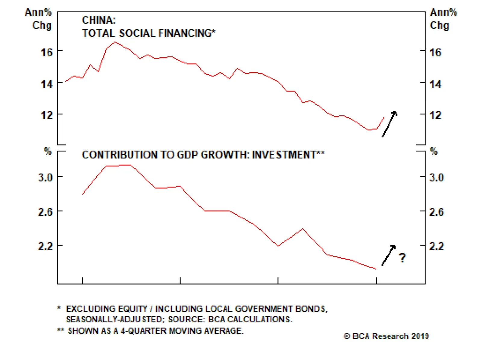
Fixed investment spending in China is generally financed through credit markets. The above chart shows that the contribution of investment spending to GDP growth has declined in tandem with decelerating credit growth. Chinese credit growth has typically…
Highlights Analysis on Indonesia is available below. EM financial markets have diverged from the global growth indicators they have historically correlated with. This raises doubts about the sustainability of this rally. In China, broad bank credit has not accelerated at all, while non-bank credit growth rose sharply in January. The lack of recovery in broad bank credit growth is corroborated by lingering sluggishness in broad money growth. This refutes widespread perception in the global investment community that Chinese banks have re-opened the credit spigots again. Feature The headline news has all been positive for emerging markets over the past two months: The Federal Reserve is going on hold, China is stimulating its economy, the U.S. and China are nearing a trade agreement and risk-on market dynamics are permeating worldwide. Nevertheless, EM stocks have failed to outperform the global equity benchmark (Chart I-1, top panel). Notably, EM relative equity performance rolled over in late December when global share prices bottomed. Chart I-1EM Stocks Have Underperformed DM Ones Since Late December
EM Stocks Have Underperformed DM Ones Since Late December
EM Stocks Have Underperformed DM Ones Since Late December
In absolute terms, EM equities have been attempting to break above their 200-day moving average, but have so far failed to do so decisively (Chart I-1, bottom panel). When a market struggles to break out or outperform amid favorable news flows and buoyant investor sentiment, the odds are that it is facing formidable headwinds under the surface, and is at risk of relapsing. We sense EM currently fits this profile. Needless to say, investor consensus is very bullish on EM, and dominated by the above-mentioned narrative, specifically the Fed turning dovish and China stimulating, which is reminiscent of 2016 when EM staged a cyclical rally. Consequently, investors have rushed to pile into EM stocks and fixed-income. Chart I-2 illustrates that asset managers’ net holdings of EM ETF (EEM) futures have doubled since October 2018. Chart I-2Investor Consensus Is Very Bullish On EM
Investor Consensus Is Very Bullish On EM
Investor Consensus Is Very Bullish On EM
As of mid-February, EMs were by far the most overweight region within global equity portfolios, according to the most recent Bank of America/Merrill Lynch survey. The survey states that net 37% of global equity investors - who participated in the survey - were overweight EM. One of our clients that we met with on the road last week summed it up like this: “Investors have ‘recency bias’.” In other words, investors believe that 2019 will resemble 2016, and in turn have no appetite to bet against Chinese stimulus. We are in accord with this interpretation of investor behavior and the EM/China rally. Yet there are some noteworthy differences between today and 2016. First, in 2016, there was massive stimulus for China’s property market. At the time, the People’s Bank of China (PBoC) monetized the unsold housing stock in Tier-3 and -4 cities via its Pledged Supplementary Lending facility. At present, there is no stimulus for real estate. Second, by early 2016 EM profits had already contracted substantially. EM profits have yet to shrink in the current downtrend. Our thesis is that EM profits will contract this year for reasons we elaborated on in depth in our previous report, Mind The Time Gap. China’s credit and fiscal impulse leads EM/Chinese profits by about 12 months, and the recent improvement in this indicator, if sustained, suggests that a trough in EM/Chinese corporate earnings will only be reached in late 2019 (Chart I-3). Therefore, as EM profits shrink, investors will likely sell EM risk assets. Chart I-3EM Corporate Earnings Are Beginning To Contract
EM Corporate Earnings Are Beginning To Contract
EM Corporate Earnings Are Beginning To Contract
Altogether, these differences with 2016 make us reluctant to chase the current EM rally, and we continue to expect a meaningful reversal in EM risk assets in the months ahead. Monitoring Global Growth We maintain that EM is much more leveraged to global trade and China’s growth than to Fed policy. For a detailed discussion on this matter, please refer to EM: A Replay of 2016 or 2001? report from February 7, 2019. Therefore, the Fed’s dovish turn is not a sufficient reason to buy EM risk assets. To buy EM cyclically, we would need to change our outlook on global trade and Chinese imports. China influences the rest of the world via its imports. A closer look at the indicators that correlate with EM risk assets and commodities do not justify the recent EM rebound. In particular: The import sub-component of China’s NBS manufacturing PMI strongly correlates with EM share prices, excess returns in EM sovereign credit, and industrial metals prices and suggest that investors should fade this rebound (Chart I-4). Chart I-4EM Stocks, EM Credit Markets, As Well As Commodities Prices Are Driven By Chinese Imports
EM Stocks, EM Credit Markets, As Well As Commodities Prices Are Driven By Chinese Imports
EM Stocks, EM Credit Markets, As Well As Commodities Prices Are Driven By Chinese Imports
The Caixin manufacturing PMI for China was up in February, but the NBS manufacturing PMI fell. In turn, manufacturing PMI indexes in Korea, Taiwan, Japan and Singapore are all plunging, with several of them dropping well below the 50 boom-bust mark (Chart I-5). Chart I-5Asian Manufacturing Is Contracting
Asian Manufacturing Is Contracting
Asian Manufacturing Is Contracting
Korean, Taiwanese, Japanese and Singaporean shipments to China were shrinking in January, while their exports to the U.S. were resilient (Chart I-6). This confirms that global trade has been weak due to China, and that there are no signs of its reversal. Chart I-6Asian Exports To China And U.S.
Asian Exports To China And U.S
Asian Exports To China And U.S
Moreover, Korea released its February export data, and its aggregate outbound shipments are contracting (Chart I-7). Chart I-7Korean Exports: Deepening Contraction
Korean Exports: Deepening Contraction
Korean Exports: Deepening Contraction
Further, China’s container freight index – the price to ship containers – has rolled over again after picking-up late last year due to front-loading of shipments to the U.S. which were induced by the U.S. import tariffs. This signals ongoing weakness in global demand, and does not justify the latest rebound in EM financial markets in general and currencies in particular (Chart I-8). Chart I-8Global Trade Is A Risk To EM Currencies
Global Trade Is A Risk To EM Currencies
Global Trade Is A Risk To EM Currencies
Finally, even in the U.S. where manufacturing has been the most resilient globally, the odds point to notable weakness in this sector. Specifically, the continuous underperformance of U.S. high-beta industrial stocks to U.S. overall industrials beckons a further slowdown in American manufacturing (Chart I-9). Chart I-9U.S. Manufacturing Is In A Soft Spot
U.S. Manufacturing Is In A Soft Spot
U.S. Manufacturing Is In A Soft Spot
Bottom Line: Although financial markets are forward-looking, the recent rally has been too fast and has already gone too far. This has created conditions for a material setback as global/China growth will continue to disappoint in the months ahead. China: Credit Versus Money Growth We have been receiving questions from clients as to whether investors should heed to the message from China’s money or credit data, given they are presently sending contradictory messages (Chart I-10). Chart I-10China: Narrow, Broad Money, And Aggregate Credit
China: Narrow, Broad Money, And Aggregate Credit
China: Narrow, Broad Money, And Aggregate Credit
Even though narrow money (M1) has historically been an excellent indicator for China/EM business cycles, the most recent (January) print – M1 annual growth rate registered a record low – was distorted due to technical/seasonal factors, and should be ignored. Specifically, deposits by enterprises plunged in January and household deposits surged as companies paid out bonuses to employees in late January ahead of the Chinese New Year that began on February 5 (Chart I-11). Provided enterprise demand deposits are in M1 but household demand deposits are a part of M2, M1 was artificially depressed in January. It will rebound in February. Chart I-11China: Technical Reasons For M1 Plunge In January
China: Technical Reasons For M1 Plunge In January
China: Technical Reasons For M1 Plunge In January
Broad money provides a more comprehensive picture of money creation in China. As such, it is more relevant to compare broad money with aggregate credit. To compute aggregate credit, we add outstanding central and local government bonds to Total Social Financing (TSF). Chart I-12 illustrates the latest improvement in aggregate credit is not confirmed by either the PBoC’s broad money measure, M2, or our measure, M3 (M3 = M2 plus other deposits plus banks’ other liabilities excluding bonds). We created this M3 measure of broad money supply because in our opinion, M2 has been underestimating the extent of money creation in China in recent years due to financial engineering. Chart I-12The Recent Uptick In Aggregate Credit Is Not Confirmed By Broad Money
The Recent Uptick In Aggregate Credit Is Not Confirmed By Broad Money
The Recent Uptick In Aggregate Credit Is Not Confirmed By Broad Money
As discussed in Box I-1 on pages 12-13, lending or purchasing of securities by banks simultaneously creates money. Therefore, bank broad credit acceleration should be mirrored in a broad money upturn. Does the lack of revival in broad money mean the latest uptick in aggregate credit data has been driven by non-bank credit? Our analysis suggests yes – non-bank credit is responsible for the strong rise in the aggregate credit numbers in January. We deconstructed aggregate credit into broad bank credit and non-bank credit (Diagram I-1). Chart I-13 illustrates that broad bank credit has not accelerated at all, while non-bank credit growth rose in January.
Chart I-
Chart I-13China: Recent Credit Acceleration Is Due To Non-Bank Credit
China: Recent Credit Acceleration Is Due To Non-Bank Credit
China: Recent Credit Acceleration Is Due To Non-Bank Credit
The lack of recovery in broad bank credit growth is corroborated by lingering sluggishness in broad money (both M2 and M3) growth (Chart I-14). Chart I-14Broad Bank Credit Is Consistent With Broad Money (As It Should Be)
Broad Bank Credit Is Consistent With Broad Money (As It Should Be)
Broad Bank Credit Is Consistent With Broad Money (As It Should Be)
Consequently, this refutes the widespread perception in the global investment community that Chinese banks have re-opened the credit spigots. Chart I-15demonstrates the annual growth rate of each component of broad bank credit. While mainland banks’ loan growth to enterprises has accelerated, their lending to non-bank financial institutions has continued to shrink. Chart I-15Broad Bank Credit And Its Components
Broad Bank Credit And Its Components
Broad Bank Credit And Its Components
In sum, broad bank credit and broad money have not revived, and their impulses are rolling over, having failed to break above zero (Chart I-14, bottom panel). Bottom Line: The improvement in aggregate credit growth in January was due to credit provided/bonds purchased by non-banks rather than by banks. This does not tell us whether the credit growth acceleration is sustainable. For a more detailed discussion on the differences between money and credit, please refer to Box I-1 on page 12-13. Investors prefer simple narratives, and have readily embraced the story that China has opened up the credit faucets. Broad bank credit data and broad money supply data do not corroborate this thesis. It may change in the months ahead, but our point is that for the moment there is not yet a simple narrative about China’s credit cycle. Investment Implications Even though China’s aggregate credit impulse ticked up in January, the 2011-‘12 and 2015-‘16 episodes signify that its bottoming can last many months. Critically, EM financial markets have historically lagged turning points in the aggregate credit impulse. These time lags have been anywhere between three to 18 months over the past 10 years. Furthermore, in 2012 there was only a minor rebound in EM share prices – not a cyclical rally – in response to the significant rise in China’s aggregate credit impulse (Chart I-16, top panel). Chart I-16Beware Of The Time Lag
Beware Of The Time Lag
Beware Of The Time Lag
Hence, even if January marked the bottom in the aggregate credit impulse – which is plausible in our opinion – EM risk assets will remain at risk based on historical time lags between the aggregate credit impulse and China-related financial markets.1 BOX 1 Why And When Money Supply Differs From Credit The following elaborates on the key differences between broad money supply and aggregate credit. 1. Why and when do broad money and credit diverge? When commercial banks provide loans to or buy bonds (or any other asset) from non-banks, they simultaneously create new money supply/deposits. Broad money supply is the sum of all deposits in the banking system, which is why we use the terms money and deposits interchangeably. When non-bank financial institutions – in China's case financial trust and investment corporations, financial leasing companies, auto-financing companies and loan companies – as well as enterprises and households make loans or buy bonds, they do not create money. Hence, money supply/deposits is mostly equal to net cumulative broad bank credit creation. The difference between aggregate credit and money supply is due to lending activities of non-bank entities (see Diagram I-1 on page 9). Lending, purchasing of bonds, or any other forms of financing by non-bank entities does not change money supply. Thus, aggregate credit is more relevant than money supply to forecast business cycle fluctuations. Apart from the fact that banks still play a very large role in aggregate financing in China, there are a few other reasons why one should not ignore broad money and rely solely on aggregate credit: Banks can extend credit, but might choose not to classify it as loans on their balance sheet for regulatory reasons. Chinese banks did this in the past by booking loans as non-standard credit assets. In any case, when a bank lends to a non-bank it creates new deposits/money, and it is hard to conceal deposits/liabilities. In these cases, broad money supply gives a better signal about the true extent of credit growth than statistics on loans. If under regulatory pressures banks reclassify their non-standard credit assets as loans, the amount of loans will expand, even though no new lending occurs. Yet, money supply/deposits will not change. In this case, loan numbers will give a false signal and money supply will be a better indicator for new credit origination by banks and, thereby, for economic activity. The true measure of Chinese bank loans and credit data were probably disguised over the past several years because banks and non-bank financial institutions were involved in financial engineering. However, in the past two years, the regulatory clampdown forced Chinese commercial banks to unwind some of these structures and properly reclassify items on their balance sheets. Both the masking of credit assets and the ensuing reclassification could have distorted loan and credit data. This is why we use broad money supply as a litmus test to gauge banks’ broad credit origination. Given TSF includes bank loans but does not include banks’ non-standard credit assets, we believe TSF understates the amount of credit in the economy. As a result, we have not been able to calculate an accurate aggregate level of non-bank credit. Only since mid-2017, when under the regulatory clampdown, banks have stopped classifying loans as non-standard credit assets, can the annual growth rate of TSF serve as a meaningful statistic. Hence, we estimate the annual growth rate of non-bank credit only starting in 2018 (please refer to Chart I-13 on page 9). 2. Does the central bank (PBoC) create money by injecting liquidity into the system? Barring lending to or buying assets from non-banks – which does not typically occur outside of quantitative easing (QE) programs – central banks do not create broad money or deposits. Central banks create banking system reserves, which are not part of the broad money supply in any country. Money supply/deposits, the ultimate purchasing power for economic agents, is created solely by commercial banks “out of thin air,” as we have discussed and illustrated in our series of reports on money, credit and savings. 3. Why do we use impulses (second derivatives of money/credit) rather than growth rates? Our goal is to forecast a change in economic activity/capital spending/imports/enterprise revenues – i.e., a change in flow variables. Money and credit are stock variables. Therefore, a change (the first derivative) in outstanding money and credit produces flow variables. The latter measures new credit and money origination in a given period. These are comparable with flow variables like spending, income and profits. To gauge changes in flow variables, i.e., the growth rate of spending, one needs to calculate a change in new money and credit origination – i.e., change in their net flow. In brief, to do an apples-to-apples comparison, one needs to use the second derivative (a change in change) in money and credit – i.e., changes in their flows – to predict changes in flow variables such as GDP/capital spending/imports/enterprise revenues. Arthur Budaghyan, Senior Vice President Emerging Markets Strategy arthurb@bcaresearch.com Lin Xiang, Research Analyst linx@bcaresearch.com Indonesia: It Is Not All About The Fed Indonesian stocks have outperformed their emerging market peers significantly in the past few months as the Federal Reserve has turned dovish and U.S. rate expectations have declined. Although U.S. bond yields do strongly and inversely correlate with Indonesian stocks’ relative performance versus the EM equity benchmark (Chart II-1, top panel), we believe there are other factors – such as Chinese growth and commodities prices – that are also important to this market (Chart II-1, bottom panel). Chart II-1Indonesian Stocks: The Fed Versus Commodities
Indonesian Stocks: The Fed Versus Commodities
Indonesian Stocks: The Fed Versus Commodities
In the next several months, slowing Chinese growth, lower commodities prices, and a renewed sell-off in EM markets will take a toll on Indonesian financial markets. Indonesian exports are contracting which will intensify as commodities prices fall and China’s purchases of coal and base metals drop (Chart II-2, top panel). Chart II-2Indonesia: Exports Are Shrinking
Indonesia: Exports Are Plunging
Indonesia: Exports Are Plunging
Indonesia’s current account deficit is already large and will continue widening as the export contraction deepens (Chart II-2, bottom panel). Remarkably, the nation’s commercial banks have been encouraged to keep the credit taps open as the central bank – Bank Indonesia (BI) – has been injecting enormous amounts of liquidity (excess reserves) into the banking system (Chart II-3, top panel). Given these liquidity injections, bank credit and domestic demand growth have remained more resilient than would otherwise have been the case. Chart II-3The Central Bank Is Injecting Liquidity
Indonesia's Central Bank Is Injecting Liquidity
Indonesia's Central Bank Is Injecting Liquidity
Yet, by injecting such enormous amounts of excess reserves into the system, the central bank has more than negated its previous liquidity tightening, resulting from the sales of its foreign exchange reserves in order to defend the rupiah (Chart II-3, bottom panel). The implications of such policy are that these excess reserves could encourage speculation against the rupiah, especially amid weakening global growth and falling commodities prices. Provided foreigners own large portions of Indonesian stocks and local-currency government bonds, a depreciation in the rupiah will produce a renewed selloff in the nation’s financial markets. A final point on Indonesian commercial banks: their net interest margins have been narrowing sharply (Chart II-4, top panel). Chart II-4Commercial Banks' Profits Will Weaken
Commercial Banks' Profits Will Weaken
Commercial Banks' Profits Will Weaken
Moreover, as global growth slows, non-performing loans (NPLs) on the balance sheets of Indonesian banks will rise. In turn, provisioning for bad loans will also increase, and bank earnings will decline (Chart II-4, bottom panel). These dynamics will be bearish for Indonesian commercial banks, which account for 44% of the overall MSCI Indonesia index. Bottom Line: Continue avoiding/underweighting Indonesian stocks and fixed-income markets. We continue shorting the IDR versus the U.S. dollar. Ayman Kawtharani, Associate Editor ayman@bcaresearch.com Footnotes 1 Please note that this represents the Emerging Markets Strategy team’s view and is different from BCA’s house view on global risk assets and global growth. The key point of contention is the outlook for China’s growth. Equity Recommendations Fixed-Income, Credit And Currency Recommendations
Highlights Many on the left have embraced Modern Monetary Theory because it seemingly provides a politically expedient way to increase social welfare spending without raising taxes. Money-financed budget deficits can be justified when an economy is stuck in a liquidity trap, but can be extremely inflationary once full employment is reached. Investors should regard MMT as simply an extreme example of the increasingly permissive attitude that policymakers are adopting towards inflation and larger budget deficits. The path to high rates is lined with low rates, meaning that an extended period of accommodative monetary policy is usually necessary to stoke inflation. Investors should maintain a bullish bias towards global equities for now, but be prepared to turn bearish late next year as inflation begins to accelerate in the United States. An earlier turn to a more defensive posture on stocks may be necessary if Bernie Sanders, or some other far-left candidate, emerges as the likely victor in the next presidential election. Feature Print Some Money And Feel The Bern You know that an economic theory has reached the big leagues of policy debate when the Fed Chair is asked about it during his congressional testimony. This is exactly what happened on February 26, 2019, when Senator David Perdue questioned Jay Powell about his views on Modern Monetary Theory, or simply MMT as it is often called. Rather ironically given its name, MMT plays down the influence of monetary policy over the economy. Its adherents argue that Congress, and not the Fed, should be responsible for maintaining full employment. MMT proponents abhor the idea of a “balanced budget.” They contend that worries about sovereign debt levels are overblown. The U.S. government can always print money to finance itself. Fiscal deficits matter, but only to the extent that excessive deficits can cause inflation. The theory’s backers are a bit cagey about exactly how much inflation they are willing to tolerate or what they would do if, as in the 1970s, inflation and unemployment both rose together. Whether one thinks MMT is crackpot economics is not the point. What matters is that its supporters are growing in number. They include Stephanie Kelton, Bernie Sanders’ former economic advisor, and one of the speakers at BCA’s forthcoming annual New York Investment Conference. In my personal opinion, Sanders stands a very good chance of winning the 2020 presidential election. This makes MMT about as market-relevant as anything out there. In the following Q&A, we discuss the details of MMT and what it means for investors: Q: How does Modern Monetary Theory differ from standard Keynesian economics? A: MMT is almost indistinguishable from Keynesian economics when an economy is stuck in a liquidity trap, an environment where even interest rates of zero are not enough to revive demand. What really separates the two schools of thought is that MMT proponents tend to see liquidity trap conditions as the normal state of affairs, whereas most Keynesians see them as the exception to the rule. Q: Who’s right? The Keynesians or the MMTers? A: That remains to be seen. Near-zero rates have been the norm for most of the last decade, and much longer in Japan. This is a key reason why MMT has grown in popularity. The future may be different, however. Output gaps are shrinking and some of the structural forces which have held down rates over the last decade may fade. For example, the ratio of workers-to-consumers has peaked around the world, which may result in a decline in global savings (Chart 1). This could push up interest rates. Chart 1The Worker-To-Consumer Ratio Has Peaked Globally
The Worker-To-Consumer Ratio Has Peaked Globally
The Worker-To-Consumer Ratio Has Peaked Globally
Q: Does the tendency of MMT backers to see the world as chronically ensnarled in a liquidity trap explain why they seem to consistently argue for bigger budget deficits? A: It does. If an economy needs negative interest rates to reach full employment, but actual rates are constrained by the zero-lower bound, anything which incrementally adds to aggregate demand will not result in higher rates. This means that increased government spending will not crowd out private investment – indeed, quite to the contrary, bigger budget deficits will “crowd in” private spending by boosting employment. The standard MMT prescription is to run a budget deficit that is large enough, but no larger, to maintain full employment. In effect, this means taking any excess private-sector savings – that is, savings which cannot be transformed into private investment or exported abroad via a current account surplus – and having the government absorb them with its own dissavings. Q: So MMT supporters are assuming that the government is competent and agile enough to tighten and loosen fiscal policy at exactly the right time? Good luck with that. A: Yes, that is a common problem with most left-wing theories: They assume that the government should not be trusted with anything unless it is run by fellow leftists, in which case it should be trusted with everything. To make the fiscal response timelier, MMT supporters have proposed creating a government job guarantee. The basic idea is that the government would hire more workers when the private sector is hunkering down, while shedding workers when the private sector is expanding. In theory, automatic fiscal stabilizers of this sort could help dampen the business cycle. The consensus among MMT backers in the U.S. is that a $15 wage would be high enough to offer a tolerable standard of living without enticing many people to opt for government work when suitable private-sector employment is available. MMT supporters are assuming that the government is competent and agile enough to tighten and loosen fiscal policy at exactly the right time. Unfortunately, as is often the case with such ideas, the devil is in the details. For example, does the $15 wage include potentially generous government benefits? What will the government do if someone shows up for work but decides to just loaf around? What about low-skilled workers who would be more productive in the private sector but are instead diverted into government make-work projects? Inquiring minds want to know. Q: And the price tag could be huge! Wouldn’t an extended period of large budget deficits – even if justified by economic circumstances – cause debt levels to spiral out of control? A: A prolonged period of large budget deficits would most certainly lead to a significant increase in the government debt burden. However, if the interest rate on government borrowing is lower than the growth rate of the economy, as MMT supporters tend to assume, the debt-to-GDP ratio will eventually stabilize.1 In such a setting, the government could just roll over the existing stock of debt indefinitely, while issuing enough new debt to cover interest payments. No additional taxes would be necessary. Chart 2 shows this point analytically.
Chart 2
Right now, projected GDP growth is higher than 10-year government borrowing rates for most countries (Chart 3). That’s the good news. The bad news is that there is no guarantee that this will remain the case indefinitely. If interest rates ever rose above GDP growth for an extended period of time, debt dynamics would quickly become unsustainable. MMTers argue that the government can borrow at any rate it wants because they see the currency as a public monopoly.
Chart 3
Q: Isn’t it crazy to assume that interest rates will always stay below GDP growth? A: Not according to MMTers. They argue that the government can borrow at any rate it wants. This is because they see the currency as a public monopoly. As long as a government is able to issue its own currency, it can create money to pay for whatever it purchases, and by definition, money pays no interest. This means that the interest rate can always be held below the growth rate of the economy. The only reason policymakers may wish to raise interest rates is if inflation is getting out of hand. However, even then, most MMT adherents would prefer that the government tighten fiscal policy either by hiking taxes on the rich or cutting spending programs they don’t like (the military is usually high on their list). Raising rates is widely seen by MMT supporters as simply providing a handout to bondholders. Q: It sounds like MMT basically cuts the Fed and other central banks out of the loop. A: That’s right. MMTers contend that monetary policy has little impact on the economy. In fact, many MMT advocates believe that higher rates raise aggregate demand by putting more income into bondholders’ pockets. It’s a very odd argument. Yes, corporate investment tends to respond more to animal spirits than to changes in interest rates. However, there is little doubt that rates affect housing, the currency, and asset prices (and all three, in turn, affect animal spirits). It is almost as if the 1982 recession – an episode where the Volcker Fed took interest rates to 19% – never happened. Q: An odd argument, but perhaps not a surprising one? A: That’s where the “Magic Money Tree” moniker comes in. When an economy is suffering from high unemployment, there really is a free lunch: Putting more people to work can increase someone’s spending without decreasing someone else’s. However, when an economy is at full employment, scarcity becomes relevant again. If a government wants to spend more, it has to convince the private sector to spend less, which it normally does by raising interest rates. MMTers like to throw out the old chestnut about how budget deficits endow the private sector with financial assets such as cash or government bonds. But if additional government spending leads to higher inflation, an increase in the volume of financial assets will simply result in the erosion of the value of existing financial assets. There may be times when more government spending is beneficial even in a full-employment economy, such as funding for basic scientific research or public infrastructure. However, there may also be times when increased government spending is wasteful and comes at the expense of valuable private-sector investment. MMT does not distinguish between the two cases because its adherents seem to deny that any such trade-off exists. Q: It sounds like MMTers want to have their cake and eat it too. A: Exactly. The political appeal of MMT is that it seemingly promises European-style welfare spending without Europe’s level of taxes. Just print more money! Let us ignore the fact that the Fed actually pays interest on bank reserves. Under the current rules, increasing the monetary base would not be costless for the government if that money ended up back at the Fed in the form of excess reserves, as it surely would. The bigger problem is that a large increase in government spending, which is not matched by much higher taxes, will quickly cause the economy to overheat. At that point, policymakers would either need to rapidly tighten fiscal policy, aggressively hike interest rates, or face hyperinflation and a plunging currency. Q: That seems like an obvious point. Why don’t MMTers see it? A: It gets back to what we discussed at the outset – MMTers regard the world as being chronically stuck in a liquidity trap. The prevailing view among MMTers is that there is still a lot of spare capacity globally, including in the United States, where the unemployment rate has fallen below official estimates of NAIRU (the Non-Accelerating Inflation Rate of Unemployment). MMT supporters tend to be skeptical of these NAIRU estimates, believing them to be biased upwards. MMTers see the world as being chronically stuck in a liquidity trap. The prevailing view among MMTers is that there is still a lot of spare capacity in the world. To be fair, the methodology used by the OECD and many other statistical agencies to calculate the full employment rate, which effectively just smooths out past values of the actual unemployment rate, has probably understated the degree of labor market slack in a few countries (Chart 4). Chart 4AThe Unemployment Rate Versus NAIRU (I)
The Unemployment Rate Versus NAIRU (I)
The Unemployment Rate Versus NAIRU (I)
Chart 4BThe Unemployment Rate Versus NAIRU (II)
The Unemployment Rate Versus NAIRU (II)
The Unemployment Rate Versus NAIRU (II)
That said, we doubt that NAIRU is overstated in the United States. Both the Fed and the OECD peg NAIRU at 4.3%, slightly below the CBO’s estimate of 4.6%. As it is, the current CBO estimate is nearly one percentage point below the post-1960 average (Chart 5). Back in the 1960s and 1970s, most economists thought NAIRU was lower than it actually turned out to be (Chart 6). This caused the Fed to keep rates below where they should have been. Chart 5U.S. NAIRU Is Estimated To Be The Lowest On Record
U.S. NAIRU Is Estimated To Be The Lowest On Record
U.S. NAIRU Is Estimated To Be The Lowest On Record
Chart 6The Fed Continuously Overstated The Magnitude Of Economic Slack In The 1970s
The Fed Continuously Overstated The Magnitude Of Economic Slack In The 1970s
The Fed Continuously Overstated The Magnitude Of Economic Slack In The 1970s
Q: Let’s bring this back to market strategy. What does the increasing popularity of MMT mean for investors? A: Investors should regard MMT as simply an extreme example of the increasingly permissive attitude that policymakers are adopting towards inflation. The idea that central banks should raise rates preemptively to avoid overheating is slowly giving way to the belief that they should wait to see the “whites of inflation’s eyes” before tightening monetary policy. Meanwhile, on the fiscal side, austerity is out, and big deficits are in. None of this should be all that surprising. Attitudes towards inflation move in generational cycles. The generation that grew up during the 1930s was highly sensitized towards deflation risk. As a result, policymakers focused on increasing employment, even at the expense of higher inflation. In contrast, the generation that came of age in the 1970s favored policies that clamped down on inflation. For today’s generation, the stagflation of the seventies is a distant memory. “Maximum employment” is the name of the game again. It often takes several years for an overheated economy to produce inflation. This is particularly true when the Phillips curve is quite flat, as appears to be the case today. To the extent that the Fed raises rates over the next 12 months, it will be in response to better-than-expected growth. The stock market should be able to do well in that environment. However, as we get into late-2020 or early-2021, inflation may begin to move materially higher, forcing the Fed to crank up the pace of rate hikes. At that point, equity prices will drop and a maximum short duration stance towards government bonds will be warranted. Q: Just in time for Bernie Sanders’ inauguration! You predicted Trump would win, but Crazy Bernie? Come on, seriously? A: My guess is that Trump was the only Republican candidate who could have beaten Hillary Clinton in 2016, while Clinton was the only Democratic candidate who could have lost to Trump. Had it been Bernie versus Trump, Trump would have lost. Given how close the election turned out to be, Sanders would have probably prevailed. This is not just idle speculation. During the tail end of the 2016 primary season, head-to-head polls showed Sanders leading Trump by about 10 points, compared to a 3-point lead for Clinton (Chart 7). The final results would have been more favorable for Trump, but given how close the election turned out to be, Sanders would have probably prevailed.
Chart 7
A strong economy will help Trump this time around. However, demographic trends continue to move against Republicans. Trump also made a strategic mistake during his first two years in office by focusing on Republican pet issues like corporate tax cuts and gutting Obamacare, rather than securing funding for the border wall, which was his signature campaign promise. For its part, the Democrat establishment will try to stymie Sanders again, but having recently watered down the “superdelegate” rules, it will be in a much weaker position to do so than last time. Q: Yikes, President Bernie doesn’t sound good for stocks! A: In our client conversations on “tail risks” facing the markets, Bernie Sanders almost never comes up. Admittedly, a lot can change in the next 12 months, including the possibility that Joe Biden will enter the race. Biden is more moderate than Sanders and has broad-based appeal. This means that it is still too early to make any significant changes to portfolio strategy. However, if Bernie Sanders, or some other far-left candidate, begins to do well in the polls, markets may start to get antsy later this year. Peter Berezin Chief Global Investment Strategist peterb@bcaresearch.com 1 Please see Global Investment Strategy Weekly Report, “Is There Really Too Much Government Debt In The World?” dated February 22, 2019. Strategy & Market Trends MacroQuant Model And Current Subjective Scores
Chart 8
Tactical Trades Strategic Recommendations Closed Trades
Highlights European Growth: Europe’s economy is slowing, while core inflation remains subdued. The ECB must now contemplate the need for a monetary policy ease so soon after ending its bond buying program. Likely ECB Options: The ECB will likely have no choice but to initiate a new round of LTROs – likely to be announced in either April or May – to prevent an unwanted tightening of credit conditions at a time of slowing economic growth. Fixed Income Implications: Stay below-benchmark on euro area duration, with inflation expectations likely to rebound alongside a more dovish ECB and rising global oil prices. Stay underweight Italian government bonds and neutral overall euro area corporate credit exposure, however, until there are more decisive signs that growth is stabilizing. Feature Back in December, the European Central Bank (ECB) - confident that the euro zone economy was healthy enough to allow the slow process of policy normalization to begin - ended its Asset Purchase Program and signaled that rate hikes could commence as soon as late 2019. Just two months later, the central bank is faced with an unexpectedly persistent and broad-based growth slump. Markets now expect no change in short-term interest rates until well into 2020. By most conventional measures, the ECB is running a very accommodative monetary stance, with a €4.7 trillion balance sheet and negative interest rates (both in nominal and inflation-adjusted terms). On a rate-of-change basis, however, policy has become incrementally less stimulative, with the balance sheet no longer expanding and real interest rates unchanged from levels of a year ago (Chart 1). An additional potential tightening of liquidity conditions is on the horizon with the ECB’s long-term funding operations for euro zone banks (LTROs and TLTROs) set to begin rolling off next year. Chart 1The ECB Needs To Ease Policy Somehow
The ECB Needs To Ease Policy Somehow
The ECB Needs To Ease Policy Somehow
Our ECB Monitor indicates that fresh monetary easing will soon be required if the current downtrend in growth persists. Given the persistent fragilities within the European banking system, not only in Italy but increasingly in core countries like Germany, a combination of slowing economic momentum and tightening monetary liquidity is a potentially toxic brew. Weaker growth raises the specter of a rise in non-performing loans held by banks that also have significant sovereign debt exposures (the so-called “Doom Loop”). In this Special Report, we consider the policy options that the ECB could realistically deliver in the coming months - given the state of the economy, inflation and banking system – with the associated investment implications for European fixed income markets. Our conclusion: the ECB will be forced to take a dovish turn as an insurance policy against tighter credit conditions and weak growth. Eurozone Economy: Broad-Based Mediocrity The ECB has categorized the current downturn, which has pushed real GDP growth in the Eurozone to a below-trend pace of 1.7% and triggered a technical recession in Italy, as simply the product of a bunch of idiosyncratic country-specific shocks (a cut in Germany auto production due to changing emissions standards, Italy-EU fiscal policy debates that raised the cost of capital in Italy, and political unrest in France damaging consumer spending). The biggest shock, however, has been exogenous. Trade policy uncertainty and a weakening Chinese economy have both been a major drag on growth for euro zone countries that rely heavily on exports, in general, and Chinese import demand, in particular. The “one-off shocks” narrative is incorrect because the slowdown has been broad-based. The majority of countries within the euro zone are suffering slowing GDP growth, falling leading economic indicators and decelerating headline inflation, according to our diffusion indices for each (Chart 2). The previous three times such a synchronized slowdown unfolded (2001, 2009 and 2012), the ECB responded with a full-blown rate cutting cycle. Inflation trends today, however, make it a bit more difficult for the ECB to consider any such possible shift in a more dovish direction. Chart 2ECB Typically Eases After A Broad-Based Economic Downturn
ECB Typically Eases After A Broad-Based Economic Downturn
ECB Typically Eases After A Broad-Based Economic Downturn
The overall unemployment rate for the region is 7.8%, well below the OECD’s estimate of the full employment NAIRU1 rate. In contrast to our diffusion indicators for the economy, the majority of euro area countries (83%) have unemployment rates lower than NAIRU (Chart 3). The previous two times labor markets were so tight in the euro area, wage inflation reached 4%, core inflation climbed beyond 2.5% and the ECB pushed policy interest rates to between 4-5%. Today, a large majority of countries are witnessing faster wage growth and core inflation, but the overall level of both is still relatively low (2.5% and 1%, respectively). Chart 3ECB Policy Is Already Very Easy
ECB Policy Is Already Very Easy
ECB Policy Is Already Very Easy
So from the point of view of the state of overall growth and inflation, the ECB is in a difficult position. Euro area growth has slowed, but not by enough to ease the nascent inflation pressures in labor markets. The story gets more complex when looking at growth and inflation at the individual country level. For the four largest economies in the region – Germany, France, Italy and Spain – the latter two remain a source of concern. Unemployment in both Spain and Italy remains in double-digits, with headline and core inflation rates at 1% or lower (Chart 4). Italy’s manufacturing PMI is now at 47.6 and Spain’s is now at 49.9, both below the 50 level indicating an expanding economy. Chart 4Italy & Spain Are Becoming An Issue (Again)
Italy & Spain Are Becoming An Issue (Again)
Italy & Spain Are Becoming An Issue (Again)
Credit growth exhibits a similar pattern. Total bank lending is contracting on a year-over-year basis in Italy (-4.3%) and Spain (-2.1%), while still growing at a positive, albeit decelerating, rate in Germany (+1.5%) and France (+5.3%). The most recent ECB Bank Lending Survey for the fourth quarter of 2018 showed that lending standards were becoming more stringent in Italy and Spain than in Germany or France (Chart 5). In Italy, where the growth downturn has been deeper and borrowing costs have gone up due to the Italian populist government’s repudiation of EU deficit limits, banks are actually tightening lending standards. Chart 5Credit Conditions Tightening At The Margin
Credit Conditions Tightening At The Margin
Credit Conditions Tightening At The Margin
The last thing the ECB wants to see now is a sustained credit contraction in the large economies where growth and banking systems are the most fragile – most notably, Italy. Bottom Line: Europe’s economy is slowing, while core inflation remains subdued. Weakness is more pronounced in the Peripheral countries compared to the Core, especially Italy. The ECB must now contemplate the need for a monetary policy ease so soon after ending its bond buying program. Italy’s Banks Are Still A Huge Headache For The ECB European banks have struggled to generate acceptable profits in recent years against a backdrop of sluggish economic growth, negative interest rates and increased regulatory capital requirements. Bank equity values remain near post-2008 crisis lows, with Italian bank stocks severely underperforming their competitors within the euro zone (Chart 6). Credit spreads for Italian banks are also far more elevated than those of their euro area peers, a reflection of the higher yields and wider spreads on Italian government bonds (which, given Italy’s BBB sovereign credit rating, means that the floor on Italian yields and credit spreads is higher than those of other euro zone countries with better credit ratings). Chart 6Italy's Fiscal Problems Impacting The Banks
Italy's Fiscal Problems Impacting The Banks
Italy's Fiscal Problems Impacting The Banks
Even given the economic fragility in Italy, Italian banks remain reasonably well-capitalized. According to the data from the European Banking Authority (EBA), Italian banks have a Common Equity Tier 1 (CET1) capital ratio of 13.8%, well above the minimum levels required by Basel III bank regulations and close to the overall euro area CET1 ratio of 14.7% (Chart 7).
Chart 7
The problem for Italian banks, however, remains the high level of non-performing loans (NPLs). EBA data shows that Italian banks have an NPL ratio of 9.4%, nearly three times the total euro area NPL ratio of 3.4%. While this is a substantial improvement from the near-20% NPL ratio seen after the 2011 European debt crisis, the absolute level of NPLs remains high. The other major risk for Italian banks is their large holdings of Italian sovereign bonds, which raises the risk of mark-to-market losses hitting the banks’ capital position as government bond yields rise (i.e. the “Doom Loop”). The ECB’s bond purchases have helped to reduce the share of Italian sovereign debt held by Italy’s banks from 25% to around 19% over the past five years (Chart 8). Yet with Italy’s sovereign credit rating now BBB – on the cusp of junk – Italian bank balance sheets remain heavily exposed to sovereign debt risk.
Chart 8
The ECB has tried to mitigate the impact of its extraordinary monetary stimulus on the profitability of Europe’s banks by offering longer-term loans (against acceptable collateral) at low interest rates. These programs, known as Long-Term Refinancing Operations (LTROs), have mostly been used by banks in Italy and Spain, which have taken up a combined 56% of all outstanding LTROs (Chart 9). Chart 956% Of ECB LTROs Have Gone To Italy & Spain
56% Of ECB LTROs Have Gone To Italy & Spain
56% Of ECB LTROs Have Gone To Italy & Spain
The most recent LTRO operation launched in 2016 was a Targeted LTRO (TLTRO) that tied the extension of ECB funding directly to the amount of new loans made by any bank that received the funding. Those TLTROs were offered at the ECB’s Marginal Deposit Rate of -0.4%, effectively providing a 40bps subsidy for new bank lending. The impact on loan growth from the TLTROs was far greater in Italy and Spain, where the share of total bank lending funded by LTROs in each country is now 10% compared to 4% for all euro area bank loans (Chart 10). Chart 10LTROs Funding 10% Of Bank Lending In Italy & Spain
LTROs Funding 10% Of Bank Lending In Italy & Spain
LTROs Funding 10% Of Bank Lending In Italy & Spain
The TLTROs extended in 2016 had a maturity of four years, which means that the loans will begin to mature next year.2 If the ECB lets these operations expire without any offering of a new program, then banks that have used that cheap liquidity will be faced with one of two choices: replace that funding with bank debt at much higher market interest rates, or reduce the size of their loan books (i.e. delever their balance sheets). For Italy’s banks, replacing all of that cheap TLTRO funding with expensive bank debt is highly unlikely. According to the Bank of Italy’s latest Financial Stability Report, bank debt represents as large a share of overall Italy bank funding as the TLTROs (around 10%), but the growth rate of that debt has been contracting at a -15% to -20% rate over the past couple of years (Table 1).3 This is how rising Italian sovereign bond yields translate into higher bank debt yields and market funding costs, restricting lending activity. Table 1Italian Banks Have Slashed Expensive Debt Market Funding
The ECB's Next Move: Taking Out Some Insurance
The ECB's Next Move: Taking Out Some Insurance
Already, Italian banks have been cutting back on lending to the most risky borrowers, according to Bank of Italy data (Chart 11). The growth rates of loans deemed “risky” and “vulnerable” contracted at a faster pace in 2018 than during 2015-17, while loans extended to “solvent” and “safe” borrowers grew more quickly in 2018 than the prior three years. These trends are likely to continue with credit standards now being tightened by Italian banks according to the ECB Bank Lending Survey.
Chart 11
An additional factor for the banks to consider is the upcoming implementation of the Basel III regulatory requirement that banks must maintain a minimum amount of funding with a maturity greater than one year (the Net Stable Funding Ratio, or NSFR). Even though the current round of TLTROs do not begin to expire until June 2020, they will turn into “short-term” funding as of June of this year when it comes to banks calculating their NSFR. That ratio is not yet binding, but banks will likely seek to plan ahead for their long-term funding and will seek guidance from the ECB. So the ECB is now faced with the prospect of letting the TLTROs begin to expire next year, placing 4% of total euro area bank lending and 10% of Italian and Spanish bank lending at risk. Given the current fragile state of growth in the euro area, especially in Italy, the central bank would be taking a huge gamble by risking an even deeper downturn through banks shrinking their loan books. The easiest way to prevent that outcome – more LTROs. Bottom Line: The ECB will likely have no choice but to initiate a new round of LTROs – likely to be announced in April or May - to prevent an unwanted tightening of credit conditions amid slowing economic growth. The ECB’s Likely Next Move? New LTROs With More Dovish Forward Guidance The ECB Governing Council meets this week. There will be a new set of economic projections prepared for this meeting, and the ECB has typically chosen to make changes to its monetary policies alongside shifts in its economic forecasts. ECB President Mario Draghi has already noted that the growth risks in the euro zone are now tilted to the downside. Even noted monetary hawks like German Bundesbank President Jans Weidmann and Dutch Central Bank President Klaas Knot – both candidates to replace Draghi when his term expires in October – have toned down their calls for monetary tightening given the weak growth in their own economies. We expect the ECB to follow a dovish script at the March ECB meeting, along these lines: Downgrade the ECB’s growth forecasts Delay the date when inflation is projected to return back to 2% target Extend forward guidance on the first rate hike out to “mid-2020 or later” (which only validates current market pricing) A pessimistic assessment of the outlook for bank lending based on elevated bank funding costs impairing the transmission of ECB’s “highly accommodative” monetary policy A discussion about the need for a new LTRO program to replace the ones that start expiring in 2020 Step 4 in that script could be delayed until the April or May ECB meetings, to allow for more time to see how the economic data unfolds. Almost all of the current downturn in real GDP growth can be attributed to the plunge in net exports – the contribution to growth from domestic demand has been stable over the past year (Chart 12). Thus, the ECB will likely want to see if the current indications of a U.S.-China trade deal, combined with more stimulus from China’s policymakers, puts a floor under the downturn in euro area trade activity. Chart 12ECB Growth Forecasts Require A Rebound In Exports
ECB Growth Forecasts Require A Rebound In Exports
ECB Growth Forecasts Require A Rebound In Exports
Step 5 in our March ECB meeting script can also be delayed to April or May, but the ECB is not likely to wait longer than that and run the risk of letting the current slowing of euro area credit growth turn into a full-blown contraction due to the end of cheap funding (Chart 13). Chart 13Tightening Lending Standards: Trigger For A New LTRO?
Tightening Lending Standards: Trigger For A New LTRO?
Tightening Lending Standards: Trigger For A New LTRO?
There has also been some speculation that the ECB could satisfy both the hawks and doves on the Governing Council by announcing a hike in the ECB Overnight Deposit rate at the same time as a new LTRO program. The Overnight Deposit rate represents the floor of the ECB’s policy interest rate corridor, with the Marginal Lending rate representing the ceiling and the Main Refinancing rate acting as the midpoint of the corridor. Yet with the ECB maintaining such a large balance sheet, with €1.2 trillion in excess reserves, the effective short-term interest rate (1-week EONIA) has traded near the Overnight Deposit Rate floor. Thus, lifting only the Overnight Deposit Rate, which is -0.4% and has been blamed for damaging the earnings of euro area banks, would effectively be the same as a traditional hike in the ECB’s main interest rate tool, the Main Refinancing Rate (Chart 14). Chart 14The ECB Cannot
The ECB Cannot "Just" Hike The Deposit Rate
The ECB Cannot "Just" Hike The Deposit Rate
Bottom Line: Offering a new LTRO, but perhaps for only a shorter time period than the expiring TLTROs (i.e. two years instead of four), seems to be the best solution for the ECB. This will prevent a potential liquidity-driven bank credit crunch in the most vulnerable parts of the European economy – Italy and Spain. Fixed Income Investment Implications Of Our ECB View 1. Duration: the benchmark 10-year German Bund yield had fallen as low as 0.09% in the most recent global bond rally, largely driven by a collapse in inflation expectations. The ECB’s likely dovish guidance on rate hikes will prevent any meaningful rise in real Bund yields. Inflation expectations, however, do have a lot more upside if BCA’s bullish oil forecast is realized – especially so if the ECB also takes a more dovish turn (Chart 15). Stay below-benchmark on euro zone duration, and stay long inflation-linked instruments like CPI swaps. Chart 15Stay Below-Benchmark On European Duration Exposure
Stay Below-Benchmark On European Duration Exposure
Stay Below-Benchmark On European Duration Exposure
2. Italian Sovereign Debt: A new LTRO program, combined with more dovish forward guidance, should help prevent the current Italian growth downturn from intensifying. However, a weak economy will sustain pressure on Italian sovereign spreads. Stay underweight for now, but look to upgrade when growth stabilizes (Chart 16). Chart 16Stay Cautious On Euro Area Spread Product Until Growth Bottoms
Stay Cautious On Euro Area Spread Product Until Growth Bottoms
Stay Cautious On Euro Area Spread Product Until Growth Bottoms
3. Euro Area Corporates: A more dovish ECB will help stabilize corporate credit spreads in the euro area, but like Italian sovereign debt, signs of more stable growth are required before spreads can meaningfully compress. Stay neutral for now. Robert Robis, CFA, Chief Fixed Income Strategist rrobis@bcaresearch.com Footnotes 1 Non-accelerating inflation rate of unemployment. 2 The loans were offered in four allotments in June 2016, September 2016, December 2016 and March 2017. Hence, the loans will mature in June 2020, September 2020, December 2020 and March 2021. 3 The November 2018 Bank of Italy Financial Stability Report can be found here: https://www.bancaditalia.it/pubblicazioni/rapporto-stabilita/2018-2/index.html Recommendations The GFIS Recommended Portfolio Vs. The Custom Benchmark Index
The ECB's Next Move: Taking Out Some Insurance
The ECB's Next Move: Taking Out Some Insurance
Duration Regional Allocation Spread Product Tactical Trades Yields & Returns Global Bond Yields Historical Returns
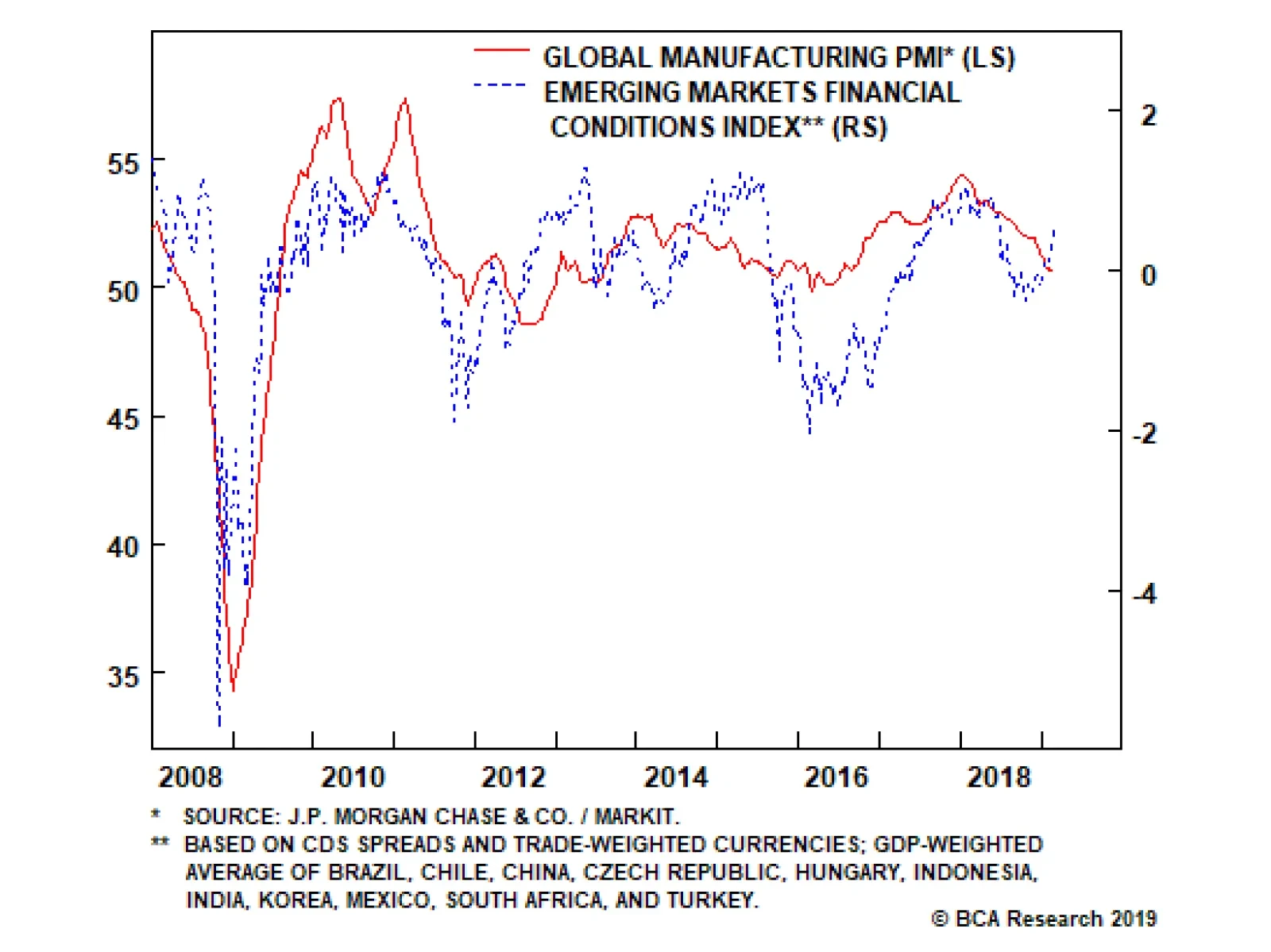
Global growth declined to 50.6 in February. This is not much of a surprise. The brutal sell off in markets in the fourth quarter of 2018 both anticipated this slowdown and worsened it as it tightened global financial conditions. This global growth…