Emerging Markets

Feature June’s economic data and second-quarter GDP indicate that China’s economic recovery may have peaked. Slight improvements in some sectors, including manufacturing investment, exports and consumption, were offset by slowing in China’s old economy, such as infrastructure and real estate. A softening economy will weigh on Chinese corporate profits in 2H21. Inflation in Producer Price Index (PPI) has likely peaked, but it remains far above its historic average. Downstream industries may benefit from low interest rates and slightly less inflationary pressures on input prices, however, their profit growth has rolled over given weakening domestic demand and base effect. Industrial profits will shift downward in 2H21, meanwhile China’s macro policy will probably disappoint investors. Last week’s GDP’s numbers show that small-to-medium enterprises (SMEs) and private-sector businesses bore the brunt of rising global commodity prices and a slow recovery in domestic household consumption and services. The data, coupled with recent policy moves, support our view that China’s leadership is focused on helping vulnerable segments of the economy rather than boosting domestic demand by broadly easing policies (Chart 1). Nonetheless, the authorities may resort to easing policy later in 2021 if export growth weakens significantly in the second half of the year. A series of Reserve Requirement Ratio (RRR) and/or interest rate cuts, increased infrastructure project approvals, and/or looser real estate regulations, will signal that China’s ongoing policy tightening cycle has ended. In recent weeks both Chinese onshore and offshore stocks slipped further in absolute terms and relative to global benchmarks (Chart 2). We continue to recommend that investors remain cautious on Chinese stocks, at least through Q3. Chart 1No Broad Easing Yet
No Broad Easing Yet
No Broad Easing Yet
Chart 2Investors Still Cautious On China's Economy And Policy
Investors Still Cautious On China's Economy And Policy
Investors Still Cautious On China's Economy And Policy
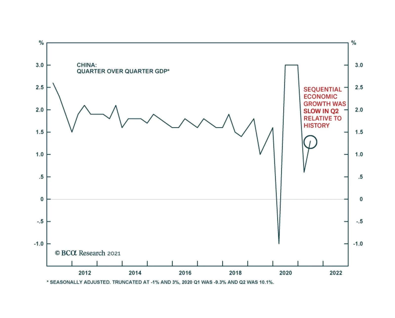
Qingyun Xu, CFA Associate Editor qingyunx@bcaresearch.com Jing Sima China Strategist jings@bcaresearch.com Q2 GDP: Recovering At A Slower Pace China’s official GDP growth, on a year-over-year basis, slowed to 7.9% in Q2 from 18.3% in Q1 (Chart 3, top panel). While Q2’s weaker reading reflects the base effect in the data, it was slightly below the market’s expectation of 8.0-8.5%. Moreover, on a sequential basis (quarter-over-quarter), Q2’s seasonally adjusted GDP growth was one of the slowest in the past decade (Chart 3, bottom panel). These figures and the underlying data highlight that China’s economic growth momentum, which historically lags the credit impulse by six to nine months, has peaked (Chart 4). However, in 1H21, China aggregate output still grew by a 5.5% average annual rate during the same period over the past two years, well within Chinese policymakers’ target of above 5% growth needed to maintain a stable economy. Meanwhile, the bifurcation in China’s economic recovery continues. While robust external demand for Chinese goods helped to underpin manufacturing output, the sector’s profit growth has lagged upstream industries. Moreover, state-owned enterprises (SOEs) are experiencing soaring profit growth whereas SMEs have struggled with rising global commodity prices and sluggish domestic consumption as discussed below. We expect that the pace in credit growth deceleration will moderate in 2H21 and interest rates will stay at historically low levels. However, the authorities are unlikely to loosen macro policies until more signs of economic weaknesses emerge. Chart 3Q2 GDP: Slowing From An Elevated Level
Q2 GDP: Slowing From An Elevated Level
Q2 GDP: Slowing From An Elevated Level
Chart 4Chinese Economic Growth Should Soften Further In 2H21
Chinese Economic Growth Should Soften Further In 2H21
Chinese Economic Growth Should Soften Further In 2H21
Robust Exports, Sluggish Manufacturing Investment Chart 5Subdued Manufacturing Investment Recovery Despite Robust Exports
Subdued Manufacturing Investment Recovery Despite Robust Exports
Subdued Manufacturing Investment Recovery Despite Robust Exports
China’s export growth in June beat market expectations, despite shipping disruptions at major ports in Guangdong province due to a resurgence in COVID-19 cases. However, the recovery in manufacturing investment was muted through most of 1H21 even though export growth was resilient (Chart 5). There are several reasons for the sluggish recovery: the RMB’s rapid appreciation in the first five months of 2021, rising inflation and the limited pricing power that Chinese exporters gained in the first half of the year likely impeded their profits and curbed their propensity to invest (Chart 6). Total export values in USD significantly outpaced those in RMB terms, suggesting that the profit gains by Chinese exporters were offset by the strengthening local currency (Chart 7). Chart 6Rapid RMB Appreciation Will Weigh On Industrial Profits
Rapid RMB Appreciation Will Weigh On Industrial Profits
Rapid RMB Appreciation Will Weigh On Industrial Profits
Chart 7Divergence Between Exports In USD versus RMB
Divergence Between Exports In USD versus RMB
Divergence Between Exports In USD versus RMB
Furthermore, manufacturers in mid-to-downstream industries have been unable to fully pass on rising input costs to domestic consumers, which is evidenced in the faster growth of manufacturing output volume compared with price increases. It contrasts with the previous inflationary cycles, where surging prices for manufactured goods surpassed output volume (Chart 8A & 8B). Chart 8AChina's Manufacturing Recovery: Stronger Volume Than Prices
China's Manufacturing Recovery: Stronger Volume Than Prices
China's Manufacturing Recovery: Stronger Volume Than Prices
Chart 8BMuted Profit Margin Recovery In Manufacturing Compared With Mining
Muted Profit Margin Recovery In Manufacturing Compared With Mining
Muted Profit Margin Recovery In Manufacturing Compared With Mining
June’s improvement in manufacturing investment may not advance into 2H21 without added policy support. The nearly 2% depreciation in the RMB against the dollar in recent weeks will alleviate some pressure on exporters’ profit margins. However, export prices in USD also started to weaken (Chart 9). In addition, June’s manufacturing PMI and a Chinese business school survey,1 reported a deterioration in business conditions among smaller businesses. The weaker sentiment will depress manufacturing investments since China’s manufacturing sector is dominated by private and smaller businesses (Chart 10). Chart 9Chinese Export Prices In USD Are Rolling Over
Chinese Export Prices In USD Are Rolling Over
Chinese Export Prices In USD Are Rolling Over
Chart 10Deteriorating Business Sentiment Will Depress Manufacturing Investments
Deteriorating Business Sentiment Will Depress Manufacturing Investments
Deteriorating Business Sentiment Will Depress Manufacturing Investments
Recent policy measures to keep a low interest-rate environment will help the export and manufacturing sectors by reducing operating costs. The measures are also in keeping with China’s shift from boosting its service sector to maintaining a steady share of manufacturing output in its domestic economy (Chart 11). Chart 11Maintaining A Steady Share Of Manufacturing Output In China's Economy
Maintaining A Steady Share Of Manufacturing Output In China's Economy
Maintaining A Steady Share Of Manufacturing Output In China's Economy
Policy Tightening In The Old Economy Continues Chart 12Investments In Real Estate Have Lost Steam
Investments In Real Estate Have Lost Steam
Investments In Real Estate Have Lost Steam
Infrastructure investment growth slowed further in June. Investments in real estate, which drove China’s economic recovery in the second half of 2020, are also losing momentum (Chart 12). The slowdown, engineered by policymakers, will likely endure for the rest of the year. Bank loans to real estate developers tumbled to a cyclical low (Chart 13). In addition, deposit and advance payments, the main source of funds for real estate projects, nose-dived along with home sales (Chart 14). Chart 13No Signs Of Looser Financing Regulations In Property Sector
No Signs Of Looser Financing Regulations In Property Sector
No Signs Of Looser Financing Regulations In Property Sector
Chart 14Falling Home Sales Will Further Depress Real Estate Investments
Falling Home Sales Will Further Depress Real Estate Investments
Falling Home Sales Will Further Depress Real Estate Investments
Chart 15Sharp Pullback In New Infrastructure Project Approvals This Year
Sharp Pullback In New Infrastructure Project Approvals This Year
Sharp Pullback In New Infrastructure Project Approvals This Year
Infrastructure project approvals by the Ministry of Finance remain on a downward trend (Chart 15). Last week, China’s Banking and Insurance Regulatory Commission (CBIRC) announced a new rule to stop financial institutions from lending to local government financing vehicles (LGFV) that hold off-balance sheet government debt. LGFVs are largely used by provincial governments to borrow from banks to help fund infrastructure projects. Regulations targeting the real estate sector will further dampen real estate investments in the second half of this year. Land purchases and housing starts, both leading indicators for real estate investment, have declined since February. Excavator sales and investment in construction equipment also deteriorated sharply (Chart 16). Given that housing prices remain elevated, we do not expect real estate regulations to shift to an easier tone. The deceleration in China’s old economy is reflected in imports. While the value of imports remains strong, the volume has slowed, which suggests that the surge was due to soaring commodity prices (Chart 17, top panel). In particular, the growth in China’s imports of copper and steel, on a year-over-year basis and in volume terms, contracted in June (Chart 17, bottom panel). Chart 16Construction Activities Set To Slow Further
Construction Activities Set To Slow Further
Construction Activities Set To Slow Further
Chart 17Falling Import Volume
Falling Import Volume
Falling Import Volume
The Key To A Consumption Recovery Retail sales picked up slightly in June following two consecutive months of decline. However, retail sales remain below their pre-pandemic level (Chart 18). Labor market dynamics and household income growth, which stayed sluggish through 1H21, hold the key to the speed and magnitude of a recovery in consumption this year (Chart 19). Chart 18Sluggish Recovery In Household Consumption
Sluggish Recovery In Household Consumption
Sluggish Recovery In Household Consumption
Chart 19A Lackluster Consumption Recovery Due To Slow Recovery in Household Income
A Lackluster Consumption Recovery Due To Slow Recovery in Household Income
A Lackluster Consumption Recovery Due To Slow Recovery in Household Income
Household precautionary savings, which remain elevated compared with their historical norms, have depressed the propensity to spend (Chart 20). While the overall unemployment rate in China’s urban centers has steadily declined this year, the rate of jobless young graduates (ages 16-24) picked up and is nearly three percentage points higher than its historical mean (Chart 21). However, the high unemployment among graduates will not encourage policymakers to stimulate the economy. The number of new graduates in both 2020 and 2021 is larger than the historical average, while the growth in new job creation has nearly recovered to that of the pre-pandemic years (Chart 22). Chart 20Households' Propensity For Precautionary Savings Remains Elevated
Households' Propensity For Precautionary Savings Remains Elevated
Households' Propensity For Precautionary Savings Remains Elevated
Chart 21Rising Unemployment Rate Among Younger Workers
Rising Unemployment Rate Among Younger Workers
Rising Unemployment Rate Among Younger Workers
Moreover, labor market slack among young graduates seems to be concentrated in the services sector, and this sector’s improvement is dependent on China’s domestic pandemic situation and inoculation rates rather than on stimulus (Chart 23). Chart 22Urban Job Creation Growth Still On The Mend
Urban Job Creation Growth Still On The Mend
Urban Job Creation Growth Still On The Mend
Chart 23Interruptions In Service Sector Recovery Due To Lingering COVID Cases
Interruptions In Service Sector Recovery Due To Lingering COVID Cases
Interruptions In Service Sector Recovery Due To Lingering COVID Cases
Elevated Inflation, Downshifting Industrial Profits Chart 24China's PPI May Have Reached A Cyclical Peak...
China's PPI May Have Reached A Cyclical Peak...
China's PPI May Have Reached A Cyclical Peak...
China’s domestic inflationary pressures eased slightly in June with a small decline in both consumer and producer prices. The input price component of the manufacturing PMI, which normally leads the PPI by about three months, dropped sharply last month, which indicates that the PPI may have reached its cyclical peak (Chart 24). However, producer price inflation will likely remain elevated in the second half of the year. Although global industrial metal prices have rolled over since May, they remain at their highest level since 2011 (Chart 25). A rapid deceleration in Chinese credit growth and weakening demand in 2H21 will remove some pressure in the sizzling hot commodity market, but global supply-side constraints will limit the downside in raw material prices, at least through the next six months. Therefore, diminishing inflationary pressures on the PPI will only slightly reduce input costs for China’s mid-to- downstream manufacturers, which have been unable to pass on rising commodity prices to domestic consumers (Chart 26). As discussed earlier, Chinese export prices in both USD and RMB terms have also rolled over. Chart 25...But Global Commodity Prices Are Still Elevated
...But Global Commodity Prices Are Still Elevated
...But Global Commodity Prices Are Still Elevated
Chart 26Absence Of Inflation Pass-Through
Absence Of Inflation Pass-Through
Absence Of Inflation Pass-Through
Given that price changes are more important to corporate profits than volume changes, Chinese mid-to-downstream industries will continue to face downward pressure on their profit margins. Profit growth in mid-to-downstream industries consistently lagged their upstream counterparts in the past 12 months (Chart 27). Moreover, state-holding enterprises, which dominate upstream industries, have seen a 150% jump in profit growth from a year ago, while the rate of profit gains among privately owned industrial companies tumbled this year (Chart 28). Chart 27A Faster Mean Reversal In Profit Growth Among Private Companies
Taking The Pulse Of China’s Slowing Economy
Taking The Pulse Of China’s Slowing Economy
Chart 28A Faster Mean Reversal In Profit Growth Among Private Companies
A Faster Mean Reversal In Profit Growth Among Private Companies
A Faster Mean Reversal In Profit Growth Among Private Companies
Chinese policymakers will probably focus on addressing imbalances in China’s industrial sector and economy by supporting SMEs and the private sector. Meanwhile, industrial profit growth will decline in 2H21 from its V-shaped recovery last year, given weakening domestic demand and the waning base effect. Table 1China Macro Data Summary
Taking The Pulse Of China’s Slowing Economy
Taking The Pulse Of China’s Slowing Economy
Table 2China Financial Market Performance Summary
Taking The Pulse Of China’s Slowing Economy
Taking The Pulse Of China’s Slowing Economy
Footnotes 1The CKGSB (Cheung Kong Graduate School Of Business) Business Conditions Index (BCI) comprises four sub-indices: corporate sales, corporate profits, corporate financing environment and inventory levels. Equity Sector Recommendations Cyclical Investment Stance
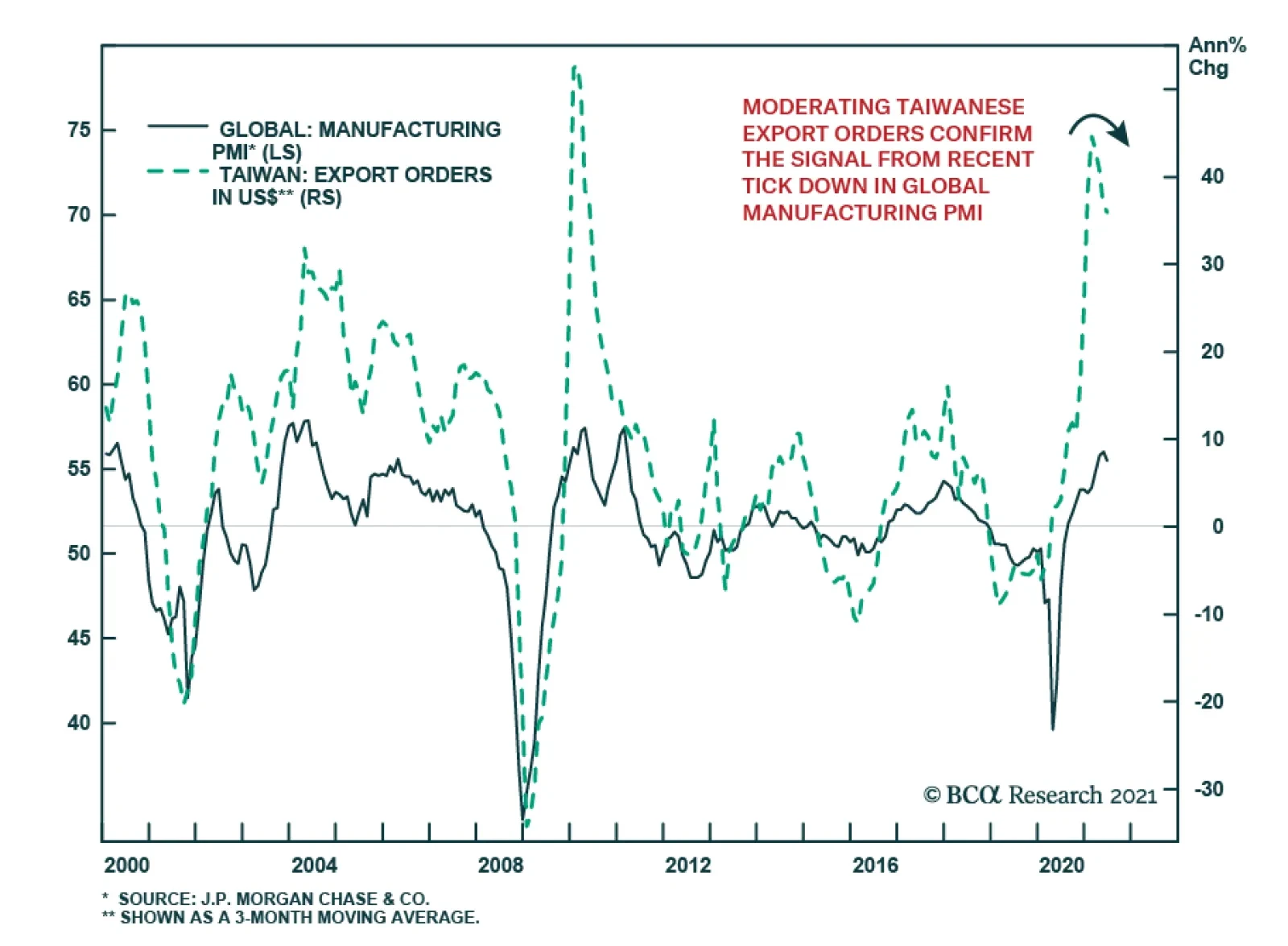
Taiwanese export orders slowed to 31.1% y/y in June from 34.5% y/y, but beat expectations of a sharper deceleration to 30.0% y/y. This brings export orders in the first half of the year to a record USD309.9 billion, which is a 39.2% y/y increase. All major…
Highlights Spread Product: The credit risk premium has shrunk considerably during the past 16 months. While we don’t foresee a period of significant spread widening any time soon, lower spreads mean lower excess corporate bond returns. We recommend three ways for investors to grab extra spread and increase their excess corporate bond returns: (i) move down in quality, (ii) extend maturity, (iii) favor high-DTS industry groups. Corporate Bond Sectors: High-DTS industry groups like Energy, Communications, Utilities and Basic Industry offer the best risk-adjusted spread pick-up within both investment grade and junk bonds. Consumer Noncyclicals and Transportation also look attractive within high-yield. Municipal Bonds: Investors can increase the average after-tax yield of their bond portfolios without taking greater credit or duration risk by favoring long-maturity tax-exempt municipal bonds (both GO and Revenue). EM Bonds: Investors can increase the average yield of their US bond portfolios by shifting out of investment grade US corporates and into USD-denominated EM Sovereign and Corporate bonds. Feature US bond yields have been on a wild ride since the pandemic struck in March 2020. The 10-year Treasury yield collapsed to 0.52% last year. It then rebounded to a high of 1.74% in March 2021 before falling back to its current 1.21%. But throughout all this volatility in rates markets, the steady outperformance of credit risk has been a constant. For the past 16 months, accommodative monetary policy has spurred a steady flow of investment into spread product, a trade that was amplified by the Fed’s extraordinary intervention in the corporate bond market. On March 23rd 2020, the Fed essentially announced a back-stop of the corporate bond market that gave investors the green light to pile into the sector. Since then, the investment grade corporate bond index has outperformed a duration-matched position in Treasury securities by 24% and the high-yield index has outperformed by 39%. Of course, the result of this consistent flow of funds into spread product has been a collapse in credit spreads. The average spread on the investment grade corporate bond index is only slightly below its post-1973 median, but it is at its tightest level since the mid-1990s (Chart 1). When we adjust for the fact that the index’s average duration has increased significantly since the 1970s, we find that the spread has only been tighter 13% of the time since 1973 (Chart 1, bottom panel). What’s more, this analysis doesn’t control for the fact that the average credit rating of the index has fallen significantly during the past few decades. In short, investment grade corporate bonds are extremely expensive and are quite possibly the most expensive they have ever been in risk-adjusted terms. Chart 1Investment Grade Corporate Bond Valuation
Investment Grade Corporate Bond Valuation
Investment Grade Corporate Bond Valuation
How should bond investors proceed in this environment? Of course, tight credit spreads will cause us to exit our recommended spread product overweight earlier in the cycle than would otherwise be the case. But for the time being, we still see quite a bit of life left in credit markets. We showed in a recent report that corporate bond excess returns tend not to turn negative until the 3/10 Treasury slope is below 50 bps, even during periods when credit spreads are tight.1 At 88 bps, the slope still has a ways to go before breaching that threshold. In the meantime, we advise investors to run high levels of credit risk in their bond portfolios, grabbing attractive risk premiums where they can be found. As for what investors can do to find attractive risk premiums, we have a few suggestions. Move Down In Quality The most obvious way to add spread to a bond portfolio is to move down in quality. Charts 2A-2E show the extra spread that can be picked up by moving down one credit tier at a time. We show both the raw spread pick-up since 1995 and the spread pick-up after adjusting for duration risk (i.e. the 12-month breakeven spread). The additional spread on offer for moving out of Aa-rated bonds and into A-rated bonds is currently 17 bps, very low compared to history (Chart 2A). The extra compensation looks a little better after adjusting for duration risk (Chart 2A, bottom panel), but it is still well below its historical mean. Similarly, investors only earn an additional 38 bps by moving out of A-rated bonds and into Baa-rated bonds (Chart 2B). This is very low compared to history and it looks even worse in duration-adjusted terms (Chart 2B, bottom panel). A move down in quality within the investment grade space may still be worth it, even though the reward for doing so is meager in historical terms. However, investors can get much more bang for their buck by moving out of investment grade entirely and into junk bonds. The additional spread earned in Ba-rated bonds compared to Baa-rated bonds (130 bps) is below its historical average, but it has been much lower in the recent past (Chart 2C). This is also true in duration-adjusted terms (Chart 2C, bottom panel). A move out of Ba-rated bonds and into B-rated bonds looks even better (Chart 2D). Yes, the raw 116 bps spread pick-up in the B-rated index compared to the Ba-rated index is well below its historical mean, but after adjusting for the lower duration of the B-rated index we see that the duration-adjusted spread pick-up in B-rated bonds is above its average historical level (Chart 2D, bottom panel). Finally, we observe that investors earn an extra 159 bps by moving out of the B-rated sector and into the Caa-rated sector (Chart 2E). This is extremely low compared to history, but it looks considerably more appealing in duration-adjusted terms (Chart 2E, bottom panel). All in all, we think it makes sense for investors to grab extra spread by moving down the quality ladder. In particular, investors should favor high-yield bonds over investment grade and focus on the B-rated credit tier where the duration-adjusted spread is most attractive. Chart 2AA Versus Aa
A Versus Aa
A Versus Aa
Chart 2BBaa Versus A
Baa Versus A
Baa Versus A
Chart 2CBa Versus Baa
Ba Versus Baa
Ba Versus Baa
Chart 2DB Versus Ba
B Versus Ba
B Versus Ba
Chart 2ECaa Versus B
Caa Versus B
Caa Versus B
Extend Maturity As an alternative to moving down in quality, investors can also increase the average spread of their credit portfolios by extending maturity within corporate bonds. Compared to history, we find that long maturity investment grade and junk bonds offer above-average compensation relative to their shorter-maturity counterparts (Chart 3A). Of course, implementing this trade means either taking more duration risk in your portfolio or offsetting the increased duration on the credit side by taking less duration risk within your government bond holdings. It’s also worth mentioning that extending maturity within corporate credit is rarely, if ever, an attractive proposition in risk-adjusted terms. The spread per unit of duration for long-maturity corporates is almost always below that of short-maturity corporates (Chart 3B). However, this risk-adjusted spread differential tends to be highest when overall corporate bond spreads are tight. In other words, it is during periods of expensive corporate bond valuations, like today, when it makes most sense to extend maturity within corporate bond portfolios. Chart 3ASpreads: Long Versus Short
Spreads: Long Versus Short
Spreads: Long Versus Short
Chart 3BRisk-Adjusted Spreads: Long Versus Short
Risk-Adjusted Spreads: Long Versus Short
Risk-Adjusted Spreads: Long Versus Short
Favor High-Beta Sectors Finally, investors can chase better returns within the corporate bond space by favoring those industry groups with the highest Duration-Times-Spread (DTS). DTS functions as a rough proxy for corporate bond excess return volatility. In other words, bonds with high (low) DTS tend to perform best during periods of spread tightening (widening) and worst during periods of spread widening (tightening). We can also look at the correlation between DTS and excess returns to get a sense of the excess return earned by taking an extra unit of DTS risk. For example, Chart 4A shows annualized excess returns for the 10 major investment grade industry groups relative to starting DTS for the period that ran from the March 23rd 2020 peak in spreads until the end of last year. The slope of the trendline is 79 bps, meaning that investors earned 79 bps of extra return for taking one extra unit of DTS risk. Notably, this credit risk premium fell to 35 bps per unit of DTS risk this year (Chart 4B), as tighter spreads led to a lower realized credit risk premium. Chart 4AInvestment Grade Credit Risk Premium: March 23 2020 To Dec 31 2020
The Collapsing Credit Risk Premium
The Collapsing Credit Risk Premium
Chart 4BInvestment Grade Credit Risk Premium: Year-To-Date
The Collapsing Credit Risk Premium
The Collapsing Credit Risk Premium
Interestingly, we don’t observe the same declining credit risk premium in high-yield. Investors earned 95 bps per unit of DTS risk between March 23rd 2020 and Dec 31st 2020 (Chart 4C), but they have earned an even greater 98 bps per unit of DTS risk so far this year (Chart 4D). The steeper line is mostly due to the Energy sector that has delivered strong excess returns and that continues to offer an enticing spread in both absolute and risk-adjusted terms. Chart 4CHigh-Yield Credit Risk Premium: March 23 2020 To Dec 31 2020
The Collapsing Credit Risk Premium
The Collapsing Credit Risk Premium
Chart 4DHigh-Yield Credit Risk Premium: Year-To-Date
The Collapsing Credit Risk Premium
The Collapsing Credit Risk Premium
The next section of this report dives into the relative attractiveness of different corporate bond industry groups. For now, we just want to stress that it makes sense for credit investors to increase their spread pick-up by favoring those industry groups with the highest DTS. Bottom Line: The credit risk premium has shrunk considerably during the past 16 months. While we don’t foresee a period of significant spread widening any time soon, lower spreads mean lower excess corporate bond returns. We recommend three ways for investors to grab extra spread and increase their excess corporate bond returns: (i) move down in quality, (ii) extend maturity, (iii) favor high-DTS industry groups. Sector Opportunities The previous section recommended three ways to increase the spread pick-up within a corporate bond portfolio. In this section, we identify sectors that offer attractive spreads in risk-adjusted terms. That is, we are looking for attractive spreads relative to other fixed income sectors with similar duration and credit rating. We specify three opportunities: 1. Corporate Bond Industry Groups Chart 5 plots a measure of risk-adjusted spread for each of the 10 major investment grade corporate bond industry groups relative to that industry group’s DTS. The risk-adjusted spread is the residual from a cross-sectional regression of sector spreads versus average credit rating and duration. The prior section noted that investors should favor high-DTS industry groups within investment grade corporate bonds, and Chart 5 reveals that those high-DTS sectors are also the most attractive in risk-adjusted terms. Energy, Utilities, Basic Industry and Communications all stand out as offering elevated risk-adjusted spreads. While the Transportation and Consumer Cyclical sectors offer low risk-adjusted spreads, the Airlines group within Transportation and the Lodging group within Consumer Cyclicals also stand out as being attractive.2 Chart 5Investment Grade Corporate Sector Valuation
The Collapsing Credit Risk Premium
The Collapsing Credit Risk Premium
Chart 6 shows the results of the same analysis performed on high-yield industry groups. Once again, we see that the high-DTS sectors look best in risk-adjusted terms. Communications, in particular, offers an extraordinarily high risk-adjusted spread that is driven by issuers in the Media: Entertainment and Wirelines sub-sectors. Overall, high-DTS industry groups like Energy, Communications, Utilities and Basic Industry offer the best risk-adjusted spread pick-up within both investment grade and junk bonds. Consumer Noncyclicals and Transportation also look attractive within high-yield. Chart 6High-Yield Corporate Sector Valuation
The Collapsing Credit Risk Premium
The Collapsing Credit Risk Premium
2. Long-Maturity Municipal Bonds Another opportunity to add risk-adjusted spread to a US bond portfolio lies in tax-exempt municipal bonds. In particular, investment grade rated tax-exempt municipal bonds at the long-end of the curve. Chart 7A shows the yield offered by the Bloomberg Barclays Municipal General Obligation (GO) index at different maturity points alongside the US Credit index yield that has the same credit rating and duration. The average credit rating for GO maturity buckets ranges from Aa1/Aa2 to Aa3/A1. Chart 7B translates the yields shown in Chart 7A into breakeven tax rates. That is, it shows the tax rate that would make an investor indifferent between owning the GO muni and the US Credit index. While the breakeven tax rates are quite high at the front-end of the curve, they fall dramatically as maturity is extended. The breakeven tax rate falls to 29% for the 8-12 year maturity bucket, 13% for the 12-17 year bucket and a mere 3% for 17-year+ maturities. In other words, any investor faced with a tax rate above 3% would be better off owning a long-maturity GO muni than a long-maturity US corporate bond. Chart 7AGeneral Obligation Munis Versus US Credit: Yields
The Collapsing Credit Risk Premium
The Collapsing Credit Risk Premium
Chart 7BGeneral Obligation Munis Versus US Credit: Breakeven Tax Rates
The Collapsing Credit Risk Premium
The Collapsing Credit Risk Premium
Charts 8A and 8B show the results of the same analysis performed for Municipal Revenue bonds relative to the US Credit index. All Revenue Muni maturity buckets have an average credit rating of Aa3/A1. We find that Revenue bonds look even more attractive than GO bonds, though once again the attractive yields are found at the long-end of the curve. The negative breakeven tax rate shown for the 22-year+ maturity bucket means that the muni bond actually offers a before-tax yield pick-up compared to the corporate credit. Chart 8ARevenue Munis Versus US Credit: Yields
The Collapsing Credit Risk Premium
The Collapsing Credit Risk Premium
Chart 8BRevenue Munis Versus US Credit: Breakeven Tax Rates
The Collapsing Credit Risk Premium
The Collapsing Credit Risk Premium
USD-denominated Emerging Market Sovereigns and Corporates Chart 9EM Sovereign And Corporate Spreads
The Collapsing Credit Risk Premium
The Collapsing Credit Risk Premium
Finally, as we noted in a recent report,3 USD-denominated Emerging Market (EM) Sovereign and Corporate bonds offer an attractive yield pick-up relative to US corporate credit. Chart 9 shows the spreads of both the EM Sovereign and EM Corporate indexes relative to duration and credit rating matched positions in the US Credit index. First, we observe that both indexes offer a significant yield advantage over the US Credit index across all investment grade credit tiers. Second, we also observe that EM Corporates look much more attractive than Sovereigns within the A and Baa credit tiers, but that Sovereigns have the advantage within the Aa credit tier. The elevated Aa Sovereign spread is the result of USD bonds issued by the UAE and Qatar that offer yields above 2%. Bottom Line: US bond investors can increase the average yield of their portfolios without taking greater credit or duration risk by focusing on high-DTS industry groups (Energy, Communications, Utilities, Basic Industry) within both investment grade and high-yield corporate bond indexes. This can also be achieved by shifting allocation into long-maturity tax-exempt municipal bonds (both GO and Revenue) and USD-denominated EM Sovereign and Corporate debt. Ryan Swift US Bond Strategist rswift@bcaresearch.com Footnotes 1 Please see US Bond Strategy Weekly Report, “The Post-FOMC Credit Environment”, dated June 29, 2021. 2 A version of this chart with all 40 industry groups can be found in our monthly Portfolio Allocation Summary. Please see US Bond Strategy Portfolio Allocation Summary, “On Track For 2022 Liftoff”, dated July 6, 2021. 3 Please see US Bond Strategy Weekly Report, “The Post-FOMC Credit Environment”, dated June 29, 2021. Recommended Portfolio Specification Other Recommendations
The Collapsing Credit Risk Premium
The Collapsing Credit Risk Premium
Treasury Index Returns
The Collapsing Credit Risk Premium
The Collapsing Credit Risk Premium
Spread Product Returns
The Collapsing Credit Risk Premium
The Collapsing Credit Risk Premium
Highlights The ECB has changed its inflation target, but its credibility remains weak. Inflation will not allow the ECB to tighten policy anytime soon. Instead, the ECB will have to add to its asset purchase program next year and may even consider dual interest rates. EUR/USD should continue to appreciate because of the weakness in the USD, but EUR/GBP, EUR/NOK, and EUR/SEK will soften. The SNB will follow the ECB; buy Swiss stocks / sell Eurozone defensives as an uncorrelated trade. China matters more than COVID-19 for the cyclical/defensive ratio. Despite our pro-cyclical medium- to long-term portfolio bias, the reflation trade is pausing. Remain tactically long telecom / short consumer discretionary as a hedge. European momentum stocks are near critical levels relative to growth equities. Feature The European Central Bank has found a new way to shed its Bundesbank heritage further and to justify the continuation of its QE program well after other central banks around the world will have ended their asset purchases. The early results of the Strategy Review and the subsequent comments by President Christine Lagarde will make it near impossible for the ECB to taper its asset purchases anytime soon. Practically, this means that the European yield curve will steepen relative to that of the US. Additionally, this policy should not hurt EUR/USD, but it will hurt EUR/GBP, EUR/NOK, and EUR/SEK. In the equity space, Swiss stocks will outperform European defensive equities, creating an opportunity for an uncorrelated trade. A New Tougher Target The ECB has abandoned its long-standing target of “close but below” 2% inflation. Even more importantly, the ECB followed the Bank of Japan and the Fed in adopting an approach whereby both downside and upside deviations from the 2% inflation target are to be fought. The ECB’s credibility was already hurt by its inability to achieve its more modest previous inflation target. Since 2009, the Euro Area HICP only averaged 1.2% (Chart 1). To prevent losing further credibility under its new mandate, the ECB will have to increase its stockpile of assets. Moreover, the ECB is far from achieving its new mandate, which will add to the ECB’s need to expand stimulus to the system even once the impact of owner-equivalent rent is included in CPI. Chart 1Mission Impossible
Mission Impossible
Mission Impossible
Chart 2Narrow Inflationary Pressures
Narrow Inflationary Pressures
Narrow Inflationary Pressures
Today, the ECB’s measure of core inflation stands at 1%, while headline inflation is 1.9%. As the economy re-opens, a surge in inflation is likely, but this spike will be transitory, even more so than in the US. As we recently showed, our estimate of the Eurozone trimmed-mean CPI has plunged close to 0%, which highlights that inflation pressures remain narrow (Chart 2). The labor market is another hurdle that will prevent Eurozone inflation from durably reaching 2% anytime soon. Currently, the total hours worked in the Euro Area remains well below the equilibrium level implied by the working-age population (Chart 3), which historically constrains wages. Moreover, it generally takes many quarters after labor shortages become prevalent before inflation begins to inch higher (Chart 4). Chart 3No Wage Pressure Yet
No Wage Pressure Yet
No Wage Pressure Yet
Chart 4No Inflation Labor Shortages For A While
No Inflation Labor Shortages For A While
No Inflation Labor Shortages For A While
The euro is the last force that caps European inflation. Despite the recent depreciation in EUR/USD, the trade-weighted euro remains near all-time highs, which historically imparts strong deflationary pressures to the economy (Chart 5). Beyond the time it will take for realized inflation to reach the ECB’s new target, inflation expectations are still inconsistent with 2% inflation. As the top panel of Chart 6illustrates, market-based inflation expectations in the Eurozone remain well below both 2% and the levels that prevailed before the Great Financial Crisis, even though rising commodity prices are lifting global inflation expectations. Market participants are not alone in doubting the ECB; professional forecasters do not see inflation at 2% in the near-term or the long-term (Chart 6, bottom panel). Chart 5The Euro Is Deflationary
The Euro Is Deflationary
The Euro Is Deflationary
Chart 6The ECB Lacks Credibility
The ECB Lacks Credibility
The ECB Lacks Credibility
In addition to the continued inability of the ECB to achieve its previous inflation target, let alone its present one, sovereign risk still hamstrings the central bank. The Italian economy remains fragile, because little structural reform has taken place. The Spanish economy cannot stand on its own two feet while the tourism industry continues to suffer due to COVID-19 related fears. And the exploding debt load of the French economy as well as its structural current account deficit raise the possibility that OATs will become unmoored. The ECB will ensure that spreads in those nations do not widen, or Eurozone inflation will never reach the new 2% target. Bottom Line: When it was time to achieve near—but below—2% inflation, the credibility of the ECB was already limited. The new target will be even harder to reach, but the symmetry around it gives the ECB more leeway to provide additional support to the Eurozone economy. Market Implications The ECB is now bound to maintain policy accommodation beyond the scheduled end of the PEPP program in March 2022, or the new policy target will be even less credible than the previous one. BCA Global Fixed Income Strategy team expects the ECB to maintain its asset purchase program beyond the stated end of the PEPP. Practically, this means that the ECB will fold the program into the pre-pandemic APP. The ECB cannot tighten policy while it remains so far from its target, especially now that missing the goalpost to the downside is as problematic as missing it to the upside. We expect the ECB to hint at this on Thursday. Chart 7The EONIA Curve Anticipated The Strategy Review
The EONIA Curve Anticipated The Strategy Review
The EONIA Curve Anticipated The Strategy Review
The ECB will also not increase interest rates for the foreseeable future, which the EONIA curve already anticipates (Chart 7). Money markets only expect a first hike in late 2024, which is appropriate. Compared to a month ago, overnight rates 10-year forward fell by more than 10bps, from 0.75% to 0.61%. We are inclined to fade this move. More stimulus raises the outlook for long-term policy rates. Amid the correction in global bond yields, betting against the decline in the long-term EONIA rate is akin to catching a falling knife; however, because the ECB is easing relative to the Fed, a box trade of buying European steepeners at the same time as US flatteners remains appropriate. The ECB could also lower the rate on TLTRO operations, resulting in a dual interest rate regime in the Eurozone. As Megan Greene and Eric Lonergan have argued, this policy would provide a further lift to the Euro Area economy by boosting the attractiveness of borrowing; at the same time, it would limit the deleterious impact of ever-more negative deposit rates on the profitability of the banking sector, because banks would borrow at extremely negative rates to finance lending activities. Chart 8JPY And YCC
JPY And YCC
JPY And YCC
The effect of the policy on the euro is more complex. When Japan announced its Yield Curve Control strategy in September 2016, it defined price stability as achieving a 2% inflation rate over the span of the business cycle. In other words, the BoJ implemented a backdoor average inflation mandate. Following this announcement, USD/JPY strengthened (Chart 8), but this move reflected the dollar rally and the global bond selloff around the US election, not yen-specific factors. This suggests that the euro will continue to track the USD inversely. BCA’s FX Strategy team remains bearish on the greenback, as a result of the growing US current account deficit and the fact that the Fed continues to target an overshoot in inflation, which suggests that, even if US nominal interest rates rise, real rates will lag behind. The EUR is nonetheless set to underperform compared to other European currencies. In the UK, house price gains are accelerating, the jobless count is declining rapidly as the economy re-opens, and the cheapness of the pound is accentuating positive inflation surprises. This combination suggests that the BoE is likely to follow the path of the Bank of Canada or the Reserve Bank of New Zealand, by beginning to tighten policy by early next year. Norway also faces a similar set of circumstances and has already announced it will lift interest rates this year. As we argued two months ago, the Riksbank is likely to follow its western neighbor, because the Swedish housing market is roaring, and the economy will remain well supported by the upcoming global capex boom. Hence, EUR/GBP, EUR/NOK, and EUR/SEK will depreciate. The Swiss National Bank should be the outlier that will follow the ECB. Swiss headline and core inflation linger at 0.6% and 0.4%, respectively. Wage growth is a meager 0.5%, because the Swiss output gap remains a massive 5.5% of GDP (Chart 9, top panel). Meanwhile, consumer confidence and retail sales are much weaker than those of Sweden, Norway, or the UK. Finally, Swiss private debt stands at 270% of GDP, which means that this economy still risks falling into a Fisherian debt-deflation trap. As a result, the SNB will continue to try to cap the upside in the CHF vis-à-vis the EUR, because the currency remains the main determinant of Swiss monetary conditions. Moreover, according to the central bank, the Swiss franc is still 10% overvalued relative to the euro, which is weighing on the country’s competitiveness (Chart 9, bottom panel). To fight the recent depreciation of EUR/CHF, the SNB will not raise rates for a long time and will intervene further in the FX market. The liquidity injections should prompt additional increases in the SNB’s domestic sight deposits, which since 2015 have resulted in a rise of Swiss bond yields relative to those of Germany (Chart 10). While counterintuitive, this relationship reflects the reflationary impact of the SNB’s asset purchases. It also means that the Swiss real estate market is set to become ever bubblier. Chart 9The SNB Will Follow The ECB
The SNB Will Follow The ECB
The SNB Will Follow The ECB
Chart 10Swiss/German Spreads To Widen
Swiss/German Spreads To Widen
Swiss/German Spreads To Widen
For Swiss shares, the picture is more complex. Swiss equities are extremely defensive, but, while they underperform Euro Area stocks when global yields rise, widening Swiss / German spreads often provide a lift to the SMI. A simple model, assuming US 10-year Treasury yields rise to 2.25% by the end of 2022 (BCA’s US Bond Strategy forecast) and that Swiss/German spreads widen to 20bps as the SNB domestic sight deposits swell, suggests that Swiss stocks will underperform that of the Euro Area over the coming 18 months (Chart 11). However, if we compare Swiss equities to European defensive sectors, then the widening in Swiss/German spreads should prompt an outperformance of Swiss equities, because their multiples benefit from ample liquidity conditions in Switzerland (Chart 12). Chart 11Swiss Stocks Are Too Defensive To Outperform Durably...
Swiss Stocks Are Too Defensive To Outperform Durably...
Swiss Stocks Are Too Defensive To Outperform Durably...
Chart 12...But They Will Beat Euro Area Defensives
...But They Will Beat Euro Area Defensives
...But They Will Beat Euro Area Defensives
Bottom Line: The results of the ECB Strategy Review will force this central bank to remain a laggard and continue to expand its balance sheet well after the expected end of the PEPP program. Eurozone interest rates will also fall behind that of other major economies. The ECB may even consider cutting the interest rate on TLTROs to boost lending. These policies will have a minimal impact on EUR/USD, which will continue to be dominated by the dollar’s fluctuations. However, EUR/GBP, EUR/SEK, and EUR/NOK will suffer. Finally, the SNB will follow the ECB and expand its balance sheet further, which will paradoxically lift Swiss/German spreads. As a result of their defensive nature, Swiss stocks will underperform Euro Area ones over the next 18 months, but they will outperform European defensive equities. Go long Swiss equities relative to European defensives, as a trade uncorrelated to the broad market. Follow China, Not Delta Chart 13
The ECB’s New Groove
The ECB’s New Groove
In recent days, doubts have grown about the European re-opening trade because of the resurgence of COVID-19 cases. The Delta variant (or any subsequent mutation for that matter) will cause hiccups along the way, but, ultimately, the re-opening will continue to proceed. As a result of the growing rate of vaccination, hospitalizations and deaths remain stable even if new cases are climbing rapidly in many countries (Chart 13). As long as the burden on the healthcare system remains limited, governments will find it difficult to justify further large-scale lockdowns. Instead, measures such as Macron’s Pass Sanitaire will provide increasing, widespread incentives for greater vaccination. Despite this sanguine take on the Delta variant, we remain concerned for the near-term outlook for cyclical equities because of the Chinese economy, even after the recent 50bps cut in the Reserve Requirement Ratio. BCA’s China Investment Strategy service believes that the RRR cut does not signal the beginning of a policy easing cycle. More evidence would be needed, such as additional RRR cuts, rising excess reserves, or supportive policies for the infrastructure and real estate sectors. For now, we heed the message from PBoC official Sun Guofeng that “the RRR cut is a standard liquidity operation.” Chart 14Fade The RRR Cut
Fade The RRR Cut
Fade The RRR Cut
The dominant force for the Chinese economy remains the previous deterioration in the credit impulse, which suggests that Q3 and Q4 growth will decelerate materially (Chart 14, top panel). Moreover, the softening impulse is consistent with weaker global economic activity, as approximated by our Global Nowcast (Chart 14, middle panel), especially since the lingering effect of the past RRR increases is still consistent with a global deceleration (Chart 14, bottom panel). In this context, we continue to hedge our long-term preference for cyclical stocks because of the near-term risks created by China and the excessively rapid move in the cyclical-to-defensives ratio (Chart 15). In response to this pause in the reflation trade, we continue to favor a long telecom/short consumer discretionary tactical position, which is supported by valuations and RoE differentials, as well as the still extended relative momentum (Chart 16). The period of risk to the global reflation trade should also allow the dollar to remain firm in the near-term, which means that for the coming months, the euro will not go beyond its trading range in place since the beginning of the year. Chart 15Cyclicals Remain Tactically Vulnerable
Cyclicals Remain Tactically Vulnerable
Cyclicals Remain Tactically Vulnerable
Chart 16Stay Long Telecom / Short Consumer Discretionary
Stay Long Telecom / Short Consumer Discretionary
Stay Long Telecom / Short Consumer Discretionary
Bottom Line: China’s RRR cut is not yet enough to bet against the temporary pause in the global reflation trade. Thus, investors should continue to hedge pro-cyclical long-term bets in their portfolios via a long telecom / short consumer discretionary position. An Exciting Chart A chart caught our eye this week: The underperformance of Eurozone momentum stocks relative to growth stocks is massively overdone (Chart 17). For now, we only want to highlight the phenomenon, but, in the coming weeks, we will delve deeper into the topic to gauge if these oversold conditions constitute an attractive opportunity. Chart 17Washed Out Moment
Washed Out Moment
Washed Out Moment
Mathieu Savary, Chief European Investment Strategist Mathieu@bcaresearch.com Currency Performance
The ECB’s New Groove
The ECB’s New Groove
Fixed Income Performance Government Bonds
The ECB’s New Groove
The ECB’s New Groove
Corporate Bonds
The ECB’s New Groove
The ECB’s New Groove
Equity Performance Major Stock Indices
The ECB’s New Groove
The ECB’s New Groove
Geographic Performance
The ECB’s New Groove
The ECB’s New Groove
Sector Performance
The ECB’s New Groove
The ECB’s New Groove
Highlights With geopolitical risks increasing around China, India is attracting greater attention from global investors. India’s youthful demographics also mark a stark contrast with China. While this demographic dividend is real, its benefits should not be overstated. India is young but socially complex, which will create unique social conflicts and policy risks. In particular, the country faces structurally large budget deficits. Regional political differences could slow down reforms. Lastly, competition with China will increase India’s own geopolitical risks. Macroeconomic and (geo)political factors, not youth alone, will determine India’s equity market returns. The bullish long-term view faces near-term challenges. Feature Map 1 PreviewIndia’s Demographic Dividend Can Be Overstated
India’s Demographics: The Devil Is In The Details
India’s Demographics: The Devil Is In The Details
“Independence had come to India like a kind of revolution; now there were many revolutions within that revolution … All over India scores of particularities that had been frozen by foreign rule, or by poverty or lack of opportunity or abjectness, had begun to flow again.” – Sir VS Naipaul, India: A Million Mutinies Now (Vintage, 1990) What is well known is that India is populous, young, and boasts a high GDP growth rate. India is also largely free of internal conflicts. Its democratic framework is seen as a pressure valve that can release social tensions. India’s hefty 58% cross-cycle premium to Emerging Markets (EM) is often attributed to the fact that India is younger than its peers, especially China. In this report we highlight that India’s demographic advantage is real but should not be overstated. For instance, India’s northern region can be likened to a demographic tinderbox. It accounts for about 45% of India’s population and is also younger than the national average. However, per capita incomes in this region are lower than the national average and to complicate matters, this region is crisscrossed by several social fault lines. This heterogeneity and economic backwardness in India’s population is the reason why the trend-line of India’s demographic dividend will not be linear. Its diverse population’s attempt to break out of its poverty will spawn unique policy risks. The North Is A Demographic Tinderbox, The South Is Prosperous But Ageing India will soon be the most populous country in the world (Chart 1). India’s median age is a decade lower than that of China to boot (Chart 2). Some emerging market investors fret about India’s low per capita income but India holds the promise of lifting individual incomes over time. This is because its GDP growth rate has been higher than that of its peers (Chart 3). Chart 1India Will Soon Be The Most Populous Country
India’s Demographics: The Devil Is In The Details
India’s Demographics: The Devil Is In The Details
Chart 2India Is A Decade Younger Than China
India’s Demographics: The Devil Is In The Details
India’s Demographics: The Devil Is In The Details
Chart 3India’s Per Capita Income Is Low, But GDP Growth Rate Is High
India’s Demographics: The Devil Is In The Details
India’s Demographics: The Devil Is In The Details
However, the “demographic dividend” narrative oversimplifies India’s investment case. India is young but also socially heterogenous and its median voter is poor. This complicates India’s development process and makes its demographic dividend trend-line non-linear. India’s social complexity is best understood if India is characterized as an amalgamation of three major regions: the North, the South (which we define to include the western region), and the East. Each of these parts are unique and have distinctive socio-demographic identities. India hence is more comparable to a continent like Europe than a country like the US. Like the European Union, India is a union of multiple social, religious, and ethnic groups. It straddles a vast geography and represents a very wide spectrum of interests. India’s South is more like a middle-income Asian country such as Sri Lanka or Vietnam whilst India’s East is more like a poor Latin American economy with latent social unrest. Understanding the heterogeneity of India’s vast populace is key to get a better sense of why an investment strategy for India must be nuanced and tactical in its approach, even if the overarching strategic view is constructive. The key features of each of these three regions can be summarized as follows: Region #1: The North This region comprises the triangular area between Jammu & Kashmir, Rajasthan and Jharkhand. This is the largest landmass in India stretching from the Himalayas to the fertile Gangetic plains of central India. Ethnically most of the population here is of Indo-Aryan descent. A lion’s share of this region’s population remains engaged in agriculture and allied activities. The North accounts for about 45% of the nation’s total population and is a demographic tinderbox. Per capita incomes are low and one in five persons falls in the age group of 15-24 years. To complicate matters, wage inflation in the farm sector, which employs a large majority of the populace in this region, has been slowing. If job creation in the non-farm sector stays insufficient then it will fan fires of social instability. The North includes states like Uttar Pradesh and Punjab which have seen a steady increase in small but notable socio-political conflicts in the recent past. Issues that triggered social conflict ranged from inter-religious marriages to resistance to amending farmer-friendly laws. Region #2: The South India’s South constitutes the large inverted-triangular region on the map and spans the area between Gujarat, Kerala, and West Bengal. We include India’s western region in this category because of its socio-economic similarities with the southern peninsula. Together the South and West account for the entirety of India’s peninsular coastline and for about 40% of total population. Historically, the South has seen far fewer external invasions and its social fabric is more homogenous than that of the North. This region is characterized by high per capita incomes, balanced gender ratios (Chart 4), and higher literacy ratios (Chart 5). Socio-political conflicts in this region are less common as compared to the North. Chart 4India’s South Has Healthy Gender Ratios Compared To North
India’s Demographics: The Devil Is In The Details
India’s Demographics: The Devil Is In The Details
Chart 5India’s South Is More Educated Than The Rest Of India
India’s Demographics: The Devil Is In The Details
India’s Demographics: The Devil Is In The Details
The state of Kerala is an exception in this region. The social fabric in this state is unusual, with Hindus accounting for only 55% of its population (versus the national average of 80%). The high degree of religious heterogeneity in this southern Indian state could perhaps be the reason why the state has lately seen a rise of small but significant incidences of social conflict. Unlike India’s young North, the median age of the population in India’s South is likely to be higher than the national average. Whilst India’s South is clearly young by global standards, this region will have to deal with problems of an ageing population before India’s North or East. The Southern region in India even today relies on migrant workers from India’s North. Region #3: The East This region is the youngest and the smallest of the three, as it accounts for the remaining 15% of India’s population. The region is young but must contend with low per capita incomes and very high degrees of religious diversity. Muslims, Christians, and other religions account for 20% of India’s population nationally but +50% of the population in India’s East. By virtue of sharing borders with countries like Bangladesh, Nepal, and Myanmar, this region is often the entry point for migration into India. It is historically the least stable of the three regions owing to its heterogeneity and the steady influx of migrants. To conclude, India is young but is also socially complex. Whilst a youthful population yields economic advantages, if this young population lacks economic opportunity then social dissatisfaction and associated risks can be a problem. Furthermore, history suggests that if a region’s populace is young but poor and diverse, then it often spawns the rise of identity politics, which takes policymakers’ attention away from matters of economic development. Social Complexity Index To better represent India’s demographic granularities, we created a Social Complexity Index (SCI), as shown in Map 1. Map 1India’s North Is A Demographic Tinderbox; South Is Prosperous But Ageing
India’s Demographics: The Devil Is In The Details
India’s Demographics: The Devil Is In The Details
The SCI for Indian states is created by adding a layer of socio-economic data over the demographic data. It uses three sets of variables: Economic well-being of a state as proxied by state-level per capita incomes. The lower the incomes, the greater the risk of social instability. This is because India’s per capita income is low to start with and if pockets have incomes that are substantially lower than the national average then the associated economic duress can be significant. Religious diversity in a state as measured by creating a Herfindahl-Hirschman Index of religious diversity in the state. The greater the religious diversity the greater the social complexity is expected to be. Youthfulness of a state as measured by population in the age group of 15-24 years relative to the total population. The greater the youth population ratio, the more complex are the social realities likely to be. If a state is exposed unfavorably to all three of the above stated parameters then such a state is deemed to have a high degree of social complexity and hence could be exposed to a higher risk of social conflicts and/or policy risks. Our Social Complexity Index (SCI) (Map 1) shows how parts of India are young but also socially complex. Why does this matter? This matters because a diverse, young and vast population’s attempt to develop will create policy risks. Policy Impact: Left-Leaning Economics, Right-Leaning Politics To be sure, governments in India will stay focused on creating large-scale jobs, a big concern for India’s median voter (Chart 6). However, given the time involved in building consensus for any major reform, progress on economic reforms (and hence job creation) will remain slow. India’s large population and democratic framework render the reform process more acceptable, but also less nimble. This contrasts with the speed of reforms executed by East Asian countries in the 1970s-90s, which turned them into export powerhouses. Two recent examples illustrate the problem of slow reform in India: Implementation of GST: Goods and services tax (GST) was a major reform that India embraced in 2017. However, the creation of a nation-wide GST was first mooted in 2000 and it took seventeen years for this reform to pass into law. Even in its current form India’s GST does not cover all products. It excludes large categories like petroleum products and electricity owing to resistance from state governments. Industrial sector growth: Despite India’s consistent efforts to grow its industrial sector as a source of large-scale, low-skill jobs, the share of this sector in India’s GDP has remained static for three decades (Chart 7). The services sector has grown rapidly in India over this period but its ability to absorb low-skill workers on a large scale is fundamentally restricted since (1) the sector needs mid-to-high skill workers and (2) the sector generates fewer jobs per unit of GDP owing to high degrees of productivity in the sector. Chart 6India’s Median Voter Worries Greatly About Job Creation
India’s Demographics: The Devil Is In The Details
India’s Demographics: The Devil Is In The Details
Chart 7India’s Industrial Sector Stuck In A Rut, India’s Workforce Is Connected And Aware
India’s Demographics: The Devil Is In The Details
India’s Demographics: The Devil Is In The Details
India’s inability to reform rapidly and create jobs on a large-scale will trigger policy risks. This factor is more relevant now than ever. In the 1990s, India was a small, closed economy that was just opening up. Hence slow reforms were acceptable as they yielded high growth off a low base. By contrast India’s masses today are at the forefront of connectivity (Chart 7). Slow job growth in a young country with high degrees of connectivity will have to be managed in the short term by responding to other needs of India’s median voter. This process might delay painful structural reforms necessary to improve productivity and hence create policy risks in the interim. What policy-risks is India exposed to? We highlight three policy risks that investors must brace for: Policy Risk #1: Structurally Large Budget Deficits Despite being young, India’s fiscal deficit has been large and as such comparable to that of countries that have an older demographic profile (Chart 8). Chart 8Despite India’s Youth, Its Fiscal Deficit Has Been Comparable To That Of Older Countries
India’s Demographics: The Devil Is In The Details
India’s Demographics: The Devil Is In The Details
Chart 9Unlike China, The Majority Of India’s Citizenry Lives On Less Than US$10 A Day
India’s Demographics: The Devil Is In The Details
India’s Demographics: The Devil Is In The Details
Whilst India’s fiscal deficit will rise and fall cyclically, it will remain elevated on a structural basis as India’s median voter is young but poor (Chart 9). This median voter will keep needing government support to tide over her economic duress. These fiscal transfers are likely to assume the form of transfer payments, food subsidies and a large interest burden on the exchequer who will need to borrow funds in the absence of adequate tax revenue growth. Two manifestations of this fiscal quagmire that India must contend with include: Revenue expenditure for India’s central government accounts for 85% of its total expenditure, with only 15% being set aside for more productive capital expenditure. Within central government revenue expenditure, 40% is foreclosed by food-subsidies, transfer payments, and interest payments. Can India’s fiscal deficit be expected to structurally trend lower? Only if India embraces big-ticket tax reforms. This appears unlikely given that India’s central tax revenue to GDP ratio has remained static at 10% of GDP for two decades owing to its inability to widen its tax base. Policy Risk #2: Foreign Policy Will Turn Rightwards India’s northern states are known to harbor unfavorable views of Pakistan. These are more unfavorable than the rest of India (Map 2). Geopolitical tension will persist due to a confluence of factors. Map 2Northern India Views Pakistan Even More Unfavorably Than Rest Of India
India’s Demographics: The Devil Is In The Details
India’s Demographics: The Devil Is In The Details
India may be forced to adopt a far more aggressive foreign policy response and shed its historical stance of neutrality. This will be done to respond to tectonic shifts in geopolitics as well as the preferences of India’s north that accounts for about 45% of India’s population. China’s active involvement in South Asia will accentuate this phenomenon whereby India tilts towards abandoning its historical foreign policy stance of non-alignment. An aggressive foreign policy stance will engender fiscal costs as well as diverting attention away from internal reform. The adoption of a more aggressive foreign policy stance will necessitate the maintenance of high defense spending when these scarce resources could be used for boosting productivity through spends on soft as well as hard infrastructure. Despite having low per capita incomes, India already is the third largest military spender globally. In 2022, India’s central government plans to allocate ~15% of its budget for defense, which is the same allocation that productivity-enhancing capital expenditure as a whole will attract. Since it will be politically untenable to cut social spending, defense spending will simply add to the budget deficit. Policy Risk #3: Regional Differences Could Get Amplified Over Time India’s northern states typically lag on human development indicators (Charts 4 and 5). Owing to their large population, these states have also lagged smaller states in the east more recently on vaccination rates, which could be a symptom of deeper problems of managing public services in highly populous states (Chart 10). Chart 10India’s Northern States Lagging On Vaccinations, Smaller Eastern States Are Leading
India’s Demographics: The Devil Is In The Details
India’s Demographics: The Devil Is In The Details
Whilst such differences between India’s more populous and less populous states are commonplace, these tensions could grow over the next few years. In specific, it is worth noting that a delimitation exercise in India is due in 2026. Delimitation refers to the process of redrawing boundaries for Lok Sabha seats to reflect changes in population. India’s Northern states are likely to receive an increased allocation of seats in India’s lower house (i.e. the Lok Sabha) beginning in 2026, despite poor performance on human development indicators. This is because India’s North accounted for 40% of seats in India’s lower house and accounted for 41% of its population in 1991. Owing rapid population growth, this region’s population share rose to 44% by 2011 and the ratio could rise further. Given that a review of the allocation of Lok Sabha seats is due in 2026, it is highly likely that India’s northern states get allocated more seats at this review. A change in political influence of different regions will have two sets of implications. Firstly, reforms that require a buy-in from all Indian states (such as GST implementation in 2017) could become trickier to implement if states that have delivered improvements in human development have to contend with a decline in political influence. Secondly, the rising political influence of India’s more populous states in the North could reinforce the trend of a less neutral and more aggressive foreign policy stance that we expect India to assume. Investment Conclusions Indian equity markets have historically traded at a hefty premium to Emerging Markets (EMs). This premium is often attributed to India’s youthful demographic structure. However academic literature has shown that realizing benefits associated with a youthful demographic structure is dependent on a country’s institutions and requires the productive employment of potential workers. It has also been shown, both theoretically and empirically, that there is nothing automatic about the link from demographic change to economic growth.1 Country-specific studies have also shown that it is difficult to find a robust relationship between asset returns on stocks, bonds, or bills, and a country’s age structure.2 An analysis of equity market returns generated by young EMs confirms that a youthful demographic structure can aid high equity returns but the geopolitical setting and macroeconomic factors matter too. Moreover, history confirms that each young country spawns a new generation of winners and losers. Fixed patterns in terms of top performing or worst performing sectors are not seen across young and populous EMs. The rest of this section highlights details pertaining to these two findings. Investment Implication#1: Youth Does Not Assure High Equity Market Returns China in the nineties, Indonesia & Brazil in the early noughties and India over the last decade had similar demographic features (see Row 1, 2 and 3 in Table 1). Table 1Leader And Laggard Sectors Can Vary Across Young, Populous Countries
India’s Demographics: The Devil Is In The Details
India’s Demographics: The Devil Is In The Details
However, it is worth noting that these four EMs delivered widely varying returns even when their demographic features were similar (see Row 5, 6 and 7 in Table 1). In real dollarized terms equity returns ranged from a CAGR of -22% to 8% for these four countries. The variation in returns can be attributed to differences in macroeconomic and geopolitical factors. Brazil’s period of political stability in the early 2000s along with its relatively high per capita incomes were potentially responsible for Brazil’s youthful demography translating into high equity market returns. At the other end of the spectrum, equity returns in China were the lowest despite a young demography owing to low per capita incomes and economic restructuring prevalent in the nineties. Investment Implication#2: Each Young Country Spawns A New Generation Of Winners And Losers Given that a young populace is expected to display a higher propensity to consume, sectors like consumer staples, consumer discretionary, and financials are expected to outperform in young countries. However, a cross-country analysis suggests that a young country does not necessarily throw up any consistent patterns of sector performance. Sectoral performance patterns too appear to be affected by demographics along with macroeconomic and geopolitical factors. Similarities in the profile of top performing sectors in India, China, Brazil and Indonesia when these countries were young are few and far between (see Row 9, 10 and 11 in Table 1). No patterns or similarities are evident even in the profile of worst performing sectors in India, China, Brazil and Indonesia when they had similar demographic features (see Row 12, 13 and 14 in Table 1). Even India’s own experience confirms that: There exists no correlation between India’s equity market returns and its demographic structure. India was at its youngest in the nineties and yet its peak equity market returns were achieved in the subsequent decade (see Row 4, 5 & 6 in Table 2). High domestic growth combined with the emergence of political stability potentially allowed India’s youth to translate into high equity market returns over 2000-2010. Table 2Youth Is Not A Sufficient Condition For A Market To Deliver High Returns
India’s Demographics: The Devil Is In The Details
India’s Demographics: The Devil Is In The Details
There exists no pattern in terms of top or worst performing sectors in India as it has aged over the last three decades (see Row 8 to 13 in Table 2). Healthcare for instance was the top performing sector in India in the 1990s when India’s median age was only 21 years. Industrials as a sector have featured as one of the worst performing sectors in India in the 1990s as well as the late noughties despite India’s youthful age structure. This could be attributed to the fact that India’s growth model pivoted off service sector growth while industrial sector development has lagged. Bottom Line: History suggests that a youthful demographic structure is a necessary but not a sufficient condition for an emerging market like India to deliver high equity market returns. Besides demographics, domestic macroeconomic and regional geopolitical factors create a deep imprint on equity returns’ patterns too. India faces a geopolitical tailwind as its economy develops and China’s risks increase. Nevertheless, owing to India’s heterogeneity and poverty, its road to realizing its demographic dividend will be paved with policy risks. Even as India’s lead on the demographic front is expected to continue, tactical underweights on this EM too are warranted from time to time. Ritika Mankar, CFA Editor/Strategist ritika.mankar@bcaresearch.com Footnotes 1 David Bloom et al, "Global demographic change: dimensions and economic significance", NBER Working Paper No. 10817, September 2004, nber.org. 2 James M Poterba, "Demographic Structure and Asset Returns" The Review of Economics and Statistics, Vol. 83, No. 4, November 2001, The MIT Press.
On the surface, the slew of Chinese data released on Thursday was positive. As expected, Q2 GDP slowed down sharply to 7.9% y/y from 18.3% y/y in Q1, reflecting the impact of the easing base effect. However, the seasonally adjusted quarter-on-quarter…
Highlights Global oil demand will remain betwixt and between recovery and relapse through 3Q21, as stronger DM consumer spending and increasing mobility wrestles with persistent concerns over COVID-19-induced lockdowns in Latin America and Asia. These concerns will be allayed as vaccines become more widely distributed, and fears of renewed lockdowns – and their associated demand destruction – recede. Going by US experience – which can be tracked on a weekly basis – as consumer spending rises in the wake of relaxed restrictions on once-routine social interactions, fuel demand will follow suit (Chart of the Week). OPEC 2.0 likely will agree to return ~ 400k b/d monthly to the market over the course of the next year and a hal. For 2021, we raised our average forecast to $70/bbl, and our 2H21 expectation to $74/bbl. For 2022 and 2023, we expect Brent to average $75 and $78/bbl. These estimates are highly sensitive to demand expectations, particularly re containment of COVID-19. Feature For every bit of good news related to the economic recovery from the COVID-19 pandemic, there is a cautionary note. Most prominently, reports of increasing demand for refined oil products like diesel fuel and gasoline in re-opening DM economies are almost immediately offset by fresh news of renewed lockdowns, re-infections in highly vaccinated populations, and fears a new mutant strain of the coronavirus will emerge (Chart 2).1 In this latter grouping, EM economies feature prominently, although Australia this week extended its lockdown following a flare-up in COVID-19 cases. Chart of the WeekUS Product Demand Revives As Economy Reopens
US Product Demand Revives As Economy Reopens
US Product Demand Revives As Economy Reopens
Chart 2COVID-19 Infection And Death Rates Keep Markets On Edge
Demand Dictates Oil Price Expectations
Demand Dictates Oil Price Expectations
Our expectation on the demand side is unchanged from last month – 2021 oil demand will grow ~ 5.4mm b/d vs. 2020 levels, while 2022 and 2023 consumption will grow 4.1 and 1.6mm b/d, respectively (Chart 3). These estimates reflect the slowing of global GDP growth over the 2021-23 interval, which can be seen in the IMF's and World Bank's GDP estimates, which we use to drive our demand forecasts.2 Weekly data from the US seen in the Chart of the Week provide a hint of what can be expected as DM and EM economies re-open in the wake of relaxed restrictions on once-routine social interactions. Demand for refined products – e.g., gasoline, diesel fuel and jet fuel – will recover, but at uneven rates over the next 2-3 years. The US EIA notes the recovery in diesel demand, which is included in "Distillates" in the chart above, has been faster and stronger than that of gasoline and jet fuel. This is largely because it reflects the lesser damage done to freight movement and activities like mining and manufacturing. The EIA expects 4Q21 US distillate demand to come in 100k b/d above 4Q19 levels at 4.2mm b/d, and to hit an all-time record of 4.3mm b/d next year. US gasoline demand is not expected to surpass 2019 levels this year or next, in the EIA's forecast. This is partly due to improved fuel efficiencies in automobiles – vehicle-miles travelled are expected to rise to ~ 9mm miles/day in the US, which will be slightly higher than 2019's level. Jet fuel demand in the US is expected to return to 2019 levels next year, coming in at 1.7mm b/d. Chart 3Global Oil Demand Forecast Remains Steady
Global Oil Demand Forecast Remains Steady
Global Oil Demand Forecast Remains Steady
Quantifying Demand Risks We use the recent uptick in COVID-19 cases as the backdrop for modelling demand-destruction scenarios in this month’s oil balances (Chart 2). We consider different scenarios of potential demand destruction caused by the resurgence in the pandemic (Table 1). Last year, demand fell by 9% on average, which we take to be the extreme down move over an entire year. In our simulations, we do not expect demand to fall as drastically this time. Table 1Demand-Destruction Scenario Outcomes
Demand Dictates Oil Price Expectations
Demand Dictates Oil Price Expectations
We modelled two scenarios – a 5% drop in demand (our low-demand-destruction scenario) and an 8% drop in demand (our high-demand-destruction scenario). A demand drop of a maximum of 2% made nearly no difference to prices, and so, we did not include it in our analysis. In both cases, demand starts to fall by September and reaches its lowest point in October 2021. We adjusted changes to demand in the same proportion as changes in demand in 2020, before making estimates converge to our base-case by end-2022. The estimates of price series are noticeably distinct during the period of the simulation (Chart 4). Starting in 2023, the low-demand-destruction prices and base-case prices nearly converge, as do their inventory levels. Prices and inventory levels in the high-demand-destruction case remain lower than the base-case during the rest of the forecast sample. OPEC 2.0 and world oil supply were kept constant in these scenarios. World oil supply is calculated as the sum of OPEC 2.0 and Non-OPEC 2.0 supply. Non-OPEC 2.0 can be broken down into the US, and Non-OPEC 2.0, Ex-US countries. Examples of these suppliers are the UK, Canada, China, and Brazil. OPEC 2.0 can be broken down into Core-OPEC 2.0 and the cohort we call "The Other Guys," which cannot increase production. Core-OPEC 2.0 includes suppliers we believe have excess spare capacity and can inexpensively increase supply quickly. Chart 4Brent Forecasts Rise As Global Economy Recovers COVID-19 Demand Destruction Scenarios
Brent Forecasts Rise As Global Economy Recovers COVID-19 Demand Destruction Scenarios
Brent Forecasts Rise As Global Economy Recovers COVID-19 Demand Destruction Scenarios
OPEC 2.0 Remains In Control We continue to expect the OPEC 2.0 producer coalition led by the Kingdom of Saudi Arabia (KSA) and Russia to maintain its so-far-successful production policy, which has kept the level of supply below demand through most of the COVID-19 pandemic (Chart 5). This allowed OECD inventories to fall below their pre-COVID range, despite a 9% loss of global demand last year (Chart 6). We expect this discipline to continue and for OPEC 2.0 to continue restoring its market share (Table 2). Chart 5OPEC 2.0 Production Policy Kept Supply Below Demand
OPEC 2.0 Production Policy Kept Supply Below Demand
OPEC 2.0 Production Policy Kept Supply Below Demand
Chart 6...And Drove OECD Inventories Down
...And Drove OECD Inventories Down
...And Drove OECD Inventories Down
Table 2BCA Global Oil Supply - Demand Balances (MMb/d, Base Case Balances)
Demand Dictates Oil Price Expectations
Demand Dictates Oil Price Expectations
Our expectation last week the KSA-UAE production-baseline impasse will be short-lived remains intact. We expect supply to be increased after this month at a rate of 400k b/d a month into 2022, per the deal most members of the coalition signed on to prior to the disagreement between the longtime GCC allies. This would, as the IEA notes, largely restore OPEC 2.0's spare capacity accumulated via production cutbacks during the pandemic of ~ 6-7mm b/d by the end of 2022 (Chart 7). It should be remembered that most of OPEC 2.0's spare capacity is held by Gulf Cooperation Council (GCC) states, which includes the UAE. The UAE's official baseline production number (i.e., its October 2018 production level) likely will be increased to 3.65mm b/d from 3.2mm b/d, and its output in 2H21 and 2022 likely will be adjusted upwards. As one of the few OPEC 2.0 members that actually has invested in higher production and can increase output meaningfully, it would, like KSA, benefit from providing barrels out of this spare capacity.3 Chart 7OPEC 2.0 Spare Capacity Will Return
Demand Dictates Oil Price Expectations
Demand Dictates Oil Price Expectations
As we noted last week, we do not think this impasse was a harbinger of a breakdown in OPEC 2.0's so-far-successful production-management strategy. In our view, this impasse was a preview of how negotiations among states with the capacity to raise production will agree to allocate supply in a market starved for capital in the future. This is particularly relevant as US shale producers continue to focus on providing competitive returns to their shareholders, which will limit supply growth to that which can be done profitably. We see the "price-taking cohort" – i.e., those producers outside OPEC 2.0 exemplified by the US shale-oil producers – remaining focused on maintaining competitive margins and shareholder priorities. This means maintaining and growing dividends, and returning capital to shareholders will have priority as the world transitions to a low-carbon business model (Chart 8).4 For 2021, we raised our average forecast to $70/bbl on the back of higher prices lifting the year-to-date average so far, and our 2H21 expectation to $74/bbl. For 2022 and 2023, we expect Brent to average $75 and $78/bbl (Chart 9). These estimates are highly sensitive to demand expectations, which, in turn, depend on the global success in containing and minimizing COVID-19 demand destruction, as we have shown above. Chart 8US Shale Producers Focus On Margins
US Shale Producers Focus On Margins
US Shale Producers Focus On Margins
Chart 9Raising Our Forecast Slightly
Raising Our Forecast Slightly
Raising Our Forecast Slightly
Investment Implications In our assessment of the risks to our views in last week's report, we noted one of the unintended consequences of the unplanned and uncoordinated rush to a so-called net-zero future will be an improvement in the competitive position of oil and gas. This is somewhat counterintuitive, but the logic goes like this: The accelerated phase-out of conventional hydrocarbon energy sources brought about policy, regulatory and legal imperatives already is reducing oil and gas capex allocations within the price-taking cohort exemplified by US shale-oil producers. This also will restrict capital flows to EM states with heavy resource endowments and little capital to develop them. Our strong-conviction call on oil, gas and base metals is premised on our view that renewables and their supporting grids cannot be developed and deployed quickly enough to make up for the energy that will be foregone as a result of these policies. Capex for the metals miners has been parsimonious, and brownfield projects continue to dominate. Greenfield projects can take more than a decade to develop, and there are few in the pipeline now as the world heads into its all-out renewables push. In a world where conventional energy production is being forced lower via legislation, regulation, shareholder and legal decisions, higher prices will ensue even if demand stays flat or falls: If supply is falling, market forces will lift oil and gas prices – and the equities of the firms producing them – higher. As for metals like copper and their producers, if supply is unable to keep up with demand, prices of the commodities and the equities of the firms producing them will be forced to go higher.5 This call underpins our long S&P GSCI and COMT ETF commodity recommendations, and our long MSCI Global Metals & Mining Producers ETF (PICK) recommendation. We will look for opportunities to get long oil and gas producer exposure via ETFs as well, given our view on oil and metals spans the next 5-10 years. Robert P. Ryan Chief Commodity & Energy Strategist rryan@bcaresearch.com Ashwin Shyam Research Associate Commodity & Energy Strategy ashwin.shyam@bcaresearch.com Commodities Round-Up Energy: Bullish The US EIA expects growth in large-scale solar capacity will exceed the increase in wind generation for the first time ever in 2021-22. The EIA forecasts 33 GW of solar PV capacity will be added to the US grid this year and next, with small-scale solar PV increasing ~ 5 GW/yr. The EIA expects wind generation to increase 23 GW in 2021-22. The EIA attributed the slow-down in wind development to the expiration of a $0.025/kWH production tax credit at the end of 2020. Taken together, solar and wind generation will account for 15% of total US electricity output by the end of 2022, according to the EIA. Nuclear power will account for slightly less than 20% of US generation in 2021-22, while hydro will fall to less than 7% owing to severe drought in the western US. At the other end of the generation spectrum, coal will account for ~ 24% of generation this year, as it takes back incremental market share from natural gas, and ~ 22% of generation in 2022. Base Metals: Bullish Iron ore prices continue to trade above $215/MT in China, even as demand is expected to slow in 2H21. Supply additions from Brazil, which ships higher quality 65% Fe ore, have been slower than expected, which is supporting prices (Chart 10). Separately, the Chinese government's auction of refined copper earlier this month cleared the market at $10,500/MT, or ~ $4.76/lb. Spot copper has been trading on either side of $4.30/lb this month, which indicates the Chinese market remains well bid. Precious Metals: Bullish The 13-year record jump in the US Consumer Price Index reported this week for the month of June is bullish for gold, as it produced weaker real rates and sparked demand for inflation hedges. Fed Chair Powell continued to stick to the view that the recent rise in inflation is transitory. The Fed’s dovish outlook will support gold prices and likely will lead to a weaker US dollar, as it reduces the possibility that US interest rates will rise soon. A falling USD will further bolster gold prices (Chart 11). Chart 10
BENCHMARK IRON ORE 62% FE, CFR CHINA (TSI)RECOVERING
BENCHMARK IRON ORE 62% FE, CFR CHINA (TSI)RECOVERING
Chart 11
Gold Prices Going Down
Gold Prices Going Down
Footnotes 1 We highlighted this risk in last week's report, Assessing Risks To Our Commodity Views, which is available at ces.bcaresearch.com. Two events – in the Seychelles and Chile, where the majority of the populations were inoculated – highlight re-infection risk. Re-infections in Indonesia along with lockdowns following the spread of the so-called COVID-19 Delta variant also are drawing attention. Please see Euro 2020 final in UK stokes fears of spread of Delta variant, published by The Straits Times on July 11, 2021. The news service notes that in addition to the threats super-spreader sporting events in Europe present, "The rapid spread of the Delta variant across Asia, Africa and Latin America is exposing crucial vaccine supply shortages for some of the world's poorest and most vulnerable populations. Those two factors are also threatening the global economic recovery from the pandemic, Group of 20 finance ministers warned on Saturday." 2 Please see the recently published IMF World Economic Outlook Reports and the World Bank Global Economic Prospects. 3 If, as we suspect, KSA and the UAE are playing a long game – i.e., a 20-30-year game – this spare capacity will become more valuable as investment capex into oil production globally slows. Please see The $200 billion annual value of OPEC’s spare capacity to the global economy published by kapsarc.org on July 17, 2018. 4 Please see Bloomberg's interview with bp's CEO Bernard Looney at Banks Need ‘Radical Transparency,’ Citi Exec Says: Summit Update, which aired on July 13, 2021. In addition to focusing on margins and returns, the company – like its peers among the majors – also is aiming to reduce oil production by 20% by 2025 and 40% by 2030. 5 This turn of events is being dramatically played out in the coal markets, where the supply of metallurgical coals is falling as demand increases. Please see Coal Prices Hit Decade High Despite Efforts to Wean the World Off Carbon published by wsj.com on June 25, 2021. Investment Views and Themes Strategic Recommendations Tactical Trades Commodity Prices and Plays Reference Table Trades Closed in 2021 Summary of Closed Trades
Image

June’s US consumer price index, which was released on Tuesday, surprised on the upside. However, there is one cooling effect on the horizon that the sizzling hot US inflation should take note of: a slowing China. Chinese PPI – which tends to lead US core…
Highlights It is too early to conclude that the PBoC’s surprise rate cut last Friday to its reserve requirement ratio (RRR) marks the beginning of another policy easing cycle. Historically it took more than a single RRR reduction to lower interest rates and to boost credit growth. Overall economic conditions do not yet suggest that Chinese policymakers will initiate a broad-based policy easing to spur demand. The end-of-July Politburo meeting will shed more light on whether there is a decisive turn in China’s overall policy stance. In previous cycles, consecutive RRR cuts led to bond market rallies, but were not good leading indicators for equities, which have been more closely correlated with cyclical swings in credit and business cycle. We recommend patience. Chinese onshore stocks are richly valued and their prices can still correct in Q3 when corporate profits and economic growth slow further. Feature The speed and magnitude of the PBoC’s 50-basis point trim in its RRR rate last week exceeded market expectations. The RRR rate drop, combined with June’s better-than-expected credit data, sparked speculation that China’s macroeconomic policy had shifted to an easier mode. A single RRR cut does not indicate that another policy easing cycle is underway. Rather, the PBoC’s intention is to prevent rising demand for liquidity in 2H21 from significantly pushing up interest rates. In addition, we do not expect that the credit impulse will decisively turn around until later this year. We will remain alert to any signs of additional policy easing, particularly because policymakers will face more pressure to maintain trend growth next year. The July Politburo meeting may provide more information on the direction of Chinese macro policy going forward. Meanwhile, investors should stay the course. In previous cycles there were long lags between the first RRR cut and sustained rallies in China’s onshore stock markets. We will continue to maintain an underweight stance towards Chinese stocks through the next three months, given that economic data and corporate profits will likely weaken further in Q3. Surprise, Surprise! The PBoC lowered the RRR rate only two days after the State Council mentioned the possibility, which exceeded the consensus. Historically, the PBoC has always made more than one RRR reduction during easing cycles, separated by about three months. Are more RRR cuts pending and does the initial decrease mark the beginning of another policy easing cycle? It is too early to conclude that a broad-based easing cycle has started, for the following reasons: First, economic fundamentals do not suggest an urgent need for policy easing. The economy is softening, but it is softening from a very elevated level (Chart 1). Importantly, production is weakening at a faster pace than demand and partially due to COVID-related idiosyncrasies. This supply-side issue cannot be solved by monetary easing. For example, the production subcomponent of the manufacturing PMI fell in June while new orders increased (Chart 2). Since its trough in April last year, the gap between new orders and production has consistently narrowed for 11 of the past 15 months, highlighting that the demand-side recovery has been outpacing the supply-side. The recent resurgence in COVID-19 cases and local lockdowns in Guangdong province, which is China’s manufacturing and export powerhouse, may have curbed June’s manufacturing production and new export orders. Global supply shortages in raw materials and chips also add to the sluggishness in manufacturing production. Chart 1Chinese Economy Is Slowing, But Not Too Slow
Chinese Economy Is Slowing, But Not Too Slow
Chinese Economy Is Slowing, But Not Too Slow
Chart 2Demand Not As Soft Compared With Production
Demand Not As Soft Compared With Production
Demand Not As Soft Compared With Production
Similarly, China’s service PMI slipped notably in June and has closely tracked the country’s domestic COVID-19 situation. The decline is an issue that policy easing and boosting demand will not solve (Chart 3). Secondly, global supply chains are still impaired and commodity prices remain elevated. Even though China’s PPI on a year-over-year basis rolled over in June, it is at its highest level since 2008 (Chart 4). As such, spurring demand through monetary easing would only exacerbate inflationary pressures among producers. Chart 3Slow Recovery In Services Largely Due To Lingering COVID Effects
Slow Recovery In Services Largely Due To Lingering COVID Effects
Slow Recovery In Services Largely Due To Lingering COVID Effects
Chart 4Producer Prices Remain Elevated
Producer Prices Remain Elevated
Producer Prices Remain Elevated
Apart from COVID-related disruptions, the weakness in China’s economy this year has been driven by slower growth in infrastructure and real estate investment due to tightened regulatory oversights that were put in place late last year (Chart 5). Construction PMI declined sharply from its peak in March and both excavator sales and loader sales have plummeted since Q1 this year (Chart 5, bottom panel). However, regulatory tightening towards the housing market and infrastructure projects remain firmly in place, suggesting that policymakers are not looking to stimulate the old economy sectors to support growth. Lastly, despite weaker home sales, housing prices in tier-one cities continue to escalate (Chart 6). The rising prices will keep authorities vigilant about excessive liquidity in the market. Chart 5It Has Been Chinese Policymakers' Intention To Slow The 'Old Economy' Sectors
It Has Been Chinese Policymakers' Intention To Slow The 'Old Economy' Sectors
It Has Been Chinese Policymakers' Intention To Slow The 'Old Economy' Sectors
Chart 6Housing Market Mania Remains Authorities' Pressure Point
Housing Market Mania Remains Authorities' Pressure Point
Housing Market Mania Remains Authorities' Pressure Point
Bottom Line: Supply-demand dynamics in the global economy and China’s domestic inflationary pressures suggest that it is premature to assume that the RRR cut marks the beginning of another policy easing cycle. Why Now? Chart 7More 'Pain' Needed For Broad Easing
More 'Pain' Needed For Broad Easing
More 'Pain' Needed For Broad Easing
The drop in the RRR highlights the PBoC’s determination to maintain a low interest-rate environment without any further easing, and does not indicate that the central bank has shifted its current policy setting framework. The PBoC has been reactive rather than proactive in the past as it typically waits for severe signs of economic weakness before broadly relaxing its policy (Chart 7). The PBoC cited two main reasons for the RRR cut. One is to ease liquidity pressures of small to medium enterprises (SMEs), which have been struggling with rising input prices and subdued output prices (Chart 8). This motive is consistent with the PBoC’s monetary position so far this year –the central bank has kept rates at historical low levels while scaling back credit creation (Chart 9). Chart 8SMEs Under Elevated Pricing Stress
SMEs Under Elevated Pricing Stress
SMEs Under Elevated Pricing Stress
Chart 9The PBoC Has Kept Rates At Historic Low Levels
The PBoC Has Kept Rates At Historic Low Levels
The PBoC Has Kept Rates At Historic Low Levels
Demand for liquidity will rise meaningfully in the second half of the year due to an acceleration in local government bond issuance and the large number of expiring medium-term lending facility (MLF) loans and bonds. The liquidity gap could significantly push up interbank and market-based interest rates without the central bank’s intervention. The amount of maturing MLF and government bonds could be more than RMB1 trillion in July. Thus, the 50bp RRR cut, which the PBoC indicates will free up about RMB1 trillion of liquidity to the banking system, will ensure that interest rates remain stable. Chart 10Bank Lending Rates Have Not Declined With Policy Rates
Bank Lending Rates Have Not Declined With Policy Rates
Bank Lending Rates Have Not Declined With Policy Rates
The PBoC also stated that it intends to keep down financing costs for both banks and SMEs. The statement is vague, but the PBoC may mean it plans to guide bank lending rates lower for SMEs and, at the same time, provide banks (particularly smaller banks) with enough liquidity to encourage lending to those enterprises. To achieve this goal, a broad-based RRR cut would be more effective than other monetary policy tools, such as open-market operations or MLF injections, which normally benefit large commercial banks more than their smaller counterparts. While interbank rates have been sliding since Q4 last year, the weighted average lending rates moved sideways and even ticked up slightly this year (Chart 10). As of Q1 2021, more than half of bank loans charged higher interest rates than the loan prime rate (LPR), highlighting a distribution matrix unfavorable to SMEs (Chart 11). Loan demand from SMEs, as shown in the PBoC survey, peaked much earlier and tumbled more rapidly than their large peers (Chart 12). Chart 11SMEs Face Rising Input And Funding Costs
China’s Monetary Policy: Easy, But Not Easing
China’s Monetary Policy: Easy, But Not Easing
Chart 12Waning SMEs' Demand For Bank Credit
Waning SMEs' Demand For Bank Credit
Waning SMEs' Demand For Bank Credit
Lowering lending rates for SMEs is usually at the cost of the banks by bearing higher default risks and lower profits. A RRR reduction, coupled with recent changes in banks’ deposit rate pricing mechanisms,1 are measures that can potentially reduce the banks’ liability costs. Bottom Line: The PBoC is using a RRR cut to avoid a sudden jump in interest rates from their low levels in 1H21, and to reduce funding costs for the SMEs and banks. What About Credit Growth? Chart 13Credit Numbers In June Beat Market Expectations
Credit Numbers In June Beat Market Expectations
Credit Numbers In June Beat Market Expectations
Credit numbers beat the market’s expectations in June. Both credit growth and impulse rose slightly after a fast deceleration in much of 1H21 (Chart 13). We continue to expect the credit impulse to hover at a low level throughout Q3. Local government bond issuance will pick up in 2H21, but the acceleration will not necessarily lead to a reversal in credit growth (Chart 14). On a year-over-year basis, high base during Q3 last year will depress credit growth and impulse in the next three months. Moreover, in the past couple years, on average local government bonds account for only about 18% of annual total social financing. As such, the pace of bank loan expansion would need to substantially accelerate to reverse the slowdown in credit growth in the next three months. In previous cycles, on average it took more than one RRR cut and about two quarters for credit growth to turn around (Chart 15). Therefore, even if monetary policy is on an easing path, we expect credit growth to pick up in Q4 at the earliest. Chart 14LG Bonds Only A Small Part Of Total Credit Creation
China’s Monetary Policy: Easy, But Not Easing
China’s Monetary Policy: Easy, But Not Easing
Chart 15Credit Growth Lags RRR Cuts By About Two Quarters
Credit Growth Lags RRR Cuts By About Two Quarters
Credit Growth Lags RRR Cuts By About Two Quarters
Furthermore, policymakers are unlikely to deviate from targeting credit growth in line with nominal GDP this year. Based on our estimate, the target suggests that the overall credit impulse relative to 2020 will be negative this year (Chart 16). Chart 16Negative Credit Impulse In 2021 Relative To 2020
Negative Credit Impulse In 2021 Relative To 2020
Negative Credit Impulse In 2021 Relative To 2020
Chart 17The Credit Structure, Rather Than Volume, Will Improve In 2H21
The Credit Structure, Rather Than Volume, Will Improve In 2H21
The Credit Structure, Rather Than Volume, Will Improve In 2H21
Meanwhile, we think that the PBoC will focus on improving the structure of credit creation by continuing to encourage medium- to long-term lending, while scaling back shadow banking and short-term loans (Chart 17). Corporate bond financing improved slightly in June. However, room for further improvement in corporate bond issuance is small this year, given tightened financing reglations on local government financing vehicles. Downside potential for corporate bond yields is also limited in 2H21, when the economy slows and corporate bond default risks are rising (Chart 18). Given elevated housing prices and tightened regulations to contain the property sector’s leverage, bank lending to real estate developers and mortgages will continue to trend down in the foreseeable future, regardless the direction of interest rates (Chart 19). Chart 18Limited Upsides For Corporate Bond Issuance In 2H21
Limited Upsides For Corporate Bond Issuance In 2H21
Limited Upsides For Corporate Bond Issuance In 2H21
Chart 19Bank Loans To Property Market Unlikely To Pick Up In 2H21
Bank Loans To Property Market Unlikely To Pick Up In 2H21
Bank Loans To Property Market Unlikely To Pick Up In 2H21
Bottom Line: Regardless changes in monetary policy, credit growth will not decisively bottom until later this year. Investment Implications Chart 20Chinese Stock Prices Failed To Break Out
Chinese Stock Prices Failed To Break Out
Chinese Stock Prices Failed To Break Out
Chinese stocks in both onshore and offshore equity markets failed to reverse their trend of underperformance relative to global stocks (Chart 20). Investors should be patient in upgrading their allocation to Chinese stocks from underweight to overweight, in both absolute terms and within a global equity portfolio. Historically, there has been a long lag between an initial RRR trim and a trough in Chinese onshore stock prices (Chart 21). Although prices moved up along with RRR cut announcements in the past, the price upticks were short lived. Stock prices in previous cycles troughed when the credit impulse and/or the economy bottomed. Given our view that a single RRR decrease does not indicate a broad-based policy easing and the credit impulse is unlikely to pick up until later this year, investors should wait for more price setbacks in Q3 before favoring Chinese stocks again. Chart 21Long Lags Between First RRR Cut And Stock Market Troughs
Long Lags Between First RRR Cut And Stock Market Troughs
Long Lags Between First RRR Cut And Stock Market Troughs
We are slightly more optimistic than last month about Chinese bonds because the RRR cut has reduced the possibility for any substantial rise in interest rates in 2H21. However, we maintain a cautious view on Chinese government and corporate bonds in Q3. In previous cycles, onshore bond yields often fluctuated sideways or even climbed a bit following the first RRR reduction. It often took several RRR drops, more policy easing signals and sure signs of economic weakening for the bond market to enter a tradable bull run (Chart 22). Therefore, we recommend investors stay on the sidelines for a better entry price point. Chart 22It Takes More Than One RRR Cut To Start A Bond Market Bull Run
It Takes More Than One RRR Cut To Start A Bond Market Bull Run
It Takes More Than One RRR Cut To Start A Bond Market Bull Run
It is also unrealistic to expect the RRR cut will lead to significant and sustained devaluation in the RMB relative to the US dollar. We expect the dollar index to rebound somewhat in Q3 on the back of positive US employment data surprises which will push US bond yields higher. However, following previous RRR cuts, the RMB had sizeable depreciations only when geopolitical events (the US-China trade war in 2018/19) or drastic central bank intervention (the August 2015 de-pegging from the USD) coincided with the RRR cuts. These scenarios are not likely to play out in the next six months (Chart 23). As such, we maintain our view that the CNY will slightly weaken against the USD in Q3 but will end the year at around 6.4. Chart 23Expect Muted And Short-Lived Movements In The USDCNY From A Single RRR Cut
Expect Muted And Short-Lived Movements In The USDCNY From A Single RRR Cut
Expect Muted And Short-Lived Movements In The USDCNY From A Single RRR Cut
Jing Sima China Strategist jings@bcaresearch.com Qingyun Xu, CFA Associate Editor qingyunx@bcaresearch.com Footnotes 1The reform changes the way banks calculate and offer deposit rates. The upper limit is set on their deposit interest rates by adding basis points to the central bank’s benchmark deposit rates, rather than multiplying the benchmark rates by a specific number. Exclusive: Banks Prepare to Lower Deposit Rates as Rate Cap Reform Takes Effect (caixinglobal.com) Cyclical Investment Stance Equity Sector Recommendations
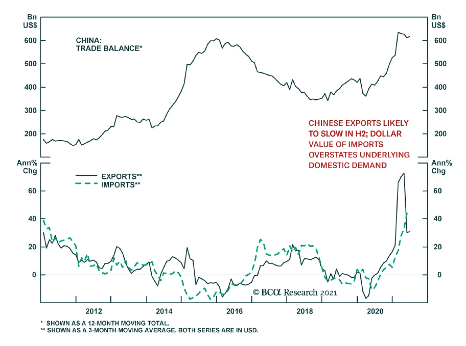
China’s trade surplus expanded unexpectedly in June, rising to $51.5 billion from $45.5 billion. The wider surplus reflects an acceleration in exports to 32.2% y/y from 27.9% y/y. Meanwhile, imports slowed to 36.7% y/y from May’s 36.7% but still beat the…