Emerging Markets

Dear client, This week, I am conducting a BCA Academy Marcroeconomic seminar in the Middle East. In lieu of our regular report, we are publishing a piece written by my colleague Jeremie Peloso. In it, Jeremie explores how to adjust valuation metrics to build country and sector selection tools which can be deployed to manage global equity portfolios. I trust you will find that this report provides a useful approach to equity selection. Best Regards, Mathieu Savary Chief European Strategist Highlights We introduce our Combined Mechanical Valuation Indicator for European equities to identify extreme valuations at the country and sector level. At the country level, the historical track record of relative valuations as an alpha-generating tool is mixed; however, they demonstrate impressive predictive power at the sector level on a 3- to 12-month time horizon. A trading strategy consisting of a basket of the five cheapest relative valuations generates excess returns with high batting averages. The current reading from our Combined Mechanical Valuation Indicator suggests investors should overweight the following European sectors: consumer discretionary relative to both Swedish and British counterparts, tech relative to Australian counterparts, communications relative to Spanish counterparts, and utilities relative to Italian counterparts. Also, favor UK energy stocks relative to their Eurozone competitors. Feature European equities have been underperforming their foreign peers for the past 10 years (Chart 1). The persistently lower profitability of European stocks partly explains their subpar performance; a DuPont decomposition of RoE reveals how Europe’s economic malaise affects corporate profitability (Chart 2). Chart 1Structural Underperformance From The Past...
Structural Underperformance From The Past...
Structural Underperformance From The Past...
Chart 2... And The Future
... And The Future
... And The Future
The Eurozone’s excessively large capital stock is chief among these culprits (Chart 2, bottom panel). It suggests that a large proportion of the capital stock in the Eurozone is misallocated which, in turn, hurts profit margins and renders the Euro Area’s asset turnover inferior to that of other countries. Compared to the US, greater economic rigidities and lower market power and concentration in Europe also hurt profitability. On net, these forces indicate that the case for overweighting European equities on a structural investment horizon (5 to 10 years) remains weak. Despite the poor long-term outlook, European stocks could still perform well on both a tactical and cyclical investment horizon. We currently recommend a modest overweight in European stocks for cyclical investors. One of our main investment themes for the remainder of 2021 is that European growth will surprise to the upside, once the re-opening of economic activity in the Eurozone gets fully underway, supported by the rapid recent progress of vaccination campaigns. This process will cause a re-rating of European assets. Our recent work shows that positive changes in economic surprises translate into generous returns for European equities and EUR/USD. Moreover, prolonged accommodative monetary policies via low rates and the ECB’s PEPP program, as well as continued fiscal support via the NGEU recovery fund, will be supportive for European assets in absolute terms. However, there are risks to our upbeat view, which we explored last week. They are as follows: (1) a slowdown in the Chinese economy, (2) a global credit impulse deterioration, and (3) inflation surges that are faster than expected. While none of these risks constitute our base case scenario, they could derail the positive cyclical environment we anticipate for European equities. In order to diversify portfolio risk away from traditional cyclical factors, this Special Report presents a mechanical valuation framework for European equities to identify high-probability attractive excess returns on a 3- to 12-month time horizon. At the country level, the historical track record of relative valuation as a selection tool is mixed; however, it demonstrates impressive predictive power at the sector level. Therefore, this method provides an attractive starting point for sector selection. The Mechanics Of The Mechanical Approach The starting point of this analysis is to select different valuation metrics. We opt for the following measures commonly accepted by the investment community: Price-to-earnings, Forward price-to-earnings, Price-to-sales, Price-to-book, Price-to-cash flows, Long-term growth in earnings. Next, we detrend each valuation measure by subtracting its 5-year moving average. We subsequently compute the difference between the detrended valuation metrics of the Euro Area MSCI equity benchmark and its chosen counterpart. For example, the calculation for the price-to-earnings ratio (P/E) with the US is as follows: Valuation Gap = (Euro Area P/E - 5-year m.a.) - (US P/E - 5-year m.a.) Then, we divide each of the valuation gaps shown above by their 5-year moving standard deviation: Mechanical Indicator = Valuation Gap / (5-year moving standard deviation of VG) The resulting valuation indicator mean-reverts and oscillates between +/- 2 standard deviations (Chart 3). We repeat this process for each valuation metric across 15 countries (including the All Country World and emerging markets MSCI indices) and the 10 GICS sectors. Considering the importance of relative sectoral biases, we create two versions of the mechanical indicators for the purpose of country analysis: a regular market-cap weighted version and a sector-neutral one, in which we weight all 10 GICS sectors equally. As Chart 4 illustrates, the differences in sector composition between the Eurozone and other regions lead to a sector-neutral valuation metric that deviates substantially from its market-cap weighted counterpart. Importantly, the sector-neutral mechanical indicators perform better on average than the market-cap weighted versions, thus reinforcing the importance of relative sectoral biases when it comes to equity valuation. Chart 3Mechanical Valuation Indicator Example
Mechanical Valuation Indicator Example
Mechanical Valuation Indicator Example
Chart 4Sector Composition Matters
Sector Composition Matters
Sector Composition Matters
Finally, given the sheer amount of computations performed, we only present the summary output from our analysis. The appendix, which starts on page 11, displays the detailed results for each of the valuation metrics, countries, and sectors. A Well-Oiled Mechanical Tool? Simple valuation measures make unreliable market timing tools. However, they are useful at extreme levels, which is precisely how the mechanical indicator is supposed to be used. The next step of our analysis is to assess our methodology and see where it displays predictive power. For this purpose, we back-tested trading rules relying on outlying readings of the relative Mechanical Valuation Indicator. More specifically, we calculated the common currency (US$) excess returns over 3-, 6-, and 12-month horizons generated by the following: Going long (overweight) European stocks, when they stood at 1 and 1.5 standard deviations on the cheap side of fair value. Going short (underweight) European stocks, when they stood at 1 and 1.5 standard deviations on the expensive side of fair value. We define excess returns as the returns in excess of the average returns observed over the past 10-year period. In other words, we want to ensure that the mechanical approach delivers more alpha than a passive buy-and-hold strategy. We use the 1.5 standard deviation threshold rather than the 2-sigma hurdle because of the lack of sufficient observations at the 2-standard deviation bar. If we had stuck to the 2-sigma threshold, the results from the back-test would not have been reliable, despite a sample with history going back to 2003. Table 1 presents the indicator’s batting average at the country level for all the valuation metrics - that is, the number of times both trading rules generated positive excess returns as a percent of the total number of signals. Table 1Mechanical Valuation Indicator (Sector-Neutral) Historical Track Record: Country Level
Valuation – A Mechanical Approach
Valuation – A Mechanical Approach
The results are mixed. Individually, none of the metrics display batting averages that significantly exceed 50% and none of the valuation metrics seem to perform uniformly across either time horizons or trading rules. On the bright side, we observe an improvement in excess returns between the +/- 1 and 1.5 standard deviation signals, especially when the mechanical indicators signal that European equities are the most expensive. Looking more closely at each valuation metric reveals that the long-term expected growth in earnings and the price-to-cash flows provided much better signals than the forward P/E and the price-to-book metrics. We repeat the same exercise at the sector level by calculating mechanical indicators for European sectors relative to comparable sectors from other regions - for example, European industrials relative to US or Chinese industrials. The results displayed in Table 2 consist of the average excess returns and batting averages across all sectors. The results for each sector can be found on page 19. Table 2Mechanical Valuation Indicator Historical Track Record: Sector Level
Valuation – A Mechanical Approach
Valuation – A Mechanical Approach
The historical track record of valuation-based trading rules yields much better results for sector selection than for country picking. All of the valuation metrics provide respectable predictive ability except for the long-term expected growth in earnings. In fact, the indicator generates positive excess returns more than two-thirds of the time; in half of the cases when the indicator fails to generate alpha, the Mechanical Valuation Indicator is computed using the long-term expected growth in earnings. Furthermore, the batting averages are above the 50% mark often, except over 12-month time horizons. Strength In Numbers: Combining The Signals The mixed results obtained from applying trading rules based on our mechanical indicator at the country level suggest we could improve the predictive power of this framework. Since individual valuation metrics do not cut it, we combine them into a simple average. Table 3Combined Mechanical Valuation Indicator (Sector-Neutral) Historical Track Record: Country Level
Valuation – A Mechanical Approach
Valuation – A Mechanical Approach
At the country level, the results are once again disappointing. As can be seen from Table 3, the quality of the signals from our combined mechanical indicator is not consistent across the board. The predictive power of the combined signals only appears to be effective when European equities are 1-sigma cheap or 1.5-sigma expensive. When the combined mechanical indicator is 1.5 standard deviations away from fair value on the expensive side, which, admittedly, is not a very common occurrence, going short (underweight) European equities deliver excess returns of 4.2%, 3.2%, and 2.6% over 3-, 6- and 12-month time horizons, respectively. Table 4Combined Mechanical Valuation Indicator Historical Track Record: Sector Level
Valuation – A Mechanical Approach
Valuation – A Mechanical Approach
Despite this disappointment, the mechanical indicator once again truly shines at the sector level. Combining the valuation metrics, excluding the long-term expected growth rate of earnings (which, as we showed does a poor job), provides an excellent predictive power on all fronts (Table 4). All the excess returns are positive, and the batting averages are satisfying, especially on the 3-month and 6-month time horizons. The most impressive performance came from the mechanical indicator signaling European equity sectors were 1.5-sigma cheap. Out of 61 occurrences, following the signal resulted in earned excess returns of 3.3% and 4.8% on average over a 6- and 12-month time horizon, respectively. Importantly, the batting averages were both close to 60%. Bottom Line: Our Combined Mechanical Valuation Indicator is a useful tool, especially for sector selection in a global portfolio. It sports an impressive historical track record and allows us to identify pockets of attractive relative valuation that generate alpha for investors on a 3- to 12-month time horizon. Investment Implication What is the current message from our Combined Mechanical Valuation Indicator? Chart 5Combined Mechanical Valuation Indicators (Sector-Neutral): Country Level
Valuation – A Mechanical Approach
Valuation – A Mechanical Approach
At present, the approach only sends two signals at the +/- one-sigma threshold at the country level and both stand on the cheap side of fair value (Chart 5). According to the sector-neutral mechanical indicator, the European MSCI equity benchmark is cheap compared to emerging markets and Chinese benchmarks. And, while not at extremes, US and global equities are still expensive relative to Eurozone stocks. Chart 6 provides the current reading from the mechanical indicator for each sector. Chart 6ACombined Mechanical Valuation Indicators: Sector Level
Valuation – A Mechanical Approach
Valuation – A Mechanical Approach
Chart 6BCombined Mechanical Valuation Indicators: Sector Level
Valuation – A Mechanical Approach
Valuation – A Mechanical Approach
Chart 7Favor UK Energy Stocks Vs. European Ones
Favor UK Energy Stocks Vs. European Ones
Favor UK Energy Stocks Vs. European Ones
A few things stand out. First, there appears to be no extreme relative valuations within materials. Second, European energy stocks turn out to be expensive relative to all other regions included in the analysis, especially against energy stocks out of China and the UK. In fact, it makes a compelling case for investors to underweight Euro Area energy stocks relative to UK counterparts (Chart 7). Third, within the communications sector, Eurozone stocks are cheap against all their counterparts except for German ones. The relative valuation does not, however, stand at an extreme. Finally, if we were to select the five strongest signals, we would select the following pairs: Overweight European consumer discretionary stocks relative to Swedish counterparts Overweight European communications stocks relative to Spanish counterparts Overweight European tech stocks relative to Australian counterparts Overweight European consumer discretionary stocks relative to UK counterparts Overweight European utilities stocks relative to Italian counterparts This basket should deliver positive excess returns over a 3- to 12-month time horizon (Chart 8). Chart 8Going With The Strongest CMVI Signals
Going With The Strongest CMVI Signals
Going With The Strongest CMVI Signals
Jeremie Peloso, Associate Editor JeremieP@bcaresearch.com Appendix A The tables below present the historical track record of the sector-neutral mechanical valuation indicator for each of the valuation metrics at the country level. Euro Area vs. US
Valuation – A Mechanical Approach
Valuation – A Mechanical Approach
Euro Area vs. All Country World
Valuation – A Mechanical Approach
Valuation – A Mechanical Approach
Euro Area vs. Emerging Markets
Valuation – A Mechanical Approach
Valuation – A Mechanical Approach
Euro Area vs. Germany
Valuation – A Mechanical Approach
Valuation – A Mechanical Approach
Euro Area vs. France
Valuation – A Mechanical Approach
Valuation – A Mechanical Approach
Euro Area vs. Italy
Valuation – A Mechanical Approach
Valuation – A Mechanical Approach
Euro Area vs. Spain
Valuation – A Mechanical Approach
Valuation – A Mechanical Approach
Euro Area vs. The Netherlands
Valuation – A Mechanical Approach
Valuation – A Mechanical Approach
Euro Area vs. UK
Valuation – A Mechanical Approach
Valuation – A Mechanical Approach
Euro Area vs. Sweden
Valuation – A Mechanical Approach
Valuation – A Mechanical Approach
Euro Area vs. Switzerland
Valuation – A Mechanical Approach
Valuation – A Mechanical Approach
Euro Area vs. Japan
Valuation – A Mechanical Approach
Valuation – A Mechanical Approach
Euro Area vs. Canada
Valuation – A Mechanical Approach
Valuation – A Mechanical Approach
Euro Area vs. Australia
Valuation – A Mechanical Approach
Valuation – A Mechanical Approach
Euro Area vs. China
Valuation – A Mechanical Approach
Valuation – A Mechanical Approach
Appendix B The tables below present the historical track record of the mechanical valuation indicator for each of the valuation metrics at the sector level. Industrials
Valuation – A Mechanical Approach
Valuation – A Mechanical Approach
Materials
Valuation – A Mechanical Approach
Valuation – A Mechanical Approach
Consumer Discretionary
Valuation – A Mechanical Approach
Valuation – A Mechanical Approach
Consumer Staples
Valuation – A Mechanical Approach
Valuation – A Mechanical Approach
Energy
Valuation – A Mechanical Approach
Valuation – A Mechanical Approach
Financials
Valuation – A Mechanical Approach
Valuation – A Mechanical Approach
Technology
Valuation – A Mechanical Approach
Valuation – A Mechanical Approach
Communications
Valuation – A Mechanical Approach
Valuation – A Mechanical Approach
Utilities
Valuation – A Mechanical Approach
Valuation – A Mechanical Approach
Health Care
Valuation – A Mechanical Approach
Valuation – A Mechanical Approach
Appendix C The tables below present the historical track record of the sector-neutral combined mechanical valuation indicator (CMVI) at the country level. Euro Area vs. US
Valuation – A Mechanical Approach
Valuation – A Mechanical Approach
Euro Area vs. All Country World
Valuation – A Mechanical Approach
Valuation – A Mechanical Approach
Euro Area vs. Emerging Markets
Valuation – A Mechanical Approach
Valuation – A Mechanical Approach
Euro Area vs. Germany
Valuation – A Mechanical Approach
Valuation – A Mechanical Approach
Euro Area vs. France
Valuation – A Mechanical Approach
Valuation – A Mechanical Approach
Euro Area vs. Italy
Valuation – A Mechanical Approach
Valuation – A Mechanical Approach
Euro Area vs. Spain
Valuation – A Mechanical Approach
Valuation – A Mechanical Approach
Euro Area vs. The Netherlands
Valuation – A Mechanical Approach
Valuation – A Mechanical Approach
Euro Area vs. UK
Valuation – A Mechanical Approach
Valuation – A Mechanical Approach
Euro Area vs. Sweden
Valuation – A Mechanical Approach
Valuation – A Mechanical Approach
Euro Area vs. Switzerland
Valuation – A Mechanical Approach
Valuation – A Mechanical Approach
Euro Area vs. Japan
Valuation – A Mechanical Approach
Valuation – A Mechanical Approach
Euro Area vs. Canada
Valuation – A Mechanical Approach
Valuation – A Mechanical Approach
Euro Area vs. Australia
Valuation – A Mechanical Approach
Valuation – A Mechanical Approach
Euro Area vs. China
Valuation – A Mechanical Approach
Valuation – A Mechanical Approach
Appendix D The tables below present the historical track record of the Combined Mechanical Valuation Indicator (CMVI) at the sector level. Industrials
Valuation – A Mechanical Approach
Valuation – A Mechanical Approach
Materials
Valuation – A Mechanical Approach
Valuation – A Mechanical Approach
Consumer Discretionary
Valuation – A Mechanical Approach
Valuation – A Mechanical Approach
Consumer Staples
Valuation – A Mechanical Approach
Valuation – A Mechanical Approach
Energy
Valuation – A Mechanical Approach
Valuation – A Mechanical Approach
Financials
Valuation – A Mechanical Approach
Valuation – A Mechanical Approach
Technology
Valuation – A Mechanical Approach
Valuation – A Mechanical Approach
Communications
Valuation – A Mechanical Approach
Valuation – A Mechanical Approach
Utilities
Valuation – A Mechanical Approach
Valuation – A Mechanical Approach
Health Care
Valuation – A Mechanical Approach
Valuation – A Mechanical Approach
Footnotes
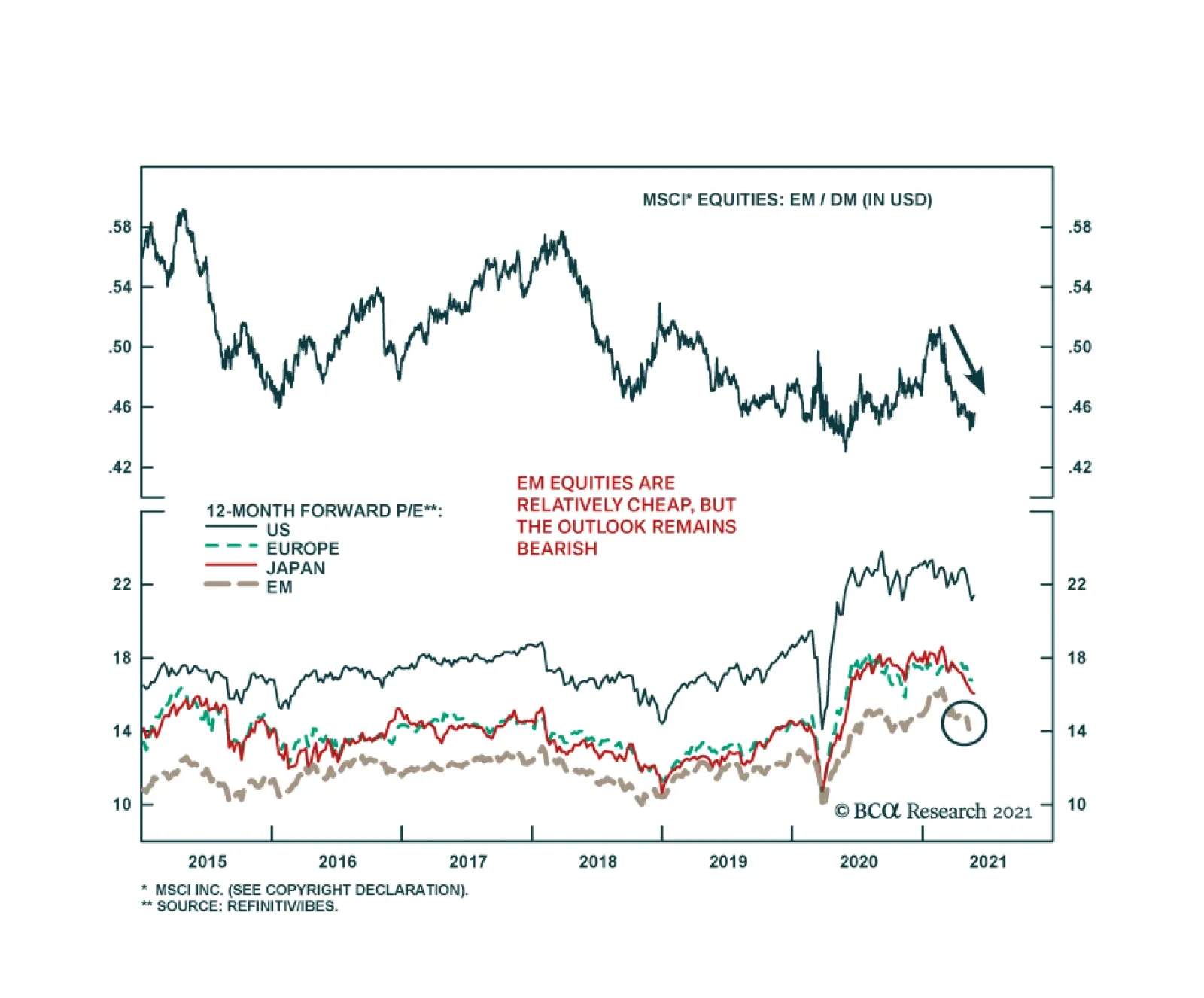
Since mid-February, emerging market equities have consistently underperformed their developed market peers. According to MSCI indices, the relative performance in common currency terms is heading towards last May’s lows. The MSCI EM index is down 6.3% since…
Highlights Our long-term FX REER models suggest the dollar remains overvalued, especially against the Chinese yuan. The cheapest currencies are the yen and the Russian ruble. The Scandinavian currencies are surprisingly expensive, according to these models. This has been due to falling relative productivity. Other notable expensive currencies are the Hong Kong dollar and Saudi riyal. That said, we do not expect the peg in the former to break anytime soon. Our limit-sell on the yen was triggered at 109. Place stops at 112. We are looking to buy a basket of petrocurrencies that include the COP and RUB. These have significantly lagged the rise in oil prices. Feature This week’s report focuses on our long-term fair value models. But a few words first on currency developments. In our view, currency markets are likely to remain driven by five important trends in the coming months. A rotation of growth from the US to other parts of the world (dollar bearish): This has been the dominant theme that has played out since the peak in the DXY index in March. The manufacturing sector in other countries first caught up to the buoyancy we saw in the US, and their service sectors are now recovering as the world vaccinates its population and reopens. In the developed world, Japan, which has been a laggard, could witness a bout of positive surprises. Market focus on inflation, and the potential of an overshoot (dollar bearish): Most market participants have been paying close attention to the inflation overshoot in the US, and whether it is transitory. Currency markets however, specifically the dollar, have been paying close attention to the inflation differential between the US and other countries, and what that means for relative real rates. A rising inflation differential between the US and its trading partners has been negative for the dollar (Chart I-1). We have noted that the US will continue to provide relative upside surprises in inflation as the US output gap closes ahead of other countries. This has been in part due to the most generous fiscal stimulus in the developed world. Chart I-1The Dollar And Relative Inflation Move Opposite Ways
The Dollar And Relative Inflation Move Opposite Ways
The Dollar And Relative Inflation Move Opposite Ways
A Federal Reserve that stays ultra-accommodative (dollar bearish): Most market participants are again focused on the Fed tapering and what that will mean for asset markets. The reality is that the Fed has started to lag many other central banks, like the Bank of Canada, the Reserve Bank of New Zealand and the Bank of England in tapering asset purchases. This could suggest it would also lag in the speed and magnitude of lifting policy rates in the medium term. This will keep US real rates depressed relative to many of its trading partners. A risk event (dollar bullish): We have been highlighting that a risk event, like a market reset, is a strong positive for the dollar, given the negative correlation with risk assets (Chart I-2). A dollar that remains expensive (dollar bearish): Our medium-term (12-18 month) target for the DXY index is 80. This will bring the currency towards fair value, according to our purchasing power parity models. As we highlighted last week, the trade balance in the US continues to deteriorate, which is one of the symptoms of an overvalued currency. Chart I-2The Dollar And Risk Assets Move Opposite Ways
The Dollar And Risk Assets Move Opposite Ways
The Dollar And Risk Assets Move Opposite Ways
Despite our bearish dollar view, it is important not to overstay our welcome. This week, we are updating our long-term models, another technical tool we use to help us navigate FX markets. These models are mostly driven by relative productivity, but we have also fine-tuned the models for each currency to account for other factors such as terms-of-trade shocks, real rate differentials and proxies for global risk aversion. These models cover 22 currencies, incorporating both G10 and emerging FX markets. The dollar remains expensive according to these models (Chart I-3). Chart I-3The US Dollar Remains Expensive
An Update To Our Long-Term FX REER Models
An Update To Our Long-Term FX REER Models
It is important to note that these models are very poor timing tools and are not designed to generate short- or medium-term forecasts. Instead, they reflect imbalances in the current equilibrium fair value of a currency. For example, a currency might be flagged as overvalued now, but a productivity boom in the next few years could allow the currency fair value to gravitate higher. So will a commodity boom. From a technical perspective, these models are like the ones we published in our last report, but with a very important change – the weights assigned in calculating relative productivity are based on dynamic trade weights. This has allowed China (which has much better productivity growth) to impact the currency fair values significantly. For all countries, the variables are highly statistically significant and are of the right signs. Finally, as housekeeping, we were triggered into a short USD/JPY position this week as our limit-sell at 109 was touched. The yen is one of the cheapest currencies according to these models. It will also benefit from all of the five key drivers for currency markets we listed above, especially real rates that are likely to stay very favorable in Japan, compared to the US (Chart I-4). Chart I-4Less Inflationary Pressures In Any Japanese Economic Rebound
Less Inflationary Pressures In Any Japanese Economic Rebound
Less Inflationary Pressures In Any Japanese Economic Rebound
The US Dollar Chart I-5
The US Dollar
The US Dollar
The dollar is expensive by 7% according to the long-term fair value model. This is despite the 13% drop in the US dollar DXY index since the March 2020 highs. In hindsight, strong reversals in the dollar occur when the currency is about two-standard deviations above the mean, which occurred with last year’s rally. Our bias is that the dollar has entered a multi-year downtrend, which will only be supercharged by expensive valuations. The big driver for the uptrend that started in 2011 was positive real interest rate differentials. As US real rates continue to rollover, relative to its G10 counterparts, this will lower the greenback’s fair value. The Euro Chart I-6
The Euro
The Euro
The euro is slightly cheap according to our fundamental models. More importantly, the euro’s fair value has been rising in recent quarters. This has been driven by a nascent improvement in the trade balance (and current account balance), following the Covid-19 crisis. Historically, when the euro has hit its fair value bands, it has tended to mean revert. Therefore, this model does a better job of catching intermediate turns in the euro, compared to the US dollar model. Our bias is that the long-term fair value for the euro sits near 1.35, something that should continue to be reflected in future model updates. The Yen Chart I-7
The Yen
The Yen
The fair value of the yen has been relatively flat over the last few years. Given that the real exchange rate has not fluctuated much either, the yen has been chronically undervalued by about one standard deviation below the mean. The yen is cheap by most measures of relative prices. We believe the yen sits at a beautiful juncture. A pickup in economic activity will keep the fair value rising, from an improvement in the current account. Meanwhile, any deterioration in economic data will lead to higher risk aversion and a higher fair value (the yen is a risk-off currency). We are short USD/JPY as of 109 this week. The British Pound Chart I-8
The British Pound
The British Pound
This model shows that the pound is fairly valued, while cable remains cheap by most of our other models. That said, at fair value, the pound can still overshoot to at least 1.5 standard deviation above/below the mean, as it has in prior episodes. The key reason the pound is not cheap in this model is due to a deterioration in the UK’s productivity growth, relative to its trading partners. In this iteration of the model, China’s larger share of British trade has exacerbated the downtrend in the fair value. However, a turnaround seems underway, as the UK puts the Brexit woes behind it (and Scottish independence is not an immediate concern). The Canadian Dollar Chart I-9
The Canadian Dollar
The Canadian Dollar
The loonie has overshot its fair value. More importantly, the fair value for the Canadian dollar has been falling since the peak of the commodity cycle in 2011. If we are indeed entering a new commodity super-cycle, then the model should begin to turn around, and assign a higher fair value to the loonie. However, Canada’s terms of trade will face strong headwinds as we move away from fossil fuels, especially oil. As such, the productivity gains in other sectors (such as metals) that will benefit from new green investments will need to be sufficiently high to offset falling productivity in crude oil. The Australian Dollar Chart I-10
The Australian Dollar
The Australian Dollar
The Australian dollar has been rising along with the improvement in its fair value. The rising fair value has been due to the exceptional rise in commodity prices (iron ore and coal) that have boosted the current account. However, like the Canadian dollar, the fair value of the Aussie has also been dropping in recent years on the back of previously depressed commodity prices. Given the growing importance of liquified natural gas in Australia’s export mix, we believe terms of trade will remain a tailwind for the Aussie over the longer term. The New Zealand Dollar Chart I-11
The New Zealand Dollar
The New Zealand Dollar
The kiwi is slightly more expensive than its antipodean neighbor. But like other commodity currencies, its fair value has fallen in recent years. The catalyst has been the drop in commodity prices and the fall in relative real rates. More recently, the fair value of the kiwi has taken a positive turn as real rates improve, and risk aversion recedes. With the RBNZ striking a hawkish tone, this remains positive for the kiwi for now, but could adversely impact financial conditions later. The Swiss Franc Chart I-12
The Swiss Franc
The Swiss Franc
On a fundamental basis, the Swiss franc is as cheap as the yen, with our models showing it as about one standard deviation undervalued. The biggest driver for the rise in the fair value of the franc has been the structural trade surplus, driven by rising productivity. The Swiss franc is traditionally a defensive currency. As such, the fair value has taken a small hit due to the fall in the gold-to-oil ratio, a proxy for risk aversion. Should the market experience some turbulence in the coming months, the franc will benefit. The Swedish Krona Chart I-13
The Swedish Krona
The Swedish Krona
The Swedish krona is showing up as expensive in our models, together with the Norwegian krone. Paradoxically, on a PPP basis, the Swedish krona is one of the cheapest currencies in our universe. The key model inputs for the Swedish krona are interest rate differentials and relative productivity trends. With the rise of China as a trading partner, the productivity differential for Sweden has fallen even more steeply in this iteration of the model. It also means that the currency is no longer massively undershooting fair value, as had been the case in previous iterations. The Norwegian Krone Chart I-14
The Norwegian Krone
The Norwegian Krone
Like the Swedish krona, the Norwegian krone is showing up as expensive in our models. However, it is one of the cheapest currencies on a PPP basis, which presents a paradox. We will be looking at the Norwegian economy in-depth next week, to help explain this paradox. A more immediate explanation is that the trade balance for Norway has been nosediving in recent years, which helps explain why the model judges the currency as becoming incrementally expensive. With the rise of China as a trading partner, the productivity differential for Norway has also fallen. The Chinese Yuan Chart I-15
The Chinese Yuan
The Chinese Yuan
The Chinese yuan is currently at about one standard deviation below fair value. Since the history of our model, the fair value of the yuan has been mostly rising. This is driven by rising relative productivity in China. Concurrently, real interest rates in China have also shot up, which has led to a strong rally in the Chinese RMB. We expect the RMB to keep appreciating in the coming years, as the fair value keeps rising. The Brazilian Real Chart I-16
The Brazilian Real
The Brazilian Real
The Brazilian real is slightly above fair value, according to our fundamental models. Meanwhile, the fair value has been falling since 2011, in line with other commodity currencies. However, if we are indeed in a new commodity super cycle, the fair value of the real should start to rise. The Mexican Peso Chart I-17
The Mexican Peso
The Mexican Peso
The Mexican Peso is trading a nudge above fair value, but the fair value has been rising since 2019. This means going forward, we could see a rising peso, coinciding with a rapid rise in its fair value. The peso is highly cyclical, so two key drivers have been working in favor of the currency. First, a falling in risk aversion (proxied by a decline in the gold-to-oil ratio) has been positive. Meanwhile, the cumulative current account will also continue to improve should global growth remain strong in the near term, especially US growth. The Chilean Peso Chart I-18
The Chilean Peso
The Chilean Peso
The Chilean peso is currently at fair value, according to our fair value model. The fair value of the Chilean peso has been falling in recent years, but this decline was even sharper when Chinese productivity gains were given a greater weight in the modelling exercise. Going forward, Chilean exports of copper will be in a structural uptrend, due to the green technology revolution. As such, the fair value of the peso should begin to gradually rise. The Colombian Peso Chart I-19
The Colombian Peso
The Colombian Peso
The Colombian peso is cheap, and so constitutes an attractive play if oil prices remain strong in the medium term. The reason is that it has one of the strongest correlations to oil prices among commodity currencies. That said, structurally, the fair value of the Colombian peso has been falling, like many other petrocurrencies. The South African Rand Chart I-20
The South African Rand
The South African Rand
The South African rand is now trading slightly below its fair value, a positive contrast to the BRL which is slightly expensive. Meanwhile, the fair value of the rand is gradually picking up, after a structural decline over the last decade. The correlation between precious metal prices and the South African rand is picking up again, as the current account moves back into surplus. We are positive gold (and silver) as inflation hedges. Meanwhile, platinum and palladium will continue to benefit from a push towards better environmental standards among traditional autos. The Russian Ruble Chart I-21
The Russian Ruble
The Russian Ruble
The Russian ruble is now sitting around one standard deviation below its fair value. We are constructive on oil, which will boost the fair value of petrocurrencies, including the Russian ruble. Meanwhile, real interest rates are at relatively high levels in Russia, even though this does not have significant explanatory power. Given cheap valuations, we are looking to buy a petrocurrency basket, including the RUB and the COP. The Korean Won Chart I-22
The Korean Won
The Korean Won
The Korean won has underperformed this year, and has been trading at a negligible divergence from its fair value over the last few years. The fair value of the Korean won has also been flat over the years. This suggests that Korean productivity growth has kept pace with its trading partners. Going forward, it also suggests the next move in the Korean won is likely to be driven by the trend in the currencies of its trading partners, especially China and the US. The Philippine Peso Chart I-23
The Philippine Peso
The Philippine Peso
The Philippine peso is expensive by about one standard deviation. This has been partly due to a decline in the fair value of the peso, a process that began in 2015. The Philippine peso is one of the few currencies whose REER tends to have well-defined and long cycles that last 5-8 years. It will be important to watch if the recent appreciation in the currency has more room to run, given expensive valuation. The Singapore Dollar Chart I-24
The Singapore Dollar
The Singapore Dollar
The Singaporean dollar is another currency whose REER tends to have long cycles, probably a feature of the managed float. The Singaporean dollar is a defensive currency, and so the appreciation in other emerging market currencies has brought relative valuations back towards fair value. The Hong Kong Dollar Chart I-25
The Hong Kong Dollar
The Hong Kong Dollar
The REER of HKD has been rising in recent years, meaning inflation in Hong Kong SAR has been outpacing that elsewhere. This has made the HKD expensive, according to our models. However, the fair value has started to fall suggesting productivity gains in the city state have also been lagging, probably a result of political unrest. That said, we expect the peg to remain in place for some time, as we highlighted in a previous special report. The Saudi Riyal Chart I-26
The Saudi Riyal
The Saudi Riyal
The fair value of the Saudi Riyal has been falling for quite a while on declining relative productivity. This has made the Riyal incrementally expensive. However, oil prices are currently elevated, which means it might take much more stretched valuations to begin to cause greater tensions for the peg. Chester Ntonifor Foreign Exchange Strategist chestern@bcaresearch.com Trades & Forecasts Forecast Summary Core Portfolio Tactical Trades Limit Orders Closed Trades
Highlights President Biden has called for the US intelligence community to investigate the origins of COVID-19 and one of Biden’s top diplomats has stated the obvious: the era of “engagement” with China is over. This clinches our long-held view that any Democratic president would be a hawk like President Trump. The US-China conflict – and global geopolitical risk – will revive and undermine global risk appetite. China faces a confluence of geopolitical and macroeconomic challenges, suggesting that its equity underperformance will continue. Domestic Chinese investors should stay long government bonds. Foreign investors should sell into the bond rally to reduce exposure to any future sanctions. The impending agreement of a global minimum corporate tax rate has limited concrete implications that are not already known but it symbolizes the return of Big Government in the western world. Our updated GeoRisk Indicators are available in the Appendix, as well as our monthly geopolitical calendar. Feature In our quarterly webcast, “Geopolitics And Bull Markets,” we argued that geopolitical themes matter to investors when they have a demonstrable relationship with the macroeconomic backdrop. When geopolitics and macro are synchronized, a simple yet powerful investment thesis can be discerned. The US war on terror, Russia’s resurgence, the EU debt crisis, and Brexit each provided cases in which a geopolitically informed macro view was both accessible and actionable at an early stage. Investors generally did well if they sold the relevant country’s currency and disfavored its equities on a relative basis. Chart 1China's Decade Of Troubles
China's Decade Of Troubles
China's Decade Of Troubles
Of course, the market takeaway is not always so clear. When geopolitics and macroeconomics are desynchronized, the trick is to determine which framework will prevail over the financial markets and for how long. Sometimes the market moves to its own rhythm. The goal is not to trade on geopolitics but rather to invest with geopolitics. One of our key views for this year – headwinds for China – is an example of synchronization. Two weeks ago we discussed China’s macroeconomic challenge. In this report we discuss China’s foreign policy challenge: geopolitical pressure from the US and its allies. In particular we address President Biden’s call for a deeper intelligence dive into the origins of COVID-19. The takeaway is negative for China’s currency and risk assets. The Great Recession dealt a painful blow to the Chinese version of the East Asian economic miracle. By 2015, China’s financial turmoil and currency devaluation should have convinced even bullish investors to keep their distance from Chinese stocks and the renminbi. If investors stuck with this bearish view despite the post-2016 rally, on fear of trade war, they were rewarded in 2018-19. Only with China’s containment of COVID-19 and large economic stimulus in 2020 has CNY-USD threatened to break out (Chart 1). We expect the renminbi to weaken anew, especially once the Fed begins to taper asset purchases. Our cyclical view is still bullish but US-China relations are unstable so we remain tactically defensive. Forget Biden’s China Review, He’s A Hawk Chinese financial markets face a host of challenges this year, despite the positive factors for China’s manufacturing sector amid the global recovery. At home these challenges consist of a structural economic slowdown, a withdrawal of policy stimulus, bearish sentiment among households, and an ongoing government crackdown on systemic risk. Abroad the Democratic Party’s return to power in Washington means that the US will bring more allies to bear in its attempt to curb China’s rise. This combination of factors presents a headwind for Chinese equities and a tailwind for government bonds (Chart 2). This is true at least until the government should hit its pain threshold and re-stimulate. Chart 2Global Investors Still Wary
Global Investors Still Wary
Global Investors Still Wary
New stimulus may not occur in 2022. The Communist Party’s leadership rotation merely requires economic stability, not rapid growth. While the central government has a record of stimulating when its pain threshold is hit, even under the economically hawkish President Xi Jinping, a financial market riot is usually part of this threshold. This implies near-term downside, particularly for global commodities and metals, which are also facing a Chinese regulatory backlash to deter speculation. In this context, President Biden’s call for a deeper US intelligence investigation into the origin of COVID-19 is an important confirming signal of the US’s hawkish turn toward China. Biden gave 90 days for the intelligence community to report back to him. We will not enter into the debate about COVID-19’s origins. From a geopolitical point of view it is a moot point. The facts of the virus origin may never be established. According to Biden’s statement, at least one US intelligence agency believes the “lab leak theory” is the most likely source of the virus (while two other agencies decided in favor of animal-to-human transmission). Meanwhile Chinese government spokespeople continue to push the theory that the virus originated at the US’s Fort Detrick in Maryland or at a US-affiliated global research center. What is certain is that the first major outbreak of a highly contagious disease occurred in Wuhan. Both sides are demanding greater transparency and will reject each other’s claims based on a lack of transparency. If the US intelligence report concludes that COVID originated from the Wuhan Institute of Virology, the Chinese government and media will reject the report. If the report exonerates the Wuhan laboratory, at least half of the US public will disbelieve it and it will not deter Biden from drawing a hard line on more macro-relevant policy disputes with China. The US’s hawkish bipartisan consensus on China took shape before COVID. Biden’s decision to order the fresh report introduces skepticism regarding the World Health Organization’s narrative, which was until now the mainstream media’s narrative. Previously this skepticism was ghettoized in US public discourse: indeed, until Biden’s announcement on May 26, the social media company Facebook suppressed claims that the virus came from a lab accident or human failure. Thus Biden’s action will ensure that a large swathe of the American public will always tend to support this theory regardless of the next report’s findings. At the same time Biden discontinued a State Department effort to prove the lab leak theory, which shows that it is not a foregone conclusion what his administration will decide. The good news is that even if the report concluded in favor of the lab leak, the Biden administration would remain highly unlikely to demand that China pay “reparations,” like the Trump administration demanded in 2020. This demand, if actualized, would be explosive. The bad news is that a future nationalist administration could conceivably use the investigation as a basis to demand reparations. Nationalism is a force to be reckoned with in both countries and the dispute over COVID’s origin will exacerbate it. Traditionally the presidents of both countries would tamp down nationalism or attempt to keep it harnessed. But in the post-Xi, post-Trump era it is harder to control. The death toll of COVID-19 will be a permanent source of popular grievance around the world and a wedge between the US and China (Chart 3). China’s international image suffered dramatically in 2020. So far in 2021 China has not regained any diplomatic ground. Chart 3Death Toll Of COVID-19
Biden Confirmed As A China Hawk (GeoRisk Update)
Biden Confirmed As A China Hawk (GeoRisk Update)
The US is repairing its image via a return to multilateralism while the Europeans have put their Comprehensive Agreement on Investment with China on hold due to a spat over sanctions arising from western accusations of genocide (a subject on which China pointedly answered that it did not need to be lectured by Europeans). Notably Biden’s Department of State also endorsed its predecessor’s accusation of genocide in Xinjiang. Any authoritative US intelligence review that solidifies doubts about the WHO’s initial investigation – even if it should not affirm the lab leak theory – would give Biden more ammunition in global opinion to form a democratic alliance to pressure China (for example, in Europe). An important factor that enables the US to remain hawkish on China is fiscal stimulus. While stimulus helps bring about economic recovery, it also lowers the bar to political confrontation (Chart 4). Countries with supercharged domestic demand do not have as much to fear from punitive trade measures. The Biden administration has not taken new punitive measures against China but it is clearly not worried about Chinese retaliation. Chart 4Large Fiscal Stimulus Lowers The Bar To Geopolitical Conflict
Biden Confirmed As A China Hawk (GeoRisk Update)
Biden Confirmed As A China Hawk (GeoRisk Update)
China’s stimulus is underrated in this chart (which excludes non-fiscal measures) but it is still true that China’s policy has been somewhat restrained and it will need to stimulate its economy again in response to any new punitive measures or any global loss of confidence. At least China is limited in its ability to tighten policy due to the threat of US pressure and western trade protectionism. Simultaneous with Biden’s announcement on COVID-19, his administration’s coordinator for Indo-Pacific affairs, Kurt Campbell, proclaimed in a speech that the era of “engagement” with China is officially over and the new paradigm is one of “competition.” By now Campbell is stating the obvious. But this tone is a change both from his tone while serving in President Obama’s Department of State and from his article in Foreign Affairs last year (when he was basically auditioning for his current role in the Biden administration).1 Campbell even said in his latest remarks that the Trump administration was right about the “direction” of China policy (though not the “execution”), which is candid. Campbell was speaking at Stanford University but his comments were obviously aimed for broader consumption. Investors no longer need to wait for the outcome of the Biden administration’s comprehensive review of policy toward China. The answer is known: the Biden administration’s hawkishness is confirmed. The Department of Defense report on China policy, due in June, is very unlikely to strike a more dovish posture than the president’s health policy. Now investors must worry about how rapidly tensions will escalate and put a drag on global sentiment. Bottom Line: US-China relations are unstable and pose an immediate threat to global risk appetite. The fundamental geopolitical assessment of US-China relations has been confirmed yet again. The US is seeking to constrain China’s rise because China is the only country capable of rivaling the US for supremacy in Asia and the world. Meanwhile China is rejecting liberalization in favor of economic self-sufficiency and maintaining an offensive foreign policy as it is wary of US containment and interference. Presidents Biden and Xi Jinping are still capable of stabilizing relations in the medium term but they are unlikely to substantially de-escalate tensions. And at the moment tensions are escalating. China’s Reaction: The Example Of Australia How will China respond to Biden’s new inquiry into COVID’s origins? Obviously Beijing will react negatively but we would not expect anything concrete to occur until the result of the inquiry is released in 90 days. China will be more constrained in its response to the US than it has been with Australia, which called for an international inquiry early last year, as the US is a superior power. Australia was the first to ban Chinese telecom company Huawei from its 5G network (back in 2018) and it was the first to call for a COVID probe. Relations between China and Australia have deteriorated steadily since then, but macro trends have clearly driven the Aussie dollar. The AUD-JPY exchange rate is a good measure for global risk appetite and it is wavering in recent weeks (Chart 5). Chart 5Australian Dollar Follows Macro Trends, Rallies Amid China Trade Spat
Australian Dollar Follows Macro Trends, Rallies Amid China Trade Spat
Australian Dollar Follows Macro Trends, Rallies Amid China Trade Spat
Tensions have also escalated due to China’s dependency on Australian commodity exports at a time of spiking commodity prices. This is a recurring theme going back to the Stern Hu affair. The COVID spat led China to impose a series of sanctions against Australian beef, barley, wine, and coal. But because China cannot replace Australian resources (at least, not in the short term), its punitive measures are limited. It faces rising producer prices as a result of its trade restrictions (Chart 6). This dependency is a bigger problem for China today than it was in previous cycles so China will try to diversify. Chart 6Constraints On China's Tarrifs On Australia
Constraints On China's Tarrifs On Australia
Constraints On China's Tarrifs On Australia
By contrast, China is not likely to impose sanctions on the US in response to Biden’s investigation, unless Biden attacks first. China’s imports from the US are booming and its currency is appreciating sharply. Despite Beijing’s efforts to keep the Phase One trade deal from collapsing, Biden is maintaining Trump’s tariffs and the US-China trade divorce is proceeding (Chart 7). Bilateral tariff rates are still 16-17 percentage points higher than they were in 2018, with US tariffs on China at 19% (versus 3% on the rest of the world) while Chinese tariffs on the US stand at 21% (versus 6% on the rest of the world). The Biden administration timed this week’s hawkish statements to coincide with the first meeting of US trade negotiators with China, which was a more civil affair. Both countries acknowledged that the relationship is important and trade needs to be continued. However, US Trade Representative Katherine Tai’s comments were not overly optimistic (she told Reuters that the relationship is “very, very challenging”). She has also been explicit about maintaining policy continuity with the Trump administration. We highly doubt that China’s share of US imports will ever surpass its pre-Trump peaks. The Biden administration has also refrained so far from loosening export controls on high-tech trade with China. This has caused a bull market in Taiwan while causing problems for Chinese semiconductor stocks’ relative performance (Chart 8). If Biden’s policy review does not lead to any relaxation of export controls on commercial items then it will mark a further escalation in tensions. Chart 7US Tarrifs Reduce China In Trade Deficit
US Tarrifs Reduce China In Trade Deficit
US Tarrifs Reduce China In Trade Deficit
Bottom Line: Until Presidents Biden and Xi stabilize relations at the top, the trade negotiations over implementing the Phase One trade deal – and any new Phase Two talks – cannot bring major positive surprises for financial markets. Chart 8US Export Controls Amid Chip Shortage
US Export Controls Amid Chip Shortage
US Export Controls Amid Chip Shortage
Congress Is More Hawkish Than Biden Biden’s ability to reduce frictions with China, should he seek to, will also be limited by Congress and public opinion. With the US deeply politically divided, and polarization at historically high levels, China has emerged as one of the few areas of agreement. The hawkish consensus is symbolized by new legislation such as the Strategic Competition Act, which is making its way through the Senate rapidly. Congress is also trying to boost US competitiveness through bills such as the Endless Frontier Act. These bills would subject China to scrutiny and potential punitive measures over a broad range of issues but most of all they would ignite US industrial policy , STEM education, and R&D, and diversify the US’s supply chains. We would highlight three key points with regard to the global impact of this legislation: Global supply chains are shifting regardless: This trend is fairly well established in tech, defense, and pharmaceuticals. It will continue unless we see a major policy reversal from China to try to court western powers and reduce frictions. The EU and India are less enthusiastic than the US and Australia about removing China from supply chains but they are not opposed. The EU Commission has recommended new defensive economic measures that cover supply chains in batteries, cloud services, hydrogen energy, pharmaceuticals, materials, and semiconductors. As mentioned, the EU is also hesitating to ratify the Comprehensive Agreement on Investment with China. Hence the EU is moving in the US’s direction independently of proposed US laws. After all, China’s rise up the tech value chain (and its decision to stop cutting back the size of its manufacturing sector) ultimately threatens the EU’s comparative advantage. The EU is also aligned with the US on democratic values and network security. India has taken a harder stance on China than usual, which marks an important break with the past. India’s decision to exclude Huawei from its 5G network is not final but it is likely to be at least partially implemented. A working group of democracies is forming regardless. The Strategic Competition Act calls for the creation of a working group of democracies but the truth is that this is already happening through more effective forums like the G7 and bilateral summits. Just as the implementation of the act would will ultimately depend on President Biden, so the willingness of other countries to adopt the recommendations of the working group would depend on their own executives. Allies have leeway as Biden will not use punitive measures against them: Any policy change from the EU, UK, India, and Australia will be independent of the US Congress passing the Strategic Competition Act. These countries will be self-directed. The US would have to devote diplomatic energy to maintaining a sustained effort by these states to counter China in the face of economic costs. This will be limited by the fact that the Biden administration will be very reluctant to impose punitive measures on allies to insist on their cooperation. The allies will set the pace of pressure on China rather than the United States. This gives the EU an important position, particularly Germany. And yet the trends in Germany suggest that the government will be more hawkish on China after the federal elections in September. Bottom Line: The Biden administration is unlikely to use punitive measures against allies so new US laws are less important than overall US diplomacy with each of the allies. Some allies will be less compliant with US policies given their need for trade with China. But so far there appears to be a common position taking shape even with the EU that is prejudicial to China’s involvement in key sectors of emerging technologies. If China does not respond by reducing its foreign policy assertiveness, then China’s economic growth will suffer. That drag would have to be offset by new supply chain construction in Southeast Asia and other countries. Investment Takeaways The foregoing highlights the international risks facing China even at a time when its trend growth is slowing (Chart 9) and its ongoing struggle with domestic financial imbalances is intensifying. China’s debt-service costs have risen sharply and Beijing is putting pressure on corporations and local governments to straighten out their finances (Chart 10), resulting in a wave of defaults. This backdrop is worrisome for investors until policymakers reassure them that government support will continue. Chart 9China's Growth Potential Slowing
China's Growth Potential Slowing
China's Growth Potential Slowing
Chart 10China's Leaders Struggle With Debt
China's Leaders Struggle With Debt
China's Leaders Struggle With Debt
China’s domestic stability is a key indicator of whether geopolitical risks could spiral out of control. In particular we think aggressive action in the Taiwan Strait is likely to be delayed as long as the Chinese economy and regime are stable. China has rattled sabers over the strait this year in a warning to the United States not to cross its red line (Chart 11). It is not yet clear how Biden’s policy continuity with the Trump administration will affect cross-strait stability. We see no basis yet for changing our view that there is a 60% chance of a market-negative geopolitical incident in 2021-22 and a 5% chance of full-scale war in the short run. Chart 11China PLA Flights Over Taiwan Strait
Biden Confirmed As A China Hawk (GeoRisk Update)
Biden Confirmed As A China Hawk (GeoRisk Update)
Putting all of the above together, we see substantial support for two key market-relevant geopolitical risks: Chinese domestic politics (including policy tightening) and persistent US-China tensions (including but not limited to the Taiwan Strait). We remain tactically defensive, a stance supported by several recent turns in global markets: The global stock-to-bond ratio has rolled over. China is a negative factor for global risk appetite (Chart 12). Global cyclical equities are no longer outperforming defensives. There is a stark divergence between Chinese cyclicals and global cyclicals stemming from the painful transition in China’s bloated industrial economy (Chart 13). Global large caps are catching a bid relative to small caps (Chart 14). Chart 12Global Stock-To-Bond Ratio Rolled Over
Global Stock-To-Bond Ratio Rolled Over
Global Stock-To-Bond Ratio Rolled Over
Chart 13Global Cyclicals-To-Defensives Pause
Biden Confirmed As A China Hawk (GeoRisk Update)
Biden Confirmed As A China Hawk (GeoRisk Update)
Chart 14Global Large Caps Catch A Bid Versus Small Caps
Global Large Caps Catch A Bid Versus Small Caps
Global Large Caps Catch A Bid Versus Small Caps
Cyclically the global economic recovery should continue as the pandemic wanes. China will eventually relax policy to prevent too abrupt of a slowdown. Therefore our strategic portfolio reflects our high-conviction view that the current global economic expansion will continue even as it faces hurdles from the secular rise in geopolitical risk, especially US-China cold war. Measurable geopolitical risk and policy uncertainty are likely to rebound sooner rather than later, with a negative impact on high-beta risk assets. Matt Gertken Vice President Geopolitical Strategy mattg@bcaresearch.com Coda: Global Minimum Tax Symbolizes Return Of Big Government On Thursday, the US Treasury Department released a proposal to set the global minimum corporate tax rate at 15%. The plan is to stop what Treasury Secretary Janet Yellen has referred to as a global “race to the bottom” and create the basis for a rehabilitation of government budgets damaged by pandemic-era stimulus. Although the newly proposed 15% rate is significantly below President Biden’s bid to raise the US Global Intangible Low-Taxed Income (GILTI) rate to 21% from 10.5%, it is the same rate as his proposed minimum tax on corporate book income. Biden is also raising the headline corporate tax rate from 21% to around 25% (or at highest 28%). Negotiators at the OECD were initially discussing a 12.5% global minimum rate. The finance ministers of both France and Germany – where the corporate income tax rates are 32.0% and 29.9%, respectively – both responded positively to the announcement. However, Ireland, which uses low corporate taxes as an economic development strategy, is obviously more comfortable with a minimum closer to its own 12.5% rate. Discussions are likely to occur when G7 finance ministers meet on June 4-5. Countries are hoping to establish a broad outline for the proposal by the G20 meeting in early July. It is highly likely that the OECD will come to an agreement. However, it is not a truly “global” minimum as there will still be tax havens. Compliance and enforcement will vary across countries. A close look at the domestic political capital of the relevant countries shows that while many countries have the raw parliamentary majorities necessary to raise taxes, most countries have substantial conservative contingents capable of preventing stiff corporate tax hikes (Table 1, in the Appendix). Our Geopolitical strategists highlight that the Biden administration’s compromise on the minimum rate reflects its pragmatism as well as emphasis on multilateralism. Any global deal will be non-binding but the two most important low-tax players are already committed to raising corporate rates well above this level: Biden’s plan is noted above, while the UK’s budget for March includes a jump in the business rate to 25% in April 2023 from the current 19%. Ireland and Hungary are the only outliers but they may eventually be forced to yield to such a large coalition of bigger economies (Chart 15). Chart 15Global Minimum Corporate Tax Impact Is Symbolic Rather Than Concrete
Biden Confirmed As A China Hawk (GeoRisk Update)
Biden Confirmed As A China Hawk (GeoRisk Update)
Thus a nominal minimum corporate tax rate is likely to be forged but it will not be truly global and it will not change the corporate rate for most countries. The reality of what companies pay will also depend on loopholes, tax havens, and the effective tax rate. Bottom Line: On a structural horizon, the global minimum corporate tax is significant for showing a paradigm shift in global macro policy: western governments are starting to raise taxes and revenue after decades of cutting taxes. The experiment with limited government has ended and Big Government is making a comeback. On a cyclical horizon, the US concession on global minimum tax is that the Biden administration aims to be pragmatic and “get things done.” Biden is also working with Republicans to pass bills covering some bipartisan aspects of his domestic agenda, such as trade, manufacturing, and China. The takeaway from a global point of view is that Biden may prove to be a compromiser rather than an ideologue, unlike his predecessors. Matt Gertken Vice President Geopolitical Strategy mattg@bcaresearch.com Roukaya Ibrahim Vice President Daily Insights RoukayaI@bcaresearch.com Footnotes 1 Kurt M. Campbell and Jake Sullivan, "Competition Without Catastrophe," Foreign Affairs, September/October 2019, foreignaffairs.com. Section II: Appendix Table 1OECD: Which Countries Are Willing And Able To Raise Corporate Tax Rates?
Biden Confirmed As A China Hawk (GeoRisk Update)
Biden Confirmed As A China Hawk (GeoRisk Update)
GeoRisk Indicator China
China: GeoRisk Indicator
China: GeoRisk Indicator
Russia
Russia: GeoRisk Indicator
Russia: GeoRisk Indicator
UK
UK: GeoRisk Indicator
UK: GeoRisk Indicator
Germany
Germany: GeoRisk Indicator
Germany: GeoRisk Indicator
France
France: GeoRisk Indicator
France: GeoRisk Indicator
Italy
Italy: GeoRisk Indicator
Italy: GeoRisk Indicator
Canada
Canada: GeoRisk Indicator
Canada: GeoRisk Indicator
Spain
Spain: GeoRisk Indicator
Spain: GeoRisk Indicator
Taiwan – Province Of China
Taiwan-Province of China: GeoRisk Indicator
Taiwan-Province of China: GeoRisk Indicator
Korea
Korea: GeoRisk Indicator
Korea: GeoRisk Indicator
Turkey
Turkey: GeoRisk Indicator
Turkey: GeoRisk Indicator
Brazil
Brazil: GeoRisk Indicator
Brazil: GeoRisk Indicator
Australia
Australia: GeoRisk Indicator
Australia: GeoRisk Indicator
Section III: Geopolitical Calendar
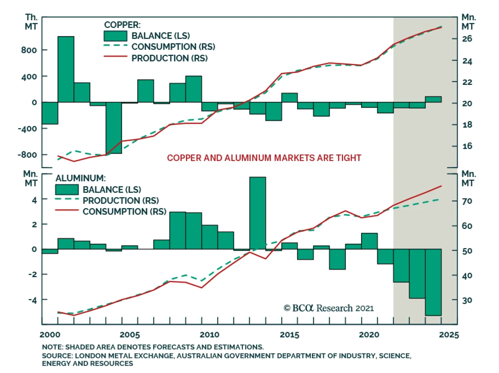
BCA Research’s Commodity & Energy Strategy service believes that China's jawboning of participants in metals markets raises the odds the State Reserve Board (SRB) will release some of its massive copper and aluminum stockpiles in the near future. …
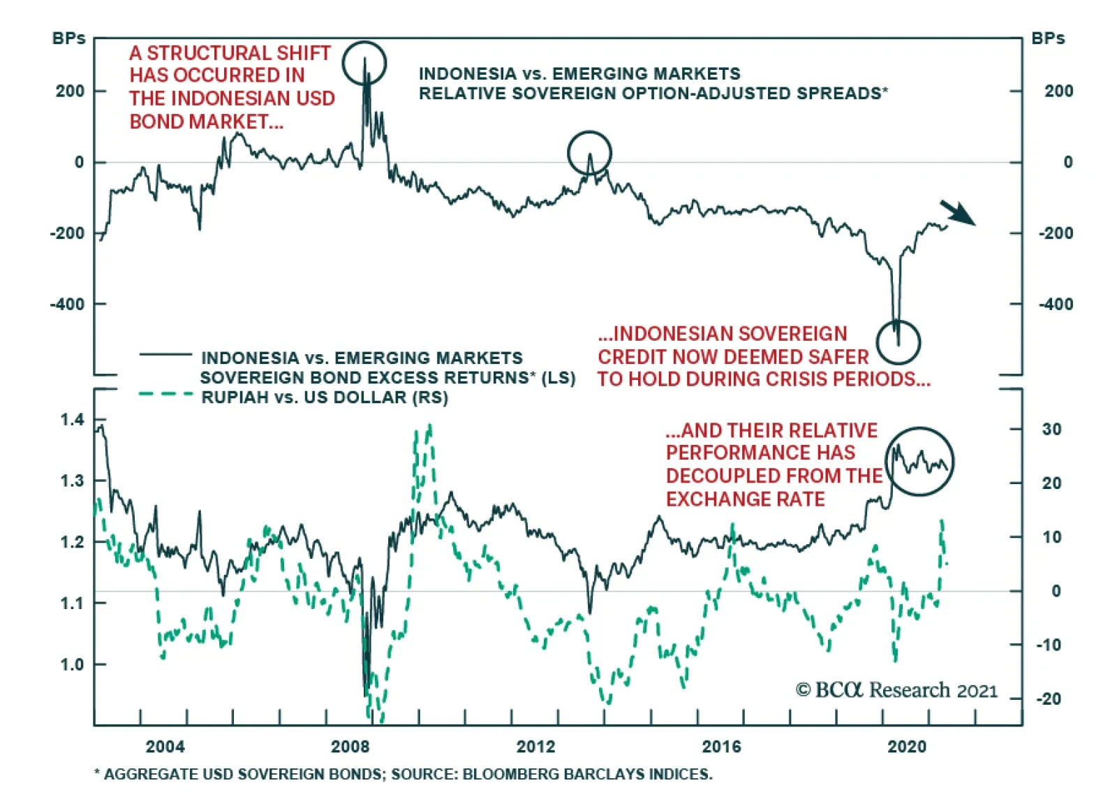
In a recent report on Indonesia, our Emerging Markets Strategy team pointed out a structural shift in the Indonesian USD bond market. Indonesian sovereign USD bonds are now considered among the safest within the EM universe. This was evident early last…
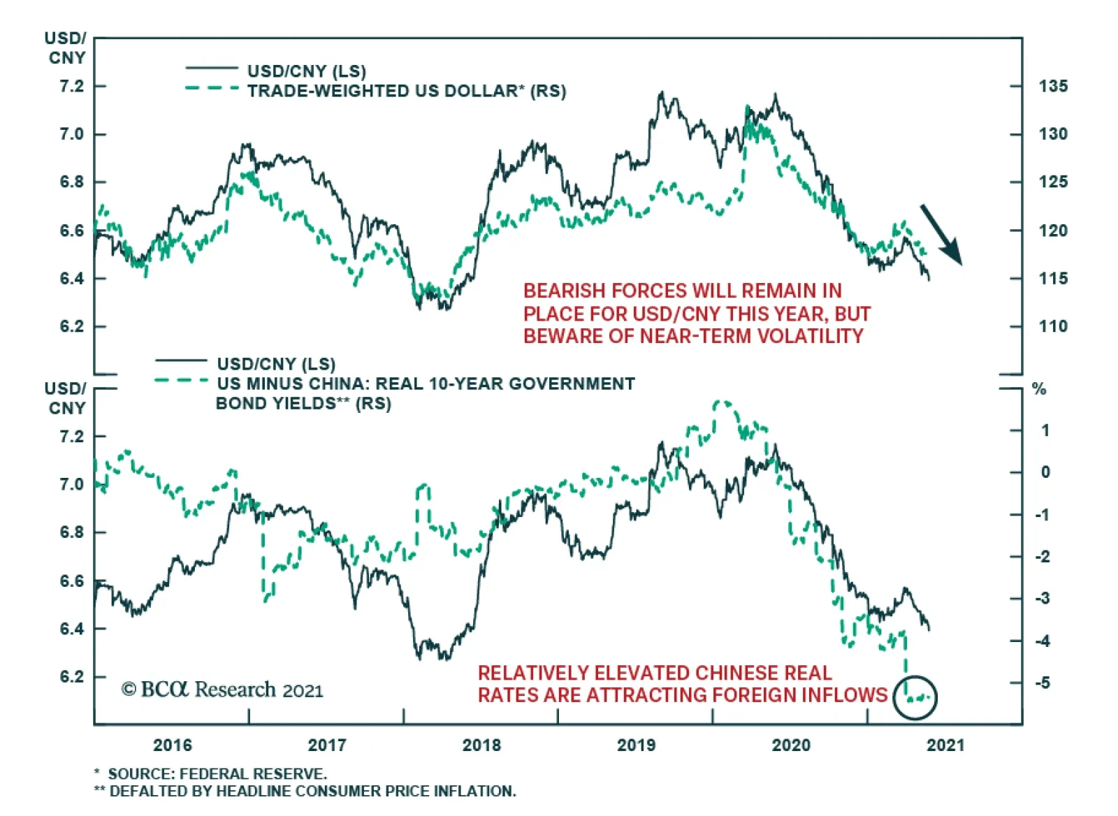
After a period of weakness in the first quarter, RMB strength has been reaffirmed. USD/CNY peaked at the end of March and is down more than 2.5% since then. Broad-based US dollar weakness explains some of the CNY’s recent gains. Nevertheless, the Chinese…
Highlights China's high-profile jawboning draws attention to tightness in metals markets, and raises the odds the State Reserve Board (SRB) will release some of its massive copper and aluminum stockpiles in the near future. Over the medium- to long-term, the lack of major new greenfield capex raises red flags for the IEA's ambitious low-carbon pathway released last week, which foresees the need for a dramatic increase in renewable energy output and a halt in future oil and gas investment to achieve net-zero emissions by 2050. Copper demand is expected to exceed mined supply by 2028, according to an analysis by S&P, which, in line with our view, also sees refined-copper consumption exceeding production this year (Chart of the Week). A constitution re-write in Chile and elections in Peru threaten to usher in higher taxes and royalties on mining in these metals producers, placing future capex at risk. Chile's state-owned Codelco, the largest copper producer in the world, fears a bill to limit mining near glaciers could put as much as 40% of its copper production at risk. We remain bullish copper and look to get long on politically induced sell-offs as the USD weakens. Feature Politicians are inserting themselves in the metals markets' supply-demand evolutions to a greater degree than in the past, which is complicating the short- and medium-term analysis of prices. This adds to an already-difficult process of assessing markets, given the opacity of metals fundamentals – particularly inventories, which are notoriously difficult to assess. Chinese Communist Party (CCP) jawboning of market participants in iron ore, steel, copper and aluminum markets over the past two weeks has weakened prices, but, with the exception of steel rebar futures in Shanghai – down ~ 17% from recent highs, and now trading at ~ 4911 RMB/MT – the other markets remain close to records. Benchmark 62% Fe iron ore at the port of Tianjin was trading ~ 4% lower at $211/MT, while copper and aluminum were trading ~ 5.5% and 6.5% off their recent records at $4.535/lb and $2,350/MT, respectively. In addition to copper, aluminum markets are particularly tight (Chart 2). Jawboning aside, if fundamentals continue to keep prices elevated – or if we see a new leg up – China's high-profile jawboning could presage a release by the State Reserve Board (SRB) of some of its massive copper and aluminum stockpiles in the near term. In the case of copper, market guesses on the size of this stockpile are ~ 2mm to 2.7mm MT. On the aluminum side, Bloomberg reported CCP officials were considering the release of 500k MT to quell the market's demand for the metal. Chart of the WeekContinue Tightening In Copper Expected
Continue Tightening In Copper Expected
Continue Tightening In Copper Expected
Chart 2Aluminum Remains Tight
Aluminum Remains Tight
Aluminum Remains Tight
Brownfield Development Not Sufficient Our balances assessments continue to indicate key base metals markets are tight and will remain so over the short term (2-3 years). Economies ex-China are entering their post-COVID-19 recovery phase. This will be followed by higher demand from renewable generation and grid build-outs that will put them in direct competition with China for scarce metals supplies for decades to come. Markets will continue to tighten. In the bellwether copper market, we expect this tightness to remain a persistent feature of the market over the medium term – 3 to 5 years out – given the dearth of new supply coming to market. Copper prices are highly correlated with the other base metals (Chart 3) – the coefficient of correlation with the other base metals making up the LME's metals index is ~ 0.86 post-GFC – and provide a useful indicator of systematic trends in these markets. Chart 3Copper Correlation With LME Index Ex-Copper
Less Metal, More Jawboning
Less Metal, More Jawboning
Copper ore quality has been falling for years, as miners focused on brownfield development to extend the life of mines (Chart 4). In Chart 5, we show the ratio of capex (in billion USD) to ore quality increases when capex growth is expanding faster than ore quality, and decreases when capex weakens and/or ore quality degradation is increasing. Chart 4Copper Capex, Ore Quality Declines
Less Metal, More Jawboning
Less Metal, More Jawboning
Chart 5Capex-to-Ore-Quality Decline Set Market Up For Higher Prices
Less Metal, More Jawboning
Less Metal, More Jawboning
Falling prices over the 2012-19 interval coincide with copper ore quality remaining on a downward trend, likely the result of previous higher prices that set off the capex boom pre-GFC. The lower prices favored brownfield over greenfield development. Goehring and Rozencwajg found in their analysis of 24 mines, about 80% of gross new reserves booked between 2001-2014 were due not to new mine discoveries but to companies reclassifying what was once considered to be waste-rock into minable reserves, lowering the cut-off grade for development.1 This is consistent with the most recent datapoints in Chart 5, due to falling ore grade values, as companies inject less capex into their operations and use it to expand on brownfield projects. Higher prices will be needed to incentivize more greenfield projects. A new report from S&P Global Market Intelligence shows copper reserves in the ground are falling along with new discoveries.2 According to the S&P analysts, copper demand is expected to exceed mined supply by 2028, which, in line with our view, sees refined-copper consumption exceeding production this year. Renewables Push At Risk Just last week, the IEA produced an ambitious and narrow path for governments to collectively reach a net-zero emissions (NZE) goal by 2050.3 Among its many recommendations, the IEA singled out the overhaul of the global electric grid, which will be required to accommodate the massive renewable-generation buildout the agency forecasts will be needed to achieve its NZE goals. The IEA forecasts annual investment in transmission and distribution grids will need to increase from $260 billion to $820 billion p.a. by 2030. This is easier said than done. Consider the build-out of China's grid, which is the largest grid in the world. To become carbon neutral by 2060, per its stated goals, investment in China’s grid and associated infrastructure is expected to approach ~ $900 billion, maybe more, over the next 5 years.4 The world’s largest fossil-fuel importer is looking to pivot away from coal and plans to more than double solar and wind power capacity to 1200 GW by 2030. Weening China off coal and rebuilding its grid to achieve these goals will be a herculean lift. It comes as no surprise that IEA member states have pushed back on the agency's NZE-by-2050 plan. This primarily is because of its requirement to completely halt fossil-fuel exploration and spending on new projects. Japan and Australia have pushed back against this plan, citing energy security concerns. Officials from both countries have stated that they will continue developing fossil fuel projects, as a back-up to renewables. Japan has been falling behind on renewable electricity generation (Chart 6). Expensive renewables and the unpopularity of nuclear fuel could make it harder for the world’s fifth largest fossil fuels consumer to move away from fossil fuels. Around the same time the IEA released its report, Australia committed $464 million to build a new gas-fired power station as a backup to renewables. Chart 6Japan Will Continue Building Fossil-Fuel Back-Up Generation
Japan Will Continue Building Fossil-Fuel Back-Up Generation
Japan Will Continue Building Fossil-Fuel Back-Up Generation
Just days after the IEA report was published, the G7 nations agreed to stop overseas coal financing. This could have devastating effects for emerging and developing nations‘ electricity grids which are highly dependent on coal. In 2020 70% and 60% of India and China’s electricity respectively were produced by coal (Chart 7).5 Chart 7EM Economies Remain Reliant On Coal-Fired Generation
Less Metal, More Jawboning
Less Metal, More Jawboning
Near-Term Copper Supply Risks Rise Even though inventories appear to be rebuilding, mounting political risks keep us bullish copper (Chart 8). Lawmakers in Chile and Peru are in the process of re-writing their constitutions to, among other things, raise royalties and taxes on mining activities in their respective countries. This could usher in higher taxes and royalties on mining for these metals producers, placing future capex at risk. In addition, Chile's state-owned Codelco, the largest copper producer in the world, fears a bill to limit mining near glaciers could put as much as 40% of its copper production at risk.6 None of these events is certain to occur. Peruvian elections, for one thing, are too close to call at this point, and Chile has a history of pro-business government. However, these are non-trivial odds – i.e., greater than Russian roulette odds of 1:6 – and if any or all of these outcomes are realized, higher costs in copper and lithium prices would result, and miners would have to pass those costs on to buyers. Bottom Line: We remain bullish base metals, especially copper. Another leg up in copper would pull base metals higher with it. We would look to get long on politically induced sell-offs, particularly with the USD weakening, as expected Chart 8Global Copper Inventories Rebuilding But Still Down Y/Y
Global Copper Inventories Rebuilding But Still Down Y/Y
Global Copper Inventories Rebuilding But Still Down Y/Y
Robert P. Ryan Chief Commodity & Energy Strategist rryan@bcaresearch.com Ashwin Shyam Research Associate Commodity & Energy Strategy ashwin.shyam@bcaresearch.com Commodities Round-Up Energy: Bullish Next Tuesday's OPEC 2.0 meeting appears to be a fairly staid affair, with little of the drama attending previous gatherings. Russian minister Novak observed the coalition would be jointly "calculating the balances" when it meets, taking into account the likely official return of Iran as an exporter, according to reuters.com. We expect a mid-year deal on allowing Iran to return to resume exports under the nuclear deal abrogated by the Trump administration in 2019, and reckon Iran has ~ 1.5mm b/d of production it can bring back on line, which likely would return its crude oil production to something above 3.8mm b/d by year-end. We are maintaining our forecast for Brent to average $64.45/bbl in 2H21; $75 and $78/bbl, in 2022 and 2023, respectively. By end 2023, prices trade to $80/bbl. Our forecast is premised on a wider global recovery going into 2H21, and continued production discipline from OPEC 2.0 (Chart 9). Base Metals: Bullish Our stop-losses was elected on our long Dec21 copper position on May 21, which means we closed the position with 48.2% return. The stop loss on our long 2022 vs short 2023 COMEX copper futures backwardation recommendation also was elected on May 20, leaving us with a return of 305%. We will be looking for an opportunity to re-establish these positions. Precious Metals: Bullish We expect the collapse in bitcoin prices, the US Fed’s decision to not raise interest rates, and a weakening US dollar to keep gold prices well bid (Chart 10). China’s ban on cryptocurrency services and Musk’s acknowledgment of the energy intensity of Bitcoin mining sent Bitcoin prices crashing. The Fed’s decision to keep interest rates constant, despite rising inflation and inflation expectations will reduce the opportunity cost of holding gold. According to our colleagues at USBS, the Fed will make its first interest rate hike only after the US economy has reached "maximum employment". The Job Openings and Labor Turnover Survey reported that job openings rose nearly 8% in March to 8.1 million jobs, however, overall hiring was little changed, rising by less than 4% to 6 million. As prices in the US rise and the dollar depreciates, gold will be favored as a store of value. On the back of these factors, we expect gold to hit $2,000/oz. Ags/Softs: Neutral Corn futures were trading close to 20% below recent highs earlier in the week at ~ $6.27/bu, on the back of much faster-than-expected plantings. Chart 9
Brent Prices Going Up
Brent Prices Going Up
Chart 10
US Dollar To Keep Gold Prices Well Bid
US Dollar To Keep Gold Prices Well Bid
Footnotes 1 Please refer to Goehring & Rozencwajg’s Q1 2021 market commentary. 2 Please see Copper cupboard remains bare as discoveries dwindle — S&P study published by mining.com 20 May 2021. 3 Please see Net Zero by 2050 – A Roadmap for the Global Energy Sector, published by the IEA. 4 Please see China’s climate goal: Overhauling its electricity grid, published by Aljazeera. 5 We discuss this in detail in Surging Metals Prices And The Case For Carbon-Capture published 13 May 2021, and Renewables ESG Risks Grow With Demand, which was published 29 April 2021. Both are available at ces.bcaresearch.com. 6 Please see A game of chicken is clouding tax debate in top copper nation, Fujimori looks to speed up projects to tap copper riches in Peru and Codelco says 40% of its copper output at risk if glacier bill passes published by mining.com 24, 23 and 20 May 2021, respectively. Investment Views and Themes Strategic Recommendations Tactical Trades Commodity Prices and Plays Reference Table Trades Closed in 2021 Summary of Closed Trades
Higher Inflation On The Way
Higher Inflation On The Way
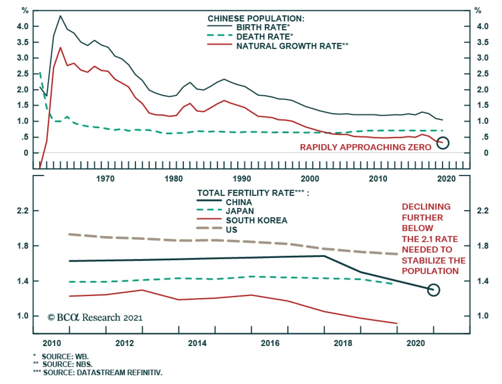
The Seventh National Population Census reinforced the magnitude of China’s demographic challenge. The Census showed three meaningful shifts in China’s demographics in the past decade: 1. China is getting old before getting rich. 2. China’s total…
Highlights We update our assumptions for the likely 10-15 year return for a wide range of different asset classes. Our methodology is basically unchanged from our last Return Assumptions report published in 2019, though we have refined our analysis and use of data in some areas. Returns over the next decade will be very low compared to history. We project that a standard global portfolio (50% equities, 30% bonds, and 20% alternatives) will return only 3.0% a year in nominal terms. That compares to a historic return of 6.3%. There are still some assets that will produce better returns, most notably small caps (4.9% a year in the US) and alternatives (6.2% for private equity, for example). But they also carry higher risk. Spreadsheets are available with detailed data. Introduction This is the third edition of our work on return assumptions. Since publishing the previous reports in November 2017 and June 2019, we have had many opportunities to discuss our methodologies with clients and in the Global Asset Allocation course at the BCA Academy. This has allowed us to test and, in many cases, refine our approach. We believe the methodologies we use have stood the test of time. We have always emphasized that this sort of capital markets assumptions (CMA) analysis is an art, not a precise science. We continue to prefer to project returns over a somewhat undefined 10-15 year period, since this allows us to think about the underlying trend of likely returns. Many other CMA papers use five (or even three) year time horizons which, in our view, are problematical since they rely heavily on a forecast of the timing, length, and severity of the next recession. Our approach is based on the concept that the return on the risk-free long-term government bond is the cornerstone to projecting asset returns, and that this return is rather predictable: It is approximately the current yield. Most other asset returns can be built up from that – the return on high-yield bonds, for example, by assuming that their historic spread over government bonds, and default and recovery rates will continue in the future. For equities, we continue to use six different methodologies, which are based on a mixture of valuation and projected earnings growth. This approach – that assumed returns can be built up from a combination of current yield plus forecast future growth in capital values – also works for most alternative asset classes, for example real estate. We have made a few minor changes to our methodology in this edition. We have, for example, made our use of historical data (for spreads, profit margins, growth relative to GDP, etc.) more consistent, using the 20-year average where possible. The biggest change this time is that clients can download here a spreadsheet with all the data in this report in order, for example, to use the data as inputs into their own optimizers. In addition, we have set up our detailed spreadsheet to allow clients to see the underlying inputs, the formulae behind our methodologies, and to input their own assumptions. This will also allow us to update the results of our analysis as often as needed. Please let us know here if you would like more details about this additional service. This Special Report is structured as follows. First, we analyze the overall results: What is the probable return from each asset class over the next 10-15 years, and how do these differ from historical returns. Next, we describe in detail the methodologies we use, for (1) economic growth, (2) fixed-income instruments, (3) equities, and (4) 12 different alternative asset classes. Then, we describe our way of forecasting currency returns, and show the return assumptions in different base currencies. Finally, we update the numbers for volatility and correlations, which many investors need as inputs into optimization programs. The summary of our results is shown in Table 1. The results are all average annual nominal total returns, in local currency terms (except for global indexes, which are in US dollars). The data is updated to end-April 2021 (except for some alternative asset classes where only quarterly data is available). Table 1BCA Assumed Returns
Return Assumptions 2021
Return Assumptions 2021
Overall Results Returns over the coming decade are likely to be very disappointing compared to history. Our assumptions suggest a typical global portfolio, consisting of 50% large-cap equities, 30% bonds, and 20% alternatives, will produce an annual nominal return of only 3.0%, compared to an average of 6.3% over the past 20 years. A US-only portfolio with a similar composition is likely to produce only a 3.1% return, compared to 7% in history. The reason is simple: Valuations currently are very stretched in almost every asset class. The risk-free rate (the 10-year government bond yield) in the US is 1.6% (compared to a 20-year average of 3.1%). It is negative in the euro area (in nominal terms) and zero in Japan. These rates are the anchor for the returns of all other asset classes, which are theoretically priced off the risk-free rate plus a risk premium. We have long argued that valuations are not a good timing tool for investors. An asset can remain very expensive or very cheap for a considerable period. But all the evidence shows that the valuation at the starting point is a very powerful indicator of long-run returns. The yield on government bonds, for example, has a strong correlation with their 10-year return (Chart 1). In the equity market, the Shiller PE has historically had little correlation with the return over one or two years, but has a 90% correlation with the return over the subsequent 10 years (Chart 2). Chart 1Starting Yield Determines Bond Returns
Return Assumptions 2021
Return Assumptions 2021
Chart 2Valuation Drive Long-Run Equtiy Returns
Valuation Drive Long-Run Equtiy Returns
Valuation Drive Long-Run Equtiy Returns
With valuations in equity markets now expensive relative to history (for example, forward PE for US stocks of 22x compared to a 20-year average of 16x, and 18x in the euro zone compared to 13x), investors should expect that equity market returns will be low relative to history. Our assumptions point to a 2.6% annual return from US stocks, 2.3% from the euro zone, and 1.6% from Japan (compared to 8.5%, 3.9%, and 3.5% over the past 20 years). Our assumptions are significantly lower than when we last published our analysis in 2019; then we projected 5.6% for US stocks, 4.7% for the euro zone, and 6.2% for Japan. The difference is that equity multiples have risen and risk-free rates have fallen significantly since then. So what should investors do? They have only two choices: Lower their return assumptions, or increase their weightings in riskier asset classes. Chart 3Hard To See How US Pension Funds Will Achieve Their Targets
Hard To See How US Pension Funds Will Achieve Their Targets
Hard To See How US Pension Funds Will Achieve Their Targets
The average US public pension fund (Chart 3) still assumes a return of 7% a year, and private pension funds’ assumption is not much lower. And yet corporate pension funds have been pushed by their consultants in recent years to increase their weighting in bonds, to more closely match their liabilities (Chart 4). It is almost mathematically impossible to achieve their targets with that sort of portfolio. In other countries, such as Australia or Canada, pension funds’ return targets are typically inflation or cash plus 3-4 percentage points. But even those targets are challenging. Chart 4...Especially With Over 50% In Bonds
Return Assumptions 2021
Return Assumptions 2021
There are asset classes which will produce higher returns. For example, we project a return of 4.9% from US small-cap stocks – and 9.7% from UK small caps. US high-yield bonds should produce a return of 3.2% a year (even after defaults) and Emerging Markets local currency sovereign debt 2.7% (in USD terms) – not exactly exciting, but at least a pick-up over other fixed-income securities. The projected returns from illiquid alternative assets continue to look relatively attractive. An equal-weighted portfolio of the 12 alternatives we cover is projected to return 5.7% a year, not much lower than the forecast of 6.1% from our 2019 report (and compared to an average of 7.1% of the past 20 years). There are some alt assets where returns have started to trend down: Private equity, for instance, is projected to return 6.2% a year, compared to 11.1% in history, and hedge funds 4.5%, compared to 5.9%. But the illiquidity premium should not disappear completely, even if the move of alternative investments to become more mainstream has reduced it to a degree. So adding more risky assets to a portfolio is an answer, at least for those investors with a long enough time-horizon that allows them to bear the inevitable big drawdowns that come with having a more volatile portfolio. And, unfortunately, lower returns mean that the incremental return gained for each unit of risk taken has declined compared to the past 10 or 20 years (Chart 5) – the efficient frontier has flattened significantly. Chart 5You Need To Take More Risk To Produce Return
Return Assumptions 2021
Return Assumptions 2021
How We Came Up With The Assumptions GDP Growth Several of our methodologies use assumptions (for example, in equity methods (2) and (3), based on projections of earnings growth, real-estate capital-value growth, and commodities prices) which require estimates of nominal GDP growth in each country and region. To make these forecasts, we assume that nominal GDP growth can be decomposed into: (1) growth of the working-age population, (2) productivity growth, and (3) inflation. This ignores capital intensity, but it has been relatively stable over history and is difficult to forecast. Table 2 shows the assumptions we use, and our forecasts for real and nominal GDP in each country and region. Table 2Calculations Of Trend GDP Growth
Return Assumptions 2021
Return Assumptions 2021
For population growth we use the United Nations’ median forecast of annual growth in the population aged 25-54 between 2020 and 2040. This ranges from -1% in Japan to +1% in Emerging Markets – although note that the range of forecast population growth in EM varies widely from 1.2% in India to -1.1% in Korea (and in China, too, is negative at -0.7%). This estimate is reasonably reliable, although it does miss some possible factors, such as changes in the female participation rate, hours worked, and changing openness to immigration. Productivity is much harder to forecast. Over the past 10 to 20 years, productivity growth has trended down in most countries (Charts 6A & B). We take a slightly more optimistic view, assuming that productivity growth over the next 10-15 years will equal the 20-year average. We base this on the belief that part of the decline in productivity since the Global Financial Crisis is due to cyclical reasons which are now dissipating, and also to expectations that new technologies coming through (artificial intelligence, big data, automation, robotics etc) will boost productivity in the coming years. Others take a more pessimistic view. The Congressional Budget Office’s forecast of trend real US GDP growth in 2022-2031 of 1.8%, for example, is lower than our estimate of 2.2% mainly because of its more cautious estimate of productivity growth. Chart 6AProductivity Growth (I)
Productivity Growth (I)
Productivity Growth (I)
Chart 6BProductivity Growth (II)
Productivity Growth (II)
Productivity Growth (II)
To derive nominal GDP growth, we assume that inflation over the next 10 years will be on average the same as over the past 20 years, for example 2% in the US, 1.6% in the euro area, 0.1% in Japan, and 3.9% in Emerging Markets (using a weighted average of EM by equity market cap). This estimate, too, has a high degree of uncertainty. One could imagine a scenario whereby inflation picks up significantly over the next decade due to excessively easy monetary policy, overly generous fiscal spending, growth in protectionism, rising labor pressure for wage increases, and the effects of a rising dependency ratio (the ratio of non-working people, especially retirees, to total population).1 But another scenario of continued “secular stagnation” and disinflation, caused by automation-driven job losses and a chronic lack of aggregate demand, is also conceivable. We think our middle-path forecast is the most sensible one to use in projecting likely asset returns, but investors might also want to plan based on these alternative scenarios too. Note that for Emerging Markets, we continue to show two different scenarios, which vary according to different projections of productivity growth. EM productivity growth has been declining steadily since around 2010, and in all major emerging economies, not just China. Our first scenario assumes that this decline ends and that, as in our assumption for developed economies, productivity growth reverts to the 20-year average. The more pessimistic (and, in our view, more likely) scenario assumes that the deterioration in productivity continues and that in 10 years’ time, EM productivity is the same as the average of developed economies. Which scenario will be correct depends on whether emerging economies, not least China, are able to implement structural reforms over the next decade, for example liberalizing the labor market, allowing a greater role for the private sector, improving corporate governance, and institutionalizing more orthodox fiscal and particularly monetary policy. Fixed Income Our anchor for calculating assumed returns is the return on long-term risk-free assets, specifically the 10-year government bond in the strongest countries. It is a reasonable assumption that an investor who buys, for example, a 10-year Treasury bond today and holds it for 10 years will make 1.6% a year in nominal US dollar terms. While this is not perfectly mathematically correct (since it ignores reinvested interest payments, for instance), empirically the return on government bonds has been very closely linked to the yield at the start-point in history (see Chart 1). From this starting-point in each country, we can easily build up the return for other fixed-income assets. These assumptions and the results are shown in Table 3. Table 3Fixed-Income Return Calculations
Return Assumptions 2021
Return Assumptions 2021
Government bonds in most countries have an average duration of less than 10 years. Over the past five years, in the US it has averaged 6.4 years, and in the euro area 8.0 years. Only in the UK is the average over 10 years: 12.4 years to be precise. To calculate the return from the government bond index for each country we therefore assume that the shape of the yield curve (using the spread between 7-year and 10-year bonds) in future will be the same as the historic 20-year average. Cash. We assume that over the next 10 years the yield on cash will gradually revert to an equilibrium level. We calculate a market-implied real long-term neutral rate from the 10-year historical average of 5-year/5-year OIS implied forwards deflated by the 5-year/5-year implied CPI swap rate. This is a change from the methodology we used in 2019, when we based this off the neutral rate, r*, as calculated by the Holston Laubach-Williams model. But the New York Fed has temporarily stopped updating its calculation of this due to pandemic-induced volatility in the data, and anyway it was not available for every country. We turn the real cash rate into a total nominal return using our assumption for inflation described in detail in the GDP section above, the 20-year historical average of CPI. For inflation-linked securities, such as TIPS, we take the average yield over the past 10 years (a 20-year average was not available in many markets) and add the assumption for inflation described above. Corporate credit. We assume that spreads, and default and recovery rates, while highly volatile over the cycle, remain stable in the long run (Chart 7). We use 20-year averages for these, except that data for investment-grade default rates in Japan, the UK, Canada, and Australia are not available and so we use the average of the US and the euro zone. High-yield default rates are not available for the UK either, and so we do the same. Other bonds. For government-related debt (which is a big part of some bond indexes, 28% in the US for example) we assume that the 20-year historical average of the option-adjusted spread over government bonds will apply in the future too. We use the same methodology for securitized debt (for example, mortgage- and asset-based bonds): The 20-year average spread over the return on government bonds. Emerging Market debt. The assumptions and results for the three categories of EM debt (US dollar sovereign debt, US dollar corporate debt, and local currency sovereign debt) are shown in Table 4. We here assume that the 20-year average historical spread will continue in future. Default and recovery rates are a little harder to calculate, due to a lack of data. For USD sovereign debt (where defaults are rare and so hard to project), we use the rating-based default rate, calculated by Aswath Damodaran of NYU Stern School of Business.2 For USD-denominated EM corporate debt, we use the historical average, calculated by Moody's 2.5%.3 For local-currency debt, we use the same rating-based default rate as for USD sovereign debt. To translate the return into hard currency, we assume that currencies will move in line with the inflation differential between Emerging Markets and the US. For EM inflation we use an average of the IMF’s inflation forecasts for the nine largest emerging markets weighted by their weights in the J.P. Morgan GBI-EM Global Diversified local government bond index, and compare this to our US inflation forecast. This produces an EM inflation forecast of 2.9% a year, compared to 2.2% for the US, thus lowering the USD-based return from local EM debt by 0.7 percentage point. (See a more detailed discussion of forecasting long-term EM currency changes in the Currency section below). Index returns. Table 3 also shows the assumed return for the Bloomberg Barclays bond index for each country and for the global bond index, based on a weighted average of our assumption for each fixed-income asset class and country. Chart 7ACredit Spreads & Default Rates (I)
Credit Spreads & Default Rates
Credit Spreads & Default Rates
Chart 7BCredit Spreads & Default Rates (II)
Credit Spreads & Default Rates
Credit Spreads & Default Rates
Table 4Emerging Market Debt
Return Assumptions 2021
Return Assumptions 2021
Equities The assumptions and detailed results for seven different equity markets are shown in Table 5. We have not made any substantial changes to our methodology for equities. We continue to use the average of six different methods to calculate the probable equity returns over the next 10-15 years. These are: Equity Risk Premium (ERP). The return from equities equals the yield on government bonds (we use 10-year bonds) plus an equity risk premium. For the US, we use an equity risk premium of 3.5%. This is based on work by Dimson, Marsh and Staunton4 showing that this is approximately the average excess return of equities over bonds in developed economies since 1900. We scale the equity risk premium for other countries using their average beta to the US market over the past 10 years. This varies from 0.66 for Japan (giving an ERP of 2.3%) and 1.2 in the euro area (ERP is 4.2%). Growth model. Here we assume that the return from equities equals the current dividend yield plus dividend growth. We need to adjust the dividend yield, however, to take into account that in some countries, particularly the US, it is more tax efficient for companies to do buybacks than to pay out dividends. We do this by adding equity withdrawals to the dividend yield. But this needs to be done on a net basis (taking into account equity issuance). We calculate this using the average annual change in the index divisor over the past 10 years. For the US, this is -0.8%, meaning there are more buybacks than new share issues. But in all other regions, the number is positive, and as high as 5.9% a year for Emerging Markets. This dilution is something that many calculations of assumed equity returns miss. For dividend growth, we assume that the dividend payout ratio remains stable, and that earnings growth is correlated with nominal GDP growth. However, history shows that earnings grow more slowly than GDP (logically so, when you consider that companies usually grow fastest before they list on a stock exchange). So we deduct 1% from nominal GDP growth to derive our earnings growth assumption. Note that for Emerging Markets, we use two different measures of dividend growth, depending on future productivity growth, as detailed above in our explanation of the GDP projections. Growth model (with reversion to mean). To take into account that valuations and profit margins typically revert to mean over the long run, we adjust the standard growth model (No. 2 above) by assuming that the current 12-month forward PE ratio and forward net profit margin for each country gradually revert over the next 10 years to their 20-year average. In the US, for example, that would mean that the current 12-month forward PE of 22.5x falls back to 16.0x, and profit margin of 12.5% falls to 10.7%. In every country and region, the profit margin is currently above the long-run average, and in all except the UK the PE is too. Note that we have changed from using the trailing PE and margin, because to use these now would be misleading given the big pandemic-driven decline in profits in 2020. Earnings yield. An intrinsically intuitive (and empirically demonstrable) way of estimating future returns is to use the earnings yield. This is based on the idea that an investor’s return from owning a stock comes either from the company paying a dividend, or from it investing retained earnings and paying a dividend in future. In the US, for example, a forward PE of 22.5x translates into an earnings yield of 4.4%. Again, here we switched this time to using 12-month forward forecast earnings yield, rather the trailing. Shiller PE. There is a strong correlation between valuation at the starting-point and the subsequent return from equities, at least over the long-run, although not over a period of less than 3-5 years (Chart 2). We regressed the Shiller PE (current price divided by average real earnings over the past 10 years) against the return from equities over the subsequent 10 years for each country and region. Composite valuation metric. The Shiller PE has its detractors. Using a fixed 10-year period does not reflect the different lengths of recessions and bull markets. It may say more about the mean-reverting nature of earnings than about whether the current price level is too high. So we also use the BCA Compositive Valuation Metric, which comprises eight indicators including, besides standard valuation measures such as price/sales and price/book, more esoteric ones such as market cap/GDP and Tobin’s Q. Again, we regress the metric against the subsequent 10-year return. Table 5Equity Return Calculations
Return Assumptions 2021
Return Assumptions 2021
Alternative Assets Real Estate & REITs. We use the same basic methodology for both: The current yield (cap rate or dividend yield) plus projected capital value appreciation (linked to GDP growth). For US direct real estate, for example, we use the simple average cap rate of the five categories of commercial real estate (CRE), apartments, office, retail, industrial, and hotels in major cities: 6.1%. We also use the simple average of available city and category data for other countries. Cap rates are notoriously hard to estimate precisely; our data include a range of real estate, not just prime locations. We assume that capital values will grow in line with nominal GDP growth (using the same assumptions for this as we used for equities, 4.2%). We then deduct 0.5% for maintenance. This produces an expected return of 9.8% for the US. The only difference for REITs is that we do not deduct maintenance since this should already be reflected in the dividend yield. US REITs have a dividend yield currently of 3.5%, which produces an assumed return of 7.7% (Table 6). One risk with this methodology is that in the post-pandemic world, work and life practices might change. This will hurt office and residential real estate in major cities (which are overrepresented in investible CRE), though smaller cities and rural areas might benefit. As a result, capital values might fall. Table 6Alternatives Return Calculations
Return Assumptions 2021
Return Assumptions 2021
Farmland & Timberland. Our methodology is similar to that for real estate: Current yield plus projected growth in capital values. For farmland, we use the farmland renter yield, sourced from the US Department of Agriculture. To estimate future land values, we take the gap between land value growth over the past 40 years (3.7%) and nominal growth of world GDP over that time (5.2%), assume that gap will continue and so deduct it from our estimate of global nominal GDP growth going forward (3.6%). This gives a result of 6.5%. For timberland, we assume that annualized returns in the future are the same as over the past 20 years. This produces a return assumption of 5.7%, which is (logically) moderately lower than our assumed return for farmland. Private Equity & Venture Capital. We project the return for private equity (PE) using the 30-year time-weighted average of the three-year rolling annualized return of PE over US large-cap equities, 3.6% (Chart 8). This produces an assumed return of 6.2%. For venture capital (VC), we use the same historical average for VC over PE (0.4%) to arrive at an assumed return of 6.6%. Hedge Funds. We use the 20-year time-weighted return of the Hedge Fund Composite Index over cash, 3.5% (Chart 9). This projects a future annual nominal return of 4.5%. Commodities. We previously used a methodology based on the idea that commodities’ bear markets in history have been rather fairly consistent, lasting on average 17 years, with an average decline of 50%, and that the current bear market began in 2012 (Chart 10). However, there are arguments that a new “commodities super-cycle” may be starting, driven by government infrastructure spending, and investment in alternative energy.5 We are agnostic for now on whether that will be the case, but it makes sense to switch to a neutral methodology, more in line with what we use for other assets classes: The return from commodities relative to GDP over the long run. Specifically, the CRB Raw Industrials Index has risen by an annualized 1.6% since 1951, during which time US nominal GDP growth averaged 6% (Chart 11). We assume that the differential will continue in future (although we calculate growth using global, not US, GDP), giving an annual return from commodities over the next 10-15 years of -0.9%. Gold. We calculate this using a regression of the gold price against nominal GDP growth and the annual change in the real 10-year yield over the past 40 years. For the forward-looking return assumption, we use a forecast of real rates (based on the equilibrium cash rate plus the average historical spread between the 10-year yield and cash) and a forecast of global nominal GDP growth. This produces an assumed return of 3.8%. Structured products. This asset class consists mainly of mortgage-backed and other asset-backed securitized instruments. In the US, these have historically returned 0.6% over US Treasurys. We assume that this premium continues, producing a total future return of 1.1% a year. Chart 8Private Equity Premium
Private Equity Premium
Private Equity Premium
Chart 9Hedge Fund Return Over Cash
Hedge Fund Return Over Cash
Hedge Fund Return Over Cash
Chart 10Commodity Prices In History
Commodity Prices In History
Commodity Prices In History
Chart 11Commodity Prices Vs. GDP Growth
Commodity Prices Vs. GDP Growth
Commodity Prices Vs. GDP Growth
Currencies Chart 12Currencies Tend To Revert To PPP
Currencies Tend To Revert To PPP
Currencies Tend To Revert To PPP
To translate our local currency returns into an investor’s base currency, we need to arrive at some projections for FX movements over the next decade. Fortunately, for developed market currencies at least, it is relatively straightforward to use purchasing power parities (PPP) to do this since, over the long run, all the major currencies have tended to revert to PPP (Chart 12). We assume that in 10 years’ time all currencies will trade at PPP. We use the IMF’s estimate of today’s PPP for each currency to calculate the current under- or over-valuation. We assume that PPP will change in future years according to the relative inflation between each country and the US. The IMF provides five-year inflation forecasts and we assume that inflation will continue at this rate until 2031. For the euro zone, we calculate the PPP of the euro using the GDP-weighted PPPs of the five largest economies. The results (Table 7) suggest that the US dollar is currently overvalued and, given the forecast of higher inflation in the US than elsewhere in the future, will depreciate significantly against all major currencies except the Australian dollar. The USD is projected to depreciate by 1.7% a year against the euro and 1.1% against the yen over the next 10 years. It is likely to appreciate by 1.3% a year against the AUD, however. Table 7Currency Return Calculations
Return Assumptions 2021
Return Assumptions 2021
Emerging Markets (Table 8) are more complicated. There is no evidence that EM currencies move towards PPP over time. All the major EM currencies are currently very cheap versus PPP (varying from 34% undervalued for the Chinese yuan to 67% for the Indonesian rupiah) but they were 10 years ago, too, and have not significantly moved towards PPP over that time. Table 8EM Currencies
Return Assumptions 2021
Return Assumptions 2021
To calculate likely EM currency moves against the USD, therefore, we carry out a regression of the nine largest EM currencies against their relative CPI inflation rate to US inflation in history. We assume an intercept of zero. The regression coefficients vary from +0.5 for China to -1.7 for Malaysia. Apart from China, Malaysia, Poland and South Africa, the coefficients were negative, meaning that historically the USD has strengthened against the EM currency at least partly in line with relative inflation. To calculate likely future currency movements, we use the IMF’s five-year inflation forecasts and assume that the same rate of inflation will continue for our whole projection period. This methodology points to moderate annual depreciation of most EM currencies against the USD, varying from 0.8% a year for the Russian ruble to 0.1% for the Indonesia rupiah. The Chinese yuan and Taiwanese dollar are projected to appreciate moderately. We calculate the average EM currency movement using the weights of these nine large economies in the EM J.P. Morgan GBI-EM Global Diversified local-currency sovereign bond index. This produces a small (0.1%) a year appreciation. However, the IMF’s EM inflation forecasts may be too optimistic. It forecasts, for example, that Brazilian inflation will be only 3.3% a year in future, compared to an average of 6.1% over the past 20 years, and Russian inflation 4.0% versus a historical average of 9.3%. This suggests that EM currency performance could be worse than our projections. Table 9 shows the returns for the major asset classes expressed in local currency terms for six base currencies, based on the calculations explained above. Table 9Returns In Different Base Currencies
Return Assumptions 2021
Return Assumptions 2021
Correlation And Volatility Below, in Table 10, we provide correlations for clients who need these inputs for their optimization calculations. Table 10Long-Run Correlation Matrix
Return Assumptions 2021
Return Assumptions 2021
Returns can be calculated using the sort of forward-looking methodologies we have described above. For volatility, we think it is reasonable to use historical average data (Table 1, far right column), since volatility does not tend to trend over the long run (Chart 13). But correlation is a different matter. Correlations have varied significantly in history due to structural changes or regime shifts. The correlation of equities to bonds, it is well known, has moved from positive in the 1980s and 1990s, to negative since 2000 – probably because inflation disappeared as a factor moving bond prices (Chart 14). The correlation between equity market has risen as a result of the globalization of investment flows, though note that it fell back in 2010-2019. Chart 13Volatility Is Fairly Stable In The Long Run
Volatility Is Fairly Stable In The Long Run
Volatility Is Fairly Stable In The Long Run
Chart 14Correlations Are Not Stable
Correlations Are Not Stable
Correlations Are Not Stable
So what correlations should investors use in an optimizer? Our recommendation would be to use the longest period of history available. A US investor, for example, might take the average correlation between Treasury bonds and large-cap US equities since 1945, 0.1%. Table 10 shows the correlation since 1973 of all the major asset classes for which data is available. Unfortunately, this misses some important asset classes such as high-yield bonds and Emerging Market equities, whose history does not go back that far. The results are intuitive – and prudent. From these numbers, it would seem sensible to use an assumption of a small positive correlation between US Treasurys and US equities, for example. US investment-grade debt has a correlation of 0.4 against equities. Global equity markets are all fairly highly correlated to each other, ranging mostly from 0.4 to 0.7. The most non-correlated asset class is commodities, especially gold. Garry Evans, Senior Vice President Global Asset Allocation garry@bcaresearch.com Amr Hanafy, Senior Analyst Global Asset Allocation amrh@bcaresearch.com Footnotes 1 These are themes that BCA Research has been writing about for several years. See, for example, please see Global Investment Strategy, "1970s-Style Inflation: Could It Happen Again? (Part 1)," dated August 10, 2018; and " 1970s-Style Inflation: Could It Happen Again? (Part 2)," dated August 24, 2018. 2 Please see http://pages.stern.nyu.edu/~adamodar/New_Home_Page/datafile/ctryprem.html 3 Annual Emerging Markets Default Study: Coronavirus Will Push Up Default Rates https://www.moodys.com/researchdocumentcontentpage.aspx?docid=PBC_1214906 4 Please see, for example, https://www.credit-suisse.com/media/assets/corporate/docs/about-us/research/publications/credit-suisse-global-investment-returns-yearbook-2021-summary-edition.pdf. 5 Please see Commodity & Energy Strategy, "Industrial Commodities Super-Cycle Or Bull Market?", dated March 4, 2021.