Emerging Markets

Highlights A slower money and credit growth in China will eventually generate disinflationary pressures by weighing on demand for commodities. The PBoC has shifted its inflation anchor and policy framework to target core CPI and the PPI rather than headline CPI. Beijing is scaling back its fiscal supports and cooling the property sector to tackle local government and housing sector debt issues. In the next six to nine months we favor companies and sectors that will benefit from global economic recovery rather than China’s domestic demand. We are long CSI500 relative to China’s A shares. The CSI500 has a larger exposure to the global economy and lower valuation relative to China’s broad onshore market. Feature As a follow up to last week’s report, we look at another topic raised in recent client meetings: whether rapidly rising producer prices in China will morph into a broad-based inflationary risk and how macroeconomic policies will evolve to counter such a risk. Clients who believe that the ongoing producer price inflation is transitory cited China’s low consumer price inflation, and slowing money and credit growth, as leading indicators of budding disinflationary pressures. Advocates of sustained inflation pointed to robust recoveries and demand among advanced economies, extremely accommodative monetary conditions worldwide, massive fiscal stimulus in the US, a weak US dollar, and supply constraints. It remains to be seen what the worldwide pandemic’s impact will be on the balance between global production capacity and aggregate demand. In this report we analyze the PBoC’s inflation target and policy framework, and conclude that while China’s monetary policy has not become more hawkish, policy tightening seems to be taking place on the fiscal front. Is Inflation In China A Risk? It is debatable whether the strong rebound in GDP growth in Q4 last year and in Q1 this year has closed China’s output gap and will lead to widespread inflation. Given data distortions due to low-base effects from the previous year and uncertainty about China’s productivity and labor force growth, any calculation of the output gap will be unreliable. In addition, China’s employment statistics lack cyclicality and cannot be used to gauge inflationary pressure stemming from wage growth and unit labor costs. Chart 1A Rollover In Credit Growth Will Weigh On Chinese Demand For Commodities
A Rollover In Credit Growth Will Weigh On Chinese Demand For Commodities
A Rollover In Credit Growth Will Weigh On Chinese Demand For Commodities
Our cyclical view of inflation is therefore based on the framework that the ongoing moderation in China's money and credit growth will eventually generate disinflationary pressures by weighing on the country’s demand for and price of commodities (Chart 1). Furthermore, behind a resilient PPI, there are suggestions that the strength in China’s economy is still bifurcated. A narrow-based uptrend in the PPI lacks the ground for sustained inflation, and is unlikely to trigger a general tightening in monetary policy. While mounting global prices for raw materials propelled strong upstream PPI, producer prices for consumer goods and core consumer price inflation remain very subdued (Chart 2). The inconsistency in producer prices among various industries highlight the unevenness of the economic recovery and, importantly, persistently muted household consumption (Chart 3). Chart 2A Bifurcated Economic Recovery
A Bifurcated Economic Recovery
A Bifurcated Economic Recovery
Chart 3A Muted Recovery In Household Consumption
A Muted Recovery In Household Consumption
A Muted Recovery In Household Consumption
Chart 4Weak Price Transmission From Upstream To Downstream Industries
Weak Price Transmission From Upstream To Downstream Industries
Weak Price Transmission From Upstream To Downstream Industries
The transmission from upstream industrial PPI to the middle and downstream sectors has also been weak (Chart 4). It is evidenced in the faster growth of manufacturing output volume compared with price increases (Chart 5). This contrasts with the previous inflationary cycles, as well as mining and ferrous metals where surging prices for raw materials have way surpassed recovery in output volume (Chart 6). Given that price changes are more important to corporate profits than volume changes, Chinese middle-to-downstream industries face downward pressure on their profit margins and will likely deliver disappointing profits, despite a strong rebound in production. Chart 5China's Manufacturing Recovery: Stronger Volume Than Prices
China's Manufacturing Recovery: Stronger Volume Than Prices
China's Manufacturing Recovery: Stronger Volume Than Prices
Chart 6China's Upstream Industries: Prices Surged Faster Than Production
China's Upstream Industries: Prices Surged Faster Than Production
China's Upstream Industries: Prices Surged Faster Than Production
Furthermore, PMI input prices, which lead core CPI by about nine months, rolled over in April (Chart 7). While it is too soon to conclude that input prices have peaked, it is implied that upward pressure on core CPI from input prices may start to ease in 2H21. Bottom Line: So far there is no sign that elevated upstream producer prices will create sustainable inflationary pressure on consumer prices. Hence our view is that the PBoC will not respond to a rising PPI by further tightening monetary policy. Chart 7PMI Input Prices Have Rolled Over
PMI Input Prices Have Rolled Over
PMI Input Prices Have Rolled Over
Chart 8Core CPI And PPI Have Been The PBoC's Inflation Targets Since 2015
Core CPI And PPI Have Been The PBoC's Inflation Targets Since 2015
Core CPI And PPI Have Been The PBoC's Inflation Targets Since 2015
The PBoC’s Inflation Target Since 2015, China’s monetary tightening cycles have closely correlated with a combination of the core CPI and PPI instead of headline CPI (Chart 8). The shift to targeting core CPI and PPI occurred despite the central bank’s frequent mention of headline CPI as its inflation target. The reasons for the shift are twofold. First, swings in food and fuel prices have become much larger since 2014, often dominating fluctuations in headline CPI (Chart 9). Secondly, the price swings were often driven by supply-side factors and did not reflect changes in demand. Therefore, monetary policies could do little to mitigate inflationary or deflationary pressures. Furthermore, the PPI seems to play a greater role in the PBoC’s monetary policymaking than the headline and core CPI (Chart 10). The tighter relationship between the de facto policy rate and the PPI is not surprising, given that China’s ex-factory price inflation reflects changes in corporate pricing, profit, and inventory cycles – all are driven by the country’s money supply and credit cycles. Chart 9Large Swings In Food And Energy Prices Distorted Headline CPI In Recent Years
Large Swings In Food And Energy Prices Distorted Headline CPI In Recent Years
Large Swings In Food And Energy Prices Distorted Headline CPI In Recent Years
Chart 10PPI Plays A Greater Role In The PBoC's Monetary Policymaking
PPI Plays A Greater Role In The PBoC's Monetary Policymaking
PPI Plays A Greater Role In The PBoC's Monetary Policymaking
The relationship between the 7-day repo rate - the de jure policy rate - and the PPI has broken down since 2015 (Chart 11). Meanwhile, the 3-month repo rate has maintained a close relationship with the PPI (Chart 10, bottom panel). The change in the relationship is because the PBoC shifted its policy to target interest rates instead of the quantity of money supply since 2015 (Chart 12). Moreover, since 2016 the PBoC has generated monetary policy tightening measures through changes in its Macro Prudential Assessment Framework (MPA) rather than directly through interest rate hikes. Chart 11Relationship Between The 7-Day Repo Rate And The PPI Has Broken Down Since 2015...
Relationship Between The 7-Day Repo Rate And The PPI Has Broken Down Since 2015...
Relationship Between The 7-Day Repo Rate And The PPI Has Broken Down Since 2015...
Chart 12...Due To Monetary Policy Regime Shifted
...Due To Monetary Policy Regime Shifted
...Due To Monetary Policy Regime Shifted
Bottom Line: The PBoC has shifted its inflation anchor and policy framework since 2015. Core CPI and the PPI are now the main inflation targets. A Quiet Fiscal Tightening? Despite a jump in the PPI, the 3-month repo rate fell sharply in the past two months (Chart 10 on page 6, bottom panel). It is possible that the PBoC considers escalating producer prices as transitory and, therefore, intends to keep its overall policy stance unchanged. However, the PBoC’s relaxed policy response towards inflation risk may be explained by Beijing’s quiet tightening on the fiscal front. Chart 13The Central Bank Has Made Little Interbank Liquidity Injections Lately
The Central Bank Has Made Little Interbank Liquidity Injections Lately
The Central Bank Has Made Little Interbank Liquidity Injections Lately
The PBoC can hold its policy rates steady by supplying adequate liquidity to the interbank system through open market operations or by reducing the demand for liquidity. On a net basis, the PBoC has recently injected very little liquidity into the interbank system, implying that banks’ liquidity demand has likely softened (Chart 13). This might be a sign of weakening credit origination. In a previous report we discussed how fiscal stimulus has become a more relevant driver of China’s credit origination since the onset of the 2014/15 economic downcycle. A rising 3-month SHIBOR can be the result of rapid fiscal and quasi-fiscal expansions, which occurred in Q3 last year. A flood of local government bond issuance drained liquidity from commercial banks, which boosted the banks’ needs to borrow money from the interbank system and pushed up interbank rates. Despite higher interest rates, credit growth soared in Q3 as fiscal multiplier provided an imminent and powerful reflationary force to the economy. In contrast, local government bond issuance was down sharply in the first four months of this year, compared with 2019 and 2020. Local governments sold 222.7 billion yuan of special-purpose bonds (SPBs) from January to April, a plunge from 730 billion yuan of debt sold in the same period in 2019 and 1.15 trillion yuan in 2020. The total local government bond issuance in Q1 this year has also been 36% and 44% lower than in Q1 2019 and 2020, respectively. A lack of local governments’ appetite to borrow coupled with a shortage in profitable infrastructure projects might have contributed to the sharp drop in bond issuance this year. Local government financing and spending have been under increased scrutiny this year. Following the State Council Executive Meeting in late March, in which Premier Li Keqiang pledged to reduce government leverage ratio and raise regulatory standards on infrastructure investment, Beijing suspended two high-speed rail projects that were initiated by provincial governments. Messages from Politburo’s meeting last week reinforced our view that policymakers may be scaling back fiscal support while further tightening regulations in the property sector. Both aspects have the potential to cool China’s demand for industrial metals and global industrial material prices (Chart 14 and Chart 15). Chart 14A Slowdown In Chinese Manufacturing Demand Will Have A Greater Impact On Global Industrial Material Prices
A Slowdown In Chinese Manufacturing Demand Will Have A Greater Impact On Global Industrial Material Prices
A Slowdown In Chinese Manufacturing Demand Will Have A Greater Impact On Global Industrial Material Prices
Chart 15Lower Housing Demand In China Will Help To Cool Industrial Metal Prices
Lower Housing Demand In China Will Help To Cool Industrial Metal Prices
Lower Housing Demand In China Will Help To Cool Industrial Metal Prices
We expect the intensity of policy tightening to reach its peak between mid-year to third-quarter 2021. It is unclear at this point whether policymakers are willing to allow local governments to significantly undershoot their SPB quota for this year. Local governments reportedly experienced a shortage in profitable investment projects towards the end of last year, and thus, parked more than 10% of proceeds from 2020 SPB issuance at the central bank. The central government may be taking a wait-and-see attitude this year, and saving more fiscal dry powder for later this year when the economic slowdown becomes more meaningful. Bottom Line: Beijing is pulling back its fiscal supports and cooling the property sector to tackle local government and housing sector debt issues. The deleveraging efforts will curb China’s demand for commodities, and may work to ease inflationary pressure on prices for raw materials. Investment Conclusions The outlook for China’s risk asset prices remains bearish, at least in the next six months. If the credit and fiscal impulse slow enough to depress corporate pricing power, inflation will not be a problem because disinflationary pressures will resurface. However, the growth of corporate profits will disappoint (Chart 16). Beijing may be saving more fiscal dry powder for later this year. Still, SPBs are only a small part of local governments’ financing source for infrastructure projects. Given the central government’s renewed focus on reducing public debt, policymakers are unlikely to unleash fiscal power to significantly boost infrastructure spending or economic growth. In the next six to nine months, we favor companies and sectors that will benefit from global economic recovery rather than China’s domestic demand. With this week's report, we initiate a long position on the CSI500 index, which has a larger exposure to the global market and lower valuation relative to China’s broad onshore market (Chart 17). Chart 16Aggregate Corporate Profit Growth Will Slow Even Though Inflation Is No Longer An Issue
Aggregate Corporate Profit Growth Will Slow Even Though Inflation Is No Longer An Issue
Aggregate Corporate Profit Growth Will Slow Even Though Inflation Is No Longer An Issue
Chart 17Long CSI500/Broad Market
Long CSI500/Broad Market
Long CSI500/Broad Market
Jing Sima China Strategist jings@bcaresearch.com Cyclical Investment Stance Equity Sector Recommendations
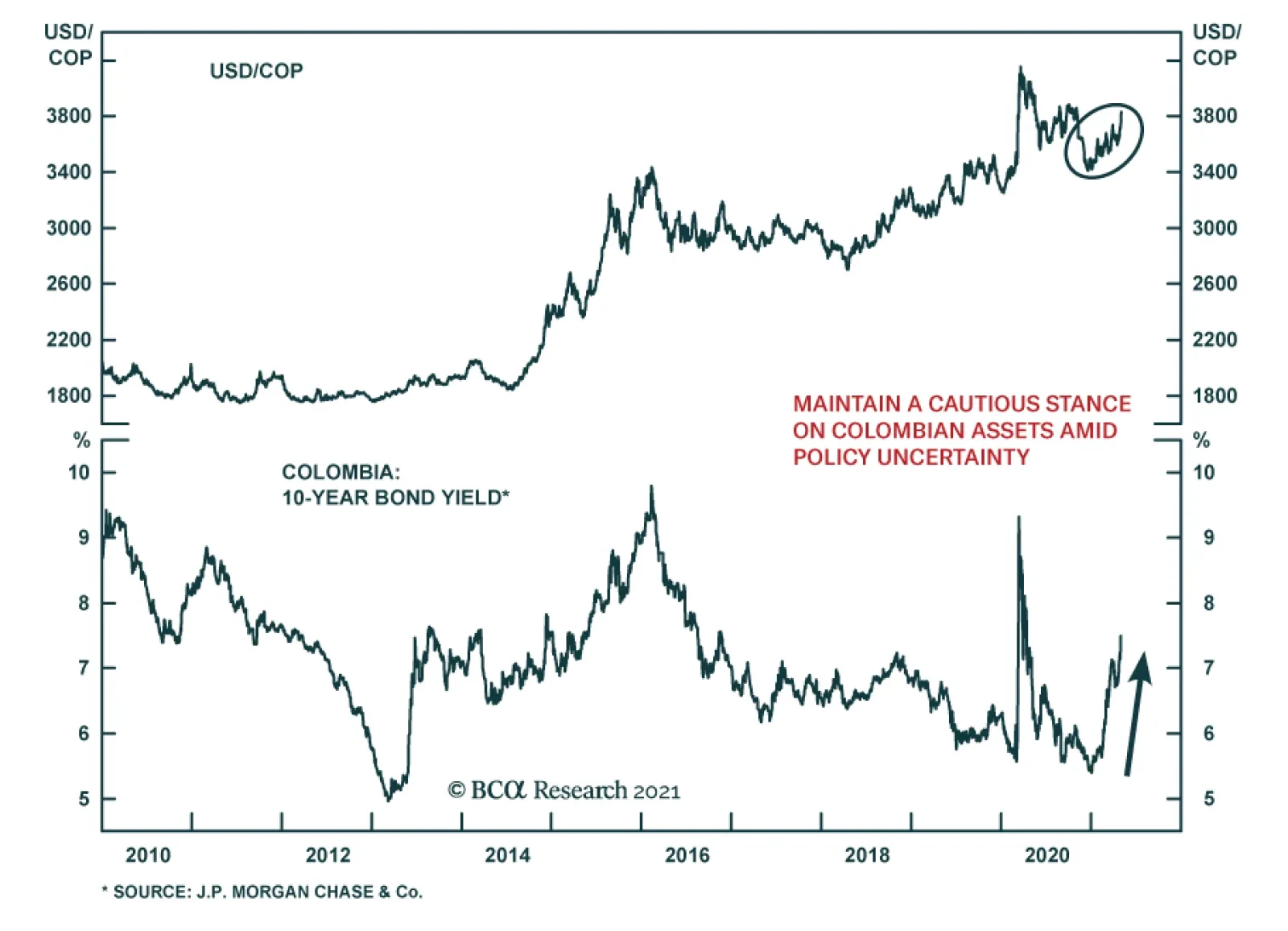
Colombian assets are reeling after President Ivan Duque withdrew a tax reform proposal on Sunday following deadly street protests and political opposition. Finance Minister Alberto Carrasquilla, who designed the bill, resigned on Monday but warned that reform…
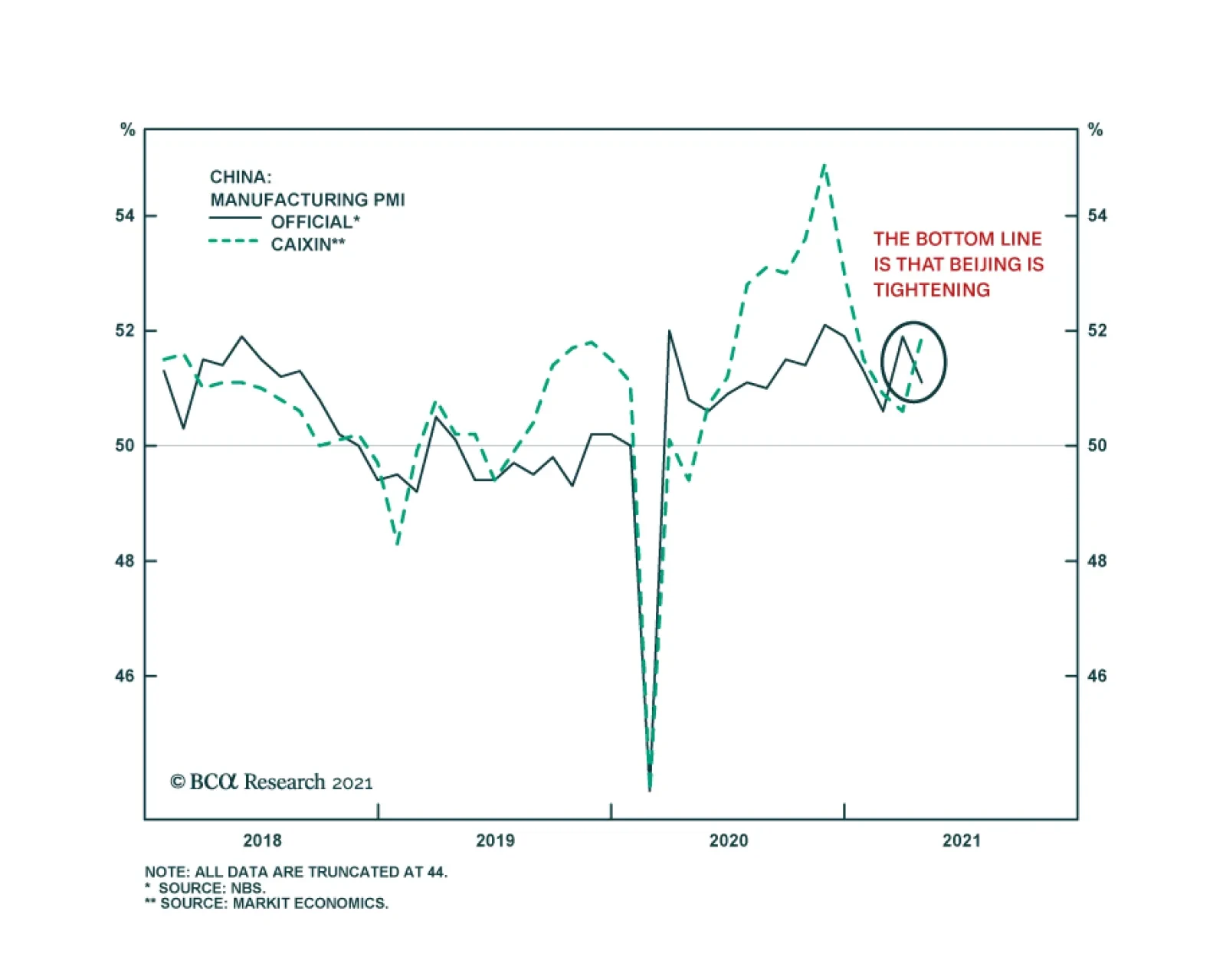
China’s official and Caixin PMIs sent contradictory messages in April. According to the NBS release, the composite PMI declined to 53.8 from 55.3 on greater than anticipated slowdowns in both the manufacturing and non-manufacturing sectors. Meanwhile, the…
Highlights Biden’s first 100 days are characterized by a liberal spend-and-tax agenda unseen since the 1960s. It is not a “bait and switch,” however. Voters do not care about deficits and debt. At least not for now. The apparent outcome of the populist surge in the US and UK in 2016 is blowout fiscal spending. Yet the US and UK also invented and distributed vaccines faster than others. US growth and equities have outperformed while the US dollar experienced a countertrend bounce. While growth will rotate to other regions, China’s stimulus is on the wane. Of Biden’s three initial geopolitical risks, two are showing signs of subsiding: Russia and Iran. US-China tensions persist, however, and Biden has been hawkish so far. Our new Australia Geopolitical Risk Indicator confirms our other indicators in signaling that China risk, writ large, remains elevated. Cyclically we are optimistic about the Aussie and Australian stocks. Mexico’s midterm elections are likely to curb the ruling party’s majority but only marginally. The macro and geopolitical backdrop is favorable for Mexico. Feature US President Joe Biden gave his first address to the US Congress on April 28. Biden’s first hundred days are significant for his extravagant spending proposals, which will rank alongside those of Lyndon B. Johnson’s Great Society, if not Franklin Delano Roosevelt’s New Deal, in their impact on US history, for better and worse. Chart 1Biden's First 100 Days - The Market's Appraisal
Biden's First 100 Days - The Market's Appraisal
Biden's First 100 Days - The Market's Appraisal
The global financial market appraisal is that Biden’s proposals will turn out for the better. The market has responded to the US’s stimulus overshoot, successful vaccine rollout, and growth outperformance – notably in the pandemic-struck service sector – by bidding up US equities and the dollar (Chart 1). From a macro perspective we share the BCA House View in leaning against both of these trends, preferring international equities and commodity currencies. However, our geopolitical method has made it difficult for us to bet directly against the dollar and US equities. Geopolitics is about not only wars and trade but also the interaction of different countries’ domestic politics. America’s populist spending blowout is occurring alongside a sharp drop in China’s combined credit-and-fiscal impulse, which will eventually weigh on the global economy. This is true even though the rest of the world is beginning to catch up in vaccinations and economic normalization. As for traditional geopolitical risk – wars and alliances – Biden has not yet leaped over the three initial foreign policy hurdles that we have highlighted: China, Russia, and Iran. In this report we will update the view on all three, as there is tentative improvement on the Russian and Iranian fronts. In addition, we will introduce our newest geopolitical risk indicator – for Australia – and update our view on Mexico ahead of its June 6 midterm elections. Biden’s Fiscal Blowout From a macro point of view, Biden’s $1.9 trillion American Rescue Plan Act (ARPA) was much larger than what Republicans would have passed if President Trump had won a second term. His proposed $2.3 trillion American Jobs Plan (AJP) is also larger, though both candidates were likely to pass an infrastructure package. The difference lies in the parts of these packages that relate to social spending and other programs, beyond COVID relief and roads and bridges. The Republican proposal for COVID relief was $618 billion while the Republicans’ current proposal on infrastructure is $568 billion – marking a $3 trillion difference from Biden. In reality Republicans would have proposed larger spending if Trump had remained president – but not enough to close this gap. And Biden is also proposing a $1.8 trillion American Families Plan (AFP). Biden’s praise for handling the vaccinations must be qualified by the Trump administration’s successful preparations, which have been unfairly denigrated. Similarly, Biden’s blame for the migrant surge at the southern border must be qualified by the fact that the surge began last year.1 A comparison with the UK will put Biden’s administration into perspective. The only country comparable to the US in terms of the size of fiscal stimulus over 2019-21 so far – excluding Biden’s AJP and AFP, which are not yet law – is the United Kingdom. Thus the consequence of the flare-up of populism in the Anglo-Saxon world since 2016 is a budget deficit blowout as these countries strive to suppress domestic socio-political conflict by means of government largesse, particularly in industrial and social programs. However, populist dysfunction was also overrated. Both the US and UK retain their advantages in terms of innovation and dynamism, as revealed by the vaccine and its rollout (Chart 2). Chart 2Dysfunctional Anglo-Saxon Populism?
Dysfunctional Anglo-Saxon Populism?
Dysfunctional Anglo-Saxon Populism?
No sharp leftward turn occurred in the UK, where Prime Minister Boris Johnson and his Conservatives had the benefit of a pre-COVID election in December 2019, which they won. By contrast, in the US, President Trump and the Republicans contended an election after the pandemic and recession had virtually doomed them to failure. There a sharp leftward turn is taking place. Going forward the US will reclaim the top rank in terms of fiscal stimulus, as Biden is likely to get his infrastructure plan (AJP) passed. Our updated US budget deficit projections appear in Chart 3. Our sister US Political Strategy gives the AJP an 80% chance of passing in some form and the AFP only a 50% chance of passing, depending on how quickly the AJP is passed. This means the blue dashed line is more likely to occur than the red dashed line. The difference is slight despite the mind-boggling headline numbers of the plans because the spending is spread out over eight-to-ten years and tax hikes over 15 years will partially offset the expenditures. Much will depend on whether Congress is willing to pay for the new spending. In Chart 3 we assume that Biden will get half of the proposed corporate tax hikes in the AJP scenario (and half of the individual tax hikes in the AFP scenario). If spending is watered down, and/or tax hikes surprise to the upside, both of which are possible, then the deficit scenarios will obviously tighten, assuming the economic recovery continues robustly as expected. But in the current political environment it is safest to plan for the most expansive budget deficit scenarios, as populism is the overriding force. Chart 3Biden’s Blowout Spending
Biden’s First 100 Days In Foreign Policy (GeoRisk Update)
Biden’s First 100 Days In Foreign Policy (GeoRisk Update)
Biden’s campaign plan was even more visionary, so it is not true that Biden pulled a “bait and switch” on voters. Rather, the median voter is comfortable with greater deficits and a larger government role in American life. Bottom Line: The implication of Biden’s spending blowout is reflationary for the global economy, cyclically negative for the US dollar, and positive for global equities. But on a tactical time frame the rotation to other equities and currencies will also depend on China’s fiscal-and-credit deceleration and whether geopolitical risk continues to fall. Russia: Some Improvement But Coast Not Yet Clear US-Russia tensions appeared to fizzle over the past week but the coast is not yet clear. We remain short Russian currency and risk assets as well as European emerging market equities. Tensions fell after President Putin’s State of the Nation address on April 21 in which he warned the West against crossing Russia’s “red lines.” Biden’s sanctions on Russia were underwhelming – he did not insist on halting the final stages of the Nord Stream II pipeline to Germany. Russia declared it would withdraw its roughly 100,000 troops from the Ukrainian border by May 1. Russian dissident Alexei Navalny ended his hunger strike. Putin attended Biden’s Earth Day summit and the two are working on a bilateral summit in June. Chart 4Russia's Domestic Instability Will Continue
Russia's Domestic Instability Will Continue
Russia's Domestic Instability Will Continue
De-escalation is not certain, however. First, some US officials have cast doubt on Russia’s withdrawal of troops and it is known that arms and equipment were left in place for a rapid mobilization and re-escalation if necessary. Second, Russian-backed Ukrainian separatists will be emboldened, which could increase fighting in Ukraine that could eventually provoke Russian intervention. Third, the US has until August or September to prevent Nord Stream from completion. Diplomacy between Russia and the US (and Russia and several eastern European states) has hit a low point on the withdrawal of ambassadors. Fourth, Russian domestic politics was always the chief reason to prepare for a worse geopolitical confrontation and it remains unsettled. Putin’s approval rating still lingers in the relatively low range of 65% and government approval at 49%. The economic recovery is weak and facing an increasingly negative fiscal thrust, along with Europe and China, Russia’s single-largest export destination (Chart 4). Putin’s handouts to households, in anticipation of the September Duma election, only amount to 0.2% of GDP. More measures will probably be announced but the lead-up to the election could still see an international adventure designed to distract the public from its socioeconomic woes. Russia’s geopolitical risk indicators ticked up as anticipated (Chart 5). They may subside if the military drawdown is confirmed and Biden and Putin lower the temperature. But we would not bet on it. Chart 5Russian Geopolitical Risk: Wait For 'All Clear' Signal
Russian Geopolitical Risk: Wait For 'All Clear' Signal
Russian Geopolitical Risk: Wait For 'All Clear' Signal
Bottom Line: It is possible that Biden has passed his first foreign policy test with Russia but it is too soon to sound the “all clear.” We remain short Russian ruble and short EM Europe until de-escalation is confirmed. The Russian (and German) elections in September will mark a time for reassessing this view. Iran: Diplomacy On Track (Hence Jitters Will Rise) While Russia may or may not truly de-escalate tensions in Ukraine, the spring and summer are sure to see an increase in focus on US-Iran nuclear negotiations. Geopolitical risks will remain high prior to the conclusion of a deal and will materialize in kinetic attacks of various kinds. This thesis is confirmed by the alleged Israeli sabotage of Iran’s Natanz nuclear facility this month. The US Navy also fired warning shots at Iranian vessels staging provocations. Sporadic attacks in other parts of the region also continue to flare, most recently with an Iranian tanker getting hit by a drone at a Syrian oil terminal.2 The US and Iran are making progress in the Vienna talks toward rejoining the 2015 nuclear deal from which the US withdrew in 2018. Iran pledged to enrich uranium up to 60% but also said this move was reversible – like all its tentative violations of the Joint Comprehensive Plan of Action (JCPA) so far (Table 1). Iran also offered a prisoner swap with the US. Saudi Arabia appears resigned to a resumption of the JCPA that it cannot prevent, with crown prince Mohammed bin Salman offering diplomatic overtures to both the US and Iran. Table 1Iran’s Nuclear Program And Compliance With JCPA 2015
Biden’s First 100 Days In Foreign Policy (GeoRisk Update)
Biden’s First 100 Days In Foreign Policy (GeoRisk Update)
Still, the closer the US and Iran get to a deal the more its opponents will need to either take action or make preparations for the aftermath. The allegation that former US Secretary of State John Kerry’s shared Israeli military plans with Iranian Foreign Minister Javad Zarif is an example of the kind of political brouhaha that will occur as different elements try to support and oppose the normalization of US-Iran ties. More importantly Israel will underscore its red line against nuclear weaponization. Previously Iran was set to reach “breakout” capability of uranium enrichment – a point at which it has enough fissile material to produce a nuclear device – as early as May. Due to sabotage at the Natanz facility the breakout period may have been pushed back to July.3 This compounds the significance of this summer as a deadline for negotiating a reduction in tensions. While the US may be prepared to fudge on Iran’s breakout capabilities, Israel will not, which means a market-relevant showdown should occur this summer before Israel backs down for fear of alienating the United States. Tit-for-tat attacks in May and June could cause negative surprises for oil supply. Then there will be a mad dash by the negotiators to agree to deal before the de facto August deadline, when Iran inaugurates a new president and it becomes much harder to resolve outstanding issues. Chart 6Iran Deal Priced Into Oil Markets?
Iran Deal Priced Into Oil Markets?
Iran Deal Priced Into Oil Markets?
Hence our argument that geopolitics adds upside risk to oil prices in the first half of the year but downside risk in the second half. The market’s expectations seem already to account for this, based on the forward curve for Brent crude oil. The marginal impact of a reconstituted Iran nuclear deal on oil prices is slightly negative over the long run since a deal is more likely to be concluded than not and will open up Iran’s economy and oil exports to the world. However, our Commodity & Energy Strategy expects the Brent price to exceed expectations in the coming years, judging by supply and demand balances and global macro fundamentals (Chart 6). If an Iran deal becomes a fait accompli in July and August the Saudis could abandon their commitment to OPEC 2.0’s production discipline. The Russians and Saudis are not eager to return to a market share war after what happened in March 2020 but we cannot rule it out in the face of Iranian production. Thus we expect oil to be volatile. Oil producers also face the threat of green energy and US shale production which gives them more than one reason to keep up production and prevent prices from getting too lofty. Throughout the post-2015 geopolitical saga between the US and Iran, major incidents have caused an increase in the oil-to-gold ratio. The risk of oil supply disruption affected the price more than the flight to gold due to geopolitical or war risk. The trend generally corresponds with that of the copper-to-gold ratio, though copper-to-gold rose higher when growth boomed and oil outperformed when US-Iran tensions spiked in 2019. Today the copper-to-gold ratio is vastly outperforming the oil-to-gold on the back of the global recovery (Chart 7). This makes sense from the point of view of the likelihood of a US-Iran deal this year. But tensions prior to a deal will push up oil-to-gold in the near term. Chart 7Biden Passes Iran Test? Likely But Not A Done Deal
Biden Passes Iran Test? Likely But Not A Done Deal
Biden Passes Iran Test? Likely But Not A Done Deal
Bottom Line: The US-Iran diplomacy is on track. This means geopolitical risk will escalate in May and June before a short-term or interim deal is agreed in July or August. Geopolitical risk stemming from US-Iran relations will subside thereafter, unless the deadline is missed. The forward curve has largely priced in the oil price downside except for the risk that OPEC 2.0 becomes dysfunctional again. We expect upside price surprises in the near term. Biden, China, And Our Australia GeoRisk Indicator Ostensibly the US and Russia are avoiding a war over Ukraine and the US and Iran are negotiating a return to the 2015 nuclear deal. Only US-China relations utterly lack clarity, with military maneuvering in the Taiwan Strait and South China Sea and tensions simmering over the gamut of other disputes. Chart 8Biden Still Faces China Test
Biden’s First 100 Days In Foreign Policy (GeoRisk Update)
Biden’s First 100 Days In Foreign Policy (GeoRisk Update)
The latest data on global military spending show not only that the US and China continue to build up their militaries but also that all of the regional allies – including Japan! – are bulking up defense spending (Chart 8). This is a substantial confirmation of the secular growth of geopolitical risk, specifically in reaction to China’s rise and US-China competition. The first round of US-China talks under Biden went awry but since then a basis has been laid for cooperation on climate change, with President Xi Jinping attending Biden’s virtual climate change summit (albeit with no bilateral summit between the two). If John Kerry is removed as climate czar over his Iranian controversy it will not have an impact other than to undermine American negotiators’ reliability. The deeper point is that climate is a narrow basis for US-China cooperation and it cannot remotely salvage the relationship if a broader strategic de-escalation is not agreed. Carbon emissions are more likely to become a cudgel with which the US and West pressure China to reform its economy faster. The Department of Defense is not slated to finish its comprehensive review of China policy until June but most US government departments are undertaking their own reviews and some of the conclusions will trickle out in May, whether through Washington’s actions or leaks to the press. Beijing could also take actions that upend the Biden administration’s assessment, such as with the Microsoft hack exposed earlier this year. The Biden administration will soon reveal more about how it intends to handle export controls and sanctions on China. For example, by May 19 the administration is slated to release a licensing process for companies concerned about US export controls on tech trade with China due to the Commerce Department’s interim rule on info tech supply chains. The Biden administration looks to be generally hawkish on China, a view that is now consensus. Any loosening of punitive measures would be a positive surprise for Chinese stocks and financial markets in general. There are other indications that China’s relationship with the West is not about to improve substantially – namely Australia. Australia has become a bellwether of China’s relations with the world. While the US’s defense commitments might be questionable with regard to some of China’s neighbors – namely Taiwan (Province of China) but also possibly South Korea and the Philippines – there can be little doubt that Australia, like Japan, is the US’s red line in the Pacific. Australian politics have been roiled over the past several years by the revelation of Chinese influence operations, state- or military-linked investments in Australia, and propaganda campaigns. A trade war erupted last year when Australia called for an investigation into the origins of COVID-19 and China’s handling of it. Most recently, Victoria state severed ties with China’s Belt and Road Initiative. Despite the rise in Sino-Australian tensions, the economic relationship remains intact. China’s stimulus overweighed the impact of its punitive trade measures against Australia, both by bidding up commodity prices and keeping the bulk of Australia’s exports flowing (Chart 9). As much as China might wish to decouple from Australia, it cannot do so as long as it needs to maintain minimum growth rates for the sake of social stability and these growth rates require resources that Australia provides. For example, global iron ore production excluding Australia only makes up 80% of China’s total iron ore imports, which necessitates an ongoing dependency here (Chart 10). Brazil cannot make up the difference. Chart 9China-Australia Trade Amid Tensions
China-Australia Trade Amid Tensions
China-Australia Trade Amid Tensions
Chart 10China Cannot Replace Australia
China Cannot Replace Australia
China Cannot Replace Australia
This resource dependency does not necessarily reduce geopolitical tension, however, because it increases China’s supply insecurity and vulnerability to the US alliance. The US under Biden explicitly aims to restore its alliances and confront autocratic regimes. This puts Australia at the front lines of an open-ended global conflict. Chart 11Introducing: Australia GeoRisk Indicator (Smoothed)
Introducing: Australia GeoRisk Indicator (Smoothed)
Introducing: Australia GeoRisk Indicator (Smoothed)
Our newly devised Australia GeoRisk Indicator illustrates the point well, as it has continued surging since the trade war with China first broke out last year (Chart 11). This indicator is based on the Australian dollar and its deviation from underlying macro variables that should determine its course. These variables are described in Appendix 1. If the Aussie weakens relative to these variables, then an Australian-specific risk premium is apparent. We ascribe that premium to politics and geopolitics writ large. A close examination of the risk indicator’s performance shows that it tracks well with Australia’s recent political history (Chart 12). Previous peaks in risk occurred when President Trump rose to power and Australia, like Canada, found itself beset by negative pressures from both the US and China. In particular, Trump threatened tariffs and the Australian government banned China’s Huawei from its 5G network. Today the rise in geopolitical risk stems almost exclusively from China. There is potential for it to roll over if Biden negotiates a reduction in tensions but that is a risk to our view (an upside risk for Australian and global equities). Chart 12Australian GeoRisk Indicator (Unsmoothed)
Australian GeoRisk Indicator (Unsmoothed)
Australian GeoRisk Indicator (Unsmoothed)
What does this indicator portend for tradable Australian assets? As one would expect, Australian geopolitical risk moves inversely to the country’s equities, currency, and relative equity performance (Chart 13). Australian equities have risen on the back of global growth and the commodity boom despite the rise in geopolitical risk. But any further spike in risk could jeopardize this uptrend. Chart 13Australia Geopolitical Risk And Tradable Assets
Australia Geopolitical Risk And Tradable Assets
Australia Geopolitical Risk And Tradable Assets
An even clearer inverse relationship emerges with the AUD-JPY exchange rate, a standard measure of risk-on / risk-off sentiment in itself. If geopolitical risk rises any further it should cause a reversal in the currency pair. Finally, Australian equities have not outperformed other developed markets excluding the US, which may be due to this elevated risk premium. Bottom Line: China is the most important of Biden’s foreign policy hurdles and unlike Russia and Iran there is no sign of a reduction in tension yet. Our Australian GeoRisk Indicator supports the point that risk remains very elevated in the near term. Moreover China’s credit deceleration is also negative for Australia. Cyclically, however, assuming that China does not overtighten policy, we take a constructive view on the Aussie and Australian equities. Biden’s Border Troubles Distract From Bullish Mexico Story The biggest criticism of Biden’s first 100 days has been his reduction in a range of enforcement measures on the southern border which has encouraged an overflow of immigrants. Customs and Border Patrol have seen a spike in “encounters” from a low point of around 17,000 in 2020 to about 170,000 today. The trend started last year but accelerated sharply after the election and had surpassed the 2019 peak of 144,000. Vice President Kamala Harris has been put in charge of managing the border crisis, both with Mexico and Central American states. She does not have much experience with foreign policy so this is her opportunity to learn on the job. She will not be able to accomplish much given that the Biden administration is unwilling to use punitive measures or deterrence and will not have large fiscal resources available for subsidizing the nations to the south. With the US economy hyper-charged, especially relative to its southern neighbors, the pace of immigration is unlikely to slacken. From a macro point of view the relevance is that the US is not substantially curtailing immigration – quite the opposite – which means that labor force growth will not deviate from its trend. What about Mexico itself? It is not likely that Harris will be able to engage on a broader range of issues with Mexico beyond immigration. As usual Mexico is beset with corruption, lawlessness, and instability. To these can be added the difficulties of the pandemic and vaccine rollout. Tourism and remittances are yet to recover. Cooperation with US federal agents against the drug cartels is deteriorating. Cartels control an estimated 40% of Mexican territory.4 Nevertheless, despite Mexico’s perennial problems, we hold a positive view on Mexican currency and risk assets. The argument rests on five points: Strong macro fundamentals: With China’s fiscal-and-credit impulse slowing sharply, and US stimulus accelerating, Mexico stands to benefit. Mexico has also run orthodox monetary and fiscal policies. It has a demographic tailwind, low wages, and low public debt. The stars are beginning to align for the country’s economy, according to our Emerging Markets Strategy. US and Canadian stimulus: The US and Canada have the second- and third-largest fiscal stimulus of all the major countries over the 2019-21 period, at 9% and 8% of GDP respectively. Mexico, with the new USMCA free trade deal in hand, will benefit. US protectionism fizzled: Even Republican senators blocked President Trump’s attempted tariffs on Mexico. Trump’s aggression resulted in the USMCA, a revised NAFTA, which both US political parties endorsed. Mexico is inured to US protectionism, at least for the short and medium term. Diversification from China: Mexico suffered the greatest opportunity cost from China’s rise as an offshore manufacturer and entrance to the World Trade Organization. Now that the US and other western countries are diversifying away from China, amid geopolitical tensions, Mexico stands to benefit. The US cannot eliminate its trade deficit due to its internal savings/investment imbalance but it can redistribute that trade deficit to countries that cannot compete with it for global hegemony. AMLO faces constraints: A risk factor stemmed from politics where a sweeping left-wing victory in 2018 threatened to introduce anti-market policies. President Andrés Manuel López Obrador (known as AMLO) and his MORENA party gained a majority in both houses of the legislature. Their coalition has a two-thirds majority in the lower house (Chart 14). However, we pointed out that AMLO’s policies have not been radical and, more importantly, that the midterm election would likely constrain his power. Chart 14Mexico’s Midterm Election Looms
Biden’s First 100 Days In Foreign Policy (GeoRisk Update)
Biden’s First 100 Days In Foreign Policy (GeoRisk Update)
These are all solid points but the last item faces a test in the upcoming midterm election. AMLO’s approval rating is strong, at 63%, putting him above all of his predecessors except one (Chart 15). AMLO’s approval has if anything benefited from the COVID-19 crisis despite Mexico’s inability to handle the medical challenge. He has promised to hold a referendum on his leadership in early 2022, more than halfway through his six-year term, and he is currently in good shape for that referendum. For now his popularity is helpful for his party, although he is not on the ballot in 2021 and MORENA’s support is well beneath his own. Chart 15AMLO’s Approval Fairly Strong
Biden’s First 100 Days In Foreign Policy (GeoRisk Update)
Biden’s First 100 Days In Foreign Policy (GeoRisk Update)
MORENA’s support is holding at a 44% rate of popular support and its momentum has slightly improved since the pandemic began. However, MORENA’s lead over other parties is not nearly as strong as it was back in 2018 (Chart 16, top panel). The combined support of the two dominant center-right parties, the Institutional Revolutionary Party and the National Action Party, is almost equal to that of MORENA. And the two center-left parties, the Democratic Revolution Party and Citizen’s Movement, are part of the opposition coalition (Chart 16, bottom panel). The pandemic and economic crisis will motivate the opposition. Chart 16MORENA’s Support Holding Up Despite COVID
Biden’s First 100 Days In Foreign Policy (GeoRisk Update)
Biden’s First 100 Days In Foreign Policy (GeoRisk Update)
Traditionally the president’s party loses seats in the midterm election (Table 2). Circumstances are different from the US, which also exhibits this trend, because Mexico has more political parties. A loss of seats from MORENA does not necessarily favor the establishment parties. Nevertheless opinion polling shows that about 45% of voters say they would rather see MORENA’s power “checked” compared to 41% who wish to see the party go on unopposed.5 Table 2Mexican President’s Party Tends To Lose Seats In Midterm Election
Biden’s First 100 Days In Foreign Policy (GeoRisk Update)
Biden’s First 100 Days In Foreign Policy (GeoRisk Update)
While the ruling coalition may lose its super-majority, it is not a foregone conclusion that MORENA will lose its majority. Voters have decades of experience of the two dominant parties, both were discredited prior to 2018, and neither has recovered its reputation so quickly. The polling does not suggest that voters regret their decision to give the left wing a try. If anything recent polls slightly push against this idea. If MORENA surprises to the upside then AMLO’s capabilities would increase substantially in the second half of his term – he would have political capital and an improving economy. While the senate is not up for grabs in the midterm, MORENA has a narrow majority and controls a substantial 60% of seats when its allies are taken into account. In this scenario AMLO could pursue his attempts to increase the state’s role in key industries, like energy and power generation, at the expense of private investors. Even then the Supreme Court would continue to act as a check on the government. The 11-seat court is currently made up of five conservatives, two independents, and three liberal or left-leaning judges. A new member, Margarita Ríos Farjat, is close to the government, leaving the conservatives with a one-seat edge over the liberals and putting the two independents in the position of swing voters. Even if AMLO maintains control of the lower house, he will not be able to override the constitutional court, as he has threatened on occasion to do, without a super-majority in the senate. Bottom Line: AMLO will likely lose some ground in the lower house and thus suffer a check on his power. This will only confirm that Mexican political risk is not likely to derail positive underlying macro fundamentals. Continue to overweight Mexican equities relative to Brazilian. Matt Gertken Vice President Geopolitical Strategy mattg@bcaresearch.com Appendix 1 The market is the greatest machine ever created for gauging the wisdom of the crowd and as such our Geopolitical Risk Indicators were not designed to predict political risk but to answer the question of whether and to what extent markets have priced that risk. Our Australian GeoRisk Indicator (see Chart 11-12 above) uses the same simple methodology used in our other indicators, which avoid the pitfall of regression-based models. We begin with a financial asset that has a daily frequency in price, in this case the AUD, and compare its movement against several fundamental factors – in this case global energy and base metal prices, global metals and mining stock prices, and the Chilean peso. Australia is a commodity-exporting country. It is the largest producer of iron ore and is among the largest producers of coal and natural gas. It is also a major trading partner for China. Due to the nature of its economy the Australian dollar moves with global metal and energy prices and the global metals and mining equity prices. Chile, another major commodity producer also moves with global metal prices, hence our inclusion of the peso in this indicator. The AUD has a high correlation with all of these assets, and if the changes in the value of the AUD lag or lead the changes in the value of these assets, the implication is that geopolitical risk unique to Australia is not priced by the market. We included the peso as Chile is not as affected as Australia by any conflict in the South China Sea or Northeast Asia, which means that a deviation of the AUD from CLP represents a unique East Asia Pacific risk. Our indicator captures the involvement of Australia in a few regional and international conflicts. The indicator climbed as Australia got involved in the East Timor emergency and declined as it exited. It continued declining even as Australia joined the US in the Afghanistan and Iraq wars, which showed that investors were unperturbed by faraway wars, while showing measurable concern in the smaller but closer Timorese conflict. Risks went up again as the nation erupted in labor protests as the Howard government made changes to the labor code. We see the market pricing higher risk again during the 2008 financial crisis, although it was modest and Australia escaped the crisis unscathed due to massive Chinese stimulus. Since then, investors have been climbing a wall of worry as they priced in Northeast Asia-related geopolitical risks. These started with the South Korean Cheonan sinking and continued with the Sino-Japanese clash over the Senkaku islands. They culminated with the Chinese ADIZ declaration in late 2013. In 2016, Australia was shocked again when Donald Trump was elected, and investor fears were evident when the details of Trump-Turnbull spat were made public. The risk indicator reached another peak during the trade wars between the US and the rest of the world. Investors were not worried about COVID-19 as Australia largely contained the pandemic, but the recent Australian-Chinese trade war pushed the risk indicator up, giving investors another wall of worry. If the Biden administration forces Australia into a democratic alliance in confrontation with autocratic China then this risk will persist for some time. Jesse Anak Kuri Associate Editor Jesse.Kuri@bcaresearch.com We Read (And Liked) ... The Narrow Corridor: States, Societies, And The Fate Of Liberty This book is a sweeping review of the conditions of liberty essential to steering the world away from the Hobbesian war of all against all. In this unofficial sequel to the 2012 hit, Why Nations Fail: The Origins Of Power, Prosperity, And Poverty, Daron Acemoglu (Professor of Economics at the Massachusetts Institute of Technology) and James A. Robinson (Professor of Global Conflict Studies at the University of Chicago) further explore their thesis that the existence and effectiveness of democratic institutions account for a nation’s general success or failure. The Narrow Corridor6 examines how liberty works. It is not “natural,” not widespread, “is rare in history and is rare today.” Only in peculiar circumstances have states managed to produce free societies. States have to walk a thin line to achieve liberty, passing through what the authors describe as a “narrow corridor.” To encourage freedom, states must be strong enough to enforce laws and provide public services yet also restrained in their actions and checked by a well-organized civil society. For example, from classical history, the Athenian constitutional reforms of Cleisthenes “were helpful for strengthening the political power of Athenian citizens while also battling the cage of norms.” That cage of norms is the informal body of customs replaced by state institutions. Those norms in turn “constrained what the state could do and how far state building could go,” providing a set of checks. Though somewhat fluid in its definition, liberty, as Acemoglu and Robinson show, is expressed differently under various “leviathans,” or states. For starters, the “Shackled Leviathan” is a government dedicated to upholding the rule of law, protecting the weak against the strong, and creating the conditions for broad-based economic opportunity. Meanwhile, the “Paper Leviathan” is a bureaucratic machine favoring the privileged class, serving as both a political and economic brake on development and yielding “fear, violence, and dominance for most of its citizens.” Other examples include: The “American Leviathan” which fails to deal properly with inequality and racial oppression, two enemies of liberty; and a “Despotic Leviathan,” which commands the economy and coerces political conformity – an example from modern China. Although the book indulges in too much jargon, it is provocative and its argument is convincing. The authors say that in most places and at most times, the strong have dominated the weak and human freedom has been quashed by force or by customs and norms. Either states have been too weak to protect individuals from these threats or states have been too strong for people to protect themselves from despotism. Importantly, many states believe that once liberty is achieved, it will remain the status quo. But the authors argue that to uphold liberty, state institutions have to evolve continuously as the nature of conflicts and needs of society change. Thus society's ability to keep state and rulers accountable must intensify in tandem with the capabilities of the state. This struggle between state and society becomes self-reinforcing, inducing both to develop a richer array of capacities just to keep moving forward along the corridor. Yet this struggle also underscores the fragile nature of liberty. It is built on a precarious balance between state and society; between economic, political, and social elites and common citizens; between institutions and norms. If one side of the balance gets too strong, as has often happened in history, liberty begins to wane. The authors central thesis is that the long-run success of states depends on the balance of power between state and society. If states are too strong, you end up with a “Despotic Leviathan” that is good for short-term economic growth but brittle and unstable over the long term. If society is too strong, the “Leviathan” is absent, and societies suffer under a pre-modern war of all against all. The ideal place to be is in the narrow corridor, under a shackled Leviathan that will grow state capacity and individual liberty simultaneously, thus leading to long-term economic growth. In the asset allocation process, investors should always consider the liberty of a state and its people, if a state’s institutions grossly favor the elite or the outright population, whether these institutions are weak or overbearing on society, and whether they signify a balance between interests across the population. Whether you are investing over a short or long horizon, returns can be significantly impacted in the absence of liberty or the excesses of liberty. There should be a preference among investors toward countries that exhibit a balance of power between state and society, setting up a better long-term investment environment, than if a balance of power did not exist. Guy Russell Research Analyst GuyR@bcaresearch.com GeoRisk Indicator China
China: GeoRisk Indicator
China: GeoRisk Indicator
Russia
Russia: GeoRisk Indicator
Russia: GeoRisk Indicator
UK
UK: GeoRisk Indicator
UK: GeoRisk Indicator
Germany
Germany: GeoRisk Indicator
Germany: GeoRisk Indicator
France
France: GeoRisk Indicator
France: GeoRisk Indicator
Italy
Italy: GeoRisk Indicator
Italy: GeoRisk Indicator
Canada
Canada: GeoRisk Indicator
Canada: GeoRisk Indicator
Spain
Spain: GeoRisk Indicator
Spain: GeoRisk Indicator
Taiwan – Province Of China
Taiwan-Province of China: GeoRisk Indicator
Taiwan-Province of China: GeoRisk Indicator
Korea
Korea: GeoRisk Indicator
Korea: GeoRisk Indicator
Turkey
Turkey: GeoRisk Indicator
Turkey: GeoRisk Indicator
Brazil
Brazil: GeoRisk Indicator
Brazil: GeoRisk Indicator
Australia
Australia: GeoRisk Indicator
Australia: GeoRisk Indicator
Footnotes 1 "President Biden’s first 100 days as president fact-checked," BBC News, April 29, 2021, bbc.com. 2 "Oil tanker off Syrian coast hit in suspected drone attack," Al Jazeera, April 24, 2021, Aljazeera.com. 3 See Yaakov Lappin, "Natanz blast ‘likely took 5,000 centrifuges offline," Jewish News Syndicate, jns.org. 4 John Daniel Davidson, "Former US Ambassador To Mexico: Cartels Control Up To 40 Percent Of Mexican Territory," The Federalist, April 28, 2021, thefederalist.com. 5 See Alejandro Moreno, "Aprobación de AMLO se encuentra en 61% previo a campañas electorales," El Financiero, April 5, 2021, elfinanciero.com. 6 Penguin Press, New York, NY, 2019, 558 pages. Section III: Geopolitical Calendar
BCA Research’s Emerging Markets Strategy service recently downgraded EM sovereign and corporate credit to underweight relative to US corporate credit over a tactical investment horizon. For EM sovereign issuers, government revenue used to service public…
Highlights Rising CO2 emissions on the back of stronger global energy growth this year will keep energy markets focused on expanding ESG risks in the buildout of renewable generation via metals mining (Chart of the Week). EM energy demand is expected to grow 3.4% this year vs. 2019 levels and will account for ~ 70% of global energy demand growth. Demand in DM economies will fall 3% this year vs 2019 levels. Overall, global demand is expected to recover all the ground lost to the COVID-19 pandemic, according to the IEA. Rising energy demand will be met by higher fossil-fuel use, with coal demand increasing by more than total renewables generation this year and accounting for more than half of global energy demand growth. Demand for renewable power will increase by 8,300 TWh (8%) this year, the largest y/y increase recorded by the IEA. As renewables generation is built out, demand for bulks (iron ore and steel) and base metals will increase.1 Building that new energy supply will contribute to rising CO2, particularly in the renewables' supply chains. Feature Energy demand will recover much of the ground lost to the COVID-19 pandemic last year, according to the IEA.2 Most of this is down to successful rollouts of vaccination programs in systemically important economies – e.g., China, the US and the UK – and the massive fiscal and monetary stimulus deployed to carry the global economy through the pandemic. The risk of further lockdowns and uncontrolled spread of variants of the virus remains high, but, at present, progress continues to be made and wider vaccine distribution can be expected. The IEA expects a global recovery in energy demand of 4.6% this year, which will put total demand at ~ 0.5% above 2019 levels. The global rebound will be led by EM economies, where demand is expected to grow 3.4% this year vs. 2019 levels and will account for ~ 70% of global energy demand growth. Energy demand in DM economies will fall 3% this year vs 2019 levels. Overall, global demand is expected to recover all the ground lost to the COVID-19 pandemic, according to the IEA. Chart of the WeekGlobal CO2 Emissions Will Rebound Post-COVID-19
Global CO2 Emissions Will Rebound Post-COVID-19
Global CO2 Emissions Will Rebound Post-COVID-19
Coal demand will lead the rebound in fossil-fuel use, which is expected to account for more than total renewables demand globally this year, covering more than half of global energy demand growth. This will push CO2 emissions up by 5% this year. Asia coal demand – led by China's and India's world-leading coal-plant buildout over the past 20 years – will account for 80% of world demand (Chart 2). Chart 2China, India Lead Coal-Fired Generation Buildout
China, India Lead Coal-Fired Generation Buildout
China, India Lead Coal-Fired Generation Buildout
Demand for renewable power will post its biggest year-on-year gain on record, increasing by 8,300 TWh (8%) this year. This increase comes at the back of roughly a decade of an increasing share of electricity from renewables globally (Chart 3). As renewables generation is built out, demand for bulks (iron ore and steel) and base metals will increase.3 Building that new energy supply will contribute to rising CO2, particularly in the renewables' supply chains. Chart 3Share of Electricity From Renewables Has Been Increasing
Share of Electricity From Renewables Has Been Increasing
Share of Electricity From Renewables Has Been Increasing
ESG Risks Increase With Renewables Buildout Governments have pledged to invest vast sums of money into the green energy transition, to reduce fossil fuels consumption and deforestation, thus curbing temperature increases. In addition, banks have pledged trillions will be made available to support the buildout of renewable technologies over the coming years. The World Bank, under the most ambitious scenarios considered (IEA ETP B2DS and IRENA REmap), projects that renewables, will make up approximately 90% of the installed electricity generation capacity up to 2050. This analysis excludes oil, biomass and tidal energy. (Chart 4). Building these renewable energy sources will be extremely mineral intensive (Chart 5). Chart 4Renewables Potential Is Huge …
Renewables ESG Risks Grow With Demand
Renewables ESG Risks Grow With Demand
While we have highlighted issues such as a lack of mining capex and decreasing ore grades in past research – both of which can be addressed by higher metals and minerals prices – the environmental, social and governance (ESG) risks posed by mining are equally important factors for investors, policymakers and mining companies to consider.4 The mining industry generally uses three principal sources of energy for its operations – diesel fuel (mostly in moving mined ore down the supply chain for processing), grid electricity and explosives. Of these three, diesel and electricity consumption contributes substantially to mining’s GHG emissions. In the mining stage, land clearing, drilling, blasting, crushing and hauling require a considerable amount of energy, and hence emit the highest amounts of greenhouse gases (GHGs). Chart 5… As Are Its Mineral Requirements
Renewables ESG Risks Grow With Demand
Renewables ESG Risks Grow With Demand
The Environmental Impact Of Mining Under the scenarios depicted in Chart 5, copper suppliers could be called on to produce approximately 21mm MT of the red metal annually between now and 2050, which is equivalent to a 7% annual increase of supplies vs. the 2017 reference year shown in the chart. Mining sufficient amounts of copper, a metal which is critical to the renewable energy buildout, both in terms of quantity and versatility, will test miners' and governments' ability to extract sufficient amounts of ore for further processing without massively damaging the environment or indigenous populations' habitats (Chart 6). Chart 6Copper Spans All Renewables Technologies
Renewables ESG Risks Grow With Demand
Renewables ESG Risks Grow With Demand
A recent risk analysis of 308 undeveloped copper orebodies found that for 180 of the orebodies – roughly equivalent to 570mm MT of copper – ore-grade risk was characterized as moderate-to-high risk.5 High risk implies a lower concentration of metal in the ore deposits. Mining in ore bodies with lower copper grades will be more energy intensive, and thus will emit more greenhouse gases. Table 1 is a risk matrix of the 40 mines that have the most amount of copper tonnage in this analysis: 27 of these mines displayed in the matrix have a medium-to-high grade risk. Table 1Mining Risk Matrix
Renewables ESG Risks Grow With Demand
Renewables ESG Risks Grow With Demand
Another analysis established a negative relationship between the ore-grade quality and energy consumption across mines for different metals and minerals.6 This paper found that, as ore grade depletes, the energy needed to extract it and send it along the supply chain for further processing is exponentially higher (Chart 7). Lastly, a recent examination found that in 2018, primary metals and mining accounted for approximately 10% of the total greenhouse gases. Using a case study of Chile, the world’s largest producer of the red metal, the researchers found that fuel consumption increased by 130% and electricity consumption per unit of mined copper increased by 32% from 2001 to 2017. This increase was primarily due to decreasing ore grades.7 As ore grades continue to fall, these exponential relationships likely will persist or become more significant. Chart 7Energy Use Rises As Ore Quality Falls
Renewables ESG Risks Grow With Demand
Renewables ESG Risks Grow With Demand
Bottom Line: While technology can improve extraction, it cannot reduce the minimum energy required for the mining process. This increased energy use will contribute to the total amount of CO2 and other GHGs emitted in the process of extracting the ores required to realize a low-carbon future. Trade-Off Between CO2 Emissions And Economic Development A recent Reuters analysis highlights the gap between EM and DM from the perspective of their renewable energy transition priorities.8 Of the 17 UN Sustainable Development Goals (SDGs), “Taking action to combat climate change” takes precedence over the rest for DM economies. This is largely because they have already dealt with other energy and income intensive SDGs such as improvements in healthcare and poverty reduction. The large scale of unmet energy demand in developing countries poses a huge challenge to controlling CO2 emissions. The populations of these countries are growing fast and are projected to continue increasing over the next three decades. Rising populations, make the issue of a "green-energy transition" extremely dynamic – i.e., not only do EM economies need to replace existing fossil fuels, but they also need to add enough extra zero-emission fuel sources to meet the growth in energy demand. Bottom Line: Coupled with the increased amount of energy required to mine the same amount of metal (due to lower ore grades), rising energy demand resulting from a burgeoning population in EM economies - which use fossil fuels to meet their primary needs - will require more metals to be mined for the renewable energy transition. This will further increase the amount of carbon dioxide and other greenhouse gas emissions from mine activity, and increase the risk to indigenous populations living close-by to the sources of this new metals supply. ESG risks will increase as a result, presenting greater challenges to attracting funding to these efforts. Ashwin Shyam Research Associate Commodity & Energy Strategy ashwin.shyam@bcaresearch.com Robert P. Ryan Chief Commodity & Energy Strategist rryan@bcaresearch.com Commodities Round-Up Energy: Bullish OPEC 2.0 was expected to stick with its decision to return ~ 2mm b/d of supply to the market at its ministerial meeting Wednesday. Markets remain wary of demand slowing as COVID-19-induced lockdowns persist and case counts increase globally. The production being returned to market includes 1mm b/d of voluntary cuts by Saudi Arabia, which could, if needs be, keep barrels off the market if demand weakens. Base Metals: Bullish Front-month COMEX copper is holding above $4.50/lb, after breaching its 11-year high earlier this week. The proximate cause of the initial lift above that level was news of a strike by Chilean port workers on Monday protesting restrictions on early pension-fund drawdowns, according to mining.com. After a slight breather, prices returned to trading north of $4.50/lb by mid-week. Last week, we raised our Dec21 COMEX copper price forecast to $5.00/lb from $4.50/lb. Separately, high-grade iron ore (65% Fe) hit record highs, while the benchmark grade (62% Fe) traded above $190/MT earlier in the week on the back of lower-than-expected production by major suppliers and USD weakness. Steel futures on the Shanghai Futures Exchange hit another record as well, as strong demand and threats of mandated reductions in Chinese steel output to reduce pollution loom (Chart 8). Precious Metals: Bullish Rising COVID cases, especially in India, Brazil and Japan are increasing gold’s safe-haven appeal (Chart 9). The US CFTC, in its Commitment of Traders (COT) report for the week ending April 20, stated that speculators raised their COMEX gold bullish positions. At the end of the two-day FOMC meeting, the Fed decided against lifting interest rates and withdrawing support for the US economy. However, officials sounded more optimistic about the economy than they did in March. The decision did not give any sign interest rates would be lifted, or asset purchases would be tapered against the backdrop of a steadily improving economy. Net, this could increase demand for gold, as inflationary pressures rise. As of Tuesday’s close, COMEX gold was trading at $1778/oz. Ags/Softs: Neutral Corn and bean futures settled down by mid-week after a sharp rally earlier. After rising to a new eight-year high just below $7/bushel due to cold weather in the US, and fears a lower harvest in Brazil will reduce global grain supplies, corn settled down to ~ $6.85/bu at mid-week trading. Beans traded above $15.50/bu earlier in the week, their highest since June 2014, and settled down to ~ $15.36/bu by mid-week. Attention remains focused on global supplies. The uptrend in grains and beans remains intact. Chart 8
OCTOBER HRC FUTURES HIT A HIGH ON THE SHFE
OCTOBER HRC FUTURES HIT A HIGH ON THE SHFE
Chart 9
Covid Uncertainty Could Push Up Gold Demand
Covid Uncertainty Could Push Up Gold Demand
Footnotes 1 Please see Renewables, China's FYP Underpin Metals Demand, published 26 November 2020, for further discussion. It is available at ces.bcaresearch.com. 2 Please see Global Energy Review 2021, the IEA's Flagship report for April 2021. 3 Please see Renewables, China's FYP Underpin Metals Demand, published 26 November 2020, for further discussion. It is available at ces.bcaresearch.com. 4 We discussed these capex issues in last week's research, Copper Headed Higher On Surge In Steel Prices, which is available at ces.bcaresearch.com. 5 Please see Valenta et al.’s ‘Re-thinking complex orebodies: Consequences for the future world supply of copper’ published in 2019 for this analysis. 6 Please see Calvo et. al.’s ‘Decreasing Ore Grades in Global Metallic Mining: A Theoretical Issue or a Global Reality?’ published in 2016 for this analysis. 7 Please see Azadi et. al.’s ‘Transparency on greenhouse gas emissions from mining to enable climate change mitigation’ published in 2020 for this analysis. 8 Please see John Kemp's Column: CO2 emission limits and economic development published 19 April 2021 by reuters.com. Investment Views and Themes Strategic Recommendations Tactical Trades Commodity Prices and Plays Reference Table Trades Closed in 2021 Summary of Closed Trades
Higher Inflation On The Way
Higher Inflation On The Way
Highlights On March 25, 2021, we downgraded EM sovereign and corporate credit to underweight relative to US corporate credit. This is a tactical downgrade for the next six months or so. China’s business cycle will be slowing, and the rest of EM will continue experiencing sluggish growth despite a US economic boom. Underwhelming revenue growth among EM borrowers will weigh on EM credit market performance. An impending slowdown in China and the ongoing US economic boom will likely benefit the US dollar and lead to lower commodity prices. This outlook warrants wider EM sovereign and corporate credit spreads. The risk to this view is that US bond/TIPS yields do not rise despite the very robust US economy. In such a case, the US dollar will fail to rally, and EM credit spreads are unlikely to widen. Nevertheless, EM credit markets will still underperform US corporate credit. Feature EM sovereign and corporate US dollar bonds and EM local currency government bonds are two distinct asset classes. They should not be compared. In a past report, we proposed that global asset allocators should consider EM sovereign and corporate USD bonds as part of a global credit portfolio that includes US corporate bonds. EM local currency government bonds are a unique asset class with idiosyncratic features and very low correlation with other assets. They should have their own place in a global diversified portfolio. This report delves into the drivers of EM USD bonds (EM credit markets) and another will focus on EM local currency bonds. What Drives EM USD Bonds? The total return on EM sovereign and corporate USD bonds can be decomposed into two components: (1) return on US Treasurys and (2) excess return from taking credit risk on EM governments and companies. Investors can get exposure to the first component by purchasing US government bonds. Hence, the only reason to invest in EM sovereign and corporate US dollar bonds versus US Treasurys is to earn excess returns by taking on EM credit risk. EM sovereign and corporate credit spreads are driven by borrowers’ ability and willingness to service debt. Doubts about willingness to service debt are rare and standard analysis often focuses on debtors’ ability to pay interest and principal on their debt. Foreign currency debt servicing ability is contingent on: (1) the borrower’s debt burden (i.e. the debt-to-revenue ratio), (2) the borrower’s revenue dynamics, (3) exchange rate fluctuations and (4) interest rates. For foreign currency debt, the exchange rate plays a critical role in determining both the debt burden and the cost of debt servicing. Currency depreciation increases the foreign currency debt burden and debt servicing costs, while currency appreciation has the opposite effect. Importantly, Box 1 below contends that EM USD debtors' creditworthiness is more sensitive to exchange rate dynamics than to US Treasury yields. Box 1 What Is More Imperative For EM FX Debtors: Exchange Rates Or Interest Rates? EM debtors with dollar debt are much more vulnerable to an appreciating dollar than to rising US interest rates. Table 1 illustrates this point using the following hypothetical simulation: we consider a Brazilian debtor with $1,000 in debt with five years remaining to maturity, and a starting point exchange rate of 4 BRL per USD. Table 1A Hypothetical Simulation: FX Debt Burden Is More Sensitive To The Exchange Rate Than Borrowing Costs
A Primer On EM USD Bonds
A Primer On EM USD Bonds
In our example, a 5% depreciation in local currency against the dollar boosts the overall debt burden by 200 BRL (please refer to row 2 of Table 1). This does not include the rise in local currency costs of interest payments. It reflects only the increased burden of the principal. An equivalent rise in debt servicing costs in local currency will require a 100-basis-point increase in US dollar borrowing costs. In other words, US dollar rates should rise by 100 basis points for interest payments to increase by BRL 200 over a five-year period (or $10 USD per year = 40 BRL per year), the time remaining to maturity. This simulation reveals that a 5% dollar appreciation versus the local currency is as painful as a 100 basis-point rise in US dollar rates and is more burdensome if the cost of coupon payments is accounted for. Given the elevated volatility of many EM currencies, there are higher odds of a 5% currency depreciation than a 100 basis-point rise in US bond yields. We therefore infer that EM FX debtors' creditworthiness is more sensitive to exchange rates than to US Treasury yields. Consequently, the trend in EM exchange rates versus the US dollar is much more important for EM credit spreads than fluctuations in US bond yields. As to the currency composition of EM FX debt, about 82% of EM external debt is in US dollar terms. As Chart 1 and 2 demonstrate, EM corporate and sovereign credit spreads correlate more strongly with EM exchange rates than with US bond yields. Chart 1EM Credit Spreads Tightly Correlate With EM Currencies
EM Credit Spreads Tightly Correlate With EM Currencies
EM Credit Spreads Tightly Correlate With EM Currencies
Chart 2EM Credit Spreads Have A Loose Correlation With US Treasury Yields
EM Credit Spreads Have A Loose Correlation With US Treasury Yields
EM Credit Spreads Have A Loose Correlation With US Treasury Yields
Further, in the medium term (up to one year), the debt burden (debt-to-revenue or debt-to-GDP ratio) of firms and countries does not fluctuate much.1 Besides, interest payments do not change much either, especially for debtors with fixed-rate loans. Of the four components listed above, two of them – the debt burden and interest rates – do not change in the medium term. Therefore, the primary focus of EM credit investors in the medium term should be the other two variables - their revenues/economic growth and exchange rate fluctuations. The Outlook For EM Economic Growth… For EM sovereign issuers, government revenue used to service public debt oscillates with its business cycle. So do EM corporate revenues. On a related note, the business cycle analysis that we often present in our strategy reports is pertinent not only for EM equities but also for EM sovereign and corporate credit markets. The broad EM business cycle and EM sovereign and corporate spreads are driven by the following: Chart 3Growth In EM (ex-China, Korea, Taiwan) Is Weaker Than In DM
Growth In EM (ex-China, Korea, Taiwan) Is Weaker Than In DM
Growth In EM (ex-China, Korea, Taiwan) Is Weaker Than In DM
1. Each country’s monetary and fiscal policies as well as the health of the banking system. These drivers remain downbeat at present. As we argued in a recent report, the fiscal thrust will be negative in many EM economies this year. In EM ex-China, last year’s monetary easing was not fully transmitted to the real economy. This is because lending rates remain high (relative to the underlying growth potential of these economies) and banks lack the appetite to originate loans. Chart 3 illustrates that manufacturing PMIs in EM (ex-China, Korea, Taiwan2) are very subdued compared to DM manufacturing PMIs. 2. China’s imports, which are an important driver of the EM business cycle, are set to decelerate considerably. Chart 4 reveals that China’s credit and fiscal spending and broad money impulses foreshadow substantial weakness in Chinese imports. The Middle Kingdom’s credit and fiscal spending impulse signifies a new downturn in construction and traditional infrastructure spending (Chart 5, top panel). Consistently, the broad money impulse is heralding a rollover in raw material prices (Chart 5, bottom panel). Chart 4Chinese Imports Are Set To Slow
Chinese Imports Are Set To Slow
Chinese Imports Are Set To Slow
Chart 5Construction And Raw Materials Are At Risk Due To A Credit Downtrend In China
Construction And Raw Materials Are At Risk Due To A Credit Downtrend In China
Construction And Raw Materials Are At Risk Due To A Credit Downtrend In China
A substantial chunk of the EM corporate USD bond universe is exposed to a slowdown in China’s “old economy”. Chinese property developers’ USD bonds account for 5% of Barclays’ EM corporate and quasi-sovereign bond index. Besides, China’s local government financing vehicles, SOEs and issuers representing the “old economy” also have a large weight (about 21%) in the EM corporate credit benchmark. Finally, EM resource companies (basic materials and energy), in turn, make up 16% of the same index (Chart 6). Chart 6Industry Composition Of Bloomberg Barclays’ EM Corporate And Quasi-Corporate Bond Index
A Primer On EM USD Bonds
A Primer On EM USD Bonds
As a result, China’s total social financing impulse leads EM corporate credit spreads (the latter are shown inverted in the chart) and is presently pointing to widening credit spreads (Chart 7). 3. The US economy is less important to broader EM growth and, hence, to EM credit spreads. US domestic demand historically exhibited a low correlation with EM corporate excess returns (Chart 8). Chart 7China's Credit Cycle Poses Risks To EM Credit Markets
China's Credit Cycle Poses Risks To EM Credit Markets
China's Credit Cycle Poses Risks To EM Credit Markets
Chart 8US Domestic Demand And EM Credit Markets: No Correlation
US Domestic Demand And EM Credit Markets: No Correlation
US Domestic Demand And EM Credit Markets: No Correlation
Many EM countries sell more to China than to the US. Exceptions are Mexico and oil producers. US oil demand is still vital to oil prices and, hence, to oil producing countries/companies. The ongoing economic boom in the US will have less boost to EM governments and corporate revenue growth than is generally perceived by the global investment community, except in Mexico and oil producing countries. Bottom Line: China’s business cycle will be slowing, and the rest of EM will continue experiencing very sluggish growth despite the US economic boom. The top panel of Chart 9 suggests that the relapse in EM manufacturing PMI heralds wider sovereign credit spreads. Similarly, declining EM net EPS revisions also point to widening corporate spreads (Chart 9, bottom panel). Chart 9EM Business Cycle Drives EM Credit Spreads
EM Business Cycle Drives EM Credit Spreads
EM Business Cycle Drives EM Credit Spreads
… And Exchange Rates As discussed in Box 1 above, exchange rate fluctuations matter a great deal for debtors’ ability to service their foreign currency liabilities. Given that the overwhelming majority of EM foreign currency debt is denominated in USD, the outlook for EM exchange rates versus the US dollar is critical to EM credit markets. We thus have the following considerations with respect to EM currencies: EM exchange rate changes correlate with their sovereign and corporate credit spreads (Chart 1 above). Currency appreciation makes foreign debt servicing cheaper and reduces credit risk, while currency depreciation has the opposite effects. In turn, EM exchange rate swings correlate more with their own business cycle than with the US’s business cycle. Chart 10 shows that the EM manufacturing PMI explains most swings in EM currencies versus the greenback. Chart 10EM Currencies Oscillate With The EM Business Cycle
EM Currencies Oscillate With The EM Business Cycle
EM Currencies Oscillate With The EM Business Cycle
As the US output gap shrinks, US interest rate expectations, including real rates, will rise. This will boost the value of the greenback over the next several months, especially in relation to currencies of countries where growth will be subdued or weakening. Overall, an impending slowdown in China and the ongoing US economic boom will boost the US dollar versus EM currencies. That, in turn, warrants wider EM sovereign and corporate credit spreads. The risk to this view is that US TIPS yields do not rise despite the very robust economy. In such a case, the US dollar will fail to rally. The lack of EM currency depreciation will in turn cap the upside in EM credit spreads. In such a case, investors will be better off staying positive on EM credit in absolute terms. EM Sovereign Credit: Cross Country Allocation Chart 11 depicts a tool to identify pockets of value among EM sovereign credits. On the X axis, we show a fundamental variable which is the country’s fiscal thrust this year minus its real (core inflation-adjusted) government local currency bond yield. On the Y axis, we plot current sovereign credit spreads for each individual country. A combination of more negative fiscal thrust and higher real government bond yields bodes ill for the outlook for nominal GDP and, hence, debt sustainability. This warrants wider sovereign credit spreads. Besides, a negative fiscal thrust and weak economic growth often produce a weak currency. When both fiscal and monetary policies are tight and cannot be relaxed, the exchange rate could act as a release valve and depreciate. The latter also heralds wider credit spreads. Chart 11 confirms that this reasoning works in reality. Countries like Brazil, Egypt and South Africa – where the fiscal thrusts are the most negative and/or real government bond yields are at their highest – trade at wider sovereign spreads. Chart 11Identifying Pockets Of Value In The EM Credit Space
A Primer On EM USD Bonds
A Primer On EM USD Bonds
By contrast, countries like Poland and the Philippines – where the fiscal thrust is positive and/or real government local currency bond yields are at their lowest – enjoy tight sovereign credit spreads. Based on this diagram, investors should overweight countries in the north-east quadrant (Colombia, Mexico, Chile, South Africa, the Philippines and Egypt) and underweight those in the south-west quadrant (Brazil, Indonesia, Malaysia, Hungary and Poland). On this chart, Turkey is an outlier. At 500 basis points, its sovereign credit spread is wider than is suggested by its fundamental indicator (calculated as the fiscal thrust minus real government bond yield). The basis is that investors and analysts including us, believe that the nation’s low real interest rates are not sustainable and will produce another major downleg in its exchange rate, which will force its real bond yields higher. In brief, Turkey’s sovereign credit spreads will narrow only if authorities hike interest rates dramatically and tighten fiscal policy. Barring these policy adjustments, the lira will continue depreciating and sovereign spreads will widen. Investment Conclusions On March 25, 2021, we downgraded EM sovereign and corporate credit to underweight relative to US corporate credit (Chart 12). This a tactical downgrade for the next six months or so. The rationale is as follows: an economic boom in the US will bolster revenues of US corporates while China will slow and the rest of EM will post weak growth. Such a growth disparity between the US on the one hand and China/EM on the other hand will weigh on the relative performance of EM credit versus US corporate credit. In absolute terms, EM sovereign and corporate credit spreads will widen if US real bond yields rise, producing a rebound in the US dollar. Chinese corporate and quasi-corporate credit spreads have already been widening (Chart 13, top panel). Chart 12Underweight EM Credit Versus US Credit
Underweight EM Credit Versus US Credit
Underweight EM Credit Versus US Credit
Chart 13Has The Rally In Chinese Offshore Credit Market Ended?
Has The Rally In Chinese Offshore Credit Market Ended?
Has The Rally In Chinese Offshore Credit Market Ended?
Chart 14A Couple Of Indicators To Watch For Asia And EM Credit
A Couple Of Indicators To Watch For Asia And EM Credit
A Couple Of Indicators To Watch For Asia And EM Credit
This has largely been due to two factors: (1) credit and regulatory tightening for property developers and the housing market weighing on bond prices of property developers (Chart 13, bottom panel); and (2) central government efforts to introduce credit and fiscal discipline among government-owned borrowers. These policies will persist, causing further repricing of credit risk for Chinese borrowers. In addition, the budding deceleration in China’s “old economy” will undermine the revenue growth of borrowers operating in this part of the economy, generating wider credit spreads. Relative performance of high-yield versus investment-grade credit has always been a coincident indicator for the direction of EM credit spreads. In emerging Asia, relative excess returns of high-yield corporates versus investment-grade ones has been drifting sideways (Chart 14, top panel). In broader EM, relative credit spreads between high-yield and investment-grade corporates are at a critical technical juncture (Chart 14, bottom panel). Presently, none of these indicators are sending a clear signal about the directions of excess returns and credit spreads in both emerging Asia and broader EM. At the moment, our sovereign credit overweights are Mexico, Colombia, Russia, Malaysia, the Philippines and Indonesia. Our underweights are Brazil, South Africa and Peru. This allocation differs slightly from the conclusions we derived from this analysis because we take into account more factors than those presented in Chart 11. Arthur Budaghyan Chief Emerging Markets Strategist arthurb@bcaresearch.com Footnotes 1 Excluding COVID- and GFC-type crises and following stimulus, the debt-to-GDP and debt-to-revenue ratios for the majority of sovereign and corporate borrowers do not change substantially within the space of a year. It is very rare for a company or government to become overindebted within a year or to reduce its debt dramatically within that time frame. The debt burden is a structural variable and it changes gradually over time. 2 Taiwan is referred to Taiwan, Province of China. Equities Recommendations
A Primer On EM USD Bonds
A Primer On EM USD Bonds
Currencies, Credit And Fixed-Income Recommendations
Highlights Developed economies continue to transition towards a post-pandemic state. Europe has further to go, but it is lagging the US at a constant rate and is thus merely delayed – not on a different path. This ongoing transition is also reflected in the global macro data, which continues to surprise to the upside. Widespread optimism about the outlook for economic activity and earnings over the coming year has led some investors to ask whether an imminent peak in the rate of growth could be a potentially negative inflection point for richly valued risky asset prices. Using our global leading economic indicator as a guide, we find that a peak in growth momentum in and of itself is not likely to be enough of a catalyst for meaningful risky asset underperformance versus government bonds. A sizeable shock to sentiment would likely be required, causing either a very serious growth slowdown, outright fears of recession, or some other event that negatively impacts earnings growth or raises the equity risk premium (“ERP”). We can identify several candidates for such a shock, including the emergence of new, vaccine-resistant variants of COVID-19, the impact of higher taxes on earnings, overtightening in China, and a potentially hawkish shift in monetary policy in the developed world. But none of these risks individually appears to be likely enough to warrant reducing cyclical portfolio exposure. We continue to expect positive absolute single-digit returns from stocks over the coming 6-12 months, and would recommend that investors remain overweight stocks versus bonds in a multi-asset portfolio. We remain overweight global ex-US equities vs. the US, but expect that euro area stocks will have to do the heavy lifting, driven either by the underperformance of global technology stocks or the outperformance of euro area financials. Within a fixed-income portfolio, we recommend a modestly short duration stance, but do so primarily on a risk-adjusted basis. Feature Chart I-1Europe Is Behind The US, But On The Same Path
Europe Is Behind The US, But On The Same Path
Europe Is Behind The US, But On The Same Path
Over the past month, developed economies have continued to transition towards a post-pandemic state. While the number of new confirmed COVID-19 cases remains relatively high on a per capita basis in the US and Europe, there continues to be significant progress on the vaccination front in all Western advanced economies. Europe continues to lag the US and the UK in terms of the share of the population that has received at least one dose of vaccine, but Chart I-1 highlights that the gap has remained constant at approximately six weeks (to the US). Panel 2 of Chart I-1 highlights that the US and UK both experienced either falling or a stable number of new cases once the number of first doses reached current European levels; Israel required significant further gains in the breadth of vaccinations before it altered COVID-19’s transmission dynamics in that country, but this appears to have occurred because of a much higher pace of spread earlier this year. The negative impact on advanced economies from reduced services activity is strongly linked to pandemic control measures (such as stay-at-home orders, curfews, forced business closures, etc). We have argued that, outside of the US, the implementation and removal of these measures is being driven by the impact of the pandemic on the medical system, rather than the sheer number of new cases and deaths. Chart I-2 highlights that, based on this framework, Europe still has further to go – current per capita hospitalizations remain much higher in France and Italy than in the US, UK, or Canada. But the nature of the disease means that hospitalizations begin to fall even if case counts remain relatively stable, and fall rapidly once new cases trend lower. Given the steady gains that European countries are making in providing first vaccine doses to their populations, it seems likely that hospitalizations there will peak sometime in the coming four to six weeks. This underscores that Europe is not on a different path than that of the US, it is simply further behind in the process (and will ultimately catch up). The transition towards a post-pandemic state is also reflected in the global macro data, which continues to positively surprise in all three major economies (Chart I-3). In Europe, the April services PMI rose back above the 50 mark, April consumer confidence surprised to the upside, and February retail sales came in better than expected (Table I-1). In the US, the March services PMI was also very strong, the labor market continued to meaningfully improve, and several measures of inflation surprised to the upside. Chart I-2Euro Area Hospitalizations Remain High, But Will Soon Decline
Euro Area Hospitalizations Remain High, But Will Soon Decline
Euro Area Hospitalizations Remain High, But Will Soon Decline
Chart I-3The Macro Data Continues To Positively Surprise
The Macro Data Continues To Positively Surprise
The Macro Data Continues To Positively Surprise
Table I-1Services PMIs And The Labor Market Continue To Meaningfully Improve
May 2021
May 2021
Chart I-4China's Current Contribution To Global Demand Is Strong
China's Current Contribution To Global Demand Is Strong
China's Current Contribution To Global Demand Is Strong
In China, the recent tick higher in the surprise index likely reflects the recognition of some data series whose release was delayed due to the Chinese New Year, as well as significant base effects (compared with Q1 2020) in many data series recorded in year-over-year terms. On a quarter-over-quarter basis, Chinese economic activity decelerated last quarter to 0.6% from the upwardly revised 3.2% in Q4 2020 – which was below the anticipated 1.4% q/q. Still, Chinese RMB-denominated import growth closely matches (lagging) data on global exports to China (in US$ terms), with the former suggesting that China’s current contribution to global external demand remains strong (Chart I-4). This is also consistent with rising producer prices, which had fallen back into deflationary territory last year (panel 2). Peaking Growth Momentum: Should Investors Be Worried? The continued increase in the number of vaccine doses administered, positive data surprises, and bullish global growth forecasts for this year have understandably led to extremely optimistic investor sentiment. It has also naturally raised the question of “what could go wrong?”, with some investors pointing to an imminent peak in the rate of growth as a potentially negative inflection point for richly valued risky asset prices. Chart I-5 addresses this question by examining 12 episodes of waning growth momentum since 1990, defined as an identifiable peak in our global leading economic indicator. Panel 2 shows the 12-month rate of change in the relative performance of global equities versus a US$-hedged 7-10 year global Treasury index. Chart I-5Is Peaking Growth Momentum A Risk For Stocks?
Is Peaking Growth Momentum A Risk For Stocks?
Is Peaking Growth Momentum A Risk For Stocks?
At first blush, the chart does support the notion that a peak in growth momentum is generally negative for risky asset prices. The subsequent 12-month relative return from stocks versus bonds following a peak in the LEI has been negative in 8 out of the 12 episodes, suggesting that the risks of an equity correction are currently quite elevated. However, there is more to the story than this simple calculation implies (Table I-2). First, two of the twelve episodes saw the global LEI peak in the context of an eventual US recession, so it is not surprising that stocks underperformed bonds in those episodes. Second, out of the six non-recessionary episodes, only two of them involved significant underperformance, in 2002 and in 2015. Table I-2Peak Growth Momentum Is An Insufficient Catalyst For Equity Underperformance
May 2021
May 2021
US equities underperformed in the former case because of the persistently damaging impact of corporate excesses that built up during the dot-com bubble, and predominantly global ex-US equities underperformed bonds in the latter case because of a combination of the significant impact on global CAPEX from the 2014 dollar and oil price shock, as well as a major decline in global bond yields. In the four other non-recessionary examples of equity underperformance, stocks only modestly underperformed bonds, and often this occurred in the context of significant events: surprising Fed hawkishness in 1994, the Asian financial crisis in 1997, a major slowdown in China in 2013, and the combination of a domestically-driven Chinese economic slowdown coupled with the Sino/US trade war in 2017/2018. The key point for investors is that a peak in growth momentum is in and of itself not enough of a catalyst for meaningful risky asset underperformance versus government bonds. A sizeable shock to sentiment would likely be required, causing either a very serious growth slowdown, outright fears of recession, or some other event that negatively impacts earnings growth or raises the equity risk premium (“ERP”). What Else Could Go Wrong? There are four other plausible risks that we can identify to a bullish stance towards risky assets over the coming 6-12 months. We discuss each of these risks below. New COVID-19 Variants Chart I-6 highlights that bottom up analysts expect global earnings per share to be 12% higher than their pre-pandemic level in 12-months’ time. This expectation is driven by extraordinarily easy fiscal and monetary policy, but also the view that vaccination against COVID-19 will allow social distancing policies to end and services activity to fully recover. However, as India is clearly – and tragically – demonstrating at present, the emerging world is lagging in terms of vaccinating its population. India’s per capita case count has soared (Chart I-7), which is surprising given that the country’s COVID-19 infection rate has been significantly below that of more advanced economies over the past year. It is therefore likely that India’s case count explosion is due to new variants of the disease, and periodic outbreaks in less developed countries – as well as vaccine hesitancy in more developed economies – risks the emergence of even newer variants that may be partially or substantially vaccine-resistant. Chart I-6Earnings Expectations Already Price In A Normalization In Services Activity
Earnings Expectations Already Price In A Normalization In Services Activity
Earnings Expectations Already Price In A Normalization In Services Activity
Chart I-7India's COVID-19 Situation Is Tragic, And Concerning
India's COVID-19 Situation Is Tragic, And Concerning
India's COVID-19 Situation Is Tragic, And Concerning
New variants of COVID-19 may prove to be less deadly, but the economic impact of the pandemic has come mainly from its potential to collapse the medical system via high rates of serious illness requiring hospitalization, not strictly from its lethality. As such, potentially new vaccine-resistant variants of the disease resulting in similar or higher rates of hospitalization pose a risk to a bullish economic outlook. Taxation Both corporate and individual tax rates are set to rise in the US over the coming 12-18 months which, at first blush, could certainly qualify as a non-recessionary event that negatively impacts earnings or raises the ERP. Corporate taxes are set to rise first as part of the American Jobs Plan, which our political strategists have argued will probably take the Biden administration most of this year to pass. The plan involves a proposed increase in the domestic corporate income tax rate to 28% from 21%, a higher minimum tax on foreign profits, and a 15% minimum tax on “book income”. In addition, as part of the American Families Plan, Biden is proposing to increase the top marginal income tax rate for households earning $400,000 or more to 39.6% (from 37%), and to substantially increase the capital gains tax rate for those earning $1 million or more from a base rate of 20% to 39.6%. The 3.8% tax on investment income that funds Obamacare would be kept in place, which would bring the total capital gain tax rate to 43.4% for that income group. Peter Berezin, BCA’s Chief Global Strategist, made two points about higher corporate taxes in a recent report.1 First, he noted that the changes would likely result in an 8% decline in forward earnings if passed as currently proposed, but that various tax credits as well as opposition to a 28% corporate tax rate from Democratic Senator Joe Manchin would likely cap the impact at 5%. Second, he argued that the behavior of 12-month forward earnings and the performance of stocks that benefitted the most from President Trump’s corporate tax cuts suggest that very little impact from these changes has been priced in. Peter argued in his report that the effect of strong economic growth will likely offset the negative impact of higher taxes on earnings, and we are inclined to agree. Chart I-8 highlights that a 5% reduction in 12-month forward earnings would reduce the equity risk premium by roughly 20-25 basis points, which would not be disastrous on its own. Still, the fact that these changes have not been priced in means that corporate tax hikes could be a more meaningful driver of lower stock prices if the impact is ultimately larger than we currently expect or if the growth outlook suddenly shifts in a negative direction. In terms of changes to individual taxes, our sense is that the proposed increase in the capital gains tax rate is more significant than the modest proposed change to the top marginal income tax rate for higher-income households. For individuals earning $1 million or more, Chart I-9 highlights that the proposed change to the capital gains rate would bring it to the highest level seen since the late 1970s. Given the rich valuation of equities, it seems inconceivable that such a change would not trigger some short-term selling of equities to lock in long-term gains at lower tax rates. Chart I-8Higher Corporate Taxes Will Only Modestly Reduce the Equity Risk Premium
Higher Corporate Taxes Will Only Modestly Reduce the Equity Risk Premium
Higher Corporate Taxes Will Only Modestly Reduce the Equity Risk Premium
Chart I-9Biden's Capital Gains Tax Proposal Would Lead To Some Selling Of Stocks...
Biden's Capital Gains Tax Proposal Would Lead To Some Selling Of Stocks...
Biden's Capital Gains Tax Proposal Would Lead To Some Selling Of Stocks...
But like upcoming changes to corporate taxes, we see the potential for higher taxes on wealthy individuals as a risk to the equity market and not as a likely driver of stock prices over a cyclical time horizon. First, our political strategists see 50/50 odds that the American Families Plan will be passed this year, meaning that short-term tax avoidance selling may be postponed until 2022. In addition, Chart I-10 highlights that over the longer term, the relationship between the maximum capital gains tax rate and the ERP is weak or nonexistent. The chart highlights that the perception of a positive relationship rests entirely on the second half of the 1970s, when the maximum capital gains tax rate was between 30-40%. However, it seems clear from the chart that the stagflationary environment of that period was responsible for a high ERP, as the capital gains rate fell from 1977 to 1982 without any significant decline in risk premia. It took until the end of the 1982 recession and the beginning of the structural disinflationary period for the equity risk premium to decline, suggesting that there is effectively no relationship between the two (and therefore no reason to believe that higher capital gains taxes will lead to sustained declines in stock market multiples). Chart I-10…But The Effect Would Not Likely Last
May 2021
May 2021
Overtightening In China Chart I-11Leading Indicators Of China's Economy Are Pointing Down, Not Up
Leading Indicators Of China's Economy Are Pointing Down, Not Up
Leading Indicators Of China's Economy Are Pointing Down, Not Up
Even though Chart I-4 highlighted that Chinese import demand is currently strong, we expect China’s growth impulse to weaken in the second half of the year. Chart I-11 highlights that our leading indicator for China’s Li Keqiang index has done a good job of predicting Chinese import growth, and the indicator is now in a clear downtrend. Panel 2 presents the components of the indicator, and shows that all three are trending lower. Monetary conditions are potentially rebounding from extremely weak levels (due to past deflation and a rise in the RMB versus the US dollar and other Asian currencies), but money supply and credit measures are deteriorating. Leading indicators for China’s economy are deteriorating because Chinese policymakers have already tightened liquidity conditions in response to the country’s rebound from the pandemic and following a surge in the credit impulse. The 3-month repo rate returned to pre-pandemic levels in the second half of last year (Chart I-12), and consequently the private sector credit impulse (particularly that of corporate bond issuance) fell despite robust medium-to-long term loan growth. Chart I-12Chinese Interest Rates Have Already Returned To Pre-COVID Levels
Chinese Interest Rates Have Already Returned To Pre-COVID Levels
Chinese Interest Rates Have Already Returned To Pre-COVID Levels
We noted in our January report that China’s credit impulse has consistently followed a 3½-year cycle since 2010, and this year has been no different. This cycle is not exogenous or mystical; it has been caused by the repeated “oversteering” of activity by Chinese policymakers who frequently oscillate between the need to fight deflation and the strong desire to curb additional private sector leveraging. Our base case view is that policymakers will not accidentally overtighten the economy, and that the credit impulse will settle somewhere between late 2019 levels and the peak rate reached in the latter half of last year. But the risk of significant oversteering cannot be ruled out, and will likely remain a downcycle risk for investors for several years to come. A Hawkish Shift In Monetary Policy In Developed Markets Last week the Bank of Canada announced that it would taper its pace of government debt purchases from 4 billion to 3 billion CAD per week. The announcement was noteworthy for many investors, as it suggested that asset purchase reductions could also be announced by the Fed and other major central banks by the end of the second or third quarter. Many investors are sensitive to the tapering question because of what transpired during the “Taper Tantrum” episode of 2013. During an appearance before Congress in late May of that year, then Chair Ben Bernanke stated that the Fed could “step down” the pace of its asset purchases in the next few FOMC meetings if economic conditions continued to improve. The result was that 10-year Treasurys fell roughly 10% in total return terms over the subsequent three-month period. While stocks rallied in response to the growth-positive implications of the move, this occurred from a much higher ERP starting point than exists today. The risk, in the minds of some investors, is that tapering today could thus lead to a correction in stock prices. There are two counterpoints to this view. First, bonds have already sold off meaningfully over the past several months in response to a significant improvement in the economic outlook, and investors already expect the Fed to raise interest rates earlier than it is publicly forecasting. It is thus difficult to see how an announcement of tapering from the Fed would significantly alter the outlook for monetary policy over the coming 6-18 months. Chart I-13Another Taper Tantrum-Like Selloff Would Necessitate Higher Expectations For R-star
Another Taper Tantrum-Like Selloff Would Necessitate Higher Expectations For R-star
Another Taper Tantrum-Like Selloff Would Necessitate Higher Expectations For R-star
Second, it is notable that the “Taper Tantrum” began at yield levels at the front end of the curve that are roughly similar to what prevails today. 5-year/5-year forward bond yields stood at roughly 3% at the beginning of the “Tantrum”, compared with 2.3% today. Chart I-13 highlights how high forward bond yields would need to rise in order to generate another selloff of similar magnitude from 10-year Treasury yields (roughly 3.65%). In our view, a rise to this level over the coming year is essentially impossible without a major shift in investor expectations about the natural rate of interest. We highlighted the risk of such a shift in last month’s report,2 but for now it would likely necessitate hard evidence of little-to-no permanent damage to the labor market from the pandemic. This is not our base case view, but it will be an important possibility to monitor as the decisive end to social distancing and other pandemic control measures draws nearer. Investment Conclusions As noted above, there are several identifiable risks to a bullish outlook for risky assets, but none of these risks individually appear to be likely. Given this, we continue to expect positive absolute single-digit returns from stocks over the coming 6-12 months, and would recommend that investors remain overweight stocks versus bonds in a multi-asset portfolio. We favor value versus growth stocks, cyclical versus defensive sectors, and small versus large cap stocks, although there is more return potential over the coming year in value versus growth than the latter two positions. We also remain short the US dollar over a cyclical time horizon. Within a global equity portfolio, we remain overweight global ex-US equities vs the US, but this position has moved against us over the past two months. Chart I-14 highlights that global ex-US equities have given back all of their October – January gains versus US equities, most of which has occurred since late-February. The chart also highlights that all of this underperformance has been driven by emerging market stocks, as euro area equity performance has been mostly stable year-to-date. Chart I-15 highlights that EM underperformance has occurred both in the broadly-defined tech sector as well as when measured in ex-tech terms. To us, this suggests that EM stocks are responding to the deterioration in leading indicators for the Chinese economy that we noted above, which implies that they are not likely to lead global ex-US equity performance higher over the course of the year barring an imminent shift in Chinese policy. We continue to expect that euro area stocks will have to do the heavy lifting, driven either by the underperformance of global technology stocks or the outperformance of euro area financials – which are extremely cheap relative to US banks and have much further scope for earnings to normalize as the pandemic draws to a close. Chart I-14Emerging Markets Have Caused Global Ex-US Stocks To Underperform
Emerging Markets Have Caused Global Ex-US Stocks To Underperform
Emerging Markets Have Caused Global Ex-US Stocks To Underperform
Chart I-15EM's Underperformance Has Been Broad-Based
EM's Underperformance Has Been Broad-Based
EM's Underperformance Has Been Broad-Based
As a final point, investors should note that we are recommending a modestly short duration stance within a fixed-income portfolio, but that we make this recommendation primarily on a risk-adjusted basis. Chart I-16 highlights that Treasury market excess returns (relative to cash) have historically been driven by whether the Fed funds rate increases by more or less than what is currently priced into the market. Over the past 12 months, the Treasury index has very substantially underperformed cash without a hawkish surprise, and the rate path that is currently implied by the OIS curve is already more hawkish than the Fed is (for now) projecting. On this basis, a neutral duration stance could be justified, but we would still prefer a modestly short duration stance due to the risk of a potential increase in investor expectations for the neutral rate of interest late this year or in early 2022. Chart I-16Policy Rate Surprises Tend To Drive The Duration Call
Policy Rate Surprises Tend To Drive The Duration Call
Policy Rate Surprises Tend To Drive The Duration Call
Jonathan LaBerge, CFA Vice President The Bank Credit Analyst April 29, 2021 Next Report: May 27, 2021 II. In COVID’s Wake: Government Debt And The Path Of Interest Rates The US fiscal outlook has deteriorated substantially over the past two decades, as a consequence of the fiscal response to both the global financial crisis and the COVID-19 pandemic. US government debt-to-GDP is now nearly as high as it was at the end of the Second World War, and is projected by the US Congressional Budget Office (CBO) to explode higher over the coming 30 years. Some investors argue that extreme levels of government debt now virtually guarantee that interest rates will remain structurally low, and we test this claim alongside a scenario that limits the projected rise in the primary deficit. We find that US fiscal reform, when it eventually occurs, will likely be negative for health care stocks. We also note that even in a scenario where the US limits the size of its future primary budget deficit, net interest outlays will likely rise to elevated levels compared to history. A comparison with the Canadian experience in the 1990s suggests a structurally negative outlook for the US dollar, from an overvalued starting point. Finally, we note that the US fiscal outlook does not necessarily prevent an increase in interest rates over the coming few years in a scenario where investors raise their expectations for the neutral rate of interest, a possibility that we discussed in last month’s report. This scenario is not our base case view, but it is plausible and should actively be monitored by investors over the coming one to two years. For now, we do not expect that rising interest rates pose a risk to stocks over the coming 6-12 months. Investors should remain cyclically overweight equities within a multi-asset portfolio, and should maintain a below-benchmark level of duration on a risk-adjusted basis. In 2001, US government debt held by the public as a share of GDP stood at 31.5%, after having fallen roughly 16 percentage points from early 1993 levels. Today, as a result of both the global financial crisis and the COVID-19 pandemic, the debt to GDP ratio has risen to a whopping 100%, and is projected to rise meaningfully higher over the coming decades. In this report we review the long-term US fiscal outlook in the wake of the pandemic, with a focus on the implications for interest rates. Some investors argue that extreme levels of government debt now virtually guarantee that interest rates will remain structurally low, and we test this claim alongside a scenario that limits the projected rise in the primary deficit. We find that US fiscal reform, when it eventually occurs, will likely be negative for health care stocks, whose fundamental performance has outstripped that of the broad equity market since the mid-1990s (reflecting pricing power that stands to be curtailed through regulation). We also note that even in a scenario where the US limits the size of its future primary budget deficit, net interest outlays will likely rise to elevated levels compared to history. A comparison with the Canadian experience in the 1990s suggests a structurally negative outlook for the US dollar, from an overvalued starting point. Finally, we note that the US fiscal outlook does not necessarily prevent an increase in interest rates over the coming few years in the hypothetical scenario that we described in last month’s report,3 i.e., an environment where the narrative of secular stagnation is challenged and investor expectations for the neutral rate rise closer to trend rates of economic growth. This scenario is not our base case view, but it is plausible and should actively be monitored by investors over the coming one to two years. For now, investors should remain cyclically overweight equities within a multi-asset portfolio, and should maintain a below-benchmark level of duration on a risk-adjusted basis. Debt Sustainability, And The CBO’s Baseline Projection When analyzing the US fiscal outlook, the Congressional Budget Office’s Long-Term Budget Outlook report is typically the reference point for investors. The report provides annual projections for the budget deficit and the debt-to-GDP ratio for the next three decades, as well as a breakdown of the projected deficit into its primary (i.e., non-interest) and net interest components. Charts II-1 and II-2 present the most recent baseline projections from the CBO, which clearly present a dire long-term outlook. The deficit and debt-to-GDP ratio are projected to be relatively stable over the next decade, but explode higher over the subsequent 20 years. In 2051, the CBO’s baseline projects that the budget deficit will be roughly 13% of GDP, with net interest costs accounting for approximately two-thirds of the deficit. Chart II-1The CBO’s Fiscal Outlook Is Extremely Negative
The CBO's Fiscal Outlook Is Extremely Negative
The CBO's Fiscal Outlook Is Extremely Negative
Chart II-2In 2051, The CBO Projects A 13% Annual Budget Deficit
May 2021
May 2021
In order to understand what is driving the CBO’s dire long-term budget and debt forecast, it is important to review the government debt sustainability equation shown below. The equation highlights that the change in a government’s debt-to-GDP ratio is approximately equal to 1) the primary deficit plus 2) net interest costs as a share of GDP, the latter being defined as the product of last year’s debt-to-GDP ratio and the difference between the average interest rate on the debt and the rate of GDP growth. Δ Debt-To-GDP Ratio ≈ Primary Deficit As A % Of GDP4 + (r-g)*(Prior Period Debt-To-GDP Ratio) Where: r = Average interest rate on government debt and g = Nominal GDP growth The equation highlights that expectations of a persistently rising debt-to-GDP ratio must occur either because of expectations of a persistent primary deficit, or expectations that interest rates will persistently exceed the rate of economic growth (or some combination of the two). This underscores why debt sustainability analysis often focuses on the primary budget balance, as a country’s debt-to-GDP ratio will be stable if no primary deficit exists and interest costs are at or below the prevailing rate of economic growth. Chart II-3 illustrates the source of the CBO’s projected rise in debt-to-GDP beyond 2031, by presenting the two components of the debt sustainability equation alongside the projected annual change in the debt-to-GDP ratio. The chart makes it clear that while the CBO is forecasting a sizeable primary deficit to continue, it is projected to grow at a slower pace than the debt-to-GDP ratio itself. The increasing rate at which the debt-to-GDP ratio is projected to grow in the latter years of the CBO’s forecast period is clearly driven by the interest rate component, meaning that “r” is projected to be greater than “g”. Chart II-4 presents this point directly, by highlighting that the CBO is forecasting the average interest rate on government debt to exceed that of nominal GDP growth in 2038, and to continue to exceed growth (by an increasing amount) thereafter. Chart II-3Decomposing The CBO's Projected Change In The Debt-To-GDP Ratio
Decomposing The CBO's Projected Change In The Debt-To-GDP Ratio
Decomposing The CBO's Projected Change In The Debt-To-GDP Ratio
Chart II-4The CBO's Projections Rest, In Part, On Rates Eventually Exceeding Growth
The CBO's Projections Rest, In Part, On Rates Eventually Exceeding Growth
The CBO's Projections Rest, In Part, On Rates Eventually Exceeding Growth
Three Adjustments To The CBO’s Baseline We make three adjustments to the CBO’s baseline in order to assess how the US fiscal outlook shifts under an interest rate path that is different than that projected by the CBO. First, we adjust the CBO’s projected budget deficit over the coming few years based on deficit forecasts from our US Political Strategy service following the passage of the American Recovery Plan act.5 Chart II-5We Test The Effect Of An Initially Higher, But More Sustainable, Rate Path
We Test The Effect Of An Initially Higher, But More Sustainable, Rate Path
We Test The Effect Of An Initially Higher, But More Sustainable, Rate Path
Next, we adjust the interest component of the total budget deficit based on a new path for short- and long-term interest rates that models a scenario in which the neutral rate of interest rises to, but not above, GDP growth (Chart II-5). In last month’s report we outlined a scenario in which this could feasibly occur,3 and the hypothetical path for interest rates shown in Chart II-5 thus incorporates both the negative budgetary impact of an earlier rise in interest rates and the positive budgetary impact of “r” never rising above “g”. We explicitly exclude any crowding out effect on long-term interest rates, based on the view that term premia are likely to remain muted in a world of low potential economic growth, unless a fiscal crisis appears to be imminent (see Box II-1). Box II-1 Arguing Against The CBO’s Crowding Out Assumption The CBO’s projection that interest rates will ultimately rise above the rate of economic growth rests on the view that increased government spending will absorb savings that would otherwise finance private investment (a “crowding out” effect). We agree that crowding out can occur over the course of the business cycle, especially in a scenario where increased government spending pushes output above its potential (creating a cyclical acceleration in inflation and eventually an increase in interest rates). But the CBO is assuming that high government debt-to-GDP ratios will crowd out private investment on a structural basis, and on this basis we disagree. First, Chart Box II-1 highlights that there is essentially no empirical relationship across countries between a country’s debt-to-GDP ratio and its long-term government bond yield. Japan is a clear outlier in the chart, but including Japan implies that the relationship is negative, not positive. Chart Box II-1There Is No Empirical Relationship Between Debt-To-GDP And Interest Rates
May 2021
May 2021
In addition, given that central banks directly control interest rates at the short-end of the curve, a structural crowding out effect can only manifest itself in the form of an elevated term premium embedded in longer-term government bond yields. Our bet is that term premia are likely to stay low in a world of low falling nominal growth, as evidenced by the experience of the past decade.6 Finally, we model the impact of two changes, beginning in 2031, that would work towards reducing the primary deficit: an increase in average government revenue to 20% of GDP (its peak level reached in 2000), and a slower pace of increase on major health care program spending. Despite the fact that population aging will increase mandatory spending on social security and health care over the coming three decades, the CBO has highlighted that the majority of the increase in spending towards these programs is projected to occur due to rising health care costs per person (Chart II-6). We thus model the impact of medical care cost control by limiting the rise in net mandatory outlays on health care programs between 2021 and 2051 to roughly half of what the CBO baseline projects. This adjustment does not prevent mandatory spending on health care programs from rising, given the strong political challenges involved in limiting spending increases that are caused by an aging population. Chart II-6The US Structural Primary Balance Is Heavily Impacted By Medical Costs
May 2021
May 2021
Charts II-7 and II-8 illustrate how these three adjustments impact the long-term US fiscal outlook. Relative to the CBO’s baseline projections, the American Recovery Plan (ARP) budget deficit forecasts from our US Political Strategy service imply that the debt-to-GDP ratio will be approximately three to four percentage points higher over the very near term, and roughly ten points higher over the long term. Chart II-7Even With Higher Rates, The Fiscal Outlook Is Meaningfully Less Bad…
Even With Higher Rates, The Fiscal Outlook Is Meaningfully Less Bad...
Even With Higher Rates, The Fiscal Outlook Is Meaningfully Less Bad...
Relative to this new baseline, an increase in interest rates to, but not above, the projected rate of nominal economic growth increases the debt-to-GDP ratio by an additional ten percentage points (20 points higher versus the CBO’s baseline) in the middle of the forecast period, but it lowers the debt-to-GDP ratio over the longer run by eliminating the effect of outsized interest rates magnifying a persistent primary deficit. Still, the debt-to-GDP ratio is projected to rise to a whopping 207% of GDP by 2051 in this scenario, with a budget deficit in excess of 10% of GDP. The third adjustment shown in Charts II-7 and II-8 underscores the impact on the US fiscal outlook of actions aimed at reducing the primary deficit. Increases in government revenue and the prevention of rising health care costs per person results in the debt-to-GDP ratio that is 64 percentage points lower in 2051 than in our normalized interest rate scenario. The budget deficit in this scenario still increases to approximately 6% of GDP thirty years from today, but in this case most of the deficit is due to the net interest component rather than the primary deficit, meaning that the debt-to-GDP ratio would be increasing at a much slower rate if interest rates were no higher than the rate of economic growth. Chart II-8 highlights that net interest spending in this scenario would rise to 4.5% of GDP, which would be meaningfully higher than the prior high of roughly 3% in the late 1980s and early 1990s. Chart II-8...With Higher Taxes And Medical Cost Control
...With Higher Taxes And Medical Cost Control
...With Higher Taxes And Medical Cost Control
Chart II-9A Meaningful, But Not Unprecedented, Rise In Net Interest Outlays
A Meaningful, But Not Unprecedented, Rise In Net Interest Outlays
A Meaningful, But Not Unprecedented, Rise In Net Interest Outlays
But that is far from unprecedented or necessarily consistent with a fiscal crisis. Chart II-9 also shows that Canada’s public debt charges rose to 6.5% of GDP in the early 1990s without triggering a public debt crisis. It is true that Canada subsequently embarked on a painful fiscal consolidation program in order to reduce its public debt burden, but this, in part, occurred because of a cyclically-adjusted primary deficit of approximately 3% - twice as large as that projected for the US in 2051 in our adjusted scenario shown in Charts II-7 and II-8. Revenue And Health Care Cost Reform Our third adjustment to the CBO’s long-term budget outlook involved changes to revenue and health care cost control to reduce the US’ projected primary deficit. Are these adjustments achievable? In our view, the answer is yes: As noted above, our scenario modeled these changes taking place a decade from today, which allows for policymakers and stakeholders to have a substantial amount of time to act and adjust to these changes. On the revenue front, we noted above that US government revenue has reached 20% of GDP in the past, in the year 2000. Chart II-10 highlights that while raising taxes will likely reduce US competitiveness, the US maintains a sizeable tax advantage relative to other advanced economies, and that this was true prior to the tax cuts that took place under the Trump administration. On the health care cost front, Chart II-11 highlights that US healthcare expenditure is much larger as a share of GDP than other countries, which was not the case prior to the 1980s. Chart II-12 highlights that this cost difference is entirely due to inpatient (i.e., hospital) and outpatient (i.e., drug) costs. While it is not clear what form it will take, it seems likely that future reforms by policymakers to eliminate rising health care costs per person will occur and can be achieved. Chart II-10The US Government Can Afford To Raise Revenue
The US Government Can Afford To Raise Revenue
The US Government Can Afford To Raise Revenue
Chart II-11The US Spends Much More On Health Care Than Other Countries
The US Spends Much More On Health Care Than Other Countries
The US Spends Much More On Health Care Than Other Countries
Chart II-12The US Significantly Outspends The World On Hospital And Drug Costs
May 2021
May 2021
The key point for investors is not whether these changes should or should not occur, but whether there are any feasible scenarios in which spiraling government debt and interest payments are avoided without the Fed purposely maintaining monetary policy at levels persistently below the rate of economic growth – and thus risking major inflationary pressure. Our analysis above highlights that there are; the question is when policymakers will choose to act and in what form. A potential tipping point may be when US government spending on net interest as a % of GDP exceeds its prior high, which occurs in 2026 in the scenario modeled in Chart II-8. In a scenario where reforms fail to materialize or where financial markets force policymakers to act, a fiscal risk premium could certainly emerge in longer-term government bond yields, which could lead the Fed to maintain lower short-term interest rates than it otherwise would. But this scenario is only likely to emerge after interest rates converge towards rates of economic growth, as US government debt will remain highly serviceable for some time if "r" remains meaningfully lower than "g". Investment Conclusions There are three potential investment implications of our research. First, the fact that rising medical costs have such a significant impact on the CBO’s projections of the primary deficit implies that fiscal reform, when it eventually occurs, will be negative for US health care stocks. Chart II-13 highlights that US health care sector earnings have outperformed broad market earnings since the mid-1990s, and that the sector has consistently delivered an above-average return on equity. This historical performance likely reflects the sector’s pricing power, which stand to be curtailed through regulatory efforts in a world where rising health care costs per person collide with fiscal belt-tightening. Interestingly, Chart II-12 highlighted that US per capita spending on medical goods is not significantly higher than in other developed markets, suggesting that the health care equipment & supplies industry may fare better over a very long term time horizon than overall health care. Second, Charts II-7 and II-8 highlighted that even if the US does raise revenue as a share of GDP and limits excessive growth in medical costs, a primary deficit will still exist and net interest outlays will still rise to elevated levels compared to what has historically been the case. We noted that Canada experienced a higher public debt burden in the 1990s and did not suffer from a fiscal crisis, but Chart II-14 highlights that the fiscal situation did weigh on the Canadian dollar, which progressively traded 10-20% below its PPP-implied fair value level over the course of the 1990s. Thus, the implication is that eventual fiscal reform in the US may be structurally negative for the US dollar, from an overvalued starting point (panels 3 and 4 of Chart II-14). Chart II-13Eventual Fiscal Reform Will Likely Be Negative For Health Care Stocks
Eventual Fiscal Reform Will Likely Be Negative For Health Care Stocks
Eventual Fiscal Reform Will Likely Be Negative For Health Care Stocks
Chart II-14The US Fiscal Outlook, Even With Some Reforms, Is Dollar-Negative
The US Fiscal Outlook, Even With Some Reforms, Is Dollar-Negative
The US Fiscal Outlook, Even With Some Reforms, Is Dollar-Negative
Finally, our scenario analysis highlights that very elevated levels of government debt do not guarantee that interest rates will remain structurally low, especially over the next decade when the US primary deficit is projected to remain relatively stable. For investors focused on forecasting the direction of 10-year Treasury yields from the perspective of valuation, it should be noted that the next decade is the relevant projection period for the Fed funds rate, not what occurs to net interest outlays in the two decades that follow. Over the very long run, it is true that there may ultimately be very strong political pressure on the Fed to keep interest rates below the prevailing rate of economic growth, as policymakers in 2030 will be able to avoid a structural adjustment to the primary deficit of roughly 1.1-1.3% of GDP for every percentage point that average interest rates on government debt are below nominal GDP growth. However, we noted above that this pressure is unlikely to build before the second half of this decade even in a scenario where interest rates rise significantly over the coming few years, and it remains an open questions whether the Fed will acquiesce to this pressure given its strong potential to fuel excess private sector leveraging. Over the coming one to two years, the key conclusion is that the US fiscal outlook is not likely to prevent an increase in interest rates over the coming few years in the hypothetical scenario that we described in last month’s report, i.e., an environment where the narrative of secular stagnation is challenged and investor expectations for the neutral rate rise closer to trend rates of economic growth. This remains a risk to our overweight stance towards risky assets and is not our base case view. But it does highlight the importance of monitoring long-dated rate expectations over the coming year, and argues, on a risk-adjusted basis, for a below-neutral duration stance within a fixed-income portfolio. Jonathan LaBerge, CFA Vice President The Bank Credit Analyst III. Indicators And Reference Charts BCA’s equity indicators highlight that the “easy” money from expectations of an eventual end to the pandemic have already been made. Our technical, valuation, and sentiment indicators are very extended, highlighting that investors should expect positive but more modest returns from stocks over the coming 6-12 months. Our monetary indicator has aggressively retreated from its high last year, reflecting a meaningful recovery in government bond yields. The indicator remains above the boom/bust line, however, highlighting that monetary policy remains supportive for risky asset prices. Forward equity earnings already price in a complete earnings recovery, but for now there is no meaningful sign of waning forward earnings momentum. Net revisions remain positive, and positive earnings surprises have risen to their strongest levels on record. Within a global equity portfolio, EM stocks have dragged down global ex-US performance, likely in response to deteriorating leading indicators for the Chinese economy. This implies that they are not likely to lead global ex-US equity performance higher over the course of the year barring an imminent shift in Chinese policy. We continue to expect that euro area stocks will have to do the heavy lifting, driven either by the underperformance of global technology stocks or the outperformance of euro area financials – which are extremely cheap relative to US banks and have much further scope for earnings to normalize as the pandemic draws to a close. The US 10-Year Treasury yield has edged lower over the past month, after having risen to levels that were extremely technically stretched. Despite this pause, our valuation index highlights that bonds are still expensive, and that yields could move higher over the cyclical investment horizon. We expect the rise to be more modest than our valuation index would imply, but we would still recommend a modestly short duration stance within a fixed-income portfolio. Commodity prices, particularly copper, lumber, and agricultural commodities, are screaming higher. This reflects bullish cyclical conditions, but also pandemic-induced supply shortages that are likely to wane later this year. Commodity prices are technically extended and sentiment is extremely bullish for most commodities, suggesting that a breather in commodity prices is likely at some point over the coming several months. US and global LEIs remain in a solid uptrend, and global manufacturing PMIs are strong. Our global LEI diffusion index has declined significantly, but this likely reflects the outsized impact of a few emerging market countries (whose vaccination progress is lagging). Strong leading and coincident indicators underscore that the global demand for goods is robust, and that output is below pre-pandemic levels in most economies because of very weak services spending. The latter will recover significantly later this year, as social distancing and other pandemic control measures disappear. EQUITIES: Chart III-1US Equity Indicators
US Equity Indicators
US Equity Indicators
Chart III-2Willingness To Pay For Risk
Willingness To Pay For Risk
Willingness To Pay For Risk
Chart III-3US Equity Sentiment Indicators
US Equity Sentiment Indicators
US Equity Sentiment Indicators
Chart III-4Revealed Preference Indicator
Revealed Preference Indicator
Revealed Preference Indicator
Chart III-5US Stock Market Valuation
US Stock Market Valuation
US Stock Market Valuation
Chart III-6US Earnings
US Earnings
US Earnings
Chart III-7Global Stock Market And Earnings: Relative Performance
Global Stock Market And Earnings: Relative Performance
Global Stock Market And Earnings: Relative Performance
Chart III-8Global Stock Market And Earnings: Relative Performance
Global Stock Market And Earnings: Relative Performance
Global Stock Market And Earnings: Relative Performance
FIXED INCOME: Chart III-9US Treasurys And Valuations
US Treasurys And Valuations
US Treasurys And Valuations
Chart III-10Yield Curve Slopes
Yield Curve Slopes
Yield Curve Slopes
Chart III-11Selected US Bond Yields
Selected US Bond Yields
Selected US Bond Yields
Chart III-1210-Year Treasury Yield Components
10-Year Treasury Yield Components
10-Year Treasury Yield Components
Chart III-13US Corporate Bonds And Health Monitor
US Corporate Bonds And Health Monitor
US Corporate Bonds And Health Monitor
Chart III-14Global Bonds: Developed Markets
Global Bonds: Developed Markets
Global Bonds: Developed Markets
Chart III-15Global Bonds: Emerging Markets
Global Bonds: Emerging Markets
Global Bonds: Emerging Markets
CURRENCIES: Chart III-16US Dollar And PPP
US Dollar And PPP
US Dollar And PPP
Chart III-17US Dollar And Indicator
US Dollar And Indicator
US Dollar And Indicator
Chart III-18US Dollar Fundamentals
US Dollar Fundamentals
US Dollar Fundamentals
Chart III-19Japanese Yen Technicals
Japanese Yen Technicals
Japanese Yen Technicals
Chart III-20Euro Technicals
Euro Technicals
Euro Technicals
Chart III-21Euro/Yen Technicals
Euro/Yen Technicals
Euro/Yen Technicals
Chart III-22Euro/Pound Technicals
Euro/Pound Technicals
Euro/Pound Technicals
COMMODITIES: Chart III-23Broad Commodity Indicators
Broad Commodity Indicators
Broad Commodity Indicators
Chart III-24Commodity Prices
Commodity Prices
Commodity Prices
Chart III-25Commodity Prices
Commodity Prices
Commodity Prices
Chart III-26Commodity Sentiment
Commodity Sentiment
Commodity Sentiment
Chart III-27Speculative Positioning
Speculative Positioning
Speculative Positioning
ECONOMY: Chart III-28US And Global Macro Backdrop
US And Global Macro Backdrop
US And Global Macro Backdrop
Chart III-29US Macro Snapshot
US Macro Snapshot
US Macro Snapshot
Chart III-30US Growth Outlook
US Growth Outlook
US Growth Outlook
Chart III-31US Cyclical Spending
US Cyclical Spending
US Cyclical Spending
Chart III-32US Labor Market
US Labor Market
US Labor Market
Chart III-33US Consumption
US Consumption
US Consumption
Chart III-34US Housing
US Housing
US Housing
Chart III-35US Debt And Deleveraging
US Debt And Deleveraging
US Debt And Deleveraging
Chart III-36US Financial Conditions
US Financial Conditions
US Financial Conditions
Chart III-37Global Economic Snapshot: Europe
Global Economic Snapshot: Europe
Global Economic Snapshot: Europe
Chart III-38Global Economic Snapshot: China
Global Economic Snapshot: China
Global Economic Snapshot: China
Jonathan LaBerge, CFA Vice President The Bank Credit Analyst Footnotes 1 Please see Global Investment Strategy "Taxing Woke Capital," dated April 16, 2021, available at gis.bcaresearch.com 2 Please see The Bank Credit Analyst Special Report "R-star, And The Structural Risk To Stocks," dated March 31, 2021, available at bca.bcaresearch.com 3 Please see The Bank Credit Analyst Special Report "R-star, And The Structural Risk To Stocks," dated March 31, 2021, available at bca.bcaresearch.com 4 Presented in this fashion, a budget deficit (surplus) is recorded with a positive (negative) sign. 5 For more information, please see US Political Strategy report “Biden’s Pittsburgh Speech And Legislative Agenda,” dated April 1, 2021, available at usp.bcaresearch.com 6 Please see “Term premia: models and some stylised facts”, by Cohen, Hördahl, and Xia, BIS Quarterly Review, September 2008.
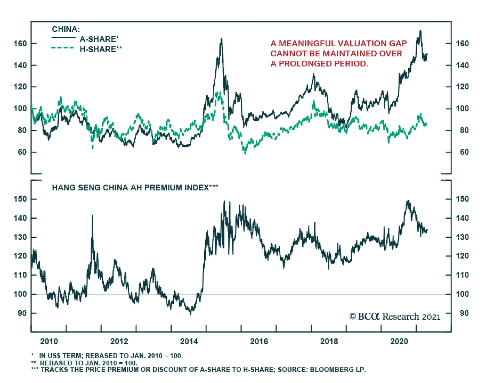
China's H-share market lagged its A-share counterpart in most of 2019 and 2020. While A shares benefited more directly from China’s domestic liquidity and monetary easing in the past two years, H-shares were hammered by political turmoil in Hong Kong (SAR)…
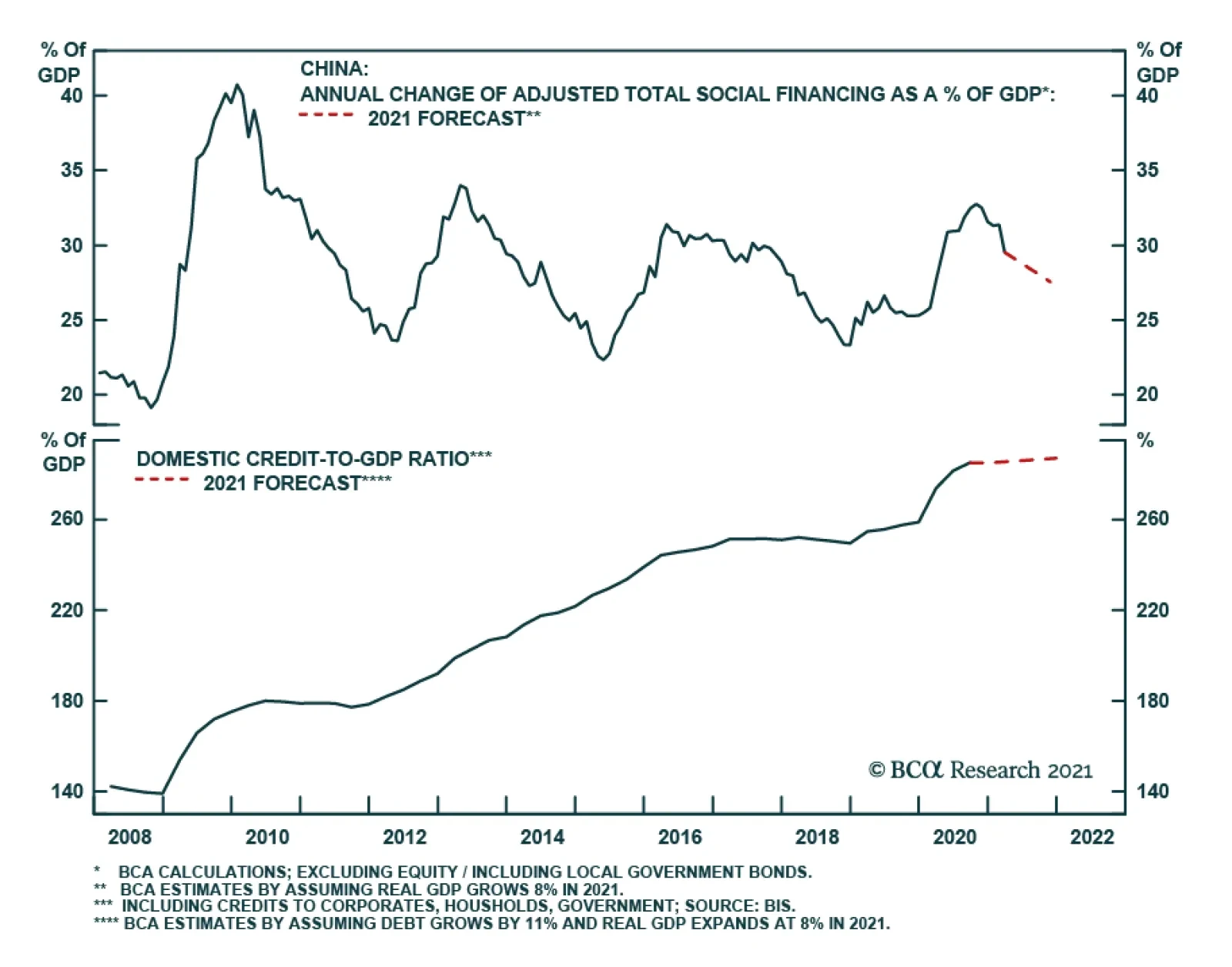
BCA Research’s China Investment Strategy service concludes that an underweight position in Chinese stocks is warranted for the next six months. Historically, China’s credit formation has consistently led economic activity by about six to nine months. A…