Emerging Markets

Highlights We use a correlation-hedge approach to manage emerging market (EM) currency exposure for global investors with nine different home currencies. For USD-based investors, EM debt volatility is driven by the EM spot exchange rate vs. USD. Hedged EM debt has better absolute and risk-adjusted returns than US Treasurys. Investing in EM equities, on the other hand, makes sense only when the expected absolute return is positive on a sustained basis. During these episodes, hedging is not necessary. If USD-based investors choose to manage EM currency exposure directly, then a 12-month momentum-based dynamic hedging strategy could add value in terms of risk-adjusted returns for both EM stocks and bonds. USD-based investors could also diversify the source of funding by selling closely correlated DM currencies using an overlay of currency forwards. For non-USD-based investors, EM currency volatility is low and there is no need to fully hedge EM exposure. Domestic bonds have very low volatility, therefore these investors should avoid EM debt if their objective is to maximize risk-adjusted returns. To enhance returns, unhedged EM equities are a much better choice than EM debt. Currency overlay, in line with our long-held view on the total portfolio approach, should be managed at the total fund level. Feature How to manage EM currency exposure when investing in EM local currency debt and equities has been a frequently asked question since our reports on managing developed market (DM) currency exposure when investing in DM equities 1,2 and government bonds.3 According to the BIS Triennial Central Bank Survey, EM currency exchange markets have evolved rapidly since 2001. The daily turnover reached 1.65 trillion dollars in April 2019, which is about 25% of the global currency daily turnover.4 While it is becoming increasingly easy to trade EM currencies, compared with DM currencies it is still more costly and operationally more challenging to hedge EM currency exposure, especially the currencies with non-deliverable forwards (NDFs) that require collateral management. In this report, we identify the return and volatility drivers of EM local currency government bonds (represented by JP Morgan’s GBI-EM Global Diversified Local Currency Index) and EM equities (represented by MSCI’s EM Net Return Index). We briefly touch on a momentum-based dynamic hedging strategy to hedge EM exposure directly for USD-based investors. Our main focus is to test a correlation-hedge approach, both static and dynamic, for nine home currencies: the US dollar (USD), the euro (EUR), the Japanese yen (JPY), the British pound (GBP), the Canadian dollar (CAD), the Australian dollar (AUD), the New Zealand dollar (NZD), the Swedish krona (SEK), and the Norwegian krone (NOK). We want to determine if a USD-based investor’s return/risk profile would be improved when investing in EM assets by using unfunded overlays of DM currency forwards. Finally, we present solutions for non-USD investors, which vary based on the correlations between the home currencies and the EM currency aggregates. Part 1: The USD Perspective 1.1 EM Asset Return Drivers In general, unhedged USD returns for US investors from investing in foreign assets can be decomposed into three parts as shown in the following equation (1): (1+Rd) = (1+Rh) (1+Rc) (1+Rs) ..…..(1) Where, Rd is the unhedged return in USD. Rh is the hedged return in USD using currency forwards. Rc is the carry return resulting from the short-term rate differential between a foreign country and the US. Rs is the spot exchange rate return of a foreign currency vs. the USD (quoted as how many USD per 1 unit of foreign currency). Chart 1A and Chart 1B show the return decompositions of JP Morgan’s (JPM) EM local currency government bonds and MSCI’s EM equities based on equation (1). Chart 1AEM Local Debt USD Return Decomposition
EM Local Debt USD Return Decomposition
EM Local Debt USD Return Decomposition
Chart 1BEM Equities USD Return Decomposition
EM Equities USD Return Decomposition
EM Equities USD Return Decomposition
Hedging reduces both the volatility and returns for both EM local currency bonds and equities; however, the return and volatility reductions are more significant in bonds than in stocks (panel 1 in Chart 1A and Chart 1B). EM currency aggregate indexes implied from JPM and MSCI are different because of the different country compositions. The currency component has been very volatile for both indexes and has generated negative returns during the 18 years from January 2003 to January 2021 (panel 3 in Chart 1A and Chart 1B). The carry component from JPM is sharply higher than that from MSCI, which is also the result of different country compositions (panel 2, Chart 1A and Chart 1B). The carry components from both indexes have very low volatility with positive returns over the 18-year period. Many EM countries had much higher interest rates than the US, therefore a US investor had to be exposed to EM currencies to capture this carry gain. Thus, from a return-enhancing perspective, an investor should hedge only if he/she expects the EM currency spot exchange rate to depreciate more than the implied carry (panel 3, Chart 1A and Chart 1B). The answer may be different from a volatility-reducing perspective, especially for EM debt where currency volatility dominates bond volatility. We plot the return-risk profiles of EM local currency bonds and equities (hedged and unhedged) in Charts 2A, 2B and 2C to show how they behave in different environments compared to US equities, US Treasurys and hedged non-US global government bonds. Table 1 further lists the detailed statistics of all the above-mentioned assets, in addition to the spot currency and carry components implied from JPM’s EM local currency bond index and MSCI’s EM index, ranked by risk-adjusted return. The entire 18-year period (Chart 2A) is also separated into the period with steadily rising EM currencies (1/2003 – 7/2008, Chart 2B) and the period with declining EM currencies (8/2008-1/2021, Chart 2C). Chart 2AUSD Asset Return-Risk Profile For The Entire Period (1/2003-1/2021)
Managing EM Currency Exposure: A Correlation-Hedge Approach
Managing EM Currency Exposure: A Correlation-Hedge Approach
Chart 2BUSD Asset Return-Risk Profile When EM Currencies Were Strong (1/2003-7/2008)
Managing EM Currency Exposure: A Correlation-Hedge Approach
Managing EM Currency Exposure: A Correlation-Hedge Approach
Chart 2CUSD Asset Return-Risk Profile When EM Currencies Were Weak (8/2008-1/2021)
Managing EM Currency Exposure: A Correlation-Hedge Approach
Managing EM Currency Exposure: A Correlation-Hedge Approach
Both EM debt and equities had impressive unhedged returns in the period from January 2003 to July 2008 when the EM currency index rose steadily against the USD. Even on a hedged basis, EM bonds still delivered better absolute returns (5.1%) than US Treasurys (4.3%) with lower volatility. In terms of EM equities, although hedged return of 22.8% significantly outpaced US equities (9.7%), the volatility of EM equities (16.8%) was much higher than US equities (9.8%). Interestingly, in the period with declining EM FX from August 2008 to January 2021, hedged EM equities (5.6%) significantly underperformed US equities (11.5%) with comparable volatility, but hedged EM bonds (4.2%) outperformed US Treasurys (3.6%) with comparable volatility, despite the negative carry. It is easy to make the case for EM equities: US investors should not touch EM equities unless they are convinced that EM is entering a sustainably strong absolute return period. There is no need to hedge the currency exposure because the risk reduction is relatively small. In the case of EM local currency debt, the three components of total returns in USD based on equation (1) have distinct characteristics as follows: First, the carry component generated an annualized return of 3.4% with only 0.7% volatility in the entire period, making it the best performer among all the assets in terms of risk-adjusted return, as shown in Table 1. Table 1USD Asset Return-Risk Profile In Different Time Periods
Managing EM Currency Exposure: A Correlation-Hedge Approach
Managing EM Currency Exposure: A Correlation-Hedge Approach
Chart 3What Drives The Hedged Return Of EM Local Debt?
What Drives The Hedged Return Of EM Local Debt?
What Drives The Hedged Return Of EM Local Debt?
Second, the hedged return or the EM duration return (i.e. the compensation for a US investor to take on EM interest rate and term premia risks), had a better return/risk profile than US Treasurys in terms of both absolute return and risk-adjusted return, regardless of whether the EM currency index rose or fell against the USD. From January 2003 to January 2021, hedged EM debt returned 4.5% with a volatility of 4.1%, giving a 1.1 return per unit of risk, while US Treasurys returned 3.8% with a volatility of 4.3%, resulting in a 0.9 return per unit of risk. This component is mainly driven by the direction of government bonds in the developed markets as shown in Chart 3. Third, from January 2003 to January 2021, the JPM-implied EM currency had the worst return/risk profile with an annualized loss of 1.7% and annualized volatility of 9.1% (Table 1). However, this component was also the most regime-dependent. Between January 2003 and July 2008 it registered an annualized gain of 7.0% and an annualized volatility of 6.2%, in contrast with the annualized loss of 5.2% and annualized volatility of 9.9% from August 2008 to January 2021. Historically, the EM currency as an aggregate, no matter how the aggregate is calculated, closely correlates to commodities as shown in Chart 4. This is because many EM countries are either commodity producers or have significant trading exposure to China, the dominant player influencing commodity prices as shown in Chart 5. Chart 4EM FX Largely Driven By Commodities
EM FX Largely Driven By Commodities
EM FX Largely Driven By Commodities
Chart 5The Commodities-China Link
The Commodities-China Link
The Commodities-China Link
It is a challenge to build a systematic EM currency model due to the complex nature of EM economies. BCA’s FX Strategy team is working on EM currency models by applying the same approach they used for their DM models. BCA’s EMS Strategy team takes a more discretionary approach to forecasting currencies. Below we will explore two options: one for investors who choose to manage an EM FX hedging program directly and another for investors who cannot manage a direct EM currency hedging program but want to improve their return-risk profile in EM assets. 1.2 Momentum-Based Dynamic Hedging Of EM Currencies Price momentum is a useful tool for dynamic hedging as shown in our previous work on DM currency exposure management. A simple rule of hedging back to the home currency when the 12-month price momentum of a foreign currency turns negative adds value for investors with several DM home currencies. Given that the USD is a strong momentum currency, it makes sense to test if a simple 12-month price momentum rule for the EM FX aggregate vs. USD adds any value. The results are encouraging as shown in Chart 6A and Chart 6B and Chart 7A and Chart 7B. Chart 6AMomentum-Based Dynamic Hedging For EM Bonds
Momentum-Based Dynamic Hedging For EM Bonds
Momentum-Based Dynamic Hedging For EM Bonds
Chart 6BMomentum-Based Dynamic Hedging For EM Stocks
Momentum-Based Dynamic Hedging For EM Stocks
Momentum-Based Dynamic Hedging For EM Stocks
In the case of EM local debt, dynamic hedging reduced volatility to 8.4% from an unhedged volatility of 11.7%, while only trimming return slightly compared with the unhedged index (Charts 6A, 7A). For EM equities, dynamic hedging cut volatility to 18.6% from the unhedged volatility of 21.1%, while increasing the return by 25 bps, compared to the unhedged index. (Charts 6B, 7B). Chart 7AEM Local Debt Return-Risk Profiles: Static Hedging* Vs. Dynamic Hedging**
Managing EM Currency Exposure: A Correlation-Hedge Approach
Managing EM Currency Exposure: A Correlation-Hedge Approach
Chart 7BEM Equities Return-Risk Profiles: Static Hedging* Vs. Dynamic Hedging**
Managing EM Currency Exposure: A Correlation-Hedge Approach
Managing EM Currency Exposure: A Correlation-Hedge Approach
These results are directionally encouraging, but this method still requires hedging all EM currencies. The approach may operationally challenge investors who are not equipped to manage EM currency overlays. Bottom Line: Using only price momentum to hedge EM currency aggregates could improve the return-risk profile of both EM debt and equities, even though the improvements would be limited. This is encouraging for our eventual systematic approach for direct EM currency hedging. 1.3 Correlation Hedge Using DM Currencies EM FX is closely correlated with DM commodity currencies, such as the NOK, CAD, AUD, and NZD. As shown in Charts 8A and 8B, even the euro has an average correlation greater than 60% with EM currency aggregates. Only the JPY has an unstable correlation with the EM currencies of less than 25%, while the GBP also has a relative lower correlation. Chart 8AJPM-Implied EM FX* Correlation** With DM FX
JPM-Implied EM FX* Correlation** With DM FX
JPM-Implied EM FX* Correlation** With DM FX
Chart 8BMSCI-Implied EM FX* Correlation** With DM FX
MSCI-Implied EM FX* Correlation** With DM FX
MSCI-Implied EM FX* Correlation** With DM FX
Therefore, a USD-based investor, instead of hedging out EM currency exposure directly, should be able to eliminate part of EM currency volatility by selling lower-yielding DM currencies. This move would diversify his/her source of funding from USD to other DM currencies with high correlations with EM currencies. To test the effect on the return-risk profile, we use an unfunded overlay of 1-month DM currency forwards and rebalance monthly. To begin, we test a static correlation hedge where each of the eight DM currencies is sold individually. Then we test a dynamic correlation hedge where each one is dynamically sold based on the BCA Forex Strategy Team’s Intermediate-Term Timing Model (ITTM), which uses the same indicators described in our DM currency hedging report. To avoid subjective selection bias among the currencies, we also test an equally- weighted basket of eight currencies (AUD, NZD, JPY, GBP, EUR, CAD, NOK, and SEK) for dynamic hedging and an equally- weighted basket of five currencies (GBP, EUR, CAD, NOK, and SEK) for static hedging. The AUD, NZD, and JPY were excluded in the static hedging basket because in general, AUD and NZD had very high carries and JPY had an unstable correlation with EM currencies. The combined results are shown in Chart 9A and Chart 9B. Additionally, Table 2A and Table 2B list the return-risk profiles together with the fully hedged and unhedged EM indexes for equities and local debt. Chart 9AStatic Correlation Hedge For US Investors
Static Correlation Hedge For US Investors
Static Correlation Hedge For US Investors
Chart 9BDynamic Correlation Hedge For US Investors
Dynamic Correlation Hedge For US Investors
Dynamic Correlation Hedge For US Investors
Table 2AEM Debt Funding Source Diversification For USD-Based Investors (2/2003-1/2021)
Managing EM Currency Exposure: A Correlation-Hedge Approach
Managing EM Currency Exposure: A Correlation-Hedge Approach
Table 2BEM Equity Funding Source Diversification For USD-Based Investors (2/2003-1/2021)
Managing EM Currency Exposure: A Correlation-Hedge Approach
Managing EM Currency Exposure: A Correlation-Hedge Approach
For US investors investing in EM local currency bonds, the best risk-adjusted return of 1.08 would come from fully hedging all the EM currencies as shown in Table 2A. Fully-hedged EM debt has the lowest volatility (4.12%), but also the lowest return (4.45%). To achieve a comparable return of unhedged EM debt (6.18%) without incurring the same high volatility (11.71%), however, a USD-based investor could either statically sell the five DM currencies or dynamically sell the eight DM currencies. The resulting risk-adjusted return of 0.8 would still be comparable to US Treasurys as shown in Table 1. US investors investing in EM equities may improve their return-risk profile by funding their positions in DM currencies. If the aim is to maximize risk-adjusted returns, then the choice would be to fund the position by selling the basket of equally weighted five DM currencies using currency forwards (i.e. using a static correlation hedge). In this way, they would achieve a comparable volatility (16.25%) as if all the EM currencies were fully hedged to USD (16.29%), while also achieving a higher return (12.29%) than when all the EM currencies were not hedged (11.71%). The return per unit of risk of 0.76 would be the highest among all the cases as shown in Table 2B and be on par with US equities as shown in Table 1. If investors prefer even higher returns without significantly higher volatility, then dynamically selling an equally weighted basket of eight currencies would achieve an annualized return of 13.03% with a higher volatility of 18.71%, resulting in a risk-adjusted return of 0.7. Bottom Line: USD-based asset allocators should use the hedged EM debt index and the unhedged EM equities index as benchmarks to measure the performance of their asset-class managers. The EM currency exposure should be managed in a currency overlay at the total fund level by either statically or dynamically selling DM currencies using a correlation hedge, depending on the return-risk preferences. Part 2: Non-USD-Perspective Six out of the eight non-USD DM currencies have strong positive correlations with EM currencies as shown in Chart 8A and Chart 8B. Therefore, non-USD investors investing in EM assets should naturally experience less spot-currency volatility (Chart 10A and Chart 10B). Consequently, they do not need to hedge EM currency exposure from a volatility perspective. But what about return enhancement? Should they consider an allocation to EM assets in place of domestic assets? If they do, would the correlation-hedge approach used by USD-based investors benefit them too? Chart 10ADM Currency Per Unit Of EM Currency
DM Currency Per Unit Of EM Currency
DM Currency Per Unit Of EM Currency
Chart 10BDM Currency Per Unit Of EM Currency
DM Currency Per Unit Of EM Currency
DM Currency Per Unit Of EM Currency
To find answers to those questions, we compare the return-risk profiles of domestic assets, unhedged EM assets, and correlation-hedged EM assets in Table 3A and Table 3B. For the correlation-hedged results for non-USD investors, we simply use the results for the US investors converted into the non-USD home currencies at spot exchange rates. This way, the return enhancements from the correlation-hedged EM assets compared to the unhedged EM assets would be similar for all nine currencies. Chart 3AEM-Debt* For Non USD-Based Investors
Managing EM Currency Exposure: A Correlation-Hedge Approach
Managing EM Currency Exposure: A Correlation-Hedge Approach
Table 3BEM-Stocks* For Non USD-Based Investors
Managing EM Currency Exposure: A Correlation-Hedge Approach
Managing EM Currency Exposure: A Correlation-Hedge Approach
We find that non-USD investors would do better to avoid local-currency EM debt if their objective is to maximize risk-adjusted returns because domestic government bonds had unbeatably low volatility, resulting in the highest risk-adjusted returns, as shown in Table 3A. But domestic government bonds had lower returns than unhedged EM bonds for all but AUD- and NZD-based investors. To further enhance the return-risk profile, non-USD investors could follow their US counterparts by dynamically diversifying their funding sources, then converting their USD returns into their home currency at spot exchange rates (i.e. not hedging the USD exposure). GBP- and JPY-based investors would benefit the most from a dynamic correlation hedge with higher returns and lower volatility compared with the unhedged case. In the case of EM equities, other than SEK- and NZD-based investors, unhedged EM equities have higher returns on an absolute and risk-adjusted basis compared with domestic equities, with GBP-, JPY- and euro-based investors benefiting the most (Table 3B). Even though NOK-based investors increased their returns by only 1% by putting funds into unhedged EM equities, they enjoy lower volatility than in domestic equities. Unlike the case for EM debt where a static correlation hedge did not improve over an unhedged case, both static and dynamic correlation hedges improve the return/risk profiles relative to the unhedged case, and the dynamic hedge outperforms the static hedge in each country. While domestic equities underperform domestic government bonds in terms of risk-adjusted returns, EM equities outperform EM local currency debt when a dynamic correlation hedge is applied. Even in the unhedged case, EM equities are still a much better choice than EM debt (Chart 11). To evaluate how this could impact an asset allocation, we replace home equity with EM equities in a 60/40 home equity/Treasury portfolio. In this extreme exercise, six of the eight non-USD-based portfolios could generate better return/risk profiles, with only the NZD- and SEK-based portfolios worse off (Chart 12). Chart 11Risk-Adjusted Return: Stocks Minus Bonds
Managing EM Currency Exposure: A Correlation-Hedge Approach
Managing EM Currency Exposure: A Correlation-Hedge Approach
Chart 12Asset Allocation Implications*
Managing EM Currency Exposure: A Correlation-Hedge Approach
Managing EM Currency Exposure: A Correlation-Hedge Approach
Bottom Line: Non-USD-based investors should avoid EM local debt if their objective is to maximize their risk-adjusted returns. For the purposes of return enhancement, EM equities are a much better choice than EM debt for all investors with the exception of those based in New Zealand and Sweden. Xiaoli Tang Associate Vice President xiaolit@bcaresearch.com Footnotes 1,2Please see Global Asset Allocation Special Reports, “Currency Hedging: Dynamic Or Static? - A Practical Guide For Global Equity Investors,” dated September 29, 2017; and "Currency Hedging: Dynamic Or Static? - A Practical Guide For Global Equity Investors (Part II)," dated October 13, 2017. 3 Please see Global Asset Allocation Special Reports, “Why Invest In Foreign Government Bonds?” dated March 12, 2018. 4 Please see "Triennial Central Bank Survey Foreign exchange turnover in April 2019," Bank for International Settlements, dated 16 September 2019.
Highlights The positive correlation between share prices and US bond yields – that has been in place since 1997 – is likely to turn negative. Looking ahead, stock prices will fall when US bond yields rise and will rally when Treasury yields drop. The basis is that the key macro risk to equities is shifting from low inflation/deflation to higher inflation. Global growth stocks will underperform value stocks. US equities will lag international markets. Investment strategies and frameworks that have worked over the past 24 years might require modifications. Feature From 1966 until 1997, US equity prices were negatively correlated with US Treasury yields (Chart 1, top panel). Since 1997, US share prices have been positively correlated with US government bond yields. We believe we are now in the process of a major paradigm shift in the stock-bond correlation, reverting to the pre-1997 relationship. Chart 1US Stock-Bond Correlation: Paradigm Shifts In 1966 And 1997
US Stock-Bond Correlation: Paradigm Shifts In 1966 And 1997
US Stock-Bond Correlation: Paradigm Shifts In 1966 And 1997
The basis for the 1997 reversal in the stock-bond correlation was a regime shift in the global macro backdrop. Before 1997, the main risk to business cycles and share prices was inflation. From 1997 until very recently, the main risk to equity markets was deflation or very low inflation. The watershed event that triggered this global macro shift from inflation to deflation was the Asian currency devaluation of 1997. The latter followed the Chinese currency devaluations of early 1994 and the Mexican peso’s crash of early 1995 (Chart 2). All these currency devaluations allowed local producers – operating in these large manufacturing hubs – to cut their export prices in US dollar terms. The price reductions unleashed deflationary forces that spread all over the world, including the US. US import prices from emerging Asia ex-China began plummeting in 1997 (Chart 3). Chart 2EM Currency Devaluations Set Off A Deflation Shock In Second Half Of 1990s
EM Currency Devaluations Set Off A Deflation Shock In Second Half Of 1990s
EM Currency Devaluations Set Off A Deflation Shock In Second Half Of 1990s
Chart 3Deflating Asian Export Prices Reinforced Disinflation Trends In US
Deflating Asian Export Prices Reinforced Disinflation Trends In US
Deflating Asian Export Prices Reinforced Disinflation Trends In US
Due to this deflationary shock from EM currency devaluations and other forces (productivity gains, globalization and outsourcing, among others), the US core inflation rate dropped to 2% in 1997 (Chart 3). This marked a regime shift in global equity markets where concerns about deflation, rather than inflation, became the prime focus of investors. Consequently, share prices rallied when bond yields rose, i.e., stock investors cheered stronger growth because the latter meant diminished deflation risks and only a modest inflation pickup. The positive relationship also prevailed in the period prior to the mid-1960s when inflation was below 2% (Chart 1). Looking ahead, the main risk to share prices, at least in the US, will be higher inflation. As investors gain confidence that US core inflation will exceed 2%, US share prices will once again exhibit a negative correlation with Treasury yields, as they did prior to 1997. Inflation Redux Odds are that US core inflation will rise well above 2%, and could potentially overshoot, over the coming 12-36 months. Chart 4US Core Inflation Lags Business Cycle By About 12 Months
US Core Inflation Lags Business Cycle By About 12 Months
US Core Inflation Lags Business Cycle By About 12 Months
Cyclical factors driving core inflation higher in the US are as follows: 1. Core inflation lags the business cycle by about 12 months (Chart 4). A continuous economic recovery points to higher core inflation starting this spring. 2. A combination of surging money supply and a potential revival in the velocity of money heralds higher nominal GDP growth and inflation. It is critical to realize that in contrast to the last decade when the Fed was also undertaking QE programs, US money supply is now skyrocketing, as shown in Chart 5. In the Special Report from October 22, BCA’s Emerging Markets team discussed in depth why US money growth is currently substantially stronger than it was in the post-GFC period. Chart 5An Unprecedented US Broad Money Boom
An Unprecedented US Broad Money Boom
An Unprecedented US Broad Money Boom
With household income and deposits (money supply) booming due to fiscal transfers funded by the Fed (genuine public debt monetization), the only missing ingredient for inflation to transpire is a pickup in the velocity of money. Lets’ recall: Nominal GDP = Price Level x Output Volume = Velocity of Money x Money Supply Solving the above equation for inflation, we arrive at: Price Level = (Velocity of Money x Money Supply) / (Output Volume) Going forward, the velocity of US money will likely recover, for it is closely associated with consumer and businesses’ willingness to spend. At that point, a rising velocity of money and greater money supply will work together to exert upward pressure on nominal GDP and inflation (Chart 6). Chart 6As Velocity Of Money Rises, Inflation Will Accelerate
As Velocity Of Money Rises, Inflation Will Accelerate
As Velocity Of Money Rises, Inflation Will Accelerate
Chart 7US Goods Prices Are Rising
US Goods Prices Are Rising
US Goods Prices Are Rising
3. Demand-supply distortions and shortages will lead to higher prices. The pandemic has distorted supply chains while the overwhelming demand for manufacturing goods has, accordingly, produced shortages. US household spending on goods is booming and US core goods prices as well as import prices from emerging Asia, China and Mexico are rising (Chart 7). Lockdowns will likely permanently curtail capacity in some service sectors. Meanwhile, the reopening of the economy will likely release pent-up demand for services. As a result, demand for some services will overwhelm supply and companies will take advantage of this new reality by charging considerably higher prices. Consumers will not mind paying higher prices to enjoy services that were not available to them for 18 months or so. This will lead to higher inflation expectations, which might become engrained. Critically, this could happen even if the unemployment rate is high or the output gap is large. 4. Pandemic-related fiscal stimulus in the US has amounted to 21% of GDP. We reckon this exceeds the lingering output gap that opened up in response to the economic crash last year. In short, US authorities are over-stimulating. On top of cyclical forces, there are several structural forces pointing to higher inflation: Higher concentration in US industries and the consequent reduction in competition create fertile grounds for inflation. Over the past two decades, the competitive structure of many US industries has changed: it has become oligopolistic. Due to cheap financing and weak enforcement of anti-trust regulations, large companies have acquired smaller competitors. Chart 8 shows the number of anti-trust enforcement cases has been in a secular decline and is currently very low. In the recent past, there were slightly more than 100 cases per annum while the 1970s averaged more than 400 cases per annum when the economy was much smaller and industry concentration was much lower than now. In many industries, several dominant players now have a substantial market share. Such a high concentration across many industries raises odds of collusion and price increases where conditions permit. Chart 9 demonstrates a measure of market concentration across all US industries. A higher number indicates higher industry concentration. Presently, we have the highest concentration in 50 years, which creates fertile ground for companies to raise their prices. Notably, the sharp drop in this measure of market concentration in the early 1980s was one of reasons behind the secular disinflation trend that followed. Chart 8In Past 20 Years Antitrust Regulations Have Not Been Reinforced In US
In Past 20 Years Antitrust Regulations Have Not Been Reinforced In US
In Past 20 Years Antitrust Regulations Have Not Been Reinforced In US
Chart 9US Industry Concentration Is At A Record High
US Industry Concentration Is At A Record High
US Industry Concentration Is At A Record High
Chart 10US Demographic Points Towards Higher Wage Inflation
US Demographic Points Towards Higher Wage Inflation
US Demographic Points Towards Higher Wage Inflation
Retirement of baby boomers entails more consumption and less production and is inflationary, ceteris paribus. The US support ratio1 (shown inverted on the chart) portends that the US is transitioning from an environment of low to higher wage growth (Chart 10). This ratio is calculated as the number of workers relative to consumers. This means more consumers exist versus workers available to produce goods and services and, hence, entails higher wages. Higher employee compensation, unless supported by rapid productivity gains, will beget higher inflation. Government policies targeting faster growth in employee compensation are conducive to higher inflation. One of the Biden administration’s key priorities is to boost wages and reduce income inequality. Unless productivity growth accelerates considerably in the coming years, odds are that labor’s share in national income will rise and companies’ profit margins will be jeopardized. Businesses will attempt to raise prices to restore their profit margins. Provided that income and spending are robust, companies might succeed in raising their prices. In the US, a (moderate) wage-inflation spiral is probable in the coming years. De-globalization – the ongoing shift away from the lowest price producer – entails higher costs of production and, ultimately, higher prices. US import prices are already rising (Chart 7 above). If the US dollar continues to depreciate, exporters to the US will have no other choice but to raise US dollar prices to protect their profit margins. Bottom Line: The US core inflation rate will rise well above 2% in the coming years. Inflationary pressures will become evident later this year when the economy opens up. The main risk to this view is that technology and automation will boost productivity and allow companies to cut or maintain prices despite rising wages. An Invincible Fed? Many investors are relying on the Fed and other central banks to get things right. Yet, policymakers are not always infallible. We offer several reasons why putting one’s faith squarely in the Fed at present might not be the most appropriate investment strategy. It is not unusual for central banks and other government agencies to fight previous wars. As long as the same war lingers, the Fed’s vision and strategy will remain adequate and its policies and actions will secure financial and economic stability, to the benefit of both bond and equity markets. Chart 11US Financial Markets Aggregate Volatility
US Financial Markets Aggregate Volatility
US Financial Markets Aggregate Volatility
However, if we are experiencing a macro paradigm shift from low to higher inflation, the Fed’s strategy and actions will likely prove inadequate, begetting higher financial market volatility, i.e., instability (Chart 11). In brief, if our inflation redux thesis is correct, the Fed will fall behind the inflation curve. In such a scenario, the bond market will continue selling off and rising yields will depress equity valuations. The Fed is excessively and singularly relying on the output gap models and the Phillips curve to forecast inflation. Yet, inflation is a complex and intricate phenomenon, and it is shaped by numerous cyclical and structural forces beyond the output gap and unemployment. Importantly, the output gap and the Phillip’s curve are theoretical models that do not have great success in real-time forecasting. If these models turn out to be wrong, policy decisions will be suboptimal. Financial markets, which up until now have put their faith in the Fed, will riot. Chart 12Inflation Could Rise And Stay High Amid High Unemployment
Inflation Could Rise And Stay High Amid High Unemployment
Inflation Could Rise And Stay High Amid High Unemployment
Interestingly, a popular economic index in the 1970s was the Misery Index, which is calculated as the sum of the inflation rate and the unemployment rate (Chart 12, top panel). The Misery Index was extremely elevated in the 1970s because both unemployment and inflation were high (Chart 12, bottom panel). The point is that inflation can be high alongside elevated unemployment. In its recent report, BCA Research’s Global Investment Strategy service argued: “Some of the mistakes that policymakers made during the 60s and 70s were far from obvious at the time. Athanasios Orphanides, who formerly served as a member of the ECB’s Governing Council, has documented that central banks in the US and other major economies systematically overestimated the amount of slack in their economies. They also overestimated trend growth, with the result that they came to see the combination of sluggish growth and seemingly high unemployment as evidence of inadequate demand.” Inflation is a very inert and persistent phenomenon, and it is not easy to reverse its trajectory. The Fed is now explicitly targeting higher inflation with full confidence that it can easily deal with high inflation when it transpires. We would bet that the Fed will get higher inflation this time, but that high inflation will turn out to be an unpleasant outcome for US policymakers. The basis is that US equity and credit markets are not priced for higher interest rates. By directly and indirectly super-charging equity and bond prices, the Fed has crafted excesses that are vulnerable to higher interest rates (Chart 13). Chart 13US Markets Are Priced To Perfection
US Markets Are Priced To Perfection
US Markets Are Priced To Perfection
On the whole, the Fed is set to fall behind the inflation curve as policymakers will be late to acknowledge higher inflation and alter their policy accordingly. This will be bad news for both equity and corporate bond markets that are priced for perfection. The 1960s Roadmap For Financial Markets? There are many similarities between the US macro picture now and as it was in the late 1960s. In the late 1960s: US inflation was subdued, and interest rates were very low in the preceding two-three decades, i.e., inflation expectations were well anchored heading into the second half of the 1960s. America’s fiscal policy was extremely easy, and the budget deficit was swelling. US domestic demand was robust, and the current account deficit was widening. Chart 14FAANGM Now And Nifty-Fifty Mania In The 1960s
FAANGM Now And Nifty-Fifty Mania In The 1960s
FAANGM Now And Nifty-Fifty Mania In The 1960s
Finally, US equities were in a long bull market and a dozen large-cap stocks (the Nifty-Fifty) was leading the rally. Notably, the decade-long profile of FAANGM2 stock prices in real terms (adjusted for inflation) resembles that of Walt Disney – one of the leaders of the Nifty-Fifty pack – in the 1960s (Chart 14). The following dynamics of financial markets in the 1960s and 1970s are noteworthy and could serve as a roadmap for the present: In the mid-1960s, US share prices initially ignored rising bond yields. However, obstinately rising Treasury yields eventually led to a major equity sell-off (bond yields are shown inverted on this panel) (Chart 15, top panel). Yet, bond yields continued ascending despite plunging share prices. Chart 151962-1974: Stock Prices, Bond Yields, Business Cycle And Inflation
1962-1974: Stock Prices, Bond Yields, Business Cycle And Inflation
1962-1974: Stock Prices, Bond Yields, Business Cycle And Inflation
The culprit was US core inflation surging well above 2% in 1966. This marked a paradigm shift in the relationship between equity prices and US Treasury yields. Share prices bottomed in late 1966 only after bond yields began declining. Notably, the S&P 500 fell by 22% in 1966, even though economic growth remained robust (Chart 15, middle panel). Critically, US bond yields in the period from 1966 until the early 1980s were more correlated with the core inflation rate than with the business cycle (Chart 15, middle and bottom panels). In short, sticky and persistent inflation not economic growth was the main worry for both US bond and stock markets from the mid-1960s until the early-1980s. Presently, the US recovery will continue, and economic growth will be rather robust. However, core inflation will climb well above 2% and US Treasury yields will increase further. At some point, this will upset the equity market. Chart 16US And EM EPS Growth Expectations Are Already Very Elevated
US And EM EPS Growth Expectations Are Already Very Elevated
US And EM EPS Growth Expectations Are Already Very Elevated
A pertinent question for stocks from a valuation standpoint is whether profit growth expectations can continue to increase enough to offset the rise in the discount factor. US equities are already pricing in a lot of earning growth: analysts’ expectations for the S&P 500’s EPS growth are 24% for 2021 and another 15% for 2022. Worth noting is that long-term EPS growth expectations have skyrocketed for both US and EM equities (Chart 16). In short, the main problem with US equities is that their valuations are expensive at a time when inflation and interest rates are set to rise. Investment Strategy The equity rally is entering a risky period. Major shakeouts are likely. Share prices will advance when US bond yields drop, and they will dip when Treasury yields ascend. As and when US share prices drop due to concerns about higher inflation, the Fed will attempt to calm investors arguing that inflation is transitory, and it knows how to deal with it. Stocks and bonds will likely rally on reassurances of this kind. However, financial markets will resume selling off if evidence from the real economy corroborates the thesis of higher inflation. The Fed will again soothe the investment community. Although equity and bond prices might firm up anew, such a rebound might not last long as investors will begin to question the appropriateness of the Fed’s policy. Chart 17No Contrarian Buy Signal For US Treasurys
No Contrarian Buy Signal For US Treasurys
No Contrarian Buy Signal For US Treasurys
The sell-off in US Treasurys is unlikely to be over for now as traders’ sentiment on government bonds is far from a bearish extreme (Chart 17). Ultimately, to cap inflation, the Fed will have to hike interest rates more than the fixed-income market is currently pricing. This will not go down well with stock or bond markets. Higher US bond yields entail that global growth stocks will underperform global value stocks. The former is much more expensive and, hence, is more vulnerable to a rising discount rate. Global equity portfolios should underweight the US, adopt a neutral stance on EM and overweight Europe and Japan. The market-cap weight of growth stocks is the highest in the US followed by EM. European and Japanese bourses are less vulnerable to rising bond yields. The Fed falling behind the inflation curve is fundamentally bearish for the US dollar. That is why the primary trend for the dollar remains down. However, the greenback is very oversold and a rebound is likely, especially if US yields continue to rise, triggering a period of risk-off in global financial markets. Arthur Budaghyan Chief Emerging Markets Strategist arthurb@bcaresearch.com Footnotes 1This measure was originally shown by BCA’s Global Investment Strategy team and is calculated as the ratio of the number of workers to the number of consumers. The number of workers incorporates age-specific variation in labor force participation, unemployment, hours worked, and productivity while the number of consumers incorporates age-specific variation in needs or wants based on age-specific consumption data. 2An equally-weighted index of Facebook, Amazon, Apple, Netflix, Google (Alphabet) and Microsoft stock prices.
Highlights The multiple paid for oil sector profits is collapsing because the market fears that the profits slump will not be short-lived. The fear is not just of a lasting hit to aviation and a slower recovery in road mobility, but an existential fear for fossil-fuelled road transportation in the post-pandemic world. Stay structurally underweight oil and gas. Within the cyclical and value segments of the equity market, overweight metals and miners versus oil and gas. Structurally underweight the stock markets of Norway and the UK which are oil and gas heavy. Structurally overweight the stock markets of Germany, Switzerland, and Denmark which have zero exposure to oil and gas or basic resources. Fractal trade: tin’s near-vertical rally is at high risk of correction. Feature Chart of the WeekOil Production Has Gone Nowhere
Oil Production Has Gone Nowhere
Oil Production Has Gone Nowhere
The Brent crude oil price recently hit $65, not far below its pre-pandemic level of $69. Yet in the stock market, oil and gas equities remain the dogs, languishing 32 percent below their pre-pandemic price level. Relative to the market, the oil and gas sector has underperformed by 42 percent, and the underperformance has been almost a straight line down. Moreover, since last June when the crude oil price has risen by 50 percent, oil and gas equity prices have gone nowhere. This massive divergence of a surging crude oil price from slumping oil and gas equities raises the obvious question, what can explain this dichotomy? (Chart I-2 and Chart I-3) Chart I-2Oil And Gas Equities Have Slumped In Absolute Terms...
Oil And Gas Equities Have Slumped In Absolute Terms...
Oil And Gas Equities Have Slumped In Absolute Terms...
Chart I-3...And In Relative ##br##Terms
...And In Relative Terms
...And In Relative Terms
One apparent puzzle is that the oil sector’s profits have underperformed their established relationship with the crude oil price. In fact, there is no puzzle. The oil sector’s profits might appear to track the oil price, but the reality is that profits track the value of oil production, meaning the product of oil production and the oil price. Clearly though, if output is flat, then profits will appear to track the oil price. But as it took a massive cut in oil output to support the oil price, the value of oil production and therefore, the oil sector’s profits, have significantly underperformed the oil price. Put another way, if you need to cut output to boost the commodity price it might help the commodity price, but it doesn’t much help the equity sector’s profits! (Chart I-4 and Chart I-5). Chart I-4Oil And Gas Profits Appear To Track The Oil Price
Oil And Gas Profits Appear To Track The Oil Price
Oil And Gas Profits Appear To Track The Oil Price
Chart I-5In Reality, Oil And Gas Profits Track The Value Of Oil Output
In Reality, Oil And Gas Profits Track The Value Of Oil Output
In Reality, Oil And Gas Profits Track The Value Of Oil Output
Will Fossil-Fuelled Road Transportation Be Driven To Extinction? We can now explain the 42 percent underperformance of oil equities, and perhaps more importantly, forecast what will happen next. When the pandemic took hold, and economic mobility ground to a halt, the oil sector’s 12-month forward profits slumped. Bear in mind that aviation accounts for 8 percent of oil consumption but, more crucially, road transportation accounts for half of all oil consumption. However, as the pandemic’s impact was expected to be short-lived, the multiple paid for those depressed 12-month forward profits rose. This partly compensated for the profit slump, but still left oil equity prices much lower. The multiple paid for oil sector profits is collapsing because the market fears that the profit slump will not be short-lived. When profits started to recover – albeit, as just discussed, by much less than the oil price rise – it should have boosted oil equity prices. The problem was that the multiple paid for those profits fell by much more than the recovery in profits, with the result that oil equities continued to underperform. Begging the question, why is the multiple paid for oil sector profits collapsing? (Chart I-6) Chart I-6Why Is The Multiple Paid For Oil Sector Profits Collapsing?
Why Is The Multiple Paid For Oil Sector Profits Collapsing?
Why Is The Multiple Paid For Oil Sector Profits Collapsing?
The multiple paid for oil sector profits is collapsing because the market fears that the profit slump will not be short-lived. The fear is not just of a lasting hit to aviation and a slower recovery in road mobility. The fear has become existential. Governments’ plans for pandemic stimulus and recovery have put green energy at front and centre stage. Thereby the recovery has fast-tracked the ultimate nemesis of the oil industry – the extinction of fossil-fuelled road transportation. Are the fears for oil consumption justified? Yes. Aviation is not likely to reach its pre-pandemic level of oil consumption for many years, and long-haul aviation may never get there. But the much bigger threat is fossil-fuelled road transportation. From October 2021, London will extend its Ultra Low Emission Zone (ULEZ) to an 8 mile radius from the city centre.1 The effect will be to banish from London all diesel-fuelled vehicles made before 2015 as well as some older petrol-fuelled vehicles. We expect other major cities to follow London’s example. In most cases, this initiative will happen regardless of the success (or not) of electric vehicles (EVs). Combined with other green initiatives around the world, policymakers’ unashamed aim is to drive fossil-fuelled road transportation to extinction. To repeat, road transportation accounts for half of all oil consumption. The upshot is that the structural downtrend in oil consumption will persist unless the shift away from fossil-fuelled road transportation hits a brick wall, or at least a bottleneck. We do not see such a brick wall or a bottleneck in the foreseeable future. We conclude that though the sector may offer occasional countertrend tactical buying opportunities, long-term equity investors should underweight oil and gas. Structurally Prefer Metals And Miners To Oil And Gas The preceding analysis of the oil sector can be extended to other commodity equities, like the metals and miners. To reiterate, it is the total value of commodity output – the product of commodity production and the commodity price – that drives the profits of commodity equities. On this basis, the long-term prospects for the metals and miners appear somewhat brighter than for oil and gas equities (Chart I-7). Chart I-7Commodity Sector Profits Track The Value Of Commodity Output
Commodity Sector Profits Track The Value Of Commodity Output
Commodity Sector Profits Track The Value Of Commodity Output
Looking at the production of copper, it has increased by around 25 percent over the past decade, albeit this is just in line with world real GDP. By comparison, the production of oil has gone nowhere (Chart of the Week). It is the total value of commodity output that drives the profits of commodity equities. Turning to price, relative to the 2011 high the copper price is around 15 percent lower, whereas the oil price is 50 percent lower (Chart I-8). Chart I-8The Copper Price Has Outperformed The Oil Price
The Copper Price Has Outperformed The Oil Price
The Copper Price Has Outperformed The Oil Price
Hence, on the all-important value of output, copper has moved in a sideways channel over the past decade while oil has been in an unmistakeable structural downtrend, with lower highs and lower lows (Chart I-9). Chart I-9The Value Of Output Is Trending Sideways For Copper, But Downwards For Oil
The Value Of Output Is Trending Sideways For Copper, But Downwards For Oil
The Value Of Output Is Trending Sideways For Copper, But Downwards For Oil
This relative trend is likely to continue as the shift from fossil-fuelled road transportation to EVs will weigh on oil demand, while supporting copper (and other metal) demand. We do not recommend an outright overweight in metals and miners given that their profits are just moving in a sideways channel. However, within the cyclical and value segments of the equity market, a good structural position is to overweight metals and miners versus oil and gas. When Oil And Gas Underperforms, So Does Norway’s OBX And The UK’s FTSE 100 Regional and country equity market performances is driven by the dominant sectors within each stock market. In relative terms, it is also driven by the sectors that are missing. If the oil and gas sector is a structural underperformer, then oil and gas heavy stock markets such as Norway and the UK will be structural underperformers too. If the oil and gas sector is a structural underperformer, it inevitably means that oil and gas heavy stock markets such as Norway and the UK will be structural underperformers too (Chart I-10 and Chart I-11). Chart I-10When Oil And Gas Underperforms, Norway's OBX Underperforms...
When Oil And Gas Underperforms, Norway's OBX Underperforms...
When Oil And Gas Underperforms, Norway's OBX Underperforms...
Chart I-11...And The UK's FTSE 100 ##br##Underperforms
...And The UK's FTSE 100 Underperforms
...And The UK's FTSE 100 Underperforms
The corollary is that stock markets which are under-exposed to the structurally underperforming sector will be at a relative advantage. This supports our structural overweighting to the stock markets of Germany, Switzerland, and Denmark, which all have zero exposure to oil and gas and basic resources. Fractal Trading System* Tin’s near-vertical rally is at high risk of correction based on fragility on all three fractal structures: 65-day, 130-day, and 260-day. A good trade is to short tin versus lead, setting a profit target and symmetrical stop-loss at 13 percent. In other trades, the underweights to China and Korea surged, but short AUD/JPY and short copper/gold reached their stop-losses. The rolling 12-month win ratio stands at 57 percent. Chart I-12Tin Vs. Lead
Tin Vs. Lead
Tin Vs. Lead
When the fractal dimension approaches the lower limit after an investment has been in an established trend it is a potential trigger for a liquidity-triggered trend reversal. Therefore, open a countertrend position. The profit target is a one-third reversal of the preceding 13-week move. Apply a symmetrical stop-loss. Close the position at the profit target or stop-loss. Otherwise close the position after 13 weeks. * For more details please see the European Investment Strategy Special Report “Fractals, Liquidity & A Trading Model,” dated December 11, 2014, available at eis.bcaresearch.com. Dhaval Joshi Chief European Investment Strategist dhaval@bcaresearch.com Footnotes 1 ULEZ will be the zone inside London’s North Circular and South Circular Roads. Fractal Trading System Cyclical Recommendations Structural Recommendations Closed Fractal Trades Trades Closed Trades Asset Performance Currency & Bond Equity Sector Country Equity Indicators Bond Yields Chart II-1Indicators To Watch - Bond Yields - Euro Area
Indicators To Watch - Bond Yields - Euro Area
Indicators To Watch - Bond Yields - Euro Area
Chart II-2Indicators To Watch - Bond Yields - Europe Ex Euro Area
Indicators To Watch - Bond Yields - Europe Ex Euro Area
Indicators To Watch - Bond Yields - Europe Ex Euro Area
Chart II-3Indicators To Watch - Bond Yields - Asia
Indicators To Watch - Bond Yields - Asia
Indicators To Watch - Bond Yields - Asia
Chart II-4Indicators To Watch - Bond Yields - Other Developed
Indicators To Watch - Bond Yields - Other Developed
Indicators To Watch - Bond Yields - Other Developed
Interest Rate Chart II-5Indicators To Watch - Interest Rate Expectations
Indicators To Watch - Interest Rate Expectations
Indicators To Watch - Interest Rate Expectations
Chart II-6Indicators To Watch - Interest Rate Expectations
Indicators To Watch - Interest Rate Expectations
Indicators To Watch - Interest Rate Expectations
Chart II-7Indicators To Watch - Interest Rate Expectations
Indicators To Watch - Interest Rate Expectations
Indicators To Watch - Interest Rate Expectations
Chart II-8Indicators To Watch - Interest Rate Expectations
Indicators To Watch - Interest Rate Expectations
Indicators To Watch - Interest Rate Expectations
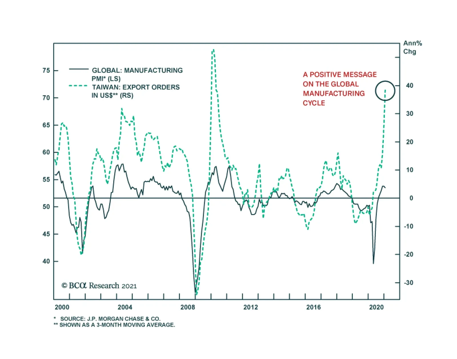
Taiwanese export orders – a bellwether for the global manufacturing cycle – surged in January, corroborating the message from Korean exports earlier this week. Total export orders accelerated 49.3% y/y, following a robust 38.3% y/y increase and outperforming…
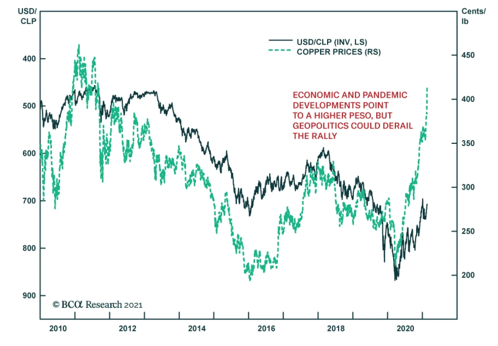
After having stagnated last year, the Chilean peso is recovering smartly, following copper prices higher. As the world’s top producer of the red metal, Chile’s currency typically benefits from favorable copper market conditions. In addition to higher…
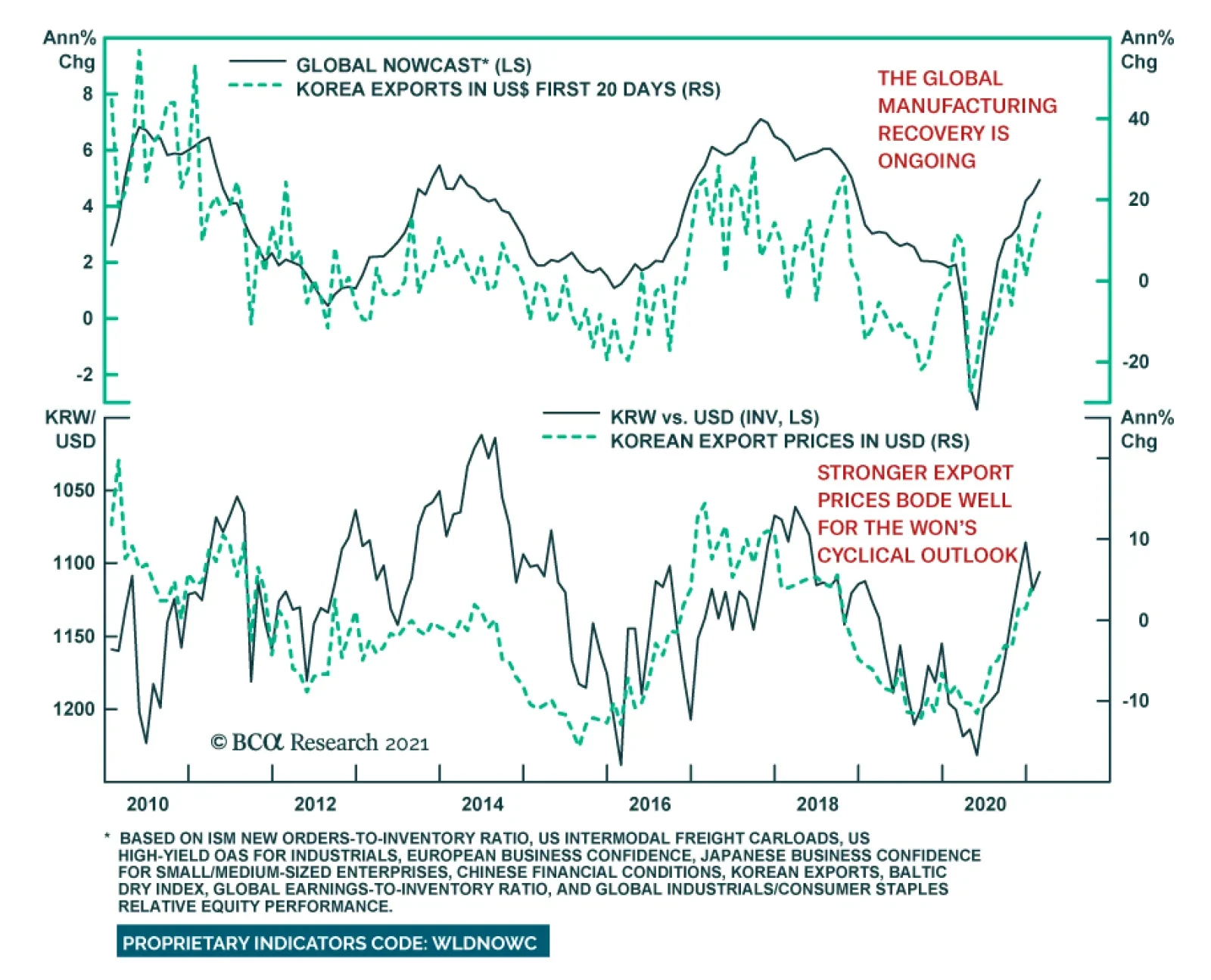
South Korea’s exports for the first 20 days of February are signaling a sharp rebound in global trade. Exports surged 16.7% y/y, marking the fastest pace since late 2018. The global shortage of chips pushed Korea’s semiconductor exports to 27.5% y/y.…

Brazilian president Jair Bolsonaro’s decision to replace Petrobras’ CEO is dashing hopes of Brazil’s return to economic orthodoxy. The president’s action came amid fears of a truckers strike on the back of higher diesel costs. Thus, the move highlights that…
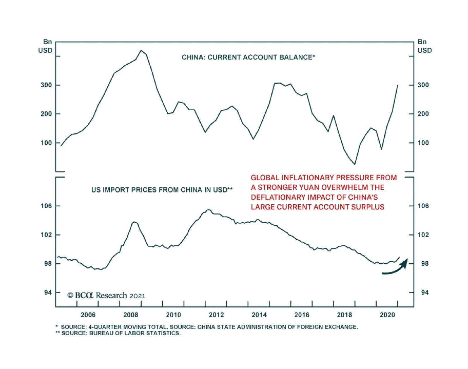
China’s current account surplus jumped to $130.2 billion in Q4 2020 from $92.2 billion in the prior quarter. This corroborates the thesis that thus far, the supply-side has been doing the bulk of the heavy lifting in China’s recovery. It also raises the…
Highlights Both the US and Iran have the intention and capability of restoring the 2015 nuclear deal so investors should presume that an escalation in tensions will conclude with a new arrangement by August this year. However, the deal that the Iranians will offer, and that Biden can accept, may be unacceptable to the Israeli government, depending on Israel’s March 23 election. Moreover if a deal is not clinched by August, the timeframe will stretch out for most of Biden’s term and strategic tensions will escalate. Major Middle Eastern conflicts and crises tend to occur at the top of the business cycle when commodity prices are soaring rather than in the early stages where we stand today. But regional instability is possible regardless, especially if the US-Iran talks fall apart. Maintain gold and safe-haven assets as the Iranian question can lead to near-term escalation even if a deal is the end-game. Feature Geopolitics is far from investors’ concerns today, so it could create some nasty surprises. Two urgent tests await the Biden administration – China/Taiwan and Iran – and provide a basis for investors to add some safe-haven assets and hedges amidst an exuberant stock rally in which complacency is very high. The past week’s developments underscore these two tests. First, Chinese officials flagged that they would cut off rare earth elements to the US, implying that they would retaliate if Biden refuses to issue waivers for US export controls on semiconductors to China.1 Second, Biden spoke on the phone with Benjamin Netanyahu for the first time. The delay signaled Biden’s distance from Netanyahu and intention to normalize ties with Israel’s arch-enemy Iran. In both the Taiwan Strait and the Persian Gulf, the base case is not a full-fledged military conflict in the short run. This is positive for the bull market. But major incidents short of war are likely in the near term and major wars cannot be ruled out. In this report we update our view of the Iran risk. A long-term solution to the nuclear threat is not at hand, which means that Israel could in the worst-case take military action on its own. Meanwhile tensions and attacks will escalate until a deal is agreed. Iranian-backed forces in Iraq have already attacked a US base near Erbil, killing an American military contractor.2 In the event of an Iranian diplomatic crisis, the stock market selloff will be short. The macro backdrop is highly reflationary and investors will buy on the dips. In the event of full-scale war, the US dollar will suffer for a longer period. Oil Price A Boon But Middle East Regimes Still Vulnerable Chart 1Oil Recovery A Boon For Middle East Markets
Oil Recovery A Boon For Middle East Markets
Oil Recovery A Boon For Middle East Markets
Brent crude oil prices have rebounded to $65 per barrel on the global economic recovery. Middle Eastern equities are rallying in absolute terms, though not relative to other emerging markets (Chart 1). This underperformance is fitting given that the region suffers from poor governance, obstacles to doing business, resource dependency, insufficient technology and capital, and high levels of political and geopolitical risk. Non-oil producers and non-oil sectors in the Middle East have generally lagged the global economic recovery (Chart 2). The continuation of the recovery is essential to these regimes because most of them lack the fiscal room to provide large fiscal relief packages. The global average in fiscal support over the past year has been 7.4% but most Middle Eastern governments have provided 2% or less (Chart 3). Current account deficits have plagued oil producers since the commodity bust of 2014 and twin deficits have become a feature of the region, limiting the fiscal response to the global pandemic. Chart 2Middle East Economy Starts To Recover
Middle East Economy Starts To Recover
Middle East Economy Starts To Recover
Chart 3Middle Eastern Regimes Fiscally Constrained
Biden, Iran, Markets
Biden, Iran, Markets
The good news is that the recovery is likely to continue on the back of vaccines and fiscal pump-priming in all of the major economies. The bad news is that a black cloud hangs over the Middle East in the form of geopolitics. Given the underperformance of regional equities, global investors are not ignoring these risks – but they are a persistent factor until the Biden administration survives its initial tests in the region to create a new equilibrium. The unfinished geopolitical business in the region centers on the role of the US and the question of Iran. It is widely understood that the US has less and less interest in the region due to its newfound energy independence on the back of the shale revolution (Chart 4). This is why the US can afford to sign and break deals as it pleases under different administrations, namely the 2015 Iranian nuclear deal, otherwise known as the Joint Comprehensive Plan of Action (JCPA). The Obama administration spent two terms concluding the deal while the Trump administration spent one term nullifying it, leaving the central geopolitical question of the region in limbo. Israel and Arab governments feel increasingly insecure in light of the US’s apparent lack of foreign policy coherence and declining interest in the region. The US has not truly abandoned the region – if anything the Biden administration is looking to maintain or increase US international involvement.3 Washington still sees the need to preserve a strategic balance between Iran and the Arab states, prevent Iran from gaining nuclear weapons, and maintain security in the critical oil chokepoint of the Persian Gulf and Strait of Hormuz (Chart 5). But Washington’s appetite for commitment and sacrifice is obviously waning. The American public is openly hostile to the idea of Middle Eastern entanglements, and three presidents in a row have been elected on the assurance that they would scale down America’s “forever wars.” A decisive majority of Americans, including military veterans and Republicans, believe the wars in Afghanistan and Iraq were not worth fighting.4 And only 6% of Americans view Iran as the top threat to their country. Chart 4Waning US Interest In Middle East
Waning US Interest In Middle East
Waning US Interest In Middle East
Chart 5Strait Of Hormuz Critical To Global Stability
Biden, Iran, Markets
Biden, Iran, Markets
America’s lack of concern about the Iranian threat marks a difference from the early 2000s and especially from its critical Middle Eastern ally Israel. Naturally Israelis have a much greater fear of Iran, and 58% see it as the nation’s top threat (Chart 6). Israel and the Gulf Arab states are drawing together, under the framework of the Trump administration’s Abraham Accords, in case the US abandons the region. A deal normalizing relations with Iran would enable Iran to expand its power and influence and, if unchecked by the US, would pose a long-lasting threat to US allies. Chart 6No US Appetite For War With Iran – Israel A Different Story
Biden, Iran, Markets
Biden, Iran, Markets
Chart 7China/Asia, Not Iran, The Strategic Priority For The US
China/Asia, Not Iran, The Strategic Priority For The US
China/Asia, Not Iran, The Strategic Priority For The US
The US’s reason for dealing with Iran is that it needs to devote more attention to its strategy in the western Pacific in countering China (Chart 7). But China is also a reason for the US to stay involved in the Middle East. China’s role is expanding because of resource dependency and the desire to expand economic integration. Beijing wants to deepen its global investments, open up new markets, and create closer links with Europe (Chart 8). Chart 8AChina's Expanding Role In Middle East
China's Expanding Role In Middle East
China's Expanding Role In Middle East
Chart 8BChina's Expanding Role In Middle East
China's Expanding Role In Middle East
China's Expanding Role In Middle East
Chart 9Unresolved US-Iran Deal A Geopolitical Risk
Unresolved US-Iran Deal A Geopolitical Risk
Unresolved US-Iran Deal A Geopolitical Risk
The opening of the Iranian economy would give the US (and EU) a greater role in Iran’s development, where China has a special advantage as long as Iran is a pariah. The US would add economic leverage to its military leverage in a region that provides China with its energy. The Chinese are not yet as capable of projecting power into the region but that is changing rapidly. There is a possible strategic balance to be established between these simultaneous foreign policy revolutions: the US-Iran détente, the Israeli-Arab détente, and the rise of Mideast-China ties. But balance is an ideal and not yet a reality. In the meantime these foreign policy revolutions must actually take place – and revolutions are rarely bloodless. It is possible for a meltdown to occur in light of the region’s profound changes. In particular, the US-Iran détente is incomplete and faces Israeli/Arab opposition, Iranian paranoia, and US foreign policy incoherence. At the moment it is premature to declare an end to the bull market in US-Iran tensions. That will come when a deal is actually sealed, and then tested and enforced. In the meantime Iranian incidents will occur (Chart 9). Geopolitical risks threaten to reduce global oil supply. Different regimes and their militant proxies will strike out against each other to establish red lines. But a US-Iran deal is highly likely – and once that occurs, the risk to oil supply shifts to the upside, as Iran’s economy will open up. Not only will Iran start exporting again but Gulf Arab producers will want to preserve their market share, which means they will pump more oil. Iran’s Regime Hardens Its Shell Ahead Of Leadership Succession The COVID-19 crisis has weakened regimes in the Middle East, much like the Great Recession sowed the seeds for the Arab Spring and many other sweeping changes in the region. But unlike the Arab Spring, the regimes most at risk today are majority Shia Muslim – with Lebanon, Iran, and Iraq all teetering on the verge of chaos (Chart 10). Chart 10Iranian Sphere De-Stabilized Amid COVID
Biden, Iran, Markets
Biden, Iran, Markets
Chart 11Iranian Economy Weak (Despite Green Shoots)
Iranian Economy Weak (Despite Green Shoots)
Iranian Economy Weak (Despite Green Shoots)
Chart 12Jobless Iranian Youth
Jobless Iranian Youth
Jobless Iranian Youth
The Iranian economy is starting to show the faintest green shoots but it is far too soon to give the all-clear signal. US sanctions have shut off access to oil export revenues. Domestic demand is weak and imports are still contracting, albeit much less rapidly. The country has seen a double dip recession over the past ten years (Chart 11). Unemployment is rife, especially among the youth. The working-age population makes up 60% of total and periodically rises up in protest (Chart 12). Inflation is soaring and the currency is still wallowing in deep depreciation (Chart 13). All of these points suggest Iran is weaker than it looks and will seek to negotiate a deal with the Biden administration. But Iran cannot trust the US so it will simultaneously prepare for the worst outcome – no deal, sanctions, and eventually war. Chart 13Iran Still Ripe For Social Unrest
Iran Still Ripe For Social Unrest
Iran Still Ripe For Social Unrest
Chart 14Iranian Regime Turning Hawkish
Biden, Iran, Markets
Biden, Iran, Markets
Iran’s response to the US’s withdrawal from the 2015 nuclear deal and imposition of maximum pressure sanctions has been to adopt a siege mentality and fortify the regime for a potential military confrontation. The country is preparing for a highly uncertain and vulnerable transition from Supreme Leader Ali Khamenei to a future leader or group of leaders. The government fixed the 2020 parliamentary elections so that hardliners or “principlists” rose to prominence at the expense of independents and especially the so-called reformists. The reformists have been humiliated by the US betrayal of the deal and re-imposition of sanctions, which exploded the economic reforms of President Hassan Rouhani, who will step down in August (Chart 14). The Timeline Of Biden’s Iran Deal Still, it is likely that the US and Iran will return to some form of the 2015 nuclear deal. Lame duck Rouhani is politically capable of returning to the deal: President Rouhani is a lame duck president whose popularity has cratered. If he can restore the deal before August then he can salvage his legacy and provide a pathway for Iran out of economic ruin by removing sanctions. It is manifestly in Iran’s interests to restore the deal – one reason why it has never left the deal and has only made incremental and reversible infractions against it. If Rouhani falls on his sword he provides the Supreme Leader and the next administration with a convenient scapegoat to enable the deal to be restored. Freshman President Biden has enough political capital to return to the deal: Biden is capable of restoring the deal, as he clearly intends to do judging by his statements, cabinet appointments, and diplomatic actions thus far. He has demanded that Iran enter back into full compliance with the deal before he eases sanctions but even this demand can be fudged. After all, it was the US that exited the deal in the first place, and Iran remains in partial compliance, so it stands to reason that the US should make the first concession to bring Iran back into compliance. None of the signatories have nullified the deal other than the US, and it was an executive (not legislative) deal, so President Biden can ultimately rejoin it by fiat. This would not be a popular move at home but the US public is preoccupied. Biden would achieve a foreign policy objective early in his term. The timeline is critical – an early deal is our base case. But if it falls through, then it could take the rest of Biden’s term in office, or longer, to forge a deal. Tensions would skyrocket over that period. The timeline is shown in Table 1. The US has identified April or May as the time when Iran will reach “breakout” capability, i.e. produce enough highly enriched uranium to make a nuclear bomb. The Israelis, for their part, estimate that breakout phase will be reached in August – the same month Rouhani is set to step down. Both the US and Israel view breakout as a red line, though there is some room for interpretation. Table 1Can Lame Duck Rouhani Salvage US Deal For Legacy By August?
Biden, Iran, Markets
Biden, Iran, Markets
The option of rejoining the old deal with Rouhani as a scapegoat will end when Rouhani exits in August. The next Iranian president is unlikely to repeat Rouhani’s mistake of pinning his administration on a promise from the Americans that could be revoked as early as January 20, 2025. The next Iranian president will be a nationalist or hardliner. Opinion shows that the public looks most favorably upon the firebrand ex-President Mahmoud Ahmadinejad or the hardline candidate from 2017 Ebrahim Raisi. Another possible candidate is Hossein Dehghan, a brigadier general. The least favorable political figures are the reformists like Rouhani (Chart 15). Chart 15Iran’s Next President Will Be Hawkish
Biden, Iran, Markets
Biden, Iran, Markets
We cannot vouch for the quality of these opinion polls but they are corroborated by other polls we have seen and they make sense with what we know and have observed in recent years. Apparently the public has turned its back on the dream of greater economic opening, with self-sufficiency making a comeback in the face of US sanctions (Chart 16). The regime will promote this attitude in advance of the leadership transition as it must be prepared to conduct a smooth succession even under the worst-case scenario of sanctions or war. Chart 16Iran Preparing For Supreme Leader’s Succession
Biden, Iran, Markets
Biden, Iran, Markets
Chart 17Nuclear Bomb Key To Regime Survival
Biden, Iran, Markets
Biden, Iran, Markets
The hitch is that Iran is interested in rejoining the deal it signed in 2015, not a grander deal. It will not sign an expanded deal that covers its regional militant proxies and ballistic missile program or requires irreversible denuclearization. The Supreme Leader has witnessed that an active nuclear weapon program and ballistic missile program provide the surest guarantees of regime survival over the long haul. The contrasting cases of Libya and North Korea illustrate the point (Chart 17). Libya gave up its nuclear program and weapons of mass destruction in the wake of the US invasion of Iraq in 2003 only to see the regime collapse in 2011 and leader Muammar Gaddafi die under NATO military pressure. By contrast, North Korea refused to give up its nuclear and missile programs and repeatedly cut deals with the US that served only to buy time and ease sanctions, and today North Korea possesses an estimated 30-45 nuclear weapons deliverable through multiple platforms. Leader Kim Jong Un has used this leverage to bargain with the great powers. The lesson for Iran could not be clearer: a short-term deal with the Americans may buy time and a reprieve from sanctions. But total, verifiable, and irreversible denuclearization means regime suicide. The Biden administration would prefer to create a much more robust deal rather than suffer the criticism of rejoining the 2015 deal, given its flaws and that the first set of deadlines in 2025 is only four years away. But Biden cannot possibly reconstruct the P5+1 coalition of countries to force Iran into a grander bargain in the context of US-Russia and US-China tensions. The sacrifices that would be necessary to bring Russia and China on board would not be worth it. Therefore Biden’s solution will be to rejoin the existing deal plus an Iranian promise to enter negotiations on a more comprehensive deal in future. The Iranians can accept this option since it serves their purpose of buying time without making irreversible concessions on their nuclear and missile programs. Israel then becomes the sticking point, as Iranian officials have said that the US rejoining the original 2015 deal would be a “calamity” and unacceptable. The Israeli government is studying options for military action in the event that Iran reaches nuclear breakout. However, the Israeli election on March 23 will determine the fate of Benjamin Netanyahu and his government’s hawkish approach to Iran. A change of government in Israel would likely bring the US and Israel into line on concluding a deal with Iran so as to avoid military conflict for the time being. If Netanyahu wins, yet the US and Iran fall back into compliance with the 2015 deal (Table 2), then Iran is still limiting its nuclear capabilities through 2025, obviating the need for a unilateral Israeli strike in the near term. Israel will not launch a unilateral strike except as a last resort, as it fears permanent alienation from its greatest security guarantor, the United States. Table 2Iran’s Compliance (And Non-Compliance) With The Joint Comprehensive Plan Of Action
Biden, Iran, Markets
Biden, Iran, Markets
If a deal cannot be put together by the time Rouhani steps down then the risk of conflict will increase as there will not be a prospect of a short-term fix. A much longer diplomatic arc will be required as Iran would draw out negotiations and the US would have to court allies to pressure Iran. The US and/or Israel could conduct sabotage or air strikes to set back the Iranian nuclear program. It is possible that the Iranian leadership or the increasingly powerful Iranian Revolutionary Guard Corps could overplay their hand in the belief that the US has no stomach for waging war. While it is true that the US public is war-weary, it is also true that that attitude would change overnight in the event of a national humiliation or attack. Investment Takeaways The Trump administration drew a hard line on nuclear proliferation. Trump’s defeat marks a softening in the US line regarding proliferation. This does not mean that the Biden administration will be ineffective – it could be even more effective with a more flexible approach – but it does mean that nuclear aspirants currently feel less pressure to make major concessions. This will hold at least until Biden demonstrates that he too can impose maximum pressure. Hence nuclear and missile tests will go up in the near term – as will various countries’ demonstrations of credible threats and red lines. The global economic recovery will strengthen oil producers by giving them greater government revenues with which to stabilize their domestic politics and restart foreign policy initiatives. The global oil price is reasonably correlated with international conflicts involving oil producers (Chart 18). With rising oil revenues, Russia, Saudi Arabia, Iran, Iraq, and others will be emboldened to pursue their national interests. Chart 18Oil Price And Global Conflict Go Hand In Hand
Biden, Iran, Markets
Biden, Iran, Markets
While the Biden administration’s end-game is a nuclear deal with Iran, the period between now and the conclusion of a deal will see an increase rather than a decrease in tensions and tit-for-tat military strikes across the region. Unexpected cutoffs of oil supplies and a risk premium in the oil price will be injected first, as we have argued. When a deal is visible on the horizon then oil prices face a downside risk, due to the resumption of Iranian oil exports and any loss of OPEC 2.0 discipline. It is possible that this moment is already upon us. This report shows a clear path to a US-Iran deal by August. US Secretary of State Anthony Blinken is reaching out to the Iranians. Saudi Arabia has recently announced that it will not continue with large production cuts. Russian oil officials have argued that the global market is balanced and production cuts are no longer necessary.5 But given that the Russians and Saudis fought an oil market share war as recently as last year, it is not clear that a collapse in OPEC 2.0 discipline is imminent. What will be the market impact if hostilities revive in anticipation of a deal? Or worse, if a deal cannot be achieved and a much longer period of US-Iran conflict opens up for Biden’s term in office? Table 3 provides a list of major geopolitical incidents and crises in the Middle East since the Yom Kippur war. We look at the S&P500’s peak and trough within the three months before and after each crisis. The median drawdown is 8% and the market has usually recovered within one month. Twelve months later the S&P is up by 12%. Table 3Stock Market Reaction To Middle East Geopolitical Crises
Biden, Iran, Markets
Biden, Iran, Markets
Table 4 shows a shortened list of the same incidents with the impact on the trade-weighted dollar, which is notable in the short run but is only persistent in the long run in the case of full-fledged wars like the first and second Persian Gulf wars. Table 4US Dollar Falls On Middle East Geopolitical Crises
Biden, Iran, Markets
Biden, Iran, Markets
The stock market impact can last for a year if the crisis coincides with a bear market and recession. Middle Eastern crises tend to occur at the height of business cycles when economic activity is running hot, inflationary pressures are high, and governments feel confident enough in their economic foundation to take foreign policy risks. The Yom Kippur war and first oil shock initiated a recession in 1973. The first Iraq war also coincided with the onset of a recession. The terrorist attack on the USS Cole occurred near the height of the Dotcom bubble and was followed by the 2001 recession. The 2019 Iranian attack on Saudi Arabia’s Abqaiq refinery also occurred at the peak of the cycle. More analogous to the situation today are crises that occurred in the early stages of the global cycle. The Arab Spring and related events in 2011 coincided with a period of market weakness that lasted for most of the year as the aftershocks of the Great Recession rippled across the emerging world. This scenario is relevant in 2021 and especially 2022, as global stimulus wears off and governments strive to navigate the deceleration in growth. Middle Eastern instability could compound that problem. The chief risk in the coming years would be a failure to resolve the Iranian question followed by a US-Iran or Israel-Iran conflict that generates instability across the Middle East. Such a catastrophe could cause major energy supply shock that would short-circuit the global economy. History shows this risk is more likely to come late in the cycle rather than early but the above analysis indicates that a failure of the Biden administration to conclude a deal this year could lead to a multi-year escalation in strategic tensions with a new hawkish Iranian president. That path, in turn, could bring forward the time frame of a major war and supply shock. The Iranians have taken a hawkish turn, are fortifying their regime for the future, and will reject total denuclearization. The US is fundamentally less interested in the region and thus susceptible to continued foreign policy incoherence. The Israelis are just capable of taking military action on their own in the event of impending Iranian nuclear weaponization. These points suggest that the risk of war with Iran is non-trivial, even though a US-Iran deal is the base case. Matt Gertken Vice President Geopolitical Strategy mattg@bcaresearch.com Footnotes 1 See Sun Yu and Demetri Sevastopulo, "China targets rare earth export curbs to hobble US defence industry," Financial Times, February 15, 2021, ft.com. 2 For the US response to the Erbil attack see Jim Garamone, "Austin Pleased With Discussions With NATO Leaders," Department of Defense News, February 17, 2021, defense.gov. 3 For example, Biden is unlikely to withdraw precipitously from the region, including Afghanistan, as Trump intended, especially as long as he is in a high-stakes negotiation with Iran. 4 Ruth Igielnik and Kim Parker, "Majorities of U.S. veterans, public say the wars in Iraq and Afghanistan were not worth fighting," Pew Research, July 10, 2019, pewresearch.org. 5 See Benoit Faucon and Summer Said, "Saudi Arabia Set to Raise Oil Output Amid Recovery in Prices," Wall Street Journal, February 17, 2021, wsj.com; Yuliya Fedorinova and Olga Tanas, "Global Oil Markets Are Now Balanced, Russia’s Novak Says," Bloomberg, February 14, 2021, Bloomberg.com.
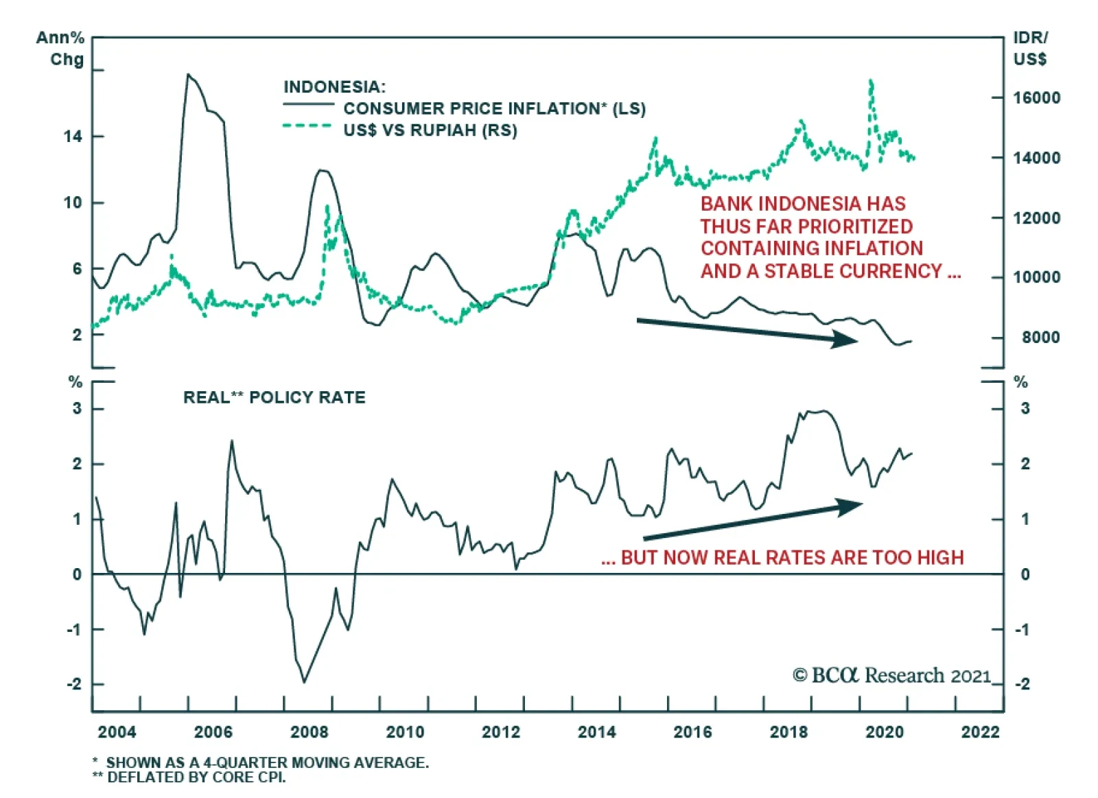
At its Thursday meeting, Indonesia’s central bank cut its policy benchmark by 25 basis points and relaxed lending rules as it downgraded the economic outlook and trimmed its forecast for bank lending growth. The seven-day repurchase rate now stands at a…