Equities

Highlights The Fed’s hawkish shift over the past six months has caused a sharp increase in US interest rates. In this report we examine the US housing market for signs of an imminent recession, given the housing sector’s strong interest rate sensitivity. In addition to a severe contraction in real home improvement spending, there are several other housing-related indicators that are ostensibly pointing in a bearish direction. The growth in total home sales and the MBA mortgage application purchase index are already in negative territory, housing affordability has deteriorated meaningfully, and the National Association of Home Builders’ (NAHB) housing market index is falling sharply. However, the breadth of house prices and building permits, consumer surveys, housing equity sector relative performance, and the fact that mortgage rates have likely peaked for the year point to a more optimistic outlook for housing. At a minimum, they do not yet suggest that the current slowdown in housing-related activity is recessionary. Structural factors are also supportive of the pace of housing construction in the US. While a slowdown in the housing market is clearly underway, it is not occurring after a period of excessive housing construction. The opposite is true: the US and several other developed market economies have underbuilt homes over the past decade. This should limit the drag on economic growth from housing-related activity, and reduces the odds that a housing market slowdown will morph into a housing-driven US recession. Feature Chart II-1The Fed's Hawkish Shift Has Caused An Extremely Sharp Rise In Interest Rates
The Fed's Hawkish Shift Has Caused An Extremely Sharp Rise In Interest Rates
The Fed's Hawkish Shift Has Caused An Extremely Sharp Rise In Interest Rates
The Fed’s hawkish shift over the past six months has caused US interest rates to rise at an extremely rapid pace. Panel 1 of Chart II-1 highlights that the spread between the US 2-year Treasury yield and the 3-month T-bill yield reached a 20-year high in early April of this year. Panel 2 shows that the two-year change in the 30-year mortgage rate will reach the highest level since the early 1980s by the end of this year if mortgage rates remain at their current level. Over the longer run, it is the level of interest rates that matters more than their change. However, changes in interest rates and other key financial market variables are also important drivers of economic activity, especially when they happen very rapidly. Given the speed of the recent adjustment in US interest rates, and the fact that the Fed funds rate will have likely reached the Fed’s neutral rate forecast by the end of this year, investors have understandably become concerned about the potential for a recession in the US. In this report we examine the US housing market for signs of an imminent recession, given the housing sector’s strong interest rate sensitivity. We conclude that while a slowdown in the housing market is clearly underway, several signs suggest that this slowdown is not recessionary. Investors should remain laser-focused on the pace of housing-related activity over the coming 6-12 months, but for now our assessment of the housing market is consistent with a modest overweight stance towards stocks within a multi-asset portfolio. A Brief Review Of The Housing Sector’s Contribution To Growth Table II-1 highlights the importance of the housing sector as a driver/predictor of US recessions. This table highlights that real residential investment is not a particularly important contributor to real GDP growth during nonrecessionary quarters, but it is the only main expenditure component exhibiting negative growth on average in the year prior to a recession.1 Table II-1Real Residential Investment Tends To Contract In The Year Prior To A Recession
June 2022
June 2022
When examining the contribution to economic growth from the housing sector, investors and housing market analysts often fully equate real residential investment with housing construction. In fact, while direct construction of housing units accounts for a sizeable portion of the contribution to growth from housing, it is just one of four components. This is an important point, as one of the often-overlooked elements of real residential investment has strongly leading properties and is currently providing a very negative signal about the housing sector. Chart II-2 breaks down what we consider as aggregate real “housing-related activity”, and Chart II-3 presents the contributions to annualized quarterly growth in housing activity from the four components. For the sake of completeness, we include personal consumption expenditures on furnishings and household equipment as part of housing-related activity, alongside the two main components of real residential investment: permanent site construction (including single and multi-family properties), and “other structures.” In reality, “other structures” is not predominantly accounted for by the construction of different types of residential properties; it is almost entirely composed of spending on home improvements and brokerage commissions on the sale of existing residential properties. Chart II-2Housing Construction Is An Important Part Of Residential Investment, But There Are Other Contributing Factors
June 2022
June 2022
Chart II-3Home Improvement Spending And Brokerage Commissions Also Drive Residential Investment
June 2022
June 2022
Aside from the link between existing home sales and the general demand for newly-built homes, the prominence of brokerage commissions in other residential structures investment helps explain why existing home sales are strongly correlated with real residential investment (Chart II-4, panel 1). Given that a distributed lag of monthly housing starts maps closely to permanent site construction (panel 2), starts and existing home sales explain a good portion of the contribution to growth from housing-related activity. Of the two remaining components of housing-related activity, Chart II-5 highlights that personal consumption expenditures on furniture and household equipment generally coincide with the pace of housing construction and new home sales. We take this to mean that the consumption component of housing-related activity is typically a derivative of the decision to build a new home or sell an existing one. Chart II-4Existing Home Sales Explain Commissions, And Housing Starts Explain Permanent Site Construction
Existing Home Sales Explain Commissions, And Housing Starts Explain Permanent Site Construction
Existing Home Sales Explain Commissions, And Housing Starts Explain Permanent Site Construction
Chart II-5The Pace Of Contraction In Home Improvement Spending Is Worrying
The Pace Of Contraction In Home Improvement Spending Is Worrying
The Pace Of Contraction In Home Improvement Spending Is Worrying
What is not coincident with construction and existing home sales is residential home improvement: Panel 2 of Chart II-5 highlights that it has strongly leading properties, and is currently contracting at its worst rate since the 2008 recession. Data on real home improvement spending is only available quarterly from 2002, so the ability to compare the current situation to previous housing market cycles is limited. But the pace of contraction is worrying and underscores that investors should be on the lookout for corroborating signs of a major contraction in the housing market. Is The Housing Data Sending A Recessionary Signal? In addition to the severe contraction in real home improvement spending shown in Chart II-5, there are several other housing-related indicators that are ostensibly pointing in a bearish direction. In particular, Chart II-6 highlights that both the growth in total home sales and the MBA mortgage application purchase index are already in negative territory, that housing affordability has deteriorated meaningfully, and that the National Association of Home Builders’ (NAHB) housing market index is falling sharply. However, there are also several signs pointing to a more optimistic outlook for housing, or at least indicating that the current slowdown in housing-related activity is not recessionary. We review these more optimistic indicators below. The Breadth Of House Prices And Building Permits In sharp contrast to previous periods of serious housing market weakness and/or recessionary periods, there is no sign yet of a major slowdown in US house price appreciation including cities with the weakest gains. In fact, Chart II-7 highlights that house prices have recently been reaccelerating on a very broad basis after having slowed in the second half of last year, which hardly bodes poorly for new home construction. Chart II-6A US Housing Sector Slowdown Is Certainly Underway
A US Housing Sector Slowdown Is Certainly Underway
A US Housing Sector Slowdown Is Certainly Underway
Chart II-7No Sign Yet Of A Major Deceleration In House Prices
No Sign Yet Of A Major Deceleration In House Prices
No Sign Yet Of A Major Deceleration In House Prices
It is true that US house price data is somewhat lagging, so it is quite likely that price weakness is forthcoming. However, there has been no sign of a major slowdown in prices through to March 2022, by which point 30-year mortgage rates had already risen 200 basis points from their 2021 low. More importantly, Chart II-8 highlights that a state-by-state diffusion index of authorized housing permits has done a very good job at leading the growth in permits nationwide, and is currently not pointing to a contraction in activity. Chart II-9 presents explanatory models for the growth in US housing starts and total home sales based on our state permits diffusion index, pending home sales, the change in mortgage rates, and housing affordability. The chart underscores that a contraction in housing activity is not what these variables would predict, even though starts and sales should be growing at a much more modest pace than what has prevailed on average over the past two years. Chart II-8Our Building Permits Diffusion Index Leads Housing Construction Activity, And Is Not Pointing To A Major Slowdown
Our Building Permits Diffusion Index Leads Housing Construction Activity, And Is Not Pointing To A Major Slowdown
Our Building Permits Diffusion Index Leads Housing Construction Activity, And Is Not Pointing To A Major Slowdown
Chart II-9Reliably Leading Indicators Of Construction And Home Sales Do Not Point To A Recessionary Outcome
Reliably Leading Indicators Of Construction And Home Sales Do Not Point To A Recessionary Outcome
Reliably Leading Indicators Of Construction And Home Sales Do Not Point To A Recessionary Outcome
Consumer Surveys The University of Michigan consumer survey shows that consumers feel it is the worst time to buy a home since the early-1980s (Chart II-10), which seems like a clearly negative sign for the housing market and an indication of the likely impact of tighter policy on housing-related activity. And yet, panel 2 highlights that this is the result of the fact that house prices in the US have surged during the pandemic, not that mortgage rates have risen too high. It is true that the number of survey respondents citing “interest rates are too high” is rising sharply, but this factor as a share of all “bad time to buy” reasons given is not meaningfully higher than it was in 2018, 2011, or 2006. It is clear that high prices are also the culprit for why consumers report that it is a bad time to buy large household durables and not that large household durables are unaffordable or that interest rates are too high (Chart II-11). Chart II-10Nearly The Worst Time To Buy A Home, Mostly Due To Prices (Not Interest Rates)
Nearly The Worst Time To Buy A Home, Mostly Due To Prices (Not Interest Rates)
Nearly The Worst Time To Buy A Home, Mostly Due To Prices (Not Interest Rates)
Chart II-11Same Story For Large Household Durables
Same Story For Large Household Durables
Same Story For Large Household Durables
It may seem counterintuitive for investors to see Charts II-10 and II-11 as in any way positive for the housing market. But, to us, the notion that elevated house prices are the main source of poor affordability supports the idea that a normalization of the housing market will occur through a combination of marginally lower demand, a slower pace of house price appreciation, and a sustained pace of housing market construction. This implies that existing home sales may be weaker than housing construction over the coming year, but the latter will help to support the contribution to overall economic growth from housing-related activity. Housing Sector Relative Performance Despite the significant slowdown in real home improvement spending and the recent decline in the NAHB’s housing market index, Chart II-12 highlights that home improvement retail and homebuilding stocks have not exhibited significantly negative abnormal returns over the past year – as they did in 1994/1995 and in the lead up to the global financial crisis. The chart, which presents a rolling 1-year “Jensen’s alpha” measure for both industries, attempts to capture the risk-adjusted performance of the industry versus the S&P 500. While the chart shows that both industries have generated negative alpha over the past year, the magnitude does not appear to be consistent with a recession. In the case of homebuilder stocks in particular, negative abnormal returns over the past year should have been meaningfully worse given the year-over-year change in mortgage rates. Chart II-13 highlights that homebuilder performance has not been cushioned by a deep valuation discount in advance of the rise in mortgage rates. Chart II-12Housing-Related Equity Sectors Are Not Warning Of A Housing-Driven Recession
Housing-Related Equity Sectors Are Not Warning Of A Housing-Driven Recession
Housing-Related Equity Sectors Are Not Warning Of A Housing-Driven Recession
Chart II-13Homebuilders Were Not Excessively Cheap Before Mortgage Rates Spiked
Homebuilders Were Not Excessively Cheap Before Mortgage Rates Spiked
Homebuilders Were Not Excessively Cheap Before Mortgage Rates Spiked
In short, the important takeaway for investors is that the relative performance of housing-related stocks is not yet consistent with a housing-led US recession. Mortgage Rates Are Not Restrictive, And Have Likely Peaked As we highlighted in Chart II-1, the two-year change in the US 30-year conventional mortgage rate will be the largest in history by the end of this year, save the Volcker era, if the mortgage rate remains at its current level. However, it is not just the change in interest rates that matters for economic activity, but rather also the level. Encouragingly, Chart II-14 highlights that the level of mortgage rates has not yet risen into restrictive territory relative to the economy’s underlying potential rate of growth. In addition, it appears that mortgage rates have overreacted to the expected pace of monetary tightening – and thus have likely peaked for this year. Two points support this view: First, panel 2 of Chart II-14 highlights that the 30-year mortgage rate is one standard deviation too high relative to the 10-year Treasury yield, underscoring that the former has overshot. And second, Chart II-15 highlights that the mortgage rate is still too high even after controlling for business cycle expectations, current coupon MBS yields, and bond & equity market volatility. Chart II-14Mortgage Rates Are Not Yet Restrictive, But Have Likely Peaked For The Year
Mortgage Rates Are Not Yet Restrictive, But Have Likely Peaked For The Year
Mortgage Rates Are Not Yet Restrictive, But Have Likely Peaked For The Year
Chart II-15No Matter How You Slice It, US Mortgage Rates Are Stretched
No Matter How You Slice It, US Mortgage Rates Are Stretched
No Matter How You Slice It, US Mortgage Rates Are Stretched
Structural Factors Supporting Housing Construction Chart II-16The US And Several Other DM Countries Have Underbuilt Homes Since The Global Financial Crisis
The US And Several Other DM Countries Have Underbuilt Homes Since The Global Financial Crisis
The US And Several Other DM Countries Have Underbuilt Homes Since The Global Financial Crisis
Our analysis above points to a scenario in which the housing market slows in a nonrecessionary fashion, supported by relatively buoyant construction activity. Structural factors, which are mostly a legacy of the global financial crisis, are also supportive of the pace of housing construction in the US and other developed market economies. We presented Chart II-16 in our June 2021 Special Report, which shows the most standardized measure of cross-country housing supply available for several advanced economies: the trend in real residential investment relative to real GDP over time. These series are all rebased to 100 as of 1997, prior to the 2002-2007 US housing market boom. The chart makes it clear that advanced economies generally fall into two groups based on this metric: those that have seen declines in real residential investment relative to GDP, especially after the global financial crisis (panel 1) and those that have experienced either an uptrend in housing construction relative to output or a flat trend (panel 2). The US, along with the euro area, the UK, and Japan, all belong to the first group, with commodity-producing and Scandinavian countries belonging to the second group. The point of the chart is that the US and most other major DM economies have seemingly experienced a chronic undersupply of homes in the wake of the global financial crisis, which should continue to support housing construction activity even if demand for housing is slowing because of a sharp increase in mortgage rates. Given that the trend in real residential investment to GDP is a somewhat crude metric of housing supply, Chart II-17 presents a more precise measure for the US. It shows the standardized trend in permanent site residential structures investment (both single- and multi-family) relative to both the US population and the number of households. The chart makes it clear that the US vastly overbuilt homes from the late-1990s to 2007, but also vastly underbuilt since 2008. Relative to the number of households, real permanent site residential structures investment is still half of a standard deviation below its long-term average – even after the surge in construction that occurred in 2020. Chart II-18 highlights a similar message: it shows that the US homeowner vacancy rate (the proportion of the housing stock that is vacant and for sale) was at a 66-year low at the end of the first quarter. Chart II-19 shows that the monthly supply of existing one-family homes on the market is also at a multi-decade low, but that the supply of new homes for sale spiked in April. Chart II-17More Precise Home Supply Measures Underscore That The US Needs To Build More Houses
More Precise Home Supply Measures Underscore That The US Needs To Build More Houses
More Precise Home Supply Measures Underscore That The US Needs To Build More Houses
Chart II-18The Homeowner Vacancy Rate Is Extremely Low
The Homeowner Vacancy Rate Is Extremely Low
The Homeowner Vacancy Rate Is Extremely Low
At first blush, this spike in the monthly supply of new homes relative to sales is quite concerning, as it has risen back to levels that prevailed in 2007. One point to note is that the increase in new home inventory relates to homes still under construction; the inventory of completed homes for sale remains quite low. In addition, from the perspective of a homebuilder, a rise in the monthly supply of new homes relative to home sales is only concerning if it translates into a significant increase in the amount of time to sell a completed home, as has historically been the case (Chart II-20). Chart II-19Existing Home Inventories Remain Low Relative To Sales...
Existing Home Inventories Remain Low Relative To Sales...
Existing Home Inventories Remain Low Relative To Sales...
Chart II-20...And Higher New Home Inventories Are Not Affecting Time-To-Sale Of Completed Homes
...And Higher New Home Inventories Are Not Affecting Time-To-Sale Of Completed Homes
...And Higher New Home Inventories Are Not Affecting Time-To-Sale Of Completed Homes
Chart II-20 highlights that a fairly significant divergence between these two series has emerged over the past decade. Despite roughly five-six months’ supply of new home inventory on average since 2012, the median number of months required to sell a new home rarely exceeded four. In early-2019 the monthly supply of new homes also spiked, and a relatively modest and nonrecessionary slowdown in housing starts was sufficient to prevent any meaningful rise in the amount of time required to sell a newly completed home. Notably, the models that we presented in Chart II-9 led the slowdown in total home sales and starts in late-2018/early-2019, and they are not pointing to a major contraction today. The key point for investors is that while a slowdown in the housing market is clearly underway, it is not occurring after a period of excessive housing construction. In fact, the opposite is true: despite a surge in construction during the pandemic, it remains below its historical average relative to the population and especially the number of households. This should act to limit the drag on economic growth from housing-related activity, and therefore reduces the odds that a housing market slowdown will morph into a housing-driven US recession. Investment Implications We noted in our May report that the inversion of the 2-10 yield curve has set a recessionary tone to any weakness in US macroeconomic data, and that a recession scare was likely. Recent negative housing market data surprises underscore that a slowdown in the US housing market is clearly underway, and that this will likely feed recessionary concerns for a time. Investors should continue to be highly focused on the evolution of US macro data when making asset allocation decisions over the coming 6-12 months, as the current economic and financial market environment remains highly uncertain. This should include a strong focus on the housing market, as consumer surveys highlight that the overall impact of falling real wages and high house prices could cause a more pronounced slowdown in housing-related activity than we expect – and that the change and level of interest rates would imply. Nevertheless, our analysis of the historical predictors of housing construction and sales points to the conclusion that the ongoing housing market slowdown is not likely to be recessionary in nature. This, in conjunction with the factors that we noted in Section 1 of our report, support maintaining a modest overweight towards stocks within a multi-asset portfolio over the coming 6-12 months. Jonathan LaBerge, CFA Vice President The Bank Credit Analyst Footnotes 1 This is aside from the contribution to growth from imports, which mechanically subtract from consumption and investment when calculating GDP.
Highlights The economic and financial market developments that have occurred over the past month are consistent with several of the risks that we identified in our recent reports. We warned in our April report that the outlook for equities had deteriorated meaningfully since the beginning of the year and recommended that investors maintain, at most, a very modest overweight toward stocks in a global multi-asset portfolio. We see the performance of the equity market over the past month as reflecting the beginning of the recession scare that we warned was coming. Still, several factors continue to suggest that this is indeed a scare, and not an actual recession. Section 2 of this month’s report reviews the US housing market for signs of an imminent recession. While a slowdown in the housing market is clearly underway, we do not yet see signs that this slowdown is recessionary. It remains an open question how forcefully Russia is willing to weaponize its natural gas exports in response to a seemingly imminent European embargo on Russian oil, and whether Russia will deploy this strategy now or later. For now, our base case view is that the euro area economy will slow and will probably contract in Q2, but it will avoid a debilitating energy-driven recession. China’s zero-tolerance COVID policy has failed to contain the disease, and it is now clear that more and more outbreaks will occur across the country over the coming months. Our base case view is that additional fiscal & monetary support is forthcoming if the spread of the disease progresses as we expect. We are likely to downgrade our outlook for global economic activity as well as our recommended allocation to risky assets if it does not materialize. Our profit margin warning indicators have deteriorated over the past month, and it is now our view that a contraction in S&P 500 margins is likely. Still, a major decline should be avoided, and we expect that S&P 500 earnings will grow at a low, single-digit rate over the coming year. We continue to recommend a marginally overweight stance towards risky assets over the coming 6-12 months, along with a neutral regional equity stance, a modestly overweight stance towards value over growth, an overweight stance towards small caps, a modestly short duration stance within a fixed-income portfolio, and short US dollar positions. Not Out Of The Woods Yet Chart I-1In May, Global Stocks Nearly Fell Into Bear Market Territory
In May, Global Stocks Nearly Fell Into Bear Market Territory
In May, Global Stocks Nearly Fell Into Bear Market Territory
May was a painful month for the equity market. Globally, stocks fell more than 4% in US$ terms, led by the US. May’s selloff pushed global stocks close to bear market territory relative to their early-January high (Chart I-1), a threshold that was breached in intra-day terms in the US last week. We warned in our April report that the outlook for equities had deteriorated meaningfully since the beginning of the year and recommended that investors maintain, at most, a very modest overweight toward stocks in a global multi-asset portfolio. In our view, the economic and financial market developments that occurred over the past month are consistent with several of the risk we identified in our recent reports. We continue to recommend that investors remain minimally overweight risky assets. Our view that investors should not be underweight risky assets hinges on three expectations: the avoidance of a US recession over the coming year, a continuation of Russian natural gas exports to key gas-reliant European countries, and the announcement from Chinese policymakers of either significant additional stimulus in its traditional form or income-support policies of the type that prevailed in developed economies in the early phase of the COVID-19 pandemic. Confirmation of these expectations is likely to push us to upgrade our recommended stance toward risky assets, especially if equities continue to sell off in response to growth fears. Conversely, we are likely to recommend downgrading risky assets to neutral or underweight if evidence mounts that our expectations are unlikely to materialize. A US Recession Scare Is Underway We noted in last month’s report that the US economy would likely avoid a recession over the coming year, but that a recession scare was quite likely. We emphasized a probable slowdown in the housing market as the locus of investors’ recessionary concern, and the US housing market data is indeed now surprising significantly to the downside (Chart I-2). We see the performance of the equity market over the past month as reflecting the beginning of the recession scare that we warned was coming. Chart I-3 highlights that the composition of the US equity selloff since the beginning of the year has looked quite unlike the growth-driven selloffs that occurred over the past decade, in that real bond yields have been a strong driver of the decline in stocks. By contrast, May’s decline has looked more like a typical growth scare, with real bond yields somewhat cushioning the impact of a significant rise in the equity risk premium. Chart I-2The US Housing Market Is Clearly Slowing
The US Housing Market Is Clearly Slowing
The US Housing Market Is Clearly Slowing
Chart I-3May’s Selloff Was Driven By Growth Fears, Not Rising Interest Rates
June 2022
June 2022
Chart I-4 highlights that it is not just the housing market that is worrying investors. The chart shows that the Conference Board’s US leading economic indicator (LEI) is slowing quite sharply, in line with previous episodes of a major growth scare. And while the weakest components of the LEI modestly improved on average in April, Chart I-5 highlights that the collapse in real wage growth alongside the recently severe underperformance of consumer stocks has fed concerns that high inflation has eroded household purchasing power – and that a contraction in real spending is imminent. Chart I-4A Serious US Growth Scare Is Underway
A Serious US Growth Scare Is Underway
A Serious US Growth Scare Is Underway
Chart I-5The Decline In Real US Wage Growth Has Caused A Major Selloff In Consumer Stocks
The Decline In Real US Wage Growth Has Caused A Major Selloff In Consumer Stocks
The Decline In Real US Wage Growth Has Caused A Major Selloff In Consumer Stocks
In Section 2 of this month’s report we provide further analysis supporting the view that the US housing market will not drive the US economy into recession. But we do continue to believe that a slowdown in housing activity is likely, and that concerns about a housing-driven recession will linger. Still, several factors continue to suggest that the US is experiencing a recession scare, and not an actual recession: The Atlanta Fed’s GDPNow model is currently predicting US real GDP growth that is only modestly below trend in Q2, and the overall estimate continues to be dragged significantly lower by a sizably negative contribution from the change in inventories (Chart I-6). Without this negative inventories effect, the Atlanta Fed’s model would be forecasting real annualized growth of over 3%. After having decelerated significantly in the second half of last year because of a broadening in consumer price inflation, Chart I-7 highlights that real personal consumption expenditures reaccelerated and real personal income ex-transfers stabilized in Q1. Chart I-6No Sign Of A Major Decline In Q2 Consumer Spending
June 2022
June 2022
Chart I-7Real Income Growth Is Stabilizing, And Real Consumer Spending Is Accelerating
Real Income Growth Is Stabilizing, And Real Consumer Spending Is Accelerating
Real Income Growth Is Stabilizing, And Real Consumer Spending Is Accelerating
US manufacturing industrial production surged in April, led by motor vehicle production (Chart I-8, panel 1). It is true that industrial production is a coincident indicator and thus does not necessarily argue against the idea that a recession is imminent. A pickup in vehicle production is encouraging, however, as it suggests that the 15% surge in the level of new car prices over the past year that contributed to the erosion in household real incomes may be set to reverse (panel 2). Chart I-8A Pickup In Auto Production Should Help Lower Car Prices And Improve Consumer Purchasing Power
A Pickup In Auto Production Should Help Lower Car Prices And Improve Consumer Purchasing Power
A Pickup In Auto Production Should Help Lower Car Prices And Improve Consumer Purchasing Power
Services spending is likely to improve, as deliveries of Pfizer’s Paxlovid antiviral drug continue to ramp up and vaccines are eventually approved for children under the age of six. Charts I-9A and I-9B highlight several real services spending categories that remain below their pre-pandemic levels, which in our view have been clearly linked to the pandemic and are not likely to be permanently lower. Americans have not likely stopped going to the gym, amusement parks, movies, live concerts, or the dentist, nor have their stopped needing to put elderly relatives in nursing care homes. They are also highly unlikely to stop traveling. There is some internal debate at BCA about the impact that working-from-home trends will have on the level of services spending, but we would note that essentially all of the spending categories shown in Charts I-9A and I-9B have exhibited uptrends that only appear to have been affected by consumer responses to the Delta and Omicron waves of the pandemic. Widely-available treatment options that reduce the fatality rate of the disease close to that of the flu are likely to be perceived by the public as an effective end of the pandemic, boosting spending on lagging categories of services spending. Chart I-9AAn Eventual End To The Pandemic…
June 2022
June 2022
Chart I-9B…Will Cause A Further Improvement In Services Spending
...Will Cause A Further Improvement In Services Spending
...Will Cause A Further Improvement In Services Spending
Based on high-frequency data from OpenTable, the number of seated diners in US restaurants is not exhibiting any major warning signs for US consumer spending (Chart I-10). Real spending in restaurants has been strongly correlated with overall real personal consumption expenditures over the past two decades, and thus Chart I-10 is not suggesting that a collapse in overall spending is imminent. Chart I-10High-Frequency Data Does Not Yet Show A Major Pullback In US Consumer Spending
High-Frequency Data Does Not Yet Show A Major Pullback In US Consumer Spending
High-Frequency Data Does Not Yet Show A Major Pullback In US Consumer Spending
As a final point concerning the risk of recession in the US, investors should note that the recent behavior of inflation expectations is encouraging and points to a potentially imminent peak in Fed hawkishness. Over the past few months, we have expressed our concern about the pace of increase in long-dated household inflation expectations. We highlighted last month that long-term market-based inflation expectations were also exhibiting some potential signs of becoming unanchored. However, Chart I-11 highlights that the momentum of long-dated household inflation expectations is now starting to flag, and that long-term market-based inflation expectations recently decreased in response to escalating growth fears. Chart I-12 clearly shows a slowing pace of core consumer prices, which will act to restrain further significant increases in long-dated inflation expectations. Chart I-11Long-Dated Inflation Expectations Point To A Potentially Imminent Peak In Fed Hawkishness
June 2022
June 2022
Chart I-12Core Inflation Momentum Is Clearly Slowing
Core Inflation Momentum Is Clearly Slowing
Core Inflation Momentum Is Clearly Slowing
Chart I-13 highlights that investors expect the Fed to raise the policy rate by the end of the year to a level even higher than what Jerome Powell implied during the Fed’s May press conference: a target range for the Fed funds rate of 2.5-2.75%, corresponding to two more 50 basis point hikes and three 25 basis point hikes during the FOMC’s September, November, and December meetings. Chart I-13Expectations For Fed Rate Hikes This Year Are Likely To Come Down If Inflation Continues To Moderate
June 2022
June 2022
It is likely that the market’s expectation for rate hikes this year will fall over the coming few months if the monthly pace of core inflation continues to slow. The Fed itself may soon signal a less intense pace of tightening than Powell recently implied – a perspective that we feel is supported by the minutes of the May FOMC meeting. That would allow the US economy to “digest” the recent adjustment in interest rates with less uncertainty about the economic outlook, which would lower the odds that a “mid-cycle slowdown” morphs into a full-blown recession. A Debilitating Energy-Driven Recession In Europe Is Not In The Cards, For Now The key issue pertaining to the European economic outlook remains the question of whether Europe’s imports of Russian natural gas will be interrupted. A European embargo of Russian oil now seems likely, which would likely cause Russian oil production to decline. Our Commodity & Energy strategy service now expects Brent oil to trade at $120/bbl on average for the remainder of the year, $5/bbl higher than current levels (Chart I-14). We agree with our Commodity & Energy Strategy team’s updated oil price forecast, but we have a different view about the odds that Russia will respond to a European oil embargo by cutting its natural gas exports to the EU. We still think this is a risk, not yet a likely event, although it may still occur later in the year. A full and immediate cutoff of natural gas exports to gas-dependent European countries such as Germany and Italy would not only destabilize the Russian economy by substantially reducing its current account surplus, it would also cause a severe recession in Europe through a combination of gas rationing to industries by government decree and surging energy prices (Chart I-15). Chart I-14A European Embargo Of Russian Oil Will Cause Brent To Rise To $120/bbl
A European Embargo Of Russian Oil Will Cause Brent To Rise To $120/bbl
A European Embargo Of Russian Oil Will Cause Brent To Rise To $120/bbl
Chart I-15A Full Cutoff Of Russian Natural Gas Would Cause A Severe European Recession
A Full Cutoff Of Russian Natural Gas Would Cause A Severe European Recession
A Full Cutoff Of Russian Natural Gas Would Cause A Severe European Recession
That could erode European voters’ willingness to provide military support for Ukraine, but it could instead backfire and galvanize European public opinion against Russia – and remove leverage that may be potentially used to secure a ceasefire agreement that will preserve its military gains in eastern Ukraine. Chart I-16Europe Is Replenishing Its Gas Storage, But It Cannot Yet Withstand A Full Cutoff
June 2022
June 2022
Russia may respond to an oil embargo by throttling the amount of natural gas exported to key European countries in a fashion that raises natural gas prices and prevents European countries from building up sufficient storage for the upcoming winter – a process that is underway but is far from complete (Chart I-16). But it remains an open question how forcefully Russia is willing to weaponize its natural gas exports, and whether it will deploy this strategy now or later. For now, our base case view is that the euro area economy will slow and will probably contract in Q2, but it will avoid a debilitating energy-driven recession. China: The Only Way Out Is Through Among the three pillars of the global economy – the US, China, and Europe – the last is arguably the least important. Today, the US and China are the core drivers of global demand, and we are therefore more concerned about the economic impact of China’s zero-tolerance COVID policy than we are about a slowdown or mild recession in Europe. Given how contagious the Omicron variant of COVID-19 has shown itself to be, and given how widespread recent outbreaks have been, it is now clear that China’s zero-tolerance policy has failed to contain the disease and that more and more outbreaks will occur across the country over the coming months. Despite public statements to the contrary, we suspect that Chinese policymakers are well aware of this situation, but are constrained by the consequences of removing the zero-tolerance policy. Recent studies suggest that China could face intensive care demand that is sixteen times existing capacity and upwards of 1.5 million deaths by removing the policy,1 roughly 1.5 times the cumulative amount of deaths that have occurred in the US during the pandemic. But the economic consequences of maintaining the zero-tolerance policy will also be severe, and therefore also likely represent a constraint on policymakers. Charts I-17 and I-18 show that China’s labor market and industrial sector have already slowed sharply over the past few months, at a pace and magnitude that is unlikely to be politically sustainable for much longer. In addition, Chart I-19 shows that China’s credit impulse fell meaningfully in April. Chart I-17China’s Labor Market Is Cratering…
China's Labor Market Is Cratering...
China's Labor Market Is Cratering...
Chart I-18…As Is Its Manufacturing Sector
... As Is Its Manufacturing Sector
... As Is Its Manufacturing Sector
Chart I-19More Fiscal & Monetary Support Will Be Needed In China Soon, If COVID-19 Cases Continue To Spread
More Fiscal & Monetary Support Will Be Needed In China Soon, If COVID-19 Cases Continue To Spread
More Fiscal & Monetary Support Will Be Needed In China Soon, If COVID-19 Cases Continue To Spread
This would be tolerable if the decline in activity was likely to be short-lived as it was at the very beginning of the pandemic, but we no longer see this as a probable outcome. We acknowledge that reported cases of COVID-19 have steadily declined in cities in the Yangtze River region, and we agree that the Shanghai lockdown may soon end for a time. But we doubt that this will mark the end of outbreaks in the region, or prevent major outbreaks from occurring in other parts of the country. If China cannot relax its zero-tolerance policy or tolerate the degree of economic weakness entailed by its continued application, then additional fiscal and monetary support is likely. While China’s leadership has stepped up its pro-growth policy measures, as evidenced by the recent cut in the 5-year loan prime rate, we strongly suspect that more support will be needed. This support may take the form of traditional stimulus via local government spending, or it may involve the introduction of income-support policies of the kind that prevailed in developed economies in the early phase of the COVID-19 pandemic. Chart I-20The Chinese Housing Market Is Slowing Significantly, Lowering The Risk Of Speculation From Income Support Policies
The Chinese Housing Market Is Slowing Significantly, Lowering The Risk Of Speculation From Income Support Policies
The Chinese Housing Market Is Slowing Significantly, Lowering The Risk Of Speculation From Income Support Policies
Chinese policymakers who are eager to prevent another significant releveraging of the economy and who want to avoid another major deterioration in housing affordability may perhaps be forgiven for seeing the developed economy experience with these programs as a poor roadmap to follow. House prices have exploded in most advanced economies during the pandemic, which has significantly contributed to a major decline in affordability. However, with the benefit of hindsight, Chinese policymakers would likely be able to recalibrate any income support program to avoid some of the excesses that occurred in DM countries, such as policies that caused aggregate disposable income to increase in the US and Canada during the pandemic. In addition, Chart I-20 highlights that the starting point for the Chinese property market is one in which house prices are seemingly poised to contract at the worst pace since late 2014 / early 2015. The latter suggests that Chinese policymakers have more ability to support household income without causing an explosion in house prices and speculative activity than DM policymakers did in 2020. Regardless of its form, it is the view of the Bank Credit Analyst service that China cannot avoid the provision of significant additional fiscal/monetary support if it maintains its zero-tolerance COVID policy for the remainder of the year given our assumption that potentially major outbreaks will continue. It is our base case view that additional support is forthcoming over the coming weeks and months if the spread of the disease progresses as we expect. We are likely to downgrade our outlook for global economic activity as well as our recommended allocation to risky assets if it does not materialize. US Corporate Profits In A Nonrecessionary Slowdown Scenario Chart I-21US Forward Earnings Very Rarely Fall While The Economy Continues To Expand
June 2022
June 2022
Chart I-3 highlighted that the US equity market selloff in May shifted from one that was strongly driven by rising real government bond yields to one in which a rising equity risk premium was the dominant driver. And yet, the chart showed that there has been no negative contribution to US stock prices from falling earnings expectations, with expected earnings having continued to rise since the beginning of the year. While it may seem counterintuitive to investors that forward earnings expectations are not falling in the middle of a major growth scare, Chart I-21 highlights that this is not abnormal. The chart highlights that forward earnings expectations rarely decline outside of the context of a recession, because actual earnings typically do not decline when the economy is expanding. This means that the potential for earnings to decline shows up as a rise in the equity risk premium during growth scares, which is what has generally occurred since the beginning of the year (excluding energy, forward EPS estimates have fallen slightly this year). In last month’s Section 2, we noted that nonrecessionary earnings declines almost always occur because of contractions in profit margins. We argued that risks to US equity margins might rise later this year. In fact, since we published our report last month, some of these risks have already materialized: our new profit margin warning indicator has jumped significantly (Chart I-22), and our sector profit margin diffusion index has fallen below the boom/bust line (Chart I-23). As such, it is now our view that a contraction in S&P 500 profit margins is likely over the coming year, which contrasts with analyst EPS growth expectations of 9.5% and sales per share growth expectations of 8% (meaning that analysts are currently forecasting a margin expansion). Chart I-22A Contraction In S&P 500 Profit Margins...
A Contraction In S&P 500 Profit Margins...
A Contraction In S&P 500 Profit Margins...
Chart I-23...Now Looks Likely
...Now Looks Likely
...Now Looks Likely
Will a likely contraction in profit margins cause an outright decline in earnings over the coming year? Investors should acknowledge that this is a risk, but for now our answer is no. Chart I-24For Now, A Severe Contraction In Margins Does Not Seem Probable
For Now, A Severe Contraction In Margins Does Not Seem Probable
For Now, A Severe Contraction In Margins Does Not Seem Probable
Taken at face value, our sector diffusion index shown in Chart I-23 suggests that profit margins are set to decline by 2 percentage points over the coming year, which would indeed imply a 7-8% contraction in earnings per share assuming 8% revenue growth. However, the index is much better at predicting inflection points in profit margins than the magnitude of the change; in several cases over the past three decades the model correctly predicted a decline in profit margins, but implied a much larger change in margins than what actually occurred. In addition, our model shown in Chart I-22 has yet to cross above the 50% mark into probable territory, and Chart I-24 highlights that net earnings revisions and net positive earnings surprises are falling but have not yet reached levels that would be consistent with a major margin decline. In sum, we expect that S&P 500 earnings will grow at a low, single-digit rate over the coming year given our expectation of a nonrecessionary slowdown scenario. This implies that US equity returns will be uninspiring over the coming year, but they will be likely be positive and will likely beat the returns offered from bonds. Investment Strategy Recommendations Considerable uncertainty remains about the global economic and financial market outlook, and there are several identifiable risks that would warrant an underweight stance towards risky assets were they to materialize. We agree that an aggressively overweight stance is not justified. Chart I-25Without A Recession, The US Equity Risk Premium Is Very Likely To Decline
Without A Recession, The US Equity Risk Premium Is Very Likely To Decline
Without A Recession, The US Equity Risk Premium Is Very Likely To Decline
However, the fact that corporate profits do not usually fall while the economy is expanding underscores why investors should be reluctant to significantly cut their risky asset exposure unless a recession appears likely. Without a recession, the US equity risk premium is very likely to decline (Chart I-25), meaning that 10-year Treasury yields closer to 4% or a significant contraction in profit margins would be required for US stocks to post negative returns over the coming 6-12 months. We would not rule out either of these outcomes, but we also do not think that they are probable. To conclude, it is fair to say that global investors are not out of the woods yet, but we continue to recommend a marginally overweight stance towards risky assets on the basis that the US will avoid a recession over the coming year, Russia is not yet likely to push Europe into a debilitating recession, and China will further ease fiscal & monetary policy to support growth. In addition to a modest overweight towards stocks in a multi-asset portfolio, we continue to recommend the following: A neutral regional equity stance, with global ex-US equities on upgrade watch in response to an improvement in the European economic outlook and further fiscal & monetary support in China. The recent passive outperformance of global ex-US stocks has occurred mainly because US stocks have fallen more than global stocks, which have “caught up” to mounting US and global growth fears. As such, ex-US stocks have outperformed for the wrong reasons, and investors should wait for durable signs of an improving global growth outlook and a falling US dollar before shifting in favor of a global ex-US equity stance. A modestly overweight stance towards value over growth stocks on the basis of better valuation. However, most of the pandemic-related outperformance of growth stocks has already reversed (Chart I-26), suggesting that the outperformance of value is getting late. An overweight stance toward global small-cap stocks over their large-cap peers, as they are now unequivocally inexpensive and have remained resilient as global growth fears have intensified (Chart I-27). Chart I-26Modestly Favor Value Stocks Due To Better Valuation, But The COVID Effects On Equity Style Have Mostly Reversed
Modestly Favor Value Stocks Due To Better Valuation, But The COVID Effects On Equity Style Have Mostly Reversed
Modestly Favor Value Stocks Due To Better Valuation, But The COVID Effects On Equity Style Have Mostly Reversed
Chart I-27Small Cap Stocks Have Recently Proven Resilient, And Are Extremely Cheap
Small Cap Stocks Have Recently Proven Resilient, And Are Extremely Cheap
Small Cap Stocks Have Recently Proven Resilient, And Are Extremely Cheap
A modestly short duration stance within a fixed-income portfolio. Short US dollar positions, as the dollar is clearly benefiting from growth fears that will wane. In addition, the US dollar is very expensive, and extremely overbought. Concerning our recommended duration stance, we acknowledge that a slower pace of rate hikes than what investors currently expect and a slowing pace of inflation would normally argue for a long duration stance. But we do not expect the Fed to stop raising interest rates unless a recession seems likely, and a slower but steady path of tightening, in conjunction with easing inflation, makes it more likely that the US economy will be able to “digest” the recent adjustment in rates without tipping into recession. This, in turn, increases the odds that the Fed funds rate will peak at a higher level than investors currently expect, which should ultimately push long-maturity yields higher rather than lower. On balance, this suggests that investors should be modestly short duration, even if long-maturity bond yields move temporarily lower over the coming few months. Long-duration positions are perhaps reasonable on a 0-3 month time horizon, but over a 6-12 month time horizon we continue to recommend a modestly short stance. Jonathan LaBerge, CFA Vice President The Bank Credit Analyst May 26, 2022 Next Report: June 30, 2022 II. Is The US Housing Market Signaling An Imminent Recession? The Fed’s hawkish shift over the past six months has caused a sharp increase in US interest rates. In this report we examine the US housing market for signs of an imminent recession, given the housing sector’s strong interest rate sensitivity. In addition to a severe contraction in real home improvement spending, there are several other housing-related indicators that are ostensibly pointing in a bearish direction. The growth in total home sales and the MBA mortgage application purchase index are already in negative territory, housing affordability has deteriorated meaningfully, and the National Association of Home Builders’ (NAHB) housing market index is falling sharply. However, the breadth of house prices and building permits, consumer surveys, housing equity sector relative performance, and the fact that mortgage rates have likely peaked for the year point to a more optimistic outlook for housing. At a minimum, they do not yet suggest that the current slowdown in housing-related activity is recessionary. Structural factors are also supportive of the pace of housing construction in the US. While a slowdown in the housing market is clearly underway, it is not occurring after a period of excessive housing construction. The opposite is true: the US and several other developed market economies have underbuilt homes over the past decade. This should limit the drag on economic growth from housing-related activity, and reduces the odds that a housing market slowdown will morph into a housing-driven US recession. Chart II-1The Fed's Hawkish Shift Has Caused An Extremely Sharp Rise In Interest Rates
The Fed's Hawkish Shift Has Caused An Extremely Sharp Rise In Interest Rates
The Fed's Hawkish Shift Has Caused An Extremely Sharp Rise In Interest Rates
The Fed’s hawkish shift over the past six months has caused US interest rates to rise at an extremely rapid pace. Panel 1 of Chart II-1 highlights that the spread between the US 2-year Treasury yield and the 3-month T-bill yield reached a 20-year high in early April of this year. Panel 2 shows that the two-year change in the 30-year mortgage rate will reach the highest level since the early 1980s by the end of this year if mortgage rates remain at their current level. Over the longer run, it is the level of interest rates that matters more than their change. However, changes in interest rates and other key financial market variables are also important drivers of economic activity, especially when they happen very rapidly. Given the speed of the recent adjustment in US interest rates, and the fact that the Fed funds rate will have likely reached the Fed’s neutral rate forecast by the end of this year, investors have understandably become concerned about the potential for a recession in the US. In this report we examine the US housing market for signs of an imminent recession, given the housing sector’s strong interest rate sensitivity. We conclude that while a slowdown in the housing market is clearly underway, several signs suggest that this slowdown is not recessionary. Investors should remain laser-focused on the pace of housing-related activity over the coming 6-12 months, but for now our assessment of the housing market is consistent with a modest overweight stance towards stocks within a multi-asset portfolio. A Brief Review Of The Housing Sector’s Contribution To Growth Table II-1 highlights the importance of the housing sector as a driver/predictor of US recessions. This table highlights that real residential investment is not a particularly important contributor to real GDP growth during nonrecessionary quarters, but it is the only main expenditure component exhibiting negative growth on average in the year prior to a recession.2 Table II-1Real Residential Investment Tends To Contract In The Year Prior To A Recession
June 2022
June 2022
When examining the contribution to economic growth from the housing sector, investors and housing market analysts often fully equate real residential investment with housing construction. In fact, while direct construction of housing units accounts for a sizeable portion of the contribution to growth from housing, it is just one of four components. This is an important point, as one of the often-overlooked elements of real residential investment has strongly leading properties and is currently providing a very negative signal about the housing sector. Chart II-2 breaks down what we consider as aggregate real “housing-related activity”, and Chart II-3 presents the contributions to annualized quarterly growth in housing activity from the four components. For the sake of completeness, we include personal consumption expenditures on furnishings and household equipment as part of housing-related activity, alongside the two main components of real residential investment: permanent site construction (including single and multi-family properties), and “other structures.” In reality, “other structures” is not predominantly accounted for by the construction of different types of residential properties; it is almost entirely composed of spending on home improvements and brokerage commissions on the sale of existing residential properties. Chart II-2Housing Construction Is An Important Part Of Residential Investment, But There Are Other Contributing Factors
June 2022
June 2022
Chart II-3Home Improvement Spending And Brokerage Commissions Also Drive Residential Investment
June 2022
June 2022
Aside from the link between existing home sales and the general demand for newly-built homes, the prominence of brokerage commissions in other residential structures investment helps explain why existing home sales are strongly correlated with real residential investment (Chart II-4, panel 1). Given that a distributed lag of monthly housing starts maps closely to permanent site construction (panel 2), starts and existing home sales explain a good portion of the contribution to growth from housing-related activity. Of the two remaining components of housing-related activity, Chart II-5 highlights that personal consumption expenditures on furniture and household equipment generally coincide with the pace of housing construction and new home sales. We take this to mean that the consumption component of housing-related activity is typically a derivative of the decision to build a new home or sell an existing one. Chart II-4Existing Home Sales Explain Commissions, And Housing Starts Explain Permanent Site Construction
Existing Home Sales Explain Commissions, And Housing Starts Explain Permanent Site Construction
Existing Home Sales Explain Commissions, And Housing Starts Explain Permanent Site Construction
Chart II-5The Pace Of Contraction In Home Improvement Spending Is Worrying
The Pace Of Contraction In Home Improvement Spending Is Worrying
The Pace Of Contraction In Home Improvement Spending Is Worrying
What is not coincident with construction and existing home sales is residential home improvement: Panel 2 of Chart II-5 highlights that it has strongly leading properties, and is currently contracting at its worst rate since the 2008 recession. Data on real home improvement spending is only available quarterly from 2002, so the ability to compare the current situation to previous housing market cycles is limited. But the pace of contraction is worrying and underscores that investors should be on the lookout for corroborating signs of a major contraction in the housing market. Is The Housing Data Sending A Recessionary Signal? In addition to the severe contraction in real home improvement spending shown in Chart II-5, there are several other housing-related indicators that are ostensibly pointing in a bearish direction. In particular, Chart II-6 highlights that both the growth in total home sales and the MBA mortgage application purchase index are already in negative territory, that housing affordability has deteriorated meaningfully, and that the National Association of Home Builders’ (NAHB) housing market index is falling sharply. However, there are also several signs pointing to a more optimistic outlook for housing, or at least indicating that the current slowdown in housing-related activity is not recessionary. We review these more optimistic indicators below. The Breadth Of House Prices And Building Permits In sharp contrast to previous periods of serious housing market weakness and/or recessionary periods, there is no sign yet of a major slowdown in US house price appreciation including cities with the weakest gains. In fact, Chart II-7 highlights that house prices have recently been reaccelerating on a very broad basis after having slowed in the second half of last year, which hardly bodes poorly for new home construction. Chart II-6A US Housing Sector Slowdown Is Certainly Underway
A US Housing Sector Slowdown Is Certainly Underway
A US Housing Sector Slowdown Is Certainly Underway
Chart II-7No Sign Yet Of A Major Deceleration In House Prices
No Sign Yet Of A Major Deceleration In House Prices
No Sign Yet Of A Major Deceleration In House Prices
It is true that US house price data is somewhat lagging, so it is quite likely that price weakness is forthcoming. However, there has been no sign of a major slowdown in prices through to March 2022, by which point 30-year mortgage rates had already risen 200 basis points from their 2021 low. More importantly, Chart II-8 highlights that a state-by-state diffusion index of authorized housing permits has done a very good job at leading the growth in permits nationwide, and is currently not pointing to a contraction in activity. Chart II-9 presents explanatory models for the growth in US housing starts and total home sales based on our state permits diffusion index, pending home sales, the change in mortgage rates, and housing affordability. The chart underscores that a contraction in housing activity is not what these variables would predict, even though starts and sales should be growing at a much more modest pace than what has prevailed on average over the past two years. Chart II-8Our Building Permits Diffusion Index Leads Housing Construction Activity, And Is Not Pointing To A Major Slowdown
Our Building Permits Diffusion Index Leads Housing Construction Activity, And Is Not Pointing To A Major Slowdown
Our Building Permits Diffusion Index Leads Housing Construction Activity, And Is Not Pointing To A Major Slowdown
Chart II-9Reliably Leading Indicators Of Construction And Home Sales Do Not Point To A Recessionary Outcome
Reliably Leading Indicators Of Construction And Home Sales Do Not Point To A Recessionary Outcome
Reliably Leading Indicators Of Construction And Home Sales Do Not Point To A Recessionary Outcome
Consumer Surveys The University of Michigan consumer survey shows that consumers feel it is the worst time to buy a home since the early-1980s (Chart II-10), which seems like a clearly negative sign for the housing market and an indication of the likely impact of tighter policy on housing-related activity. And yet, panel 2 highlights that this is the result of the fact that house prices in the US have surged during the pandemic, not that mortgage rates have risen too high. It is true that the number of survey respondents citing “interest rates are too high” is rising sharply, but this factor as a share of all “bad time to buy” reasons given is not meaningfully higher than it was in 2018, 2011, or 2006. It is clear that high prices are also the culprit for why consumers report that it is a bad time to buy large household durables and not that large household durables are unaffordable or that interest rates are too high (Chart II-11). Chart II-10Nearly The Worst Time To Buy A Home, Mostly Due To Prices (Not Interest Rates)
Nearly The Worst Time To Buy A Home, Mostly Due To Prices (Not Interest Rates)
Nearly The Worst Time To Buy A Home, Mostly Due To Prices (Not Interest Rates)
Chart II-11Same Story For Large Household Durables
Same Story For Large Household Durables
Same Story For Large Household Durables
It may seem counterintuitive for investors to see Charts II-10 and II-11 as in any way positive for the housing market. But, to us, the notion that elevated house prices are the main source of poor affordability supports the idea that a normalization of the housing market will occur through a combination of marginally lower demand, a slower pace of house price appreciation, and a sustained pace of housing market construction. This implies that existing home sales may be weaker than housing construction over the coming year, but the latter will help to support the contribution to overall economic growth from housing-related activity. Housing Sector Relative Performance Despite the significant slowdown in real home improvement spending and the recent decline in the NAHB’s housing market index, Chart II-12 highlights that home improvement retail and homebuilding stocks have not exhibited significantly negative abnormal returns over the past year – as they did in 1994/1995 and in the lead up to the global financial crisis. The chart, which presents a rolling 1-year “Jensen’s alpha” measure for both industries, attempts to capture the risk-adjusted performance of the industry versus the S&P 500. While the chart shows that both industries have generated negative alpha over the past year, the magnitude does not appear to be consistent with a recession. In the case of homebuilder stocks in particular, negative abnormal returns over the past year should have been meaningfully worse given the year-over-year change in mortgage rates. Chart II-13 highlights that homebuilder performance has not been cushioned by a deep valuation discount in advance of the rise in mortgage rates. Chart II-12Housing-Related Equity Sectors Are Not Warning Of A Housing-Driven Recession
Housing-Related Equity Sectors Are Not Warning Of A Housing-Driven Recession
Housing-Related Equity Sectors Are Not Warning Of A Housing-Driven Recession
Chart II-13Homebuilders Were Not Excessively Cheap Before Mortgage Rates Spiked
Homebuilders Were Not Excessively Cheap Before Mortgage Rates Spiked
Homebuilders Were Not Excessively Cheap Before Mortgage Rates Spiked
In short, the important takeaway for investors is that the relative performance of housing-related stocks is not yet consistent with a housing-led US recession. Mortgage Rates Are Not Restrictive, And Have Likely Peaked As we highlighted in Chart II-1, the two-year change in the US 30-year conventional mortgage rate will be the largest in history by the end of this year, save the Volcker era, if the mortgage rate remains at its current level. However, it is not just the change in interest rates that matters for economic activity, but rather also the level. Encouragingly, Chart II-14 highlights that the level of mortgage rates has not yet risen into restrictive territory relative to the economy’s underlying potential rate of growth. In addition, it appears that mortgage rates have overreacted to the expected pace of monetary tightening – and thus have likely peaked for this year. Two points support this view: First, panel 2 of Chart II-14 highlights that the 30-year mortgage rate is one standard deviation too high relative to the 10-year Treasury yield, underscoring that the former has overshot. And second, Chart II-15 highlights that the mortgage rate is still too high even after controlling for business cycle expectations, current coupon MBS yields, and bond & equity market volatility. Chart II-14Mortgage Rates Are Not Yet Restrictive, But Have Likely Peaked For The Year
Mortgage Rates Are Not Yet Restrictive, But Have Likely Peaked For The Year
Mortgage Rates Are Not Yet Restrictive, But Have Likely Peaked For The Year
Chart II-15No Matter How You Slice It, US Mortgage Rates Are Stretched
No Matter How You Slice It, US Mortgage Rates Are Stretched
No Matter How You Slice It, US Mortgage Rates Are Stretched
Structural Factors Supporting Housing Construction Chart II-16The US And Several Other DM Countries Have Underbuilt Homes Since The Global Financial Crisis
The US And Several Other DM Countries Have Underbuilt Homes Since The Global Financial Crisis
The US And Several Other DM Countries Have Underbuilt Homes Since The Global Financial Crisis
Our analysis above points to a scenario in which the housing market slows in a nonrecessionary fashion, supported by relatively buoyant construction activity. Structural factors, which are mostly a legacy of the global financial crisis, are also supportive of the pace of housing construction in the US and other developed market economies. We presented Chart II-16 in our June 2021 Special Report, which shows the most standardized measure of cross-country housing supply available for several advanced economies: the trend in real residential investment relative to real GDP over time. These series are all rebased to 100 as of 1997, prior to the 2002-2007 US housing market boom. The chart makes it clear that advanced economies generally fall into two groups based on this metric: those that have seen declines in real residential investment relative to GDP, especially after the global financial crisis (panel 1) and those that have experienced either an uptrend in housing construction relative to output or a flat trend (panel 2). The US, along with the euro area, the UK, and Japan, all belong to the first group, with commodity-producing and Scandinavian countries belonging to the second group. The point of the chart is that the US and most other major DM economies have seemingly experienced a chronic undersupply of homes in the wake of the global financial crisis, which should continue to support housing construction activity even if demand for housing is slowing because of a sharp increase in mortgage rates. Given that the trend in real residential investment to GDP is a somewhat crude metric of housing supply, Chart II-17 presents a more precise measure for the US. It shows the standardized trend in permanent site residential structures investment (both single- and multi-family) relative to both the US population and the number of households. The chart makes it clear that the US vastly overbuilt homes from the late-1990s to 2007, but also vastly underbuilt since 2008. Relative to the number of households, real permanent site residential structures investment is still half of a standard deviation below its long-term average – even after the surge in construction that occurred in 2020. Chart II-18 highlights a similar message: it shows that the US homeowner vacancy rate (the proportion of the housing stock that is vacant and for sale) was at a 66-year low at the end of the first quarter. Chart II-19 shows that the monthly supply of existing one-family homes on the market is also at a multi-decade low, but that the supply of new homes for sale spiked in April. Chart II-17More Precise Home Supply Measures Underscore That The US Needs To Build More Houses
More Precise Home Supply Measures Underscore That The US Needs To Build More Houses
More Precise Home Supply Measures Underscore That The US Needs To Build More Houses
Chart II-18The Homeowner Vacancy Rate Is Extremely Low
The Homeowner Vacancy Rate Is Extremely Low
The Homeowner Vacancy Rate Is Extremely Low
At first blush, this spike in the monthly supply of new homes relative to sales is quite concerning, as it has risen back to levels that prevailed in 2007. One point to note is that the increase in new home inventory relates to homes still under construction; the inventory of completed homes for sale remains quite low. In addition, from the perspective of a homebuilder, a rise in the monthly supply of new homes relative to home sales is only concerning if it translates into a significant increase in the amount of time to sell a completed home, as has historically been the case (Chart II-20). Chart II-19Existing Home Inventories Remain Low Relative To Sales...
Existing Home Inventories Remain Low Relative To Sales...
Existing Home Inventories Remain Low Relative To Sales...
Chart II-20...And Higher New Home Inventories Are Not Affecting Time-To-Sale Of Completed Homes
...And Higher New Home Inventories Are Not Affecting Time-To-Sale Of Completed Homes
...And Higher New Home Inventories Are Not Affecting Time-To-Sale Of Completed Homes
Chart II-20 highlights that a fairly significant divergence between these two series has emerged over the past decade. Despite roughly five-six months’ supply of new home inventory on average since 2012, the median number of months required to sell a new home rarely exceeded four. In early-2019 the monthly supply of new homes also spiked, and a relatively modest and nonrecessionary slowdown in housing starts was sufficient to prevent any meaningful rise in the amount of time required to sell a newly completed home. Notably, the models that we presented in Chart II-9 led the slowdown in total home sales and starts in late-2018/early-2019, and they are not pointing to a major contraction today. The key point for investors is that while a slowdown in the housing market is clearly underway, it is not occurring after a period of excessive housing construction. In fact, the opposite is true: despite a surge in construction during the pandemic, it remains below its historical average relative to the population and especially the number of households. This should act to limit the drag on economic growth from housing-related activity, and therefore reduces the odds that a housing market slowdown will morph into a housing-driven US recession. Investment Implications We noted in our May report that the inversion of the 2-10 yield curve has set a recessionary tone to any weakness in US macroeconomic data, and that a recession scare was likely. Recent negative housing market data surprises underscore that a slowdown in the US housing market is clearly underway, and that this will likely feed recessionary concerns for a time. Investors should continue to be highly focused on the evolution of US macro data when making asset allocation decisions over the coming 6-12 months, as the current economic and financial market environment remains highly uncertain. This should include a strong focus on the housing market, as consumer surveys highlight that the overall impact of falling real wages and high house prices could cause a more pronounced slowdown in housing-related activity than we expect – and that the change and level of interest rates would imply. Nevertheless, our analysis of the historical predictors of housing construction and sales points to the conclusion that the ongoing housing market slowdown is not likely to be recessionary in nature. This, in conjunction with the factors that we noted in Section 1 of our report, support maintaining a modest overweight towards stocks within a multi-asset portfolio over the coming 6-12 months. Jonathan LaBerge, CFA Vice President The Bank Credit Analyst III. Indicators And Reference Charts BCA’s equity indicators generally paint a pessimistic picture for stock prices. Our monetary indicator is at its weakest level in almost three decades, and our valuation indicator highlights that stocks are still expensive. Meanwhile, both our sentiment and technical indicators have broken down, and have not yet reached levels that would indicate an imminent reversal. Investors should be, at most, very modestly overweight stocks versus bonds over the coming year. Equity earnings will likely rise over the coming year if the US economy avoids a recession (as we expect), but analysts are pricing in too much growth over the coming year. A contraction in profit margins is now likely, signaling that earnings will grow at a low single-digit pace. Net earnings revisions are falling, but are not yet signaling a large enough decline in margins that would cause earnings to contract even in the face of positive revenue growth. Within a global equity portfolio, we recommend a neutral regional equity allocation. The recent passive outperformance of global ex-US stocks has occurred mainly because US stocks have fallen more than global stocks, which have “caught up” to mounting US and global growth fears. Investors should wait for durable signs of an improving global growth outlook and a falling US dollar before shifting in favor of a global ex-US equity stance. Within a fixed-income portfolio, long-duration positions are reasonable on a 0-3 month time horizon given that 10-year Treasurys are significantly oversold. But over a 6-12 month time horizon, we continue to recommend a modestly short stance. A slower but steady path of tightening, in conjunction with easing inflation, makes it more likely that the US economy will be able to “digest” the recent adjustment in rates without tipping into recession. This should ultimately push long-maturity yields higher rather than lower. Our composite technical indicator for commodity prices continues to highlight that commodities are overbought. Still, the geopolitical situation continues to favor higher energy prices, as a seemingly imminent European oil embargo against Russia will likely lower Russian oil production. Additional fiscal & monetary support in China is likely to cause a renewed rally in industrial metals, although they may fall in the nearer-term as COVID-19 cases continue to spread across China. We remain structurally bullish on industrial metals prices given that Russia’s aggression has sped up Europe’s decarbonization timeline. US and global LEIs remain in positive territory but have now rolled over significantly from very elevated levels. Our global LEI diffusion index is now rising, which may herald a stabilization in our global LEI. Manufacturing PMIs are falling in the US and globally, but have not yet fallen below the boom/bust line and are far from levels normally consistent with a recession. EQUITIES: Chart III-1US Equity Indicators
US Equity Indicators
US Equity Indicators
Chart III-2Willingness To Pay For Risk
Willingness To Pay For Risk
Willingness To Pay For Risk
Chart III-3US Equity Sentiment Indicators
US Equity Sentiment Indicators
US Equity Sentiment Indicators
Chart III-4US Stock Market Breadth
US Stock Market Breadth
US Stock Market Breadth
Chart III-5US Stock Market Valuation
US Stock Market Valuation
US Stock Market Valuation
Chart III-6US Earnings
US Earnings
US Earnings
Chart III-7Global Stock Market And Earnings: Relative Performance
Global Stock Market And Earnings: Relative Performance
Global Stock Market And Earnings: Relative Performance
Chart III-8Global Stock Market And Earnings: Relative Performance
Global Stock Market And Earnings: Relative Performance
Global Stock Market And Earnings: Relative Performance
FIXED INCOME: Chart III-9US Treasurys And Valuations
US Treasurys And Valuations
US Treasurys And Valuations
Chart III-10Yield Curve Slopes
Yield Curve Slopes
Yield Curve Slopes
Chart III-11Selected US Bond Yields
Selected US Bond Yields
Selected US Bond Yields
Chart III-1210-Year Treasury Yield Components
10-Year Treasury Yield Components
10-Year Treasury Yield Components
Chart III-13US Corporate Bonds And Health Monitor
US Corporate Bonds And Health Monitor
US Corporate Bonds And Health Monitor
Chart III-14Global Bonds: Developed Markets
Global Bonds: Developed Markets
Global Bonds: Developed Markets
Chart III-15Global Bonds: Emerging Markets
Global Bonds: Emerging Markets
Global Bonds: Emerging Markets
CURRENCIES: Chart III-16US Dollar And PPP
US Dollar And PPP
US Dollar And PPP
Chart III-17US Dollar And Indicator
US Dollar And Indicator
US Dollar And Indicator
Chart III-18US Dollar Fundamentals
US Dollar Fundamentals
US Dollar Fundamentals
Chart III-19Japanese Yen Technicals
Japanese Yen Technicals
Japanese Yen Technicals
Chart III-20Euro Technicals
Euro Technicals
Euro Technicals
Chart III-21Euro/Yen Technicals
Euro/Yen Technicals
Euro/Yen Technicals
Chart III-22Euro/Pound Technicals
Euro/Pound Technicals
Euro/Pound Technicals
COMMODITIES: Chart III-23Broad Commodity Indicators
Broad Commodity Indicators
Broad Commodity Indicators
Chart III-24Commodity Prices
Commodity Prices
Commodity Prices
Chart III-25Commodity Prices
Commodity Prices
Commodity Prices
Chart III-26Commodity Sentiment
Commodity Sentiment
Commodity Sentiment
Chart III-27Speculative Positioning
Speculative Positioning
Speculative Positioning
ECONOMY: Chart III-28US And Global Macro Backdrop
US And Global Macro Backdrop
US And Global Macro Backdrop
Chart III-29US Macro Snapshot
US Macro Snapshot
US Macro Snapshot
Chart III-30US Growth Outlook
US Growth Outlook
US Growth Outlook
Chart III-31US Cyclical Spending
US Cyclical Spending
US Cyclical Spending
Chart III-32US Labor Market
US Labor Market
US Labor Market
Chart III-33US Consumption
US Consumption
US Consumption
Chart III-34US Housing
US Housing
US Housing
Chart III-35US Debt And Deleveraging
US Debt And Deleveraging
US Debt And Deleveraging
Chart III-36US Financial Conditions
US Financial Conditions
US Financial Conditions
Chart III-37Global Economic Snapshot: Europe
Global Economic Snapshot: Europe
Global Economic Snapshot: Europe
Chart III-38Global Economic Snapshot: China
Global Economic Snapshot: China
Global Economic Snapshot: China
Jonathan LaBerge, CFA Vice President The Bank Credit Analyst Gabriel Di Lullo Research Associate Footnotes 1 Cai, J. . et al., Modeling Transmission Of SARS-CoV-2 Omicron in China, Nature Medicine. May 10, 2022. 2 This is aside from the contribution to growth from imports, which mechanically subtract from consumption and investment when calculating GDP.
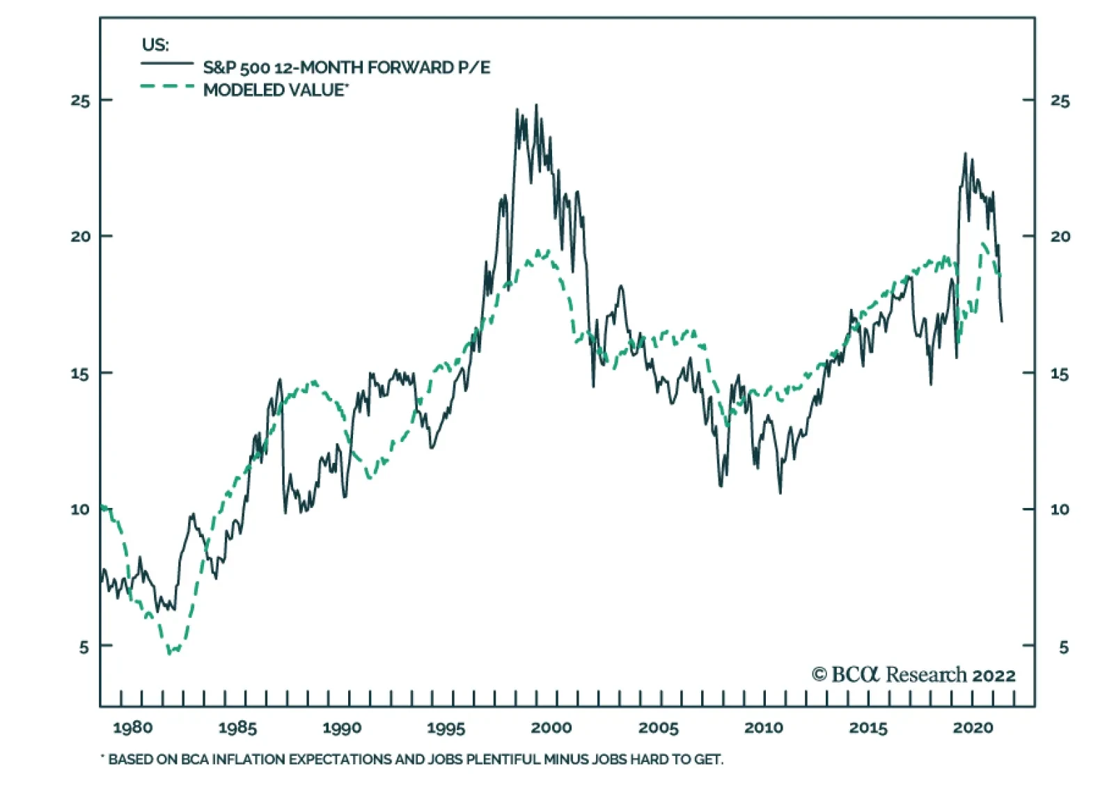
BCA Research’s US Investment Strategy service estimates that the forward multiple’s fair value is one or two points above its current level. Although no one should expect that any given financial instrument should trade at its fair value at any particular…
Executive Summary Real Estate Is A Poor Inflation Hedge
The Real Estate Sector Deep Dive
The Real Estate Sector Deep Dive
The real estate sector is experiencing a robust post-pandemic recovery fueled by easy monetary and fiscal policy, with vacancy rates falling, earnings growing, and balance sheets looking healthy. Despite being a real asset, our in-depth analysis shows that the sector appears to be a poor inflation hedge and underperforms the market when inflation is elevated. There is a great dispersion within the sector – correlations across REIT segments are low. Residential REITs offer solid protection against inflation: Rent growth outpaces inflation thanks to chronic housing underbuilding and a recent rebound in new household formation. Likewise, we expect the Industrial REITs segment to offer inflation protection. Following recent supply disruptions, companies are shifting away from the “just-in-time” to “just-in-case” model, spurring strong demand for warehousing, fulfillment, and logistics centers, and pushing up rents. Office and Retail REITs segments will be the two industry laggards due to structural shifts in consumer and worker behavior. Bottom Line: Today we downgrade the S&P Real Estate sector from overweight to neutral while keeping a granular intra-sector allocation. Specifically, we recommend investors overweight Specialized, Industrial, and Residential REITs, while underweighting Office and Retail segments. Feature Related Report US Equity StrategyHave US Equities Hit Rock Bottom? The last few months have been marred by a violent sell-off in US equities, with stubbornly high inflation, and the Fed’s well-telegraphed hawkishness being front and center of the market rout. While this is a toxic brew for most equity sectors, Real Estate finds itself in a crosscurrent of two opposing trends. It is a high-yielding real asset that, at least in principle, is well-positioned to withstand inflation (most landlords are able to raise rents at least in line with inflation). However, tightening monetary policy and rising mortgage rates present unique challenges for the sector, suppressing demand for real estate and compressing the present value of future cash flows, thus handicapping capital appreciation. The recent downside surprise in the NAHB housing market reading is a case in point: 69 reported while the consensus range was 75 -77, signaling a sharp deceleration in house price growth. There is also a pronounced turn in sales activity (Chart 1). However, just as the real economy is not the stock market, the housing market is only one of the segments of the Real Estate sector. In this report, we will provide an overview of the entire sector, including valuations and fundamentals, and will consider the effects of inflation and rate regimes on sector performance. We will also take a look at the various segments of the REIT equity sector and the key drivers of their performance in our quest for the best inflation hedge. Chart 1Real Estate Sales Have Turned Down
Real Estate Sales Have Turned Down
Real Estate Sales Have Turned Down
The US REIT Overview The REIT Sector Has Experienced Strong Growth Over The Past Decade There are more than 225 REITs in the US registered with the SEC, 175 of which trade on the NYSE. The ever-expanding cohort of NYSE-traded REITs has experienced explosive growth over the past 10 years, as a result of investors' search for yield, and this cohort now has a combined equity market capitalization of more than $1.4 trillion (Chart 2). These are mostly equity REITs – trusts that own and operate income-producing assets and earn income mostly through rents. Thirty of these equity REITs comprise the S&P 500 Real Estate sector. The Real Estate sector is small at 3% of S&P 500 market capitalization but its share has been growing steadily over time (Chart 3). Chart 2Equity REITs Have Gained Popularity Over The Past Decade
The Real Estate Sector Deep Dive
The Real Estate Sector Deep Dive
Chart 3Real Estate Is A Small Sector But Its Share Has Been Growing Steadily
Real Estate Is A Small Sector But Its Share Has Been Growing Steadily
Real Estate Is A Small Sector But Its Share Has Been Growing Steadily
REITs Are Equities, But Not Quite The business model of most REITs is rather simple: Lease space and collect rent on the properties, then distribute income as a dividend to shareholders. There are a number of IRS provisions that REITs have to comply with, of which the following are most relevant to investors: Invest at least 75% of total assets in real estate, cash, or US Treasuries; Derive at least 75% of gross income from rents, interest on mortgages that finance property, or real estate sales; and Pay a minimum of 90% of taxable income in the form of shareholder dividends each year.1 REITs are total return investments as they provide income as well as capital appreciation. Sector Composition The S&P 500 Real Estate sector consists of two industries – REITs, which represent roughly 98% of the sector, and Real Estate Management and Development, which is about 2% of the sector. We will focus on the REITs. The S&P 500 REIT industry is comprised of eight broad categories (Chart 4), of which Specialized REITs are by far the largest, at 45% of the sector market capitalization. The composition of the REIT market has changed over the years. While the traditional retail and residential segments dominated the market in the first years of the millennium, structural changes have shifted the balance towards specialized segments such as infrastructure, data centers, as well as industrial REITs (Chart 5). The pandemic and a shift toward remote work have accelerated many of the existing trends, such as a decline in the office segment. Consolidations of health care facilities and hospitals have reduced the Health Care REIT segment. Chart 4The S&P 500 REIT Industry Composition
The Real Estate Sector Deep Dive
The Real Estate Sector Deep Dive
Chart 5REITs Composition Is Changing Over Time
The Real Estate Sector Deep Dive
The Real Estate Sector Deep Dive
Sector Performance Since 2010, in the aftermath of the GFC, the Real Estate sector has underperformed the S&P 500 by 20% (Chart 6). However, within the sector, there is a wide divergence in relative performance, with Industrial REITs beating the index by 10%, while Office, Hotels, and Health Care REITs lagging by some 50%. More recently, the Real Estate Sector has performed more or less in line with the S&P 500 (Table 1), in contrast to the wild swings in relative performance experienced by other sectors. Like their corporate brethren in the Health Care sector, defensive Health Care REIT performance was stellar, beating the S&P 500 by 10% over the past 12 months. Hotel REITs bounced back strongly after a prolonged period of underperformance because of a nascent post-pandemic recovery in travel. Clearly, there is significant dispersion in both long- and short-term performance within the sector – correlations across segments are low (Chart 7). It is important to understand the key drivers of each segment for better asset selection. Chart 6In The Aftermath Of The GFC, The Real Estate Sector Has Underperformed
In The Aftermath Of The GFC, The Real Estate Sector Has Underperformed
In The Aftermath Of The GFC, The Real Estate Sector Has Underperformed
Chart 7Correlations Across REIT Segments Are Low
Correlations Across REIT Segments Are Low
Correlations Across REIT Segments Are Low
Table 1Performance Relative To The S&P 500
The Real Estate Sector Deep Dive
The Real Estate Sector Deep Dive
REIT Dividend Yield And TINA One of the main attractions of REITs is their IRS-mandated high dividend payout. Indeed, currently, the Real Estate sector dividend yield is 2.9%, a whole 130 bps higher than for the S&P 500. In fact, all REIT sectors and subsectors (with the exception of the lodging/resorts sector) currently have dividend yields higher than those of public equities (Chart 8). However, for many investors, yield comparison goes beyond equities alone. For multi-asset investors, the REIT yield is usually competing with the yield on other fixed-income instruments (Chart 9). Currently, REITs offer yields on par with investment-grade bonds, but arguably they are more attractive thanks to capital appreciation potential. Chart 8Almost All REIT Segments Yield More Than The S&P 500
The Real Estate Sector Deep Dive
The Real Estate Sector Deep Dive
Chart 9REIT Yield Is Attractive
The Real Estate Sector Deep Dive
The Real Estate Sector Deep Dive
Performance Of The Real Estate Sector In Different Inflation And Rate Regimes Real estate is a real asset and resilience to inflationary pressures is literally embedded in its name. Unfortunately, empirical analysis of the performance of Real Estate sectors during periods of high inflation disappoints. Chart 10 demonstrates that Real Estate is quite simply not a good inflation hedge. The sector tends to have the strongest performance when inflation is in the 2-3.5% range, beating the S&P 500 54% of the time. As inflation rises, RE tends to lag the broad market. This result is surely confounding. The likely explanation is that rising inflation is literally an invitation to tighter monetary policy. As rates rise, Real Estate underperforms (Chart 11). Higher interest rates decrease the value of real estate assets by discounting future cash flows at a higher rate, thus impairing the capital appreciation component of the Real Estate total return. As such, cap rates and interest rates move in lockstep (Chart 12). Chart 10Real Estate Is A Poor Inflation Hedge
The Real Estate Sector Deep Dive
The Real Estate Sector Deep Dive
Chart 11REITs Tend To Underperform When Rates Are Rising
The Real Estate Sector Deep Dive
The Real Estate Sector Deep Dive
Thus, when inflation is high and rates are on the rise, the sector is caught in the crosscurrents: While overall, the ability to raise rents insulates the sector from the adverse effects of inflation, higher rates dampen capital appreciation. Hence, it is not surprising that high inflation and the rising rate regime are unfavorable for the sector (Chart 13), with the sector’s median three-month performance in this regime since 1970 lagging the S&P 500 by 1.8%. In this regime, RE beats the market only 38% of the time. Chart 12Cap Rates And Interest Rates Move In Lockstep
Cap Rates And Interest Rates Move In Lockstep
Cap Rates And Interest Rates Move In Lockstep
Chart 13High Inflation And Rising Rates Are Unfavorable For Real Estate
The Real Estate Sector Deep Dive
The Real Estate Sector Deep Dive
While the S&P 500 Real Estate Sector is a poor inflation hedge, for investors with the ability to be more granular in REIT allocations, drilling down to sub-categories of the market might be beneficial. The real estate market is diverse and different segments do not react the same way to rising interest rates or inflation. Bottom Line: It appears that in a battle between inflation (favorable for the sector yield) and rising rates (unfavorable for capital appreciation), rates have the upper hand. Fundamentals And Valuations Even though REITs are technically equities, their analysis requires different metrics. Whereas equity investors rely on multiples such as price-to-earnings (P/E) or price-to-book (P/B), for REITs price-to-funds from operations (P/FFO) is a more important valuation tool. FFO is favored over earnings since it adds back depreciation and amortization expense. FFO also adds any gains (or subtracts any losses) from sales of underlying assets to net income. REITs traded at a steady 17x FFO between the end of the GFC and the start of the pandemic. FFO fell by 30% in the first two quarters of 2020 compared to Q4 2019, pushing the P/FFO multiple to 24.7 – a level that appears to be an expensive “post-pandemic normal” (Chart 14). The risk premium for REITs (calculated as the FFO yield minus the real 10-year Treasury yield) – currently at 5.4% – remains higher than the pre-GFC bottom of 3.5%. Consider Chart 15: On this basis, REITs are attractive. Chart 14REITs Are Trading At An Easy Money Post-Pandemic High
REITs Are Trading At An Easy Money Post-Pandemic High
REITs Are Trading At An Easy Money Post-Pandemic High
Chart 15Risk Premium Is Still Reasonable
Risk Premium Is Still Reasonable
Risk Premium Is Still Reasonable
In terms of profitability, the sector appears to be thriving: Occupancy rates are rising (Chart 16) and FFO is growing. However, it is important to note that US economic growth is slowing, and that may reverse the fortunes of the sector, weakening demand for properties, and lifting vacancy rates. Bottom Line: Earnings continue to rise, and cap rates – while declining – remain high compared to the risk-free rate. A post-pandemic recovery is underway. However, slowing economic growth has a potential to reverse these favorable trends. Chart 16Occupancy Rates Are Rising Again
Occupancy Rates Are Rising Again
Occupancy Rates Are Rising Again
REIT Balance Sheets Are Healthy The real estate sector has historically been seen as risky due to its high leverage, but leverage has been on the decline. Over the past decade, REIT reliance on equity capital has increased, with the equity/asset ratio rising from 32% in 2008 to 45% in 2022. The ratio of debt-to-book assets stands at around 48% , much lower than 58% during the GFC (Chart 17). REITs have also extended the average maturity of their debt from five years in 2008 to over 7.5 years today. The fall in interest rates over the past two decades has benefited equity REITs: As rates fell, so did the interest they paid on their debt. Liquidity ratios also improved, with coverage ratio (earnings relative to interest expense) rising to a solid 6.5x. Bottom Line: REIT balance sheet health has improved significantly as the share of equity financing continues to grow. Also, a downward trend in interest rates has made existing debt more manageable. Chart 17A Shift Towards Equity Financing And Falling Rates Have Fortified REIT Balance Sheet
A Shift Towards Equity Financing And Falling Rates Have Fortified REIT Balance Sheet
A Shift Towards Equity Financing And Falling Rates Have Fortified REIT Balance Sheet
REIT Segments And Their Economic Drivers The pandemic has accelerated some existing trends in the real estate sector and established new ones. Some sectors will struggle in this new environment, while others will flourish. There is a broad dispersion across the REIT segments in terms of yield vs capitalization, and the ability to withstand inflation and rising rates. REIT Segments In Charts – Residential and Industrial Appear Most Attractive Vacancy Rates are declining across all segments. The industrial segment has the lowest vacancy rate at 4.1%, followed by residential at 4.9%. Offices have the highest vacancy rates at 12.2% (Chart 18). Rents are rising. Apartments have experienced the steepest increase from 1.3% growth in 2020 to 11.3% in Q1-2022. Industrial rent growth has accelerated from 5.3% to 11%. Office rent growth is decelerating (Chart 19). Chart 18Vacancy Rates Recovered For All Segments But Office
The Real Estate Sector Deep Dive
The Real Estate Sector Deep Dive
Chart 19Residential And Industrial Rent Increases Outpace Inflation
The Real Estate Sector Deep Dive
The Real Estate Sector Deep Dive
Acquisitions are increasing at a robust pace with apartments experiencing the most activity (Chart 20). Sales Prices are also increasing (Chart 21). Industrial sales prices on average were up 15% from one year ago, while multifamily property prices rose 10.5%. Both these assets are earning rental income and returns that are higher than the current inflation rate, which makes them attractive assets to hold at a time of high inflation. Chart 20Sales Activity Is Robust
The Real Estate Sector Deep Dive
The Real Estate Sector Deep Dive
Chart 21Industrial And Residential Properties Are Most Popular Among Investors
The Real Estate Sector Deep Dive
The Real Estate Sector Deep Dive
The Cap Rate is experiencing compression (Chart 22) as higher rents boost sales prices, making properties more expensive. As a result, multi-family properties, which boast the highest rent growth and the lowest occupancy rate, have the lowest cap rate at 3.2%. Low demand for office space due to the pandemic has pushed the cap rate to 4.9%. Total Return is a combination of the rising value of a property and its yield, which moves in the opposite direction. As of April, Apartments had the highest total annual return of 12.7%, followed by Industrial at 10.7%. The total return of all commercial segments, except for Office, has exceeded the rate of inflation. Furthermore, we will comment on each of the segments to explain the trends observed in the charts (Chart 23). Chart 22Cap Rates Are Relatively Low Across The Board
The Real Estate Sector Deep Dive
The Real Estate Sector Deep Dive
Chart 23Industrial and Residential Produced The Highest Total Returns
The Real Estate Sector Deep Dive
The Real Estate Sector Deep Dive
Specialized REITs Are A Play On The Digitalization Of The Economy While other segment names are self-explanatory, Specialized is a little trickier. The specialized REITs segment accounts for properties not classified elsewhere. These REITs own and manage a unique mix of property types such as movie theaters, farmland, and energy pipelines. Also, a REIT that consists of, say, both office and retail properties, would also be classified as Specialized. This is the broadest and most diversified category, and it is not surprising that it accounts for nearly half of the sector by market cap. It is also the highest-yielding category with a dividend yield of 4.7%. The specialized category is particularly attractive as it includes many high-tech geared categories, such as communication networks and data centers. Properties that support the digital economy have attracted a lot of demand over the past couple of years, and FFO growth is strong (Chart 24). With a host of new technologies in the wings, demand for data centers is expected to continue to grow. Due to the high and complex technical set-up specifications, leases are usually longer (upwards of five years). Since lease terms are long, owners can’t reset rent to keep up with inflation. On the other hand, strong demand for data centers is pushing new rents up. Fundamentals for the segment are supportive: The cap rate, at 4.4%, is in line with the REIT benchmark (Chart 25). Chart 24Strong Demand For Data Centers
Strong Demand For Data Centers
Strong Demand For Data Centers
Chart 25Data Center Cap Rate Is In Line With The Benchmark
Data Center Cap Rate Is In Line With The Benchmark
Data Center Cap Rate Is In Line With The Benchmark
Bottom Line: We favor the Specialized REIT segment. It is well diversified and resilient to market swings. It also has significant exposure to the technology sector and benefits from a shift towards a more digitalized economy. This should also immunize the sector over the economic cycle as dependence on data increases structurally. Key tickers for this segment are: AMT, CCI. Retail REITs Are Battling Headwinds From E-commerce The “death of retail” is not a new phenomenon – consumer spending continues to shift from in-store to online. Over the past two decades, non-store retail sales in the US have grown at an annualized 9.5%, compared to 3.1% for in-store sales. E-commerce has risen to almost 14% of total retail sales. This shift is reflected in the halving of the weight of retail REITs in the Real Estate sector over the past decade. The headwinds facing the sector – particularly shopping centers – have not abated. The retail REIT occupancy rate is among the lowest in the CRE: 96% as of Q4-2021. However, with little construction underway, rent growth is not likely to decline, and will rise to mid-3%. With rents not keeping up with inflation, retail properties are a poor inflation hedge. Bottom Line: We recommend investors underweight the retail sector within their broad real estate exposure. The structural headwinds are not likely to disappear, while inflation will remain a major headwind. Key tickers for this segment are: O, SPG. Office REITs – Workers Are Not Coming Back There has long been a close link between office demand and employment. As the labor market tightens, demand for offices increases, and rents rise. However, “this time is different” due to the tectonic shift brought about by the pandemic. According to the NAR, not all workers are returning to the office (Chart 26): 17% of office employees are still telecommuting. Worse yet, there is an ongoing decline in small business formatting, impairing demand for new office space. As a result, the sector is currently flush with supply, and the occupancy rate is down from 94% to 89% (Chart 27). Yet, asking rents continue to recover, albeit slowly, and lag the rate of inflation: As of April 2022, the average year-over-year growth was 1.3%.2 Given the ongoing construction of about 150 MSF, the vacancy rate will likely remain above 10%, but rents will continue to increase modestly as more workers return to the office.3 Chart 26Many Workers Are Not Returning To The Office
The Real Estate Sector Deep Dive
The Real Estate Sector Deep Dive
Chart 27The Pandemic Has Changed Office Demand Dynamics
The Pandemic Has Changed Office Demand Dynamics
The Pandemic Has Changed Office Demand Dynamics
Bottom Line: Underweight the office sector within broad real estate exposure. A shift to remote work, elevated vacancy rates, and ongoing construction are likely to put the brakes on rent growth. Real rent growth is expected to be negative – this segment is a poor inflation hedge. Key tickers for this segment are: ARE, BXP. Residential REITs – Housing Shortages Are A Tailwind Residential REITs are primarily focused on apartments, but single-family homes and mobile homes fall under the same category (Chart 28). This segment is the closest proxy to the US housing market. The housing sector has been undersupplied for decades: The ratio of annual housing starts to the total number of households is 1.2 – 0.7 percentage points below its pre-GFC average (Chart 29). Chart 28Apartments Make Up The Majority Of Residential REITs
Apartments Make Up The Majority Of Residential REITs
Apartments Make Up The Majority Of Residential REITs
Chart 29Housing Undersupply Is Not A New Issue...
Housing Undersupply Is Not A New Issue...
Housing Undersupply Is Not A New Issue...
This has pushed up prices, increasing unaffordability, particularly for first-time buyers (Chart 30). This increased the percentage of US housing inventory occupied by renters rather than owners (Chart 31). Chart 30...Making Home Prices Unaffordable
...Making Home Prices Unaffordable
...Making Home Prices Unaffordable
Chart 31Pushing More People Towards Renting
Pushing More People Towards Renting
Pushing More People Towards Renting
Recently, housing shortages have been further exacerbated by a post-pandemic rebound in new household formation (Chart 32). Rising mortgage rates tend to further increase the demand for rental units. Vacancy rates are bound to fall further, leading to sustained double-digit rent and price growth. As of April, multi-family rents are up 9.4% year-over-year, higher than this inflation rate of 8.5%. Bottom Line: Chronic underbuilding and a recent rebound in new household formation have spurred demand for housing, putting upward pressure on rents, making the category an excellent inflation hedge. Key tickers for this segment are: AVB, EQR. Chart 32Household Formation Has Rebounded
Household Formation Has Rebounded
Household Formation Has Rebounded
Industrial Property Industrial REITs manage industrial facilities, with the logistics segment being a key growth driver thanks to high exposure to e-commerce. Industrial properties include warehouses, fulfillment centers, and last-mile delivery and distribution. Research by Prologis shows that e-commerce requires more than 3x the logistics space of brick-and-mortar sales. That is why occupancy rates have been rising over the past decade, and are currently at an all-time high, four percentage points higher than their 20-year average (Chart 33). The pandemic has also revealed how vulnerable current supply chains are and has accelerated a trend BCA Research has highlighted for years: The decline of globalization. Going forward, companies will move to re-shore some of their production to gain greater control over supply chains transitioning from “just-in-time” to “just-in-case” inventory management to minimize supply disruptions. This shift will amplify the need for industrial space. As a result, Industrial REIT rent growth has been robust, with rents up 11% year-over-year, with 37% of 390 markets posting double-digit rent growth. Rent growth lower down the value chain closer to the end-consumer has been particularly strong: Asking rents for logistics space are up on average 12.4% year-over-year mostly due to the scarcity of permittable land (Chart 34). Chart 33Increase Demand For Warehouses Pushed Up Occupancy Rates
Increase Demand For Warehouses Pushed Up Occupancy Rates
Increase Demand For Warehouses Pushed Up Occupancy Rates
Chart 34Logistics Rent Growth Is The Fastest Due To Scarcity
The Real Estate Sector Deep Dive
The Real Estate Sector Deep Dive
Bottom Line: We expect the Industrial sector to continue to outperform the broad REIT market, supported by strong demand for fulfillment and logistics centers which is pushing rents up. Industrial REITs are an excellent inflation hedge. Key tickers for this segment are: PLD, DRE. Investment Implications The real estate sector is experiencing a robust post-pandemic recovery fueled by easy monetary and fiscal policy, with vacancy rates falling, earnings growing, and balance sheets looking healthy. However, despite being a real asset, the sector appears to be a poor inflation hedge, underperforming the market when inflation is elevated. High inflation is often accompanied by rising rates, which reduce the value of future cash flows, impair capital appreciation, and offset income gains brought about by rent increases. Further, slowing growth may become a significant headwind, reversing gains in occupancy rates. Out of an abundance of caution, we are downgrading Real Estate from overweight to equal weight. However, Real Estate is a diverse sector, with segments almost uncorrelated to each other. As such, we recommend a granular allocation within the sector. Overweight Specialized, Industrial, and Residential segments which benefit from positive long-term trends, enjoy low vacancy rates, and positive real rent growth. We also recommend underweight allocations to Office and Retail segments, which suffer from adverse trends brought about by changes in consumer behavior, that translate into elevated vacancy rates and negative real rent growth. Bottom Line: The Real Estate sector is sensitive to rising rates and is a poor inflation hedge. We are downgrading the sector from overweight to equal weight. However, the sector is diverse, and commercial real estate sectors have a low correlation to each other. Within the sector, we favor Specialized, Industrial, and Residential segments that benefit from favorable long-term trends, and offer strong wage growth and potential for capital appreciation. These segments are likely to be strong inflation hedges. Irene Tunkel Chief Strategist, US Equity Strategy irene.tunkel@bcaresearch.com Footnotes 1 Investopedia 2 Commercial Market Insights, April 2022, National Association of REALTORS® Research Group 3 Ibid Recommended Allocation Recommended Allocation: Addendum
The Real Estate Sector Deep Dive
The Real Estate Sector Deep Dive
Executive Summary The sharp slide in the S&P 500 forward multiple has been painful, but it's only two-thirds of the way to its 1987 and 2002 declines. The inverse correlation between interest rates and the index P/E multiple is well established; if rates stop backing up, the multiple will stop being squeezed. Stocks would really be in trouble if their gains had entirely been a function of multiple inflation, but earnings growth has done the heavy lifting since 2008. Earnings growth will likely decelerate over the rest of the year, but it will remain a tailwind. A model regressing the index's forward multiple against a proprietary measure of inflation expectations and consumer perceptions of the labor market does a good job of explaining past valuation moves. If inflation has peaked and labor demand remains strong, multiples may be able to retrace some of their losses. De-Rating May Have Gone A Little Too Far
De-Rating May Have Gone A Little Too Far
De-Rating May Have Gone A Little Too Far
Bottom Line: Although the 23% de-rating in equity valuations has been severe, it is not unprecedented – larger declines occurred in 1987 and 2002. While we estimate that the forward multiple’s fair value is one or two points above its current level, there is no timetable for when the actual multiple will return to it. Feature Our client conversations over the last few weeks have ultimately found their way to the issue that is front of mind for nearly all investors: Is the equity selloff almost finished, and how far will it go if it’s not? When analyzing equity performance, we find it useful to decompose the S&P 500 into expected earnings and the multiple investors are willing to pay for them. Solid full-year US growth remains our base-case scenario, even if our conviction has declined as inflation has bounded higher, Russia’s invasion of Ukraine has turbo-charged geopolitical tensions while crimping commodity supplies, and China’s response to its COVID surge threatens to undo tentative supply-chain progress. We therefore view moves in the S&P 500’s forward P/E multiple as the key swing factor. This report gathers our responses to several client questions that touch on multiples and presents some new research related to them. Our goal is to bring some fresh insights to the discussion while encouraging more clients to engage with it. Previous De-Rating Episodes Multiples have lost a lot of ground in a short period of time. Is there any precedent for what we’ve seen so far this year? Reliable consensus earnings estimates have only been compiled since 1979, so the entire history of forward multiple data is confined to the last 40-plus years. Over that timeframe, there have been two other periods when the month-end index multiple fell at least as much over a similarly brief stretch (Chart 1, top panel). The first occurred in 1987, when the forward multiple fell five points from 14.8 at the end of August to 9.8 at the end of November, a stunning three-month 33% valuation haircut that largely unfolded during Black Monday’s single-session bear market. The second occurred as the bear market that followed the dotcom bust careened to its conclusion, with the forward multiple again falling by a third, from 21.6 at year-end 2001 to 14.5 at the end of September 2002. Chart 1Multiples Can Reverse Suddenly
Multiples Can Reverse Suddenly
Multiples Can Reverse Suddenly
The year-to-date decline of just under five multiple points, from 21.6 at year-end to 16.7 as of Wednesday’s close, has amounted to a 23% valuation adjustment in four-and-a-half months that has driven the index 18% lower. In standardized terms, the index multiple has matched 1987 with a 1.15-standard-deviation tumble, but it is still a half of a standard deviation shy of 2002’s swoon (Chart 1, bottom panel). The multiple’s 1.5-standard-deviation slide from its August 2020 month-end peak is a full standard deviation less than the 2.5-standard-deviation peak-to-trough flogging it endured during the dotcom bust. Bottom Line: The current selloff has been severe, but it is not unprecedented. Multiples can compress swiftly, especially when they are as elevated as they have been since stocks bottomed amidst the initial shock of the pandemic. Matching 1987's and 2002's 33% haircuts would involve lopping off another two multiple points and knocking the index down to the low 3,400s. Multiples And Interest Rates The history is scary. 3,400 would take us right back to where we were before the vaccines arrived and wipe out a year and a half of gains, but I take some comfort from still-low interest rates. Stocks may not be cheap relative to the whole 43-year history, but am I wrong to think they look pretty appealing given a 3% 10-year Treasury yield? Related Report US Investment StrategyQ&A About Rate Hikes And Stocks Interest rates provide the means for discounting future cash flows back to their present value and the theoretical link between multiples and interest rates is rock solid. When long-dated Treasury yields fall, the present value of a company’s future earnings rises, all else equal, and when yields rise, present value falls. All is not equal, of course, and earnings are prone to moving with interest rates, but the inverse relationship between interest rates and the present value of a fixed series of future cash flows is as constant as the tides. The empirical history shows that the theory holds up in the real world. The inverse relationship between S&P 500 forward multiples and 10-year Treasury yields is robust, with the level of yields explaining 46% of the variation in S&P 500 valuations since the forward multiple series began (Chart 2, top panel). The simple regression fit is undermined by the circled cluster of outlying observations with yields between 4.5 and 6.75% and forward multiples of 18 and above, all of which occurred between January 1997 and May 2002, when the dotcom mania severed the link between valuations and rates. When those observations are removed, the relationship becomes even stronger, with the level of yields explaining 69% of the variation in S&P 500 valuations (Chart 2, bottom panel). Chart 2When Rates Zig, Multiples Zag
Equity Multiples Q&A
Equity Multiples Q&A
Removing the dotcom observations from the datasets highlights the variability of forward valuations within the 0.5-4% range of Treasury yields that has prevailed since 2008. The observations well below the best-fit regression line occurred soon after the onset of the global financial crisis, when a growth shortfall loomed as the biggest threat and deflation was a plausible outcome. The observations well above the best-fit line were recorded since the pandemic, as the economy rode a wave of fiscal and monetary steroids whose potentially inflationary side effects were beyond the marginal price-setters’ decision horizon. We note that multiples are most likely headed back below the best-fit line if stagflation risks are perceived to grow in line with many investors’ fears. The equity risk premium (ERP), calculated as the forward earnings yield (the inverse of the forward multiple) less the real 10-year Treasury yield, offers a rosier perspective for viewing the interaction between interest rates and equity valuations. It supports the notion that equity prices are attractive, given the current yield backdrop, and draws a sharp distinction between the pandemic’s 20-plus multiples and the dotcom era’s (Chart 3). Simple regression against the 10-year Treasury yield suggests that the S&P 500 is now fairly valued, while the ERP argues that it’s somewhat cheap. Equity valuations are vulnerable to further yield backups under both approaches, however. Chart 3Compared To Bonds, Equities Are Cheap
Compared To Bonds, Equities Are Cheap
Compared To Bonds, Equities Are Cheap
Bottom Line: Multiples deserve to be elevated, relative to their history, given that long-dated Treasury yields remain near the bottom of their historical range, but they face more de-rating pressure if yields continue to rise. What Goes Around Comes Around The de-rating that’s occurring right now shouldn’t surprise anyone who’s stopped believing in Santa Claus and the tooth fairy. The Fed has manufactured the entire post-crisis rally with zero interest rates and QE and we’re simply witnessing the inevitable unwind. How can you argue that the selloff doesn’t have further to go? We hear the manufactured/manipulated argument a lot but we do not believe that the data support it. The advance in the S&P 500 since January 1, 2008 (Chart 4, top panel) has comfortably surpassed nearly everyone’s contemporaneous expectations and we do not dispute that ample monetary accommodation played a large part in smoothing the way for the US economy’s comparatively rapid recovery. In our view, however, the boost to the economy, as proxied by the potent rise in expected S&P 500 earnings (Chart 4, middle panel), was more important than investors’ increased willingness to pay up for them (Chart 4, bottom panel). Rebasing both series to 100 as of January 1, 2008 shows that consensus earnings estimates have risen by four more times than forward multiples since the onset of the global financial crisis. A similar analysis obtains for the current pandemic era, especially now that the S&P 500’s forward multiple has dipped back below its January 1, 2020 level (Chart 5, bottom panel). The index’s annualized 9.7% return has surpassed most investors’ wildest hopes when stocks were crumbling in the middle of March 2020 (Chart 5, top panel). The gain is entirely attributable to the 12.9% annualized increase in consensus earnings expectations (Chart 5, middle panel). Lavishly generous fiscal and monetary accommodation deserves the credit for the earnings snapback. Though excessive aid may eventually cause the economy to overheat, we disagree with the idea that the pandemic rally has been built on a house of monetary stimulus cards. Chart 4Earnings Have Driven The Post-Crisis ...
Earnings Have Driven The Post-Crisis ...
Earnings Have Driven The Post-Crisis ...
Chart 5... And Post-Pandemic Bull Markets
... And Post-Pandemic Bull Markets
... And Post-Pandemic Bull Markets
An Index Valuation Model Where do you think the S&P 500’s forward multiple should be right now? Although no one should expect that any given financial instrument should trade at its fair value at any particular moment in time, it is useful to have approximate fair value estimates to gauge assets’ relative attractiveness and future return prospects. To apply some quantitative rigor to answering this question, we set out to build a regression model that would point the way to an appropriate valuation range. We started with the 10-year Treasury yield as our first independent variable and examined various inflation, equity sentiment and consumer sentiment series to discover other variables that could enhance its explanatory powers. To most nearly isolate the multiple impact, we passed over measures of economic activity for variables that would not be expected to exert an equal or greater impact on S&P 500 earnings. Inflation measures in themselves failed to contribute to the cause, but inflation expectations series proved more availing. None of the major equity sentiment surveys nor BCA’s composite sentiment indicator contributed to the other variables’ explanatory power. Consumer confidence surveys showed some promise, and the difference in the Conference Board’s Jobs Plentiful/Jobs Hard to Find series performed the best in backtests. Much to our surprise, the 10-year Treasury yield lost its statistical significance along the way and we duly jettisoned it, leaving us with a model that regressed the index forward multiple against the exponentially smoothed long-run moving average of measured inflation used by our fixed income strategists to assess Treasury fair values and the net Jobs Plentiful measure. Chart 6 shows the historical path of the S&P 500’s forward four-quarter earnings multiple and the fitted value from our regression. The backtested fit is quite good, as befits the model’s 72% r-squared. Encouragingly, the model suggests that the de-rating has gone too far. It returned an 18.5 value at the end of April, a full point above the actual 17.5 reading and nearly two points above the 16.7 multiple as of Wednesday’s close. Chart 6Estimating What The S&P 500's Forward Multiple Should Be
Estimating What The S&P 500's Forward Multiple Should Be
Estimating What The S&P 500's Forward Multiple Should Be
We take any modeled point estimate with a grain of salt and are dyed-in-the-wool skeptics about any quantitative model’s persistence as a practical investment guide. We nonetheless performed this modeling exercise to provide a quantitative historical basis for estimating the fair value of the S&P 500’s forward multiple. The fact that we threw the 10-year Treasury yield overboard does not invalidate Chart 2; multiples and long-maturity yields are plainly inversely related, but our internal inflation expectations measure apparently conveys all of the 10-year yield’s information about the forward multiple’s historical moves and then some. Like every conscientious evidence-based researcher, we will go wherever the data lead us, independent of any preconceptions we might bring to a particular study. The Road Ahead When will the selloff end? We don’t know the date, the time or the level at which the equity selloff will eventually end. If our view that earnings will hold up is correct, however, the answer will turn on when the de-rating ends. The equity risk premium, a simple regression against the level of long Treasury yields and a multi-factor regression incorporating BCA’s proprietary inflation expectations model and consumers’ perceptions of the jobs market all suggest that de-rating has gotten ahead of itself. A 23% haircut over four-and-a-half months seems extreme when we think an adverse inflection point is over a year away. We have never counted on settling down with TINA, figuring that it wasn’t her nature to stick around for the long haul. Sentiment is fickle, and one day investors will discover that she’s left without a by-your-leave. Despite the upheaval so far this year, however, we think equities still hold considerable relative allure. With inflation mauling the value of cash holdings and high-duration bonds, one could argue that the alternatives to equities are even less appealing than they were when she first appeared on the scene. Our Global Investment Strategy service tactically upgraded global equities to overweight from neutral two weeks ago and we are more inclined to add equity exposure than reduce it when we revisit our ETF portfolio holdings in next week’s month-end report. There is no shortage of obvious concerns from Beijing to Moscow to Bentonville, Arkansas, but we think the factors that could go right are getting short shrift. Russian forces bogged down in eastern Ukraine are less likely to pursue expanded military adventures, reducing the potential that western Europe and the US could be drawn into a larger conflict. China’s zero-COVID policy may be doomed to futility, but headway on domestic production of an mRNA vaccine and the global ramp-up of anti-viral medication production could limit future outbreaks’ impact on the supply chain. The bottom line is that we remain constructive over the cyclical 3-to-12-month timeframe, while sharing the house view that the tactical equity outlook has improved. If the backup in bond yields has run its course for the time being, we expect that equity de-rating has as well. Doug Peta, CFA Chief US Investment Strategist dougp@bcaresearch.com
Executive Summary Villains Still Lurking
Villains Still Lurking
Villains Still Lurking
European assets and the euro already discount a significant worsening of Europe’s economic outlook. If the global economic situation were to stabilize, then European assets would be a buy at current levels. However, there remain very large risks lurking over the outlook. First, a further deterioration in energy flows between Russia and the EU is a major threat to the European economic outlook. Second, the ECB delivering the seven rate hikes priced in the June 2023 Euribor contract would be painful for the European economy. Third, further selloff in the US equity market could translate into more pain for European equities. And fourth, the weakness in the Chinese economy and aggressive monetary tightening in the broader EM space outside China are additional risks. These risks loom large enough, so that investors should avoid bottom-fishing the market. Wait until greater clarity emerges or valuations improve further. Bottom Line: Don’t be a hero. European assets and the euro are probably in the process of bottoming. However, the probability of a very significant additional decline is large enough that investors should continue to emphasize capital preservation over return maximization. Also, continue to favor defensives over cyclical assets. After declining nearly 8% since its January 2021 peak, the euro is down another 7% so far this year. Meanwhile, the Dow Jones Euro STOXX 50, which has plunged 17% since its January 5, 2022 apex, or 22% in US dollar terms, trades at 11.2 times 2023 earnings estimates. At these valuations, European assets already discount a major growth slump in Europe. Is it time to buy European assets, to favor cyclicals versus defensives, and to buy the euro? At face value, the answer is “yes,” but uncertainty abounds, which means that capital preservation remains paramount. As a result, we recommend investors avoid bottom-fishing European assets. They should wait for a safer entry point, rather than trying to pick through the market trough. Plenty Of Risks Four main risks cast a long shadow on the performance of European assets: The evolution of the energy crisis, the potential for an ECB policy mistake, the threat of a worsening US selloff, and the instability in EM. The Energy Crisis It’s official: Sweden and Finland are applying to join NATO. Turkey’s objection will create delays in the process, but it will not stop it. Turkey needs protection against Russia, and it needs help to support the lira. Turkey’s acquiescence, therefore, will be bought. What is genuinely surprising is Russia’s silence. President Putin threatened to flex Russia’s military muscles if Sweden and Finland were to abandon their neutrality. Yet, he now has “no problem” with their bid to join the alliance. We are skeptical, especially as the EU is aiming to ban Russian oil imports by the end of the year. Based on these observations, we continue to see a further deterioration in energy flows between Russia and the EU as a major threat to the European economic outlook. It is far from a guaranteed outcome, but its probability is elevated enough (more than 30%) and so impactful that any investment strategy must account for it. Chart 1Rebuilding Nat Gas Stocks Is A Must
Don’t Be A Hero
Don’t Be A Hero
Chart 2Low-Income Households Are At Risk
Don’t Be A Hero
Don’t Be A Hero
Moreover, European nations continue to pay a premium for their energy and are trying to rebuild their natural gas inventory ahead of winter (Chart 1). Thus, the energy market continues to carry a significant recession risk for the Eurozone. Lower-income households already spend a substantial portion of their income on utilities and transportation costs, and their consumption is highly sensitive to the evolution of energy prices (Chart 2). A Policy Mistake We consider a rate hike in July a policy mistake, but it would be a true error if the ECB ratified the pricing currently embedded in the €STR curve (Chart 3). Why would a rate hike constitute a policy mistake? The EU’s inflation spike is not a reflection of strong domestic demand. It reflects foreign factors over which the ECB has no control. Energy prices drive European inflation and are passing-through to core CPI (Chart 4). Yet, wage growth remains tepid at 2.6%. Hiking rates will not bring about the additional energy supply Europe needs to tame inflation. Chart 3Too Far Too Fast
Too Far Too Fast
Too Far Too Fast
Chart 4European Inflation Is Energy inflation
European Inflation Is Energy inflation
European Inflation Is Energy inflation
Chart 5The US Is Lifting Prices Around The World
The US Is Lifting Prices Around The World
The US Is Lifting Prices Around The World
Even the analysis of the ECB is conflicted. On May 11, Executive Board Member Isabel Schnabel highlighted the need for an imminent interest rate hike, yet she also underscored the global nature of the current inflation outbreak. Goods prices in Europe not only reflect higher input costs, but they also bear the imprint of the excess demand in the US, which is lifting the price of goods prices around the world (Chart 5). However, an ECB rate hike will do little to tame US demand for manufactured goods. In the monetary policy realm, only aggressive tightening by the Fed will have the desired effect, which will trickle down to lower European inflation. Thus, European interest rate hikes will accentuate consumption weaknesses already visible across the region more than they will slow inflation. While a few rate hikes will not have a major impact, the seven rate hikes priced in the June 2023 Euribor contract would be disastrous as long as Europe is hamstrung by the current relative price shock. We remain long this contract. Worsening US Equity Selloff Investors seem to be waking up to the reality that US consumers are facing the same difficult predicament as European consumers: rising energy and food prices and contracting real incomes. The recent earnings call by Walmart was a shock that caused an 8% drubbing for consumer staples and a 7% fall in consumer discretionary equities. Until US inflation clearly peaks, investors will have to evaluate how much deeper the pain for consumers may run. Moreover, since consumers have begun to cut their discretionary spending in response to strained budgets, the ability of firms to pass on rising input costs is dwindling. Hence, investors will have to handicap the risks to margins as well. Chart 6Fed Put Not Exercised
Fed Put Not Exercised
Fed Put Not Exercised
US inflation also impacts the Fed’s outlook. Until inflation has decelerated for a few months, the Fed will remain comfortable with tighter financial conditions. This means that the strike price of the so-called Fed put is inversely proportional to inflation, especially since FCIs are far from tight (Chart 6). As a result, inflation or energy prices must soften before the Fed can begin to send comforting signals to the market. Chart 7Where Walmart Goes, So Does The Market?
Where Walmart Goes, So Does The Market?
Where Walmart Goes, So Does The Market?
The US market has cheapened significantly, and a floor should be close; but the risks remain considerable. A very smart investor with whom we regularly chat highlighted that we have not yet seen a full-fledged liquidation. Only once energy stocks have also been purged will the necessary condition for a bottom be met (since only then will all the speculative activity have been cleared). In fact, the recent poor performance of Walmart highlights the risk that the S&P 500 could suffer one last down leg to 3500, since over the past 12 years, WMT often leads the SPX (Chart 7). Another 300 points decline in the US benchmark could translate into significant selling pressure in the Euro STOXX, because it sports an elevated beta. EM Instability EM are still facing ample risks, which could easily dislodge the prospects of European firms servicing these economies. As a result, EM constitute another major threat for European equities. Chart 8Less COVID In Shanghai and Jilin
Less COVID In Shanghai and Jilin
Less COVID In Shanghai and Jilin
The outlook for China remains fraught with risks. National COVID cases are declining as a result of the collapse in cases in the Shanghai and Jilin provinces (Chart 8). However, Omicron is spreading around the nation, with broadening lockdowns in Beijing and Tianjin. The one certainty is that the Chinese Communist Party remains wedded to its zero-COVID policy. Considering the size of the country and how contagious the various Omicron variants are, rolling lockdowns and their deleterious impact on activity are here to stay. China therefore remains a source of downside risk for global goods demand. Unemployment is surging, and the PMIs are extremely weak, suggesting a contraction in GDP is coming. Moreover, households continue to deleverage (Chart 9). The CNY’s weakness confirms the risks to earnings growth in Europe, and the yield spread between China and the US points to further downside in the RMB (Chart 10, top panel). Interestingly, the weakness of the yen could also drag the CNY lower because of competitive pressures. Chester Ntonifor, BCA’s Chief Foreign Exchange strategist recommends investors sell CNY/JPY. Historically, a depreciating CNY/JPY portends weakness in European stock prices (Chart 10, bottom panel). Chart 9Chinese Growth Problems
Chinese Growth Problems
Chinese Growth Problems
Chart 10A Weaker CNY Augurs Poorly For European Stocks
A Weaker CNY Augurs Poorly For European Stocks
A Weaker CNY Augurs Poorly For European Stocks
The broader EM space outside of China is also a source of risk. EM countries are tightening monetary policy, which is slowing economic activity in nations already exposed to declining Chinese imports. Additionally, as Arthur Budaghyan shows, the strength in the dollar is tightening EM financial conditions and invites further increases in EM policy rates because of the inflationary impact of depreciating currencies. An additional tightening in EM financial conditions in response to this toxic mix will invite greater downside for European equities (Chart 11). Bottom Line: European equities already reflect enough of a valuation cushion to compensate for a significant slowdown in European growth. However, ample risks to global growth still lurk in the background. If these risks materialize, European stocks could selloff another 15% or so. Moreover, the overvaluation of cyclical stocks relative to defensive ones has now been purged, but China’s economic weakness remains a major handicap (Chart 12). Consequently, don’t be hero: avoid bottom-fishing European assets, especially cyclical ones. Chart 11Brewing EM Troubles
Brewing EM Troubles
Brewing EM Troubles
Chart 12Cyclicals At Risk From China
Cyclicals At Risk From China
Cyclicals At Risk From China
Is it Time to Buy the Euro? After falling below 1.04, EUR/USD has rebounded to 1.055. Is it time to buy the euro? The euro now embeds a large discount that reflects fears of a recession and stagflation in the Eurozone. A purchasing power parity model developed by BCA’s Foreign Exchange Strategy team that accounts for the differences in consumption baskets in Europe and the US shows that EUR/USD is trading at its deepest discount to fair value since 2001. Moreover, BCA’s Intermediate-term timing model, which is based on an augmented interest rate parity framework, confirms that EUR/USD is cheap. Additionally, BCA’s Intermediate-Term Technical Indicator is massively oversold (Chart 13). For the euro to bottom durably, the dollar needs to reverse its rally. The combination of net speculative positions on the DXY and BCA’s Dollar Capitulation Index point to elevated chances of an imminent peak (Chart 14). Chart 13The Euro's Large Risk Premium
The Euro's Large Risk Premium
The Euro's Large Risk Premium
Chart 14The Over Extended Dollar
The Over Extended Dollar
The Over Extended Dollar
Despite this backdrop, three of the aforementioned risks to European stocks translate into threats to the euro: A Russian energy embargo would cause a much more severe European recession. Two weeks ago, we highlighted a Bundesbank study which showed that such a cutoff would curtail German growth by 5% point for 2022. We also highlighted that this shock would cause a temporary but significant increase in inflation. This combination would be poisonous for the euro, and it carries a roughly 30% probability. A policy mistake in the Euro Area would cause a period of significant spread widening in the periphery. Such shocks often prompt a widening in the breakup risk-premium for the euro. This risk premium pushes EUR/USD lower. Chart 15Chinese Assets Matter To The Euro
Chinese Assets Matter To The Euro
Chinese Assets Matter To The Euro
Chinese growth problems often hurt the euro as well as European stocks. A fall in the Chinese stock-to-bond ratio often leads to a weaker EUR/USD, since both variables are correlated to Chinese economic activity. Additionally, a depreciating CNY is also synonymous with a softer euro because a declining renminbi hurts European exporters (Chart 15). Further weaknesses in the S&P 500 no longer guarantee a fall in EUR/USD. Investors are worried about the US equity outlook because they are extrapolating the impact on consumers of rising energy and food prices. They are applying the template of what is going on in Europe to US households, which means that they are pricing in a convergence of US growth toward European growth (barring the three additional shocks highlighted in the bullet points above). Related Report European Investment StrategyIs UK Stagflation Priced In? Bottom Line: From a technical and valuation perspective, the rebound in the euro that began this week could last longer. However, several exceptional risks could prevent this bounce from morphing into a durable rally. The significant odds of a Russian energy embargo stand at the top of the list of concerns, but so does the possibility of a policy mistake in Europe as well China’s problems. Thus, even if the euro is bottoming, don’t be a hero and wait on a safer entry point to focus on capital preservation. In fact, BCA’s Foreign Strategy team is now selling EUR/JPY. Within a European context, a short GBP/CHF position is attractive as a portfolio hedge. The Swiss National Bank seems more tolerant of a higher CHF as a vehicle to tame growing inflationary pressures, while the UK faces significant risks. Mathieu Savary, Chief European Strategist Mathieu@bcaresearch.com Tactical Recommendations Cyclical Recommendations Structural Recommendations
Inflation continues to put pressure on the US consumers. Negative real wage growth (Chart 1) and soaring prices of food and energy are pushing many low and middle-class Americans to shift spending away from discretionary items toward necessities (Chart 2). We have written about this here. Chart 1CHART 1
CHART 1
CHART 1
Chart 2
On The US Consumer, Powell, And Retailers Carnage
On The US Consumer, Powell, And Retailers Carnage
Table 1
On The US Consumer, Powell, And Retailers Carnage
On The US Consumer, Powell, And Retailers Carnage
The recent earnings commentary from Walmart and Target are attesting the trend. Both noted that consumers are switching from the high-margin items (non-necessities) to the lower-margin necessity items like food. Both companies have also commented on the ongoing supply chain challenges and rising costs of both goods (COGS) and wages. Target reported a 430bps contraction in gross margins. Peak margins for the sector are surely in the rear-view mirror. Both Walmart and Target provided negative guidance. As a result, a retail “carnage” has ensued, WMT is down 20%, COST 15%, and TGT 30% over the past three days. The sell-off was exacerbated by the Powell’s comments that combating inflation is likely to incur economic pain, hinting at a possibility of a recession on the back of the Fed’s actions. These comments have reiterated the Fed’s hawkish stance, and have removed any hope of the Fed’s put, i.e., the Fed coming to the rescue of the spluttering equity market. What’s next? We believe that the markets can continue to fall. A few conditions of our Equity Capitulation scorecard have not been yet met (Table 1). Rate stabilization – The Fed’s hawkish stance and a plan to front-load a rate hiking cycle suggest that monetary conditions will continue to tighten (-1) Economic growth expectations do not yet reflect the deteriorating economic backdrop. US GDP forecasts will be further downgraded (-1) Earnings growth expectations need to come down to reflect supply disruptions, raging input prices, and the stronger dollar (-1) Oil prices have somewhat stabilized (+1) Valuations have retraced, signaling that the market is reasonably priced. However, earnings downgrades will push forward multiples higher (0) Technicals signal that the market is oversold (+2) “Black swans” – headwinds from the war in Ukraine and lockdowns in China (-2) Bottom Line: On balance, risks for US equities slightly outweigh the upside opportunity. A market bottom is still a few weeks, or even months, away.
Executive Summary Indian Voter’s Economic Miseries Are Ascendant
Indian Voter's Economic Miseries Are Ascendant
Indian Voter's Economic Miseries Are Ascendant
India has a strong strategic geopolitical position but is likely to face turbulence in the short term. This is because India remains expensive, and investors worry if the record political stability shown by India since 2014 can last. We highlight that the ruling Bhartiya Janata Party (BJP) may lose some seats in the near term. India’s most populous states could witness a few cases of social conflict as economic miseries grow. India may also temporarily resort to a degree of fiscal populism. But the BJP will be able to hold power for a third consecutive term in 2024, that too with a simple majority. The burst of fiscal populism will be temporary. Moreover, the next tier of India’s most populous states are well-positioned to drive India’s growth story in the long run. We urge investors to tactically short India / long Brazil financials given that India may see some turbulence in the short run. Strategic investors should consider long India tech / short China tech. Trade Recommendation Inception Date Return SHORT INDIA / LONG BRAZIL FINANCIALS 2022-02-10 12.5% Bottom Line: The ruling political party in India may face some political setbacks in the short term. It could even resort to fiscal populism. But the ruling party in a base case, should be able to retain power for a third term in 2024. On a tactical timeframe we advise caution on India but remain constructive on a strategic horizon. Feature The woods are lovely, dark and deep, But I have promises to keep, And miles to go before I sleep, And miles to go before I sleep. – Robert Frost, Stopping By Woods On A Snowy Evening (New Hampshire, 1923) The protagonist in this famous poem is overwhelmed by the beauty of the wintry woods, but then must stay vigilant about the here and now. The situation that confronts an investor into India today, is surprisingly similar. India has a strong strategic geopolitical position, a position that has strengthened following the Ukraine war. However, Indian markets might face turbulence in the short term. This is because India remains expensive and its ability to keep promises (about high degrees of political stability or about its fiscal discipline) could be tested on a tactical time horizon. In specific, investors with exposure to India worry about three politico-economic challenges: The Anti-Incumbency Challenge Related Report Geopolitical StrategyIndia's Politics: Know When To Hold 'Em, Know When To Fold 'Em 13 September 2013 is a key date in India’s modern history. On this day the Bhartiya Janata Party (BJP) announced Narendra Modi as BJP’s prime ministerial (PM) candidate just a few months ahead of the 2014 general elections. From 13 September 2013 till date, MSCI India has incidentally outperformed MSCI EM by a resounding 94.8%. In 2013, markets celebrated the rise of the Modi-led BJP government since such a dispensation was new, and it promised to deliver structural reform. But now when general elections will be held in 2024, the BJP must deal with a middling report card on reforms and a two-term anti-incumbency to boot. Given this clients worry if 2024 could see India go back to an era of coalition governments? The Fiscal Challenge India under BJP has displayed impressive degrees of fiscal discipline. With rising inflation now adding to Indian voters’ miseries and with a loaded state election calendar due in 2023, investors ask if India’s notable streak of fiscal fortitude can last? The Demographics Challenge As China’s weak demographic future becomes clearer, India’s youthful demographics keep attracting paeans. This is partially responsible for the fact that India has traded at a five-year average premium of 54.5% to China on forward price to earnings. With increasing reports of communal violence and inflation-related protests breaking out in India, investors also worry about India’s so-called demographic dividend and how best to play the game? In a foundational GPS Special Report published in 2018 we had made the point that, “Predicting political outcomes is difficult, but to generate geopolitical alpha investors should focus on ‘beating the spread’ not predicting the match winner”. At a time when there is much uncertainty about India’s immediate future, we highlight three key base case predictions with respect to India. By highlighting these key predictions, we hope investors can position themselves for generating geopolitical alpha. We conclude the report with actionable investment recommendations. India’s High Political Stability, Likely To Stay In 2024 Chart 1Bhartiya Janata Party’s (BJP) Win In India In 2014 Was Historic
Indian Politics: The Woods Are Lovely...
Indian Politics: The Woods Are Lovely...
The Bhartiya Janata Party (BJP) stormed into power in 2014. Its assumption of power under PM Modi’s leadership was historic. This is because this was the first time since 1984 that a single political party had managed to secure a simple majority on its own steam (Chart 1). The rise of BJP in this resurrected avatar marked a structural break from the past, in three distinct ways: End To Instability Of Nineties: The rise of BJP 2.0 in 2014 marked an end to the political instability seen in the nineties when governments struggled to complete their full five-year terms. This is a problem that India’s South Asian neighbors like Sri Lanka and Pakistan are yet to overcome. End Of Coalition Politics Of Early 2000s: BJP’s rise in 2014 also marked an end to the coalition politics of the early 2000s. While three coalition governments in India managed to complete their five-year terms from 1999-2014, the reform agenda over this period was often held at ransom by smaller coalition partners. India’s ability to break away from coalition governments back in 2014 was commendable given that several developing countries as well as developed countries still have coalition governments at the helm. Regime Continuity: The BJP’s rise in 2014 and their re-election in 2019 meant that the same political party was able to hold power in India (that too with a simple majority) for a decade. Other EMs have not seen this quality of continuity over the last few years. Owing to this streak of unprecedented political stability that India has been able to offer since 2014, India has attracted a high premium relative to democratic EM peers (Chart 2). But with India’s general elections due in 2024, investors into India are keen to know if India will continue to attract this high political stability premium. This worry is justified for two sets of reasons: (1) The last time any government in India was able to pull off three consecutive full five-year terms, was way back in the sixties. There is no recent precedent to BJP’s pursuit for a third consecutive term in India. (2) The most recent election held in India’s largest state i.e., Uttar Pradesh saw the BJP retain power but saw its seat count fall by 18%. This, investors worry could be an indicator of BJP losing traction in the politically critical region of northern India. Reading the tea leaves left behind after all recent elections suggests that India is most likely to see a single political party maintain a simple majority for a third consecutive term in 2024. BJP’s footprint northern in India will be dented owing to anti-incumbency. But despite this, the BJP should be able to maintain a simple majority at the national level in 2024. This is because the BJP appears to be working on deploying a crucial strategy i.e., to offset declines in north India with gains elsewhere. India’s northern states account for 45% of India’s population. Whilst the BJP’s rise in 2014 was pivoted on this geography, its ability to retain power beyond a decade will be dependent on its ability to offset losses in India’s sprawling north with gains in other large states. Interestingly, the BJP’s predecessor i.e., the Congress party had to deal with the reciprocal of this problem. The Congress party stayed in power for a decade (from 2004-14) owing to support from southern and western Indian states. But then the Congress party’s reign could not last beyond a decade because it failed to break into northern India (Chart 3); at a time when it was losing popularity in India’s west and south. Chart 2India Has Been Trading At A Premium To EM Democracies
India Has Been Trading At A Premium To EM Democracies
India Has Been Trading At A Premium To EM Democracies
Chart 3Congress Party-Led UPA Alliance Could Not Break Into North India
Indian Politics: The Woods Are Lovely...
Indian Politics: The Woods Are Lovely...
The fact that the BJP is now working to straddle both i.e. (1) its traditional base in the north and west as well as (2) new geographies in the east and south is evident from the recent election results: 2019 General Elections: Even as BJP’s seat count in the north Indian states of Uttar Pradesh and Bihar fell in 2019 (Chart 3) it managed to offset this decline by increasing presence in India’s east (in states like West Bengal and Orissa) and in India’s south (in states like Karnataka and Telangana). Consequently, the share of BJP’s seats accounted for by major states outside north India notably increased in 2019 from 2014 (Chart 4). Recent State Elections: The BJP has evidently been able to offset losses in its core northern base (in states like Uttar Pradesh), by increasing its presence in India’s east (in states like West Bengal and Bihar) (Chart 5). Chart 4BJP Is Growing Its Influence Outside North India
Indian Politics: The Woods Are Lovely...
Indian Politics: The Woods Are Lovely...
Chart 5BJP Is Offsetting Losses In North With Gains In East
Indian Politics: The Woods Are Lovely...
Indian Politics: The Woods Are Lovely...
Chart 6In a Base Case, BJP Should Cross The Halfway Mark At 2024 General Elections
Indian Politics: The Woods Are Lovely...
Indian Politics: The Woods Are Lovely...
In fact, it is critical to note that state elections are due in Gujarat in December 2022, where the BJP is highly likely to lose seat share as it faces a five-term anti-incumbency. Given that Gujarat as a region too is part of BJP’s core voter base, BJP’s seat losses in Gujarat could trigger a wave of selling on India’s bourses. If this leads India’s expensive valuations to be driven down, then this could present a buying opportunity because as long as the BJP keeps compensating for losses in traditional constituencies with inroads into newer realms (like say Karnataka where state elections are due in May 2023 or in Rajasthan and Madhya Pradesh where elections are due in end-2023); BJP’s standalone seat count in 2024 is highly likely to cross the half-way mark (Chart 6). To conclude, we re-iterate our constructive outlook on India on a strategic horizon, in view of the high probability of regime continuity lasting in this EM beyond a decade. In a worst-case scenario, we expect a BJP-led coalition to assume power in India in 2024 but this coalition too will be stable and should need the support of a maximum of two regional parties. Bottom Line: The BJP will lose seat share in parts of north and west India but should be able to retain power in 2024 by offsetting these losses with gains in India’s east and south. Most recent election results confirm that the BJP is working meticulously to make this formula work. If BJP’s political losses in its traditional constituencies triggers a market correction, then this should be used as a buying opportunity by strategic investors. Fiscal Risks In India Are Not Dead; They Will Surface, Before Receding Again In 1952 when India’s first national assembly was formed, left-leaning parties were the mainstay of India’s national politics. Back then a left-of-center party i.e., the Congress Party was in power with +70% seats in the national assembly. Then, the leftist Communist Party of India (CPI) was the second largest political party. As the decades went by left-leaning policies kept losing importance in India but the left-of-center national parties influenced Indian politics in a big way right up until 2014. Cut to 2014, the rise of the Bhartiya Janata Party (BJP) meant that the mainstay of Indian politics now became right-of-center politics. Left-leaning parties became too insignificant to matter at the national level with the Congress Party and the Communist Party of India (M) now cumulatively accounting for only about 11% seats in the national assembly. India’s political pendulum swinging to the right was accompanied by another key development i.e., India’s fiscal management became more prudent (Chart 7). Doles and transfer payments were restrained, and efforts were also made to shore-up tax revenues. But does the BJP-led transition to right-of-center politics mean that left-of-center politics in India are dead, as are the associated risks of fiscal populism? The Indian bond market seems to think so. India’s 10-year bond yield is up only 85 bps since 1 Jan 2020 to date, which is lower than a 106 bps increase seen in the US or 573 bps increase seen in a large emerging market like Brazil. Notwithstanding the superior fiscal discipline maintained by BJP-led governments so far, it is worth asking if this streak of fiscal resilience can last over the next two years? We highlight that even as the right-of-center BJP will remain a force to reckon with, we expect the BJP’s fiscal policy to temporarily swerve to the left owing to three sets of reasons: Miseries Breed Populism: It is true that recent BJP-led governments have maintained superior fiscal discipline (Chart 7). However high levels of inflation are known to feed populist tendencies of governments globally. India will be no exception to this trend because economic miseries of India’s median voter have worsened over the last six months (Chart 8). Chart 7BJP Led Governments Have Maintained Tighter Fiscal Deficits In India
Indian Politics: The Woods Are Lovely...
Indian Politics: The Woods Are Lovely...
Chart 8Economic Miseries Of India's Median Voter Have Been Worsening
Economic Miseries Of India's Median Voter Have Been Worsening
Economic Miseries Of India's Median Voter Have Been Worsening
Chart 9Government Spends Tend To Pick Up In The Run-Up To General Elections
Indian Politics: The Woods Are Lovely...
Indian Politics: The Woods Are Lovely...
Political Cycle: History also suggests that there is a cyclical element to fiscal laxity in India. Populism as a theme tends to become more defined in the two years leading to a general election (Chart 9). This cyclicality in fiscal expansion could also be driven by the fact that India tends to have a loaded state election calendar in the year just before a general election. Competition: As the BJP’s reign matures, it will increasingly face competition from regional parties (Chart 10). Given that most major regional political parties in India operate on the segment between the center and the left of political spectrum (Chart 10), BJP may see sense in metamorphosizing its fiscal policy into one which is closer to the left, albeit temporarily. Chart 10Regional Parties Like SP And AAP Could Grow Their National Footprint
Indian Politics: The Woods Are Lovely...
Indian Politics: The Woods Are Lovely...
Chart 11India’s Debt Levels Are High And Rising
Indian Politics: The Woods Are Lovely...
Indian Politics: The Woods Are Lovely...
It is worth noting that as compared to major EMs, India’s debt levels are high today (Chart 11). Against this backdrop an expansion of India’s fiscal deficit could result in turbulence in Indian markets. Bottom Line: The BJP is highly likely to temporarily switch to an expansive fiscal policy stance in the run up to the 2024 general elections. This shift will be driven by the need to retain power in the face of rising miseries of its median voter and to overcome competition from influential regional players. Most Populous Regions, May Not Necessarily Be Drivers Of India’s Growth The ‘demographic dividend’ narrative is often used to justify a bullish stance on India. But such a narrative oversimplifies India’s investment case and may even yield poor investment outcomes. India’s demographics power its consumption engine, but the same demographics can also be a liability sometimes. This is because while India is young, its populace is also poor and large. The combination of a massive population (that creates pressure on limited resources) and nascent institutions (that are yet to ensure a fair use of resources) is at the heart of corruption in India. For instance, the coming to light of the 2G-spectrum scam a decade ago on 16 November 2010 saw Indian markets correct by 6% over the next ten days. Hence ‘corruption’ is one of the ways in which India’s demographics can end-up being a drag on India’s investment returns. Chart 12Six Indian States Account For India’s Political Nucleus
Indian Politics: The Woods Are Lovely...
Indian Politics: The Woods Are Lovely...
With China’s population likely to have peaked last year, India’s population which is likely to peak in the 2040s - keeps attracting investor interest. In this report we peel the onion around India’s demographics in a way that allows investors to make the most of its demographics, whilst avoiding pitfalls associated with the same. We highlight that paradoxically; India’s most populous states may not be the main drivers of India’s growth over the next decade. On the other hand, investing in the ‘next eight’ most populous states, could present a superior opportunity to profit from India’s demographics. Six Indian states account for more than half of India’s population (Chart 12) and each of these states are larger than Germany or Turkey in terms of population (Map 1). Despite being populous, these states could emerge as flashpoints of social conflict over the next decade. This is because it is possible that these states’ economic growth fails to be brisk enough to meet aspirations of its vast populace. Early signs of this phenomenon are evident from the fact that these states’ share in India’s population has been rising, but their share in national income has fallen (Chart 13). Today these six states account for more than half of India’s population but generate less than half of its national GDP (Chart 14). Map 1India’s Most Populous States, May Not Necessarily Lead On Growth
Indian Politics: The Woods Are Lovely...
Indian Politics: The Woods Are Lovely...
Chart 13Most Populous States Of India, Are Not Necessarily Leading On Growth
Indian Politics: The Woods Are Lovely...
Indian Politics: The Woods Are Lovely...
Chart 14Next Eight Largest States Of India Are Economically Dynamic
Indian Politics: The Woods Are Lovely...
Indian Politics: The Woods Are Lovely...
Despite accounting for the lion’s share of India’s population, these six states’ growth potential could be compromised by: Economic Weakness: Primary sectors account for an unusually large share of the local economies of the most populous states today (Chart 15). Social Complexity: Most of the populous states are also characterized by greater social complexity as compared to other Indian states (Chart 16). In other words, their populations are young but are also poor and more heterogenous, which in turn exposes these states to a higher risk of social conflict. Chart 15Primary Activities Account For A Large Chunk Of Populous States’ GDP
Indian Politics: The Woods Are Lovely...
Indian Politics: The Woods Are Lovely...
Chart 16The Risk Of Social Conflict Is Higher, In The More Populous States
Indian Politics: The Woods Are Lovely...
Indian Politics: The Woods Are Lovely...
Leverage: The debt to GDP ratio of the more populous states often tends to be higher too (Chart 17). Now contrary to the situation in India’s most populous states, India’s ‘next eight’ largest states (by population) could emerge as hubs of economic dynamism (Map 1). This is because: Faster Growth: These states' share in national GDP is growing faster than the pace at which their share in India’s population is growing (Chart 13). As of today, the next eight states account for less than a third of India’s population but more than a third of India’s national income (Chart 14). Fewer Constraints: The next eight most populous states have more modern economic structures (Chart 15), lower risk of social conflict (Chart 16) and mildly superior public finances (Chart 17). Last but not the least, the ‘next eight’ states are poised favorably from a political perspective as well. This is because the Bhartiya Janta Party (i.e., BJP) has a weak footprint in these states (Chart 18) and will be keen to offer supportive economic policies to win over their median voter. Chart 17More Populous States, Also Can Be More Leveraged
Indian Politics: The Woods Are Lovely...
Indian Politics: The Woods Are Lovely...
Chart 18Next Eight Most Populous States Likely To Attract More Political Attention Going Forward
Indian Politics: The Woods Are Lovely...
Indian Politics: The Woods Are Lovely...
Bottom Line: While the demographic dividend that India enjoys is real, its benefits will not be spread uniformly across India’s geographies. For instance, some of the most populous states of India could lag on the growth front. To profit from India’s demographics and yet mitigate risks associated with the same, we urge investors to build portfolios that maximize exposure to the second tier of populous states in India. Investment Conclusion The Bhartiya Janta Party (BJP) in India appears set to emerge as the first party in India’s modern history to retain power beyond a decade with a simple majority. But to pull off this rare feat, it will have to metamorphosize and may exhibit some changes such as: Develop a focus on regions that are outside its core constituency, in a bid to offset anti-incumbency in its core constituencies. Sharpen its policy focus on the next tier of populous states, given that some of these states have greater growth potential and given that the BJP’s footprint in the second tier of populous states has room to grow. Adopt an expansive fiscal policy in the run up to the 2024 elections, to combat the rising economic miseries of India’s median voter. To play these dynamics, we urge clients to consider the following trades: Strategic Trades For clients with a holding period mandate of more than 12 months, we urge such investors to go strategically long Indian tech / short Chinese tech (Chart 19). The trade allows investors to play the unique and high degrees of political stability that India will offer on a strategic horizon. Chart 19Strategic Trade: Long Indian Tech / Short Chinese Tech
Strategic Trade: Long Indian Tech / Short Chinese Tech
Strategic Trade: Long Indian Tech / Short Chinese Tech
Chart 20Tactical Trade: Short India / Long Brazilian Financials
Tactical Trade: Short India / Long Brazilian Financials
Tactical Trade: Short India / Long Brazilian Financials
Moreover, it is notable the Indian tech industry’s key bases are concentrated in Karnataka, Andhra Pradesh and Telangana. All three states fall within the next tier of populous states of India. Thus, this trade allows investors to maximize exposure to both an economically vibrant region and sector of India. Tactical Trades For investors with a holding period mandate of less than 12 months, a trade that can be activated to profit from India’s short-term geopolitical risks is to short India / long Brazilian Financials (Chart 20). This allows investors to profit from the cyclical risks that will affect India (1) as commodity prices stay high and (2) as rising economic miseries fan fiscal risks. Ritika Mankar, CFA Editor/Strategist ritika.mankar@bcaresearch.com Strategic Themes Open Tactical Positions (0-6 Months) Open Cyclical Recommendations (6-18 Months) Regional Geopolitical Risk Matrix
Listen to a short summary of this report. Executive Summary The US Inflation Surprise Index Has Rolled Over
Goldilocks: A Skeptical Q&A
Goldilocks: A Skeptical Q&A
Global equities are nearing a bottom and will rally over the coming months as inflation declines and growth reaccelerates. While equity valuations are not at bombed-out levels, they have cheapened significantly. Global stocks trade at 15.3-times forward earnings. We are upgrading tech stocks from underweight to neutral. The NASDAQ Composite now trades at a forward P/E of 22.6, down from 32.9 at its peak last year. The 10-year Treasury yield should decline to 2.5% by the end of the year, which will help tech stocks at the margin. The US dollar has peaked. A weakening dollar will provide a tailwind to stocks, especially overseas bourses. US high-yield spreads are pricing in a default rate of 6.2% over the next 12 months, well above the trailing default rate of 1.2%. Favor high-yield credit over government bonds within a fixed-income portfolio. Bottom Line: The recent sell-off in stocks provides a good opportunity to increase equity allocations. We expect global stocks to rise 15%-to-20% over the next 12 months. Back to Bullish We wrote a report on April 22nd arguing that global equities were heading towards a “last hurrah” in the second half of the year as a Goldilocks environment of falling inflation and supply-side led growth emerges. Last week, we operationalized this view by tactically upgrading stocks to overweight after having downgraded them in late February. This highly out-of-consensus view change, coming at a time when surveys by the American Association of Individual Investors and other outfits show extreme levels of bearishness, has garnered a lot of attention. In this week’s report, we answer some of the most common questions from the perspective of a skeptical reader. Q: Inflation is at multi-decade highs, global growth is faltering, and central banks are about to hike rates faster than we have seen in years. Isn’t it too early to turn bullish? A: We need to focus on how the world will look like in six months, not how it looks like now. Inflation has likely peaked and many of the forces that have slowed growth, such as China’s Covid lockdown and the war in Ukraine, could abate. Q: What is the evidence that inflation has peaked? And may I remind you, even if inflation does decline later this year, this is something that most investors and central banks are already banking on. Inflation would need to fall by more than expected for your bullish scenario to play out. A: That’s true, but there is good reason to think that this is precisely what will happen. Overall spending in the US is close to its pre-pandemic trend. However, spending on goods remains above trend while spending on services is below trend (Chart 1). Services prices tend to be stickier than goods prices. Thus, the shift in spending patterns caused goods inflation to rise markedly with little offsetting decline in services inflation. To cite one of many examples, fitness equipment prices rose dramatically, but gym membership fees barely fell (Chart 2). Chart 1Total US Consumer Spending Is Almost Exactly At Its Pre-Pandemic Trend, But The Composition Of Spending Remains Skewed
Total US Consumer Spending Is Almost Exactly At Its Pre-Pandemic Trend, But The Composition Of Spending Remains Skewed
Total US Consumer Spending Is Almost Exactly At Its Pre-Pandemic Trend, But The Composition Of Spending Remains Skewed
Chart 2Asymmetries Matter: Firms Manufacturing Sports Equipment Jacked Up Prices, But Gyms Barely Cut Prices
Asymmetries Matter: Firms Manufacturing Sports Equipment Jacked Up Prices, But Gyms Barely Cut Prices
Asymmetries Matter: Firms Manufacturing Sports Equipment Jacked Up Prices, But Gyms Barely Cut Prices
As goods demand normalizes, goods inflation will come down. Meanwhile, the supply of goods should increase as the pandemic winds down, and hopefully, a detente is reached in Ukraine. There are already indications that some supply-chain bottlenecks have eased (Chart 3). Q: Even if supply shocks abate, which seems like a BIG IF to me, wouldn’t the shift in spending towards services supercharge what has been only a modest acceleration in services inflation so far? A: Wages are the most important driver of services inflation. Although the evidence is still tentative, it does appear as though wage inflation is peaking. The 3-month annualized growth rate in average hourly earnings for production and nonsupervisory workers slowed from 7.2% in the second half of 2021 to 3.8% in April (Chart 4). Assuming productivity growth of 1.5%, this is consistent with unit labor cost inflation of only slightly more than 2%, which is broadly consistent with the Fed’s CPI inflation target.1
Image
Chart 4Wage Pressures May Be Starting To Ease
Wage Pressures May Be Starting To Ease
Wage Pressures May Be Starting To Ease
Image
Moreover, a smaller proportion of firms expect to raise wages over the next six months than was the case late last year according to a variety of regional Fed surveys (Chart 5). The same message is echoed by the NFIB small business survey (Chart 6). Consistent with all this, the US Citi Inflation Surprise Index has rolled over (Chart 7). Chart 6... Small Business Owners Included
... Small Business Owners Included
... Small Business Owners Included
Chart 7The US Inflation Surprise Index Has Rolled Over
The US Inflation Surprise Index Has Rolled Over
The US Inflation Surprise Index Has Rolled Over
Q: What about the “too cold” risk to your Goldilocks scenario? The risks of recession seem to be rising. A: The market is certainly worried about this outcome, and that has been the main reason stocks have fallen of late. However, we do not think this fear is justified, certainly not in the US (Chart 8). US households are sitting on $2.3 trillion excess savings, equal to about 14% of annual consumption. The ratio of household debt-to-disposable income is down 36 percentage points from its highs in early 2008, giving households the wherewithal to spend more. Core capital goods orders, a good leading indicator for capex, have surged. The homeowner vacancy rate is at a record low, suggesting that homebuilding will be fairly resilient in the face of higher mortgage rates. Q: It seems like the Fed has a nearly impossible task on its hands: Increase labor market slack by enough to cool the economy but not so much as to trigger a recession. You yourself have pointed out that the Fed has never achieved this in its history. A: It is correct that the unemployment rate has never risen by more than one-third of a percentage point in the US without a recession occurring (Chart 9). That said, there are three reasons to think that a soft landing can be achieved this time.
Image
Chart 9When Unemployment Starts Rising, It Usually Keeps Rising
When Unemployment Starts Rising, It Usually Keeps Rising
When Unemployment Starts Rising, It Usually Keeps Rising
First, increasing labor market slack is easier if one can raise labor supply rather than reducing labor demand. Right now, the participation rate is nearly a percentage point below where it was in 2019, even if one adjusts for increased early retirement during the pandemic (Chart 10). Wages have risen relatively more at the bottom end of the income distribution. This should draw more low-wage workers into the labor force. Furthermore, according to the Federal Reserve, accumulated bank savings for the lowest-paid 20% of workers have been shrinking since last summer, which should incentivize job seeking (Chart 11). Chart 10Labor Participation Has Further Scope To Recover
Labor Participation Has Further Scope To Recover
Labor Participation Has Further Scope To Recover
Chart 11Depleted Savings Will Force More Lower-Wage Workers Into The Labor Market
Depleted Savings Will Force More Lower-Wage Workers Into The Labor Market
Depleted Savings Will Force More Lower-Wage Workers Into The Labor Market
Second, long-term inflation expectations remain well contained, which makes a soft landing more likely. Median expected inflation 5-to-10 years out in the University of Michigan survey stood at 3% in May, roughly where it was between 2005 and 2013 (Chart 12). Median expected earnings growth in the New York Fed Survey of Consumer Expectations was only slightly higher in April than it was prior to the pandemic (Chart 13). Chart 12Consumer Long-Term Inflation Expectations Have Risen But Remain Relatively Low
Consumer Long-Term Inflation Expectations Have Risen But Remain Relatively Low
Consumer Long-Term Inflation Expectations Have Risen But Remain Relatively Low
Chart 13US Consumers Do Not Expect Wages To Grow At A Much Higher Rate Than In The Pre-Pandemic Period
US Consumers Do Not Expect Wages To Grow At A Much Higher Rate Than In The Pre-Pandemic Period
US Consumers Do Not Expect Wages To Grow At A Much Higher Rate Than In The Pre-Pandemic Period
A third reason for thinking that a soft landing may be easier to achieve this time around is that the US private-sector financial balance – the difference between what the private sector earns and spends – is still in surplus (Chart 14). This stands in contrast to the lead-up to both the 2001 and 2008-09 recessions, when the private sector was living beyond its means. Q: You have spoken a lot about the US, but the situation seems dire elsewhere. Europe may already be in recession as we speak! A: The near-term outlook for Europe is indeed challenging. The euro area economy grew by only 0.8% annualized in the first quarter. Mathieu Savary, BCA’s Chief European Strategist, expects an outright decline in output in Q2. To no one’s surprise, the war in Ukraine is weighing on European growth. The Bundesbank estimates that a full embargo of Russian oil and gas would reduce German real GDP by an additional 5% on top of the damage already inflicted by the war (Chart 15). Chart 14The US Private-Sector Financial Balance Remains In Surplus
The US Private-Sector Financial Balance Remains In Surplus
The US Private-Sector Financial Balance Remains In Surplus
Chart 15Germany’s Economy Will Sink Without Russian Energy
Goldilocks: A Skeptical Q&A
Goldilocks: A Skeptical Q&A
While such a full embargo is possible, it is not our base case. In a remarkable about-face, Putin now says he has “no problems” with Finland and Sweden joining NATO, provided that they do not place military infrastructure in their countries. He had previous threatened a military response at the mere suggestion of NATO membership. In any case, there are few signs that Putin’s increasingly insular and dictatorial regime would respond to an oil embargo or other economic incentives. The wealthy oligarchs who were supposed to rein him in are cowering in fear. It is also not clear if Europe would gain any political leverage over Russia by adopting policies that push its own economy into a recession. It is worth noting that the price of the December 2022 European natural gas futures contract is down 39% from its peak at the start of the war (Chart 16). It is also noteworthy that European EPS estimates have been trending higher this year even as GDP growth estimates have been cut (Chart 17). This suggests that the analyst earnings projections were too conservative going into the year. Chart 16European Natural Gas Futures Are High But Below Their Peak
European Natural Gas Futures Are High But Below Their Peak
European Natural Gas Futures Are High But Below Their Peak
Chart 17European And US EPS Estimates Have Been Trending Higher This Year
European And US EPS Estimates Have Been Trending Higher This Year
European And US EPS Estimates Have Been Trending Higher This Year
Chart 18Chinese Property Sector: Signs Of Contraction
Chinese Property Sector: Signs Of Contraction
Chinese Property Sector: Signs Of Contraction
Q: What about China? The lockdowns are crippling growth and the property market is in shambles. A: There is truth to both those claims. The government has all but said that it will not abandon its zero-Covid policy anytime soon, even going as far as to withdraw from hosting the 2023 AFC Asian Cup. While the number of new cases has declined sharply in Shanghai, future outbreaks are probable. On the bright side, China is likely to ramp up domestic production of Pfizer’s Paxlovid drug. Increased availability of the drug will reduce the burden of the disease once social distancing restrictions are relaxed. As far as the property market is concerned, sales, starts, completions, as well as home prices are all contracting (Chart 18). BCA’s China Investment Strategy expects accelerated policy easing to put the housing sector on a recovery path in the second half of this year. Nevertheless, they expect the “three red lines” policy to remain in place, suggesting that the rebound in housing activity will be more muted than in past recoveries.2 Ironically, the slowdown in the Chinese housing market may not be such a bad thing for the rest of the world. Remember, the main problem these days is inflation. To the extent that a sluggish Chinese housing market curbs the demand for commodities, this could provide some relief on the inflation front. Q: So bad news is good news. Interesting take. Let’s turn to markets. You mentioned earlier that equity sentiment was very bearish. Fair enough, but I would note the very same American Association of Individual Investors survey that you cited also shows that investors’ allocation to stocks is near record highs (Chart 19). Shouldn’t we look at what investors are doing rather than what they’re saying? A: The discrepancy may not be as large as it seems. As Chart 20 illustrates, investors may not like stocks, but they like bonds even less. Chart 19Individual Investors Still Hold A Lot Of Stock
Individual Investors Still Hold A Lot Of Stock
Individual Investors Still Hold A Lot Of Stock
Image
Chart 20B... But They Like Bonds Even Less
... But They Like Bonds Even Less
... But They Like Bonds Even Less
Chart 21Global Equities Are More Attractively Valued After The Recent Sell-Off
Global Equities Are More Attractively Valued After The Recent Sell-Off
Global Equities Are More Attractively Valued After The Recent Sell-Off
Global equities currently trade at 15.3-times forward earnings; a mere 12.5-times outside the US. The global forward earnings yield is 6.7 percentage points higher than the global real bond yield. In 2000, the spread between the earnings yield and the real bond yield was close to zero (Chart 21). It should also be mentioned that institutional data already show a sharp shift out of equities. The latest Bank of America survey revealed that fund managers cut equity allocations to a net 13% underweight in May from a 6% overweight in April and a net 55% overweight in January. Strikingly, fund managers were even more underweight bonds than stocks. Cash registered the biggest overweight in two decades. Q: Your bullish equity bias notwithstanding, you were negative on tech stocks last year, arguing that the NASDAQ would turn into the NASDOG. Given that the NASDAQ Composite is down 29% from its highs, is it time to increase exposure to some beaten down tech names? A: Both the cyclical and structural headwinds facing tech stocks that we discussed in These Three High-Flying Equity Sectors Could Come Crashing Back Down To Earth and The Disruptor Delusion remain in place. Nevertheless, with the NASDAQ Composite now trading at 22.6-times forward earnings, down from 32.9 at its peak last year, an underweight in tech is no longer appropriate (Chart 22). A neutral stance is now preferable. Chart 22Tech Stock Valuations Have Returned To Earth
Tech Stock Valuations Have Returned To Earth
Tech Stock Valuations Have Returned To Earth
Q: I guess if bond yields come down a bit more, that would help tech stocks? A: Yes. Tech stocks tend to be growth-oriented. Falling bond yields raise the present value of expected cash flows more for growth companies than for other firms. While we do expect global bond yields to eventually rise above current levels, yields are likely to decline modestly over the next 12 months as inflation temporarily falls. We expect the US 10-year yield to end the year at around 2.5%. Q: A decline in US bond yields would undermine the high-flying dollar, would it not? A: It depends on how bond yields abroad evolve. US Treasuries tend to be relatively high beta, implying that US yields usually fall more when global yields are declining (Chart 23). Thus, it would not surprise us if interest rate differentials moved against the dollar later this year. Chart 23US Treasuries Have A Higher Beta Than Most Other Government Bond Markets
US Treasuries Have A Higher Beta Than Most Other Government Bond Markets
US Treasuries Have A Higher Beta Than Most Other Government Bond Markets
It is also important to remember that the US dollar is a countercyclical currency (Chart 24). If global growth picks up as pandemic dislocations fade and the Ukraine war winds down, the dollar is likely to weaken. Chart 24The Dollar Is A Countercyclical Currency
The Dollar Is A Countercyclical Currency
The Dollar Is A Countercyclical Currency
Image
A wider trade deficit could also imperil the greenback. The US trade deficit has increased from US$45 billion in December 2019 to US$110 billion. Equity inflows have helped finance the trade deficit, but net flows have turned negative of late (Chart 25). Finally, the dollar is quite expensive – 27% overvalued based on Purchasing Power Parity exchange rates. Q: Let’s sum up. Please review your asset allocation recommendations both for the next 12 months and beyond. A: To summarize, global inflation has peaked. Growth should pick up later this year as supply-chain bottlenecks abate. The combination of falling inflation and supply-side led growth will provide a springboard for equities. We expect global stocks to rise 15%-to-20% over the next 12 months. Historically, non-US stocks have outperformed their US peers when the dollar has been weakening (Chart 26). EM stocks, in particular, have done well in a weak dollar environment Chart 26Non-US Stocks Will Benefit From A Weaker US Dollar
Non-US Stocks Will Benefit From A Weaker US Dollar
Non-US Stocks Will Benefit From A Weaker US Dollar
Chart 27The Market Is Too Pessimistic On Default Risk
The Market Is Too Pessimistic On Default Risk
The Market Is Too Pessimistic On Default Risk
Within fixed-income portfolios, we recommend a modest long duration stance over the next 12 months. We favor high-yield credit over safer government bonds. US high-yield spreads imply a default rate of 6.2% over the next 12 months compared to a trailing 12-month default rate of only 1.2% (Chart 27). Chart 28Falling Inflation Will Buoy Consumer Sentiment
Falling Inflation Will Buoy Consumer Sentiment
Falling Inflation Will Buoy Consumer Sentiment
Our guess is that this Goldilocks environment will end towards the end of next year. As inflation comes down, real wage growth will turn positive. Consumer confidence, which is now quite depressed, will improve (Chart 28). Stronger demand will cause inflation to reaccelerate in 2024, setting the stage for another round of central bank rate hikes. Peter Berezin Chief Global Strategist peterb@bcaresearch.com Follow me on LinkedIn Twitter Footnotes 1 The Federal Reserve targets an average inflation rate of 2% for the Personal Consumption Expenditures (PCE) index. Due to compositional differences between the two indices, CPI inflation has historically averaged 30-to-50 basis points higher than PCE inflation. This is why the Fed effectively targets a CPI inflation rate of 2.3%-to-2.5%. 2 The People’s Bank of China and the housing ministry issued a deleveraging framework for property developers in August 2020, consisting of a 70% ceiling on liabilities-to-assets, a net debt-to-equity ratio capped at 100%, and a limit on short-term borrowing that cannot exceed cash reserves. Developers breaching these “red lines” run the risk of being cut off from access to new loans from banks, while those who respect them can only increase their interest-bearing borrowing by 15% at most. Global Investment Strategy View Matrix
Goldilocks: A Skeptical Q&A
Goldilocks: A Skeptical Q&A
Special Trade Recommendations Current MacroQuant Model Scores
Goldilocks: A Skeptical Q&A
Goldilocks: A Skeptical Q&A
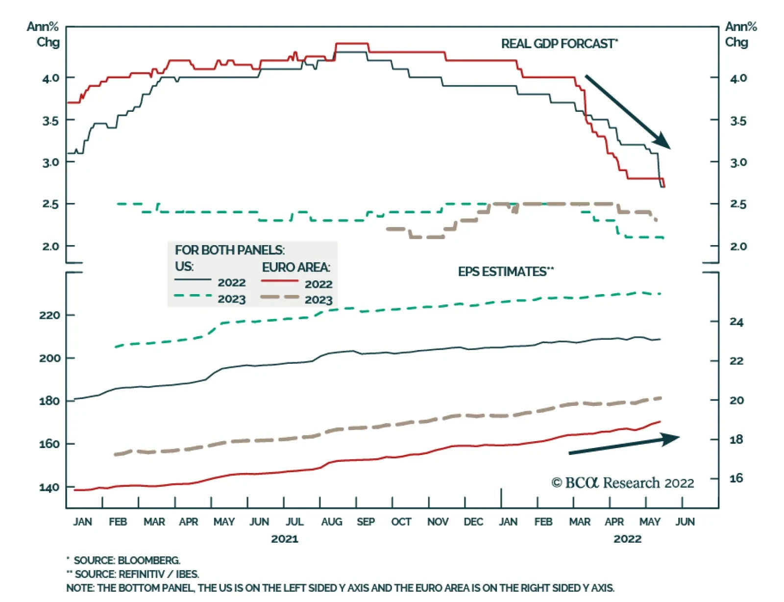
Global growth headwinds have increased since the start of the year. Commodity prices have soared on the back of the war in Ukraine. The Eurozone’s near-term economic outlook has dimmed and is at risk of a more severe deterioration if Russia deprives it of its…