Equities

Highlights Several factors point to both an improvement and a deterioration in economic and financial market conditions, underscoring that the 6- to 12-month investment outlook is unavoidably uncertain. On the one hand, the US will likely avoid a recession over the coming year, slowing headline inflation will boost real wages and lower the equity risk premium, bond yields will not move much higher this year, and US services spending will support consumption as the pandemic continues to recede in importance. These are positive factors that will work to support economic activity and risky asset prices. On the other hand, the US will likely experience a recession scare focused on the housing market, the European economy may contract, Omicron’s spread in China threatens a further rise in shipping costs and a trade shock for Europe, and US inflation expectations may unanchor despite a falling inflation rate. For now, investors should remain minimally-overweight stocks over a 6- to 12-month time horizon, although that assessment may change in either a bullish or bearish direction over the coming several months. Within a global equity allocation, we recommend that investors maintain a neutral regional stance. The larger risk of a recession in Europe than in the US would normally imply that investors should be overweight US stocks, but euro area stocks have already underperformed global stocks significantly since Russia’s invasion of Ukraine. Within a fixed-income portfolio, we recommend that investors maintain a modestly short duration stance despite our forecast that long-maturity bond yields will not increase much this year. More nimble investors should be neutral duration, and should test a long stance if US data releases begin to exhibit meaningfully negative surprises. The US dollar is likely to strengthen over the near term, but we expect it to be lower a year from today. The Scourge Of Harry Truman US President Truman famously lamented the need for “one-handed” economists. His complaint reflected how essential it is for economic policymakers to receive clear advice about the best path forward. Investors understandably have even less tolerance for ambiguity than Truman did about the macro landscape and the attendant investment implications. However, there are times when the economic and financial market outlook is unavoidably uncertain. The current economic and geopolitical environment easily qualifies as one of those instances. Several factors point to both an improvement and a deterioration in economic and financial market conditions, which we review in detail below. The likely avoidance of a recession in the US over the coming year suggests that investors should remain minimally-overweight stocks over a 6- to 12-month time horizon, although that assessment may change in either a bullish or bearish direction over the coming several months. What Could Go Right The US Will Likely Avoid A Recession Over The Coming Year Chart I-1The Odds Of A US Recession Are Currently Low
The Odds Of A US Recession Are Currently Low
The Odds Of A US Recession Are Currently Low
We downgraded our odds of an above-trend 2022 growth scenario in last month’s report,1 but noted that a stagflation-lite environment of below-trend growth and above-target inflation was a more likely outcome than recession. We based this assessment on our view that the US neutral rate of interest is likely higher than the Fed and investors expect, which we discussed at length in past reports.2 Chart I-1 highlights that our recession probability indicator also supports this view, as it does not yet signal that a recession is on the horizon.3 Table I-1 highlights the components of the model (which is significantly influenced by the Conference Board’s LEI), and shows that the model is not providing a meaningful warning signal. The Fed funds rate component of the model will likely flash red next month following the FOMC meeting, and we have listed it as providing a warning signal in Table I-1. But rising rates themselves have not proven to be a particularly timely indicator of a recession; this is similarly true with rising inflation expectations and oil prices. We noted in last month’s report that a surge in oil prices has not been an especially consistent indicator of a recession since 2000. Table I-1The Components Of Our Recession Model Are Not Yet Flashing A Warning Sign
May 2022
May 2022
The yield curve component of the model is based on the spread between the 10-year Treasury yield and the 3-month T-bill yield in order to minimize false recession signals, and we agree that the 10-year / 2-year spread has better leading properties. But even the latter curve measure has recently moved back into positive territory (Chart I-2), which will certainly qualify as a false yield curve signal if a recession is avoided over the coming 18 months. Within the components of the Conference Board’s LEI, Table I-1 highlights that there have been signs of weakness from the manufacturing sector, consumer expectations, and the credit market. Chart I-3 aggregates the deviation of six of these components from their trend, and shows that they have indeed been consistent with a significant slowdown in economic activity. Chart I-2The 2/10 Yield Curve Is No Longer Inverted
The 2/10 Yield Curve Is No Longer Inverted
The 2/10 Yield Curve Is No Longer Inverted
Chart I-3The Weakest Components Of The Conference Board's LEI Are Not Yet Signaling A Recession
The Weakest Components Of The Conference Board's LEI Are Not Yet Signaling A Recession
The Weakest Components Of The Conference Board's LEI Are Not Yet Signaling A Recession
However, two caveats are warranted. First, part of this weakness reflects the ongoing shift from goods to services spending, unraveling the massive surge in goods spending that occurred during the pandemic (Chart I-4). Second, Chart I-3 highlights that similar weaknesses occurred in the past outside of the context of a recession, most notably in 1995/1996, in the aftermath of the 1994 bond market crisis; in 1998/1999, following the Long-Term Capital Management (LTCM) crisis; in 2015, following the collapse in oil prices; and, finally, in 2018/2019, in response to the Trump administration’s trade war. None of these instances resulted in a contraction in output. Headline Inflation Is Likely To Come Down Headline consumer price inflation is currently extremely high in the US. Rising prices do not just reflect energy, food, or pandemic-related effects. Chart I-5 highlights that trimmed mean CPI and PCE inflation rates have accelerated significantly since last summer, and are currently running at 6% and 3.6% year-over-year rates, respectively. Chart I-4Part Of The Weakness In Manufacturing Activity Indicators Reflects A Shift In Spending From Goods To Services
Part Of The Weakness In Manufacturing Activity Indicators Reflects A Shift In Spending From Goods To Services
Part Of The Weakness In Manufacturing Activity Indicators Reflects A Shift In Spending From Goods To Services
Chart I-5There Is More To High Inflation Than Food, Energy, And Pandemic-Related Effects...
There Is More To High Inflation Than Food, Energy, And Pandemic-Related Effects...
There Is More To High Inflation Than Food, Energy, And Pandemic-Related Effects...
However, it seems likely that inflation has peaked in the US (or is about to do so), even abstracting from base effects.Chart I-6 highlights that the one-month rate of change in trimmed mean measures seemingly peaked in October and January, and shows that the level of used car prices also appears to be trending lower (panel 2). The ongoing shift away from goods to services spending noted above will also push core ex-COVID-related consumer prices lower. Finally, BCA’s Commodity & Energy strategy service is forecasting that Brent crude oil prices will average roughly $90/bbl for the remainder of the year, which would likely bring US gasoline prices back toward $3.50/gallon and will lower both headline inflation and energy passthrough effects to core prices (Chart I-7). Chart I-6... But The Rate Of Headline Inflation Has Likely Peaked
... But The Rate Of Headline Inflation Has Likely Peaked
... But The Rate Of Headline Inflation Has Likely Peaked
Chart I-7Our Forecast For Oil Implies US Gasoline Prices Will Fall
Our Forecast For Oil Implies US Gasoline Prices Will Fall
Our Forecast For Oil Implies US Gasoline Prices Will Fall
A meaningful deceleration in inflation will help reverse some of the recent decline in real wage growth that has occurred, and will likely lower the equity risk premium (see Section 2 of this month’s report). Long-Maturity Bond Yields Will Not Move Much Higher This Year Chart I-8Our Inflation Probability Model Is Signaling Core Inflation That Is Roughly In Line With The Fed's Latest Forecast
Our Inflation Probability Model Is Signaling Core Inflation That Is Roughly In Line With The Fed's Latest Forecast
Our Inflation Probability Model Is Signaling Core Inflation That Is Roughly In Line With The Fed's Latest Forecast
Chart I-8 highlights that our inflation probability model is currently signaling core PCE inflation of roughly 4.3% over the coming year. This is only moderately above the Fed’s forecast for this year, suggesting that a moderation in the rate of inflation makes it more likely that the Fed will raise rates in line with, or only moderately above, what was projected in the March Summary of Economic Projections (1.9% by the end of this year, and 2.8% by the end of 2023). By contrast, Chart I-9 highlights that the OIS curve is pricing the Fed funds rate at 80 basis points higher by the end of this year than what the Fed projected in March, suggesting that the bar for further hawkish surprises is quite high. We agree that the Fed will likely front-load a good portion of its planned tightening this year, and we agree that a 50 basis point hike is likely next month and also possibly in June. However, it is quite possible that the Fed will ultimately raise rates over the coming year at a slower pace than investors currently anticipate, which would lower yields at the front end of the curve. Chart I-9The Bar For Further Hawkish Surprises From The Fed Is Quite High
May 2022
May 2022
If short-maturity yields are flat or trend modestly lower over the coming year, then a significant further rise in long-maturity yields would likely necessitate a major shift in neutral rate expectations on the part of investors or the Fed. We believe that such a shift will eventually occur, as the economic justification for long-maturity bond yields well below trend rates of economic growth disappeared in the latter half of the last economic expansion. However, we noted in last month’s Special Report that a low neutral rate outlook has become entrenched in the minds of investors and the Fed, and is only likely to change once the Fed funds rate rises meaningfully and a recession does not materialize.4 BCA’s fixed-income team currently recommends that investors maintain a neutral duration stance; the Bank Credit Analyst service is more inclined to recommend a modestly short stance. However, the key point for investors is that another significant rise in long-maturity bond yields is unlikely over the coming year, which is positive for economic activity and investor sentiment. The Pandemic Will Recede In Importance, Supporting Services Spending Chart I-10COVID Hospitalizations And Deaths Remain Low In The DM World
COVID Hospitalizations And Deaths Remain Low In The DM World
COVID Hospitalizations And Deaths Remain Low In The DM World
While the pandemic is clearly not over in China (discussed below), it is likely to continue to recede in importance in the US and other highly vaccinated, and relatively highly exposed DM economies. Despite the fact that confirmed cases of COVID-19 have risen in the DM world in March and April, Chart I-10 highlights that there has been very little increase in ICU patients or deaths. A recent study from the US CDC suggests that 58% of the US population overall and more than 75% of younger children have been infected with the SARS-COV-2 virus since the start of the pandemic.5 When combined with a vaccination rate close to 70%, that signals an extraordinarily high national immunity to severe illness from the disease. Chart I-11 also highlights that deliveries of Pfizer’s Paxlovid continue to climb in the US, a drug that seemingly works against all known variants and has been found to reduce hospitalizations from COVID significantly if taken within the first five days of symptoms. Given that the decline in services spending that we showed in Chart I-4 has been clearly linked to the pandemic, we expect that a slowing pandemic will continue to support services spending. Goods spending is normally a more forceful driver of economic activity than is the case for services spending, but the magnitude of the recent contribution to growth from services spending has been absolutely unprecedented in the post-World War II economic environment (Chart I-12). This underscores that a continued recovery in services spending relative to its pre-pandemic trend will provide a ballast to overall consumer spending as goods spending continues to normalize. Chart I-11Paxlovid To The Rescue!
Paxlovid To The Rescue!
Paxlovid To The Rescue!
Chart I-12Real Services Spending Will Continue To Be A Forceful Driver Of US Economic Activity
Real Services Spending Will Continue To Be A Forceful Driver Of US Economic Activity
Real Services Spending Will Continue To Be A Forceful Driver Of US Economic Activity
What Could Go Wrong The US Will Likely Experience A Recession Scare Chart I-13US Housing Affordability Has Cratered, In Large Part Due To Surging House Prices
US Housing Affordability Has Cratered, In Large Part Due To Surging House Prices
US Housing Affordability Has Cratered, In Large Part Due To Surging House Prices
Despite our view that the US economy will avoid a recession over the coming year, it seems likely that investors will experience a recession scare at some point over the coming 6 to 12 months. Even though it has recently moved back into positive territory, the inversion of the 2-10 yield curve has set the scene for a recessionary overtone to any visible weakness in the US macro data over the coming months. We noted above that the manufacturing and goods-producing sectors of the US economy are likely to slow as spending returns to services. More importantly, the extremely sharp increase in mortgage rates will likely cause at least a temporary slowdown in US housing activity, even if that slowdown does not ultimately prove to be contractionary.Chart I-13 highlights that the recent increase in mortgage rates will cause US housing affordability to deteriorate back to 2007 levels. While rising mortgage rates will be the proximate cause of this deterioration in affordability, panel 2 highlights that the real culprit has been a significant increase in house prices relative to income. There is strong evidence pointing to the fact that US real residential investment has been too weak since the global financial crisis (GFC).6 We agree that high prices will likely spur additional housing construction (which will support growth). But over the nearer-term, the sharp deterioration in affordability may imply that house price appreciation will have to fall below the rate of income growth, which would represent a very sharp correction in house price gains that would almost assuredly appear recessionary for a time. The European Economy May Contract We have discussed the risk of a European recession in past reports, and noted that it would be almost certain to occur in a scenario in which Russia’s energy exports to Europe were to be completely cut off. We continue to see this as an unlikely scenario, although the odds have increased significantly of late in light of Russia’s halt of gas supplies to Bulgaria and Poland and Germany’s apparent acceptance of an oil embargo against Russia. However, Chart I-14 highlights that a recession, at least a technical one, may occur in Germany even if its imports of Russian natural gas are not interrupted. The chart shows that the German IFO business climate indicator for manufacturing has deteriorated more than the Markit PMI has, and panel 2 highlights that IFO-reported service sector sentiment is considerably worse than what was suggested by the Markit services PMI. Chart I-15 highlights that European stocks are not fully priced for a European recession, either in relative or absolute terms. This underscores the risk to global equities if real euro area growth falls meaningfully below current consensus expectations of 1.9% this year. Chart I-14German Business Sentiment Suggests A Possible Recession
German Business Sentiment Suggests A Possible Recession
German Business Sentiment Suggests A Possible Recession
Chart I-15Euro Area Stocks Are Not Fully Priced For A European Recession
Euro Area Stocks Are Not Fully Priced For A European Recession
Euro Area Stocks Are Not Fully Priced For A European Recession
Omicron Will Continue To Spread In China Table I-2The Ports Of Shanghai and Ningbo Are Quite Important To Chinese Trade Flows
May 2022
May 2022
Confirmed cases of COVID-19 have surged in China over the past two months, and it is now clear that the country’s zero-tolerance policy will fail to contain the spread of the disease. We initially downgraded the odds of our above-trend growth scenario in our January report specifically in response to the risk that the Omicron variant of the virus posed to China.7 That risk that is now manifesting itself most acutely in Shanghai, but also increasingly in other coastal and northeastern provinces. Chart I-16COVID Restrictions In China Are Causing Significant Delays In Suppliers' Delivery Times
COVID Restrictions In China Are Causing Significant Delays In Suppliers' Delivery Times
COVID Restrictions In China Are Causing Significant Delays In Suppliers' Delivery Times
China’s COVID surge has two implications for the global economic and financial market outlook. The first is that the surge has led to increased port congestion and shipping delays, which clearly threaten to cause a further rise in global shipping costs. We have noted in past reports that shipping costs from China to the West Coast of the US surged following the one month shutdown of the port of Yantian last year. Table I-2 highlights that the ports of Shanghai and nearby Ningbo handle nearly 30% of China’s total ocean shipping volume. Chart I-16 highlights that road traffic restrictions in the Yangtze River Delta have caused significant delays in suppliers’ delivery times, further raising the risk of bottlenecks that may take months to clear. Chart I-17China's Battle With Omicron Further Raises The Risk Of A Euro Area Recession
China's Battle With Omicron Further Raises The Risk Of A Euro Area Recession
China's Battle With Omicron Further Raises The Risk Of A Euro Area Recession
The second implication of China’s COVID surge is that China’s contribution to global growth is at risk of declining significantly further, at least for a time. If Chinese economic activity slows sharply in response to the lockdowns and a further spread of the disease, we fully expect Chinese policymakers to provide further stimulus to support household income in line with what occurred in DM countries two years ago. In addition, some investors have argued that reduced commodity demand from China is actually desirable in the current environment, as it would further reduce inflationary pressure in the US and other developed economies. However, Chart I-17 highlights that Chinese import growth has already slowed very significantly, which has clearly impacted euro area exports. European exports to China are not predominantly commodity-based, and it is yet unclear whether the form of stimulus that Chinese policymakers will introduce will be particularly import-intensive. As such, China’s failure to contain Omicron further adds to the risk of the European recession we noted above, and threatens our view that US headline inflation will trend lower this year. Inflation Expectations May Unanchor Despite Slowing Inflation We discussed above that US inflation will decelerate this year and that this may allow the Fed to raise interest rates at a slower pace than currently expected by market participants. One risk to this view is the possibility that inflation expectations may unanchor to the upside, despite an easing in inflation. Even though inflation expectations have not trended in a different direction than actual inflation since the GFC, Chart I-18 highlights that this has occurred in the past (from 2001-2006). In our view, the level of inflation that is likely to prevail over the coming two years will be an extremely important determinant of whether inflation expectations break above their post-2000 range. For now, Chart I-18 highlights that the Fed’s expectation for core inflation this year is reasonable, but it remains an open question whether core inflation will decelerate below 3% next year as the Fed is forecasting. This is notable, because US core PCE inflation peaked at a rate of 2.6% during the 2002-2007 economic expansion, which is the period when stable long-dated inflation expectations were prevalent. Chart I-19 highlights that market-based inflation expectations are currently challenging or have risen above their 2004-2014 average. We noted in last month’s report that long-dated household inflation expectations will be historically low, even if inflation decelerates in line with what near-dated CPI swaps are forecasting. Chart I-18Inflation Expectations May Still Unanchor Even If The Inflation Rate Comes Down
Inflation Expectations May Still Unanchor Even If The Inflation Rate Comes Down
Inflation Expectations May Still Unanchor Even If The Inflation Rate Comes Down
Chart I-19Market-Based Inflation Expectations May Soon Rise Above Pre-GFC Range
Market-Based Inflation Expectations May Soon Rise Above Pre-GFC Range
Market-Based Inflation Expectations May Soon Rise Above Pre-GFC Range
The bottom line for investors is that a slowing of inflation over the coming several months may not be enough to prevent long-term inflation expectations from rising. That raises the risk of an even more aggressive pace of interest rates than currently expected by investors, because the Fed is determined to avoid repeating the mistakes of the 1970s when rising inflation expectations led to a wage-price spiral that required years of comparatively tight monetary policy to correct. By contrast, the Fed will view a temporary income-statement recession stemming from a sharp rise in interest rates as the lesser of two evils. A recession to prevent a long-lasting wage-price spiral would also probably be better for investors over the longer run, but a recession would clearly imply a significant decline in risky asset prices at some point over the coming two years were it to occur. Investment Conclusions Chart I-20Despite The Risks Facing Europe, Euro Area Stocks Are Not A Clear Underweight Candidate
Despite The Risks Facing Europe, Euro Area Stocks Are Not A Clear Underweight Candidate
Despite The Risks Facing Europe, Euro Area Stocks Are Not A Clear Underweight Candidate
From the perspective of allocating to risky assets, the most important question for investors to answer is whether the US is likely to experience a recession over the coming year. As we noted above, in our view the answer is “no”, which implies that US earnings growth will remain positive and that investors should not be underweight stocks within a global multi-asset portfolio. It is true that earnings can decline outside of the context of a recession, but we discuss in Section 2 of our report that this has almost always been associated with a significant contraction in profit margins. The factors that have historically been associated with a nonrecessionary decline in profit margins may occur later this year, but our indicators so far point more to flat margins rather than a significant decline. For now, investors should remain minimally-overweight stocks over a 6 to 12 month time horizon, although that assessment may change in either a bullish or bearish direction over the coming several months. Within a global equity allocation, we recommend that investors maintain a neutral regional allocation. The larger risk of a recession in Europe than in the US would normally imply that investors should be overweight US stocks, but euro area stocks have already underperformed global stocks significantly since Russia’s invasion of Ukraine. Chart I-15 highlighted that they will underperform further if euro area growth turns negative. It is not clear, however, if that risk warrants an underweight stance today, especially considering the enormous valuation advantage offered by euro area stocks versus their US counterparts and the fact that the euro has already fallen to a five-year low (Chart I-20). Chart I-21Favor A Neutral Stance Towards Cyclical Stocks Versus Defensives
Favor A Neutral Stance Towards Cyclical Stocks Versus Defensives
Favor A Neutral Stance Towards Cyclical Stocks Versus Defensives
Within the dimensions of the equity market, Chart I-21 highlights that the outperformance of cyclicals versus defensives was already late at the onset of Russia’s invasion of Ukraine, and that the uptrend in relative performance has seemingly ended. Still, a moderately overweight stance toward stocks overall does not especially support an underweight stance toward cyclicals; therefore, we recommend a neutral stance over the coming year. We continue to recommend that investors (modestly) favor value stocks over growth stocks on the basis of better value and as a hedge against potentially higher long-maturity yields, although we acknowledge that most of the outsized outperformance of growth stocks during the pandemic has already reversed. Despite their recent underperformance, we continue to favor global small-cap stocks over their large-cap peers, as they are now unequivocally inexpensive and have seemingly already priced in a likely recession scare in the US later this year (Chart I-22). Within a fixed-income portfolio, we recommend that investors maintain a modestly short duration stance despite our forecast that long-maturity bond yields will not increase much this year. We are wary of recommending a neutral duration stance given the possibility that investors or the Fed may upwardly revise their neutral rate expectations earlier than we anticipate; however, investors are also likely to see long-maturity yields come down for a time in response to a housing market slowdown over the coming several months. More nimble investors should be neutral duration, and should test a long stance if US data releases begin to exhibit meaningfully negative surprises. Finally, while we are bearish toward the dollar on a 6- to 12-month time horizon, it is likely to strengthen over the near term. Chart I-23 highlights that our composite technical indicator for the US dollar is now clearly in overbought territory. We expect that a downtrend will begin once the war in Ukraine reaches a durable conclusion and clarity about the economic impact of the spread of Omicron in China – and the likely policy response – emerges. Chart I-22The Selloff In Small Caps Seems Overdone
The Selloff In Small Caps Seems Overdone
The Selloff In Small Caps Seems Overdone
Chart I-23US Dollar And Indicator The Dollar Is Ripe For A Major Pullback Beyond Likely Near-Term Strength
US Dollar And Indicator The Dollar Is Ripe For A Major Pullback Beyond Likely Near-Term Strength
US Dollar And Indicator The Dollar Is Ripe For A Major Pullback Beyond Likely Near-Term Strength
Jonathan LaBerge, CFA Vice President The Bank Credit Analyst April 28, 2022 Next Report: May 26, 2022 II. The US Equity Market: A Fundamental, Technical, And Value-Based Review All four of our US Equity indicators are currently pointing in a bearish direction. Our Monetary Indicator has fallen to a three decade low, our Technical Indicator has broken into negative territory, our Valuation Indicator still signals extreme equity pricing, and our Speculation Indicator does not yet support a contrarian buy signal. Still, we do not expect a US recession over the coming year, which implies that S&P 500 revenue growth will stay positive. Nonrecessionary earnings contractions are rare, and are almost always associated with a significant contraction in profit margins. Our new profit margin warning indicator currently suggests the odds of falling margins are low, although the risks may rise later this year. Stocks are extremely expensive, but rich valuations are being driven by extremely low real bond yields, rather than investor exuberance. Valuation is unlikely to impact US stock market performance significantly over the coming year unless long-maturity bond yields rise substantially further. Technical analysis of stock prices has a long and successful history at boosting investment performance, which ostensibly suggests that investors should be paying more attention to technical conditions in the current environment. However, technical trading rules have been less helpful in expansionary environments when inflation is above average and when stock prices and bond yields are less likely to be positively correlated (as is currently the case). As such, the recent technical breakdown of the US equity market may simply reflect a reduced signal-to-noise ratio associated with these economic and financial market regimes. For now, we see our indicators as supportive of a cautious, minimally-overweight stance toward stocks within a multi-asset portfolio over the coming 6 to 12 months. Rising odds of a recession, declining profit margins, and a large increase in investor or Fed expectations for the neutral rate of interest are the most significant threats to the equity market, the risks of which should be monitored closely by investors. In Section 1 of our report, we reviewed why a recession in the US is unlikely over the coming 6 to 12 months. However, we also highlighted that the risks to the economic outlook are meaningful and that an aggressively overweight stance toward risky assets is currently unwarranted. During times of significant uncertainty, investors should pay relatively more attention to long-term economic and financial market indicators with a reliable track record. In this report we begin by briefly reviewing the message from our US Equity Indicators, and then turn to a deeper examination of the top-down outlook for earnings, the determinants of rich valuation in the US stock market, and whether investors should rely on technical indicators in the current environment. We conclude that, while an indicator-based approach is providing mixed signals about the US equity market, we generally see our indicators as supportive of a cautious, minimally-overweight stance toward stocks within a multi-asset portfolio. Aside from tracking the risk of a recession, investors should be closely attuned to signs of a contraction in profit margins or shifting neutral rate expectations as a basis to reduce equity exposure to below-benchmark levels. A Brief Review Of Our US Equity Indicators Chart II-1Our Equity Indicators Are Pointing In A Bearish Direction
Our Equity Indicators Are Pointing In A Bearish Direction
Our Equity Indicators Are Pointing In A Bearish Direction
Chart II-1 presents our US Equity Indicators, which we update each month in Section 3 of our report. We highlight our observations below: Chart II-1 shows that our Monetary Indicator has fallen to its lowest level since 1995, when the Fed surprised investors and shifted rapidly in a hawkish direction. The indicator is most acutely impacted by the speed of the rise in 10-year Treasury yields and a massive surge in the BCA Short Rate Indicator to levels that have not prevailed since the late 1970s (Chart II-2). Our Technical Indicator has recently broken into negative territory, which we have traditionally interpreted as a sign to sell stocks. The indicator has been dragged lower by a deterioration in stock market breadth across several tracked measures and by weak sentiment (Chart II-3). The momentum component of the indicator is fractionally positive but is exhibiting clear weakness. Our Valuation Indicator continues to highlight that US equities are extremely overvalued relative to their history, despite the recent sell-off in stock prices. Our Speculation Indicator arguably provides the least negative signal of our four indicators, at least from a contrarian perspective. In Q1 2021, the indicator nearly reached the all-time high set in March 2000, but it has since retreated significantly and has exited extremely speculative territory. While this may eventually provide a positive signal for stocks, equity returns have historically been below average during months when the indicator declines. Thus, the downtrend in the Speculation Indicator still points to weakness in stock prices, at least over the nearer term. Chart II-2Our Monetary Indicator Is Falling In Part Because Of Surging Interest Rate Expectations
Our Monetary Indicator Is Falling In Part Because Of Surging Interest Rate Expectations
Our Monetary Indicator Is Falling In Part Because Of Surging Interest Rate Expectations
Chart II-3All Three Components Of Our Technical Indicator Are Falling
All Three Components Of Our Technical Indicator Are Falling
All Three Components Of Our Technical Indicator Are Falling
In summary, all four of our US Equity indicators are currently pointing in a bearish direction, which clearly argues against an aggressively overweight stance favoring equities within a multi-asset portfolio. At the same time, we reviewed the odds of a US recession over the coming year in Section 1 of our report and argued that a recession is not likely over the coming 12 months. Thus, one key question for investors is whether a nonrecessionary contraction in earnings is likely over the coming year. We address this question in the next section of our report, before turning to a deeper examination of the relative importance of equity valuation and technical indicators. Gauging The Risk Of A Nonrecessionary Earnings Contraction Chart II-4Nonrecessionary Earnings Declines Usually Occur Due To Falling Margins
Nonrecessionary Earnings Declines Usually Occur Due To Falling Margins
Nonrecessionary Earnings Declines Usually Occur Due To Falling Margins
Based on S&P data, there have been five cases since 1960 when 12-month trailing earnings per share fell year-over-year, while the economy continued to expand (Chart II-4). Sales per share growth remained positive in four of these cases (panel 2), underscoring that falling profit margins have been mostly responsible for these nonrecessionary earnings declines. We have noted our concern about how elevated US profit margins have become and have argued that a significant further expansion is not likely to occur over the coming 12-24 months.8 To gauge the risk of a sizeable decline in margins over the coming year, we construct a new indicator based on the seven instances when S&P 500 margins fell outside the context of a recession. This includes two cases when margins fell but earnings did not (because of buoyant revenue growth). We based the indicator on these five factors: Changes in unit labor cost growth to measure the impact of wage costs on firm profitability; Lagging changes in commodity prices as a proxy for material costs; The level of real short-term interest rates as a proxy for borrowing costs; Changes in a sales growth proxy to measure the impact of operating leverage on margins; And changes in the ISM manufacturing index to capture any residual impact on margins from the business cycle. Chart II-5The Odds Of A Nonrecessionary Profit Margin Contraction Are Currently Low
The Odds Of A Nonrecessionary Profit Margin Contraction Are Currently Low
The Odds Of A Nonrecessionary Profit Margin Contraction Are Currently Low
Chart II-5 presents the indicator, which is shaded both for recessionary periods and the seven nonrecessionary margin contraction episodes we identified. While the indicator does not perfectly predict margin contractions outside of recessions, it did signal 50% or greater odds of a margin contraction in four of the seven episodes we examined, and signals high odds of a contraction in margins during recessions. Among the three cases in which the indicator failed to indicate falling margins during an expansion, two of those failures were episodes when earnings growth did not ultimately contract. The inability to explain the 1997-1998 margin contraction is the most relevant failure of the indicator, in addition to two false signals in 1963 and 1988. Still, the approach provides a useful framework to gauge the risk of falling profit margins, and the results provide an interesting and somewhat surprising message about the relative importance of the factors we included. We would have expected that accelerating wages would have been the most significant factor explaining nonrecessionary profit margin declines. Wages were highly significant, but they were the second most important factor behind our sales growth proxy. Lagged commodity prices were the third most significant factor, followed by real short-term interest rates. Changes in the ISM manufacturing index were least significant, underscoring that our sales growth proxy already captures most of the effect of the business cycle on profit margins. This suggests that operating leverage is an important determinant of margins during economic expansions, and that investors should be most concerned about declining profit margins when both revenue growth is slowing significantly and wage growth is accelerating. The indicator currently points to low odds of a nonrecessionary margin contraction, but this is likely to change over the coming year. We expect that all five of the factors will evolve in a fashion that is negative for margins over the coming twelve months: While the pace of its increase is slowing, median wage growth continues to accelerate, even when adjusting for the fact that 1st quartile wage growth is growing at an above-average rate (Chart II-6). Combining the latter with higher odds of at or below-trend growth this year implies that unit labor costs may rise further over the coming twelve months. Analysts expect S&P 500 revenue growth to slow nontrivially over the coming year (Chart II-7). Current expectations point to growth slowing to a level that would still be quite strong relative to what has prevailed over the past decade; however, accelerating wage costs in lockstep with decelerating revenue growth is exactly the type of combination that has historically been associated with falling margins during economic expansions. Chart II-6Wage Growth Is Accelerating...
Wage Growth Is Accelerating...
Wage Growth Is Accelerating...
Chart II-7...And Revenue Growth Is Set To Slow
...And Revenue Growth Is Set To Slow
...And Revenue Growth Is Set To Slow
Although these are less impactful factors, the lagged effect of the recent surge in commodity prices will also weigh on margins over the coming year, as will rising real interest rates and a likely slowdown in manufacturing activity in response to slower goods spending. In addition to our new indicator, we have two other tools at our disposal to track the odds of a decline in profit margins over the coming year. First, Chart II-8 illustrates that an industry operating margin diffusion index does a decent job at leading turning points in S&P 500 profit margins, despite its volatility. And second, Chart II-9 highlights that changes in the sales and profit margin diffusion indexes sourced from the Atlanta Fed’s Business Inflation Expectations Survey have predicted turning points in operating sales per share and margins over the past decade. Chart II-9 does suggest that profit margins may not rise further, but flat margins are not likely to be a threat to earnings growth over the coming year if a recession is avoided (as we expect). Chart II-8Sector Diffusion Indexes Are Not Signaling A Major Warning Sign For Margins...
Sector Diffusion Indexes Are Not Signaling A Major Warning Sign For Margins...
Sector Diffusion Indexes Are Not Signaling A Major Warning Sign For Margins...
Chart II-9...Neither Are The Atlanta Fed Business Sales And Margin Diffusion Indexes
...Neither Are The Atlanta Fed Business Sales And Margin Diffusion Indexes
...Neither Are The Atlanta Fed Business Sales And Margin Diffusion Indexes
The conclusion for investors is that the odds of a decline in profit margins over the coming year are elevated and should be monitored, but are seemingly not yet imminent. In combination with expectations for slowing revenue growth, this implies, for now, that earnings growth over the coming year will be low but positive. Valuation, Interest Rates, And The Equity Risk Premium As noted above, our Valuation Indicator continues to highlight that US Equities are extremely overvalued relative to their history. Our Valuation Indicator is a composite of different valuation measures, and we sometimes receive questions from investors asking about the seemingly different messages provided by these different metrics. For example, Chart II-10 highlights that equity valuation has almost, but not fully, returned to late-1990 conditions based on the Price/Earnings (P/E) ratio, but is seemingly more expensive based on the Price/Book (P/B) and especially Price/Sales (P/S) ratios. In our view, this apparent discrepancy is easily resolved. Relative to the P/E ratio, both the P/B and especially P/S ratios are impacted by changes in aggregate profit margins, which have risen structurally over the past two decades because of the rising share of broadly-defined technology companies in the US equity index (Chart II-11). Barring a major shift in the profitability of US tech companies over the coming year, we do not see discrepancies between the P/E, P/B, or P/S ratios as being particularly informative for investors. As an additional point, we also do not see the Shiller P/E or other cyclically-adjusted P/E measures as providing any extra information about the richness or cheapness of US equities today, as these measures tend to move in line with the 12-month forward P/E ratio (Chart II-12). Chart II-10US Equities Are Extremely Overvalued, Based On Several Valuation Metrics
US Equities Are Extremely Overvalued, Based On Several Valuation Metrics
US Equities Are Extremely Overvalued, Based On Several Valuation Metrics
Chart II-11Tech Margins Have Caused Stocks To Look Especially Expensive On A Price/Sales Basis
Tech Margins Have Caused Stocks To Look Especially Expensive On A Price/Sales Basis
Tech Margins Have Caused Stocks To Look Especially Expensive On A Price/Sales Basis
In our view, rather than focusing on different measures of valuation, it is important for investors to understand the root cause of extreme US equity prices, as well as what factors are likely to drive equity multiples over the coming year. As we have noted in previous reports, the reason that US stocks are extremely overvalued today is very different from the reason for similar overvaluation in the late 1990s. Charts II-13 and II-14 present two different versions of the equity risk premium (ERP), one based on trailing as reported earnings (dating back to 1872), and one based on twelve-month forward earnings (dating back to 1979). Chart II-12The Shiller P/E Ratio Does Not Convey Any 'New' Information About Valuation
The Shiller P/E Ratio Does Not Convey Any 'New' Information About Valuation
The Shiller P/E Ratio Does Not Convey Any 'New' Information About Valuation
Chart II-13The Equity Risk Premium Is In Line With Its Historical Average…
The Equity Risk Premium Is In Line With Its Historical Average
The Equity Risk Premium Is In Line With Its Historical Average
The ERP accounts for the portion of equity market valuation that is unexplained by real interest rates, and the charts highlight that the US ERP is essentially in line with its historical average based on both measures, in sharp contrast to the stock market bubble of the late 1990s. This underscores that historically low interest rates well below the prevailing rate of economic growth are the root cause of extreme equity overvaluation in the US (Chart II-15), meaning that very rich pricing can be thought of as “rational exuberance.” Chart II-14…In Sharp Contrast To The Late 1990s
...In Sharp Contrast To The Late 1990s
...In Sharp Contrast To The Late 1990s
Chart II-15US Equities Are Extremely Expensive Because Bond Yields Are Extremely Low
US Equities Are Extremely Expensive Because Bond Yields Are Extremely Low
US Equities Are Extremely Expensive Because Bond Yields Are Extremely Low
Chart II-16The Equity Risk Premium Is Fairly Well Explained By The Misery Index
The Equity Risk Premium Is Fairly Well Explained By The Misery Index
The Equity Risk Premium Is Fairly Well Explained By The Misery Index
Over the longer term, the risks to US equity valuation are clearly to the downside, as we detailed in our October 2021 report.9 But over the coming 6 to 12 months, US equity multiples are likely to be flat or modestly up in the US. As we noted in Section 1 of our report, a significant further rise in long-maturity bond yields will likely necessitate a major shift in neutral rate expectations on the part of investors and the Fed, which we think is more likely a story for next year than this year. And Chart II-16 highlights that the ERP has historically been well explained by the sum of unemployment and inflation (the Misery Index), which should come down over the coming several months as inflation moderates and the unemployment rate remains low. To conclude, it is absolutely the case that US equities are extremely expensive, but this fact is unlikely to impact US stock market performance significantly unless long-maturity bond yields rise substantially further. Technical Analysis Amid A Shifting Economic Regime Technical analysis of financial markets, and especially stocks, has a long history. It has also provided disciplined investors with significant excess returns over time. A simple stock / bond switching rule based on whether stock prices were above their nine-month moving average at the end of the previous month has significantly outperformed since the 1960s, earning an average excess annual return of 1.3% relative to a 60/40 stock/bond benchmark portfolio (Chart II-17). This outsized performance has come at the cost of only a minor increase in portfolio volatility. Ostensibly, then, investors should be paying more attention to equity technical conditions in the current environment, which we noted above are not positive. Our Technical Indicator has recently broken into negative territory, and the S&P 500 has clearly fallen back below its 200-day moving average. However, Chart II-17 presented generalized results over long periods of time. Over the past two decades, investors have been able to rely on a durably negative correlation between stock prices and bond yields to help boost portfolio returns from technically-driven switching rule strategies. Chart II-18 highlights that this correlation has been much lower over the past two years than has been the case since the early 2000s, raising the question of whether similar switching strategies are viable today. In addition, there is the added question of whether technical analysis is helpful to investors during certain types of economic and financial market regimes, such as high inflation environments. Chart II-17Technically-Driven Trading Rules Have Historically Provided Investors With A Lot Of Alpha
Technically-Driven Trading Rules Have Historically Provided Investors With A Lot Of Alpha
Technically-Driven Trading Rules Have Historically Provided Investors With A Lot Of Alpha
Chart II-18Switching-Rule Strategies May Not Work As Well When Stock Prices And Bond Yields Are Not Positively Correlated
Switching-Rule Strategies May Not Work As Well When Stock Prices And Bond Yields Are Not Positively Correlated
Switching-Rule Strategies May Not Work As Well When Stock Prices And Bond Yields Are Not Positively Correlated
To test whether the message from technical indicators may be relied upon today, we examine the historical returns from a technically-driven portfolio switching strategy during nonrecessionary months under four conditions that reflect the economic and political realities currently facing investors: months when both stock and bond returns are negative; months of above-average inflation; months of above-average geopolitical risk; and the 1970s, when the Misery Index was very elevated. In all the cases we consider, the switching rule is simple: whether the S&P 500 index was above its nine-month moving average at the end of the previous month. If so, the rule overweights equities for the subsequent months; if not, the rule overweights a comparatively risk-free asset. We consider portfolios with either 10-year Treasurys or 3-month Treasury bills as the risk-free asset, as well as a counterfactual scenario in which cash always earns a 1% annual rate of return (to mimic the cash returns currently available to investors). Table II-1 presents the success and whipsaw rate of the trading rule. Table II-2 presents the annualized cumulative returns from the strategy. The tables provide three key observations: As reflected in Chart II-17, both Tables II-1 and II-2 highlight that simple technical trading rules have historically performed well, and that outperformance has occurred in both recessionary and nonrecessionary periods. Relative to nonrecessionary periods overall, technical trading rules have underperformed during the particular nonrecessionary regimes that we examined. It is the case not only that these strategies have performed in inferior ways during these regimes, but also that they were less consistent signals in that they generated significantly more “whipsaws” for investors. Among the four nonrecessionary regimes that we tested, technical indicators underperformed the least during periods of above-average geopolitical risk, and performed abysmally during nonrecessionary (but generally stagflationary) months in the 1970s. Table II-1During Expansions, Technically-Driven Switching Rules Underperform…
May 2022
May 2022
Table II-2…When Inflation Is High And When Stocks And Bonds Lose Money
May 2022
May 2022
The key takeaway for investors is that technical analysis is likely to be helpful for investors to improve portfolio performance as we approach a recession but may be less helpful in an expansionary environment in which inflation is above average and when stock prices and bond yields are less likely to be positively correlated. Investment Conclusions Echoing the murky economic outlook that we detailed in Section 1 of our report, our analysis highlights that an indicator-based approach is providing mixed signals about the US equity market. On the one hand, all four of our main equity indicators are currently providing a bearish signal, and the risk of a nonrecessionary contraction in S&P 500 profit margins over the coming year is elevated – albeit seemingly not imminent. On the other hand, our expectation that the US will not slip into recession over the coming year implies that revenue growth will stay positive, which has historically been associated with expanding earnings. In addition, US equity multiples are likely to be flat or modestly up, and the recent technical breakdown in the S&P 500 may simply reflect a reduced signal-to-noise ratio that appears to exist in expansionary environments in which inflation is high and the stock price / bond yield correlation is near-zero or negative. Netting these signals out, we see our equity indicators as supportive of a cautious, minimally-overweight stance toward stocks within a multi-asset portfolio. The emergence of a recession, declining profit margins, and a significant increase in investor or Fed expectations for the neutral rate of interest are the most significant threats to the equity market. We will continue to monitor these risks and adjust our investment recommendations as needed over the coming several months. Stay tuned! Jonathan LaBerge, CFA Vice President The Bank Credit Analyst Gabriel Di Lullo Research Associate III. Indicators And Reference Charts As discussed in this month’s Section 2, BCA’s equity indicators do not paint an optimistic picture for stock prices. Our monetary indicator is at its weakest point in almost three decades, our valuation indicator continues to highlight that stocks are overvalued, and both our sentiment and technical indicators have broken down. An eventual easing in the latter two measures will ultimately prove positive for equities, but this will likely happen only once they reach extremes. Investors should be at most modestly overweight stocks versus bonds over the coming year. Forward equity earnings are likely pricing in too much of an increase in earnings per share over the coming year. Net earnings revisions and net positive earnings surprises have rolled over considerably, although there is no meaningful sign yet of a decline in the level of forward earnings. Earnings growth is more likely than not to be positive over the coming year, but will be modest. Within a global equity portfolio, we recommend a neutral stance towards cyclicals versus defensives, as well as a neutral regional equity stance. Euro area stocks are not a clear underweight candidate despite the risk of a European recession. Within a fixed-income portfolio, the 10-Year Treasury Yield has very little further upside over the coming year, arguing for a modestly short duration stance. We do not believe that the Fed will end up raising rates to a level higher than investors are forecasting over the coming year. Commodity prices continue to rise in a broad-based fashion following Russia’s invasion of Ukraine, and our composite technical indicator highlights that they remain significantly overbought. We expect oil and food prices to come down over the coming year, but there is a risk to that assessment. Russia aggression has very likely sped up Europe’s decarbonization timeline, suggesting that investors should be tactically, cyclically, and structurally bullish on industrial metals prices. US and global LEIs have rolled over from very elevated levels. Our global LEI diffusion index has declined very significantly, but this likely reflects the outsized impact of a few emerging market countries. Leading and coincident indicators remain decently strong, and we do not expect a recession in the US over the coming year. However, the odds of a stagflationary-lite outcome of above-target inflation and at-or-below-trend growth have increased because of the war. EQUITIES: Chart III-1US Equity Indicators
US Equity Indicators
US Equity Indicators
Chart III-2Willingness To Pay For Risk
Willingness To Pay For Risk
Willingness To Pay For Risk
Chart III-3US Equity Sentiment Indicators
US Equity Sentiment Indicators
US Equity Sentiment Indicators
Chart III-4US Stock Market Breadth
US Stock Market Breadth
US Stock Market Breadth
Chart III-5US Stock Market Valuation
US Stock Market Valuation
US Stock Market Valuation
Chart III-6US Earnings
US Earnings
US Earnings
Chart III-7Global Stock Market And Earnings: Relative Performance
Global Stock Market And Earnings: Relative Performance
Global Stock Market And Earnings: Relative Performance
Chart III-8Global Stock Market And Earnings: Relative Performance
Global Stock Market And Earnings: Relative Performance
Global Stock Market And Earnings: Relative Performance
FIXED INCOME: Chart III-9US Treasurys And Valuations
US Treasurys And Valuations
US Treasurys And Valuations
Chart III-10Yield Curve Slopes
Yield Curve Slopes
Yield Curve Slopes
Chart III-11Selected US Bond Yields
Selected US Bond Yields
Selected US Bond Yields
Chart III-1210-Year Treasury Yield Components
10-Year Treasury Yield Components
10-Year Treasury Yield Components
Chart III-13US Corporate Bonds And Health Monitor
US Corporate Bonds And Health Monitor
US Corporate Bonds And Health Monitor
Chart III-14Global Bonds: Developed Markets
Global Bonds: Developed Markets
Global Bonds: Developed Markets
Chart III-15Global Bonds: Emerging Markets
Global Bonds: Emerging Markets
Global Bonds: Emerging Markets
CURRENCIES: Chart III-16US Dollar And PPP
US Dollar And PPP
US Dollar And PPP
Chart III-17US Dollar And Indicator
US Dollar And Indicator
US Dollar And Indicator
Chart III-18US Dollar Fundamentals
US Dollar Fundamentals
US Dollar Fundamentals
Chart III-19Japanese Yen Technicals
Japanese Yen Technicals
Japanese Yen Technicals
Chart III-20Euro Technicals
Euro Technicals
Euro Technicals
Chart III-21Euro/Yen Technicals
Euro/Yen Technicals
Euro/Yen Technicals
Chart III-22Euro/Pound Technicals
Euro/Pound Technicals
Euro/Pound Technicals
COMMODITIES: Chart III-23Broad Commodity Indicators
Broad Commodity Indicators
Broad Commodity Indicators
Chart III-24Commodity Prices
Commodity Prices
Commodity Prices
Chart III-25Commodity Prices
Commodity Prices
Commodity Prices
Chart III-26Commodity Sentiment
Commodity Sentiment
Commodity Sentiment
Chart III-27Speculative Positioning
Speculative Positioning
Speculative Positioning
ECONOMY: Chart III-28US And Global Macro Backdrop
US And Global Macro Backdrop
US And Global Macro Backdrop
Chart III-29US Macro Snapshot
US Macro Snapshot
US Macro Snapshot
Chart III-30US Growth Outlook
US Growth Outlook
US Growth Outlook
Chart III-31US Cyclical Spending
US Cyclical Spending
US Cyclical Spending
Chart III-32US Labor Market
US Labor Market
US Labor Market
Chart III-33US Consumption
US Consumption
US Consumption
Chart III-34US Housing
US Housing
US Housing
Chart III-35US Debt And Deleveraging
US Debt And Deleveraging
US Debt And Deleveraging
Chart III-36US Financial Conditions
US Financial Conditions
US Financial Conditions
Chart III-37Global Economic Snapshot: Europe
Global Economic Snapshot: Europe
Global Economic Snapshot: Europe
Chart III-38Global Economic Snapshot: China
Global Economic Snapshot: China
Global Economic Snapshot: China
Jonathan LaBerge, CFA Vice President The Bank Credit Analyst Gabriel Di Lullo Research Associate Footnotes 1 Please see The Bank Credit Analyst "April 2022," dated March 31, 2022, available at bca.bcaresearch.com 2 Please see The Bank Credit Analyst "Do Excess Savings Explain Low US Interest Rates?" dated March 31, 2022, and "R-star, And The Structural Risk To Stocks," dated March 31, 2021, available at bca.bcaresearch.com 3 Please see US Investment Strategy/ US Bond Strategy Special Report "Gauging The Risk Of Recession: Slowdown Or Double-Dip?" dated August 16, 2010, available at usbs.bcaresearch.com 4 Please see The Bank Credit Analyst "Do Excess Savings Explain Low US Interest Rates?" dated March 31, 2022, available at bca.bcaresearch.com 5 Clarke, KE, JM Jones, Y Deng, et al. Seroprevalence of Infection-Induced SARS-CoV-2 Antibodies — United States. September 2021–February 2022. 6 Please see The Bank Credit Analyst "Global House Prices: A New Threat For Policymakers," dated May 27, 2021, available at bca.bcaresearch.com 7 Please see The Bank Credit Analyst "January 2022," dated December 23, 2021, available at bca.bcaresearch.com 8 Please see The Bank Credit Analyst “OUTLOOK 2022: Peak Inflation – Or Just Getting Started?” dated December 1, 2021, available at bca.bcaresearch.com 9 Please see The Bank Credit Analyst “The “Invincible” US Equity Market: The Longer-Term Outlook For US Stocks In Relative And Absolute Terms,” dated September 30, 2021, available at bca.bcaresearch.com
Executive Summary Using the real yield on inflation protected bonds as a gauge of the long-term real interest rate is possibly the biggest mistake in finance. The ultra-low real yield on inflation protected bonds captures nothing more than a stampede for inflation protection overwhelming a tiny supply of inflation protected bonds. The long-term real interest rate embedded in the US bond and US stock markets is likely to be significantly higher than the -0.2 percent real yield on US inflation protected bonds. Long-term investors should overweight conventional bonds and stocks versus inflation protected bonds. On a 6-12 month horizon, overweight both US bonds and US stocks. With core inflation on the cusp of rolling over and global growth decelerating, the end is in sight for the sell-offs both in long duration bonds and in the stock market. Fractal trading watchlist: High dividend stocks, and MSCI Hong Kong versus MSCI China. The Low ‘Real Bond Yield’ Just Reflects A Massive Demand For Inflation Protection
The Low 'Real Bond Yield' Just Reflects A Massive Demand For Inflation Protection
The Low 'Real Bond Yield' Just Reflects A Massive Demand For Inflation Protection
Bottom Line: The end is in sight for the sell-offs both in long duration bonds and in the stock market. Feature “It ain’t what you don’t know that gets you into trouble. It’s what you know for sure that just ain’t so” One of my favourite quotes, ostensibly attributed to Mark Twain, warns us that trouble doesn’t come from what you don’t know. Rather, trouble comes from what you think you know for certain but turns out to be wrong. In economics and finance the “what you know for sure that just ain’t so” is the long-term real interest rate. In economics and finance the “what you know for sure that just ain’t so” is the long-term real interest rate. The long-term real interest rate is arguably the most fundamental concept in economics and finance. It encapsulates the risk-free real return on savings, and it is embedded in the returns offered by all assets such as bonds and equities. The trouble is, the way that most people quantify the long-term real interest rate turns out to be wrong. Specifically, most people define the long-term real interest rate as the real yield on (10-year) inflation protected bonds, which now stands at -0.2 percent in the US and -2.3 percent in the UK. US and UK inflation protected bonds will of course deliver the negative long-term real returns that their yields offer. So, most people believe that the long-term real interest rate is still depressed, permitting many rate hikes from the Federal Reserve and Bank of England before monetary policy becomes ‘restrictive’, and providing a massive cushion to asset valuations before they become expensive.This commonly held belief is arguably the biggest mistake in finance. The Long-Term Real Interest Rate Is Not What You Think The biggest mistake in finance stems from the confluence of two factors: first, the inflation protected bond market is the only true hedge against inflation; and second, it is tiny. Compared with the $45 trillion US equity market and the $25 trillion T-bond market, the Treasury Inflation Protected Securities (TIPS) market is worth just $1.5 trillion. Many other economies do not even have an inflation protected bond market! The ultra-low real yield on inflation protected bonds captures nothing more than the massive imbalance between huge demand for inflation hedges and tiny supply. When the price level surges, as it has recently, stock and bond investors have a fiduciary duty to seek an inflation hedge, even if they are shutting the stable door after the horse has bolted (Chart I-1). With at least $70 trillion worth of investors all wanting a piece of the $1.5 trillion TIPS market, the demand for TIPS surges, meaning that their real yield collapses. Therefore, the ultra-low real yield on inflation protected bonds captures nothing more than the massive imbalance between huge demand for inflation hedges and tiny supply. Chart I-1When The Price Level Surges, Investors Flood Into Inflation Protected Bonds
When The Price Level Surges, Investors Flood Into Inflation Protected Bonds
When The Price Level Surges, Investors Flood Into Inflation Protected Bonds
The proof comes from the perfect positive correlation between the oil price and so-called ‘inflation expectations.’ As a surging oil price drives down the 10-year TIPS yield relative to the 10-year T-bond yield, this difference in yields – which is the commonly accepted definition of expected inflation through 2022-32 – also surges (Chart I-2and Chart I-3). This perfect positive correlation also applies to the so-called ‘5-year, 5-year forward’ inflation rate, the expected inflation rate through 2027-32 (Chart I-4). Chart I-2Inflation Expectations Just Track The Oil Price
Inflation Expectations Just Track The Oil Price
Inflation Expectations Just Track The Oil Price
Chart I-3Inflation Expectations Are Just A Mathematical Function Of The Oil Price
Inflation Expectations Are Just A Mathematical Function Of The Oil Price
Inflation Expectations Are Just A Mathematical Function Of The Oil Price
Chart I-4Even The ‘5-Year, 5-Year Forward’ Inflation Expectation Just Tracks The Oil Price
Even The '5-Year, 5-Year Forward' Inflation Expectation Just Tracks The Oil Price
Even The '5-Year, 5-Year Forward' Inflation Expectation Just Tracks The Oil Price
Yet this observed positive correlation between the oil price and inflation expectations is nonsensical, because the reality is the exact opposite! The higher the price level at a given moment, the lower will be the subsequent inflation rate. This is just basic maths. The subsequent inflation rate is the future price divided by the current price, so dividing by a higher price results in a lower number. The empirical evidence over the last 50 years confirms this. The higher the oil price, the lower the subsequent inflation rate (Chart I-5). Chart I-5But A Higher Oil Price Means Lower Subsequent Inflation
But A Higher Oil Price Means Lower Subsequent Inflation
But A Higher Oil Price Means Lower Subsequent Inflation
As the price level surges, subsequent inflation declines, both in theory and in practice. Hence, we should subtract a smaller number from the nominal bond yield to get a higher long-term real interest rate. In other words, all else being equal, the impact of a higher price level is to lift the long-term real interest rate. To repeat, the very low real yield on inflation protected bonds just captures the stampede of inflation hedging demand overwhelming a tiny supply (Chart I-6). Given this distortion, the real yield on inflation protected bonds is likely not the long-term real interest rate embedded in the much larger bond and stock markets. Right now, the long-term real interest rate embedded in the bond and stock markets is likely to be significantly higher than the -0.2 percent real yield on TIPS. Chart I-6The Low ‘Real Bond Yield’ Just Reflects A Massive Demand For Inflation Protection
The Low 'Real Bond Yield' Just Reflects A Massive Demand For Inflation Protection
The Low 'Real Bond Yield' Just Reflects A Massive Demand For Inflation Protection
To which the obvious rejoinder is: if the real yield embedded in conventional bonds and stocks is much higher than in inflation protected bonds, why does the market not arbitrage it away? The simple answer is that the market will arbitrage it away, but in slow motion. This is because the mispricing between expected and realised inflation will crystallise in real time, and not ahead of it. Nevertheless, this slow motion arbitrage provides a compelling opportunity for patient long-term investors. Overweight conventional bonds and stocks versus inflation protected bonds. The Best Way To Value The Stock Market Given that we cannot use the yield on inflation protected bonds as a reliable measure of the long-term real interest rate embedded in stock prices, it is also a big mistake to value equities versus the real bond yield. In The Case Against A ‘Super Bubble’ (And The Case For) we explained the much better way to value equities. The basic idea is that the cashflows of any investment can be condensed into one future ‘lump sum payment’. So, we just need to know the size of this lump sum payment, and then to calculate its present value. The US stock market tracks (the 30-year T-bond price) multiplied by (profits expected in the year ahead). For a stock market, the size of the payment just tracks current profits multiplied by ‘a structural growth constant’, and the present value just tracks the value of an equal duration bond. For example, the duration of the US stock market is the same as that of the 30-year T-bond, at around 25 years.1 It follows that the US stock market price should track: (The 30-year T-bond price) multiplied by (profits expected in the year ahead) multiplied by (a structural growth constant) To the extent that the structural growth outlook for profits does not change, we can simplify the expression to: (The 30-year T-bond price) multiplied by (profits expected in the year ahead) This approach might seem simplistic, yet it perfectly explains the US stock market’s evolution both over the past 40 years (Chart I-7) and over the past year (Chart I-8). Specifically, in 2022 to date, the major drag on the US stock market has been the sell-off in the 30-year T-bond. Chart I-7The US Stock Market = The 30-Year T-Bond Price Times Profits (40 Year Chart)
The US Stock Market = The 30-Year T-Bond Price Times Profits (40 Year Chart)
The US Stock Market = The 30-Year T-Bond Price Times Profits (40 Year Chart)
Chart I-8The US Stock Market = The 30-Year T-Bond Price Times Profits (1 Year Chart)
The US Stock Market = The 30-Year T-Bond Price Times Profits (1 Year Chart)
The US Stock Market = The 30-Year T-Bond Price Times Profits (1 Year Chart)
For the foreseeable future, we expect profit growth to be lacklustre, keeping the 30-year T-bond price as the dominant driver of the US stock market. With core inflation on the cusp of rolling over and global growth decelerating, the end is in sight for the sell-off in long duration bonds and therefore for the sell-off in the stock market. On a 6-12 month horizon, overweight both US bonds and US stocks. Fractal Trading Watchlist This week, we note that the MSCI index outperformance of Hong Kong versus Chinese has reached a point of fragility on its 260-day fractal structure that has signalled previous major turning points in 2015, 2016, 2018, 2019, and 2020. Therefore, we have added this to our watchlist of investments that are at or approaching turning points, which is available in full on our website: cpt.bcaresearch.com We also highlight that the strong rally in high dividend stocks (the ETF is HDV) is vulnerable to correction if, as we expect, bond yields stabilise or reverse (Chart I-9). Accordingly, the recommended trade is to short high dividend stocks (HDV) versus the 10-year T-bond, setting the profit target and symmetrical stop-loss at 6 percent. Chart I-9The Outperformance Of High Dividend Stocks Is Vulnerable To Reversal
The Outperformance Of High Dividend Stocks Is Vulnerable To Reversal Fractal Trading Watch List
The Outperformance Of High Dividend Stocks Is Vulnerable To Reversal Fractal Trading Watch List
The Outperformance Of MSCI Hong Kong Versus China Is Vulnerable To Reversal
The Outperformance Of MSCI Hong Kong Versus China Is Vulnerable To Reversal
The Outperformance Of MSCI Hong Kong Versus China Is Vulnerable To Reversal
Chart 1The Strong Trend In The 18-Month-Out US Interest Rate Future Is Fragile
The Strong Trend In The 18-Month-Out US Interest Rate Future Is Fragile
The Strong Trend In The 18-Month-Out US Interest Rate Future Is Fragile
Chart 2The Strong Trend In The 3 Year T-Bond Is Fragile
The Strong Trend In The 3 Year T-Bond Is Fragile
The Strong Trend In The 3 Year T-Bond Is Fragile
Chart 3AUD/KRW Is Vulnerable To Reversal
AUD/KRW Is Vulnerable To Reversal
AUD/KRW Is Vulnerable To Reversal
Chart 4Canada Versus Japan Is Reversing
Canada Versus Japan Is Reversing
Canada Versus Japan Is Reversing
Chart 5Canada's TSX-60's Outperformance Might Be Over
Canada's TSX-60's Outperformance Might Be Over
Canada's TSX-60's Outperformance Might Be Over
Chart 6US Healthcare Providers Vs. Software At Risk of Reversal
US Healthcare Providers Vs. Software At Risk of Reversal
US Healthcare Providers Vs. Software At Risk of Reversal
Chart 7Bitcoin's 65-Day Fractal Support Is Holding For Now
Bitcoin's 65-Day Fractal Support Is Holding For Now
Bitcoin's 65-Day Fractal Support Is Holding For Now
Chart 8A Potential Switching Point From Tobacco Into Cannabis
A Potential Switching Point From Tobacco Into Cannabis
A Potential Switching Point From Tobacco Into Cannabis
Chart 9Biotech Is A Major Buy
Biotech Is A Major Buy
Biotech Is A Major Buy
Chart 10CAD/SEK Reversal Has Started
CAD/SEK Reversal Has Started
CAD/SEK Reversal Has Started
Chart 11Financials Versus Industrials To Reverse
Financials Versus Industrials To Reverse
Financials Versus Industrials To Reverse
Chart 12Norway's Outperformance Could End
Norway's Outperformance Could End
Norway's Outperformance Could End
Chart 13Greece's Brief Outperformance To End
Greece's Brief Outperformance To End
Greece's Brief Outperformance To End
Chart 14BRL/NZD At A Resistance Point
BRL/NZD At A Resistance Point
BRL/NZD At A Resistance Point
Chart 15The Outperformance Of Resources Versus Healthcare Is Vulnerable To Reversal
The Outperformance Of Resources Versus Healthcare Is Vulnerable To Reversal
The Outperformance Of Resources Versus Healthcare Is Vulnerable To Reversal
Chart 16The Outperformance Of Resources Versus Biotech Has Started To Reverse
The Outperformance Of Resources Versus Biotech Has Started To Reverse
The Outperformance Of Resources Versus Biotech Has Started To Reverse
Chart 17Cotton's Outperformance Is Vulnerable To Reversal
Cotton's Outperformance Is Vulnerable To Reversal
Cotton's Outperformance Is Vulnerable To Reversal
Chart 18US Homebuilders' Underperformance Has Reached A Potential Turning Point
US Homebuilders' Underperformance Has Reached A Potential Turning Point
US Homebuilders' Underperformance Has Reached A Potential Turning Point
Chart 19Switzerland's Outperformance Vs. Germany Has Started To End
Switzerland's Outperformance Vs. Germany Has Started To End
Switzerland's Outperformance Vs. Germany Has Started To End
Chart 20The Rally In USD/EUR Could End
The Rally In USD/EUR Could End
The Rally In USD/EUR Could End
Chart 21The Outperformance Of MSCI Hong Kong Versus China Is Vulnerable To Reversal
The Outperformance Of MSCI Hong Kong Versus China Is Vulnerable To Reversal
The Outperformance Of MSCI Hong Kong Versus China Is Vulnerable To Reversal
Dhaval Joshi Chief Strategist dhaval@bcaresearch.com Footnotes 1 The duration of any investment quantifies how far into the future its cashflows lie, by averaging those cashflows into one theoretical future ‘lump sum’. Defined mathematically, it is the weighted average of the times of its cashflows, in which the weights are the present values of the cashflows. For a bond, the duration also equals the percentage change in the bond price for every 1 percent change in its yield. Fractal Trading System Fractal Trades
This Is The Biggest Mistake In Finance: The Real Interest Rate
This Is The Biggest Mistake In Finance: The Real Interest Rate
This Is The Biggest Mistake In Finance: The Real Interest Rate
This Is The Biggest Mistake In Finance: The Real Interest Rate
6-Month Recommendations Structural Recommendations Closed Fractal Trades Indicators To Watch - Bond Yields Chart II-1Indicators To Watch - Bond Yields - Euro Area
Indicators To Watch - Bond Yields - Euro Area
Indicators To Watch - Bond Yields - Euro Area
Chart II-2Indicators To Watch - Bond Yields - Europe Ex Euro Area
Indicators To Watch - Bond Yields - Europe Ex Euro Area
Indicators To Watch - Bond Yields - Europe Ex Euro Area
Chart II-3Indicators To Watch - Bond Yields - Asia
Indicators To Watch - Bond Yields - Asia
Indicators To Watch - Bond Yields - Asia
Chart II-4Indicators To Watch - Bond Yields - Other Developed
Indicators To Watch - Bond Yields - Other Developed
Indicators To Watch - Bond Yields - Other Developed
Indicators To Watch - Interest Rate Expectations Chart II-5Indicators To Watch - Interest Rate Expectations
Indicators To Watch - Interest Rate Expectations
Indicators To Watch - Interest Rate Expectations
Chart II-6Indicators To Watch - Interest Rate Expectations
Indicators To Watch - Interest Rate Expectations
Indicators To Watch - Interest Rate Expectations
Chart II-7Indicators To Watch - Interest Rate Expectations
Indicators To Watch - Interest Rate Expectations
Indicators To Watch - Interest Rate Expectations
Chart II-8Indicators To Watch - Interest Rate Expectations
Indicators To Watch - Interest Rate Expectations
Indicators To Watch - Interest Rate Expectations
Executive Summary Allies Still Have Faith In USD
Allies Still Have Faith In USD
Allies Still Have Faith In USD
The Biden administration’s use of sanctions has prompted market speculation about the longevity of the dollar. Yet the DXY has hit 100 and could break out, in the context of rising interest rates and safe-haven demand. The US’s increasingly frequent recourse to economic sanctions is a sign of growing foreign policy challenges. US rivals will continue to diversify away from dollar-denominated reserves. However, from a big picture point of view, there is no clear case that the dollar suffers from US sanctions. When global growth reaccelerates, the dollar can weaken. But until then it will remain resilient. Recommendation (Tactical) Inception Level Inception Date Return Long DXY 96.19 23-FEB-22 5.8% Bottom Line: Tactically stay long DXY and defensives over cyclicals. Feature The US’s aggressive use of sanctions against Russia, in response to its invasion of Ukraine, has prompted market speculation about the future of the global financial and monetary system. Related Report US Political StrategyBiden's Foreign Policy And The Midterms It is helpful to begin with facts – what we really know – before launching into grandiose predictions for the future. For example, while some analysts are predicting the demise of the US dollar’s position as the leading reserve currency, so far global investors have bid up the dollar in the face of rising policy uncertainty (Chart 1). In this report we conduct a short overview of US sanctions policy and draw a few simple investment conclusions. Chart 1US Political Risk And The Dollar
US Political Risk And The Dollar
US Political Risk And The Dollar
US Extra-Territorialism Not Yet Hurting The USD The DXY is now trading at 101.2, above the psychological threshold of 100, suggesting that it could break out above its 2016 102.2 peak. The drivers are an expected sharp rise in real interest rates, in both absolute and relative terms, as the Federal Reserve starts on a rate hike cycle that is expected to add 225 basis points to the Fed funds rate this year alone to combat core inflation of 6.5%. This monetary backdrop must be combined with extreme global political and economic instability to explain the dollar’s potential breakout. The global situation is growing less stable, as EU-Russia energy trade breaks down while China imposes lockdowns to stop the spread of Covid-19. Over the past twenty years, the US has struggled to maintain its global leadership. Washington became distracted by wars in the Middle East and South Asia, a national property market crash and financial crisis, and a spike in political polarization and populism. The US public grew war-weary, while the US faced growing challenges from large and powerful nations that it could not confront militarily. Therefore US policymakers turned to economic tools to try to achieve their objectives: namely sanctions but also tariffs and export controls. Many economists and political scientists have warned that the US’s expanding use of economic sanctions – and broader trend of international, extra-territorial, law enforcement – would drive other countries to sell the US dollar and buy other assets, so as to reduce their vulnerability to US tools. This reasoning is sound, as we can see with Russia, which has reduced its dollar-denominated foreign exchange reserves from 41% to 16% since 2016, while increasing its gold holdings from 15% to 22% over the same period. Other major countries vulnerable to US sanctions could follow in Russia’s footsteps. However, so far, the dollar is not suffering excessively from such moves. On the contrary it is rising. The US started using sanctions aggressively with North Korea in 2005, Iran in 2010, and Russia since 2012. The dollar has fluctuated based on other factors, namely rising when the global commodity and industrial cycle was falling (Chart 2). Chart 2TWUSD And DXY Since 2000
TWUSD And DXY Since 2000
TWUSD And DXY Since 2000
Sanctions are a limited prism through which to examine the dollar. But if there is any observable effect of the US’s turn toward sanctions against major players like Russia in 2012 and China in 2018, it is that it has boosted the dollar rather than hurt it. Obviously that trend could change someday. But for now, as the Ukraine war dramatically heightens the US struggle with its rivals, investors should observe that the dollar is on the verge of a breakout. If the dollar continues to rise, it suggests that the US’s structural turn toward more aggressive economic and financial sanctions is not negative for the dollar. It may be neutral or positive. Cyclically the trade-weighted dollar is nowhere near its 2020 peak and could still fall short of that peak, especially if global tensions subside. But the collapse in the euro has caused the DXY to break above its 2020 peak already. Bottom Line: Stay tactically long DXY while watching whether it can break sustainably above 100 to determine whether our cyclically neutral view should be upgraded. US Sanctions On North Korea In this century, the US began to turn more aggressive in its use of sanctions when it confronted the “Axis of Evil” following the terrorist attacks on September 11, 2001. North Korea withdrew from the Nuclear Non-Proliferation Treaty in 2003 and began to pursue a nuclear and ballistic missile program more intently. The US responded by levying serious sanctions on that state beginning in 2005. Gradually tougher US sanctions never caused a change in the North Korean regime or foreign policy. On the contrary North Korea achieved nuclear weaponization and is today outlining an expansive nuclear doctrine. US sanctions on North Korea were never going to drive global macro trends. However, they could have had an impact on South Korean trends. Initially none of the US sanctions reversed the dollar’s decline against the Korean won. After the global financial crisis in 2008, when the dollar began an uptrend against the won, we observe periods of significant new sanctions in which the won rises and the dollar falls (Chart 3, top panel). The same can be said for the outperformance of US equities relative to South Korean equities – if sanctions had any impact, they simply reinforced the flight to US assets in a globally disinflationary context. The trend was mirrored within the US equity market by the rise of tech versus industrials (Chart 3, bottom panel). Chart 3US Sanctions On North Korea
US Sanctions On North Korea
US Sanctions On North Korea
Since Covid-19, the outperformance of US tech is now being overturned by high inflation, which has triggered a vicious selloff in tech. In 2022, global growth is slowing, stagflation is taking shape, and the odds of a recession are rising. Stagflation is negative for both industrials and tech, but more so tech. However, South Korea is still suffering from a deteriorating global macro and geopolitical backdrop, as globalization falters, US-China competition rises, and the US fails to contain North Korean ambitions. Sanctions are a symptom rather than a cause. Bottom Line: US sanctions on North Korea pose no threat to the US dollar. Tactically US industrials can continue to outperform tech but both sectors will suffer in a stagflationary context. US Sanctions On Venezuela The US has slapped sanctions on Venezuela since the early 2000s but these sanctions kicked into high gear in 2015 after President Nicolas Maduro took power and eliminated the last vestiges of democratic and constitutional order. The US recognized the opposition as the legitimate government so sanctions relief will not be easy or convenient. Sanctions have not changed the regime’s behavior, but the regime has all but collapsed and major changes could happen sooner than people expect. Moreover any short-term sanction relief prompted by high oil prices will not be sustainable: the Republican Party will oppose it, hence private US corporations will doubt its durability, and Venezuela’s failing oil industry cannot be revived quickly anyway (Chart 4, top panel). The US has strong relations with Venezuela’s neighbor Colombia. Yet Colombia faces the greatest economic and security risks from Venezuelan instability. The US dollar vastly outstripped the Colombian peso over the past decade, consistent with the US energy sector’s underperformance (Chart 4, bottom panel). Chart 4US Sanctions On Venezuela
US Sanctions On Venezuela
US Sanctions On Venezuela
With Covid-19, this trend reversed because of the global energy squeeze and inflationary environment. The implication was positive for the Colombian peso as well as global (and US) energy sector relative performance. But the peso only marginally improved against the dollar, while US energy outperformance is now stretched. Bottom Line: Energy sector still enjoys macro tailwinds but it is no longer clear that US energy stocks will outperform the broad market for much longer. Favor energy by staying long US energy small caps versus large caps. Also stay long oil and gas transportation and storage sub-sector relative to the broad market. The Biden administration is unlikely to give sanction relief to Venezuela. If it does, it will be ineffective at reducing oil prices in the short term. Either way, there will be little impact on the US dollar. US Sanctions On Iran US policy toward Iran is critical to global stability and energy prices in 2022 and the coming years. US sanctions did not change Iran’s behavior alone, but in league with the P5+1 (the UK, France, China, Russia, plus Germany) sanctions forced Iran to accept limit on its nuclear program in 2015. However, the Trump administration withdrew from that agreement and imposed “maximum pressure” sanctions on Iran in 2018, leading to a sharp depreciation in the market exchange rate of the Iranian toman (Chart 5, top panel). The Saudi Arabian riyal, by contrast, is pegged to the dollar and remains steady except when oil prices collapse (Chart 5, middle panel). The Saudis still rely on the Americans for national security so they are unlikely to abandon the dollar, though they may marginally diversify their foreign exchange reserves. The Biden administration wants to rejoin the 2015 deal but first is trying to extract concessions from Iran. Iran feels limited pressure: while its currency is still weak and inflation high, Iran has not succumbed to social unrest. Iranian oil production and exports are rising amid global high prices (Chart 5, bottom panel). Ultimately Iran wants to continue to advance its nuclear program in line with the North Korean strategy. Hence Biden can rejoin the deal unilaterally if he wants to avoid Middle Eastern instability ahead of the midterm elections. But it would be a short-term, stop-gap agreement and the reduction in oil prices would be fleeting. By contrast, if Biden fails to lift Iran’s sanctions, then the risk of oil disruptions from the Middle East goes way up. Tactically investors should expect upside risks to the oil price, but that would kill more demand and weigh on global growth. Over the past decade the outperformance of US equities relative to Saudi and Emirati equities falls in line with the outperformance of US tech relative to energy sectors. As mentioned, this trend has largely run its course, although it can go further in the short run. But there is a broader trend related to growth versus value styles. The UAE’s stock market is heavily weighted toward financials, while the US is heavily weighted toward tech. The US tech sector has collapsed relative to financials (Chart 6). Chart 5US Sanctions On Iran
US Sanctions On Iran
US Sanctions On Iran
Chart 6US Sanctions On Iran
US Sanctions On Iran
US Sanctions On Iran
Bottom Line: US energy and financials sectors can fare reasonably well in a stagflationary context but their outperformance relative to tech is largely priced from a cyclical point of view. US maximum pressure sanctions on Iran never hurt the US dollar. US Sanctions On Russia The US’s extraordinary sanctions against Russia in 2022 – including freezing its dollar-denominated foreign exchange reserves – have sparked market fears that countries will divest from US dollars to protect themselves from any future US sanctions. To be clear, the US has confiscated foreign enemies’ property and foreign exchange reserves in the past. True, Russia is qualitatively different from other countries, such as Iran, because it is one of the world’s great powers. Yet the US closed off all economic and financial linkages with Russia from 1949-1991 because of the Cold War, the very period when the US dollar rose to prominence as the global reserve currency. In 2022, sanctions on Russia have primarily hurt the Russian ruble, not the US dollar (Chart 7). The Russians divested from the dollar after invading Ukraine in 2014 to reduce the impact of sanctions. But they were not able to divest fast enough to prevent the 2022 sanctions from pummeling their financial system and economy. Chart 7US Sanctions On Russia
US Sanctions On Russia
US Sanctions On Russia
Going forward Russia will be much more insulated from the US dollar but at a terrible cost to long-term productivity. The lesson for other US rivals may be to diversify away from the dollar – but that will be a secondary lesson. The primary lesson will be to take economic stability into account when making strategic security decisions. Economic stability requires ongoing engagement in the global financial system and US dollar system. US sanctions on Russia have benefited US equities and dollar relative to Russian assets as one would expect. Russia’s invasion of Ukraine exacerbated the trend. The takeaway for US investors is that the energy sector’s outperformance sector’s outperformance can continue in the short run but is becoming stretched from a cyclical perspective. Bottom Line: Investors should expect oil and the energy sector to remain strong in the short run, while tech will suffer in an inflationary and stagflationary environment. But energy may not outperform tech for much longer. US Sanctions On China US policy toward China is the critical question today. China holds $1 trillion in dollar-denominated exchange reserves and must recycle around $200 billion in current account surpluses every year into global assets. The US has imposed sweeping sanctions on Iran since 2010, Russia since 2012, and China since 2018. China began diversifying away from dollar-denominated foreign exchange reserves in 2011 in the wake of the Great Recession. The US-initiated trade war in 2018 solidified the change in China’s foreign reserve strategy. The US sanctions against Russia will further solidify it. There are some signs that US punitive measures affected the USD-CNY exchange rate but global economic cycles are far more powerful. The yuan appreciated from 2005 until the global financial crisis, during the height of US-China economic and diplomatic engagement. It depreciated through the manufacturing slowdown of 2015 and the US-China trade war. It appreciated again with the pandemic stimulus and global trade rebound. The yuan was affected by US sanctions and tariffs on the margin amid these larger macro swings (Chart 8, top panel). Still, the overarching trend since 2014 points to a rising dollar and falling yuan. Globalization is in retreat and US-China strategic competition is heating up. As with South Korea, these trends are negative for Chinese assets. US sanctions are a symptom rather than a cause of the underlying macro and geopolitical dynamics. The same point can be made with regard to US equity performance relative to Chinese – and hence US tech outperformance relative to US industrial stocks (Chart 8, bottom panel). However, as with Korea, the cyclical takeaway is to favor industrials over technology in a stagflationary environment. Chart 8US Sanctions On China
US Sanctions On China
US Sanctions On China
Bottom Line: Tactically favor US industrials over tech until the world’s stagflationary trajectory is corrected. US-China relations are one area where US sanction policy can hurt the dollar, as China will seek to diversify over time. But so far the evidence is scant. US Sanctions And Foreign Holdings Of Treasuries Having examined US sanctions on a country-by-country basis, we should now turn toward holdings of US dollars and Treasury securities. Are US economic sanctions jeopardizing the willingness of states to hold US assets? First, Americans hold 74% of outstanding treasuries. Foreigners hold the remaining 26% (Chart 9, top panel). This is a large degree of foreign ownership that reflects the US’s openness as an economy, as well as the size of the treasury market, which makes it attractive to foreign savers who need a place to store their wealth. Of this 26%, defense allies hold about 36%. Theoretically up to 17% of treasuries stand at risk of rapid liquidation by non-allied states afraid of US sanctions. But a conservative estimate would be 6%. Notably the share of foreign-held treasuries held by non-allies has fallen from 40% in 2009 to 23% today. Non-allies are reducing their share fairly rapidly (Chart 9, middle panel). What this really means is that China and Hong Kong are reducing their share – from 26% in 2008 to 16% today. Brazil and India have maintained a steady 6% of foreign-held treasuries. Notably the offshore financial centers see a growing share, suggesting that trust in the dollar remains strong even among states and entities that wish to hide their identity. Some of the divestment that has occurred from non-allied states may be overstated due to rerouting through these third parties. Looking at the data in absolute terms, only China – and arguably Brazil – can be said with any certainty to be pursuing a dedicated policy of divesting from US dollar reserves (Chart 10). This makes sense, as China, like Russia, is engaged in geopolitical competition with the US and therefore must take precautions against future US punitive measures. But these measures are not so far generating a worldwide flight from the dollar, either at the micro level or the macro level. Chart 9Foreign Purchases Of US Treasuries
Foreign Purchases Of US Treasuries
Foreign Purchases Of US Treasuries
Chart 10Foreigners With Large Treasury Holdings
Foreigners With Large Treasury Holdings
Foreigners With Large Treasury Holdings
In fact, the biggest competitor to the US dollar is the euro. This is clear from looking at the share of global currency reserves – the two are inversely proportional (Chart 11). And yet it is the European Union, not the US, that could suffer a long-term loss of security, productivity, and stability as a result of Russia’s invasion of Ukraine. The euro is losing status as a reserve currency and the war could exacerbate that trend. Chart 11Global Reserve Currency Basket
Global Reserve Currency Basket
Global Reserve Currency Basket
Europe does not provide protection from US sanctions. The EU, like the US, utilizes economic sanctions and the two entities share many similar foreign policy objectives. Europe is also allied with the US through NATO. When the US withdrew from the Iran nuclear deal, the EU did not withdraw, yet EU entities enforced the sanctions, as their economic linkages with the US were much more valuable than those with Iran. In the case of Russia, the two have imposed sanctions in league, as they will likely do toward other small or great powers that attempt to reshape the global order through military force. The next competitors to the dollar and euro are grouped together in Chart 11 above because they are the US’s “maritime allies,” such as Japan, the United Kingdom, and Australia. These countries will pursue a similar foreign policy to the United States and they do not offer protection from US sanctions during times of conflict or war. The true competitor is the Chinese renminbi. The renminbi will grow as a share of global reserves. But it faces serious obstacles from China’s economic policy, currency controls, closed capital account, and geopolitical competition with the United States. Washington’s sanctions have already targeted China yet the US dollar has remained resilient. Bottom Line: The US’s erratic foreign policy in recent decades has potentially weighed on the US’s commanding position as a global reserve currency, with its share of reserves falling from 71% in 2000 to 59% today. But US allies have mostly picked up the slack. And the dollar’s top competitor, the euro, is likely to suffer more than the dollar from the Ukraine war. Still it is true that US sanctions are alienating China, which will continue to diversify away from the dollar. Investment Takeaways Tactically stay long the US dollar (DXY). The combination of monetary policy tightening and foreign policy challenges is driving a dollar rally that could result in a breakout. US sanctions policy is not a convincing reason to sell the dollar in today’s context. Over the medium term dollar diversification poses a risk, although the dollar will still remain the single largest reserve currency over a long-term, strategic horizon. For further discussion see the Special Report by our Foreign Exchange Strategy and Geopolitical Strategy, “Is The Dollar’s Reserve Status Under Threat?” Given US domestic policy uncertainty in an election year, and foreign policy challenges, stay long defensive sectors, namely health care, over cyclical sectors. Tactically our renewable energy trade has dropped sharply. But cyclically it remains attractive, as our recent Special Report with our US Equity Strategy team demonstrates. If Congress fails to succeed in promoting its new climate and energy bill, then this trade could suffer bad news in the near term. Tactically US industrials can continue to outperform the tech sector, given the stagflationary context that is developing. Energy’s outperformance, especially relative to tech, is becoming stretched, at least from a cyclical point of view. But geopolitical trends suggest oil risks are still to the upside tactically. For now, maintain exposure to high energy prices by staying long energy small caps versus large caps and O&G transportation and storage. Matt Gertken Senior Vice President Chief US Political Strategist mattg@bcaresearch.com Strategic View Open Tactical Positions (0-6 Months) Open Cyclical Recommendations (6-18 Months) Table A2Political Risk Matrix
US Sanctions And The Market Impact
US Sanctions And The Market Impact
Table A3US Political Capital Index
US Sanctions And The Market Impact
US Sanctions And The Market Impact
Chart A1Presidential Election Model
US Sanctions And The Market Impact
US Sanctions And The Market Impact
Chart A2Senate Election Model
US Sanctions And The Market Impact
US Sanctions And The Market Impact
Table A4APolitical Capital: White House And Congress
US Sanctions And The Market Impact
US Sanctions And The Market Impact
Table A4BPolitical Capital: Household And Business Sentiment
US Sanctions And The Market Impact
US Sanctions And The Market Impact
Table A4CPolitical Capital: The Economy And Markets
US Sanctions And The Market Impact
US Sanctions And The Market Impact
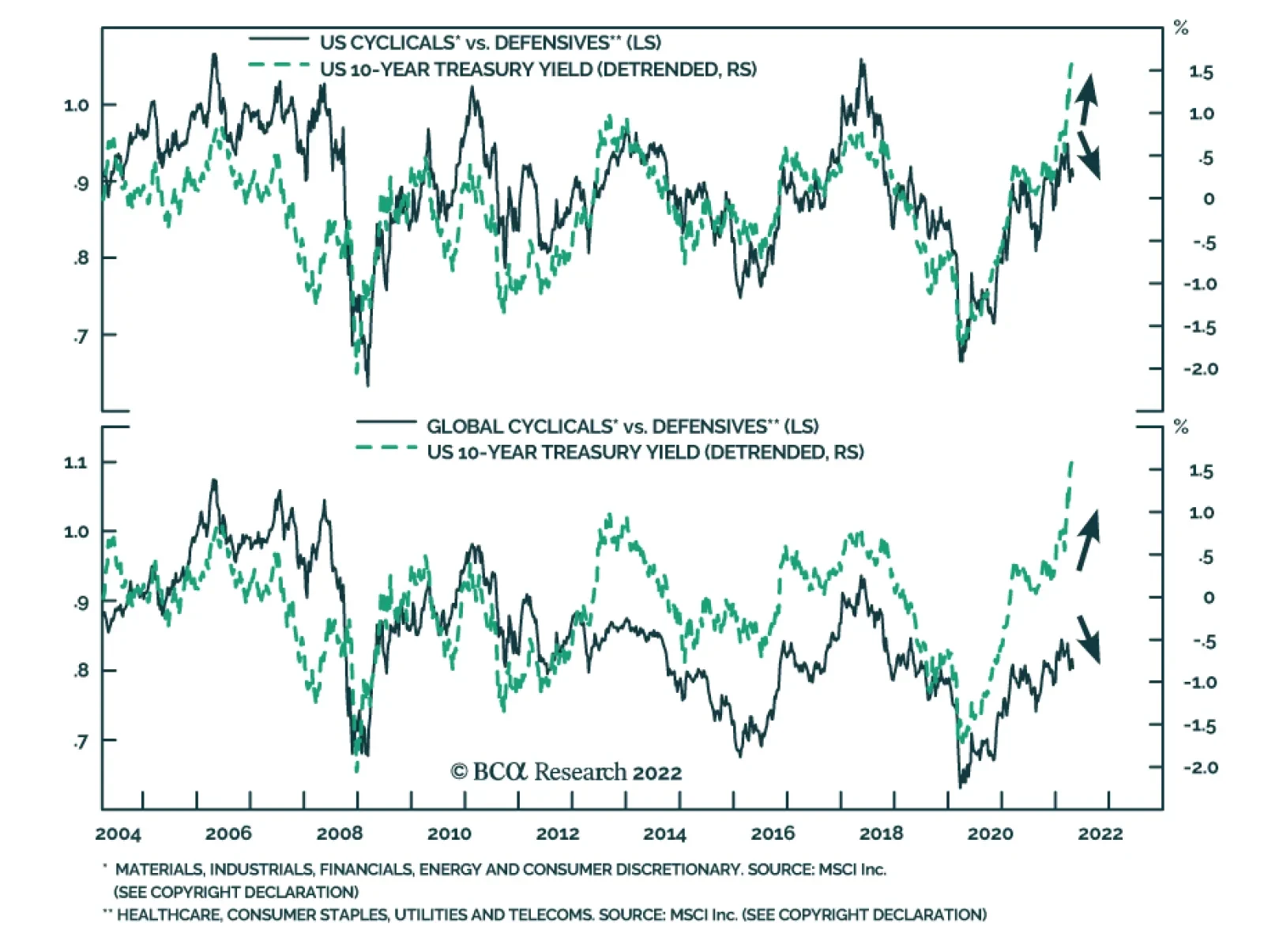
The outperformance of cyclical sectors relative to their defensive peers has historically coincided with periods of rising 10-year Treasury yields. Increasing government bond yields tend to signal an improving growth landscape which benefits the more cyclical…
S&P 500 Drops To Near 2022 Low
…
Australian equities are down less than 1% in USD terms so far this year, passively outperforming other developed market equity benchmarks. By comparison, the S&P 500 is down nearly 10% while the Euro Stoxx 50 has declined almost 18% so far this year. This…
Listen to a short summary of this report. Executive Summary Small Caps Are Looking Attractive Relative To Their Large Cap Peers
Small Caps Are Looking Attractive Relative To Their Large Cap Peers
Small Caps Are Looking Attractive Relative To Their Large Cap Peers
Adverse supply shocks have pushed down global growth this year, while pushing up inflation. With the war raging in Ukraine and China trying to contain a major Covid outbreak, these supply shocks are likely to persist for the next few months. Things should improve in the second half of the year. Inflation will come down rapidly, probably even more than what markets are discounting. Global growth will reaccelerate as pandemic headwinds abate. The return of Goldilocks will allow the Fed and other central banks to temper their hawkish rhetoric, helping to support equity prices while restraining bond yields. Unfortunately, this benign environment will sow the seeds of its own demise. Falling inflation during the remainder of the year will lift real incomes, leading to increased consumer spending. Inflation will pick up towards the end of 2023, forcing central banks to turn hawkish again. Trade Inception Level Initiation Date Stop Loss Long iShares Core S&P Small Cap ETF (IJR) / SPDR S&P 500 ETF (SPY) 100 Apr 21/2022 -5% Trade Recommendation: Go long US small caps vs. large caps via the iShares Core S&P Small-Cap ETF (IJR) and the SPDR S&P 500 ETF (SPY). Bottom Line: Global equities are heading towards a “last hurrah” starting in the second half of this year. Stay overweight stocks on a 12-month horizon. Push or Pull? Economists like to distinguish between “demand-pull” and “cost-push” inflation. The former occurs in response to positive demand shocks while the latter reflects negative supply shocks. In order to tell one from the other, it is useful to look at real wages. When real wages are rising briskly, households tend to spend more, leading to demand-pull inflation. In contrast, when wages fail to keep up with rising prices, it is a good bet that we have cost-push inflation on our hands. Chart 1 shows that real wages have been falling across the major economies over the past year. The decline in real wages has coincided with a steep drop in consumer confidence (Chart 2). This points to cost-push forces as the main culprits behind today’s high inflation rates. Chart 1Real Wages Are Declining
Real Wages Are Declining
Real Wages Are Declining
Chart 2Consumer Confidence Has Soured
Consumer Confidence Has Soured
Consumer Confidence Has Soured
A close look at the breakdown of recent inflation figures supports this conclusion. The US headline CPI rose by 8.5% year-over-year in March. The bulk of the inflation occurred in supply-constrained categories such as food, energy, and vehicles (Chart 3). Chart 3The Acceleration In Inflation Has Been Driven By Pandemic And War-Impacted Categories
Here Comes Goldilocks
Here Comes Goldilocks
The Toilet Paper Economy When the pandemic began, shoppers rushed out to buy essential household supplies including, most famously, toilet paper. Chart 4In A Break From The Past, Goods Prices Soared During The Pandemic
In A Break From The Past, Goods Prices Soared During The Pandemic
In A Break From The Past, Goods Prices Soared During The Pandemic
The toilet paper used in offices is somewhat different than the sort used at home. So, to some extent, work-from-home (and do other stuff-at-home) arrangements did boost the demand for consumer-grade toilet paper. However, a much more important factor was household psychology. People scrambled to buy toilet paper because others were doing the same. As often occurs in prisoner-dilemma games, society moved from one Nash equilibrium – where everyone was content with the amount of toilet paper they had – to another equilibrium where they wanted to hold much more paper than they previously did. What has gone largely unnoticed is that the toilet paper fiasco was replicated across much of the global supply chain. Worried that they would not have enough intermediate goods on hand to maintain operations, firms began to hoard inputs. Retailers, anxious at the prospect of barren shelves, put in bigger purchase orders than they normally would have. All this happened at a time when demand was shifting from services to goods, and the pandemic was disrupting normal goods production. No wonder the prices of goods – especially durable goods — jumped (Chart 4). Peak Inflation? The war in Ukraine could continue to generate supply disruptions over the coming months. The Covid outbreak in China could also play havoc with the global supply chain. While the number of Chinese Covid cases has dipped in recent days, Chart 5 highlights that 27 out of 31 mainland Chinese provinces are still reporting new cases, up from 14 provinces in the beginning of February. The number of ships stuck outside of Shanghai has soared (Chart 6). Chart 527 Out Of 31 Chinese Provinces Are Reporting New Cases, Up From 14 Provinces In The Beginning Of February
Here Comes Goldilocks
Here Comes Goldilocks
Chart 6The Clogged-Up Port Of Shanghai
Here Comes Goldilocks
Here Comes Goldilocks
Chart 7Inflation Will Decelerate This Year Thanks To Base Effects
Inflation Will Decelerate This Year Thanks To Base Effects
Inflation Will Decelerate This Year Thanks To Base Effects
Nevertheless, the peak in inflation has probably been reached in the US. For one thing, base effects will push down year-over-year inflation (Chart 7). Monthly core CPI growth rates were 0.86% in April, 0.75% in May, and 0.80% in June of 2021. These exceptionally high prints will fall out of the 12-month average during the next few months. More importantly, goods inflation will abate as spending shifts back toward services. Chart 8 shows that spending on goods remains well above the pre-pandemic trend in the US, while spending on services remains well below. Excluding autos, US retail inventories are about 5% above their pre-pandemic trend (Chart 9). Core goods prices fell in March for the first time since February 2021. Fewer pandemic-related disruptions, and hopefully a stabilization in the situation in Ukraine, could set the stage for sharply lower inflation and a revival in global growth in the second half of this year. How long will this Goldilocks environment last? Our guess is that it will endure until the second half of next year, but probably not much beyond then. As inflation comes down over the coming months, real income growth will rise. What began as cost-push inflation will morph into demand-pull inflation by the end of 2023. The Fed will need to resume hiking at that point, potentially bringing rates to over 4% in 2024. Chart 8Spending On Services Remains Well Below The Pre-Pandemic Trend, While Spending On Goods Is Above It
Spending On Services Remains Well Below The Pre-Pandemic Trend, While Spending On Goods Is Above It
Spending On Services Remains Well Below The Pre-Pandemic Trend, While Spending On Goods Is Above It
Chart 9Shelves Are Well Stocked In The US
Shelves Are Well Stocked In The US
Shelves Are Well Stocked In The US
Investment Implications Wayne Gretzky famously said that he always tries to skate to where the puck is going to be, not where it has been. Macro investors should follow the same strategy: Ask what the global economy will look like in six months and invest accordingly. The past few months have been tough for the global economy and financial markets. Last week, bullish sentiment fell to the lowest level in 30 years in the American Association of Individual Investors poll (Chart 10). Global growth optimism dropped in April to a record low in the BofA Merrill Lynch Fund Manager Survey. Chart 10AAII Survey: Equity Bulls Are In Short Supply
AAII Survey: Equity Bulls Are In Short Supply
AAII Survey: Equity Bulls Are In Short Supply
Chart 11The Equity Risk Premium Remains Elevated
The Equity Risk Premium Remains Elevated
The Equity Risk Premium Remains Elevated
Yet, a Goldilocks environment of falling inflation and supply-side led growth awaits in the second half of the year. Even if this environment does not last beyond the end of 2023, it could provide a “last hurrah” for global equities. Despite the spike in bond yields, the earnings yield on stocks still exceeds the real bond yield by 5.4 percentage points in the US, and by 7.8 points outside the US (Chart 11). TINA’s siren song may have faded but it is far from silent. Global equities have about 10%-to-15% upside from current levels over a 12-month horizon. We recommend that investors increase allocations to non-US stock markets, value stocks, and small caps over the coming months (see trade recommendation below). Consistent with our view that the neutral rate of interest is higher than widely believed in the US and elsewhere, we expect the 10-year Treasury yield to eventually rise to around 4% in 2024. However, with US inflation likely to trend lower in the second half of this year, we do not expect much upside for yields over a 12-month horizon. If anything, the fact that bond sentiment in the latest BofA Merrill Lynch survey was the most bearish in 20 years suggests that the near-term risk to yields is to the downside. Trade Idea: Go Long US Small Caps Versus Large Caps Small caps have struggled of late. Over the past 12 months, the S&P 600 small cap index has declined 3%, even as the S&P has managed to claw out a 5% gain. At this point, small caps are starting to look relatively cheap (Chart 12). The S&P 600 is trading at 14-times forward earnings compared to 19-times for the S&P 500. Notably, analysts expect small cap earnings to rise more over the next 12 months, as well as over the long term, than for large caps. Chart 12Small Caps Are Looking Attractive Relative To Their Large Cap Peers
Small Caps Are Looking Attractive Relative To Their Large Cap Peers
Small Caps Are Looking Attractive Relative To Their Large Cap Peers
Chart 13Small Caps Tend To Outperform When Growth Is Picking Up And The Dollar Is Depreciating
Small Caps Tend To Outperform When Growth Is Picking Up And The Dollar Is Depreciating
Small Caps Tend To Outperform When Growth Is Picking Up And The Dollar Is Depreciating
Small caps tend to perform best in settings where growth is accelerating and the US dollar is weakening (Chart 13). Economic growth should benefit from a supply-side boost later this year as pandemic headwinds fade and more low-skilled workers rejoin the labor market. With inflation set to decline, the need for the Fed to generate hawkish surprises will temporarily subside, putting downward pressure on the dollar. Investors should consider going long the S&P 600 via the iShares Core S&P Small-Cap ETF (IJR) versus the S&P 500 via the SPDR S&P 500 ETF (SPY). Peter Berezin Chief Global Strategist peterb@bcaresearch.com Follow me on LinkedIn Twitter Global Investment Strategy View Matrix
Here Comes Goldilocks
Here Comes Goldilocks
Special Trade Recommendations Current MacroQuant Model Scores
Here Comes Goldilocks
Here Comes Goldilocks
Executive Summary The Declining Value Of An Old Friendship
Indo-Russian Relations: Quo Vadis?
Indo-Russian Relations: Quo Vadis?
India may buy cheap oil from Russia, but oil alone cannot expand this partnership. India needs to maintain a balance of power against China and Pakistan. With Russia’s heft set to decline, India will be compelled to explore a configuration with America. India will slowly yet surely move into America’s sphere of influence. Strong geopolitical as well as economic incentives exist for both sides to develop partnership. The US’s grand strategy will continue to collide with that of Russia and China. China will increasingly align with Russia and is doomed to stay entangled in a strategic conflict with India. With India a promising emerging market set to cleave to America, we reiterate our strategic buy call on India. Tactically however we are bearish on India. We also recommend investors go strategically long Indian tech / short Chinese tech. This pair trade is likely to keep rising on a secular basis. Trade Recommendation Inception Date Return LONG INDIAN TECH / CHINESE TECH EQUITIES 2022-04-21 Bottom Line: For reasons of geopolitics as well as macroeconomics, we maintain our constructive view on India and our negative view on China on a strategic time frame. On a tactical timeframe, we remain sellers of India given cyclical political and macro risks. Feature Russia’s invasion of Ukraine has forced all players at the global geopolitical table to show their hand. The one major player at the table who is yet to show her cards is India. Which side India choses matters. Its geopolitical rise is one of the many reasons we live in a brave new multipolar world. India will gain influence in the global economy as a large buyer of oil and guns and as a user of tech platforms and capital. Related Report Geopolitical StrategyFrom Nixon-Mao To Putin-Xi The situation is complicated by mixed signals. India has played a geopolitically neutral or “non-aligned” role for most of its time since independence in 1947. Those who believe India will stay neutral point to the fact that India has continued buying oil from Russia and has abstained from voting on both anti-Russia and anti-Ukrainian resolutions at the United Nations. Those who predict that India will side with Russia have trouble explaining how India will get along with China, which committed to a “no limits” strategic partnership with Russia prior to the invasion. Those who speculate that India will align with the US have trouble explaining India’s persistent ties with Russia and the Biden administration’s threat of punishment for those who help Russia circumvent US sanctions. In this report we argue that the Indo-Russian friendship is destined to fade over a long-term, strategic horizon. The reason is simple: Russia’s geopolitical power is fading and hence it can no longer help India meet its regional security goals. The growing Russia-China alignment will only alienate India further. Hence, we expect the relationship between India and Russia to be reduced to a transactional status – mainly trade in oil and guns over the next few years, while strategic realities will drive India to tighten relations with the US and its Asian allies. Three geopolitical forces will break down the camaraderie between India and Russia, namely: (1) A collision in the grand strategies of America with that of both China and Russia, (2) India’s need to align with the US to underwrite its own regional security, and (3) China’s rising distrust of India as India aligns with the US and its allies. In fact, we expect China and India to stay embroiled in a strategic conflict over the next few years. Any thaw in their relations will be temporary at best. The rest of this report explains and quantifies these forces. We conclude with actionable investment conclusions. Let’s dive straight in. US Versus China-Russia: A Grand Strategy Collision “For the enemy is the communist system itself – implacable, insatiable, unceasing in its drive for world domination … For this is not a struggle for supremacy of arms alone – it is also a struggle for supremacy between two conflicting ideologies: freedom under God versus ruthless, Godless tyranny. “ – John F. Kennedy, Remarks at Mormon Tabernacle, Utah (September 1960) Chart 1China’s Is An Export-Powered Economic Heavyweight
Indo-Russian Relations: Quo Vadis?
Indo-Russian Relations: Quo Vadis?
It’s been six decades since these words were spoken and today the quotation is more relevant than at any time since the Cold War ended in 1991. The excerpt captures how the Biden administration has positioned itself with respect to Russia and China, only replacing “communist” with “autocratic” in Russia’s case. The Ukraine war helps America advance its grand strategy with respect to Russia. The Ukraine war is steadily draining Russia’s already limited economic might. Western sanctions aim to weaken Russia further. Russia’s military capabilities are now in greater doubt than before, so that its only remaining geopolitical strengths are nuclear weapons and, significantly, its leverage as an energy supplier. With Russia weakened, yet capable of reinforcing China, America will focus more intensely on China over the coming years and the breakdown in US-China relations will only accelerate. China is a genuine economic competitor to the United States (Chart 1). Its strategic rise worries America. To make matters worse, America poses a unique threat to China. China relies heavily on energy imports (Chart 2) from the Middle East (Chart 3). This is a source of great vulnerability as China’s fuel imports must traverse seas that America controls (Map 1). During peace time, and periods of robust US-China strategic engagement, this vulnerability is not an issue. But China is acutely aware that America has the capability to choke China’s energy access at will in the event of hostilities, just as it did to Japan in World War II. Russia has managed to wage war in Ukraine, against US wishes, since it is a net energy supplier to Europe and the global economy. Chart 2China And India Rely On Imports For Energy
Indo-Russian Relations: Quo Vadis?
Indo-Russian Relations: Quo Vadis?
Chart 3India And China Both Depend On Middle East For Oil
Indo-Russian Relations: Quo Vadis?
Indo-Russian Relations: Quo Vadis?
Map 1US Military Footprint In Middle East Threatens China … Yet US Presence In South Asia Is Weak
Indo-Russian Relations: Quo Vadis?
Indo-Russian Relations: Quo Vadis?
Atop China’s fuel-supply related insecurities, America has begun a strategic pivot to Asia in recent years. For instance, America has pulled troops out of Iraq and Afghanistan, declared a trade war on China, and strengthening strategic alliances and partnerships with regional geopolitical powers like India and Australia (Table 1). The US has retained its alliance with the Philippines despite an adverse government there, while South Korea has just elected a pro-American president again. With Japan, South Korea and Australia aligned militarily with the US, China’s naval power pales in comparison (Chart 4). Table 1America’s Influence In Asia Is Rising
Indo-Russian Relations: Quo Vadis?
Indo-Russian Relations: Quo Vadis?
Chart 4China’s Naval Power Pales Versus US Allies In Asia
Indo-Russian Relations: Quo Vadis?
Indo-Russian Relations: Quo Vadis?
Now China cannot watch America refurbish its grand strategy in Asia silently. Given China’s need for supply security, geopolitical independence, and regional influence, Beijing will double down on building its influence in Asia and in the eastern hemisphere. Against this backdrop of US-China competition, military conflict becomes increasingly likely, especially in the form of “proxy wars” involving China’s neighbors but conceivably even in the form of US-China naval warfare. China’s plans to modernize and enhance its economic prowess will add to America’s worries (Chart 5). A bipartisan consensus of American lawmakers is focused on reviving America’s economic strength but simultaneously limiting China’s benefit by restricting Chinese imports and American high-tech exports (Chart 6). Since Beijing cannot afford to base its national strategy on the hope of lingering American engagement, US-China trade relations will weaken regardless of which party controls the White House. Chart 5China’s Growing Might Worries America
Indo-Russian Relations: Quo Vadis?
Indo-Russian Relations: Quo Vadis?
Chart 6US Growth Does Not Equal Growth In Imports From China
Indo-Russian Relations: Quo Vadis?
Indo-Russian Relations: Quo Vadis?
The consensus in global financial media (which we never bought) held that the Biden administration would reduce tensions with China – but the détente never occurred and the remaining window for détente is limited by the uncertainty of the 2024 election. The US is currently occupied with Russia but threatening to impose secondary sanctions on China if it provides military assistance or circumvents sanctions. The Russo-Ukrainian war has led to an energy price shock that hurts an industrial economy like China’s. For the rest of this year China’s leaders will be consumed with managing the energy shock, a nationwide Covid-19 outbreak, and the important political reshuffle this fall. Only in 2023 will Beijing have room for maneuver when it comes to the US. But the US cannot return to engagement, which strengthens China’s economy, while China cannot open up to the US economy and become more exposed to future US sanctions. Bottom Line: A grand strategy collision between the US and China is certain. US dominance of sea routes that China uses for energy imports necessarily intimidates China. America’s pivot to Asia threatens China’s regional influence. This will prompt China to restrict American advances in strategic geographies —and not only the Taiwan Strait but also, as we will see, in South Asia. US-India Strategic Alignment: Only A Matter Of Time “If they [nation states] wish to survive, they must be willing to go to war to preserve a balance against the growing hegemonic power of the period.” – Nicholas J. Spykman, America's Strategy in World Politics (Harcourt, Brace and Co, 1942) For reasons of strategy, China will continue to build its influence in South Asia. South Asia offers prospects of sea access to the Indian Ocean, namely via Pakistan. This factor could ease China’s fuel supply insecurities. Also, penetrating northern India helps China set up a noose around India’s neck, thus neutralizing a potential enemy and US ally. In short China will pursue a two-pronged strategy of Eurasian development and naval expansion, both of which threaten India. Against this backdrop, India needs US support to counter Pakistan to its west, China’s latest intrusions into its eastern flank (Map 2), and China’s maritime challenge. India has historically spent generously on defense, but its military might pales in comparison to that of China. Even partial support from America would help India make some progress toward a balance of power in South Asia (Chart 7). Map 2China’s Newfound Interest In India’s Eastern Flank
Indo-Russian Relations: Quo Vadis?
Indo-Russian Relations: Quo Vadis?
Chart 7America Can Provide Military Heft To India
Indo-Russian Relations: Quo Vadis?
Indo-Russian Relations: Quo Vadis?
Chart 8US Is A Key Trading Partner For India
Indo-Russian Relations: Quo Vadis?
Indo-Russian Relations: Quo Vadis?
There’s another reason why US alignment makes sense for India. Much like China, India is highly import-dependent for its fuel needs (Chart 2). Given India’s high reliance on the Middle East for energy, India stands to benefit from America’s solid military footprint in this region (Map 1). The US too has a motive in exploring this alliance. India can provide a strategic foothold on the Eurasian rimland. America will value this new access route to Eurasia because America knows that its military footprint in South Asia is surprisingly weak – a weakness it needs to address against the backdrop of China’s increasing influence in the region (Map 1). Meaningful economic interests also underpin the US-India relationship. India and the US appear like sparring partners from time to time. The US may raise issues of human rights violations in India and the two may bicker over trade. However there exist strong economic incentives for the two countries to keep their differences under check and develop a long-term strategic partnership. The US is a major user of India’s software services and buys nearly a fifth of India’s merchandise exports. The trading relationship that India shares with the US is far more developed than India’s trading relationship with China and Russia (Chart 8). Capital is a factor of production that India desperately needs to finance its high growth. America and its allies are also major suppliers of capital to India (Chart 9). India is averse to granting China the political influence that would go along with major capital infusions and direct investments. Chart 9US And Its Allies Are Major Suppliers Of Capital To India
Indo-Russian Relations: Quo Vadis?
Indo-Russian Relations: Quo Vadis?
Chart 10India Offers US Firms Access To High Growth
Indo-Russian Relations: Quo Vadis?
Indo-Russian Relations: Quo Vadis?
Chart 11India Is A Key Market For American Big Tech
Indo-Russian Relations: Quo Vadis?
Indo-Russian Relations: Quo Vadis?
India on its part is a large marketplace which offers high growth prospects (Chart 10) and remains open and accessible to American corporations (unlike say Russia or China). The growth element is something that American firms will value more over time, as the American economy is mature and has a lower potential growth rate. Most importantly if the US imposes sanctions on India, then two key business lobbies are sure to mitigate the damage. In specific: Since India is a key potential market for American tech firms (Chart 11), Big Tech will always desire amicable Indo-US relations. Since India is the third largest buyer of defense goods globally, American defense suppliers will have similar intentions. In both cases, US policy planners will support these industries’ lobbying efforts due to the grand strategic considerations outlined above. Bottom Line: India will slowly yet surely move into America’s sphere of influence. Notwithstanding persistent differences, the Indo-US relationship will strengthen over a strategic timeframe. Strong geopolitical motives as well as notable economic incentives exist for both sides to develop this alignment. Indo-Russian Alignment: Destined To Fade The Indo-Russian friendship can be traced back to the second half of the 20th century. The fulcrum was the fact that Russia was a formidable land-based power and provided an offset against threats from China and Pakistan (Chart 12). The finest hour of this friendship perhaps came in 1971 when Russia sided with India in its war with Pakistan. India’s citizens hold an unusually favorable opinion of Russia (Chart 13). Chart 12The Declining Value Of An Old Friendship
Indo-Russian Relations: Quo Vadis?
Indo-Russian Relations: Quo Vadis?
Chart 13Indians Hold A Favorable Opinion Of Russians
Indo-Russian Relations: Quo Vadis?
Indo-Russian Relations: Quo Vadis?
Despite this rich past, the Indo-Russia friendship is doomed to fade over a strategic timeframe. Even if Russia’s share in Indian oil rises from current low levels of 2%, this glue alone cannot hold the Indo-Russian relationship together for one key reason: Russia’s geopolitical might has been waning and Russia can no longer help India establish a balance of power against China and Pakistan (Table 2). In fact, since 2006, the Russo-Indian partnership has been commanding lower geopolitical power than that of China (Chart 12). Table 2Russia’s Military Heft Is Of Limited Use To India Today
Indo-Russian Relations: Quo Vadis?
Indo-Russian Relations: Quo Vadis?
Managing regional security is a key strategic concern for India. As Russia’s geopolitical power wanes so will India’s utility of Russia as an effective guarantor of India’s security. Russia’s war in Ukraine is ominous in this regard, as Russian armed forces were forced to retreat from Kyiv, while the country’s already bleak economic prospects have worsened under western sanctions. The solidification of the China-Russia axis will alienate India further (Chart 14). China is essential to Russia’s economy now while Moscow is essential to China’s Eurasian strategy of bypassing American naval dominance to reduce its supply insecurity. Russia holds the keys to Central Asia, from a military-security point of view, and hence also to the Middle East. Furthermore, limited economic bonds exist to prevent India and Russia from falling out. Russia accounts for a smidgen of India’s trade (Chart 8). India is Russia’s largest arms client (accounting for +20% of its arms sales) but this reliance could also decline over time: The Indian government has been pursuing a range of policies to increase the indigenous production of arms. This is a strategic goal that would also reinforce India’s economic need for more effective manufacturing capabilities. Russia’s own defense franchise had been coming under pressure, even before the Ukraine war (Chart 15). On the contrary, Western arms manufacturers’ franchise has been steadily growing. Chart 14China-Russia Axis Will Alienate India
Indo-Russian Relations: Quo Vadis?
Indo-Russian Relations: Quo Vadis?
Chart 15The Rise & Rise Of Western Arms Manufacturers
Indo-Russian Relations: Quo Vadis?
Indo-Russian Relations: Quo Vadis?
While the US may look the other way in the short term when India buys arms from Russia, over a period of time the US is bound to pull India away by using a combination of sticks (mild sanctions) and carrots (heavy discounts). Two aforementioned external factors will also work against the Indo-Russia relationship namely (1) The Russo-Chinese alignment and its clash with US grand strategy and (2) The coming-to-life of a US-India strategic alignment. Bottom Line: India’s need for cheap oil will preserve basic Indo-Russian relations for some time. But oil alone cannot drive a deeper strategic alignment. Regional security concerns are paramount for India. Russia’s geopolitical decline will force India to explore an alignment with America, which will offer India security in the Indian Ocean and Persian Gulf in the face of China’s emergence in this region. Is A Realignment In Indo-China Relations Possible? But why should India not join the other Asian giants to balance against America’s threat of global dominance? Would such a bloc not secure India’s interests? And what if the US imposes harsh sanctions for India’s continued trade with Russia and strategic neutrality? Or what if a future US administration grows restless and attempts to force India to choose sides sooner rather than later? Even if the US offends India, it will only lead to a temporary improvement in India’s ties with the China-Russia alliance. This is because America stands to lose if India cleaves towards the Sino-Russian alliance and would thus quickly correct its policy. In specific: Security Interests: America will risk losing all influence in South Asia if India were to cleave towards China. India provides a key foothold for America to control China’s regional ascendance especially given that the US has now withdrawn from Afghanistan and its bilateral relations with Pakistan are weak. Business Interests: India’s movement into the China-Russia sphere of influence can have adverse business implications for American corporations and US allies, given that the US is abandoning the Chinese market over time, while India is a large and fast-growing consumer of American tech exports and services. India could emerge as a major buyer of American defense goods and will import more and more energy provided by the US and its partners in the Persian Gulf. These business groups will lobby for the withdrawal of US sanctions on India given India’s long-term potential. Meanwhile any improvement in Indo-Chinese relations will have a limited basis. In specific: Ascendant Nationalism In China And India: China’s declining potential GDP is motivating a rise in nationalism and an assertive foreign policy. Meanwhile India’s inability to create plentiful jobs for a young and growing population is also fuelling a wave of nationalism. A historic turn toward Sino-Indian economic engagement would require the domestic political ability to embrace and promote each other’s well-being. Pakistan Factor: India’s eastern neighbor Pakistan is controlled by its military. The military’s raison d'être is enforced by maintaining an aggressive stance towards India, while pursuing economic development through whatever other means are available. As long as Pakistan’s military stays influential its stance towards India will be hostile. And as long as Pakistan’s economy remains weak (Chart 16), its reliance on China will remain meaningful (Chart 17). Chart 16Pakistan: High Military Influence, Low Economic Vigor
Indo-Russian Relations: Quo Vadis?
Indo-Russian Relations: Quo Vadis?
Chart 17China & Pakistan: Iron Brothers?
Indo-Russian Relations: Quo Vadis?
Indo-Russian Relations: Quo Vadis?
Chart 18Indians View China And Pakistan Negatively
Indo-Russian Relations: Quo Vadis?
Indo-Russian Relations: Quo Vadis?
China also benefits from its alliance with Pakistan because it provides an alternative entry point into India and access to the Indian Ocean. Fundamental Distrust: For reasons of history, Indians harbor a negative opinion of both Pakistan and China (Chart 18). This factor reinforces the first point that any Indian administration will see limited political dividends from developing a long-term alignment with China or with Pakistan. Bottom Line: If any Indo-Chinese détente materializes owing to harsh US sanctions, which we do not expect, the result will be temporary. America has limited incentives to push India towards the Sino-Russian camp. More importantly, China and India will stay entangled in a strategic conflict for reasons of both history and geography. Investment Conclusions Chart 19Sell India Tactically But Buy India On A Strategic Horizon
Sell India Tactically But Buy India On A Strategic Horizon
Sell India Tactically But Buy India On A Strategic Horizon
The historic Indo-Russia relationship will weaken over the next few years as India and Russia explore new alignments with USA and China respectively. The relationship may not collapse entirely but has limited basis to grow given Russia’s declining geopolitical clout. Indo-American economic interests are set to deepen not just for reasons of security. India may consider looking for alternatives to Russian arms in the American defense industry while American Big Tech will be keen to grow their footprint in India. With India set to cleave to America, a country whose geopolitical power remains unparalleled today, we reiterate our constructive long-term investment view on India (Chart 19). However, tactically we remain worried about near-term geopolitical and macro headwinds that India must confront. China will strengthen relations with Russia over the next few years. It needs Russia’s help to execute its Eurasian strategy and to diversify its sources of fuel supply, over the long run. Given that the US and its allies will be engaged in a conflict with China over a strategic horizon, we reiterate our strategic sell call on China. Tactically we are neutral on Chinese stocks, given that they have already sold off sharply in accordance with our views over the past two years. In view of both these calls, we urge clients with a holding period mandate of more than 12 months to reduce exposure to Chinese assets and increase exposure to Indian assets. We also recommend investors go strategically long Indian tech / short Chinese tech. This pair trade is likely to keep rising on a secular basis. Ritika Mankar, CFA Editor/Strategist ritika.mankar@bcaresearch.com Matt Gertken Chief Geopolitical Strategist mattg@bcaresearch.com Strategic Themes Open Tactical Positions (0-6 Months) Open Cyclical Recommendations (6-18 Months) Regional Geopolitical Risk Matrix
Executive Summary In this first of a regular series of ‘no holds barred’ conversations with a concerned client we tackle the hot topic of inflation. Month-on-month US core inflation has already peaked, 12-month US core inflation is about to peak, and demand destruction will ultimately pull down headline inflation too. Given modest and slowing growth in unit labour costs, there is no imminent risk of a wage-price spiral. Surging inflation expectations are just capturing the frothiness in inflation protected bond prices that massive hedging demand is creating. This recent massive demand for inflation hedges such as inflation protected bonds and commodities will recede and take the frothiness out of their prices. On a 6-12 month horizon, underweight inflation protected bonds and commodities… …overweight conventional bonds and stocks… …and tilt towards healthcare and biotech. The Performance Of Inflation Protected Bonds Versus Conventional Bonds Just Tracks The Oil Price
The Performance Of TIPS Versus T-Bonds Is Just A Play On The Oil Price
The Performance Of TIPS Versus T-Bonds Is Just A Play On The Oil Price
Bottom Line: US core inflation is about to peak, demand destruction will ultimately pull down headline inflation, and there is no imminent risk of a wage-price spiral. On a 6-12 horizon, overweight stocks and conventional bonds versus commodities and inflation protected bonds. Feature Welcome to the first of a regular series of Counterpoint reports that takes the form of a ‘no holds barred’ conversation with a concerned client. Roughly once a month, our open and counterpoint conversations will address a major question or concern for investors. This inaugural conversation tackles the hot topic of inflation. On Peak Inflation Client: Thank you for addressing my worries. Like many people right now, I am concerned about inflation. My first question is, when is inflation going to peak? CPT: The good news is that, in an important sense, inflation has already peaked. Month-on-month core inflation in the US reached a high of 0.9 percent through April-June last year. In the more recent pickup through October-January it reached a ‘lower peak’ of 0.6 percent. And in March it dropped to 0.3 percent. Client: Ok, but inflation usually refers to the 12-month inflation rate – when will that peak? CPT: The 12-month inflation rate is just the sum of the last twelve month-on-month rates. So, when the big numbers of April-June of last year drop off to be replaced by the smaller numbers of April-June of this year, the 12-month inflation rate will fall sharply (Chart I-1). Chart I-1Month-On-Month Core Inflation Has Already Peaked, And 12-Month Core Inflation Is About To Peak
Month-On-Month Core Inflation Has Already Peaked, And 12-Month Core Inflation Is About To Peak
Month-On-Month Core Inflation Has Already Peaked, And 12-Month Core Inflation Is About To Peak
Client: Even if the 12-month inflation rate does peak soon, it will still be far too high. When will it return to the 2 percent target? CPT: In the pandemic era, monthly core inflation has been non-linear. Meaning it has been either ‘high-phase’ of 0.5 percent and above, or ‘low-phase’ of 0.3 percent and below. In March it returned to low-phase. If it stays in low-phase, then as an arithmetic identity, the 12-month core inflation rate will be close to its target twelve months from now. Client: So far, you have just talked about core inflation which excludes energy and food prices. What about headline inflation? Specifically, isn’t the Ukraine crisis a massive supply shock for Russian and Ukrainian sourced energy and food? Demand destruction will ultimately pull down headline inflation too. CPT: Yes, headline inflation may take longer to come down than core inflation. But supply shocks ultimately resolve themselves through demand destruction. Client: Could you elaborate on that? CPT: Sure. With fuel and food prices surging, many people are asking: do I really need to make that journey? Do I really need to keep the heating on? Can I buy a cheaper loaf of bread? So, they will cut back, and to the extent that they can’t cut back on energy and food, demand for other more discretionary items will come down, and eventually weigh on prices. Client: At the same time, the pandemic is still raging – look at what’s happening in Shanghai right now. Won’t further disruptions to supply chains just add further fuel to inflation? CPT: Yes, but to repeat, inflation that is entirely due to a supply shock ultimately resolves itself through demand destruction. On The Source Of The Inflation Crisis Client: I am puzzled. If supply shock generated inflation resolves itself, then what has caused the post-pandemic inflation to be anything but ‘transitory’? CPT: The simple answer is the pandemic’s draconian lockdowns combined with massive handouts of government cash unleashed a massive demand shock. But it wasn’t a shock in the magnitude of demand, it was a shock in the distribution of demand (Chart I-2). Chart I-2The Pandemic's Draconian Lockdowns Combined With Massive Government Stimulus Unleashed A Massive Shock In The Distribution Of Demand
The Pandemic's Draconian Lockdowns Combined With Massive Government Stimulus Unleashed A Massive Shock In The Distribution Of Demand
The Pandemic's Draconian Lockdowns Combined With Massive Government Stimulus Unleashed A Massive Shock In The Distribution Of Demand
Client: Could you explain that? CPT: Well, we were all locked at home and flush with government supplied cash, and we couldn’t spend the cash on services. So, we spent it on what we could spend it on – namely, durable goods. This created a massive shock in the distribution of demand, out of services whose supply could easily adjust downwards, and into goods whose supply could not easily adjust upwards. Client: Can you give me some specific examples? CPT: Sure. Airlines could cut back their flights, but auto manufacturers couldn’t make more cars. So, airfares didn’t collapse but used car prices went vertical! The result being the surge in inflation. Client: Do you have any more evidence? Inflation is highest in those economies where the cash handouts and furlough schemes were the most generous, like the US and the UK. CPT: Yes, the three separate surges in month-on-month core inflation all occurred after surges in durable goods demand (Chart I-3). Additionally, inflation is highest in those economies where the cash handouts and furlough schemes were the most generous – like the US and the UK. Chart I-3The Three Surges In Month-On-Month Core Inflation All Occurred After Surges In Durable Goods Demand
The Three Surges In Month-On-Month Core Inflation All Occurred After Surges In Durable Goods Demand
The Three Surges In Month-On-Month Core Inflation All Occurred After Surges In Durable Goods Demand
Client: If we get more waves of Covid, what’s to stop all this happening again? CPT: Nothing, so we should be vigilant. That said, we now have coping strategies for Covid that do not necessitate massive handouts of government cash. Also, we have already binged on durable goods, making it much harder to repeat that trick. On Wages And Inflation Expectations Client: I am still worried that if workers can negotiate much higher wages in response to higher prices, then it would threaten a wage-price spiral. CPT: Agreed, but it is technically incorrect to focus on wage inflation. The correct metric to focus on is unit labour cost inflation – which is wage growth in excess of productivity growth. In the US, this was 3.5 percent through 2021, slowing to just a 0.9 percent annual rate in the fourth quarter. So, it is not flashing danger, at least yet. Client: Ok, but what about the surge in inflation expectations. Isn’t that flashing danger? CPT: We should treat inflation expectations with a huge dose of salt, as they simply track the oil price, and therefore provide a nonsensical prediction of future inflation! (Chart I-4) Chart I-4The Tight Relationship Between The Oil Price And Inflation Expectations Is Intuitive, Appealing... And Nonsense
The Tight Relationship Between The Oil Price And Inflation Expectations Is Intuitive, Appealing... And Nonsense
The Tight Relationship Between The Oil Price And Inflation Expectations Is Intuitive, Appealing... And Nonsense
Client: What can explain this nonsense? CPT: Simply that when the oil price is high, investors flood into inflation hedges such as inflation protected bonds. So, the surge in inflation expectations is just capturing the frothiness in inflation protected bond prices that this massive hedging demand is creating. We can see similar frothiness in some commodity prices. The recent massive demand for inflation hedges such as inflation protected bonds and commodities will recede and take the frothiness out of their prices. Client: How so? CPT: Well to the extent that commodity prices drive headline inflation, the apples-for-apples relationship should be between commodity price inflation and headline inflation, and this is what we generally see (Chart I-5). But recently, this relationship has broken down and instead we see a tighter relationship between headline inflation and commodity price levels (Chart I-6 and Chart I-7). The likely causality here is that, just as for inflation protected bonds, massive inflation hedging demand has created frothiness in some commodity prices. Chart I-5Commodity Price Inflation Usually Drives Headline Inflation, But Recently The Relationship Broke Down
Commodity Price Inflation Usually Drives Headline Inflation, But Recently The Relationship Broke Down
Commodity Price Inflation Usually Drives Headline Inflation, But Recently The Relationship Broke Down
Chart I-6Recently, We See A Weak Relationship Between Commodity Price Inflation And Headline Inflation...
Recently, We See A Weak Relationship Between Commodity Price Inflation And Headline Inflation...
Recently, We See A Weak Relationship Between Commodity Price Inflation And Headline Inflation...
Chart I-7...But A Tight Relationship Between Headline Inflation And Commodity Price Levels
...But A Tight Relationship Between Headline Inflation And Commodity Price Levels
...But A Tight Relationship Between Headline Inflation And Commodity Price Levels
On The Investment Implications Client: To sum up your view then, month-on-month US core inflation has already peaked, 12-month US core inflation is about to peak, and demand destruction will ultimately pull down headline inflation. Given modest and slowing growth in unit labour costs, there is no imminent risk of a wage-price spiral, and surging inflation expectations are just capturing the frothiness in inflation protected bond prices that massive hedging demand is creating. What does this view mean for investment strategy? On a 6-12 horizon, overweight stocks and conventional bonds versus commodities and inflation protected bonds. CPT: Well given that inflation is peaking, one obvious implication is that the massive demand for inflation hedges will recede and take the frothiness out of their prices. On a 6-12 month horizon this means underweighting inflation protected bonds and commodities (Chart I-8). Chart I-8The Performance Of Inflation Protected Bonds Versus Conventional Bonds Just Tracks The Oil Price
The Performance Of Inflation Protected Bonds Versus Conventional Bonds Just Tracks The Oil Price
The Performance Of Inflation Protected Bonds Versus Conventional Bonds Just Tracks The Oil Price
Client: What about the surge in bond yields – when will that reverse? CPT: Empirically, we have seen that bond yields turn just ahead of the turn in the 12-month core inflation rate. Hence, on a 6-12 month horizon this means overweighting bonds. Client: Finally, what does all this mean for stock markets? CPT: The weakness of stock markets this year has been entirely due to falling valuations, rather than falling profits. If the headwind to valuations from rising bond yields turns into a tailwind from falling bond yields, it will boost stocks – especially long-duration stocks with relatively defensive profits. On a 6-12 month horizon this means overweighting stocks, and our favourite sectors are healthcare and biotech. Client: Thank you very much for this open and counterpoint conversation. Fractal Trading Watchlist Due to the Easter holidays, there are no new trades this week. However, the full updated watchlist of 20 investments that are experiencing or approaching turning points is available on our website: cpt.bcaresearch.com Chart 1The Strong Trend In The 18-Month-Out US Interest Rate Future Is Fragile
The Strong Trend In The 18-Month-Out US Interest Rate Future Is Fragile
The Strong Trend In The 18-Month-Out US Interest Rate Future Is Fragile
Chart 2The Strong Trend In The 3 Year T-Bond Is Fragile
The Strong Trend In The 3 Year T-Bond Is Fragile
The Strong Trend In The 3 Year T-Bond Is Fragile
Chart 3AUD/KRW Is Vulnerable To Reversal
AUD/KRW Is Vulnerable To Reversal
AUD/KRW Is Vulnerable To Reversal
Chart 4Canada Versus Japan Is Vulnerable To Reversal
Canada Versus Japan Is Vulnerable To Reversal
Canada Versus Japan Is Vulnerable To Reversal
Chart 5Canada's TSX-60's Outperformance Might Be Over
Canada's TSX-60's Outperformance Might Be Over
Canada's TSX-60's Outperformance Might Be Over
Chart 6US Healthcare Providers Vs. Software At Risk of Reversal
US Healthcare Providers Vs. Software At Risk of Reversal
US Healthcare Providers Vs. Software At Risk of Reversal
Chart 7Bitcoin's 65-Day Fractal Support Is Holding For Now
Bitcoin's 65-Day Fractal Support Is Holding For Now
Bitcoin's 65-Day Fractal Support Is Holding For Now
Chart 8A Potential Switching Point From Tobacco Into Cannabis
A Potential Switching Point From Tobacco Into Cannabis
A Potential Switching Point From Tobacco Into Cannabis
Chart 9Biotech Is A Major Buy
Biotech Is A Major Buy
Biotech Is A Major Buy
Chart 10CAD/SEK Reversal Has Started
CAD/SEK Reversal Has Started
CAD/SEK Reversal Has Started
Chart 11Financials Versus Industrials To Reverse
Financials Versus Industrials To Reverse
Financials Versus Industrials To Reverse
Chart 12Norway's Outperformance Could End
Norway's Outperformance Could End
Norway's Outperformance Could End
Chart 13Greece's Brief Outperformance To End
Greece's Brief Outperformance To End
Greece's Brief Outperformance To End
Chart 14BRL/NZD At A Resistance Point
BRL/NZD At A Resistance Point
BRL/NZD At A Resistance Point
Chart 15The Outperformance Of Resources Versus Healthcare Is Vulnerable To Reversal
The Outperformance Of Resources Versus Healthcare Is Vulnerable To Reversal
The Outperformance Of Resources Versus Healthcare Is Vulnerable To Reversal
Chart 16The Outperformance Of Resources Versus Biotech Is Vulnerable To Reversal
The Outperformance Of Resources Versus Biotech Is Vulnerable To Reversal
The Outperformance Of Resources Versus Biotech Is Vulnerable To Reversal
Chart 17Cotton's Outperformance Is Vulnerable To Reversal
Cotton's Outperformance Is Vulnerable To Reversal
Cotton's Outperformance Is Vulnerable To Reversal
Chart 18US Homebuilders' Underperformance Is At A Potential Turning Point
US Homebuilders' Underperformance Is At A Potential Turning Point
US Homebuilders' Underperformance Is At A Potential Turning Point
Chart 19Fractal Trading Watch List
Fractal Trading Watch List
Fractal Trading Watch List
Chart 20Fractal Trading Watch List
Fractal Trading Watch List
Fractal Trading Watch List
Dhaval Joshi Chief Strategist dhaval@bcaresearch.com Fractal Trading System Fractal Trades
Conversation With A Concerned Client: On Inflation
Conversation With A Concerned Client: On Inflation
Conversation With A Concerned Client: On Inflation
Conversation With A Concerned Client: On Inflation
6-Month Recommendations Structural Recommendations Closed Fractal Trades Indicators To Watch - Bond Yields Chart II-1Indicators To Watch - Bond Yields - Euro Area
Indicators To Watch - Bond Yields - Euro Area
Indicators To Watch - Bond Yields - Euro Area
Chart II-2Indicators To Watch - Bond Yields - Europe Ex Euro Area
Indicators To Watch - Bond Yields - Europe Ex Euro Area
Indicators To Watch - Bond Yields - Europe Ex Euro Area
Chart II-3Indicators To Watch - Bond Yields - Asia
Indicators To Watch - Bond Yields - Asia
Indicators To Watch - Bond Yields - Asia
Chart II-4Indicators To Watch - Bond Yields - Other Developed
Indicators To Watch - Bond Yields - Other Developed
Indicators To Watch - Bond Yields - Other Developed
Indicators To Watch - Interest Rate Expectations Chart II-5Indicators To Watch - Interest Rate Expectations
Indicators To Watch - Interest Rate Expectations
Indicators To Watch - Interest Rate Expectations
Chart II-6Indicators To Watch - Interest Rate Expectations
Indicators To Watch - Interest Rate Expectations
Indicators To Watch - Interest Rate Expectations
Chart II-7Indicators To Watch - Interest Rate Expectations
Indicators To Watch - Interest Rate Expectations
Indicators To Watch - Interest Rate Expectations
Chart II-8Indicators To Watch - Interest Rate Expectations
Indicators To Watch - Interest Rate Expectations
Indicators To Watch - Interest Rate Expectations
Netflix delivered a sobering account of its Q1 performance and outlook at its earnings call on Tuesday. The tech giant lost 200,000 subscribers in the first quarter – the first decline in customers since 2011. Moreover, the company expects to lose another two…