Equities

Highlights With geopolitical risks increasing around China, India is attracting greater attention from global investors. India’s youthful demographics also mark a stark contrast with China. While this demographic dividend is real, its benefits should not be overstated. India is young but socially complex, which will create unique social conflicts and policy risks. In particular, the country faces structurally large budget deficits. Regional political differences could slow down reforms. Lastly, competition with China will increase India’s own geopolitical risks. Macroeconomic and (geo)political factors, not youth alone, will determine India’s equity market returns. The bullish long-term view faces near-term challenges. Feature Map 1 PreviewIndia’s Demographic Dividend Can Be Overstated
India’s Demographics: The Devil Is In The Details
India’s Demographics: The Devil Is In The Details
“Independence had come to India like a kind of revolution; now there were many revolutions within that revolution … All over India scores of particularities that had been frozen by foreign rule, or by poverty or lack of opportunity or abjectness, had begun to flow again.” – Sir VS Naipaul, India: A Million Mutinies Now (Vintage, 1990) What is well known is that India is populous, young, and boasts a high GDP growth rate. India is also largely free of internal conflicts. Its democratic framework is seen as a pressure valve that can release social tensions. India’s hefty 58% cross-cycle premium to Emerging Markets (EM) is often attributed to the fact that India is younger than its peers, especially China. In this report we highlight that India’s demographic advantage is real but should not be overstated. For instance, India’s northern region can be likened to a demographic tinderbox. It accounts for about 45% of India’s population and is also younger than the national average. However, per capita incomes in this region are lower than the national average and to complicate matters, this region is crisscrossed by several social fault lines. This heterogeneity and economic backwardness in India’s population is the reason why the trend-line of India’s demographic dividend will not be linear. Its diverse population’s attempt to break out of its poverty will spawn unique policy risks. The North Is A Demographic Tinderbox, The South Is Prosperous But Ageing India will soon be the most populous country in the world (Chart 1). India’s median age is a decade lower than that of China to boot (Chart 2). Some emerging market investors fret about India’s low per capita income but India holds the promise of lifting individual incomes over time. This is because its GDP growth rate has been higher than that of its peers (Chart 3). Chart 1India Will Soon Be The Most Populous Country
India’s Demographics: The Devil Is In The Details
India’s Demographics: The Devil Is In The Details
Chart 2India Is A Decade Younger Than China
India’s Demographics: The Devil Is In The Details
India’s Demographics: The Devil Is In The Details
Chart 3India’s Per Capita Income Is Low, But GDP Growth Rate Is High
India’s Demographics: The Devil Is In The Details
India’s Demographics: The Devil Is In The Details
However, the “demographic dividend” narrative oversimplifies India’s investment case. India is young but also socially heterogenous and its median voter is poor. This complicates India’s development process and makes its demographic dividend trend-line non-linear. India’s social complexity is best understood if India is characterized as an amalgamation of three major regions: the North, the South (which we define to include the western region), and the East. Each of these parts are unique and have distinctive socio-demographic identities. India hence is more comparable to a continent like Europe than a country like the US. Like the European Union, India is a union of multiple social, religious, and ethnic groups. It straddles a vast geography and represents a very wide spectrum of interests. India’s South is more like a middle-income Asian country such as Sri Lanka or Vietnam whilst India’s East is more like a poor Latin American economy with latent social unrest. Understanding the heterogeneity of India’s vast populace is key to get a better sense of why an investment strategy for India must be nuanced and tactical in its approach, even if the overarching strategic view is constructive. The key features of each of these three regions can be summarized as follows: Region #1: The North This region comprises the triangular area between Jammu & Kashmir, Rajasthan and Jharkhand. This is the largest landmass in India stretching from the Himalayas to the fertile Gangetic plains of central India. Ethnically most of the population here is of Indo-Aryan descent. A lion’s share of this region’s population remains engaged in agriculture and allied activities. The North accounts for about 45% of the nation’s total population and is a demographic tinderbox. Per capita incomes are low and one in five persons falls in the age group of 15-24 years. To complicate matters, wage inflation in the farm sector, which employs a large majority of the populace in this region, has been slowing. If job creation in the non-farm sector stays insufficient then it will fan fires of social instability. The North includes states like Uttar Pradesh and Punjab which have seen a steady increase in small but notable socio-political conflicts in the recent past. Issues that triggered social conflict ranged from inter-religious marriages to resistance to amending farmer-friendly laws. Region #2: The South India’s South constitutes the large inverted-triangular region on the map and spans the area between Gujarat, Kerala, and West Bengal. We include India’s western region in this category because of its socio-economic similarities with the southern peninsula. Together the South and West account for the entirety of India’s peninsular coastline and for about 40% of total population. Historically, the South has seen far fewer external invasions and its social fabric is more homogenous than that of the North. This region is characterized by high per capita incomes, balanced gender ratios (Chart 4), and higher literacy ratios (Chart 5). Socio-political conflicts in this region are less common as compared to the North. Chart 4India’s South Has Healthy Gender Ratios Compared To North
India’s Demographics: The Devil Is In The Details
India’s Demographics: The Devil Is In The Details
Chart 5India’s South Is More Educated Than The Rest Of India
India’s Demographics: The Devil Is In The Details
India’s Demographics: The Devil Is In The Details
The state of Kerala is an exception in this region. The social fabric in this state is unusual, with Hindus accounting for only 55% of its population (versus the national average of 80%). The high degree of religious heterogeneity in this southern Indian state could perhaps be the reason why the state has lately seen a rise of small but significant incidences of social conflict. Unlike India’s young North, the median age of the population in India’s South is likely to be higher than the national average. Whilst India’s South is clearly young by global standards, this region will have to deal with problems of an ageing population before India’s North or East. The Southern region in India even today relies on migrant workers from India’s North. Region #3: The East This region is the youngest and the smallest of the three, as it accounts for the remaining 15% of India’s population. The region is young but must contend with low per capita incomes and very high degrees of religious diversity. Muslims, Christians, and other religions account for 20% of India’s population nationally but +50% of the population in India’s East. By virtue of sharing borders with countries like Bangladesh, Nepal, and Myanmar, this region is often the entry point for migration into India. It is historically the least stable of the three regions owing to its heterogeneity and the steady influx of migrants. To conclude, India is young but is also socially complex. Whilst a youthful population yields economic advantages, if this young population lacks economic opportunity then social dissatisfaction and associated risks can be a problem. Furthermore, history suggests that if a region’s populace is young but poor and diverse, then it often spawns the rise of identity politics, which takes policymakers’ attention away from matters of economic development. Social Complexity Index To better represent India’s demographic granularities, we created a Social Complexity Index (SCI), as shown in Map 1. Map 1India’s North Is A Demographic Tinderbox; South Is Prosperous But Ageing
India’s Demographics: The Devil Is In The Details
India’s Demographics: The Devil Is In The Details
The SCI for Indian states is created by adding a layer of socio-economic data over the demographic data. It uses three sets of variables: Economic well-being of a state as proxied by state-level per capita incomes. The lower the incomes, the greater the risk of social instability. This is because India’s per capita income is low to start with and if pockets have incomes that are substantially lower than the national average then the associated economic duress can be significant. Religious diversity in a state as measured by creating a Herfindahl-Hirschman Index of religious diversity in the state. The greater the religious diversity the greater the social complexity is expected to be. Youthfulness of a state as measured by population in the age group of 15-24 years relative to the total population. The greater the youth population ratio, the more complex are the social realities likely to be. If a state is exposed unfavorably to all three of the above stated parameters then such a state is deemed to have a high degree of social complexity and hence could be exposed to a higher risk of social conflicts and/or policy risks. Our Social Complexity Index (SCI) (Map 1) shows how parts of India are young but also socially complex. Why does this matter? This matters because a diverse, young and vast population’s attempt to develop will create policy risks. Policy Impact: Left-Leaning Economics, Right-Leaning Politics To be sure, governments in India will stay focused on creating large-scale jobs, a big concern for India’s median voter (Chart 6). However, given the time involved in building consensus for any major reform, progress on economic reforms (and hence job creation) will remain slow. India’s large population and democratic framework render the reform process more acceptable, but also less nimble. This contrasts with the speed of reforms executed by East Asian countries in the 1970s-90s, which turned them into export powerhouses. Two recent examples illustrate the problem of slow reform in India: Implementation of GST: Goods and services tax (GST) was a major reform that India embraced in 2017. However, the creation of a nation-wide GST was first mooted in 2000 and it took seventeen years for this reform to pass into law. Even in its current form India’s GST does not cover all products. It excludes large categories like petroleum products and electricity owing to resistance from state governments. Industrial sector growth: Despite India’s consistent efforts to grow its industrial sector as a source of large-scale, low-skill jobs, the share of this sector in India’s GDP has remained static for three decades (Chart 7). The services sector has grown rapidly in India over this period but its ability to absorb low-skill workers on a large scale is fundamentally restricted since (1) the sector needs mid-to-high skill workers and (2) the sector generates fewer jobs per unit of GDP owing to high degrees of productivity in the sector. Chart 6India’s Median Voter Worries Greatly About Job Creation
India’s Demographics: The Devil Is In The Details
India’s Demographics: The Devil Is In The Details
Chart 7India’s Industrial Sector Stuck In A Rut, India’s Workforce Is Connected And Aware
India’s Demographics: The Devil Is In The Details
India’s Demographics: The Devil Is In The Details
India’s inability to reform rapidly and create jobs on a large-scale will trigger policy risks. This factor is more relevant now than ever. In the 1990s, India was a small, closed economy that was just opening up. Hence slow reforms were acceptable as they yielded high growth off a low base. By contrast India’s masses today are at the forefront of connectivity (Chart 7). Slow job growth in a young country with high degrees of connectivity will have to be managed in the short term by responding to other needs of India’s median voter. This process might delay painful structural reforms necessary to improve productivity and hence create policy risks in the interim. What policy-risks is India exposed to? We highlight three policy risks that investors must brace for: Policy Risk #1: Structurally Large Budget Deficits Despite being young, India’s fiscal deficit has been large and as such comparable to that of countries that have an older demographic profile (Chart 8). Chart 8Despite India’s Youth, Its Fiscal Deficit Has Been Comparable To That Of Older Countries
India’s Demographics: The Devil Is In The Details
India’s Demographics: The Devil Is In The Details
Chart 9Unlike China, The Majority Of India’s Citizenry Lives On Less Than US$10 A Day
India’s Demographics: The Devil Is In The Details
India’s Demographics: The Devil Is In The Details
Whilst India’s fiscal deficit will rise and fall cyclically, it will remain elevated on a structural basis as India’s median voter is young but poor (Chart 9). This median voter will keep needing government support to tide over her economic duress. These fiscal transfers are likely to assume the form of transfer payments, food subsidies and a large interest burden on the exchequer who will need to borrow funds in the absence of adequate tax revenue growth. Two manifestations of this fiscal quagmire that India must contend with include: Revenue expenditure for India’s central government accounts for 85% of its total expenditure, with only 15% being set aside for more productive capital expenditure. Within central government revenue expenditure, 40% is foreclosed by food-subsidies, transfer payments, and interest payments. Can India’s fiscal deficit be expected to structurally trend lower? Only if India embraces big-ticket tax reforms. This appears unlikely given that India’s central tax revenue to GDP ratio has remained static at 10% of GDP for two decades owing to its inability to widen its tax base. Policy Risk #2: Foreign Policy Will Turn Rightwards India’s northern states are known to harbor unfavorable views of Pakistan. These are more unfavorable than the rest of India (Map 2). Geopolitical tension will persist due to a confluence of factors. Map 2Northern India Views Pakistan Even More Unfavorably Than Rest Of India
India’s Demographics: The Devil Is In The Details
India’s Demographics: The Devil Is In The Details
India may be forced to adopt a far more aggressive foreign policy response and shed its historical stance of neutrality. This will be done to respond to tectonic shifts in geopolitics as well as the preferences of India’s north that accounts for about 45% of India’s population. China’s active involvement in South Asia will accentuate this phenomenon whereby India tilts towards abandoning its historical foreign policy stance of non-alignment. An aggressive foreign policy stance will engender fiscal costs as well as diverting attention away from internal reform. The adoption of a more aggressive foreign policy stance will necessitate the maintenance of high defense spending when these scarce resources could be used for boosting productivity through spends on soft as well as hard infrastructure. Despite having low per capita incomes, India already is the third largest military spender globally. In 2022, India’s central government plans to allocate ~15% of its budget for defense, which is the same allocation that productivity-enhancing capital expenditure as a whole will attract. Since it will be politically untenable to cut social spending, defense spending will simply add to the budget deficit. Policy Risk #3: Regional Differences Could Get Amplified Over Time India’s northern states typically lag on human development indicators (Charts 4 and 5). Owing to their large population, these states have also lagged smaller states in the east more recently on vaccination rates, which could be a symptom of deeper problems of managing public services in highly populous states (Chart 10). Chart 10India’s Northern States Lagging On Vaccinations, Smaller Eastern States Are Leading
India’s Demographics: The Devil Is In The Details
India’s Demographics: The Devil Is In The Details
Whilst such differences between India’s more populous and less populous states are commonplace, these tensions could grow over the next few years. In specific, it is worth noting that a delimitation exercise in India is due in 2026. Delimitation refers to the process of redrawing boundaries for Lok Sabha seats to reflect changes in population. India’s Northern states are likely to receive an increased allocation of seats in India’s lower house (i.e. the Lok Sabha) beginning in 2026, despite poor performance on human development indicators. This is because India’s North accounted for 40% of seats in India’s lower house and accounted for 41% of its population in 1991. Owing rapid population growth, this region’s population share rose to 44% by 2011 and the ratio could rise further. Given that a review of the allocation of Lok Sabha seats is due in 2026, it is highly likely that India’s northern states get allocated more seats at this review. A change in political influence of different regions will have two sets of implications. Firstly, reforms that require a buy-in from all Indian states (such as GST implementation in 2017) could become trickier to implement if states that have delivered improvements in human development have to contend with a decline in political influence. Secondly, the rising political influence of India’s more populous states in the North could reinforce the trend of a less neutral and more aggressive foreign policy stance that we expect India to assume. Investment Conclusions Indian equity markets have historically traded at a hefty premium to Emerging Markets (EMs). This premium is often attributed to India’s youthful demographic structure. However academic literature has shown that realizing benefits associated with a youthful demographic structure is dependent on a country’s institutions and requires the productive employment of potential workers. It has also been shown, both theoretically and empirically, that there is nothing automatic about the link from demographic change to economic growth.1 Country-specific studies have also shown that it is difficult to find a robust relationship between asset returns on stocks, bonds, or bills, and a country’s age structure.2 An analysis of equity market returns generated by young EMs confirms that a youthful demographic structure can aid high equity returns but the geopolitical setting and macroeconomic factors matter too. Moreover, history confirms that each young country spawns a new generation of winners and losers. Fixed patterns in terms of top performing or worst performing sectors are not seen across young and populous EMs. The rest of this section highlights details pertaining to these two findings. Investment Implication#1: Youth Does Not Assure High Equity Market Returns China in the nineties, Indonesia & Brazil in the early noughties and India over the last decade had similar demographic features (see Row 1, 2 and 3 in Table 1). Table 1Leader And Laggard Sectors Can Vary Across Young, Populous Countries
India’s Demographics: The Devil Is In The Details
India’s Demographics: The Devil Is In The Details
However, it is worth noting that these four EMs delivered widely varying returns even when their demographic features were similar (see Row 5, 6 and 7 in Table 1). In real dollarized terms equity returns ranged from a CAGR of -22% to 8% for these four countries. The variation in returns can be attributed to differences in macroeconomic and geopolitical factors. Brazil’s period of political stability in the early 2000s along with its relatively high per capita incomes were potentially responsible for Brazil’s youthful demography translating into high equity market returns. At the other end of the spectrum, equity returns in China were the lowest despite a young demography owing to low per capita incomes and economic restructuring prevalent in the nineties. Investment Implication#2: Each Young Country Spawns A New Generation Of Winners And Losers Given that a young populace is expected to display a higher propensity to consume, sectors like consumer staples, consumer discretionary, and financials are expected to outperform in young countries. However, a cross-country analysis suggests that a young country does not necessarily throw up any consistent patterns of sector performance. Sectoral performance patterns too appear to be affected by demographics along with macroeconomic and geopolitical factors. Similarities in the profile of top performing sectors in India, China, Brazil and Indonesia when these countries were young are few and far between (see Row 9, 10 and 11 in Table 1). No patterns or similarities are evident even in the profile of worst performing sectors in India, China, Brazil and Indonesia when they had similar demographic features (see Row 12, 13 and 14 in Table 1). Even India’s own experience confirms that: There exists no correlation between India’s equity market returns and its demographic structure. India was at its youngest in the nineties and yet its peak equity market returns were achieved in the subsequent decade (see Row 4, 5 & 6 in Table 2). High domestic growth combined with the emergence of political stability potentially allowed India’s youth to translate into high equity market returns over 2000-2010. Table 2Youth Is Not A Sufficient Condition For A Market To Deliver High Returns
India’s Demographics: The Devil Is In The Details
India’s Demographics: The Devil Is In The Details
There exists no pattern in terms of top or worst performing sectors in India as it has aged over the last three decades (see Row 8 to 13 in Table 2). Healthcare for instance was the top performing sector in India in the 1990s when India’s median age was only 21 years. Industrials as a sector have featured as one of the worst performing sectors in India in the 1990s as well as the late noughties despite India’s youthful age structure. This could be attributed to the fact that India’s growth model pivoted off service sector growth while industrial sector development has lagged. Bottom Line: History suggests that a youthful demographic structure is a necessary but not a sufficient condition for an emerging market like India to deliver high equity market returns. Besides demographics, domestic macroeconomic and regional geopolitical factors create a deep imprint on equity returns’ patterns too. India faces a geopolitical tailwind as its economy develops and China’s risks increase. Nevertheless, owing to India’s heterogeneity and poverty, its road to realizing its demographic dividend will be paved with policy risks. Even as India’s lead on the demographic front is expected to continue, tactical underweights on this EM too are warranted from time to time. Ritika Mankar, CFA Editor/Strategist ritika.mankar@bcaresearch.com Footnotes 1 David Bloom et al, "Global demographic change: dimensions and economic significance", NBER Working Paper No. 10817, September 2004, nber.org. 2 James M Poterba, "Demographic Structure and Asset Returns" The Review of Economics and Statistics, Vol. 83, No. 4, November 2001, The MIT Press.

Weekly Performance Update For the week ending Thu Jul 15, 2021 The Market Monitor displays the trailing 1-quarter performance of strategies based around the BCA Score. For each region, we construct an equal-weighted, monthly rebalanced portfolio consisting of the top 3 stocks per sector and compare it with the regional benchmark. For each portfolio, we show the weekly performance of individual holdings in the Top Contributors/Detractors table. In addition, the Top Prospects table shows the holdings that currently have the highest BCA Score within the portfolio. For more details, click the region headers below to be redirected to the full historical backtest for the strategy. BCA US Portfolio
Market Monitor (Jul 15, 2021)
Market Monitor (Jul 15, 2021)
Total Weekly Return BCA US Portfolio S&P500 TRI 0.73% 0.92% Top Contributors TX:US ESGR:US AN:US ANAT:US PSB:US Weekly Return 31 bps 27 bps 17 bps 13 bps 7 bps Top Detractors DELL:US ET:US SIG:US LPX:US ENBL:US Weekly Return -16 bps -16 bps -14 bps -14 bps -13 bps Top Prospects ESGR:US MPLX:US ANAT:US BRK.A:US TX:US BCA Score 98.82% 95.52% 95.26% 94.88% 94.47% BCA Canada Portfolio
Market Monitor (Jul 15, 2021)
Market Monitor (Jul 15, 2021)
Total Weekly Return BCA Canada Portfolio S&P/TSX TRI -0.92% 0.61% Top Contributors CS:CA RUS:CA GIB.A:CA NWH.UN:CA CSU:CA Weekly Return 18 bps 10 bps 7 bps 5 bps 5 bps Top Detractors CFP:CA IFP:CA BB:CA WEED:CA CRON:CA Weekly Return -34 bps -30 bps -23 bps -17 bps -14 bps Top Prospects LNF:CA IFP:CA CFP:CA CS:CA LNR:CA BCA Score 99.21% 99.11% 97.65% 96.46% 95.82% BCA UK Portfolio
Market Monitor (Jul 15, 2021)
Market Monitor (Jul 15, 2021)
Total Weekly Return BCA UK Portfolio FTSE 100 TRI 0.42% -0.27% Top Contributors TUNE:GB SVST:GB NLMK:GB AGRO:GB MNOD:GB Weekly Return 34 bps 26 bps 22 bps 20 bps 18 bps Top Detractors HFD:GB FDEV:GB DEC:GB PZC:GB NVTK:GB Weekly Return -25 bps -18 bps -16 bps -14 bps -12 bps Top Prospects SVST:GB NLMK:GB GLTR:GB ROSN:GB GROW:GB BCA Score 98.36% 97.66% 95.92% 95.79% 93.68% BCA Eurozone Portfolio
Market Monitor (Jul 15, 2021)
Market Monitor (Jul 15, 2021)
Total Weekly Return BCA EMU Portfolio MSCI EMU TRI -0.27% 1.28% Top Contributors APAM:NL POST:AT ATS:AT SOLV:BE US:IT Weekly Return 18 bps 11 bps 7 bps 6 bps 6 bps Top Detractors CNV:FR ROTH:FR PHA:FR GTT:FR REY:IT Weekly Return -33 bps -11 bps -9 bps -8 bps -8 bps Top Prospects STR:AT FDJ:FR ROTH:FR SOLV:BE TESB:BE BCA Score 99.81% 98.29% 97.59% 97.45% 97.16% BCA Japan Portfolio
Market Monitor (Jul 15, 2021)
Market Monitor (Jul 15, 2021)
Total Weekly Return BCA Japan Portfolio TOPIX TRI 1.70% 1.00% Top Contributors 7994:JP 9543:JP 6960:JP 8133:JP 8630:JP Weekly Return 20 bps 19 bps 17 bps 13 bps 12 bps Top Detractors 8117:JP 8979:JP 3468:JP 3539:JP 4326:JP Weekly Return -17 bps -4 bps -3 bps -2 bps -0 bps Top Prospects 4966:JP 8117:JP 6960:JP 9436:JP 8133:JP BCA Score 99.95% 98.90% 98.70% 98.13% 97.70% BCA Hong Kong Portfolio
Image
Total Weekly Return BCA Hong Kong Portfolio Hang Seng TRI 1.03% 3.11% Top Contributors 2877:HK 3600:HK 1898:HK 323:HK 148:HK Weekly Return 64 bps 54 bps 31 bps 25 bps 24 bps Top Detractors 1919:HK 316:HK 329:HK 43:HK 990:HK Weekly Return -56 bps -51 bps -40 bps -29 bps -25 bps Top Prospects 1277:HK 98:HK 857:HK 1606:HK 990:HK BCA Score 99.86% 99.31% 99.04% 98.80% 98.67% BCA Australia Portfolio
Market Monitor (Jul 15, 2021)
Market Monitor (Jul 15, 2021)
Total Weekly Return BCA Australia Portfolio S&P/ASX All Ord. TRI 0.42% 0.02% Top Contributors GRR:AU RUL:AU JLG:AU AST:AU SDG:AU Weekly Return 50 bps 22 bps 18 bps 10 bps 8 bps Top Detractors TLX:AU NEW:AU PSQ:AU CVW:AU SGF:AU Weekly Return -22 bps -18 bps -17 bps -16 bps -13 bps Top Prospects BSE:AU BFG:AU GRR:AU AGI:AU SGF:AU BCA Score 98.77% 98.47% 98.41% 98.34% 97.32%
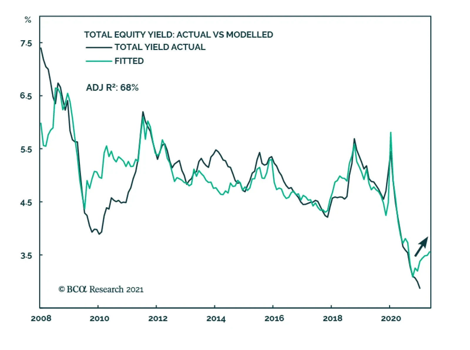
Highlights The August 1 deadline for Congress to raise the debt ceiling will come and go but the looming debt showdown will not replay the 2011-13 crisis. It is not a major risk to the bull market. The Biden administration still has the political capital to pass a signature piece of legislation via budget reconciliation by end of year. The tax component of the plan may bring a negative surprise but the market is likely to be more concerned over inflation expectations, eventual Fed rate hikes, and the 2022 fiscal cliff. The Delta variant of COVID-19 is spreading rapidly in Republican-leaning states but the existence of effective vaccines presents an immediate solution. Any substantial new jitters over the pandemic will increase monetary and fiscal stimulus. Stay long value over growth stocks despite near term risks and setbacks. Reassess if technical support is broken. Feature The Democratic Party is attempting to achieve two major things before Congress goes on recess in early August. The first is a $1.2 trillion bipartisan infrastructure package – which will take longer than that and may never pass. The second is a $2-$6 trillion budget resolution that will contain reconciliation instructions to enable the Senate to pass President Joe Biden’s proposed $2.5-$4.1 trillion American Jobs and Families Plan with 51 votes. Democrats may very well achieve this resolution before going on recess but that is the very problem when it comes to negotiations with Republicans. Even though divisions within Republican ranks make bipartisanship more likely to succeed than usual, investors should not bet on it. A partisan reconciliation process virtually guarantees both that Democrats pass their next spending bill without major disappointments for the market and that the debt ceiling is not a substantial risk to the bull market. The real risk for investors is that the markets have mostly priced the Democrats’ stimulus spending and will increasingly turn to tax hikes and especially Fed rate hikes. While we expect dovish surprises from the Fed, the strong 4.5% year-on-year growth in core consumer prices, in the context of booming consumer sentiment (Chart 1), suggests the opposite. Chart 1Consumer Confidence Still Rebounding
Consumer Confidence Still Rebounding
Consumer Confidence Still Rebounding
The Debt Ceiling Is Not A Significant Risk To The Bull Market Investors are increasingly concerned about the US debt ceiling, or statutory limit on the national debt, which comes due on August 1. But the debt ceiling does not pose a significant risk to the bull market this time around. The US is not in the same political context as it was in 2011-13 when debt showdowns roiled markets. Investors’ concerns are understandable, of course. In the wake of the Great Recession, congressional Democrats and Republicans quarreled over the debt ceiling, resulting in notable disinflationary episodes in which stocks fell while Treasuries and the dollar rallied (Chart 2). A close look at the debt showdowns of summer 2011 and winter 2012-13 reveals that the “risk off” phase occurred immediately in the first case and over the succeeding month in the second case (Chart 3). The implication is that the whole period from September to December of 2021 could be at risk from any new debt showdown. To understand why risk is not substantial this year one needs to understand what the debt ceiling is. Chart 2ABiden Will Fare Better Than Obama On Debt Ceiling
Biden Will Fare Better Than Obama On Debt Ceiling
Biden Will Fare Better Than Obama On Debt Ceiling
Chart 2BBiden Will Fare Better Than Obama On Debt Ceiling
Biden Will Fare Better Than Obama On Debt Ceiling
Biden Will Fare Better Than Obama On Debt Ceiling
Chart 3A Close Look At Debt Ceiling Showdowns, 2011-13
A Close Look At Debt Ceiling Showdowns, 2011-13
A Close Look At Debt Ceiling Showdowns, 2011-13
The debt ceiling is a legislative instrument intended to constrain the US’s public debt. Congress must authorize a higher debt limit to enable the Treasury Department to make debt payments. Legislating a higher debt ceiling is not the same as legislating government spending. Congress spends money through the annual appropriations process. Government spending amidst recurring budget deficits requires new debt issuance to provide the funds to be spent. But debt in excess of the statutory limit must be authorized by raising the limit. The last time Congress expanded the debt ceiling was in August 2019, leaving August 1, 2021 as the next deadline. Theoretically it is unpopular for congressmen to increase the allowance for their own profligate policies and as such the debt ceiling acts a curb on deficits and debt. In reality the two political parties usually pull together the 60 votes needed in the Senate to raise or suspend the limit and prevent the federal government from defaulting on debt payments that come due. The reason is that, if the debt limit were not raised, the government would default on debt payments and be forced to halt social security payments, civil servant wages, and other essential payments. A failure to write checks to seniors and military veterans would be extremely unpopular and both the president’s party and the opposition party would suffer for it (Chart 4). Chart 4ABoth President And Congress To Suffer From Any Debt Showdown
The Debt Ceiling Is The Least Of Your Worries
The Debt Ceiling Is The Least Of Your Worries
Chart 4BBoth President And Congress To Suffer From Any Debt Showdown
The Debt Ceiling Is The Least Of Your Worries
The Debt Ceiling Is The Least Of Your Worries
This does not mean that 10 Senate Republicans can easily be found to join 50 Democrats, thus reaching 60 votes in the Senate to raise the debt limit. The battle is likely to extend well into the fall, pushing up against Treasury Secretary Janet Yellen’s warning that the Treasury could run out of funds before Congress returns in mid-September. The battle will likely extend into October and create fears of a default. Getting 10 Republicans is difficult. It will not occur as part of a compromise infrastructure package, even though this package already has 11 Republicans supporting it. First, the bipartisan infrastructure deal may fail anyway because Republicans know that Democratic leadership, whether they admit it or not, will tie the deal to the passage of their larger budget reconciliation bill later this fall. Since Republicans oppose the reconciliation bill they may not be able to save face if they vote for an infrastructure deal that enables it. And Democrats do not have any reason to compromise on a bipartisan deal if they think it will destroy their larger reconciliation ambitions. Second, if a bipartisan infrastructure deal comes together, Republicans will insist that the debt ceiling is kept separate. They will not want to link themselves and their infrastructure spending with the bulging national debt. Rather they will want to force the Democrats to link their massive social spending with the national debt. Democrats may accept this trade off since the Biden administration wants a bipartisan deal – as long as they are given guarantees from moderate Senate Democrats that the latter will support the reconciliation bill. Public opinion is not generally distressed when it comes to federal budget deficits and the national debt. Only 3% of Americans cite these as the most important problem facing the country today – obviously people are more concerned with the general economic recovery and unemployment (Chart 5). However, voters clearly believe debt is one of the country’s problems, with 43% saying they are “very concerned” about debt growth, including 45% of independents. Republicans are under significant pressure on these issues, which is why only moderates would conceivably vote to raise the debt limit and even then would only raise it if forced to choose between doing so and triggering a national default (Chart 6). Brinkmanship is to be expected. Chart 5Voters Say Recovery More Important Than Debt
The Debt Ceiling Is The Least Of Your Worries
The Debt Ceiling Is The Least Of Your Worries
Chart 6Yet Concern About Debt Is Not Negligible
The Debt Ceiling Is The Least Of Your Worries
The Debt Ceiling Is The Least Of Your Worries
While public opinion generally favors infrastructure spending, support for infrastructure falls when it is explicitly linked to increases in national debt. Only 39% of voters, and 30% of independents, think it is acceptable to increase the debt to pay for infrastructure, according to a recent Ipsos/Reuters poll (Chart 7). About 60% of Democrats agree with this statement and 22% of Republicans. The implication – as we have long argued – is that investors should not bet on a bipartisan deal. They should bet on the partisan reconciliation process. Chart 7Democrats Support More Debt For Infrastructure … Others Do Not
The Debt Ceiling Is The Least Of Your Worries
The Debt Ceiling Is The Least Of Your Worries
Support for extreme deficit spending is likely to wane as the economy recovers and the sense of crisis abates. Support for emergency COVID-19 fiscal relief was very high early this year (Chart 8). Yet even at the height of the lockdowns there was a non-negligible group of voters who claimed to care about deficits (Chart 9). Fortunately for the Biden administration, the window of opportunity has not yet closed. The rise in the Delta variant of COVID-19 is generating higher hospitalization rates and renewed concerns about the pandemic, which will help support additional stimulus measures (Table 1). There is still time to pass a major spending bill on infrastructure and/or social welfare before the end of the year. Chart 8Support For COVID Relief Was Very High
The Debt Ceiling Is The Least Of Your Worries
The Debt Ceiling Is The Least Of Your Worries
Chart 9Yet Voters Showed Some Concern About Deficits Even At Height Of Crisis
The Debt Ceiling Is The Least Of Your Worries
The Debt Ceiling Is The Least Of Your Worries
Table 12022 Swing States Struggling With COVID-19
The Debt Ceiling Is The Least Of Your Worries
The Debt Ceiling Is The Least Of Your Worries
Ultimately Democrats control both chambers of Congress and will be able to vote with party discipline on raising the debt ceiling. They can raise the debt ceiling with a simple majority vote if they include it in their upcoming budget reconciliation bill. This is the main reason why investors should look through any financial market jitters: there is a clear escape hatch if Republicans obstruct. The only reason we do not exclude the possibility of Republican cooperation entirely is that Republicans are in such desperate need of a lifeline following President Trump’s defeat and the post-election riot on Capitol Hill. Indeed, the last time Republicans saw anywhere near such low levels of partisan identification was in 2013, after House Republicans brought the US to the brink of defaulting on its debt (Chart 10). The Senate Republicans are divided, not unified in willingness to trigger a default, and we can count at least 10 Senate Republicans who will capitulate if necessary to prevent a default. Chart 10Republicans Need A Lifeline … Infrastructure May Be It
The Debt Ceiling Is The Least Of Your Worries
The Debt Ceiling Is The Least Of Your Worries
Of course, Senate Republicans could refuse to raise the debt ceiling anyway. But the crucial difference is that Congress is not gridlocked. Democrats, as the ruling party, would suffer in the event of a default and they have the reconciliation process to prevent that from happening. (We have also maintained that they will eventually water down or abolish the Senate filibuster, which would open another way to lift the debt ceiling, although so far they have not succeeded in doing so.) Bottom Line: There are reasons for investors to be increasingly risk averse – tax hikes, eventual Fed rate hikes, the 2022 fiscal cliff, global growth sputters – but the debt ceiling is not one of them. Any major stock market jitters that emerge because of the debt ceiling should be ignored if they are not attended by more significant risks. Biden’s Political Capital Still Sufficient For One More Big Bill All year we have maintained that President Biden will get at least one signature bill passed in addition to the huge COVID-19 relief bill, the American Rescue Plan, passed at the beginning of the year. This view is based in our reading of his political support and capability, as evinced in our Political Capital Index, which we update weekly in the Appendix. This view is on track and we maintain high conviction. Nevertheless readers should be aware that Biden’s support will wobble over the coming months and US economic policy uncertainty will rebound from post-pandemic lows. This week’s update of the Political Capital Index shows some chinks in Biden’s armor that will likely get wider over the coming months, though we do not expect them to prevent the bill from passing. First, while political polarization has subsided from recent peaks in 2020, our polarization indicators are starting to rebound from post-election lows. Our polarization proxy (the gap in partisan approval of the president) will eventually find a floor considering the historically high structural polarization in the country. Meanwhile economic sentiment polarization and the Philly Fed Partisan Conflict Index climbed from their respective lows in the first half of the year, as Congress bickered over Biden’s next reconciliation bill (Chart 11). The upcoming partisan battles over infrastructure, the debt ceiling, budget appropriations, voting rights, guns, the Hyde amendment (abortion), a possible government shutdown, and the midterm elections will revive polarization even if it does not surpass 2020 peaks. Partisanship will ensure the passage of a reconciliation bill but then it will reduce Biden’s ability to pass legislation afterwards. Chart 11Polarization Still Historically Elevated
Polarization Still Historically Elevated
Polarization Still Historically Elevated
Second, Biden’s approval rating is rebounding a bit in July from its low point in June but the legislative process – as well as looming foreign policy challenges and other negative surprises – will weigh on his approval, at least until his infrastructure bill passes (Chart 12). Over the medium term, strong consumer sentiment and a recovering economy will prevent Biden’s approval rating from falling to President Trump’s levels, at least until a major mistake or negative shock occurs. Nevertheless presidents tend to have low approval ratings in the modern era due to partisanship and so far Biden is no exception. Chart 12ABiden Approval Will Suffer Till Infrastructure Passes
The Debt Ceiling Is The Least Of Your Worries
The Debt Ceiling Is The Least Of Your Worries
Chart 12BBiden Approval Will Suffer Till Infrastructure Passes
The Debt Ceiling Is The Least Of Your Worries
The Debt Ceiling Is The Least Of Your Worries
Third, while small business continues to be more concerned with wages and inflation than with Biden’s legislative agenda, concerns about higher taxes are gradually emerging. The business community may finally be internalizing Biden’s American Jobs Plan, which will include a corporate tax hike and possibly also individual tax hikes (Chart 13). The stock market is unlikely to ignore Biden’s corporate tax hikes forever, even if they only cause a one-off hit to earnings of 8%-10%. We expect negative tax surprises from the reconciliation process. The small business community’s opposition to Biden’s agenda is well known, and limited in impact, but it will increasingly detract from his political capital on the margin. Fourth, the economy is beginning to decelerate albeit from a very high rate of growth. The manufacturing PMI and its employment component have fallen from their highs in the first half of the year while the ratio of new orders to inventories was flat in June. The non-manufacturing sector showed the same trend with non-manufacturing business activity and new orders-to-inventories coming down from earlier heights. Non-manufacturing employment ticked down though it will likely rebound soon as enhanced federal unemployment benefits expire (Chart 14). Capex intentions softened a bit. Chart 13Small Biz Wakes Up To Inflation, Tax Hikes
Small Biz Wakes Up To Inflation, Tax Hikes
Small Biz Wakes Up To Inflation, Tax Hikes
Chart 14Economy To Decelerate From Highs
Economy To Decelerate From Highs
Economy To Decelerate From Highs
Still, the unemployment rate continued its decline in June and household and business balance sheets are strong as the economic recovery continues. Biden’s ability to pass his spending plans will ensure that the government contribution to growth remains robust in the coming years, after a soft patch in 2022 as the infrastructure plan is gradually rolled out. Most of these indicators show improvement relative to November, which gives Biden a store of political capital. Bottom Line: Polarization and policy uncertainty are likely to rebound as the economy decelerates, albeit from rapid growth. Ultimately Biden is likely to pass a signature government spending plan by the end of the year, which will give his approval rating a boost. But given thin margins in Congress, and the looming 2022 midterm elections, Biden’s political capital will largely be exhausted after the second half of this year. Fiscal policy will likely be frozen in place for several years after that. Investment Takeaways The debt ceiling is not a major risk to the bull market, though congressional brinkmanship is inevitable. We are prepared for more volatility and near-term equity setbacks but jitters arising solely from the debt ceiling should be looked through.. Investors should stay focused on the high likelihood that Biden and the Democrats will pass a reconciliation bill that will add about $1.3-$2.5 trillion to the budget deficit over eight years. Disappointments in the bill (higher taxes, lower spending) pose a greater risk to the stock market than the debt ceiling. This bill will solidify the economic recovery but also exact a one-off toll on corporate earnings and hasten concerns over rising inflation expectations and Fed rate hikes. Furthermore a fiscal cliff looms in 2022 as budget deficits normalize from extreme levels. Until new stimulus is secured, this fiscal cliff poses a much greater risk than debt ceilings or a possible government shutdown. The Delta variant of the COVID-19 virus is threatening to clog hospitals and thus poses a risk of forcing authorities to tighten social restrictions, especially in Republican-leaning states where vaccination rates are lower (Chart 15). However, we expect vaccinations to rise – and meanwhile highly vaccinated areas will remain free to conduct business. As long as vaccines remain effective, any scare over variants of the virus will be limited. A selloff is possible but would trigger new bouts of monetary and fiscal stimulus. Chart 15Red States Will Have To Increase Vaccination
The Debt Ceiling Is The Least Of Your Worries
The Debt Ceiling Is The Least Of Your Worries
We will maintain our cyclical orientation of favoring value stocks over growth stocks, although this trade faces an immediate and critical test that could trigger a revaluation (Chart 16). Tactically it should be clear from this report that rising policy uncertainty and other near-term risks are abounding. Chart 16A Test For Value Versus Growth
A Test For Value Versus Growth
A Test For Value Versus Growth
Matt Gertken Vice President Geopolitical Strategy mattg@bcaresearch.com Jesse Anak Kuri Associate Editor jesse.Kuri@bcaresearch.com Appendix Table A1USPS Trade Table
The Debt Ceiling Is The Least Of Your Worries
The Debt Ceiling Is The Least Of Your Worries
Table A2Political Risk Matrix
The Debt Ceiling Is The Least Of Your Worries
The Debt Ceiling Is The Least Of Your Worries
Chart A1Presidential Election Model
The Debt Ceiling Is The Least Of Your Worries
The Debt Ceiling Is The Least Of Your Worries
Chart A2Senate Election Model
The Debt Ceiling Is The Least Of Your Worries
The Debt Ceiling Is The Least Of Your Worries
Table A3Political Capital Index
The Debt Ceiling Is The Least Of Your Worries
The Debt Ceiling Is The Least Of Your Worries
Table A4APolitical Capital: White House And Congress
The Debt Ceiling Is The Least Of Your Worries
The Debt Ceiling Is The Least Of Your Worries
Table A4BPolitical Capital: Household And Business Sentiment
The Debt Ceiling Is The Least Of Your Worries
The Debt Ceiling Is The Least Of Your Worries
Table A4CPolitical Capital: The Economy And Markets
The Debt Ceiling Is The Least Of Your Worries
The Debt Ceiling Is The Least Of Your Worries
Footnotes
In yesterday’s Sector Insight report we stripped out the base effect from SPX earnings growth. Today, we repeat this exercise and look at a two-year annualised growth rate for US headline CPI as well as some of its categories. Using 2019 as a benchmark year reveals that the headline number is at 3%, sitting on par with the 2011 level – a sharp contrast to the regular 12-month YoY CPI rate (6%) that is close to pre-GFC highs. In fact, the key food & energy categories also appear contained despite the former perking up during the pandemic (Chart 1). 2021/2020 comparison of food and energy prices yields 2.4% and 7.5% YoY inflation respectively. There are also exceptions: The used cars category is clearly accelerating (19%) even compared to 2019, albeit it is just a small component of the headline CPI number. For completion purposes, Chart 2 on the next page also shows data for some of the pandemic-scared industries including airlines and shelter, for which prices are still below pre-pandemic highs. Bottom Line: While optically the 2021 US inflation is surging, our analysis suggests that numbers are exaggerated by the base effect from the pandemic. Chart 1
Chart 1
Chart 1
Chart 2
Chart 2
Chart 2
Highlights It is too early to conclude that the PBoC’s surprise rate cut last Friday to its reserve requirement ratio (RRR) marks the beginning of another policy easing cycle. Historically it took more than a single RRR reduction to lower interest rates and to boost credit growth. Overall economic conditions do not yet suggest that Chinese policymakers will initiate a broad-based policy easing to spur demand. The end-of-July Politburo meeting will shed more light on whether there is a decisive turn in China’s overall policy stance. In previous cycles, consecutive RRR cuts led to bond market rallies, but were not good leading indicators for equities, which have been more closely correlated with cyclical swings in credit and business cycle. We recommend patience. Chinese onshore stocks are richly valued and their prices can still correct in Q3 when corporate profits and economic growth slow further. Feature The speed and magnitude of the PBoC’s 50-basis point trim in its RRR rate last week exceeded market expectations. The RRR rate drop, combined with June’s better-than-expected credit data, sparked speculation that China’s macroeconomic policy had shifted to an easier mode. A single RRR cut does not indicate that another policy easing cycle is underway. Rather, the PBoC’s intention is to prevent rising demand for liquidity in 2H21 from significantly pushing up interest rates. In addition, we do not expect that the credit impulse will decisively turn around until later this year. We will remain alert to any signs of additional policy easing, particularly because policymakers will face more pressure to maintain trend growth next year. The July Politburo meeting may provide more information on the direction of Chinese macro policy going forward. Meanwhile, investors should stay the course. In previous cycles there were long lags between the first RRR cut and sustained rallies in China’s onshore stock markets. We will continue to maintain an underweight stance towards Chinese stocks through the next three months, given that economic data and corporate profits will likely weaken further in Q3. Surprise, Surprise! The PBoC lowered the RRR rate only two days after the State Council mentioned the possibility, which exceeded the consensus. Historically, the PBoC has always made more than one RRR reduction during easing cycles, separated by about three months. Are more RRR cuts pending and does the initial decrease mark the beginning of another policy easing cycle? It is too early to conclude that a broad-based easing cycle has started, for the following reasons: First, economic fundamentals do not suggest an urgent need for policy easing. The economy is softening, but it is softening from a very elevated level (Chart 1). Importantly, production is weakening at a faster pace than demand and partially due to COVID-related idiosyncrasies. This supply-side issue cannot be solved by monetary easing. For example, the production subcomponent of the manufacturing PMI fell in June while new orders increased (Chart 2). Since its trough in April last year, the gap between new orders and production has consistently narrowed for 11 of the past 15 months, highlighting that the demand-side recovery has been outpacing the supply-side. The recent resurgence in COVID-19 cases and local lockdowns in Guangdong province, which is China’s manufacturing and export powerhouse, may have curbed June’s manufacturing production and new export orders. Global supply shortages in raw materials and chips also add to the sluggishness in manufacturing production. Chart 1Chinese Economy Is Slowing, But Not Too Slow
Chinese Economy Is Slowing, But Not Too Slow
Chinese Economy Is Slowing, But Not Too Slow
Chart 2Demand Not As Soft Compared With Production
Demand Not As Soft Compared With Production
Demand Not As Soft Compared With Production
Similarly, China’s service PMI slipped notably in June and has closely tracked the country’s domestic COVID-19 situation. The decline is an issue that policy easing and boosting demand will not solve (Chart 3). Secondly, global supply chains are still impaired and commodity prices remain elevated. Even though China’s PPI on a year-over-year basis rolled over in June, it is at its highest level since 2008 (Chart 4). As such, spurring demand through monetary easing would only exacerbate inflationary pressures among producers. Chart 3Slow Recovery In Services Largely Due To Lingering COVID Effects
Slow Recovery In Services Largely Due To Lingering COVID Effects
Slow Recovery In Services Largely Due To Lingering COVID Effects
Chart 4Producer Prices Remain Elevated
Producer Prices Remain Elevated
Producer Prices Remain Elevated
Apart from COVID-related disruptions, the weakness in China’s economy this year has been driven by slower growth in infrastructure and real estate investment due to tightened regulatory oversights that were put in place late last year (Chart 5). Construction PMI declined sharply from its peak in March and both excavator sales and loader sales have plummeted since Q1 this year (Chart 5, bottom panel). However, regulatory tightening towards the housing market and infrastructure projects remain firmly in place, suggesting that policymakers are not looking to stimulate the old economy sectors to support growth. Lastly, despite weaker home sales, housing prices in tier-one cities continue to escalate (Chart 6). The rising prices will keep authorities vigilant about excessive liquidity in the market. Chart 5It Has Been Chinese Policymakers' Intention To Slow The 'Old Economy' Sectors
It Has Been Chinese Policymakers' Intention To Slow The 'Old Economy' Sectors
It Has Been Chinese Policymakers' Intention To Slow The 'Old Economy' Sectors
Chart 6Housing Market Mania Remains Authorities' Pressure Point
Housing Market Mania Remains Authorities' Pressure Point
Housing Market Mania Remains Authorities' Pressure Point
Bottom Line: Supply-demand dynamics in the global economy and China’s domestic inflationary pressures suggest that it is premature to assume that the RRR cut marks the beginning of another policy easing cycle. Why Now? Chart 7More 'Pain' Needed For Broad Easing
More 'Pain' Needed For Broad Easing
More 'Pain' Needed For Broad Easing
The drop in the RRR highlights the PBoC’s determination to maintain a low interest-rate environment without any further easing, and does not indicate that the central bank has shifted its current policy setting framework. The PBoC has been reactive rather than proactive in the past as it typically waits for severe signs of economic weakness before broadly relaxing its policy (Chart 7). The PBoC cited two main reasons for the RRR cut. One is to ease liquidity pressures of small to medium enterprises (SMEs), which have been struggling with rising input prices and subdued output prices (Chart 8). This motive is consistent with the PBoC’s monetary position so far this year –the central bank has kept rates at historical low levels while scaling back credit creation (Chart 9). Chart 8SMEs Under Elevated Pricing Stress
SMEs Under Elevated Pricing Stress
SMEs Under Elevated Pricing Stress
Chart 9The PBoC Has Kept Rates At Historic Low Levels
The PBoC Has Kept Rates At Historic Low Levels
The PBoC Has Kept Rates At Historic Low Levels
Demand for liquidity will rise meaningfully in the second half of the year due to an acceleration in local government bond issuance and the large number of expiring medium-term lending facility (MLF) loans and bonds. The liquidity gap could significantly push up interbank and market-based interest rates without the central bank’s intervention. The amount of maturing MLF and government bonds could be more than RMB1 trillion in July. Thus, the 50bp RRR cut, which the PBoC indicates will free up about RMB1 trillion of liquidity to the banking system, will ensure that interest rates remain stable. Chart 10Bank Lending Rates Have Not Declined With Policy Rates
Bank Lending Rates Have Not Declined With Policy Rates
Bank Lending Rates Have Not Declined With Policy Rates
The PBoC also stated that it intends to keep down financing costs for both banks and SMEs. The statement is vague, but the PBoC may mean it plans to guide bank lending rates lower for SMEs and, at the same time, provide banks (particularly smaller banks) with enough liquidity to encourage lending to those enterprises. To achieve this goal, a broad-based RRR cut would be more effective than other monetary policy tools, such as open-market operations or MLF injections, which normally benefit large commercial banks more than their smaller counterparts. While interbank rates have been sliding since Q4 last year, the weighted average lending rates moved sideways and even ticked up slightly this year (Chart 10). As of Q1 2021, more than half of bank loans charged higher interest rates than the loan prime rate (LPR), highlighting a distribution matrix unfavorable to SMEs (Chart 11). Loan demand from SMEs, as shown in the PBoC survey, peaked much earlier and tumbled more rapidly than their large peers (Chart 12). Chart 11SMEs Face Rising Input And Funding Costs
China’s Monetary Policy: Easy, But Not Easing
China’s Monetary Policy: Easy, But Not Easing
Chart 12Waning SMEs' Demand For Bank Credit
Waning SMEs' Demand For Bank Credit
Waning SMEs' Demand For Bank Credit
Lowering lending rates for SMEs is usually at the cost of the banks by bearing higher default risks and lower profits. A RRR reduction, coupled with recent changes in banks’ deposit rate pricing mechanisms,1 are measures that can potentially reduce the banks’ liability costs. Bottom Line: The PBoC is using a RRR cut to avoid a sudden jump in interest rates from their low levels in 1H21, and to reduce funding costs for the SMEs and banks. What About Credit Growth? Chart 13Credit Numbers In June Beat Market Expectations
Credit Numbers In June Beat Market Expectations
Credit Numbers In June Beat Market Expectations
Credit numbers beat the market’s expectations in June. Both credit growth and impulse rose slightly after a fast deceleration in much of 1H21 (Chart 13). We continue to expect the credit impulse to hover at a low level throughout Q3. Local government bond issuance will pick up in 2H21, but the acceleration will not necessarily lead to a reversal in credit growth (Chart 14). On a year-over-year basis, high base during Q3 last year will depress credit growth and impulse in the next three months. Moreover, in the past couple years, on average local government bonds account for only about 18% of annual total social financing. As such, the pace of bank loan expansion would need to substantially accelerate to reverse the slowdown in credit growth in the next three months. In previous cycles, on average it took more than one RRR cut and about two quarters for credit growth to turn around (Chart 15). Therefore, even if monetary policy is on an easing path, we expect credit growth to pick up in Q4 at the earliest. Chart 14LG Bonds Only A Small Part Of Total Credit Creation
China’s Monetary Policy: Easy, But Not Easing
China’s Monetary Policy: Easy, But Not Easing
Chart 15Credit Growth Lags RRR Cuts By About Two Quarters
Credit Growth Lags RRR Cuts By About Two Quarters
Credit Growth Lags RRR Cuts By About Two Quarters
Furthermore, policymakers are unlikely to deviate from targeting credit growth in line with nominal GDP this year. Based on our estimate, the target suggests that the overall credit impulse relative to 2020 will be negative this year (Chart 16). Chart 16Negative Credit Impulse In 2021 Relative To 2020
Negative Credit Impulse In 2021 Relative To 2020
Negative Credit Impulse In 2021 Relative To 2020
Chart 17The Credit Structure, Rather Than Volume, Will Improve In 2H21
The Credit Structure, Rather Than Volume, Will Improve In 2H21
The Credit Structure, Rather Than Volume, Will Improve In 2H21
Meanwhile, we think that the PBoC will focus on improving the structure of credit creation by continuing to encourage medium- to long-term lending, while scaling back shadow banking and short-term loans (Chart 17). Corporate bond financing improved slightly in June. However, room for further improvement in corporate bond issuance is small this year, given tightened financing reglations on local government financing vehicles. Downside potential for corporate bond yields is also limited in 2H21, when the economy slows and corporate bond default risks are rising (Chart 18). Given elevated housing prices and tightened regulations to contain the property sector’s leverage, bank lending to real estate developers and mortgages will continue to trend down in the foreseeable future, regardless the direction of interest rates (Chart 19). Chart 18Limited Upsides For Corporate Bond Issuance In 2H21
Limited Upsides For Corporate Bond Issuance In 2H21
Limited Upsides For Corporate Bond Issuance In 2H21
Chart 19Bank Loans To Property Market Unlikely To Pick Up In 2H21
Bank Loans To Property Market Unlikely To Pick Up In 2H21
Bank Loans To Property Market Unlikely To Pick Up In 2H21
Bottom Line: Regardless changes in monetary policy, credit growth will not decisively bottom until later this year. Investment Implications Chart 20Chinese Stock Prices Failed To Break Out
Chinese Stock Prices Failed To Break Out
Chinese Stock Prices Failed To Break Out
Chinese stocks in both onshore and offshore equity markets failed to reverse their trend of underperformance relative to global stocks (Chart 20). Investors should be patient in upgrading their allocation to Chinese stocks from underweight to overweight, in both absolute terms and within a global equity portfolio. Historically, there has been a long lag between an initial RRR trim and a trough in Chinese onshore stock prices (Chart 21). Although prices moved up along with RRR cut announcements in the past, the price upticks were short lived. Stock prices in previous cycles troughed when the credit impulse and/or the economy bottomed. Given our view that a single RRR decrease does not indicate a broad-based policy easing and the credit impulse is unlikely to pick up until later this year, investors should wait for more price setbacks in Q3 before favoring Chinese stocks again. Chart 21Long Lags Between First RRR Cut And Stock Market Troughs
Long Lags Between First RRR Cut And Stock Market Troughs
Long Lags Between First RRR Cut And Stock Market Troughs
We are slightly more optimistic than last month about Chinese bonds because the RRR cut has reduced the possibility for any substantial rise in interest rates in 2H21. However, we maintain a cautious view on Chinese government and corporate bonds in Q3. In previous cycles, onshore bond yields often fluctuated sideways or even climbed a bit following the first RRR reduction. It often took several RRR drops, more policy easing signals and sure signs of economic weakening for the bond market to enter a tradable bull run (Chart 22). Therefore, we recommend investors stay on the sidelines for a better entry price point. Chart 22It Takes More Than One RRR Cut To Start A Bond Market Bull Run
It Takes More Than One RRR Cut To Start A Bond Market Bull Run
It Takes More Than One RRR Cut To Start A Bond Market Bull Run
It is also unrealistic to expect the RRR cut will lead to significant and sustained devaluation in the RMB relative to the US dollar. We expect the dollar index to rebound somewhat in Q3 on the back of positive US employment data surprises which will push US bond yields higher. However, following previous RRR cuts, the RMB had sizeable depreciations only when geopolitical events (the US-China trade war in 2018/19) or drastic central bank intervention (the August 2015 de-pegging from the USD) coincided with the RRR cuts. These scenarios are not likely to play out in the next six months (Chart 23). As such, we maintain our view that the CNY will slightly weaken against the USD in Q3 but will end the year at around 6.4. Chart 23Expect Muted And Short-Lived Movements In The USDCNY From A Single RRR Cut
Expect Muted And Short-Lived Movements In The USDCNY From A Single RRR Cut
Expect Muted And Short-Lived Movements In The USDCNY From A Single RRR Cut
Jing Sima China Strategist jings@bcaresearch.com Qingyun Xu, CFA Associate Editor qingyunx@bcaresearch.com Footnotes 1The reform changes the way banks calculate and offer deposit rates. The upper limit is set on their deposit interest rates by adding basis points to the central bank’s benchmark deposit rates, rather than multiplying the benchmark rates by a specific number. Exclusive: Banks Prepare to Lower Deposit Rates as Rate Cap Reform Takes Effect (caixinglobal.com) Cyclical Investment Stance Equity Sector Recommendations
Earnings season is upon us again. Time just flies! This quarter, according to Refinitiv, Net Income is expected to increase by 64.9% YoY on Revenue growth of 18.5%. EPS growth is expected to be 68.1% - it is higher than income growth by 3.2% thanks to the projected share repurchases. BCA Model expects a 3.6% buyback yield. These numbers are truly spectacular, and yet a little suspicious. So what do we make of them? Similar to the inflation story, Q2-21 earnings season growth numbers look so high because they are dominated by the base effect: growth is computed against the worst quarter of the pandemic, Q2-20. To strip out the base effect, we calculated quarterly earnings growth with respect to Q2 of 2019 for the S&P 500 as well as its GICS1 sectors. Looking at the cleaner numbers reveals that SPX quarterly EPS growth sits at a respectable 12.2%. This number appears manageable, in sharp contrast to eyewatering growth calculated based on Q2-20 comparables. Bottom Line: The implication is that once we take out the once in a lifetime pandemic effect, we observe that earnings growth is normalizing, and expectations are rather reasonable.
Earnings Season Is On
Earnings Season Is On
According to BCA Research’s US Equity Strategy service, we are at the outset of the new dividend and buyback cycle. Both market and company-related factors underpin dividend and buyback trends. The quality of a company’s profitability, cash flow, and…

Over a 12-month horizon, investors should maintain a modest overweight allocation to equities. Although pandemic-related uncertainties linger – particularly regarding the emergence and impact of variants – global growth will remain strong. And even though…
US President Joe Biden tapped a new “channel” of direct communications with Russian President Vladimir Putin on July 9 to protest another cyber-attack thought to have originated by criminals operating on Russian soil. A Russian group of hackers known as REvil…
Feature Since the end of the first quarter, the decline in Treasury yields has been the most important trend in global financial markets. It has contributed to the return of the outperformance of growth stocks relative to value stocks, the underperformance of Eurozone equities relative to the S&P 500, and the tepid results of cyclicals relative to defensive equities. This decline in yields is a temporary phenomenon, because the global economy continues to re-open and inventory levels remain so low that further restocking is in the cards. The cyclical picture is not without blemish; COVID-19 variants remain a concern. However, if these risks were to materialize into another delayed re-opening, then further reflationary efforts by both monetary and fiscal authorities would buoy financial markets. The greatest near-term worry for the global economy and markets comes from China. The Chinese credit impulse is slowing markedly and fiscal support has yet to come to the rescue. This phenomenon is the main reason why this publication maintains a cautious tactical stance on Eurozone cyclical stocks, even if we believe these sectors have ample scope to outperform over the remainder of the business cycle. As a corollary, we believe that yields will likely remain within range this summer and Eurozone benchmarks will lag behind the US. This week, we review key charts, organized by theme, highlighting some of these key concepts. As an aside, none covers inflation. Even if the balance of evidence suggests that any sharp increase in Eurozone inflation will be temporary, the proof will only become more visible by early 2022. The Opening Is On Track… The pace of vaccination across the major Eurozone economies has picked up meaningfully since the spring. Consequently, the number of doses distributed per capita is rapidly approaching that of the US, even as it still lags behind that of the UK (Chart 1). As a result of this improvement, the stringency of lockdown measures is declining, which is allowing European mobility to recover (Chart 2). While this phenomenon is evident around the world, EM still lag in terms of vaccination rates. However, the Global Health Innovation Center at Duke University expects 10 billion vaccine doses to be produced by the year’s end, which will be enough to inoculate most (if not all) the vulnerable people in the world by early 2022. Consequently, the re-opening of the economy will remain a potent tailwind behind global growth for three or four more quarters. Chart 1Vaccination Progress...
Vaccination Progress...
Vaccination Progress...
Chart 2...Leads To Greater Activity
...Leads To Greater Activity
...Leads To Greater Activity
… But Near-Term Headwinds Remain The re-opening of the global economy will allow growth to stay well above trend for the upcoming 12 months, at least. Global industrial activity could nonetheless decelerate this summer. Input costs have risen. The two most important ones, oil and interest rates, are already consistent with a peak in the US ISM manufacturing and the global PMI (Chart 3). In this context, the decelerating Chinese credit impulse is concerning (Chart 4) because it portends a hit to global trade and industrial activity. The effect of this slowdown should be most evident in the third and fourth quarters of 2021. However, it will be temporary because Beijing only wants credit to grow in line with GDP, rather than an outright deleveraging. Thus, the credit impulse will stabilize before the year’s end, which will allow the positive effect of the global re-opening to be fully experienced once again. Chart 3Rising Input Costs...
Rising Input Costs...
Rising Input Costs...
Chart 4...And China's Credit Slowdown Matter
...And China's Credit Slowdown Matter
...And China's Credit Slowdown Matter
Domestic Tailwind In Europe Despite the extreme sensitivity of the European economy to the global business cycle, Europe should continue to produce positive surprises. The supports to the domestic economy are strong. The NGEU funds means that Europe will suffer one of the smallest fiscal drag among G-10 nations next year. Moreover, the re-opening will support household income and allow the positive effect of the increase in the money supply to buoy consumption (Chart 5). Finally, rising consumer confidence, and the ebbing propensity to save will reinforce the tailwinds behind consumption (Chart 6). Chart 5Europe's Domestic Activity
Europe's Domestic Activity
Europe's Domestic Activity
Chart 6...Will Improve Further
...Will Improve Further
...Will Improve Further
Higher Bond Yields Are Coming… The environment continues to support higher yields. Our BCA Pipeline Inflation Indicator is surging, which historically translates into higher global borrowing costs (Chart 7). Most importantly, our Nominal Cyclical Spending Proxy remains very robust, which normally leads to rising yields (Chart 8). While US inflation expectations at the short end of the curve already fully reflect current inflationary pressures, the 5-year/5-year forward inflation breakeven rates will have additional upside. Moreover, the term premium and real rates remain depressed, and policy normalization will cause these variables to climb higher over time. Chart 7Higher Yields Will Come...
Higher Yields Will Come...
Higher Yields Will Come...
Chart 8...Later This Year
...Later This Year
...Later This Year
… But Not This Summer It could take some time before the bearish backdrop for bonds results in higher bond yields. First, bonds have yet to purge fully their oversold status created by the 125 basis-point surge that took place between August 2020 and March 2021 (Chart 9). This vulnerability is even more salient in an environment in which the Chinese credit impulse is decelerating. As Chart 10 illustrates, a slowing total social financing number reliably leads to bond rallies. While the chart looks dire for bond bears, it must be placed in context, in which global fiscal policy remains accommodative considering the decline in the private sector savings rate and in which Advanced Economies’ capex will stay strong. Thus, instead of betting on a large swoon in yields in the coming quarters, we expect US yields to remain stuck between 1.20% and 1.70% for a few more months before they resume their upward path once the Chinese economy stabilizes. Chart 9But Bonds Are Still Oversold...
But Bonds Are Still Oversold...
But Bonds Are Still Oversold...
Chart 10...And Fundamentals Cap Yields For Now
...And Fundamentals Cap Yields For Now
...And Fundamentals Cap Yields For Now
A Positive Cyclical Backdrop For The Euro The near-term forces suggest that the euro will remain range bound over the summer, between 1.16 and 1.23. EUR/USD is a pro-cyclical pair, and so the near-term lack of upside to global growth will act as a temporary ceiling on this currency. Nonetheless, the 18-month outlook continues to favor the common currency. Investors have shed Eurozone exposure for more than 10 years and are structurally underweight this region (Chart 11). Hence, EUR/USD should benefit from any positive reassessment of the growth path in the Euro Area compared to that of the US. Additionally, the euro benefits from a structural current account surplus compared to the USD, which translates into a positive basic balance of payments (Chart 12). In an environment in which US real interest rates are low in relation to foreign ones and in which the Fed wants to maintain accommodative monetary conditions to achieve maximum employment, the capital account balance is unlikely to come to the rescue of the dollar. In this context, EUR/USD still possesses significant cyclical upside and is likely to move back above 1.30 by the year’s end of 2022. Chart 11Investors Underweight Eurozone Assets...
Investors Underweight Eurozone Assets...
Investors Underweight Eurozone Assets...
Chart 12...And The BoP Favors The Euro
...And The BoP Favors The Euro
...And The BoP Favors The Euro
The Bull Market In Global Stocks Is Not Over The cyclical outlook for equities remains supportive. To begin with, in most years, equities eke out positive returns, as long as a recession is not around the corner; we do not expect a recession anytime soon. Moreover, while the balance of valuation risk and monetary accommodation is not as supportive of stocks as it was last year, it is not pointing to an imminent deep pullback either (Chart 13). The equity risk premium echoes this message. Our ERP measure adjusts for the expected growth rate of earnings as well as the lack of stationarity of the ERP. According to this indicator, equities are not an urgent buy, but they are not at risk of a bear market either (Chart 14). This combination does not prevent corrections, but it suggests that pullbacks of 10% are to be bought. Chart 13Equities Are Not A Screaming Buy...
Equities Are Not A Screaming Buy...
Equities Are Not A Screaming Buy...
Chart 14...Nor A Screaming Sell
...Nor A Screaming Sell
...Nor A Screaming Sell
Europe’s Structural Underperformance Is Intact… Eurozone stocks have been underperforming their US counterparts since the GFC. As Chart 15 highlights, this subpar performance reflects the decline in European EPS relative to US ones. There is very little case to be made for this underperformance to end on a structural basis. Europe remains saddled with an excessive capital stock and ageing assets. This combination is weighing on European profit margins and RoE (Chart 16). To put an end to this structural underperformance, either European firms will have to consolidate within each industry (allowing cuts to the excess capital stock, to increase concentration, and to boost profit margins) or the regulatory burden must rise in the US to curtail rates of returns in relation to European levels. Chart 15Europe's Underperformance...
Europe's Underperformance...
Europe's Underperformance...
Chart 16...Reflects Profitability Problems
...Reflects Profitability Problems
...Reflects Profitability Problems
…But The Window For A Cyclical Outperformance Remains Open Despite a challenging structural backdrop, European equities have a window to outperform US stocks, similar to the outperformance of Japan from 1999 to 2006, which only marked a pause within a prolonged relative bear market. European stocks beat their US counterparts when global yields rise (Chart 17). This is because European benchmarks underweight growth stocks relative to US markets. The effect of higher yields on the relative performance of the Euro Area is not limited to the impact of higher discount rates. Yields rise when global economic activity is above trend. As Chart 18 highlights, robust readings of our Global Growth Indicator correlate with an outperformance of the EPS of value stocks compared to growth equities. Thus, when rates rise, Europe should enjoy both a period of re-rating relative to the US and stronger profits. Chart 17Yields Drive European Stocks...
Yields Drive European Stocks...
Yields Drive European Stocks...
Chart 18...And So Does Global Growth
...And So Does Global Growth
...And So Does Global Growth
Positives For Euro Area Financials Like the broad European market, the financials’ fluctuations are linked to interest rates. Moreover, Euro Area banks also move in line with EUR/USD (Chart 19). As a result, our positive view on both yields and the euro for the next 18 months or so should translate into an outperformance of financials in Europe. Additionally, European banks are inexpensive, embedding not just depressed long-term growth expectations, but also a wide risk premium. Europe’s structural problems mean that investors are correct to expect poor earnings growth from the region’s banks. However, the risk premium is overdone. Eurozone banks are much safer than they were 10 years ago. Banks now sport significantly higher Tier 1 capital adequacy ratios and NPLs have shrunk considerably (Chart 20). Moreover, governmental supports and credit guarantees implemented during the pandemic should limit the upside to NPL in the coming quarters. Finally, the so-called doom-loop that used to bind government and bank solvency together is not as problematic as it once was, because the ECB is a willing buyer of government paper and the NGEU programs create the embryo of fiscal risk sharing that limit these dynamics. As a result, investors should overweight this sector for the next 18 months. Chart 19Financials Have A Window To Shine...
Financials Have A Window To Shine...
Financials Have A Window To Shine...
Chart 20...And Are Less Risky
...And Are Less Risky
...And Are Less Risky
A Tactical Hedge Our worries about the impact on the global economy of the Chinese credit slowdown are likely to prompt some downside in European cyclical equities relative to defensive ones. Moreover, cyclicals are still significantly overbought relative to defensives, while our relative Combined Mechanical Valuation Indicator confirms the near-term threat (Chart 21). A high-octane vehicle to play this tactical underperformance of cyclicals relative to defensives is to buy Euro Area telecom stocks relative to consumer discretionary equities. Not only are the discretionary stocks massively overbought and expensive relative to telecoms (Chart 22), they also offer a lower RoE. This backdrop makes the short discretionary / long telecoms bet a great hedge for portfolios with a pro-cyclical bias over one- to two-year horizons. Chart 21Cyclicals Are Tactically Vulnerable...
Cyclicals Are Tactically Vulnerable...
Cyclicals Are Tactically Vulnerable...
Chart 22...But This Risk Can Be Hedged Away
...But This Risk Can Be Hedged Away
...But This Risk Can Be Hedged Away
Currency Performance Currency Performance
Summer Charts
Summer Charts
Fixed Income Performance Government Bonds
Summer Charts
Summer Charts
Corporate Bonds
Summer Charts
Summer Charts
Equity Performance Major Stock Indices
Summer Charts
Summer Charts
Geographic Performance
Summer Charts
Summer Charts
Sector Performance
Summer Charts
Summer Charts