Equities

Over the past several weeks, the S&P 500 has failed to break above its May 7 all-time high. This stagnation is consistent with indications that the rally was vulnerable to some profit taking. Inflationary fears highlighted by various data releases,…

Highlights We update our assumptions for the likely 10-15 year return for a wide range of different asset classes. Our methodology is basically unchanged from our last Return Assumptions report published in 2019, though we have refined our analysis and use of data in some areas. Returns over the next decade will be very low compared to history. We project that a standard global portfolio (50% equities, 30% bonds, and 20% alternatives) will return only 3.0% a year in nominal terms. That compares to a historic return of 6.3%. There are still some assets that will produce better returns, most notably small caps (4.9% a year in the US) and alternatives (6.2% for private equity, for example). But they also carry higher risk. Spreadsheets are available with detailed data. Introduction This is the third edition of our work on return assumptions. Since publishing the previous reports in November 2017 and June 2019, we have had many opportunities to discuss our methodologies with clients and in the Global Asset Allocation course at the BCA Academy. This has allowed us to test and, in many cases, refine our approach. We believe the methodologies we use have stood the test of time. We have always emphasized that this sort of capital markets assumptions (CMA) analysis is an art, not a precise science. We continue to prefer to project returns over a somewhat undefined 10-15 year period, since this allows us to think about the underlying trend of likely returns. Many other CMA papers use five (or even three) year time horizons which, in our view, are problematical since they rely heavily on a forecast of the timing, length, and severity of the next recession. Our approach is based on the concept that the return on the risk-free long-term government bond is the cornerstone to projecting asset returns, and that this return is rather predictable: It is approximately the current yield. Most other asset returns can be built up from that – the return on high-yield bonds, for example, by assuming that their historic spread over government bonds, and default and recovery rates will continue in the future. For equities, we continue to use six different methodologies, which are based on a mixture of valuation and projected earnings growth. This approach – that assumed returns can be built up from a combination of current yield plus forecast future growth in capital values – also works for most alternative asset classes, for example real estate. We have made a few minor changes to our methodology in this edition. We have, for example, made our use of historical data (for spreads, profit margins, growth relative to GDP, etc.) more consistent, using the 20-year average where possible. The biggest change this time is that clients can download here a spreadsheet with all the data in this report in order, for example, to use the data as inputs into their own optimizers. In addition, we have set up our detailed spreadsheet to allow clients to see the underlying inputs, the formulae behind our methodologies, and to input their own assumptions. This will also allow us to update the results of our analysis as often as needed. Please let us know here if you would like more details about this additional service. This Special Report is structured as follows. First, we analyze the overall results: What is the probable return from each asset class over the next 10-15 years, and how do these differ from historical returns. Next, we describe in detail the methodologies we use, for (1) economic growth, (2) fixed-income instruments, (3) equities, and (4) 12 different alternative asset classes. Then, we describe our way of forecasting currency returns, and show the return assumptions in different base currencies. Finally, we update the numbers for volatility and correlations, which many investors need as inputs into optimization programs. The summary of our results is shown in Table 1. The results are all average annual nominal total returns, in local currency terms (except for global indexes, which are in US dollars). The data is updated to end-April 2021 (except for some alternative asset classes where only quarterly data is available). Table 1BCA Assumed Returns
Return Assumptions 2021
Return Assumptions 2021
Overall Results Returns over the coming decade are likely to be very disappointing compared to history. Our assumptions suggest a typical global portfolio, consisting of 50% large-cap equities, 30% bonds, and 20% alternatives, will produce an annual nominal return of only 3.0%, compared to an average of 6.3% over the past 20 years. A US-only portfolio with a similar composition is likely to produce only a 3.1% return, compared to 7% in history. The reason is simple: Valuations currently are very stretched in almost every asset class. The risk-free rate (the 10-year government bond yield) in the US is 1.6% (compared to a 20-year average of 3.1%). It is negative in the euro area (in nominal terms) and zero in Japan. These rates are the anchor for the returns of all other asset classes, which are theoretically priced off the risk-free rate plus a risk premium. We have long argued that valuations are not a good timing tool for investors. An asset can remain very expensive or very cheap for a considerable period. But all the evidence shows that the valuation at the starting point is a very powerful indicator of long-run returns. The yield on government bonds, for example, has a strong correlation with their 10-year return (Chart 1). In the equity market, the Shiller PE has historically had little correlation with the return over one or two years, but has a 90% correlation with the return over the subsequent 10 years (Chart 2). Chart 1Starting Yield Determines Bond Returns
Return Assumptions 2021
Return Assumptions 2021
Chart 2Valuation Drive Long-Run Equtiy Returns
Valuation Drive Long-Run Equtiy Returns
Valuation Drive Long-Run Equtiy Returns
With valuations in equity markets now expensive relative to history (for example, forward PE for US stocks of 22x compared to a 20-year average of 16x, and 18x in the euro zone compared to 13x), investors should expect that equity market returns will be low relative to history. Our assumptions point to a 2.6% annual return from US stocks, 2.3% from the euro zone, and 1.6% from Japan (compared to 8.5%, 3.9%, and 3.5% over the past 20 years). Our assumptions are significantly lower than when we last published our analysis in 2019; then we projected 5.6% for US stocks, 4.7% for the euro zone, and 6.2% for Japan. The difference is that equity multiples have risen and risk-free rates have fallen significantly since then. So what should investors do? They have only two choices: Lower their return assumptions, or increase their weightings in riskier asset classes. Chart 3Hard To See How US Pension Funds Will Achieve Their Targets
Hard To See How US Pension Funds Will Achieve Their Targets
Hard To See How US Pension Funds Will Achieve Their Targets
The average US public pension fund (Chart 3) still assumes a return of 7% a year, and private pension funds’ assumption is not much lower. And yet corporate pension funds have been pushed by their consultants in recent years to increase their weighting in bonds, to more closely match their liabilities (Chart 4). It is almost mathematically impossible to achieve their targets with that sort of portfolio. In other countries, such as Australia or Canada, pension funds’ return targets are typically inflation or cash plus 3-4 percentage points. But even those targets are challenging. Chart 4...Especially With Over 50% In Bonds
Return Assumptions 2021
Return Assumptions 2021
There are asset classes which will produce higher returns. For example, we project a return of 4.9% from US small-cap stocks – and 9.7% from UK small caps. US high-yield bonds should produce a return of 3.2% a year (even after defaults) and Emerging Markets local currency sovereign debt 2.7% (in USD terms) – not exactly exciting, but at least a pick-up over other fixed-income securities. The projected returns from illiquid alternative assets continue to look relatively attractive. An equal-weighted portfolio of the 12 alternatives we cover is projected to return 5.7% a year, not much lower than the forecast of 6.1% from our 2019 report (and compared to an average of 7.1% of the past 20 years). There are some alt assets where returns have started to trend down: Private equity, for instance, is projected to return 6.2% a year, compared to 11.1% in history, and hedge funds 4.5%, compared to 5.9%. But the illiquidity premium should not disappear completely, even if the move of alternative investments to become more mainstream has reduced it to a degree. So adding more risky assets to a portfolio is an answer, at least for those investors with a long enough time-horizon that allows them to bear the inevitable big drawdowns that come with having a more volatile portfolio. And, unfortunately, lower returns mean that the incremental return gained for each unit of risk taken has declined compared to the past 10 or 20 years (Chart 5) – the efficient frontier has flattened significantly. Chart 5You Need To Take More Risk To Produce Return
Return Assumptions 2021
Return Assumptions 2021
How We Came Up With The Assumptions GDP Growth Several of our methodologies use assumptions (for example, in equity methods (2) and (3), based on projections of earnings growth, real-estate capital-value growth, and commodities prices) which require estimates of nominal GDP growth in each country and region. To make these forecasts, we assume that nominal GDP growth can be decomposed into: (1) growth of the working-age population, (2) productivity growth, and (3) inflation. This ignores capital intensity, but it has been relatively stable over history and is difficult to forecast. Table 2 shows the assumptions we use, and our forecasts for real and nominal GDP in each country and region. Table 2Calculations Of Trend GDP Growth
Return Assumptions 2021
Return Assumptions 2021
For population growth we use the United Nations’ median forecast of annual growth in the population aged 25-54 between 2020 and 2040. This ranges from -1% in Japan to +1% in Emerging Markets – although note that the range of forecast population growth in EM varies widely from 1.2% in India to -1.1% in Korea (and in China, too, is negative at -0.7%). This estimate is reasonably reliable, although it does miss some possible factors, such as changes in the female participation rate, hours worked, and changing openness to immigration. Productivity is much harder to forecast. Over the past 10 to 20 years, productivity growth has trended down in most countries (Charts 6A & B). We take a slightly more optimistic view, assuming that productivity growth over the next 10-15 years will equal the 20-year average. We base this on the belief that part of the decline in productivity since the Global Financial Crisis is due to cyclical reasons which are now dissipating, and also to expectations that new technologies coming through (artificial intelligence, big data, automation, robotics etc) will boost productivity in the coming years. Others take a more pessimistic view. The Congressional Budget Office’s forecast of trend real US GDP growth in 2022-2031 of 1.8%, for example, is lower than our estimate of 2.2% mainly because of its more cautious estimate of productivity growth. Chart 6AProductivity Growth (I)
Productivity Growth (I)
Productivity Growth (I)
Chart 6BProductivity Growth (II)
Productivity Growth (II)
Productivity Growth (II)
To derive nominal GDP growth, we assume that inflation over the next 10 years will be on average the same as over the past 20 years, for example 2% in the US, 1.6% in the euro area, 0.1% in Japan, and 3.9% in Emerging Markets (using a weighted average of EM by equity market cap). This estimate, too, has a high degree of uncertainty. One could imagine a scenario whereby inflation picks up significantly over the next decade due to excessively easy monetary policy, overly generous fiscal spending, growth in protectionism, rising labor pressure for wage increases, and the effects of a rising dependency ratio (the ratio of non-working people, especially retirees, to total population).1 But another scenario of continued “secular stagnation” and disinflation, caused by automation-driven job losses and a chronic lack of aggregate demand, is also conceivable. We think our middle-path forecast is the most sensible one to use in projecting likely asset returns, but investors might also want to plan based on these alternative scenarios too. Note that for Emerging Markets, we continue to show two different scenarios, which vary according to different projections of productivity growth. EM productivity growth has been declining steadily since around 2010, and in all major emerging economies, not just China. Our first scenario assumes that this decline ends and that, as in our assumption for developed economies, productivity growth reverts to the 20-year average. The more pessimistic (and, in our view, more likely) scenario assumes that the deterioration in productivity continues and that in 10 years’ time, EM productivity is the same as the average of developed economies. Which scenario will be correct depends on whether emerging economies, not least China, are able to implement structural reforms over the next decade, for example liberalizing the labor market, allowing a greater role for the private sector, improving corporate governance, and institutionalizing more orthodox fiscal and particularly monetary policy. Fixed Income Our anchor for calculating assumed returns is the return on long-term risk-free assets, specifically the 10-year government bond in the strongest countries. It is a reasonable assumption that an investor who buys, for example, a 10-year Treasury bond today and holds it for 10 years will make 1.6% a year in nominal US dollar terms. While this is not perfectly mathematically correct (since it ignores reinvested interest payments, for instance), empirically the return on government bonds has been very closely linked to the yield at the start-point in history (see Chart 1). From this starting-point in each country, we can easily build up the return for other fixed-income assets. These assumptions and the results are shown in Table 3. Table 3Fixed-Income Return Calculations
Return Assumptions 2021
Return Assumptions 2021
Government bonds in most countries have an average duration of less than 10 years. Over the past five years, in the US it has averaged 6.4 years, and in the euro area 8.0 years. Only in the UK is the average over 10 years: 12.4 years to be precise. To calculate the return from the government bond index for each country we therefore assume that the shape of the yield curve (using the spread between 7-year and 10-year bonds) in future will be the same as the historic 20-year average. Cash. We assume that over the next 10 years the yield on cash will gradually revert to an equilibrium level. We calculate a market-implied real long-term neutral rate from the 10-year historical average of 5-year/5-year OIS implied forwards deflated by the 5-year/5-year implied CPI swap rate. This is a change from the methodology we used in 2019, when we based this off the neutral rate, r*, as calculated by the Holston Laubach-Williams model. But the New York Fed has temporarily stopped updating its calculation of this due to pandemic-induced volatility in the data, and anyway it was not available for every country. We turn the real cash rate into a total nominal return using our assumption for inflation described in detail in the GDP section above, the 20-year historical average of CPI. For inflation-linked securities, such as TIPS, we take the average yield over the past 10 years (a 20-year average was not available in many markets) and add the assumption for inflation described above. Corporate credit. We assume that spreads, and default and recovery rates, while highly volatile over the cycle, remain stable in the long run (Chart 7). We use 20-year averages for these, except that data for investment-grade default rates in Japan, the UK, Canada, and Australia are not available and so we use the average of the US and the euro zone. High-yield default rates are not available for the UK either, and so we do the same. Other bonds. For government-related debt (which is a big part of some bond indexes, 28% in the US for example) we assume that the 20-year historical average of the option-adjusted spread over government bonds will apply in the future too. We use the same methodology for securitized debt (for example, mortgage- and asset-based bonds): The 20-year average spread over the return on government bonds. Emerging Market debt. The assumptions and results for the three categories of EM debt (US dollar sovereign debt, US dollar corporate debt, and local currency sovereign debt) are shown in Table 4. We here assume that the 20-year average historical spread will continue in future. Default and recovery rates are a little harder to calculate, due to a lack of data. For USD sovereign debt (where defaults are rare and so hard to project), we use the rating-based default rate, calculated by Aswath Damodaran of NYU Stern School of Business.2 For USD-denominated EM corporate debt, we use the historical average, calculated by Moody's 2.5%.3 For local-currency debt, we use the same rating-based default rate as for USD sovereign debt. To translate the return into hard currency, we assume that currencies will move in line with the inflation differential between Emerging Markets and the US. For EM inflation we use an average of the IMF’s inflation forecasts for the nine largest emerging markets weighted by their weights in the J.P. Morgan GBI-EM Global Diversified local government bond index, and compare this to our US inflation forecast. This produces an EM inflation forecast of 2.9% a year, compared to 2.2% for the US, thus lowering the USD-based return from local EM debt by 0.7 percentage point. (See a more detailed discussion of forecasting long-term EM currency changes in the Currency section below). Index returns. Table 3 also shows the assumed return for the Bloomberg Barclays bond index for each country and for the global bond index, based on a weighted average of our assumption for each fixed-income asset class and country. Chart 7ACredit Spreads & Default Rates (I)
Credit Spreads & Default Rates
Credit Spreads & Default Rates
Chart 7BCredit Spreads & Default Rates (II)
Credit Spreads & Default Rates
Credit Spreads & Default Rates
Table 4Emerging Market Debt
Return Assumptions 2021
Return Assumptions 2021
Equities The assumptions and detailed results for seven different equity markets are shown in Table 5. We have not made any substantial changes to our methodology for equities. We continue to use the average of six different methods to calculate the probable equity returns over the next 10-15 years. These are: Equity Risk Premium (ERP). The return from equities equals the yield on government bonds (we use 10-year bonds) plus an equity risk premium. For the US, we use an equity risk premium of 3.5%. This is based on work by Dimson, Marsh and Staunton4 showing that this is approximately the average excess return of equities over bonds in developed economies since 1900. We scale the equity risk premium for other countries using their average beta to the US market over the past 10 years. This varies from 0.66 for Japan (giving an ERP of 2.3%) and 1.2 in the euro area (ERP is 4.2%). Growth model. Here we assume that the return from equities equals the current dividend yield plus dividend growth. We need to adjust the dividend yield, however, to take into account that in some countries, particularly the US, it is more tax efficient for companies to do buybacks than to pay out dividends. We do this by adding equity withdrawals to the dividend yield. But this needs to be done on a net basis (taking into account equity issuance). We calculate this using the average annual change in the index divisor over the past 10 years. For the US, this is -0.8%, meaning there are more buybacks than new share issues. But in all other regions, the number is positive, and as high as 5.9% a year for Emerging Markets. This dilution is something that many calculations of assumed equity returns miss. For dividend growth, we assume that the dividend payout ratio remains stable, and that earnings growth is correlated with nominal GDP growth. However, history shows that earnings grow more slowly than GDP (logically so, when you consider that companies usually grow fastest before they list on a stock exchange). So we deduct 1% from nominal GDP growth to derive our earnings growth assumption. Note that for Emerging Markets, we use two different measures of dividend growth, depending on future productivity growth, as detailed above in our explanation of the GDP projections. Growth model (with reversion to mean). To take into account that valuations and profit margins typically revert to mean over the long run, we adjust the standard growth model (No. 2 above) by assuming that the current 12-month forward PE ratio and forward net profit margin for each country gradually revert over the next 10 years to their 20-year average. In the US, for example, that would mean that the current 12-month forward PE of 22.5x falls back to 16.0x, and profit margin of 12.5% falls to 10.7%. In every country and region, the profit margin is currently above the long-run average, and in all except the UK the PE is too. Note that we have changed from using the trailing PE and margin, because to use these now would be misleading given the big pandemic-driven decline in profits in 2020. Earnings yield. An intrinsically intuitive (and empirically demonstrable) way of estimating future returns is to use the earnings yield. This is based on the idea that an investor’s return from owning a stock comes either from the company paying a dividend, or from it investing retained earnings and paying a dividend in future. In the US, for example, a forward PE of 22.5x translates into an earnings yield of 4.4%. Again, here we switched this time to using 12-month forward forecast earnings yield, rather the trailing. Shiller PE. There is a strong correlation between valuation at the starting-point and the subsequent return from equities, at least over the long-run, although not over a period of less than 3-5 years (Chart 2). We regressed the Shiller PE (current price divided by average real earnings over the past 10 years) against the return from equities over the subsequent 10 years for each country and region. Composite valuation metric. The Shiller PE has its detractors. Using a fixed 10-year period does not reflect the different lengths of recessions and bull markets. It may say more about the mean-reverting nature of earnings than about whether the current price level is too high. So we also use the BCA Compositive Valuation Metric, which comprises eight indicators including, besides standard valuation measures such as price/sales and price/book, more esoteric ones such as market cap/GDP and Tobin’s Q. Again, we regress the metric against the subsequent 10-year return. Table 5Equity Return Calculations
Return Assumptions 2021
Return Assumptions 2021
Alternative Assets Real Estate & REITs. We use the same basic methodology for both: The current yield (cap rate or dividend yield) plus projected capital value appreciation (linked to GDP growth). For US direct real estate, for example, we use the simple average cap rate of the five categories of commercial real estate (CRE), apartments, office, retail, industrial, and hotels in major cities: 6.1%. We also use the simple average of available city and category data for other countries. Cap rates are notoriously hard to estimate precisely; our data include a range of real estate, not just prime locations. We assume that capital values will grow in line with nominal GDP growth (using the same assumptions for this as we used for equities, 4.2%). We then deduct 0.5% for maintenance. This produces an expected return of 9.8% for the US. The only difference for REITs is that we do not deduct maintenance since this should already be reflected in the dividend yield. US REITs have a dividend yield currently of 3.5%, which produces an assumed return of 7.7% (Table 6). One risk with this methodology is that in the post-pandemic world, work and life practices might change. This will hurt office and residential real estate in major cities (which are overrepresented in investible CRE), though smaller cities and rural areas might benefit. As a result, capital values might fall. Table 6Alternatives Return Calculations
Return Assumptions 2021
Return Assumptions 2021
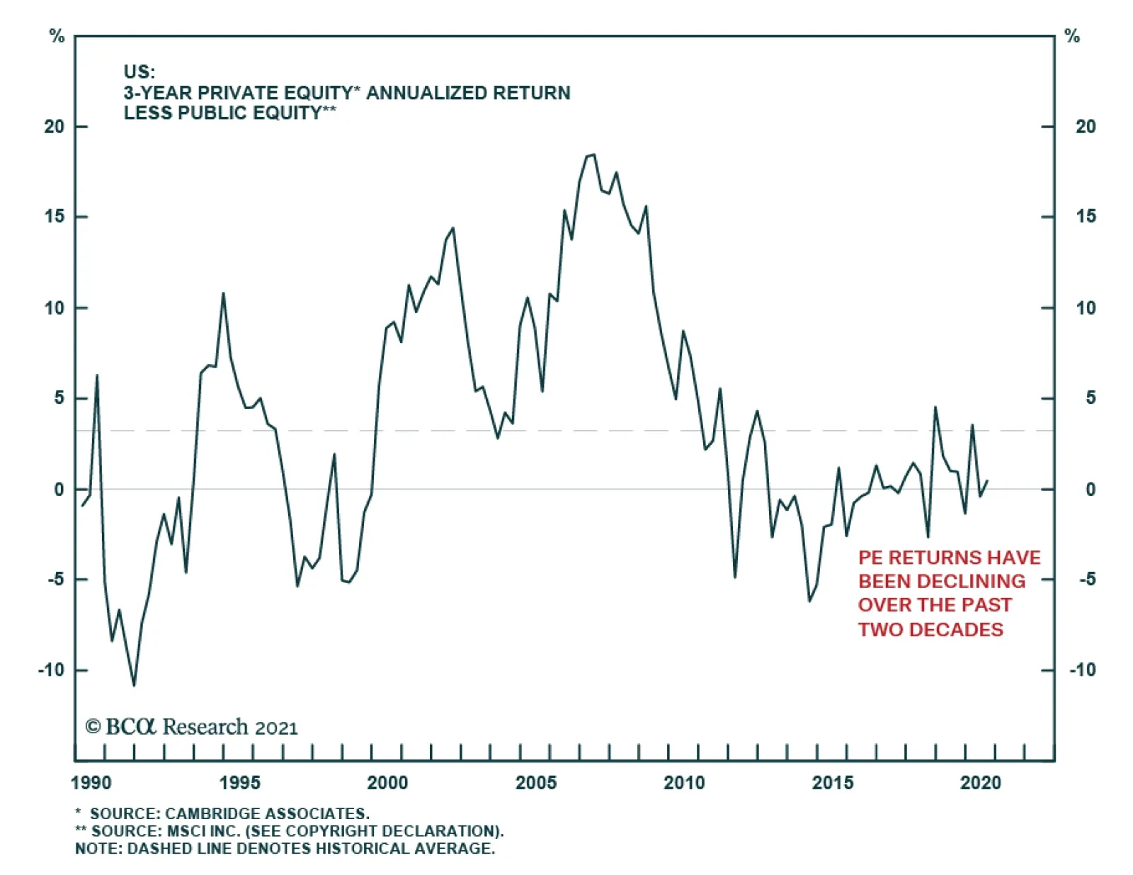
Farmland & Timberland. Our methodology is similar to that for real estate: Current yield plus projected growth in capital values. For farmland, we use the farmland renter yield, sourced from the US Department of Agriculture. To estimate future land values, we take the gap between land value growth over the past 40 years (3.7%) and nominal growth of world GDP over that time (5.2%), assume that gap will continue and so deduct it from our estimate of global nominal GDP growth going forward (3.6%). This gives a result of 6.5%. For timberland, we assume that annualized returns in the future are the same as over the past 20 years. This produces a return assumption of 5.7%, which is (logically) moderately lower than our assumed return for farmland. Private Equity & Venture Capital. We project the return for private equity (PE) using the 30-year time-weighted average of the three-year rolling annualized return of PE over US large-cap equities, 3.6% (Chart 8). This produces an assumed return of 6.2%. For venture capital (VC), we use the same historical average for VC over PE (0.4%) to arrive at an assumed return of 6.6%. Hedge Funds. We use the 20-year time-weighted return of the Hedge Fund Composite Index over cash, 3.5% (Chart 9). This projects a future annual nominal return of 4.5%. Commodities. We previously used a methodology based on the idea that commodities’ bear markets in history have been rather fairly consistent, lasting on average 17 years, with an average decline of 50%, and that the current bear market began in 2012 (Chart 10). However, there are arguments that a new “commodities super-cycle” may be starting, driven by government infrastructure spending, and investment in alternative energy.5 We are agnostic for now on whether that will be the case, but it makes sense to switch to a neutral methodology, more in line with what we use for other assets classes: The return from commodities relative to GDP over the long run. Specifically, the CRB Raw Industrials Index has risen by an annualized 1.6% since 1951, during which time US nominal GDP growth averaged 6% (Chart 11). We assume that the differential will continue in future (although we calculate growth using global, not US, GDP), giving an annual return from commodities over the next 10-15 years of -0.9%. Gold. We calculate this using a regression of the gold price against nominal GDP growth and the annual change in the real 10-year yield over the past 40 years. For the forward-looking return assumption, we use a forecast of real rates (based on the equilibrium cash rate plus the average historical spread between the 10-year yield and cash) and a forecast of global nominal GDP growth. This produces an assumed return of 3.8%. Structured products. This asset class consists mainly of mortgage-backed and other asset-backed securitized instruments. In the US, these have historically returned 0.6% over US Treasurys. We assume that this premium continues, producing a total future return of 1.1% a year. Chart 8Private Equity Premium
Private Equity Premium
Private Equity Premium
Chart 9Hedge Fund Return Over Cash
Hedge Fund Return Over Cash
Hedge Fund Return Over Cash
Chart 10Commodity Prices In History
Commodity Prices In History
Commodity Prices In History
Chart 11Commodity Prices Vs. GDP Growth
Commodity Prices Vs. GDP Growth
Commodity Prices Vs. GDP Growth
Currencies Chart 12Currencies Tend To Revert To PPP
Currencies Tend To Revert To PPP
Currencies Tend To Revert To PPP
To translate our local currency returns into an investor’s base currency, we need to arrive at some projections for FX movements over the next decade. Fortunately, for developed market currencies at least, it is relatively straightforward to use purchasing power parities (PPP) to do this since, over the long run, all the major currencies have tended to revert to PPP (Chart 12). We assume that in 10 years’ time all currencies will trade at PPP. We use the IMF’s estimate of today’s PPP for each currency to calculate the current under- or over-valuation. We assume that PPP will change in future years according to the relative inflation between each country and the US. The IMF provides five-year inflation forecasts and we assume that inflation will continue at this rate until 2031. For the euro zone, we calculate the PPP of the euro using the GDP-weighted PPPs of the five largest economies. The results (Table 7) suggest that the US dollar is currently overvalued and, given the forecast of higher inflation in the US than elsewhere in the future, will depreciate significantly against all major currencies except the Australian dollar. The USD is projected to depreciate by 1.7% a year against the euro and 1.1% against the yen over the next 10 years. It is likely to appreciate by 1.3% a year against the AUD, however. Table 7Currency Return Calculations
Return Assumptions 2021
Return Assumptions 2021
Emerging Markets (Table 8) are more complicated. There is no evidence that EM currencies move towards PPP over time. All the major EM currencies are currently very cheap versus PPP (varying from 34% undervalued for the Chinese yuan to 67% for the Indonesian rupiah) but they were 10 years ago, too, and have not significantly moved towards PPP over that time. Table 8EM Currencies
Return Assumptions 2021
Return Assumptions 2021
To calculate likely EM currency moves against the USD, therefore, we carry out a regression of the nine largest EM currencies against their relative CPI inflation rate to US inflation in history. We assume an intercept of zero. The regression coefficients vary from +0.5 for China to -1.7 for Malaysia. Apart from China, Malaysia, Poland and South Africa, the coefficients were negative, meaning that historically the USD has strengthened against the EM currency at least partly in line with relative inflation. To calculate likely future currency movements, we use the IMF’s five-year inflation forecasts and assume that the same rate of inflation will continue for our whole projection period. This methodology points to moderate annual depreciation of most EM currencies against the USD, varying from 0.8% a year for the Russian ruble to 0.1% for the Indonesia rupiah. The Chinese yuan and Taiwanese dollar are projected to appreciate moderately. We calculate the average EM currency movement using the weights of these nine large economies in the EM J.P. Morgan GBI-EM Global Diversified local-currency sovereign bond index. This produces a small (0.1%) a year appreciation. However, the IMF’s EM inflation forecasts may be too optimistic. It forecasts, for example, that Brazilian inflation will be only 3.3% a year in future, compared to an average of 6.1% over the past 20 years, and Russian inflation 4.0% versus a historical average of 9.3%. This suggests that EM currency performance could be worse than our projections. Table 9 shows the returns for the major asset classes expressed in local currency terms for six base currencies, based on the calculations explained above. Table 9Returns In Different Base Currencies
Return Assumptions 2021
Return Assumptions 2021
Correlation And Volatility Below, in Table 10, we provide correlations for clients who need these inputs for their optimization calculations. Table 10Long-Run Correlation Matrix
Return Assumptions 2021
Return Assumptions 2021
Returns can be calculated using the sort of forward-looking methodologies we have described above. For volatility, we think it is reasonable to use historical average data (Table 1, far right column), since volatility does not tend to trend over the long run (Chart 13). But correlation is a different matter. Correlations have varied significantly in history due to structural changes or regime shifts. The correlation of equities to bonds, it is well known, has moved from positive in the 1980s and 1990s, to negative since 2000 – probably because inflation disappeared as a factor moving bond prices (Chart 14). The correlation between equity market has risen as a result of the globalization of investment flows, though note that it fell back in 2010-2019. Chart 13Volatility Is Fairly Stable In The Long Run
Volatility Is Fairly Stable In The Long Run
Volatility Is Fairly Stable In The Long Run
Chart 14Correlations Are Not Stable
Correlations Are Not Stable
Correlations Are Not Stable
So what correlations should investors use in an optimizer? Our recommendation would be to use the longest period of history available. A US investor, for example, might take the average correlation between Treasury bonds and large-cap US equities since 1945, 0.1%. Table 10 shows the correlation since 1973 of all the major asset classes for which data is available. Unfortunately, this misses some important asset classes such as high-yield bonds and Emerging Market equities, whose history does not go back that far. The results are intuitive – and prudent. From these numbers, it would seem sensible to use an assumption of a small positive correlation between US Treasurys and US equities, for example. US investment-grade debt has a correlation of 0.4 against equities. Global equity markets are all fairly highly correlated to each other, ranging mostly from 0.4 to 0.7. The most non-correlated asset class is commodities, especially gold. Garry Evans, Senior Vice President Global Asset Allocation garry@bcaresearch.com Amr Hanafy, Senior Analyst Global Asset Allocation amrh@bcaresearch.com Footnotes 1 These are themes that BCA Research has been writing about for several years. See, for example, please see Global Investment Strategy, "1970s-Style Inflation: Could It Happen Again? (Part 1)," dated August 10, 2018; and " 1970s-Style Inflation: Could It Happen Again? (Part 2)," dated August 24, 2018. 2 Please see http://pages.stern.nyu.edu/~adamodar/New_Home_Page/datafile/ctryprem.html 3 Annual Emerging Markets Default Study: Coronavirus Will Push Up Default Rates https://www.moodys.com/researchdocumentcontentpage.aspx?docid=PBC_1214906 4 Please see, for example, https://www.credit-suisse.com/media/assets/corporate/docs/about-us/research/publications/credit-suisse-global-investment-returns-yearbook-2021-summary-edition.pdf. 5 Please see Commodity & Energy Strategy, "Industrial Commodities Super-Cycle Or Bull Market?", dated March 4, 2021.
Highlights The Seventh National Population Census highlights the seriousness of China’s demographic deterioration; apart from a shrinking working-age population, the nation’s fertility and birth rates have dropped meaningfully. China’s urbanization rate will likely slow in the second half of this decade. The country’s urban population growth is only slightly positive, while the rural population is declining and aging. Demand for housing will experience a structural downshift, particularly in less developed regions. Competition for labor will become fiercer among regions and sectors, and wage growth will continue to accelerate. However, the manufacturing sector will remain competitive regardless of wage inflation, thanks to the rising quality of China’s labor force and innovation. Interest rates will structurally shift to a lower range, providing some tailwind to Chinese equities and government bonds. Feature The Seventh Population Census, conducted by the National Bureau of Statistics every 10 years, reinforced the magnitude of China’s demographic challenge. The nation’s population is not only aging but is set to start shrinking due to extremely low birth and fertility rates. The main implication is that China’s urbanization rate will slow and property market will likely encounter a structural downshift, tied to declining demand from both its working-age (age 15 to 64) and total population. Demand for housing will increasingly concentrate in top-tier cities because these metropolitan areas have more advantages attracting labor. Secondly, manufacturing will likely maintain its share of GDP, despite China’s push for consumption and growth in the service sector. Importantly, interest rates will continue to shift downward along with a decelerating potential growth; waning interest rates will create a tailwind to China’s capital market in the long term. Highlights From The Census The Census showed three meaningful shifts in China’s demographics in the past decade: 1. China is getting old before getting rich. China is experiencing a worse demographic transition than Japan in the early 1990s, with a lower level of per capita wealth than Japan attained when its working-age population peaked (Chart 1). Over the past ten years China’s population has only expanded by 5.4%, the lowest rate since the first census in 1953. Moreover, the country’s oldest cohort rose from 8.9% in 2010 to 13.5% and the working-age population is falling more quickly than in Japan. China’s working-age population peaked in 2010 and then fell by 6.79 percentage points in the next 10 years. In contrast, Japan’s working-age population peaked in 1992 and fell by 2.18 percentage points in the subsequent decade (Chart 1, top panel). 2. China’s total population is set to start declining in five years. Some demographers project that China’s total population will peak in 2027,1 but a high-level Chinese official recently predicted that the country’s population will start to trend down as early as in 2025.2 The relaxation of the one-child policy in 2015 helped to lift the birthrate (births per 1,000 people) briefly in 2016, before falling sharply again in 2017. The population’s natural growth rate, calculated as birthrate minus deathrate, is rapidly approaching zero (Chart 2). Chart 1China's Working Population Falling Faster Than Japan's In 1990s
China's Working Population Falling Faster Than Japan's In 1990s
China's Working Population Falling Faster Than Japan's In 1990s
Chart 2China's Population Growth Will Turn Negative In Mid-2020s
China's Population Growth Will Turn Negative In Mid-2020s
China's Population Growth Will Turn Negative In Mid-2020s
The birthrate is the main determinant of the population’s natural growth rate given that China’s deathrate has been steady for decades. If the birthrate continues to fall at the current rate, then China will undoubtedly reach a population turning point and will join nations such as Japan, Germany and South Korea, which have negative population growth. 3. A low fertility trap. Chart 3China's Alarmingly Low Fertility Rate Is Set To Decline Even Further...
China's Alarmingly Low Fertility Rate Is Set To Decline Even Further...
China's Alarmingly Low Fertility Rate Is Set To Decline Even Further...
China’s extremely low fertility rate3 is a major contributor to its falling birthrate. The current 1.3 reading is less than in many developed countries, such as Japan with 1.4 and the US with 1.6, and it is far below the fertility rate of 2.1 needed to stabilize a population, according to the United Nations (Chart 3). China’s fertility rate is set to dive even further in the coming years due to structural factors such as a dwindling number of childbearing-age women linked to the one-child policy implemented in the 1980s (Chart 4). China’s high female labor participation rate and low propensity among young people to get married, and the high cost of raising children in urban areas, all are long-standing socio-economic issues hindering the Chinese from having more babies (Chart 5). Chart 4…Due To Fewer Childbearing-Age Women And…
China’s Shifting Demographic Profile
China’s Shifting Demographic Profile
Chart 5...Structural Issues That Curb Chinese Propensity To Produce Babies
...Structural Issues That Curb Chinese Propensity To Produce Babies
...Structural Issues That Curb Chinese Propensity To Produce Babies
Bottom Line: These structural trends will take decades to reverse. China faces a dramatic plunge in its population in the very near future if the authorities do not enact significant and immediate policy changes. Urbanization Pace Will Slow The Census indicates that rapid urbanization continued through 2020, with the rate hitting 64% of the population, up 14 percentage points from 2010. However, the headline number in the urbanization rate understates China’s progress in industrialization, i.e. the country’s rural-to-urban transition has entered a late stage and the current pace cannot be sustained in the future. Significantly, China’s underlying demographic shifts will likely lead to a passive increase in the urbanization rate in the second half of this decade. This trend will curb rather than boost demand in urban areas. The experience of developed countries suggests that the pace of urbanization begins to slow when the rate reaches around 70% (Chart 6). Based on China’s current level, the country should reach the 70% threshold in just six to seven years. Meanwhile, China is much more industrialized than generally perceived: the country’s industrialization rate is currently 85%, which means that 85% of jobs in China are in non-agricultural sectors (Chart 7). Chart 6Urbanization Progress Stabilizes When Reaching 70%
Urbanization Progress Stabilizes When Reaching 70%
Urbanization Progress Stabilizes When Reaching 70%
Chart 7China Is Much More Industrialized Than Commonly Believed
China Is Much More Industrialized Than Commonly Believed
China Is Much More Industrialized Than Commonly Believed
Furthermore, a higher urbanization reading may be the result of negative natural population growth. Given that the urbanization rate is calculated as a percentage of urban population in the total population, a decline in the absolute level of total population (the denominator) could lead to a passive increase in the numerator. Chart 8Japan Has Had A "Passive" Increase In Urbanization Since 2012
Japan Has Had A "Passive" Increase In Urbanization Since 2012
Japan Has Had A "Passive" Increase In Urbanization Since 2012
For example, Japan’s urbanization rate rose significantly during the 2000s, and maintained an upward momentum even as its total population peaked in 2010. However, its urban population growth rate dropped dramatically and turned negative in 2012 – suggesting the increase in the urbanization rate is due to a shrinking total population instead of expanding urbanities (Chart 8). The rising deathrate of the rural elderly population is another important reason for the accelerated increase in Japan's urbanization rate. China’s urban population growth is on a sharp down trend, although it is still slightly positive (Chart 9). However, the rural population has shrunk and aged, which limits future migration from rural to urban areas (Chart 10). China’s rural population has shrunk by almost half from its peak in 1995 to 2020. The share of the rural population 50 years and older doubled in the same period. Chart 9China's Urban Population Growth Is On The Decline...
China's Urban Population Growth Is On The Decline...
China's Urban Population Growth Is On The Decline...
Chart 10...While Rural Population Has Shrunk And Aged
...While Rural Population Has Shrunk And Aged
...While Rural Population Has Shrunk And Aged
Thus, China’s rural-to-urban migration has slowed in the past decade (the trend turned negative last year due to the pandemic). The number of new migrant workers moving from the country to the city tumbled from 12.5 million a year to 2.5 million, and the number of younger migrants (50 years and younger) has contracted since 2017 (Chart 11). Chart 11The Number Of Young Migrant Workers Started Contracting In 2017
The Number Of Young Migrant Workers Started Contracting In 2017
The Number Of Young Migrant Workers Started Contracting In 2017
Bottom Line: Country-to-city migration will be smaller going forward based on a diminishing rural population, an increasing number of elders and a reduced proportion of young people in rural areas. When China’s population peaks, which is highly likely by 2025, its urbanization progress will turn passive and the aggregate population growth in urban areas may also turn negative. Aggregate Housing Demand Will Dwindle The demographic shifts described above will impact the demand for properties and accentuate regional divergences in housing demand and prices. Historically, changes in the working-age population led residential home sales by five to six years. Home sales have fluctuated in a downward trend in the past five years along with a peak in the working-age population in 2015 (Chart 12). Moreover, the sharp deterioration in China’s birthrate means that home sales will be significantly reduced in the next 15-20 years. Chart 12Aggregate Demand For Housing Will Dwindle Along With Smaller Labor Force
Aggregate Demand For Housing Will Dwindle Along With Smaller Labor Force
Aggregate Demand For Housing Will Dwindle Along With Smaller Labor Force
Chart 13Population Is An Important Driver For Urban Development
Population Is An Important Driver For Urban Development
Population Is An Important Driver For Urban Development
The regional divergence in the demand for housing will also widen. Population, especially the labor force, is an important driver for urban development and housing (Chart 13 above). Population migration mainly occurs among 15-59-year-olds, and this cohort is also the main homeowner group. As China’s labor force increasingly flocks to developed areas, the economic development of less developed areas will face greater challenges (Chart 14). Those areas will encounter a combination of declining birthrate and outflow of labor force. This demographic shift is already evident in many two- and third-tier cities where housing prices have lagged far behind the tier-one cities (Chart 15). Chart 14Less Developed Regions Have Seen Net Population Losses In The Past Decade…
China’s Shifting Demographic Profile
China’s Shifting Demographic Profile
Chart 15...And Softening Housing Prices
...And Softening Housing Prices
...And Softening Housing Prices
Bottom Line: The drop in China’s birthrate and working-age population will lead to less demand for housing. However, China’s first-tier cities (and core metropolitan areas) will likely continue to outperform third- and fourth-tier cities in terms of labor growth, consumption and home prices. Labor Measures And Manufacturing Competitiveness Labor shortages in selected sectors and upward pressure on wages will likely intensify in the coming decade. While labor quantity will decrease, the quality of China’s labor force will remain competitive. From an aggregate economy perspective, improving labor productivity and automation can help to offset the smaller number of workers (Chart 16). Following two decades of rapid expansion in the industrial sector, China’s labor shortages began to multiply when the country’s urbanization ratio rose to between 50% and 60%. Looking at Japan and Korea, for example, a shortage in manufacturing labor emerged when the countries’ manufacturing/agricultural employment ratio climbed above one. China’s employment ratio likely have crossed this threshold in the mid-2010s, coinciding with a rollover in its working-age population and a massive jump in wage growth (Chart 17). Chart 16Improving Labor Quality To Offset Smaller Labor Quantity
China’s Shifting Demographic Profile
China’s Shifting Demographic Profile
Chart 17Manufacturing Labor Shortage And Wage Pressure Intensified In Mid-2010s
Manufacturing Labor Shortage And Wage Pressure Intensified In Mid-2010s
Manufacturing Labor Shortage And Wage Pressure Intensified In Mid-2010s
The manufacturing and service sectors will continue to compete with agriculture for labor. The wage gap between urban and rural areas is disappearing and there are signs of labor market tightness in urban settings (Chart 18). While the demand for labor has been flat, labor supply peaked in 2013/14 and has been on the wane since that time, which has resulted in an ascending demand-to-supply ratio in China’s urban labor market (Chart 19). Chart 18Wage Gap Between Urban And Rural Areas Is Disappearing
Wage Gap Between Urban And Rural Areas Is Disappearing
Wage Gap Between Urban And Rural Areas Is Disappearing
Chart 19Urban Labor Supply Can't Keep Up With Demand
Urban Labor Supply Can't Keep Up With Demand
Urban Labor Supply Can't Keep Up With Demand
The bright side is that China’s labor shortage and escalating wages have not eroded the competitiveness of its manufacturing sector. Impressive labor productivity gains and progressively improving labor quality have trumped higher input costs (Chart 20). Consistent with improved productivity, China’s share of global trade continues to build regardless of higher wages, a stronger currency, and import tariffs from the US (Chart 21). The manufacturing sector has gradually climbed the value-added chain in recent years and mounting wage pressures will likely push the corporate sector, particularly in more developed coastal regions, to move further away from a labor-intensive model. Chart 20Rising Wages But Stable Unit Labor Costs
Rising Wages But Stable Unit Labor Costs
Rising Wages But Stable Unit Labor Costs
Chart 21Chinese Exporters Have Maintained Their Global Market Share Despite Higher Costs
Chinese Exporters Have Maintained Their Global Market Share Despite Higher Costs
Chinese Exporters Have Maintained Their Global Market Share Despite Higher Costs
The 14th Five-Year Plan outlined policymakers’ decision to maintain the share of manufacturing in GDP, which is around 30%. Labor productivity in the manufacturing sector is notably higher than in the service sector. In an environment of shrinking labor, keeping workers in a high-productivity sector may be a better way to stabilize potential growth. Bottom Line: The competition for labor between sectors will intensify. Meanwhile, manufacturing’s share of China’s economy will likely be sustained in this decade, which will help to mitigate the speed of the deceleration in China’s growth. Implications On Policy Setting Chart 22AInterest Rates Drop With Aging Population
Interest Rates Drop With Aging Population
Interest Rates Drop With Aging Population
The combination of a weak fertility/birthrate and a decline in the working-age population will weigh on consumption and investment growth, bringing deflationary headwinds to the economy. China’s interest rate regime will likely follow its Asian neighbors to downshift structurally (Chart 22). Despite moderating potential economic growth, a low interest rate environment may be positive for China’s financial asset prices. Chart 22BInterest Rates Drop With Aging Population
Interest Rates Drop With Aging Population
Interest Rates Drop With Aging Population
Chart 22CInterest Rates Drop With Aging Population
Interest Rates Drop With Aging Population
Interest Rates Drop With Aging Population
Chart 23Support Ratios Are Declining Globally
Support Ratios Are Declining Globally
Support Ratios Are Declining Globally
One could argue that a falling support ratio – measured by the number of workers relative to consumers – can lead to inflation (Chart 23). This could happen to the US where baby boomers retire but continue to spend particularly on healthcare, while production falls along with the available workers. As production falls in relation to consumption, inflation could rise. However, this is not the case in China where both production and consumption will fall. Demand from an aging population may increase pockets of inflationary pressures, such as healthcare and elderly care, but it is unlikely to fully offset weakening demand from a declining working-age population and total population. In other words, both the numerator (workers) and denominator (consumers) will be falling in China. While a weakening demographic profile is negative for economic growth, lower prices on capital will make corporate debt-servicing cheaper. Further industrial consolidation aimed at supply-side reforms will also improve corporate profitability. Cheaper capital, improving productivity and efficiency could provide tailwinds to Chinese stocks and government bonds in the long run. Jing Sima China Strategist jings@bcaresearch.com Footnotes 1As of 2020, China’s total population is at 1411.78 million. 2"China faces an economic crisis as a population peak nears," South China Morning Post, April 18, 2021. 3The total fertility rate is based on the number of newborns by women in child-bearing years, which is ages 15-44 or 15-49 by international statistical standards. Cyclical Investment Stance Equity Sector Recommendations
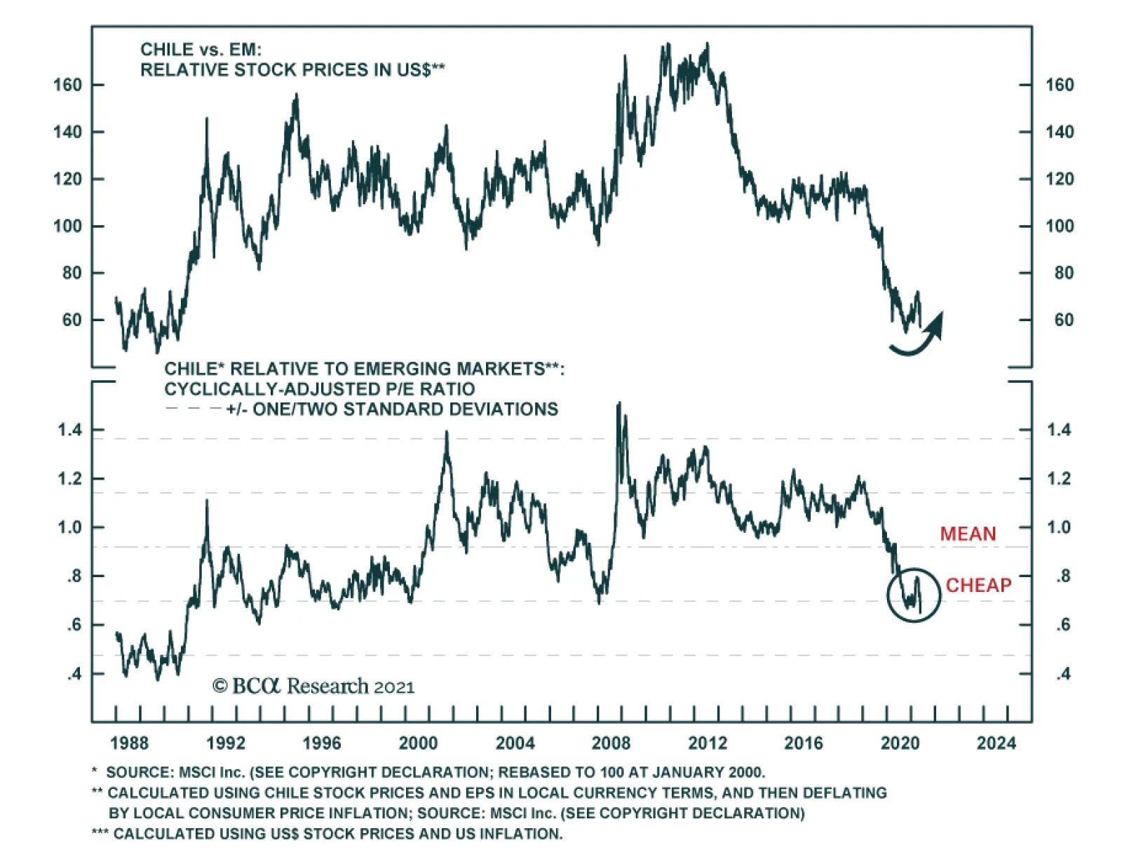
Chilean equities collapsed last week on news of the ruling coalition’s surprise underperformance in the election for members of the constitutional convention tasked with rewriting the constitution. President Sebastian Pinera’s center-right Chile Vamos…
Highlights The number one risk to our upbeat view on European economic activity and assets is a Chinese economic slowdown. The second most important risk to our view is a potential deterioration in the global credit impulse, even outside of China. The third major risk is that the current bout of US inflation proves to be permanent, which, paradoxically, would prompt a deflationary shock for the global economy. Despite these risks, we maintain our favorable view on European assets over the coming 12 to 18 months. However, favoring industrials over materials, and financials over other cyclicals, Swedish equities and peripheral bonds in balanced portfolios mitigate some of these risks. Do not expect the ECB to announce a tapering of its asset purchases at the June meeting. The ECB will lag well behind the Fed and the BoE. Buy European steepeners and US flatteners as a box trade. Feature Over the past three weeks, a sustained marketing push gave us the opportunity to interact intensively with a large subset of our clients (albeit virtually, courtesy of COVID-19). Generally, our positive stance on European assets was well received, but investors are loosely committing themselves to this view and very few are willing to make an aggressive bet on Europe. In fact, in most meetings, we spent more time than usual discussing the risks to our upbeat view on Europe and European cyclical equities. Three risks to our 12- to 18-month view standout. The first is a serious slowdown in Chinese growth. The second is a greater-than-anticipated impact on economic activity as a result of a deterioration in DM credit impulses. The third is stronger-than-expected US inflation. An also-ran was the risk that the current vaccines do not protect against the two variants of the COVID-19 virus dominant in India. However, an increasing body of recent scientific studies demonstrates that this is not the case; hence, this risk has been lowered to minor. Risk #1: A Chinese Slowdown Authorities in China have been constricting credit policy over the past six months. The key tools used have been a regulatory tightening in shadow-banking activities and real estate transactions, moral suasion on small banks to limit the expansion of their loan books, and slowing liquidity injections in the interbank system. Beijing’s policy tightening reflects the following two worries. First, the financial stability risk has increased meaningfully over the past 16 months. China’s corporate debt-to-GDP has increased 13 points to 163%, and is among the highest for major economies (Chart 1). Moreover, Chinese policymakers remain concerned by the middle-income trap, which would become an increasingly likely outcome if the stability of the country’s financial and banking system were compromised. Second, the latest round of stimulus has worsened wealth inequalities. House prices have been robust, yet household disposable income growth is still low by the yardstick of the past 40 years (Chart 2). Thus, a large proportion of China’s population has experienced a decline in housing affordability. Chart 1China"s Financial Stabilitiy Risk
China"s Financial Stabilitiy Risk
China"s Financial Stabilitiy Risk
Chart 2Chinese Households Are Not Doing That Well
Chinese Households Are Not Doing That Well
Chinese Households Are Not Doing That Well
The Chinese economy recently started to feel the impact of the policy tightening. China’s April retail sales data missed expectation by 7.2%, and, as our China Investment Strategy colleagues have observed, the demand side of the economy has lagged behind the recovery in supply ever since China re-opened last year. Credit trends confirm this assessment. The decline in the excess reserve ratio of the Chinese banking system is consistent with the recent deterioration in the credit impulse, which accelerated in April (Chart 3). Since the Great Financial Crisis, weaker Chinese credit flows herald softer global industrial activity and trade (Chart 3, bottom panel). The Chinese slowdown could become a major problem for the European economy and its asset markets. As we recently showed, the sensitivity of European economic activity to global growth has been steadily increasing over the past 20 years (Chart 4). Moreover, the spread between M1 and M2 money supply growth in China best explains the gap between European industrial activity and that of the US (Chart 4, middle and bottom panels). Essentially, M1 minus M2 approximates the Chinese private sector’s marginal propensity to consume, because it captures how fast demand deposits are growing relative to savings deposits. Thus, the recent decline in China’s marginal propensity to consume constitutes a bad omen for European activity and profit growth, both in absolute terms and relative to the US. Chart 3A Policy-Induced Slowdown
A Policy-Induced Slowdown
A Policy-Induced Slowdown
Chart 4Europe Is More Exposed Than The US
Europe Is More Exposed Than The US
Europe Is More Exposed Than The US
The slowdown in China’s economy will hurt European asset prices via multiple channels. Importantly, cyclical stocks are expensive and overbought compared to defensive ones. A meaningful decline in Chinese growth could result in a deep fall in the cyclicals-to-defensives ratio, which would hurt the pro-cyclical EUR/USD exchange rate (Chart 5). A weaker China might also create a significant fall in global yields, because it would hurt global growth, accentuate deflationary forces, and upset investor sentiment. European stocks underperform US equities when global yields decline (Chart 6). Chart 5The Euro Is Pro-Cyclical
The Euro Is Pro-Cyclical
The Euro Is Pro-Cyclical
Chart 6A Key Threat To European Stocks
A Key Threat To European Stocks
A Key Threat To European Stocks
Despite the dire impact that a Chinese economic slowdown normally causes on European growth and assets, this outcome remains a risk and not a base case (albeit, the top risk in our view). First, today is one of the rare occasions when global and European economic activity can decouple from China. The Euro Area’s vaccination campaign is gaining steam, which will allow a re-opening of the economy this summer (Chart 7). The vast pent-up demand in durable goods evident in Europe and the positive impact of the European monetary expansion on the contribution of consumer expenditure to real GDP growth also create powerful offsets (Chart 8). Chart 8European Pent-Up Demand As An Offset
European Pent-Up Demand As An Offset
European Pent-Up Demand As An Offset
Chart 7Improving Vaccine Rollout
Improving Vaccine Rollout
Improving Vaccine Rollout
The global industrial cycle is more buffered than usual against a Chinese economic slowdown. The collapse in the inventory-to-sales ratios around the world will fuel several quarters of restocking, which will boost the global manufacturing sector (Chart 9). Moreover, governments across advanced economies are unleashing large-scale infrastructure plans, such as the $2 trillion bill proposed by the Biden administration in the US or the EUR250 billion budget proposal by the Draghi government in Italy. As the EUR750 billion NGEU funds are disbursed, the tailwind to infrastructure spending will only grow (Chart 10). Additionally, the current spurt in inflation around the world is a relative price shock driven by scarcity created during the pandemic. This price shock incentivizes companies to expand production and capacity to meet demand. As a result, global capex intentions are rising, which will create an additional offset to China. Chart 9Restocking Ahead
Restocking Ahead
Restocking Ahead
Chart 10More Fiscal Support This Way Comes
More Fiscal Support This Way Comes
More Fiscal Support This Way Comes
Finally, constraints on Chinese policymakers limit to how far Chinese growth will decelerate. The Chinese Communist Party Congress, in which the make-up of the politburo is determined for the next five years, takes place in October 2022. However, the weak growth rate of household disposable income creates a headache for China’s leadership. While another round of massive stimulus is unlikely to shore up household disposable income (it has not worked thus far), Beijing will not take the chance to generate another deflationary shock. This constraint creates a natural floor under the growth deceleration that Beijing can tolerate. Thus, while a policy mistake is still possible, it is not our base case scenario. Investment Implication Faced with the aforementioned dynamics, BCA recommends that investors with a short-term investment horizon go neutral on cyclical equities relative to defensive ones. Practically, this means that EUR/USD is likely to continue to churn between 1.18 and 1.235 for the coming two to three months. Additionally, European equities are likely to move sideways relative to their US counterparts over this period. Within cyclical equities, we favor industrials over materials. Commodity prices, and thus the materials sector, are the most exposed to China. Meanwhile, the outlook for infrastructure spending and capex in DM economies has a greater impact on industrial stocks than on materials ones. Technically, industrials remain toward the bottom of their upward-slopping trend channel relative to materials, which suggests further catch up is likely (Chart 11). We also favor European financials over the rest of the cyclical sectors. The negative impact of a greater-than-expected Chinese economic slowdown on global yields will hurt financials. Nonetheless, domestic economic activity affects financials more than it influences the more internationally focused industrials and materials sectors. Thus, if the Eurozone service PMI can slingshot higher, a result of the re-opening of the economy this summer, then European financials will outperform industrials and materials stocks even if the Chinese economy slows (Chart 12). Moreover, financials trade at a large discount compared to these other two cyclical sectors (Chart 12). Chart 11Overweight Industrials Vs Materials
Overweight Industrials Vs Materials
Overweight Industrials Vs Materials
Chart 12Financials As A Protection Against China
Financials As A Protection Against China
Financials As A Protection Against China
Finally, we continue to favor Swedish equities. Industrials and financials account for 65% of the Swedish MSCI benchmark compared to 30% for that of the Euro Area. Therefore, they are particularly exposed to the positive outlook on global infrastructure spending and capex. Moreover, Swedish equities generate a return on equity of 15%, compared to 6% for the Eurozone stocks. To protect against the risk created by a weakening Chinese economy, we recommend investors hedge a long / overweight bet on Sweden with a short / underweight position in Norwegian equities that massively over-represent energy and materials. Risk #2: A Global Credit Impulse Deterioration According to the BIS data, the global credit impulse is on the verge of deteriorating, even outside of China. The G10 plus China annual credit impulse is elevated and peaking (Chart 13, left). Meanwhile, quarterly credit impulses in the US, the Euro Area, and China are negative (Chart 13, right), which often leads to turning points in the annual change in credit flows. Chart 13A Global Credit Impulse Problem
A Global Credit Impulse Problem (I)
A Global Credit Impulse Problem (I)
Chart 13A Global Credit Impulse Problem
A Global Credit Impulse Problem (I)
A Global Credit Impulse Problem (I)
A deterioration in the credit impulse could result in a sharp slowdown in global economic growth, because the deceleration in credit creation is broad-based among the major economies. If global growth decelerates, then European economic activity will also suffer. Table 1Essential Sector Breakdowns
Risks
Risks
The impact on European financial markets will come from lower yields. A growth deceleration prompted by a falling credit impulse will put downward pressure on yields and will hurt the performance of value stocks relative to growth equities. Cyclical equities will also underperform defensive ones. In this scenario, European stocks will lag behind their US counterparts because of their relative sectoral biases (Table 1). Within the European benchmark, Tech-heavy Dutch stocks would perform best once yields begin to decline. The effect on growth of the slowing credit impulse remains a risk and not a base case scenario. Last year’s surge in credit intake mostly reflected precautionary demand. Companies around the world tapped their credit lines or the capital markets early in the crisis to build liquidity buffers. They then continued to borrow to take advantage of the exceptionally low interest rates that prevailed throughout most of the year. Similarly, a large proportion of household borrowing amounted to debt refinancing. As a result, last year’s explosion in credit growth had a limited impact on spending. Thus, the credit impulse’s decline in advanced economies should minimally hurt aggregate demand in the coming months. Investment Implication Investors can protect against this risk by overweighting Italian and Spanish bonds in a balanced portfolio. First, these instruments continue to offer better value than other government bonds around the world. Moreover, if global growth turns out to be weaker than expected, the ECB might have to increase the envelope of the PEPP program, which has greatly benefited peripheral bonds. Moreover, the NGEU and REACT EU program buttress weaker European sovereign borrowers. Therefore, yield-hungry global investors will resume their aggressive purchase of the high-yielding peripheral bonds if global interest rates decline anew because of softening economic activity. Risk #3: Stronger Than Expected US Inflation BCA’s house view is that the current surge in global and US inflation is transitory, even if the pressures could last a few months before ebbing. It is mainly a consequence of inadequate aggregate supply in the face of a sudden surge in demand. We cannot be dogmatic about the inflation risk. The price-components of all the major activity surveys in the world are rising, and, in the US, the inflation expectations of households have risen meaningfully (Chart 14). If an inflation mentality were to take root, then core CPI would not decelerate toward yearend. Stronger-than-expected US core CPI would put significant upward pressure on Treasury yields. First, long-dated inflation expectations could begin to converge to the breakeven rates in the shorter tenors of the curve (Chart 15). More importantly, the Fed would become more hawkish sooner. This faster policy tightening would lift the OIS curve and result in higher real yields as well. Chart 14Are Inflation Expectations Becoming Unmoored?
Are Inflation Expectations Becoming Unmoored?
Are Inflation Expectations Becoming Unmoored?
Chart 15Long-Dated Market-Based Inflation Expectations Still Lag
Long-Dated Market-Based Inflation Expectations Still Lag
Long-Dated Market-Based Inflation Expectations Still Lag
The euro would therefore weaken, and the dollar would rally across the board. European inflationary pressures are limited compared to those of the US. The Eurozone suffers from a larger output gap due to the lagging nature of the European recovery, which more timid fiscal stimulus and Europe’s late start to the vaccination campaign compounded. Consequently, the ECB will not match the Fed’s faster tightening of policy, even in this scenario. Higher US TIPS yields and a stronger dollar would ultimately be deflationary blows to global growth. The dollar would directly tighten EM financial conditions. Higher real yields would destabilize stretched equity prices around the world. The resulting shock to global financial conditions would cause a major slowdown in global growth to occur much earlier than we currently foresee. While yields would rise at first, they would end 2022 at much lower levels than we currently expect because of this deflationary outcome. This combination would be very harmful to European equities, both in absolute terms and relative to the global benchmark. At first, European stocks would probably briefly fare well. Once investors begin to digest the deleterious impact of stronger inflation on global growth, however, the pro-cyclical European market will begin to suffer. Tighter EM financial conditions and underperforming financials will only accentuate the European stock market ills. Much stronger inflation is a risk and not a base case for now, because the current bout of inflation is transitory. The supply-side of the economy is already responding to the signal created by higher prices. Firms are set to increase their inventories and capex intentions are moving higher. Moreover, many of the bottlenecks constraining global supply chains will loosen, as the global economy re-opens in response to the international vaccination campaign. Additionally, current labor shortages in low-wage industry will also dissipate, once the $300 weekly support by the US government ends after the month of September. Thus, the supply of labor will also pick up in the fourth quarter of 2021. Moreover, the Fed could remain tolerant of an inflation overshoot, which would limit the pain of its impact. That being said, there is a real inflation risk due to the global deterioration in the dependency ratio and the shift to the left in terms of the economic preferences of the median voter. However, this danger is backdated to 2024 and beyond, once global labor markets are closer to full employment. Investment Implication There is little protection in our current set of recommendations against this risk, but this is a smaller threat than the previous two risks. However, when viewed alongside the first and second set of risks, the combined probability of a dangerous outcome for the market in general and for Europe in particular has grown compared to six months ago. Thus, while the jury is still out on these questions, it makes sense to de-risk portfolios temporarily, until the reward-to-risk ratio has once again improved. Hence, a tactical neutral stance on cyclical relative to defensive equities and on Europe relative to the rest of the world is appropriate for now. Will The ECB Join The BoC? At its April meeting, the Bank of Canada jolted the market by announcing a much earlier-than-anticipated start to its tapering program. We do not believe that the ECB will follow up at its June meeting. In a recent report, BCA’s Global Fixed-Income Strategy team highlighted the constraint that will prevent the ECB from adjusting policy next month. The main factors are as follows: The results from the ECB’s strategic review have yet to be announced. Adjusting policy before an eventual change in the inflation mandate of the central banks creates an unnecessary risk of policy whipsaw. Yet another policy flip-flop would further mar the ECB’s credibility. Chart 16The ECB Does Not Want To Upend Credit Growth
The ECB Does Not Want To Upend Credit Growth
The ECB Does Not Want To Upend Credit Growth
Loan growth in Europe is slowing down, led by France. However, Italian credit activity is improving in response to the generous TLTRO uptake in the southern economy (Chart 16). At this juncture, a rapid policy adjustment would threaten the recovery, while Europe has yet to re-open. Italian spreads remain fragile. The ECB’s asset purchases are an important contributor to the easing in financial conditions across the periphery. The recent 25bps widening in the BTP-Bund spread is a reminder that European fixed-income markets are not fully tension-free. Thus, a rapid removal of support could prompt a reflex selloff in Italian bonds. The subsequent tightening in financial conditions would unnecessarily feed deflationary pressures in Europe. The euro is strong. If the ECB unsettled the market and removed monetary accommodation as fast or even faster than the Fed, the euro’s rally would suddenly accelerate. This would generate a powerful deflationary shock for Europe that would force the ECB to adjust its inflation forecasts downward. Chart 17Especially When China Creates A Threat
Especially When China Creates A Threat
Especially When China Creates A Threat
The Chinese economy is weak, which increases uncertainty around European economic outcome via the trade channel (Chart 17). Instead, the meetings in the back half of the year are much more likely candidates for the ECB to begin talking about its tapering program. By then, the European economic re-opening will have taken place, to which growth will have responded. The results of the ECB’s strategic reviews will have been announced. Finally, plans will have been ratified for the usage of NGEU funds across the EU, and thus, fiscal clarity will improve. Even if the ECB starts talking before yearend of terminating the PEPP, its communications will indicate that the program’s full envelope will be deployed within the original time frame. Thus, the PEPP program will be in place until the end of March 2022. Moreover, to prevent a rapid deterioration in bank credit, the ECB will continue to provide generous financing to deposit-taking institutions via the TLTRO program. Under these circumstances, the ECB is unlikely to increase its deposit rate before 2014. These views imply that the ECB policy tightening (both on the balance sheet and interest rate fronts) will lag behind that of the Fed, the BoE, the Norges Bank, and the Riksbank. Only the BoJ and the SNB will move after the ECB. The continued involvement of the ECB in the European fixed-income market, along with the elevated likelihood that we remain years away from the first rate hike, confirms that an overweight stance in European peripheral bonds is appropriate. We also continue to overweight corporate credit within European fixed-income portfolios. Our fixed-income colleagues also share these views. Chart 18Justifying A Box Trade
Justifying A Box Trade
Justifying A Box Trade
Finally, the German yield curve should steepen compared to that of the US. Even if the ECB lags well behind the Fed when it comes to tightening policy, the current terminal rate proxy embedded in the EONIA curve is too low (Chart 18). Meanwhile, the earlier lift-off date for interest rates in the US relative to the Euro Area points to rising short rates west of the Atlantic. In this context, a box trade buying steepeners in Europe and flatteners in the US is appropriate, especially since it generates a positive carry of 167 bps (hedged into USD). Mathieu Savary, Chief European Investment Strategist Mathieu@bcaresearch.com Cyclical Recommendations Structural Recommendations Currency Performance
Risks
Risks
Fixed Income Performance Government Bonds
Risks
Risks
Corporate Bonds
Risks
Risks
Equity Performance Major Stock Indices
Risks
Risks
Geographic Performance
Risks
Risks
Sector Performance
Risks
Risks
Closed Trades
With prospective returns from major asset classes so unattractive, investors continue to pour money into illiquid assets such as private equity (PE). PE funds last year raised $660 billion (compared to only $185 billion in 2010), and have already raised $345…
Dear client, In addition to this weekly report, we also sent you a Special Report on cryptocurrencies, authored by my colleagues Guy Russell and Matt Gertken. The conclusion is that government authorities are likely to lean against the proliferation of cryptocurrencies, something we suspected in our most recent report on the topic. Regards, Chester Highlights Net foreign inflows into US assets probably peaked in March. Meanwhile, there are strong reasons to believe outflows from US securities will accelerate in the coming months. As such, the 12-18-month outlook for the US dollar remains negative. Cryptocurrencies are correcting sharply amidst a crackdown in China, a risk we warned investors about in our Special Report last month. We are increasingly favoring the yen. Lower the limit-sell on USD/JPY to 109. Hold long CHF/NZD positions recommended last week. Feature Chart I-1Current Account Deficit = Capital Account Surplus
Current Account Deficit = Capital Account Surplus
Current Account Deficit = Capital Account Surplus
The US runs a sizeable trade deficit. As such, it must import capital to finance this deficit (Chart I-1). Over the last year, this has been driven by equity and agency bond purchases by foreigners. However, we might be at the apex of a shift, where foreign appetite for US securities starts a meaningful decline. Financing The US Deficit TIC data is usually a lagging indicator for FX markets, but still holds valuable insights into foreign appetite for US assets. On this front, the March data was particularly instructive: There were strong inflows into US Treasury notes and bonds, to the tune of almost $120 bn. This was the greatest driver of monthly inflows. This was also the largest monthly increase since the global financial crisis. Net inflows into US equities stood at $32.2 bn in March. This is on par with the three-month average, but a sharp deceleration from December inflows of $78.3 bn. Corporate bonds commanded particularly strong inflows in March to the tune of $43.1 bn. It appears that foreign private concerns swapped their agency bond purchases with corporate bonds. US residents repatriated $54.1 bn back home in March. Official concerns were big buyers of long-term US Treasury bonds, but this was offset by a large sale of US T-bills. Net foreign official purchases of overall US securities were just $6.5 bn. With the dollar down since March, it is a fair assumption that the strong inflows we saw since then have somewhat reversed. The question going forward is whether there has been a regime shift in US purchases, specifically the purchase of equities (and agency bonds). And if so, can the purchase of US Treasurys pick up the slack (Chart I-2). Foreign inflows into the US equity market tend to be driven by expected rates of return, either from an expected rerating of the multiple or from profit growth. A rerating of the US equity multiple, relative to the rest of the world, has inversely tracked interest rates (Chart I-3). This is due to the higher weighting of defensive sectors in the US equity market. Concurrently, we showed in a recent report that profit growth on an aggregate level also tends to move in sync with relative economic momentum.1 Chart I-2Equity Inflows Have Financed ##br##The US Deficit
Equity Inflows Have Financed The US Deficit
Equity Inflows Have Financed The US Deficit
Chart I-3Rising Bond Yields Would Curtail Equity Inflows
Rising Bond Yields Would Curtail Equity Inflows
Rising Bond Yields Would Curtail Equity Inflows
If growth is rotating away from the US, and global bond yields still have upside, this will curtail foreign appetite for US equities. This appears to be the story since March, as non-US bourses have outperformed (Chart I-4). Chart I-4ANon-US Markets Are Bottoming
Non-US Markets Are Bottoming
Non-US Markets Are Bottoming
Chart I-4BNon-US Markets Are Bottoming
Non-US Markets Are Bottoming
Non-US Markets Are Bottoming
In terms of fixed income flows, the rise in US bond yields towards a peak of circa 180bps in March undoubtedly triggered strong inflows into the US Treasury market. Since then, yields outside the US have been moving somewhat higher, especially in Germany. This should curtail bond inflows, and also fits with a growth rotation away from the US. While foreign central banks were net buyers of US Treasurys in March, the “other reportables” category from the CFTC data show a huge short position in US 10-year futures. Foreign central banks are usually grouped in this category. This will suggest the accumulation of Treasurys should reverse in the coming months (Chart I-5). Chart I-5Did Central Banks Hedge Their March Purchases?
Did Central Banks Hedge Their March Purchases?
Did Central Banks Hedge Their March Purchases?
A rotation of growth from the US towards other parts of the world would also make it more difficult to finance the US current account deficit. This is because it will compress real interest rate spreads between the US and the rest of the world. From a historical perspective, inflows into US Treasury assets only tend to accelerate when real rates in the US are at least 50-100 bps above that in other G10 economies (Chart I-6). That could explain why despite a positive Treasury-JGB spread of 165 basis points, Japanese investors were very much absent buyers in March (Chart I-7). Chart I-6Real Rate Differentials And Bond Capital Flows
Real Rate Differentials And Bond Capital Flows
Real Rate Differentials And Bond Capital Flows
Chart I-7The Big Boys Did Not Buy Much Treasurys In March
The Big Boys Did Not Buy Much Treasurys In March
The Big Boys Did Not Buy Much Treasurys In March
Critical to this view is the outlook for US inflation. On this front, we note the following: First, the output gap in the US should close faster than most other economies, at least according to the OECD (Chart I-8). Ceteris paribus, US inflation should outpace that in other countries in the near term and put downward pressure on real rates. Chart I-8The US Should Generate Higher Inflation
The US Should Generate Higher Inflation
The US Should Generate Higher Inflation
Fiscal spending has been more pronounced in the US compared to other countries, which will further fan the inflationary flames. The Fed is the only central bank in the G10 committed to an inflation overshoot. In a nutshell, there is compelling evidence to suggest US inflows peaked in March from both foreign equity and bond investors. Upside surprises in inflation are more likely in the US in the very near term compared to other economies, which will depress real rates. Meanwhile, higher global yields are also a negative for the US equity market. There Is No Alternative Chart I-9A Deep And Liquid Pool Of Treasurys
A Deep And Liquid Pool Of Treasurys
A Deep And Liquid Pool Of Treasurys
My colleague, Mathieu Savary, has made the case that there is no alternative to US Treasurys. The treasury market is the most liquid and the deepest safe haven pool in the capital market universe (Chart I-9). Ergo, a flight to safety will always bid up Treasurys, as we saw in March 2020. We do agree that Treasurys will continue to act as the world’s safe haven benchmark for now. However, that privilege is fraying at the edges, and it is the marginal changes that matter for dollar investors. Competition for safe haven assets continues to intensify as the narrative switches from 40 years of disinflationary forces to the rising prospect of an inflation overshoot. Inflation is anathema to fiat currencies, including the dollar. For investors, precious metals have been a preferred habitat for anti-fiat holdings. That said, cryptocurrencies are also rising in the ranks as an alternative. In our Special Report2 released a month ago, we suggested government regulation was a huge risk for cryptocurrencies. But more specifically, the degree to which cryptocurrencies can benefit from a shift away from dollars will depend on whether private investors or central banks drive the outflows. Since the peak in the DXY index in 2020, the biggest sellers of US Treasurys have been private investors. Cryptocurrencies benefited from this diversification. That has changed since March, which partly explains the big drawdown in crypto prices. In general, you always want to align yourself with strong buyers who are price indiscriminate. Foreign central banks (the biggest holders of US Treasurys) prefer gold as their anti-dollar asset. This puts an solid footing under gold prices, compared to cryptocurrencies or other anti-fiat assets. It is worth noting that competition between the dollar and gold often run in long cycles. In the 1970s, as inflation took hold in the US, the dollar depreciated and gold soared. In the 1980s, the dollar took off and gold fell sharply, as the Federal Reserve was able to bring down inflation. The 1990s were relatively disinflationary, which supported the dollar (Chart I-10). A whiff of rising inflation in the early 2000s hurt the dollar, while the 2010s were characterized by very low inflation, supporting the dollar. More recently, the dollar is weakening as inflationary trends accelerate faster in the US (Chart I-11). Chart I-10The Dollar And Inflation Move Opposite Ways (1)
The Dollar And Inflation Move Opposite Ways (1)
The Dollar And Inflation Move Opposite Ways (1)
Chart I-11The Dollar And Inflation Move Opposite Ways (2)
The Dollar And Inflation Move Opposite Ways (2)
The Dollar And Inflation Move Opposite Ways (2)
One of our favorite indicators for gauging ultimate downside in the dollar is the bond-to-gold ratio. The rationale is that the bond-to-gold ratio should capture investor preference at the margin for either US Treasurys or gold. This in turn has been a good measure of investor confidence in the greenback. On this basis, the bond-to-gold ratio (TLT-to-GLD ETF) is breaking down to fresh cycle lows (Chart I-12). This has historically pointed towards a lower US dollar. Chart I-12The Dollar And The Bond-To-Gold Ratio
The Dollar And The Bond-To-Gold Ratio
The Dollar And The Bond-To-Gold Ratio
Within precious metals, we like gold but love silver. As such, we are short the gold-to-silver ratio since an entry point of 68. Our bias is that initial support for this ratio is 60. Meanwhile, we also like platinum, and will go long versus palladium at current levels. A Few Other Indicators A few other market developments are pointing to a lower dollar in the coming months. The dollar tends to decline in the second half of the year. This has been true since the 1970s (Chart I-13). Importantly, even during the Paul Volcker years in the 80s when the dollar staged a meaningful rally, it often fell in the second half of the year. The winner in the second half of the year has usually been the Swiss franc and the Japanese yen (Chart I-14). Chart I-13The Dollar Usually Strengthens In H1
A Peak In US Inflows?
A Peak In US Inflows?
Chart I-14The Dollar Usually Weakens In H2
A Peak In US Inflows?
A Peak In US Inflows?
The OECD leading economic indicators still suggest US growth remains robust relative to the rest of the G10. However, our expectation is that this gap will decrease sharply in the second half of this year. That said, the current reading is a risk to our dollar bearish view (Chart I-15). Chart I-15US Exceptionalism Is A Risk For Dollar Bears
US Exceptionalism Is A Risk For Dollar Bears
US Exceptionalism Is A Risk For Dollar Bears
Lumber has started to underperform Dr. Copper. Lumber benefits from solid US housing activity, while copper is more tied to global growth and the emerging investment in green technology. As a counter-cyclical currency, the dollar also tends to underperform higher beta currencies when lumber is underperforming copper (Chart I-16). The copper-to-gold ratio has also bottomed, suggesting ample liquidity is now fueling growth (Chart I-17). We suggested last week that the velocity of money across countries was a key variable to watch in getting the dollar call right. So far, the collapse in money velocity is least acute in China, explaining the rise in the copper-to-gold ratio and the improvement in non-US yields compared to the US. Chart I-16Lumber/Copper Prices And The Dollar
Lumber/Copper Prices And The Dollar
Lumber/Copper Prices And The Dollar
Chart I-17Copper/Gold Prices And Bond Yields
Copper/Gold Prices And Bond Yields
Copper/Gold Prices And Bond Yields
In summary, many cyclical indicators still point to a lower dollar. The key risk to this view is an equity market correction, and/or persistent relative strength in US growth. Chester Ntonifor Foreign Exchange Strategist chestern@bcaresearch.com Footnotes 1 Please see Foreign Exchange Strategy Report, "Trading Currencies Using Equity Signals," dated May 7, 2021. 2 Please see Foreign Exchange Special Report, "Will Cryptocurrencies Displace Fiat," dated April 23, 2021. Trades & Forecasts Forecast Summary Core Portfolio Tactical Trades Limit Orders Closed Trades
Trying To Find A New Equilibrium
Trying To Find A New Equilibrium
The SPX has been striving to find direction over the past couple of weeks in the seasonally weak month of May, as “transitory inflation” may actually morph into more semi-permanent inflation. The Fed’s latest minutes signaled that tapering is likely on its way, especially if non-farm payrolls resume increasing month-over-month near the one million mark as the economy will be in full reopening mode this Memorial Day. Historically, there is some turbulence that comes with the transition from ultra-easy monetary policy stance to, at the margin, less easy monetary policy warning that a shakeout equity market phase still looms. Tack on the modestly negative signal from investor positioning in the options market (top panel) and a volatile summer is likely upon us. Finally, news of China’s crackdown on cryptocurrencies has taken a bite out of Bitcoin that has been experiencing wild intra-day swings of late. Some of these apparent liquidation pressures have spilled over to the S&P 500 and, given the recent tight positive correlation between Bitcoin and the SPX (bottom panel), warn that some caution is still warranted in the equity space, at least in the near-term.
Weekly Performance Update For the week ending Thu May 20, 2021 The Market Monitor displays the trailing 1-quarter performance of strategies based around the BCA Score. For each region, we construct an equal-weighted, monthly rebalanced portfolio consisting of the top 3 stocks per sector and compare it with the regional benchmark. For each portfolio, we show the weekly performance of individual holdings in the Top Contributors/Detractors table. In addition, the Top Prospects table shows the holdings that currently have the highest BCA Score within the portfolio. For more details, click the region headers below to be redirected to the full historical backtest for the strategy. BCA US Portfolio
Market Monitor (May 20, 2021)
Market Monitor (May 20, 2021)
Total Weekly Return BCA US Portfolio S&P500 TRI -0.41% 1.18% Top Contributors AM:US AMKR:US TXN:US GOOG.L:US NWSA:US Weekly Return 26 bps 19 bps 10 bps 10 bps 9 bps Top Detractors SCCO:US UHAL:US AN:US UGI:US PII:US Weekly Return -26 bps -17 bps -14 bps -11 bps -11 bps Top Prospects TX:US UHAL:US ESGR:US SCCO:US AN:US BCA Score 99.58% 98.02% 96.67% 95.30% 93.87% BCA Canada Portfolio
Market Monitor (May 20, 2021)
Market Monitor (May 20, 2021)
Total Weekly Return BCA Canada Portfolio S&P/TSX TRI 1.71% 2.17% Top Contributors AUP:CA DCBO:CA NXE:CA NPI:CA NWC:CA Weekly Return 43 bps 32 bps 31 bps 15 bps 15 bps Top Detractors IFP:CA CFP:CA CS:CA CCA:CA FTT:CA Weekly Return -23 bps -22 bps -9 bps -8 bps -6 bps Top Prospects CS:CA IFP:CA CFP:CA LNF:CA RUS:CA BCA Score 99.90% 99.70% 98.56% 98.20% 98.13% BCA UK Portfolio
Market Monitor (May 20, 2021)
Market Monitor (May 20, 2021)
Total Weekly Return BCA UK Portfolio FTSE 100 TRI 0.99% 0.95% Top Contributors DRX:GB PLUS:GB PZC:GB TYMN:GB FDEV:GB Weekly Return 35 bps 21 bps 16 bps 12 bps 12 bps Top Detractors ROSN:GB FXPO:GB CNE:GB TEP:GB SPI:GB Weekly Return -16 bps -14 bps -10 bps -7 bps -6 bps Top Prospects SVST:GB NLMK:GB TUNE:GB GLTR:GB BPCR:GB BCA Score 99.76% 98.66% 97.58% 96.58% 94.88% BCA Eurozone Portfolio
Market Monitor (May 20, 2021)
Market Monitor (May 20, 2021)
Total Weekly Return BCA EMU Portfolio MSCI EMU TRI 1.43% 1.32% Top Contributors VGP:BE KESKOB:FI SOL:IT CNV:FR AOF:DE Weekly Return 23 bps 20 bps 17 bps 14 bps 13 bps Top Detractors MOL:IT PHH2:DE EDNR:IT STR:AT FSKRS:FI Weekly Return -20 bps -9 bps -8 bps -6 bps -4 bps Top Prospects SOLV:BE POST:AT STR:AT FSKRS:FI SO:FR BCA Score 99.43% 98.67% 98.00% 97.29% 96.66% BCA Japan Portfolio
Market Monitor (May 20, 2021)
Market Monitor (May 20, 2021)
Total Weekly Return BCA Japan Portfolio TOPIX TRI 2.31% 2.54% Top Contributors 3291:JP 9543:JP 8795:JP 4326:JP 8850:JP Weekly Return 36 bps 35 bps 31 bps 25 bps 22 bps Top Detractors 2791:JP 6458:JP 4839:JP 8133:JP 4708:JP Weekly Return -29 bps -26 bps -22 bps -8 bps -7 bps Top Prospects 6960:JP 4966:JP 1766:JP 9436:JP 3291:JP BCA Score 99.26% 98.18% 97.92% 97.60% 97.41% BCA Hong Kong Portfolio
Image
Total Weekly Return BCA Hong Kong Portfolio Hang Seng TRI 2.52% 2.81% Top Contributors 990:HK 1830:HK 1600:HK 327:HK 867:HK Weekly Return 56 bps 41 bps 28 bps 28 bps 21 bps Top Detractors 323:HK 1898:HK 316:HK 1606:HK 43:HK Weekly Return -34 bps -16 bps -14 bps -11 bps -6 bps Top Prospects 1606:HK 990:HK 316:HK 323:HK 116:HK BCA Score 99.19% 99.16% 98.80% 98.71% 98.53% BCA Australia Portfolio
Market Monitor (May 20, 2021)
Market Monitor (May 20, 2021)
Total Weekly Return BCA Australia Portfolio S&P/ASX All Ord. TRI 0.25% 0.67% Top Contributors ADH:AU HT1:AU PDN:AU BLX:AU FLN:AU Weekly Return 22 bps 18 bps 16 bps 16 bps 14 bps Top Detractors MGX:AU STX:AU GRR:AU PSQ:AU MVF:AU Weekly Return -27 bps -26 bps -21 bps -16 bps -13 bps Top Prospects GRR:AU BSE:AU PSQ:AU MGX:AU CAJ:AU BCA Score 99.66% 99.31% 97.84% 95.43% 94.79%
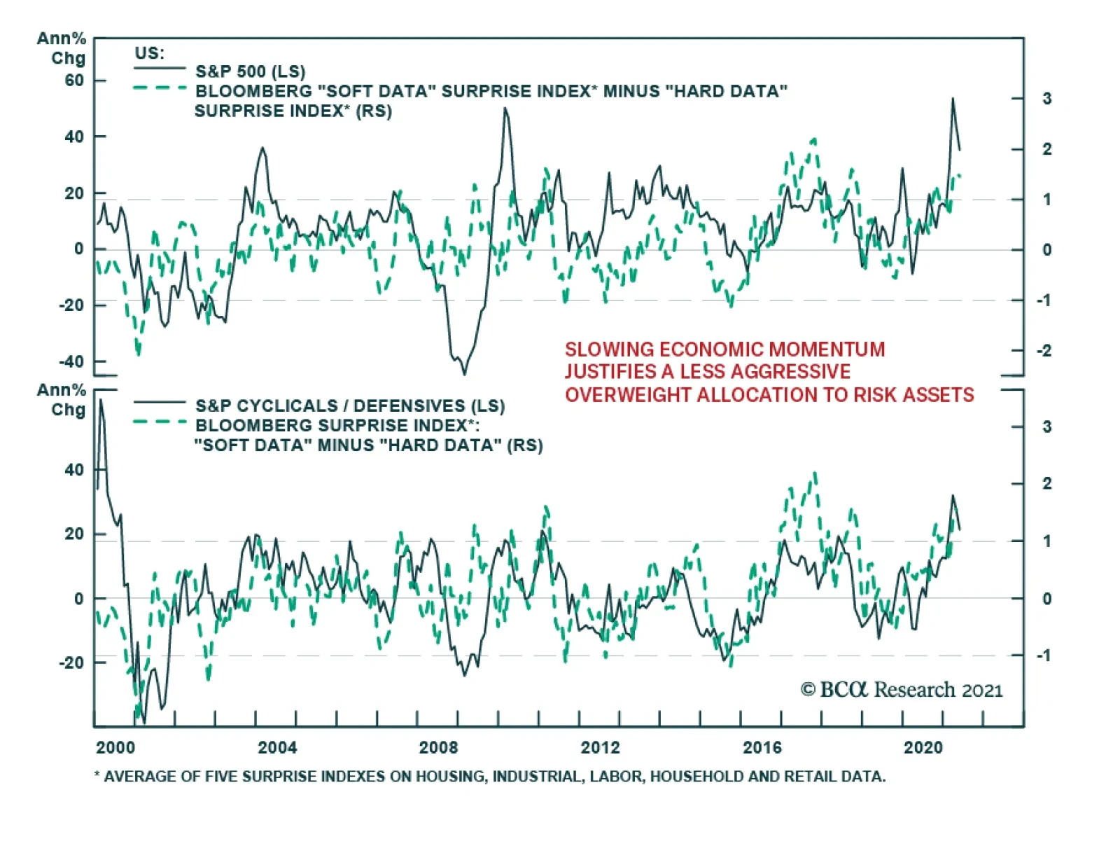
Since last July, the margin of positive surprises from US data releases has been steadily retreating. On Thursday, Citigroup’s US Economic Surprise Index fell below the zero line for the first time since last June – indicating that incoming data is now…