Equities

Highlights Sweden’s economic recovery is robust and will deepen. Policy is accommodative. Very few advanced economies will benefit as much from the global economic rebound. The labor market will tighten, capacity utilization will increase, and inflation will rise faster than the Riksbank forecasts. On a one- to two-year investment horizon, the SEK is a buy against both the USD and the EUR. Despite their pronounced outperformance, Swedish stocks possess significantly more upside against both Eurozone and US equities over the remainder of the cycle. Swedish industrials will beat their competitors in both these markets. Nonetheless, China’s policy tightening creates a meaningful tactical risk, which selling Norwegian stocks can hedge. Italy’s fiscal plan constitutes a new salvo in Europe’s efforts to avoid last decade’s mistakes. Feature Last week, the Swedish Riksbank did not follow in the footsteps of the Norges Bank. The Swedish central bank acknowledged that the economy is performing better than anticipated and that the housing market is gaining in strength; yet, it refrained from hinting at any forthcoming adjustment to its policy rate or the pace of its asset purchase program. The positive outlook for the Swedish economy will force the Riksbank to tighten policy significantly before the ECB. As a result, we expect the Swedish Krona to outperform the euro and the US dollar. Moreover, investors should continue to overweight Swedish equities due to their large exposure to industrials and financials, even if they have already significantly outperformed the Euro Area. Sweden’s Economic Outlook The Swedish economy will accelerate, which will put pressure on resource utilization and fan inflationary risk in the years ahead. The degree of stimulus supporting Sweden is consequential. Chart 1A Dual Labor Market
A Dual Labor Market
A Dual Labor Market
On the fiscal front, the government support measures that have been announced since the beginning of the COVID-19 crisis currently amount to SEK420bn, or SEK197bn for 2020 (4% of GDP), and SEK223bn for 2021 (4.5% of GDP). Moreover, generous labor market protection and part-time employment schemes meant that the number of employees in permanent employment contracts remained stable during the pandemic (Chart 1). Thus, the bulk of the rise in Swedish unemployment came from workers on fixed-term contracts. Monetary policy remains very accommodative as well. The Riksbank left its repo rate unchanged at 0% through the crisis, but cut its lending rate from 0.75% to 0.1%. More importantly, the Swedish central bank is aggressively injecting liquidity into the economy. It set up a SEK500bn funding-for-lending facility in order to incentivize bank lending to the nonfinancial private sector, and started a SEK700bn QE program, which as of Q1 2021 had purchased SEK380bn securities and which will purchase another SEK120bn in Q2, with covered bonds issued by banks accounting for 70% of it. As a result, the amount of securities held on the Riksbank balance sheet will nearly triple by year end (Chart 2). Chart 2The Riksbank Is Open For Business
Take A Chance On Sweden
Take A Chance On Sweden
Beyond the monetary and fiscal stimulus, many factors point to greater economic strength for Sweden. Despite a slow start to the process, as of last week, nearly 30% of the Swedish population had received at least one vaccine dose, which is broadly in line with vaccination rates prevalent in France or Germany. Crucially, the pace of vaccination is accelerating at a rate of 13% per week. Even if this second derivative slows, more than 70% of the population will have received at least one dose by this summer. Thus, greater mobility is in the cards during the second quarter, which will boost household spending. Chart 3The Wealth Effect
The Wealth Effect
The Wealth Effect
The housing market also favors a pick-up in consumption. The HOX housing price index is growing at a 15% annual rate, its fastest expansion in over 5 years. As a result of the wealth effect, this rapid appreciation is consistent with a swift improvement in the growth rate of household expenditures (Chart 3). Moreover, spending on durable goods now stands 1.3% above its pre-pandemic levels, while spending on non-durables is back to pre-pandemic levels. This context suggests that increased mobility translates into greater spending. The industrial sector remains a particularly bright spot in the Swedish economy. Sweden is extremely sensitive to the global industrial and trade cycle, because exports represent 45% of GDP. Moreover, the highly cyclical intermediate and capital goods comprise 56% of the country’s foreign shipments, which accentuates the beta of the Swedish economy. BCA Research remains optimistic about the global industrial cycle. Sweden will reap a significant dividend. Already the Swedish PMI points to stronger industrial production, and the index’s exports component is roaring ahead (Chart 4). The potential for a greater uptake in consumption, capex, and durable goods spending in the rest of the EU (Sweden’s largest trading partner) bodes well for the Swedish manufacturing sector. Additionally, if the collapse in the US inventory-to-sales ratio is any indication for the rest of the world, a global restocking cycle is forthcoming, which will further boost Swedish industrial activity (Chart 4, bottom panels). Finally, global public infrastructure plans are on the rise, which will also help Sweden. Chart 4Sweden Is well Placed
Sweden Is well Placed
Sweden Is well Placed
Chart 5Brightening Labor Market Prospects
Brightening Labor Market Prospects
Brightening Labor Market Prospects
In this context, the Swedish labor market should tighten significantly in the approaching quarters. Already, job vacancies are rebounding, and redundancy notices have normalized, which matches both the GDP growth surprise in Q1 and the continued rise in the NIER Sweden Economic Tendency Indicator. Furthermore, the employment component of the PMIs stands at 58.9 and is consistent with a sharp improvement in job growth over the coming year (Chart 5). The expected labor market growth will contribute to an increase in capacity utilization, which will place upward pressure on wages and inflation. When the 12-month moving average of US and Eurozone imports rises, so does the Riksbank Resource Utilization Indicator, because global trade has such a pronounced effect on the Swedish economy (Chart 6). Meanwhile, greater resource utilization leads to accelerated inflation, greater labor shortages, and rising unit labor costs (Chart 7). Chart 6CAPU Will Rise
CAPU Will Rise
CAPU Will Rise
Chart 7The Coming Pressure Buildup
The Coming Pressure Buildup
The Coming Pressure Buildup
Bottom Line: As a result of generous stimulus and the global economic recovery, the Swedish economy is set to continue its rebound. Consequently, employment and capacity utilization will improve meaningfully, which will lead to a resurgence of inflation and wages in the coming 24 months. Investment Implications On a 12 to 24 months horizon, we remain positive on the Swedish krona and Swedish equities. Fixed Income And FX Chart 8Three Hikes By 2025
Three Hikes By 2025
Three Hikes By 2025
The backend of the Swedish OIS curve only discounts 75bps of hikes by 2025. This pricing is too modest (Chart 8). The Swedish economy will rebound further as the vaccination campaign advances, and rising house prices and household indebtedness will fan growing long-term risk to financial stability, both of which suggest that the Riksbank will have to change its tack in 2022. The great likelihood that the Fed will start tapering off its asset purchase toward the end this year, that the ECB will follow sometime in 2022, and that the Norges Bank will be increasing interest rates next year will give more leeway to the Swedish central bank. A wider Sweden/Germany 10-year government bond spread is not an appealing vehicle to play a more hawkish Riksbank down the road. This spread hit a 23-year high in March and now rests at 62bps or its 98th percentile since 2000. Moreover, the terminal rate proxy embedded in the German money market curve is currently so low that the spread between Sweden’s and the Eurozone’s terminal rate proxy stands near a record high. Hence, German yields already embed much more pessimism than Swedish ones. Nonetheless, BCA recommends a below benchmark duration exposure within the Swedish fixed-income space, as we do for other government bond markets around the world.1 A bullish bias toward the SEK is a bet on the Riksbank that offers a very appealing risk/reward ratio, according to BCA Research’s Foreign Exchange Strategy strategists.2 The krona is very cheap against both the euro and the US dollar, trading at 9% and 29% discounts to purchasing power parity, respectively. Moreover, the Swedish current account stands at 5.2% of GDP, compared to 2.3% and -3.1% for the Euro Area and the US, creating a natural underpinning under the SEK. Chart 9The SEK Loves Growth
The SEK Loves Growth
The SEK Loves Growth
Over the coming 12 to 24 months, cyclical forces favor selling EUR/SEK and USD/SEK on any strength. The SEK is one of the most cyclical G-10 currencies and has one of the strongest sensitivities to the US dollar. Hence, our positive global economic outlook and our FX strategists negative view on the greenback are synonymous with a weak USD/SEK. These same factors also mean that the krona will appreciate more than the euro, as the negative correlation between EUR/SEK and our Boom/Bust Indicator and global earnings growth illustrate (Chart 9). Equities We also like Swedish equities, but the state of the Swedish economy and the evolution of the Riksbank policy surprise have a limited impact on Swedish equities. The Swedish bourse is mostly about the evolution of the global business cycle. The Swedish benchmark heightened sensitivity to the global business cycle reflects its massive overweight in deep cyclicals, with industrials, financials, consumer discretionary, and materials accounting for 38.4%, 26.1%, 9.7% and 3.7% of the MSCI index respectively, or 78% altogether (Table 1). As a result, BCA’s preference for global cyclicals at the expense of defensives and this publication’s fondness for the recovery laggards like the industrial and financial sectors automatically translate into a favorable bias toward Sweden’s stocks.3 Table 1Mamma Mia! That’s A Lot Of Cyclicals
Take A Chance On Sweden
Take A Chance On Sweden
Valuations offer a more complex picture, but they do not diminish our predilection for Sweden. Swedish equities trade at a discount to US stocks but at a premium to Euro Area ones (Chart 10). However, Swedish stocks offer higher RoEs and profit margins than both the US and the Euro Area, while also sporting lower leverage (Chart 11). Thus, their valuation premium to Euro Area stocks is warranted and their discount to US ones is excessive, especially when rising yields hurt the relative performance of the growth stocks that dominate US indexes. Chart 10Swedish Discounts And Premia
Swedish Discounts And Premia
Swedish Discounts And Premia
Chart 11Profitable Sweden
Profitable Sweden
Profitable Sweden
The outlook for Swedish earnings is appealing, both in absolute and relative terms. The Swedish market’s extreme sensitivity to global economic activity means that Sweden’s EPS increase and beat US profits when the Riksbank Resource Utilization Indicator expands (Chart 12). These relationships are artefacts of the Swedish economy’s pro-cyclicality, which causes capacity utilization to interweave tightly with the global business cycle (Chart 6). Chart 12The Winner Takes It All
The Winner Takes It All
The Winner Takes It All
Chart 13Better Capex Play Than You
Better Capex Play Than You
Better Capex Play Than You
Global capex and infrastructure spending favor Swedish equities compared to Euro Area ones. Over the past thirty years, Sweden’s stocks have outperformed those of the Eurozone when capital goods orders in the advanced economies have expanded (Chart 13). This reflects the Swedish benchmark’s large overweight in industrials, a sector that is the prime beneficiary of global capex. Capital goods orders are recovering well, and their growth rate can climb higher, especially as western multinationals announce capex plans and as governments from the US to Italy intend to ramp up infrastructure spending. Moreover, the large pent-up demand for durable goods in the Eurozone further enhances the potential of industrial firms, and thus, of Swedish equities.4 Chart 14Another Sign Of Pro-Cyclicality
Another Sign Of Pro-Cyclicality
Another Sign Of Pro-Cyclicality
BCA Research’s positive cyclical stance on commodities offers another reason to overweight Sweden’s market relative to that of the US and the Euro Area. Our Commodity and Energy Strategy sister service anticipates significant further upside for natural resources, especially base metals, over the remainder of the business cycle.5 Commodity prices still have room to rally, because demand will grow as the global economy continues to recover and because the supply of natural resources has been constrained by a decade of low investment. As a result, rising metal prices will symptomatize strong economic activity around the world and will incentivize capex in commodity extraction, both of which will boost the revenue of industrial firms. Furthermore, commodity price inflation often corresponds with rising yields, which boosts financials as well. These relationships explain the Swedish stocks’ outperformance of US and Eurozone stocks, when natural resource prices rally, despite the former’s low exposure to materials (Chart 14). At the sector level, the appeal of Swedish industrials relative to those of the Eurozone and the US completes the rationale to favor Swedish equities in a global portfolio. Swedish industrials are just as profitable as US ones and are more so than Euro Area ones, while having significantly lower leverage than either of them (Chart 15). Additionally, for the past two years, the EPS growth of Swedish industrials has bested that of US and Eurozone ones. Yet, their forward P/E ratio trades in line with the US and the Euro Area, while the sell-side’s long-term relative earnings growth estimate is too depressed (Chart 16). The same observations are valid when comparing Swedish industrials to French or German ones. Hence, in the context of a global business cycle upswing, buying Swedish industrials while selling their US and Euro Area competitors is an appealing pair trade, especially since it also involves short USD/SEK and short EUR/SEK bets. Chart 15Attractive Swedish Industrials...
Attractive Swedish Industrials...
Attractive Swedish Industrials...
Chart 16...And Not Expensive
...And Not Expensive
...And Not Expensive
Despite our optimism toward Swedish stocks on a 12 to 24 months basis, investors must hedge a near-term risk. Chinese authorities are aiming to contain financial excesses and trying to restrain credit growth. As we showed four weeks ago, China’s excess reserve ratio is contracting, which points toward a slowdown in the Chinese credit impulse.6 Historically, such a development can hurt global cyclicals, and thus, also Swedish equities. However, BCA Research’s China strategists believe that Beijing will not kill off the Chinese business cycle; thus, the recent disappointment in the Chinese PMI is transitory.7 Chart 17Industrials vs Materials: Europe vs China
Industrials vs Materials: Europe vs China
Industrials vs Materials: Europe vs China
Materials more than industrials will suffer the brunt of a China slowdown, as the re-opening trade and capex cycle among advanced economies will create a buffer for the latter. Indeed, the performance of global industrials relative to materials stocks correlates with the evolution of the spread between the Euro Area and Chinese PMI (Chart 17). Thus, we recommend selling Norwegian equities to hedge the tactical risk inherent in an overweight on Sweden. As Table 1 above shows, Norway overweighs materials and energy (two sectors greatly exposed to China), hence, a temporary pullback in commodity prices should hurt Norwegian stocks more than Swedish ones. Bottom Line: The SEK is an inexpensive and attractive vehicle to bet on both the global business cycle strength and the Swedish economic recovery. Thus, investors should use any rebound in EUR/SEK and USD/SEK to sell these pairs. Moreover, Swedish stocks greatly overweight cyclical sectors, particularly industrials and materials. This sectoral profile renders Swedish equities as attractive bets on the global economy. Additionally, Swedish shares display alluring operating metrics. As a result, we recommend investors go long Swedish industrials relative to those of the US and Euro Area. They should also overweight Swedish equities against the US and the Eurozone. Consequent to some China-related tactical risks, an underweight stance on Norwegian stocks constitutes an attractive hedge to this Swedish exposure. A Few Words On Italy’s National Recovery And Resilience Plan Mario Draghi’s plan to revive the Italian economy, announced last week, is an important marker of Europe’s changing relationship with fiscal policy. Last decade, excessive austerity contributed to subpar growth, ultimately firing up concerns about debt sustainability in many peripheral economies, and fueled risk premia in Italy and Spain. Under the cover of the current crisis, and in the face of the changing political winds in Brussel and Berlin where fiscal rectitude is not the mantra it once was, national European governments are beginning to propose ambitious fiscal stimulus plans. The National Recovery and Resilience program illustrates these dynamics. The EUR248bn plan is a testament to the importance of the NGEU recovery program as well as the REACT EU recovery fund. Through these facilities, the EU will contribute EUR191.5bn to the fiscal plan via grants and loans. Italy will contribute the remainder of the funds. While the total amount disbursed over the next six years corresponds to 14% of Italy’s 2019 GDP, the Draghi government estimates that the program will add 3.2 percentage points to GDP between 2024 and 2026. Importantly, markets are not rebelling. Despite expectations that Italy would continue to run an accommodative fiscal policy, the BTP/Bund spreads remain stable. We can expect this trend of greater stimulus to be mimicked around the EU. Spain is another large recipient of the NGEU program, and it too is likely to increase stimulus beyond what the EU will fund. France will hold an election in May 2022, and President Macron has all the incentives to stimulate the economy between now and then. If, as we wrote last week, Germany shifts to the left in September, then this outcome will be guaranteed. Bottom Line: The Draghi plan is the first salvo of greater fiscal stimulus in the EU. This trend will help Eurozone growth improve relative to the US over the coming few years. Despite a loose fiscal policy, BTPs and other peripheral bonds will continue to outperform on the back of declining risk premia. Mathieu Savary, Chief European Investment Strategist Mathieu@bcaresearch.com Footnotes 1Please see Global Fixed Income Strategy “GFIS Model Bond Portfolio Q1/2021 Performance Review & Current Allocations: Grand Reopening,” dated April 6, 2021, available at gfis.bcaresearch.com 2Please see Foreign Exchange Strategy “2021 Key Views: Tradeable Themes,” dated December 4, 2020, available at fes.bcaresearch.com 3Please see European Investment Strategy “Summer Of ‘21,” dated March 22, 2021, available at eis.bcaresearch.com 4Please see European Investment Strategy “Winds Of Change: Germany Goes Green,” dated April 23, 2021, available at eis.bcaresearch.com 5Please see Commodity & Energy Strategy “Industrial Commodities Super-Cycle Or Bull Market?” dated March 4, 2021, available at ces.bcaresearch.com 6Please see European Investment Strategy “The Euro Dance: One Step Back, Two Steps Forward,” dated March 29, 2021, available at eis.bcaresearch.com 7Please see China Investment Strategy “National People’s Congress Sets Tone For 2021 Growth,” dated March 17, 2021, available at cis.bcaresearch.com Cyclical Recommendations Structural Recommendations Currency Performance
Take A Chance On Sweden
Take A Chance On Sweden
Fixed Income Performance Government Bonds
Take A Chance On Sweden
Take A Chance On Sweden
Corporate Bonds
Take A Chance On Sweden
Take A Chance On Sweden
Equity Performance Major Stock Indices
Take A Chance On Sweden
Take A Chance On Sweden
Geographic Performance
Take A Chance On Sweden
Take A Chance On Sweden
Sector Performance
Take A Chance On Sweden
Take A Chance On Sweden
Closed Trades
Highlights Last week featured a lot of good news for financial markets and the economy … : US GDP grew at 6.4% in the first quarter, powered by 10.7% growth in consumption; the six largest companies in the S&P 500 reported first quarter earnings that exceeded expectations by an average of 41%; and the Fed remained resolutely dovish. … and we continue to believe that they are likely to remain in our “just-right” base-case scenario over the next twelve months … : Our Goldilocks base-case scenario is underpinned by strong growth and accommodative monetary policy. Strong growth is assured as long as the virus doesn’t come roaring back, and the Fed still isn’t even talking about talking about tapering its asset purchases, much less hiking the fed funds rate. … so our risk-friendly asset allocation recommendations remain unchanged: There are no signs yet that equities and credit will not continue to generate significant excess returns over Treasuries and cash over the next twelve months. Feature We will be holding a webcast next Monday, May 10th at 10:00 a.m. Eastern time in lieu of publishing a Weekly Report. Please join us with your questions to make it a fully interactive event. We will resume our regular publication schedule on the 17th. Some say the world will end in fire, Some say in ice. – Robert Frost, “Fire and Ice” We continue to view financial markets and the economy through the lens of our stylized Goldilocks-and-the-Two-Tails distribution (Figure 1). Though the figure gives short shrift to our subjective probability that the Goldilocks base-case scenario will unfold over the next twelve months (≈ 70-75%), and overstates the likelihood of a too-cold outcome (≈ 5-10%), the size of the too-hot right tail (≈ 20-25%) is roughly in line with our expectations. Last week’s spate of economic data, company earnings releases and Fed guidance supported our view and shored up our conviction in it. The twin pillars of well-above-trend growth and extremely accommodative monetary policy remain firmly in place. Figure 1Goldilocks And The Two Tails
Fire, Not Ice
Fire, Not Ice
Last week’s data were especially strong. Sticking to the highlights, and skipping the uncertain impacts of the measures President Biden floated before a joint session of Congress, the following items suggest that the just-right scenario is considerably more probable than not. The Conference Board’s consumer confidence index surged higher (Chart 1, top panel) and given the way it tends to track the jobs plentiful sub-index (Chart 1, bottom panel), the road ahead looks good, provided that job openings rise as businesses still operating at limited capacity ramp up their operations. We have not found that consumer confidence is a robust predictor of key economic series, but the advance supports the notion that several elements are falling into place. Chart 1Consumer Confidence Is Surging ...
Consumer Confidence Is Surging ...
Consumer Confidence Is Surging ...
Initial jobless claims for the week ended April 23rd made their third straight post-pandemic low and the four-week moving average extended its recent descent (Chart 2). The four-week moving average is poised to take another step lower next week once the 742,000 April 2nd reading falls out of the calculation (the last three weeks have averaged 568,000). Headline first-quarter GDP growth of 6.4% was strong, albeit just shy of consensus expectations, but the underlying details were better. Adjusting for the 2.6-percentage-point drag from inventory destocking, which will turn into a boost when inventories are replenished in the future, and backing out the 0.9-percentage-point trade deficit, real final domestic demand surged at an annualized rate of 9.9%. Chart 2... And Layoffs Are Steadily Falling
... And Layoffs Are Steadily Falling
... And Layoffs Are Steadily Falling
On the corporate earnings front, the six largest S&P 500 constituents, Apple, Microsoft, Amazon, Google, Facebook and Tesla, all reported earnings that easily surpassed consensus expectations (Table 1). Those six companies account for 23% of aggregate index market cap and their beats drove projected per-share first-quarter earnings more than 7% higher, from $42.69 to $45.83. Even if the reports were not necessarily greeted by share-price gains, they have the index poised to deliver a fourth consecutive earnings beat of outsized proportions (Chart 3). Although the biggest companies’ successes in the calendar first quarter cannot blindly be extrapolated into the future, they suggest that S&P 500 earnings over the next four quarters will be greater than the market expected before last week. The beat goes on. Table 1Lifting All Boats
Fire, Not Ice
Fire, Not Ice
Chart 3Four Straight Quarters Of Eye-Popping Beats
Fire, Not Ice
Fire, Not Ice
The Fed Maintains Its Poker Face While the FOMC acknowledged that the economy has strengthened since its mid-March meeting, it showed no inclination to accelerate its timetable for dialing back accommodation. Though all four of the tweaks to its mid-March statement amounted to a marginal upgrade of its assessment of the economy’s current state and/or prospects, Chair Powell held fast to his messaging and the committee stayed the course on asset purchases. We continue to take the Fed at its word that it will not hike rates until the economy passes its “three tests” and it will not begin to taper asset purchases until it judges that the economy has made "substantial progress" toward meeting them. The picture has surely improved, but the inflation and employment criteria are not yet within reach. To recap, the Fed’s three preconditions for hiking the fed funds rate are as follows: 12-month PCE inflation must be 2% or higher. Labor market conditions must have reached levels consistent with maximum employment. 12-month PCE inflation must be on track to moderately exceed 2% for some time. Whether or not the economy has made substantial progress toward meeting those criteria is a squishier concept and the Fed has already given itself pre-emptive discretion on the first and most objective criterion by saying it will look through any transitory factors that push measured inflation higher. Powell called out base effects from last year’s pandemic wipeout that will disappear by June. He also cited supply-chain bottlenecks, and while he conceded that it is much harder to predict when they will be resolved, the committee is certain that they will prove to be a temporary phenomenon as well. “Full employment” is also a subjective metric, but the quarterly Summary of Economic Projections, released after every other FOMC meeting, provides a ready proxy. Our US Bond Strategy colleagues have calculated the average monthly net payroll gains required to reach the low end, the midpoint and the high end of the range of the participants’ long-run unemployment rate estimates, which currently span 3.5% to 4.5%, under various labor force participation rate assumptions (Tables 2A, 2B and 2C). We are focused on the top row of each iteration of the table because only a return to the pre-pandemic labor force participation rate of 63.3% would seem to satisfy the Fed’s stated commitment to achieving broad-based employment gains. While a return to the 3.5% pre-pandemic unemployment rate would also be consonant with spreading the gains from the expansion most broadly, it is useful to consider the full range of plausible outcomes given the Fed’s desire to retain some decision-making flexibility. Table 2AAverage Monthly Nonfarm Payroll Growth Required For The Unemployment Rate To Reach 4.5% By The Given Date
Fire, Not Ice
Fire, Not Ice
Table 2BAverage Monthly Nonfarm Payroll Growth Required For The Unemployment Rate To Reach 4% By The Given Date
Fire, Not Ice
Fire, Not Ice
Table 2CAverage Monthly Nonfarm Payroll Growth Required For The Unemployment Rate To Reach 3.5% By The Given Date
Fire, Not Ice
Fire, Not Ice
Per our colleagues’ simple assumptions, it would require an average of anywhere from 701,000 to 833,000 monthly net payroll additions to hit full employment by the end of the year, 534,000 to 631,000 by the middle of 2022, and 410,000 to 487,000 by the end of 2022. The year-end 2021 targets are probably too ambitious, but we think the economy can return to full employment at some point next year, given that labor demand will likely rise sharply upon the release of pent-up consumption demand. As a back-of-the-envelope check on the tables’ conclusions, we take a return to pre-pandemic employment as the goal for a return to full employment. Through March, 8.3 million fewer people were employed than at the pre-pandemic peak in December 20191 (Chart 4). It would take fourteen months (May 2022) to regain full employment at an average monthly pace of 600,000 net hires or seventeen months (August 2022) to achieve that goal at a 500,000-per-month clip. Chart 4More Than 8 Million Workers Still Don't Have A Job
More Than 8 Million Workers Still Don't Have A Job
More Than 8 Million Workers Still Don't Have A Job
A 500,000-to-600,000 range seems doable to us if herd immunity can be achieved before the end of the summer and we expect that the economy will return to full employment somewhere around the middle of next year. That will position the Fed to hike rates for the first time in 2022, in line with the market’s December 2022 lift-off projection, and announce the start of tapering at the end of 2021 or the beginning of 2022. Those Fed views support our recommendations to maintain below-benchmark duration within fixed income portfolios and underweight Treasuries. Press Conference Highlights Jay Powell stayed on message at the post-meeting press conference, resisting every attempt to goad him into revealing more about the tapering timetable or expressing concern about the pickup in inflation and inflation expectations or the economy’s potential to overheat following unprecedentedly large fiscal stimulus. On Tapering Direct questions about tapering bookended the press conference and Powell batted them away directly and concisely. Opening question: Is it time to start talking about talking about tapering yet? A: No, it is not time yet. We’ll give the public plenty of notice when it is. Final question: What are we getting for $120 billion [of Treasury and agency purchases each month] that we couldn’t get for less? A: There will come a time to talk about talking about tapering. That time is not now. On Inflation (And Armchair Quarterbacks) The combination of strong fiscal support and the reversal of a synchronized (and unprecedented) global economic shutdown has the economy beginning to move ahead with potent momentum. The re-opening is likely to produce increases in inflation but we are fully cognizant that they are likely to be temporary. While we are not going to adjust monetary policy unnecessarily in response to temporary inflation pressures, we do not want inflation expectations “materially above” 2% and we will use our tools to bring them down if they were to reach those levels. Our commitment to our price stability mandate is the key difference between now and the late sixties and seventies and we’re well aware of the history of that period. On Transitory Inflation Factors Base effects are going to add about one percentage point to headline and 70 basis points to core inflation in April and May. They will disappear and “carry no implications for the rate of inflation in later periods.” Bottlenecks are a temporary blockage or restriction in the supply chain that slows down the process of delivering a good or bringing it to market. We think of them as things that will naturally be resolved as businesses and individuals adapt. They therefore do not call for a change in monetary policy even if it’s difficult to predict when they will disappear. For the bottlenecks, it’s “a matter of when they will pass through, not whether they will pass through.” What’s happening to prices now is a function of the re-opening of the economy. Demand, spurred by fiscal transfers and people going back to work, has come back much more quickly while the supply side will take a little bit of time to adapt. On Overheating/Bubbles The overall financial stability picture is mixed, but we view it as manageable on balance. There’s some froth in capital markets and strong home price appreciation is not an “unalloyed good,” but the housing market is much more stable than it was before the crisis. Leverage in the financial system is not a problem, the large banks are very well capitalized and don’t have any funding issues and households are in very good shape. Investment Implications Although our conviction levels are lower against a backdrop of unprecedented fiscal stimulus and the inherent uncertainty surrounding a global pandemic, we continue to hold to our view that overheating is unlikely in the near term. The output gap has still not closed and while households have an enormous amount of dry powder in the form of what we estimate to be $2.1 trillion of excess savings, some of 2020’s foregone services demand has been lost forever. The share of foregone demand that has been deferred rather than destroyed will not be released immediately and may well be spread out over a broad range of price points where there is available capacity (think flying business instead of coach, sitting in the best seats at the stadium or the theater, or ordering more expensive bottles of wine). Most importantly on the inflation front, broad wage pressures have not yet emerged. As Chair Powell noted, if the labor market really were tightening, one would expect wages to be rising. We expect that idled workers will return to the labor force as vaccinations proceed, schools reopen and the pandemic becomes less of an impediment to working. We are skeptical that the $300 weekly federal unemployment insurance benefit supplement is having a material effect on labor force participation, but the program will cease in September in any event. Chart 5Neither TIPS Inflation Break-Evens ...
Neither TIPS Inflation Break-Evens ...
Neither TIPS Inflation Break-Evens ...
Chart 6... Nor CPI Swap Inflation Break-Evens Are Sounding The Alarm
... Nor CPI Swap Inflation Break-Evens Are Sounding The Alarm
... Nor CPI Swap Inflation Break-Evens Are Sounding The Alarm
Our biggest inflation concern revolves around long-term inflation expectations. As long as economic actors like workers and businesses do not believe the long-run trajectory of consumer prices has changed, they have no reason to change their behavior to demand wage and price increases to keep pace with an upward inflection in the CPI. The slope of the two-to-five-year and five-to-ten-year segments of the inflation expectations curve remain negative (Charts 5 and 6), suggesting that the inflation mindset necessary to support an upward price spiral has not taken hold. We will not worry about the risk-asset bull market’s fiery demise until the 2-year/5-year and 5-year/10-year break-even slopes start to test the top of their post-GFC range, implying that investors believe a new inflation era has arrived. Doug Peta, CFA Chief US Investment Strategist dougp@bcaresearch.com Footnotes 1 Per the household survey. The monthly employment situation report also includes the establishment survey of employers. We use the household survey here because it is used to calculate the unemployment rate though the establishment survey’s 8.4-million employment shortfall is nearly equivalent to the household survey's.
What Does Our S&P 500 Dividend Discount Model Say?
What Does Our S&P 500 Dividend Discount Model Say?
Since 2017, we have been updating our SPX dividend discount model (DDM) every April when the previous year’s annual S&P 500 dividend payment is finalized from the Standard & Poor’s. Table 1 below summarizes the results of our analysis. Our dividend growth estimates in the DDM result in an SPX 4,047 fair value target. As a reminder, we have been and remain very conservative in our other DDM assumptions. In more detail, we assume that no buybacks will occur, a long-held assumption of ours, i.e. we pencil in a steady divisor in the coming five-year time frame. 2026 is our terminal year when dividend growth settles at 6.6%, 60bps below the long-term average (bottom panel). Our 8.2% discount rate also mirrors the corporate junk bond yield historical average (please click here if you would like to receive our DDM and insert your own assumptions, along with our EPS/multiple sensitivity and ERP analyses that can also be found in the following Strategy Report). Bottom Line: Our DDM corroborates the message that the SPX is fully priced and points to 4,047 as the fair value price.
What Does Our S&P 500 Dividend Discount Model Say?
What Does Our S&P 500 Dividend Discount Model Say?

Weekly Performance Update For the week ending Thu Apr 29, 2021 The Market Monitor displays the trailing 1-quarter performance of strategies based around the BCA Score. For each region, we construct an equal-weighted, monthly rebalanced portfolio consisting of the top 3 stocks per sector and compare it with the regional benchmark. For each portfolio, we show the weekly performance of individual holdings in the Top Contributors/Detractors table. In addition, the Top Prospects table shows the holdings that currently have the highest BCA Score within the portfolio. For more details, click the region headers below to be redirected to the full historical backtest for the strategy. BCA US Portfolio
Market Monitor (Apr 29, 2021)
Market Monitor (Apr 29, 2021)
Total Weekly Return BCA US Portfolio S&P500 TRI 1.69% 1.86% Top Contributors DCP:US WES:US LPX:US MPLX:US SCCO:US Weekly Return 26 bps 24 bps 22 bps 15 bps 13 bps Top Detractors TGNA:US TRTN:US UTHR:US NRG:US NWSA:US Weekly Return -10 bps -9 bps -9 bps -6 bps -4 bps Top Prospects TX:US SCCO:US ESGR:US UHAL:US BRK.A:US BCA Score 99.58% 97.15% 97.12% 95.81% 94.73% BCA Canada Portfolio
Market Monitor (Apr 29, 2021)
Market Monitor (Apr 29, 2021)
Total Weekly Return BCA Canada Portfolio S&P/TSX TRI 0.83% 1.19% Top Contributors TOU:CA APHA:CA PXT:CA LIF:CA TOY:CA Weekly Return 38 bps 25 bps 24 bps 16 bps 13 bps Top Detractors QBR.A:CA AUP:CA H:CA L:CA EMP.A:CA Weekly Return -22 bps -18 bps -12 bps -9 bps -8 bps Top Prospects CFP:CA IFP:CA LNF:CA NWC:CA RUS:CA BCA Score 99.22% 98.92% 98.69% 92.61% 88.52% BCA UK Portfolio
Market Monitor (Apr 29, 2021)
Market Monitor (Apr 29, 2021)
Total Weekly Return BCA UK Portfolio FTSE 100 TRI 0.61% 0.38% Top Contributors TUNE:GB HSBK:GB DGOC:GB FXPO:GB CNE:GB Weekly Return 36 bps 33 bps 21 bps 15 bps 12 bps Top Detractors AO.:GB SSE:GB SVST:GB LSRG:GB DRX:GB Weekly Return -14 bps -11 bps -9 bps -8 bps -8 bps Top Prospects SVST:GB NLMK:GB TUNE:GB BPCR:GB GLTR:GB BCA Score 99.79% 99.27% 98.05% 97.39% 96.74% BCA Eurozone Portfolio
Market Monitor (Apr 29, 2021)
Market Monitor (Apr 29, 2021)
Total Weekly Return BCA EMU Portfolio MSCI EMU TRI 0.48% 0.01% Top Contributors AOF:DE IPS:FR SOLV:BE EVN:AT PHH2:DE Weekly Return 24 bps 16 bps 9 bps 8 bps 7 bps Top Detractors CNV:FR VIS:ES VIRP:FR MOL:IT TEN:IT Weekly Return -20 bps -12 bps -9 bps -9 bps -7 bps Top Prospects CNV:FR PHH2:DE SOL:IT SOLV:BE ROTH:FR BCA Score 99.51% 99.12% 98.75% 97.97% 96.58% BCA Japan Portfolio
Market Monitor (Apr 29, 2021)
Market Monitor (Apr 29, 2021)
Total Weekly Return BCA Japan Portfolio TOPIX TRI -1.08% -0.70% Top Contributors 8595:JP 4980:JP 8966:JP 6960:JP 9503:JP Weekly Return 17 bps 14 bps 11 bps 10 bps 9 bps Top Detractors 8255:JP 4534:JP 5451:JP 5943:JP 1766:JP Weekly Return -20 bps -17 bps -17 bps -16 bps -13 bps Top Prospects 1766:JP 9436:JP 4008:JP 8595:JP 8133:JP BCA Score 99.43% 99.07% 98.55% 98.00% 97.78% BCA Hong Kong Portfolio
Image
Total Weekly Return BCA Hong Kong Portfolio Hang Seng TRI 1.14% 1.91% Top Contributors 1888:HK 148:HK 1898:HK 867:HK 373:HK Weekly Return 33 bps 25 bps 24 bps 15 bps 14 bps Top Detractors 990:HK 1117:HK 315:HK 1883:HK 719:HK Weekly Return -14 bps -11 bps -8 bps -6 bps -5 bps Top Prospects 990:HK 2232:HK 811:HK 3306:HK 86:HK BCA Score 99.91% 98.78% 97.55% 97.11% 96.98% BCA Australia Portfolio
Market Monitor (Apr 29, 2021)
Market Monitor (Apr 29, 2021)
Total Weekly Return BCA Australia Portfolio S&P/ASX All Ord. TRI -0.14% 0.47% Top Contributors STX:AU 360:AU SGF:AU PDN:AU CAJ:AU Weekly Return 40 bps 34 bps 19 bps 16 bps 9 bps Top Detractors API:AU HVN:AU ADH:AU HT1:AU DDR:AU Weekly Return -34 bps -26 bps -22 bps -16 bps -16 bps Top Prospects BSE:AU GRR:AU PSQ:AU BLX:AU BFG:AU BCA Score 99.83% 99.32% 98.75% 97.77% 96.89%
Highlights Biden’s first 100 days are characterized by a liberal spend-and-tax agenda unseen since the 1960s. It is not a “bait and switch,” however. Voters do not care about deficits and debt. At least not for now. The apparent outcome of the populist surge in the US and UK in 2016 is blowout fiscal spending. Yet the US and UK also invented and distributed vaccines faster than others. US growth and equities have outperformed while the US dollar experienced a countertrend bounce. While growth will rotate to other regions, China’s stimulus is on the wane. Of Biden’s three initial geopolitical risks, two are showing signs of subsiding: Russia and Iran. US-China tensions persist, however, and Biden has been hawkish so far. Our new Australia Geopolitical Risk Indicator confirms our other indicators in signaling that China risk, writ large, remains elevated. Cyclically we are optimistic about the Aussie and Australian stocks. Mexico’s midterm elections are likely to curb the ruling party’s majority but only marginally. The macro and geopolitical backdrop is favorable for Mexico. Feature US President Joe Biden gave his first address to the US Congress on April 28. Biden’s first hundred days are significant for his extravagant spending proposals, which will rank alongside those of Lyndon B. Johnson’s Great Society, if not Franklin Delano Roosevelt’s New Deal, in their impact on US history, for better and worse. Chart 1Biden's First 100 Days - The Market's Appraisal
Biden's First 100 Days - The Market's Appraisal
Biden's First 100 Days - The Market's Appraisal
The global financial market appraisal is that Biden’s proposals will turn out for the better. The market has responded to the US’s stimulus overshoot, successful vaccine rollout, and growth outperformance – notably in the pandemic-struck service sector – by bidding up US equities and the dollar (Chart 1). From a macro perspective we share the BCA House View in leaning against both of these trends, preferring international equities and commodity currencies. However, our geopolitical method has made it difficult for us to bet directly against the dollar and US equities. Geopolitics is about not only wars and trade but also the interaction of different countries’ domestic politics. America’s populist spending blowout is occurring alongside a sharp drop in China’s combined credit-and-fiscal impulse, which will eventually weigh on the global economy. This is true even though the rest of the world is beginning to catch up in vaccinations and economic normalization. As for traditional geopolitical risk – wars and alliances – Biden has not yet leaped over the three initial foreign policy hurdles that we have highlighted: China, Russia, and Iran. In this report we will update the view on all three, as there is tentative improvement on the Russian and Iranian fronts. In addition, we will introduce our newest geopolitical risk indicator – for Australia – and update our view on Mexico ahead of its June 6 midterm elections. Biden’s Fiscal Blowout From a macro point of view, Biden’s $1.9 trillion American Rescue Plan Act (ARPA) was much larger than what Republicans would have passed if President Trump had won a second term. His proposed $2.3 trillion American Jobs Plan (AJP) is also larger, though both candidates were likely to pass an infrastructure package. The difference lies in the parts of these packages that relate to social spending and other programs, beyond COVID relief and roads and bridges. The Republican proposal for COVID relief was $618 billion while the Republicans’ current proposal on infrastructure is $568 billion – marking a $3 trillion difference from Biden. In reality Republicans would have proposed larger spending if Trump had remained president – but not enough to close this gap. And Biden is also proposing a $1.8 trillion American Families Plan (AFP). Biden’s praise for handling the vaccinations must be qualified by the Trump administration’s successful preparations, which have been unfairly denigrated. Similarly, Biden’s blame for the migrant surge at the southern border must be qualified by the fact that the surge began last year.1 A comparison with the UK will put Biden’s administration into perspective. The only country comparable to the US in terms of the size of fiscal stimulus over 2019-21 so far – excluding Biden’s AJP and AFP, which are not yet law – is the United Kingdom. Thus the consequence of the flare-up of populism in the Anglo-Saxon world since 2016 is a budget deficit blowout as these countries strive to suppress domestic socio-political conflict by means of government largesse, particularly in industrial and social programs. However, populist dysfunction was also overrated. Both the US and UK retain their advantages in terms of innovation and dynamism, as revealed by the vaccine and its rollout (Chart 2). Chart 2Dysfunctional Anglo-Saxon Populism?
Dysfunctional Anglo-Saxon Populism?
Dysfunctional Anglo-Saxon Populism?
No sharp leftward turn occurred in the UK, where Prime Minister Boris Johnson and his Conservatives had the benefit of a pre-COVID election in December 2019, which they won. By contrast, in the US, President Trump and the Republicans contended an election after the pandemic and recession had virtually doomed them to failure. There a sharp leftward turn is taking place. Going forward the US will reclaim the top rank in terms of fiscal stimulus, as Biden is likely to get his infrastructure plan (AJP) passed. Our updated US budget deficit projections appear in Chart 3. Our sister US Political Strategy gives the AJP an 80% chance of passing in some form and the AFP only a 50% chance of passing, depending on how quickly the AJP is passed. This means the blue dashed line is more likely to occur than the red dashed line. The difference is slight despite the mind-boggling headline numbers of the plans because the spending is spread out over eight-to-ten years and tax hikes over 15 years will partially offset the expenditures. Much will depend on whether Congress is willing to pay for the new spending. In Chart 3 we assume that Biden will get half of the proposed corporate tax hikes in the AJP scenario (and half of the individual tax hikes in the AFP scenario). If spending is watered down, and/or tax hikes surprise to the upside, both of which are possible, then the deficit scenarios will obviously tighten, assuming the economic recovery continues robustly as expected. But in the current political environment it is safest to plan for the most expansive budget deficit scenarios, as populism is the overriding force. Chart 3Biden’s Blowout Spending
Biden’s First 100 Days In Foreign Policy (GeoRisk Update)
Biden’s First 100 Days In Foreign Policy (GeoRisk Update)
Biden’s campaign plan was even more visionary, so it is not true that Biden pulled a “bait and switch” on voters. Rather, the median voter is comfortable with greater deficits and a larger government role in American life. Bottom Line: The implication of Biden’s spending blowout is reflationary for the global economy, cyclically negative for the US dollar, and positive for global equities. But on a tactical time frame the rotation to other equities and currencies will also depend on China’s fiscal-and-credit deceleration and whether geopolitical risk continues to fall. Russia: Some Improvement But Coast Not Yet Clear US-Russia tensions appeared to fizzle over the past week but the coast is not yet clear. We remain short Russian currency and risk assets as well as European emerging market equities. Tensions fell after President Putin’s State of the Nation address on April 21 in which he warned the West against crossing Russia’s “red lines.” Biden’s sanctions on Russia were underwhelming – he did not insist on halting the final stages of the Nord Stream II pipeline to Germany. Russia declared it would withdraw its roughly 100,000 troops from the Ukrainian border by May 1. Russian dissident Alexei Navalny ended his hunger strike. Putin attended Biden’s Earth Day summit and the two are working on a bilateral summit in June. Chart 4Russia's Domestic Instability Will Continue
Russia's Domestic Instability Will Continue
Russia's Domestic Instability Will Continue
De-escalation is not certain, however. First, some US officials have cast doubt on Russia’s withdrawal of troops and it is known that arms and equipment were left in place for a rapid mobilization and re-escalation if necessary. Second, Russian-backed Ukrainian separatists will be emboldened, which could increase fighting in Ukraine that could eventually provoke Russian intervention. Third, the US has until August or September to prevent Nord Stream from completion. Diplomacy between Russia and the US (and Russia and several eastern European states) has hit a low point on the withdrawal of ambassadors. Fourth, Russian domestic politics was always the chief reason to prepare for a worse geopolitical confrontation and it remains unsettled. Putin’s approval rating still lingers in the relatively low range of 65% and government approval at 49%. The economic recovery is weak and facing an increasingly negative fiscal thrust, along with Europe and China, Russia’s single-largest export destination (Chart 4). Putin’s handouts to households, in anticipation of the September Duma election, only amount to 0.2% of GDP. More measures will probably be announced but the lead-up to the election could still see an international adventure designed to distract the public from its socioeconomic woes. Russia’s geopolitical risk indicators ticked up as anticipated (Chart 5). They may subside if the military drawdown is confirmed and Biden and Putin lower the temperature. But we would not bet on it. Chart 5Russian Geopolitical Risk: Wait For 'All Clear' Signal
Russian Geopolitical Risk: Wait For 'All Clear' Signal
Russian Geopolitical Risk: Wait For 'All Clear' Signal
Bottom Line: It is possible that Biden has passed his first foreign policy test with Russia but it is too soon to sound the “all clear.” We remain short Russian ruble and short EM Europe until de-escalation is confirmed. The Russian (and German) elections in September will mark a time for reassessing this view. Iran: Diplomacy On Track (Hence Jitters Will Rise) While Russia may or may not truly de-escalate tensions in Ukraine, the spring and summer are sure to see an increase in focus on US-Iran nuclear negotiations. Geopolitical risks will remain high prior to the conclusion of a deal and will materialize in kinetic attacks of various kinds. This thesis is confirmed by the alleged Israeli sabotage of Iran’s Natanz nuclear facility this month. The US Navy also fired warning shots at Iranian vessels staging provocations. Sporadic attacks in other parts of the region also continue to flare, most recently with an Iranian tanker getting hit by a drone at a Syrian oil terminal.2 The US and Iran are making progress in the Vienna talks toward rejoining the 2015 nuclear deal from which the US withdrew in 2018. Iran pledged to enrich uranium up to 60% but also said this move was reversible – like all its tentative violations of the Joint Comprehensive Plan of Action (JCPA) so far (Table 1). Iran also offered a prisoner swap with the US. Saudi Arabia appears resigned to a resumption of the JCPA that it cannot prevent, with crown prince Mohammed bin Salman offering diplomatic overtures to both the US and Iran. Table 1Iran’s Nuclear Program And Compliance With JCPA 2015
Biden’s First 100 Days In Foreign Policy (GeoRisk Update)
Biden’s First 100 Days In Foreign Policy (GeoRisk Update)
Still, the closer the US and Iran get to a deal the more its opponents will need to either take action or make preparations for the aftermath. The allegation that former US Secretary of State John Kerry’s shared Israeli military plans with Iranian Foreign Minister Javad Zarif is an example of the kind of political brouhaha that will occur as different elements try to support and oppose the normalization of US-Iran ties. More importantly Israel will underscore its red line against nuclear weaponization. Previously Iran was set to reach “breakout” capability of uranium enrichment – a point at which it has enough fissile material to produce a nuclear device – as early as May. Due to sabotage at the Natanz facility the breakout period may have been pushed back to July.3 This compounds the significance of this summer as a deadline for negotiating a reduction in tensions. While the US may be prepared to fudge on Iran’s breakout capabilities, Israel will not, which means a market-relevant showdown should occur this summer before Israel backs down for fear of alienating the United States. Tit-for-tat attacks in May and June could cause negative surprises for oil supply. Then there will be a mad dash by the negotiators to agree to deal before the de facto August deadline, when Iran inaugurates a new president and it becomes much harder to resolve outstanding issues. Chart 6Iran Deal Priced Into Oil Markets?
Iran Deal Priced Into Oil Markets?
Iran Deal Priced Into Oil Markets?
Hence our argument that geopolitics adds upside risk to oil prices in the first half of the year but downside risk in the second half. The market’s expectations seem already to account for this, based on the forward curve for Brent crude oil. The marginal impact of a reconstituted Iran nuclear deal on oil prices is slightly negative over the long run since a deal is more likely to be concluded than not and will open up Iran’s economy and oil exports to the world. However, our Commodity & Energy Strategy expects the Brent price to exceed expectations in the coming years, judging by supply and demand balances and global macro fundamentals (Chart 6). If an Iran deal becomes a fait accompli in July and August the Saudis could abandon their commitment to OPEC 2.0’s production discipline. The Russians and Saudis are not eager to return to a market share war after what happened in March 2020 but we cannot rule it out in the face of Iranian production. Thus we expect oil to be volatile. Oil producers also face the threat of green energy and US shale production which gives them more than one reason to keep up production and prevent prices from getting too lofty. Throughout the post-2015 geopolitical saga between the US and Iran, major incidents have caused an increase in the oil-to-gold ratio. The risk of oil supply disruption affected the price more than the flight to gold due to geopolitical or war risk. The trend generally corresponds with that of the copper-to-gold ratio, though copper-to-gold rose higher when growth boomed and oil outperformed when US-Iran tensions spiked in 2019. Today the copper-to-gold ratio is vastly outperforming the oil-to-gold on the back of the global recovery (Chart 7). This makes sense from the point of view of the likelihood of a US-Iran deal this year. But tensions prior to a deal will push up oil-to-gold in the near term. Chart 7Biden Passes Iran Test? Likely But Not A Done Deal
Biden Passes Iran Test? Likely But Not A Done Deal
Biden Passes Iran Test? Likely But Not A Done Deal
Bottom Line: The US-Iran diplomacy is on track. This means geopolitical risk will escalate in May and June before a short-term or interim deal is agreed in July or August. Geopolitical risk stemming from US-Iran relations will subside thereafter, unless the deadline is missed. The forward curve has largely priced in the oil price downside except for the risk that OPEC 2.0 becomes dysfunctional again. We expect upside price surprises in the near term. Biden, China, And Our Australia GeoRisk Indicator Ostensibly the US and Russia are avoiding a war over Ukraine and the US and Iran are negotiating a return to the 2015 nuclear deal. Only US-China relations utterly lack clarity, with military maneuvering in the Taiwan Strait and South China Sea and tensions simmering over the gamut of other disputes. Chart 8Biden Still Faces China Test
Biden’s First 100 Days In Foreign Policy (GeoRisk Update)
Biden’s First 100 Days In Foreign Policy (GeoRisk Update)
The latest data on global military spending show not only that the US and China continue to build up their militaries but also that all of the regional allies – including Japan! – are bulking up defense spending (Chart 8). This is a substantial confirmation of the secular growth of geopolitical risk, specifically in reaction to China’s rise and US-China competition. The first round of US-China talks under Biden went awry but since then a basis has been laid for cooperation on climate change, with President Xi Jinping attending Biden’s virtual climate change summit (albeit with no bilateral summit between the two). If John Kerry is removed as climate czar over his Iranian controversy it will not have an impact other than to undermine American negotiators’ reliability. The deeper point is that climate is a narrow basis for US-China cooperation and it cannot remotely salvage the relationship if a broader strategic de-escalation is not agreed. Carbon emissions are more likely to become a cudgel with which the US and West pressure China to reform its economy faster. The Department of Defense is not slated to finish its comprehensive review of China policy until June but most US government departments are undertaking their own reviews and some of the conclusions will trickle out in May, whether through Washington’s actions or leaks to the press. Beijing could also take actions that upend the Biden administration’s assessment, such as with the Microsoft hack exposed earlier this year. The Biden administration will soon reveal more about how it intends to handle export controls and sanctions on China. For example, by May 19 the administration is slated to release a licensing process for companies concerned about US export controls on tech trade with China due to the Commerce Department’s interim rule on info tech supply chains. The Biden administration looks to be generally hawkish on China, a view that is now consensus. Any loosening of punitive measures would be a positive surprise for Chinese stocks and financial markets in general. There are other indications that China’s relationship with the West is not about to improve substantially – namely Australia. Australia has become a bellwether of China’s relations with the world. While the US’s defense commitments might be questionable with regard to some of China’s neighbors – namely Taiwan (Province of China) but also possibly South Korea and the Philippines – there can be little doubt that Australia, like Japan, is the US’s red line in the Pacific. Australian politics have been roiled over the past several years by the revelation of Chinese influence operations, state- or military-linked investments in Australia, and propaganda campaigns. A trade war erupted last year when Australia called for an investigation into the origins of COVID-19 and China’s handling of it. Most recently, Victoria state severed ties with China’s Belt and Road Initiative. Despite the rise in Sino-Australian tensions, the economic relationship remains intact. China’s stimulus overweighed the impact of its punitive trade measures against Australia, both by bidding up commodity prices and keeping the bulk of Australia’s exports flowing (Chart 9). As much as China might wish to decouple from Australia, it cannot do so as long as it needs to maintain minimum growth rates for the sake of social stability and these growth rates require resources that Australia provides. For example, global iron ore production excluding Australia only makes up 80% of China’s total iron ore imports, which necessitates an ongoing dependency here (Chart 10). Brazil cannot make up the difference. Chart 9China-Australia Trade Amid Tensions
China-Australia Trade Amid Tensions
China-Australia Trade Amid Tensions
Chart 10China Cannot Replace Australia
China Cannot Replace Australia
China Cannot Replace Australia
This resource dependency does not necessarily reduce geopolitical tension, however, because it increases China’s supply insecurity and vulnerability to the US alliance. The US under Biden explicitly aims to restore its alliances and confront autocratic regimes. This puts Australia at the front lines of an open-ended global conflict. Chart 11Introducing: Australia GeoRisk Indicator (Smoothed)
Introducing: Australia GeoRisk Indicator (Smoothed)
Introducing: Australia GeoRisk Indicator (Smoothed)
Our newly devised Australia GeoRisk Indicator illustrates the point well, as it has continued surging since the trade war with China first broke out last year (Chart 11). This indicator is based on the Australian dollar and its deviation from underlying macro variables that should determine its course. These variables are described in Appendix 1. If the Aussie weakens relative to these variables, then an Australian-specific risk premium is apparent. We ascribe that premium to politics and geopolitics writ large. A close examination of the risk indicator’s performance shows that it tracks well with Australia’s recent political history (Chart 12). Previous peaks in risk occurred when President Trump rose to power and Australia, like Canada, found itself beset by negative pressures from both the US and China. In particular, Trump threatened tariffs and the Australian government banned China’s Huawei from its 5G network. Today the rise in geopolitical risk stems almost exclusively from China. There is potential for it to roll over if Biden negotiates a reduction in tensions but that is a risk to our view (an upside risk for Australian and global equities). Chart 12Australian GeoRisk Indicator (Unsmoothed)
Australian GeoRisk Indicator (Unsmoothed)
Australian GeoRisk Indicator (Unsmoothed)
What does this indicator portend for tradable Australian assets? As one would expect, Australian geopolitical risk moves inversely to the country’s equities, currency, and relative equity performance (Chart 13). Australian equities have risen on the back of global growth and the commodity boom despite the rise in geopolitical risk. But any further spike in risk could jeopardize this uptrend. Chart 13Australia Geopolitical Risk And Tradable Assets
Australia Geopolitical Risk And Tradable Assets
Australia Geopolitical Risk And Tradable Assets
An even clearer inverse relationship emerges with the AUD-JPY exchange rate, a standard measure of risk-on / risk-off sentiment in itself. If geopolitical risk rises any further it should cause a reversal in the currency pair. Finally, Australian equities have not outperformed other developed markets excluding the US, which may be due to this elevated risk premium. Bottom Line: China is the most important of Biden’s foreign policy hurdles and unlike Russia and Iran there is no sign of a reduction in tension yet. Our Australian GeoRisk Indicator supports the point that risk remains very elevated in the near term. Moreover China’s credit deceleration is also negative for Australia. Cyclically, however, assuming that China does not overtighten policy, we take a constructive view on the Aussie and Australian equities. Biden’s Border Troubles Distract From Bullish Mexico Story The biggest criticism of Biden’s first 100 days has been his reduction in a range of enforcement measures on the southern border which has encouraged an overflow of immigrants. Customs and Border Patrol have seen a spike in “encounters” from a low point of around 17,000 in 2020 to about 170,000 today. The trend started last year but accelerated sharply after the election and had surpassed the 2019 peak of 144,000. Vice President Kamala Harris has been put in charge of managing the border crisis, both with Mexico and Central American states. She does not have much experience with foreign policy so this is her opportunity to learn on the job. She will not be able to accomplish much given that the Biden administration is unwilling to use punitive measures or deterrence and will not have large fiscal resources available for subsidizing the nations to the south. With the US economy hyper-charged, especially relative to its southern neighbors, the pace of immigration is unlikely to slacken. From a macro point of view the relevance is that the US is not substantially curtailing immigration – quite the opposite – which means that labor force growth will not deviate from its trend. What about Mexico itself? It is not likely that Harris will be able to engage on a broader range of issues with Mexico beyond immigration. As usual Mexico is beset with corruption, lawlessness, and instability. To these can be added the difficulties of the pandemic and vaccine rollout. Tourism and remittances are yet to recover. Cooperation with US federal agents against the drug cartels is deteriorating. Cartels control an estimated 40% of Mexican territory.4 Nevertheless, despite Mexico’s perennial problems, we hold a positive view on Mexican currency and risk assets. The argument rests on five points: Strong macro fundamentals: With China’s fiscal-and-credit impulse slowing sharply, and US stimulus accelerating, Mexico stands to benefit. Mexico has also run orthodox monetary and fiscal policies. It has a demographic tailwind, low wages, and low public debt. The stars are beginning to align for the country’s economy, according to our Emerging Markets Strategy. US and Canadian stimulus: The US and Canada have the second- and third-largest fiscal stimulus of all the major countries over the 2019-21 period, at 9% and 8% of GDP respectively. Mexico, with the new USMCA free trade deal in hand, will benefit. US protectionism fizzled: Even Republican senators blocked President Trump’s attempted tariffs on Mexico. Trump’s aggression resulted in the USMCA, a revised NAFTA, which both US political parties endorsed. Mexico is inured to US protectionism, at least for the short and medium term. Diversification from China: Mexico suffered the greatest opportunity cost from China’s rise as an offshore manufacturer and entrance to the World Trade Organization. Now that the US and other western countries are diversifying away from China, amid geopolitical tensions, Mexico stands to benefit. The US cannot eliminate its trade deficit due to its internal savings/investment imbalance but it can redistribute that trade deficit to countries that cannot compete with it for global hegemony. AMLO faces constraints: A risk factor stemmed from politics where a sweeping left-wing victory in 2018 threatened to introduce anti-market policies. President Andrés Manuel López Obrador (known as AMLO) and his MORENA party gained a majority in both houses of the legislature. Their coalition has a two-thirds majority in the lower house (Chart 14). However, we pointed out that AMLO’s policies have not been radical and, more importantly, that the midterm election would likely constrain his power. Chart 14Mexico’s Midterm Election Looms
Biden’s First 100 Days In Foreign Policy (GeoRisk Update)
Biden’s First 100 Days In Foreign Policy (GeoRisk Update)
These are all solid points but the last item faces a test in the upcoming midterm election. AMLO’s approval rating is strong, at 63%, putting him above all of his predecessors except one (Chart 15). AMLO’s approval has if anything benefited from the COVID-19 crisis despite Mexico’s inability to handle the medical challenge. He has promised to hold a referendum on his leadership in early 2022, more than halfway through his six-year term, and he is currently in good shape for that referendum. For now his popularity is helpful for his party, although he is not on the ballot in 2021 and MORENA’s support is well beneath his own. Chart 15AMLO’s Approval Fairly Strong
Biden’s First 100 Days In Foreign Policy (GeoRisk Update)
Biden’s First 100 Days In Foreign Policy (GeoRisk Update)
MORENA’s support is holding at a 44% rate of popular support and its momentum has slightly improved since the pandemic began. However, MORENA’s lead over other parties is not nearly as strong as it was back in 2018 (Chart 16, top panel). The combined support of the two dominant center-right parties, the Institutional Revolutionary Party and the National Action Party, is almost equal to that of MORENA. And the two center-left parties, the Democratic Revolution Party and Citizen’s Movement, are part of the opposition coalition (Chart 16, bottom panel). The pandemic and economic crisis will motivate the opposition. Chart 16MORENA’s Support Holding Up Despite COVID
Biden’s First 100 Days In Foreign Policy (GeoRisk Update)
Biden’s First 100 Days In Foreign Policy (GeoRisk Update)
Traditionally the president’s party loses seats in the midterm election (Table 2). Circumstances are different from the US, which also exhibits this trend, because Mexico has more political parties. A loss of seats from MORENA does not necessarily favor the establishment parties. Nevertheless opinion polling shows that about 45% of voters say they would rather see MORENA’s power “checked” compared to 41% who wish to see the party go on unopposed.5 Table 2Mexican President’s Party Tends To Lose Seats In Midterm Election
Biden’s First 100 Days In Foreign Policy (GeoRisk Update)
Biden’s First 100 Days In Foreign Policy (GeoRisk Update)
While the ruling coalition may lose its super-majority, it is not a foregone conclusion that MORENA will lose its majority. Voters have decades of experience of the two dominant parties, both were discredited prior to 2018, and neither has recovered its reputation so quickly. The polling does not suggest that voters regret their decision to give the left wing a try. If anything recent polls slightly push against this idea. If MORENA surprises to the upside then AMLO’s capabilities would increase substantially in the second half of his term – he would have political capital and an improving economy. While the senate is not up for grabs in the midterm, MORENA has a narrow majority and controls a substantial 60% of seats when its allies are taken into account. In this scenario AMLO could pursue his attempts to increase the state’s role in key industries, like energy and power generation, at the expense of private investors. Even then the Supreme Court would continue to act as a check on the government. The 11-seat court is currently made up of five conservatives, two independents, and three liberal or left-leaning judges. A new member, Margarita Ríos Farjat, is close to the government, leaving the conservatives with a one-seat edge over the liberals and putting the two independents in the position of swing voters. Even if AMLO maintains control of the lower house, he will not be able to override the constitutional court, as he has threatened on occasion to do, without a super-majority in the senate. Bottom Line: AMLO will likely lose some ground in the lower house and thus suffer a check on his power. This will only confirm that Mexican political risk is not likely to derail positive underlying macro fundamentals. Continue to overweight Mexican equities relative to Brazilian. Matt Gertken Vice President Geopolitical Strategy mattg@bcaresearch.com Appendix 1 The market is the greatest machine ever created for gauging the wisdom of the crowd and as such our Geopolitical Risk Indicators were not designed to predict political risk but to answer the question of whether and to what extent markets have priced that risk. Our Australian GeoRisk Indicator (see Chart 11-12 above) uses the same simple methodology used in our other indicators, which avoid the pitfall of regression-based models. We begin with a financial asset that has a daily frequency in price, in this case the AUD, and compare its movement against several fundamental factors – in this case global energy and base metal prices, global metals and mining stock prices, and the Chilean peso. Australia is a commodity-exporting country. It is the largest producer of iron ore and is among the largest producers of coal and natural gas. It is also a major trading partner for China. Due to the nature of its economy the Australian dollar moves with global metal and energy prices and the global metals and mining equity prices. Chile, another major commodity producer also moves with global metal prices, hence our inclusion of the peso in this indicator. The AUD has a high correlation with all of these assets, and if the changes in the value of the AUD lag or lead the changes in the value of these assets, the implication is that geopolitical risk unique to Australia is not priced by the market. We included the peso as Chile is not as affected as Australia by any conflict in the South China Sea or Northeast Asia, which means that a deviation of the AUD from CLP represents a unique East Asia Pacific risk. Our indicator captures the involvement of Australia in a few regional and international conflicts. The indicator climbed as Australia got involved in the East Timor emergency and declined as it exited. It continued declining even as Australia joined the US in the Afghanistan and Iraq wars, which showed that investors were unperturbed by faraway wars, while showing measurable concern in the smaller but closer Timorese conflict. Risks went up again as the nation erupted in labor protests as the Howard government made changes to the labor code. We see the market pricing higher risk again during the 2008 financial crisis, although it was modest and Australia escaped the crisis unscathed due to massive Chinese stimulus. Since then, investors have been climbing a wall of worry as they priced in Northeast Asia-related geopolitical risks. These started with the South Korean Cheonan sinking and continued with the Sino-Japanese clash over the Senkaku islands. They culminated with the Chinese ADIZ declaration in late 2013. In 2016, Australia was shocked again when Donald Trump was elected, and investor fears were evident when the details of Trump-Turnbull spat were made public. The risk indicator reached another peak during the trade wars between the US and the rest of the world. Investors were not worried about COVID-19 as Australia largely contained the pandemic, but the recent Australian-Chinese trade war pushed the risk indicator up, giving investors another wall of worry. If the Biden administration forces Australia into a democratic alliance in confrontation with autocratic China then this risk will persist for some time. Jesse Anak Kuri Associate Editor Jesse.Kuri@bcaresearch.com We Read (And Liked) ... The Narrow Corridor: States, Societies, And The Fate Of Liberty This book is a sweeping review of the conditions of liberty essential to steering the world away from the Hobbesian war of all against all. In this unofficial sequel to the 2012 hit, Why Nations Fail: The Origins Of Power, Prosperity, And Poverty, Daron Acemoglu (Professor of Economics at the Massachusetts Institute of Technology) and James A. Robinson (Professor of Global Conflict Studies at the University of Chicago) further explore their thesis that the existence and effectiveness of democratic institutions account for a nation’s general success or failure. The Narrow Corridor6 examines how liberty works. It is not “natural,” not widespread, “is rare in history and is rare today.” Only in peculiar circumstances have states managed to produce free societies. States have to walk a thin line to achieve liberty, passing through what the authors describe as a “narrow corridor.” To encourage freedom, states must be strong enough to enforce laws and provide public services yet also restrained in their actions and checked by a well-organized civil society. For example, from classical history, the Athenian constitutional reforms of Cleisthenes “were helpful for strengthening the political power of Athenian citizens while also battling the cage of norms.” That cage of norms is the informal body of customs replaced by state institutions. Those norms in turn “constrained what the state could do and how far state building could go,” providing a set of checks. Though somewhat fluid in its definition, liberty, as Acemoglu and Robinson show, is expressed differently under various “leviathans,” or states. For starters, the “Shackled Leviathan” is a government dedicated to upholding the rule of law, protecting the weak against the strong, and creating the conditions for broad-based economic opportunity. Meanwhile, the “Paper Leviathan” is a bureaucratic machine favoring the privileged class, serving as both a political and economic brake on development and yielding “fear, violence, and dominance for most of its citizens.” Other examples include: The “American Leviathan” which fails to deal properly with inequality and racial oppression, two enemies of liberty; and a “Despotic Leviathan,” which commands the economy and coerces political conformity – an example from modern China. Although the book indulges in too much jargon, it is provocative and its argument is convincing. The authors say that in most places and at most times, the strong have dominated the weak and human freedom has been quashed by force or by customs and norms. Either states have been too weak to protect individuals from these threats or states have been too strong for people to protect themselves from despotism. Importantly, many states believe that once liberty is achieved, it will remain the status quo. But the authors argue that to uphold liberty, state institutions have to evolve continuously as the nature of conflicts and needs of society change. Thus society's ability to keep state and rulers accountable must intensify in tandem with the capabilities of the state. This struggle between state and society becomes self-reinforcing, inducing both to develop a richer array of capacities just to keep moving forward along the corridor. Yet this struggle also underscores the fragile nature of liberty. It is built on a precarious balance between state and society; between economic, political, and social elites and common citizens; between institutions and norms. If one side of the balance gets too strong, as has often happened in history, liberty begins to wane. The authors central thesis is that the long-run success of states depends on the balance of power between state and society. If states are too strong, you end up with a “Despotic Leviathan” that is good for short-term economic growth but brittle and unstable over the long term. If society is too strong, the “Leviathan” is absent, and societies suffer under a pre-modern war of all against all. The ideal place to be is in the narrow corridor, under a shackled Leviathan that will grow state capacity and individual liberty simultaneously, thus leading to long-term economic growth. In the asset allocation process, investors should always consider the liberty of a state and its people, if a state’s institutions grossly favor the elite or the outright population, whether these institutions are weak or overbearing on society, and whether they signify a balance between interests across the population. Whether you are investing over a short or long horizon, returns can be significantly impacted in the absence of liberty or the excesses of liberty. There should be a preference among investors toward countries that exhibit a balance of power between state and society, setting up a better long-term investment environment, than if a balance of power did not exist. Guy Russell Research Analyst GuyR@bcaresearch.com GeoRisk Indicator China
China: GeoRisk Indicator
China: GeoRisk Indicator
Russia
Russia: GeoRisk Indicator
Russia: GeoRisk Indicator
UK
UK: GeoRisk Indicator
UK: GeoRisk Indicator
Germany
Germany: GeoRisk Indicator
Germany: GeoRisk Indicator
France
France: GeoRisk Indicator
France: GeoRisk Indicator
Italy
Italy: GeoRisk Indicator
Italy: GeoRisk Indicator
Canada
Canada: GeoRisk Indicator
Canada: GeoRisk Indicator
Spain
Spain: GeoRisk Indicator
Spain: GeoRisk Indicator
Taiwan – Province Of China
Taiwan-Province of China: GeoRisk Indicator
Taiwan-Province of China: GeoRisk Indicator
Korea
Korea: GeoRisk Indicator
Korea: GeoRisk Indicator
Turkey
Turkey: GeoRisk Indicator
Turkey: GeoRisk Indicator
Brazil
Brazil: GeoRisk Indicator
Brazil: GeoRisk Indicator
Australia
Australia: GeoRisk Indicator
Australia: GeoRisk Indicator
Footnotes 1 "President Biden’s first 100 days as president fact-checked," BBC News, April 29, 2021, bbc.com. 2 "Oil tanker off Syrian coast hit in suspected drone attack," Al Jazeera, April 24, 2021, Aljazeera.com. 3 See Yaakov Lappin, "Natanz blast ‘likely took 5,000 centrifuges offline," Jewish News Syndicate, jns.org. 4 John Daniel Davidson, "Former US Ambassador To Mexico: Cartels Control Up To 40 Percent Of Mexican Territory," The Federalist, April 28, 2021, thefederalist.com. 5 See Alejandro Moreno, "Aprobación de AMLO se encuentra en 61% previo a campañas electorales," El Financiero, April 5, 2021, elfinanciero.com. 6 Penguin Press, New York, NY, 2019, 558 pages. Section III: Geopolitical Calendar
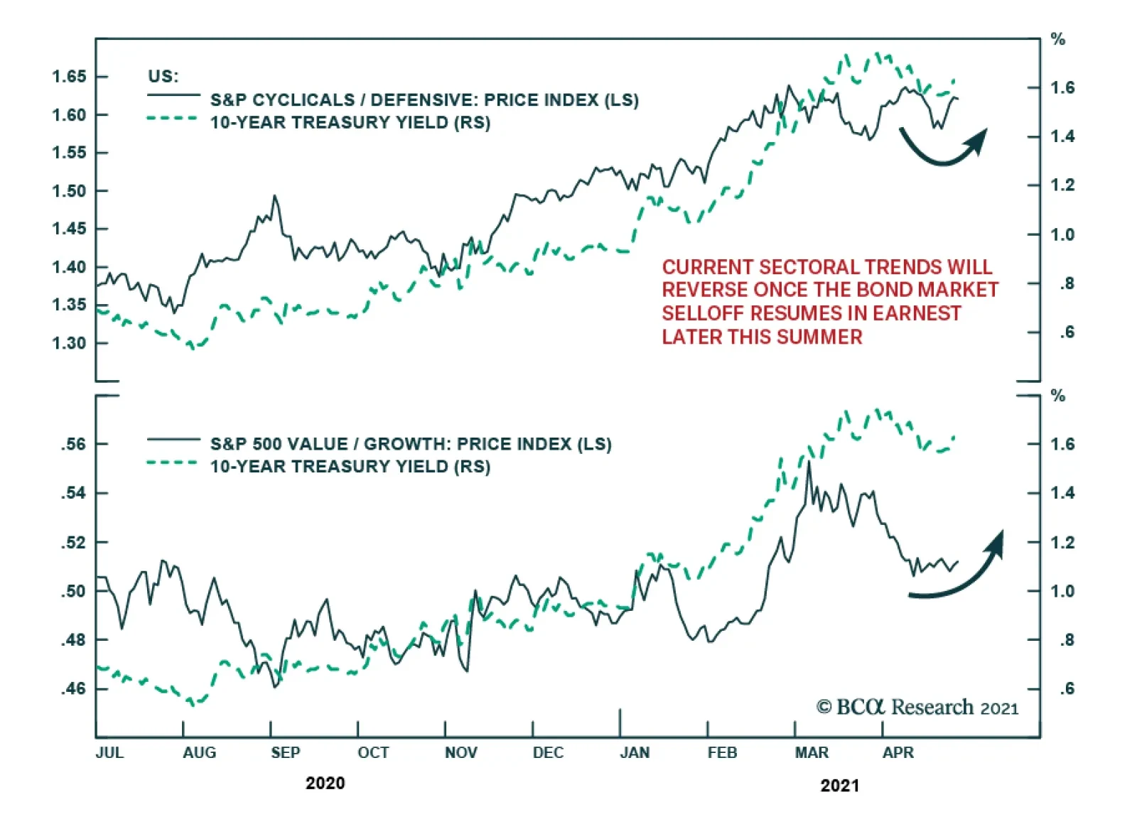
The lack of traction in the Treasury selloff in light of the strong GDP print is interesting (see The Numbers). At first, 10-year yields rose to their highest level in more than two weeks. However, the subsequent reversal of the yield increase suggests that…
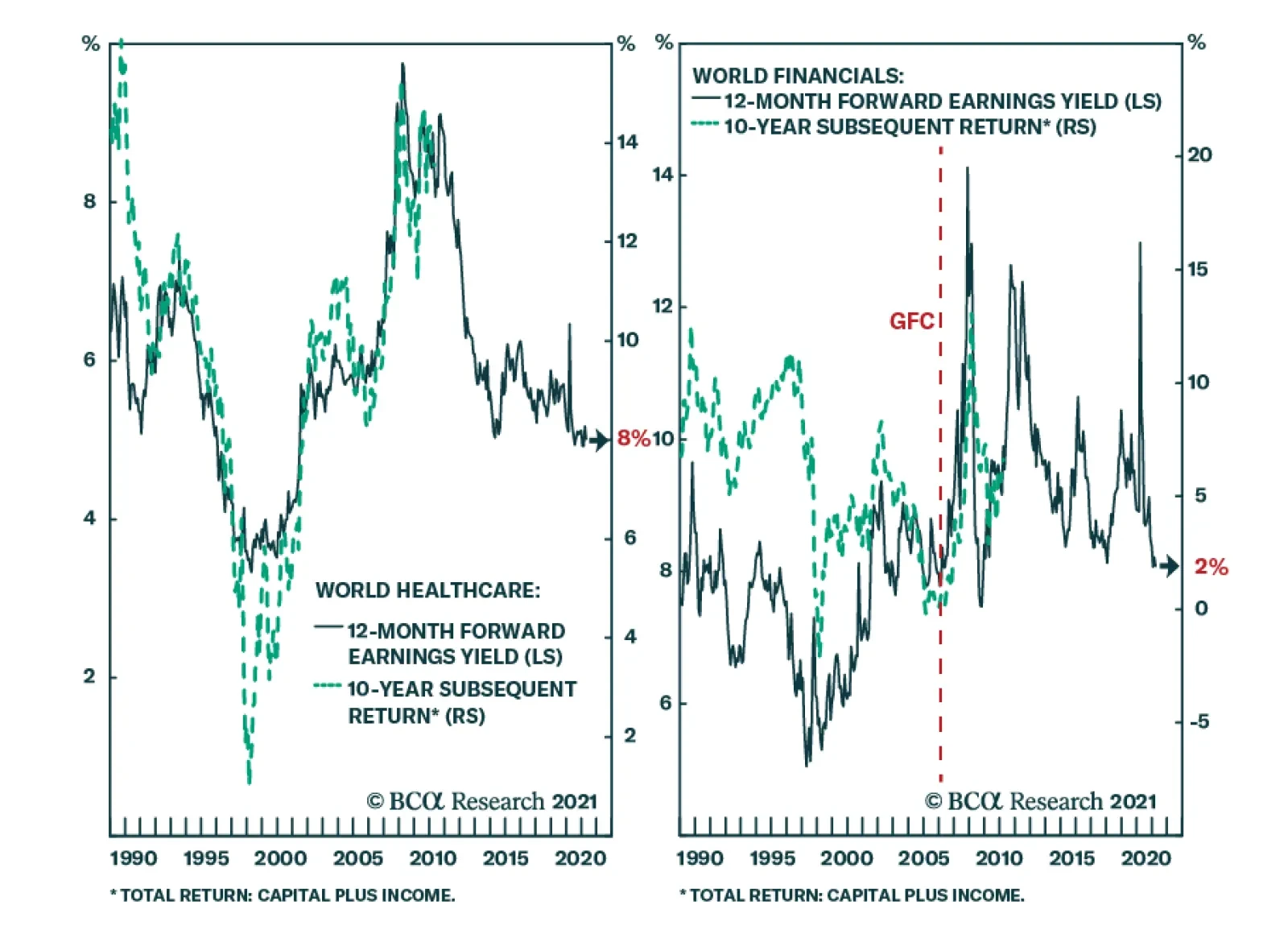
A dominant phenomenon in the financial markets of recent years has been the so-called ‘search for yield’. BCA Research’s Counterpoint service argues that at first glance, the search for yield makes sense, but on deeper thought, the distinction between yield…
Rev Your Engines
Rev Your Engines
In this Monday’s Special Report, we revisited our infrastructure basket in light of the coming Biden’s American Jobs and American Families fiscal plans. There is a high chance that US fiscal spending will be a dominating macro force over the coming years, benefiting US infrastructure-related stocks. At the same time, looking beyond the conducive domestic backdrop, the rest of the world is also on the cusp of getting back to normal heralding a synchronized global growth setting. Not only will the US twin deficits weigh on the greenback, but a looming commodity super-cycle is also a boon for hypersensitive commodity-exposed currencies. This dual boost coupled with the budding rebound in EMs is music to the ears of US infrastructure-reliant US conglomerates (see chart). Bottom Line: We recommend investors gain exposure to our infrastructure basket on both a cyclical and structural time horizon.
Highlights The US fiscal outlook has deteriorated substantially over the past two decades, as a consequence of the fiscal response to both the global financial crisis and the COVID-19 pandemic. US government debt-to-GDP is now nearly as high as it was at the end of the Second World War, and is projected by the US Congressional Budget Office (CBO) to explode higher over the coming 30 years. Some investors argue that extreme levels of government debt now virtually guarantee that interest rates will remain structurally low, and we test this claim alongside a scenario that limits the projected rise in the primary deficit. We find that US fiscal reform, when it eventually occurs, will likely be negative for health care stocks. We also note that even in a scenario where the US limits the size of its future primary budget deficit, net interest outlays will likely rise to elevated levels compared to history. A comparison with the Canadian experience in the 1990s suggests a structurally negative outlook for the US dollar, from an overvalued starting point. Finally, we note that the US fiscal outlook does not necessarily prevent an increase in interest rates over the coming few years in a scenario where investors raise their expectations for the neutral rate of interest, a possibility that we discussed in last month’s report. This scenario is not our base case view, but it is plausible and should actively be monitored by investors over the coming one to two years. For now, we do not expect that rising interest rates pose a risk to stocks over the coming 6-12 months. Investors should remain cyclically overweight equities within a multi-asset portfolio, and should maintain a below-benchmark level of duration on a risk-adjusted basis. In 2001, US government debt held by the public as a share of GDP stood at 31.5%, after having fallen roughly 16 percentage points from early 1993 levels. Today, as a result of both the global financial crisis and the COVID-19 pandemic, the debt to GDP ratio has risen to a whopping 100%, and is projected to rise meaningfully higher over the coming decades. Feature In this report we review the long-term US fiscal outlook in the wake of the pandemic, with a focus on the implications for interest rates. Some investors argue that extreme levels of government debt now virtually guarantee that interest rates will remain structurally low, and we test this claim alongside a scenario that limits the projected rise in the primary deficit. We find that US fiscal reform, when it eventually occurs, will likely be negative for health care stocks, whose fundamental performance has outstripped that of the broad equity market since the mid-1990s (reflecting pricing power that stands to be curtailed through regulation). We also note that even in a scenario where the US limits the size of its future primary budget deficit, net interest outlays will likely rise to elevated levels compared to history. A comparison with the Canadian experience in the 1990s suggests a structurally negative outlook for the US dollar, from an overvalued starting point. Finally, we note that the US fiscal outlook does not necessarily prevent an increase in interest rates over the coming few years in the hypothetical scenario that we described in last month’s report,1 i.e., an environment where the narrative of secular stagnation is challenged and investor expectations for the neutral rate rise closer to trend rates of economic growth. This scenario is not our base case view, but it is plausible and should actively be monitored by investors over the coming one to two years. For now, investors should remain cyclically overweight equities within a multi-asset portfolio, and should maintain a below-benchmark level of duration on a risk-adjusted basis. Debt Sustainability, And The CBO’s Baseline Projection When analyzing the US fiscal outlook, the Congressional Budget Office’s Long-Term Budget Outlook report is typically the reference point for investors. The report provides annual projections for the budget deficit and the debt-to-GDP ratio for the next three decades, as well as a breakdown of the projected deficit into its primary (i.e., non-interest) and net interest components. Charts II-1 and II-2 present the most recent baseline projections from the CBO, which clearly present a dire long-term outlook. The deficit and debt-to-GDP ratio are projected to be relatively stable over the next decade, but explode higher over the subsequent 20 years. In 2051, the CBO’s baseline projects that the budget deficit will be roughly 13% of GDP, with net interest costs accounting for approximately two-thirds of the deficit. Chart II-1The CBO’s Fiscal Outlook Is Extremely Negative
The CBO's Fiscal Outlook Is Extremely Negative
The CBO's Fiscal Outlook Is Extremely Negative
Chart II-2In 2051, The CBO Projects A 13% Annual Budget Deficit
May 2021
May 2021
In order to understand what is driving the CBO’s dire long-term budget and debt forecast, it is important to review the government debt sustainability equation shown below. The equation highlights that the change in a government’s debt-to-GDP ratio is approximately equal to 1) the primary deficit plus 2) net interest costs as a share of GDP, the latter being defined as the product of last year’s debt-to-GDP ratio and the difference between the average interest rate on the debt and the rate of GDP growth. Δ Debt-To-GDP Ratio ≈ Primary Deficit As A % Of GDP2 + (r-g)*(Prior Period Debt-To-GDP Ratio) Where: r = Average interest rate on government debt and g = Nominal GDP growth The equation highlights that expectations of a persistently rising debt-to-GDP ratio must occur either because of expectations of a persistent primary deficit, or expectations that interest rates will persistently exceed the rate of economic growth (or some combination of the two). This underscores why debt sustainability analysis often focuses on the primary budget balance, as a country’s debt-to-GDP ratio will be stable if no primary deficit exists and interest costs are at or below the prevailing rate of economic growth. Chart II-3 illustrates the source of the CBO’s projected rise in debt-to-GDP beyond 2031, by presenting the two components of the debt sustainability equation alongside the projected annual change in the debt-to-GDP ratio. The chart makes it clear that while the CBO is forecasting a sizeable primary deficit to continue, it is projected to grow at a slower pace than the debt-to-GDP ratio itself. The increasing rate at which the debt-to-GDP ratio is projected to grow in the latter years of the CBO’s forecast period is clearly driven by the interest rate component, meaning that “r” is projected to be greater than “g”. Chart II-4 presents this point directly, by highlighting that the CBO is forecasting the average interest rate on government debt to exceed that of nominal GDP growth in 2038, and to continue to exceed growth (by an increasing amount) thereafter. Chart II-3Decomposing The CBO's Projected Change In The Debt-To-GDP Ratio
Decomposing The CBO's Projected Change In The Debt-To-GDP Ratio
Decomposing The CBO's Projected Change In The Debt-To-GDP Ratio
Chart II-4The CBO's Projections Rest, In Part, On Rates Eventually Exceeding Growth
The CBO's Projections Rest, In Part, On Rates Eventually Exceeding Growth
The CBO's Projections Rest, In Part, On Rates Eventually Exceeding Growth
Three Adjustments To The CBO’s Baseline We make three adjustments to the CBO’s baseline in order to assess how the US fiscal outlook shifts under an interest rate path that is different than that projected by the CBO. First, we adjust the CBO’s projected budget deficit over the coming few years based on deficit forecasts from our US Political Strategy service following the passage of the American Recovery Plan act.3 Chart II-5We Test The Effect Of An Initially Higher, But More Sustainable, Rate Path
We Test The Effect Of An Initially Higher, But More Sustainable, Rate Path
We Test The Effect Of An Initially Higher, But More Sustainable, Rate Path
Next, we adjust the interest component of the total budget deficit based on a new path for short- and long-term interest rates that models a scenario in which the neutral rate of interest rises to, but not above, GDP growth (Chart II-5). In last month’s report we outlined a scenario in which this could feasibly occur,1 and the hypothetical path for interest rates shown in Chart II-5 thus incorporates both the negative budgetary impact of an earlier rise in interest rates and the positive budgetary impact of “r” never rising above “g”. We explicitly exclude any crowding out effect on long-term interest rates, based on the view that term premia are likely to remain muted in a world of low potential economic growth, unless a fiscal crisis appears to be imminent (see Box II-1). Box II-1 Arguing Against The CBO’s Crowding Out Assumption The CBO’s projection that interest rates will ultimately rise above the rate of economic growth rests on the view that increased government spending will absorb savings that would otherwise finance private investment (a “crowding out” effect). We agree that crowding out can occur over the course of the business cycle, especially in a scenario where increased government spending pushes output above its potential (creating a cyclical acceleration in inflation and eventually an increase in interest rates). But the CBO is assuming that high government debt-to-GDP ratios will crowd out private investment on a structural basis, and on this basis we disagree. First, Chart Box II-1 highlights that there is essentially no empirical relationship across countries between a country’s debt-to-GDP ratio and its long-term government bond yield. Japan is a clear outlier in the chart, but including Japan implies that the relationship is negative, not positive. Chart Box II-1There Is No Empirical Relationship Between Debt-To-GDP And Interest Rates
May 2021
May 2021
In addition, given that central banks directly control interest rates at the short-end of the curve, a structural crowding out effect can only manifest itself in the form of an elevated term premium embedded in longer-term government bond yields. Our bet is that term premia are likely to stay low in a world of low falling nominal growth, as evidenced by the experience of the past decade.4 Finally, we model the impact of two changes, beginning in 2031, that would work towards reducing the primary deficit: an increase in average government revenue to 20% of GDP (its peak level reached in 2000), and a slower pace of increase on major health care program spending. Despite the fact that population aging will increase mandatory spending on social security and health care over the coming three decades, the CBO has highlighted that the majority of the increase in spending towards these programs is projected to occur due to rising health care costs per person (Chart II-6). We thus model the impact of medical care cost control by limiting the rise in net mandatory outlays on health care programs between 2021 and 2051 to roughly half of what the CBO baseline projects. This adjustment does not prevent mandatory spending on health care programs from rising, given the strong political challenges involved in limiting spending increases that are caused by an aging population. Chart II-6The US Structural Primary Balance Is Heavily Impacted By Medical Costs
May 2021
May 2021
Charts II-7 and II-8 illustrate how these three adjustments impact the long-term US fiscal outlook. Relative to the CBO’s baseline projections, the American Recovery Plan (ARP) budget deficit forecasts from our US Political Strategy service imply that the debt-to-GDP ratio will be approximately three to four percentage points higher over the very near term, and roughly ten points higher over the long term. Chart II-7Even With Higher Rates, The Fiscal Outlook Is Meaningfully Less Bad…
Even With Higher Rates, The Fiscal Outlook Is Meaningfully Less Bad...
Even With Higher Rates, The Fiscal Outlook Is Meaningfully Less Bad...
Relative to this new baseline, an increase in interest rates to, but not above, the projected rate of nominal economic growth increases the debt-to-GDP ratio by an additional ten percentage points (20 points higher versus the CBO’s baseline) in the middle of the forecast period, but it lowers the debt-to-GDP ratio over the longer run by eliminating the effect of outsized interest rates magnifying a persistent primary deficit. Still, the debt-to-GDP ratio is projected to rise to a whopping 207% of GDP by 2051 in this scenario, with a budget deficit in excess of 10% of GDP. The third adjustment shown in Charts II-7 and II-8 underscores the impact on the US fiscal outlook of actions aimed at reducing the primary deficit. Increases in government revenue and the prevention of rising health care costs per person results in the debt-to-GDP ratio that is 64 percentage points lower in 2051 than in our normalized interest rate scenario. The budget deficit in this scenario still increases to approximately 6% of GDP thirty years from today, but in this case most of the deficit is due to the net interest component rather than the primary deficit, meaning that the debt-to-GDP ratio would be increasing at a much slower rate if interest rates were no higher than the rate of economic growth. Chart II-8 highlights that net interest spending in this scenario would rise to 4.5% of GDP, which would be meaningfully higher than the prior high of roughly 3% in the late 1980s and early 1990s. Chart II-8...With Higher Taxes And Medical Cost Control
...With Higher Taxes And Medical Cost Control
...With Higher Taxes And Medical Cost Control
Chart II-9A Meaningful, But Not Unprecedented, Rise In Net Interest Outlays
A Meaningful, But Not Unprecedented, Rise In Net Interest Outlays
A Meaningful, But Not Unprecedented, Rise In Net Interest Outlays
But that is far from unprecedented or necessarily consistent with a fiscal crisis. Chart II-9 also shows that Canada’s public debt charges rose to 6.5% of GDP in the early 1990s without triggering a public debt crisis. It is true that Canada subsequently embarked on a painful fiscal consolidation program in order to reduce its public debt burden, but this, in part, occurred because of a cyclically-adjusted primary deficit of approximately 3% - twice as large as that projected for the US in 2051 in our adjusted scenario shown in Charts II-7 and II-8. Revenue And Health Care Cost Reform Our third adjustment to the CBO’s long-term budget outlook involved changes to revenue and health care cost control to reduce the US’ projected primary deficit. Are these adjustments achievable? In our view, the answer is yes: As noted above, our scenario modeled these changes taking place a decade from today, which allows for policymakers and stakeholders to have a substantial amount of time to act and adjust to these changes. On the revenue front, we noted above that US government revenue has reached 20% of GDP in the past, in the year 2000. Chart II-10 highlights that while raising taxes will likely reduce US competitiveness, the US maintains a sizeable tax advantage relative to other advanced economies, and that this was true prior to the tax cuts that took place under the Trump administration. On the health care cost front, Chart II-11 highlights that US healthcare expenditure is much larger as a share of GDP than other countries, which was not the case prior to the 1980s. Chart II-12 highlights that this cost difference is entirely due to inpatient (i.e., hospital) and outpatient (i.e., drug) costs. While it is not clear what form it will take, it seems likely that future reforms by policymakers to eliminate rising health care costs per person will occur and can be achieved. Chart II-10The US Government Can Afford To Raise Revenue
The US Government Can Afford To Raise Revenue
The US Government Can Afford To Raise Revenue
Chart II-11The US Spends Much More On Health Care Than Other Countries
The US Spends Much More On Health Care Than Other Countries
The US Spends Much More On Health Care Than Other Countries
Chart II-12The US Significantly Outspends The World On Hospital And Drug Costs
May 2021
May 2021
The key point for investors is not whether these changes should or should not occur, but whether there are any feasible scenarios in which spiraling government debt and interest payments are avoided without the Fed purposely maintaining monetary policy at levels persistently below the rate of economic growth – and thus risking major inflationary pressure. Our analysis above highlights that there are; the question is when policymakers will choose to act and in what form. A potential tipping point may be when US government spending on net interest as a % of GDP exceeds its prior high, which occurs in 2026 in the scenario modeled in Chart II-8. In a scenario where reforms fail to materialize or where financial markets force policymakers to act, a fiscal risk premium could certainly emerge in longer-term government bond yields, which could lead the Fed to maintain lower short-term interest rates than it otherwise would. But this scenario is only likely to emerge after interest rates converge towards rates of economic growth, as US government debt will remain highly serviceable for some time if "r" remains meaningfully lower than "g". Investment Conclusions There are three potential investment implications of our research. First, the fact that rising medical costs have such a significant impact on the CBO’s projections of the primary deficit implies that fiscal reform, when it eventually occurs, will be negative for US health care stocks. Chart II-13 highlights that US health care sector earnings have outperformed broad market earnings since the mid-1990s, and that the sector has consistently delivered an above-average return on equity. This historical performance likely reflects the sector’s pricing power, which stand to be curtailed through regulatory efforts in a world where rising health care costs per person collide with fiscal belt-tightening. Interestingly, Chart II-12 highlighted that US per capita spending on medical goods is not significantly higher than in other developed markets, suggesting that the health care equipment & supplies industry may fare better over a very long term time horizon than overall health care. Second, Charts II-7 and II-8 highlighted that even if the US does raise revenue as a share of GDP and limits excessive growth in medical costs, a primary deficit will still exist and net interest outlays will still rise to elevated levels compared to what has historically been the case. We noted that Canada experienced a higher public debt burden in the 1990s and did not suffer from a fiscal crisis, but Chart II-14 highlights that the fiscal situation did weigh on the Canadian dollar, which progressively traded 10-20% below its PPP-implied fair value level over the course of the 1990s. Thus, the implication is that eventual fiscal reform in the US may be structurally negative for the US dollar, from an overvalued starting point (panels 3 and 4 of Chart II-14). Chart II-13Eventual Fiscal Reform Will Likely Be Negative For Health Care Stocks
Eventual Fiscal Reform Will Likely Be Negative For Health Care Stocks
Eventual Fiscal Reform Will Likely Be Negative For Health Care Stocks
Chart II-14The US Fiscal Outlook, Even With Some Reforms, Is Dollar-Negative
The US Fiscal Outlook, Even With Some Reforms, Is Dollar-Negative
The US Fiscal Outlook, Even With Some Reforms, Is Dollar-Negative
Finally, our scenario analysis highlights that very elevated levels of government debt do not guarantee that interest rates will remain structurally low, especially over the next decade when the US primary deficit is projected to remain relatively stable. For investors focused on forecasting the direction of 10-year Treasury yields from the perspective of valuation, it should be noted that the next decade is the relevant projection period for the Fed funds rate, not what occurs to net interest outlays in the two decades that follow. Over the very long run, it is true that there may ultimately be very strong political pressure on the Fed to keep interest rates below the prevailing rate of economic growth, as policymakers in 2030 will be able to avoid a structural adjustment to the primary deficit of roughly 1.1-1.3% of GDP for every percentage point that average interest rates on government debt are below nominal GDP growth. However, we noted above that this pressure is unlikely to build before the second half of this decade even in a scenario where interest rates rise significantly over the coming few years, and it remains an open questions whether the Fed will acquiesce to this pressure given its strong potential to fuel excess private sector leveraging. Over the coming one to two years, the key conclusion is that the US fiscal outlook is not likely to prevent an increase in interest rates over the coming few years in the hypothetical scenario that we described in last month’s report, i.e., an environment where the narrative of secular stagnation is challenged and investor expectations for the neutral rate rise closer to trend rates of economic growth. This remains a risk to our overweight stance towards risky assets and is not our base case view. But it does highlight the importance of monitoring long-dated rate expectations over the coming year, and argues, on a risk-adjusted basis, for a below-neutral duration stance within a fixed-income portfolio. Jonathan LaBerge, CFA Vice President The Bank Credit Analyst Footnotes 1 Please see The Bank Credit Analyst Special Report "R-star, And The Structural Risk To Stocks," dated March 31, 2021, available at bca.bcaresearch.com 2 Presented in this fashion, a budget deficit (surplus) is recorded with a positive (negative) sign. 3 For more information, please see US Political Strategy report “Biden’s Pittsburgh Speech And Legislative Agenda,” dated April 1, 2021, available at usp.bcaresearch.com 4 Please see “Term premia: models and some stylised facts”, by Cohen, Hördahl, and Xia, BIS Quarterly Review, September 2008.
Highlights Developed economies continue to transition towards a post-pandemic state. Europe has further to go, but it is lagging the US at a constant rate and is thus merely delayed – not on a different path. This ongoing transition is also reflected in the global macro data, which continues to surprise to the upside. Widespread optimism about the outlook for economic activity and earnings over the coming year has led some investors to ask whether an imminent peak in the rate of growth could be a potentially negative inflection point for richly valued risky asset prices. Using our global leading economic indicator as a guide, we find that a peak in growth momentum in and of itself is not likely to be enough of a catalyst for meaningful risky asset underperformance versus government bonds. A sizeable shock to sentiment would likely be required, causing either a very serious growth slowdown, outright fears of recession, or some other event that negatively impacts earnings growth or raises the equity risk premium (“ERP”). We can identify several candidates for such a shock, including the emergence of new, vaccine-resistant variants of COVID-19, the impact of higher taxes on earnings, overtightening in China, and a potentially hawkish shift in monetary policy in the developed world. But none of these risks individually appears to be likely enough to warrant reducing cyclical portfolio exposure. We continue to expect positive absolute single-digit returns from stocks over the coming 6-12 months, and would recommend that investors remain overweight stocks versus bonds in a multi-asset portfolio. We remain overweight global ex-US equities vs. the US, but expect that euro area stocks will have to do the heavy lifting, driven either by the underperformance of global technology stocks or the outperformance of euro area financials. Within a fixed-income portfolio, we recommend a modestly short duration stance, but do so primarily on a risk-adjusted basis. Feature Chart I-1Europe Is Behind The US, But On The Same Path
Europe Is Behind The US, But On The Same Path
Europe Is Behind The US, But On The Same Path
Over the past month, developed economies have continued to transition towards a post-pandemic state. While the number of new confirmed COVID-19 cases remains relatively high on a per capita basis in the US and Europe, there continues to be significant progress on the vaccination front in all Western advanced economies. Europe continues to lag the US and the UK in terms of the share of the population that has received at least one dose of vaccine, but Chart I-1 highlights that the gap has remained constant at approximately six weeks (to the US). Panel 2 of Chart I-1 highlights that the US and UK both experienced either falling or a stable number of new cases once the number of first doses reached current European levels; Israel required significant further gains in the breadth of vaccinations before it altered COVID-19’s transmission dynamics in that country, but this appears to have occurred because of a much higher pace of spread earlier this year. The negative impact on advanced economies from reduced services activity is strongly linked to pandemic control measures (such as stay-at-home orders, curfews, forced business closures, etc). We have argued that, outside of the US, the implementation and removal of these measures is being driven by the impact of the pandemic on the medical system, rather than the sheer number of new cases and deaths. Chart I-2 highlights that, based on this framework, Europe still has further to go – current per capita hospitalizations remain much higher in France and Italy than in the US, UK, or Canada. But the nature of the disease means that hospitalizations begin to fall even if case counts remain relatively stable, and fall rapidly once new cases trend lower. Given the steady gains that European countries are making in providing first vaccine doses to their populations, it seems likely that hospitalizations there will peak sometime in the coming four to six weeks. This underscores that Europe is not on a different path than that of the US, it is simply further behind in the process (and will ultimately catch up). The transition towards a post-pandemic state is also reflected in the global macro data, which continues to positively surprise in all three major economies (Chart I-3). In Europe, the April services PMI rose back above the 50 mark, April consumer confidence surprised to the upside, and February retail sales came in better than expected (Table I-1). In the US, the March services PMI was also very strong, the labor market continued to meaningfully improve, and several measures of inflation surprised to the upside. Chart I-2Euro Area Hospitalizations Remain High, But Will Soon Decline
Euro Area Hospitalizations Remain High, But Will Soon Decline
Euro Area Hospitalizations Remain High, But Will Soon Decline
Chart I-3The Macro Data Continues To Positively Surprise
The Macro Data Continues To Positively Surprise
The Macro Data Continues To Positively Surprise
Table I-1Services PMIs And The Labor Market Continue To Meaningfully Improve
May 2021
May 2021
Chart I-4China's Current Contribution To Global Demand Is Strong
China's Current Contribution To Global Demand Is Strong
China's Current Contribution To Global Demand Is Strong
In China, the recent tick higher in the surprise index likely reflects the recognition of some data series whose release was delayed due to the Chinese New Year, as well as significant base effects (compared with Q1 2020) in many data series recorded in year-over-year terms. On a quarter-over-quarter basis, Chinese economic activity decelerated last quarter to 0.6% from the upwardly revised 3.2% in Q4 2020 – which was below the anticipated 1.4% q/q. Still, Chinese RMB-denominated import growth closely matches (lagging) data on global exports to China (in US$ terms), with the former suggesting that China’s current contribution to global external demand remains strong (Chart I-4). This is also consistent with rising producer prices, which had fallen back into deflationary territory last year (panel 2). Peaking Growth Momentum: Should Investors Be Worried? The continued increase in the number of vaccine doses administered, positive data surprises, and bullish global growth forecasts for this year have understandably led to extremely optimistic investor sentiment. It has also naturally raised the question of “what could go wrong?”, with some investors pointing to an imminent peak in the rate of growth as a potentially negative inflection point for richly valued risky asset prices. Chart I-5 addresses this question by examining 12 episodes of waning growth momentum since 1990, defined as an identifiable peak in our global leading economic indicator. Panel 2 shows the 12-month rate of change in the relative performance of global equities versus a US$-hedged 7-10 year global Treasury index. Chart I-5Is Peaking Growth Momentum A Risk For Stocks?
Is Peaking Growth Momentum A Risk For Stocks?
Is Peaking Growth Momentum A Risk For Stocks?
At first blush, the chart does support the notion that a peak in growth momentum is generally negative for risky asset prices. The subsequent 12-month relative return from stocks versus bonds following a peak in the LEI has been negative in 8 out of the 12 episodes, suggesting that the risks of an equity correction are currently quite elevated. However, there is more to the story than this simple calculation implies (Table I-2). First, two of the twelve episodes saw the global LEI peak in the context of an eventual US recession, so it is not surprising that stocks underperformed bonds in those episodes. Second, out of the six non-recessionary episodes, only two of them involved significant underperformance, in 2002 and in 2015. Table I-2Peak Growth Momentum Is An Insufficient Catalyst For Equity Underperformance
May 2021
May 2021
US equities underperformed in the former case because of the persistently damaging impact of corporate excesses that built up during the dot-com bubble, and predominantly global ex-US equities underperformed bonds in the latter case because of a combination of the significant impact on global CAPEX from the 2014 dollar and oil price shock, as well as a major decline in global bond yields. In the four other non-recessionary examples of equity underperformance, stocks only modestly underperformed bonds, and often this occurred in the context of significant events: surprising Fed hawkishness in 1994, the Asian financial crisis in 1997, a major slowdown in China in 2013, and the combination of a domestically-driven Chinese economic slowdown coupled with the Sino/US trade war in 2017/2018. The key point for investors is that a peak in growth momentum is in and of itself not enough of a catalyst for meaningful risky asset underperformance versus government bonds. A sizeable shock to sentiment would likely be required, causing either a very serious growth slowdown, outright fears of recession, or some other event that negatively impacts earnings growth or raises the equity risk premium (“ERP”). What Else Could Go Wrong? There are four other plausible risks that we can identify to a bullish stance towards risky assets over the coming 6-12 months. We discuss each of these risks below. New COVID-19 Variants Chart I-6 highlights that bottom up analysts expect global earnings per share to be 12% higher than their pre-pandemic level in 12-months’ time. This expectation is driven by extraordinarily easy fiscal and monetary policy, but also the view that vaccination against COVID-19 will allow social distancing policies to end and services activity to fully recover. However, as India is clearly – and tragically – demonstrating at present, the emerging world is lagging in terms of vaccinating its population. India’s per capita case count has soared (Chart I-7), which is surprising given that the country’s COVID-19 infection rate has been significantly below that of more advanced economies over the past year. It is therefore likely that India’s case count explosion is due to new variants of the disease, and periodic outbreaks in less developed countries – as well as vaccine hesitancy in more developed economies – risks the emergence of even newer variants that may be partially or substantially vaccine-resistant. Chart I-6Earnings Expectations Already Price In A Normalization In Services Activity
Earnings Expectations Already Price In A Normalization In Services Activity
Earnings Expectations Already Price In A Normalization In Services Activity
Chart I-7India's COVID-19 Situation Is Tragic, And Concerning
India's COVID-19 Situation Is Tragic, And Concerning
India's COVID-19 Situation Is Tragic, And Concerning
New variants of COVID-19 may prove to be less deadly, but the economic impact of the pandemic has come mainly from its potential to collapse the medical system via high rates of serious illness requiring hospitalization, not strictly from its lethality. As such, potentially new vaccine-resistant variants of the disease resulting in similar or higher rates of hospitalization pose a risk to a bullish economic outlook. Taxation Both corporate and individual tax rates are set to rise in the US over the coming 12-18 months which, at first blush, could certainly qualify as a non-recessionary event that negatively impacts earnings or raises the ERP. Corporate taxes are set to rise first as part of the American Jobs Plan, which our political strategists have argued will probably take the Biden administration most of this year to pass. The plan involves a proposed increase in the domestic corporate income tax rate to 28% from 21%, a higher minimum tax on foreign profits, and a 15% minimum tax on “book income”. In addition, as part of the American Families Plan, Biden is proposing to increase the top marginal income tax rate for households earning $400,000 or more to 39.6% (from 37%), and to substantially increase the capital gains tax rate for those earning $1 million or more from a base rate of 20% to 39.6%. The 3.8% tax on investment income that funds Obamacare would be kept in place, which would bring the total capital gain tax rate to 43.4% for that income group. Peter Berezin, BCA’s Chief Global Strategist, made two points about higher corporate taxes in a recent report.1 First, he noted that the changes would likely result in an 8% decline in forward earnings if passed as currently proposed, but that various tax credits as well as opposition to a 28% corporate tax rate from Democratic Senator Joe Manchin would likely cap the impact at 5%. Second, he argued that the behavior of 12-month forward earnings and the performance of stocks that benefitted the most from President Trump’s corporate tax cuts suggest that very little impact from these changes has been priced in. Peter argued in his report that the effect of strong economic growth will likely offset the negative impact of higher taxes on earnings, and we are inclined to agree. Chart I-8 highlights that a 5% reduction in 12-month forward earnings would reduce the equity risk premium by roughly 20-25 basis points, which would not be disastrous on its own. Still, the fact that these changes have not been priced in means that corporate tax hikes could be a more meaningful driver of lower stock prices if the impact is ultimately larger than we currently expect or if the growth outlook suddenly shifts in a negative direction. In terms of changes to individual taxes, our sense is that the proposed increase in the capital gains tax rate is more significant than the modest proposed change to the top marginal income tax rate for higher-income households. For individuals earning $1 million or more, Chart I-9 highlights that the proposed change to the capital gains rate would bring it to the highest level seen since the late 1970s. Given the rich valuation of equities, it seems inconceivable that such a change would not trigger some short-term selling of equities to lock in long-term gains at lower tax rates. Chart I-8Higher Corporate Taxes Will Only Modestly Reduce the Equity Risk Premium
Higher Corporate Taxes Will Only Modestly Reduce the Equity Risk Premium
Higher Corporate Taxes Will Only Modestly Reduce the Equity Risk Premium
Chart I-9Biden's Capital Gains Tax Proposal Would Lead To Some Selling Of Stocks...
Biden's Capital Gains Tax Proposal Would Lead To Some Selling Of Stocks...
Biden's Capital Gains Tax Proposal Would Lead To Some Selling Of Stocks...
But like upcoming changes to corporate taxes, we see the potential for higher taxes on wealthy individuals as a risk to the equity market and not as a likely driver of stock prices over a cyclical time horizon. First, our political strategists see 50/50 odds that the American Families Plan will be passed this year, meaning that short-term tax avoidance selling may be postponed until 2022. In addition, Chart I-10 highlights that over the longer term, the relationship between the maximum capital gains tax rate and the ERP is weak or nonexistent. The chart highlights that the perception of a positive relationship rests entirely on the second half of the 1970s, when the maximum capital gains tax rate was between 30-40%. However, it seems clear from the chart that the stagflationary environment of that period was responsible for a high ERP, as the capital gains rate fell from 1977 to 1982 without any significant decline in risk premia. It took until the end of the 1982 recession and the beginning of the structural disinflationary period for the equity risk premium to decline, suggesting that there is effectively no relationship between the two (and therefore no reason to believe that higher capital gains taxes will lead to sustained declines in stock market multiples). Chart I-10…But The Effect Would Not Likely Last
May 2021
May 2021
Overtightening In China Chart I-11Leading Indicators Of China's Economy Are Pointing Down, Not Up
Leading Indicators Of China's Economy Are Pointing Down, Not Up
Leading Indicators Of China's Economy Are Pointing Down, Not Up
Even though Chart I-4 highlighted that Chinese import demand is currently strong, we expect China’s growth impulse to weaken in the second half of the year. Chart I-11 highlights that our leading indicator for China’s Li Keqiang index has done a good job of predicting Chinese import growth, and the indicator is now in a clear downtrend. Panel 2 presents the components of the indicator, and shows that all three are trending lower. Monetary conditions are potentially rebounding from extremely weak levels (due to past deflation and a rise in the RMB versus the US dollar and other Asian currencies), but money supply and credit measures are deteriorating. Leading indicators for China’s economy are deteriorating because Chinese policymakers have already tightened liquidity conditions in response to the country’s rebound from the pandemic and following a surge in the credit impulse. The 3-month repo rate returned to pre-pandemic levels in the second half of last year (Chart I-12), and consequently the private sector credit impulse (particularly that of corporate bond issuance) fell despite robust medium-to-long term loan growth. Chart I-12Chinese Interest Rates Have Already Returned To Pre-COVID Levels
Chinese Interest Rates Have Already Returned To Pre-COVID Levels
Chinese Interest Rates Have Already Returned To Pre-COVID Levels
We noted in our January report that China’s credit impulse has consistently followed a 3½-year cycle since 2010, and this year has been no different. This cycle is not exogenous or mystical; it has been caused by the repeated “oversteering” of activity by Chinese policymakers who frequently oscillate between the need to fight deflation and the strong desire to curb additional private sector leveraging. Our base case view is that policymakers will not accidentally overtighten the economy, and that the credit impulse will settle somewhere between late 2019 levels and the peak rate reached in the latter half of last year. But the risk of significant oversteering cannot be ruled out, and will likely remain a downcycle risk for investors for several years to come. A Hawkish Shift In Monetary Policy In Developed Markets Last week the Bank of Canada announced that it would taper its pace of government debt purchases from 4 billion to 3 billion CAD per week. The announcement was noteworthy for many investors, as it suggested that asset purchase reductions could also be announced by the Fed and other major central banks by the end of the second or third quarter. Many investors are sensitive to the tapering question because of what transpired during the “Taper Tantrum” episode of 2013. During an appearance before Congress in late May of that year, then Chair Ben Bernanke stated that the Fed could “step down” the pace of its asset purchases in the next few FOMC meetings if economic conditions continued to improve. The result was that 10-year Treasurys fell roughly 10% in total return terms over the subsequent three-month period. While stocks rallied in response to the growth-positive implications of the move, this occurred from a much higher ERP starting point than exists today. The risk, in the minds of some investors, is that tapering today could thus lead to a correction in stock prices. There are two counterpoints to this view. First, bonds have already sold off meaningfully over the past several months in response to a significant improvement in the economic outlook, and investors already expect the Fed to raise interest rates earlier than it is publicly forecasting. It is thus difficult to see how an announcement of tapering from the Fed would significantly alter the outlook for monetary policy over the coming 6-18 months. Chart I-13Another Taper Tantrum-Like Selloff Would Necessitate Higher Expectations For R-star
Another Taper Tantrum-Like Selloff Would Necessitate Higher Expectations For R-star
Another Taper Tantrum-Like Selloff Would Necessitate Higher Expectations For R-star
Second, it is notable that the “Taper Tantrum” began at yield levels at the front end of the curve that are roughly similar to what prevails today. 5-year/5-year forward bond yields stood at roughly 3% at the beginning of the “Tantrum”, compared with 2.3% today. Chart I-13 highlights how high forward bond yields would need to rise in order to generate another selloff of similar magnitude from 10-year Treasury yields (roughly 3.65%). In our view, a rise to this level over the coming year is essentially impossible without a major shift in investor expectations about the natural rate of interest. We highlighted the risk of such a shift in last month’s report,2 but for now it would likely necessitate hard evidence of little-to-no permanent damage to the labor market from the pandemic. This is not our base case view, but it will be an important possibility to monitor as the decisive end to social distancing and other pandemic control measures draws nearer. Investment Conclusions As noted above, there are several identifiable risks to a bullish outlook for risky assets, but none of these risks individually appear to be likely. Given this, we continue to expect positive absolute single-digit returns from stocks over the coming 6-12 months, and would recommend that investors remain overweight stocks versus bonds in a multi-asset portfolio. We favor value versus growth stocks, cyclical versus defensive sectors, and small versus large cap stocks, although there is more return potential over the coming year in value versus growth than the latter two positions. We also remain short the US dollar over a cyclical time horizon. Within a global equity portfolio, we remain overweight global ex-US equities vs the US, but this position has moved against us over the past two months. Chart I-14 highlights that global ex-US equities have given back all of their October – January gains versus US equities, most of which has occurred since late-February. The chart also highlights that all of this underperformance has been driven by emerging market stocks, as euro area equity performance has been mostly stable year-to-date. Chart I-15 highlights that EM underperformance has occurred both in the broadly-defined tech sector as well as when measured in ex-tech terms. To us, this suggests that EM stocks are responding to the deterioration in leading indicators for the Chinese economy that we noted above, which implies that they are not likely to lead global ex-US equity performance higher over the course of the year barring an imminent shift in Chinese policy. We continue to expect that euro area stocks will have to do the heavy lifting, driven either by the underperformance of global technology stocks or the outperformance of euro area financials – which are extremely cheap relative to US banks and have much further scope for earnings to normalize as the pandemic draws to a close. Chart I-14Emerging Markets Have Caused Global Ex-US Stocks To Underperform
Emerging Markets Have Caused Global Ex-US Stocks To Underperform
Emerging Markets Have Caused Global Ex-US Stocks To Underperform
Chart I-15EM's Underperformance Has Been Broad-Based
EM's Underperformance Has Been Broad-Based
EM's Underperformance Has Been Broad-Based
As a final point, investors should note that we are recommending a modestly short duration stance within a fixed-income portfolio, but that we make this recommendation primarily on a risk-adjusted basis. Chart I-16 highlights that Treasury market excess returns (relative to cash) have historically been driven by whether the Fed funds rate increases by more or less than what is currently priced into the market. Over the past 12 months, the Treasury index has very substantially underperformed cash without a hawkish surprise, and the rate path that is currently implied by the OIS curve is already more hawkish than the Fed is (for now) projecting. On this basis, a neutral duration stance could be justified, but we would still prefer a modestly short duration stance due to the risk of a potential increase in investor expectations for the neutral rate of interest late this year or in early 2022. Chart I-16Policy Rate Surprises Tend To Drive The Duration Call
Policy Rate Surprises Tend To Drive The Duration Call
Policy Rate Surprises Tend To Drive The Duration Call
Jonathan LaBerge, CFA Vice President The Bank Credit Analyst April 29, 2021 Next Report: May 27, 2021 II. In COVID’s Wake: Government Debt And The Path Of Interest Rates The US fiscal outlook has deteriorated substantially over the past two decades, as a consequence of the fiscal response to both the global financial crisis and the COVID-19 pandemic. US government debt-to-GDP is now nearly as high as it was at the end of the Second World War, and is projected by the US Congressional Budget Office (CBO) to explode higher over the coming 30 years. Some investors argue that extreme levels of government debt now virtually guarantee that interest rates will remain structurally low, and we test this claim alongside a scenario that limits the projected rise in the primary deficit. We find that US fiscal reform, when it eventually occurs, will likely be negative for health care stocks. We also note that even in a scenario where the US limits the size of its future primary budget deficit, net interest outlays will likely rise to elevated levels compared to history. A comparison with the Canadian experience in the 1990s suggests a structurally negative outlook for the US dollar, from an overvalued starting point. Finally, we note that the US fiscal outlook does not necessarily prevent an increase in interest rates over the coming few years in a scenario where investors raise their expectations for the neutral rate of interest, a possibility that we discussed in last month’s report. This scenario is not our base case view, but it is plausible and should actively be monitored by investors over the coming one to two years. For now, we do not expect that rising interest rates pose a risk to stocks over the coming 6-12 months. Investors should remain cyclically overweight equities within a multi-asset portfolio, and should maintain a below-benchmark level of duration on a risk-adjusted basis. In 2001, US government debt held by the public as a share of GDP stood at 31.5%, after having fallen roughly 16 percentage points from early 1993 levels. Today, as a result of both the global financial crisis and the COVID-19 pandemic, the debt to GDP ratio has risen to a whopping 100%, and is projected to rise meaningfully higher over the coming decades. In this report we review the long-term US fiscal outlook in the wake of the pandemic, with a focus on the implications for interest rates. Some investors argue that extreme levels of government debt now virtually guarantee that interest rates will remain structurally low, and we test this claim alongside a scenario that limits the projected rise in the primary deficit. We find that US fiscal reform, when it eventually occurs, will likely be negative for health care stocks, whose fundamental performance has outstripped that of the broad equity market since the mid-1990s (reflecting pricing power that stands to be curtailed through regulation). We also note that even in a scenario where the US limits the size of its future primary budget deficit, net interest outlays will likely rise to elevated levels compared to history. A comparison with the Canadian experience in the 1990s suggests a structurally negative outlook for the US dollar, from an overvalued starting point. Finally, we note that the US fiscal outlook does not necessarily prevent an increase in interest rates over the coming few years in the hypothetical scenario that we described in last month’s report,3 i.e., an environment where the narrative of secular stagnation is challenged and investor expectations for the neutral rate rise closer to trend rates of economic growth. This scenario is not our base case view, but it is plausible and should actively be monitored by investors over the coming one to two years. For now, investors should remain cyclically overweight equities within a multi-asset portfolio, and should maintain a below-benchmark level of duration on a risk-adjusted basis. Debt Sustainability, And The CBO’s Baseline Projection When analyzing the US fiscal outlook, the Congressional Budget Office’s Long-Term Budget Outlook report is typically the reference point for investors. The report provides annual projections for the budget deficit and the debt-to-GDP ratio for the next three decades, as well as a breakdown of the projected deficit into its primary (i.e., non-interest) and net interest components. Charts II-1 and II-2 present the most recent baseline projections from the CBO, which clearly present a dire long-term outlook. The deficit and debt-to-GDP ratio are projected to be relatively stable over the next decade, but explode higher over the subsequent 20 years. In 2051, the CBO’s baseline projects that the budget deficit will be roughly 13% of GDP, with net interest costs accounting for approximately two-thirds of the deficit. Chart II-1The CBO’s Fiscal Outlook Is Extremely Negative
The CBO's Fiscal Outlook Is Extremely Negative
The CBO's Fiscal Outlook Is Extremely Negative
Chart II-2In 2051, The CBO Projects A 13% Annual Budget Deficit
May 2021
May 2021
In order to understand what is driving the CBO’s dire long-term budget and debt forecast, it is important to review the government debt sustainability equation shown below. The equation highlights that the change in a government’s debt-to-GDP ratio is approximately equal to 1) the primary deficit plus 2) net interest costs as a share of GDP, the latter being defined as the product of last year’s debt-to-GDP ratio and the difference between the average interest rate on the debt and the rate of GDP growth. Δ Debt-To-GDP Ratio ≈ Primary Deficit As A % Of GDP4 + (r-g)*(Prior Period Debt-To-GDP Ratio) Where: r = Average interest rate on government debt and g = Nominal GDP growth The equation highlights that expectations of a persistently rising debt-to-GDP ratio must occur either because of expectations of a persistent primary deficit, or expectations that interest rates will persistently exceed the rate of economic growth (or some combination of the two). This underscores why debt sustainability analysis often focuses on the primary budget balance, as a country’s debt-to-GDP ratio will be stable if no primary deficit exists and interest costs are at or below the prevailing rate of economic growth. Chart II-3 illustrates the source of the CBO’s projected rise in debt-to-GDP beyond 2031, by presenting the two components of the debt sustainability equation alongside the projected annual change in the debt-to-GDP ratio. The chart makes it clear that while the CBO is forecasting a sizeable primary deficit to continue, it is projected to grow at a slower pace than the debt-to-GDP ratio itself. The increasing rate at which the debt-to-GDP ratio is projected to grow in the latter years of the CBO’s forecast period is clearly driven by the interest rate component, meaning that “r” is projected to be greater than “g”. Chart II-4 presents this point directly, by highlighting that the CBO is forecasting the average interest rate on government debt to exceed that of nominal GDP growth in 2038, and to continue to exceed growth (by an increasing amount) thereafter. Chart II-3Decomposing The CBO's Projected Change In The Debt-To-GDP Ratio
Decomposing The CBO's Projected Change In The Debt-To-GDP Ratio
Decomposing The CBO's Projected Change In The Debt-To-GDP Ratio
Chart II-4The CBO's Projections Rest, In Part, On Rates Eventually Exceeding Growth
The CBO's Projections Rest, In Part, On Rates Eventually Exceeding Growth
The CBO's Projections Rest, In Part, On Rates Eventually Exceeding Growth
Three Adjustments To The CBO’s Baseline We make three adjustments to the CBO’s baseline in order to assess how the US fiscal outlook shifts under an interest rate path that is different than that projected by the CBO. First, we adjust the CBO’s projected budget deficit over the coming few years based on deficit forecasts from our US Political Strategy service following the passage of the American Recovery Plan act.5 Chart II-5We Test The Effect Of An Initially Higher, But More Sustainable, Rate Path
We Test The Effect Of An Initially Higher, But More Sustainable, Rate Path
We Test The Effect Of An Initially Higher, But More Sustainable, Rate Path
Next, we adjust the interest component of the total budget deficit based on a new path for short- and long-term interest rates that models a scenario in which the neutral rate of interest rises to, but not above, GDP growth (Chart II-5). In last month’s report we outlined a scenario in which this could feasibly occur,3 and the hypothetical path for interest rates shown in Chart II-5 thus incorporates both the negative budgetary impact of an earlier rise in interest rates and the positive budgetary impact of “r” never rising above “g”. We explicitly exclude any crowding out effect on long-term interest rates, based on the view that term premia are likely to remain muted in a world of low potential economic growth, unless a fiscal crisis appears to be imminent (see Box II-1). Box II-1 Arguing Against The CBO’s Crowding Out Assumption The CBO’s projection that interest rates will ultimately rise above the rate of economic growth rests on the view that increased government spending will absorb savings that would otherwise finance private investment (a “crowding out” effect). We agree that crowding out can occur over the course of the business cycle, especially in a scenario where increased government spending pushes output above its potential (creating a cyclical acceleration in inflation and eventually an increase in interest rates). But the CBO is assuming that high government debt-to-GDP ratios will crowd out private investment on a structural basis, and on this basis we disagree. First, Chart Box II-1 highlights that there is essentially no empirical relationship across countries between a country’s debt-to-GDP ratio and its long-term government bond yield. Japan is a clear outlier in the chart, but including Japan implies that the relationship is negative, not positive. Chart Box II-1There Is No Empirical Relationship Between Debt-To-GDP And Interest Rates
May 2021
May 2021
In addition, given that central banks directly control interest rates at the short-end of the curve, a structural crowding out effect can only manifest itself in the form of an elevated term premium embedded in longer-term government bond yields. Our bet is that term premia are likely to stay low in a world of low falling nominal growth, as evidenced by the experience of the past decade.6 Finally, we model the impact of two changes, beginning in 2031, that would work towards reducing the primary deficit: an increase in average government revenue to 20% of GDP (its peak level reached in 2000), and a slower pace of increase on major health care program spending. Despite the fact that population aging will increase mandatory spending on social security and health care over the coming three decades, the CBO has highlighted that the majority of the increase in spending towards these programs is projected to occur due to rising health care costs per person (Chart II-6). We thus model the impact of medical care cost control by limiting the rise in net mandatory outlays on health care programs between 2021 and 2051 to roughly half of what the CBO baseline projects. This adjustment does not prevent mandatory spending on health care programs from rising, given the strong political challenges involved in limiting spending increases that are caused by an aging population. Chart II-6The US Structural Primary Balance Is Heavily Impacted By Medical Costs
May 2021
May 2021
Charts II-7 and II-8 illustrate how these three adjustments impact the long-term US fiscal outlook. Relative to the CBO’s baseline projections, the American Recovery Plan (ARP) budget deficit forecasts from our US Political Strategy service imply that the debt-to-GDP ratio will be approximately three to four percentage points higher over the very near term, and roughly ten points higher over the long term. Chart II-7Even With Higher Rates, The Fiscal Outlook Is Meaningfully Less Bad…
Even With Higher Rates, The Fiscal Outlook Is Meaningfully Less Bad...
Even With Higher Rates, The Fiscal Outlook Is Meaningfully Less Bad...
Relative to this new baseline, an increase in interest rates to, but not above, the projected rate of nominal economic growth increases the debt-to-GDP ratio by an additional ten percentage points (20 points higher versus the CBO’s baseline) in the middle of the forecast period, but it lowers the debt-to-GDP ratio over the longer run by eliminating the effect of outsized interest rates magnifying a persistent primary deficit. Still, the debt-to-GDP ratio is projected to rise to a whopping 207% of GDP by 2051 in this scenario, with a budget deficit in excess of 10% of GDP. The third adjustment shown in Charts II-7 and II-8 underscores the impact on the US fiscal outlook of actions aimed at reducing the primary deficit. Increases in government revenue and the prevention of rising health care costs per person results in the debt-to-GDP ratio that is 64 percentage points lower in 2051 than in our normalized interest rate scenario. The budget deficit in this scenario still increases to approximately 6% of GDP thirty years from today, but in this case most of the deficit is due to the net interest component rather than the primary deficit, meaning that the debt-to-GDP ratio would be increasing at a much slower rate if interest rates were no higher than the rate of economic growth. Chart II-8 highlights that net interest spending in this scenario would rise to 4.5% of GDP, which would be meaningfully higher than the prior high of roughly 3% in the late 1980s and early 1990s. Chart II-8...With Higher Taxes And Medical Cost Control
...With Higher Taxes And Medical Cost Control
...With Higher Taxes And Medical Cost Control
Chart II-9A Meaningful, But Not Unprecedented, Rise In Net Interest Outlays
A Meaningful, But Not Unprecedented, Rise In Net Interest Outlays
A Meaningful, But Not Unprecedented, Rise In Net Interest Outlays
But that is far from unprecedented or necessarily consistent with a fiscal crisis. Chart II-9 also shows that Canada’s public debt charges rose to 6.5% of GDP in the early 1990s without triggering a public debt crisis. It is true that Canada subsequently embarked on a painful fiscal consolidation program in order to reduce its public debt burden, but this, in part, occurred because of a cyclically-adjusted primary deficit of approximately 3% - twice as large as that projected for the US in 2051 in our adjusted scenario shown in Charts II-7 and II-8. Revenue And Health Care Cost Reform Our third adjustment to the CBO’s long-term budget outlook involved changes to revenue and health care cost control to reduce the US’ projected primary deficit. Are these adjustments achievable? In our view, the answer is yes: As noted above, our scenario modeled these changes taking place a decade from today, which allows for policymakers and stakeholders to have a substantial amount of time to act and adjust to these changes. On the revenue front, we noted above that US government revenue has reached 20% of GDP in the past, in the year 2000. Chart II-10 highlights that while raising taxes will likely reduce US competitiveness, the US maintains a sizeable tax advantage relative to other advanced economies, and that this was true prior to the tax cuts that took place under the Trump administration. On the health care cost front, Chart II-11 highlights that US healthcare expenditure is much larger as a share of GDP than other countries, which was not the case prior to the 1980s. Chart II-12 highlights that this cost difference is entirely due to inpatient (i.e., hospital) and outpatient (i.e., drug) costs. While it is not clear what form it will take, it seems likely that future reforms by policymakers to eliminate rising health care costs per person will occur and can be achieved. Chart II-10The US Government Can Afford To Raise Revenue
The US Government Can Afford To Raise Revenue
The US Government Can Afford To Raise Revenue
Chart II-11The US Spends Much More On Health Care Than Other Countries
The US Spends Much More On Health Care Than Other Countries
The US Spends Much More On Health Care Than Other Countries
Chart II-12The US Significantly Outspends The World On Hospital And Drug Costs
May 2021
May 2021
The key point for investors is not whether these changes should or should not occur, but whether there are any feasible scenarios in which spiraling government debt and interest payments are avoided without the Fed purposely maintaining monetary policy at levels persistently below the rate of economic growth – and thus risking major inflationary pressure. Our analysis above highlights that there are; the question is when policymakers will choose to act and in what form. A potential tipping point may be when US government spending on net interest as a % of GDP exceeds its prior high, which occurs in 2026 in the scenario modeled in Chart II-8. In a scenario where reforms fail to materialize or where financial markets force policymakers to act, a fiscal risk premium could certainly emerge in longer-term government bond yields, which could lead the Fed to maintain lower short-term interest rates than it otherwise would. But this scenario is only likely to emerge after interest rates converge towards rates of economic growth, as US government debt will remain highly serviceable for some time if "r" remains meaningfully lower than "g". Investment Conclusions There are three potential investment implications of our research. First, the fact that rising medical costs have such a significant impact on the CBO’s projections of the primary deficit implies that fiscal reform, when it eventually occurs, will be negative for US health care stocks. Chart II-13 highlights that US health care sector earnings have outperformed broad market earnings since the mid-1990s, and that the sector has consistently delivered an above-average return on equity. This historical performance likely reflects the sector’s pricing power, which stand to be curtailed through regulatory efforts in a world where rising health care costs per person collide with fiscal belt-tightening. Interestingly, Chart II-12 highlighted that US per capita spending on medical goods is not significantly higher than in other developed markets, suggesting that the health care equipment & supplies industry may fare better over a very long term time horizon than overall health care. Second, Charts II-7 and II-8 highlighted that even if the US does raise revenue as a share of GDP and limits excessive growth in medical costs, a primary deficit will still exist and net interest outlays will still rise to elevated levels compared to what has historically been the case. We noted that Canada experienced a higher public debt burden in the 1990s and did not suffer from a fiscal crisis, but Chart II-14 highlights that the fiscal situation did weigh on the Canadian dollar, which progressively traded 10-20% below its PPP-implied fair value level over the course of the 1990s. Thus, the implication is that eventual fiscal reform in the US may be structurally negative for the US dollar, from an overvalued starting point (panels 3 and 4 of Chart II-14). Chart II-13Eventual Fiscal Reform Will Likely Be Negative For Health Care Stocks
Eventual Fiscal Reform Will Likely Be Negative For Health Care Stocks
Eventual Fiscal Reform Will Likely Be Negative For Health Care Stocks
Chart II-14The US Fiscal Outlook, Even With Some Reforms, Is Dollar-Negative
The US Fiscal Outlook, Even With Some Reforms, Is Dollar-Negative
The US Fiscal Outlook, Even With Some Reforms, Is Dollar-Negative
Finally, our scenario analysis highlights that very elevated levels of government debt do not guarantee that interest rates will remain structurally low, especially over the next decade when the US primary deficit is projected to remain relatively stable. For investors focused on forecasting the direction of 10-year Treasury yields from the perspective of valuation, it should be noted that the next decade is the relevant projection period for the Fed funds rate, not what occurs to net interest outlays in the two decades that follow. Over the very long run, it is true that there may ultimately be very strong political pressure on the Fed to keep interest rates below the prevailing rate of economic growth, as policymakers in 2030 will be able to avoid a structural adjustment to the primary deficit of roughly 1.1-1.3% of GDP for every percentage point that average interest rates on government debt are below nominal GDP growth. However, we noted above that this pressure is unlikely to build before the second half of this decade even in a scenario where interest rates rise significantly over the coming few years, and it remains an open questions whether the Fed will acquiesce to this pressure given its strong potential to fuel excess private sector leveraging. Over the coming one to two years, the key conclusion is that the US fiscal outlook is not likely to prevent an increase in interest rates over the coming few years in the hypothetical scenario that we described in last month’s report, i.e., an environment where the narrative of secular stagnation is challenged and investor expectations for the neutral rate rise closer to trend rates of economic growth. This remains a risk to our overweight stance towards risky assets and is not our base case view. But it does highlight the importance of monitoring long-dated rate expectations over the coming year, and argues, on a risk-adjusted basis, for a below-neutral duration stance within a fixed-income portfolio. Jonathan LaBerge, CFA Vice President The Bank Credit Analyst III. Indicators And Reference Charts BCA’s equity indicators highlight that the “easy” money from expectations of an eventual end to the pandemic have already been made. Our technical, valuation, and sentiment indicators are very extended, highlighting that investors should expect positive but more modest returns from stocks over the coming 6-12 months. Our monetary indicator has aggressively retreated from its high last year, reflecting a meaningful recovery in government bond yields. The indicator remains above the boom/bust line, however, highlighting that monetary policy remains supportive for risky asset prices. Forward equity earnings already price in a complete earnings recovery, but for now there is no meaningful sign of waning forward earnings momentum. Net revisions remain positive, and positive earnings surprises have risen to their strongest levels on record. Within a global equity portfolio, EM stocks have dragged down global ex-US performance, likely in response to deteriorating leading indicators for the Chinese economy. This implies that they are not likely to lead global ex-US equity performance higher over the course of the year barring an imminent shift in Chinese policy. We continue to expect that euro area stocks will have to do the heavy lifting, driven either by the underperformance of global technology stocks or the outperformance of euro area financials – which are extremely cheap relative to US banks and have much further scope for earnings to normalize as the pandemic draws to a close. The US 10-Year Treasury yield has edged lower over the past month, after having risen to levels that were extremely technically stretched. Despite this pause, our valuation index highlights that bonds are still expensive, and that yields could move higher over the cyclical investment horizon. We expect the rise to be more modest than our valuation index would imply, but we would still recommend a modestly short duration stance within a fixed-income portfolio. Commodity prices, particularly copper, lumber, and agricultural commodities, are screaming higher. This reflects bullish cyclical conditions, but also pandemic-induced supply shortages that are likely to wane later this year. Commodity prices are technically extended and sentiment is extremely bullish for most commodities, suggesting that a breather in commodity prices is likely at some point over the coming several months. US and global LEIs remain in a solid uptrend, and global manufacturing PMIs are strong. Our global LEI diffusion index has declined significantly, but this likely reflects the outsized impact of a few emerging market countries (whose vaccination progress is lagging). Strong leading and coincident indicators underscore that the global demand for goods is robust, and that output is below pre-pandemic levels in most economies because of very weak services spending. The latter will recover significantly later this year, as social distancing and other pandemic control measures disappear. EQUITIES: Chart III-1US Equity Indicators
US Equity Indicators
US Equity Indicators
Chart III-2Willingness To Pay For Risk
Willingness To Pay For Risk
Willingness To Pay For Risk
Chart III-3US Equity Sentiment Indicators
US Equity Sentiment Indicators
US Equity Sentiment Indicators
Chart III-4Revealed Preference Indicator
Revealed Preference Indicator
Revealed Preference Indicator
Chart III-5US Stock Market Valuation
US Stock Market Valuation
US Stock Market Valuation
Chart III-6US Earnings
US Earnings
US Earnings
Chart III-7Global Stock Market And Earnings: Relative Performance
Global Stock Market And Earnings: Relative Performance
Global Stock Market And Earnings: Relative Performance
Chart III-8Global Stock Market And Earnings: Relative Performance
Global Stock Market And Earnings: Relative Performance
Global Stock Market And Earnings: Relative Performance
FIXED INCOME: Chart III-9US Treasurys And Valuations
US Treasurys And Valuations
US Treasurys And Valuations
Chart III-10Yield Curve Slopes
Yield Curve Slopes
Yield Curve Slopes
Chart III-11Selected US Bond Yields
Selected US Bond Yields
Selected US Bond Yields
Chart III-1210-Year Treasury Yield Components
10-Year Treasury Yield Components
10-Year Treasury Yield Components
Chart III-13US Corporate Bonds And Health Monitor
US Corporate Bonds And Health Monitor
US Corporate Bonds And Health Monitor
Chart III-14Global Bonds: Developed Markets
Global Bonds: Developed Markets
Global Bonds: Developed Markets
Chart III-15Global Bonds: Emerging Markets
Global Bonds: Emerging Markets
Global Bonds: Emerging Markets
CURRENCIES: Chart III-16US Dollar And PPP
US Dollar And PPP
US Dollar And PPP
Chart III-17US Dollar And Indicator
US Dollar And Indicator
US Dollar And Indicator
Chart III-18US Dollar Fundamentals
US Dollar Fundamentals
US Dollar Fundamentals
Chart III-19Japanese Yen Technicals
Japanese Yen Technicals
Japanese Yen Technicals
Chart III-20Euro Technicals
Euro Technicals
Euro Technicals
Chart III-21Euro/Yen Technicals
Euro/Yen Technicals
Euro/Yen Technicals
Chart III-22Euro/Pound Technicals
Euro/Pound Technicals
Euro/Pound Technicals
COMMODITIES: Chart III-23Broad Commodity Indicators
Broad Commodity Indicators
Broad Commodity Indicators
Chart III-24Commodity Prices
Commodity Prices
Commodity Prices
Chart III-25Commodity Prices
Commodity Prices
Commodity Prices
Chart III-26Commodity Sentiment
Commodity Sentiment
Commodity Sentiment
Chart III-27Speculative Positioning
Speculative Positioning
Speculative Positioning
ECONOMY: Chart III-28US And Global Macro Backdrop
US And Global Macro Backdrop
US And Global Macro Backdrop
Chart III-29US Macro Snapshot
US Macro Snapshot
US Macro Snapshot
Chart III-30US Growth Outlook
US Growth Outlook
US Growth Outlook
Chart III-31US Cyclical Spending
US Cyclical Spending
US Cyclical Spending
Chart III-32US Labor Market
US Labor Market
US Labor Market
Chart III-33US Consumption
US Consumption
US Consumption
Chart III-34US Housing
US Housing
US Housing
Chart III-35US Debt And Deleveraging
US Debt And Deleveraging
US Debt And Deleveraging
Chart III-36US Financial Conditions
US Financial Conditions
US Financial Conditions
Chart III-37Global Economic Snapshot: Europe
Global Economic Snapshot: Europe
Global Economic Snapshot: Europe
Chart III-38Global Economic Snapshot: China
Global Economic Snapshot: China
Global Economic Snapshot: China
Jonathan LaBerge, CFA Vice President The Bank Credit Analyst Footnotes 1 Please see Global Investment Strategy "Taxing Woke Capital," dated April 16, 2021, available at gis.bcaresearch.com 2 Please see The Bank Credit Analyst Special Report "R-star, And The Structural Risk To Stocks," dated March 31, 2021, available at bca.bcaresearch.com 3 Please see The Bank Credit Analyst Special Report "R-star, And The Structural Risk To Stocks," dated March 31, 2021, available at bca.bcaresearch.com 4 Presented in this fashion, a budget deficit (surplus) is recorded with a positive (negative) sign. 5 For more information, please see US Political Strategy report “Biden’s Pittsburgh Speech And Legislative Agenda,” dated April 1, 2021, available at usp.bcaresearch.com 6 Please see “Term premia: models and some stylised facts”, by Cohen, Hördahl, and Xia, BIS Quarterly Review, September 2008.