Equities
On Wednesday, President Biden unveiled his second major economic program. The American Jobs Plan is a $2.4 trillion investment in the country’s infrastructure, designed to improve the quality of infrastructure, create jobs and “out-compete China”. The…
Size and Sentiment had been the dominant factors driving equity markets since the conclusion of the US Presidential Election and positive vaccine news in early November 2020. Other key factors such as Quality and Safety had been lagging. This phenomenon was…

In the latest Special Report we attempted to answer the question of whether this coming rebound in CPI is a paradigm shift that will push the US into a new era of consistently high (i.e. above 3%/annum) core CPI inflation, or is it a merely counter trend inflationary spike within the broader deflationary megatrend? We took a deep dive into six structural forces behind inflation that we identified. Four of those forces were pro-inflationary, while the remaining two were anti-inflationary (Table 1). We also assigned a value on our subjective strength scale for each force. Each value incorporates how quickly a particular force will come to fruition, and how strong it will be over the next 5-to-10 year period. Based on our analysis, we concluded that there are rising odds that the deflationary megatrend has run its course and has reached an inflection point of turning inflationary. Bottom Line: On a structural basis (10-years), it is likely that the deflationary trend is turning. For more details please refer to this Monday’s Special Report.
From Deflation To Eventual Inflation
From Deflation To Eventual Inflation
In the decade following the global financial crisis, investor concerns that the Fed’s monetary policies have artificially boosted equity market valuation have been mostly overblown. But today, it is now true that US equities are increasingly dependent on persistently low bond yields, as stocks can only avoid near bubble-like relative pricing if yields remain below trend rates of economic growth. Macroeconomic theory and the historical record both support the notion that nominal interest rates are normally in equilibrium when they are roughly equal to the trend rate of nominal income growth. A gap between interest rates and trend rates of growth was indeed justified for a few years following the global financial crisis, but in the few years prior to the pandemic, it is altogether possible that the neutral rate of interest (or “r-star”) was in fact meaningfully higher than academic estimates suggested. In a scenario where the US output gap closes quickly, inflation rises above target, and where permanent damage to the labor market from the pandemic is relatively limited, we expect the narrative of secular stagnation to be challenged and for investor expectations for the neutral rate to move closer to trend rates of economic growth. That would imply that the 5-year/5-year forward Treasury yield could hypothetically rise above 3%, and possibly as high as 4% or more. Such a shift would push the US equity risk premium back to 2002 levels based on current stock market pricing. This is not necessarily negative for equities, but it is also not clear what equity risk premium investors will require to contend with the myriad risks to the economic outlook that did not exist in the early 2000s. A low ERP that is technically not as low as that of the tech bubble era could thus still threaten stock prices, as T.I.N.A., “There Is No Alternative,” may not prevail. Many investors have questioned what asset allocation strategy should be pursued in a scenario where stock prices and bond yields are no longer positively correlated. While they are not likely to be without cost, options exist for investors to potentially earn positive absolute returns in a scenario where a significant shift in the interest rate outlook threatens both stock and bond prices. Chart II-1Equity Valuation Concerns Have Persisted For The Past Decade...
Equity Valuation Concerns Have Persisted For The Past Decade...
Equity Valuation Concerns Have Persisted For The Past Decade...
For the better part of the last decade, many investors have argued that the Fed’s monetary policies have artificially boosted equity market valuation. Based on the cyclically-adjusted P/E ratio metric originated by Robert Shiller, stocks reached pre-global financial crisis (GFC) multiples in late 2014 and early 2015 (Chart II-1). Based on metrics such as the price-to-sales ratio, stocks rose to pre-GFC valuation in late 2013, and are now even more richly valued than they were at the height of the dotcom bubble. These concerns have mostly occurred in response to absolute changes in stock multiples, but equity valuation cannot be divorced from the prevailing level of interest rates. Relative to bond yields, stocks were extraordinarily cheap for many years following the GFC. Measured by one simple approach to calculating the equity risk premium, the spread between the 12-month forward earnings yield (the inverse of the forward P/E ratio) and the real 10-year Treasury yield, stocks were the cheapest following the GFC that they had been since the mid 1980s, and remain reasonably priced today (Chart II-2). Chart II-2...But Stocks Have Actually Been Cheap Versus Bonds
...But Stocks Have Actually Been Cheap Versus Bonds
...But Stocks Have Actually Been Cheap Versus Bonds
The fact that stocks have appeared to be expensive for several years but quite cheap (or reasonably priced) relative to bonds underscores the fact that longer-term bond yields have been extraordinarily low following the global financial crisis. Still, equities were not dependent on low bond yields prior to the pandemic, as illustrated in Chart II-3. The chart highlights the range of 10-year Treasury yields that would be consistent with the pre-GFC equity risk premium range (measured from 2002-2007), alongside the actual 10-year yield and trend nominal GDP growth. The chart shows that for years following the financial crisis, bond yields could have risen to levels well above trend rates of economic growth and stocks would still have been priced in line with pre-crisis norms. This “normal pricing” range for the 10-year declined as the expansion continued, but remained consistent with trend growth rates and above the actual 10-year yield up until the beginning of the pandemic. Chart II-3 also highlights, however, that the circumstances changed last year. The equity risk premium briefly rose at the onset of the pandemic as stocks initially sold off sharply, but then quickly fell as stock prices recovered in response to aggressive fiscal and monetary easing. Today, it is true that US equities are increasingly dependent on persistently low bond yields, as stocks can only avoid bubble-like relative pricing if yields remain below trend rates of economic growth. Chart II-3Now, Stocks Are Increasingly Dependent On Low Bond Yields
Now, Stocks Are Increasingly Dependent On Low Bond Yields
Now, Stocks Are Increasingly Dependent On Low Bond Yields
Prior to the pandemic, most fixed-income investors would have viewed the risk of bond yields rising to trend nominal GDP growth, let alone above it, as minimal. Global investors have come to accept the secular stagnation narrative as described by Larry Summers in November 2013, and have gravitated to academic estimates of the neutral rate of interest (“R-star”) that show a substantial gap between the natural rate and trend real growth (Chart II-4). This view has manifested itself in a decline in surveyed estimates of the long-run Fed funds rate, but at present the 5-year/5-year forward Treasury yield has pushed well above this survey-derived fair value range (Chart II-5). It is possible that the fiscal response to the pandemic will cause investor views about r-star to evolve even further over the coming 12-24 months, and in this report we explore the potential headwind that such an evolution could present to stock prices at some point – potentially as early as next year. Chart II-4Investors Have Accepted Secular Stagnation, And The View That R-star Is Well Below Trend Rates Of Growth
Investors Have Accepted Secular Stagnation, And The View That R-star Is Well Below Trend Rates Of Growth
Investors Have Accepted Secular Stagnation, And The View That R-star Is Well Below Trend Rates Of Growth
Chart II-5The Market's Views About R-star May Be Shifting
The Market's Views About R-star May Be Shifting
The Market's Views About R-star May Be Shifting
R-star: A Brief Primer Macroeconomic theory and the historical record both support the notion that nominal interest rates are normally in equilibrium when they are roughly equal to the trend rate of nominal income growth. From the perspective of macro theory, the neutral rate of interest is determined by the supply of and demand for savings. But in practical terms, this implies that the neutral rate should normally be closely linked to the trend rate of economic growth. For example, if interest rates – and thus the cost of capital – were persistently below aggregate income growth, then demand for capital (and thus credit and likely labor demand) should increase as firms seek to profit from the gap between the interest rate and the expected rate of return from real investment. As such, the trend rate of growth acts as a good proxy for the interest rate that will balance the supply and demand for credit during normal economic circumstances. Empirically, academic estimates of r-star closely followed estimates of trend real GDP growth prior to the global financial crisis, as shown in Chart II-4 above. In addition, we noted in our January report that the stance of monetary policy, as defined by the difference between nominal GDP growth and the 10-year Treasury yield, has generally done a good job of explaining the US output gap prior to 2000. This supports the notion that monetary policy is stimulative (restrictive) when bond yields are below (above) trend growth rates. However, in the years following the GFC, investors’ estimates of r-star collapsed, as evidenced by the sharp decline in 5-year / 5-year forward Treasury yields (Chart II-6). This was followed by a decline in primary dealer and FOMC expectations for the long-term Fed funds rate, which investors took as validating their view that the neutral rate of interest has permanently declined. Chart II-6Investors Led The Fed And Others In Expecting A Lower Nominal Neutral Rate
Investors Led The Fed And Others In Expecting A Lower Nominal Neutral Rate
Investors Led The Fed And Others In Expecting A Lower Nominal Neutral Rate
R-star And Trend Growth: Is A Gap Between The Two Really Justified? Chart II-7R-star Likely Did Decline Following The GFC (For A Time)
R-star Likely Did Decline Following The GFC (For A Time)
R-star Likely Did Decline Following The GFC (For A Time)
It seems clear that r-star did indeed decline for a time after the GFC. The US and select European economies suffered a balance sheet recession in 2008/2009 that impacted credit demand for an extended period of time (Chart II-7), and extraordinarily low interest rates for several years did not fuel major credit excesses (at least in the household sector). But as we detailed in a Special Report last year,1 we doubt that the decline in r-star was permanent, for several reasons. The first, and most important, is that there have been at least four deeply impactful non-monetary shocks to both the US and global economies since 2008 that magnified the impact of prolonged household deleveraging and help explain the disconnect between growth and interest rates during the last economic cycle: The euro area sovereign debt crisis Premature fiscal austerity in the US, the UK, and euro area from 2010 – 2012/2014 The US dollar / oil price shock of 2014 The Trump administration’s aggressive use of tariffs beginning in 2018, impacting China but also other developed market economies. Chart II-8Recent Trends In US Private Sector Leverage Do Not Suggest R-star Is Very Low
Recent Trends In US Private Sector Leverage Do Not Suggest R-star Is Very Low
Recent Trends In US Private Sector Leverage Do Not Suggest R-star Is Very Low
Except for the oil price shock of 2014 (which was driven by technological developments and a price war among producers), all of these non-monetary shocks were caused or exacerbated by policymakers – often for political reasons or due to regulatory failures. Second, the trend in US private sector credit growth last cycle does not suggest that r-star fell permanently. Chart II-8 underscores two points: the first is that while US household sector credit contracted for several years following the global financial crisis, it started growing again in 2013 and had largely closed the gap with income growth prior to the pandemic. The second point is that the nonfinancial corporate sector clearly leveraged itself over the course of the last expansion, arguing that interest rates have not in any way been restrictive for businesses. Third, we disagree with a common view in the marketplace that the 2018-2019 period supported the validity of low academic estimates of the neutral rate. Chart II-9 highlights that monetary policy ceased to be stimulative in 2019 according to the Laubach & Williams r-star estimate, which some investors have argued explains the late 2018 equity market selloff, the 2019 slowdown in the US housing market, the inversion of the yield curve, and the global manufacturing recession. Chart II-9Monetary Policy Ceased To Be Stimulative In 2019, According To The LW R-star Estimate
Monetary Policy Ceased To Be Stimulative In 2019, According To The LW R-star Estimate
Monetary Policy Ceased To Be Stimulative In 2019, According To The LW R-star Estimate
But this narrative ignores other important factors that contributed to the slowdown. For example, Chart II-10 highlights that this period of economic weakness exactly coincided with the most intense phase of the Sino-US trade war, as well as a significant slowdown in Chinese credit growth. The chart highlights that the selloff in the US equity market began almost immediately after a surge in the effective tariff rates levied by the two countries against each other, and after the Chinese credit impulse fell three percentage points (from 30% to 27% of GDP). Chart II-10The 2018 Stock Market Selloff Occurred Once Sino-US Tariffs Exploded
The 2018 Stock Market Selloff Occurred Once Sino-US Tariffs Exploded
The 2018 Stock Market Selloff Occurred Once Sino-US Tariffs Exploded
Chart II-11 highlights that interest rates did likely impact the housing market, but that it was the speed at which rates rose that was damaging rather than their level. The chart shows that the rise in mortgage rates from late 2016 to late 2018 was among the largest 2-year increases that has occurred since the early 1980s, so it is unsurprising that the growth in home sales and real residential investment slowed for a time. Additionally, Chart II-12 highlights that the rise in mortgage rates during this period did not cause a downtrend in mortgage credit growth, which only occurred in Q4 2018 in response to the impact of the sharp selloff in the equity market on household net worth. Chart II-11Mortgage Rates Rose Very Significantly From Late 2016 To Late 2018
Mortgage Rates Rose Very Significantly From Late 2016 To Late 2018
Mortgage Rates Rose Very Significantly From Late 2016 To Late 2018
Chart II-12A Record Rise In Mortgage Rates Did Not Crack The Housing Market
A Record Rise In Mortgage Rates Did Not Crack The Housing Market
A Record Rise In Mortgage Rates Did Not Crack The Housing Market
In short, the late 2018 / 2019 period saw a major global aggregate demand shock occur following an already-established slowdown in Chinese credit growth and a rapid rise in interest rates in the DM world. It is these factors that were likely responsible for the 2019 slowdown in economic growth, not the fact that interest rates reached levels that restricted economic activity on their own. R-star In A Post-Pandemic World Charts II-7 – II-12 above suggest that a gap between interest rates and trend rates of growth was indeed justified for a few years following the global financial crisis, but that a decline in r-star only appeared to be permanent due to persistent, non-monetary policy shocks to aggregate demand. In the few years prior to the pandemic, it is altogether possible that r-star was in fact meaningfully higher than academic estimates suggested. But that is now a counterfactual assertion, as the pandemic has transformed the outlook for interest rates and bond yields in conflicting ways. A 10% decline in the level of real output was the most intensely negative non-monetary shock to aggregate demand since the 1930s (Chart II-13), and we agree that another depression would have occurred without extraordinary government assistance. The economic damage caused by the pandemic certainly does not work in favor of a higher neutral rate, and we highlighted in Section 1 of our report that the Fed expects there to be some lingering and persistent slack in the labor market even once the pandemic is over. Chart II-13Without Major Monetary And Fiscal Policy Support, The Pandemic Would Probably Have Caused A Depression
Without Major Monetary And Fiscal Policy Support, The Pandemic Would Probably Have Caused A Depression
Without Major Monetary And Fiscal Policy Support, The Pandemic Would Probably Have Caused A Depression
Chart II-14A Huge Increase In Government Transfers And Spending Is Underway
April 2021
April 2021
On the other hand, Larry Summers, the chief proponent of the theory of secular stagnation, has argued for several years that increased fiscal spending was warranted in order to address an imbalance between private sector savings and investment. Summers himself now characterizes US fiscal policy as the “least responsible” that he has seen over the past 40 years, because of too-large government spending that risks overheating the economy (Chart II-14). Summers’ critique rests in large part on the fact that new government spending has not occurred in the form of investment (to balance out the existence of excess savings), but is instead providing transfers to households that in many cases have already accumulated significant excess savings. But the key point for investors is that the pandemic has completely shifted the narrative about fiscal spending, from “arguably insufficient for several years following the global financial crisis” to now “risking a dramatic overheating of the economy.” Some elements of Summers’ criticism of the Biden administration’s fiscal policy are justified, particularly the policy of large direct transfer payments to workers who have suffered no loss in employment or income as a result of the pandemic. Despite this, as detailed in Section 1 of our report, we are more sanguine about the risks of aggressive overheating for three reasons: it does seem likely that some portion of the spending on services that has been “missing” over the past year will never return or will be slow to return, some of the excess savings that have accumulated will not be immediately (or ever) spent, and the rise in consumer inflation expectations that has occurred over the past year has happened from an extremely low starting point and has yet to even rise above its post-GFC range. The low odds that we assign to dangerously above-target inflation over the coming 12-24 months does not, however, mean that investors’ expectations for r-star will stay low. For right or for wrong, the US government has aggressively dis-saved over the past year, in an environment where low expectations for the neutral rate were anchored by a view of excessive private sector savings and insufficient demand from governments. In a scenario where the US output gap closes quickly, inflation rises modestly above target, and where permanent damage to the labor market from the pandemic is relatively limited, it seems reasonable to conclude that the narrative of secular stagnation will be challenged and that investor expectations for the neutral rate will converge towards trend rates of economic growth. That would imply that the 5-year/5-year forward Treasury yield could hypothetically rise above 3%, possibly as high as 4% or more. This is not our base case view, but it will be an important possibility to monitor as the decisive end to social distancing and other pandemic control measures draws nearer. Investment Conclusions A rise in the 5-year/5-year forward Treasury yield does not, in and of itself, suggest that 10-year Treasury yields will rise to levels that would threaten a significant decline in stock prices. The Fed does not control the long-end of the Treasury curve, but it does exert a very strong influence on the short-end. For example, were the Fed to follow the median current projection of FOMC participants and refrain from raising interest rates until sometime after 2023, it would limit how high current 10-year Treasury yields could rise. But it is not difficult to envision plausible scenarios where the 10-year Treasury yield rises above the range consistent with the pre-GFC US equity risk premium. Chart II-15 presents three hypothetical fair value paths for the 10-year yield assuming a mid-2022 liftoff date and a 4% terminal Fed funds rate for the following three scenarios: Chart II-1510-Year Yields Could Rise Meaningfully Further If Investors Shift Their Expectations For R-star
10-Year Yields Could Rise Meaningfully Further If Investors Shift Their Expectations For R-star
10-Year Yields Could Rise Meaningfully Further If Investors Shift Their Expectations For R-star
The Fed raises rates at a pace of 1% (4 hikes) per year, with a term premium of 10 basis points The Fed raises rates at a pace of 1% (4 hikes) per year, with a term premium of 50 basis points The Fed raises rates at a pace of 1.5% (6 hikes) per year, with a term premium of 50 basis points In the first scenario, based on the current US 12-month forward P/E ratio, the fair value of the 10-year Treasury yield would rise above the range consistent with a reasonable ERP in the middle of 2022, the liftoff point assumed in all three scenarios. In the second and third scenarios, the US equity ERP would already be quite low. When using the late 1999 / early 2000 bubble period as a reference point, even the scenarios shown in Chart II-15 are not very threatening to stock prices. Given current equity market pricing, the third scenario would take the US equity risk premium back to mid 2002 levels, which were still meaningfully higher than during the peak of the bubble. And that is assuming an earlier liftoff than the market currently expects, a faster pace of rate hikes than experienced during the last economic cycle, and a very meaningful increase in the market’s expectations for the neutral rate. But it is not clear what equity risk premium investors will require to contend with the myriad risks to the economic outlook that did not exist in the early 2000s. For example, equity investors are today faced with a riskier policy environment than existed 20 years ago in the US and in other developed economies that is at least partially driven by populist sentiment, potentially impacting earnings via lower operating margins or higher taxes. These or other risks existed at several points over the past decade and T.I.N.A. (“There Is No Alternative”) prevailed, but that occurred precisely because the equity risk premium was very elevated. A low ERP that is technically not as low as what prevailed during the tech bubble era could thus still threaten stock prices, raising the specter of negative absolute returns from stocks and nominal government bonds for a period of time, beginning potentially at or in the lead-up to the first Fed rate hike. Chart II-16There Are Alternatives To A Traditional 60/40 Portfolio In A Rising Rate Environment
There Are Alternatives To A Traditional 60/40 Portfolio In A Rising Rate Environment
There Are Alternatives To A Traditional 60/40 Portfolio In A Rising Rate Environment
Many investors have questioned what asset allocation strategy should be pursued in a scenario where stock prices and bond yields are no longer positively correlated. Chart II-16 provides some perspective on the question, by comparing the total return of a 60/40 stock/bond portfolio to a strategy involving the opportunistic redeployment of cash into stocks. The strategy rule maintains a 50/50 stock/cash allocation during normal market conditions, but it then shifts the entire cash allocation into equities following a 15% selloff in the stock market. The portfolio is shifted back to a 50/50 allocation once stocks rise to a new rolling 1-year high. The chart highlights that 60/40 balanced portfolio-style returns may be achievable with cash as the diversifier without a significant reduction in the Sharpe ratio. In fact, the strategy has the effect of lowering average volatility due to prolonged periods of comparatively lower equity exposure, although this occurs at the cost of higher volatility during periods of high market stress (precisely when investors most want protection from volatility). But the bottom line for investors is that while they are not likely to be without cost, options exist for investors to potentially earn positive absolute returns in a scenario where a significant shift in the interest rate outlook threatens both stock and bond prices. As noted above, this remains a risk to our view rather than our expectation, but we will continue to monitor the potential threat posed to stock prices as the pandemic draws to a decisive close later this year. Jonathan LaBerge, CFA Vice President The Bank Credit Analyst Footnotes 1 2020-03-20 GIS SR “Revisiting The Neutral Rate Of Interest: A Contrarian View In A Time Of Crisis.”
Highlights Extremely accommodative fiscal policy and a rapid pace of vaccination puts the US on track to close its output gap by the end of the year. The situation is different in Europe, and the euro area economy will likely continue to underperform the US until at least the summer. Investors are now unusually more hawkish than the Fed, whose caution is driven by the expectation of some lingering and persistent slack in the labor market even once the pandemic is over. The Fed’s rate projections, coupled with the extraordinary size of the American Rescue Plan, have stoked investor concerns about a significant rise in inflation. For inflation to rise dangerously above the Fed’s target, the US would likely need to see a persistently strong and positive output gap, and/or a major upward shift in expectations among consumers and firms. We expect a meaningful recovery in inflation this year, perhaps to above-target levels even without factoring in transitory supply-chain effects, but probably not to levels that investors deem to be “out of control.” Over the coming 6 to 12 months, a comparatively sanguine perspective on inflation supports a bullish view on stocks and an overweight stance towards equities within a multi-asset portfolio. We recommend that investors maintain below-benchmark portfolio duration, and overweight US speculative over investment-grade corporate bonds. The fact that Europe may lag growth-wise for a few months could continue to impact regional equity performance as well as the trend in the dollar over the coming 0-3 months. But over a 6-12 month time horizon, we continue to favor global ex-US vs. US stocks, and expect the dollar to be lower than it is today. A Brighter Light At The End Of The Tunnel Chart I-1Even Better Than Some Optimists Would Have Predicted
Even Better Than Some Optimists Would Have Predicted
Even Better Than Some Optimists Would Have Predicted
Over the past 4-6 weeks, the US has continued to make incredible progress in vaccinating its population against COVID-19. Chart I-1 highlights that the pace of vaccination is now well within the range required for herd immunity to be in place by the end of the third quarter. If this pace continues at an average of 2.5 million doses per day, the US will have vaccinated 90% of its population by the end of September (if it is determined that the vaccine is safe to give to children). And these calculations assume the continuation of a two-dose regime, meaning that the eventual rollout of Johnson & Johnson's Janssen vaccine – which requires only one dose and has shown to be extremely effective at preventing severe illness and death – could shorten the time to herd immunity rates of vaccination among adults even further. The situation is clearly different in Europe. The vaccination progress in several European countries is woefully behind that of the US and the UK (Chart I-2), and per capita cases in the euro area have again risen significantly above that of the US (Chart I-3). This reality motivated last week’s news that the European Union is reportedly planning on banning exports of the AstraZeneca vaccine for a period of time, as European policymakers grow increasingly concerned about the potential economic consequences of lengthened or additional pandemic control measures over the coming few months. Chart I-2Europe Is Badly Lagging The Vaccine Race…
April 2021
April 2021
There was at least some positive economic news from Europe this month, as reflected by the flash manufacturing and services PMIs (Chart I-4). The euro area manufacturing PMI surpassed that of the US this month, reflecting that the prospects for goods-producing companies in Europe remain solidly linked to the strong global manufacturing cycle. Services, on the other hand, have been the weak spot in Europe, having remained below the boom/bust line since last summer (in contrast to the US). The March services PMI highlighted that this gap is now starting to narrow, although the euro area economy will likely continue to underperform the US until at least the summer. Chart I-3...And It Is Starting To Show
...And It Is Starting To Show
...And It Is Starting To Show
Chart I-4Some Closure Of The Services Gap, But Still A Ways To Go
Some Closure Of The Services Gap, But Still A Ways To Go
Some Closure Of The Services Gap, But Still A Ways To Go
The underperformance of the European services sector over the past nine months has been due in part to more severe pandemic control measures, but also a comparatively timid fiscal policy. The IMF’s October Fiscal Monitor highlighted that the US had provided roughly eight percentage points more of GDP in above-the-line fiscal measures versus the European Union as a whole, and that was before the US December 2020 relief bill and this month’s $1.9 trillion American Rescue Plan (ARP) act were passed. The CBO estimates that the ARP will result in about US$1 trillion in outlays in 2021, which is roughly 5% of nominal GDP. Consequently, Chart I-5 highlights that consensus expectations now suggest that the output gap will be marginally positive by the end of the year, with the Fed’s most recent forecast implying that real GDP will be more than 1% above the CBO’s estimate of potential output. Chart I-5The US Output Gap Will Likely Be Closed By The End Of This Year
The US Output Gap Will Likely Be Closed By The End Of This Year
The US Output Gap Will Likely Be Closed By The End Of This Year
The Fed Versus The Market Despite this, the Fed held pat during this month’s FOMC meeting and did not validate market expectations of rate hikes beginning in early 2023. Chart I-6 highlights the Fed funds rate path over the coming years as implied by the OIS curve, alongside the Fed’s median projection of the Fed funds rate. This means that investors are now more hawkish than the Fed, which is the opposite of what has typically prevailed since the global financial crisis. Chart I-6The Market Is Now, Unusually, More Hawkish Than The Fed
The Market Is Now, Unusually, More Hawkish Than The Fed
The Market Is Now, Unusually, More Hawkish Than The Fed
Fed Chair Jerome Powell implied during the March 17 press conference that some FOMC participants were unwilling to change their projections for the path of interest rates based purely on a forecast, which argues that the median dot in the Fed’s “dot plot” will shift higher in the second half of the year if participants’ growth and inflation forecasts come to fruition. But Charts I-7A and I-7B suggest that the Fed’s caution is also driven by the expectation of some lingering and persistent slack in the labor market even once the pandemic is over. Chart I-7AA Positive Output Gap Implies…
April 2021
April 2021
Chart I-7B…An Unemployment Rate Below NAIRU
April 2021
April 2021
The charts highlight the historical relationship between the output gap and the deviation of NAIRU from the unemployment rate, from 2000 and 2010. In both cases, the charts show that the unemployment rate would be below the CBO’s estimate of NAIRU at the end of this year (roughly 4.5%) given the CBO’s estimate for potential (i.e. full employment) GDP and the Fed's forecast for growth. However, the Fed is forecasting that the unemployment rate will essentially be at NAIRU, which is itself above the Fed’s longer-run unemployment rate projection of 4%. As such, the Fed does not see the unemployment rate falling to “full employment” levels this year, a precondition for the onset of rate normalization. Investors should note that the relationships shown in Charts I-7A and I-7B suggest that the unemployment rate will be closer to 3-3.5% at the end of this year if the Fed’s growth forecast is correct, which would constitute full employment based on the Fed’s 4% unemployment rate target. The difference between a 3-3.5% unemployment rate and the Fed’s estimate of 4.5% translates to a gap of roughly 1.5-2.5 million jobs at the end of this year, which underscores that the Fed expects either a significant shift in temporary to permanent unemployment or an influx of unemployed workers back into the labor force who don’t quickly find jobs once social distancing ends and pandemic restrictions are no longer required. Chart I-8The Full Employment Level Of GDP Has Not Been Significantly Revised
The Full Employment Level Of GDP Has Not Been Significantly Revised
The Full Employment Level Of GDP Has Not Been Significantly Revised
There are three possible circumstances that would resolve this seeming contradiction. The first is that the Fed’s estimate for growth this year is simply too high, and that the output gap will be close to zero at the end of the year (i.e., more in line with consensus market expectations). The second is that the CBO is understating the level of GDP that is consistent with full employment, namely that potential GDP is higher than what they currently project. But Chart I-8 shows that the CBO’s current estimate for potential output at the end of this year is only 0.4% below what it had estimated prior to the pandemic, which is smaller than the positive gap implied by the Fed’s growth estimate for this year (roughly 1.2%). The third possibility is that the Fed is overestimating the extent to which the pandemic will cause permanent damage to the labor market. As we noted in our February report, even once social distancing is no longer required, it does seem likely that some portion of the spending on services that has been “missing” over the past year will never return. While it seems reasonable to expect that the gap in spending on hospitality and travel will close quickly once the health situation allows, it also seems reasonable to expect that some service areas, particularly retail, will experience a permanent loss in demand owing to durable shifts in consumer behavior that occurred during the pandemic (greater familiarity and use of online shopping, a permanent reduction of some magnitude in commuting, etc). A gap of 1.5-2.5 million jobs accounts for roughly 10-15% of pre-pandemic employment in retail trade, or 4-7% of the sum of retail trade, leisure & hospitality, and other services. It is possible that permanent job losses or significantly deferred job recovery of this size will occur, but it is far from clear that it will. Were job losses / deferred jobs recovery of this magnitude to not materialize, it would suggest that the US will reach full employment earlier than the Fed is currently projecting, and would significantly increase the odds that the Fed will begin to taper its asset purchases and/or raise interest rates at some point next year – which is earlier than investors currently expect. For Now, Dangerously Above-Target Inflation Is Unlikely Fed projections of a 0% Fed funds rate for the next 2 1/2 years, coupled with the extraordinary size of the American Rescue Plan, have understandably stoked investor concerns about a significant rise in inflation. Larry Summers’ recent interview with Bloomberg was emblematic of the concern, during which he criticized the Biden administration’s fiscal policy as the “least responsible” that the US has experienced in four decades and warned of the potential inflationary consequences of overheating the economy.1 It is true that the Federal Reserve is explicitly aiming to generate a temporary overshoot of inflation relative to its target, the Biden administration’s fiscal plan is legitimately large, and there is a tremendous pool of excess savings that could be deployed later this year once the pandemic is essentially over. Clearly, the risks of overheating must be higher than they have been in the past. But from our perspective, out-of-control inflation over the coming 12-24 months would very likely necessitate one of two things to occur, and possibly both: US consumers decide to spend an overwhelmingly large amount of the excess savings that have been accumulated. Main street expectations for consumer prices rise sharply, prompted by a public discussion about the likelihood of a shifting inflation regime. Our view is rooted in the examination of the modern-day Phillips Curve that we presented in our January report, which considers both the impact of economic/labor market slack and inflation expectations as a driver of actual inflation. The modern-day Phillips Curve posits that expectations act as the trend for inflation, and slack in the economy determines whether actual inflation is above or below that baseline. Chart I-9 highlights that the output gap worked well prior to the global financial crisis at explaining the difference between actual and exponentially-smoothed inflation, the latter acting as a long-history proxy for expectations. Pre-GFC, the chart highlights that there have been only two exceptions to the relationship that concerned the magnitude rather than the direction of inflation. Post-GFC, the relationship deviated substantially, but in a way that implied that actual inflation was too strong during the last expansion, not too weak – particularly during the early phase of the economic recovery. This likely occurred because expectations initially stayed very well anchored due to the Fed’s strong record of maintaining low and stable inflation, but ultimately declined due to a persistently negative output gap as well as in response to the 2014 collapse in oil prices (Chart I-10). Chart I-9Pre-GFC, The Output Gap Generally Explained Inflation Surprises
Pre-GFC, The Output Gap Generally Explained Inflation Surprises
Pre-GFC, The Output Gap Generally Explained Inflation Surprises
Chart I-10Inflation Expectations Eventually Succumbed Post-GFC To Collapsing Energy Prices
Inflation Expectations Eventually Succumbed Post-GFC To Collapsing Energy Prices
Inflation Expectations Eventually Succumbed Post-GFC To Collapsing Energy Prices
Thus, for inflation to rise dangerously above the Fed’s target, the US would likely need to see a persistently strong and positive output gap, and/or a major upward shift in expectations among consumers and firms. Chart I-11 highlights that the amount of excess savings that have accumulated as a percentage of GDP does indeed significantly exceed the magnitude of the output gap, but some of those savings have been and will be invested in financial markets (boosting valuation), some will be used to pay down debt, some will eventually be spent on international travel (boosting services imports), and some will likely be permanently held as deposits in anticipation of future tax increases. And while long-term household expectations for prices have risen since the passing of the CARES act last year, the rise has merely unwound the decline that took place following the 2014 oil price collapse (Chart I-12). Chart I-11A Huge Pool Of Savings Exists, But Not All Of It Will Be Spent
A Huge Pool Of Savings Exists, But Not All Of It Will Be Spent
A Huge Pool Of Savings Exists, But Not All Of It Will Be Spent
Chart I-12Long-Term Consumer Inflation Expectations Have Risen From A Very Low Base
Long-Term Consumer Inflation Expectations Have Risen From A Very Low Base
Long-Term Consumer Inflation Expectations Have Risen From A Very Low Base
For now, this framework points to a meaningful recovery in inflation this year, perhaps to above-target levels even without factoring in transitory supply-chain effects, but probably not to levels that investors deem to be “out of control.” Investment Conclusions Over the coming 6 to 12 months, a comparatively sanguine perspective on inflation supports a bullish view on stocks and an overweight stance towards equities within a multi-asset portfolio. While the Fed is likely to shift in a hawkish direction compared with its current projections, it is highly unlikely to become meaningfully more hawkish than current market expectations unless economic growth and the recovery in the labor market is much stronger than the Fed or the market is projecting. In fact, even if the market’s expectations for the first Fed rate hike shift to mid-2022 over the coming several months, Chart I-13 highlights that the impact on the equity market is likely to be minimal unless investors shift up their expectations for the terminal Fed funds rate. The chart presents a fair value estimate for the 10-year Treasury yield based on the OIS-implied path of the Fed funds rate out to December 2024, and assumes that short rates ultimately rise to the Fed’s long-term Fed funds rate projection of 2.5%. The second fair value series assumes that the shape of the OIS curve stays the same, but shifts closer by 6 months. Chart I-13The Market’s Assumed Rate Hike Path And Terminal Rate Are Not Threatening For Stocks
April 2021
April 2021
The chart underscores that the 10-year yield will rise to at most between 2-2.2% by the end of the year based on these scenarios. A shift forward in the timing of Fed rate hikes will impact the short end of the curve, but the long end will remain relatively unchanged if terminal rate expectations stay constant and the term premium on long-term bonds remains near zero. These levels would in no way be economically damaging nor threatening to stock market valuation. It is possible, however, that investor expectations for the neutral rate of interest (“r-star”) will shift higher once the pandemic is over, and we explore this risk to stocks in Section 2 of our report. For now, this remains a risk to our view rather than our expectation, but it is likely to remain an important possibility to monitor as the decisive end to social distancing and other pandemic control measures draws nearer. Within fixed income, we recommend that investors maintain below-benchmark portfolio duration even though investors are already pricing in a more hawkish path for the Fed funds rate. First, Chart I-13 highlighted that yields at the long end of the curve are likely to continue to move modestly higher this year even if the projected path for the Fed funds rate remains relatively unchanged. But more importantly, barring a substantially negative development on the health or vaccine front that prolongs the pandemic, the risk appears to be clearly to the upside in terms of the timing of the first Fed rate hike and the terminal Fed funds rate. As such, from a risk-reward perspective, a long duration stance remains unattractive. We would also recommend overweighting US speculative over investment-grade corporate bonds, as spreads are not as historically depressed for the former than the latter (Chart I-14). Finally, in terms of the dimensions of equity market performance and the dollar, we recommend that investors overweight global ex-US equities vs. the US, overweight value vs. growth, overweight cyclicals vs. defensives, and overweight small vs. large caps. We are also bearish on the dollar on a 12-month time horizon. However, there are two caveats that investors should bear in mind. First, global cyclicals versus defensives (especially in equally-weighted terms) as well as small versus large caps have already mostly normalized not just the impact of the pandemic but as well that of the 2018-2019 Trump trade war (Chart I-15). We would expect, at best, modest further gains from both positions this year. Chart I-14Speculative-Grade Corporate Bonds Are Less Expensive Than Investment-Grade
Speculative-Grade Corporate Bonds Are Less Expensive Than Investment-Grade
Speculative-Grade Corporate Bonds Are Less Expensive Than Investment-Grade
Chart I-15Going Forward, Expect More Modest Gains From Cyclicals And Small Caps
Going Forward, Expect More Modest Gains From Cyclicals And Small Caps
Going Forward, Expect More Modest Gains From Cyclicals And Small Caps
Second, the fact that Europe may lag growth-wise for a few months could continue to impact regional equity performance as well as the trend in the dollar on a 0-3 month time horizon. The US dollar is typically a counter-cyclical currency, but there have been exceptions to that rule. And historically, exceptions have tended to revolve around periods when US growth has been quite strong, as is currently the case (Chart I-16). A continued counter-trend rally in the dollar is thus possible over the course of the next few months, but we would expect USD-EUR to be lower than current levels 12 months from now. Chart I-16A Short-Term Counter-Trend Dollar Move Is Possible
A Short-Term Counter-Trend Dollar Move Is Possible
A Short-Term Counter-Trend Dollar Move Is Possible
A counter-trend dollar move could also correspond with a period of US outperformance versus global ex-US, or at a minimum, a period of flat performance when global ex-US stocks would normally outperform. Our China strategists expect that the Chinese credit impulse will decelerate later this year (Chart I-17), which would weigh on EM stocks and heighten the importance of European equities in driving global ex-US outperformance. European equity outperformance, in turn, will likely necessitate the outperformance of euro area financials. Chart I-18 highlights that euro area equity underperformance versus the US last year was mostly a tech story, but today there is little difference between the relative performance of euro area stocks overall versus indexes that exclude the broadly-defined technology sector. In both cases, the euro area index is roughly 10% below its US counterpart relative to pre-pandemic levels, which exactly matches the extent to which euro area financials have underperformed. Chart I-17A Slowing Chinese Credit Impulse Means EM Equities Will Struggle To Outperform
A Slowing Chinese Credit Impulse Means EM Equities Will Struggle To Outperform
A Slowing Chinese Credit Impulse Means EM Equities Will Struggle To Outperform
Chart I-18Euro Area Financials Need To Outperform For Europe To Outperform
Euro Area Financials Need To Outperform For Europe To Outperform
Euro Area Financials Need To Outperform For Europe To Outperform
Euro area financials have demonstrated very poor fundamental performance over the past decade, but they are likely to outperform for some period once the European vaccination campaign gains enough traction to alter the disease’s transmission and hospitalization dynamics. Chart I-19 highlights that euro area bank 12-month forward earnings have further room to recover to pre-pandemic levels than for banks in the US, and Chart I-20 highlights that euro area banks trade at their deepest price-to-book discount versus their US peers since the euro area financial crisis. Chart I-19Euro Area Bank Earnings Have Catch-Up Potential
Euro Area Bank Earnings Have Catch-Up Potential
Euro Area Bank Earnings Have Catch-Up Potential
Chart I-20Euro Area Banks Are Extremely Cheap Versus The US
Euro Area Banks Are Extremely Cheap Versus The US
Euro Area Banks Are Extremely Cheap Versus The US
Thus, while euro area and global ex-US equities may not outperform on the back of rising global stock prices over the coming few months, investors focused on a 6-12 month time horizon should respond by increasing their allocation to European stocks and to further reduce dollar exposure. Jonathan LaBerge, CFA Vice President The Bank Credit Analyst March 31, 2021 Next Report: April 29, 2021 II. R-star, And The Structural Risk To Stocks In the decade following the global financial crisis, investor concerns that the Fed’s monetary policies have artificially boosted equity market valuation have been mostly overblown. But today, it is now true that US equities are increasingly dependent on persistently low bond yields, as stocks can only avoid near bubble-like relative pricing if yields remain below trend rates of economic growth. Macroeconomic theory and the historical record both support the notion that nominal interest rates are normally in equilibrium when they are roughly equal to the trend rate of nominal income growth. A gap between interest rates and trend rates of growth was indeed justified for a few years following the global financial crisis, but in the few years prior to the pandemic, it is altogether possible that the neutral rate of interest (or “r-star”) was in fact meaningfully higher than academic estimates suggested. In a scenario where the US output gap closes quickly, inflation rises above target, and where permanent damage to the labor market from the pandemic is relatively limited, we expect the narrative of secular stagnation to be challenged and for investor expectations for the neutral rate to move closer to trend rates of economic growth. That would imply that the 5-year/5-year forward Treasury yield could hypothetically rise above 3%, and possibly as high as 4% or more. Such a shift would push the US equity risk premium back to 2002 levels based on current stock market pricing. This is not necessarily negative for equities, but it is also not clear what equity risk premium investors will require to contend with the myriad risks to the economic outlook that did not exist in the early 2000s. A low ERP that is technically not as low as that of the tech bubble era could thus still threaten stock prices, as T.I.N.A., “There Is No Alternative,” may not prevail. Many investors have questioned what asset allocation strategy should be pursued in a scenario where stock prices and bond yields are no longer positively correlated. While they are not likely to be without cost, options exist for investors to potentially earn positive absolute returns in a scenario where a significant shift in the interest rate outlook threatens both stock and bond prices. Chart II-1Equity Valuation Concerns Have Persisted For The Past Decade...
Equity Valuation Concerns Have Persisted For The Past Decade...
Equity Valuation Concerns Have Persisted For The Past Decade...
For the better part of the last decade, many investors have argued that the Fed’s monetary policies have artificially boosted equity market valuation. Based on the cyclically-adjusted P/E ratio metric originated by Robert Shiller, stocks reached pre-global financial crisis (GFC) multiples in late 2014 and early 2015 (Chart II-1). Based on metrics such as the price-to-sales ratio, stocks rose to pre-GFC valuation in late 2013, and are now even more richly valued than they were at the height of the dotcom bubble. These concerns have mostly occurred in response to absolute changes in stock multiples, but equity valuation cannot be divorced from the prevailing level of interest rates. Relative to bond yields, stocks were extraordinarily cheap for many years following the GFC. Measured by one simple approach to calculating the equity risk premium, the spread between the 12-month forward earnings yield (the inverse of the forward P/E ratio) and the real 10-year Treasury yield, stocks were the cheapest following the GFC that they had been since the mid 1980s, and remain reasonably priced today (Chart II-2). Chart II-2...But Stocks Have Actually Been Cheap Versus Bonds
...But Stocks Have Actually Been Cheap Versus Bonds
...But Stocks Have Actually Been Cheap Versus Bonds
The fact that stocks have appeared to be expensive for several years but quite cheap (or reasonably priced) relative to bonds underscores the fact that longer-term bond yields have been extraordinarily low following the global financial crisis. Still, equities were not dependent on low bond yields prior to the pandemic, as illustrated in Chart II-3. The chart highlights the range of 10-year Treasury yields that would be consistent with the pre-GFC equity risk premium range (measured from 2002-2007), alongside the actual 10-year yield and trend nominal GDP growth. The chart shows that for years following the financial crisis, bond yields could have risen to levels well above trend rates of economic growth and stocks would still have been priced in line with pre-crisis norms. This “normal pricing” range for the 10-year declined as the expansion continued, but remained consistent with trend growth rates and above the actual 10-year yield up until the beginning of the pandemic. Chart II-3 also highlights, however, that the circumstances changed last year. The equity risk premium briefly rose at the onset of the pandemic as stocks initially sold off sharply, but then quickly fell as stock prices recovered in response to aggressive fiscal and monetary easing. Today, it is true that US equities are increasingly dependent on persistently low bond yields, as stocks can only avoid bubble-like relative pricing if yields remain below trend rates of economic growth. Chart II-3Now, Stocks Are Increasingly Dependent On Low Bond Yields
Now, Stocks Are Increasingly Dependent On Low Bond Yields
Now, Stocks Are Increasingly Dependent On Low Bond Yields
Prior to the pandemic, most fixed-income investors would have viewed the risk of bond yields rising to trend nominal GDP growth, let alone above it, as minimal. Global investors have come to accept the secular stagnation narrative as described by Larry Summers in November 2013, and have gravitated to academic estimates of the neutral rate of interest (“R-star”) that show a substantial gap between the natural rate and trend real growth (Chart II-4). This view has manifested itself in a decline in surveyed estimates of the long-run Fed funds rate, but at present the 5-year/5-year forward Treasury yield has pushed well above this survey-derived fair value range (Chart II-5). It is possible that the fiscal response to the pandemic will cause investor views about r-star to evolve even further over the coming 12-24 months, and in this report we explore the potential headwind that such an evolution could present to stock prices at some point – potentially as early as next year. Chart II-4Investors Have Accepted Secular Stagnation, And The View That R-star Is Well Below Trend Rates Of Growth
Investors Have Accepted Secular Stagnation, And The View That R-star Is Well Below Trend Rates Of Growth
Investors Have Accepted Secular Stagnation, And The View That R-star Is Well Below Trend Rates Of Growth
Chart II-5The Market's Views About R-star May Be Shifting
The Market's Views About R-star May Be Shifting
The Market's Views About R-star May Be Shifting
R-star: A Brief Primer Macroeconomic theory and the historical record both support the notion that nominal interest rates are normally in equilibrium when they are roughly equal to the trend rate of nominal income growth. From the perspective of macro theory, the neutral rate of interest is determined by the supply of and demand for savings. But in practical terms, this implies that the neutral rate should normally be closely linked to the trend rate of economic growth. For example, if interest rates – and thus the cost of capital – were persistently below aggregate income growth, then demand for capital (and thus credit and likely labor demand) should increase as firms seek to profit from the gap between the interest rate and the expected rate of return from real investment. As such, the trend rate of growth acts as a good proxy for the interest rate that will balance the supply and demand for credit during normal economic circumstances. Empirically, academic estimates of r-star closely followed estimates of trend real GDP growth prior to the global financial crisis, as shown in Chart II-4 above. In addition, we noted in our January report that the stance of monetary policy, as defined by the difference between nominal GDP growth and the 10-year Treasury yield, has generally done a good job of explaining the US output gap prior to 2000. This supports the notion that monetary policy is stimulative (restrictive) when bond yields are below (above) trend growth rates. However, in the years following the GFC, investors’ estimates of r-star collapsed, as evidenced by the sharp decline in 5-year / 5-year forward Treasury yields (Chart II-6). This was followed by a decline in primary dealer and FOMC expectations for the long-term Fed funds rate, which investors took as validating their view that the neutral rate of interest has permanently declined. Chart II-6Investors Led The Fed And Others In Expecting A Lower Nominal Neutral Rate
Investors Led The Fed And Others In Expecting A Lower Nominal Neutral Rate
Investors Led The Fed And Others In Expecting A Lower Nominal Neutral Rate
R-star And Trend Growth: Is A Gap Between The Two Really Justified? Chart II-7R-star Likely Did Decline Following The GFC (For A Time)
R-star Likely Did Decline Following The GFC (For A Time)
R-star Likely Did Decline Following The GFC (For A Time)
It seems clear that r-star did indeed decline for a time after the GFC. The US and select European economies suffered a balance sheet recession in 2008/2009 that impacted credit demand for an extended period of time (Chart II-7), and extraordinarily low interest rates for several years did not fuel major credit excesses (at least in the household sector). But as we detailed in a Special Report last year,2 we doubt that the decline in r-star was permanent, for several reasons. The first, and most important, is that there have been at least four deeply impactful non-monetary shocks to both the US and global economies since 2008 that magnified the impact of prolonged household deleveraging and help explain the disconnect between growth and interest rates during the last economic cycle: The euro area sovereign debt crisis Premature fiscal austerity in the US, the UK, and euro area from 2010 – 2012/2014 The US dollar / oil price shock of 2014 The Trump administration’s aggressive use of tariffs beginning in 2018, impacting China but also other developed market economies. Chart II-8Recent Trends In US Private Sector Leverage Do Not Suggest R-star Is Very Low
Recent Trends In US Private Sector Leverage Do Not Suggest R-star Is Very Low
Recent Trends In US Private Sector Leverage Do Not Suggest R-star Is Very Low
Except for the oil price shock of 2014 (which was driven by technological developments and a price war among producers), all of these non-monetary shocks were caused or exacerbated by policymakers – often for political reasons or due to regulatory failures. Second, the trend in US private sector credit growth last cycle does not suggest that r-star fell permanently. Chart II-8 underscores two points: the first is that while US household sector credit contracted for several years following the global financial crisis, it started growing again in 2013 and had largely closed the gap with income growth prior to the pandemic. The second point is that the nonfinancial corporate sector clearly leveraged itself over the course of the last expansion, arguing that interest rates have not in any way been restrictive for businesses. Third, we disagree with a common view in the marketplace that the 2018-2019 period supported the validity of low academic estimates of the neutral rate. Chart II-9 highlights that monetary policy ceased to be stimulative in 2019 according to the Laubach & Williams r-star estimate, which some investors have argued explains the late 2018 equity market selloff, the 2019 slowdown in the US housing market, the inversion of the yield curve, and the global manufacturing recession. Chart II-9Monetary Policy Ceased To Be Stimulative In 2019, According To The LW R-star Estimate
Monetary Policy Ceased To Be Stimulative In 2019, According To The LW R-star Estimate
Monetary Policy Ceased To Be Stimulative In 2019, According To The LW R-star Estimate
But this narrative ignores other important factors that contributed to the slowdown. For example, Chart II-10 highlights that this period of economic weakness exactly coincided with the most intense phase of the Sino-US trade war, as well as a significant slowdown in Chinese credit growth. The chart highlights that the selloff in the US equity market began almost immediately after a surge in the effective tariff rates levied by the two countries against each other, and after the Chinese credit impulse fell three percentage points (from 30% to 27% of GDP). Chart II-10The 2018 Stock Market Selloff Occurred Once Sino-US Tariffs Exploded
The 2018 Stock Market Selloff Occurred Once Sino-US Tariffs Exploded
The 2018 Stock Market Selloff Occurred Once Sino-US Tariffs Exploded
Chart II-11 highlights that interest rates did likely impact the housing market, but that it was the speed at which rates rose that was damaging rather than their level. The chart shows that the rise in mortgage rates from late 2016 to late 2018 was among the largest 2-year increases that has occurred since the early 1980s, so it is unsurprising that the growth in home sales and real residential investment slowed for a time. Additionally, Chart II-12 highlights that the rise in mortgage rates during this period did not cause a downtrend in mortgage credit growth, which only occurred in Q4 2018 in response to the impact of the sharp selloff in the equity market on household net worth. Chart II-11Mortgage Rates Rose Very Significantly From Late 2016 To Late 2018
Mortgage Rates Rose Very Significantly From Late 2016 To Late 2018
Mortgage Rates Rose Very Significantly From Late 2016 To Late 2018
Chart II-12A Record Rise In Mortgage Rates Did Not Crack The Housing Market
A Record Rise In Mortgage Rates Did Not Crack The Housing Market
A Record Rise In Mortgage Rates Did Not Crack The Housing Market
In short, the late 2018 / 2019 period saw a major global aggregate demand shock occur following an already-established slowdown in Chinese credit growth and a rapid rise in interest rates in the DM world. It is these factors that were likely responsible for the 2019 slowdown in economic growth, not the fact that interest rates reached levels that restricted economic activity on their own. R-star In A Post-Pandemic World Charts II-7 – II-12 above suggest that a gap between interest rates and trend rates of growth was indeed justified for a few years following the global financial crisis, but that a decline in r-star only appeared to be permanent due to persistent, non-monetary policy shocks to aggregate demand. In the few years prior to the pandemic, it is altogether possible that r-star was in fact meaningfully higher than academic estimates suggested. But that is now a counterfactual assertion, as the pandemic has transformed the outlook for interest rates and bond yields in conflicting ways. A 10% decline in the level of real output was the most intensely negative non-monetary shock to aggregate demand since the 1930s (Chart II-13), and we agree that another depression would have occurred without extraordinary government assistance. The economic damage caused by the pandemic certainly does not work in favor of a higher neutral rate, and we highlighted in Section 1 of our report that the Fed expects there to be some lingering and persistent slack in the labor market even once the pandemic is over. Chart II-13Without Major Monetary And Fiscal Policy Support, The Pandemic Would Probably Have Caused A Depression
Without Major Monetary And Fiscal Policy Support, The Pandemic Would Probably Have Caused A Depression
Without Major Monetary And Fiscal Policy Support, The Pandemic Would Probably Have Caused A Depression
Chart II-14A Huge Increase In Government Transfers And Spending Is Underway
April 2021
April 2021
On the other hand, Larry Summers, the chief proponent of the theory of secular stagnation, has argued for several years that increased fiscal spending was warranted in order to address an imbalance between private sector savings and investment. Summers himself now characterizes US fiscal policy as the “least responsible” that he has seen over the past 40 years, because of too-large government spending that risks overheating the economy (Chart II-14). Summers’ critique rests in large part on the fact that new government spending has not occurred in the form of investment (to balance out the existence of excess savings), but is instead providing transfers to households that in many cases have already accumulated significant excess savings. But the key point for investors is that the pandemic has completely shifted the narrative about fiscal spending, from “arguably insufficient for several years following the global financial crisis” to now “risking a dramatic overheating of the economy.” Some elements of Summers’ criticism of the Biden administration’s fiscal policy are justified, particularly the policy of large direct transfer payments to workers who have suffered no loss in employment or income as a result of the pandemic. Despite this, as detailed in Section 1 of our report, we are more sanguine about the risks of aggressive overheating for three reasons: it does seem likely that some portion of the spending on services that has been “missing” over the past year will never return or will be slow to return, some of the excess savings that have accumulated will not be immediately (or ever) spent, and the rise in consumer inflation expectations that has occurred over the past year has happened from an extremely low starting point and has yet to even rise above its post-GFC range. The low odds that we assign to dangerously above-target inflation over the coming 12-24 months does not, however, mean that investors’ expectations for r-star will stay low. For right or for wrong, the US government has aggressively dis-saved over the past year, in an environment where low expectations for the neutral rate were anchored by a view of excessive private sector savings and insufficient demand from governments. In a scenario where the US output gap closes quickly, inflation rises modestly above target, and where permanent damage to the labor market from the pandemic is relatively limited, it seems reasonable to conclude that the narrative of secular stagnation will be challenged and that investor expectations for the neutral rate will converge towards trend rates of economic growth. That would imply that the 5-year/5-year forward Treasury yield could hypothetically rise above 3%, possibly as high as 4% or more. This is not our base case view, but it will be an important possibility to monitor as the decisive end to social distancing and other pandemic control measures draws nearer. Investment Conclusions A rise in the 5-year/5-year forward Treasury yield does not, in and of itself, suggest that 10-year Treasury yields will rise to levels that would threaten a significant decline in stock prices. The Fed does not control the long-end of the Treasury curve, but it does exert a very strong influence on the short-end. For example, were the Fed to follow the median current projection of FOMC participants and refrain from raising interest rates until sometime after 2023, it would limit how high current 10-year Treasury yields could rise. But it is not difficult to envision plausible scenarios where the 10-year Treasury yield rises above the range consistent with the pre-GFC US equity risk premium. Chart II-15 presents three hypothetical fair value paths for the 10-year yield assuming a mid-2022 liftoff date and a 4% terminal Fed funds rate for the following three scenarios: Chart II-1510-Year Yields Could Rise Meaningfully Further If Investors Shift Their Expectations For R-star
10-Year Yields Could Rise Meaningfully Further If Investors Shift Their Expectations For R-star
10-Year Yields Could Rise Meaningfully Further If Investors Shift Their Expectations For R-star
The Fed raises rates at a pace of 1% (4 hikes) per year, with a term premium of 10 basis points The Fed raises rates at a pace of 1% (4 hikes) per year, with a term premium of 50 basis points The Fed raises rates at a pace of 1.5% (6 hikes) per year, with a term premium of 50 basis points In the first scenario, based on the current US 12-month forward P/E ratio, the fair value of the 10-year Treasury yield would rise above the range consistent with a reasonable ERP in the middle of 2022, the liftoff point assumed in all three scenarios. In the second and third scenarios, the US equity ERP would already be quite low. When using the late 1999 / early 2000 bubble period as a reference point, even the scenarios shown in Chart II-15 are not very threatening to stock prices. Given current equity market pricing, the third scenario would take the US equity risk premium back to mid 2002 levels, which were still meaningfully higher than during the peak of the bubble. And that is assuming an earlier liftoff than the market currently expects, a faster pace of rate hikes than experienced during the last economic cycle, and a very meaningful increase in the market’s expectations for the neutral rate. But it is not clear what equity risk premium investors will require to contend with the myriad risks to the economic outlook that did not exist in the early 2000s. For example, equity investors are today faced with a riskier policy environment than existed 20 years ago in the US and in other developed economies that is at least partially driven by populist sentiment, potentially impacting earnings via lower operating margins or higher taxes. These or other risks existed at several points over the past decade and T.I.N.A. (“There Is No Alternative”) prevailed, but that occurred precisely because the equity risk premium was very elevated. A low ERP that is technically not as low as what prevailed during the tech bubble era could thus still threaten stock prices, raising the specter of negative absolute returns from stocks and nominal government bonds for a period of time, beginning potentially at or in the lead-up to the first Fed rate hike. Chart II-16There Are Alternatives To A Traditional 60/40 Portfolio In A Rising Rate Environment
There Are Alternatives To A Traditional 60/40 Portfolio In A Rising Rate Environment
There Are Alternatives To A Traditional 60/40 Portfolio In A Rising Rate Environment
Many investors have questioned what asset allocation strategy should be pursued in a scenario where stock prices and bond yields are no longer positively correlated. Chart II-16 provides some perspective on the question, by comparing the total return of a 60/40 stock/bond portfolio to a strategy involving the opportunistic redeployment of cash into stocks. The strategy rule maintains a 50/50 stock/cash allocation during normal market conditions, but it then shifts the entire cash allocation into equities following a 15% selloff in the stock market. The portfolio is shifted back to a 50/50 allocation once stocks rise to a new rolling 1-year high. The chart highlights that 60/40 balanced portfolio-style returns may be achievable with cash as the diversifier without a significant reduction in the Sharpe ratio. In fact, the strategy has the effect of lowering average volatility due to prolonged periods of comparatively lower equity exposure, although this occurs at the cost of higher volatility during periods of high market stress (precisely when investors most want protection from volatility). But the bottom line for investors is that while they are not likely to be without cost, options exist for investors to potentially earn positive absolute returns in a scenario where a significant shift in the interest rate outlook threatens both stock and bond prices. As noted above, this remains a risk to our view rather than our expectation, but we will continue to monitor the potential threat posed to stock prices as the pandemic draws to a decisive close later this year. Jonathan LaBerge, CFA Vice President The Bank Credit Analyst III. Indicators And Reference Charts BCA’s equity indicators highlight that the “easy” money from expectations of an eventual end to the pandemic have already been made. Our technical, valuation, and sentiment indicators are very extended, highlighting that investors should expect positive but more modest returns from stocks over the coming 6-12 months. Our monetary indicator has aggressively retreated from its high last year, reflecting a meaningful recovery in government bond yields. The indicator remains above the boom/bust line, however, highlighting that monetary policy remains supportive for risky asset prices. Forward equity earnings already price in a complete earnings recovery, but for now there is no meaningful sign of waning forward earnings momentum. Net revisions remain very strong, and positive earnings surprises have ticked slightly lower from their strongest levels on record. Within a global equity portfolio, US stocks have recently risen versus global ex-US, reflecting a countertrend rise in the US dollar and a lagging vaccination campaign in Europe. We expect a deceleration in the Chinese credit impulse later this year, which will weigh on EM stocks and heighten the importance of European equities in driving global ex-US outperformance. European equity outperformance, in turn, will likely necessitate the outperformance of euro area financials. The US 10-Year Treasury yield has risen well above its 200-day moving average. Long-dated yields are technically stretched to the upside, but our valuation index highlights that bonds are still extremely expensive and that yields could move higher over the cyclical investment horizon. The recent bounce in the US dollar has reflected improved relative US growth expectations, but also previously oversold levels. The dollar may continue to strengthen on a 0-3 month time horizon, but we expect it to be lower in 12 months’ time than it is today. Commodity prices have recovered not just back to pre-pandemic levels, but also back to 2014 levels. This underscores that many commodity prices are extended, and may be due for a breather once the Chinese credit impulse begins to decline. US and global LEIs remain in a solid uptrend, and global manufacturing PMIs are strong. This underscores that the global demand for goods is robust, and that output is below pre-pandemic levels in most economies because of very weak services spending. The latter will recover significantly later this year, as social distancing and other pandemic control measures disappear. EQUITIES: Chart III-1US Equity Indicators
US Equity Indicators
US Equity Indicators
Chart III-2Willingness To Pay For Risk
Willingness To Pay For Risk
Willingness To Pay For Risk
Chart III-3US Equity Sentiment Indicators
US Equity Sentiment Indicators
US Equity Sentiment Indicators
Chart III-4Revealed Preference Indicator
Revealed Preference Indicator
Revealed Preference Indicator
Chart III-5US Stock Market Valuation
US Stock Market Valuation
US Stock Market Valuation
Chart III-6US Earnings
US Earnings
US Earnings
Chart III-7Global Stock Market And Earnings: Relative Performance
Global Stock Market And Earnings: Relative Performance
Global Stock Market And Earnings: Relative Performance
Chart III-8Global Stock Market And Earnings: Relative Performance
Global Stock Market And Earnings: Relative Performance
Global Stock Market And Earnings: Relative Performance
FIXED INCOME: Chart III-9US Treasurys And Valuations
US Treasurys And Valuations
US Treasurys And Valuations
Chart III-10Yield Curve Slopes
Yield Curve Slopes
Yield Curve Slopes
Chart III-11Selected US Bond Yields
Selected US Bond Yields
Selected US Bond Yields
Chart III-1210-Year Treasury Yield Components
10-Year Treasury Yield Components
10-Year Treasury Yield Components
Chart III-13US Corporate Bonds And Health Monitor
US Corporate Bonds And Health Monitor
US Corporate Bonds And Health Monitor
Chart III-14Global Bonds: Developed Markets
Global Bonds: Developed Markets
Global Bonds: Developed Markets
Chart III-15Global Bonds: Emerging Markets
Global Bonds: Emerging Markets
Global Bonds: Emerging Markets
CURRENCIES: Chart III-16US Dollar And PPP
US Dollar And PPP
US Dollar And PPP
Chart III-17US Dollar And Indicator
US Dollar And Indicator
US Dollar And Indicator
Chart III-18US Dollar Fundamentals
US Dollar Fundamentals
US Dollar Fundamentals
Chart III-19Japanese Yen Technicals
Japanese Yen Technicals
Japanese Yen Technicals
Chart III-20Euro Technicals
Euro Technicals
Euro Technicals
Chart III-21Euro/Yen Technicals
Euro/Yen Technicals
Euro/Yen Technicals
Chart III-22Euro/Pound Technicals
Euro/Pound Technicals
Euro/Pound Technicals
COMMODITIES: Chart III-23Broad Commodity Indicators
Broad Commodity Indicators
Broad Commodity Indicators
Chart III-24Commodity Prices
Commodity Prices
Commodity Prices
Chart III-25Commodity Prices
Commodity Prices
Commodity Prices
Chart III-26Commodity Sentiment
Commodity Sentiment
Commodity Sentiment
Chart III-27Speculative Positioning
Speculative Positioning
Speculative Positioning
ECONOMY: Chart III-28US And Global Macro Backdrop
US And Global Macro Backdrop
US And Global Macro Backdrop
Chart III-29US Macro Snapshot
US Macro Snapshot
US Macro Snapshot
Chart III-30US Growth Outlook
US Growth Outlook
US Growth Outlook
Chart III-31US Cyclical Spending
US Cyclical Spending
US Cyclical Spending
Chart III-32US Labor Market
US Labor Market
US Labor Market
Chart III-33US Consumption
US Consumption
US Consumption
Chart III-34US Housing
US Housing
US Housing
Chart III-35US Debt And Deleveraging
US Debt And Deleveraging
US Debt And Deleveraging
Chart III-36US Financial Conditions
US Financial Conditions
US Financial Conditions
Chart III-37Global Economic Snapshot: Europe
Global Economic Snapshot: Europe
Global Economic Snapshot: Europe
Chart III-38Global Economic Snapshot: China
Global Economic Snapshot: China
Global Economic Snapshot: China
Jonathan LaBerge, CFA Vice President The Bank Credit Analyst Footnotes 1 “Summers Sees ‘Least Responsible’ Fiscal Policy in 40 Years,” Bloomberg News, March 20, 2021. 2 2020-03-20 GIS SR “Revisiting The Neutral Rate Of Interest: A Contrarian View In A Time Of Crisis.”
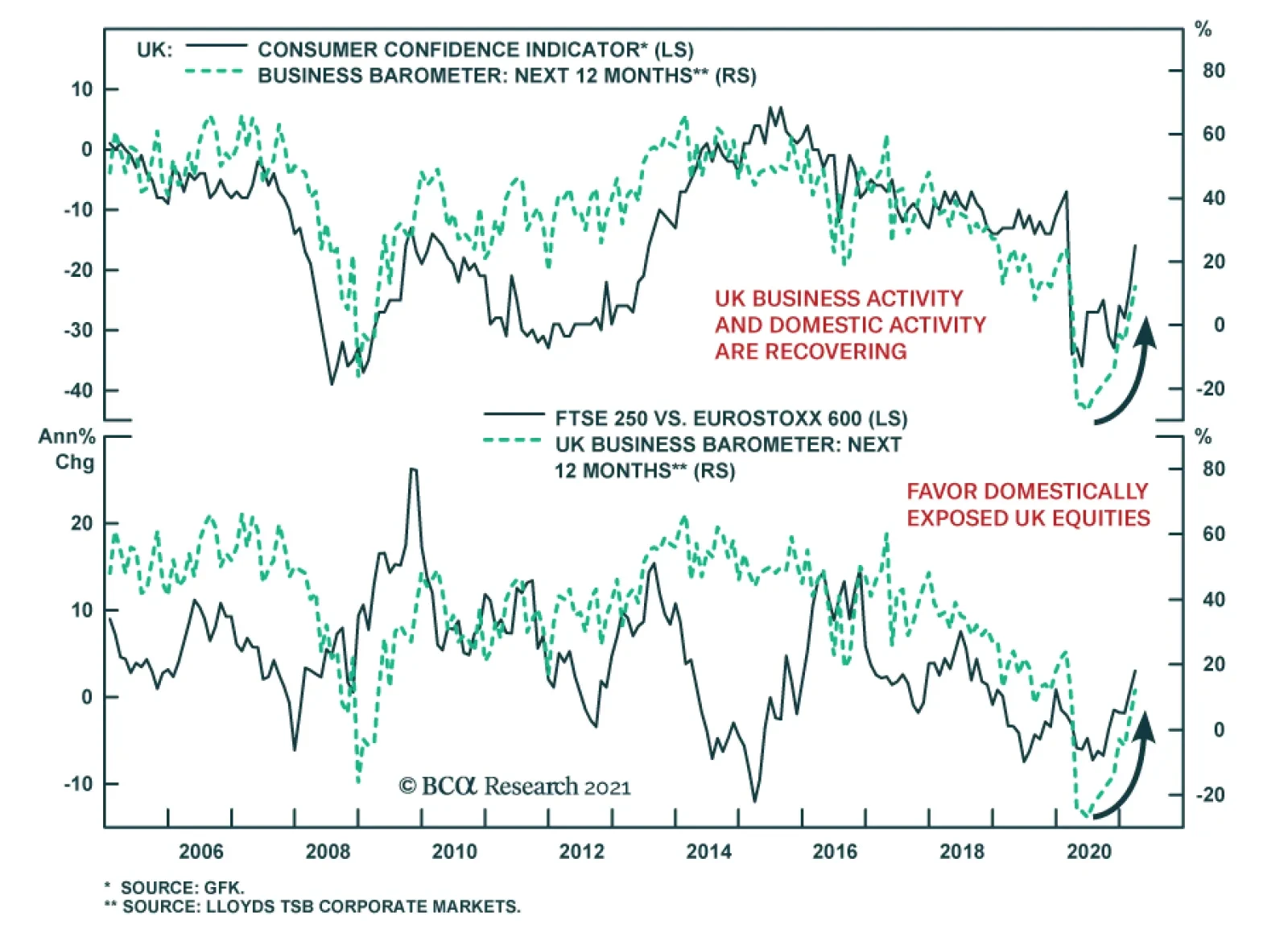
The UK Lloyds Bank Business Barometer jumped to a pandemic high of 15 in March from 2 in February, reflecting greater optimism about both the current economic situation as well as the 12-month outlook for business activity. This corroborates the message from…
The inflation/deflation debate has been dominating the news flow and we are compelled to offer our thoughts in two-part series of Special Reports on this widely discussed, but also widely misunderstood topic. Over the past year, we have been inundated with countless questions about our outlook on inflation given the dual monetary and fiscal stimuli that have been ongoing since Covid-19 hit (Chart 1). We take this opportunity to provide detailed answers on everything inflation in this series of Special Reports. Specifically, in this first report we focus on the long-term and structural forces behind US core CPI inflation. We go in depth into the drivers behind the current deflationary trend and also examine what other variables might break that trend in the future. We also try to ignore the medium-term outlook because the inflation story is well-known as the financial media is littered with charts that slice and dice the ISM manufacturing release in every possible way showing that inflation will rebound. Hence, there is no disagreement about the medium-term path for the core CPI inflation. Chart 12020 Stimuli
2020 Stimuli
2020 Stimuli
The important question that we look to answer in this Special Report is whether this rebound is a paradigm shift that will push the US into a new era of consistently high (i.e. above 3%/annum) core CPI inflation, or is it a merely counter trend inflationary spike within the broader deflationary megatrend? Laying The Groundwork Before we wrestle with the structural forces behind inflation, first we must get the question of quantitative easing (QE) and its effects on the real economy and inflation out of the way. Undoubtedly, QE is an integral part of any discussion about the real-word and/or financial asset price inflation, and while it tickles the public’s imagination with hyperinflationary fears, the reality is that those fears are largely misplaced (Chart 2). In fact, pundits have established a consensus: “QE only affects the financial economy as it increases bank reserves that can never escape in the real economy. On the other hand, fiscal stimulus affects the real economy and can cause genuine inflation.” There clearly hasn’t been any material inflation since the GFC, so the argument of “QE only affecting the financial economy” appears to be correct, but at closer look there is room for a different interpretation. What is important to understand is that QE is nothing but a tool, sometimes a signaling tool, in the Fed’s arsenal, and like any tool, it can be used in different ways. Chart 2Boogeyman?
(Part I) Tinkering With Inflation: Outlook
(Part I) Tinkering With Inflation: Outlook
The fact that there has not been any material real-world inflation since the housing bubble is neither because QE is structurally deflationary nor because it “cannot touch” the real economy, but because policy makers chose to use the QE tool to rescue creditors (the financial sector) rather than debtors (the real economy) during the GFC. Delving deeper in the Great Recession, the banks were largely undercapitalized with cash accounting for a tiny portion of overall assets and Treasury holdings being at historic lows (Chart 3). The rest of the assets were tied to loans and other risky securities. Once NINJA loans and other subprime loans along with the derivative CLOs/CDOs house of cards began imploding, the banking sector could not stomach the losses owing to the nonexistent cash buffer, and the entire system went into insolvency mode. This is when the Fed stepped in with QE (and the Treasury with TARP in order to recapitalize the banks) to bail out the nervous system of the US economy by boosting reserves and giving freshly printed money to the banks in exchange for their Treasurys, MBS and other risky securities. By providing support to the banking system, the Fed was counterbalancing a deflationary financial industry shutdown (the Richard Koo balance sheet type recession) rather than injecting an inflationary real economic stimulus. As a result, nearly all of the newly created money was stuck in the financial system in the form of new reserves, and as far as the real economy was concerned, no new money entered directly into the real world. This is how the consensus of “QE only affecting the financial economy” was formed, and why we did not observe a long-lasting rise in CPI despite all of the GFC-brought about stimuli. Chart 3Banks Were Well-capitalized
Banks Were Well-capitalized
Banks Were Well-capitalized
Fast-forward to today, and the backdrop could not be more different. The banking sector was well capitalized, so doing an aggressive QE to boost reserves and to stimulate the financial sector would have only provided marginal benefits. The deflationary shock came through the real economy, not the financial economy, meaning that a real (i.e. fiscal) stimulus was needed. Once again, the QE tool comes to the rescue. This time however, QE was also used to finance Main Street stimulus programs as the Fed bought long dated Treasury (and other) securities that pushed interest rates to rock bottom levels and helped facilitate government stimulus spending. Consequently, a more meaningful fraction of QE money reached Main Street and had an effect on the real economy and was not just locked in new reserves. As a reminder, when rates fall to zero and the Fed embarks on QE, the lines between monetary and fiscal policies get blurred. When QE (instead of the foreign or private sectors) is used to facilitate government expenditures, which later on gets distributed into the real economy, QE can provide inflationary support and can reach the real economy. Chart 42008 Versus Today
2008 Versus Today
2008 Versus Today
Perhaps the best way to illustrate the difference between 2008 and 2020 is by showing M2 money supply data. The spike in M2 data in 2020 dwarfs the one in 2008; in 2020 QE money reached the real economy and ended up in private sector’s bank accounts (thus contributing to M2 growth), whereas in 2008 QE money was mainly locked in bank reserves. True the money multiplier and M2 money stock velocity are still in hibernation, and were we to see a sustainable inflationary impulses both of these indicators would have to show signs of life (Chart 4). So does this mean that there are grounds for longer-term inflationary concerns since in 2020 QE actually reached the real economy? To answer this question, we now dig deeper into the secular inflation forces and split them in two camps: pro-inflationary and anti-inflationary. Pro-Inflationary Driver #1: The Buenos Aires Consensus Our view since last June has been that fiscal deficits are here to stay as far as the eye can see and the shift from the Washington to the Buenos Aires Consensus1 is a paradigm shift with staying power. The most important long-term consequence of the Buenos Aires Consensus will be higher inflation. And we are not talking just the asset price kind – which investors have enjoyed over the past decade – but of the more traditional flavor: consumer price inflation. Crudely put, as long as fiscal support remains in place (proverbial helicopter drop, Chart 5) after the pandemic is long forgotten it can serve as a meaningful catalyst for structural inflation, instead of being a one-off counterbalancing short-term boost. To reiterate just how much more powerful fiscal spending is outside of a recession, we conduct a labor market analysis and show that a large percentage of the present-day stimulus is being used to counterbalance the deflationary pandemic shock, rather than contributing to driving inflation higher. Table 1 shows our proxy for total payroll losses incurred by America households as a direct result of the pandemic. Our estimate is $501 billion from March 2020 until today. Chart 5Helicopter Checks
Helicopter Checks
Helicopter Checks
The Committee for a Responsible Federal Budget also publishes detailed statistics on the dollar flow of every pandemic stimulus program to a specific economic sector. As of today, US households received $1,400 billion, but some of the stimulus categories simply defer a payment that households still have to make in the future, instead of injecting brand-new money. After stripping those categories out, we arrive to a cleaner number of roughly $1,000 billion – that is how much new money US households received. Next, we subtract our total payroll loss proxy resulting into a net inflow of approximately $500 billion or 2.3% of 2020 US GDP. This is a respectable sum and 2.3% is significant. However, it has one major drawback. The 2.3% GDP stimulus number assumes that every single dollar was actually spent into the real economy, which we know is not true. Table 1The Counterbalancing Effect
(Part I) Tinkering With Inflation: Outlook
(Part I) Tinkering With Inflation: Outlook
A recent New York Fed study on how American households used their stimulus money concluded that: “36.4% of the stimulus money was used to boost savings, 34.5% to paydown debt, 25.9% was spent on essentials and non-essentials, and finally the rest of the money (3.2%) was donated”. It is worth noting that this study also looked at the expected spending patterns for the new round of stimulus checks, and the results were generally the same. To obtain a more realistic number of how much of the net $500 billion inflow actually entered the economy, we multiply it by 25.9% (how much money was used on spending according to the NY Fed) and arrive at a better estimate of $130 billion or 0.6% of 2020 US GDP, which is by no means an astronomical number that will shatter into pieces the current deflationary megatrend. This empirical exercise demonstrated how a large percentage of the present-day stimulus is being used to counterbalance the deflationary pandemic shock. However, if our thesis of a Buenos Aires Consensus in which governments spend even outside of recessions pans out, then there will not be the aforementioned counterbalancing effect, and all the fiscal dollars will go straight to contributing to rising inflation until the deflationary megatrend is broken. Pro-Inflationary Driver #2: Demographics In the long run, inflation tends to oscillate alongside a country’s demographics. More specifically, it is the relative size of the three age cohorts (young, working-age, and old) that plays a key role in driving inflation. People who are in the working-age cohort are at their peak productivity, which implies that their contribution to the production of goods and services is greater than the demand for new credit they generate, meaning that they produce a deflationary pull. The opposite is true for the other two age cohorts (the young and the old). Neither one is contributing to the production of goods & services, while both still generate new credit in the economy (for example student loans), and the end result is an inflationary pull. Hence, it is the interplay between these three age cohorts that serves as a structural force behind inflation. To put some numbers behind this conceptual framework, we turn our attention to a paper “The enduring link between demography and inflation” written by Mikael Juselius and Előd Takáts. In the paper, the authors conduct rigorous cross-country analysis and find that indeed, people 30-60 years of age (the working-age cohort) exert deflationary pressure, while the other two cohorts contribute to rising inflation. Chart 6 plots the age-structure effect for the US against inflation. The authors also quantified that over the 40-year period (1970-2010) the increase in the working-age population (due to baby-boomers) has lowered inflationary pressures by almost five percentage points in the US (Chart 7). Meanwhile, by extrapolating the likely path of demographic data by 40 years (2010-2050), the authors observed a shift from deflationary to inflationary age pressure mainly due to the incoming increase in the proportion of the old cohort. Their estimate of the expected pull on inflation in the US will be approximately two and a half percent (Chart 8). Chart 6Demographics Are A Mighty Force
Demographics Are A Mighty Force
Demographics Are A Mighty Force
Chart 7From Deflationary...
(Part I) Tinkering With Inflation: Outlook
(Part I) Tinkering With Inflation: Outlook
Chart 8...To Inflationary
(Part I) Tinkering With Inflation: Outlook
(Part I) Tinkering With Inflation: Outlook
Going forward, US demographics will be more inflationary than deflationary. Pro-Inflationary Driver #3: De-Globalization The “apex of globalization” or “de-globalization” is our third pro-inflationary driver. We have written about this theme extensively at BCA Research and it is the mega-theme of our sister Geopolitical Strategy (GPS) service. Odds are high that countries will continue looking inward as the US sustains its aggressive trade policy, China’s trend growth slows, and US-China strategic tensions intensify. Chart 9 shows that we are at the conclusion of a period of tranquility. Pax Americana underpinned globalization as much as Pax Britannica before it. The US is in a relative decline after decades of geopolitical stability allowed countries like China to rise to “great power” status and rivals like Russia to recover from the chaos of the 1990s. Chart 9The Tide Is Turning
The Tide Is Turning
The Tide Is Turning
De-globalization has become the consensus since the election of Donald Trump. But Trump is not the prophet of de-globalization; he is its acolyte. And now, President Biden is continuing in Trump’s footsteps. Globalization is ending because of structural factors, not cyclical ones. And its decline was pre-written into its “source code.” Three factors stand at the center of this assessment, first outlined in a 2014 GPS Special Report, “The Apex Of Globalization – All Downhill From Here”: multipolarity, populism and protectionism. Events have since confirmed this view. The three pillars of globalization are the free movement of goods, capital, and people across national borders. We expect to see marginally less of each in the future and this should prove inflationary. Pro-Inflationary Driver #4: US Dollar Bear Market The path of least resistance is lower for the US dollar and it represents our final pro-inflationary driver. Chart 10 highlights the ebbs and flows of the trade-weighted US dollar since it floated in the early-1970s. The DXY index has moved in six-to-ten year bull and bear markets. The most recent trough was during the depths of the Great Recession, while the peak was in early-2020. If history repeats, eventually the dollar will mean revert lower in the 2020s, especially given the fiscal profligacy (Buenos Aires Consensus) of the current administration that may continue into 2024. Chart 10Time For A Downcycle?
Time For A Downcycle?
Time For A Downcycle?
True, the US dollar remains the global reserve currency, but that exorbitant privilege is clearly fraying on the edges as the balance-of-payments dynamics are heading in the wrong direction. While the US Congressional Budget Office (CBO) expects some normalization in the US budget deficit over the next 4 years since the pandemic shock will be over, looking further into the future the CBO forecasts a further reacceleration in deficit spending. Assuming a stable to grinding lower current account deficit in the next several years, the path of least resistance is lower for the currency. BCA’s US dollar model also corroborates the twin deficit message and suggests ample structural downside for the USD (Chart 11). The apex of globalization will also hurt the greenback in a reflexive manner. In a world where all the markets are integrated, borrowers in EM nations often use the reserve currency to issue liabilities at a lower cost. This boosts the demand by EM central banks for US dollar reserves to protect domestic banking systems funded in USD. Moreover, some countries like China implement pegs (both official and unofficial) to the US dollar in order to maintain their competitiveness and export their production surpluses to the US. To do so they buy US assets. If the global economy becomes more fragmented and the Sino-US relationship continues to deteriorate structurally as we expect, then these sources of demand for the dollar will recede. Overlay the widening US current account deficit, and you have the perfect recipe for a depreciating trade-weighted US dollar. Importantly, the 1970s is an interesting period to examine in more detail. As the Nixon administration floated the greenback this aggravated the inflationary pressures (Chart 12) that were building all along the 1960s when the US adopted the Mutually Assured Destruction Doctrine along with the Cold War space race that eventually saw the US landing on the moon in 1969. Chart 11A Bearish Outlook
A Bearish Outlook
A Bearish Outlook
Chart 12The Greenback In The 1970s
The Greenback In The 1970s
The Greenback In The 1970s
A lower greenback is synonymous with rising commodity and import prices and given that the US is the consumer of last resort (70% PCE), the commodity/import price pendulum will swing from a deflationary to an inflationary force. Anti-Inflationary Driver #1: Technology’s Creative Destruction Schumpeter’s “creative destruction” forces dominate technology companies in general and Silicon Valley in particular, and represent our fist anti-inflationary driver. These creative destruction forces in the tech industry are inherently deflationary. As a result, tech business models have evolved to thrive during disinflationary periods. Chart 13 shows the software sector deflator derived from national accounts, and since the mid-1980s more often than not it has been mired in deflation. US semiconductor prices, computer hardware prices, and almost any tech related category from the PCE, PPI and CPI releases looks more or less the same as software, underscoring that this is a technology sector wide modus operandi. More recently, Uber Technologies and Airbnb, to name a few, continually bring existing capacity online and that adds another layer of deflation forces at work in select industries they operate in. Tack on technology infiltrating finance and soon the extremely opaque health care services industry that comprises almost 20% of US GDP or $4tn and a deflationary impulse will likely reverberate across these large segments of the US economy that have managed to sustain high pricing power over the decades. Chart 13Technological Progress Is Deflationary
Technological Progress Is Deflationary
Technological Progress Is Deflationary
Thus, these creative destruction processes remain alive and well in tech land and will continue to exert deflationary/disinflationary pressure (of the good kind) on the US economy. Anti-Inflationary Driver #2: Income & Wealth Inequality The growing trend in income and wealth inequality is our second anti-inflationary force. We first want to focus on the issue of income inequality as it leads to wealth inequality. Income inequality refers to the distribution of wages and profits generated by the economy. It is the proverbial “share of the pie” that households from different socioeconomic brackets receive. The link with inflation comes through the marginal propensity to save statistic of those different brackets. Lower income households have nearly nonexistent propensity to save as they live paycheck to paycheck. Therefore, any additional income inflow they receive gets immediately syphoned into the real economy. In contrast, the top 10% have a high propensity to save as all of their living expenses are well covered, so any additional income they receive is stashed away into savings and does not enter the real economy. This is why following the Trump’s tax cut that benefitted the top 10% there has not been a durable spike in CPI inflation. The fact that in the US the income share of the top 10% is growing at stratospheric rates at the same as time as the bottom 90% are struggling to cover even a $400 unexpected expense needs no introduction. The exact reasons as to why that happened would require a separate Special Report, but one of the main reasons is the multi-decade suppression of unions, which does not allow employees to bargain effectively for a larger slice of corporate profits. Given that profits are an exact mirror image of labor expenses, it is not surprising that the union movement is being marginalized (Charts 14 & 15). Staying on the topic of inflation, as we already outlined, when the lower and medium socioeconomic brackets receive more income, it does not disappear in the savings accounts, but instead it is redirected into the real economy causing a healthy inflationary uptick. Chart 14No Power = No Money
No Power = No Money
No Power = No Money
Chart 15The Tug Of War
The Tug Of War
The Tug Of War
Chart 16 shows the wealth share of the top 10% of American households on inverted scale. Since the 1920s, inflation and the wealth share of the top 10% has moved in opposite directions. There were two distinct periods when the wealth share of the bottom 90% rose: from the early 1930s until the early 1950s, and from the mid-1960s until the mid-1980s. Both of these periods were accompanied by rising CPI inflation. Chart 16Wealth Equality Is Inflationary
Wealth Equality Is Inflationary
Wealth Equality Is Inflationary
At the same time, when looking at any other period outside of those golden days for the bottom 90%, US inflation was anemic. This empirical evidence further underscores the importance of income and wealth distribution in the economy, and given the current US political and economic realities, we do not expect any material changes in labor dynamics to take root. The top 10% will continue benefitting at the expense of the bottom 90%, which will keep US CPI inflation suppressed. Concluding Thoughts In this Special Report our goal was to look beyond the already known medium term inflation outlook, and present both sides of the argument about the long-term inflation trend. We took a deep dive into six structural forces behind inflation that we identified. Four of those forces were pro-inflationary, while the remaining two were anti-inflationary (Table 2). We also assigned a value on our subjective strength scale for each force. Each value incorporates how quickly a particular force will come to fruition, and how strong it will be over the next 5-to-10 year period. Based on our analysis, we conclude that there are rising odds that the deflationary megatrend has run its course and has reached an inflection point of turning inflationary. Table 2Inflation Dots
(Part I) Tinkering With Inflation: Outlook
(Part I) Tinkering With Inflation: Outlook
In the next Special Report from our Tinkering With Inflation series, we will conduct a thought experiment and explore a world in which our forecasts prove to be accurate, and a new inflationary paradigm engulfs the US economy. Under such a backdrop what will the US equity sector winners and losers, especially given the related shift in the stock-to-bond correlation? Stay tuned. Arseniy Urazov Research Associate ArseniyU@bcaresearch.com Footnotes 1 Buenos Aires Consensus is our catchall term for everything that is opposite of the Washington Consensus: less globalization, fiscal stimulus as far as the eyes can see, erosion of central bank independence, and a dirigiste (as opposed to laissez-faire) approach to economics that seeks to protect “state champions,” stifles innovation, and ultimately curbs productivity growth.
Highlights Global manufacturing activity will soon peak due to growing costs and China’s policy tightening. This process will allow the dollar’s rebound to continue. EUR/USD’s correction will run further. This pullback in the euro is creating an attractive buying opportunity for investors with a 12- to 24-month investment horizon. Eurozone banks will continue to trade in unison with the euro. Feature The correction in the euro has further to run. The dollar currently benefits from widening real interest differentials, but a growing list of headwinds will cause a temporary setback for the global manufacturing sector, which will fuel the greenback rally further. Nonetheless, EUR/USD will stabilize between 1.15 and 1.12, after which it will begin a new major up-leg. Consequently, investors with a 12- to 24-month investment horizon should use the current softness to allocate more funds to the common currency. A Hiccup In Global Industrial Activity Global manufacturing activity is set to decelerate on a sequential basis and the Global Manufacturing PMI will soon peak. The first problem for the global manufacturing sector is the emergence of financial headwinds. The sharp rebound in growth in the second half of 2020 and the optimism created by last year’s vaccine breakthrough as well as the rising tide of US fiscal stimulus have pushed US bond yields and oil prices up sharply. These financial market moves are creating a “growth tax” that will bite soon. Mounting US interest rates have lifted global borrowing costs while the doubling in Brent prices has increased the costs of production and created a small squeeze on oil consumers. Thus, even if the dollar remains well below its March 2020 peak, our Growth Tax Indicator (which incorporates yields, oil prices and the US dollar) warns of an imminent top in the US ISM Manufacturing and the Global Manufacturing PMI (Chart 1). Already, the BCA Global Leading Economic Indicator diffusion index has dipped below the 50% line, which usually ushers in downshifts in global growth. A deceleration in China’s economy constitutes another problem for the global manufacturing cycle. Last year’s reflation-fueled rebound in Chinese economic activity was an important catalyst to the global trade and manufacturing recovery. However, according to BCA Research’s Emerging Market Strategy service, Beijing is now tightening policy, concerned by a build-up in debt and excesses in the real estate sector. Already, the PBoC’s liquidity withdrawals are resulting in a decline of commercial bank excess reserves, which foreshadows a slowing of China’s credit impulse (Chart 2). Chart 1The Global Growth Tax Will Bite
The Global Growth Tax Will Bite
The Global Growth Tax Will Bite
Chart 2Chinese Credit Will Slow
Chinese Credit Will Slow
Chinese Credit Will Slow
In addition to liquidity withdrawals, Chinese policymakers are also tightening the regulatory environment to tackle excessive debt buildups and real estate speculation. The crackdown on property developers and house purchases will cause construction activity to shrink in the second half of 2021. Meanwhile, tougher rules for both non-bank lenders and the asset management divisions of banks will further harm credit creation. BCA’s Chief EM strategist, Arthur Budaghyan, notes that consumer credit is already slowing. Chinese fiscal policy is unlikely to create a counterweight to the deteriorating credit impulse. China’s fiscal impulse will be slightly negative next year. Chinese financial markets are factoring in these headwinds, and on-shore small cap equities are trying to break down while Chinese equities are significantly underperforming global benchmarks. Chart 3Deteriorating Surprises
Deteriorating Surprises
Deteriorating Surprises
Bottom Line: The combined assault from the rising “growth tax” and China’s policy tightening is leaving its mark. Economic surprises in the US, the Eurozone, EM and China have all decelerated markedly (Chart 3), which the currency market echoes. Some of the most pro-cyclical currencies in the G-10 are suffering, with the SEK falling relative to the EUR and the NZD and AUD both experiencing varying degrees of weakness. The Euro Correction Will Run Further… Until now, the euro’s decline mostly reflects the rise in US interest rate differentials; however, the coming hiccup in the global manufacturing cycle is causing a second down leg for the euro. First, the global economic environment remains consistent with more near-term dollar upside, due to: Chart 4Commodities Are Vulnerable
Commodities Are Vulnerable
Commodities Are Vulnerable
A commodity correction that will feed the dollar’s rebound. Aggregate speculator positioning and our Composite Technical Indicator show that commodity prices are technically overextended (Chart 4). With this backdrop, the coming deceleration in Chinese economic activity is likely to catalyze a significant pullback in natural resources, which will hurt rates of returns outside the US and therefore, flatter the dollar. The dollar’s counter-cyclicality. The expected pullback in the Global Manufacturing PMI is consistent with a stronger greenback (Chart 5). The dollar’s momentum behavior. Among G-10 FX, the dollar responds most strongly to the momentum factor (Chart 6). Thus, the likelihood is high that the dollar’s recent rebound will persist, especially because our FX team’s Dollar Capitulation Index has only recovered to neutral from oversold levels and normally peaks in overbought territory. Chart 5The Greenback's Counter-Cyclicality
The Greenback's Counter-Cyclicality
The Greenback's Counter-Cyclicality
Chart 6The Dollar Is A High Momentum Currency
The Euro Dance: One Step Back, Two Steps Forward
The Euro Dance: One Step Back, Two Steps Forward
Second, the euro’s specific dynamics remain negative for now. Based on our short-term valuation model, the fair value of EUR/USD has downshifted back to 1.1, which leaves the euro 7% overvalued (Chart 7). Until now, real interest rate differentials and the steepening of the US yield curve relative to Germany’s have driven the decline in the fair value estimate. However, the deceleration in global growth also hurts the euro’s fair value because the US is less exposed than the Eurozone to the global manufacturing cycle. Chart 7The Euro's Short-Term Fair Value Is At 1.1
The Euro's Short-Term Fair Value Is At 1.1
The Euro's Short-Term Fair Value Is At 1.1
Chart 8Speculators Have Not Capitulated
Speculators Have Not Capitulated
Speculators Have Not Capitulated
The euro is also technically vulnerable, similar to commodities. Speculators are still massively net long EUR/USD and the large pool of long bets in the euro suggests that a capitulation has yet to take place (Chart 8). The euro responds very negatively to a weak Chinese economy. The Eurozone has deeper economic ties with China than the US. Exports to China account for 1.7% of the euro area’s GDP, and 2.8% of Germany’s compared to US exports to China at 0.5% of GDP. Indirect financial links are also larger. Credit to EM accounts for 45% of the Eurozone’s GDP compared to 5% for the US. Thus, the negative impact of a Chinese slowdown on EM growth has greater spillovers on European than on US ones rates of returns. A weak CNY and sagging Chinese capital markets harm the euro. The euro’s rebound from 1.064 on March 23 2020 to 1.178 did not reflect sudden inflows into European fixed-income markets. Instead, the money that previously sought higher interest rates in the US left that country for EM bonds and China’s on-shore fixed-income markets, the last major economies with attractive yields. These outflows from the US to China and EM pushed the dollar down, which arithmetically helped the euro. Thus, the recent EUR/USD correlates closely with Sino/US interest rate and with the yuan because the euro’s strength reflects the dollar demise (Chart 9). Consequently, a decelerating Chinese economy will also hurt EUR/USD via fixed-income market linkages. Finally, the euro will depreciate further if global cyclical stocks correct relative to defensive equities. Deep cyclicals (financials, consumer discretionary, energy, materials and industrials) represent 59% of the Eurozone MSCI benchmark versus 36% of the US index. Cyclical equities are exceptionally overbought and expensive relative to defensive names. They are also very levered to the global business cycle and Chinese imports. In this context, the expected deterioration in both China’s economic activity and the Global Manufacturing PMI could cause a temporary but meaningful pullback in the cyclicals-to-defensives ratio and precipitate equity outflows from Europe into the US (Chart 10). Chart 9EUR/USD And Chinese Rates
EUR/USD And Chinese Rates
EUR/USD And Chinese Rates
Chart 10EUR/USD Will Follow Cyclicals/Defensives
EUR/USD Will Follow Cyclicals/Defensives
EUR/USD Will Follow Cyclicals/Defensives
Bottom Line: A peak in the global manufacturing PMI will hurt the euro, especially because China will meaningfully contribute to this deceleration in global industrial activity. Thus, the euro’s pullback has further to run. An important resistance stands at 1.15. A failure to hold will invite a rapid decline to EUR/USD 1.12. Nonetheless, the euro’s depreciation constitutes nothing more than a temporary pullback. … But The Long-Term Bull Market Is Intact We recommend buying EUR/USD on its current dip because the underpinnings of its cyclical bull market are intact. Chart 11Investors Structurally Underweight Europe
Investors Structurally Underweight Europe
Investors Structurally Underweight Europe
First, investors are positioned for a long-term economic underperformance of the euro area relative to the US. The depressed level of portfolio inflows into Europe relative to the US indicates that investors already underweight European assets (Chart 11). This pre-existing positioning limits the negative impact on the euro of the current decrease in European growth expectations (Chart 11, bottom panel). Second, as we wrote last week, European growth is set to accelerate significantly this summer. Considering the absence of ebullient investor expectations toward the euro, this process can easily create upside economic surprises later this year, especially when compared to the US. Moreover, the deceleration in Chinese and global growth will most likely be temporary, which will limit the duration of their negative impact on Europe. Third, the US stimulus measure will create negative distortions for the US dollar. The addition of another long-term stimulus package of $2 trillion to $4 trillion to the $7 trillion already spent by Washington during the crisis implies that the US government deficit will not narrow as quickly as US private savings will decline. Therefore, the US current account deficit will widen from its current level of 3.5% of GDP. As a corollary, the US twin deficit will remain large. Meanwhile, the Fed is unlikely to increase real interest rates meaningfully in the coming two years because it believes any surge in inflation this year will be temporary. Furthermore, the FOMC aims to achieve inclusive growth (i.e. an overheated labor market). This policy combination forcefully points toward greater dollar weakness. The US policy mix looks particularly dollar bearish when compared to that of the Eurozone. To begin with, the balance of payment dynamics make the euro more resilient. The euro area benefits from the underpinning of a current account surplus of 1.9% of GDP. Moreover, the European basic balance of payments stands at 1.5% of GDP compared to a 3.6% deficit for the US. Additionally, FDI into Europe are rising relative to the US. The divergence in the FDI trends will continue due to the high probability that the Biden administration will soon increase corporate taxes. Chart 12The DEM In The 70s
The DEM In The 70s
The DEM In The 70s
The combination of faster vaccine penetration and much larger fiscal stimulus means that the US economy will overheat faster than Europe’s. Because the Fed seems willing to tolerate higher inflation readings, US CPI will rise relative to the Eurozone. In the 1970s, too-easy policy in Washington meant that the gap between US and German inflation rose. Despite the widening of interest rate and growth differentials in favor of the USD or the rise in German relative unemployment, the higher US inflation dominated currency fluctuations and the deutschemark appreciated (Chart 12). A similar scenario is afoot in the coming years, especially in light of the euro bullish relative balance of payments. Fourth, valuations constitute an additional buttress behind the long-term performance of the euro. Our FX strategy team Purchasing Power Parity model adjusts for the different composition of price indices in the US and the euro area. Based on this metric, the euro is trading at a significant 13% discount from its long-term fair value, with the latter being on an upward trend (Chart 13). Furthermore, BCA’s Behavioral Exchange Rate Model for the trade-weighted euro is also pointing up, which historically augurs well for the common currency. Lastly, even if the ECB’s broad trade-weighted index stands near an all-time high, European financial conditions remain very easy. This bifurcation suggests that the euro is not yet a major hurdle for the continent and can enjoy more upside (Chart 14). Chart 13EUR/USD Trades Well Below Long-Term Fair Value
EUR/USD Trades Well Below Long-Term Fair Value
EUR/USD Trades Well Below Long-Term Fair Value
Chart 14Easy European Financial Conditions
Easy European Financial Conditions
Easy European Financial Conditions
Chart 15Make Room For the Euro!
Make Room For the Euro!
Make Room For the Euro!
Finally, the euro will remain a beneficiary from reserve diversification away from the USD. The dollar’s status as the premier reserve currency is unchallenged. However, its share of global reserves has scope to decline while the euro’s proportion could move back to the levels enjoyed by legacy European currencies in the early 1990s (Chart 15). Large reserve holders will continue to move away from the dollar. BCA Research’s Geopolitical Strategy team argues that US tensions with China transcend the Trump presidency. Meanwhile, the current administration’s relationship with Russia and Saudi Arabia will be cold. For now, their main alternative to the dollar is the euro because of its liquidity. Moreover, the NGEU stimulus program creates an embryonic mechanism to share fiscal risk within the euro area. The Eurozone is therefore finally trying to evolve away from a monetary union bereft of a fiscal union. This process points toward a lower probability of a break up, which makes the euro more attractive to reserve managers. Bottom Line: Despite potent near-term headwinds, the euro’s long-term outlook remains bright. Global investors already underweight European assets, yet balance of payment and policy dynamics point toward a higher euro. Moreover, valuations and geopolitical developments reinforce the cyclical tailwinds behind EUR/USD. Thus, investors with a 12- to 24-month investment horizon should use the current euro correction to gain exposure to the European currencies. Any move in EUR/USD below 1.15 will generate a strong buy signal. Sector Focus: European Banks And The Istanbul Shake The recent decline in euro area bank stocks coincides with the 14% increase in USD/TRY and the 17% decline in the TUR Turkish equities ETF following the sacking of Naci Ağbal, the CBRT governor. President Erdogan is prioritizing growth over economic stability because his AKP party is polling poorly ahead of the 2023 election. The Turkish economy is already overheating, and the lack of independence of the CBRT under the leadership of Şahap Kavcıoğlu promises a substantial increase in Turkish inflation, which already stands at 16%. Hence, foreign investors will flee this market, creating further downward pressures on the lira and Turkish assets. European banks have a meaningful exposure to Turkey. Turkish assets account for 3% of Spanish bank assets or 28% of Tier-1 capital. For France, this exposure amounts to 0.7% and 5% respectively, and for the UK, it reaches 0.3% and 2%. As a comparison, claims on Turkey only represent 0.3% and 0.5% of the assets and Tier-1 capital of US banks. Unsurprisingly, fluctuations in the Turkish lira have had a significant impact one the share prices of European banks in recent years, even after controlling for EPS and domestic yield fluctuations (Table 1). Table 1TRY Is Important To European Banks…
The Euro Dance: One Step Back, Two Steps Forward
The Euro Dance: One Step Back, Two Steps Forward
Nonetheless, today’s TRY fluctuations are unlikely to have the same lasting impact on European banks share prices as they did from 2017 to 2019 because European banks have already shed significant amounts of Turkish assets (Chart 16). This does not mean that European banks are out of the woods yet. The level of European yields remains a key determinant of the profitability of Eurozone’s banks, and thus, of their share prices (Chart 17, top panel). Moreover, the euro still tightly correlates with European bank stocks as well (Chart 17, bottom panel). As a result, our view that the global manufacturing cycle will experience a temporary downshift and the consequent downside in EUR/USD both warn of further underperformance of European banks. Chart 16… But Less Than It Once Was
The Euro Dance: One Step Back, Two Steps Forward
The Euro Dance: One Step Back, Two Steps Forward
Chart 17Higher Yields And A stronger Euro, These Are Few Of My Favorite Things
Higher Yields And A stronger Euro, These Are Few Of My Favorite Things
Higher Yields And A stronger Euro, These Are Few Of My Favorite Things
These same views also suggest that this decline in bank prices is creating a buying opportunity. Ultimately, we remain cyclically bullish on the euro and the transitory nature of the manufacturing slowdown implies that global yields will resume their ascent. The cheap valuations of European banks, which trade at 0.6-times book value, make them option-like vehicles to bet on these trends, even if the banking sectors long-term prospects are murky. Moreover, they are a play on Europe’s domestic recovery this summer. We will explore banks in greater detail in future reports. Mathieu Savary, Chief European Investment Strategist Mathieu@bcaresearch.com Cyclical Recommendations Structural Recommendations Closed Trades Currency Performance
The Euro Dance: One Step Back, Two Steps Forward
The Euro Dance: One Step Back, Two Steps Forward
Fixed Income Performance Government Bonds
The Euro Dance: One Step Back, Two Steps Forward
The Euro Dance: One Step Back, Two Steps Forward
Corporate Bonds
The Euro Dance: One Step Back, Two Steps Forward
The Euro Dance: One Step Back, Two Steps Forward
Equity Performance Major Stock Indices
The Euro Dance: One Step Back, Two Steps Forward
The Euro Dance: One Step Back, Two Steps Forward
Geographic Performance
The Euro Dance: One Step Back, Two Steps Forward
The Euro Dance: One Step Back, Two Steps Forward
Sector Performance
The Euro Dance: One Step Back, Two Steps Forward
The Euro Dance: One Step Back, Two Steps Forward
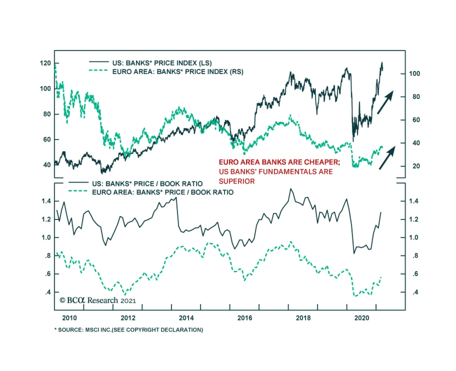
On Thursday, the Fed made officials plans to remove pandemic-era restrictions on dividends and share buybacks for banks that clear stress tests at the end of June. As suggested by the relatively modest gains since the announcement, the news was mostly priced…
Optimistic sell-side analysts’ forward earnings forecasts are rebalancing the market’s return away from multiple expansion and toward an earnings-led explanation. But, with expectations still sitting at extremes, even a minor setback can result a significant drawdown, especially in the absence of a valuation cushion. Chart 1 shows the difference between forward and trailing earnings growth and represents another yellow flag. Chart 2 on the next page zooms into each of the circled periods and reveals that 3/4 iterations resulted into an outright bear market in the SPX, while the one in 2009 was followed by a swift 10% correction in a matter of two months. To be clear, we are not calling for a bear market, nor did Chart 1 cause those bear markets, but just like an inverted yield curve reflects that the overall economy is susceptible to an external shock, this earnings surprise factor works in a similar way and signals that any mishap can result into a sizable drawdown. Bottom Line: Near-term caution is warranted in the prospects of the broad equity market, and we reiterate our long VIX June futures hedge that got triggered intraday on Monday just below the 25 mark. Chart 1
Beware Excessive Profit Optimism
Beware Excessive Profit Optimism
Chart 2
Beware Excessive Profit Optimism
Beware Excessive Profit Optimism