Equities
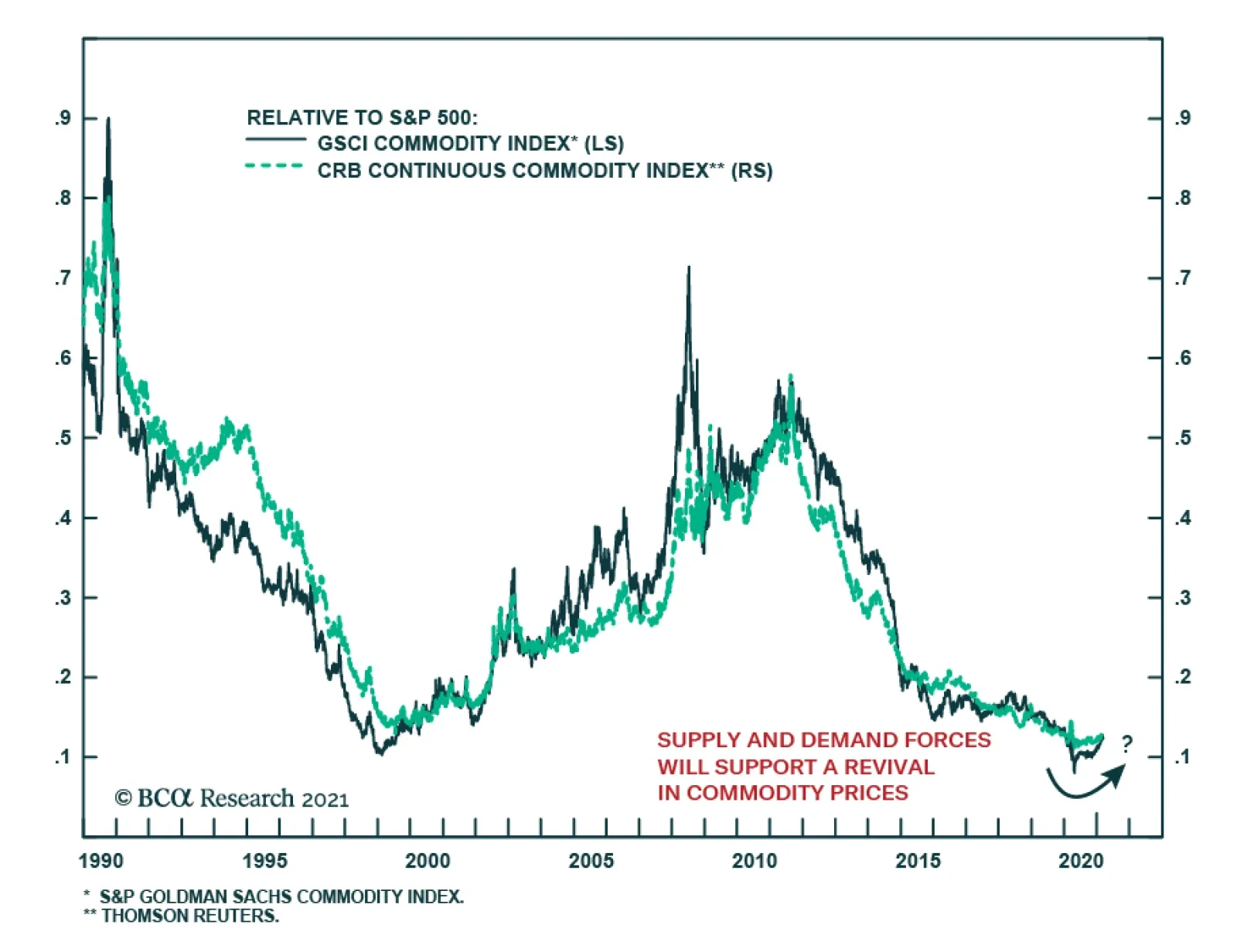
The past 10 years have been rough for commodity investors. After a decade-long bull market in the early 2000s, major commodity indices have continuously underperformed equities. The question now is what to expect of the coming decade? The conditions that…
BCA Research’s geopolitical strategists have a structurally bullish view on global tensions. Of note are risks in the South and East China Seas, the Persian Gulf and Indian Ocean basin, the Mediterranean, and even the Baltic Sea and Arctic. These risks…

Monitoring China Closely
Monitoring China Closely
Deterioration in Chinese data pushed us to downgrade the cyclical/defensive portfolio bent from overweight to neutral last month (third panel), and today we highlight yet another warning shot originating across the Pacific Ocean. Bloomberg’s compiled China High-Frequency Economic Activity Index (CHFEAI) has downshifted since peaking last December, warning that investors should keep their “China” guard up. The CSI 300 is following down the path of the CHFEAI (second panel), and the risk is that the S&P 500 may be next in line (top panel), as it has closely tracked China, albeit with a slight lag, since COVID-19 hit, as we first showed in our December 21, 2020 Special Report. Tack on the absence of an SPX valuation cushion, and there are rising odds that select deep cyclical/highly levered/China exposed sectors will start to sniff out some China trouble. Bottom Line: The S&P 500 is nearly perfectly priced and at a spitting distance from our 4,000 end-2021 target. China’s slowdown, especially post the 100 year Communist Party anniversary this summer, remains a key macro risk to monitor and can serve as a catalyst for an SPX correction.
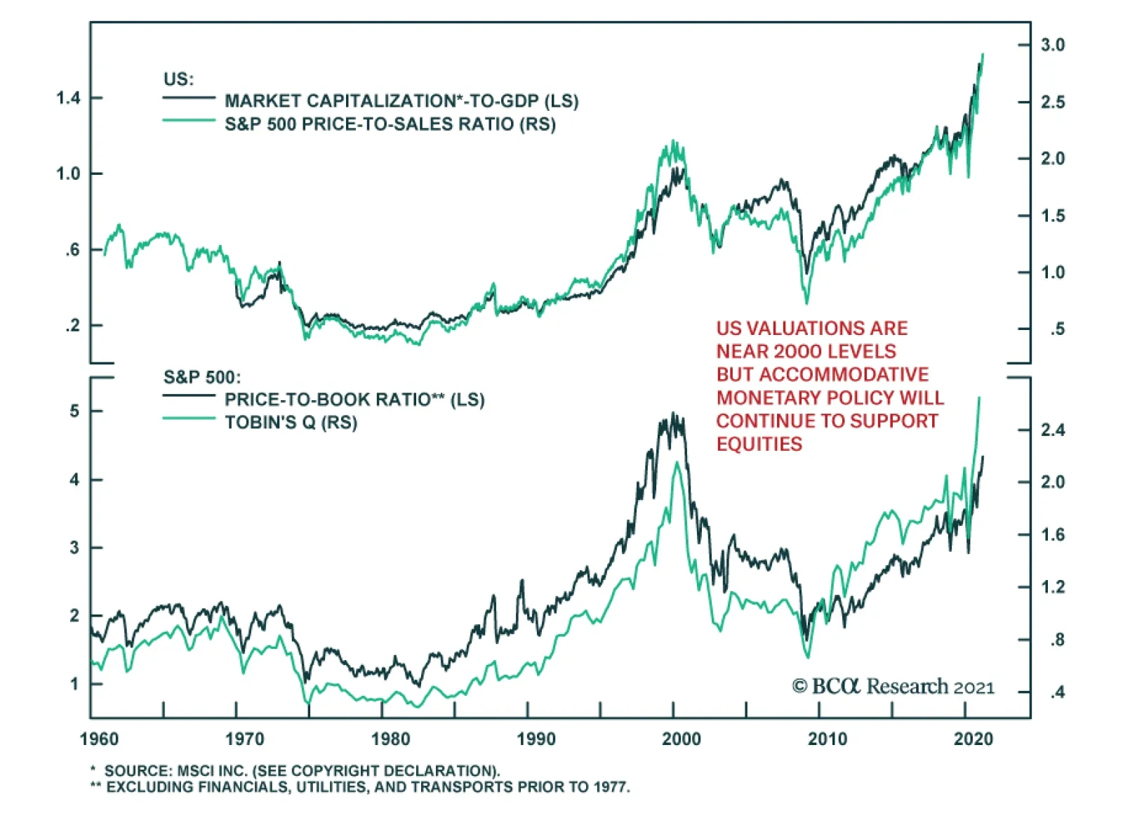
As US equities keep reaching new highs, many parallels are being drawn with the situation in 2000. The simplest one has to do with valuations. Valuations reached nosebleed levels in 2000. While the forward P/E ratio on the S&P 500 is somewhat below its…
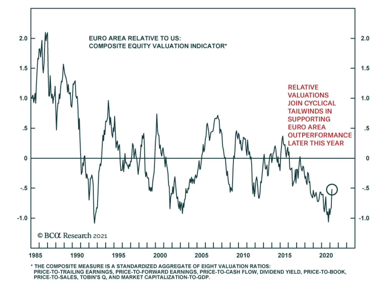
European equities underperformed US stocks for the most part of last year, and after a brief bounce in Q4, have largely stalled in relative terms. The latest wave of infections led to prolonged restrictions in the Old Continent, weighing on its economic…
Highlights Global Duration: Markets are correctly interpreting the $1.9 trillion US fiscal stimulus package as a factor justifying higher global growth expectations and bond yields. Maintain a below-benchmark stance on overall global duration. Yield Betas & Country Allocation: Within government bond portfolios, overweighting the “lower-beta” countries that have bond yields less sensitive to changes in US yields (Germany, France, Japan) versus the higher-beta markets (Canada, Australia, UK) remains the appropriate strategy during the current bond bear market. Underweights should remain concentrated in the US, though, as it is highly unlikely that any central bank will begin to tighten policy before the Fed. UK Follow-Up: The conclusions from our UK Special Report published last week do not change after adjusting for the difference in the inflation indices used to calculate UK inflation-linked bond yields compared to those of other countries. UK real interest rates are the lowest in the developed economies, while inflation breakevens are the highest. NOTE: There will be no Global Fixed Income Strategy report published next week. Instead, BCA Chief Global Fixed Income Strategist Rob Robis will do a webcast discussing his latest thoughts on global bond markets. Yields Rising Around The World Chart of the WeekPolicy Mix Is Bond-Bearish
Policy Mix Is Bond-Bearish
Policy Mix Is Bond-Bearish
The path of least resistance for global bond yields remains biased upward. Optimism on future economic growth remains ebullient with consumer and business confidence indices surging in much of the developed world. The epicenter of the global bond bear market remains the US, where pandemic related economic restrictions are being unwound with 21.4% of the US population now having received at least one dose of a vaccine. Fiscal policy in the US is also supporting the positive vibes on future growth after the $1.9 trillion stimulus package was signed into law by President Biden last week. The 10-year US Treasury yield climbed back to the 2021 high of 1.63% on the back of that announcement. The US stimulus package changes the trajectory of the 2021 US fiscal impulse from a $0.8 trillion contraction to a $0.3 trillion expansion, according to estimates from the US Committee for a Responsible Federal Budget (Chart of the Week). This, combined with ongoing quantitative easing from global central banks eager to keep bond yields as low as possible until inflation expectations sustainably return to policymaker targets, is providing a bond-bearish lift to both inflation expectations and real yields – most notably in the US. Central bankers can try to fight back against the speed of the increase in bond yields by maintaining their commitment to current policy settings, as the European Central Bank (ECB) and Bank of Canada (BoC) did last week. The Fed, Bank of England (BoE) and Bank of Japan (BoJ) will all get the chance to do the same this at this week’s policy meetings. The likely message from all will be one of staying the course and not reflexively responding to higher bond yields, which have not triggered a broad-based selloff in global risk assets that would pre-emptively tighten financial conditions. The S&P 500 index hit an all-time high last week, while equity markets in Europe and Japan have returned to pre-pandemic levels (Chart 2). Global corporate credit spreads have remained calm, consistent with a positive growth backdrop that diminishes the potential for credit downgrades and defaults. The US dollar has gotten a lift from improving US growth expectations and relatively higher US Treasury yields, which has had some negative spillover effect into emerging market equities and currencies. The dollar rebound has been relatively modest to date, however, with the DXY index up only 3% from the early 2021 lows. A major reason why global equity and credit markets have absorbed higher bond yields so well is because the sheer scope of the new US fiscal stimulus will have a major impact on growth momentum both in the US and outside the US. This comes on top of the boost to optimism from the speed of the US and UK vaccine rollouts. In an update to its December 2020 economic outlook published last week, the OECD estimated that the $1.9 trillion US stimulus will boost US real GDP growth by 3.8 percentage points versus its original forecast over the next year (Chart 3). Other countries will also benefit from the implied surge in US demand spilling over from that stimulus package, with the OECD projecting a 1.1 percentage point increase to world real GDP growth. Chart 2Risk Assets Ignoring Rising Global Bond Yields
Risk Assets Ignoring Rising Global Bond Yields
Risk Assets Ignoring Rising Global Bond Yields
Chart 3Big Growth Spillovers From US Fiscal Stimulus
Harder, Better, Faster, Stronger
Harder, Better, Faster, Stronger
Countries that have the greater exposure to US demand, like Canada and Mexico, are expected to benefit a bit more than the rest of the world, but the expected boost to growth is consistent (around one half of a percentage point) from China to Europe to Japan to major emerging market countries like Brazil. That US-fueled pickup in global economic activity will help absorb some of the spare capacity that opened up during the COVID-19 pandemic. In Chart 4 and Chart 5, we show the estimates taken from the December 2020 OECD Economic Outlook for the output gaps in the US, euro area, UK, Japan, Canada and Australia for 2021 and 2022. We adjust those projections by the OECD’s estimate of the impact of the US fiscal stimulus in 2021, as well as by the additional upward revisions to the OECD growth projections in 2021 and 2022 that were published last week. Chart 4The $1.9 Trillion Stimulus Will Close The US Output Gap …
Harder, Better, Faster, Stronger
Harder, Better, Faster, Stronger
Chart 5… And Help Narrow Output Gaps Elsewhere
Harder, Better, Faster, Stronger
Harder, Better, Faster, Stronger
Chart 6Maintain Below-Benchmark Duration
Maintain Below-Benchmark Duration
Maintain Below-Benchmark Duration
The conclusion is that the US output gap will be eliminated in 2022, while output gaps will still be negative, but diminished, in the other countries after factoring in the impact of the latest US fiscal package. This suggests that the maximum upward pressure on global bond yields should still be centered in the US, where inflation pressures will be more evident and the Fed will likely begin signaling a shift to a less dovish stance sooner than other central banks (although not likely until much later in 2021). Our Global Duration Indicator continues to flag pressure for higher bond yields ahead for the major developed economies (Chart 6). The improving growth momentum means that rising real yields should increasingly become the more important driver of higher nominal bond yields. Persistent central bank dovishness in the face of that growth surge, however, means that it is still too soon to position for narrowing global inflation expectations or any bearish flattening of government bond yield curves - even in the US. Bottom Line: Markets are correctly interpreting the $1.9 trillion US fiscal stimulus package as a factor justifying higher global growth expectations and bond yields. Maintain a below-benchmark stance on overall global duration. Using Yield Betas For Bond Country Allocation, One More Time Over the past two months, we have published Special Reports that delved into the outlook for bond yields and currencies in Australia, Canada and the UK. We selected those three countries as they represented the most likely downgrade candidates within our recommended government bond country allocation given their status as “higher beta” bond markets that are more correlated to US Treasury yields. We estimate US Treasury yield betas from a rolling regression (over a three-year window) of changes in 10-year non-US government bond yields to changes in 10-year US Treasury yields (Chart 7). This allows us to assess which markets are more or less sensitive to the ups and downs of US bond yields. We have used this framework to help guide our country allocation strategy during the pandemic and, for the most part, it has been successful. Chart 7Government Bond Yield Sensitivities To USTs Are Shifting Fast
Government Bond Yield Sensitivities To USTs Are Shifting Fast
Government Bond Yield Sensitivities To USTs Are Shifting Fast
So far in 2021, the markets with higher US Treasury yield betas (Canada, Australia and New Zealand) have underperformed the lower beta markets (Germany, France and Japan). We show that in the top panel of Chart 8, which plots the yield betas at the start of the year versus the year-to-date relative return of each country’s government bond market to that of the overall Bloomberg Barclays Global Treasury index. The returns are adjusted to reflect any differences in the durations of each country versus that of the overall index, and are shown in USD-hedged terms to allow for a common currency comparison. The bottom panel of Chart 8 shows the same relationship for the all of 2020. This is a mirror image of what has occurred so far in 2021, with the countries with higher yield betas outperforming the lower beta markets. The obvious difference between the two years is the direction of Treasury yields, which fell in 2020 and have been rising this year. So far in 2020, the differences between the returns of the higher beta markets have been quite similar. New Zealand has had the biggest negative performance (-2.8% versus the global benchmark), but this has only been moderately worse than Australia (-2.6%) and Canada (-2.4%). These are all just slightly worse than the return of US Treasuries relative to the Global Treasury index (-2.3%). Our estimated yield betas have changed rapidly over the past few months. For example, the rolling three-year yield beta of Australia has shot up from 0.61 at the beginning of the year to 0.78, while Canada has seen a similar move (0.81 to 0.88). This reflects the rapid repricing of interest rate expectations in both countries as current growth momentum and growth expectations improve. While not a perfect relationship, yield betas do show some correlation to our Central Bank Monitors – designed to measure the pressure on central banks to tighten of ease monetary policy (Chart 9). The latest increases in the yield betas of Australia, New Zealand and Canada have occurred alongside a rising trend in our Central Bank Monitors for each nation. The implication is that the relative underperformance of government bonds in those countries is related to the cyclical pressure for the RBA, RBNZ and BoC to tighten monetary policy. Chart 8An Intuitive Link Between Yield Betas & Bond Market Performance
Harder, Better, Faster, Stronger
Harder, Better, Faster, Stronger
Chart 9Cyclical Pressures & Yield Betas Are Linked
Cyclical Pressures & Yield Betas Are Linked
Cyclical Pressures & Yield Betas Are Linked
At the same time, the yield betas of government bonds in Germany and the UK have remained low despite the cyclical upturn in our ECB and BoE Monitors. The lingering impact of COVID-19 lockdowns on economic growth and inflation in the euro area and UK is likely weighing on bond yields in both regions. This limits any challenge to the dovish forward guidance of the ECB and BoE, in contrast to the repricing of interest rate expectations seen in other countries. The market-implied path of policy interest rates extracted from OIS forward curves does show a much more aggressive expected path of policy rates in the higher beta markets versus the lower beta markets (Chart 10). Chart 10More Rate Hikes Expected In The Higher Yield Beta Countries
Harder, Better, Faster, Stronger
Harder, Better, Faster, Stronger
The “liftoff” date for each central bank shown, representing when the first full interest rate hike is priced into the OIS forwards, is shown in Table 1. We rank the countries in the table by the amount of time until the discounted liftoff date, from shortest to longest. The first rate hike is expected in New Zealand in June 2022, with the BoC expected to lift rates in Canada two months later. The market is not pricing a full rate hike by the Fed until January 2023, while liftoff in the UK and Australia are expected during the summer of 2023. Table 1The "Pecking Order" Of Global Liftoff
Harder, Better, Faster, Stronger
Harder, Better, Faster, Stronger
We treat the countries with perpetually low interest rates, the euro area and Japan, differently in Table 1, as both the ECB and BoJ would most likely move slowly if and when they ever decided to raise rates again. Thus, we define liftoff as only a 10bp increase in policy interest rates for those two regions, while for all the other central banks we assume the size of the first rate hike will be 25bps. On that reduced basis, the market is priced for “liftoff” by the ECB and BoJ in September 2023 and February 2025, respectively. In terms of that “order of liftoff” shown in Table 1, we generally agree with current market pricing except for New Zealand and Canada. We fully expect the Fed to be the first central bank to begin signaling the path towards monetary policy normalization, largely due to the impact of the fiscal stimulus, starting with a move to begin tapering the Fed’s asset purchases at the start of 2022. The Fed will also be the first to begin rate hikes after tapering. We do not anticipate the BoC or Reserve Bank of New Zealand (RBNZ) to make any hawkish moves (reduced asset purchases or rate hikes) before the Fed does the same, as this would put unwanted appreciation pressures on the New Zealand and Canadian dollars. We expect the BoC and RBNZ to move soon after the Fed begins to shift, followed by the BoE and RBA a bit later after that in line with the current liftoff ordering. The pace of rate hikes after liftoff also appears to be a bit too aggressively priced in the countries with higher yield betas. The cumulative amount of interest rate increases to the end of 2024 currently priced in OIS curves is larger in Canada (175bps) and Australia (156bps) than the US (139bps) and New Zealand (140bps). The relative differences are not huge, however, but we think the odds favor the Fed delivering the greater amount of rate hikes over the next three years. More generally, when looking at what is more important for each central bank in determining the timing of liftoff, we can boil it down to a couple of the most important measures for the higher beta countries (Chart 11): US: The Fed will continue to focus on both inflation expectations and broad measures of labor market utilization before signaling any policy shift. On that basis, there is still some way to go before TIPS breakevens return to the 2.3-2.5% level we believe to be consistent with the Fed sustainably hitting its 2% inflation goal on the PCE deflator. Also, there is still a lot of ground to cover before the US labor market fully returns to pre-pandemic health, as the employment/population ratio is four percentage points below the pre-COVID peak. New Zealand: The RBNZ is now under a lot more pressure to tighten policy after the New Zealand government changed the central bank’s remit to include stabilizing house prices, which have soured to unaffordable levels that have exacerbated income inequality. With house prices now rising at a 19% annual rate, the highest since 2004, the RBNZ will be under pressure to hike sooner, although any associated rise in the New Zealand dollar will likely be of equal concern. Canada: The BoC has been very candid that its current policy mix of aggressive asset purchases and 0% policy rates will be altered if the Canadian economy improves. We believe that the current trends of booming house price inflation, recovering business investment prospects and a rapidly recovering labor market will all make the BoC more willing to signal tighter monetary policy fairly soon after the Fed does the same. Australia: The RBA is likely to continue surprising bond markets with its dovishness in the face of a rapidly recovering economy, given underwhelming inflation. In a recent speech, RBA Governor Philip Lowe noted that Australian inflation will not return to the RBA’s 2-3% target band without wage growth rising from the current 1.4% pace up to 3%. The RBA does not expect the labor market to tighten enough to generate that kind of wage growth until at least 2024, suggesting no eagerness to begin normalizing monetary policy. Among the lower-beta markets, the most important things that will dictate future policy moves are the following (Chart 12): Chart 11What To Watch In The Higher Yield Beta Countries
What To Watch In The Higher Yield Beta Countries
What To Watch In The Higher Yield Beta Countries
Chart 12What To Watch In The Lower Yield Beta Countries
What To Watch In The Lower Yield Beta Countries
What To Watch In The Lower Yield Beta Countries
UK: The BoE’s current focus is on how fast the UK economy recovers from the pandemic shock, with inflation expectations remaining elevated (see the next section of this report). The degree of strength in business investment and consumer spending will thus dictate the timing of any BoE shift to a less accommodative policy stance. Euro Area: The latest set of ECB projections call for inflation to only reach 1.4% by 2023. As long as inflation (both realized and expected) stays well below the 2% ECB target, the central bank will focus more on supporting easy financial conditions (lower corporate bond yields, tighter Italy-Germany yield spreads and resisting euro currency strength). Japan: Inflation continues to underwhelm in Japan, and the BoJ is a long way from contemplating any tightening measures. Summing it all up, we still see value in using yield betas to dictate our recommended fixed income country allocations. Although these should be complemented with assessments of the relative likelihood of central banks moving before others to further refine country allocations. Bottom Line: Within government bond portfolios, overweighting the “lower-beta” countries that have bond yields less sensitive to changes in US yields (Germany, France, Japan) versus the higher-beta markets (Canada, Australia, UK) remains the appropriate strategy during the current bond bear market. Underweights should remain concentrated in the US, though, as it is highly unlikely that any central bank will begin to tighten policy before the Fed. A Brief Follow-Up To Our UK Special Report In our Special Report on the UK published last week, we noted that the UK had the lowest real bond yields and highest inflation expectations among the developed market countries with inflation-linked bonds.1 Some astute clients pointed out that we neglected to discuss how the UK inflation-linked bonds are priced off the UK Retail Price Index (RPI) which typically runs with a faster inflation rate than the UK Consumer Price Index (CPI). This creates a downward bias to UK real yields in comparison to other countries that use domestic CPI indices in inflation-linked bond pricing. We did not ignore the RPI-CPI differential in our report, we just did not think it to be relevant to the conclusions of our report. The UK still has the lowest real rates and highest inflation expectations even after adjusting both by the RPI-CPI gap (Chart 13). Furthermore, survey-based measures of UK inflation expectations are broadly in line with the RPI-based inflation breakevens, confirming the message from the RPI-based real yields and inflation expectations. Chart 13UK Real Yields Are Too Low, Using RPI Or CPI
UK Real Yields Are Too Low, Using RPI Or CPI
UK Real Yields Are Too Low, Using RPI Or CPI
Looking ahead, the RPI-CPI gap is likely to stay in a much narrower range compared to its longer run history. Chart 14A Less Active BoE Has Narrowed The RPI-CPI Gap
A Less Active BoE Has Narrowed The RPI-CPI Gap
A Less Active BoE Has Narrowed The RPI-CPI Gap
For example, between 2000 and 2007, the RPI-CPI gap averaged a full percentage point but with very large fluctuations (Chart 14). This is because mortgage interest costs are included in the RPI but are not part of the CPI. Thus, RPI inflation tends to be more volatile when the BoE is more active in adjusting interest rates. After the 2008 financial crisis, the BoE has kept policy rates at very low levels with very few changes. The RPI-CPI gap has narrowed as a result, averaging only one-half of a percentage point between 2009 to today. Thus, our conclusion on UK bond yields remains the same – Gilt yields are too low and are likely to rise further over the next 6-12 months. Robert Robis, CFA Chief Fixed Income Strategist rrobis@bcaresearch.com Footnotes 1 Please see BCA Research Global Fixed Income Strategy/Foreign Exchange Strategy Special Report, "Why Are UK Interest Rates Still So Low?",dated March 10, 2021, available at gfis.bcaresearch.com and fes.bcaresearch.com. Recommendations The GFIS Recommended Portfolio Vs. The Custom Benchmark Index
Harder, Better, Faster, Stronger
Harder, Better, Faster, Stronger
Duration Regional Allocation Spread Product Tactical Trades Yields & Returns Global Bond Yields Historical Returns
BCA Research’s US Equity Strategy service highlights the performance of the S&P 500’s sectors when Treasury yields rise, dissecting between inflationary and disinflationary episodes. The team conducted a study of both the broad equity market…
Highlights Portfolio Strategy Firming leading rail freight indicators signal that intermodal, coal and commodity (ex-coal) carloads are in high demand. Tack on the global economic reopening in the back half of the year and rising commodity prices, and factors are falling into place for a durable outperformance phase in rails. Boost exposure in the S&P rails index to overweight. Recovering lodging demand coupled with restrained industry capacity should restore hoteliers’ pricing power and boost profitability. The S&P hotels, resorts and cruises index remains a high-conviction overweight. Recent Changes Boost the S&P railroads index to overweight, today. On March 9, our 5% rolling stop on the S&P autos & components index was triggered and we lifted exposure to neutral that netted our portfolio 29% in relative gains since the January 25, 2021 inception. This move also augmented the S&P consumer discretionary sector back to a benchmark allocation resulting in a 7.5% gain. Table 1
More Reflective Than Restrictive
More Reflective Than Restrictive
Feature While President Biden signed a new $1.9tn fiscal package into law last week, valid concerns surrounding the path of the 10-year US Treasury yield added choppiness to the stock market’s consolidation phase (Chart 1). Junk bond spreads stayed calm despite the ongoing Treasury bond market selloff and related MOVE index (bond market volatility) jump and remain a key indicator to monitor in order to gauge if a garden variety equity market pullback can morph into something more significant. Recent empirical evidence suggests that the deviation between the MOVE index and junk spreads will likely return to equilibrium via a settling down of the former, as occurred in the May 2013 taper tantrum episode (Chart 2). Chart 1Choppiness Galore
Choppiness Galore
Choppiness Galore
Chart 2A Taper Tantrum Repeat?
A Taper Tantrum Repeat?
A Taper Tantrum Repeat?
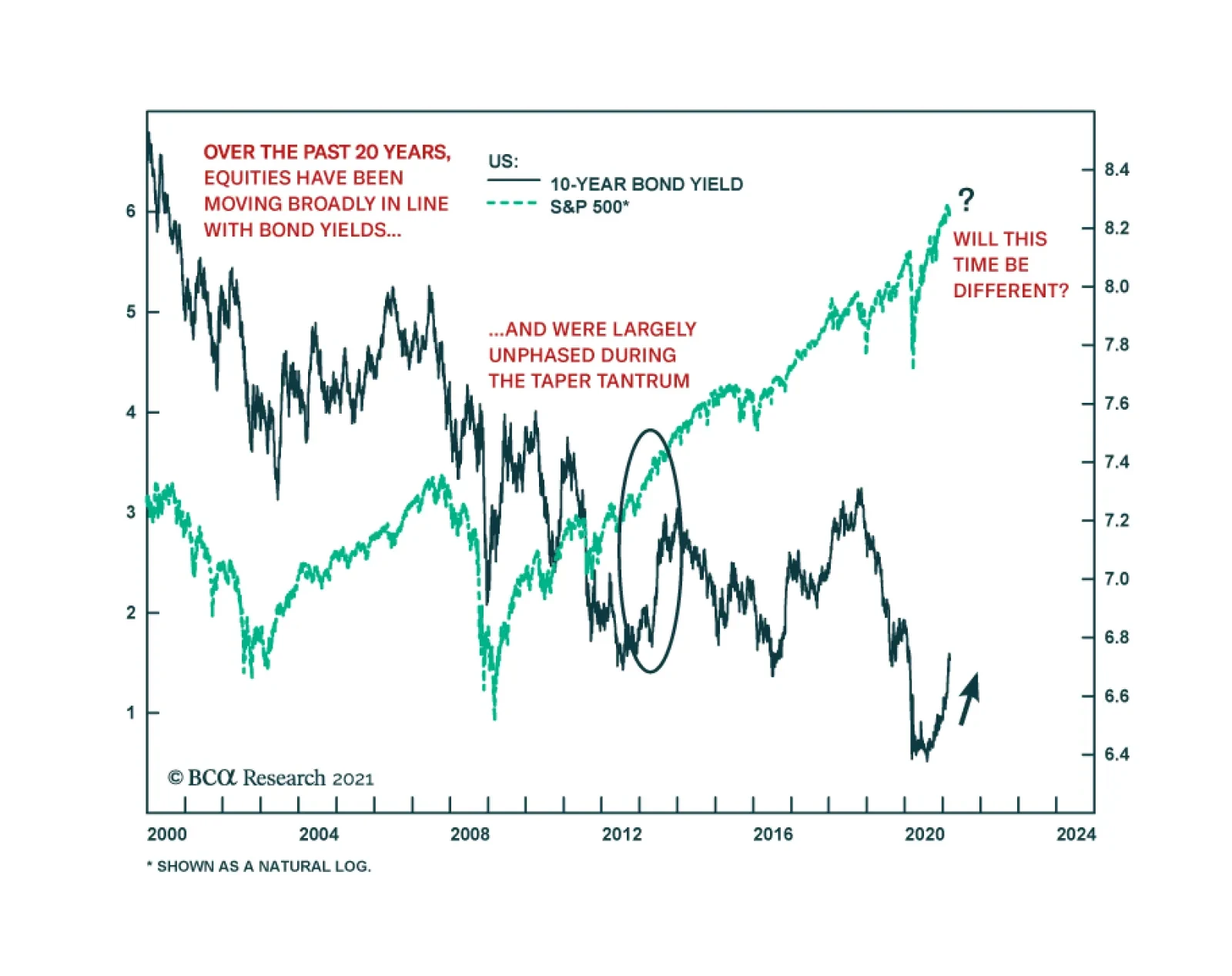
Importantly, delving deeper in the relationship between bonds and stocks and putting it in historical context is instructive. Our sister Emerging Markets Strategy service recently posited that in the coming years the current negative correlation between stock and bond prices will revert to positive as it prevailed prior to the Asian Crisis (Chart 3). The post-1997 era is largely characterized as disinflationary, while the period from the 1960s to the mid-1990s as primarily inflationary. As a reminder core PCE price inflation was last above the Fed’s 2.5% target in the early 1990s (please see grey zone, top panel, Chart 3). Chart 3From Inflation To Disinflation And Back To Inflation?
From Inflation To Disinflation And Back To Inflation?
From Inflation To Disinflation And Back To Inflation?
Importantly, what will cement the correlation between stock prices and bond prices becoming definitively positive anew will be a shift upward of core PCE price inflation. Chart 4 shows that core PCE inflation leads the stock-to-bond correlation by 45 months and can serve as a confirming signpost that bonds will no longer offer downward protection to stocks and likely render risk parity useless. Chart 4Joined At The Hip, Albeit With A Lag
Joined At The Hip, Albeit With A Lag
Joined At The Hip, Albeit With A Lag
If this paradigm shift is indeed taking root, this raises two questions: First, how will the broad equity market perform during a more persistent bond market selloff phase? Second, what equity sectors will likely outperform under such a scenario and which ones should equity investors avoid/underweight in their portfolios? Our analysis centered on historically significant bond market selloffs, which we clearly depict in the shaded areas in Chart 5. Chart 5Don’t Fear The Bond Bear
Don’t Fear The Bond Bear
Don’t Fear The Bond Bear
Table 2 shows the results of our analysis broken down in two separate eras. Between the 1960s and the early-1990s, “the inflation era”, we use monthly data, whereas from the early-1990s onward, “the disinflation era”, we use high quality daily data. In the seven inflationary iterations the SPX median fall was 3%,1 whereas in the nine disinflationary episodes the SPX median rise was 18%.2 Impressively, since the LTCM debacle every single bond market selloff has been cheered by the stock market (Table 2). Table 2SPX Returns During Bond Bear Markets
More Reflective Than Restrictive
More Reflective Than Restrictive
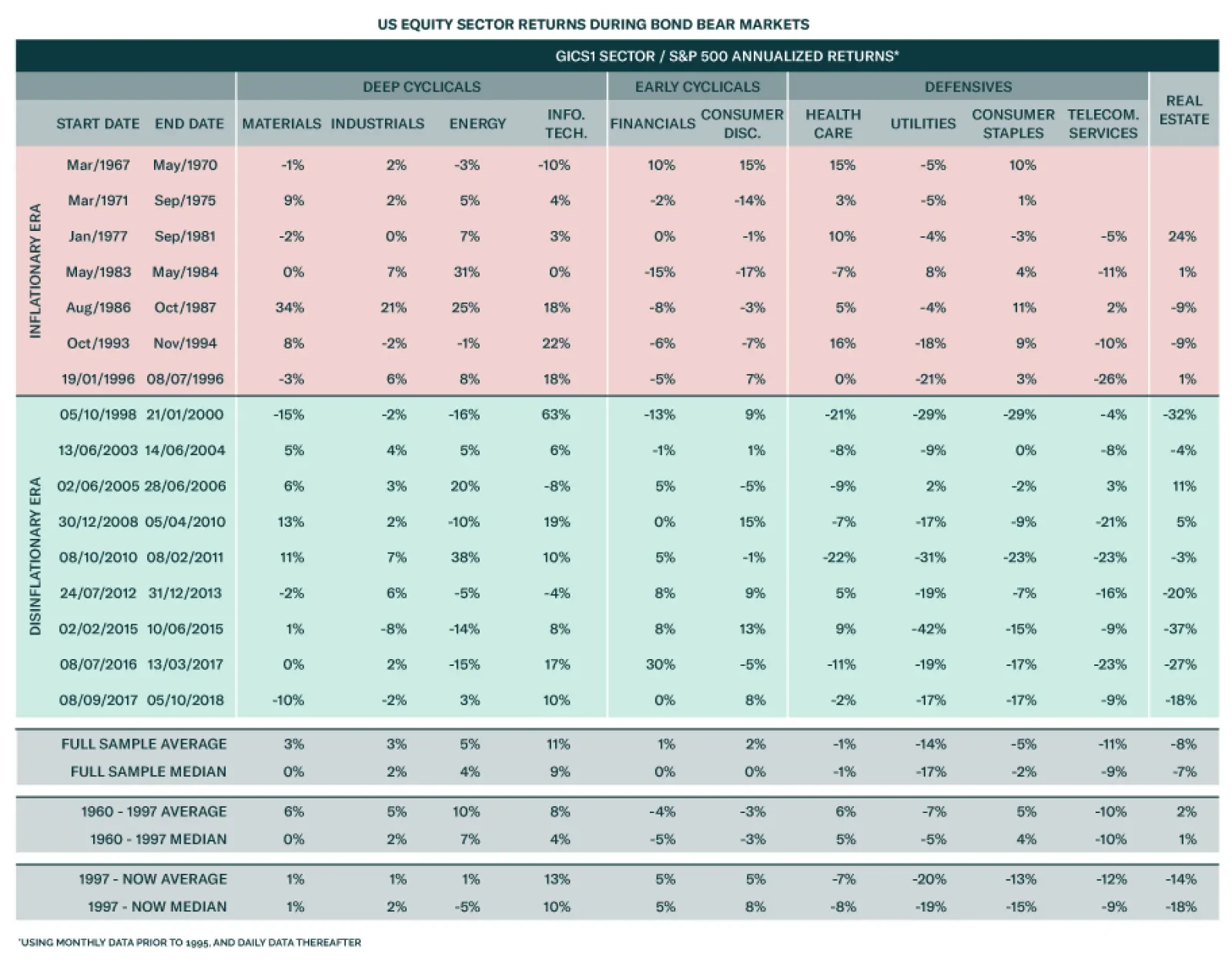
Table 3 delves deeper into GICS1 sectors and compares relative returns to the SPX during sizable bond market selloffs. Table 3US Equity Sector Returns During Bond Bear Markets
More Reflective Than Restrictive
More Reflective Than Restrictive
During “the inflationary era” deep cyclicals outperformed the broad market, whereas early cyclicals trailed the SPX. The defensives’ performance is split down the middle with telecom and utilities faring poorly, while health care and staples outshining the SPX. One surprising result is that during “the inflationary era” relative tech performance was very resilient compared with what one would expect. There is an accentuation of relative returns in “the disinflationary era”, with all the defensives significantly underperforming and the deep cyclicals broadly outshining the SPX. Early cyclicals make a U-turn and are clear outperformers. One surprising result is the energy sector’s negative median return. Finally, the real estate sector’s significant underperformance really stands out in “the disinflationary era”. Netting it all out, the broad equity market has historically risen consistently in tandem with a bond market sell off primarily in “the disinflationary era”. Impressively, the SPX has been resilient on average even in “the inflationary era”; granted there have also been some notable drawdowns (Table 2). The implication is that at the current juncture the SPX may have some trouble digesting the bond market’s rapid selloff, but will recover smartly especially as the bond market selloff eventually proves more reflective of growth rather than restrictive. (For inclusion purposes, the appendix on page 16 shows the GICS1 sector performance since the 1960s with shaded areas depicting periods of significant bond market selloffs, and similar to Chart 3 the appendix on page 19 plots the relative share price monthly returns correlation to bond price monthly returns.) This week, we update our high-conviction overweight view on an early-cyclical sub-group with a reopening tailwind, and lift a deep cyclical transportation index to an above benchmark allocation. Hop Back On The Rails The Dow Theory is in full force and serves as a confirmation of the breakout in the Dow Industrials recently, as transports have been firing on all cylinders of late, and is also a harbinger of new all-time relative share price highs in railroads (Chart 6). Today we recommend investors get back on board the rails, a key transportation sub group, and lift exposure from neutral to overweight. Chart 6Dow Theory Green Light
Dow Theory Green Light
Dow Theory Green Light
Leading indicators in all three key rail freight categories suggests that the railroad rebound is still in the early innings. The V-shaped recovery in the ISM manufacturing and services surveys is underpinning total rail shipments and signals that our rail diffusion indicator has more upside (Chart 7). Chart 7All Aboard…
All Aboard…
All Aboard…
The Cass Freight Index shipments and expenditures components are also on a tear and corroborate that demand for rail freight services is robust. The upshot is that still beaten down sell-side analysts’ relative revenue growth estimates will likely surprise to the upside (Chart 8). Importantly, our Railroad Indicator does an excellent job in capturing this firming rail demand backdrop and signals that relative share price momentum has more room to rise (second panel, Chart 9). Chart 8...The Rails
...The Rails
...The Rails
Chart 9Intermodal Is On Fire
Intermodal Is On Fire
Intermodal Is On Fire
On the intermodal front, the back half of the year economic reopening due to the population’s inoculation along with President Biden's freshly signed fiscal spending bill suggest that retail related hauling services will pick up steam. The overall business sales-to-inventories (S/I) ratio in general and the retail S/I ratio in particular corroborate the upbeat demand outlook for intermodal carloads (third panel, Chart 9). Similarly, the LA port is as busy as ever as containerships are arriving non-stop full of cargo from China (bottom panel, Chart 9). On the commodity front, coal shipments are staging a comeback from extremely depressed levels and there is scope for a jump to expansionary territory especially given the soaring natural gas prices (second & middle panels, Chart 10). With regard to the broad commodity complex (excluding the historically large coal carload category) the demand profile for rail services is as upbeat as ever. Not only are commodity prices galloping higher, but also BCA’s Global Leading Economic Indicator is steeply accelerating painting a bright picture for rail hauling (fourth & bottom panels, Chart 10). Moreover, the surging global PMI signals that the global economic recovery is also on the ascent, which bodes well for relative profit growth (middle panel, Chart 11). Chart 10Commodity Carloads Set To Surge
Commodity Carloads Set To Surge
Commodity Carloads Set To Surge
Chart 11Global Recovery Is A Tailwind
Global Recovery Is A Tailwind
Global Recovery Is A Tailwind
Importantly, on the operating front our railroad industry profit margin proxy is at an historically wide level and underscores that the path of least resistance is higher for margins (Chart 11). Thus, rail profits are highly levered to industry pricing power that is on the cusp of spiking higher, especially if our thesis of the firming rail demand backdrop is accurate. The implication is that a rerating phase is in the cards for the S&P railroads index (middle panel, Chart 12). Finally, our EPS macro model has slingshot higher and suggests that rail earnings have a long runway ahead (bottom panel, Chart 12). Netting it all out, firming leading rail freight indicators signal that intermodal, coal and commodity (ex-coal) carloads are in high demand. Tack on the global economic reopening and rising commodity prices, and factors are falling into place for a durable outperformance phase in rails. Bottom Line: Boost the S&P rails index to overweight, today. The ticker symbols for the stocks in this index are: BLBG: S5RAIL – CSX, KSU, NSC, UNP. Chart 12Pricing Power Holds The Key
Pricing Power Holds The Key
Pricing Power Holds The Key
Stay Checked In To Hotels In late-November we boosted the S&P hotels, resorts & cruises index to overweight and got some eyebrows raised from our diverse client base. Subsequently, we added this niche consumer discretionary sub-group to our high-conviction overweight list for 2021 and the client pushback intensified. Today, we reiterate our high-conviction call on the S&P hotels, resorts & cruises index that has already added alpha to our portfolio to the tune of 17% since inception. While relative share price momentum has climbed of late and relative valuations have troughed, our sense is that the re-rating phase is just getting under way (Chart 13). As the global push for COVID-19 vaccinations heats up, the semblance of normality will serve as a catalyst to unlock excellent value in hotels. True, lodging services demand is as downbeat as ever, but this index is a prime beneficiary of the reopening trade. Pent-up services demand will get unleashed with consumers likely indulging on more lavish vacationing starting this Memorial Day. Rising government transfers, a soaring savings rate and increasing incomes all augur well for lodging demand and is also corroborated by our hotels demand indicator (Chart 14). Tack on firming consumer sentiment and the ISM services index staying squarely above the 50 expansion line, and the industry’s demand outlook lifts further. Chart 13A Valuation Re-rating Phase Looms
A Valuation Re-rating Phase Looms
A Valuation Re-rating Phase Looms
Chart 14Leading Demand Indicators Give The All-clear
Leading Demand Indicators Give The All-clear
Leading Demand Indicators Give The All-clear
Given that hotel capacity has been restrained, there are high odds that upbeat demand will likely catch hoteliers unprepared to fulfil it, and thus causing a jump in selling prices (Chart 15). Business travel is also slated to return as a flexible work place environment becomes the norm and the need to meet clients and prospects in order to conduct business will come back with a vengeance. The implication is that beaten down industry profit margins will recover smartly and boost lodging profitability especially given the collapse in the industry’s wage bill (Chart 15). Finally, our S&P hotels, resorts & cruises macro sales model encapsulates all these moving parts and signals that the budding recovery in revenue growth will gain momentum in the back half of the year (Chart 16). Chart 15Widening Margins Will Restore Profitability
Widening Margins Will Restore Profitability
Widening Margins Will Restore Profitability
Chart 16Macro-based Revenue Growth Model Points To A V-shaped Recovery
Macro-based Revenue Growth Model Points To A V-shaped Recovery
Macro-based Revenue Growth Model Points To A V-shaped Recovery
Adding it all up, recovering lodging demand coupled with restrained industry capacity should restore hoteliers’ pricing power and boost profitability. Bottom Line: We reiterate the high-conviction overweight status in the S&P hotels, resorts and cruises index. The ticker symbols for the stocks in this index are: BLBG: S5HOTL – MAR, HLT, CCL, RCL, NCLH. Anastasios Avgeriou US Equity Strategist anastasios@bcaresearch.com Appendix Chart A1
More Reflective Than Restrictive
More Reflective Than Restrictive
Chart A2
More Reflective Than Restrictive
More Reflective Than Restrictive
Chart A3
More Reflective Than Restrictive
More Reflective Than Restrictive
Chart A4
More Reflective Than Restrictive
More Reflective Than Restrictive
Chart A5
More Reflective Than Restrictive
More Reflective Than Restrictive
Chart A6
More Reflective Than Restrictive
More Reflective Than Restrictive
Footnotes 1 Given the different time frames of the bond market selloffs we decided to show annualized equity returns. 2 Ibid. Current Recommendations Current Trades Strategic (10-Year) Trade Recommendations
Overdose?
Overdose?
Size And Style Views February 24, 2021 Stay neutral cyclicals over defensives January 12, 2021 Stay neutral small over large caps June 11, 2018 Long the BCA Millennial basket The ticker symbols are: (AAPL, AMZN, UBER, HD, LEN, MSFT, NFLX, SPOT, ABNB, V). January 22, 2018 Favor value over growth
Highlights We find that the factors that are most important in making allocation decisions will depend on whether diversification takes place across countries or across sectors. In line with the academic literature, we find that there are larger potential diversification benefits from diversifying across sectors than across countries. However, investors who choose to diversify across countries should not focus on sector composition since country effects are a larger driver of return for countries. Likewise, most sector performance is explained by sector effects and not country composition. Thus, investors who diversify across sectors should mainly base their decisions on sector dynamics. Sector composition is relatively more important in countries like Canada or Australia whose composition is substantially different from the global portfolio. Meanwhile, country composition is relatively more important in sectors like I.T. or Materials whose composition is substantially different from the global portfolio. Most of the country effects cannot be explained by currency movements. This means that country-specific factors will drive country performance even for investors who hedge their currency exposure. Feature Suppose you are building your global equity portfolio from scratch. You must decide how much to allocate to the US, the euro area, Japan, China, etc. Which factors do you prioritize to make your decision? Should you focus on the economic outlook for each country? Or should you instead focus on making sector calls, and base your country selection on sector composition? How much does currency exposure affect returns? What if you are not diversifying across countries but instead across sectors? In this report we attempt to answer these questions by quantitatively deconstructing the different drivers of global equity performance. Specifically, we calculate the “pure” country and “pure” sector effects in a global portfolio – i.e., the variation of returns purely attributable to countries and the variation of returns purely attributable to sectors. We then use the insight of our analysis to investigate the following three questions: How does sector composition contribute to country relative performance? How does country composition contribute to sector relative performance? How much of the country effect is currency exposure? The report is structured as follows: We start with our Methodology section which explains the data used, our estimation method, as well as an explanation on how to interpret our estimates and a discussion on the limitations of our analysis. In the next section we show our Estimation Results of country and sector effects in the global portfolio. We then use these results to answer the Three Questions on Global Equity Allocation we mentioned above. We summarize our conclusions in our Investment Implications section. Finally, please see the Appendix for supplementary material. In addition, we will be releasing another report over the next few weeks taking this same approach but looking at an Emerging Markets portfolio instead of a global portfolio. Methodology Data We begin by obtaining total return indices from MSCI for 10 sectors in 10 different geographical areas. Our indices are USD- denominated and are evaluated from the perspective of a USD-based investor. We define our sample period from August 2000 to January 2021. We then exclude the indices which do not have enough history or where trading has halted. This leaves us with 94 different sector indices that we use for our estimation. Table 1 shows which sectors we can use for each geographical area. We also exclude the real estate sector from our calculations as it does not have enough back data. Table 1Sample Of Indices For Country And Sector Effect Estimation
What Drives Performance? The Effect Of Countries And Sectors In A Global Equity Portfolio
What Drives Performance? The Effect Of Countries And Sectors In A Global Equity Portfolio
Estimation To estimate sector and country effects, we follow the Weighted Least Squares (WLS) regression approach of Phyltaktis & Xia & Heston & Rouwenhorts.1 The return of a sector index in a country can be decomposed into four components: A common return for equities (α), a country effect (β), a sector effect (γ), and an error term (ε) . For example, the return of Canada’s information technology (I.T.) sector can be decomposed into a common return for equities, a country effect for Canada, a sector effect for I.T., and an error term:
What Drives Performance? The Effect Of Countries And Sectors In A Global Equity Portfolio
What Drives Performance? The Effect Of Countries And Sectors In A Global Equity Portfolio
We can generalize this model by defining a dummy Ci that equals to 1 if the index belongs to Country i, and 0 otherwise, and a dummy Sjthat equals to 1 if the index belongs to sector j and 0 otherwise:
What Drives Performance? The Effect Of Countries And Sectors In A Global Equity Portfolio
What Drives Performance? The Effect Of Countries And Sectors In A Global Equity Portfolio
We use the above framework to estimate the individual effects. We calculate the different country (β) and sector (γ) effects using a Weighted Least Squares regression – using the market cap weight of each index in the global portfolio as a weight when minimizing the errors. Each time we perform the regression, we obtain the country and sector effects for a single month. Thus, we repeat our WLS regression for every month where we have data, to obtain time series of country and sector effects. Constraints Because every index belongs to exactly one sector and one country, we have a perfect multicollinearity problem. To solve this issue, we set the following restrictions:
What Drives Performance? The Effect Of Countries And Sectors In A Global Equity Portfolio
What Drives Performance? The Effect Of Countries And Sectors In A Global Equity Portfolio
Where wi represents the weight of country i at time t - 1 in the global stock market and vj represents the weight of sector j at time t - 1 in the global stock market. In essence, this adjustment means that on a market-cap weighted basis, all country effects net out to zero in the global portfolio (and the same for all sector effects). Interpretation Chart 1Interpretation And Limitations Of Our Analysis
Interpretation And Limitations Of Our Analysis
Interpretation And Limitations Of Our Analysis
How should one interpret the different coefficients? By construction, the common return to equities (α) ends up being equal to the return of the benchmark – i.e., the market-weighted global portfolio (Chart 1, panel 1). The pure country effects (β) can be interpreted as the return from a country relative to the benchmark once we have neutralized the effect of sector composition. The pure sector effects (γ) can be interpreted as the return from a sector relative to the benchmark once we have neutralized the effect of country composition. Limitations Our approach has the following limitations: It assumes that all indices have an equal exposure to the common return of equities. It assumes homogenous sectors across countries. We know this is not the case: The industry composition of sectors is different across countries. For example, the tech sector in the US has a much higher weighting to the Hardware & Equipment industry than the tech sector in the euro area, which has a relatively higher weighting in the Semiconductor industry (Chart 1, panels 2 and 3). It rules out the existence of interaction effects between variables. While it is a well established fact that style exposure (i.e., momentum, value, etc) is a significant contributor to returns of equities,2 our analysis ignores these factors. Estimation Results Sector Effects We can breakup our sample into two periods: The first period starts from the beginning of our sample in 2000, to the end of the Global Financial Crisis in March 2009. Over this cycle, Materials, Energy and Consumer Staples had the best cumulative pure sector effect (Chart 2A). Meanwhile, I.T., Communication Services, and Financials had the worst effect. The second period starts in March 2009 and ends in the present. During this period, I.T. and Consumer Discretionary had the best cumulative pure sector effect, with Industrials a distant third (Chart 2B). On the other hand, the biggest losers were Communication Services,3 Utilities, and Energy. Chart 2APure Sector Effects (Sept 2009 – Mar 2009)
Pure Sector Effects (Sept 2009 to Mar 2009)
Pure Sector Effects (Sept 2009 to Mar 2009)
Chart 2BPure Sector Effects (Mar 2009 – Jan 2021)
Pure Sector Effects (Mar 2009 to Jan 2021)
Pure Sector Effects (Mar 2009 to Jan 2021)
Country Effects Once again we divide our sample intotwo periods. In the pre-GFC period the countries with the best pure country effect were China, Australia, and EM ex-China (Chart 3A). Meanwhile the UK, the US, and Japan had the worst effects. Post-GFC, the US, Sweden, and Australia had the most positive country effects, while the euro area, Emerging Markets ex-China, and Japan had the most negative ones (Chart 3B). Chart 3APure Country Effects (Sept 2000 – Mar 2009)
Pure Country Effects (Sept 2000 - Mar 2009)
Pure Country Effects (Sept 2000 - Mar 2009)
Chart 3BPure Country Effects (Mar 2009 – Jan 2021)
Pure Country Effects (Mar 2009 to Jan 2021)
Pure Country Effects (Mar 2009 to Jan 2021)
Sector Vs. Country Effects Chart 4Country Versus Sector Effects
Country Versus Sector Effects
Country Versus Sector Effects
Which effect accounts for a greater amount of variation? To answer this question, we look at the market-weighted volatility of sector effects and country effects in the global portfolio. Chart 4 shows our results. In line with the academic literature,4 we find that sector-specific variation was generally higher than country-level variation in the global portfolio over the past two decades. Why is this the case? Previous work on sector and country effects has suggested that greater financial market integration across countries has reduced the country-level variability relative to sector-level variability. Indeed, studies using data that extends prior to 2000 have found that country effects variability used to dominate up to the beginning of the 1990s.5 This implies that equity allocators obtain greater diversification benefits from diversifying across sectors versus diversifying across countries. Three Questions On Global Equity Allocation 1. How does sector composition contribute to country performance? Does the fact that sector effects are larger than country effects mean that one should pay more attention to sectors than to countries? Not quite. The magnitude of country or sector effects only tells you the magnitude of variation across each aspect – and hence the potential for diversification benefits. It does not tell you what drives performance once you have chosen a particular method of diversification. So which aspect should you care about the most if you are diversifying across countries? We can use our estimates of sector and country effects to assess how much of the performance of a country can be attributed to its pure country effect and how much can be attributed to its sector composition. To perform this attribution analysis, we rearrange our original formula. As an example, suppose we are trying to decompose the return of Canadian equities over the global benchmark. We use the following approach:
What Drives Performance? The Effect Of Countries And Sectors In A Global Equity Portfolio
What Drives Performance? The Effect Of Countries And Sectors In A Global Equity Portfolio
In other words, the return of Canadian equities over the benchmark is a function of three things: Pure Country Effect: The premium/discount from holding Canadian equities. Sector Composition Effect: The effect of the unique sector composition of the Canadian equity market. If the sector composition is identical to the global benchmark, then the effect of sector composition is equal to zero. Residual Effect: The performance that is not explained by either the country effect or the sector composition. This could be either estimation error, the effect of the missing the Real Estate sector, idiosyncratic company factors, or industry composition differences between the sectors of the country and those in the global benchmark. Table 2 decomposes the performance of various countries relative to the global benchmark into these three elements over different time frames (Sep 2000 - Mar 2009, Apr 2009 - Mar 2020, and Apr 2020 - Jan 2021). From these tables we can make the following observations: Table 2Decomposition Of Country Relative Returns
What Drives Performance? The Effect Of Countries And Sectors In A Global Equity Portfolio
What Drives Performance? The Effect Of Countries And Sectors In A Global Equity Portfolio
Chart 5Pure Country And Sector Composition Effects In Country Relative Returns
Pure Country And Sector Composition Effects In Country Relative Returns
Pure Country And Sector Composition Effects In Country Relative Returns
The US outperformance during the 2010s was mostly a US-specific story and not a tech-overweight story. The benefits of sector composition only contributed 0.5% per month (annualized) versus 2.4% from the pure US effect. We can confirm this insight by looking at the performance of the individual US sectors against the performance of global sectors. Apart from Energy, every single US sector outperformed its global counterpart over this period (Chart 5, top panel). Japan had the most favorable sector composition during the 2010s, thanks to its large underweight in Energy and overweight in Consumer Discretionary and Industrials (Chart 5, middle panel). However, this was not enough to prevent Japanese equities from underperforming the global benchmark, as the Japanese pure country effect subtracted almost 5% of returns per month on an annualized basis. For some countries like Canada and Australia, the effect of sectors composition was relatively more significant. Generally, these countries had a sector composition that was very different from the global benchmark (Chart 5, bottom panel).6 2. How does country composition contribute to sector performance? What about if you choose to diversify across sectors? Much like country indices are influenced by their sector composition, sector indices are also influenced by their country composition. But how much does country composition affect performance? We can use a similar framework to the one applied in our previous question. Suppose we are trying to decompose the return of global Energy equities over the global benchmark. We use the following approach:
What Drives Performance? The Effect Of Countries And Sectors In A Global Equity Portfolio
What Drives Performance? The Effect Of Countries And Sectors In A Global Equity Portfolio
In other words, the return of global Energy equities over the benchmark is a function of three things: Pure Sector Effect: The premium/discount from holding equities in the Energy sector. Country Composition Effect: The effect of the unique country composition of the Energy sector. If the country composition is identical to the global benchmark, then the effect of country composition is equal to zero. Residual Effect: The performance that is not explained by either the country effect or the sector composition. This could be either estimation error, the effect of missing countries, or idiosyncratic company factors. Table 3 decomposes the performance of various sectors relative to the benchmark. From these tables we can make the following observations: Table 3Decomposition Of Sector Relative Returns
What Drives Performance? The Effect Of Countries And Sectors In A Global Equity Portfolio
What Drives Performance? The Effect Of Countries And Sectors In A Global Equity Portfolio
Chart 6Pure Sector And Country Composition Effects In Sector Relative Returns
Pure Sector And Country Composition Effects In Sector Relative Returns
Pure Sector And Country Composition Effects In Sector Relative Returns
The outperformance of the Health Care sector during the 2010s was mostly a US story. The large overweight to the US gave this sector the most favorable composition during the 2010s. We can confirm this by looking at the performance of global ex-US Health Care stocks, which underperformed by 20% since the end of the Great Financial Crisis (Chart 6, top panel). However, country composition was generally small in its overall effect to sector performance. Much as it was the case for countries, sectors like Health Care or Materials whose country composition was very different from the global portfolio tended to be more influenced by country composition (Chart 6, bottom panel).7 3. How much of the country effect is currency exposure? One explanation as to what might drive country effects is simply foreign-currency variation. For example, in a USD-based portfolio, all UK equities will be influenced by movements of GBP/USD. But exactly how much does currency exposure influence country-specific variation? Determining this is critical for equity allocators since currency exposure can be hedged through currency futures. We attempt to answer this question using a regression approach.8 Since currencies are expressed in relative terms, we look at the pure country effect of each region relative to the US: i.e., the outperformance/underperformance of countries relative to the US that is purely a function of country effects. After, we then regress these relative country effects versus the corresponding currency (for example we regress the relative country effect of the UK to the US with GBP/USD). From the regression we can obtain the coefficient of variation, which is the percentage of country effect variance explained by the currency. Chart 7 shows the results for each country. From this chart we can make the following observations: Currency effects were generally stronger in more cyclical markets. Meanwhile, currency effects explained almost none of the country-specific returns of Japanese or Chinese equities.9 In line with the academic literature, we find that most of the country-specific variation is not attributable to currency movements. This means that country-specific effect will still be a major driver of returns even for investors who hedge their currency exposure. If currencies can’t explain the bulk of country-specific variation, then what does? While the answer to this question is outside of the scope of this report, our hypothesis is that the answer lies in a combination of macroeconomic, political, and sentiment factors that are particular to each country. Thus, there is great value in country-specific analysis when allocating across the equity markets of different countries. Chart 7Currency Exposure Explains At Most A Third Of The Country Effect
What Drives Performance? The Effect Of Countries And Sectors In A Global Equity Portfolio
What Drives Performance? The Effect Of Countries And Sectors In A Global Equity Portfolio
Investment Implications In line with the academic literature, in this report we found that sector effects tend to be larger than country effects in the global portfolio. This means that there are larger diversification benefits from diversifying across sectors than across countries. However, for various reasons such as benchmarking constraints or index availability, we recognize that it is not always possible to choose how to diversify your equity portfolio. In this case, it is important to determine what drives performance when each method of diversification is used. We find that the main driver of outperformance or underperformance will depend on the choice of diversification. Country performance is mostly driven by country specific factors. Thus, making country allocation decisions based mainly on sector preferences will lead to the wrong conclusions. Instead, investors who diversify across countries should focus first and foremost on country-level analysis. Likewise, sector outperformance is mostly driven by sector-specific factors, which means that investors diversifying across sectors should focus mostly on sector-level analysis. This does not mean that composition is completely irrelevant. In countries like Canada, Switzerland, and Australia, whose sector weights are considerably different from the global benchmark, sector composition can have a substantial effect on relative performance. On the other hand, sectors like I.T. and Materials will also be influenced by their country weightings. Finally, we found that currency exposure can at most explain about one third of country-specific variation. This means that for investors who diversify across countries, country-specific factors will still be the biggest drivers of returns even if they hedge their currency. Appendix Appendix Chart 1 (I)Pure Country And Sector Composition Effects For Country Indices
What Drives Performance? The Effect Of Countries And Sectors In A Global Equity Portfolio
What Drives Performance? The Effect Of Countries And Sectors In A Global Equity Portfolio
Appendix Chart 1 (II)Pure Country And Sector Composition Effects For Country Indices
What Drives Performance? The Effect Of Countries And Sectors In A Global Equity Portfolio
What Drives Performance? The Effect Of Countries And Sectors In A Global Equity Portfolio
Appendix Chart 2 (I)Pure Sector And Country Composition Effects For Global Sector Indices
What Drives Performance? The Effect Of Countries And Sectors In A Global Equity Portfolio
What Drives Performance? The Effect Of Countries And Sectors In A Global Equity Portfolio
Appendix Chart 2 (II)Pure Sector And Country Composition Effects For Global Sector Indices
What Drives Performance? The Effect Of Countries And Sectors In A Global Equity Portfolio
What Drives Performance? The Effect Of Countries And Sectors In A Global Equity Portfolio
Juan Correa Ossa, CFA Associate Editor juanc@bcaresearch.com Footnotes 1 For more details please see Kate Phylaktis & Lichuan Xia, “The Changing Role of Industry and Country Effects in the Global Equity Market,” The European Journal of Finance, 2-8, 627-648, 2006, and Steven L. Heston and K. Geert Rouwenhorst, “Does Industrial Structure Explain the Benefits of International Diversification?,” Journal of Financial Economics, 36-, 3-27, 1994. 2 Please see Geert Bekaert, Robert J Hodrick, and Xioyan Zhang, “International Stock Return Comovements,” The Journal of Finance, 64-6, 259-2626, 2009. 3 Be advised that the Communication Services sector substantially changed its industry composition in late 2018. This is not necessarily a problem since our regression is cross-sectional and not across time. However, it is notable that the pure sector effect of the Communication Services sector started to trend up following the change. 4 Please see “Country and Industrial Effects In Global Equity Returns,” Norges Bank Discission Note, 2019. 5 Please see “Country and Industrial Effects In Global Equity Returns,” Norges Bank Discission Note, 2019. 6 Please see the Appendix for more details on how sector composition influenced relative country performance. 7 Please see the Appendix for more details on how country composition influenced relative sector performance. 8 This approach is based on the methodology of Heston and Rouwenhorts. For details, please see Steven L. Heston and K. Geert Rouwenhorst, “Does Industrial Structure Explain the Benefits of International Diversification?,” Journal of Financial Economics, 36-1, 3-27, 1994. 9 Up until 2017, all stocks in the MSCI China investable index used to be HKD-denominated or USD-denominated. Since HKD volatility is very low it makes sense that currency effects are relatively low over our whole sample. However, Since 2017, MSCI has began to include A-shares (CNY denominated), which means that our analysis might not be representative of the current state of the index.
Global bond yields were up (again) on Friday, weighing down on growth stocks (again). Once more, the proximate cause of the bond selloff was good news. This time it was President Biden’s optimistic vaccine outlook. Much ink has been spilled on the impact…