Equities
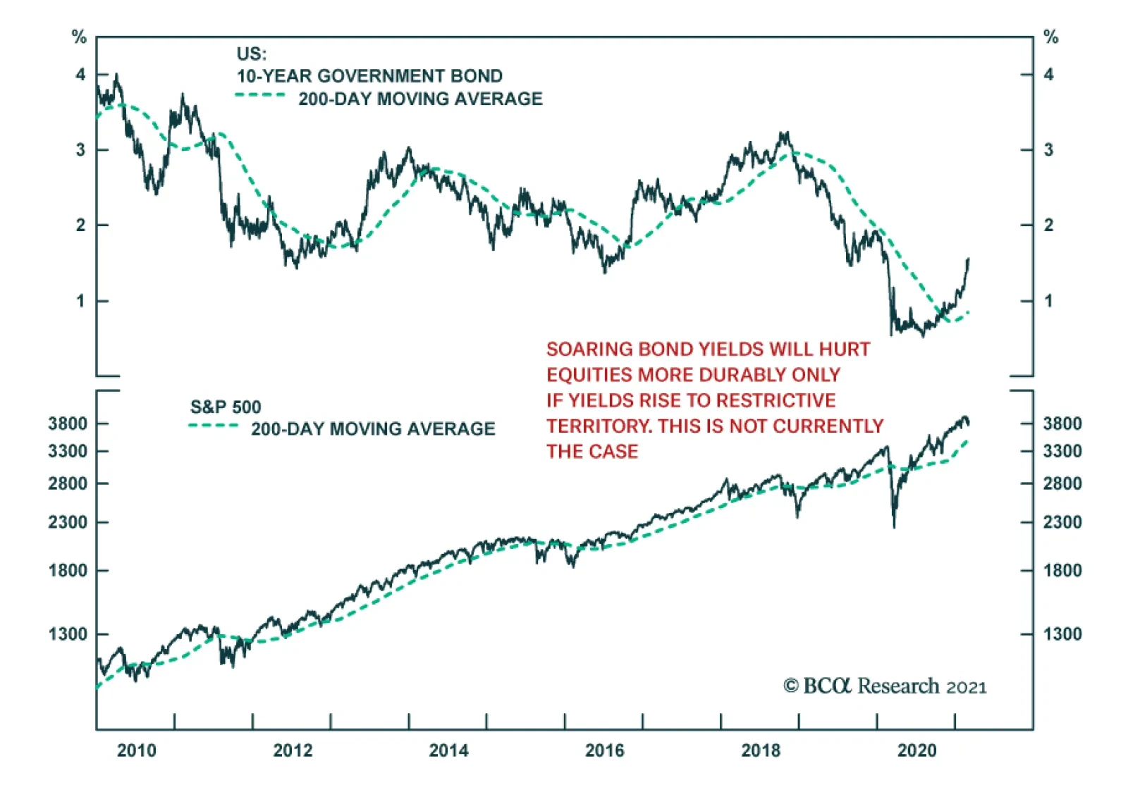
The US 10-year Treasury yield had climbed 16 basis points so far this month, alarming equity investors. March’s selloff to date follows a 35 basis point rise in February – the deepest monthly bond rout since November 2016. Although investors are…
BCA Research’s Global Investment Strategy service concludes that the end of the pandemic will herald a period of value-oriented outperformance. There are some notable similarities between 2000 and the present. One potential parallel with 2000 that is worth…

Highlights The recent backup in bond yields could cause stocks to fall further in the near term. However, history suggests that as long as yields remain low in absolute terms, as they are now, equities will recover. Market angst that the Fed is about to turn more hawkish is unwarranted. Central banks around the world have both the tools and the inclination to keep bond yields from rising excessively. Despite the jump in bond yields, the forward earnings yield is 540 basis points above the real bond yield in the US. Outside the US, the forward earnings yield is 615 basis points above the real bond yield. In 2000, the earnings yield was below the real bond yield. Just as value stocks began to outperform growth stocks in mid-2000, the end of the pandemic will herald a similar period of value-oriented outperformance. Commodity producers and banks will lead the way. Some Parallels Between Today And 2000… Stock prices have buckled in recent weeks, raising concerns that global bourses are at risk of a major crash, just like they were in early 2000. There are certainly some notable similarities between 2000 and the present: In both cases, the preceding rise in stock prices was fueled by the Federal Reserve’s desire to prevent an exogenous shock from causing a major recession (Chart 1). Last year, the shock was the pandemic. In 1998, it was the collapse of Long-Term Capital Management (LTCM). The Connecticut-based hedge fund imploded shortly after Russia defaulted on its debt, leading to a gut-wrenching 22% decline in the S&P 500. The brewing crisis prompted the Fed to cut rates by a total of 75 basis points. Spurred on by fears of Y2K, the Fed also injected vast amounts of liquidity into the financial system. Tech stocks led the market higher both in the late 1990s and last year. The NASDAQ Composite rose 68% between its intra-day low in October 1998 and March 2000. In 2020, the NASDAQ outperformed the S&P 500 by 24% and returned 44% overall. Chart 1The NASDAQ's 1999 Surge Followed The 1998 “Insurance Cuts” And Coincided With The Fed’s Balance-Sheet Expansion
The NASDAQ's 1999 Surge Followed The 1998 "Insurance Cuts" And Coincided With The Fed's Balance-Sheet Expansion
The NASDAQ's 1999 Surge Followed The 1998 "Insurance Cuts" And Coincided With The Fed's Balance-Sheet Expansion
Chart 2Low-Priced Stocks Have Been The Winners In The First Quarter
Shades Of 2000
Shades Of 2000
The speculative mania in the 1990s spread from large-cap tech stocks to small-cap companies. We saw the same pattern earlier this year, with prices and trading volumes exploding among smaller, low-priced stocks (Chart 2). As was the case in the late 1990s, retail investors – this time armed with “stimmy” checks and access to zero-commission trading accounts – plowed into the market. Chart 3Some Pockets Of Bullish Equity Sentiment
Shades Of 2000
Shades Of 2000
Chart 4Some Pockets Of Bullish Equity Sentiment
Shades Of 2000
Shades Of 2000
Bullish equity investor sentiment was rampant at the peak of the stock market in 2000. Although not quite to the same extent as back then, most measures of investor sentiment turned bullish prior to the recent selloff (Chart 3). Like most investors, analysts were wildly optimistic on stocks in the late 1990s (Chart 4). Long-term earnings growth projections are very optimistic today, a potentially ominous signal given that (unlike in the late 1990s), productivity growth is now more anemic. Rising stock prices in the late 1990s allowed corporate insiders to cash in their options, while enabling new companies to go public. Recently, we have seen a flurry of companies list their shares, in some cases through dubious SPAC vehicles (Chart 5). Valuations reached nosebleed levels in 2000. While the forward P/E ratio on the S&P 500 is somewhat below its 2000 peak, other valuation measures such as price-to-sales, Tobin’s Q, and enterprise value-to-EBITDA are above where they were in 2000 (Chart 6). Chart 5Renewed Interest In Listing Stocks
Shades Of 2000
Shades Of 2000
Chart 6Stretched Valuations, Then And Now
Shades Of 2000
Shades Of 2000
… But One Important Difference Despite the parallels between today and 2000, there is an important difference: The Federal Reserve. Having cut rates in 1998, the Fed reversed course in mid-1999, eventually taking the fed funds rate up to 6.5% in May 2000. The yield curve inverted in February of that year, shortly after the 10-year yield reached a high of 6.79%. Chart 7What Happens To Equities When Treasury Yields Rise?
Shades Of 2000
Shades Of 2000
Bond yields have risen briskly over the past six months. However, they remain very low in absolute terms. While rising yields can produce a temporary stock market correction, they need to move into restrictive territory in order to trigger a recession and an accompanying bear market in equities. Chart 7 highlights some research that Garry Evans and BCA’s Global Asset Allocation team recently produced. It shows eight episodes since 1990 of a sharp rise in the 10-year Treasury yield. On every occasion (except in 1993-94, when the Fed unexpectedly raised rates in February 1994), equities performed strongly while rates were rising (Table 1). Today, the forward earnings yield on the S&P 500 is 540 basis points above the real yield. In 2000, the real bond yield was higher than the earnings yield (Chart 8). The gap between earnings yields and real bond yields is even greater outside the US, where valuations are generally more attractive. By the same token, the S&P 500 dividend yield was well below the bond yield in 2000. Today, they are roughly the same. Even if one were to pessimistically assume that US companies are unable to raise nominal dividend payments at all for the next decade, the S&P 500 would need to fall by 21% in real terms for equities to underperform bonds. Many other stock markets would have to decline by more than that (Chart 9). Table 1As Long As Bond Yields Don't Rise Into Restrictive Territory, Stocks Will Recover
Shades Of 2000
Shades Of 2000
Chart 8Relative To Bonds, Stocks Are More Favorably Valued Now Than in 2000
Relative Valuations Favor Equities
Relative Valuations Favor Equities
Chart 9Stocks Would Need To Fall A Lot For Equities To Underperform Bonds
Stocks Would Need To Fall A Lot For Equities To Underperform Bonds
Stocks Would Need To Fall A Lot For Equities To Underperform Bonds
Central Banks Will Lean Against Rising Bond Yields Stocks sold off earlier today on the perception that Jay Powell had failed to push back forcefully against the recent increase in bond yields. We think this angst is unwarranted. As Powell noted, most of the rise in bond yields reflected economic optimism. If yields were to continue rising in the absence of further economic improvements, the Fed would dial up the rhetoric, stressing its ability to buy bonds in unlimited quantities in order to support the economy. Despite all the fiscal stimulus, the unemployment rate remains elevated – perhaps as high as 10% according to some Fed measures. The prime-age employment-to-population ratio is four percentage points below where it was before the pandemic (Chart 10). Moreover, many stimulus measures will expire towards the end of the year. With the prospect of a “fiscal cliff” in 2022, we expect the Fed to want to tread carefully in withdrawing monetary support. What would really rattle investors is if long-term inflation expectations were to rise above the Fed’s comfort zone. However, considering the 5-year/5-year forward inflation breakevens are still below where they were in 2012-13, this is not an imminent risk (Chart 11). Chart 10The Fed Will Remain Accommodative To Aid The Labor Market Recovery
The Fed Will Remain Accommodative To Aid The Labor Market Recovery
The Fed Will Remain Accommodative To Aid The Labor Market Recovery
Chart 11Inflation Expectations Have Recovered But Are Still Low
Shades Of 2000
Shades Of 2000
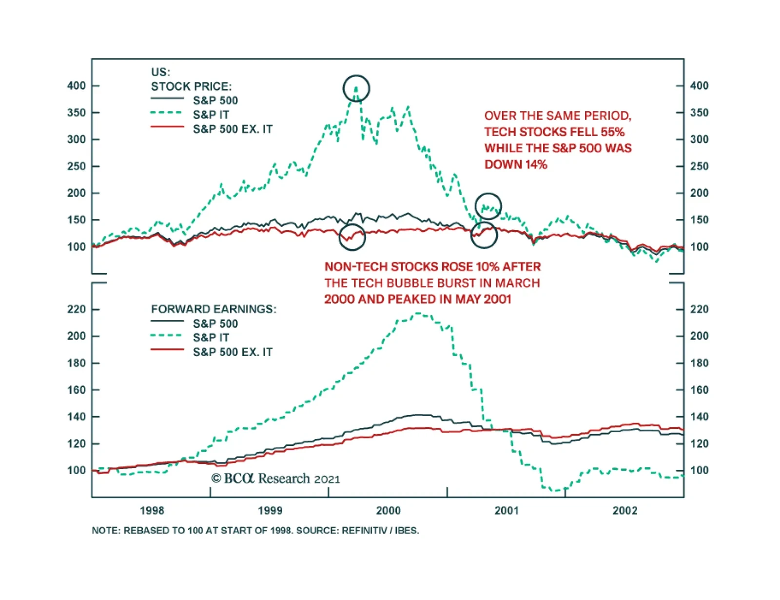
Like the Fed, the ECB wants to keep financial conditions highly accommodative. On Tuesday, ECB Executive Board member Fabio Panetta, echoing comments made by other senior ECB officials, said that higher yields were “unwelcome and must be resisted.” He noted that “We are already seeing undesirable contagion from rising US yields into the euro area yield curve,” adding that the ECB “should not hesitate” to increase the pace of bond purchases. The ECB’s threat is credible. Already, its purchases have deviated significantly from its capital key, revealing Frankfurt’s willingness to act where and when it is needed. In the same spirit, the Reserve Bank of Australia boosted its government bond purchases earlier this week after the 10-year yield backed up from 0.7% last October to over 1.9% late last week. The RBA also reaffirmed its intent to maintain the current 3-year Yield Curve Control target at 0.1%, stating that “The Board will not increase the cash rate until actual inflation is sustainably within the 2-to-3 percent target range. For this to occur, wages growth will have to be materially higher than it is currently. This will require significant gains in employment and a return to a tight labour market. The Board does not expect these conditions to be met until 2024 at the earliest.” The RBA’s determination to keep bond yields down is noteworthy given that the neutral rate of interest is higher in Australia than in most other developed economies.1 If the RBA does not intend to raise rates for the next three years, it may take even longer for other central banks to take away the punch bowl. Will Value Stocks Begin To Outperform As They Did Starting In Mid-2000? There is another potential parallel with 2000 that is worth mentioning. This was the year that the outperformance of growth stocks came to a halt and value stocks began to shine. In fact, outside of the tech sector, the S&P 500 did not peak until May 2001 (Chart 12). Value continued to outperform right through to 2007. Since February 12th of this year, the price of the highly liquid Vanguard Growth ETF (VUG, market cap of $143 billion) has fallen by 8.9% while the price of the Vanguard Value ETF (VTV, market cap of $97 billion) has risen 0.5%. Despite the nascent outperformance of value names, they still remain relatively cheap. According to a simple valuation measure that combines price-to-earnings, price-to-book, and dividend yields, value stocks are more than three standard deviations cheap relative to growth stocks – a bigger valuation gap than seen at the height of the dotcom bubble (Chart 13). Chart 12The Non-Tech Portion Of The Stock Market Peaked More Than A Year After The Tech Bubble Burst
The Non-Tech Portion Of The Stock Market Peaked More Than A Year After The Tech Bubble Burst
The Non-Tech Portion Of The Stock Market Peaked More Than A Year After The Tech Bubble Burst
Chart 13The Tech Bust Of 2000 Also Marked The Start Of A Multi-Year Outperformance By Value
The Tech Bust Of 2000 Also Marked The Start Of A Multi-Year Outperformance By Value
The Tech Bust Of 2000 Also Marked The Start Of A Multi-Year Outperformance By Value
The Outlook For Commodity Stocks And Bank Shares Commodity producers are overrepresented in value indices. Strong global growth against a backdrop of tight supply should heat up the commodity complex over the next 12-to-18 months. Chart 14 shows that capital investment in the oil and gas sector has fallen by more than 50% since 2014. BCA’s Commodity & Energy Strategy service, led by Robert Ryan, expects crude oil demand to outstrip supply over the remainder of this year (Chart 15). Chart 14Oil + Gas Capex Collapses In COVID-19’s Wake
Shades Of 2000
Shades Of 2000
Chart 15Crude Oil Demand To Outstrip Supply Over The Remainder Of This Year
Shades Of 2000
Shades Of 2000
A physical deficit in the metals markets – particularly for copper and aluminum – should also persist this year (Charts 16A & 16B). While the boom in electric vehicle (EV) production represents a long-term threat to oil, it is manna from heaven for many metals. A battery-powered EV can contain more than 180 pounds of copper compared with 50 pounds for conventional autos. By 2030, the demand from EVs alone should amount to close to 4mm tonnes of copper per year, a big slug of demand in a market that consumes about 26mm tonnes per year. Chart 16ACopper Will Be In Physical Deficit...
Copper Will Be In Physical Deficit...
Copper Will Be In Physical Deficit...
Chart 16B...As Will Aluminum
...As Will Aluminum
...As Will Aluminum
Ongoing strong demand for metals from China should also buoy metals prices. While trend GDP growth in China has slowed, the economy is much bigger than it was in the 2000s. China’s annual aggregate consumption of metals is five times as high as it was back then. The incremental increase in China’s metal consumption, as measured by the volume of commodities consumed, is also double what it was 20 years ago (Chart 17). As we discussed in our report To Deleverage Its Economy, China Needs MORE Debt, the Chinese government has no choice but to continue to recycle persistently elevated household savings into commodity-intensive capital investment. This will ensure ample commodity demand from China for years to come. Chart 17China Keeps Buying More And More Commodities
Chinese Consumption Of Most Metals Continues To Rise China Keeps Buying More And More Commodities
Chinese Consumption Of Most Metals Continues To Rise China Keeps Buying More And More Commodities
Chart 18Credit Growth Has Been Recovering
Credit Growth Has Been Recovering
Credit Growth Has Been Recovering
Along with commodity producers, financials helped propel value indices during the 2000s. While credit growth is unlikely to revert to its pre-GFC days, it has been trending higher in both the US and Europe (Chart 18). Analysts are starting to take note of improving bank earnings prospects. EPS estimates for banks are rising more quickly than for tech companies on both sides of the Atlantic (Chart 19). Not only is the “E” in the P/E ratio for banks likely to rise, the ratio itself will increase. Currently, US and European banks are trading at 14 and 10-times forward earnings, respectively, a huge discount to the broad market in general, and tech stocks in particular (Chart 20). Chart 19EPS Estimates For Banks Are Rising More Quickly Than For Tech Companies (I)
EPS Estimates For Banks Are Rising More Quickly Than For Tech Companies (I)
EPS Estimates For Banks Are Rising More Quickly Than For Tech Companies (I)
Chart 19EPS Estimates For Banks Are Rising More Quickly Than For Tech Companies (II)
EPS Estimates For Banks Are Rising More Quickly Than For Tech Companies (II)
EPS Estimates For Banks Are Rising More Quickly Than For Tech Companies (II)
Chart 20Banks Are Cheap
Banks Are Cheap
Banks Are Cheap
Bottom Line: Despite near-term uncertainty, investors should overweight stocks on a 12-month horizon, while pivoting away from last year’s winners (growth stocks) towards last year’s losers (value stocks). Peter Berezin Chief Global Strategist pberezin@bcaresearch.com Footnotes 1 According to RBA’s estimates, the neutral rate of interest in Australia is at the high end of developed market estimates. Specifically, Australia’s R-star is higher than the average of the US and euro area R-stars and is slightly lower than the average of the Canadian and UK neutral rates. Global Investment Strategy View Matrix
Shades Of 2000
Shades Of 2000
Special Trade Recommendations
Shades Of 2000
Shades Of 2000
Current MacroQuant Model Scores
Shades Of 2000
Shades Of 2000
Highlights We use a correlation-hedge approach to manage emerging market (EM) currency exposure for global investors with nine different home currencies. For USD-based investors, EM debt volatility is driven by the EM spot exchange rate vs. USD. Hedged EM debt has better absolute and risk-adjusted returns than US Treasurys. Investing in EM equities, on the other hand, makes sense only when the expected absolute return is positive on a sustained basis. During these episodes, hedging is not necessary. If USD-based investors choose to manage EM currency exposure directly, then a 12-month momentum-based dynamic hedging strategy could add value in terms of risk-adjusted returns for both EM stocks and bonds. USD-based investors could also diversify the source of funding by selling closely correlated DM currencies using an overlay of currency forwards. For non-USD-based investors, EM currency volatility is low and there is no need to fully hedge EM exposure. Domestic bonds have very low volatility, therefore these investors should avoid EM debt if their objective is to maximize risk-adjusted returns. To enhance returns, unhedged EM equities are a much better choice than EM debt. Currency overlay, in line with our long-held view on the total portfolio approach, should be managed at the total fund level. Feature How to manage EM currency exposure when investing in EM local currency debt and equities has been a frequently asked question since our reports on managing developed market (DM) currency exposure when investing in DM equities 1,2 and government bonds.3 According to the BIS Triennial Central Bank Survey, EM currency exchange markets have evolved rapidly since 2001. The daily turnover reached 1.65 trillion dollars in April 2019, which is about 25% of the global currency daily turnover.4 While it is becoming increasingly easy to trade EM currencies, compared with DM currencies it is still more costly and operationally more challenging to hedge EM currency exposure, especially the currencies with non-deliverable forwards (NDFs) that require collateral management. In this report, we identify the return and volatility drivers of EM local currency government bonds (represented by JP Morgan’s GBI-EM Global Diversified Local Currency Index) and EM equities (represented by MSCI’s EM Net Return Index). We briefly touch on a momentum-based dynamic hedging strategy to hedge EM exposure directly for USD-based investors. Our main focus is to test a correlation-hedge approach, both static and dynamic, for nine home currencies: the US dollar (USD), the euro (EUR), the Japanese yen (JPY), the British pound (GBP), the Canadian dollar (CAD), the Australian dollar (AUD), the New Zealand dollar (NZD), the Swedish krona (SEK), and the Norwegian krone (NOK). We want to determine if a USD-based investor’s return/risk profile would be improved when investing in EM assets by using unfunded overlays of DM currency forwards. Finally, we present solutions for non-USD investors, which vary based on the correlations between the home currencies and the EM currency aggregates. Part 1: The USD Perspective 1.1 EM Asset Return Drivers In general, unhedged USD returns for US investors from investing in foreign assets can be decomposed into three parts as shown in the following equation (1): (1+Rd) = (1+Rh) (1+Rc) (1+Rs) ..…..(1) Where, Rd is the unhedged return in USD. Rh is the hedged return in USD using currency forwards. Rc is the carry return resulting from the short-term rate differential between a foreign country and the US. Rs is the spot exchange rate return of a foreign currency vs. the USD (quoted as how many USD per 1 unit of foreign currency). Chart 1A and Chart 1B show the return decompositions of JP Morgan’s (JPM) EM local currency government bonds and MSCI’s EM equities based on equation (1). Chart 1AEM Local Debt USD Return Decomposition
EM Local Debt USD Return Decomposition
EM Local Debt USD Return Decomposition
Chart 1BEM Equities USD Return Decomposition
EM Equities USD Return Decomposition
EM Equities USD Return Decomposition
Hedging reduces both the volatility and returns for both EM local currency bonds and equities; however, the return and volatility reductions are more significant in bonds than in stocks (panel 1 in Chart 1A and Chart 1B). EM currency aggregate indexes implied from JPM and MSCI are different because of the different country compositions. The currency component has been very volatile for both indexes and has generated negative returns during the 18 years from January 2003 to January 2021 (panel 3 in Chart 1A and Chart 1B). The carry component from JPM is sharply higher than that from MSCI, which is also the result of different country compositions (panel 2, Chart 1A and Chart 1B). The carry components from both indexes have very low volatility with positive returns over the 18-year period. Many EM countries had much higher interest rates than the US, therefore a US investor had to be exposed to EM currencies to capture this carry gain. Thus, from a return-enhancing perspective, an investor should hedge only if he/she expects the EM currency spot exchange rate to depreciate more than the implied carry (panel 3, Chart 1A and Chart 1B). The answer may be different from a volatility-reducing perspective, especially for EM debt where currency volatility dominates bond volatility. We plot the return-risk profiles of EM local currency bonds and equities (hedged and unhedged) in Charts 2A, 2B and 2C to show how they behave in different environments compared to US equities, US Treasurys and hedged non-US global government bonds. Table 1 further lists the detailed statistics of all the above-mentioned assets, in addition to the spot currency and carry components implied from JPM’s EM local currency bond index and MSCI’s EM index, ranked by risk-adjusted return. The entire 18-year period (Chart 2A) is also separated into the period with steadily rising EM currencies (1/2003 – 7/2008, Chart 2B) and the period with declining EM currencies (8/2008-1/2021, Chart 2C). Chart 2AUSD Asset Return-Risk Profile For The Entire Period (1/2003-1/2021)
Managing EM Currency Exposure: A Correlation-Hedge Approach
Managing EM Currency Exposure: A Correlation-Hedge Approach
Chart 2BUSD Asset Return-Risk Profile When EM Currencies Were Strong (1/2003-7/2008)
Managing EM Currency Exposure: A Correlation-Hedge Approach
Managing EM Currency Exposure: A Correlation-Hedge Approach
Chart 2CUSD Asset Return-Risk Profile When EM Currencies Were Weak (8/2008-1/2021)
Managing EM Currency Exposure: A Correlation-Hedge Approach
Managing EM Currency Exposure: A Correlation-Hedge Approach
Both EM debt and equities had impressive unhedged returns in the period from January 2003 to July 2008 when the EM currency index rose steadily against the USD. Even on a hedged basis, EM bonds still delivered better absolute returns (5.1%) than US Treasurys (4.3%) with lower volatility. In terms of EM equities, although hedged return of 22.8% significantly outpaced US equities (9.7%), the volatility of EM equities (16.8%) was much higher than US equities (9.8%). Interestingly, in the period with declining EM FX from August 2008 to January 2021, hedged EM equities (5.6%) significantly underperformed US equities (11.5%) with comparable volatility, but hedged EM bonds (4.2%) outperformed US Treasurys (3.6%) with comparable volatility, despite the negative carry. It is easy to make the case for EM equities: US investors should not touch EM equities unless they are convinced that EM is entering a sustainably strong absolute return period. There is no need to hedge the currency exposure because the risk reduction is relatively small. In the case of EM local currency debt, the three components of total returns in USD based on equation (1) have distinct characteristics as follows: First, the carry component generated an annualized return of 3.4% with only 0.7% volatility in the entire period, making it the best performer among all the assets in terms of risk-adjusted return, as shown in Table 1. Table 1USD Asset Return-Risk Profile In Different Time Periods
Managing EM Currency Exposure: A Correlation-Hedge Approach
Managing EM Currency Exposure: A Correlation-Hedge Approach
Chart 3What Drives The Hedged Return Of EM Local Debt?
What Drives The Hedged Return Of EM Local Debt?
What Drives The Hedged Return Of EM Local Debt?
Second, the hedged return or the EM duration return (i.e. the compensation for a US investor to take on EM interest rate and term premia risks), had a better return/risk profile than US Treasurys in terms of both absolute return and risk-adjusted return, regardless of whether the EM currency index rose or fell against the USD. From January 2003 to January 2021, hedged EM debt returned 4.5% with a volatility of 4.1%, giving a 1.1 return per unit of risk, while US Treasurys returned 3.8% with a volatility of 4.3%, resulting in a 0.9 return per unit of risk. This component is mainly driven by the direction of government bonds in the developed markets as shown in Chart 3. Third, from January 2003 to January 2021, the JPM-implied EM currency had the worst return/risk profile with an annualized loss of 1.7% and annualized volatility of 9.1% (Table 1). However, this component was also the most regime-dependent. Between January 2003 and July 2008 it registered an annualized gain of 7.0% and an annualized volatility of 6.2%, in contrast with the annualized loss of 5.2% and annualized volatility of 9.9% from August 2008 to January 2021. Historically, the EM currency as an aggregate, no matter how the aggregate is calculated, closely correlates to commodities as shown in Chart 4. This is because many EM countries are either commodity producers or have significant trading exposure to China, the dominant player influencing commodity prices as shown in Chart 5. Chart 4EM FX Largely Driven By Commodities
EM FX Largely Driven By Commodities
EM FX Largely Driven By Commodities
Chart 5The Commodities-China Link
The Commodities-China Link
The Commodities-China Link
It is a challenge to build a systematic EM currency model due to the complex nature of EM economies. BCA’s FX Strategy team is working on EM currency models by applying the same approach they used for their DM models. BCA’s EMS Strategy team takes a more discretionary approach to forecasting currencies. Below we will explore two options: one for investors who choose to manage an EM FX hedging program directly and another for investors who cannot manage a direct EM currency hedging program but want to improve their return-risk profile in EM assets. 1.2 Momentum-Based Dynamic Hedging Of EM Currencies Price momentum is a useful tool for dynamic hedging as shown in our previous work on DM currency exposure management. A simple rule of hedging back to the home currency when the 12-month price momentum of a foreign currency turns negative adds value for investors with several DM home currencies. Given that the USD is a strong momentum currency, it makes sense to test if a simple 12-month price momentum rule for the EM FX aggregate vs. USD adds any value. The results are encouraging as shown in Chart 6A and Chart 6B and Chart 7A and Chart 7B. Chart 6AMomentum-Based Dynamic Hedging For EM Bonds
Momentum-Based Dynamic Hedging For EM Bonds
Momentum-Based Dynamic Hedging For EM Bonds
Chart 6BMomentum-Based Dynamic Hedging For EM Stocks
Momentum-Based Dynamic Hedging For EM Stocks
Momentum-Based Dynamic Hedging For EM Stocks
In the case of EM local debt, dynamic hedging reduced volatility to 8.4% from an unhedged volatility of 11.7%, while only trimming return slightly compared with the unhedged index (Charts 6A, 7A). For EM equities, dynamic hedging cut volatility to 18.6% from the unhedged volatility of 21.1%, while increasing the return by 25 bps, compared to the unhedged index. (Charts 6B, 7B). Chart 7AEM Local Debt Return-Risk Profiles: Static Hedging* Vs. Dynamic Hedging**
Managing EM Currency Exposure: A Correlation-Hedge Approach
Managing EM Currency Exposure: A Correlation-Hedge Approach
Chart 7BEM Equities Return-Risk Profiles: Static Hedging* Vs. Dynamic Hedging**
Managing EM Currency Exposure: A Correlation-Hedge Approach
Managing EM Currency Exposure: A Correlation-Hedge Approach
These results are directionally encouraging, but this method still requires hedging all EM currencies. The approach may operationally challenge investors who are not equipped to manage EM currency overlays. Bottom Line: Using only price momentum to hedge EM currency aggregates could improve the return-risk profile of both EM debt and equities, even though the improvements would be limited. This is encouraging for our eventual systematic approach for direct EM currency hedging. 1.3 Correlation Hedge Using DM Currencies EM FX is closely correlated with DM commodity currencies, such as the NOK, CAD, AUD, and NZD. As shown in Charts 8A and 8B, even the euro has an average correlation greater than 60% with EM currency aggregates. Only the JPY has an unstable correlation with the EM currencies of less than 25%, while the GBP also has a relative lower correlation. Chart 8AJPM-Implied EM FX* Correlation** With DM FX
JPM-Implied EM FX* Correlation** With DM FX
JPM-Implied EM FX* Correlation** With DM FX
Chart 8BMSCI-Implied EM FX* Correlation** With DM FX
MSCI-Implied EM FX* Correlation** With DM FX
MSCI-Implied EM FX* Correlation** With DM FX
Therefore, a USD-based investor, instead of hedging out EM currency exposure directly, should be able to eliminate part of EM currency volatility by selling lower-yielding DM currencies. This move would diversify his/her source of funding from USD to other DM currencies with high correlations with EM currencies. To test the effect on the return-risk profile, we use an unfunded overlay of 1-month DM currency forwards and rebalance monthly. To begin, we test a static correlation hedge where each of the eight DM currencies is sold individually. Then we test a dynamic correlation hedge where each one is dynamically sold based on the BCA Forex Strategy Team’s Intermediate-Term Timing Model (ITTM), which uses the same indicators described in our DM currency hedging report. To avoid subjective selection bias among the currencies, we also test an equally- weighted basket of eight currencies (AUD, NZD, JPY, GBP, EUR, CAD, NOK, and SEK) for dynamic hedging and an equally- weighted basket of five currencies (GBP, EUR, CAD, NOK, and SEK) for static hedging. The AUD, NZD, and JPY were excluded in the static hedging basket because in general, AUD and NZD had very high carries and JPY had an unstable correlation with EM currencies. The combined results are shown in Chart 9A and Chart 9B. Additionally, Table 2A and Table 2B list the return-risk profiles together with the fully hedged and unhedged EM indexes for equities and local debt. Chart 9AStatic Correlation Hedge For US Investors
Static Correlation Hedge For US Investors
Static Correlation Hedge For US Investors
Chart 9BDynamic Correlation Hedge For US Investors
Dynamic Correlation Hedge For US Investors
Dynamic Correlation Hedge For US Investors
Table 2AEM Debt Funding Source Diversification For USD-Based Investors (2/2003-1/2021)
Managing EM Currency Exposure: A Correlation-Hedge Approach
Managing EM Currency Exposure: A Correlation-Hedge Approach
Table 2BEM Equity Funding Source Diversification For USD-Based Investors (2/2003-1/2021)
Managing EM Currency Exposure: A Correlation-Hedge Approach
Managing EM Currency Exposure: A Correlation-Hedge Approach
For US investors investing in EM local currency bonds, the best risk-adjusted return of 1.08 would come from fully hedging all the EM currencies as shown in Table 2A. Fully-hedged EM debt has the lowest volatility (4.12%), but also the lowest return (4.45%). To achieve a comparable return of unhedged EM debt (6.18%) without incurring the same high volatility (11.71%), however, a USD-based investor could either statically sell the five DM currencies or dynamically sell the eight DM currencies. The resulting risk-adjusted return of 0.8 would still be comparable to US Treasurys as shown in Table 1. US investors investing in EM equities may improve their return-risk profile by funding their positions in DM currencies. If the aim is to maximize risk-adjusted returns, then the choice would be to fund the position by selling the basket of equally weighted five DM currencies using currency forwards (i.e. using a static correlation hedge). In this way, they would achieve a comparable volatility (16.25%) as if all the EM currencies were fully hedged to USD (16.29%), while also achieving a higher return (12.29%) than when all the EM currencies were not hedged (11.71%). The return per unit of risk of 0.76 would be the highest among all the cases as shown in Table 2B and be on par with US equities as shown in Table 1. If investors prefer even higher returns without significantly higher volatility, then dynamically selling an equally weighted basket of eight currencies would achieve an annualized return of 13.03% with a higher volatility of 18.71%, resulting in a risk-adjusted return of 0.7. Bottom Line: USD-based asset allocators should use the hedged EM debt index and the unhedged EM equities index as benchmarks to measure the performance of their asset-class managers. The EM currency exposure should be managed in a currency overlay at the total fund level by either statically or dynamically selling DM currencies using a correlation hedge, depending on the return-risk preferences. Part 2: Non-USD-Perspective Six out of the eight non-USD DM currencies have strong positive correlations with EM currencies as shown in Chart 8A and Chart 8B. Therefore, non-USD investors investing in EM assets should naturally experience less spot-currency volatility (Chart 10A and Chart 10B). Consequently, they do not need to hedge EM currency exposure from a volatility perspective. But what about return enhancement? Should they consider an allocation to EM assets in place of domestic assets? If they do, would the correlation-hedge approach used by USD-based investors benefit them too? Chart 10ADM Currency Per Unit Of EM Currency
DM Currency Per Unit Of EM Currency
DM Currency Per Unit Of EM Currency
Chart 10BDM Currency Per Unit Of EM Currency
DM Currency Per Unit Of EM Currency
DM Currency Per Unit Of EM Currency
To find answers to those questions, we compare the return-risk profiles of domestic assets, unhedged EM assets, and correlation-hedged EM assets in Table 3A and Table 3B. For the correlation-hedged results for non-USD investors, we simply use the results for the US investors converted into the non-USD home currencies at spot exchange rates. This way, the return enhancements from the correlation-hedged EM assets compared to the unhedged EM assets would be similar for all nine currencies. Chart 3AEM-Debt* For Non USD-Based Investors
Managing EM Currency Exposure: A Correlation-Hedge Approach
Managing EM Currency Exposure: A Correlation-Hedge Approach
Table 3BEM-Stocks* For Non USD-Based Investors
Managing EM Currency Exposure: A Correlation-Hedge Approach
Managing EM Currency Exposure: A Correlation-Hedge Approach
We find that non-USD investors would do better to avoid local-currency EM debt if their objective is to maximize risk-adjusted returns because domestic government bonds had unbeatably low volatility, resulting in the highest risk-adjusted returns, as shown in Table 3A. But domestic government bonds had lower returns than unhedged EM bonds for all but AUD- and NZD-based investors. To further enhance the return-risk profile, non-USD investors could follow their US counterparts by dynamically diversifying their funding sources, then converting their USD returns into their home currency at spot exchange rates (i.e. not hedging the USD exposure). GBP- and JPY-based investors would benefit the most from a dynamic correlation hedge with higher returns and lower volatility compared with the unhedged case. In the case of EM equities, other than SEK- and NZD-based investors, unhedged EM equities have higher returns on an absolute and risk-adjusted basis compared with domestic equities, with GBP-, JPY- and euro-based investors benefiting the most (Table 3B). Even though NOK-based investors increased their returns by only 1% by putting funds into unhedged EM equities, they enjoy lower volatility than in domestic equities. Unlike the case for EM debt where a static correlation hedge did not improve over an unhedged case, both static and dynamic correlation hedges improve the return/risk profiles relative to the unhedged case, and the dynamic hedge outperforms the static hedge in each country. While domestic equities underperform domestic government bonds in terms of risk-adjusted returns, EM equities outperform EM local currency debt when a dynamic correlation hedge is applied. Even in the unhedged case, EM equities are still a much better choice than EM debt (Chart 11). To evaluate how this could impact an asset allocation, we replace home equity with EM equities in a 60/40 home equity/Treasury portfolio. In this extreme exercise, six of the eight non-USD-based portfolios could generate better return/risk profiles, with only the NZD- and SEK-based portfolios worse off (Chart 12). Chart 11Risk-Adjusted Return: Stocks Minus Bonds
Managing EM Currency Exposure: A Correlation-Hedge Approach
Managing EM Currency Exposure: A Correlation-Hedge Approach
Chart 12Asset Allocation Implications*
Managing EM Currency Exposure: A Correlation-Hedge Approach
Managing EM Currency Exposure: A Correlation-Hedge Approach
Bottom Line: Non-USD-based investors should avoid EM local debt if their objective is to maximize their risk-adjusted returns. For the purposes of return enhancement, EM equities are a much better choice than EM debt for all investors with the exception of those based in New Zealand and Sweden. Xiaoli Tang Associate Vice President xiaolit@bcaresearch.com Footnotes 1,2Please see Global Asset Allocation Special Reports, “Currency Hedging: Dynamic Or Static? - A Practical Guide For Global Equity Investors,” dated September 29, 2017; and "Currency Hedging: Dynamic Or Static? - A Practical Guide For Global Equity Investors (Part II)," dated October 13, 2017. 3 Please see Global Asset Allocation Special Reports, “Why Invest In Foreign Government Bonds?” dated March 12, 2018. 4 Please see "Triennial Central Bank Survey Foreign exchange turnover in April 2019," Bank for International Settlements, dated 16 September 2019.
Weekly Performance Update For the week ending Thu Mar 04, 2021 The Market Monitor displays the trailing 1-quarter performance of strategies based around the BCA Score. For each region, we construct an equal-weighted, monthly rebalanced portfolio consisting of the top 3 stocks per sector and compare it with the regional benchmark. For each portfolio, we show the weekly performance of individual holdings in the Top Contributors/Detractors table. In addition, the Top Prospects table shows the holdings that currently have the highest BCA Score within the portfolio. For more details, click the region headers below to be redirected to the full historical backtest for the strategy. BCA US Portfolio
Market Monitor (Mar 4, 2021)
Market Monitor (Mar 4, 2021)
Total Weekly Return BCA US Portfolio S&P500 TRI -1.63% -1.55% Top Contributors WES:US MPLX:US AM:US UHAL:US NRG:US Weekly Return 49 bps 20 bps 15 bps 10 bps 10 bps Top Detractors EXPI:US IEP:US AWK:US ICLR:US CCI:US Weekly Return -73 bps -33 bps -22 bps -20 bps -20 bps Top Prospects TX:US QFIN:US SCCO:US MORN:US LPX:US BCA Score 99.49% 97.38% 95.03% 92.70% 91.21% BCA Canada Portfolio
Market Monitor (Mar 4, 2021)
Market Monitor (Mar 4, 2021)
Total Weekly Return BCA Canada Portfolio S&P/TSX TRI -1.98% -0.47% Top Contributors PXT:CA MG:CA CSH.UN:CA SPB:CA LNR:CA Weekly Return 33 bps 13 bps 9 bps 8 bps 7 bps Top Detractors SCR:CA CS:CA NXE:CA SOY:CA APHA:CA Weekly Return -53 bps -48 bps -36 bps -30 bps -24 bps Top Prospects LNF:CA IFP:CA CFP:CA FTT:CA MIC:CA BCA Score 99.69% 99.64% 99.03% 86.29% 85.06% BCA UK Portfolio
Market Monitor (Mar 4, 2021)
Market Monitor (Mar 4, 2021)
Total Weekly Return BCA UK Portfolio FTSE 100 TRI -0.33% 0.22% Top Contributors MTO:GB SMS:GB OXIG:GB ROSN:GB PZC:GB Weekly Return 27 bps 24 bps 14 bps 13 bps 8 bps Top Detractors TRMR:GB FDEV:GB MXCT:GB PLUS:GB GLO:GB Weekly Return -31 bps -26 bps -18 bps -15 bps -12 bps Top Prospects NLMK:GB SVST:GB MNOD:GB GLTR:GB PLUS:GB BCA Score 98.66% 98.59% 97.82% 97.57% 95.74% BCA Eurozone Portfolio
Market Monitor (Mar 4, 2021)
Market Monitor (Mar 4, 2021)
Total Weekly Return BCA EMU Portfolio MSCI EMU TRI -1.95% 0.24% Top Contributors FDJ:FR LOTB:BE SOLV:BE GCO:ES ZV:IT Weekly Return 11 bps 11 bps 11 bps 8 bps 6 bps Top Detractors MELE:BE FTK:DE PHA:FR VBK:DE REG1V:FI Weekly Return -46 bps -25 bps -23 bps -19 bps -18 bps Top Prospects SOL:IT LOG:ES EDNR:IT HAL:NL IPS:FR BCA Score 98.45% 96.79% 95.55% 95.37% 94.65% BCA Japan Portfolio
Market Monitor (Mar 4, 2021)
Market Monitor (Mar 4, 2021)
Total Weekly Return BCA Japan Portfolio TOPIX TRI 0.06% -2.15% Top Contributors 4980:JP 9436:JP 3132:JP 7966:JP 8133:JP Weekly Return 19 bps 9 bps 8 bps 7 bps 6 bps Top Detractors 3765:JP 7943:JP 8198:JP 8739:JP 8595:JP Weekly Return -12 bps -11 bps -9 bps -6 bps -5 bps Top Prospects 8198:JP 4966:JP 8173:JP 3291:JP 8133:JP BCA Score 99.22% 98.98% 97.27% 96.43% 96.40% BCA Hong Kong Portfolio
Image
Total Weekly Return BCA Hong Kong Portfolio Hang Seng TRI -5.53% -2.78% Top Contributors 1378:HK 867:HK 86:HK 6198:HK 2798:HK Weekly Return 18 bps 10 bps 5 bps 4 bps 2 bps Top Detractors 2008:HK 579:HK 1798:HK 2138:HK 818:HK Weekly Return -78 bps -55 bps -49 bps -47 bps -42 bps Top Prospects 1830:HK 1866:HK 1571:HK 2138:HK 297:HK BCA Score 99.06% 98.75% 98.06% 97.38% 95.61% BCA Australia Portfolio
Market Monitor (Mar 4, 2021)
Market Monitor (Mar 4, 2021)
Total Weekly Return BCA Australia Portfolio S&P/ASX All Ord. TRI -2.08% -0.85% Top Contributors GRR:AU PDN:AU JLG:AU ARF:AU CWP:AU Weekly Return 55 bps 23 bps 15 bps 13 bps 11 bps Top Detractors ADO:AU 360:AU OCL:AU PSQ:AU SDG:AU Weekly Return -80 bps -42 bps -39 bps -30 bps -20 bps Top Prospects GRR:AU BSE:AU BLX:AU PSQ:AU BFG:AU BCA Score 99.69% 99.66% 99.28% 99.10% 99.02%
Highlights The Biden administration will not attempt a major diplomatic “reset” with Russia. The era of engagement is over. Russia faces rising domestic political risk and rising geopolitical risk at the same time. A war in the Baltics is possible but unlikely. Putin has benefited from taking calculated risks and wants to keep the US and Europe divided. The Russian economy is weighed down by structural flaws as well as tight policy. Investors focused on absolute returns should sell Russian assets. For EM-dedicated investors, our Emerging Markets Strategy recommends a neutral allocation to Russian stocks and local currency bonds and an overweight allocation to US dollar-denominated sovereign and corporate debt. Feature “We will not hesitate to raise the cost on Russia.” – US President Joseph R. Biden, State Department, February 4, 2021 The Biden presidency will differ from its predecessors in that there will not be a major attempt to engage Russia at the outset. Previous US presidents sought to reach out to their Russian counterparts to create room for maneuver. This was true of Presidents Reagan, Clinton, Bush, Obama, and Trump. Even Biden has shown a semblance of reengagement by extending an arms reduction pact. But investors should not be misled. The United States and the Democratic Party have shifted their approach to Russia since the failure of the diplomatic “reset” that occurred in 2009-11 and Washington will take a fundamentally more hawkish approach. Russia is not Biden’s top foreign policy focus – that would be Iran and China. But as with China, engagement has given way to Great Power struggle and hence there will not be a grace period before geopolitical tensions re-escalate. Tensions will keep the risk premium elevated for Russia’s currency and assets. The same is true of emerging European markets that get caught up in any US-Russia conflicts. Putin, Biden, And Grand Strategy Understanding US-Russia relations in 2021 requires a brief outline of both the permanent and temporary strategies of the United States and Russia. Russia’s grand strategy over the centuries has focused on establishing a dominant central government, controlling as large of a frontier as possible, and maintaining a high degree of technological sophistication. The nightmare of the Russian elite consists of foreign powers manipulating and weaponizing the country’s extremely diverse peoples and territories against it, reducing the world’s largest nation-state to its historical origin as a geographically indefensible and technologically backward principality. Chart 1Russia's Revival In Perspective
Russia's Revival In Perspective
Russia's Revival In Perspective
Russia can endure long stretches of austerity in order to undermine and outlast rival states in this effort to achieve defensible borders. Russia’s strategy since the rise of President Vladimir Putin has focused on rebuilding the state and military after the collapse of the Soviet Union so as to restore internal security and re-establish political dominance in the former Soviet space (Chart 1). Partial invasions of Georgia and Ukraine and a military buildup along the border with the Baltic states show Russia’s commitment to prevent American or US-allied control of strategic buffer spaces. Expansion of the North Atlantic Treaty Organization (NATO) and the European Union poses an enduring threat to Putin’s strategy. Putin has countered through conventional and nuclear deterrence as well as the use of “hybrid warfare,” trade embargoes, cyberattacks, and disinformation. To preempt challengers within the former Soviet space Russia also maintains a “veto” over geopolitical developments outside that space, as with nuclear proliferation (Iran), civil wars (Syria, Libya), or resource production (OPEC 2.0). The evident flaw in Putin’s strategy is the decay of the economy, the long depreciation of the ruble, and the drop in quality of life and labor force growth. See the macro sections below for a full discussion of these negative trends. Compare the American strategy: America’s grand strategy is to control North America, dominate the oceans, prevent the rise of regional empires, and maintain the leading position in technology and talent. A nightmare for American policymakers would be a collapse of the federal union among the disparate regions and the rise of a secure foreign empire that could supplant the US’s naval preponderance. This is especially true if the rival empire were capable of supplanting US supremacy in technology, since then the US would not even be safe within North America. America’s strategy under the Biden administration is to mitigate internal political divisions through economic growth, maintain its global posture by refurbishing alliances, and reassert its technological primacy by encouraging immigration and trade. The status quo of strong growth and rising polarization has been beneficial for US technology but not for foreign and defense policy (Chart 2). Political polarization has prevented the US from executing a steady long-term strategy for over 30 years. As a result, Russia has partially rebuilt the Soviet sphere of influence and China is constructing a sphere of its own. A few conclusions can be drawn from the above. First, China poses a greater challenge to the US than Russia from a strategic point of view. China is capable of creating a regional empire that can one day challenge the US for technological leadership. Modern Russia must summon all its strength to carve out small pieces of its former empire – it is not a contender for supremacy in technology or in any regions other than its own. Second, however, Russia’s resurgence under Putin poses a secondary challenge to American grand strategy. Russia can undermine US strategy very effectively. The effect today is to aid the rise of China, on which Russia’s economy increasingly depends (Chart 3). Chart 2US Tech Boom Coincided With Disinflation, Polarization
US Tech Boom Coincided With Disinflation, Polarization
US Tech Boom Coincided With Disinflation, Polarization
Chart 3Russia’s Turn To The Far East
Biden And Russia: No Diplomatic "Reset" This Time
Biden And Russia: No Diplomatic "Reset" This Time
Unlike the US, Russian leadership has not changed over the past year – and Vladimir Putin’s tactics are likely to be consistent. These were underscored by the constitutional revisions approved by popular vote in September 2020. Not only will Putin be eligible to remain president till 2036 but also Russia reaffirmed its willingness to intervene militarily into neighboring regions by asserting its right to defend Russian-speaking peoples everywhere. Finally, Russia ensured there would be no giving away of territories, thus ruling out a solution on Ukraine over Crimea.1 Bottom Line: The US-Russia conflict will continue under the Biden administration, even though Biden’s primary concern will be China. Biden’s Foreign Policy Intentions It is too soon to draw conclusions about Biden’s foreign policy “doctrine” as he has not yet faced any major challenges or taken any major actions. Biden’s first two foreign policy speeches and interim national security strategy guidance establish his foreign policy intentions, which will have to be measured against his administration’s capabilities.2 His chief intentions are to revive the economy and court US allies: First, Biden asserts that every foreign action will be taken with US working families in mind, co-opting Trump’s populism and emphasizing that US international strength rests on internal unity which flows from a strong economy. This goal will largely be met as the administration is already passing a major economic stimulus and is likely to pass a second bill with long-term investments by October. The impact on Russia is mixed but the Biden administration is largely correct that a strong recovery in the US economy and reduction in political polarization will be a major asset in its dealings with Russia and other rivals. Second, Biden asserts that diplomacy will be the essence of his foreign policy. He aims to create or rebuild an alliance of democracies that spans from the UK and European Union to the East Asian democracies. The two goals of economy and diplomacy are connected because Biden envisions the democracies working together to make “historic investments” in technology, setting global standards and rules of trade, and defending against hacking and intellectual property theft. This goal will have mixed success: the EU and US will manage their own trade tensions reasonably well but they will disagree on how to handle Russia and especially China. Biden explicitly sets up this alliance of democracies against autocracies. He calls China the US’s “most serious competitor” but also highlights Russia: “The challenges with Russia may be different than the ones with China, but they’re just as real.”3 Table 1 shows the Biden administration’s notable comments and actions on Russia so far. What is clear is that the US will not seek an extensive new diplomatic engagement with Russia.4 The failure of the Obama administration’s “diplomatic reset” with Russia has disabused the Democratic Party of the notion that strategic patience and outreach are the right approaches to Putin’s regime. The reset and its failure are described in detail in Box 1. Table 1Biden Administration's First 100 Days: Key Statements And Actions On Russia
Biden And Russia: No Diplomatic "Reset" This Time
Biden And Russia: No Diplomatic "Reset" This Time
Box 1: What Was The US-Russia Diplomatic Reset? What Comes Next? Most American presidents open their foreign policy with overtures to Russia to create space to maneuver, given that Russia is capable of undermining US aims in so many areas. The Barack Obama administration made a notable effort at this in 2009, which was dubbed the “diplomatic reset.” It was a rest because relations had collapsed over Russia’s use of natural gas pipelines as a weapon against Ukraine and especially its invasion of Georgia in 2008. Then Vice President Joe Biden led the reset. President Putin had stepped aside in accordance with constitutional term limits, putting his protégé Dmitri Medvedev in the presidential seat, which supported the reset because Medvedev had at least some desire to reform Russia’s economy. The reset lasted long enough for Washington and Moscow to agree on the need for a strategic settlement on the question of Iran – which would culminate in the 2015 nuclear deal – as well as to admit Russia to the World Trade Organization (WTO). But the aftermath of the financial crisis proved an inauspicious time for a reset. Along with the Arab Spring, popular unrest emerged in Moscow in 2011 and western influence crept into Ukraine – all of it allegedly fomented by Washington. Putin feared he would lose central control at home and frontier control abroad. He also sensed an opportunity given that commodity prices were filling state coffers while the US was focused on domestic policy, increasingly polarized, and unwilling to make the sacrifices necessary to solidify its influence in eastern Europe. Russia’s betrayal of the reset resulted in a string of losses for the US and its European allies: the Edward Snowden affair, the invasion of Ukraine, the intervention in Syria, the meddling in the 2016 US election, and most recently the SolarWinds hack. The Obama administration refrained from a strong reaction over Crimea partly to seal the Iran deal. But Russia pressed its advantage after that. It is doubtful that Russia’s influence decided the 2016 election but, regardless, the Democratic Party fell from power and then watched in dismay as the Trump administration revoked the Iran deal. Now that the Democrats are back in power they will seek to retaliate not only for the SolarWinds hack but also for the betrayal of the reset. However, retaliation will come at a time of Washington’s choosing. Bottom Line: The Biden administration’s foreign policy will emphasize alliances of democracies in opposition to autocracies like Russia and China. Biden is planning a more hawkish approach to Russia than previous recent administrations. Biden’s Foreign Policy Capabilities There are a few clear limitations on Biden’s foreign policy goals. First, his administration will largely be focused on domestic priorities. In foreign affairs there is at best the chance to salvage the Obama administration’s foreign policy legacy. Second, Biden’s dealings with China will take up most of his time and energy. China’s fourteenth five-year plan contains a state-driven technological Great Leap Forward that will frustrate any attempt by Biden to reduce tensions. Biden will not be able to devote much attention to Russia if he pursues China with the attention it deserves, i.e. to secure US interests yet avoid a war.5 Third, Biden will be limited by allied risk aversion and the need for consensus on difficult decisions. If his diplomacy with Europe is successful then China and Russia will face steeper costs for any provocative actions. If it fails then European risk aversion will prevail, the allies will remain divided, and China and Russia will faces few costs for maintaining current policies. Table 2Russia’s Pipeline Export Capacity
Biden And Russia: No Diplomatic "Reset" This Time
Biden And Russia: No Diplomatic "Reset" This Time
The Nordstream Two pipeline will be a key test of European willingness to follow the US’s lead even if it means taking on greater risks: Nordstream Two is a major expansion of Russian-EU energy cooperation but contrary to America’s national interest. German Chancellor Angela Merkel still backs the project despite Russia’s poisoning and imprisonment of dissident Alexei Navalny and forceful suppression of protests. However, Merkel is a lame duck and there is some evidence that German commitment to the project is fraying.6 Biden has not tried to halt the pipeline project, but he still could. There are only 100 miles left to the pipeline. Construction resumed in January after a hiatus last year due to US sanctions. The project will take five months to complete at the rate of 0.6 miles per day. The Biden administration still has time to halt the project through sanctions. If it does, the Russians will react harshly to this significant loss of economic and strategic influence over Europe (Table 2). Biden will have a crisis on his hands in Europe. If Biden does nothing on Nordstream, then Russia will conclude that his administration is not serious and take actions that undermine the Biden administration in accordance with Putin’s established strategy. This would prompt Biden to act on his pledge to stand up to Putin’s provocations. Whereas if Biden imposes sanctions to halt Nordstream, Russia will retaliate. Elsewhere it is possible that Biden will be too confrontational with Russia for Europe’s liking. Biden plans to increase support for Ukraine, which will prompt an increase in military conflict this spring.7 The US will promote democracy across eastern Europe, including Belarus, and it is possible that Russia could overreact to this threat of turning peripheral regimes against Russia. The EU is on the front lines in the conflict with Russia and will not want the US to act aggressively – but the US is specifically seeking to “raise the cost” on Russia for its aggression.8 Bottom Line: Russia is not Biden’s priority. But his pledge both to promote democracy and retaliate against Russian provocations sets the US up for a period of higher tensions. US-Russia Engagement On Iran? Will the US not need to engage Russia to achieve various policy goals? Specifically, while highlighting competition, Biden says he will engage Russia and China on global challenges, namely the pandemic, climate change, cybersecurity, and nuclear proliferation. Nuclear proliferation is the only one of these areas where US-Russia cooperation might matter. After all, there is zero chance of cybersecurity cooperation. Whereas on nuclear issues, the US and Russia immediately extended the New START arms reduction treaty through 2026 and could also work together on Iran. Biden is determined to restore the Obama administration’s 2015 nuclear deal. Moscow does not have an interest in a nuclear-armed Iran so there is some overlap of interest. The Iranian issue will require Biden to consider whether he is willing to make major concessions to Russia: Compromise the hard line on Russia: A new Iranian administration takes office in August. Biden is likely to have to rush a return to the 2015 nuclear deal before that time if he wants a deal with Iran. Otherwise it would take years for Biden and the Europeans to reconstitute the P5+1 coalition with Russia and China and negotiate an entirely new deal. Biden would have to make major concessions to Russia and China. His stand against autocracy would be compromised from the get-go. Maintain the hard line on Russia: The alternative is for Biden to rejoin the 2015 nuclear deal with a flick of his wrist, with Iranian President Hassan Rouhani signing off by August. Biden would extract promises from the Iranians to keep talking about a broader deal in future. In this case Biden would not need to give the Russians or Chinese any new concessions. Chart 4China Enforces Iran Sanctions
China Enforces Iran Sanctions
China Enforces Iran Sanctions
The Biden administration will be keen to make sure that Russia does not exploit the US eagerness for a deal with Iran as it did with the original deal in 2014-15. Iran has an individual interest in restoring the deal, which is to gain sanction relief and avoid air strikes. The Europeans have helped Iran keep the deal alive. China is at least officially enforcing sanctions (Chart 4). Russia is also urging a return to the deal and would be isolated if it tried to sabotage the deal. This could happen but it would escalate the conflict between the US and Russia. Otherwise, if a deal is agreed, the US will continue putting pressure on Russia in other areas. Bottom Line: The Biden administration is likely to seal an Iranian nuclear deal without any major concessions to Russia. Tail Risk – A War In The Baltics? It is well established that the Putin regime will use belligerent foreign adventures to distract from domestic woes. Just look at poor opinion polling tends to precede major foreign invasions (Chart 5). With the eruption of social unrest in the wake of COVID-19 and the imprisonment of opposition leader Alexei Navalny, it is entirely possible that Russia will activate this tool again. The implication is a new crisis in Ukraine, a larger Russian military presence in Belarus, or further escalation of hybrid warfare or cyberwar in other areas. What about an invasion of the Baltic states of Latvia, Lithuania, and Estonia? Unlike other hotspots in Russia's periphery this is a perennial "black swan" risk that would equate with a geopolitical earthquake in Europe. A Baltic war is conceivable based on Russia’s geographic proximity, military superiority, and military buildup on the border and in the Kaliningrad exclave. The combined military spending of NATO dwarfs that of Russia but NATO is extremely vulnerable in this far eastern flank (Chart 6). However, Europe would cutoff Russia’s economy and join the US in countermeasures while Russia would be left to occupy hostile countries.9 Chart 5Putin Lashes Out When Popularity Falls
Putin Lashes Out When Popularity Falls
Putin Lashes Out When Popularity Falls
The Baltic states are members of NATO and thus an attack on one is theoretically an attack on all. President Trump ultimately endorsed Article V of the NATO treaty on collective self-defense and President Biden has enthusiastically reaffirmed it. The guarantee is meaningless without greater military support to enforce it, so NATO could try to reinforce its forward presence there. This could provoke Russia to retaliate, likely with measures short of full-scale war. Chart 6Russia Would Be Desperate To Invade Baltics
Biden And Russia: No Diplomatic "Reset" This Time
Biden And Russia: No Diplomatic "Reset" This Time
Since the wars in Iraq and Afghanistan, US rivals have observed that the American public lacks the willingness to fight small wars. It responded weakly to Russia’s invasion of Crimea and China’s encroachments in the South China Sea and Hong Kong. However, foreign rivals do not know whether the unpredictable US leadership and public are willing to fight a major war. Hence Russia and China are likely to continue to focus on incremental gains and calculated risks rather than frontal challenges. Based on the Biden administration’s moderate political capital (very narrow electoral and legislative control), the US will continue to be divided and distracted. Russia, China, and other powers will test the administration and make an assessment before they attempt any major foreign adventures. The testing period is imminent, however, and thus holds out negative surprises for investors. It is also possible that Biden could make the first move – particularly on Russia, where retaliation for the 2020 SolarWinds hack should be expected. Bottom Line: A full-scale war in the Baltics is possible but unlikely as the Russians have succeeded through calculated risks whereas they face drastic limitations in a major war against the NATO alliance. Growth Weighed Down By Tight Policy We now turn to Russia’s domestic economic conditions. Here, Russia also faces major challenges. Authorities are determined to keep a tight lid on both monetary and fiscal policies. In particular, high domestic borrowing costs and negative fiscal thrust will weigh down domestic demand over the next six-to-12 months. There are three reasons authorities will maintain tight monetary and fiscal policies: First, concerns about high inflation are deeply entrenched among consumers, enterprises, and policymakers. Russian consumers and businesses tend to have higher-than-realized inflation expectations. This is due to the history of high inflation as well as stagflation in Russia. A recent consumer poll reveals that rising prices are the number one concern among households (Table 3). Remarkably, the poll was conducted in August amid the height of the pandemic and high unemployment. This suggests that households do not associate growth slumps with lower inflation but rather fear inflation even amid a major recession (i.e., worry about stagflation). Table 3Fear Of Inflation Prevalent Amongst Consumers’ Expectations
Biden And Russia: No Diplomatic "Reset" This Time
Biden And Russia: No Diplomatic "Reset" This Time
Second, Central Bank of Russia Governor Elvira Nabiullina is one of the most hawkish central bankers in the world. Her early tenure was characterized by the 2014-15 currency crisis and a major inflation spike. To combat structural inflation and bring down persisting high inflation expectations, the central bank has adopted a very hawkish policy stance since 2014. There is no sign that the central bank is about to change its hawkish policy. Specifically, monetary authorities have been syphoning liquidity from the banking system. With relatively tight banking system liquidity and high borrowing costs, private credit growth will fail to accelerate from current levels. Third, the government still projects an austere budget for 2021. The fiscal thrust will be -1.7% of GDP this year (Chart 7). While a moderate spending increase is likely, it will not be sufficient to boost materially domestic demand. There are no signs yet that the fiscal rule10 will be further relaxed, potentially releasing more funds for the government to spend this year. The fiscal rule has become an important gauge of the country’s ability to weather swings in energy prices. In addition to the points listed above, policymakers’ inflation worries stem from the economy’s structural drawbacks: Despite substantial nominal currency depreciation in recent years, Russia runs a current account deficit excluding energy. When a country runs a chronic current account deficit, including periods of major domestic demand recessions and currency devaluations, it is a symptom of a lack of productivity gains. Real incomes grew at a quick pace from the mid-1990s, largely driven by the resource boom in the 2000s. Yet rising real incomes were not complemented by expanding domestic manufacturing capacity to produce consumer and industrial goods. As such, imports of consumer goods and services rose alongside real incomes. Russia has been underinvesting. Gross fixed capital formation excluding resources industries and residential construction has never surpassed 10% of GDP in either nominal or real terms (Chart 8). Chart 7Russia: Fiscal Policy Will Remain Austere In 2021
Russia: Fiscal Policy Will Remain Austere In 2021
Russia: Fiscal Policy Will Remain Austere In 2021
Chart 8Russia: Underinvestment Within Domestic Sectors
Russia: Underinvestment Within Domestic Sectors
Russia: Underinvestment Within Domestic Sectors
Geopolitical tensions with the West have discouraged FDI inflows and hindered Russian companies’ ability to raise capital externally. This has inhibited capital spending and ”know-how” transfer and, hence, bodes ill for productivity gains. Russian domestic industries are highly concentrated and, in some cases, oligopolistic in nature. This allows incumbents to raise prices. The number of registered private enterprises has fallen below early 2000s levels (Chart 9). Despite chronic currency depreciation, Russian resource companies have failed to grab a large share of their respective export markets. For instance, Russia’s oil market share of total global oil production has been flat for over a decade and the nation has been losing market share in the global natural gas industry. A shrinking labor force due to poor demographics and meager immigration complements Russia’s sluggish productivity growth and caps its potential GDP growth (Chart 10). Chart 9Russia: Increasing Industry Concentration
Russia: Increasing Industry Concentration
Russia: Increasing Industry Concentration
Some positive signs are appearing in the form of import substitution. Since the Ukraine conflict in 2014 and the resulting Western sanctions, the government has enacted various laws and decrees to incentivize domestic production, and with it providing substitutions for imported goods. Their impact is noticeable in certain sectors. Chart 10Russia: Poor Potential Growth Outlook
Russia: Poor Potential Growth Outlook
Russia: Poor Potential Growth Outlook
In particular, the country has invested heavily in the food industry, as food imports are 16% of overall imports. Agricultural sector output has been rising while imports of key food categories have declined. Recent decrees on industrial goods will likely boost domestic production of some goods and processed resources. Around 40% of Russian imports are concentrated in machinery, industrial equipment, transportation parts, and vehicles. Hence, raising competitiveness in production of industrial goods is essential for Russia to reduce reliance on imports. In short, fewer imports of goods for domestic consumption will make inflation less sensitive to fluctuations in the exchange rate. The current trend is mildly positive, but its pace remains slow. Bottom Line: Russia needs to raise its productivity and labor force growth and, hence, potential GDP growth to deliver reasonable high-income growth without raising inflation. The Cyclical OutLook: Worry About Growth, Not Inflation Cyclically, high domestic borrowing costs and lackluster fiscal spending will weigh down domestic growth and cap inflation for the next 12 months. Russia’s real borrowing costs are among the highest in the EM space. High borrowing costs are causing notable financial stress amongst corporate and household debtors. Commercial banks’ NPLs and provisions are high and rising (Chart 11). Unwilling to take on more credit risk, banks have shunned traditional lending and have instead expanded their assets into financial securities. This trend will likely persist and corporate and consumer credit will fail to boost investment and consumption. The recent pickup in inflation was primarily due to rising food prices and the previous currency depreciation pass-through. Chart 12 illustrates the recent currency appreciation heralds a rollover in core inflation. Chart 11Russia: High Borrowing Costs Are Leading To Higher Credit Stress
Russia: High Borrowing Costs Are Leading To Higher Credit Stress
Russia: High Borrowing Costs Are Leading To Higher Credit Stress
Chart 12Russia: Inflation Will Rollover Due To Stable RUB
Russia: Inflation Will Rollover Due To Stable RUB
Russia: Inflation Will Rollover Due To Stable RUB
In fact, a broad range of inflation indicators suggest that core inflation remains within the central bank target (Chart 13). These measures of inflation are less correlated with the ruble movements. Chart 13Russia: Inflation Is At Central Bank Target Of 4%
Russia: Inflation Is At Central Bank Target Of 4%
Russia: Inflation Is At Central Bank Target Of 4%
Chart 14Russia: Tame Recovery In Domestic Activity
Russia: Tame Recovery In Domestic Activity
Russia: Tame Recovery In Domestic Activity
High-frequency data suggest that consumer spending and business activity remain tame (Chart 14). Bottom Line: The latest uptick in Russia’s core CPI is likely transitory. Cyclical conditions for a material rise in inflation and hence monetary tightening are not in place. Investment Takeaways Chart 15Russia Underperforms Amid Commodity Bull Run
Russia Underperforms Amid Commodity Bull Run
Russia Underperforms Amid Commodity Bull Run
Russia’s sluggish economy and austere policy backdrop suggest that the fires of domestic political unrest will continue to burn. While political instability may force the Kremlin to ease fiscal policy, the easing so far envisioned is slight. The implication is that Russia faces rising domestic political risk simultaneously with the rise in international, geopolitical risk stemming from the Biden administration’s efforts to promote democracy in Russia’s periphery and push back against its regional and global attempts to undermine the US-led global order. So far the totality of Russia’s risks have outweighed the benefits of the global economic recovery as Russian assets are trailing the rally in commodity prices (Chart 15). The ruble is above the lows reached at the height of the Ukraine crisis, whether compared to the GBP or the EUR, suggesting further downside when US-Russia tensions spike (Chart 16). The currency is neither cheap nor expensive at present (Chart 17). Chart 16Ruble Will Fall Further On Geopolitical Risk But Floor Not Far
Ruble Will Fall Further On Geopolitical Risk But Floor Not Far
Ruble Will Fall Further On Geopolitical Risk But Floor Not Far
Chart 17Russia: The Ruble Is Fairly Valued
Russia: The Ruble Is Fairly Valued
Russia: The Ruble Is Fairly Valued
Chart 18Geopolitical Risk Will Revive Despite Apparent Top
Geopolitical Risk Will Revive Despite Apparent Top
Geopolitical Risk Will Revive Despite Apparent Top
Our Geopolitical Risk Indicator for Russia is forming a bottom, implying that global investors believe the worst has passed. This is a mistake and we expect the indicator to change course and price in new risk. The result will weigh on Russian equities, which are fairly well correlated with this indicator (Chart 18). Overall, we recommend investors who care about absolute returns to sell Russian assets. For dedicated EM equity as well as EM local currency bond portfolios, BCA's Emerging Markets Strategy recommends a neutral stance on Russia (Chart 19). Rising bond yields in the US will continue weighing especially on high-flying growth stocks. The low market-cap weight of technology/growth stocks in the Russian bourse makes the latter less vulnerable to rising global bond yields. Concerning local rates, we see value in 10-year swap rates, as tight monetary and fiscal policies will keep a lid on inflation. With the central bank unlikely to hike rates anytime soon, a steep yield curve offers good value in the long end of the curve for fixed income investors. Finally, orthodox macro policies will benefit fixed-income investors on the margin. In regard to EM credit (USD bonds) portfolio, the Emerging Markets Strategy team recommends overweighting Russia (Chart 20). The government has little local currency debt and minimal US dollar debt. Not surprisingly, Russia has been a low-beta credit market and it will outperform its EM peers in a broad sell off. Chart 19Russia: Move To Neutral Local Currency Bond Allocation
Russia: Move To Neutral Local Currency Bond Allocation
Russia: Move To Neutral Local Currency Bond Allocation
Lastly, the Emerging Markets Strategy is moving Ukrainian local currency government bonds to underweight and closing the 5-year local currency bond position. Risks of military confrontation on the Ukraine front have escalated. Chart 20Russia: Remain Overweight On USD Credit
Russia: Remain Overweight On USD Credit
Russia: Remain Overweight On USD Credit
Matt Gertken Vice President Geopolitical Strategy mattg@bcaresearch.com Andrija Vesic Associate Editor Emerging Markets Strategy AndrijaV@bcaresearch.com Footnotes 1 See Pavlo Limkin et al, “Putin’s new constitution spells out modern Russia’s imperial ambitions,” Atlantic Council, September 10, 2020, atlanticcouncil.org. 2 See White House, “Remarks by President Biden on America’s Place in the World,” February 4, 2021, and “Remarks by President Biden at the 2021 Virtual Munich Security Conference,” February 19, 2021, whitehouse.org. 3 See “Remarks … at the … Munich Security Conference” in footnote 2 above. 4 We first outlined this US-Russia disengagement in our last joint special report on Russia, “US-Russia: No Reverse Kissinger (Yet),” July 3, 2020, bcaresearch.com. 5 See Margarita Assenova, “Clouds Darkening Over Nord Stream Two Pipeline,” Jamestown Foundation, February 1, 2021, Jamestown.org. 6 Biden’s “Interim National Security Strategic Guidance,” White House, March 3, 2021, whitehouse.org, reinforces this point by focusing most of its attention on China and largely neglecting Russia. 7 See “Kremlin concerned about rising tensions in Donbass,” Tass, March 4, 2021, tass.com. 8 One way in which this could transpire would be a carbon border tax. The EU says imposing a tariff on carbon-intensive imports will proceed unilaterally if there is not a UN agreement in November because it is a “matter of survival” for its industry as it raises green regulation. The Biden administration also promised in its campaign to levy a “carbon adjustment fee.” Russia, which is exposed as a fossil fuel exporter that does not have a carbon pricing scheme, says such a fee would go against WTO rules. See Kate Abnett, “EU sees carbon border levy as ‘matter of survival’ for industry,” Reuters, January 18, 2021, reuters.com; Sam Morgan, “Moscow cries foul over EU’s planned carbon border tax,” Euractiv, July 27, 2020, euractiv.com. 9 See Heinrich Brauss and Dr. András Rácz, “Russia’s Strategic Interests and Actions in the Baltic Region,” German Council on Foreign Relations, DGAP Report, January 7, 2021, dgap.org; Christopher S. Chivvis et al, “NATO’s Northeastern Flank: Emerging Opportunities for Engagement,” Rand Corporation, 2017. 10 The rule stipulates that a portion of oil and gas revenues that the government can spend is determined by a fixed oil price benchmark. Currently, the benchmark oil price stands at $42 per barrel. The fiscal rule also encompasses constraints on the National Welfare Fund withdrawals in oil prices below $42 per barrel.
Update On The Reopening Trade
Update On The Reopening Trade
Recently we reopened our long “Back-To-Work”/short “COVID-19 Winners” pair trade that we first instituted in the September 8th, 2020 Strategy Report, and subsequently closed earlier this year for a gain of 21.5%, since inception as our risk management rolling stop was hit. The selloff in the bond market last week served as a catalyst and turbocharged this pair trade that is highly levered to the economic reopening theme; already stellar gains have accrued for our portfolio to the tune of 20% since the early February second inception. Importantly, as the bottom panel of the chart on the right shows, the relative price ratio still has catch up potential to the parabolic move in yields. More recently, we took a deep dive into the economic reopening theme and created two baskets (laggards and overshooters) from the entire GICS4 universe we cover and recommended investors put an intra “Back-To-Work” trade on. Bottom Line: Stay with the long “Back-To-Work” / short “COVID-19 Winners” pair trade. The ticker symbols in the “Back-To-Work” and “COVID-19 Winners” baskets are: LUV, DAL, MAR, HLT, CVX, EOG, SBUX, MCD, CAT, HON, AXP, COF, NUE, GM; and TDOC, FCN, ZM, CTXS, JNJ, AMGN, REGN, CLX, RBGLY, WMT, COST, KR, NFLX, AMZN, respectively.
Dear Client From March 18 I will be writing under a new product title, the BCA Research Counterpoint. The aim of the Counterpoint is to generate a high volume of investment opportunities that are unconnected to the business cycle and run counter to the conventional wisdom. For those of you that have followed the European Investment Strategy through the past ten years, Counterpoint will seamlessly continue the same intellectual framework of investment ‘mega-themes’, fundamental analysis, fractal analysis, and sector primacy. The difference is that the investment opportunities will encompass all geographies. To whet your appetite, early Counterpoint reports will introduce new investment mega-themes including: the compelling structural case for cryptocurrencies; why shocks such as the pandemic are inherently predictable; and the structural transformation coming to the global labour market. There will also be an upgrade of the proprietary Fractal Trading System to generate more ideas per week and to boost the win ratio towards 70 percent. As for the European Investment Strategy, it will continue in the very capable hands of my colleague and friend, Mathieu Savary. Mathieu has previously written the Foreign Exchange Service, the flagship Bank Credit Analyst, and most recently the Daily Insights. Moreover, Mathieu is French. So if anyone knows how Europe works (and doesn’t work), it is Mathieu! I do hope you read both products. Best regards Dhaval Highlights If bond yields continue their march higher, the most dangerous earthquake will happen in the global real estate market. If higher bond yields caused even a 10 percent decline in the $300 trillion global real estate market it would unleash a deflationary impulse equal to one third of world GDP This would make any preceding inflationary impulse feel like a waltz in the park. For long-term investors who can ride out near term pain, there are three important conclusions: The ultimate low in bond yields is still ahead of us. The structural bull market in stocks will continue until bond yields reach their ultimate low. Equity investors should structurally tilt towards ‘growth’ sectors that will benefit from the ultimate low in bond yields. Feature Chart of the WeekThe Real Estate Market Dwarfs The Stock Market And The Global Economy
The Real Estate Market Dwarfs The Stock Market And The Global Economy
The Real Estate Market Dwarfs The Stock Market And The Global Economy
In the last couple of weeks, higher bond yields have caused tremors in the stock market. But if bond yields continue their march higher and stay there, the most dangerous earthquake will not happen in the stock market, it will happen in the real estate market. The $90 trillion worth of the global stock market is large, but it is chicken feed compared with the $300 trillion worth of global real estate (Chart of the Week). The big worry is that the valuation of global real estate is critically dependent on bond yields staying low. If higher bond yields caused even a 10 percent decline in global real estate values, it would amount to a $30 trillion plunge in global wealth. Such a deflationary impulse, equal to one third of world GDP, would make any preceding inflationary impulse feel like a waltz in the park. Hence, to anybody worried that we are on the road to inflation, we pose a simple question. How would the world economy cope with the massive deflationary impact on $300 trillion of global real estate?1 The Real Risk Is Real Estate Over the past decade, global real estate rents have broadly tracked nominal GDP, as they should. But real estate prices have massively outperformed rents (Chart I-2). The reason is that the valuation paid for those rents has surged by 35 percent. This ‘multiple expansion’ of real estate which has added $80 trillion to global wealth – broadly equivalent to global GDP – is entirely due to lower bond yields. Chart I-2Real Estate Prices Have Massively Outperformed Rents And GDP
Real Estate Prices Have Massively Outperformed Rents And GDP
Real Estate Prices Have Massively Outperformed Rents And GDP
Within the global real estate market, the residential segment constitutes 80 percent by value. Commercial real estate accounts for a little over 10 percent, and agricultural and forestry real estate makes up the remainder. It follows that the most important component of the real estate boom has been a housing boom. Given that most homes are owner-occupied, the boom in house prices has boosted the wealth of the ordinary global citizen by much more than the boom in stock prices. Moreover, the 2010s housing boom was unprecedented in its penetration and regional breadth, simultaneously encompassing cities, suburbs, and rural areas across North America, Europe, Asia and Australasia. Even Germany and Japan joined in, making it the most widely participated-in housing boom in economic history. What was behind this synchronised and broad-based housing boom? The answer is the universal decline in bond yields. As the global real estate firm Savills puts it: “Real estate has increased significantly in value, spurred on by the intervention of central banks and their suppression of bond yields” In fact, as the US and China now dominate the global real estate market, the downtrend in the global rental yield has closely tracked the downtrend in the US and China long bond yields. The big danger would be if this downtrend turned into an uptrend, undermining the valuation of $300 trillion of global real estate. To repeat, even a 10 percent synchronised decline in global real estate prices would wipe out $30 trillion of global wealth equal to one third of annual GDP, and it would impact almost everybody. The ‘multiple expansion’ of real estate has added $80 trillion to global wealth, broadly equivalent to global GDP. But where is the pain point? Our answer is that if inflation fears lifted the average US and China 30-year bond yield to 3.75 percent (from 3 percent now), it would constitute the change in trend that would unleash a massive countervailing deflationary impulse from falling house prices (Chart I-3). Chart I-3Higher Bond Yields Would Unleash A Massive Deflationary Impulse From Falling House Prices
Higher Bond Yields Would Unleash A Massive Deflationary Impulse From Falling House Prices
Higher Bond Yields Would Unleash A Massive Deflationary Impulse From Falling House Prices
Waiting For Rationality To Return To Stocks In the stock market, the August to mid-February period was a brief aberration in which stocks rallied in tandem with rising bond yields. But looking at the bigger picture, the bull market in stocks, just as for real estate, is due to lower bond yields (Chart I-4). Chart I-4The August To Mid-February Rally In Stocks Was An Aberration
The August To Mid-February Rally In Stocks Was An Aberration
The August To Mid-February Rally In Stocks Was An Aberration
Since 2008, global stock market profits have gone nowhere. Therefore, the only reason that the stock market surged is that the valuation paid for those unchanged profits surged. Just as for real estate, the stock market’s valuation surged because bond yields collapsed (Chart I-5). Chart I-5The Bull Market In Stocks Is Entirely Due To Higher Valuations
The Bull Market In Stocks Is Entirely Due To Higher Valuations
The Bull Market In Stocks Is Entirely Due To Higher Valuations
Taking account of this downtrend in bond yields, the post-2008 boom in valuations is rational. However, as we warned two weeks ago, the continued expansion of valuations while bond yields are backing up means that The Rational Bubble Is Turning Irrational. The point of vulnerability is in high-flying tech stocks. Since 2009, the technology sector earnings yield has always maintained a minimum 2.5 percent premium over the 10-year T-bond yield, defining the envelope of the rational bubble. But in recent weeks, this envelope has been breached, indicating that valuation is entering a new and irrational phase (Chart I-6). Chart I-6The Rational Bubble Is Turning Irrational
The Rational Bubble Is Turning Irrational
The Rational Bubble Is Turning Irrational
For long-term investors the pressing questions are: how much higher can bond yields go, and for how long? Our answers are, much less than 1 percent, and not for long – because the deflationary impact on $300 trillion of real estate would eventually force bond yields into a very sharp reversal. The Road To Inflation Ends At Deflation Many people believe that ‘real’ assets such as real estate and stocks perform well in an inflationary scare. But this is a misunderstanding. Granted, the income generated by real assets should keep pace with nominal GDP. But the valuation paid for that income collapses, taking the price of the asset down with it. From the state of price stability, in which most developed economies now find themselves, the creation of inflation is a non-linear phenomenon. Non-linear means that policymakers’ efforts result in either nothing (witness Japan or Switzerland), or in uncontrolled inflation (witness the US in the late 1960s). In fact, can you name any economy that has shifted from price stability to a controlled inflation? If you can, please tell me in an email! When an economy phase shifts from price stability to price instability, the valuations of real assets collapse. This is because the starting valuation needed to generate a given real return during uncontrolled inflation is much lower than during price stability. When an economy phase shifts from price stability to price instability, the valuations of real assets collapse. Chart I-7 should make this crystal clear. During the low-inflation 1990s and 2000s, a starting price to earnings multiple of 15 consistently generated a prospective 10-year real return of 10 percent. But during the uncontrolled inflation of the 1970s, the same starting multiple of 15 generated a real return of zero. To generate a real return of 10 percent, the starting multiple had to sink to 7. This explains why the prices of stocks and real estate collapsed in the 1970s and why they would collapse again in a new inflationary scare. Chart I-7In An Inflation Scare, Valuations Have To Collapse To Generate An Adequate Real Return
In An Inflation Scare, Valuations Have To Collapse To Generate An Adequate Real Return
In An Inflation Scare, Valuations Have To Collapse To Generate An Adequate Real Return
As an aside, this also explains why so-called ‘financial repression’ – whereby the central bank holds down bond yields while the government generates inflation – will not work. While it is conceivable that a government could corner its government bond market and thereby repress it, it would be near-impossible to repress the much larger asset-classes of stocks and real estate. Once these large and privately priced markets sniffed out the government’s nefarious plan, the valuation of such assets would collapse to generate the previously required real return – the result being an almighty crash in stock and real estate prices. Given that the combined value of such markets dwarfs the $90 trillion global economy, the road to inflation would end at deflation. For long-term investors who can ride out near term pain, all of this leads to three important conclusions: The ultimate low in bond yields is still ahead of us. The structural bull market in stocks will continue until bond yields reach their ultimate low. Equity investors should structurally tilt towards ‘growth’ sectors that will benefit from the ultimate low in bond yields. Fractal Trading System* In a very successful week, short MSCI Korea versus MSCI AC World achieved its 10.6 percent profit target and short tin versus lead quickly achieved its 13 percent profit target. This takes the rolling 12-month win ratio to 60 percent. Given the transition to the new product title, there are no new trades this week. We look forward to introducing the upgraded Fractal Trading System and some new trades in the BCA Counterpoint on March 18. Chart I-8MSCI Korea Vs. MSCI All-Country World
MSCI Korea Vs. MSCI All-Country World
MSCI Korea Vs. MSCI All-Country World
* For more details please see the European Investment Strategy Special Report “Fractals, Liquidity & A Trading Model,” dated December 11, 2014, available at eis.bcaresearch.com. Dhaval Joshi Chief European Investment Strategist dhaval@bcaresearch.com Footnotes 1 Source: Savills Prime Index: World Cities, August 2020; and Savills: 8 things to know about global real estate value, July 2018. Fractal Trading System Cyclical Recommendations Structural Recommendations Closed Fractal Trades Trades Closed Trades Asset Performance Currency & Bond Equity Sector Country Equity Indicators Bond Yields Chart II-1Indicators To Watch - Bond Yields - Euro Area
Indicators To Watch - Bond Yields - Euro Area
Indicators To Watch - Bond Yields - Euro Area
Chart II-2Indicators To Watch - Bond Yields - Europe Ex Euro Area
Indicators To Watch - Bond Yields - Europe Ex Euro Area
Indicators To Watch - Bond Yields - Europe Ex Euro Area
Chart II-3Indicators To Watch - Bond Yields - Asia
Indicators To Watch - Bond Yields - Asia
Indicators To Watch - Bond Yields - Asia
Chart II-4Indicators To Watch - Bond Yields - Other Developed
Indicators To Watch - Bond Yields - Other Developed
Indicators To Watch - Bond Yields - Other Developed
Interest Rate Chart II-5Indicators To Watch - Interest Rate Expectations
Indicators To Watch - Interest Rate Expectations
Indicators To Watch - Interest Rate Expectations
Chart II-6Indicators To Watch - Interest Rate Expectations
Indicators To Watch - Interest Rate Expectations
Indicators To Watch - Interest Rate Expectations
Chart II-7Indicators To Watch - Interest Rate Expectations
Indicators To Watch - Interest Rate Expectations
Indicators To Watch - Interest Rate Expectations
Chart II-8Indicators To Watch - Interest Rate Expectations
Indicators To Watch - Interest Rate Expectations
Indicators To Watch - Interest Rate Expectations
Highlights Portfolio Strategy The selloff in the long end of the Treasury bond market and related yield curve steepening, rising loan growth and a turnaround in bank net interest margins, all signal that a durable re-rating phase is in the offing in the beaten down financials sector. Soaring real and nominal yields on the back of a US economic reopening, sinking policy uncertainty, and the specter of a countertrend USD rally, all undermine global gold mining stocks. Downgrade to underweight. We deem there is an exploitable opportunity within the reopening theme and we reiterate our recent pair trade recommendation: long USES “Laggards” basket/short USES “Overshooters” basket (excluding the GICS1 sectors). Recent Changes Downgrade the global gold mining index to underweight, today. This move also pushes the S&P materials sector to a neutral allocation. Last week our rolling 2.5% stop was triggered and we booked gains of 17% in the deep cyclicals/defensives portfolio bent that is now on even keel. On February 10, we closed the S&P consumer staples and the S&P homebuilding high-conviction underweights for 8% and -11% returns, respectively, since the December 7 inception. On February 11, we rolled over the synthetic long SPY options structure from March expiry (long $390/$410 call spread/short $340 put) to June expiry (long $400/$420 call spread/short $340 put) netting gains of $5.41/contract or 676% since the January 12 inception. Feature While stocks swiftly gyrated last week and the selloff in Treasury bonds dominated the news flow, the corporate bond market remained as placid as ever. This eerie calmness is slightly unnerving as junk spreads, all the way out to the CCC poor-quality spectrum, have been steadily sinking. But, resurging commodities likely confirm that there is no real reason to panic as global growth remains on an upward trajectory courtesy of pent-up demand that will get unleashed in the back half of the year as the global economy reopens (Chart 1). We recently reinitiated the long “Back-To-Work” basket as the expense of our “COVID-19 Winners” basket and this trade is already up another 21.3% since the second inception on Feb 3, 2021. With regard to monetary policy that remains a key pillar of equity euphoria, the Fed has vociferously signaled that they will not be backing down from QE and their ZIRP policy. The FOMC is not even thinking about thinking about tapering asset purchases, despite a looming inflation spike in the coming months due to base effects and bottlenecks that they vehemently deem transitory. Chart 1Eerie Calm?
Eerie Calm?
Eerie Calm?
Importantly, Charts 2 & 3 show that both the ISM’s manufacturing prices paid index and a sideways move in retail gasoline prices predict a surge in headline CPI in the April/May time frame as we first showed in a recent Special Report. Chart 2The Bond Market Is Already…
The Bond Market Is Already…
The Bond Market Is Already…
Chart 3…Testing The Fed
…Testing The Fed
…Testing The Fed
Tack on a plethora of anecdotes regarding shortages and price hikes in a slew of industries and an inflationary spurt is already here. In more detail, an inflationary impulse is not only evident in chip and car shortages and in container freight shipping rates, but also in dry bulk transport rates. Drilling beneath the surface of the Baltic Dry Index, and looking beyond Capesize carriers, reveals that Panamax and Handysize vessel freight rates are on a tear, probing 11-year highs and more than quadrupling since the March lows (Chart 4). These smaller ships are more nimble and rarely take voyage empty as recent container ships have been when returning to China to reload. Thus, the sizable increase in Handysize and Panamax shipping rates suggests that commodity demand is robust, especially industrial commodities. Returning to US shores, the most recent retail sales report also caused a jump in the Atlanta Fed’s GDPNow and the NY Fed’s Nowcast forecasts for Q1 near double digit real GDP growth. For calendar 2021, according to daily data from Bloomberg, economists expect US real GDP growth north of 4.9% (Chart 5). More blow out quarters are in the offing courtesy of the inoculation of the population, the reopening of the economy and persistent government largesse. Chart 4Look Beneath The Surface…
Look Beneath The Surface…
Look Beneath The Surface…
Chart 5…And The Economic Recovery Is Gaining Steam…
…And The Economic Recovery Is Gaining Steam…
…And The Economic Recovery Is Gaining Steam…
Crudely put, while consumers will not buy 10 coffees or eat 10 meals at a restaurant all at once when the economy fully reopens, they may choose to fly business on their next vacation and indulge on a more lavish hotel. Add on that the hospitality industry specifically has aggressively shut down capacity and an inflationary impulse is likely as consumer purse strings will loosen very quickly. Thus, trust in the Fed’s ultra-dovishness represents the biggest equity market risk in the coming months as the FOMC allows the economy to run hot and there are high odds that the bond market will continue to test the Fed’s resolve. Our sense is that the Fed will initially ignore the spike in inflation, at least until the summer, thus refraining from removing the proverbial “punch bowl”. However, if the market detects any signs of a “less dovish” Fed, especially if high inflation prints persist for whatever reason, risk premia will get repriced a lot higher (Chart 6). Chart 6…But A Lot Of Good News Is Baked In
…But A Lot Of Good News Is Baked In
…But A Lot Of Good News Is Baked In
Staying on the topic of interest rates, we have a long-held rule of thumb that stocks cannot stomach more than 100-125bps tightening via a selloff in the 10-year US Treasury bond in a less than a year time frame basis. In other words, were the 10-year US Treasury yield to surpass and stay over 1.55% by March, 2.05% by June, and 1.75% by August, then the equity market will likely suffer a pullback, especially given the absence of a valuation cushion. In fact, last Thursday the 10-year US Treasury yield cleared the 1.6% hurdle and stocks sold off violently. In more detail, we examined data from 2009 onward, therefore only covering the QE era, which would increase the applicability of our analysis. Importantly, the 2009-2011 iterations provide the closest parallels as to what will likely take root this cycle as those instances occurred in a post recessionary environment, which is similar to today. The 2009-2011 period also best aligns with the main reason for having this rule of thumb in the first place: to gauge the risk of interest rates undermining the market by weighing on forward multiples and/or via an economic slowdown because of tightening in monetary conditions. Our analysis shows that while the exact timing and size of the stock market drawdown varies from episode to episode, it is generally consistent with a roughly 10% pullback in the S&P 500 albeit with a 1-2 month lag following the trigger in our rule1 (Chart 7). Chart 7Monitoring Our 100-125bps Rule Of Thumb
Monitoring Our 100-125bps Rule Of Thumb
Monitoring Our 100-125bps Rule Of Thumb
Keep in mind that such a pullback is consistent with historical precedents when the Fed is actively engaged in QE, with the most recent example being last September’s/October’s 10% drawdown. Our sense is that the ongoing bond market selloff will serve as a catalyst for a continuation/acceleration of the reopening/rotation/reflation trade out of highly valued tech stocks and into more compellingly valued deep and early cyclicals. Such a transition typically proves tumultuous. This week, we update our sanguine view on an early-cyclical sector, and act on the downgrade alert to a deep cyclical sector via downgrading a safe haven commodity index to a below benchmark allocation. Financials Are On Fire Within the GICS1 universe, the most levered sector to interest rates is the S&P financials sector. Given that the bond selloff has staying power, we reiterate our overweight stance on this early-cyclical sector that we fist boosted to an above benchmark allocation on November 16, 2020. Following up from the 100-125bps bond market tightening rule of thumb, adding another layer of complexity via bringing in the yield curve (YC) is instructive. This analysis corroborates our rule of thumb and suggests that not only do 10-year US Treasury yields have more room to rise, but also so does the S&P financials sector, especially given that it is hovering at an extremely depressed level relative to the S&P 500 (Chart 8). Chart 8V-Shaped Recovery?
V-Shaped Recovery?
V-Shaped Recovery?
Historically the yield curve peaks at a range of 150 to 250 bps. In the past 7 cycles, this range was in place with only one exception: the first leg of the double dip recession in the early 80s. This represents a stellar track record of where the YC peters out based on empirical evidence. Even in the post GFC world, the YC steepened north of 250bp (thrice) and during the early stages of that recovery. The implication is that if history at least rhymes, then the yield curve can steepen a lot more. Were it to revisit the 250bps level, the YC could nearly double from current levels (Chart 9A). Practically, given that the Fed will pin the 2-year US Treasury yield near zero with a near-term max value of roughly 50bps, this equates to a tentative early-cycle peak 10-year Treasury yield range of 2% to 3%. Chart 9AYield Curve Can Steepen A Lot More
Yield Curve Can Steepen A Lot More
Yield Curve Can Steepen A Lot More
Putting this in perspective, at current levels, the 10-year US Treasury yield is roughly where it stood right after Brexit in mid-2016, which was last cycle’s trough, and still deeply in overvalued territory according to BCA bond valuation model (Chart 9B). Importantly, back then, as now, yields have been late comers to the equity rally. As a reminder, during the manufacturing recession the SPX troughed on Feb 15, 2016 – the day the Royal Dutch Shell / BG Group merger closed – while interest rates bottomed in the first week of July 2016. One key driver of the positive impact of rising interest rates on relative financials share prices will be the end to the banking sector’s hemorrhaging net interest margins (Chart 10). Chart 9BBonds Remain Extremely Overvalued
Bonds Remain Extremely Overvalued
Bonds Remain Extremely Overvalued
Chart 10NIM Turnaround Looms
NIM Turnaround Looms
NIM Turnaround Looms
Financial services companies represent the nervous system of every economy and a vibrant economy is synonymous with firming loan growth (bottom panel, Chart 11). Beyond the recovery in the broad non-financial corporate sector, the overheating residential housing market in particular is another vital area that is propping up the financials sector (top panel, Chart 11). All of this suggests that relative profitability will pick up steam this year, a message that our macro-driven relative EPS models also corroborate (second panel, Chart 12). This stands in marked contrast to sell-side analysts’ profit expectations and represents an exploitable trading opportunity: the earnings hurdle is so low for financials that even a modest beat of suppressed EPS growth expectations will go a long way in breathing fresh life into this neglected early-cyclical sector (third & bottom panels, Chart 12). Tack on pent up financials sector buyback demand and a 40bps dividend yield carry versus the SPX and the profit outlook brightens further for this interest rate-sensitive sector. Chart 11Financials Rising Alongside The Economy
Financials Rising Alongside The Economy
Financials Rising Alongside The Economy
Finally, relative valuations are bombed out on any metric used (middle, fourth & bottom panels, Chart 13). Granted, relative technicals are not as alluring as last November, however our Technical Indicator is still below overbought levels that have marked prior relative performance peaks (second panel, Chart 13). Chart 12Green Light On Earnings
Green Light On Earnings
Green Light On Earnings
Chart 13Financials Are Cheap No Matter How You Cut It
Financials Are Cheap No Matter How You Cut It
Financials Are Cheap No Matter How You Cut It
Adding it all up, the selloff in the long end of the Treasury bond market and the associated yield curve steepening, rising loan growth and a turnaround in bank net interest margins signal that a durable re-rating phase looms for the beaten down financials sector. Bottom Line: Continue to overweight the S&P financials sector. Are Gold Miners Losing Their Luster? Last December when we penned the 2021 high-conviction calls Strategy Report, we put global gold miners in the “also rans” section as we did not have the courage to go underweight despite our view of an economic reopening and selloff in the bond market. It is never too late. Today, we use the downgrade alert we issued on the S&P materials sector to trim the sector to neutral via downgrading the global gold mining index to a below benchmark allocation. As a reminder, in mid-January we had put the materials sector on our downgrade watch list as a way to express the move of the cyclicals/defensives portfolio bent back down to even keel. The stock-to-bond (S/B) ratio has broken out to at least a three decade high because stocks are near all-time highs and bonds are selling off violently. This represents an explosive cocktail for gold stocks and is warning that there is ample downside for relative share prices (S/B ratio shown inverted, Chart 14). Chart 14Sell Gold Miners…
Sell Gold Miners…
Sell Gold Miners…
This is largely due to the definitive reopening of the US economy in the coming quarters (bottom panel, Chart 15). It is also evident in 5-year/5-year forward real yields that have been soaring year-to-date signaling that investors should shy away from gold miners (real yields shown inverted, middle panel, Chart 15). Even nominal yields underscore that the path of least resistance for global gold mining equities points lower, especially given that the recent bond market selloff is driven by the real (i.e. growth) not inflation component. As a reminder, gold bullion and gold miners yield next to nothing thus when real rates rise, the opportunity cost to hold gold and gold miners skyrockets and investors abandon gold miners for higher yielding assets (top panel, Chart 16). The recent fall in the share of global negative yielding bonds by over $4tn also weighs on the prospects of gold miners (bottom panel, Chart 16). Importantly, while we are not calling for the Fed to raise rates any time soon, the 12-month forward fed funds rate discounter (as backed out of the OIS curve) has jumped back to the zero line, opening a wide gap with relative share prices. This is unsustainable and our sense is that this gulf will narrow via a drop in the latter in the coming months (fed funds rate discounter shown inverted and advanced, middle panel, Chart 16). Chart 15…When The Economy Is Roaring
…When The Economy Is Roaring
…When The Economy Is Roaring
Another source of worry for gold stocks is the USD. Historically, a rising greenback pushes gold bullion and gold equities lower and vice versa. If the US economy will rebound at a faster clip than the euro area as the Fed is explicitly taking inflation risk and is allowing the economy to run hot, then at some point the US dollar may start to flex its muscles. Granted, this will likely be a countertrend rally in the context of a USD bear market that commenced last spring, especially given the still lopsided US dollar positioning (Chart 17). Chart 16Rising Rates Are bearish Bullion
Rising Rates Are bearish Bullion
Rising Rates Are bearish Bullion
Chart 17Mighty USA = Countertrend Rally In The USD
Mighty USA = Countertrend Rally In The USD
Mighty USA = Countertrend Rally In The USD
In addition, US and global policy uncertainties are melting as the US/Sino trade war has been in hibernation, the US elections are behind us and a “Blue Wave” sweep is certain to deliver mega fiscal easing packages, thus exerting downward pressure on the safe haven status of gold bullion and gold mining equities (Chart 18). Finally, the global equity risk premium is in freefall as not only the Fed, but also the ECB, the BoJ, and a plethora of other CB including EM ones are doing QE effectively engineering a “risk on” asset price inflation phase (Chart 18). Nevertheless, our bearish gold mining equity thesis has to contend with oversold conditions and bombed out relative valuations. We will be closely monitoring these two risks and stand ready to act and cut losses in case value oriented buyers come out of left field (Chart 19). Chart 18Mind The Catch Down Phase
Mind The Catch Down Phase
Mind The Catch Down Phase
Chart 19Two Risks To Monitor
Two Risks To Monitor
Two Risks To Monitor
Netting it all out, soaring real and nominal yields on the back of a US economic reopening, sinking policy uncertainty, and the specter of a countertrend USD rally, all undermine global gold mining stocks. Bottom Line: Downgrade the global gold mining index to underweight today. This move also pushes the S&P materials sector back to the neutral zone. A Few Words On The “Back-To-Work” Trade Last year we created two baskets of stocks to capture the economic reopening theme by constructing a long/short pair trade. This year, we crystallized 21.5% in gains from that pair trade and subsequently reopened it and it is already up another 21.3% since the second inception on February 3, 2021. Two weeks ago, we took a fresh look at the economic reopening theme and pitted “Back-To-Work” laggards against leaders. First, we filtered for well-behaved cyclical industries among all the sectors and sub-sectors we cover. We define a well-behaved cyclical industry as one that trailed the SPX from February 19, 2020 to March 23, 2020; and then outpaced the broad market from March 23, 2020 to today (all computations are in relative to SPX terms). Such filtering excluded all of the defensive & cyclical industries that outperformed the market during the recession, and it also excluded those industries that were too damaged by the pandemic and could not recover above the March 23 trough level (for example, airlines) always in relative terms. Chart 20 is a stylized depiction of our analysis. In total 27 industries survived the filtering. We then computed what is the minimum percentage increase required in order for each group to recover to its February 19 level, and then calculated the difference between that required increase and the one that actually materialized. A positive value signifies that the sector climbed above its February 19 level, whereas a negative value means that the sector still has not recovered. Chart 20Stylized Depiction Of “Back-To-Work” Sectors To Buy And To Avoid…
Blind Trust
Blind Trust
Chart 21 displays the results. Our rationale is as follows: should the economic recovery and normalization themes continue unabated as we expect, then the risk/reward trade-off of owning the “laggards” is greater than the “overshooters”: the former have ample upside potential left, whereas the latter are already discounting a lot of good news. Chart 22 plots the ratio of the two baskets against the ISM manufacturing prices paid sub-component and the 10-year US Treasury yield and supports our rationale that the “laggards” have a long runway ahead versus the “overshooters”. Chart 21…Buy The Laggards / Sell The Overshooters
Blind Trust
Blind Trust
Chart 22Inflation Impulse Beneficiaries
Inflation Impulse Beneficiaries
Inflation Impulse Beneficiaries
Bottom Line: We deem there is an exploitable opportunity within the reopening theme and we reiterate our recent pair trade recommendation: long USES “Laggards” basket/short USES “Overshooters” basket (excluding the GICS1 sectors). As a proxy for this trade we include tickers for the largest stock in each sub-sector (excluding GICS1). Laggards: V, BLK, HCA, MCD, HON, AXP, JPM, COP, PSX, MAR, SLB. Overshooters: EMR, BLL, LIN, NUE, UNP, HD, DHI, CAT, MS, J, TSLA, AMAT. We are aware of some minor conflicts between the “Overshooters” and the “Back-To-Work” basket and also versus our current recommendations table, but we still recommend investors stick with this pair trade. Anastasios Avgeriou US Equity Strategist anastasios@bcaresearch.com Footnotes 1 A quick note on the taper tantrum and the 2016 iterations. During those periods the S&P 500 actually fell at the same time as yields rose (not after the rule was triggered), so technically we should not have counted that as a valid iteration on our chart. Current Recommendations Current Trades Strategic (10-Year) Trade Recommendations
Overdose?
Overdose?
Size And Style Views February 24, 2021 Stay neutral cyclicals over defensives January 12, 2021 Stay neutral small over large caps June 11, 2018 Long the BCA Millennial basket The ticker symbols are: (AAPL, AMZN, UBER, HD, LEN, MSFT, NFLX, SPOT, ABNB, V). January 22, 2018 Favor value over growth
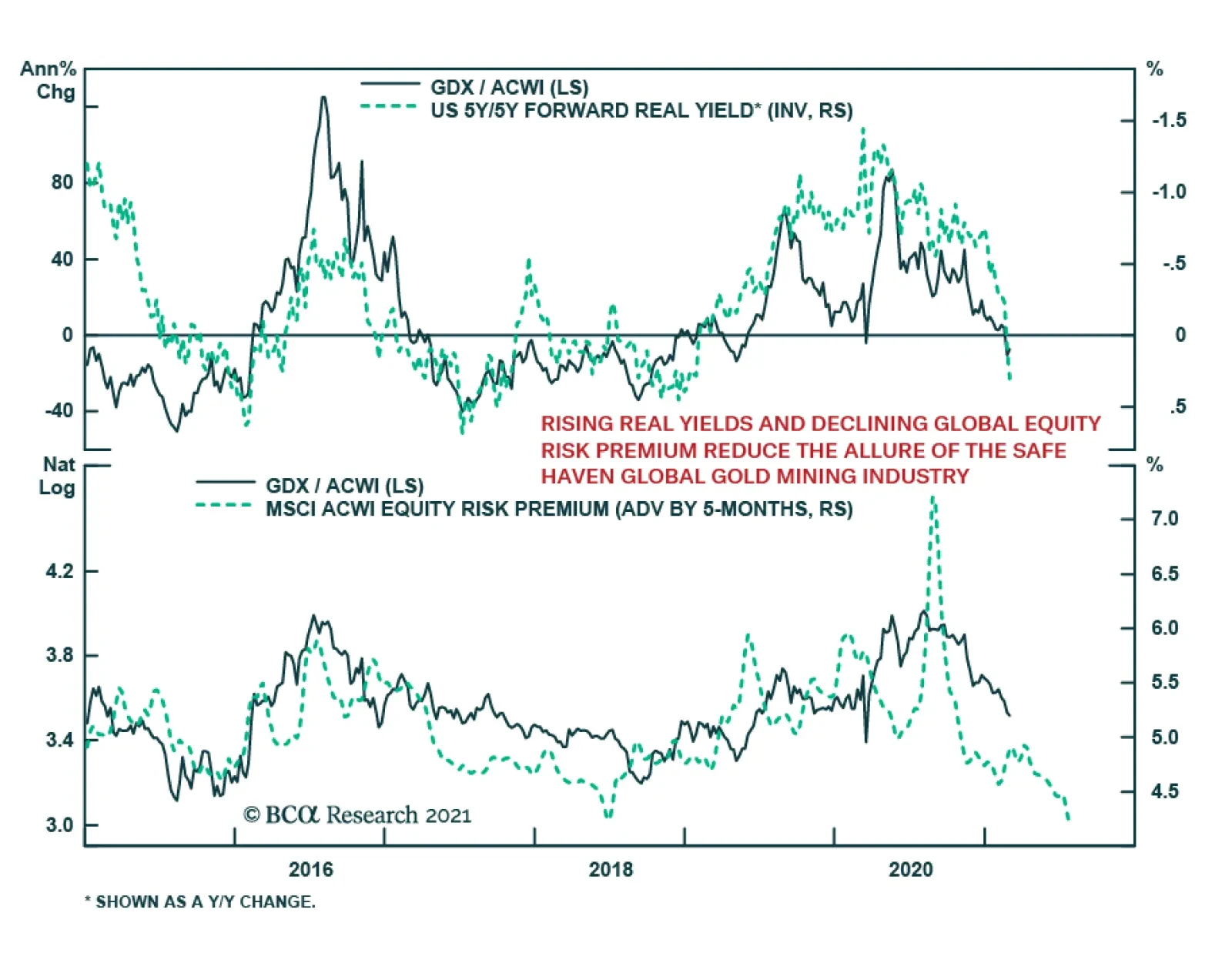
Our US equity strategists recently downgraded the global mining index to underweight. The economic reopening theme is a dominant force in the market. 5-year/5-year forward real yields have been soaring year-to-date, signaling that investors should shy away…