Euro Area

Dear Client, Next week, there will not be a written European Investment Strategy report; instead we will host a Webcast on April 26 with Chester Ntonifor, BCA’s Foreign Exchange Strategist. Regards, Mathieu Savary Executive Summary Cyclicals Are Not Cheap Enough
Cyclicals Are Not Cheap Enough
Cyclicals Are Not Cheap Enough
Global growth remains fragile as China’s economy becomes increasingly affected by COVID containment measures. The US economy is likely to slow down significantly in the coming months, while Europe flirts with a recession. This time around, monetary policy is unlikely to provide a relief valve. While European equities may inch higher in the coming months, cyclical stocks do not offer the necessary valuation discount relative to defensive equities to compensate investors against these risks. Heed the rotational patterns to guide near-term country and sector allocation. The French election remains an important source of risk, even though President Emmanuel Macron is still the favorite. Bottom Line: Maintain a modest positive bias toward equities, but overweight defensive stocks at the expense of cyclicals. Focus on short-term capital protection by favoring small-cap over momentum stocks, materials over energy, and UK equities over French ones. Chart 1So Far, Defensives Win
Plenty Of Risks For Cyclical Stocks
Plenty Of Risks For Cyclical Stocks
European equities have experienced a very volatile first quarter, with a maximum drawdown of nearly 23%. Since their March 7th low, they have rebounded 18% but remain 13% below the January 5th high. Apart from the energy sector, defensives have been running the show so far this year (Chart 1). We wrote four weeks ago that the European market is likely to have made its low for the year, but that the volatility of the first quarter of 2022 is likely to continue. We still hold this view. For now, we recommend investors stay long European equities, but defensive sector and country stances are appropriate. Cyclical stocks have corrected, but front-loaded global economic risks create additional downside. Economic Risks Abound The global economic environment remains fragile as headwinds continue to build. Cyclical equities do not seem to have fully discounted this threat. China’s economic outlook constitutes the first hindrance to global growth. COVID cases in Shanghai are surging and many Chinese cities are also witnessing an acceleration in new cases (Chart 2). The Communist Party is still adamant about its zero-tolerance policy, which suggests that these severe lockdowns will become the norm around the country. This situation creates significant downside for Chinese domestic demand, which will prompt a growth slowdown. The service sector is already feeling the pain from the lockdowns. The March import numbers also highlight an abrupt slowdown in the goods sector (Chart 3). In CNY terms, imports contracted 1.7% annually. This is a nominal number. Both global goods and commodity inflation are elevated, and thus, import volumes are weakening sharply. Furthermore, a recent Reuters article indicated that Chinese crude oil imports have already contracted 14% annually. Chart 2China's COVID Problem
China's COVID Problem
China's COVID Problem
Chart 3Slowing Chinese Domestic Demand
Slowing Chinese Domestic Demand
Slowing Chinese Domestic Demand
Chart 4Declining Shipping Costs, But For How Long?
Declining Shipping Costs, But For How Long?
Declining Shipping Costs, But For How Long?
China’s COVID policy also risks adding new supply chain bottlenecks. Freight within the country is grinding to a halt and ships are queuing up outside the port of Shanghai. As lockdowns multiply around China, risks to global supply chains will increase, hence, the recent decline in shipping rates out of China may soon be undone (Chart 4). This represents a major risk for the global economy, as it would tighten constraints to global economic activity. It also threatens European profitability, as PPI inflation would outpace CPI inflation for longer than anticipated (Chart 4, bottom panel). The US also shows signs of weakness. While a US recession is unlikely, a meaningful deceleration is probable. US consumers are feeling the pinch from surging food and energy prices. Consequently, real wages are contracting 1.8% annually and consumer confidence has plunged (Chart 5). Thankfully, US households have accumulated $185 billion in excess savings since the pandemic began and their net worth has increased by $33 trillion, which should prevent a complete meltdown. Nevertheless, a further deterioration in retail sales is still very likely. Businesses are also increasingly worried. The March NFIB survey shows that Small Business Optimism is falling quickly and that few companies believe it is a good time to expand (Chart 5, bottom panel). Adding to these stresses, the most cyclical sector of the US economy is weakening rapidly. The recent rise in US mortgage rates to 5% is causing a collapse in mortgage applications for house purchases and is behind the 30% tumble suffered by homebuilder stocks (Chart 6). Chart 5US Confidence Is Falling
US Confidence Is Falling
US Confidence Is Falling
Chart 6Tarnished US Housing Outlook
Tarnished US Housing Outlook
Tarnished US Housing Outlook
Europe is in a situation worse than the US and is at risk of a recession in the first half of 2022, or, at least, a very severe growth slowdown. As we highlighted six weeks ago, the energy shock in Europe is larger than it is in the US; moreover, Europe does not enjoy the counterweight of a large commodity sector. Recent data confirm that a slowdown is imminent. The ZEW Expectations survey, the German Ifo, and the European Commission’s Consumer Confidence data are all collapsing, which is consistent with a severe shock (Chart 7). To add insult to injury, bond yields continue to rise; therefore, the only relief valve for the region is a weak currency. Global monetary policy is unlikely to come to the rescue of investors anytime soon. The Fed began lifting rates in March and, if the actions of the Bank of Canada and the Reserve Bank of New Zealand are any indication, the FOMC will increase rates by 50bps in May. The OIS curve expects a Fed Funds rate at 2.2% by year-end, which seems appropriate. With a backdrop of weakening growth, a flat yield curve and an additional increase in real rates will feed risk aversion, especially against the cyclical sectors of the market (Chart 8). Chart 7Severe Slowdown In Europe... Or Worse
Severe Slowdown In Europe... Or Worse
Severe Slowdown In Europe... Or Worse
Chart 8Slowing Growth Meets Higher Real Rates
Slowing Growth Meets Higher Real Rates
Slowing Growth Meets Higher Real Rates
The liquidity tightening is not a phenomenon unique to the US. 63% of global central banks have removed monetary accommodation over the past three months (Chart 9). Moreover, our BCA Monetary Index continues to deteriorate. While we cannot characterize global monetary policy as being anywhere close to tight right now, cyclical equities remain vulnerable to the liquidity slowdown. Bottom Line: The global economy is likely to deteriorate in the coming months. The impact of COVID-19 on Chinese growth will only increase, while Europe flirts with a recession in the first half of the year. Meanwhile, US growth faces swelling headwinds. Expect a meaningful deterioration in global economic surprises (Chart 10). In this context, tighter policy will feed risk aversion, which will create a particularly strong headwind for cyclical stocks. Chart 9A Global Tightening
A Global Tightening
A Global Tightening
Chart 10Economic Surprises Will Fall
Economic Surprises Will Fall
Economic Surprises Will Fall
European Cyclicals Remain Vulnerable This backdrop is not equity-friendly and points to meagre returns over the next three to six months. Nonetheless, European stocks will not generate negative returns over this time frame because European benchmarks already discount a significant portion of the negative news, as illustrated by the surge in their earnings yield (Chart 11). Importantly, inflation in Europe should peak over the summer as the commodity impulse is decelerating (Chart 11, bottom panel). Therefore, fears of stagflation will recede, which will help aggregate European shares (Chart 12). Chart 11European Stocks Already Discount A Lot
European Stocks Already Discount A Lot
European Stocks Already Discount A Lot
Chart 12Ebbing Stagflation Fears Will Help European Equities
Ebbing Stagflation Fears Will Help European Equities
Ebbing Stagflation Fears Will Help European Equities
The consequence of the additional slowdown in global growth is likely to be reflected in the relative performance of European cyclical sectors. Already, Swedish economic growth and asset prices have deteriorated (Chart 13). This poor performance does not bode well for cyclical assets, considering the heightened sensitivity of Swedish assets to the global industrial cycle. More signals point to downside for the cyclical/defensive split. While the short-term momentum of the performance of cyclicals relative to defensives is becoming oversold, its 40-week rate of change has yet to reach a paroxysm (Chart 14). Additionally, cyclicals have not experienced the kind of valuation discount associated with a full discounting of the economic and monetary headwinds described in the previous section (Chart 14, bottom panel). Chart 13Heed Sweden's Message
Heed Sweden's Message
Heed Sweden's Message
Chart 14Cyclicals Are Not Cheap Enough
Cyclicals Are Not Cheap Enough Cyclicals Are Not Cheap Enough
Cyclicals Are Not Cheap Enough Cyclicals Are Not Cheap Enough
The commodity sector is also at risk of a pullback. China’s economic slowdown is likely to hurt commodity demand. While this will not end the secular commodity bull market underpinned by a lack of supply capacity, it could easily cause a significant correction in commodity prices. If, as we anticipate, inflation slows this summer, the inflation-hedging demand for commodities will also pause. These dynamics would hurt mining stocks, which have avoided a serious pullback, as well as the energy sector. Thus, a correction in commodities would cause additional weaknesses for the cyclicals-to-defensives ratio (Chart 15). Yields create a supplemental risk. Historically, rising US yields and inflation expectations correlate with an outperformance of cyclical shares. However, in 2022, cyclicals have bifurcated from yields and CPI swaps (Chart 16), because higher yields currently do not signal reflation but stagflation. If yields rise further, it will hurt growth prospects and damage cyclicals. If they fall, it will likely reflect increasing growth fears, which is also negative for cyclicals. Moreover, falling yields will hurt the profit margins of financials, which are a large component of cyclicals. Therefore, cyclicals seem stuck in a lose-lose situation with respect to yields. Chart 15The Commodity Link
The Commodity Link
The Commodity Link
Chart 16Yields and Cyclicals: A Lose-Lose Proposition
Yields and Cyclicals: A Lose-Lose Proposition
Yields and Cyclicals: A Lose-Lose Proposition
The strength in the dollar creates the last major hurdle for cyclicals. A strong dollar both tightens global financials conditions and indicates weak growth ahead. Consequently, it often heralds a period of softness in the cyclicals-to-defensives ratio (Chart 17). How should investors position themselves? We have a long-held preference for telecommunication services stocks over consumer discretionary equities and for healthcare relative to tech shares. These trades have respectively generated hefty gains of 32% and 13% since June 2021, but they are becoming long in the tooth (Chart 18). Chart 17A Strong Dollar Hurts Cyclicals
A Strong Dollar Hurts Cyclicals
A Strong Dollar Hurts Cyclicals
Chart 18Hedges Have Performed Strongly
Hedges Have Performed Strongly
Hedges Have Performed Strongly
Related Report European Investment StrategyThe Great Rotation As an alternative, we recommend investors stay nimble and use our Excess Returns Rotation Approach expanded in a Special Report two months ago. Below, you will find the new trades suggested by this process. Bottom Line: Cyclicals remain vulnerable. They have not reached the kind of valuation discount necessary to compensate investors for weaker growth and tighter monetary policy. To hedge against these risks, we recommended selling consumer discretionary relative to telecom stocks and tech shares relative to healthcare. However, investors should not add to those trades to mitigate against further weaknesses in cyclical stocks. Instead, investors should focus on relative rotational patterns (see next section). Mathieu Savary, Chief European Strategist Mathieu@bcaresearch.com Excess Returns Rotation Maps: An Update1 European Investment Styles The most noteworthy move comes from small-cap stocks, going from the “Lagging” quadrant to the “Leading” one rapidly (Chart 19). This is consistent with our view that European small-cap equities’ outperformance has further to run. The attractiveness of value stocks is thinning relative to growth stocks (Table 1). Chart 19Relative Rotation Graph: European Investment Styles
Plenty Of Risks For Cyclical Stocks
Plenty Of Risks For Cyclical Stocks
Table 1European Investment Styles Positioning
Plenty Of Risks For Cyclical Stocks
Plenty Of Risks For Cyclical Stocks
Trade Recommendations (12-Month Horizon): Volatility stocks relative to momentum (unchanged) Small-cap stocks relative to momentum (new) European Sectors Chart 20 illustrates the wild ride in European equity markets in the wake of the Ukraine/Russia conflict. Most sectors experienced violent swings, moving rapidly across several quadrants. Only consumer discretionary, tech, and utilities stocks have remained in the same quadrant, the former two in “Lagging” and the latter in “Leading.” Interestingly, the European energy sector has moved into the “Weakening” quadrant (Table 2). We are taking profit on our Long Energy / Short Financials recommendation. It delivered 14% returns since mid-February and is getting long in the tooth. Chart 20Relative Rotation Graph: European Sectors
Plenty Of Risks For Cyclical Stocks
Plenty Of Risks For Cyclical Stocks
Table 2European Sectors Positioning
Plenty Of Risks For Cyclical Stocks
Plenty Of Risks For Cyclical Stocks
Trade Recommendations (12-Month Horizon): Materials over energy (unchanged) Energy over financials (unchanged) Tech over communication services (unchanged) Utilities over healthcare (new) Communication services over healthcare (new) Consumer discretionary over healthcare (new) European National Markets Sectoral biases dictate the rotational patterns exhibited by European national bourses (Chart 21). The cyclicality of the German, French, and Italian markets caused them to lag behind their European counterparts. Meanwhile, the Dutch market remains solidly in the Lagging quadrant, mirroring tech equities. Only Spain and Sweden have shown signs of improvement over the past twelve weeks and should outperform the European benchmark over the short term (Table 3). Chart 21Relative Rotation Graph: European National Markets
Plenty Of Risks For Cyclical Stocks
Plenty Of Risks For Cyclical Stocks
Table 3European National Markets Positioning
Plenty Of Risks For Cyclical Stocks
Plenty Of Risks For Cyclical Stocks
Trade Recommendations (12-Month Horizon): UK stocks over Dutch ones (new) UK stocks over French ones (new) Italian stocks over Swedish ones (new) UK stocks over Swedish ones (new) French Elections: Preparing For The Second Round The first round of the French presidential elections did not surprise. As in 2017, incumbent President Emmanuel Macron will face Marine Le Pen in the second round. Beyond this expected outcome, two important takeaways will be crucial in the second round: The collapse of traditional right-wing (Les Républicains) and left-wing (Parti Socialiste) parties. Far-left candidate Jean-Luc Mélenchon surprised to the upside with 22% of votes, right behind Marine Le Pen. The key implication is that the vote transfer has become more favorable to Macron (Diagram 1). In 2017, Marine Le Pen created the surprise and bested center-right candidate François Fillon by the narrowest of margins. As a result, Le Pen’s attempt to appeal to Fillon’s voters was a real threat. Today, the third largest pool of voters belongs to far-left candidate Mélenchon, who has already called upon his voters “not to give a single vote to Marine Le Pen.” Diagram 1Extrapolating France’s First-Round Election To The Second Round
Plenty Of Risks For Cyclical Stocks
Plenty Of Risks For Cyclical Stocks
How does it translate into voting intentions for the second round? Assuming a full transfer of votes from the defeated candidates based on the support they made public, Macron will crush Marine Le Pen as he did in 2017. However, this is unlikely, since many voters feel stuck between a rock and a hard place, and may decide not to vote. Related Report European Investment StrategyFrance: Macron And Macro Assuming Macron obtains only half of the voting intentions from other parties, while Marine Le Pen retains the full support from other far-right candidates’ voters, acquires half of the center-right votes, and secures a quarter of Mélenchon’s votes, the outcome will be much narrower at 53.4% vs. 46.6% in favor of Macron. This is in line with national polls. Two weeks ago, we presented the investment implications of a second Macron mandate. Since then, we have received many questions about the market consequences should Marine Le Pen enjoy a surprise victory. While this is not our base-case, we cannot rule out the possibility of a negative shock to the markets. Chart 22A Le Pen Surprise Victory Would Hurt The Euro
A Le Pen Surprise Victory Would Hurt The Euro
A Le Pen Surprise Victory Would Hurt The Euro
The only certainty within this very uncertain outcome is that Marine Le Pen would be constrained by a strong opposition in the Assemblée Nationale. Although she has changed her stance on “Frexit,” her presidency would undoubtfully carry an increased geopolitical risk within the European Union (EU) and hurt European unity and integration efforts. Thus, the resulting French isolationism would be synonymous with a weaker euro (Chart 22). French assets would be de-rated because her presidency would reverse previous reform efforts, which would hurt trend GDP growth, productivity, and the role of France within the EU. These trends are not only negative for stocks, but they would also put long-term upward pressure on OATs yields as French public finances would deteriorate meaningfully under a populist Le Pen presidency. In this context, underweighting both French equities and government bonds would be warranted. Jeremie Peloso, Associate Editor JeremieP@bcaresearch.com Footnotes Tactical Recommendations Cyclical Recommendations Structural Recommendations
Executive Summary Macron Still Favored, But Le Pen Cannot Be Ruled Out
Le Pen And Other Hurdles (GeoRisk Update)
Le Pen And Other Hurdles (GeoRisk Update)
Macron is still favored to win the French election but Le Pen’s odds are 45%. Le Pen would halt France’s neoliberal structural reforms, paralyze EU policymaking, and help Russia’s leverage in Ukraine. But she would lack legislative support and would not fatally wound the EU or NATO. European political risk will remain high in Germany, Italy, and Spain. Favor UK equities on a relative basis. Financial markets are complacent about Russian geopolitical risk again. Steer clear of eastern European assets. Do not bottom feed in Chinese stocks. China faces social unrest. North Korean geopolitical risk is back. Australia’s election is an opportunity, not a risk. Stay bullish on Latin America. Prefer Brazil over India. Stay negative on Turkey and Pakistan. Trade Recommendation Inception Date Return TACTICALLY LONG US 10-YEAR TREASURY 2022-04-14 Bottom Line: Go long the US 10-year Treasury on geopolitical risk and near-term peak in inflation. Feature Last year we declared that European political risk had reached a bottom and had nowhere to go but up. Great power rivalry with Russia primarily drove this view but we also argued that our structural theme of populism and nationalism would feed into it. Related Report Geopolitical StrategyThe Geopolitical Consequences Of The Ukraine War In other words, the triumph of the center-left political establishment in the aftermath of Covid-19 would be temporary. The narrow French presidential race highlights this trend. President Emmanuel Macron is still favored but Marine Le Pen, his far-right, anti-establishment opponent, could pull off an upset victory on April 24. The one thing investors can be sure of is that France’s ability to pursue neoliberal structural reforms will be limited even if Macron wins, since he will lack the mandate he received in 2017. Our GeoRisk Indicators this month suggest that global political trends are feeding into today’s stagflationary macroeconomic context. Market Complacent About Russia Again Global financial markets are becoming complacent about European security once again. Markets have begun to price a slightly lower geopolitical risk for Russia after it withdrew military forces from around Kyiv in an open admission that it failed to overthrow the government. However, western sanctions are rising, not falling, and Russia’s retreat from Kyiv means it will need to be more aggressive in the south and east (Chart 1). Chart 1Russia: GeoRisk Indicator
Russia: GeoRisk Indicator
Russia: GeoRisk Indicator
Russia has not achieved its core aim of a militarily neutral Ukraine – so it will escalate the military effort to achieve its aim. Any military failure in the east and south would humiliate the Putin regime and make it more unpredictable and dangerous. The West has doubled down on providing Ukraine with arms and hitting Russia with sanctions (e.g. imposing a ban on Russian coal). Germany prevented an overnight ban on Russian oil and natural gas imports but the EU is diversifying away from Russian energy rapidly. Sanctions that eat away at Russia’s export revenues will force it to take a more aggressive posture now, to achieve a favorable ceasefire before funding runs out. Sweden and Finland are reviewing whether to join NATO, with recommendations due by June. Russia will rattle sabers to underscore its red line against NATO enlargement and will continue to threaten “serious military-political repercussions” if these states try to join. We would guess they would remain neutral as a decision to join NATO could lead to a larger war. Bottom Line: Global equities will remain volatile due to a second phase of the war and potential Russian threats against Ukraine’s backers. European equities and currency, especially in emerging Europe, will suffer a persistent risk premium until a ceasefire is concluded. What If Le Pen Wins In France? By contrast with the war in Ukraine, the French election is a short-term source of political risk. A surprise Le Pen victory would shake up the European political establishment but investors should bear in mind that it would not revolutionize the continent or the world, as Le Pen’s powers would be limited. Unlike President Trump in 2017, she would not take office with her party gaining full control of the legislature. Le Pen rallied into the first round of the election on April 10, garnering 23% of the vote, up from 21% in 2017. This is not a huge increase in support but her odds of winning this time are much better than in 2017 because the country has suffered a series of material shocks to its stability. Voters are less enthusiastic about President Macron and his centrist political platform. Macron, the favorite of the political establishment, received 28% of the first-round vote, up from 24% in 2017. Thus he cannot be said to have disappointed expectations, though he is vulnerable. The euro remains weak against the dollar and unlikely to rally until Russian geopolitical risk and French political risk are decided. The market is not fully pricing French risk as things stand (Chart 2). Chart 2France: GeoRisk Indicator
France: GeoRisk Indicator
France: GeoRisk Indicator
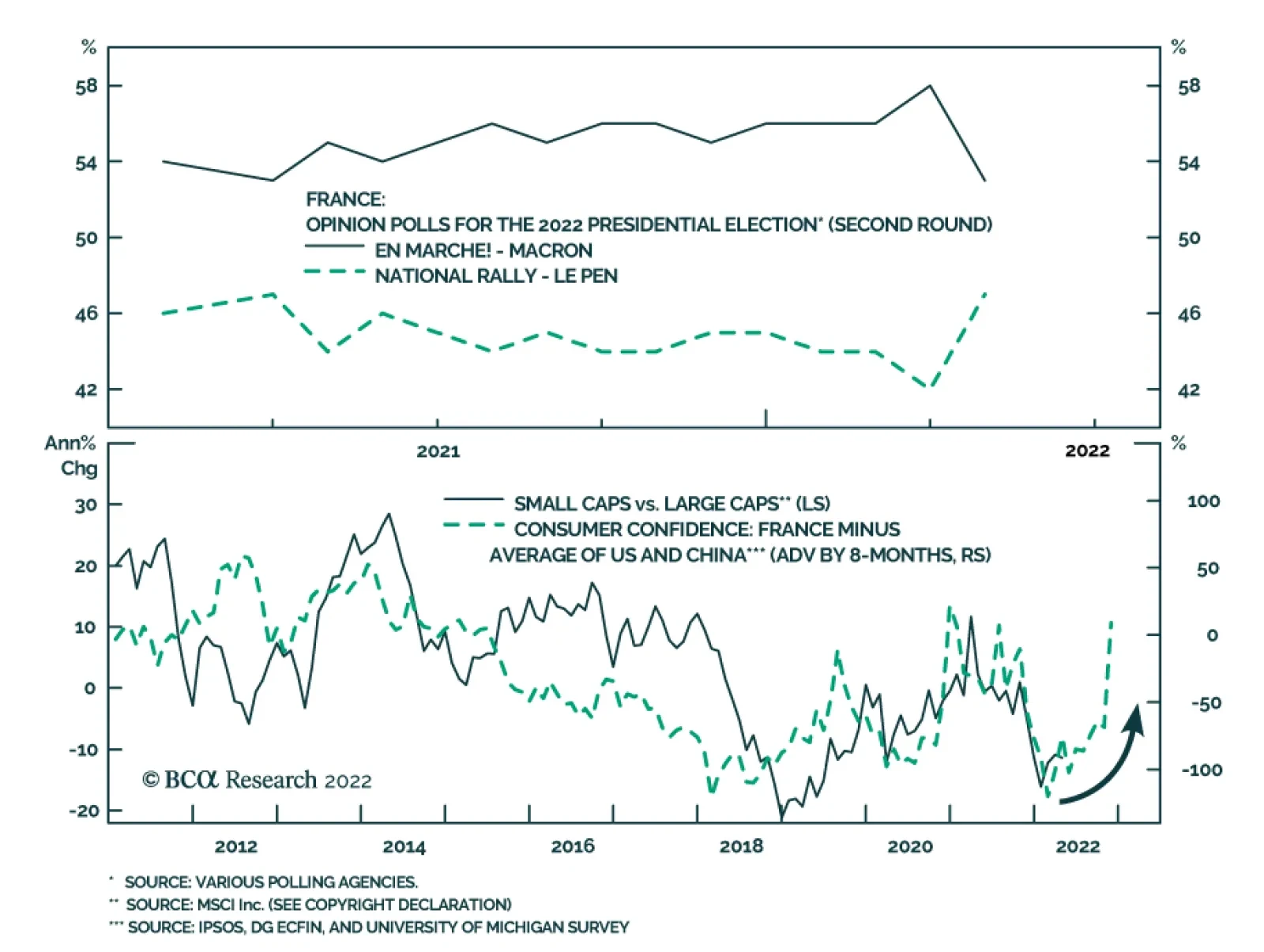
The first-round election results show mixed trends. The political establishment suffered but so did the right-wing parties (Table 1). The main explanation is that left-wing, anti-establishment candidate Jean-Luc Mélenchon beat expectations while the center-right Republicans collapsed. Macron is leading Le Pen by only five percentage points in the second-round opinion polling as we go to press (Chart 3). Macron has maintained this gap throughout the race so far and both candidates are very well known to voters. But Le Pen demonstrated significant momentum in the first round and momentum should never be underestimated. Table 1Results Of France’s First-Round Election
Le Pen And Other Hurdles (GeoRisk Update)
Le Pen And Other Hurdles (GeoRisk Update)
Chart 3French Election: Macron Maintains Lead
French Election: Macron Maintains Lead
French Election: Macron Maintains Lead
Are the polls accurate? Anti-establishment candidates outperformed their polling by 7 percentage points in the first round. Macron, the right-wing candidates, and the pro-establishment candidates all underperformed their March and April polls (Chart 4). Hence investors should expect polls to underrate Le Pen in the second round. Chart 4French Polls Fairly Accurate Versus First-Round Results
Le Pen And Other Hurdles (GeoRisk Update)
Le Pen And Other Hurdles (GeoRisk Update)
Given the above points, it is critical to determine which candidate will gather the most support from voters whose first preference got knocked out in the first round. The strength of anti-establishment feeling means that the incumbent is vulnerable while ideological camps may not be as predictable as usual. Mélenchon has asked his voters not to give a single vote to Le Pen but he has not endorsed Macron. About 21% of his supporters say they will vote for Le Pen. Only a little more of them said they would vote for Macron, at 27% (Chart 5). Chart 5To Whom Will Voters Drift?
Le Pen And Other Hurdles (GeoRisk Update)
Le Pen And Other Hurdles (GeoRisk Update)
Diagram 1, courtesy of our European Investment Strategy, illustrates that Macron is favored in both scenarios but Le Pen comes within striking distance under certain conservative assumptions about vote switching. Diagram 1Extrapolating France’s First-Round Election To The Second Round
Le Pen And Other Hurdles (GeoRisk Update)
Le Pen And Other Hurdles (GeoRisk Update)
Macron’s approval rating has improved since the pandemic. This is unlike the situation in other liberal democracies (Chart 6). Chart 6Macron Handled Pandemic Reasonably Well
Le Pen And Other Hurdles (GeoRisk Update)
Le Pen And Other Hurdles (GeoRisk Update)
The pandemic is fading and the economy reviving. Unemployment has fallen from 8.9% to 7.4% over the course of the pandemic. Real wage growth, at 5.8%, is higher than the 3.3% that prevailed when Macron took office in 2017 (Chart 7). Chart 7Real Wages A Boon For Macron
Le Pen And Other Hurdles (GeoRisk Update)
Le Pen And Other Hurdles (GeoRisk Update)
But these positives do not rule out a Le Pen surprise. The nation has suffered not one but a series of historic shocks – the pandemic, inflation, and the war in Ukraine. Inflation is rising at 5.1%, pushing the “Misery Index” (inflation plus unemployment) to 12%, higher than when Macron took office, even if lower than the EU average (Chart 8). Chart 8Misery Index The Key Threat To Macron
Misery Index The Key Threat To Macron
Misery Index The Key Threat To Macron
Le Pen has moderated her populist message and rebranded her party in recent years to better align with the median French voter. She claims that she will not pursue a withdrawal from the European Union or the Euro Area currency union. This puts her on the right side of the one issue that disqualified her from the presidency in the past. Yet French trust in the EU is declining markedly, which suggests that Le Pen is in step with the median voter on wanting greater French autonomy (Chart 9). Le Pen’s well-known sympathy toward Vladimir Putin and Russia is a liability in the context of Russian aggression in Ukraine. Only 35% of French people had a positive opinion of Russia back in 2019, whereas 50% had a favorable view of NATO, and the gap has likely grown as a result of the invasion (Chart 10). However, the historic bout of inflation suggests that economic policy could be the most salient issue for voters rather than foreign policy. Chart 9Le Pen Only Electable Because She Accepted Europe
Le Pen And Other Hurdles (GeoRisk Update)
Le Pen And Other Hurdles (GeoRisk Update)
Chart 10Le Pen’s NATO Stance Not Disqualifying
Le Pen And Other Hurdles (GeoRisk Update)
Le Pen And Other Hurdles (GeoRisk Update)
Le Pen’s economic platform is fiscally liberal and protectionist, which will appeal to voters upset over the rising cost of living and pressures of globalization. She wants to cut the income tax and value-added tax, while reversing Macron’s attempt at raising the retirement age and reforming the pension system. France’s tax rates on income, and on gasoline and diesel, are higher than the OECD average. In other words, Macron is running on painful structural reform while Le Pen is running on fiscal largesse. This is another reason to take seriously the risk of a Le Pen victory. What should investors expect if Le Pen pulls off an upset? France’s attempt at neoliberal structural reforms would grind to a halt. While Le Pen may not be able to pass domestic legislation, she would be able to halt the implementation of Macron’s reforms. Productivity and the fiscal outlook would suffer. Le Pen’s ability to change domestic policy will be limited by the National Assembly, which is due for elections from June 12-19. Her party, the National Rally (formerly the Front National), has never won more than 20% of local elections and performed poorly in the 2017 legislative vote. Investors should wait to see the results of the legislative election before drawing any conclusions about Le Pen’s ability to change domestic policy. France’s foreign policy would diverge from Europe’s. If Le Pen takes the presidency, she will put France at odds with Brussels, Berlin, and Washington, in much the same way that President Trump did. She would paralyze European policymaking. Yet Le Pen alone cannot take France out of the EU. The French public’s negative view of the EU is not the same as a majority desire to leave the bloc – and support for the euro currency stands at 69%. Le Pen does not have the support for “Frexit,” French exit from the EU. Moreover European states face immense pressures to work together in the context of global Great Power Rivalry. Independently they are small compared to the US, Russia, and China. Hence the EU will continue to consolidate as a geopolitical entity over the long run. Russia, however, would benefit from Le Pen’s presidency in the context of Ukraine ceasefire talks. EU sanctions efforts would freeze in place. Le Pen could try to take France out of NATO, though she would face extreme opposition from the military and political establishment. If she succeeded on her own executive authority, the result would be a division among NATO’s ranks in the face of Russia. This cannot be ruled out: if the US and Russia are fighting a new Cold War, then it is not unfathomable that France would revert to its Cold War posture of strategic independence. However, while France withdrew from NATO’s integrated military command from 1966-2009, it never withdrew fully from the alliance and was always still implicated in mutual defense. In today’s context, NATO’s deterrent capability would not be much diminished but Le Pen’s administration would be isolated. Russia would be unable to give any material support to France’s economy or national defense. Bottom Line: Macron is still favored for re-election but investors should upgrade Le Pen’s chances to a subjective 45%. If she wins, the euro will suffer a temporary pullback and French government bond spreads will widen over German bunds. The medium-term view on French equities and bonds will depend on her political capability, which depends on the outcome of the legislative election from June 12-19. She will likely be stymied at home and only capable of tinkering with foreign policy. But if she has legislative support, her agenda is fiscally stimulative and would produce a short-term sugar high for French corporate earnings. However, it would be negative for long-term productivity. UK, Italy, Spain: Who Else Faces Populism? Chart 11Rest Of Europe: GeoRisk Indicators
Rest Of Europe: GeoRisk Indicators
Rest Of Europe: GeoRisk Indicators
Between Russian geopolitical risk and French political risk, other European countries are likely to see their own geopolitical risk premium rise (Chart 11). But these countries have their own domestic political dynamics that contribute to the reemergence of European political risk. Germany’s domestic political risk is relatively low but it faces continued geopolitical risk in the form of Russia tensions, China’s faltering economy, and potentially French populism (Chart 11, top panel). In Italy, the national unity coalition that took shape under Prime Minister Mario Draghi was an expedient undertaken in the face of the pandemic. As the pandemic fades, a backlash will take shape among the large group of voters who oppose the EU and Italian political establishment. The Italian establishment has distributed the EU recovery funds and secured the Italian presidency as a check on future populist governments. But it may not be able to do more than that before the next general election in June 2023, which means that populism will reemerge and increase the political risk premium in Italian assets going forward (Chart 11, second panel). Spain is still a “divided nation” susceptible to a rise in political risk ahead of the general election due by December 10, 2023. However, the conservative People’s Party, the chief opposition party, has suffered from renewed infighting, which gives temporary relief to the ruling Socialist Worker’s Party of Prime Minister Pedro Sanchez. The Russia-Ukraine issue caused some minor divisions within the government but they are not yet leading to any major political crisis, as nationwide pro-Ukraine sentiment is largely unified. The Andalusia regional election, which is expected this November, will be a check point for the People’s Party’s new leadership and a test run for next year’s general election. Andalusia is the most populous autonomous community in Spain, consisting about 17% of the seats in the congress (the lower house). The risk for Sanchez and the Socialists is that the opposition has a strong popular base and this fact combined with the stagflationary backdrop will keep political polarization high and undermine the government’s staying power (Chart 11, third panel). While Prime Minister Boris Johnson has survived the scandal over attending social events during Covid lockdowns, as we expected, nevertheless the Labour Party is starting to make a comeback that will gain momentum ahead of the 2024 general election. Labour is unlikely to embrace fiscal austerity or attempt to reverse Brexit anytime soon. Hence the UK’s inflationary backdrop will persist (Chart 11, fourth panel). Bottom Line: European political risk has bottomed and will rise in the coming months and years, although the EU and Eurozone will survive. We still favor UK equities over developed market equities (excluding the US) because they are heavily tilted toward consumer staples and energy sectors. Stay long GBP-CZK. Favor European defense stocks over tech. Prefer Spanish stocks over Italian. China: Social Unrest More Likely China’s historic confluence of internal and external risks continues – and hence it is too soon for global investors to try to bottom-feed on Chinese investable equities (Chart 12). A tactical opportunity might emerge for non-US investors in 2023 but now is not the right time to buy. Chart 12China: GeoRisk Indicator
China: GeoRisk Indicator
China: GeoRisk Indicator
In domestic politics, the reversion to autocracy under Xi is exacerbating the economic slowdown. True, Beijing is stimulating the economy by means of its traditional monetary and fiscal tools. The latest data show that the total social financing impulse is reviving, primarily on the back of local government bonds (Chart 13). Yet overall social financing is weaker because private sector sentiment remains downbeat. The government is pursuing excessively stringent social restrictions in the face of the pandemic. Beijing is doubling down on “Covid Zero” policy by locking down massive cities such as Shanghai. The restrictions will fail to prevent the virus from spreading. They are likely to engender social unrest, which we flagged as our top “Black Swan” risk this year and is looking more likely. Lockdowns will also obstruct production and global supply chains, pushing up global goods inflation. Meanwhile the property sector continues to slump on the back of weak domestic demand, large debt levels, excess capacity, regulatory scrutiny, and negative sentiment. Consumer borrowing appetite and general animal spirits are weak in the face of the pandemic and repressive political environment (Chart 14). Chart 13China's Stimulus Has Clearly Arrived
China's Stimulus Has Clearly Arrived
China's Stimulus Has Clearly Arrived
Chart 14Yet Chinese Animal Spirits Still Suffering
Yet Chinese Animal Spirits Still Suffering
Yet Chinese Animal Spirits Still Suffering
Hence China will be exporting slow growth and inflation – stagflation – to the rest of the world until after the party congress. At that point President Xi will feel politically secure enough to “let 100 flowers bloom” and try to improve economic sentiment at home and abroad. This will be a temporary phenomenon (as were the original 100 flowers under Chairman Mao) but it will be notable for 2023. In foreign politics, Russia’s attack on Ukraine has accelerated the process of Russo-Chinese alliance formation. This partnership will hasten US containment strategy toward China and impose a much faster economic transition on China as it pursues self-sufficiency. The result will be a revival of US-China tensions. The implications are negative for the rest of Asia Pacific: Taiwanese geopolitical risk will continue rising for reasons we have outlined in previous reports. In addition, Taiwanese equities are finally starting to fall off from the pandemic-induced semiconductor rally (Chart 15). The US and others are also pursuing semiconductor supply security, which will reduce Taiwan’s comparative advantage. Chart 15Taiwan: GeoRisk Indicator
Taiwan: GeoRisk Indicator
Taiwan: GeoRisk Indicator
South Korea faces paralysis and rising tensions with North Korea. The presidential election on May 9 brought the conservatives back into the Blue House. The conservative People Power Party’s candidate, Yoon Suk-yeol, eked out a narrow victory that leaves him without much political capital. His hands are also tied by the National Assembly, at least for the next two years. He will attempt to reorient South Korean foreign policy toward the US alliance and away from China. He will walk away from the “Moonshine” policy of engagement with North Korea, which yielded no fruit over the past five years. North Korea has responded by threatening a nuclear missile test, restarting intercontinental ballistic missile tests for the first time since 2017, and adopting a more aggressive nuclear deterrence policy in which any South Korean attack will ostensibly be punished by a massive nuclear strike. Tensions on the peninsula are set to rise (Chart 16). Three US aircraft carrier groups are around Japan today, despite the war in Europe (where two are placed), suggesting high threat levels. Chart 16South Korea: GeoRisk Indicator
South Korea: GeoRisk Indicator
South Korea: GeoRisk Indicator
Australia’s elections present opportunity rather than risk. Prime Minister Scott Morrison formally scheduled them for May 21. The Australian Labor Party is leading in public opinion and will perform well. The election threatens a change of parties but not a drastic change in national policy – populist parties are weak. No major improvement in China relations should be expected. Any temporary improvement, as with the Biden administration, will be subject to reversal due to China’s long-term challenge to the liberal international order. Cyclically the Australian dollar and equities stand to benefit from the global commodity upcycle as well as relative geopolitical security due to American security guarantees (Chart 17). Chart 17Australia: GeoRisk Indicator
Australia: GeoRisk Indicator
Australia: GeoRisk Indicator
Bottom Line: China’s reversion to autocracy will keep global sentiment negative on Chinese equities until 2023 at earliest. Stay short the renminbi and Taiwanese dollar. Favor the Japanese yen over the Korean won. Favor South Korean over Taiwanese equities. Look favorably on the Australian dollar. Turkey, South Africa, And … Canada Turkish geopolitical risk will remain elevated in the context of a rampant Russia, NATO’s revival and tensions with Russia, the threat of commerce destruction and accidents in the Black Sea region, domestic economic mismanagement, foreign military adventures, and the threat posed to the aging Erdogan regime by the political opposition in the wake of the pandemic and the lead-up to the 2023 elections (Chart 18). Chart 18Turkey: GeoRisk Indicator
Turkey: GeoRisk Indicator
Turkey: GeoRisk Indicator
While we are tactically bullish on South African equities and currency, we expect South African political risk to rise steadily into the 2024 general election. Almost a year has passed since the civil unrest episode of 2021. Covid-19 lockdowns have been lifted and the national state of disaster has ended, which has helped quell social tensions. This is evident in the decline of our South Africa GeoRisk indicator from 2021 highs (Chart 19). While fiscal austerity is under way in South Africa, we have argued that fiscal policy will reverse course in time for the 2024 election. In this year’s fiscal budget, the budget deficit is projected to narrow from -6% to -4.2% over the next two years. Government has increased tax revenue collection through structural reforms that are rooting out corruption and wasteful expenditure. But the ANC will have to tap into government spending to shore up lost support come 2024. Thus South Africa benefits tactically from commodity prices but cyclically the currency is vulnerable. Chart 19South Africa: GeoRisk Indicator
South Africa: GeoRisk Indicator
South Africa: GeoRisk Indicator
Canadian political risk will rise but that should not deter investors from favoring Canadian assets that are not exposed to the property bubble. Prime Minister Justin Trudeau has had a net negative approval rating since early 2021 and his government is losing political capital due to inflation, social unrest, and rising difficulties with housing affordability (Chart 20). While he does not face an election until 2025, the Conservative Party is developing more effective messaging. Chart 20Canada: GeoRisk Indicator
Canada: GeoRisk Indicator
Canada: GeoRisk Indicator
India Will Stay Neutral But Lean Toward The West Chart 21Sino-Pak Alliance’s Geopolitical Power Is Thrice That Of India
Le Pen And Other Hurdles (GeoRisk Update)
Le Pen And Other Hurdles (GeoRisk Update)
US President Joe Biden has openly expressed his administration’s displeasure regarding India’s response to Russia’s invasion of Ukraine. This has led many to question the strength of Indo-US relations and the direction of India’s geopolitical alignments. To complicate matters, China’s overtures towards India have turned positive lately, leading clients to ask if a realignment in Indo-China relations is nigh. To accurately assess India’s long-term geopolitical propensities, it is important to draw a distinction between ‘cyclical’ and ‘structural’ dynamics that are at play today. Such a distinction yields crystal-clear answers about India’s strategic geopolitical leanings. In specific: Indo-US Relations Will Strengthen On A Strategic Horizon: As the US’s and China’s grand strategies collide, minor and major geopolitical earthquakes are bound to take place in South Asia and the Indo-Pacific. Against this backdrop, India will strategically align with the US to strengthen its hand in the region (Chart 21). While the Russo-Ukrainian war is a major global geopolitical event, for India this is a side-show at best. True, India will retain aspects of its historic good relations with Russia. Yet countering China’s encirclement of India is a far more fundamental concern for India. Since Russia has broken with Europe, and China cannot reject Russia’s alliance, India will gradually align with the US and its allies. India And China Will End Up As A Conflicting Dyad: Strategic conflict between the two Asian powers is likely because China’s naval development and its Eurasian strategy threaten India’s national security and geopolitical imperatives, while India’s alliances are adding to China’s distrust of India. Thus any improvement in Sino-Indian diplomatic relations will be short-lived. The US will constantly provide leeway for India in its attempts to court India as a key player in the containment strategy against China. The US and its allies are the premier maritime powers and upholders of the liberal world order – India serves its national interest better by joining them rather than joining China in a risky attempt to confront the US navy and revolutionize the world order. Indo-Russian Relations Are Bound To Fade In The Long Run: India will lean towards the US over the next few years for reasons of security and economics. But India’s movement into America’s sphere of influence will be slow – and that is by design. India is testing waters with America through networks like the Quadrilateral Dialogue. It sees its historic relationship with Russia as a matter of necessity in the short run and a useful diversification strategy in the long run. True, India will maintain a trading relationship with Russia for defense goods and cheap oil. But this trade will be transactional and is not reason enough for India to join Russia and China in opposing US global leadership. While these factors will mean that Indo-Russian relations are amicable over a cyclical horizon, this relationship is bound to fade over a strategic horizon as China and Russia grow closer and the US pursues its grand strategy of countering China and Russia. Bottom Line: India may appear to be neutral about the Russo-Ukrainian war but India will shed its historical stance of neutrality and veer towards America’s sphere of influence on a strategic timeframe. India is fully aware of its strategic importance to both the American camp and the Russo-Chinese camp. It thus has the luxury of making its leanings explicit after extracting most from both sides. Long Brazil / Short India Brazil’s equity markets have been on a tear. MSCI Brazil has outperformed MSCI EM by 49% in 2022 YTD. Brazil’s markets have done well because Brazil is a commodity exporter and the war in Ukraine has little bearing on faraway Latin America. This rally will have legs although Brazil’s political risks will likely pick back up in advance of the election (Chart 22). The reduction in Brazil’s geopolitical risk so far this year has been driven mainly by the fact that the currency has bounced on the surge in commodity prices. In addition, former President Lula da Silva is the current favorite to win the 2022 presidential elections – Lula is a known quantity and not repugnant to global financial institutions (Chart 23). Chart 22Brazil's Markets Have Benefitted From Rising Commodity Prices
Brazil's Markets Have Benefitted From Rising Commodity Prices
Brazil's Markets Have Benefitted From Rising Commodity Prices
Chart 23Brazil: Watch Out For Political Impact Of Commodity Prices
Brazil: Watch Out For Political Impact Of Commodity Prices
Brazil: Watch Out For Political Impact Of Commodity Prices
Whilst there is no denying that the first-round effects of the Ukraine war have been positive for Brazil, there is a need to watch out for the second-round effects of the war as Latin America’s largest economy heads towards elections. Surging prices will affect two key constituencies in Brazil: consumers and farmers. Consumer price inflation in Brazil has been ascendant and adding to Brazil’s median voter’s economic miseries. Rising inflation will thus undermine President Jair Bolsonaro’s re-election prospects further. The fact that energy prices are a potent polling issue is evinced by the fact that Bolsonaro recently sacked the chief executive of Petrobras (i.e. Brazil’s largest listed company) over rising fuel costs. Furthermore, Brazil is a leading exporter of farm produce and hence also a large importer of fertilizers. Fertilizer prices have surged since the war broke out. This is problematic for Brazil since Russia and Belarus account for a lion’s share of Brazil’s fertilizer imports. Much like inflation in general, the surge in fertilizer prices will affect the elections because some of the regions that support Bolsonaro also happen to be regions whose reliance on agriculture is meaningful (Map 1). They will suffer from higher input prices. Map 1States That Supported Bolso, Could Be Affected By Fertilizer Price Surge
Le Pen And Other Hurdles (GeoRisk Update)
Le Pen And Other Hurdles (GeoRisk Update)
Chart 24Long Brazil Financials / Short India
Long Brazil Financials / Short India
Long Brazil Financials / Short India
Given that Bolsonaro continues to lag Lula on popularity ratings – and given the adverse effect that higher commodity prices will have on Brazil’s voters – we expect Bolsonaro to resort to fiscal populism or attacks on Brazil’s institutions in a last-ditch effort to cling to power. He could even be emboldened by the fact that Sérgio Moro, the former judge and corruption fighter, decided to pull out of the presidential race. This could provide a fillip to Bolso’s popularity. Bottom Line: Brazil currently offers a buying opportunity owing to attractive valuations and high commodity prices. But investors should stay wary of latent political risks in Brazil, which could manifest themselves as presidential elections draw closer. We urge investors to take-on only selective tactical exposure in Brazil for now. Equities appear cheap but political and macro risks abound. To play the rally yet stave off political risk, we suggest a tactical pair trade: Long Brazil Financials / Short India (Chart 24). Whilst we remain constructive on India on a strategic horizon, for the next 12 months we worry about near-term macro and geopolitical headwinds as well as India’s rich valuations. Don’t Buy Into Pakistan’s Government Change Chart 25Pakistan’s Military Is Unusually Influential
Le Pen And Other Hurdles (GeoRisk Update)
Le Pen And Other Hurdles (GeoRisk Update)
The newest phase in Pakistan’s endless cycle of political instability has begun. Prime Minister Imran Khan has been ousted. A new coalition government and a new prime minister, Shehbaz Sharif, have assumed power. Prime Minister Sharif’s appointment may make it appear like risks imposed by Pakistan have abated. After all, Sharif is seen as a good administrator and has signaled an interest in mending ties with India. But despite the appearance of a regime change, geopolitical risks imposed by Pakistan remain intact for three sets of reasons: Military Is Still In Charge: Pakistan’s military has been and remains the primary power center in the country (Chart 25). Former Prime Minister Khan’s rise to power was possible owing to the military’s support and he fell for the same reason. Since the military influences the civil administration as well as foreign policy, a lasting improvement in Indo-Pak relations is highly unlikely. Risk Of “Rally Round The Flag” Diversion: General elections are due in Pakistan by October 2023. Sharif is acutely aware of the stiff competition he will face at these elections. His competitors exist outside as well as inside his government. One such contender is Bilawal Bhutto-Zardari of the Pakistan People’s Party (PPP), which is a key coalition partner of the new government that assumed power. Imran Khan himself is still popular and will plot to return to power. Against such a backdrop the newly elected PM is highly unlikely to pursue an improvement in Indo-Pak relations. Such a strategy will adversely affect his popularity and may also upset the military. Hence we highlight the risk of the February 2021 Indo-Pak ceasefire being violated in the run up to Pakistan’s general elections. India’s government has no reason to prevent tensions, given its own political calculations and the benefits of nationalism. Internal Social Instability Poor: Pakistan is young but the country can be likened to a social tinderbox. Many poor youths, a weak economy, and inadequate political valves to release social tensions make for an explosive combination. Pakistan remains a source of geopolitical risk for the South Asian region. Some clients have inquired as to whether the change of government in Pakistan implies closer relations with the United States. The US has less need for Pakistan now that it has withdrawn from Afghanistan. It is focused on countering Russia and China. As such the US has great need of courting India and less need of courting Pakistan. Pakistan will remain China’s ally and will struggle to retain significant US assistance. Bottom Line: We remain strategic sellers of Pakistani equities. Pakistan must contend with high internal social instability, a weak democracy, a weak economy and an unusually influential military. As long as the military remains excessively influential in Pakistan, its foreign policy stance towards India will stay hostile. Yet the military will remain influential because Pakistan exists in a permanent geopolitical competition with India. And until Pakistan’s economy improves structurally and endemically, its alliance with China will stay strong. Investment Takeaways Cyclically go long US 10-year Treasuries. Geopolitical risks are historically high and rising but complacency is returning to markets. Meanwhile inflation is nearing a cyclical peak. Favor US stocks over global. It is too soon to go long euro or European assets, especially emerging Europe. Favor UK equities over developed markets (excluding the US). Stay long GBP-CZK. Favor European defense stocks over European tech. Stay short the Chinese renminbi and Taiwanese dollar. Favor the Japanese yen over the Korean won. Favor South Korean over Taiwanese equities. Matt Gertken Chief Geopolitical Strategist mattg@bcaresearch.com Ritika Mankar, CFA Editor/Strategist ritika.mankar@bcaresearch.com Jesse Anak Kuri Associate Editor Jesse.Kuri@bcaresearch.com Yushu Ma Research Analyst yushu.ma@bcaresearch.com Guy Russell Senior Analyst GuyR@bcaresearch.com Alice Brocheux Research Associate alice.brocheux@bcaresearch.com Strategic Themes Open Tactical Positions (0-6 Months) Open Cyclical Recommendations (6-18 Months) Regional Geopolitical Risk Matrix Section III: Geopolitical Calendar
Executive Summary The structural downtrend in Chinese bond yields has a lot further to go, because it is helping to let the air out gently of stratospheric valuations in the real estate sector, and thereby preventing a hard landing for the Chinese economy. In the US, flagging mortgage and housing market activity is weighing on an already slowing economy. Buy US T-bonds. The long T-bond yield is close to a peak. Switch equity exposure into long-duration sectors such as healthcare and biotech. Go overweight US homebuilders versus US insurers. The peak in bond yields will also take pressure off US homebuilder shares whose recent collapse has been the mirror-image of the surge in the 30-year mortgage rate. Fractal trading watchlist: Basic resources; Switzerland versus Germany; and USD/EUR. The Collapse In US Homebuilder Shares Is The Mirror-Image Of The Surge In The Mortgage Rate
The Collapse In US Homebuilder Shares Is The Mirror-Image Of The Surge In The Mortgage Rate
The Collapse In US Homebuilder Shares Is The Mirror-Image Of The Surge In The Mortgage Rate
Bottom Line: The global bond yield cannot rise much further before it destabilises the $350 trillion global real estate market and thereby destabilises the global economy. Feature Quietly and largely unnoticed, Chinese long-dated bond yields have been drifting lower (Chart I-1 and Chart I-2). At a time that surging bond yields elsewhere in the world have grabbed all the attention, the largely unnoticed contrarian move in Chinese bond yields through the past year is significant because of something else that has gone largely unnoticed: Chinese real estate has become by far the largest asset-class in the world, worth $100 trillion.1 Chart I-1The Contrarian Downdrift In The Chinese 30-Year Bond Yield
The Contrarian Downdrift In The Chinese 30-Year Bond Yield
The Contrarian Downdrift In The Chinese 30-Year Bond Yield
Chart I-2The Contrarian Downdrift In The Chinese 10-Year Bond Yield
The Contrarian Downdrift In The Chinese 10-Year Bond Yield
The Contrarian Downdrift In The Chinese 10-Year Bond Yield
Chinese Real Estate Is Trading On A Stratospheric Valuation The $100 trillion valuation of Chinese real estate market is greater than the $90 trillion global economy, is more than twice the size of the $45 trillion US real estate market and the $45 trillion US stock market, and dwarfs the $18 trillion Chinese economy. Suffice to say, Chinese real estate’s pre-eminence as the world’s largest asset-class is mostly due to its stratospheric valuation. Prime residential rental yields in Guangzhou, Shanghai, Hangzhou, Shenzhen and Beijing have collapsed to 1.5 percent, the lowest rental yields in the world and less than half the global average of 3 percent. Versus rents therefore, Chinese real estate is now twice as expensive as in the rest of the world (Chart I-3). Chart I-3Versus Rents, Chinese Real Estate Is The Most Expensive In The World
$350 Trillion Of Global Real Estate Can’t Swallow Higher Bond Yields
$350 Trillion Of Global Real Estate Can’t Swallow Higher Bond Yields
To corroborate this point, while the US real asset market is worth around two times US annual GDP, the Chinese real estate market is worth more than five times China’s annual GDP! The structural downtrend in Chinese bond yields has a lot further to go. Crucially, the downward drift in Chinese bond yields is alleviating some of the pressure on the extremely highly valued Chinese real estate market – as it helps to let the air out gently of the stratospheric valuations, and thereby avoid a hard landing for the Chinese economy. Hence, the structural downtrend in Chinese bond yields has a lot further to go. The Surge In US Mortgage Rates Is Taking Its Toll Meanwhile, in the rest of the world, the surge in bond yields poses a major threat to the decade long housing boom. Versus rents, US house prices are the most expensive ever – more expensive even than during the early 2000s so-called ‘housing bubble’. For the first time since 2008, the US 30-year mortgage rate is higher than the prime residential rental yield. Until recently, the historically low rental yield on US real estate was justified by an extremely low bond yield. But the recent surge in the bond yield has changed all that. For the first time since 2008, the US 30-year mortgage rate is higher than the prime residential rental yield2 (Chart I-4). Chart I-4The US 30-Year Mortgage Rate Is Now Higher Than The Prime Residential Rental Yield
The US 30-Year Mortgage Rate Is Now Higher Than The Prime Residential Rental Yield
The US 30-Year Mortgage Rate Is Now Higher Than The Prime Residential Rental Yield
The surge in US mortgage rates is taking its toll. Since the end of January, US mortgage applications for home purchase have fallen by almost a fifth (Chart I-5), and the lower demand for home purchase mortgages is starting to weigh on home construction (Chart I-6). Building permits for new private housing units were already falling in February, but a more up-to-date sign of the pain is the 35 percent collapse in US homebuilder shares. Chart I-5US Mortgage Applications For Home Purchase Have Fallen By Almost A Fifth
US Mortgage Applications For Home Purchase Have Fallen By Almost A Fifth
US Mortgage Applications For Home Purchase Have Fallen By Almost A Fifth
Chart I-6The Lower Demand For Home Purchase Mortgages Is Starting To Weigh On Home Construction
The Lower Demand For Home Purchase Mortgages Is Starting To Weigh On Home Construction
The Lower Demand For Home Purchase Mortgages Is Starting To Weigh On Home Construction
$350 Trillion Of Global Real Estate Can’t Swallow Higher Bond Yields Mortgage rates drive real estate rental yields because of the arbitrage between buying versus renting a similar home. Given a fixed annual budget for housing, I must choose between how much home I can buy – which depends on the mortgage rate, versus how much home I can rent – which depends on the rental yield. The arbitrage should make me indifferent between the two options. As a simple example of this arbitrage, let’s assume my annual budget for housing is $10k, and both the mortgage rate and rental yield are 4 percent. I will be indifferent between spending the $10k on interest on a $250k mortgage loan to buy the home, or spending the $10k to rent a similar $250k home. If the mortgage rate rises to 5 percent, then the maximum loan that my $10k of interest payment will afford me falls to $200k, reducing my maximum bid to buy the home. If I am the marginal bidder, then the home price will fall to $200k, so that the $10k rent on the similar valued home will also equate to a higher rental yield of 5 percent. In practice, the simple arbitrage described above is complicated by several factors: the maximum loan-to-value that a lender will offer on the home; the different transaction costs of buying versus renting; and the fact that people prefer to buy than to rent because buying a home is an investment which also provides a consumption service – shelter, whereas renting a home only provides the consumption service. Nevertheless, these complications do not diminish the overarching connection between mortgage rates and rental yields. The lion’s share of the real estate boom has come from a massive valuation uplift, which in turn has come from structurally lower bond yields. All of which brings us to the decade long global real estate boom that has doubled the value of global real estate market to an eye-watering $350 trillion, four times the size of the $90 trillion global economy. During this unprecedented boom, global rents have risen by 40 percent, tracking world nominal GDP, as they should. This means that the lion’s share of the real estate boom has come from a massive valuation uplift, which in turn has come from structurally lower bond yields (Chart I-7). Chart I-7The Lion's Share Of The Global Real Estate Boom Has Come From A Massive Uplift In Valuations
The Lion's Share Of The Global Real Estate Boom Has Come From A Massive Uplift In Valuations
The Lion's Share Of The Global Real Estate Boom Has Come From A Massive Uplift In Valuations
Since the global financial crisis, there has been an excellent empirical relationship between the global long-dated bond yield (US/China average) and the global rental yield. The important takeaway is that the global bond yield cannot rise much further before it destabilises the $350 trillion global real estate market and thereby destabilises the global economy (Chart I-8). Chart I-8The Global Bond Yield Cannot Rise Much Further Before It Destabilises The $350 Trillion Global Real Estate Market
The Global Bond Yield Cannot Rise Much Further Before It Destabilises The $350 Trillion Global Real Estate Market
The Global Bond Yield Cannot Rise Much Further Before It Destabilises The $350 Trillion Global Real Estate Market
Some Investment Conclusions The good news is that the recent rise in the global bond yield has been limited by the downdrift in Chinese bond yields. Given the massive overvaluation of Chinese real estate, the structural downtrend in Chinese bond yields has a lot further to go. Meanwhile in the US, unless bond yields back down quickly, flagging mortgage and housing market activity will weigh on an already slowing economy. If US bond yields don’t back down quickly, the feedback from consequent slowdown in the economy will ultimately bring yields down anyway. As I explained last week in Fat-Tailed Inflation Signals A Peak In Bond Yields I do expect the long T-bond yield to back down relatively quickly. The sharp drop in US core inflation to just 0.3 percent month-on-month in March signals that inflation is peaking. Hence, medium to long term investors should be buying US T-bonds, and switching equity exposure into long-duration sectors such as healthcare and biotech. Finally, a peak in bond yields will also take pressure off US homebuilder shares whose recent collapse has been the mirror-image of the surge in the 30-year mortgage rate (Chart I-9). Hence, go overweight US homebuilders versus US insurers. Chart I-9The Collapse In US Homebuilder Shares Is The Mirror-Image Of The Surge In The Mortgage Rate
The Collapse In US Homebuilder Shares Is The Mirror-Image Of The Surge In The Mortgage Rate
The Collapse In US Homebuilder Shares Is The Mirror-Image Of The Surge In The Mortgage Rate
Fractal Trading Watchlist Given that inflation hedging investment demand has driven at least part of the strong rally in basic resources, a peak in inflation and bond yields threatens to unwind the recent outperformance of basic resources shares. This is corroborated by the extremely fragile 130-day fractal structure (Chart I-10). Accordingly, the recommended trade is to short basic resources (GNR) versus the broad market, setting the profit target and symmetrical stop-loss at 11.5 percent. This week we are also adding to our watchlist: Switzerland versus Germany; and USD/EUR. The full list of 20 investments that are experiencing or approaching turning points is available on our website: cpt.bcaresearch.com Chart I-10The Outperformance Of Basic Resources Is Vulnerable To Reversal
The Outperformance Of Basic Resources Is Vulnerable To Reversal
The Outperformance Of Basic Resources Is Vulnerable To Reversal
Switzerland's Outperformance Vs. Germany Could End
Switzerland's Outperformance Vs. Germany Could End
Switzerland's Outperformance Vs. Germany Could End
The Rally In USD/EUR Could End
The Rally In USD/EUR Could End
The Rally In USD/EUR Could End
Chart 1The Strong Trend In The 18-Month-Out US Interest Rate Future Is Fragile
The Strong Trend In The 18-Month-Out US Interest Rate Future Is Fragile
The Strong Trend In The 18-Month-Out US Interest Rate Future Is Fragile
Chart 2The Strong Trend In The 3 Year T-Bond Is Fragile
The Strong Trend In The 3 Year T-Bond Is Fragile
The Strong Trend In The 3 Year T-Bond Is Fragile
Chart 3AUD/KRW Is Vulnerable To Reversal
AUD/KRW Is Vulnerable To Reversal
AUD/KRW Is Vulnerable To Reversal
Chart 4Canada Versus Japan Is Vulnerable To Reversal
Canada Versus Japan Is Vulnerable To Reversal
Canada Versus Japan Is Vulnerable To Reversal
Chart 5Canada's TSX-60's Outperformance Might Be Over
Canada's TSX-60's Outperformance Might Be Over
Canada's TSX-60's Outperformance Might Be Over
Chart 6US Healthcare Providers Vs. Software At Risk of Reversal
US Healthcare Providers Vs. Software At Risk of Reversal
US Healthcare Providers Vs. Software At Risk of Reversal
Chart 7Bitcoin's 65-Day Fractal Support Is Holding For Now
Bitcoin's 65-Day Fractal Support Is Holding For Now
Bitcoin's 65-Day Fractal Support Is Holding For Now
Chart 8A Potential Switching Point From Tobacco Into Cannabis
A Potential Switching Point From Tobacco Into Cannabis
A Potential Switching Point From Tobacco Into Cannabis
Chart 9Biotech Is A Major Buy
Biotech Is A Major Buy
Biotech Is A Major Buy
Chart 10CAD/SEK Reversal Has Started
CAD/SEK Reversal Has Started
CAD/SEK Reversal Has Started
Chart 11Financials Versus Industrials To Reverse
Financials Versus Industrials To Reverse
Financials Versus Industrials To Reverse
Chart 12Norway's Outperformance Could End
Norway's Outperformance Could End
Norway's Outperformance Could End
Chart 13Greece's Brief Outperformance To End
Greece's Brief Outperformance To End
Greece's Brief Outperformance To End
Chart 14BRL/NZD At A Resistance Point
BRL/NZD At A Resistance Point
BRL/NZD At A Resistance Point
Chart 15The Outperformance Of Resources Versus Healthcare Is Vulnerable To Reversal
The Outperformance Of Resources Versus Healthcare Is Vulnerable To Reversal
The Outperformance Of Resources Versus Healthcare Is Vulnerable To Reversal
Chart 16The Outperformance Of Resources Versus Biotech Is Vulnerable To Reversal
The Outperformance Of Resources Versus Biotech Is Vulnerable To Reversal
The Outperformance Of Resources Versus Biotech Is Vulnerable To Reversal
Chart 17Cotton's Outperformance Is Vulnerable To Reversal
Cotton's Outperformance Is Vulnerable To Reversal
Cotton's Outperformance Is Vulnerable To Reversal
Chart 18US Homebuilders' Underperformance Is At A Potential Turning Point
US Homebuilders' Underperformance Is At A Potential Turning Point
US Homebuilders' Underperformance Is At A Potential Turning Point
Chart 19Fractal Trading Watch List
Fractal Trading Watch List
Fractal Trading Watch List
Chart 20Fractal Trading Watch List
Fractal Trading Watch List
Fractal Trading Watch List
Dhaval Joshi Chief Strategist dhaval@bcaresearch.com Footnotes 1 We estimate the value of Chinese real estate at the end of 2021 to be $97 trillion, comprising residential $85 trillion, commercial $6 trillion, and agricultural $6 trillion. The source is: the Savills September 2021 report ‘The total value of global real estate’, which valued the global real estate market to the end of 2020; and the February 2022 report ‘Savills Prime Residential Index: World Cities’ which allowed us to update the valuations to the end of 2021. 2 The US prime residential rental yield is the simple average of the prime residential rental yields in New York, Miami, Los Angeles and San Francisco. Source: Savills. Fractal Trading System Fractal Trades
$350 Trillion Of Global Real Estate Can’t Swallow Higher Bond Yields
$350 Trillion Of Global Real Estate Can’t Swallow Higher Bond Yields
$350 Trillion Of Global Real Estate Can’t Swallow Higher Bond Yields
$350 Trillion Of Global Real Estate Can’t Swallow Higher Bond Yields
6-Month Recommendations Structural Recommendations Closed Fractal Trades Indicators To Watch - Bond Yields Chart II-1Indicators To Watch - Bond Yields - Euro Area
Indicators To Watch - Bond Yields - Euro Area
Indicators To Watch - Bond Yields - Euro Area
Chart II-2Indicators To Watch - Bond Yields - Europe Ex Euro Area
Indicators To Watch - Bond Yields - Europe Ex Euro Area
Indicators To Watch - Bond Yields - Europe Ex Euro Area
Chart II-3Indicators To Watch - Bond Yields - Asia
Indicators To Watch - Bond Yields - Asia
Indicators To Watch - Bond Yields - Asia
Chart II-5Indicators To Watch - Bond Yields - Other Developed
Indicators To Watch - Bond Yields - Other Developed
Indicators To Watch - Bond Yields - Other Developed
Indicators To Watch - Interest Rate Expectations Indicators To Watch - Interest Rate Expectations
Indicators To Watch - Interest Rate Expectations
Indicators To Watch - Interest Rate Expectations
Chart II-6Indicators To Watch - Interest Rate Expectations
Indicators To Watch - Interest Rate Expectations
Indicators To Watch - Interest Rate Expectations
Chart II-7Indicators To Watch - Interest Rate Expectations
Indicators To Watch - Interest Rate Expectations
Indicators To Watch - Interest Rate Expectations
Chart II-8Indicators To Watch - Interest Rate Expectations
Indicators To Watch - Interest Rate Expectations
Indicators To Watch - Interest Rate Expectations
Results of the first round of the French presidential election show France’s centrist President Emmanuel Macron ahead with 28% of the votes, while far-right challenger Marine Le Pen captured second place with 23% of the votes. The two are now heading for a…
Executive Summary From Net Borrower To Net Lenders
From Net Borrower To Net Lenders
From Net Borrower To Net Lenders
Yields are rising across Europe. Peripheral spreads are unlikely to experience the same violent widening as last decade. Europe now has a buyer of last resort. Italy and Spain have moved from current account deficit to current account surplus nations. However, Italy and Spain are not conducting the kind of structural reforms necessary to cause public debt-to-GDP ratios to fall back below the Maastricht Treaty criteria. Nonetheless, based on our stress tests, Italian and Spanish yields can rise significantly more before debt-servicing costs become a major problem in these nations. Economic activity, not Spanish or Italian public finances, is the true constraint on European yields. Bottom Line: German yields can rise above 2% without causing a public finance crisis in Italy and Spain. To reach this level, however, nominal growth in Europe must remain robust. As a result, any pullback in yields caused by oversold conditions in the bond market will be temporary. Year-to-date, German 10-year yields have risen more than 80bps, while spreads have widened in the periphery. This has supercharged the interest rate moves: Italian BTP yields and Spanish Bono yields are up nearly 120bps and 110bps, respectively. As a result, Italian government bonds now offer a 2.4% yield, a level not experienced durably since the first half of 2019. Meanwhile, Spanish yields are close to 1.7%—their highest levels since 2017. Investors are increasingly concerned by the damage levied by higher yields in Southern Europe. Since 2018, Italian public debt has risen by 32% of GDP to 170% of GDP, and Spanish public debt has risen by 28% of GDP to 138% of GDP. These higher debt burdens beg the following question: How high can European yields rise before a new sovereign debt crisis engulfs the Eurozone? Private sector financial balances and the balance of payments in the periphery are now very different from what they were between 2008 and 2012. As a result, the odds of a similar crisis are much lower than last decade, which should allow German yields to rise further in the coming years. Italy and Spain have moved on from experiencing an EM-style balance of payment crisis with explosive debt market dynamics. They are now stuck in a Japanese scenario of excess private sector savings and low economic growth. “This Time Is Different” These might be the four most dangerous words in finance, but understanding the differences between the present situation and the sovereign debt crisis is essential to assessing the impact of higher yields on Italian and Spanish public finances. Chart 1From Net Borrower To Net Lenders
From Net Borrower To Net Lenders
From Net Borrower To Net Lenders
The most important transformation in the Southern European economies is the rise in private sector savings. From 1999 to 2013, Italy’s private sector financial balance averaged 2.2% of GDP. Constant government deficits resulted in a significant national dissaving, forcing the country to borrow from abroad as expressed by a current account deficit that lasted from 2000 to 2013 (Chart 1, top panel). At the present moment, Italy’s current account is in a surplus equal to 3.5% of GDP, as private savings stand at 13% of GDP, up from 5% before COVID-19. The change is even more dramatic in Spain. The Spanish private sector financial balance was in a large deficit from 1999 to 2008, which averaged 5.6% of GDP and reached a nadir of 11.3% of GDP in 2007. As a result, Spain relied on foreign lending between 1980 and 2012, with a current account deficit that averaged 3% of GDP over that period (Chart 1, second panel). The switch from the status of foreign borrower to the status of surplus nation is fundamental. A country where excess private savings are so abundant they can finance large public deficits and still generate current account surpluses will experience more limited pressure on borrowing costs than a country that needs to borrow from abroad. Japan is a perfect example. Elevated public borrowing ends up being a vehicle to absorb private sector excess savings and does not constitute profligacy. Despite higher debt loads, Italy’s public finances seem more sustainable than those of Spain. The International Monetary Fund’s (IMF) October 2021 Fiscal Monitor forecast shows the Italian primary budget balance, both on an absolute basis and on a cyclically-adjusted basis, moving from -6% and -2.9% of GDP, respectively, closer to zero by 2026 (Chart 2). In Spain, primary budget balances, both on an absolute basis and on a cyclically-adjusted basis, are anticipated to improve from -8.9% and -3.4% of GDP, respectively, to -2.5% of GDP by 2026. Despite these deficits, the IMF also expects public debt to decrease by 10% of GDP to 146% in Italy and to remain flat at 120% of GDP in Spain (Chart 3). Importantly, in both cases, the upward pressure on public debt will be limited over the next five years because private savings are already high and unlikely to rise further. Chart 2Public Deficits Will Narrow Further
Public Deficits Will Narrow Further
Public Deficits Will Narrow Further
Chart 3Debt Will Stay High, So Will Private Savings
Debt Will Stay High, So Will Private Savings
Debt Will Stay High, So Will Private Savings
The role of the European Central Bank (ECB) as a backstop also contributes to creating a different environment than the one that prevailed prior to the “whatever it takes” era. Before Mario Draghi’s landmark July 2012 speech, there was no explicit buyer of last resort in the European sovereign debt market. Now, there is one, and its presence limits how rapidly private sector buyers might lose confidence in a country’s bond market and how far spreads can widen, even if the central bank buying has its own limit. In fact, Draghi’s forward guidance calmed the markets and caused a 250bps and 280bps collapse in Italian and Spanish 10-year yields before the ECB had even purchased a single BTP or Bono. The role of the ECB as a buyer of last resort remains crucial going forward. Yields in Italy and Spain are still 480bps and 600bps below their 2011-2012 peaks at a time when investors anticipate an end to the PEPP and APP purchases. Importantly, these spreads are narrower, even though the APP and the PEPP have purchased far more German and French sovereign bonds than Italian and Spanish bonds (Chart 4). As long as the ECB continues to emphasize that it maintains its optionality to support Italian and Spanish bond markets, even as its asset purchases end, peripheral spreads will not move back above 300bps, especially since Euroscepticism is not the risk it once was (Chart 5). Chart 4Germany and France, Not Spain and Italy, Dominated PEPP Buying
Stress Testing Italian And Spanish Yields
Stress Testing Italian And Spanish Yields
Chart 5Euroscepticism on the Wane
Euroscepticism on the Wane
Euroscepticism on the Wane
Bottom Line: As illustrated by the evolution of their current account balances, peripheral Eurozone economies have moved from deep savings deficits to a state of surplus savings. This makes them less vulnerable to the funding crises that prompted the European sovereign debt crisis. Moreover, the Eurozone now has a buyer of last resort for sovereign bonds: the post-Draghi ECB. Its presence, not its continued buying, creates the necessary insurance to limit buying strikes by the private sector, which also curtails how far Italian or Spanish spreads can widen. Long-Term Problems Abound In the long term, Italy and Spain will only be able to curtail government debt-to-GDP ratios meaningfully if trend growth recovers. This means more reforms are needed to boost productivity and labor participation rates (Chart 6). Chart 6Reforms, Not Austerity, Will Bring Debt Down Below Maastricht Levels
Stress Testing Italian And Spanish Yields
Stress Testing Italian And Spanish Yields
Chart 7Competitiveness Problems In The Periphery
Competitiveness Problems In The Periphery
Competitiveness Problems In The Periphery
For now, the picture remains bleak. Spain emerged out of the sovereign debt crisis with strong reform zeal. The Mariano Rajoy government reformed pensions and the labor market, which prompted a significant decline in unit labor costs compared to the Euro Area average. The pace of reforms has slowed, however, and the Pedro Sánchez government has eroded some of its predecessor’s efforts. As a result, since 2018, Spanish unit labor costs have increased once again relative to the rest of the Eurozone (Chart 7). Italy never implemented significant reforms, because it has long been beset by political paralysis. Unit labor costs are not outstripping the rest of the Eurozone, but productivity continues to lag. Economic growth in Italy and Spain will remain tepid in the coming years, which will prevent any meaningful decline in debt. The poor trend in relative competitiveness and productivity of the past few years is unlikely to be undone. Work by the OECD shows that prior to the pandemic, Spain and Italy had shifted away from being among the leading reformers in Europe. Instead, this role now falls to France, Greece, Austria, and Germany (Chart 8), which confirms last week’s analysis that France’s reform effort remains serious, even if it is less ambitious than what transpired over the past five years. As a consequence of slow growth, investment in Spain and Italy will trail behind the rest of the Eurozone. Thus, private sector savings will remain elevated and private nonfinancial sector debt loads are unlikely to increase meaningfully (Chart 9). As a result, the public sector will continue to absorb the private sector’s excess savings, which means that the debt-to-GDP ratio could sustain more upside pressure than what either the IMF or the OECD anticipate. Chart 8Italy And Spain As Reform Laggards
Stress Testing Italian And Spanish Yields
Stress Testing Italian And Spanish Yields
Chart 9Private Debt Is Not The Problem
Private Debt Is Not The Problem
Private Debt Is Not The Problem
These dynamics bear a striking resemblance to what happened in Japan. They also imply that Italy and Spain will remain a drag on European growth for years to come, as long as the fundamental reasons behind the private sector’s elevated savings rate are not addressed. Bottom Line: Italian and Spanish public debt-to-GDP ratios will continue to deteriorate as reform efforts are too tepid to lift durably trend GDP growth. Their private sectors will continue to save more than they invest, which, in turn, will push government debt higher. The Italian and Spanish economies will remain a drag on European growth for the foreseeable future. Stress Test Scenarios How high can yields rise in the Eurozone before Italy and Spain experience meaningful funding stresses? We explore two scenarios: one in which 10-year yields rise by an additional 2%, and a very aggressive scenario in which they rise a whopping 5%, bringing Italian and Spanish borrowing costs in the vicinity of the European debt crisis of 2011-2012. To conduct this experiment, we use a simple approach of regressing debt-service payments as a share of GDP on the level of yields. Modeling debt payments in euros was another alternative, but yield levels are also affected by the evolution of nominal GDP. As a result, using this approach considers both the numerator and the denominator of the debt-service payment modeling. Chart 10Private Debt Is Not The Problem
Private Debt Is Not The Problem
Private Debt Is Not The Problem
Under the first scenario, Italian 10-year yields would rise to 4.4% from 2.4% today. This is still well below the 7.5% yield recorded in late 2011. In this context, government debt servicing would reach 4.5% of GDP, which is comparable to the average that prevailed prior to the Euro Area crisis (Chart 10). This suggests that Italian yields slightly above 4% are still somewhat manageable, albeit far from ideal. Under the second scenario, 10-year BTP yields would rise to 7.4% from 2.4% today. This is comparable to the level of yields observed at the apex of the European sovereign debt crisis, but it assumes that this yield level would remain in place for a year. As a result of the higher debt load today compared to a decade ago, the resulting debt-servicing costs have reached 5.4% of GDP, which is higher than those between 2012 and 2013 (Chart 10). This scenario is clearly unsustainable and suggests that yields of this magnitude would cripple the Italian government. Moving to Spain, the dynamics are slightly different. Spain’s refinancing schedule is more front-loaded than that of Italy. As a result, using the yields on 10-year Bonos as an independent variable in our regression approach does not explain well the evolution of Spanish debt-servicing costs. Instead, a simple regression model using both 3-year and 10-year yields does a much better job, because it reflects the heavier rollover of Spanish debt. Chart 11Stress Testing Spanish Public Finances
Stress Testing Spanish Public Finances
Stress Testing Spanish Public Finances
In the first scenario, 3-year yields would rise by 1% to 1.7% and 10-year yields would increase from 2% to 3.7%, well below the 7% yields that prevailed in 2012. As a result, the Spanish government’s debt-servicing costs would be expected to rise to 2.8% of GDP, which is well below the levels that prevailed at the apex of the European debt crisis, but still above the level that existed in the first decade following the introduction of the euro (Chart 11). While far from ideal, this level is easily manageable for the Spanish government and is comparable to the Eurozone average prior to 2008. In the second scenario, 3-year yields are assumed to rise 2.5% to 3.2% and 10-year yields to increase an extra 5% to 6.7%, still slightly shy of the 7% yields from 2012. In this scenario, debt servicing costs are expected to jump above 3.5% of GDP (Chart 11) and are unsustainable unless nominal GDP growth remains above 7% and the primary budget balance improves to zero. As a result, an increase in Bono yields toward 7% is far too high for the Spanish government to withstand. We acknowledge that, although it points to an upper bound in yields, the second scenario is highly unlikely for several reasons. First, a 500bps increase in 10-year yields would far exceed the roughly 350bps rise experienced during the sovereign debt crisis of the previous decade. More importantly, many factors have changed since then: Spain and Italy’s shift from borrowing nations to surplus savings nations, the role of the ECB as buyer of last resort, greater support for the euro across all the Eurozone nations, and greater unity among EU countries as exemplified by the NextGenerationEU (NGEU) program. The first scenario would be painful but manageable for both Italy and Spain. It suggests that peripheral yields may rise meaningfully in the coming years, especially if nominal GDP growth remains higher than it was last decade when fiscal austerity was Europe’s mantra. However, fiscal austerity was self-defeating because, the more orthodox countries tried to be, the worse their growth was, making debt arithmetic unmanageable (Chart 12). Chart 12Counterproductive Austerity
Stress Testing Italian And Spanish Yields
Stress Testing Italian And Spanish Yields
We can go one step further. Even if Italian and Spanish spreads widen another 100bps from this point on and settle between 200bps and 300bps above German yields, European public finances can withstand German yields rising to 2%. This seems surprising, but we cannot forget the context. German yields cannot reach those levels in a vacuum. If they increase that much, it is because nominal growth is strong, which makes debt arithmetic more manageable in the European periphery. Statistically, the relationship between Spanish debt servicing costs and German yields is negative, while the link between Italian debt servicing costs and German yields is statistically low, underscoring the role of growth. However, if German yields were to rise as Europe’s nominal GDP growth settled back to last decade’s range, then Italian and Spanish debt would implode. This is a far-fetched scenario; even the recent ECB’s pivot reflects stronger nominal activity. This does not mean that German yields will rise above 2% in the next five years, but rather it highlights that economic activity, not the peripheral nations’ public finances, is the true constraint on European yields. Bottom Line: The ECB’s role as a buyer of last resort, the shift to savings surpluses in Italy and Spain, as well as the greater European unity and lower Euroscepticism prevalent across the continent limit how far spreads can rise in the periphery. In this context, Spain and Italy can withstand higher yields than those of the last decade, since these higher borrowing costs reflect stronger nominal economic activity. Ultimately, the true constraint on German yields is not the finances of Southern Europe, but rather the state of economic growth in the Eurozone. Conclusions Related Report European Investment StrategyThe Lasting Bond Bear Market European yields continue to have significant upside, as we expect European growth to remain stronger than it was last decade even if Italy and Spain will continue to lag behind the rest of Europe. As we observed two weeks ago, Europe is no longer burdened by untimely fiscal austerity. Furthermore, the efforts to decrease the energy dependence on Russia and modernize the European economy will continue to support capex and aggregate demand. The upper band on German yields seems to be around 2%, assuming that Italian and Spanish spreads rise 100bps to 150bps over the coming years. Even the banking sector in the periphery can withstand significant upside in bond yields. BTPs and Bonos represent 11% and 6.8% of the Spanish and Italian financial sectors’ balance sheet, respectively (Chart 13). This is much higher than the role of OATs and Bunds in the French and German financial sectors, but Spanish and Italian banks have much lower NPLs and enjoy much more robust Tier-1 capital ratios than they did a decade ago (Chart 14). As a result, the doom-loop that plagued those economies ten years ago is not as pronounced. In fact, bank lending rates in Italy and Spain are now lower than they are in Germany, which contrasts greatly with the previous decade (Chart 14, bottom panel). Chart 13Exposure To The Home Country
Exposure To The Home Country
Exposure To The Home Country
Chart 14Improved Bank Health In The Periphery
Improved Bank Health In The Periphery
Improved Bank Health In The Periphery
Bottom Line: Bonds around the world and in Europe are massively oversold and are due for a countertrend rally. This pullback in yields, however, will be transitory. Higher trend nominal GDP growth around the world and in Europe indicates that yields have much further to rise over the next five years. Mathieu Savary, Chief European Strategist Mathieu@bcaresearch.com Tactical Recommendations Cyclical Recommendations Structural Recommendations
Executive Summary The Dollar Has Broken Above Overhead Resistance
The Dollar Has Broken Above Overhead Resistance
The Dollar Has Broken Above Overhead Resistance
Most central banks continue to dial up their hawkish rhetoric, led by the Fed. This is putting upward pressure on the dollar (Feature Chart). The big surprise has been resilient inflationary pressures across many economies. In our view, the market has already priced in an aggressive path for interest rates in the US, putting the onus on the Fed to deliver on these expectations. Meanwhile, other central banks that are also facing domestic inflationary pressures will play catch up. Our short USD/JPY position was triggered at 124. While there are no immediate catalysts for yen bulls, the currency is very cheap, and speculators are very short. Look to sell the DXY soon. RECOMMENDATIONS INCEPTION LEVEL inception date RETURN Short DXY 102 2022-04-07 - SHORT USD/JPY 124 2022-04-05 0.02 Bottom Line: Technically, the dollar has broken above overhead resistance, putting it within striking distance of the March 2020 highs at 103. However, given stretched positioning, our bias is that incremental increases in the DXY will require much more upside surprises in US interest rates. This is not our base case. Feature The dollar performed well in the first quarter of this year. Year-to-date, the DXY index is up 3.9%. Remarkably, this has coincided with strength in many commodity currencies such as the BRL, ZAR, COP, CLP, and AUD, that tend to be high beta plays on a falling dollar (Chart 1). Technically, the dollar has broken above overhead resistance, putting it within striking distance of the March 2020 highs of 103 (Chart 2). However, given stretched positioning, our bias is that incremental increases in the DXY will require much more upside surprises in US interest rates. This is not our base case. Chart 1The Dollar And Commodity Currencies Have Been Strong This Year
Month In Review: A Continued Hawkish Shift
Month In Review: A Continued Hawkish Shift
Chart 2The Dollar Has Broken Above Overhead ##br##Resistance
The Dollar Has Broken Above Overhead Resistance
The Dollar Has Broken Above Overhead Resistance
As we have highlighted in past reports, the dollar continues to face a tug of war. If rates rise substantially in the US, and that undermines the US equity market leadership (Chart 3), the dollar could suffer. If US rates rise by less than what the market expects, record high speculative positioning in the dollar will surely reverse. Chart 3Dollar Tailwinds Remain Intact
Dollar Tailwinds Remain Intact
Dollar Tailwinds Remain Intact
This week’s Month-In Review report goes over our take on the latest G10 data releases, and the implication for currency strategy both in the near term and longer term. US Dollar: The Fed Stays Hawkish Chart 4The Case For More Tightening
The Case For More Tightening
The Case For More Tightening
The dollar DXY index is up 3.9% year-to-date. The key data releases the Federal Reserve watches continue to suggest a hawkish path for interest rates going forward. Inflation remains strong in the US. Headline CPI came in at 7.9% year-on-year in February and is expected to accelerate in next week’s release. Nonfarm payrolls are still robust. The US added 431K jobs in March, nudging the unemployment rate to a cycle low of 3.6%. Wages are inflecting higher, which is pulling up unit labor costs. The Atlanta Fed Wage Growth Tracker currently sits at 6%. These developments continue to underpin market expectations for aggressive interest rate increases. The market now expects the Fed to raise rates to 2.25% by December 2022. Speculators are also very long the dollar. The mispricing in the dollar comes from the fact that markets are expecting the Fed to be more aggressive than other central banks in curtailing monetary accommodation this year (as proxied by two-year yield spreads). However, the reality is that other central banks are also ratcheting up their hawkish rhetoric. As such, we expect policy convergence to be a theme that will play out in 2022, putting downward pressure on the dollar. In conclusion, our 3-month view on the dollar is neutral, based on the risk of further escalation in the Ukrainian crisis and robust inflation prints, but our 9-month assessment will be to sell the dollar on any strength. We are revising our year-end target on the DXY to 95. The Euro: Stagflation Chart 5Euro Area Real Yields Are Too Low
Euro Area Real Yields Are Too Low
Euro Area Real Yields Are Too Low
The euro continues to weaken, down 4.2% this year, after hitting an intraday low of 1.08 last month. Economic data in the eurozone has been soft, especially on the back of a surge in the number of new Covid-19 cases, rising energy costs driven by the military conflict between Ukraine and Russia, and a weak euro adding to upward pressure on inflation. This is pinning the euro area in a stagflationary quagmire. More specifically: The headline HICP (harmonized index of consumer prices) index for the euro area was 7.5% for March. The hawks in the ECB are very uncomfortable with last week’s HICP release of 9.8% in Spain, 7.3% in Germany, and 7% in Italy. House prices in the euro area are accelerating on the back of very low real rates. This is increasing the unaffordability of homes across the eurozone. One of our favorite measures of economic activity, the Sentix Economic Index, tumbled in April. At -18, this is the lowest since July 2020, a negative surprise vis-à-vis the expected -9.4. Faced with a deteriorating economic backdrop, but strong inflationary pressures, the ECB has chosen a hawkish path to maintain credibility. Asset purchases will be tapered this year, and rate hikes are on the table. Forward markets are now pricing 53 bps of interest rate increases this year. In our view, while the ECB will not deliver the pace of rate hikes anticipated by markets in the near term, pricing of interest rate differentials between the eurozone and the US will narrow, as the ECB plays catch up. We are neutral on the euro over a 3-month horizon but are buyers over 9 months and beyond. Stay long EUR/GBP as a play on policy convergence between the ECB and BoE. Our year-end target for EUR/USD is 1.18. The Japanese Yen: A Contrarian View Chart 6Too Many Yen Bears
Too Many Yen Bears
Too Many Yen Bears
The Japanese Yen: A Contrarian View The Japanese yen is down 7% year-to-date. This pins it as the worst performing G10 currency this year. The story for Japan (and the yen) has been a very slow emergence from the latest Covid-19 wave. This has kept domestic inflation very subdued, allowing the BoJ to stay dovish, even as the external environment has done better. This has pushed interest rate differentials against the Japanese yen. The latest trigger for the selloff in the yen was the BoJ’s commitment to maintain yield curve control as global interest rates have been surging. This pushed USD/JPY above 125, the highest since 2015. On the back of this move, incoming economic data justified the BoJ’s stance. Headline inflation has picked up (still at 0.9%), but core “core” inflation remains at -1%. At 1.21, the job-to-applicant ratio is well below its pre-pandemic level of around 1.6. Ergo, the labor market is not as tight as a 2.7% unemployment rate suggests. Wage growth is improving, currently at 1.2% for February. That said, is it hard to argue that Japanese workers have bargaining power and can trigger a wage/inflation spiral that will allow the BoJ to pivot. Related Report Foreign Exchange StrategyThe Yen In 2022 Despite these negatives, we are constructive on the yen because the downside is well priced in, while upside surprises are not. Real rates remain higher in Japan than for other G10 countries. Speculators are also very short the yen. As we highlighted last week, the yen is also extremely cheap. We went short USD/JPY at 124. Our view is that interest rate expectations for the US are overdone in the near term. As such a stabilization/retracement in global yields could be a bullish development for yen bulls. Our target is 110 with a stop at 128. British Pound: A Hawkish BoE Chart 7The Case For A Hawkish BoE
The Case For A Hawkish BoE
The Case For A Hawkish BoE
The pound is down 3.4% year-to-date. The Bank of England has been one of the more aggressive central banks, raising interest rates to 0.75% last month. Inflation continues to soar in the UK - headline CPI was at 6.2% in February while core inflation clocked in at 5.2%. This prompted the governor to send a letter to the Chancellor of the Exchequer, explaining why monetary policy has allowed inflation to deviate from the BoE’s mandate of 2%. According to the BoE’s projections, inflation will rise above 8% this year before peaking. At the same time, taxes are slated to rise in the UK this month. While the labor market continues to heal, the combination will be a hit to consumer sentiment in the near term. The SONIA curve in the UK is pricing 130 bps of price hikes this year. While the BOE must contain inflationary pressures (in accordance with their mandate), the risks of a policy mistake have risen. Tight monetary and fiscal policy in the UK could stomp out any budding economic green shoots. The pound is also very sensitive to global financial conditions, and an equity market correction, especially on the back of heightened tensions in Ukraine, will put pressure on cable. We are short sterling, via a long EUR position. In our view, the EUR/GBP cross is heavily underpricing the risks to the UK economy in the near term. Australian Dollar: A Commodity Story Chart 8The RBA Will Stay Patient
The RBA Will Stay Patient
The RBA Will Stay Patient
The Australian dollar is up 3% year-to-date, making it the best performing G10 currency. The Reserve Bank of Australia kept rates on hold at its April 5th meeting, but it ratcheted up its hawkish tone. The two critical measures that the RBA is focusing on, inflation and wages, have been improving. As a result, the shift in the RBA stance was justified. Since its March meeting, home prices have continued to accelerate, rising 23.7% year-on-year in Q4. Meanwhile, the unemployment rate has fallen to a cycle low of 4% in Q4. This is below many measures of NAIRU. The RBA expects inflationary pressures to remain persistent in 2022, but ultimately fall to 2.75% in 2023. This will still be at the upper bound of their 2%-3% target range. Admittedly, wages are still low by historical standards, but as Governor Philip Lowe has highlighted, the behavior of the Phillip’s Curve at these low levels of unemployment is unpredictable. The external environment is also AUD bullish. The RBA Index of Commodity prices soared by 40.9% year-on-year in March, widening the gap with a rather muted AUD (up 3.4% this year). In our view, the market is concerned about the zero-Covid policy in China (Australia’s biggest export partner), which could dim Australia’s economic outlook in the near term. On the flip side, many speculators are now short the Aussie which is bullish from a contrarian perspective. A healthy trade balance is also putting upward pressure on the currency. We are lifting our limit buy on AUD/USD to 72 cents, after being stopped out for a modest profit earlier this year. New Zealand Dollar: Positive Catalysts, But Overvalued Chart 9Home Price Inflation In New Zealand Is Rolling Over
Home Price Inflation In New Zealand Is Rolling Over
Home Price Inflation In New Zealand Is Rolling Over
The New Zealand dollar is up 1% year-to-date. The Reserve Bank of New Zealand is among the most hawkish within the G10. The cash rate is at 1%, the highest among major developed economies on the back of economic data which remains robust. Home prices, a metric the RBNZ monitors to calibrate monetary policy, are rising 23.4% year-on-year as of March. While we are modestly positive on the Kiwi, it has become very expensive according to most of our models. The result is that the trade balance continues to print a deficit, with the latest data point in February deteriorating to NZ$ -8.4 billion. Kiwi bonds also offer the highest yield in the G10, meaning the market has already priced a hawkish path of interest rates by the RBNZ. Given the crosscurrents mentioned above, we are neutral the kiwi versus the dollar over both a 3-month and 9-month horizon. Canadian Dollar: The BoC Will Stay Hawkish Chart 10The BoC Will Hike Next Week
The BoC Will Hike Next Week
The BoC Will Hike Next Week
The CAD is up 0.4% year-to-date. The Bank of Canada is expected to raise interest rates by 50bps to 1% at next week’s meeting. This is not a surprise, since all the measures the BoC looks at to calibrate monetary policy are robust. Both headline and core inflation are well above the midpoint of the 1%-3% target range. The common, trim, and median inflation prints are either at or above the upper bound of the central bank’s target at 2.6%, 4.3%, and 3.5%, respectively. This suggests inflationary pressures in Canada are broad based. Employment in Canada is back above pre-pandemic levels, with the unemployment rate slated to come in at 5.4% with today’s release, close to estimates of NAIRU. House price inflation is raging across many cities in Canada, which argues that monetary policy is too easy and mortgage rates are too low. We have always highlighted that the key driver of the CAD remains the outlook for monetary policy and the path of energy prices. In the near term, oil prices will stay volatile as the situation in Ukraine continues to be very fluid, but the CAD has not priced in the fact that the BoC is leading the interest rate cycle vis-à-vis the US this time around. Speculators are only neutral the CAD, an appropriate stance over the next three months. That said, we are buyers of CAD over a 9-to-12-month horizon, with a target of 0.84. Swiss Franc: A Safe Haven Chart 11The SNB Will Lean Against Franc Strength
The SNB Will Lean Against Franc Strength
The SNB Will Lean Against Franc Strength
The Swiss economy continued to fare well in the first quarter. The manufacturing PMI jumped to 64 in March. Retail sales were up 12.8% year-on-year in February. The labor market remains strong with unemployment near pre-pandemic levels. Switzerland’s direct exposure to the war appears relatively limited with little inflationary spillovers. CPI stood at 2.4% year-on-year in March, with about 1% of the increase coming from energy prices. The Swiss economy is still generating a record trade surplus, coming in at CHF 5.7bn in February. Safe-haven inflows into the franc have dampened inflationary dynamics. This leaves room for the SNB to continue easing monetary policy for longer relative to other central banks in the developed world. In terms of monetary policy, the SNB kept interest rates unchanged at -0.75% at its Q1 meeting. The SNB has also described the franc as “highly valued” and said that it is willing to intervene in FX markets as necessary to counter the upward pressure in the currency. Sight deposits have been rising in March. We are neutral CHF on both a 3-month and 9-month horizon but will be buyers of EUR/CHF at current levels. Norwegian Krone: Bullish On A 12-18 Month Horizon Chart 12NOK Has A Policy Tailwind
NOK Has A Policy Tailwind
NOK Has A Policy Tailwind
The NOK is flat this year. In March, the Norges Bank raised the policy rate by 25 bps to 0.75%, in line with policymakers’ previous statements. Citing rising import prices and a tight labor market, the committee now expects to increase rates to 2.5% by the end of 2023, up from an assessment of 1.75% in December. Inflation accelerated again in February, with headline and core CPI at 3.7% and 2.1% year-on-year respectively. Despite the removal of all Covid-19 restrictions in mid-February, consumer demand data remained soft with retail sales, household consumption, and loan growth all down in February. Still, the overall economy remains strong, and the Bank expects a rebound in demand going forward. The manufacturing PMI jumped to 59.6 in March after a three-month decline. Industrial production rose 1.6% year-on-year in February, after lackluster performance in January. The trade surplus remains robust. Registered unemployment fell to 2% in March and with rising wage expectations, the case for tighter monetary policy remains intact. The uncertainty over energy-related sanctions can keep oil prices volatile in the near time, as well as the NOK. That said, our commodity team expects oil to average $93/bbl next year, which is higher than what the forward markets are pricing. That will be bullish for the NOK. Swedish Krona: Lower Now, Strong Later Chart 13The SEK Is Not Pricing Rate Hikes By The Riksbank
The SEK Is Not Pricing Rate Hikes By The Riksbank
The SEK Is Not Pricing Rate Hikes By The Riksbank
SEK is down 4% year-to-date. The Riksbank remains one of the most dovish central banks in the G10, keeping the repo rate at 0% at its February meeting, with no hikes projected until 2024. Since then, inflation data has come in well above expectations and several board members have spoken out on the need to reevaluate monetary policy. The OIS curve is now pricing about two hikes by the end of the year. CPIF was 4.5% year-on-year in February and the measure excluding energy jumped to 3.4%, up from 2.5% in January. With fears that the conflict in Ukraine will exacerbate this trend, a survey of 12-month inflation expectations stood at a record 10.2% in March. While inflation is surprising to the upside, underlying economic data has been on the weaker side. The Swedish new orders-to-inventory ratio has fallen sharply. Consumer confidence also dipped in March, to the lowest point since the Global Financial Crisis. Sweden remains highly sensitive to eurozone economic conditions. As such, it is also in the direct firing range of any economic turbulence in the euro area, though it will also benefit from growth stabilization later this year, should macroeconomic risks abate. SEK is the second most undervalued currency based on our Purchasing Power Parity models and is likely positioned for a coiled spring rebound when the Riksbank eventually turns more hawkish. We are neutral SEK over a 3-month horizon but are bullish longer term. Chester Ntonifor Foreign Exchange Strategist chestern@bcaresearch.com Trades & Forecasts Strategic View Cyclical Holdings (6-18 months) Tactical Holdings (0-6 months) Limit Orders Forecast Summary
Executive Summary Natgas Price Surge Boosts Hydrogen's Prospects
EU Gas Crisis Boosts Hydrogen's Prospects
EU Gas Crisis Boosts Hydrogen's Prospects
Russia's invasion of Ukraine and the surge in EU natural gas prices it provoked will accelerate investment in clean-hydrogen technology, which uses renewable energy to separate water into hydrogen and oxygen. This already has pushed the cost of clean – or "green" – hydrogen below the cost of competing forms of the fuel on the continent. Widespread adoption of carbon pricing will further enhance the attractiveness of green hydrogen, making it more competitive in transportation and refining applications. The cost of producing clean hydrogen in China also has fallen, owing to the competition for liquified natural gas (LNG) with the EU. Relatively low US natural gas prices are keeping the cost of green hydrogen above alternatives. The US DOE is prioritizing hydrogen development, and is funding research to reduce its cost from ~ $5/kg to $1/kg over the next 10 years. Falling clean-hydrogen costs raise the risk of stranded investment in natural-gas exploration and production. Bottom Line: The EU's drive to diversify away from Russian natural gas as quickly as possible will keep competition for scarce LNG between the EU and Asian markets high, as both bid for scarce supplies. This will redound to the benefit of clean hydrogen and its supporting technology, but might limit natgas E+P. Feature The war in Ukraine will keep the price of natural gas, particularly in its liquid state (LNG), elevated, as the EU and Asia compete for scarce supplies to refill inventories and prepare for the coming winter, along with keeping their heavy industries operating (Chart 1). In the Europe-Middle East-Africa (EMEA) markets and China, higher natgas prices, including LNG, already have lifted the cost of pulling hydrogen from natgas – so-called blue and grey hydrogen – above that of green (or "clean") hydrogen, which is produced by separating the hydrogen and oxygen in water via electrolysis. With natgas prices remaining elevated this year and next, investment in clean-hydrogen technology and its supporting infrastructure can be expected to increase. Government support for hydrogen as a clean fuel – i.e., research funding and tax support – will allow this technology to reach economies of scale and lower costs over the coming decade. Chart 1Russia's Invasion Of Ukraine Will Boost Hydrogen's Prospects
EU Gas Crisis Boosts Hydrogen's Prospects
EU Gas Crisis Boosts Hydrogen's Prospects
Related Report Commodity & Energy StrategySurging Metals Prices And The Case For Carbon-Capture Government policy can increase the advantage of green-hydrogen and other clean-energy technologies by adopting carbon-pricing schemes on a large scale, as well. Such schemes would assess actual – and avoidable – costs of pollution to incentivize investment in non-polluting technologies. We have argued in the past that this is best done via taxes that can provide revenues to support and fund the development of renewable energy. Ideally, such schemes would include mechanisms to offset the regressive nature of such taxes. Absent a tax, Carbon Clubs that impose tariffs or duties on states not abiding by carbon-reduction policies seeking to export to states that do employ such policies, as developed by William Nordhaus, would be useful.1 Ukraine War Improves Hydrogen Economics Governments supporting low- or zero-carbon emission technologies in their push to contain the rise in the Earth's temperature are focused on hydrogen, which, when consumed in a fuel cell, emits no pollution. Apart from being a fuel source, hydrogen also can be used to store energy. It can power electric grids when there is intermittent electricity supply, making it ideal as a back-up energy source for renewable-energy technologies – solar and wind, in particular – which, as the UK and Europe discovered last summer, can be extremely variable and unreliable. Based on its method of production, hydrogen is assigned a color – grey, blue, or green (Chart 2). In a nutshell: Chart 2Types of Hydrogen By Color
EU Gas Crisis Boosts Hydrogen's Prospects
EU Gas Crisis Boosts Hydrogen's Prospects
Grey hydrogen is produced when steam reacts with a hydrocarbon fuel (typically natural gas) to produce hydrogen via a process known as steam-methane reforming (SMR). The downside of this technology is it can result in CO2 and carbon escaping into the environment. Blue hydrogen is created by the same SMR process as grey hydrogen; however, carbon capture and storage (CCS) technology is added to the process to reduce carbon emissions from the steam and fuel reaction. Green hydrogen – aka "clean hydrogen" – is produced with electricity from renewables like wind or solar – in a process that separates water into oxygen and hydrogen via electrolysis. Electricity is the primary cost driver in the production of green hydrogen, followed by the elctrolyzers used to separate oxygen and hydrogen (Chart 3). For this reason, countries where renewable electricity is abundant will be ideal candidates for so-called clean hydrogen. Among renewables, wind and solar are the most developed, and cheapest sources of electricity (Chart 4). As a result, the International Renewable Energy Agency (IRENA) believes countries in the Middle East, Africa, and Oceania have the highest potential to become green hydrogen exporters.2 A constant electric load is crucial for efficient and cost-effective hydrogen production. Electrolyzers will either underperform or overheat if subjected to a variable electric load, reducing their lifespan, and hence increasing overall capital costs. This is yet another reason why countries with vast quantities of wind and solar energy will be at an advantage producing clean hydrogen. Chart 3Renewables Are Primary Cost For Green Hydrogen
EU Gas Crisis Boosts Hydrogen's Prospects
EU Gas Crisis Boosts Hydrogen's Prospects
Chart 4Cheap Wind And Solar Electricity Can Reduce Green Hydrogen Costs
EU Gas Crisis Boosts Hydrogen's Prospects
EU Gas Crisis Boosts Hydrogen's Prospects
Until now, deficient electrolyzer investment and production have resulted in high capital costs. Low innovation in the technology is due to a dearth of consumer demand due to the high prices, leading to a vicious cycle (Diagram 1). According to IRENA, increasing the manufacturing intensity of stacks – the primary component of the electrolyzer – could reduce the share of its cost from 45% to 30% of the total.3 Russia's invasion of Ukraine and the surge in EU natural gas prices it provoked will accelerate investment in green-hydrogen technology. The war already has pushed the cost of clean hydrogen below the cost of competing grey and blue forms of the fuel on the continent. We expect this will persist over the next two years, as the EU and Asia compete for scarce natural gas and LNG supplies going into the coming winter to rebuild depleted gas inventories, and to keep base metals smelters and refineries up and running. Diagram 1The Vicious Cycle Plaguing Hydrogen
EU Gas Crisis Boosts Hydrogen's Prospects
EU Gas Crisis Boosts Hydrogen's Prospects
The cost of grey hydrogen from natgas was ~ $6.70/kg last month vs a mid-point estimate of ~ $5.75/kg for green hydrogen in the Europe-Middle East-Africa (EMEA) markets.4 In China, green hydrogen was running at ~ $3.20/kg vs a grey cost of ~ $5.30/kg. The US is the outlier here, given its abundance of natural gas production. Grey hydrogen cost $1.20/kg, while green hydrogen was running at ~ $3.30/kg. It is difficult to determine whether green hydrogen will remain cheaper than blue in the EMEA and China markets. Under normal conditions – absent highly backwardated fuel markets – blue hydrogen is considered a bridge to the green variant, since it only builds on the incumbent grey hydrogen production process and is cheaper (Chart 5). Approximately 90% of total hydrogen produced annually is grey. If the EU is forced to ration natgas – Germany, e.g., is preparing its population for such a contingency in the event Russian supplies are shut off – reduced fuel availability will act as a hard constraint for blue-hydrogen production. This would prolong green-hydrogen's cost advantage. Chart 5Green Hydrogen Typically Most Expensive Hue
EU Gas Crisis Boosts Hydrogen's Prospects
EU Gas Crisis Boosts Hydrogen's Prospects
That being said, green hydrogen has its own geopolitical problems. Procuring the critical minerals and metals required to build electrolyzers can prove to be challenging, given the metals’ locations are highly concentrated in states with stressed electrical infrastructures like South Africa, which produces 85% and 70% of global iridium and platinum supply respectively (Chart 6). Both metals are in commonly used electrolyzers. Metals supply disruptions in China similar to those that occurred this past winter can affect numerous metal supply chains necessary for hydrogen production. Chart 6Concentration Risks In Hydrogen Materials
EU Gas Crisis Boosts Hydrogen's Prospects
EU Gas Crisis Boosts Hydrogen's Prospects
Displacing High-Polluting Technology According to the IRENA, hydrogen could cover up to 12% of global energy use by 2050.5 Green hydrogen has numerous potential applications: Backstopping intermittent renewable energy; Performing as a “zero-emissions” fuel for maritime shipping and aviation; An energy source for high-heat industrial processes that cannot otherwise be electrified; A feedstock in some industrial processes, like steel production.6 The adoption of hydrogen for new applications has been slow, with uptake limited to the last decade, when fuel cell electric vehicle (FCEV) deployment started gaining traction. In addition, this energy source can be used to produce commodities such as steel, cement and glass used in construction, and ammonia needed to fertilize crops.7 In terms of size, global hydrogen demand was 90 Mt in 2020, with most of it coming from refining and industrial uses. Governments have committed to greater hydrogen use, but not nearly enough to meet net-zero energy emissions by 2050 (Chart 7).8 IRENA estimates that over 30% of hydrogen could be traded across borders by 2050, a higher share than natural gas today.9 According to the Energy Networks Association, up to a fifth of natural gas consumption currently used could be replaced by hydrogen.10 Countries most able to generate cheap renewable electricity will be best placed to produce competitive green hydrogen.11 Chart 7Hydrogen Contributes To Lower Emissions
EU Gas Crisis Boosts Hydrogen's Prospects
EU Gas Crisis Boosts Hydrogen's Prospects
Investment Implications High natgas prices – in its pipeline and liquid forms – will redound to the benefit of clean hydrogen and its supporting technology. The relative cost advantage green hydrogen has over its grey and blue competition will persist this year and most likely in 2023, as the EU and China continue to bid for scarce natgas supplies in the wake of Russia's invasion of Ukraine. This could persist, if markets begin pricing the availability and future reliability of clean hydrogen on par with fossil-fuel availability. However, this will require significant increases in green-hydrogen technology investment, particularly in electrolysers. Government support – e.g., the US DOE's efforts to reduce the cost of green hydrogen to $1/kg over the next 10 years from $5/kg – will be important in this regard. The development of green-hydrogen capacity and its infrastructure could limit the further development of natural gas, which will be increasingly important during the global energy transition. The conventional natgas resource base benefits from a fully developed global infrastructure, which, if augmented with funding and tax support for carbon-capture and storage technology, will provide a necessary bridge to a low-carbon energy grid. Robert P. Ryan Chief Commodity & Energy Strategist rryan@bcaresearch.com Ashwin Shyam Research Associate Commodity & Energy Strategy ashwin.shyam@bcaresearch.com Paula Struk Research Associate Commodity & Energy Strategy paula.struk@bcaresearch.com Commodity Round-Up Industrial bulks (iron ore and steel) and metals are becoming more expensive, increasing the cost of Europe’s effort to diversify away from Russian natural gas. European countries that relied on pipeline natgas from Russia will need to construct import facilities and regasification plants to switch to LNG from other exporters. Cross-border European pipelines also will be required to transport imported natural gas from the Iberian Peninsula and Eastern Europe to inland Europe. The US will be expanding LNG export facilities in the Gulf out to 2025, after which growth in export capacity will level off at ~ 10 Bcf/d. It has a large latent export capacity of ~ 187 million tons of LNG, however 48% of that capacity will come via projects currently under construction or awaiting permits. The build-out and expansion of LNG import and export facilities will be steel- and metals- intensive. Renewables-based energy the EU will look to as another alternative to Russian gas will compete with new LNG facilities’ metal demand, given green energy’s infrastructure requirements (Chart 8). The US and China will compete with the EU for these metals, as the world aims to achieve net-zero carbon emissions by 2050. The downside risk is the current COVID wave in China, and the stringent lockdown accompanying it, which started in end-March. Lockdowns will slow down economic activity and demand for metals. So far, however, copper - widely used in the nation’s large property sector - seems to have been untouched by activity in China. This is likely due to low inventory levels, the Ukraine crisis, and political uncertainty in the copper rich countries of Peru and Chile, which has slowed investment activity in the region. According to BCA’s China Investment Strategy, China’s zero-tolerance COVID policy will lead to frequent lockdowns and outweigh the positive effects of stimulus, given the high transmissibility of the Omicron variant now spreading there. Copper demand growth likely slows in China, but outside China demand for steel and base metals is holding up.. Chart 8
EU Gas Crisis Boosts Hydrogen's Prospects
EU Gas Crisis Boosts Hydrogen's Prospects
Footnotes 1 Please see Surging Metals Prices And The Case For Carbon-Capture, which we published 13 May 2021. It is available at ces.bcaresearch.com. Nordhaus is the 2018 Nobel Laureate in Economics in 2018. Please see Carbon Market Clubs and the New Paris Regime published by the World Bank in July 2016. The intellectual and computational framework for this technology was developed by Nordhaus. 2 Please see Geopolitics of The Energy Transformation: The Hydrogen Factor, published by IRENA. 3 Please see Green Hydrogen Cost Reduction: Scaling Up Electrolyzers to Meet the 1.5°C Climate Goal, published by IRENA. 4 Please see Ukraine war | Green hydrogen 'now cheaper than grey in Europe, Middle East and China': BNEF, published by rechargenews.com on March 7, 2022. 5 https://www.irena.org/newsroom/pressreleases/2022/Jan/Hydrogen-Economy-… 6 Please see Hydrogen: Future of Clean Energy or a False Solution? published by Sierra Club 5 January 2022. 7 Please see Green hydrogen has long been hyped as a replacement for fossil fuels. Now, one of the industry’s biggest players is preparing its IPO published by Fortune on January 10, 2022. 8 Please see Global Hydrogen Review 2021 published by IEA November 2021. 9 Please see Hydrogen Economy Hints at New Global Power Dynamics published by IRENA on January 15, 2022. 10 Please see Hydrogen could replace 20% of natural gas in the grid from next year published by Institution for Mechanical Engineers 14 January 2022. 11 See footnote #9. Investment Views and Themes Strategic Recommendations Trades Closed in 2021
Image
Executive Summary Our recommended model bond portfolio outperformed its custom index by a robust +48bps in Q1/2022 – an impressive performance given the significant uncertainties stemming from the Ukraine war, surging commodity prices and hawkish central banks. This outperformance came entirely from the rates side of the portfolio (+52bps) as global government bond yields surged, driven by a large underweight to US Treasuries. The credit side of the portfolio was largely unchanged versus the benchmark (-4bps). Looking ahead, we see global bond yields as being more rangebound over the next six months. A lot of rate hikes in 2022 are already discounted (most notably in the US) and global inflation is likely to decelerate in Q2 & Q3. As the global monetary tightening cycle evolves, positioning more defensively in global credit, rather than duration management, will provide the better opportunity to generate alpha in bond portfolios. GFIS Model Bond Portfolio Recommended Positioning For The Next Six Months
GFIS Model Bond Portfolio Q1/2022 Review & Outlook: Trading The Consolidation Phase
GFIS Model Bond Portfolio Q1/2022 Review & Outlook: Trading The Consolidation Phase
Bottom Line: In our model bond portfolio, we are downgrading US investment grade corporates to underweight, and reducing high-yield exposure in the US and Europe to neutral. We are also reducing inflation-linked bond allocations in the US and euro area to underweight versus nominals. Feature The first three months were horrific for global bond markets. The Bloomberg Global Aggregate index delivered a total return of -6.2%, the second worst quarter since 1990. No sector, from government bonds to corporate debt to emerging market spread product, was immune to the pressures from soaring energy prices, war-driven uncertainty and hawkish central bankers belated responding to the worst bout of global inflation since the 1970s. Related Report Global Fixed Income StrategyOur Model Bond Portfolio Strategy To Begin 2022: Choosing Our Battles Wisely That toxic cocktail for bond returns may lose some potency in the coming months if a de-escalation of the Ukraine tensions can be reached. However, the bigger drivers of bond market volatility – high global inflation and the monetary tightening necessary to combat it – are more likely to linger for longer than expected. Government bond yields are unlikely to fall much in this environment. Increasingly, global credit spreads, especially for corporate debt in the US, will face intensifying widening pressure as central banks rapidly dial back pandemic-era monetary accommodation, led by the US Federal Reserve. With that in mind, we present our quarterly review of the BCA Research Global Fixed Income Strategy (GFIS) model bond portfolio for the first quarter of 2022. We also present our recommended positioning for the portfolio for the next six months, as well as portfolio return expectations for our base case and alternative investment scenarios. As a reminder to existing readers (and to new clients), the model portfolio is a part of our service that complements the usual macro analysis of global fixed income markets. The portfolio is how we communicate our opinion on the relative attractiveness between government bond and spread product sectors. We do this by applying actual percentage weightings to each of our recommendations within a fully invested hypothetical bond portfolio. Q1/2022 Model Bond Portfolio Performance: Regional Allocation Drives Outperformance Chart 1Q1/2022 Performance: Big Gains From Rising Bond Yields
Q1/2022 Performance: Big Gains From Rising Bond Yields
Q1/2022 Performance: Big Gains From Rising Bond Yields
The total return for the GFIS model portfolio (hedged into US dollars) in the third quarter was -4.6%, outperforming the custom benchmark index by +48bps (Chart 1).1 In terms of the specific breakdown between the government bond and spread product allocations in our model portfolio, the former generated +52bps of outperformance versus our custom benchmark index while the latter underperformed by -4bps. In an extremely negative quarter for fixed income both in terms of the breadth and depth of losses, our regional allocation choices helped us continue generating outperformance after we transitioned to a neutral overall portfolio duration stance in mid-February. Throughout the quarter, we maintained a significant underweight on US Treasuries in the portfolio, even after we tactically upgraded our duration tilt. We expected US government debt to still underperform that of other developed markets, even in an environment where the rise in global bond yields was due for a breather. Our rationale worked – admittedly helped by the inflationary shock of the Russian invasion of Ukraine - with the US Treasury part of our portfolio generating a whopping +63bps of outperformance (Table 1). Table 1GFIS Model Bond Portfolio Q1/2022 Overall Return Attribution
GFIS Model Bond Portfolio Q1/2022 Review & Outlook: Trading The Consolidation Phase
GFIS Model Bond Portfolio Q1/2022 Review & Outlook: Trading The Consolidation Phase
Meanwhile, our biggest government bond overweights were in Europe, a market we expected to perform defensively in a portfolio context. We were obviously caught offside on this call as energy prices and inflation expectations in Europe surged in response to the Ukraine conflict. In total, our portfolio lost -30bps in active return terms in euro area government bonds, with the losses spread evenly between the core and periphery. We did staunch the bleeding somewhat by reducing our allocation to the periphery in the last two weeks of the quarter and using the proceeds to fund an increased allocation to European investment grade corporates. The European corporate index spread has tightened -23bps since that switch. Turning to the credit side of the portfolio, the most successful position was our underweight tilt on emerging market (EM) USD-denominated corporates (+10bps) and sovereigns (+9bps) during a catastrophic quarter for EM risky assets driven by the conflict as well as weakness in the Chinese economy. We sustained losses from our overweight on US CMBS (-11bps) which was broadly offset by gains from our underweight on US MBS (+10bps). Lastly, while we were hurt by the sell-off in euro area high-yield (-13bps), where we were overweight to start 2022, we did scale back some of that exposure towards the end of the quarter when markets started to discount the risk of a “worst case” scenario of direct NATO intervention in Ukraine. The bar charts showing the total and relative returns for each individual government bond market and spread product sector in our model portfolio are presented in Charts 2 & 3. Chart 2GFIS Model Bond Portfolio Q1/2022 Government Bond Performance Attribution
GFIS Model Bond Portfolio Q1/2022 Review & Outlook: Trading The Consolidation Phase
GFIS Model Bond Portfolio Q1/2022 Review & Outlook: Trading The Consolidation Phase
Chart 3GFIS Model Bond Portfolio Q1/2022 Spread Product Performance Attribution By Sector
GFIS Model Bond Portfolio Q1/2022 Review & Outlook: Trading The Consolidation Phase
GFIS Model Bond Portfolio Q1/2022 Review & Outlook: Trading The Consolidation Phase
Biggest Outperformers: Underweight US Treasuries with a maturity greater than 10 years (+23bps) Underweight UK Gilts with a maturity greater than 10 years (+14bps) Underweight US treasuries with a maturity between 3 and 5 years (+12bps) Biggest Underperformers: Overweight euro area high-yield corporates (-13bps) Overweight US CMBS (-11bps) Overweight Spanish Bonos (-5bps) Chart 4 presents the ranked benchmark index returns of the individual countries and spread product sectors in the GFIS model bond portfolio for Q1/2022. Returns are hedged into US dollars (we do not take active currency risk in this portfolio) and adjusted to reflect duration differences between each country/sector and the overall custom benchmark index for the model portfolio. We have also color coded the bars in each chart to reflect our recommended investment stance for each market during Q1 (red for underweight, dark green for overweight, gray for neutral). Chart 4Ranking The Winners & Losers From The GFIS Model Bond Portfolio Universe In Q1/2022
GFIS Model Bond Portfolio Q1/2022 Review & Outlook: Trading The Consolidation Phase
GFIS Model Bond Portfolio Q1/2022 Review & Outlook: Trading The Consolidation Phase
Ideally, we would look to see more green bars on the left side of the chart where market returns are highest, and more red bars on the right side of the chart were returns are lowest. That pattern largely held true in Q1/2022, especially at the tail ends of the chart. During a quarter where all the major asset classes in our portfolio lost money on a hedged and duration-matched basis, we outperformed by selectively underweighting the worst performers. Notably, we were underweight UK Gilts (-1280bps) and EM Sovereigns (-1103bps) on the extreme right side of the chart. We were also underweight US Treasuries (-531bps) which, despite being in the middle of Chart 4, contributed hugely to our portfolio outperformance due to their large market cap weighting in the benchmark index. Broadly, this means that, except for Europe and Australia, our highest conviction calls worked in our favor during the quarter. Bottom Line: Our model bond portfolio outperformed its benchmark index in the third quarter of the year by +48bps – a positive result coming largely from underweight positions in US Treasuries, UK Gilts, and EM credit. Changes To Our Model Bond Portfolio Allocations The uncertainty stemming from the Russia/Ukraine conflict led us to temporarily neutralize many of the recommended exposures in the model bond portfolio. We not only moved to neutral on overall portfolio duration, we also neutralized individual country yield curve tilts and inflation-linked bond allocations. While the situation remains fluid, the worst-case scenarios of the conflict expanding beyond the borders of Ukraine appear to have been avoided. This leads us to reconsider where to once again take active risks on the rates side of the portfolio. Chart 5Our Duration Indicator Calling For Slowing Global Yield Momentum
Our Duration Indicator Calling For Slowing Global Yield Momentum
Our Duration Indicator Calling For Slowing Global Yield Momentum
Duration On overall portfolio duration, we are maintaining a neutral (“at benchmark”) stance in the portfolio. Our Global Duration Indicator is currently signaling that the strong upward momentum of global bond yields should fade over the next few months (Chart 5). Slowing global growth expectations – a trend that was already in place prior to the Ukraine conflict - are the major reason why our Duration Indicator has turned lower. The war-fueled surge in energy prices has helped push global bond yields higher through rising inflation breakevens, which also prompted central banks – most notably the Fed and the Bank of England (BoE)- to signal a need for a faster pace of interest rate hikes in 2022 despite softening growth momentum. Looking ahead, that strong link between oil prices and bond yields will not be broken until there is some sort of de-escalation of the Ukraine conflict, which does not appear imminent. This supports a near-term neutral overall duration stance. Yield Curve Allocations In terms of yield curve exposure, we see some opportunities to adjust allocations (Chart 6). US curves have inverted and UK curves are flirting with inversion as markets are pricing in more Fed/BoE tightening, while curves in Germany and France have bear-steepened with longer-term inflation expectations going up faster than shorter-term interest rate expectations. In the US and UK, the yield curve flattening also reflects the “front loading” of Fed/BoE rate hike expectations. Overnight index swap (OIS) curves are pricing in 190bps of rate hikes in the US, and 134bps in the UK, by the end of 2022. This is followed quickly by rate cuts discounted in H2/2023 and 2024 in both countries. We see it as more likely that both central banks will deliver fewer hikes than discounted in 2022 and but will push rates to higher levels than priced by the end of 2024. That leads us to add a mild steepening bias into our US and UK government bond allocations in the model bond portfolio. We offset that by inserting a flattening bias in the German and French yield curve allocations to keep the overall portfolio duration at 7.5 years, matching that of the custom benchmark index (Chart 7). Chart 6Curve Flattening In The US & UK Is Overdone
Curve Flattening In The US & UK Is Overdone
Curve Flattening In The US & UK Is Overdone
Chart 7Overall Portfolio Duration: Stay Neutral
Overall Portfolio Duration: Stay Neutral
Overall Portfolio Duration: Stay Neutral
Chart 8No Change To Our Country Allocations To Begin Q2/22
No Change To Our Country Allocations To Begin Q2/22
No Change To Our Country Allocations To Begin Q2/22
Country Allocations Turning to our country allocations, we see no need to make major changes right now (Chart 8). We still prefer to maintain an underweight stance on countries that are more likely to see multiple central bank rate hikes in 2022 (the US, UK, Canada) versus those that are less likely (Germany, France, Japan, Australia). We are also staying neutral on Italian and Spanish government bonds with the ECB set to taper the pace of its asset purchases in Q2. Less ECB buying raises the risk that higher yields will be required to entice private sector buyers to buy Italian and Spanish debt with a smaller central bank backstop. Inflation-Linked Bonds Our Comprehensive Breakeven Inflation (CBI) indicators assess the potential for a significant move in 10-year breakeven inflation rates, based on deviations from variables that typically correlate with breakevens like oil prices or survey-based measures of inflation expectations. At the moment, none of the CBIs for the eight countries in our model bond portfolio are below zero (Chart 9), which would be a signal that breakevens are too low and can move higher. Chart 9Inflation-Linked Bond Exposure: Reduce Europe & The US, Increase Canada
GFIS Model Bond Portfolio Q1/2022 Review & Outlook: Trading The Consolidation Phase
GFIS Model Bond Portfolio Q1/2022 Review & Outlook: Trading The Consolidation Phase
Canada has the lowest CBI, and last week, we added a tactical trade to go long 10-year Canadian inflation breakevens. We will add that position to our model bond portfolio this week, moving the Canadian “linkers” allocation to overweight versus nominal Canadian government bonds (within an overall underweight allocation to Canada in the model bond portfolio). On the other side of our CBI rankings are countries where the CBIs are well above zero and breakevens are more stretched: Germany, Italy, France and the US. We are currently neutral inflation-linked bonds in those four countries, but strictly as a hedge against the war-fueled risks of further increases in oil prices. Now, however, 10-year breakevens have widened to levels that already factor in more expensive oil, even with oil prices struggling to break out to new highs. As a result, we are downgrading the allocation to linkers in Germany, Italy, France and the US to underweight within the model bond portfolio (Chart 10). Corporate Bonds The most meaningful changes we are making to our model bond portfolio, and in our strategic investment recommendations, are to our corporate bond allocations: We are downgrading US investment grade corporate bond exposure from neutral to underweight (2 out of 5) We are downgrading US high-yield corporate bond exposure from overweight to neutral (3 out of 5) We are also downgrading euro area high-yield exposure from overweight to neutral (3 out of 5) Credit spreads across the developed market and EM space have fully unwound the surge seen after Russia invaded Ukraine on February 24 (Chart 11). We had turned more cautious on global spread product exposure in early March because of the war-fueled shock to energy prices and investor sentiment. We viewed this as a bigger issue for European and EM credit, with Europe heavily reliant on Russian energy supplies and EM market liquidity impacted by bans on trading of Russian assets. We therefore reduced exposures to European high-yield and EM hard currency debt in the model bond portfolio. Chart 10Our Inflation-Linked Bond Country Allocations
Our Inflation-Linked Bond Country Allocations
Our Inflation-Linked Bond Country Allocations
Now, while markets have become more sanguine about the prospects of a long war that can more directly draw in Western forces, a bigger threat to financial market stability has emerged – more aggressive tightening of global monetary policy led by the Fed. Chart 11Global Credit Spreads Have Returned To Pre-Invasion Levels
Global Credit Spreads Have Returned To Pre-Invasion Levels
Global Credit Spreads Have Returned To Pre-Invasion Levels
Chart 12Global Monetary Backdrop Turning More Negative For Credit
Global Monetary Backdrop Turning More Negative For Credit
Global Monetary Backdrop Turning More Negative For Credit
Already, the move away from quantitative easing by the Fed, ECB and BoE has led to a negative impulse for global credit returns (Chart 12). Excess returns for the Bloomberg Global Corporate and High-Yield indices are now essentially flat on a year-over-year basis, and the riskiest credit tiers of both indices are seeing the greater spread widening (bottom panel). Another indicator of tightening monetary policy, the flat US Treasury curve, is also signaling a poor environment for US credit market returns. Our colleagues at our sister service, BCA Research US Bond Strategy, have noted that when the 2-year/10-year US Treasury curve flattens below +25bps, the odds of US investment grade credit outperforming duration-matched Treasuries decline sharply. Dating back to 1973, the average excess return (over Treasuries) for the Bloomberg US investment grade index over the twelve months after the 2/10 curve flattens below +25bps is -0.56%. The 2/10 US Treasury curve is now inverted at -3bps, even with the Fed having only delivered a single +25bp rate hike so far in the current cycle. This is a highly unusual occurrence, as the Treasury curve typically inverts after the Fed has delivered multiple rate hikes in a tightening cycle. Bond investors are clearly “front-running” the Fed in discounting aggressive rate hikes in 2022 in response to US inflation near 8%. We think the Fed will deliver fewer hikes than markets are discounting this year, but will do more in 2023 and 2024. Yet the message from the now-inverted yield curve, and what it means for corporate bond performance, is too powerful to ignore. This underpins our decision to downgrade our recommended allocation to US investment grade to underweight. We do not, however, see a need to move the allocations for other corporate bond markets as aggressively. The credit spread widening seen so far in 2022 in the US and Europe – a trend that was already in place before the start of the Ukraine war – has restored more value to European corporate spreads compared to US equivalents. That can be seen when looking at our preferred measure of spread valuations, 12-month breakeven spreads.2 The historical percentile ranking of the 12-month breakeven spread is 63% for euro area investment grade and a much lower 23% for US investment grade (Chart 13). The absolute level of the euro area ranking justifies maintaining an overweight stance on euro area investment grade, both in absolute terms and relative to US investment grade. A smaller gap exists for high-yield, where the euro area 12-month breakeven spread percentile ranking is 50% versus 33% in the US. Those lower percentile rankings justify no higher than a neutral allocation to high-yield on either side of the Atlantic. On the surface, maintaining a higher allocation to US high-yield over US investment grade does appear counter-intuitive in an environment where the US Treasury curve is inverted and investors are growing increasingly worried that the Fed will need to engineer a major growth slowdown to cool inflation. However, that same high inflation helps to maintain a fast enough pace of nominal economic growth to limit the default risk for riskier borrowers. Moody’s estimates that the default rate for high-yield corporates will reach 3.1% in the US and 2.6% in Europe by year-end. Using those estimates, we can calculate a default-adjusted spread, or the current high-yield spread minus one-year-ahead expected default losses. That spread is currently 134bps in the US and 206bps in Europe, both well above the low end of the long-run range and closer to the long-run average (Chart 14). Those are levels that are consistent with a neutral allocation to high-yield in both regions, as current spreads offer a decent cushion in an environment of relatively low default risk. Chart 13More Attractive Spread Levels In Europe Vs. US
More Attractive Spread Levels In Europe Vs. US
More Attractive Spread Levels In Europe Vs. US
Chart 14Low Default Risk Helps Support High-Yield Valuations
Low Default Risk Helps Support High-Yield Valuations
Low Default Risk Helps Support High-Yield Valuations
Chart 15Persistent Headwinds To EM Credit Performance
Persistent Headwinds To EM Credit Performance
Persistent Headwinds To EM Credit Performance
Emerging Markets Finally, we continue to see more reasons to be cautious on EM USD-denominated credit, given the lack of support from typical fundamental drivers (Chart 15). Weak Chinese growth, slowing commodity price momentum (on a year-over-year basis), and a firm US dollar are all factors that weigh on EM economic growth and the ability to service hard-currency debt. We are maintaining an underweight allocation to EM USD-denominated sovereign and corporate debt in our model bond portfolio. Indications that China is ready to introduce more fiscal and monetary stimulus, and/or if the Fed’s messaging turned less hawkish – and less US dollar bullish – would be the signals necessary for us to consider an EM upgrade. Summing It All Up The full list of our recommended portfolio allocations after making all of the above changes can be seen in Table 2. The changes leave the portfolio with the following high-level characteristics: Table 2GFIS Model Bond Portfolio Recommended Positioning For The Next Six Months
GFIS Model Bond Portfolio Q1/2022 Review & Outlook: Trading The Consolidation Phase
GFIS Model Bond Portfolio Q1/2022 Review & Outlook: Trading The Consolidation Phase
Chart 16Overall Portfolio Allocation: Underweight Spread Product Vs Governments
GFIS Model Bond Portfolio Q1/2022 Review & Outlook: Trading The Consolidation Phase
GFIS Model Bond Portfolio Q1/2022 Review & Outlook: Trading The Consolidation Phase
the overall duration exposure remains at-benchmark (i.e. neutral) the portfolio has now flipped to an underweight stance on the exposure of spread product to government bonds, equal to four percentage points of the portfolio (Chart 16) the tracking error of the portfolio, or its expected volatility in excess of that of the benchmark, is 80bps – a level similar to that before the changes were made and still well below our self-imposed 100bps tracking error limit (Chart 17) the portfolio now has a yield below that of the custom benchmark index, equal to 2.51% (Chart 18). Chart 17Overall Portfolio Risk: Moderate
Overall Portfolio Risk: Moderate
Overall Portfolio Risk: Moderate
Chart 18Overall Portfolio Yield: Below-Benchmark
Overall Portfolio Yield: Below-Benchmark
Overall Portfolio Yield: Below-Benchmark
The changes leave the portfolio much more exposed to a widening of global credit spreads than a rise in government bond yields – a desired outcome with bond yields already discounting a lot of tightening but credit spreads still at historically tight levels. Bottom Line: As the global monetary tightening cycle evolves, positioning more defensively in global credit, rather than duration management, will provide the better opportunity to generate alpha in bond portfolios. We are expressing that by cutting the exposure to corporate bonds in our model bond portfolio. Portfolio Scenario Analysis For The Next Six Months After making all the specific changes to our model portfolio weightings, which can be seen in the tables on pages 23-25, we now turn to our regular quarterly scenario analysis to determine the return expectations for the portfolio for the next six months. On the credit side of the portfolio, we use risk-factor-based regression models to forecast future yield changes for global spread product sectors as a function of four major factors - the VIX, oil prices, the US dollar and the fed funds rate (Table 3A). For the government bond side of the portfolio, we avoid using regression models and instead use a yield-beta driven framework, taking forecasts for changes in US Treasury yields and translating those in changes in non-US bond yields by applying a historical yield beta (Table 3B). Table 3AFactor Regressions Used To Estimate Spread Product Yield Changes
GFIS Model Bond Portfolio Q1/2022 Review & Outlook: Trading The Consolidation Phase
GFIS Model Bond Portfolio Q1/2022 Review & Outlook: Trading The Consolidation Phase
Table 3BEstimated Government Bond Yield Betas To US Treasuries
GFIS Model Bond Portfolio Q1/2022 Review & Outlook: Trading The Consolidation Phase
GFIS Model Bond Portfolio Q1/2022 Review & Outlook: Trading The Consolidation Phase
For our scenario analysis over the next six months, we use a base case scenario plus two alternate “tail risk” scenarios. In the current environment, our scenarios center around developments in the Ukraine/Russia conflict and the impacts on uncertainty and commodity-fueled inflation. Base Case There is no further escalation of the Ukraine/Russia conflict, possibly resulting in a temporary ceasefire. Oil prices pull back on a lower war risk premium, helping lower inflation expectations. Global realized inflation peaks during Q2/2022, alongside some moderation of global growth in lagged response to high energy prices. Within that slower pace of global growth, the US outperforms Europe while Chinese growth remains weak because of COVID lockdowns (although that will eventually lead to more stimulus from Chinese policymakers). The Fed delivers 100bps of rate hikes by July, starting with a 50bp increase at the May meeting, before pausing at the September meeting in response to slowing US inflation and growth. There is a mild bear flattening of the US Treasury curve, but yields remain broadly unchanged over the full six month scenario period with the Fed not hiking by more than currently discounted. The Brent oil price retreats by -10%, the US dollar modestly appreciates by 2%, the VIX stays close to current levels at 20 and the fed funds rate reaches 1.5%. Escalation Scenario The is no reduction in Ukraine war tensions, with increased Russian aggression resulting in greater NATO military involvement. The risk premium in oil prices increases, delaying the expected peak in global inflation until the second half of 2022. Inflation expectations remain elevated. Global growth weakens more than in the base case scenario because of higher energy prices, but with US growth still outperforming Europe. China’s economy remains weighed down by COVID lockdowns and an inadequate fiscal/monetary/credit policy response. The Fed is forced to be more aggressive because of high inflation expectations, delivering 150bps of hikes by September. The US Treasury curve bear-flattens, but with Treasury yields rising across the curve through wider TIPS breakevens and greater-than-expected rate hikes keeping real yields stable. The Brent oil price rises +25%, the VIX index climbs to 30, the US dollar appreciates by +5% thanks to slowing global growth and a more aggressive move by the Fed to push the funds rate to 2%. De-Escalation Scenario There is a full and lasting ceasefire between Russia and Ukraine. The war risk premium in oil prices collapses, allowing global inflation to peak in Q2 and then decline rapidly. Global growth sentiment improves because of lower energy prices and diminished worries about a wider world war. European growth outperforms US growth (relative to expectations) as European natural gas prices decline. China responds faster than expected to the latest COVID wave with more aggressive policy stimulus. Lower inflation allows the Fed to be more patient on rate hikes, delivering only 75bps of hikes by July before pausing. The Treasury curve moderately bull-steepens, although the absolute decline in nominal Treasury yields is fairly small as lower TIPS breakevens are partially offset by higher real yields (as growth sentiment improves). The Brent oil price falls -20%, the VIX index drifts down to 18, and the US dollar depreciates by -3% as global growth improves and the Fed pushes the funds rate to a less-than-expected 1.25% by July. The excess return scenarios for the model bond portfolio, using the above inputs in our simple quantitative return forecast framework, are shown in Table 4A. The US Treasury yield assumptions are shown in Table 4B. For the more visually inclined, we present charts showing the model inputs and Treasury yield projections in Chart 19 and Chart 20, respectively. Table 4AGFIS Model Bond Portfolio Scenario Analysis For The Next Six Months
GFIS Model Bond Portfolio Q1/2022 Review & Outlook: Trading The Consolidation Phase
GFIS Model Bond Portfolio Q1/2022 Review & Outlook: Trading The Consolidation Phase
Table 4BUS Treasury Yield Assumptions For The 6-Month Forward Scenario Analysis
GFIS Model Bond Portfolio Q1/2022 Review & Outlook: Trading The Consolidation Phase
GFIS Model Bond Portfolio Q1/2022 Review & Outlook: Trading The Consolidation Phase
Chart 19Risk Factor Assumptions For The Scenario Analysis
Risk Factor Assumptions For The Scenario Analysis
Risk Factor Assumptions For The Scenario Analysis
Chart 20US Treasury Yield Assumptions For The Scenario Analysis
US Treasury Yield Assumptions For The Scenario Analysis
US Treasury Yield Assumptions For The Scenario Analysis
Given our neutral overall portfolio duration stance, and the mild changes in nominal bond yields implied by our forecasts, it should not be surprising that the rates side of the portfolio is expected to not contribute any excess return in Q2 and Q3. However, Fed rate hikes – which push up yields on spread product in the forecasting regressions – result in negative credit returns in all scenarios (especially in the cases where the VIX is expected to rise). Thus, the return on the credit side of the model portfolio, where we are now underweight credit risk, will be the main driver of performance, delivering a range of excess return outcomes between +29bps and +53bps. Bottom Line: The next six months will be about locking in the significant gains in our model bond portfolio performance from rising bond yields, and transitioning to outperforming via wider credit spreads in US investment grade and EM hard currency debt. Robert Robis, CFA Chief Fixed Income Strategist rrobis@bcaresearch.com Shakti Sharma Senior Analyst ShaktiS@bcaresearch.com Footnotes 1 The GFIS model bond portfolio custom benchmark index is the Bloomberg Barclays Global Aggregate Index, but with allocations to global high-yield corporate debt replacing very high-quality spread product (i.e. AA-rated). We believe this to be more indicative of the typical internal benchmark used by global multi-sector fixed income managers. 2 12-month breakeven spreads compare the option-adjusted spread (OAS) of a credit market or sector to its duration, using Bloomberg bond index data. The breakeven spread is the amount of spread widening that must occur over a one-year horizon to make the total return of a credit instrument equal to that of duration-matched risk-free government debt. GFIS Model Bond Portfolio Recommended Positioning Active Duration Contribution: GFIS Recommended Portfolio Vs. Custom Performance Benchmark
GFIS Model Bond Portfolio Q1/2022 Review & Outlook: Trading The Consolidation Phase
GFIS Model Bond Portfolio Q1/2022 Review & Outlook: Trading The Consolidation Phase
The GFIS Recommended Portfolio Vs. The Custom Benchmark Index Global Fixed Income - Strategic Recommendations* Cyclical Recommendations (6-18 Months)
GFIS Model Bond Portfolio Q1/2022 Review & Outlook: Trading The Consolidation Phase
GFIS Model Bond Portfolio Q1/2022 Review & Outlook: Trading The Consolidation Phase
Executive Summary Europe Is Russia's Key Gas Customer
Germany Closer To Rationing Natgas
Germany Closer To Rationing Natgas
Full-on rationing of natural gas by Germany took a step closer to reality, as the standoff with Russia over its insistence on being paid in roubles for gas plays out. News that Germany initiated its first step toward rationing spiked European and UK natgas prices by more than 12% on Wednesday. Higher prices for coal, oil and renewable energy will follow, as these energy sources compete at the margin with natgas in Europe. Inflation and inflation expectations will move higher if Germany ultimately rations scarce natgas supplies. We are watching to see who blinks first – Germany or Russia. The risk of aluminum-smelter shut-downs in Europe once again is elevated. Other metals-refining operations also are at risk of shutdown if rationing is invoked. Trade difficulties arising from Russia's invasion of Ukraine and related sanctions will lead to further bottlenecks on base-metal exports from Russia, as Rusal warned this week. This will further confound the energy transition. Western governments will be forced to accelerate investments and subsidies in carbon-capture technology as fossil-fuel usage and prospects revive. Bottom Line: Fast-changing EU natural gas supply-demand dynamics are impacting competing energy and base metals markets. This is throwing up confusion around the global renewable-energy transition and extending its timetable. Fossil fuels fortunes are being revived, as a result. We remain long commodity index exposure and the equities of oil-and-gas producers and base-metals miners. Feature Events in the EU natural gas markets are changing rapidly in the wake of fast-changing developments in the Russia-Ukraine war. In the wake of these changes, economic prospects for Europe and Russia are rapidly evolving – both potentially negatively over the short run. Full-on rationing of natural gas by Germany took a step closer to reality, as its standoff with Russia over payment for gas in roubles plays out. News Germany is preparing its citizens for rationing spiked European and UK natgas prices by more than 12% Wednesday. It's not clear whether Russia or Germany are bluffing on this score. Russia's oil and gas exports last year accounted for close to 40% of the government's budget. According to Russia's central bank, crude and product revenue last year amounted to just under $180 billion, while pipeline and LNG shipments of natgas generated close to $62 billion last year. Europe is Russia's biggest natgas market, accounting for ~ 40% of its exports. However, as the relative shares of revenues indicate, natgas exports are less important to Russia than crude and liquids exports. Losing this revenue stream for a year would amount to losing ~ $25 billion of revenue, all else equal. In the event, however, the net loss might be lower, since this would put a bid under the natgas market ex-Europe, which would offset part or most of the lost natgas sales to Europe. If Russia is able to re-market those lost volumes, it could offset the loss of European sales. Knock-On Effects The immediate knock-on effect of this news turns out to be higher prices for oil, UK and European natgas. This is not unexpected, as gasoil competes at the margin with natgas in space heating markets, while competition across regions also can be expected to increase. Once again, the risk of aluminum-smelter shut-downs in Europe is elevated if rationing is imposed by Germany. Other metals-refining operations also are at risk of shutdown if rationing is invoked. Lastly, fertilizer production in Europe would be materially impacted, given some 70% of fertilizer costs are accounted for by natgas. In addition to these endogenous EU effects, trade difficulties arising from Russia's invasion of Ukraine and related sanctions will lead to further bottlenecks on base-metal exports from Russia, as Rusal warned this week.1 This will further confound the energy transition as the world's third-largest aluminum smelter faces sanctions – official and self-imposed – and the loss of inputs from Western suppliers, along with reduced access to capital and funding from the West. If, over time, Russia's base metals industries are degraded by the lack of access to capital and technology as oil and gas will be, the global renewable-energy transition will be slowed considerably. We already expect Russia's oil and gas production to fall over time due to the economic isolation created by Russia's invasion of Ukraine, rendering it a diminished member of OPEC 2.0. Russia accounts for ~ 10% of global crude oil supplies, and is the second largest producer of crude oil in the coalition. A long-term degradation of its production profile will exacerbate the persistent imbalance between demand relative to supply globally, which continues to force oil inventories lower (Chart 1). On the metals side, Russia accounts for 6%, 5% and 4% of global primary aluminum, refined nickel and copper production. Persistent supply deficits have left inventories in these markets – particularly nickel and copper – tight and getting tighter (Chart 2).2 Chart 1Oil Inventories Remain Tight...
Oil Inventories Remain Tight...
Oil Inventories Remain Tight...
Chart 2… As Do Metals Inventories
Germany Closer To Rationing Natgas
Germany Closer To Rationing Natgas
Europe's Radical Pivot In a little over a month's time, the EU has been forced to abandon once-immutable post-Cold War beliefs shared by the electorate and politicians of all stripes. Ever-deepening commercial ties with Russia did not ensure EU energy security, nor did they obviate what arguably is any state's primary responsibility: Protecting and defending its citizens. Because of its failed engagement policy with Russia over the post-Cold War interval, the EU is forced to scramble to restore its energy production and expand its sources of energy imports. In addition, it is repeatedly asserting its intent to "double down" of the speed of its renewable-energy transition. And, last but certainly not least, it is forced to rapidly rearm itself in industrial commodity markets that are in the midst of prolonged physical deficits and inventory drawdowns.3 The Russian invasion of Ukraine spurred the EU to action on both the energy and defense fronts. It is rushing head-long into eliminating its dependence on Russia for fuel, particularly natural gas, and will pursue re-arming its member states forthwith (Chart 3). Chart 3Weaning EU Off Russian Gas Will Prove Difficult
Germany Closer To Rationing Natgas
Germany Closer To Rationing Natgas
On the energy front, the EU adopted a two-prong approach to cleave itself from Russian natgas: 1) Diversify its sources of natural gas, which largely will be in the form of liquified natural gas (LNG), and 2) doubling down on renewable energy generation. EU officials are aiming to replace two-thirds of their Russian gas imports by the end of this year, which is an ambitious target. Over the next two years or so, EU officials hope to fully wean themselves from Russian natgas via a combination of infrastructure buildouts and a renewed push to increase domestic production, which was being throttled back by earlier attempts to secure increased Russian supplies, and a strong focus on renewables. EU's US LNG Deal The EU signed a deal with the US to receive an additional 15 Bcm of natural gas in 2022, and 50 Bcm annually by 2030, which is equal to ~ 30% of the EU’s 2020 Russian gas imports. How exactly this will be done is unknown. In 2021, the EU imported 155 bcm of natgas from Russia, or more than 3x the amount being discussed with the US; 14 bcm of that was LNG.4 Just exactly what meeting of the minds was achieved between the EU and US government is totally unclear at this point. The US is not an LNG supplier, nor can it order private companies to renege on existing contacts. The US government likely will use its good offices to attempt to persuade Asian buyers to allow their contracted volumes to be diverted to European buyers, but that would, in all likelihood, mean they would switch to another fuel (e.g., coal) as an alternative if they take that deal. This would, we believe, require some sort of financial incentive to induce such behavior. US liquefaction capacity is also running at near full capacity (Chart 4). While there are projects in the pipeline, in the medium-term (2 – 5 years) the lack of export capacity will act as a constraint to the amount of LNG that can be shipped to the EU. Chart 4Europe Critical To Russia's Gas Industry
Germany Closer To Rationing Natgas
Germany Closer To Rationing Natgas
For Russia, its shipments of gas to OECD-Europe represent more than 70% of its exports (Chart 5). Arguably, Europe is just as important to Russia as Russia is to Europe. With the EU set on a course to sever ties completely, Russia will be forced to invest in pipeline capacity to take more of its gas to China via the Power of Siberia 2 pipeline. In the short-term, US LNG exports to the EU will face headwinds since much of Central and Eastern Europe rely on piped gas from Russia. As a result, many countries within Europe are not equipped with sufficient regasification facilities and are running at near peak utilization rates (Chart 6). Germany does not have any such capacity. Chart 5Not Much Room For US LNG Exports To Grow…
Germany Closer To Rationing Natgas
Germany Closer To Rationing Natgas
Chart 6…Or For Additional European LNG Imports
Germany Closer To Rationing Natgas
Germany Closer To Rationing Natgas
LNG import facilities that have additional intake capacity in the Iberian Peninsula and Eastern Europe do not have sufficient pipeline capacity to move gas inland. This will require additional infrastructure investment as well. To deal with this lack of infrastructure, Germany, Italy and the Netherlands are moving quickly to procure Floating Storage and Regasification (FSRUs) to convert LNG back to its gaseous state. While not the five-year proposition a dedicated LNG train requires to bring on line, setting up FSRUs still could be a years-long process.5 How quickly these assets can be mobilized, and the volumes they can deliver remain to be seen. Investment Implications Fast-changing EU natural gas supply-demand dynamics are impacting competing energy and base metals markets. This is throwing up confusion around the global renewable-energy transition and extending its timetable. Fossil fuels fortunes are being revived, as a result. At this point it is impossible to handicap the odds of a cut-off of Russian natgas to Europe, or its duration if it does occur. Either way, competitive suppliers to Russia – particularly US shale-gas producers selling into the LNG market and the vessels that transport it – will benefit regardless of the course taken by Germany and Russia on rationing. We remain long commodity index via the S&P GSCI and COMT ETF, and the equities of oil-and-gas producers and base-metals miners via the PICK, XME and XOP ETFs. Commodity Round-Up Energy: Bullish Oil prices were whipsawed by new reports suggesting Russia would substantially reduce its military operations in Kyiv ahead of ceasefire talks with Ukraine, only to have that speculation dashed by US officials indicating nothing had changed in the status quo to warrant such a view. Markets restored the risk premium that fell out of prices on the unwarranted speculation, with Brent prices once again above $110/bbl this week. At present, the fundamental oil picture remains tight. In the run-up to a decision from OPEC 2.0's March meeting today, we continued to expect KSA, the UAE and Kuwait to increase production by up to 1.6mm b/d this year, and another 600k b/d next year. To date, OPEC 2.0 has fallen short by ~ 1.2mm b/d since it started returning production taken off line during the pandemic. In return for higher output, we continue to expect the US to deepen its commitment to defending the Gulf Co-operation Council (GCC) states making up core-OPEC 2.0. If we do not see an increase in core-OPEC 2.0 production, we will have to re-assess our fundamental outlook on KSA's, the UAE's and Kuwait's ability to increase production. We also will have to determine whether – even if the supply is available to return to the market – these states have embraced a revenue-maximization strategy, given the fiscal breakeven price for these states now averages ~ $64/bbl. It also is possible that heavily discounted Russian crude oil – trading more than $30/bbl below Brent (vs. the standard $2.50/bbl Urals normally commands) – convinces core-OPEC 2.0 states that oil prices are not so high for large EM buyers like India and China as to create demand destruction. We believe the latter view likely is prevailing at present. We continue to expect Brent to average $93/bbl this year and next (Chart 7). Base Metals: Bullish BHP Group Ltd. will invest more than $10 billion to expand metals production over the next 50 years in Chile. The metals giant aims to stay ESG compliant, provided there is a supportive investment environment provided by the Chilean government. Resource-rich Latin American countries such as Chile and Peru have elected left-leaning governments intent on redistributing mining profits and ensuring companies comply with the ESG framework. As Chile considers raising mining royalties and redrafts its constitution, mining investment in the country has stalled. Political uncertainty in these countries has coincided with low global copper inventories (Chart 8) and high demand. Chart 7
Higher Prices Expected
Higher Prices Expected
Chart 8
Copper Inventories Moving Up
Copper Inventories Moving Up
Robert P. Ryan Chief Commodity & Energy Strategist rryan@bcaresearch.com Footnotes 1 Please see Aluminum Giant Rusal Flags Stark Risks Triggered by War in Ukraine published by Bloomberg on March 30, 2022. 2 Please see our Special Report entitled Commodities' Watershed Moment, published on March 10, 2022. It is available at ces.bcaresearch.com. 3 Please see footnote 2. 4 Please see How Deep Is Europe's Dependence on Russian Oil? published by the Columbia Climate School on March 14, 2022. 5 Please see Europe battles to secure specialised ships to boost LNG imports published by ft.com 28 March 2022. Germany appears to be most advanced in its procurement of FSRU capacity, and is close to concluding a deal that would allow it to regasify 27 bcm annually. Investment Views and Themes Strategic Recommendations Trades Closed in 2021
Image
Executive Summary Refreshing Our Tactical Trade List
A Post-Invasion Reassessment Of Our Tactical Trade Recommendations
A Post-Invasion Reassessment Of Our Tactical Trade Recommendations
Our current list of tactical trade recommendations centers around two broad themes that predate the Ukraine conflict – rising global inflation expectations and relatively stronger upward pressure on US interest rates. Both themes have been strengthened by the spillovers from the war in Eastern Europe, most notably the link between soaring commodity prices and rising inflation. We still see value in holding our recommended cross-country spread trades that will benefit from continued US bond underperformance (short US Treasuries versus government bonds in Germany, Canada and New Zealand, all at the 10-year maturity). We also maintain our bias to lean against the yield curve flattening trend in the US, but we now prefer to do it solely via our existing SOFR futures calendar spread position. Finding attractively valued inflation breakeven spread trades is more difficult after the latest oil-fueled run-up in developed market inflation expectations. Canadian breakevens, however, stand out as having the greatest upside potential according to our Comprehensive Breakeven Indicators. Bottom Line: Remain in US-Germany, US-Canada an US-New Zealand 10-year government bond yield spread widening trades. Maintain our recommended position in the US SOFR futures curve (long Dec/22 futures, short Dec/24 futures). Add a new inflation-linked bond trade, going long 10-year Canadian breakevens. Feature One month has passed since Russia invaded Ukraine, and investors are still struggling to sort out the financial market implications. Equity markets in the US and Europe have recovered the losses incurred immediately after the conflict began. Equity market volatility has also fallen back to pre-invasion levels according to the VIX index (and its European counterpart, the VStoxx index). That decline in equity volatility has also coincided with a narrowing of corporate credit spreads in both the US and Europe, with the former now fully back to pre-invasion levels. Yet while credit spread volatility has calmed down, government bond yield volatility remains elevated thanks to rising commodity prices putting upward pressure on expectations for inflation and monetary policy (Chart 1). Chart 1Global Bond Yields Are Above Pre-Invasion Levels
Global Bond Yields Are Above Pre-Invasion Levels
Global Bond Yields Are Above Pre-Invasion Levels
Table 1Refreshing Our Tactical Trade List
A Post-Invasion Reassessment Of Our Tactical Trade Recommendations
A Post-Invasion Reassessment Of Our Tactical Trade Recommendations
We have already made some “wartime” adjustments to our global bond market cyclical recommendations, with those changes reflected in our model bond portfolio. This week, we review our shorter-term tactical trade recommendations. Our current list of tactical trades revolves around two broad themes that predate the Ukraine conflict – rising global inflation expectations and relatively stronger cyclical upward pressure on US interest rates. Both themes have been strengthened by the spillovers from the war in Eastern Europe, most notably the link between soaring commodity prices and rising inflation. We continue to see the value in holding on to most of our existing tactical trades, with only a couple of adjustments to be made to our US yield curve and global inflation-linked bond positions (Table 1). US Yield Curve Tactical Trades: Shift Focus To SOFR Steepeners We have recommended trades that lean against the aggressive flattening of the US Treasury curve discounted in forward rates since late 2021. Our view has been that markets were discounting too rapid a pace of Fed rate increases in 2022. With the Fed likely delivering fewer hikes than expected, Treasury curve steepening trades would benefit as the spot Treasury curve would flatten by less than implied by the forwards. Related Report Global Fixed Income StrategyFive Reasons To Tactically Increase US Duration Exposure Now Needless to say, that view has not panned out as we anticipated. The spread between 10-year and 2-year US Treasury yields now sits at a mere +13bps, down from +104bps when we initiated our 2-year/10-year steepener trade last November. The forwards now discount an inversion of that curve starting in June of this year, which would be an extraordinary outcome by historical standards. Typically, the US Treasury curve inverts only after the Fed has delivered an extended monetary tightening cycle that delivers multiple rate hikes over at least a 1-2 year period (Chart 2). Today, the curve has nearly inverted with the Fed having only delivered only a single 25bp rate increase earlier this month. Chart 2The UST Curve Is Unusually Flat Right Now
The UST Curve Is Unusually Flat Right Now
The UST Curve Is Unusually Flat Right Now
Of course, the Fed’s reaction function in the current cycle is different compared to the past. The Fed now follows an average inflation targeting framework that tolerates temporary inflation overshoots after periods when US inflation ran below the Fed’s 2% target. Now, however, the Fed has no choice but to respond to surging US inflation, which has been accelerating since September and is now at levels last seen in 1982. Chart 3Our SOFR Trade Is Similar To Our UST Curve Trade
Our SOFR Trade Is Similar To Our UST Curve Trade
Our SOFR Trade Is Similar To Our UST Curve Trade
We still see the market pricing in too much Fed tightening this year and too few rate hikes in 2023/24. The US overnight index swap (OIS) curve now discounts 218bps of rate hikes in 2022, but 44bps of rate cuts between June 2023 and December 2024. We think a more likely scenario is the Fed doing less than discounted this year, as US inflation should show some deceleration in the latter half of 2022, but then continuing to raise rates in 2023 into 2024. We have expressed this view more specifically through an additional tactical trade that was initiated last month, going long the December 2022 3-month SOFR futures contract versus shorting the December 2024 3-month SOFR futures contract. This new trade is essentially a calendar spread trade between two futures contracts, but with a return profile that has looked quite similar to our 2-year/10-year US Treasury curve flattening trade (Chart 3). Having two tactical trades that are highly correlated, and which both are driven by the same theme of the Fed doing less this year and more over the next two years, is inefficient. We see the SOFR calendar spread trade as a more precise expression of our Fed policy view compared to the 2-year/10-year Treasury curve steepener. In addition, the SOFR trade now offers slightly better value after it has lagged the performance of the Treasury curve trade over the past couple of weeks. Thus, we are keeping this trade in our Tactical Overlay portfolio (see the table on page 15), while closing out our 2-year/10-year steepener at a loss of -92bps.1 Cross-Country Spread Trades: Keeping Betting On Relatively Higher US Yields In our Tactical Overlay portfolio, we currently have three recommended cross-country government bond spread trades that all have one thing in common – a sale of 10-year US Treasuries. The long side of the three trades are different (Germany, New Zealand and Canada), but the logic underlying all three trades is the same. The Fed will deliver more rate hikes than the central banks in the other countries. 10-year US Treasury-German Bund spread Chart 4UST-Bund Spread Is Too Low
UST-Bund Spread Is Too Low
UST-Bund Spread Is Too Low
Expecting a wider US Treasury-German Bund spread remains our highest conviction view in G-10 government bond markets. This is a trade we have described as a more efficient way to position for rising US bond yields than a pure below-benchmark US duration stance. We have maintained that recommendation in both our model bond portfolio and our Tactical Overlay portfolio. For the latter, that trade was implemented using 10-year bond futures in both markets and is up 3.9% since initiation back in October 2021. The case for expecting even more Treasury-Bund spread widening remains strong, for several reasons: Underlying inflation remains higher in the US, particularly when looking at domestic sources of inflation like wages and service sector prices. Europe, which relies more heavily on Russia for its energy supplies than the US, is more at risk of a negative growth shock from the Ukraine conflict. Our fundamental model of the 10-year Treasury-Bund spread shows that the current level of the spread (+197bps) is about one full standard deviation below fair value, which itself is rising due to stronger US economic growth, faster US inflation and a more aggressive path for monetary tightening from the Fed relative to the ECB (Chart 4). The spread between our 24-month discounters in the US and Europe, which measure the amount of rate hikes priced into OIS curves for the two regions over the next two years, has proven to be good leading indicator of the 10-year Treasury-Bund spread. That discounter spread is currently at 99bps, levels last seen when the 10-year Treasury-Bund spread climbed to the 250-300bps range in 2017/18 (Chart 5). With the relative forward curves now discounting a slight narrowing of the US-German 10-year spread over the next year, betting on a wider spread does not suffer from negative carry. We are maintaining this trade in our Tactical Overlay portfolio with great conviction. 10-year US Treasury-Canada government bond spread We entered another cross-country spread trade involving a US Treasury short position earlier this month, in this case versus 10-year Canadian government bonds. This trade is a bet on relative monetary policy moves between the Fed and the Bank of Canada (BoC). Like the Fed, the BoC is facing a problem of high inflation and tight labor markets. Canadian core CPI inflation hit a 19-year high of 3.9% in January, while the Canadian unemployment rate is at a 3-year low of 5.5%. The US is facing even higher inflation and even lower unemployment, but one major difference between the two nations is the degree of household sector debt loads. Canada’s household debt/income ratio now stands at 180%, 55 percentage points higher than the equivalent US ratio, thanks to greater residential mortgage borrowing in Canada (Chart 6). Chart 5Stay Positioned For More UST-Bund Spread Widening
Stay Positioned For More UST-Bund Spread Widening
Stay Positioned For More UST-Bund Spread Widening
The Canadian OIS curve is now discounting a peak policy rate of 3.1% in 2023, which is at the high end of the BoC’s estimated 1.75-2.75% range for the neutral policy rate. Chart 6The BoC Will Have Trouble Matching Fed Hawkishness
The BoC Will Have Trouble Matching Fed Hawkishness
The BoC Will Have Trouble Matching Fed Hawkishness
Elevated household debt will limit the BoC’s ability to lift rates that high, as this would trigger a major retrenchment of housing demand and a significant cooling of house prices. While the US is also facing issues with robust housing demand and high house prices, this is less of a factor that would limit Fed tightening relative to the BoC because US household balance sheets are not as levered as their Canadian counterparts. We are keeping our short US/long Canada spread trade (implemented using bond futures) in our Tactical Overlay portfolio, with the BoC unlikely to keep pace with the expected Fed rate increases over the next year (Chart 7). Chart 7Stay Positioned For A Narrower Canada-US Spread
Stay Positioned For A Narrower Canada-US Spread
Stay Positioned For A Narrower Canada-US Spread
10-year US Treasury-New Zealand government bond spread The third cross-country trade in our Tactical Overlay is 10-year New Zealand-US spread widening trade. Chart 8A Big Gap In NZ-US Relative Interest Rate Expectations
A Big Gap In NZ-US Relative Interest Rate Expectations
A Big Gap In NZ-US Relative Interest Rate Expectations
Like the Germany and Canada spread trades, we expect the Fed to deliver more rate hikes than the Reserve Bank of New Zealand (RBNZ) which should push up US Treasury yields versus New Zealand equivalents. In the case of this trade, however, interest rate expectations in New Zealand are far more aggressive. Chart 9Stay Positioned For NZ-US Spread Tightening
Stay Positioned For NZ-US Spread Tightening
Stay Positioned For NZ-US Spread Tightening
The RBNZ has already lifted its Official Cash Rate (OCR) by 75bps since starting the tightening cycle in mid-2021. The New Zealand OIS curve is now discounting an additional 253bps of rate hikes in this cycle, eventually reaching a peak OCR of 3.5% in June 2023. This would put the OCR into slightly restrictive territory based on the range of neutral rate estimates from the RBNZ’s various quantitative models (Chart 8). This contrasts to the pricing in the US OIS curve that places the peak in the fed funds rate at 2.8% next year before falling back to the low end of the FOMC’s 2.0-3.0% range of neutral estimates in 2024. Both the US and New Zealand are suffering from similarly high rates of inflation, with New Zealand headline inflation reaching 5.9% in the last available data from Q4/2021. However, while markets are already pricing in restrictive monetary settings in New Zealand, markets are yet to price in a similarly restrictive move in the fed funds rate. We continue to see scope for a narrowing of the New Zealand-US 10-year bond yield spread over at least the next six months. There has already been meaningful compression of the 2-year yield spread as US rate expectations have converged towards New Zealand levels (Chart 9) – we expect the 10-year spread to follow suit. Inflation Breakeven Trades: Swap Canada For Australia We currently have one inflation-linked bond (ILB) trade in our Tactical Overlay portfolio, betting on higher inflation breakevens in Australia. We initiated this trade last October, largely based on the signal from our suite of Comprehensive Breakeven Indicators (CBI) for the major developed economy ILB markets. The CBIs contain three components: the deviation from fair value from our 10-year breakeven spread models, the distance between realized headline inflation and the central bank target, and the gap between the 10-year breakeven and survey-based measures of longer-term inflation expectations. Those three measures are standardized and aggregated to form the CBI. Countries with lower CBIs have more upside potential for breakevens, and their ILBs should be favored over those from nations with higher CBIs. Chart 10Breaking Down Our Comprehensive Breakeven Inflation Indicators
A Post-Invasion Reassessment Of Our Tactical Trade Recommendations
A Post-Invasion Reassessment Of Our Tactical Trade Recommendations
Chart 11Favor Canadian Inflation-Linked Bonds Vs. Australia
Favor Canadian Inflation-Linked Bonds Vs. Australia
Favor Canadian Inflation-Linked Bonds Vs. Australia
Given the latest run-up in global inflation breakevens on the back of soaring oil prices, there are now no countries in our CBI universe that have a negative CBI (Chart 10). Canada has the lowest CBI, and thus the highest upside potential for breakeven spread widening. We are taking a modest profit of +40bps in our Australian breakeven trade, as we are approaching the self-imposed six-month holding period limit on our tactical trades and our Australian CBI is not indicating major upside for Australian breakevens.2 Based on the message from our indicators, we see a better case for entering a new tactical spread widening position in 10-year Canadian ILBs. A comparison of the CBIs between Canada and Australia shows that the Canadian 10-year inflation breakeven is well below our model-implied fair value, which incorporates both oil prices and currency levels (Chart 11). This contrasts to the Australian breakeven which is now well above fair value. A similar divergence appears when comparing breakeven spreads to survey-based measures of inflation expectations, with Canadian breakevens looking too “undervalued” compared to Australia. While realized headline inflation is above the respective central bank targets, especially in Canada, the valuation cushion makes the ILBs of the latter the better bargain of the two. The details of our new Canadian 10-year breakeven trade, where we go long the cash ILB and sell 10-year Canadian bond futures against it, are shown in our Tactical Overlay table on page 15. Robert Robis, CFA Chief Fixed Income Strategist rrobis@bcaresearch.com Footnotes 1 The Treasury curve trade is actually a “butterfly” trade, where we have included an allocation to US 3-month Treasury bills (cash) to make the curve steepener duration-neutral. Thus, the trade is more specifically a position where we are long a 2-year US Treasury bullet and short a cash/10-year US Treasury barbell with a duration equal to that of the 2-year. 2 We have recently discovered an error in our how we have calculated the returns on the 10-year Australian futures leg of our Australian 10-year inflation breakeven widening trade. The final total return for our trade shown in the Tactical Overlay table on page 15 corrects for our error, and fortunately shows a significantly higher return than we have published in past reports. GFIS Model Bond Portfolio Recommended Positioning Active Duration Contribution: GFIS Recommended Portfolio Vs. Custom Performance Benchmark
A Post-Invasion Reassessment Of Our Tactical Trade Recommendations
A Post-Invasion Reassessment Of Our Tactical Trade Recommendations
The GFIS Recommended Portfolio Vs. The Custom Benchmark Index Global Fixed Income - Strategic Recommendations* Cyclical Recommendations (6-18 Months)
A Post-Invasion Reassessment Of Our Tactical Trade Recommendations
A Post-Invasion Reassessment Of Our Tactical Trade Recommendations
Tactical Overlay Trades