Euro Area
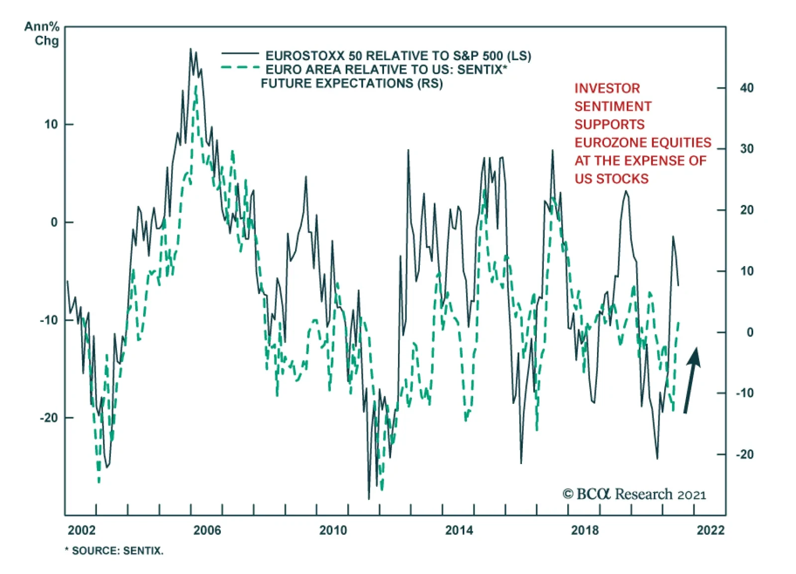
The Sentix Economic Index for the Eurozone continues to provide a positive signal for Euro Area equities. The headline index jumped to 28.1 in June from 21.0 in May, beating expectations of a more muted increase to 25.4. In particular, the indicator shows…
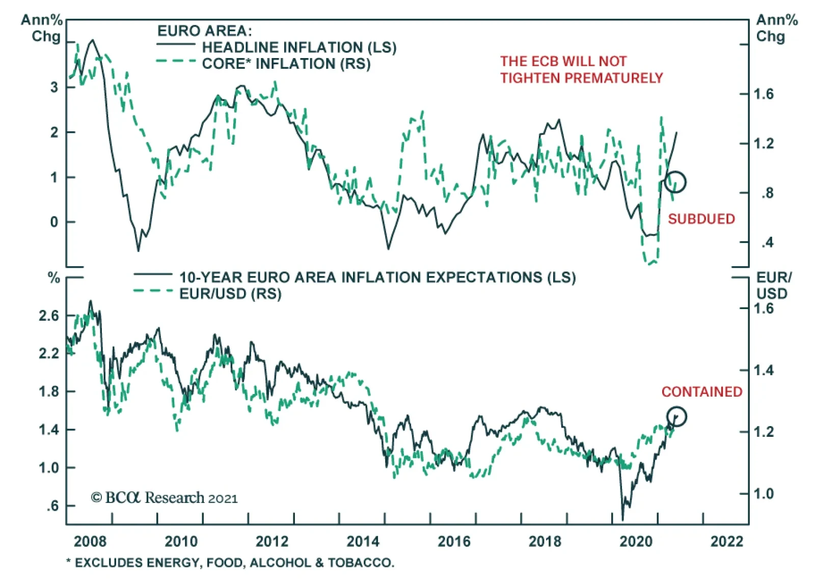
Consumer prices accelerated in the Euro Area in May. The headline consumer price index rose to 2.0% y/y from 1.6% y/y in April. Although the May figure is above the ECB’s target “of below 2%”, the central bank will not hint toward policy tightening on June 10…

Highlights The Fed: The Fed will formally discuss tapering plans over the course of this summer and fall and announce the slowing of asset purchases before the end of 2021. Its labor market objectives will also be achieved in time to lift rates in 2022. Non-US Developed Markets: The central banks outside the US most likely to deliver tapering and/or outright rate hikes over the next 1-2 years are those facing housing bubbles – the Bank of Canada and Reserve Bank of New Zealand. The ECB will do nothing on rates while adjusting asset purchase programs to preserve the size of its balance sheet, while the Reserve Bank of Australia will also sit on their hands for longer. Bond Strategy Recommendations: Investors should maintain below-benchmark portfolio duration in US-only and global fixed income portfolios. Global bond investors should also favor exposure in markets where central banks will be more dovish than expected (core Europe, Australia), while limiting exposure to markets where hawkish surprises are more likely (the US, Canada, New Zealand). Feature The recovery from the 2020 COVID recession is now well underway and many investors are getting antsy about when central bankers might respond by removing monetary policy accommodation. Some central banks appear more eager than others. Both the Bank of Canada and Bank of England, for instance, have already started to reduce their rates of bond buying. Meanwhile, the US Federal Reserve is only just now starting to talk about the timing of its own tapering. This Special Report lays out a timeline for what central bank actions we should expect during the next two years. The first section focuses exclusively on the US Federal Reserve and the second section incorporates likely announcements from other central banks. Based on a comparison of our expected central bank timeline with current market prices, we conclude that investors should maintain below-benchmark portfolio duration in US-only and global fixed income portfolios. Global bond investors should also favor government bonds in countries where central banks are likely to be less hawkish than markets expect (core Europe, Australia) versus bonds from countries where hawkish surprises are more likely (US, Canada, New Zealand and, potentially, the UK and Sweden). The Federal Reserve’s Timeline Chart 1 shows our anticipated timeline for when the Federal Reserve will make specific policy announcements between now and the start of 2024. Chart 1The Federal Reserve’s Timeline
A Central Bank Timeline For The Next Two Years
A Central Bank Timeline For The Next Two Years
First, over the course of this summer, the Fed will initiate discussions about when to taper its asset purchases. Then, asset purchase tapering will be announced at the December 2021 FOMC meeting with purchases set to decline as of the beginning of 2022. We expect that net Fed purchases will fall to zero by the end of Q3 2022. That is, by that time the Fed will no longer be adding to its securities holdings. Rather, it will keep the size of its balance sheet constant. Then, with its balance sheet no longer growing, the Fed will begin the process of lifting interest rates. We expect the first rate hike to occur at the December 2022 FOMC meeting. Finally, some time after the fed funds rate is well above the zero bound, the Fed will try to reduce the size of its securities portfolio. How do we arrive at this timeline? Table 1A Checklist For Liftoff
A Central Bank Timeline For The Next Two Years
A Central Bank Timeline For The Next Two Years
We start with the Fed’s forward guidance about the timing of the first rate hike (Table 1). The Fed has told us that it will lift rates off the zero bound once (i) PCE inflation is above 2%, (ii) the labor market is at “maximum employment” and (iii) inflation is expected to remain above 2% for some time. The first item on the Fed’s liftoff checklist has already been met and the third item logically follows from the other two. That is, if inflation is above 2% and the labor market is at “maximum employment” then the Fed will certainly expect inflation to remain high. This means that the second item on the Fed’s checklist is the most critical for assessing the timing of liftoff. In assessing the US labor market’s progress toward “maximum employment” we first have to define what “maximum employment” means. Based on the Fed’s communications, we infer that “maximum employment” means an unemployment rate between 3.5% and 4.5% - a range consistent with the Fed’s NAIRU estimates – and a labor force participation rate that has recovered back to pre-pandemic levels (Chart 2). Table 2 presents the average monthly growth in nonfarm payrolls that is required to reach that definition of maximum employment by specific future dates. For example, we calculate that average monthly payroll growth of 698k to 830k will cause the labor market to reach maximum employment by the end of this year. Average monthly payroll growth of 412k to 493k is required to hit the Fed’s target by the end of 2022. Chart 2Defining "Maximum Employment"
Defining "Maximum Employment"
Defining "Maximum Employment"
Table 2Average Monthly Nonfarm Payroll Growth Required To Reach Maximum Employment By The Given Date
A Central Bank Timeline For The Next Two Years
A Central Bank Timeline For The Next Two Years
The most recent issue of the Bank Credit Analyst posits several reasons why US employment growth will pick up steam in the coming months.1 We agree with this view and note that indicators of labor demand such as job openings, the NFIB “jobs hard to get” survey and the Conference Board’s “jobs plentiful” survey also point to accelerating employment gains.2 All told, we think that average monthly payroll growth of 412k to 493k is eminently achievable (Chart 3). This means that the Fed will hit its three liftoff criteria in time to hike rates before the end of 2022. Chart 3Max Employment By The End of 2022
Max Employment By The End of 2022
Max Employment By The End of 2022
Working backwards from the expected liftoff date, the Fed has said that it needs to see “substantial progress” toward the criteria listed in Table 1 before it will taper its pace of asset purchases. The definition of “substantial progress” remains somewhat unclear, but a few recent Fed communications provide some clues. First, Fed Chair Jay Powell said that he wants to see a “string of months” like the strong March employment report before it will be appropriate to reduce the pace of asset purchases. The question of how many months constitutes a “string” remains unclear, but it certainly seems plausible that we could see two or three more strong employment reports over the course of the summer. Other Fed Governors appear to agree with this timeline. Governor Randal Quarles: If my expectations about economic growth, employment, and inflation over the coming months are borne out, however, and especially if they come in stronger than I expect, then, as noted in the minutes of the last FOMC meeting, it will become important for the FOMC to begin discussing our plans to adjust the pace of asset purchases at upcoming meetings.3 Fed Vice-Chair Richard Clarida: I myself think that the pace of labor market improvement will pick up. […] It may well be the time that – there will come a time in upcoming meetings we’ll be at the point where we can begin to discuss scaling back the pace of asset purchases …4 Fed Governor Christopher Waller: The May and June jobs report[s] may reveal that April was an outlier, but we need to see that first before we start thinking about adjusting our policy stance.5 Our takeaway from these comments is that two or three more strong employment reports, say 500k or higher, would be sufficient for the Fed to more formally discuss tapering plans. Further, several Fed Governors seem to agree with our forecast that nonfarm payroll growth will accelerate in the coming months. With that in mind, it seems reasonable to expect that the Fed will discuss tapering plans over the course of the summer and fall, and that it will have seen sufficient labor market gains to announce a formal plan before the end of this year. Assuming that a tapering announcement occurs before the end of this year and that asset purchases actually start declining as of Jan 1st 2022, we estimate that the tapering process will conclude by the end of Q3 2022. That is, the Fed will hold the size of its balance sheet constant as of that date. Chart 4Balance Sheet Growth Will End Before The First Rate Hike
Balance Sheet Growth Will End Before The First Rate Hike
Balance Sheet Growth Will End Before The First Rate Hike
At the very least, the Fed will certainly bring its net purchases to zero before it lifts rates. This is because it would be incoherent for the Fed to be tightening policy through its interest rate actions while it eases policy with its balance sheet strategy. Indeed, this is the roadmap that the Fed followed leading up to the 2015 rate hike cycle (Chart 4). Finally, we note that the Fed will try to reduce the size of its balance sheet only after the process of rate hikes is well underway. This will be consistent with the last tightening cycle when the Fed waited until the funds rate was 1.5% before it pared the size of its securities portfolio (Chart 4). We also want to stress that the Fed will only try to reduce the size of its balance sheet. In fact, we doubt that this process will get very far. The main reason for our skepticism is that there is an ongoing structural issue in the Treasury market where the supply of securities keeps growing while stricter regulations make it more costly for primary dealers to intermediate trades.6 In this environment, there are strong odds that Treasury market liquidity will evaporate whenever there is a significant shock to financial markets. When that happens, the Fed will be forced to support Treasury market liquidity through large-scale purchases, as was the case during last March’s market turmoil (Chart 5). In essence, the likelihood of future shocks that will necessitate Fed intervention in the Treasury market makes it unlikely that the Fed will make much progress reducing the size of its balance sheet. Chart 5Fed Had To Support Treasury Market In March 2020
Fed Had To Support Treasury Market In March 2020
Fed Had To Support Treasury Market In March 2020
Market Expectations And Investment Implications We can get a sense of how our Fed timeline compares to consensus expectations by looking at the New York Fed’s Surveys of Market Participants and Primary Dealers (Tables 3A & 3B). Respondents to these surveys expect tapering to start in early 2022, in line with our expectations, though they generally see it taking longer for net purchases to fall to zero. Respondents also expect a later Fed liftoff date than we do and don’t see the Fed trying to reduce the size of its balance sheet until well after rate hikes have begun. Table 3ASurvey of Market Participants Expected Fed Timeline
A Central Bank Timeline For The Next Two Years
A Central Bank Timeline For The Next Two Years
Table 3BSurvey Of Primary Dealers Expected Fed Timeline
A Central Bank Timeline For The Next Two Years
A Central Bank Timeline For The Next Two Years
But more important for investors than survey results is what is currently priced into the yield curve. In that regard, the overnight index swap curve is priced for Fed liftoff in February 2023 and a total of 75 bps of rate hikes by the end of 2023 (Chart 6). We expect rate hikes to start earlier and proceed more quickly than that, and therefore recommend running below-benchmark duration in US bond portfolios. Chart 6Market Rate Expectations
Market Rate Expectations
Market Rate Expectations
The Timelines For Other Central Banks Policymakers outside the US are facing many of the same issues that the Fed is – rapidly recovering economies coming out of the pandemic, inflation overshoots, and surging asset prices. However, not every central bank will respond at the same time, or same pace, as the Fed. In Charts 7a and 7b, we show additional timelines for two of the most important non-Fed central banks: the European Central Bank (ECB) and the BoE. We see the likely dates and policy decisions playing out as follows. Chart 7AThe ECB’s Timeline
A Central Bank Timeline For The Next Two Years
A Central Bank Timeline For The Next Two Years
Chart 7BThe Bank Of England’s Timeline
A Central Bank Timeline For The Next Two Years
A Central Bank Timeline For The Next Two Years
European Central Bank For the ECB, the timing of its upcoming inflation strategy review is the most critical element. That report is due to be delivered in the latter half of this year, most likely in September or October (no firm release date has been announced by the ECB). It is highly unlikely that any meaningful policy changes will be implemented before that strategic review is completed. Some ECB officials have hinted that a move to a Fed-like interpretation of the ECB inflation target, tolerating overshoots of the target to make up for past undershoots, could result from the strategy review. The more likely option will be a move to an inflation target range, perhaps a 1-3% tolerance band, that offers more policy flexibility than the current target of just below 2%. This will potentially “move the goalposts” for the ECB in a way that will make monetary tightening even less likely compared to previous cycles. Looking at past ECB tightening episodes dating back to the central bank’s inception in 1998, it is clear that a majority of countries within the euro area must be seeing inflation that is high enough, with unemployment low enough, before any policy tightening can take place. Chart 8 illustrates this point, by showing “breadth” measures for unemployment and inflation across the euro area.7 Chart 8The ECB Usually Tightens When Growth AND Inflation Are Broad Based
The ECB Usually Tightens When Growth AND Inflation Are Broad Based
The ECB Usually Tightens When Growth AND Inflation Are Broad Based
Specifically, the chart shows the percentage of euro area countries with an unemployment rate below the OECD’s estimate of full employment (second panel), the percentage of euro area countries with headline inflation higher than one year earlier (third panel) and the percentage of euro area countries with headline inflation above the ECB’s 2% target (bottom panel). We compare those breadth measures to the actual path of policy interest rates and the size of the ECB’s balance sheet (top panel). The conclusion from the chart is that the euro area is still a long way from having the sort of broad-based rise in inflation or fall in unemployment necessary to trigger a reduction in the size of its balance sheet or actual interest rate hikes. Chart 9The ECB Is Under No Pressure To Tighten Pre-Emptively
The ECB Is Under No Pressure To Tighten Pre-Emptively
The ECB Is Under No Pressure To Tighten Pre-Emptively
Nonetheless, our expectation is that the ECB will want to begin preparing the markets for the end of the Pandemic Emergency Purchase Program (PEPP) - which has been buying government bonds since March 2020 in a less constrained fashion than previous asset purchase programs - shortly after the inflation strategy review is concluded. Much of the euro area economy is already showing signs of rapid recovery from pandemic induced lockdowns, amid an accelerating pace of vaccinations. On top of that, the Next Generation European Union (NGEU) recovery fund is set to begin distributing funds in the final quarter of 2021, providing a meaningful lift to government investment and expected growth in 2022. It will be difficult for the ECB to justify the need for an “emergency” program like the PEPP to continue against such a growth backdrop, especially with euro area inflation no longer at the depressed levels seen in 2020. We expect the ECB to begin preparing the market for the end of PEPP heading into the December 2021 ECB policy meeting, when it will be announced that the program will not be renewed when it expires in March 2022 (Chart 9). As always for such major policy announcements, the ECB will wish to do so when there is a new set of economic forecasts used to justify any changes. This is why December – the first meeting after the strategic review is completed that will also have new forecasts – is the earliest realistic date for an announcement on the PEPP. The communication around the PEPP announcement will need to be delicate, as the PEPP has significantly increased the ECB’s footprint in European bond markets. The share of government bonds owned by the ECB has increased by anywhere from five to ten percentage points since the PEPP began (Chart 10). We expect the ECB will be forced to expand its existing Public Sector Purchase Program (PSPP) to make up for the eventual disappearance of the PEPP. This means that the PEPP will be effectively “rolled into” the PSPP, to limit the damage from a likely post-PEPP surge in bond yields in the more fragile markets like Italy, Spain and even Greece – especially with the euro now trading close to pre-2008 highs on a trade-weighted basis (Chart 11). Chart 10The PEPP Can Expire, But Cannot Disappear
A Central Bank Timeline For The Next Two Years
A Central Bank Timeline For The Next Two Years
Chart 11ECB Must Avoid A 'PEPP Taper Tantrum'
ECB Must Avoid A 'PEPP Taper Tantrum'
ECB Must Avoid A 'PEPP Taper Tantrum'
There is a chance that the ECB will want to avoid any “PEPP taper tantrum” in Peripheral European yields (and spreads versus Germany) by making an announcement on PEPP expiry and PSPP expansion at the same meeting. If that happens, we suspect it would happen in December of this year rather than sometime in the first quarter of 2022. Beyond that, the ECB will likely seek to keep financial conditions as accommodative as possible by keeping policy interest rates unchanged well into 2023, with an actual rate hike not likely until mid-2024 at the earliest. The ECB could deliver a more modest form of “tightening” before then by letting some of the cheap bank funding programs (TLTROs) expire. Although we suspect that even those programs will need to be renewed, perhaps at less attractive financing terms, to prevent an unwanted tightening of credit conditions in the euro area banking system. Bank Of England Chart 12BoE Forecasts Are Conservative
BoE Forecasts Are Conservative
BoE Forecasts Are Conservative
Having already announced a tapering of the pace of its bond buying in early May, the BoE is likely to continue along that path over the next year. We expect the BoE, like the ECB, to make any future taper announcements when new sets of economic forecasts are published in Monetary Policy Reports. Thus, the next taper announcements are expected in August 2021, November 2021 and February 2022, with a full tapering down to zero net purchases (new buying only replacing maturing bonds) by May 2022 at the latest. The first rate hike will occur between 6-12 months after the end of tapering, possibly as early as November 2022 but, more likely in our view, sometime closer to mid-2023. The most recent set of BoE economic forecasts calls for headline UK CPI inflation to rise to 2.3% in 2022 before settling down to 2% in 2023 and 1.9% in 2024 (Chart 12). This would be a mild inflation outcome by recent UK standards during what will certainly be a period of strong post-pandemic growth over the next 12-18 months. Longer-term inflation expectations, both survey-based and extracted from CPI swaps and inflation-linked Gilts, are priced for a bigger inflation upturn above 3%. The BoE has been one of the least active central banks in the developed world since the 2008 financial crisis. The BoE main policy rate, the Bank Rate, has been no higher than 0.75% since then, even with the BoE threatening to lift rates to higher levels many times under the leadership of former Governor Mark Carney when inflation was overshooting the bank’s 2% target. Of course, the Brexit uncertainty since mid-2016 effectively tied the hands of the central bank and prevented any possible policy tightening. Now that Brexit has actually happened, however, the BoE has more flexibility to respond to developments with UK economic growth and inflation, as needed. A possible path for the UK Cash Rate was laid out in a recent speech by BoE Monetary Policy Committee (MPC) member Gertjan Vlieghe.8 He triggered a selloff across the Gilt market with his comment that a BoE rate hike could occur as early as Q2 2022 – with the Bank Rate rising to 1.25% from the current 0.1% by 2024 - under more optimistic scenarios for UK growth and employment. His base case, however, was that the coming uptick in UK inflation will prove to be temporary, but that a move towards full employment will make the first hike more likely toward the end of 2022 with modest rate increases in 2023 and 2024 that will take the Bank Rate to 0.75% (Chart 13). Chart 13Gilts Are Vulnerable To A Hawkish Surprise
Gilts Are Vulnerable To A Hawkish Surprise
Gilts Are Vulnerable To A Hawkish Surprise
Vlighe’s base case scenario on growth and interest rates is in line with the BoE’s current forecasts that call for spare capacity in the UK economy to be fully eliminated by mid-2022, with rate hikes to begin in mid-2023. That is broadly in line with our projected BoE timeline and with current pricing in the UK OIS curve, although we see risks tilted towards faster growth and inflation – and the BoE moving more aggressively than projected – over the next 12-18 months. Other Major Developed Market Central Banks Looking beyond the “Big Three” of the Fed, ECB and BoE, central bank timelines have become increasingly dependent on a single factor – the strength of domestic housing markets. House prices are booming in Canada, New Zealand and Sweden, with valuation measures like the ratio of median house prices to median incomes soaring to historical extremes according to the OECD (Chart 14). House prices are also climbing fast in the US and UK, but the valuation measures have not surpassed the peaks seen during the mid-2000s housing bubble. The housing boom has already motivated some central banks to respond by turning less dovish sooner than expected, even with unemployment rates still above pre-pandemic peaks (Chart 15).9 The BoC noted that soaring Canadian housing values motivated the taper announcement in April. The Reserve Bank of New Zealand (RBNZ) has come under political pressure over the growing unaffordability of New Zealand homes, with the government changing the central bank’s remit earlier this year to force the RBNZ to explicitly consider house price inflation when setting monetary policy. Chart 14Surging House Prices Can Turn Doves Into Hawks
Surging House Prices Can Turn Doves Into Hawks
Surging House Prices Can Turn Doves Into Hawks
Chart 15These CBs Could Turn More Hawkish Before Reaching Full Employment
These CBs Could Turn More Hawkish Before Reaching Full Employment
These CBs Could Turn More Hawkish Before Reaching Full Employment
We expect more tapering announcements from the BoC over the latter half of 2021, with a first rate hike likely sometime in the first quarter of 2022. We see the RBNZ moving aggressively, as well, tapering over the remainder of 2021 before lifting rates by the spring of 2022 at the latest. Sweden’s Riksbank will be the next central bank to turn more hawkish because of surging home values, although they will lag the pace of the BoC and RBNZ with Sweden only now beginning to emerge from lockdowns associated with a third wave of COVID-19 cases. Importantly, Australia – a country that has dealt with house price surges in the past – has seen house price valuations retreat over the past few years, even with the Reserve Bank of Australia (RBA) slashing policy rates to historic lows. The RBA also introduced yield curve control in 2020 to anchor the level of short-term bond yields, while also engaging in outright bond purchases to mitigate the rise in longer-term bond yields. With Australian inflation still remaining well below target in a year of rising global inflation, and with subdued labor costs likely to keep price pressures moderate over the next 12-18 months, we expect the RBA to move very slowly on both tapering and rate hikes. Finally, for completeness, we should note that we do not expect any policy changes from the Bank of Japan (BoJ) over the next two years, with inflation likely to remain far below the central bank’s 2% target. Non-US Investment Implications In Table 4, we show the timing of the first rate hike (i.e. “liftoff”), and the subsequent amount of total rate hikes to the end of 2024, as currently discounted in the OIS curves of the eight countries discussed in this report. We rank the countries in the table in order of liftoff dates, starting with the closest to today. Table 4The “Pecking Order” Of Central Bank Rate Hikes
A Central Bank Timeline For The Next Two Years
A Central Bank Timeline For The Next Two Years
The RBNZ is expected to hike first in May 2022, followed by the BoC (September 2022), the Fed (February 2023), the RBA (April 2023), the Riksbank (May 2023), the BoE (May 2023), the ECB (June 2023) and the BoJ (October 2025). The cumulative amount of rate hikes discounted to the end of 2024 rank similarly: more rate increases are expected in New Zealand (167bps), Canada (150bps), the US (137bps) and Australia (113bps); while fewer rate increases are expected in the Sweden (63bps), the UK (61bps), the euro area (31bps) and Japan (7bps). According to our various central bank timelines discussed in this report, we see the risks of a rate hike coming sooner than discounted by markets in the US, Canada and New Zealand. We see central banks moving slower than markets expect in the euro area and Australia, while we see Sweden and UK priced in line with our base case views (although we see risks tilted towards a more hawkish turn faster than expected in the latter two). The story is the same in terms of cumulative rate hikes discounted in OIS curves, with markets not pricing in enough rate hikes in New Zealand, Canada and the US – and, possibly, Sweden and the UK – while pricing too many hikes in Australia and the euro area. This leads us to recommend the following country allocations in a global government bond portfolio: Underweight the US, Canada and New Zealand Overweight Australia and core Europe (and Japan) Neutral Sweden and the UK, but with a bias to downgrade. Ryan Swift US Bond Strategist rswift@bcaresearch.com Robert Robis, CFA Chief Fixed Income Strategist rrobis@bcaresearch.com Footnotes 1 Please see The Bank Credit Analyst June 2021 Monthly Report, "Global House Prices: A New Threat For Policymakers", dated May 27, 2021. 2 Please see US Bond Strategy Weekly Report, “Lower For Longer, Then Faster Than You Think”, dated May 25, 2021. 3 https://www.federalreserve.gov/newsevents/speech/quarles20210526b.htm 4 https://ca.news.yahoo.com/federal-reserve-vice-chair-richard-clarida-yahoo-finance-transcript-may-2021-173007192.html 5 https://www.federalreserve.gov/newsevents/speech/waller20210513a.htm 6 For a longer discussion of Treasury market liquidity issues please see US Investment Strategy / US Bond Strategy Special Report, “Alphabet Soup 2: Shocked And Awed”, dated July 28, 2020. 7 For more details, please see Global Fixed Income Strategy Report, “ECB Outlook: Walking On Eggshells”, dated May 19, 2021. 8 The full speech can be found here: https://www.bankofengland.co.uk/speech/2021/may/gertjan-vlieghe-speech-hosted-by-the-department-of-economics-and-the-ipr 9 For more details on the global housing boom, see Global Fixed Income Strategy Special Report, “Global House Prices: A New Threat For Policymakers”, dated May 28, 2021. Fixed Income Sector Performance Recommended Portfolio Specification
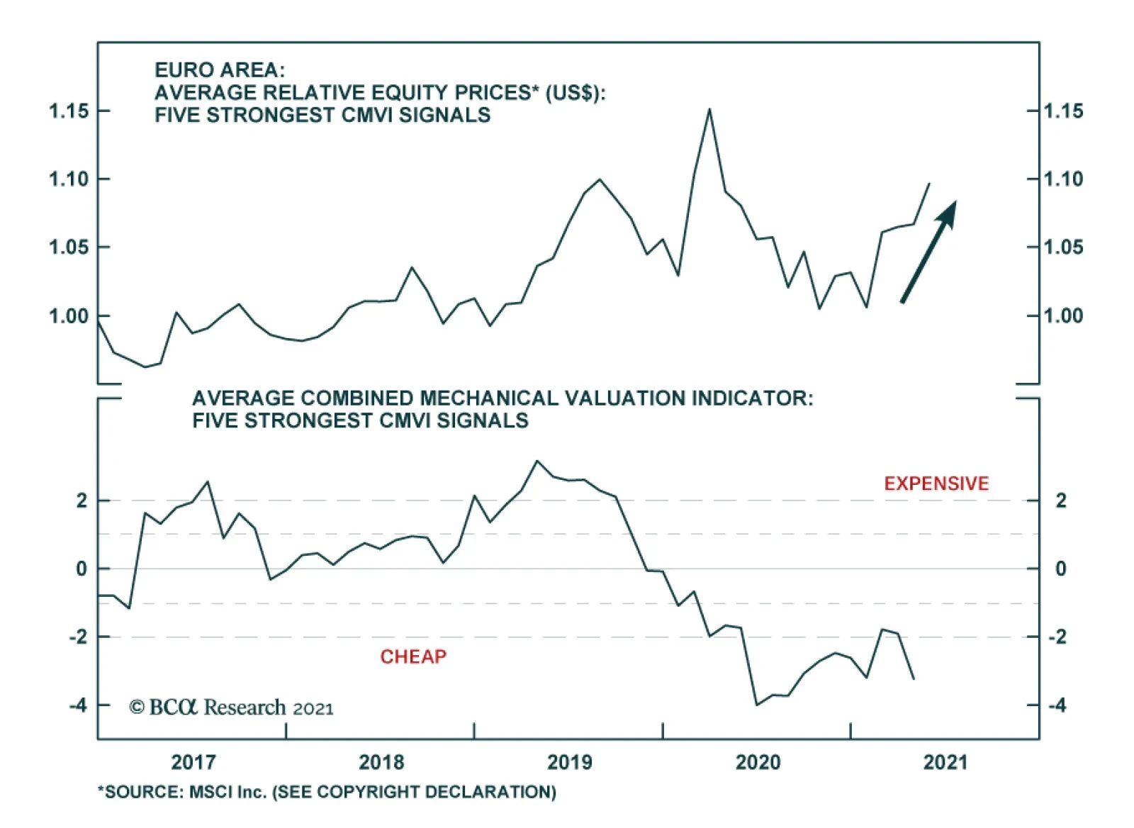
BCA Research’s European Investment Strategy service introduces its Combined Mechanical Valuation Indicator for European equities to identify extreme valuations at the country and sector level. At present, the Combined Mechanical Valuation Indicator only…
Highlights House prices are rising rapidly across the developed markets, in response to the extraordinary monetary and fiscal policy stimulus implemented to fight the pandemic. Evidence points to the house price surge being driven by monetary policy that has left real interest rates far below equilibrium levels. Supply factors are a secondary cause of the house price boom. Financial stability risks stemming from rising house prices are less acute than the pre-2008 experience, as overall household leverage has grown more slowly during the pandemic and global banks are better capitalized. Rapidly rising house prices are forcing some central banks to turn less accommodative earlier than expected. The recent hawkish turns by the Bank of Canada and Reserve Bank of New Zealand may be canaries in the coal mine for other central banks – perhaps even the Fed – if house prices and household leverage start rising together. Feature The COVID-19 pandemic led to the sharpest economic recession since World War II, alongside an enormous rise in unemployment. Consensus expectations call for the output gap to be closed (or mostly closed) in most advanced economies by the end of this year, but it remains an open question how quickly these economies will be able to return to full employment amid potentially permanent shifts in demand for office space and goods sold at physical, “brick and mortar” retail locations. Despite this sizeable and swift economic shock, house price appreciation accelerated last year in the developed world. Chart II-1 highlights that US house prices rose at an 18% annualized pace in the second half of 2020, whereas they accelerated at a high-single digit pace in developed markets ex-US (on a GDP-weighted basis). This, in conjunction with a sharp rise in the household sector credit-to-GDP ratio (Chart II-2), has unnerved some investors while raising questions about the implications for monetary policy. Chart II-1House Prices Are Surging Around The World
House Prices Are Surging Around The World
House Prices Are Surging Around The World
Chart II-2Rising Fears About Deteriorating Household Balance Sheets
Rising Fears About Deteriorating Household Balance Sheets
Rising Fears About Deteriorating Household Balance Sheets
Before we discuss the investment implications of the global housing boom, however, we must first accurately determine the reasons why it is happening. The Work-From-Home Effect: Less Than Meets The Eye When analyzing the surprising behavior of the housing market last year, the working-from-home effect brought upon by the pandemic emerges as an obvious factor potentially explaining house price gains. Last year, following recommended or mandatory stay-at-home orders from governments, most office-based businesses rapidly shifted to work-from-home arrangements as an emergency response. However, in the month or two following the beginning of stay-at-home orders, several national US surveys found many office workers preferred the flexibility afforded by work-from-home arrangements. Many employers, correspondingly, found that the productivity of their employees did not suffer while working from home, or that it even improved. Several prominent corporations in the US have subsequently made some work-from-home options permanent, or even allowed employees to work from offices in a different city than they did prior to the pandemic. Newfound work-from-home options have undoubtedly created new demand for housing, and thus explained the surge in house prices seen over the past year in the minds of some investors. However, in our view, evidence from the US, the UK, and France suggests that the work-from-home effect better explains differences in price gains across housing types and within large metropolitan areas, rather than aggregate or national-level changes in house prices. Chart II-3 provides some quantification of the impact of work-from-home policies by plotting US resident migration patterns by city. This data has been compiled by CBRE, and the impact of COVID is shown as the change in net move-ins from 2019 to 2020 per 1000 people. This helps control for the underlying migration pattern that existed in US cities prior to the pandemic. Chart II-3Work From Home Policies Have Impacted Migration Trends…
June 2021
June 2021
The chart highlights that the negative migration impact from COVID has been mostly concentrated in New York City and the three most populous cities on the West Coast (by metro area): Los Angeles, San Francisco, and Seattle. And yet, Chart II-4 highlights that house price inflation in these four cities has accelerated to a double-digit pace, only modestly below the national average. Chart II-4...But Cities With Outward Migration Still Have Very Strong House Price Gains
...But Cities With Outward Migration Still Have Very Strong House Price Gains
...But Cities With Outward Migration Still Have Very Strong House Price Gains
The house price indexes shown in Chart II-4 represent aggregate, metro area trends, and clearly some regions within these metro areas have experienced house price deceleration or outright deflation versus gains in areas outside the urban core. But Chart II-5 highlights that house prices have declined in Manhattan basically in line with the change in net move-ins as a share of the population, underscoring that double-digit metro area-wide house price gains appear to be vastly disproportionate to changes in net migration. Similarly, Chart II-6 highlights that rents decelerated in the US over the past year but remained in positive territory and grew at a 3.5% annualized rate from February to April. Chart II-5In Manhattan, House Prices Have Tracked Net Migration
June 2021
June 2021
Chart II-6Rent Costs Have Decelerated, But Have Not Contracted
Rent Costs Have Decelerated, But Have Not Contracted
Rent Costs Have Decelerated, But Have Not Contracted
Evidence from Paris and London also suggests that a work-from-home effect is insufficient to explain broad house price gains. Panel 1 of Chart II-7 highlights that house prices in France have accelerated significantly, but that apartment prices have decelerated only fractionally in lockstep. Panel 2 shows that the acceleration in house prices does reflect a work-from-home effect, as prices have risen faster in inner Parisian suburbs. Panel 3, however, highlights that Parisian apartment prices, the dominant property type in the urban core, have decelerated modestly. Chart II-8 highlights that house price gains have not even decelerated in greater London; they have been merely been modestly outstripped by gains in Outer South East (outside of the Outer Metropolitan Area). Chart II-7In France, Parisian Apartment Prices Are Simply Lagging, Not Falling
In France, Parisian Apartment Prices Are Simply Lagging, Not Falling
In France, Parisian Apartment Prices Are Simply Lagging, Not Falling
Chart II-8In The UK, Greater London Property Prices Are Accelerating
In The UK, Greater London Property Prices Are Accelerating
In The UK, Greater London Property Prices Are Accelerating
The Policy Effect: The Fundamental Driver Of The Housing Market Despite the broader location flexibility that work-from-home policies now provide to potential homeowners, it seems inconceivable that the housing market would have responded in the manner that it has over the past year given the size of the economic shock brought on by the pandemic without significant support from policy. Above-the-line fiscal measures to the pandemic have totaled in the double-digits in advanced economies (Chart II-9), and monetary policy has contributed to easier financial conditions via rate cuts, asset purchases, and sizeable programs to support financial market liquidity. Chart II-9There Has Been A Massive Fiscal Policy Response To The Crisis
June 2021
June 2021
In fact, Charts II-10-II-13 present compelling evidence that fiscal and monetary policy have been the core drivers of significant house price gains over the past year. Charts II-10 and II-11 plot the above-the-line fiscal response of advanced economies against the year-over-year growth rate in house prices as well as its acceleration (the change in the year-over-year growth rate). The charts show a clearly positive relationship, with a stronger link between the pandemic fiscal response and the acceleration in house prices. Chart II-10Differences In Last Year’s Fiscal Response…
June 2021
June 2021
Chart II-11…Help Explain Differences In House Price Gains
June 2021
June 2021
Chart II-12Pre-Pandemic Differences In The Monetary Policy Stance…
June 2021
June 2021
Chart II-13…Do An Even Better Job Of Explaining 2020 House Price Gains
June 2021
June 2021
Charts II-12 and II-13 highlight the even stronger link between house prices and the pre-pandemic monetary policy stance in advanced economies, defined as the difference between each country’s 2-year government bond yield and its Taylor Rule-implied policy interest rate as of Q4 2019. We construct each country’s Taylor Rule using the original specification, with core consumer price inflation, a 2% inflation target, and real potential GDP growth as the definition of the real equilibrium interest rate. The charts make it clear that easy monetary policy strongly explains house price gains in 2020, particularly the year-over-year percent change rather than its acceleration. This makes sense, given that monetary policy was already quite easy in many countries at the onset of the pandemic – meaning that changes were less pronounced than they would have been had interest rates been higher. The explanation that emerges from Charts II-10-II-13 is that historic fiscal easing, combined with an easy starting point for monetary policy – that became even easier last year – enabled demand from work-from-home policies to manifest during an extremely severe recession. We agree that work-from-home policies have shifted the geographic preferences of some home buyers and likely provided a new source of net demand from renters in urban cores purchasing homes in outlying areas. But we strongly doubt that the net effect of work-from-home policies in the midst of an extreme shock to economic activity would have caused the rise in house prices that we have observed, certainly not to this level, without major support from policy. This underscores that policy, and not the work-from-home effect, has and will likely remain the core driver of the global housing market. The Supply Effect: Mostly A Red Herring Chart II-14Countries Fall Into Two Groups In Terms Of The Relative Trend In Real Residential Investment
Countries Fall Into Two Groups In Terms Of The Relative Trend In Real Residential Investment
Countries Fall Into Two Groups In Terms Of The Relative Trend In Real Residential Investment
One perennial question that emerges when analyzing the housing market, particularly in markets with outsized house price gains, is the impact of constrained supply. It is frequently argued that constrained supply is squeezing prices higher in many markets, and that the appropriate policy solution to extreme house price gains is to enable widespread housing construction – not to raise interest rates. We do not rule out the potential impact of constrained supply in certain cities or regional housing markets, and we have highlighted in previous research that a positive relationship does exist between population density in urban regions and median house price-to-income ratios.1 But as a broad explanation for supercharged house price gains, the supply argument appears to fall flat. Chart II-14 presents the most standardized measure of cross-country housing supply available for several advanced economies, the trend in real residential investment relative to real GDP over time. These series are all rebased to 100 as of 1997, prior to the 2002-2007 US housing market boom. The chart makes it clear that advanced economies generally fall into two groups based on this metric: those that have seen declines in real residential investment relative to GDP, especially after the global financial crisis (panel 1), and those that have experienced either an uptrend in housing construction relative to output or have seen a flat trend (panel 2). If scarce housing supply was the core driver of outsized house price gains, then we would expect to see stronger gains in the countries shown in panel 1 and smaller gains in the countries shown in panel 2. In fact, mostly the opposite is true: Charts II-15 and II-16 highlight that the relationship between the level of these indexes today relative to their 1997 or 2005 levels is positively related to the magnitude of house price gains last year, suggesting that housing market supply has generally been responding to demand over the past decade. The US and possibly New Zealand stand as possible exceptions to the trend, suggesting that relatively scarce supply may be boosting prices even further in these markets beyond what fiscal and monetary policy would suggest. Chart II-15Countries That Have Seen A Stronger Pace Of Residential Investment…
June 2021
June 2021
Chart II-16…Have Experienced Stronger House Price Gains
June 2021
June 2021
Chart II-17Is This Not Enough Supply, Or Too Much Demand?
June 2021
June 2021
As a final point about the inclination of investors to gravitate towards supply-side arguments related to the housing market, Chart II-17 presents a simple thought experiment. The chart shows a simple housing supply-demand curve diagram, in a scenario where the demand curve for housing has shifted out more than the supply curve has (thus raising house prices). Is this a scenario in which supply is too tight? Or is it a case in which demand is too strong? In our view, the tight supply answer is reasonable in circumstances where the increase in demand is normal or otherwise sustainable. But Charts II-10-II-13 clearly showed that housing demand is being boosted by easy policy, which in the case of some countries has occurred for years: interest rates have remained well below levels that macroeconomic theory would traditionally consider to be in equilibrium, and this has occurred alongside significant household sector leveraging (Chart II-18). As such, in our view, investors should be more inclined to view the global housing market as generally being driven by demand-side rather than supply-side factors. This Is Not 2007/08 … Yet We highlighted in Chart II-2 above that the household sector debt-to-GDP ratio increased sharply last year, which has raised some questions about debt sustainability among investors. For the most part, the rise in this ratio actually reflects denominator effects (namely a sharp contraction in nominal GDP) rather than a huge surge in household debt. Chart II-19 shows BIS data for the annual growth in total household debt in developed economies was roughly stable last year, at least until Q3 (the most recent datapoint available from the BIS). Chart II-18Low Interest Rates Have Fueled Household Leveraging
Low Interest Rtaes Have Fueled Household Leveraging
Low Interest Rtaes Have Fueled Household Leveraging
Chart II-19Total Credit Growth Has Been Stable, But Mortgage Credit Growth Is Accelerating
Total Credit Growth Has Been Stable, But Mortgage Credit Growth Is Accelerating
Total Credit Growth Has Been Stable, But Mortgage Credit Growth Is Accelerating
Chart II-20US Mortgage Growth Is Picking Up, As Repayments Slow Consumer Credit Growth
US Mortgage Growth Is Picking Up, As Repayments Slow Consumer Credit Growth
US Mortgage Growth Is Picking Up, As Repayments Slow Consumer Credit Growth
But Chart II-19 shows the recent trend in total household debt, which masks diverging mortgage and non-mortgage debt trends. In the US, euro area, Canada, and Sweden, household mortgage debt has accelerated to varying degrees, underscoring that households have likely paid down non-mortgage debt with some of the savings that they have accumulated from a significant reduction in spending on services. Chart II-20 shows this effect directly in the case of the US; mortgage debt growth accelerated by roughly 1.5 percentage points in the second half of the year, whereas consumer credit growth (made up of student loans, auto loans, credit cards, and other revolving credit) decelerated significantly. This aligns with data showing that US households have used some of their savings windfall to pay down their credit card balances. This changing mix within household debt - less higher-interest-rate consumer credit, more lower-interest-rate collateralized mortgage debt – could, on the margin, help mitigate financial stability risks from the housing boom by moderating overall debt service burdens. The starting point for the latter matters, though, in accurately assessing the risks from rising house prices and increased mortgage debt, particularly in countries where household debt levels are already high. According to data from the BIS, the US already has one of the lowest household debt service ratios (7.6%) among the developed economies (Chart II-21).2 This compares favorably to the double-digit debt service ratios in the “higher-risk” countries like Canada (12.6%), Sweden (12.1%) and Norway (16.2%). On top of that, US commercial banks have become far more prudent with mortgage loan underwriting standards since the 2008 financial crisis. The New York Fed’s Household Debt and Credit report shows that an increasing majority of mortgage lending made by US banks since the 2008 crisis has been to those with very high FICO credit scores (Chart II-22). This is in sharp contrast to the steady lending to “subprime” borrowers with poor credit scores that preceded the 2008 financial crisis. The median FICO score for new mortgage originations as of Q1 2021 was 788, compared to 707 in Q4 2006 at the peak of the mid-2000s US housing boom. Chart II-21Diverging Trends In Global Household Debt Servicing Costs
Diverging Trends In Global Household Debt Servicing Costs
Diverging Trends In Global Household Debt Servicing Costs
Chart II-22US Banks Have Become More Prudent With Mortgage Lending
US Banks Have Become More Prudent With Mortgage Lending
US Banks Have Become More Prudent With Mortgage Lending
US bank balance sheets are also now less directly exposed to a fall in housing values. Residential loans now represent only 10% of the assets on US bank balance sheets, compared to 20% at the peak of the last housing bubble (Chart II-23). This puts the US in the “lower-risk” group of countries in Europe, the UK and Japan where mortgages are less than 20% of bank balance sheets. This compares favorably to the “higher risk” group of countries where residential loans are a far larger share of bank assets (Chart II-24), like Canada (32%), New Zealand (49%), Sweden (45%) and Australia (40%). Chart II-23Banks Have Limited Direct Exposure To Housing Here
Banks Have Limited Direct Exposure To Housing Here
Banks Have Limited Direct Exposure To Housing Here
Chart II-24Banks Are Far More Exposed To Housing Here
Banks Are Far More Exposed To Housing Here
Banks Are Far More Exposed To Housing Here
Like nature, however, the financial ecosystem abhors a vacuum. “Non-bank” mortgage lenders have filled the void from traditional US banks reducing their lending to lower-quality borrowers, and they now represent around two-thirds of all US mortgage origination, a big leap from the 20% origination share in 2007. Non-bank lenders have also taken on growing shares of new mortgage origination in other countries like the UK, Canada and Australia. Chart II-25Global Banks Can Withstand A Housing Shock
June 2021
June 2021
Non-bank lenders do not take deposits and typically fund themselves via shorter-term borrowings, which raises the potential for future instability if credit markets seize up. These lenders also, on average, service mortgages with a higher probability of default, so they are exposed to greater credit losses when house prices decline. However, the risk of a full-blown 2008-style commercial banking crisis, with individual depositors’ funds at risk from a bank failure, are reduced with a greater share of riskier mortgage lending conducted by non-bank entities. This is especially true with global commercial banks far better capitalized today, with double-digit Tier 1 capital ratios (Chart II-25), thanks to regulatory changes made after the Global Financial Crisis. Net-net, we conclude that the overall financial stability implications of the current surge in house prices in the developed economies are relatively modest on average. The acceleration in mortgage growth has occurred alongside reductions in non-mortgage growth, at a time when banks are better able to withstand a shock from any sustained future downturn in house prices. However, if house prices continue to accelerate and new homebuyers are forced to take on ever increasing amounts of mortgage debt, financial stability issues could intensify in some countries. Services spending will recover in a vaccinated post-COVID world, as economies reopen and consumer confidence improves, which will likely end the trend of falling non-residential consumer debt offsetting rising mortgage debt in countries like the US and Canada. Overall levels of household debt could begin to rise again relative to incomes, building up future financial stability risks when central banks begin to normalize pandemic-related monetary policies – a process that has already started in some countries because of the housing boom. The Monetary Policy Implications Of Surging House Prices Rapidly appreciating house prices are becoming an area of concern for policymakers in countries like Canada and New Zealand, where the affordability of housing is becoming a political, as well as an economic, issue. In the case of New Zealand, the government has actually altered the remit of the Reserve Bank of New Zealand (RBNZ) to more explicitly factor in the impact of monetary policy on housing costs. The Bank of Canada announced in April that it would taper its pace of government debt purchases and signaled that its decision was based, at least in small part, on signs of speculative behavior in Canada’s housing market. Macroprudential measures like limiting loan-to-value ratios of new mortgage loans are a policy option that governments in those countries have already implemented to try and cool off housing demand. Yet while such measures can help alleviate demand-supply mismatches in certain cities and regions, the efficacy of such measures in sustainably slowing the ascent of house prices on a national scale is unclear. In the April 2021 IMF Global Financial Stability Report, researchers estimated that, for a broad group of countries, the implementation of a new macro-prudential measure designed to cool loan demand reduced national household debt/GDP ratios by a mere one percentage point, on average, over a period encompassing four years.3 If macroprudential measures are that ineffective in sustainably reducing demand for mortgage loans, then the burden of slowing house price appreciation will have to fall on the more blunt instruments of monetary policy. Importantly, surging house price inflation is not likely to give a boost to realized inflation measures – an important issue given the current backdrop of rapidly rising realized inflation rates in many countries. Housing costs do represent a significant portion of consumer price indices in many developed countries, ranging from 19% in New Zealand to 33% in the US (Chart II-26), with the euro area being the outlier with housing having a mere 2% weighting in the headline inflation index. Chart II-26A Limited Impact On Actual Inflation From Housing
June 2021
June 2021
Yet those so-called “housing” categories overwhelmingly measure only housing rental costs and not actual house prices. This is an important distinction because rents – which are often imputed measures like in the US and not even actual rental costs - are rising at a far slower pace than actual house prices in most countries, so the housing contribution to realized inflation is relatively modest. So the good news is that booming house prices will not worsen the acceleration of realized global inflation that has concerned investors and policymakers in 2021. Yet that does not mean that central bankers will not be forced to tighten policy to cool off red-hot housing demand that is clearly being fueled by persistently negative real interest rates. In Chart II-27 and Chart II-28, we show both nominal and real policy interest rates for the “lower risk” and “higher risk” country groupings that we described earlier. The real policy rates are nominal policy rates versus realized headline CPI inflation. The dotted lines in the charts represent the future path of rates discounted by markets. Specifically, the projection for nominal rates is taken from overnight index swap (OIS) forward curves, while the projection for real rates is calculated by subtracting the discounted path of inflation expectations extracted from CPI swap forwards. Chart II-27Markets Discounting Negative Real Rates For The Next Decade
Markets Discounting Negative Real Rates For The Next Decade
Markets Discounting Negative Real Rates For The Next Decade
Chart II-28Negative Real Rates Are Unsustainable During A Housing Bubble
Negative Real Rates Are Unsustainable During A Housing Bubble
Negative Real Rates Are Unsustainable During A Housing Bubble
There are two key takeaways from these charts: Real policy interest rates are at or very close to the most deeply negative levels seen since the 2008 financial crisis. Markets are discounting that real rates will be at or below 0% for most of the next decade. Admittedly, there is room for debate over what the equilibrium level of real interest rates (a.k.a. “r-star”) should be in the coming years. However, we deem it a major stretch to believe that real rates need to be persistently low or negative for the next ten years to support even trend growth across the developed economies. In our view, the current boom in housing demand and mortgage borrowing provides clear evidence that negative real rates are below equilibrium and, thus, are stimulating credit demand. Thus, the only way for a central bank to cool off housing demand will be to raise both nominal and, more importantly, real interest rates. Canada and New Zealand will be the “canaries in the coal mine” among developed market central banks for such a move. According to the latest Bank of Canada Financial Stability Review, nearly 22% of Canadian mortgages are highly levered, with a loan-to-value ratio greater than 450%, a greater share of such mortgages than during the 2016/17 housing boom (Chart II-29). Canadian house prices have risen to such an extent that home prices in major cities like Toronto, Vancouver and Montreal are among the most expensive in North America.4 Stunningly, a recent Bloomberg Nanos opinion poll revealed that nearly 50% of Canadians would support Bank of Canada rate hikes to cool off the red-hot housing market (Chart II-30). The central bank will be unable to resist the pressure to use monetary policy to slam on the brakes of the housing market – investors should expect more tapering and, eventually, rate hikes from the Bank of Canada over at least the next couple of years. Chart II-29Canadians Are Leveraging Up To Buy Expensive Homes
Canadians Are Leveraging Up To Buy Expensive Homes
Canadians Are Leveraging Up To Buy Expensive Homes
Chart II-3050% Of Canadians Want A Rate Hike To Cool Housing
June 2021
June 2021
In New Zealand, worsening housing affordability has reached a point where a 20% down payment on the median national house price is equal to 223% of median disposable income (Chart II-31). This is forcing more first-time home buyers to take on levels of mortgage debt that the RBNZ deems highly risky (top panel). Like the Bank of Canada, the RBNZ will prove to be one of the most hawkish central banks in the developed world over the next couple of years as the central bank follows their newly-revised remit to try and cool off housing demand in New Zealand. Who is next? Housing values, measured by the ratio of median national house prices to median national household incomes, are rising in the US and UK but are still below the peaks of the mid-2000s housing bubble (Chart II-32). Meanwhile, housing is becoming more expensive across the euro area, but not in a consistent manner, with valuations in Germany and Spain having increased far more than in France or Italy. Housing valuations have actually improved in Australia over the past couple of years on a price-to-income basis. The most likely candidates for a housing-related hawkish turn are in Scandinavia, with housing valuations in Sweden and Norway closing in on Canada/New Zealand levels. Chart II-31New Zealand Housing Is Wildly Unaffordable
New Zealand Housing Is Wildly Unaffordable
New Zealand Housing Is Wildly Unaffordable
Chart II-32Global House Price/Income Ratios Are Trending Higher
Global House Price/Income Ratios Are Trending Higher
Global House Price/Income Ratios Are Trending Higher
Investment Conclusions The current acceleration in global house prices is an inevitable outcome of the extraordinary monetary and fiscal easing implemented during the pandemic. Higher realized inflation is pushing real rates deeper into negative territory in many countries, fueling the demand for housing. Central banks in countries with more stretched housing valuations will be forced to turn more hawkish sooner than expected, leading to tapering and, eventually, rate hikes to cool housing demand. This has negative implications for government bond markets in countries where housing is more expensive and real yields remain too low, like Canada, New Zealand and Sweden (Chart II-33). Investors should limit exposure to government bonds in those markets over the next 6-12 months. Chart II-33Negative Real Yields & Expensive Housing Valuations – An Unsustainable Mix
June 2021
June 2021
Bond markets in countries where house prices are not rising rapidly enough to force policymakers to turn more hawkish more quickly – like core Europe, Australia and even Japan - are likely to be relative outperformers. The US and UK are “cuspy” bond markets, as housing valuations are becoming more expensive in those two countries but the Fed and Bank of England are not facing the same domestic political pressure to use monetary policy tools to fight the growing unaffordability of housing. That could change, though, if overall household leverage begins to rise alongside house price inflation as the US and UK economies emerge from the pandemic. Current pricing in OIS curves shows that markets expect the RBNZ and Bank of Canada to begin hiking rates in May 2022 and September 2022, respectively (Table II-1). This is well ahead of expectations for “liftoff” from other developed markets central banks, including the Fed in April 2023. The cumulative amount of rate hikes following liftoff to the end of 2024 is highest in Canada, New Zealand, the US and Australia. Those are also countries with currencies that are trading at or above the purchasing power parity levels derived from our currency strategists’ valuation models. This highlights the difficult choice that central bankers facing housing bubbles must confront, as the rate hikes that will help cool off housing demand will lead to currency appreciation that could impact other parts of their economies like exports and manufacturing. Table II-1Hawkish Central Banks Must Live With Currency Strength
June 2021
June 2021
Tracking the second-round economic consequences of eventual monetary policy actions to control excessive house price inflation, particularly in “higher risk” countries, is likely to be the subject of future Bank Credit Analyst / Global Fixed Income Strategy reports. Jonathan LaBerge, CFA Vice President The Bank Credit Analyst Robert Robis, CFA Chief Fixed Income Strategist Footnotes 1 Please see Global Investment Strategy "Canada: A (Probably) Happy Moment In An Otherwise Sad Story," dated July 14, 2017, available at gis.bcaresearch.com 2 Importantly, the BIS debt service ratios include the payment of both principal and interest, thus making it a true measure of debt service costs that includes repayment of borrowed funds – a critical issue in countries with high loan-to-value ratios for home mortgages. 3 Please see page 46 of Chapter 2 of the April 2021 IMF Global Financial Stability Report, which can be found here: https://www.imf.org/en/Publications/GFSR/Issues/2021/04/06/global-finan… 4 “Vancouver, Toronto and Hamilton are the least affordable cities in North America: report”, CBC News, May 20, 2021
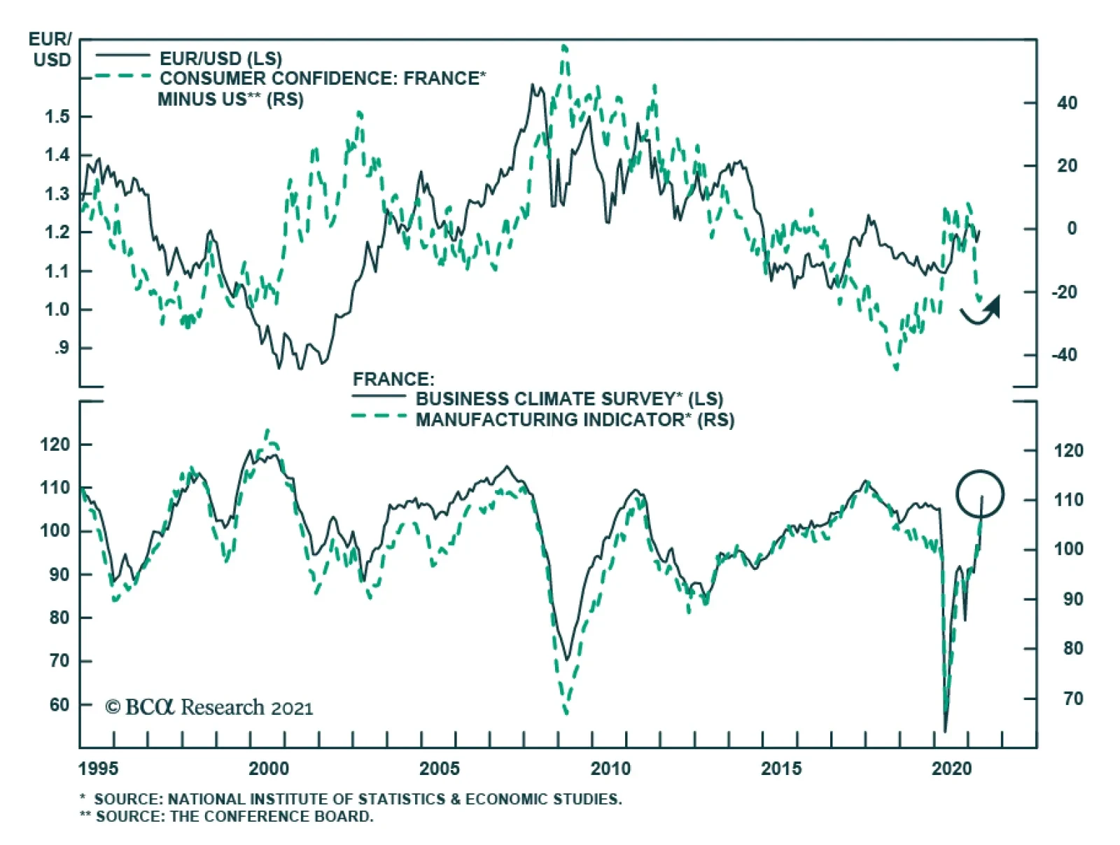
French sentiment improved markedly in May. The INSEE business confidence index jumped to a pandemic-high of 108 in May from 95, beating expectations by 10 points The last time business sentiment was so elevated was in August 2018. Moreover, the improvement…
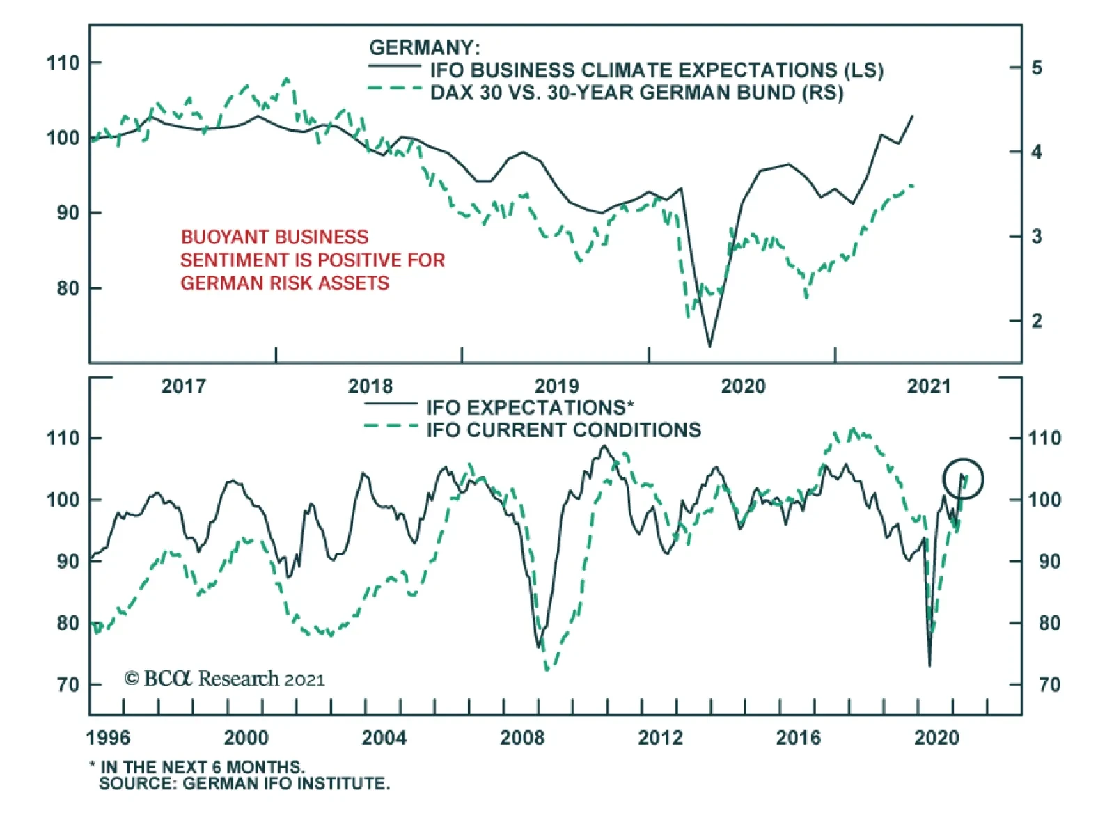
The German IFO rose sharply in May, indicating that business confidence is firming. After a disappointing release in April, the Business Climate index jumped 2.6 points to 99.2, beating expectations of a more muted increase to 98. The improvement was driven…
Highlights ECB Tapering?: Investor fears that the ECB could follow the Bank of Canada and Bank of England and begin to taper its bond buying sooner than expected – perhaps as soon as next month’s policy meeting – are misplaced. The last thing the ECB wants to see is the surge in the euro and Italian bond yields that would surely follow any move to pre-emptively begin reducing monetary accommodation in response to faster European growth and inflation. Euro Area Bond Strategy: We are sticking with our current European bond recommendations: overweighting Europe within global bond portfolios - favoring Peripheral sovereigns and corporates versus government debt of the core countries - while also overweighting inflation-linked bonds in France, Italy and Germany where breakevens are undervalued. We also suggest a new tactical trade to fade the current market pricing of ECB rate hikes by going long the December 2023 euribor interest rate futures contract. Feature Dear Client, Next week, we will be jointly publishing a Special Report, discussing the investment implications of the current global housing boom, with our colleagues at the monthly Bank Credit Analyst. You will be receiving that report on Friday, May 28. We will return to regular weekly publishing schedule on Tuesday, June 1. - Rob Robis Chart of the WeekAn Underwhelming Rise In European Bond Yields
An Underwhelming Rise In European Bond Yields
An Underwhelming Rise In European Bond Yields
For next month’s monetary policy meeting, European Central Bank (ECB) President Christine Lagarde reportedly plans to invite the Governing Council members to meet in person for the first time since the start of the pandemic. That provides an interesting subtext to a meeting that will surely involve a debate over how much monetary support is still necessary for an increasingly vaccinated Europe that is emerging from the depths of COVID-19. Some ECB officials have already noted that the risks to economic growth and inflation expectations were now “tilted to the upside”, according to the minutes of the last ECB meeting in April. With European economic confidence improving, European bond yields have moved higher in response (Chart of the Week). The benchmark 10-year German bund yield now sits at -0.11%, up 46bps year-to-date but with half of that move occurring over the past month. The pickup up in yields has not been contained to the core countries of Germany and France – the 10-year Italian government bond yield is now up to 1.11%, over twice the level that began 2021 (0.52%). Inflation expectations have picked up sharply, with the 5-year/5-year forward euro CPI swap now up to 1.63%, a level last seen in December 2018. These yield increases have lagged the big moves seen in other countries; 10-year government bond yields in the US and Canada have seen year-to-date increases of 72bps and 90bps, respectively. In those countries, yields have surged because of rising inflation expectations and worries about a tapering of central bank bond buying – concerns that turned out to be accurate in the case of Canada, where the Bank of Canada did indeed announce a slower pace of bond buying last month. In our view, it is still too soon for the ECB to contemplate such a shift to a less dovish policy stance. This message is corroborated by our ECB Monitor that has risen but is still not signaling a need for tighter monetary policy. The bond selloff in Europe looks like a case of "too much, too fast". The ECB Now Has A Lot To Think About Recent euro area economic data has not only caught up to the earlier strength visible in the US, but in some cases is back to levels not seen for many years. The expectations component of the German ZEW survey surged nearly 14 points in May and is now up to levels last seen in 2000. The Markit PMI for manufacturing reached an all-time high of 62.9 in April. The European Commission’s consumer confidence index for the euro area is nearly back to pre-pandemic levels (Chart 2), which bodes well for a continued recovery of the Markit PMI for services. More positive news on the pandemic is driving the surge in growth expectations. The pace of new COVID-19 cases has fallen steadily, with Italy – one of the hardest-stricken regions during the initial months of the pandemic – now seeing the lowest rate of new cases since October (on a rolling 7-day basis). Meanwhile, the pace of vaccinations has accelerated after a slow initial rollout; the number of daily jabs administered (per 100 people) is now greater in Germany, France and Italy than in the US (Chart 3). Chart 2European Growth Is Recovering
European Growth Is Recovering
European Growth Is Recovering
Chart 3Inoculation Acceleration In Europe
Inoculation Acceleration In Europe
Inoculation Acceleration In Europe
Chart 4How Much Spare Capacity Is There In Europe?
How Much Spare Capacity Is There In Europe?
How Much Spare Capacity Is There In Europe?
The rapid increase in inoculations is setting Europe up for a solid recovery from the lockdown-driven double-dip recession of Q4/2020 and Q1/2021. The European Commission upgraded its growth forecasts for the euro area last week, with real GDP now expected to expand by 4.3% in 2021 and 4.4% in 2022, compared with previous forecasts of 3.8% in both years. All euro area countries are now expected to see a return to the pre-pandemic level of economic output by the end of 2022 – a number boosted by a pickup in public investment through the Next Generation EU (NGEU) package, which is expected to begin paying out funds later this summer. The ECB will surely raise its own forecasts at the June meeting, both for economic growth and inflation. The outlook for the latter will likely turn into the biggest source of debate within the ECB Governing Council. Despite the fairly coordinated recovery of survey-based data like the manufacturing PMIs, there remains a wide divergence of unemployment rates - and measures of spare capacity, more generally - within the euro area (Chart 4). This will make it difficult for the ECB to determine if the current surge in realized inflation, which has pushed the annual growth of headline HICP inflation towards the 2% level in many euro zone nations, can persist with countries like Italy and Spain still suffering from very high unemployment. The wide dispersion of unemployment rates within the euro zone also suggests that the current level of policy rates (at or below 0%) is appropriate. One simple metric to measure the “breadth” of European labor market strength is to look at the percentage of euro area countries that have an unemployment rate below the OECD’s estimate of the full employment NAIRU.1 That metric correlates well with an estimate of the appropriate level of euro area short-term interest rates generated by a basic Taylor Rule. Currently, only 43% of euro zone countries are beyond full employment, which is consistent with an ECB policy rate round 0% (Chart 5). Chart 5Policy Rates Near 0% Are Still Appropriate
Policy Rates Near 0% Are Still Appropriate
Policy Rates Near 0% Are Still Appropriate
A slightly larger share of countries (47%) is witnessing an acceleration in wage growth (bottom panel). This could mean that some of the NAIRU estimates for the individual countries are too low, which would fit with the acceleration in overall euro area wage growth seen since 2015. With so many euro area countries still working off the rise in unemployment generated by the pandemic, however, it will take some time for the ECB to get a clear enough read on labor market dynamics to determine if any necessary monetary policy adjustments should be made. The “breadth” of data trends do not only correlate to theoretical interest rate measures like the Taylor Rule. Actual ECB policy decisions are motivated by the degree to which higher growth and inflation is evident across the euro area. In Chart 6, we show a similar metric to the labor market breadth measures from Chart 5, but using other economic and inflation data. Specifically, we show the percentage of euro area countries that are seeing: Chart 6ECB Typically Tightens When Growth AND Inflation Are Broad Based
ECB Typically Tightens When Growth AND Inflation Are Broad Based
ECB Typically Tightens When Growth AND Inflation Are Broad Based
a) Accelerating growth momentum, indicated by an OECD leading economic indicator that is higher than the level of one year earlier; b) Accelerating inflation momentum, comparing the latest reading on headline HICP inflation to that of one year earlier; c) Relatively high inflation, measured by headline HICP inflation being above the ECB’s “just below 2%” target. Looking at all previous periods of ECB monetary tightening since the inception of the euro in 1998 – taking the form of actual policy rate hikes or a flat-to-declining trend in the ECB’s balance sheet – it is clear that the ECB does not tighten without at least 75% of euro area countries seeing both economic growth and inflation accelerate. Actual rate hikes occur when at least 75% of countries had inflation above 2%, as occurred during the hiking cycles of 2000, 2005-2007 and 2011. More recently, the ECB paused the expansion of its balance sheet in 2017 when growth and inflation accelerated, but did not make any policy rate adjustments as only 50% of countries had inflation above 2%. Today, essentially all euro area countries are seeing accelerating growth momentum compared to the pandemic-depressed levels of a year ago. 59% of the euro area is seeing faster inflation, a number that is likely to move higher as more of Europe reopens from lockdown amid a surge in global commodity prices. Yet only 12% of euro area countries have headline inflation above 2%, suggesting that realized inflation is not yet strong enough to trigger even an ECB balance sheet adjustment, based on the 2017 experience. Don’t Bet On A June ECB Taper So judging by past ECB behavior, an announcement to taper bond buying at the June policy meeting would be highly premature. A more likely scenario is that an upgrade of the ECB’s growth and inflation forecast prompts a discussion of what to do with all the varying parts of the ECB’s monetary stimulus – quantitative easing, bank funding programs like TLTROs, as well as policy interest rates. Yet it will be impossible for the ECB Governing Council to reach any conclusions on their next step(s) at the June meeting because the very nature of the ECB's inflation target might soon change. The ECB is currently conducting a review of its monetary policy strategy – the first since 2003 – that is scheduled for completion later this year. Some adjustment to the ECB inflation target is expected to allow more flexibility, but it is not yet clear what that change will look like. Could the ECB follow the lead of the Federal Reserve and move to an “average inflation target” regime, tolerating overshoots of the inflation target after periods of below-target inflation? ECB Chief Economist Philip Lane noted back in March that “there was a very strong logic” to the Fed’s new approach. He also said that the “very different histories of inflation” in some European countries may make it difficult to reach an agreement on any system that allows even temporary periods of higher inflation.2 More recently, Bank of Finland Governor Olli Rehn – a moderate member of the Governing Council who was considered a candidate for the current ECB presidency – came out in favor of the ECB shifting to a Fed-like average inflation target for Europe in a recent Financial Times interview.3 Rehn noted that a Fed-like focus on aiming for maximum unemployment “makes sense in the current context of a lower natural rate of interest.” Rehn went on to describe the ECB’s current wording of its inflation target as having “generated a perception of asymmetry” such that “2 per cent is perceived as a ceiling and that is dampening inflation expectations.” We imagine that Jens Weidmann from the Bundesbank would vehemently oppose any move to change the ECB inflation target to tolerate even a temporary period of inflation above 2%. German headline HICP inflation already reached 2.1% in April, with more increases likely as the German economy reopens from extended pandemic lockdowns. Yet even if Weidmann were to not dig in his heels against any “loosening” of the ECB inflation target, the looming conclusion of the ECB strategy review makes it highly unlikely that any change in policy – like tapering – could credibly be announced before then. If higher inflation will be tolerated, then why bother to taper at all? Looking beyond the inflation strategy review, there are other factors that could weigh on the ECB in its deliberations on the next monetary policy move: China policy tightening: China – Europe’s largest trading partner – has seen its policymakers begin to rein in credit growth, and fiscal spending, after allowing a surge in borrowing in 2020 to help boost growth during the pandemic. Our measure of the China credit impulse leads the annual growth rate of European exports to China by around nine months (Chart 7), and is flagging a dramatic slowing of exports in the latter half of this year. This represents a downside risk to euro area growth, particularly in countries that export more heavily to China like Germany. Slowing loan growth: The annual growth rate of overall euro area bank lending peaked at 12.2% back in February and is now down to 10.9% (Chart 8). Much of the softening has occurred in Germany and France – countries that had seen a big take-up of subsidized bank funding through the ECB’s TLTROs. The pricing incentives set up by the ECB for the latest TLTRO program were highly attractive, and it appears that German and French banks took advantage of the cheap funding to ramp up lending activity. This makes the economic interpretation of the bank lending data more challenging for the ECB, especially with Italian loan growth – and TLTRO usage – now accelerating. Chart 7Warning Signs For European Export Demand
Warning Signs For European Export Demand
Warning Signs For European Export Demand
Chart 8ECB LTROs Are Becoming Italy-Focused
ECB LTROs Are Becoming Italy-Focused
ECB LTROs Are Becoming Italy-Focused
NGEU spending: As mentioned earlier, disbursements from the €750bn NGEU (a.k.a. “recovery fund”) are expected to begin later this year, pending EU approval of government investment proposals. NGEU funds are intended to finance initiatives that can boost future economic growth, like investments in digital and green programs. Most euro area countries have already submitted their proposals, led by Italy’s request for €192bn. Chart 9NGEU Will Give A Big Boost To European Growth Over The Next Five Years
ECB Outlook: Walking On Eggshells
ECB Outlook: Walking On Eggshells
Chart 10NGEU Impact Will Be Front Loaded
NGEU Impact Will Be Front Loaded
NGEU Impact Will Be Front Loaded
A recent study by S&P Global concluded that NGEU investments could boost overall euro area growth by between 1.3 and 3.9 percentage points, cumulatively, between 2021 and 2026 (Chart 9).4 That same study also noted that the impacts of the spending will be front-loaded over the next two years (Chart 10). The Italian government believes that NGEU investment could double Italy’s anemic trend growth rate to 1.5%. Many ECB officials have noted that NGEU is the kind of structural fiscal stimulus that makes it less necessary to maintain highly accommodative monetary policy. Until the NGEU proposals are finalized and the final approved amounts are dispersed, however, the ECB will be unable to adjust its economic forecasts to account for more government investment. Given all of these immediate uncertainties, including how successfully Europe can reopen from pandemic lockdowns, we do not see a plausible scenario where the ECB Governing Council could conclude at the June policy meeting that an immediate change in the current monetary policy tools and guidance was needed. Bottom Line: Investor fears that the ECB could follow the Bank of Canada and Bank of England and begin to taper its bond buying sooner than expected – perhaps as soon as next month’s policy meeting – are misplaced. Likely ECB Next Moves & Investment Implications While a June taper announcement from the ECB is unlikely, a hint towards a future move is quite possible. The ECB is notorious for preparing markets well in advance of any policy shifts, thus the official statement following the June meeting – as well as ECB President Lagarde’s press conference – could contain clues as to what the ECB will do next. Chart 11ECB Easing Takes Many Forms
ECB Easing Takes Many Forms
ECB Easing Takes Many Forms
A discussion of what will happen with the Pandemic Emergency Purchase Program (PEPP) – which is scheduled to end next March – could come up in June. We deem it more likely that the topic will be raised at the September policy meeting when there will be more clarity on the success of the reopening of Europe’s economy, and to the final approved size of the NGEU funds, which will determine the need to maintain an asset purchase program introduced because of the COVID-19 shock. There are certainly many policy options available for the ECB to choose from when they do decide to dial back accommodation. There are several policy interest rates that could be adjusted. Although it is likely that when the ECB next tries to hike interest rates, the first rate to move will be the overnight deposit rate which is currently at -0.5% and represents the “floor” for short-term interest rates in Europe (Chart 11). Rate hikes will not occur before the balance sheet tools are reduced or unwound, however, which means asset purchases will be dialed back first. Market participants are well aware of that order of policy choices, as a very flat path for short-term interest rates is currently discounted in the European overnight index swap (OIS) curve. The spread between forward rates in the OIS and CPI swap curves can be used as a proxy for the market forward pricing of real interest rates. Currently, the market-implied real ECB policy rate is expected to stay between -2% and -1% over the next decade (Chart 12). Put another way, the markets are pricing in a very flat path for ECB policy rates that will stay below expected inflation over the next ten years. While the natural real rate of interest in Europe is likely very low given low trend growth, a real rate as low as -2% discounts a lot of bad structural news for the European economy. By comparison, the NY Fed’s last estimate of the natural real rate (r-star) for Europe – calculated in Q2/2020 before the economic volatility surrounding the pandemic made r-star estimation more unreliable – was positive at +0.6%. The prolonged path of negative expected real interest rates in Europe goes a long way in explaining the persistence of negative real bond yields in the benchmark German government yield curve. Simply put, there is little belief that the ECB will ever be able to engineer a full-blown rate hike cycle – an outcome that Japanese fixed income investors are quite familiar with. Given the ECB’s constant worry about the level of the euro, and its role in impacting European growth and inflation expectations, markets are correct in thinking that it will be difficult for the ECB to lift rates much without triggering unwanted currency appreciation. It is no coincidence that the euro has been consistently undervalued on a purchasing power parity (PPP) basis ever since the ECB moved to a negative interest rate policy back in 2014 (Chart 13). Chart 12Markets Expect Negative European Real Rates For The Next Decade
Markets Expect Negative European Real Rates For The Next Decade
Markets Expect Negative European Real Rates For The Next Decade
Looking ahead, the ECB will need to be careful about signaling any changes in monetary policy, including tapering, that would force markets to revise up the future path of European interest rates and give the euro a large boost. Chart 13Low ECB Rates Keeping The Euro Undervalued
Low ECB Rates Keeping The Euro Undervalued
Low ECB Rates Keeping The Euro Undervalued
That means that European real bond yields are likely to stay deeply negative over at least the latter half of 2021, with any additional nominal yield increases coming from higher inflation expectations (Chart 14). This will limit how much more European bond yields can rise from current levels. Chart 14European Bond Strategy Summary
European Bond Strategy Summary
European Bond Strategy Summary
We continue to believe that core European bond yields will trade with a “low yield beta” to US Treasury yields over at least the second half of 2021 and likely into 2022 when we expect the Fed to begin tapering its bond buying. Thus, we are sticking with our strategic recommendation to overweight core European government bonds versus US Treasuries in global bond portfolios. We simply see greater odds of a taper occurring in the US than in Europe, with the Fed more likely to deliver subsequent post-taper rate hikes than the ECB. We still recommend a moderately below-benchmark duration stance within dedicated European bond portfolios, although if the 10-year German bund yield rises significantly into positive territory, we would likely look to raise our suggested European duration exposure. We are also maintaining our recommended overweight on European inflation-linked bonds, as breakeven spreads in Germany, France and Italy are the only ones that remain below fair value in our suite of global valuation models. On European credit, we continue to recommend overweighting spread product versus sovereign bonds. That includes Italian and Spanish government bonds, as well as both investment grade and high-yield corporate debt. The time to turn more bearish on those markets will be when the ECB does begin to taper its asset purchases, as credit spreads have tended to widen during periods when the growth of the ECB’s balance sheet has been decelerating (Chart 15). We expect that when the ECB does finally decide to taper, the net amount of TLTROs will likely be maintained near current levels (by introducing new TLTROs to replace expiring ones). This will ensure that borrowing costs in the more fragile countries like Italy do not spike higher from the double-whammy of reduced ECB buying of Italian bonds and diminished access to cheap ECB bank funding. One final note – we are introducing a new trade in our Tactical Overlay portfolio on page 19 this week, as a way to fade the markets pricing in a more hawkish ECB outlook. A 10bp rate hike – the most likely size of any first attempt for the ECB to lift rates – is now priced in the OIS curve around mid-2023. By the end of 2023, nearly 25bps of hikes are discounted in forward rate curves. We do not expect the ECB to lift rates at all in 2023, but even if rates were increased, a cumulative 25bps of hikes within six months is unlikely to be delivered. Thus, we recommend going long the December 2023 3-month Euribor interest rate futures contract at an entry price of 100.27 (Chart 16). Chart 15ECB Tapering Would Be Bad News For European Credit
ECB Tapering Would Be Bad News For European Credit
ECB Tapering Would Be Bad News For European Credit
Chart 16Go Long Dec/2023 Euribor Futures
Go Long Dec/2023 Euribor Futures
Go Long Dec/2023 Euribor Futures
Bottom Line: The last thing the ECB wants to see is the surge in the euro and Italian bond yields that would surely follow any move to pre-emptively begin reducing monetary accommodation in response to faster European growth and inflation. We are sticking with our current European bond recommendations: overweighting Europe within global bond portfolios - favoring Peripheral sovereigns and corporates versus government debt of the core countries - while also overweighting inflation-linked bonds in France, Italy and Germany where breakevens are undervalued. Robert Robis, CFA Chief Fixed Income Strategist rrobis@bcaresearch.com Footnotes 1 NAIRU is an acronym for the Non-Accelerating Inflation Rate of Unemployment. 2 Lane’s comments came from a wide-ranging interview with the Financial Times published on March 16, 2021, which can be found here: https://www.ft.com/content/2aa6750d-48b7-441e-9e84-7cb6467c5366 3 Rehn’s comments were published earlier this month on May 9 and can be found here: https://www.ft.com/content/05a12645-ceb2-4cd5-938e-974b778e16e0 4 The S&P Global report, titled “Next Generation EU Will Shift European Growth Into A Higher Gear”, can be found here: https://www.spglobal.com/ratings/en/research/articles/210427-next-generation-eu-will-shift-european-growth-into-a-higher-gear-1192994 Recommendations The GFIS Recommended Portfolio Vs. The Custom Benchmark Index
ECB Outlook: Walking On Eggshells
ECB Outlook: Walking On Eggshells
Duration Regional Allocation Spread Product Tactical Trades Yields & Returns Global Bond Yields Historical Returns
Highlights Global Tapering: The Bank of England has joined the Bank of Canada as central banks tapering the pace of bond buying. Markets are now trying to sort out who is next and concluding that it will not be the Federal Reserve, with US employment still well below the pre-pandemic peak. US Treasury yields will continue trading sideways until there is greater clarity on the pace of US labor market improvement, especially after the big downside miss in the April jobs report. US Treasury Curve: We are adding a new recommended US butterfly trade to our Tactical Overlay portfolio, going long the 5-year bullet and short the 2/30 barbell using US Treasury futures. This trade should benefit with US Treasury curve steepening overshooting the pace of past cycles, while offering attractive carry if persistent Fed dovishness slows the cyclical transition to a bear-flattening curve regime. Feature Heading into 2021, one of our key investment themes for the year was that no major central bank would shift to a less dovish monetary policy stance before the Fed. Not even five months into the year, our theme has already been proven incorrect. Last week, the Bank of England (BoE) announced a slower pace of its asset purchases, following a similar tapering decision by the Bank of Canada (BoC) last month. Chart of the WeekUS Jobs Recovery Lagging, Despite Vaccine Success
Who Tapers Next?
Who Tapers Next?
We had assumed that no central bank could tolerate the currency strength that would inevitably occur by tapering ahead of the Fed. That was clearly not the case in Canada, and the Canadian dollar has already appreciated 4.6% versus the greenback since the BoC taper announcement April 21. The British pound also rallied solidly against both the US dollar and euro immediately after the BoE taper announcement last week. Markets are beginning to speculate on future taper candidates, like the Reserve Bank of New Zealand (RBNZ), with the New Zealand dollar being one of the strongest currencies in the G10 versus the US dollar since the end of March (+4.4%). Investors had been debating the possibility that the Fed could begin tapering sometime in the second half of 2020, largely based on what has to date been a successful US vaccination campaign. Yet while that led to optimism that the US economy can quickly reopen and return to normal, the fact remains that the recovery in US employment from the COVID shock has lagged other major economies (Chart of the Week). The big downside miss on the April US payrolls report highlights how the Fed can be patient before joining the tapering club. US Treasury yields are likely to continue trading sideways, and the US dollar will trade soft, until markets can sort out the true state of US labor demand versus supply. Which Central Bank Could Follow The BoC And BoE? Back in March, we published a report that discussed what we called the “pecking order of global liftoff”.1 We looked at how interest rate markets were pricing in an increasingly diverse path out of the coordinated global monetary easing enacted last year during the COVID recession (Chart 2). We looked at both the timing of “liftoff” (the first rate hike) and the pace of hikes afterward to the end of 2024. We then ranked the countries by the market-implied timing of liftoff. Chart 2Sorting Out The Relative Hawks & Doves Among Global CBs
Sorting Out The Relative Hawks & Doves Among Global CBs
Sorting Out The Relative Hawks & Doves Among Global CBs
At the time, overnight index swap (OIS) curves were discounting the earliest liftoff from the RBNZ (June 2022) and BoC (August 2022). The Fed was expected to hike in January 2023, followed by the BoE in June 2023 and Reserve Bank of Australia (RBA) in July 2023. The European Central Bank (ECB) and Bank of Japan (BoJ) were the laggards, with no rate hiked discounted until September 2023 and February 2025, respectively. In terms of the pace of rate hikes after liftoff through 2024, our list was broken into two groups. The more aggressive central banks were expected to be the BoC (+175bps), RBA (+156bps), RBNZ (+140bps) and the Fed (+139bps). Much smaller amounts of rate hikes were anticipated from the BoE (+63bps), ECB (+25bps) and BoJ (+9bps). In the two months since our March report, the market timing of liftoff, and the pace of subsequent hikes, has shifted for all those countries (Table 1). The BoC is now expected to move in September 2022, ahead of the RBNZ (October 2022). In 2023, the Fed is now priced for liftoff in March 2023, followed by the BoE and RBA (both in July 2023). The ECB liftoff date is little changed (now August 2023), while the market has dramatically pushed out the timing of any BoJ hike (now November 2025). The cumulative rate hikes through 2024 are moderately lower for all countries except Australia (a reduction in total tightening of 56bps). Table 1The Fed Is Sliding Down The “Pecking Order Of Liftoff” List
Who Tapers Next?
Who Tapers Next?
What is interesting about these changes is that the market has pulled forward the timing of liftoff for the BoE and RBA, while pushing it out for the BoC, RBNZ, BoJ and, most importantly, the Fed. The Fed is now drifting down the “pecking order” for liftoff, expected to lift rates only a couple of months before the BoE or RBA. This is a major change from previous monetary policy cycles, when the Fed would typically be a first mover when it comes to tightening policy. Chart 3The Momentum Of Global QE Has Already Been Slowing
The Momentum Of Global QE Has Already Been Slowing
The Momentum Of Global QE Has Already Been Slowing
While the BoC and BoE decisions to taper quantitative easing (QE) have garnered the headlines, the pace of global central bank balance sheet expansion had already peaked at the start of 2021 (Chart 3). The pace has slowed most dramatically in Canada and the US, but this was a result of certain emergency programs expiring – most notably the Fed’s corporate bond buying vehicles late last year and the BoC’s short-term repo facilities more recently. Greater financial market stability was the reason cited to end those programs, while still leaving government bond QE buying in place unchanged. The year-over-year pace of global QE was set to slow, simply from less favorable comparisons to 2020 after the surge in central bank balance sheet expansion last year. Yet now we are starting to see actual tapering of government bond purchases from some central banks. Is such “early tightening” warranted? Back in that same March report where we discussed the order of global liftoff, we gave our assessment of the most important factors that could drive central banks to consider a shift to a less dovish stance (like tapering). For the BoC, we cited booming house prices and robust business confidence as reasons the BoC could turn less dovish sooner (Chart 4). For the BoE, we noted a sharper-than-expected recovery in domestic investment and consumer spending, as the locked-down UK economy reopens, as reasons why the BoE could begin to tweak its policy settings. For both central banks, all those indicators were mentioned as factors leading to their decision to taper. For the Fed, we determined that rising inflation expectations and increasing labor market tightness would both be required for the Fed to turn less dovish. Only inflation expectations have reached that goal, with the US Employment/Population ratio still well below the pre-pandemic peak (Chart 5). For the RBA, we looked solely at realized inflation measures, as the RBA has explicitly noted that Australian wage growth must rise sustainably towards 3% - nearly double current levels - before realized CPI inflation could return to the 2-3% target range. For both the Fed and RBA, the necessary conditions for a change in current policy settings have not yet been met. Chart 4What The More Hawkish CBs Are Watching
What The More Hawkish CBs Are Watching
What The More Hawkish CBs Are Watching
Chart 5What The More Dovish CBs Are Watching
What The More Dovish CBs Are Watching
What The More Dovish CBs Are Watching
For the ECB, we noted that realized inflation (and the ECB’s inflation forecasts), along with the Italy-Germany government bond spread as a measure of financial conditions, were the most important indicators to watch before the ECB could consider any move to taper its QE programs (Chart 6). Italian spreads have widened a bit in recent months, while the latest set of ECB economic forecasts still call for headline euro area inflation to remain well south of the 2% target out to 2023. For the BoJ, we simply cited a rise in realized inflation as the only possible development that could lead to a BoJ taper. The BoJ now forecasts that Japanese inflation will not reach the 2% central bank target until at least 2024. So for both the ECB and BoJ, the conditions do not warrant any imminent tapering of bond buying. Chart 6What The Most Dovish CBs Are Watching
What The Most Dovish CBs Are Watching
What The Most Dovish CBs Are Watching
As another way to determine who could taper next, we turn to our Central Bank Monitors, which are designed to measure the pressure on policymakers to ease or tighten monetary setting. All the Monitors have responded to the recovery in global growth and inflation, along with the easing of financial conditions implied by booming markets, over the past year. Yet only the RBA Monitor is calling for tightening (Chart 7), indicating that the RBA’s current focus on only wages and realized inflation is a departure from their behavior in the past. The Fed and BoE Monitors have risen to the zero line, suggesting no further pressure to ease policy but no tightening is needed either. The ECB, BoJ and RBNZ Monitors are all close, but just below, the zero line, suggesting diminishing need for more monetary stimulus (Chart 8). Chart 7Bond Yields Have Moved Ahead Of Our CB Monitors
Bond Yields Have Moved Ahead Of Our CB Monitors
Bond Yields Have Moved Ahead Of Our CB Monitors
Chart 8Yields Overshooting Tightening Pressures Here Too
Yields Overshooting Tightening Pressures Here Too
Yields Overshooting Tightening Pressures Here Too
Based on our assessment of the above indicators, we judge the RBNZ to be the next central bank most likely to taper, sometime in the 2nd half of 2021. We still see the Fed starting to signal tapering later this year, but with actual slowing of US Treasury (and Agency MBS) purchases not occurring until early 2022. The year-over-year momentum of bond yields correlates strongly with the Central Bank Monitors. The rise in global bond yields seen over the past year has exceeded the pace implied by the Monitors. This is unsurprising given how rapidly the global economy has recovered from pandemic-fueled recession in 2020. Supply chain disruptions and surging commodity prices have also given a lift to bond yields via rising inflation expectations, even as central banks have promised to keep rates on hold for at least the next couple of years. Yet purely from a monetary policy perspective, the surge in global bond yields looks to have gone a bit too far, too fast. Bottom Line: Markets are now trying to sort out who will taper next after the BoC and BoE, and have concluded that it will not be the Federal Reserve, with US employment still well below the pre-pandemic peak. US Treasury yields will continue trading sideways until there is greater clarity on the pace of US labor market improvement, especially after the big downside miss in the April jobs report. Bond yields in other developed markets appear to have overshot economic momentum, and a period of consolidation is needed before yields can begin moving higher again. US Treasury Curve: How Much Steepening Left? Chart 9A Pause In The UST Bear-Steepening Trend
A Pause In The UST Bear-Steepening Trend
A Pause In The UST Bear-Steepening Trend
For most of the past year, the primary trend in the US Treasury curve has been one of bear steepening. Longer maturity yields have borne the brunt of the upward pressure stemming from the rapid recovery in US (and global) economic growth from the depths of the 2020 COVID-19 recession. In recent weeks, however, the surge in longer-maturity Treasury yields has stalled, as have the immediate steepening pressures (Chart 9). Purely from a fundamental economic perspective, a steepening Treasury curve is an expected result of the reflationary mix of growth, inflation and monetary policy currently at work in the US. For example, since the 2020 lows, 5-year/5-year forward inflation expectations from the TIPS market have risen 143bps while the ISM manufacturing index surged from a low of 41 to a high of 65 in March of this year (Chart 10). Combine that with the Fed cutting rates to 0% last year, while promising to keep rates unchanged through 2023 and reinforcing that commitment through QE, and it is no surprise to see a steeper US Treasury curve. Chart 10UST Curve Steepening Has Been Driven By Reflation
UST Curve Steepening Has Been Driven By Reflation
UST Curve Steepening Has Been Driven By Reflation
Yet even despite these obvious steepening pressures, the pace of the Treasury curve steepening does seem to be a bit rapid compared to history. In Chart 11, we show a “cycle-on-cycle” analysis, comparing the slope of various US Treasury curve segments (2-year versus 5-year, 5-year versus 10-year, 10-year versus 30-year) to the average of the previous five US business cycles, dating back to the 1970s. The curves are lined up to the start date of the previous recession, with the vertical line in the chart representing that date. Thus, this chart allows us to see how the Treasury curve evolved heading into, and coming out of, economic downturns. Chart 11 shows that the current 2-year/5-year curve, with a steepness of 63bps, is in line with past steepening moves coming out of recession. For the curve segments at longer maturities, the pace of steepening has been much more rapid than in the past. In fact, the current 5-year/10-year slope of 82bps is already above the average past peak level, as is the 10-year/30-year curve of 72bps. If we do the same cycle-on-cycle analysis for the three previous US recessions dating back to 1990, the current curve slopes are more in line with levels seen one year into the economic expansion (Chart 12). During those previous cycles, the curve steepening trend ended around two years into the expansion. This suggests that the current curve steepening could continue into 2022, except for one major difference – the Fed cut rates to 0% very rapidly last year, far faster than in the previous easing cycles. This suggests that additional curve steepening from current levels can only occur through a surge in US inflation. Chart 11Current UST Steepening Has Moved Fast Compared To Past Cycles
Current UST Steepening Has Moved Fast Compared To Past Cycles
Current UST Steepening Has Moved Fast Compared To Past Cycles
Chart 12Can More UST Curve Steepening Occur With A 0% Funds Rate?
Can More UST Curve Steepening Occur With A 0% Funds Rate?
Can More UST Curve Steepening Occur With A 0% Funds Rate?
The slope of the Treasury curve is typically correlated to the level of the nominal fed funds rate, but is even more strongly correlated to the funds rate minus actual inflation, or the real fed funds rate. When the real funds rate is below the natural real rate of interest, a.k.a. r-star, the Treasury curve has historically exhibited its strongest steepening trend. That can be seen in Chart 13, where we show the real fed funds rate (adjusted by US core CPI inflation) compared to the New York Fed’s estimate of r-star. The gap between the two series is shown in the bottom panel, correlating very strongly to the 2-year/30-year Treasury curve slope. Chart 13Curve Steepening Results When Real Rates Are Below R*
Curve Steepening Results When Real Rates Are Below R*
Curve Steepening Results When Real Rates Are Below R*
With the nominal funds rate at zero, that gap between r-star and the real fed funds rate can only widen in a fashion that would support more curve steepening if a) realized US inflation moves higher or b) r-star moves higher. Both outcomes are possible as the US economic recovery, fueled by expanding vaccinations and fiscal stimulus. Both real rates and r-star are much lower in the current cycle than in previous economic recoveries, although the r-star/real funds rate gap appears to be following a more typical path that suggests potential additional steepening pressure (Chart 14). The wild card in this analysis is the Fed itself. If US economic growth and inflation evolve in way that makes it more likely the Fed would have to begin tapering QE and, eventually, signal future rate hikes, the Treasury curve may shift to a more typical bear-flattening trend seen during tightening cycles. We saw an example of that after the release of the March US employment report, where over a million jobs were created in a single month, causing 5-year Treasury yields to jump higher than longer-maturity Treasuries (i.e. curve flattening). Looking ahead, it appears that the US yield curve is more likely to slowly transition to a bear-flattening/bull-steepening regime than continue the bear-steepening/bull-flattening: trend of the past twelve months. One way to position for this is to enter into butterfly curve trades that offer attractive carry or valuation. For that, we turn to our Treasury curve valuation models. We have been recommending a Treasury yield curve trade in our Tactical Overlay portfolio on page 19, going long a 7-year bullet versus going short a 5-year/10-year barbell (Chart 15). This barbell is now very cheap on our models, which measure value by regressing the butterfly spread on the underlying slope of the curve. In this case, the spread between the 5/7/10 butterfly is unusually wide compared to the slope of the 5/10 Treasury curve. According to our model, this butterfly spread discounts nearly 100bps of additional 5/10 steepening, an excessive amount compared to past cycles. Chart 14R* - Real Funds Rate Gap Below Previous Cyclical Peaks
R* - Real Funds Rate Gap Below Previous Cyclical Peaks
R* - Real Funds Rate Gap Below Previous Cyclical Peaks
Chart 15Maintain Our Current 5/7/10 UST Butterfly Trade
Maintain Our Current 5/7/10 UST Butterfly Trade
Maintain Our Current 5/7/10 UST Butterfly Trade
While the valuation is attractive on the 5/7/10 butterfly (Table 2), the carry on this position is a modest 12bps. A butterfly with more attractive carry is the 2/5/30 butterfly. Table 2US Butterfly Strategy Valuation: Standardized Residuals
Who Tapers Next?
Who Tapers Next?
Table 3US Butterfly Strategies: Carry
Who Tapers Next?
Who Tapers Next?
Chart 16Enter A New 2/5/30 UST Butterfly Trade
Enter A New 2/5/30 UST Butterfly Trade
Enter A New 2/5/30 UST Butterfly Trade
This butterfly has a neutral valuation (Chart 16) on our model, but offers 35bps of carry - the most attractive among all butterflies involving a 5-year bullet (Table 3). With US Treasury yields, and the Treasury curve slope, likely to remain rangebound for the next few months, going for higher carry trades is an attractive strategy – particularly if used in conjunction with a below-benchmark duration stance, which we still advocate. The 2/5/30 butterfly represents an attractive near-term hedge to that more defensive duration posture. Bottom Line: We are adding a new recommended US Treasury butterfly trade to our Tactical Overlay portfolio, going long the 5-year bullet and short the 2/30 barbell. This trade should benefit with US Treasury curve steepening overshooting the pace of past cycles, while offering attractive carry if persistent Fed dovishness slows the cyclical transition to a bear-flattening curve regime. Robert Robis, CFA Chief Fixed Income Strategist rrobis@bcaresearch.com Footnotes 1 Please see BCA Research Global Fixed Income Strategy Report, "Harder, Better, Faster, Stronger", dated March 16, 2021, available at gfis.bcaresearch.com. Recommendations The GFIS Recommended Portfolio Vs. The Custom Benchmark Index
Who Tapers Next?
Who Tapers Next?
Duration Regional Allocation Spread Product Tactical Trades Yields & Returns Global Bond Yields Historical Returns
Highlights Important leading indicators of Eurozone activity point to record growth in the coming quarters. Progress on the vaccination front, global pent-up demand, and easing fiscal policy will fuel the Euro Area recovery. Consensus growth expectations for the Eurozone do not reflect this upbeat outlook; hence, European economic surprises will remain firm. Robust economic surprises will help European stocks, especially small-cap ones. They will also allow for a stronger EUR/USD and rising German 10-year yields. The UK economy is strong, and the BoE will be among the first central banks to tighten policy meaningfully. However, investors understand the UK’s strength well. While the cyclical outlook for the pound is bright against both the USD and the EUR, the GBP is vulnerable to some near-term profit taking. Downgrade UK small-cap stocks to neutral on a tactical basis. Feature The case for the Eurozone’s recovery is only growing stronger. However, consensus growth forecasts for the Euro Area remain modest. Faced with this dichotomy, the European economy has ample room to generate positive surprises in the coming months. This process will support European financial assets, small-cap stocks in particular. This contrasts with UK assets, where investors have already embedded generous growth assumptions in response to the country’s rapid pace of vaccination. A tactical downgrade of UK small-cap equities is appropriate. Surprise! Two indicators from outside the Eurozone point to an elevated likelihood that the European economy will generate some exceptionally strong growth numbers over the coming 12 months. First, the Swiss KOF Economic Barometer hit an all-time high in April. The KOF series is an excellent leading indicator of Switzerland’s economic activity, and it currently forecasts record GDP growth and PMIs for that country (Chart 1). This message of strength for Switzerland bodes well for the Eurozone. While the Swiss market is defensive, owing to its heavy exposure to healthcare and consumer staple stocks, the Swiss economy is pro-cyclical. Exports represent 60% of GDP, and exports to the Eurozone account for 40% of this total. Moreover, the growth-sensitive machinery, consumer goods, and chemicals categories account for almost 50% of shipments. Based on these observations, the KOF Economic Barometer forecasting ability unsurprisingly extends beyond Swiss economic variables; it also anticipates positive growth for the Global Manufacturing PMI, the Euro Area Manufacturing PMI, and the Eurozone’s forward earnings (Chart 2). Chart 1Climbing Swiss Peaks
Climbing Swiss Peaks
Climbing Swiss Peaks
Chart 2A Good Sign For The Eurozone
A Good Sign For The Eurozone
A Good Sign For The Eurozone
Second, an aggregation of Swedish economic data confirms the KOF indicator’s message and also calls for record economic activity in Europe. Our Swedish Economic Diffusion Index, which incorporates 14 data series from the Nordic country, points toward a further acceleration in the Euro Area PMIs relative to the US (Chart 3). It is also consistent with a pick-up in the performance of European equities relative to the US. These important indicators of the European economy reflect a variety of forces at play that increasingly point toward stronger growth. Among them, the improvement in the pace of vaccination is crucial to lifting the mood across the continent. As the top panel of Chart 4 illustrates, the number of daily vaccine doses administered across major Euro Area economies is accelerating sharply. While it took three months to inoculate 20% of the population, it only took one month to raise the vaccinated population to nearly 40% (Chart 4, bottom panel). Chart 3Sweden Leads The Eurozone
Sweden Leads The Eurozone
Sweden Leads The Eurozone
Chart 4Accelerating Vaccinations
Accelerating Vaccinations
Accelerating Vaccinations
Euro Area fiscal policy is also moving in a more growth-friendly direction. The Italian Budget announced on April 26 will add EUR248 billion in spending over the next six years. For the moment, Germany has abandoned its debt brake, and, as we wrote three weeks ago, the September election is likely to reify this outcome and further ease fiscal policy in Europe’s biggest economy. Spain is the second largest recipient of the NGEU funds, and it is expected to increase fiscal spending by EUR167 billion over the coming six years. In addition, France has yet to give clear hints about its plan, but next year’s elections are likely to result in further stimulus measures as well. Thus, fiscal easing in Europe will only increase from this point on (Chart 5). Chart 5The Expanding European Stimulus
A Surprising Dance
A Surprising Dance
Accumulated pent-up demand remains another potent fuel for growth in the Euro Area. Unlike in the US, spending on durable goods in the Eurozone has not overtaken its pre-pandemic levels (Chart 6). Furthermore, global inventory-to-sales ratio are low, which hints at a coming inventory restocking cycle. These two trends will benefit Euro Area economic activity. The service sector recovery has more to go. Despite some recent improvements, the Eurozone’s Service PMI remains depressed compared to that of the US (Chart 7, top panel). However, the acceleration in the European vaccination campaign and the continued injection of fiscal support at the same time as the lockdowns ebb should result in a significant catch up in service activity in the Euro Area. Thus, the double-dip recession is on the verge of ending and giving way to a robust GDP expansion (Chart 7, bottom panel). Chart 6Ample European Pent-up Demand
Ample European Pent-up Demand
Ample European Pent-up Demand
Chart 7The Service Sector Recovery Is Paramount
The Service Sector Recovery Is Paramount
The Service Sector Recovery Is Paramount
Even though the recovery in GDP growth will lead to strong positive economic surprises for the Euro Area, consensus growth expectations for the region remain conservative. According to Bloomberg, Eurozone annual GDP growth is expected to reach 12.6% in Q2 because of an extremely strong base effect. However, growth will decelerate suddenly and hit 2.3% in Q3 and 4.3% in Q4. Growth is anticipated to be 4.1% in 2022. These are low thresholds to beat, and thus, economic surprises will remain positive. Chart 8Decomposing The Surprises
Decomposing The Surprises
Decomposing The Surprises
The source of positive economic surprises is likely to be broad-based. If the service sector recaptures some of its previous shine, the Surveys and Business Cycle component and the Labor Market component of the Bloomberg surprises index will improve and remain positive for many months (Chart 8). Moreover, the absorption of pent-up demand will allow the Retail and Wholesale as well the Personal/Household components to remain robust or firm up further. Finally, the strength of the global manufacturing sector and the elevated potential for a global inventory restocking will allow the Industrial component to firm up anew. Bottom Line: The European economy is in a good place to validate the upbeat message from the KOF Economic Barometer or the Swedish Economic Diffusion Index. Since expectations for European economic activity are still limited for the second half of 2021, this strong growth performance will result in positive economic surprises. Investment Implications The heightened odds that Europe will generate significant positive economic surprises for the coming quarters means that investors’ perspective of the Euro Area will gradually improve. While this process will ultimately curtail the ability of Europe to beat expectations, it will also lift Eurozone assets. If our forecast is correct that European economic surprises will largely be positive over the coming 6 to 12 months, then European equities are more likely to generate generous returns than otherwise. Table 1 highlights that positive changes in the Economic Surprise Index (ESI) on a 3-month, 6-month, and 12-month horizon coincide with returns of the Euro Area MSCI equity benchmarks that have positive batting averages of 72%, 70%, and 73%, respectively. Moreover, the average and median returns are significantly higher than when the ESI deteriorates. Table 1Forecasting Strong Surprises Means Forecasting Strong Equity Returns
A Surprising Dance
A Surprising Dance
The signal from the ESI is weaker if we do not make forecasts about its direction. The batting averages of subsequent 3-month and 6-month equity returns following an improving ESI are 63% and 69%, respectively, and the median subsequent returns are higher than if today’s ESI is deteriorating, but not to the same extent as when we make a forecast of the ESI. 12-month returns for the Eurozone MSCI index have a 58% chance of being positive, if the ESI increases over a 12-month window, which is lower than the 63% batting average if the ESI worsens. Moreover, average and median 12-month expected returns are somewhat higher if the ESI has been deteriorating rather than improving over the past 12-month period. European small cap equities will be prime beneficiaries of the coming growth outperformance. From an economic perspective, this makes sense because small-cap stocks are geared more toward domestic growth than large-cap equities, which are dominated by multinationals. Table 2 shows that 3-month, 6-month, and 12-month periods of improvement in the surprise index precede an outperformance of small-cap relative to large-cap stocks over similar windows of time. Thus, the current positive level of the European ESI and its ability to rise further should favor small-cap European equities. Table 2Favor Small-Cap Stocks
A Surprising Dance
A Surprising Dance
Table 3A Bullish Backdrop For EUR/USD
A Surprising Dance
A Surprising Dance
The same exercise shows that the outlook also favors the euro. European economic surprises should continue to outpace the US, because Eurozone growth will catch up to the US, but investors already have much loftier expectations for US activity than for the Euro Area. Table 3 illustrates that periods when the Eurozone’s ESI is greater than that of the US, EUR/USD generates a positive 3-month return 65% of the time, with a median gain of 1.3%. When the US ESI is higher, the EUR/USD depreciates 55% of the time, with a median loss of -0.5%. Chart 9Rising German Yields?
Rising German Yields?
Rising German Yields?
Finally, the potential for stronger European ESI is negative for Bunds. Speeches by various members of the European Central Bank Governing Council indicate that the ECB will tolerate higher yields, if they reflect stronger economic activity. As the European vaccination campaign advances and the fiscal stimulus increases, the need to maintain depressed Bunds yields recedes. Hence, a continuation of positive ESI readings is now more likely to boost these yields. Additionally, the gap between the European ESI and the US one will remain positive, thus, a period of rising German yields relative to the US is more likely (Chart 9). Bottom Line: The ability of the European economy to continue to surprise positively should generate attractive equity returns on the continent. Moreover, this economic backdrop is consistent with an outperformance of small-cap equities, as well as an appreciating EUR/USD. Under these circumstances, Bunds yields should experience more upside. Country Focus: The UK’s Outlook Is Brightening, Unsurprisingly Last week, the Bank of England left the total size of its asset purchase program in place at GBP875 billion, even if the weekly pace of purchases was slowed to GBP3.4 billion from GBP4.4 billion. The BoE also raised its 2021 growth forecast to 7.5%, from 5% in February. The BoE is joining the Bank of Canada as one of the first central banks to taper its asset purchase program. It will also be one of the first central banks to increase interest rates, after the Norges Bank, but ahead of the Fed. In a way, the UK shares many similarities with our recent positive depiction of the Swedish economy. Chart 10Support For Household Net Worth
Support For Household Net Worth
Support For Household Net Worth
The rapid pace of vaccination in the UK allows for a vigorous economic recovery. In all likelihood, the UK economy will have contracted in Q1 2021 because of the severe lockdowns that prevailed then; however, these lockdowns are being eased and economic fundamentals point up. Our Global Fixed Income and Foreign Exchange strategists recently demonstrated that house prices are increasing on the back of rising mortgage approvals and falling household debt-servicing obligations (Chart 10). The robust readings of the RICS House Prices survey only confirm the positive outlook for housing prices. Expanding house prices will elevate consumption. An appreciating housing stock boosts the wealth of households and leads to higher UK consumer confidence. Moreover, business confidence is improving; the rise in capex intentions not only indicates that investments will increase, but is also a precursor to climbing job vacancies (Chart 11). Brighter labor market prospects often result in rising consumption, especially if wages firm up, as we argued seven weeks ago. The current bout of economic strength points to some upside in UK inflation as well. The elevated PMI readings and the rapid increase in construction activity are reliable forecasters of higher CPI prints (Chart 12). However, this not a uniquely British phenomenon, and it remains to be seen how durable this rising inflation will be. Chart 11UK Consumption Will Rise More
UK Consumption Will Rise More
UK Consumption Will Rise More
Chart 12Accelerating UK Inflation
Accelerating UK Inflation
Accelerating UK Inflation
Despite this positive economic outlook, investors should adopt a more cautious tactical stance toward UK markets. The problem for British assets is that investors have understood UK’s vaccination strength so well that they embed much optimism in the price of financial instruments levered to domestic economic activity. In contrast to the Eurozone, Bloomberg consensus forecast anticipate Q2 year-on-year GDP growth of 20.7%, 6.1% for Q3 and 6.5% for Q4. Cable is particularly ripe for some near-term profit taking. Our Intermediate-Term Technical Indicator and the 52-week rate of change of GBP/USD, as well as net speculative positions and sentiment, all point to a correction in that pair (Chart 13). Moreover, the 13-week momentum measure for EUR/GBP shows that the rapid decline in this cross is also overdone. As a result, BCA’s Foreign Exchange strategists closed their short EUR/GBP position to book some gains. It is also time to downgrade British mid- and small-cap stocks from our current overweight stance, at least on a tactical basis. Compared to large-cap UK stocks, small-cap names have moved in a parabolic fashion, and the ratio’s elevated 52-week rate-of-change measure warns of a pullback, especially in light of the deterioration in near-term momentum (Chart 14). The message from technical indicators is particularly concerning, because the forward earnings of small-cap stocks are plunging relative to large cap ones (Chart 15). Additionally, valuation multiples on UK small-cap stocks have vastly outpaced those of their larger counterparts, despite a rapid decline in relative RoE (Chart 16). Chart 13Cable Is Ripe For Some Near-Term Profit Taking
Cable Is Ripe For Some Near-Term Profit Taking
Cable Is Ripe For Some Near-Term Profit Taking
Chart 14UK Small-Cap Stocks Are Technically Vulnerable
UK Small-Cap Stocks Are Technically Vulnerable
UK Small-Cap Stocks Are Technically Vulnerable
Chart 15Deteriorating Profit Performance
Deteriorating Profit Performance
Deteriorating Profit Performance
Chart 16Quite The Valuation Premium
Quite The Valuation Premium
Quite The Valuation Premium
Ultimately, these cautious views are of a short-term nature. BCA’s Foreign Exchange strategists remain upbeat on the pound on a 12- to 24-month basis. Cable continues to trade at a deep discount to our purchasing-power parity estimate, which adjusts for the composition of price indexes in the UK and the US (Chart 17). Moreover, real short rate differentials still favor GBP/USD. The pound also trades at a discount to the euro based on long-term valuation metrics. Most importantly, real interest rates differentials at both the short- and long-end of the curve, as well as the outlook for the evolution of monetary policy in the UK relative to the Euro Area, indicate a significantly lower EUR/GBP (Chart 18). Chart 17Despite Nera-term risks, Cable's Cyclical Underpinning Is Strong
Despite Nera-term risks, Cable's Cyclical Underpinning Is Strong
Despite Nera-term risks, Cable's Cyclical Underpinning Is Strong
Chart 18Lower EUR/GBP Ahead
Lower EUR/GBP Ahead
Lower EUR/GBP Ahead
For small-cap equities, the cyclical picture is more complex. On the one hand, their domestic exposure and a higher pound over the coming 12 to 24 months should help them, unlike the large-cap UK stocks, which derive most of their income from abroad and are negatively affected by a higher GBP. On the other hand, UK small-cap stocks have become so expensive that we need to see how an appreciating pound will boost their earnings relative to large-cap stocks before adjusting our neutral stance. Bottom Line: The strong UK economy will allow the BoE to be one of the first major DM central banks to tighten policy. This will support a further appreciation of the pound against both the dollar and the euro over the coming 12 to 24 months. Nonetheless, the GBP has been overbought on a tactical basis and is vulnerable to a near-term pullback. Similarly, compared to large-cap equities, we are downgrading small-cap UK stocks from overweight to neutral on a tactical basis. Mathieu Savary, Chief European Investment Strategist Mathieu@bcaresearch.com Jeremie Peloso, Associate Editor JeremieP@bcaresearch.com Cyclical Recommendations Structural Recommendations Trades Currency Performance
A Surprising Dance
A Surprising Dance
Fixed Income Performance Government Bonds
A Surprising Dance
A Surprising Dance
Corporate Bonds
A Surprising Dance
A Surprising Dance
Equity Performance Major Stock Indices
A Surprising Dance
A Surprising Dance
Geographic Performance
A Surprising Dance
A Surprising Dance
Sector Performance
A Surprising Dance
A Surprising Dance
Closed Trades