Euro Area

Dear clients, This week we are sending you a Research Note on balance of payments across the G10, authored by my colleague Kelly Zhong. With unprecedented monetary and fiscal stimulus, balance-of-payment dynamics will become an even more important driver of currencies over the next few years. That said, while the US current account is in deficit, the short dollar narrative is beginning to capture investor imagination, suggesting the call is rapidly becoming consensus. We are in the consensus camp, but are going short GBP today, as a bet on a short-term reversal. As for cable, the recent rally has gotten ahead of potential volatility in the coming months, even though it is cheap. Finally, we are lowering our target on the short gold/silver trade to 65, but tightening the stop-loss to 75. I hope you find the report insightful. Chester Ntonifor, Vice President Foreign Exchange Strategy Highlights COVID-19 has turned the world upside down this year, and severely impaired global trade. Global trade values plunged by 5% quarter-on-quarter in the first quarter, and are forecasted to have slumped by 27% in the second quarter. Most countries have also seen negative foreign direct investment (FDI) growth in the first few months of 2020. Global FDI inflows are forecasted to fall by 40% this year and drop by an additional 5-10% next. While all countries have been hit by COVID-19, the economic damage appears particularly pronounced in countries heavily reliant on foreign funding. Feature COVID-19 has turned the world upside down in 2020. The global economy headed into recession following a decade-long expansion. While many economies are starting to ease restriction measures, the possibility of a second wave remains a big downside risk to the global economy. If history is any guide, the Spanish flu during the early 1900s came in three waves, the second of which brought the most severe damage. Undoubtedly, international trade has been under severe pressure this year. Global trade volumes plunged by 5% in the first quarter, and are expected to be down 27% in the second quarter from their levels in the final three months of 2019. Moreover, the path of recovery remains uncertain as the pandemic continues to disrupt global supply chains and weaken consumer confidence. According to the United Nations Conference on Trade and Development (UNCTAD), it may take until late 2021/early 2022 for global trade to recover to pre-pandemic levels (Chart 1). As reinvested earnings make up more than half of total FDI, squeezed earnings this year will have a direct impact on FDI in the aftermath of COVID-19. Global FDI inflows rebounded in 2019, reaching a total of $1.5 trillion, as the effect of the 2017 US tax reforms waned and US repatriation declined. This year, however, most countries have seen negative FDI growth rates in the first few months in 2020. According to UNCTAD, global FDI inflows are forecast to plunge by 40%, bringing total FDI inflows below the US$1 trillion level for the first time since 2005 (Chart 2). Unfortunately, as reinvested earnings make up more than half of total FDI, squeezed earnings this year will have a direct impact on FDI in the aftermath of COVID-19. Typically, FDI flows bottom only six to 18 months after the end of a recession. FDI inflows are forecast to decline further by another 5-10% in 2021. Chart 1Steep Decline In Trade Volumes In 1H'20
Steep Decline In Trade Volumes In 1H'20
Steep Decline In Trade Volumes In 1H'20
Chart 2Global FDI Projected To Fall Through 2021
Global FDI Projected To Fall Through 2021
Global FDI Projected To Fall Through 2021
While all economies have been hit by COVID-19, the impact varies by region. Emerging market countries, particularly those linked to commodities and manufacturing-intensive industries, appear to be have been hit harder by the crisis. This makes sense, given trade is much more volatile than services or consumption. Chart 3 shows that while exports make up less than 30% of GDP in the US, they amount to over 130% of GDP in Thailand and Malaysia, and over 300% of GDP in Singapore and Hong Kong. Chart 3Reliance On Trade Differ Across Countries
Balance Of Payments Beyond COVID-19
Balance Of Payments Beyond COVID-19
Going forward, the recoveries might be uneven as well. Prior to COVID-19, global trade flows were already facing many challenges, including trade disputes, geopolitical tensions and rising protectionism. COVID-19 may have just supercharged two megatrends: Technology and Innovation: The pool of investments concentrated on exploiting raw materials and cheap labor is shrinking, while those promoting technology and ESG are becoming crucial. De-globalization: Policymakers in many countries are promoting more regulation and intervention, especially in key industries related to national security and health care. This suggests COVID-19 might represent a tipping point, making balance of payments all the more important for currencies, as investors become more discerning between countries and sectors with a high return on capital and those without. The euro area, Switzerland, Australia and Sweden sport the best basic balance surpluses. In this report, we look at the balance-of-payment dynamics in the G10. The most important measure for us is the basic balance, which takes the sum of the current account and net long-term capital inflows. Our rationale is that these tend to measure the underlying competitiveness of a currency more accurately than other balance of payment measures. On this basis, the euro area, Switzerland, Australia and Sweden sport the best basic balance surpluses. The US is the worst (Chart 4). Below, we visit some of key drivers behind these trends. Chart 4Basic Balances Across G10
Balance Of Payments Beyond COVID-19
Balance Of Payments Beyond COVID-19
United States Chart 5US Balance Of Payments
US Balance Of Payments
US Balance Of Payments
The US basic balance is deteriorating again (Chart 5). The key driver has been a decline in foreign direct investment. If this trend continues, this could further undermine the US currency. The US remains the world’s largest FDI recipient, attracting US$261 billion in 2019, which is almost double the size of FDI inflows into the second largest FDI recipient – China – with US$141 billion of inflows last year. However, cross-border flows have since fallen off a cliff after the waning effect of the one-time tax dividend introduced at the end of 2017. The lack of mega-M&A deals has also been a contributing factor. The trends in the trade balance have been flat, despite a push by the Trump Administration to reduce the US trade deficit and rejuvenate the US economy. The most recent second-quarter data show a deterioration from -2.3% of GDP to -2.8%. The trade deficit with China did drop by 21% to $345 billion in 2019, however, US companies quickly found alternatives from countries that are not affected by newly imposed tariffs, particularly from Southeast Asia: The US trade deficit with Vietnam jumped by 30%, or $16.3 billion, in 2019. More recently, exports have plunged much faster than imports, further widening the US trade deficit. On portfolio flows, the most recent TIC data show that US Treasurys continued to be shunned by foreigners in May. In short, the US balance-of-payment dynamics are consistent with our bearish dollar view. Euro Area Chart 6Euro Area Balance Of Payments
Euro Area Balance Of Payments
Euro Area Balance Of Payments
A rising basic balance surplus has been one of the key pillars underpinning a bullish euro thesis. Of course, an apex in globalization will hurt this thesis, but the starting point for the euro area is much better than many of its trading partners. The trade surplus in the euro area was not spared from COVID-19 – it plunged to €9.4 billion in May from €20.7 billion the same month last year, as the pandemic hit global demand and disrupted supply chains. Exports tumbled by 29.5% year-on-year to €143.3 billion while imports declined by 26.7% to €133.9 billion. Even in this dire scenario, the trade surplus still remains a “healthy” 1.8% of GDP, buffeting the current account (Chart 6). Foreign direct investment inflows have regained some ground in recent years, with the improvement accelerating in recent months. FDI inflows surged by 18% in 2019, reaching US$429 billion. Outflows also rose by 13% in 2019, led by a large increase in investment by multinationals based in the Netherlands and Germany. Going forward, FDI is sure to drop, but this will not be a European-centric problem. Portfolio flows have started to reverse, but have not been the key driver of the basic balance. This is because ever since the European Central Bank introduced negative interest rates in 2014, portfolio outflows have been persisted. This also makes sense since Europeans need to recycle their excess savings abroad. In sum, despite the headwinds to global trade and investment, the basic balance remains at a healthy 2.9% of GDP, which bodes well for the euro. Japan Chart 7Japan Balance Of Payments
Japan Balance Of Payments
Japan Balance Of Payments
A key pillar for the basic balance in Japan has been the current account balance, which has been buffeted over the years by income receipts from Japan’s large investment positions abroad. Going forward, this could make the yen very attractive in a world less reliant on global trade. Japanese exports tumbled by 26.2% year-on-year in June, led by lower sales in transport equipment, motor vehicles and manufactured goods. However, the slowing export trend was well in place before the pandemic. Exports had been declining for 18 consecutive months before COVID-19 dealt the final blow. Imports also fell by 14% year-on-year in June, led by lower energy prices. On the service side of the income equation, foreign visitors to Japan dropped by 99.9% from over 2.5 million in January to less than 2,000 in May. That equates to about 2% of the Japanese population. Despite all this, Japan still sports a healthy current account surplus, at 4% of GDP (Chart 7). In 2019, Japan remained the largest investor in the world, heavily recycling its current account surplus. FDI outflows from Japanese multinationals surged by 58% to a record US$227 billion, including US$104 billion in cross-border M&A deals. Notable mentions include Takeda acquiring Shire (Ireland) for US$60 billion, and SoftBank Group acquiring a stake in WeWork (the US) for US$6 billion. In terms of portfolio investments, foreign bond purchases have eased of late as global interest rates approach zero. Higher real rates are now being found in safe-haven currencies like the Swiss franc and the Japanese yen, which is supportive for the yen. Overall, the basic balance in Japan is at nil, in perfect balance between domestic savings and external investments. United Kingdom Chart 8UK Balance Of Payments
UK Balance Of Payments
UK Balance Of Payments
The key development in the UK’s balance-of-payment dynamics is that a cheap pound combined with the pandemic appear to have stemmed the decline in the trade balance. The UK has run a current account deficit each year since 1983. This has kept the basic balance mostly negative (Chart 8). That could change if the marginal improvement in trade is durable and meaningful. The current account deficit further widened to £21.1 billion, or 3.8% of GDP, in the first quarter, of which the goods trade balance was more volatile than usual. Since May, the goods trade balance has been slowly recovering to £2.8 billion, but has been offset by the services trade deficit. The primary income deficit also widened in the first quarter as offshore businesses rushed to preserve cash buffers. Foreign direct investment in the UK has been improving of late, currently sitting at 3.7% of GDP. This is encouraging, given the steep post-Brexit drop. Going forward, we continue to favor the British pound over the long term due to its cheap valuation. However, we are going short today, as a play on a tactical dollar bounce. More on this next week. Canada Chart 9Canada Balance Of Payments
Canada Balance Of Payments
Canada Balance Of Payments
The Canadian basic balance has been flat for over a decade, as the persistent current account deficit has continuously been financed by FDI inflows and portfolio investment (Chart 9). This is a vote of confidence by investors over longer-term returns on Canadian assets. Canada is one of the largest exporters of crude oil, meaning the fall in resource prices generated a big dent in export incomes. However, the country is slowly on a recovery path. Exports increased 6.7% month-on-month in May, helping narrow the trade deficit to C$0.7 billion. More importantly, a positive net international investment position means that positive income flows into Canada are buffeting the current account balance. In 2019, Canada was the 10th largest FDI recipient in the world, with FDI inflows increasing to US$50 billion. Today, the basic balance stands at a surplus of 1% of GDP. Australia Chart 10Australia Balance Of Payments
Australia Balance Of Payments
Australia Balance Of Payments
Australia’s trade balance has been rapidly improving since the 2016 bottom, and has been the primary driver of an improving basic balance. While exports fell as the pandemic hit a nadir, imports fell more deeply. This allowed the trade surplus to widen in the first six months of the year compared to last year. Australia has long had a current account deficit, as import requirements to help drive investment opportunities were not met by domestic savings. With those projects now bearing fruit, the funding requirement has greatly eased. This has buffeted the current account balance, which turned positive for the first time last year following a 35-year-long deficit, and continues to rocket higher (Chart 10). Going forward, Australia’s trade balance and current account balance are likely to continue increasing as Australia has a comparative advantage in exports of resources, especially LNG, which is consistent with the ESG megatrend. Australia is also introducing major reforms to its foreign investment framework to protect national interests and local assets from acquisitions. Meanwhile, net portfolio investment remains negative, suggesting the current account surplus is being recycled abroad. In short, we believe the Aussie dollar has a large amount of running room, based on its healthy basic balance surplus of 4% of GDP. New Zealand Chart 11New Zealand Balance Of Payments
New Zealand Balance Of Payments
New Zealand Balance Of Payments
Compared to its antipodean neighbour, the New Zealand basic balance has been flat for many years, but has seen recent improvement (Chart 11). The trade balance was boosted by goods exports, which were up NZ$261 million, while imports were down NZ$352 million in the first quarter of this year. The rise in goods exports was led by an increase in fruit (mainly kiwifruit), milk, powder, butter and cheese. More recently, due to the ease of lockdown measures, exports increased by 2.2% year-on-year in June while imports marginally rose by 0.2%, further enhancing New Zealand’s trade balance. The primary income deficit widened to NZ$2.2 billion in the first quarter due to less earnings on foreign investment. Moreover, the secondary income deficit also widened, driven by a smaller inflow of non-resident withholding tax. Despite this, the current account deficit narrowed to NZ$1.6 billion in the first quarter, or 2% of GDP, the smallest deficit since 2016. New Zealand received $5.4 billion in FDI flows in 2019, rising from only $2 billion in 2018. Most FDI inflows arrived from Canada, Australia, Hong Kong and Japan. Impressively, according to the World Bank’s 2020 Doing Business Report, New Zealand ranked first out of 190 countries due to its openness and business-friendly economy, low levels of corruption, good protection of property rights, political stability and favorable tax policies. Portfolio investment inflows also increased by NZ$11.8 billion. The improvement in the backdrop of New Zealand’s basic balance will allow it to outperform the US dollar. As a tactical trade, however, we are short the kiwi versus the CAD. The basis is that relative terms of trade favor the CAD for now. Switzerland Chart 12Switzerland Balance Of Payments
Switzerland Balance Of Payments
Switzerland Balance Of Payments
Switzerland’s basic balance is almost always in surplus, driven by a structural uptrend in the trade balance (Chart 12). This has allowed the trade-weighted Swiss franc to outperform on a structural basis. We expect this trend to continue. As a country consistently running high surpluses, Switzerland also tends to invest more in foreign assets. Over the years, these smart investments have helped buffet the current account. Overall, in the first three months of this year, the current account balance stood at CHF 17.4 billion, or 11.2% of GDP. In terms of the net international investment position, both stocks of assets and liabilities fell by CHF 110 billion and CHF 42 billion, respectively in the first quarter, due to falling equity prices globally. The net international investment position fell by CHF 67 billion to CHF 745 billion in the January-March period. That said, Switzerland continued to deploy capital abroad in the first quarter, which should help buffet the current account going forward. The positive balance-of-payment backdrop has created a headache for the Swiss National Bank. As such, the SNB will likely continue to intervene in the foreign exchange markets to calm appreciation in the franc. We believe the franc will continue to outperform the USD in the near term, but underperform the euro. Norway Chart 13Norway Balance Of Payments
Norway Balance Of Payments
Norway Balance Of Payments
Norway has a very open economy, with trade representing over 70% of GDP, and it has been hit quite hard by COVID-19 this year. The trade surplus started to plunge sharply due to falling energy prices at the beginning of the lockdown (Chart 13). More recently, Norway posted its first trade deficit in May since last September, which carried over to June, as exports fell more than imports. Thanks to increases in income receipts from abroad, the current account balance remained flat at NOK 66.1 billion in the first quarter. With persistent current account surpluses, Norway has long been a capital exporter. However, the FDI outflow and inflow gap is gradually closing. In 2019, net FDI was -3.5% of GDP. In the first quarter of this year, it was -3.3%. Portfolio outflows have also softened over the years, as the current account balance has narrowed. There was, however, a trend change in the first three months of this year - Norway’s purchases of foreign bonds, surged as investors switched to safer assets. Ultimately, we remain NOK bulls due to its cheap valuation. As economies gradually reopen and ease lockdown measures, the recovery in energy prices will push the Norwegian krone back toward its fair value. Sweden Chart 14Sweden Balance Of Payments
Sweden Balance Of Payments
Sweden Balance Of Payments
Sweden maintained its trade surplus with the rest of the world throughout the first few months of 2020 (Chart 14). Imports fell more than exports amid the pandemic. The goods trade balance almost doubled from the fourth quarter of 2019 to SEK 68.8 billion in the first quarter of 2020. The primary income surplus also increased by SEK 10 billion to SEK 42.2, further strengthening the current account and bringing the total current account surplus to SEK 80.6 billion, or 4% of GDP. Both FDI inflows and outflows have been increasing in Sweden, but the net number was slightly negative. In the first quarter of 2020, FDI inflows rose by SEK 51.6 billion while FDI outflows increased by SEK 100.6 billion. In terms of portfolio investment, Swedish investors reduced their portfolio investment abroad by SEK 141 billion in the first quarter, while foreigners decreased their portfolio investment in Sweden by SEK 45.8 billion. In conclusion, the Swedish krona remains one of our favorite longs due to its increasing basic balance surplus (4% of GDP) and its cheap valuation. We are long the Nordic basket (NOK and SEK) against both the euro and the US dollar. Kelly Zhong Research Analyst kellyz@bcaresearch.com Chester Ntonifor Foreign Exchange Strategist chestern@bcaresearch.com Footnotes Trades & Forecasts Forecast Summary Core Portfolio Tactical Trades Limit Orders Closed Trades
Please note that we will be on our summer holidays next week. Our next report will come out on August 20. Highlights The 30-year bond yield is the puppet master pulling the strings of all other investments. Where 30-year bond yields are still far from the lower bound, they will ultimately get a lot closer. Continue to overweight 30-year bonds in the US and periphery Europe versus 30-year bonds in core Europe. Continue to overweight the US stock market versus the European stock market. An expected near-term setback to stocks versus bonds will briefly pause the European currency rally. The gold rally is also due a pause, given that it is overstretched relative to the decline in the real bond yield. Fractal trade: Long USD/PLN. Feature Chart I-1AThe Collapsed 30-Year Bond Yield Explains The Collapse Of Banks...
The Collapsed 30-Year Bond Yield Explains The Collapse Of Banks...
The Collapsed 30-Year Bond Yield Explains The Collapse Of Banks...
Chart I-1B...And The Collapsed Earnings Yield (Surging Valuation) Of Tech And Healthcare
...And The Collapsed Earnings Yield (Surging Valuation) Of Tech And Healthcare
...And The Collapsed Earnings Yield (Surging Valuation) Of Tech And Healthcare
The abiding mantra of this publication is that investment is complex, but it is not complicated. By complex, we mean that the financial markets are not fully predictable or analysable. By not complicated, we mean that the relative prices of everything are inextricably connected, rather like the movements of a puppet. All you need to do is find the puppet master pulling the strings. Right now, the puppet master is the 30-year bond. The Real Action Is In 30-Year Bonds While most people are focussing on the 10-year bond yield, the real action has been at the ultra-long 30-year maturity. In the US and periphery Europe, 30-year yields are within a whisker of all-time lows. Yet these ultra-long bond yields are still well above those in core Europe which are much closer to the lower bound. The upshot is that while all yields have equal scope to rise, yields have more scope to fall further in the US and periphery Europe than in core Europe (Chart I-2 and Chart I-3). Chart I-230-Year Yields In The US And Periphery Europe...
30-Year Yields In The US And Periphery Europe...
30-Year Yields In The US And Periphery Europe...
Chart I-3...Are Still Well Above Those In ##br##Core Europe
...Are Still Well Above Those In Core Europe
...Are Still Well Above Those In Core Europe
This simple asymmetry has created a winning relative value strategy that will keep on winning. Overweight 30-year bonds in the US and periphery Europe versus 30-year bonds in core Europe. Our preferred expression is to overweight 30-year bonds in the US and Spain versus Germany and France. Bond yields have more scope to fall further in the US and periphery Europe than in core Europe. Remarkably, in the US, the 10-year real yield is also tightly tracking the 30-year nominal yield (minus a constant 2.2 percent) (Chart I-4). Using a little algebra, this means that the market’s 10-year inflation expectation is just a steady-state value of 2.2 percent minus a shortfall equalling the shortfall in the 10-year nominal yield versus the 30-year nominal yield (Chart I-5). Chart I-4The 10-Year Real Yield Is Just ##br##Tracking The 30-Year Nominal ##br##Yield
The 10-Year Real Yield Is Just Tracking The 30-Year Nominal Yield
The 10-Year Real Yield Is Just Tracking The 30-Year Nominal Yield
Chart I-5The 10-Year Inflation Expectation Can Be Derived From The 30-Year And 10-Year Nominal Yields
The 10-Year Inflation Expectation Can Be Derived From The 30-Year And 10-Year Nominal Yields
The 10-Year Inflation Expectation Can Be Derived From The 30-Year And 10-Year Nominal Yields
10-year inflation expectation = 2.2 – (30-year nominal yield – 10-year nominal yield) The reason that this is remarkable is we can explain the trend in inflation expectations from just the 30-year and 10-year nominal yields, and nothing more. In turn, gold is tightly tracking the inverted real yield, as it theoretically should. Gold, which generates no yield, becomes relatively more valuable as the real yield on other assets diminishes (Chart I-6). Having said that, the most recent surge in the gold price is stretched relative to its relationship with the real bond yield, suggesting that the strong rally in gold is due a pause (Chart I-7). Chart I-6Gold Is Just Tracking The (Inverted) Real Yield...
Gold Is Just Tracking The (Inverted) Real Yield...
Gold Is Just Tracking The (Inverted) Real Yield...
Chart I-7...But Gold's Most Recent Surge Is ##br##Stretched
...But Gold's Most Recent Surge Is Stretched
...But Gold's Most Recent Surge Is Stretched
The 30-Year Bond Is Driving Stock Markets Moving to the stock market, bank relative performance has closely tracked the collapse in the 30-year yield, because the collapsed bond yield signals both weaker bank credit growth and a likely increase in banks’ non-performing loans (Chart of the Week, left panel). Banks and other ‘value cyclicals’ whose cashflows are in terminal decline are highly sensitive to the prospects for near-term cashflows, which are under severe pressure in the pandemic era. At the same time, as the distant cashflows are small, the banks’ share prices are less sensitive to the uplifted net present values of these distant cashflows that come from lower bond yields. In contrast, technology, healthcare and other ‘growth defensives’ generate a growing stream of cashflows. Making their net present values highly sensitive to a change in the bond yield used to discount those large distant cashflows. The profits of the tech and healthcare sectors are proving to be highly resilient in the pandemic era. Through 2018, the 30-year yield went up by 1 percent, so the forward earnings yield of growth defensives went up by 1 percent (their valuations fell). Subsequently, the 30-year yield has collapsed by 2 percent, so unsurprisingly the forward earnings yield of growth defensives has also collapsed by 2 percent (their valuations have surged). To repeat, financial markets are not complicated (Chart of the Week, right panel). Moreover, the profits of the growth defensives are proving to be highly resilient in the pandemic era, holding up well in the worst shock to demand since the Great Depression. The combination of resilient profits with higher valuations explains why the technology and healthcare sectors are reaching new highs, while the rest of the stock market is going nowhere (Chart I-8). Chart I-8Tech And Healthcare At New Highs While The Rest Of The Market Languishes
Tech And Healthcare At New Highs While The Rest Of The Market Languishes
Tech And Healthcare At New Highs While The Rest Of The Market Languishes
Meanwhile, the relative performance of stock markets is also uncomplicated. It just stems from the relative exposure to the high-flying growth defensive sectors. Compared with Europe, the US has a 20 percent larger exposure to technology and healthcare (Chart I-9). Which is all you need to explain the consistent outperformance of the US versus Europe (Chart I-10). Chart I-9The US Is 20 Percent Over-Exposed To Tech And Healthcare...
The US Is 20 Percent Over-Exposed To Tech And Healthcare...
The US Is 20 Percent Over-Exposed To Tech And Healthcare...
Chart I-10...Which Explains Its Consistent Outperformance Versus Europe
...Which Explains Its Consistent Outperformance Versus Europe
...Which Explains Its Consistent Outperformance Versus Europe
A Quick Comment On European Currencies And The Dollar Turning to the foreign exchange market, the recent rally in European currencies can at least partly be explained as a sell-off in the dollar. Begging the question, what is behind the dollar’s recent weakness? The dollar has moved as a mirror-image of the global stock market. For the broad dollar index, the explanation is quite straightforward. True to its traditional role as a haven currency, the dollar has moved as a mirror-image of the global stock market, measured by the MSCI All Country World Index (in local currencies). Simply put, as the stock market has shaken off its year-to-date losses, the dollar has shaken off its year-to-date gains (Chart I-11). Chart I-11The Dollar Has Just Tracked The (Inverted) Stock Market
The Dollar Has Just Tracked The (Inverted) Stock Market
The Dollar Has Just Tracked The (Inverted) Stock Market
Looking ahead, we can link the prospects of currencies to the outlook for 30-year bond yields. A further compression in yields will weaken the dollar, and help European currencies, in two ways. First, as already mentioned, yields have more scope to decline in the US than in core Europe, and a fading US yield premium will weigh on the dollar. Second, to the extent that the lower yields can prevent a protracted bear market in stocks and other risk-assets, non-haven currencies can perform well versus the haven dollar. Having said that, an expected near-term setback to stocks versus bonds will briefly pause the European currency rally. Concluding Remarks The charts in this report should leave you in no doubt that the 30-year bond yield – particularly in the US – is the puppet master pulling the strings of all investments: bond market relative performance, real bond yields, gold, banks, growth defensives, equity market relative performance, and major currencies. Which raises the crucial question, can the downtrend in 30-year bond yields continue? Yes, absent an imminent vaccine or treatment for Covid-19, the downtrend in yields can continue. As we explained last week in An Economy Without Mouths And Noses Will Lose 10 Percent Of Jobs, the spectre of mass unemployment is looming large. Specifically, the major threat to the jobs market lies in the coming months when government lifelines to employers – such as state-subsidised furlough schemes – are cut or weakened. Where 30-year bond yields are still far from the lower bound, they will ultimately get a lot closer. Hence, it is inevitable that those central banks that can become more dovish will become more dovish. Given the political difficulties of using fiscal policy bullets, the lessons from Japan and Europe are that the monetary policy bullets get fully expended first. In practical terms, this means that where 30-year bond yields are still far from the lower bound, they will ultimately get a lot closer. The upshot is that core European bonds will continue to underperform US bonds, and that the European stock market will continue to underperform the US stock market. European currencies will trend higher versus the dollar, albeit a setback to stocks versus bonds is a near-term risk to the European currency uptrend. Fractal Trading System* This week’s recommended trade is to play a potential countertrend move in the dollar via long USD/PLN. The profit target and symmetrical stop-loss is set at 4 percent. The rolling 1-year win ratio now stands at 57 percent. Chart I-12USD/PLN
USD/PLN
USD/PLN
When the fractal dimension approaches the lower limit after an investment has been in an established trend it is a potential trigger for a liquidity-triggered trend reversal. Therefore, open a countertrend position. The profit target is a one-third reversal of the preceding 13-week move. Apply a symmetrical stop-loss. Close the position at the profit target or stop-loss. Otherwise close the position after 13 weeks. * For more details please see the European Investment Strategy Special Report “Fractals, Liquidity & A Trading Model,” dated December 11, 2014, available at eis.bcaresearch.com. Dhaval Joshi Chief European Investment Strategist dhaval@bcaresearch.com Fractal Trading System Cyclical Recommendations Structural Recommendations Closed Fractal Trades Trades Closed Trades Asset Performance Currency & Bond Equity Sector Country Equity Indicators Bond Yields Chart II-1Indicators To Watch - Bond Yields
Indicators To Watch - Bond Yields
Indicators To Watch - Bond Yields
Chart II-2Indicators To Watch - Bond Yields
Indicators To Watch - Bond Yields
Indicators To Watch - Bond Yields
Chart II-3Indicators To Watch - Bond Yields
Indicators To Watch - Bond Yields
Indicators To Watch - Bond Yields
Chart II-4Indicators To Watch - Bond Yields
Indicators To Watch - Bond Yields
Indicators To Watch - Bond Yields
Interest Rate Chart II-5Indicators To Watch - Interest Rate Expectations
Indicators To Watch - Interest Rate Expectations
Indicators To Watch - Interest Rate Expectations
Chart II-6Indicators To Watch - Interest Rate Expectations
Indicators To Watch - Interest Rate Expectations
Indicators To Watch - Interest Rate Expectations
Chart II-7Indicators To Watch - Interest Rate Expectations
Indicators To Watch - Interest Rate Expectations
Indicators To Watch - Interest Rate Expectations
Chart II-8Indicators To Watch - Interest Rate Expectations
Indicators To Watch - Interest Rate Expectations
Indicators To Watch - Interest Rate Expectations
Highlights Global Bond Yields: The growing divide between falling negative real bond yields and rising inflation expectations in the US and other major developed economies may be a sign of investors pricing in slower long-run potential economic growth in the aftermath of the COVID-19 recession – and, thus, lower equilibrium real interest rates. Stay overweight inflation-linked bonds versus nominal equivalents. Currency-hedged spread product: A broad ranking of currency-hedged global spread product yields, adjusted for volatility and credit quality, shows that the most attractive yields (hedged into USD, EUR, GBP and JPY) are on offer in emerging market USD-denominated investment grade corporates and high-yield company debt in the US and UK. Feature Global bond yields are testing the downside of the narrow trading ranges that have persisted since May. As of last Friday, the yield on the Bloomberg Barclays Global Treasury index was at 0.41%, only 3 basis points (bps) above the 2020 low seen back in March. The 10-year US Treasury yield closed yesterday at 0.56%, only 6bps above the year-to-date low. Chart of the Week
A Massive Shock To Growth ... And Interest Rates
A Massive Shock To Growth ... And Interest Rates
Concerns about global growth, with the number of new COVID-19 cases still surging in the US and new breakouts occurring in countries like Spain and Australia, would seem to be the logical culprit for the decline in yields. The first reads on global GDP data for the 2nd quarter released last week were historically miserable, with declines of -33% (annualized) in the US and -10% in the euro area (non-annualized). That represents a very deep hole of lost output, literally wiping out several years of growth. Even with the sharp improvements seen recently in cyclical indicators like global manufacturing PMIs, especially in China and Europe, a return to pre-pandemic levels of global economic output is many years away. Central banks will have no choice but to keep policy rates near 0% for at last the next couple of years, as is the current forward guidance provided by the Fed, ECB and others. Lower global bond yields may simply be reflecting the reality that it will take a long time to heal the economic wounds from the pandemic. However, there may be a more insidious reason why bond yields are falling. Investors may be permanently marking down their expectations for long-term potential economic growth, and equilibrium interest rates, in response to the devastation caused by the COVID-19 recession. Last week, Fitch Ratings lowered its estimates for long-term potential GDP growth, used to determine sovereign credit ratings, by 0.5 percentage points for the US (now 1.4%), 0.5 percentage points for the euro area (now 0.7%) and 0.7 percentage points in the UK (now 0.7%).1 These are declines similar in magnitude to the plunge in the OECD’s potential growth rate estimates seen after the 2009 Great Recession (Chart of the Week). Bond yields in the US and Europe witnessed a fundamental repricing in response, with nominal 5-year yields, 5-years forward breaking 200bps below the 4-6% range that prevailed in the US and Europe during the decade prior to the Great Recession. A similar re-rating of global bond yields to structurally lower levels may now be happening, with investors now believing that central banks will have difficulty raising rates much (if at all) in the future - even after the pandemic has ended. The Message From Declining Negative Real Bond Yields Chart 2The Real Rate/Breakevens Divergence Continues
The Real Rate/Breakevens Divergence Continues
The Real Rate/Breakevens Divergence Continues
The typical signals about economic growth from government bond yields are now less clear because of the aggressive policy responses to the COVID-19 crisis. 0% policy rates, dovish forward guidance on the timing of any future rate increases, large scale asset purchases (QE), and more extreme measures like yield curve control to peg bond yields, have all acted to suppress the level and volatility of nominal global bond yields. Within those calm nominal yields, however, the dynamic that has been in place since May - rising inflation breakevens and falling real bond yields – is growing in intensity. The 10-year US TIPS real yield is now at a new all-time low of -1.02%, while the 10-year TIPS breakeven is now up to 1.58%, the highest since February before the pandemic began to roil financial markets (Chart 2). Similar trends are evident in most other major developed economy bond markets, with the gap between falling real yields and widening breakevens growing at a notably faster pace in Canada and Australia. More often than not, longer-term real yields tend to move in the same direction as inflation expectations when economic growth is improving. The former responds to faster economic activity, often with an associated pick up in private sector credit demand. At the same time, rising inflation expectations discount higher economic resource utilization (i.e. lower unemployment) and confidence that inflation will start to pick up. A deeply negative correlation between longer-term real yields and inflation expectations is unusual, but not unprecedented. A deeply negative correlation between longer-term real yields and inflation expectations is unusual, but not unprecedented. In Chart 3, we show the range of rolling three-year correlations between 10-year inflation-linked (real) government bond yields and 10-year inflation breakevens in the US, Germany, France, Italy, the UK, Japan, Canada and Australia for the post-crisis period. The triangles in the chart are the latest three-year correlation, while the diamonds are a more recent measure showing the 13-week correlation. There are a few key takeaways from this chart: Chart 3Negative Real Yield/Breakevens Correlations Are Not Unprecedented
Are Bond Markets Throwing In The Towel On Long-Term Growth?
Are Bond Markets Throwing In The Towel On Long-Term Growth?
All countries shown have experienced a sustained period of negative correlation between real yields and inflation breakevens; The correlation has mostly been positive in Australia and has always been negative in Japan; Most importantly, the deeply negative correlations seen over the past three months – with rising breakevens all but fully offsetting falling real yields – are at or below the range of historical experience for all countries shown. Chart 4TIPS Yields May Stay Negative For Some Time
TIPS Yields May Stay Negative For Some Time
TIPS Yields May Stay Negative For Some Time
In the current virus-stricken world, where many businesses that have closed during the pandemic may never reopen, there will be abundant spare global economic capacity for several years. In the US, measures of spare capacity like the unemployment gap (the unemployment rate minus the full-employment NAIRU rate) have been a reliable leading directional indicator of the long-run correlation between real TIPS yields and TIPS breakevens over the past decade (Chart 4). The surge in US unemployment seen since the spring, which has pushed the jobless rate into double-digit territory, suggests that the current deeply negative correlation between US real yields and inflation breakevens can persist over the next 6-12 months. Given the large increases in unemployment seen in other countries, the negative correlations between real yields and inflation breakevens should also continue outside the US. As for inflation expectations, those remain correlated in the short-run to changes in oil prices and exchange rates in all countries. On that front, there is still some room for breakevens to widen to reach the fair value levels implied by our models.2 A good conceptual way to think about inflation breakevens on a more fundamental level, however, is as a “vote of confidence” in a central bank’s monetary policy stance. If investors perceive policy settings to be too tight, markets will price in slower growth and lower inflation expectations, and vice versa. Every developed market central bank is now setting policy rates near or below 0% - and promising to keep them there until at least the end of 2022. Thus, the trend of rising global inflation breakevens can continue as a reflection of very dovish central banks that will be more tolerant of increases in inflation and not tighten policy pre-emptively. Currently, real 10-year inflation-linked bond yields are below the New York Fed’s estimates of the neutral real short-term rate, or “r-star”, in the US and the UK (Chart 5), as well as in the euro area and Canada (Chart 6).3 In the US and euro area, real yields have followed the broad trend of r-star, but the gap between the two is relatively moderate with r-star estimated to be only 0.5% in the US and 0.2% in the euro zone (where the ECB is setting a negative nominal interest rate on European bank deposits at the central bank – a policy choice that the Fed has been very reluctant to consider). Chart 5Negative Real Bond Yields Are Below R* In The US & UK ...
Negative Real Bond Yields Are Below R* In The US & UK ...
Negative Real Bond Yields Are Below R* In The US & UK ...
Chart 6... As Well As In The Euro Area & Canada
... As Well As In The Euro Area & Canada
... As Well As In The Euro Area & Canada
A more interesting study is in the UK where 10yr inflation-linked Gilt yields have fallen below -2.5%, but without the Bank of England implementing any negative nominal policy rates. In the UK, inflation expectations have been relatively high – running in the 2.5-3% range prior to the COVID-19 recession – as the Bank of England has consistently kept overnight interest rates below actual CPI inflation since the 2008 financial crisis. Thus, nominal Gilt yields have stayed relatively low for longer, as real yields and inflation expectations have remained negatively correlated for a long period with the Bank of England maintaining a consistently negative real policy rate. Chart 7Spillovers From Negative TIPS Yields Into Other Assets
Spillovers From Negative TIPS Yields Into Other Assets
Spillovers From Negative TIPS Yields Into Other Assets
If the Fed were to do the same in the US, keeping the funds rate very low even as inflation rises, then a similar dynamic could take place where real TIPS yields continue to fall and TIPS breakevens continue to rise as the market prices in a sustained negative real fed funds rate. That may already be happening, with Fed Chair Jerome Powell hinting last week that the Fed is in the process of completing its inflation strategy review – with a shift towards rate hikes occurring only after realized inflation has sustainably increased to the Fed’s 2% target. A forecast of inflation heading to 2% because of falling unemployment will no longer be enough.4 Other factors may be at work depressing real bond yields while boosting inflation expectations, such as the massive QE bond buying programs of the Fed, ECB and other central banks. Yet even QE programs are essentially an aggressive form of forward guidance designed to drive down longer-term bond yields by lowering expectations of future interest rates. In sum, it is increasingly likely that the current phase of negative global real bond yields may become longer lasting if markets believe that equilibrium real policy rates are now negative. Bond investors will expect central banks to sit on their hands and do nothing in that environment, even if inflation starts to increase. This not only has implications for bond markets, but other asset classes as well based on what is happening in the US. The steady decline in the in the 10-year US TIPS yield has boosted the valuation of assets that typically have been considered inflation hedges, like equities and gold (Chart 7). The fall in TIPS yields also suggests that more weakness in the US dollar is likely to come over the next 6-12 months – another reflationary factor that should help lift global inflation expectations and boost the attractiveness of inflation-linked bonds. The current phase of negative global real bond yields may become longer lasting if markets believe that equilibrium real policy rates are now negative. Bottom Line: The growing divide between falling negative real bond yields and rising inflation expectations in the US and other major developed economies may be a sign of investors pricing in slower long-run potential economic growth in the aftermath of the COVID-19 recession – and, thus, lower equilibrium real interest rates. Stay overweight inflation-linked bonds versus nominal equivalents. Searching For Value In Global Spread Product Last week, we looked at the impact of currency hedging on the attractiveness of government bond yields across the developed markets.5 We concluded that US Treasuries still offered superior yields to most other countries’ sovereign bonds, even with the US dollar in a weakening trend and after hedging out currency risk. We also presented a cursory look at the relative attractiveness of the major global spread product categories in that report, but without factoring in any considerations on the relative credit quality or volatility between sectors. This week, we will look at the relative value of global spread products hedged into USD, GBP, EUR and JPY, but after controlling for those credit and volatility risks. We conducted a similar analysis in early 2018,6 ranking the currency-hedged yields for a wide variety of global spread products by the ratio of yields to trailing volatility. This time, instead of looking at the just that simple valuation metric, we use regression models to make a judgment on how under- or over-valued spread products are relative to their “fair value”. To recap the methodology of this analysis, we take the Bloomberg Barclays index yield-to-maturity (YTM) for each spread product category, hedged into the four currencies used in this analysis, and divide it by the annualized trailing volatility of those yields over both short-term (1-year) and long-term (3-year) windows. In order to hedge the yields into each currency, we used the annualized differentials between spot and 3-month forward exchange rates, which is the all-in cost of hedging. We then compare those currency-hedged, volatility-adjusted yields to two measures of risk: the index credit rating and duration times spread (DTS) for each spread product. Table 1 summarizes the attractiveness of each product when hedged into different currencies. The rank is based on the average of four different valuation measures.7 The higher the rank, the more attractive the sector is in terms of yield relative to risk measures such as both short-term and long-term volatilities, credit ratings, and DTS. Table 1Ranking Currency-Hedged, Risk-Adjusted Global Spread Product Yields
Are Bond Markets Throwing In The Towel On Long-Term Growth?
Are Bond Markets Throwing In The Towel On Long-Term Growth?
A few interesting points come from the table: Emerging market (EM) USD-denominated investment grade (IG) corporate debt ranks at or near the top of the rankings, for all currencies; the opposite holds true for EM USD-denominated sovereign bonds Almost all European spread products rank poorly for non-euro denominated investors US & UK high-yield (HY) rank highly for all currencies US real estate related assets (MBS and CMBS) also rank well for all investor groups In general, US products are more attractive than European credit sectors. This is mainly because US spread products offer higher yields than European ones even after accounting for volatility and the weakening US dollar. Almost all European spread products rank poorly for non-euro denominated investors. Chart 8 shows the unhedged YTM on the x-axis and the option-adjusted spread (OAS) on the y-axis (Table 2 contains the abbreviations used in this chart and all remaining charts in this report). Unsurprisingly, the YTM and OAS follow a very tight linear relationship. However, when yields are hedged into different currencies and risk measures are factored in, the result changes. Chart 8Global Spread Product Yields & Spreads
Are Bond Markets Throwing In The Towel On Long-Term Growth?
Are Bond Markets Throwing In The Towel On Long-Term Growth?
Charts 9A to 12B show the details of spread product analysis with different currency hedges and risk factors. To limit the number of charts shown, we show only currency-hedged yields adjusted by long-term trailing volatility (the rankings do not change significantly when using a shorter-term volatility measure). The y-axis in all charts shows the volatility-adjusted yields, while the x-axis shows credit ratings and DTS. Sectors that are close to upper-right in each chart are more attractive (undervalued), while spread products that are close to bottom-left are less attractive (overvalued). Chart 9AGlobal Spread Product Yields, Hedged Into USD, Adjusted For Credit Quality
Are Bond Markets Throwing In The Towel On Long-Term Growth?
Are Bond Markets Throwing In The Towel On Long-Term Growth?
Chart 9BGlobal Spread Product Yields, Hedged Into USD, Adjusted For Duration-Times-Spread
Are Bond Markets Throwing In The Towel On Long-Term Growth?
Are Bond Markets Throwing In The Towel On Long-Term Growth?
Chart 10AGlobal Spread Product Yields, Hedged Into EUR, Adjusted For Credit Quality
Are Bond Markets Throwing In The Towel On Long-Term Growth?
Are Bond Markets Throwing In The Towel On Long-Term Growth?
Chart 10BGlobal Spread Product Yields, Hedged Into EUR, Adjusted For Duration-Times-Spread
Are Bond Markets Throwing In The Towel On Long-Term Growth?
Are Bond Markets Throwing In The Towel On Long-Term Growth?
Chart 11AGlobal Spread Product Yields, Hedged Into GBP, Adjusted For Credit Quality
Are Bond Markets Throwing In The Towel On Long-Term Growth?
Are Bond Markets Throwing In The Towel On Long-Term Growth?
Chart 11BGlobal Spread Product Yields, Hedged Into GBP, Adjusted For Duration-Times-Spread
Are Bond Markets Throwing In The Towel On Long-Term Growth?
Are Bond Markets Throwing In The Towel On Long-Term Growth?
Chart 12AGlobal Spread Product Yields, Hedged Into JPY, Adjusted For Credit Quality
Are Bond Markets Throwing In The Towel On Long-Term Growth?
Are Bond Markets Throwing In The Towel On Long-Term Growth?
Chart 12BGlobal Spread Product Yields, Hedged Into JPY, Adjusted For Duration-Times-Spread
Are Bond Markets Throwing In The Towel On Long-Term Growth?
Are Bond Markets Throwing In The Towel On Long-Term Growth?
Table 2Global Spread Products In Our Analysis
Are Bond Markets Throwing In The Towel On Long-Term Growth?
Are Bond Markets Throwing In The Towel On Long-Term Growth?
An interesting result is that when comparing the three major high-yield products (US-HY, EMU-HY and UK-HY), US-HY is the most attractive in USD terms, but UK-HY is more attractive when hedged into GBP, EUR, and JPY. Another observation is that higher quality bonds such as government-related and agency debt in the US and euro area are overvalued and less attractive given how low their yields are, regardless of their low volatility. The results from this analysis may differ from our current recommendations. For example, we currently only have a neutral recommendation on EM corporates, but based on this analysis, EM corporates offer the most attractive return in USD terms. This analysis is purely based on YTM and traditional risk factors without considering other concerns that could make EM assets riskier such as the spread of COVID-19 in major EM countries. However, these rankings do line up with our major spread product call of overweighting US IG and HY corporate debt versus euro area equivalents. Based on this analysis, EM corporates offer the most attractive return in USD terms. Bottom Line: A broad ranking of currency-hedged global spread product yields, adjusted for volatility and credit quality, shows that the most attractive yields (hedged into USD, EUR, GBP and JPY) are on offer in emerging market USD-denominated investment grade corporates and high-yield company debt in the US and UK. Robert Robis, CFA Chief Fixed Income Strategist rrobis@bcaresearch.com Ray Park, CFA Research Analyst ray@bcaresearch.com Footnotes 1https://www.fitchratings.com/research/sovereigns/coronavirus-impact-on-gdp-will-be-felt-for-years-to-come-27-07-2020 2 Please see BCA Global Fixed Income Strategy Weekly Report, "How To Play The Revival Of Global Inflation Expectations", dated June 23, 2020, available at gfis.bcaresarch.com. 3 We use the French 10-year inflation-linked bond as the proxy for the entire euro area, as this is the oldest inflation-linked bond market in the region and thus has the most data history. 4https://www.wsj.com/articles/fed-weighs-abandoning-pre-emptive-rate-moves-to-curb-inflation-11596360600?mod=hp_lead_pos6 5 Please see BCA Research Weekly Report, “What A Weaker US Dollar Means For Global Bond Investors”, dated July 28, 2020, available at gfis.bcaresarch.com. 6 Please see BCA Global Fixed Income Strategy Weekly Report, "Policymakers Are Now Selling Put Options On Volatility, Not Asset Prices", dated March 6, 2018, available at gfis.bcareseach.com. 7 Hedged YTM/Short-term trailing volatility vs. Credit Rating; Hedged YTM/Long-term trailing volatility vs. Credit Rating; Hedged YTM/Long-term trailing volatility vs. Duration; Hedged YTM/Long-term trailing volatility vs. Duration. Recommendations The GFIS Recommended Portfolio Vs. The Custom Benchmark Index
Are Bond Markets Throwing In The Towel On Long-Term Growth?
Are Bond Markets Throwing In The Towel On Long-Term Growth?
Duration Regional Allocation Spread Product Tactical Trades Yields & Returns Global Bond Yields Historical Returns
Markets have shrugged off the rise in COVID-19 cases in the US and new clusters in other places such as Spain, Hong Kong, Melbourne, and Tokyo (Chart 1). The MSCI All-Country World Index is now only 4% off its all-time high in February. We don’t see the markets ignoring reality for much longer. Economic activity remains very subdued (Chart 2), which will eventually cause a significant rise in bankruptcies and problems for banks. Nevertheless, the unprecedented monetary and fiscal stimulus will be increased further in coming weeks, which should prevent a big shift towards pessimism for a while. The crunch time will come in the northern-hemisphere winter, when COVID cases in North America and Europe are likely to rise sharply again. Risk assets at their current levels are not pricing in those risks. Recommended Allocation
Monthly Portfolio Update: Winter Is Coming – But Maybe Not Yet
Monthly Portfolio Update: Winter Is Coming – But Maybe Not Yet
Chart 1COVID Cases Are Still On The Rise
COVID Cases Are Still On The Rise
COVID Cases Are Still On The Rise
Chart 2Activity Remains Subdued
Monthly Portfolio Update: Winter Is Coming – But Maybe Not Yet
Monthly Portfolio Update: Winter Is Coming – But Maybe Not Yet
Markets are driven by the second derivative of growth. It is not surprising, then, that equities began to rally in March, exactly when economic data stopped deteriorating, even though it remained atrocious (Chart 3). Real interest rates have also continued to fall, even as risk assets rallied; this further fueled the rally, since the theoretical value of equities rises as the rate at which they are discounted falls (Chart 4). Chart 3Data Stopped Deteriorating In March
Data Stopped Deteriorating In March
Data Stopped Deteriorating In March
Chart 4Real Interest Rates Have Continued To Fall
Real Interest Rates Have Continued To Fall
Real Interest Rates Have Continued To Fall
But the question now is: Can the data continue to improve? PMIs will fall back towards 50, and economic releases are unlikely to surprise so strongly on the upside. In the US, as a result of the rise in COVID-19 cases and renewed (albeit mostly moderate) government restrictions on activity, consumer confidence has started to weaken again and initial unemployment claims to pick up (Charts 5 and 6). Even though the Fed will remain ultra-dovish, real rates will not fall much further from their current level, which is the lowest since TIPS started trading in the late 1990s. Chart 5Consumer Confidence Is Weakening Again
Consumer Confidence Is Weakening Again
Consumer Confidence Is Weakening Again
Chart 6The Jobs Market Has Stopped Improving
The Jobs Market Has Stopped Improving
The Jobs Market Has Stopped Improving
Chart 7Will Money Supply Growth Peak?
Will Money Supply Growth Peak?
Will Money Supply Growth Peak?
Money supply growth has grown rapidly, as a result of the increase in central-bank balance-sheets and the rush of companies to borrow to shore up their cash positions (Chart 7). The increase in excess liquidity has also been a force behind the rise in risk assets. But money supply growth is likely to slow from now. At least partly offsetting these risks will be further fiscal stimulus. BCA Research’s Geopolitical strategists see Congress approving a big new package of around $2.5 trillion, mainly because of widespread popular support for an extension of more generous unemployment benefits (Table 1). Agreement should come before the scheduled recess on August 10 (if it doesn’t, this would trigger a market selloff). The recent agreement between European Union leaders on a EUR750 billion fiscal package was a major breakthrough, since it represented joint borrowing backed by the rich northern European countries to provide transfers to the poorer periphery. Table 1There Is Much Public Support For Fiscal Stimulus
Monthly Portfolio Update: Winter Is Coming – But Maybe Not Yet
Monthly Portfolio Update: Winter Is Coming – But Maybe Not Yet
Further upside may come as the many investors who have missed the rally since March capitulate and buy risk assets. Investor sentiment is currently unusually polarized. Speculative individuals and hedge funds are very bullish (Chart 8). But more conservative pension funds, wealth managers, and individual investors, mostly remain cautious, as evidenced by the AAII weekly survey, in which many more investors say they expect the stock market to fall over the next six months than to rise (Chart 9). Cash levels remain high by historical standards (Chart 10). Although only a minority of investors turned positive in March, a recent academic study demonstrated how hedge funds and small active institutions have a disproportionate influence on price movements (Chart 11). A downside risk, then, would be if these investors decided to take profits or turned more bearish. Chart 8Hedge Funds Are Bullish...
Hedge Funds Are Bullish...
Hedge Funds Are Bullish...
Chart 9...But Retail Investors Very Cautious
...But Retail Investors Very Cautious
...But Retail Investors Very Cautious
Chart 10Cash Holdings Remain Elevated
Cash Holdings Remain Elevated
Cash Holdings Remain Elevated
Chart 11Some Smaller Investors Have A Big Impact
Monthly Portfolio Update: Winter Is Coming – But Maybe Not Yet
Monthly Portfolio Update: Winter Is Coming – But Maybe Not Yet
We have argued, since the pandemic began, that investors should not take high-conviction bets in such an uncertain environment. They should, rather, design portfolios which are robust under various scenarios. After the 43% rise in global equities since March, we cannot recommend an above-benchmark weighting, since downside risks are not priced in. We remain neutral on global equities. However, fixed-income instruments look even more unattractive at the current low level of rates; we remain underweight. We recommend hedging via a large overweight in cash, which leaves dry powder for when a better buying opportunity arises. Currencies: A key (as always) to the macro view is what happens to the US dollar. Many of the drivers of the dollar – interest-rate differentials, valuation, momentum, and relative money-supply growth – point to it weakening further (Chart 12). The trade-weighted dollar is already off 9% from its March peak. We turned bearish on the USD in our Quarterly published at the beginning of July. It is too early, however, to declare that the dollar bull market, which began in 2012, is definitely over. Chart 12Dollar Indicators Are Bearish...
Dollar Indicators Are Bearish...
Dollar Indicators Are Bearish...
Chart 13…But Short USD Is Now A Consensus
Monthly Portfolio Update: Winter Is Coming – But Maybe Not Yet
Monthly Portfolio Update: Winter Is Coming – But Maybe Not Yet
A new downturn in the global economy would push the dollar back up again, since it is a safe-haven currency. Shorting the dollar, especially against the euro, is now a consensus position, and so a near-term reversal is quite likely (Chart 13). But, over the next 12-18 months, a move above 1.22 for the euro and towards 100 for the yen is possible. We will continue to analyze whether the dollar could be entering a bear market, since this would necessarily make us more structurally positive on commodities and emerging markets. Equities: A pickup in global growth and a weakening US dollar might prove positive for cyclicals and value stocks in the long run, which would cause European and EM equities to outperform. Given the current uncertainty, however, we cannot recommend that stance and therefore continue to prefer “growth defensives” such as Health Care and Technology, which implies an overweight on the overall US market. Valuations in the Health Care sector remain attractive (Chart 14). Companies in the (broadly defined) Tech sector are beneficiaries of the pandemic, generally have robust balance-sheets, and should continue to see strong earnings growth for some years. And, while Technology is clearly expensive, valuations are still nowhere as excessive as in 2000 (Chart 15). For Tech to crash would require either that it go ex-growth, or that there is significant regulatory action. Chart 14Health Care Still Attractively Valued
Health Care Still Attractively Valued
Health Care Still Attractively Valued
Chart 15Tech Still Way Below Bubble Levels
Tech Still Way Below Bubble Levels
Tech Still Way Below Bubble Levels
Chart 16Europe No Longer So Dominated By Financials
Europe No Longer So Dominated By Financials
Europe No Longer So Dominated By Financials
Neither of these seems likely for now. Euro zone equities are less dominated than they were by Financials, but remain more cyclical than the US, with very few internet-related names (Chart 16). Fixed Income: Central banks will remain very dovish and, as Fed chair Jerome Powell has emphasized, are not even thinking about thinking about tightening policy. This suggests that nominal rates will rise only moderately, even if growth continues to pick up. The Fed still has plenty of room to ease further if needed, since the programs it rolled out in March have barely been taken up yet (Table 2). We thus recommend a neutral position on duration. We find TIPS attractive as a hedge against an eventual spike in inflation. The 10-year breakeven inflation rate implied in TIPS remains around 100 basis points below being compatible with the Fed achieving its 2% PCE inflation target in the long run (Chart 17). The announcement in September of the results of the Fed’s 18-month review of its policy framework, which is likely to intensify its efforts to achieve the inflation target, could push breakevens up a bit further. In credit, we continue to recommend buying whatever central banks are buying, mostly investment-grade corporate bonds and the top end of the US junk bond market. Though spreads have fallen a long way, they are still well above end-2019 levels, and look attractive in a world of such low government bond yields (Chart 18). Table 2Usage Of The 2020 Federal Reserve Emergency Lending Facilities
Monthly Portfolio Update: Winter Is Coming – But Maybe Not Yet
Monthly Portfolio Update: Winter Is Coming – But Maybe Not Yet
Chart 17TIPS Still Pricing Low Inflation For A Decade
TIPS Still Pricing Low Inflation For A Decade
TIPS Still Pricing Low Inflation For A Decade
Chart 18Credit Spreads Could Fall Further
Credit Spreads Could Fall Further
Credit Spreads Could Fall Further
Commodities: The weakening US dollar and continued expansion of Chinese stimulus (Chart 19) should be positive for industrial metals prices over the next six to nine months. Oil prices also have some further upside, since the OPEC 2.0 agreement to restrict supply is being adhered to, and demand will gradually pick up (although air travel will remain depressed, more commuters are using their cars as they avoid public transport). BCA Research’s Energy Service forecasts Brent crude to average $44 in the second half of this year, and $65 in 2021 (up from the current $43). Gold has already run up a lot and is now close to a record high price in real terms, with sentiment very optimistic (Chart 20). Chart 19China Stimulus Positive For Metals
China Stimulus Positive For Metals
China Stimulus Positive For Metals
Nonetheless, in an environment of very low real rates, it represents a good hedge against extreme tail risks, and therefore we continue to recommend a moderate position as an insurance. Chart 20Gold Looking Rather Toppish
Gold Looking Rather Toppish
Gold Looking Rather Toppish
Garry Evans, Senior Vice President Global Asset Allocation garry@bcaresearch.com Recommended Asset Allocation
Dear Client, In lieu of our regular report next week, we will be sending you a Special Report from my colleague Garry Evans, Chief Global Asset Allocation Strategist. Garry will be discussing the social and industrial changes that will remain in place even after the COVID-19 pandemic is over, and how investors should tilt their portfolios to take advantage of them. I hope you find his report insightful. Best regards, Peter Berezin, Chief Global Strategist Highlights The number of coronavirus cases in the US appears to have peaked. Negotiations to avert a fiscal cliff continue in Washington. While we expect a deal to be reached, markets could tread nervously until this happens. The US dollar will weaken further over the next 12 months. Narrowing interest rate differentials, a revival in global growth, deteriorating momentum, and pricey valuations all bode poorly for the greenback. Global equities in general, and non-US stocks in particular, tend to fare well in a weak dollar environment. Small cap and value stocks usually outperform when the dollar weakens. Bank shares should start to do better as yield curves steepen and faster economic growth reduces concerns over non-performing loans. US Virus Wave Cresting, But Fiscal Risks Intensifying Chart 1US: Number Of New Cases Seems To Be Peaking
The Stock Market Implications Of A Weaker Dollar
The Stock Market Implications Of A Weaker Dollar
Last week, we argued that the two biggest near-term threats to stocks and other risky assets were the rising number of coronavirus cases in parts of the US and the looming fiscal cliff.1 Since then, the news on the virus has been broadly positive, while developments on the fiscal front have been mixed. Chart 1 shows that the number of new cases seems to have peaked in the US. In Texas, Florida, California, and Arizona, the share of doctor visits linked to suspected Covid infections is trending lower. This metric leads diagnoses by about one-to-two weeks (Chart 2). Chart 2Doctor Visits, Which Lead Diagnoses, Are Trending Lower
The Stock Market Implications Of A Weaker Dollar
The Stock Market Implications Of A Weaker Dollar
Over half the US population lives in states that have either suspended or reversed reopening plans (Chart 3). Assuming the number of infections keeps falling and fiscal policy is not unduly tightened, household spending and employment growth – which appear to have stalled out in the second half of July – should begin to pick up. Chart 3Not So Fast
The Stock Market Implications Of A Weaker Dollar
The Stock Market Implications Of A Weaker Dollar
Unfortunately, the assumption that fiscal policy will remain stimulative looks somewhat shaky. Expanded unemployment benefits for 30 million Americans, consisting mainly of an additional $600 per week for unemployed workers, are set to expire at the end of July. Congressional Republicans have suggested trimming benefits to $200 per week. However, even that would represent a fiscal tightening of nearly 3% of GDP. A Question Of Incentives The Republican position is understandable, given that two-thirds of unemployed workers are currently receiving more in unemployment benefits than they earned while working. Thus, some scaling back of benefits is not only inevitable, but desirable. The question is one of timing. While job openings have risen from their lows, they are still 23% below where they were at the start of the year. According to the NFIB survey, the share of small businesses reporting difficulty in finding qualified workers has also fallen from year-ago levels. When the binding constraint on employment is a shortage of jobs rather than a shortage of workers, higher unemployment benefits will likely boost hiring. This is because increased benefits will increase spending on goods and services across the economy, thus augmenting the demand for labor. Debt, Gold, And The Dollar Chart 4Gold Prices Have Risen On The Back Of Falling Real Yields
Gold Prices Have Risen On The Back Of Falling Real Yields
Gold Prices Have Risen On The Back Of Falling Real Yields
Does the inevitable increase in government debt due to ongoing fiscal stimulus portend disaster down the road? According to many commentators, the recent drop in the dollar and the surge in gold prices is surely telling us that it does. While it is a compelling story, it is mainly false. The yield on the 30-year Treasury bond currently stands at 1.20%, down from 1.5% in mid-June and 2.33% at the start of the year. Bondholders may be many things, but masochistic is not one of them. If they really thought a fiscal crisis was around the corner, yields would be a lot higher. So why is the dollar falling and gold rallying? The answer is inflation expectations have risen off very low levels, which has pushed down real yields. Gold prices are almost perfectly correlated with real interest rates (Chart 4). The Real Reason The Dollar Has Fallen Going into this year, US real yields had a lot more room to decline than rates abroad. For example, at the start of 2019, US real 2-year yields were 221 bps above comparable euro area yields. Today, US real rates are 35 bps lower – a swing of 256 bps. Yield differentials have narrowed against other economies as well, which has pushed down the value of the dollar (Chart 5). In addition, relative growth dynamics have hurt the greenback. The US economy tends to be less cyclical than most of its trading partners. While the US benefits from faster global growth, the rest of the world benefits even more. This causes capital to flow from the US to other countries, leading to a weaker dollar (Chart 6). Chart 5The Greenback Has Been Losing Interest Rate Support
The Greenback Has Been Losing Interest Rate Support
The Greenback Has Been Losing Interest Rate Support
Chart 6The Dollar Usually Weakens When Global Growth Accelerates
The Dollar Usually Weakens When Global Growth Accelerates
The Dollar Usually Weakens When Global Growth Accelerates
Chart 7The Dollar And Cycles
The Stock Market Implications Of A Weaker Dollar
The Stock Market Implications Of A Weaker Dollar
BCA Research’s Foreign Exchange Strategist, Chester Ntonifor, has stressed that the dollar typically fares worst in the initial stages of business cycle recoveries (Chart 7). That is the stage we are in today. Indeed, the gap in growth between the US and the rest of the world is likely to be larger than usual over the next few quarters because the pandemic has hit the US harder than most other developed economies. Momentum is also working against the dollar. Being a contrarian is usually a smart investment strategy. That is not the case when it comes to trading the dollar. With the dollar, you want to follow the herd. This is because the dollar is a high momentum currency (Chart 8). A simple trading rule that buys the dollar when it is trading above its 50-day or 200-day moving average, and sells the dollar when it is trading below its respective moving averages, has historically made a lot of money. Likewise, the dollar performs best prospectively when sentiment is bullish and improving (Chart 9). Currently, the dollar is trading below its various moving averages. Sentiment is also poor and deteriorating (Chart 10). Chart 8USD Is A High Momentum Currency
The Stock Market Implications Of A Weaker Dollar
The Stock Market Implications Of A Weaker Dollar
Chart 9Trading The Dollar: The Trend Is Your Friend
The Stock Market Implications Of A Weaker Dollar
The Stock Market Implications Of A Weaker Dollar
Chart 10The Dollar Has Started Breaking Down
The Dollar Has Started Breaking Down
The Dollar Has Started Breaking Down
Chart 11The Dollar Is Still Fairly Expensive
The Stock Market Implications Of A Weaker Dollar
The Stock Market Implications Of A Weaker Dollar
If the dollar were cheap, all the factors discussed above could be overlooked. But the dollar is not cheap. It is still pricey based on purchasing power parity measures which compare the common-currency cost of identical consumption bundles from one country to the next (Chart 11). A Weaker Dollar is Bullish For Stocks, Especially Non-US Stocks Global equities in general, and non-US stocks in particular, tend to perform well when the dollar is weakening (Chart 12). Chart 12A Weaker Dollar Should Help Global Equities
A Weaker Dollar Should Help Global Equities
A Weaker Dollar Should Help Global Equities
Chart 13Cyclicals Tend To Outperform Defensives In A Falling Dollar Environment
Cyclicals Tend To Outperform Defensives In A Falling Dollar Environment
Cyclicals Tend To Outperform Defensives In A Falling Dollar Environment
Cyclical sectors such as industrials, energy, and materials normally outperform defensives in a weak dollar environment (Chart 13). Relative profit growth in these sectors tends to rise when the dollar depreciates (Chart 14). To the extent that cyclicals are overrepresented in stock market indices outside the US, this gives non-US equities a leg up. Chart 14Relative Profit Growth In Cyclical Sectors Tend To Rise When The USD Depreciates
Relative Profit Growth In Cyclical Sectors Tend To Rise When The USD Depreciates
Relative Profit Growth In Cyclical Sectors Tend To Rise When The USD Depreciates
EM Is The Big Winner From Dollar Weakness A weaker dollar is particularly beneficial to emerging markets. Commodity prices usually rise when the dollar drops (Chart 15). Rising resource prices are good news for many emerging markets. EM debt dynamics also tend to improve when the dollar weakens. EM external debt has grown in recent years (Chart 16). About 80% of EM foreign currency denominated debt is in dollars. A falling dollar reduces the local-currency value of US dollar-denominated liabilities, thus strengthening the balance sheets of many EM companies and governments. Emerging markets with large current account deficits and significant dollar liabilities such as Brazil, Indonesia, Turkey, and Mexico will outperform EMs that generally run current account surpluses and have little in the way of foreign-currency debt. Chart 15Commodity Prices Usually Rise When The Dollar Falls
Commodity Prices Usually Rise When The Dollar Falls
Commodity Prices Usually Rise When The Dollar Falls
Chart 16EM External Debt Has Grown In Recent Years
EM External Debt Has Grown In Recent Years
EM External Debt Has Grown In Recent Years
The Federal Reserve today is trying to engineer an easing in US financial conditions. A weaker dollar is facilitating that goal. Historically, EM stocks have been almost perfectly inversely correlated with US financial conditions (Chart 17). Chart 17EM Equities Benefit From Easier US Financial Conditions
EM Equities Benefit From Easier US Financial Conditions
EM Equities Benefit From Easier US Financial Conditions
What About DM? The impact of a weaker dollar on the stock markets of developed economies is more nuanced. Consider the euro area, for example. On the one hand, a stronger euro hurts the euro area economy, which can ultimately push down domestic profits. A stronger EUR/USD also reduces the profits of European companies with operations in the US when those profits are converted back into euros. That can also hurt European stocks. On the other hand, the overall reflationary effect of a weaker dollar on global growth tends to push up profits. In practice, the latter effect usually dominates the former. Thus, euro area stocks, just like stocks in most other markets, generally outperform the US when the dollar is weakening (Chart 18). Chart 18ANon-US Stock Markets Do Well Vis-À-Vis The US When The Dollar Is Weakening
Non-US Stock Markets Do Well Vis-À-Vis The US When The Dollar Is Weakening
Non-US Stock Markets Do Well Vis-À-Vis The US When The Dollar Is Weakening
Chart 18BNon-US Stock Markets Do Well Vis-À-Vis The US When The Dollar Is Weakening
Non-US Stock Markets Do Well Vis-À-Vis The US When The Dollar Is Weakening
Non-US Stock Markets Do Well Vis-À-Vis The US When The Dollar Is Weakening
Small Caps And Value Stocks Tend To Outperform When The Dollar Weakens Even though companies in the small cap Russell 2000 index generate less of their sales from abroad than those in the S&P 500, small caps still tend to outperform large caps in weak dollar environments (Chart 19). This is partly because smaller companies are more cyclical in nature. It is also because the US dollar performs best in a risk-off setting when investors are pouring money into the safe-haven Treasury markets. In contrast, small caps excel in a risk-on environment. Value stocks tend to outperform growth stocks in a weaker dollar environment (Chart 20). Like small caps, cyclical equity sectors are overrepresented in value indices. Financials also tend to punch above their weight in value indices. Chart 19Small Caps Tend To Outperform Large Caps During Weak Dollar Environments...
Small Caps Tend To Outperform Large Caps During Weak Dollar Environments...
Small Caps Tend To Outperform Large Caps During Weak Dollar Environments...
Chart 20...The Same Goes For Value Stocks
...The Same Goes For Value Stocks
...The Same Goes For Value Stocks
Small caps and value stocks outperformed between 2000 and 2008, a time when the US dollar was generally weakening. That period saw both a commodity boom and a wave of debt-fueled housing booms. The former lifted commodity prices, while the latter buoyed financials. Commodity prices should rise over the next 12 months thanks to a rebound in global growth and copious Chinese stimulus. Chart 21 shows that the Chinese credit impulse is on track to reach the highest levels since the Global Financial Crisis, while the fiscal deficit will probably hit a record 8% of GDP. The Outlook For Financial Stocks Gauging the outlook for financials is trickier. Credit growth has slowed sharply since the Global Financial Crisis, which has weighed on bank profits. The structural decline in bond yields has also been toxic for bank shares (Chart 22). Lower bond yields tend to translate into flatter yield curves, which can depress net interest margins. Chart 21China Has Opened The Spigots
China Has Opened The Spigots
China Has Opened The Spigots
Chart 22The Structural Decline In Bond Yields Has Been Negative For Bank And Value Stocks
The Structural Decline In Bond Yields Has Been Negative For Bank And Value Stocks
The Structural Decline In Bond Yields Has Been Negative For Bank And Value Stocks
A falling dollar has historically been associated with higher bond yields (Chart 23). As global growth recovers over the next 12 months, bond yields will edge higher. That said, central bank bond purchases, coupled with aggressive forward guidance, will keep bond yields from rising as much as they normally would. And even if nominal yields do rise, inflation expectations will rise even more, implying that real yields will fall further. Falling real yields tend to benefit growth stocks more than they benefit value stocks. Chart 23Bond Yields Tend To Rise When The Dollar Weakens
Bond Yields Tend To Rise When The Dollar Weakens
Bond Yields Tend To Rise When The Dollar Weakens
Still, even a modest steepening of the yield curve will be good for bank earnings. A recovery in economic activity should also dampen concerns about a spike in bad loans. Credit spreads normally fall when economic growth is improving and the dollar is weakening (Chart 24). Banks have significantly increased provisions since the start of the year, which has depressed reported earnings. If some of those provisions are reversed, profits will jump. Chart 24Credit Spreads Tend To Fall When Growth Is Improving And The Dollar Is Weakening
Credit Spreads Tend To Fall When Growth Is Improving And The Dollar Is Weakening Credit Spreads Tend To Fall When Growth Is Improving And The Dollar Is Weakening
Credit Spreads Tend To Fall When Growth Is Improving And The Dollar Is Weakening Credit Spreads Tend To Fall When Growth Is Improving And The Dollar Is Weakening
Chart 25Bank And Value Stocks Are Quite Cheap
The Stock Market Implications Of A Weaker Dollar
The Stock Market Implications Of A Weaker Dollar
Moreover, bank stocks in particular, and value stocks in general, are extremely cheap by historic standards (Chart 25). Thus, while the case for favoring value over growth is not as clear-cut as it could be, it is strong enough that long term-oriented investors should consider moving capital from high-flying tech stocks to unloved value stocks. Peter Berezin Chief Global Strategist peterb@bcaresearch.com Footnotes 1 Please see Global Investment Strategy Weekly Report, “Will Bond Yields Ever Go Up?” dated July 24, 2020. Global Investment Strategy View Matrix
The Stock Market Implications Of A Weaker Dollar
The Stock Market Implications Of A Weaker Dollar
Current MacroQuant Model Scores
The Stock Market Implications Of A Weaker Dollar
The Stock Market Implications Of A Weaker Dollar
Highlights The tech sector faces mounting domestic political and geopolitical risks. We fully expected stimulus hiccups but believe they will give way to large new fiscal support, given that COVID-19 is weighing on consumer confidence. Europe’s relative political stability is a good basis for the euro rally but any comeback in opinion polling by President Trump could give dollar bulls new life. DXY is approaching a critical threshold below which it would break down further. The US could take aggressive actions on Russia and Iran, but China and the Taiwan Strait remain the biggest geopolitical risk. Feature Near-term risks continue to mount against the equity rally, even as governments’ combined monetary and fiscal policies continue to support a cyclical economic rebound. Chart 1Tech Bubble Amid Tech War
Tech Bubble Amid Tech War
Tech Bubble Amid Tech War
Testimony by the chief executives of Facebook, Apple, Amazon, and Alphabet to the US House of Representatives highlighted the major political risks facing the market leaders. There are three reasons not to dismiss these risks despite the theatrical nature of the hearings. First, the tech companies’ concentration of wealth would be conspicuous during any economic bust, but this bust has left pandemic-stricken consumers more reliant on their services. Second, acrimony is bipartisan – conservatives are enraged by the tendency of the tech companies to side with the Democratic Party in policing the range of acceptable political discourse, and they increasingly agree with liberals that the companies have excessive corporate power warranting anti-trust probes. Executive action is the immediate risk, but in the coming one-to-two years congressional majorities will also be mustered to tighten regulation. Third, technology is the root of the great power struggle between the US and China – a struggle that will not go away if Biden wins the election. Indeed Biden was part of the administration that launched the US’s “Pivot to Asia” and will have better success in galvanizing US diplomatic allies behind western alternatives to Chinese state-backed and military-linked tech companies. US tech companies struggle to outperform Chinese tech companies except during episodes of US tariffs, given the latter firms’ state-backed turn toward innovation and privileged capture of the Chinese domestic market (Chart 1). The US government cannot afford to break up these companies without weighing the strategic consequences for America’s international competitiveness. The attempt to coordinate a western pressure campaign against Huawei and other leading Chinese firms will continue over the long run as they are accused of stealing technology, circumventing UN sanctions, violating human rights, and compromising the national security of the democracies. China, for its part, will be forced to take counter-measures. US tech companies will be caught in the middle. Like the threat of executive regulation in the domestic sphere, the threat of state action in the international sphere is difficult to time. It could happen immediately, especially given that the US is having some success in galvanizing an alliance even under President Trump (see the UK decision to bar Huawei) and that President Trump’s falling election prospects remove the chief constraint on tough action against China (the administration will likely revoke Huawei’s general license on August 13 or closer to the election). Massive domestic economic stimulus empowers the US to impose a technological cordon and China to retaliate. Combining this headline risk to the tech sector with other indications that the equity rally is extended – the surge in gold prices, the fall in the 30-year/5-year Treasury slope – tells us that investors should be cautious about deploying fresh capital in the near term. Republicans Will Capitulate To New Stimulus Just as President Trump has ignored bad news on the coronavirus, financial markets have ignored bad news on the economy. Dismal Q2 GDP releases were fully expected – Germany shrank by 10.1% while the US shrank by 9.5% on a quarterly basis, 32.9% annualized. But the resurgence of the virus is threatening new government restrictions on economic activity. US initial unemployment claims have edged up over the past three weeks. US consumer confidence regarding future expectations plummeted from 106.1 in June to 91.5 in July, according to the Conference Board’s index. Chart 2Global Instability Will Follow Recession
A Tech Bubble Amid A Tech War (GeoRisk Update)
A Tech Bubble Amid A Tech War (GeoRisk Update)
Setbacks in combating the virus will hurt consumers even assuming that governments lack the political will to enforce new lockdowns. The share of countries in recession has surged to levels not seen in 60 years (Chart 2). Financial markets can look past recessions, but the pandemic-driven recession will result in negative surprises and second-order effects that are unforeseen. Yes, fresh fiscal stimulus is coming, but this is more positive for the cyclical outlook than the tactical outlook. Stimulus “hiccups” could precipitate a near-term pullback – such a pullback may be necessary to force politicians to resolve disputes over the size and composition of new stimulus. This risk is immediate in the United States, where House Democrats, Senate Republicans, and the White House have hit an all-too-predictable impasse over the fifth round of stimulus. The bill under negotiation is likely to be President Trump’s last chance to score a legislative victory before the election and the last significant legislative economic relief until early 2021. The Senate Republicans have proposed a $1.1 trillion HEALS Act in response to the House Democrats’ $3.4 trillion HEROES Act, passed in mid-May. As we go to press, the federal unemployment insurance top-up of $600 per week is expiring, with a potential cost of 3% of GDP in fiscal tightening, as well as the moratorium on home evictions. Congress will have to rush through a stop-gap measure to extend these benefits if it cannot resolve the debate on the larger stimulus package. If Democrats and Republicans split the difference then we will get $2.5 trillion in stimulus, likely by August 10. Compromise on the larger package is easy in principle, as Table 1 shows. If the two sides split the difference between their proposals in a commonsense way, as shown in the fourth and fifth columns of Table 1, then the result will be a $2.5 trillion stimulus. This estimate fits with what we have published in the past and likely meets market expectations for the time being. Table 1Outline Of Fifth US COVID Stimulus Package (Estimate)
A Tech Bubble Amid A Tech War (GeoRisk Update)
A Tech Bubble Amid A Tech War (GeoRisk Update)
Whether it is enough for the economy depends on how the virus develops and how governments respond once flu season picks up and combines with the coronavirus to pressure the health system this fall. A back-of-the-envelope estimate of the amount of spending necessary to keep the budget deficit from shrinking in the second half of the year comes much closer to the House Democrats’ $3.4 trillion bill (Table 2), which suggests that what appears to be a massive stimulus today could appear insufficient tomorrow. Nevertheless, $2.5 trillion is not exactly small. It would bring the US total to $5 trillion year-to-date, or 24% of GDP! Table 2Reducing The Budget Deficit On A Quarterly Basis Will Slow Economy
A Tech Bubble Amid A Tech War (GeoRisk Update)
A Tech Bubble Amid A Tech War (GeoRisk Update)
While a compromise bill should come quickly, the Republican Party is more divided over this round of stimulus than earlier this year. Chart 3US Personal Income Looks Good Compared To 2008-09
US Personal Income Looks Good Compared To 2008-09
US Personal Income Looks Good Compared To 2008-09
First, there is some complacency due to the fact that the economy is recovering, not collapsing as was the case back in March. Our US bond strategist, Ryan Swift, has shown that US personal income is much better off, thus far, than it was in the months following the 2008 financial crisis, even though the initial pre-transfer hit to incomes is larger (Chart 3). Second, the Republican Party is reacting to growing unease within its ranks over the yawning budget deficit, now the largest since World War II (Chart 4). Chart 4If Republicans React To Deficit Concerns They Cook Their Own Goose
If Republicans React To Deficit Concerns They Cook Their Own Goose
If Republicans React To Deficit Concerns They Cook Their Own Goose
Chart 5Consumer Confidence Sends Warning Signal To Republicans
A Tech Bubble Amid A Tech War (GeoRisk Update)
A Tech Bubble Amid A Tech War (GeoRisk Update)
If Republicans are guided by complacency and fiscal hawks, they will cook their own goose. A failure to provide government support will cause a financial market selloff, will hurt consumer confidence, and will put the final nail in the coffin of their own chance of re-election as well as President Trump’s. Consumer confidence tracks fairly well with presidential approval rating and election outcomes. A further dip could disqualify Trump, whereas a last-minute boost due to stimulus and an economic surge could line him up for a comeback in the last lap (Chart 5). These constraints are obvious so we maintain our high conviction call that a bill will be passed, likely by August 10. But at these levels on the equity market, we simply have no confidence in the market gyrations leading up to or following the passage of the bill. Our conviction level is on the cyclical, 12-month horizon, in which case we expect US and global stimulus to operate and equities to rise. Bottom Line: Political and economic constraints will force Republicans to join Democrats and pass a new stimulus bill of about $2.5 trillion by around August 10. This is cyclically positive, but hiccups in getting it passed, negative surprises, and other risks tied to US politics discourage us from taking an overtly bullish stance over the next three months. Yes, US-China Tensions Are Still Relevant Chart 6Chinese Politburo"s Bark Worse Than Bite On Stimulus
Chinese Politburo"s Bark Worse Than Bite On Stimulus
Chinese Politburo"s Bark Worse Than Bite On Stimulus
Financial markets have shrugged off US-China tensions this year for understandable reasons. The pandemic, recession, and stimulus have overweighed the ongoing US-China conflict. As we have argued, China is undertaking a sweeping fiscal and quasi-fiscal stimulus – despite lingering hawkish rhetoric – and the size is sufficient to assist in global economic recovery as well as domestic Chinese recovery. What the financial market overlooks is that China’s households and firms are still reluctant to spend (Chart 6). China’s Politburo's late July meetings on the economy are frequently important. Initial reports of this year’s meet-up reinforce the stimulus narrative. Hints of hawkishness here and there serve a political purpose in curbing market exuberance, both at home and in the US election context, but China will ultimately remain accommodative because it has already bumped up against its chief constraint of domestic stability. Note that this assessment also leaves space for market jitters in the near-term. The phase one trade deal remains intact as President Trump is counting on it to make the case for re-election while China is looking to avoid antagonizing a loose cannon president who still has a chance of re-election. As long as broad-based tariff rates do not rise, in keeping with Trump’s deal, financial markets can ignore the small fry. We maintain a 40% risk that Trump levels sweeping punitive measures; our base case is that he goes to the election arguing that he gets results through his deal-making while carrying a big stick. At the same time, our view that domestic stimulus removes the economic constraints on conflict, enabling the two countries to escalate tensions, has been vindicated in recent weeks. Chinese political risk continues on a general uptrend, based on market indicators. The market is also starting to price in the immense geopolitical risks embedded in Taiwan’s situation, which we have highlighted consistently since 2016. While North Korea remains on a diplomatic track, refraining from major military provocations, South Korean political risk is still elevated both for domestic and regional reasons (Chart 7). Chart 7China Political Risk Still Trending Upward
China Political Risk Still Trending Upward
China Political Risk Still Trending Upward
The market is gradually pricing in a higher risk premium in the renminbi, Taiwanese dollar, and Korean won, and this pricing accords with our longstanding political assessment. The closure of the US and Chinese consulates in Houston and Chengdu is only the latest example of this escalating dynamic. While the US’s initial sanctions on China over Hong Kong were limited in economic impact, the longer term negative consequences continue to build. Hong Kong was the symbol of the Chinese Communist Party’s compatibility with western liberalism; the removal of Hong Kong’s autonomy strikes a permanent blow against this compatibility. China’s decision to go forward with the imposition of a national security law in Hong Kong – and now to bar pro-democratic candidates from the September 6 Legislative Council elections, which will probably be postponed anyway – has accelerated coalition-building among the western democracies. The UK is now clashing with China more openly, especially after blocking Huawei from its 5G system and welcoming Hong Kong political refugees. Australia and China have fought a miniature trade war of their own over China’s lack of transparency regarding COVID-19, and Canada is implicated in the Huawei affair. Even the EU has taken a more “realist” approach to China. Across the Taiwan Strait, political leaders are assisting fleeing Hong Kongers, crying out against Beijing’s expansion of control in its periphery, rallying support from informal allies in the US and West, and doubling down on their “Silicon Shield” (prowess in semiconductor production) as a source of protection. Intel Corporation’s decision to increase its dependency on TSMC for advanced microchips only heightens the centrality of this island and this company in the power struggle between the US and China. China cannot fulfill its global ambitions if the US succeeds in creating a technological cordon. Taiwan is the key to China’s breaking through that cordon. Therefore Taiwan is at heightened risk of economic or even military conflict. The base case is that Beijing will impose economic sanctions first, to undermine Taiwanese leadership. The uncertainty over the US’s willingness to defend Taiwan is still elevated, even if the US is gradually signaling a higher level of commitment. This uncertainty makes strategic miscalculations more likely than otherwise. But Taiwan’s extreme economic dependence on the mainland gives Beijing a lever to pursue its interests and at present that is the most important factor in keeping war risk contained. By the same token, Taiwanese economic and political diversification increases that risk. A “fourth Taiwan Strait crisis” that involves trade war and sanctions is our base case, but war cannot be ruled out, and any war would be a major war. Thus investors can safely ignore Tik-Tok, Hong Kong LegCo elections, and accusations of human rights violations in Xinjiang. But they cannot ignore concrete deterioration in the Taiwan Strait. Or, for that matter, the South and East China Seas, which are not about fishing and offshore drilling but about China’s strategic depth and positioning around Taiwan. Taiwan is at heightened risk of economic or military conflict. The latest developments have seen the CNY-USD exchange rate roll over after a period of appreciation associated with bilateral deal-keeping (Chart 8). Depreciation makes it more likely that President Trump will take punitive actions, but these will still be consistent with maintaining the phase one deal unless his re-election bid completely collapses, rendering him a lame duck and removing his constraints on more economically significant confrontation. We are perilously close to such an outcome, which is why Trump’s approval rating and head-to-head polling against Joe Biden must be monitored closely. If his budding rebound is dashed, then all bets are off with regard to China and Asian power politics. Chart 8A Warning Of Further US-China Escalation
A Warning Of Further US-China Escalation
A Warning Of Further US-China Escalation
Bottom Line: China’s stimulus, like the US stimulus, is a reason for cyclical optimism regarding risk assets. The phase one trade deal with President Trump is less certain – there is a 40% chance it collapses as stimulus and/or Trump’s political woes remove constraints on conflict. Hong Kong is a red herring except with regard to coalition-building between the US and Europe; the Taiwan Strait is the real geopolitical risk. Maritime conflicts relate to Taiwan and are also market-relevant. Europe, Russia, And Oil Risks Europe has proved a geopolitical opportunity rather than a risk, as we have contended. The passage of joint debt issuance in keeping with the seven-year budget reinforces the point. The Dutch, facing an election early next year, held up the negotiations, but ultimately relented as expected. Emmanuel Macron, who convinced German Chancellor Angela Merkel to embrace this major compromise for European solidarity, is seeing his support bounce in opinion polls at home. He is being rewarded for taking a leadership position in favor of European integration as well as for overseeing a domestic economic rebound. His setback in local elections is overstated as a political risk given that the parties that benefited do not pose a risk to European integration, and will ally with him in 2022 against any populist or anti-establishment challenger. We still refrain from reinitiating our long EUR-USD trade, however, given the immediate risks from the US election cycle (Chart 9). We will reevaluate if Trump’s odds of victory fall further. A Biden victory is very favorable for the euro in our view. Chart 9EUR-USD Gets Boost From EU Solidarity
EUR-USD Gets Boost From EU Solidarity
EUR-USD Gets Boost From EU Solidarity
We are bullish on pound sterling because even a delay or otherwise sub-optimal outcome to trade talks is mostly priced in at current levels (Charts 10A and 10B). Prime Minister Boris Johnson has the raw ability to walk away without a deal, in the context of strong domestic stimulus, but the long-term economic consequences could condemn him to a single term in office. Compromise is better and in both parties’ interests. Chart 10APound Sterling A Buy Over Long Run
Pound Sterling A Buy Over Long Run
Pound Sterling A Buy Over Long Run
Chart 10BPound Sterling A Buy Over Long Run
Pound Sterling A Buy Over Long Run
Pound Sterling A Buy Over Long Run
Two other risks are worth a mention in this month’s GeoRisk Update: Chart 11Russia: GeoRisk Indicator Russian Bonds May Face Sanctions
Russia: GeoRisk Indicator Russian Bonds May Face Sanctions
Russia: GeoRisk Indicator Russian Bonds May Face Sanctions
Russia: In recent reports we have maintained that Russian geopolitical risk is understated by markets. Domestic unrest is rising, the Trump administration could impose penalties over Nordstream 2 or other issues to head off criticism on the campaign trail, and a Biden administration would be outright confrontational toward Putin’s regime. Moscow may intervene in the US elections or conduct larger cyber attacks. US sanctions could ultimately target trading of local currency Russian government bonds, which so far have been spared (Chart 11). Iran: The jury is still out on whether the recent series of mysterious explosions affecting critical infrastructure in Iran are evidence of a clandestine campaign of sabotage (Table 3). The nature of the incidents leaves some room for accident and coincidence.1 But the inclusion of military and nuclear sites in the list leads us to believe that some degree of “wag the dog” is going on. The prime suspect would be Israel and/or the United States during the window of opportunity afforded by the Trump administration, which looks to be closing over the next six months. Trump likely has a high tolerance for conflict with Iran ahead of the election. Even though Americans are war-weary, they will rally to the president’s defense if Iran is seen as the instigator, as opinion polls showed they did in September 2019 and January of this year. Iran is avoiding goading Trump so far but if it suffers too great of damage from sabotage then it may be forced to react. The dynamic is unstable and hence an oil price spike cannot be ruled out. Table 3Wag The Dog Scenario Playing Out In Iran
A Tech Bubble Amid A Tech War (GeoRisk Update)
A Tech Bubble Amid A Tech War (GeoRisk Update)
Chart 12Oil Supply Risks Stem From Iran/Iraq, But COVID Threat To Demand Persists
Oil Supply Risks Stem From Iran/Iraq, But COVID Threat To Demand Persists
Oil Supply Risks Stem From Iran/Iraq, But COVID Threat To Demand Persists
Oil markets have the capacity and the large inventories necessary to absorb supply disruptions caused by a single Iranian incident (Chart 12). Only a chain reaction or major conflict would add to upward pressure. This would also require global demand to stay firm. The threat from COVID-19 suggests that volatility is the only thing one can count on in the near-term. Over the long run we remain bullish crude oil due to the unfettered commitment by world governments to reflation. Bottom Line: The euro rally is fundamentally supported but faces exogenous risks in the short run. We would steer clear of Russian currency and local currency bonds over the US election campaign and aftermath, particularly if Trump’s polling upturn becomes a dead cat bounce. Iran is a “gray swan” geopolitical risk, hiding in plain sight, but its impact on oil markets will be limited unless a major war occurs. Investment Implications The US dollar is at a critical juncture. Our Foreign Exchange Strategist Chester Ntonifor argues that if the DXY index breaks beneath the 93-94 then the greenback has entered a structural bear market. The most recent close was 93.45 and it has hovered below 94 since Monday. Failure to pass US stimulus quickly could result in a dollar bounce along with other safe havens. Over the short run, investors should be prepared for this and other negative surprises relating to the US election and significant geopolitical risks, especially involving China, the tech war, and the Taiwan Strait. Over the long run, investors should position for more fiscal support to combine with ultra-easy monetary policy for as far as the eye can see. The Federal Reserve is not even “thinking about thinking about raising rates.” This combination ultimately entails rising commodity prices, a weakening dollar, and international equity outperformance relative to both US equities and government bonds. Matt Gertken Vice President Geopolitical Strategy mattg@bcaresearch.com Footnotes 1 See Raz Zimmt, "When it comes to Iran, not everything that goes boom in the night is sabotage," Atlantic Council, July 30, 2020. Section II: Appendix : GeoRisk Indicator China
China: GeoRisk Indicator
China: GeoRisk Indicator
Russia
Russia: GeoRisk Indicator
Russia: GeoRisk Indicator
UK
UK: GeoRisk Indicator
UK: GeoRisk Indicator
Germany
Germany: GeoRisk Indicator
Germany: GeoRisk Indicator
France
France: GeoRisk Indicator
France: GeoRisk Indicator
Italy
Italy: GeoRisk Indicator
Italy: GeoRisk Indicator
Canada
Canada: GeoRisk Indicator
Canada: GeoRisk Indicator
Spain
Spain: GeoRisk Indicator
Spain: GeoRisk Indicator
Taiwan
Taiwan: GeoRisk Indicator
Taiwan: GeoRisk Indicator
Korea
Korea: GeoRisk Indicator
Korea: GeoRisk Indicator
Turkey
Turkey: GeoRisk Indicator
Turkey: GeoRisk Indicator
Brazil
Brazil: GeoRisk Indicator
Brazil: GeoRisk Indicator
Section III: Geopolitical Calendar
Highlights The dollar is on the verge of a significant breakdown. If the DXY punches through 94, it will likely mark the beginning of a structural bear market. The most recent catalyst – fiscal support in the euro zone – has been good news on the “anti-dollar” front. Agreement on the EU recovery fund has underscored a powerful centripetal force for the euro. Because it is a reserve currency, a breakdown in the dollar will amplify the global liquidity surge. This will lead to a self-reinforcing spiral of better global growth, and a weaker dollar. Our long Scandinavian currency basket and long silver versus gold positions have benefitted tremendously from the shift in sentiment. Stick with them. While our technical indicators are flagging the dollar as oversold, any bounce from current levels should be shorted. Our FX model remains dollar bearish, and is recommending shorting the DXY for the month of August. Feature Chart I-1On A Precipice
The Great FX Rotation
The Great FX Rotation
The DXY index is punching below key support levels and on the verge of a significant multi-year decline. Up until March, the dollar was trading in a narrow band (Chart I-1). With that support now breached, the next key test for the DXY index will be the 93-94 zone, defined by the upward-sloping trend line, in place since the 2011 lows. As the breakdown becomes more broad-based, especially vis-a-vis emerging market currencies, this will cement the transition from easing financial conditions to improving global growth. Our trade basket has benefitted significantly from the shift in market sentiment, especially being long the NOK, the SEK and silver relative to gold. As Chart I-2 shows, while gold and the safe-haven currencies remain this year’s frontrunners, the more industrial metals such as silver and platinum will likely take over the baton by year end. Within the G10 universe, cyclical currencies such as the Australian dollar and the Norwegian krone are now in the technical definition of a bull market. Such a rotation usually signals a genuine and potentially meaningful breakdown in the dollar. Chart I-2The Great FX Rotation
The Great FX Rotation
The Great FX Rotation
Our trade basket has benefitted significantly from the shift in market sentiment, especially being long the NOK, the SEK and silver relative to gold. Technical indicators suggest the dollar is likely to consolidate losses in the weeks ahead. Our intermediate-term indicator is in the lower decile of its range, and speculators are very short the cross (see US dollar section on page 14). That said, any bounce should be used as an opportunity to establish fresh short positions, contrary to the “buy-on-the-dip” strategy that has worked well over the last decade. DXY Breakdown: What Has Changed? US dollar weakness has been driven by three interrelated factors: Non-US economies that were initially hit by COVID-19 are well into their reopening phases. Meanwhile, new infections in the US are proving rather sticky. As a result, economic momentum is higher outside the US. This partly explains why the euro is outperforming both the US dollar and the yen (Chart I-3). Money velocity is rising faster outside the US, suggesting animal spirits are being rekindled at a faster pace abroad (Chart I-4). This is evident in capital flows, where some non-US markets have started to outperform. In the classical equation MV=PQ,1 a rise in M has historically been accompanied by a collapse in V, suggesting the economy remained in a liquidity trap. With the fiscal spending spigots now open almost everywhere, a rise in both M and V will be explosive for nominal output. Chart I-3Positive COVID-19 Trends For Europe
Positive COVID-19 Trends For Europe
Positive COVID-19 Trends For Europe
Chart I-4Money Velocity Outside The US
Money Velocity Outside The US
Money Velocity Outside The US
There was significant progress towards a European fiscal union this week, with leaders agreeing to a €750 billion recovery fund. Assuming the agreement is ratified, this will underscore a powerful centripetal force for the common-currency union. As the “anti-dollar,” this is positive for the euro (and negative for the greenback). More on this later. The US economy had been relatively resilient compared to the rest of the world, at least until late. This was in part driven by a late start to state-wide shutdowns. With various US municipalities and states now reversing reopening plans, economic activity abroad is now improving relative to the US. Chart I-5 shows the economic surprise index between the Eurozone and the US is inflecting sharply higher from very depressed levels. Historically, this has usually put a floor under the euro. Similarly, G10 PMIs have bottomed relative to the US. These trends should continue in the months ahead. Chart I-5EUR/USD And Relative Growth
EUR/USD And Relative Growth
EUR/USD And Relative Growth
How High Can EUR/USD Rise? Agreement on the EU recovery fund was a historic event, not due to the size of the package but because of revealed preferences toward euro membership. For over two decades, the standard dilemma plaguing the euro area was that centralized monetary policy was never a panacea for desynchronized business cycles.2 The lack of fiscal transfers between member nations amplified this problem. With Italian and Spanish bond yields now collapsing towards those in the core, liquidity is flowing to where it is most needed, significantly curtailing euro break-up risk. The key components of the agreement are €360 billion in the form of loans and €390 billion in the form of grants. The money will be borrowed via bonds issued by the European Commission, with maturities of three to 30 years. Repayment will not be due until 2027. The most important component of the deal, the grants, is a de facto fiscal transfer. Going forward, the next catalyst for euro strength must be growth differentials between the euro zone and the US. This will translate into an improvement in the equilibrium rate of interest between the two blocs (Chart I-6). This is quite plausible in a post-COVID-19 world. As a relatively closed economy, the US has tended to have a higher services component to GDP. However, the service sector has been hit much harder by the pandemic due to social distancing measures that will likely remain in place for a while. A more drawn-out services recovery raises the prospect that countries geared more towards manufacturing, such as Europe, Japan and China, could experience better growth (Chart I-7). Chart I-6EUR/USD And The Neutral Rate
EUR/USD And The Neutral Rate
EUR/USD And The Neutral Rate
Chart I-7Service Industries Could Stay Weak For A While
Service Industries Could Stay Weak For A While
Service Industries Could Stay Weak For A While
Chart I-8The European Periphery Is Competitive Again
The European Periphery Is Competitive Again
The European Periphery Is Competitive Again
Internally within the euro zone, a powerful adjustment has already occurred. Unit labor costs in Greece, Ireland, Portugal and Spain are well off their peak. This has effectively eliminated the competitiveness gap with the core that had accumulated over the previous two decades (Chart I-8). Italy remains saddled with a rigid and less-productive workforce, but overall adjustments have still come a long way in plugging a key fissure undermining the common-currency area. The euro tends to be largely driven by pro-cyclical flows. Fortunately for investors, European equities, especially those in the periphery, remain unloved, given they are trading at very cheap multiples. Part of the reason is that most Eurozone bourses are heavy in cyclical stocks that are well into a 10-year relative bear market.3 A re-rating of cyclical stocks, especially banks and energy, relative to defensives could be the catalyst that carries the next leg of the euro rally. This could push the EUR/USD towards 1.20. As higher-beta, the Scandinavian currencies will also benefit. For now, most analysts remain very pessimistic about European profits relative to those in the US, but that could change if the dollar enters a structural bear market (Chart I-9). Chart I-9Relative Profit Revisions Lead EUR/USD
Relative Profit Revisions Lead EUR/USD
Relative Profit Revisions Lead EUR/USD
Cyclical Or Structural Move? If the DXY punches through 94, it will likely mark the beginning of a structural bear market. If the DXY punches through 94, it will likely mark the beginning of a structural bear market. The dollar tends to run in long cycles, driven by fundamentals but also confidence. In our report last week, we suggested three indicators for gauging a shift in confidence. The total return of US bonds versus gold: Gold and US Treasurys are competing assets (Chart I-10), with the dollar being the key arbiter, as we argued last week. The TLT/GLD ratio has dropped from over 1.16 to 0.96, putting it at the precipice of bear-market territory. The USD/CNY exchange rate: Tensions are flaring up between the US and China, with the latest being the US government’s closure of China’s Houston consulate. Yet USD/CNY is still holding around 7. As the key arbiter between the dollar and emerging market currencies, a firm yuan limits upward pressure on the greenback. The gold-to-silver ratio (GSR): This correlates well with the dollar, and has absolutely collapsed (Chart I-11). Given similar moves in gold versus copper and oil, it is fair to assume that the global economy is not in a liquidity trap. Chart I-10Gold And Treasurys Are Competing Assets
Gold And Treasurys Are Competing Assets
Gold And Treasurys Are Competing Assets
Chart I-11The Gold-To-Silver Ratio Has Collapsed
The Gold-To-Silver Ratio Has Collapsed
The Gold-To-Silver Ratio Has Collapsed
The more important point is that there is a nascent, concerted push by both institutional investors and central banks to diversify out of dollar assets: The S&P 500 usually moves inversely to gold, but both have been moving in sync since the March lows (Chart I-12). This suggests investors have been using gold rather than US bonds to hedge their equity long positions. The dollar proved to be the best safe-haven asset during the March drawdown. With the Federal Reserve having flooded the system with dollars, gold (and precious metals) are the next logical choice. Since 2014, central banks have been aggressively diversifying out of their dollar holdings. This is not only evident in the official TIC data that continues to show foreign officials are selling Treasurys, but within IMF reserve data well. Part of these flows have gone into other currencies, especially the yen, but a huge portion has been to gold (Chart I-13). This has been driven by emerging market countries such as Russia and China, the same concerns in the middle of geopolitical confrontations with the US. Chart I-12Gold And The S&P 500 Are Moving Together
Gold And The S&P 500 Are Moving Together
Gold And The S&P 500 Are Moving Together
Chart I-13Central Banks Are Loading Their Gold Vaults
Central Banks Are Loading Their Gold Vaults
Central Banks Are Loading Their Gold Vaults
Within our service (and together with our Commodity & Energy colleagues), we have been highlighting that precious metals will be a huge beneficiary from the Fed’s reflationary efforts, even though they are overbought. As a hedged bet, we have been long silver versus gold, a trade that continues to perform well. As the gold trade becomes crowded and demand for diversification from fiat money remains strong, silver and platinum could be the outperformers. Chart 14 shows that precious metals such as silver and platinum are much cheaper from a historical perspective. As the gold trade becomes crowded and demand for diversification from fiat money remains strong, silver and platinum could be the outperformers. Chart I-14Silver And Platinum Remain Relatively Cheap
Silver And Platinum Remain Relatively Cheap
Silver And Platinum Remain Relatively Cheap
In a nutshell, remain long silver, SEK, NOK and petrocurrencies. Currency traders can also add platinum to the list. These top picks will continue to benefit from global reflation, dollar weakness and a breakout in the euro. Chester Ntonifor Foreign Exchange Strategist chestern@bcaresearch.com Currencies US Dollar Chart II-1USD Technicals 1
USD Technicals 1
USD Technicals 1
Chart II-2USD Technicals 2
USD Technicals 2
USD Technicals 2
Recent data in the US have been positive: Existing home sales surged by 20.7% in June compared with May, the highest monthly gain on record. This followed a strong increase in building permits and housing starts last week. The University of Michigan consumer sentiment declined from 78.1 to 73.2 in July, while the Chicago Fed national activity index ticked up from 3.5 to 4.1 in June. Initial jobless claims increased by 1416K for the week ended July 17th, higher than the 1307K increase the previous week. The DXY index continued to edge lower, falling by 1% this week. Our bias is that the US dollar is likely to begin a long depreciation should the global economy continue to rebound. Report Links: A Simple Framework For Currencies - July 17, 2020 DXY: False Breakdown Or Cyclical Bear Market? - June 5, 2020 Cycles And The US Dollar - May 15, 2020 The Euro Chart II-3EUR Technicals 1
EUR Technicals 1
EUR Technicals 1
Chart II-4EUR Technicals 2
EUR Technicals 2
EUR Technicals 2
Recent data in the euro area have been mixed: The current account surplus narrowed from €14.4 billion to €7.95 billion in May. Headline inflation was flat at 0.3% year-on-year in June. Core inflation also remained at 0.8% year-on-year in June. Preliminary consumer confidence marginally fell from -14.7 to -15 in July. The euro appreciated by 1.4% against the US dollar this week, climbing to the highest level in almost two years, alongside European equities. The catalyst was the €750 billion rescue fund (around 5.5% of EU GDP) announced this Tuesday. The fact that member countries reached an agreement is encouraging for the sustainability of the euro. Report Links: On The DXY Breakout, Euro, And Swiss Franc - February 21, 2020 Updating Our Balance Of Payments Monitor - November 29, 2019 On Money Velocity, EUR/USD And Silver - October 11, 2019 The Yen Chart II-5JPY Technicals 1
JPY Technicals 1
JPY Technicals 1
Chart II-6JPY Technicals 2
JPY Technicals 2
JPY Technicals 2
Recent data in Japan have been mostly negative: The trade deficit narrowed from ¥601 billion to ¥424 billion in June. Exports fell by 26.2% year-on-year while imports fell by 14.4% In June. National headline CPI remained flat at 0.1% year-on-year in June, while core inflation was also unchanged at 0.4%. The Jibun Bank manufacturing PMI increased from 40.1 to 42.6 in July. The Japanese yen rose by 0.2% against the US dollar this week. In the monthly report released this Wednesday, Japan’s Cabinet Office reported improvement in 6 out of 14 economic categories, including consumer spending, exports, production and public investment. However, capital spending, corporate profits and employment remain weak due to the pandemic. That said, we are long the Japanese yen as a safe-haven hedge. Report Links: The Near-Term Bull Case For The Dollar - February 28, 2020 Building A Protector Currency Portfolio - February 7, 2020 Currency Market Signals From Gold, Equities And Flows - January 31, 2020 British Pound Chart II-7GBP Technicals 1
GBP Technicals 1
GBP Technicals 1
Chart II-8GBP Technicals 2
GBP Technicals 2
GBP Technicals 2
Recent data in the UK have been positive: The Rightmove house price index rose by 3.7% year-on-year in July, up from 2.1% the previous month. CBI industrial trends survey orders recovered from -58% to -46% in July. The British pound appreciated by 1.6% against the US dollar this week. Near-term volatility around Brexit negotiations is a negative for the pound, but it is cheap and unloved. Report Links: Updating Our Balance Of Payments Monitor - November 29, 2019 A Few Trade Ideas - Sept. 27, 2019 United Kingdom: Cyclical Slowdown Or Structural Malaise? - Sept. 20, 2019 Australian Dollar Chart II-9AUD Technicals 1
AUD Technicals 1
AUD Technicals 1
Chart II-10AUD Technicals 2
AUD Technicals 2
AUD Technicals 2
Recent data in Australia have been mixed: Retail sales rose by 2.4% month-on-month in June, following 16.9% increase the previous month. NAB business confidence fell to -15 from -12 in Q2. The Australian dollar jumped by 2.3% against the US dollar this week. The recent RBA meeting minutes suggested that there is no need to adjust its policy measures in the current environment and reiterated that negative interest rates remain “extraordinarily unlikely”. Report Links: On AUD And CNY - January 17, 2020 Updating Our Balance Of Payments Monitor - November 29, 2019 A Contrarian View On The Australian Dollar - May 24, 2019 New Zealand Dollar Chart II-11NZD Technicals 1
NZD Technicals 1
NZD Technicals 1
Chart II-12NZD Technicals 2
NZD Technicals 2
NZD Technicals 2
There was scant data from New Zealand this week: The New Zealand business index surged from 37.5 to 54.1 in June. The New Zealand dollar rose by 1.8% against the US dollar this week. Following weak inflation data last week , the Westpac Economic Bulletin suggests consumer prices will remain subdued on weakened demand. This raises the prospect of further stimulus from the RBNZ. Report Links: Currencies And The Value-Versus-Growth Debate - July 10, 2020 Updating Our Balance Of Payments Monitor - November 29, 2019 Place A Limit Sell On DXY At 100 - November 15, 2019 Canadian Dollar Chart II-13CAD Technicals 1
CAD Technicals 1
CAD Technicals 1
Chart II-14CAD Technicals 2
CAD Technicals 2
CAD Technicals 2
Recent data in Canada have been positive: Retail sales increased by 18.7% month-on-month in May. Auto sales were particularly strong. The new house price index increased by 1.3% year-on-year in June. The Teranet/National Bank house price index rose by 5.9%. Headline inflation increased from -0.4% to 0.7% year-on-year in June, as oil prices recovered. Core inflation also rose from 1.6% to 1.8% year-on-year in June. The Canadian dollar rose by 1.3% against the US dollar this week. The inflation data were stronger than expected, led by gas, food and shelter prices. Going forward, a recovery in energy prices will be important for the performance of the CAD. In general, we like petrocurrencies. Report Links: Currencies And The Value-Versus-Growth Debate - July 10, 2020 More On Competitive Devaluations, The CAD And The SEK - May 1, 2020 A New Paradigm For Petrocurrencies - April 10, 2020 Swiss Franc Chart II-15CHF Technicals 1
CHF Technicals 1
CHF Technicals 1
Chart II-16CHF Technicals 2
CHF Technicals 2
CHF Technicals 2
Recent data in Switzerland have been positive: The trade balance widened marginally from CHF 2.7 billion to CHF 2.8 billion in June. Exports rose by 6.9% month-on-month while imports jumped by 7.3%. Total sight deposits continued to increase from CHF 688.6 billion to CHF 691.5 billion for the week ended July 17th. The Swiss franc appreciated by 1.3% against the US dollar this week. Switzerland has seen a trade recovery in recent months. Notably, luxury goods exports like Swiss watches increased by 58.9% month-on-month in June, though well below pre-COVID-19 levels. Report Links: On The DXY Breakout, Euro, And Swiss Franc - February 21, 2020 Currency Market Signals From Gold, Equities And Flows - January 31, 2020 Portfolio Tweaks Before The Chinese New Year - January 24, 2020 Norwegian Krone Chart II-17NOK Technicals 1
NOK Technicals 1
NOK Technicals 1
Chart II-18NOK Technicals 2
NOK Technicals 2
NOK Technicals 2
Recent data in Norway have been positive: Exports and imports both improved in June, especially with rebounding oil prices. The trade surplus widened from NOK2.7 billion to NOK3.2 billion. The Norwegian krone appreciated by 1.3% against the US dollar this week. Our Commodity & Energy team holds the view that global fiscal stimulus to combat COVID-19 will support global oil demand. Moreover, both OPEC and the US are likely to continue production cuts. Their bias is that oil prices will continue to grind higher, which is bullish for the Norwegian krone. Swedish Krona Chart II-19SEK Technicals 1
SEK Technicals 1
SEK Technicals 1
Chart II-20SEK Technicals 2
SEK Technicals 2
SEK Technicals 2
Recent data in Sweden have been negative: The unemployment rate rose to 9.8% in June, up from 9% the previous month and 7.2% the same month last year. The Swedish krona surged by 2% against the US dollar this week. The latest Labor Force Survey released this week showed that the labor market in Sweden continues to deteriorate. In June, employment fell by 148,000. Average hours worked per week fell by 8.4%. That said, the Swedish krona remains cheap and will benefit from a global economic recovery. Footnotes 1Where M = money supply, V = velocity of money, P = price level and Q = output. 2Please see Foreign Exchange Strategy Weekly Report, "EUR/USD And The Neutral Rate Of Interest", dated June 14, 2019. 3Please see Foreign Exchange Strategy Special Report, "Currencies And The Value-Vs Growth Debate", dated July 10, 2020. Trades & Forecasts Forecast Summary Core Portfolio Tactical Trades Limit Orders Closed Trades
What's The Message From USTs Relative To Bunds?
What's The Message From USTs Relative To Bunds?
The drubbing in the US/EMU sovereign bond spread is cause for concern for the SPX’s slingshot recovery off the March 23 lows, especially given the tight positive correlation of these two series over the past three decades (top panel). Typically, higher relative yields attract capital to US shores and vice versa, and some of that capital inevitably leaks into US stocks. Moreover, theory would suggest that relative yields move with the ebb and flow of relative return on capital. Indeed, the bottom panel of the chart highlights such an empirical relationship. Currently, euro area return on assets is narrowing the gap with the US which usually happens in recessions. The persistent unresponsiveness in the 10-year UST yield near the zero line which stands closer to the ECB’s NIRP, likely spells short-term trouble for the SPX. Bottom Line: We remain cautious on the near-term prospects of the S&P 500 until the election uncertainty lifts in November.
Highlights In this report, we initiate coverage of the EU Emission Trading System’s (ETS) CO2 allowances. We expect this policy-driven cap-and-trade market to become central to the market-driven pricing mechanism for CO2 fundamentals. Futures on EU CO2 emissions allowances will resume their rally – and surpass the €30 level seen in July 2019 – as ETS allowances supplies tighten in September. Global CO2 emissions are projected to fall 8% this year – 2.6 billion MT (2.6 gigatonnes, or Gt) – as a result of the COVID-19 pandemic, based on IEA modeling. If realized, this would be up to six times the decline in CO2 emissions following the Global Financial Crisis (GFC). The speed at which actual CO2 emissions return to pre-COVID-19 levels will be a function of how quickly global growth recovers, and the intensity of “green” investments. Post-COVID-19, the rebound in emissions could be sharply higher, as has been the case with previous global downturns. Following the GFC, CO2 emissions recovered all of the year-on-year (y/y) decline in 2009 by 2010 (Chart of the Week). As with any COVID-19-related projection, uncertainty – to the upside and downside – dominates our outlook. Chart of the WeekCOVID-19 Crushes Global CO2 Emissions
COVID-19 Crushes Global CO2 Emissions
COVID-19 Crushes Global CO2 Emissions
Feature The EU’s CO2 emissions market is designed to achieve policy goals – i.e., reducing the carbon footprint of utilities and manufacturers in Europe. As tempting as it may be to view the surge in EU CO2 emission allowances futures as a harbinger of a powerful recovery in European economic growth, such hopes would be misplaced (Chart 2).1 The sharp rally in part reflects the expected decrease in the volume of CO2 emission allowances that will be available for trading over the September 2020 – August 2021 period. In line with its policy mandates, the ETS reduced this volume by 0.33 Gt following a May 2020 meeting, bringing the total volume available for trade in the year beginning in September to ~ 1.32 Gt.2 The EU’s CO2 emissions market is designed to achieve policy goals – i.e., reducing the carbon footprint of utilities and manufacturers in Europe – vs. pricing those emissions purely as a function of supply-demand fundamentals. Chart 2CO2 Allowances Rally Reflects Anticipated Supply Squeeze
CO2 Allowances Rally Reflects Anticipated Supply Squeeze
CO2 Allowances Rally Reflects Anticipated Supply Squeeze
CO2 Emissions As is the case with industrial commodities – particularly oil, base metals, iron ore and steel – non-OECD markets dominate CO2 emissions. CO2 is the largest greenhouse gas (GHG) emitted into the atmosphere, and the largest share – almost two-thirds – of it is accounted for by fossil fuel use in industrial and transportation processes (Chart 3). CO2 emissions are closely tied to oil consumption. In non-OECD economies, this means they are closely tied to GDP, as the income elasticity of oil consumption for EM economies is ~ 0.65, meaning a 1% increase in income translates to a 0.65% increase in oil demand. In DM, transportation and electric generation drive hydrocarbon usage. In non-OECD and OECD markets, we model emissions as a function of oil consumption and financial variables (Chart 4). Chart 3Fossil-Fuel CO2 Dominates GHG Emissions
EU CO2 Markets Rally On Lower Allowances Supply
EU CO2 Markets Rally On Lower Allowances Supply
It comes as no surprise that commodity prices generally are highly correlated with CO2 emissions, given the markets in which they trade are continually responding to supply-demand shifts in industrial and consumer markets. This can be seen in our Global Commodity Factor, which extracts the common factor across 28 real commodity prices (Chart 5). Chart 4CO2 Emissions Trend With GDP, Oil Consumption
CO2 Emissions Trend With GDP, Oil Consumption
CO2 Emissions Trend With GDP, Oil Consumption
As is the case with industrial commodities – particularly oil, base metals, iron ore and steel – non-OECD markets dominate CO2 emissions (Chart 6). Chart 5CO2, Commodity Prices Closely Aligned
CO2, Commodity Prices Closely Aligned
CO2, Commodity Prices Closely Aligned
Chart 6Non-OECD Economies Dominate CO2 Emissions
EU CO2 Markets Rally On Lower Allowances Supply
EU CO2 Markets Rally On Lower Allowances Supply
Within this category, China accounts for ~ 45% of non-OECD CO2 emissions post-GFC, and close to 28% of global emissions, according to BP’s 2020 Statistical Review.3 China’s heavy reliance on coal-fired power generation and heating drive its CO2 emissions (Chart 7, top panel). Asia as a whole accounts for ~ 19 Gt of CO2 emissions, or 53% of the global total, while the US and Europe account for 18% and 17%, respectively.4 US CO2 emissions are driven by electric generation and transport, as the bottom panel of Chart 7 shows. Chart 7Electric Generation And Heating Drive China’s CO2 Emissions
EU CO2 Markets Rally On Lower Allowances Supply
EU CO2 Markets Rally On Lower Allowances Supply
EU CO2 Emission Allowances The ETS also will force the overall number of emission allowances to contract at a 2.2% rate p.a. beginning next year. In the 21st century, ICE EUA futures prices have not followed actual EU CO2 emissions (Chart 8). This is not unexpected, given this market largely is a policy-driven market, not a fundamentally driven market. The ETS runs a cap-and-trade system covering ~ 45% of the EU’s GHG emissions, which limits emissions by more than 11,000 power stations, industrial plants and other heavy energy-use applications. Until 2019, the ETS adjusted supplies of emissions allowances by literally removing surpluses from the market resulting from overallocations of supplies via its free allocations and auctions. Thereafter, the ETS Market Stability Reserve (MSR), began absorbing unallocated emissions allowances to keep prices from falling to the point that investment in CO2 abatement would be disincentivized.5 Chart 8Two Ships In The Night: EU CO2 Emissions and EUA Futures
Two Ships In The Night: EU CO2 Emissions and EUA Futures
Two Ships In The Night: EU CO2 Emissions and EUA Futures
As ETS system surplus allocations are reduced, we expect this market will more closely reflect the actual supply and demand for CO2 allowances. The ETS also will force the overall number of emission allowances to contract at a 2.2% rate p.a. beginning next year, versus the 1.74% p.a. contraction observed over the 2013-2020 period, in order, it says, to keep the GHG emissions falling to policy levels set for 2030. Even with its flaws vis-à-vis a true commodity market driven by supply-demand fundamentals, the ETS’s CO2 emissions allowances market is extremely important as a source of information regarding the state of the world. Last year, Reuters’s Refinitiv service estimated that of the $164 billion worth of CO2 emissions traded globally 90% was accounted for by the European market.6 As ETS system surplus allocations are reduced, we expect this market will more closely reflect the actual supply and demand for CO2 allowances. This will allow it to generate a market-clearing price for emissions allowances, which will be a valuable data point for global markets, especially when it comes to allocating capital to reducing GHG emissions. The ETS is retaining the right to issue free allocations, so that participants in the system are not disadvantaged by other jurisdictions not subject to the stringent requirements imposed by the ETS. Bottom Line: The ETS’s CO2 emission allowances will resume the rally launched in March 2020, as the supply of allowances contracts beginning in September. We are not ready to recommend any positions in this market, but will continue to follow and write about it going forward, expecting it will become not only a viable market but an important source of information of the market-clearing price of CO2 emissions. Robert P. Ryan Chief Commodity & Energy Strategist rryan@bcaresearch.com Hugo Bélanger Associate Editor Commodity & Energy Strategy HugoB@bcaresearch.com Fernando Crupi Research Associate Commodity & Energy Strategy FernandoC@bcaresearch.com Commodities Round-Up Energy: Overweight Brent and WTI prices have been moving side-ways since June at ~ $41/bbl and $39/bbl, respectively. Fundamentals are tightening but fear of a second wave of COVID-19 infections weighs on prices. Bakken shale-oil producers could struggle to restart drilling and production activities after a court ordered the closure of the basin’s crucial Dakota Access pipeline – responsible for moving ~ 600k b/d – due to insufficient environmental checks. As previously shut-in production comes back on line, regional prices could remain under pressure to incentivize additional crude-by-rail volumes – at close to double the transportation costs – out of the basin, keeping prices below producers’ breakevens (Chart 9). Base Metals: Neutral Copper prices continue moving up as economic activity in China recovers (Chart 10). Prices are now 32% higher vs. March lows. Large metal-producing countries in Latin America have been hit hard by the COVID-19 pandemic. This puts supply at risk and could have lasting impacts as needed investment in new mines is delayed. In fact, Codelco announced it is suspending construction at its El Teniente mine in Chile due to rising COVID-19 cases in the region. Copper could enter a persistent supply-deficit period if demand remains in its upward trend. Precious Metals: Neutral Gold prices crossed $1,800/oz on Tuesday, reaching their highest level since 2011. The yellow metal’s rally continues to be fueled by record Western investment demand. ETFs inflows in June reached 104 tons, pushing gold-backed ETF volumes and AUM to new highs. Globally, ETF holdings’ tonnage increased by 25% ytd. This more than offsets the collapse in physical demand from China and India. Going forward, we expect a lower US dollar will support income growth in EM countries, providing additional demand for gold. Ags/Softs: Underweight The latest USDA Acreage report surprised the market, with corn producers planting 5 million less acres than their intentions in March. This large decline caused corn futures to rally to 3-month highs. Since then, the market has focused on adverse weather, hoping dryness in major corn producing areas would reduce corn yields. However, that didn’t materialize. Forecasts are showing less intense heat in the Midwest crop belt and futures are losing some ground compared to recent highs. The market is now awaiting Friday’s USDA Supply and Demand report. With exports on pace to come in slightly below the USDA estimate for the year and a much-reduced planting area, we expect corn ending stocks to be well below the June estimate of 3.32 Bn bushels. Chart 9Bakken Crude Prices Are Falling Vs WTI
Bakken Crude Prices Are Falling Vs WTI
Bakken Crude Prices Are Falling Vs WTI
Chart 10China's Economic Growth Supports Copper Prices
China's Economic Growth Supports Copper Prices
China's Economic Growth Supports Copper Prices
Footnotes 1 These futures are the EUA contracts for delivery of Carbon Emission Allowances at the Union Registry, which was set up to account “for all allowances issued under the EU emissions trading system (EU ETS).” Contracts for delivery of these allowances are traded on ICE Futures Europe’s platform. 2 Please see ETS Market Stability Reserve to reduce auction volume by over 330 million allowances between September 2020 and August 2021 published by the European Commission May 8, 2020. 3 Please see bp Statistical Review of World Energy 2020: a pivotal moment published June 17, 2020. 4 Please see CO2 and Greenhouse Gas Emissions published by Our World in Data, a collaboration between researchers at the University of Oxford, and the non-profit organization Global Change Data Lab, in December 2019. 5 Surpluses have been a feature of the market since 2009. Please see Market Stability Reserve published by the European Commission. 6 Please see Value of global CO2 markets hit record 144 billion euros in 2018: report published January 16, 2019 by reuters.com. Investment Views and Themes Recommendations Strategic Recommendations Tactical Trades Trade Recommendation Performance In 2020 Q1
EU CO2 Markets Rally On Lower Allowances Supply
EU CO2 Markets Rally On Lower Allowances Supply
Commodity Prices and Plays Reference Table Trades Closed In 2020 Summary of Closed Trades
EU CO2 Markets Rally On Lower Allowances Supply
EU CO2 Markets Rally On Lower Allowances Supply
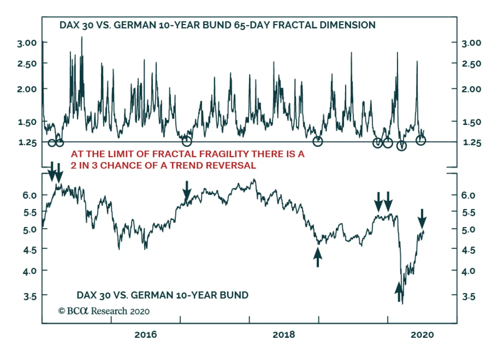
BCA Research's European Investment Strategy service's fractal trading model has given them a sell signal on the stock-to-bond ratio. Since 2015, a collapsed 65-day fractal structure of the German stock-to-bond ratio has reliably presaged a change in trend,…