Euro Area

Highlights The cyclical rally in stocks is not over, but the S&P 500 will churn between 2800 and 3200 this summer. Supportive policy, robust household balance sheets and budding economic growth have put a floor under global bourses. Political risk, demanding valuations and COVID-related headlines are creating potent headwinds in the near term that must be resolved. During the ongoing flat but volatile performance of equities, investors should build short positions against government bonds and the dollar. Deep cyclicals, banks and Japanese equities offer opportunities to generate alpha. In the long term, structurally rising inflation will ensure that stocks outperform bonds, but commodities will beat them both. Feature Institutional investors still despise the equity market rebound that began on March 23. Relative to history, professional investors are heavily overweight cash, bonds and defensive sectors but they are underweight equities as an asset class and cyclical sectors specifically. Furthermore, the beta of global macro hedge funds to the stock market is in the bottom of its distribution, which indicates the funds’ low net exposure to equities. The attitude of market participants is understandable given that the economy is in tatters. According to the New York Fed Weekly Economic Index, Q2 GDP in the US will contract by 8.4% compared with last year. Industrial production is still 15.9% below its pre-pandemic high and the US unemployment rate stands at either 13.3% or 16.4%, depending how the BLS accounts for furloughed employees. Moreover, deflationary forces are building, which hurts profits. Despite these discouraging economic reports, the S&P 500 is trading only 7.9% below its February 19 all-time high and is displaying a demanding forward P/E ratio of 21.4. Stocks will continue to churn over the summer with little direction. Financial markets are forward looking and the collapse of risk asset prices in March forewarned of an economic calamity. Stimulus, liquidity conditions and an eventual recovery are creating strong tailwinds for stocks. However, demanding valuations, rising political risks and overbought short-term technicals argue for a correction. These forces will probably balance out each other in the coming months. Investors must be nimble. Buying beta is not enough; finding cheap assets levered to the nascent recovery will be a source of excess returns. Bonds are vulnerable to the recovery and purchasing deep cyclicals at the expense of defensives makes increasing sense. Japanese stocks offer another attractive opportunity. Five Pillars Behind Stocks… Our BCA Equity Scorecard remains in bullish territory despite the conflict between the sorry state of the global economy and the violence of the equity rally since late March (Chart I-1). Five forces support share prices. Chart I-1The Rally Is Underpinned
The Rally Is Underpinned
The Rally Is Underpinned
The first pillar is extraordinarily accommodative liquidity conditions created by global central banks, which have aggressively slashed policy rates and allowed real interest rates to collapse. Additionally, forward guidance indicates that policy will remain easy for the foreseeable future. For example, the Federal Reserve does not anticipate tightening policy through 2022 and the Bank of Japan expects to stand pat until at least 2023. In response, the yield curve in advanced economies has started to steepen, which indicates that the policy easing is having a positive impact on the world’s economic outlook (Chart I-2). Various liquidity measures demonstrate the gush of high-powered money in the financial and economic system in the wake of monetary policy easing. Our US Financial Liquidity Index and dollar-based liquidity measure have skyrocketed. Historically, these two indicators forecast the direction of growth and the stock market (Chart I-3). Chart I-2The Yield Curve Likes What It Sees
The Yield Curve Likes What It Sees
The Yield Curve Likes What It Sees
Chart I-3Exploding Liquidity Conditions
Exploding Liquidity Conditions
Exploding Liquidity Conditions
The second pillar is the greatest fiscal easing since World War II. The US government has increased spending by $2.9 trillion since March. House Democrats have passed an additional $3 trillion plan. Senate Republicans will not ratify the entire proposal, but our Geopolitical Strategy service expects them to concede to $2 trillion.1 Meanwhile, the White House is offering a further $1 trillion infrastructure program over five years. Details of the infrastructure plan are murky, but its existence confirms that fiscal profligacy is the new mantra in Washington and the federal deficit could reach 23% of GDP this year. Chart I-4Loosest Fiscal Policy Since WWII
July 2020
July 2020
The list of new fiscal measures worldwide is long; the key point is that governments are injecting funds to lessen the COVID-19 recession pain on their respective populations and small businesses (Chart I-4). Excluding loans guarantees, even tight-fisted Germany has rolled out EUR 0.44 trillion in relief programs, amounting to 12.9% of GDP. Japan has announced JPY 63.5 trillion of “fresh water” stimulus so far, representing 11.4% of GDP. Loan guarantees administered by various governments along with the Fed’s Primary and Secondary Market Credit Facilities also limit how high business bankruptcies will climb. As we discussed last month, it is unlikely that countries will return to the level of spending and budget deficits that prevailed prior to COVID-19, even if the intensity of fiscal support declines from its current extreme.2 Voters in the West and emerging markets are fed up with the Washington Consensus of limited state intervention. Consequently, the median voter has pivoted to the left on economic matters, especially in Anglo-Saxon nations (Chart I-5).3 The fiscal laxity consistent with economic populism and dirigisme will boost aggregate demand for many years. The third supporting pillar is the private sector’s response to monetary and fiscal easing unleashed by global policymakers. Unlike in 2008, the amount of loans and commercial papers issued by US businesses is climbing, which indicates stronger market access than during the Great Financial Crisis (GFC). A consequence of the large uptick in credit growth has been an explosion in banking deposits. Given the surge in private-sector liquidity – not just base money – broad money creation has eclipsed that of the GFC (Chart I-6). Part of this money will seek higher returns than the -0.97% real short rate available to investors in the US (or -0.9% in Europe), a process that will bid up risk assets. Chart I-5The US Population's Shift To The Left
July 2020
July 2020
Chart I-6The Private Sector's Liquidity Is Improving
The Private Sector's Liquidity Is Improving
The Private Sector's Liquidity Is Improving
The financial health of the US household sector is the fourth pillar buttressing stocks. Households entered the recession with debt equal to 99.4% of disposable income, the lowest share in 19 years. Moreover, debt servicing only represents 9.7% of disposable income, the lowest percentage of the past four decades. Along with generous support from the US government, the resilience created by strong balance sheets explains why delinquency rates remain muted despite a surge in unemployment (Table I-1).4 Moreover, the decline in household net worth pales in comparison with the GFC (Chart I-7). Hence, the wealth effect will not have the same deleterious impact on consumption as it did after 2008. In the wake of large fiscal transfers, the savings rate explosion to an all-time high of 32.9% is a blessing. The surge in savings is applying a powerful brake on 67.7% of the US economy, but its eventual decline will fuel a quick consumption recovery, a positive trend absent after the GFC. Table I-1Consumer Borrowers Are Hanging In There
July 2020
July 2020
Chart I-7Smaller Hit To Net Worth Than The GFC
Smaller Hit To Net Worth Than The GFC
Smaller Hit To Net Worth Than The GFC
The final pillar is the path of the global business cycle. Important predictors of the US economy have improved. The June Philly Fed and Empire State surveys are gaining ground, thanks to their rebounding new orders and employment components. The Conference Board’s LEI is also climbing, even when its financial constituents are excluded. Residential activity, which also leads the US business cycle, is sending positive signals. According to the June NAHB Housing market index, homebuilder confidence is quickly recouping lost ground and building permits are bottoming. These two series suggest that the contribution of housing to GDP growth will only expand. Household spending is showing promising growth as the economy re-opens. In May, US auto sales jumped 44.1% higher and retail sales (excluding autos) soared by 12.4%. Additionally, the retail sales control group5 has already recovered to its pre-pandemic levels. The healing labor market and the bounce in consumer confidence have fueled this record performance because they will prompt a normalization in the savings rate. Progress is also evident outside the US. The expectations component of the German IFO survey is rebounding vigorously, a good omen for European industrial production (Chart I-8). Similarly, the continued climb in China’s credit and fiscal impulse suggests that global industrial production will move higher. Finally, EM carry trades are recovering, which indicates that liquidity is seeping into corners of the global economy that contribute the most to capex (Chart I-9). Chart I-8European Hopes
European Hopes
European Hopes
Chart I-9Positive Signals For Global Manufacturers
Positive Signals For Global Manufacturers
Positive Signals For Global Manufacturers
Against this backdrop, there is an increasing probability that analysts will upgrade their 2020 EPS estimates. The odds of upward revisions to 2021 and 2022 estimates (especially outside of the tech and healthcare sectors) are much more significant, especially because the historical pattern of deep recessions followed by sharp rebounds should repeat itself (Chart I-10). A strong recovery will ultimately foster risk-taking. Mechanically, higher expected cash flows and lower risk premia will remain tailwinds behind stocks. Chart I-10The Deeper The Fall, The Faster The Rebound
July 2020
July 2020
… And Three Reasons To Worry The five pillars shoring up stocks face three powerful factors working at cross purposes against share prices. The first hurdle against stocks is that in aggregate, the S&P 500 is already discounting the coming economic recovery. In the US, the 12-month forward P/E ratio bounced from a low of 13.4 on March 23 to the current 21.4. Bidding up multiples to such heights in a short timeframe opens up the potential for investor disappointments with economic activity or earnings. Equally concerning, the global expectations component of the German ZEW survey has returned to near-record highs. The ZEW is a survey of financial professionals largely influenced by the performance of equities. In order for stocks to continue to rise, they will need an even greater global economic rebound than implied by the ZEW (Chart I-11). Chart I-11Stocks Already Know That IP Will Jump Back
Stocks Already Know That IP Will Jump Back
Stocks Already Know That IP Will Jump Back
Political risk poses a second hurdle against stocks. As intense as it is today, policy uncertainty will not likely abate this summer, which will put upward pressure on the equity risk premium. According to BCA Research’s Geopolitical strategy service, the combination of elevated share prices and President Trump’s low approval rating will increase the prospect of erratic moves by the White House. A pitfall particularly under-appreciated by risk assets is a new round of tariffs in the Sino-US trade war.6 Another hazard is an escalation of tensions with the European Union. US domestic politics are also problematic. Fiscal stimulus has been a pillar for the market. However, as the economy recovers, politicians could let down their guard and resist passing new measures on the docket. This danger is self-limiting. If legislators delay voting on proposed laws, then the resulting drop in the market will put greater pressure on policymakers to continue to support the economy. Either way, this tug-of-war could easily cause some painful bouts of market volatility. Chart I-12How Long Will Stocks Ignore Politics?
How Long Will Stocks Ignore Politics?
How Long Will Stocks Ignore Politics?
In recent months, the equity risk premium could ignore rising political risk as long as financial liquidity was expanding at an accelerating pace (Chart I-12). However, the bulk of monetary easing is over because the Fed, the ECB and the global central banks have already expended most of their ammunition. Moreover, the ECB, the Bank of England, the Bank of Japan and the Swiss National Bank have agreed to slow the pace at which they tap the Fed’s dollar swap line from daily to three times a week. This indicates that the private sector’s extreme appetite for liquidity has been satiated by the increase in base money since March 19. Thus, the expansion of liquidity will decelerate, even if its level remains plentiful. Overlooking political uncertainty will become harder after the second derivative of liquidity turns negative. The third hurdle against the stock market is the evolution of COVID-19. A second wave of infection has started in many countries and it will only continue to escalate as economies re-open, loosen social distancing rules and test more potential cases. Investors will be rattled by headlines such as the resumption of lockdowns in Beijing and mounting new cases in the southern US. Chart I-13A Different Wave
A Different Wave
A Different Wave
BCA’s base case is that a second wave of infections will not result in large-scale lockdowns that paralyzed the global economy in Q1 and Q2. Importantly, the number of new deaths is lagging the spread of recorded new infections (Chart 1-13). This dichotomy highlights better testing, our improved understanding of the disease and our greater capacity to protect vulnerable individuals. A Summer Of Discontent The S&P 500 and global equities will face a summer of directionless gyrations with elevated volatility. Before we can escape this pattern, the technical froth that has engulfed the market must dissipate. Our Tactical Strength Indicator is massively overbought and is consistent with a period of consolidation. (Chart I-14). The same is true of short-term breadth. The proportion of NYSE stocks trading above their 10-week moving average is close to its highest level in the past 20 years, which indicates that meaningful equity gains are doubtful in the coming months. (Chart I-14, bottom panel). A correction should not morph into a renewed bear market because the pillars behind stocks are too strong. Nonetheless, the S&P 500 may retest the 2800-2900 zone during the summer. On the upside, it will be capped near 3200 during that same period. A resolution of the political risks surrounding the market is needed to settle the churning pattern. Another factor will be the progressive normalization of our tactical indicators after an extended period of sideways trading. Finally, continued progress on the treatment of COVID-19 (not necessarily a vaccine) and the formulation of a coherent health policy for the fall will create the impetus for higher share prices later this year. How To Profit When Stocks Churn A strategy most likely to generate the highest reward-to-risk ratio will be to focus on assets and sectors that have not yet fully priced in the upcoming global economic recovery, unlike the broad stock market. The bond market fits within this strategy. G-7 and US yields remain extremely expensive (Chart I-15). Additionally, according to our Composite Technical Indicator, Treasuries are losing momentum (see Section III, page 41). This valuation and technical backdrop renders government bonds vulnerable to both a strong economy and an upward reassessment of the outlook for inflation. Chart I-14A Needed Digestive Break
A Needed Digestive Break
A Needed Digestive Break
Chart I-15Bonds Are Pricey...
Bonds Are Pricey...
Bonds Are Pricey...
Cyclical dynamics also paint a poor outlook for bonds. Globally, the supply of government securities is swelling by approximately $6 trillion, which will slowly lift depressed term premia. Moreover, there has been a sharp incline in excess liquidity as approximated by the gap between our US Financial Liquidity Index and the rate of change of the US LEI. Such a development has led yields higher since the GFC (Chart I-16). Finally, the diffusion index of fifteen Swedish economic variables has started to recover, an indicator that often signals higher yields (Chart I-17). Sweden is an excellent bellwether for the global business cycle because it is a small, open economy where shipments of industrial and intermediate goods account for 55% of exports. Chart I-16...And Vulnerable To Excess Liquidity
...And Vulnerable To Excess Liquidity
...And Vulnerable To Excess Liquidity
Chart I-17Sweden's Message
Sweden's Message
Sweden's Message
The FX market also offers reasonably priced vehicles to bet on the burgeoning global cyclical upswing. Balance-of-payments dynamics are increasingly bearish for the US dollar. A fall in the household savings rate will widen the current account deficit because the fiscal balance remains deeply negative. Meanwhile, US real interest rate differentials are narrowing, thus the capital account surplus will likely recede. The resulting balance-of-payment deficit will accentuate selling pressures on the USD created by a pick-up in global industrial activity (Chart I-18). AUD/CHF offers another attractive opportunity. The AUD trades near a record low relative to the CHF, yet this cross will benefit from a rebound in global nominal GDP growth (Chart I-19). Moreover, Australia managed the COVID-19 crisis very well and it can proceed quickly with its re-opening. Meanwhile, the expensiveness of the CHF versus the EUR will continue to foster deflationary pressures in Switzerland. This contrast ensures that the Swiss National Bank remains more dovish than the Reserve Bank of Australia. Chart I-18Bearish Dollar Backdrop
Bearish Dollar Backdrop
Bearish Dollar Backdrop
Chart I-19AUD/CHF As A Bet On The Recovery
AUD/CHF As A Bet On The Recovery
AUD/CHF As A Bet On The Recovery
Within equities, deep cyclical stocks remain attractive relative to defensive ones. The same acceleration in our excess liquidity proxy that warned of a fall in bond prices indicates that the cyclicals-to-defensives ratio should appreciate. This ratio also benefits meaningfully when the dollar depreciates. A weaker dollar is synonymous with stronger global industrial production. It also eases deflationary pressures and boosts the price of commodities, which increases pricing power for industrial, material and energy stocks. Finally, the cyclical-to-defensives ratio rises when the silver-to-gold ratio turns up. An outperformance of silver has been an important signal that reflation is starting to improve the global economic outlook (Chart I-20).7 Chart I-20Cyclicals Have Not Priced In The Recovery
Cyclicals Have Not Priced In The Recovery
Cyclicals Have Not Priced In The Recovery
Banks also offer attractive opportunities. Investors have clobbered banks because they expect prodigious non-performing loans (NPL) due to the threats to private-sector balance sheets from the deepest recession in nine decades. However, NPLs are not expanding by as much as anticipated thanks to the ample support by global monetary and fiscal authorities. Moreover, banks were conservative and built loss reserves ahead of the crisis. In this context, the extreme valuation discount embedded in banks relative to the S&P 500 seems exaggerated (Chart I-21). Additionally, the gap between the expected growth rate of banks’ long-term earnings and that of the broad market is wider than at any other point in the past 15 years. Investors have also bid up the price of protection against bank shares (Chart I-22). Therefore, despite near-term risks induced by the Fed’s Stress Test, banks are a cheap contrarian bet on a global recovery. Chart I-21Banks Are Cheap
Banks Are Cheap
Banks Are Cheap
Chart I-22Banks As A Contrarian Bet
Banks As A Contrarian Bet
Banks As A Contrarian Bet
Investors should continue to favor foreign versus US equities, which is consistent with our positive outlook on banks and deep cyclical stocks, as well as our negative disposition toward the dollar. Foreign stocks outperform US ones when the dollar depreciates because the former overweight cyclical equities and financials (Chart I-23). Moreover, foreign stocks trade at discounts to US equities and embed significantly lower expected cash flow growth, which suggests that they would offer investors upside from the impending global economic recovery. Chart I-23Favor Foreign Stocks
Favor Foreign Stocks
Favor Foreign Stocks
EM stocks fit within this context. Both EM FX and equities trade at a valuation discount consistent with an upcoming rally (Chart I-24). Moreover, cheap valuations increase the likelihood that a depreciating US dollar will boost EM currencies by easing global financial conditions. Moreover, the momentum of EM equities relative to global ones is forming a positive divergence with the price ratio, which is consistent with liquidity making its way into these markets (Chart I-25). Our Emerging Markets Strategy team is more worried about EM stocks than we are because EM bourses would be unlikely to participate as much as US ones in a mania driven by retail investors.8 Chart I-24Attractive EM Valuations
Attractive EM Valuations
Attractive EM Valuations
Chart I-25EM: A Coiled-Spring Bet On A Weaker Dollar?
EM: A Coiled-Spring Bet On A Weaker Dollar?
EM: A Coiled-Spring Bet On A Weaker Dollar?
Chart I-26Japanese Stocks As A Trade
Japanese Stocks As A Trade
Japanese Stocks As A Trade
Finally, an opportunity to overweight Japanese equities has emerged. The Nikkei has collapsed in conjunction with a meltdown in Japanese industrial production. However, Japanese earnings should recover faster than in the rest of the world. Japan has efficiently handled its COVID-19 outbreak with fewer lockdowns. Moreover, Japan’s earnings per share (EPS) are highly levered to both the global business cycle and China’s economic fluctuations. Consequently, if we expect global activity to recover and China’s credit and fiscal impulse to continue to improve, then we also anticipate that Japan’s EPS will outperform the MSCI All-Country World Index (Chart I-26). Additionally, on a price-to-cash flow basis, Japanese equities trade at a deep-enough discount to global stocks to foreshadow an upcoming period of outperformance. Bottom Line: Equities will be tossed about for the coming quarter or two, buffeted between five tailwinds and three headwinds. While the S&P is expected to gyrate between 2800 and 3200 this summer, investors can seek alpha by selling bonds, selling the dollar and buying AUD/CHF, and favoring deep cyclical stocks as well as banks at the expense of defensives. As a corollary, foreign equities, especially Japanese ones, have a window to outperform the US. EM stocks could also generate excess returns, but they are a more uncertain bet. Exploring Long-Term Risks We explore some investment implications linked to our theme of structurally rising inflation, which will cause lower real long-term portfolio returns than in the previous four decades. Populism and the ossification of the supply-side of the economy will push inflation up this cycle toward an average of 3% to 5%.9 Chart I-27S&P 500 Long-Term Perspective
S&P 500 Long-Term Perspective
S&P 500 Long-Term Perspective
Adjusted for inflation, the 10-year cumulative average return for stocks stands at 12.4%, which is an elevated reading. The strength of the past performance increases the probability that a period of mean reversion is near (Chart I-27). The end of the debt supercycle raises the likelihood that an era of low real returns will materialize. Non-financial debt accounts for 258.7% of GDP, a level only topped at the depth of the Great Depression when nominal GDP collapsed by 46% from its 1929 peak. Meanwhile, yields are at record lows (Chart I-28). Such a combination suggests that there is little way forward to boost debt by enough to enhance growth, especially when each additional dollar of debt generates a diminishing amount of output. Chart I-28The End Of The Debt Super Cycle
The End Of The Debt Super Cycle
The End Of The Debt Super Cycle
Chart I-29Little Room To Cut Taxes
Little Room To Cut Taxes
Little Room To Cut Taxes
Populist governments will remain profligate and play an expanding role in the economy instead of accepting the necessary increase in savings required to reduce debt and create a more robust economy. However, effective personal and corporate tax rates are already very low in the US (Chart I-29). Therefore, the only way to offer fiscal support would be to increase government spending. Growth will become less vigorous as the government’s share of GDP increases (Chart I-30). Moreover, monetary policy will likely remain lax, which boosts the chance of stagflation developing. Chart I-30The Bigger The Government, The Lower The Growth
July 2020
July 2020
Elevated stock multiples are a problem for long-term investors. The S&P 500’s Shiller P/E ratio stands at 29.1, and its price-to-sales ratio is at 2.2. If bond yields remain minimal, then low discount rates can rationalize those extreme multiples. However, if inflation moves above 4%, especially when real output is not expanding robustly, then multiples will mean-revert and equities will generate subpar real returns. Chart I-31Profit Margins: From Tailwind To Headwind?
Profit Margins: From Tailwind To Headwind?
Profit Margins: From Tailwind To Headwind?
Profit margins pose an additional problem for stocks. The decline in unit labor costs relative to selling prices has allowed abnormally wide domestic EBITDA margins to persist (Chart I-31). However, inflation, populism, greater government involvement in the economy and lower efficiency of supply chains will conspire to undo this extraordinary level of profitability. In other words, while the share of national income taken up by wages will expand, profits will account for a progressively smaller slice of output. (Chart I-31, bottom panel). Lower profit margins will push down RoE and accentuate the decline in multiples while also hurting projected long-term cash flows. Chart I-32Elevated Household Exposure To Stocks
Elevated Household Exposure To Stocks
Elevated Household Exposure To Stocks
Finally, from a structural perspective, households are already aggressively overweighting equities. Stocks comprise 54% of US households’ discretionary portfolios. US households held more shares only in 1968 and 2000, two years that marked the beginning of painful drops in real stock prices (Chart I-32). US stocks are most vulnerable to the increase of inflation. Not only are they much more expensive than their global counterparts, but as the Section II special report written by Matt Gertken highlights, the growing nationalism spreading around the world hurts the global order built by and around the US during the past 70 years. With this system of influence diminished, US firms will not be able to command their current valuation premium. Despite low expected real rates of return, equities will still outperform bonds in the coming decade (Table I-2). Even though stocks are more volatile than bonds, stocks have not significantly outperformed bonds during the past 35 years. This was possible because inflation fell from its peak in the early 1980s. However, bonds are unlikely to once again generate higher risk-adjusted returns than equities if inflation bottoms. Moreover, bonds are more expensive than stocks (Chart I-33). A structural bear market in bonds would hurt risk-parity strategies and end the incredible strength in growth stocks. Table I-2Rising Inflation Flatters Stocks Over Bonds
July 2020
July 2020
The outperformance of stocks over bonds will be of little solace to investors if equities generate poor real returns. Instead, investors should explore commodities, an asset class that benefits from rising inflation, especially given the combination of strong government spending and too-accommodative monetary policy. Moreover, after a decade of weak capex in natural resource extraction, the supply of commodities will expand slowly. Hence, our base case this cycle is for a weakening in the stock-to-gold ratio (Chart I-34). The stock-to-industrial commodities ratio will also fall from its heady levels. As a result, the energy, materials and industrial sectors are attractive on a long-term basis beyond the next six to 12 months. Chart I-33Bonds Look Worse Than Stocks...
Bonds Look Worse Than Stocks...
Bonds Look Worse Than Stocks...
Chart I-34...But Gold Looks The Best
...But Gold Looks The Best
...But Gold Looks The Best
Mathieu Savary Vice President The Bank Credit Analyst June 25, 2020 Next Report: July 30, 2020 II. Nationalism And Globalization After COVID-19 Economic shocks in recent decades have led to surges in nationalism and the COVID-19 crisis is unlikely to be different. Nationalism adds to the structural challenges facing globalization, which is already in retreat. Investors face at least a 35% chance that President Trump will be reelected and energize a nationalist and protectionist agenda that is globally disruptive. China is also indulging in nationalism as trend growth slows, raising the probability of a clash with the US even if Trump does not win. US-China economic decoupling will present opportunities as well as risks – primarily for India and Southeast Asia. Since the Great Recession, investors have watched the US dollar and US equities outperform their peers in the face of a destabilizing world order (Chart II-1). Chart II-1US Outperformance Amid Global Disorder
US Outperformance Amid Global Disorder
US Outperformance Amid Global Disorder
Global and American economic policy uncertainty has surged to the highest levels on record. Investors face political and geopolitical power struggles, trade wars, a global pandemic and recession, and social unrest. How will these risks shape up in the wake of COVID-19? First, massive monetary and fiscal stimulus ensure a global recovery but they also remove some of the economic limitations on countries that are witnessing a surge in nationalism. Second, nationalism creates a precarious environment for globalization – namely the wave of “hyper-globalization” since 2000. Nationalism and de-globalization do not depend on the United States alone but rather have shifted to the East, which means that geopolitical risks will remain elevated even if the US presidential election sees a restoration of the more dovish Democratic Party. Economic Shocks Fuel Nationalism’s Revival Nationalism is the idea that the political state should be made up of a single ethnic or cultural community. While many disasters have resulted from this idea, it is responsible for the modern nation-state and it has enabled democracies to take shape across Europe, the Americas, and beyond. Industrialization is also more feasible under nationalism because cultural conformity helps labor competitiveness.10 At the end of the Cold War, transnational communist ideology collapsed and democratic liberalism grew complacent. Each successive economic shock or major crisis has led to a surge in nationalism to fill the ideological gaps that were exposed. Chart II-2The Resurgence Of Russian Nationalism
July 2020
July 2020
Chart II-3USA: From Nationalism To Anti-Nationalism
July 2020
July 2020
For instance, various nationalists and populists emerged from the financial crises of the late 1990s. Russian President Vladimir Putin sought to restore Russia to greatness in its own and other peoples’ eyes (Chart II-2). Not every Russian adventure has mattered for investors, but taken together they have undermined the stability of the global system and raised barriers to exchange. The invasion of Crimea in 2014 and the interference in the US election in 2016 helped to fuel the rise in policy uncertainty, risk premiums in Russian assets, and safe havens over the past decade. The September 11, 2001 terrorist attacks in the United States created a surge in American nationalism (Chart II-3). This surge has since collapsed, but while it lasted the US destabilized the Middle East and provided Russia and China with the opportunity to pursue a nationalist path of their own. Investors who went long oil and short the US dollar at this time could have done worse. The 2008 crisis spawned new waves of nationalist feeling in countries such as China, Japan, the UK, and India (Chart II-4). Conservatives of the majority cultural group rose to power, including in China, where provincial grassroots members of the elite reasserted the Communist Party’s centrality. Japan and India became excellent equity investment opportunities in their respective spheres, while the UK and China saw their currencies weaken. The rising number of wars and conflicts across the world since 2008 reflects the shift toward nationalism, whether among minority groups seeking autonomy or nation-states seeking living space (Chart II-5). Chart II-4Nationalist Trends Since The Great Recession
July 2020
July 2020
Chart II-5World Conflicts Rise After Major Crises
July 2020
July 2020
COVID-19 is the latest economic shock that will feed a new round of nationalism. At least 750 million people are extremely vulnerable across the world, mostly concentrated in the shatter belt from Libya to Turkey, Iran, Pakistan, and India.11 Instability will generate emigration and conflict. Once again the global oil supply will be at risk from Middle Eastern instability and the dollar will eventually fall due to gargantuan budget and trade deficits. Today’s shock will differ, however, in the way it knocks against globalization, a process that has already begun to slow. Specifically, this crisis threatens to generate instability in East Asia – the workshop of the world – due to the strategic conflict between the US and China. This conflict will play out in the form of “proxy battles” in Greater China and the East Asian periphery. The dollar’s recent weakness is a telling sign of the future to come. In the short run, however, political and geopolitical risks are acute and will support safe havens. Globalization In Retreat Nationalism is not necessarily at odds with globalization. Historically there are many cases in which nationalism undergirds a foreign policy that favors trade and eschews military intervention. This is the default setting of maritime powers such as the British and Dutch. Prior to WWII it was the American setting, and after WWII it was the Japanese. Over the past thirty years, however, the rise of nationalism has generally worked against global trade, peace, and order. That’s because after WWII most of the world accepted internationalist ideals and institutions promoted by the United States that encouraged free markets and free trade. Serious challenges to that US-led system are necessarily challenges to global trade. This is true even if they originate in the United States. Globalization has occurred in waves continuously since the sixteenth century. It is not a light matter to suggest that it is experiencing a reversal. Yet the best historical evidence suggests that global imports, as a share of global output, have hit a major top (Chart II-6).12 The line in this chart will fall further in 2020. American household deleveraging, China’s secular slowdown, and the 2014 drop in oil and commodities have had a pervasive impact on the export contribution to global growth. Chart II-6Globalization Hits A Major Top
Globalization Hits A Major Top
Globalization Hits A Major Top
Chart II-7Both Goods And Services Face Headwinds
Both Goods And Services Face Headwinds
Both Goods And Services Face Headwinds
The next upswing of the business cycle will prompt an increase in trade in 2021. Global fiscal stimulus this year amounts to 8% of GDP and counting. But will the import-to-GDP ratio surpass previous highs? Probably not anytime soon. It is impossible to recreate America’s consumption boom and China’s production boom of the 1980s-2000s with public debt alone. Global trend growth is slowing. Isn’t globalization proceeding in services, if not goods? The world is more interconnected than ever, with nearly half of the population using the Internet – almost 30% in Sub-Saharan Africa. One in every two people uses a smartphone. Eventually the pandemic will be mitigated and global travel will resume. Nevertheless, the global services trade is also facing headwinds. And it requires even more political will to break down barriers for services than it does for goods (Chart II-7). The desire of nations to control and patrol cyberspace has resulted in separate Internets for authoritarian states like Russia and China. Even democracies are turning to censorship and content controls to protect their ideologies. Political demands to protect workers and industries are gaining ground. Policymakers in China and Russia have already shifted back toward import substitution; now the US and EU are joining them, at least when it comes to strategic sectors (health, defense). Nationalists and populists across the emerging world will follow their lead. Regional and wealth inequalities are driving populations to be more skeptical of globalization. GDP per capita has not grown as fast as GDP itself, a simple indication of how globalization does not benefit everyone equally even though it increases growth overall (Chart II-8). Inequality is a factor not only because of relatively well-off workers in the developed world who resent losing their job or earning less than their neighbors. Inequality is also rife in the developing world where opportunities to work, earn higher wages, borrow, enter markets, and innovate are lacking. Over the past decade, emerging countries like Brazil, Indonesia, Mexico, and South Africa have seen growing skepticism about whether foreign openness creates jobs or lifts wages.13 Immigration is probably the clearest indication of the break from globalization. The United States and especially the European Union have faced an influx of refugees and immigrants across their southern borders and have resorted to hard-nosed tactics to put a stop to it (Chart II-9). Chart II-8Global Inequality Fuels Protectionism
July 2020
July 2020
Chart II-9US And EU Crack Down On Immigration
July 2020
July 2020
There is zero chance that these tough tactics will come to an end anytime soon in Europe, where the political establishment has discovered a winning combination with voters by promoting European integration yet tightening control of borders. This combination has kept populists at bay in France, Italy, the Netherlands, Spain, and Germany. A degree of nationalism has been co-opted by the transnational European project. In the US, extreme polarization could cause a major change in immigration policy, depending on the election later this year. But note that the Obama administration was relatively hawkish on the border and the next president will face sky-high unemployment, which discourages flinging open the gates. Reduced immigration will weigh on potential GDP growth and drive up the wage bill for domestic corporations. If nationalism continues to rise and to hinder the movement of people, goods, capital, and ideas, then it will reduce the market’s expectations of future earnings. American Nationalism Still A Risk The United States is experiencing a “Civil War Lite” that may take anywhere from one-to-five years to resolve. The November 3 presidential election will have a major impact on the direction of nationalism and globalization over the coming presidential term. If President Trump is reelected – which we peg at 35% odds – then American nationalism and protectionism will gain a new lease on life. Other nations will follow the US’s lead. If Trump fails, then nationalism will likely be driven by external forces, but protectionism will persist in some form. Chart II-10Trump Is Not Yet Down For The Count
July 2020
July 2020
Investors should not write Trump off. If the election were held today, Trump would lose, but the election is still four months away. His national approval rating has troughed at a higher level than previous troughs. His disapproval rating has spiked but has not yet cleared its early 2019 peak (Chart II-10).14 This is despite an unprecedented deluge of bad news: universal condemnation from Democrats and the media, high-profile defections from fellow Republicans and cabinet members, stunning defeats at the Supreme Court, and scathing rebukes from top US army officers. If Trump’s odds are 35% then this translates to a 35% chance that the United States will continue pursuing globally disruptive “America First” foreign and trade policies in the 2020-24 period. First Trump will attempt to pass a Reciprocal Trade Act to equalize tariffs with all trading partners. Assuming Democrats block it in the House of Representatives, he will still have sweeping executive authority to levy tariffs. He will launch the next round in the trade war with China to secure a “Phase Two” trade deal, which will be tougher because it will be focused on structural reforms. He could also open new fronts against the European Union, Mexico, and other trade surplus countries. By contrast, these risks will melt away if Biden is elected. Biden would restore the Obama administration’s approach of trade favoritism toward strategic allies and partners, such as Europe and the members of the Trans-Pacific Partnership, but only occasional use of tariffs. Biden would work with international organizations like the World Trade Organization. His foreign policy would also open up trade with pariah states like Iran, reducing the tail-risk of a war to almost zero. Biden would be tougher on China than Presidents Obama or Bill Clinton, as the consensus in Washington is now hawkish and Biden would need to keep the blue-collar voters he won back from Trump. He may keep Trump’s tariffs in place as negotiating leverage. But he is less likely to expand these tariffs – and there is zero chance he will use them against Europe. At the same time, it will take a year or more to court the allies and put together a “coalition of the willing” to pressure China on structural reforms and liberalization. China would get a reprieve – and so would financial markets. Thus investors have a roughly 65% chance of seeing US policy “normalize” into an internationalist (not nationalist) approach that reduces the US contribution to trade policy uncertainty and geopolitical risk over the next few years at minimum. But there are still four months to go before the election; these odds can change, and equity market volatility will come first. Moreover a mellower US would still need to react to nationalism in Asia. European Nationalism Not A Risk (Yet) Chart II-11English Versus Scottish Nationalism
English Versus Scottish Nationalism
English Versus Scottish Nationalism
European nationalism has reemerged in recent years but has greatly disappointed the prophets of doom who expected it to lead to the breakup of the European Union. The southern European states suffered the most from COVID-19 but many of them have made their decision regarding nationalism and the supra-national EU. Greece underwent a depression yet remained in the union. Italians could easily elect the right-wing anti-establishment League to head a government in the not-too-distant future. But there is no appetite for an Italian exit. Brexit is the grand exception. If Trump wins, then the UK and British Prime Minister Boris Johnson will be seen as the vanguard of the revival of nationalism in the West. If Trump loses, English nationalism will appear an isolated case that is constrained by its own logic given the response of Scottish nationalism (Chart II-11). The trend in the British Isles would become increasingly remote from the trends in continental Europe and the United States. The majority of Europeans identify both as Europeans and as their home nationality, including majorities in countries like Greece, Italy, France, and Austria where visions of life outside the union are the most robust (Chart II-12). Even the Catalonians are focused on options other than independence, which has fallen to 36% support. Eastern European nationalists play a careful balancing game of posturing against Brussels yet never drifting so far as to let Russia devour them. Chart II-12European Nationalism Is Limited (For Now)
European Nationalism Is Limited (For Now)
European Nationalism Is Limited (For Now)
Europeans have embraced the EU as a multi-ethnic confederation that requires dual allegiances and prioritizes the European project. COVID-19 has so far reinforced this trend, showing solidarity as the predominant force, and much more promptly than during the 2011 crisis. It will take a different kind of crisis to reverse this trend of deeper integration. European nationalists would benefit from another economic crash, a new refugee wave from the Middle East, or conflict with Turkish nationalism. The latter is already burning brightly and will eventually flame out, but not before causing a regional crisis of some kind. European policymakers are containing nationalism by co-opting some of its demands. The EU is taking steps to guard against globalization, particularly on immigration and Chinese mercantilism. The lack of nationalist uprisings in Europe do not overthrow the contention that globalization is slowing down. Europe can become more integrated at home while maintaining the higher barriers against globalization that it has always maintained relative to the UK and United States. Chinese Nationalism The Biggest Risk The nationalist risk to globalization is most significant in East Asia and the Pacific, where Chinese nationalism continues the ascent that began with the Great Recession. China’s slowdown in growth rates has weakened the Communist Party’s confidence in the long-term viability of single-party rule. The result has been a shift in the party line to promote ideology and quality of life improvements to compensate for slower income gains. Xi Jinping’s governing philosophy consists of nationalist territorial gains, promoting “the China Dream” for the middle class, and projecting ambitious goals of global influence by 2035 and 2049. The result has been a clash between mainland Chinese and peripheral Chinese territories – especially Hong Kong and Taiwan (Chart II-13). The turn away from Chinese identity in these areas runs up against their economic interest. It is largely a reaction to the surge in mainland nationalist sentiment, which cannot be observed directly due to the absence of reliable opinion polling. Chart II-13AChinese Nationalism On The Mainland, Anti-Nationalism In Periphery
July 2020
July 2020
Chart II-13BChinese Nationalism On The Mainland, Anti-Nationalism In Periphery
July 2020
July 2020
The conflict over identity in Greater China is perhaps the world’s greatest geopolitical risk. While Hong Kong has no conceivable alternative to Beijing’s supremacy, Taiwan does. The US is interested in reviving its technological and defense relationship with Taiwan now that it seeks to counterbalance China. Chart II-14Taiwan: Epicenter Of US-China Cold War
July 2020
July 2020
Beijing may be faced with a technology cordon imposed by the United States, and yet have the option of circumventing this cordon via Taiwan’s advanced semiconductor manufacturing. Taiwan’s “Silicon Shield” used to be its security guarantee. Now that the US is tightening export controls and sanctions on China, Beijing has a greater need to confiscate that shield. This makes Taiwan the epicenter of the US-China struggle, as we have highlighted since 2016. The risk of a fourth Taiwan Strait crisis is as pertinent in the short run as it is over the long run, given that the US and China have already intensified their saber-rattling in the Strait (Chart II-14), including in the wake of COVID-19 specifically. China’s secular slowdown is prompting it to encroach on the borders of all of its neighbors simultaneously, creating a nascent balance-of-power alliance ranging from India to Australia to Japan. If China fails to curb its nationalism, then eventually US political polarization will decline as the country unites in the face of a peer competitor. If American divisions persist, they could drive the US to instigate conflict with China. Thus a failure of either side to restrain itself is a major geopolitical risk. The US and China ultimately face mutually assured destruction in the event of conflict, but they can have a clash in the near term before they learn their limits. The Cold War provides many occasions of such a learning process – from the Berlin airlift to the Cuban missile crisis. Such crises typically present buying opportunities for financial markets, but the consequences could be more far reaching if the Asian manufacturing supply chain is permanently damaged or if the shifting of supply chains out of China is too rapid. Globalization will also suffer as a result of currency wars. The US has not been successful in driving the dollar down, a key demand of the US-China trade war. It is much harder to force China to reform its labor and wage policies than it is to force it to appreciate its currency. But unlike Japan in 1985, China will not commit to unilateral appreciation for fear of American economic sabotage. Punitive measures will remain an American tool. Contrary to popular belief, the US is not attempting to eliminate its trade deficit. It is attempting to reduce overreliance on China. Status quo globalization is intolerable for US strategy. But autarky is intolerable for US corporations. The compromise is globalization-ex-China, i.e., economic decoupling. Investment Implications Chart II-15Favor International Stocks As Growth Revives
Favor International Stocks As Growth Revives
Favor International Stocks As Growth Revives
US stock market’s capitalization now makes up 58% of global capitalization (Chart II-15), reflecting the strength and innovation of American companies as well as a worldwide flight to safety during a decade of rising policy uncertainty and geopolitical risk. The revival of global growth amid this year’s gargantuan stimulus will prompt a major rotation out of US equities and into international and emerging market equities over the long run. As mentioned, the US greenback would also trend downward. However, there will be little clarity on the pace of nationalism and the fate of globalization until the US election is decided. Moreover the fate of globalization does not depend entirely on the United States. It mostly depends on countries in the east – Russia, China, and India, all of which are increasingly nationalistic. A miscalculation over Taiwan, North Korea, the East China Sea, the South China Sea, trade, or technology could ignite into tariffs, sanctions, boycotts, embargoes, saber-rattling, proxy battles, and potentially even direct conflict. These risks are elevated in the short run but will persist in the long run. As the US decouples from China it will have to deepen relations with other trading partners. The trade deficit will not go away but will be redistributed to Asian allies. Southeast Asian nations and India – whose own nationalism has created a shift in favor of economic development – will be the long-run beneficiaries. Matt Gertken Vice President Geopolitical Strategist III. Indicators And Reference Charts We continue to favor stocks at the expense of bonds, a view held since our April issue. Global fiscal and monetary conditions remain highly accommodative. Now that the global economy is starting to recover as lockdowns ease, another tailwind for stocks has emerged. Nonetheless, last month we warned that the S&P 500 was entering a consolidation phase and that a pattern of volatile ups and downs would ensue. The combination of tactically overbought markets, elevated geopolitical risk, and a looming second wave of infections continues to sustain this short-term view. Hence, the S&P 500 is likely to churn between 2088 and 3200 over the coming months. On a cyclical basis, the same factors that made us willing buyers of stocks since late March remain broadly in place. Stocks are becoming increasingly expensive, but monetary conditions are extremely accommodative. Our Speculation Indicator continues to send a benign signal, which indicates that from a cyclical perspective, the market is not especially vulnerable. Finally, our Revealed Preference Indicator is flashing a strong buy signal. Tactically, equities must still digest the heady gains made since March 23. We have had five 5% or more corrections since March 23. More of them are in the cards. Both our Tactical Strength Indicator and the share of NYSE stocks trading above their 10-week moving averages point to a pullback of 5% to 10%. Moreover, while it remains extremely stimulative, our Monetary Indicator is not rising anymore, which increases the probability that traders start to pay more attention to geopolitical risks. According to our Bond Valuation Index, Treasurys are significantly more overvalued than equities. Additionally, our Composite Technical Indicator is losing momentum. This backdrop is dangerous for bonds, especially when sentiment towards this asset class is as high as it is today and economic growth is turning the corner. Finally, we expect the yield curve to steepen, especially for very long maturities where the Fed is less active. In a similar vein, inflation breakeven rates are a clean vehicle to bet on higher yields. Since we last published, the dollar has broken down. The greenback is expensive and its counter-cyclicality is a major handicap during a global economic recovery. Additionally, the US twin deficits are increasingly problematic. The fiscal deficit remains exceptionally wide and the re-opening of the US economy will pull down the household savings rate. The current account deficit is therefore bound to widen. The continued low level of real interest rates will complicate financing this deficit and to equilibrate the funding of US liabilities, the dollar will depreciate. The widening in the current account deficit also means that the large increase in money supply by the Fed will leak out of the US economy. This process will accentuate the dollar’s negative impulse. Technically, the accelerating downward momentum in our Dollar Composite Technical Indicator also warns of additional downside for the USD. Commodities continue to gain traction. The rapid move up in the Baltic Dry index suggests that more gains are in store for natural resource prices, especially as our momentum indicator is gaining strength. Moreover, the commodity advance/decline line remains in an uptrend. A global economic recovery, a weakening dollar, and falling real interest rates (driven by easy policy) indicate that fundamental factors – not just technical ones – are also increasingly commodity bullish. Tactically, if stocks churn, as we expect, commodities will likely do so as well. However, this move should also be seen as a consolidation of previous gains. Finally, gold remains strong, lifted by accommodative monetary conditions and a weak dollar. However, the yellow metal is now trading at a significant premium to its short-term fundamentals. Gold too is likely to trade in a volatile sideways pattern, especially if bond yields rise. EQUITIES: Chart III-1US Equity Indicators
US Equity Indicators
US Equity Indicators
Chart III-2Willingness To Pay For Risk
Willingness To Pay For Risk
Willingness To Pay For Risk
Chart III-3US Equity Sentiment Indicators
US Equity Sentiment Indicators
US Equity Sentiment Indicators
Chart III-4Revealed Preference Indicator
Revealed Preference Indicator
Revealed Preference Indicator
Chart III-5US Stock Market Valuation
US Stock Market Valuation
US Stock Market Valuation
Chart III-6US Earnings
US Earnings
US Earnings
Chart III-7Global Stock Market And Earnings: Relative Performance
July 2020
July 2020
Chart III-8Global Stock Market And Earnings: Relative Performance
July 2020
July 2020
FIXED INCOME: Chart III-9US Treasurys And Valuations
July 2020
July 2020
Chart III-10Yield Curve Slopes
Yield Curve Slopes
Yield Curve Slopes
Chart III-11Selected US Bond Yields
Selected US Bond Yields
Selected US Bond Yields
Chart III-1210-Year Treasury Yield Components
10-Year Treasury Yield Components
10-Year Treasury Yield Components
Chart III-13US Corporate Bonds And Health Monitor
US Corporate Bonds And Health Monitor
US Corporate Bonds And Health Monitor
Chart III-14Global Bonds: Developed Markets
Global Bonds: Developed Markets
Global Bonds: Developed Markets
Chart III-15Global Bonds: Emerging Markets
Global Bonds: Emerging Markets
Global Bonds: Emerging Markets
CURRENCIES: Chart III-16US Dollar And PPP
US Dollar And PPP
US Dollar And PPP
Chart III-17US Dollar And Indicator
US Dollar And Indicator
US Dollar And Indicator
Chart III-18US Dollar Fundamentals
US Dollar Fundamentals
US Dollar Fundamentals
Chart III-19Japanese Yen Technicals
Japanese Yen Technicals
Japanese Yen Technicals
Chart III-20Euro Technicals
Euro Technicals
Euro Technicals
Chart III-21Euro/Yen Technicals
Euro/Yen Technicals
Euro/Yen Technicals
Chart III-22Euro/Pound Technicals
Euro/Pound Technicals
Euro/Pound Technicals
COMMODITIES: Chart III-23Broad Commodity Indicators
Broad Commodity Indicators
Broad Commodity Indicators
Chart III-24Commodity Prices
Commodity Prices
Commodity Prices
Chart III-25Commodity Prices
Commodity Prices
Commodity Prices
Chart III-26Commodity Sentiment
Commodity Sentiment
Commodity Sentiment
Chart III-27Speculative Positioning
Speculative Positioning
Speculative Positioning
ECONOMY: Chart III-28US And Global Macro Backdrop
US And Global Macro Backdrop
US And Global Macro Backdrop
Chart III-29US Macro Snapshot
US Macro Snapshot
US Macro Snapshot
Chart III-30US Growth Outlook
US Growth Outlook
US Growth Outlook
Chart III-31US Cyclical Spending
US Cyclical Spending
US Cyclical Spending
Chart III-32US Labor Market
US Labor Market
US Labor Market
Chart III-33US Consumption
US Consumption
US Consumption
Chart III-34US Housing
US Housing
US Housing
Chart III-35US Debt And Deleveraging
US Debt And Deleveraging
US Debt And Deleveraging
Chart III-36US Financial Conditions
US Financial Conditions
US Financial Conditions
Chart III-37Global Economic Snapshot: Europe
Global Economic Snapshot: Europe
Global Economic Snapshot: Europe
Chart III-38Global Economic Snapshot: China
Global Economic Snapshot: China
Global Economic Snapshot: China
Mathieu Savary Vice President The Bank Credit Analyst Footnotes 1 Please see Geopolitical Strategy "Social Unrest Can Still Cause Volatility," dated June 5, 2020, available at gps.bcaresearch.com 2 Please see The Bank Credit Analyst "June 2020," dated May 28, 2020, available at bca.bcaresearch.com 3 Please see Geopolitical Strategy "Introducing: The Median Voter Theory," dated June 8, 2016, available at gps.bcaresearch.com 4 Please see US Investment Strategy "So Far, So Good (How Markets Learned To Stop Worrying And Love Washington, DC)," dated June 8, 2020, available at usis.bcaresearch.com 5 The control group excludes auto and gas stations, and building materials. 6 Please see Geopolitical Strategy "Geopolitics Is The Next Shoe To Drop," dated April 10, 2020, available at gps.bcaresearch.com 7 Gold and silver are precious metals that benefit from lower interest rates and a weak dollar. However, a much larger proportion of the demand for silver comes from industrial processes. Thus, silver outperforms gold when an economic recovery is imminent. 8 Please see Emerging Markets Strategy "A FOMO-Driven Mania?," dated June 4, 2020, and Emerging Markets Strategy "EM: Follow The Momentum," dated June 18, 2020, available at ems.bcaresearch.com 9 Please see The Bank Credit Analyst "June 2020," dated May 28, 2020, available at bca.bcaresearch.com 10 Ernest Gellner, Nations and Nationalism (Ithaca, NY: Cornell University Press, 1983). 11 Neli Esipova, Julie Ray, and Ying Han, “750 Million Struggling To Meet Basic Needs With No Safety Net,” Gallup News, June 16, 2020. 12 Christopher Chase-Dunn et al, “The Development of World-Systems,” Sociology of Development 1 (2015), pp. 149-172; and Chase-Dunn, Yukio Kawano, Benjamin Brewer, “Trade globalization since 1795: waves of integration in the world-system,” American Sociological Review 65 (2000), pp. 77-95. 13 Bruce Stokes, “Americans, Like Many In Other Advanced Economies, Not Convinced Of Trade’s Benefits,” September 26, 2018. 14 In other words, the mishandling of COVID-19 and the historic George Floyd protests of June 2020 have not taken as great of a toll on Trump’s national approval, thus far, as the Ukraine scandal last October, the government shutdown in January-February 2019, the near-failure to pass tax cuts in December 2017, or the Charlottesville incident in August 2017. This is surprising and points once more to Trump’s very solid political base, which could serve as a springboard for a comeback over the next four months.
Highlights We conservatively estimate lost output from shutdowns and social distancing will equal $10 trillion, and we expect the jobs market to be permanently scarred. Inflation, even at 2 percent, is a pipe dream, which leads to three investment conclusions on a 1-year horizon: Overweight US T-bonds and Spanish Bonos versus German Bunds and French OATs. Any high-quality bond yield that can decline will decline. Overweight CHF/USD. The tightening yield spread will structurally favour the CHF, while the haven status of the CHF should prevent it from underperforming in periods of market stress. Overweight defensive equities (technology and healthcare) versus cyclical equities (banks and energy). This implies underweight European equities versus other markets. Fractal trade: Short Germany versus the UK. The recent outperformance of German equities is technically extended. Feature Chart of the WeekCredit Impulses Are Large, But The Hole In Output Is Much Larger
Credit Impulses Are Large, But The Hole In Output Is Much Larger
Credit Impulses Are Large, But The Hole In Output Is Much Larger
Big numbers befuddle us. Hardly a day passes without someone listing the unprecedented global stimulus unleashed to counter the coronavirus forced shutdowns – the trillions in government spending promises, tax relief, loan guarantees, money supply growth, and central bank asset-purchases. The most optimistic estimates quantify the total stimulus at $15 trillion. This includes $7 trillion of loan guarantees plus increases in central bank balance sheets which do not directly boost demand. So the direct stimulus is closer to $7 trillion.1 Yet the size of the stimulus is meaningless until we quantify the massive hole in economic output that needs to be filled. Assuming no further large-scale shutdowns, we conservatively estimate that the hole will amount to 12 percent of world output, or $10 trillion. A $10 Trillion Hole In Output Last week, the UK’s Office for National Statistics (ONS) helped us to estimate the hole in output, because unusually the ONS calculates UK GDP on a monthly basis. Between February and April, when the UK economy went from fully open to full shutdown, UK GDP collapsed by 25 percent. This despite the UK having an outsized number of jobs suitable for ‘working from home.’ For a more typical economy, we estimate that a full shutdown collapses output by 30 percent (Chart I-2). Chart I-2A Full Shutdown Collapses Output By 30 Percent
A Full Shutdown Collapses Output By 30 Percent
A Full Shutdown Collapses Output By 30 Percent
The next question is: how long does the full shutdown last? Assuming it lasts for three months, output would suffer a hole amounting to 7.5 percent of annual GDP.2 But in practice, the economy will not fully re-open after three months. Social distancing will persist until people feel confident that the pandemic is under control. An effective vaccine against Covid-19 is unlikely to be available for a year. So, even without government policy to enforce social distancing, many people will choose to avoid crowds and congregations for fear of catching the virus. The size of the stimulus is meaningless until we quantify the massive hole in economic output. This means that the sectors that rely on crowds and congregations – leisure and hospitality and retail trade – will be operating at half-capacity, at best. Given that these sectors generate 9 percent of GDP, operating at half-capacity will create an additional hole amounting to 4.5 percent of output. More worryingly, these two sectors employ 21 percent of all workers, so operating at sub-par will leave the jobs market permanently scarred.3 Combining the 7.5 percent existing hole with the 4.5 percent future hole, the full hole in economic output will amount to around 12 percent of annual GDP. As global GDP is worth around $85 trillion, this equates to $10 trillion. Crucially though, our estimate assumes that a second wave of the pandemic will not force a new cycle of shutdowns. If it does, the hole will become even bigger. Don’t Be Fooled By Money Supply Growth The recent growth in broad money supply seems a big number. Since the start of the year, the outstanding stock of bank loans has increased by around $0.7 trillion in the euro area, and by $1 trillion in both the US and China (Chart I-3 and Chart I-4). This has boosted the 6-month credit impulses in all three economies. Indeed, the US 6-month credit impulse recently hit its highest value of all time, and the combined 6-month impulse across all three blocs equals around $2 trillion (Chart of the Week). Chart I-3Don't Be Fooled By Money Supply Growth In The Euro Area And The US...
Don't Be Fooled By Money Supply Growth In The Euro Area And The US...
Don't Be Fooled By Money Supply Growth In The Euro Area And The US...
Chart I-4...And In ##br##China
...And In China
...And In China
This 6-month credit impulse quantifies the additional borrowing in the most recent six-month period compared to the previous period. Ordinarily, a $2 trillion impulse would create a huge boost to demand. After all, the private sector does not usually borrow just to hold the cash in a bank. Yet in the coronavirus crisis this is precisely what has happened. While the shutdowns lasted, firms drew on existing bank credit lines to build up emergency cash buffers. Therefore, much of the money growth will not generate new demand. While the shutdowns lasted, firms drew on existing bank credit lines to build up emergency cash buffers. To the extent that this cash is sitting idly in a firm’s bank account, the monetary velocity will decline. Meaning there will be a much-reduced transmission from credit impulses to spending growth. Furthermore, when the economy re-opens, many firms will relinquish the precautionary credit lines. There is no point holding cash in the bank when there are few investment opportunities. Hence, credit impulses will fall back – as seems to be the case right now in the US. QE: The Great Misunderstanding To repeat, big numbers befuddle us. They must always be put into context. No truer is this than when it comes to central bank asset-purchases. The great misunderstanding is that the act of central banks buying assets, per se, drives up those asset prices. Central banks act as lenders of last resort to solvent but illiquid banks and sovereigns. If there is ample liquidity in these markets – as is the case now – then the primary function of central bank asset-purchases is to set the term-structure of interest rates. In turn, the term-structure of global interest rates establishes the prices of $500 trillion of global assets. The prices of these assets are inextricably inter-connected and inter-dependent4 (Chart I-5). Chart I-5The Prices Of $500 Trillion Of Assets Are Inextricably Inter-Connected
The Prices Of $500 Trillion Of Assets Are Inextricably Inter-Connected
The Prices Of $500 Trillion Of Assets Are Inextricably Inter-Connected
The great misunderstanding is that the act of central banks buying assets, per se, drives up those asset prices. Yet central banks set no price target for their asset-purchases. They leave that to the market. Moreover, in the context of the $500 trillion of inter-dependent asset prices, the $10-15 trillion or so of central bank asset-purchases to date constitutes chicken feed (Chart I-6). Hence, the mechanism by which asset-purchases work is through the signal they give to the $500 trillion market on the likely course of interest rate policy. This sets the term-structure of interest rates, which in turn sets the required return on all the $500 trillion of assets (Chart I-7). Chart I-6$10-15 Trillion Of QE Is Chicken Feed...
$10-15 Trillion Of QE Is Chicken Feed...
$10-15 Trillion Of QE Is Chicken Feed...
Chart I-7...Compared To $500 Trillion Of Assets Priced By The Term-Structure Of Interest Rates
...Compared To $500 Trillion Of Assets Priced By The Term-Structure Of Interest Rates
...Compared To $500 Trillion Of Assets Priced By The Term-Structure Of Interest Rates
As the ECB’s former Chief Economist, Peter Praet, explains: “There is a signalling channel inherent in asset purchases, which reinforces the credibility of forward guidance on policy rates. This credibility of promises to follow a certain course for policy rates in the future is enhanced by the asset purchases, as these asset purchases are a concrete demonstration of our desire (to keep policy rates at the lower bound.)” The credible commitment to keep policy rates near the lower bound for an extended period depresses bond yields towards the lower bound too. But once bond yields have reached their lower bound the effectiveness of central bank asset-purchases becomes exhausted. Three Investment Conclusions The main purpose of this report was to put the $7 trillion of direct stimulus dollars unleashed into the economy into a proper context. With lost output estimated at $10 trillion and the jobs market permanently scarred, inflation – even at 2 percent – is a pipe dream. Moreover, a second wave of the pandemic and a new cycle of shutdowns would inject a further disinflationary impulse. This leads to three investment conclusions on a 1-year horizon: Any high-quality bond yield that can decline – because it is not already near the -1 percent lower bound to yields – will decline. An excellent relative value trade is to overweight US T-bonds and Spanish Bonos versus German Bunds and French OATs (Chart I-8). Long CHF/USD is a win-win. The tightening yield spread will structurally favour the CHF, while the haven status of the CHF should prevent it from underperforming in periods of market stress. Overweight defensive equities versus cyclical equities, with technology correctly defined as defensive, not cyclical. The performance of cyclicals (banks and energy) versus defensives (technology and healthcare) is now joined at the hip to the bond yield (Chart I-9). This implies underweight European equities versus other markets. Chart I-8Bond Yields That Can Decline Will Decline
Bond Yields That Can Decline Will Decline
Bond Yields That Can Decline Will Decline
Chart I-9The Performance Of Cyclicals Versus Defensives Is Joined At The Hip To The Bond Yield
The Performance Of Cyclicals Versus Defensives Is Joined At The Hip To The Bond Yield
The Performance Of Cyclicals Versus Defensives Is Joined At The Hip To The Bond Yield
Fractal Trading System* The recent outperformance of German equities is technically extended. Accordingly, this week’s recommended trade is to go short Germany versus the UK, expressed through the MSCI dollar indexes. Set the profit target and symmetrical stop-loss at 5 percent.
MSCI: Germany Vs. UK
MSCI: Germany Vs. UK
In other trades, long euro area personal products versus healthcare achieved its 7 percent profit target at which it was closed. The rolling 1-year win ratio now stands at 65 percent. When the fractal dimension approaches the lower limit after an investment has been in an established trend it is a potential trigger for a liquidity-triggered trend reversal. Therefore, open a countertrend position. The profit target is a one-third reversal of the preceding 13-week move. Apply a symmetrical stop-loss. Close the position at the profit target or stop-loss. Otherwise close the position after 13 weeks. * For more details please see the European Investment Strategy Special Report “Fractals, Liquidity & A Trading Model,” dated December 11, 2014, available at eis.bcaresearch.com. Footnotes 1 Source: Reuters estimate. 2 A 30 percent loss in output for a quarter of a year (3 months) amounts to a 30*0.25 = 7.5 percent loss in annual output. 3 Using the weights of leisure and hospitality and retail trade in the US economy as a proxy for the global weights. 4 The $500 trillion of assets comprises: real estate $300 trillion, public and private equity $100 trillion, corporate bonds and EM debt $50 trillion, and high-quality government bonds $50 trillion. Dhaval Joshi Chief European Investment Strategist dhaval@bcaresearch.com Fractal Trading System Cyclical Recommendations Structural Recommendations Closed Fractal Trades Trades Closed Trades Asset Performance Currency & Bond Equity Sector Country Equity Indicators Bond Yields Indicators To Watch - Bond Yields
Indicators To Watch - Bond Yields
Indicators To Watch - Bond Yields
Indicators To Watch - Bond Yields
Indicators To Watch - Bond Yields
Indicators To Watch - Bond Yields
Indicators To Watch - Bond Yields
Indicators To Watch - Bond Yields
Indicators To Watch - Bond Yields
Indicators To Watch - Bond Yields
Indicators To Watch - Bond Yields
Indicators To Watch - Bond Yields
Interest Rate Indicators To Watch - Interest Rate Expectations
Indicators To Watch - Interest Rate Expectations
Indicators To Watch - Interest Rate Expectations
Indicators To Watch - Interest Rate Expectations
Indicators To Watch - Interest Rate Expectations
Indicators To Watch - Interest Rate Expectations
Indicators To Watch - Interest Rate Expectations
Indicators To Watch - Interest Rate Expectations
Indicators To Watch - Interest Rate Expectations
Indicators To Watch - Interest Rate Expectations
Indicators To Watch - Interest Rate Expectations
Indicators To Watch - Interest Rate Expectations
In a webcast this Friday I will be joined by our Chief US Equity Strategist, Anastasios Avgeriou to debate ‘Sectors To Own, And Sectors To Avoid In The Post-Covid World’. Today’s report preludes five of the points that we will debate. Please join us for the full discussion and conclusions on Friday, June 12, at 8:00 AM EDT (1:00 PM BST, 2:00 PM CEST, 8.00 PM HKT). Highlights Technology is behaving like a Defensive. Defensive versus Cyclical = Growth versus Value. Growth stocks are not a bubble if bond yields stay ultra-low. The post-Covid world will reinforce existing sector mega-trends. Sectors are driving regional and country relative performance. Fractal trade: Long ZAR/CLP. Chart of the WeekSector Defensiveness/Cyclicality = Positive/Negative Sensitivity To The Bond Price
Sector Defensiveness/Cyclicality = Positive/Negative Sensitivity To The Bond Price
Sector Defensiveness/Cyclicality = Positive/Negative Sensitivity To The Bond Price
1. Technology Is Behaving Like A Defensive How do we judge an equity sector’s sensitivity to the post-Covid economy, so that we can define it as cyclical or defensive? One approach is to compare the sector’s relative performance with the bond price. According to this approach, the more negatively sensitive to the bond price, the more cyclical is the sector. And the more positively sensitive to the bond price, the more defensive is the sector (Chart I-1). On this basis the most cyclical sectors in the post-Covid economy are, unsurprisingly: energy, banks, and materials. Healthcare is unsurprisingly defensive. Meanwhile, the industrials sector sits closest to neutral between cyclical and defensive, showing the least sensitivity to the bond price. The tech sector’s vulnerability to economic cyclicality appears to have greatly reduced. The big surprise is technology, whose high positive sensitivity to the bond price during the 2020 crisis qualifies it as even more defensive than healthcare. This contrasts sharply with its behaviour during the 2008 crisis. Back then, tech’s relative performance was negatively correlated with the bond price, defining it as classically cyclical. But over the past year, tech’s relative performance has been positively correlated with the bond price, defining it as classically defensive (Chart I-2 and Chart I-3). Chart I-2In 2008, Tech Behaved Like ##br##A Cyclical...
In 2008, Tech Behaved Like A Cyclical...
In 2008, Tech Behaved Like A Cyclical...
Chart I-3...But In 2020, Tech Is Behaving Like A Defensive
...But In 2020, Tech Is Behaving Like A Defensive
...But In 2020, Tech Is Behaving Like A Defensive
This is not to say that the big tech companies cannot suffer shocks. They can. For example, from new superior technologies, or from anti-oligopoly legislation. However, the tech sector’s vulnerability to economic cyclicality appears to have greatly reduced over the past decade. 2. Defensive Versus Cyclical = Growth Versus Value If we reclassify the tech sector as defensive in the 2020s economy, then the post mid-March rebound in stocks was first led by defensives. Cyclicals took over leadership of the rally only in May. Moreover, with the reclassification of tech as defensive, the two dominant defensive sectors become tech and healthcare. But tech and healthcare are also the dominant ‘growth’ sectors. The upshot is that growth versus value has now become precisely the same decision as defensive versus cyclical (Chart I-4). Chart I-4Defensive Versus Cyclical = Growth Versus Value
Defensive Versus Cyclical = Growth Versus Value
Defensive Versus Cyclical = Growth Versus Value
3. Growth Stocks Are Not A Bubble If Bond Yields Stay Ultra-Low Some people fear that growth stocks have become dangerously overvalued. There is even mention of the B-word. Let’s address these fears. Yes, valuations have become richer. For example, the forward earnings yield for healthcare is down to 5 percent; and for big tech it is down to just over 4 percent. This valuation starting point has proved to be an excellent guide to prospective 10-year returns, and now implies an expected annualised return from big tech in the mid-single digits. Yet this modest positive return is well above the extremes of the negative 10-year returns implied and delivered from the dot com bubble (Chart I-5). Chart I-5Big Tech Is Priced To Deliver A Positive Return, Unlike In 2000
Big Tech Is Priced To Deliver A Positive Return, Unlike In 2000
Big Tech Is Priced To Deliver A Positive Return, Unlike In 2000
Moreover, we must judge the implied returns from growth stocks against those available from competing long-duration assets – specifically, against the benchmark of high-quality government bond yields. If bond yields are ultra-low, then they must depress the implied returns on growth stocks too. Meaning higher absolute valuations (Chart I-6 and Chart I-7). Chart I-6Tech's Forward Earnings Yield Is Above The Bond Yield, Unlike In 2000
Tech's Forward Earnings Yield Is Above The Bond Yield, Unlike In 2000
Tech's Forward Earnings Yield Is Above The Bond Yield, Unlike In 2000
Chart I-7Healthcare's Forward Earnings Yield Is Above The Bond Yield, Unlike In 2000
Healthcare's Forward Earnings Yield Is Above The Bond Yield, Unlike In 2000
Healthcare's Forward Earnings Yield Is Above The Bond Yield, Unlike In 2000
In the real bubble of 2000, big tech was priced to return 12 percent (per annum) less than the 10-year T-bond. Whereas today, the implied return from big tech – though low in absolute terms – is above the ultra-low yield on the 10-year T-bond. If bond yields are ultra-low, then they must depress the implied returns on growth stocks too. The upshot is that high absolute valuations of growth stocks are contingent on bond yields remaining at ultra-low levels. And that the biggest threat to growth stock valuations would be a sustained rise in bond yields. 4. The Post-Covid World Will Reinforce Existing Sector Mega-Trends If a sector maintains a structural uptrend in sales and profits, then a big drop in the share price provides an excellent buying opportunity for long-term investors. This is because the lower share price stretches the elastic between the price and the up-trending profits, resulting in an eventual catch-up. However, if sales and profits are in terminal decline, then the sell-off is not a buying opportunity other than on a tactical basis. This is because the elastic will lose its tension as profits drift down towards the lower price. In fact, despite the sell-off, if the profit downtrend continues, the price may be forced ultimately to catch-down. This leads to a somewhat counterintuitive conclusion. After a big drop in the stock market, long-term investors should not buy everything that has dropped. And they should not buy the stocks and sectors that have dropped the most if their profits are in major downtrends. In this regard, the post-Covid world is likely to reinforce the existing mega-trends. The profits of oil and gas, and of European banks will remain in major structural downtrends (Chart I-8 and Chart I-9). Conversely, the profits of healthcare, and of European personal products will remain in major structural uptrends (Chart I-10 and Chart I-11). Chart I-8Oil And Gas Profits In A Major ##br##Downtrend
Oil And Gas Profits In A Major Downtrend
Oil And Gas Profits In A Major Downtrend
Chart I-9Bank Profits In A Major ##br##Downtrend
European Banks Profits In A Major Downtrend Bank Profits In A Major Downtrend
European Banks Profits In A Major Downtrend Bank Profits In A Major Downtrend
Chart I-10Healthcare Profits In A Major Uptrend
Healthcare Profits In A Major Uptrend
Healthcare Profits In A Major Uptrend
Chart I-11Personal Products Profits In A Major Uptrend
Personal Products Profits In A Major Uptrend
Personal Products Profits In A Major Uptrend
5. Sectors Are Driving Regional And Country Relative Performance Finally, sector winners and losers determine regional and country equity market winners and losers. Nowadays, a stock market’s relative performance is predominantly a play on its distinguishing overweight and underweight ‘sector fingerprint’. This is because major stock markets are dominated by multinational corporations which are plays on their global sectors, rather than the region or country in which they have a stock market listing. It follows that when tech and healthcare outperform, the tech-heavy and healthcare-heavy US stock market must outperform, while healthcare-lite emerging markets (EM) must underperform. It also follows that the tech-heavy Netherlands and healthcare-heavy Denmark stock markets must outperform. Sector mega-trends will shape the mega-trends in regional and country relative performance. Equally, when energy and banks underperform, the energy-heavy Norway and bank-heavy Spain stock markets must underperform. (Chart I-12 and Chart I-13). These are just a few examples. Every stock market is defined by a sector fingerprint which drives its relative performance. Chart I-12Sector Relative Performance Drives...
Sector Relative Performance Drives...
Sector Relative Performance Drives...
Chart I-13...Regional And Country Relative Performance
...Regional And Country Relative Performance
...Regional And Country Relative Performance
If sector mega-trends continue, they will also shape the mega-trends in regional and country relative performance – favouring those stock markets that are heavy in growth stocks and light in old-fashioned cyclicals. Please join the webcast to hear the full debate and conclusions. Fractal Trading System* This week’s recommended trade is to go long the South African rand versus the Chilean peso. Set the profit target and symmetrical stop-loss at 5 percent. In other trades, long Spanish 10-year bonds versus New Zealand 10-year bonds achieved its 3.5 percent profit target at which it was closed. And long Australia versus New Zealand equities is approaching its 12 percent profit target. The rolling 1-year win ratio now stands at 63 percent. Chart I-14ZAR/CLP
ZAR/CLP
ZAR/CLP
When the fractal dimension approaches the lower limit after an investment has been in an established trend it is a potential trigger for a liquidity-triggered trend reversal. Therefore, open a countertrend position. The profit target is a one-third reversal of the preceding 13-week move. Apply a symmetrical stop-loss. Close the position at the profit target or stop-loss. Otherwise close the position after 13 weeks. * For more details please see the European Investment Strategy Special Report “Fractals, Liquidity & A Trading Model,” dated December 11, 2014, available at eis.bcaresearch.com. Dhaval Joshi Chief European Investment Strategist dhaval@bcaresearch.com Fractal Trading System Cyclical Recommendations Structural Recommendations Closed Fractal Trades Trades Closed Trades Asset Performance Currency & Bond Equity Sector Country Equity Indicators Bond Yields Chart II-1Indicators To Watch - Bond Yields
Indicators To Watch - Bond Yields
Indicators To Watch - Bond Yields
Chart II-2Indicators To Watch - Bond Yields
Indicators To Watch - Bond Yields
Indicators To Watch - Bond Yields
Chart II-3Indicators To Watch - Bond Yields
Indicators To Watch - Bond Yields
Indicators To Watch - Bond Yields
Chart II-4Indicators To Watch - Bond Yields
Indicators To Watch - Bond Yields
Indicators To Watch - Bond Yields
Interest Rate Chart II-5Indicators To Watch - Interest Rate Expectations
Indicators To Watch - Interest Rate Expectations
Indicators To Watch - Interest Rate Expectations
Chart II-6Indicators To Watch - Interest Rate Expectations
Indicators To Watch - Interest Rate Expectations
Indicators To Watch - Interest Rate Expectations
Chart II-7Indicators To Watch - Interest Rate Expectations
Indicators To Watch - Interest Rate Expectations
Indicators To Watch - Interest Rate Expectations
Chart II-8Indicators To Watch - Interest Rate Expectations
Indicators To Watch - Interest Rate Expectations
Indicators To Watch - Interest Rate Expectations
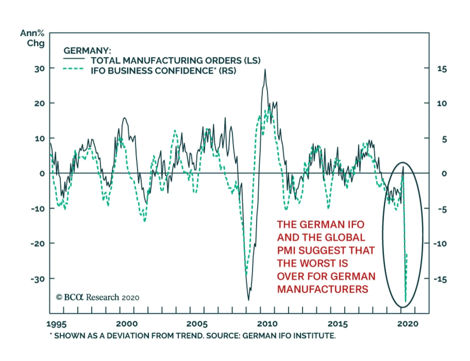
Germany’s April manufacturing orders were nothing short of atrocious. They bore the brunt of the pain created by the German shutdowns and the global recession. Overall orders contracted 36.7% on an annual basis, domestic orders fell 31.8% and foreign orders…
Highlights The dollar is likely to churn on recent weakness before a cyclical bear market fully unfolds. The reason is that the economic landscape remains fraught with uncertainty, both politically and economically. We continue to recommend a barbell strategy. Hold a basket of the cheapest currencies such as the NOK, SEK, and GBP along with some safe havens. Watch the performance of cyclicals versus defensives and non-US markets versus the S&P 500 as important barometers for dollar downside. The EUR/USD could touch 1.16, while still staying in the confines of a structural bear market. Our FX model is more aggressive, and is recommending shorting the DXY for the month of June. Feature Chart I-1The Dollar Tries To Break Down
DXY: False Breakdown Or Cyclical Bear Market?
DXY: False Breakdown Or Cyclical Bear Market?
The DXY index is punching below key support levels in an attempt to reverse the cyclical bull market in place since 2011. Our technical roadmap has been the upward-sloping channel, in place since 2018 (Chart I-1). At 96.77, the DXY index is already several ticks below the lower bound of this channel. As the breakdown becomes more broad based, especially vis-à-vis the euro, this will cement the transition from easing financial conditions to improving global growth. Cyclical currencies such as the Australian dollar and the Norwegian krone have already bounced powerfully from their March lows and have now entered the technical definition of a bull market (Chart I-2). For example, from a low of 55 cents, the Aussie is now trading at 69 cents, up 25%. As long-term dollar bears, our portfolio has benefited tremendously from this shift in market sentiment.1 Chart I-2A Report Card On Currency Performance
DXY: False Breakdown Or Cyclical Bear Market?
DXY: False Breakdown Or Cyclical Bear Market?
The key question for new investors is whether the move in the dollar represents a false breakdown or the beginning of a cyclical bear market. To answer this, we are reviewing key charts and indicators to explain dollar weakness and help gauge whether it pays to enter new short positions. Explaining Dollar Weakness US dollar weakness has been driven by three interrelated factors: Non-US economies that were initially hit by COVID-19 are reopening faster. As a result, economic momentum is higher outside the US. The rise in economic momentum is supporting money velocity outside the US. In other words, animal spirits are being rekindled at a faster pace abroad. In the classical equation MV=PQ,2 a rise in both M and V can be explosive for nominal output. Higher money velocity outside the US has started to attract capital inflows. This is beginning to show up in the outperformance of non-US markets. With economies outside the US now reopening, PMIs abroad have recovered at a faster pace. Chart I-3 shows that dollar strength throughout most of March can be partly explained by the relative resilience of the US economy, in part driven by a late start to state-wide shutdowns. This was exacerbated by a dollar liquidity shortage, as demand for US dollars abroad surged. With economies outside the US now reopening, PMIs abroad have recovered at a faster pace. As Chart I-2 illustrates, developed market currencies have fared in pecking order of the easing in lockdown measures, with the AUD outperforming the CAD, and the SEK outperforming the EUR. Prior to the onset of COVID-19, there was a pretty tight correlation between global services relative to manufacturing activity and the dollar (Chart I-4). As a relatively closed economy, the US tended to benefit when services output had the upper hand. This time around, the service sector has been hit much harder due to social distancing measures in place, but it is also likely to have a more drawn-out recovery. For example, visits to theme parks or restaurants are unlikely to retrace back to their pre-crisis peaks anytime soon. However, construction activity, especially geared towards infrastructure or residential housing, may bounce back sooner. Chart I-3A Strong Recovery Outside The US
A Strong Recovery Outside The US
A Strong Recovery Outside The US
Chart I-4USD And Manufacturing Vs Services
USD And Manufacturing Vs Services
USD And Manufacturing Vs Services
The key message is that global manufacturing activity so far is holding up better than services, and activity is picking up faster abroad. This has historically been good news for procyclical currencies. Money Velocity And The Dollar There is increasing evidence that money velocity is being supported outside the US. For global manufacturing activity to recover, it requires a rise in animal spirits to begin to capitalize on very generous financing conditions. In this respect, there is increasing evidence that money velocity is being supported outside the US. In the euro area, the velocity of money in Germany has stopped falling relative to the US. This is a marked change from anything we have seen since the European debt crisis. More importantly, the ebb and flow of ‘V’ in Germany relative to the US has mirrored the relative path of interest rates (Chart I-5). Global industrial activity remains quite subdued, but it appears that sentiment among German investors is very upbeat for the post-COVID recovery. This has usually been a good barometer for the improvement in PMIs (Chart I-6). Granted, the improvement in relative V has been driven mostly by the collapse in US money velocity. But what matters for currencies are relative trends. Once economic activity enters a full-fledged recovery, we expect US output to be hampered by the rise in the dollar over the past 18 months, while cyclical economies will be buffeted by much-cheapened currencies. This raises the prospect of much more pronounced economic vigor outside the US. Chart I-5Money Velocity Support In Europe
Money Velocity Support In Europe
Money Velocity Support In Europe
Chart I-6Euro Area Sentiment Is Improving
Euro Area Sentiment Is Improving
Euro Area Sentiment Is Improving
The ratio of the velocity of money between the US and China has tended to track the gold/silver ratio (GSR) with a tight fit (Chart I-7). A falling ratio signifies that the number of times money is changing hands in China outpaces the number in the US. This also tends to coincide with a pickup in manufacturing activity, for the simple reason that silver has more industrial uses than gold. Therefore, the recent collapse in the GSR is prescient. Soft data confirms this trend. Both the Caixin and NBS manufacturing PMI are outperforming that in the US, and are likely to keep doing so in the coming months (Chart I-8). Chart I-7Money Velocity Support In China?
Money Velocity Support In China?
Money Velocity Support In China?
Chart I-8Wide Gap Between Chinese And US Output
Wide Gap Between Chinese And US Output
Wide Gap Between Chinese And US Output
It is important to note that while there has been some disconnect between the performance of the economy and stock prices, no such dichotomy exists in currency markets. The ratio of cyclical currencies relative to defensive ones tends to track the global PMI directionally. While this ratio is below its 2008 lows, the global PMI has bottomed at higher levels (Chart I-9). The difference can probably be explained by the fact that either domestic investors (especially retail) have been the dominant buyers of equities, and/or institutional investors have been hedging currency risk. It is true that the bounce in AUD/CHF (or other procyclical pairs) from the lows has brought it closer to technically stretched levels, and some measure of indigestion is overdue. That said, this mainly reflects mean reversion from deeply oversold levels (Chart I-10). If manufacturing activity can keep improving, and the velocity of money outside the US can pick up, this will revive capital flows into these markets, which will lead to more pronounced breakouts. Given the huge uncertainty surrounding these forecasts, we believe the risk to the greenback is currently balanced. Chart I-9Equity And Currency Markets Have Diverged
Equity And Currency Markets Have Diverged
Equity And Currency Markets Have Diverged
Chart I-10Still Oversold
Still Oversold
Still Oversold
Capital Flows As An Indicator The nascent upturn in a few growth indicators is also coinciding with a positive signal from equity markets. Global cyclical stocks have started to outperform defensives in recent weeks, as flows into more cyclical ETF markets are accelerating (Chart I-11). Chart I-11Inflows Into Cyclical ETFs
Inflows Into Cyclical ETFs
Inflows Into Cyclical ETFs
Chart I-12Inflows Into US Assets Are Picking Up
Inflows Into US Assets Are Picking Up
Inflows Into US Assets Are Picking Up
The S&P 500 has been the best performing market for a few years now, so a crucial part of the dollar call lies in international equity markets outperforming the US. Indeed, the latest data show that as recent as March, net foreign inflows into US equity markets were quite strong (Chart I-12). This might explain why the S&P 500 continued to outperform during the March drawdown. In a nutshell, the outperformance of more cyclical currencies will require confirmation of a breakout in their relative equity market performance. This applies to the euro area, commodity-producing countries, and other emerging and developed market currencies (Charts I-13A and I-13B). The catalyst will have to be rising relative returns on capital outside the US, but the starting point is also extremely attractive valuations. Chart I-13ANascent Bounce In Cyclicals Versus Defensives
Nascent Bounce In Cyclicals Versus Defensives
Nascent Bounce In Cyclicals Versus Defensives
Chart I-13BNascent Bounce In Cyclicals Versus Defensives
Nascent Bounce In Cyclicals Versus Defensives
Nascent Bounce In Cyclicals Versus Defensives
We recently penned a report titled “Cycles And The US Dollar,” which showed empirically that US valuations have more than fully capitalized future earning streams, especially vis-à-vis their G10 peers. That said, before a cyclical bear market can fully unfold, we are watching two key indicators for dollar downside: As the Fed continues to dilute existing bond shareholders, the ratio of the US bond ETF (TLT) to gold (GLD) will be an important proxy for investor sentiment. One of the functions of money is as a store of value, and gold remains a viable threat to the dollar (and Treasurys) in this regard. A falling ratio will suggest private investors are dumping their bond holdings in exchange for harder assets such as precious metals. Recent inflows into the GLD ETF may be signaling such a shift (Chart I-14), but it will take a clean break in this ratio below 0.95 to solidify the trend. As geopolitical tensions between US and China mount, the USD/CNY exchange rate will become the key arbiter between two dollars: one versus emerging markets and the other versus developed markets. So far, USD/CNY is holding close to cyclical highs, but a break above will put Asian currencies at risk. This will have negative implications for developed-market commodity currencies (Chart I-15). Chart I-14Gold And USD Inflows Diverge
Gold And USD Inflows Diverge
Gold And USD Inflows Diverge
Chart I-15Tied To The Hip
Tied To The Hip
Tied To The Hip
EUR, GBP And Housekeeping We continue to recommend a barbell strategy. Hold a basket of the cheapest currencies such as the NOK, SEK, and the GBP along with some safe havens. Being short the gold/silver ratio is also a good way to play an eventual economic recovery, with the benefit of a tremendous valuation cushion. The market certainly applauded the European Central Bank’s addition of €600 billion in bond purchases, given the fall in peripheral bond spreads. The euro also bounced on the back of two factors: Chart I-16QE And EUR/USD
QE And EUR/USD
QE And EUR/USD
Even with additional stimulus, the balance sheet impulse of the Fed is still larger than that of the ECB (Chart I-16). Historically, this has favored long EUR/USD positions. The compression in peripheral spreads should boost European growth as it lowers the cost of capital for countries such as Spain and Italy. This improves debt dynamics and encourages the productive deployment of capital. Technically, the EUR/USD can rally towards 1.16 while remaining within the confines of a structural bear market (Chart I-17). Beyond this point, it will be imperative for European growth dynamics to take over the baton to support a much higher exchange rate. As we mentioned earlier, the velocity of money in Germany has stopped falling relative to the US, but relative improvement is not yet enough to warrant structural positions in EUR/USD. Our FX model is more aggressive, and is recommending shorting the DXY for the month of June. Our FX model is more aggressive, and is recommending shorting the DXY for the month of June. Since the 1980s, this three-factor model has outperformed the DXY index by a significant margin (Chart I-18). Chart I-17EUR/USD Could Touch 1.16
EUR/USD Could Touch 1.16
EUR/USD Could Touch 1.16
Chart I-18The Model Is Short DXY In June
The Model Is Short DXY In June
The Model Is Short DXY In June
Finally, our limit-sell on EUR/GBP was triggered at 0.90 last week. While valuation favors a short position, the ramp-up in Brexit tensions is a key risk to this trade. As such, we are placing tight stops at 0.905. Chester Ntonifor Foreign Exchange Strategist chestern@bcaresearch.com Currencies US Dollar Chart II-1USD Technicals 1
USD Technicals 1
USD Technicals 1
Chart II-2USD Technicals 2
USD Technicals 2
USD Technicals 2
Recent data in the US have been negative: Headline PCE fell from 1.3% to 0.5% year-on-year in April. Core PCE also declined from 1.7% to 1%. Personal income surged by 10.5% month-on-month in April, while personal spending decreased by 13.6%, implying a higher savings rate. Total vehicle sales increased from 8.6 million to 11 million in May. Factory orders fell by 13% month-on-month in April. The trade deficit widened from $42.3 billion to $49.4 billion in April. Initial jobless claims increased by 1877K for the week ended May 29th. The DXY index fell by 1.1% this week, reflecting cautiously positive sentiment as many countries started to ease lockdown measures. Report Links: Cycles And The US Dollar - May 15, 2020 Capitulation? - April 3, 2020 The Dollar Funding Crisis - March 19, 2020 The Euro Chart II-3EUR Technicals 1
EUR Technicals 1
EUR Technicals 1
Chart II-4EUR Technicals 2
EUR Technicals 2
EUR Technicals 2
Recent data in the euro area have been negative: Headline inflation fell from 0.3% to 0.1% year-on-year in May, while core inflation was unchanged at 0.9%. The unemployment rate increased from 7.1% to 7.3% in April. The Markit manufacturing PMI slightly fell from 39.5 to 39.4 in May, while the services PMI increased from 28.7 to 30.5. Retail sales plunged by 19.6% year-on-year in April, following an 8.8% decline the previous month. EUR/USD appreciated by 1.4% this week. On Thursday, the ECB kept key interest rates unchanged, while announcing a further 600 billion euros increase of its PEPP facility, taking the total to 1.35 trillion euros. There was also an extension of the program till June 2021. Report Links: On The DXY Breakout, Euro, And Swiss Franc - February 21, 2020 Updating Our Balance Of Payments Monitor - November 29, 2019 On Money Velocity, EUR/USD And Silver - October 11, 2019 The Yen Chart II-5JPY Technicals 1
JPY Technicals 1
JPY Technicals 1
Chart II-6JPY Technicals 2
JPY Technicals 2
JPY Technicals 2
Recent data in Japan have been mostly negative: Construction orders plunged by 14.3% year-on-year in April. Housing starts fell by 12.9% year-on-year in April. Capital spending increased by 4.3% quarter-on-quarter in Q1. The monetary base surged by 3.9% year-on-year in May. The manufacturing PMI was unchanged at 38.4 in May, while the services PMI increased from 21.5 to 26.5. The Japanese yen fell by 1.3% against the US dollar this week. Japan lifted its nationwide state of emergency last week, however, the economy is still in deep recession as COVID-19 continues to disrupt global supply chains. Report Links: The Near-Term Bull Case For The Dollar - February 28, 2020 Building A Protector Currency Portfolio - February 7, 2020 Currency Market Signals From Gold, Equities And Flows - January 31, 2020 British Pound Chart II-7GBP Technicals 1
GBP Technicals 1
GBP Technicals 1
Chart II-8GBP Technicals 2
GBP Technicals 2
GBP Technicals 2
Recent data in the UK have been mixed: The Markit manufacturing PMI slightly increased from 40.6 to 40.7 in May. The services PMI also ticked up from 27.8 to 29. Nationwide housing prices fell by 1.7% month-on-month in May. Money supply (M4) surged by 9.5% year-on-year in April. Mortgage approvals increased by 15.8K in April, down from 56K the previous month. GBP/USD increased by 1.7% this week. The Bank of England urged banks to step up no-deal Brexit plans this week, implying that there might have been a shift in the BoE’s assumptions about the outcome of ongoing talks between the UK and the European Union. That being said, we remain bullish on the pound from a valuation perspective, but are tightening our stop loss this week. Report Links: Updating Our Balance Of Payments Monitor - November 29, 2019 A Few Trade Ideas - Sept. 27, 2019 United Kingdom: Cyclical Slowdown Or Structural Malaise? - Sept. 20, 2019 Australian Dollar Chart II-9AUD Technicals 1
AUD Technicals 1
AUD Technicals 1
Chart II-10AUD Technicals 2
AUD Technicals 2
AUD Technicals 2
Recent data in Australia have been mixed: The manufacturing index increased from 35.8 to 41.6 in May. The current account surplus increased from A$1 billion to A$8.4 billion in Q1. However, more recent trade data was less encouraging. Imports plunged by 9.8% month on month in April while exports slumped by 11.3%. The trade surplus narrowed from A$10.6 billion to A$8.8 billion. GDP grew by 1.4% year-on-year in Q1. On a quarterly basis, it fell by 0.3% compared with the last quarter in 2019. Building permits increased by 5.7% year-on-year in April. AUD/USD appreciated remarkably by 4.5% this week. On Tuesday, the RBA kept its interest rate unchanged at 0.25%. Moreover, the RBA sounds cautiously positive in its rate statement, saying that “it is possible that the depth of the downturn will be less than earlier expected.” Report Links: On AUD And CNY - January 17, 2020 Updating Our Balance Of Payments Monitor - November 29, 2019 A Contrarian View On The Australian Dollar - May 24, 2019 New Zealand Dollar Chart II-11NZD Technicals 1
NZD Technicals 1
NZD Technicals 1
Chart II-12NZD Technicals 2
NZD Technicals 2
NZD Technicals 2
Recent data in New Zealand have been negative: Terms of trade fell by 0.7% quarter-on-quarter in Q1, down from a 2.8% increase the previous quarter. It is the first fall since Q4 2018. Building permits fell by 6.5% month-on-month in April, following a 21.7% monthly decrease in March. NZD/USD increased by 4% this week. The fall in terms of trade was led by the decline in meat prices, including lamb and beef, from record levels at the end of 2019. Forestry product prices also fell by 3.4% quarterly in Q1. On a positive note, New Zealand is prepared to ease lockdown measures as there has been no new cases reported for nearly two weeks. Report Links: Updating Our Balance Of Payments Monitor - November 29, 2019 Place A Limit Sell On DXY At 100 - November 15, 2019 USD/CNY And Market Turbulence - August 9, 2019 Canadian Dollar Chart II-13CAD Technicals 1
CAD Technicals 1
CAD Technicals 1
Chart II-14CAD Technicals 2
CAD Technicals 2
CAD Technicals 2
Recent data in Canada have been negative: GDP plunged by 8.2% quarter-on-quarter in Q1. The Markit manufacturing PMI increased from 33 to 40.6 in May. Labor productivity increased by 3.4% quarterly in Q1. Imports fell from C$48 billion to C$36 billion in April. Exports also declined from C$46 billion to C$33 billion. The trade deficit widened from C$1.5 billion to C$3.3 billion. The Canadian dollar rose by 2.2% this week, alongside oil prices. On Wednesday, the BoC kept interest rates unchanged at 0.25%. It also decided to scale back the frequency of some market operations as financing conditions have improved. Report Links: More On Competitive Devaluations, The CAD And The SEK - May 1, 2020 A New Paradigm For Petrocurrencies - April 10, 2020 The Loonie: Upside Versus The Dollar, But Downside At The Crosses Swiss Franc Chart II-15CHF Technicals 1
CHF Technicals 1
CHF Technicals 1
Chart II-16CHF Technicals 2
CHF Technicals 2
CHF Technicals 2
Recent data in Switzerland have been negative: KOF leading indicator fell from 59.7 to 53.2 in May. Real retail sales plunged by 20% year-on-year in April, following a 5.8% decrease the previous month. The manufacturing PMI increased from 40.7 to 42.1 in May. GDP declined by 1.3% year-on-year in Q1. On a quarter-on-quarter basis, GDP fell by 2.6% compared with Q4 2019. Headline consumer prices kept falling by 1.3% year-on-year in May. The Swiss franc rose by 0.5% against the US dollar this week. The 2.6% quarterly decline in Switzerland’s GDP has been the most severe since 1980, mostly led by hotels and restaurants which suffered a 23.4% fall. In addition, the consistent decline in consumer prices might lead the SNB to further step up FX intervention. Report Links: On The DXY Breakout, Euro, And Swiss Franc - February 21, 2020 Currency Market Signals From Gold, Equities And Flows - January 31, 2020 Portfolio Tweaks Before The Chinese New Year - January 24, 2020 Norwegian Krone Chart II-17NOK Technicals 1
NOK Technicals 1
NOK Technicals 1
Chart II-18NOK Technicals 2
NOK Technicals 2
NOK Technicals 2
There has been scant data from Norway this week: The current account surplus increased from NOK 25 billion to NOK 66 billion in Q1. The Norwegian krone appreciated by 3.5% against the US dollar this week. Statistics Norway’s recent balance of payments report shows that the balance of goods and services surged to NOK 27 billion in Q1. Balance of income and current transfers also increased from NOK 1.9 billion to NOK 38.9 billion. Our Nordic basket against the euro and the US dollar is now 10% in the money. Report Links: A New Paradigm For Petrocurrencies - April 10, 2020 Building A Protector Currency Portfolio - February 7, 2020 On Oil, Growth And The Dollar - January 10, 2020 Swedish Krona Chart II-19SEK Technicals 1
SEK Technicals 1
SEK Technicals 1
Chart II-20SEK Technicals 2
SEK Technicals 2
SEK Technicals 2
Recent data in Sweden have been negative: GDP increased by 0.4% year-on-year in Q1, down from 0.5% the previous quarter. The trade surplus increased from SEK 5.2 billion to SEK 7.6 billion in April. The manufacturing PMI increased from 36.4 to 39.2 in May. Industrial production plunged by 16.6% year-on-year in April. Manufacturing new orders also declined by 20.7% year-on-year. The Swedish krona increased by 2.5% against the US dollar this week. Sweden’s GDP grew modestly in Q1, which is better than most of its European counterparts, following its decision not to impose a full lockdown to contain the virus. Report Links: Updating Our Balance Of Payments Monitor - November 29, 2019 Where To Next For The US Dollar? - June 7, 2019 Balance Of Payments Across The G10 - February 15, 2019 Footnotes 1Please see our table of trades below. 2Where M = money supply, V = velocity of money, P = price level and Q = output. Trades & Forecasts Forecast Summary Core Portfolio Tactical Trades Limit Orders Closed Trades
Highlights Social distancing must persist to prevent dangerous super-spreading of COVID-19. The jobs recovery will be much weaker than the output recovery, because the sectors most hurt by social distancing have a very high labour intensity. This will force a prolonged period of ultra-accommodative monetary policy… …structurally favour T-bonds and Bonos over Bunds and OATs… …growth defensives such as tech and healthcare… …and the S&P 500 over the Euro Stoxx 50. Stay overweight Animal Care (PAWZ). Working from home has generated a puppy boom. Fractal trade: short gold, long lead. Feature As economies reopen, economists and strategists are quibbling about the shape of the output recovery: U, V, W, square root, or even ‘swoosh’. But for the furloughed or displaced worker, the more urgent question is, what will be the shape of the jobs recovery? Unfortunately, the jobs recovery will be much weaker than the output recovery – because the sectors most hurt by social distancing have a very high labour intensity (Chart Of The Week). Chart Of The Week 1ALeisure And Hospitality Makes A Large Contribution To Jobs Relative To Output
A Jobless V-Shape Recovery, And A Puppy Boom
A Jobless V-Shape Recovery, And A Puppy Boom
Chart Of The Week 1BFinance Makes A Small Contribution To Jobs Relative To Output
A Jobless V-Shape Recovery, And A Puppy Boom
A Jobless V-Shape Recovery, And A Puppy Boom
Output Might Snap Back, But Jobs Will Not The sectors most hurt by social distancing make a huge contribution to employment but a much smaller contribution to economic output. This is true for Europe and all advanced economies, though the following uses US data given its superior granularity and timeliness. The leisure and hospitality sector generates 11 percent of jobs, but just 4 percent of output. Retail trade generates 10 percent of jobs, but just 5 percent of output. It follows that if both sectors are operating at half their pre-coronavirus capacity, output will be down by 4.5 percent, but employment will collapse by 10.5 percent. Conversely, sectors which are relatively unaffected by social distancing make a small contribution to employment but a much bigger contribution to economic output. Financial activities generate just 6 percent of jobs, but 19 percent of economic output. Information technology generates just 2 percent of jobs, but 5 percent of output (Table I-1). Table I-1Sectors Hurt By Social Distancing Have A Very High Labour Intensity
A Jobless V-Shape Recovery, And A Puppy Boom
A Jobless V-Shape Recovery, And A Puppy Boom
If economies are reopened but social distancing persists – either via government policy or personal choice – then output can rebound in a V-shape, but employment cannot (Chart I-2). Forcing a prolonged period of ultra-accommodative monetary policy, with all its ramifications for financial markets. Chart I-2UK Unemployment Is Set To Surge If The US Is Any Guide
UK Unemployment Is Set To Surge If The US Is Any Guide
UK Unemployment Is Set To Surge If The US Is Any Guide
This raises a key question. Must social distancing persist? To answer, we need to pull together our latest understanding of COVID-19. COVID-19: What We Know So Far Many people argue that coronavirus fears are disproportionate. The mortality rate seems comfortingly low, at well below 0.5 percent (Chart 3). Yet this argument misses the point. Chart I-3The COVID-19 Mortality Rate Is Not High
A Jobless V-Shape Recovery, And A Puppy Boom
A Jobless V-Shape Recovery, And A Puppy Boom
COVID-19 is dangerous not because it kills, but because it makes a lot of people seriously ill. It has a low mortality rate, but a high morbidity rate. According to the World Health Organisation, around one in six that gets infected “develops difficulty in breathing”. Moreover, The Lancet points out that many recovered COVID-19 patients suffer pulmonary fibrosis, a permanent scarring of the lungs that impairs their breathing for the rest of their lives. Hence, while COVID-19 is highly unlikely to kill you, it could damage your health forever1 (Figure I-1). Figure 1COVID-19 Is Unlikely To Kill You, But It Could Permanently Damage Your Lungs
A Jobless V-Shape Recovery, And A Puppy Boom
A Jobless V-Shape Recovery, And A Puppy Boom
The most famous COVID-19 victim to date is British Prime Minister Boris Johnson who spent several days recovering in intensive care. By his own admission, Johnson’s only pre-existing conditions are that he is overweight and “drinks an awful lot”. But those pre-existing conditions could apply to a large swathe of the population. COVID-19 is virulent. But we now know that most infections are the result of so-called ‘super-spreaders’ – a small minority of virus carriers who infect tens or hundreds of other people. We also know that talking loudly, singing, or chanting tends to eject higher doses of the virus, and in an aerosol form that can linger in enclosed spaces. This creates the perfect conditions for one infected person to infect scores of others very quickly. Based on this latest knowledge, the good news is that economies can reopen. The bad news is that, until an effective vaccine is developed, social distancing must persist. Specifically, people must avoid forming the crowds, congregations, and loud gatherings that can generate very dangerous super-spreading events. Hence, the sectors that are most hurt by social distancing – leisure and hospitality and retail trade – will continue to operate well below capacity for many months, at a minimum. And as these sectors have a very high labour intensity, there will be no V-shape recovery in jobs. Without Higher Bond Yields, European Equities Struggle To Outperform Social distancing is set to persist, which will create heaps of slack in advanced economy labour markets. This will force central banks to push the monetary easing ‘pedal to the metal’ – though in many cases, the pedal is already at the metal. In turn, this will force bond yields to stay ultra-low and, where they can, go even lower. One immediate takeaway is to stay overweight positively yielding US T-bonds and Spanish Bonos versus negatively yielding German Bunds and French OATs. Depressed bond yields must also compress the discount rate on competing long-duration investments that generate safely growing cashflows. Meaning, growth defensive equities such as technology and healthcare. Now comes the part that is conceptually difficult to grasp because it is novel to this unprecedented era of ultra-low bond yields. Take some time to absorb the following few paragraphs. For growth defensives, both components of the discount rate – the bond yield and the equity risk premium (ERP) – compress together. This is because the ERP is a tight function of the difference in equity and bond price ‘negative asymmetries’, defined as the potential price downside versus upside. When bond yields converge to their lower limit, bond prices converge to their upper limit, which increases the potential price downside versus upside. The result is that the difference in equity and bond negative asymmetries converges to zero, forcing the ERP to converge to zero. As the discount rate on growth defensives such as tech and healthcare collapses towards zero, the net present value must increase exponentially. This exponentially higher valuation of tech and healthcare is a mathematical consequence of the novel risk relationship between growth defensive equities and bonds at ultra-low bond yields. The unprecedented phenomenon has a major implication for European equity relative performance. The Euro Stoxx 50 is heavily underweight technology and healthcare, and this defining sector fingerprint is the key structural driver of European equity market relative performance (Chart I-4). Meanwhile, the relative performance of technology and healthcare is just an inverse exponential function of the bond yield (Chart I-5). The upshot is that European equities tend to outperform other regions only when bond yields are heading higher and the growth defensives are underperforming (Chart I-6). Chart I-4The Euro Stoxx 50's Underweight In Tech Drives Its Relative Performance
The Euro Stoxx 50's Underweight In Tech Drives Its Relative Performance
The Euro Stoxx 50's Underweight In Tech Drives Its Relative Performance
Chart I-5Tech Outperforms When The Bond Yield Declines...
Tech Outperforms When The Bond Yield Declines...
Tech Outperforms When The Bond Yield Declines...
Chart I-6...Hence, Without Higher Bond Yields The Euro Stoxx 50 Struggles To Outperform
...Hence, Without Higher Bond Yields The Euro Stoxx 50 Struggles To Outperform
...Hence, Without Higher Bond Yields The Euro Stoxx 50 Struggles To Outperform
Some commentators are calling the higher valuations in tech and healthcare a new bubble. But it is a bubble only to the extent that bond yields are in a ‘negative bubble’, meaning that ultra-low yields are unsustainable. However, with social distancing set to leave heaps of slack in the advanced economy labour markets, ultra-low bond yields are here to stay and could go even lower. Moreover, as shown earlier, tech and healthcare demand and output are immune to social distancing. They may even benefit from social distancing. Hence, on a one-year horizon and beyond, stay overweight the growth defensive tech and healthcare sectors. And stay overweight the tech and healthcare heavy S&P 500 versus Euro Stoxx 50. A Puppy Boom We finish on a very positive note for animal lovers. The shift to working from home has generated a puppy boom. The Association of German Dogs claims that “the demand for puppies is endless” and the UK Kennel Club says that “there is unprecedented demand.” In the era of social distancing, the waiting list for puppies has quadrupled, and prices of easy to look after crossbreeds such as cockapoos have more than doubled. The demand for pet food and equipment is also very strong. Dogs make excellent companions for the socially isolated, which describes how many people are now feeling. Furthermore, with millions of people now working from home or on extended furlough, a growing number of households can fulfil the dream of owning a dog. We have recommended a structural overweight to the Animal Care sector based on the ‘humanisation’ of pets and the structural uptrend in spend per pet, especially on veterinary costs (Chart I-7). Animal Care has outperformed by 50 percent in the past two and a half years, but the shift to working from home will add impetus to the structural uptrend (Chart I-8). Chart I-7Animal Care Prices Are Rising...
Animal Care Prices Are Rising...
Animal Care Prices Are Rising...
Chart I-8...And The Animal Care Sector Is Strongly Outperforming
...And The Animal Care Sector Is Strongly Outperforming
...And The Animal Care Sector Is Strongly Outperforming
Stay overweight Animal Care. The ETF ticker, appropriately enough, is called PAWZ. Fractal Trading System This week’s recommended trade is to short gold versus lead, given that the relative performance recently reached a fractal resistance point that has successfully identified four previous turning points. Set the profit target and symmetrical stop-loss at 13 percent. In our other open trades, five are in profit and one is in loss. The rolling 1-year win ratio now stands at 64 percent.
Gold Vs. Lead
Gold Vs. Lead
When the fractal dimension approaches the lower limit after an investment has been in an established trend it is a potential trigger for a liquidity-triggered trend reversal. Therefore, open a countertrend position. The profit target is a one-third reversal of the preceding 13-week move. Apply a symmetrical stop-loss. Close the position at the profit target or stop-loss. Otherwise close the position after 13 weeks. * For more details please see the European Investment Strategy Special Report “Fractals, Liquidity & A Trading Model,” dated December 11, 2014, available at eis.bcaresearch.com. Dhaval Joshi Chief European Investment Strategist dhaval@bcaresearch.com Footnotes 1 https://www.thelancet.com/journals/lanres/article/PIIS2213-2600(20)30222-8/fulltext Fractal Trading System Cyclical Recommendations Structural Recommendations Closed Fractal Trades Trades Closed Trades Asset Performance Currency & Bond Equity Sector Country Equity Indicators Bond Yields Chart II-1Indicators To Watch - Bond Yields
Indicators To Watch - Bond Yields
Indicators To Watch - Bond Yields
Chart II-2Indicators To Watch - Bond Yields
Indicators To Watch - Bond Yields
Indicators To Watch - Bond Yields
Chart II-3Indicators To Watch - Bond Yields
Indicators To Watch - Bond Yields
Indicators To Watch - Bond Yields
Chart II-4Indicators To Watch - Bond Yields
Indicators To Watch - Bond Yields
Indicators To Watch - Bond Yields
Interest Rate Chart II-5Indicators To Watch - Interest Rate Expectations
Indicators To Watch - Interest Rate Expectations
Indicators To Watch - Interest Rate Expectations
Chart II-6Indicators To Watch - Interest Rate Expectations
Indicators To Watch - Interest Rate Expectations
Indicators To Watch - Interest Rate Expectations
Chart II-7Indicators To Watch - Interest Rate Expectations
Indicators To Watch - Interest Rate Expectations
Indicators To Watch - Interest Rate Expectations
Chart II-8Indicators To Watch - Interest Rate Expectations
Indicators To Watch - Interest Rate Expectations
Indicators To Watch - Interest Rate Expectations
Highlights In this Weekly Report, we present our semi-annual chartbook of the BCA Central Bank Monitors. All of the Monitors are now below the zero line, indicating the need for continued easy global monetary policy to help mitigate the COVID-19 recession (Chart of the Week). Central bankers have already responded in an intense and rapid fashion to the crisis, delivering a series of rate cuts, increased asset purchase programs and measures to support bank lending to businesses suffering under quarantines. All of these vehicles have helped trigger a powerful rally in global bond markets that helped revitalize risk assets as well. After the coordinated global easing response of the past few months, the optimal policy choices now differ from country to country. This creates opportunities to benefit from country allocation decisions even in a world of puny government bond yields. The overall signal from our Central Bank Monitors is still bond bullish, however – at least over the next few months until there is evidence of how fast global growth is rebounding from the COVID-19 lockdowns. An Overview Of The BCA Central Bank Monitors Chart of the WeekUltra-Accommodative Monetary Policies Are Still Required
Ultra-Accommodative Monetary Policies Are Still Required
Ultra-Accommodative Monetary Policies Are Still Required
Chart 2A Bond-Bullish Message From Our CB Monitors
A Bond-Bullish Message From Our CB Monitors
A Bond-Bullish Message From Our CB Monitors
The BCA Central Bank Monitors are composite indicators designed to measure the cyclical growth and inflation pressures that can influence future monetary policy decisions. The economic data series used to construct the Monitors are not the same for every country, but the list of indicators generally measure the same things (i.e. manufacturing cycles, domestic demand strength, commodity prices, labor market conditions, exchange rates, etc). The data series are standardized and combined to form the Monitors. Readings above the zero line for each Monitor indicate pressures for central banks to raise interest rates, and vice versa. Through the nexus between growth, inflation, and market expectations of future interest rate changes, the Monitors do exhibit broad correlations to government bond yields in the Developed Markets (Chart 2). All of the Monitors are indicating intense pressure to maintain very easy monetary policies in response to the global COVID-19 recession. While the bad economic and inflation news is largely discounted in the depressed level of bond yields worldwide, there are still opportunities to position country allocations within a government bond portfolio based on the message from our Monitors (overweighting the US, the UK and Canada, underweighting Germany and Japan). All of the Monitors are indicating intense pressure to maintain very easy monetary policies in response to the global COVID-19 recession. In each BCA Central Bank Monitor Chartbook, we include a new chart for each country that we have not shown previously. In this edition, we show the components of the Monitors, grouped into those focusing on economic growth and inflation, plotted alongside our estimate of the appropriate level of central bank policy interest rates derived using a Taylor Rule. Fed Monitor: Policy Must Stay Accommodative Our Fed Monitor has collapsed below the zero line to recessionary levels (Chart 3A) in response to the coronavirus crisis. The Fed has already delivered a series of aggressive policy responses since March to help support an economy ravaged by the virus, including: interest rate cuts; quantitative easing (QE), including buying corporate and municipal debt; and setting up lending schemes for small businesses. The lockdown of almost the entire country has helped “flatten the curve” of the spread of COVID-19, but at a painful economic cost. The unemployment rate rose to 14.7% in April, the highest level since the Great Depression, and is expected to peak at levels above 20%. The result is unsurprising: a massive increase in spare economic capacity with a threat of deflation as headline CPI inflation plummeted to 0.3% in April (Chart 3B). Chart 3AUS: Fed Monitor
US: Fed Monitor
US: Fed Monitor
Chart 3BUS Realized Inflation Flirting With 0%
US Realized Inflation Flirting With 0%
US Realized Inflation Flirting With 0%
Within the components of our Fed Monitor, weakening growth has been the main driver of the decline (Chart 3C). Our Taylor Rule estimate suggests a deeply negative fed funds rate is “appropriate”, although the Fed is likely to pursue other avenues of easing like yield curve control before ever attempting a sub-0% policy rate. Chart 3CNegative Rates Are 'Required' In The US, But The Fed Has Other Options
Negative Rates Are 'Required' In The US, But The Fed Has Other Options
Negative Rates Are 'Required' In The US, But The Fed Has Other Options
The fall in US Treasury yields over the past few months has been in line with the decline in our Fed Monitor (Chart 3D). While the US economy is slowly awakening from lockdowns, consumer and business confidence are likely to remain fragile given the numerous risks from a second wave of COVID-19, worsening US-China relations and, more recently, social unrest. Thus, we continue to recommend an overweight strategic allocation to the US within global government bond portfolios. The fall in US Treasury yields over the past few months has been in line with the decline in our Fed Monitor Chart 3DTreasury Yields Fully Reflect Pressure For More Fed Easing
Treasury Yields Fully Reflect Pressure For More Fed Easing
Treasury Yields Fully Reflect Pressure For More Fed Easing
BoE Monitor: Negative Rates On The Horizon? Our Bank of England (BoE) Monitor has collapsed to the lowest level in its history on the back of the severe COVID-19 recession (Chart 4A). The BoE already cut the Bank Rate to 0.1% in March, ramped up asset purchases, and introduced a Term Funding scheme to support business lending. Any additional easing from here might entail negative policy rates, which markets are already discounting. The UK unemployment rate is expected to peak around 8%, with the BoE projecting the economy to shrink by -14% this year, which would be the worst recession in modern history. Inflation has dropped sharply on the back of the dual collapse of energy prices and economic growth, ending a period of currency-fueled inflation increases (Chart 4B). Chart 4AUK: BoE Monitor
UK: BoE Monitor
UK: BoE Monitor
Chart 4BUK Realized Inflation Is Slowing Rapidly
UK Realized Inflation Is Slowing Rapidly
UK Realized Inflation Is Slowing Rapidly
The components of our BoE Monitor fully reflect the dire economic situation (Chart 4C), with weak growth – led by sharp falls in business confidence – driving the collapse of the Monitor more than falling inflation pressures. Our Taylor Rule estimate of the policy rate is not yet calling for negative rates, but that is because we are using the New York Fed’s estimate of r* as the neutral real rate, which is a relatively high 1.4% (by comparison, r* in the US is estimated to be 0.5%). Chart 4CNegative Rates Are Not Yet Required In The UK
Negative Rates Are Not Yet Required In The UK
Negative Rates Are Not Yet Required In The UK
The sharp fall in the BoE Monitor suggests that Gilt yields will remain under downward pressure in the coming months (Chart 4D). New BoE Governor Andrew Bailey has stated that a move to negative rates is not imminent, but markets will continue to flirt with the notion of sub-0% interest rates until the economy and inflation stabilize. We maintain an overweight stance on UK Gilts. Chart 4DBoE Monitor Suggests Continued Downward Pressure On Gilt Yields
BoE Monitor Suggests Continued Downward Pressure On Gilt Yields
BoE Monitor Suggests Continued Downward Pressure On Gilt Yields
ECB Monitor: Continued Monetary Support Is Needed Our European Central Bank (ECB) Monitor is now well below the zero line, signaling a strong need for easier monetary policy to fight the COVID-19 downturn (Chart 5A). The ECB has delivered multiple measures to ease monetary conditions, including a new €750bn bond-buying vehicle and liquidity operations to help banks maintain lending to European businesses. The recession has hit the region hard, with real GDP declining by -3.8% in Q1, the sharpest fall since records began in 1995. Unemployment rates have climbed higher, although to much lower levels than seen in the US thanks to more generous government labor support programs that have helped to limit layoffs. The sharp downturn has resulted in both a surge in spare economic capacity and plunge in headline inflation to 0.3% in April (Chart 5B). Chart 5AEuro Area: ECB Monitor
Euro Area: ECB Monitor
Euro Area: ECB Monitor
Chart 5BEurope Is On The Edge Of Deflation
Europe Is On The Edge Of Deflation
Europe Is On The Edge Of Deflation
Within the individual components of our ECB Monitor, both weaker growth and near-0% inflation have both contributed to the Monitor’s decline (Chart 5C). Our Taylor Rule measure shows that the ECB’s current stance of having policy rates modestly below 0% is appropriate. Chart 5CThe ECB Needs To Keep Its Foot On The Monetary Accelerator
The ECB Needs To Keep Its Foot On The Monetary Accelerator
The ECB Needs To Keep Its Foot On The Monetary Accelerator
Despite the ECB’s easing measures, and in contrast to the message from our ECB Monitor, the downward momentum in core European bond yields has been fading (Chart 5D). With the ECB reluctant to push policy rates deeper into negative territory, and with reliable cyclical indicators like the German ZEW and IFO surveys showing signs that euro area growth is starting to recover from the lockdowns, the case for even lower core European yields in the coming months is not strong. We maintain our recommended underweight stance on German and French government bonds. We maintain our recommended underweight stance on German and French government bonds. Chart 5DNo Pressure For Higher German Bund Yields
No Pressure For Higher German Bund Yields
No Pressure For Higher German Bund Yields
BoJ Monitor: What More Can Be Done? Our Bank of Japan (BoJ) Monitor has fallen further below zero, indicating easier policy is required (Chart 6A). The BoJ has already introduced additional easing measures in the past couple of months: extending forward guidance (inflation is projected to remain below the BoJ’s 2% target for the next three years), increasing asset purchases and enhancing loan programs to small and medium sized companies. New cases of COVID-19 have slowed sharply in Japan, prompting an end to the national state of emergency last week. Importantly, the virus did not hit Japan's labor market as severely as in other developed countries. The unemployment rate did reach a two-year high in April, but is still only 2.6% (Chart 6B). Fiscal stimulus and measures to protect job losses have played a major role in preventing a bigger spike in joblessness. Even with those measures, growth remains weak and realized inflation is heading back towards deflation. Chart 6AJapan: BoJ Monitor
Japan: BoJ Monitor
Japan: BoJ Monitor
Chart 6BJapan Nearing Deflation Once Again
Japan Nearing Deflation Once Again
Japan Nearing Deflation Once Again
Looking at the components of our BoJ Monitor, contracting growth, more than weakening inflation pressures, is the bigger driver of the fall in the Monitor below zero (Chart 6C). However, our Taylor Rule estimate does not suggest that the current level of the policy rate is out of line. Chart 6CBoJ Needs More Easing (Somehow) Until The Economy Revives
BoJ Needs More Easing (Somehow) Until The Economy Revives
BoJ Needs More Easing (Somehow) Until The Economy Revives
The BoJ’s current combined policies of negative rates, QE and yield curve control are keeping JGB yields at near-0% levels. Those policies are also suppressing yield volatility and preventing an even bigger fall in JGB yields (with larger capital gains) as suggested by our BoJ Monitor (Chart 6D). We continue to recommend a maximum underweight in Japanese government bonds in a yield-starved world. Chart 6DJGB Yields Will Be Anchored For Some Time
JGB Yields Will Be Anchored For Some Time
JGB Yields Will Be Anchored For Some Time
BoC Monitor: Deflationary Pressures Intensifying Our Bank of Canada (BoC) Monitor has collapsed into “easier policy required” territory, reaching levels last seen during the 2009 recession (Chart 7A). The central bank has already introduced several easing measures to help boost the virus-stricken economy, including cutting the Bank Rate to a mere 0.25% and starting a QE program to buy government bonds for the first time ever. Before the COVID-19 outbreak, some softening of the economy was already underway. Now, after the imposition of nationwide lockdowns to limit the spread of the virus, the unemployment rate has spiked to 13% - a level last seen in the early 1980s. The result is a massive deflationary output gap has opened up (Chart 7B), with realized headline CPI inflation printing at -0.2% in April. Chart 7ACanada: BoC Monitor
Canada: BoC Monitor
Canada: BoC Monitor
Chart 7BOutright Headline CPI Deflation In Canada
Outright Headline CPI Deflation In Canada
Outright Headline CPI Deflation In Canada
The fall in our BoC Monitor has been driven by both collapsing economic growth and weakening inflation pressures (Chart 7C). Our Taylor Rule estimate suggests that one of new BoC Governor Tiff Macklem’s first policy decisions may need to be a move to negative interest rates. Macklem and other BoC officials have not played up the possibility of cutting rates below 0%. However, the fact that the BoC provided no economic growth forecasts in the most recent Monetary Policy Report highlights the extreme uncertainties surrounding the economic impact from COVID-19 – even with the Canadian government providing a large fiscal response to the pandemic. Chart 7CBoC Monitor Plunging Due To High Unemployment & Low Inflation
BoC Monitor Plunging Due To High Unemployment & Low Inflation
BoC Monitor Plunging Due To High Unemployment & Low Inflation
We upgraded our recommended stance on Canadian government debt to overweight back in March, and the collapse of the BoC Monitor suggests continued downward pressure on Canadian yields (Chart 7D). Stay overweight. The collapse of the BoC Monitor suggests continued downward pressure on Canadian yields. Chart 7DCanadian Yield Momentum In Line With The BoC Monitor
Canadian Yield Momentum In Line With The BoC Monitor
Canadian Yield Momentum In Line With The BoC Monitor
RBA Monitor: Rate Cutting Cycle Is Done Due to a slump in export demand and a weakening housing market, our Reserve Bank of Australia (RBA) monitor has been consistently calling for rate cuts since April 2018 (Chart 8A). Australia began its easing cycle early, having delivered a total of 125bps of stimulus since June 2019, with the two most recent cuts coming directly in response to the COVID-19 crisis. As in other developed markets, the unemployment gap in Australia has widened dramatically, owing to job losses concentrated in tourism, entertainment, and dining out (Chart 8B). Although inflation briefly breached the low end of the RBA’s 2-3% target band in Q1, this will not be a lasting development. The RBA sees headline CPI deflating by -1% year-on-year in Q2/2020 and, even as far as 2022, only sees it growing at 1.5%. Chart 8AAustralia: RBA Monitor
Australia: RBA Monitor
Australia: RBA Monitor
Chart 8BInflation Will Remain Stuck Below RBA 2-3% Target
Inflation Will Remain Stuck Below RBA 2-3% Target
Inflation Will Remain Stuck Below RBA 2-3% Target
Although both the growth and inflation components of our RBA Monitor are below zero, the former drove the most recent decline (Chart 8C) led by consumer confidence almost touching the 2008 lows. The RBA has already responded by cutting rates to near 0%, well below the Taylor Rule implied estimate, and initiating yield curve control with a cap on 3-year government bond yields at 0.25%. Chart 8CNo Pressure For The RBA To Go To Negative Rates
No Pressure For The RBA To Go To Negative Rates
No Pressure For The RBA To Go To Negative Rates
Overall, Australian bond yields have accurately priced in the dovish signal from our RBA Monitor (Chart 8D). With COVID-19 relatively well contained in Australia, there is less pressure on the RBA to ease further. Governor Lowe has also ruled out negative rates, which will put a floor under yields. Owing to these factors, we confidently reiterate our neutral stance on Australian government debt within global fixed income portfolios. Australian bond yields have accurately priced in the dovish signal from our RBA Monitor. Chart 8DAustralian Bond Yields Are Unlikely To Move Much Lower
Australian Bond Yields Are Unlikely To Move Much Lower
Australian Bond Yields Are Unlikely To Move Much Lower
RBNZ Monitor: Cause For Concern After a resurgence late last year, our Reserve Bank of New Zealand (RBNZ) Monitor has declined to a level slightly below zero (Chart 9A). The RBNZ responded to the pandemic by delivering a massive -75bps cut in March, but has since left the policy rate untouched, preferring to deliver further stimulus by doubling the size of its QE program. Forward guidance is signaling that the policy rate will remain at 0.25% until 2021, but the central bank has not ruled out negative rates in the future. Although the actual unemployment numbers do not yet capture the impact of the pandemic, both consensus and RBNZ forecasts call for a blowout in the unemployment gap (Chart 9B). The RBNZ expects the steady improvement in inflation seen up to Q1/2020 to be wiped out, with headline CPI projected to remain below the 1-3% target range until mid-2022. Chart 9ANew Zealand: RBNZ Monitor
New Zealand: RBNZ Monitor
New Zealand: RBNZ Monitor
Chart 9BRealized NZ Inflation Was Drifting Higher, Pre-Virus
Realized NZ Inflation Was Drifting Higher, Pre-Virus
Realized NZ Inflation Was Drifting Higher, Pre-Virus
Surprisingly, the inflation component of our RBNZ Monitor is actually calling for tighter monetary policy, owing to significant strength in the housing market (Chart 9C). However, this trend is likely to reverse - the RBNZ foresees a -9% decline in house prices over the remainder of 2020. Meanwhile, growth components such as consumer confidence and employment will remain depressed, holding down our RBNZ monitor. Chart 9CGrowth, Now Inflation, Has Driven The RBNZ Monitor Lower
Growth, Now Inflation, Has Driven The RBNZ Monitor Lower
Growth, Now Inflation, Has Driven The RBNZ Monitor Lower
Overall, the momentum in New Zealand bond yields seems to have overshot the message from our RBNZ Monitor (Chart 9D). However, with so much uncertainty about business investment and cash flows from key sectors such as tourism and education, it is too early to bet on an improvement in yields. We therefore maintain a neutral recommendation on NZ sovereign debt. Chart 9DNZ Bond Yields Are Unlikely To Move Lower
NZ Bond Yields Are Unlikely To Move Lower
NZ Bond Yields Are Unlikely To Move Lower
Riksbank Monitor: Worries For The Coronavirus Mavericks Amid the global pandemic, our Riksbank Monitor has collapsed to all-time lows (Chart 10A). In its April monetary policy decision, the Riksbank opted for continued asset purchases and liquidity measures to support bank lending to companies over a move to negative rates. One of the primary concerns for the Riksbank is headline CPI inflation, which fell into mild deflation (-0.4% year-over-year) in April on the back of lower energy prices and weaker domestic demand (Chart 10B). This could spill over into a lasting decline in long-term inflation expectations if the economy does not quickly improve. Chart 10ASweden: Riksbank Monitor
Sweden: Riksbank Monitor
Sweden: Riksbank Monitor
Chart 10BSwedish Realized Inflation Back To 0%
Swedish Realized Inflation Back To 0%
Swedish Realized Inflation Back To 0%
Both the growth and inflation components of our Riksbank Monitor are calling for further easing, with the growth component now at post-crisis lows (Chart 10C). The collapse on the growth side can be attributed to historic falls in retail confidence, the manufacturing PMI and employment while the inflation component remains depressed due to low headline numbers and inflation expectations. Chart 10CThe Riksbank Hates Negative Rates, But Could Still Need Them If The Economy Worsens
The Riksbank Hates Negative Rates, But Could Still Need Them If The Economy Worsens
The Riksbank Hates Negative Rates, But Could Still Need Them If The Economy Worsens
The sharp downward move in our Riksbank Monitor suggests Swedish bond yields should remain under downward pressure in the coming months (Chart 10D). The key factor for yields will be the effect of the relatively lax measures implemented by Sweden to combat the pandemic. Sweden saw positive GDP growth in Q1/2020 due to fewer restrictions on the economy. However, infection and mortality rates are much higher in Sweden than in neighboring countries and, as a result, Denmark and Norway excluded Sweden from their open border agreement. Continued restrictions of the sort are bearish for growth – and bullish for bonds – in this trade-dependent economy. Chart 10DSwedish Bond Yields Will Remain Under Downward Pressure
Swedish Bond Yields Will Remain Under Downward Pressure
Swedish Bond Yields Will Remain Under Downward Pressure
Robert Robis, CFA Chief Fixed Income Strategist rrobis@bcaresearch.com Ray Park, CFA Research Analyst ray@bcaresearch.com Shakti Sharma Research Associate ShaktiS@bcaresearch.com Recommendations The GFIS Recommended Portfolio Vs. The Custom Benchmark Index
BCA Central Bank Monitor Chartbook: Collapse
BCA Central Bank Monitor Chartbook: Collapse
Duration Regional Allocation Spread Product Tactical Trades Yields & Returns Global Bond Yields Historical Returns
Highlights China is taking advantage of global chaos to solidify its sphere of influence – beginning with Hong Kong. The crisis is also motivating the European Union to link arms more tightly through a symbolic step toward fiscal solidarity and transfers. US, Chinese, and European stimulus measures are cyclically positive but near-term risks abound. Hiccups in stimulus rollout are to be expected – and China’s disappointing stimulus thus far may cause market turmoil before policymakers do what we expect and add greater oomph. US-China relations are breaking down as we outlined, as renminbi depreciation coincides with Trump approval depreciation. The risks of the UK failing to agree to a trade deal with the EU are higher than prior to COVID-19. Stay defensive tactically – the risk-on rally is not yet confirmed by major reflation indicators yet geopolitical risks are spiking. Feature Chart 1Will Geopolitics Stunt The Early Bull's Growth?
Will Geopolitics Stunt The Early Bull's Growth?
Will Geopolitics Stunt The Early Bull's Growth?
After wavering at the 2,900 level, the S&P 500 broke above 3,000. As we go to press, it is holding the line, despite a surge in geopolitical risk emanating from the efforts of the Great Powers to consolidate their spheres of influence at the expense of globalization. Key cyclical indicators are on the verge of breaking out. Our “China Play Index,” which consists of the Australian dollar, Swedish equities, Brazilian equities, and iron ore prices, is reviving smartly. The copper-to-gold ratio, however, is not really confirming the rally (Chart 1). Nor are Asian currencies. We recommend a tactically defensive stance. We are not dogmatic, but are not convinced that the rally will overcome near-term risks. We expect explosive political and geopolitical events throughout the summer. Near-Term Geopolitical Risks To The Rally Our reasons for near-term caution are as follows: Global stimulus hiccups: China’s National People’s Congress over the weekend disappointed expectations on the size of economic stimulus. This is a short-term risk, we argue below, but nevertheless a risk. The US Congress may not pass stimulus until July 2 and the final law will fall short of the House bill of $3 trillion. The European “Next Generation EU” recovery fund is only 750 billion euros in size and may not be agreed until July, or even September if the financial market does not impose urgency. We elaborate below. Ultimately policymakers will keep doing “whatever it takes” but there will be hiccups first and they will trouble the market in the near term (Chart 2). Chart 2Stimulus Tsunami Will Peak This Summer
Spheres Of Influence (GeoRisk Update)
Spheres Of Influence (GeoRisk Update)
Sino-American conflict: The “phase one” trade deal was never going to bring durable comfort to markets about US-China cooperation, and the outbreak of COVID-19 prompted our March 13 argument that US-China tensions would erupt sooner than we thought. So far the market is grinding higher despite the materialization of this risk. Mega-stimulus and the equity rally enable the US and China to clash. At some point escalation will upset the market. Domestic stimulus is substituting for a collapse in globalization and risk markets are cheering. But increased domestic support will enable political leaders to clash with each other and keep upping the ante. The higher the market goes the more willing President Trump will be to expend some ammunition on China and other political targets. But if you play with sticks, somebody always gets hurt. The market is betting that Trump is a typical US president, typically bashing China in an election year. We are arguing that he is atypical, that this is an atypical election year, and that China’s own ambition cannot be left out of the equation. Wild cards: Jokers, one-eyed jacks, suicidal kings, and aces are all wild in this deck. Emerging markets like Russia (Chart 3) – and rogue regimes like Iran – pose non-negligible risks of upsetting the global rebound this year. Chart 3ARussian Risk To Rise Further On Libya, US Tensions
Russian Risk To Rise Further On Libya, US Tensions
Russian Risk To Rise Further On Libya, US Tensions
Chart 3BRussian Risk To Rise Further On Libya, US Tensions
Russian Risk To Rise Further On Libya, US Tensions
Russian Risk To Rise Further On Libya, US Tensions
Chart 4Equity Investors Wise To Erdogan's Mischief
Equity Investors Wise To Erdogan's Mischief
Equity Investors Wise To Erdogan's Mischief
Investors cannot focus on tail risks all the time, but not all geopolitical risks are tail risks. This is particularly the case because of the US election, which heightens Washington’s willingness to retaliate to any provocations. Geopolitics in the Mediterranean are verifiably unstable, particularly in Libya where Russia looks to make a major intervention yet Turkey is also involved (Chart 4). This affects North African and European security. Iran is under historic stress and will attempt to undermine the Trump administration as it has no downside to Democratic victory in November. In a recent event we hosted with the CFA Institute in India and Asia Pacific, only 4% of participants highlighted Russia and 2% Iran as a significant source of political risk this year, while 93% highlighted the US and China. Clearly the US-China competition is the great game. But other risks are underrated, especially Russia. Stimulus hiccups this summer are likely to be overcome in the US, EU, and China, so perhaps the market will look through this risk while economies reopen and leading indicators inevitably improve. US-China tensions could remain bound within Trump’s desire to keep the stock market up during his election campaign and China’s desire not to incur Trump’s unmitigated wrath if he happens to be reelected. Russian, Iranian, and emerging market risks, if they materialize, may have merely localized and ephemeral market effects. However, Trump’s falling approval rating and executive decree to open the social media companies to litigation supports our thesis that he is not enslaved by the stock market. The market is expecting “the Art of the Deal” to lead to positive outcomes but that assumption is not as reliable in a recessionary context as it is in an economic boom. The Atlanta Fed’s second quarter real GDP growth estimate stands at -40.4%. Any state that provokes the US over the next five months risks a massive or unpredictable retaliation. China will ultimately bring stimulus to 15.5% of GDP. Deflation and unemployment are a massive constraint. We do not mention the well-known risks of weak consumer activity and business investment amid the pandemic, which itself is expected to revive in the fall with no guarantee of a vaccine by then. Bottom Line: In the near term, maintain safe haven trades such as long Japanese yen, US Treasuries, and defensive equity sectors. China Stimulus Hiccups Won’t Last, But Will Sow Doubt The most important question in China is the implication of the National People’s Congress with regard to the size of stimulus. After the stimulus blowout of 2015-16, Xi Jinping consolidated power and launched a deleveraging campaign. His administration is determined to keep a lid on systemic risks, especially the money and credit bubble. Chart 5China's Stimulus Faces Doubts But Will Prove Huge In The End
China's Stimulus Faces Doubts But Will Prove Huge In The End
China's Stimulus Faces Doubts But Will Prove Huge In The End
Beijing’s targets for central and local government spending disappointed market observers. In Chart 2 above, we revised Beijing’s fiscal stimulus from 11% of GDP to 4.3% of GDP as a result of lower-than-expected targets for local government special bonds and central government special treasury bonds, as well as a corrected calculation of the fiscal relief for small and-medium-sized enterprises. This 4.3% understates the real size of China’s stimulus because it includes only fiscal elements. Since the Communist Party and state bureaucracy control the banks and many large enterprises, one must also include credit growth – it is a quasi-fiscal factor. Total social financing (total private credit) is usually the biggest element of China’s periodic bouts of stimulus. While Chinese authorities showed restraint in their fiscal measures, they announced that credit growth would “significantly” exceed nominal GDP growth, which has collapsed due to the virus lockdowns. Our Emerging Markets Strategy estimates that credit growth will accelerate to 14% this year, making for an 11.2% of GDP increase in total credit, and a combined fiscal and credit impulse that will reach 15.5% of GDP (Chart 5). The dramatic global economic shock and the hit to China’s labor market ensure that additional stimulus will be applied as needed to plug the output gap. Soaring unemployment is a fundamental risk to social stability and hence to single-party rule. This means that the fiscal impulse will in the end likely exceed 4.3% as new measures are rolled out later this year. It also means that credit growth will surprise to the upside, as the regime loosens the reins on shadow banks as well as state-controlled lenders. Nevertheless, accepting our Emerging Market Strategy’s base case of 15.5% of GDP fiscal and credit impulse, we would note that China’s economy is much larger as a share of the global economy today than it was in previous rounds of stimulus. Thus while the stimulus may be smaller than that in 2008 as a proportion of China’s economy, it is larger as a proportion of the world’s (Table 1). China-linked asset prices, such as industrial metals, will see rising demand over time. Table 1China Fiscal+Credit Impulse Will Be Big Relative To World
Spheres Of Influence (GeoRisk Update)
Spheres Of Influence (GeoRisk Update)
The Xi administration’s preference is not to overstimulate and exacerbate its problems of imbalanced growth, falling productivity, and excessive indebtedness. But its constraint is deflation, unemployment, and social instability. Insufficiently loose policy in the midst of a very deep global recession could prove to be the biggest policy mistake of all time. To refuse to loosen as needed, or to re-tighten policy too soon, would be to make a cruel joke out of the new policy slogan, “the Six Stabilities and Six Guarantees” and jeopardize Xi Jinping’s ability to reconsolidate power ahead of the twentieth National Party Congress in 2022. Rather the constraint will force policymakers to alter any hawkish preferences if growth looks to relapse. Bottom Line: Doubts about the sufficiency of China’s fiscal and monetary stimulus pose a near-term risk to global risk assets since investors face disappointing stimulus promises on the surface, combined with lack of certainty about Beijing’s willingness to increase stimulus going forward. We are confident that Beijing will ultimately do whatever it takes to stabilize employment and try to ensure social stability. But this implies near-term challenges and possibly a market riot prior to resolution. Before then, many market participants, including in China, will believe that the Xi Jinping administration will be hawkish and resistant to re-leveraging. China’s Sphere Of Influence Global geopolitical risk stems from the Xi Jinping regime at least as much as from the Donald Trump regime, as we have long pointed out. The scenario unfolding as we go to press is precisely the one we outlined back in March in which Beijing depreciates its currency to ease its economic woes while President Trump’s approval rating falls due to his own woes, prompting him to retaliate. The CNY-USD exchange rate is largely pricing out the phase one trade deal, which is marked by the peak in renminbi strength in Chart 6. Chart 6Phase One Trade Deal Priced Out Of Renminbi Already
Phase One Trade Deal Priced Out Of Renminbi Already
Phase One Trade Deal Priced Out Of Renminbi Already
Chart 7China's Warning To Trump Could Scrap Trade Deal
China's Warning To Trump Could Scrap Trade Deal
China's Warning To Trump Could Scrap Trade Deal
This depreciation is not merely the effect of market moves – though weakness in global and Asian trade and manufacturing certainly reinforce it. The People’s Bank of China’s fixing rate has been guiding the currency to its lowest point since 2008 amid the spike in US-China tensions over the past month (Chart 7). China says it will adhere to the phase one deal as long as it is mutual. It is buying more soybeans, cotton, pork, and beef from the United States relative to last year. Demand has collapsed. Unless China decides to dictate purchases as a subsidy to keep the agreement alive, its purchases will fall short of the huge expansion envisioned in the deal. US actions could nullify the deal anyway. President Trump and his Economic Director Larry Kudlow have both suggested that the administration no longer cares about maintaining the deal. China was fast becoming unpopular in the US and this trend has skyrocketed as a result of COVID-19. China’s other notable decision at the National People’s Congress was to state that it would impose a new national security law on Hong Kong SAR, after the autonomous financial center’s long reluctance to do so. Beijing has sought greater direct control of the city since early in Xi’s term, in contravention of the promise of 50 years of substantial autonomy enshrined in the Sino-British Joint Declaration of 1984. Beijing’s action comes after Hong Kong’s widespread civil unrest last year and ahead of the city’s Legislative Council elections in September, which will likely become a major geopolitical flashpoint. The United States is retaliating by removing Hong Kong’s designation as an autonomous region. This entails higher tariffs, tougher export controls, stricter visa requirements, and likely sanctions directed at mainland entities that will enforce the national security law in various ways, including eventually some Chinese banks. The US also accelerated sanctions against China for its civil rights abuses in Xinjiang – sanctions that target tech and security companies – and is moving forward with a bill to threaten Chinese companies that hold American Depository Receipts (ADRs) with delisting from American stock exchanges if they do not meet the same auditing requirements as other foreign companies. This potentially affects $1.8 trillion in market capitalization over a 3-4 year period. China’s power grab in Hong Kong initiates a market-negative Sino-American dynamic that will last all year. It cannot be assumed that Trump will accept Beijing’s implicit offer of swapping phase one trade deal implementation for China’s historic encroachment on Hong Kong’s autonomy. The imposition of legislative dependency on Hong Kong should not have been a surprise to investors given recent trends, but it was, as Hong Kong equities fell by 6% at first blush. There is more downside, judging by our China GeoRisk Indicator, which is in a clear uptrend for all of these reasons and correlates reasonably well with the Hang Seng index (Chart 8). Chart 8Hong Kong Equities Face More Downside From Geopolitics
Hong Kong Equities Face More Downside From Geopolitics
Hong Kong Equities Face More Downside From Geopolitics
While the US will retaliate over Hong Kong, the question for global investors is whether the conflict spills over into the rest of China’s periphery. This would highlight the systemic nature of the geopolitical risk and make it harder for the market to swallow the new cold war. Our Taiwan Strait GeoRisk Indicator (Chart 9) is pricing zero political risk despite the clear risk that Beijing will eventually resort to economic sanctions to penalize the mainland-skeptic government there; that the US will seek to shore up the diplomatic and defense relationship in significant ways in what may be the final five months of the Trump administration; and that Taiwan may seek to draw the US into granting greater economic and security assurances. Chart 9Taiwan Equities Pricing ZERO Geopolitical Risk ... Huge Mispricing
Taiwan Equities Pricing ZERO Geopolitical Risk ... Huge Mispricing
Taiwan Equities Pricing ZERO Geopolitical Risk ... Huge Mispricing
Our Korea GeoRisk Indicator (Chart 10) has also fallen drastically. This risk indicator deviates from Korean equities frequently due to North Korean risks, which equity investors tend (usually correctly) to ignore. This year is different, however, because Kim Jong Un’s decision whether to give Trump a diplomatic win, or frustrate him with the test of a nuclear device or intercontinental ballistic missile, actually has a bearing on Trump’s election odds and the pace of US-China escalation. If Kim humiliates Trump then we expect Trump to make a major show of force in the region that would draw China into a strategic standoff. Chart 10North Korea Is Relevant In 2020 Due To Trump
North Korea Is Relevant In 2020 Due To Trump
North Korea Is Relevant In 2020 Due To Trump
China is attempting to solidify its sphere of influence, first in Hong Kong but later in Taiwan and the Korean peninsula. The United States is pushing back and the US election cycle combined with massive stimulus means that push will come to shove. Bottom Line: Investors should steer clear of Chinese, Taiwanese, and Korean currencies and risk assets in the near term. We recommend playing the cyclical China recovery via Korean equities over the long run. The European Sphere Of Influence The European Union is also attempting to strengthen and expand its sphere of influence – namely with steps in the direction of a fiscal union. Our GeoRisk Indicators are generally flagging a huge drop in political risk for Germany, France, Italy, and Spain (Charts 11A & 11B). The reason is that the economies have collapsed yet the equity market has bounded back on ECB quantitative easing and huge promises of fiscal support. In the coming months these risk indicators will rise even as economies reopen because the debate over fiscal and monetary policies is heating up. Our base case is that both the debate over EU recovery funds and the German constitutional court’s objections to QE will resolve in dovish compromises. Chart 11AEurope’s Not-Quite Hamiltonian Moment
Europe's Not-Quite Hamiltonian Moment
Europe's Not-Quite Hamiltonian Moment
Chart 11BEurope’s Not-Quite Hamiltonian Moment
Europe's Not-Quite Hamiltonian Moment
Europe's Not-Quite Hamiltonian Moment
At issue on the fiscal front is the EU Commission’s “Next Generation EU” recovery fund. Commission President Ursula von der Leyen is offering to create a 750 billion euro relief fund (500 billion in grants, 250 billion in loans). The decision is contentious because it would entail the EU Commission issuing bonds – essentially joint bonds among the EU states – to raise funds that would then be distributed through the EU Commission seven-year budget (2021-7). Joint issuance would be a symbolic step toward greater solidarity. This proposal began with an agreement between French President Emmanuel Macron and German Chancellor Angela Merkel to launch the 500 billion in grants. Merkel signaled earlier this year that she was prepared to accept joint bond issuance focused on the immediate crisis. When more fiscally hawkish or euroskeptic states objected that loans should be used instead of grants, von der Leyen simply added their proposal to the total, despite the fact that the ECB and European Stability Mechanism (ESM) already offer emergency loans to help states through the global crisis. The proposal marks a victory of the fiscally dovish Mediterranean states (once called “Club Med”) over the frugal Germans, with Macron prevailing on Merkel to foist yet another major compromise onto her conservative German power base in the name of European integration and solidarity before she exits the chancellorship in 2021. But it is not as if German elites like Merkel and von der Leyen are running amok: German public opinion is Europhile and supportive of bolder actions to share burdens, save the union, and shore up the continental economy. The market is not pricing any political risk in Taiwan despite clear dangers. Stay short Taiwanese equities. The recovery fund itself is limited in size, relative to overall stimulus actions thus far. But it would plug an important gap for states like Italy and Spain, which are constrained by large public debt loads and have not provided enough stimulus as yet. The “Frugal Four,” the Netherlands, Austria, Sweden, and Denmark, are leading the opposition to the use of grants rather than loans and any effort to establish a track leading to European fiscal union. But they are also willing to negotiate. Estonia and other nations are also objecting, with the eastern Europeans seeking to ensure that southern Europe does not take the lion’s share of the funds, while the core European states will use the funds to pressure populist and euroskeptic eastern states that have defied the European Court of Justice and other institutions (Chart 12). Chart 12Europe: Distribution Of ‘NextGen EU’ Fund
Spheres Of Influence (GeoRisk Update)
Spheres Of Influence (GeoRisk Update)
A final decision may not be settled by the time of a special summit in July but some compromise should be expected by the fall or (latest) end of year. The proposal would do the very thing that its opponents resist: pave the way toward jointly issued bonds in future that do not have a time limit or a single purpose (today’s sole purpose being pandemic relief). Hence the negotiations will be intense and it will likely require a return of financial instability to bring them to a conclusion. The global financial crisis and its aftermath provoked a higher degree of integration among the EU member states despite the tendency of the mainstream media to assume that the dissonance between monetary and fiscal policy would create an unbridgeable rupture. COVID-19 is now supporting this pattern of Brussels not letting a good crisis go to waste. Chart 13Europe Fends Off Latest Doubts About Solidarity
Europe Fends Off Latest Doubts About Solidarity
Europe Fends Off Latest Doubts About Solidarity
The reason is that the EU is a geopolitical project. As Russia revived, the US began to act unilaterally and unpredictably, and China emerged as a global heavyweight, European powers were forced to huddle together ever more tightly to create economies of scale and improve their security against various external and unconventional threats. Influential German Finance Minister Olaf Scholz has compared the new recovery fund to the work of American founding father Alexander Hamilton in mutualizing the early American states’ war debt so as to create a tighter fiscal union among the states. For that very reason the more Euroskeptic member states oppose the proposal – long rejecting the idea of a “United States of Europe.” Today’s proposals are more symbolic, less substantial, than Hamilton’s famous Compromise of 1790. Nevertheless we would not underrate them as they highlight the way the European states continually turn crisis moments that worry the markets about European break-up into new opportunities to combine more closely. As such it is fitting that the European break-up risk premium has fallen, signifying a drop in peripheral bond spreads (Chart 13). The battle over debt mutualization is not over yet so spreads could widen again, but the trend will be down as the bloc develops new tools to combat the latest crisis. The United Kingdom obviously marks a major exception to this reinforcement of the European sphere of influence. The Brits are historically and geopolitically opposed to a unified continental political power. Having decided to leave, they lack the ability to obstruct from within. But they are also not necessarily more likely to yield in their trade negotiations. British political risks are understandably low because Prime Minister Boris Johnson and his Conservative Party won a strong mandate in December and technically do not have to face voters again until 2024. The major limitation on a “no trade deal” outcome in talks with Brussels was a recession – yet that has already occurred. London could ultimately bite the bullet and accept that outcome if the trade talks turn acrimonious. The GBP/EUR is not pricing a full “no deal” exit. Stimulus and economic recovery suggest that it is a good time to go long sterling but we will pass on this trade in the short run due to resilient dollar strength and the reduced barrier to exiting without a trade deal (Charts 14A & 14B). Chart 14ABrexit Trade Talks Not Globally Relevant
Brexit Trade Talks Not Globally Relevant
Brexit Trade Talks Not Globally Relevant
Chart 14BBrexit Trade Talks Not Globally Relevant
Brexit Trade Talks Not Globally Relevant
Brexit Trade Talks Not Globally Relevant
Bottom Line: We do not yet recommend reinstituting our long EUR/USD trade, which we initiated late last year as part of our annual forecast. The COVID-19 crisis has created such a spike in geopolitical and political risk that we expect the US dollar to remain surprisingly strong throughout the coming months and for US equities to outperform global equities beyond expectation. Nevertheless we will look to reinitiate this long-term trade at an appropriate time, as it fits squarely with our “European Integration” theme since 2012. Investment Takeaways Our contention that “geopolitics is the next shoe to drop” has materialized. This has negative near-term implications for global risk assets. However, thus far, market positives have outweighed negatives for global investors faced with the reopening of economies and wartime-magnitude fiscal and monetary stimulus. Buying risky assets makes sense for investors with a long-term investment horizon – and we recommend cyclical plays like commodities, corporate bonds, infrastructure stocks, and defense stocks in our strategic portfolio. We also recognize that if key cyclical and reflation indicators break out from here, then a cyclical bull market could take shape. Yet our analytical framework reveals that recession and mega-stimulus have diminished the financial and economic constraints that would normally deter geopolitical actors from ambitious actions on the international stage. Most notably, the US election dynamic has turned upside-down. President Trump is the underdog and will need to develop a reelection bid that does not hinge on the economy. Doubling down on “America First” foreign policy and trade policy makes the most sense and the ramifications are negative for the markets over the next five months. This is the key dynamic that makes US-China, US-North Korea, US-Russia, and US-Iran tensions more market-relevant than they would otherwise be. It also will dampen an otherwise positive story for the euro, in the short run. Matt Gertken Vice President Geopolitical Strategist mattg@bcaresearch.com Section II: Appendix : GeoRisk Indicator China:
China: GeoRisk Indicator
China: GeoRisk Indicator
Russia:
Russia: GeoRisk Indicator
Russia: GeoRisk Indicator
UK:
UK: GeoRisk Indicator
UK: GeoRisk Indicator
Germany:
Germany: GeoRisk Indicator
Germany: GeoRisk Indicator
France:
France: GeoRisk Indicator
France: GeoRisk Indicator
Italy:
Italy: GeoRisk Indicator
Italy: GeoRisk Indicator
Canada:
Canada: GeoRisk Indicator
Canada: GeoRisk Indicator
Spain:
Spain: GeoRisk Indicator
Spain: GeoRisk Indicator
Taiwan:
Taiwan: GeoRisk Indicator
Taiwan: GeoRisk Indicator
Korea:
Korea: GeoRisk Indicator
Korea: GeoRisk Indicator
Turkey:
Turkey: GeoRisk Indicator
Turkey: GeoRisk Indicator
Brazil:
Brazil: GeoRisk Indicator
Brazil: GeoRisk Indicator
Section III: Geopolitical Calendar
Highlights Risk assets continue to ignore the dire state of the economy. “Don’t fight the Fed” will dictate investment policy for the coming months. Populism and supply-chain diversification will shape the world after COVID-19. Global stimulus will result in higher long-term inflation when the labor market returns to full employment. Asset prices are not ready for higher inflation rates. Precious metals, especially silver, will offer inflation protection. Stocks should structurally outperform bonds, even if they generate lower returns than in the past. Tech will continue to rise for now, but this sector will suffer when inflation turns higher. Feature Despite the continued collapse in economic activity, the S&P 500 remains resilient, bolstered by the largesse of the Federal Reserve and US government, and generous stimulus packages in other major economies. Stocks will likely climb even higher with this backdrop, but a violent second wave of COVID-19 infections may derail the scenario in the near term. The biggest risk, which is long-term in nature, is rising inflation. Public debt ratios will skyrocket in the G-10 and many emerging markets. Private debt loads, which are elevated in most countries, will also increase. Add rising populism and ageing populations into this mix and the incentive to push prices higher and reduce real debt loads becomes too enticing. Long-term investors must be wary. For the time being, overweight equities relative to bonds, but the specter of rising inflation suggests that growth stocks (e.g. tech) will not offer attractive long-term returns. Investors with an eye on multi-year returns should use the ongoing surge in growth stocks to strategically switch their portfolios toward small-cap equities, traditional cyclicals and precious metals. Economic Freefall Continues Most economic indicators paint a dismal picture for the US. Industrial activity is suffering tremendously. In April, industrial production collapsed by 15%, a pace matching the depth of the Great Financial Crisis (GFC). The ISM New Orders-to-Inventories ratio remains extremely weak with no glimmer of a rebound in IP in May. The numbers for trucking activity and railway freight are equally poor. Chart I-1A Worried Consumer Saves
A Worried Consumer Saves
A Worried Consumer Saves
The US labor market has not been this ill since the 1930s. 20.5 million jobs vanished in April and the unemployment rate soared to 14.7%, despite a 2.5 percentage point decline in the participation rate. The number of employees involuntarily working in part-time positions has surged by 5.9 million, which has hiked up the broader U-6 unemployment rate to 22.8%. Wage growth has rebounded smartly to 7.7%, but this is an illusion. Average hourly earnings rose only because low-wage workers in the leisure and hospitality fields bore the brunt of the pain, accounting for 37% of layoffs. The worst news is that the Bureau of Labor Statistics (BLS) classifies any worker explicitly fired due to COVID-19 as temporarily laid off, but without a vaccine it is highly unlikely that employment in the leisure, hospitality or airline sectors will normalize anytime soon. Unsurprisingly, lockdowns have limited the ability of households to spend. Americans have boosted their savings rate to 13.1%, the highest level in 39 years, as they worry about catching a potentially deadly illness, losing their jobs, watching their incomes fall, or all of the above (Chart I-1). This double hit to both employment and consumer confidence sparked a 22% collapse in retail sales on an annual basis in April, the worst reading on record. Putting it all together, real GDP contracted at a 4.8% quarterly annualized rate in Q1 2020 and the Congressional Budget Office expects second-quarter annual growth to plummet to -37.7%. The New York Fed’s Weekly Economic Index suggests a more muted contraction of 11.1% (Chart I-2), which would still represent a post-war record. Investors must look beyond the gloom. The economic weakness is not limited to the US. In Europe and in emerging markets, retail sales and auto sales are disappearing at an unparalleled pace. Industrial production readings in those economies have been catastrophic and manufacturing PMIs are still in deeply contractionary territory. As a result, our Global Economic A/D line and our Global Synchronicity indicator continues to flash intense weakness (Chart I-3). Chart I-2The Worst Is Still To Come
The Worst Is Still To Come
The Worst Is Still To Come
Chart I-3Dismal Growth, Everywhere
Dismal Growth, Everywhere
Dismal Growth, Everywhere
Chart I-4China Leads The Way
China Leads The Way
China Leads The Way
Investors must look beyond the gloom. China’s experience with COVID-19 is instructive despite questions regarding the number of cases reported. China was the first country to witness the painful impact of COVID-19 and the quarantines needed to fight the disease. It was also the first country to control the virus’s spread and, most importantly, to escape the lockdown, along with being the first to enact economic stimulatory measures. The results are clear: industrial production, domestic new orders, and to a lesser extent, retail sales, are all experiencing V-shaped recoveries (Chart I-4). Even Chinese yields are rising, despite interest rate cuts by the People’s Bank of China. Accommodative Policy Matters Most The global policy “put option” is still in full force, which is boosting asset prices. A 41% rally in the median US stock reflects both a massive amount of funds inundating the financial system and a recovery that will take hold in the coming 12 months in response to this stimulus and the end of lockdowns. Global monetary policies have been even more aggressive than after the GFC. Interest rates have fallen as quickly and as broadly as they did around the Lehman bankruptcy. Moreover, unorthodox policy measures have become the norm (Chart I-5). Chart I-5Easy Policy, Everywhere
Easy Policy, Everywhere
Easy Policy, Everywhere
In China, credit generation is quickly accelerating and has reached 28% of GDP, the highest in 2 years. Moreover, policymakers are emphasizing the need to create 9 million jobs in cities and keep the unemployment rate at 6%. Consequently, the recent rebound in construction activity will continue because it is a perfect medium to absorb excess workers. The ever-expanding quotas for local government special bonds to CNY3.75 trillion will also ensure that infrastructure spending energizes any recovery. Therefore, we expect Chinese imports of raw materials and machinery to accelerate into the second half of the year. The country’s orders of machine tools from Japan have already bottomed, which bodes well for overall Japanese orders (Chart I-6). Europe has also moved in the right direction. Government support continues to expand and combined public deficits will reach EUR 0.9 trillion, or 8.5% of GDP. Governmental guarantees have reached at least EUR1.4 trillion. Meanwhile, the European Central Bank’s balance sheet is swelling more quickly than during either the GFC or the euro area crisis (Chart I-7). Unsurprisingly, European shadow rates have collapsed to -7.6% and European financial conditions are the easiest they have been in 8 years. Chart I-6Will China's Rebound Matter?
Will China's Rebound Matter?
Will China's Rebound Matter?
Chart I-7The ECB Is Aggressive
The ECB Is Aggressive
The ECB Is Aggressive
More importantly, COVID-19 has broken the taboo of common bond issuance in Europe. Last week, Chancellor Merkel, President Macron and EC President von der Leyen hatched a plan to issue common bonds that will finance a EUR 750 billion recovery fund as part of the European Commission Multiannual Financial Framework. The EC will then allocate EUR 500 billion of grants (not loans) to EU nations as long as they adhere to European principles. The unified front by the three most senior European politicians reflects elevated support for the EU among all European nations and an understanding that economic ruin in the smaller nations could capsize the core nations (Chart I-8). Hence, fiscal risk-sharing will increasingly become the norm in Europe. Unsurprisingly, Italian, Spanish, Portuguese and Greek bond spreads all narrowed significantly following the announcement. Chart I-8The Forces That Bind
The Forces That Bind
The Forces That Bind
Chart I-9Negative Rates Are Here, Sort Of
Negative Rates Are Here, Sort Of
Negative Rates Are Here, Sort Of
US policymakers have abandoned any semblance of orthodoxy. The Fed’s programs announced so far have lifted its balance sheet by $2.9 trillion and could generate an expansion to $11 trillion by year-end. Moreover, Fed Chair Jerome Powell has highlighted that there is “no limit” to what the Fed can do with its unconventional policy apparatus. The nature of the US funding market makes negative rates very dangerous and, therefore, highly doubtful in that country. Nonetheless, the Fed is willing to buy more paper from the public and private sectors to push the shadow rate and real interest rates further into negative territory (Chart I-9). Moreover, the Federal government has already bumped up the deficit by $3 trillion and the House has passed another $3 trillion in spending. Senate Republicans will pass some of this program to protect themselves in November. According to BCA Research’s Geopolitical Strategy service, a total escalation in the federal deficit of $5 trillion (or 23% of 2020 GDP) is extremely likely this year. Chart I-10The Fed Is Monetizing The Deficit
The Fed Is Monetizing The Deficit
The Fed Is Monetizing The Deficit
Combined fiscal and monetary policy in the US will have a more invigorating impact on the recovery than the measures passed in 2008-09. They represent a larger share of output than during the GFC (10.5% versus 6% of GDP for the government spending and 15.2% versus 8.3% for the Fed’s balance sheet expansion). Moreover, the Fed is buying a much greater percentage of the Treasury’s issuance than during the GFC (Chart I-10). Therefore, the Fed is much closer to monetizing government debt than it was 11 years ago. The combined monetary and fiscal easing should result in a larger fiscal multiplier because the private sector is not financing as much of the government’s largesse. Thus, the increase in the private sector’s savings rate should be short-lived and the current account deficit will widen to reflect the greater fiscal outlays. Low real rates and a larger balance-of-payments disequilibrium should weaken the dollar which will ease US financial conditions further. A Trough In Inflation Maintaining incredibly easy monetary and fiscal conditions as the economy reopens will lead to higher inflation when the labor market reaches full employment. Core CPI has collapsed to 1.4% on an annual basis and to -2.4% on a three-month annualized basis, the lowest reading on record. The breakdown of the CPI report is equally dreadful (Chart I-11). However, CPI understates inflation because the basket measured by the BLS includes many areas of commerce currently not frequented by consumers. Items actually purchased by households, such as food, have experienced accelerating inflation in recent months. Fiscal risk-sharing will increasingly become the norm in Europe. Beyond this technicality, the most important factor behind the anticipated structural uptick in inflation is a large debt load burdening the global economy. Total nonfinancial debt in the US stands at 254% of GDP, 262% in the euro area, 380% in Japan, 301% in Canada, 233% in Australia, 293% in Sweden and 194% in emerging markets (Chart I-12). Historically, the easiest method for policymakers to decrease the burden of liabilities is inflation; the current political climate increases the odds of that outcome. Chart I-11Weak Core
Weak Core
Weak Core
Chart I-12Record Debt, Everywhere
Record Debt, Everywhere
Record Debt, Everywhere
Households in the G-10 and emerging markets are angry. Growing inequalities, coupled with income immobility, have created dissatisfaction with the economic system (Chart I-13). Before the GFC, US households could gorge on debt to support their spending patterns, and inequalities went unnoticed. After the crisis revealed weakness in the household sector, banks tightened their credit standards and consumption slowed, constrained by a paltry expansion of the median household income. As a consequence, the American public increasingly supports left-wing economic policies (Chart I-14). Chart I-13Inequalities + Immobility = Anger
June 2020
June 2020
Chart I-14The US Population's Shift To The Left
June 2020
June 2020
COVID-19 is exacerbating the population’s discontent and highlighting economic disparities. The recession is hitting poor households in the US harder than the general population or highly skilled white-collar employees who can easily telecommute. Millennials, the largest demographic group in the US, are also irate. Their lifetime earnings were already lagging that of their parents because most millennials entered the job market in the aftermath of the GFC.1 Their income and balance sheet prospects were beginning to improve just as the pandemic shock struck. Finally, in response to the lockdowns and school closures caused by COVID-19, young families with children have to juggle permanent childcare and daily work demands from employers, resulting in a lack of separation between home and office.2 Economic populism will generate a negative supply shock, which will push up prices (Diagram I-1). BCA has espoused the theme of de-globalization since 20143 and COVID-19 will accelerate this trend. Firms do not want fragile supply chains that fall victim to random shocks; instead, they are looking to diversify their sources (Chart I-15). Additionally, workers and households want protection from foreign competition and perceived unfair trade practices. This sentiment is evident in a lack of trust toward China (Chart I-16). China-bashing will become a mainstay of American politics and rising tariffs will continue to increase the cost of doing business (Chart I-17). Last year’s Sino-US trade war was a precursor of events to come. Diagram I-1The Inflationary Impact Of A Stifled Supply Side
June 2020
June 2020
Chart I-15COVID-19 Accelerates The Desire To Repatriate Production
June 2020
June 2020
Chart I-16China As A Political Piñata
June 2020
June 2020
Chart I-17The Cost Of Doing International Business Will Rise
The Cost Of Doing International Business Will Rise
The Cost Of Doing International Business Will Rise
Chart I-18A Problem For Productivity
A Problem For Productivity
A Problem For Productivity
The rate of capital stock accumulation does not bode well for the supply side of the economy. Productivity trails the path of capex, with a long time lag. The 10-year moving average of non-residential investment in the US bottomed three years ago. Its subsequent uptick should enhance average productivity. However, the growth of the real net capital stock per employee remains weak and will not strengthen because companies are curtailing spending in the recession. Moreover, the efficiency of the capital stock is well below its long-term average and probably will not mend if supply chains are made less efficient. These factors are negative for productivity and thus, the capacity to expand the supply side of the economy (Chart I-18). Finally, a significant share of capital stock is stranded and uneconomical. The airline industry is a good example. Going forward, regulations will keep the middle row seats empty. Fewer filled seats imply that the capital stock has lost significant value, which creates a negative supply shock for the industry. To break even, airlines will have to raise the price of fares. IATA estimates that fares will increase by 43%, 49% and 54% on North American, European and Asian routes, respectively (Table I-1). The same analysis can be applied to restaurants, hotels, cinemas, etc. – industries that will have to curtail their supplies and change their practices in response to COVID-19. Table I-1The Inflationary Impact Of Supply Cuts
June 2020
June 2020
Chat I-19Pandemics Boost Wages
June 2020
June 2020
While rising populism will hurt the supply side of the economy, it will also hike demand. Redistribution is an outcome of populism. Corporate tax hikes hurt rich households that receive more than 50% of their income from profits. High marginal tax rates on high earners will also curtail their disposable income. Shifting a bigger share of national income to the middle class will depress the savings rate and boost demand. It is estimated that the middle class’s marginal propensity to spend is 90% compared with 60% for richer households. In fact, in the past 40 years, the shift in income distribution has curtailed demand by 3% of GDP. Pandemics also increase real wages. Òscar Jordà, Sanjay Singh, and Alan Taylor demonstrated that European real wages accelerated following pandemics (Chart I-19). Fewer willing workers contributed to the climb in real wages by decreasing the supply of labor. Higher real wages are positive for consumption. China-bashing will become a mainstay of American politics and rising tariffs will continue to increase the cost of doing business. Populism will also put upward pressure on public spending. Governments globally and in the US are bailing out the private sector to an even larger extent than they did after the GFC. Discontent with expanding inequalities and the perceived lack of accountability of the corporate sector4 will push the government to be more involved in economic management than it was after 2008. Moreover, the post-2008 environment showed that austerity was negative for private sector income growth and the economic welfare of the middle class (Chart I-20). Thus, government spending and deficits as a share of GDP will be structurally higher for the coming decade. Higher deficits mechanically boost aggregate demand which is inflationary if the advance of aggregate supply is sluggish. Chat I-20Austerity Hurts
June 2020
June 2020
Central banks will likely enable these inflationary dynamics. The Fed knows that it has missed its objective by a cumulative 4% since former Chairman Ben Bernanke set an official inflation target of 2% in 2012. Thus, it has lost credibility in its ability to generate 2% inflation, which is why the 10-year breakeven rate stands at 1.1% and not within the 2.3%-2.5% range that is consistent with its mandate. Moreover, the Fed is worried that the immediate deflationary impact of COVID-19 will further depress inflation expectations and reinforce low realized inflation. This logic partly explains why the Fed currently recommends more stimulus and the Federal Open Market Committee will be reluctant to remove accommodation anytime soon. Inflation will likely move toward 4-5% after the US economy regains full employment. Central banks may fall victim to growing populism. Both the Democrats and Republicans want control over the US Fed. If Congress changes the Fed’s mandate, there would be great consequences for inflation. Prior to the Federal Reserve Reform Act of 1977, the Fed’s mandate was to foster full employment conditions without any explicit mention of inflation. Therefore, the Fed kept the unemployment rate well below NAIRU for most of the post-war period. This tight labor market was a key ingredient behind the inflationary outbreak of the 1970s. After the reform act explicitly imposed a price stability directive on top of the Fed’s employment mandate, the unemployment rate spent a much larger share of time above NAIRU, which contributed to the structural decline in inflation after 1982 (Chart I-21). Chat I-21The Fed's Mandate Matters
The Fed's Mandate Matters
The Fed's Mandate Matters
Finally, demographics will also feed inflationary pressures. The global support ratio peaked in 2014 as the number of workers per dependent decreased due to ageing of the population in the West and China (Chart I-22). A declining support ratio depresses the growth of the supply side of the economy because the dependents continue to consume. In today’s world, dependents are retirees, who have higher healthcare spending needs. This healthcare spending will accrue additional government spending. Moreover, it will continue to push up healthcare inflation, which will contribute to higher overall inflation (Chart I-23). Chat I-22Demographics: From Deflation To Inflation
Demographics: From Deflation To Inflation
Demographics: From Deflation To Inflation
Chat I-23Aging Will Feed Healthcare Inflation
Aging Will Feed Healthcare Inflation
Aging Will Feed Healthcare Inflation
Bottom Line: COVID-19 has highlighted inequalities in the population and will accelerate a move toward populism that started four years ago. Consequently, the supply side of the economy will grow more slowly than it did in prior decades, while greater government interventions and redistributionist policies will boost aggregate demand. Additionally, monetary policy will probably stay easy for too long and demographic factors will compound the supply/demand mismatch. Inflation will likely move toward 4-5% after the US economy regains full employment, but will not surge to 1970s levels. Investment Implications Chat I-24Breakevens Will Listen To Commodities
Breakevens Will Listen To Commodities
Breakevens Will Listen To Commodities
Extremely accommodative economic policy and a shift to higher inflation will dominate asset markets for the next five years or more. Breakevens in the G-10 are pricing in permanently subdued inflation for the coming decade, which creates a large re-pricing opportunity if inflation troughs when the labor market reaches full employment. Investors cannot wait for inflation to turn the corner to bet on higher breakevens. After the GFC, core CPI bottomed in October 2010, but US breakevens hit their floor at 0.15% in December 2008. Instead, a rebound in commodity prices and a turnaround in the global economic outlook may signal when investors should buy breakevens (Chart I-24). Chat I-25Deleterious US Balance Of Payments Dynamics
Deleterious US Balance Of Payments Dynamics
Deleterious US Balance Of Payments Dynamics
A repricing of inflation expectations will depress real rates. Central banks want to see inflation expectations normalize towards 2.3%-2.5% before signaling an end to accommodation. Moreover, political pressures and high debt loads will likely loosen their reaction functions to higher breakeven. As a result, real interest rates will decline because nominal ones will not rise by as much as inflation expectations. This is exactly what central banks want to achieve because it will foster a stronger recovery. Our US fixed-income strategists favor TIPS over nominal Treasurys. The dollar will probably depreciate in the post-COVID-19 environment. As we wrote last month, the US is the most aggressive reflator among major economies. The twin deficit will expand while US real rates will remain depressed. This is very negative for the USD, especially in an environment where the US money supply is outpacing global money supply (Chart I-25).5 Additionally, Chinese reflation will stimulate global industrial production, which normally hurts the dollar. EM currencies are cheap enough that long-term investors should begin to bet on them (Chart I-26), especially if global inflation structurally shifts higher. Precious metals win from the combination of higher inflation, lower real rates and a weaker dollar. However, silver is more attractive than gold. Unlike the yellow metal, it trades at a discount to the long-term inflation trend (Chart I-27). Moreover, silver has more industrial uses, especially in the solar panel and computing areas. Thus, the post-COVID-19 recovery and the need to double up supply chains will boost industrial demand for silver and lift its price relative to gold. Our FX strategists recommend selling the gold-to-silver ratio.6 Chat I-26Cheap EM FX
Cheap EM FX
Cheap EM FX
Chat I-27Silver Is The Superior Inflation Hedge
Silver Is The Superior Inflation Hedge
Silver Is The Superior Inflation Hedge
Chat I-28Still Time To Favor Stocks Over Bonds
Still Time To Favor Stocks Over Bonds
Still Time To Favor Stocks Over Bonds
Investors should favor stocks over bonds. This statement is more an indictment of the poor value of bonds and their lack of defense against rising inflation than a structural endorsement of stocks. The equity risk premium is elevated. To make this call, we need to account for the lack of stationarity of this variable and adjust for the expected growth rate of earnings. Nonetheless, once those factors are accounted for, our ERP indicator continues to flash a buy signal in favor of equities at the expense of bonds (Chart I-28). Moreover, bonds tend to underperform stocks when inflation trends up for a long time (Table I-2). Table I-2Rising Inflation Flatters Stocks Over Bonds
June 2020
June 2020
Chart I-29Bonds Are Prohibitively Expensive
Bonds Are Prohibitively Expensive
Bonds Are Prohibitively Expensive
In absolute terms, G-7 government bonds are also vulnerable, both tactically and structurally. They are overbought and currently trade at their greatest premium to fair value since Q4 2009 and Q1 1986, two periods followed by sharp rebounds in yields (Chart I-29). Moreover, the previous experience with QE programs shows that even if real rates diminish, the reflationary impact of aggressive monetary policy on breakeven rates is enough to increase nominal interest rates (Chart I-30). Additionally, as our European Investment Strategy team indicates, bond yields are close to their practical lower bound, which creates a negative skew to their return profile.7 This asymmetric return distribution destroys their ability to hedge equity risk going forward, making this asset class less appealing to investors. This problem is particularly salient in Europe and Japan. A lower dollar, which is highly reflationary for global growth, will likely catalyze the rise in yields. Chart I-30QE Will Lift Breakevens And Yields
QE Will Lift Breakevens And Yields
QE Will Lift Breakevens And Yields
As long as real rates remain under downward pressure, the window to own stocks remains open, even if stocks continue to churn. Equities are expensive, but when yields are taken into consideration, their adjusted P/E is in line with the historical average (Chart I-31). Moreover, periods of weak growth associated with lower real interest rates can foster a large expansion in multiples (Chart I-32). Chart I-31Low Bond Yields Allow High Stock Multiples
Low Bond Yields Allow High Stock Multiples
Low Bond Yields Allow High Stock Multiples
Chart I-32Multiples Will Rise Further As The Fed Floods The World With Low Rates
Multiples Will Rise Further As The Fed Floods The World With Low Rates
Multiples Will Rise Further As The Fed Floods The World With Low Rates
Whether to have faith in stocks in absolute terms on a long-term basis is complicated by our view on inflation and populism. Strong inflation will increase nominal rates. Moreover, low productivity coupled with higher real wages, less-efficient supply chains and higher taxes will accentuate the margin compression that higher inflation typically creates. Thus, equities are expected to generate poor real returns over the long term, even if they beat bonds. Chart I-33Tech EPS Leadership
Tech EPS Leadership
Tech EPS Leadership
Tech stocks are another structural problem for equities. Including Amazon, Google and Facebook, tech stocks account for 41% of the S&P 500’s market cap. As our US Equity Strategy service explains, wherever tech goes, so does the US market.8 Tech stocks are the current market darling. Today, the tech sector is the closest thing to a safe-haven in the mind of market participants, because a post-COVID-19 environment will favor tech spending (telecommuting, e-commerce, cloud computing, etc.). The problem for long-term investors is that this view is the most consensus view. Already, investors expect the tech sector to generate the highest EPS outperformance relative to the rest of the S&P 500 in more than 15 years (Chart I-33). Moreover, in a low-yield environment, investors are particularly willing to bid up the multiples of growth stocks such as tech equities because low interest rates result in muted discount factors for long-term cash flows. When should investors begin betting against the tech sector? Backed by a powerful narrative, tech stocks are evolving into a mania. Yet, contrarian investors understand, being too early to sell a mania can be deadly. Bond yields should not be relied on to signal an end to the bubble. During most of the 1990s, tech would outperform the market when Treasury yields declined. However, when the tech outperformance became manic, yields became irrelevant. From the fall of 1998 to the beginning of 2000, 10-year yields rose from 4.2% to 6.8%, yet the tech sector outperformed the S&P 500 by 127%. More recently, yields rose from 1.33% in the summer of 2016 to 3.25% in November 2018, but tech outperformed the broader market by 39%. Investors should favor stocks over bonds. Instead, higher inflation will be the key factor to end the tech sector’s infallibility. Since the 1990s, higher core inflation has led periods of tech underperformance by roughly six months. This relationship also held at the apex of the tech bubble in the second half of the 1990s (Chart I-34). Relative tech forward EPS suffers when core inflation rises, as the rest of the S&P 500 is more geared to higher nominal GDP growth. In essence, if nominal growth is less scarce, then the need to bid up growth stocks diminishes. Moreover, the dollar will likely be the first early signal because it leads nominal GDP. As a result, a weak dollar leads to a contraction in tech relative multiples by approximately 9 months (Chart I-35). Chart I-34Tech Hates Inflation...
Tech Hates Inflation...
Tech Hates Inflation...
Chart I-35...And A Soft Dollar
...And A Soft Dollar
...And A Soft Dollar
We recommend long-term investors shift their portfolios toward industrial equities when inflation turns the corner. As a corollary, the low exposure of European and Japanese stocks to the tech sector suggests these cheap bourses will finally reverse their more-than-a-decade-long underperformance at the same time. This strategy means that even if the S&P 500 generates negative real returns during the coming decade, investors could still eke out positive returns from their stock holdings. Higher inflation will be the key factor to end the tech sector’s infallibility. Chart I-36The Time For Commodities Is Coming Back
The Time For Commodities Is Coming Back
The Time For Commodities Is Coming Back
Finally, commodities plays are also set to shine in the coming decade. Commodities are very cheap and oversold relative to stocks (Chart I-36). Commodities outperform equities in an environment where inflation rises, real rates decline and the dollar depreciates. Consequently, materials and energy stocks may be winners. As a corollary, Latin American and Australian equities should also reverse their decade-long underperformance when inflation and the dollar turn the corner. This month's Section II Special Report is an in depth study of the Spanish Flu pandemic, written by our colleague Amr Hanafy and also published in BCA Research’s Global Asset Allocation service. Amr thoroughly analyses the evolution of the 100-year old pandemic and which measures mattered most to contain the virus and allow a return to economic normality. Mathieu Savary Vice President The Bank Credit Analyst May 28, 2020 Next Report: June 25, 2020 II. Lessons From The Spanish Flu What Can 1918/1919 Teach Us About COVID-19? “Those who cannot remember the past are condemned to repeat it” George Santayana – 1905 Chart II-1Coronavirus: As Contagious But Not As Deadly As Spanish Flu
June 2020
June 2020
Today’s economy is very different to that of 100 years ago. Many countries then were in the middle of World War I (which ended in November 1918). The characteristics of the Spanish Flu which struck the world in 1918 and 1919 were also different to this year’s pandemic. COVID-19 is almost as contagious as the Spanish Flu, but it is much less deadly (Chart II-1). Healthcare systems and treatments today are far more advanced than those of a century ago: many people who caught Spanish flu died of complications caused by bacterial pneumonia, given the absence of antibiotics. Influenza viruses tend to mutate rapidly: the influenza virus in 1918 first mutated to become far more virulent in its second wave, and then to become much milder. Coronaviruses have a “proofreading” capacity and mutate less easily.9 Nevertheless, an analysis of the pandemic of 100 years ago provides a number of insights into the current crisis, particularly now that policymakers are easing social-distancing rules to help the economy, even at the risk of more cases and deaths. Among the lessons of 1918-1919: Non-pharmaceutical interventions (NPIs) do lower mortality rates. The speed at which NPIs are implemented and the period of implementation are as important as the number of measures taken. Removing or relaxing measures too early can lead to a renewed rise in mortality rates. It is hard to compare current fiscal and monetary policies to those taken during the 1918 pandemic, since policy in both areas was already easy before the pandemic as a result of the world war. However, a severe pandemic would certainly call for a wartime-like fiscal and monetary response. The economy was negatively impacted by the pandemic in 1918-19 but, despite the shock to industrial activity and employment, the economy subsequently rebounded quickly, in a V-shaped recovery. Introduction Predicting how the economy will react to the COVID-19 pandemic is hard. Governments and policymakers face multiple uncertainties: How effective are different containment measures? Will cases and deaths rebound quickly if lockdown measures are eased? When will the coronavirus disappear? When will a vaccine be ready? With an event unprecedented in the experience of anyone alive today, perhaps there are some lessons to be learned from history. For this Special Report, we attempt to draw some parallels between the current situation and the 1918-19 Spanish flu. We focus on the different containment efforts implemented, the role that fiscal and monetary policies played, the impact on markets and the economy, and whether history can throw any light on how the COVID-19 crisis might pan out. The 1918 Spanish Flu Chart II-2The Spanish Flu Hit The World In Three Waves
The Spanish Flu Hit The World In Three Waves
The Spanish Flu Hit The World In Three Waves
The 1918 influenza pandemic was the most lethal in modern history. Soldiers returning from World War I helped spread the pandemic across the globe. The first recorded case is believed to have been in an army camp in Kansas. While there is no official count, researchers estimate that about 500 million people contracted the virus globally, with a mortality rate of between 5% and 10%. The pandemic occurred over three waves in 1918 and 1919 – the first in the spring of 1918, the second (and most deadly) in the fall of 1918, and the third in spring 1919 (Chart II-2). In the US alone, official data estimate that around 500,000 deaths (or over 25% of all deaths) in 1918 and 1919 were caused by pneumonia and influenza.10 The pandemic moved swiftly to Europe and reached Asia by mid-1918, but became more lethal only towards the end of the year (Map II-1).11 Map II-1The Spread Of Influenza Through Europe
June 2020
June 2020
Initially, scientists were puzzled by the origin of the influenza and its biology. It was not until a decade later, in the early 1930s, that Richard Shope isolated the particular influenza virus from infected pigs, confirming that a virus caused the Spanish Flu, not a bacterium as most had thought. Many of those who caught this strain of influenza died as a result of their lungs filling with fluid in a severe form of pneumonia. In reporting death rates, then, it is considered best practice to include deaths from both influenza and pneumonia. The first wave had almost all the hallmarks of a seasonal flu, albeit of a highly contagious strain. Symptoms were similar and mortality rates were only slightly higher than a normal influenza. The first wave went largely unnoticed given that deaths from pneumonia were common then. US public health reports show that the disease received little attention until it reappeared in a more severe form in Boston in September 1918.12 Most countries did not begin investigating and reporting cases until the second wave was underway (Chart II-3). Chart II-3Most Countries Began Reporting Only When The Second Wave Hit
June 2020
June 2020
This second wave – which was more lethal because the virus had mutated – had a unique characteristic. Unlike the typical influenza mortality curve – which is usually “U” shaped, affecting mainly the very young and elderly – the 1918 influenza strain had a “W”-shaped mortality curve – impacting young adults as well as old people (Chart II-4). This pattern was evident in all three waves, but most pronounced during the second wave. The reason for this was that the infection caused by the influenza became hyperactive, producing a “cytokine storm” – when mediators secreted from the immune system result in severe inflammation.13 Simply put, as the virus became virulent, the body’s immune system overworked to fight it. Younger people, with strong immune systems, suffered most from this phenomenon. Chart II-4A Unique Characteristic: Impacting Younger Adults
June 2020
June 2020
By the summer of 1919, the pandemic was over, since those who had been infected had either died or recovered, therefore developing immunity. The lack of records makes it difficult to assess if “herd immunity” was achieved. However, some historical accounts and research – particularly for army groups in the US and the UK – suggest that those exposed to the disease in the first mild wave were not affected during the second more severe wave.14 The failure to define the causative pathogen at the time made development of a vaccine impossible. Nevertheless, some treatments and remedies showed modest success. These varied from using a serum – obtained from people who had recovered, who therefore had antibodies against the disease – to simple symptomatic drugs and various oils and herbs. The Effectiveness Of Non-Pharmaceutical Interventions (NPIs) Chart II-5Travel Slowed...Just Not Enough
Travel Slowed...Just Not Enough
Travel Slowed...Just Not Enough
What we today call “social distancing” showed positive effects during the 1918-19 pandemic. These included measures very similar to those applied today: school closures, isolation and quarantines, bans on some sorts of public gatherings, and more. However, there were few travel bans. The number of passengers carried during the months of the pandemic did noticeably decline though (Chart II-5). Table II-1, based on research by Hatchett, Mecher and Lipsitch, breaks down NPIs by type for 17 major US cities. Most cities implemented a wide range of interventions. But it was not only the type of NPIs implemented that made a difference, but also the speed and length of implementation. Further research by Markel, Lipman and Navarro based on 43 US cities shows that the median number of days between the first reported influenza case and the first NPI implementation was over two weeks. The median period during which various NPIs were implemented was about six weeks (Table II-2). Table II-1Measures Applied Then Are Very Similar To Those Applied Today
June 2020
June 2020
Table II-2NPIs Were Implemented Only For Short Periods
June 2020
June 2020
Markel, Lipman and Navarro's findings show that a rapid public-health response was an important factor in reducing the mortality rate by slowing the rate of infection, what we now refer to as “flattening the curve.” There were major differences in cities’ policies: both the speed at which they implement NPIs, and the length of the implementation period. Chart II-6 shows that: Cities that acted quickly to implement NPIs slowed the rate of infections and deaths (Chart II-6, panel 1) Cities that acted quickly had lower mortality rates from influenza and pneumonia (Chart II-6, panel 2) Cities that implemented NPIs for longer periods had fewer deaths (Chart II-6, panel 3) Chart II-7 quantifies the number of NPIs taken, the time it took to implement the measures, and the length of NPIs to gauge policy strictness. Cities with stricter enforcement had lower death rates than those with laxer measures. Chart II-6Fast Response And Longer Implementation Led To Fewer Deaths...
June 2020
June 2020
Chart II-7...So Did Policy Strictness
June 2020
June 2020
For example, Kansas City, less than a week after its first reported case, had implemented quarantine and isolation measures. By the second week, schools, churches, and other entertainment facilities closed. Schools reopened a month later (in early November) but quickly shut again until early January 1919. While we do not have definitive dates on when each NPI was lifted, some sort of protective measures in Kansas City were in place for almost 170 days. By contrast, Philadelphia, one of the cities hardest hit by Spanish Flu, took more than a month to implement any measures. Its tardiness meant that it reached a peak mortality rate much more quickly: in 13 days compared to 31 days for Kansas City. Even after the first reported case, the Liberty Loans Parade was still held on September 28, 1918 – with the knowledge that hundreds of thousands of spectators might be vulnerable to infection.15,16 It was not until a few days later that institutions were closed and a ban on public gatherings was imposed. Many other cities also held a Liberty Loans Parade, including Pittsburgh and Washington DC, but Philadelphia’s was the deadliest. Studies also show that relaxing interventions too early could be as damaging as implementing them too late. St. Louis, for example, was quick to lift restrictions and suffered particularly badly in the second wave as a result. It later reinstated NPIs up until end of February 1919. Other cities that eased restrictions too early (San Francisco and Minneapolis, for example) also suffered from a second swift, albeit milder, increase in weekly excess death rates from pneumonia and influenza (Chart II-8). Chart II-8Relaxing Lockdown Measures Too Early Can Lead To A Second Rise In Deaths...
June 2020
June 2020
Chart II-9...And So Can Highly Effective Measures
June 2020
June 2020
Of course, NPIs cannot be implemented indefinitely. A recent research paper by Bootsma and Ferguson raises the point that suppressing a pandemic may not be the best strategy because it just leaves some people susceptible to infection later. They argue that highly effective social distancing measures, which allow a susceptible pool of people to reintegrate into society when the measures are lifted, are likely to lead to a resurgence in infections and fatalities in a second peak (Chart II-9).17 They suggest an optimal level of control measures to reduce R (the infection rate) to a value that makes a significant portion of the population immune once measures are lifted. The Impact Of The Spanish Flu On The Economy And Markets How did the Spanish Flu pandemic affect the economy? Many pandemic researchers ignore the official recession identified by the NBER during the months of the pandemic (between August 1918 and March 1919).18 The reason is that most of the evidence indicates that the economic effects of the 1918-19 pandemic were short-term and relatively mild.19 Disentangling drivers of the economy is, indeed, tricky given that WW1 ended in November 1918. However, it is easy to underestimate the negative impact of the pandemic since the war had such a big impact on the economy, as well as investor and public sentiment. Various research papers support the fact that, while the pandemic did indeed have an adverse effect on the economy, NPIs did not just depress mortality rates, but also sped the post-pandemic economic recovery.20 Research by Correia, Sergio, and Luck showed that the areas most severely affected by the pandemic saw a sharp and persistent decline in real economic activity, whereas cities that intervened earlier and more aggressively, experienced a relative increase in economic activity post the pandemic.21 Their findings are based on the increase in manufacturing employment after the pandemic compared to before it (1919 versus 1914). However, note that the rise of manufacturing payrolls in 1919 was high everywhere given the return of soldiers post-WWI. The researchers also note that those cities hardest hit by the pandemic also saw a negative impact on manufacturing activity, the stock of durable goods, and bank assets. Chart II-10Short-Term Price Impact Was Disinflationary
Short-Term Price Impact Was Disinflationary
Short-Term Price Impact Was Disinflationary
Because Spanish flu disproportionately killed younger adults, many families lost their breadwinner. In economic terms, this implies both a negative supply shock and negative demand shock. If fewer employees are available to produce a certain good, supply will fall. The same reduction in employment also implies reduced income and therefore lower purchasing power. Both cases will result in a decrease in output. However, the change in prices depends on the decline of supply relative to demand. In 1918-19, the impact was disinflationary: demand declined by more than supply, and both spending and consumer prices fell during the pandemic (Chart II-10). US factory employment fell by over 8% between March 1918 and March 1919 – the period from the beginning of the first wave until the end of the second wave. It is important to note, however, that few businesses went bankrupt during the pandemic years (Chart II-11). Additionally, the November 1918 Federal Reserve Bulletin highlighted that many cities, including New York, Kansas City, and Richmond, experienced a shortage of labor due to the influenza.22 Factory employment in New York fell by over 10% during this period. The link between the labor shortages and the decline in industrial production is unclear. Industrial activity in the US peaked just before the second wave, contracting by over 20% during the second wave (Chart II-12). Various industries reported disruptions: automobile production fell by 67%, anthracite coal production and shipments fell by around 45%, and railroad freight revenues declined by over seven billion ton-miles (Chart II-12, panels 2, 3 & 4). However, some of this decline is attributed to falling defense production after the war. Chart II-11Loss Of Middle-Aged Adults = Loss Of Breadwinners
Loss Of Middle-Aged Adults = Loss Of Breadwinners
Loss Of Middle-Aged Adults = Loss Of Breadwinners
Chart II-12Activity Slowed, But Rebounded Quickly
Activity Slowed, But Rebounded Quickly
Activity Slowed, But Rebounded Quickly
Chart II-13The War Had A Bigger Impact On The Stock Market Than The Pandemic
The War Had A Bigger Impact On The Stock Market Than The Pandemic
The War Had A Bigger Impact On The Stock Market Than The Pandemic
Chart II-14Monetary Policy Was Easy...Even Before The Pandemic Started
Monetary Policy Was Easy...Even Before The Pandemic Started
Monetary Policy Was Easy...Even Before The Pandemic Started
The equity market moved in a broad range in 1915-1919 and fell sharply only ahead of the 1920 recession (Chart II-13). Seemingly, stock market participants were more focused on the war than the pandemic. The lack of reporting of the pandemic could have contributed to this: newspapers were encouraged to avoid carrying bad news for reasons of patriotism and did not widely cover the pandemic until late 1918.23 The Federal Reserve played an active role in funding the government’s spending on the war, and so monetary policy was very easy during the pandemic – but for other reasons. The Fed used its position as a lender to the banking system to facilitate war bond sales.16 Interest rates were cut in 1914 and 1915 even before the US entered the war. The US economy had been in recession between January 1913 and December 1914. Policy rates remained low throughout 1916 and 1917 and slightly rose in 1918 and 1919. It was not until 1920 that Federal Reserve Bank System tightened policy rapidly to choke off inflation, which accelerated to over 20% in mid-1920 – rising inflation being a common post-war phenomenon (Chart II-14). The Lessons Of 1918-19 For The Coronavirus Pandemic Non-pharmaceutical interventions should continue to be implemented until a vaccine, effective therapeutic drugs, or mass testing is available. Relaxing measures prematurely is as damaging as a tardy reaction to the pandemic. Reacting quickly and imposing multiple measures for longer periods not only reduces mortality rates, but also improves economic outcomes post-crisis. The economy suffers in the short-term: supply and demand shocks lead to lower output. The demand shock however is larger leading to lower prices and disinflationary pressures, at least during and immediately after the pandemic. Amr Hanafy Senior Analyst Global Asset Allocation III. Indicators And Reference Charts Last month, we maintained a positive disposition toward stocks, especially at the expense of government bonds. The global economy may be in the midst of its most severe contraction since the Great Depression, but betting against stocks is too dangerous when fiscal and monetary policy are both as easy as they are today. In essence, don’t fight the Fed. This view remains in place, even if the short-term risk/reward ratio for holding stocks is deteriorating. On a cyclical basis, the same factors that made us willing buyers of stocks remain broadly in place. Stocks are not as cheap as they were in late March, but monetary conditions have only eased further as real interest rates weakened. Additionally, our Speculation Indicator has eased, which indicates that contrary to many commentators’ perceptions, speculation is not rampant. Confirming this intuition, the equity risk premium remains elevated (even when one takes into account its lack of stationarity) and expected growth rates of earnings are still very low. Finally, our Revealed Preference Indicator is finally flashing a strong buy signal. Tactically, equities are still overbought. We have had four 5% or more corrections since March 23. More of them are in the cards. However, the most likely outcome for the S&P 500 this summer is a churning pattern, not a major downward move below 2700. The median stock is still 26% below its August 2018 low and only a fraction of equities on the NYSE trade above their 30-week moving average. These indicators do not scream that a major correction is on the horizon, especially when policy is as accommodative as it is today. We continue to recommend investors take advantage of the supportive backdrop for stocks by buying equities relative to bonds. In contrast to global bourses, government bonds are still massively overbought on a cyclical basis and trading at their largest premium to fair value since Q4 2008 and late 1985. Additionally, the vast sums of both monetary and fiscal stimulus injected in the economy should lift inflation expectations and thus, bond yields. The yield curve is therefore slated to steepen further. Since we last published, the dollar has not meaningfully depreciated, but the DXY is trying to breakdown while our composite technical indicator is making lower highs. It is too early to gauge whether the recent rebound in the IDR, the MXN, or the ZAR is anything more than an oversold bounce, but if it were to continue, it would indicate that the expensive greenback is starting to buckle under the weight of the quickly expanding twin deficit. The widening in the current account deficit that will result from extraordinarily loose fiscal policy means that the large increase in money supply by the Fed will leak out of the US economy. This process is highly bearish for the dollar. Ultimately, the timing of the dollar’s weakness will all boil down to global growth. As signs are building up that global growth is bottoming, odds are rising that the dollar will finally breakdown. Get ready for a meaningful downward move over the coming months. Finally, commodities seem to be gaining traction. The Continuous Commodity Index’s A/D line is quickly moving up and our Composite Technical Indicator is quickly rising from extremely oversold levels. Oil will hold the key for the broad complex. Oil supply has started to adjust lower and oil demand is set to improve starting June/July as the global economy re-opens, fueled with massive amounts of stimulus. As a result, inventories should start to meaningfully decline this summer, which will support the recent recovery in oil prices. If oil can rebound further, industrial commodities will follow. Finally, gold is a mixed bag in the near term. The dollar is set to weaken significantly and inflation breakevens to move higher, which will mitigate the negative impact of declining risk aversion. Silver is a superior play to gold as it will benefit from a recovery in global growth. EQUITIES: Chart III-1US Equity Indicators
US Equity Indicators
US Equity Indicators
Chart III-2Willingness To Pay For Risk
Willingness To Pay For Risk
Willingness To Pay For Risk
Chart III-3US Equity Sentiment Indicators
US Equity Sentiment Indicators
US Equity Sentiment Indicators
Chart III-4Revealed Preference Indicator
Revealed Preference Indicator
Revealed Preference Indicator
Chart III-5US Stock Market Valuation
US Stock Market Valuation
US Stock Market Valuation
Chart III-6US Earnings
US Earnings
US Earnings
Chart III-7Global Stock Market And Earnings: Relative Performance
Global Stock Market And Earnings: Relative Performance
Global Stock Market And Earnings: Relative Performance
Chart III-8Global Stock Market And Earnings: Relative Performance
Global Stock Market And Earnings: Relative Performance
Global Stock Market And Earnings: Relative Performance
FIXED INCOME: Chart III-9US Treasurys And Valuations
US Treasurys And Valuations
US Treasurys And Valuations
Chart III-10Yield Curve Slopes
Yield Curve Slopes
Yield Curve Slopes
Chart III-11Selected US Bond Yields
Selected US Bond Yields
Selected US Bond Yields
Chart III-1210-Year Treasury Yield Components
10-Year Treasury Yield Components
10-Year Treasury Yield Components
Chart III-13US Corporate Bonds And Health Monitor
US Corporate Bonds And Health Monitor
US Corporate Bonds And Health Monitor
Chart III-14Global Bonds: Developed Markets
Global Bonds: Developed Markets
Global Bonds: Developed Markets
Chart III-15Global Bonds: Emerging Markets
Global Bonds: Emerging Markets
Global Bonds: Emerging Markets
CURRENCIES: Chart III-16US Dollar And PPP
US Dollar And PPP
US Dollar And PPP
Chart III-17US Dollar And Indicator
US Dollar And Indicator
US Dollar And Indicator
Chart III-18US Dollar Fundamentals
US Dollar Fundamentals
US Dollar Fundamentals
Chart III-19Japanese Yen Technicals
Japanese Yen Technicals
Japanese Yen Technicals
Chart III-20Euro Technicals
Euro Technicals
Euro Technicals
Chart III-21Euro/Yen Technicals
Euro/Yen Technicals
Euro/Yen Technicals
Chart III-22Euro/Pound Technicals
Euro/Pound Technicals
Euro/Pound Technicals
COMMODITIES: Chart III-23Broad Commodity Indicators
Broad Commodity Indicators
Broad Commodity Indicators
Chart III-24Commodity Prices
Commodity Prices
Commodity Prices
Chart III-25Commodity Prices
Commodity Prices
Commodity Prices
Chart III-26Commodity Sentiment
Commodity Sentiment
Commodity Sentiment
Chart III-27Speculative Positioning
Speculative Positioning
Speculative Positioning
ECONOMY: Chart III-28US And Global Macro Backdrop
US And Global Macro Backdrop
US And Global Macro Backdrop
Chart III-29US Macro Snapshot
US Macro Snapshot
US Macro Snapshot
Chart III-30US Growth Outlook
US Growth Outlook
US Growth Outlook
Chart III-31US Cyclical Spending
US Cyclical Spending
US Cyclical Spending
Chart III-32US Labor Market
US Labor Market
US Labor Market
Chart III-33US Consumption
US Consumption
US Consumption
Chart III-34US Housing
US Housing
US Housing
Chart III-35US Debt And Deleveraging
US Debt And Deleveraging
US Debt And Deleveraging
Chart III-36US Financial Conditions
US Financial Conditions
US Financial Conditions
Chart III-37Global Economic Snapshot: Europe
Global Economic Snapshot: Europe
Global Economic Snapshot: Europe
Chart III-38Global Economic Snapshot: China
Global Economic Snapshot: China
Global Economic Snapshot: China
Mathieu Savary Vice President The Bank Credit Analyst Footnotes 1 Reid Cramer et al., The Emerging Millennial Wealth Gap, Divergent Trajectories, Weak Balance Sheets, and Implications for Social Policy, New America, Oct 2019. 2 https://www.wsj.com/articles/new-normal-amid-coronavirus-working-from-home-while-schooling-the-kids-11584437400 3 Please see Geopolitical Strategy Special Report "The Apex Of Globalization - All Downhill From Here," dated November 12, 2014, available at gps.bcaresearch.com 4 Please see The Bank Credit Analyst Special Report "The Productivity Puzzle: Competition Is The Missing Ingredient," dated June 27, 2019, available at bca.bcaresearch.com 5 Please see The Bank Credit Analyst Monthly Report "May 2020," dated April 30, 2020, available at bca.bcaresearch.com 6 Please see Foreign Exchange Strategy Weekly Report "A Few Trades Amidst A Pandemic," dated May 22, 2020, available at fes.bcaresearch.com 7 Please see European Investment Strategy Weekly Report "European Investors Left Defenceless," dated May 21, 2020, available at eis.bcaresearch.com 8 Please see US Equity Strategy Special Report "Debunking Earnings," dated May 19, 2020, available at uses.bcaresearch.com 9 Please see the Q&A with immunologist and Nobel laureate Professor Peter Doherty, published by BCA Research April 1st 2020: BCA Research Special Report, “Questions On The Coronavirus: An Expert Answers,” available at bcaresearch.com 10 Please see “Leading Cause of Death, 1990-1998,” CDC Centers for Disease Control and Prevention. 11 Please see Ansart S, Pelat C, Boelle PY, Carrat F, Flahault A, Valleron AJ, “Mortality burden of the 1918-1919 influenza pandemic in Europe,” NCBI. 12 Please see Public Health Report, vol. 34, No. 38, Sept. 19, 1919. 13 Please see Qiang Liu, Yuan-hong Zhou, Zhan-qiu Yang Cell Mol Immunol. 2016 Jan; 13(1): 3–10. 14 Please see Shope, R. (1958) Public Health Rep. 73, 165–178. 15 The Liberty Loans Parade was intended to promote the sale of government bonds to pay for World War One. 16 Please see Hatchett RJ, Mecher CE, Lipsitch M (2007) "Public health interventions and epidemic intensity during the 1918 influenza pandemic,"PNAS 104: 7582–7587. 17 Please see Bootsma M, Ferguson N, “The Effect Of Public Health Measures On The 1918 Influenza Pandemic In U.S. Cities,” PNAS (2007). 18 Please see https://www.nber.org/cycles.html 19 Please see https://www.stlouisfed.org/~/media/files/pdfs/community-development/res…12 Please see https://libertystreeteconomics.newyorkfed.org/2020/03/fight-the-pandemic-save-the-economy-lessons-from-the-1918-flu.html. 20 Please see Correia, Sergio and Luck, Stephan and Verner, Emil, Pandemics Depress the Economy, Public Health Interventions Do Not: Evidence from the 1918 Flu (March 30, 2020). Available at SSRN: https://ssrn.com/abstract=3561560 or http://dx.doi.org/10.2139/ssrn.3561560. 21 Please see Board of Governors of the Federal Reserve System (U.S.), 1935- and Federal Reserve Board, 1914-1935. "November 1918," Federal Reserve Bulletin (November 1918). 22 Please see https://newrepublic.com/article/157094/americas-newspapers-covered-pandemic. 23 Please see https://www.federalreservehistory.org/essays/feds_role_during_wwi.
Highlights Investment Grade Sector Valuation: Our investment grade corporate bond sector valuation models for the US, euro area, UK, Canada and Australia show some common messages, as markets have adjusted to a virus-stricken world. The most attractive valuations can be found within Energy and Financials, with defensive sectors like Utilities and Consumer Non-Cyclicals looking expensive everywhere. Global Corporate Bond Strategy: Investors should focus global investment grade corporate bond allocations along country lines, while keeping overall spread risk close to benchmark levels, over the next 6-12 months. Specifically, we favor overweighting the US (especially at maturities of five years or less where the Fed is buying) and the UK, while keeping a neutral allocation to euro area corporates. We also like Australian and Canadian corporate debt versus sovereigns in both countries. Feature Chart 1A Swift Policy Response Has Brought Spreads Under Control
A Swift Policy Response Has Brought Spreads Under Control
A Swift Policy Response Has Brought Spreads Under Control
Global policymakers have responded swiftly and aggressively to the COVID-19 outbreak and associated deep worldwide recession. This includes not only fiscal stimulus and monetary easing, but central banks buying corporate debt outright and providing other liquidity backstops. Coming at a time of collapsing economic growth and deteriorating corporate credit quality, these combined policy initiatives have reduced the negative tail risk for growth-sensitive assets like corporate debt. The result: a sharp tightening of corporate bond spreads across the developed markets (Chart 1). After such a large and broad-based rally, the easiest gains from the “beta” of owning corporate credit have been exhausted. Additional spread tightening is still expected in the coming months as governments begin to restart their economies after the COVID-19 quarantines start to loosen and global growth slowly begins to improve. Spreads are unlikely to return all the way to the pre-virus tights, however, as the recovery will be uneven and there is still the threat of a second wave of coronavirus infections later this year. To that end, it makes sense for investors to begin seeking out the “alpha” in corporate debt markets by looking at relative valuations across sectors to find opportunities. It makes sense for investors to begin seeking out the “alpha” in corporate debt markets by looking at relative valuations across sectors to find opportunities. In this report, we will conduct a review of our entire suite of global investment grade corporate sector relative value models. We will cover the US, provide fresh updates of our recently published look at the euro area1 and the UK,2 while also revisiting our relative value framework for Canada first introduced last year.3 We will also apply the same corporate bond sector value methodology to a new country: Australia. In addition, we will examine value across credit tiers using breakeven spread analysis for each of these regions. A Brief Note On Our Corporate Bond Relative Value Tools Before delving into the results from our models, we take this opportunity to refresh readers on the methodology underpinning these analyses. Our sector relative value framework determines “fair value” spreads for each of the major and minor industry level sub-indices of the overall investment grade universe of individual developed market economies (using Bloomberg Barclays bond indices). The methodology takes each sector’s individual option-adjusted spread (OAS) and regresses it with all other sectors in a cross-sectional model. The models vary slightly across countries/regions, as the independent variables in the regression are selected based on parameter significance and predictive power for local sector spreads. Using the common coefficients from that regression, a risk-adjusted "fair value" spread is calculated. The difference between the actual OAS and fair value OAS – a.k.a. the residual from the regression - is our valuation metric used to inform our sector allocation ranking. We then look at the relationship between these residuals and duration-times-spread (DTS), our primary measure of sector riskiness, to give a reading on the risk/reward trade-off for each sector. We then apply individual sector weights based on the model output and our desired level of overall spread risk to come up with a recommended credit portfolio. The weights are determined at our discretion and are not the output from any quantitative portfolio optimization process. The only constraints are that all sector weights must add to 100% (i.e. the portfolio is fully invested with no use of leverage) and the overall level of spread risk (DTS) must equal our desired target. To examine value across credit tiers, we use a different metric - 12-month breakeven spread percentile rankings. Specifically, we calculate how much spread widening is required over a one-year horizon to eliminate the yield advantage of owning corporate bonds versus duration-matched government debt. We then show those breakeven spreads as a percentile ranking versus its own history, to allow comparisons over periods with differing underlying spread volatility. With the key details of our models squared away, we will now present the results of our models for each country/region, along with our recommended allocation across sectors. We also discuss our recommended level of overall spread risk for each country/region, which helps inform our specific sector weightings. A Country-By-Country Assessment Of Investment Grade Corporates US In Table 1, we present the latest output from our US investment grade sector valuation model. In keeping with the framework used by BCA Research US Bond Strategy, we use the average credit rating, duration, and duration-squared (convexity) of each sector as the model inputs. To determine our US sector recommendations, we not only need to look at the spread valuations from the relative value model, but we must also consider what level of overall US spread risk (DTS) to target. Table 1US Investment Grade Corporate Sector Valuation & Recommended Allocation
Hunting For Alpha In The Global Corporate Bond Jungle
Hunting For Alpha In The Global Corporate Bond Jungle
With the Fed now purchasing investment grade corporates with maturities of up to five years in the primary and secondary markets, it makes sense to take advantage of that explicit support by focusing exposures on shorter-maturity bonds. Thus, we recommend targeting a relatively moderate level of spread risk (within an overweight allocation to US investment grade corporates) by favoring sectors with a DTS less than or equal to that of the overall US investment grade index. The sweet spot, therefore, is the upper-left quadrant in Chart 2 - sectors with positive risk-adjusted spread residuals from the relative value model and a relatively lower DTS. Chart 2US Investment Grade Corporate Sectors: Risk Vs. Reward
Hunting For Alpha In The Global Corporate Bond Jungle
Hunting For Alpha In The Global Corporate Bond Jungle
Chart 3US IG: More Value In The Lower Tiers
US IG: More Value In The Lower Tiers
US IG: More Value In The Lower Tiers
On that basis, some of the most attractive overweight candidates are Cable Satellite, Media Entertainment, Integrated Energy, Diversified Manufacturing, Brokerage/Asset Managers, and Other Financials. Meanwhile, the least attractive sectors within this framework are Railroads, Communications, Wirelines, Wireless, Other Industrials and Utilities (including Electric, Natural Gas, and Other Utilities). While we have chosen to underweight much of the Energy space (with the exception of Integrated Energy) because of generally high DTS numbers, investors who are comfortable with taking on a higher level of spread risk can find some of the most attractive risk-adjusted valuations within oil related sectors. Our colleagues at BCA Research Commodity & Energy Strategy expect oil prices to continue to steadily rise in the months ahead, with Brent oil trading, on average, at $40/bbl this year and $68/bbl in 2021.4 We recommend targeting a relatively moderate level of spread risk (within an overweight allocation to US investment grade corporates). Across credit tiers, the higher-quality portion of the US investment grade corporate bond market appears unattractive, with spreads ranking below the historical median for Aaa- and Aa-rated debt (Chart 3). Conversely, Baa-rated debt appears most attractive, with spreads almost in the historical upper quartile. Euro Area In Table 2, we present the results of our euro area investment grade sector valuation model. The independent variables in this model are each sector’s duration, trailing 12-month spread volatility, and credit rating. Note that we will be using the same independent variables in our UK model. Table 2Euro Area Investment Grade Corporate Sector Valuation & Recommended Allocation
Hunting For Alpha In The Global Corporate Bond Jungle
Hunting For Alpha In The Global Corporate Bond Jungle
Spreads have already tightened significantly since our last discussion of euro area corporates in mid-April, with credit markets more fully pricing in greater monetary stimulus from the European Central Bank (ECB) – including increased government and corporate bond purchases. Thus, we believe it is reasonable to target a neutral level of overall portfolio DTS close to that of the benchmark index (within a neutral allocation to euro area investment grade). This means that, visually, we can think about our overweight candidates as sectors that are in the top half of Chart 4 - with positive residuals from our relative value model - but close to the dashed vertical line denoting the euro area benchmark index DTS. Target a neutral level of overall portfolio DTS close to that of the benchmark index (within a neutral allocation to euro area investment grade). Chart 4Euro Area Investment Grade Corporate Sectors: Risk Vs. Reward
Hunting For Alpha In The Global Corporate Bond Jungle
Hunting For Alpha In The Global Corporate Bond Jungle
Chart 5Euro Area IG: All Credit Buckets Are Attractive
Euro Area IG: All Credit Buckets Are Attractive
Euro Area IG: All Credit Buckets Are Attractive
Within this framework, the most attractive sectors are Diversified Manufacturing, Packaging, Media Entertainment, Wireless, Wirelines, Automotive, Retailers, Services, Integrated Energy, Refining, Other Industrials, Bank Subordinated Debt and Brokerage/Asset Managers. The most unattractive sectors are Chemicals, Metals & Mining, Lodging, Restaurants, Consumer Products, Pharmaceuticals, Independent Energy, Midstream Energy, Airlines, Electric Utilities, and Senior Bank Debt. On a breakeven spread basis, all euro area investment grade credit tiers look attractive and rank well above their historical medians (Chart 5). The greatest value is in the upper rungs, with Aa-rated spreads ranking in the historical upper quartile; Aaa-rated and A-rated spreads almost meet that qualification as well, with Baa-rated spreads lagging a bit further behind (but still well above median). UK In Table 3, we present the latest output from our UK relative value spread model. With the Bank of England’s record expansion of corporate bond holdings still underway, we see good reason to maintain our overweight allocation to UK investment grade corporates on a tactical (0-6 months) and strategic basis (6-12 months). We are also targeting an overall portfolio DTS higher than that of the benchmark index—which we accomplish by overweighting sectors in the upper right quadrant of Chart 6. Table 3UK Investment Grade Corporate Sector Valuation & Recommended Allocation
Hunting For Alpha In The Global Corporate Bond Jungle
Hunting For Alpha In The Global Corporate Bond Jungle
Chart 6UK Investment Grade Corporate Sectors: Risk Vs. Reward
Hunting For Alpha In The Global Corporate Bond Jungle
Hunting For Alpha In The Global Corporate Bond Jungle
Chart 7UK IG: Value In All Tiers Except Aaa
UK IG: Value In All Tiers Except Aaa
UK IG: Value In All Tiers Except Aaa
Based on this framework, some of the most attractive overweight candidates are Diversified Manufacturing, Cable Satellite, Media Entertainment, Railroads, Financial Institutions, Life Insurance, Healthcare and Other Financials. Meanwhile, the most unattractive sectors are Basic Industry, Chemicals, Metals and Mining, Building Materials, Lodging, Consumer Products, Food & Beverage, Pharmaceuticals, Energy, and Technology. On a breakeven spread basis, Aa-rated spreads appear most attractive while A-rated and Baa-rated spreads also rank above their historical medians (Chart 7). Canada Table 4 shows the output from our Canadian relative value spread model. The independent variables in this model are: sector duration, one-year ahead default probability (as calculated by Bloomberg) and credit rating. Table 4Canada Investment Grade Corporate Sector Valuation & Recommended Allocation
Hunting For Alpha In The Global Corporate Bond Jungle
Hunting For Alpha In The Global Corporate Bond Jungle
This week, the Bank of Canada (BoC) will join peer central banks in purchasing investment grade debt via its Corporate Bond Purchase Program (CBPP). First announced in April, the program has a maximum size of C$10 billion, equal to only 2% of the Bloomberg Barclays Canadian investment grade index. Nonetheless, the BoC’s actions have already helped rein in corporate spreads. Yet given this unprecedented support from the central bank, with room to add more if necessary to stabilize Canadian financial conditions, we feel comfortable recommending an overweight allocation to Canadian investment grade corporates vs. Canadian sovereign debt, but with spread risk close to the overall index. Consequently, we are targeting sectors in the upper half of Chart 8 with a DTS close to the corporate average denoted by the dashed line. Chart 8Canada Investment Grade Corporate Sectors: Risk Vs. Reward
Hunting For Alpha In The Global Corporate Bond Jungle
Hunting For Alpha In The Global Corporate Bond Jungle
Chart 9Canada IG: Great Value Across Tiers
Canada IG: Great Value Across Tiers
Canada IG: Great Value Across Tiers
Our top overweight candidates are concentrated within the Financials category: Life Insurance, Healthcare REITs and Other Financials. Meanwhile, we recommend underweighting Construction Machinery, Environmental, Retailers, Supermarkets, Wirelines, Transportation Services, Cable Satellite, and Media Entertainment. On a breakeven spread basis, there is value in all credit tiers in the Canadian investment grade space, with Aaa-rated, Aa-rated, and Baa-rated spreads all in the uppermost historical quartile (Chart 9). Australia Table 5 shows the output from our new Australia relative value spread model. The independent variables in this model are sector credit rating, one-year ahead default probability (as calculated by Bloomberg), and yield-to-maturity. Due to the relatively small size of the Australian corporate bond market, we are focusing our analysis on Level 3 sectors within the Bloomberg Barclays Classification System (BCLASS) rather than the more granular Level 4 analysis we have employed for other markets. Table 5Australia Investment Grade Corporate Sector Valuation & Recommended Allocation
Hunting For Alpha In The Global Corporate Bond Jungle
Hunting For Alpha In The Global Corporate Bond Jungle
We recently recommended going overweight Australian investment grade corporate debt vs. government bonds.5 We feel comfortable reiterating that overweight stance while maintaining a neutral level of overall spread risk. As with Canada, we are looking for sectors in Chart 10 that show positive risk-adjusted valuations and have a DTS close to the Australian corporate benchmark. Chart 10Australia Investment Grade Corporate Sectors: Risk Vs. Reward
Hunting For Alpha In The Global Corporate Bond Jungle
Hunting For Alpha In The Global Corporate Bond Jungle
Chart 11Australia IG: Favor A-Rated and Baa-Rated Credit
Australia IG: Favor A-Rated and Baa-Rated Credit
Australia IG: Favor A-Rated and Baa-Rated Credit
Based on that, our top overweight candidates are Capital Goods, Consumer Cyclicals, Energy, Other Utility, Insurance, Finance Companies, and Other Financials. Meanwhile, we are avoiding sectors such as Technology, Transportation, Electric and Natural Gas. On a breakeven spread basis, Baa-rated spreads look incredibly attractive, ranking at the 99.9th percentile; A-rated spreads are also above their historical median (Chart 11). Meanwhile, the higher quality Aaa and Aa tiers are relatively unattractive. As the relevant data by credit tier are not available in the Bloomberg Barclays Indices, we have instead used the Bloomberg AusBond Indices for this particular case, which unfortunately limits the history of our analysis to mid-2014. Bottom Line: Investors should focus global investment grade corporate bond allocations along country lines, while keeping overall spread risk close to benchmark levels, over the next 6-12 months. Specifically, we favor overweighting the US (especially at maturities of five years or less where the Fed is buying) and the UK, while keeping a neutral allocation to euro area corporates. We also like Australian and Canadian corporate debt versus sovereigns in both countries. Comparing Sector Valuations Across Markets The above analyses have allowed us to paint a picture of sector valuation within regions. However, there is added benefit in looking at risk-adjusted valuations across the three major corporate bond markets—the US, euro area and UK—with the intent of spotting broader sector level trends in the global investment grade universe that are not limited to just one market. Looking at Table 6, we can see some clear patterns: Table 6Valuations Across Major Corporate Bond Markets
Hunting For Alpha In The Global Corporate Bond Jungle
Hunting For Alpha In The Global Corporate Bond Jungle
Chart 12Canada, Euro Area, and UK Win Out On A Breakeven Spread Basis
Canada, Euro Area, and UK Win Out On A Breakeven Spread Basis
Canada, Euro Area, and UK Win Out On A Breakeven Spread Basis
The most attractive sectors across the board are concentrated in the Financials space. Brokerage/Asset Managers, Insurance—especially Life Insurance - REITs and Other Financials all look well positioned. Valuations for Oil Field Services and Refining within the Energy space are also creating an attractive entry point ahead of the steady rebound in oil prices. Conversely, the most expensive sectors are the traditionally “defensive” ones, such as Utilities, Consumer Non-Cyclicals, and even Technology, which is now debatably a defensive sector. Most interesting are the idiosyncratic stories. These are sectors which have benefited or lost in outsized ways due to the unique impacts of COVID-19 on the economy, but which also have relatively wide or tight risk-adjusted spreads across all three countries. For example, Packaging and Paper, which should benefit from the increased demand for online shopping, and Media Entertainment, which benefits from a captive audience boosting streams and ratings, both have attractive spreads. On the other hand, we have Restaurants, with unattractive spread valuations at a time where more people will choose to stay home rather than take the health and safety risks associated with eating out. The most expensive sectors are the traditionally “defensive” ones, such as Utilities, Consumer Non-Cyclicals, and even Technology, which is now debatably a defensive sector. Finally, we can also employ our breakeven spread analysis to assess value across investment grade corporate bond markets and the country level (Chart 12). Within this framework, all the regions we have covered in this report appear attractive – especially Canada, the euro area and the UK – with Australia only appearing fairly valued. Bottom Line: Our investment grade corporate bond sector valuation models for the US, euro area, UK, Canada and Australia show some common messages, as markets have adjusted to a virus-stricken world. The most attractive valuations can be found within Energy and Financials, with defensive sectors like Utilities and Consumer Non-Cyclicals looking expensive everywhere. Shakti Sharma Research Associate ShaktiS@bcaresearch.com Robert Robis, CFA Chief Fixed Income Strategist rrobis@bcaresearch.com Footnotes 1 Please see BCA Research Global Fixed Income Strategy Weekly Report, "Buy What The Central Banks Are Buying", dated April 14, 2020, available at gfis.bcaresearch.com. 2 Please see BCA Research Global Fixed Income Strategy Weekly Report, "Global Inflation Expectations Are Now Too Low", dated April 28, 2020, available at gfis.bcaresearch.com. 3 Please see BCA Research Global Fixed Income Strategy Weekly Report, "The Great White North: A Framework For Analyzing Canadian Corporate Bonds", dated August 28, 2019, available at gfis.bcaresearch.com. 4 Please see BCA Research Commodity & Energy Strategy Weekly Report, "US Politics Will Drive 2H20 Oil Prices", dated May 21, 2020, available at ces.bcaresearch.com. 5 Please see BCA Research Global Fixed Income Strategy Special Report, "Australia: All Good Streaks Must Come To An End", dated May 13, 2020, available at gfis.bcaresearch.com. Recommendations The GFIS Recommended Portfolio Vs. The Custom Benchmark Index
Hunting For Alpha In The Global Corporate Bond Jungle
Hunting For Alpha In The Global Corporate Bond Jungle
Duration Regional Allocation Spread Product Tactical Trades Yields & Returns Global Bond Yields Historical Returns