Euro Area
Europe is moving in the right direction. COVID-19 has broken the taboo of common bond issuance in Europe. Last week, Chancellor Merkel, President Macron and EC President von der Leyen hatched a plan to issue common bonds that will finance a EUR500 billion…
It is easy to focus on the negatives afflicting the Spanish economy. Tourism accounts for 15% of GDP and will greatly atrophy over the coming years. NPLs will surge as 10% of businesses have already gone bankrupt and more will do so. However, some positive…

Highlights German bunds and Swiss bonds are no longer haven assets. The haven assets are the Swiss franc, Japanese yen, and US T-bonds. Gold is less effective as a haven asset. During this year’s coronavirus crash, the gold price fell by -7 percent. As such, our haven asset of choice for a further demand shock would be the 30-year T-bond, whose price rose by 10 percent during the crash. Technology and healthcare are the two sectors most likely to contain haven equities. Fractal trade: long Polish zloty versus euro. German Bunds And Swiss Bonds Are No Longer Haven Assets Chart of the WeekGold Is Tracking The US 30-Year T-Bond Price... But The T-Bond Is The Better Haven Asset
Gold Is Tracking The US 30-Year T-Bond Price... But The T-Bond Is The Better Haven Asset
Gold Is Tracking The US 30-Year T-Bond Price... But The T-Bond Is The Better Haven Asset
European investors have been left defenceless. German bunds and Swiss bonds used to be the safest of haven assets. You used to be able to bet your bottom dollar – or euro or Swiss franc for that matter – that the bond prices would rally during a demand shock. Not in 2020. When the global economy and stock markets collapsed from mid-February through mid-March, the DAX slumped by -39 percent. Yet the German 10-year bund price, rather than rallying, fell by -2 percent, while the Swiss 10-year bond price fell by -4 percent.1 The lower limit to bond yields is around -1 percent. The reason is that German and Swiss bond yields are close to the practical lower limit to yields, which we believe is around -1 percent (Chart I-2). This means that German and Swiss bond prices cannot rise much, though they can theoretically fall a lot. Chart I-2German And Swiss Bond Yields Are Near Their Practical Lower Bound
German And Swiss Bond Yields Are Near Their Practical Lower Bound
German And Swiss Bond Yields Are Near Their Practical Lower Bound
The behaviour of German bunds and Swiss bonds during the current crisis contrasts with previous episodes of market stress when their yields were unconstrained by the -1 percent lower limit. During the heat of the euro debt crisis in 2011, the 10-year bund price rallied by 12 percent. Likewise, during the frenzy of the global financial crisis in 2008, the 10-year bund price rallied by 7 percent (Chart I-3 - Chart I-5). Chart I-3German And Swiss Bonds Protected Investors During The 2008 Crash
German And Swiss Bonds Protected Investors During The 2008 Crash
German And Swiss Bonds Protected Investors During The 2008 Crash
Chart I-4German And Swiss Bonds Protected Investors During The 2011 Crash
German And Swiss Bonds Protected Investors During The 2011 Crash
German And Swiss Bonds Protected Investors During The 2011 Crash
Chart I-5German And Swiss Bonds Did Not Protect Investors During The 2020 Crash
German And Swiss Bonds Did Not Protect Investors During The 2020 Crash
German And Swiss Bonds Did Not Protect Investors During The 2020 Crash
The defencelessness of European investors can also be illustrated via a ‘balanced’ 25:75 portfolio containing the DAX and 10-year German bund. The balanced portfolio theory is that a large weighting to bonds should counterbalance a sharp sell-off in equities, thereby protecting the overall portfolio. The theory worked well… until now. In this year’s coronavirus crisis, the 25:75 DAX/bund portfolio suffered a loss of -13 percent. This is substantially worse than the loss of -2 percent during the euro debt crisis in 2011, and the loss of -7 percent during the global financial crisis in 2008 (Chart I-6 - Chart I-8). Chart I-6A 25:75 DAX:Bund Portfolio Lost 7 Percent During The 2008 Crash
A 25:75 DAX:Bund Portfolio Lost 7 Percent During The 2008 Crash
A 25:75 DAX:Bund Portfolio Lost 7 Percent During The 2008 Crash
Chart I-7A 25:75 DAX:Bund Portfolio Lost 2 Percent During The 2011 Crash
A 25:75 DAX:Bund Portfolio Lost 2 Percent During The 2011 Crash
A 25:75 DAX:Bund Portfolio Lost 2 Percent During The 2011 Crash
Chart I-8A 25:75 DAX:Bund Portfolio Lost 13 Percent During The 2020 Crash
A 25:75 DAX:Bund Portfolio Lost 13 Percent During The 2020 Crash
A 25:75 DAX:Bund Portfolio Lost 13 Percent During The 2020 Crash
What Are The Haven Assets? The lower limit to the policy interest rate – and therefore bond yields – is around -1 percent, because -1 percent counterbalances the storage costs of holding physical cash or other stores of value. If banks passed a deeply negative policy rate to their depositors, the depositors would flee into other stores of value. But if banks did not pass a deeply negative policy rate to their depositors, it would wipe out the banks’ net interest (profit) margin. Either way, a deeply negative policy rate would destroy the banking system. German and Swiss bond prices cannot rise much. German and Swiss bond yields are close to the -1 percent lower limit, meaning that the bond prices are close to their upper limit. Begging the question: what are the haven assets whose prices will rise and protect long-only investors when economic demand slumps? We can think of three. The Swiss franc. The Japanese yen (Chart I-9). US T-bonds. Chart I-9The Swiss Franc And Japanese Yen Are Haven Assets
The Swiss Franc And Japanese Yen Are Haven Assets
The Swiss Franc And Japanese Yen Are Haven Assets
During the coronavirus crash, the 10-year T-bond price rallied by 4 percent while the 30-year T-bond price rallied by 10 percent (Chart I-10). Compared with German bund and Swiss bond yields, US T-bond yields were – and still are – further from the -1 percent lower limit. The good news is that long-dated T-bonds can still protect investors during a demand shock, although be warned that the extent of protection diminishes as yields get closer to the lower limit. Chart I-10Long-Dated US T-Bonds Are Haven Assets
Long-Dated US T-Bonds Are Haven Assets
Long-Dated US T-Bonds Are Haven Assets
What about gold? As gold has a zero yield, it becomes relatively more attractive to own as the yield on other haven assets declines and turns negative. In fact, through the last three years, the gold price has been nothing more than a proxy for the US 30-year T-bond price (Chart of the Week). But gold is an inferior haven asset. During the coronavirus crash, the gold price fell by -7 percent, meaning it did not offer the protection that T-bonds offered. As such, our haven asset of choice for a further demand shock would not be gold. It would be the 30-year T-bond. What Are The Haven Equities? Many investors still use (root mean squared) volatility as a metric of investment risk. There’s a big problem with this. Volatility treats price upside the same as price downside. This is unrealistic. Nobody minds the price upside, they only care about the downside! Hence, a truer metric of risk is the potential for short-term losses versus gains. This truer measure of risk is known as negative asymmetry, or negative skew. In the twilight zone of ultra-low bond yields, bond prices take on this unattractive negative skew. As German bunds and Swiss bonds have taught us this year, bond prices can suffer losses, but they cannot offer gains. This means that bonds become riskier investments relative to other long-duration investments such as equities whose own negative skew remains relatively stable. The upshot is that the prospective return offered by equities must collapse. This is because both components of the equity return – the bond yield plus the equity risk premium – shrink simultaneously. Equity valuations rise as an exponential function of inverted bond yields. Given that valuation is just the inverse of prospective return, the effect is that equity valuations rise as an exponential function of inverted bond yields. Chart I-11 illustrates this exponentiality by showing that technology equity multiples have tightly tracked the inverted bond yield plotted on a logarithmic scale. Chart I-11Technology Valuations Are Exponentially Sensitive To The (Inverted) Bond Yield
Technology Valuations Are Exponentially Sensitive To The (Inverted) Bond Yield
Technology Valuations Are Exponentially Sensitive To The (Inverted) Bond Yield
Unfortunately, not all equities will benefit from this powerful dynamic. Equities must meet two crucial conditions to justify this exponential re-rating. One condition is that their sales and profits must be relatively resilient in the face of the current coronavirus induced demand shock. And they should not be at risk of a structural discontinuity, as is likely for say airlines, leisure and many other old-fashioned cyclicals. A second condition is that their cashflows must be weighted further into the future, so that their ‘net present values’ are much more geared to the decline in bond yields. Equities that meet these two conditions are likely to benefit the most from the ongoing era of ultra-low bond yields. And the two equity sectors that appear the biggest beneficiaries are technology and healthcare. In the coronavirus world, these two sectors will likely contain the haven equities. Stay structurally overweight technology and healthcare. Fractal Trading System* This week’s recommended trade is to go long the Polish zloty versus the euro. The profit-target and symmetrical stop-loss are set at 2 percent. Most of the other open trades are flat, though long Australian 30-year bonds versus US 30-year T-bonds and Euro area personal products versus healthcare are comfortably in profit. The rolling 1-year win ratio now stands at 61 percent. Chart I-12PLN/EUR
PLN/EUR
PLN/EUR
When the fractal dimension approaches the lower limit after an investment has been in an established trend it is a potential trigger for a liquidity-triggered trend reversal. Therefore, open a countertrend position. The profit target is a one-third reversal of the preceding 13-week move. Apply a symmetrical stop-loss. Close the position at the profit target or stop-loss. Otherwise close the position after 13 weeks. * For more details please see the European Investment Strategy Special Report “Fractals, Liquidity & A Trading Model,” dated December 11, 2014, available at eis.bcaresearch.com. Dhaval Joshi Chief European Investment Strategist dhaval@bcaresearch.com Footnotes 1 From February 19 through March 18, 2020. Fractal Trading System Cyclical Recommendations Structural Recommendations Closed Fractal Trades Trades Closed Trades Asset Performance Currency & Bond Equity Sector Country Equity Indicators Bond Yields Chart II-1Indicators To Watch - Bond Yields
Indicators To Watch - Bond Yields
Indicators To Watch - Bond Yields
Chart II-2Indicators To Watch - Bond Yields
Indicators To Watch - Bond Yields
Indicators To Watch - Bond Yields
Chart II-3Indicators To Watch - Bond Yields
Indicators To Watch - Bond Yields
Indicators To Watch - Bond Yields
Chart II-4Indicators To Watch - Bond Yields
Indicators To Watch - Bond Yields
Indicators To Watch - Bond Yields
Interest Rate Chart II-5Indicators To Watch - Interest Rate Expectations
Indicators To Watch - Interest Rate Expectations
Indicators To Watch - Interest Rate Expectations
Chart II-6Indicators To Watch - Interest Rate Expectations
Indicators To Watch - Interest Rate Expectations
Indicators To Watch - Interest Rate Expectations
Chart II-7Indicators To Watch - Interest Rate Expectations
Indicators To Watch - Interest Rate Expectations
Indicators To Watch - Interest Rate Expectations
Chart II-8Indicators To Watch - Interest Rate Expectations
Indicators To Watch - Interest Rate Expectations
Indicators To Watch - Interest Rate Expectations
Highlights Fed/BoE NIRP: It is too soon for either the Fed or Bank of England to consider a move to a negative interest rate policy (NIRP), even with US and UK money markets flirting with pricing in that outcome. Lessons from “NIRP 1.0”: In the countries that did go to negative rates in 2014-16 (Japan, Switzerland, the euro area, Sweden and Denmark), there existed some combination of weak economies, near-0% inflation, anemic credit growth or unwanted currency appreciation. Negative rates were needed to help fight those trends by driving down longer-term bond yields. NIRP 2.0?: Among the major countries without negative rate policies in effect (the US, UK, Canada and Australia), there is no evidence that longer-term borrowing rates need to fall further to boost credit growth, even in the midst of deep recessions. However, additional strength of the stubbornly resilient US dollar could be the deflationary shock that eventually forces the Fed into NIRP. Feature Chart 1NIRP 2.0 Would Trigger A Surge Of Negative Yielding Bonds
NIRP 2.0 Would Trigger A Surge Of Negative Yielding Bonds
NIRP 2.0 Would Trigger A Surge Of Negative Yielding Bonds
Within a 20-month window in 2014-16, the central banks of Japan, Sweden, the euro area, Switzerland and Denmark all cut policy interest rates to below 0% - where they remain to this day. Fast forward to 2020, in the midst of a global pandemic and deep worldwide recession that has already forced major developed market central banks to cut rates close to 0%, there is now increased speculation that the negative interest rate policy (NIRP) club might soon get a few new members. The Federal Reserve has been front and center in that group. Fed funds futures contracts had recently priced in slightly negative rates in 2021, despite Fed Chair Jerome Powell repeatedly saying that a sub-0% funds rate was not in the Fed’s plans. The Bank of England (BoE) has also seen markets inch toward pricing in negative rates, although BoE officials have been more open to the idea of negative rates as a viable policy choice. Even the Reserve Bank of New Zealand has suggested that negative rates may be needed there soon. An expansion of the list of countries that have moved to negative rates, beyond the “NIRP 1.0” group of 2014-16, has the potential to drive down global bond yields even further. Already, there is $11 trillion of negative yielding debt within the Bloomberg Barclays Global Aggregate index, representing 20% of the total (Chart 1) If there is a shift to negative rates in the potential “NIRP 2.0” group of major developed economies with policy rates now near 0% – a list that includes the US, the UK, Canada and Australia – then the amount of negative yielding debt worldwide will soar to new highs. An expansion of the list of countries that have moved to negative rates, beyond the “NIRP 1.0” group of 2014-16, has the potential to drive down global bond yields even further. In this report, we take a look at the conditions that led the NIRP 1.0 countries to shift to negative rates in the middle of the last decade, to see if any similarities exist in non-NIRP countries today. We conclude that the conditions are not yet in place for a shift to sub-0% policy rates in the US, the UK, Canada or Australia – all countries where central banks still have other policy tools available to provide stimulus before resorting to negative rates. How Negative Interest Rates Can “Work” To Revive Growth Broadly speaking, central banks around the world have had difficulty meeting their inflation targets since the 2008 Global Financial Crisis. The main reason for this has been sub-par economic growth, much of which is structural due to aging demographics and weak productivity. Since central bankers must stick to their legislated inflation targeting mandates, they are forced to cut rates when economic growth and inflation are too low. If real economic growth remains weak for structural reasons, then central banks can enter into a cycle of continually cutting rates all the way to zero, or even below zero, in order to try and prevent low inflation from becoming entrenched into longer-term inflation expectations. If growth and inflation continue to languish even after policy rates have reached 0%, then other tools must be used to ease monetary conditions to try and stimulate economies. These typically involve driving down longer-term borrowing rates (bond yields) through dovish forward guidance on future monetary policy, bond purchases through quantitative easing (QE) and, if those don’t work, moving to negative policy interest rates. A nice summary indicator to identify this intertwined dynamic of real economic growth and inflation is to look at the trend growth rate of nominal GDP. Chart 2 shows the policy interest rates three-year annualized trend of nominal GDP growth for the NIRP 1.0 countries, dating back to before the 2008 crisis. Japan stands out as the weakest of the group, with trend nominal growth contracting during and after the 2009 recession, while struggling to reach even +2% since then. The euro area, Sweden and Switzerland all enjoyed +5% nominal growth prior to 2008, before a plunge to the 1-2% range during and after the recession. After that, the three countries had varying degrees of economic success. Between 2016 and 2019, Sweden saw trend nominal growth between 4-5%, while the euro area struggled to achieve even +3% nominal growth and Switzerland maintained a Japan-like pace. Chart 2Fewer Tools Left For NIRP 1.0 Countries To Boost Growth
Fewer Tools Left For NIRP 1.0 Countries To Boost Growth
Fewer Tools Left For NIRP 1.0 Countries To Boost Growth
Chart 3NIRP 2.0 Candidates Can Still Expand QE First
NIRP 2.0 Candidates Can Still Expand QE First
NIRP 2.0 Candidates Can Still Expand QE First
The European Central Bank (ECB), Swiss National Bank (SNB), the Bank of Japan (BoJ) and Sweden’s Riksbank all cut policy rates aggressively in 2008/09, helping spur a recovery in nominal growth. The central banks had to keep rates lower for longer because of structurally weak growth, leaving far less capacity to ease aggressively in response to the growth downturn a few years later. Eventually, the ECB, SNB, BoJ and Riksbank all went to negative rates between June 2014 and February 2016. The BoJ and SNB, facing persistent headwinds from strengthening currencies, also resorted to aggressive balance sheet expansion to provide additional monetary stimulus – trends that have continued to this day, with both central banks having balance sheets equal to around 120% of GDP. The experience of these four NIRP 1.0 countries showed that the move to negative rates was a process that began in the 2008 financial crisis. Central banks there were unable to raise rates much, if at all, after the recession, leaving little ammunition to fight the varying growth slowdowns suffered between 2012 and 2016. Eventually, rates had to be cut below 0% which, combined with QE, helped generate lower bond yields, weaker currencies and, eventually, a pickup in growth and inflation. Looking at the NIRP 2.0 candidate countries, nominal GDP growth has also struggled since the financial crisis, unable to stay much above 3-4% in the US, Canada and the UK. Only Australia has seen trend growth reach peaks closer to 5-6% (Chart 3). The Fed, BoE, Reserve Bank of Australia (RBA) and Bank of Canada (BoC) all also cut rates aggressively in 2008/09, with the Fed and BoE doing QE buying of domestic bonds. Rates were left at low levels after the crisis in the US and UK, with only the RBA and, to a lesser extent, the BoC hiking rates after the recession ended. When growth slowed again in these countries during the 2014-16 period, the RBA and BoC did lower policy rates, but negative rates were avoided by all four central banks. Today, nominal growth rates have collapsed because of the COVID-19 lockdowns that have shuttered much of the world economy. Central banks that have had any remaining capacity to cut policy rates back to 0% have done so, yet this recession has already become so deep that additional declines in rates may be necessary to stabilize unemployment and inflation. The experience of the NIRP 1.0 countries shows that negative rates can also be effective in boosting growth – especially in countries suffering unwanted currency strength. One way to see the problem that monetary policymakers are now facing is by looking at Taylor Rule estimates of appropriate interest rate levels (Charts 4 and 5). Given the rapid surge in global unemployment rates to levels that, in some cases, have not been seen since the Great Depression (Chart 6), alongside decelerating inflation, Taylor Rule implied policy rates are now deeply negative in the US (-5.6%), Canada (-2.9%) and euro area (-1.7%).1 Taylor Rules show that moderately negative rates are also needed in Sweden (-0.5%), Switzerland (-0.2%) and Japan (-0.2%). Only in Australia (+1.3%) and the UK (+0.3%) is the Taylor Rule indicating that negative rates are not currently required. Chart 4Taylor Rule Says More Rate Cuts Needed Here …
Taylor Rule Says More Rate Cuts Needed Here ...
Taylor Rule Says More Rate Cuts Needed Here ...
Chart 5… But Rates Are Appropriate Here
... But Rates Are Appropriate Here
... But Rates Are Appropriate Here
Chart 6The Main Reason Why Taylor Rule Implied Policy Rates Have Plunged
The Main Reason Why Taylor Rule Implied Policy Rates Have Plunged
The Main Reason Why Taylor Rule Implied Policy Rates Have Plunged
Among the potential NIRP 2.0 candidates, the negative rate option has been avoided and aggressive QE balance sheet expansion has been pursued by all of them – including the BoC and RBA who avoided asset purchase programs in 2008/09. Balance sheet expansion can be an adequate substitute for policy interest rate cuts by helping drive down longer-term bond yields and borrowing rates, which helps spur credit demand and, eventually, economic growth. Yet the experience of the NIRP 1.0 countries shows that negative rates can also be effective in boosting growth – especially in countries suffering unwanted currency strength. How negative rates worked for the NIRP 1.0 countries For the ECB (Chart 7), BoJ (Chart 8), Riksbank (Chart 9) and SNB, the path from negative policy rates in 2014-16 to, eventually, faster economic growth and inflation followed a similar process: Chart 7The Euro Area's Negative Rates Experience
The Euro Area's Negative Rates Experience
The Euro Area's Negative Rates Experience
Chart 8Japan's Negative Rates Experience
Japan's Negative Rates Experience
Japan's Negative Rates Experience
Chart 9Sweden's Negative Rates Experience
Sweden's Negative Rates Experience
Sweden's Negative Rates Experience
Moving to negative policy rates resulted in a sharp decline in nominal government bond yields The fall in yields helped trigger currency depreciation Nominal yields fell faster than inflation expectations, allowing real bond yields to turn negative Credit growth eventually began to pick up in response to the decline in real borrowing costs Inflation bottomed out and started to move higher. In Japan, the euro area and Sweden, this process played out fairly rapidly with credit growth and inflation bottoming within 6-12 months of the move to negative rates. Only in Switzerland (Chart 10), where the SNB gave up on currency intervention in January 2015, was the process delayed, as the surge in the currency triggered a move into deeper deflation and higher real bond yields. It took a little more than a year for the deflationary impact of the franc’s surge to fade, allowing real bond yields to decline and credit growth and inflation to bottom out and recover. The implication is clear – negative rates are good for real assets, but troublesome for banks. Of course, we are talking about the pure economic effect of negative rates as a monetary policy tool. There are side effects of having negative nominal interest rates and deeply negative real bond yields, like surging asset values (especially for real assets like housing). Bank profitability is also negatively impacted by the sharp fall in longer-term bond yields that hurts net interest margins, even with higher lending volumes and reduced non-performing loans. Chart 10Switzerland's Negative Rates Experience
Switzerland's Negative Rates Experience
Switzerland's Negative Rates Experience
Chart 11Negative Rates Are Good For Real Assets
Negative Rates Are Good For Real Assets
Negative Rates Are Good For Real Assets
This can be seen in Charts 11 & 12, which compare the performance of real house prices and bank equities (relative to the domestic equity market) in the years leading up to, and following, the move to negative rates in 2014-16 for the NIRP 1.0 countries. The implication is clear – negative rates are good for real assets, but troublesome for banks. Chart 12Negative Rates Are Bad For Bank Stocks
Negative Rates Are Bad For Bank Stocks
Negative Rates Are Bad For Bank Stocks
Nonetheless, the experience of the NIRP 1.0 countries suggests that the potential NIRP 2.0 countries could see similar benefits on growth and inflation – but not before other policy options are exhausted first. Bottom Line: In the countries that did go to negative rates in 2014-16 (Japan, Switzerland, the euro area, Sweden and Denmark), there existed some combination of weak economies, near-0% inflation, anemic credit growth or unwanted currency appreciation. Negative rates were needed to help fight those trends by driving down longer-term bond yields and helping spur credit growth and, eventually, some inflation. Depreciating currencies had a big role to play in generating those outcomes. Negative Rates Are Not Necessary (Yet) In The NIRP 2.0 Countries As discussed earlier, the sharp surge in unemployment because of the COVID-19 global recession means that negative interest rates may now be “appropriate” in the US and Canada, based on Taylor Rules. Negative rates are not needed in the UK and Australia, however, although policy rates need to stay very low in both countries. A similar divergence can be seen in inflation. Headline CPI inflation rates were already under severe downward pressure from the recent collapse in oil prices. The surge in spare economic capacity opened up by the current recession can only exacerbate the disinflation trend. However, the drop in inflation has been more acute in the US and Canada relative to the UK and Australia, suggesting a greater need for the Fed and BoC to be even more stimulative than the BoE or RBA (Chart 13). A renewed breakout of the currency to new cyclical highs could be the deflationary signal that triggers the Fed into an even more aggressive policy response. There is one area where the Fed stands alone in this group. The relentless strength of the US dollar, even as the Fed’s rate cuts have taken much of the attractive carry out of the greenback, hurts US export competitiveness in a demand-deficient recessionary global economy. The strong dollar also acts as a dampening influence on US inflation. A renewed breakout of the currency to new cyclical highs could be the deflationary signal that triggers the Fed into an even more aggressive policy response (Chart 14). This would mirror the experience of the NIRP 1.0 countries prior to the move to negative rates, where unwanted currency strength crippled both economic growth and inflation. Chart 13The Threat Of Deflation Could Trigger NIRP
The Threat Of Deflation Could Trigger NIRP
The Threat Of Deflation Could Trigger NIRP
Chart 14Could More USD Strength Drag The Fed Into NIRP?
Could More USD Strength Drag The Fed Into NIRP?
Could More USD Strength Drag The Fed Into NIRP?
For now, the Fed has many other policy options open before negative rates would be seriously considered. The reach of its QE programs could be expanded even further, even including equity purchases. The existing bond QE could be combined with a specific yield target (i.e. yield curve control) for shorter-maturity US Treasuries, helping anchor US yields at low levels for longer. Summing it all up, we do not see the need for any of the NIRP 2.0 candidates to move to negative rates anytime soon. The need for such extreme policies is not yet necessary, though, both in the US and the other NIRP 2.0 candidate countries. Bank lending is expanding at a double-digit pace in the US, and still at a decent 5-7% pace in the UK, Canada and Australia, even in the midst of a sharp recession (Chart 15). This may only be due to the numerous loan guarantees provided by governments as part of fiscal stimulus responses, or it may be related to companies running down credit lines to maintain liquidity. The experience of the NIRP 1.0 countries, though, suggests that credit growth must be far weaker than this to require negative policy rates to push down longer-term borrowing costs. Chart 15These Already Look Very "NIRP-ish"
These Already Look Very "NIRP-ish"
These Already Look Very "NIRP-ish"
Chart 16Too Soon For Global NIRP, Maintain Neutral Global Duration Exposure
Too Soon For Global NIRP, Maintain Neutral Global Duration Exposure
Too Soon For Global NIRP, Maintain Neutral Global Duration Exposure
Summing it all up, we do not see the need for any of the NIRP 2.0 candidates to move to negative rates anytime soon. In terms of investment implications, we continue to recommend an overall neutral stance on global duration exposure, as we see little immediate impetus for yields to move lower because of reduced expectations of future interest rates or inflation (Chart 16). We will continue to watch currency levels and credit growth as a sign that policymakers may need to shift their tone in the coming months. Bottom Line: Among the major countries without negative rate policies in effect (the US, UK, Canada and Australia), there is no evidence that longer-term borrowing rates need to fall further to boost credit growth, even in the midst of deep recessions. However, additional strength of the stubbornly resilient US dollar could be the deflationary shock that eventually forces the Fed into NIRP. Robert Robis, CFA Chief Fixed Income Strategist rrobis@bcaresearch.com The GFIS Recommended Portfolio Vs. The Custom Benchmark Index
Negative Rates: Coming Soon To A Bond Market Near You?
Negative Rates: Coming Soon To A Bond Market Near You?
Footnotes 1 Our specification of the Taylor Rule uses unemployment rates relative to full employment (NAIRU) levels as the measure of spare capacity in the economies. For the neutral real interest rate, we use the New York Fed’s estimate of r-star for the US, Canada, the euro area and the UK; while using the OECD’s estimate of potential GDP growth as the neutral real rate measure for countries where we have no r-star estimate (Japan, Sweden, Switzerland and Australia).
Highlights Global stimulus efforts are sufficient thus far, but more will need to be done, especially by Europe and emerging markets. Hiccups will not be well-received by financial markets. The net public wealth of countries helps put debt constraints into perspective in a world of zero and negative interest rates. Insufficient fiscal policy is a bigger risk for Europe in the near term than any Germany-mandated withdrawal of ECB quantitative easing. European states remain locked in a geopolitical predicament that prevents them from abandoning each other despite serious differences over fiscal policy, which will persist. We are tactically long defensive plays and safe havens. Stay long JPY-EUR. Feature This week we focus on two questions: Will global stimulus be enough to fill the gap in demand? And will Germany impose a hard limit on European stimulus efforts? Our answers are yes to the first and no to the second. It is impossible for governments to replace private activity indefinitely, but the resumption of private activity is inevitable one way or another. Governments are continuing to provide massive fiscal and monetary support. The near term is cloudy, however, due to the mismatch between uncertain economic reopening and increasing impediments to new stimulus. Weak spots in the global fiscal stimulus efforts arise in Europe and emerging markets excluding China. Europe, at least, is a temporary catch – as Germany has no choice but to help the rest of the EU prop up aggregate demand. But fiscal policy is a greater near-term risk to peripheral European assets than any cessation of monetary support from the ECB. Will Global Stimulus Be Enough? Yes, Eventually Chart 1 shows the latest update of our global fiscal stimulus chart comparing the size of today’s stimulus to the 2008-10 period. Countries that make up 92% of global GDP are providing about 8% of global GDP in fiscal stimulus. Full calculations can be found in the Appendix. Chart 1US Still Leads In Fiscal Stimulus
Will Europe Halt The Global Gravy Train?
Will Europe Halt The Global Gravy Train?
The chief difference between our calculation and that of others is that we include government loans while excluding government loan guarantees. If a government gives a loan to a business or household, funds are transferred to the receiver’s deposits and can be spent to make necessary purchases or pay fixed costs. A loan guarantee, by contrast, is helpful but does not involve a transfer of funds. Our colleague Jonathan LaBerge, has recently written a Special Report analyzing the size of global fiscal stimulus. He provides an alternative calculation in Chart 2, which focuses on “above the line” measures, i.e. only measures affecting government revenues and expenditures. Government loans, guarantees, and other “below the line” measures are left aside in this conservative definition of stimulus. Chart 2Japan Leads In IMF “Above The Line” Account Of Stimulus
Will Europe Halt The Global Gravy Train?
Will Europe Halt The Global Gravy Train?
Chart 3 shows the discrepancies between Jonathan’s version and our own – they are not very large. The major differences are Japan, China, Germany, Italy, and South Africa. Of these only Germany, Japan, and China are significant.1 Chart 3Geopolitical Strategy Estimates Accord Less Stimulus To Japan, More To Germany And China, Than IMF Does
Will Europe Halt The Global Gravy Train?
Will Europe Halt The Global Gravy Train?
In Japan’s case, we include the stimulus measures that Japan passed at the end of 2019 because even though they were not passed in response to the pandemic, they will take affect at the same time as those that were. We do not include private sector complements to government action, which Japan includes in its account, since private responses are hard to predict and we do not include them for other countries. In China’s case, official estimates underrate the easing of credit policy. Credit is a quasi-fiscal function in China since the Communist Party controls the banks. With a large credit expansion the overall stimulus impact will be larger than expected, as long as borrowers still want to borrow. Data thus far this year suggests that they do, if only to cover expenses and debt payments. Our assessment that China’s stimulus will reach about 10% of GDP follows BCA Research’s China Investment Strategy. The UK and especially Italy, Spain, and France are falling short in their stimulus efforts … Is global stimulus “enough” to plug the gap in demand? Chart 4 shows our colleague Jonathan’s narrower definition of stimulus compared with estimates of the drop in demand from social lockdowns and spillover effects. It assumes a fiscal multiplier of 1.1. The result suggests that the US, China, and Australia are clearly doing enough; Germany, Japan, and Canada are arguably doing enough; other countries including Italy, France, and Spain will likely have to do more. Chart 4Which Countries Have Plugged The Gap In Demand So Far?
Will Europe Halt The Global Gravy Train?
Will Europe Halt The Global Gravy Train?
The latest news confirms this assessment. The US Congress is negotiating another phase of stimulus that will provide a second round of direct payments to households, a third infusion of small business loans, and a large bailout of state and local governments. The current total is $2 trillion, and so far this year these totals are only revised upward. This tendency stems from the political setup: Trump needs to stimulate for the election, GOP senators’ fates ultimately hinge on Trump, while the House Democrats cannot withhold stimulus merely to undermine the Republicans. Similarly, there can be little doubt that China and Japan will provide more stimulus to maintain full employment – their different political systems have always demanded it. We are more concerned about Europe. The UK and especially Italy, Spain, and France are falling short in their stimulus efforts, with the last three ranging from 2%-4% of GDP, according to Chart 4 above. They will add more stimulus, but might they still fall short of what is needed? Assuming that the ECB will provide adequate liquidity, and that low bond yields for a long time will enable debts to be serviced, these countries can service their debts for some time. But what then is the constraint? From a long-term point of view, the UK and peripheral European nations have relatively fewer national assets to weigh against their well-known liabilities. They are closer to their constraints in issuing debt, even if those constraints are nearly impossible to establish and years away from being hit. This is apparent from the IMF’s data series on net public wealth, i.e. total public sector assets and liabilities (Chart 5A). These data, from 2016, are a bit stale, but they are still useful because they take account of assets like natural resources, real estate, state-owned companies, and pension plans that retain value over the long run. It does no good to refer to the large debt loads of countries without considering the vast holdings that they command. By the same token, at some point the debt loads look formidable even relative to these huge realms. Chart 5ANet Public Wealth: A Fuller Picture Of The Debt Story
Will Europe Halt The Global Gravy Train?
Will Europe Halt The Global Gravy Train?
These data tend to underrate the sustainability of developed markets, which are highly indebted but have reserve currencies, safe haven status, and large, liquid credit markets. They overrate the sustainability of emerging markets, with large resource wealth and low-debt, but vulnerable currencies and credit markets. This is not only true for emerging markets with the most negative net worth, like Brazil, or with unsustainable fiscal policies, like Turkey and South Africa. China would look a lot worse in net public wealth, if this could be calculated, than it does on the general government ledger (Chart 5B), due to the liabilities of its state-owned enterprises and local governments. It would look more like the US or Japan in net public wealth – yet without a reserve currency. Chart 5BNet Government Debt: Flatters EM, Not DM
Will Europe Halt The Global Gravy Train?
Will Europe Halt The Global Gravy Train?
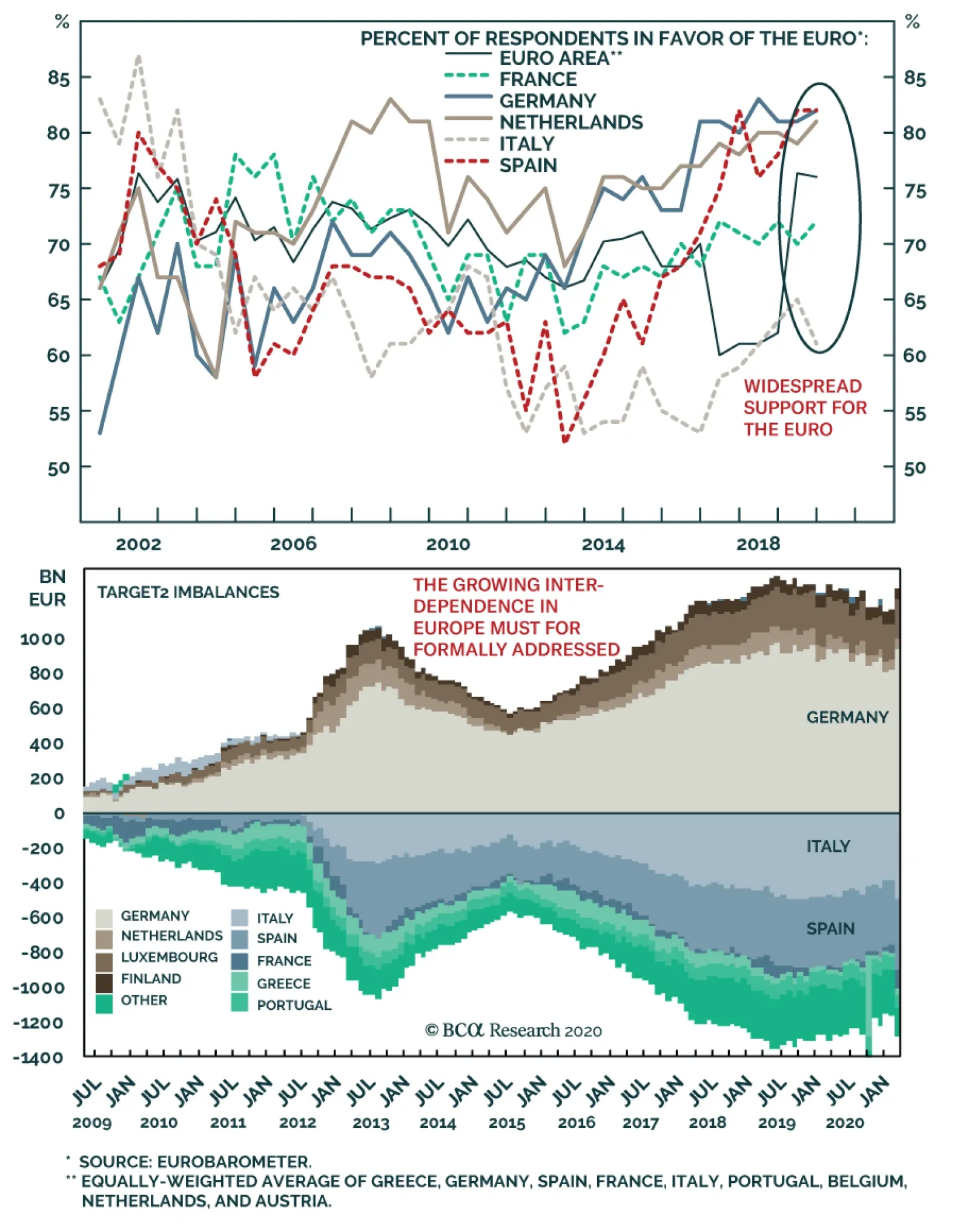
Nevertheless the European states have a problem that the other developed markets do not have: the Euro Area’s “constitutional” order is still unsettled. Questions are continually arising about whether countries’ liabilities are backstopped by a single currency authority and the entire assets of the Euro Area. These questions will tend to be settled in favor of European integration. But treaty battles in the context of upcoming elections – in the Netherlands, Germany, France, and likely Italy and Spain – will provide persistent volatility. Bottom Line: Fiscal stimulus passed thus far is only “sufficient” in a few economies; it is insufficient in southern Europe and emerging markets. Uncertainty about the pandemic, and the pace of economic reopening and normalization, combined with any hiccups in providing adequate stimulus will create near-term volatility. Will Germany Halt Quantitative Easing? No, Not Ultimately The questions about Europe highlighted above have come to the fore with the reemergence of the “German question,” which in today’s context means Germany’s and northern Europe’s willingness to conduct fiscal policy to help rebalance the Euro Area and monetary policy to ease conditions for heavily indebted, low productivity southern Europe. We have little doubt that Germany will provide more than its current 10.3% of GDP fiscal stimulus given that it has explicitly stated that state lender KfW has no limit on the amount of loans it can provide to small businesses. This accounts for the difference between our fiscal stimulus estimate and the IMF’s, but the fullest count, including “below the line” measures, would amount to nearly 35% of GDP. A sea change in the German attitude toward fiscal policy has occurred, which we have tracked in reports over the years. This shift gives permission for other European states to loosen their belts as well. We also have little doubt that German leaders will ultimately accept the ECB’s need to take desperate measures to backstop the European financial system: The “dirty little secret” of the Euro Area is that debt is already mutualized through the Target 2 banking imbalance, worth 1.5 trillion euros (Chart 6). As our Chief European Investment Strategist Dhaval Joshi has argued, Germany, as the largest shareholder in the ECB, holds a large quantity of Italian bonds, and Italians have deposited the proceeds of these bond purchases in German banks. All of this is denominated in euros. If Italy redenominates into lira, it can make bond payments in lira and the ECB and Germany will suffer capital losses. Germany would then face Italians withdrawing their deposits from German banks that would still be denominated in euros (or the deutschmark). The cause of this predicament is the ECB’s quantitative easing program (Chart 7). Chart 6Europe’s Gordian Knot
Will Europe Halt The Global Gravy Train?
Will Europe Halt The Global Gravy Train?
Thus Chancellor Angela Merkel’s shift in tone to become more supportive of joint debt issuance belies the fact that European debt is already mutualized through the Gordian knot of Target2 imbalances. This is a politically unpalatable reality for Germans, but they generally accept it because it is in Germany’s national interest to maintain the monetary union and broader European integration. Chart 7Quantitative Easing Puts Germans On Hook For Italy
Quantitative Easing Puts Germans On Hook For Italy
Quantitative Easing Puts Germans On Hook For Italy
However, the market may need reassurances about “the German question” from time to time, as EU institutional evolution is ongoing. Financial markets did not sell off on the German court’s ruling on May 5, which ostensibly gave the Bundesbank three months before withdrawing from the ECB’s quantitative easing program. Since the sovereign debt crisis, investors have come to recognize that there is more undergirding European integration than mere German preference. Namely, geopolitics – which we have outlined many times, originally in a 2011 Special Report. European nations cannot compete globally without banding together, and Germany is not powerful enough to go it alone. Still, there will be more consequences from this week’s ruling. At issue is the budgetary sovereignty of the European member states as well as Article 123 of the Treaty of Europe, which holds that neither the ECB nor the national central banks of member states can directly purchase public debts. The latter is a prohibition on the monetary financing of deficits. It became controversial in the wake of Mario Draghi’s 2012 declaration that the ECB would do “whatever it takes” to preserve the euro and the ECB’s 2015 Public Sector Purchase Program (PSPP) quantitative easing program, which the European Court of Justice deemed legal on December 11, 2018. The controversy is now implicitly shifting to the new Pandemic Emergency Purchase Program. The other principle concerned is that of “proportionality,” which requires that EU entities not take actions beyond what is necessary to achieve treaty objectives. If the ECB acted without regard to the limits of its mandate, the fiscal supremacy of the states, and the broader economic and fiscal consequences of QE, then its actions would violate the principle of proportionality and would require adjustment by EU authorities or non-participation from member state authorities. The German court did not attempt to overrule or invalidate the European court’s decision in favor of QE, or QE as a whole. Rather, it held that this ruling was not “comprehensible,” hence requiring an independent German ruling, and that the larger question of whether QE violates the prohibition against debt monetization is “not ascertainable.” The reason is that the ECB did not explain its actions adequately and the European Court of Justice did not demand an explanation. Presumably once this is done more decisive determinations can be made. Essentially the German court is demanding “documentation” by the ECB Governing Council that it weighed its monetary decisions against larger economic and fiscal consequences. So will the Bundesbank withdraw from the ECB’s QE operations in three months? Highly unlikely! The ECB, whether directly or indirectly, will provide an assessment of the proportionality of its actions to the Bundesbank and the German court will probably conclude, with limitations, that the ECB’s actions were largely within its mandate. If not, however, markets will plunge. Then the Bundestag or the Bundesbank will have to intervene to ensure that Germany does not in fact withdraw support from the ECB. European nations cannot compete globally without banding together, and Germany is not powerful enough to go it alone. How can we be sure? German opinion. Chancellor Merkel and her ruling Christian Democrats have not suffered this year so far from launching a wartime fiscal expansion and backing the ECB and EU institutions in their emergency actions. On the contrary, they have received one of the biggest bounces in popular opinion polls of any western leaders over the course of the global pandemic. While the bounce will deflate once the acute crisis subsides, this polling signals more than the average rally around the flag (Chart 8). Merkel’s approval rating started to rise when her party embraced more expansive fiscal policy in late 2019 in reaction to malaise revealed in the 2017 election. Germany’s handling of today’s crisis, both the pandemic and the expansive fiscal policy, has put the ruling party in the lead for the 2021 elections (Chart 9). Chart 8Germans See Popular Opinion ‘Bounce’ Amid COVID
Will Europe Halt The Global Gravy Train?
Will Europe Halt The Global Gravy Train?
Chart 9Merkel's CDU Revives Amid Global Crisis
Merkel's CDU Revives Amid Global Crisis
Merkel's CDU Revives Amid Global Crisis
Chart 10Germans Support Euro, But Lean On ECB
Will Europe Halt The Global Gravy Train?
Will Europe Halt The Global Gravy Train?
Moreover Germans are enthusiastically in support of the euro and the EU relative to their peers – which makes sense because Germany has been the greatest beneficiary of European integration (Chart 10). The ECB, by contrast, does not have strong support – and is losing altitude. But a crisis provoked by the court and centered on the ECB would quickly become a crisis about the euro and European project as a whole. Opinion has broken in this direction despite Merkel’s and Germany’s many compromises over the years. Remember that Merkel’s capitulation to the Mediterranean states on the European Council in June 2011, which paved the way for Draghi’s famous dictum, was initially seen as a failure by her to defend German interests. Merkel and her party have also recovered from the hit they took when she insisted that Germany take in a huge influx of Syrian refugees in 2015. German popular opinion is relevant when discussing the judicial system and rule of law. No court can ignore popular opinion entirely, no matter how independent and austere, because every court ultimately needs public opinion to maintain its credibility. The European Court’s decision is final, as long as Germany remains committed to the EU. Yet German sovereignty still gives German institutions a say. If the German court persists in attempting to block Bundesbank participation in QE, the result will be a bond market riot that pushes up peripheral debt funding costs. This would eventually risk forcing peripheral states out of the Euro Area, which is against German interests. It is very unlikely things will go so far. Rather, the court will back down after receiving due attention and having its legitimate concerns addressed. The imperatives of European integration are as powerful today as they were in 2011. True, other court challenges will open up against the ECB, particularly the PEPP. But bear in mind that it will be even easier to show that ECB actions are proportional – that broader economic consequences have been weighed – in the case of the pandemic relief emergency than with respect to PSPP prior to COVID. Today it is households and small businesses that need protection from an act of God, not banks and bureaucracies that need protection from the consequences of their excesses. As for the size and duration of QE, the court will try to force some limitations to be acknowledged given the risk to fiscal sovereignty. In this sense, the ECB faces a new constraint, albeit one that we doubt will prove relevant in the near term. Ultimately, the consequence of imposing some limits on central bank policy is to restore authority to member state budgets and European fiscal coordination. In the short term, emergency provision can be provided via the European Stability Mechanism (ESM), whose lending conditions can be relaxed, and by the ECB’s Outright Monetary Transactions (OMT), which can buy bonds amid a market riot. But beyond the immediate crisis the clash over fiscal policy will persist because at some point countries will have to climb down from their extraordinary stimulus and the attempt to restore limits will be contentious. Germany has already made a huge shift in a more fiscally accommodative direction. Italy, Spain, and France are currently not providing enough, but they will add more. Future governments might demand more than even today’s more dovish Germany is willing to accept. Down the road, if these states do not provide more stimulus, then their recoveries will be weaker and political malaise will get worse. An anti-establishment outcome is already likely in Italy in the coming year or two, due to the ability of the League to capitalize on post-COVID voter anger. The big question after that is France in 2022. Macron’s approval rating is holding up, we expect him to win, but his bounce amid the pandemic is not remarkable. From our point of view the peripheral states have a license to spend, so spend they will. But then fiscal conflicts will revive later. Bottom Line: The German constitutional court is not going to try to force the Bundesbank to withdraw from QE, but it is attempting to lay a foundation for the imposition of at least some limits on this policy. The risk to European assets in the short run is not on the monetary side but the fiscal side. Over the long run, the “German question” will never be settled. But the imperatives of European integration are as powerful today as they were in 2011. Each new crisis exposes the weakness of the peripheral states, their need for European institutions. It also exposes Germany’s need to accommodate them when they form a united front. Investment Takeaways Financial markets have no clarity on economic reopening in the face of the virus or how governments will respond to resurgent outbreaks or a second wave in the fall. Taking into consideration the initial shock of the lockdowns plus spillover effects, the cumulative impact to annual GDP rises to 6%-8% by the end of this year for major economies. If another lockdown occurs, the level of GDP would be 10-12% lower at the end of the year depending on the region. This bare risk suggests that global equities face a relapse in the near term. Eventually economic reopening will proceed, as the working age population will demand it. But the path between here and there is rocky and any hiccups in providing stimulus will create even more volatility. Globally, we continue to argue that political and geopolitical risks are rising across the board as the pandemic and recession evolve into a struggle among nations to maintain security amid vulnerabilities and distract from their problems at home. Rumors that China is about to declare an air defense identification zone (ADIZ) in the South China Sea are unverified but we have long expected this to occur and tensions and at least some saber-rattling would ensue. We also expect the US to surprise the market with punitive tech and trade measures against China in the near term and to upgrade relations with Taiwan. We remain long JPY-EUR on a tactical 0-3 month horizon. We are converting our tactical long S&P consumer staples, which is up 6%, to a relative trade against the broad market. Matt Gertken Vice President Geopolitical Strategist mattg@bcaresearch.com Appendix Appendix Table 1The Global Fiscal Stimulus Response To COVID-19
Will Europe Halt The Global Gravy Train?
Will Europe Halt The Global Gravy Train?
Footnotes 1 In the case of Italy, we assume that parliament will pass the latest proposed increase in stimulus from 1.4% to 3.1% of GDP. In the case of South Africa, we expect the IMF to include these measures soon. Germany is discussed below.
Highlights Our baseline view foresees a U-shaped recovery, as economies slowly relax lockdown measures. There are significant risks to this forecast, however. On the upside, a vaccine or effective treatment could hasten the reopening of economies and recovery in spending. On the downside, containment measures could end up being eased too quickly, leading to a surge in new cases. A persistent spell of high unemployment could also permanently damage economies, especially if fiscal and monetary stimulus is withdrawn too quickly. In addition, geopolitical risks loom large, with the US election likely to be fought on who sounds tougher on China. Earnings estimates have yet to fall as much as we think they will, making global equities vulnerable to a near-term correction. Nevertheless, the spread between earnings yields and bond yields is wide enough to justify a modest overweight to stocks on a 12-month horizon. Is It Safe To Come Down? We published a report two weeks ago entitled Still Stuck In The Tree where we likened the current situation to one where an angry bear has chased a hiker up a tree.1 Having reached a high enough branch to escape immediate danger, the hiker breathes a sigh of relief. As time goes by, however, the hiker starts to get nervous. Rather than disappearing back into the forest, the bear remains at the base of the tree licking its chops. Meanwhile, the hiker is cold, hungry, and late for work. Like the hiker, the investment community breathed a collective sigh of relief when the number of cases in Italy and Spain, the first two major European economies to be hit by the coronavirus, began to trend lower. In New York City, which quickly emerged as the epicentre of the crisis in the United States, more COVID patients have been discharged from hospitals than admitted for the past three weeks (Chart 1). Chart 1Discharges From New York Hospitals Have Exceeded Admissions For The Past Three Weeks
Risks To The U
Risks To The U
Deepest Recession Since The 1930s Yet, this progress has come at a very heavy economic cost. The IMF expects the global economy to shrink by 3% this year (Chart 2). In 2009, global GDP barely contracted. Chart 2Severe Damage To The Global Economy This Year
Risks To The U
Risks To The U
The sudden stop in economic activity has led to a surge in unemployment. According to the Bloomberg consensus estimate, the US unemployment rate rose to 16% in April. The true unemployment rate is probably higher since to be considered unemployed one has to be looking for work, which is difficult if not impossible in the presence of widespread lockdowns. Regardless, even the official unemployment rate is the worst since the Great Depression (Chart 3). Chart 3Unemployment Rate Seen Jumping To Levels Not Reached Since The Great Depression
Unemployment Rate Seen Jumping To Levels Not Reached Since The Great Depression
Unemployment Rate Seen Jumping To Levels Not Reached Since The Great Depression
Unshackling The Economy A key difference from the 1930s is that today’s recession has been self-induced. Policymakers want workers to stay home as much as possible. The hope is that once businesses reopen, most of these workers will return to their jobs. How long will that take? Our baseline scenario envisions a slow but steady reopening of the global economy starting later this month, which should engender a U-shaped economic recovery. Since mid-March, much of the world has been trying to compensate for lost time by taking measures that would not have been necessary if policymakers had acted sooner. As Box 1 explains, some loosening of lockdown measures could be achieved without triggering a second wave of cases once the infection rate has been brought down to a sufficiently low level. To the extent that economic activity tends to move in tandem with the number of interactions that people have, a relaxation of social distancing measures should produce a modest rebound in growth. New technologies and a better understanding of how the virus is transmitted should also allow some of the more economically burdensome measures to be lifted. As we have discussed before, mass testing can go a long way towards reducing the spread of the disease (Chart 4).2 Right now, high-quality tests are in short supply, but that should change over the coming months. Chart 4Mass Testing Will Help
Risks To The U
Risks To The U
Increased mask production should also help. Early in the pandemic, officials in western nations promulgated the view that masks do not work. At best, this was a noble lie designed to ensure that anxious consumers did not deprive frontline workers of necessary safety equipment. At worst, it needlessly led many people astray. As East Asia’s experience shows, mask wearing saves lives. A recent paper estimated that the virus could be vanquished if 80% of people wore masks that were at least 60% effective, a very low bar that even cloth masks would pass (Chart 5).3 Chart 5Masks On!
Risks To The U
Risks To The U
Recent research has also cast doubt on the merits of closing schools. The China/WHO joint commission could not find a single instance during contact tracing where a child transmitted the virus to an adult. A study by the UK Royal College of Paediatrics provides further support to the claim that children are unlikely to be important vectors of transmission. The evidence includes a case study of a nine year-old boy who contracted the virus in the French Alps but fortunately failed to transmit it to any of the more than 170 people he had contact with in three separate schools.4 Along the same lines, there is evidence that the odds of adults catching the virus indoors is at least one order of magnitude higher than outdoors.5 This calls into question the strategy of states such as California of clearing out prisons of dangerous felons in order to make room for beachgoers.6 Upside Risks To The U: Medical Breakthroughs While a U-shaped economic recovery remains our base case, we see both significant upside and downside risks to this outcome. The best hope for an upside surprise is that a vaccine or effective treatment becomes available soon. There are already eight human vaccine trials underway, with another 100 in the planning stages. In the race to develop a vaccine, Oxford is arguably in the lead. Scientists at the university’s Jenner Institute have developed a genetically modified virus that is harmless to people, but which still prompts the immune system to produce antibodies that may be able to fight off COVID. The vaccine has already worked well on rhesus monkeys. If it proves effective on humans, researchers hope to have several million doses available by September. On the treatment side, Gilead’s remdesivir gained FDA approval for emergency use after early results showed that it helps hasten the recovery of coronavirus patients. Hydroxychloroquine, which President Trump has touted on numerous occasions, is the subject of dozens of clinical trials internationally. While evidence that hydroxychloroquine can treat the virus post-infection is thin, there is some data to suggest that it can work well as a prophylactic.7 Research is also being conducted on nearly 200 other treatments, including an improbable contender: famotidine, the compound found in the heartburn remedy Pepcid.8 Downside Risk: Too Open, Too Soon Chart 6The Lesson From The Spanish Flu: The Second Wave Could Be Worse Than The First
Risks To The U
Risks To The U
As noted above, once the number of new cases drops to sufficiently low levels, some relaxation of containment measures can be achieved without reigniting the pandemic. That said, there is a clear danger that measures will end up being relaxed too aggressively and too soon. This is precisely what happened during the Spanish Flu (Chart 6). It has become customary to talk about the risk of a second wave of infections; however, the reality is that we have not even concluded the first wave. While the number of cases in New York has been falling, it has been rising in many other US states. As a result, the total number of new coronavirus cases nationwide has remained steady for the past five weeks (Chart 7). It is the same story globally: Falling caseloads in western Europe and East Asia have been offset by rising cases in countries such as Russia, India, and Brazil (Chart 8). Chart 7The Spread Of COVID-19 Has Not Been Contained Everywhere (I)
Risks To The U
Risks To The U
Chart 8The Spread Of Covid-19 Has Not Been Contained Everywhere (II)
Risks To The U
Risks To The U
Chart 9Widespread Social Distancing Has Dampened The Spread Of All Flus And Colds
Risks To The U
Risks To The U
At the heart of the problem is that COVID-19 remains a highly contagious disease. Most studies assign a Reproduction Number, R, of 3-to-4 to the virus. As a point of comparison, the Spanish flu is estimated to have had an R of 1.8. An R of 3.5 would require about 70% of the population to acquire herd immunity to keep the virus at bay.9 As discussed in Box 2, the “true” level of herd immunity may be substantially greater than that. At this point, if you come down with a cough and fever, you should assume you have COVID. As Chart 9 shows, social distancing measures have brought the number of viral respiratory illnesses down to almost zero in the United States. Up to 30% of common cold cases stem from the coronavirus family. Just like it would be foolhardy to assume that the common cold has been banished from the face of the earth, it would be unwise to assume that COVID will not return if containment measures are quickly lifted. Downside Risk: Permanent Economic Damage Chart 10No Spike In Bankruptcies For Now
Risks To The U
Risks To The U
There are a lot of asymmetries in economics: It is easier to lose a job than to find one; starting a new business is also more difficult than going bankrupt. The good news so far is that bankruptcies have been limited and most unemployed workers have not been permanently laid off (Chart 10 and Chart 11). Thus, for the most part, the links that bind firms to workers have not been severed. Chart 11Temporary Layoffs Account For Most Of The Recent Increase In Unemployment
Temporary Layoffs Account For Most Of The Recent Increase In Unemployment
Temporary Layoffs Account For Most Of The Recent Increase In Unemployment
Unfortunately, there is a risk that the economy will suffer permanent damage if unemployment remains high and economic activity stays depressed. For some sectors, such as airlines, long-term damage is nearly assured. It took a decade for real household spending on airlines to return to pre 9/11 levels (Chart 12). It could take even longer for the physiological scars of the pandemic to fade. While businesses outside the travel and hospitality sectors will see a quicker rebound, they could still experience subdued demand for as long as social distancing measures persist. Chart 129/11 Was A Big Shock For US Air Travel
9/11 Was A Big Shock For US Air Travel
9/11 Was A Big Shock For US Air Travel
There is not much that fiscal policy can do to reverse the immediate hit to GDP from the pandemic. If people cannot work, they cannot produce. What fiscal stimulus can do is push enough money into the hands of households and firms to enable them to meet their financial obligations, while hopefully creating some pent-up demand that can be unleashed when businesses reopen. For now and for the foreseeable future, there is no need to tighten fiscal policy. The private sector in the major economies is generating plenty of savings with which governments can finance budget deficits. Indeed, standard economic theory suggests that if governments tried to “save more” by reducing budget deficits, total national savings would actually decline.10 Nevertheless, just as fiscal policy was prematurely tightened in many countries following the Great Recession, there is a risk that austerity measures will be reintroduced too quickly again. Likewise, calls to tighten monetary policy could grow louder. Just this week, Germany’s constitutional court ruled that the EU Court of Justice had overstepped its powers by failing to require the ECB to conduct an assessment of the “proportionality” of its controversial asset purchase policy. The German high court ordered the Bundesbank to suspend QE in three months unless the ECB Governing Council provides “documentation” showing it meets the criteria of proportionality. Among other things, the ruling could undermine the ECB’s newly launched €750 billion Pandemic Emergency Purchase Programme (PEPP). Downside Risk: Geopolitical Tensions Had the virus originated anywhere else but China, President Trump could have made a political case for further deescalating the Sino-US trade war in an effort to shore up the US economy and stock market. Not only did that not happen, but the likelihood of a new clash between China and the US has gone up dramatically. Antipathy towards China is rising (Chart 13). As our geopolitical team has stressed, the US election is likely to be fought on who can sound tougher on China. With the economy on the ropes, Trump will try to paint Joe Biden as too passive and conflicted to stand up to China. Indeed, running as a “war president” may be Trump’s only chance of getting re-elected. Chart 13US Nationalism Is On The Rise Amid Broad-Based Anti-China Sentiment
Risks To The U
Risks To The U
At the domestic political level, the pandemic has exacerbated already glaringly wide inequalities. While well-paid white-collar workers have been able to work from the comfort of their own homes, poorer blue-collar workers have either been furloughed or asked to continue working in a dangerous environment (in nursing homes or meat-packing plants, for example). It is not clear what the blowback from all this will be, but it is unlikely to be benign. Investment Implications Global equities and credit spreads have tracked the frequency of Google search queries for “coronavirus” remarkably well (Chart 14). As coronavirus queries rose, stocks plunged; as the number of queries subsided, stocks rallied. If there is a second wave of infections, anxiety about the virus is likely to grow again, leading to another sell-off in risk assets. Chart 14Joined At The Hip
9/11 Was A Big Shock For US Air Travel Joined At The Hip
9/11 Was A Big Shock For US Air Travel Joined At The Hip
Chart 15Negative Earnings Revisions Will Weigh On Stocks In The Near Term
Risks To The U
Risks To The U
Earnings estimates have come down, but are still above where we think they ought to be. This makes global equities vulnerable to a correction (Chart 15). Meanwhile, retail investors have been active buyers, eagerly gobblingup stocks such as American Airlines and Norwegian Cruise Lines that have fallen on hard times recently (Chart 16). They have also been active buyers of the USO oil ETF, which is down 80% year-to-date. When retail investors are trying to catch a falling knife, that is usually an indication that stocks have yet to reach a bottom. As such, we recommend that investors maintain a somewhat cautious stance on the near-term direction of stocks. Chart 16Retail Investors Keen To Buy The Dip
Risks To The U
Risks To The U
Chart 17Favor Equities Over Bonds Over A 12-Month Horizon
Favor Equities Over Bonds Over A 12-Month Horizon
Favor Equities Over Bonds Over A 12-Month Horizon
Chart 18USD Is A Countercyclical Currency
USD Is A Countercyclical Currency
USD Is A Countercyclical Currency
Looking further out, the spread between earnings yields and bond yields is wide enough to justify a modest overweight to stocks on a 12-month horizon (Chart 17). If global growth does end up rebounding, cyclicals should outperform defensives. As a countercyclical currency, the dollar will probably weaken (Chart 18). A weaker greenback, in turn, will boost commodity prices (Chart 19). Historically, stronger global growth and a softer dollar have translated into outperformance of non-US stocks relative to their US peers (Chart 20). Thus, investors should prepare to add international equity exposure to their portfolios later this year. Chart 19Commodity Prices Usually Rise When The Dollar Weakens
Commodity Prices Usually Rise When The Dollar Weakens
Commodity Prices Usually Rise When The Dollar Weakens
Chart 20Non-US Equities Tend To Outperform Their US Peers When Global Growth Is Improving And The Dollar Is Weakening
Non-US Equities Tend To Outperform Their US Peers When Global Growth Is Improving And The Dollar Is Weakening
Non-US Equities Tend To Outperform Their US Peers When Global Growth Is Improving And The Dollar Is Weakening
Box 1The Dynamics Of R
Risks To The U
Risks To The U
Box 2Why Herd Immunity Is Not Enough
Risks To The U
Risks To The U
Peter Berezin Chief Global Strategist peterb@bcaresearch.com Footnotes 1 Please see Global Investment Strategy Weekly Report, “Still Stuck In The Tree,” dated April 16, 2020. 2 Please see Global Investment Strategy Weekly Report, “Testing Times,” dated April 9, 2020. 3 Philip Anfinrud, Valentyn Stadnytskyi, et al., “Visualizing Speech-Generated Oral Fluid Droplets with Laser Light Scattering,” nejm.org (April 15, 2020); Jeremy Howard, Austin Huang, Li Zhiyuan, Zeynep Tufekci, Vladmir Zdimal, Helene-mari van der Westhuizen, et al., “Face Masks Against COVID-19: An Evidence Review,” Preprints.org, (April 12, 2020); and Liang Tian, Xuefei Li, Fei Qi, Qian-Yuan Tang, Viola Tang, Jiang Liu, Zhiyuan Li, Xingye Cheng, Xuanxuan Li, Yingchen Shi, Haiguang Liu, and Lei-Han Tang, “Calibrated Intervention and Containment of the COVID-19 Pandemic,” arxiv.org (April 2, 2020). 4 “COVID-19 – Research Evidence Summaries,” Royal College of Paediatrics and Child Health; and Alison Boast, Alasdair Munro, and Henry Goldstein, “An evidence summary of Paediatric COVID-19 literature,” Don’t Forget The Bubbles (2020). 5 Hiroshi Nishiura, Hitoshi Oshitani, Tetsuro Kobayashi, Tomoya Saito, Tomimasa Sunagawa, Tamano Matsui, Takaji Wakita, MHLW COVID-19 Response Team, and Motoi Suzuki, “Closed environments facilitate secondary transmission of coronavirus disease 2019 (COVID-19),” medRxiv (April 16, 2020). 6 “Coronavirus: Arrests as California beachgoers defy lockdown,” Skynews (April 26, 2020); and “High-risk sex offender rearrested days after controversial release from OC Jail,” abc7.com (May 1, 2020). 7 Sun Hee Lee, Hyunjin Son, and Kyong Ran Peck, “Can post-exposure prophylaxis for COVID-19 be considered as an outbreak response strategy in long-term care hospitals?” International Journal of Antimicrobial Agents (April 25, 2020). 8 Brendan Borrell, “New York clinical trial quietly tests heartburn remedy against coronavirus,” Science (April 26, 2020). 9 In the simplest models, the herd immunity threshold is reached when P = 1-1/Ro, where P is the proportion of the population which has acquired immunity and Ro is the basic reproductive number. Assuming an Ro of 3.5, heard immunity will be achieved once more than 71.4% of the population has been infected (1-1/3.5). For further discussion on this, please refer to Global Investment Strategy, “Second Quarter 2020 Strategy Outlook: World War V,” dated March 27, 2020. 10 It is easiest to understand this point by considering a closed economy where savings, by definition, equals investment. Savings is the sum of private and public savings. Suppose the economy is depressed and the government increases public savings by either raising taxes or cutting spending. Since this action will further depress the economy, private investment will fall even more. But, since investment must equal total savings, private savings must decline more than proportionately with any increase in public savings. This happens because tighter fiscal policy leads to lower GDP. It is difficult to save if one does not have a job. To the extent that lower GDP reduces employment, it also tends to reduce private-sector savings. Global Investment Strategy View Matrix
Risks To The U
Risks To The U
Current MacroQuant Model Scores
Risks To The U
Risks To The U
In lieu of the next weekly report I will be presenting the quarterly webcast ‘Leaving The Euro Would Be MAD, But Mad Things Can Happen’ on Thursday 14 May at 10.00AM EDT (3.00PM BST, 4.00PM CEST, 10.00PM HKT). As usual, the webcast will take a TED talk format lasting 18 minutes, followed by live questions. Don’t miss it. Highlights For the time being, stick with the very successful strategies of: Overweighting higher yielding US T-bonds versus negative yielding German bunds and Swiss bonds. Overweighting technology and healthcare versus banks and materials. Overweighting growth versus value. Overweighting the S&P 500 versus the Eurostoxx 50. Overweighting Germany, France, and Switzerland in a European equity portfolio. The big caveat is that these strategies are highly correlated. Fractal trade: long euro area personal products versus healthcare. Feature Chart I-1Bond Yields And Commodity Prices Are Correlating To One
Bond Yields And Commodity Prices Are Correlating To One
Bond Yields And Commodity Prices Are Correlating To One
Chatting with friends, family and clients it seems that our lives under lockdown and social distancing have lost much of their differentiation across time and space. Wherever in the world we live, whatever we do, our days and lives are correlating to one. Interestingly, the financial markets have experienced a similar loss of differentiation. In the coronavirus world, markets are also correlating to one. Financial Markets Are Not Complicated One of our abiding investment mantras is that: Financial markets are complex, but they are not complicated. The words complex and complicated are sometimes used synonymously, but they mean different things. Complex means something that is not fully predictable or analysable. Complicated means something that is made up of many parts. Financial markets are not complicated. The financial markets are not complicated because a few parts drive the relative prices of everything, though these parts themselves are complex. Identify and understand these few parts and you will get all your investment decisions right: asset allocation, sector allocation, style allocation, regional allocation, country allocation. This has become even more so this year as our response to the coronavirus has correlated all our lives and economic behaviour to one. One fundamental part is the bond yield. The collapse in commodity prices, more than any other real-time indicator, illustrates the demand destruction resulting from coronavirus-induced lockdowns and social distancing. Bond yields have plunged in lockstep with this demand destruction, given the implications for higher unemployment as well as lower inflation – the two key tenets that drive central bank policy (Chart of the Week). The plunging bond yield, in turn, has driven the underperformance of banks (Chart I-2), for two reasons. First, to the extent that a depressed bond yield reflects a low-growth economy, it also reflects a poorer outlook for bank credit growth, which effectively constitutes a bank’s ‘sales’. Second, a depressed bond yield means a flat or inverted yield curve, which squeezes bank net interest (profit) margins. Chart I-2Banks And Bond Yields Are Correlating To One
Banks And Bond Yields Are Correlating To One
Banks And Bond Yields Are Correlating To One
Conversely, the plunging bond yield has signified an environment in which big tech and healthcare equities outperform (Chart I-3 and Chart I-4), also for two reasons. First, big tech and healthcare sales are more protected against a sudden dip in the economy. Second, their cashflows are weighted further into the future, and so their ‘net present values’ rise more when bond yields plunge. Chart I-3Tech (Inverted) And Bond Yields Are Correlating To One
Tech (Inverted) And Bond Yields Are Correlating To One
Tech (Inverted) And Bond Yields Are Correlating To One
Chart I-4Healthcare (Inverted) And Bond Yields Are Correlating To One
Healthcare (Inverted) And Bond Yields Are Correlating To One
Healthcare (Inverted) And Bond Yields Are Correlating To One
A declining bond yield also signifies an environment in which basic materials equities underperform, as our first chart powerfully illustrates. So, if you call the bond yield right, you will get your asset allocation between cash and bonds right, but you will also your equity sector allocation right. And if you get your equity sector allocation right you will automatically get your value versus growth style allocation right too. At an overarching level, the value versus growth allocation is nothing more than the performance of value sectors, like banks, versus growth sectors, like big tech and healthcare (Chart I-5). Chart I-5Value Versus Growth = Banks Versus Tech
Value Versus Growth = Banks Versus Tech
Value Versus Growth = Banks Versus Tech
Furthermore, you will also get your regional and country allocation right. This is because each major stock market has distinguishing ‘long’ sectors in which it contains up to a quarter of its total market capitalisation, as well as distinguishing ‘short’ sectors in which it has a significant under-representation. The combination of this long sector and short sector gives each equity index its distinguishing fingerprint which drives relative performance (Table I-1): Table I-1The Sector Fingerprints Of Major Regional Stock Markets
Markets Are Correlating To One
Markets Are Correlating To One
FTSE 100 = long financials and energy, short technology. Eurostoxx 50 = long financials, short technology and healthcare. Nikkei 225 = long industrials, short financials and energy. S&P 500 = long technology and healthcare, short materials. MSCI Emerging Markets = long financials, short healthcare. Specifically, the distinguishing fingerprints of the Eurostoxx 50 and the S&P 500 mean that the Eurostoxx 50 has a 12 percent over-representation to financials and materials at the expense of an 18 percent under-representation to technology and healthcare. It follows that if banks and materials underperform technology and healthcare, the Eurostoxx 50 must underperform the S&P 500. Everything else is irrelevant (Chart I-6). Chart I-6Euro Area Versus US = Banks Versus Tech
Euro Area Versus US = Banks Versus Tech
Euro Area Versus US = Banks Versus Tech
The same principle applies to the stock markets within Europe. Relative performance comes from nothing more than the stock market’s long and short sector fingerprint combined with sector performance (Table I-2 and Table I-3). Table I-2The Sector Fingerprints Of Euro Area Stock Markets
Markets Are Correlating To One
Markets Are Correlating To One
Table I-3The Sector Fingerprints Of Non Euro Area European Stock Markets
Markets Are Correlating To One
Markets Are Correlating To One
For example, if healthcare outperforms then its overrepresentation in the stock markets of Switzerland and Denmark means that they must outperform too (Chart I-7 and Chart I-8). Likewise, if technology outperforms, then the technology-heavy Netherlands stock market must outperform (Chart I-9). Chart I-7Long Switzerland = Long Healthcare
Long Switzerland = Long Healthcare
Long Switzerland = Long Healthcare
Chart I-8Long Denmark = Long Healthcare
Long Denmark = Long Healthcare
Long Denmark = Long Healthcare
Chart I-9Long Netherlands = Long Tech
Long Netherlands = Long Tech
Long Netherlands = Long Tech
All Investment Strategies Are Highly Correlated To repeat, financial markets are not complicated. If you get the over-arching decision(s) right, you will get everything right. The unfortunate corollary is that if you get the over-arching decision wrong you will get everything wrong. Asset allocation, sector allocation, style allocation, regional allocation, and country allocation are correlating to one. We really wish that financial markets were more complicated – because then asset allocation, sector allocation, style allocation, regional allocation and country allocation would be independent investment decisions which offered diversification at the total portfolio level. But the charts in this report should make it crystal clear that all these separate decisions are correlating to one. They are all really the same decision. Today, the decision on where bond yields are headed is particularly tough because they have already come down a lot in a very short space of time. Yet we do not foresee a sustained backup in yields for three reasons: First, even if governments ease lockdowns and reopen economies, demand will remain depressed. Most people are isolating themselves or socially distancing not because their governments are forcing them to, but because they fear infection. The easing of lockdowns, per se, will not remove that fear. And if workers are forced back into jobs when it is unsafe, then infection rates will start to rise again. Second, unless commodity prices rise sharply in the coming months the base effect of commodity prices will put downward pressure on 12-month inflation rates later in the summer (Chart I-10). To the extent that central banks focus on – and target – these totemic annual inflation rates, it will be very difficult to turn hawkish. On the contrary, there may be pressure to turn even more dovish. Chart I-10The Base Effect Will Weigh On Inflation Later This Year
The Base Effect Will Weigh On Inflation Later This Year
The Base Effect Will Weigh On Inflation Later This Year
Third, our most trusted technical indicator is not flashing the red signal that bonds are dangerously overbought, as they were in January 2019, August 2019, and early-March 2020 (Chart I-11). Chart I-11Bonds Are Not Yet At A Technical Tipping Point
Bonds Are Not Yet At A Technical Tipping Point
Bonds Are Not Yet At A Technical Tipping Point
So, for the time being, we are sticking with the very successful strategies of: Overweighting higher yielding US T-bonds versus negative yielding German bunds and Swiss bonds. Overweighting technology and healthcare versus banks and materials. Overweighting growth versus value. Overweighting the S&P 500 versus the Eurostoxx 50. Overweighting Germany, France, and Switzerland in a European equity portfolio. The big caveat is that these strategies are highly correlated. Fractal Trading System* With markets correlating to one, it is becoming more difficult to find trades which are not correlated with the over-arching driver. Hence, this week’s recommended trade is a pair-trade between two defensive sectors: long euro area personal products versus healthcare. The profit target is 7 percent, with a symmetrical stop-loss. The rolling 1-year win ratio now stands at 61 percent. Chart I-12Euro Area Personal Products Vs. Health Care
Euro Area Personal Products Vs. Health Care
Euro Area Personal Products Vs. Health Care
When the fractal dimension approaches the lower limit after an investment has been in an established trend it is a potential trigger for a liquidity-triggered trend reversal. Therefore, open a countertrend position. The profit target is a one-third reversal of the preceding 13-week move. Apply a symmetrical stop-loss. Close the position at the profit target or stop-loss. Otherwise close the position after 13 weeks. * For more details please see the European Investment Strategy Special Report “Fractals, Liquidity & A Trading Model,” dated December 11, 2014, available at eis.bcaresearch.com. Dhaval Joshi Chief European Investment Strategist dhaval@bcaresearch.com Fractal Trading System Cyclical Recommendations Structural Recommendations Closed Fractal Trades Trades Closed Trades Asset Performance Currency & Bond Equity Sector Country Equity Indicators Bond Yields Chart II-1Indicators To Watch - Bond Yields
Indicators To Watch - Bond Yields
Indicators To Watch - Bond Yields
Chart II-2Indicators To Watch - Bond Yields
Indicators To Watch - Bond Yields
Indicators To Watch - Bond Yields
Chart II-3Indicators To Watch - Bond Yields
Indicators To Watch - Bond Yields
Indicators To Watch - Bond Yields
Chart II-4Indicators To Watch - Bond Yields
Indicators To Watch - Bond Yields
Indicators To Watch - Bond Yields
Interest Rate Chart II-5Indicators To Watch - Interest Rate Expectations
Indicators To Watch - Interest Rate Expectations
Indicators To Watch - Interest Rate Expectations
Chart II-6Indicators To Watch - Interest Rate Expectations
Indicators To Watch - Interest Rate Expectations
Indicators To Watch - Interest Rate Expectations
Chart II-7Indicators To Watch - Interest Rate Expectations
Indicators To Watch - Interest Rate Expectations
Indicators To Watch - Interest Rate Expectations
Chart II-8Indicators To Watch - Interest Rate Expectations
Indicators To Watch - Interest Rate Expectations
Indicators To Watch - Interest Rate Expectations
Germany’s factory orders have begun a violent freefall in March, contracting 16% on an annual basis. Capital goods were particularly hard hit, contracting nearly 25% on an annual basis. Germany’s economy depends on exports of industrial goods for its growth.…
Yesterday, BCA Research's Global Fixed Income Strategy service concluded that internal divisions over Italy were a crucial determinant of why the ECB chose the LTROs over ramping up asset purchases. The unique nature of the COVID-19 outbreak has somewhat…
Highlights ECB: The ECB disappointed markets last week who expected an increase in the size of its asset purchase schemes given the recent increase of Italian bond yields. For now, the central bank remains focused on preventing a European credit crunch through increased use of bank funding measures like TLTROs – although a renewed selloff in BTPs would likely change the minds of the “Italy hawks” on the ECB Governing Council. Euro Area High-Yield: Valuations for euro area junk bonds improved somewhat during the COVID-19 selloff, but spreads do not offer much protection from the coming surge in default losses. Remain underweight euro area high-yield corporates in global fixed income portfolios. Feature Chart 1Will Growth Trump Liquidity For Euro Area Junk Bonds?
Will Growth Trump Liquidity For Euro Area Junk Bonds?
Will Growth Trump Liquidity For Euro Area Junk Bonds?
Over the past week, investors heard from the three major developed market central banks – the Federal Reserve, the European Central Bank (ECB) and the Bank of Japan (BoJ). The Fed and BoJ did little to seriously impact financial markets, offering only strengthened forward guidance on already hyper-easy policy settings along with some expansion of existing asset purchase programs (involving municipal bonds for the Fed, JGBs and Japanese corporate bonds for the BoJ). The ECB was the most interesting of the three, because of what was NOT done – namely, an increase in the amount of asset purchases – and what it implies about the policy debate within the central bank on how to deal with Italy. The hit to the euro area economy from the COVID-19 lockdowns has been sharp and brutal, pushing the entire region quickly into deep recession (Chart 1). Given such a severe hit to growth, and with policy interest rates already at zero (or even negative), the only avenue for the ECB to deliver more stimulus is through expanding its balance sheet through asset purchases and liquidity provision to banks. This makes the ECB’s next moves on its balance sheet critical for determining the future path of European risk assets like equities and high-yield corporate bonds – the latter of which we discuss later in this report. A Cautious Next Step From The ECB Chart 2An Unprecedented Economic Collapse
An Unprecedented Economic Collapse
An Unprecedented Economic Collapse
The need for the ECB to do something at last week’s monetary policy meeting was obvious. Real GDP for the entire region is estimated to have contracted -3.8% on a year-over-year basis in the first quarter of the year. At the country level, large declines occurred in France (-5.8%), Italy (-4.7%) and Spain (-5.2%) that were far greater than seen during the 2009 recession. The decline was broad-based across industries as well, with the European Commission’s (EC) business confidence indices collapsing in April for manufacturing, services, retail and construction (Chart 2). The bottom has also fallen out on the EC price expectations indices, suggesting that outright deflation across the euro area is just around the corner. The ECB last week provided what were called “alternative scenarios” for the impact of COVID-19 on euro area growth. We presume these are meant to be an alternative to the most recent set of ECB economic projections that were published in March that now look wildly optimistic given the COVID-19 lockdowns. The revised scenarios now call for a real GDP contraction in 2020 of anywhere from -5% to -12%, with only a partial recovery of those losses in 2021.1 The central bank also provided an estimate of the output loss by industry from COVID-19 related lockdowns (Table 1) – a staggering -60% for retail, transportation, accommodation and food services and -40% for manufacturing and construction. Table 1The Lockdown Has Been Painful For Europe
The ECB Will Do Whatever It Takes … Eventually
The ECB Will Do Whatever It Takes … Eventually
Against this horrendous growth and inflation backdrop, with forecasts being slashed, the expectation was that the ECB would ramp up the size of its bond buying programs to try and ease financial conditions further. That would help cushion the growth downturn and attempt to put a floor under collapsing inflation expectations (Chart 3). Yet at last week’s monetary policy meeting, the ECB announced the following: No changes in policy interest rates No increase in the size of the Asset Purchase Program (APP) from the existing €120bn or Pandemic Emergency Purchase Program (PEPP) from the existing €750bn For existing targeted long-term refinancing operations (TLTROs) between June 2020 and June 2021, interest rates were lowered by -25bps A new long-term refinancing operation for euro area banks was introduced called the Pandemic Emergency Long Term Refinancing Operation (PELTRO), which would offer liquidity to euro area banks on a monthly basis until December, at an interest rate of -0.25%. The increased use of LTROs was an easier way for the ECB Governing Council to avoid a potential credit crunch if euro area banks become more risk averse. The ECB clearly wants to take no chances on banks reining in loan activity. The latest ECB Bank Lending Survey, released just two days before last week’s policy meeting, showed a modest tightening of standards for bank loans to businesses in the first quarter of 2020. This was most visible in Germany and Italy, with France actually showing a slight decline in the net percentage of banks tightening lending standards (Chart 4). The survey also showed that euro area banks expected a significant net easing of lending standards in response to the loan guarantees and liquidity support measures announced by European governments to mitigate the impact of COVID-19 lockdowns. Chart 3Expanding The Balance Sheet Is The Only Tool The ECB Has Left
Expanding The Balance Sheet Is The Only Tool The ECB Has Left
Expanding The Balance Sheet Is The Only Tool The ECB Has Left
Chart 4The ECB Wants To Avoid A Credit Crunch
The ECB Wants To Avoid A Credit Crunch
The ECB Wants To Avoid A Credit Crunch
With bank lending growth across the entire euro area having already increased to 4.9% on a year-over-year basis in March, the fastest pace in two years, the ECB clearly wants to take no chances on banks reining in loan activity - even if those loans are merely for stressed companies tapping existing credit lines, or taking advantage of government loan guarantees to minimize layoffs in a deep recession. Another surge in Italian bond yields in the next few months would likely trigger an increase in the size of the PEPP. However, there was likely an additional reason why the ECB chose the LTRO route over ramping up asset purchases – internal political divisions over Italy. Chart 5Italian Financial Stability Remains Critical For The ECB
Italian Financial Stability Remains Critical For The ECB
Italian Financial Stability Remains Critical For The ECB
There remain some on the ECB Governing Council that do not wish to keep buying more BTPs, thus giving Italy a blank check to run even larger budget deficits. The unique nature of the COVID-19 outbreak has somewhat loosened those biases against the highly indebted countries of southern Europe, as evidenced by the inclusion of Greek bonds in the PEPP shopping list. Yet there are still many within the ECB, and within the governments of the “hard money” countries of the euro area, who would prefer to see Italy get monetary support for greater deficit spending through ECB vehicles with conditionality like Outright Monetary Transactions (OMT). Given these internal divisions over Italy, an increase in the size of the existing asset purchase schemes will only take place if there is a major increase in Italian risk premiums that threatens the financial stability of the entire euro area. On that front, risk indicators like the BTP-Bund spread and credit default spreads on Italian banks have risen over the past month, but remain well below the stressed levels witnessed during the Global Financial Crisis and the European Debt Crisis (Chart 5). Additionally, Italian bank stocks have actually been outperforming their euro area peers since early 2019, while the Italy-Germany spread curve is not inverted (2-year spreads higher than 10yr spreads) as occurred in 2011 when investors feared Italy would crash out of the euro. With Italian government yields still at relatively low and manageable levels, even as the highly-indebted Italian government has stated that its budget deficit will surge to -10% of GDP to provide stimulus to a virus-ravaged economy, there is no pressure on the ECB to increase the size of the PEPP that was just announced less than two months ago. Yet even with all the internal divisions, another surge in Italian bond yields in the next few months would likely trigger an increase in the size of the PEPP to prevent a broader tightening of euro area financial conditions. For this reason, we continue to recommend a strategic (6-12 months) overweight stance on Italian government bonds within global fixed income portfolios. Bottom Line: The ECB disappointed markets last week who expected an increase in the size of its asset purchase schemes given the recent increase of Italian bond yields. For now, the central bank remains focused on preventing a European credit crunch through increased use of bank funding measures like TLTROs – although a renewed selloff in BTPs would likely change the minds of the “Italy hawks” on the ECB Governing Council. A Quick Look At Euro Area High-Yield Valuation We recently upgraded our recommended investment stance on euro area investment grade corporate bonds to neutral.2 This shift was based on the ECB increasing the amount of its corporate bond purchases as part of its COVID-19 monetary easing measures, coming after the Fed announced its own new programs to buy US investment grade corporates. With the major central banks providing direct support to higher quality corporates, the left side of the return distribution for those bonds eligible for these purchase programs has effectively been reduced. This warrants a higher weighting for those bonds in investor portfolios. For high-yield corporates, the story is more nuanced. Both the Fed and ECB have announced that investment grade bonds purchased in their bond buying programs, which are then subsequently downgraded to below investment grade, can stay on the balance sheet of those programs. This makes Ba-rated junk bonds – the highest credit tier below investment grade – a relatively more attractive bet within the overall high-yield universe, both in the US and Europe. Although the lack of a direct central bank bid still makes high-yield corporates a riskier bet in a recessionary environment where default losses will surely increase. This means rather than just “buying what the central banks are buying”, we must rely on more traditional metrics to determine if high-yield bonds offer value. To evaluate the attractiveness of euro area high-yield corporates, we use three different approaches that use relative value to other credit markets, or more intrinsic value based on potential credit losses. Relative spreads vs. euro area investment grade One way to assess the value of euro area high-yield is to compare its credit spread to that of higher-rated euro area investment grade corporate bonds. Since movements in both spreads are highly correlated, as they both benefit from accelerating euro area economic growth (and vice versa), any change in spreads between the two could represent a relative value opportunity. Currently, the option-adjusted spread (OAS) of the euro area high-yield benchmark index (635bps) is 449bps over that of the investment grade index (186bps), using Bloomberg Barclays index data (Chart 6). While this is a relatively wide spread differential for the years since the 2008 financial crisis, it is not a particularly large gap during a recession that is likely to be deeper than the 2009 downturn. The same argument holds when looking at the ratio of the euro area high-yield OAS to the investment grade OAS, which is only at average levels for the post crisis period (3rd panel). 12-month breakeven spreads One of our favorite credit valuation tools is the 12-month breakeven spread, which measures the amount of spread widening over a one-year horizon that would make the total return of a corporate bond equal to that of a duration-matched government bond. We apply that calculation to data for an entire spread product sector, like investment grade or high-yield, to determine a breakeven spread for that sector. We then look at the percentile ranks of the breakeven spread versus its own history to determine if that particular fixed income sector looks relatively attractive. Rather than just “buying what the central banks are buying”, we must rely on more traditional metrics to determine if high-yield bonds offer value. On that basis, euro area high-yield corporates, across all credit tiers, offer somewhat attractive spreads, with 12-month breakevens in the upper half of the historical distribution (Chart 7). US high-yield, by comparison, offers far more attractive spreads with 12-month breakevens in the upper quartile of their historical distribution across all credit tiers. Only the riskiest Caa-rated bonds are in the top 25% of the distribution in the euro area (Chart 8). Chart 6In The Euro Area, HY Is Not That Cheap Versus IG
In The Euro Area, HY Is Not That Cheap Versus IG
In The Euro Area, HY Is Not That Cheap Versus IG
Chart 712-Month Breakeven Spreads For Euro Area HY Are Now More Attractive ...
12-Month Breakeven Spreads For Euro Area HY Are Now More Attractive ...
12-Month Breakeven Spreads For Euro Area HY Are Now More Attractive ...
Chart 8… But Not Versus US High-Yield
The ECB Will Do Whatever It Takes … Eventually
The ECB Will Do Whatever It Takes … Eventually
The overall attractiveness of US high-yield versus euro area equivalents can also be seen when comparing the benchmark index yields in common currency terms. For the overall indices, euro area junk bond yields, hedged into USD dollars, offer a yield of 7.8%, virtually equal to the 8.0% yield in the US (Chart 9), although more material differences do exist within credit tiers. Chart 9A Comparison Of Junk Bond Yields In The Euro Area & The US
The ECB Will Do Whatever It Takes … Eventually
The ECB Will Do Whatever It Takes … Eventually
Default-adjusted spreads The other metric that we use to assess the value of high-yield corporate bonds is default-adjusted spreads. This measure takes the high-yield index OAS and subtracts credit losses to determine an “excess” spread. We look at the current default-adjusted spread versus its long-run average to determine if high-yield spreads offer an attractive valuation cushion relative to expected credit losses. To determine the credit losses, we need the default rate, and the recovery rate given default, for the overall high-yield market. For defaults, we will use the output of our euro area default rate model (Chart 10). The model uses four variables: lending standards for businesses from the ECB bank lending survey, high-yield ratings downgrades as a share of all rating actions, euro area real GDP growth, and the median debt-to-equity ratio for a sample of issuers in the euro area high-yield space. All the variables are advanced such that the model produces a one-year-ahead forecast of expected high-yield defaults.3 Our high-yield model is projecting that the euro area default rate will climb to 11% by the end of 2020, before declining to 8% mid-2021 as the euro area economy recovers from the 2020 recession. For the euro recovery rate, we are using a range based on the historical experience during recessions (30%) and recoveries (45%). Using our default rate model projection, and that range of recovery rates, we can produce a range of euro area default-adjusted spreads. Euro area high-yield spreads do not offer much of a spread cushion to absorb expected default losses over the next year. Thus, euro area junk bonds are expensive. In Chart 11, we show the history of the euro area default adjusted spread. We have added the long run average (358bps) and the +/1 standard deviation of the spread. Spreads at or lower than -1 standard deviation are considered expensive (i.e. the high-yield index spread is too low relative to credit losses), and vice versa. The shaded box in the bottom right corner of the chart represents our forecasted default-adjusted spread for the next year. Chart 10Our Model Says The Euro Area Default Rate Will Surpass 10%
Our Model Says The Euro Area Default Rate Will Surpass 10%
Our Model Says The Euro Area Default Rate Will Surpass 10%
Chart 11Euro Area HY Default-Adjusted Spreads Do Not Offer Compelling Value
Euro Area HY Default-Adjusted Spreads Do Not Offer Compelling Value
Euro Area HY Default-Adjusted Spreads Do Not Offer Compelling Value
Chart 12An Aggressive Overweight Stance On Risk Assets Is Still Not Warranted
An Aggressive Overweight Stance On Risk Assets Is Still Not Warranted
An Aggressive Overweight Stance On Risk Assets Is Still Not Warranted
Our projected spread range over the next twelve months is 218bps to -112bps, well below the long-run average and at the low end of the historical distribution. We conclude from this analysis that current euro area high-yield spreads do not offer much of a spread cushion to absorb expected default losses over the next year. Thus, euro area junk bonds are expensive. Given the lack of a compelling valuation argument under all our metrics, we are leaving our recommended investment stance on euro area high-yield bonds at underweight. We continue to focus our recommended global spread product allocations on overweights in markets where there is direct and explicit support from policymaker purchase programs: US investment grade bonds with maturity of less than five years, US Ba-rated high-yield bonds, and UK investment grade corporates. This selectively overweight investment stance on global credit is warranted from a risk management perspective, as well. Our “Pro-Risk Checklist” of indicators that would lead us to recommend a more aggressive stance on risk assets in general, and spread product in particular, is still flashing a cautious message (Chart 12). The US dollar continues to strengthen (exacerbating global deflation and dollar funding pressures); the VIX index of US equity volatility has fallen below our threshold of 40, but not by much; and the number of new global (ex-China) COVID-19 cases is showing mixed results, falling in the US and Italy but increasing elsewhere. Bottom Line: Valuations for euro area junk bonds improved somewhat during the COVID-19 selloff, but spreads do not offer much protection from the coming surge in default losses. Remain underweight euro area high-yield corporates in global fixed income portfolios. Robert Robis, CFA Chief Fixed Income Strategist rrobis@bcaresearch.com Footnotes 1 The alternative ECB growth forecasts can be found here: https://www.ecb.europa.eu/pub/economic-bulletin/focus/2020/html/ecb.ebbox202003_01~767f86ae95.en.html 2 Please see BCA Research Global Fixed Income Strategy Weekly Report, "Buy What The Central Banks Are Buying", dated April 14, 2020, available at gfis.bcaresearch.com. 3 For real GDP growth, we use Bloomberg consensus forecasts for the next four quarters in the model. Recommendations The GFIS Recommended Portfolio Vs. The Custom Benchmark Index
The ECB Will Do Whatever It Takes … Eventually
The ECB Will Do Whatever It Takes … Eventually
Duration Regional Allocation Spread Product Tactical Trades Yields & Returns Global Bond Yields Historical Returns