Euro Area

Highlights US Corporates: The Fed continues to expand the reach of its extraordinary monetary policies designed to combat the COVID-19 recession, now giving itself the ability to hold BB-rated US high-yield bonds within its corporate bond buying programs. Raise allocations to US BB-rated corporates to overweight, within a neutral overall strategic (6-12 months) allocation to US high-yield. Euro Area Corporates: European investment grade corporate debt has seen significant spread widening over the past month, but spreads have stabilized with the ECB introducing a new asset purchase program with fewer restrictions. Upgrade euro area investment grade corporates to neutral from underweight on both a tactical (0-6 months) and strategic (6-12 months) basis. Favor debt from beaten-up sectors that are already priced for severe economic weakness like Energy, Transportation and non-bank Financials. Central Banks Are A Corporate Bond Investor’s Best Friend Right Now Chart of the WeekThe Fed & ECB Are Supporting Bond Markets
The Fed & ECB Are Supporting Bond Markets
The Fed & ECB Are Supporting Bond Markets
The actions of policymakers worldwide to help mitigate the severe economic shock from the COVID-19 recession have helped boost global risk assets over the past couple of weeks. This is particularly notable in US corporate bond markets, where credit spreads have tightened for both shorter-maturity investment grade bonds and Ba-rated high-yield (Chart of the Week). It is not a coincidence that those are the parts of the US corporate bond market that the Fed is now explicitly backstopping through its off-balance-sheet investment programs. Last week, the Fed unveiled yet another “bazooka” to help ease US financial conditions, broadening the scope of its previously investment grade-only corporate bond purchase programs to include Ba-rated high-yield corporate bonds and high-yield ETFs. In Europe, meanwhile, the European Central Bank (ECB) is also providing additional monetary support through increased asset purchases of both government and corporate debt. Those purchases are focused more on the weakest links in the euro area financial and economic chain like Italian sovereign bonds. This has helped to stabilize credit spreads for both Italian government bonds and euro area investment grade corporate debt. This support from policymakers is critical to prevent a further tightening of financial conditions during a severe global recession (Chart 2). The excess return (over government bonds) for the Bloomberg Barclays global high-yield bond index is now down 15% on a year-over-year basis. High-yield corporate bond spreads are well above the lows seen earlier this year on both sides of the Atlantic, across all credit quality tiers. In the US, spreads between credit quality tiers had widened to levels not seen in several years. Within the US investment grade universe, the gap between Baa-rated and Aa-rated spreads had widened from 20bps to 60bps (Chart 3), a level last seen in September 2011, but now sits at 39bps. Chart 2Junk Bonds Already Discount A Big Recession
Junk Bonds Already Discount A Big Recession
Junk Bonds Already Discount A Big Recession
Chart 3The Fed Wants These Spreads To Tighten
The Fed Wants These Spreads To Tighten
The Fed Wants These Spreads To Tighten
Looking in the other direction of the credit quality spectrum, the spread between Baa-rated and Ba-rated corporates – the line of demarcation between investment grade and high-yield bonds – had blown out from 132bps in February to 556bps, but is now at 360bps. This is the market pricing in the growing risk of fallen angels being downgraded from investment grade to junk. In our view, the Ba-Baa spread is the best indicator to follow to see if the Fed’s extension of its bond purchase program to high-yield is working to reduce borrowing costs for lower-rated US companies. Both in the US and Europe, we continue to recommend a credit investment strategy that favors the parts of the markets that the Fed and ECB are most directly involved in now. That means staying overweight US investment grade corporate bonds with maturities of less than five years (the Fed’s maturity limit for its bond buying program). It also means staying overweight Italian government debt versus core European equivalents. The Fed’s new extension into high-yield corporates within its buying programs means we need to upgrade our recommendation on US BB-rated high-yield to overweight within our recommended neutral strategic (6-12 months) allocation to US junk bonds. We are making that change on a tactical basis in our model bond portfolio, as well, as can be seen on pages 14-15. As the title of this Weekly Report suggests, buy what the central banks are buying. The Fed’s new extension into high-yield corporates within its buying programs means we need to upgrade our recommendation on US BB-rated high-yield to overweight within our recommended neutral strategic (6-12 months) allocation to US junk bonds. In Europe, there is now scope to also raise allocations to euro area corporate bonds, as well, as we discuss over the remainder of this report. Bottom Line: The Fed continues to expand the reach of its extraordinary monetary policies designed to combat the COVID-19 recession, now giving itself the ability to hold BB-rated US high-yield bonds within its corporate bond buying programs. Raise allocations to US BB-rated corporates to overweight within a neutral overall strategic (6-12 months) allocation to US high-yield. Looking For Value In Euro Area Investment Grade Bonds The outlook for euro area spread product does not have as clean-cut a story as is the case for US credit. The ECB is not explicitly supporting European corporate credit markets to the same degree as the Fed is with its open-ended off-balance sheet investment vehicles. While the ECB has introduced a new large €750bn asset purchase program, the Pandemic Emergency Purchase Program (PEPP), to help ease financial conditions in the euro area, no specific details have yet been provided specifying how much of the PEPP will go towards corporate debt versus sovereign bonds. The ECB has already loosened the country and issuer limit restrictions it has imposed on its existing Asset Purchase Program (APP), however, which means that the central bank will be very flexible with the PEPP purchases. That means helping reduce sovereign risk premiums in Peripheral Europe by buying greater amounts of Italian, Spanish and even Greek government debt. That also likely means buying more corporate debt in the most stressed sectors of the euro area economy, as needed. Greater ECB bond purchases would make euro area investment grade credit – which has seen some value restored after the recent bout of spread widening - more attractive over both tactical and strategic investment horizons. This is true even with much of the euro area now in a deep recession because of COVID-19 lockdowns, which has already been discounted in the poor investment performance of euro area corporates. Greater ECB bond purchases would make euro area investment grade credit – which has seen some value restored after the recent bout of spread widening - more attractive over both tactical and strategic investment horizons. Year-to-date, euro area corporate credit markets have been hit hard by the global credit selloff (Table 1). In total return terms denominated in euros, the Bloomberg Barclays euro area investment grade corporate bond index is down -5.0% so far in 2020. The numbers are slightly better relative to duration-matched euro area government bonds (the pure credit component), with the index excess return down -5.5% year-to-date. At the broad sector level, the laggards so far in 2020 have been the sectors most exposed to the sharp downturn in European (and global) economic growth. In excess return terms, the worst performing sectors year-to-date within the eleven major groupings shown in Table 1 have been Consumer Cyclicals (-8.5%), Transportation (-8.1%), Energy (-7.2%). The best performing sectors are those that would be categorized as less cyclical and more “defensive”, like Utilities (-4.3%), Technology (-4.3%) and Financials (-4.7%). In many ways, this is a mirror image of 2019, when Consumer Cyclicals and Transportation were among the top performers while Technology was the worst performer. Table 1Euro Area Investment Grade Corporate Bond Returns
Buy What The Central Banks Are Buying
Buy What The Central Banks Are Buying
Chart 4Euro Area Corporate Spreads Are Relatively Subdued Vs. Past Credit Cycles
Euro Area Corporate Spreads Are Relatively Subdued Vs. Past Credit Cycles
Euro Area Corporate Spreads Are Relatively Subdued Vs. Past Credit Cycles
When looking at the differences in spreads between credit tiers in the euro area, the gaps are not as wide as in the US (Chart 4). The index spread on Baa-rated euro area corporates is only 44bps above that of Aa-rated credit, far below the 100bps gap seen at the peak of the 2001 and 2011 spread widening episodes and well below the 200bps witnessed in 2008. Looking at the difference between Ba-rated and Baa-rated euro area spreads paints a similar picture, with the gap between the highest high-yield credit tier and lowest investment grade credit tier now sitting at 297bps after getting as wide as 431bps in late March – close to the 500bps peak seen in 2011 but far below the 1000bps levels seen in 2001 and 2007 The broad conclusion looking strictly at credit tiers is that euro area corporates have cheapened up a bit during the COVID-19 selloff, but on a more modest scale compared to previous euro area credit cycles. A similar conclusion is reached when looking at industry-level credit spreads. The broad conclusion looking strictly at credit tiers is that euro area corporates have cheapened up a bit during the COVID-19 selloff, but on a more modest scale compared to previous euro area credit cycles. A similar conclusion is reached when looking at industry-level credit spreads. In Charts 5 & 6, we show the history of option-adjusted spreads (OAS) for the major industrial sub-groupings of the Bloomberg Barclays euro area investment grade corporate indices. Unsurprisingly, spreads look relatively wide for the biggest underperforming sectors like Energy, Consumer Cyclicals and Transportation. The spread widening has been more contained in the better performing sectors like Technology. Chart 5A Mixed Performance For Euro Area Investment Grade Spreads By Industry …
A Mixed Performance For Euro Area Investment Grade Spreads By Industry ...
A Mixed Performance For Euro Area Investment Grade Spreads By Industry ...
Chart 6…. With Spreads Well Below 2001 And 2008 Credit Cycle Peaks
... With Spreads Well Below 2001 And 2008 Credit Cycle Peaks
... With Spreads Well Below 2001 And 2008 Credit Cycle Peaks
When looking at the individual country corporate bond indices within the euro area, the current levels of spreads do not look particularly wide in an historical context. In Chart 7, we show a bar chart of the range of index OAS for the six largest euro area countries (Germany, France, Italy, Spain, the Netherlands, Belgium and Austria). The current OAS is shown within that historical range. The chart shows that current spreads are in the middle of that range for most countries, suggesting some better value has been restored by the COVID-19 selloff but with spreads remaining relatively subdued compared to past euro area credit cycles.1 Chart 7Euro Area Investment Grade Corporate Spreads By Country
Buy What The Central Banks Are Buying
Buy What The Central Banks Are Buying
On a relative basis, investment grade spreads are tightest in France (203bps), the Netherlands (202bps) and Belgium (226bps), and widest in Germany (255bps), Italy (255bps), Austria (251bps) and Spain (234bps). With the ECB already promising greater flexibility in the country allocations of its sovereign bond purchases within the PEPP, Italian corporates may offer the best value within the major euro area countries. With the ECB already promising greater flexibility in the country allocations of its sovereign bond purchases within the PEPP, Italian corporates may offer the best value within the major euro area countries. We can get a better sense of relative corporate bond spread valuation at the country level by looking at the 12-month breakeven spread percentile rankings of those spreads. This is one of the tools we use to assess value in global credit spreads, as measured by historical “spread cushions”. Specifically, we calculate how much spread widening is required over a one-year horizon to eliminate the yield advantage of owning corporate bonds versus duration-matched government debt. We then show those breakeven spreads as a percentile ranking versus its own history, to allow comparisons over periods with differing underlying spread volatility. In Charts 8 & 9, we show the 12-month breakeven spread percentile rankings for Germany, France, Italy, Spain, Belgium and Austria. On this basis, the current level of spreads looks most historically attractive in Germany, Italy and France, with the breakeven spread in the upper quartile versus its history dating back to the year 2000. Spreads in Spain, Belgium and Austria also look relatively wide versus their own history, but to a lesser extent than in Germany, France and Italy. Chart 8German, Italian & French Investment Grade Corporates Offer Better Value On A Breakeven Spread Basis ….
German, Italian & French Investment Grade Corporates Offer Better Value On A Breakeven Spread Basis ...
German, Italian & French Investment Grade Corporates Offer Better Value On A Breakeven Spread Basis ...
Chart 9… Than Spanish, Belgian & Austrian Investment Grade Corporates
Buy What The Central Banks Are Buying
Buy What The Central Banks Are Buying
Chart 10Euro Area Investment Grade Corporate Spreads Are Relatively Wide Across All Credit Tiers
Euro Area Investment Grade Corporate Spreads Are Relatively Wide Across All Credit Tiers
Euro Area Investment Grade Corporate Spreads Are Relatively Wide Across All Credit Tiers
So while there are some modest differences in value to exploit within the euro area investment grade corporate bond universe at the country level, there is less to choose from across credit tiers. The 12-month breakeven spreads for Aaa-rated, Aa-rated, A-rated and Baa-rated euro area corporates are all within the upper quartiles of their own history (Chart 10). One other tool we can use to assess value across euro area investment grade corporates is our sector relative value framework. Borrowing from the methodology used by our colleagues at BCA Research US Bond Strategy to assess US investment grade corporates, the sector relative value framework determines “fair value” spreads for each of the major and minor industry level sub-indices of the overall euro area investment grade universe. The methodology takes each sector's individual OAS and regresses it in a cross-sectional regression with all other sectors. The independent variables in the model are each sector's duration, trailing 12-month spread volatility, and credit rating - the primary risk factors for any corporate bond. Using the common coefficients from that regression, a risk-adjusted "fair value" spread is calculated. The difference between the actual OAS and fair value OAS is our valuation metric used to inform our sector allocation ranking. The latest output from the euro area relative value spread model can be found in Table 2. We also show the duration-times-spread (DTS) for each sector in those tables, which we use as the primary way to measure the riskiness (volatility) of each sector. The scatterplot in Chart 11 shows the tradeoff between the valuation residual from our model and each sector's DTS. Table 2Euro Area Investment Grade Corporate Sector Valuation & Recommended Allocation
Buy What The Central Banks Are Buying
Buy What The Central Banks Are Buying
We can then apply individual sector weights based on the model output and our desired level of overall spread risk to come up with a recommended credit portfolio. The weights are determined at our discretion and are not the output from any quantitative portfolio optimization process. The only constraints are that all sector weights must add to 100% (i.e. the portfolio is fully invested with no use of leverage) and the overall level of spread risk (DTS) must equal our desired target. The strongest overweight candidates (a DTS score equal to or greater than that of the overall index with the highest positive valuation residual) are the following euro area investment grade sectors: Packaging, Tobacco, Other Industrials, Media Entertainment, Supermarkets, Integrated Energy, Consumer Cyclical Services and all non-bank Financials (Insurance, REITs, Brokerages and Finance Companies). Against the current backdrop of euro area corporate spreads offering relatively wide spreads on a breakeven spread basis, and with the ECB providing a highly accommodative monetary backdrop that includes more purchases of both government and corporate debt, we think targeting an overall portfolio DTS greater than that of the euro area investment grade corporate bond index is reasonable. On that basis, we are looking to go overweight sectors with relatively higher DTS and positive risk-adjusted spread residuals from our relative value model (and vice versa). Those overweight candidates would ideally be located in the upper right quadrant of Chart 11. Chart 11Euro Area Investment Grade Corporate Sectors: Valuation Versus Risk
Buy What The Central Banks Are Buying
Buy What The Central Banks Are Buying
Based on the latest output from the relative value model, the strongest overweight candidates (a DTS score equal to or greater than that of the overall index with the highest positive valuation residual) are the following euro area investment grade sectors: Packaging, Tobacco, Other Industrials, Media Entertainment, Supermarkets, Integrated Energy, Consumer Cyclical Services and all non-bank Financials (Insurance, REITs, Brokerages and Finance Companies). The least attractive sectors within this framework (negative risk-adjusted valuations) are: Senior Bank Debt, Natural Gas, Other Utilities, Metals and Mining, Chemicals, Construction Machinery, Lodging, Cable and Satellite, Restaurants, Food/Beverage, Health Care, Oil Field Services, Building Materials and Aerospace/Defense. Bottom Line: European investment grade corporate debt has seen significant spread widening over the past month, but spreads should stabilize with the ECB introducing a new asset purchase program with fewer restrictions. Upgrade euro area investment grade corporates to neutral from underweight on both a tactical (0-6 months) and strategic (6-12 months) basis. Favor debt from beaten-up sectors that are already priced for severe economic weakness like Energy, Transportation and non-bank Financials. Robert Robis, CFA Chief Fixed Income Strategist rrobis@bcaresearch.com Footnotes 1 For the Netherlands, there is a much shorter history of corporate bond index data available from Bloomberg Barclays than the other euro area countries shown in Chart 7. The OAS range only encompasses about seven years of data, while the other countries go back as far as the early 2000s. Recommendations The GFIS Recommended Portfolio Vs. The Custom Benchmark Index
Buy What The Central Banks Are Buying
Buy What The Central Banks Are Buying
Duration Regional Allocation Spread Product Tactical Trades Yields & Returns Global Bond Yields Historical Returns
Highlights The near-term is fraught with risk for US equities and global risk assets. Investors concerned over uncertainty, a slow recovery, and economic aftershocks must also guard against geopolitics. COVID-19 is not a victory for dictatorship over democracies. Democracies face voters and will ultimately improve government effectiveness. President Trump is likely to lose the US election. As this becomes increasingly likely, his policy will turn more aggressive, increasing geopolitical risks – particularly in US-China relations. Stay short CNY-USD. Stay long defense stocks. Feature Chart 1Another Downdraft Is Likely
Geopolitics Is The Next Shoe To Drop
Geopolitics Is The Next Shoe To Drop
US equity prices have risen 26% since their March 23 low point, but our review of systemic global crises suggests that a re-test of the bottom would not be surprising (Chart 1). A range of mitigating health policies – plus still-growing policy stimulus – will most likely prevent a depression. But a longer than expected economic trough, due to some persistent level of social distancing pre-vaccine, and negative second-order effects, such as emerging market crises, could trigger another wave of selling. Moreover we expect another shoe to drop: geopolitics. A Light At The End Of The Tunnel Governments are starting to get a handle on the COVID-19 pandemic. The number of daily new cases in the European Union, which is most clearly correlated with global equities, has subsided (Chart 2). Chart 2Any Setbacks Will Hit Equity Market Hard
Any Setbacks Will Hit Equity Market Hard
Any Setbacks Will Hit Equity Market Hard
The US is also seeing new cases crest. To be safe one should count on a subsidiary spike that could easily set back US equities after a notable stock market rally (Chart 2, second panel). But Europe has shown that social distancing works, which US investors will recognize. Italy’s Prime Minister Giuseppe Conte is expected to begin the gradual loosening of social controls to restart the economy. Since Italy is the hardest hit of the western nations (second only to Spain), its leaders will not relax lockdown measures unless they are sure they can do so safely (Chart 2, bottom panel). Still, if governments loosen controls too soon, they may have to tighten them again. Uncertainty will therefore persist regarding the pace of economic normalization, which is bound to be slow due to the fact that discretionary spending will remain suppressed, as it is today in China, and the special precautions that at-risk populations like the elderly will have to take. Economic stimulus measures are still growing in size. Japan’s stimulus, which we count at 16% of GDP, is smaller than the headline 20% but still very large. We have long argued that Japan was on the forefront of the move toward debt monetization among developed markets, but COVID-19 has accelerated the paradigm shift. The United Kingdom has now explicitly stated that the Bank of England will directly finance government debt. The Spanish government is proposing Universal Basic Income (UBI), which it hopes to make permanent, rather than merely for the duration of the pandemic. The jury is still out on whether the weak Pedro Sanchez government will be able to pass it but the current is in favor of “whatever it takes.” Italy’s Five Star Movement has long advocated universal basic income and is part of a ruling coalition that has received a wave of popular support to combat the crisis. At present only a more limited “income of emergency” is being legislated, in keeping with the more centrist Democratic Party, a coalition partner. But Italy’s devastation creates the impetus for bolder moves, either by this government or a subsequent government in 2021 or after. The European institutions are backstopping these states, at least for now, so any deeper disagreements about climbing down from stimulus will have to wait until the coming years. The EU itself is likely to announce additional fiscal measures, via the European Stability Mechanism, whose austerity requirements will be waived, and the European Investment Bank. We can see a token agreement on “coronabonds” (joint debt issuance by the Euro Area), but investors should not fixate on the eurobond debate. These would require a new mechanism, which is inexpedient, whereas the existing mechanisms are already sufficient to bankroll the huge deficit spending plans that the member states are already rolling out. The United States is negotiating an additional “phase four” package that could range between $500 billion and $2 trillion, meaning anywhere from 2.5% to 10% of GDP in new measures (Chart 3). Our estimate would err on the high side because it will largely consist of the same key elements as the “phase three” $2.3 trillion package: unemployment benefits and cash to households, plus a larger dollop for local governments than in the last package. Chart 3Fiscal Tsunami Is Still Building
Geopolitics Is The Next Shoe To Drop
Geopolitics Is The Next Shoe To Drop
Congress is scheduled to return to vote the week of April 20, but an early return is entirely possible if the pandemic worsens. If the infection curve is flattening, then Republican Senators may hold out longer in negotiations. Squabbling would cause temporary agitation in equity markets. The Democrats and the Republicans still have a mutual interest in spending profusely: the Republicans to try to salvage their seats through economic improvement by November; the Democrats to prove their election proposition that a larger role for government is necessary. Finally, China is preparing to announce more stimulus. So far Chinese measures amount to only 3% of GDP but this is insufficient given the weakness in China’s economic rebound thus far. The expansion in quasi-fiscal spending (government-controlled credit expansion) is an open question, but we would guesstimate a minimum of 3% of GDP. Dramatic measures should be expected because China is undergoing the first recessionary environment since the Cultural Revolution and President Xi Jinping risks a monumental economic destabilization if he hesitates to shore up aggregate demand, which would ultimately threaten single-party rule. We see little chance of him making this mistake. The problem is that animal spirits and external demand will remain weak regardless, an occasion for disappointments among bullish equity investors. Moreover US-China geopolitical risks are rising again, as discussed below. Our updated list of fiscal measures for 25 countries can be found in the Appendix. Bottom Line: The pandemic is peaking in the US and EU, while more stimulus is coming. This is positive for equity investors with a 12-month time frame but the near-term remains vulnerable to another selloff. Democracies Are Not Less Effective Than Dictatorships The pandemic has given rise to wildly misleading narratives in the financial community and mainstream media about the political ramifications for different nations. Getting these narratives right is important for one’s investment strategy. The most popular is that China “won” – is expanding its global influence – while the United States “lost” – is failing at global leadership. More broadly the authoritarian eastern model is said to be triumphing over the western democratic model. The real distinction among states is whether they were familiar with pandemics emanating from China, the unreliability of China’s transparency and communications, and the need to track and trace infections from the beginning. Thus South Korea, Taiwan, Singapore, Vietnam, and Japan have all had relatively benign experiences and all but Vietnam are democracies, with varying degrees of representation and contestation. Nor is COVID-19 an “eastern” versus “western” thing. Germany did an effective job testing, tracking, and tracing infections as well. Germans are relatively law-abiding and trust Chancellor Angela Merkel and the state governments to “do the right thing.” Canada, with its experience of SARS, has also reacted effectively. Denmark, Austria, and the Czech Republic are already tentatively reopening their economies. Yet the number of new confirmed cases per million people shows that Germany is not wildly different from the US and Italy (Chart 4). The truth is that Italy’s bad fortune alerted the US and G7 states to take the threat more seriously – the US has had good outcomes in Washington State but bad outcomes in highly populated New York. Nor is it true that the American health care system is uniquely terrible in treating patients, as is so widely claimed. US deaths per million are worse than Germany but better than Italy (Chart 5) – and Italy’s health system is also not to blame. Failure of ruling parties to spring into decisive action is the main differentiator. Chart 4US In Line With Italy In New Cases …
Geopolitics Is The Next Shoe To Drop
Geopolitics Is The Next Shoe To Drop
Chart 5… But Better In Limiting Deaths
Geopolitics Is The Next Shoe To Drop
Geopolitics Is The Next Shoe To Drop
Chart 6Dictatorships Good At Halting Freedoms
Geopolitics Is The Next Shoe To Drop
Geopolitics Is The Next Shoe To Drop
Dictatorships have had fewer cases and deaths, if their statistics can be trusted – which is a big if.1 This does not suggest that their governance model is better, but rather that they are better at halting freedoms, such as free movement (Chart 6). North Korea has zero cases of COVID-19. People were already under lockdown. Variation within the dictatorships stems from their policy responses and experience fighting pandemics. China, the origin of several recent outbreaks, has extensive experience. It also has a functional health system, fiscal resources, and a heavily centralized power structure. Iran, however, has less experience and capability. The question now is Russia, which was slow to react and has a growing outbreak, yet has a heavily centralized power structure to flatten the curve. Incidentally domestic risk is an important reason for Russia to cooperate with OPEC on oil production cuts, as we have argued. These points can be demonstrated by comparing COVID-19 deaths per million to each nation’s health capabilities and underlying vulnerability to the disease. Note that our intention is to highlight the role of policy in outcomes, not to attempt a full explanation of an epidemiological phenomenon. In Chart 7A, we judge health capacity by health spending per head and life expectancy at the age of 60. Nations that spend a lot per person, and whose people live longer, have better health systems. Yet many of these states are seeing the highest number of deaths because they are European and Europe was the epicenter of the outbreak. Chart 7ARich, Healthy Countries Got Hit Hardest Because Unprepared
Geopolitics Is The Next Shoe To Drop
Geopolitics Is The Next Shoe To Drop
The US ranks right along with Germany and Sweden.2 Policy responses – early testing, tracking, and tracing – explain why South Korea has far fewer deaths than Italy and Spain on a population-weighted basis. However, the underlying conditions still matter, as the US’s health system, travel bans, and distance from the crisis produced better outcomes than its other policy responses would have implied. These data will be more accurate once the infection curve has flattened across the world. The situation is changing rapidly. If the US rises up in deaths per capita, it will be because of its slow responses, or subsequent policies. The same goes for emerging market economies that are ranking low in deaths but either have not seen the full effect of the pandemic, or had more time to adjust policy due to the crisis in Europe. Emerging market economies have lower health capacity, but also younger and hence healthier populations. The older the society, and the higher proportion of severe illnesses like heart and lung disease, the more susceptible to COVID-19 deaths, as Chart 7B shows. But yet again, the policy response still proves decisive. China has more deaths than some countries that are more vulnerable, because it got hit first. If Brazil and Turkey rise higher and higher above China in deaths, as is likely, it is because of policy failure, not basic vulnerability. Chart 7BEurope And US: Vulnerable Populations, Governments Slow To React
Geopolitics Is The Next Shoe To Drop
Geopolitics Is The Next Shoe To Drop
Russia stands out as especially vulnerable in this Chart 7B. Here is where authoritarian measures may pay off, as with China, but only in the short term – since Russia will still be left with an elderly population highly prone to severe illness and a creaking health system. As mentioned above, the risk to Russian stability is a factor pushing for geopolitical cooperation in oil market cartel behavior to push prices up and improve the fiscal outlook to enable better domestic stability management. Bottom Line: Government policy, particularly preparedness and rapid action, have been the decisive factors in containing COVID-19, not dictatorial or democratic government types. The richest countries have the most freedoms and the most vulnerable elderly demographics. Within the rich countries, southern Europe reacted slowly and got hit hardest, with some exceptions. The US’s incompetence has been overrated, based on deaths, probably because of President Trump’s general unpopularity. These results are preliminary but they suggest that the US and EU will experience political change to address their lack of rapid action. Non-democracies will still have to deal with the recession and the consequences on social stability. Democracies Face Voter Blowback Democracies will face the wrath of voters once the immediate crisis dies down. The crisis has driven people to rally around the flag, creating polling bounces for national leaders and ruling parties. In some cases the trough-to-peak increase in popular support is remarkable – President Trump's approval reached 10 percentage points briefly, and he rose over 50% approval in some polls for the first time in his presidency (Chart 8A). Yet these initial bounces are already subsiding, as in Trump’s case (Chart 8B). Chart 8ADemocracies Are Accountable To Voters
Geopolitics Is The Next Shoe To Drop
Geopolitics Is The Next Shoe To Drop
Chart 8BAnd Polling Bounces Are Fading
Geopolitics Is The Next Shoe To Drop
Geopolitics Is The Next Shoe To Drop
By this measure, the US, Italy, France, and Spain all face serious political reckonings going forward. Trump is the first in the firing line. Our quantitative election model relies on state-level leading economic indicators that are lagging and show him still winning with 273 Electoral College votes (Chart 9A). However, if we introduce a 2008-magnitude economic shock to these indexes, the Democrats flip Michigan, Wisconsin, Pennsylvania, and New Hampshire, yielding 334 Electoral College votes for former Vice President Joe Biden (Chart 9B). This is assuming Trump’s approval rating stays the same, which, at 46%, is strong relative to the whole term in office. Chart 9AOur Quant Election Model Will Turn Against Trump When Data Catches Up
Geopolitics Is The Next Shoe To Drop
Geopolitics Is The Next Shoe To Drop
Chart 9BA 2008-Style Shock To States Gives Democrats The White House
Geopolitics Is The Next Shoe To Drop
Geopolitics Is The Next Shoe To Drop
Our qualitative judgement reinforces our election model. Historically, US elections are referendums on the ruling party. An incumbent president helps the party win reelection. But a recession is usually insurmountable. George Bush Sr lost in 1992 despite a shallow recession that ended the year before. While Joe Biden is a flawed candidate in numerous ways, the question voters face in November is whether they are better off than they were four years ago. With thousands of deaths and an unemployment rate at or above 20%, it is hard to see swing state voters answering “yes.” Not impossible, but we subjectively put the odds at 35%, and that could easily be revised downward if Trump’s polling falls back down to the 42% range. Trump will also be responsible for the handling of the pandemic itself. His administration obviously made several policy mistakes. A paper trail will highlight intelligence warnings as early as November, and warnings from his inner circle as early as January, that will hurt him.3 Objectively, the Republican Party’s greatest policy flaw, prior to COVID-19, was health care – and this will connect with COVID-19 even if the Affordable Care Act (Obamacare) has little to do with crisis response. Bottom Line: The first and most important political casualty of the pandemic will be Trump’s presidency. Not because the US is uniquely incompetent in the face of the pandemic – although it obviously could have done better, judging by several of the other democracies – but because this year happens to be an election year and democracies hold governments accountable. Major Risk Of Clash With China Chart 10China Likely To Depreciate The Renminbi
China Likely To Depreciate The Renminbi
China Likely To Depreciate The Renminbi
There are two downside geopolitical risks that follow directly from the above. First, while the Democratic candidate Joe Biden is a “centrist,” his position will move to the left of the political spectrum. This is to energize the progressive faction of the party – which is already energized. The market will be taken aback if Biden produces major leftward shifts, in the direction of Senator Bernie Sanders, on taxes, regulation, health care, pharmaceuticals, banks, energy, or tech. This is not a problem when the market is down 36%, but as the market rallies, it becomes more relevant. While US taxes and regulation will go up, Biden will still have to win over the Midwestern Rust Belt voter through trade protectionism, a la Trump and Bernie. This will be exacerbated by the pandemic, which has supercharged American popular enmity toward China and fear of supply chain vulnerability toward China. When Biden reveals that he is protectionist too, US equities will react negatively. Second, more immediately, the clash with China may happen much sooner. As President Trump comes to realize he is losing his grip on power, he will have an incentive to retaliate against China for its mishandling of the pandemic, shift the blame, and achieve long-term strategic objectives as well. This makes Trump’s approval rating a critical indicator – not only of his reelection odds, but of whether he determines he has lost and therefore adopts more belligerent foreign or trade policy. We view the danger zone as anything less than 43%. If Trump becomes a lame duck, he could target China, or other countries, such as Venezuela. The advantage of the latter is that it could have the desired political effect without threatening the economic restart. A conflict with Iran would have bigger consequences – particularly negative for Europe. But in the COVID-19 context, Venezuela and Iran are not relevant to American voters. A conflict with North Korea, however, is part of the strategic conflict with China and would be hard to keep separate from broader tensions. This is only likely if Kim Jong Un stages a major provocation. At present, Washington and Beijing are keeping a lid on tensions. Presidents Trump and Xi are in communication. Beijing has rebuked the foreign minister who accused the US military of bringing COVID-19 to Wuhan. Trump has stopped using inflammatory rhetoric about the “Chinese virus.” China is not depreciating the renminbi, it is upholding other aspects of the trade deal, and it is sending face masks and ventilators to assist the US with the health crisis. But this could change. With its economy under extreme pressure, Beijing must take greater moves to stimulate. An obvious victim will be the renminbi, which is arguably stronger than it should be, especially if China cuts interest rates further, no doubt in great part because of the “phase one” trade deal with the United States (Chart 10). If and when Beijing decides that it must ease the downward pressure on exports and the economy, the renminbi will slide. This will provoke Trump. If he is convinced he cannot salvage the economy anyway, then he has an incentive to channel American anger toward China into new punitive measures over currency manipulation. Finally, the ingredients for our “Taiwan black swan” scenario are falling into place. Taiwan has long attempted to gain representation in the World Health Organization but has been blocked by Beijing’s assertion of the One China principle. However, Taiwan is now caught in an escalating tussle with the WHO leadership that involves both Washington and Beijing. Taipei warned the WHO as early as December that COVID-19 could be transmitted by humans and that the pandemic risk was high.4 Both China and the WHO leadership are simultaneously under pressure from the Trump administration for failing to share information and sound the alarm to prepare other nations. Bottom Line: If President Trump decides to prosecute China for its handling of the virus, and/or promote US-Taiwan relations in a way that aggravates China, then the trigger for a major geopolitical incident will have arrived. Investment Implications It is impossible to predict the precise catalyst or timing of such a crisis. We observe that the US and China are each experiencing historic economic dislocation, their strategic relationship has broken down over the past decade, and their populations are incensed at each other over grievances relating to the trade war, COVID-19, and various disinformation campaigns. Taiwan is at the epicenter of this conflict, due to its defense relationship with the United States and renewed political tensions with China under Xi Jinping. But the Chinese tech sector, North Korea, the South and East China Seas, Xinjiang, and Iran are also potential catalysts. Geopolitics is the other shoe to drop in the wake of COVID-19. Presidents Trump and Xi Jinping are the biggest sources of geopolitical risk, as we outlined in our 2020 forecast. They are cooperating in the immediate crisis, but in the aftermath there will be recriminations. A worsening domestic situation, a loss of prestige for either leader, or a foreign policy provocation could trigger punitive measures, saber rattling, or even military incidents. Risk assets are rallying on the light at the end of the tunnel. We are reaching and in some countries passing the peak intensity of the (first wave of the) pandemic. But the economic aftermath is extremely uncertain and the political fallout has hardly begun. In the US, the implication is clearly negative for Trump. But if that implication is realized, it points to much higher geopolitical risks within 2020 than are currently being considered as the world focuses on the virus. If President Trump chooses to wag the dog with Venezuela, that is obviously a much more positive outcome for global risk assets than if he attempts to achieve American strategic objectives of curbing China’s global assertiveness. Tactically, we remain defensive and recommend defensive US equity sectors and the Japanese yen. On a 12-month and beyond time frame we are more bullish on global growth and are long gold and oil. We remain strategically short CNY-USD and short Taiwanese equities relative to Korean. Matt Gertken Vice President Geopolitical Strategist mattg@bcaresearch.com Appendix Appendix TableThe Global Fiscal Stimulus Response To COVID-19
Geopolitics Is The Next Shoe To Drop
Geopolitics Is The Next Shoe To Drop
Footnotes 1 Given that one of Iran’s top health officials has criticized China for its questionable data and lack of transparency, one does not need to trust the US Intelligence Community’s assessment that China misled the world in the early days of the outbreak. See Matthew Petti, "Even Iran Doesn't Believe China's Coronavirus Stats," April 6, 2020. 2 Readers accustomed to the apocalyptic view of the US health system may wonder that the US comes out looking very well on health capacity. This is because we combine and standardize the scores for per capita spending and longevity. However our data also show that the US is inefficient on health: its life expectancy scores are slightly lower than those of the Europeans, yet it spends more per head. 3 See Josh Margolin and James Gordon Meek, "Intelligence report warned of coronavirus crisis as early as November: Sources," ABC News, April 8, 2020, and Maggie Haberman, "Trade Adviser Warned White House in January of Risks of a Pandemic," New York Times, April 6, 2020. 4 See "Taiwan says WHO failed to act on coronavirus transmission warning," Financial Times, March 19, 2020.
Highlights Europe’s dirty little secret: Euro area debt is already mutualised. Investment implication: Overweight Italian BTPs, underweight German bunds, and overweight the euro on a structural (2-year plus) horizon. ESM plus ECB plus OMT equals a compromise solution to fund stimulus at a mutualised euro area interest rate. Investment implication: Overweight Italian BTPs, underweight German bunds on a cyclical (6-12 month) horizon. Spain’s high early peak in morbidity means that it has taken its pain upfront, at least compared to other countries. Investment implication: upgrade Spain’s IBEX to a tactical overweight – and remove it from the cyclical underweight basket. Feature Chart of the WeekThe Underperformances Of China, Italy And Spain Were A Mirror-Image Of Their Covid-19 Morbidity Curves
The Underperformances Of China, Italy And Spain Were A Mirror-Image Of Their Covid-19 Morbidity Curves
The Underperformances Of China, Italy And Spain Were A Mirror-Image Of Their Covid-19 Morbidity Curves
More About Morbidity Curves Most analyses of the pandemic tend to focus on the grim daily mortality statistics. Yet the key to the pandemic’s evolution is not its mortality rate, but rather its morbidity (severe illness) rate. This is because, without a vaccine, the total area underneath the morbidity curve is fixed. The cumulative number of people who will fall severely ill is pre-determined at the outset (Figures 1-3). Figure I-1The Area Under The Morbidity Curve Is Fixed, A High First Peak Means A Low Second Peak
Will Europe Unite Or Split?
Will Europe Unite Or Split?
Figure I-2A Low First Peak Means An Extended First Peak…
Will Europe Unite Or Split?
Will Europe Unite Or Split?
Figure I-3…Or A High Second Peak
Will Europe Unite Or Split?
Will Europe Unite Or Split?
Very optimistically assuming a Covid-19 morbidity rate of 1 percent, and that 65 percent of the population must get infected to exhaust the pandemic, we know that Covid-19 will ultimately make 0.65 percent of the population severely ill. Absent a vaccine, this number is set in stone. But the number of deaths is not set in stone. It depends on the availability of emergency medical treatment for those that are severely ill. For Covid-19 this means access to ventilation in an intensive care unit (ICU). Yet even the best equipped countries only have ICUs for 0.03 percent of the population. Therefore, the emergency treatment must be rationed either by supply or by demand. Without a Covid-19 vaccine, we cannot change the cumulative number of people who will become severely ill. Rationing by supply means that we must deny emergency treatment to the severely ill – not just Covid-19 patients but victims of, say, heart attacks or car crashes. Accept more deaths. Rationing by demand means that we must flatten the demand (morbidity) curve so that demand is always satisfied by the limited ICU supply. During the pandemics of 1918-19 and 1957, countries could ration emergency medical treatment by supply. Not in 2020. In an era of universal healthcare, everybody is entitled to, and expects to get, emergency medical care. Which means we must ration emergency medical treatment by demand. As such, we must analyse the 2020 response differently to the responses in 1918-19 and 1957. To repeat, without a vaccine, we cannot change the area under the morbidity curve. There is no way of escaping this truth. A low first peak requires a very elongated peak or a high second peak (Chart I-2). Conversely, countries that have suffered a high first peak will need a shorter peak and small (or no) second peak. Chart I-2Japan's Early Stabilisation Was A False Dawn
Japan's Early Stabilisation Was A False Dawn
Japan's Early Stabilisation Was A False Dawn
Turning to an equity market implication, the underperformances of highly cyclical and domestically exposed Spain and Italy have closely tracked their morbidity curves (Chart I-1). Given that both countries have suffered very high first peaks in morbidity, the strong implication is that they have taken their pain upfront – at least compared to other countries. In the case of Spain, the market is also technically oversold (see Fractal Trading System). Investment implication: upgrade Spain’s IBEX to a tactical overweight – and remove it from the cyclical underweight basket. How Europe Could Unite Europe is dithering on its fiscal response to the pandemic. Specifically, Germany and the Netherlands are pushing back against the concept of mutualised euro area debt in the form of ‘corona-bonds’. But a pandemic is an act of nature, an indiscriminate exogenous shock. What is the point of the economic and monetary union if Italy must fund its response to an act of nature at the Italian 10-year yield of 1.5 percent rather than the euro area 10-year yield of 0 percent? (Chart I-3 and Chart I-4) Chart I-3To Fight An Act Of Nature Why Should Italy Borrow At A Higher Rate...
To Fight An Act Of Nature Why Should Italy Borrow At A Higher Rate...
To Fight An Act Of Nature Why Should Italy Borrow At A Higher Rate...
Chart I-4...When It Could Borrow At A Lower Mutualised Rate?
...When It Could Borrow At A Lower Mutualised Rate?
...When It Could Borrow At A Lower Mutualised Rate?
The good news is there is a compromise solution to fund stimulus at a mutualised interest rate. It uses the euro area’s €500 billion bailout fund, the European Stability Mechanism (ESM). But the compromise solution carries two problems which need mitigation. First, ESM credit lines come with conditionality. Italy would rightly balk if it were shackled like Greece, Portugal, and Ireland were after the euro debt crisis. Luckily, the ESM is likely to regard the current ‘act of nature’ crisis very differently to the debt crisis and impose only minimum and appropriate conditionality – for example, that credit lines should be used for healthcare and social welfare spending. Second, ESM credit lines come with a stigma. Taking fright that Italy is tapping the ESM, the bond market might drive up the yields on Italian BTPs. If this pushed up Italy’s overall funding rate, it would defeat the purpose of using the ESM in the first place. ESM plus ECB plus OMT equals a compromise solution to borrow at a mutualised interest rate. The hope is that the bond market, realising that Italy is using the bailout facility to counter an act of nature, would not drive up BTP yields. But if it did, the ECB could counter this by buying BTPs. One option would be to use its Outright Monetary Transactions (OMT) facility. Set up during the euro debt crisis, the OMT’s specific function is to counter bond market attacks when they are not justified by the economic fundamentals. In other words, to prevent a liquidity crisis escalating into a solvency crisis. Thereby, ESM plus ECB plus OMT equals a compromise solution to fund stimulus at a mutualised euro area interest rate. Investment implication: Overweight Italian BTPs, underweight German bunds on a cyclical (6-12 month) horizon. Europe’s Dirty Little Secret Outwardly, Germany and the Netherlands are reluctant to go down the slippery slope to mutualised euro area debt. But here’s the dirty little secret they don’t want you to know. Euro area debt is already mutualised. The stealth mutualisation has happened via the Target2 banking imbalance which now stands at €1.5 trillion. This imbalance is an accounting identity showing that Italy is owed ‘German euros’ via its large quantity of bank deposits in German banks while Germany is symmetrically owed ‘Italian euros’ via its large effective holding of Italian government bonds. The imbalance is irrelevant if a German euro equals an Italian euro. But if Italy defaulted on its bonds – by repaying them in a reinstated and devalued lira – then Target2 means that Germany must pick up the bill (Chart I-5). Chart I-5Target2 Means That If Italy Defaults, Germany Picks Up The Bill
Will Europe Unite Or Split?
Will Europe Unite Or Split?
The Target2 imbalance is the result of the ECB’s QE program, in which the central bank has bought hundreds of billions of Italian bonds. If Italy repaid those bonds in a devalued lira, then the ECB would become insolvent, and the central bank’s remaining shareholders would have to plug the hole. The biggest shareholder would be Germany. Could Germany force Italy to repay its bonds in euros? No. According to a legal principle called ‘lex monetae’ Italy can repay its debt in its sovereign currency, whatever that is. Meanwhile, because of the fragility of the Italian banking system, the Italians who sold the bonds to the ECB deposited the cash in German banks. Legally, these depositors must be paid back in whatever is the German currency. Euro area debt is already mutualised. If euro area debt is already mutualised, why do policymakers continue to pretend that it isn’t? There are three reasons. First no policymaker would want to publicise that Germany is now on the hook if Italy left the euro. Second, no policymaker would want to publicise that the ECB has put Germany in this position (Chart I-6). Chart I-6ECB QE Has Created The Target2 Imbalance
ECB QE Has Created The Target2 Imbalance
ECB QE Has Created The Target2 Imbalance
Third, and most important, policymakers would point out that the mutualisation of debt only happens if the euro breaks up. They would argue that because the euro is irreversible, the debt is not mutualised. In fact, their argument is completely back to front. The truth is: Because euro area debt is now mutualised, the euro has become irreversible. Investment implication: Overweight Italian BTPs, underweight German bunds, and overweight the euro on a structural (2-year plus) horizon. Fractal Trading System* As already discussed, this week’s recommended trade is long Spain’s IBEX 35 versus the Euro Stoxx 600. The profit target is 3 percent with a symmetrical stop-loss. Meanwhile our other trade, long Australia versus New Zealand has moved into a 2 percent profit. The rolling 12-month win ratio now stands at 66 percent. Chart I-7IBEX 35 Vs. EUROSTOXX 600
IBEX 35 Vs. EUROSTOXX 600
IBEX 35 Vs. EUROSTOXX 600
When the fractal dimension approaches the lower limit after an investment has been in an established trend it is a potential trigger for a liquidity-triggered trend reversal. Therefore, open a countertrend position. The profit target is a one-third reversal of the preceding 13-week move. Apply a symmetrical stop-loss. Close the position at the profit target or stop-loss. Otherwise close the position after 13 weeks. * For more details please see the European Investment Strategy Special Report “Fractals, Liquidity & A Trading Model,” dated December 11, 2014, available at eis.bcaresearch.com. Dhaval Joshi Chief European Investment Strategist dhaval@bcaresearch.com Fractal Trading System Cyclical Recommendations Structural Recommendations Closed Fractal Trades Trades Closed Trades Asset Performance Currency & Bond Equity Sector Country Equity Indicators Bond Yields Chart II-1Indicators To Watch - Bond Yields
Indicators To Watch - Bond Yields
Indicators To Watch - Bond Yields
Chart II-2Indicators To Watch - Bond Yields
Indicators To Watch - Bond Yields
Indicators To Watch - Bond Yields
Chart II-3Indicators To Watch - Bond Yields
Indicators To Watch - Bond Yields
Indicators To Watch - Bond Yields
Chart II-4Indicators To Watch - Bond Yields
Indicators To Watch - Bond Yields
Indicators To Watch - Bond Yields
Interest Rate Chart II-5Indicators To Watch - Interest Rate Expectations
Indicators To Watch - Interest Rate Expectations
Indicators To Watch - Interest Rate Expectations
Chart II-6Indicators To Watch - Interest Rate Expectations
Indicators To Watch - Interest Rate Expectations
Indicators To Watch - Interest Rate Expectations
Chart II-7Indicators To Watch - Interest Rate Expectations
Indicators To Watch - Interest Rate Expectations
Indicators To Watch - Interest Rate Expectations
Chart II-8Indicators To Watch - Interest Rate Expectations
Indicators To Watch - Interest Rate Expectations
Indicators To Watch - Interest Rate Expectations
Highlights Bond Yield Differentials: The deepening global recession has prompted aggressive monetary easing measures by virtually every developed economy central bank. With policy rates now near zero everywhere, government bond yield differentials between countries have been reduced substantially. Currency Hedged vs Unhedged Yields: Opportunities still exist in some countries to create synthetically “higher” yields relative to low local rates by hedging the currency exposure of foreign bonds. Country Allocation: Italy and Spain government bonds offer the most attractive yields, hedged into any of the major currencies (USD, EUR, GBP, JPY). Among the lower yielders, Canadian, Australian, French and Japanese government bonds offer the most attractive yield pickups, on a currency-hedged basis, versus yields in the US, Germany, and the UK. Feature Chart 1A Synchronized Collapse
A Synchronized Collapse
A Synchronized Collapse
The COVID-19 economic downturn is already shaping up to be one of the deepest global recessions in history. While there have been worldwide industrial slowdowns and manufacturing recessions in the past, what is happening now is different in that all countries are suffering sharp contractions in activity in the much larger services sectors that employ far more workers. The result will be massive increases in unemployment, as is already happening in the US where a staggering 10 million workers have filed for jobless benefits over just the past two weeks. Central bankers have responded to the shock to growth by following essentially the same playbook: cutting interest rates to zero as rapidly as possible, followed up with quantitative easing and other programs to support financial markets. With a synchronized economic collapse leading to policy convergence, government bond yields have plunged worldwide, but yield differentials between countries have also fallen sharply as a result (Chart of the Week). In this report, we will present the case for using currency hedging more actively than usual to create more attractive global bond yields. What can a global government bond investor do in this environment of tiny-but-highly-correlated bond yields to squeeze out some incremental additional return? In this report, we will present the case for using currency hedging more actively than usual to create more attractive global bond yields. A Fundamentally Driven Yield Convergence Chart 2Yields Are Low Everywhere
Yields Are Low Everywhere
Yields Are Low Everywhere
As a simple starting point, just looking at the level of government bond yields in the developed economies is a good indication of how little there is to choose from between countries right now. For example, a 10-year government bond in the US was yielding 0.67% yesterday, compared to a 10-year yield in Australia, Canada and the UK of 0.82%, 0.75%, and 0.33% respectively (Chart 2). Not only are those low absolute yields, but those spreads versus US Treasuries are very narrow in an historical context. Another way to see how similar interest rate structures have become within the major developed markets is by looking at market expectations of future policy rates. Our proxy for the market’s pricing of the terminal nominal policy rate – the 5-year overnight index swap (OIS) rate, 5-years forward – shows that interest rate markets are expecting policy rates to stay very low over the next few years. The fall in the terminal rate estimate has been the largest in the US and Canada, where the markets were still pricing in a “peak” policy rate level around 2% as late as December – the figure is now 0.6% in the US and 1.1% in Canada (Chart 3). Chart 3Global Policy Rate Convergence
Global Policy Rate Convergence
Global Policy Rate Convergence
So if the bond markets now believe that the current levels of bond yields will be sustained for longer, is that a realistic belief? There is already a considerable amount of both monetary and fiscal stimulus that has been introduced by policymakers. At some point, this stimulus should begin to stabilize and boost economic growth, but only after the immediate public health crisis of the COVID-19 outbreak has begun to subside. That will eventually help put a floor under developed market government bond yields. Chart 4The Backdrop Remains Conducive To Global Bond Yields Staying Low
The Backdrop Remains Conducive To Global Bond Yields Staying Low
The Backdrop Remains Conducive To Global Bond Yields Staying Low
As we discussed in a recent weekly report, three elements must all happen before a true and lasting bottom for both risk assets and bond yields can begin to take place (Chart 4):1 The net number of new COVID-19 cases must begin to slow in critical countries like the US and Italy, a first step before the lockdown restrictions can start to be lifted; The US dollar (USD) must peak out and begin to roll over, taking stress off non-US borrowers of USD-denominated debt; The VIX must sustainably fall back from the levels above 40 that imply very volatile markets and continued investor nervousness about the future. Global government bond yields are likely to remain relatively range bound over the next month or two, at least. Out of this list, the slowing in the number of new cases of the virus in Italy is a positive sign, as is the VIX falling back to the mid-40s. The sticky USD is still a major issue, however, particularly for borrowers with major dollar debts in the emerging world. There is not yet an “all clear” from this checklist, suggesting that global government bond yields are likely to remain relatively range bound over the next month or two, at least. This means bond investors need to consider alternative strategies to boost the yield of their government bond portfolios. Bottom Line: The deepening global recession has prompted similar monetary easing measures by virtually every developed economy central bank. With policy rates near zero everywhere, government bond yield differentials between countries have been largely eliminated. Searching For More Attractive Yields - With Currency Hedging When discussing our country allocation strategy, we have always looked at the yields and relative returns of government bonds in each country in hedged currency terms rather than in local currency terms. This is to remove the significant return volatility coming from currency exposure, while also making an appropriate “apples-to-apples” comparison of the yields on offer in each country. We have chosen the USD as the “base currency” for all these comparisons. In Chart 5, we show a static snapshot of the government bond yield curves, in local currency terms, for the US, Germany, France, Italy, the UK, Japan, Canada and Australia. The US, Canada and Australia remain the relative high-yielders within the major developed markets, although the “riskier” credits of Italy and Spain offer the highest outright yields. Unhedged German yields look particularly unattractive here, with the entire yield curve offering yields below 0%. Chart 5Currency-Unhedged Global Government Bond Yield Curves
Get Out The Magnifying Glass: Finding Value In Government Bond Yields
Get Out The Magnifying Glass: Finding Value In Government Bond Yields
Chart 6USD-Hedged Global Government Bond Yield Curves
Get Out The Magnifying Glass: Finding Value In Government Bond Yields
Get Out The Magnifying Glass: Finding Value In Government Bond Yields
In Chart 6, we show those same yield curves, but with the non-US yields all shown on a USD-hedged basis. The yields include the net gain/cost of hedging foreign currency back into US dollars using 3-month currency forwards. Shown this way, the non-US yield curves can be more directly compared to the “base” US Treasury curve. Looking at those yields shows that there is a much tighter convergence of yields with the US for most countries, but in a relative narrower range between 0.5% and 1.25% across the full maturity spectrum. The Fed’s rapid easing cycle, which started with the 75bps of rate cuts in the summer of 2019 and continued with the rapid move to a near-zero funds rate during the COVID-19 crisis, has dramatically altered the calculus for both global bond country allocation and currency hedging. Chart 7Fed Rate Cuts Have Reduced The Yield Advantage of USTs
Fed Rate Cuts Have Reduced The Yield Advantage of USTs
Fed Rate Cuts Have Reduced The Yield Advantage of USTs
Chart 8Fed Rate Cuts Have Taken The Carry Out Of The USD
Fed Rate Cuts Have Taken The Carry Out Of The USD
Fed Rate Cuts Have Taken The Carry Out Of The USD
First, the Fed’s easing cycle triggered a major decline in US Treasury yields that was not matched in other countries, eliminating much of the unhedged yield advantage of Treasuries over non-US peers (Chart 7). At the same time, the Fed’s rate cuts eliminated much of the interest rate “carry” of owning US dollars versus other currencies. The amount of that reduction was significant, with the gain of hedging a euro or yen currency exposure into dollars reduced from nearly around 250bps in the spring of 2019 to just over 100bps today (Chart 8). That dramatically alters the attractiveness of even negative-yielding German and Japanese government bonds, whose yields could once have been transformed into a relatively high USD-based yield via currency hedging. The Fed’s easing cycle triggered a major decline in US Treasury yields that was not matched in other countries, eliminating much of the unhedged yield advantage of Treasuries over non-US peers. At the same time, the Fed’s rate cuts eliminated much of the interest rate “carry” of owning US dollars versus other currencies. Country Allocation Strategy Implications For dedicated global government bond investors, the only way to earn meaningfully higher yields in the current environment is to consider selective currency hedging of bond exposures. In Tables 1-4, we show 2-year, 5-year, 10-year and 30-year government bond yields for the major developed economy bond markets. The yields are hedged into USD, EUR, GBP and JPY, to allow comparisons of foreign yields for investors with those four base currencies. Table 1Currency-Hedged 2-Year Government Bond Yields
Get Out The Magnifying Glass: Finding Value In Government Bond Yields
Get Out The Magnifying Glass: Finding Value In Government Bond Yields
Table 2Currency-Hedged 5-Year Government Bond Yields
Get Out The Magnifying Glass: Finding Value In Government Bond Yields
Get Out The Magnifying Glass: Finding Value In Government Bond Yields
Table 3Currency-Hedged 10-Year Government Bond Yields
Get Out The Magnifying Glass: Finding Value In Government Bond Yields
Get Out The Magnifying Glass: Finding Value In Government Bond Yields
Table 4Currency-Hedged 30-Year Government Bond Yields
Get Out The Magnifying Glass: Finding Value In Government Bond Yields
Get Out The Magnifying Glass: Finding Value In Government Bond Yields
For USD-based investors, there are still some interesting opportunities available to find a USD-hedged foreign yield that can exceed that of US Treasuries. The higher-yielding European markets like Italy and Spain are the obvious places to find yield, and we continue to recommend those bonds with the ECB now buying more of the riskier euro area government bonds as part of its new Pandemic Emergency Purchase Program. However, Canadian, Australian and French bonds – hedged into USD – all offer intriguing yield pickups over US Treasuries. Even the negative yields available in Japan and Switzerland look interesting when expressed in USD terms, although that is not the case for negative yielding German bonds. Canadian, Australian and French bonds – hedged into USD – all offer intriguing yield pickups over US Treasuries. Even the negative yields available in Japan and Switzerland look interesting when expressed in USD terms, although that is not the case for negative yielding German bonds. In Tables 5-8, the currency-hedged yields for each country are shown as a spread to the relevant “base” bond yield for each currency. For example, under the “EUR” column in Table 6, the cells show the yield spread between 5-year government bonds hedged into euros and 5-year German bonds. Here, we can see that there are far fewer opportunities for euro-based bond investors to find non-European yields that offer adequate yield pickups versus German yields. The pickings are even less slim for Japanese investors, with many non-Japanese yields trading below Japanese yields on a JPY-hedged basis. Table 5Currency-Hedged 2-Year Govt. Bond Yield Spreads Versus The
Get Out The Magnifying Glass: Finding Value In Government Bond Yields
Get Out The Magnifying Glass: Finding Value In Government Bond Yields
Table 6Currency-Hedged 5-Year Govt. Bond Yield Spreads Versus The
Get Out The Magnifying Glass: Finding Value In Government Bond Yields
Get Out The Magnifying Glass: Finding Value In Government Bond Yields
Table 7Currency-Hedged 10-Year Govt. Bond Yield Spreads Versus The
Get Out The Magnifying Glass: Finding Value In Government Bond Yields
Get Out The Magnifying Glass: Finding Value In Government Bond Yields
Table 8Currency-Hedged 30-Year Govt. Bond Yield Spreads Versus The
Get Out The Magnifying Glass: Finding Value In Government Bond Yields
Get Out The Magnifying Glass: Finding Value In Government Bond Yields
In sum, looking across all eight tables shown, the most consistently attractive yields, across all currencies and maturities, can be found in Australia, Canada, France, Italy and Spain. Bottom Line: Opportunities still exist in some countries to create synthetically “higher” yields relative to low local rates by hedging the currency exposure of foreign bonds. Italy and Spain government bonds offer the most attractive yields, hedged into any of the major currencies (USD, EUR, GBP, JPY). Among the lower yielders, Canadian, Australian, French and Japanese government bonds offer the most attractive yield pickups, on a currency-hedged basis, versus yields in the US, Germany, and the UK. Robert Robis, CFA Chief Fixed Income Strategist rrobis@bcaresearch.com Footnotes 1 Please see BCA Global Fixed Income Strategy Weekly Report, "Central Banks To Markets: Redefining "Whatever It Takes"", dated March 24, 2020, available at gfis.bcaresearch.com. Recommendations The GFIS Recommended Portfolio Vs. The Custom Benchmark Index
Get Out The Magnifying Glass: Finding Value In Government Bond Yields
Get Out The Magnifying Glass: Finding Value In Government Bond Yields
Duration Regional Allocation Spread Product Tactical Trades Yields & Returns Global Bond Yields Historical Returns
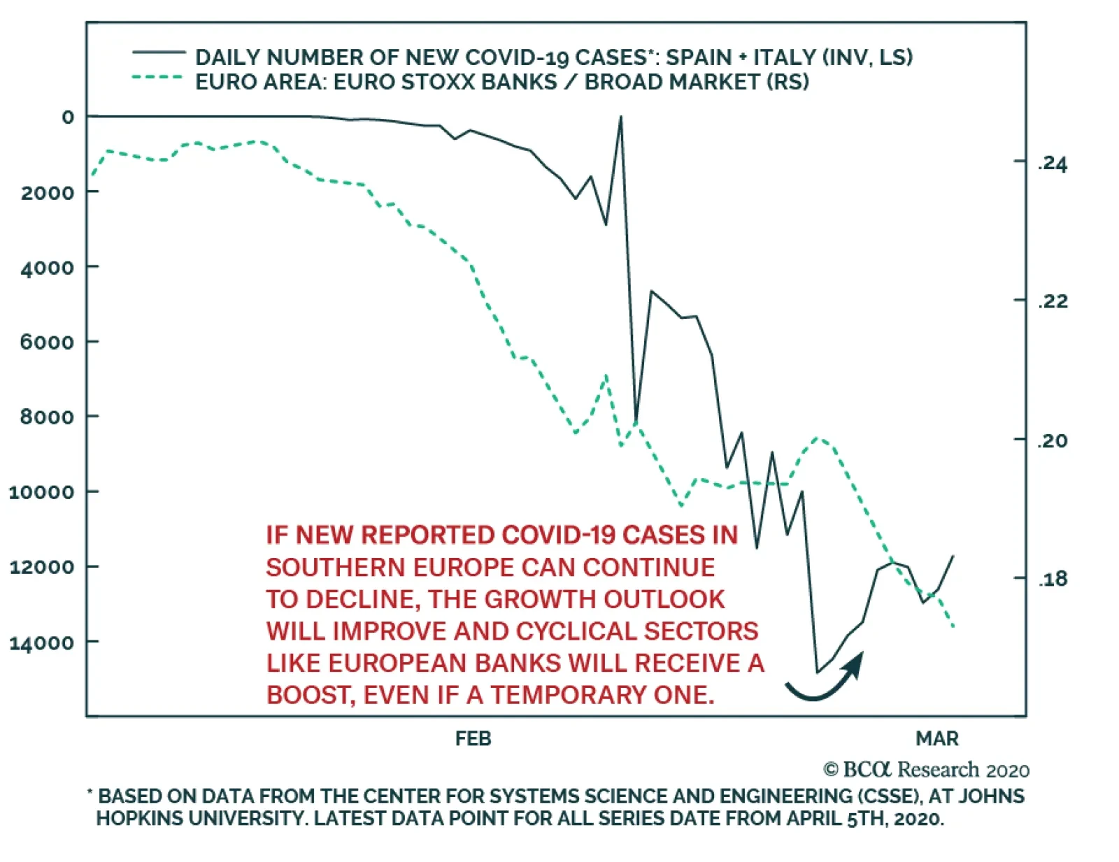
The number of newly reported cases of COVID-19 in Italy and Spain seems to have peaked 13 days ago. This by no means indicates that an end of the lockdowns is imminent, but if China’s experience is any guide, it suggests that we are finally getting closer to…
We have been closely monitoring the dynamics of the COVID-19 outbreak in Italy. If the containment of the virus can gather momentum, it could fuel the prospect that other Western countries can also gain control of the epidemic. The data on new infections…
Highlights The economic shutdown needed to exhaust the coronavirus pandemic must last much longer than is anticipated. For example, in Italy it must last 24 weeks. If the economy is reopened too soon, the pandemic will reignite in a second wave later this year, just as in 1918. Take the 12 percent profit in the tactical overweight to equities versus bonds and go neutral. Stay underweight European equities and euro area banks given their high sensitivity to the economy. Stay overweight US T-bonds versus German bunds and Swiss bonds. All high-quality bond yields will eventually reach the lower bound of -1 percent, making US T-bonds the most attractive in class. The euro is a structural overweight but a tactical neutral – because in equity market corrections the repatriation of foreign investments into domestic cash boosts the demand for dollars relative to the euro. Fractal trades: Go long Australia versus New Zealand. Short palladium versus nickel was closed at 32 percent profit. Feature “You’ve got to understand that you don’t make the timeline, the virus makes the timeline” – Dr. Anthony Fauci, Director of the National Institute of Allergy and Infectious Diseases It’s A Biological Crisis The coronavirus crisis is first and foremost a biological crisis. This makes it fundamentally different to the 2008 global financial crisis, the 2000 dot com bust, the 1990 Japanese crash, and the 1930s Great Depression – all of which were financial crises needing financial and economic cures. As such, the current crisis needs to be analysed very differently. Crucially, the financial and economic policy responses to the coronavirus crisis are only a palliative, not a cure. The cure is to exhaust the coronavirus pandemic. But to exhaust the pandemic without overburdening stretched healthcare systems will require shutting the economy for months. If the economy is reopened too soon, then the pandemic will reignite in a second and a possible third wave just as in 1918-19 (Chart of the Week). Chart I-1If The Economy Is Reopened Too Soon The Pandemic Will Reignite, Just As In 1918-19
If The Economy Is Reopened Too Soon The Pandemic Will Reignite, Just As In 1918-19
If The Economy Is Reopened Too Soon The Pandemic Will Reignite, Just As In 1918-19
The US fiscal stimulus package amounts to 10 percent of annual GDP. But if exhausting the pandemic requires a third of the economy to be shut for a third of the year, then the economy would lose one ninth, or 11 percent, of its annual output. Hence, despite the biggest fiscal boost of all time, the economy would end up shrinking (Chart I-2). Chart I-2Fiscal Stimulus Is Massive, But Might Not Be Enough
The Economy Must Shut For 24 Weeks
The Economy Must Shut For 24 Weeks
Meanwhile, Germany’s willingness to remove the ‘debt brake’ that limits its structural federal deficit to 0.35 percent of GDP, the willingness to issue euro ‘corona-bonds’, and the ECB’s willingness to increase the size and breath of its asset-purchase program are minor details in a much bigger story. Rather like rearranging the deckchairs on the Titanic. Ignore the minor details and concentrate on the bigger story. How long must the economy stay shut to exhaust the pandemic? The Crucial Metric Is Not Mortality, It Is Morbidity Some people counter that in shutting the economy, “the cure is worse than the disease”. They argue that most coronavirus victims suffer mild or no illness. Moreover, the mortality rate is low and might not be much higher than that of the flu. Even if this turns out to be true, the argument misses the point. Death requires very little medical intervention and resource, whereas severe illness requires massive medical intervention and resource. Moreover, when the severe illness is a respiratory illness, it leaves the sufferer struggling to breathe and needing ventilation in an intensive care unit (ICU). No civilized society can deny an ICU to somebody who is struggling to breathe. Therefore, the most important metric for the coronavirus crisis is not its mortality rate, but rather its morbidity (severe illness) rate. Or more specifically, the morbidity rate versus the economy’s ICU capacity. How long must the economy stay shut to exhaust the pandemic? Enter the Diamond Princess. The cruise ship turned into a laboratory for the coronavirus because all 3700 passengers and crew were quarantined and tested for the infection. Of the 700 people who tested positive, 11 have subsequently died. But the more important point is that 45 people needed ICU treatment, meaning the coronavirus morbidity rate was four times its mortality rate (Table I-1). Table I-1On The Diamond Princess, The COVID-19 Morbidity Rate Was Four Times Its Mortality Rate
The Economy Must Shut For 24 Weeks
The Economy Must Shut For 24 Weeks
A separate study by the Intensive Care National Audit & Research Centre in the UK corroborates this, suggesting that the coronavirus morbidity rate is around three times the mortality rate and that the average time in an ICU for a coronavirus patient is half a week.1 Let’s be optimistic and assume that the coronavirus mortality rate is around 0.3 percent and that its morbidity rate is around three times higher at 1 percent. This means that if a hundred thousand people get infected, one thousand will need ICU treatment. But even advanced economies have only a dozen or so ICU beds per hundred thousand people. For example, Italy has 12.5 (Chart I-3). Chart I-3Advanced Economies Have Only A Dozen Or So ICU Beds Per Hundred Thousand People
The Economy Must Shut For 24 Weeks
The Economy Must Shut For 24 Weeks
If each severely ill coronavirus patient averages half a week in an ICU, this means that only 2500 Italians out of hundred thousand, or 2.5 percent of the population, can get infected every week before the ICU capacity is breached. Northern Italy, specifically Lombardy, went into crisis because it allowed its coronavirus infection rate to breach its ICU capacity. Yet ‘flattening the curve’ of infections comes at a cost. Keeping the weekly infection rate below ICU capacity means that the infection rate must be suppressed for longer to achieve the holy grail of ‘herd immunity’. This is the point when around 60 percent of the population have caught the disease. To achieve herd immunity without breaching its ICU capacity, Italy would have to shut its economy for 24 weeks. Other economies might need less or more time depending on their own morbidity rates versus ICU capacity, but it would still be a minimum of many months. Meaning that the draconian measures that flatten the infection curve – quarantining, social distancing, and essentially shutting the economy – must also stay in place for many months after infection rates have stopped rising. Therein lies the big problem.2 If The Economy Reopens Too Soon The Pandemic Will Reignite A pandemic is a classic complex adaptive system. Its evolution depends on the sum of many millions of individual actions which themselves depend on the evolving pandemic data. When mortality, morbidity and infection rates are surging the public will sense an emergency, and so accept the loss of liberty and livelihood that comes from quarantining and shutting the economy. The result is that ‘R-nought’ – the number of people that each infected person infects – drops, which suppresses the pandemic. If the economy reopens too soon, the pandemic will reignite in a second wave. But once infection rates level off or reverse, the public’s sense of emergency dissipates. People push back against the continued loss of liberty and livelihood. As do policymakers, especially those seeking imminent re-election. The result is that R-nought reaccelerates. In fact, the emergency has not dissipated. Once R-nought reaccelerates, the large proportion of the population who have not been infected are sitting ducks for the virus. Therefore, if the economy reopens too soon, the pandemic will reignite in a second wave (Chart I-4). Chart I-4When A Large Proportion Of The Population Is Uninfected, ‘R-Nought’ Must Stay Low
The Economy Must Shut For 24 Weeks
The Economy Must Shut For 24 Weeks
History provides a salutary warning. During the 1918-19 pandemic, no US city experienced a second wave while its main battery of social distancing policies remained in place. Second waves only occurred after the city economies were reopened too soon.3 Implications For The Financial Markets The key message is that the economic shutdown must last longer than is anticipated. And that if the economy is reopened too soon, the pandemic will reignite in a second wave later this year. Therefore: 1. Move to neutral equities tactically: Our March 12 tactical recommendation to overweight equities versus bonds (long S&P500 versus German 30-year bund) achieved its 12 percent profit target and is now closed (Chart I-5). Chart I-5The Technical Rebound Has Happened As Predicted
The Technical Rebound Has Happened As Predicted
The Technical Rebound Has Happened As Predicted
2. Overweight equities on a long-term horizon: Investors with a 2 year or longer horizon beyond the pandemic should overweight equities versus bonds – because the prospective annualised return from equities, 6 percent, is much more attractive than that from bonds, 1 percent (Chart I-6 and Chart I-7). Chart I-6The Prospective Annual Return From Equities At 6 Percent…
The Prospective Annual Return From Equities At 6 Percent...
The Prospective Annual Return From Equities At 6 Percent...
Chart I-7...Is Much More Attractive Than 1 Percent From Bonds
...Is Much More Attractive Than 1 Percent From Bonds
...Is Much More Attractive Than 1 Percent From Bonds
3. Underweight European equities: Our 2020 recommendation to underweight the euro area relative to the US and Japan is providing rich rewards as the S&P 500 has outperformed by 8 percent, and the Nikkei 225 has outperformed by 10 percent. Given the economic sensitivity of the Eurostoxx 50, stay underweight. 4. Underweight euro area banks: Likewise, euro area banks have underperformed the market by almost 25 percent this year. But it is too soon to remove this underweight. 5. Overweight US T-bonds versus German bunds and Swiss bonds: The US 30-year T-bond has outperformed the German 30-year bund by 18 percent this year. Stick with this position. Ultimately, all high-quality bond yields are going to hit the lower bound of -1 percent, making US T-bonds the most attractive in class. 6. The euro is a structural overweight but a tactical neutral: The structural pecking order for currencies is the reverse of bonds. However, during equity market corrections the repatriation of foreign investments into domestic cash boosts the demand for dollars relative to other currencies. This warrants a tactically neutral stance to the euro. Fractal Trading System* The fractal trading system has performed very well during the recent crisis. Long S&P 500 versus the German 30-year bund delivered its 12 percent profit target. And short palladium versus nickel delivered its 32 percent profit target. This week’s recommended trade is to go long Australia versus New Zealand expressed through their MSCI (US$) indexes. The profit target is 12 percent with a symmetrical stop-loss. The rolling 12-month win ratio now stands at 64 percent. Chart I-8Australia Vs. New Zealand
Australia Vs. New Zealand
Australia Vs. New Zealand
When the fractal dimension approaches the lower limit after an investment has been in an established trend it is a potential trigger for a liquidity-triggered trend reversal. Therefore, open a countertrend position. The profit target is a one-third reversal of the preceding 13-week move. Apply a symmetrical stop-loss. Close the position at the profit target or stop-loss. Otherwise close the position after 13 weeks. * For more details please see the European Investment Strategy Special Report “Fractals, Liquidity & A Trading Model,” dated December 11, 2014, available at eis.bcaresearch.com. Dhaval Joshi Chief European Investment Strategist dhaval@bcaresearch.com Footnotes 1 Source: ICNARC report on COVID-19 in critical care, 27 March 2020 2 If 60 percent are infected, then 0.6 percent would require an ICU. This equates to 600 people out of a hundred thousand for whom there are 12.5 ICUs. If the average stay in the ICU is half a week, this would require 600/12.5 half weeks, or 0.5*600/12.5 full weeks = 24 weeks. 3 Source: Public health interventions and epidemic intensity during the 1918 influenza pandemic; Hatchett, Mecher, and Lipsitch Fractal Trading System
The Economy Must Shut For 24 Weeks
The Economy Must Shut For 24 Weeks
The Economy Must Shut For 24 Weeks
The Economy Must Shut For 24 Weeks
Cyclical Recommendations Structural Recommendations
The Economy Must Shut For 24 Weeks
The Economy Must Shut For 24 Weeks
The Economy Must Shut For 24 Weeks
The Economy Must Shut For 24 Weeks
The Economy Must Shut For 24 Weeks
The Economy Must Shut For 24 Weeks
The Economy Must Shut For 24 Weeks
The Economy Must Shut For 24 Weeks
Closed Trades Asset Performance Currency & Bond Equity Sector Country Equity Indicators Bond Yields Indicators To Watch - Bond Yields
Indicators To Watch - Bond Yields
Indicators To Watch - Bond Yields
Indicators To Watch - Bond Yields
Indicators To Watch - Bond Yields
Indicators To Watch - Bond Yields
Indicators To Watch - Bond Yields
Indicators To Watch - Bond Yields
Indicators To Watch - Bond Yields
Indicators To Watch - Bond Yields
Indicators To Watch - Bond Yields
Indicators To Watch - Bond Yields
Interest Rate Indicators To Watch - Interest Rate Expectations
Indicators To Watch - Interest Rate Expectations
Indicators To Watch - Interest Rate Expectations
Indicators To Watch - Interest Rate Expectations
Indicators To Watch - Interest Rate Expectations
Indicators To Watch - Interest Rate Expectations
Indicators To Watch - Interest Rate Expectations
Indicators To Watch - Interest Rate Expectations
Indicators To Watch - Interest Rate Expectations
Indicators To Watch - Interest Rate Expectations
Indicators To Watch - Interest Rate Expectations
Indicators To Watch - Interest Rate Expectations
Highlights Recommended Allocation
Quarterly Portfolio Outlook: Playing The Optionality
Quarterly Portfolio Outlook: Playing The Optionality
The outlook for markets over the next few months is highly uncertain. On the optimistic side, new COVID-19 cases are probably close to peaking (for now), and so equities could continue to rally. But there are many risks too. Growth numbers will be horrendous for some months. Second-round effects (corporate defaults, problems in EM and with euro zone banks, for example) will emerge. We recommend a balanced portfolio, robust both for risk-on rallies and a further sell-off. We stay overweight equities versus bonds. Government bonds will not provide significantly positive returns even in a severe recession. Thus, over the next 12-months, equities are likely to outperform them. But we leaven the equity overweight with a “minimum volatility” strategy, overweight the low-beta US market, and more stable sectors such as Healthcare and Technology. Within bonds, we stay underweight government bonds, and raise Investment Grade credit to overweight, given the Fed’s backstop. Even in a risk-on rally, government yields will not rise quickly so we recommend a neutral stance on duration. The massive stimulus will eventually be inflationary, so we recommend TIPS, which are very cheaply valued. We are overweight cash and gold as hedges against further market turbulence. Among alternatives, macro hedge funds and farmland look attractively defensive now. We would start to look for opportunities in private debt (especially distressed debt) as the recession advances. Commodity futures are attractive as an inflation hedge. Overview Playing The Optionality From the start of the crisis, we argued that markets would bottom around the time when new cases of COVID-19 peaked. At the end of March, there were clear signs that this would happen in April, with Italy and Spain having probably already peaked and the US, if it follows the same trajectory, being only two or three weeks away (Chart 1). Chart 1Close To A Peak In New Cases?
Quarterly Portfolio Outlook: Playing The Optionality
Quarterly Portfolio Outlook: Playing The Optionality
But what happens next? A relief rally is likely, as often happens in bear markets – and indeed one probably started with the three-day 18% rise in US equities in the last week of March. Note, for example, the strong rallies in spring 2008 and summer 2000 before the second leg down in those bear markets (Chart 2). Chart 2Mid Bear Market Rallies Are Common
Mid Bear Market Rallies Are Common
Mid Bear Market Rallies Are Common
However, there is still a lot of potential bad news for markets to digest. Global growth has collapsed, as a result of people in many countries being forced to stay at home. US GDP growth in Q2 could fall by as much as 10% quarter-on-quarter (unannualized). Horrendously bad data will come as a shock to investors over the coming months. Despite the unprecedented stimulus measures from central banks and governments worldwide (Chart 3), nasty second-round effects are inevitable. Given the high level of corporate debt in the US, defaults will rise, to perhaps above the level of 2008-9 (Chart 4). EM borrowers have almost $4 trillion of foreign-currency debt outstanding, and will struggle to service this after the rise in the dollar and wider credit spreads. Euro area banks are poorly capitalized and have high non-performing debt levels left over from the last recession; they will be hit by a new wave of bankruptcies. Undoubtedly, there are some banks and hedge funds sitting on big trading losses after the drastic sell-off and stomach-churning volatility. Mid-East sovereign wealth funds will unload more assets to fill fiscal holes left by the collapsed oil price. Chart 3Massive Stimulus Everywhere
Quarterly Portfolio Outlook: Playing The Optionality
Quarterly Portfolio Outlook: Playing The Optionality
Chart 4Possible Second-Round Effects
Possible Second-Round Effects
Possible Second-Round Effects
There is also the question of when the pandemic will end. We are not epidemiologists, so find this hard to judge (but please refer to the answers from an authority in our recent Special Report1). The coronavirus will disappear only when either enough people in a community have had the disease to produce “herd immunity,” or there is a vaccine – which is probably 18 months away. Some epidemiologists argue that in the UK and Italy 40%-60% of the population may have already had COVID-19 and are therefore immune.2 But an influential paper from researchers at Imperial College suggested that repeated periods of lockdown will be necessary each time a new wave of cases emerges3 (Chart 5). Chart 5More Waves Of The Pandemic To Come?
Quarterly Portfolio Outlook: Playing The Optionality
Quarterly Portfolio Outlook: Playing The Optionality
At the end of March, global equities were only 23% off their mid-February record high – and were down only 34% even at their low point. That doesn’t seem like enough to fully discount all the potential pitfalls over coming months. This sort of highly uncertain environment is where portfolio construction comes in. We recommend that clients position their portfolios with optionality to remain robust in any likely outcome. There are likely to be rallies in risk assets over coming months, particularly when the coronavirus shows signs of petering out. There is significant asymmetric career risk for portfolio managers here. No portfolio manager will be fired for missing the pandemic and underperforming year-to-date (though some may because their firms go out of business or retrench). But a PM who misses a V-shaped rebound in risk assets over the rest of the year could lose their job. This will provide a strong incentive to try to pick the bottom. Chart 6Bond Yields Can't Go Much Lower
Bond Yields Can't Go Much Lower
Bond Yields Can't Go Much Lower
Government bond yields are close to their theoretical lows. The 10-year US Treasury yield is 0.6% and it unlikely to fall below 0% even in a severe recession (since the Fed has stated that it will not cut short-term rates below 0%). In other countries, the low for yields has turned out to be around -0.3% to -0.9% (Chart 6). The total return from risk-free bonds, therefore, will be close to zero even in a dire economic environment (Table 1). This means that the call between bonds and equities comes down to whether equity prices will be higher or lower in 12-months. Quite likely, they will be higher. Given this, and the optionality of participating in rebounds, we maintain our overweight on equities versus bonds. We would, however, be inclined to lower our equity weighting in the event of a big rally in stocks over the next few months. Table 1Not Much Room For Upside From Bonds
Quarterly Portfolio Outlook: Playing The Optionality
Quarterly Portfolio Outlook: Playing The Optionality
Table 2Bear Markets Are Often Much Worse
Quarterly Portfolio Outlook: Playing The Optionality
Quarterly Portfolio Outlook: Playing The Optionality
But there are also many downside risks. In the past two recessions, global equities fell by 50%-60% (Table 2). Despite the much worse economic environment this time, the peak-to-trough decline is so far much more limited. Moreover, valuations are not particularly compelling yet (Chart 7). To leaven our overall overweight on equities, we recommend a “minimum volatility” strategy, with tilts towards the low-beta US market, and some more defensive sectors such as Healthcare and Technology. China and China-related stocks also look somewhat attractive, since that country got over the coronavirus first, and is responding with a big increase in infrastructure spending (Chart 8). To hedge against downside risk, we also leave in place our overweights in cash and gold. Chart 7Equities Are Not Yet Super Cheap
Equities Are Not Yet Super Cheap
Equities Are Not Yet Super Cheap
Chart 8China Infra Spending To Rise
China Infra Spending To Rise
China Infra Spending To Rise
Garry Evans, Senior Vice President Chief Global Asset Allocation Strategist garry@bcaresearch.com What Our Clients Are Asking – About The Coronavirus Have We Seen The Bottom In Equity Markets? Chart 9Watch Closely COVID-19
Quarterly Portfolio Outlook: Playing The Optionality
Quarterly Portfolio Outlook: Playing The Optionality
After hitting a low on March 23, global equities have recovered more than one-third of their loss during this particularly rapid bear market, in response to the massive monetary and fiscal stimulus around the globe. It’s very hard to pinpoint the exact bottom of any equity bear market. The current one is particularly difficult in two ways: First, it was largely due to the exogenous shock from the COVID-19 pandemic. If history is any guide, we will first need to see a peak in infected cases globally before we can call a true bottom in equities (Chart 9). Second, the massive and coordinated response from central banks and governments around the world is unprecedented, as the global “lockdown” freezes the global economy. It’s encouraging to see the Chinese PMI bouncing back to 52 in March after a sharp drop to deep contraction level in February. However, the bounce back was mostly from production. Both export orders and imports remain weak. US initial jobless claims have skyrocketed to 3.3 million. If the peak of infection in the US follows similar patterns in China and Italy, then it would be another encouraging sign even if the US economic data continued to get worse. BCA Research’s base-case is for this recession to have a U-shaped recovery. This means that equity markets are likely to be range bound until we have a better handle on the future course of the pandemic. As such, we suggest investors actively manage risk by adding to positions when the S&P 500 gets close to 2250 and reducing risk when it gets close to 2750 during the bottoming process. What Will Be The Long-Term Consequences? Maybe it seems too early to think about this, but the coronavirus pandemic will change the world at least as profoundly as did the 1970s inflation, 9/11, and the Global Financial Crisis (GFC). Here are some things that might change: Chart 10Government Debt Will Rise Significantly
Government Debt Will Rise Significantly
Government Debt Will Rise Significantly
Government debt levels will rise dramatically, as a result of the huge fiscal packages being (rightly) implemented by many countries. In the US, after the $2 trillion spending increase and a fall in tax revenues, the annual fiscal deficit will rise from 6% of GDP to 15%-20%. Government debt/GDP could exceed the 122% reached at the end of WW2 (Chart 10). Ultimately, central banks will have to monetize this debt, perhaps by capping long-term rates or by buying a substantial part of issuance. This could prove to be inflationary. Households and companies may want to build in greater cushions and no longer live “on the edge”. US households have repaired their balance-sheets since 2009, raising the savings rate to 8% (Chart 11). But surveys suggest that almost one-third of US households have less than $1,000 in savings. They may, therefore, now save more. This could depress consumption further in coming years. Companies have maximized profitability over the past decades, under pressure from shareholders, by keeping inventories, spare cash, and excess workers to a minimum. Given the sudden stop caused by the pandemic (and who is to say that there will not be more pandemics in future), companies may want to protect themselves from future shocks. The inventory/sales ratio, which had been falling for decades, has picked up a little since the GFC (Chart 12). Inventory levels are likely to be raised further. Companies may also run less leveraged balance-sheets, rather than hold the maximum amount of debt their targeted credit rating can bear. This is all likely to reduce long-term profit growth. Chart 11Households May Become Even More Cautious
Households May Become Even More Cautious
Households May Become Even More Cautious
Chart 12Companies Will Run With Higher Inventories
Companies Will Run With Higher Inventories
Companies Will Run With Higher Inventories
The pandemic has highlighted the vulnerability of healthcare systems. China still spends only 5% of GDP on health, compared to 9% in Brazil and 8% in South Africa (Chart 13). The lack of intensive care beds and woefully inadequate epidemic plans in the US and other developed countries will also need to be tackled. Healthcare stocks should benefit. Chart 13Healthcare Spending Will Need To Rise
Healthcare Spending Will Need To Rise
Healthcare Spending Will Need To Rise
How Risky Are Euro Area Banks? Chart 14Euro Area Banks Are Quite Fragile
Euro Area Banks Are Quite Fragile
Euro Area Banks Are Quite Fragile
Banks in the euro area have underperformed their developed market peers by over 65% since the Global Financial Crisis (GFC) (Chart 14, panel 1). Their structural issues – many of which we highlighted in a previous Special Report – remain unsolved. Euro area banks remain highly leveraged compared to their US counterparts (panel 2). Their exposure to emerging economies is high (panel 3), and they continue to be a major provider of European corporate funding. US corporates, by contrast, are mainly funded through capital markets. The sector is also highly fragmented with both outward and inward M&A activity declining post the GFC. Profitability continues to be a key long-term concern, despite having recently stabilized (panel 4). The ECB’s ultra-dovish monetary stance and negative policy rates do not help banks’ performance either. Banks’ relative return has been correlated to the ECB policy rate since the GFC (panel 5). Following the coronavirus outbreak, the ECB is likely to remain dovish for a prolonged period. The ECB’s recently announced measures should, however, provide banks with ample liquidity to hold and spur economic activity through increased lending to households and corporates. Absent consolidation in the European banking sector, competition is likely to dampen banks’ profits. Additionally, the severity of the economic downturn caused by the coronavirus outbreak will determine if their significant exposure to emerging economies, the energy sector, and domestic corporates will hurt them further. For now, we would recommend investors underweight euro area banks. Where Can I Get Income In This Low-Yield World? Chart 15The Bear Market Has Unveiled Attractive Income Opportunities
The Bear Market Has Unveiled Attractive Income Opportunities
The Bear Market Has Unveiled Attractive Income Opportunities
For long-term investors who can tolerate price volatility, there is currently an opportunity to invest in high-income securities at relatively cheap prices. Below we list three of our favorite assets to obtain income returns: Dividend Aristocrats: The S&P 500 Dividend Aristocrats Index is composed of S&P 500 companies which have increased dividend payouts for 25 consecutive years or more. In order to provide such a steady stream of income through a such long timeframe, and even provide dividend increases in recessions, the companies in this index need to have a track record of running cashflow-rich businesses. Thus, the risk of dividend cuts is relatively low in these companies. Currently, the Dividend Aristocrat Index has a trailing dividend yield of 3.2% (Chart 15 – top panel). Fallen Angels: As we discussed in our November Special Report, fallen angels have attractive characteristics that separate them from the rest of the junk market. They tend to have longer maturities as well as a higher credit quality than the overall index. Crucially, fallen angels often enter the high-yield index at a discount, since certain institutional investors are forced to sell them when they are no longer IG-rated (middle panel). Thus, selected fallen angels which are not at a substantial risk of default could be a tremendous income opportunity. Currently fallen angels have a yield to worst of 10.65%. Sovereign US dollar EM debt: Our Emerging Markets Strategy service has argued that most EM sovereigns are unlikely to default on their debts, and instead will use their currencies as a release valve to ease financial conditions in their economies. Thus, hard-currency sovereign issues could prove to be attractive income investments if held to maturity. The bottom panel of Chart 15 (panel 3) shows the current yield-to-worst of the EM sovereign hard currency debt that has an overweight rating by our Emerging Markets service. Global Economy Chart 16The Collapse Begins
The Collapse Begins
The Collapse Begins
Overview: The global economy in early January looked on the cusp of a strong manufacturing pickup, driven by the natural cycle and by moderate fiscal stimulus out of China. The coronavirus changed all that. We now face a recession of a severity unseen since the 1930s. The fiscal and monetary response has been similarly rapid and radical. This will tackle immediate liquidity and even solvency risks. But, with consumers in many countries confined to their homes, a recovery is entirely dependent on when the number of new cases of COVID-19 peaks. In an optimistic scenario, this might be in late April or May. On a pessimistic one, the pandemic will continue in waves for several quarters. US: It is highly likely that the NBER will eventually declare that the US entered recession in March 2020. With many states in lockdown, consumption (which comprises 70% of GDP) will slump: only half of consumption is non-discretionary (rent, food, utility bills etc.); the other half is likely to shrink significantly while lockdowns continue. Judged by the 3.3 million initial claims in the week of March 16-21, unemployment will jump from its February level of 3.5% very rapidly towards 10%. Fiscal and monetary stimulus measures will cushion the downside (enabling households to pay rent and companies to service debt). But whether the recession is V-shaped or prolonged will be dependent on the length of the pandemic. Euro Area: European manufacturing growth was showing clear signs of picking up before the coronavirus pandemic hit (Chart 16 panel 1). But lockdowns in Italy, Spain and other countries will clearly push growth way into negative territory. The severity is clear from the first datapoints to reflect March activity, such as the ZEW survey. The ECB, after an initially disappointing response, has promised EUR750 billion (and more if needed) in bond purchases. The fiscal response so far has been more lukewarm, although Germany has now scrapped its requirement to run a budget surplus. One key question: will the stronger nothern European economies agree to “euro bonds”, joint and severally guaranteed, to finance fiscal spending in the weaker periphery? Chart 17...With Chinese Data Leading The Way
...With Chinese Data Leading The Way
...With Chinese Data Leading The Way
Japan: Japan’s economy was performing poorly even before the coronavirus pandemic, mainly because of the side-effects of last October’s consumption tax hike, and the slowdown in China (Chart 17, panel 2). So far, Japan has seen fewer cases of COIVD-19 than other large countries, but this may just reflect a lack of testing. Japan also has less room for policy response. Government debt is already 250% of GDP. The Bank of Japan has moderately increased purchases of equity ETFs and remains committed to maintaining government bonds yields around 0%. But Japan seems culturally and institutionally unable to roll out the sort of ultra-radical measures taken in other developed economies. Emerging Markets: China’s economy was severely disrupted in January and February, as reflected in an unprecedented collapse of the Caixin Services PMI to 26.5 (Chart 17, panel 3). However, big data (such as traffic congestion) suggest that in March people were gradually returning to work and companies restarting manufacturing operations. Q1 GDP growth will clearly be negative, and growth for the year may be barely above 0%. The authorities are ramping up infrastructure spending, which BCA expects to grow by 6-8% this year.4 Interest rates have also fallen below their 2015 levels, but not yet to their 2009 lows. Both fiscal and monetary policy are likely to be eased further. Elsewhere in Emerging Markets, the key question is whether central banks will cut rates to support rapidly weakening economies, or keep rates steady to prop up collapsing currencies. This is not an easy choice. Interest Rates: Central banks in developed markets have cut rates to their lowest possible levels with the Fed, for example, slashing from 1.25%-1.5% to 0%-0.25% within just 10 days in March. The Fed has signalled that it will not go below zero. Short-term policy rates globally, therefore, have essentially hit their lower bounds. Long-term rates have been volatile, with the 10-year US Treasury yield swinging down to 0.6% before jumping to 1.2%. While uncertainty continues, long-term risk-free rates are unlikely to rise substantially and, in the event of a prolonged severe recession, we would see the US 10-year yield falling to zero – but no lower. Global Equities Chart 18Is The V-Shaped Recovery Sustainable?
Quarterly Portfolio Outlook: Playing The Optionality
Quarterly Portfolio Outlook: Playing The Optionality
What’s Next? Global equities lost 32.8% year-to-date as of March 23, 2020. All countries and sectors in our coverage were in the red. Even the best performing country (Japan) and the best performing global sector (Consumer Staples) lost 26.7% and 23.2% respectively. From March 24 to March 26, however, equities made the best three-day gains since the Great Depression, recouping about one-third of the loss, even though US initial jobless claims came in at 3.3 million and also the US reported a higher number of cumulative infected people than China, with a much higher number of deaths per million people (Chart 18). So have we reached the bottom of the bear market? Is this “V-shaped” recovery sustainable? How should an investor construct a multi-asset global portfolio that’s sound for the next 9-12 months given the uncertainty associated with COVID-19 and the massive monetary and fiscal stimulus around the world? Based on our long-held philosophy of taking risks where risks will most likely be rewarded, we are most comfortable taking risk at the asset class level, by overweighting equities versus bonds, together with overweights in cash and gold as hedges. Within the equity portfolio, we are reducing risk by making the following adjustments: Upgrade US to overweight from underweight financed by downgrading the euro zone to underweight from overweight. Upgrade Tech to overweight, while closing two overweight bets on Financials and Energy and one underweight on consumer staples to benchmark weighting. Country Allocation: Becoming More Defensive Chart 19US And Euro Area: Trading Places
US And Euro Area: Trading Places
US And Euro Area: Trading Places
In December 2019 we added risk by upgrading the euro area to overweight and Emerging Markets to neutral based on our macro view that the global economy was on its way to recovery. Data releases in January did show signs of recovery in the global economy. However, the COVID-19 outbreak has changed the global landscape, and we are clearly in a recession now. When conditions change, we change our recommendations. We must make a judgment call because the economic data will not give us any timely, useful readings for some time to come. Back in December, the key reason to upgrade the euro area was the recovery of China which flows into the exports of the euro area. We think China will continue to stimulate its economy. However, given the global growth collapse, the “flow through” effect to the euro area will be delayed for some time. We prefer to play the China effect directly rather than indirectly. That’s why we maintain the neutral weighting of EM versus DM, but downgrade the euro area to underweight, and upgrade US to overweight. We also note the two following factors: First, as shown in Chart 19, panel 1, the relative performance between the euro area and the US is highly correlated with the relative performance between global Financials and Technology. This is not surprising given the sector composition of the two region’s equity indices. As such, this country adjustment is in line with our sector adjustment of upgrading Technology and downgrading Financials. Second, with a lower beta, US equities provide a better defense when economic uncertainty and financial market volatility are high. The risk to this adjustment, however, is valuation. As shown in panel 4, euro area valuation is extremely cheap compared to the US. However, PMI releases as well as forward earnings estimates are likely to get worse again before they get better, given the region’s reliance on exports to China and the structural issues in its banking system. Global Sector Allocation: Getting Closer To Benchmark Chart 20Reducing Sector Bets
Reducing Sector Bets
Reducing Sector Bets
We make four changes in the global sector portfolio to reduce sector bets, since we do not have a high conviction given market volatility and our house view that recovery out of this recession will be U-shaped. These are downgrading Financials to neutral, while upgrading Technology to overweight. We also close the overweight in Energy and underweight in Consumer Staples, leaving them both at benchmark weighting. Financials: We upgraded Financials in October last year as an upside hedge. This move did not pan out as bond yields plummeted. BCA Research’s US Bond Strategy service upgraded duration to neutral from underweight on March 10 as they do not see a high likelihood for yields to move significantly higher over the next 9-12 months. This does not bode well for Financials’ performance (Chart 20, panel 1). Even though the Fed and other central banks have come in as the lenders of last resort, loan growth could be weak going forward and non-performing loans could increase, especially in the euro area. Valuation, however, is very attractive. Technology: DRAM prices started to improve even before the COVID-19 outbreak. The global lockdown to fight against the pandemic is further spurring demand for both software and hardware, which should support better earnings growth (panel 2). The risk is that relative valuation is still not cheap, even though absolute valuation has come down after the recent selloff. Energy: The outlook for oil prices is too uncertain. The fight between Saudi Arabia and Russia is weighing on the supply side, while the global lockdown is denting demand prospect. The earnings outlook for energy companies is dire, while valuations are very attractive (panel 3). Consumer Staples: This is a classic defensive sector that does well in recessions. In addition, its relative valuation has improved to neutral from very expensive (panel 4). Government Bonds Chart 21Stay Aside On Duration
Stay Aside On Duration
Stay Aside On Duration
Upgrade Duration To Neutral. Global bond yields had a wild ride in Q1 as equities plummeted into bear market territory. The 10-year US Treasury yield made an historical low of 0.32% overnight on March 9, then quickly reversed back up to 1.27% on March 18, closing the quarter at 0.67%, compared to 1.88% at the beginning of the quarter (Chart 21). We are already in a recession and BCA’s house view is for a U-shaped recovery. This implies that global bond yields will likely follow a bottoming process similar to global equities, as new infections peak and high-frequency economic data start to recover. As such, we upgrade our duration call to neutral, to be in line with the position of BCA Research’s US Bond Strategy (USBS) service. Favor Linkers Vs. Nominal Bonds. The combined effect of the plummet in oil prices and the coronavirus outbreak has crushed inflation expectation to an extremely low level. As shown in Chart 22, the 10-year breakeven inflation rate is currently at 0.95%, 88 bps lower than its fair value. The fair value is estimated based on USBS’s Adaptive Expectations Model. Investors with a 12-month investment horizon should continue to favor TIPS over nominal Treasuries, but those with shorter horizons may be advised to stand aside and wait for the daily number of new COVID-19 cases to reach zero before re-initiating the position. Chart 22TIPS Offer A Ton Of Long-Run Value Extremely Cheap Inflation Protection
TIPS Offer A Ton Of Long-Run Value Extremely Cheap Inflation Protection
TIPS Offer A Ton Of Long-Run Value Extremely Cheap Inflation Protection
Corporate Bonds Chart 23High Quality Junk
High Quality Junk
High Quality Junk
It is undeniable that the dearth of cashflow caused by the lockdowns will spur a ferocious wave of defaults, particularly in the high-yield sector. It also is not clear that this risk is adequately compensated for. Currently, our US bond strategist believes that spreads are pricing an 11% default rate – in line with the default rate of the 2000/2001 recession. While it is not our base case, a default cycle like 2008, where 14% of companies in the index defaulted is a very clear possibility, as revenues have ground to a halt. However, several positive factors in the junk space must also be considered. Roughly 1% of the high-yield index matures in less than one year, which means that refinancing risk for junk credits should remain relatively subdued (Chart 23, top panel). Moreover, the quality of junk bonds is relatively high compared to previous periods of stress: when the market peaked in 2000 and 2007, Ba-rated credit (the highest quality of high yield) stood at 30% and 37% of the overall index respectively (middle panel). Today this credit quality stands at 49% of the high yield market, indicating a relatively healthier credit profile for junk. Additionally, the high-risk energy sector, which is likely to experience a substantial amount of defaults given the collapse in oil prices, now represents less than 8% of the market capitalization of the whole index (bottom panel). Taking these positive factors into consideration, we believe that a downgrade to underweight is not warranted, and instead we are downgrading high-yield credit from overweight to neutral. What about the investment-grade space? the massive stimulus package announced by the Fed, which effectively allows IG issuers to roll over their entire stock of debt, should provide a backstop to this market. One valid concern is that credit agencies can still downgrade a large number of issuers, making them ineligible to receive support. However, it seems that the credit agencies are aware of how much hinges on their ratings, and are communicating that they will factor the measures taken by various government programs into their credit analysis.5 Thus, considering that spreads are already extended, the Fed is providing unprecedent support and credit agencies are unlikely to knock out many companies out of investment-grade ratings, we are upgrading investment-grade credit from neutral to overweight. Commodities Chart 24Oil Prices & Politics Do Not Mix
Oil Prices & Politics Do Not Mix
Oil Prices & Politics Do Not Mix
Energy (Overweight): Oil markets were driven by supply/demand dynamics until a third factor, politics, shifted the market equilibrium. The recent clash between Saudi Arabia and Russia led to the breakdown of the OPEC 2.0 coalition and to Brent prices tanking by over 60% to $26 in March. The length of this breakdown is unknown. However, we believe the parties are likely to return to the negotiation table within the next months as the damage to countries which are dependent on oil begins to appear. The fiscal budget breakeven point remains much higher than the current oil price – it is around $83 for Saudi Arabia and $47 for Russia. Weakness in global crude demand will continue to put further downward pressure on prices, until economic activity recovers from the COVID-19 slowdown. Our Commodity & Energy Strategists expect the Brent crude oil price to average $36/bbl, with WTI trading some $3-$4 below that, in 2020 (Chart 24, panels 1 & 2). Industrial Metals (Neutral): Industrial metals prices were on track to pick up until the coronavirus hit global activity at the beginning of the year. Prices face further short-term headwinds as global manufacturing remains suppressed. Once the global social distancing ends and activity resumes, industrial metal prices should pick up as fiscal stimulus and infrastructure spending, especially in China, is implemented (panel 3). Precious Metals (Neutral): As the coronavirus spread, global risk assets have tumbled. Over the past 12 months, we have recommended investors increase their allocation to gold as both an inflation hedge and a beneficiary of accommodative monetary policy globally. However, we also recently highlighted that gold was reaching overbought territory and that a pullback was possible in the short-term. Nevertheless, investors should continue to maintain gold exposure to hedge against the eventuality that the pandemic is not contained within the coming weeks (panels 4 & 5). Currencies Chart 25Competing Forces Pushing The US Dollar In Different Directions
Competing Forces Pushing The US Dollar In Different Directions
Competing Forces Pushing The US Dollar In Different Directions
The USD has gone through a rollercoaster during the coronavirus crisis. Initially, the DXY fell by 4.8%, as rate differentials moved violently against the dollar when the Fed cut rates to zero. But this fall didn’t last long: as liquidity dried up, the cost for dollar funding surged, causing the dollar to skyrocket by almost 8.3%. Since then, the liquidity measures taken by monetary authorities have made the dollar reverse course once more. At this point there are multiple forces pulling the greenback in opposing directions. On the one hand, the collapse in global growth caused by the shutdowns should push the dollar higher. Moreover, momentum – one of the most reliable directional indicators for the dollar – continues to point to further upside (Chart 25, panels 1 and 2). However, the Fed’s generous USD swap lines with other major central banks as well as the massive pool of liquidity deployed have already stabilized funding costs in European and British currency markets, and look poised to do the same in others (Chart 25, panel 3). Thus, since there is no clarity on which force will prevail in this tug of war, we are remaining neutral on the US dollar. That being said, long-term investors can begin to buy some of the most depressed currencies, such as AUD/USD. This cross is currently trading at a 12% discount to PPP according to the OECD – the steepest discount that this currency has had in 17 years. Additionally, our China Investment Strategy projects that China will accelerate infrastructure investment this year to counteract the negative economic effects of the lockdown. This pick up in investment should increase base-metal demand, proving a boost to the Australian dollar in the process. Alternatives Chart 26Favor Macro Hedge Funds Over Private Equity During Recessions
Favor Macro Hedge Funds Over Private Equity During Recessions
Favor Macro Hedge Funds Over Private Equity During Recessions
Intro: The coronavirus outbreak caused tremendous market volatility and huge declines in liquid assets. Many clients have asked over the past few weeks which illiquid assets make sense in the current environment. To answer that, we stick to our usual recommendation framework, dividing illiquid assets into three buckets: Return Enhancers: Over the past year, we have been recommending clients to pare back private-equity exposure and increase allocation to hedge funds – particularly macro hedge funds, which often outperform other risky alternative assets during economic slowdowns and recessions (Chart 26, panel 1). Private debt – particularly distressed debt – could become a beneficiary of the current environment. The market turmoil will leave some assets heavily discounted, which can provide an opportunity for nimble funds to make investments at attractive valuations. In a previous Special Report, we highlighted Business Development Companies (BDCs) as a liquid alternative to direct private lending.6 They have taken a hit over the past month, even compared to equities and junk bonds. However, their recovery as markets bottom is usually significant (panels 2 & 3). Inflation Hedges: The coordinated “whatever-it-takes” stance implemented by global governments and central banks to mitigate the coronavirus crisis is likely to have inflationary consequences in the long-term. In that environment, investors should favor commodity futures over real estate (panel 4). As global growth reaccelerates in response to stimulus and resumed manufacturing activity over the next 12 months, the USD should weaken, and commodity prices should rise. Volatility Dampeners: Timberland and farmland remain our long-time favorite assets within this bucket. We have previously shown that both assets outperform other traditional and alternative assets during recessions and equity bear markets (panel 5). Farmland particularly should fare well in this environment, being more insulated from the economy, given food’s inelastic demand Risks To Our View Chart 27Dollar Would Fall In A Strong Recovery
Dollar Would Fall In A Strong Recovery
Dollar Would Fall In A Strong Recovery
Since our recommendations are based on a middle course, hedging both upside and downside risks, we need to consider how extreme these two eventualities could be. On the upside, the most optimistic scenario would be one in which the coronavirus largely disappears after April or May. The massive amount of fiscal and monetary stimulus would produce a jet-fuelled rally in risk assets. The dollar has soared over the past few weeks, as a risk-off currency (Chart 27), and would likely fall sharply. This would be very positive for commodities and Emerging Markets assets. The strong cyclical recovery would also help euro zone and Japanese equities relative to the more defensive US. Value stocks and small caps would outperform. Chart 28Could It Get Worse Than 2008 - Or Even 1932?
Could It Get Worse Than 2008 - Or Even 1932?
Could It Get Worse Than 2008 - Or Even 1932?
Downside risks are less easy to forecast. As Warren Buffet wrote in 2002: “you only find out who is swimming naked when the tide goes out.” The shock to the system caused by the coronavirus is certainly larger than the Global Financial Crisis of 2007-9 and could approach that caused by the Great Depression (Chart 28), though hopefully without the egregious policy errors of the latter. It is hard, therefore, to know where problems will emerge: US corporate debt, EM borrowers, and euro zone banks would be our most likely candidates. But there could be others. The oil price is another key uncertainty. Demand could collapse by at least 10% as a result of the severe recession. The breakdown of the production agreement between Saudi Arabia and Russia could produce a supply increase of 4-5%. Given this, Brent crude would fall to $20 a barrel. That would represent a strong tailwind to global recovery (Chart 29). On the other hand, a rapprochement between Saudi and Russia (and even with regulators in Texas) could push oil prices back up again – a positive for markets such as Canada and Mexico. Chart 29Cheap Oil Boosts Growth
Cheap Oil Boosts Growth
Cheap Oil Boosts Growth
Footnotes 1 Please see BCA Special Report, "Questions On The Coronavirus: An Expert Answers," dated 31 March 2020, available at bcaresearch.com 2 https://www.medrxiv.org/content/10.1101/2020.03.24.20042291v1 3 https://www.imperial.ac.uk/media/imperial-college/medicine/sph/ide/gida-fellowships/Imperial-College-COVID19-NPI-modelling-16-03-2020.pdf 4 Please see China Investment Strategy Weekly Report, “Chinese Economic Stimulus: How Much For Infrastructure And The Property Market,” dated 25th March 2020, available at cis.bcaresarch.com 5 A release by Moody’s on March 25 stated that their actions “will be more tempered for higher-rated companies that are likely to benefit from policy intervention or extraordinary government support.” 6 Please see Global Asset Allocation Special Report, “Private Debt: An Investment Primer,” dated June 6, 2018, available at gaa.bcaresearch.com GAA Asset Allocation
We noted in an Insight earlier this week that the US appears to be following Italy’s COVID-19 experience by roughly two weeks. The chart above makes this point more directly by comparing the US and Italian COVID-19 case count on a like-for-like…
Highlights Investment Grade: Investors should overweight investment grade corporate bonds relative to a duration-matched position in Treasury securities, with a particular focus on bonds that are eligible for the Fed’s purchase programs. High-Yield: Caution is still warranted in the high-yield market. At current levels, spreads do not adequately compensate investors for the coming default cycle. We would recommend buying high-yield if the average index spread rises to a range of 1075 bps – 1290 bps. Fed Purchases: Fed corporate bond purchases will cause investment grade spreads to tighten, particularly out to the 5-year maturity point. However, the program won’t stop the coming onslaught of ratings downgrades. High-Yield Sectors: The Energy, Transportation, Capital Goods, Consumer Cyclical and Consumer Noncyclical sectors are all highly exposed to the looming default cycle. Financials and Utilities look like the best places to hide out. Feature Chart 1Will The Fed's Corporate QE Mark The Top In Spreads?
Will The Fed's Corporate QE Mark The Top In Spreads?
Will The Fed's Corporate QE Mark The Top In Spreads?
The COVID pandemic and associated recession have already caused turmoil in financial markets and prompted a policy response from the Federal Reserve that is unprecedented in its aggressiveness. US investment grade and high-yield corporate spreads widened 280 bps and 764 bps, respectively, to start the year. Then, they tightened by 78 bps and 179 bps, respectively, after the Fed announced it is stepping into the corporate bond market for the first time (Chart 1). Clearly, this is a challenging time for corporate bond investors. But sifting through all the noise, we think there are three key questions to stay focused on: How will the Federal Reserve’s support for the corporate bond market impact spreads? At what level do spreads fully discount the looming default cycle? What sectors within the corporate bond market are most/least at risk of experiencing large-scale defaults? What Can The Fed Hope To Accomplish By Buying Corporate Debt? As part of its package of monetary policy stimulus measures to combat the US COVID-19 recession, the Fed has undertaken a dramatic new step to try and lower borrowing costs for US businesses – the outright buying of US investment grade corporate bonds. The main details of these new programs are as follows: The Fed will purchase investment grade corporate bonds, loans and related exchange-traded funds (ETFs) as part of these programs. Bonds can be purchased in the primary (newly-issued) and secondary markets. The purchases will not be held on the Fed’s balance sheet. Instead, two off-balance sheet Special Purpose Vehicles (SPVs), one for primary market purchases and one for secondary market purchases, will buy the bonds. Both SPVs are initially funded by the US Treasury and will be levered up via loans from the Fed. The primary market SPV will buy newly-issued bonds with credit ratings as low as BBB- and maturities of four years or less. Eligible issuers are US businesses with material operations in the United States; that list of companies may be expanded in the future. Eligible issuers do not include companies that are expected to receive direct financial assistance from the US government (i.e. no buying of bonds from companies getting bailout funds). The secondary market SPV will buy bonds with maturities of up to five years and credit ratings as low as BBB-, with a buying limit of 10% of the entire stock of eligible debt of any single company. This secondary market SPV will also buy investment grade bond ETFs, up to 20% of the outstanding shares of any single ETF. Through the primary market facility, any eligible company can “borrow” from the Fed, through bond purchases or direct loans, an amount greater than its maximum outstanding debt (bonds plus loans) on any day over the past twelve months. Specifically: 140% of all debt for AAA-rated issuers, 130% for AA-rated issuers, 120% for A-rated issuers and 110% for BBB-rated issuers. Since those percentages are all greater than 100, this effectively means that the Fed will allow eligible companies to potentially roll over their entire stocks of debt through this program, plus some net new borrowing. With the primary market facility, issuers can even defer interest payments on the funds borrowed from the Fed for up to six months, with the interest payments added to the final repayment amount (any company choosing this option cannot do share buybacks or make dividend payments). These programs are set to run until September 30 of this year, with an option to extend as needed. The Fed’s new initiatives represent a new step for the central bank, providing direct lending to any company that needs it. The Fed had to do this through off-balance-sheet SPVs, since direct buying of corporates is not permitted under the Federal Reserve Act. With this structure, it is technically the US Treasury department that bears the initial credit risk through its seed funding of each SPV. The BoJ was the first of the major central banks to start buying corporate bonds. This structure is different than the recent corporate bond QE programs of the European Central Bank (ECB), Bank of England (BoE) and Bank of Japan (BoJ), where the credit risk was directly taken onto the central bank balance sheets. But from an investment perspective, the difference in structure between the Fed’s corporate bond buying program and that of other central banks is nothing more than a technicality. It is still worthwhile to see if any lessons can be learned from these other countries. The Corporate Bond Buying Experience Of Other Central Banks The BoJ was the first of the major central banks to start buying corporate bonds, in a program that began in February 2009 and continued until October 2012. The program initially involved only the purchase of very high-quality corporate debt (rated A or higher) and only for maturities up to one year. The pool of eligible bonds was later increased to allow for lower credit quality (rated BBB or higher) and longer maturities (up to three years). The BoJ ended up buying a total of 3.2 trillion yen (US$30 billion) of bonds during that program, representing nearly 50% of total Japanese investment grade nonfinancial debt (Chart 2). Credit spreads tightened modestly over the life of the program, particularly for the shorter maturity debt that the BoJ was directly buying.1 Research from the BoJ concluded that the corporate bond buying did improve liquidity for the bonds that were eligible for the program, although there was no discernable pickup in overall Japanese corporate bond issuance.2 The BoE started its Corporate Bond Purchase Scheme (CBPS) in August 2016, as part of a package of stimulus measures to cushion the economic blow from the UK’s stunning vote to leave the European Union. The CBPS bought £10bn of UK nonfinancial investment grade corporate bonds over a period of 18 months, with ratings as low as BBB-. This was a relatively modest share of all eligible nonfinancial bonds (4.7%), but UK credit spreads did tighten over the life of the program (Chart 3). The BoE’s own research has determined that the spread tightening was due to lower downgrade/default risk premiums, and that the program triggered a surge in investment grade issuance in the weeks and months following its launch.3 Chart 2The BoJ's Corporate Bond Buying Experience
The BoJ's Corporate Bond Buying Experience
The BoJ's Corporate Bond Buying Experience
Chart 3The BoE's Corporate Bond Buying Experience
The BoE's Corporate Bond Buying Experience
The BoE's Corporate Bond Buying Experience
The ECB announced its Corporate Sector Purchase Program (CSPP) in March 2016, with the actual bond purchases beginning three months later. This was an expansion of the ECB’s overall Asset Purchase Program that had previously been focused on government debt. Like the BoJ and BoE programs, only nonfinancial debt of domestic euro area companies rated BBB- or higher was eligible. The ECB did buy bonds across a wide maturity spectrum of 1-30 years. The ECB’s purchases in the first 18 months of the CSPP were sizeable, between €60-80bn per month, reaching a cumulative total of nearly 20% of the stock of eligible bonds (Chart 4). This not only drove credit spreads tighter for bonds in the CSPP, but also pushed spreads lower for bonds that were not directly purchased by the ECB, like bank debt. The ECB described this as evidence of a strong “portfolio balance effect”, where investors who sold their bonds to the central bank ended up redeploying the proceeds into other parts of the euro area corporate bond market.4 One major difference between the ECB CSPP and the BoJ and BoE programs was that the ECB could conduct the necessary purchases in the primary market, if necessary. This represented a major new source of funding for smaller euro area companies that did not previously issue corporate bonds, preferring to get most of their debt financing through bank loans. As evidence of this, the year-over-year growth rate of euro area corporate bond issuance soared from 2.5% to 10% in the first year of the CSPP (Chart 5). Chart 4The ECB's Corporate Bond ##br##Buying Experience
The ECB's Corporate Bond Buying Experience
The ECB's Corporate Bond Buying Experience
Chart 5ECB Primary Market Buying Spurred A Boom In Issuance
ECB Primary Market Buying Spurred A Boom In Issuance
ECB Primary Market Buying Spurred A Boom In Issuance
Investment Conclusions Applying these lessons to the US, the first conclusion we reach is that Fed corporate bond purchases will tighten spreads for eligible securities. In this case, eligible securities include all investment grade rated US corporate bonds with maturities less than five years. In effect, the Fed’s primary market facility could be thought of as adding an agency backing to these eligible bonds since the Fed has effectively guaranteed that this debt can be rolled over and that bond investors will be made whole. It’s noteworthy that last week saw a record amount of new investment grade corporate bond issuance as firms rushed to take advantage of the program. Second, we should see some positive knock-on effects on spreads of ineligible investment grade securities, i.e. investment grade corporate bonds with maturities greater than five years. The impact will not be as large as for eligible securities, but since many of the same issuers operate at both ends of the curve, long-maturity spreads will benefit at the margin from any reduction in interest expense for the issuer. Third, any trickle-down effects to high-yield spreads will be much smaller. No high-yield issuers can benefit from the program, and while the Fed could eventually open up its facilities to include high-yield debt, we wouldn’t count on it. We suspect the moral hazard of “bailing out the junk bond market” would simply be a step too far for the Federal Reserve. We should see some positive knock-on effects on spreads of ineligible securities. In sum, we would advocate an overweight allocation to US investment grade corporate bonds today – especially on securities eligible for the Fed’s programs. We do not recommend a similar overweight stance on US high-yield, where spreads will continue to fluctuate based on the fundamental default outlook (see section titled “Assessing The Value In High-Yield” below). Can The Fed Re-Steepen US Credit Spread Curves And Prevent Ratings Downgrades? Prior to the Fed’s announcement of the new programs, the US investment grade corporate spread curve had become inverted, with shorter maturity spreads exceeding longer maturity ones. This has historically been a harbinger of increased investment grade downgrades and high-yield defaults (Chart 6). With the Fed’s new programs focusing on bonds with maturities of up to five years, the Fed’s buying can potentially lead to a re-steepening of the investment grade spread curve by driving down shorter maturity spreads. Chart 6Inverted US Credit Spread Curves Are Flashing An Ominous Message
Inverted US Credit Spread Curves Are Flashing An Ominous Message
Inverted US Credit Spread Curves Are Flashing An Ominous Message
Already, the investment grade spread curve has begun to disinvert in the first week of the Fed’s programs (Chart 7). At the same time, the bond rating agencies are moving aggressively to adjust credit opinions in light of the US recession. Already, downgrades from Moody’s and S&P are outpacing upgrades by a 3-1 ratio year-to-date – a pace not seen since the depths of the financial crisis, according to Bloomberg.5 Chart 7The Fed's New Programs Are Already Helping Disinvert Investment Grade Spread Curves
The Fed's New Programs Are Already Helping Disinvert Investment Grade Spread Curves
The Fed's New Programs Are Already Helping Disinvert Investment Grade Spread Curves
The Fed’s actions should be successful at re-steepening the investment grade credit curve. However, we doubt that they will have much impact on ratings decisions. While the Fed can reduce borrowing costs and prevent default by rolling over maturing debt for investment grade issuers, this has a relatively minor impact on corporate balance sheet health. In fact, the Fed's programs will only improve balance sheet health for firms that just roll over existing debt loads and don’t take on any new debt. Any firm that takes on new debt during this period will come out of the crisis with more leverage than when it entered. All else equal, that should warrant a downgrade. Bottom Line: Fed corporate bond purchases will cause investment grade spreads to tighten, particularly out to the 5-year maturity point. However, the program won’t stop the coming onslaught of ratings downgrades. Assessing The Value In High-Yield What Kind Of Default Cycle Is Already “In The Price”? High-yield debt may not benefit from the Fed’s corporate bond-buying programs. But, as in every other cycle, there will come a time when spreads discount the full extent of future default losses. At that point it will be appropriate to increase allocations to the sector. Our Default-Adjusted Spread will guide us as we make that determination. Our Default-Adjusted Spread is the excess spread available in the Bloomberg Barclays High-Yield index after subtracting realized default losses. Specifically, we calculate the Default-Adjusted Spread as: Index OAS – [Default Rate x (1 – Recovery Rate)] The default and recovery rates apply to the 12-month period that follows the index spread reading. For example, the Default-Adjusted Spread for January 2019 uses the index OAS from January 2019 and default losses incurred between February 2019 and January 2020. Table 1 shows that there is a strong link between the Default-Adjusted Spread and excess High-Yield returns relative to duration-matched Treasuries. Specifically, we see that losses are a near certainty if the Default-Adjusted Spread is negative and that return prospects are poor for spreads below 150 bps. A Default-Adjusted Spread above its historical average of 250 bps is an obvious buying opportunity, while a spread above 400 bps virtually guarantees strong returns. Table 1The Default-Adjusted Spread & High-Yield Excess Returns
Trading The US Corporate Bond Market In A Time Of Crisis
Trading The US Corporate Bond Market In A Time Of Crisis
This helps clarify the task at hand. We must make an assumption about what the default and recovery rates will be for the next 12 months, then apply those assumptions to the current index spread. The resulting Default-Adjusted Spread will tell us if High-Yield bonds are worth a look. Table 2 shows the Default-Adjusted Spread that results from different combinations of default and recovery rates.6 For example, a 10% default rate and 35% recovery rate together imply a Default-Adjusted Spread of 271 bps, suggesting an attractive buying opportunity. Table 2Default-Adjusted Spread (BPs) Given Different Assumptions For Default And Recovery Rates
Trading The US Corporate Bond Market In A Time Of Crisis
Trading The US Corporate Bond Market In A Time Of Crisis
What Sort Of Default Cycle Should We Expect? To answer this question we turn to Table 3. Table 3 lists periods since the mid-1980s when the default rate rose above 4%, along with several factors that influence the level of default losses: The magnitude of the economic downturn, proxied by the worst year-over-year real GDP growth reading recorded during that timeframe. The duration of the economic downturn, measured as the number of quarters from the peak to trough in real GDP. Nonfinancial corporate leverage – measured as total debt divided by book value of equity – at the cycle peak. Table 3A Brief History Of Default Cycles
Trading The US Corporate Bond Market In A Time Of Crisis
Trading The US Corporate Bond Market In A Time Of Crisis
Alongside these determining factors, the table also shows the peak 12-month default rate seen during the cycle and the recovery rate that occurred alongside it. First, we notice a strong relationship between the magnitude of the economic shock and the peak default rate. Meanwhile, corporate leverage does a better job explaining the recovery rate. Notice that recoveries were greater in 2008 than in 2001, despite 2008’s larger economic shock. Turning to the current situation, our base case assumption is that we will see severe economic contraction in Q1 and Q2 of this year followed by some recovery in the third and fourth quarters. All told, 2020 annual GDP growth could be close to the -3.9% seen in 2008, though the duration of the peak-to-trough economic shock will be only two quarters instead of six.7 Based on the historical comparables listed in Table 3, this sort of economic shock could generate a peak default rate somewhere between 11% and 13%. As for recoveries, nonfinancial corporate leverage is currently higher than during any of the prior episodes in our study. It follows that the recovery rate will be very low, perhaps on the order of 20%-25%. Turning back to Table 2, we see that our default and recovery rate assumptions imply a Default-Adjusted Spread somewhere between -119 bps and +96 bps. This is too low to be considered a buying opportunity. A Default-Adjusted Spread above its historical average of 250 bps is an obvious buying opportunity, while a spread above 400 bps virtually guarantees strong returns. Table 4 flips this analysis around and shows the option-adjusted-spread on the Bloomberg Barclays High-Yield index that would generate a Default-Adjusted Spread of 250 bps based on different assumptions for the default and recovery rates. Recall that we consider a Default-Adjusted Spread of 250 bps or above as a buying opportunity. Using the aforementioned default and recovery rate assumptions, we would see a buying opportunity in high-yield if the average index spread rose to a range of 1075 bps – 1290 bps, or above. As of Friday’s close, the index option-adjusted spread was 921 bps. Table 4High-Yield Index Spread (BPs) That Would Imply A Buying Opportunity* In Different Default Loss Scenarios
Trading The US Corporate Bond Market In A Time Of Crisis
Trading The US Corporate Bond Market In A Time Of Crisis
Bottom Line: High-yield spreads do not discount the full extent of the looming default cycle and will not benefit from the Fed’s asset purchase programs. Investors should stay cautious on high-yield for now and look to increase allocations when the average index spread moves into a range of 1075 bps to 1290 bps. Which High-Yield Sectors Are Most Exposed? Even during a period of large-scale defaults, sector and firm selection are vital in the high-yield bond market. In fact, you could argue that sector selection becomes even more important during a default cycle, as some sectors bear the brunt of default losses while others skate through relatively unscathed. To wit, Chart 8plots the 12-month trailing speculative grade default rate alongside a diffusion index that shows the percentage of 30 high-yield industry groups – as defined by Moody’s Investors Service – that have a trailing 12-month default rate above 4%. Even at the peaks of the default cycles during the last two recessions, only 47% and 63% of industry groups experienced significant default waves. Chart 8Sector Selection Is Vital In A Default Cycle
Sector Selection Is Vital In A Default Cycle
Sector Selection Is Vital In A Default Cycle
To help identify which sectors are most at risk during the current default cycle, we consider how the 10 main high-yield industry groups, as defined by Bloomberg Barclays, stack up on three crucial credit metrics: The share of firms rated Caa Growth in par value of debt outstanding since the last recession Change in the median firm’s net debt-to-EBITDA ratio since the last recession8 Charts A1-A10 in the Appendix show how the three credit metrics for each industry group have evolved over time. In the remainder of this report we compare the sectors against each other across each of the above three dimensions. Note that Box 1 provides a legend for the sector name abbreviations used in Charts 9, 10 and 11. Box 1Sector Abbreviations
Trading The US Corporate Bond Market In A Time Of Crisis
Trading The US Corporate Bond Market In A Time Of Crisis
Chart 9OAS Versus Share Of Caa-Rated Debt
Trading The US Corporate Bond Market In A Time Of Crisis
Trading The US Corporate Bond Market In A Time Of Crisis
Chart 10OAS Versus Debt Growth
Trading The US Corporate Bond Market In A Time Of Crisis
Trading The US Corporate Bond Market In A Time Of Crisis
Chart 11OAS Versus Net Debt-To-EBITDA
Trading The US Corporate Bond Market In A Time Of Crisis
Trading The US Corporate Bond Market In A Time Of Crisis
Share Of Caa-Rated Debt Even during a large default cycle the bulk of default losses will be borne by firms rated Caa and below. In Chart 9, we see that if we ignore the outlying Technology, Transportation and Energy sectors, there is a fairly linear relationship between credit spreads and the share of firms rated Caa in each sector. Transportation and Energy currently trade at very wide spreads because those sectors’ revenues are heavily impacted by the current crisis. Technology spreads remain low because, despite the high percentage of Caa-rated debt, the sector has one of the lower net debt-to-EBITDA ratios (see Chart A6). All in all, Chart 9 suggests that Capital Goods, Communications, Consumer Cyclicals and Consumer Noncyclicals all carry a large proportion of low-rated debt. In contrast, Financials and Utilities appear much safer. Debt Growth Another good way to assess which sectors are most likely to experience defaults is to look at which sectors added the most debt during the economic recovery (Chart 10). On that note, the rapid levering-up of the Energy sector clearly sticks out. Beyond that, Capital Goods, Consumer Noncyclicals and Technology also added significant amounts of debt during the recovery. In contrast, the Utilities sector actually reduced its debt load. Change In Net Debt-to-EBITDA Finally, it’s important to note that simply adding debt does not necessarily put a sector at greater risk of default if earnings are rising even more quickly. For this reason we also look at recent trends in net debt-to-EBITDA (Chart 11). Here, we see that wide spreads in Energy and Transportation are justified by large increases in net debt-to-EBITDA. Conversely, Financials and Communications have seen improvement. Bottom Line: Based on a survey of three important credit metrics: The Energy, Transportation, Capital Goods, Consumer Cyclical and Consumer Noncyclical sectors are all highly exposed to the looming default cycle. In contrast, Financials and Utilities look like the best places to hide out. Appendix Chart A1Basic Industry Credit Metrics
Basic Industry Credit Metrics
Basic Industry Credit Metrics
Chart A2Capital Goods Credit Metrics
Capital Goods Credit Metrics
Capital Goods Credit Metrics
Chart A3Consumer Cyclical Credit Metrics
Consumer Cyclical Credit Metrics
Consumer Cyclical Credit Metrics
Chart A4Consumer Non-Cyclical Credit Metrics
Consumer Non-Cyclical Credit Metrics
Consumer Non-Cyclical Credit Metrics
Chart A5Energy Credit Metrics
Energy Credit Metrics
Energy Credit Metrics
Chart A6Technology Credit Metrics
Technology Credit Metrics
Technology Credit Metrics
Chart A7Transportation Credit Metrics
Transportation Credit Metrics
Transportation Credit Metrics
Chart A8Communications Credit Metrics
Communications Credit Metrics
Communications Credit Metrics
Chart A9Utilities Credit Metrics
Utilities Credit Metrics
Utilities Credit Metrics
Chart A10Financial Institutions Credit Metrics
Financial Institutions Credit Metrics
Financial Institutions Credit Metrics
Ryan Swift US Bond Strategist rswift@bcaresearch.com Robert Robis, CFA Chief Fixed Income Strategist rrobis@bcaresearch.com Jeremie Peloso Senior Analyst jeremiep@bcaresearch.com Footnotes 1 The March 2011 earthquake and tsunami in Japan created a lot of short-term credit spread volatility, but even then, shorter-maturity bonds saw less spread widening than the overall index. 2 https://www.imes.boj.or.jp/research/papers/english/18-E-04.pdf 3 https://www.bankofengland.co.uk/quarterly-bulletin/2017/q3/corporate-bond-purchase-scheme-design-operation-and-impact 4 The ECB described this effect in a 2018 report that can be accessed here: https://www.ecb.europa.eu/pub/pdf/other/ecb/ebart201803_02.en.pdf 5 https://www.bloomberg.com/news/articles/2020-03-26/s-p-moody-s-cut-credit-grades-at-fastest-pace-since-2008-crisis 6 Calculations are based on the index spread as of market close on Friday March 27. 7 For more details on BCA’s assessment of the economic outlook please see Global Investment Strategy Second Quarter 2020 Strategy Outlook, “World War V”, dated March 27, 2020, available at gis.bcaresearch.com 8 Median net debt-to-EBITDA is calculated from our bottom-up sample of high-yield firms that consists of all the firms in the Bloomberg Barclays High-Yield index for which data are available. Data are retrieved on a quarterly basis and the sample is adjusted once per year based on changes in the composition of the Barclays indexes. As of Q2 2019, this sample includes 354 companies.