Europe
The ECB’s June Monetary Policy Statement started with “high inflation is a major challenge for all of us. The Governing Council will make sure that inflation returns to our two percent target over the medium term.” This hawkish message set the tone for the…

Executive Summary Natural Gas Markets Eerily Quiet
Natgas Markets: The Eye Of The Storm
Natgas Markets: The Eye Of The Storm
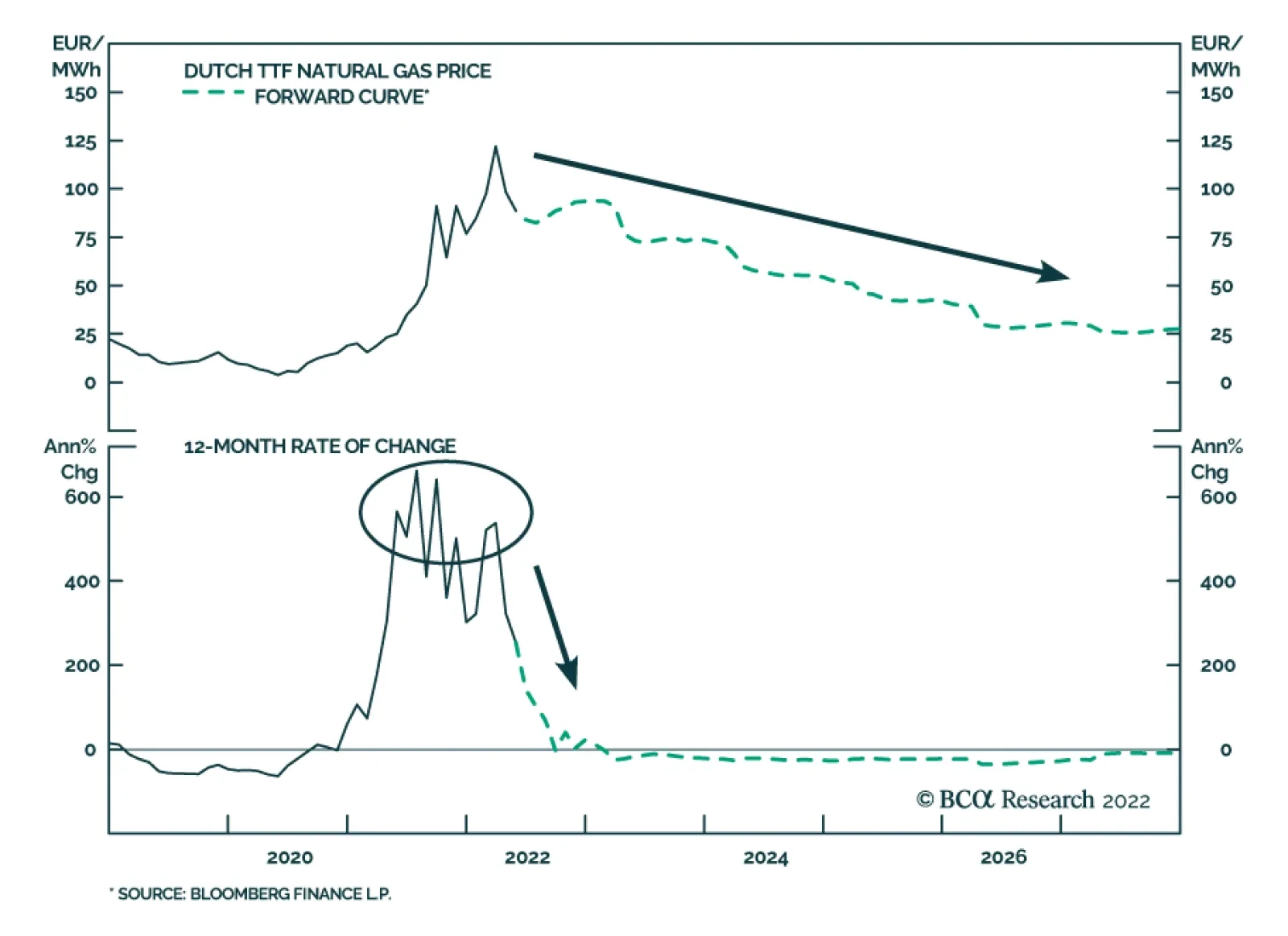
An eerie calm in European natural gas markets belies the state of war in Ukraine that already is producing a cutoff of Russian natgas supplies in retaliation for the EU’s oil embargo. Such cutoffs will accelerate, and send natgas prices in Europe and Asia sharply higher if they occur sooner – as we expect – rather than later. The US will continue to send most of its LNG exports to Europe. These exports are expected to average 12 Bcf/d this year, up 22% from last year’s level. Planners in Europe and Asia will want to secure as much natgas supply as possible by the end of October to refill storage for the November-March withdrawal season, which is beginning to look like another La Niña winter. The US Climate Prediction Center makes the odds of such an event, which is associated with colder-than-normal winters in the Northern Hemisphere, just over 60%. Bottom Line: European governments are preparing their citizens for natgas rationing, in the event of a cutoff of Russian gas. This will occur sooner rather than later. In its wake, EU GDP will fall, and inflation will rise as knock-on effects constrict base metals, fertilizer and food supplies. At tonight’s close, we will be getting long 1Q23 TTF futures on the ICE, expecting prices to again exceed €225/MWh. Feature Related Report Commodity & Energy StrategyHigher Gasoline, Diesel Prices Ahead Russia is at war with Ukraine. NATO military support for Ukraine – with the EU at the forefront – is being maintained at a high level, and Ukrainian forces are vigorously defending their homeland.1 The EU embargoed Russian oil imports to sharply reduce funding for Russia’s war machine. Russia will be compelled to follow through on its threat to cut off pipeline gas shipments to Europe, following the embargo.2 It is highly doubtful Russia will countenance the timetable envisioned in the EU embargo, which calls for a phase-out of oil imports by yearend that removes close to 3mm b/d, or 90% of Russia’s sales into its largest market (Chart 1). Equally doubtful is the notion the EU will countenance funding Russia’s war on Ukraine over the course of such a phase-out. Our colleague Matt Gertken, who runs BCA’s Geopolitical Strategy, demonstrated that while such a phase-out schedule may be optimal for both sides – i.e., it prolongs revenue flows to Russia and gas flows to the EU – it almost surely is not an equilibrium.3 An equilibrium in this prisoners’ dilemma obtains when both sides act immediately to end their vulnerability to the other unilaterally upsetting the optimal state – i.e., endure short-term pain for long-term gain (Diagram 1). For this reason, we believe Russia’s cutoff of natgas shipments to the EU will occur sooner rather than later, to inflict maximum pain on the EU going into the coming winter season. The EU knows this, and is preparing its citizens for rationing of natgas. Chart 1EU’s Russian Oil Embargo Cuts Sales By 90% By Year-end
Natgas Markets: The Eye Of The Storm
Natgas Markets: The Eye Of The Storm
Diagram 1The EU, Russia Prisoners’ Dilemma
Natgas Markets: The Eye Of The Storm
Natgas Markets: The Eye Of The Storm
Russian Natgas Cutoff To The EU Underway Russia already has begun reducing natural gas supplies to the EU (Chart 2). Russian gas flows to Finland, Poland, Bulgaria, Netherlands, and Denmark were embargoed after these states refused to pay for gas in rubles (Chart 3). Russia reduced gas shipments to Germany – albeit marginally – after Shell refused to pay for natgas supplied to Germany in rubles. While this only disrupted 1.3% of total natgas consumption in Germany, it showed Russia will quickly act against what it views as “unfriendly” customers.4 Ukraine was forced to shut a gas transit point through which 8% of total Russian gas flows reach Europe, after Russian occupying forces were found to be siphoning gas, according to Gas Transmission System Operator of Ukraine (GTSOU). As a result, gas flows from Russia have taken a further hit and have not recovered (Chart 4). EU member states whose supply of Russian gas has been disrupted will need to search for alternatives. Orsted, an energy company supplying natgas to Denmark, stated it will source gas from the EU market. Given supply constraints in Europe, an increase in the number of bids on the single EU market will raise the Dutch Title Transfer Facility (TTF), all else equal. Chart 2Russia Starts Cutting Gas Flows
Russia Starts Cutting Gas Flows
Russia Starts Cutting Gas Flows
Chart 3Russian Gas Flows To EU Falling Overall...
Russian Gas Flows To EU Falling Overall...
Russian Gas Flows To EU Falling Overall...
Chart 4...Particularly Via Ukraine
...Particularly Via Ukraine
...Particularly Via Ukraine
Higher TTF prices will direct gas flows from the US to Europe, reducing gas available for domestic consumption. LNG gas exports to Europe have maintained their upward trend since 2016 and were up by 87% (674 BCF) in 1Q22 vs the same period in 2019 (Chart 5). Chart 5US LNG Exports To Europe Surge
Natgas Markets: The Eye Of The Storm
Natgas Markets: The Eye Of The Storm
Simultaneously, the US witnessed its largest inventory withdrawal this winter in the last four years (Chart 6). Warmer-than-normal temperatures and drought conditions in the US also are increasing domestic demand, as electricity companies are forced to substitute hydroelectric power with natgas-fired generation. Increased exports and weather phenomena have combined to push the Henry Hub contract above $9.50/MMBtu this week, the highest level since 2008. Chart 6US Natgas Inventories Slowly Filling
Natgas Markets: The Eye Of The Storm
Natgas Markets: The Eye Of The Storm
US LNG Exports To Europe Surge Higher European prices for US natgas have disincentivized shipments to Asia, where prices – measured by the Japan Korea Marker (JKM) – have been trading below the TTF so far this year on average (Chart 7). This has allowed European gas inventories to refill at a rapid pace. As of 4 June, the EU’s working gas inventories were ~49% full and are above last year’s level for this time of the year (Chart 8). Chart 7Natural Gas Markets Eerily Quiet
Natgas Markets: The Eye Of The Storm
Natgas Markets: The Eye Of The Storm
Chart 8European Gas Storage Refill Off To A Good Start
Natgas Markets: The Eye Of The Storm
Natgas Markets: The Eye Of The Storm
Shanghai’s reopening will propel Chinese economic activity and demand for natgas, making an already tight global natural gas market tighter. However, the risk of rolling lockdowns in China will keep Asia’s LNG demand in check.5 LNG vessel charter rates have increased sharply since the Russia-Ukraine war began, largely on the back of European demand (Chart 9). We expect this to be a regular feature of the international gas market going forward, as more LNG export capacity is added in the US – it will rise to 12.6 Bcf/d next year, e.g. – and global demand remains strong. Chart 9Surge in LNG Charter Rates
Surge in LNG Charter Rates
Surge in LNG Charter Rates
Europe Is Critically Short LNG Infrastructure Most of the EU’s existing 158 Bcm of annual regasification capacity is located around the Iberian Peninsula (Chart 10), which is not well-connected to the rest of Europe. As a result, to substitute Russian piped gas for LNG imports, investments for import terminals and regasification capacity will be required. In its REPowerEU program the European Commission expects to move closer to complete independence from Russian fossil fuels by importing an additional 50 Bcm of LNG per year, reducing demand, and ramping up renewable energy. Germany is aiming for independence from Russian gas flows by planning a shoreside LNG terminal and ordering four Floating Storage and Regasification Units (FSRUs). The FSRUs, which are expected to come online between year-end and the start of next year will have a combined capacity under 24 Bcm per year. Chart 10Europe Needs More Re-Gasification Capacity
Natgas Markets: The Eye Of The Storm
Natgas Markets: The Eye Of The Storm
These plans, however, are not aligned with the nation’s pathway to go carbon neutral by 2045. An environmental activist group has filed a lawsuit to halt the construction of the LNG terminal. The group also is opposed to Germany’s draft LNG acceleration bill, which will allow imports until two years before 2045.6 This reflects two problems all EU nations will face as they transition to LNG from pipeline Russian gas imports. Firstly, member states will need to invest billions of euros in new LNG capacity, and given current politics, likely will have to decide to scrap or repurpose this infrastructure in during the transition to green energy. Opposing this possibility is the high likelihood that EU states will need to enter long-term LNG contracts to ensure supply security and shield themselves from volatile natgas prices. For the immediate future, the EU likely will kick this can down the road for as long as possible. Investment Implications Back in March, Germany and Austria began preparing their citizens for natgas rationing.7 Now the IEA is warning all of Europe the likelihood of such action is increasing rapidly.8 State and local planners throughout Europe will spend the next five months or so lining up as much LNG and pipeline gas as possible going into the coming winter season. While the inventory-injection in Europe is off to a good start, planners most likely hope to exceed their minimum target for filling 80% of storage in time for the November-March withdrawal season. In addition to the risk of a Russian cutoff of supplies, planners have to account for a higher likelihood of a colder-than-normal winter, given the odds of another La Niña winter, which is associated with colder-than-normal winters in the Northern Hemisphere. The US Climate Prediction Center makes the odds of such an event – the third such event in as many years – just over 60%. If European states are forced to implement rationing of natgas, knock-on effects resulting from prioritizing human needs over industrial concerns will, once again, restrict base metals, fertilizer and food supplies. We remain long energy, metals and grains exposure via the S&P GSCI and COMT ETF as the natural-gas drama in Europe plays out. In addition, we remain long the XOP, XME, PICK, and CRAK ETFs to maintain our equity exposure to industrial commodities. At tonight’s close, we will be getting tactically long 1Q22 futures on the ICE, expecting prices to again exceed €225/MWh. This will complement our existing tactical commodity exposures in 4Q22 TTF futures. Robert P. Ryan Chief Commodity & Energy Strategist rryan@bcaresearch.com Ashwin Shyam Research Analyst Commodity & Energy Strategy ashwin.shyam@bcaresearch.com Paula Struk Research Associate Commodity & Energy Strategy paula.struk@bcaresearch.com Commodities Round-Up Energy: Bullish US refined product demand rose just under 4% for the week ended 3 June 2022, led by a surge in jet-fuel demand of 26.5% yoy – finishing at 1.6mm b/d vs. 1.26mm b/d the year earlier, according to the US EIA. This provides further evidence consumer pent-up demand for travel is being released, after the long shut-downs in travel caused by COVID-19 beginning in 1Q20. The surge in jet-fuel demand was enough to offset yoy declines in gasoline and distillates such as diesel fuel and heating oil of 0.9% and 2.8%, respectively. Gasoline inventories were down 800k barrels yoy, which put them 10% below their five-year average level at the end of the reporting week. Distillate inventories rose 2.6mm barrels, but this still left them 23% below their five-year average. Crude oil inventories in the US including those in the Strategic Petroleum Reserve (SPR), which is being drawn down to provide charging stock to refiners, drew 7.3mm barrels, and stood at 519mm barrels. Versus year-ago levels, crude inventories including the SPR are down 17%. Base Metals: Bullish Copper production in Chile fell 9.8% yoy in April as state-owned copper giant Codelco’s monthly supply fell 6.1% yoy to 116,000 tons. In Peru, protests against mines by displaced communities have seen suspensions in copper mine production, including that of MMG-owned Las Bambas. Although the International Copper Study Group (ICSG) expects a physical surplus for refined copper markets next year, falling production in Chile and civil unrest in Peru continue to plague the rebuilding of stocks (Chart 11). Globally, a risk matrix we reproduced in a report last year showed that approximately 570 million Metric Tons of copper faced a significant ESG risk.9 This increases the risk of new copper projects being stymied by activist groups, and further curtailing future copper production. Precious Metals: Bullish According to data from World Gold Council, gold ETFs faced net outflows in May as the USD and interest rates strengthened, following the Fed rate hikes (Chart 12). In his speech, Fed Governor Christopher Waller explained that by increasing interest rates, the Fed aims to match labor demand to supply and reduce wage growth, which in turn will lower inflation.10 This, however, does not deal with high inflation via the mechanism of elevated food and fuel prices, which will remain high as long as supply disruptions continue in these markets. Chart 11
LME Copper Stocks Going Down
LME Copper Stocks Going Down
Chart 12
Natgas Markets: The Eye Of The Storm
Natgas Markets: The Eye Of The Storm
Footnotes 1 Please see The Institute For The Study Of War for daily updates of the Russia-Ukraine war. 2 Please see Higher Gasoline, Diesel Prices Ahead, which we published last week, for further discussion of the EU’s embargo of Russian oil imports. The EU embargo initially will be on Russian seaborne oil imports, which will tighten global crude oil and refined-product markets further. Pipeline imports are due to phase out by year-end. Cumulatively, this will translate to a 90% decrease in Russian crude and product exports to the EU, representing ~ 3mm b/d of lost sales. Our report is available at ces.bcaresearch.com. 3 Please see Energy Cutoff Continues (GeoRisk Update), published by BCA Research’s Geopolitical Strategy on June 1, 2022. It is available at gps.bcaresearch.com. 4 According to a recent report from Gemeinshcafts Diagnose institution prepared on behalf of Germany’s Federal Ministry of Economics and Climate Protection, if Russia embargos oil and gas to Germany immediately the German economy will fall into a sharp recession. The cumulative loss to macroeconomic output in 2022 and 2023 will amount to 220 billion euros, or more than 6.5% of annual economic output. 5 For more on the risk of rolling lockdowns in China, please see Not The Time To Be A Contrarian, published by BCA’s Emerging Markets Strategy on May 19, 2022. 6 Please see Germany’s Cabinet Moves to Head Off Lawsuits Against LNG Terminals, published by The Maritime Executive on May 11, 2022 7 Please see Germany Closer To Rationing Natgas, which we published on March 31, 2022. 8 Please see Europe at risk of winter energy rationing, energy watchdog warns, published by ft.com on June 8, 2022. 9 Please see Renewables ESG Risk Grows With Demand, which we published on April 29, 2022 10 For the speech, please see Responding to High Inflation with Some Thoughts on a Soft Landing. Investment Views and Themes Recommendations Strategic Recommendations Tactical Trades Trades Closed in 2022
Executive Summary The Efficient Market Hypothesis (EMH) is flawed. This Holy Grail of financial economics assumes that investors are a homogenous bunch with identical investment horizons, when the reality is that investors have a wide spectrum of time horizons. The alternative but less well-known Fractal Market Hypothesis (FMH) recognizes that investors with different time horizons interpret the same facts and information differently. The key conclusion of the FMH is that when the different investment horizons are all active in the market, the price reflects all available information, meaning that the market is efficient, liquid, and stable. But when the different investment horizons start to converge and coalesce, the market becomes inefficient, illiquid, and vulnerable to a trend reversal. Using the FMH over the past six months, 5 structured recommendations were closed in profit: Short ILS/GBP, Short Coffee versus Cocoa, Short World Basic Resources versus Market, Long EUR/CHF, and Short Semiconductors versus Tech. Against this, 3 structured recommendations were closed in loss: Short Nickel versus Silver, Long Polish Bonds versus US Bonds, and Short World Semiconductors versus Biotech. Within the 10 open trades, 3 are in healthy profit, 4 are flat, and 3 are in loss. The Efficient Market Hypothesis Does Not Describe The Truth; The Fractal Market Hypothesis Does
Fractal Trading Update - June 2022
Fractal Trading Update - June 2022
Bottom Line: As few investors are aware of the Fractal Market Hypothesis, it gives a competitive advantage to those that use it to identify potential trend reversals. Feature For nations and societies, disagreement and conflict are unhealthy. But for financial markets, the opposite is true – it is the lack of disagreement and conflict that is unhealthy. This is because the market needs disagreement to generate liquidity, the ability to trade quickly and in large volume without destabilizing the market price. If I want to buy a share, then somebody must sell me that share. It follows that I and the seller must disagree about the attractiveness of the share at the current price. Likewise, if I and like-minded individuals want to buy ten million shares, it follows that lots of market participants must disagree with us. If lots of market participants do not disagree with us, there will be insufficient liquidity to complete the transaction without a price change. And if too many people are engaged in groupthink, the price change could be extreme. Markets Become Inefficient When There Is Not Enough Disagreement How can there be major disagreement about the attractiveness of an investment when we all have access to the same facts and information? According to the Efficient Market Hypothesis (EMH) there cannot be, because asset prices always reflect all available information.1 Unfortunately, the Efficient Market Hypothesis is flawed. This Holy Grail of financial economics assumes that investors are a homogenous bunch with identical investment horizons, when the reality is that investors have a wide spectrum of time horizons – ranging from the milliseconds of momentum-driven high-frequency trading (HFT) to the decades of a value-driven pension fund. The market is efficient only when a wide spectrum of investment horizons is setting the price, signified by the market having a rich fractal structure. The alternative but less well-known Fractal Market Hypothesis (FMH) recognizes the reality of different time horizons. Crucially, the FMH acknowledges that investors with different time horizons interpret the same facts and information differently. In other words, they disagree (Box I-1). Box 1-1The Efficient Market Hypothesis Does Not Describe The Truth; The Fractal Market Hypothesis Does
Fractal Trading Update - June 2022
Fractal Trading Update - June 2022
For example, the momentum-based high frequency trader might interpret a sharp one-day sell-off as a sell signal, but the value-based pension fund might interpret the same information as a buying opportunity. This disagreement will create liquidity without requiring a big price adjustment. Thereby it also fosters market stability. The key conclusion of the Fractal Market Hypothesis is that when the different investment horizons are all active in the market, the price does reflect all available information, meaning that the market is efficient, liquid, and stable. But when the different investment horizons start to converge and coalesce, the market becomes inefficient, illiquid, and vulnerable to a trend reversal. Buy and sell orders will no longer match without a price change, possibly extreme. Can we measure the loss of efficiency in a specific investment, and thereby anticipate a potential trend reversal? The answer is yes, by monitoring its fractal dimension, using the expression in the Appendix. Although many readers may find the concept of a fractal dimension intimidating, the idea is simple and intuitive. It just measures the complexity – or information content – in an object or structure. Thereby, when an investment’s fractal dimension reaches its lower limit, it warns that the information content of longer-term investors is missing from the price. When the longer-term investors do ultimately re-enter the price setting process, the question is: will they endorse the recent trend because of some major change in the fundamentals – such as the start of the Russia/Ukraine war? Or will they reject it, as an unjustified deviation from a fundamental anchor. In most cases, it is the latter: a rejection and a trend reversal. As few investors are aware of the Fractal Market Hypothesis, it gives a competitive advantage to those that use it to identify potential trend reversals. Fractal Trading Update Using the Fractal Market Hypothesis over the past six months, 5 structured recommendations were closed in profit: Short ILS/GBP, Short Coffee versus Cocoa, Short World Basic Resources versus Market, Long EUR/CHF, and Short Semiconductors versus Tech. A fragile fractal structure warns of a crowded trade. One structured recommendation was closed flat: Short Personal Goods versus Consumer Services. Against this, 3 structured recommendations were closed in loss: Short Nickel versus Silver, Long Polish Bonds versus US Bonds, and Short World Semiconductors versus Biotech. Within the 10 open trades, 3 are in healthy profit, 4 are flat, and 3 are in loss. As for the unstructured recommendations, for which we do not define profit targets or expiry dates, we are pleased to report that out of 31 recommendations, only 2 failed to experience a countertrend reversal. Wins 1) November 18th: Short ILS/GBP Achieved its profit target of 4.2 percent. 2) November 25th: Short Coffee versus Cocoa (Chart I-1) Achieved almost half of its 30 percent profit target at expiry. Chart I-1Fractal Analysis Correctly Predicted A Reversal In Coffee Versus Cocoa
Fractal Analysis Correctly Predicted A Reversal In Coffee Versus Cocoa
Fractal Analysis Correctly Predicted A Reversal In Coffee Versus Cocoa
3) January 20th: Short World Semiconductors versus Tech (Chart I-2) Achieved its profit target of 6 percent. Chart I-2Fractal Analysis Correctly Predicted A Reversal In World Semiconductors Versus Technology
Fractal Analysis Correctly Predicted A Reversal In World Semiconductors Versus Technology
Fractal Analysis Correctly Predicted A Reversal In World Semiconductors Versus Technology
4) March 10th: Long EUR/CHF Achieved its profit target of 3.6 percent. 5) April 14th: Short World Basic Resources versus Market (Chart I-3) Achieved its profit target of 11.5 percent. Chart I-3Fractal Analysis Correctly Predicted A Reversal In World Basic Resources Versus Market
Fractal Analysis Correctly Predicted A Reversal In World Basic Resources Versus Market
Fractal Analysis Correctly Predicted A Reversal In World Basic Resources Versus Market
In addition, Short World Personal Goods versus Consumer Services which was opened on December 9th reached a high-water mark of 10.5 percent but expired flat. Losses 1) December 2nd: Short World Semiconductors versus Biotech Hit its stop loss of 9.5 percent. 2) January 13th: Long Poland versus US: 10-Year Government Bonds Reached a high-water mark of 3.7 percent, but then reversed to hit its stop loss of 8 percent. In the current geopolitical crisis, Poland has been a casualty due to its lengthy border with Ukraine. 3) February 3rd: Short Nickel versus Silver (Chart I-4) Hit its stop loss at 20 percent following an explosive short-squeeze rally in the Nickel price. Chart I-4Nickel's Short-Squeeze Rally Forced A Price Trend Prolongation
Nickel's Short-Squeeze Rally Forced A Price Trend Prolongation
Nickel's Short-Squeeze Rally Forced A Price Trend Prolongation
Open Trades 1) January 27th: Long MSCI Korea versus All-Country World (Chart I-5) Open, in profit, having reached a high-water mark of 6 percent (versus an 8 percent target). Chart I-5Fractal Analysis Correctly Predicted A Rebound In Korea Versus All-Country World
Fractal Analysis Correctly Predicted A Rebound In Korea Versus All-Country World
Fractal Analysis Correctly Predicted A Rebound In Korea Versus All-Country World
2) February 24th: Long US Biotech versus US Tech Open, in profit, having reached a high-water mark of 10.5 (versus a 17.5 percent target). 3) March 3rd: Short World Banks versus Consumer Services Reached a high-water mark of 7.3 percent (versus a 12 percent target), but then reversed and is in loss. 4) March 24th: Long 5-Year T-bond Open, in modest loss. 5) April 7th: Short World Non-Life Insurance versus Homebuilders (Chart I-6) Open, in profit having reached a high-water mark of 12.4 percent (versus a 14 percent target). Chart I-6Fractal Analysis Correctly Predicted A Reversal In World Non-Life Insurance Versus Homebuilders
Fractal Analysis Correctly Predicted A Reversal In World Non-Life Insurance Versus Homebuilders
Fractal Analysis Correctly Predicted A Reversal In World Non-Life Insurance Versus Homebuilders
6) April 7th: Long JPY/CHF Reached a high-water mark of 3.4 percent versus a 4 percent target, but then reversed into modest loss. This suggests that the trade needed a narrower profit target. 7) April 28th: Short High Dividend ETF versus US 10-Year T-bond Open, in modest loss, having reached a high-water mark of 2.9 percent (versus a 6 percent target). 8) May 19th: Short FTSE 100 versus STOXX Europe 600 Open, and flat. 9) June 2nd: Long JPY/USD (Chart I-7) Open, and flat. Chart I-7The Sell-Off In JPY/USD Has Reached A Potential Turning Point
The Sell-Off In JPY/USD Has Reached A Potential Turning Point
The Sell-Off In JPY/USD Has Reached A Potential Turning Point
10) June 2nd: Short Australia Basic Resources versus World Market (Chart I-8) Open, and flat. Chart I-8The Australian Basic Resources Sector Is Vulnerable To Reversal
The Australian Basic Resources Sector Is Vulnerable To Reversal
The Australian Basic Resources Sector Is Vulnerable To Reversal
Our full watchlist of 29 investments that are at, or approaching turning points, is available on our website: cpt.bcaresearch.com Appendix: Calculating The Fractal Dimension Of A Financial Market
Fractal Trading Update - June 2022
Fractal Trading Update - June 2022
Chart 1AUD/KRW Is Vulnerable To Reversal
AUD/KRW Is Vulnerable To Reversal
AUD/KRW Is Vulnerable To Reversal
Chart 2Canada Versus Japan Is Reversing
Canada Versus Japan Is Reversing
Canada Versus Japan Is Reversing
Chart 3Canada's TSX-60's Outperformance Might Be Over
Canada's TSX-60's Outperformance Might Be Over
Canada's TSX-60's Outperformance Might Be Over
Chart 4US Healthcare Providers Vs. Software At Risk of Reversal
US Healthcare Providers Vs. Software At Risk of Reversal
US Healthcare Providers Vs. Software At Risk of Reversal
Chart 5BRL/NZD At A Resistance Point
BRL/NZD At A Resistance Point
BRL/NZD At A Resistance Point
Chart 6Homebuilders Versus Healthcare Services Has Turned
Homebuilders Versus Healthcare Services Has Turned
Homebuilders Versus Healthcare Services Has Turned
Chart 7CNY/USD Has Reversed
CNY/USD Has Reversed
CNY/USD Has Reversed
Chart 8CAD/SEK Is Vulnerable To Reversal
CAD/SEK Reversal Has Started
CAD/SEK Reversal Has Started
Chart 9Financials Versus Industrials To Reverse
Financials Versus Industrials To Reverse
Financials Versus Industrials To Reverse
Chart 10The Outperformance Of Resources Versus Biotech Has Started To Reverse
The Outperformance Of Resources Versus Biotech Has Started To Reverse
The Outperformance Of Resources Versus Biotech Has Started To Reverse
Chart 11The Outperformance Of Resources Versus Healthcare Is Vulnerable To Reversal
The Outperformance Of Resources Versus Healthcare Is Vulnerable To Reversal
The Outperformance Of Resources Versus Healthcare Is Vulnerable To Reversal
Chart 12FTSE100 Outperformance Vs. Euro Stoxx 50 Is Reversing
FTSE100 Outperformance Vs. Euro Stoxx 50 Is Reversing
FTSE100 Outperformance Vs. Euro Stoxx 50 Is Reversing
Chart 13Netherlands Underperformance Vs. Switzerland Is Ending
Netherlands Underperformance Vs. Switzerland Has Been Exhausted
Netherlands Underperformance Vs. Switzerland Has Been Exhausted
Chart 14The Sell-Off In The 30-Year T-Bond Is Approaching Fractal Fragility
The Sell-Off In The 30-Year T-Bond Is Approaching Fractal Fragility
The Sell-Off In The 30-Year T-Bond Is Approaching Fractal Fragility
Chart 15The Sell-Off In The NASDAQ Is Approaching Fractal Fragility
The Sell-Off In The NASDAQ Is Approaching Fractal Fragility
The Sell-Off In The NASDAQ Is Approaching Fractal Fragility
Chart 16Food And Beverage Outperformance Exhausted
Food And Beverage Outperformance Has Been Exhausted
Food And Beverage Outperformance Has Been Exhausted
Chart 17The Strong Trend In The 18-Month-Out US Interest Rate Future Is Fragile
The Strong Trend In The 18-Month-Out US Interest Rate Future Is Fragile
The Strong Trend In The 18-Month-Out US Interest Rate Future Is Fragile
Chart 18The Strong Trend In The 3 Year T-Bond Is Fragile
The Strong Trend In The 3 Year T-Bond Is Fragile
The Strong Trend In The 3 Year T-Bond Is Fragile
Chart 19A Potential Switching Point From Tobacco Into Cannabis
A Potential Switching Point From Tobacco Into Cannabis
A Potential Switching Point From Tobacco Into Cannabis
Chart 20Biotech Is A Major Buy
Biotech Is A Major Buy
Biotech Is A Major Buy
Chart 21Norway's Outperformance Could End
Norway's Outperformance Could End
Norway's Outperformance Could End
Chart 22Cotton Versus Platinum Is Reversing
Cotton Versus Platinum Is Reversing
Cotton Versus Platinum Is Reversing
Chart 23Switzerland's Outperformance Vs. Germany Has Ended
Switzerland's Outperformance Vs. Germany Has Started To End
Switzerland's Outperformance Vs. Germany Has Started To End
Chart 24The Rally In USD/EUR Has Ended
The Rally In USD/EUR Has Ended
The Rally In USD/EUR Has Ended
Chart 25The Outperformance Of MSCI Hong Kong Versus China Is Vulnerable To Reversal
The Outperformance Of MSCI Hong Kong Versus China Is Vulnerable To Reversal
The Outperformance Of MSCI Hong Kong Versus China Is Vulnerable To Reversal
Chart 26A Potential New Entry Point Into Petcare
A Potential New Entry Point Into Petcare
A Potential New Entry Point Into Petcare
Chart 27Czech Outperformance Near Exhaustion
Czech Outperformance Near Exhaustion
Czech Outperformance Near Exhaustion
Chart 28US REITS Are Oversold Versus Utilities
US REITS Are Oversold Versus Utilities
US REITS Are Oversold Versus Utilities
Chart 29GBP/USD At A Turning Point
GBP/USD At A Turning Point
GBP/USD At A Turning Point
Dhaval Joshi Chief Strategist dhaval@bcaresearch.com Hadi Elzein Research Associate hadi.elzein@bcaresearch.com Footnotes 1 Strictly speaking, the EMH assumes there is some disagreement, but that this disagreement is random and follows a standard Gaussian (bell-curve) distribution. Therefore, the EMH assumes that a share price just follows a random walk until new (unpredictable) fundamental information arrives. Fractal Trades
Fractal Trading Update - June 2022
Fractal Trading Update - June 2022
6-Month Recommendations Structural Recommendations Closed Fractal Trades Indicators To Watch - Bond Yields Chart II-1Indicators To Watch - Bond Yields - Euro Area
Indicators To Watch - Bond Yields - Euro Area
Indicators To Watch - Bond Yields - Euro Area
Chart II-2Indicators To Watch - Bond Yields - Europe Ex Euro Area
Indicators To Watch - Bond Yields - Europe Ex Euro Area
Indicators To Watch - Bond Yields - Europe Ex Euro Area
Chart II-3Indicators To Watch - Bond Yields - Asia
Indicators To Watch - Bond Yields - Asia
Indicators To Watch - Bond Yields - Asia
Chart II-4Indicators To Watch - Bond Yields - Other Developed
Indicators To Watch - Bond Yields - Other Developed
Indicators To Watch - Bond Yields - Other Developed
Indicators To Watch - Interest Rate Expectations Chart II-5Indicators To Watch - Interest Rate Expectations
Indicators To Watch - Interest Rate Expectations
Indicators To Watch - Interest Rate Expectations
Chart II-6Indicators To Watch - Interest Rate Expectations
Indicators To Watch - Interest Rate Expectations
Indicators To Watch - Interest Rate Expectations
Chart II-7Indicators To Watch - Interest Rate Expectations
Indicators To Watch - Interest Rate Expectations
Indicators To Watch - Interest Rate Expectations
Chart II-8Indicators To Watch - Interest Rate Expectations
Indicators To Watch - Interest Rate Expectations
Indicators To Watch - Interest Rate Expectations
Executive Summary Competing Forces On Global Bond Yields
Competing Forces On Global Bond Yields
Competing Forces On Global Bond Yields
Bond yields in the developed world have ticked higher recently, due to a renewed increase in oil prices and the spillover effect from more hawkish policy expectations out of Europe. The competing forces of slowing global growth momentum and geopolitical uncertainty on one side, and high inflation with tightening monetary policies on the other, will keep global government bond yields rangebound over the next several months. UK investment grade corporate bonds now offer an intriguing combination of higher yields, attractive spread valuations and strong financial health. By maturity, shorter-maturity corporates offer the best value. At the industry level, spreads look most attractive for Financials. A hawkish Bank of England, both through rate hikes and upcoming outright sales of corporate debt the central bank has purchased via quantitative easing, remains a major headwind to UK corporate bond returns. Sectors most at risk to central bank sales are Water, Consumer Cyclicals and Consumer Non-Cyclicals. Bottom Line: Stay neutral on overall duration exposure in global bond portfolios. Maintain a neutral stance on UK corporates, favoring shorter-maturity bonds and Financial names, but look to upgrade once UK inflation peaks and the Bank of England pauses on tightening. Trendless, Friendless Bond Markets Chart 1Recovering From The Ukraine War Shock...
Recovering From The Ukraine War Shock...
Recovering From The Ukraine War Shock...
Although it may not feel like it given the ferocity of some daily price swings, many important financial markets have not moved all that much, cumulatively, since the first major shock of 2022 – the start of the Russian invasion of Ukraine on February 24. For example, the S&P 500 is only down around -2% from the pre-invasion level, while the VIX index of equity option volatility is at 24, seven points below the closing level on February 23 (Chart 1). The Bloomberg US investment grade corporate bond index spread is only 12bps above its pre-invasion level, down 20bps from the peak seen in mid-May. More recently, even US bond yields have shown signs of stabilization. The 10-year US Treasury yield has traded in a 2.70-3.15% range since the start of April, while the MOVE index of US Treasury option volatility has fallen by one-quarter since its most recent peak in early May. Not all markets, however, have seen this kind of relative stability. Global oil prices are trading close to post-invasion highs, as are government bond yields in Germany and the UK. High-yield credit spreads in the US and Europe are both still around 50bps above where they were pre-invasion. The DXY US dollar index is 6% above the pre-invasion level, led by the USD/JPY currency pair that has appreciated to levels last seen in 2002. Given the mix of slowing global growth momentum and ongoing geopolitical uncertainty, but with persistent high inflation and tightening global monetary policy, it is unsurprising that financial markets are having a difficult time formulating a consistent message. This is especially true for global government bond yields. Chart 2Competing Forces On Global Bond Yields
Competing Forces On Global Bond Yields
Competing Forces On Global Bond Yields
Even as market-based inflation expectations have eased a bit in recent weeks, bond yields across the developed world have been unable to decline because markets continue to discount more rate hikes (Chart 2). Yet with such a significant amount of monetary tightening now priced in across all countries, global bond yields are more likely to stay rangebound over the next 3-6 months than begin a new trend. Chart 3DM Bond Yields Discounting Tight Monetary Policy
DM Bond Yields Discounting Tight Monetary Policy
DM Bond Yields Discounting Tight Monetary Policy
10-year government bond yields and 2-year-ahead interest rate expectations in overnight index swap (OIS) curves are trading in lockstep in the US, Europe, UK, Canada and Australia (Chart 3). This correlation indicates that longer-term bond yields have become a pure play on future policy rate expectations, rather than a reflection of rising inflation expectations as was the case in 2021. However, both yields and rate expectations are now trading close to, or even well above, plausible estimates of neutral nominal policy rates in all regions - including estimates provided by central bankers themselves. For example, in Australia, where the RBA just delivered a 50bp rate hike this week, markets are pricing in a peak Cash Rate between 3.5-4%, even with RBA Governor Philip Lowe stating that the neutral rate is likely in the 2-3% range – a view that we agree with. The situation is even more extreme in the euro area, with the euro area OIS curve now pricing in a peak policy rate between 1.5-2%, with most of that increase coming over the next 12 months. While we expect the ECB to fully exit the negative (deposit) rate era by September, rate hikes beyond that are far less likely given slowing euro area growth momentum and still-moderate euro area inflation beyond the spillover effects from energy costs. Only in the US are markets potentially underestimating the potential peak in the fed funds rate for this tightening cycle. Estimates of the longer-run (neutral) funds rate from the latest set of FOMC projections back in March ranged from 2.0-3.0%. Thus, the current level of 10-year bond yields, and 2-year-ahead rates discounted in the US OIS curve, are only at the top end of that range. It is possible that the Fed will have to raise rates to restrictive levels (i.e. above 3%) given the size of the current US inflation overshoot. More importantly, the US neutral rate is likely higher than the Fed thinks it is, possibly as high as 4% according to BCA Research’s Chief Global Strategist, Peter Berezin. We continue to see the US as the one major government bond market where there is a risk that markets are underestimating the neutral policy rate. For that reason, we remain underweight US Treasuries in the BCA Research Global Fixed Income Strategy model bond portfolio. Don’t Dismiss The QT Effect One other factor that has likely kept global bond yields elevated, even as global growth has softened, has been the shift away from central bank asset purchases towards quantitative tightening (QT). As policymakers have moved to slow, or even stop, the buying of government bonds, the term premium component of longer-term bond yields has risen. The moves have been quite large. Using our own in-house estimates, the term premium on 10-year government bond yields have jumped by about 100bps on average in the US, UK, Canada, Australia and Europe since the lows seen during the 2020 COVID global recession (Chart 4). The jump in term premiums is occurring at the same time as markets have moved to price in more rate hikes and a higher path for real interest rates (bottom panel). Chart 4Yields Repricing As QE Moves To QT
Yields Repricing As QE Moves To QT
Yields Repricing As QE Moves To QT
Chart 5Stay Neutral Global Duration Exposure
Stay Neutral Global Duration Exposure
Stay Neutral Global Duration Exposure
That combined effect of the upward repricing of term premiums – especially as more price-sensitive private investors replace the demand for bonds from price-insensitive central banks - but with less upward movement in already elevated interest rate expectations will keep longer-term bond yields in trading ranges during the “Global QT Phase” over at least the next six months and likely longer. That message is reinforced by our Global Duration Indicator, which is heralding a peak in global bond yield momentum over the latter half of 2022 (Chart 5). Bottom Line: Stay neutral on overall duration exposure in global bond portfolios, with yields in the major developed markets likely to stay rangebound over the next few months. Assessing The Value In UK Investment Grade Corporates Chart 6A Big Jump In UK Investment Grade Corporate Yields
A Big Jump In UK Investment Grade Corporate Yields
A Big Jump In UK Investment Grade Corporate Yields
Global credit markets have had a rough time in 2022, and UK corporate debt is no exception. The Bloomberg UK Corporate index of investment grade corporate debt has delivered a year-to-date total return of -11%, as the index yield-to-maturity rose 174bps to 4% - the highest level since 2014 (Chart 6). Relative to UK Gilts, the results have also been grim as corporate credit spreads have widened, with the Bloomberg UK corporate index realizing an excess return of -3% since the start of the year. We have maintained a neutral stance on UK corporate bond exposure in our global model bond portfolio during the selloff. This was the result of a relative value opinion, as we have concentrated our more defensive view on global investment grade corporate debt with an underweight to US corporates. However, after the significant repricing of UK investment grade credit, it is now a good time to reassess our opinion on the asset class. Spread Valuation From a pure spread valuation perspective, UK investment grade now looks more attractive. Our preferred valuation metric – 12-month breakeven spreads - shows that the UK investment grade corporate index spread, on a duration-adjusted basis, is now in the 75th percentile of its history over the past 25 years (Chart 7). Chart 7UK Corporate Spreads Now Offer Some Value
UK Corporate Spreads Now Offer Some Value
UK Corporate Spreads Now Offer Some Value
We find 12-month breakevens to a useful spread valuation measure, as they show how much spreads would need to widen to make the expected one-year-ahead return on a credit product equal to that of a duration-matched position in government bonds. In other words, breakevens measure the spread “cushion” against excess return losses from spread widening. What makes the current attractive reading on UK investment grade spread valuation so interesting is that the absolute level of spreads is still relatively low. The Bloomberg UK investment grade corporate index spread is currently 170bps, but during previous episodes where the 12-month breakeven as near the top quartile ranking – as is currently the case – the index spread ranged from 200-350bps. The reason for that relates to the index duration which, at 7.3 years, is down 1.5 years from the 2020 peak and at the lowest level since 2011. Some of that lower duration is related to the convexity effect from higher corporate bond yields. But there has also been a reduction in the average maturity of the UK investment grade corporate bond universe, with the index average maturity now at 10.4 years, down a full year lower over the past 12 months and the lowest average maturity since 1999. UK companies appear to have shortened up the maturity profile of their bond issuance, which helped reduce the riskiness (duration) of corporate bond returns to rising yields. Thus, the message from the 12-month breakevens is correct – UK investment grade corporate bond yields are attractive from a historical perspective, on a duration-adjusted basis. Chart 8UK Credit Curves Are Relatively Flat
UK Credit Curves Are Relatively Flat
UK Credit Curves Are Relatively Flat
When looking within the UK investment grade universe, the messages on valuation are a bit more mixed. The UK credit curve is not particularly steep, when looking at the spread differences by credit rating within the benchmark index universe (Chart 8). There is a similar message when looking at 12-month breakevens broken down by credit rating, where there is little difference between the percentile rankings (Chart 9). However, the 12-month breakeven percentile rankings broken down by maturity buckets show that shorter-maturity bonds have noticeably higher percentile rankings than longer-maturity UK corporates (top panel). From a cross-country perspective, UK corporate breakeven percentile rankings are much higher than equivalent rankings for US corporates, but are lower than those of the euro area. Chart 9Shorter-Maturity UK Spreads Are More Attractive
Mixed Messages & Range-Bound Bond Yields
Mixed Messages & Range-Bound Bond Yields
Corporate Financial Health Our top-down UK Corporate Health Monitor (CHM) - which uses data on non-financial corporate sector revenues, expenses and balance sheets taken from GDP accounts – has shown a very strong improvement in UK corporate financial health over the past few years (Chart 10). The biggest improvements are in the categories related to debt service, with interest coverage at the highest level since 2002 and debt coverage is at the highest level since 1999. Chart 10UK Corporates Can Withstand Higher Borrowing Rates
UK Corporates Can Withstand Higher Borrowing Rates
UK Corporates Can Withstand Higher Borrowing Rates
Chart 11Stay Neutral UK Corporates Until The BoE Is Done
Stay Neutral UK Corporates Until The BoE Is Done
Stay Neutral UK Corporates Until The BoE Is Done
The message from our top-down UK CHM is similar to the conclusions from an October 2021 BoE report that analyzed the UK corporate sector from a financial stability perspective. In that report, the BoE used a bottom-up sample of 500 UK companies and concluded that corporate borrowing rates could rise as much as 400bps before the share of companies with a “distressed” interest coverage ratio below 2.5 would rise to the past historical peak. Within our top-down UK CHM, relatively wide corporate profit margins are also contributing to the strong reading on UK corporate health. Like the interest/debt coverage ratios, those margins provide some cushion to profits in the current environment of high inflation and elevated input costs for businesses. The all-in message from our UK CHM is that financial health is a fundamental tailwind for UK corporate bond performance. Monetary Policy Attractive spread valuations and strong financial health metrics would normally justify an overweight stance on any corporate bond market. However, the monetary policy cycle is also an important factor that drives corporate bond performance. Currently, with the BoE not only hiking rates but also moving to QT on asset purchases, monetary policy is a severe headwind to UK corporate bond returns. Related Report Global Fixed Income StrategyIt’s Time To Flip The Script - Upgrade UK Gilts The annual growth rate of the BoE’s balance sheet has proven to be a reliable leading indicator of UK corporate bond annual excess returns. With the growth in the balance sheet set to turn negative in the latter half of 2022 (Chart 11), it will prove difficult for UK credit spreads to narrow in a way that will boost excess returns. The BoE’s aggressive (by its standards) rate hiking cycle, in response to UK inflation that is nearing 10% alongside a very tight labor market, remains a threat to UK economic growth that is already losing some momentum. As we discussed in a recent Special Report, the UK neutral interest rate is likely no more than 1.5-2%. If the BoE were to follow current market pricing and push Bank Rate toward 2.5%, this would be a restrictive policy stance that would likely result in a sharp growth slowdown if not a full-blown recession. Importantly, our UK Central Bank Monitor is showing signs of peaking (bottom panel), due to signs of slower economic growth and tightening financial conditions. A peak in UK inflation would help reduce the Monitor even further, and would likely correspond to a pause on BoE rate hikes – a necessary condition before we would upgrade our recommended stance on UK investment grade corporates to overweight. Some Final Thoughts On Industry Sector Valuation Our UK investment grade corporate sector valuation model is a cross-sectional analysis of individual industry/sector corporate credit spreads, after controlling for differences in duration, convexity and credit rating. The model is currently signaling that there are few compelling valuation stories with positive “risk-adjusted” spreads (Chart 12). Only Financials look cheap, while Consumer Cyclicals, Consumer Non-Cyclicals and Capital Goods are all trading at expensive risk-adjusted spreads. Chart 12Not Many Compelling Values Within UK Corporates By Industry
Mixed Messages & Range-Bound Bond Yields
Mixed Messages & Range-Bound Bond Yields
An additional risk to UK corporate bond performance relates to the BoE’s decision to unwind its corporate bond portfolio. The BoE has announced that there will be outright sales from the corporate holdings accumulated over the past couple of years, with a goal of having the stock of debt fully unwound by the end of 2023. This is important for much of the UK investment grade corporate bond universe, where the BoE holds between 8-10%, on average, of outstanding debt (Chart 13).1 Chart 13The BoE Has Become An Important Corporate Bondholder
Mixed Messages & Range-Bound Bond Yields
Mixed Messages & Range-Bound Bond Yields
When we compare our risk-adjusted spreads versus the BoE ownership share by sector, we conclude that Consumer Cyclicals, Consumer Non-Cyclicals and Other Utilities offer the most unattractive combination of expensive spreads and high BoE concentration (Chart 14). We recommended underweight allocations to those sectors within an overall neutral allocation to UK corporates. Chart 14BoE Asset Sales Are A Major Risk For Some UK Corporate Sectors
Mixed Messages & Range-Bound Bond Yields
Mixed Messages & Range-Bound Bond Yields
Bottom Line: Maintain a neutral stance on UK corporates, given the mix of attractive valuations but tighter monetary policy. Favoring shorter-maturity bonds and Financial names, but look to upgrade once UK inflation peaks and the Bank of England pauses on tightening. Robert Robis, CFA Chief Fixed Income Strategist rrobis@bcaresearch.com Footnotes 1 In Chart 13, we use the market capitalization of each sector from the Bloomberg UK corporate bond index in the numerator of all ratios shown, as a proxy for outstanding debt. GFIS Model Bond Portfolio Recommended Positioning Active Duration Contribution: GFIS Recommended Portfolio Vs. Custom Performance Benchmark
Mixed Messages & Range-Bound Bond Yields
Mixed Messages & Range-Bound Bond Yields
The GFIS Recommended Portfolio Vs. The Custom Benchmark Index Global Fixed Income - Strategic Recommendations* Cyclical Recommendations (6-18 Months)
Mixed Messages & Range-Bound Bond Yields
Mixed Messages & Range-Bound Bond Yields
According to BCA Research’s European Investment Strategy service, global activity will not find a durable bottom until inflation peaks, which implies that the market must see a stabilization in energy prices first. Thus, Q2 or early Q3 is likely to represent…
Several ECB hawks – Robert Holzmann, Martins Kazaks, and Klaas Knot – have recently entertained the possibility of a jumbo 50bp rate hike this year. Data released last week shows that inflationary pressures accelerated in May. CPI inflation rose on a monthly…
Listen to a short summary of this report. Executive Summary Sentiment On Sterling Is Depressed
Sentiment On Sterling Is Depressed
Sentiment On Sterling Is Depressed
The pound will suffer in the short term, setting the stage for a coiled-spring rebound. Cable is extremely cheap by most measures (Feature chart). The BoE could engineer a soft landing in the UK economy. If successful, it will annihilate sterling vigilantes, in a volte-face of the ERM crisis. We are cognizant of near-term risks. As such, we are long EUR/GBP with a target of 0.90, but will be buyers of cable at 1.20. Ultimately, the pound is undervalued on a longer-term basis. GBP/USD should touch 1.36 over the next 12-18 months. RECOMMENDATIONS INCEPTION LEVEL inception date RETURN long eur/gbp 0.846 2021-10-15 0.27 Bottom Line: The pound will likely face pressure in the near term, but will fare well over a cyclical horizon. Our 12-month target is 1.36. This target is based on a modest reversion towards PPP fair value, and some erosion in the “crisis” discount. Admittedly, sentiment on the pound is very depressed, and we could be wrong in our near-term assessment and cable has indeed bottomed. Feature Chart 1A Play On Cable Downside
A Play On Cable Downside
A Play On Cable Downside
There has been much discussion around the premise that the pound could enter a capitulation phase, akin to an emerging market-style currency crisis. With inflation sitting at 9%, well above the Bank of England’s 2% target, the narrative is that interest rates need to rise substantially but will, at the same time, kill any recovery. The result will be a sharp fall in the pound. We began to highlight the near-term risks to cable in October of last year, going long EUR/GBP in the process, as a way to play sterling downside (Chart 1). That said, our longer-term view on the pound remained positive. In this report, we review what has changed since, and if a negative longer-term view is now warranted. UK Balance Of Payments Almost all currency crises are rooted in a deterioration of the external balance, and this is certainly true for the UK. The trade deficit sits at 7.9% of GDP, the worst among G10 countries (Chart 2). As a result, the current account is also in deficit. That said, there are reasons for optimism. Related Report Foreign Exchange StrategyAn Update On Sterling The Office for National Statistics (ONS) suggests that a change in methodology in January 2022 could be exarcebating the deterioration in the latest release of the trade balance. In our view, there are two key reasons why the UK’s balance of trade is worsening. The first is the oil shock – fuels constitute 11% of UK imports. Second, unprecedented fiscal stimulus led to an overshoot in goods imports. These negative forces are likely cyclical in nature, rather than structural. It is also noteworthy that most of the goods imported into the UK are machinery and transport equipment, which could go a long way in improving its productive capacity (Chart 3). Chart 2The UK Trade Balance Has Deteriorated
The UK Trade Balance Has Deteriorated
The UK Trade Balance Has Deteriorated
Chart 3Goods Imports Have Been A Hit To The UK Trade Balance
Goods Imports Have Been A Hit To The UK Trade Balance
Goods Imports Have Been A Hit To The UK Trade Balance
In parallel, there has been a structural improvement in the UK’s current account balance. This has mostly been driven by a rising primary income balance. In short, investments abroad are earning more, relative to domestic liabilities (Chart 4). The UK runs a large negative international investment position. Despite this, it has maintained the ability to issue debt bought by foreigners, while investing in high-return assets abroad. Secondary income has admittedly been in a structural deficit, but a falloff in transfer payments under the Brexit agreement will significantly improve this balance (Chart 5). Chart 4The UK Current Account Is Improving
The UK Current Account Is Improving
The UK Current Account Is Improving
Chart 5A Fall In Brexit Payments Will Mend Secondary Income
Is Sterling Facing Another Crisis?
Is Sterling Facing Another Crisis?
Finally, the pound’s share of global foreign exchange turnover is 12.8%, just behind the dollar, euro, and yen. That said, London dwarfs New York, Hong Kong, and Tokyo as a hub for foreign exchange trading (Chart 6). The pound also very much remains among the most desirable global currencies. Global allocation of FX reserves in sterling have been rising over the last decade (Chart 7). It currently stand at 4.8%, higher than the RMB at 2.8%, and all other emerging market currencies combined. Chart 6London Remains An Important Financial Center
Is Sterling Facing Another Crisis?
Is Sterling Facing Another Crisis?
Chart 7The Pound Is Still A Reserve Currency
The Pound Is Still A Reserve Currency
The Pound Is Still A Reserve Currency
It is noteworthy to revisit the period the pound experienced an EM-style crisis – under the European Exchange Rate Mechanism (ERM), when cable was effectively pegged to the German mark at an expensive level. At the time, UK inflation was running hot, while German inflation was more subdued. By importing monetary policy from the Bundesbank, the BoE was able to tame inflation, but at a high cost to growth. In Germany, the reunification boom warranted much higher interest rates, which was not appropriate for the UK . Cable eventually collapsed by 32.9% peak-to-trough, as the UK ran out of foreign currency reserves. Chart 8Cable Is Very Cheap
Cable Is Very Cheap
Cable Is Very Cheap
There are three key differences between that episode and today: The pound is freely floating. Foreign exchange markets are extremely fluid and adjust to expectations quite quickly. A collapse in the pound seems unlikely, unless the UK faces a new large exogenous shock. Inflation is running hot in many countries, not just the UK. The pound is extremely cheap, and stimulative for the economy. On a real effective exchange rate basis, the pound is at record lows (Chart 8). Will The BoE Make A Policy Mistake? Sterling is pricing in a policy mistake by the BoE. First, inflation is well above its 2% target. Second, the labor market has tightened significantly. The unemployment rate hit a 47-year low of 3.7%, and job vacancies are low, pushing wages higher. As such, either the BoE allows inflation expectations to become unmoored, destroying the purchasing power of the pound, or kills the recovery to maintain credibility (Chart 9). Chart 9The UK Labor Market Is Tight
The UK Labor Market Is Tight
The UK Labor Market Is Tight
While difficult, there are reasons to believe the BoE can achieve a soft landing. According to an in-house study, only one-third of the rise in UK inflation has been driven by demand-side pull, with the balance related to supply factors.1 The latter have been the usual suspects – rising energy costs, supply shortages, and even legacies of the Brexit shock (Chart 10). UK electricity prices have cratered since the opening of the 1,400MW undersea cable with Norway (Chart 11). Chart 10Most Of The Increase To UK Prices Is Supply-Driven
Is Sterling Facing Another Crisis?
Is Sterling Facing Another Crisis?
Chart 11A Sharp Drop In Electricity Prices
A Sharp Drop In Electricity Prices
A Sharp Drop In Electricity Prices
Second, it is likely that the neutral rate of interest in the UK is lower in a post-Brexit, post-COVID-19 world. This is visible in trend productivity growth, but even the size of the labor force has shrunk significantly. The UK workforce is down by 560,000 people since the start of the pandemic. This has been partly due to less immigration and more retirees, but the vast majority has been due to health side-effects from the pandemic, and delays in getting adequate medical care. As a result, there has barely been a recovery in the UK participation rate (Chart 12). Chart 12AThe Participation Rate In The UK Is Below Trend
The Participation Rate In The UK Is Below Trend
The Participation Rate In The UK Is Below Trend
Chart 12BA Low Participation Rate Across Many Regions
A Low Participation Rate Across Many Regions
A Low Participation Rate Across Many Regions
In hindsight, a least-regrets strategy to policy tightening – lift rates faster now, and then back off if financial conditions tighten sufficiently – seems appropriate. Frontloading the pace of tightening will flatten the UK gilts curve further. With most borrowing costs in the UK tied to the longer end of the curve, refinancing costs might not edge up that much, while inflation expectations will be well contained. The real canaries in the coal mine from this strategy are the economies of Australia, New Zealand, and Canada, where household debt is much more elevated (Chart 13), and the percentage of variable rate mortgages are higher. Chart 13Household Debt Is Not Alarming In The UK
Household Debt Is Not Alarming In The UK
Household Debt Is Not Alarming In The UK
Larger fiscal stimulus will partially offset the near-term hit from tighter monetary policy. The additional £15 billion cost-of-living package announced last month is quite substantial at 0.7% of GDP. This gives the BoE breathing room to tighten policy in the near term. The redistributionist nature of the plan – taxing windfall profits from large energy companies, and using that to subsidize consumers most in need – could be what is required to achieve a soft landing, if the energy shock is temporary. Our Global Fixed Income colleagues upgraded UK gilts to overweight last month, on the basis that market pricing further out the SONIA curve was too aggressive. In our prior report on sterling, we also suggested that market expectations for interest rate increases may have overshot. Money markets are discounting a peak in the bank rate at 2.8%. The BoE’s new Market Participants survey suggests it will peak at 1.75%. While the BoE will deliver sufficient monetary tightening to lean against near-term inflationary pressures, it will be very wary to overdo it. This is especially true if the neutral rate in the economy is much lower. What Next For The Pound? Our view is that the pound faces near-term risks but is a buy longer term. There is an old adage that credibility is hard to earn, but easy to lose. For the UK in particular, this hits the mark. The Bank of England is the oldest central bank in the world, after the Riksbank. Yes, the BoE can make a policy mistake (as it has in the past), but treating the pound as an emerging market asset is a stretch (Chart 14). That said, our Chief European Strategist, Mathieu Savary, believes stagflation is not fully priced into UK assets. In the near term, he might be right. The UK’s large trade deficit puts the onus on foreigners to dictate movements in the pound. The pound does well when animal spirits are fervent. So far, markets have bid up a substantial safe-haven premium into the dollar (Chart 15). As a proxy, the pound has been sold. Northern Ireland could also return as a thorn in the side of sterling. Chart 14The Pound Is A Risk-On Currency Cable And EM Stocks
The Pound Is A Risk-On Currency Cable And EM Stocks
The Pound Is A Risk-On Currency Cable And EM Stocks
Chart 15The Dollar Has A Hefty Safe-Haven Premium
The Dollar Has A Hefty Safe-Haven Premium
The Dollar Has A Hefty Safe-Haven Premium
From a bird’s eye view, three factors tend to drive currencies – the macroeconomic environment, valuation, and sentiment. For now, markets have latched on to the GBP’s vulnerability to an EM-style crisis. That said, cable is very cheap, even accounting for elevated UK inflation. Our in-house PPP model suggests the pound could appreciate by 4% per year, over the next 10 years, just to revert to fair value (Chart 16). Chart 16Cable Is Cheap
Cable Is Cheap
Cable Is Cheap
Admittedly, the UK desperately needs an improvement in productivity growth for further currency gains. To encourage capital inflows that the pound depends on, the UK needs to be at the forefront of disruptive technologies such as electric cars, digital currencies, 3D printing, and even innovations in gene therapy. High finance and fashion will remain relevant for London, but the need for innovation is high. Investment Conclusions Chart 17Sentiment On Sterling Is Depressed
Sentiment On Sterling Is Depressed
Sentiment On Sterling Is Depressed
The pound will likely face pressure in the near term, but will fare well over a cyclical horizon. Our 12-month target is 1.36. This target is based on a modest reversion towards PPP fair value, and some erosion in the “crisis” discount. Admittedly, sentiment on the pound is very depressed, and we could be wrong in our near-term assessment if cable has indeed bottomed. Our intermediate-term timing model suggests that GBP is undervalued and has bottomed. Technical indicators also warn that cable is ripe for a fervent rebound (Chart 17). Particularly, our intermediate-term technical indicator is rebounding from oversold levels. The Aussie would outperform the pound in the long term, but AUD/GBP is vulnerable to a commodity relapse in the shorter term. Housekeeping We were stopped out of our short EUR/JPY trade for a loss of -2.78%, as oil prices and bond yields rebounded. This trade is a hedge to our pro-cyclical portfolio, so we will look to reenter it at more attractive levels. We are also lowering the stop-loss on our short RUB trade. This is a speculative bet many clients will not be able to play, but we expect it to payoff over the longer term. Chester Ntonifor Foreign Exchange Strategist chestern@bcaresearch.com Footnotes 1 Michael Saunders, "The route back to 2% inflation," (Speech given at the Resolution Foundation), May 9, 2022. Trades & Forecasts Strategic View Cyclical Holdings (6-18 months) Tactical Holdings (0-6 months) Limit Orders Forecast Summary
Executive Summary Crude Oil Prices Will Remain High
Crude Oil Prices Will Remain High
Crude Oil Prices Will Remain High
The EU embargo on Russian seaborne oil imports will tighten global crude oil and refined-product markets further. Pipeline imports are due to phase out by year-end. This will translate to a 90% decrease in Russian crude and product exports to the EU, representing ~ 3mm b/d of lost sales. Russian crude oil production will fall to 7-8mm b/d by year-end 2023, unless the state pre-emptively cuts output before that. This would push crude oil above $140/bbl. We expect Russia to reduce natural gas exports to the EU in the wake of the oil embargo. Refined-product markets will remain tight, given refining capacity losses, tight crude oil markets and still-strong gasoline and diesel demand. OPEC 2.0 is expected to maintain its policy to nominally increase oil supply by 432k b/d at its meeting this week. Actual oil output returned to the market by the coalition is ~ 1.5mm – 1.7mm b/d below nominal levels. Bottom Line: Oil markets will continue to tighten in the wake of the EU’s embargo on Russian imports this week. Refined-product markets will remain well bid, with prices of gasoline, jet and diesel fuel close to or above record levels. We remain long oil producers and refiners via the XOP and CRAK ETFs, along with the S&P GSCI and COMT ETF, to retain exposure to higher commodity prices and backwardation. Feature Global refined-product markets are tight and getting tighter. Related Report Commodity & Energy StrategyOil, Natgas Prices Set To Surge As the Northern Hemisphere driving season gets underway, gasoline and diesel prices in the US are at record levels – up 56.55% and 70.17% respectively yoy. So are jet-fuel prices, which are up 107.97% yoy in the US. Prices are similarly robust ex-US and trading at or close to record levels. During the COVID-19 pandemic, the US permanently lost ~ 5% of total refining capacity. Currently, three of the largest refineries in the US are working on replenishing less than half of that loss by end-2023, which will take total US refining capacity to under 18.5mm b/d. US gasoline stocks are low for this time of the year. Markets expect higher demand this driving season, which unofficially ends in early September with the Labor Day weekend in the US. The US went into the Memorial Day Weekend – the start of the summer driving season – with record high motor gas prices (Chart 1). Gasoline stocks normally build in the off-season winter months. However, this year inventories are depleted (Chart 2) because of relatively high distillate “crack spreads” – gross refining margins – which incentivized refiners to produce more diesel, jet and marine fuels.1 This meant gasoline output was sacrificed in the process, which left markets tight going into the summer driving season.2 Chart 1High Gas Prices Bring In US Driving Season
High Gas Prices Bring In US Driving Season
High Gas Prices Bring In US Driving Season
US distillate crack spreads are at record highs, after stocks hit a 14-year low last month (Chart 3). Reduced oil refinery capacity will constrict future supply, keeping prices elevated, which will feed into inflation. Demand destruction will be required to balance markets and bring prices lower. Chart 2Depleted Stocks Due To Low Gasoline Margins
Higher Gasoline, Diesel Prices Ahead
Higher Gasoline, Diesel Prices Ahead
Chart 3Low Distillate Stocks Produce Record Cracks
Higher Gasoline, Diesel Prices Ahead
Higher Gasoline, Diesel Prices Ahead
Tight Supply-Demand Fundamentals, High Prices US refined-product prices have been strengthening since 2021 due to high crude oil prices, rising demand and lower refinery capacity and utilization rates. This keeps the level of demand for refined products consistently above the level of supply, which forces refiners to pull down inventories or increase imports to cover the supply-demand gaps. Higher refined-product prices ensue as inventories fell. As a result, crack spreads were pushed higher to encourage higher output, which remains problematic because of supply-side pressure in global crude-oil markets (Chart 4). Crude oil prices account for 60% of gasoline and 49% of diesel costs, respectively.3 Last year OPEC 2.0’s production-management strategy kept the level of crude oil supply below demand, but this year additional forces are constraining output. Supply disruptions following Russia’s invasion of Ukraine, lower OPEC 2.0 production, and non-OPEC capital discipline, particularly from US shale-oil producers, have combined to constrain crude-oil production. We expect continued production restraint by core OPEC 2.0 (Saudi Arabia and the UAE); lower output from the rest of the coalition; falling Russian supply due to sanctions and an EU embargo on Russian oil imports; and continued capital discipline by shale producers. These factors will offset weaker global oil demand resulting from slower GDP growth in the EU and China. Chart 4Supply Will Barely Rise Despite High Margins
Higher Gasoline, Diesel Prices Ahead
Higher Gasoline, Diesel Prices Ahead
Volatile supply-demand dynamics will keep crude oil prices elevated this year and next (Chart 5).4 The EU’s embargo on Russian oil, in particular, will raise oil-price volatility, and leave prices upwardly biased. Lastly, we do not expect the US and Iran to renew the Joint Comprehensive Plan of Action (JCPOA), which would allow ~ 1mm b/d of Iranian exports to return to the market. Chart 5Crude Oil Prices Will Remain High
Crude Oil Prices Will Remain High
Crude Oil Prices Will Remain High
Tighter Product Markets Will Persist Refined-product stocks in the US and the rest of the world were low prior to Russia’s invasion of Ukraine, owing to strong demand growth and weak crude-oil supply growth last year, along with lower global refining capacity. US refinery utilization rates last year and earlier this year fell as refiners undertook heavier-than-usual maintenance, which was deferred during the pandemic (Chart 6). Refiners also closed ~ 1mm b/d in 2020 during the COVID-19 pandemic, which resulted in ~ 5% of US refining capacity being shut-in at the start of 2021.5 Global refining capacity has fallen by more than 2mm b/d since the COVID-19 pandemic.6 As midterm elections approach, the Biden administration has been urging refiners to restart idle capacity to little or no avail, and has threatened to re-introduce export restrictions on crude oil in an attempt to hold down gasoline and diesel prices. Chart 6US Refiners Were Shut-In For Maintenance
Higher Gasoline, Diesel Prices Ahead
Higher Gasoline, Diesel Prices Ahead
Gasoline markets are going into their first summer without COVID-19 restrictions since 2020. While US data for the first 3 months of 2022 suggest Americans’ gasoline consumption was more price-inelastic than in the past (Chart 7), a series of record-breaking gasoline prices recently may have been enough to start curbing US gasoline demand (Chart 8). All the same, US consumers appear to be willing to pay up for holiday breaks and get-aways, which will keep pressure on inventories during the summer driving season. Chart 7US Gasoline Demand Price Inelastic In Q1…
Higher Gasoline, Diesel Prices Ahead
Higher Gasoline, Diesel Prices Ahead
Chart 8…But Record Breaking Prices May Change That
Higher Gasoline, Diesel Prices Ahead
Higher Gasoline, Diesel Prices Ahead
Jet, Diesel Remain Tight, Especially In Europe The approval of an embargo on Russian oil imports into the EU earlier this week means member states on the continent that rely heavily on Russian distillate exports will remain exposed to higher refined-product prices (Chart 9).7 This will keep European diesel prices and crack spreads elevated this year and next (Chart 10). Chart 9EU Dependent On Russia For Diesel
Higher Gasoline, Diesel Prices Ahead
Higher Gasoline, Diesel Prices Ahead
Chart 10Europe Refining Margins Will Remain Elevated
Higher Gasoline, Diesel Prices Ahead
Higher Gasoline, Diesel Prices Ahead
Shipping markets also will continue to feel the pressure of higher prices, particularly for marine diesel fuel. Russia’s invasion of Ukraine forced insurance rates higher, which propelled shipping-rates higher in Europe and Russia (Chart 11). The EU is now slapping sanctions on insurers. In addition, the Ukraine war forced a re-routing of ships and port congestion, which led to massive supply-chain disruptions due to closures and blockades.8 High refined-product prices partly is the result of European refineries either permanently shutting in production or switching to renewable energy production when faced with low Covid-19-induced demand in 2020. In the first half of 2021, as product demand started to rise, the parabolic increase in prices of natgas – used as a fuel by refiners – was an additional headwind to refining margins. Chart 11Cost Of Shipping Crude, Products Surges
Higher Gasoline, Diesel Prices Ahead
Higher Gasoline, Diesel Prices Ahead
As of last December, more than 800 kb/d – or 5% of the continent’s refining capacity – was permanently taken offline during the pandemic.9 As a result, OECD Europe’s refining capacity for 2022 will be 11.4 mmb/d, ~ 0.8 mmb/d below pre-pandemic levels.10 Europe will need to look elsewhere for distillates. Attempting to substitute refined products in such tight energy markets will not be cheap. Sourcing imports from other states will tighten exporters’ domestic refined product markets and dislocate distillate supply to their traditional importers, which will tighten those states’ domestic markets as well. This could lead to something similar to what we are currently witnessing in LNG markets between Europe and Asia. The US, despite having its own tight refined products market, likely will step up as an alternate supplier to fill the Russian distillate supply void for states reliant on Russian diesel, jet and marine fuels. This can be seen in the 32-month high in Gulf Coast diesel exports from the US, which are the result of stronger imports by Europe and LatAm.11 Investment Implications The EU embargo on Russian oil imports will tighten global refined-product markets. If Russia retaliates by pre-emptively cutting crude oil production by 20-30%, prices would significantly exceed our forecast of $113/bbl this year and $122/bbl next year – reaching or surpassing $140/bbl. Refined-product markets will remain well bid, with prices of gasoline, jet and diesel fuel close to or above record levels. We remain long oil producers and refiners via the XOP and CRAK ETFs, along with the S&P GSCI and COMT ETF, to retain exposure to higher commodity prices and backwardation. Ashwin Shyam Research Analyst Commodity & Energy Strategy ashwin.shyam@bcaresearch.com Paula Struk Research Associate Commodity & Energy Strategy paula.struk@bcaresearch.com Robert P. Ryan Chief Commodity & Energy Strategist rryan@bcaresearch.com Commodities Round-Up Energy: Bullish We continue to expect Russia to cut off natural gas exports to the EU in retaliation for the embargo on EU oil imports from Russia agreed this week. The timing of this cut-off is uncertain, however. As our colleague Matt Gertken notes in this week’s Geopolitical Strategy, Russia and the EU both would benefit if exports were maintained as long as possible and phased down slowly. This would provide Russia with revenues to wage war in Ukraine, while allowing Europe to avoid recession as it phases out Russian gas. This is not an equilibrium, however, as it leaves both sides exposed to a sudden reversal of the tacit understanding. In equilibrium – i.e., the strategies that guarantee the EU and Russia lose the least – both states reduce their energy trade immediately. Russia needs to show strength in the face of the EU’s embargo, and Europe needs to cut the revenues fueling Russia’s war in Ukraine, which also will deter similar aggression against member states in the future. As soon as the EU weans itself off Russian natgas, Russia’s leverage disappears. If Europe does not diversify immediately, Russia can punish it severely by cutting off energy before it is prepared. (Chart 12). In the meantime, the EU is moving heaven and earth to fill its natgas storage as quickly as possible (Chart 13). According to the GIE AGSI, the percent-full level was 46.68% as of May 30, 2022. Precious Metals: Bullish Gold prices pared losses last Wednesday after the Federal Open Market Committee’s (FOMC) minutes of the May meeting indicated the Fed will not raise rates by more than the half percentage points markets had priced in for June and July. Recent weakness in gold prices despite heightened geopolitical uncertainty can be attributed to the Fed’s tightening cycle. Rate hikes will increase real interest rates, the opportunity cost of holding non-yielding bullion and strengthen the USD, which competes directly with gold for safe-haven demand, and will also raise the price of gold in local currencies. Base Metals: Bullish Chile’s National Institute of Statistics reported the country’s Mining Production Index fell 10.6% year-over-year (y-o-y) in April, dragging the country’s overall Industrial Production Index lower by 3.6% y-o-y. The drop in mining was due to a 9.8% fall in copper production y-o-y. The contraction in mined copper output this month follows y-o-y contractions of 15%, 7% and 7.2% in January, February and March respectively this year. Chart 12
Higher Gasoline, Diesel Prices Ahead
Higher Gasoline, Diesel Prices Ahead
Chart 13
Higher Gasoline, Diesel Prices Ahead
Higher Gasoline, Diesel Prices Ahead
Footnotes 1 The “crack spread” (or “cracks”) is an industry term for gross margins. It derives its name from the literal cracking of the bonds holding the hydrocarbon molecules of crude oil together under intense heat and pressure, and reforming them into refined products like gasoline and diesel fuel and other liquids and gases. The crack spread is the difference between the price of a refined product and crude oil in USD/bbl. 2 In this report, we focus on diesel fuel and gasoline. Low stocks, high prices and high crack spreads are a feature of jet-fuel markets as well. 3 Please see the US EIA’s May 2022 Gasoline and Fuel Update. 4 Please see Oil, Natgas Prices Set To Surge published on May 19, 2022 for our latest balances and price forecasts. 5 Please see the U.S. EIA’s 30 June, 2021 edition of This Week In Petroleum. 6 Please see White House Eyes Restarting Idle Refineries, published by ttnews.com on May 26, 2022. 7 Please see Breakingviews: Oil embargo will hurt Putin more than EU, published by reuters.com on May 31, 2022. 8 For more on this, please refer to High Food Prices Drive EM Inflation, which we published on May 12, 2022. 9 Please see Viewpoint: European refiners cautious on cusp of 2022, published by Argus Media on December 30, 2021. 10 Please see the IEA’s January 2022 Oil Market Report. 11 Please see to PADD 3 diesel exports reach 32 month high as the competition for the non-Russian molecule begins, published by Vortexa on May 4, 2022. Investment Views and Themes Strategic Recommendations Tactical Trades Trades Closed in 2022
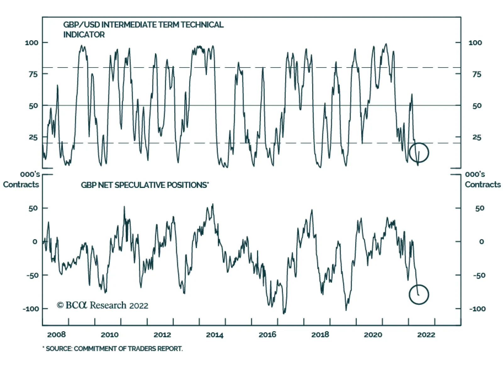
GBP/USD has been strengthening over the past three weeks after hitting a two-year low of 1.22 on May 12. Does this mark the beginning of a more sustainable rally? Cable faces crosscurrents over the near term. On the one hand, the BoE’s recent messaging…
Executive Summary Investors face a dilemma. The faster that inflation comes down, the better it will be for valuations via a stronger rally in the bond price. But if a collapse in inflation requires a sharp deceleration in growth, the worse it will be for profits. Bond yields are likely in a peaking process, but the sharpest declines may come a few months down the road, after an unambiguous roll-over in food and energy inflation. The stock market’s valuation-driven sell-off is likely over, but the danger is that it morphs into a profits-driven sell-off. As such, the stock market will remain under pressure through 2022, though it is likely to be higher 12 months from now in June 2023. High conviction recommendation: Overweight healthcare versus basic resources. In other words, tilt towards sectors that benefit the most from rising bond prices and that suffer the least from contracting profits. New high conviction recommendation: Go long the Japanese yen. As bond yield differentials re-tighten, the yen will rally. Additionally, the yen will benefit from its haven status in a period of recessionary risk. Fractal trading watchlist: JPY/USD, GBP/USD, and Australian basic resources. If 2022-23 = 1981-82, Then This Is What Happens To The Stock Market
If 2022-23 = 1981-82, Then This Is What Happens To The Stock Market
If 2022-23 = 1981-82, Then This Is What Happens To The Stock Market
Bottom Line: The risk is that the valuation-driven sell-off morphs into a profits-driven sell-off. Feature In May, many stock markets reached the drawdown of 20 percent that defines a technical bear market. Yet what has caught many people off guard is that the bear market in stocks has happened during a bull market in profits. Since the start of 2022, US profits are up by 5 percent.1 The bear market in stocks has happened during a bull market in profits… so far. This shatters the shibboleth that bear markets only happen when there is a profits recession. The 2022 bear market has been a valuation-driven bear market. US profits rose 5 percent, but the multiple paid for those profits collapsed by 25 percent, taking the market into bear territory. None of this should come as any surprise to our regular readers. As we have pointed out many times, a stock market can be likened to a bond with a variable rather than a fixed income. So, just as with a bond, every stock market has a ‘duration’ which establishes which bond it most behaves like. It turns out that that long-duration US stock market has the same duration as a 30-year bond. This means that: The US stock market = (The 30-year T-bond price) multiplied by (US profits) It follows that if the 30-year bond price falls by more than profits rise, then the stock market will sell off. And if the 30-year bond price falls by much more than profits rise, then the stock market will enter a valuation-driven bear market. Therein lies the story of 2022 so far (Chart I-1). Chart I-1The Bear Market Is Valuation-Driven. Profits Are Up... For Now
The Bear Market Is Valuation-Driven. Profits Are Up... For Now
The Bear Market Is Valuation-Driven. Profits Are Up... For Now
Just As In 1981-82, Will The Sell-Off Morph From Valuation-Driven To Profits-Driven? In Markets Echo 1981, When Stagflation Morphed Into Recession, we argued that a good template for what happens to the economy and the markets in 2022-23 is the experience of 1981-82. Does 2022-23 = 1981-82? Then, just as now, the world’s central banks were obsessed with ‘breaking the back’ of inflation, and piloting the economy to a ‘soft landing’. Then, just as now, the central banks were desperate to repair their badly damaged credibility in managing the economy. And then, just as now, an invasion-led war between two major commodity producers – Iran and Iraq – was disrupting commodity supplies and adding to inflationary pressures. In 1981, just as now, the equity market sell-off started as a valuation sell-off, driven by a declining 30-year T-bond price. Profits held up through most of 1981, just as they have so far in 2022. In September 1981, US core inflation finally peaked, with bond yields following soon after. In the current experience, March 2022 appears to have marked the equivalent peak in US core inflation (Chart I-2 and Chart I-3). Chart I-2Does September 1981...
Does September 1981...
Does September 1981...
Chart I-3...Equal March 2022?
...Equal March 2022?
...Equal March 2022?
In late 1981, when the 30-year T-bond price rebounded, the good news was that beaten-down equity valuations also reached their low point. The bad news was that just as the valuation-driven sell-off ended, profits keeled over, and the valuation-driven sell-off morphed into a profits-driven sell-off (Chart I-4). In 2022-23, could history repeat? Chart I-4In September 1981, The Sell-Off Morphed From Valuation-Driven To Profits-Driven
In September 1981, The Sell-Off Morphed From Valuation-Driven To Profits-Driven
In September 1981, The Sell-Off Morphed From Valuation-Driven To Profits-Driven
Recession Or No Recession? That Is Not The Question History rhymes, it rarely repeats exactly. What if the 2022-23 experience can avoid the outright economic recession of the 1981-82 experience? This brings us to another shibboleth that needs to be shattered. You don’t need the economy to go into recession for profits to go into recession. To understand why, we need to visit the concept of operational leverage. Profits is a small number that comes from the difference of two large numbers: sales and the costs of generating those sales. As any company will tell you, sales can be volatile, but costs – which are dominated by wages – are sticky and much slower to change. The upshot is that if sales growth exceeds costs growth, there is a massively leveraged impact on profits growth. This is the magic of operational leverage. But if sales growth falls below sticky cost growth, the magic turns into a curse. The operational leverage goes into reverse, and profits collapse. Using US stock market profits as an example, the magic turns into a curse at real GDP growth of 1.25 percent, above which profits grow at six times the difference, and below which profits shrink at six times the difference (Chart I-5). Chart I-5A Model For US Profits Growth: (Real GDP Growth - 1.25) Times 6
A Model For US Profits Growth: (Real GDP Growth - 1.25) Times 6
A Model For US Profits Growth: (Real GDP Growth - 1.25) Times 6
Strictly speaking, we should compare US profits growth with world GDP growth because multinationals generate their sales globally rather than domestically. But to the extent that the US has both the world’s largest stock market and the world’s largest economy, it is a reasonable comparison. We should also compare both profits and sales in either nominal or real terms, rather than a mixture. But even with these tweaks, we would still find that the dominant driver of profit growth is operational leverage. ‘Recession or no recession?’ is a somewhat moot question, because even non-recessionary low growth is enough to tip profits into contraction. Therefore, the conclusion still stands – ‘recession or no recession?’ is a somewhat moot question, because even non-recessionary low growth is enough to tip profits into contraction. Such a period of low growth is now likely. If 2022-23 = 1981-82, What Happens Next? To repeat: The US stock market = (The 30-year T-bond price) multiplied by (US profits) This means that investors face a dilemma. The faster that inflation comes down, the better it will be for valuations via a stronger rally in the bond price. But if a collapse in inflation requires a sharp deceleration in growth, the worse it will be for profits. This was the precise set-up in December 1981, the equivalent of June 2022 in our historical template. In which case, what can we expect next? 1. Bond yields are likely in a peaking process, but the sharpest declines may come a few months down the road, after an unambiguous roll-over in food and energy inflation (Chart I-6). Chart I-6If 2022-23 = 1981-82, Then This Is What Happens To The Bond Yield
If 2022-23 = 1981-82, Then This Is What Happens To The Bond Yield
If 2022-23 = 1981-82, Then This Is What Happens To The Bond Yield
2. The stock market’s valuation-driven sell-off is likely over, but the danger is that it morphs into a profits-driven sell-off. As such, the stock market will remain under pressure through 2022, though it is likely to be higher 12 months from now in June 2023 (Chart I-7). Chart I-7If 2022-23 = 1981-82, Then This Is What Happens To The Stock Market
If 2022-23 = 1981-82, Then This Is What Happens To The Stock Market
If 2022-23 = 1981-82, Then This Is What Happens To The Stock Market
3. Long-duration defensive sectors will outperform short-duration cyclical sectors. In other words, tilt towards sectors that benefit the most from rising bond prices and suffer the least from contracting profits. As such, a high conviction recommendation is to overweight healthcare versus basic resources (Chart I-8). Chart I-8If 2022-23 = 1981-82, Then This Is What Happens To Healthcare Versus Resources
If 2022-23 = 1981-82, Then This Is What Happens To Healthcare Versus Resources
If 2022-23 = 1981-82, Then This Is What Happens To Healthcare Versus Resources
4. In foreign exchange, the setup is very bullish for the Japanese yen through the next 12 months. The yen’s recent sell-off is explained by bond yields rising outside Japan. As these bond yield differentials re-tighten, the yen will rally. Additionally, the yen will benefit from its haven status in a period of recessionary risk. A new high conviction recommendation is to go long the Japanese yen (Chart I-9). Chart I-9The Yen's Sell-Off Is Due To Bond Yields Rising Outside Japan
The Yen's Sell-Off Is Due To Bond Yields Rising Outside Japan
The Yen's Sell-Off Is Due To Bond Yields Rising Outside Japan
Fractal Trading Watchlist Supporting our bullish fundamental case for the Japanese yen, the sell-off in JPY/USD has reached the point of fragility on its 260-day fractal structure that marked previous major turning points in 2013 and 2015 (Chart 10). Hence, a first new trade is long JPY/USD, setting the trade length at 6 months, and the profit target and symmetrical stop-loss at 5 percent. Chart I-10The Sell-Off In JPY/USD Has Reached A Potential Turning Point
The Sell-Off In JPY/USD Has Reached A Potential Turning Point
The Sell-Off In JPY/USD Has Reached A Potential Turning Point
Supporting our bearish fundamental case for resources stocks, the outperformance of Australian basic resources has reached the point of fragility on its 130-day fractal structure that marked previous turning points in 2013, 2015, and 2021 (Chart I-11). Hence, a second new trade is short Australian basic resources versus the world market, setting the trade length at 6 months, and the profit target and symmetrical stop-loss at 10 percent. Chart I-11The Australian Basic Resources Sector Is Vulnerable To Reversal
The Australian Basic Resources Sector Is Vulnerable To Reversal
The Australian Basic Resources Sector Is Vulnerable To Reversal
Finally, we are adding GBP/USD to our watchlist, given that its 260-day fractal structure is close to the point of fragility that marked major turns in 2014, 2015, and 2016. Our full watchlist of 29 investments that are at, or approaching turning points, is available on our website: cpt.bcaresearch.com Fractal Trading Watchlist: New Additions GBP/USD At A Turning Point
GBP/USD At A Turning Point
GBP/USD At A Turning Point
Chart 1AUD/KRW Is Vulnerable To Reversal
AUD/KRW Is Vulnerable To Reversal
AUD/KRW Is Vulnerable To Reversal
Chart 2Canada Versus Japan Is Reversing
Canada Versus Japan Is Reversing
Canada Versus Japan Is Reversing
Chart 3Canada's TSX-60's Outperformance Might Be Over
Canada's TSX-60's Outperformance Might Be Over
Canada's TSX-60's Outperformance Might Be Over
Chart 4US Healthcare Providers Vs. Software At Risk of Reversal
US Healthcare Providers Vs. Software At Risk of Reversal
US Healthcare Providers Vs. Software At Risk of Reversal
Chart 5BRL/NZD At A Resistance Point
BRL/NZD At A Resistance Point
BRL/NZD At A Resistance Point
Chart 6Homebuilders Versus Healthcare Services Has Turned
Homebuilders Versus Healthcare Services Has Turned
Homebuilders Versus Healthcare Services Has Turned
Chart 7CNY/USD Has Reversed
CNY/USD Has Reversed
CNY/USD Has Reversed
Chart 8CAD/SEK Reversal Has Started
CAD/SEK Reversal Has Started
CAD/SEK Reversal Has Started
Chart 9Financials Versus Industrials To Reverse
Financials Versus Industrials To Reverse
Financials Versus Industrials To Reverse
Chart 10The Outperformance Of Resources Versus Biotech Has Started To Reverse
The Outperformance Of Resources Versus Biotech Has Started To Reverse
The Outperformance Of Resources Versus Biotech Has Started To Reverse
Chart 11The Outperformance Of Resources Versus Healthcare Is Vulnerable To Reversal
The Outperformance Of Resources Versus Healthcare Is Vulnerable To Reversal
The Outperformance Of Resources Versus Healthcare Is Vulnerable To Reversal
Chart 12FTSE100 Outperformance Vs. Euro Stoxx 50 Is Reversing
FTSE100 Outperformance Vs. Euro Stoxx 50 Is Reversing
FTSE100 Outperformance Vs. Euro Stoxx 50 Is Reversing
Chart 13Netherlands Underperformance Vs. Switzerland Has Been Exhausted
Netherlands Underperformance Vs. Switzerland Has Been Exhausted
Netherlands Underperformance Vs. Switzerland Has Been Exhausted
Chart 14The Sell-Off In The 30-Year T-Bond Is Approaching Fractal Fragility
The Sell-Off In The 30-Year T-Bond Is Approaching Fractal Fragility
The Sell-Off In The 30-Year T-Bond Is Approaching Fractal Fragility
Chart 15The Sell-Off In The NASDAQ Is Approaching Fractal Fragility
The Sell-Off In The NASDAQ Is Approaching Fractal Fragility
The Sell-Off In The NASDAQ Is Approaching Fractal Fragility
Chart 16Food And Beverage Outperformance Has Been Exhausted
Food And Beverage Outperformance Has Been Exhausted
Food And Beverage Outperformance Has Been Exhausted
Chart 17The Strong Trend In The 18-Month-Out US Interest Rate Future Is Fragile
The Strong Trend In The 18-Month-Out US Interest Rate Future Is Fragile
The Strong Trend In The 18-Month-Out US Interest Rate Future Is Fragile
Chart 18The Strong Trend In The 3 Year T-Bond Is Fragile
The Strong Trend In The 3 Year T-Bond Is Fragile
The Strong Trend In The 3 Year T-Bond Is Fragile
Chart 19A Potential Switching Point From Tobacco Into Cannabis
A Potential Switching Point From Tobacco Into Cannabis
A Potential Switching Point From Tobacco Into Cannabis
Chart 20Biotech Is A Major Buy
Biotech Is A Major Buy
Biotech Is A Major Buy
Chart 21Norway's Outperformance Could End
Norway's Outperformance Could End
Norway's Outperformance Could End
Chart 22Cotton Versus Platinum Is Reversing
Cotton Versus Platinum Is Reversing
Cotton Versus Platinum Is Reversing
Chart 23Switzerland's Outperformance Vs. Germany Has Started To End
Switzerland's Outperformance Vs. Germany Has Started To End
Switzerland's Outperformance Vs. Germany Has Started To End
Chart 24The Rally In USD/EUR Has Ended
The Rally In USD/EUR Has Ended
The Rally In USD/EUR Has Ended
Chart 25The Outperformance Of MSCI Hong Kong Versus China Is Vulnerable To Reversal
The Outperformance Of MSCI Hong Kong Versus China Is Vulnerable To Reversal
The Outperformance Of MSCI Hong Kong Versus China Is Vulnerable To Reversal
Chart 26A Potential New Entry Point Into Petcare
A Potential New Entry Point Into Petcare
A Potential New Entry Point Into Petcare
Chart 27Czech Outperformance Near Exhaustion
Czech Outperformance Near Exhaustion
Czech Outperformance Near Exhaustion
Chart 28US REITS Are Oversold Versus Utilities
US REITS Are Oversold Versus Utilities
US REITS Are Oversold Versus Utilities
Chart 29GBP/USD At A Turning Point
GBP/USD At A Turning Point
GBP/USD At A Turning Point
Dhaval Joshi Chief Strategist dhaval@bcaresearch.com Footnotes 1 Defined as 12-month forward earnings per share. Fractal Trading System
More On 2022-23 = 1981-82, And The Danger Ahead
More On 2022-23 = 1981-82, And The Danger Ahead
More On 2022-23 = 1981-82, And The Danger Ahead
More On 2022-23 = 1981-82, And The Danger Ahead
6-Month Recommendations Structural Recommendations Closed Fractal Trades Indicators To Watch - Bond Yields Chart II-1Indicators To Watch - Bond Yields - Euro Area
Indicators To Watch - Bond Yields - Euro Area
Indicators To Watch - Bond Yields - Euro Area
Chart II-2Indicators To Watch - Bond Yields - Europe Ex Euro Area
Indicators To Watch - Bond Yields - Europe Ex Euro Area
Indicators To Watch - Bond Yields - Europe Ex Euro Area
Chart II-3Indicators To Watch - Bond Yields - Asia
Indicators To Watch - Bond Yields - Asia
Indicators To Watch - Bond Yields - Asia
Chart II-4Indicators To Watch - Bond Yields - Other Developed
Indicators To Watch - Bond Yields - Other Developed
Indicators To Watch - Bond Yields - Other Developed
Indicators To Watch - Interest Rate Expectations Chart II-5Indicators To Watch - Interest Rate Expectations
Indicators To Watch - Interest Rate Expectations
Indicators To Watch - Interest Rate Expectations
Chart II-6Indicators To Watch - Interest Rate Expectations
Indicators To Watch - Interest Rate Expectations
Indicators To Watch - Interest Rate Expectations
Chart II-7Indicators To Watch - Interest Rate Expectations
Indicators To Watch - Interest Rate Expectations
Indicators To Watch - Interest Rate Expectations
Chart II-8Indicators To Watch - Interest Rate Expectations
Indicators To Watch - Interest Rate Expectations
Indicators To Watch - Interest Rate Expectations