Europe
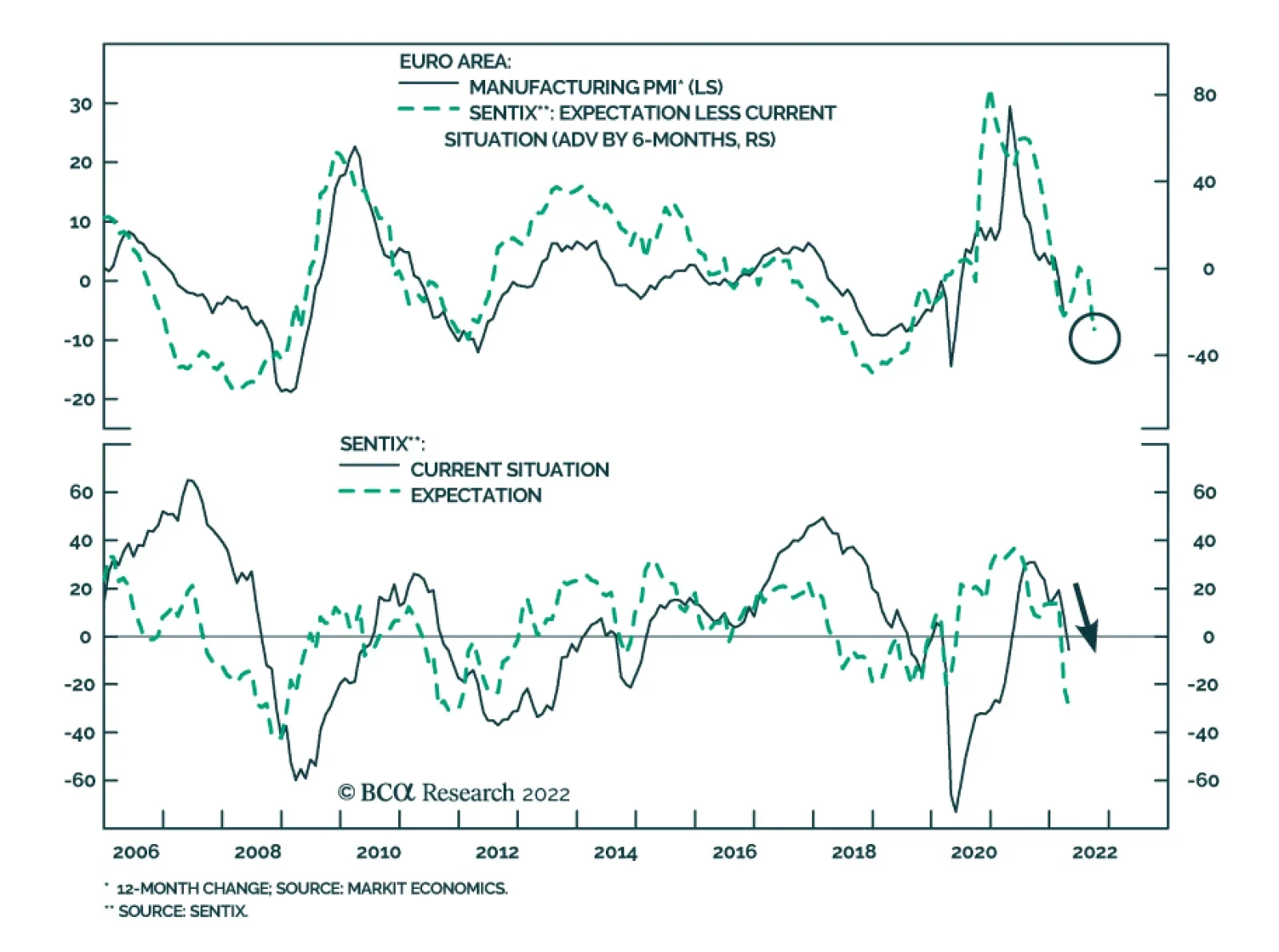
The April Sentix Economic Index sent a negative signal about investor morale. The overall index for the Eurozone collapsed 11 points to -18 – the lowest since July 2020 and a negative surprise to expectations of -9.4. The sharp decline reflects a…

Executive Summary Cheap Or Expensive?
Cheap Or Expensive?
Cheap Or Expensive?
President Emmanuel Macron will be re-elected.French growth will slow in the coming quarters but will also remain solid beyond that horizon.France’s reform push will continue, particularly pension reforms and efforts to reduce inefficiencies. However, austerity is unlikely to materialize.French stocks will underperform once energy inflation peaks. Consumer discretionary and staples have run ahead of themselves relative to the broad market and to their European peers. French small-cap stocks and aerospace and defense equities are attractive.RecommendationsINCEPTIONDATERETURN (%)COMMENTBuy French Small-Caps Equities / Sell French Large-Caps Equities (*)04/04/2022 CyclicalSell French Consumer Equities Relative to French Benchmark (*)04/04/2022 CyclicalOverweight French Aerospace & Defense**04/04/2022 Structural Bottom Line: A second Macron presidency will not boost the appeal of French large-cap equities, even if it helps French long-term growth. Investors should underweight the French market in Europe via a large underweight in French consumer discretionary and consumer staple stocks. However, investors should overweight French defense names as well as small-cap equities.FeatureThe French presidential election is upon us. President Emmanuel Macron ambitious pro-growth and pro-business reform agenda in 2017 tackled the roots of the French malaise of the past decades. Our conviction that Macron would win a second mandate has survived challenges such as the “Yellow Vest Movement” in 2019 and then COVID-19. Now, with the shock of the Ukraine war, the evidence still suggests he will win the upcoming election. Chart 1Five More Years Of Macron
France: Macron And Macro
France: Macron And Macro
Macron is the favorite with 53% of voting intentions against Marine Le Pen in the second round of the election (Chart 1). Even a potential Russian interference in the French election wouldn’t change the outcome of such a duel, which we discussed at length last summer. Since then, Macron’s advantages over Le Pen have only strengthened, boosted by his handling of Omicron and the Ukraine/Russia crisis while the center-right and the far-right battle each other (Chart 1, bottom panel).Macron also took the unofficial leadership of Europe after Angela Merkel exited the stage. He managed to breathe new life into the European Union (EU), bringing forth greater unity. As a result, the current war in Ukraine and elevated energy prices have made this political rendez-vous more relevant. Chart 2Less Euroscepticism Helps Macron
Less Euroscepticism Helps Macron
Less Euroscepticism Helps Macron
The main axis of Macron’s next term is to make France a more independent nation within a stronger Europe. This is a paradox, but what it means is that he is capitalizing on the current geopolitical climate of great power struggle and hypo-globalization. France is breaking with its tradition of Euroscepticism to secure its national interests within a closer European bloc (Chart 2).True, the French economy will not be spared from the current stagflation episode and growth will slow in the near term. However, France is in a better position to withstand the energy shock than most of its European peers.After Macron is re-elected, his political capital will be replenished and his structural reform effort will continue, albeit with modifications to deal with the post-pandemic and post-Ukraine environment. Fiscal and monetary policies remain very accommodative. As a result, Macron has a favorable chance of reforming France further. Pension reform as well as the green and digital transitions will improve France’s economic competitiveness over the long run.2017 vs. 2022: One Pandemic, One Recession, And One War Later Chart 3The French Economy Will Surprise To The Upside
France: Macron And Macro
France: Macron And Macro
France was badly hit by COVID-19. However, appropriate fiscal policy and strong domestic demand are driving the recovery (Chart 3). While most sectors are expected to recover fully by 2023, a few sectors, such as automotive, aeronautics, and tourism, still lag behind pre-pandemic levels (Chart 3, panel 2). On the upside, France appears to be doing better than the other major European economies (Chart 3, bottom panel). Moreover, about 1.5% of GDP worth of leftover funds from emergency measures and the recovery plan are to be deployed in 2022.The Ukrainian conflict challenges this positive backdrop. Growth forecasts for 2022 were revised to 2.8% from 4%. The impact from elevated energy prices is projected to reduce annual GDP growth by 0.7% and to trim an additional 0.2% once international spillovers are factored in (Table 1). Nonetheless, France is not as vulnerable to Russian energy as Germany and Italy (Chart 4). For now, Russia-EU energy flow continues, although the threats are rising. Germany once again rejected an energy boycott when Biden visited Europe two weeks ago, but it is also preparing for the eventuality that gas flows may dry up, which highlights the fluidity of the situation. Table 1Impact Of High Energy Prices
France: Macron And Macro
France: Macron And Macro
Chart 4Low Vulnerability To Russian Energy…
France: Macron And Macro
France: Macron And Macro
The direct consequences of the conflict on French exports are limited. Russia, Ukraine, and Belarus represent 1.2% of French exports, or EUR12 billion, most of which comes from transport equipment and other manufactured goods (Table 2). Table 2… And Low Trade Exposure
France: Macron And Macro
France: Macron And Macro
The evolution of the Chinese economy is another major external influence on French growth. France is exposed to the deceleration of the Chinese manufacturing PMI induced by the slowdown in Chinese credit growth. The recent closing of cities like Shanghai or Shenzhen because of the spread of the Omicron variant will accentuate near-term risks. However, Chinese policymakers want to stabilize growth by the time the Communist Party reshuffles this fall and the credit impulse is trying to bottom, which will help French exports to China improve later this year or next (Chart 5).Higher inflation is another consequence of supply disruptions and elevated energy prices caused by the Ukrainian war. For now, this is not a pressing concern in France. Headline inflation came in at 5.1%, well below the European average (Table 3). The government intervened to shield consumers from rising energy prices by handing out energy vouchers, freezing gas prices until the end of the year, and cutting electricity taxes. Chart 5France Is Sensitive To The Chinese Economy
France Is Sensitive To The Chinese Economy
France Is Sensitive To The Chinese Economy
Table 3Lower Inflation In France
France: Macron And Macro
France: Macron And Macro
Chart 6French Households Accumulated Plenty Of Excess Savings
France: Macron And Macro
France: Macron And Macro
This is good news for French households, as it preserves some of their purchasing power, especially when compared to Spanish households that suffer an inflation rate of 9.8%. However, it is not enough to prevent consumer confidence from crumbling. From Table 1, consumer spending is projected to fall by 1%. Yet, French consumers benefit from their large savings, accumulated during the pandemic (Chart 6). Unlike the US, where the household savings rate has already gone back to pre-pandemic levels, the savings rate in France is still high. Households can use those excess savings to mitigate elevated energy prices.With respect to employment, the generous French furlough scheme contributed to this accumulation of savings by limiting the rise in unemployment (Chart 7). Therefore, the French labor market was resilient throughout the crisis and has recovered quickly. Labor force participation exceeds its pre-crisis level by about 0.5%. Youth unemployment reached its lowest level since the 1980s, at 14.8 %, in part because of the 2017 labor and vocational reforms. Moreover, labor market conditions are now tighter than they were pre-pandemic and firms are increasingly complaining about labor shortages (Chart 8). The business sector still expects employment growth to remain as robust as it was in 2018. As a result, French wage growth will firm up before the year-end. Chart 7The French Labor Market Has Recovered...
The French Labor Market Has Recovered...
The French Labor Market Has Recovered...
Chart 8...And Is Showing Signs Of Tightening
...And Is Showing Signs Of Tightening
...And Is Showing Signs Of Tightening
The corporate sector has several reasons to be optimistic (Chart 9). The emergency measures prevented widespread corporate defaults and bank lending remained supportive through the crisis. Profit margins are high. Additionally, conducting business in France is becoming easier. Business creation has continued to rise (Chart 9, bottom panel) and FDI projects were up 32% in 2021, making France the largest investment destination in Europe. Nonetheless, the rise in non-financial gross corporate debt is concerning, even though the increase in net debt was limited by the jump in bank deposits during the crisis (Chart 10). Chart 9France Is Becoming More Business Friendly
France Is Becoming More Business Friendly
France Is Becoming More Business Friendly
Chart 10Corporate Debt Is A Concern
France: Macron And Macro
France: Macron And Macro
Bottom Line: French growth will decelerate in the coming quarter in response to the Ukrainian crisis, but it will remain stronger than that of its European peers. In the second half of the year, stronger demand recovery in hard-hit sectors, Chinese stimulus, European fiscal support, pent-up demand, and a declining energy drag will allow growth to recover markedly.Reforms: Take 2(022)The series of recent crises highlight several weaknesses in the French economy. The pandemic revealed how vulnerable and underfunded the French health sector is. It also underscored that digitalization is inadequate in French firms. The Ukraine/Russia conflict is mixed: it underscores the energy dependence of European countries and highlights the need for greater defense spending, even if France is already less dependent than others and manufactures state of the art military equipment.Related ReportEuropean Investment StrategyFrance: More Than Just A Déjà-VuIn both crises, the French social welfare state played a crucial role as an automatic stabilizer. The IMF estimates that stabilizers absorbed about 80% of the household income shock during the pandemic, while government spending to contain high energy prices amounted to €15.5 billion since last fall.The fiscal response to these crises caused a large addition to the public debt, which already stands at 115% of GDP. Furthermore, at 55% of GDP before COVID, France’s public expenditure ratio was already one of the highest in the Eurozone (Chart 11). For now, the debt burden is manageable because low interest rates make France’s debt arithmetic benign. However, such an elevated share of output controlled by the government increases resource misallocation and hurts productivity, meaning it weighs on potential GDP growth.Low interest rates are not guaranteed in the future. Putting France’s debt on a sustainable path requires structural reforms (Chart 12). Already, the OECD estimates that the 2017-2018 labor-market and tax reforms have generated positive economic spillovers across all income levels (Chart 12, bottom panel). Chart 11Public Debt Just Got Bigger
France: Macron And Macro
France: Macron And Macro
Chart 12Structural Reforms & Pubic Debt
France: Macron And Macro
France: Macron And Macro
Going forward, reducing debt and cutting spending will be hard considering France’s energy and defense structural goals. Macron’s political party, En Marche!, may perform well in this year’s legislative election, but it is unlikely to achieve the sweeping victory that it saw in 2017. Macron will therefore be forced to compromise to build a coalition in favor of structural reform. His strength in the Assembly will be the chief uncertainty and critical determinant of his ability to achieve his key reform goals in the coming five years. As a result, Macron will focus on lifting French trend growth further by encouraging digital and green transitions. Beyond pension reforms, fiscal austerity will be limited to ensure the social acceptability of structural reforms.In the rest of this section, we focus on the two most important reforms proposed by Macron for his second mandate: pensions and economic competitiveness plans. Reducing public spending is needed to alleviate the burden on resources created by the massive size of the French government, but France’s strategic needs outstrip Macron’s ability to slash spending.French Pension System: Too Generous Table 4Public Spending Comparison
France: Macron And Macro
France: Macron And Macro
Pension represents 14% of GDP compared with 10% in Germany (Table 4). Expenditures on pension explains 35% of the difference on total public spending between France and the Euro Area.Reforming the pension system is a sensitive topic in France. It arguably cost Nicolas Sarkozy his re-election bid in 2012. Yet, pension reforms are essential. The current system is complex and fragmented, with 42 different types of coexisting pensions, each with its own calculation rules. Chart 13Pension Reform Is Long Overdue
France: Macron And Macro
France: Macron And Macro
Additionally, it does not reflect the ageing of the population (Chart 13). Employment among the 55-64 age cohort is only 56% in France, compared to 62% in the OECD average. Also, the effective retirement age in France is 60.8, compared with an average of 65 in Europe. Furthermore, replacement rates (pension / last salaries) are high, which puts an unsustainable burden on the state’s finances.According to the French think tank Institut Montaigne, progressively pushing the retirement age to 65 would save €7.7 billion per year by 2027 and €18 billion per year by 2032. Overall, the government would save around €50 billion per year through such pension adjustments and simplification reforms as well as by operating cost reductions. This would largely finance Macron’s investment to improve competitiveness, digitalization, the green transition, and national defense.Transitioning To Reduce InefficienciesTo boost long-term growth, an important prong of Macron’s project is the €100 billion “France Relance” recovery plan. It is part of the NGEU pandemic relief funds and includes €30 billion for green transition (including measures to improve energy performance of buildings, to increase rail freight, and to support businesses to make the transition). It also includes €34 billion for competitiveness and innovation (tax cuts and support for digitalization). Chart 14French Handicap: Productivity
France: Macron And Macro
France: Macron And Macro
This plan is a band-aid if the many inefficiencies undermining France’s productivity are not tackled (Chart 14). The uptake of digital technologies is uneven and lags far behind other developed nations with respect to cloud computing and the internet of things. Small businesses perform particularly poorly (Chart 15). As a result, the French tech sector has become a priority of Macron’s government. The “France 2030” investment plan unveiled in October 2021, worth €30 billion over five years, aims to foster industrial and tech “champions of the future.” It intends to lift business creation in the tech sector. Nonetheless, this is easier said than done; picking low-hanging fruits will help productivity but matching the prowess of the US is highly unlikely.Another problem is the inefficiency of French R&D. Government support for business R&D is elevated but does not translate into high R&D intensity (Chart 16). This problem is not unique to France: R&D returns across the EU do not match those of the US. Addressing France’s bureaucratic and extremely centralized management structure could tackle some of this hindrance (Chart 16, bottom panel). Chart 15France Is Digitally Lagging …
France: Macron And Macro
France: Macron And Macro
Chart 16… And Full Of Inefficiencies
France: Macron And Macro
France: Macron And Macro
When it comes to the green transition, Macron focuses on three axes: renewable energies, energy efficiency, and electric vehicles.Macron wants a “massive deployment” of renewable energies. A new plan for the construction of additional nuclear reactors will be implemented, since it is the only solution that allows France to reduce its carbon emissions quickly. Alongside this plan for electricity generation, a strategy will be put in place to increase energy efficiency. This is where the support to electric vehicle production and adoption comes in (Chart 17).Reforming energy taxes is another avenue to generate greater revenues, such as from higher carbon pricing, and this would help finance more green investments. Eliminating fossil fuel subsidies, for which France spends significantly more than its peers, and streamlining tax collectioncould yield 1% in annual savings by 2027 (Chart 18). Moreover, increasing carbon prices to EUR65 per ton by 2030 would contribute to France’s environmental goals and provide additional revenue. Chart 17French EV-olution
France: Macron And Macro
France: Macron And Macro
Chart 18More Green Taxes
France: Macron And Macro
France: Macron And Macro
Bottom Line: The re-election of President Macron portends another reform push in France. The large public debt load threatens national long-term economic prospects. Hence, increasing potential GDP growth is paramount. True, Macron’s majority in the Assemblée Nationale will decrease, which will limit the scope of the next reform round. Nonetheless, France will implement pension reforms that can both increase the size of the labor force and finance further initiatives. Moreover, France will push forward with efforts to streamline tech investment, increase spending in the nuclear electricity production, and boost energy efficiency.Investment ImplicationsThe investment implications of a second Macron mandate are manifold. First, investors should remain overweight the French tech sector compared to that of the rest of the Eurozone because of the boost to earnings from greater public investment. Chart 19Small-Caps, Big Upside
Small-Caps, Big Upside
Small-Caps, Big Upside
French small-cap stocks will also benefit from reforms. French small-cap equities have become oversold relative to their large-cap counterparts, falling 30% in relative terms since their late 2017 peak (Chart 19). Part of that underperformance anticipated the drag on French households from spiking energy prices. However, French households are more insulated from the impact of high inflation than their US or European counterparts. Moreover, the previous set of reforms boosted lower- and middle-class income (Chart 12 on page 9). Consequently, French consumer confidence will grow compared to that in the US and China, which helps the relative performance of French small-cap shares (Chart 19, panel 2). Rising German yields and an eventual stabilization in the euro will also buoy these stocks (Chart 19, bottom two panels).French industrials equities will be another sector to enjoy a dividend from Macron’s policy initiatives. The “France 2030” plan involves an increase in capex. The build-up in nuclear power under the green transition plan is also positive for industrial earnings. These policies will favor domestic spending, which bolsters French industrial stocks.Last week, we described the tailwinds for European aerospace and defense equities. The same logic holds true for French aerospace and defense names, which are our favorite plays within the French industrial complex. Chart 3 on page 3 highlighted that the aerospace sector is among the major areas of the economy for which gross value added has yet to recoup its pandemic losses. The gradual re-opening of the global economy will create an important tailwind for the sector. Moreover, France is the fourth-largest global defense exporter. Thus, the French defense industry will profit from the upside in global military spending.Related ReportGeopolitical StrategyFrance: Macron (And Structural Reforms) Still Favored In 2022In this context, French aerospace and defense stocks should outperform not only the overall French market, but also their industrial peers (Chart 20). Since we already favor aerospace and defense equities within the Euro Area, the overweight of French aerospace and defense shares does not translate into an overweight compared to their European competitors. The position of French large-cap stocks within a European portfolio is more complex. They are unlikely to exhibit any significant net impact from Macron’s reform push. French equities have outperformed the rest of Europe already. Most of this outperformance reflected sectoral biases; the French market overweights industrial and consumer stocks. However, the country effect explains the recent outperformance of French equities (Chart 21). The country effect can be approximated by comparing French stocks to the rest of the European market on a sector-neutral basis. Chart 20Favor French Aerospace & Defense
Favor French Aerospace & Defense
Favor French Aerospace & Defense
Chart 21Country Effect Explains The Recent Outperformance Of French Equities
Country Effect Explains The Recent Outperformance Of French Equities
Country Effect Explains The Recent Outperformance Of French Equities
The lower vulnerability of the French economy to higher energy prices compared to the rest of Europe explains this outcome (see Chart 4 on page 4). The outperformance of French consumer stocks (which account for nearly a third of the index) relative to their European competitors added to the country effect as well.An end to the energy spike is likely to arrest the outperformance of French equities. Over the past six years, Brent crude oil prices expressed in euros as well as oil and gas inflation have supported the performance of French equities relative to German ones much better than core inflation or bond yields (Chart 22). The forward earnings of French equities compared to those of the Eurozone market closely track energy markets (Chart 23). Essentially, the French market biases and the country’s low reliance on imported energy are valuable hedges when stagflation fears are rampant (Chart 24). Chart 22The End Of The French Reign Draws Near
The End Of The French Reign Draws Near
The End Of The French Reign Draws Near
Chart 23Supply Shock Lifted French Earnings
Supply Shock Lifted French Earnings
Supply Shock Lifted French Earnings
The best vehicle to underweight French large-cap stocks is to underweight French consumer stocks compared to the Euro Area MSCI benchmark. French equities outperformed the rest of Europe by a greater extent than relative earnings would have implied, which resulted in a small P/E expansion (Chart 25). However, when consumer stocks are excluded, French stocks have performed in line with the rest of the Euro Area and have underperformed relative earnings, which has caused a derating of the French market excluding consumer stocks (Chart 25, bottom two panels). Chart 24French Equities Thrive When Stagflation Fears Are High
French Equities Thrive When Stagflation Fears Are High
French Equities Thrive When Stagflation Fears Are High
Chart 25Cheap Or Expensive?
Cheap Or Expensive?
Cheap Or Expensive?
French consumer equities have become very expensive. Their relative performance has completely decoupled from earnings compared to their Eurozone competitors and their relative valuation has expanded to two sigma above its past 20 years average (Chart 26). Measured against the French broad equity market, the same dynamics can be observed (Chart 26, bottom two panels). These divergences are unsustainable and the most likely catalyst for their correction is the rapid decline in global consumer confidence (Chart 27). Chart 26French Consumer Equities Are Expensive
Beware French Consumer Stocks
Beware French Consumer Stocks
Chart 27Crumbling Consumer Confidence Does Not Bode Well For French Consumer Stocks
French Consumer Equities Are Expensive
French Consumer Equities Are Expensive
Bottom Line: The best direct bets on President Macron’s re-election are to overweight French small-cap stocks compared to large-cap ones and to favor aerospace and defense stocks within the French market. Investors should also underweight French stocks in Europe. However, to do so, investors should underweight French consumer stocks and maintain a benchmark weight for the other French sectors compared to their allocation in the Eurozone benchmark. Traders should buy Euro Area consumer staples and consumer discretionary stocks and sell French ones. Jeremie Peloso,Associate EditorJeremieP@bcaresearch.comMathieu Savary,Chief European StrategistMathieu@bcaresearch.comFootnotes
Executive Summary Equities Are Still Attractive Versus Bonds
Equities Are Still Attractive Versus Bonds
Equities Are Still Attractive Versus Bonds
Macroeconomic Outlook: Global growth will reaccelerate in the second half of this year provided a ceasefire in Ukraine is reached. Inflation will temporarily come down as the dislocations caused by the war and the pandemic subside, before moving up again in late 2023. Equities: Maintain a modest overweight in stocks over a 12-month horizon, favoring non-US equities, small caps, and value stocks. Look to turn more defensive in the second half of 2023 in advance of another wave of inflation. Fixed income: The neutral rate of interest in the US is around 3.5%-to-4%, which is substantially higher than the consensus view. Bond yields will move sideways this year but will rise over the long haul. Overweight Germany, France, Japan, and Australia while underweighting the US and the UK in a global bond portfolio. Credit: Corporate debt will outperform high-quality government bonds over the next 12 months. Favor HY over IG and Europe over the US. Spreads will widen again in late 2023. Currencies: As a countercyclical currency, the US dollar will weaken later this year, with EUR/USD rising to 1.18. We are upgrading our view on the yen from bearish to neutral due to improved valuations. The CNY will strengthen as the Chinese authorities take steps to boost domestic demand. Commodities: Oil prices will dip in the second half of 2022 as the geopolitical premium in crude declines and more OPEC supply comes to market. However, oil and other commodity prices will start moving higher by mid-2023. Bottom Line: The cyclical bull market in stocks that began in 2009 is running long in the tooth, but the combination of faster global growth later this year and a temporary lull in inflation should pave the way for one final hurrah for equities. Dear Client, Instead of our regular report this week, we are sending you our Quarterly Strategy Outlook, where we explore the major trends that are set to drive financial markets in the rest of 2022 and beyond. Next week, please join me for a webcast on Monday, April 11 at 9:00 AM EDT (2:00 PM BST, 3:00 PM CEST, 9:00 PM HKT) where I will discuss the outlook. Best regards, Peter Berezin, Chief Global Strategist P.S. You can now follow me on LinkedIn and Twitter. I. Overview We continue to recommend overweighting global equities over a 12-month horizon. However, we see downside risks to stocks both in the near term (next 3 months) and long term (2-to-5 years). In the near term, stocks will weaken anew if Russia’s stated intentions to scale back operations in Ukraine turn out to be a ruse. There is also a risk that China will need to temporarily shutter large parts of its economy to combat the spread of the highly contagious BA.2 Omicron variant. While stocks could suffer a period of indigestion in response to monetary tightening by the Fed and a number of other central banks, we doubt that rates will rise enough over the next 12 months to undermine the global economy. This reflects our view that the neutral rate of interest in the US and most other countries is higher than widely believed. If the neutral rate ends up being between 3.5% and 4% in the US, as we expect, the odds are low that the Fed will induce a recession by raising rates to 2.75%, as the latest dot plot implies (Chart 1). Chart 1The Market Sees The Fed Raising Rates To Around 3% And Then Backing Off
2022 Second Quarter Strategy Outlook – The New Neutral
2022 Second Quarter Strategy Outlook – The New Neutral
The downside of a higher neutral rate is that eventually, investors will need to value stocks using a higher real discount rate. How fast markets mark up their estimate of neutral depends on the trajectory of inflation. We were warning about inflation before it was cool to warn about inflation (see, for example, our January 2021 report, Stagflation in a Few Months?; or our February 2021 report, 1970s-Style Inflation: Yes, It Could Happen Again). Our view has been that inflation will follow a “two steps up, one step down” pattern. We are currently near the top of those two steps: US inflation will temporarily decline in the second half of this year, as goods inflation drops but service inflation is slow to rise. The decline in inflation will provide some breathing room for the Fed, allowing it to raise rates by no more than what markets are already discounting over the next 12 months. Unfortunately, the respite in inflation will not last long. By the end of 2023, inflation will start to pick up again, forcing the Fed to resume hiking rates in 2024. This second round of Fed tightening is not priced by the markets, and so when it happens, it could be quite disruptive for stocks and other risk assets. Investors should overweight equities on a 12-month horizon but look to turn more defensive in the second half of 2023. II. The Global Economy War and Pestilence Are Near-Term Risks BCA’s geopolitical team, led by Matt Gertken, was ringing the alarm bell about Ukraine well before Russia’s invasion. Recent indications from Russia that it will scale back operations in Ukraine could pave the way for a ceasefire; or they could turn out to be a ruse, giving Russia time to restock supply lines and fortify its army in advance of a new summertime campaign against Kyiv. It is too early to tell, but either way, our geopolitical team expects more fighting in the near term. The West is not keen to give Putin an easy off-ramp, and even if it were, it is doubtful he would take it. The only way that Putin can salvage his legacy among his fan base in Russia is to decisively win the war in order to ensure Ukraine’s military neutrality. For his part, Zelensky cannot simply agree to Russia’s pre-war demands that Ukraine demilitarize and swear off joining NATO unless Russian forces first withdraw. To give in to such demands without any concrete security guarantees would raise the question of why Ukraine fought the war to begin with. The Impact of the Ukraine War on the Global Economy The direct effect of the war on the global economy is likely to be small. Together, Russia and Ukraine account for 3.5% of global GDP in PPP terms and 1.9% in dollar terms. Exports to Russia and Ukraine amount to only 0.2% of G7 GDP (Chart 2). Most corporations have little direct exposure to Russia, although there are a few notable exceptions (Chart 3). Chart 2Little Direct Trade Exposure To Russia And Ukraine
2022 Second Quarter Strategy Outlook – The New Neutral
2022 Second Quarter Strategy Outlook – The New Neutral
In contrast to the direct effects, the indirect effects have the potential to be sizable. Russia is the world’s second largest oil producer, accounting for 12% of annual global output (Chart 4). It is the world’s top exporter of natural gas. About half of European natural gas imports come from Russia. Russia is also a significant producer of nickel, copper, aluminum, steel, and palladium. Chart 3Only A Handful Of Firms Have Significant Sales Exposure To Russia
2022 Second Quarter Strategy Outlook – The New Neutral
2022 Second Quarter Strategy Outlook – The New Neutral
Chart 4Russia is The World's Second Largest Oil Producer
Russia is The World's Second Largest Oil Producer
Russia is The World's Second Largest Oil Producer
Russia and Ukraine are major agricultural producers. Together, they account for a quarter of global wheat exports, with much of it going to the Middle East and North Africa (Chart 5). They are also significant producers of potatoes, corn, sugar beets, and seed oils. In addition, Russia produces two-thirds of all ammonium nitrate, the main source of nitrogen-based fertilizers. Largely as a result of higher commodity prices and other supply disruptions, the OECD estimates that the war could shave about 1% off of global growth this year, with Europe taking the brunt of the hit (Chart 6). At present, the futures curves for most commodities are highly backwardated (Chart 7). While one cannot look to the futures as unbiased predictors of where spot prices are heading, it is fair to say that commodity markets are discounting some easing in prices over the next two years. If that does not occur, global growth could weaken more than the OECD expects. Chart 5Developing Economies Buy The Bulk Of Russian And Ukrainian Wheat
2022 Second Quarter Strategy Outlook – The New Neutral
2022 Second Quarter Strategy Outlook – The New Neutral
Chart 6The War In Ukraine Could Shave One Percentage Point Off Of Global Growth
2022 Second Quarter Strategy Outlook – The New Neutral
2022 Second Quarter Strategy Outlook – The New Neutral
Chart 7Futures Curves For Most Commodities Are Backwardated
2022 Second Quarter Strategy Outlook – The New Neutral
2022 Second Quarter Strategy Outlook – The New Neutral
Another Covid Wave Two years after “two weeks to flatten the curve,” the world continues to underappreciate the power of exponential growth. Suppose that it takes five days for someone with Covid to infect someone else. If everyone with Covid infects an average of six people, the cumulative number of Covid cases would rise from 1,000 to 10 million in around four weeks. Suppose you could cut the number of new infections in half to three per person. In that case, it would take about six weeks for 10 million people to be infected. In other words, mitigation measures that cut the infection rate by half would only extend how long it takes for 10 million people to be infected by two weeks. That’s not a lot. The point is that any infection rate above one will generate an explosive rise in cases. In the pre-Omicron days, keeping the infection rate below one was difficult, but not impossible for countries with the means and motivation to do so. As the virus has become more contagious, however, keeping it at bay has grown more difficult. The latest strain of Omicron, BA.2, appears to be 40% more contagious than the original Omicron strain, which itself was about 4-times more contagious than Delta. BA.2 is quickly spreading around the world. The number of cases has spiked across much of Europe, parts of Asia, and has begun to rise in North America (Chart 8). In China, the authorities have locked down Shanghai, home to 25 million people. Chart 8Covid Cases Are On The Rise Again
2022 Second Quarter Strategy Outlook – The New Neutral
2022 Second Quarter Strategy Outlook – The New Neutral
The success that China has had in suppressing the virus has left its population with little natural immunity; and given the questionable efficacy of its vaccines, with little artificial immunity as well. Moreover, as is the case in Hong Kong, a large share of mainland China’s elderly population remains completely unvaccinated. Chart 9New Covid Drugs Are Set To Hit The Market
2022 Second Quarter Strategy Outlook – The New Neutral
2022 Second Quarter Strategy Outlook – The New Neutral
This presents the Chinese authorities with a difficult dilemma: Impose severe lockdowns over much of the population, or let the virus run rampant. As the logic of exponential change described above suggests, there is not much of a middle ground. Our guess is that the Chinese government will choose the former option. China has already signed a deal to commercialize Pfizer’s Paxlovid. The drug is highly effective at preventing hospitalization if taken within five days from the onset of symptoms. Fortunately, Paxlovid production is starting to ramp up (Chart 9). China will probably wait until it has sufficient supply of the drug before relaxing its zero-Covid policy. While beneficial to growth later this year, this strategy could have a negative near-term impact on activity, as the authorities continue to play whack-a-mole with Covid. Chart 10Inflation Is Running High, Especially In The US
Inflation Is Running High, Especially In The US
Inflation Is Running High, Especially In The US
Central Banks in a Bind Standard economic theory says that central banks should adjust interest rates in response to permanent shocks, while ignoring transitory ones. This is especially true if the shock in question emanates from the supply side of the economy. After all, higher rates cool aggregate demand; they do not raise aggregate supply. The lone exception to this rule is when a supply shock threatens to dislodge long-term inflation expectations. If long-term inflation expectations become unanchored, what began as a transitory shock could morph into a semi-permanent one. The problem for central banks is that the dislocations caused by the Ukraine war are coming at a time when inflation is already running high. Headline CPI inflation reached 7.9% in the US in February, while core CPI inflation clocked in at 6.4%. Trimmed-mean inflation has increased in most economies (Chart 10). Fortunately, while short-term inflation expectations have moved up, long-term expectations have been more stable. Expected US inflation 5-to-10 years out in the University of Michigan survey stood at 3.0% in March, down a notch from 3.1% in January, and broadly in line with the average reading between 2010 and 2015 (Chart 11). Survey-based measures of long-term inflation expectations are even more subdued in the euro area and Japan (Chart 12). Market-based inflation expectations have risen, although this partly reflects higher oil prices. Even then, the widely-watched 5-year, 5-year forward TIPS inflation breakeven rate remains near the bottom of the Fed’s comfort range of 2.3%-to-2.5% (Chart 13).1 Chart 11Long-Term Inflation Expectations Remain Contained In The US...
Long-Term Inflation Expectations Remain Contained In The US...
Long-Term Inflation Expectations Remain Contained In The US...
Chart 12... And In The Euro Area And Japan
... And In The Euro Area And Japan
... And In The Euro Area And Japan
Chart 13The Market's Long-Term Inflation Expectations Are Near The Bottom Of The Fed's Comfort Zone
The Market's Long-Term Inflation Expectations Are Near The Bottom Of The Fed's Comfort Zone
The Market's Long-Term Inflation Expectations Are Near The Bottom Of The Fed's Comfort Zone
Goods versus Services Inflation Most of the increase in consumer prices has been concentrated in goods rather than services (Chart 14). This is rather unusual in that goods prices usually fall over time; but in the context of the pandemic, it is entirely understandable. Chart 14Goods Prices Have Been A Major Driver Of Overall Inflation
2022 Second Quarter Strategy Outlook – The New Neutral
2022 Second Quarter Strategy Outlook – The New Neutral
The pandemic caused spending to shift from services to goods (Chart 15). This occurred at the same time as the supply of goods was being adversely affected by various pandemic-disruptions, most notably the semiconductor shortage that is still curtailing automobile production. Chart 15AGoods Inflation Should Fade As Consumption Shifts Back Towards Services (I)
Goods Inflation Should Fade Goods Inflation Should Fade As Consumption Shifts Back Towards Services (I)
Goods Inflation Should Fade Goods Inflation Should Fade As Consumption Shifts Back Towards Services (I)
Chart 15BGoods Inflation Should Fade As Consumption Shifts Back Towards Services (II)
Goods Inflation Should Fade Goods Inflation Should Fade As Consumption Shifts Back Towards Services (II)
Goods Inflation Should Fade Goods Inflation Should Fade As Consumption Shifts Back Towards Services (II)
Looking out, the composition of consumer spending will shift back towards services. Supply chain bottlenecks should also abate, especially if the situation in Ukraine stabilizes. It is worth noting that the number of ships on anchor off the coast of Los Angeles and Long Beach has already fallen by half (Chart 16). The supplier delivery components of both the manufacturing and nonmanufacturing ISM indices have also come off their highs (Chart 17). Even used car prices appear to have finally peaked (Chart 18). Chart 16Shipping Delays Are Abating
Shipping Delays Are Abating
Shipping Delays Are Abating
Chart 17Delivery Times Are Slowly Coming Down
Delivery Times Are Slowly Coming Down
Delivery Times Are Slowly Coming Down
Chart 18Used Car Prices May Have Finally Peaked
Used Car Prices May Have Finally Peaked
Used Car Prices May Have Finally Peaked
On the Lookout for a Wage-Price Spiral Could rising services inflation offset any decline in goods inflation this year? It is possible, but for that to happen, wage growth would have to accelerate further. For now, much of the acceleration in US wage growth has occurred at the bottom end of the income distribution (Chart 19). It is easy to see why. Chart 20 shows that low-paid workers have not returned to the labor market to the same degree as higher-paid workers. However, now that extended unemployment benefits have lapsed and savings deposits are being drawn down, the incentive to resume work will strengthen. Chart 19Wage Growth Has Picked Up, But Mostly At The Bottom End Of The Income Distribution
Wage Growth Has Picked Up, But Mostly At The Bottom End Of The Income Distribution
Wage Growth Has Picked Up, But Mostly At The Bottom End Of The Income Distribution
Chart 20More Low-Wage Employees Should Return To Work
More Low-Wage Employees Should Return To Work
More Low-Wage Employees Should Return To Work
Chart 21More Workers Will Return To Their Jobs Once The Pandemic Ends
More Workers Will Return To Their Jobs Once The Pandemic Ends
More Workers Will Return To Their Jobs Once The Pandemic Ends
The end of the pandemic should allow more workers to remain at their jobs. In January, during the height of the Omicron wave, 8.75 million US workers (5% of the total workforce) were absent from work due to the virus (Chart 21). How High Will Interest Rates Eventually Rise? If goods inflation comes down swiftly later this year, and services inflation is slow to rise, then overall inflation will decline. This should allow the Fed to pause tightening in early 2023. Whether the Fed will remain on hold beyond then depends on where the neutral rate of interest resides. Chart 22The Yield Curve Inverted in Mid-2019 But Growth Accelerated
The Yield Curve Inverted in Mid-2019 But Growth Accelerated
The Yield Curve Inverted in Mid-2019 But Growth Accelerated
The neutral rate, or equilibrium rate as it is sometimes called, is the interest rate consistent with full employment and stable inflation. If the Fed pauses hiking before interest rates have reached neutral, the economy will eventually overheat, forcing the Fed to resume hiking. In contrast, if the Fed inadvertently raises rates above neutral, unemployment will start rising, requiring the Fed to cut rates. Markets are clearly worried about the latter scenario. The 2/10 yield curve inverted earlier this week. With the term premium much lower than in the past, an inversion in the yield curve is not the powerful harbinger of recession that it once was. After all, the 2/10 curve inverted in August 2019 and the economy actually strengthened over the subsequent six months before the pandemic came along (Chart 22). Nevertheless, an inverted yield curve is consistent with markets expectations that the Fed will raise rates above neutral. That is always a dangerous undertaking. Raising rates above neutral would likely push up the unemployment rate. There has never been a case in the post-war era where the 3-month moving average of the unemployment rate has risen by more than 30 basis points without a recession occurring (Chart 23). Chart 23When Unemployment Starts Rising, It Usually Keeps Rising
When Unemployment Starts Rising, It Usually Keeps Rising
When Unemployment Starts Rising, It Usually Keeps Rising
As discussed in the Feature Section below, the neutral rate of interest is probably between 3.5% and 4% in the US. This is good news in the short term because it lowers the odds that the Fed will raise rates above neutral during the next 12 months. It is bad news in the long run because it means that the Fed will find itself even more behind the curve than it is now, making a recession almost inevitable. The Feature Section builds on our report from two weeks ago. Readers familiar with that report should feel free to skip ahead to the next section. III. Feature: A Higher Neutral Rate Conceptually, the neutral rate is the interest rate that equates the amount of investment a country wants to undertake at full employment with the amount of savings that it has at its disposal.2 Anything that reduces savings or increases investment would raise the neutral rate (Chart 24). Chart 24The Savings-Investment Balance Determines The Neutral Rate Of Interest
2022 Second Quarter Strategy Outlook – The New Neutral
2022 Second Quarter Strategy Outlook – The New Neutral
A number of factors are likely to lower desired savings in the US over the next few years: Households will spend down their accumulated pandemic savings. US households are sitting on $2.3 trillion (10% of GDP) in excess savings, the result of both decreased spending on services during the pandemic and the receipt of generous government transfer payments (Chart 25). Household wealth has soared since the start of the pandemic (Chart 26). Conservatively assuming that households spend three cents of every additional dollar in wealth, the resulting wealth effect could boost consumption by 4% of GDP. Chart 25Plenty Of Pent-Up Demand
Plenty Of Pent-Up Demand
Plenty Of Pent-Up Demand
Chart 26Net Worth Has Soared Since The Pandemic
Net Worth Has Soared Since The Pandemic
Net Worth Has Soared Since The Pandemic
The household deleveraging cycle has ended (Chart 27). Household balance sheets are in good shape. After falling during the initial stages of the pandemic, consumer credit has begun to rebound. For the first time since the housing boom, mortgage equity withdrawals are rising. Banks are easing lending standards on consumer loans across the board. Chart 27US Household Deleveraging Pressures Have Abated
US Household Deleveraging Pressures Have Abated
US Household Deleveraging Pressures Have Abated
Chart 28Baby Boomers Have Amassed A Lot Of Wealth
2022 Second Quarter Strategy Outlook – The New Neutral
2022 Second Quarter Strategy Outlook – The New Neutral
Baby boomers are retiring. They hold over half of US household wealth, considerably more than younger generations (Chart 28). As baby boomers transition from being savers to dissavers, national savings will decline. Government budget deficits will stay elevated. Fiscal deficits subtract from national savings. While the US budget deficit will come down over the next few years, the IMF estimates that the structural budget deficit will still average 4.9% of GDP between 2022 and 2026 compared to 2.0% of GDP between 2014 and 2019 (Chart 29).Chart 29Fiscal Policy: Tighter But Not Tight
2022 Second Quarter Strategy Outlook – The New Neutral
2022 Second Quarter Strategy Outlook – The New Neutral
On the investment front: The deceleration in trend GDP growth, which depressed investment spending, has largely run its course.3 According to the Congressional Budget Office, real potential GDP growth fell from over 3% in the early 1980s to about 1.9% today. The CBO expects potential growth to edge down only slightly to 1.7% over the next few decades (Chart 30). After moving broadly sideways for two decades, core capital goods orders – a leading indicator for capital spending – have broken out to the upside (Chart 31). Capex intention surveys remain upbeat (Chart 32). The average age of the nonresidential capital stock currently stands at 16.3 years, the highest since 1965 (Chart 33). Chart 30Much Of The Deceleration In Potential Growth Has Already Happened
Much Of The Deceleration In Potential Growth Has Already Happened
Much Of The Deceleration In Potential Growth Has Already Happened
Chart 31Positive Signs For Capex (I)
Positive Signs For Capex (I)
Positive Signs For Capex (I)
Chart 32Positive Signs For Capex (II)
Positive Signs For Capex (II)
Positive Signs For Capex (II)
Chart 33An Aging Capital Stock
An Aging Capital Stock
An Aging Capital Stock
Similar to nonresidential investment, the US has been underinvesting in residential real estate (Chart 34). The average age of the housing stock has risen to a 71-year high of 31 years. The homeowner vacancy rate has plunged to the lowest level on record. The number of newly finished homes for sale is half of what it was prior to the pandemic. Chart 34US Housing Is In Short Supply
US Housing Is In Short Supply
US Housing Is In Short Supply
The New ESG: Energy Security and Guns The war in Ukraine will put further upward pressure on the neutral rate, especially outside of the United States. After staging a plodding recovery following the euro debt crisis, European capital spending received a sizable boost from the launch of the NextGenerationEU Recovery Fund (Chart 35). As Mathieu Savary points out in his latest must-read report on Europe, capital spending will rise further in the years ahead as European governments accelerate efforts to make their economies less reliant on Russian energy. Germany has already announced plans to construct three new LNG terminals. The push to build out Europe’s energy infrastructure is coming at a time when businesses are looking to ramp up capital spending. As in the US, Europe’s capital stock has aged rapidly over the past decade (Chart 36). Chart 35European Capex Should Recover
European Capex Should Recover
European Capex Should Recover
Chart 36European Machines Need More Than Just An Oil Change
European Machines Need More Than Just An Oil Change
European Machines Need More Than Just An Oil Change
Chart 37The War In Ukraine Calls For More Spending Across Europe
The War In Ukraine Calls For More Spending Across Europe
The War In Ukraine Calls For More Spending Across Europe
Meanwhile, European governments are trying to ease the burden from rising energy costs. For example, France has introduced a rebate on fuel. It is part of a EUR 20 billion package aimed at cutting heating and electricity bills. European military spending will rise. Military spending currently amounts to 1.5% of GDP, well below NATO’s threshold of 2% (Chart 37). Germany has announced that it will spend EUR 100 billion more on defense. European governments will also need to boost spending to accommodate Ukrainian refugees. The UN estimates that four million refugees have left Ukraine, with the vast majority settling in the EU. A Smaller Chinese Current Account Surplus? The difference between what a country saves and invests equals its current account balance. Historically, China has been a major exporter of savings, which has helped depress interest rates abroad. While China’s current account surplus has declined as a share of its own GDP, it has remained very large as a share of global ex-China GDP, reflecting China’s growing weight in the global economy (Chart 38). Many analysts assume that China will double down on efforts to boost exports in order to offset the drag from falling property investment. However, there is a major geopolitical snag with that thesis: A country that runs a current account surplus must, by definition, accumulate assets from the rest of the world. As the freezing of Russia’s foreign exchange reserves demonstrates, that is a risky proposition for a country such as China. Rather than increasing its current account surplus, China may seek to bolster its economy by raising domestic demand. This could be achieved by either boosting domestic infrastructure spending or raising household consumption. Notably, China’s credit impulse appears to have bottomed and is set to increase in the second half of the year. This is good news not just for Chinese growth but growth abroad (Chart 39). Chart 38Will China Be A Source Of Excess Savings?
Will China Be A Source Of Excess Savings?
Will China Be A Source Of Excess Savings?
Chart 39China's Credit Impulse Appears To Have Bottomed
China's Credit Impulse Appears To Have Bottomed
China's Credit Impulse Appears To Have Bottomed
The IMF’s latest projections foresee China’s current account surplus falling by more than half between 2021 and 2026 as a share of global ex-China GDP. If this were to happen, the neutral rate in China and elsewhere would rise. IV. Financial Markets A. Portfolio Strategy Chart 40The Markets Wobbled And Then Recovered After The Beginning Of The Last Four Fed Rate Cycles
The Markets Wobbled And Then Recovered After The Beginning Of The Last Four Fed Rate Cycles
The Markets Wobbled And Then Recovered After The Beginning Of The Last Four Fed Rate Cycles
As noted in the overview, if the neutral rate turns out to be higher than currently perceived, the Fed is unlikely to induce a recession by raising rates over the next 12 months. That is good news for equities. A look back at the past four Fed tightening cycles shows that stocks often wobble when the Fed starts hiking rates, but then usually rise as long as rates do not move into restrictive territory (Chart 40). Unfortunately, a higher neutral rate also means that investors will eventually need to value stocks using a higher discount rate. It also means that any decline in inflation this year will not last. The US economy will probably start to overheat again in the second half of 2023. This will set the stage for a second, and more painful, tightening cycle in 2024. Admittedly, there is a lot of uncertainty over our “two steps up, one step down” forecast for inflation. It is certainly possible that the “one step down” phase does not last long and that the resurgence in inflation we are expecting in the second half of next year occurs earlier. It is also possible that investors will react negatively to rising rates, even if the economy is ultimately able to withstand them. As such, only a modest overweight to equities is justified over the next 12 months, with risks tilted to the downside in the near term. More conservative asset allocators should consider moving to a neutral stance on equities already, as my colleague Garry Evans advised clients to do in his latest Global Asset Allocation Quarterly Portfolio Outlook. B. Fixed Income Stay Underweight Duration Over a 2-to-5 Year Horizon Our recommendation to maintain below-benchmark duration in fixed-income portfolios panned out since the publication of our Annual Outlook in December, with the US 10-year Treasury yield rising from 1.43% to 2.38%. We continue to expect bond yields in the US to rise over the long haul. Conceptually, the yield on a government bond equals the expected path of policy rates over the duration of the bond plus a term premium. The term premium is the difference between the return investors can expect from buying a long-term bond that pays a fixed interest rate, and the return from rolling over a short-term bill. The term premium has been negative in recent years. Investors have been willing to sacrifice return to own long-term bonds because bond prices usually rise when the odds of a recession go up. The fact that monthly stock returns and changes in bond yields have been positively correlated since 2001 underscores the benefits that investors have received from owning long-term bonds as a hedge against unfavorable economic news (Chart 41). However, now that inflation has emerged as an increasingly important macroeconomic risk, the correlation between stock returns and changes in bond yields could turn negative again. Unlike weak economic growth, which is bad for only stocks, high inflation is bad for both bonds and stocks. Chart 41Correlation Between Stock Returns And Bond Yields Could Turn Negative
Correlation Between Stock Returns And Bond Yields Could Turn Negative
Correlation Between Stock Returns And Bond Yields Could Turn Negative
If bond yields start to rise whenever stock prices fall, the incentive to own long-term bonds will decline. This will cause the term premium to increase. Assuming the term premium rises to about 0.5%, and a neutral rate of 3.5%-to-4%, the long-term fair value for the 10-year US Treasury yield is 4%-to-4.5%. This is well above the 5-year/5-year forward yield of 2.20%. Move from Underweight to Neutral Duration Over a 12-Month Horizon Below benchmark duration positions usually do well when the Fed hikes rates by more than expected over the subsequent 12 months (Chart 42). Chart 42The Golden Rule Of Bond Investing
The Golden Rule Of Bond Investing
The Golden Rule Of Bond Investing
Given our view that US inflation will temporarily decline later this year, the Fed will probably not need to raise rates over the next 12 months by more than the 249 basis points that markets are already discounting. Thus, while a below-benchmark duration position is advisable over a 2-to-5-year time frame, it could struggle over a horizon of less than 12 months. Our end-2022 target range for the US 10-year Treasury yield is 2.25%-to-2.5%. Chart 43Bond Sentiment And Positioning Are Bearish
Bond Sentiment And Positioning Are Bearish
Bond Sentiment And Positioning Are Bearish
Supporting our decision to move to a neutral benchmark duration stance over a 12-month horizon is that investor positioning and sentiment are both bond bearish (Chart 43). From a contrarian point of view, this is supportive of bonds. Global Bond Allocation BCA’s global fixed-income strategists recommend overweighting German, French, Australian, and Japanese government bonds, while underweighting those of the US and the UK. They are neutral on Italy and Spain given that the ECB is set to slow the pace of bond buying. The neutral rate of interest has risen in the euro area, partly on the back of more expansionary fiscal policy across the region. In absolute terms, however, the neutral rate in the euro area is still quite low, and possibly negative. Unlike in the US, where inflation has risen to uncomfortably high levels, much of Europe would benefit from higher inflation expectations, as this would depress real rates across the region, giving growth a boost. This implies that the ECB is unlikely to raise rates much over the next two years. As with the euro area, Japan would benefit from lower real rates. The Bank of Japan’s yield curve control policy has been put to the test in recent weeks. To its credit, the BoJ has stuck to its guns, buying bonds in unlimited quantities to prevent yields from rising. We expect the BoJ to stay the course. Unlike in the euro area and Japan, inflation expectations are quite elevated in the UK and wage growth is rising quickly there. This justifies an underweight stance on UK gilts. Although job vacancies in Australia have climbed to record levels, wage growth is still not strong enough from the RBA’s point of view to justify rapid rate hikes. As a result, BCA’s global fixed-income strategists remain overweight Australian bonds. Finally, our fixed-income strategists are underweight Canadian bonds but are contemplating upgrading them given that markets have already priced in 238 basis points in tightening over the next 12 months. Unlike in the US, high levels of consumer debt will also limit the Bank of Canada’s ability to raise rates. Modest Upside in High-Yield Corporate Bonds Credit spreads have narrowed in recent days but remain above where they were prior to Russia’s invasion of Ukraine. Since the start of the year, US investment-grade bonds have underperformed duration-matched Treasurys by 154 basis points, while high-yield bonds have underperformed by 96 basis points (Chart 44). The outperformance of high-yield relative to investment-grade debt can be explained by the fact that the former has more exposure to the energy sector, which has benefited from rising oil prices. Looking out, falling inflation and a rebound in global growth later this year should provide a modestly supportive backdrop for corporate credit. High-yield spreads are still pricing in a default rate of 3.8% over the next 12 months (Chart 45). This is well above the trailing 12-month default rate of 1.3%. Our fixed-income strategists continue to prefer US high-yield over US investment-grade. Chart 44Spreads Have Narrowed Over The Past Two Weeks But Remain Above Pre-War Levels
Spreads Have Narrowed Over The Past Two Weeks But Remain Above Pre-War Levels
Spreads Have Narrowed Over The Past Two Weeks But Remain Above Pre-War Levels
Chart 45Spread-Implied Default Rate Is Too High
2022 Second Quarter Strategy Outlook – The New Neutral
2022 Second Quarter Strategy Outlook – The New Neutral
European credit is attractively priced and should benefit from any stabilization in the situation in Ukraine. Our fixed-income strategists prefer both European high-yield and investment-grade bonds over their US counterparts. As with equities, the bull market in corporate credit will end in late 2023 as the Fed is forced to resume raising rates in 2024 in the face of an overheated economy. C. Currencies Chart 46Widening Interest Rate Differentials Have Supported The Dollar
Widening Interest Rate Differentials Have Supported The Dollar
Widening Interest Rate Differentials Have Supported The Dollar
The US Dollar Will Weaken Starting in the Second Half of 2022 Since bottoming last May, the US dollar has been trending higher. While the dollar could strengthen further in the near term if the war in Ukraine escalates, the fundamental backdrop supporting the greenback is starting to fray. If US inflation comes down later this year, the Fed is unlikely to raise rates by more than what markets are already discounting over the next 12 months. Thus, widening rate differentials will no longer support the dollar (Chart 46). The dollar is a countercyclical currency: It usually weakens when global growth is strengthening and strengthens when global growth is weakening (Chart 47). The dollar tends to be particularly vulnerable when growth expectations are rising more outside the US than in the US (Chart 48). Chart 47The Dollar Is A Countercyclical Currency
The Dollar Is A Countercyclical Currency
The Dollar Is A Countercyclical Currency
Chart 48Better Growth Prospects Abroad Will Weigh On The US Dollar
Better Growth Prospects Abroad Will Weigh On The US Dollar
Better Growth Prospects Abroad Will Weigh On The US Dollar
Global growth should rebound in the second half of the year once the pandemic finally ends and the situation in Ukraine stabilizes. Growth is especially likely to recover in Europe. This will support the euro, a dovish ECB notwithstanding. Chester Ntonifor, BCA’s Foreign Exchange Strategist, expects EUR/USD to end the year at 1.18. The Dollar is Overvalued The dollar’s ascent has left it overvalued by more than 20% on a Purchasing Power Parity (PPP) basis (Chart 49). The PPP exchange rate equalizes the price of a representative basket of goods and services between the US and other economies. PPP deviations from fair value have done a reasonably good job of predicting dollar movements over the long run (Chart 50). Chart 49USD Remains Overvalued
2022 Second Quarter Strategy Outlook – The New Neutral
2022 Second Quarter Strategy Outlook – The New Neutral
Chart 50Valuations Matter For FX Long-Term Returns
Valuations Matter For FX Long-Term Returns
Valuations Matter For FX Long-Term Returns
Reflecting the dollar’s overvaluation, the US trade deficit has widened sharply (Chart 51). Excluding energy exports, the US trade deficit as a share of GDP is now the largest on record. Equity inflows have helped finance America’s burgeoning current account deficit (Chart 52). However, these inflows have ebbed significantly as foreign investors have lost their infatuation with US tech stocks. Chart 51The US Trade Deficit Has Widened
The US Trade Deficit Has Widened
The US Trade Deficit Has Widened
Chart 52Net Inflows Into US Equities Have Dried Up
Net Inflows Into US Equities Have Dried Up
Net Inflows Into US Equities Have Dried Up
Dollar positioning remains stretched on the long side (Chart 53). That is not necessarily an obstacle in the short run, given that the dollar tends to be a momentum currency, but it does suggest that the greenback could weaken over a 12-month horizon as more dollar bulls jump ship. The Yen: Cheaper but Few Catalysts for a Bounce The trade-weighted yen has depreciated by 6.4% since the start of the year. The yen is 31% undervalued relative to the dollar on a PPP basis (Chart 54). In a nod to these improved valuations, we are upgrading our 12-month and long-term view on the yen from bearish to neutral. Chart 53Still A Lot of Dollar Bulls
Still A Lot of Dollar Bulls
Still A Lot of Dollar Bulls
Chart 54The Yen Has Gotten Cheaper
The Yen Has Gotten Cheaper
The Yen Has Gotten Cheaper
While the yen is unlikely to weaken much from current levels, it is unlikely to strengthen. As noted above, the Bank of Japan has no incentive to abandon its yield curve control strategy. Yes, the recent rapid decline in the yen is a shock to the economy, but it is a “good” shock in the sense that it could finally jolt inflation expectations towards the BoJ’s target of 2%. If inflation expectations rise, real rates would fall, which would be bearish for the currency. Favor the RMB and other EM Currencies The Chinese RMB has been resilient so far this year, rising slightly against the dollar, even as the greenback has rallied against most other currencies. Real rates are much higher in China than in the US, and this has supported the RMB (Chart 55). Chart 55Higher Real Rates In China Have Supported The RMB
Higher Real Rates In China Have Supported The RMB
Higher Real Rates In China Have Supported The RMB
Chart 56The RMB Is Undervalued Based On PPP
The RMB Is Undervalued Based On PPP
The RMB Is Undervalued Based On PPP
Despite the RMB’s strength, it is still undervalued by 10.5% relative to its PPP exchange rate (Chart 56). While productivity growth has slowed in China, it remains higher than in most other countries. The real exchange rates of countries that benefit from fast productivity growth typically appreciates over time. China holds about half of its foreign exchange reserves in US dollars, a number that has not changed much since 2012 (Chart 57). We expect China to diversify away from dollars over the coming years. Moreover, as discussed earlier in the report, the incentive for China to run large current account surpluses may fade, which will result in slower reserve accumulation. Both factors could curb the demand for dollars in international markets. Chart 57Half Of Chinese FX Reserves Are Held In USD Assets
2022 Second Quarter Strategy Outlook – The New Neutral
2022 Second Quarter Strategy Outlook – The New Neutral
A resilient RMB will provide a tailwind for other EM currencies. Many EM central banks began to raise rates well before their developed market counterparts. In Brazil, for example, the policy rate has risen to 11.75% from 2% last April. With inflation in EMs likely to come down later this year as pandemic and war-related dislocations subside, real policy rates will rise, giving EM currencies a boost. D. Commodities Longer-Term Bullish Thesis on Commodities Remains Intact BCA’s commodity team, led by Bob Ryan, expects crude prices to fall in the second half of the year, before moving higher again in 2023. Their forecast is for Brent to dip to $88/bbl by end-2022, which is below the current futures price of $97/bbl. Chart 58Dearth Of Oil Capex Will Put A Floor Under Oil Prices
2022 Second Quarter Strategy Outlook – The New Neutral
2022 Second Quarter Strategy Outlook – The New Neutral
The risk to their end-2022 forecast is tilted to the upside. The relationship between the Saudis and the US has become increasingly strained. This could hamper efforts to bring more oil to market. Hopes that Iranian crude will reach global markets could also be dashed if, as BCA’s geopolitical strategists expect, the US-Iran nuclear deal falls through. A cut-off of Russian oil could also cause prices to rise. While Urals crude is being sold at a heavy discount of $30/bbl to Brent (compared to a discount of around $2/bbl prior to the invasion), it is still leaving the country. In fact, Russian oil production actually rose in March over February. An escalation of the war would make it more difficult for Russia to divert enough oil to China, India, and other countries in order to evade Western sanctions. Looking beyond this year, Bob and his team see upside to oil prices. They expect Brent to finish 2023 at $96/bbl, above the futures price of $89/bbl. Years of underinvestment in crude oil production have led to tight supply conditions (Chart 58). Proven global oil reserves increased by only 6% between 2010 and 2020, having risen by 26% over the preceding decade. Stay Positive on Metals As with oil, there has been little investment in mining capacity in recent years. While a weaker property market in China will weigh on metals prices, this will be partly offset by increased infrastructure spending. The shift towards green energy will also boost metals prices. The typical electric vehicle requires about four times as much copper as a typical gasoline-powered vehicle. Huge amounts of copper will also be necessary to expand electrical grids. Favor Gold Over Cryptos After breaking above $2,000/oz, the price of gold has retreated to $1,926/oz. In the near term, gold prices will be swayed by geopolitical developments. Longer term, real rates will dictate the direction of gold prices. Chart 59 shows that there is a very strong correlation between the price of gold and TIPS yields. If we are correct that the neutral rate of interest is 3.5%-to-4% in the US, real bond yields will eventually need to rise from current levels. Gold prices are quite expensive by historic standards, which represents a long-term risk (Chart 60). Chart 59Strong Correlation Between Real Rates And Gold
Strong Correlation Between Real Rates And Gold
Strong Correlation Between Real Rates And Gold
Chart 60Gold Is Quite Pricey From A Historical Perspective
Gold Is Quite Pricey From A Historical Perspective
Gold Is Quite Pricey From A Historical Perspective
That said, we expect the bulk of the increase in real bond yields to occur only after mid-2023. As mentioned earlier, the Fed will probably not have to deliver more tightening that what markets are already discounting over the next 12 months. Thus, gold prices are unlikely to fall much in the near term. In any case, we continue to regard gold as a safer play than cryptocurrencies. As we discussed in Who Pays for Cryptos?, the long-term outlook for cryptocurrencies remains daunting. Many of the most hyped blockchain applications, from DeFi to NFTs, will turn out to be duds. Concerns that cryptocurrencies are harming the environment, contributing to crime, and enriching a small group of early investors at the expense of everyone else will lead to increased regulatory scrutiny. Our long-term target for Bitcoin is $5,000. E. Equities Equities Are Still Attractively Priced Relative to Bonds Corporate earnings are highly correlated with the state of the business cycle (Chart 61). A recovery in global growth later this year will bolster revenue, while easing supply-chain pressures should help contain costs in the face of rising wages. It is worth noting that despite all the shocks to the global economy, EPS estimates in the US and abroad have actually risen this year (Chart 62). Chart 61The Business Cycle Drives Earnings
The Business Cycle Drives Earnings
The Business Cycle Drives Earnings
Chart 62Global EPS Estimates Have Held Up Reasonably Well
2022 Second Quarter Strategy Outlook – The New Neutral
2022 Second Quarter Strategy Outlook – The New Neutral
Chart 63Equities Are Still Attractive Versus Bonds
Equities Are Still Attractive Versus Bonds
Equities Are Still Attractive Versus Bonds
As Doug Peta, BCA’s Chief US Strategist has pointed out, the bar for positive earnings surprises for Q1 is quite low: According to Refinitiv/IBES, S&P 500 earnings are expected to fall by 4.5% in Q1 over Q4 levels. Global equities currently trade at 18-times forward earnings. Relative to real bond yields, stocks continue to look reasonably cheap (Chart 63). Even in the US, where valuations are more stretched, the earnings yield on stocks exceeds the real bond yield by 570 basis points. At the peak of the market in 2000, the gap between earnings yields and real bond yields was close to zero. Favor Non-US Markets, Small Caps, and Value Valuations are especially attractive outside the US. Non-US equities trade at 13.7-times forward earnings. Emerging markets trade at a forward P/E of only 12.1. Correspondingly, the gap between earnings yields and real bond yields is about 200 basis points higher outside the US. In general, non-US markets fare best in a setting of accelerating growth and a weakening dollar – precisely the sort of environment we expect to prevail in the second half of the year (Chart 64). US small caps also perform best when growth is strengthening and the dollar is weakening (Chart 65). In contrast to the period between 2003 and 2020, small caps now trade at a discount to their large cap brethren. The S&P 600 currently trades at 14.4-times forward earnings compared to 19.7-times for the S&P 500, despite the fact that small cap earnings are projected to grow more quickly both over the next 12-months and over the long haul (Chart 66). Chart 64A Weaker Dollar And Stronger Global Economy Are Tailwinds For Non-US Stocks
A Weaker Dollar And Stronger Global Economy Are Tailwinds For Non-US Stocks
A Weaker Dollar And Stronger Global Economy Are Tailwinds For Non-US Stocks
Chart 65US Small Caps Usually Fare Well When The Economy Is Strengthening And The Dollar Is Weakening
US Small Caps Usually Fare Well When The Economy Is Strengthening And The Dollar Is Weakening
US Small Caps Usually Fare Well When The Economy Is Strengthening And The Dollar Is Weakening
Globally, growth stocks have outperformed value stocks by 60% since 2017. However, only one-tenth of that outperformance has come from faster earnings growth (Chart 67). This has left value trading nearly two standard deviations cheap relative to growth. Chart 66Small Caps Look Attractive Relative To Large Caps
Small Caps Look Attractive Relative To Large Caps
Small Caps Look Attractive Relative To Large Caps
Chart 67Value Remains Cheap
Value Remains Cheap
Value Remains Cheap
Chart 68Higher Yields Tend To Flatter Bank Stocks And Usually Weigh On Tech
Higher Yields Tend To Flatter Bank Stocks And Usually Weigh On Tech
Higher Yields Tend To Flatter Bank Stocks And Usually Weigh On Tech
Tech stocks are overrepresented in growth indices, while banks are overrepresented in value indices. US banks have held up relatively well since the start of the year but have not gained as much as one would have expected based on the significant increase in bond yields (Chart 68). With the deleveraging cycle in the US coming to an end, US banks sport both attractive valuations and the potential for better-than-expected earnings growth. European banks should also recover as the situation in Ukraine stabilizes. They trade at only 7.9-times forward earnings and 0.6-times book. On the flipside, structurally higher bond yields will weigh on tech shares. Moreover, as we discussed in our recent report entitled The Disruptor Delusion, a cooling in pandemic-related tech spending, increasing market saturation, and concerns about Big Tech’s excessive power will all hurt tech returns. Peter Berezin Chief Global Strategist peterb@bcaresearch.com Footnotes 1 The Federal Reserve targets an average inflation rate of 2% for the personal consumption expenditures (PCE) index. The TIPS breakeven is based on the CPI index. Due to compositional differences between the two indices, CPI inflation has historically averaged 30-to-50 basis points higher than PCE inflation. This is why the Fed effectively targets a CPI inflation rate of about 2.3%-to-2.5%. 2 These savings can either by generated domestically or imported from abroad via a current account deficit. 3 Theoretically, there is a close relationship between trend growth and the equilibrium investment-to-GDP ratio. For example, if real trend growth is 3% and the capital stock-to-GDP ratio is 200%, a country would need to invest 6% of GDP net of depreciation to maintain the existing capital stock-to-GDP ratio. In contrast, if trend growth were to fall to 2%, the country would only need to invest 4% of GDP. Global Investment Strategy View Matrix
2022 Second Quarter Strategy Outlook – The New Neutral
2022 Second Quarter Strategy Outlook – The New Neutral
Special Trade Recommendations Current MacroQuant Model Scores
2022 Second Quarter Strategy Outlook – The New Neutral
2022 Second Quarter Strategy Outlook – The New Neutral
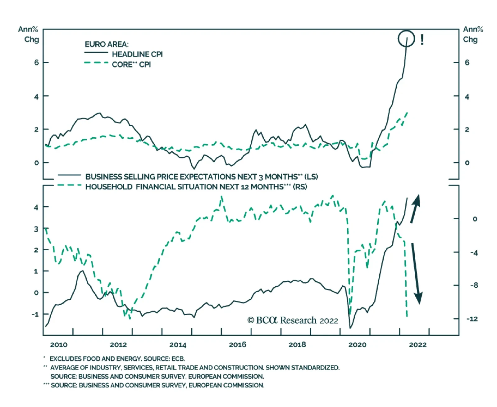
Eurozone CPI inflation surged from 5.9% y/y in February to a record high of 7.5% y/y in March and beat expectations of a 6.7% y/y increase. Soaring headline inflation came on the back of a massive 44.7% increase in energy prices. The core CPI index which…
Executive Summary The Dollar And The Yield Curve
The Dollar And The Yield Curve
The Dollar And The Yield Curve
The dollar has tended to decline 3-to-6 months after the Fed starts hiking interest rates. This has been true since the mid-1990s. Beyond that timeframe, the path of the dollar has depended on what other central banks are doing, and/or which stage of the business cycle we are in. The flattening yield curve in the US is coinciding with a strong dollar (Feature chart), but the historical evidence is that this relationship is very fickle. While the dollar tends to rise during recessions, the average business cycle over the last 40 years has also lasted 90 months, making a recession in the next year possible, but not probable. The dollar has usually followed a long boom/bust cycle of 10 years. If the Fed stays behind the inflation curve, we could be entering a period of weakness akin to the pre-Volcker years in the 70s. The greenback has also tended to be seasonally strong in H1 and weaker in H2. The yen has generally been the best-performing currency shortly after a Fed rate hike. Go short USD/JPY if it touches 124. RECOMMENDATION INCEPTION LEVEL inception date RETURN Short USD/JPY 124 2022-04-01 - Bottom Line: Our bias remains that the DXY index does not have much upside above 100. Our 12-month target remains 90. Feature Chart I-1Dollar Action Before Curve Inversions Is Mixed
Dollar Action Before Curve Inversions Is Mixed
Dollar Action Before Curve Inversions Is Mixed
Rudi Dornbusch was one of the pioneers behind the theory that currency markets tend to overreact. His observation was as simple as it was brilliant. Currency markets are fluid, while prices tend to be sticky. Therefore, a monetary response to an inflation overshoot will initially cause a knee-jerk reaction in the currency before it settles back towards equilibrium. While we have oversimplified Dornbusch’s overshooting model, it is hard to ignore the fact that today’s currency and bond markets could potentially be overreacting. The 10-year/2-year US Treasury spread briefly turned negative this week, as the short end catapulted higher. Historically, that has been a precursor to an impending recession. This is important because the dollar has usually done well during recessions, even though its performance ahead of doomsday has been mixed over a 40-year period (Chart I-1). Given this backdrop, this report attempts to answer a few questions. How has the dollar performed over prior Federal Reserve tightening cycles? What drives the relationship between the dollar and the yield curve? Are the Fed rate hikes currently priced in the short end of the curve credible? Which currencies have historically excelled or suffered once the Fed begins to tighten policy? And finally, what is the roadmap investors should use to gauge the path of the dollar going forward? The Dollar And The Yield Curve Chart I-2A Rising Dollar Has Tracked A Flattening Curve
A Rising Dollar Has Tracked A Flattening Curve
A Rising Dollar Has Tracked A Flattening Curve
The relationship between the dollar and the yield curve has been tight over the last three years. A flattening curve throughout most of 2018 signaled US policy was getting too restrictive relative to underlying economic conditions. The dollar was also rising (Chart I-2). The Federal Reserve eventually responded by cutting rates, which allowed the curve to steepen again, eventually putting a top in the greenback. Our Chief US Bond Strategist, Ryan Swift, has characterized this cycle as the dollar/bond feedback loop (Chart I-3). Chart I-3The Dollar/Bond Feedback Loop
Lessons From Fed Interest Rate Hikes
Lessons From Fed Interest Rate Hikes
In retrospect, this feedback loop works through two channels. First, almost 90% of global transactions are conducted in US dollars, which means the cost of doing business (paying for imports, reconciling accounts payables, servicing debt, and so on) rises for foreigners as the dollar appreciates. This puts a break on economic activity abroad. Second, as a counter-cyclical currency, the dollar tends to attract capital when growth in the rest of the world is slowing, reinforcing this loop. Eventually, a strong dollar and rising domestic bond yields put a break on US economic activity, which causes the Fed to back off. Investors with a high-conviction view that we are close to a recession should be buying the dollar on weakness. In our view, many central banks are becoming too hawkish at the exact moment global growth is set to slow. That said, not unlike the Dornbusch analogy at the start of this text, currency markets have overreacted. Specifically: Over the last 40 years, the average business cycle has lasted 90 months. An inverted yield curve does not corroborate this fact, considering the recession in 2020. It is well known that there are previous episodes of the yield curve inverting, without an impending recession. This time around, rate hike expectations have been heavily priced at the front end of the curve, while being underpriced at the long end. The inference is that the market thinks the Fed is about to make a policy mistake. With policy rates in the US still at 25-50 bps, those near-term rate expectations will turn out to be wrong if US economic growth does indeed slow, forcing the Fed to pivot. The term premium in the US (and globally) is very low, and could rise as quantitative easing is wound down, and yield-curve control is relaxed in bond markets such as Japan. That could help lift longer-term bond yields. Global yield curves have tended to move in unison, with the UK curve historically being the first to invert ahead of a recession. That has not yet happened. Elsewhere, Japanese, and German yield curves are steep (Chart I-4). Chart I-4Global Yield Curves Tend To Move In Unison
Global Yield Curves Tend To Move In Unison
Global Yield Curves Tend To Move In Unison
Historically, the relationship between the yield curve and the dollar has not been consistent (Chart I-5). In the early 80s, the dollar initially rose with a steepening yield curve. In retrospect, rising real rates at the long end of the Treasury curve drove the initial dollar rally. The backdrop was Federal Reserve Chairman Paul Volcker’s resolve to crack down on inflation. Thereafter, rising trade imbalances on the back of a strong dollar eventually led to the Plaza Accord in 1985, which weakened the dollar despite a curve that remained steep. In the 1990s, the dollar rose along with a flattening curve and a productivity boom in the US. In both the latter half of the 2000s and 2010s, the curve flattened, but the performances of the dollar in each case were opposites - weakness in the 2000s, but strength over the last decade. Chart I-5No Consistent Relationship Between The Dollar And The Yield Curve
No Consistent Relationship Between The Dollar And The Yield Curve
No Consistent Relationship Between The Dollar And The Yield Curve
The bottom line is that the dollar tends to do well during recessions, which historically has happened after the yield curve inverts. Prior to that, the performance of the dollar is mixed. Dollar Performance Over Prior Tightening Cycles Chart I-6The Dollar Falls After The First Fed Rate Hike
The Dollar Falls After The First Fed Rate Hike
The Dollar Falls After The First Fed Rate Hike
The dollar has tended to decline 3-to-6 months after the Fed starts hiking interest rates. This has been true since the mid-1990s (Chart I-6). The average decline after six months has been 5.3%. This will pin the DXY at around 95 or so by late summer. As the Appendix shows, while this relationship has been consistent for the dollar, it has been inconclusive for the hiking cycles of other central banks. The exceptions are the CAD, GBP, and SEK which tend to rally three months after their respective central banks raise rates. The AUD initially stalls but performs well one year after the Reserve Bank of Australia lifts interest rates. There is a rationale as to why the dollar performs well ahead of interest rate increases by the Fed, and falters shortly after. Historically, the Fed has usually been the first to start the process of hiking interest rates globally. It has also been the central bank that has lifted rates by the most (Chart I-7). This history of credibility has nudged forward markets to grow accustomed to anticipating the Federal Reserve to be ahead of the curve. As of now, US policy rates stand at 0.25% but the two-year yield is at 2.4%. This divergence could be viewed as vote of credibility akin to during the Volcker years (Chart I-8). Chart I-7The Fed Has Usually Led The Hiking Cycle
The Fed Has Usually Led The Hiking Cycle
The Fed Has Usually Led The Hiking Cycle
Chart I-8The 2-Year/3-Month Treasury Spread Is Very Wide
The 2-year/3-month Treasury Spread Is Very Wide
The 2-year/3-month Treasury Spread Is Very Wide
Beyond a 3-to-6-month timeframe, the path of the dollar has depended on what other central banks are doing (Table I-1). The BoE, BoC, Norges Bank, and RBNZ all raised rates before the Fed. The Riksbank and RBA ended QE ahead of the Fed. The BoJ’s balance sheet has been flat-to-shrinking since 2021. The US dollar has tended to do well when US interest rates are in the top decile amongst the G10 countries (Chart I-9). While that was true before the Covid-19 crisis, it is no longer the case today. This suggests the onus is on the Fed to meet market expectations and keep the dollar strong. Table I-1The Performance Of Currencies Is Mixed When Their Resident Central Bank Hikes Rates
Lessons From Fed Interest Rate Hikes
Lessons From Fed Interest Rate Hikes
Chart I-9The Fed Is Lagging Other G10 Central Banks
The Fed Is Lagging Other G10 Central Banks
The Fed Is Lagging Other G10 Central Banks
Interestingly, the yen has generally done very well around Fed rate hikes (Chart I-10), followed by commodity currencies (Table I-2). It also happens to be incredibly cheap today (Chart I-11). Our bias is that should inflation pick up faster in Japan, the yen will rally ahead of any anticipated changes to monetary policy. Chart I-10G10 Currencies Around The First Fed ##br##Rate Hike
G10 Currencies Around The First Fed Rate Hike
G10 Currencies Around The First Fed Rate Hike
Table 2Most Currencies Appreciate Shortly After The First Fed Rate Hike
Lessons From Fed Interest Rate Hikes
Lessons From Fed Interest Rate Hikes
Chart I-11The Yen Is Very Cheap
The Yen Is Very Cheap
The Yen Is Very Cheap
Are Fed Rate Hikes Sustainable? There is a case to be made that the Federal Reserve could indeed hike interest rates faster than other economies. The 3-month rate-of-change in the dollar has closely followed the mini-growth oscillations between the US and other G10 economies (Chart I-12). US growth is now relatively strong (as measured by relative PMIs or relative economic surprise indices). Barring a global recession, the Fed has more scope to raise interest rates. Related Report Foreign Exchange StrategyThe Yen In 2022 On the flip side, financial conditions in the US are tightening quickly as mortgage rates rise, and the dollar soars. This is happening at a time when growth is weak in China and the PBoC is on an easing path. Chinese long bond yields (a proxy for Chinese growth) tend to rise when the PBoC stimulates growth. (Chart I-13). When the number of Covid-19 cases in China rolls over, there will be a case for growth to firmly bottom. Chart I-12Economic Growth Is Relatively Strong In The US
Economic Growth Is Relatively Strong In The US
Economic Growth Is Relatively Strong In The US
Chart I-13The Chinese Economy Is Soft
The Chinese Economy Is Soft
The Chinese Economy Is Soft
This is important since most Asian economies are very dependent on China to close their output gaps and reach escape velocity in economic growth. Take the example of Japan. Tourist arrivals (mainly from Asia) generally represent 25% of the overall Japanese population but today, that number remains near zero. As a result, consumption outlays in Japan are well below the pre-pandemic trend (Chart I-14). As growth recovers, the Japanese economy should be one of the best candidates for generating non-inflationary growth. This is a bullish backdrop for the currency. Chart I-14Japanese Consumption Is Well Below Trend
Japanese Consumption Is Well Below Trend
Japanese Consumption Is Well Below Trend
Finally, real interest rates in the US remain very low. Empirically, currencies react more to the path of relative real rates (Chart I-15). Chart I-15US Real Rates Are Very Low
US Real Rates Are Very Low
US Real Rates Are Very Low
Seasonality: Friend Or Foe? Coincidentally, the dollar also usually weakens in the second half of the year (Chart I-16). This dovetails with our bias that the dollar also underperforms after the first Fed interest rate hike. This has been especially true over the last decade (Chart I-17). Chart I-16The Dollar Is Seasonally Weak In H2
Lessons From Fed Interest Rate Hikes
Lessons From Fed Interest Rate Hikes
Chart I-17The Dollar Is Seasonally Weak In H2
The Dollar Is Seasonally Weak In H2
The Dollar Is Seasonally Weak In H2
The dollar has already priced in that the Fed will lead the interest rate hiking cycle. However, as we have been highlighting in recent reports, rising inflation is a global problem and not one that is exclusive to the US. The hawks in the ECB are very uncomfortable with this week’s HICP (harmonized index of consumer prices) release of 9.8% in Spain, 7.3% in Germany, and 7% in Italy. As a comparison, headline inflation in the US is 7.9%. A weak euro will only fan the inflationary flame in the eurozone. The Japanese economy could be next in unleashing inflationary surprises, especially on the back of a very cheap yen (Chart I-11). This will raise the probability that the Bank of Japan eases yield curve control. In short, the potential for upside surprises in interest rates is highest outside the US. Concluding Thoughts The academic evidence suggests that short-term interest rates matter more for currencies, especially when policy is close to the zero bound. The BIS report on the topic concludes that short maturity bonds have had the strongest FX impact.1 Moreover, near the effective lower bound, the foreign-exchange impact is greater as the adjustment burden falls onto the exchange rate. As FX becomes the axle of adjustment at lower interest rates, a strong dollar and weaker euro and yen are likely to grease the wheels of an economic rebound in these latter economies. For now, economic momentum in the US is stronger, which indicates that the Fed will initially deliver the bulk of rate hikes priced in the OIS curve this year. Beyond then, if growth picks up faster outside the US, especially in the euro area and Japan, then the USD could enter a consolidation phase. Finally, the yen has tended to be the best-performing currency after a Fed rate hike. Go short USD/JPY if it touches 124. Appendix: Currency Performance Around Interest Rate Hikes United States
Lessons From Fed Interest Rate Hikes
Lessons From Fed Interest Rate Hikes
United States
Lessons From Fed Interest Rate Hikes
Lessons From Fed Interest Rate Hikes
Euro Area
Lessons From Fed Interest Rate Hikes
Lessons From Fed Interest Rate Hikes
Japan
Lessons From Fed Interest Rate Hikes
Lessons From Fed Interest Rate Hikes
United Kingdom
Lessons From Fed Interest Rate Hikes
Lessons From Fed Interest Rate Hikes
Canada
Lessons From Fed Interest Rate Hikes
Lessons From Fed Interest Rate Hikes
Australia
Lessons From Fed Interest Rate Hikes
Lessons From Fed Interest Rate Hikes
New Zealand
Lessons From Fed Interest Rate Hikes
Lessons From Fed Interest Rate Hikes
Switzerland
Lessons From Fed Interest Rate Hikes
Lessons From Fed Interest Rate Hikes
Norway
Lessons From Fed Interest Rate Hikes
Lessons From Fed Interest Rate Hikes
Sweden
Lessons From Fed Interest Rate Hikes
Lessons From Fed Interest Rate Hikes
Chester Ntonifor Foreign Exchange Strategist chestern@bcaresearch.com Footnotes 1 Ferrari, Massimo, Kearns, Jonathan and Schrimpf, Andreas, “Monetary policy’s rising FX impact in the era of ultra-low rates,” Bank of International Settlements, April 2017. Trades & Forecasts Strategic View Tactical Holdings (0-6 months) Limit Orders Forecast Summary
Executive Summary Europe Is Russia's Key Gas Customer
Germany Closer To Rationing Natgas
Germany Closer To Rationing Natgas
Full-on rationing of natural gas by Germany took a step closer to reality, as the standoff with Russia over its insistence on being paid in roubles for gas plays out. News that Germany initiated its first step toward rationing spiked European and UK natgas prices by more than 12% on Wednesday. Higher prices for coal, oil and renewable energy will follow, as these energy sources compete at the margin with natgas in Europe. Inflation and inflation expectations will move higher if Germany ultimately rations scarce natgas supplies. We are watching to see who blinks first – Germany or Russia. The risk of aluminum-smelter shut-downs in Europe once again is elevated. Other metals-refining operations also are at risk of shutdown if rationing is invoked. Trade difficulties arising from Russia's invasion of Ukraine and related sanctions will lead to further bottlenecks on base-metal exports from Russia, as Rusal warned this week. This will further confound the energy transition. Western governments will be forced to accelerate investments and subsidies in carbon-capture technology as fossil-fuel usage and prospects revive. Bottom Line: Fast-changing EU natural gas supply-demand dynamics are impacting competing energy and base metals markets. This is throwing up confusion around the global renewable-energy transition and extending its timetable. Fossil fuels fortunes are being revived, as a result. We remain long commodity index exposure and the equities of oil-and-gas producers and base-metals miners. Feature Events in the EU natural gas markets are changing rapidly in the wake of fast-changing developments in the Russia-Ukraine war. In the wake of these changes, economic prospects for Europe and Russia are rapidly evolving – both potentially negatively over the short run. Full-on rationing of natural gas by Germany took a step closer to reality, as its standoff with Russia over payment for gas in roubles plays out. News Germany is preparing its citizens for rationing spiked European and UK natgas prices by more than 12% Wednesday. It's not clear whether Russia or Germany are bluffing on this score. Russia's oil and gas exports last year accounted for close to 40% of the government's budget. According to Russia's central bank, crude and product revenue last year amounted to just under $180 billion, while pipeline and LNG shipments of natgas generated close to $62 billion last year. Europe is Russia's biggest natgas market, accounting for ~ 40% of its exports. However, as the relative shares of revenues indicate, natgas exports are less important to Russia than crude and liquids exports. Losing this revenue stream for a year would amount to losing ~ $25 billion of revenue, all else equal. In the event, however, the net loss might be lower, since this would put a bid under the natgas market ex-Europe, which would offset part or most of the lost natgas sales to Europe. If Russia is able to re-market those lost volumes, it could offset the loss of European sales. Knock-On Effects The immediate knock-on effect of this news turns out to be higher prices for oil, UK and European natgas. This is not unexpected, as gasoil competes at the margin with natgas in space heating markets, while competition across regions also can be expected to increase. Once again, the risk of aluminum-smelter shut-downs in Europe is elevated if rationing is imposed by Germany. Other metals-refining operations also are at risk of shutdown if rationing is invoked. Lastly, fertilizer production in Europe would be materially impacted, given some 70% of fertilizer costs are accounted for by natgas. In addition to these endogenous EU effects, trade difficulties arising from Russia's invasion of Ukraine and related sanctions will lead to further bottlenecks on base-metal exports from Russia, as Rusal warned this week.1 This will further confound the energy transition as the world's third-largest aluminum smelter faces sanctions – official and self-imposed – and the loss of inputs from Western suppliers, along with reduced access to capital and funding from the West. If, over time, Russia's base metals industries are degraded by the lack of access to capital and technology as oil and gas will be, the global renewable-energy transition will be slowed considerably. We already expect Russia's oil and gas production to fall over time due to the economic isolation created by Russia's invasion of Ukraine, rendering it a diminished member of OPEC 2.0. Russia accounts for ~ 10% of global crude oil supplies, and is the second largest producer of crude oil in the coalition. A long-term degradation of its production profile will exacerbate the persistent imbalance between demand relative to supply globally, which continues to force oil inventories lower (Chart 1). On the metals side, Russia accounts for 6%, 5% and 4% of global primary aluminum, refined nickel and copper production. Persistent supply deficits have left inventories in these markets – particularly nickel and copper – tight and getting tighter (Chart 2).2 Chart 1Oil Inventories Remain Tight...
Oil Inventories Remain Tight...
Oil Inventories Remain Tight...
Chart 2… As Do Metals Inventories
Germany Closer To Rationing Natgas
Germany Closer To Rationing Natgas
Europe's Radical Pivot In a little over a month's time, the EU has been forced to abandon once-immutable post-Cold War beliefs shared by the electorate and politicians of all stripes. Ever-deepening commercial ties with Russia did not ensure EU energy security, nor did they obviate what arguably is any state's primary responsibility: Protecting and defending its citizens. Because of its failed engagement policy with Russia over the post-Cold War interval, the EU is forced to scramble to restore its energy production and expand its sources of energy imports. In addition, it is repeatedly asserting its intent to "double down" of the speed of its renewable-energy transition. And, last but certainly not least, it is forced to rapidly rearm itself in industrial commodity markets that are in the midst of prolonged physical deficits and inventory drawdowns.3 The Russian invasion of Ukraine spurred the EU to action on both the energy and defense fronts. It is rushing head-long into eliminating its dependence on Russia for fuel, particularly natural gas, and will pursue re-arming its member states forthwith (Chart 3). Chart 3Weaning EU Off Russian Gas Will Prove Difficult
Germany Closer To Rationing Natgas
Germany Closer To Rationing Natgas
On the energy front, the EU adopted a two-prong approach to cleave itself from Russian natgas: 1) Diversify its sources of natural gas, which largely will be in the form of liquified natural gas (LNG), and 2) doubling down on renewable energy generation. EU officials are aiming to replace two-thirds of their Russian gas imports by the end of this year, which is an ambitious target. Over the next two years or so, EU officials hope to fully wean themselves from Russian natgas via a combination of infrastructure buildouts and a renewed push to increase domestic production, which was being throttled back by earlier attempts to secure increased Russian supplies, and a strong focus on renewables. EU's US LNG Deal The EU signed a deal with the US to receive an additional 15 Bcm of natural gas in 2022, and 50 Bcm annually by 2030, which is equal to ~ 30% of the EU’s 2020 Russian gas imports. How exactly this will be done is unknown. In 2021, the EU imported 155 bcm of natgas from Russia, or more than 3x the amount being discussed with the US; 14 bcm of that was LNG.4 Just exactly what meeting of the minds was achieved between the EU and US government is totally unclear at this point. The US is not an LNG supplier, nor can it order private companies to renege on existing contacts. The US government likely will use its good offices to attempt to persuade Asian buyers to allow their contracted volumes to be diverted to European buyers, but that would, in all likelihood, mean they would switch to another fuel (e.g., coal) as an alternative if they take that deal. This would, we believe, require some sort of financial incentive to induce such behavior. US liquefaction capacity is also running at near full capacity (Chart 4). While there are projects in the pipeline, in the medium-term (2 – 5 years) the lack of export capacity will act as a constraint to the amount of LNG that can be shipped to the EU. Chart 4Europe Critical To Russia's Gas Industry
Germany Closer To Rationing Natgas
Germany Closer To Rationing Natgas
For Russia, its shipments of gas to OECD-Europe represent more than 70% of its exports (Chart 5). Arguably, Europe is just as important to Russia as Russia is to Europe. With the EU set on a course to sever ties completely, Russia will be forced to invest in pipeline capacity to take more of its gas to China via the Power of Siberia 2 pipeline. In the short-term, US LNG exports to the EU will face headwinds since much of Central and Eastern Europe rely on piped gas from Russia. As a result, many countries within Europe are not equipped with sufficient regasification facilities and are running at near peak utilization rates (Chart 6). Germany does not have any such capacity. Chart 5Not Much Room For US LNG Exports To Grow…
Germany Closer To Rationing Natgas
Germany Closer To Rationing Natgas
Chart 6…Or For Additional European LNG Imports
Germany Closer To Rationing Natgas
Germany Closer To Rationing Natgas
LNG import facilities that have additional intake capacity in the Iberian Peninsula and Eastern Europe do not have sufficient pipeline capacity to move gas inland. This will require additional infrastructure investment as well. To deal with this lack of infrastructure, Germany, Italy and the Netherlands are moving quickly to procure Floating Storage and Regasification (FSRUs) to convert LNG back to its gaseous state. While not the five-year proposition a dedicated LNG train requires to bring on line, setting up FSRUs still could be a years-long process.5 How quickly these assets can be mobilized, and the volumes they can deliver remain to be seen. Investment Implications Fast-changing EU natural gas supply-demand dynamics are impacting competing energy and base metals markets. This is throwing up confusion around the global renewable-energy transition and extending its timetable. Fossil fuels fortunes are being revived, as a result. At this point it is impossible to handicap the odds of a cut-off of Russian natgas to Europe, or its duration if it does occur. Either way, competitive suppliers to Russia – particularly US shale-gas producers selling into the LNG market and the vessels that transport it – will benefit regardless of the course taken by Germany and Russia on rationing. We remain long commodity index via the S&P GSCI and COMT ETF, and the equities of oil-and-gas producers and base-metals miners via the PICK, XME and XOP ETFs. Commodity Round-Up Energy: Bullish Oil prices were whipsawed by new reports suggesting Russia would substantially reduce its military operations in Kyiv ahead of ceasefire talks with Ukraine, only to have that speculation dashed by US officials indicating nothing had changed in the status quo to warrant such a view. Markets restored the risk premium that fell out of prices on the unwarranted speculation, with Brent prices once again above $110/bbl this week. At present, the fundamental oil picture remains tight. In the run-up to a decision from OPEC 2.0's March meeting today, we continued to expect KSA, the UAE and Kuwait to increase production by up to 1.6mm b/d this year, and another 600k b/d next year. To date, OPEC 2.0 has fallen short by ~ 1.2mm b/d since it started returning production taken off line during the pandemic. In return for higher output, we continue to expect the US to deepen its commitment to defending the Gulf Co-operation Council (GCC) states making up core-OPEC 2.0. If we do not see an increase in core-OPEC 2.0 production, we will have to re-assess our fundamental outlook on KSA's, the UAE's and Kuwait's ability to increase production. We also will have to determine whether – even if the supply is available to return to the market – these states have embraced a revenue-maximization strategy, given the fiscal breakeven price for these states now averages ~ $64/bbl. It also is possible that heavily discounted Russian crude oil – trading more than $30/bbl below Brent (vs. the standard $2.50/bbl Urals normally commands) – convinces core-OPEC 2.0 states that oil prices are not so high for large EM buyers like India and China as to create demand destruction. We believe the latter view likely is prevailing at present. We continue to expect Brent to average $93/bbl this year and next (Chart 7). Base Metals: Bullish BHP Group Ltd. will invest more than $10 billion to expand metals production over the next 50 years in Chile. The metals giant aims to stay ESG compliant, provided there is a supportive investment environment provided by the Chilean government. Resource-rich Latin American countries such as Chile and Peru have elected left-leaning governments intent on redistributing mining profits and ensuring companies comply with the ESG framework. As Chile considers raising mining royalties and redrafts its constitution, mining investment in the country has stalled. Political uncertainty in these countries has coincided with low global copper inventories (Chart 8) and high demand. Chart 7
Higher Prices Expected
Higher Prices Expected
Chart 8
Copper Inventories Moving Up
Copper Inventories Moving Up
Robert P. Ryan Chief Commodity & Energy Strategist rryan@bcaresearch.com Footnotes 1 Please see Aluminum Giant Rusal Flags Stark Risks Triggered by War in Ukraine published by Bloomberg on March 30, 2022. 2 Please see our Special Report entitled Commodities' Watershed Moment, published on March 10, 2022. It is available at ces.bcaresearch.com. 3 Please see footnote 2. 4 Please see How Deep Is Europe's Dependence on Russian Oil? published by the Columbia Climate School on March 14, 2022. 5 Please see Europe battles to secure specialised ships to boost LNG imports published by ft.com 28 March 2022. Germany appears to be most advanced in its procurement of FSRU capacity, and is close to concluding a deal that would allow it to regasify 27 bcm annually. Investment Views and Themes Strategic Recommendations Trades Closed in 2021
Image
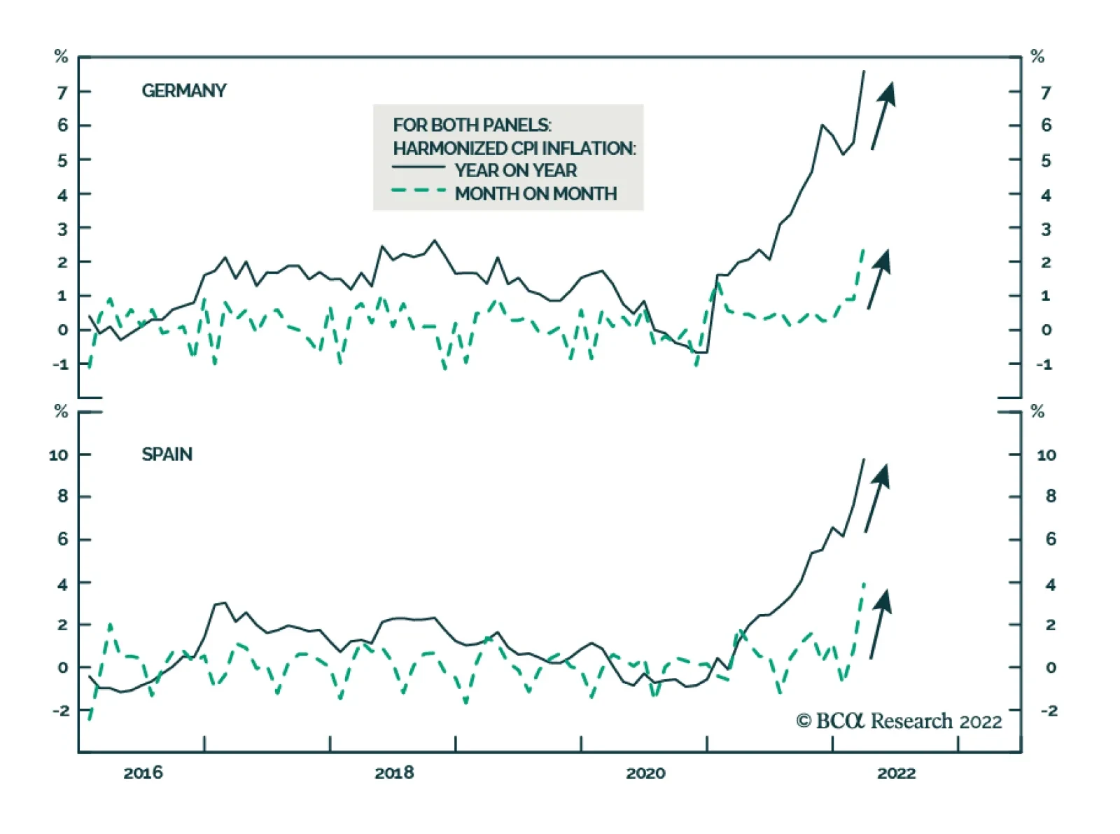
German and Spanish CPI inflation surprised to the upside in March. In Spain, harmonized consumer prices soared 9.8% y/y – significantly above the anticipated 8.4% y/y increase and February’s 7.6% y/y rate. Similarly, German harmonized consumer prices…
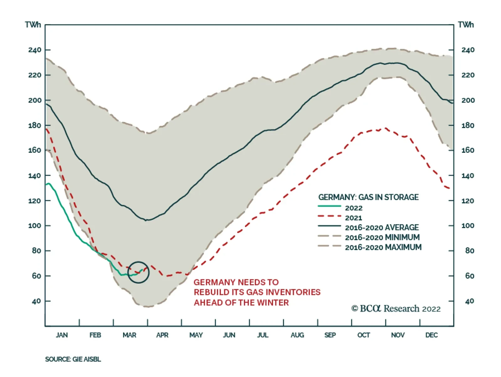
On Wednesday, Germany activated an emergency law to manage gas supplies in the event that natural gas inflows from Russia are cutoff. This move comes after the G7 rejected Russia’s demand for gas payment in rubles. Germany’s emergency law will ensure that…

Optimism about a Russia-Ukraine ceasefire supported the rally in global equities on Tuesday. During talks in Istanbul, Russia’s Deputy Defense Minister Alexander Fomin promised to reduce military activity near Kyiv and Chernihiv in order to build trust during…
Executive Summary Refreshing Our Tactical Trade List
A Post-Invasion Reassessment Of Our Tactical Trade Recommendations
A Post-Invasion Reassessment Of Our Tactical Trade Recommendations
Our current list of tactical trade recommendations centers around two broad themes that predate the Ukraine conflict – rising global inflation expectations and relatively stronger upward pressure on US interest rates. Both themes have been strengthened by the spillovers from the war in Eastern Europe, most notably the link between soaring commodity prices and rising inflation. We still see value in holding our recommended cross-country spread trades that will benefit from continued US bond underperformance (short US Treasuries versus government bonds in Germany, Canada and New Zealand, all at the 10-year maturity). We also maintain our bias to lean against the yield curve flattening trend in the US, but we now prefer to do it solely via our existing SOFR futures calendar spread position. Finding attractively valued inflation breakeven spread trades is more difficult after the latest oil-fueled run-up in developed market inflation expectations. Canadian breakevens, however, stand out as having the greatest upside potential according to our Comprehensive Breakeven Indicators. Bottom Line: Remain in US-Germany, US-Canada an US-New Zealand 10-year government bond yield spread widening trades. Maintain our recommended position in the US SOFR futures curve (long Dec/22 futures, short Dec/24 futures). Add a new inflation-linked bond trade, going long 10-year Canadian breakevens. Feature One month has passed since Russia invaded Ukraine, and investors are still struggling to sort out the financial market implications. Equity markets in the US and Europe have recovered the losses incurred immediately after the conflict began. Equity market volatility has also fallen back to pre-invasion levels according to the VIX index (and its European counterpart, the VStoxx index). That decline in equity volatility has also coincided with a narrowing of corporate credit spreads in both the US and Europe, with the former now fully back to pre-invasion levels. Yet while credit spread volatility has calmed down, government bond yield volatility remains elevated thanks to rising commodity prices putting upward pressure on expectations for inflation and monetary policy (Chart 1). Chart 1Global Bond Yields Are Above Pre-Invasion Levels
Global Bond Yields Are Above Pre-Invasion Levels
Global Bond Yields Are Above Pre-Invasion Levels
Table 1Refreshing Our Tactical Trade List
A Post-Invasion Reassessment Of Our Tactical Trade Recommendations
A Post-Invasion Reassessment Of Our Tactical Trade Recommendations
We have already made some “wartime” adjustments to our global bond market cyclical recommendations, with those changes reflected in our model bond portfolio. This week, we review our shorter-term tactical trade recommendations. Our current list of tactical trades revolves around two broad themes that predate the Ukraine conflict – rising global inflation expectations and relatively stronger cyclical upward pressure on US interest rates. Both themes have been strengthened by the spillovers from the war in Eastern Europe, most notably the link between soaring commodity prices and rising inflation. We continue to see the value in holding on to most of our existing tactical trades, with only a couple of adjustments to be made to our US yield curve and global inflation-linked bond positions (Table 1). US Yield Curve Tactical Trades: Shift Focus To SOFR Steepeners We have recommended trades that lean against the aggressive flattening of the US Treasury curve discounted in forward rates since late 2021. Our view has been that markets were discounting too rapid a pace of Fed rate increases in 2022. With the Fed likely delivering fewer hikes than expected, Treasury curve steepening trades would benefit as the spot Treasury curve would flatten by less than implied by the forwards. Related Report Global Fixed Income StrategyFive Reasons To Tactically Increase US Duration Exposure Now Needless to say, that view has not panned out as we anticipated. The spread between 10-year and 2-year US Treasury yields now sits at a mere +13bps, down from +104bps when we initiated our 2-year/10-year steepener trade last November. The forwards now discount an inversion of that curve starting in June of this year, which would be an extraordinary outcome by historical standards. Typically, the US Treasury curve inverts only after the Fed has delivered an extended monetary tightening cycle that delivers multiple rate hikes over at least a 1-2 year period (Chart 2). Today, the curve has nearly inverted with the Fed having only delivered only a single 25bp rate increase earlier this month. Chart 2The UST Curve Is Unusually Flat Right Now
The UST Curve Is Unusually Flat Right Now
The UST Curve Is Unusually Flat Right Now
Of course, the Fed’s reaction function in the current cycle is different compared to the past. The Fed now follows an average inflation targeting framework that tolerates temporary inflation overshoots after periods when US inflation ran below the Fed’s 2% target. Now, however, the Fed has no choice but to respond to surging US inflation, which has been accelerating since September and is now at levels last seen in 1982. Chart 3Our SOFR Trade Is Similar To Our UST Curve Trade
Our SOFR Trade Is Similar To Our UST Curve Trade
Our SOFR Trade Is Similar To Our UST Curve Trade
We still see the market pricing in too much Fed tightening this year and too few rate hikes in 2023/24. The US overnight index swap (OIS) curve now discounts 218bps of rate hikes in 2022, but 44bps of rate cuts between June 2023 and December 2024. We think a more likely scenario is the Fed doing less than discounted this year, as US inflation should show some deceleration in the latter half of 2022, but then continuing to raise rates in 2023 into 2024. We have expressed this view more specifically through an additional tactical trade that was initiated last month, going long the December 2022 3-month SOFR futures contract versus shorting the December 2024 3-month SOFR futures contract. This new trade is essentially a calendar spread trade between two futures contracts, but with a return profile that has looked quite similar to our 2-year/10-year US Treasury curve flattening trade (Chart 3). Having two tactical trades that are highly correlated, and which both are driven by the same theme of the Fed doing less this year and more over the next two years, is inefficient. We see the SOFR calendar spread trade as a more precise expression of our Fed policy view compared to the 2-year/10-year Treasury curve steepener. In addition, the SOFR trade now offers slightly better value after it has lagged the performance of the Treasury curve trade over the past couple of weeks. Thus, we are keeping this trade in our Tactical Overlay portfolio (see the table on page 15), while closing out our 2-year/10-year steepener at a loss of -92bps.1 Cross-Country Spread Trades: Keeping Betting On Relatively Higher US Yields In our Tactical Overlay portfolio, we currently have three recommended cross-country government bond spread trades that all have one thing in common – a sale of 10-year US Treasuries. The long side of the three trades are different (Germany, New Zealand and Canada), but the logic underlying all three trades is the same. The Fed will deliver more rate hikes than the central banks in the other countries. 10-year US Treasury-German Bund spread Chart 4UST-Bund Spread Is Too Low
UST-Bund Spread Is Too Low
UST-Bund Spread Is Too Low
Expecting a wider US Treasury-German Bund spread remains our highest conviction view in G-10 government bond markets. This is a trade we have described as a more efficient way to position for rising US bond yields than a pure below-benchmark US duration stance. We have maintained that recommendation in both our model bond portfolio and our Tactical Overlay portfolio. For the latter, that trade was implemented using 10-year bond futures in both markets and is up 3.9% since initiation back in October 2021. The case for expecting even more Treasury-Bund spread widening remains strong, for several reasons: Underlying inflation remains higher in the US, particularly when looking at domestic sources of inflation like wages and service sector prices. Europe, which relies more heavily on Russia for its energy supplies than the US, is more at risk of a negative growth shock from the Ukraine conflict. Our fundamental model of the 10-year Treasury-Bund spread shows that the current level of the spread (+197bps) is about one full standard deviation below fair value, which itself is rising due to stronger US economic growth, faster US inflation and a more aggressive path for monetary tightening from the Fed relative to the ECB (Chart 4). The spread between our 24-month discounters in the US and Europe, which measure the amount of rate hikes priced into OIS curves for the two regions over the next two years, has proven to be good leading indicator of the 10-year Treasury-Bund spread. That discounter spread is currently at 99bps, levels last seen when the 10-year Treasury-Bund spread climbed to the 250-300bps range in 2017/18 (Chart 5). With the relative forward curves now discounting a slight narrowing of the US-German 10-year spread over the next year, betting on a wider spread does not suffer from negative carry. We are maintaining this trade in our Tactical Overlay portfolio with great conviction. 10-year US Treasury-Canada government bond spread We entered another cross-country spread trade involving a US Treasury short position earlier this month, in this case versus 10-year Canadian government bonds. This trade is a bet on relative monetary policy moves between the Fed and the Bank of Canada (BoC). Like the Fed, the BoC is facing a problem of high inflation and tight labor markets. Canadian core CPI inflation hit a 19-year high of 3.9% in January, while the Canadian unemployment rate is at a 3-year low of 5.5%. The US is facing even higher inflation and even lower unemployment, but one major difference between the two nations is the degree of household sector debt loads. Canada’s household debt/income ratio now stands at 180%, 55 percentage points higher than the equivalent US ratio, thanks to greater residential mortgage borrowing in Canada (Chart 6). Chart 5Stay Positioned For More UST-Bund Spread Widening
Stay Positioned For More UST-Bund Spread Widening
Stay Positioned For More UST-Bund Spread Widening
The Canadian OIS curve is now discounting a peak policy rate of 3.1% in 2023, which is at the high end of the BoC’s estimated 1.75-2.75% range for the neutral policy rate. Chart 6The BoC Will Have Trouble Matching Fed Hawkishness
The BoC Will Have Trouble Matching Fed Hawkishness
The BoC Will Have Trouble Matching Fed Hawkishness
Elevated household debt will limit the BoC’s ability to lift rates that high, as this would trigger a major retrenchment of housing demand and a significant cooling of house prices. While the US is also facing issues with robust housing demand and high house prices, this is less of a factor that would limit Fed tightening relative to the BoC because US household balance sheets are not as levered as their Canadian counterparts. We are keeping our short US/long Canada spread trade (implemented using bond futures) in our Tactical Overlay portfolio, with the BoC unlikely to keep pace with the expected Fed rate increases over the next year (Chart 7). Chart 7Stay Positioned For A Narrower Canada-US Spread
Stay Positioned For A Narrower Canada-US Spread
Stay Positioned For A Narrower Canada-US Spread
10-year US Treasury-New Zealand government bond spread The third cross-country trade in our Tactical Overlay is 10-year New Zealand-US spread widening trade. Chart 8A Big Gap In NZ-US Relative Interest Rate Expectations
A Big Gap In NZ-US Relative Interest Rate Expectations
A Big Gap In NZ-US Relative Interest Rate Expectations
Like the Germany and Canada spread trades, we expect the Fed to deliver more rate hikes than the Reserve Bank of New Zealand (RBNZ) which should push up US Treasury yields versus New Zealand equivalents. In the case of this trade, however, interest rate expectations in New Zealand are far more aggressive. Chart 9Stay Positioned For NZ-US Spread Tightening
Stay Positioned For NZ-US Spread Tightening
Stay Positioned For NZ-US Spread Tightening
The RBNZ has already lifted its Official Cash Rate (OCR) by 75bps since starting the tightening cycle in mid-2021. The New Zealand OIS curve is now discounting an additional 253bps of rate hikes in this cycle, eventually reaching a peak OCR of 3.5% in June 2023. This would put the OCR into slightly restrictive territory based on the range of neutral rate estimates from the RBNZ’s various quantitative models (Chart 8). This contrasts to the pricing in the US OIS curve that places the peak in the fed funds rate at 2.8% next year before falling back to the low end of the FOMC’s 2.0-3.0% range of neutral estimates in 2024. Both the US and New Zealand are suffering from similarly high rates of inflation, with New Zealand headline inflation reaching 5.9% in the last available data from Q4/2021. However, while markets are already pricing in restrictive monetary settings in New Zealand, markets are yet to price in a similarly restrictive move in the fed funds rate. We continue to see scope for a narrowing of the New Zealand-US 10-year bond yield spread over at least the next six months. There has already been meaningful compression of the 2-year yield spread as US rate expectations have converged towards New Zealand levels (Chart 9) – we expect the 10-year spread to follow suit. Inflation Breakeven Trades: Swap Canada For Australia We currently have one inflation-linked bond (ILB) trade in our Tactical Overlay portfolio, betting on higher inflation breakevens in Australia. We initiated this trade last October, largely based on the signal from our suite of Comprehensive Breakeven Indicators (CBI) for the major developed economy ILB markets. The CBIs contain three components: the deviation from fair value from our 10-year breakeven spread models, the distance between realized headline inflation and the central bank target, and the gap between the 10-year breakeven and survey-based measures of longer-term inflation expectations. Those three measures are standardized and aggregated to form the CBI. Countries with lower CBIs have more upside potential for breakevens, and their ILBs should be favored over those from nations with higher CBIs. Chart 10Breaking Down Our Comprehensive Breakeven Inflation Indicators
A Post-Invasion Reassessment Of Our Tactical Trade Recommendations
A Post-Invasion Reassessment Of Our Tactical Trade Recommendations
Chart 11Favor Canadian Inflation-Linked Bonds Vs. Australia
Favor Canadian Inflation-Linked Bonds Vs. Australia
Favor Canadian Inflation-Linked Bonds Vs. Australia
Given the latest run-up in global inflation breakevens on the back of soaring oil prices, there are now no countries in our CBI universe that have a negative CBI (Chart 10). Canada has the lowest CBI, and thus the highest upside potential for breakeven spread widening. We are taking a modest profit of +40bps in our Australian breakeven trade, as we are approaching the self-imposed six-month holding period limit on our tactical trades and our Australian CBI is not indicating major upside for Australian breakevens.2 Based on the message from our indicators, we see a better case for entering a new tactical spread widening position in 10-year Canadian ILBs. A comparison of the CBIs between Canada and Australia shows that the Canadian 10-year inflation breakeven is well below our model-implied fair value, which incorporates both oil prices and currency levels (Chart 11). This contrasts to the Australian breakeven which is now well above fair value. A similar divergence appears when comparing breakeven spreads to survey-based measures of inflation expectations, with Canadian breakevens looking too “undervalued” compared to Australia. While realized headline inflation is above the respective central bank targets, especially in Canada, the valuation cushion makes the ILBs of the latter the better bargain of the two. The details of our new Canadian 10-year breakeven trade, where we go long the cash ILB and sell 10-year Canadian bond futures against it, are shown in our Tactical Overlay table on page 15. Robert Robis, CFA Chief Fixed Income Strategist rrobis@bcaresearch.com Footnotes 1 The Treasury curve trade is actually a “butterfly” trade, where we have included an allocation to US 3-month Treasury bills (cash) to make the curve steepener duration-neutral. Thus, the trade is more specifically a position where we are long a 2-year US Treasury bullet and short a cash/10-year US Treasury barbell with a duration equal to that of the 2-year. 2 We have recently discovered an error in our how we have calculated the returns on the 10-year Australian futures leg of our Australian 10-year inflation breakeven widening trade. The final total return for our trade shown in the Tactical Overlay table on page 15 corrects for our error, and fortunately shows a significantly higher return than we have published in past reports. GFIS Model Bond Portfolio Recommended Positioning Active Duration Contribution: GFIS Recommended Portfolio Vs. Custom Performance Benchmark
A Post-Invasion Reassessment Of Our Tactical Trade Recommendations
A Post-Invasion Reassessment Of Our Tactical Trade Recommendations
The GFIS Recommended Portfolio Vs. The Custom Benchmark Index Global Fixed Income - Strategic Recommendations* Cyclical Recommendations (6-18 Months)
A Post-Invasion Reassessment Of Our Tactical Trade Recommendations
A Post-Invasion Reassessment Of Our Tactical Trade Recommendations
Tactical Overlay Trades