Europe
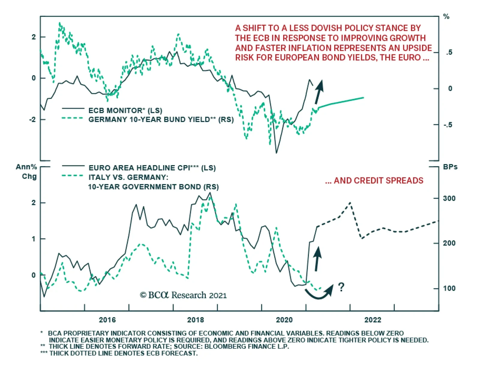
Yesterday’s ECB monetary policy meeting offered no surprises for investors. All policy interest rates were left unchanged, as were the sizes of the ECB’s asset purchase programs. In the press conference following the meeting, ECB President…
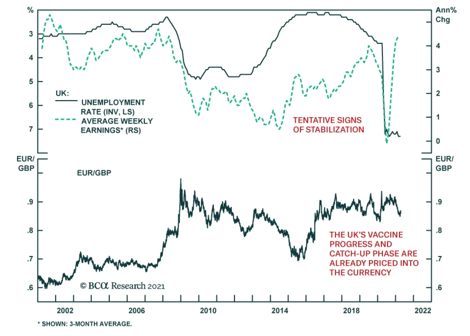
The UK jobs report showed tentative signs of stabilization in the British labor market in March. Jobless claims rose by 10.1 thousand versus a revised 67.3 thousand increase in the prior month, and the claimant rate remained flat at February's revised 7.3%.…
Determining the relationship between relative growth, relative bond yields and foreign exchange movements can be an arduous task. According to our FX Strategists, a circular approach works best. Long bond yields can be regarded as a key signaling mechanism…

Highlights There are tentative signs that US growth outperformance is ebbing. The recovery in the manufacturing sector abroad is already taking leadership from the US. This trend will soon rotate to the service sector. As such, long-term investors should begin to accumulate the euro on weakness. The Canadian economy is improving faster than our February assessment. This suggests the CAD could outperform sooner rather than later. Feature Chart I-1The Euro Drives The DXY
Relative Growth, The Euro, And The Loonie
Relative Growth, The Euro, And The Loonie
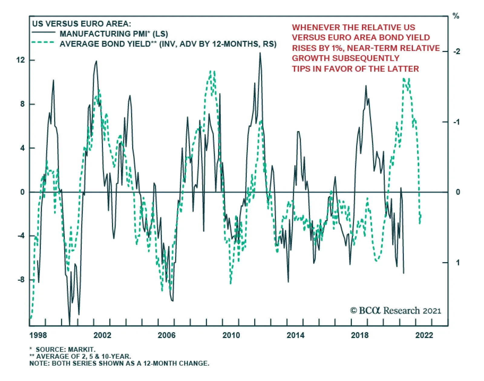
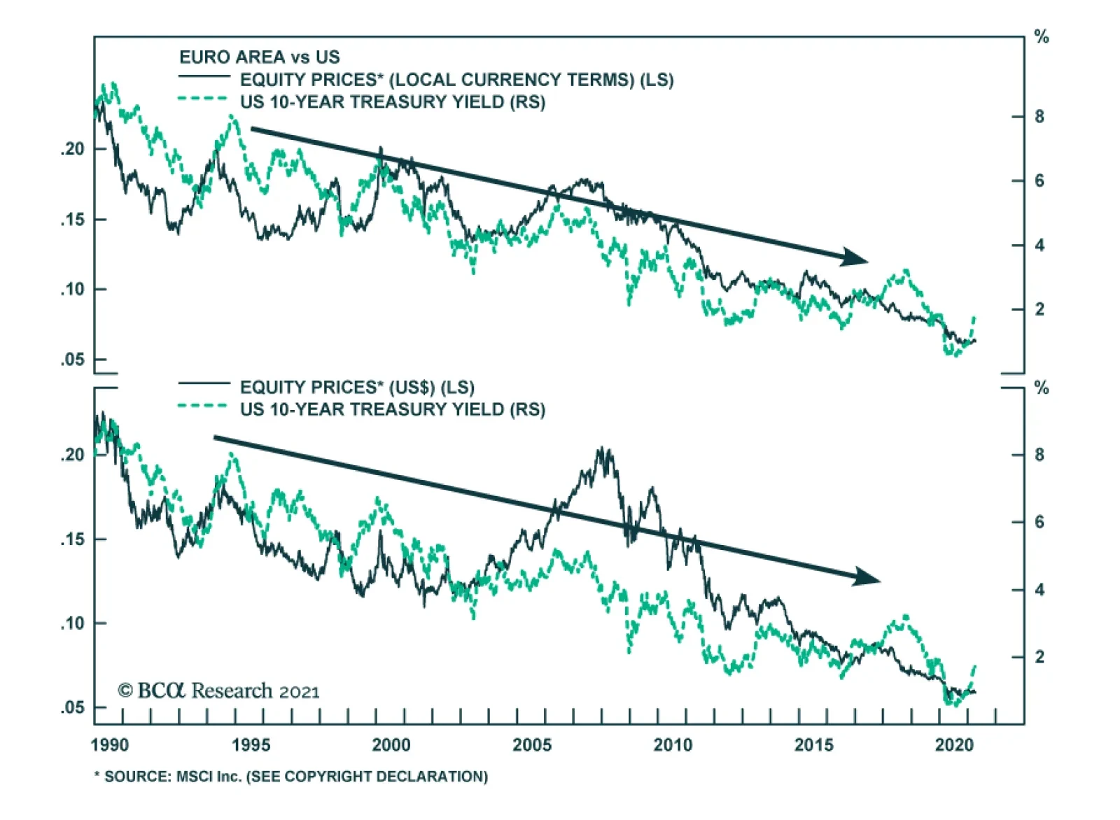
The US economy has been the growth outperformer this year. As such, yields have been rising faster in the US and the dollar has caught a bid. Since the start of the year, the DXY index has retraced 2.5% of its yearly losses against developed market currencies. Meanwhile, the rally has been a broad-based one with the euro, yen and Swedish krona taking the brunt of the decline (Chart I-1). Our bias is that growth outperformance will rotate from the US to the rest of the world later this year. This should hurt the dollar and benefit procyclical currencies. This week, we look at the euro and loonie, two currencies that should benefit from this shift. EUR/USD And The Manufacturing Cycle The relationship between bond yields and the economy is circular. Long bond yields can be regarded as a key signaling mechanism about the growth prospects of an economy. At the same time, bond yields directly affect financial conditions, especially when they rise too far too fast. From the point of view of short-term currency forecasting, determining the tipping point at which rising yields become restrictive could be extremely beneficial in forecasting relative economic growth. Chart I-2 shows that whenever the relative bond yield between the US and the euro area rises by 1%, near-term relative growth subsequently tips in favor of the latter, with a lag of about 12 months. This is important since the correlation between EUR/USD and relative growth is quite strong in the short term (Chart I-3). As such, while the rise in yields between the US and the euro area can hurt EUR/USD in the short term, it will begin to benefit relative euro/US growth in the longer term. Chart I-2Relative Bond Yields And The Manufacturing Cycle
Relative Bond Yields And The Manufacturing Cycle
Relative Bond Yields And The Manufacturing Cycle
Chart I-3Economic Data Is Surprising To The Upside In The Euro Area
Economic Data Is Surprising To The Upside In The Euro Area
Economic Data Is Surprising To The Upside In The Euro Area
Bond Flows And Other Market Signals Despite the increase in US Treasury yields, we have not seen higher European purchases of US bonds this year (Chart I-4). During the dollar bull market from 2011 to 2020, there was a direct correlation between rising US yields and higher Treasury purchases. One difference this time around is that other safe-haven bond markets like Canada, Australia, New Zealand and even the UK, are sporting attractive yields today. US yields have not risen much against other G10 countries in aggregate. This will continue to dent the extent to which the euro can fall. On the flipside, the upside to the euro could be quite substantial. From a purchasing parity perspective, the euro can rise 15% just to reset its discount relative to the US. PPP adjustments tend to take several years, but if the US continues to pursue inflationary policies, then by definition, the fair value of the euro will also rise (Chart I-5). Chart I-4Europeans Have Not Been Increasing Treasury Holdings
Europeans Have Not Been Increasing Treasury Holdings
Europeans Have Not Been Increasing Treasury Holdings
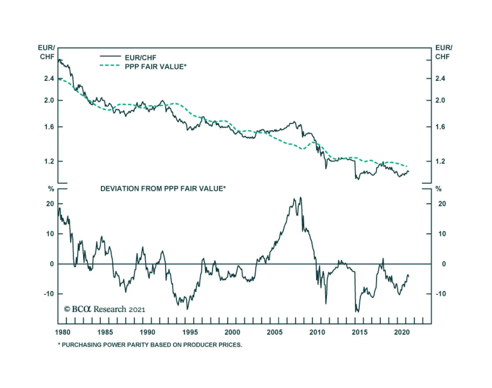
Chart I-5The Euro Remains Slightly ##br##Undervalued
The Euro Remains Slightly Undervalued
The Euro Remains Slightly Undervalued
Other cyclical factors also suggest that the euro could experience a coiled-spring rebound. Copper prices have surged this year and the traditional relationship with the euro has been offside (Chart I-6). While copper is benefiting from a move away from carbon towards cleaner electricity, the euro can benefit as well. European economies have decades of experience in renewable technology and could begin to see meaningful inflows into these sectors once investment capital is deployed. This makes the Bloomberg forecast of EUR/USD at 1.23 at the end of 2022 too pessimistic (Chart I-7). Chart I-6The Euro Could Have A Coiled-Spring Rebound Soon
The Euro Could Have A Coiled-Spring Rebound Soon
The Euro Could Have A Coiled-Spring Rebound Soon
Chart I-7Sentiment On The Euro Has Been Slightly Reset
Sentiment On The Euro Has Been Slightly Reset
Sentiment On The Euro Has Been Slightly Reset
Finally, we are short EUR/JPY as a tactical hedge with tight stops at 131. We are also lifting our limit-buy on the EUR/USD from 1.15 to 1.16. The Canadian Recovery Is Accelerating Chart I-8The Canadian Business Survey Outlook Was Encouraging
The Canadian Business Survey Outlook Was Encouraging
The Canadian Business Survey Outlook Was Encouraging
The Canadian recovery is taking shape faster than our February assessment, which the latest Business Outlook Survey corroborated. Both investment intentions and future sales growth were quite strong, with the former hitting a multi-decade high (Chart I-8). Notably: Two-thirds of firms see sales exceeding pre-pandemic levels; most firms stated that the second wave is having less or no impact to sales, compared to the first; and capacity constraints remain high in certain industries, but overall inflationary concerns remain relatively subdued. The robustness of the survey took us by surprise, given that a second wave of infections is raging, and most of the country is under lockdown. That said, the strength in investment spending is becoming a key theme in a global context, suggesting Canada could see significant FDI flows in the coming years. Markets have started pricing in a faster pace of rate hikes in Canada (Chart I-9). This has been a rare occurrence over the last decade and, together with our Global Fixed Income Strategy colleagues, we still believe there is less of a chance that Canada leads the hiking cycle. However, this could change if momentum in the economy allows it to surpass US growth. Chart I-9Markets Are Pricing In Faster Hikes In Canada
Markets Are Pricing In Faster Hikes In Canada
Markets Are Pricing In Faster Hikes In Canada
The IMF estimates that Canadian real GDP growth will be 5% this year and 4.7% next year. Growth could be much stronger than these levels, according to the Bloomberg Nanos Confidence Index (Chart I-10). Chart I-10Canadian GDP On The Mend
Canadian GDP On The Mend
Canadian GDP On The Mend
The employment report has improved tremendously since our February assessment (Chart I-11). Looking at the sub-components of the BoC Monitor, the weakness was centered on economic variables. This is changing, as the Canadian unemployment rate is falling faster than the US unemployment rate (Chart I-12). That is a bullish development for the CAD. Chart I-11The Canadian Jobs Recovery Is Robust
The Canadian Jobs Recovery Is Robust
The Canadian Jobs Recovery Is Robust
Chart I-12Canadian Employment Catching Up To The US
Canadian Employment Catching Up To The US
Canadian Employment Catching Up To The US
The Canadian housing market is heating up. Overall, house prices are up 10% with many cities well exceeding these levels (Chart I-13). The path for Canadian housing prices has been as follows: government support and macro prudential measures leading to a convergence in prices between low- and high-priced cities. Specifically, Vancouver (and to a certain extent, Toronto) are seeing softer pricing growth, while other cities recover. However, as prices start to deviate away from nominal incomes in lower-priced cities, the risk of wider macro prudential measures greatly increases. The second point is crucial, since the rise in Canadian home prices has been more pronounced than in other countries, such as Australia or the US. This means that both rising indebtedness and falling affordability are likely to present a key macro risk to the Canadian economy. Residential construction is a non-negligible part of the Canadian economy (Chart I-14). Chart I-13The Canadian Housing Market Has Heated Up
The Canadian Housing Market Has Heated Up
The Canadian Housing Market Has Heated Up
Chart I-14Residential Construction Is Booming
Residential Construction Is Booming
Residential Construction Is Booming
Bottom Line: Recent developments are increasing the odds that the Bank of Canada hikes rates sooner rather than later. This will allow further gains in the CAD. The CAD And Oil Crude oil prices are another hugely important driver for the CAD. In fact, for most of this year, interest rates have not been an important factor as the BoC faded any near-term improvement in the Canadian outlook. The Covid-19 crisis together with slow vaccination progress also hurt the recovery, putting the brakes on an appreciating loonie (Chart I-15). Our commodity strategists predict that Brent crude will hit $75 in 2023. This is higher than the forward markets are discounting. Rising forward prices will be synonymous with a higher CAD. However, Canada sells the Western Canadian Select (WCS) blend, which has historically traded at a significant discount to Brent or WTI (Chart I-16). Rising environmental standards hurt Canada, since WCS has a higher sulphur content. Pipeline capacity also remains a major bottleneck to getting Canadian crude to US refineries. Chart I-15The Loonie Has Lagged
The Loonie Has Lagged
The Loonie Has Lagged
Chart I-16Canadian Oil Prices Could Lag The Recovery
Canadian Oil Prices Could Lag The Recovery
Canadian Oil Prices Could Lag The Recovery
The redeeming feature this time around is that the correlation between the CAD/USD and crude oil prices is rising faster than for other currencies, as the US begins to embark on significant infrastructure projects (Chart I-17). Around 50% of US oil imports come from Canada. The Covid-19 crisis also slowed US oil production relative to Canada, which has helped increase the correlation between oil prices and the currency. Portfolio flows into Canada have been accelerating this year, benefitting oil stocks and the loonie. Chart I-17Sensitivity Of USD/CAD To Oil Has Increased
Sensitivity Of USD/CAD To Oil Has Increased
Sensitivity Of USD/CAD To Oil Has Increased
Investment Conclusions Chart I-18The CAD Is Cheap
The CAD Is Cheap
The CAD Is Cheap
The CAD remains cheap. It is trading at one standard deviation below its long-term mean, on a real effective exchange rate basis (Chart I-18). A return to the mean would generate about 10% upside. Our PPP model is less bullish, suggesting the loonie is cheap by about 5%. This still puts 84-85 cents within striking distance. Should the nascent Canadian recovery morph into a genuine acceleration, the CAD could rally even higher. Chester Ntonifor Foreign Exchange Strategist chestern@bcaresearch.com Currencies U.S. Dollar Chart II-1USD Technicals 1
USD Technicals 1
USD Technicals 1
Chart II-2USD Technicals 2
USD Technicals 2
USD Technicals 2
US economic data has been robust this week: CPI in March rose 2.6% year-on-year and 0.6% month-on-month, both exceeding expectations. PPI in March came in at 4.2% year-on-year and 1% month-on-month, beating expectations. The Empire Manufacturing survey staged a meaningful rebound from 17.4 to 26.3 in April. Retail sales were particularly strong, coming in at 9.8% month-on-month in March. The NAHB housing market index remained strong at 83 in April. The DXY Index fell by 0.5% this week. The drop in bond yields was surprising, given robust data. This is likely a signal that bond short positions are becoming a crowded trade. The DXY index is rolling over in April; a trend that supports its seasonal pattern. Report Links: Arbitrating Between Dollar Bulls And Bears - March 19, 2021 The Dollar Bull Case Will Soon Fade - March 5, 2021 Are Rising Bond Yields Bullish For The Dollar? - February 19, 2021 The Euro Chart II-3EUR Technicals 1
EUR Technicals 1
EUR Technicals 1
Chart II-4EUR Technicals 2
EUR Technicals 2
EUR Technicals 2
Recent data from the euro area have been mildly positive: Retail sales grew by 3% month-on-month in February versus the expected 1.7%. ZEW Economic Sentiment for both Germany and the EU in April came in lower than forecast. Industrial production fell by 1% in February over the prior month. German CPI came in at 0.5% month-on-month, in line with forecasts. The euro rose by 0.5% against the dollar this week, making this a second week of appreciation. The new Covid-19 wave may be a drag on EUR/USD in the near term, but this has also reset sentiment and positioning indicators. Our intermediate-term indicator has rolled over substantially, which is bullish from a contrarian perspective. Report Links: Portfolio And Model Review - February 5, 2021 On Japanese Inflation And The Yen - January 29, 2021 The Dollar Conundrum And Protection - November 6, 2020 JapaneseYen Chart II-5JPY Technicals 1
JPY Technicals 1
JPY Technicals 1
Chart II-6JPY Technicals 2
JPY Technicals 2
JPY Technicals 2
Data out of Japan have been mixed: Machinery orders recorded another month of decline, falling by 8.5% month-on-month in February versus an expected 2.8% increase. However, more positively, machine tool orders grew by 65% year-on-year in March. PPI in February came in at 0.8% month-on-month, better than expectations. The Japanese yen rose by 0.4% against the US dollar this week and remains one of the strongest G10 currencies in April. Our intermediate-term indicator has collapsed and speculators are net short the currency. We remain short EUR/JPY as a portfolio hedge. Report Links: The Dollar Bull Case Will Soon Fade - March 5, 2021 On Japanese Inflation And The Yen - January 29, 2021 The Dollar Conundrum And Protection - November 6, 2020 British Pound Chart II-7GBP Technicals 1
GBP Technicals 1
GBP Technicals 1
Chart II-8GBP Technicals 2
GBP Technicals 2
GBP Technicals 2
Recent data out of the UK have been mildly positive: February GDP rose 0.4% versus the prior month, slightly falling short of the expected 0.6% rise. Both the industrial and manufacturing production and the construction output exceeded expectations in February, growing at 1%, 1.3%, and 1.6% month-on-month. The trade deficit with the EU increased to 16.4B in February. The British pound rose by 0.3% against the US dollar this week, ranking in the middle among G10 currencies and flat against the Euro. We exited our short EUR/GBP trade last week to take profit on UK’s vaccination success and expected catch up phase for other economies. The elevated net speculative positioning on the pound also makes us neutral. Report Links: Portfolio And Model Review - February 5, 2021 The Dollar Conundrum And Protection - November 6, 2020 Revisiting Our High-Conviction Trades - September 11, 2020 Australian Dollar Chart II-9AUD Technicals 1
AUD Technicals 1
AUD Technicals 1
Chart II-10AUD Technicals 2
AUD Technicals 2
AUD Technicals 2
Recent data in Australia were strong: NAB business conditions came in at 25 in March versus 17 in February. The Westpac Consumer Confidence Index for April rose 6.2% month-on-month to 118.8, highest since August 2010. The labor recovery remains on track. 71K new jobs were added in March versus expectations of 35K. The unemployment rate also fell from 5.8% to 5.6%. The Australian dollar remained flat against the US dollar this week. However, the recent robust data, soaring terms of trade, and high bond yields make AUD/USD a suitable recovery trade. That said, given Mexico’s proximity to the US where recent economic data are strong, we are short the AUD/MXN pair. Report Links: The Dollar Bull Case Will Soon Fade - March 5, 2021 Portfolio And Model Review - February 5, 2021 Australia: Regime Change For Bond Yields & The Currency? - January 20, 2021 New Zealand Dollar Chart II-11NZD Technicals 1
NZD Technicals 1
NZD Technicals 1
Chart II-12NZD Technicals 2
NZD Technicals 2
NZD Technicals 2
The was scant data out of New Zealand this week: RBNZ held the official cash rate at 0.25% and its asset purchase program steady against a backdrop of a heated housing market, citing uncertainty over the outlook for growth. The NZIERB Business Confidence came in at -13% for Q1 versus -6% in Q4, a first decline in four quarters. The New Zealand dollar remained flat against the US dollar this week. On the day of the rate announcement, NZD rallied while the OIS curve flattened, which is a perplexing development. We believe the OIS curve had the appropriate response. Near term upside risk for Kiwi is the planned travel bubble with Australia. We are long the AUD/NZD. Report Links: Portfolio And Model Review - February 5, 2021 Currencies And The Value-Versus-Growth Debate - July 10, 2020 Updating Our Balance Of Payments Monitor - November 29, 2019 Canadian Dollar Chart II-13CAD Technicals 1
CAD Technicals 1
CAD Technicals 1
Chart II-14CAD Technicals 2
CAD Technicals 2
CAD Technicals 2
The recent data out of Canada have been strong: The Bank of Canada Business Outlook Survey was robust. The sentiment indicator recorded 2.87 in Q1, up from 1.3 in Q4 and highest since 2018. The March employment report was blockbuster. There were 303K new jobs versus an expectation of 100K. The split between part-time and full-time was healthy, 175K versus 128K. This brought down the unemployment rate to 7.5% in March, beating both forecasts and the February reading of 8.2%. The Canadian dollar rose by 0.3% against the US dollar this week. We spend some time in the front section discussing the Canadian dollar, which could be a little vulnerable in the short term, but could touch 84 cents in the coming 12-months. Report Links: Will The Canadian Recovery Lead Or Lag The Global Cycle? - February 12, 2021 Currencies And The Value-Versus-Growth Debate - July 10, 2020 More On Competitive Devaluations, The CAD And The SEK - May 1, 2020 Swiss Franc Chart II-15CHF Technicals 1
CHF Technicals 1
CHF Technicals 1
Chart II-16CHF Technicals 2
CHF Technicals 2
CHF Technicals 2
There was scant data out of Switzerland this week: The unemployment reading was 3.3% in March, lower than both the forecast and prior month. The Swiss franc was flat against the US dollar this week, remaining a top performer amongst the G10 currencies in April. As we indicated in last week’s report, the Franc may be due for a rebound after its underperformance in the first three months this year. While the CHF may continue its appreciation against the US dollar, we are long EUR/CHF on valuations concern, but are maintaining tight stops at 1.095. Our USD/CHF intermediate-term indicator is also due for a reversal. Report Links: Portfolio And Model Review - February 5, 2021 The Dollar Conundrum And Protection - November 6, 2020 On The DXY Breakout, Euro, And Swiss Franc - February 21, 2020 Norwegian Krone Chart II-17NOK Technicals 1
NOK Technicals 1
NOK Technicals 1
Chart II-18NOK Technicals 2
NOK Technicals 2
NOK Technicals 2
The recent data out of Norway have been mixed: GDP in February fell by 0.5% month-on-month. House prices increased by 3.4% quarter-on-quarter in Q1. March CPI came in at 3.1% year-on-year, versus expectations of a 3.4% increase. CPI disappointment was driven mainly by a 0.6% month-on-month decline in consumer goods prices. The Norwegian krone remained flat against the US dollar this week. Despite the Norges Bank’s expected rate hike this year, the earliest amongst the G10 nations, the NOK may see near term downside risks given the weak inflation data this month and the potential weakening in oil prices due to renewed virus lockdowns globally. Strategically we remain long NOK along with SEK for an eventual decline in the dollar. Report Links: Portfolio And Model Review - February 5, 2021 Revisiting Our High-Conviction Trades - September 11, 2020 A New Paradigm For Petrocurrencies - April 10, 2020 Swedish Krona Chart II-19SEK Technicals 1
SEK Technicals 1
SEK Technicals 1
Chart II-20SEK Technicals 2
SEK Technicals 2
SEK Technicals 2
The recent inflation data out of Sweden have been strong: The CPIF measure, favored by the Riksbank, rose 1.9% year-on-year versus the 1.5% increase in February. The rise was only was 1.4% ex-energy, but most inflation measures have rebounded powerfully from the 2020 lows. The Swedish krona, up by 1.4% against US dollar this week, was a top performing G10 currency both this week and in April. The 5-year and 10-year inflation swaps remain well anchored above the 2% level, suggesting markets are not regarding the increase in Swedish inflation as transitory. This could bring forward rate hike expectations. The higher 2-year real yield in Sweden versus US, due to higher US inflation, will also support the SEK. However, new Covid-19 cases remain a concern. Report Links: Revisiting Our High-Conviction Trades - September 11, 2020 Updating Our Balance Of Payments Monitor - November 29, 2019 Where To Next For The US Dollar? - June 7, 2019 Trades & Forecasts Forecast Summary Core Portfolio Tactical Trades Limit Orders Closed Trades
Highlights Stronger global growth in the wake of continued and expected fiscal and monetary stimulus, and progress against COVID-19 are boosting oil demand assumptions by the major data suppliers for this year. We lifted our 2021 global demand estimate by 640k b/d to 98.25mm b/d, and assume OPEC 2.0 will make the necessary adjustments to keep Brent prices closer to $60/bbl than not, so as not to disrupt a fragile recovery. We are maintaining our 2022 and 2023 Brent forecasts at $65/bbl and $75/bbl. Commodity markets are ignoring the rising odds of armed conflict involving the US, Russia and China and their clients and allies. Russia has massed troops on Ukraine’s border and warned the US not to interfere. China has massed warships off the coast of the Philippines, and continues its incursions in Taiwan’s air-defense zone, keeping US forces on alert. Intentional or accidental engagement would spike oil prices. Two-way price risk abounds. In addition to the risk of armed hostilities, faster distribution of vaccines would accelerate recovery and boost prices above our forecasts. Downside risk of a resurgence in COVID-19-induced lockdowns remains, as rising death and hospitalization rates in Brazil, India and Europe attest (Chart of the Week). Feature Oil-demand estimates – ours included – are reviving in the wake of measurable progress in combating the COVID-19 pandemic in major economies, and an abundance of fiscal and monetary stimulus, particularly out of the US.1 On the back of higher IMF GDP projections, we lifted our 2021 global demand estimate by 640k b/d to 98.25mm b/d in this month’s balances. In our modeling, we assume OPEC 2.0 will make the necessary adjustments to keep Brent prices closer to $60/bbl than not, so as not to disrupt a fragile recovery. In an unusual turn of events, the early stages of the recovery in oil demand will be led by DM markets, which we proxy using OECD oil consumption (Chart 2). Thereafter, EM economies, re-take the growth lead next year and into 2023. Chart of the WeekCOVID-19 Deaths, Hospitalizations Threaten Global Recovery
Upside Oil Price Risks Are Increasing
Upside Oil Price Risks Are Increasing
Chart 2DM Demand Surges This Year
DM Demand Surges This Year
DM Demand Surges This Year
Absorbing OPEC 2.0 Spare Capacity We continue to model OPEC 2.0, the producer coalition led by the Kingdom of Saudi Arabia (KSA) and Russia, as the dominant producer in the market. The growth we are expecting this year will absorb a significant share of OPEC 2.0’s spare capacity, most of which – ~ 6mm b/d of the ~ 8mm b/d – is to be found in KSA (Chart 3). The core producers’ spare capacity allows them to meet recovering demand faster than the US shale producers can mobilize rigs and crews and get new supply into gathering lines and on to main lines. We model the US shale producers as a price-taking cohort, who will produce whatever the market allows them to produce. After falling to 9.22mm b/d in 2020, we expect US production to recover to 9.56mm b/d this year, 10.65mm b/d in 2022, and 11.18mm in 2023 (Chart 4). Lower 48 production growth in the US will be led by the shales, which will account for ~ 80% of total US output each year. Chart 3Core OPEC 2.0 Spare Capacity Will Respond First To Higher Demand
Core OPEC 2.0 Spare Capacity Will Respond First To Higher Demand
Core OPEC 2.0 Spare Capacity Will Respond First To Higher Demand
Chart 4Shale Is The Marginal Barrel In The Price Taking Cohort
Shale Is The Marginal Barrel In The Price Taking Cohort
Shale Is The Marginal Barrel In The Price Taking Cohort
OPEC 2.0’s dominant position on the supply side allows it to capture economic rents before non-coalition producers, which will remain a disincentive to them until the spare capacity is exhausted. Thereafter, the price-taking cohort likely will fund much of its E+P activities out of retained earnings, given their limited ability to attract capital. Equity investors will continue to demand dividends that can be maintained and grown, or return of capital via share buybacks. This will restrain production growth to those firms that are profitable. We expect the OPEC 2.0 coalition’s production discipline will keep supply levels just below demand so that inventories continue to fall, just as they have done during the COVID-19 pandemic, despite the demand destruction it caused (Chart 5). These modeling assumptions lead us to continue to expect supply and demand will continue to move toward balance into 2023 (Table 1). Chart 5Supply-Demand Balances in 2021
Supply-Demand Balances in 2021
Supply-Demand Balances in 2021
Table 1BCA Global Oil Supply - Demand Balances (MMb/d, Base Case Balances)
Upside Oil Price Risks Are Increasing
Upside Oil Price Risks Are Increasing
We continue to expect this balancing to induce persistent physical deficits, which will keep inventories falling into 2023 (Chart 6). As inventories are drawn, OPEC 2.0’s dominant-producer position will allow it to will keep the Brent and WTI forward curves backwardated (Chart 7).2 We are maintaining our 2022 and 2023 Brent forecasts at $65/bbl and $75/bbl (Chart 8). Chart 6OPEC 2.0 Policy Continues To Keep Supply Below Demand...
OPEC 2.0 Policy Continues To Keep Supply Below Demand...
OPEC 2.0 Policy Continues To Keep Supply Below Demand...
Chart 7OECD Inventories Fall to 2023
OECD Inventories Fall to 2023
OECD Inventories Fall to 2023
Chart 8Brent Forecasts Rise As Global Economy Recovers
Brent Forecasts Rise As Global Economy Recovers
Brent Forecasts Rise As Global Economy Recovers
Two-Way Price Risk Abounds Risks to our views abound on the upside and the downside. To the upside, the example of the UK and the US in mobilizing its distribution of vaccines is instructive. Both states got off to a rough start, particularly the US, which did not seem to have a strategy in place as recently as January. After the US kicked its procurement and distribution into high gear its vaccination rates soared and now appear to be on track to deliver a “normal” Fourth of July holiday in the US. The UK has begun its reopening this week. Both states are expected to achieve herd immunity in 3Q21.3 The EU, which mishandled its procurement and distribution likely benefits from lessons learned in the UK and US and achieves herd immunity in 4Q21, according to McKinsey’s research. Any acceleration in this timetable likely would lead to stronger growth and higher oil prices. The next big task for the global community will be making vaccines available to EM economies, particularly those in which the pandemic is accelerating and providing the ideal setting for mutations and the spread of variants that could become difficult to contain. The risk of a resurgence in large-scale COVID-19-induced lockdowns remains, as rising death and hospitalization rates in Brazil, India and Europe attest. Cry Havoc The other big upside risk we see is armed conflict involving the US, Russia, China and their clients and allies. Commodity markets are ignoring these risks at present. Even though they do not rise to the level of war, the odds of kinetic engagement – planes being shot down or ships engaging in battle in the South China Sea – are rising on a daily basis. This is not unexpected, as our colleagues in BCA Research’s Geopolitical Strategy pointed out recently.4 Indeed, our GPS service, led by Matt Gertken, warned the Biden administration would be tested in this manner by Russia and China from the get-go. Russia has massed troops on Ukraine’s border and warned the US not to interfere. China has massed warships off the coast of the Philippines, and continues its incursions in Taiwan’s air-defense zone, keeping US forces on alert. Political dialogue between the US and Russia and the US and China is increasingly vitriolic, with no sign of any leavening in the near future. Intentional or accidental engagement could let slip the dogs of war and spike oil prices briefly. Finally, OPEC 2.0 is going to have to accommodate the “official” return of Iran as a bona fide oil exporter, if, as we expect, it is able to reinstate its nuclear deal – i.e., the Joint Comprehensive Plan of Action (JCPOA) – with Western states, which was abrogated by then-President Donald Trump in 2018. This may prove difficult, given our view that the oil-price collapse of 2014-16 was the result of the Saudis engineering a market-share war to tank prices, in an effort to deny Iran $100+ per-barrel prices that had prevailed between end-2010 and mid-2014. OPEC 2.0, particularly KSA, has not publicly involved itself in the US-Iran negotiations. However, it is worthwhile recalling that following the disastrous market-share war launched in 2014, KSA and the rest of OPEC 2.0 did accommodate Iran’s return to markets post-JCPOA. Robert P. Ryan Chief Commodity & Energy Strategist rryan@bcaresearch.com Ashwin Shyam Research Associate Commodity & Energy Strategy ashwin.shyam@bcaresearch.com Commodities Round-Up Energy: Bullish Brent and WTI prices rallied sharply following the release of the EIA’s Weekly Petroleum Status Report showing a 9.1mm-barrel decline in US crude and product stocks for the week ended 9 April 2021. This was led by a huge draw in commercial crude and distillate inventories (5.9mm barrels and 2.1mm barrels, respectively). These draws came on the back of generally bullish global demand upgrades by the major data services (EIA, IEA and OPEC) over the past week. These assessments were supported by EIA data showing refined-product demand – i.e., “product supplied” – jumped 1.1mm b/d for the week ended 9 April. With vaccine distributions picking up steam, despite setbacks on the Johnson & Johnson jab, the storage draws and improved demand appear to have catalyze the move higher. Continued weakness in the USD also provided a tailwind, as did falling real interest rates in the US. Base Metals: Bullish Nickel prices fell earlier this week, as China’s official Xinhua news agency reported that Chinese Premier, Li Keqiang stressed the need to strengthen raw materials’ market regulation, amidst rising commodities prices, which been pressuring corporate financial performance (Chart 9). This statement came after China’s top economic advisor, Liu He also called for authorities to track commodities prices last week. Nickel prices fell by around $500/ ton earlier this week on this news, and were trading at $16,114.5/MT on the London Metals exchange as of Tuesday’s close. Other base metals were not affected by this news. Precious Metals: Bullish The US dollar and 10-year treasury yields fell after March US inflation data was released earlier this week. US consumer prices rose by the most in nearly nine years. The demand for an inflation hedge, coupled with the falling US dollar and treasury yields, which reduce the opportunity cost of purchasing gold, caused gold prices to rise (Chart 10). This uncertainty, coupled with the increasing inflationary pressures due to the US fiscal stimulus will increase demand for gold. Spot COMEX gold prices were trading at $1,746.20/oz as of Tuesday’s close. Ags/Softs: Neutral The USDA reported ending stocks of corn in the US stood at 1.35 billion bushels, well below market estimates of 1.39 billion and the 1.50 billion-bushel estimate by the Department last month, according to agriculture.com’s tally. Global corn stocks ended at 283.9mm MT vs a market estimate of 284.5mm MT and a Department estimate of 287.6mm MT. Chart 9Base Metals Are Being Bullish
Base Metals Are Being Bullish
Base Metals Are Being Bullish
Chart 10Gold Prices To Rise
Gold Prices To Rise
Gold Prices To Rise
Footnotes 1 Please see US-Russia Pipeline Standoff Could Push LNG Prices Higher, which we published on 8 April 2021 re the IMF’s latest forecast for global growth. Briefly, the Fund raised its growth expectations for this year and next to 6% and 4.4%, respectively, nearly a full percentage-point increase versus its January forecast update for 2021 2 A backwardated forward curve – prompt prices trading in excess of deferred prices – is the market’s way of signaling tightness. It means refiners of crude oil value crude availability right now over availability a year from now. This is exactly the same dynamic that drives an investor to pay $1 today for a dollar bill delivered tomorrow than for that same dollar bill delivered a year from now (that might only fetch 98 cents today, e.g.). 3 Please see When will the COVID-19 pandemic end?, published 26 March 2021 by McKinsey & Co. 4 Please see The Arsenal Of Democracy, a prescient analysis published 2 April 2021 by BCA’s Geopolitical Strategy. The report notes the Biden administration “still faces early stress-tests on China/Taiwan, Russia, Iran, and even North Korea. Game theory helps explain why financial markets cannot ignore the 60% chance of a crisis in the Taiwan Strait. A full-fledged war is still low-probability, but Taiwan remains the world’s preeminent geopolitical risk.” Investment Views and Themes Recommendations Strategic Recommendations Tactical Trades Commodity Prices and Plays Reference Table Trades Closed in 2021 Summary of Closed Trades
Higher Inflation On The Way
Higher Inflation On The Way
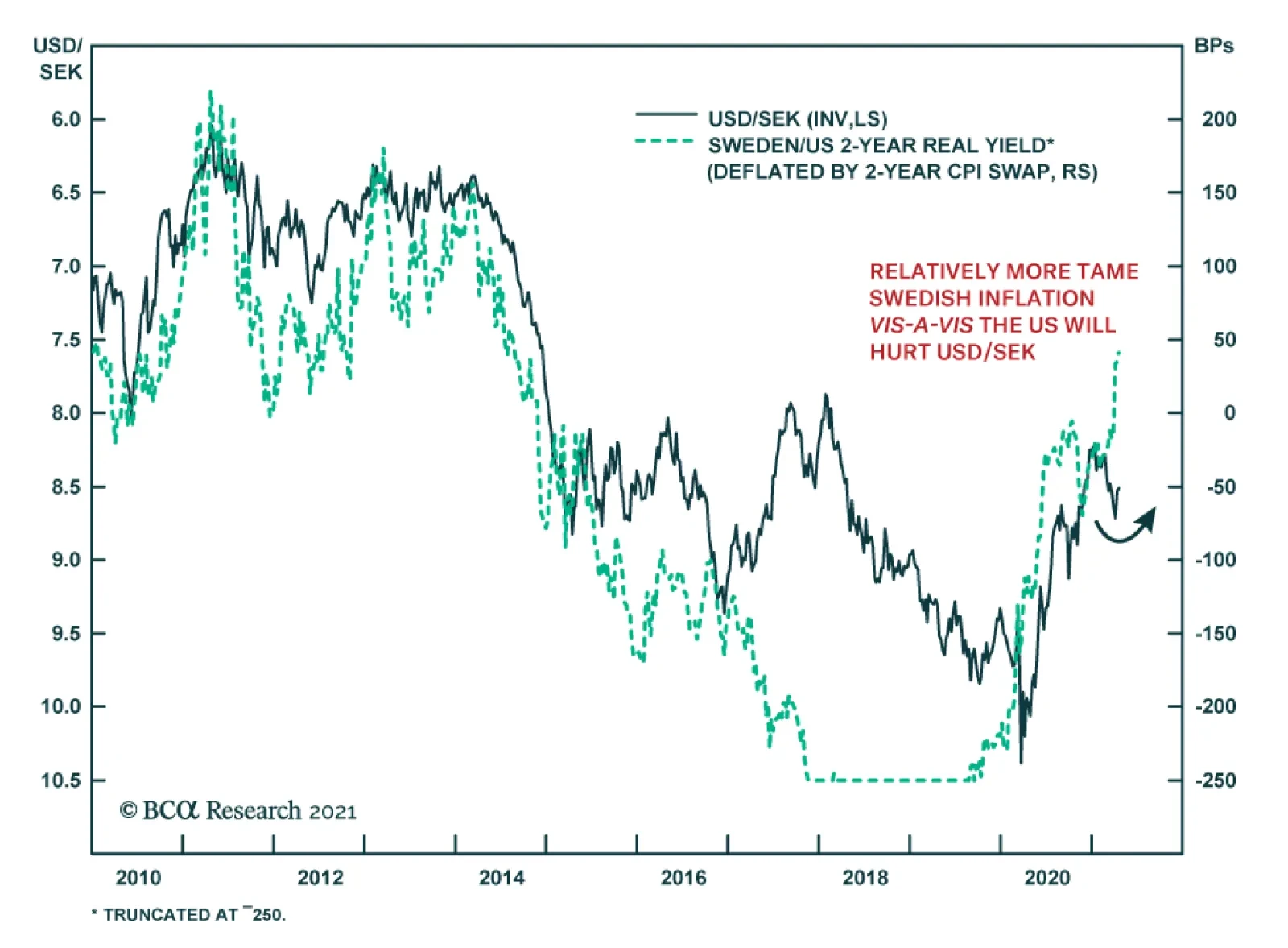
Swedish inflation accelerated in March, beating expectations of a more muted pick up. The CPIF measure favored by the Riksbank came in at 1.9% y/y, higher than the 1.5% reading in February and just shy of the central bank’s 2% target. Food and energy…
Highlights Global Inflation: The case for maintaining a strategic overall allocation to inflation-linked bonds (ILBs) versus nominal government debt in dedicated global fixed income portfolios remains intact. Global growth expectations are accelerating as vaccinations increase, spare capacity is increasingly being absorbed across the developed world and central banks (led by the Federal Reserve) continue to show no inclination to tighten policy anytime soon. Inflation-Linked Bond Allocations: ILB valuations, however, are no longer uniformly cheap across all countries. Real yields are now moving in a less coordinated fashion as markets try to sort out the timing and pace of eventual future central bank tightening. We recommend shifting inflation-linked bond exposure from Canada to Germany, as both markets have similar valuations but the Bank of Canada is likely to turn less dovish well ahead of the ECB. Feature Chart of the WeekMarkets Remain Unconcerned About An Inflation Overshoot
Markets Remain Unconcerned About An Inflation Overshoot
Markets Remain Unconcerned About An Inflation Overshoot
The global reflation trade over the past year has been highly rewarding to investors. Equity and credit markets worldwide have delivered outstanding returns on the back of highly stimulative monetary and fiscal policies implemented to deal with the negative economic effects of COVID-19. The global INflation trade has also paid off for investors in inflation-linked bonds (ILBs), which have outperformed nominal government debt across the developed economies dating back to last spring. The rising trend for global inflation breakevens remains intact, but is approaching some potential resistance points. A GDP-weighted average of 10-year breakeven inflation rates among the major developed economies is just shy of the 2% level that has represented a firm ceiling over the past decade (Chart of the Week). At the same time, the Bloomberg consensus forecast for headline CPI inflation for that same group of countries calls for an increase to only 1.8% by year-end before slowing to 1.7% in 2022. The latest forecasts from the IMF are similar, calling for headline inflation in the advanced economies to reach 1.6% in 2021 and 1.7% in 2022. If those modest forecasts for realized inflation come to fruition, then there is likely not much more upside in inflation breakevens, in aggregate. Country selection within the ILB universe will become more important over the next 6-12 months, as divergences in growth, realized inflation and central bank reactions will lead to a more heterogeneous path for global inflation breakevens. Underlying Inflation Backdrop Still Supports Rising Breakevens On a total return basis, ILBs enjoyed an extended run of success prior to this year. The cumulative total return of the asset class (in local currency terms) between 2012 and 2020 was a whopping 61% in the UK, 25% in Canada, 22% in the US and 21% in the euro area (aggregating the individual countries in the region with inflation-linked bonds). However, the absolute performance of ILBs has been more disperse on a country-by-country basis so far in 2021. ILBs are down year-to-date in Canada (-6.2%), the UK (-5.0%) and the US (-1.4%). On the other hand, euro area ILBs have delivered a positive total return of +0.5% so far in 2021. Real bond yields have climbed off the lows in the US, UK and, most notably, Canada where the overall index yield on the Bloomberg Barclays inflation-linked bond index is now in positive territory for the first time since before the pandemic started (Chart 2). At the same time, real bond yields have been drifting lower in the euro area. These real yield moves are related to shifting perceptions of central bank responses to the global growth upturn. For example, pricing in overnight index swap (OIS) curves have pulled forward the timing and pace of future interest rate increases in the US and Canada – i.e. real policy rates will become less negative - while there has been comparatively little change in euro zone rate expectations. While the absolute returns for ILBs have become less correlated, the relative trade between nominal and inflation-linked government bonds in all countries remains intact. 10-year breakeven inflation rates have been steadily climbing in the US and UK, while depressed Japanese breakevens have crept modestly higher (Chart 3). Even Europe, where inflation has remained subdued for years, has seen a significant shift higher in inflation breakevens. (Chart 4). The turn in breakevens has occurred alongside a major change in investor perceptions of future inflation, with surveys like the ZEW showing an overwhelming majority of financial professionals expecting higher inflation in the US, Europe and the UK. Chart 2A Fading Bull Market In Inflation-Linked Bonds
A Fading Bull Market In Inflation-Linked Bonds
A Fading Bull Market In Inflation-Linked Bonds
Chart 3A Solid Recovery In Inflation Expectations
A Solid Recovery In Inflation Expectations
A Solid Recovery In Inflation Expectations
Chart 4European Inflation Expectations Starting To Normalize
European Inflation Expectations Starting To Normalize
European Inflation Expectations Starting To Normalize
Inflation forecasts have shifted in response to faster global growth expectations on the back of vaccine optimism and aggressive US fiscal stimulus. Yet inflation forecasts remain modest compared to the huge growth figures expected for 2021 and 2022. In its latest World Economic Outlook published last week, the IMF upgraded its global real GDP forecast to 6.0% for 2021 and 4.4% for 2022. This represented an increase of 0.5 and 0.4 percentage points, respectively, from the last set of forecasts published back in January. While growth upgrades occurred across all major developed and emerging economies, the biggest upgrades came in the US and Canada, for both 2021 and 2022. As a result, the IMF projects the output gap in both countries to turn positive over 2022 and 2023, and be nearly closed in core Europe, Australia and Japan (Chart 5). The IMF is not projecting a major inflation surge on the back of those upbeat growth forecasts, though. While headline inflation in the US is expected to climb to 2.3% in 2021 and 2.4% in 2022, the same measure in Canada is only projected to rise to 1.7% and 2.0% over the same two years. European inflation is expected to remain subdued, reaching only 1.4% this year and drifting back to 1.2% in 2022 despite real GDP growth averaging 4.1% over the two-year period. The IMF attributes the benign inflation outcomes, even in the face of booming growth rates and the rapid elimination of output gaps, to the structural disinflationary backdrop for so-called “non-cyclical” inflation (Chart 6). The IMF defines this as the components of inflation indices that are less sensitive to changes in aggregate demand. The IMF estimates show that the contribution from non-cyclical components to overall inflation in the advanced economies had fallen to essentially zero at the end of 2020. Chart 5A Big Expected Narrowing Of Output Gaps
How Much More Juice Is Left In The Global Inflation Breakeven Trade?
How Much More Juice Is Left In The Global Inflation Breakeven Trade?
Chart 6Non-Cyclical Components Still Weighing On Global Inflation
Non-Cyclical Components Still Weighing On Global Inflation
Non-Cyclical Components Still Weighing On Global Inflation
There is considerable upside risk for the more cyclical components of inflation that could result in inflation overshooting the IMF projections (Chart 7). Chart 7Cyclical Backdrop Is Inflationary
Cyclical Backdrop Is Inflationary
Cyclical Backdrop Is Inflationary
For example, in the US, the Prices Paid component of the ISM Manufacturing index remains elevated at post-2008 highs, while the year-over-year change in the Producer Price Index soared to 6% in March. Across the Atlantic, the European Commission business and consumer surveys have shown a big surge in the net balance of respondents expecting higher inflation in manufacturing and retail trade. Previous weakness in the US dollar and surging commodity prices are playing a major role in this rapid pick-up in price pressures seen in many countries. Given the current backdrop of strong global growth expectations, with actual activity accelerating as vaccinations increase and more parts of the global economy reopen, inflation pressures are unlikely to fade in the near term. With realized inflation rates set to spike due to base effect comparisons to the pandemic-fueled collapse one year ago, the upward pressure on global ILB inflation breakevens will persist in the coming months – especially with breakevens still below levels that would prompt central banks to turn less dovish sooner than expected. Bottom Line: The case for maintaining a strategic overall allocation to inflation-linked bonds (ILBs) versus nominal government debt in dedicated global fixed income portfolios remains intact. Global growth expectations are accelerating as vaccinations increase, spare capacity is increasingly being absorbed across the developed world and central banks (led by the Federal Reserve) continue to show no inclination to tighten policy anytime soon. Assessing Value In Developed Market Inflation-Linked Bonds Chart 8USD Outlook Now More Mixed
USD Outlook Now More Mixed
USD Outlook Now More Mixed
Although the current backdrop remains conducive to a continuation of the rising trend in global ILB breakevens, there are factors that could begin to slow the upward momentum. The future path of the US dollar is now a bit less certain (Chart 8). While the DXY index is still down 7.4% compared to a year ago, it is up 2.4% so far in 2021. Shorter-term real interest rate differentials between the US and the other major developed markets remain dollar-bearish. At the same time, longer-term real yield differentials have risen in favor of the US (middle panel). Furthermore, US growth is outperforming other developed economies, typically a dollar-bullish factor (bottom panel). Given the usual negative correlation between the US dollar and commodity prices, a loss of downside dollar momentum could also slow the pace of commodity price appreciation. This represents a risk to additional global ILB outperformance versus government bonds. Our GDP-weighted aggregate of 10-year ILB breakevens for the major developed economies is currently just under 2% - levels more consistent with oil prices over $80/bbl than the current price closer to $60/bbl (Chart 9). Chart 9Breakevens Consistent With Much Higher Oil Prices
Breakevens Consistent With Much Higher Oil Prices
Breakevens Consistent With Much Higher Oil Prices
Given some of these uncertainties over the strength of any future inflationary push from a weaker US dollar and rising commodity prices, a broad overweight allocation to ILBs across the entire developed market universe may no longer generate the same strong returns versus nominal government bonds seen over the past year. With the “easy money” already having been made in the global breakeven widening trade, country allocation within the ILB universe has now become a more important dimension for bond investors to consider. To assess the relative attractiveness of individual ILB markets, we turn to a few valuation tools. Our regression-based valuation models for 10-year ILB breakevens in the US, UK, France, Italy, Germany, Japan, Canada and Australia are all presented in the Appendix on pages 14-17. The two inputs into the model are the annual rate of change of the Brent oil price in local currency terms (as a measure of shorter-term inflation pressure) and a five-year moving average of realized headline CPI inflation (as a longer-term trend that provides a structural “anchor” for breakevens based off actual inflation outcomes). We first presented these models in April 2020, but we have now made a change in response to some of the unprecedented developments witnessed over the past year.1 Despite the strong visual correlation between the level of oil prices and inflation breakevens in most countries, we chose to use the annual growth of oil prices, rather than the level, in our breakeven models. This is because we found it more logical to compare a rate of change concept like inflation (and breakevens) to the rate of change of oil. However, the oil input into our breakeven models could produce nonsensical results during periods of extreme oil volatility that did not generate equivalent swings in breakeven inflation rates. A good example of that occurred in 2016, when the annual rate of change of the Brent oil price briefly surged toward 100%, yet 10-year US TIPS breakevens did not rise above 2% (Chart 10). An even bigger swing in oil prices has occurred over the past year, with oil prices up over +200% compared to the collapse in prices that occurred one year ago. Putting such an extreme move into our US model would have pushed the “fair value” level of the 10-year TIPS breakeven to 4% - an implausible outcome given that the 10-year breakeven has never risen to even as high as 3% in the entire 24-year history of the TIPS market. Chart 10Pass-Through Of Extreme Oil Moves Has Limits
Pass-Through Of Extreme Oil Moves Has Limits
Pass-Through Of Extreme Oil Moves Has Limits
To deal with this problem, we have truncated the rate of change of oil prices in all our breakeven models at levels consistent with past peaks of breakevens. Going back to the US example, we have “capped” the rate of change of the Brent oil price at +40%, as past periods when oil price momentum was greater than 40% did not translate into any additional increase in TIPS breakevens. We then re-estimated the model using this truncated oil price series to generate fair value breakeven levels. Chart 11A Mixed Impact Of USD Moves On Non-US Breakevens
A Mixed Impact Of USD Moves On Non-US Breakevens
A Mixed Impact Of USD Moves On Non-US Breakevens
We did this for all eight of our individual country breakeven models and in all cases, truncating extreme oil moves improved the accuracy of the model. Interestingly, we did not truncate the downside momentum of oil prices, as there was no obvious “cut-off” point where periods of collapsing oil prices did not generate equivalent declines in breakevens. Oil prices remain the most critical short-term variable to determine ILB breakeven valuation. While it is intuitive to think that currency movements should also have a meaningful impact on inflation (both realized and expected), the effect is not consistent across countries. For example, euro area breakevens appear to be positively correlated to the euro, while Japanese breakevens rarely rise without yen weakness (Chart 11). One other factor to consider when evaluating the value of breakevens is the possible existence of an inflation risk premium component during periods of higher uncertainty over future inflation. Such uncertainty could result in increased demand for ILBs from investors driving up the price of ILBs (thus lowering the real yield) relative to nominal yielding bonds, leading to wider breakevens that do not necessarily reflect a true rise in expected inflation. A simple way to measure such an inflation risk premium is to compare market-based breakevens to survey-based measures of inflation forecasts taken from sources like the Philadelphia Fed's Survey of Professional Forecasters and the Bank of Canada’s Survey Of Consumer Expectations. The assumption here is that the survey-based measures represent a more accurate (or, at least, less biased) depiction of underlying inflation expectations in an economy. We present these simple measures of inflation risk premia, comparing 10-year breakevens to survey-based measures of inflation expectations, in Chart 12 and Chart 13. Breakevens had been trading well below survey-based measures of inflation expectations after the negative pandemic growth shock in 2020 in all countries shown. After the steady climb in global breakevens seen over the past year, those gaps have largely disappeared, with breakevens now trading slightly above survey based inflation expectations in the US, UK and Australia. Chart 12No Major Inflation Risk Premia In These Markets
No Major Inflation Risk Premia In These Markets
No Major Inflation Risk Premia In These Markets
Chart 13Canadian & Australian Breakevens In Line With Inflation Surveys
Canadian & Australian Breakevens In Line With Inflation Surveys
Canadian & Australian Breakevens In Line With Inflation Surveys
Chart 14Assessing The Value Of Breakevens
Assessing The Value Of Breakevens
Assessing The Value Of Breakevens
In Chart 14, we show the valuation residuals from our 10-year ILB breakeven models, along with two other measures of potential breakeven valuation: a) the distance between current breakeven levels and their most recent pre-pandemic peaks; and b) the difference between breakevens and the survey-based measures of inflation expectations. The model results show that breakevens are furthest below fair value in France, Japan and Germany, and the most above fair value in the UK and Australia. The message of undervaluation from our models is confirmed in the other two metrics for France, Japan, Germany, Canada and Italy. The overvaluation message for Australia is consistent across all three valuation metrics, while the signals are mixed for US and UK breakevens. In Japan, while the combined signals of all three valuation metrics indicate that breakevens are far too low, the very robust positive correlation between Japanese breakevens and the USD/JPY exchange rate implies that a bet on wider breakevens requires a much weaker yen. In Canada, while the 10-year breakeven does appear cheap, the real yield has also climbed faster than any of the other countries over the past several months as markets have rapidly repriced a more hawkish path for the Bank of Canada. Recent comments from Bank of Canada officials have leaned a bit hawkish, hinting at a possible taper of its bond-buying program, as the central bank appears unhappy with the renewed boom in Canadian housing values. An early tightening of monetary conditions would likely cap any additional upside in Canadian inflation breakevens. In Europe, the undervaluation of breakevens is more compelling. The ECB is likely to maintain its dovish policy settings into at least 2023, even if growth recovers later this year as increased vaccinations lead to the end of lockdowns. As shown earlier, European breakevens can continue to rise even if the euro is also appreciating versus the US dollar, especially if growth is recovering and oil prices are rising. Euro area breakevens are likely to continue drifting higher over at least the rest of 2021. Currently in our model bond portfolio, we have allocations to ILBs out of nominal government bonds in the US, France, Canada and Italy, with no allocations in Germany, Japan, Australia or the UK. After assessing our valuation measures, we are comfortable with the ILB exposure in France and Italy and lack of positions in the UK and Australia. We still see the upside case for US breakevens, with the economy reopening rapidly fueled further by fiscal policy, and the Fed likely to maintain its current highly dovish forward guidance until much later in 2021. We are reluctant to add exposure to Japanese ILBs, despite attractive valuations, as we are not convinced that USD/JPY has enough upside potential to help realize that undervaluation of Japanese breakevens. Thus, as a new change to our model portfolio this week that reflects our assessment of ILB breakeven valuations and risks, we are closing out the exposure to Canadian ILBs and adding a new position in German ILBs of equivalent size (see the model bond portfolio tables on pages 18-19). Bottom Line: ILB valuations are no longer uniformly cheap across all countries. Real yields are now moving in a less coordinated fashion as markets try to sort out the timing and pace of eventual future central bank tightening. We recommend shifting inflation-linked bond exposure from Canada to Germany, as both markets have similar valuations but the Bank of Canada is likely to turn less dovish well ahead of the ECB. Robert Robis, CFA Chief Fixed Income Strategist rrobis@bcaresearch.com Footnotes 1 Please see BCA Research Global Fixed Income Strategy Report, "Global Inflation Expectations Are Now Too Low", dated April 28, 2020, available at gfis.bcaresearch.com. Appendix Chart A1Our US 10-Year Inflation Breakeven Model
How Much More Juice Is Left In The Global Inflation Breakeven Trade?
How Much More Juice Is Left In The Global Inflation Breakeven Trade?
Chart A2Our UK 10-Year Inflation Breakeven Model
How Much More Juice Is Left In The Global Inflation Breakeven Trade?
How Much More Juice Is Left In The Global Inflation Breakeven Trade?
Chart A3Our France 10-Year Inflation Breakeven Model
How Much More Juice Is Left In The Global Inflation Breakeven Trade?
How Much More Juice Is Left In The Global Inflation Breakeven Trade?
Chart A4Our Italy 10-Year Inflation Breakeven Model
How Much More Juice Is Left In The Global Inflation Breakeven Trade?
How Much More Juice Is Left In The Global Inflation Breakeven Trade?
Chart A5Our Japan 10-Year Inflation Breakeven Model
How Much More Juice Is Left In The Global Inflation Breakeven Trade?
How Much More Juice Is Left In The Global Inflation Breakeven Trade?
Chart A6Our Germany 10-Year Inflation Breakeven Model
How Much More Juice Is Left In The Global Inflation Breakeven Trade?
How Much More Juice Is Left In The Global Inflation Breakeven Trade?
Chart A7Our Canada 10-Year Inflation Breakeven Model
How Much More Juice Is Left In The Global Inflation Breakeven Trade?
How Much More Juice Is Left In The Global Inflation Breakeven Trade?
Chart A8Our Australia 10-Year Inflation Breakeven Model
How Much More Juice Is Left In The Global Inflation Breakeven Trade?
How Much More Juice Is Left In The Global Inflation Breakeven Trade?
Recommendations
How Much More Juice Is Left In The Global Inflation Breakeven Trade?
How Much More Juice Is Left In The Global Inflation Breakeven Trade?
The GFIS Recommended Portfolio Vs. The Custom Benchmark Index Duration Regional Allocation Spread Product Tactical Trades Yields & Returns Global Bond Yields Historical Returns
According to BCA Research’s European Investment Strategy service, structural headwinds are still too strong to hold a long-term bullish view on Eurozone equities relative to the US. However, the coming two years should be kind to euro area stocks. This…
Highlights Structural headwinds are still too strong to hold a long-term bullish view on Eurozone equities relative to the US. However, the coming two years should be kind to euro area stocks. The relative performance of European stocks compared to that of the US is predominantly a function of yields. BCA foresees higher yields over a 24-month period. Moreover, European equities are exceptionally cheap, which accentuates their appeal as a yield play. Tactical considerations indicate that a modest overweight in European stocks, not an aggressive one, is most appropriate for cyclical investors. European investment grade bonds are appealing in a European fixed-income portfolio. Feature Chart 1Europe's Underperformance Explained
Europe's Underperformance Explained
Europe's Underperformance Explained
Over the past decade, Eurozone equities have massively underperformed US ones. The poor outcome generated by European bourses mimicked the fall in European profits against the US (Chart 1). Considering that the relative performance of euro area stocks stands at an all-time low, should investors begin to bet on Europe? The outlook for yields favors European stocks on a cyclical basis. However, the structural picture suggests that both Europe and the US must experience fundamental changes before European stocks can surpass their US counterparts on a long-term basis. Structural Challenges Remain The case for overweighting European equities on a structural investment horizon (5 to 10 years) remains weak. Only some major changes in the European and US economies can alter the long-term headwinds facing Eurozone stocks. Table 1US Possesses The Favored Sectors
Time And Attraction
Time And Attraction
Sectoral biases partly explain Europe’s inability to match the US’s profit potential. The US market over-represents high-margin and high return-on-equity businesses, such as technology and healthcare, while most Eurozone bourses have significant weightings in the structurally challenged financial, materials, and energy sectors (Table 1). This difference in sector representation also explains the larger buybacks witnessed in US markets compared to euro area ones, which further boosted the US’s relative EPS. Chart 2Japan Never Recovered
Japan Never Recovered
Japan Never Recovered
The performance of Japanese equities over the past three decades provides another cautionary tale for European stocks. Despite a substantial underperformance in the 1990s, Japanese equities never meaningfully recovered in the 2000s and ended up falling further behind the US over the past 12 years (Chart 2). A powerful liquidity trap and a 23% decline in the Japanese population compared to that of the US seriously hampered the ability of Japanese firms to generate stronger relative cash flows. This challenging profit picture meant that no matter how low JGB rates fell in comparison to the US, Japanese multiples never benefited from a significant re-rerating. The Eurozone suffers from similar ills to that of Japan, which warns that the latter constitutes a valid template for European assets. Europe’s population is expected to decline by 16% relative to that of the US over the coming three decades, which will hurt sales and capex in Europe. Moreover, despite low interest rates, private credit demand is weak, which limits the region’s economic vigor. Most concerning, Europe’s capital stock as a share of GDP is substantial, especially in the periphery (Chart 3). Such an observation indicates that there is a high probability that previously misallocated capital is burdening the euro area. This misallocation will continue to hurt economic activity, because it encumbers demand via weak capex and also harms productivity. A DuPont decomposition of RoE reveals how Europe’s economic malaise affects corporate profitability (Chart 4). The Eurozone’s excessively large capital stocks means that its asset turnover is inferior to that of the US, which corroborates the notion that capital is misallocated. Moreover, the euro area’s low profit margins reflect more than its sectoral composition. Greater economic rigidities as well as lower market power and concentration in Europe hurt profitability (even if it limits inequalities compared to the US). Finally, the corporate sector is deleveraging, which is a consequence of a liquidity trap and poor trend growth, causing the ratio of RoE to RoA to decline relative to the US. Chart 3Too Much Capital
Too Much Capital
Too Much Capital
Chart 4DuPont De No Good
DuPont De No Good
DuPont De No Good
To reverse the structural outperformance of US equities relative to the Eurozone, Europe’s secular profitability underperformance must end. We will look for the following factors to stop this decline, which we will explore in further detail over time: European reforms. Europe will remain disadvantaged until its excess capital stock is written off. This process is complex and it will require greater fiscal integration as well as greater reforms to promote competition and to decrease labor market as well as service sector rigidities. More Innovation. Despite a strong patent record in economies such as Germany, Europe lags behind the US in the creation of leading innovative companies. Europe’s industrial and consumer discretionary sectors could prove beneficiaries of the green revolution taking place around the world, but it is still too early to tell. Chart 5Market Power Helps The US
Market Power Helps The US
Market Power Helps The US
An ossification of the US economy. Europe could also begin to outperform, because the US might lose its edge. Economic populism is rife in the US, fueled by growing discontent with economic inequalities. As a result, government involvement in the economy as well as regulatory efforts could increase significantly. While a push to redistribute income toward the middle class would alleviate inequalities, it would hurt profitability and cause US RoE to decline toward European levels (Chart 5). Bottom Line: The secular underperformance of Eurozone equities reflects their inability to generate as much profits as US ones. Beyond sector biases, Europe’s demographic hurdles and its deeper problem with secular stagnation remain its key handicaps. For now, there is no solid case to bet on a major change in these trends, which only European reforms or problems in the US can undo. But A Cyclical Opportunity Exists Despite the challenging structural environment for European equities, the cyclical outlook (24 months) is attractive. Even in Japan, multi-year episodes of outperformance punctuated a decades-long underperformance relative to the US or the MSCI all-country world index. In the case of the Eurozone, this upbeat view rests on BCA Research expectations of higher global yields. The performance of Europe’s equities relative to the US correlates closely with the level of US yields (Chart 6). The sectoral footprint of both bourses is an important driver of this correlation. The US overweighs growth and defensive stocks, which account for 49% and 23% of its capitalization, respectively. Meanwhile, the euro area over-represents value stocks and deep cyclicals, which account for 55% and 26% of its market, respectively. Historically, global value stocks beat growth equities when yields are rising (Chart 7). Chart 6A Yield Story
A Yield Story
A Yield Story
Chart 7What Value Likes
What Value Likes
What Value Likes
The outperformance of value stocks when yields rise is multifaceted. Deep cyclicals, such as industrials, materials, financials and energy, constitute a larger share of value benchmark than growth ones. Consequently, when yields increase because the global business cycle experiences an upswing, the earnings of value stocks accelerate compared to those of growth stocks (Chart 7, bottom panel). The positive impact of yields on the value versus growth split is also more direct. Higher yields, especially if they accompany a steeper yield curve, boost the profitability of financials. Meanwhile, mounting yields increase the discount factor applied to the long-term deferred cash flows that contribute a large proportion of the intrinsic value of growth stocks. Higher yields also support the relative performance of Eurozone stocks via the evolution of the expected growth rates of their long-term earnings. As Chart 8 illustrates, upgrades to sell-side estimates of the long-term growth rate of European EPS relative to the US coincide with a steeper US yield curve slope and rising 5-year/5-year forward Treasury yields. These relationships exist because European economic activity and sectoral representation are more cyclical than that of the US. Eurozone equities look like a particularly cheap bet on higher yields over the coming 18 to 24 months. Sentiment toward European assets remains depressed compared to the US. Even on an equal-weighted basis, the discount of the expected long-term growth rate of euro area EPS relative to the US is exceptionally wide (Chart 9, top panel). True, the sustainable growth rate (SGR) of earnings is a function of the return on equity and the dividend payout ratio. Nonetheless, despite the fact that the euro area low RoE forces the European SGR down, Eurozone stocks embed a long-term growth rate that is 47% too low vis-à-vis the US. Other metrics underscore the cheapness of European equities relative to the US. Our Mechanical Valuation Indicator, which is sector neutral, stands at a 1-sigma discount in favor of the Eurozone (Chart 9, bottom panel). Chart 8EPS Growth and The Yield Structure
EPS Growth and The Yield Structure
EPS Growth and The Yield Structure
Chart 9Europe Is Cheap
Europe Is Cheap
Europe Is Cheap
Ultimately, Europe’s relative expected growth and valuations are particularly depressed, because domestic activity lags behind that of the US by a significant margin. As the vaccination campaign advances and the economy reopens later in the quarter, the Eurozone’s service sector will catch up and the earnings growth discount will dissipate (Chart 10). Moreover, regardless of its recent dynamism, even the European industrial sector has room to catch up to the US. Our Swedish Economic Diffusion Index captures the general strength in Swedish economic activity, which foretells a further increase in both the euro area Manufacturing PMI and equities relative to the US (Chart 11). Chart 10Stronger Services Will Help
Stronger Services Will Help
Stronger Services Will Help
Chart 11Listen To Sweden
Listen To Sweden
Listen To Sweden
Bottom Line: BCA’s expectations that global yields will rise over the coming 24 months are consistent with Eurozone equities outperforming US ones over this period, even if the long-term outlook remains challenging for Europe. European equities are much more pro-cyclical than US ones, which is reified by their sector and value biases. Moreover, euro area equities currently embed a particularly large discount to their US counterpart, which increases their attractiveness as a play on rising bond yields. The Right Entry Point? Strategy and forecasts are two different things. BCA strongly believes that yields will rise over the coming two years; however, a large overweight in Eurozone equities is a risky bet at the current juncture. Instead, we recommend investors opt for a modest overweight. Short-term traders should stay clear of this market for now. The reason for this cautiousness is that yields are very vulnerable to a temporary near-term pullback because: Chart 12A Countertrend Bond Rally?
A Countertrend Bond Rally?
A Countertrend Bond Rally?
Technicals point to a counter-trend bounce in bond prices. Our BCA Composite Technical Indicator is massively oversold, our Composite Sentiment Indicator is extremely depressed, and speculators are aggressively shorting T-Bonds (Chart 12). The recent bond market behavior is puzzling. Despite March’s blockbuster non-farm payroll data and Manufacturing, as well as Services ISM surveys, yields are softening. Not even the announcement of the Biden administration’s $2.3 trillion American Jobs Plan could increase yields in recent weeks. This price action confirms that bonds are oversold and that, until the recent price decline is digested, the threshold to push yields higher has risen meaningfully. Equities are at risk of a pullback. Euphoria is prevalent, which increases the odds of corrective action in equities. Our BCA Equity Capitulation Index stands at a 45-year high (Chart 13) and our US Equity Strategy team’s Risk Appetite Index is at its highest levels since 2007, both of which suggest that complacency is rife. Moreover, the put/call ratio has collapsed to 0.45, which shows the carefree attitude of traders. Yields will decline if stock prices correct. EM equities are underperforming US stocks. EM benchmarks are more sensitive to marginal changes in the global growth outlook. For now, the risk is that growth disappoints lofty expectations. Since 2014, periods of relative weakness in EM bourses precede declines in Treasury yields (Chart 14). Authorities are trying to limit credit growth in China. As we argued two weeks ago, Beijing is aiming to slow credit growth to prevent systemic vulnerabilities from developing. This process is fraught with risks and is likely to result in a deceleration in China’s economy. While Europe and most emerging markets remained mired in a health crisis, China will be a source of temporary downside for global economic activity. The recent announcement that the PBoC asked Chinese banks to limit new loans confirms this assessment. Chart 13Euphoria!
Euphoria!
Euphoria!
Chart 14EM Stocks Are Telling Us Something
EM Stocks Are Telling Us Something
EM Stocks Are Telling Us Something
Bottom Line: For now, investors with a cyclical horizon (two years) should only keep a modest overweight position in Eurozone equities because the near-term outlook for yields points to some temporary downside. Not allocating the full allowable capital budget to Europe will allow investors to upgrade their overweight after the near-term downside in yields has passed. Investors may also consider implementing some hedges. Our foreign exchange strategist recommends a short EUR/JPY position as a form of portfolio protection. Keeping some cash in yen to deploy later in Europe mimics this advice. Short-term traders should stay clear of Europe as long as bond markets have not digested their oversold condition. Market Focus: Investment Grade Corporates and the ECB The ECB’s minutes highlight that investment grade corporate bonds are attractive within European fixed-income portfolios. The recently released ECB minutes revealed that higher real rates do not overly concern the Governing Council, because they reflect an improving global economic outlook and not an eventual policy tightening. Moreover, the GC does not want to give the impression it will engage in yield control, yet the pace of purchases under the Pandemic Emergency Purchase Programme (PEPP) will remain accelerated and flexible until June, at a minimum. The ECB will not derail the supportive environment for economic activity anytime soon. Meanwhile, as we have argued in past reports, fiscal policy in Europe will also stay relaxed for the time being. Thus, the Eurozone’s policy environment remains supportive for credit spreads, especially since the default cycle has been muted. However, do corporate bonds already fully price in this positive backdrop? According to the 12-month breakeven spread, European credit spreads can compress further. The breakeven spread is the amount of spread widening required for corporate bond returns to break even with a duration-matched position in government bond securities over a 12-month horizon. It is approximated by dividing the OAS of a bond (or an index) by its duration. The breakeven spread is then compared to its own history, by observing the percentage of time that it has been lower in the past.1 Chart 15Some Value Left
Some Value Left
Some Value Left
European credit spreads have tightened 160 bps since March last year and are already below their pre-Covid level (Chart 15). However, the 12-month breakeven spread has been tighter 18% of the time since 1999. In other words, higher quality corporate bonds in Europe have room to see further spread compression, since policy will remain relaxed for a long time. This is especially true in the Aa-rated credit tier, where the breakeven spread has been more expensive 35% of the time (not shown). Meanwhile, US breakeven spreads for IG corporate bonds are in their 2nd percentile and policy will tighten sooner than in Europe. Therefore, bond investors with a European-only mandate are not forced to step down the quality ladder as aggressively as those in the US do. Table 2Norway, France And Italy Stand Out
Time And Attraction
Time And Attraction
Table 2 provides the same analysis at the country level. Taking into consideration the average credit rating of each countries’ investment grade bonds, we find that Norwegian, French, and Italian spreads have the most value left. Interestingly, the ECB’s purchases of Italian and French paper is currently deviating widely from its capital keys, which should place downward pressure on credit spreads in these jurisdictions. Bottom Line: There is still value left in European investment grade corporate bonds, unlike in the US, where valuations are extremely expensive and a decrease in quality is warranted. For now, such a move is uncalled for in Europe, especially since the value in its high-yield index is concentrated in its riskiest credit tiers. At the country level, investors should favor Norwegian, French, and Italian investment grade corporate bonds. Mathieu Savary, Chief European Investment Strategist Mathieu@bcaresearch.com Jeremie Peloso, Senior Analyst JeremieP@bcaresearch.com Footnotes 1We find this valuation tool superior to others for two main reasons: (i) using the breakeven spread rather than the average index OAS allows us to control for the changing average duration of the benchmark bond indices; and (ii) the percentile rank is often a better representation of credit spreads than the spread itself. Cyclical Recommendations Structural Recommendations Trades Currency Performance
Time And Attraction
Time And Attraction
Fixed Income Performance Government Bonds
Time And Attraction
Time And Attraction
Corporate Bonds
Time And Attraction
Time And Attraction
Equity Performance Major Stock Indices
Time And Attraction
Time And Attraction
Geographic Performance
Time And Attraction
Time And Attraction
Sector Performance
Time And Attraction
Time And Attraction
Closed Trades
According to BCA Research’s Foreign Exchange Strategy service, the Swiss National Bank welcomes the recent weakness in the franc , but technicals suggest a tactical rally in CHF is likely. The Swiss franc has been one of the worst-performing currencies…