Europe

Highlights The dollar is on the verge of a significant breakdown. If the DXY punches through 94, it will likely mark the beginning of a structural bear market. The most recent catalyst – fiscal support in the euro zone – has been good news on the “anti-dollar” front. Agreement on the EU recovery fund has underscored a powerful centripetal force for the euro. Because it is a reserve currency, a breakdown in the dollar will amplify the global liquidity surge. This will lead to a self-reinforcing spiral of better global growth, and a weaker dollar. Our long Scandinavian currency basket and long silver versus gold positions have benefitted tremendously from the shift in sentiment. Stick with them. While our technical indicators are flagging the dollar as oversold, any bounce from current levels should be shorted. Our FX model remains dollar bearish, and is recommending shorting the DXY for the month of August. Feature Chart I-1On A Precipice
The Great FX Rotation
The Great FX Rotation
The DXY index is punching below key support levels and on the verge of a significant multi-year decline. Up until March, the dollar was trading in a narrow band (Chart I-1). With that support now breached, the next key test for the DXY index will be the 93-94 zone, defined by the upward-sloping trend line, in place since the 2011 lows. As the breakdown becomes more broad-based, especially vis-a-vis emerging market currencies, this will cement the transition from easing financial conditions to improving global growth. Our trade basket has benefitted significantly from the shift in market sentiment, especially being long the NOK, the SEK and silver relative to gold. As Chart I-2 shows, while gold and the safe-haven currencies remain this year’s frontrunners, the more industrial metals such as silver and platinum will likely take over the baton by year end. Within the G10 universe, cyclical currencies such as the Australian dollar and the Norwegian krone are now in the technical definition of a bull market. Such a rotation usually signals a genuine and potentially meaningful breakdown in the dollar. Chart I-2The Great FX Rotation
The Great FX Rotation
The Great FX Rotation
Our trade basket has benefitted significantly from the shift in market sentiment, especially being long the NOK, the SEK and silver relative to gold. Technical indicators suggest the dollar is likely to consolidate losses in the weeks ahead. Our intermediate-term indicator is in the lower decile of its range, and speculators are very short the cross (see US dollar section on page 14). That said, any bounce should be used as an opportunity to establish fresh short positions, contrary to the “buy-on-the-dip” strategy that has worked well over the last decade. DXY Breakdown: What Has Changed? US dollar weakness has been driven by three interrelated factors: Non-US economies that were initially hit by COVID-19 are well into their reopening phases. Meanwhile, new infections in the US are proving rather sticky. As a result, economic momentum is higher outside the US. This partly explains why the euro is outperforming both the US dollar and the yen (Chart I-3). Money velocity is rising faster outside the US, suggesting animal spirits are being rekindled at a faster pace abroad (Chart I-4). This is evident in capital flows, where some non-US markets have started to outperform. In the classical equation MV=PQ,1 a rise in M has historically been accompanied by a collapse in V, suggesting the economy remained in a liquidity trap. With the fiscal spending spigots now open almost everywhere, a rise in both M and V will be explosive for nominal output. Chart I-3Positive COVID-19 Trends For Europe
Positive COVID-19 Trends For Europe
Positive COVID-19 Trends For Europe
Chart I-4Money Velocity Outside The US
Money Velocity Outside The US
Money Velocity Outside The US
There was significant progress towards a European fiscal union this week, with leaders agreeing to a €750 billion recovery fund. Assuming the agreement is ratified, this will underscore a powerful centripetal force for the common-currency union. As the “anti-dollar,” this is positive for the euro (and negative for the greenback). More on this later. The US economy had been relatively resilient compared to the rest of the world, at least until late. This was in part driven by a late start to state-wide shutdowns. With various US municipalities and states now reversing reopening plans, economic activity abroad is now improving relative to the US. Chart I-5 shows the economic surprise index between the Eurozone and the US is inflecting sharply higher from very depressed levels. Historically, this has usually put a floor under the euro. Similarly, G10 PMIs have bottomed relative to the US. These trends should continue in the months ahead. Chart I-5EUR/USD And Relative Growth
EUR/USD And Relative Growth
EUR/USD And Relative Growth
How High Can EUR/USD Rise? Agreement on the EU recovery fund was a historic event, not due to the size of the package but because of revealed preferences toward euro membership. For over two decades, the standard dilemma plaguing the euro area was that centralized monetary policy was never a panacea for desynchronized business cycles.2 The lack of fiscal transfers between member nations amplified this problem. With Italian and Spanish bond yields now collapsing towards those in the core, liquidity is flowing to where it is most needed, significantly curtailing euro break-up risk. The key components of the agreement are €360 billion in the form of loans and €390 billion in the form of grants. The money will be borrowed via bonds issued by the European Commission, with maturities of three to 30 years. Repayment will not be due until 2027. The most important component of the deal, the grants, is a de facto fiscal transfer. Going forward, the next catalyst for euro strength must be growth differentials between the euro zone and the US. This will translate into an improvement in the equilibrium rate of interest between the two blocs (Chart I-6). This is quite plausible in a post-COVID-19 world. As a relatively closed economy, the US has tended to have a higher services component to GDP. However, the service sector has been hit much harder by the pandemic due to social distancing measures that will likely remain in place for a while. A more drawn-out services recovery raises the prospect that countries geared more towards manufacturing, such as Europe, Japan and China, could experience better growth (Chart I-7). Chart I-6EUR/USD And The Neutral Rate
EUR/USD And The Neutral Rate
EUR/USD And The Neutral Rate
Chart I-7Service Industries Could Stay Weak For A While
Service Industries Could Stay Weak For A While
Service Industries Could Stay Weak For A While
Chart I-8The European Periphery Is Competitive Again
The European Periphery Is Competitive Again
The European Periphery Is Competitive Again
Internally within the euro zone, a powerful adjustment has already occurred. Unit labor costs in Greece, Ireland, Portugal and Spain are well off their peak. This has effectively eliminated the competitiveness gap with the core that had accumulated over the previous two decades (Chart I-8). Italy remains saddled with a rigid and less-productive workforce, but overall adjustments have still come a long way in plugging a key fissure undermining the common-currency area. The euro tends to be largely driven by pro-cyclical flows. Fortunately for investors, European equities, especially those in the periphery, remain unloved, given they are trading at very cheap multiples. Part of the reason is that most Eurozone bourses are heavy in cyclical stocks that are well into a 10-year relative bear market.3 A re-rating of cyclical stocks, especially banks and energy, relative to defensives could be the catalyst that carries the next leg of the euro rally. This could push the EUR/USD towards 1.20. As higher-beta, the Scandinavian currencies will also benefit. For now, most analysts remain very pessimistic about European profits relative to those in the US, but that could change if the dollar enters a structural bear market (Chart I-9). Chart I-9Relative Profit Revisions Lead EUR/USD
Relative Profit Revisions Lead EUR/USD
Relative Profit Revisions Lead EUR/USD
Cyclical Or Structural Move? If the DXY punches through 94, it will likely mark the beginning of a structural bear market. If the DXY punches through 94, it will likely mark the beginning of a structural bear market. The dollar tends to run in long cycles, driven by fundamentals but also confidence. In our report last week, we suggested three indicators for gauging a shift in confidence. The total return of US bonds versus gold: Gold and US Treasurys are competing assets (Chart I-10), with the dollar being the key arbiter, as we argued last week. The TLT/GLD ratio has dropped from over 1.16 to 0.96, putting it at the precipice of bear-market territory. The USD/CNY exchange rate: Tensions are flaring up between the US and China, with the latest being the US government’s closure of China’s Houston consulate. Yet USD/CNY is still holding around 7. As the key arbiter between the dollar and emerging market currencies, a firm yuan limits upward pressure on the greenback. The gold-to-silver ratio (GSR): This correlates well with the dollar, and has absolutely collapsed (Chart I-11). Given similar moves in gold versus copper and oil, it is fair to assume that the global economy is not in a liquidity trap. Chart I-10Gold And Treasurys Are Competing Assets
Gold And Treasurys Are Competing Assets
Gold And Treasurys Are Competing Assets
Chart I-11The Gold-To-Silver Ratio Has Collapsed
The Gold-To-Silver Ratio Has Collapsed
The Gold-To-Silver Ratio Has Collapsed
The more important point is that there is a nascent, concerted push by both institutional investors and central banks to diversify out of dollar assets: The S&P 500 usually moves inversely to gold, but both have been moving in sync since the March lows (Chart I-12). This suggests investors have been using gold rather than US bonds to hedge their equity long positions. The dollar proved to be the best safe-haven asset during the March drawdown. With the Federal Reserve having flooded the system with dollars, gold (and precious metals) are the next logical choice. Since 2014, central banks have been aggressively diversifying out of their dollar holdings. This is not only evident in the official TIC data that continues to show foreign officials are selling Treasurys, but within IMF reserve data well. Part of these flows have gone into other currencies, especially the yen, but a huge portion has been to gold (Chart I-13). This has been driven by emerging market countries such as Russia and China, the same concerns in the middle of geopolitical confrontations with the US. Chart I-12Gold And The S&P 500 Are Moving Together
Gold And The S&P 500 Are Moving Together
Gold And The S&P 500 Are Moving Together
Chart I-13Central Banks Are Loading Their Gold Vaults
Central Banks Are Loading Their Gold Vaults
Central Banks Are Loading Their Gold Vaults
Within our service (and together with our Commodity & Energy colleagues), we have been highlighting that precious metals will be a huge beneficiary from the Fed’s reflationary efforts, even though they are overbought. As a hedged bet, we have been long silver versus gold, a trade that continues to perform well. As the gold trade becomes crowded and demand for diversification from fiat money remains strong, silver and platinum could be the outperformers. Chart 14 shows that precious metals such as silver and platinum are much cheaper from a historical perspective. As the gold trade becomes crowded and demand for diversification from fiat money remains strong, silver and platinum could be the outperformers. Chart I-14Silver And Platinum Remain Relatively Cheap
Silver And Platinum Remain Relatively Cheap
Silver And Platinum Remain Relatively Cheap
In a nutshell, remain long silver, SEK, NOK and petrocurrencies. Currency traders can also add platinum to the list. These top picks will continue to benefit from global reflation, dollar weakness and a breakout in the euro. Chester Ntonifor Foreign Exchange Strategist chestern@bcaresearch.com Currencies US Dollar Chart II-1USD Technicals 1
USD Technicals 1
USD Technicals 1
Chart II-2USD Technicals 2
USD Technicals 2
USD Technicals 2
Recent data in the US have been positive: Existing home sales surged by 20.7% in June compared with May, the highest monthly gain on record. This followed a strong increase in building permits and housing starts last week. The University of Michigan consumer sentiment declined from 78.1 to 73.2 in July, while the Chicago Fed national activity index ticked up from 3.5 to 4.1 in June. Initial jobless claims increased by 1416K for the week ended July 17th, higher than the 1307K increase the previous week. The DXY index continued to edge lower, falling by 1% this week. Our bias is that the US dollar is likely to begin a long depreciation should the global economy continue to rebound. Report Links: A Simple Framework For Currencies - July 17, 2020 DXY: False Breakdown Or Cyclical Bear Market? - June 5, 2020 Cycles And The US Dollar - May 15, 2020 The Euro Chart II-3EUR Technicals 1
EUR Technicals 1
EUR Technicals 1
Chart II-4EUR Technicals 2
EUR Technicals 2
EUR Technicals 2
Recent data in the euro area have been mixed: The current account surplus narrowed from €14.4 billion to €7.95 billion in May. Headline inflation was flat at 0.3% year-on-year in June. Core inflation also remained at 0.8% year-on-year in June. Preliminary consumer confidence marginally fell from -14.7 to -15 in July. The euro appreciated by 1.4% against the US dollar this week, climbing to the highest level in almost two years, alongside European equities. The catalyst was the €750 billion rescue fund (around 5.5% of EU GDP) announced this Tuesday. The fact that member countries reached an agreement is encouraging for the sustainability of the euro. Report Links: On The DXY Breakout, Euro, And Swiss Franc - February 21, 2020 Updating Our Balance Of Payments Monitor - November 29, 2019 On Money Velocity, EUR/USD And Silver - October 11, 2019 The Yen Chart II-5JPY Technicals 1
JPY Technicals 1
JPY Technicals 1
Chart II-6JPY Technicals 2
JPY Technicals 2
JPY Technicals 2
Recent data in Japan have been mostly negative: The trade deficit narrowed from ¥601 billion to ¥424 billion in June. Exports fell by 26.2% year-on-year while imports fell by 14.4% In June. National headline CPI remained flat at 0.1% year-on-year in June, while core inflation was also unchanged at 0.4%. The Jibun Bank manufacturing PMI increased from 40.1 to 42.6 in July. The Japanese yen rose by 0.2% against the US dollar this week. In the monthly report released this Wednesday, Japan’s Cabinet Office reported improvement in 6 out of 14 economic categories, including consumer spending, exports, production and public investment. However, capital spending, corporate profits and employment remain weak due to the pandemic. That said, we are long the Japanese yen as a safe-haven hedge. Report Links: The Near-Term Bull Case For The Dollar - February 28, 2020 Building A Protector Currency Portfolio - February 7, 2020 Currency Market Signals From Gold, Equities And Flows - January 31, 2020 British Pound Chart II-7GBP Technicals 1
GBP Technicals 1
GBP Technicals 1
Chart II-8GBP Technicals 2
GBP Technicals 2
GBP Technicals 2
Recent data in the UK have been positive: The Rightmove house price index rose by 3.7% year-on-year in July, up from 2.1% the previous month. CBI industrial trends survey orders recovered from -58% to -46% in July. The British pound appreciated by 1.6% against the US dollar this week. Near-term volatility around Brexit negotiations is a negative for the pound, but it is cheap and unloved. Report Links: Updating Our Balance Of Payments Monitor - November 29, 2019 A Few Trade Ideas - Sept. 27, 2019 United Kingdom: Cyclical Slowdown Or Structural Malaise? - Sept. 20, 2019 Australian Dollar Chart II-9AUD Technicals 1
AUD Technicals 1
AUD Technicals 1
Chart II-10AUD Technicals 2
AUD Technicals 2
AUD Technicals 2
Recent data in Australia have been mixed: Retail sales rose by 2.4% month-on-month in June, following 16.9% increase the previous month. NAB business confidence fell to -15 from -12 in Q2. The Australian dollar jumped by 2.3% against the US dollar this week. The recent RBA meeting minutes suggested that there is no need to adjust its policy measures in the current environment and reiterated that negative interest rates remain “extraordinarily unlikely”. Report Links: On AUD And CNY - January 17, 2020 Updating Our Balance Of Payments Monitor - November 29, 2019 A Contrarian View On The Australian Dollar - May 24, 2019 New Zealand Dollar Chart II-11NZD Technicals 1
NZD Technicals 1
NZD Technicals 1
Chart II-12NZD Technicals 2
NZD Technicals 2
NZD Technicals 2
There was scant data from New Zealand this week: The New Zealand business index surged from 37.5 to 54.1 in June. The New Zealand dollar rose by 1.8% against the US dollar this week. Following weak inflation data last week , the Westpac Economic Bulletin suggests consumer prices will remain subdued on weakened demand. This raises the prospect of further stimulus from the RBNZ. Report Links: Currencies And The Value-Versus-Growth Debate - July 10, 2020 Updating Our Balance Of Payments Monitor - November 29, 2019 Place A Limit Sell On DXY At 100 - November 15, 2019 Canadian Dollar Chart II-13CAD Technicals 1
CAD Technicals 1
CAD Technicals 1
Chart II-14CAD Technicals 2
CAD Technicals 2
CAD Technicals 2
Recent data in Canada have been positive: Retail sales increased by 18.7% month-on-month in May. Auto sales were particularly strong. The new house price index increased by 1.3% year-on-year in June. The Teranet/National Bank house price index rose by 5.9%. Headline inflation increased from -0.4% to 0.7% year-on-year in June, as oil prices recovered. Core inflation also rose from 1.6% to 1.8% year-on-year in June. The Canadian dollar rose by 1.3% against the US dollar this week. The inflation data were stronger than expected, led by gas, food and shelter prices. Going forward, a recovery in energy prices will be important for the performance of the CAD. In general, we like petrocurrencies. Report Links: Currencies And The Value-Versus-Growth Debate - July 10, 2020 More On Competitive Devaluations, The CAD And The SEK - May 1, 2020 A New Paradigm For Petrocurrencies - April 10, 2020 Swiss Franc Chart II-15CHF Technicals 1
CHF Technicals 1
CHF Technicals 1
Chart II-16CHF Technicals 2
CHF Technicals 2
CHF Technicals 2
Recent data in Switzerland have been positive: The trade balance widened marginally from CHF 2.7 billion to CHF 2.8 billion in June. Exports rose by 6.9% month-on-month while imports jumped by 7.3%. Total sight deposits continued to increase from CHF 688.6 billion to CHF 691.5 billion for the week ended July 17th. The Swiss franc appreciated by 1.3% against the US dollar this week. Switzerland has seen a trade recovery in recent months. Notably, luxury goods exports like Swiss watches increased by 58.9% month-on-month in June, though well below pre-COVID-19 levels. Report Links: On The DXY Breakout, Euro, And Swiss Franc - February 21, 2020 Currency Market Signals From Gold, Equities And Flows - January 31, 2020 Portfolio Tweaks Before The Chinese New Year - January 24, 2020 Norwegian Krone Chart II-17NOK Technicals 1
NOK Technicals 1
NOK Technicals 1
Chart II-18NOK Technicals 2
NOK Technicals 2
NOK Technicals 2
Recent data in Norway have been positive: Exports and imports both improved in June, especially with rebounding oil prices. The trade surplus widened from NOK2.7 billion to NOK3.2 billion. The Norwegian krone appreciated by 1.3% against the US dollar this week. Our Commodity & Energy team holds the view that global fiscal stimulus to combat COVID-19 will support global oil demand. Moreover, both OPEC and the US are likely to continue production cuts. Their bias is that oil prices will continue to grind higher, which is bullish for the Norwegian krone. Swedish Krona Chart II-19SEK Technicals 1
SEK Technicals 1
SEK Technicals 1
Chart II-20SEK Technicals 2
SEK Technicals 2
SEK Technicals 2
Recent data in Sweden have been negative: The unemployment rate rose to 9.8% in June, up from 9% the previous month and 7.2% the same month last year. The Swedish krona surged by 2% against the US dollar this week. The latest Labor Force Survey released this week showed that the labor market in Sweden continues to deteriorate. In June, employment fell by 148,000. Average hours worked per week fell by 8.4%. That said, the Swedish krona remains cheap and will benefit from a global economic recovery. Footnotes 1Where M = money supply, V = velocity of money, P = price level and Q = output. 2Please see Foreign Exchange Strategy Weekly Report, "EUR/USD And The Neutral Rate Of Interest", dated June 14, 2019. 3Please see Foreign Exchange Strategy Special Report, "Currencies And The Value-Vs Growth Debate", dated July 10, 2020. Trades & Forecasts Forecast Summary Core Portfolio Tactical Trades Limit Orders Closed Trades
Highlights For financials and energy to produce a sustained rally, there must be no relapse in global growth during the autumn and winter of 2020/21. However, with the coronavirus still in play and the usual flu and virus season yet to come, a key hurdle to overcome will be the physical reopening of schools and childcare facilities this September. Hence, for the time being, remain overweight healthcare and technology versus financials and energy. This implies underweight European stocks versus US stocks, and overweight Germany, France, Netherlands and Switzerland within Europe. Play good news in Europe by remaining long EUR, CHF, and SEK versus USD, and long US T-bonds and Spanish Bonos versus German Bunds and French OATs. Fractal trade: Short silver. Feature Chart Of The WeekDenmark's OMX Is At An All-Time High, While The FTSE 100 Is Languishing. Why?
Denmark's OMX Is At An All-Time High, While The FTSE 100 Is Languishing. Why?
Denmark's OMX Is At An All-Time High, While The FTSE 100 Is Languishing. Why?
Once upon a time, the stock market existed as a barometer of the economy. Or at least, a good representation of the size and composition of profits in the host economy. But that time is long gone. Today, a tiny handful of companies are driving the performance of supposedly broad indexes such as the FTSE 100 and the S&P 500. Indeed, we should more accurately call the FTSE 100 the FTSE ‘10’ ignoring the other 90. And we should call the S&P 500 the S&P ‘5’ ignoring the other 495. Meaning that stock markets are no longer stock ‘markets’. Yet many analysts still try and explain the stock market’s performance through traditional top-down macro drivers such as GDP growth, profit margins across the host economy, and so on. The trouble is that when the stock market is dominated by a tiny handful of companies, this 20th century approach is doomed to fail. Today, we must take a more granular approach based on the type of companies that are dominating each stock market. Sector Concentration Is Driving Stock Markets The handful of companies that dominate each stock market tend to be the leaders in their global sector. This means that each stock market is defined by a sector concentration, which has often evolved by chance, based on where companies chose to start up and list. This sector concentration usually has little or no connection with the host economy. For example, Denmark’s OMX index is dominated by Novo Nordisk, a global biotech company. The FTSE 100 is heavily weighted to the oil majors Royal Dutch and BP as well as global bank HSBC, which have only a limited exposure to the UK economy. On the other side of the Atlantic, Apple, Microsoft, Amazon, Google and Facebook are massively over-represented in the S&P 500 compared with their contribution to the US economy. A crucial defining feature of a stock market turns out to be its exposure to healthcare and technology – whose profits are in major structural uptrends – versus the exposure to financials and energy – whose profits are in major structural downtrends (Charts 2 - 5). Chart I-2Healthcare Profits Are In A Structural Uptrend
Healthcare Profits Are In A Structural Uptrend
Healthcare Profits Are In A Structural Uptrend
Chart I-3Technology Profits Are In A Structural Uptrend
Technology Profits Are In A Structural Uptrend
Technology Profits Are In A Structural Uptrend
Chart I-4Financial Profits Are In A Structural Downtrend
Financial Profits Are In A Structural Downtrend
Financial Profits Are In A Structural Downtrend
Chart I-5Energy Profits Are In A Structural Downtrend
CHART 5
CHART 5
The stock market capitalisation in healthcare and technology stands at 52 percent for Denmark and 40 percent for the US, compared with just 20 percent for Europe and 12 percent for the UK. The flip side is that the stock market capitalisation in financials and energy stands at just 8 percent for Denmark and 11 percent for the US, compared with 21 percent for Europe and 30 percent for the UK. This explains, for example, why Denmark’s OMX is hitting all-time highs while the FTSE 100 is languishing (Chart of the Week). That said, the price of the growing stream of healthcare and technology profits can still fall if it is at an unjustifiably high level. And the price of the shrinking stream of financial and energy profits can still rise if it is at an unjustifiably low level. Hence, the key question is: what determines the prices of these two groups of sectors, one whose profits are in a major uptrend, the other whose profits are in a major downtrend? Healthcare And Tech Performance Hinges On The Bond Yield The price of a rapidly growing profit stream is weighted to the values of the large distant cashflows, making it highly sensitive to the discount rate applied to those distant cashflows. Whereas the price of a rapidly shrinking profit stream is weighted to the values of the large immediate cashflows, making it much more sensitive to the near-term evolution of the economy (Box I-1). Box I-1Bond Yield Sensitivity Versus Economic Sensitivity
The End Of The Stock 'Market'
The End Of The Stock 'Market'
The upshot is that for stocks and sectors whose profits are in a major uptrend, the key driver of the price is the direction of the bond yield. Whereas for stocks and sectors whose profits are in a major downtrend, the key driver is the near-term direction of the world economy (Chart I-6 and Chart I-7). Chart I-6Exposure To Healthcare And Technology Determines Bond Yield Sensitivity
Exposure To Healthcare And Technology Determines Bond Yield Sensitivity
Exposure To Healthcare And Technology Determines Bond Yield Sensitivity
Chart I-7Exposure To Financials And Energy Determines Economic Sensitivity
Exposure To Financials And Energy Determines Economic Sensitivity
Exposure To Financials And Energy Determines Economic Sensitivity
Pulling all of this together, the rally in healthcare and technology stocks is extremely vulnerable to a sustained rise in the bond yield. But a sustained rise in the bond yield seems highly unlikely without a breakthrough vaccine or treatment for COVID-19. While the coronavirus is still in play, the long-term hollowing out and scarring in the jobs market will only become apparent in the coming months once furlough schemes and temporary relief programs end. This will force all central banks to remain ultra-dovish and where possible, become more dovish. Meanwhile, for financials and energy to produce a sustained rally, there must be no relapse in global growth during the autumn and winter of 2020/21. However, with the coronavirus still in play and the usual flu and virus season yet to come, a key hurdle to overcome will be the physical reopening of schools and childcare facilities this September. Hence, for the time being, remain overweight healthcare and technology versus financials and energy. This translates to underweight Europe versus the US. And overweight Germany, France, Netherlands and Switzerland within Europe. How To Play Good News In Europe Things have been going right in Europe. First, unlike in the US, the COVID-19 outbreak is subsiding, at least for now. New infections have been steadily declining through the warm summer months (Chart I-8). Chart I-8New Infections Declining In Europe, Rising In The US
New Infections Declining In Europe, Rising In The US
New Infections Declining In Europe, Rising In The US
Second, the ECB has injected ample liquidity into the banking system which, combined with ultra-low interest rates, has permitted a strong expansion in bank lending. Though somewhat disappointingly, the bank lending surveys tell us that the loans are being used for emergency working capital requirements rather than investment. Third, the EU has approved a €750 billion Recovery Fund, over half of which will take the form of grants to the sectors and regions most stricken by the coronavirus crisis. Given that the fund will be financed by jointly issued EU bonds, this amounts to a fiscal transfer to the areas that need the most help. Hence, even if the amount of the stimulus may be smaller than in other parts of the word, it comprises a huge symbolic step towards greater unity in the EU and euro area. Still, despite this trifecta of good news, European stock markets have not outperformed (Chart I-9). This just emphasises that stock market relative performance has little connection with domestic economics and politics. To reiterate, stock market relative performance is almost always the result of the sector concentration of a handful of dominant stocks. Chart I-9Despite Good News In Europe, European Equities Are Not Outperforming
Despite Good News In Europe, European Equities Are Not Outperforming
Despite Good News In Europe, European Equities Are Not Outperforming
Begging the question: how to play the continuation of good news in Europe? The answer is through the currency and fixed income markets, which have a much stronger connection with domestic economics and politics (Chart I-10 and Chart I-11). Chart I-10Play Good News In Europe Via European Currencies...
Play Good News In Europe Via European Currencies...
Play Good News In Europe Via European Currencies...
Chart I-11...And Sovereign Yield Spread Tightening
...And Sovereign Yield Spread Tightening
...And Sovereign Yield Spread Tightening
Remain long a basket of EUR, CHF, and SEK versus the USD. Our favourite cross out of these three is long CHF/USD given the haven character of the CHF in periods of market stress. To play bond yield convergence between the US and Europe and between core and periphery Europe, remain long US 30-year T-bonds and Spanish 30-year Bonos versus German 30-year bunds and French 30-year OATs. Dhaval Joshi Chief European Investment Strategist dhaval@bcaresearch.com Fractal Trading System* The spectacular rally in silver is fractally fragile, and at a point which has signalled several trend reversals through the past five years. Accordingly, this week’s recommended trade is short silver, with the profit target and symmetrical stop-loss set at 12.5 percent. In other trades, long GBP/RUB achieved its profit target. Against this, short Germany versus UK and long bitcoin cash versus ethereum reached their stop-losses. Long nickel versus copper reached the end of its holding period in partial loss. The rolling 12-month win ratio now stands at 59 percent.
Silver
Silver
When the fractal dimension approaches the lower limit after an investment has been in an established trend it is a potential trigger for a liquidity-triggered trend reversal. Therefore, open a countertrend position. The profit target is a one-third reversal of the preceding 13-week move. Apply a symmetrical stop-loss. Close the position at the profit target or stop-loss. Otherwise close the position after 13 weeks. * For more details please see the European Investment Strategy Special Report “Fractals, Liquidity & A Trading Model,” dated December 11, 2014, available at eis.bcaresearch.com. Fractal Trading System Cyclical Recommendations Structural Recommendations Closed Fractal Trades Trades Closed Trades Asset Performance Currency & Bond Equity Sector Country Equity Indicators Bond Yields Chart II-1Indicators To Watch - Bond Yields
Indicators To Watch - Bond Yields
Indicators To Watch - Bond Yields
Chart II-2Indicators To Watch - Bond Yields
Indicators To Watch - Bond Yields
Indicators To Watch - Bond Yields
Chart II-3Indicators To Watch - Bond Yields
Indicators To Watch - Bond Yields
Indicators To Watch - Bond Yields
Chart II-4Indicators To Watch - Bond Yields
Indicators To Watch - Bond Yields
Indicators To Watch - Bond Yields
Interest Rate Chart II-5Indicators To Watch - Interest Rate Expectations
Indicators To Watch - Interest Rate Expectations
Indicators To Watch - Interest Rate Expectations
Chart II-6Indicators To Watch - Interest Rate Expectations
Indicators To Watch - Interest Rate Expectations
Indicators To Watch - Interest Rate Expectations
Chart II-7Indicators To Watch - Interest Rate Expectations
Indicators To Watch - Interest Rate Expectations
Indicators To Watch - Interest Rate Expectations
Chart II-8Indicators To Watch - Interest Rate Expectations
Indicators To Watch - Interest Rate Expectations
Indicators To Watch - Interest Rate Expectations
What's The Message From USTs Relative To Bunds?
What's The Message From USTs Relative To Bunds?
The drubbing in the US/EMU sovereign bond spread is cause for concern for the SPX’s slingshot recovery off the March 23 lows, especially given the tight positive correlation of these two series over the past three decades (top panel). Typically, higher relative yields attract capital to US shores and vice versa, and some of that capital inevitably leaks into US stocks. Moreover, theory would suggest that relative yields move with the ebb and flow of relative return on capital. Indeed, the bottom panel of the chart highlights such an empirical relationship. Currently, euro area return on assets is narrowing the gap with the US which usually happens in recessions. The persistent unresponsiveness in the 10-year UST yield near the zero line which stands closer to the ECB’s NIRP, likely spells short-term trouble for the SPX. Bottom Line: We remain cautious on the near-term prospects of the S&P 500 until the election uncertainty lifts in November.
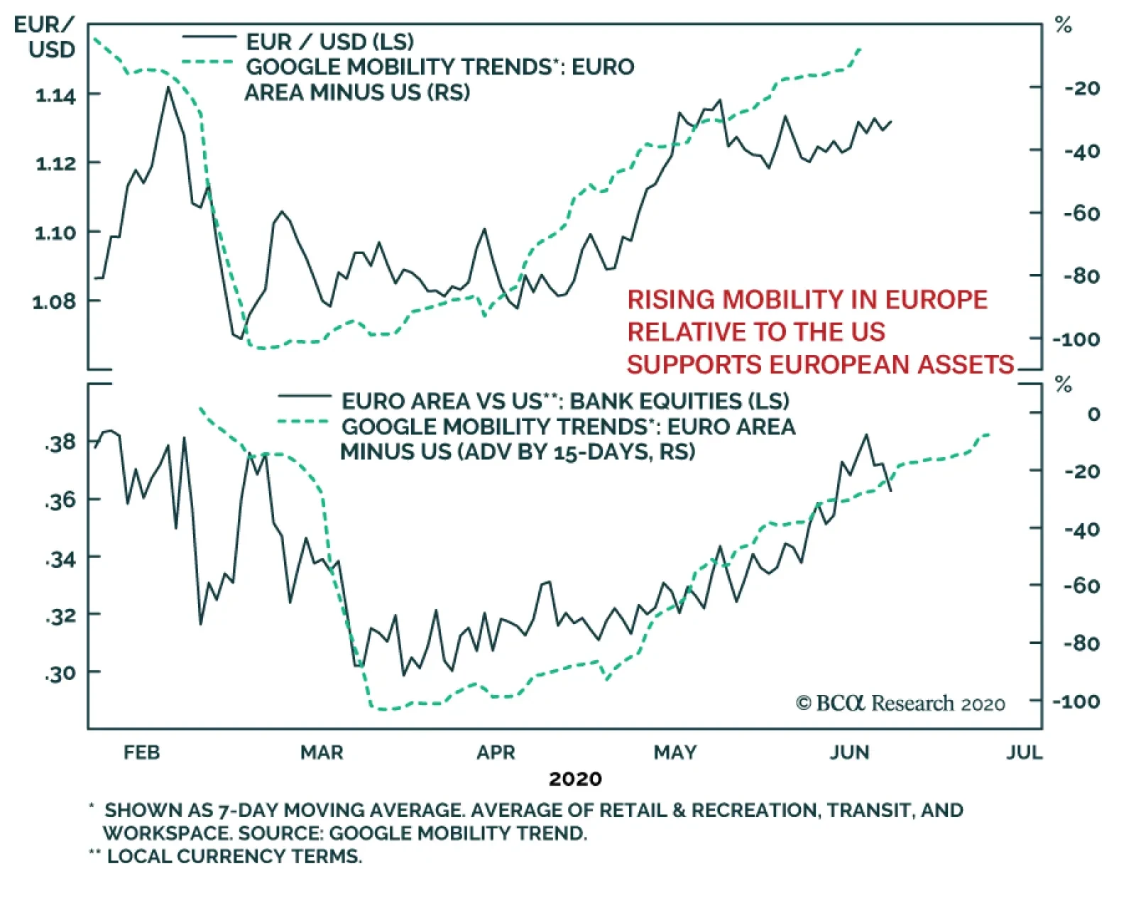
Europe implemented particularly draconian lockdowns in the spring, which resulted in violent declines in mobility and, as a corollary, in economic activity. However, Europe is re-opening and its second wave remains marginal. Consequently, European mobility is…
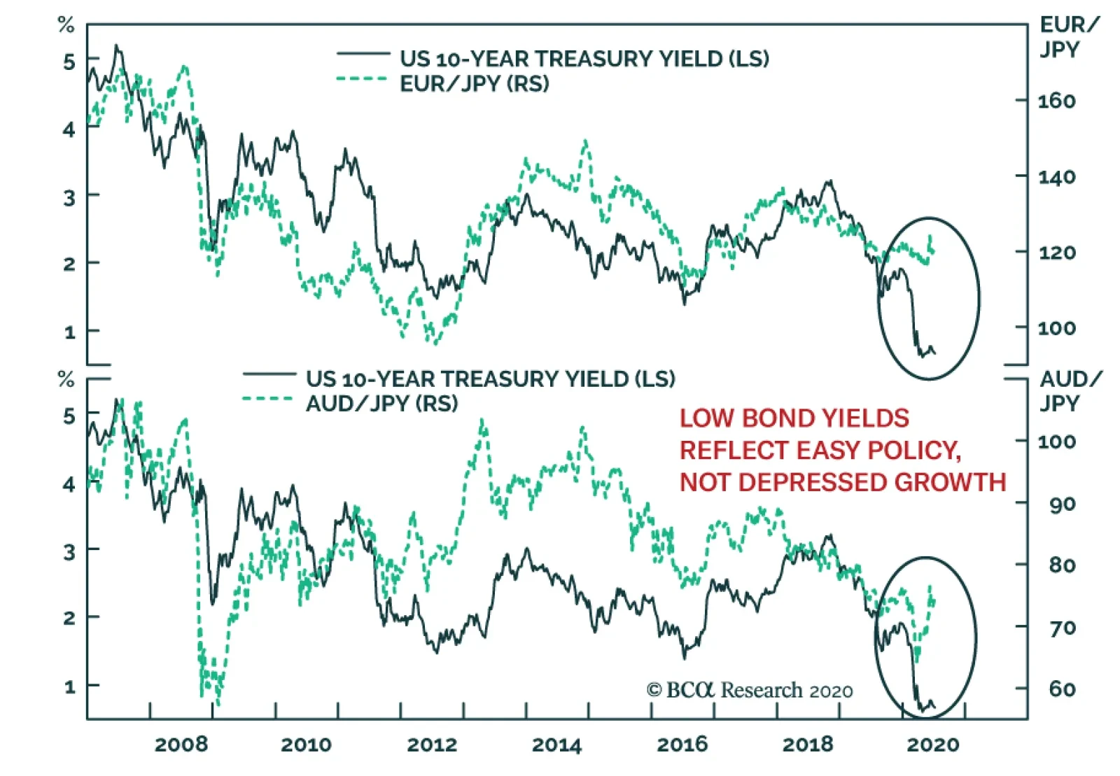
Among many investors, low bond yields arouse worries that equities will make new lows in the coming months. The idea is that low bond yields, especially their extremely depressed real components, point to weaker growth ahead. After all, many observers argue…
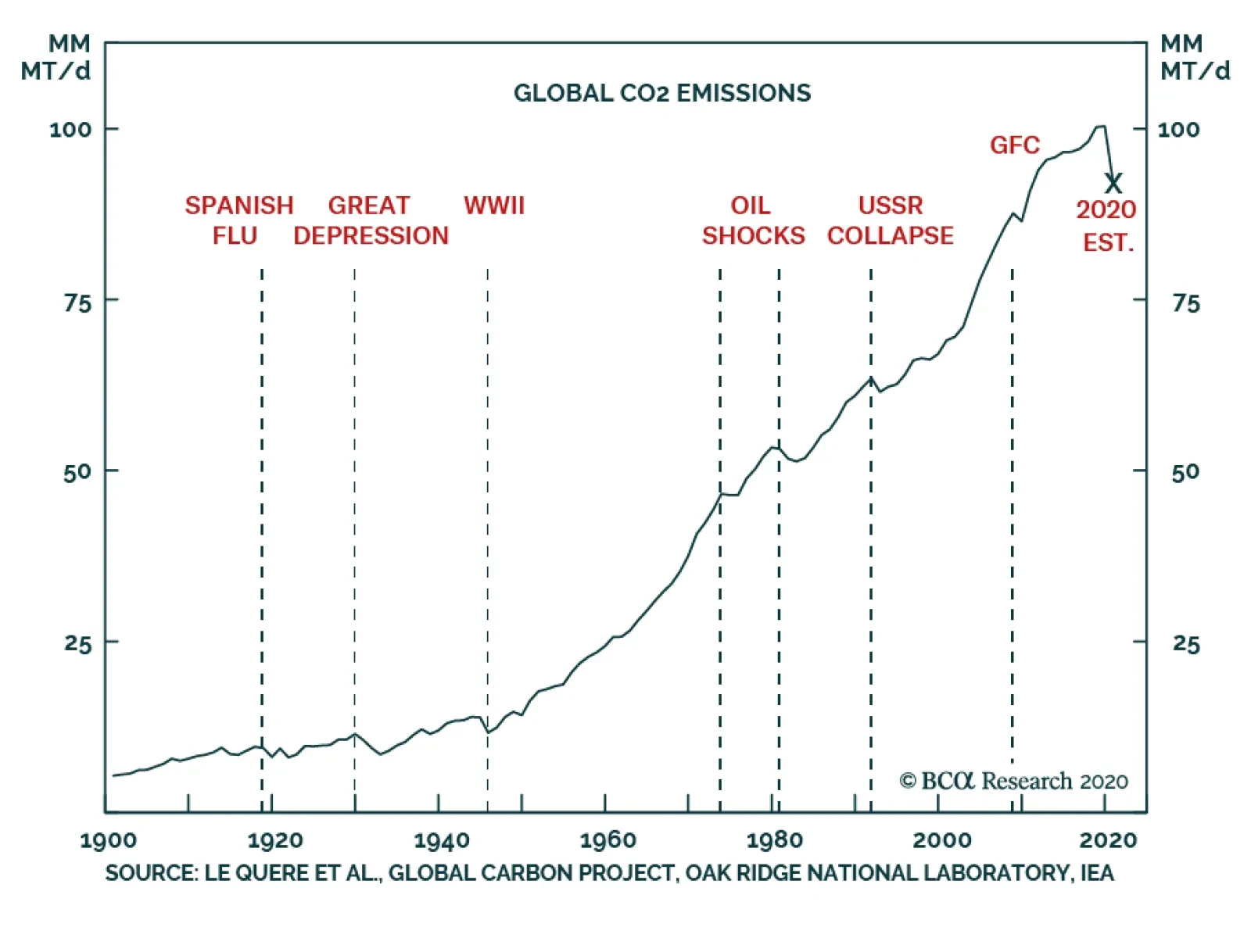
Highlights In this report, we initiate coverage of the EU Emission Trading System’s (ETS) CO2 allowances. We expect this policy-driven cap-and-trade market to become central to the market-driven pricing mechanism for CO2 fundamentals. Futures on EU CO2 emissions allowances will resume their rally – and surpass the €30 level seen in July 2019 – as ETS allowances supplies tighten in September. Global CO2 emissions are projected to fall 8% this year – 2.6 billion MT (2.6 gigatonnes, or Gt) – as a result of the COVID-19 pandemic, based on IEA modeling. If realized, this would be up to six times the decline in CO2 emissions following the Global Financial Crisis (GFC). The speed at which actual CO2 emissions return to pre-COVID-19 levels will be a function of how quickly global growth recovers, and the intensity of “green” investments. Post-COVID-19, the rebound in emissions could be sharply higher, as has been the case with previous global downturns. Following the GFC, CO2 emissions recovered all of the year-on-year (y/y) decline in 2009 by 2010 (Chart of the Week). As with any COVID-19-related projection, uncertainty – to the upside and downside – dominates our outlook. Chart of the WeekCOVID-19 Crushes Global CO2 Emissions
COVID-19 Crushes Global CO2 Emissions
COVID-19 Crushes Global CO2 Emissions
Feature The EU’s CO2 emissions market is designed to achieve policy goals – i.e., reducing the carbon footprint of utilities and manufacturers in Europe. As tempting as it may be to view the surge in EU CO2 emission allowances futures as a harbinger of a powerful recovery in European economic growth, such hopes would be misplaced (Chart 2).1 The sharp rally in part reflects the expected decrease in the volume of CO2 emission allowances that will be available for trading over the September 2020 – August 2021 period. In line with its policy mandates, the ETS reduced this volume by 0.33 Gt following a May 2020 meeting, bringing the total volume available for trade in the year beginning in September to ~ 1.32 Gt.2 The EU’s CO2 emissions market is designed to achieve policy goals – i.e., reducing the carbon footprint of utilities and manufacturers in Europe – vs. pricing those emissions purely as a function of supply-demand fundamentals. Chart 2CO2 Allowances Rally Reflects Anticipated Supply Squeeze
CO2 Allowances Rally Reflects Anticipated Supply Squeeze
CO2 Allowances Rally Reflects Anticipated Supply Squeeze
CO2 Emissions As is the case with industrial commodities – particularly oil, base metals, iron ore and steel – non-OECD markets dominate CO2 emissions. CO2 is the largest greenhouse gas (GHG) emitted into the atmosphere, and the largest share – almost two-thirds – of it is accounted for by fossil fuel use in industrial and transportation processes (Chart 3). CO2 emissions are closely tied to oil consumption. In non-OECD economies, this means they are closely tied to GDP, as the income elasticity of oil consumption for EM economies is ~ 0.65, meaning a 1% increase in income translates to a 0.65% increase in oil demand. In DM, transportation and electric generation drive hydrocarbon usage. In non-OECD and OECD markets, we model emissions as a function of oil consumption and financial variables (Chart 4). Chart 3Fossil-Fuel CO2 Dominates GHG Emissions
EU CO2 Markets Rally On Lower Allowances Supply
EU CO2 Markets Rally On Lower Allowances Supply
It comes as no surprise that commodity prices generally are highly correlated with CO2 emissions, given the markets in which they trade are continually responding to supply-demand shifts in industrial and consumer markets. This can be seen in our Global Commodity Factor, which extracts the common factor across 28 real commodity prices (Chart 5). Chart 4CO2 Emissions Trend With GDP, Oil Consumption
CO2 Emissions Trend With GDP, Oil Consumption
CO2 Emissions Trend With GDP, Oil Consumption
As is the case with industrial commodities – particularly oil, base metals, iron ore and steel – non-OECD markets dominate CO2 emissions (Chart 6). Chart 5CO2, Commodity Prices Closely Aligned
CO2, Commodity Prices Closely Aligned
CO2, Commodity Prices Closely Aligned
Chart 6Non-OECD Economies Dominate CO2 Emissions
EU CO2 Markets Rally On Lower Allowances Supply
EU CO2 Markets Rally On Lower Allowances Supply
Within this category, China accounts for ~ 45% of non-OECD CO2 emissions post-GFC, and close to 28% of global emissions, according to BP’s 2020 Statistical Review.3 China’s heavy reliance on coal-fired power generation and heating drive its CO2 emissions (Chart 7, top panel). Asia as a whole accounts for ~ 19 Gt of CO2 emissions, or 53% of the global total, while the US and Europe account for 18% and 17%, respectively.4 US CO2 emissions are driven by electric generation and transport, as the bottom panel of Chart 7 shows. Chart 7Electric Generation And Heating Drive China’s CO2 Emissions
EU CO2 Markets Rally On Lower Allowances Supply
EU CO2 Markets Rally On Lower Allowances Supply
EU CO2 Emission Allowances The ETS also will force the overall number of emission allowances to contract at a 2.2% rate p.a. beginning next year. In the 21st century, ICE EUA futures prices have not followed actual EU CO2 emissions (Chart 8). This is not unexpected, given this market largely is a policy-driven market, not a fundamentally driven market. The ETS runs a cap-and-trade system covering ~ 45% of the EU’s GHG emissions, which limits emissions by more than 11,000 power stations, industrial plants and other heavy energy-use applications. Until 2019, the ETS adjusted supplies of emissions allowances by literally removing surpluses from the market resulting from overallocations of supplies via its free allocations and auctions. Thereafter, the ETS Market Stability Reserve (MSR), began absorbing unallocated emissions allowances to keep prices from falling to the point that investment in CO2 abatement would be disincentivized.5 Chart 8Two Ships In The Night: EU CO2 Emissions and EUA Futures
Two Ships In The Night: EU CO2 Emissions and EUA Futures
Two Ships In The Night: EU CO2 Emissions and EUA Futures
As ETS system surplus allocations are reduced, we expect this market will more closely reflect the actual supply and demand for CO2 allowances. The ETS also will force the overall number of emission allowances to contract at a 2.2% rate p.a. beginning next year, versus the 1.74% p.a. contraction observed over the 2013-2020 period, in order, it says, to keep the GHG emissions falling to policy levels set for 2030. Even with its flaws vis-à-vis a true commodity market driven by supply-demand fundamentals, the ETS’s CO2 emissions allowances market is extremely important as a source of information regarding the state of the world. Last year, Reuters’s Refinitiv service estimated that of the $164 billion worth of CO2 emissions traded globally 90% was accounted for by the European market.6 As ETS system surplus allocations are reduced, we expect this market will more closely reflect the actual supply and demand for CO2 allowances. This will allow it to generate a market-clearing price for emissions allowances, which will be a valuable data point for global markets, especially when it comes to allocating capital to reducing GHG emissions. The ETS is retaining the right to issue free allocations, so that participants in the system are not disadvantaged by other jurisdictions not subject to the stringent requirements imposed by the ETS. Bottom Line: The ETS’s CO2 emission allowances will resume the rally launched in March 2020, as the supply of allowances contracts beginning in September. We are not ready to recommend any positions in this market, but will continue to follow and write about it going forward, expecting it will become not only a viable market but an important source of information of the market-clearing price of CO2 emissions. Robert P. Ryan Chief Commodity & Energy Strategist rryan@bcaresearch.com Hugo Bélanger Associate Editor Commodity & Energy Strategy HugoB@bcaresearch.com Fernando Crupi Research Associate Commodity & Energy Strategy FernandoC@bcaresearch.com Commodities Round-Up Energy: Overweight Brent and WTI prices have been moving side-ways since June at ~ $41/bbl and $39/bbl, respectively. Fundamentals are tightening but fear of a second wave of COVID-19 infections weighs on prices. Bakken shale-oil producers could struggle to restart drilling and production activities after a court ordered the closure of the basin’s crucial Dakota Access pipeline – responsible for moving ~ 600k b/d – due to insufficient environmental checks. As previously shut-in production comes back on line, regional prices could remain under pressure to incentivize additional crude-by-rail volumes – at close to double the transportation costs – out of the basin, keeping prices below producers’ breakevens (Chart 9). Base Metals: Neutral Copper prices continue moving up as economic activity in China recovers (Chart 10). Prices are now 32% higher vs. March lows. Large metal-producing countries in Latin America have been hit hard by the COVID-19 pandemic. This puts supply at risk and could have lasting impacts as needed investment in new mines is delayed. In fact, Codelco announced it is suspending construction at its El Teniente mine in Chile due to rising COVID-19 cases in the region. Copper could enter a persistent supply-deficit period if demand remains in its upward trend. Precious Metals: Neutral Gold prices crossed $1,800/oz on Tuesday, reaching their highest level since 2011. The yellow metal’s rally continues to be fueled by record Western investment demand. ETFs inflows in June reached 104 tons, pushing gold-backed ETF volumes and AUM to new highs. Globally, ETF holdings’ tonnage increased by 25% ytd. This more than offsets the collapse in physical demand from China and India. Going forward, we expect a lower US dollar will support income growth in EM countries, providing additional demand for gold. Ags/Softs: Underweight The latest USDA Acreage report surprised the market, with corn producers planting 5 million less acres than their intentions in March. This large decline caused corn futures to rally to 3-month highs. Since then, the market has focused on adverse weather, hoping dryness in major corn producing areas would reduce corn yields. However, that didn’t materialize. Forecasts are showing less intense heat in the Midwest crop belt and futures are losing some ground compared to recent highs. The market is now awaiting Friday’s USDA Supply and Demand report. With exports on pace to come in slightly below the USDA estimate for the year and a much-reduced planting area, we expect corn ending stocks to be well below the June estimate of 3.32 Bn bushels. Chart 9Bakken Crude Prices Are Falling Vs WTI
Bakken Crude Prices Are Falling Vs WTI
Bakken Crude Prices Are Falling Vs WTI
Chart 10China's Economic Growth Supports Copper Prices
China's Economic Growth Supports Copper Prices
China's Economic Growth Supports Copper Prices
Footnotes 1 These futures are the EUA contracts for delivery of Carbon Emission Allowances at the Union Registry, which was set up to account “for all allowances issued under the EU emissions trading system (EU ETS).” Contracts for delivery of these allowances are traded on ICE Futures Europe’s platform. 2 Please see ETS Market Stability Reserve to reduce auction volume by over 330 million allowances between September 2020 and August 2021 published by the European Commission May 8, 2020. 3 Please see bp Statistical Review of World Energy 2020: a pivotal moment published June 17, 2020. 4 Please see CO2 and Greenhouse Gas Emissions published by Our World in Data, a collaboration between researchers at the University of Oxford, and the non-profit organization Global Change Data Lab, in December 2019. 5 Surpluses have been a feature of the market since 2009. Please see Market Stability Reserve published by the European Commission. 6 Please see Value of global CO2 markets hit record 144 billion euros in 2018: report published January 16, 2019 by reuters.com. Investment Views and Themes Recommendations Strategic Recommendations Tactical Trades Trade Recommendation Performance In 2020 Q1
EU CO2 Markets Rally On Lower Allowances Supply
EU CO2 Markets Rally On Lower Allowances Supply
Commodity Prices and Plays Reference Table Trades Closed In 2020 Summary of Closed Trades
EU CO2 Markets Rally On Lower Allowances Supply
EU CO2 Markets Rally On Lower Allowances Supply
BCA Research's Commodity & Energy Strategy service has initiated coverage of the EU Emission Trading System’s (ETS) CO2 allowances. They expect this policy-driven cap-and-trade market to become central to the market-driven pricing mechanism for CO2…
BCA Research's European Investment Strategy service's fractal trading model has given them a sell signal on the stock-to-bond ratio. Since 2015, a collapsed 65-day fractal structure of the German stock-to-bond ratio has reliably presaged a change in trend,…
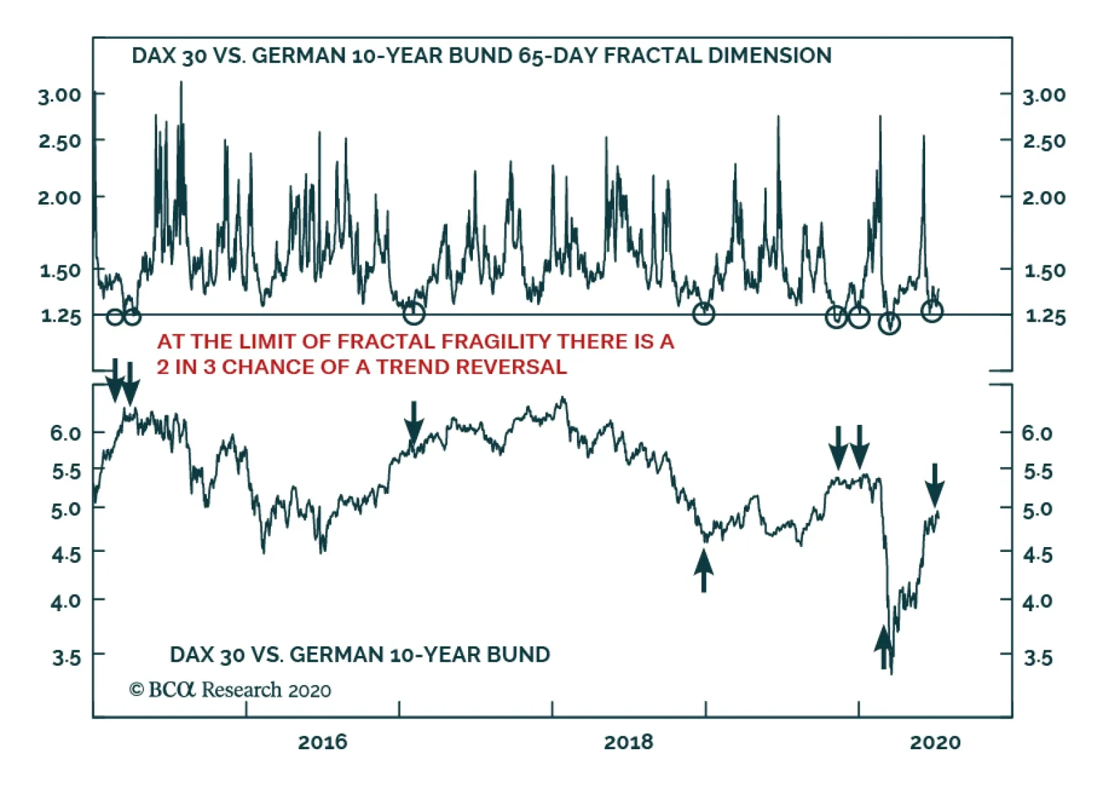
Please note that I will be hosting a webcast on Friday July 17 and that the webcast will replace next week’s report. Highlights Go tactically short stocks versus bonds. But express it as short DAX versus the US 10-year T-bond, given the greater scope for compression in US bond yields than in German bond yields. Target a profit of 10 percent but apply a stop-loss if stock versus bond outperformance continues for another 10 percent. There is now a strong incentive for short-term investing and a strong disincentive for long-term investing, forcing formerly long-term investors to think and behave like traders. Don’t obsess with the Covid-19 mortality rate. Focus instead on the morbidity, or hospitalization, rate. Covid-19 is unlikely to kill you, but it can make you ill and, in some unlucky cases, permanently ill. Feature Chart of the WeekA Sell Signal For Stocks To Bonds
A Sell Signal For Stocks To Bonds
A Sell Signal For Stocks To Bonds
Financial markets have reached an absurdity. It is now more rewarding to be a short-term trader who holds investments for just three months than it is to be a long-term investor who buys and holds them for ten years. And just to be clear, we are comparing cumulative returns over the entire holding period of three months versus one that is forty times longer at ten years. The case for buying and holding most mainstream investments has collapsed. Investors seeking attractive long-term returns can no longer rely on mainstream bond and stock markets. Nowadays, the long-term investment story is about sectors and themes, and we will continue to tell this story in our regular reports. However, this week we will focus on the implications of short-termism in the mainstream markets. Short-Term Returns Now Beat Long-Term Returns Through the past year, anybody who has bought the German 10-year bund, with the intention of holding it until it redeems in 2029 is guaranteed a deeply negative return. Yet there have been many three-month periods in which the bund has generated a high single-digit return (Chart I-2). Chart I-23-Month Returns Now Beat 10-Year Returns!
3-Month Returns Now Beat 10-Year Returns!
3-Month Returns Now Beat 10-Year Returns!
Likewise, anybody who owns the US 10-year T-bond has made almost as much money in the first three months of this year as they mathematically can by holding it for ten years! By extension, the same principle also applies to mainstream stock markets which are priced for feeble long-term returns – yet can rally by 20-30 percent in the space of a few weeks. It is now more rewarding to be a short-term trader who holds investments for three months than it is to be a long-term investor who buys and holds them for ten years. Admittedly, these are nominal returns, and the long-term real returns could be boosted by deflation. Nevertheless, the economy would have to experience Great Depression levels of deflation to make the long-term real returns genuinely attractive. Yet it wasn’t always like this. Until recent years, the cumulative returns available from long-term investing were many multiples of those available from short-term investing – as they should be (Chart I-3 and Chart I-4). But today, the incentive structure is back-to-front. There is a strong disincentive for long-term investing and a strong incentive for short-term investing, forcing formerly long-term investors to think and behave like traders. Albeit traders that must get their timing right. Chart I-3Today, There Is A Strong Disincentive For Long-Term Investing...
Today, There Is A Strong Disincentive For Long-Term Investing...
Today, There Is A Strong Disincentive For Long-Term Investing...
Chart I-4...And A Strong Incentive For Short-Term Investing
...And A Strong Incentive For Short-Term Investing
...And A Strong Incentive For Short-Term Investing
Unfortunately, when everybody behaves like traders there are worrying implications for financial market liquidity and stability. Short-Termism Destroys Market Liquidity We have been brought up to believe that agreement and consensus create peace and harmony, whereas disagreement and opposition create conflict and discord. Hence, it is natural to think that agreement and consensus also create calm and stability in the financial markets. Yet nothing could be further from the truth. A calm and stable market requires disagreement. Disagreement is the source of market liquidity and stability. Meaning, the ability to convert stocks into cash, or cash into stocks, quickly and in volume without destabilising the stock price. For an investor to convert a large amount of stocks into cash without destabilising the price, a mirror-image investor must be willing to take the opposite position. It follows that market liquidity comes from a disagreement about the attractiveness of the investment at a given price. As an aside, we often read comments such as ‘investors are moving out of stocks into cash’, or vice-versa. Such comments are nonsensical. If one investor is selling stocks, then a mirror-image investor must be buying stocks. The stocks cannot just vanish into thin air! A market which loses its variation of investment horizons loses its liquidity and stability. If institutional investors are selling, then a mirror-image investor must be buying. The mirror-image buyer could be less savvy retail investors, in which case we might interpret the institutional selling as a sell signal. Or the mirror-image buyer could be ‘smart money’ hedge funds, in which case we might interpret the institutional selling as a buy signal. It follows that unless we know the identity of both the seller and the buyer, the ‘flows’ information is useless. The much more useful information is the variation of investment horizons in the market. This is because a market which possesses a variation of investment horizons also possesses the disagreement required for liquidity and stability. Conversely, a market which lacks this variation of investment horizons could soon run out of liquidity and undergo a change in trend. Investors with different time horizons disagree about the attractiveness of an investment at a given price because they interpret the same facts and information differently. For example, a day-trader will interpret an outsized rally as a ‘momentum’ buy signal, whereas a value investor will interpret the same information as a ‘loss of value’ sell signal. Therefore, the market possesses liquidity and stability when its participants possess a variation of investment horizons. For example, both a 1-day horizon and a 3-month (65 business days) horizon. The corollary is that the market’s liquidity and stability disappear when its participants no longer possess this healthy variation in horizons. In technical terms, this occurs when the market’s fractal structure collapses. In the above example, it would be signalled by the 65-day fractal dimension collapsing to its lower limit (Chart I-5). Chart I-5The Stock-To-Bond Fractal Structure Has Collapsed
The Stock-To-Bond Fractal Structure Has Collapsed
The Stock-To-Bond Fractal Structure Has Collapsed
All of which brings us to our tactical stock-to-bond sell signal. A Sell Signal For Stocks To Bonds Since 2015, a collapsed 65-day fractal structure of the German stock-to-bond ratio has reliably presaged a change in trend, implying either a sell or buy signal based on the direction of the preceding trend. The two most recent occurrences happened this year on January 2, a sell signal, and March 9, a buy signal (Chart of the Week). A collapsed 65-day fractal structure of the German stock-to-bond ratio has reliably presaged a change in trend. The 65-day fractal structure of the German stock-to-bond ratio has collapsed once again, reinforced by a similar observation in the US stock-to-bond ratio. This suggests that the recent 40 percent rally in stocks versus bonds is approaching exhaustion and is susceptible to a tactical reversal (Chart I-6). Chart I-6The 40 Percent Rally In Stocks Versus Bonds May Be Near Exhaustion
The 40 Percent Rally In Stocks Versus Bonds May Be Near Exhaustion
The 40 Percent Rally In Stocks Versus Bonds May Be Near Exhaustion
Hence, go tactically short stocks versus bonds. But express it as short DAX versus the US 10-year T-bond, given the greater scope for compression in US bond yields than in German bond yields. Target a profit of 10 percent but apply a stop-loss if the outperformance continues for another 10 percent. One caveat is that bullish fundamentals can swamp fragile fractal structures. Hence, the strong outperformance of stocks versus bonds would persist if, for example, a breakthrough treatment or vaccine suddenly emerged for Covid-19. On the other hand, it is worth noting that US hospitalizations for the disease are rising once again, even if deaths, so far, are not (Chart I-7). Nevertheless, we reiterate that the Covid-19 morbidity (severe illness) rate is much more important than the mortality rate, for two reasons. Chart I-7US Hospitalizations For Covid-19 Are Rising Again
A Sell Signal For Stocks To Bonds
A Sell Signal For Stocks To Bonds
First, it is morbidity rather than mortality that swamps the finite and limited intensive care unit (ICU) capacity in healthcare systems. Second, the evidence now suggests that many recovered Covid-19 victims suffer long-term damage to their lungs and/or other vital organs such as kidneys, the liver, and the brain. This is the case even for apparently mild cases of the disease that do not require hospitalization. Therefore, don’t obsess with the Covid-19 mortality rate. Focus instead on the morbidity, or hospitalization, rate. The threat from Covid-19 is not that it will kill you. It almost certainly won’t. The threat is that it will make you ill and, in some unlucky cases, permanently ill. Fractal Trading System* As discussed, this weeks recommended trade is short DAX versus 10-year T-bond, setting a profit target and symmetrical stop-loss at 10 percent. Chart I-8GBP/RUB
GBP/RUB
GBP/RUB
In other trades, long GBP/RUB is within a whisker of its 3 percent profit target. The rolling 1-year win ratio now stands at 59 percent When the fractal dimension approaches the lower limit after an investment has been in an established trend it is a potential trigger for a liquidity-triggered trend reversal. Therefore, open a countertrend position. The profit target is a one-third reversal of the preceding 13-week move. Apply a symmetrical stop-loss. Close the position at the profit target or stop-loss. Otherwise close the position after 13 weeks. * For more details please see the European Investment Strategy Special Report “Fractals, Liquidity & A Trading Model,” dated December 11, 2014, available at eis.bcaresearch.com. Dhaval Joshi Chief European Investment Strategist dhaval@bcaresearch.com Fractal Trading System Cyclical Recommendations Structural Recommendations Closed Fractal Trades Trades Closed Trades Asset Performance Currency & Bond Equity Sector Country Equity Indicators Bond Yields Chart II-1Indicators To Watch - Bond Yields
Indicators To Watch - Bond Yields
Indicators To Watch - Bond Yields
Chart II-2Indicators To Watch - Bond Yields
Indicators To Watch - Bond Yields
Indicators To Watch - Bond Yields
Chart II-3Indicators To Watch - Bond Yields
Indicators To Watch - Bond Yields
Indicators To Watch - Bond Yields
Chart II-4Indicators To Watch - Bond Yields
Indicators To Watch - Bond Yields
Indicators To Watch - Bond Yields
Interest Rate Chart II-5Indicators To Watch - Interest Rate Expectations
Indicators To Watch - Interest Rate Expectations
Indicators To Watch - Interest Rate Expectations
Chart II-6Indicators To Watch - Interest Rate Expectations
Indicators To Watch - Interest Rate Expectations
Indicators To Watch - Interest Rate Expectations
Chart II-7Indicators To Watch - Interest Rate Expectations
Indicators To Watch - Interest Rate Expectations
Indicators To Watch - Interest Rate Expectations
Chart II-8Indicators To Watch - Interest Rate Expectations
Indicators To Watch - Interest Rate Expectations
Indicators To Watch - Interest Rate Expectations
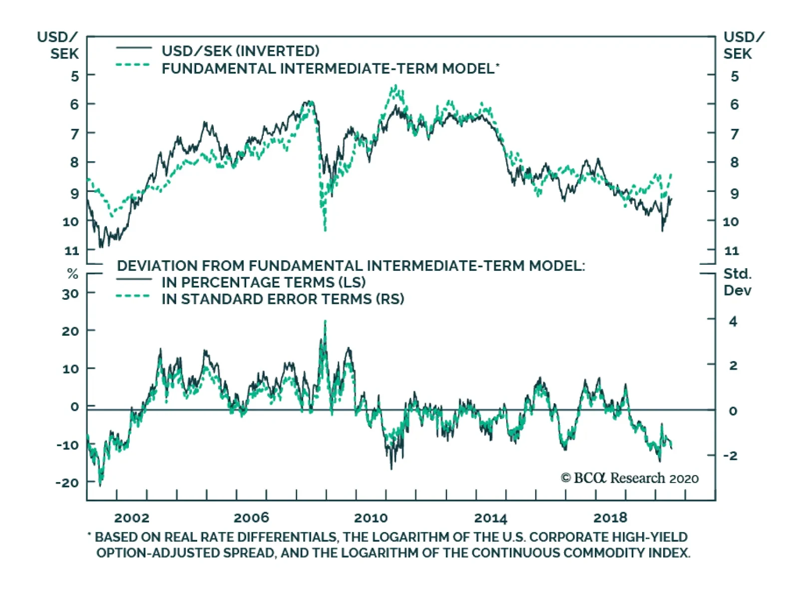
BCA Research's Foreign Exchange Strategy service's intermediate-term model shows that the Swedish krona is now quite cheap. As such, it is one of their favorite longs. Meanwhile, since the Fed extended its USD swap lines, SEK has lagged the bounce in AUD,…