Europe
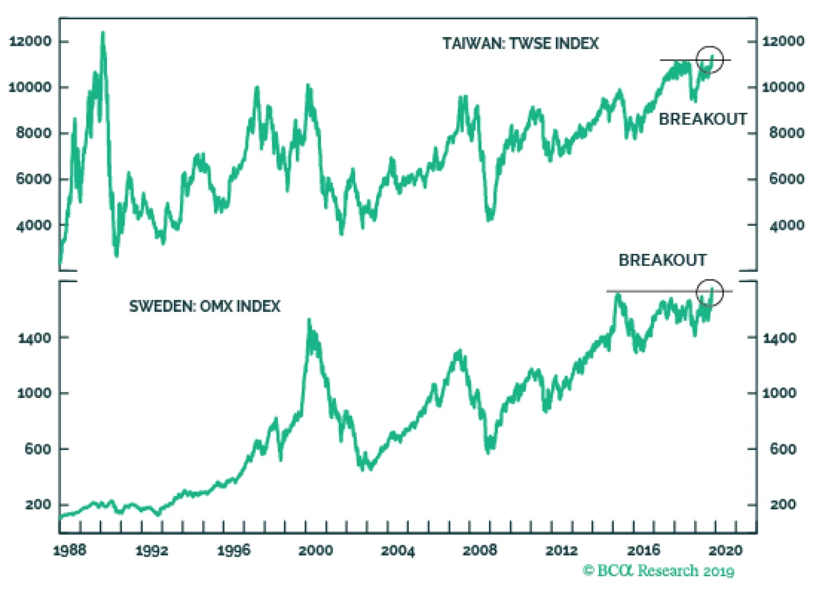
A variety of pro-cyclical financial variables are pointing toward an improving global growth outlook. The AUD/JPY has clearly bottomed, the USD/KRW is weakening, and the silver to gold ratio has been strengthening. The most eye-catching development has…

Highlights Rising recession risk, shaky economic fundamentals, and absence of positive yielding assets motivate us to reexamine which assets can be counted on to protect a portfolio in the future. We analyze 10 safe havens on four different dimensions: consistency, versatility, efficiency, and costs. Using this framework, we examine the historical performance of each safe haven and provide an outlook on their likely effectiveness over the next decade. We conclude that U.S. TIPS and farmland should provide the best portfolio protection. Cash, U.S. Treasuries and gold are other good alternatives. Meanwhile, U.S. investment-grade bonds, global ex-U.S. bonds, silver, and currency futures are likely to be poor protection choices. Feature For most investors, capital preservation is the most important goal when managing money. However, how to go about it remains a difficult question. Investing in safe havens can be painful during bull markets, as their returns are usually lower than those of equities. Moreover, economic, political, and financial regimes change over time, which means that an asset that protected your portfolio in the past might not do so in the future. Therefore, it becomes good practice to review one’s safety measures periodically, even if one does not think that a crash is imminent. The current environment in particular, is a propitious time to review safe havens given that: Chart I-1A Great Time To Review Safety Measures
A Great Time To Review Safety Measures
A Great Time To Review Safety Measures
A key recession signal is flashing red: The yield curve inverted in the United States in August (Chart I-1 – top panel). An inversion of the yield curve does not necessarily imply a recession, but historically it has been a very reliable signal of one, given that it indicates that monetary policy is too tight for the economy. Structural risks are rising: Rich equity valuations in the U.S. and high leverage levels elsewhere are signs that the pillars supporting this bull market might be fragile (Chart I-1 – middle panel). In addition, protectionism and populism, forces that BCA has long argued are here to stay, threaten to upend the regime of free trade that has benefited equities since the 1950s.1 Yields are near all-time lows: Historically, investors have been able to endure bear markets by hiding in safe assets with positive yield, as these assets will normally provide a reliable cash flow regardless of the economic situation. However, these type of assets are increasingly hard to find, particularly in the government bond space, where 50% of developed country bonds have negative yields (Chart I-1 – bottom panel). Considering these factors, how should investors protect their portfolios in the next decade? To answer this question, we analyze 10 safe havens divided into five broad asset classes: Nominal government bonds: U.S. Treasuries and global ex-U.S. government bonds. Other fixed income: U.S. investment-grade credit and U.S. TIPS.2 Currencies: yen futures and Swiss franc futures. Precious metals: gold futures and silver futures. Other assets: farmland and U.S. cash. We look at historical performance since 1973 for all safe havens except for global ex-U.S. bonds and farmland. For these assets, we look at performance since 1991 due to limited data availability. We mainly look at quarterly returns in order to compare illiquid assets to publicly traded ones. We do not consider each safe haven in isolation, but rather as an addition to equities within a portfolio. Specifically, we explore our safe haven universe relative to the MSCI All Country World equity index from the perspective of a U.S. investor. For our non-U.S. clients, we will release a report from the perspective of other countries if there is sufficient interest. Importantly, we do not look only at historical performance. We also examine whether there is a reason to believe that future returns will be different from past ones, by analyzing how the properties of each safe haven might have changed. When evaluating each safe haven, we focus on four properties: Consistency: a safe haven should generate consistent positive returns during periods of negative equity performance, with returns increasing with the severity of the equity drawdown. Versatility: safe havens should perform well across different types of crises. Efficiency: a safe haven should produce enough upside during crises, so only a small allocation to the safe haven is necessary to reduce losses. Costs: drag to portfolio overall performance (opportunity costs) should be as small as possible. Readers who wish to see just our overall conclusions should read our Summary Of Results section below. For our analysis of how safe havens have performed in the past, please see the Historical Performance section. Finally, for our analysis of how we expect the performance of safe havens to change, please see our Outlook section. Summary Of Results The Best Safe Havens U.S. TIPS should be an excellent safe haven to protect a portfolio in the next decade. While TIPS might not be as cheap to hold as they have been in the past, upside potential remains strong, which means that a moderate allocation can provide substantial protection to an equity portfolio. Moreover, U.S. TIPS are one of the best hedges against crises triggered by rising rates and inflation, which in our view are the biggest structural risks that asset allocators face. Farmland could also be a great safe haven for investors who have the ability to allocate to illiquid assets given that it is the cheapest safe haven in terms of portfolio drag. However, investors should be aware that the current low yield could potentially affect its performance during crises. Good Alternatives Cash can be a good alternative to protect an equity portfolio, given its outstanding performance during equity drawdowns caused by inflation. Moreover, its opportunity costs should decrease relative to the past. However, investors should take into account that the efficiency of cash at the current juncture is poor, which means that a relatively large allocation is needed in order to achieve meaningful portfolio protection. A portfolio with a 30% allocation to Treasuries historically provided the same downside protection as a portfolio with a 44% allocation to gold. We also like gold futures as a safe haven since they offer some of the most attractive opportunity costs. In addition, their upside is greater than that of most safe havens due to their negative correlations with real rates. However, gold’s volatility makes it an unreliable asset, which prevents us from placing it higher in the safe haven hierarchy. Historically, U.S. Treasuries have been one of the best safe havens to hedge an equity portfolio. Will this performance continue in the future? We do not think so. While yields are still high enough to provide plenty of upside potential, they have fallen to the point where they have increased the opportunity costs of U.S. Treasuries and reduced their consistency. The Rest Global ex-U.S. bonds have very limited upside due to their low yields. Meanwhile U.S. investment-grade credit remains at risk from poor corporate balance sheets, compounded by the fact that credit no longer has an attractive yield cushion. Currencies like the yen and the Swiss franc will continue to be unreliable and very expensive safe havens. Finally, while silver’s costs and reliability could improve, its high cyclicality relative to other safe havens will make silver a poor protection choice. Historical performance Consistency How did safe havens perform when equities lost money? To assess consistency, we plot the performance of each safe haven during all quarters when global equities had losses (Chart I-2). Cash and farmland were the only assets to have positive returns during every equity drawdown. U.S. Treasuries and U.S. TIPS were also very consistent, and had the additional advantage that their returns tended to increase as equity losses worsened. Global ex-U.S. bonds, while not as consistent, generated positive returns most of the time. Chart I-2Safe Haven Returns During Drawdowns In Global Equities
Safe Haven Review: A Guide To Portfolio Protection In The 2020s
Safe Haven Review: A Guide To Portfolio Protection In The 2020s
On the other hand, investment-grade bonds, the yen, the Swiss franc, gold, and silver were much more inconsistent. In general, even though these assets had larger positive returns than other assets, they were prone to deep selloffs concurrent with equity drawdowns. Silver was the worst of all safe havens, being mostly a negative return asset during quarters of negative equity performance. Versatility How did the type of crisis affect the performance of safe havens? We classify crises according to their catalyst into the following four categories: bursts of U.S. asset bubbles (tech bubble, 2008 housing crisis), ex-U.S. crises (1998 EM crisis, European debt crisis), flash crashes/political events (1987 Black Monday, 9/11 terrorist attack), rate/inflation shocks (1974 oil crisis, 1980 Fed shock) and others (every other equity drawdown we could not classify).3 We look at the performance of seven safe havens since 1973 (Chart I-3A) and of all 10 since 19914 (Chart I-3B): Chart I-3ASafe Haven Return During Different Type Of Crisis (1973 - Present)
Safe Haven Review: A Guide To Portfolio Protection In The 2020s
Safe Haven Review: A Guide To Portfolio Protection In The 2020s
Chart I-3BSafe Haven Return During Different Type Of Crisis (1991 - Present)
Safe Haven Review: A Guide To Portfolio Protection In The 2020s
Safe Haven Review: A Guide To Portfolio Protection In The 2020s
During bursts of U.S. asset bubbles, U.S. Treasuries were the most effective hedge in both sample periods, followed by U.S. TIPS and farmland. Corporate bonds, cash, gold, and the Swiss franc also had positive returns, though they were small. Finally, the yen and silver had negative returns. During crises happening outside of the U.S., U.S. Treasuries were once again the best option. U.S. TIPS, yen futures, farmland, gold, and U.S. investment-grade bonds also provided strong returns. Meanwhile, global ex-U.S. bonds and cash provided relatively weak returns, while both the Swiss franc and silver accrued losses. During flash crashes/political events, the Swiss franc had the best performance followed by global ex-U.S. bonds, though in general all safe havens but silver provided positive returns. Rate/inflation shocks were the most difficult type of crisis to hedge. Cash and U.S. TIPS were by far the best performers. Moreover, while U.S. Treasuries were able to eke out a small positive return, all other safe havens lost money during these crises. Efficiency How much allocation to each safe haven was needed to protect an equity portfolio? Chart I-4 show how adding incremental amounts of each safe haven5 to an equity portfolio reduced the overall portfolio’s 10% conditional VaR (the average of the bottom decile of returns).6 Since 1973, U.S. TIPS and U.S. nominal government bonds were the most efficient safe havens, providing the most protection per unit of allocation (Chart I-4 – top panel). Conditional VaR was reduced by almost half when allocating 40% to either Treasuries or TIPS. Cash, U.S. investment-grade, the yen, the Swiss franc, gold, and silver followed in that order. The difference between the safe havens was significant. As an example, a portfolio with a 30% allocation to U.S. Treasuries historically provided the same downside protection as a portfolio with a 36% allocation to U.S. IG credit, a 39% allocation to the yen or a 44% allocation to gold. Meanwhile, there was no allocation to silver which would have provided the same level of protection. When using a sample from 1991, the main difference was the reduced efficiency of cash – the result of lower average interest rates when using a more recent sample. Other than cash, the efficiency of most safe havens remained unchanged: U.S. Treasuries were the best option, followed by U.S. TIPS, farmland, U.S. investment-grade bonds, global ex-U.S. government bonds, cash, the yen, gold, the Swiss franc, and silver in that order (Chart I-4 – bottom panel). Chart I-4Historically, Fixed-Income Assets Were The Most Efficient Safe Havens
Safe Haven Review: A Guide To Portfolio Protection In The 2020s
Safe Haven Review: A Guide To Portfolio Protection In The 2020s
Costs How do safe haven returns compare to equities? To evaluate opportunity costs, we compare the difference of the historical return of each safe haven versus global equities. Overall, hedging with currencies was extremely costly, as their return was well below that of equities in both samples (Chart I-5). Cash was also an expensive safe haven to hedge with, particularly in the most recent sample. On the other hand, fixed-income assets like U.S Treasuries, investment-grade credit, and U.S. TIPS had very low costs (global ex-U.S. bonds also had cost of around 2% in a limited sample). Farmland had negative opportunity costs because it outperformed equities during the sample period.7 Chart I-5Historically Fixed Income Assets And Farmland Had The Lowest Opportunity Cost
Safe Haven Review: A Guide To Portfolio Protection In The 2020s
Safe Haven Review: A Guide To Portfolio Protection In The 2020s
Outlook Chart I-6No More Yield Cushion
Safe Haven Review: A Guide To Portfolio Protection In The 2020s
Safe Haven Review: A Guide To Portfolio Protection In The 2020s
Chart I-7Silver Has Become Less Cyclical
Silver Has Become Less Cyclical
Silver Has Become Less Cyclical
For our outlook, we assess how the four traits under study have changed for all safe havens: Consistency: Will safe havens continue to be reliable in the absence of high coupons? Many of the safe havens in our sample were effective at hedging equities due to their high yield. Even if they had negative capital appreciation, total returns stayed positive thanks to the offsetting effect of the yield return. However, as rates have declined, yield return has also decreased substantially (Chart I-6). Therefore, safe havens, like cash, government bonds, and even farmland will not be as consistent as they were in the past. Credit could be even more vulnerable: the combination of a low yield, and unhealthy fundamentals will turn U.S. corporate bonds into a negative-return asset in the next crisis. Silver might be the lone safe haven to improve its consistency. Industrial use for silver has fallen substantially in the past 10 years, decreasing its cyclical nature (Chart I-7). Thus, while silver might still be an erratic safe haven, it should be more consistent in the future than its historical performance would suggest. Versatility: What will the next crisis look like? Chart I-8Inflation and Political Crisis Will Plague The 2020s
Inflation and Political Crisis Will Plague The 2020s
Inflation and Political Crisis Will Plague The 2020s
Determining what the next crisis will look like is crucial for safe haven selection. Below we rank the types of crises in order of how likely and severe we think they will be in the future: Inflation/rate shock: We expect inflation to be significantly higher over the next decade. This will be the highest risk for asset allocators in the future. As we explained in our May 2019 report, a change in monetary policy framework, procyclical fiscal policy, waning Fed independence, declining globalization, and demographic forces are all conspiring to lift inflation in the next decade.8 Importantly, we believe that the Fed will be dovish initially, as it cannot let inflation continue to underperform its target after missing the mark for the last 10 years (Chart I-8 – top panel). However, this will cause an inflationary cycle, which will eventually lead the Fed to raise rates significantly and trigger a recession. Political events/flash crashes: Political events will also pose a risk to the markets on a structural basis. The rise of China as a superpower has shifted the world into a paradigm of multipolarity, which historically has resulted in military conflict. Moreover, animus for conflict is not dependent on President Trump. The American public in general feels that the economic relationship with China is detrimental to the United States (Chart I-8 – bottom panel). This means that any president, Democrat or Republican will have a political incentive to jostle with China for economic and political supremacy for years to come. Ex-U.S. crises: We expect Emerging Markets in general, and China in particular, to be among the most vulnerable parts of the global economy as we enter the next decade. Over the last 10 years, China’s money supply has increased four-fold, becoming larger than the money supply of the U.S. and the euro area combined. In addition, corporate debt as a % of GDP stands at 155%, higher than Japan at the peak of its bubble and higher than any country in recorded history (Chart I-9). We rank this type of crisis slightly below the first two because Emerging Market assets are depressed already. Thus, while we believe that there is further downside to come for these economies, some weakness has already been priced in. U.S. asset bubble burst: We believe that there are no systemic excesses in the U.S. economy, making a U.S. asset bubble burst a lesser risk than other types of crises. Although it is true that U.S. corporate debt stands at all-time highs, it is still at a much lower level than in other countries. Moreover, weakness of corporate credit is not likely to have systemic consequences on the economy, given that leveraged institutions like banks and households hold only a small amount of outstanding corporate debt (Chart I-10). Chart I-9EM crises Are Also A Risk
EM crises Are Also A Risk
EM crises Are Also A Risk
Chart I-10A U.S. Corporate Debt Deblacle Will Not Have Systemic Consequences
A U.S. Corporate Debt Deblacle Will Not Have Systemic Consequences
A U.S. Corporate Debt Deblacle Will Not Have Systemic Consequences
What does this ranking mean in terms of safe haven performance? U.S. TIPS and cash should be held in high regard as they will be some of the only assets that will perform well during an inflation/rate shock. The Swiss franc and global ex-U.S. bonds should be best performers during political crises, although U.S. TIPS could also provide adequate protection. Efficiency: Is there any upside left for safe havens when interest rates are near zero? As yields go below the zero bound it becomes harder for bonds to generate large positive returns. European or Japanese government bonds in particular would need their yields to go deep into negative territory to counteract a large selloff in equities (Table I-1). But can interest rates go that low? We do not think so. The recent auction of German bunds, where a 0%-yielding 30-year bond attracted the weakest demand since 2011, suggests that interest rates in these countries might be close to their lower bound. On the other hand, though U.S. yields are low, they are still high enough for U.S. Treasuries to provide high returns in case of a crisis. Table I-1No Room For Positive Returns In The Government Bond Space Outside Of The U.S.
Safe Haven Review: A Guide To Portfolio Protection In The 2020s
Safe Haven Review: A Guide To Portfolio Protection In The 2020s
Low rates also have an effect on the efficiency of U.S. investment-grade bonds, cash, and farmland because their upside during crises does not come from capital appreciation but rather from their yield, (the price of IG credit actually declines during most crisis). As mentioned earlier, their yield has declined substantially compared to the past, which means that a larger allocation will be necessary to counteract a selloff. Chart I-11Switzerland Has A High Incentive To Prevent The Franc From Appreciating
Safe Haven Review: A Guide To Portfolio Protection In The 2020s
Safe Haven Review: A Guide To Portfolio Protection In The 2020s
The upside of the yen could also be compromised. The Bank of Japan is likely to intervene aggressively in the currency market to prevent the Japanese economy from falling into a deflationary spiral, since it is very difficult for it to lower Japanese rates further. The Swiss franc is even more vulnerable. In contrast to Japan, Switzerland is a small open economy that has to import most of its products (Chart I-11). This means that the Swiss National Bank has a very high incentive to intervene in currency markets during a crisis, given that a rally in the franc could depress inflation severely. What about U.S. TIPS? In contrast to nominal government bond yields or even yields on corporate debt, U.S. real rates are not limited by the zero bound (Chart I-12). This makes TIPS a more attractive option than other fixed-income assets, since real rates can have much more room for further downside than nominal ones. To be clear, this will only be the case if our forecast of an inflationary crisis materializes. Likewise, since gold is heavily influenced by real rates, it should also offer significant upside during the next crisis.9 Chart I-12Real Rates Have More Downside Potential Than Nominal Ones
Real Rates Have More Downside Potential Than Nominal Ones
Real Rates Have More Downside Potential Than Nominal Ones
Costs: Can I afford to hold safe havens in a world of low returns? To provide an outlook for the expected cost of each safe haven, we use the return assumptions from our June Special Report.10 We subtract the expected return on global equities from the expected return for each safe haven to reach an expected cost value. However, three of the safe havens (global ex-U.S. government bonds, the Swiss franc and silver) did not have a return estimate. We compute their expected returns as follows: For the Swiss franc we use the methodology we used for all other currencies in our report. We base the expected return on the current divergence from the IMF PPP value, as well as the IMF inflation estimates. In addition, we add the relative cash rate assumed return for both our yen and Swiss franc estimates, as futures take into account carry return. For global ex-U.S. bonds we take the weighted average of the expected return of the euro area, Japan, U.K., Canada, and Australia government bonds. We weight the returns according to their market capitalization in the Bloomberg/Barclays government bond index. Due to silver’s dual role as an inflation hedge and industrial metal, silver prices are a function of both gold prices and global growth. To obtain a return estimate we run a regression on silver against these two variables and use our growth and gold return estimate to arrive at an assumed return for silver. Chart I-13 shows our results: while their cost will improve, currency futures remain the most expensive hedge. The opportunity cost of precious metals and cash will decrease, making them more attractive options than in the past. Meanwhile, low yields will increase the opportunity costs of most fixed-income assets. Finally, farmland will remain the cheapest safe haven, even with decreased performance. Chart I-13Oportunity Cost For Fixed Income Safe Havens Will Be Higher Than In The Past
Safe Haven Review: A Guide To Portfolio Protection In The 2020s
Safe Haven Review: A Guide To Portfolio Protection In The 2020s
Juan Manuel Correa Ossa Senior Analyst juanc@bcaresearch.com Appendix A
Safe Haven Review: A Guide To Portfolio Protection In The 2020s
Safe Haven Review: A Guide To Portfolio Protection In The 2020s
Footnotes 1 Please see Geopolitical Strategy Special Report, "The Apex Of Globalization – All Downhill From Here, " dated November 12, 2014, available at gps.bcaresearch.com. 2 We use a synthetic TIPS series for data prior to 1997. For details on the methodology, please see: Kothari, S.P. and Shanken, Jay A., “Asset Allocation with Inflation-Protected Bonds,” Financial Analysts Journal, Vol. 60, No. 1, pp. 54-70, January/February 2004. 3 For a detailed list of how we classified each equity drawdown, please see Appendix A. 4 The only crises caused by a rate/inflation shock occurred in 1974 and 1980. Thus we have this type of drawdown only in Chart 3A and not in Chart 3B. 5 For yen, Swiss franc, silver and gold futures we assume an allocation to an ETF which follows their performance. Since futures have zero initial costs they cannot be directly compared to traditional assets in terms of percentage allocation. 6 We prefer this measure over VaR given that it captures the properties of the left tail of returns more accurately. 7 While the farmland index subtracts management fees, we recognize that there are costs involved in holding these illiquid assets which are not necessarily captured by the return indices. Thus, the real historical cost of holding farmland was not negative but likely close to zero. 8 Please see Global Asset Allocation Strategy Special Report "Investors’ Guide To Inflation Hedging: How To Invest When Inflation Rises," dated May 22, 2019, available at gaa.bcaresearch.com. 9 Please see Commodity & Energy Strategy Special Report "All that Glitters…And Then Some" dated July 25, 2019, available at ces.bcaresearch.com. 10 Please see Global Asset Allocation Strategy Special Report "Return Assumptions - Refreshed and Refined" dated June 25, 2019,
Highlights Equities & Bonds: The accelerating upward momentum of global equities – the ultimate “leading economic indicator” – suggests that the current rise in global bond yields can continue. Maintain below-benchmark overall duration exposure, while staying overweight global corporate credit versus government bonds. U.S. Agency MBS: U.S. agency MBS spreads are now attractive relative to high-quality U.S. corporate bonds, both in absolute terms and on a risk-adjusted basis. Increase allocations to agency MBS, while reducing exposure to Aaa-, Aa- and A-rated U.S. corporates. Feature The U.S. Federal Reserve and European Central Bank (ECB) are both set to ease monetary policy this week. The Fed is almost certain to deliver a third consecutive 25bp rate cut at tomorrow’s FOMC meeting, while the ECB will restart its bond buying program on Friday. Yet government bond yields around the world continue to drift higher, as markets reduce expectations of incremental rate cuts moving forward. Equity prices are an excellent leading indicator of global growth, while bond yields typically reflect current economic conditions. Thus, equity prices should be considered a leading indicator of bond yields. Chart of the WeekMore Upside For Global Bond Yields
More Upside For Global Bond Yields
More Upside For Global Bond Yields
Yields are finally responding to the evidence that global growth is troughing - a dynamic that we have been telegraphing in recent weeks. Global equity markets are rallying, with the U.S. S&P 500 hitting a new all-time high yesterday. The year-over-year increase in global equities, using the MSCI World Index, is now at +10%, the fastest pace of upward acceleration seen since January 2017. Some of that rally in U.S. stock markets can be chalked up to 3rd quarter earnings beating depressed expectations. Yet there is also a forward-looking component of the rally that bond markets are starting to notice. Equity prices are an excellent leading indicator of global growth, while bond yields typically reflect current economic conditions. Thus, equity prices should be considered a leading indicator of bond yields. We see no reason to discount the positive message on growth from rallying equity markets, especially when confirmed by an improvement in our global leading economic indicator (LEI), led by the more cyclical emerging market (EM) countries (Chart of the Week). Falling stock prices in 2018 accurately heralded the global growth slowdown of 2019 which triggered the huge decline in bond yields. Why should rising stock prices not be interpreted in the same light, predicting better global growth – and higher bond yields – over the next 6-12 months? Multiple Signals Point To Higher Bond Yields The more optimistic message on growth is not only confined to developed market (DM) stock prices. EM equities and currencies have begun to perk up, with EM corporate credit spreads remaining stable, as well, mimicking the moves seen in U.S. credit markets. Bond volatility measures like the U.S. MOVE index of Treasury options are retreating to the lower levels implied by equity volatility indices like the U.S. VIX index, which is now just above the 2019 low (Chart 2). Markets are clearly pricing out some of the more negative tail-risk outcomes that prevailed through much of 2019. Some of that reduction in volatility can be attributed to the recent de-escalation of U.S.-China trade tensions and U.K. Brexit risks, both important developments that can help lift depressed global business confidence. A reduction in trade/political uncertainty should help fortify the transmission mechanism between easing global financial conditions and economic activity – an outcome that could extend the rise in yields given stretched bond-bullish duration positioning (Chart 3). Chart 2A More Pro-Risk Global Market Backdrop
A More Pro-Risk Global Market Backdrop
A More Pro-Risk Global Market Backdrop
Chart 3Less Uncertainty = Higher Yields
Less Uncertainty = Higher Yields
Less Uncertainty = Higher Yields
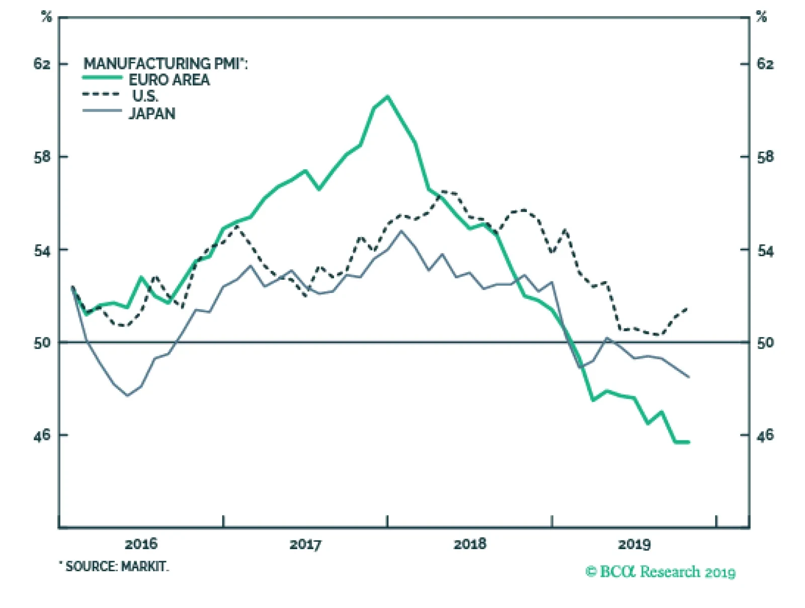
The improving global growth story remains the bigger factor pushing bond yields higher, though. While the manufacturing PMI data within the DM world remain weak, the downward momentum is starting to bottom out on a rate-of-change basis (Chart 4). The EM aggregate PMI index is showing even more improvement, sitting at 51 and above the year-ago level, helping confirm the pickup in EM equity market momentum (bottom panel). Importantly, if this is indeed the trough in the EM PMI, the index would have bottomed above the 2015 trough of 48.5. Given the improvement seen in “Big Mo” for global equities and global LEIs and PMIs, we remain comfortable with our current below-benchmark stance on global interest rate duration exposure. Given the improvement seen in “Big Mo” for global equities and global LEIs and PMIs, we remain comfortable with our current below-benchmark stance on global interest rate duration exposure. How high could yields rise in the near term? Looking at yields on a country-by-country level, a reasonable initial target for yields would be a return to the medium-term trend as defined by the 200-day moving average (MA). For benchmark 10-year DM government yields, those targets are: U.S. Treasuries: the 200-day MA is 2.18%, +23bps above the current level German Bunds: the 200-day MA is -0.22%, +11bps above the current level U.K. Gilts: the 200-day MA is 0.89%, +17bps above the current level Japanese government bonds (JGBs): the 200-day MA is -0.10%, +2bps above the current level Canadian government bonds: the 200-day MA is 1.59%, -2bps below the current level Australian government bonds: the 200-day MA is 1.53%, +43bps above the current level Among those markets, the U.S. is likely to reach the level implied by the 200-day MA, led by the market pricing out the -53bps of rate cuts over the next twelve months discounted in the U.S. Overnight Index Swap curve (Chart 5) – a number that includes the likely -25bp cut tomorrow. A move beyond that 200-day MA may take longer to develop, as it would require markets to begin pricing in some reversal of the Fed’s “mid-cycle cuts” of 2019. That outcome would first require a pickup in TIPS breakevens. The Fed would not feel justified in risking a tightening of financial conditions by signaling rate hikes without the catalyst of higher inflation expectations. Chart 4EM Growth Leading The Way?
EM Growth Leading The Way?
EM Growth Leading The Way?
Chart 5UST Yields Have More Upside
UST Yields Have More Upside
UST Yields Have More Upside
German Bund yields are even closer to that 200-day MA than Treasuries but, as in the U.S., a sustained move beyond that level would require an increase in bombed-out inflation expectations, with the 10-year EUR CPI swap rate now sitting at only 1.05% (Chart 6). As for other markets, the likelihood of reaching, or breaching, the 200-day MA is more varied (Chart 7). Chart 6Bund Yield Upside Limited By Inflation
Bund Yield Upside Limited By Inflation
Bund Yield Upside Limited By Inflation
The move in the Canadian 10-year yield to just above its 200-day MA fits with Canada’s status as a “high-beta” bond market, as we discussed in last week’s report.1 Chart 7Which Yields Will Test The 200-day MA?
Which Yields Will Test The 200-day MA?
Which Yields Will Test The 200-day MA?
The Bank of Canada also meets this week and, while no change in policy is expected, the central bank will be publishing a new Monetary Policy Report that will update their current line of thinking about the Canadian economy and inflation. U.K. Gilts should easily blow through the 200-day MA if and when a final Brexit deal is signed, as the Bank of England remains highly reluctant to consider any policy easing even as political uncertainty weighs on economic growth. With the European Union now agreeing to an extension of the Brexit deadline to January 31, and with U.K. prime minister Boris Johnson now pursuing an early election in December, the political risk premium in Gilts will persist. Thus, Gilt yields will likely lag the move higher seen in higher-beta markets like the U.S. and Canada. JGBs remain the ultimate low-beta bond market with the Bank of Japan continuing to anchor the 10-yield around 0%, making Japan a good overweight candidate in an environment of rising global bond yields. Australian bond yields have the largest distance to the 200-day MA, but the Reserve Bank of Australia is giving little indication that it is ready to shift away from its dovish bias anytime soon, while inflation remains subdued. We do not expect a rapid jump in yields back towards the medium-term trend in the near term, and Australian yields will continue to lag the pace of the uptrend in the higher-beta global bond markets. Net-net, a climb in yields over the next 3-6 months to (or beyond) the 200-day MA is most likely in the U.S. and Canada, and least likely in Japan, Germany and Australia (and the U.K. until the Brexit uncertainty is finally sorted out). Bottom Line: The accelerating momentum of global equities – the ultimate “leading economic indicator” – is suggesting that the current rise in global bond yields can continue. Maintain below-benchmark overall duration exposure, while staying overweight global corporate credit versus government bonds. Raise Allocations To U.S. Agency MBS Out Of Higher Quality Corporate Credit Chart 8U.S. MBS More Attractive Than High-Rated U.S. Corporates
U.S. MBS More Attractive Than High-Rated U.S. Corporates
U.S. MBS More Attractive Than High-Rated U.S. Corporates
Our colleagues at our sister service, BCA Research U.S. Bond Strategy, recently initiated a recommendation to favor U.S. agency MBS versus high-rated (Aaa, Aa, A) U.S. corporate bonds.2 This week, we are adding this position to the BCA Research Global Fixed Income Strategy recommended model bond portfolio. There are three factors supporting this recommendation: 1) The absolute level of MBS spreads is competitive The average option-adjusted spread (OAS) for conventional 30-year U.S. agency MBS – rated Aaa and with the backing of U.S. government housing agencies - is currently 57bps. That is only 3bps below the spread on Aa-rated corporates and 26bps below that of A-rated credit. (Chart 8). 2) Risk-adjusted MBS spreads look very attractive Agency MBS exhibit negative convexity, with an interest rate duration that declines when yields fall. The opposite is true for positively convex investment grade corporate bonds, where the duration rises as yields decrease. This makes agency MBS look attractive on a risk-adjusted basis after the kind of big decline in bond yields seen in 2019. The average duration of the Bloomberg Barclays U.S. agency MBS index is now only 3.4 compared to 7.9 for an A-rated corporate bond. Both of those durations were around similar levels at the 2018 peak in U.S. bond yields, but now the gap between them is large. With those new durations, it would take a 17bp widening of the agency MBS spread for an investor to see losses versus duration-matched U.S. Treasuries, compared to only an 11bp widening of the A-rated corporate spread (bottom panel). This is a big change in the relative risk profile of agency MBS versus high-rated U.S. corporates compared to a year ago, making the former look relatively more attractive. That was not the case the last time agency MBS duration fell so sharply in 2015/16, since corporate bond spreads were widening (getting cheaper) at that time. Today, corporate bond spreads have been stable as corporate duration has increased and agency MBS duration has plunged, making risk-adjusted MBS spreads more attractive. Given our view that U.S. Treasury yields will continue to grind higher, favoring lower duration assets like agency MBS over higher duration investment grade corporates makes sense. Given our view that U.S. Treasury yields will continue to grind higher, favoring lower duration assets like agency MBS over higher duration investment grade corporates makes sense. 3) Macro risks are reduced Mortgage refinancing activity remains the biggest macro driver of MBS spreads, particularly in an environment when mortgage rates are falling and prepayments are accelerating. There was a pickup in refinancing activity over the past year as mortgage rates fell, but the increase has been small relative to similar-sized rate declines in the past (Chart 9). We interpret this as an indication that, after the sustained period of low mortgage rates seen in the decade since the Great Financial Crisis, most homeowners have already had an opportunity to refinance. In other words, the so-called “refi burnout“ is now quite high. Chart 9Muted Refi Activity Keeping Nominal U.S. MBS Spreads Low
Muted Refi Activity Keeping Nominal U.S. MBS Spreads Low
Muted Refi Activity Keeping Nominal U.S. MBS Spreads Low
Beyond refinancing, the other macro risks for agency MBS are subdued. The credit quality of outstanding U.S. mortgages remains solid. The median credit (FICO) score for newly-issued mortgages remains high and stable near the post-2008 crisis highs, while mortgage lending standards have mostly been easing over that same period according to the Federal Reserve Senior Loan Officers Survey. In addition, U.S. housing activity remains solid, with the most reliable indicators like single-family new home sales and the National Association of Home Builders activity surveys all up solidly following this year’s sharp drop in mortgage rates (Chart 10). This makes MBS less risky for two reasons: a) stronger housing activity typically leads to higher mortgage rates, which limits future refi activity; and b) more robust housing demand will boost home prices, the value of the underlying collateral for MBS securities. Chart 10U.S. Housing Activity Hooking Up
U.S. Housing Activity Hooking Up
U.S. Housing Activity Hooking Up
Chart 11Relative Value Favoring U.S. MBS Over U.S. Corporates
Relative Value Favoring U.S. MBS Over U.S. Corporates
Relative Value Favoring U.S. MBS Over U.S. Corporates
Given the improved risk-reward balance of agency MBS versus higher-quality U.S. corporates, we recommend that dedicated fixed income investors make this shift within bond portfolios, reducing allocations to Aaa-rated, Aa-rated and A-rated corporates while increasing exposure to agency MBS. Agency MBS is part of the investment universe of our model bond portfolio. Thus, we are increasing the recommended weighting of agency MBS while reducing the exposure to U.S. investment grade corporates in the portfolio. The changes can be seen in the table on Page 11. We do not split out the investment grade exposure by credit tier in the portfolio, as we prefer to allocate by broad sector groupings (Financials, Industrials, Utilities). So we cannot implement the precise “MBS for high-rated corporates” switch in the model portfolio. There is still a case for reducing overall investment grade exposure and adding to MBS weightings, however. The relative option-adjusted spread of agency MBS and investment grade corporates typically leads the relative excess returns (over duration-matched U.S. Treasuries) between the two by around one year (Chart 11). Thus, the compression of the spread differential between MBS and corporates over the past year is signaling that agency MBS should be expected to outperform the broad U.S. investment grade universe over the next twelve months. Bottom Line: U.S. agency MBS spreads are now attractive relative to high-quality U.S. corporate bonds, both in absolute terms and on a risk-adjusted basis. Increase allocations to agency MBS, while reducing exposure to Aaa-, Aa- and A-rated U.S. corporates. Robert Robis, CFA Chief Fixed Income Strategist rrobis@bcaresearch.com Footnotes 1 Please see BCA Research Global Fixed Income Strategy Weekly Report, “Cracks Are Forming In The Bond-Bullish Narrative”, dated October 23, 2019, available at gfis.bcaresearch.com. 2 Please see BCA Research U.S. Bond Strategy Weekly Report, “Two Themes And Two Trades”, dated October 1, 2019, available at usbs.bcaresarch.com. Recommendations The GFIS Recommended Portfolio Vs. The Custom Benchmark Index
Big Mo(mentum) Is Turning Positive
Big Mo(mentum) Is Turning Positive
Duration Regional Allocation Spread Product Tactical Trades Yields & Returns Global Bond Yields Historical Returns
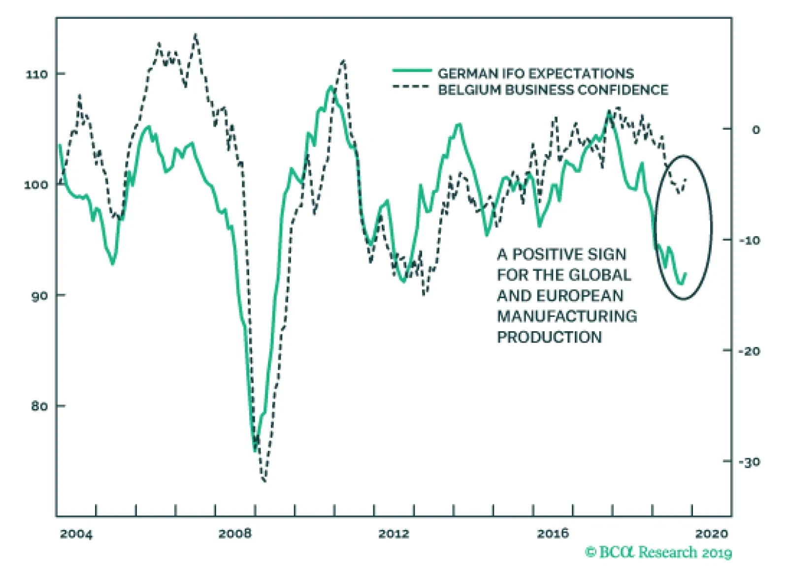
On the heels of yesterday’s disappointing German PMIs, the October Belgian Business Confidence and German IFO surveys will help alleviate fears towards the European economy. While the current assessment component of the IFO softened from 98.5 to 97.8, the…
The closer a bond yield gets to the -1 percent lower bound, the more limited becomes the possibility for a further yield decline (capital gain), while the possibility for a yield increase (capital loss) stays unlimited. This creates a negative skew or…
Highlights The U.S. and China are moving toward formalizing a trade ceasefire that reduces geopolitical risk in the near term. The risk of a no-deal Brexit is finished – removing a major downside to European assets. Spanish elections reinforce our narrative of general European political stability. Go long 10-year Italian BTPs / short 10-year Spanish bonos for a trade. Geopolitical risks will remain elevated in Turkey, rise in Russia, but remain subdued in Brazil. A post-mortem of Canada’s election suggests upside to fiscal spending but further downside to energy sector investment over the short to medium term. Feature After a brief spike in trade war-related geopolitical risk just prior to the resumption of U.S.-China negotiations, President Trump staged a tactical retreat in the trade war. Chart 1Proxy For Trade War Shows Falling Risk
Proxy For Trade War Shows Falling Risk
Proxy For Trade War Shows Falling Risk
Negotiating in Washington, President Trump personally visited the top Chinese negotiator Liu He and the two sides announced an informal “phase one deal” to reverse the summer’s escalation in tensions: China will buy $40-$50 billion in U.S. agricultural goods while the U.S. will delay the October 15 tariff hike. More difficult issues – forced tech transfer, intellectual property theft, industrial subsidies – were punted to later. The RMB is up 0.7% and our own measures of trade war-related risk have dropped off sharply (Chart 1). We think these indicators will be confirmed and Trump’s retreat will continue – as long as he has a chance to save the 2020 economic outlook and his reelection campaign. Odds are low that Trump will be removed from office by a Republican-controlled senate – the looming election provides the republic with an obvious recourse for Trump’s alleged misdeeds. However, Trump’s approval rating is headed south. While it is around the same level as President Obama’s at this point in his first term, Obama’s started a steep and steady rise around now and ended above 50% for the election, a level that is difficult to foresee for Trump (Chart 2). So Trump desperately needs an economic boost and a policy victory to push up his numbers. Short of passing the USMCA, which is in the hands of the House Democrats, a deal with China is the only way to get a major economic and political win at the same time. Hence the odds of Presidents Trump and Xi actually signing some kind of agreement are the highest they have been since April (when we had them pegged at 50/50). Trump will have to delay the December 15 tariff hike and probably roll back some of the tariffs over next year as continuing talks “make progress,” though we doubt he will remove restrictions on tech companies like Huawei. Still, we strongly believe that what is coming is a détente rather than the conclusion of the Sino-American rivalry crowned with a Bilateral Trade Agreement. Strategic tensions are rising on a secular basis between the two countries. These tensions could still nix Trump’s flagrantly short-term deal-making, and they virtually ensure that some form of trade war will resume in 2021 or 2022, if indeed a ceasefire is maintained in 2020. Both sides are willing to reduce immediate economic pain but neither side wants to lose face politically. Trump will not forge a “grand compromise.” Our highest conviction view all along has been – and remains – that Trump will not forge a “grand compromise” ushering in a new period of U.S.-China economic reengagement in the medium or long term. China’s compliance, its implementation of structural changes, will be slow or lacking and difficult to verify at least until the 2020 verdict is in. This means policy uncertainty will linger and business confidence and capex intentions will only improve on the margin, not skyrocket upward (Chart 3). Chart 2Trump Needs A Policy Win And Economic Boost
How Much To Buy An American President? – GeoRisk Update: October 25, 2019
How Much To Buy An American President? – GeoRisk Update: October 25, 2019
Chart 3Sentiment Will Improve ... Somewhat
Sentiment Will Improve ... Somewhat
Sentiment Will Improve ... Somewhat
The problem for bullish investors is that even if global trade uncertainty falls, and the dollar’s strength eases, fear will shift from geopolitics to politics, and from international equities to American equities (Chart 4). Trump, hit by impeachment and an explosive reaction to his Syria policy, is entering into dangerous territory for the 2020 race. Trump’s domestic weakness threatens imminent equity volatility for two reasons. Chart 4American Outperformance Falls With Trade Tensions
bca.gps_wr_2019_10_25_c4
bca.gps_wr_2019_10_25_c4
Chart 5Democratic Win In 2020 Is Market-Negative
Democratic Win In 2020 Is Market-Negative
Democratic Win In 2020 Is Market-Negative
First, if Trump’s approval rating falls below today’s 42%, investors will begin pricing a Democratic victory in 2020, i.e. higher domestic policy uncertainty, higher taxes, and the re-regulation of the American economy (Chart 5). This re-rating may be temporarily delayed or mitigated by the fact that former Vice President Joe Biden is still leading the Democratic Party’s primary election race. Biden is a known quantity whose policies would simply restore the Obama-era status quo, which is only marginally market-negative. Contrary to our expectations Biden's polling has not broken down due to accusations of foul play in Ukraine and China. Nevertheless, Senator Elizabeth Warren will gradually suck votes away from fellow progressive Senator Bernie Sanders and in doing so remain neck-and-neck with Biden (Chart 6). When and if she pulls ahead of Biden, markets face a much greater negative catalyst. (Yes, she is also capable of beating Trump, especially if his polling remains as weak as it is.) Chart 6Warren Will Rise To Front-Runner Status With Biden
How Much To Buy An American President? – GeoRisk Update: October 25, 2019
How Much To Buy An American President? – GeoRisk Update: October 25, 2019
Second, if Trump becomes a “lame duck” he will eventually reverse the trade retreat above and turn into a loose cannon in his final months in office. Right now we see a decline in geopolitical risk, but if the economy fails to rebound or the China ceasefire offers little support, then Trump will at some point conclude that his only chance at reelection is to double down on his confrontation with America’s enemies and run as a “war president.” A cold war crisis with China, or a military confrontation with Iran (or North Korea, Venezuela, or some unexpected target) could occur. But since September we have been confirmed in believing that Trump is trying to be the dealmaker one last time before any shift to the war president. Bottom Line: The “phase one” trade deal is really just a short-term ceasefire. Assuming it is signed by Trump and Xi, it suggests no increase in tariffs and some tariff rollback next year. However, as recessionary fears fade, and if Trump’s reelection chances stabilize, U.S.-China tensions on a range of issues will revive – and there is no getting around the longer-term conflict between the two powers. For this and other reasons, we remain strategically short RMB-USD, as the flimsy ceasefire will only briefly see RMB appreciation. BoJo's Brexit Bluff Is Finished Our U.K. indicator captured a sharp decline in political risk in the past two weeks and our continental European indicators mirrored this move (Chart 7). The risk that the U.K. would fall out of the EU without a withdrawal agreement has collapsed even further than in September, when parliament rejected Prime Minister Boris Johnson’s no-deal gambit and we went long GBP-USD. We have since added a long GBP-JPY trade. Chart 7Collapse In No-Deal Risk Will Echo Across Europe
Collapse In No-Deal Risk Will Echo Across Europe
Collapse In No-Deal Risk Will Echo Across Europe
Chart 8Unlikely To See Another Tory/Brexit Rally Like This
Unlikely To See Another Tory/Brexit Rally Like This
Unlikely To See Another Tory/Brexit Rally Like This
The risk of “no deal” is the only reason to care about Brexit from a macro point of view, as the difference between “soft Brexit” and “no Brexit” is not globally relevant. What matters is the threat of a supply-side shock to Europe when it is already on the verge of recession. With this risk removed, sentiment can begin to recover (and Trump’s trade retreat also confirms our base case that he will not impose tariffs on European cars on November 14). Since Brexit was the only major remaining European political risk, European policy uncertainty will continue to fall. The Halloween deadline was averted because the EU, on the brink of recession, offered a surprising concession to Johnson, enabling him to agree to a deal and put it up for a vote in parliament. The deal consists of keeping Northern Ireland in the European Customs Union but not the whole of the U.K., effectively drawing a new soft border at the Irish Sea. The bill passed the second reading but parliament paused before finalizing it, rejecting Johnson’s rapid three-day time table. The takeaway is that even if an impending election returns Johnson to power, he will seek to pass his deal rather than pull the U.K. out without a deal. This further lowers the odds of a no-deal Brexit as it illuminates Johnson's preferences, which are normally hidden from objective analysis. True, there is a chance that the no-deal option will reemerge if Johnson’s deal totally collapses due to parliamentary amendments, or if the U.K. and EU have failed to agree to a future relationship by the end of the transition period on December 31, 2020 (which can be extended until the end of 2022). However, the chance is well below the 30% which we deemed as the peak risk of no-deal back in August. Johnson created the most credible threat of a no-deal exit that we are likely to see in our lifetimes – a government with authority over foreign policy determined to execute the outcome of a popular referendum – and yet parliament stopped it dead in its tracks. Johnson does not want a no-deal recession and his successors will not want one either. After all, the support for Brexit and for the Tories has generally declined since the referendum, and the Tories are making a comeback on the prospect of an orderly Brexit (Chart 8). All eyes will now turn toward the impending election. Opinion polls still show that Johnson is likely to be returned to power (Chart 9). The Tories have a prospect of engrossing the pro-Brexit vote while the anti-Brexit opposition stands divided. No-deal risk only reemerges if the Conservatives are returned to power with another weak coalition that paralyzes parliament. Chart 9Tory Comeback As BoJo Gets A Deal
Tory Comeback As BoJo Gets A Deal
Tory Comeback As BoJo Gets A Deal
Chart 10Brexit Means Greater Fiscal Policy
Brexit Means Greater Fiscal Policy
Brexit Means Greater Fiscal Policy
Whatever the election result, we maintain our long-held position that Brexit portends greater fiscal largesse (Chart 10). The agitated swath of England that drove the referendum result will not be assuaged by leaving the European Union – the rewards of Brexit are not material but philosophical, so material grievances will return. Voter frustration will rotate from the EU to domestic political elites. Voters will demand more government support for social concerns. Johnson’s own government confirms this point through its budget proposals. A Labour-led government would oversee an even more dramatic fiscal shift. Our GeoRisk indicator will fall on Brexit improvements but the question of the election and next government will ensure it does not fall too far. Our long GBP trades are tactical and we expect volatility to remain elevated. But the greatest risk, of no deal, is finished, so it does make sense for investors with a long time horizon to go strategically long the pound. The greatest risk, of a no deal Brexit, is finished. Bottom Line: Brexit posed a risk to the global economy only insofar as it proved disorderly. A withdrawal agreement by definition smooths the process. Continental Europe will not suffer a further shock to net exports. The Brexit contribution to global policy uncertainty will abate. The pound will rise against the euro and yen and even against the dollar as long as Trump’s trade retreat continues. Spain: Further Evidence Of European Stability We have long argued that the majority of Catalans do not want independence, but rather a renegotiation of the region's relationship with Spain (Chart 11). This month’s protests in Barcelona following the Catalan independence leaders’ sentencing are at the lower historical range in terms of size – protest participation peaked in 2015 along with support for independence (Table 1). Table 1October Catalan Protests Unimpressive
How Much To Buy An American President? – GeoRisk Update: October 25, 2019
How Much To Buy An American President? – GeoRisk Update: October 25, 2019
Our Spanish risk indicator is showing a decline in political risk (Chart 12). However, we believe that this fall is slightly overstated. While the Catalan independence movement is losing its momentum, the ongoing protests are having an impact on seat projections for the upcoming election. Chart 11Catalonians Not Demanding Independence
Catalonians Not Demanding Independence
Catalonians Not Demanding Independence
Chart 12Right-Wing Win Could Surprise Market, But No Worries
Right-Wing Win Could Surprise Market, But No Worries
Right-Wing Win Could Surprise Market, But No Worries
Since the April election, the right-wing bloc of the People’s Party, Ciudadanos, and Vox has been gaining in the seat projections at the expense of the Socialist Party and Podemos. Over the course of the protests, the left-wing parties’ lead over the right-wing parties has narrowed from seven seats to one (Chart 13). If this momentum continues, a change of government from left-wing to right-wing becomes likely. However, a right-wing government is not a market-negative outcome, and any increase in risk on this sort of election surprise would be short-lived. The People’s Party has moderated its message and focused on the economy. Besides pledging to limit the personal tax rate to 40% and corporate tax rate to 20%, the People’s Party platform supports innovation, R&D spending, and startups. The party is promising tax breaks and easier immigration rules to firms and employees pursuing these objectives. Chart 13Spanish Right-Wing Parties Narrow Gap With Left
How Much To Buy An American President? – GeoRisk Update: October 25, 2019
How Much To Buy An American President? – GeoRisk Update: October 25, 2019
Another outcome of the election would be a governing deal between PSOE and Podemos, along with case-by-case support from Ciudadanos. After a shift to the right lost Ciudadanos 5% in support since the April election, leader Albert Rivera announced in early October that he would be lifting the “veto” on working with the Socialist Party. If the right-wing parties fall short of a majority, then Rivera would be open to talks with Socialist leader Pedro Sanchez. A governing deal between PSOE, Podemos, and Ciudadanos would have 175 seats, as of the latest projections, which is just one seat short of a majority. As we go to press, this is the only outcome that would end Spain’s current political gridlock, and would therefore be the most market-positive outcome. Bottom Line: Despite having a fourth election in as many years, Spanish political risk is contained. This is reinforced by a relatively politically stable backdrop in continental Europe, and marginally positive developments in the U.K. and on the trade front. We remain long European versus U.S. technology, and long EU versus Chinese equities. We will also be looking to go long EUR/USD when and if the global hard data turn. Following our European Investment Strategy, we recommend going long 10-year Italian BTPs / short 10-year Spanish bonos for a trade. Turkey, Brazil, And Russia Chart 14Turkish Risk Will Rise Despite 'Ceasefire'
Turkish Risk Will Rise Despite 'Ceasefire'
Turkish Risk Will Rise Despite 'Ceasefire'
Turkey’s political risk skyrocketed upward after we issued our warning in September (Chart 14). We maintain that the Trump-Erdogan personal relationship is not a basis for optimism regarding Turkey’s evading U.S. sanctions. Both chambers of the U.S. Congress are preparing a more stringent set of sanctions, focusing on the Turkish military, in the wake of Trump’s decision to withdraw U.S. forces from northeast Syria. At a time when Trump needs allies in the senate to defend him against eventual impeachment articles, he is not likely to veto and risk an override. Moreover, Turkey’s military incursion into Syria, which may wax and wane, stems from economic and political weakness at home and will eventually exacerbate that weakness by fueling the growing opposition to Erdogan’s administration and requiring more unorthodox monetary and fiscal accommodation. It reinforces our bearish outlook on Turkish lira and assets. Chart 15Brazilian Risk Will Not Re-Test 2018 Highs
Brazilian Risk Will Not Re-Test 2018 Highs
Brazilian Risk Will Not Re-Test 2018 Highs
Brazil’s political risk has rebounded (Chart 15). The Senate has virtually passed the pension reform bill, as expected, which raises the official retirement age for men and women to 65 and 63 respectively. This will generate upwards of 800 billion Brazilian real in savings to improve the public debt profile. Of course, the country will still run primary deficits and thus the public debt-to-GDP ratio will still rise. Now the question shifts to President Jair Bolsonaro and his governing coalition. Bolsonaro’s approval rating has ticked up as we expected (Chart 16). If this continues then it is bullish for Brazil because it suggests that he will be able to keep his coalition together. But investors should not get ahead of themselves. Bolsonaro is not an inherently pro-market leader, there is no guarantee that he will remain disciplined in pursuing pro-productivity reforms, and there is a substantial risk that his coalition will fray without pension reform as a shared goal (at least until markets riot and push the coalition back together). Therefore we expect political risk to abate only temporarily, if at all, before new trouble emerges. Furthermore, if reform momentum wanes next year, then Brazil’s reform story as a whole will falter, since electoral considerations emerge in 2021-22. Hence it will be important to verify that policymakers make progress on reforms to tax and trade policy early next year. Our Russian geopolitical risk indicator is also lifting off of its bottom (see Appendix). This makes sense given Russia’s expanding strategic role (particularly in the Middle East), its domestic political troubles, and the risks of the U.S. election. The latter is especially significant given the risk (not our base case, however) that a Democratic administration could take a significantly more aggressive posture toward Russia. Political risk in Turkey and Russia will continue to rise. Bottom Line: Political risk in Turkey and Russia will continue to rise. Russia is a candidate for a “black swan” event, given the eerie quiet that has prevailed as Putin devotes his fourth term to reducing domestic political instability. Brazil, on the other hand, has a 12-month window in which reform momentum can be reinforced, reducing whatever spike in risk occurs in the aftermath of the ruling coalition’s completion of pension reform. Canada: Election Post-Mortem Prime Minister Justin Trudeau returned to power at the head of a minority government in Canada’s federal election (Chart 17). The New Democratic Party (NDP) lost 15 seats from the last election, but will have a greater role in parliament as the Liberals will need its support to pass key agenda items (and a formal governing coalition is possible). The NDP’s result would have been even worse if not for its last-minute surge in the polls after the election debates and Trudeau’s “blackface” scandal. Chart 17Liberals Need The New Democrats Now
How Much To Buy An American President? – GeoRisk Update: October 25, 2019
How Much To Buy An American President? – GeoRisk Update: October 25, 2019
The Conservative Party won the popular vote but only 121 seats in parliament, leaving the western provinces of Alberta and Saskatchewan aggrieved. The Bloc Québécois, the Quebec nationalist party, gained 22 seats to become the third-largest party in the House. Energy investment faces headwinds in the near-term. The Liberal Party will face resistance from the Left over the Trans Mountain pipeline. Trudeau will not necessarily have to sacrifice the pipeline to appease the NDP. He may be able to work with Conservatives to advance the pipeline while working with the NDP on the rest of his agenda. But on the whole the election result is the worst-case scenario for the oil sector and political questions will have to be resolved before Canada can take advantage of its position as a heavy crude producer near the U.S. Gulf refineries in an era in which Venezuela is collapsing and Saudi Arabia is exposed to geopolitical risk and attacks. More broadly, the Liberals will continue to endorse a more expansive fiscal policy than expected, given Canada’s low budget deficits and the need to prevent minor parties from eating away at the Liberal Party’s seat count in future. Bottom Line: The Liberal Party failed to maintain its single-party majority. Trudeau’s reliance on left-wing parties in parliament may prove market-negative for the Canadian energy sector, though that is not a forgone conclusion. Over the longer term the sector has a brighter future. Matt Gertken Geopolitical Strategist mattg@bcaresearch.com Ekaterina Shtrevensky Research Analyst ekaterinas@bcaresearch.com Appendix GeoRisk Indicator
TRADE WAR GEOPOLITICAL RISK INDICATOR
TRADE WAR GEOPOLITICAL RISK INDICATOR
U.K.: GeoRisk Indicator
U.K.: GEOPOLITICAL RISK INDICATOR
U.K.: GEOPOLITICAL RISK INDICATOR
France: GeoRisk Indicator
FRANCE: GEOPOLITICAL RISK INDICATOR
FRANCE: GEOPOLITICAL RISK INDICATOR
Germany: GeoRisk Indicator
GERMANY: GEOPOLITICAL RISK INDICATOR
GERMANY: GEOPOLITICAL RISK INDICATOR
Spain: GeoRisk Indicator
SPAIN: GEOPOLITICAL RISK INDICATOR
SPAIN: GEOPOLITICAL RISK INDICATOR
Italy: GeoRisk Indicator
ITALY: GEOPOLITICAL RISK INDICATOR
ITALY: GEOPOLITICAL RISK INDICATOR
Canada: GeoRisk Indicator
CANADA: GEOPOLITICAL RISK INDICATOR
CANADA: GEOPOLITICAL RISK INDICATOR
Russia: GeoRisk Indicator
RUSSIA: GEOPOLITICAL RISK INDICATOR
RUSSIA: GEOPOLITICAL RISK INDICATOR
Turkey: GeoRisk Indicator
TURKEY: GEOPOLITICAL RISK INDICATOR
TURKEY: GEOPOLITICAL RISK INDICATOR
Brazil: GeoRisk Indicator
BRAZIL: GEOPOLITICAL RISK INDICATOR
BRAZIL: GEOPOLITICAL RISK INDICATOR
Taiwan: GeoRisk Indicator
TAIWAN: GEOPOLITICAL RISK INDICATOR
TAIWAN: GEOPOLITICAL RISK INDICATOR
Korea: GeoRisk Indicator
KOREA: GEOPOLITICAL RISK INDICATOR
KOREA: GEOPOLITICAL RISK INDICATOR
What's On The Geopolitical Radar?
How Much To Buy An American President? – GeoRisk Update: October 25, 2019
How Much To Buy An American President? – GeoRisk Update: October 25, 2019
Section III: Geopolitical Calendar
The October flash PMIs released this morning show a very modest stabilization. The Eurozone manufacturing gauge was stable at 45.7, as was Germany’s which increased slightly from 41.7 to 41.9. France’s manufacturing index rebounded from 50.5 to 50.1. Japanese…
Highlights On a tactical horizon, underweight bonds versus cash, especially those bonds with deeply negative yields… …and underweight bonds versus equities. On a strategic horizon, remain overweight a 50:50 combination of U.S. T-bonds and Italian BTPs versus a 50:50 combination of German Bunds and Spanish Bonos, at either 10-year or 30-year bond maturities. Investors could also play the component pairs: overweight U.S. T-bonds versus German bunds; and overweight Italian BTPs versus Spanish Bonos. New recommendation: switch Japanese yen long exposure into Swedish krona long exposure. Fractal trade: long SEK/JPY. Feature Chart of the WeekSwiss Bond Yields Have Found It Difficult To Go Down, But Easy To Go Up!
Swiss Bond Yields Have Found It Difficult To Go Down, But Easy To Go Up!
Swiss Bond Yields Have Found It Difficult To Go Down, But Easy To Go Up!
Anybody who has dared to bet that JGB yields would rise has ended up being carried out of their job, feet first. Shorting Japanese government bonds (JGBs) is known as the widow maker trade. Over the past 20 years, any investment manager who has dared to bet that JGB yields would rise – whether starting from 2 percent, 1 percent, or even 0.5 percent – has ended up being carried out of their job in a box, feet first. Today, the Bank of Japan’s policy of ‘yield curve control’ means that JGB yields are constrained within a tight range around zero, limiting their immediate scope to break higher. The European equivalent of the widow maker trade has been to short Swiss government bonds. Just as with JGB’s during the past two decades, anybody who has dared to bet that Swiss government bond yields would rise – whether starting from 2 percent, 1 percent, or 0.5 percent – has been proved fatally wrong (Chart I-2). Chart I-2Widow Makers: Shorting Japanese And Swiss Bonds
Widow Makers: Shorting Japanese And Swiss Bonds
Widow Makers: Shorting Japanese And Swiss Bonds
That is, until this year, when Swiss government bond yields reached -1 percent. The Lower Bound To Bond Yields Is Around -1 Percent According to several senior central bankers who have spoken to us, the practical lower bound to the policy interest rate is -1 percent, because “-1 percent counterbalances the storage cost of holding physical cash and/or other stores of value”. They argue that if bank deposit rates were to fall much below -1 percent, it would be logical for bank depositors to flee wholesale into physical cash, and such a deposit flight would destroy the banking system.1 Still, couldn’t central banks just abolish physical cash, forcing us all into ‘digital cash’ with unlimited negative interest rates? No, because that would just push us into other stores of value: for example, gold, or the rapidly growing ‘decentralised’ cryptocurrency asset-class. The common counterargument is that cryptocurrencies’ volatility makes them a poor store of value. But that is also true for gold: during a few months in 2013, gold lost one third of its value (Chart I-3). Yet who has ever argued that gold cannot be a store of value just because its price is volatile! Chart I-3Gold Is A Store Of Value ##br## Despite Its Volatility
Gold Is A Store Of Value Despite Its Volatility
Gold Is A Store Of Value Despite Its Volatility
The practical lower bound to the policy interest rate is around -1 percent because the central bank policy rate establishes the banking system’s funding rate – for example, the Eonia rate in the euro area (Chart I-4). If the funding rate fell well below the rate that the banks were paying on deposits, the banking system would come under severe strain and ultimately go bust. The lower bound of the policy rate also sets the lower bound of the bond yield, because a bond yield is just the expected average policy rate over the bond’s lifetime. Chart I-4The Policy Interest Rate Establishes The Banking System's Funding Rate
The Policy Interest Rate Establishes The Banking System's Funding Rate
The Policy Interest Rate Establishes The Banking System's Funding Rate
There is one important exception. If bond investors price in the possibility of being repaid in a different and more valuable currency, the bond yield will carry a further redenomination discount as an offset for the potential currency gain. This is relevant to euro area bonds because there remains the remote possibility of euro disintegration. Bonds which would expect to see a currency redenomination gain – notably, German bunds – therefore carry an additional discount on their yields. But for bonds where no currency redenomination is possible, the practical lower bound to bond yields is around -1 percent. Overweight High Yielding Bonds Versus Low Yielding Bonds To state the obvious, the closer that a bond yield gets to the -1 percent lower bound, the more limited becomes the possibility for a further yield decline (capital gain), while the possibility for a yield increase (capital loss) stays unlimited. This unattractive lack of upside combined with plenty of potential downside is called negative skew or negative asymmetry. It follows that, close to the lower bound of yields, the cyclicality or ‘beta’ of bond prices also becomes asymmetric. In risk-off phases, the bond prices cannot rally; while in risk-on phases, bond prices can plummet. Making such bonds a ‘lose-lose’ proposition. Case in point: Swiss bond yields have found it difficult to go down this year, but very easy to go up (Chart of the Week). Because their yields were already so close to -1 percent, Swiss bond yields could not decline much during the bond market’s recent strong rally – meaning, Swiss bond prices were very low beta on the way up. But in the recent reversal, Swiss bond yields have risen much more than others – meaning, Swiss bond prices are high beta on the way down (Chart I-5). Chart I-5Swiss Bond Prices Are Low Beta Going Up, But High Beta Going Down
Swiss Bond Prices Are Low Beta Going Up, But High Beta Going Down
Swiss Bond Prices Are Low Beta Going Up, But High Beta Going Down
Does this mean the widow maker trade can finally work? Yes, but only on a tactical horizon. For the full rationale, which we will not repeat here, please see Growth To Rebound In The Fourth Quarter, But Fade In 2020. However in summary, expect bond yields to edge modestly higher, and especially those yields that are deeply in negative territory. Also on a tactical horizon, prefer equities over bonds. On a longer term horizon, a much safer way to play the asymmetric beta is to short low yielding bonds in relative terms. In other words, overweight high yielding bonds versus low yielding bonds.2 Close to the lower bound of yields, the cyclicality or ‘beta’ of bond prices becomes asymmetric. Our strategic recommendation is to overweight a 50:50 combination of U.S. T-bonds and Italian BTPs versus a 50:50 combination of German Bunds and Spanish Bonos, at either 10-year or 30-year bond maturities. Since initiation five months ago, the recommendation at the 30-year maturity is already up by almost 7 percent. Nevertheless, it has a lot further to go (Chart I-6). Investors could also play the component pairs: overweight U.S. T-bonds versus German bunds; and overweight Italian BTPs versus Spanish Bonos (Chart I-7 and Chart I-8), but the combined two bonds versus two bonds recommendation has better return to risk characteristics. Chart I-6Expect High Yielding Bonds To Outperform Low Yielding Bonds
Expect High Yielding Bonds To Outperform Low Yielding Bonds
Expect High Yielding Bonds To Outperform Low Yielding Bonds
Chart I-7Expect Yield Spread Convergence At 10-Year Maturities...
Expect Yield Spread COnvergence At 10-Year Maturities...
Expect Yield Spread COnvergence At 10-Year Maturities...
Chart I-8...And At 30-Year ##br##Maturities
...And At 30-Year Maturities
...And At 30-Year Maturities
Switch Into The Swedish Krona Bond yield spreads are also an important driver of currency moves. The currency corollary of overweighting high yielding versus low yielding bonds is to tilt towards low yielding currencies, because these are the currencies that have the most scope for substantial upside. Our favourite low yielding currency has been the Japanese yen, and this has worked very well. Since early 2018, the yen has been the strongest major currency, and is up 16 percent versus the euro. But our favourite currency is now changing to the Swedish krona, for three reasons: The SEK is depressed from a valuation perspective. For example, it is the only major currencies that is weaker than the GBP compared to before the Brexit vote in 2016 (Chart I-9). Chart I-9The Swedish Krona Has Underperformed The Pound Despite Brexit
The Swedish Krona Has Underperformed The Pound Despite Brexit
The Swedish Krona Has Underperformed The Pound Despite Brexit
Unlike other major central banks, the Riksbank is seeking to normalise the policy rate upwards. The SEK is technically oversold on its 130-day fractal dimension, signalling over-pessimism in the price (Chart I-10), while the JPY is showing the opposite tendency. Chart I-10The Swedish Krona Is Due A Countertrend Move
The Swedish Krona Is Due A Countertrend Move
The Swedish Krona Is Due A Countertrend Move
Bottom Line: switch Japanese yen long exposure into Swedish krona long exposure. Fractal Trading System* (Chart 1-11) As just discussed, this week's recommended trade is long SEK/JPY. Set the profit target at 1.5 percent with a symmetrical stop-loss. In other trades, long NZD/JPY has started off very well and long Spain versus Belgium achieved its 3.5 percent profit target, at which it was closed, leaving five open positions. For any investment, excessive trend following and groupthink can reach a natural point of instability, at which point the established trend is highly likely to break down with or without an external catalyst. An early warning sign is the investment’s fractal dimension approaching its natural lower bound. Encouragingly, this trigger has consistently identified countertrend moves of various magnitudes across all asset classes. Chart I-11
NZD VS. JPY
NZD VS. JPY
The post-June 9, 2016 fractal trading model rules are: When the fractal dimension approaches the lower limit after an investment has been in an established trend it is a potential trigger for a liquidity-triggered trend reversal. Therefore, open a countertrend position. The profit target is a one-third reversal of the preceding 13-week move. Apply a symmetrical stop-loss. Close the position at the profit target or stop-loss. Otherwise close the position after 13 weeks. Use the position size multiple to control risk. The position size will be smaller for more risky positions. For more details please see the European Investment Strategy Special Report “Fractals, Liquidity & A Trading Model,” dated December 11, 2014, available at eis.bcaresearch.com. Dhaval Joshi Chief European Investment Strategist dhaval@bcaresearch.com Footnotes 1 The cost of holding physical cash is the cost of its safe storage. 2 Please see the European Investment Strategy Weekly Report ‘Growth To Rebound In The Fourth Quarter, But Fade In 2020’, October 3, 2019 available at eis.bcaresearch.com. Fractal Trading Model Cyclical Recommendations Structural Recommendations Fractal Trades
The ‘Widow Maker’ Trade: Can It Finally Work?
The ‘Widow Maker’ Trade: Can It Finally Work?
The ‘Widow Maker’ Trade: Can It Finally Work?
The ‘Widow Maker’ Trade: Can It Finally Work?
The ‘Widow Maker’ Trade: Can It Finally Work?
The ‘Widow Maker’ Trade: Can It Finally Work?
The ‘Widow Maker’ Trade: Can It Finally Work?
The ‘Widow Maker’ Trade: Can It Finally Work?
Trades Closed Trades Asset Performance Currency & Bond Equity Sector Country Equity Indicators Bond Yields Chart II-1Indicators To Watch - Bond Yields
Indicators To Watch - Bond Yields
Indicators To Watch - Bond Yields
Chart II-2Indicators To Watch - Bond Yields
Indicators To Watch - Bond Yields
Indicators To Watch - Bond Yields
Chart II-3Indicators To Watch - Bond Yields
Indicators To Watch - Bond Yields
Indicators To Watch - Bond Yields
Chart II-4Indicators To Watch - Bond Yields
Indicators To Watch - Bond Yields
Indicators To Watch - Bond Yields
Interest Rate Chart II-5Indicators To Watch - Interest Rate Expectations
Indicators To Watch - Interest Rate Expectations
Indicators To Watch - Interest Rate Expectations
Chart II-6Indicators To Watch - Interest Rate Expectations
Indicators To Watch - Interest Rate Expectations
Indicators To Watch - Interest Rate Expectations
Chart II-7Indicators To Watch - Interest Rate Expectations
Indicators To Watch - Interest Rate Expectations
Indicators To Watch - Interest Rate Expectations
Chart II-8Indicators To Watch - Interest Rate Expectations
Indicators To Watch - Interest Rate Expectations
Indicators To Watch - Interest Rate Expectations
Highlights Shifting Trends: The factors that have driven bond yields lower throughout 2019 – slowing growth, rising uncertainty, demand for safe assets and dovish monetary policy expectations – have all started to turn in a more bond-bearish direction. Duration & Country Allocation Strategy: Maintain a moderate below-benchmark stance on aggregate bond portfolio duration. Favor lower-beta countries with central banks that are more likely to stay relatively dovish as global yields drift higher, like core Europe, Australia and Japan. Credit Allocation Strategy: Stay overweight corporate bonds versus government debt in the U.S. and Europe, both for investment grade and high-yield. Maintain just a neutral stance on EM USD-denominated spread product, but look to upgrade if global growth improves further and the USD begins to weaken. Feature Chart of the WeekBond Yields Sniffing A Turn In Global Growth?
Bond Yields Sniffing A Turn In Global Growth?
Bond Yields Sniffing A Turn In Global Growth?
It has been fifty days (and counting) since the 2019 low for the benchmark 10-year U.S. Treasury yield was reached on September 3. The year-to-date low for the benchmark 10-year German bund yield was seen six days before that on August 28. Yields have risen by a healthy amount since those dates, up +34bps and +37bps for the 10yr Treasury and Bund, respectively. This has occurred despite the significant degree of bond-bullish pessimism on global growth and inflation that can be found in financial media reporting and investor surveys. The fact that yields are now steadily moving away from the lows suggests that the 2019 narrative for financial markets – slowing global growth, triggered by political uncertainty and the lagged impact of previous Fed monetary tightening and China credit tightening, forcing central banks to turn increasingly more dovish – is no longer correct. If that is true, yields have more near-term upside as overbought government bond markets begin to “sniff out” a bottoming out of global growth momentum (Chart of the Week). In this Weekly Report, we take a look at the changing state of the factors that fueled the sharp decline in bond yields in 2019. We follow that up with a review of all our current recommended investment positions on duration, country allocation and spread product allocations in light of recent developments. We conclude that maintaining a below-benchmark duration exposure, while favoring lower-beta countries in sovereign debt and overweighting corporate debt in the U.S. and Europe, is the most appropriate fixed income strategy for the next 6-12 months. The timing of the bottoming of yields in the major developed markets (DM) should not be surprising, given the more bond-bearish turn of reliable leading directional yield indicators. Yields Are Rising At The Right Time, For The Right Reasons Chart 2Bond-Bullish Growth & Inflation Factors Are Turning
Bond-Bullish Growth & Inflation Factors Are Turning
Bond-Bullish Growth & Inflation Factors Are Turning
The timing of the bottoming of yields in the major developed markets (DM) should not be surprising, given the more bond-bearish turn of reliable leading directional yield indicators. The diffusion index of our global leading economic indicator (LEI), which leads the real (ex-inflation expectations) component of DM bond yields by twelve months, is at an elevated level (Chart 2). At the same time, the slowing of the annual rate of growth in the trade-weighted U.S. dollar, which leads 10-year DM CPI swap rates by around six months, is signaling that bond yields have room to increase from the inflation expectations side. Finally, the rising trend of positive data surprises for the major DM countries is also pointing to higher yields. Breaking it down at the country level, the pickup in DM 10-year bond yields since the 2019 lows has been widespread (Charts 3 & 4). The range of yield increases is as low as +16bps in Japan, where the Bank of Japan (BoJ) is pursuing a yield target, to +46bps in Canada where the economy and inflation are both accelerating. Chart 3Pricing Out Some Expected Rate Cuts …
Pricing Out Some Expected Rate Cuts ...
Pricing Out Some Expected Rate Cuts ...
Chart 4… Across All Developed Markets
... Across All Developed Markets
... Across All Developed Markets
The increase in yields has also occurred alongside reduced expectations for easier monetary policy. Our 12-month discounters, which measure the expected change in short-term interest rates priced into Overnight Index Swap (OIS) curves, show that markets have partially priced out some (but not all) expected rate cuts in all major DM countries. The Three Things That Have Changed For Global Bond Markets So what has changed to trigger a reduction in rate cut expectations and an increase in global yields? The bond-bullish narrative that we refer to in the title of this report can be broken down into the following three elements, which have all turned recently: Slowing global growth (now potentially bottoming) Chart 5Global Growth Bottoming Out
Global Growth Bottoming Out
Global Growth Bottoming Out
Current global growth is still trending lower, when looking at measures like manufacturing PMIs or sentiment surveys like the global ZEW index. Forward-looking measures like our global LEI, however, have been moving higher in recent months, suggesting that a bottom in the PMIs may soon unfold (Chart 5). We investigated that improvement in our global LEI in a recent report and concluded that the move higher was focused almost exclusively within the emerging market (EM) sub-components that are most sensitive to improving global growth.1 This fits with the improvement shown in the OECD LEI for China, a bottoming of the annual growth rate of world exports, and the general acceleration of global equity markets – the classic leading economic indicator. Rising political uncertainty (now potentially fading) The U.S.-China trade war (including the implications for the upcoming 2020 U.S. presidential election) and the U.K. Brexit saga have been the main sources of bond-bullish political uncertainty over the past several months. Yet recent developments have helped reduce the odds of the most negative tail risk outcomes, providing a bit of a boost to global bond yields. The U.S. and China have agreed (in principle) to a “phase one” trade deal that, at a minimum, lowers the chances of a further escalation of the trade dispute through higher tariffs. Meanwhile, the momentum has shifted towards a potential final Brexit agreement between the U.K. and European Union that can avoid an ugly no-deal outcome. Our colleagues at BCA Research Geopolitical Strategy believe that developments are likely to continue moving away from the worst-case scenarios, given the constraints faced by policymakers.2 U.S. President Donald Trump is now in full campaign mode for the 2020 elections and needs a deal (of any kind) to deflect criticism that his trade battle with China is dragging the U.S. economy into recession. Already, there has been a sharp decline in income growth for workers in swing states that could vote for either party’s candidate in next year’s election (Chart 6). Trump cannot afford to lose voters in those states, many of which are in the U.S. industrial heartland (i.e. Ohio, Michigan) that helped put him in the White House. In other words, he is highly incentivized to turn down the heat on the trade war or else face a potential loss next November. While these political uncertainties have not been fully resolved by these latest developments, the shift in momentum away from worst-case scenarios has likely been enough to reduce the safe-haven bid for DM government bonds, helping push yields higher. Meanwhile, China is facing a slowing economy and rising unemployment, but with reduced means to fight the downtrend given high private sector debt that has impaired the typical response between easier monetary conditions and economic activity (Chart 7). While the Chinese government does not want to be seen as caving in to U.S. pressure on trade policy, its desire to maintain social stability by preventing a further rise in unemployment from the trade war provides a powerful incentive to try and ratchet down tensions with the U.S. Chart 6Political Reasons For Trump To Retreat On Trade
Political Reasons For Trump To Retreat On Trade
Political Reasons For Trump To Retreat On Trade
In the U.K., a no-deal Brexit is an economically painful and politically unpopular outcome that would severely damage the re-election chances of Prime Minister Boris Johnson and his Conservative party. Thus, even a hard-line Brexiteer like Johnson must respond to the political constraints forcing him to try and get a Brexit deal done (Chart 8). Chart 7Economic Reasons For China To Retreat On Trade
Economic Reasons For China To Retreat On Trade
Economic Reasons For China To Retreat On Trade
Chart 8Political Reasons To Retreat On A No-Deal Brexit
Political Reasons To Retreat On A No-Deal Brexit
Political Reasons To Retreat On A No-Deal Brexit
While these political uncertainties have not been fully resolved by these latest developments, the shift in momentum away from worst-case scenarios has likely been enough to reduce the safe-haven bid for DM government bonds, helping push yields higher. Bull-flattening pressure on yield curves (now turning into moderate bear-steepening) The final leg down in bond yields in August had a technical aspect to it, fueled by the demand for duration and convexity from asset-liability managers like European pension funds and insurance companies. Falling yields act to raise the value of liabilities for that group of investors, forcing them to rapidly increase the duration of their assets to match the duration of their liabilities (the technique used to limit the gap between the value of assets and liabilities). That duration increase is carried out by buying government bonds with longer maturities (and higher convexity), but also through the use of interest rate derivatives like long maturity swaps and swaptions. The end result is a bull flattening of yield curves (both for government bonds and swaps) and a rise in swaption volatility (i.e. the price of swaptions). Those dynamics were clearly in play in August after the shocking imposition of fresh U.S. tariffs on Chinese imports early in the month. Bond and swaption volatilities spiked, and bond/swap yield curves bull-flattened, in both Europe and the U.S. (Chart 9). That effect only lasted a few weeks, however, and volatilities have since declined and curves have steepened. This suggests that the “convexity-buying” effect has run its course and is now starting to work in the opposite direction, with asset-liability managers looking to reduce the duration of their assets as higher yields lower the value of their liabilities. This is putting some upward pressure on longer-maturity global bond yields. Chart 9Signs Of Reduced Convexity-Related Bond Buying
Signs Of Reduced Convexity-Related Bond Buying
Signs Of Reduced Convexity-Related Bond Buying
Chart 10Bull-Flattening Yield Curve Pressures Easing Up A Bit
Bull-Flattening Yield Curve Pressures Easing Up A Bit
Bull-Flattening Yield Curve Pressures Easing Up A Bit
Chart 11Fed & ECB Actions Should Help Steepen Up Curves
Fed & ECB Actions Should Help Steepen Up Curves
Fed & ECB Actions Should Help Steepen Up Curves
The steepening seen so far must be put in context, however, as yield curves remain very flat across the DM world (Chart 10). Term premia on longer-term bonds remain very depressed, although those should start to increase as global growth stabilizes and the massive safe-haven demand for global government debt begins to dissipate. Some pickup in inflation expectations would also help impart additional bear-steepening momentum to yield curves – a more likely result now that the Fed and ECB have both cut interest rates and, more importantly, will start provide additional monetary easing by expanding their balance sheets (Chart 11). Bottom Line: The factors that have driven bond yields lower throughout 2019 – slowing growth, rising uncertainty, demand for safe assets and dovish monetary policy expectations – have all started to turn in a more bond-bearish direction. Reviewing Our Recommended Bond Allocations In light of these shifting global trends described above, the fixed income investment implications are fairly straightforward: Yields are rising around the world, suggesting that the current move is a shift higher driven by non-country-specific factors like more stable future global growth prospects. Duration: A moderate below-benchmark overall duration stance is warranted for global fixed income portfolios, with yields likely to continue drifting higher over at least the next six months. A big surge in yields is unlikely, as central banks will need to see decisive evidence that global growth is not only bottoming, but accelerating, before shifting away from the current dovish bias. Given the reporting lags in the economic data, such evidence is unlikely to appear until the first quarter of 2020 at the earliest. Yet given how flat yield curves are across the DM government bond markets, the trajectory of forward rates is quite stable relative to spot yield levels, making it much easier to beat the forwards by positioning for even a modest yield increase. Country Allocation: Yields are rising around the world, suggesting that the current move is a shift higher driven by non-country-specific factors like more stable future global growth prospects. In that case, using yield betas to the “global” bond yield is a good way to consider country allocation decisions within a fixed income portfolio. We looked at those yield betas in an August report, using Bloomberg Barclays government bond index data for the 7-10 year maturity buckets of individual countries and the Global Treasury aggregate (Chart 12).3 The rolling 3-year betas were highest in the U.S. and Canada, making them good countries to underweight within a global government bond portfolio in a rising yield environment. The yield betas were lowest in Japan, Germany and Australia, making them good overweight candidates. The U.K. was a unique case of having a relatively high historical yield beta prior to the 2016 Brexit referendum and a lower yield beta since then - making the U.K. allocation highly conditional on the resolution of the Brexit uncertainty. Spread Product Allocation: The backdrop described in this report, where global growth is bottoming out but where central banks maintain a dovish bias, is a perfect sweet spot for global spread product like corporate bonds and Peripheral European government debt. Thus, an overweight stance on overall global spread product versus governments is warranted. The backdrop described in this report, where global growth is bottoming out but where central banks maintain a dovish bias, is a perfect sweet spot for global spread product like corporate bonds and Peripheral European government debt. With regards to our current strategic fixed income recommendations and model bond portfolio allocations, we already have much of the positioning described above in place. We are below-benchmark on overall duration, underweight higher-beta U.S. Treasuries; overweight government bonds in lower-beta Germany, France, Japan and Australia (Chart 13); overweight investment grade corporate bonds in the U.S., euro area and U.K.; and overweight high-yield corporate bonds in the U.S. and euro area. Chart 12Favor Lower-Beta Government Bond Markets
Favor Lower-Beta Government Bond Markets
Favor Lower-Beta Government Bond Markets
There are areas where our positioning could change, however. Chart 13Lower-Beta Laggards Should Start To Outperform
Lower-Beta Laggards Should Start To Outperform
Lower-Beta Laggards Should Start To Outperform
In terms of government bonds, we are currently overweight the U.K. and neutral Canada. A final Brexit deal would justify a downgrade of Gilts to at least neutral, if not underweight, as the Bank of England has signaled that rate hikes would be justified if the Brexit uncertainty was resolved. A downgrade of higher-beta Canadian government debt to underweight could also be justified, although the Bank of Canada is not signaling that a change in monetary policy (in either direction) is warranted. For now, we will hold off on any change to our U.K. stance, as it is now likely that there will be another extension of the Brexit deadline beyond October 31. As for Canada, we remain neutral for now but will revisit that stance in an upcoming Weekly Report. With regards to spread product, we are only neutral EM USD-denominated sovereign and corporate debt, as well as Spanish sovereign bonds; and underweight Italian government debt. An EM upgrade to overweight would require two things that are not yet in place: a weaker U.S. dollar and accelerating Chinese economic growth. Chart 14Stay Overweight Corporates In The U.S. & Europe
Stay Overweight Corporates In The U.S. & Europe
Stay Overweight Corporates In The U.S. & Europe
As for Peripheral governments, we have preferred to be overweight European corporate debt relative to sovereign bonds in Italy and Spain. The recent powerful rally in the Periphery, however, has driven the spreads over German bunds in those countries down to levels in line with corporate credit spreads (Chart 14). We will maintain these allocations for now, but will investigate the relative value proposition between euro area Peripheral sovereigns and corporates in an upcoming report. Bottom Line: Maintain a moderate below-benchmark stance on aggregate bond portfolio duration. Favor lower-beta countries with central banks that are more likely to stay relatively dovish as global yields drift higher, like core Europe, Australia and Japan. Stay overweight corporate bonds versus government debt in the U.S. and Europe, both for investment grade and high-yield. Maintain just a neutral stance on EM USD-denominated spread product, but look to upgrade if global growth improves further and the USD begins to weaken. Robert Robis, CFA Chief Fixed Income Strategist rrobis@bcaresearch.com Footnotes 1 Please see BCA Research Global Fixed Income Strategy Weekly Report, “What Is Driving The Improvement In The BCA Global Leading Economic Indicator?”, dated October 2, 2019, available at gfis.bcaresearch.com. 2 Please see BCA Research Geopolitical Strategy Weekly Report, “Five Constraints For The Fourth Quarter”, dated October 11, 2019, available at gps.bcaresearch.com. 3 Please see BCA Research U.S. Bond Strategy/Global Fixed Income Strategy Weekly Report, “Where’s The Positive Carry In Bond Markets?", dated August 20, 2019, available at usbs.bcaresearch.com and gfis.bcaresearch.com. Recommendations The GFIS Recommended Portfolio Vs. The Custom Benchmark Index
Cracks Are Forming In The Bond-Bullish Narrative
Cracks Are Forming In The Bond-Bullish Narrative
Duration Regional Allocation Spread Product Tactical Trades Yields & Returns Global Bond Yields Historical Returns
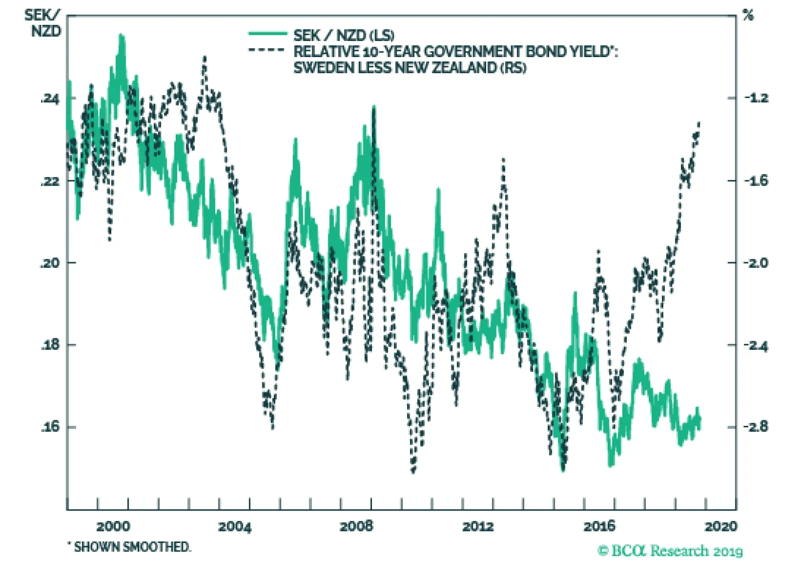
Selling NZD/SEK is the optimal vehicle to play any Swedish krona rebound. USD/SEK and NZD/SEK are often highly correlated; since the SEK has a higher beta to global growth than the kiwi (Sweden exports 45% of its GDP versus 27% for New Zealand). On a relative…