Europe

Highlights The onset of a down-oscillation in growth strongly suggests a rotation out of the growth-sensitive Industrials and Materials into the relatively defensive Healthcare sector. But if the sharpest move in bond yields has already happened, it also suggests that Banks might hold up versus other cyclical sectors. New recommendation 1: Overweight Banks versus Industrials. New recommendation 2: Overweight Eurostoxx50 versus Nikkei225. Remain overweight Eurostoxx50 versus Shanghai Composite and neutral versus the S&P500. Feature Chart of the WeekEuro Stoxx 50 Vs. Nikkei 225 = Global Banks In Euros Vs. Global Industrials In Yen
Euro Stoxx 50 Vs. Nikkei 225 = Global Banks In Euros Vs. Global Industrials In Yen
Euro Stoxx 50 Vs. Nikkei 225 = Global Banks In Euros Vs. Global Industrials In Yen
Several decades ago, English football’s top division was a showcase for the top English and British footballers. But not anymore. This year, the top six footballers in the English Premier League hail from Argentina, the Netherlands, Belgium, Senegal, Portugal, plus a token Englishman. Nowadays, if you want to see English or British footballers you have to go to the lower divisions.1 The English Premier League provides a powerful analogy for the FTSE100. Many of the top companies in this blue-chip index have their origins and main businesses outside the U.K. The names say it all: Royal Dutch, Hong Kong and Shanghai Banking Corporation, British American Tobacco, and so on. Just like in football, if you want stock market exposure to the U.K, you now have to go to the lower divisions: the FTSE250 or the FTSE Small Cap. A view on an economy does not necessarily translate into the same view on its mainstream stock market. The leading companies in the FTSE100 are multinationals, whose sales and profits have a minimal exposure to the economic fortunes of the U.K. This leads to a result which causes investors a great deal of cognitive dissonance: a view on an economy does not necessarily translate into the same view on its mainstream stock market. Picking Stock Markets The Right Way Royal Dutch is neither a Dutch company nor a U.K. company, it is a global company. And the same is true for the vast majority of companies in the FTSE100 and all other major indexes such as the Eurostoxx50, Nikkei225, and S&P500. However, Royal Dutch is most definitely an oil and gas company which moves in lockstep with the global energy sector. Hence, by far the most important performance differentiator for any mainstream equity index is the sector fingerprint that distinguishes the equity index from its peers. Each major stock market has a distinguishing ‘long’ sector in which it contains up to a quarter of its total market capitalisation, as well as a distinguishing ‘short’ sector in which it has a significant under-representation. The combination of this long sector and short sector gives each equity index its distinguishing fingerprint (Table 1):
Chart I-
FTSE100 = long energy, short technology. Eurostoxx50 = long banks, short technology. Nikkei225 = long industrials, short banks and energy. S&P500 = long technology, short materials. MSCI Emerging Markets = long technology, short healthcare. Another important factor is the currency. Royal Dutch receives its revenues and incurs its costs in multiple major currencies, such as euros and dollars. In other words, Royal Dutch’s global business is currency neutral. But the Royal Dutch stock price is quoted in London in pounds. Hence, if the pound strengthens, the company’s multi-currency profits will decline in pound terms, weighing on the stock price. Conversely, if the pound weakens, it will lift the Royal Dutch stock price. This means that the domestic economy can impact its stock market through the currency channel. Albeit it is a counterintuitive relationship: a strong economy via a strong currency hinders the stock market; a weak economy via a weak currency helps the stock market. Be Careful With Valuation Comparisons Chart of the Week to Chart I-7 should prove beyond doubt that the sector plus currency effect is all that you need to get right to allocate between these four major regions. The charts show all the permutations of relative performances taken from the S&P500, Eurostoxx50, Nikkei225 and FTSE100 over the last decade. Chart I-2FTSE 100 Vs. S&P 500 = Global Energy In Pounds Vs. Global Technology In Dollars
FTSE 100 Vs. S&P 500 = Global Energy In Pounds Vs. Global Technology In Dollars
FTSE 100 Vs. S&P 500 = Global Energy In Pounds Vs. Global Technology In Dollars
Chart I-3FTSE 100 Vs. Nikkei 225 = Global Energy In Pounds Vs. Global Industrials In Yen
FTSE 100 Vs. Nikkei 225 = Global Energy In Pounds Vs. Global Industrials In Yen
FTSE 100 Vs. Nikkei 225 = Global Energy In Pounds Vs. Global Industrials In Yen
Chart I-4FTSE 100 Vs. Euro Stoxx 50 = Global Energy In Pounds Vs. Global Banks In Euros
FTSE 100 Vs. Euro Stoxx 50 = Global Energy In Pounds Vs. Global Banks In Euros
FTSE 100 Vs. Euro Stoxx 50 = Global Energy In Pounds Vs. Global Banks In Euros
Chart I-5Euro Stoxx 50 Vs. S&P 500 = Global Banks In Euros Vs. Global Technology In Dollars
Euro Stoxx 50 Vs. S&P 500 = Global Banks In Euros Vs. Global Technology In Dollars
Euro Stoxx 50 Vs. S&P 500 = Global Banks In Euros Vs. Global Technology In Dollars
Chart I-6Euro Stoxx 600 Vs. MSCI Emerging Markets = Global Healthcare In Euros Vs. Global Technology In Dollars
Euro Stoxx 600 Vs. MSCI Emerging Markets = Global Healthcare In Euros Vs. Global Technology In Dollars
Euro Stoxx 600 Vs. MSCI Emerging Markets = Global Healthcare In Euros Vs. Global Technology In Dollars
Chart I-7S&P500 Vs. Nikkei225 = Global Tech In Dollars Vs. Global Industrials ##br##In Yen
S&P500 Vs. Nikkei225 = Global Tech In Dollars Vs. Global Industrials In Yen
S&P500 Vs. Nikkei225 = Global Tech In Dollars Vs. Global Industrials In Yen
One important implication of sectors and currencies driving stock market allocation is that the head-to-head comparison of stock market valuations is meaningless. Two sectors with vastly different structural growth prospects – say, energy and technology – must necessarily trade on vastly different valuations. So the sector with the lower valuation is not necessarily the better-valued sector. By extension, the stock market with the lower valuation because of its sector fingerprint is not necessarily the better-valued stock market. Likewise, if investors anticipate the pound to ultimately strengthen – because they see that the pound is structurally cheap today – they might downgrade Royal Dutch’s multi-currency profit growth expectations in pound terms and trade the stock at an apparent discount. But allowing for the anticipated decline in other currencies versus the pound there is no discount. It follows that any multinational listed in Europe will give a false impression of cheapness if investors see European currencies as structurally undervalued. Another implication is that simple ‘value’ indexes may not actually offer value. In reality, they comprise a collection of sectors on the lowest head-to-head valuations which, to repeat, does not necessarily make them better-valued. The sector plus currency effect is all that you need to allocate between equity markets. Some people suggest comparing a valuation with its own history, and assessing how many ‘standard deviations’ it is above or below its norm. Unfortunately, the concept of a standard deviation is meaningful only if the underlying series is ‘stationary’ – meaning, it has no step changes through time. But sector valuations are ‘non-stationary’: they do undergo major step changes when they enter a vastly different economic climate. For example, the structural outlook for bank profits undergoes a step change when a credit boom ends. Therefore, comparing a bank valuation after a credit boom with the valuation during the credit boom is like comparing an apple with an orange! The Current Message Last week, we pointed out that current activity indicators are losing momentum, or outright rolling over. The reason being that “both the interest rate impulse and short-term credit impulses are now on the cusp of down-oscillations, which will bear on economies and financial markets in the second half of the year.” This week’s profit warning from BASF supports this analysis. To be clear, this is not a binary issue about recession or no recession. This is just a common or garden down-oscillation in European (and global) growth which tends to happen every 18 months or so with remarkable regularity. Nevertheless, the down-oscillation has a major bearing on sector allocation (Chart I-8) and, therefore, a major bearing on regional equity allocation. Chart I-8Switch Out Of Growth-Sensitives Into Healthcare
Switch Out Of Growth-Sensitives Into Healthcare
Switch Out Of Growth-Sensitives Into Healthcare
Based on the major equity index ‘sector fingerprints’ we need to rank the attractiveness of six major global sectors: Materials, Energy, Industrials, Banks, Healthcare, and Technology. In the first half of the year, Industrials outperformed while Banks underperformed. Why? Because Industrials were following the up-oscillation in growth whereas Banks were tracking the bond yield down, as the flattening (or inverting) yield curve ate into their margins. Now, the onset of a down-oscillation in growth strongly suggests a rotation out of the growth-sensitive Industrials and Materials into the relatively defensive Healthcare sector (Chart I-8). But if the sharpest move in bond yields has already happened, it also suggests that Banks might hold up versus other cyclical sectors (Chart I-9 and Chart I-10). Meanwhile, for Energy and Technology we do not hold a high-conviction view. Hence, our ranking of the sectors is as follows: Chart I-9Banks Have Tracked The Bond Yield ##br##Down...
Banks Have Tracked The Bond Yield Down...
Banks Have Tracked The Bond Yield Down...
Chart I-10...But If The Sharpest Move In Yields Is Over, Banks Can Outperform Other Cyclicals
...But If The Sharpest Move In Yields Is Over, Banks Can Outperform Other Cyclicals
...But If The Sharpest Move In Yields Is Over, Banks Can Outperform Other Cyclicals
Healthcare Banks Energy and Technology Industrials and Materials On the basis of this ranking, and the major equity index sector fingerprints we are making two new recommendations. Overweight Banks versus Industrials. Overweight Eurostoxx50 versus Nikkei225. For completeness, remain overweight Eurostoxx50 versus Shanghai Composite and neutral versus the S&P500. A New Look To Our Recommendations Finally, from this week onwards we are changing the way we show our investment recommendations. Trades will refer to an investment horizon of 3 months or less, and these will mostly fall within the Fractal Trading System. Cyclical Recommendations will refer to an investment horizon usually between 3 months and a year, and will be sub-divided into asset allocation, equities, and bonds, rates and currencies. Structural Recommendations will refer to an investment horizon longer than a year, and will also be sub-divided into asset allocation, equities, and bonds, rates and currencies. We are changing the way we show our investment recommendations. We have also taken the opportunity to close long-standing stale positions. We hope you find the new look more user-friendly. Next week we will be publishing a jointly written round table discussion in which we debate and explore the interesting view differences within BCA. Absent a major development in the markets, this will replace the normal weekly report. Fractal Trading System* This week we note that the strong rally in the Australian stock market has reached a 65-day fractal dimension which has signalled previous countertrend reversals especially in relative terms. Accordingly, this week’s recommended trade is short ASX 200 vs. FTSE100. The profit target is 2% with a symmetrical stop-loss. In other trades, we are pleased to report that short euro area industrials vs. market achieved its profit target and is now closed. This leaves five open positions. For any investment, excessive trend following and groupthink can reach a natural point of instability, at which point the established trend is highly likely to break down with or without an external catalyst. An early warning sign is the investment’s fractal dimension approaching its natural lower bound. Encouragingly, this trigger has consistently identified countertrend moves of various magnitudes across all asset classes. Chart I-11
ASX 200 VS. FTSE100
ASX 200 VS. FTSE100
The post-June 9, 2016 fractal trading model rules are: When the fractal dimension approaches the lower limit after an investment has been in an established trend it is a potential trigger for a liquidity-triggered trend reversal. Therefore, open a countertrend position. The profit target is a one-third reversal of the preceding 13-week move. Apply a symmetrical stop-loss. Close the position at the profit target or stop-loss. Otherwise close the position after 13 weeks. Use the position size multiple to control risk. The position size will be smaller for more risky positions. * For more details please see the European Investment Strategy Special Report “Fractals, Liquidity & A Trading Model,” dated December 11, 2014, available at eis.bcaresearch.com. Dhaval Joshi, Chief European Investment Strategist dhaval@bcaresearch.com Footnotes 1 The top six players are based on the six nominations for the 2019 PFA Footballer of the Year: Sergio Aguero (Argentina), Virgil Van Dijk (Netherlands), Eden Hazard (Belgium), Sadio Mane (Senegal), Bernardo Silva (Portugal), and Raheem Sterling (England). Virgil Van Dijk was the winner. Fractal Trading System Cyclical Recommendations Structural Recommendations Closed Fractal Trades Trades Closed Trades Asset Performance Currency & Bond Equity Sector Country Equity Indicators Bond Yields Chart II-1Indicators To Watch - Bond Yields
Indicators To Watch - Bond Yields
Indicators To Watch - Bond Yields
Chart II-2Indicators To Watch - Bond Yields
Indicators To Watch - Bond Yields
Indicators To Watch - Bond Yields
Chart II-3Indicators To Watch - Bond Yields
Indicators To Watch - Bond Yields
Indicators To Watch - Bond Yields
Chart II-4Indicators To Watch - Bond Yields
Indicators To Watch - Bond Yields
Indicators To Watch - Bond Yields
Interest Rate Chart II-5Indicators To Watch - Interest Rate Expectations
Indicators To Watch - Interest Rate Expectations
Indicators To Watch - Interest Rate Expectations
Chart II-6Indicators To Watch - Interest Rate Expectations
Indicators To Watch - Interest Rate Expectations
Indicators To Watch - Interest Rate Expectations
Chart II-7Indicators To Watch - Interest Rate Expectations
Indicators To Watch - Interest Rate Expectations
Indicators To Watch - Interest Rate Expectations
Chart II-8Indicators To Watch - Interest Rate Expectations
Indicators To Watch - Interest Rate Expectations
Indicators To Watch - Interest Rate Expectations
Highlights The breakout in financial asset prices stands at odds with a deteriorating profit outlook. This suggests a high probability of a coiled-spring reversal in one of the two variables as we enter the thin summer trading months. We are maintaining a pro-cyclical currency stance, but are making a few portfolio tweaks in case we are caught offside during what could be a volatile summer. Maintain very tight stops on cable at 1.25, but look to sell EUR/GBP between 0.92 and 0.94. Our top pick for long positions are petrocurrencies, as geopolitical support is unlikely to ebb anytime soon. Buy a speculative basket of the Norwegian krone, Russian ruble, Mexican peso, and Colombian peso versus the euro. The latest RBA interest rate cut might be the ultimate insurance backstop needed to jumpstart the Australian economy. Remain long the Aussie dollar versus both the greenback and the kiwi, but with tight stops on the former. Any “flash crashes” are likely to favor the currencies of countries where tradeable bonds are in short supply. Remain short USD/JPY. Also, tactically sell gold bullion versus the yen. Feature Chart I-1The Markets And Data Diverge
The Markets And Data Diverge
The Markets And Data Diverge
Financial markets are at an important crossroads as we head into the thin summer trading months. Asset prices have been reflated by plunging bond yields, with the S&P 500 hitting fresh highs this week. On the other hand, incoming manufacturing data across the major economies continue to deteriorate, suggesting the profit cycle remains in a downtrend. Either markets get better visibility into an improving profit outlook, or stock prices will succumb to the pressure of incoming data weakness (Chart I-1). For currency strategy, this means fundamentals could be temporarily put to the wayside, as markets flip the switch towards risk aversion. Our recommendations this week are threefold. First, maintain tight stops on tactical positions, especially those susceptible to summer volatility. Topping this list is our long position in the British pound. Second, our top pick for long positions are petrocurrencies, as geopolitical support is unlikely to ebb anytime soon. Finally, maintain portfolio insurance by being short the USD/JPY. Also, sell gold against the yen, given that relative sentiment has shifted in extreme favor of the former. A Summer Attack On The Pound? The episodes leading to the collapse of the pound in 1992 have important lessons for today.1 Britain entered the Exchange Rate Mechanism (ERM) in October of 1990 in an attempt to find a stable nominal anchor. In the years preceding entry into the ERM, inflation in the U.K. had been high and rising, leading to an appreciation in the real exchange rate. The rationale was that by adopting German interest rates, inflation would finally be tempered, and the real exchange rate would eventually be realigned. Most of the adjustment in the pound happened quickly, but a key difference from today is that exit from the ERM was unanticipated, unlike Brexit. During the ensuing years, pressure on the pound was relatively short-lived and could be quickly reversed by foreign exchange interventions or modest increases in interest rates. Meanwhile, the prospect of a European Monetary Union (EMU) also provided an anchor for expectations, since it would allow for more sound domestic policies. Problems began to surface in June 1992, when the Danes voted no in a referendum on the Maastricht Treaty that included a chapter on the EMU. This led to severe doubts about the progress made towards a union, especially as the outcome of the French referendum in September was expected to be close. Investors began to question where the shadow exchange rate for ERM currencies lay, especially where the Italian lira or the Spanish peseta were concerned. In August of that year, Britain began to massively step up interventions in the foreign exchange market, having to borrow excessively through the Very Short Term Financing facility (VSTF) to increase reserves. It also promised to raise interest rates from 10% to 12%, and later to 15%. But as an overvalued exchange rate had generated extremely sluggish GDP growth going into the 1990s, markets were not convinced the U.K. would tap into its unlimited borrowing facility or raise interest rates sufficiently to defend the pound. On black Wednesday in September 1992, Britain suspended membership to the ERM. There are a few important lessons that stand in stark contrast to a hard Brexit: Most of the adjustment in the pound happened quickly, but a key difference from today is that exit from the ERM was unanticipated, unlike Brexit. Foreign exchange markets are extremely fluid and adjust to expectations quite quickly, usually with overshoots or undershoots. From its peak, GBP/USD depreciated by 24% by the end of October 1992. It subsequently fell to a low of 1.418 in February 1993 (Chart I-2). Peak to trough, cable has already fallen by 28%. Judging from the real effective exchange rate adjusted for consumer prices, the pound was overvalued as the U.K. entered the ERM. A persistent inflation differential between the U.K. and Germany had led to significant appreciation in the real rate. That gap is much narrower today (Chart I-3). Chart I-2The Pound Drop During ERM Was Quick And Violent
The Pound Drop During ERM Was Quick And Violent
The Pound Drop During ERM Was Quick And Violent
Chart I-3Not Much Misalignment In##br## U.K. Prices Today
Not Much Misalignment In U.K. Prices Today
Not Much Misalignment In U.K. Prices Today
The overvaluation of the pound meant that domestic growth was under tremendous pressure. Growth was already at recessionary levels entering into the ERM. Meanwhile, a bursting real estate bubble necessitated lower, not higher interest rates. This put to test the credibility of the peg. Today, U.K. growth is outpacing that of Germany, and will only improve if the pound drops further (Chart I-4). Productivity in the U.K. has kept pace with that of Germany over the last several years, suggesting the fall in the pound has been unwarranted. The Tory government runs a balanced budget and the Bank of England has much foreign exchange reserves to intervene in the market should confidence in the pound collapse. More importantly, the British currency is freely floating meaning there are less “hidden sins” compared to the fixed exchange rate period when it had to use the VSTF facility to boost reserves (Chart I-5). Chart I-4The U.K. Is Growing Faster Than The Eurozone's Engine
The U.K. Is Growing Faster Than The Eurozone's Engine
The U.K. Is Growing Faster Than The Eurozone's Engine
Chart I-5Britain Has Lots Of ##br##FX Reserves
Britain Has Lots Of FX Reserves
Britain Has Lots Of FX Reserves
A new conservative leadership is, at the margin, more negative for the pound (the assessment of our geopolitical strategists is that the odds of a hard Brexit have risen to 21% from 14%). However, our simple observation is that the pound is below where it was after the 2016 referendum results, yet more people are now in favor of staying in the union (Chart I-6). The pound is below where it was after the 2016 referendum results, yet more people are now in favor of staying in the union. This dichotomy might be the reason why in a speech this week, BoE Governor Mark Carney continued to highlight the growing divergence between market interest rate expectations (almost a 50% probability of a cut this year) and the central bank’s more hawkish bias. The experience of the ERM suggests it will be extremely destabilizing for the pound if the BoE is unable to anchor market interest rate expectations. This is especially true since the second quarter is likely to be a very weak one, leaving little time for data improvement until the October 31st Brexit deadline. Chart I-6More People In Favour Of The Union
More People In Favour Of The Union
More People In Favour Of The Union
Chart I-7Cable Valuation Reflects Brexit Risk
Cable Valuation Reflects Brexit Risk
Cable Valuation Reflects Brexit Risk
Putting it all together, our bias is that if there is a hard Brexit, the pound could easily drop to the 1.10-1.15 zone. Part of this move will be an undershoot. The real effective exchange rate of the pound is now lower than where it was after the U.K. exited the ERM in 1992, with a drawdown that has been of similar magnitude (24% in both episodes) (Chart I-7). In the case of a soft Brexit (or no Brexit), the pound should converge toward the mid-point of its (or above) historical real effective exchange rate range, which will pin it 15-20% higher, or at around 1.50. As for EUR/GBP, U.K. gilt yields stand at 108-basis-point over German bunds, an attractive spread should carry trades return in favor. Historically, such a spread has usually pinned the EUR/GBP much lower (Chart I-8). Yes, incoming data in the U.K. has softened, but employment growth has been holding up, wages are inflecting higher and the average U.K. consumer appears in decent shape. Investment and construction have been the weak spot in the U.K. economy, but may marginally improve on lower rates. Meanwhile, from a technical perspective, the pound is also oversold versus the euro (Chart I-9). Chart I-8EUR/GBP Is A Sell Long-Term
EUR/GBP Is A Sell Long-Term
EUR/GBP Is A Sell Long-Term
Chart I-9EUR/GBP Is Overbought
EUR/GBP Is Oversold
EUR/GBP Is Oversold
Bottom Line: Stay long the pound as we enter volatile summer trading, but maintain tight stops at 1.25. Sell EUR/GBP if 0.94 is touched. Buy A Speculative Basket Of Petrocurrencies Rising geopolitical tensions between the U.S. and Iran continue to support oil prices. Meanwhile, at its latest meeting, OPEC agreed to extend its production cuts to the first half of 2020. This will put upward pressure on forward curves, nudging oil near our Commodity & Energy Strategy service’s target of $75 per barrel.2 Should demand pick up later this year, it will supercharge the uptrend. More importantly, the risk of escalation between Iran and the U.S. is high, given that the former has been backed up into a corner on falling oil exports. Together with a weakening U.S. dollar, this will be categorically bullish for petrocurrencies. In our currency portfolio, we are long the NOK versus both the SEK and CAD as exposure to both crude oil prices and the Brent premium. This week, we are adding a speculative basket of the Colombian peso, Mexican peso and Russian ruble to benefit from any surge in the oil geopolitical risk premium. This basket is attractive for two reasons. First, the currencies are trading at a discount to what is implied by the oil price (Chart I-10). This discount could rapidly close if it becomes evident that oil supplies are at major risk. It is also beneficial that the shipping routes these supplies take categorically avoids the Straits of Hormuz, or the epicenter of the conflict. Second, the carry from the trade is attractive at 5%, which provides some cushion against downside risks. The risk of escalation between Iran and the U.S. is high. Together with a weakening U.S. dollar, this will be categorically bullish for petrocurrencies. The positive correlation between petrocurrencies and oil has been gradually eroded as the U.S. economy has become less and less of an oil importer. Meanwhile, Norwegian production has been falling for a few years. This is why it may be increasingly more profitable to be long a basket of petrocurrencies versus oil-consuming nations rather than the U.S. Going long versus the euro is also a cushion against a knee-jerk rally in the dollar. Also going long a basket of higher-yielding EM petrocurrencies versus DM ones is a good bet (Chart I-11). Chart I-10Petrocurrencies Are Attractive
Petrocurrencies Are Attractive
Petrocurrencies Are Attractive
Chart I-11EM Versus DM Oil Basket
EM Versus DM Oil Basket
EM Versus DM Oil Basket
Bottom Line: Buy a speculative basket of the Norwegian krone, Russian ruble, Mexican peso and Colombian peso versus the euro. Investors should also consider a basket of EM petrocurrencies versus DM ones. A Final Note On Gold The short-term technical picture for gold has become unfavorable. This suggests that investors could be caught offside in the interim holding gold as a hedge. We recommend swapping some gold bullion for yen to insure against this risk for three reasons: As both are safe-haven proxies, yen in gold terms has tended to mean revert since 2012, so as to maintain a stable ratio of 138,000 JPY per ounce of gold. Today, the yen is sitting at two standard deviations below this range (Chart I-12). Open interest for gold is surging towards new highs, while that of the yen is making fresh lows. In the case of a rush towards safe havens, the liquidity squeeze is likely to favor appreciation in the yen (Chart I-13). Chart I-12Sell Some Bullion For Yen Paper
Sell Some Bullion For Yen Paper
Sell Some Bullion For Yen Paper
Chart I-13A Liquidity Squeeze Could Favor The Yen
A Liquidity Squeeze Could Favor The Yen
A Liquidity Squeeze Could Favor The Yen
Speculators are long gold but short the yen, which is attractive from a contrarian standpoint (Chart I-14). Chart I-14Speculators Are Long Gold And Short Yen
Speculators Are Long Gold And Short Yen
Speculators Are Long Gold And Short Yen
Bottom Line: Remain short USD/JPY and sell a basket of gold versus some yen. Chester Ntonifor, Foreign Exchange Strategist chestern@bcaresearch.com Footnotes 1 Mathias Zurlinden, “The Vulnerability of Pegged Exchange Rates: The British Pound in the ERM,” Economic Research, Vol. 75, No. 5 (September/October 1993). 2 Please see Commodity & Energy Strategy Weekly Report, titled “Oil Volatility Will Abate As Financial Conditions Ease,” dated July 4, 2019, available at ces.bcaresearch.com Currencies U.S. Dollar Chart II-1USD Technicals 1
USD Technicals 1
USD Technicals 1
Chart II-2USD Technicals 2
USD Technicals 2
USD Technicals 2
Recent data in the U.S. have been soft: Headline PCE fell to 1.5% year-on-year in May. Core PCE was unchanged at 1.6% year-on-year. Personal income growth was unchanged at 0.5% month-on-month in May, while personal spending fell to 0.4% month-on-month. Markit composite and manufacturing PMI both increased to 51.5 and 50.6 in June. However, ISM manufacturing and non-manufacturing PMI both decreased to 51.7 and 55.1 in June. Chicago purchasing managers’ index fell to 49.7 in June. Trade deficit widened to $55.5 billion in May. Factory orders contracted by 0.7% month-on-month in May. Also, durable goods orders fell by 1.3% month-on-month in May. DXY index increased by 0.4% this week. Our bond-to-gold indicator continues to point towards a weaker dollar. We believe that the combination of Chinese stimulus and the lagged effects from easing financial conditions should lift the global growth later this year, which would be a headwind for the dollar. Report Links: On Gold, Oil And Cryptocurrencies - June 28, 2019 Battle Of The Central Banks - June 21, 2019 EUR/USD And The Neutral Rate Of Interest - June 14, 2019 The Euro Chart II-3EUR Technicals 1
EUR Technicals 1
EUR Technicals 1
Chart II-4EUR Technicals 2
EUR Technicals 2
EUR Technicals 2
Recent data in the euro area have been mixed: Headline inflation was unchanged at 1.2% year-on-year in June, while core inflation increased to 1.1% year-on-year in June. Money supply (M3) grew by 4.8% year-on-year in May. Markit composite PMI increased to 52.2 in June. Manufacturing PMI fell to 47.6, while services PMI increased to 53.6. Unemployment rate fell to 7.5% in May. Producer price inflation fell to 1.6% year-on-year in May. Retail sales growth fell to 1.3% year-on-year in May. EUR/USD fell by 0.8% this week. IMF managing director Christine Lagarde was nominated to replace Mario Draghi as European Central Bank president this week. Analysts believe that she will likely maintain the ECB’s accommodative stance. This was confirmed by the plunge in 10-year bund yields to -40bps. Report Links: Battle Of The Central Banks - June 21, 2019 EUR/USD And The Neutral Rate Of Interest - June 14, 2019 Take Out Some Insurance - May 3, 2019 Japanese Yen Chart II-5JPY Technicals 1
JPY Technicals 1
JPY Technicals 1
Chart II-6JPY Technicals 2
JPY Technicals 2
JPY Technicals 2
Recent data in Japan have been mixed: The Tankan survey for Q2 was a mixed bag. The index for large manufacturers fell from 12 to 7. That for non-manufacturers increased from 21 to 23. Importantly, capex intentions rose from 1.2% to 7.4%. Housing starts contracted by 8.7% year-on-year in May. Construction orders continue to fall by 16.9% year-on-year in May. Nikkei composite PMI increased to 50.8 in June. Manufacturing PMI fell to 49.3, while services PMI increased to 51.9. Consumer confidence fell to 38.7 in June. USD/JPY has been flat this week. While Trump and Xi agreed to delay the trade talks during the G20 summit last weekend, there is no real progress toward a final trade agreement that could alleviate the tariffs. We continue to recommend the yen as a safe-haven hedge. Report Links: Battle Of The Central Banks - June 21, 2019 Short USD/JPY: Heads I Win, Tails I Don’t Lose Too Much - May 31, 2019 Beware Of Diminishing Marginal Returns - April 19, 2019 British Pound Chart II-7GBP Technicals 1
GBP Technicals 1
GBP Technicals 1
Chart II-8GBP Technicals 2
GBP Technicals 2
GBP Technicals 2
Recent data in the U.K. have been negative: GDP growth was unchanged at 1.8% year-on-year in Q1. Current account deficit widened to £30 billion in Q1. Markit composite PMI fell to 49.7 in June. Manufacturing PMI decreased to 48; Construction PMI fell to 43.1; Services PMI fell to 50.2. Mortgage approvals fell to 65.4 thousand in May, while the Nationwide house price index was up 0.5% year-on-year. GBP/USD fell by 1% this week. BoE governor Carney warned in a speech this week that “a global trade war and a no deal Brexit remain growing possibilities not certainties.” Moreover, he stated that monetary policy must address the consequences of such uncertainty for the behavior of business, household, and financial markets. The probability of a BoE rate cut by the end of this year has thus increased from 21% to 46% following his speech. Report Links: Battle Of The Central Banks - June 21, 2019 A Contrarian View On The Australian Dollar - May 24, 2019 Take Out Some Insurance - May 3, 2019 Australian Dollar Chart II-9AUD Technicals 1
AUD Technicals 1
AUD Technicals 1
Chart II-10AUD Technicals 2
AUD Technicals 2
AUD Technicals 2
Recent data in Australia have been mostly positive: The Markit manufacturing PMI increased from 51.7 to 52.0 Terms of trade remain in a powerful uptrend. HIA new home sales increased by 28.8% month-on-month in May. This is beginning to put a floor under building approvals. Trade surplus increased to A$5.8 billion in May, the highest on record. Retail sales increased by 0.1% month-on-month in May. AUD/USD increased by 0.3% this week. Following the rate cut last month, the RBA again cut interest rates by another 25 basis points to a historical low of 1% this week. During the policy statement, Governor Philip Lowe stated that this should support employment growth and provide greater confidence to achieve the inflation target. We continue to favor the Australian dollar from a contrarian perspective. Report Links: A Contrarian View On The Australian Dollar - May 24, 2019 Beware Of Diminishing Marginal Returns- April 19, 2019 Not Out Of The Woods Yet - April 5, 2019 New Zealand Dollar Chart II-11NZD Technicals 1
NZD Technicals 1
NZD Technicals 1
Chart II-12NZD Technicals 2
NZD Technicals 2
NZD Technicals 2
Recent data in New Zealand have been positive: Consumer confidence increased by 2.8% month-on-month in June. Building permits increased by 13.2% month-on-month in May. NZD/USD fell by 0.3% this week. With its policy rate 50 basis points higher than its antipodean counterpart, the RBNZ is now under pressure to cut rates in the coming weeks. The market is currently pricing an 84% probability of a rate cut for the next policy meeting in August, and 94% chance rates will be cut before year-end. Should data disappoint in the interim, additional cuts could be priced in. Hold on to our long AUD/NZD and SEK/NZD positions. Report Links: Where To Next For The U.S. Dollar? - June 7, 2019 Not Out Of The Woods Yet - April 5, 2019 Balance Of Payments Across The G10 - February 15, 2019 Canadian Dollar Chart II-13CAD Technicals 1
CAD Technicals 1
CAD Technicals 1
Chart II-14CAD Technicals 2
CAD Technicals 2
CAD Technicals 2
Recent data in Canada have been positive: GDP growth increased to 1.5% year-on-year in Q1. Bloomberg Nanos confidence continues to rise to 58.3 last week. This tends to lead GDP growth by a quarter or two. Markit manufacturing PMI increased to 49.2 in June. Exports and imports both increased to C$53.1 billion and C$52.3 billion in May. The trade balance turned positive to C$0.8 billion on surging exports to the U.S. USD/CAD fell by 0.5% this week. The BoC Business Outlook Survey published last Friday highlighted that business sentiment has slightly improved, and that hiring intentions continue to be healthy. This should underpin the loonie in the near-term. Report Links: On Gold, Oil And Cryptocurrencies - June 28, 2019 Currency Complacency Amid A Global Dovish Shift - April 26, 2019 A Shifting Landscape For Petrocurrencies - March 22, 2019 Swiss Franc Chart II-15CHF Technicals 1
CHF Technicals 1
CHF Technicals 1
Chart II-16CHF Technicals 2
CHF Technicals 2
CHF Technicals 2
Recent data in Switzerland have been negative: KOF leading indicator fell to 93.6 in June. Real retail sales contracted by 1.7% year-on-year in May. Manufacturing PMI fell to 47.7 in June. Headline inflation was unchanged at 0.6% year-on-year in June, while core inflation increased to 0.7% year-on-year in June. USD/CHF increased by 0.4% this week. The CHF/NZD cross has been correcting in recent weeks, and could eventually trigger our limit buy order at 1.45. Stay tuned. Report Links: What To Do About The Swiss Franc? - May 17, 2019 Beware Of Diminishing Marginal Returns - April 19, 2019 Balance Of Payments Across The G10 - February 15, 2019 Norwegian Krone Chart II-17NOK Technicals 1
NOK Technicals 1
NOK Technicals 1
Chart II-18NOK Technicals 2
NOK Technicals 2
NOK Technicals 2
Recent data in Norway have been mixed: Manufacturing PMI fell from 54.1 to 51.9 in June. Registered unemployment was unchanged at 2.1% in June. House prices are inflecting higher, to the tune of 2.6% year-on-year in June. USD/NOK fell by 0.5% this week. This week’s OPEC meeting extended the production cuts into 1Q20. Easing global financial conditions and Chinese stimulus should help revive oil demand. Our Commodity & Energy Strategy team continues to expect Brent to average $75/bbl by the end of this year. Stay long NOK/SEK and short CAD/NOK. Report Links: On Gold, Oil And Cryptocurrencies - June 28, 2019 Currency Complacency Amid A Global Dovish Shift - April 26, 2019 A Shifting Landscape For Petrocurrencies - March 22, 2019 Swedish Krona Chart II-19SEK Technicals 1
SEK Technicals 1
SEK Technicals 1
Chart II-20SEK Technicals 2
SEK Technicals 2
SEK Technicals 2
Recent data in Sweden have been negative: Retail sales fell by 0.5% year-on-year in May. Composite PMI fell to 50.5 in June. Manufacturing and services PMI both fell to 52 and 49.9. USD/SEK increased by 0.4% this week. The Riksbank held its interest rate unchanged at -0.25% this week as widely expected. However, the tone in the communique was hawkish. That said, the trade disputes between U.S. and China, and the Brexit chaos remain downside risks to the European economy, and the Riksbank might push the planned rate hike further down the road. Report Links: Where To Next For The U.S. Dollar? - June 7, 2019 Balance Of Payments Across The G10 - February 15, 2019 A Simple Attractiveness Ranking For Currencies - February 8, 2019 Trades & Forecasts Forecast Summary Core Portfolio Tactical Trades Limit Orders Closed Trades
A Trans-Atlantic Comparison Of Growth, Inflation & Interest Rates (Part 2)
…
A Trans-Atlantic Comparison Of Growth, Inflation & Interest Rates (Part 1)
…
Highlights Current activity indicators are now losing momentum, or outright rolling over. This confirms that European (and global) growth is now entering a down-oscillation. Why? It is the rate of decline in the bond yield that has driven the current up-oscillation in growth and it is mathematically impossible for the rate of decline in the bond yield to keep increasing, or even stay where it is. Equity investors should rotate from pro-cyclical to pro-defensive sectors. But the support to risk-asset valuations from low bond yields will keep the aggregate European equity market in a sideways channel. Feature Chart of the WeekThe Interest Rate Impulse And Credit Impulse Are Both Entering ##br##Down-Oscillations
The Interest Rate Impulse And Credit Impulse Are Both Entering Down-Oscillations
The Interest Rate Impulse And Credit Impulse Are Both Entering Down-Oscillations
If the level of interest rates drove economic growth then, let’s face it, the economies of Japan and Switzerland would have reached the moon by now! In both Japan and Switzerland, the policy rate and long bond yield have been at ultra-low levels for decades (Chart I-2). This is true for both the nominal level and the real level of the interest rate and bond yield. But we all know that the level of interest rates does not drive economic growth. Chart I-2Japan And Switzerland Have Had Ultra-Low Bond Yields For Decades
Japan And Switzerland Have Had Ultra-Low Bond Yields For Decades
Japan And Switzerland Have Had Ultra-Low Bond Yields For Decades
If Interest Rates Decline At A Reduced Pace, Growth Slows Most people understand that it is the change in interest rates that can drive economic growth. The main transmission mechanism is by adding to or subtracting from credit creation. For example if, in a given period, a -0.5 percent decline in the interest rate added €50 billion to credit creation, then the extra €50 billion would constitute additional economic demand. Many people struggle to understand the subtle and counterintuitive follow-on point. If interest rates decline, but at a reduced pace, it can slow economic growth. To understand why, let’s continue the example. If, in the following period, a further -0.5 percent decline in the interest rate added another €50 billion of credit-sourced demand, it would constitute the same rate of growth as in the first period. But a further -0.25 percent decline in the interest rate which added €25 billion to demand would result in the growth rate halving. The counterintuitive thing is that the interest rate has continued to decline, yet it has caused growth to slow! If interest rates decline, but at a reduced pace, it can slow economic growth. This counterintuitive dynamic is about to unfold in the European and global economy during the second half of this year. The pace of change in the interest rate (inverted) drives the credit impulse, and thereby drives short-term growth oscillations (Chart I-3). Of course, other influences on credit creation can sometimes swamp the interest rate impact. But not in the latest cycle. From the fourth quarter of 2018, both the pace of decline in the interest rate – or more precisely, the bond yield – and the credit impulse were in a synchronised and closely connected up-oscillation. Chart I-3The Pace Of Change In the Bond Yield (Inverted) Drives The Credit Impulse
The Pace Of Change In the Bond Yield (Inverted) Drives The Credit Impulse
The Pace Of Change In the Bond Yield (Inverted) Drives The Credit Impulse
Unfortunately, it is mathematically impossible for the pace of decline in the bond yield to keep increasing, or indeed stay where it is. Hence, both the interest rate and credit impulses are now on the cusp of down-oscillations, which will bear on economies and financial markets in the second half of the year (Chart of the Week). Growth Rebounded, But Will Now Fade From the fourth quarter of 2018, European and global growth very clearly entered an up-oscillation. Let’s list all the evidence: First and foremost, quarter-on-quarter GDP growth rates picked up: by 2.5 percent in Germany; by 1 percent in the euro area; and by 1 percent in the developed economies (Chart I-4).1 The stark evidence that growth rebounded, but is now rolling over. The best current activity indicators rebounded: specifically the ZEW economic sentiment indicators for both Germany and the euro area (Chart I-5 and Chart I-6); the euro area composite PMI picked up too, albeit very modestly. Chart I-4Global Growth Rebounded... But Is Now Likely To Roll Over
Global Growth Rebounded... But Is Now Likely To Roll Over
Global Growth Rebounded... But Is Now Likely To Roll Over
Chart I-5Current Activity Indicators ##br##Rebounded...
Current Activity Indicators Rebounded...
Current Activity Indicators Rebounded...
Chart I-6...But Are Now Rolling Over
...But Are Now Rolling Over
...But Are Now Rolling Over
The aforementioned interest rate impulses (inverted) and 6-month credit impulses picked up, and sharply in China (Chart I-7). Chart I-7Short-Term Impulses Rebounded... But Are Now Rolling Over
Short-Term Impulses Rebounded... But Are Now Rolling Over
Short-Term Impulses Rebounded... But Are Now Rolling Over
The equity sector that is most exposed to growth – the industrials – strongly outperformed the broader market, especially in the euro area (Chart I-8). Chart I-8Industrials Outperformed Strongly... But Are Now Rolling Over
Industrials Outperformed Strongly... But Are Now Rolling Over
Industrials Outperformed Strongly... But Are Now Rolling Over
In fact, just the first item on our list, the pick-up in GDP growth, should suffice to demonstrate the up-oscillation in growth, and that should be that. After all, GDP – after revisions – is the broadest measure of economic activity. Nevertheless, for the sceptics, the corroboration of four independent pieces of evidence should, once and for all, confirm that growth rebounded late last year and early this year. Now though, all of these indicators are losing momentum, or outright rolling over. This confirms that growth is now entering a down-oscillation. Why? To repeat, it is the rate of decline in the bond yield that has driven the current up-oscillation in growth and it is mathematically impossible for the rate of decline in the bond yield to keep increasing, or even stay where it is. The ultimate test of a good theory is its predictive power. In the case of investment strategy this means calling the markets right. Our bond yield and credit impulse oscillation framework passes this test with flying colours, especially at the last two turning-points. On February 1, 2018 at the onset of the last down-oscillation we correctly recommended: “Downgrade banks to underweight versus healthcare” Then on August 30 2018 at the onset of the last up-oscillation we correctly recommended: “Take profits in the 35 percent outperformance of European healthcare versus banks” Now, at the onset of a new down-oscillation, we recommended last week that equity investors should as a first step go underweight European industrials and switch once again to the less economically-sensitive and less price-sensitive healthcare sector. Sector rotation has huge implications for equity market regional and country allocation. Nowadays, regional and country relative performance just comes from the dominant stock and sector fingerprints of each stock market. Next week, we will advise on what the onset of a new down-oscillation means for Europe as a region relative to the world as well as for equity market allocation within Europe. Enhancing The ‘Rule Of 4’ And The ‘Rule Of 3’ The level of interest rates does not drive economic growth, but the level of interest rates – or more precisely, bond yields – does drive the valuations of equities and other risk-assets. Moreover, it does so in a viciously non-linear way. Essentially, at a tipping point, higher bond yields can suddenly undermine the valuation support of equities, triggering a plunge in the stock market and other risk-assets which threatens a disinflationary impulse on the economy. How can we sense this tipping point? Previously we defined it as when the sum of the 10-year yields on the T-bond, German bund, and JGB is at 4 percent, the ‘rule of 4’. Conversely, when the sum is below 3 percent, the ‘rule of 3’, the seemingly rich valuation of equities and other risk-assets is well underpinned.2 Higher bond yields can suddenly undermine the valuation support of equities. Did this framework work? Yes, perfectly. On September 13 2018 when the global bond yield was approaching danger level, our framework was spot-on in forecasting that: “Using the 10-year T-bond yield as a roadmap, a short trip to the uplands of 3.5 percent would precede a longer journey down to 2 percent” Nevertheless, today we are enhancing the rule. The global bond yield must include China and it must include the aggregate euro area rather than just Germany. Hence, our enhanced metric is the simple average of the 10-year yields of the U.S., the euro area, and China. But to simplify matters, we can proxy the 10-year yield of the aggregate euro area with the 10-year yield of France. So calculate the simple average of the 10-year yields of the U.S., France, and China (Chart I-9). Chart I-9The Rules Of 4 And 3 Become The Rules Of 2.5 And 2
The Rules Of 4 And 3 Become The Rules Of 2.5 And 2
The Rules Of 4 And 3 Become The Rules Of 2.5 And 2
A value approaching 2.5 equates to danger for equities and risk-assets. A value below 2.0 equates to an underpinning for equities and risk-assets. Today, the value stands at 1.8. So to sum up, European (and global) growth will experience a down-oscillation in the second half of 2019, but the support to risk-asset valuations will keep the aggregate European equity market in a sideways channel. For equity investors, the big game in town will be sector rotation, as well as regional and country rotation. Of which, more next week. Stay tuned. Fractal Trading System* This week we note that the spectacular rally in the Greek stock market this year is now ripe for a countertrend move. We prefer to play this on a hedged basis, so this week’s recommended trade is short Athex versus the Eurostoxx 600. Set the profit target at 7 percent with a symmetrical stop-loss. Chart I-10
Athex Composite
Athex Composite
The Fractal Trading System now has five open positions. For any investment, excessive trend following and groupthink can reach a natural point of instability, at which point the established trend is highly likely to break down with or without an external catalyst. An early warning sign is the investment’s fractal dimension approaching its natural lower bound. Encouragingly, this trigger has consistently identified countertrend moves of various magnitudes across all asset classes. The post-June 9, 2016 fractal trading model rules are: When the fractal dimension approaches the lower limit after an investment has been in an established trend it is a potential trigger for a liquidity-triggered trend reversal. Therefore, open a countertrend position. The profit target is a one-third reversal of the preceding 13-week move. Apply a symmetrical stop-loss. Close the position at the profit target or stop-loss. Otherwise close the position after 13 weeks. Use the position size multiple to control risk. The position size will be smaller for more risky positions. * For more details please see the European Investment Strategy Special Report “Fractals, Liquidity & A Trading Model,” dated December 11, 2014, available at eis.bcaresearch.com. Dhaval Joshi, Chief European Investment Strategist dhaval@bcaresearch.com Footnotes 1 Based on a GDP weighted average of the U.S., euro area, and Japan. 2 Please see the European Investment Strategy Weekly Report ‘The Rule Of 4 Becomes The Rule Of 3’ dated March 21, 2019 available at eis.bcaresearch.com. Fractal Trading System Recommendations Asset Allocation Equity Regional and Country Allocation Equity Sector Allocation Bond and Interest Rate Allocation Currency and Other Allocation Closed Fractal Trades Trades Closed Trades Asset Performance Currency & Bond Equity Sector Country Equity Indicators Bond Yields Chart II-1Indicators To Watch - Bond Yields
Indicators To Watch - Bond Yields
Indicators To Watch - Bond Yields
Chart II-2Indicators To Watch - Bond Yields
Indicators To Watch - Bond Yields
Indicators To Watch - Bond Yields
Chart II-3Indicators To Watch - Bond Yields
Indicators To Watch - Bond Yields
Indicators To Watch - Bond Yields
Chart II-4Indicators To Watch - Bond Yields
Indicators To Watch - Bond Yields
Indicators To Watch - Bond Yields
Interest Rate Chart II-5Indicators To Watch - Interest Rate Expectations
Indicators To Watch - Interest Rate Expectations
Indicators To Watch - Interest Rate Expectations
Chart II-6Indicators To Watch - Interest Rate Expectations
Indicators To Watch - Interest Rate Expectations
Indicators To Watch - Interest Rate Expectations
Chart II-7Indicators To Watch - Interest Rate Expectations
Indicators To Watch - Interest Rate Expectations
Indicators To Watch - Interest Rate Expectations
Chart II-8Indicators To Watch - Interest Rate Expectations
Indicators To Watch - Interest Rate Expectations
Indicators To Watch - Interest Rate Expectations
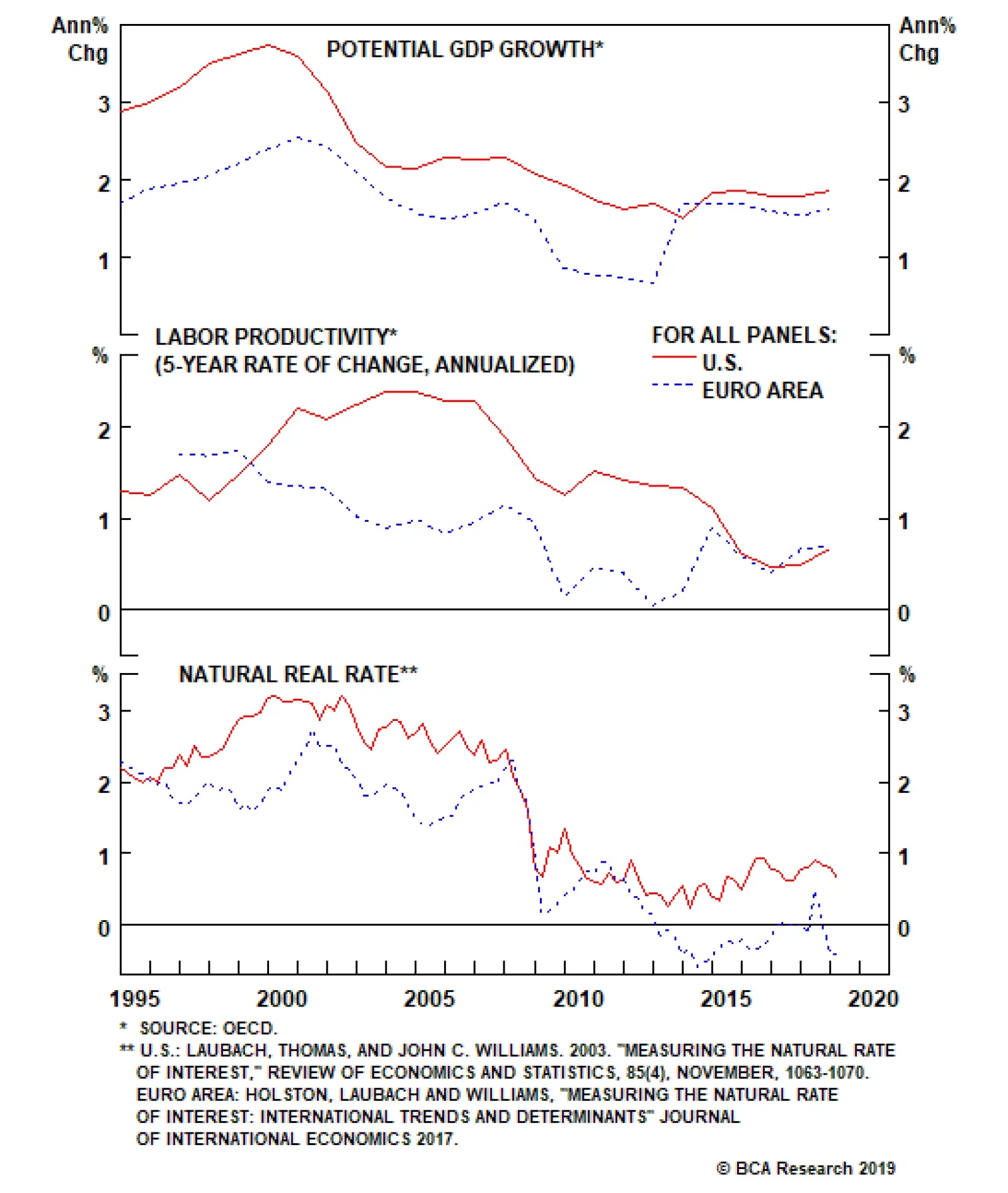
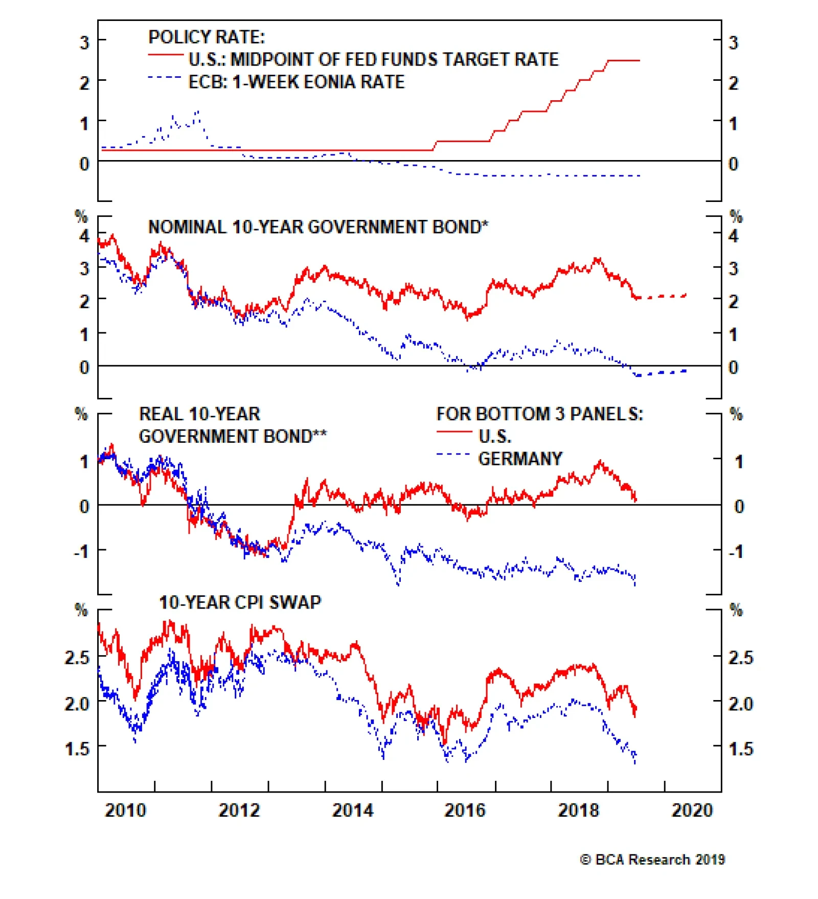
Highlights Relative Growth & Inflation: Underlying U.S. and European economic growth momentum remains surprisingly similar, with weakness concentrated in manufacturing industries most exposed to trade uncertainty. Realized inflation readings are also fairly close, although there is less spare capacity in the U.S. where wages are growing at a much faster rate. UST-Bund Spread: The yield gap between 10-year U.S. Treasuries and German Bunds is now fairly valued after the larger decline in U.S. yields seen in 2019. The Fed is more likely to deliver less easing relative to market expectations than the ECB, leaving the UST-Bund spread susceptible to a rebound over the 6-12 months. Hedged Vs Unhedged: We continue to recommend overweighting German Bunds vs U.S. Treasuries in global currency-hedged bond portfolios, given the substantial yield pickup gained by hedging into U.S. dollars out of euros. Feature “We should have Draghi instead of our Fed person.” – U.S. President Donald Trump Chart of the WeekIt’s Tough To Get A Weaker USD, Mr. President
It's Tough To Get A Weaker USD, Mr. President
It's Tough To Get A Weaker USD, Mr. President
In his own inimitable way, President Trump in the above quote has called out the glaring difference between the ECB, which seems very willing to deliver more policy stimulus to a struggling euro area economy, and the Fed, which is reluctantly being pulled towards a rate cut. Yet while the current ECB President will be looking for a new job in a few months after his term expires, the reality is that President Trump will have to live with the current Fed leadership for the foreseeable future. Our Central Bank Monitors do indicate a need for easier monetary policy on both sides of the Atlantic (Chart of the Week). The signal from our ECB Monitor is stronger than that of our Fed Monitor, but U.S. Treasury and German bund yields have both fallen sharply with markets pricing in lower inflation expectations and new policy stimulus. The result is a relatively modest narrowing of U.S.-European expected interest rate differentials that has had little impact in weakening the U.S. dollar (USD) versus the euro. With both the Fed and ECB now in play for rate cuts, this is a good time to review the drivers of the spread between U.S. Treasury (UST) yields and German government bond yields – specifically, the widely-followed 10-year Treasury-Bund spread. A Quick Trans-Atlantic Comparison Of Growth, Inflation & Interest Rates The global bond rally seen this year has driven the 10-year UST yield fall back to the 2% level last seen in 2016. The 10-year Bund yield, on the other hand, has plummeted to a new all-time low of -0.3%. The yield move in the U.S. was larger, thus the UST-Bund spread has narrowed from a 2019 peak of 253bps to the current level of 233bps. Breaking down the nominal 10-year yields into the real yield and inflation expectations components illustrates how the current wide UST-Bund spread is almost purely a “real” phenomenon (Chart 2). 10-year CPI rates are 1.9% and 1.4% in the U.S. and euro area, respectively, accounting for 50bps of the overall 233bps UST-Bund spread. Adjusting the nominal yields by those CPI swap rates leaves a real 10-year Treasury yield of +0.1%, compared to -1.7% in Europe (using the 10-year German yield versus 10-year euro CPI swap). Thus, the market-implied real yield differential is 180bps, accounting for the bulk of the nominal UST-Bund spread. Our proxy for the market’s expectation of the real neutral interest rate – the 5-year Overnight Index Swap (OIS) rate, 5-years forward minus the 5-year CPI swap rate, 5-years forward – is indicating that investors now think the neutral real fed funds rate is 0% and the neutral real ECB rate is around -1% (Chart 3). Chart 2Real Yields Dictating UST-Bund Spread
Real Yields Dictating UST-Bund Spread
Real Yields Dictating UST-Bund Spread
Chart 3Global Yields Discounting Fresh ECB QE?
Global Yields Discounting Fresh ECB QE?
Global Yields Discounting Fresh ECB QE?
Those market-implied measures typically follow the path of our estimate of the term premium for the 10-year Treasury and Bund. For both markets, however, the term premium is now at a much more negative level than suggested by the past relationship with our real neutral rate proxy. The gap between the 10-year UST term premium (-60bps) and the 10-year German Bund term premium (-124bps) now contributes about 64bps to the nominal UST-Bund spread. When looking at the relative cyclical state of the U.S. and European economies at present, there are surprisingly few differences that show up in the data. Term premia are heavily influenced by investor risk aversion and the demand for safe assets during periods of uncertainty. Given the numerous headline risks that investors are faced with at the moment (U.S.-China trade, slowing global growth, U.S.-Iran military tensions, the start of the 2020 U.S. Presidential election cycle), it is understandable that money has flooded into the safety of developed market government debt. Yet when looking at the relative cyclical state of the U.S. and European economies at present, there are surprisingly few differences that show up in the data (Chart 4). The euro area manufacturing PMI is now at 47.8, below the 50 line that indicates an expanding industrial sector, but may be starting to stabilize. The U.S. ISM manufacturing index, at the same time, now sits at 52.1 and is closing in on the levels seen in Europe. Meanwhile, consumer confidence measures remain elevated both in the U.S. and Europe, even after the recent small dips. Business confidence measures like the NFIB U.S. small business survey and the European Commission’s business climate indicator remain firm relative to the post-crisis history, although both are off their cyclical peaks. That relative dearth of spare capacity in the U.S. compared to Europe is the most fundamental reason for the higher level of U.S. interest rates relative to the euro area. Turning to the state of labor markets on both sides of the Atlantic, the stories are also similar (Chart 5). Unemployment rates are well below the OECD’s estimates of the full employment NAIRU level. Wages are starting to gain some upward momentum in Europe, but U.S. Average Hourly Earnings are growing about one percentage point faster than equivalent measures in the euro area. Chart 4Not A Huge U.S.-Europe Cyclical Growth Gap
Not A Huge U.S.-Europe Cyclical Growth Gap
Not A Huge U.S.-Europe Cyclical Growth Gap
Chart 5Not A Huge U.S.-Europe Structural Growth Gap
Not A Huge U.S.-Europe Structural Growth Gap
Not A Huge U.S.-Europe Structural Growth Gap
The implication here is that there is less slack in the U.S. labor market than in Europe, as exemplified by the fast rate of wage growth in the U.S. Chart 6A Bit More Wage Inflation In The U.S.
A Bit More Wage Inflation In The U.S.
A Bit More Wage Inflation In The U.S.
That relative dearth of spare capacity in the U.S. compared to Europe is the most fundamental reason for the higher level of U.S. interest rates relative to the euro area (Chart 6). U.S. potential GDP growth is only marginally faster than it is in Europe, with virtually the same rate of long-term labor productivity growth (about 0.5% per year, according to the OECD). Yet according to the New York Fed’s most recent estimates of the natural real interest rate (“r-star”), the level of the inflation-adjusted policy rate that would be considered neither stimulative nor restrictive given current estimates of spare capacity, is 0.7% in the U.S. and -0.4% in Europe.1 Looking ahead, both the Fed and ECB are likely to deliver some monetary easing in the coming months, perhaps as soon as the next set of policy meetings in late July. The market expects much more from the Fed, though, with 92bps of cuts discounted over the next twelve months. 16bps of cuts are also expected from the ECB, but that is more likely to be delivered than the market expectation for the Fed. There is even a chance that the ECB could restart their Asset Purchase Program, although likely not after delivering a small rate cut first. In any case, there is likely to be more disappointment from the Fed compared to the ECB over the next 6-12 months, with the result being some upward pressure placed on the UST-Bund spread. Bottom Line: Underlying U.S. and European economic growth momentum remains surprisingly similar, with weakness concentrated in manufacturing industries most exposed to trade uncertainty. Realized inflation readings are also fairly close, although there is less spare capacity in the U.S. where wages are growing at a much faster rate. There is likely to be more disappointment from the Fed compared to the ECB over the next 6-12 months, with the result being some upward pressure placed on the UST-Bund spread. Valuation & Currency Risk In The UST-Bund Spread Our valuation model for the 10-year Treasury-Bund spread indicates that the current spread level of 233bps is very close to fair value of 223bps (Chart 7). Chart 7UST-Bund Spread Fairly Valued
UST-Bund Spread Fairly Valued
UST-Bund Spread Fairly Valued
The main variables in the model are the spread between the fed funds rate and the ECB 1-week refinancing rate, the ratio of the unemployment rates of the U.S. and euro area, and the differential between the headline inflation rates of the U.S. and euro area. The model also includes the balance sheets of the Fed and ECB as variables, to capture any effects on the Treasury-Bund spread from quantitative easing programs. Historically, the UST-Bund spread has been driven mostly by the gap between Fed and ECB policy rates and, to a lesser extent, the relative state of unemployment. Inflation differentials have become less of a driver of the spread during the years since the 2008 financial crisis (Chart 8), although this is part of the broader issue of wage growth diverging from price inflation in the developed economies. The reaction function of the central banks, and of bond yields, is still rooted in the amount of perceived spare economic capacity – and future inflation potential – implied by unemployment rates. Looking ahead, if the Fed and ECB were both to deliver the full amount of easing over the next year discounted in the USD and EUR OIS curves, then the fair value of the spread would narrow to 208bps. The one-year-ahead forward rates for both the 10-year UST and German Bund imply a spread tightening to 229bps, which means that it would likely require the Fed delivering the full 92bps of easing discounted over the next twelve months – not our base case view – to make betting on additional UST-Bund spread tightening a profitable trade that would beat the forwards. So while the case for betting on additional UST-Bund spread narrowing is a poor one at current levels, the case for favoring Bunds over Treasuries on a currency-hedged basis in U.S. dollar terms is strong. Going long German government bonds vs U.S. Treasuries, while hedging the euro currency exposure into U.S. dollars, actually generates a pickup in yield, despite the fact that the entire German yield curve has negative yields out to 15-year maturities. Chart 9 shows the U.S.-German bond yield spreads for the 2-year, 5-year, 10-year and 30-year maturities. The solid line in all panels represents the yield spread in currency-unhedged terms, while the dotted line in all panels shows the spread after hedging the Bund yields into U.S. dollar equivalents (using 3-month currency forwards). Across all four maturities shown, the wide unhedged U.S.-German spreads turn into negative spreads after currency hedging. This is due to the considerably higher short-term interest rates in the U.S. that are gained when selling euros forward for dollars. Chart 8UST-Bund Spread Driven By Fed/ECB Gap
UST-Bund Spread Driven By Fed/ECB Gap
UST-Bund Spread Driven By Fed/ECB Gap
Chart 9UST-Bund Spreads Look VERY Different After Hedging FX Risk
UST-Bund Spreads Look VERY Different After Hedging FX Risk
UST-Bund Spreads Look VERY Different After Hedging FX Risk
Thus, going long German government bonds vs U.S. Treasuries, while hedging the euro currency exposure into U.S. dollars, actually generates a pickup in yield, despite the fact that the entire German yield curve has negative yields out to 15-year maturities. When looking at the relative performance of German bonds relative to not only U.S. Treasuries, but the overall Bloomberg Barclays Global Treasury index, Germany has basically matched the index over the past year in currency-hedged terms (Chart 10, middle panel). On an unhedged basis, the relative performance of German debt is obviously far more volatile given the swings in the euro. Yet even in unhedged terms, the relative performance of Germany versus the U.S. appears to be turning around, despite the recent additional narrowing of the UST-Bund spread (bottom panel). Chart 10Favor Bunds Over USTs In USD-Hedged Bond Portfolios
Favor Bunds Over USTs In USD-Hedged Bond Portfolios
Favor Bunds Over USTs In USD-Hedged Bond Portfolios
Chart 11UST-Bund Spread Tightening Looks Stretched
UST-Bund Spread Tightening Looks Stretched
UST-Bund Spread Tightening Looks Stretched
This highlights the risk of solely looking at the spread between yields denominated in different currencies. FX movements can dominate relative yield changes, as has been the case of late with the EUR/USD exchange rate rising off the 2019 lows on the back of falling UST yields. We continue to prefer viewing cross-country spread trades in currency-hedged terms when we make our recommendations. On that basis, we like hedged Bunds over U.S. Treasuries – especially with the current UST-Bund spread now discounting a lot of relatively bad news in the U.S. versus Europe (Chart 11). Bottom Line: The Fed is more likely to deliver less easing relative to market expectations than the ECB, leaving the UST-Bund spread susceptible to a rebound over the next 6-12 months. We continue to recommend overweighting German Bunds vs U.S. Treasuries in global currency-hedged bond portfolios, given the substantial yield pickup gained by hedging into U.S. dollars out of euros. Robert Robis, CFA, Chief Fixed Income Strategist rrobis@bcaresearch.com 1 The New York Fed’s r-star estimates can be found here: https://www.newyorkfed.org/research/policy/rstar Recommendations The GFIS Recommended Portfolio Vs. The Custom Benchmark Index
What Next For The Treasury-Bund Spread?
What Next For The Treasury-Bund Spread?
Duration Regional Allocation Spread Product Tactical Trades Yields & Returns Global Bond Yields Historical Returns
Highlights Central banks globally have turned dovish, with the Fed virtually promising to cut rates in July. But this will be an “insurance” cut, like 1995 and 1998, not the beginning of a pre-recessionary easing cycle. The global expansion remains intact, with the fundamental drivers of U.S. consumption robust and China likely to ramp up its credit stimulus over the coming months. The Fed will cut once or twice, but not four times over the next 10 months as the futures markets imply. Underlying U.S. inflation – properly measured – is trending higher to above 2%. U.S. GDP growth this year will be around 2.5%. Inflation expectations will move higher as the crude oil price rises. Unemployment is at a 50-year low and the U.S. stock market at an historical peak. These factors suggest bond yields are more likely to rise than fall from current levels. The upside for U.S. equities is limited, but earnings growth should be better than the 3% the bottom-up consensus expects. The key for allocation will be when to shift in the second half into higher-beta China-related plays, such as Europe and Emerging Markets. For now, we remain overweight the lower-beta U.S. equity market, neutral on credit, and underweight government bonds. To hedge against the positive impact of China stimulus, we raise Australia to neutral, and re-emphasize our overweights on the Industrials and Energy sectors. Feature Overview Precautionary Dovishness – Or Looming Recession? Recommendations
Quarterly Portfolio Outlook: Precautionary Dovishness – Or Looming Recession?
Quarterly Portfolio Outlook: Precautionary Dovishness – Or Looming Recession?
Central banks everywhere have taken a decidedly dovish turn in recent weeks. June’s FOMC statement confirmed that “uncertainties about the outlook have increased….[We] will act as appropriate to sustain the expansion,” hinting broadly at a rate cut in July. The Bank of Japan’s Kuroda said he would “take additional easing action without hesitation,” and hinted at a Modern Monetary Theory-style combination of fiscal and monetary policy. European Central Bank President Draghi mentioned the possibility of restarting asset purchases. There are two possible explanations. Either the global economy is heading into recession, and central banks are preparing for a full-blown easing cycle. Or these are “insurance” cuts aimed at prolonging the expansion, as happened in 1995 and 1998, or similar to when the Fed went on hold for 12 months in 2016 (Chart 1). Our view is that it is most likely the latter. The reason for this is that the main drivers of the global economy, U.S. consumption ($14 trillion) and the Chinese economy ($13 trillion) are likely to be strong over the next 12 months. U.S. wage growth continues to accelerate, consumer sentiment is close to a 50-year high, and the savings rate is elevated (Chart 2); as a result core U.S. retail sales have begun to pick up momentum in recent months (Chart 3). Unless something exogenous severely damages consumer optimism, it is hard to see how the U.S. can go into recession in the near future, considering that consumption is 70% of GDP. Moreover, despite weaknesses in the manufacturing sector – infected by the China-led slowdown in the rest of the world – U.S. service sector growth and the labor market remain solid. This resembles 1998 and 2016, but is different from the pre-recessionary environments of 2000 and 2007 (Chart 4). There is also no sign on the horizon of the two factors that have historically triggered recessions: a sharp rise in private-sector debt, or accelerating inflation (Chart 5). Chart 1Insurance Cuts, Or Full Easing Cycle?
Insurance Cuts, Or Full Easing Cycle?
Insurance Cuts, Or Full Easing Cycle?
Chart 2Consumption Fundamentals Are Strong...
Consumption Fundamentals Are Strong...
Consumption Fundamentals Are Strong...
Chart 3...Leading To Rebound In Retail Sales
...Leading To Rebound In Retail Sales
...Leading To Rebound In Retail Sales
Chart 4Manufacturing Weak, But Services Holding Up
Manufacturing Weak, But Services Holding Up
Manufacturing Weak, But Services Holding Up
Chart 5No Signs Of Usual Recession Triggers
No Signs Of Usual Recession Triggers
No Signs Of Usual Recession Triggers
China’s efforts to reflate via credit creation have been somewhat half-hearted since the start of the year. Investment by state-owned companies has picked up, but the private sector has been spooked by the risk of a trade war and has slowed capex (Chart 6). China may have hesitated from full-blown stimulus because the authorities in April were confident of a successful outcome to trade talks with the U.S., and a bit concerned that the liquidity was going into speculation rather than the real economy. But we see little reason why they will not open the taps fully if growth remains sluggish and trade tensions heighten.1 Chinese credit creation clearly has a major impact on many components of global growth – in particular European exports, Emerging Markets earnings, and commodity prices – but the impact often takes 6-12 months to come through (Chart 7). A key question is when investors should position for this to happen. We think this decision is a little premature now, but will be a key call for the second half of the year. Chart 6China's Half-Hearted Reflation
China's Half-Hearted Reflation
China's Half-Hearted Reflation
Chart 7China Credit Growth Affects The World
China Credit Growth Affects The World
China Credit Growth Affects The World
Chart 8Fed Won't Cut As Much As Market Wants...
Fed Won't Cut As Much As Market Wants...
Fed Won't Cut As Much As Market Wants...
The Fed has so clearly signaled rate cuts that we see it cutting by perhaps 50 basis points over the next few months (maybe all in one go in July if it wants to “shock and awe” the market). But the futures market is pricing in four 25 bps cuts by April next year. With GDP growth likely to be around 2.5% this year, unemployment at a 50-year low, trend inflation above 2%,2 and the stock market at an historical high, we find this improbable. Two cuts would be similar to what happened in 1995, 1998 and (to a degree) 2016 (Chart 8). In this environment, we think it likely that equities will outperform bonds over the next 12 months. When the Fed cuts by less than the market is expecting, long-term rates tend to rise (Chart 9). BCA’s U.S. bond strategists have shown that after mid-cycle rate cuts, yields typically rise: by 59 bps in 1995-6, 58 bps in 1998, and 19 bps in 2002.3 A combination of rising inflation, stronger growth ex-U.S., a less dovish Fed that the market expects, and a rising oil price (which will push up inflation expectations) makes it unlikely – absent an outright recession – that global risk-free yields will fall much below current levels. Moreover, June’s BOA Merrill Lynch survey cited long government bonds as the most crowded trade at the moment, and surveys of investor positioning suggest duration among active investors is as long as at any time since the Global Financial Crisis (Chart 10). Chart 9...So Bond Yields Are Likely To Rise
...So Bond Yields Are Likely To Rise
...So Bond Yields Are Likely To Rise
Chart 10Investors Betting On Further Rate Decline
Investors Betting On Further Rate Decline
Investors Betting On Further Rate Decline
The outlook for U.S. equities is not that exciting. Valuations are not cheap (with forward PE of 16.5x), but earnings should be revised up from the currently very cautious level: the bottom-up consensus forecasts S&P 500 EPS growth at only 3% in 2019 (and -3% YoY in Q2). We have sympathy for the view that there are three put options that will prop up stock prices in the event of external shocks: the Fed put, the Xi put, and the Trump put. Relating to the last of these, it is notable that President Trump tends to turn more aggressive in trade talks with China whenever the U.S. stock market is strong, but more conciliatory when it falls (Chart 11). For now, therefore, we remain overweight U.S. equities, as a lower beta way to play an environment that continues to be positive – but uncertain – for stocks. But we continue to watch for the timing to move into higher-beta China-related markets as the effects of China’s stimulus start to come through. Chart 11Trump Turns Softer When Market Falls
Trump Turns Softer When Market Falls
Trump Turns Softer When Market Falls
Garry Evans Chief Global Asset Allocation Strategist garry@bcaresearch.com What Our Clients Are Asking Chart 12Temporary Forces Drove Inflation Downturn
Temporary Forces Drove Inflation Downturn
Temporary Forces Drove Inflation Downturn
Why Is Inflation So Low? After reaching 2% in July 2018, U.S. core PCE currently stands at 1.6%, close to 18 month lows. This plunge in inflation, along with increased worries about the trade war and continued economic weakness, has led the market to believe that the Fed Funds Rate is currently above the neutral rate, and that several rate cuts are warranted in order to move policy away from restrictive territory. We believe that the recent bout of low inflation is temporary. The main contributor to the fall in core PCE has been financial services prices, which shaved off up to 40 basis points from core PCE (Chart 12, panel 1). However, assets under management are a big determinant of financial services prices, making this measure very sensitive to the stock market (panel 2). Therefore, we expect this component of core PCE to stabilize as equity prices continue to rise. The effect of higher equity prices, and the stabilization of other goods that were affected by the slowdown of global growth in late 2018 and early 2019, may already have started to push inflation higher. Month-on-month core PCE grew at an annualized rate of 3% in April, the highest pace since the end of 2017. Meanwhile, trimmed mean PCE, a measure that has historically been a more stable and reliable gauge of inflationary pressures, is at a near seven-year high (panel 3). The above implies that the market might be overestimating how much the Fed is going to ease. We believe that the Fed will likely cut once this year to soothe the pain caused by the trade war on financial markets. However, with unemployment at 50-year lows, and inflation set to rise again, the Fed is unlikely to deliver the 92 basis points of cuts currently priced by the OIS curve for the next 12 months. This implies that investors should continue to underweight bonds. Chart 13Turning On The Taps
Turning On The Taps
Turning On The Taps
Will China Really Ramp Up Its Stimulus? The direction of markets over the next 12 months (a bottoming of euro area and Emerging Markets growth, commodity prices, the direction of the USD) are highly dependent on whether China further increases monetary stimulus in the event of a breakdown in trade negotiations with the U.S. But we hear much skepticism from clients: aren’t the Chinese authorities, rather, focused on reducing debt and clamping down on shadow banking? Aren’t they worried that liquidity will simply flow into speculation and have little impact on the real economy? Now the government has someone to blame for a slowdown (President Trump), won’t they use that as an excuse – and, to that end, are preparing the population for a period of pain by quoting as analogies the Long March in the 1930s and the Korea War (when China ground down U.S. willingness to prolong the conflict)? We think it unlikely that the Chinese government would be prepared to allow growth to slump. Every time in the past 10 years that growth has slowed (with, for example, the manufacturing PMI falling significantly below 50) they have always accelerated credit growth – on the basis of the worst-case scenario (Chart 13, panel 1). Why would they react differently this time, particularly since 2019 is a politically sensitive year, with the 70th anniversary of the founding of the People’s Republic in October and several other important anniversaries? Moreover, the government is slipping behind in its target to double per capita income in the 10 years to end-2020 (panel 2). GDP growth needs to be 6.5-7% over the next 18 months to achieve the target. The government’s biggest worry is employment, where prospects are slipping rapidly (panel 3). This also makes it difficult for the authorities to retaliate against U.S. companies that have large operations, such as Apple or General Motors, since such measures would hurt their Chinese employees. Besides a significant revaluation of the RMB (which we think likely), China has few cards to play in the event of a full-blown trade war other than fully turning on the liquidity tap again.
Chart 14
Aren’t There Signs Of Bubbliness In Equity Markets? Clients have asked whether the current market environment has been showing any classic signs of euphoria. These usually appear with lots of initial public offerings (IPO), irrational M&A activity, and excess investor optimism. The IPO market has some similarities to the years leading up to the dot-com bubble, but it is important to look below the surface. The percentage of IPOs with negative earnings in 2018 was similar to the previous peak in 1999. However, the average first-day return of IPOs in 2019, while still above the historical average, has been much lower than that during the dot-com bubble period (Chart 14, panel 1). There is also a difference in the composition of firms going public. There are now many IPOs for biotech firms that have heavily invested in R&D, and so have relatively low sales currently but await a breakthrough in their products; by their nature, these are loss-making (panel 2). Cross-sector, unrelated M&A activity has also often been a sign of bubble peaks. It is a consequence of firms stretching to find inorganic growth late in the cycle. Such deals are characterized by high deal premiums, and are usually conducted through stock purchases rather than in cash. The current average deal premium is below its historical average (panel 3). Additionally, 2018 and 2019-to-date M&A deals conducted using cash represented 60% and 90% of the total respectively, compared to only 17% between 1996 and 2000. Investor sentiment is also moderately pessimistic despite the rally in the S&P 500 since the beginning of the year (panel 4). This caution suggests that investors are fearful of the risk of recession rather than overly positive about market prospects, despite the U.S. market being at an historical high. Given the above, we do not see any signals of the sort of euphoria and bubbliness that typically accompanies stock market tops. Will Japan Benefit From Chinese Reflation? Japan has been one of the worst-performing developed equity markets since March 2009, when global equities hit their post-crisis bottom in both USD (Chart 15) and local currency terms. Now with increasing market confidence in China’s reflationary policies, clients are asking if Japan is a good China play given its close ties with the Chinese economy. Our answer is No.
Chart 15
Chart 16Downgrade Japan To Underweight
Downgrade Japan To Underweight
Downgrade Japan To Underweight
It’s true that Japanese equities did respond to past Chinese reflationary efforts, but the outperformances were muted and short-lived (Chart 16, panel 1). Even though Japanese exports to China will benefit from Chinese reflationary policy (panel 5), MSCI Japan index earnings growth does not have strong correlation with Japanese exports to China, as shown in panel 4. This is not surprising given that exports to China account for only about 3% of nominal GDP in Japan (compared to almost 6% for Australia, for example). The MSCI Japan index is dominated by Industrials (21%) and Consumer Discretionary (18%). Financials, Info Tech, Communication Services and Healthcare each accounts for about 8-10%. Other than the Communication Services sector, all other major sectors in Japan have underperformed their global peers since the Global Financial Crisis (panels 2 and 3). The key culprit for such poor performance is Japan’s structural deflationary environment. Wage growth has been poor despite a tight labor market. This October’s consumption tax increase will put further downward pressure on domestic consumers. There is no sign of the two factors that have historically triggered recessions: a sharp rise in private-sector debt, or accelerating inflation. As such, we are downgrading Japan to a slight underweight in order to close our underweight in Australia (see page 16). This also aligns our recommendation with the output from our DM Country Allocation Quant Model, which has structurally underweighted Japan since its inception in January 2016. Global Economy Chart 17Is Consumption Enough To Prop Up U.S. Growth?
Is Consumption Enough To Prop Up U.S. Growth?
Is Consumption Enough To Prop Up U.S. Growth?
Overview: The tight monetary policy of last year (with the Fed raising rates and China slowing credit growth) has caused a slowdown in the global manufacturing sector, which is now threatening to damage worldwide consumption and the relatively closed U.S. economy too. The key to a rebound will be whether China ramps up the monetary stimulus it began in January but which has so far been rather half-hearted. Meanwhile, central banks everywhere are moving to cut rates as an “insurance” against further slowdown. U.S.: Growth data has been mixed in recent months. The manufacturing sector has been affected by the slowdown in EM and Europe, with the manufacturing ISM falling to 52.1 in May and threatening to dip below 50 (Chart 17, panel 2). However, consumption remains resilient, with no signs of stress in the labor market, average hourly earnings growing at 3.1% year-on-year, and consumer confidence at a high level. As a result, retail sales surprised to the upside in May, growing 3.2% YoY. The trade war may be having some negative impact on business sentiment, however, with capex intentions and durable goods orders weakening in recent months. Euro Area: Current conditions in manufacturing continue to look dire. The manufacturing PMI is below 50 and continues to decline (Chart 18, panel 1). In export-focused markets like Germany, the situation looks even worse: Germany’s manufacturing PMI is at 45.4, and expectations as measured by the ZEW survey have deteriorated again recently. Solid wage growth and some positive fiscal thrust (in Italy, France, and even Germany) have kept consumption stable, but the recent tick-up in German unemployment raises the question of how sustainable this is. Recovery will be dependent on Chinese stimulus triggering a rebound in global trade. Chart 18Few Signs Of Recovery In Global Ex-U.S. Growth
Few Signs Of Recovery In Global Ex-U.S. Growth
Few Signs Of Recovery In Global Ex-U.S. Growth
Japan: The slowdown in China continues to depress industrial production and leading indicators (panel 2). But maybe the first “green shoots” are appearing thanks to China’s stimulus: in April, manufacturing orders rose by 16.3% month-on-month, compared to -11.4% in March. Nonetheless, consumption looks vulnerable, with wage growth negative YoY each month so far this year, and the consumption tax rise in October likely to hit consumption further. The Bank of Japan’s six-year campaign of maximum monetary easing is having little effect, with core core inflation stuck at 0.5% YoY, despite a small pickup in recent months – no doubt because the easy monetary policy has been offset by a steady tightening of fiscal policy. Emerging Markets: China’s growth has slipped since the pickup in February and March caused by a sharp increase in credit creation. Seemingly, the authorities became more confident about a trade agreement with the U.S., and worried about how much of the extra credit was going into speculation, rather than the real economy. The manufacturing PMI, having jumped to almost 51 in March, has slipped back to 50.2. A breakdown of trade talks would undoubtedly force the government to inject more liquidity. Elsewhere in EM, growth has generally been weak, because of the softness in Chinese demand. In Q1, GDP growth was -3.2% QoQ annualized in South Africa, -1.7% in Korea, and -0.8% in both Brazil and Mexico. Only less China-sensitive markets such as Russia (3.3%) and India (6.5%) held up. Interest rates: U.S. inflation has softened on the surface, with the core PCE measure slipping to 1.6% in April. However, some of the softness was driven by transitory factors, notably the decline in financial advisor fees (which tend to move in line with the stock market) which deducted 0.5 points from core PCE inflation. A less volatile measure, the trimmed mean PCE deflator, however, continues to trend up and is above the Fed’s 2% target. Partly because of the weaker historical inflation data, inflation expectations have also fallen (panel 4). As a result, central banks everywhere have become more dovish, with the Australian and New Zealand reserve banks cutting rates and the Fed and ECB raising the possibility they may ease too. The consequence has been a big fall in 10-year government bonds yields: in the U.S. to only 2% from 3.1% as recently as last September. Global Equities Chart 19Worrisome Earnings Prospects
Worrisome Earnings Prospects
Worrisome Earnings Prospects
Remain Cautiously Optimistic, Adding Another China Hedge: Global equities managed to eke out a small gain of 3.3% in Q2 despite a sharp loss of 5.9% in May. Within equities, our defensive country allocation worked well as DM equities outperformed EM by 2.9% in Q2. Our cyclical tilt in global sector positioning, however, did not pan out, largely due to the 2% underperformance in global Energy as the oil price dropped by 2% in Q2. Going forward, BCA’s House View remains that global economic growth will pick up sometime in the second half thanks to accommodative monetary policies globally and the increasing likelihood of a large stimulus from China to counter the negative effect from trade tensions. This implies that equities are likely to rally again after a period of congestion within a trading range, supporting a cautiously optimistic portfolio allocation for the next 9-12 months. The “optimistic” side of our allocation is reflected in two aspects: 1) overweight equities vs. bonds at the asset class level; and 2) overweight cyclicals vs. defensives at the global sector level. However, corporate profit margins are rolling over and earnings growth revisions have been negative (Chart 19). Therefore, the “cautious” side of our allocation remains a defensive country allocation, reflected by overweighting DM vs. EM. Our macro view hinges largely on what happens to China. There is an increasing likelihood that China may be on a reflationary path to stimulate economic growth. We upgraded global Industrials in March to hedge against China’s re-acceleration. Now we upgrade Australia to neutral from a long-term underweight, by downgrading Japan to a slight underweight from neutral, because Australia will benefit more from China’s reflationary policies (see next page). Chart 20Australian Equities: Close The Underweight
Australian Equities: Close The Underweight
Australian Equities: Close The Underweight
Upgrade Australian Equities To Neutral The relative performance of MSCI Australian equities to global equities has been closely correlated with the CRB metal price most of the time. Since the end of 2015, however, the CRB metals index has increased by more than 40%, yet Australian equities did not outperform (Chart 20, panel 1). Why? The MSCI Australian index is concentrated in Financials (mostly banks) and Materials (mostly mining), as shown in panel 2. Aussie Materials have outperformed their global peers, but the banks have not (panel 3). The banks are a major source of financing for the mining companies (hence the positive correlation with metal prices). They are also the source of financing for the Aussie housing markets, which have weighed down on the banks’ performance over the past few years due to concerns about stretched valuations. We have been structurally underweight Australian equities because of our unfavorable view on industrial commodities, and also our concerns on the Australian housing market and the problems of the banks. This has served us well, as Australian equities have done poorly relative to the global aggregate since late 2012. Now interest rates in Australia have come down significantly. Lower mortgage rates should help stabilize house prices, which suffered in Q1 their worst year-on-year decline, 7.7%, in over three decades. Australian equity earnings growth is still slowing relative to the global earnings, but the speed of slowing down has decreased significantly. With 6% of GDP coming from exports to China, Aussie profit growth should benefit from reflationary policies from China (panel 4). Relative valuation, however, is not cheap (panel 5). All considered, we are closing our underweight in Australian equities as another hedge against a Chinese-led re-acceleration in economic growth. This is financed by downgrading Japan to a slight underweight (for more on Japan, see What Our Clients Are Asking, on page 11). Government Bonds Chart 21Limited Downside In Yields
Limited Downside In Yields
Limited Downside In Yields
Maintain Slight Underweight On Duration: After the Fed signaled at its June meeting that rates cuts were likely on the way, the U.S. 10-year Treasury yield dropped to 1.97% overnight on June 20, the lowest since November 2016. Overall, the 10-year yield dropped by 40 bps in Q2 to end the quarter at 2%. BCA’s Fed Monitor is now indicating that easier monetary policy is required. But that is already more than discounted in the 92 bps of rate cuts over the next 12 months priced in at the front end of the yield curve, and by the current low level of Treasury yields. (Chart 21). We see the likelihood of one or two “insurance” cuts by the Fed, but the current environment (with a record-high stock market, tight corporate spreads, 50-year low unemployment rate, and 2019 GDP on track to reach 2.5%) is not compatible with a full-out cutting campaign. In addition, the latest Merrill Lynch survey indicated that long duration is the most crowded global trade. Given BCA’s House View that the U.S. economy is not heading into a recession but rather experiencing a manufacturing slowdown mainly due to external shocks, the path of least resistance for Treasury yields is higher rather than lower. Investors should maintain a slight underweight on duration over the next 9-12 months. Chart 22Favor Linkers Over Nominal Bonds
Favor Linkers Over Nominal Bonds
Favor Linkers Over Nominal Bonds
Favor Linkers Vs. Nominal Bonds: Global inflation expectations have dropped anew in the second quarter, with the 10-year CPI swap rate now sitting at 1.55%, 41 bps lower than its 2018 high of 1.96%. However, historically, the change in the crude oil price tends to have a good correlation with inflation expectations. BCA’s Commodity & Energy Strategy service revised down its 2019 Brent crude forecast to an average of US$73 per barrel from US$75, but this implies an average of US$79 in H2. (Chart 22). This would cause a significant rise in inflation expectations in the second half, supporting our preference for inflation-linked over nominal bonds. We also favor linkers in Japan and Australia over their respective nominal bonds. Corporate Bonds Chart 23Profit Growth Should Still Outpace Debt Growth
Profit Growth Should Still Outpace Debt Growth
Profit Growth Should Still Outpace Debt Growth
We turned cyclically overweight on credit within a fixed-income portfolio in February. Since then, corporate bonds have produced 120 basis points of excess return over duration-matched Treasuries. We believe this bullish stance on credit will continue to pay dividends. The global leading economic indicators have started to stabilize while multiple credit impulses have started to perk up all over the world. Historically, improving global growth has been positive for corporate bonds (Chart 23, panel 1). A valid concern is the deceleration in profit growth in the U.S., as the yearly growth of pre-tax profits has fallen from 15% in 2018 Q4 to 7% in the first quarter of this year. In general, corporate bonds suffer when profit growth lags debt growth, as defaults tends to rise in this environment. Is this scenario likely over the coming year? We do not believe so. While weak global growth at the end of 2018 and beginning of 2019 is likely to weigh on revenues, the current contraction in unit labor costs should bolster profit margins and keep profit growth robust (panel 2). Additionally, the Fed’s Senior Loan Officer Survey shows that C&I loan demand has decreased significantly this year, suggesting that the pace of U.S. corporate debt growth is set to slow (panel 3). How long will we remain overweight? We expect that the Federal Reserve will do little to no tightening over the next 12 months. This will open a window for credit to outperform Treasuries in a fixed-income portfolio. We have also reduced our double underweight in EM debt, since an acceleration of Chinese monetary stimulus would be positive for this asset class. Commodities Chart 24Watch Oil And Be Wary Of Gold
Watch Oil And Be Wary Of Gold
Watch Oil And Be Wary Of Gold
Energy (Overweight): Supply/demand fundamentals continue to be the main driver of crude oil prices. However, it seems as though the market is discounting something else. President Trump’s tweets, OPEC+ coalition statements, and concerns about future demand growth are contributing to price swings (Chart 24, panel 1). According to the Oxford Institute for Energy Studies, weak demand has reduced oil prices by $2/barrel this year. That should be offset, however, by a much larger contribution from supply cuts, speculative demand, and a deteriorating geopolitical environment. We see crude prices tilted to the upside, as OPEC’s ability to offset any supply disruptions (besides Iran and Venezuela) is limited (panel 2). We expect Brent to average $73 in 2019 and $75 in 2020. Industrial Metals (Neutral): A stronger USD accompanied by weakening global growth since 2018 has put downward pressure on industrial metal prices, which are down about 20% since January 2018. However, we now have renewed belief that the Chinese authorities will counter with a reflationary response though credit and fiscal stimulus. That should push industrial metal prices higher over the coming 12 months (panel 3). Precious Metals (Neutral): Allocators to gold are benefiting from the current environment of rising geopolitical risk, dovish central banks, a weaker USD, and the market’s flight to safety. Escalated trade tensions, falling global yields, and lower growth prospects are some of the factors that have supported the bullion’s 18% return since its September 2018 low. Until evidence of a bottom in global growth emerges, we expect the copper-to-gold ratio – another barometer for global growth – to continue falling (panel 4). The months ahead could see a correction, as investors take profits with gold in overbought territory. Nevertheless, we continue to recommend gold as both an inflation hedge as well as against any uncertain escalated political tensions. Currencies Chart 25Stronger Global Growth Will Weigh On The Dollar
Stronger Global Growth Will Weigh On The Dollar
Stronger Global Growth Will Weigh On The Dollar
U.S. dollar: The trade-weighted dollar has been flat since we lowered our recommendation from positive to neutral in April. We expect that the Fed will cut rates at least once this year, easing financial conditions, and boosting economic activity. This will eventually prove negative for the dollar. However as long as the global economy is weak the greenback should hold up. Stay neutral for now. Euro: Since we turned bullish on the euro in April, EUR/USD has appreciated by 1.5%. Overall, we continue to be bullish on EUR/USD on a cyclical timeframe. Forward rate expectations continue to be near 2014 lows, suggesting that there is little room for U.S. monetary policy to tighten further vis-à-vis euro area monetary policy, creating a floor under the euro (Chart 25, panel 1). EM Currencies: We continue to be negative on emerging market currencies. However, some indicators suggest that Chinese weakness, the main engine behind the EM currency bear market might be reaching its end. Chinese marginal propensity to spend (proxied by M1 growth relative to M2 growth), has bottomed and seems to have stabilized (panel 2). The bond market has taken note of this development, as Chinese yields are now rising relative to U.S. ones (panel 3). Historically, both of these developments have resulted in a rally for emerging market currencies. Thus, while we expect the bear market to continue for the time being, the pace of decline is likely to ease, making EM currencies an attractive buy by the end of the year. Accordingly, we are reducing our underweight in EM currencies from double underweight to a smaller underweight position. Alternatives
Chart 26
Return Enhancers: Hedge funds historically display a negative correlation with global growth momentum. Despite growth slowing over the past year, hedge funds underperformed the overall GAA Alternatives Index as well as private equity. Hedge funds usually outperform other risky alternatives during recessions or periods of high credit market stress. Credit spreads have been slow to rise in response to the slowing economy and worsening political environment. A pickup in spreads should support hedge fund outperformance (Chart 26, panel 2). Inflation Hedges: As we approach the end of the cycle, we continue to recommend investors reduce their real estate exposure and increase allocations towards commodity futures. Our May 2019 Special Report4 analyzed how different asset classes perform in periods of rising inflation. Our expectation is that inflation will pick up by the end of the year. An allocation to commodity futures, particularly energy, historically achieved excess returns of nearly 40% during periods of mild inflation (panel 3). Volatility Dampeners: Realized volatility in the catastrophe bond market is generally low. In fact, absent any catastrophe losses, catastrophe bonds provide stable returns, with volatility that is comparable to global bonds (panel 4). In a December 2017 Special Report,5 we tested for how the inclusion of catastrophe bonds in a traditional 60/40 equity-bond portfolio would have impacted portfolio risk-return characteristics. Replacing global equities with catastrophe bonds reduced annualized volatility by more than 1.5%. Risks To Our View Chart 27What Risk Of Recession?
What Risk Of Recession?
What Risk Of Recession?
Our main scenario is sanguine on global growth, which means we argue that bond yields will not fall much below current levels. The risks to this view are mostly to the downside. There could be a full-blown recession. Most likely this would be caused either by China failing to do stimulus, or by U.S. rates being more restrictive than the Fed believes. Both of these explanations seem implausible. As we argue elsewhere, we think it unlikely that China would simply allow growth to slow without reacting with monetary and fiscal stimulus. If current Fed policy is too tight for the economy to withstand, it would imply that the neutral rate of interest is zero or below, something that seems improbable given how strong U.S. growth has been despite rising rates. Formal models of recession do not indicate an elevated risk currently (Chart 27). We continue to watch for the timing to move into higher-beta China-related markets as the effects of China’s stimulus start to come through. Even if growth is as strong as we forecast, is there a possibility that bond yields fall further. This could come about – for a while, at least – if the Fed is aggressively dovish, oil prices fall (perhaps because of a positive supply shock), inflation softens further, and global growth remains sluggish. Absent a recession, we find those outcomes unlikely. The copper-to-gold ratio has been a good indicator of U.S. bond yields (Chart 28). It suggests that, at 2%, the 10-year Treasury yield has slightly overshot. In fact, in June copper prices started to rebound, as the market began to price in growing Chinese demand. Chart 28Can Bond Yields Fall Any Further?
Can Bond Yields Fall Any Further?
Can Bond Yields Fall Any Further?
Chart 29Are Analysts Right To Be So Gloomy?
Are Analysts Right To Be So Gloomy?
Are Analysts Right To Be So Gloomy?
For U.S. equities to rise much further, multiple expansion will not be enough; the earnings outlook needs to improve. Analysts are still cautious with their bottom-up forecasts, expecting only 3% EPS growth for the S&P500 this year (Chart 29). This seems easy to beat. But a combination of further dollar strength, worsening trade war, further slowdown in Europe and Emerging Markets, and higher U.S. wages would put it at risk. Footnotes 1 Please see What Our Clients Are Asking on page 9 of this Quarterly for further discussion on why we are confident China will ramp up stimulus if necessary. 2 Trimmed Mean PCE inflation, a better indicator of underlying inflation than the Core PCE deflator, is above 2%. Please see What Our Clients Are Asking on page 8 of this Quarterly for details. 3 Please see U.S. Bond Strategy Weekly Report, “Track Records,” dated June 18, available at usb.bcaresearch.com. 4 Please see Global Asset Allocation Special Report “Investors’ Guide To Inflation Hedging: How To Invest When Inflation Rises,” dated May 22, 2019 available at gaa.bcaresearch.com 5 Please see Global Asset Allocation Special Report “A Primer On Catastrophe Bonds,” dated December 12, 2017 available at gaa.bcaresearch.com GAA Asset Allocation
Image
Highlights Fed policy is likely to proceed in two stages: An initial stage characterized by a highly accommodative monetary policy, followed by a second stage where the Fed is raising rates aggressively in response to galloping inflation. The first stage, which will end in late 2021, will be heaven for risk assets. The subsequent stage, which will feature a global recession, will be hell. In the end, we expect the fed funds rate to reach 4.75%, representing thirteen more 25-basis point hikes than implied by current market pricing. For the time being, investors should maintain a pro-risk stance: Overweight global equities and high-yield credit relative to government bonds and cash. Regardless of what happens to the trade negotiations, China is stimulating its economy, which will benefit global growth. As a countercyclical currency, the dollar will weaken over the next 12 months. Cyclical stocks will outperform defensives. We expect to upgrade European and EM stocks this summer. Feature Dear Client, In lieu of next week’s report, I will be hosting a webcast on Wednesday, July 3rd at 10:00 AM EDT, where I will be discussing the major investment themes and views I see playing out for the rest of the year and beyond. Best regards, Peter Berezin, Chief Global Strategist Macro Outlook Right On Stocks, Wrong On Bonds We turned structurally bullish on global equities following December’s sell-off, having temporarily moved to the sidelines last June. This view has generally played out well. In contrast, our view that bond yields would rise this year as stocks recovered has been one gigantic flop. What went wrong with the bond view? The answer is that central banks are reacting to incoming news and data differently than in the past. As we discuss below, this has monumental implications for investment strategy. A Not So Recessionary Environment If one had been told at the start of the year that investors would be expecting the fed funds rate to fall to 1.5% by mid-2020 – with a 93% chance that the Fed would cut rates at least twice and a 62% chance it will cut rates three times in 2019 – one would probably have assumed that the U.S. had teetered into recession and that the stock market would be down on the year (Chart 1).
Chart 1
Instead, the S&P 500 is near an all-time high, while credit spreads have narrowed by 145 bps since the start of the year. Outside the manufacturing sector, the economy continues to grow at an above-trend pace and the unemployment rate is below most estimates of full employment. According to the Atlanta Fed, real final domestic demand is set to increase by 2.8% in Q2, up from 1.6% in Q1. Real personal consumption expenditures are tracking to rise at a 3.7% annualized pace (Chart 2).
Chart 2
So why is the Fed telegraphing rate cuts when real interest rates are barely above zero? A few reasons stand out: Global growth has slowed (Chart 3). The trade war has heated up again following President Trump’s decision to further increase tariffs on Chinese goods. Inflation expectations have fallen in the U.S. as well as around the world (Chart 4). Chart 3Global Growth Has Slowed
Global Growth Has Slowed
Global Growth Has Slowed
Chart 4Inflation Expectations Have Fallen Around The World
Inflation Expectations Have Fallen Around The World
Inflation Expectations Have Fallen Around The World
There’s More To The Story As important as they are, these three factors, even taken together, would not be enough to justify rate cuts were it not for an additional consideration: The Fed, like most other major central banks, has become increasingly worried that the neutral rate of interest – the rate consistent with full employment and stable inflation – is extremely low. This has resulted in a major shift in its reaction function. Nobody really knows exactly where the neutral rate is. According to the widely-cited Laubach Williams (L-W) model, the nominal neutral rate stands at 2.2% in the United States. This is close to current policy rates (Chart 5). The range for the longer-term interest rate dot in the Summary of Economic Projections is between 2.4% and 3.3%, which is higher than the L-W estimate. However, the range has trended lower since it was introduced in 2014 (Chart 6). Chart 5The Fed Thinks Rates Are Close To Neutral
The Fed Thinks Rates Are Close To Neutral
The Fed Thinks Rates Are Close To Neutral
Chart 6
A Fundamental Asymmetry Given that inflation expectations are quite low and there is considerable uncertainty over the level of the neutral rate, it does make some sense for policymakers to err on the side of being too dovish rather than too hawkish. This is because there is an asymmetry in monetary policy in the current environment. If the neutral rate turns out to be higher than expected and inflation starts to accelerate, central banks can always raise rates. In contrast, if the neutral rate turns out to be very low, the decision to hike rates could plunge the economy into a downward spiral. Historically, the Fed has cut rates by over five percentage points during recessions (Chart 7). At the present rate of inflation, the zero-lower bound on interest rates would be quickly reached, at which point monetary policy would become largely impotent. Chart 7The Fed Is Worried About The Zero Bound
The Fed Is Worried About The Zero Bound
The Fed Is Worried About The Zero Bound
The asymmetry described above argues in favor of letting the economy run hot in order to allow inflation to rise. A higher inflation rate going into a recession would let a central bank push real rates deeper into negative territory before the zero bound is reached. In addition, a higher inflation rate would facilitate wage adjustments in response to economic shocks. Firms typically try to reduce costs when demand for their products and services declines, but employers are often wary of cutting nominal wages. Even though it is not fully rational, workers get more upset when they are told that their wages will fall by 2% when inflation is 1% than when they are told their wages will rise by 1% when inflation is 3%. More controversially, a modestly higher inflation rate could improve financial stability. In a low-inflation, low-nominal-rate environment, risky borrowers are likely to be able to roll over loans for an extended period of time. This could lead to the proliferation of bad debt. Chart 8Higher Underlying Inflation Can Cushion Nominal Asset Price Declines
Higher Underlying Inflation Can Cushion Nominal Asset Price Declines
Higher Underlying Inflation Can Cushion Nominal Asset Price Declines
Higher inflation can also cushion the blow from a burst asset bubble. For example, the Case-Shiller 20-City Composite Index fell by 34% between 2006 and 2012, or 41% in real terms. If inflation had averaged 4% over this period and real home prices had fallen by the same amount, nominal home prices would have declined by only 26%, resulting in fewer underwater mortgages (Chart 8). A New Reaction Function It is usually a mistake to base market views on an opinion about what policymakers should do rather than what they will do. On rare occasions, however, the opposite is true. And, where our Fed call is concerned, this seems to be the case. Where we fumbled earlier this year was in assuming the Fed would follow a more traditional, Taylor Rule-based monetary framework, which calls for raising rates as the output gap shrinks. Instead, the Fed has adopted a risk-based approach of the sort described above, reminiscent in many ways of the optimal control framework that Janet Yellen set out in 2012. The New Normal Becomes The New Consensus
Chart 9
If one is going to conduct monetary policy in a way that errs on the side of letting the economy overheat, one should not be too surprised if the economy does overheat. Yet, the implied rate path from the futures curve suggests that investors are not taking this risk seriously. Chart 9 shows that investors are assigning a mere 5% chance that U.S. short-term rates will be above 3.5% in mid-2022. Why isn’t the market assigning more of a risk to an inflation overshoot? We suspect that most investors have bought into the consensus view that the real neutral rate is zero. According to this view, U.S. monetary policy had already turned restrictive last year when the 10-year Treasury yield climbed above 3%. If this view is correct, the recent decline in yields may stave off a recession, but it will not be enough to cause the economy to overheat. Many of the same investors also believe that deep-seated structural forces ranging from globalization, automation, demographics, to the waning power of trade unions, will all prevent inflation from rising much over the coming years even if the unemployment rate continues to fall. In other words, the Phillips curve is broken and destined to stay that way. But are these views correct? We think not. Where Is Neutral? There is a big difference between arguing that the neutral rate may be low – and taking preemptive steps to remedy it – and arguing that it definitely is low. We subscribe to the former view, but not the latter. Our guess is that in the end, we will discover that the neutral rate is lower than in the past, but not nearly as low as investors currently think. Probably closer to 1.5% in real terms than 0%. As we discussed in detail two weeks ago, while a deceleration in trend growth has pushed down the neutral rate, other forces have pushed it up.1 These include looser fiscal policy (especially in the U.S.), a modest revival in private-sector credit demand, and dwindling labor market slack. Since the neutral rate cannot be observed directly, the best we can do is monitor the more interest rate-sensitive sectors of the economy to see if they are cooling in a way that would be expected if monetary policy had become restrictive. For example, housing is a long-lived asset that is usually financed through debt. Hence, it is highly sensitive to changes in mortgage rates. History suggests that the recent decline in mortgage rates will spur a rebound in home sales and construction later this year (Chart 10). The fact that homebuilder confidence has bounced back this year and purchase mortgage applications have reached a cycle high is encouraging in that regard. The same goes for the fact that the vacancy rate is near an all-time low, housing starts have been running well below the rate of household formation, and the quality of mortgage lending has been quite strong (Chart 11). Chart 10Declining Yields Bode Well For Housing
Declining Yields Bode Well For Housing
Declining Yields Bode Well For Housing
Chart 11U.S. Housing: No Oversupply Problem, While Demand Is Firm
U.S. Housing: No Oversupply Problem, While Demand Is Firm
U.S. Housing: No Oversupply Problem, While Demand Is Firm
Nevertheless, if the rebound in housing activity fails to materialize, it would provide evidence that other factors, such as job security concerns among potential homebuyers, are overwhelming the palliative effects of lower mortgage rates. Have Financial Markets “Trapped” Central Banks? An often-heard argument is that central banks can ill-afford to raise rates for fear of unsettling financial markets. Proponents of this argument often mention that the value of all equities, corporate bonds, real estate and other risk assets around the world exceeds $400 trillion, five times greater than global GDP. There are at least two things wrong with this argument. First, an increase in financial wealth should translate into more spending, and hence a higher neutral rate of interest. Second, as we discussed earlier this year, the feedback loop between asset prices and economic activity tends to kick in only when monetary policy has already become restrictive.2 When policy rates are close to or above neutral, further rate hikes threaten to push the economy into recession. Corporate profits inevitably contract during recessions, which hurts risk asset prices. A vicious spiral can develop where falling asset prices lead to less spending throughout the economy, leading to lower profits and even weaker asset prices. In contrast, when interest rates are below their neutral level, as we believe is the case today in the major economies, an increase in policy rates will simply reduce the odds that the economy will overheat, which is ultimately a desirable outcome. U.S. Imbalances Are Modest Chart 12U.S. Corporate Debt (I): No Cause For Alarm
U.S. Corporate Debt (I): No Cause For Alarm
U.S. Corporate Debt (I): No Cause For Alarm
Recessions usually occur when rising rates expose some serious imbalances in the economy. In the U.S. at least, the imbalances are fairly modest. As noted above, housing is on solid ground, which means that mortgage rates would need to rise substantially before the sector crumbles. Equities are pricey, but far from bubble territory. Moreover, unlike in the late 1990s, the run-up in stock prices over the past five years has not led to a massive capex overhang. Corporate debt is the weakest link in the financial system, but we should keep things in perspective. Even after the recent run-up, net corporate debt is only modestly higher than it was in the late 1980s, a period where the fed funds rate averaged nearly 10% (Chart 12). Thanks to low interest rates and rapid asset accumulation, the economy-wide interest coverage ratio is above its long-term average, while the ratio of debt-to-assets is below its long-term average (Chart 13). The corporate sector financial balance – the difference between what businesses earn and spend – is still in surplus. Every recession during the past 50 years has begun when the corporate sector financial balance was in deficit (Chart 14). Chart 13U.S. Corporate Debt (II): No Cause For Alarm
U.S. Corporate Debt (II): No Cause For Alarm
U.S. Corporate Debt (II): No Cause For Alarm
Chart 14U.S. Corporate Debt (III): No Cause For Alarm
U.S. Corporate Debt (III): No Cause For Alarm
U.S. Corporate Debt (III): No Cause For Alarm
The Dollar, The Neutral Rate, and Global Growth In a globalized economy, capital flows can equalize, at least partially, neutral rates across countries. If any one central bank tries to raise rates – while others are standing pat or even cutting rates – the currency of the economy where rates are rising will shoot up, causing net exports to shrink and growth to slow. In the case of the U.S. dollar, there is an additional issue to worry about, which is that there is about $12 trillion in overseas dollar-denominated debt. A stronger greenback would make it difficult for external borrowers to service their debts, leading to increased bankruptcies and defaults. Since financial and economic imbalances are arguably larger outside the U.S., a rising dollar would probably pose more of a problem for the rest of the world than for the United States. Although this is a serious risk, it is unlikely to materialize over the next 12-to-18 months, given our assumption that the dollar will weaken over this period. The U.S. dollar trades as a countercyclical currency, which is another way of saying that it tends to weaken whenever global growth strengthens (Chart 15). While the U.S. benefits from faster global growth, the rest of the world benefits even more. This stems from the fact that the U.S. has a smaller manufacturing base and a larger service sector than most other economies, which makes the U.S. a “low beta” economy. Hence, stronger global growth tends to cause capital to flow from the U.S. to the rest of the world, putting downward pressure on the greenback. Right now, China is stimulating its economy. The stimulus is a reaction to both slowing domestic growth, as well as worries about the potential repercussions of a trade war. It also reflects the fact that Chinese credit growth had sunk to a level only modestly above nominal GDP growth late last year. With the ratio of credit-to-GDP no longer rising quickly, the authorities had the luxury of suspending the deleveraging campaign (Chart 16). Chart 15The Dollar Is A Countercyclical Currency
The Dollar Is A Countercyclical Currency
The Dollar Is A Countercyclical Currency
Chart 16Chinese Deleveraging Campaign Has Now Been Put On The Backburner
Chinese Deleveraging Campaign Has Now Been Put On The Backburner
Chinese Deleveraging Campaign Has Now Been Put On The Backburner
The combination of Chinese stimulus, the lagged effects from lower bond yields, and a turn in the global manufacturing cycle should all lift global growth in the back half of this year. This should cause the dollar to weaken. Trade War Worries Needless to say, this rosy outlook is predicated on the assumption that the trade war does not get out of hand. Our baseline envisions a “muddle through” scenario, where some sort of deal is hatched that allows the U.S. to bring down existing tariffs over time in exchange for a binding agreement by the Chinese to improve market access for U.S. companies and better secure intellectual property rights. The specifics of the deal are less important than there being a deal – any deal – that avoids a major escalation. Ultimately, the distinction between a “small” trade war and a “moderate” trade war is a function of how high tariffs end up being. Tariffs are taxes, and while no one likes to pay taxes, they are a familiar part of the global capitalist system.
Chart 17
What is less familiar, and much more dangerous to global finance, are nontariff barriers that effectively bar countries from accessing critical inputs and technologies. Most global trade is in the form of intermediate goods (Chart 17). If a company cannot access the global supply chain, there is a good chance it may not be able to function at all. The current travails of Huawei is a perfect example of this. A full-blown trade war would create a lot of stranded capital. The stock market represents a claim on the existing capital stock, not the capital stock that would emerge after a trade war has been fought. Stocks would plunge in this scenario, with the U.S. and most other economies succumbing to a recession. Enough voters would blame Donald Trump that he would lose the election. While such an outcome cannot be entirely dismissed, it is precisely its severity that makes it highly unlikely. Inflation: Waiting For Godot? Global monetary policy is highly accommodative at present, and will only become more so if the Fed and some other central banks cut rates. Provided that the trade war does not boil over, global growth should accelerate, putting downward pressure on the U.S. dollar. A weaker dollar will further ease global financial conditions. In such a setting, global growth is likely to remain above trend, leading to a further erosion of labor market slack. Among the major economies, the U.S. is the closest to exhausting all remaining spare capacity (Chart 18). The unemployment rate has fallen to 3.6%, the lowest level since 1969. The number of people outside the labor force who want a job as a share of the working-age population is below the level last seen in 2000. The quits and job opening rates remain near record highs. Given the erosion in slack, why has inflation not taken off? To some extent, the answer is that the Phillips curve is “kinked.” A decline in the unemployment rate from say, 8% to 5%, does little to boost inflation because even at 5%, there are enough jobless workers keen to accept what employment offers they get. It is only once the unemployment rate falls well below NAIRU that inflation starts to kick in. In the 1960s, it was not before the unemployment rate fell two percentage points below NAIRU that inflation broke out (Chart 19). Chart 18U.S. Is Back To Full Employment
U.S. Is Back To Full Employment
U.S. Is Back To Full Employment
Chart 19Inflation Took Off In The 1960s Amid An Overheated Economy
Inflation Took Off In The 1960s Amid An Overheated Economy
Inflation Took Off In The 1960s Amid An Overheated Economy
Wage growth has picked up. However, productivity growth has risen as well. As a result, unit labor costs – the ratio of wages-to-productivity – have actually decelerated over the past 18 months. Unit labor cost inflation tends to lead core inflation by up to one year (Chart 20). Chart 20No Imminent Threat Of A Wage-Price Inflationary Spiral
No Imminent Threat Of A Wage-Price Inflationary Spiral
No Imminent Threat Of A Wage-Price Inflationary Spiral
As the unemployment rate continues to drop, wage growth is likely to begin outstripping productivity gains. A wage-price spiral could develop. This is not a major risk for the next 12 months, but could become an issue thereafter. Could structural forces related to globalization, automation, demographics, and waning union power prevent inflation from rising even if labor markets tighten significantly further? We think that is unlikely. Globalization Regardless of what happens to the trade war, the period of hyperglobalization, ushered in by the fall of the Berlin Wall and China’s entry into the WTO, is over. As a share of global GDP, trade has been flat for more than ten years (Chart 21). Chart 21Globalization Has Peaked
Globalization Has Peaked
Globalization Has Peaked
Granted, it is not just the change in globalization that matters for inflation. The level matters too. In a highly globalized world, excess demand in one economy can be satiated with increased imports from another economy. However, this is only true if other economies have enough spare capacity. Even outside the United States, the unemployment rate in the G7 economies is approaching a record low (Chart 22). Chart 22The Unemployment Rate In The U.S. And Elsewhere Is Near Record Lows
The Unemployment Rate In The U.S. And Elsewhere Is Near Record Lows
The Unemployment Rate In The U.S. And Elsewhere Is Near Record Lows
In any case, for a fairly closed economy such as the U.S., where imports account for only 15% of GDP, relative prices would need to shift a lot in order to incentivize households and firms to purchase substantially more goods from abroad. In the absence of dollar appreciation, this would require that the prices of U.S. goods increase in relation to the prices of foreign goods. In other words, U.S. inflation would still have to rise above that of the rest of the world. Automation Everyone likes to think that they are living in a special age of technological innovation. Yet, according to the productivity statistics, U.S. productivity has grown at a slower pace over the last decade than during the 1970s (Chart 23). As we argued in a past report, this is unlikely to be the result of measurement error.3 Perhaps the recent pickup in productivity growth will mark the start of a new structural trend. Maybe, but it could also just reflect a temporary cyclical revival. As labor has become less plentiful, companies have started to invest in more capital. Chart 24 shows that productivity growth and capital spending are highly correlated over the business cycle.
Chart 23
Chart 24U.S. Productivity Growth And Capex Move In Lock-Step
U.S. Productivity Growth And Capex Move In Lock-Step
U.S. Productivity Growth And Capex Move In Lock-Step
It is less clear whether total factor productivity (TFP) growth — which reflects such things as technological know-how and business practices – has turned the corner. Over the past two centuries, TFP growth has accounted for over two-thirds of overall productivity growth. Recent data suggests TFP growth in the U.S. and around the world has remained sluggish (Chart 25). Chart 25ATotal Factor Productivity Remains Muted Across Developed Markets
Total Factor Productivity Remains Muted Across Developed Markets
Total Factor Productivity Remains Muted Across Developed Markets
Chart 25BTotal Factor Productivity Remains Muted Across Developed Markets
Total Factor Productivity Remains Muted Across Developed Markets
Total Factor Productivity Remains Muted Across Developed Markets
Even if TFP growth does accelerate, it is not obvious that this will end up being deflationary. Increased productivity means more income, but more income means more potential spending. To the extent that stronger productivity growth expands aggregate supply, it also has the potential to raise aggregate demand. Thus, while faster productivity growth in one sector will cause relative prices in that sector to fall, this will not necessarily reduce the overall price level. Chart 26Rising Labor Share Of Income Occurring Alongside Labor Market Tightening
Rising Labor Share Of Income Occurring Alongside Labor Market Tightening
Rising Labor Share Of Income Occurring Alongside Labor Market Tightening
Chart 27
True, faster productivity growth has the ability to shift income from poor workers to rich capitalists. Since the former spend more of their income than the latter, this could slow aggregate demand growth. However, the recent trend has been in the other direction, as a tighter labor market has pushed up labor’s share of income (Chart 26). Among workers, wage growth is now higher at the bottom end of the income distribution than at the top (Chart 27). Demographics For several decades, slower population growth has reduced the incentive for firms to expand capacity. Population aging has also shifted more people into their prime saving years. The combination of lower investment demand and higher desired savings pushed down the neutral rate on interest. Chart 28The Worker-To-Consumer Ratio Has Peaked Globally
The Worker-To-Consumer Ratio Has Peaked Globally
The Worker-To-Consumer Ratio Has Peaked Globally
Now that baby boomers are starting to retire, they are moving from being savers to dissavers. Chart 28 shows that ratio of workers-to-consumers globally has begun to decline as the post-war generation leaves the labor force. As more people stop working, aggregate savings will fall. The shortage of savings will put upward pressure on the neutral rate. If central banks drag their feet in raising policy rates in response to an increase in the neutral rate, monetary policy will end up being too stimulative. As economies overheat, inflation will pick up. The Waning Power Of Unions The declining influence of trade unions is often cited as a reason for why inflation will remain subdued. There are a number of problems with this argument. First, unionization rates in the U.S. peaked in the mid-1950s, more than a decade before inflation began to accelerate. Second, while the unionization rate continued to decline in the U.S. during the 1980s and 1990s, it remained elevated in Canada. Yet, this did not prevent Canadian inflation from falling as rapidly as it did in the United States (Chart 29). The widespread use of inflation-linked wage contracts in the 1970s appears mainly to have been a consequence of rising inflation rather than the cause of it (Chart 30). Chart 29Inflation Fell In Canada, Despite A High Unionization Rate
Inflation Fell In Canada, Despite A High Unionization Rate
Inflation Fell In Canada, Despite A High Unionization Rate
Chart 30Higher Inflation Led To More Inflation-Indexed Wage Contracts, Not The Other Way Around
Higher Inflation Led To More Inflation-Indexed Wage Contracts, Not The Other Way Around
Higher Inflation Led To More Inflation-Indexed Wage Contracts, Not The Other Way Around
Ultimately, the price level cannot increase on a sustained basis independent of other things such as the level of the money supply. Unions have influence over wages, but in the long run, central banks play the decisive role. Alt-Right Or Ctrl-Left, The Result Is Usually Inflation In a speech to the Council on Foreign Relations this week, Jay Powell noted that “The Fed is insulated from short-term political pressures – what is often referred to as our ‘independence’.”4 The operative words in his remarks were “short-term”. Powell knows full well that the Fed’s independence is not cast in stone. Even if Trump cannot legally fire or demote him, the President can choose who to nominate to the Fed’s Board of Governors. Early on in his tenure, Trump showed little interest in the workings of the Federal Reserve. He even went so far as to nominate Marvin Goodfriend – definitely no good friend of easy money – to the Fed board. Trump’s last two candidates, Stephen Moore and Herman Cain, were both political flunkies, happy to ditch their previous commitments to hard money in favor of Trump’s desire to see lower interest rates. Neither made it as far as the Senate confirmation process. Recent media reports have suggested that Trump will nominate Judy Shelton, a previously unknown economist whose main claim to fame is the promulgation of a bizarre theory about why the Fed should not pay interest on excess reserves (which, conveniently, would imply that overnight rates would need to fall to zero immediately).5 It is not clear whether Trump’s attempt to stack the Fed with lackeys will succeed. But one thing is clear: Countries with independent central banks tend to end up with lower inflation rates than countries where central banks are not independent (Chart 31).
Chart 31
Whether it be Trump-style right-wing populism or left-wing populism (don’t forget, MMT is a product of the left, not the right), the result is usually the same: higher inflation. Investment Recommendations Overall Strategy The discussion above suggests the Fed will proceed along a two-stage path: An initial stage characterized by a highly accommodative monetary policy, followed by a second stage where the Fed is raising rates aggressively in response to galloping inflation. The first stage will be heaven for risk assets. The subsequent stage will be hell. The big question is when the transition from stage one to stage two will occur. Inflation is a highly lagging indicator. It usually does not peak until a recession has begun and does not bottom until a recovery is well under way (Chart 32).
Chart 32
While some measures of U.S. core inflation such as the Dallas Fed’s “trimmed mean” have moved back up to 2%, this follows a prolonged period of sub-target inflation. For now, the Fed wants both actual inflation and inflation expectations to increase. Thus, we doubt that inflation will move above the Fed’s comfort zone before 2021, and it will probably not be until 2022 that monetary policy turns contractionary. It will take even longer for inflation to rise meaningfully in the euro area and Japan. Recessions rarely happen if monetary policy is expansionary. Sustained equity bear markets in stocks, in turn, almost never happen outside of recessionary periods (Chart 33). As such, a pro-risk asset allocation, favoring global equities and high-yield credit over safe government bonds and cash, is warranted at least for the next 12 months. Chart 33Recessions And Equity Bear Markets Usually Overlap
Recessions And Equity Bear Markets Usually Overlap
Recessions And Equity Bear Markets Usually Overlap
The key market forecast charts on the first page of this report graphically lay out our baseline forecasts for equities, bonds, currencies, and commodities. Broadly speaking, we expect a risk-on environment to prevail until the end of 2021, followed by a major sell-off in equities and credit. Equities Stocks tend to peak about six months before the onset of a recession. In the 13-to-24 month period prior to the recession, returns tend to be substantially higher than during the rest of the expansion (Table 1). We are approaching that party phase. Table 1Too Soon To Get Out
Third Quarter 2019 Strategy Outlook: The Long Hurrah
Third Quarter 2019 Strategy Outlook: The Long Hurrah
Global equities currently trade at 15-times forward earnings. Unlike last year, earning growth estimates are reasonably conservative (Chart 34). Chart 34Global Stocks Are Not That Expensive
Global Stocks Are Not That Expensive
Global Stocks Are Not That Expensive
Outside the U.S., stocks trade at a respectable 13-times forward earnings. Considering that bond yields are negative in real terms in most economies – and negative in nominal terms in Japan and many parts of Europe – this implies a sizable equity risk premium. We have yet to upgrade EM and European stocks to overweight, but expect to do so some time this summer, once we see some evidence that global growth is accelerating. International stocks should do especially well in common-currency terms over the next 12 months, if the dollar continues to trend lower, as we expect will be the case. We are less enthusiastic about Japanese equities. First, there is still the risk that the Japanese government will needlessly raise the consumption tax in October. Second, as a risk-off currency, the yen is likely to struggle in an environment of strengthening global growth. Investors looking for exposure to Japanese stocks should favor the larger multinational exporters. At the global sector level, cyclicals should outperform defensives in an environment of stronger global growth, a weaker dollar, and ongoing Chinese stimulus. We particularly like industrials and energy. Financials should catch a bid in the second half of this year. According to the forwards, the U.S. yield curve will steepen by 38 bps over the next six months (Chart 35). Worries about an inverted yield curve will taper off. Curves will also likely steepen outside the U.S. as growth prospects improve. A steeper yield curve is manna from heaven for banks. Euro area banks trade at an average dividend yield of 6.4% (Chart 36). We are buying them as part of a tactical trade recommendation.
Chart 35
Chart 36Euro Area Banks Are A Buy
Euro Area Banks Are A Buy
Euro Area Banks Are A Buy
Fixed Income The path to higher rates is lined with lower rates. The longer a central bank keeps rates below their neutral level, the more economies will overheat, and the larger the eventual inflation overshoot will be. The Fed’s dovish turn means that rates will stay lower for longer, but will ultimately go higher than we had originally envisioned. As a result, we are increasing our estimate of the terminal fed funds rate for this cycle by 50 bps to 4.75% and initiating a new trade going short the March 2022 Eurodollar futures contract. Our terminal fed funds rate projection assumes a neutral real rate of 1.5% and a peak inflation rate of 2.75%. Rates will rise roughly 50 basis points above neutral in the first half of 2022, enough to generate a recession later that year. The 10-year Treasury yield will peak at 4% this cycle. While the bulk of the increase will happen in 2021/22, yields will still rise over the next 12 months, as U.S. growth surprises on the upside. Thus, a short duration stance is warranted even in the near-to-medium term. The German 10-year yield will peak at 1.5% in 2022. We expect the U.S.-German spread to narrow modestly through to end-2021 and then widen somewhat as U.S. inflation accelerates relative to German inflation. The spread between Italian and German yields will decline in the lead-up to the global recession in 2022 and widen thereafter. U.K. gilt yields are likely to track global bond yields, although Brexit remains a source of downside risk for yields. Our base case is either no Brexit or a very soft Brexit, given that popular opinion has turned away from leaving the EU (Chart 37). Chart 37U.K.: In The Case Of A Do-Over, The Remain Side Would Likely Win
U.K.: In The Case Of A Do-Over, The Remain Side Would Likely Win
U.K.: In The Case Of A Do-Over, The Remain Side Would Likely Win
Chart 38U.S. Default Losses Will Remain In Check
U.S. Default Losses Will Remain In Check
U.S. Default Losses Will Remain In Check
We expect only a very modest increase in Japanese yields over the next five years. Japanese long-term inflation expectations are much lower than in the other major economies, which will require an extended period of near-zero rates to rectify. We expect corporate credit to outperform government bonds over the next 12 months. While spreads are not likely to narrow much from present levels, the current yield pickup is high enough to compensate for expected bankruptcy risk. Our U.S. fixed-income strategists expect default losses on the Bloomberg Barclays High-Yield index on the order of 1.25%-1.5% over the next 12 months (Chart 38). In that scenario, the junk index offers 224 bps – 249 bps of excess spread, a solid positive return that is only slightly below the historical average of 250 bps. Currencies And Commodities The two-stage Fed cycle described above will govern the trajectory of the dollar over the next few years. In the initial stage, where global growth is accelerating and the Fed is falling ever further behind the curve in normalizing monetary policy, the dollar will depreciate. Dollar weakness will be especially pronounced against the euro and EM currencies. Commodities and commodity currencies will see solid gains. Our commodity strategists are particularly bullish on oil, as they expect crude prices to benefit from both stronger global demand and increasingly tight supply conditions. The Chinese yuan will start strengthening again if a detente is reached in the trade talks. Even if a truce fails to materialize, the Chinese authorities will likely step up the pace of credit stimulus, rather than trying to engineer a significant, and possibly disorderly, devaluation. In the second stage, where the Fed is desperately hiking rates to prevent inflation expectations from becoming unmoored, the dollar will soar. The combination of higher U.S. rates and a stronger dollar will cause global equities to crash and credit spreads to widen. The resulting tightening in financial conditions will lead to slower global growth, which will further turbocharge the dollar. Only once the Fed starts cutting rates again in late 2022 will the dollar weaken anew. Gold should do well in the first stage of the Fed cycle and at least part of the second stage. In the first stage, gold will benefit from a weaker dollar. In the initial part of the second stage, gold prices will continue to rise as inflation fears escalate. Gold will probably weaken temporarily once real interest rates reach restrictive territory and a recession becomes all but inevitable. We recommended buying gold on April 17, 2019. The trade is up 10.8% since then. Stick with it. Peter Berezin, Chief Global Strategist Global Investment Strategy peterb@bcaresearch.com Footnotes 1 Please see Global Investment Strategy Weekly Report, “A Two-Stage Fed Cycle,” dated June 14, 2019. 2 Please see Global Investment Strategy Weekly Report, “Low Odds Of An FCI Doom Loop,” dated January 4, 2019. 3 Please see Global Investment Strategy Special Report, "Weak Productivity Growth: Don't Blame The Statisticians," dated March 26, 2016. 4 Please see “Powell Emphasizes Fed’s Independence,” The New York Times, June 25, 2019. 5 Heather Long, “Trump’s potential Fed pick Judy Shelton wants to see ‘lower rates as fast as possible’,” The Washington Post, June 19, 2019. Strategy & Market Trends MacroQuant Model And Current Subjective Scores
Chart 39
Tactical Trades Strategic Recommendations Closed Trades
Highlights The sharp fall in the bond-to-gold ratio is an important signal to pay heed to. It might suggest that confidence in the U.S. dollar is finally waning. If correct, the sharp rally in crypto currencies over the past few months warrants monitoring. We are maintaining a pro-cyclical currency stance, while cognizant of the fact that many growth barometers remain in freefall. Oil and petrocurrencies are being supported by geopolitical risk, but a rebound in underlying demand could supercharge the uptrend. We are looking to buy a speculative basket of the Russian ruble and Colombian peso versus the U.S. dollar or Japanese yen. The Norges Bank remains the most hawkish G10 central bank. Hold long NOK/SEK positions. Meanwhile, North Sea crude should continue trading at a premium to WTI, while Norway should also outperform Canada domestically. Remain short CAD/NOK at current levels. Feature Chart I-1Major Peak In The Bond-To-Gold Ratio
Major Peak In The Bond-To-Gold Ratio
Major Peak In The Bond-To-Gold Ratio
Gold continues to outperform Treasurys, which has historically been an ominous sign for the U.S. dollar. Ever since the end of the Bretton Woods agreement broke the gold/dollar link in the early ‘70s, bullion has stood as a viable threat to dollar liabilities, capturing the ebbs and flows of investor confidence in the greenback tick for tick. With the Federal Reserve’s dovish shift, we may just have triggered one of the necessary catalysts for a selloff in the U.S. dollar (Chart I-1). The implications for currency strategy could be far and wide, especially vis-à-vis our procyclical stance. For example, one of the crosses we are watching fervently is the AUD/JPY exchange rate, since the Aussie tends to be a high-beta currency among G10 FX traders, while the yen tends to be the lowest. More importantly, the AUD/JPY cross is bouncing off an important technical level, having failed to punch below the critical 72-74 zone. In our eyes, the recent bounce could be the prologue to a reflationary rally. On Gold One beneficiary from a lower U.S. dollar is gold. Gold may be breaking out to multi-year highs, but the important takeaway for macro traders is that we may be entering a seismic shift in the investment landscape. Almost every major economy now has or is inching towards negative real interest rates. So, investors who are worried about the U.S. twin deficits and the crowded trade of being long Treasurys will shift into gold, given other major bond markets are getting perilously expensive. Gold has a long-standing relationship with negative interest rates, though the correlation has shifted over time (Chart I-2). The intuition behind falling real rates and rising gold prices is that low rates reduce the opportunity cost of holding non-income generating assets such as gold. And while odds are that yields may creep higher from current low levels, this will still be bullish for gold, if driven by rising inflation expectations. Gold tends to be a “Giffen good” meaning physical demand tends to increase as prices rise. Support for the dollar is fraying at the edges, judging from relative interest rate differentials, international flows and balance-of-payment dynamics. Data from the International Monetary Fund (IMF) shows that the global allocation of foreign exchange reserves towards the U.S. dollar peaked at about 72% in the early 2000s and has been in a downtrend since. At the same time, foreign central banks have been amassing tremendous gold reserves, notably Russia and China, almost to the tune of the total annual output of the yellow metal (Chart I-3). The U.S. dollar remains the reserve currency of the world today, but that exorbitant privilege is clearly fading. Chart I-2Gold And Real ##br##Yields
Gold And Real Yields
Gold And Real Yields
Chart I-3Central Banks Are Absorbing Most Gold Production
Central Banks Are Absorbing Most Gold Production
Central Banks Are Absorbing Most Gold Production
Gold tends to be a “Giffen good” meaning physical demand tends to increase as prices rise. Ever since the gold bubble burst in 2011, both financial and jewelry demand has evaporated. The reality is that both China and India went on a buying binge of coins and jewelry during gold’s last bull market, and there is no reason to expect this time to be different (Chart I-4). For all the talk about flexible exchange rate regimes, it seems as if the world’s major central banks have been fixing their exchange rates to the gold price (Chart I-5). This suggests that gold price risks could be asymmetric to the upside, at least for now. A fall in prices encourages accumulation by EM central banks as a way to diversify out of their dollar reserves, while a rise in prices encourages financial demand and jewelry consumption. Chart I-4Gold Is A Giffen Good
Gold Is A Giffen Good
Gold Is A Giffen Good
Chart I-5Fixed Exchange Rates Versus Gold?
Fixed Exchange Rates Versus Gold?
Fixed Exchange Rates Versus Gold?
The explosive rise in cryptocurrency prices highlights that the world is becoming flush again with liquidity, but also signals trepidation against global monetary policy settings (Chart I-6). In its basic function, money should be a store of value, a unit of account and a medium of exchange. Bitcoin’s high price volatility violates its function as a unit of account, but so do other currencies such as the Venezuelan peso or the Turkish Lira. In all, this boosts the demand for alternative assets, including gold. Bottom Line: Interest rate differentials are moving against the dollar, but our important takeaway – that gold continues to outperform Treasurys – is an ominous sign. This is bullish for pro-cyclical currency trades and gold. Chart I-6Confidence In The Dollar Is Waning
Confidence In The Dollar Is Waning
Confidence In The Dollar Is Waning
On Oil Oil prices have been supported by rising geopolitical tensions between the U.S. and Iran, but will be supercharged if demand bottoms later this year. The view of our Geopolitical strategists is that the risk of escalation between the two factions is high, given Iran has been pinned into a corner with falling oil exports.1 Together with a falling U.S. dollar, this will be categorically bullish for petrocurrencies. In the cases of Canada and Norway, petroleum represents around 20% and 60% of total exports, so it is easy to see why a big fluctuation in the price of oil can have deep repercussions for their external balances. Our baseline still calls for Brent prices to touch $75/bbl by year-end. Oil demand tends to follow the ebbs and flows of the business cycle, and demand is contracting along with the slowdown in global trade (Chart I-7). But there is rising evidence of more and more activity along sea routes, judging from the Baltic Dry and Harpex shipping indexes. With over 60% of global petroleum consumed fueling the transportation sector, this is positive. This obviously hinges critically on a resolution to the trade war between the U.S. and China. However, with Chinese and Indian oil imports still growing healthily, this should also put a floor under global demand growth (Chart I-8). Chart I-7Global Oil Demand Has Been Weak
Global Oil Demand Has Been Weak
Global Oil Demand Has Been Weak
Chart I-8Oil Demand Green Shoots
Oil Demand Green Shoots
Oil Demand Green Shoots
Any increase in oil demand will materialize at a time when OPEC spare capacity is low. Global spare capacity cannot handle the loss of both Venezuelan and Iranian exports. Unplanned outages wiped off about 1.5% of supply in 2018, and lost output from both countries is nudging the oil market dangerously close to a negative supply shock (Chart I-9). The explosive rise in cryptocurrency prices signals trepidation against global monetary policy settings. In terms of petrocurrencies, there remains a gaping wedge that has opened vis-à-vis the price of oil (Chart I-10). While it is true that the landscape for oil production is rapidly shifting with the U.S. shale revolution grabbing market share from both OPEC and non-OPEC members, terms of trade still matter for petrocurrencies. Chart I-9A New Oil Baron
A New Oil Baron
A New Oil Baron
Chart I-10Opportunity Or Regime Shift?
Opportunity Or Regime Shift?
Opportunity Or Regime Shift?
The positive correlation between petrocurrencies and oil has been gradually eroded as the U.S. economy has become less and less of an oil importer. Meanwhile, Norwegian production has been falling for a few years. In statistical terms, petrocurrencies had a near-perfect positive correlation with oil around the time U.S. production was about to take off (Chart I-11). Since then, that correlation has fallen from around 0.8 to roughly 0.3. This is why it may be increasingly more profitable to be long petrocurrencies versus a basket of oil-consuming nations, rather than the U.S. Chart I-11Shifting Landscape For Petrocurrencies
Shifting Landscape For Petrocurrencies
Shifting Landscape For Petrocurrencies
Bottom Line: Both the CAD and NOK remain positively correlated with oil. So do the Russian ruble and the Colombian and Mexican pesos. That said, a loss of global market share has hurt the oil sensitivity of many petrocurrencies. Transportation bottlenecks for Canadian crude and falling production in Norway are also added negatives. Remain Long NOK/SEK And Short CAD/NOK The Norges Bank remains the most hawkish G10 central bank, having hiked interest rates to 1.25% at last week’s meeting. Governor Øystein Olsen signaled further rate increases later this year – at a time when global central banks are turning dovish. This will continue to put upward pressure under the Norwegian krone. Our recommendation is to stay long NOK/SEK and short CAD/NOK. Both the CAD and NOK remain positively correlated with oil. So do the Russian ruble and the Colombian and Mexican pesos. The Norwegian economy remains closely tied to oil, with the bottom in oil prices in 2016 having jumpstarted employment growth, business confidence and wage growth. With inflation near the central bank’s target and our expectation for oil prices to grind higher, we agree with the central bank’s assessment that the future path of interest rates is likely higher (Chart I-12). Short CAD/NOK positions are an excellent way to play U.S. dollar downside (Chart I-13). The 6.50-6.60 level for the CAD/NOK has proven to be a formidable resistance since 2015. Chart I-12The Norwegian Economy Will Rebound
The Norwegian Economy Will Rebound
The Norwegian Economy Will Rebound
Chart I-13Sell USD Via CAD/NOK
Sell USD Via CAD/NOK
Sell USD Via CAD/NOK
At $20/bbl, the discount between Western Canadian Select crude oil and Brent has narrowed, but remains wide. This has usually pinned CAD/NOK around the 6.30 level (Chart I-14). The NOK tends to outperform the SEK when oil prices are rising. This trade also benefits from a positive carry. Both the Canadian and Norwegian housing markets continue to be frothy, but in the latter it has been concentrated in Oslo, with Bergen and Trondheim having had more muted increases. In Canada, the rise in house prices could rotate to smaller cities, as macro-prudential measures implemented in Toronto and Vancouver nudge investors away from those markets. The Canadian government has decided to provide residents with a potential line of credit in exchange for equity stakes of up to 10% in residential homes. While this does little to improve the affordability of houses in expensive cities, it almost guarantees that those in competitive markets will be bid up. This will encourage a continued buildup of household leverage, which is a long-term negative for the Canadian dollar (Chart I-15). Chart I-14Oil Differentials Will Weigh On CAD/NOK
Oil Differentials Will Weigh On CAD/NOK
Oil Differentials Will Weigh On CAD/NOK
Chart I-15The CAD Looks Vulnerable Longer-Term
The CAD Looks Vulnerable Longer-Term
The CAD Looks Vulnerable Longer-Term
Bottom Line: Remain short CAD/NOK and long NOK/SEK for a trade. Chester Ntonifor, Foreign Exchange Strategist chestern@bcaresearch.com Footnotes 1 Please see Geopolitical Strategy Weekly Report, titled “Escalation … Everywhere,” dated June 21, 2019, available at gps.bcaresearch.com Currencies U.S. Dollar Chart II-1USD Technicals 1
USD Technicals 1
USD Technicals 1
Chart II-2USD Technicals 2
USD Technicals 2
USD Technicals 2
Recent data in the U.S. have been mostly negative: The Markit composite PMI fell to 50.6 in June. Both manufacturing and services fell to 50.1 and 50.7 respectively. On the housing market front, existing home sales increased by 2.5% month-on-month in May. However, new home sales contracted by 7.8% month-on-month. The house price index increased by 0.4% month-on-month in April. Both Dallas and Richmond Fed Manufacturing indices fell to -12.1 and 3 in June. Advanced goods trade balance fell to $74.55 billion in May. Final annualized Q1 GDP was unchanged at 3.1% quarter-on-quarter, and core PCE increased by 1.2% quarter-on-quarter in Q1. DXY index has been flat this week. As we mentioned in last week’s report, we are closely monitoring the bond-to-gold ratio to gauge the direction of the U.S. dollar. Gold prices continue to soar this week by 5% due to safe-haven buying, the Fed’s dovish pivot, and rising inflation expectations. Our bias is that the balance of forces are moving away from the U.S. dollar. Report Links: Battle Of The Central Banks - June 21, 2019 EUR/USD And The Neutral Rate Of Interest - June 14, 2019 Where To Next For The U.S. Dollar? - June 7, 2019 The Euro Chart II-3EUR Technicals 1
EUR Technicals 1
EUR Technicals 1
Chart II-4EUR Technicals 2
EUR Technicals 2
EUR Technicals 2
Recent data in the euro area remain negative: The Markit composite PMI increased to 52.1 in June. The manufacturing PMI increased slightly to 47.8, and services PMI increased to 53.4. Sentiment remains depressed in June: Business climate fell to 0.17; Industrial confidence decreased to -5.6; Economic sentiment dropped to 103.3; Services sentiment came in at 11; Consumer confidence declined to -7.2. EUR/USD has been flat this week. The dovish message by Mario Draghi last week has limited the upside for the euro recently. However, in the long term, the dovish contest by global central banks will support a global economic recovery. That said, the trade war remains one of the biggest downside risks to our baseline scenario. Any deal or no-deal coming out of the G20 summit will likely re-shape expectations for the global economy and the euro. Report Links: Battle Of The Central Banks - June 21, 2019 EUR/USD And The Neutral Rate Of Interest - June 14, 2019 Take Out Some Insurance - May 3, 2019 Japanese Yen Chart II-5JPY Technicals 1
JPY Technicals 1
JPY Technicals 1
Chart II-6JPY Technicals 2
JPY Technicals 2
JPY Technicals 2
Recent data in Japan have been mixed: Headline and core CPI fell to 0.7% and 0.5% year-on-year respectively in May. The Nikkei manufacturing PMI declined to 49.5 in June. The leading economic index increased to 95.9 in April. The coincident index rose to 102.1 in April. Retail sales grew by 1.2% year-on-year in May. USD/JPY rose by 0.2% this week. The BoJ published the monetary policy meetings minutes this week, highlighting the upside and downside risk factors to their forecast. Close attention is being paid to outside economic developments and the scheduled consumption tax hike for the fiscal year 2019, and peaking-out of Olympic games-related demand and IT sector developments for the fiscal year 2020. Besides that, the BoJ members agree that the accommodative monetary policy should be sustained for an extended period. Report Links: Battle Of The Central Banks - June 21, 2019 Short USD/JPY: Heads I Win, Tails I Don’t Lose Too Much - May 31, 2019 Beware Of Diminishing Marginal Returns - April 19, 2019 British Pound Chart II-7GBP Technicals 1
GBP Technicals 1
GBP Technicals 1
Chart II-8GBP Technicals 2
GBP Technicals 2
GBP Technicals 2
Recent data in the U.K. have been negative: Public sector net borrowing fell to £4.5 billion in May. CBI retailing survey fell to -42 in June, from a previous reading of -27. GBP/USD fell by 0.4% this week. The probability of a “no-deal” Brexit has increased as a result of the new leadership contest. However, during the inflation report hearings this week, BoE Governor Carney highlighted that unless the next PM makes a “no-deal” Brexit their preferred policy, additional dovishness might not be warranted. We continue to favor the pound but will respect the stop loss at 1.25 if triggered. Report Links: Battle Of The Central Banks - June 21, 2019 A Contrarian View On The Australian Dollar - May 24, 2019 Take Out Some Insurance - May 3, 2019 Australian Dollar Chart II-9AUD Technicals 1
AUD Technicals 1
AUD Technicals 1
Chart II-10AUD Technicals 2
AUD Technicals 2
AUD Technicals 2
Recent data in Australia have been positive: CBA composite PMI increased to 53.1 in June. Manufacturing and services PMI increased to 51.7 and 53.3 respectively. ANZ Roy Morgan weekly consumer confidence increased slightly from 114.2 to 114.3. AUD/USD increased by 1% this week, now trading around 0.6996. Any good news coming out of the trade deal during the G20 summit could support the Aussie dollar and put a floor under this cross. Report Links: A Contrarian View On The Australian Dollar - May 24, 2019 Beware Of Diminishing Marginal Returns- April 19, 2019 Not Out Of The Woods Yet - April 5, 2019 New Zealand Dollar Chart II-11NZD Technicals 1
NZD Technicals 1
NZD Technicals 1
Chart II-12NZD Technicals 2
NZD Technicals 2
NZD Technicals 2
Recent data in New Zealand have been negative: Exports and imports both increased to NZ$5.81 billion and NZ$5.54 billion in May. The total trade balance fell to NZ$264 million in May. ANZ activity outlook fell to 8 in June, and business confidence fell to -38.1. NZD/USD increased by 1.7% this week. On Wednesday, the RBNZ kept interest rates unchanged at 1.5% and the market is currently pricing a 71.6% probability of rate cuts for the next policy meeting in August. Our bias remains that while the kiwi will benefit from broad dollar weakness, it will underperform its antipodean counterpart. We remain long AUD/NZD and SEK/NZD. Report Links: Where To Next For The U.S. Dollar? - June 7, 2019 Not Out Of The Woods Yet - April 5, 2019 Balance Of Payments Across The G10 - February 15, 2019 Canadian Dollar Chart II-13CAD Technicals 1
CAD Technicals 1
CAD Technicals 1
Chart II-14CAD Technicals 2
CAD Technicals 2
CAD Technicals 2
Recent data in Canada have been mostly positive: Retail sales growth slowed down to 0.1% month-on-month in April. Wholesale trade sales soared by 1.7% month-on-month in April. Bloomberg Nanos weekly confidence index rose to 57.8. CFIB business barometer increased to 61.5 in June. USD/CAD fell by 0.8% this week. The Canadian dollar continues to strengthen on the back of positive data surprises and recovering oil prices. U.S. EIA reported falling commercial crude oil inventories for last week. The tension continues between the U.S. and Iran. Moreover, OPEC is likely to cut their oil supply during the next meeting beginning in July. All these factors point to higher oil prices and will likely lift the loonie. Report Links: Currency Complacency Amid A Global Dovish Shift - April 26, 2019 A Shifting Landscape For Petrocurrencies - March 22, 2019 Into A Transition Phase - March 8, 2019 Swiss Franc Chart II-15CHF Technicals 1
CHF Technicals 1
CHF Technicals 1
Chart II-16CHF Technicals 2
CHF Technicals 2
CHF Technicals 2
There is little data from Switzerland this week: ZEW expectations index fell to -30 in June. USD/CHF has been flat this week. We remain overweight the franc in the long run due to solid Swiss economic fundamentals, including a high savings rate, rising productivity, and current account surplus. It also serves as a perfect hedge to any downside risks, both economic and geopolitical. The long CHF/NZD recommendation in our April 26 weekly report remains valid, though we do not have this trade on. Report Links: What To Do About The Swiss Franc? - May 17, 2019 Beware Of Diminishing Marginal Returns - April 19, 2019 Balance Of Payments Across The G10 - February 15, 2019 Norwegian Krone Chart II-17NOK Technicals 1
NOK Technicals 1
NOK Technicals 1
Chart II-18NOK Technicals 2
NOK Technicals 2
NOK Technicals 2
There is little data from Norway this week: Retail sales contracted by 1.3% in May. USD/NOK has been flat this week. The Norwegian krone remains one of our favorite currencies due to the rising oil prices and widening interest rate differentials. The front section of this bulletin reinforces our bullish petrocurrency view. Report Links: Currency Complacency Amid A Global Dovish Shift - April 26, 2019 A Shifting Landscape For Petrocurrencies - March 22, 2019 Balance Of Payments Across The G10 - February 15, 2019 Swedish Krona Chart II-19SEK Technicals 1
SEK Technicals 1
SEK Technicals 1
Chart II-20SEK Technicals 2
SEK Technicals 2
SEK Technicals 2
Recent data in Sweden have been mostly positive: Producer price inflation fell to 3.5% year-on-year in May. Trade balance increased to 8.3 billion SEK in May. USD/SEK fell by 0.8% this week. As we mentioned before, the Swedish exports could be a very powerful leading indicator of the global economy. In May, the Swedish exports increased to 137 billion SEK from 129 billion SEK in April. Hold on to our long SEK/NZD position. Report Links: Where To Next For The U.S. Dollar? - June 7, 2019 Balance Of Payments Across The G10 - February 15, 2019 A Simple Attractiveness Ranking For Currencies - February 8, 2019 Trades & Forecasts Forecast Summary Core Portfolio Tactical Trades Closed Trades
Highlights So What? Economic stimulus will encourage key nations to pursue their self-interest – keeping geopolitical risk high. Why? The U.S. is still experiencing extraordinary strategic tensions with China and Iran … simultaneously. The Trump-Xi summit at the G20 is unlikely to change the fact that the United States is threatening China with total tariffs and a technology embargo. The U.S. conflict with Iran will be hard to keep under wraps. Expect more fireworks and oil volatility, with a large risk of hostilities as long as the U.S. maintains stringent oil sanctions. All of our GeoRisk indicators are falling except for those of Germany, Turkey and Brazil. This suggests the market is too complacent. Maintain tactical safe-haven positioning. Feature “That’s some catch, that Catch-22,” he observed. “It’s the best there is,” Doc Daneeka agreed. -Joseph Heller, Catch-22 (1961) One would have to be crazy to go to war. Yet a nation has no interest in filling its military’s ranks with lunatics. This is the original “Catch-22,” a conundrum in which the only way to do what is individually rational (avoid war) is to insist on what is collectively irrational (abandon your country). Or the only way to defend your country is to sacrifice yourself. This is the paradox that U.S. President Donald Trump faces having doubled down on his aggressive foreign policy this year: if he backs away from trade war to remove an economic headwind that could hurt his reelection chances, he sacrifices the immense leverage he has built up on behalf of the United States in its strategic rivalry with China. “Surrender” would be a cogent criticism of him on the campaign trail: a weak deal will cast him as a pluto-populist, rather than a real populist – one who pandered to China to give a sop to Wall Street and the farm lobby just like previous presidents, yet left America vulnerable for the long run. Similarly, if President Trump stops enforcing sanctions against Iranian oil exports to reduce the threat of a conflict-induced oil price shock that disrupts his economy, then he reduces the United States’s ability to contain Iran’s nuclear and strategic advances in the wake of the 2015 nuclear deal that he canceled. The low appetite for American involvement in the region will be on full display for the world to see. Iran will have stared down the Great Satan – and won. In both cases, Trump can back down. Or he can try to change the subject. But with weak polling and yet a strong economy, the point is to direct voters’ attention to foreign policy. He could lose touch with his political base at the very moment that the Democrats reconnect with their own. This is not a good recipe for reelection. More important – for investors – why would he admit defeat just as the Federal Reserve is shifting to countenance the interest rate cuts that he insists are necessary to increase his economic ability to drive a hard bargain with China? Why would he throw in the towel as the stock market soars? And if Trump concludes a China deal, and the market rises higher, will he not be emboldened to put more economic pressure on Mexico over border security … or even on Europe over trade? The paradox facing investors is that the shift toward more accommodative monetary policy (and in some cases fiscal policy) extends the business cycle and encourages political leaders to pursue their interests more intently. China is less likely to cave to Trump’s demands as it stimulates. The EU does not need to fear a U.K. crash Brexit if its economy rebounds. This increases rather than decreases the odds of geopolitical risks materializing as negative catalysts for the market. Similarly, if geopolitical risk falls then the need for stimulus falls and the market will be disappointed. The result is still more volatility – at least in the near term. The G20 And 2020 As we go to press the Democratic Party’s primary election debates are underway. The progressive wave on display highlights the overarching takeaway of the debates: the U.S. election is now an active political (and geopolitical) risk to the equity market. A truly positive surprise at the G20 would be a joint statement by Trump and Xi plus some tariff rollback. Whenever Trump’s odds of losing rise, the U.S. domestic economy faces higher odds of extreme policy discontinuity and uncertainty come 2021, with the potential for a populist-progressive agenda – a negative for financials, energy, and probably health care and tech.
Chart 1
Yet whenever Trump’s odds of winning rise, the world faces higher odds of an unconstrained Trump second term focusing on foreign and trade policy – a potentially extreme increase in global policy uncertainty – without the fiscal and deregulatory positives of his first term. We still view Trump as the favored candidate in this race (at 55% chance of reelection), given that U.S. underlying domestic demand is holding up and the labor market has not been confirmed to be crumbling beneath the consumer’s feet. Still Chart 1 highlights that Trump’s shift to more aggressive foreign and trade policy this spring has not won him any additional support – his approval rating has been flat since then. And his polling is weak enough in general that we do not assign him as high of odds of reelection as would normally be afforded to a sitting president on the back of a resilient economy. This raises the question of whether the G20 will mark a turning point. Will Trump attempt to deescalate his foreign conflicts? Yes, and this is a tactical opportunity. But we see no final resolution at hand. With China, Trump’s only reason to sign a weak deal would be to stem a stock market collapse. With Iran, Trump is no longer in the driver’s seat but could be forced to react to Iranian provocations. Bottom Line: Trump’s polling has not improved – highlighting the election risk – but weak polling amid a growing economy and monetary easing is not a recipe for capitulating to foreign powers. The Trump-Xi Summit On China the consensus on the G20 has shifted toward expecting an extension of talks and another temporary tariff truce. If a new timetable is agreed, it may be a short-term boon for equities. But we will view it as unconvincing unless it is accompanied with a substantial softening on Huawei or a Trump-Xi joint statement outlining an agreement in principle along with some commitment of U.S. tariff rollback. Otherwise the structural dynamic is the same: Trump is coercing China with economic warfare amid a secular increase in U.S.-China animosity that is a headwind for trade and investment. Table 1 shows that throughout the modern history of U.S.-China presidential-level summits, the Great Recession marked a turning point: since then, bilateral relations have almost always deteriorated in the months after a summit, even if the optics around the summit were positive. Table 1U.S.-China Leaders Summits: A Chronology
The G20 Catch-22 ... GeoRisk Indicators Update: June 28, 2019
The G20 Catch-22 ... GeoRisk Indicators Update: June 28, 2019
The last summit in Buenos Aires was no exception, given that the positive aura was ultimately followed by a tariff hike and technology-company blacklistings. Of course, the market rallied for five months in between. Why should this time be the same? First, the structural factors undermining Sino-American trust are worse, not better, with Trump’s latest threats to tech companies. Second, Trump will ultimately resent any decision to extend the negotiations. China’s economy is rebounding, which in the coming months will deprive Trump of much of the leverage he had in H2 2018 and H1 2019. He will be in a weaker position if they convene in three months to try to finalize a deal. Tariff rollback will be more difficult in that context given that China will be in better shape and that tariffs serve as the guarantee that any structural concessions will be implemented. Bottom Line: Our broader view regarding the “end game” of the talks – on the 2020 election horizon – remains that China has no reason to implement structural changes speedily for the United States until Trump can prove his resilience through reelection. Yet President Trump will suffer on the campaign trail if he accepts a deal that lacks structural concessions. Hence we expect further escalation from where we are today, knowing full well that the G20 could produce a temporary period of improvement just as occurred on December 1, 2018. The Iran Showdown Is Far From Over Disapproval of Trump’s handling of China and Iran is lower than his disapproval rating on trade policy and foreign policy overall, suggesting that despite the lack of a benefit to his polling, he does still have leeway to pursue his aggressive policies to a point. A breakdown of these opinions according to key voting blocs – a proxy for Trump’s ability to generate support in Midwestern swing states – illustrates that his political base is approving on the whole (Chart 2).
Chart 2
Yet the conflict with Iran threatens Trump with a hard constraint – an oil price shock – that is fundamentally a threat to his reelection. Hence his decision, as we expected, to back away from the brink of war last week (he supposedly canceled air strikes on radar and missile installations at the last minute on June 21). He appears to be trying to control the damage that his policy has already done to the 2015 U.S.-Iran equilibrium. Trump has insisted he does not want war, has ruled out large deployments of boots on the ground, and has suggested twice this week that his only focus in trying to get Iran back into negotiations is nuclear weapons. This implies a watering down of negotiation demands to downplay Iran’s militant proxies in the region – it is a retreat from Secretary of State Mike Pompeo’s more sweeping 12 demands on Iran and a sign of Trump’s unwillingness to get embroiled in a regional conflict with a highly likely adverse economic blowback. The Iran confrontation is not over yet – policy-induced oil price volatility will continue. This retreat lacks substance if Trump does not at least secretly relax enforcement of the oil sanctions. Trump’s latest sanctions and reported cyberattacks are a sideshow in the context of an attempted oil embargo that could destabilize Iran’s entire economy (Charts 3 and 4). Similarly, Iran’s downing of a U.S. drone pales in comparison to the tanker attacks in Hormuz that threatened global oil shipments. What matters to investors is the oil: whether Iran is given breathing space or whether it is forced to escalate the conflict to try to win that breathing space.
Chart 3
Chart 4Iran’s Rial Depreciated Sharply
Iran's Rial Depreciated Sharply
Iran's Rial Depreciated Sharply
The latest data suggest that Iran’s exports have fallen to 300,000 barrels per day, a roughly 90% drop from 2018, when Trump walked away from the Iran deal. If this remains the case in the wake of the brinkmanship last week then it is clear that Iran is backed into a corner and could continue to snarl and snap at the U.S. and its regional allies, though it may pause after the tanker attacks. Chart 5More Oil Volatility To Come
More Oil Volatility To Come
More Oil Volatility To Come
Tehran also has an incentive to dial up its nuclear program and activate its regional militant proxies in order to build up leverage for any future negotiation. It can continue to refuse entering into negotiations with Trump in order to embarrass him – and it can wait until Trump’s approach is validated by reelection before changing this stance. After all, judging by the first Democratic primary debate, biding time is the best strategy – the Democratic candidates want to restore the 2015 deal and a new Democratic administration would have to plead with Iran, even to get terms less demanding than those in 2015. Other players can also trigger an escalation even if Presidents Trump and Rouhani decide to take a breather in their conflict (which they have not clearly decided to do). The Houthi rebels based in Yemen have launched another missile at Abha airport in Saudi Arabia since Trump’s near-attack on Iran, an action that is provocative, easily replicable, and not necessarily directly under Tehran’s control. Meanwhile OPEC is still dragging its feet on oil production to compensate for the Iranian losses, implying that the cartel will react to price rises rather than preempt them. The Saudis could use production or other means to stoke conflict. Bottom Line: Given our view on the trade war, which dampens global oil demand, we expect still more policy-induced volatility (Chart 5). We do not see oil as a one-way bet … at least not until China’s shift to greater stimulus becomes unmistakable. North Korea: The Hiccup Is Over Chart 6China Ostensibly Enforces North Korean Sanctions
China Ostensibly Enforces North Korean Sanctions
China Ostensibly Enforces North Korean Sanctions
The single clearest reason to expect progress between the U.S. and China at the G20 is the fact that North Korea is getting back onto the diplomatic track. North Korea has consistently been shown to be part of the Trump-Xi negotiations, unlike Taiwan, the South China Sea, Xinjiang, and other points of disagreement. General Secretary Xi Jinping took his first trip to the North on June 20 – the first for a Chinese leader since 2005 – and emphasized the need for historic change, denuclearization, and economic development. Xi is pushing Kim to open up and reform the economy in exchange for a lasting peace process – an approach that is consistent with China’s past policy but also potentially complementary with Trump’s offer of industrialization in exchange for denuclearization. President Trump and Kim Jong Un have exchanged “beautiful” letters this month and re-entered into backchannel discussions. Trump’s visit to South Korea after the G20 will enable him and President Moon Jae-In to coordinate for a possible third summit between Trump and Kim. Progress on North Korea fits our view that the failed summit in Hanoi was merely a setback and that the diplomatic track is robust. Trump’s display of a credible military threat along with Chinese sanctions enforcement (Chart 6) has set in motion a significant process on the peninsula that we largely expect to succeed and go farther than the consensus expects. It is a long-term positive for the Korean peninsula’s economy. It is also a positive factor in the U.S.-China engagement based on China’s interest in ultimately avoiding war and removing U.S. troops from the peninsula. From an investment point of view, an end to a brief hiatus in U.S.-North Korean diplomacy is a very poor substitute for concrete signs of U.S.-China progress on the tech front or opening market access. There has been nothing substantial on these key issues since Trump hiked the tariff rate in May. As a result, it is perfectly possible for the G20 to be a “success” on North Korea but, like the Buenos Aires summit on December 1, for markets to sell the news (Chart 7). Chart 7The Last Trade Truce Didn't Stop The Selloff
The Last Trade Truce Didn't Stop The Selloff
The Last Trade Truce Didn't Stop The Selloff
Chart 8China Needs A Final Deal To Solve This Problem
China Needs A Final Deal To Solve This Problem
China Needs A Final Deal To Solve This Problem
Bottom Line: North Korea is not a basis in itself for tariff rollback, but only as part of a much more extensive U.S.-China agreement. And a final agreement is needed to improve China’s key trade indicators on a lasting basis, such as new export orders and manufacturing employment, which are suffering amid the trade war. We expect economic policy uncertainty to remain elevated given our pessimistic view of U.S.-China trade relations (Chart 8). What About Japan, The G20 Host?
Chart 9
Japan faces underrated domestic political risk as Prime Minister Abe Shinzo approaches a critical period in his long premiership, after which he will almost certainly be rendered a “lame duck,” likely by the time of the 2020 Tokyo Olympics. The question is when will this process begin and what will the market impact be? If Abe loses his supermajority in the July House of Councillors election, then it could begin as early as next month. This is a real risk – because a two-thirds majority is always a tall order – but it is not extreme. Abe’s polling is historically remarkable (Chart 9). The Liberal Democratic Party and its coalition partner Komeito are also holding strong and remain miles away from competing parties (Chart 10). The economy is also holding up relatively well – real wages and incomes have improved under Abe’s watch (Chart 11). However, the recent global manufacturing slowdown and this year’s impending hike to the consumption tax in October from 8% to 10% are killing consumer confidence. Chart 10Japan's Ruling Coalition Is Strong
Japan's Ruling Coalition Is Strong
Japan's Ruling Coalition Is Strong
The collapse in consumer confidence is a contrary indicator to the political opinion polling. The mixed picture suggests that after the election Abe could still backtrack on the tax hike, although it would require driving through surprise legislation. He can pull this off in light of global trade tensions and his main objective of passing a popular referendum to revise the constitution and remilitarize the country. Chart 11Japanese Wages Up, But Consumer Confidence Diving
Japanese Wages Up, But Consumer Confidence Diving
Japanese Wages Up, But Consumer Confidence Diving
We would not be surprised if Japan secured a trade deal with the U.S. prior to China. Because Abe and the United States need to enhance their alliance, we continue to downplay the risk of a U.S.-Japan trade war. Bloomberg recently reported that President Trump was threatening to downgrade the U.S.-Japan alliance, with a particular grievance over the ever-controversial issue of the relocation of troops on Okinawa. We view this as a transparent Trumpian negotiating tactic that has no applicability – indeed, American military and diplomatic officials quickly rejected the report. We do see a non-trivial risk that Trump’s rhetoric or actions will hurt Japanese equities at some point this year, either as Trump approaches his desired August deadline for a Japan trade deal or if negotiations drag on until closer to his decision about Section 232 tariffs on auto imports on November 14. But our base case is that there will be either no punitive measures or only a short time span before Abe succeeds in negotiating them away. We would not be surprised if the Japanese secured a deal prior to any China deal as a way for the Trump administration to try to pressure China and prove that it can get deals done. This can be done because it could be a thinly modified bilateral renegotiation of the Trans-Pacific Partnership, which had the U.S. and Japan at its center. Bottom Line: Given the combination of the upper house election, the tax hike and its possible consequences, a looming constitutional referendum which poses risks to Abe, and the ongoing external threat of trade war and China tensions, we continue to see risk-off sentiment driving Japanese and global investors to hold then yen. We maintain our long JPY/USD recommendation. The risk to this view is that Bank of Japan chief Haruhiko Kuroda follows other central banks and makes a surprisingly dovish move, but this is not warranted at the moment and is not the base case of our Foreign Exchange Strategy. GeoRisk Indicators Update: June 28, 2019 Our GeoRisk indicators are sending a highly complacent message given the above views on China and Iran. All of our risk measures, other than our German, Turkish, and Brazilian indicators, are signaling a decrease geopolitical tensions. Investors should nonetheless remain cautious: Our German indicator, which has proven to be a good measure of U.S.-EU trade tensions, has increased over the first half of June (Chart 12). We expect Germany to continue to be subject to risk because of Trump’s desire to pivot to European trade negotiations in the wake of any China deal. The auto tariff decision was pushed off until November. We assign a 45% subjective probability to auto tariffs on the EU if Trump seals a final China deal. The reason it is not our base case is because of a lack of congressional, corporate, or public support for a trade war with Europe as opposed to China or Mexico, which touch on larger issues of national interest (security, immigration). There is perhaps a 10% probability that Trump could impose car tariffs prior to securing a China deal. Chart 12U.S.-EU Trade Tensions Hit Germany
U.S.-EU Trade Tensions Hit Germany
U.S.-EU Trade Tensions Hit Germany
Chart 13German Greens Overtaking Christian Democrats!
German Greens Overtaking Christian Democrats!
German Greens Overtaking Christian Democrats!
Germany is also an outlier because it is experiencing an increase in domestic political uncertainty. Social Democrat leader Andrea Nahles’ resignation on June 2 opened the door to a leadership contest among the SPD’s membership. This will begin next week and conclude on October 26, or possibly in December. The result will have consequences for the survivability of Merkel’s Grand Coalition – in case the SPD drops out of it entirely. Both Merkel and her party have been losing support in recent months – for the first time in history the Greens have gained the leading position in the polls (Chart 13). If the coalition falls apart and Merkel cannot put another one together with the Greens and Free Democrats, she may be forced to resign ahead of her scheduled 2021 exit date. The implication of the events with Trump and Merkel is that Germany faces higher political risk this year, particularly in Q4 if tariff threats and coalition strains coincide. Meanwhile, Brazilian pension reform has been delayed due to an inevitable breakdown in the ability to pass major legislation without providing adequate pork barrel spending. As for the rest of Europe, since European Central Bank President Mario Draghi’s dovish signal on June 18, all of our European risk indicators have dropped off. Markets rallied on the news of the ECB’s preparedness to launch another round of bond-buying monetary stimulus if needed, easing tensions in the region. Italian bond spreads plummeted, for instance. The Korean and Taiwanese GeoRisk indicators, our proxies for the U.S.-China trade war, are indicating a decrease in risk as the two sides moved to contain the spike in tensions in May. While Treasury Secretary Steve Mnuchin notes that the deal was 90% complete in May before the breakdown, there is little evidence yet that any of the sticking points have been removed over the past two weeks. These indicators can continue to improve on the back of any short-term trade truce at the G20. The Russian risk indicator has been hovering in the same range for the past two months. We expect this to break out on the back of increasing mutual threats between the U.S. and Russia. The U.S. has recently agreed to send an additional 1000 rotating troops to Poland, a move that Russia obviously deems aggressive. The Russian upper chamber has also unanimously supported President Putin’s decree to suspend the Intermediate Nuclear Forces treaty, in the wake of the U.S. decision to do so. This would open the door to developing and deploying 500-5500 km range land-based and ballistic missiles. According to the deputy foreign minister, any U.S. missile deployment in Europe will lead to a crisis on the level of the Cuban Missile Crisis. Russia has also sided with Iran in the latest U.S.-Iran tension escalation, denouncing U.S. plans to send an additional 1000 troops to the Middle East and claiming that the shot-down U.S. drone was indeed in Iranian airspace. We anticipate the Russian risk indicator to go up as we expect Russia to retaliate in some way to Poland and to take actions to encourage the U.S. to get entangled deeper into the Iranian imbroglio, which is ultimately a drain on the U.S. and a useful distraction that Russia can exploit. In Turkey, both domestic and foreign tensions are rising. First, the re-run of the Istanbul mayoral election delivered a big defeat for Turkey’s President Erdogan on his home turf. Opposition representative Ekrem Imamoglu defeated former Prime Minister Binali Yildirim for a second time this year on June 23 – increasing his margin of victory to 9.2% from 0.2% in March. This was a stinging rebuke to Erdogan and his entire political system. It also reinforces the fact that Erdogan’s Justice and Development Party (AKP) is not as popular as Erdogan himself, frequently falling short of the 50% line in the popular vote for elections not associated directly with Erdogan (Chart 14). This trend combined with his personal rebuke in the power base of Istanbul will leave him even more insecure and unpredictable.
Chart 14
Second, the G20 summit is the last occasion for Erdogan and Trump to meet personally before the July 31 deadline on Erdogan’s planned purchase of S-400 missile defenses from Russia. Erdogan has a chance to delay the purchase as he contemplates cabinet and policy changes in the wake of this major domestic defeat. Yet if Erdogan does not back down or delay, the U.S. will remove Turkey from the F-35 Joint Strike Fighter program, and may also impose sanctions over this purchase and possibly also Iranian trade. The result will hit the lira and add to Turkey’s economic woes. Geopolitically, it will create a wedge within NATO that Russia could exploit, creating more opportunities for market-negative surprises in this area. Finally, we expect our U.K. risk indicator to perk up, as the odds of a no-deal Brexit are rising. Boris Johnson will likely assume Conservative Party leadership and the party is moving closer to attempting a no-deal exit. We assign a 21% probability to this kind of Brexit, up from our previous estimate of 14%. It is more likely that Johnson will get a deal similar to Theresa May’s deal passed or that he will be forced to extend negotiations beyond October. Matt Gertken, Vice President Geopolitical Strategist mattg@bcaresearch.com Ekaterina Shtrevensky, Research Analyst ekaterinas@bcaresearch.com France: GeoRisk Indicator
France: GeoRisk Indicator
France: GeoRisk Indicator
U.K.: GeoRisk Indicator
U.K.: GeoRisk Indicator
U.K.: GeoRisk Indicator
Germany: GeoRisk Indicator
Germany: GeoRisk Indicator
Germany: GeoRisk Indicator
Italy: GeoRisk Indicator
Italy: GeoRisk Indicator
Italy: GeoRisk Indicator
Spain: GeoRisk Indicator
Spain: GeoRisk Indicator
Spain: GeoRisk Indicator
Russia: GeoRisk Indicator
Russia: GeoRisk Indicator
Russia: GeoRisk Indicator
Korea: GeoRisk Indicator
Korea: GeoRisk Indicator
Korea: GeoRisk Indicator
Taiwan: GeoRisk Indicator
Taiwan: GeoRisk Indicator
Taiwan: GeoRisk Indicator
Turkey: GeoRisk Indicator
Turkey: GeoRisk Indicator
Turkey: GeoRisk Indicator
Brazil: GeoRisk Indicator
Brazil: GeoRisk Indicator
Brazil: GeoRisk Indicator
What's On The Geopolitical Radar?
Chart 25
Section III: Geopolitical Calendar