Europe

Highlights In the second half of 2019, economic growth will stop accelerating… …but an underpinning of equity valuations will limit sell-off magnitudes to around 10 percent or so, rather than deeper sustained plunges. The equity market will end up in a sideways channel… …but defensives, such as healthcare, will outperform economically-sensitive sectors. Overweight Euro Stoxx 50 versus Shanghai Composite. Overweight the JPY. Bitcoin is due another technical correction. Feature The 2019 playbook for economies and markets is playing out exactly as we predicted. In our first report of this year we wrote that 2019 would be the economic and investment opposite of 2018. Opposite to 2018 because the first half of 2019 would see inflation fade, and growth accelerate. And opposite to 2018 because the second half of 2019 would see inflation stop fading, and growth stop accelerating (Chart of the Week). Chart of the WeekIn The First Half Of 2019, Inflation Faded, Growth Accelerated
In The First Half Of 2019, Inflation Faded, Growth Accelerated
In The First Half Of 2019, Inflation Faded, Growth Accelerated
Inflation Faded, Growth Accelerated Back in early January, we wrote: “Inflation is set to disappoint as the recent near-halving of the crude oil price feeds into both headline and core consumer price indexes. With central banks now promising even greater ‘dependence on the incoming data’, this unfolding dynamic will force them to temper any hawkish intentions and rhetoric, limiting the extent of upside in bond yields.” This was a controversial view at the time. Yet within a month of writing, the Federal Reserve had stopped hiking interest rates, while the ECB and other major central banks had also pivoted to more dovish. We also wrote: “Germany should benefit from another support to growth. Last year, the auto sector – a major engine of the German economy – spluttered as it absorbed the new WLTP emissions testing standard. Through the middle of 2018 German motor vehicle exports suffered a €20 billion hit which shaved 0.6 percent from Germany’s €3.4 trillion economy (Chart I-2). Now, if auto exports stabilize, this drag will disappear. And if auto exports recover to the pre-WLTP level after this one-off and temporary shock, Germany will receive a 0.6% mirror-image boost to growth.” 1 2019 is the economic and investment opposite of 2018. We now know that the German economy accelerated to a close-to-trend 1.7% clip in the second quarter, up from a -0.8 percent rate of contraction in the third quarter of 2018 (Chart I-3). This is not just due to relief in the auto sector. Growth in other European economies has also rebounded, so the acceleration in growth has a broader foundation, and is now beyond doubt. Given the openness of the European economy, it is also inconceivable that this growth pick-up does not reflect a more generalized acceleration in global activity.2 Chart I-2The WTLP Drag On German Auto Exports Is Over
The WTLP Drag On German Auto Exports Is Over
The WTLP Drag On German Auto Exports Is Over
Chart I-3German GDP Growth Accelerated To A 1.7 Percent Clip
German GDP Growth Accelerated To A 1.7 Percent Clip
German GDP Growth Accelerated To A 1.7 Percent Clip
To repeat, the 2019 playbook for economies and financial markets is playing out exactly as expected; in the first half of the year, inflation faded while growth accelerated. The question is: what happens next? Growth Will Struggle To Accelerate Further Clients ask us an important theoretical question: what is the most important driver for the economy and financial markets; is it the change in the bond yield (or interest rate) or is it the level of the bond yield? The answer is that both the change and the level of the bond yield are important in their different ways. The German economy accelerated to a close-to-trend 1.7% clip in the second quarter. When it comes to accelerations and decelerations in credit creation, it is the change in the bond yield that is the most important. Remember, GDP is a flow statistic, which means that GDP growth is a change of flow statistic receiving contributions from the change of flow of credit. As changes in the flow of credit result from the change in the bond yield – all else being equal – it is the change in the bond yield that drives GDP growth. If all of this sounds somewhat confusing, then Chart I-4 should make the point crystal clear. Chart I-4The Change In The Bond Yield Drives GDP Growth
The Change In The Bond Yield Drives GDP Growth
The Change In The Bond Yield Drives GDP Growth
Since last November, high-quality 10-year bond yields have plunged 70 bps, and this collapse in yields helped to provide a strong impulse to growth in the first half of 2019. To receive the same impulse again in the second half, bond yields would have to plunge another 70 bps. But with the German 10-year bund yield already at -0.1 percent, the same rate of decline seems highly unlikely, if not mathematically impossible. The upshot is that the growth impulse from declining bond yields can only fade in the second half of this year. However, when it comes to valuations and solvencies in the financial markets, it is the level of the bond yield that is the most important. Essentially, at a tipping point, higher bond yields can suddenly and viciously undermine the valuation support of equities, triggering a plunge in the stock market and other risk-assets which threatens a disinflationary impulse on the economy. The growth impulse from declining bond yields can only fade in the second half of this year. How can we sense this tipping point? It broadly equates to when the sum of the 10-year yields on the T-bond, German bund, and JGB is at 4 percent, the ‘rule of 4’ (Chart I-5). Conversely, when the sum is below 3 percent, the ‘rule of 3’, – as it is now – the seemingly rich valuation of equities versus bonds is broadly justified (Chart I-6).3 Chart I-5When The Sum Of 10-Year Yields On The T-Bond, Bund, And JGB Equals 4 Percent, The Global 10-Year Yield Equals 2 Percent
When The Sum Of 10-Year Yields On The T-Bond, Bund, And JGB Equals 4 Percent, The Global 10-Year Yield Equals 2 Percent
When The Sum Of 10-Year Yields On The T-Bond, Bund, And JGB Equals 4 Percent, The Global 10-Year Yield Equals 2 Percent
Chart I-6The Rule Of 4, And The Rule Of 3
The Rule Of 4, And The Rule Of 3
The Rule Of 4, And The Rule Of 3
The upshot is that in the second half of 2019, economic growth will stop accelerating, but the support to equity valuations will limit sell-off magnitudes to around 10 percent or so, rather than deeper sustained plunges (Chart I-7). In aggregate, the equity market will end up in a sideways channel, but defensives, such as healthcare, will outperform economically-sensitive sectors. Chart I-7The Low Expected Return On Equities Is Justified When Bond Yields Are Ultra-Low
The Low Expected Return On Equities Is Justified When Bond Yields Are Ultra-Low
The Low Expected Return On Equities Is Justified When Bond Yields Are Ultra-Low
How Did We Do? In our first report of the year, we also made (or reiterated) five investment recommendations. Today, we will review whether they worked or not, and what to do with them now. 1. Own a 25:75 combination of European banks relative to market, plus U.S. T-bonds. Chart I-8Banks Didn’t Outperform, But Bonds Did!
Banks Didn't Outperform, But Bonds Did!
Banks Didn't Outperform, But Bonds Did!
Did it work? Yes. Although European banks underperformed the market, this was more than offset by the huge rally in T-bonds that resulted from the Fed going on hold (Chart I-8). Hence, the position is up 1 percent this year and 3.5 percent since its inception last November with the added advantage of negligible volatility. What to do now. Take profits. 2. Overweight EM versus DM. Did it work? No. EM has underperformed DM this year, though the position is broadly flat since its inception in November. What to do now. Close this position and switch into overweight Euro Stoxx 50 versus Shanghai Composite. 3. Overweight European versus U.S. equities. Did it work? The position is flat this year, though modestly up since its inception in November. What to do now. Maintain the position for a little while longer, as an expected short-term underperformance of the tech sector should benefit the tech-lite European equity market. 4. Overweight Italian assets versus European assets. Did it work? The position is broadly flat this year for both Italian equities and bonds relative to their European benchmarks. What to do now. Close any cyclical exposure to Italy, but maintain a structural exposure to Italian BTPs either in absolute or relative terms. 5. Overweight the JPY. Chart I-9In Japan And Europe, The Expected Interest Rate Cannot Go Much Lower
In Japan And Europe, The Expected Interest Rate Cannot Go Much Lower
In Japan And Europe, The Expected Interest Rate Cannot Go Much Lower
Did it work? Yes. The broad trade-weighted JPY has outperformed this year, and especially so the JPY/EUR cross. What to do now. Maintain the position. When the expected interest rate is at its lower bound, then it is difficult for the central bank to hurt its currency. In technical terms, the currency possesses a highly attractive payoff profile called positive skew (Chart I-9). Of course, there are plenty of currencies whose interest rates are near the technical lower bound, but we like the JPY because it has less political risk than the others. So for the moment, remain overweight the JPY. Fractal Trading System* This week we note that after a 100 percent rally in a near straight line, bitcoin’s 65-day fractal dimension is at the lower bound that has reliably signaled previous technical corrections. On that basis, this week’s recommended trade is short bitcoin, setting the profit target and symmetrical stop-loss at 27 percent. Also, we are very pleased to report that short tech versus healthcare quickly achieved its 6.5 percent profit target and is now closed. This leaves four open positions. For any investment, excessive trend following and groupthink can reach a natural point of instability, at which point the established trend is highly likely to break down with or without an external catalyst. An early warning sign is the investment’s fractal dimension approaching its natural lower bound. Encouragingly, this trigger has consistently identified countertrend moves of various magnitudes across all asset classes. Chart I-10
Bitcoin
Bitcoin
The post-June 9, 2016 fractal trading model rules are: When the fractal dimension approaches the lower limit after an investment has been in an established trend it is a potential trigger for a liquidity-triggered trend reversal. Therefore, open a countertrend position. The profit target is a one-third reversal of the preceding 13-week move. Apply a symmetrical stop-loss. Close the position at the profit target or stop-loss. Otherwise close the position after 13 weeks. Use the position size multiple to control risk. The position size will be smaller for more risky positions. * For more details please see the European Investment Strategy Special Report “Fractals, Liquidity & A Trading Model,” dated December 11, 2014, available at eis.bcaresearch.com. Dhaval Joshi, Chief European Investment Strategist dhaval@bcaresearch.com Footnotes 1 German auto net exports and GDP are quoted at annualized rates. The Worldwide Harmonized Light Vehicle test Procedure (WLTP) is a new standard for auto emissions that took effect on September 1 2018. 2 Quarter-on-quarter real GDP growth at annualized rates. 3 Please see the European Investment Strategy Weekly Report “The Rule of 4 Becomes the Rule of 3” dated March 21, 2019 available at eis.bcaresearch.com. Fractal Trading System Recommendations Asset Allocation Equity Regional and Country Allocation Equity Sector Allocation Bond and Interest Rate Allocation Currency and Other Allocation Closed Fractal Trades Trades Closed Trades Asset Performance Currency & Bond Equity Sector Country Equity Indicators Bond Yields Chart II-1Indicators To Watch - Bond Yields
Indicators To Watch - Bond Yields
Indicators To Watch - Bond Yields
Chart II-2Indicators To Watch - Bond Yields
Indicators To Watch - Bond Yields
Indicators To Watch - Bond Yields
Chart II-3Indicators To Watch - Bond Yields
Indicators To Watch - Bond Yields
Indicators To Watch - Bond Yields
Chart II-4Indicators To Watch - Bond Yields
Indicators To Watch - Bond Yields
Indicators To Watch - Bond Yields
Interest Rate Chart II-5Indicators To Watch - Interest Rate Expectations
Indicators To Watch - Interest Rate Expectations
Indicators To Watch - Interest Rate Expectations
Chart II-6Indicators To Watch - Interest Rate Expectations
Indicators To Watch - Interest Rate Expectations
Indicators To Watch - Interest Rate Expectations
Chart II-7Indicators To Watch - Interest Rate Expectations
Indicators To Watch - Interest Rate Expectations
Indicators To Watch - Interest Rate Expectations
Chart II-8Indicators To Watch - Interest Rate Expectations
Indicators To Watch - Interest Rate Expectations
Indicators To Watch - Interest Rate Expectations
Highlights Global financial markets are currently dealing with a fresh round of uncertainty related to U.S.-China trade tensions. Yet while equities and government bond yields have fallen in response to the U.S. imposition of tariffs and escalation of the trade war with China, corporate bond markets in the developed economies have been relatively well-behaved (so far). Credit spreads have only widened modestly, which perhaps should not be surprising given central bankers’ increasingly dovish bias combined with early signs of a cyclical global growth rebound (Chart 1). Feature Chart 1Global Corporates: Shifting To A Friendlier Growth Backdrop?
Global Corporates: Shifting To A Friendlier Growth Backdrop?
Global Corporates: Shifting To A Friendlier Growth Backdrop?
With that in mind, this week we are presenting the latest update of our Corporate Health Monitor (CHM) Chartbook. The CHMs are composite indicators of balance sheet and income statement ratios (using both top-down and bottom-up data) that are designed to assess the financial well-being of the overall non-financial corporate sectors in the major developed economies. A brief overview of the methodology is presented in Appendix 1 on page 15. The main conclusion from the latest readings on our CHMs is that slower economic growth over the past year has resulted in some erosion of overall global credit quality. The deterioration was most pronounced in the more economically fragile regions that have suffered the deepest pullbacks in growth: Europe and Japan. The CHMs are currently giving an overall “neutral” signal in the U.S., although there are some worrying trends developing within the sub-components like interest coverage and short-term liquidity. Meanwhile, the CHMs in the U.K. and Canada are showing modest cyclical deterioration from very strong levels. Broadly speaking, the CHMs support our main global corporate bond market investment recommendations: a tactical aggregate overweight versus global government bonds, with a regional bias favoring the U.S. over Europe, and a quality bias tilted towards U.S. high-yield (HY) over investment grade (IG). Renewed U.S.-China trade hostilities represent a threat to that pro-cyclical fixed income asset allocation, although we expect more aggressive responses from policymakers on both sides (more fiscal and monetary stimulus in China, a more dovish bias from the Fed) to offset any tariff-induced weakness in growth. U.S. Corporate Health Monitors: Cyclically OK, But Longer-Term Problems Are Brewing Our top-down U.S. CHM is sending a neutral message on credit quality, sitting right on the threshold separating “deteriorating health” from “improving health” (Chart 2). The indicator, however, has been trending in a direction showing improving credit metrics over the past year. From a fundamental perspective, the top-down U.S. CHM suggests that the U.S. credit cycle is being extended by the stubborn endurance of the U.S. business cycle. The resilience of the U.S. economy, combined with the positive impact on U.S. profitability from the Trump corporate tax cuts, has put U.S. companies in a cyclically healthier position, even with relatively high leverage. The ratios directly related to corporate profits that go into the top-down CHM – return on capital, profit margins and interest coverage – have all gone up over the past year, generating the bulk of the directional improvement in the top-down CHM. From a fundamental perspective, the top-down U.S. CHM suggests that the U.S. credit cycle is being extended by the stubborn endurance of the U.S. business cycle. In other words, there are no immediate domestic pressures on U.S. corporate finances that should require significantly wider credit spreads to compensate for rising downgrade/default risk. That does not mean that all the news is good, however. The short-term liquidity ratio has fallen sharply and is now at levels last seen in the years leading up to the 2008 Financial Crisis. Similar deteriorations can be seen in the short-term liquidity ratios within the bottom-up versions of our U.S. CHMs for IG corporates (Chart 3) and HY companies (Chart 4). Coming at a time when interest coverage ratios have been steadily declining for IG, and are already at low levels for HY, declining short-term liquidity would leave U.S. corporates highly vulnerable during the next economic downturn. Chart 2Top-Down U.S. CHM: A Neutral Reading
Top-Down U.S. CHM: A Neutral Reading
Top-Down U.S. CHM: A Neutral Reading
Chart 3Bottom-Up U.S. IG CHM: Modest Deterioration With Worrying Trends
Bottom-Up U.S. IG CHM: Modest Deterioration With Worrying Trends
Bottom-Up U.S. IG CHM: Modest Deterioration With Worrying Trends
We see no reason yet to exit our tactical overweight stance on U.S. IG and HY corporates versus both U.S. Treasuries and non-U.S. corporates. For now, however, the message from our bottom-up U.S. CHMs is the same as that from our top-down U.S. CHM, with all hovering near the zero line suggesting no major deterioration in overall credit quality. We see no reason yet to exit our tactical overweight stance on U.S. IG and HY corporates versus both U.S. Treasuries and non-U.S. corporates (Chart 5). Our favored indicators continue to point to a rebound in global growth in the latter half of 2019, and the Fed currently has no desire to push the funds rate into restrictive territory, so the risk/reward over the next six months still favors staying overweight U.S. corporates. The medium-term outlook, however, is far more challenging given the growing body of evidence pointing to the advanced age of the U.S. credit cycle, such as falling interest coverage and liquidity. Chart 4Bottom-Up U.S. HY CHM: A Cyclical Improvement, Nothing More
Bottom-Up U.S. HY CHM: A Cyclical Improvement, Nothing More
Bottom-Up U.S. HY CHM: A Cyclical Improvement, Nothing More
Chart 5U.S. Corporates: Stay Tactically Overweight IG & HY
U.S. Corporates: Stay Tactically Overweight IG & HY
U.S. Corporates: Stay Tactically Overweight IG & HY
One final point – in Appendix 2 starting on page 17, we present bottom-up CHMs for the main industry sector groupings of companies that go into our overall U.S. IG CHM. Most of the sector CHMs are hovering near the zero line, but two industry groupings stand out as having a rising CHM that is now well within “deteriorating health” territory – Consumer Staples and Utilities. Euro Corporate Health Monitors: Worsened By Weaker Growth The message from our bottom-up CHMs for the euro area shows that there was some damage done to credit quality from last year’s growth slump, evidenced by lower profit margins and interest coverage ratios. Although overall credit quality remains fairly neutral (i.e. the CHMs remain near the zero line). For euro area IG, the gap between domestic and foreign issuers in the euro area corporate bond market continues to widen, with the former now slightly in the “deteriorating health” zone (Chart 6). Profit margins have fallen far more sharply for domestic issuers, reflecting the very rapid slowing of euro area growth over the latter half of 2019. Interest coverage for domestic issuers is also lower than for foreign issuers, while short-term liquidity ratios have weakened for both over the past year. For euro area HY, the signal from the bottom-up CHM is more consistently positive between domestic and foreign issuers (Chart 7). Leverage has declined, but profit-based metrics have worsened for both sets of issuers. Interest/debt coverage and liquidity, however, are far worse for domestic issuers. Chart 6Bottom-Up Euro Area IG CHMs: Weaker Growth Hitting Domestic Issuers
Bottom-Up Euro Area IG CHMs: Weaker Growth Hitting Domestic Issuers
Bottom-Up Euro Area IG CHMs: Weaker Growth Hitting Domestic Issuers
Chart 7Bottom-Up Euro Area HY CHMs: Healthier Through Lower Leverage
Bottom-Up Euro Area HY CHMs: Healthier Through Lower Leverage
Bottom-Up Euro Area HY CHMs: Healthier Through Lower Leverage
Within the euro area, our bottom-up IG CHMs for Core and Periphery countries have worsened over the past year, from healthy levels, and are now hovering just above the zero line (Chart 8). Interest coverage is considerably stronger for Core issuers, although profitability metrics are remarkably similar. Short-term liquidity ratios have also fallen for both regional groups over the past year. The spread tightening already seen in euro area credit is too extreme relative to the still sluggish pace of economic growth in the region. Despite the lack of a major overall negative signal from the euro area CHMs, we are only maintaining a neutral allocation to euro area corporates, even within our current overweight stance on overall global corporates (Chart 9). The spread tightening already seen in euro area credit is too extreme relative to the still sluggish pace of economic growth in the region. This will inhibit the ability for spreads to tighten further in the event of a pickup in growth, while also leaving spreads vulnerable to widening pressures if euro area growth continues to languish. Chart 8Bottom-Up Euro Area Regional IG CHMs: Trending In The Wrong Direction
Bottom-Up Euro Area Regional IG CHMs: Trending In The Wrong Direction
Bottom-Up Euro Area Regional IG CHMs: Trending In The Wrong Direction
Chart 9Euro Area Corporates: Stay Tactically Neutral IG & HY
Euro Area Corporates: Stay Tactically Neutral IG & HY
Euro Area Corporates: Stay Tactically Neutral IG & HY
Chart 10Relative Bottom-Up CHMs: Continue To Favor U.S. Over Europe
Relative Bottom-Up CHMs: Continue To Favor U.S. Over Europe
Relative Bottom-Up CHMs: Continue To Favor U.S. Over Europe
In addition, we are sticking with our preference to favor U.S. corporates – both IG and HY – over euro area equivalents for two important reasons: stronger U.S. growth and better U.S. corporate health. The gap between the combined IG/HY bottom-up CHMs for the U.S. and euro area has been strongly correlated to the difference in credit spreads between euro area and U.S. issuers (Chart 10).1 The latest trends show a narrowing of the gap between the U.S. and euro area CHMs, suggesting relative corporate health favors U.S. names (middle panel). At the same time, the relatively stronger performance of the U.S. economy continues to support U.S. corporate performance versus euro area equivalents (bottom panel). U.K. Corporate Health Monitor: Brexit Uncertainty Is Not Helping Our top-down U.K. CHM remains in the “improving health” zone, although the indicator has been drifting towards “deteriorating health” over the past two years. Almost all of the components of the U.K. CHM have contributed to this worsening trend (Chart 11), with only short-term liquidity remaining in a powerful multi-year uptrend. Most worryingly, the interest and debt coverage ratios remain historically depressed, even as the Bank of England has keep interest rates at extraordinarily low levels for the past several years. The cyclical deterioration in the U.K. CHM components can be traced to the sluggish performance of the U.K. economy and corporate profits. The cyclical deterioration in the U.K. CHM components can be traced to the sluggish performance of the U.K. economy and corporate profits. The persistent uncertainty from Brexit has weighed on business confidence and investment spending by U.K. firms, keeping growth at a below-trend pace. While the immediate deadline of “Brexit Day” came and went back in March, there is still a high degree of uncertainty over the U.K.’s future economic relationship with the European Union. With Prime Minister Theresa May now set to step down, an election will extend the period of politically-driven uncertainty in the U.K. We have maintained a moderate underweight recommendation on U.K. corporates in our model bond portfolio over the past year, despite the lack of an obvious negative signal from our U.K. CHM. Spread widening in 2018 has been followed by spread tightening in 2019 (Chart 12), but the latter has been driven by the global rally in risk assets rather than diminished perceptions of U.K. political risk. Chart 11U.K. Top-Down CHM: Modest Pullback From Healthy Levels
U.K. Top-Down CHM: Modest Pullback From Healthy Levels
U.K. Top-Down CHM: Modest Pullback From Healthy Levels
Chart 12U.K. Corporates: Stay Modestly Underweight
U.K. Corporates: Stay Modestly Underweight
U.K. Corporates: Stay Modestly Underweight
Although there has been some improvement in U.K. economic data of late, leading economic indicators continue to trend lower. In addition, the Bank of England continues to hint that any positive resolution to the Brexit uncertainty could result in a tightening of monetary policy (although that is less of a threat given the synchronized dovish turn by global central bankers over the past few months). Given all the uncertainties, the risk/reward balance continues to favor a modest underweight in U.K. corporates, particularly at current tight spread levels to Gilts. Japan Corporate Health Monitor: A Modest Cyclical Deterioration Our bottom-up Japan CHM has shown a worsening trend over the past year and now sits in the “deteriorating health” zone (Chart 13).2 Interestingly, all of the individual components have contributed to that move in the CHM, and not just the cyclical components (profit margins, return on capital, interest coverage) that reflect the recent slowing of economic growth in Japan. Leverage has increased (albeit from very low levels), while short-term liquidity has also weakened (albeit from very high levels). Strictly looking at the overall level of all the Japan CHM components, the message does not signal a major deterioration in Japanese corporate credit quality. Leverage, defined here as the ratio of total debt to the book value of equity, is still below 100%, well below the 100-140% range seen between 2006 and 2015. The same story applies to the return on capital, which at 5% is still high versus Japan’s history (although very low by global standards). Interest coverage and short-term liquidity both remain high relative to the past decade. The absolute level of Japanese corporate health remains solid, but there has been marginal deterioration from weaker economic growth. On that front, the cyclical momentum in Japan’s economy is not improving. According to the latest Tankan survey, Japanese firms reported that their business outlook was worse than previously expected. Declining confidence has damaged capital spending, as shown by the falling growth of domestic machinery and machine tool orders. Japan’s economy remains highly levered to global growth and export demand and their economy has taken a hit from the slower pace of global trade over the past year. Wage growth has also weakened after finally seeing some positive momentum in 2018, which is weighing on consumer confidence and spending. Japan’s corporate spread has widened slightly (+5bps) since the beginning of this year (Chart 14), in contrast to the spread tightening seen in other major developed economy corporate bond markets (the Bloomberg Barclays Global Corporates index spread has tightened by -33bps year-to-date). This is a sign that the markets have responded to the slowing growth momentum in Japan with a bit of a wider risk premium. Yet despite that widening, Japanese corporates with small positive yields continue to generate positive excess returns versus Japanese Government Bonds (JGBs) with yields held near zero by the Bank of Japan’s Yield Curve Control policy. Thus, we continue to recommend an overweight stance on Japanese corporates vs JGBs as a buy-and-hold carry trade, even with the softening in our Japan CHM. Chart 13Japan Bottom-Up CHM: Cyclical Deterioration
Japan Bottom-Up CHM: Cyclical Deterioration
Japan Bottom-Up CHM: Cyclical Deterioration
Chart 14Japan Corporates: Stay Overweight Vs JGBs For Carry
Japan Corporates: Stay Overweight Vs JGBs For Carry
Japan Corporates: Stay Overweight Vs JGBs For Carry
Canada Corporate Health Monitor: Still In Decent Shape Our top-down and bottom-up Canadian CHMs indicate an improving trend in Canadian corporate health, with both remaining in the “improving health” area over the past few years (Chart 15). The marginal moves have shown some modest deterioration in the cyclically-sensitive components (most notably, return on capital and profit margins for the top-down Canadian CHM). This should not be surprising given how rapidly Canadian economic growth slowed in the final quarter of 2018. There has also been some deterioration in the non-cyclical components. Leverage is high and rising, while the absolute levels of return on capital and debt/interest coverage are historically low. This may be building up risks for the next major Canadian economic downturn, but for now, Canadian companies look in decent shape. With so much of Canada’s economy (and its financial markets) geared to the performance of the energy sector, the recent recovery in global oil prices is a significant boost for the overall Canadian corporate market. Our commodity strategists see additional upside in oil prices over the next six months, which will further underpin the health of Canadian oil companies – and should also help support Canadian corporate bond performance. The Bank of Canada is now taking an extended pause from its rate-hiking cycle, with policy rates well below the central bank’s own estimate of neutral (2.25-3.25%). Accommodative monetary conditions and relatively low Canadian interest rates will continue to make Canadian corporates attractive, in an environment of decent growth and firm corporate health. Chart 15Canada CHMs: Still Healthy, Despite Slower Growth
Canada CHMs: Still Healthy, Despite Slower Growth
Canada CHMs: Still Healthy, Despite Slower Growth
Chart 16Canadian Corporates: Stay Overweight Vs Canadian Govt. Debt
Canadian Corporates: Stay Overweight Vs Canadian Govt. Debt
Canadian Corporates: Stay Overweight Vs Canadian Govt. Debt
We continue recommending an overweight position in Canadian corporate debt relative to Canadian government bonds as a carry trade. Spreads have been in a very stable range since the 2009 recession (Chart 16), ranging between 100-200bps even during periods when our CHMs were indicating worsening corporate health. To break out of that range to the upside, we would need to see a prolonged deterioration of Canadian economic growth or sharp monetary tightening from the Bank of Canada – neither outcome is likely over the next 6-12 months. Robert Robis, CFA, Chief Fixed Income Strategist rrobis@bcaresearch.com Ray Park, CFA, Research Analyst ray@bcaresearch.com Appendix 1: An Overview Of The BCA Corporate Health Monitors The BCA Corporate Health Monitor (CHM) is a composite indicator designed to assess the underlying financial strength of the corporate sector for a country. The Monitor is an average of six financial ratios inspired by those used by credit rating agencies to evaluate individual companies. However, we calculate our ratios using top-down (national accounts) data for profits, interest expense, debt levels, etc. The idea is to treat the entire corporate sector as if it were one big company, and then look at the credit metrics that would be used to assign a credit rating to it. Importantly, only data for the non-financial corporate sector is used in the CHM, as the measures that would be used to measure the underlying health of banks and other financial firms are different than those for the typical company. The six ratios used in the CHM are shown in Table 1 below. To construct the CHM, the individual ratios are standardized, added together, and then shown as a deviation from the medium-term trend. That last part is important, as it introduces more cyclicality into the CHM and allows it to better capture major turning points in corporate well-being. Largely because of this construction, the CHM has a very good track record at heralding trend changes in corporate credit spreads (both for Investment Grade and High-Yield) over many cycles. Table 1Definitions Of Ratios That Go Into The CHMs
BCA Corporate Health Monitor Chartbook: Growth Powdering Over Some Warts
BCA Corporate Health Monitor Chartbook: Growth Powdering Over Some Warts
Top-down CHMs are now available for the U.S., euro area, the U.K. and Canada. The CHM methodology was extended in 2016 to look at corporate health by industry and by credit quality.3 The financial data of a broad set of individual U.S. and euro area companies was used to construct individual “bottom-up” CHMs using the same procedure as the more familiar top-down CHM. Some of the ratios differ from those used in the top-down CHM (see Table 1), largely due to definitional differences in data presented in national income accounts versus those from actual individual company financial statements. The bottom-up CHMs analyze the health of individual sectors, and can be aggregated up into broad CHMs for Investment Grade and High-Yield groupings to compare with credit spreads. In 2018, we introduced bottom-up CHMs for Japan and Canada. With the country expansion of our CHM universe, we now have coverage for 92% of the Bloomberg Barclays Global Aggregate Corporate Bond Index (Appendix Chart 1).
Image
Appendix 2: U.S. Bottom-Up CHMs For Selected Sectors
APPENDIX 2: ENERGY SECTOR
APPENDIX 2: ENERGY SECTOR
APPENDIX 2: MATERIALS SECTOR
APPENDIX 2: MATERIALS SECTOR
APPENDIX 2: COMMUNICATIONS SECTOR
APPENDIX 2: COMMUNICATIONS SECTOR
APPENDIX 2: CONSUMER DISCRETIONARY SECTOR
APPENDIX 2: CONSUMER DISCRETIONARY SECTOR
APPENDIX 2: CONSUMER STAPLES SECTOR
APPENDIX 2: CONSUMER STAPLES SECTOR
APPENDIX 2: HEALTH CARE SECTOR
APPENDIX 2: HEALTH CARE SECTOR
APPENDIX 2: INDUSTRIALS SECTOR
APPENDIX 2: INDUSTRIALS SECTOR
APPENDIX 2: TECHNOLOGY SECTOR
APPENDIX 2: TECHNOLOGY SECTOR
APPENDIX 2: UTILITIES SECTOR
APPENDIX 2: UTILITIES SECTOR
Footnotes 1 We only use the CHMs for euro area domestic issuers in this aggregate bottom-up CHM, as this is most reflective of uniquely European corporate credits. This also eliminates double-counting from U.S. companies that issue in the euro area market that are part of our U.S. CHMs. 2 We do not currently have a top-down CHM for Japan given the lack of consistent government data sources for all the necessary components. 3 Please see Section II of The Bank Credit Analyst, “U.S. Corporate Health Gets A Failing Grade”, dated February 2016, available at bca.bcaresearch.com. Recommendations The GFIS Recommended Portfolio Vs. The Custom Benchmark Index
BCA Corporate Health Monitor Chartbook: Growth Powdering Over Some Warts
BCA Corporate Health Monitor Chartbook: Growth Powdering Over Some Warts
Duration Regional Allocation Spread Product Tactical Trades Yields & Returns Global Bond Yields Historical Returns
Switzerland ticks off all the characteristics of a safe-haven currency. Its large net international investment position of 125% of GDP generates huge income inflows. Meanwhile, rising productivity over the years has led to a structural surplus in its trading…
Highlights The rising spectre of global market volatility has reignited interest in the Swiss franc. In the current geopolitical game of brinksmanship between the U.S. and China, the risk of miscalculation is high, suggesting it pays to have insurance in place. The large net short positioning in the Swiss franc and cheap valuation make it attractive from a contrarian standpoint. That said, the Swiss National Bank (SNB) is unlikely to sit and watch the CHF catapult to new highs. We expect currency intervention will be actively and aggressively used as a policy tool. Over the longer term, high domestic savings, rising productivity and a chronic current account surplus are underlying sources of support for the Swiss franc. Hold on to CHF/NZD positions recommended on April 26. We expect the unofficial floor of EUR/CHF 1.08-1.12 to hold in the near term but will respect our stop-loss at 1.11 if it is breached. Feature For most of the past decade, the Swiss franc has tended to be a dormant currency, interspersed by short bouts of intense volatility. For example, the USD/CHF is sitting today exactly where it was in early 2008, yet during this period the franc has seen wild gyrations that have lasted anywhere from just a few days to a few months. Outside of these swings, both USD/CHF and EUR/CHF have been mostly stable (Chart I-1). Chart I-1On The Verge Of A Big Move?
On The Verge Of A Big Move?
On The Verge Of A Big Move?
The first bout of volatility occurred during the Great Financial Crisis, when the franc appreciated by 13% versus the euro, from July to October 2008. The second adjustment was marked by the European debt crisis, with the drop in the euro putting tremendous upward pressure on the franc. From the beginning of 2010 until September 2011 (when the SNB eventually put a currency floor in place), the euro plummeted by almost 35% versus the franc. More importantly, two-thirds of this adjustment occurred in the short few months before the SNB took action. The most recent adjustment in the franc has been the most interesting, because it was the central bank itself – not market forces – that triggered volatility in the exchange rate. In January 2015, the SNB decided to abandon the EUR/CHF 1.20 floor. The euro instantaneously cratered by about 30% versus the franc before retracing half of those losses a few days after. Since then, the EUR/CHF has been slowly creeping back towards the levels that prevailed before the floor was abandoned. The unifying theme across all three episodes is that the franc has tended to stage big moves near market riot points. Over the past week, the Swiss franc has emerged as one of the best-performing currencies amid the rising spectre of global market volatility (Chart I-2). This brings forward a few interesting questions. Will the SNB abandon the unofficial floor of EUR/CHF 1.08-1.12, or does it have an incentive to vigorously defend the currency? Should market volatility intensify from current levels, what trading opportunities are available to investors? Finally, what is the medium- and long-term outlook for the Swiss franc? Chart I-2The Franc Loves Volatility
The Franc Loves Volatility
The Franc Loves Volatility
The Case For An Unofficial Cap The irony of the Swiss currency cap is that both its inception in 2011 and eventual demise in 2015 were rooted in deep external deflationary shocks, but the rationale behind the SNB’s moves in both episodes was vastly different. Back in 2011, Switzerland was rapidly stepping back into deflation, having just barely escaped it a year earlier. More importantly, this was driven by tradeable goods prices, given the franc’s rampant appreciation. At its nadir in 2011, goods prices were deflating by 3%, and rapidly dragging down inflation expectations with them. The SNB quickly realized that for a small, open economy like Switzerland, the exchange rate becomes incrementally important if deflation is entrenched (Chart I-3). Ergo, sitting and watching the trade-weighted Swiss franc continue to appreciate, especially given the euro was in a cascading downdraft, appeared to be a recipe for disaster. The stakes were especially high, given recent memory of the Great Recession. The cap worked like a charm, and the authorities could not have hoped for a better result. Inflation expectations staged a V-shaped recovery, along with headline inflation. The economy entered into a meaningful economic rebound, with the PMI swiftly rising above 50 and real GDP growth accelerating from near standstill to a 2.5% pace by 2014. This set the stage for a stock market rally that more than doubled the SMI index, nudging it back to its pre-crisis highs. The SNB quickly realized that for a small, open economy like Switzerland, the exchange rate often dictates the trend in domestic inflation. Since then, the inflation dynamics have improved even further, reinforcing the view that the SNB continues to manage the currency, even though the EUR/CHF floor was abandoned over four years ago. Inflation has risen almost uninterruptedly since it bottomed in 2015 (Chart I-4) – a feat that has not been replicated in major economies like the U.S. or euro area. During the same period, the EUR/CHF has trended higher, stabilizing during bouts of EUR/USD weakness but strengthening alongside gains in the euro. This has cheapened the trade-weighted franc, buffeting consumer prices. Chart I-3Exchange Rates Affect Tradeable Goods' Prices
Exchange Rates Affect Tradeable Goods' Prices
Exchange Rates Affect Tradeable Goods' Prices
Chart I-4The SNB Has Done A Good ##br##Job So Far
The SNB Has Done A Good Job So Far
The SNB Has Done A Good Job So Far
Our bias is that the whisper floor of 1.08-1.12 for EUR/CHF will continue to persist until the Swiss economy decisively exits deflation. In its latest monetary policy report, the SNB lowered its inflation target for 2019 and 2020 from 0.5% to 0.3% and 1% to 0.6% respectively. Meanwhile, three key factors suggest the inflation rate will continue to be anchored at low levels in the near term: Global trade has slowed meaningfully since the onset of 2018 and continues to drift downward. Given the complex nature of Swiss exports and their high-ranking in the value chain, they have been largely insulated from the slowdown (Chart I-5). It also helps that exporters have been able to cut prices to maintain volume sales. However, there is a natural limit as to how much exporters can cut prices to maintain demand, or how long exports can be insulated from a global slowdown, let alone a trade war. Falling exports will be a renewed powerful deflationary pulse for the domestic economy. While the franc has cheapened, our models suggest it still remains 5% overvalued versus the euro (Chart I-6). This explains in part why import prices remain under downward pressure, since it is just the mirror image of an expensive currency. In a world of still-low inflation, any adjustment in the real exchange rate can only occur very slowly. Swiss prices are rising at a 0.7% annual rate, while eurozone prices are rising at a 1.7% clip. This suggests it will take about five years just for the franc to close its overvaluation gap versus the euro. This suggests the SNB will be loath to tolerate any knee-jerk appreciation in the franc. Chart I-5Swiss Exports At Risk From A Trade War
Swiss Exports At Risk From A Trade War
Swiss Exports At Risk From A Trade War
Chart I-6EUR/CHF Is Still 5% Cheap
EUR/CHF Is Still 5% Cheap
EUR/CHF Is Still 5% Cheap
While the output gap has closed, it remains well below levels that have previously begun to generate meaningful inflationary pressures in the domestic economy. Domestic retail sales remain weak on the back of tepid wage growth. While the unemployment rate is at 2.4%, it usually takes the unemployment rate falling below 1% before it begins to generate any significant inflationary pressures. This is unlikely to happen over the next six to nine months. The Swiss labor market is extremely flexible and fluid, allowing for tremendous efficiency. Part-time employment continues to dominate job gains, meaning the need for precautionary savings will continue to restrain spending. Chart I-7Money Supply Growth Has Converged To GDP Growth
Money Supply Growth Has Converged To GDP Growth
Money Supply Growth Has Converged To GDP Growth
Interestingly, the SNB has not had to ramp up its balance sheet significantly in recent years. Part of the reason is that the slowdown in global trade eased natural demand for francs, which meant the SNB was no longer accumulating foreign exchange reserves at a rampant pace. More importantly, the SNB has used the global slowdown to drain excess liquidity from the system and somewhat renormalize policy. Back in 2011 when the SNB put the cap in place, there was an explosion in domestic liquidity, with broad money supply rising at a 10% pace. As panicked investors were fleeing the European periphery, there were large inflows into the Swiss economy and into the haven of government bonds, driving up the franc in the process. The same pattern was repeated again in 2016 after the U.K. referendum to leave the EU. This time around, a lack of significant EU tail risks on the near-term horizon have curtailed safe-haven flows into the franc. This has allowed Swiss money supply growth to converge towards nominal GDP growth, effectively sterilizing excess liquidity (Chart I-7). The message from SNB Central Bank Chair Thomas Jordan has been very clear: Interest rates could be lowered further, along with powerful intervention in the foreign exchange market if necessary. This suggests that in the near term the preference for the SNB is for a stable exchange rate. The issue is that market forces have occasionally dictated otherwise, especially during riot points. With the S&P 500 off its highs, corporate spreads both in the U.S. and euro area inching higher, the VIX in an uptrend and government bond yields falling, we may be approaching such a point. Lessons From The 1990s And 2015 The natural questions that follow are that if the cap worked so perfectly, then why was it scrapped in the first place? And why not explicitly put it back on, given the rising specter of global asset volatility and Swiss franc strength? After all, if the risk for Switzerland is that it could abruptly step back into deflation, then the SNB can use the franc as a potent weapon to ease domestic financial conditions. Capping the franc at a cheap level to the euro, say back at 1.20, could be exactly what the doctor prescribed. The reality is that there are both political and economic constraints to such a commitment. While the decision to scrap the EUR/CHF floor was a puzzle to most investors back in 2015, a post-mortem analysis suggests the reasoning in hindsight was rather obvious. Back in 2015, the world economy was entering into a manufacturing recession as China closed off the credit spigots. This was particular acute in the Eurozone, which had just exited a double-dip recession but was facing credit growth falling at a 7% pace. Enter quantitative easing. The deflationary backdrop back then had already led to an explosion of high-powered money as foreigners flocked into Swiss assets. Foreign exchange reserves were rapidly outpacing the monetary base and quickly closing in on nominal GDP (Chart I-8). The risk of course is that if surging money and credit growth cannot fuel consumer price inflation, it can only stimulate an asset price boom. A floor to a currency about to ride a wave of large-scale monetary stimulus was disconcerting to even the most Keynesian of Swiss central bankers. A floor to a currency about to ride a wave of large-scale monetary stimulus was disconcerting to even the most Keynesian of Swiss central bankers. Meanwhile, there had already been a rising chorus of discontent among right-wing politicians in 2014, specifically those within the Swiss People’s Party (SVP) who wanted the central bank to stop buying foreign currencies and significantly lift its gold holdings instead. As early as October of 2014, opinion polls suggested that support for the proposal was at 44%, with only 39% of Swiss citizens against.1 Memories from the 1990s asset burst in Switzerland were front and center among SVP members. The Plaza Accord had led to the proliferation of carry trades into Switzerland as the U.S. dollar fell. This was supercharged by strong migration into Switzerland ahead of the fall of the Berlin Wall. All of this lit a fire under the real estate market. The SNB was eventually forced to raise interest rates from 3.5% in 1998 to 9% in 1992, transforming a real estate bull market into a 20-year bust (Chart I-9). With the SVP currently ahead in opinion polls ahead of the October 2019 elections, this is likely to remain a constraint Chart I-8Still Lots Of High-Powered Money In Switzerland
Still Lots Of High-Powered Money In Switzerland
Still Lots Of High-Powered Money In Switzerland
Chart I-9Macro-Prudential Measures Have Stymied A Housing Bubble
Macro-Prudential Measures Have Stymied A Housing Bubble
Macro-Prudential Measures Have Stymied A Housing Bubble
Economically, the SNB has to walk a fine line between a predominantly deflationary backdrop in Switzerland but a rising debt-to-GDP ratio that pins it among the highest in the G10 (Chart I-10). Too little stimulus, and the economy runs the risk of entering a debt-deflation spiral, as inflation expectations continue to be anchored strongly to the downside. Too much stimulus, and the result will be a build up of imbalances, leading to an eventual bust. This dilemma was the “raison d’ être” of the Swiss currency cap in 2011, but let to its eventual demise in 2015. Chart I-10The Swiss Have Lots Of Debt
The Swiss Have Lots Of Debt
The Swiss Have Lots Of Debt
A final thought about the cap: It is different from a peg in that the former allows the franc to depreciate versus the euro, while the latter does not. This makes the cap an asymmetric mechanism: Only when the CHF is under upward pressure will the cap act as a QE mechanism, because the SNB has to buy euros while selling Swiss francs. Should the franc weaken against the euro, the SNB does not have to intervene, hence its balance sheet stops expanding and QE ends. The key risk is that the euro drops substantially, inviting speculation back into the Swiss economy. This risk is clearly unpalatable for both Swiss politicians and the SNB, which is why two-way asymmetry was reintroduced into the system. Trading Dynamics As A Safe Haven Switzerland ticks off all the characteristics of a safe-haven currency. Its large net international investment position of 125% of GDP generates huge income inflows. Meanwhile, rising productivity over the years has led to a structural surplus in its trading balance and a rising fair value for the currency. Consequently, the franc has tended to have an upward bias over the years, supercharged during periods of risk aversion (Chart I-11). Switzerland ticks off all the characteristics of a safe-haven currency. During bull markets, countries that have negative interest rates are subject to powerful outflows from carry trades. The impact of these are difficult to measure, but it is fair to assume that periods of low hedging costs (which tend to correspond with periods of lower volatility) can be powerful catalysts. As markets get volatile and these trades get unwound, unhedged positions become victim to short-covering flows. Given the negative yield from hedging trades funded in Swiss francs (Chart I-12), it is fair to assume a pronounced flight-to-safety will cause a knee-jerk appreciation in the franc, like in past episodes. Chart I-11The "Curse" Of The##br## SNB
The "Curse" Of The SNB
The "Curse" Of The SNB
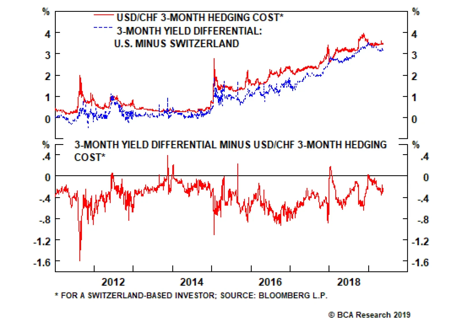
Chart I-12Hedging Against Franc Strength Is Expensive
Hedging Against Franc Strength Is Expensive
Hedging Against Franc Strength Is Expensive
This is especially true, since the U.S. tax reforms have already driven foreign affiliates in Switzerland to liquidate investments (mostly real estate) and repatriate those funds back into Treasurys. Foreign direct investment in Switzerland is falling at a rate of 15% of GDP, causing the basic balance to hit -4% of GDP. These FDI outflows are unlikely to remain a headwind for the franc going forward, assuming the tax benefit was a one-time deal. Instead, a favorable balance-of-payments backdrop will continue to be a key underpinning behind the strong franc (Chart I-13). Chart I-13A One-Time Adjustment In The Basic Balance
A One-Time Adjustment In The Basic Balance
A One-Time Adjustment In The Basic Balance
The message is that during rising periods of risk aversion, like now, speculators should accumulate francs as a portfolio hedge. We continue to favour the CHF/NZD, recommended on April 26. Aggressive investors can also sell the USD/CHF. Investment Conclusions Our long-term fair value models suggest the Swiss franc is currently cheap (Chart I-14). This makes it attractive both on a short- and longer-term basis versus a basket of currencies. The exception is versus the euro, given the EUR/CHF is still undervalued by 5%. Froth in the housing market has been eliminated. Stricter policies toward immigration, along with macro-prudential measures, such as a cap on second homes and stricter lending standards, have helped (Chart I-15). Meanwhile, the surprise move by the SNB to abandon the EUR/CHF floor has rebalanced the market. Back then, Swiss real estate became more expensive for investors in the euro area who used the SNB put to speculate on properties in Zurich and Geneva. Demand for Swiss real estate has largely decreased since then, eliminating this key source of risk for the SNB (Chart I-16) Chart I-14The Swiss Franc Is Cheap By Some Measures
The Swiss Franc Is Cheap By Some Measures
The Swiss Franc Is Cheap By Some Measures
Chart I-15The Swiss People's Party ##br##Had Its Way
The Swiss People's Party Had Its Way
The Swiss People's Party Had Its Way
Our bias is that over the next few years, the Swiss franc will be more of a dormant currency, gently appreciating towards its fair value but periodically interspersed by bouts of intense volatility. Interestingly, we may be entering such a riot point. German bund yields fell below Japanese levels this week. Historically, a falling bund yield has been a bad omen for EUR/CHF. We will respect our 1.11 stop loss on long EUR/CHF if breached (Chart I-17). Chart I-16The SNB Had Its Way
The SNB Had Its Way
The SNB Had Its Way
Chart I-17Where Next For Bund Yields?
Where Next For Bund Yields?
Where Next For Bund Yields?
Chester Ntonifor, Foreign Exchange Strategist chestern@bcaresearch.com Footnotes 1 Please see www.reuters.com. Currencies U.S. Dollar Chart II-1USD Technicals 1
USD Technicals 1
USD Technicals 1
Chart II-2USD Technicals 2
USD Technicals 2
USD Technicals 2
Recent data from the U.S. have been positive: Headline inflation and core inflation increased to 2% and 2.1% year-on-year respectively in April. NFIB business optimism index increased to 103.5 in April. NY Empire State Manufacturing index increased to 17.8 in May. Retail sales fell by 0.2% month-on-month in April, but the Redbook retail sales clocked in a solid 5.4% growth year-on-year. Industrial production decreased by 0.5% month-on-month in April, but is still growing at 0.9% year-on-year. On the housing market front, MBA mortgage applications contracted by 0.6% in May. NAHB housing market index increased to 66 in May. Housing starts increased by 5.7% to 1.24 million month-on-month in April. Building permits increased by 0.6% to 1.3 million in April. DXY index increased by 0.4% this week. U.S. and Chinese negotiators failed to reach an agreement regarding tariffs. The increased tariffs on Chinese goods was followed by the inevitable retaliation by China this Monday. As the market gauges the net impact of the tariff from both sides, volatility will prevail. Report Links: President Trump And The Dollar - May 9, 2019 Take Out Some Insurance - May 3, 2019 Currency Complacency Amid A Global Dovish Shift - April 26, 2019 The Euro Chart II-3EUR Technicals 1
EUR Technicals 1
EUR Technicals 1
Chart II-4EUR Technicals 2
EUR Technicals 2
EUR Technicals 2
Recent data in the euro area have been weaker-than-expected: Industrial production in the euro area fell by 0.6% year-on-year in March. The euro area ZEW economic sentiment fell to -1.6 in May. The German ZEW economic sentiment fell to -2.1 in May, while current situation improved to 8.2. Euro area GDP growth came in line at 1.2% year-on-year in Q1. German GDP growth increased to 0.4% quarter-on-quarter in Q1, while on a year-on-year measure, the growth rate fell from 0.9% to 0.6%. Trade balance in the euro area fell to 17.9 billion euros in March. German harmonized consumer price inflation was unchanged at 2.1% year-on-year in April. French industrial output contracted by 0.9% month-on-month in March, while non-farm payrolls increased to 0.3% quarter-on-quarter in Q1. EUR/USD fell by 0.4% this week. While signs are still pointing to a tentative recovery in the euro area, global trade war rhetoric and volatile incoming data continue to weigh on investor sentiment. Trump is poised to delay a decision to impose auto tariffs on EU and Japanese exports by up to six months, which suggests he might ramp up the trade war with China. Report Links: Take Out Some Insurance - May 3, 2019 Reading The Tea Leaves From China - April 12, 2019 Into A Transition Phase - March 8, 2019 The Japanese Yen Chart II-5JPY Technicals 1
JPY Technicals 1
JPY Technicals 1
Chart II-6JPY Technicals 2
JPY Technicals 2
JPY Technicals 2
Recent data in Japan have been mixed: Leading economic index and coincident index fell to 96.3 and 99.6 respectively in March. Trade balance by the balance-of-payment measure increased to 700 billion yen in March. Adjusted current account balance fell to 1.27 trillion yen in March. On the housing market front, the construction orders increased by 66.1% year-on-year in March. Housing starts grew by 10% year-on-year in March. Reconstruction efforts following last year’s disasters appear well underway. Machine tool orders contracted by 33.4% year-on-year in April. Japanese producer price inflation decreased to 1.2% year-on-year in April, while still higher than expected. USD/JPY fell by 0.7% initially, then gradually recovered, returning flat this week. The ongoing trade disputes largely increased short-term volatility in the yen. We continue to recommend the yen as a portfolio hedge. Report Links: Beware Of Diminishing Marginal Returns - April 19, 2019 Tug OF War, With Gold As Umpire - March 29, 2019 A Trader’s Guide To The Yen - March 15, 2019 British Pound Chart II-7GBP Technicals 1
GBP Technicals 1
GBP Technicals 1
Chart II-8GBP Technicals 2
GBP Technicals 2
GBP Technicals 2
Recent data in the U.K. have been solid, despite softer employment data: Nominal GDP growth increased to 1.8% year-on-year in Q1. Manufacturing production increased by 2.6% year-on-year in March. Industrial production increased by 1.3% year-on-year. Total trade balance came in at a deficit of 5.4 billion pounds in March. This was an improvement from the last reading of a 6.2 billion deficit in February. ILO unemployment rate fell to 3.8% in March, while the average earnings growth fell from 3.5% to 3.2%. Moreover, claimant count increased by 24.7K in April. GBP/USD fell by 1.6% this week. The pound remains one of our favorite currencies for the time being from a valuation perspective. Moreover, U.K. data continue to surprise positively. The catalyst for pound weakness this week was Theresa May’s announcement she will set out a timetable for her resignation next month, once the fourth iteration of Brexit is submitted for a vote. Report Links: Take Out Some Insurance - May 3, 2019 Not Out Of The Woods Yet - April 5, 2019 A Trader’s Guide To The Yen - March 15, 2019 Australian Dollar Chart II-9AUD Technicals 1
AUD Technicals 1
AUD Technicals 1
Chart II-10AUD Technicals 2
AUD Technicals 2
AUD Technicals 2
Recent data in Australia have been negative: Home loans contracted by 2.5% in March. Crucially, this was driven by both owner-occupied and investor lending. National Australia Bank’s business conditions and business confidence indices both fell in April. Business conditions fell to 3, and business confidence decreased to 0. Westpac consumer confidence fell to 0.6% in May. Consumer inflation expectations fell to 3.3% in May. On the labor market front, the wage price index was unchanged at 2.3% year-on-year in Q1. Unemployment rate increased to 5.2%, while participation rate increased to 65.8%. 28.4 thousand new jobs were created in April. However, this is due to the creation of 34.7 thousand part-time jobs, while 6.3 thousand full-time jobs were lost. AUD/USD fell by 1% this week. We remain overweight the Australian dollar as it will be one of the first pro-cyclical currencies to benefit from Chinese stimulus. But we will respect our AUD/USD 0.68 stop loss if it is breached. Report Links: Beware Of Diminishing Marginal Returns - April 19, 2019 Not Out Of The Woods Yet - April 5, 2019 Into A Transition Phase - March 8, 2019 New Zealand Dollar Chart II-11NZD Technicals 1
NZD Technicals 1
NZD Technicals 1
Chart II-12NZD Technicals 2
NZD Technicals 2
NZD Technicals 2
Recent data in New Zealand have been negative: Food price index fell by 0.1% month-on-month in April. Visitor arrivals contracted by 2.6% year-on-year in March. REINZ house sales continue to contract by 11.5% year-on-year in April. Net migration fell to 59 thousand in Q1. Migration has been an important source of demand for New Zealand. NZD/USD fell by 0.4% this week. The New Zealand dollar remains very vulnerable to external shocks, especially from the trade front. Meanwhile, terms of trade dynamics continue to favor AUD vis-à-vis NZD. The domestic environment, including reduced immigration also remains a headwind for the economy. Report Links: Not Out Of The Woods Yet - April 5, 2019 Balance Of Payments Across The G10 - February 15, 2019 A Simple Attractiveness Ranking For Currencies - February 8, 2019 Canadian Dollar Chart II-13CAD Technicals 1
CAD Technicals 1
CAD Technicals 1
Chart II-14CAD Technicals 2
CAD Technicals 2
CAD Technicals 2
Recent data from Canada have been promising: Building permits increased by 2.1% month-on-month in March. On the labor market front, the unemployment rate fell to 5.7% in April, and 106.5 thousand new jobs were created. Participation rate increased to 65.9%, and average hourly earnings increased by 2.6% year-on-year in April. This was a blockbuster jobs report. Headline inflation increased to 2% year-on-year in April, while core inflation decreased to 1.5%. Manufacturing sales increased by 2.1% month-on-month in March. USD/CAD decreased by 0.1% this week. The good news from the Canadian housing sector and labor market has supported the loonie. On Wednesday, Canadian Foreign Affairs Minister Chrystia Freeland called again for the U.S. to lift steel and aluminum tariffs in order to create “true free trade” on the continent. On the U.S. side, Treasury Secretary Steven Mnuchin said that Washington was close to resolving its differences with Mexico and Canada over steel and aluminum tariffs. Report Links: Currency Complacency Amid A Global Dovish Shift - April 26, 2019 A Shifting Landscape For Petrocurrencies - March 22, 2019 Into A Transition Phase - March 8, 2019 Swiss Franc Chart II-15CHF Technicals 1
CHF Technicals 1
CHF Technicals 1
Chart II-16CHF Technicals 2
CHF Technicals 2
CHF Technicals 2
There is little data from Switzerland this week: Producer and import prices fell by 0.6% in April. USD/CHF fell by 0.1% this week. The Swiss franc remains a safe-haven currency, and growing political uncertainty will increase demand for the franc. We discuss the outlook for the franc at length in the front section of this report. Report Links: Beware Of Diminishing Marginal Returns - April 19, 2019 Balance Of Payments Across The G10 - February 15, 2019 A Simple Attractiveness Ranking For Currencies - February 8, 2019 Norwegian Krone Chart II-17NOK Technicals 1
NOK Technicals 1
NOK Technicals 1
Chart II-18NOK Technicals 2
NOK Technicals 2
NOK Technicals 2
Recent data in Norway have been mixed: Core inflation fell to 2.6% year-on-year in April, while still higher than the expected 2.5%. Headline inflation was unchanged at 2.9% year-on-year in April. Real GDP growth did slow down to a 0.3% quarter-on-quarter pace in Q1. However, seasonal factors were at play. Strong agricultural output in Q4 2018 was not repeated in Q1 following last year’s summer drought. There was also low power production in the months of February and March. The trade balance increased to 17.6 billion NOK in April. USD/NOK has been volatile but returned flat this week. Two Saudi oil-pumping stations were targeted in a drone attack this Tuesday. The tensions in the Middle East increased the risk of oil supply shortages, which is bullish for oil price, thus beneficial for the Norwegian krone. Report Links: Currency Complacency Amid A Global Dovish Shift - April 26, 2019 A Shifting Landscape For Petrocurrencies - March 22, 2019 Balance Of Payments Across The G10 - February 15, 2019 Swedish Krona Chart II-19SEK Technicals 1
SEK Technicals 1
SEK Technicals 1
Chart II-20SEK Technicals 2
SEK Technicals 2
SEK Technicals 2
Recent data in Sweden have been positive: Swedish Public Employment Service (PES) unemployment rate fell to 3.5% in April. Headline consumer price inflation climbed to 2.1% year-on-year in April. Core consumer price inflation increased to 1.6% year-on-year in April. USD/SEK has been flat this week. As a pro-cyclical currency, the Swedish krona will soon benefit from a global growth recovery once political uncertainties and external shocks play out. We remain positive on the krona. Report Links: Balance Of Payments Across The G10 - February 15, 2019 A Simple Attractiveness Ranking For Currencies - February 8, 2019 Global Liquidity Trends Support The Dollar, But... - January 25, 2019 Trades & Forecasts Forecast Summary Core Portfolio Tactical Trades Closed Trades
The simple reason is that profits growth is highly leveraged to economic growth. For many years, the big moves in the Euro Stoxx 50 have reflected changes in euro area GDP growth. It follows that what investors really need is not a current activity…
This acceleration is beyond doubt: euro area GDP growth picked up to 1.6 percent in the first quarter of 2019 from a low of 0.6 percent in the third quarter of 2018. Given the openness of the euro area economy, it is inconceivable that this growth pick-up…
Highlights The trade war escalation is just the catalyst and not the cause of the market correction. This year’s absolute double-digit returns have most likely already been made during the early-2019 star alignment of near-perfect conditions for investors. The remainder of the year is likely to be a much tougher going for all the major asset-classes. Short a 30:60:10 portfolio of equities, bonds, and oil, setting the profit target and stop-loss at 3 percent. In the second half of the year, the big story will be sector rotation. Healthcare is likely to flip from underperformer to outperformer versus technology. Given their sector skews, it follows that European equities are likely to outperform Chinese equities. Feature A star alignment of near-perfect conditions lifted the entire financial market complex in the early part of the year. For investors, pretty much everything that could go right did go right! (Chart of the Week). Chart of the WeekIn Near-Perfect Conditions, European Equities Performed Very Well... But Chinese Equities Performed Even Better
In Near-Perfect Conditions, European Equities Performed Very Well... But Chinese Equities Performed Even Better
In Near-Perfect Conditions, European Equities Performed Very Well... But Chinese Equities Performed Even Better
The Federal Reserve stopped hiking interest rates; the ECB and other major central banks also pivoted to dovish; Brexit was delayed; the Italy versus Brussels spat over fiscal policy de-escalated; the drag from new emissions standards on German auto production eased; the trade war threat seemed to recede; and crucially, economic activity accelerated sharply (more about this later). A Rare Star Alignment… Which Cannot Last There was another rare star alignment: equities, bonds, and crude oil generated simultaneous strong rallies (Chart I-2). Such a star alignment is almost unheard of, because there are no set of economic circumstances that should benefit all three asset-classes at the same time. For example, if the oil price surge is inflationary – or at least less deflationary – then it should hurt bonds; if the surge is deflationary on real demand, then it should hurt equities. Equities, bonds, and oil should not surge together. Equities, bonds, and oil should not surge together, and on the extremely rare occasions they do, the simultaneous rally soon breaks down. Consider a €100 investment portfolio consisting of €30 equities, €60 long-dated bonds, and €10 crude oil. At the start of this year, the portfolio returned 10 percent in just three months. This is extremely rare, and has happened on only two other occasions in the past 25 years, in 2009 and 2016 (Chart I-3). Chart I-2A Rare Star Alignment:##br## Equities, Bonds, And Oil Surged ##br##Simultaneously
A Rare Star Alignment: Equities, Bonds, And Oil Surged Simultaneously
A Rare Star Alignment: Equities, Bonds, And Oil Surged Simultaneously
Chart I-3A Rare Star Alignment: A 30:60:10 Portfolio of Equities: Bonds: Oil Gained 10 Percent In 3 Months
A Rare Star Alignment: A 30:60:10 Portfolio of Equities: Bonds: Oil Gained 10 Percent In 3 Months
A Rare Star Alignment: A 30:60:10 Portfolio of Equities: Bonds: Oil Gained 10 Percent In 3 Months
On both previous occasions, the simultaneous rally broke down, and the portfolio went on to lose a large chunk of its 10 percent gain. Hence, at our quarterly webcast last week, we initiated a new investment recommendation: to short a 30:60:10 portfolio of equities, bonds, and oil, setting the profit target and stop-loss at 3 percent.1 When conditions are perfect, they are vulnerable to the tiniest setback. But the vulnerability emanates from the fragility of the perfect conditions, and not the precise setback. As an analogy, visualize a tree bedecked in its beautiful foliage in the autumn, and imagine you gently shake the tree. The gentlest of shakes will make the leaves collapse. At first glance, your shake caused the collapse, but in truth, your shake was just the catalyst; the underlying cause was the fragility of the autumnal foliage. Another catalyst, say a puff of wind, could have equally triggered the same collapse. When conditions are perfect, they are vulnerable to the tiniest setback. The re-escalation of the trade war has dominated the recent column inches and investment analyst missives. But just like the gentle shake of the tree, it is just a catalyst for the market correction. The underlying cause was that the simultaneous and strong rallies in all financial assets, based on a star alignment of near-perfect conditions, was vulnerable to the first blemish to the perfection. And the blemish could have been anything. Economic Activity Has Undoubtedly Accelerated… One of the things that drove up equity markets was the acceleration in economic activity. This acceleration is beyond doubt: euro area GDP prints show that growth picked up to 1.6 percent in the first quarter of 2019 from a low of 0.6 percent in the third quarter of 2018 (Chart I-4). Given the openness of the euro area economy, it is inconceivable that this growth pick-up does not reflect a more generalized acceleration in global activity.2 Chart I-4Euro Area GDP Growth Accelerated To 1.6 Percent
Euro Area GDP Growth Accelerated To 1.6 Percent
Euro Area GDP Growth Accelerated To 1.6 Percent
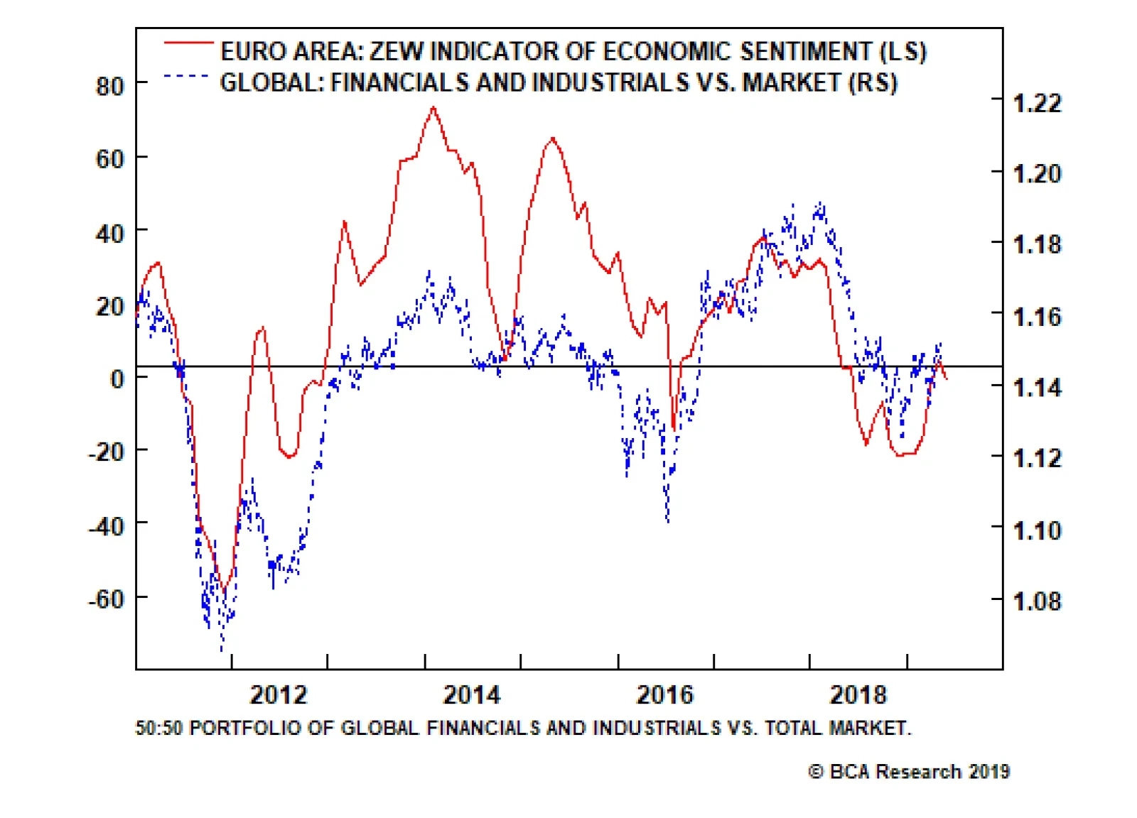
The trouble is that we do not receive these GDP prints in real-time. From the mid-point of the quarter to which the GDP prints refer to their release date around one month after the quarter end, there is a two and a half month delay. To proxy activity in real-time, we must look at current activity indicators (CAIs) which gauge GDP growth, but are available without much of a delay. While several such indicators exist, we have found that the ZEW economic sentiment indicator (not to be confused with the current situation indicator) does the job extremely well in real-time. Current activity indicators do not help equity investors. Having said that, current activity indicators do not help equity investors. The simple reason is that the equity market is a current activity indicator itself, and it would be absurd to expect one CAI to predict another CAI! In fact, the best current activity indicator is not the equity market taken as a whole. This is because the aggregate equity market can move as a result of drivers other than current economic activity, most notably central bank policy. Therefore, it turns out that the very best current activity indicator is found within the equity market: specifically, the performance of economically sensitive equity sectors – such as industrials and financials – relative to the aggregate market (Chart I-5 and Chart I-6). Both this and the ZEW economic sentiment indicator confirm that economic activity has accelerated sharply since late last year, but has suffered a slight setback in the last month. Chart I-5The Best Current Activity Indicator Is The Relative Performance Of Economically Sensitive Equity Sectors
The Best Current Activity Indicator Is The Relative Performance Of Economically Sensitive Equity Sectors
The Best Current Activity Indicator Is The Relative Performance Of Economically Sensitive Equity Sectors
Chart I-6The Best Current Activity Indicator Is The Relative Performance Of Economically Sensitive Equity Sectors
The Best Current Activity Indicator Is The Relative Performance Of Economically Sensitive Equity Sectors
The Best Current Activity Indicator Is The Relative Performance Of Economically Sensitive Equity Sectors
…But Can The Acceleration In Economic Activity Continue? To be crystal clear, let’s repeat the crucial point. Economically sensitive investments do not move on the level of GDP growth; economically sensitive investments move on the real-time change in GDP growth. The simple reason is that profits growth is highly leveraged to economic growth. Hence when GDP growth picks up, the embedded ‘g’ used to calculate the present value of the investment rises very sharply, which means that today’s price also rises very sharply; and vice versa when GDP growth declines. But once GDP growth stabilizes, even at a high level, there is no further meaningful change in ‘g’, or in the price. For any remaining sceptics, Chart I-7 shows that for many years, the big moves in the Euro Stoxx 50 have resulted from the changes in euro area GDP growth. Chart I-7The Euro Stoxx 50 Moves On Changes In GDP Growth
The Euro Stoxx 50 Moves On Changes In GDP Growth
The Euro Stoxx 50 Moves On Changes In GDP Growth
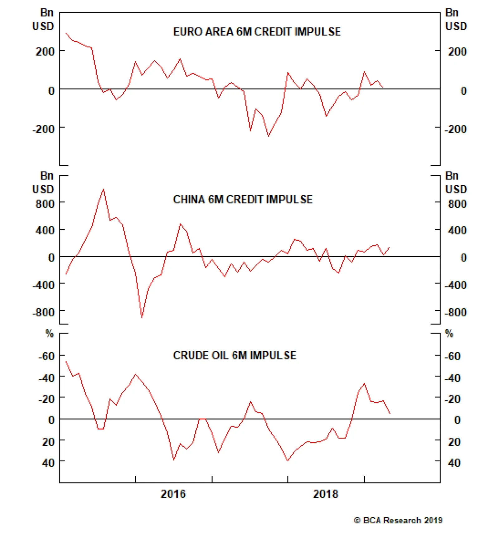
It follows that what investors really need is not a current activity indicator, but a future activity indicator (FAI). If investors could reliably predict the change in economic activity, then they could also reliably allocate between economically sensitive and defensive investments, as well as to the equity market as a whole. We have found that a future activity indicator for Europe would contain three components: The domestic 6-month credit impulse. The international 6-month credit impulse, and specifically the 6-month credit impulse in China given the large volume of European exports that head to the largest emerging economy. The crude oil price 6-month impulse, where a price decline constitutes a positive impulse given Europe’s dependence on energy imports. Chart I-8The Drivers Of Europe's Future Activity Indicator Are Losing Momentum
The Drivers Of Europe's Future Activity Indicator Are Losing Momentum
The Drivers Of Europe's Future Activity Indicator Are Losing Momentum
Today, we find that the 6-month credit impulse both in the euro area and in China have lost momentum; meanwhile, given the rebound in the oil price, the crude oil price 6-month impulse has clearly faded (Chart I-8). Hence, our future activity indicator suggests that in the second half of this year, euro area GDP growth is unlikely to accelerate much from the current 1.5-2 percent clip. For investors, this means that this year’s absolute double-digit returns have most likely already been made during the early-2019 star alignment of near-perfect conditions. And the remainder of the year is likely to be much tougher going for all the major asset-classes. Still, there are always double-digit returns to be found somewhere in the investment landscape. In the second half of the year, the big story will be sector rotation. For example, in recent reports, we highlighted that healthcare is likely to flip from underperformer to outperformer versus technology. Given their sector skews, it follows that European equities are likely to outperform Chinese equities. Fractal Trading System* This week’s recommended trade is based on an oddity. While the majority of stock markets have suffered corrections, New Zealand’s NZX 50 has escaped relatively unscathed so far, making it vulnerable to a corrective underperformance one way or another. Hence, short the NZX 50 versus the FTSE100, and set the profit target and stop-loss at 2 percent. In other trades, short China versus Japan quickly achieved its profit target. Long Nikkei 225 versus Hang Seng was also closed in profit at the end of the 65 day maximum holding period. Against these two profitable trades, long SEK/NOK was closed at its stop-loss. This leaves the Fractal Trading System with four open positions. For any investment, excessive trend following and groupthink can reach a natural point of instability, at which point the established trend is highly likely to break down with or without an external catalyst. An early warning sign is the investment’s fractal dimension approaching its natural lower bound. Encouragingly, this trigger has consistently identified countertrend moves of various magnitudes across all asset classes. Chart I-9
NZX 50 VS. FTSE100
NZX 50 VS. FTSE100
The post-June 9, 2016 fractal trading model rules are: When the fractal dimension approaches the lower limit after an investment has been in an established trend it is a potential trigger for a liquidity-triggered trend reversal. Therefore, open a countertrend position. The profit target is a one-third reversal of the preceding 13-week move. Apply a symmetrical stop-loss. Close the position at the profit target or stop-loss. Otherwise close the position after 13 weeks. Use the position size multiple to control risk. The position size will be smaller for more risky positions. * For more details please see the European Investment Strategy Special Report “Fractals, Liquidity & A Trading Model,” dated December 11, 2014, available at eis.bcaresearch.com. Dhaval Joshi, Chief European Investment Strategist dhaval@bcaresearch.com Footnotes 1 The precise mix of the portfolio is 29% MSCI World $, 29% German 30-year bund, 29% U.S. 30-year T-bond, 13% WTI. Please see a replay of the webcast ‘From Sweet Spot to Weak Spot’ available at eis.bcaresearch.com. 2 Quarter-on-quarter real GDP growth at annualized rates. Fractal Trading System Recommendations Asset Allocation Equity Regional and Country Allocation Equity Sector Allocation Bond and Interest Rate Allocation Currency and Other Allocation Closed Fractal Trades Trades Closed Trades Asset Performance Currency & Bond Equity Sector Country Equity Indicators Bond Yields Chart II-1Indicators To Watch - Bond Yields
Indicators To Watch - Bond Yields
Indicators To Watch - Bond Yields
Chart II-2Indicators To Watch - Bond Yields
Indicators To Watch - Bond Yields
Indicators To Watch - Bond Yields
Chart II-3Indicators To Watch - Bond Yields
Indicators To Watch - Bond Yields
Indicators To Watch - Bond Yields
Chart II-4Indicators To Watch - Bond Yields
Indicators To Watch - Bond Yields
Indicators To Watch - Bond Yields
Interest Rate Chart II-5Indicators To Watch - Interest Rate Expectations
Indicators To Watch - Interest Rate Expectations
Indicators To Watch - Interest Rate Expectations
Chart II-6Indicators To Watch - Interest Rate Expectations
Indicators To Watch - Interest Rate Expectations
Indicators To Watch - Interest Rate Expectations
Chart II-7Indicators To Watch - Interest Rate Expectations
Indicators To Watch - Interest Rate Expectations
Indicators To Watch - Interest Rate Expectations
Chart II-8Indicators To Watch - Interest Rate Expectations
Indicators To Watch - Interest Rate Expectations
Indicators To Watch - Interest Rate Expectations
Highlights U.S. Bond Strategy: U.S. Treasury yields are already priced for rate cuts and lower inflation, even as U.S. (and global) growth indicators are improving and U.S. realized inflation has ticked up. Maintain a below-benchmark stance on U.S. duration, even in the face of the current U.S.-China trade tensions. Stay overweight U.S. corporates versus Treasuries as well, with global growth indicators improving and U.S. monetary policy not yet restrictive. European Bond Strategy: Government bond yields in core Europe are too low relative to tentative signs that growth has bottomed out. At the same time, tight euro area corporate bond spreads already discount better economic momentum. Stay below-benchmark on euro area duration exposure, but maintain only a neutral weighting on euro area corporate bonds. Feature Monetary & Fiscal Policy Is More Important Than Trade Policy Chart 1Government Bonds Are Overvalued
Government Bonds Are Overvalued
Government Bonds Are Overvalued
The old market bugaboo from 2018, “global trade uncertainty”, returned last week after the U.S. and China failed to reach a trade deal by last Friday’s deadline. The Trump Administration followed through on its threat to raise the tariff rate on $200 billion of Chinese exports to the U.S. from 10% to 25%, effective immediately. China retaliated by announcing fresh tariffs on $60 billion of U.S. exports to China, effective June 1st. Global equities have responded negatively, with the S&P 500 down -5% since President Trump first Tweeted his threat to increase tariffs on May 5. Global bond yields have declined in a standard risk-off move. The 10-year U.S. Treasury yield dropped -13bps over the past week - despite higher-than-expected April CPI and PPI inflation releases – and now sits at 2.40%. Meanwhile, the 10-year German Bund has dipped back into negative territory despite recent data releases showing an unexpected pickup in German industrial activity in March, and a sharp increase in Euro Area core inflation in April. Despite the greater uncertainty, we do not see a case for making any changes to our recommended pro-growth medium-term fixed income recommendations on duration (below-benchmark) or asset allocation (overweight corporates versus government debt). The BCA Global Fixed Income Strategy Duration Indicator continues to climb, indicating cyclical pressures for higher global bond yields (Chart 1). Yet at the same time, the deeply negative term premium component of yields in the U.S. and Europe (and most other developed markets) suggests that there is a lot of pessimism on growth and inflation (and a big safe-haven bid from investors) embedded in the current level of yields. Despite the greater uncertainty, we do not see a case for making any changes to our recommended pro-growth medium-term fixed income recommendations on duration (below-benchmark) or asset allocation (overweight corporates versus government debt). Our colleagues at BCA Geopolitical Strategy now believe that the odds of a trade agreement being reached this year are a 50/50 coin flip. If the talks do break down completely, however, China’s policymakers will almost certainly ramp up additional stimulus measures to offset the hit to growth from the U.S. tariffs. As a reminder, China’s exports to the U.S. only account for around 3.5% of China’s GDP (Chart 2), so U.S. tariffs matter far less than domestic stimulus via fiscal and monetary easing. Thus, any additional stimulus will help sustain the current blossoming rebound in global growth, which has been fueled in part by improved economic sentiment and a pickup in Chinese credit growth (Chart 3). In addition, Chinese import demand has ticked higher, our global leading economic indicator (LEI) is bottoming out, the ZEW surveys of economic sentiment are climbing higher and even the OECD LEI for China is starting to perk up. Chart 2China-U.S. Trade Is A Small Part Of The Two Economies
China-U.S. Trade Is A Small Part Of The Two Economies
China-U.S. Trade Is A Small Part Of The Two Economies
Dovish central banks will also help limit the damage from increased trade uncertainty. In particular, the Fed will not rock the boat and stay “patient” by keeping rates on hold for longer. Chart 3A Consistent Message On A Global Growth Recovery
A Consistent Message On A Global Growth Recovery
A Consistent Message On A Global Growth Recovery
Although given the inflationary implications of higher tariffs and the FOMC’s belief that the recent dip in core PCE inflation was “transitory”, the current market pricing for Fed easing appears too optimistic. Dovish central banks will also help limit the damage from increased trade uncertainty. We did get our first post-tariff read on the Fed’s thinking last Friday, and it did not sound like rate cuts were on the way. Atlanta Fed president Raphael Bostic noted that the most recent CPI and PPI inflation readings suggest that “price pressures are a little hotter” and that the U.S. is “almost to the cusp where we are going to see prices move”.1 He also noted that U.S. businesses are far more likely to pass on a higher 25% tariff on Chinese imports to consumer prices, where previously they had been more willing to absorb the higher cost of the smaller 10% tariff. Of course, an even bigger near-term selloff in global equity and credit markets is possible, if the current impasse between D.C. and Beijing persists without any indication of fresh negotiations. BCA Global Investment Strategy has recommended a tactical hedge to the overall overweight allocation to global equities in our House View matrix by shorting the S&P 500 index.2 However, we do not see the need to make any similar recommendations on the U.S. fixed income side – both the below-benchmark duration stance and the overweight corporate credit tilt - for the following reasons (Chart 4): Our Fed Monitor continues to signal that no rate cuts are required in the U.S., while -31bps of cuts over the next year are already discounted in the U.S. Overnight Index Swap curve. U.S. financial conditions have only tightened modestly on last week’s moves – after the substantial easing seen year-to-date – and still point to above-trend GDP growth over the rest of 2019. U.S. inflation expectations have dipped back to recent lows, even as realized inflation has hooked up; TIPS breakevens are now 40-50bps below levels consistent with the Fed hitting its 2% PCE inflation target. The Treasury market is now very overbought from a momentum perspective, while duration positioning is now very long according to the JPMorgan Client Survey. The reaction of U.S. corporate credit spreads to the trade headlines has been relatively muted to date (Chart 5), less than what was seen last December when the market feared a hawkish Fed policy mistake – over the medium-term, monetary policy matters more than trade policy for credit markets. Chart 4Stay Below-Benchmark U.S. Duration
Stay Below-Benchmark U.S. Duration
Stay Below-Benchmark U.S. Duration
Chart 5A Modest Reaction (So Far) To The Tariffs
A Modest Reaction (So Far) To The Tariffs
A Modest Reaction (So Far) To The Tariffs
In other words, U.S. Treasury yields now discount a lot of bad news and, thus, have limited downside even in the event of a further breakdown of U.S.-China trade talks. On the other hand, any positive news on fresh U.S.-China negotiations could send both equities and bond yields substantially higher and tighten credit spreads. On a risk/reward basis, a below-benchmark U.S. duration stance and overweight tilt on U.S. corporates are still warranted, even with the more elevated uncertainty on U.S.-China trade. Bottom Line: U.S. bond yields are already priced for rate cuts and lower inflation, even as U.S. (and global) growth indicators are improving and U.S. realized inflation has ticked up. Maintain a below-benchmark stance on U.S. duration, even in the face of the current U.S.-China trade tensions. Stay overweight U.S. corporates versus Treasuries as well, with global growth indicators improving and U.S. monetary policy not yet restrictive. European Bond Markets – Too Much Bad News In Yields, Too Much Good News In Credit Spreads With markets now focused on the U.S.-China trade squabble, the European economic situation is garnering few headlines. Investors may be missing out on a good story, with euro area data now more frequently surprising to the upside (Chart 6). The ZEW measures of economic sentiment have been picking up in the past few months, most notably in Germany and France, even with current conditions still perceived to be soft. Improved sentiment is where economic upturns begin, however, and it looks like better days lie ahead for European growth. Investors may be missing out on a good story, with euro area data now more frequently surprising to the upside. The 2018 downturn in euro area GDP growth was a result of a sharp downturn in exports that fed into large pullbacks in industrial production. The most recent data, however, shows that exports have started growing again, and production growth is stabilizing (Chart 7). Credit growth has also hooked up in Germany and France, while the credit contraction in Italy and Spain is bottoming out. Chart 6Upside Growth Surprises In Europe?
Upside Growth Surprises In Europe?
Upside Growth Surprises In Europe?
Chart 7Starting To Reverse The 2018 Downturn
Starting To Reverse The 2018 Downturn
Starting To Reverse The 2018 Downturn
The improvement in global leading indicators, such as the China credit impulse and our global LEI diffusion index, points to a rebound in euro area export growth over the latter half of the year (Chart 8). The escalation in the U.S.-China trade dispute is a potential source of concern but, as discussed earlier in this report, Chinese policymakers will likely provide additional stimulus measures to offset any hit from U.S. tariffs. This will help boost European exports to China, especially if Chinese citizens are forced to divert demand away from tariffed U.S. goods towards tariff-free European products. The likely result is that a recovery in net exports will help boost overall euro area GDP growth to an above-trend pace over the next few quarters, which could generate some surprising upside pressures on inflation. Overall euro area inflation remains well below the European Central Bank (ECB) target of “just below” 2%. Looking ahead, faster rates of inflation are more likely over the next 6-12 months (Chart 9). The early “flash” estimate for April headline HICP inflation was 1.7%, but the lagged impact of higher oil prices and a soft euro should provide a lift towards Q4/2019, boosted by faster year-over-year comparisons versus the 2018 plunge in global oil prices. The flash estimate for April also showed that core HICP inflation jumped from 1% to 1.3%. That is a large move even for a data series that has always been volatile, and there may be more signal than noise this time with wage growth also accelerating. Chart 8Exports Set To Boost European Growth
Exports Set To Boost European Growth
Exports Set To Boost European Growth
Chart 9A Whiff Of Inflation?
A Whiff Of Inflation?
A Whiff Of Inflation?
In terms of bond investment strategy, the benchmark 10yr German Bund yield looks too low according to most valuation components (Chart 10): Inflation expectations are too low relative to the rising trend in euro-denominated oil prices, and with actual inflation stabilizing. Our estimate of the term premium component of the Bund yield is also depressed, within 25bps of the deeply negative levels seen during 2015/16, when inflation was near zero and the ECB was most aggressively buying government bonds in its Asset Purchase Program. Our proxy for the market’s expectation of the real neutral short-term interest rate in the euro area - the 5-year EUR Overnight Index Swap rate, 5-years forward minus the 5-year EUR CPI swap rate, 5-years forward – is now down to -0.6%. Even allowing for modest potential growth rates in the euro area, and the persistent problems of weak profitability for European banks, such deeply negative real rate expectations discount a lot of pessimism. Similar to the story for U.S. Treasury yields laid our earlier in this report, the medium term risk/reward tradeoff for German Bund yields points to a below-benchmark duration stance as most appropriate. The upside in yields will likely come almost entirely from the inflation expectations component initially, as the ECB will maintain a dovish bias until they are convinced that the economy is indeed accelerating. Thus, we continue to recommend owning inflation protection in the euro area, either through inflation-linked bonds or CPI swaps. Similar to the story for U.S. Treasury yields laid our earlier in this report, the medium term risk/reward tradeoff for German Bund yields points to a below-benchmark duration stance as most appropriate. For spread product, a combination of improving growth, moderate inflation and stable monetary policy should be ideal for the performance of credit. Unfortunately, the robust rally in euro area corporate bonds so far in 2019 has tightened spreads to levels consistent with an accelerating economy (Chart 11). In other words, European corporate credit already discounts the faster growth that is likely to be seen later this year. Just looking at the relationship between credit and the euro area manufacturing PMI, the current level of spreads is more consistent with a PMI several points above the current soft reading that is still below the expansionary 50 line. Chart 10Stay Below-Benchmark ##br##Euro Area Duration
Stay Below-Benchmark Euro Area Duration
Stay Below-Benchmark Euro Area Duration
Chart 11Stay Neutral European Corporates & Underweight BTPs
Stay Neutral European Corporates & Underweight BTPs
Stay Neutral European Corporates & Underweight BTPs
We continue to recommend only a neutral allocation to euro area corporates (both investment grade and high-yield), given the competing forces of cyclical improvement but stretched valuation. As for our other major tilt in Europe, we continue to recommend a cautious, below-benchmark, stance on Italian government bonds. The indicators for the Italian economy are lagging the signs of life seen in other large euro area nations, amidst ongoing fiscal squabbles with the EU. We continue to recommend a below-benchmark stance on Italian government bonds until there is more decisive evidence of a rebound in Italian growth, signaled by a rising OECD LEI for Italy (which has been negatively correlated to Italy-German spreads over the past decade). Bottom Line: Government bond yields in core Europe are too low relative to tentative signs that growth has bottomed out. At the same time, tight euro area corporate bond spreads already discount better economic momentum. Stay below-benchmark on euro area duration exposure, but maintain only a neutral weighting on euro area corporate bonds. Robert Robis, CFA, Chief Fixed Income Strategist rrobis@bcaresearch.com Footnotes 1https://www.bloomberg.com/news/articles/2019-05-09/fed-s-bostic-warns-consumers-may-feel-hit-on-china-tariff-boost 2 Please see BCA Global Investment Strategy Special Alert, “Stay Cyclically Overweight Global Equities, But Hedge Near-Term Downside Risks From An Escalation Of A Trade War”, dated May 10th 2019, available at gis.bcareseach.com. Recommendations Duration Regional Allocation Spread Product Tactical Trades Yields & Returns Global Bond Yields Historical Returns
Why has the median voter remained supportive of European institutions despite mixed economic performance? For one, investors – particularly outside continental Europe – continue to overstate how much emphasis Europeans put on “economic prosperity” as a key…
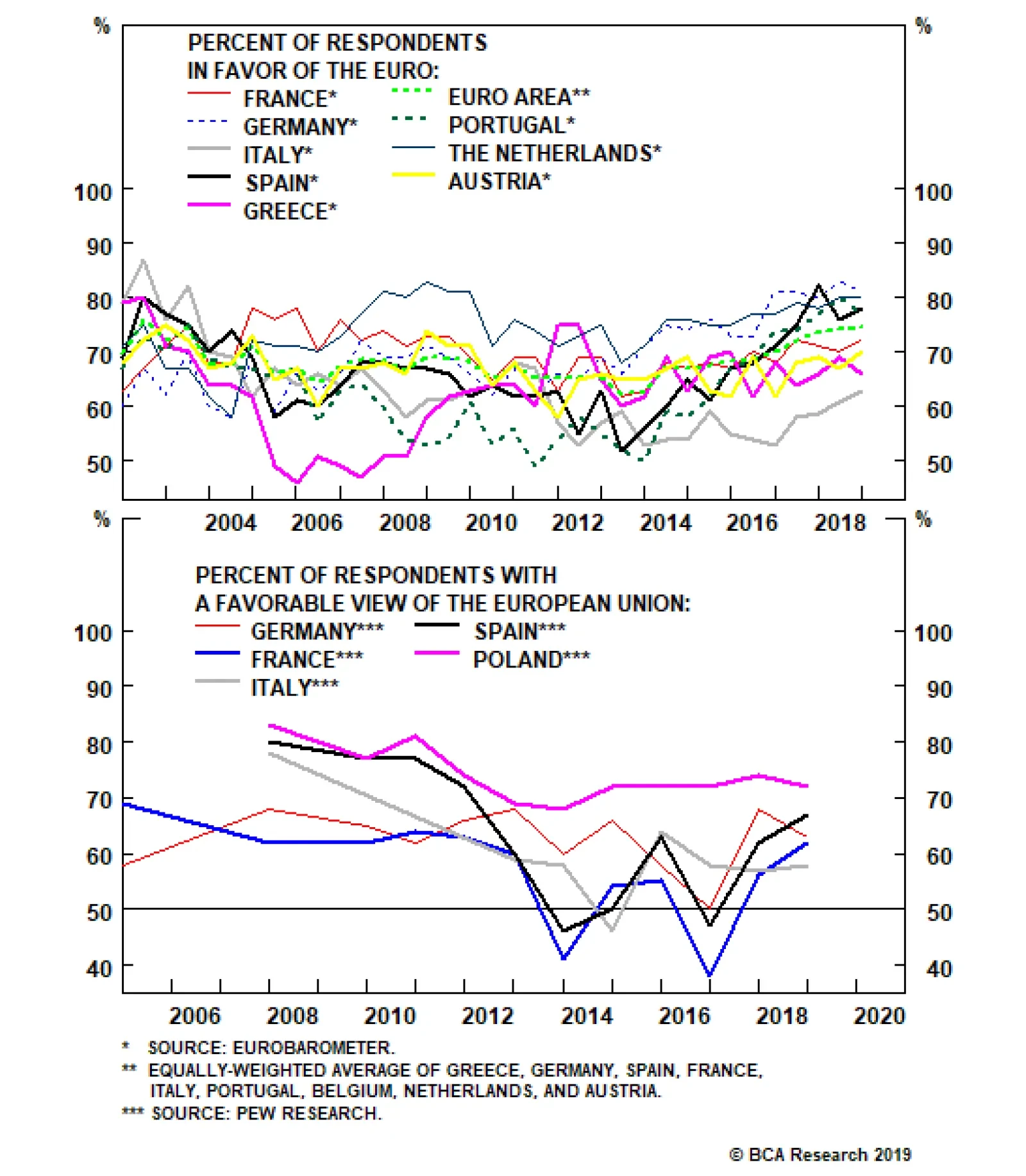
This concept is simple to understand, but difficult to implement. It is far easier to get lost in rumor intelligence-driven analysis of political consultants and journalists who pass on the cocktail party chatter insights gathered through speaking with…