Europe

Highlights The USD remains supported by fundamentals, especially now that its late-2016 excesses have been purged. Solid U.S. growth contrasts with weaker growth in the rest of the world, which will incentivize further inflows into the U.S. dollar. Despite this positive cyclical view, the tactical outlook remains risky for dollar bulls. In the immediate term, the euro will benefit from easing Italian tensions and as well as from the dollar's correction, but its six-month outlook remains poor. The AUD could also rebound right now, but any such rally should be used to build further short positions. Feature After a furious rally from February to August, the dollar has been weakening since the middle of last month. Since July, we have been worried that the dollar could stage a bit of a correction,1 but we remained committed to the view that ultimately the greenback would rise further in 2018. It is now time to review whether this thesis still holds. BCA believes that the USD's correction could run through the fall, but that the final quarter of 2018 should still prove a rewarding period for dollar bulls. Ultimately, policy divergences will remain a crucial support for the dollar, especially as EM weakness continues to affect the distribution of growth across the globe. USD: Not Yet Extended The dollar ultimately follows the path implied by its fundamental drivers - whether they are interest rate spreads, growth and inflation differentials, relative equity prices, or even relative money-supply growth. However, the path taken by the USD around its drivers is rather wide, and the dollar regularly overshoots and undershoots the equilibrium implied by the aggregation of all these fundamentals (Chart I-1). Academics call this the "band of agnosticism." Chart I-1The Dollar To Follow Fundamentals Higher
The Dollar To Follow Fundamentals Higher
The Dollar To Follow Fundamentals Higher
This cycle was no exception. BCA's Fundamentals Index for the dollar hooked up in 2011, a move associated with a turning point in the greenback itself. However, the dollar remained in undershoot territory for many years. Then suddenly, in 2014, the coiled spring was released and the dollar surged higher, moving above its "band of agnosticism" in 2015 - a moved exacerbated by the sudden rally that followed the election of Donald Trump in November 2016. Once the dollar had become over-loved, over-owned and expensive, it also became vulnerable. The pick-up in global growth that was so evident in 2017 caused a serious correction in this vulnerable currency. However, the selloff had a positive impact: U.S. growth, interest rates, equities and so on continued to move favorably, and the dollar is now positioned to rebound anew, having purged its most egregious excesses. The global economic backdrop is also positive for the dollar. For one, the theme of monetary divergences is still at play. Boosted by a healthy banking sector, healthy household balance sheets and an untimely fiscal stimulus of 1.7% of GDP, U.S. growth has hit 2.8%, well above potential. Moreover, growth has been above potential for eight years, and now U.S. capacity utilization is at its tightest level since the late 1980s. Historically, so large an absence of slack has been linked to higher U.S. interest rates (Chart I-2). Yet interest rate markets are pricing in roughly four increases over the next 24 months, even as Lael Brainard warned that the Federal Reserve could move beyond the hikes implied by its own forecast, the "dot plots." Chart I-2Tight Capacity Utilization Implies Higher U.S. Rates...
Tight Capacity Utilization Implies Higher U.S. Rates...
Tight Capacity Utilization Implies Higher U.S. Rates...
The U.S. economy continues to fare well, as U.S. real interest rates remain 60 basis points below neutral rates and the yield curve has yet to invert. However, U.S. rates matter for the rest of the world as well. There, the picture is less pretty. EM dollar debt stands near record levels (Chart I-3). Hence, EM financial conditions have been hit by the combined assault of higher U.S. rates and an appreciating dollar. Nowhere is this clearer than when looking at the interplay between U.S. bond yields and the South African rand or AUD/JPY, a cross highly correlated to EM currencies. This cycle, rising U.S. bond yields have most often been associated with a rising ZAR or a rising AUD/JPY (Chart I-4). However, this time around, as was the case during the May 2013 Taper Tantrum, rising bond yields are linked to these pro-cyclical currency pairs falling. This suggests that rising yields are not reflecting global growth anymore, and are in fact restrictive for the rest of the world, even if they are not a problem for the U.S. Chart I-3... Which Will Hurt EM Economies
... Which Will Hurt EM Economies
... Which Will Hurt EM Economies
Chart I-4Higher U.S. Rates Now Hurt Global Growth
Higher U.S. Rates Now Hurt Global Growth
Higher U.S. Rates Now Hurt Global Growth
This inference is underpinned by the decline in BCA's U.S. Financial Liquidity Index, which heralds additional weakness in global growth and commodity prices (Chart I-5). Already we are seeing symptoms of the malaise. Japanese foreign machine tool orders are contracting, and BCA's Asian Leading Economic Indicator is in deep contraction (Chart I-6). Chart I-5Dollar Liquidity Is A Problem For Growth
Dollar Liquidity Is A Problem For Growth
Dollar Liquidity Is A Problem For Growth
Chart I-6Signs That Global Growth Is Already Suffering
Signs That Global Growth Is Already Suffering
Signs That Global Growth Is Already Suffering
A rising fed funds rate and falling ex-U.S. growth is likely to continue to support the dollar. The dollar loves nothing more than falling global growth. The U.S. economy has low exposure to global trade and to the global industrial sector, and therefore when global growth slows, the U.S. economy is relatively insulated from foreign shocks. This means that U.S. rates of return do not suffer as much as foreign ones. This is even truer in the rare instances when global growth slows while U.S. economic activity continues to power ahead, especially when artificially inflated by untimely fiscal stimulus. This is a characterization of the current environment. Hence, money will continue to flow into the U.S. economy on a two- to three-quarter horizon. In fact, portfolio flows into the U.S. remain well below the levels that prevailed during the previous decade (Chart I-7). The current account deficit is also smaller, hence, if net foreign portfolio flows can increase due to the attraction of higher U.S. rates of return, the U.S. balance of payments will move into a greater surplus, creating a strong underpinning for the dollar. This positive cyclical backdrop for the greenback is not without impediments. Most crucially are the short-term dynamics. Since July, we have been warning clients that a tactical correction in the dollar was likely. While EUR/USD has indeed rebounded, most other currencies have displayed rather tepid performances. This does not mean that the tactical risks to the dollar have abated. Quite the opposite, they are rising. As Chart I-8 illustrates, a large buildup in dollar longs has materialized, yet the G10 economic surprise index is making a trough. Moreover, the diffusion index of the BCA Global Leading Economic indicator is also stabilizing. Additionally, USD /CNY has failed to make new highs and the Turkish central bank just raised rates to 24% - which if Argentina is any guide is likely to provide only temporary relief for the TRY. This means that a period of risk-on sentiment in EM could emerge. Stretched dollar positioning, a temporary stabilization in global growth and EM inflows could precipitate a serious correction in the dollar. Chart I-7Dollar Favorable Flows
Dollar Favorable Flows
Dollar Favorable Flows
Chart I-8Tactical Risks To The Dollar
Tactical Risks To The Dollar
Tactical Risks To The Dollar
Bottom Line: The dollar is still supported by potent cyclical tailwinds. The U.S. economy is roaring and at full employment, yet global growth is suffering because global liquidity conditions are deteriorating. Higher rates of return in the U.S. will therefore attract additional capital, supporting the greenback in the process. Despite this positive cyclical backdrop, the short-term outlook is murkier. Speculators have aggressively bought the dollar, leaving them vulnerable to any positive surprises in global growth, even temporary ones. Fade The Euro Rebound The euro has benefited from the cool-off in Italian politics. The populist Five Star Movement / Lega Nord coalition is backing away from a budget confrontation with Brussels, as Giovanni Tria, Italy's minister of finance, wants a 2% budget deficit, while Deputy Prime Minister Matteo Salvini is arguing for a 2.9% budget hole - well south of the 6% levels touted during the campaign. As a result, the spread between Italian BTPs and German bunds has fallen from 193 basis points at the beginning of the month to 150 basis points this week (Chart I-9). Since gyrations in Italian spreads reflect the evolution of the perceived probability that the euro area will fall apart, the fall in the spreads has implied a fall in the euro area-breakup risk premium. This has created a boon for the euro. Another support for the euro emerged yesterday. At his press conference, European Central Bank President Mario Draghi divulged that the ECB has curtailed its growth forecast for 2018 and 2019, but not its inflation forecast. In fact, Draghi went as far as mentioning that his confidence that euro area inflation would move back to target in the medium term has increased. There is no denying that the inflationary backdrop has improved as European wages and labor costs have indeed starting to recover (Chart I-10). However, the picture is not that straightforward. The lagged impact of the previous fall in euro area inflation relative to the U.S. is likely to continue to be felt in EUR/USD moving forward, as has been the case over the past 10 years (Chart I-11). Chart I-9The Euro Area Break Up Risk Premium Is Declining
The Euro Area Break Up Risk Premium Is Declining
The Euro Area Break Up Risk Premium Is Declining
Chart I-10Rising Euro Area Labor Costs
Rising Euro Area Labor Costs
Rising Euro Area Labor Costs
Chart I-11Relative Inflation Backdrop Is Still Euro Bearish
Relative Inflation Backdrop Is Still Euro Bearish
Relative Inflation Backdrop Is Still Euro Bearish
This risk is compounded by developments in China. As we have often argued, the growth differential between the euro area and China can largely be explained by growth dynamics in China. As Chart I-12 illustrates, when Chinese monetary conditions tighten, or when China's marginal propensity to consume - as approximated by the gap between M1 and M2 - declines, this often leads to underperformance of European economic activity relative to the U.S. Chart I-12AChinese Economy Still Hurting Euro Area Vs U.S. (I)
Chinese Economy Still Hurting Euro Area Vs U.S. (I)
Chinese Economy Still Hurting Euro Area Vs U.S. (I)
Chart I-12BChinese Economy Still Hurting Euro Area Vs U.S. (II)
Chinese Economy Still Hurting Euro Area Vs U.S. (II)
Chinese Economy Still Hurting Euro Area Vs U.S. (II)
Today, Chinese monetary conditions have improved somewhat as the Chinese authorities try to combat the shock to the Chinese economy created by the growing trade war between the U.S. and China. However, Matt Gertken, BCA's Geopolitical Strategy service's expert on Chinese policy, believes that Chinese policymakers do not intent to actually cause economic growth to pick up. Indeed, they are committed to reform and deleveraging, and only want to limit downside to the Chinese economy.2 Thus, the large growth gap between the U.S. and the euro area is here to stay. As markets absorb news of Chinese stimulus, EUR/USD could rebound toward 1.19, but we are inclined to fade such a rebound. For one, the growth and inflation gap between the U.S. and the euro area remains euro bearish. Additionaly BCA's Central Bank Monitor for the Fed clearly points toward the need to tighten U.S. monetary policy, while our indicator for the ECB points to the need to maintain an extremely loose policy setting in Europe (Chart I-13). With the euro still trading above its intermediate-term fair value estimate (Chart I-14), beyond any short-term rally the euro still possesses ample downside in the fourth quarter. As such, we would use the current rebound in the euro as an opportunity to buy the dollar once again. Chart I-13The U.S. Needs More Tightening, Europe Does Not
The U.S. Needs More Tightening, Europe Does Not
The U.S. Needs More Tightening, Europe Does Not
Chart I-14The Euro Possesses Downside
The Euro Possesses Downside
The Euro Possesses Downside
Bottom Line: Falling risk premia in Italy, a pick-up in European wages and signs of stimulus in China are creating some support under the euro. However, European growth and inflation are set to continue to lag well behind the U.S. as China's stimulus is not designed to reverse its deleveraging campaign and boost growth, but instead to limit downside to growth created by the U.S.-China trade war. Hence, we will use the current rebound in the euro and correction in the USD to buy the greenback again in the coming weeks. What's Going On Down Under? In recent months, the Australian economy has managed to generate some impressive numbers on the employment front. However, until recently this was not enough to prompt investors to push the AUD higher. In fact, as recently as Monday, AUD/USD was trading at 0.71. Investors are skeptical about the Australian economy's underlying strength. The NAB Business Confidence for the Next Period has weakened sharply, while mortgage approvals and house prices have also sagged. This suggests that new orders, employment and consumption could follow lower (Chart I-15). This represents a big problem for the Aussie, as our central bank monitor for the Reserve Bank of Australia is already in "easing required" territory (Chart I-16). The RBA will therefore not be able to hike rates any time soon, despite the fact that U.S. interest rates are currently in an uptrend. As such, interest rate differentials between Australia and the U.S. will continue to deteriorate. Chart I-15Australia Is Set To Slowdown
Australia Is Set To Slowdown
Australia Is Set To Slowdown
Chart I-16China And Australia Are Joined At The Hip
China And Australia Are Joined At The Hip
China And Australia Are Joined At The Hip
Moreover, Australia has been hit directly by the decline in Chinese industrial activity. As Chart I-17 illustrates, Australian exports are a direct function of China's Li-Keqiang index. This has two implications. First, the current rebound in the Li-Keqiang index suggests that investors could bid up the AUD with great alacrity if the USD were to correct further, a thesis we espouse. However, since we do not anticipate the rebound in the Li-Keqiang indicator to have much longevity, nor do we anticipate the greenback's correction to morph into a bear market, this also means that we would use any rebound in the AUD to sell more of it. Beyond China, EM at large still constitutes a risk for AUD/USD. Arthur Budaghyan, our Chief EM strategist, argues that the period of weakness in EM assets has further to run. Our views on the U.S. dollar, on declining global liquidity and on Chinese policy corroborate this assessment. If EM economies slow further, the still-elevated expected long-term growth rate in EM earnings could decline further as well. Since growth expectations on EM EPS are indicative of expected interest rates and terms-of-trade for Australia, this also suggests that the AUD could suffer significant downside in the coming quarters (Chart I-18). Finally, the AUD remains a pricey currency. AUD/USD continues to trade significantly above its purchasing-power-parity fair value, and the real trade-weighted AUD remains above its long-term average (Chart I-19). As such, the AUD does not possess the required valuation cushion to make it a buy in this challenging context. Chart I-17RBA ##br##Cannot Hike
RBA Cannot Hike
RBA Cannot Hike
Chart I-18EM Has Yet To Be Fully Re-Rated, ##br##And So Does The AUD
EM Has Yet To Be Fully Re-Rated, And So Does The AUD
EM Has Yet To Be Fully Re-Rated, And So Does The AUD
Chart I-19No Valuation Cushion##br## In The AUD
No Valuation Cushion In The AUD
No Valuation Cushion In The AUD
Bottom Line: The Australian economy has posted some solid employment numbers, but the trends in business confidence and the housing market augur poorly. Australian monetary policy will have to remain very loose. Moreover, since China's stimulus is likely to be limited, any rebound in the AUD on the back of a dollar correction should be faded, especially as the Aussie does not offer any valuation cushion. Mathieu Savary, Vice President Foreign Exchange Strategy mathieu@bcaresearch.com 1 Please see Foreign Exchange Strategy Weekly Report, titled "Time To Pause And Breathe", dated July 6, 2018, available at fes.bcaresearch.com 2 Please see Foreign Exchange Strategy Special Report, titled "China: How Stimulating is The Stimulus?", dated August 24, 2018, available at fes.bcaresearch.com Currencies U.S. Dollar Recent data in the U.S. has been mixed: Average hourly earnings growth outperformed expectations significantly, coming in at 2.9%. Moreover, nonfarm payrolls also surprised to the upside, coming in at 201 thousand, but this was mitigated by large downward revisions to the previous two months. Additionally initial jobless claims surprised positively, coming in at 203 thousand. However, core inflation underperformed expectations, coming in at 2.2%. Finally, DXY has been flat for the past couple of weeks. We continue to be bullish on the dollar on a cyclical basis, as inflationary pressures will continue to accumulate in the U.S., causing the fed to hike more than expected, particularly in 2019. Moreover, high U.S. borrowing cost will likely weigh on global growth, giving an additional boost to the dollar, as the U.S. has a lower beta than other DM economies to the global economic cycle. Report Links: The Dollar And Risk Assets Are Beholden To China’s Stimulus - August 3, 2018 Rhetoric Is Not Always Policy - July 27, 2018 Time To Pause And Breathe - July 6, 2018 Chart II-1USD Technicals 1
USD Technicals 1
USD Technicals 1
Chart II-2USD Technicals 2
USD Technicals 2
USD Technicals 2
The Euro Recent data in the euro area has been negative: Both headline and core inflation surprised to the downside, coming in at 2% and 1% respectively. Moreover, industrial production yearly growth also surprised to the downside, coming in at -0.1%. Finally, retail sales yearly growth also underperformed expectations, coming in at 1.1%. EUR/USD has been flat the past two weeks. Yesterday, however the market rallied as the ECB confirmed that it expects to wind down its bond-buying program. Nevertheless, it also lowered growth forecast for this year and next. We continue to believe that the euro will have downside until the end of the year, as a policy and regulatory tightening in China will weigh on the global industrial cycle, to which Europe is highly levered. Report Links: Time To Pause And Breathe - July 6, 2018 What Is Good For China Doesn’t Always Help The World - June 29, 2018 Updating Our Long-Term FX Fair Value Models - June 22, 2018 Chart II-3EUR Technicals 1
EUR Technicals 1
EUR Technicals 1
Chart II-4EUR Technicals 2
EUR Technicals 2
EUR Technicals 2
The Yen Recent data in Japan has been mixed: Tokyo ex fresh food inflation outperformed expectations, coming in at 0.9%. Moreover, overall household spending yearly growth also surprised positively, coming in at 0.1%. However, labor cash earnings yearly growth underperformed expectations substantially, coming in at 1.5%. Finally, Markit Services PMI surprised to the downside, coming in at 51.5. USD/JPY has been flat the past couple of weeks. Overall, we are bullish on the yen against the euro and the commodity currencies, as the tightening in monetary policy in the U.S. as well as in China should create a risk off environment where safe heavens like the yen benefits and cyclical currencies suffer. Report Links: Rhetoric Is Not Always Policy - July 27, 2018 Updating Our Long-Term FX Fair Value Models - June 22, 2018 Rome Is Burning: Is It The End? - June 1, 2018 Chart II-5JPY Technicals 1
JPY Technicals 1
JPY Technicals 1
Chart II-6JPY Technicals 2
JPY Technicals 2
JPY Technicals 2
British Pound Recent data in the U.K. has been mixed: Average hourly earnings yearly growth excluding and including bonuses both came in above expectations, at 2.9% and 2.6% respectively. Moreover, Markit Services PMI also outperformed expectations, coming in at 54.3. However, industrial production surprised to the downside, coming in at 0.9%. Finally, nationwide housing prices yearly growth also surprised negatively, coming in at 2%. GBP/USD has rallied by roughly 0.5% the past couple of weeks. We believe that the pound could have some short term upside, as positioning continues to be significantly bearish. That being said, we are bearish on the pound on a cyclical basis, particularly against the yen. At this moment, the pound does not appear to have much of a geopolitical risk premium embedded in its price. Thus, any turbulence in the Brexit negotiations could result in significant downside for the GBP. Report Links: Updating Our Long-Term FX Fair Value Models - June 22, 2018 Inflation Is In The Price - June 15, 2018 Updating Our Intermediate Timing Models - May 18, 2018 Chart II-7GBP Technicals 1
GBP Technicals 1
GBP Technicals 1
Chart II-8GBP Technicals 2
GBP Technicals 2
GBP Technicals 2
Australian Dollar Recent data in Australia has been mixed: Gross domestic product yearly growth came in above expectations, at 3.4%. However, building permits month-on-month growth surprised to the downside, coming in at -5.2%. Finally, the RBA Commodity Index SDR yearly growth surprised positive, coming in at 6.7%. After a bout of pronounced weakness, AUD/USD has been flat for the past couple of weeks. We believe that the Australian dollar has further downside particularly against the yen and the dollar. Australia's economy is very sensitive to the Chinese industrial cycle, as iron ore is Australia's main commodity export. However, the overleveraged industrial complex is precisely the economic sector where Chinese policymakers want to rein in credit excesses. This will curb industrial activity in China, and hurt the economies of commodity supplies like Australia. Report Links: What Is Good For China Doesn’t Always Help The World - June 29, 2018 Updating Our Long-Term FX Fair Value Models - June 22, 2018 Updating Our Intermediate Timing Models - May 18, 2018 Chart II-9AUD Technicals 1
AUD Technicals 1
AUD Technicals 1
Chart II-10AUD Technicals 2
AUD Technicals 2
AUD Technicals 2
New Zealand Dollar Recent data in New Zealand has been mixed: Retail sales and retail sales ex autos yearly growth both outperformed expectations, coming in at 1.1% and 1.4% respectively. Moreover, the trade balance also surprised to the upside, coming in at -4.4 billion dollars/ However, the terms of trade Index underperformed expectations, coming in at 0.6%. NZD/USD has fallen by roughly 0.8% against the dollar for the past couple of weeks. We continue to be bearish on kiwi on a cyclical basis. The combination of high U.S. rates and deleveraging in China will weigh on carry currencies like the NZD. Furthermore, we also hold a bearish view on a structural basis, given that the new government has vowed to curb immigration and add an unemployment mandate to the RBNZ, both developments which are negative for the currency. Report Links: Updating Our Long-Term FX Fair Value Models - June 22, 2018 Updating Our Intermediate Timing Models - May 18, 2018 Value Strategies In FX Markets: Putting PPP To The Test - May 11, 2018 Chart II-11NZD Technicals 1
NZD Technicals 1
NZD Technicals 1
Chart II-12NZD Technicals 2
NZD Technicals 2
NZD Technicals 2
Canadian Dollar Recent data in Canada has been mixed: Both core and headline inflation outperformed expectations, coming in at 1.6% and 3% respectively. Moreover, manufacturing shipments month-on-month growth also outperformed expectations, coming in at 1.1%. However, retail sales month-on-month growth surprised to the downside, coming in at -0.2%. USD/CAD has been flat for the past couple of weeks. We are short this cross as a hedge to our dollar bullish view, as inflationary pressures in Canada remain strong. Moreover, the CAD will continue to outperform the AUD, as the divergence between Canada's and Australia's main export markets- China and the U.S. - will persist. Report Links: Updating Our Long-Term FX Fair Value Models - June 22, 2018 Inflation Is In The Price - June 15, 2018 Rome Is Burning: Is It The End? - June 1, 2018 Chart II-13CAD Technicals 1
CAD Technicals 1
CAD Technicals 1
Chart II-14CAD Technicals 2
CAD Technicals 2
CAD Technicals 2
Swiss Franc Recent data in Switzerland has been mixed: Gross domestic product yearly growth outperformed expectations, coming in at 3.4%. The SVME PMI also surprised to the upside, coming in at 64.8. However, the KOF leading indicator surprised negatively, coming in at 100.3. Finally, real retail sales growth also underperformed expectations, coming in at -0.3%. EUR/CHF has risen by roughly 0.5% this past two weeks. We continue to be bearish on the franc on a long-term basis, as inflationary pressures in Switzerland are still too weak for the SNB to remove its accommodative monetary policy, or stop its currency intervention. That being said, the CHF could experience some short term upside if the sell-off in emerging markets continues. Report Links: Updating Our Long-Term FX Fair Value Models - June 22, 2018 Updating Our Intermediate Timing Models - May 18, 2018 Value Strategies In FX Markets: Putting PPP To The Test - May 11, 2018 Chart II-15CHF Technicals 1
CHF Technicals 1
CHF Technicals 1
Chart II-16CHF Technicals 2
CHF Technicals 2
CHF Technicals 2
Norwegian Krone Recent data in Norway has been mixed: Both headline and core inflation outperform expectations, coming in at 3.4% and 1.9%. Moreover, the Labour Force survey also surprised to the upside, coming in at 3.9%. However, retail sales growth underperformed expectations, coming in at 0.7%. USD/NOK has fallen by nearly 2% over the last two weeks. We are bullish on the NOK against other commodity currencies like the AUD and the NZD. This is because oil will likely outperform within the commodity space. After all, Our commodity strategist have explained at length why political risk in Iraq and Venezuela could cause a shortage of supply in the oil markets, while Chinese deleveraging in the industrial sector will weigh on base metal demand. Report Links: Updating Our Long-Term FX Fair Value Models - June 22, 2018 Updating Our Intermediate Timing Models - May 18, 2018 Value Strategies In FX Markets: Putting PPP To The Test - May 11, 2018 Chart II-17NOK Technicals 1
NOK Technicals 1
NOK Technicals 1
Chart II-18NOK Technicals 2
NOK Technicals 2
NOK Technicals 2
Swedish Krona Recent data in Sweden has been mixed: Retail sales yearly growth surprised to the downside, coming in at -1.2%. However, consumer confidence outperformed expectations, coming in at 102.6. The krona has been the best performing currency during the past two weeks, with USD/SEK falling by roughly 2% over this period. At the moment we continue to be bullish USD/SEK, as the krona is the most sensitive currency to the dollar's strength. However, on a longer term basis, we believe that inflationary pressures in Sweden will ultimately force the Riskbank to hike more than the market expects, providing support for the SEK. Report Links: Updating Our Long-Term FX Fair Value Models - June 22, 2018 Updating Our Intermediate Timing Models - May 18, 2018 Value Strategies In FX Markets: Putting PPP To The Test - May 11, 2018 Chart II-19SEK Technicals 1
SEK Technicals 1
SEK Technicals 1
Chart II-20SEK Technicals 2
SEK Technicals 2
SEK Technicals 2
Trades & Forecasts Forecast Summary Core Portfolio Tactical Trades Closed Trades
Highlights In an environment where both interest rates and inflation are low but rising at a time of stretched equity valuations, what can investors do to enhance risk-adjusted portfolio returns? In this report, we investigate the roles of three types of popular instruments in a portfolio context: 1) Floating-Rate Notes, 2) Leveraged Loans and 3) Danish Mortgage Bonds. Floating-rate notes benefit from rising interest rates, but they are not a free lunch. Leveraged loans also benefit from rising interest rates; their very high correlation with high-yield bonds make them a good substitute for a portion of high-yield exposure in a rising-rate environment. Danish mortgage bonds have attracted foreign investors in recent years, but foreign ownership already accounts for about a quarter of the less than half a trillion USD market. Their positive correlation with aggregate bonds and negative correlation with equities in both Japan and the euro area make them a possible substitute for a portion of the bond basket in a balanced portfolio. Feature BCA has upgraded cash to overweight in the current environment, where inflation and interest rates are both low but rising, and equity valuations are stretched.1 For U.S. investors, holding cash is quite attractive as the cash yield is now higher than the equity dividend yield. For investors in the euro area, Switzerland, Sweden, Denmark and Japan, however, holding cash actually is a sure way to eat into portfolio returns, given the negative yields in these countries (Table 1). Table 1Current Yields* (%)
Searching For Yield In A Low-Return Environment
Searching For Yield In A Low-Return Environment
Some clients, particularly those in Europe, have asked where to put cash to get higher returns. Unfortunately, it's hard to increase return without assuming additional risk. As shown in Table 1, investors could pick up some yield by putting money in 3-month deposits instead of 3-month Treasury bills, but even 3-month deposit rates are still negative in some European countries. In this report, we investigate the roles of three types of popular instruments in a low but rising rate environment: 1) Floating-Rate Notes (FRNs), 2) Leveraged Loans (LLs) and 3) Danish Mortgage Bonds (DMBs). 1. Floating-Rate Notes An FRN offers coupon payments that float or adjust periodically based on a predetermined benchmark rate. Typical benchmarks in the U.S. are Treasury bills, LIBOR, the prime rate or some other short-term interest rate. Once the benchmark is chosen, the issuer will establish an additional spread that it is willing to pay over the chosen benchmark rate. The spread mainly reflects an issuer's credit quality and the time to maturity of the note. Even though coupon reset frequency can vary between daily, weekly, monthly, quarterly and yearly, the average coupon rate has responded quickly to the fed funds rate, as shown in Chart 1. Issuers can be both government-sponsored enterprises and investment-grade corporations. Before the 2008 Great Financial Crisis, FRNs were mostly issued by corporations. Some of the notes, however, performed badly during the financial crisis, causing a drop in both total issuance and the share of corporate issuance (Chart 2). FRNs can be either callable or non-callable with or without caps and floors, so FRNs carry credit risk - and callable ones also carry call risk. In terms of interest rate risk, it applies mostly to the income received. Chart 1Rising Rate Environment Benefits FRNs
Rising Rate Environment Benefits FRNs
Rising Rate Environment Benefits FRNs
Chart 2Corporate Dominance In FRN Market
Corporate Dominance In FRN Market
Corporate Dominance In FRN Market
Because of the nature of floating rates, FRNs can benefit from rising interest rates and have limited price sensitivity to interest rates. As shown in Chart 3, the Bloomberg/Barclays U.S. Floating-Rate Note index has lower duration than the cash index, as represented by the Bloomberg/Barclays Treasury (<1 year) index, while it offers a nice yield pickup. Since the inception of the index in December 2003 it has, in general, outperformed the cash index. This reward, however, has come at a cost: it does not provide cash-like protection when such protection is needed in times like the Great Financial Crisis and the euro debt crisis in 2011 (Chart 3, panels 3 and 4). This is because the majority of FRNs are offered by corporations that carry credit risk. Consequently, FRNs have higher correlations to high-yield bonds and equities than to the aggregate bond index, as shown in Chart 4. Chart 3FRNs: Not A Free Lunch
FRNs: Not A Free Lunch
FRNs: Not A Free Lunch
Chart 4FRNs: A Lower Risk Alternative To Junk Bonds
FRNs: A Lower Risk Alternative To Junk Bonds
FRNs: A Lower Risk Alternative To Junk Bonds
The ideal time to invest in FRNs is when rates are low and are expected to rise. This is essentially our view on rates now. Instead of thinking of it as a cash alternative with higher risk, however, we recommend clients take the funding from the high-yield bucket, in line with our downgrade of high yield to neutral from overweight, and also our call of reducing portfolio duration. So how to invest in FRNs? According to Bloomberg Barclays, the U.S. FRN market has a market value of US$505.8 billion, which is small compared to the US$1,267.5 billion high-yield bond market. As such, FRNs are relatively less liquid to trade than corporate bonds. Therefore, they are mostly suitable for purchasing and holding to maturity. One can purchase individual floating-rate securities through a broker, or can invest in mutual funds that invest only in FRNs. Also, there are ETFs that only hold FRNs. Table 2 shows some basic information on three dedicated FRN ETFs. Table 2FRN ETFs*
Searching For Yield In A Low-Return Environment
Searching For Yield In A Low-Return Environment
2. Leveraged Loans Leveraged loans, also known as bank loans or senior secured loans, are a type of corporate debt that also have floating coupon rates, which, like the FRNs, adjust to changes in prevailing interest rates and hence benefit from rising rates. These loans tend to be senior to an issuer's traditional corporate bonds, and are collateralized by a pledge of the issuer's assets. However, secured does not mean safe. These loans are private investments which are generally held by funds or large institutional investors. Most of them carry sub-investment-grade ratings and can default. They also tend to be very illiquid to trade, because physical delivery to the buyer is often needed from a seller (by faxing the paperwork, for example). As such, during periods of market volatility, these loans can be subject to significant price declines. Even though bank loans share the same feature of having "floating coupon rates" as FRNs, they are higher risk securities. In the U.S., bank loans have been mostly inferior to FRNs on a risk-adjusted return basis, as their higher return is offset by much higher volatility (Chart 5A). In the euro area, however, these loans have become more favorable than FRNs since the start of 2018 (Chart 5B). Chart 5ALeveraged Loans Vs. FRNs: U.S.
Leveraged Loans Vs. FRNs: U.S.
Leveraged Loans Vs. FRNs: U.S.
Chart 5BLeveraged Loans Vs. FRNs: Euro Area
Leveraged Loans Vs. FRNs: Euro Area
Leveraged Loans Vs. FRNs: Euro Area
Historically, when interest rates have risen, bank loans have outperformed traditional fixed-income securities, and vice versa, because of their floating-rate feature, as shown in Charts 6A and 6B. This positive correlation with rates has been more consistent when the relative performance of bank loans is compared to government bonds and investment-grade corporate bonds. When compared to high-yield bonds, however, the correlation appears weak, as shown in the bottom panels of Charts 6A and 6B. This is not surprising given that these loans share similar "sub-investment grade" credit quality with junk bonds. In fact, as shown in Chart 7, bank loans have a highly positive correlation with junk bonds, yet a mostly negative correlation with the aggregate bond index both in the U.S. and the euro area. Chart 6ALLs Outperform When Rates Rise: U.S.
LLs Outperform Whe Rates Rise: U.S.
LLs Outperform Whe Rates Rise: U.S.
Chart 6BLLs Outperform When Rates Rise: Euro Area
LLs Outperform When Rates Rise: Euro Area
LLs Outperform When Rates Rise: Euro Area
Chart 7Bank Loan Correlations With Traditional Bonds
Bank Loan Correlations With Traditional Bonds
Bank Loan Correlations With Traditional Bonds
This correlation feature has two very interesting implications: a) Adding bank loans to a standard aggregate bond portfolio could add diversification, and b) replacing some high-yield holdings with bank loans could generate a sub-investment grade basket with a better risk/reward profile compared to high-yield alone. Chart 8 and Table 3 show that historically there has existed an "optimal" combination of bank loans and high-yield bonds that somewhat improves the risk-adjusted return of the sub-investment grade basket. It's worth noting, however, that this historically "optimal" combination is subject to data frequency and time period, as is the case for the U.S. where the optimal weight for bank loans has been about 40% from 2002 to the present, but about 80% in the period from 1997 to the present. As such, in addition to thorough credit analysis to evaluate the suitability of bank loans, investors should also consider the variable nature of correlation when considering replacing part of their high-yield bond exposure with bank loans. Chart 8Junk Bonds - Leverage Loans Basket Profiles
Searching For Yield In A Low-Return Environment
Searching For Yield In A Low-Return Environment
Table 3Risk Return Profiles Of Sub-Investment Grade Baskets
Searching For Yield In A Low-Return Environment
Searching For Yield In A Low-Return Environment
3. Danish Mortgage Bonds A Danish mortgage bond (DMB) is essentially a loan to a borrower who has taken out a mortgage on his or her home. Mortgage bonds are issued by mortgage credit institutions which often have high credit ratings. Some DMBs have fixed rates, while others have floating rates with a minimum of zero percent. Some of these bonds can also be callable, often at par (100). With a solid history of over 200 years, the DMB market has survived numerous occasions of economic and political turmoil, including the bankruptcy of the Kingdom of Denmark in 1813, the Great Depression of the 1930s and the Great Financial Crisis and ensuing recession in 2008. Over its entire history, every single issued bond has been repaid in full to investors, in large part due to the strong legislative framework that protects the bond investors (see Appendix 1). As of the end of July 2018, the DMB market consisted of kr. 2.672 trillion of AAA-rated covered bonds. Once largely dominated by local pensions and insurance companies, the DMB market has seen increasing interest from foreign investors in recent years. According to data from the Danish central bank, foreign ownership of fixed rate mortgage bonds stood at kr. 295 billion (29%) in July 2018 compared to kr. 154 billion (18%) in January 2016 (Chart 9). In terms of total holdings of all mortgage bonds (fixed rate, variable rate and bonds backing interest adjustment loans), foreigners held kr. 614 billion (23%), an increase of kr. 27 billion compared to the beginning of 2016. Japanese investors, who have suffered many years of extremely low yields domestically, have been quite active in the DMB market. According to data from the Bank of Japan, Japanese investors purchased some kr. 50 billion of long-term Danish non-government bonds in the period from 2016 to June 2018.3 In June 2018, Nykredit, the largest Danish mortgage bank with a market share of about 40%, even created a DMB index hedged to yen using one-month forward rates due to popular demand and corresponding requests from Japanese investors. As shown in Chart 10, since 2009, the DMB index hedged to yen has outperformed both JGBs and Japanese corporate bonds. Chart 9Foreign Ownership of Danish Fixed Rate Mortgage Bonds*
Searching For Yield In A Low-Return Environment
Searching For Yield In A Low-Return Environment
Chart 10DMBs For Japanese Investors
DMBs For Japanese Investors
DMBs For Japanese Investors
Even though interest rates in the U.S. are much higher than those in the euro area, investing in the U.S. after hedging the currency is not really attractive for euro investors. For example, U.S. bank loans have outperformed European bank loans in local currency terms; after being hedged into euro, however, the yield advantage disappears. In terms of government bonds, euro investors really have no incentive to invest in U.S. Treasurys, hedged or unhedged (Chart 11). Given the Danish krone's peg to the euro, it is natural for euro investors to look at the DMB market. Chart 12 shows that DMBs have indeed outperformed both government and corporate bonds in the euro area when 3-month deposit rate turns negative. During the 2008 financial crisis, DMBs also outperformed euro area corporate bonds. However, they did underperform both euro area corporate and government bonds when the European Central Bank started buying bonds after the euro debt crisis. So, how would the exposure of DMBs impact a portfolio's risk/return profile? We have two interesting observations from Chart 13: Chart 11Rate Advantage Vs. Currency Risk
Rate Advantage Vs. Currency Risk
Rate Advantage Vs. Currency Risk
Chart 12DMBs For Euro Investors
DMBs For Euro Investors
DMBs For Euro Investors
Chart 13DMBs As A Domestic Bond Substitute?
DMBs As A Domestic Bond Substitute?
DMBs As A Domestic Bond Substitute?
In Japan, hedged DMBs have a very low correlation with equities, corporate bonds and JGBs, even though the correlation with equities has generally been negative, and with bonds generally positive. In the euro area, DMBs have a negative correlation with equities, but a highly positive correlation with both government and corporate bonds. And the correlation to government bonds is quite similar to that of corporate bonds. Therefore, in theory, replacing part of a standard bond portfolio with DMBs could improve a balanced portfolio's risk/return profile for both Japanese and euro area investors. Table 4 shows the risk/return profiles of hypothetical 60/40 standard domestic equity/bond portfolios for Japan and euro area that have a certain percentage of domestic bonds replaced with Danish mortgage bonds: for Japan, the DMBs are hedged to yen, and for the euro area they are unhedged but converted into euros. Table 460/40 Equity/Bond Portfolio Profile with DMB Exposures
Searching For Yield In A Low-Return Environment
Searching For Yield In A Low-Return Environment
As expected, for Japan, substituting domestic aggregate bonds with hedged DMBs increases portfolio return more than volatility, thereby improving risk/adjusted returns. For the euro area, however, the story is not straightforward. Over a longer time frame, DMBs have not been a good substitute for euro area aggregate bonds. Since the 3-month euro rate turned negative in June 2015, however, DMBs have largely improved a balanced portfolio's risk/return profile. It is also worth noting that, unlike Japanese investors who benefit from a positive hedging gain since the Danish three-month rate has been lower than Japan's since 2015, euro area investors do not have such a benefit. Also, even though the DMB market is the largest covered bond market in the world, its market size is less than half a trillion USD. Given the fact that foreign investors already account for about a quarter of the market, it is not clear how euro area investors can significantly deploy more capital to enhance portfolio returns. Xiaoli Tang, Associate Vice President xiaoliT@bcaresearch.com Appendix 1: The Danish Mortgage Act4 Danish mortgage bonds are issued under the Danish Mortgage Act. Two key features of the Act protect investors in DMBs. First, the central element in the Danish Mortgage Act is the "balancing principle." This principle requires that there is a match between the inflows and outflows of a mortgage-issuing bank, and limits the amount of risk (interest rate, FX, volatility and liquidity) that a Danish mortgage bank can undertake. In addition, Danish mortgage banks must meet minimum capital requirements of 8% of risk-weighted assets. Second, the "Danish title number and land registration systems and efficient compulsory sale procedure" ensures well-defined property rights through a general register of all properties in Denmark. Ownership and encumbrances on individual properties are easily identified, and that information is available to the public. If a borrower defaults on a payment, the mortgage bank can take over the property and the compulsory sale procedure ensures that a mortgage bank can sell the property in the real estate market or through a forced sale. The period from default to a forced sale to be completed can be as short as six months. 1 Please see Global Investment Strategy Special Report entitled, "Three Policy Puts Go Kaput: Downgrade Global Equities To Neutral," dated June 20, 2018. 2 Please see "Fixed Rate Mortgage Bonds Are Attractive For Foreigners," Portfolio Investment, Danmarks Nationalbank, dated August 28, 2018. 3 Please see "Fixed Rate Mortgage Bonds Are Attractive For Foreigners," Portfolio Investment, Danmarks Nationalbank, dated August 28, 2018. 4 Please see "Danish Covered Bond Handbook," Danske Bank, dated September 15, 2017.
Dear Client, I am travelling in Europe this week visiting clients. Instead of our Weekly Report, we are sending you a Special Report written by my colleague Xiaoli Tang of BCA's Global Asset Allocation. The report examines three types of instruments investors can look to in order to enhance risk-adjusted portfolio returns at a time when interest rates and inflation are low but rising: floating-rate notes, leveraged loans and Danish mortgage bonds. I trust you will find it informative. Best regards, Peter Berezin, Chief Global Strategist Highlights In an environment where both interest rates and inflation are low but rising at a time of stretched equity valuations, what can investors do to enhance risk-adjusted portfolio returns? In this report, we investigate the roles of three types of popular instruments in a portfolio context: 1) Floating-Rate Notes, 2) Leveraged Loans and 3) Danish Mortgage Bonds. Floating-rate notes benefit from rising interest rates, but they are not a free lunch. Leveraged loans also benefit from rising interest rates; their very high correlation with high-yield bonds make them a good substitute for a portion of high-yield exposure in a rising-rate environment. Danish mortgage bonds have attracted foreign investors in recent years, but foreign ownership already accounts for about a quarter of the less than half a trillion USD market. Their positive correlation with aggregate bonds and negative correlation with equities in both Japan and the euro area make them a possible substitute for a portion of the bond basket in a balanced portfolio. Feature BCA has upgraded cash to overweight in the current environment, where inflation and interest rates are both low but rising, and equity valuations are stretched.1 For U.S. investors, holding cash is quite attractive as the cash yield is now higher than the equity dividend yield. For investors in the euro area, Switzerland, Sweden, Denmark and Japan, however, holding cash actually is a sure way to eat into portfolio returns, given the negative yields in these countries (Table 1). Table 1Current Yields* (%)
Searching For Yield In A Low-Return Environment
Searching For Yield In A Low-Return Environment
Some clients, particularly those in Europe, have asked where to put cash to get higher returns. Unfortunately, it's hard to increase return without assuming additional risk. As shown in Table 1, investors could pick up some yield by putting money in 3-month deposits instead of 3-month Treasury bills, but even 3-month deposit rates are still negative in some European countries. In this report, we investigate the roles of three types of popular instruments in a low but rising rate environment: 1) Floating-Rate Notes (FRNs), 2) Leveraged Loans (LLs) and 3) Danish Mortgage Bonds (DMBs). 1. Floating-Rate Notes An FRN offers coupon payments that float or adjust periodically based on a predetermined benchmark rate. Typical benchmarks in the U.S. are Treasury bills, LIBOR, the prime rate or some other short-term interest rate. Once the benchmark is chosen, the issuer will establish an additional spread that it is willing to pay over the chosen benchmark rate. The spread mainly reflects an issuer's credit quality and the time to maturity of the note. Even though coupon reset frequency can vary between daily, weekly, monthly, quarterly and yearly, the average coupon rate has responded quickly to the fed funds rate, as shown in Chart 1. Issuers can be both government-sponsored enterprises and investment-grade corporations. Before the 2008 Great Financial Crisis, FRNs were mostly issued by corporations. Some of the notes, however, performed badly during the financial crisis, causing a drop in both total issuance and the share of corporate issuance (Chart 2). FRNs can be either callable or non-callable with or without caps and floors, so FRNs carry credit risk - and callable ones also carry call risk. In terms of interest rate risk, it applies mostly to the income received. Chart 1Rising Rate Environment Benefits FRNs
Rising Rate Environment Benefits FRNs
Rising Rate Environment Benefits FRNs
Chart 2Corporate Dominance In FRN Market
Corporate Dominance In FRN Market
Corporate Dominance In FRN Market
Because of the nature of floating rates, FRNs can benefit from rising interest rates and have limited price sensitivity to interest rates. As shown in Chart 3, the Bloomberg/Barclays U.S. Floating-Rate Note index has lower duration than the cash index, as represented by the Bloomberg/Barclays Treasury (<1 year) index, while it offers a nice yield pickup. Since the inception of the index in December 2003 it has, in general, outperformed the cash index. This reward, however, has come at a cost: it does not provide cash-like protection when such protection is needed in times like the Great Financial Crisis and the euro debt crisis in 2011 (Chart 3, panels 3 and 4). This is because the majority of FRNs are offered by corporations that carry credit risk. Consequently, FRNs have higher correlations to high-yield bonds and equities than to the aggregate bond index, as shown in Chart 4. Chart 3FRNs: Not A Free Lunch
FRNs: Not A Free Lunch
FRNs: Not A Free Lunch
Chart 4FRNs: A Lower Risk Alternative To Junk Bonds
FRNs: A Lower Risk Alternative To Junk Bonds
FRNs: A Lower Risk Alternative To Junk Bonds
The ideal time to invest in FRNs is when rates are low and are expected to rise. This is essentially our view on rates now. Instead of thinking of it as a cash alternative with higher risk, however, we recommend clients take the funding from the high-yield bucket, in line with our downgrade of high yield to neutral from overweight, and also our call of reducing portfolio duration. So how to invest in FRNs? According to Bloomberg Barclays, the U.S. FRN market has a market value of US$505.8 billion, which is small compared to the US$1,267.5 billion high-yield bond market. As such, FRNs are relatively less liquid to trade than corporate bonds. Therefore, they are mostly suitable for purchasing and holding to maturity. One can purchase individual floating-rate securities through a broker, or can invest in mutual funds that invest only in FRNs. Also, there are ETFs that only hold FRNs. Table 2 shows some basic information on three dedicated FRN ETFs. Table 2FRN ETFs*
Searching For Yield In A Low-Return Environment
Searching For Yield In A Low-Return Environment
2. Leveraged Loans Leveraged loans, also known as bank loans or senior secured loans, are a type of corporate debt that also have floating coupon rates, which, like the FRNs, adjust to changes in prevailing interest rates and hence benefit from rising rates. These loans tend to be senior to an issuer's traditional corporate bonds, and are collateralized by a pledge of the issuer's assets. However, secured does not mean safe. These loans are private investments which are generally held by funds or large institutional investors. Most of them carry sub-investment-grade ratings and can default. They also tend to be very illiquid to trade, because physical delivery to the buyer is often needed from a seller (by faxing the paperwork, for example). As such, during periods of market volatility, these loans can be subject to significant price declines. Even though bank loans share the same feature of having "floating coupon rates" as FRNs, they are higher risk securities. In the U.S., bank loans have been mostly inferior to FRNs on a risk-adjusted return basis, as their higher return is offset by much higher volatility (Chart 5A). In the euro area, however, these loans have become more favorable than FRNs since the start of 2018 (Chart 5B). Chart 5ALeveraged Loans Vs. FRNs: U.S.
Leveraged Loans Vs. FRNs: U.S.
Leveraged Loans Vs. FRNs: U.S.
Chart 5BLeveraged Loans Vs. FRNs: Euro Area
Leveraged Loans Vs. FRNs: Euro Area
Leveraged Loans Vs. FRNs: Euro Area
Historically, when interest rates have risen, bank loans have outperformed traditional fixed-income securities, and vice versa, because of their floating-rate feature, as shown in Charts 6A and 6B. This positive correlation with rates has been more consistent when the relative performance of bank loans is compared to government bonds and investment-grade corporate bonds. When compared to high-yield bonds, however, the correlation appears weak, as shown in the bottom panels of Charts 6A and 6B. This is not surprising given that these loans share similar "sub-investment grade" credit quality with junk bonds. In fact, as shown in Chart 7, bank loans have a highly positive correlation with junk bonds, yet a mostly negative correlation with the aggregate bond index both in the U.S. and the euro area. Chart 6ALLs Outperform When Rates Rise: U.S.
LLs Outperform Whe Rates Rise: U.S.
LLs Outperform Whe Rates Rise: U.S.
Chart 6BLLs Outperform When Rates Rise: Euro Area
LLs Outperform When Rates Rise: Euro Area
LLs Outperform When Rates Rise: Euro Area
Chart 7Bank Loan Correlations With Traditional Bonds
Bank Loan Correlations With Traditional Bonds
Bank Loan Correlations With Traditional Bonds
This correlation feature has two very interesting implications: a) Adding bank loans to a standard aggregate bond portfolio could add diversification, and b) replacing some high-yield holdings with bank loans could generate a sub-investment grade basket with a better risk/reward profile compared to high-yield alone. Chart 8 and Table 3 show that historically there has existed an "optimal" combination of bank loans and high-yield bonds that somewhat improves the risk-adjusted return of the sub-investment grade basket. It's worth noting, however, that this historically "optimal" combination is subject to data frequency and time period, as is the case for the U.S. where the optimal weight for bank loans has been about 40% from 2002 to the present, but about 80% in the period from 1997 to the present. As such, in addition to thorough credit analysis to evaluate the suitability of bank loans, investors should also consider the variable nature of correlation when considering replacing part of their high-yield bond exposure with bank loans. Chart 8Junk Bonds - Leverage Loans Basket Profiles
Searching For Yield In A Low-Return Environment
Searching For Yield In A Low-Return Environment
Table 3Risk Return Profiles Of Sub-Investment Grade Baskets
Searching For Yield In A Low-Return Environment
Searching For Yield In A Low-Return Environment
3. Danish Mortgage Bonds A Danish mortgage bond (DMB) is essentially a loan to a borrower who has taken out a mortgage on his or her home. Mortgage bonds are issued by mortgage credit institutions which often have high credit ratings. Some DMBs have fixed rates, while others have floating rates with a minimum of zero percent. Some of these bonds can also be callable, often at par (100). With a solid history of over 200 years, the DMB market has survived numerous occasions of economic and political turmoil, including the bankruptcy of the Kingdom of Denmark in 1813, the Great Depression of the 1930s and the Great Financial Crisis and ensuing recession in 2008. Over its entire history, every single issued bond has been repaid in full to investors, in large part due to the strong legislative framework that protects the bond investors (see Appendix 1). As of the end of July 2018, the DMB market consisted of kr. 2.672 trillion of AAA-rated covered bonds. Once largely dominated by local pensions and insurance companies, the DMB market has seen increasing interest from foreign investors in recent years. According to data from the Danish central bank, foreign ownership of fixed rate mortgage bonds stood at kr. 295 billion (29%) in July 2018 compared to kr. 154 billion (18%) in January 2016 (Chart 9). In terms of total holdings of all mortgage bonds (fixed rate, variable rate and bonds backing interest adjustment loans), foreigners held kr. 614 billion (23%), an increase of kr. 27 billion compared to the beginning of 2016. Japanese investors, who have suffered many years of extremely low yields domestically, have been quite active in the DMB market. According to data from the Bank of Japan, Japanese investors purchased some kr. 50 billion of long-term Danish non-government bonds in the period from 2016 to June 2018.3 In June 2018, Nykredit, the largest Danish mortgage bank with a market share of about 40%, even created a DMB index hedged to yen using one-month forward rates due to popular demand and corresponding requests from Japanese investors. As shown in Chart 10, since 2009, the DMB index hedged to yen has outperformed both JGBs and Japanese corporate bonds. Chart 9Foreign Ownership of Danish Fixed Rate Mortgage Bonds*
Searching For Yield In A Low-Return Environment
Searching For Yield In A Low-Return Environment
Chart 10DMBs For Japanese Investors
DMBs For Japanese Investors
DMBs For Japanese Investors
Even though interest rates in the U.S. are much higher than those in the euro area, investing in the U.S. after hedging the currency is not really attractive for euro investors. For example, U.S. bank loans have outperformed European bank loans in local currency terms; after being hedged into euro, however, the yield advantage disappears. In terms of government bonds, euro investors really have no incentive to invest in U.S. Treasurys, hedged or unhedged (Chart 11). Given the Danish krone's peg to the euro, it is natural for euro investors to look at the DMB market. Chart 12 shows that DMBs have indeed outperformed both government and corporate bonds in the euro area when 3-month deposit rate turns negative. During the 2008 financial crisis, DMBs also outperformed euro area corporate bonds. However, they did underperform both euro area corporate and government bonds when the European Central Bank started buying bonds after the euro debt crisis. So, how would the exposure of DMBs impact a portfolio's risk/return profile? We have two interesting observations from Chart 13: Chart 11Rate Advantage Vs. Currency Risk
Rate Advantage Vs. Currency Risk
Rate Advantage Vs. Currency Risk
Chart 12DMBs For Euro Investors
DMBs For Euro Investors
DMBs For Euro Investors
Chart 13DMBs As A Domestic Bond Substitute?
DMBs As A Domestic Bond Substitute?
DMBs As A Domestic Bond Substitute?
In Japan, hedged DMBs have a very low correlation with equities, corporate bonds and JGBs, even though the correlation with equities has generally been negative, and with bonds generally positive. In the euro area, DMBs have a negative correlation with equities, but a highly positive correlation with both government and corporate bonds. And the correlation to government bonds is quite similar to that of corporate bonds. Therefore, in theory, replacing part of a standard bond portfolio with DMBs could improve a balanced portfolio's risk/return profile for both Japanese and euro area investors. Table 4 shows the risk/return profiles of hypothetical 60/40 standard domestic equity/bond portfolios for Japan and euro area that have a certain percentage of domestic bonds replaced with Danish mortgage bonds: for Japan, the DMBs are hedged to yen, and for the euro area they are unhedged but converted into euros. Table 460/40 Equity/Bond Portfolio Profile with DMB Exposures
Searching For Yield In A Low-Return Environment
Searching For Yield In A Low-Return Environment
As expected, for Japan, substituting domestic aggregate bonds with hedged DMBs increases portfolio return more than volatility, thereby improving risk/adjusted returns. For the euro area, however, the story is not straightforward. Over a longer time frame, DMBs have not been a good substitute for euro area aggregate bonds. Since the 3-month euro rate turned negative in June 2015, however, DMBs have largely improved a balanced portfolio's risk/return profile. It is also worth noting that, unlike Japanese investors who benefit from a positive hedging gain since the Danish three-month rate has been lower than Japan's since 2015, euro area investors do not have such a benefit. Also, even though the DMB market is the largest covered bond market in the world, its market size is less than half a trillion USD. Given the fact that foreign investors already account for about a quarter of the market, it is not clear how euro area investors can significantly deploy more capital to enhance portfolio returns. Xiaoli Tang, Associate Vice President xiaoliT@bcaresearch.com Appendix 1: The Danish Mortgage Act4 Danish mortgage bonds are issued under the Danish Mortgage Act. Two key features of the Act protect investors in DMBs. First, the central element in the Danish Mortgage Act is the "balancing principle." This principle requires that there is a match between the inflows and outflows of a mortgage-issuing bank, and limits the amount of risk (interest rate, FX, volatility and liquidity) that a Danish mortgage bank can undertake. In addition, Danish mortgage banks must meet minimum capital requirements of 8% of risk-weighted assets. Second, the "Danish title number and land registration systems and efficient compulsory sale procedure" ensures well-defined property rights through a general register of all properties in Denmark. Ownership and encumbrances on individual properties are easily identified, and that information is available to the public. If a borrower defaults on a payment, the mortgage bank can take over the property and the compulsory sale procedure ensures that a mortgage bank can sell the property in the real estate market or through a forced sale. The period from default to a forced sale to be completed can be as short as six months. 1 Please see Global Investment Strategy Special Report entitled, "Three Policy Puts Go Kaput: Downgrade Global Equities To Neutral," dated June 20, 2018. 2 Please see "Fixed Rate Mortgage Bonds Are Attractive For Foreigners," Portfolio Investment, Danmarks Nationalbank, dated August 28, 2018. 3 Please see "Fixed Rate Mortgage Bonds Are Attractive For Foreigners," Portfolio Investment, Danmarks Nationalbank, dated August 28, 2018. 4 Please see "Danish Covered Bond Handbook," Danske Bank, dated September 15, 2017. Strategy & Market Trends Tactical Trades Strategic Recommendations Closed Trades
Highlights An inflation scare would initially take bond yields higher. But the higher bond yields would undermine the valuation support of global risk-assets worth several times the size of the global economy. Thereby, an inflation scare could unleash a potentially much larger disinflationary scare. And the subsequent decline in yields would exceed the original rise. Using the 10-year T-bond yield for our roadmap (because it is least impacted by the lower bound to yields) a short trip to the uplands of 3.5% would precede a longer journey down to 2%. Feature The global long bond yield has been trapped within a tight sideways channel for almost two years (Chart of the Week); the global equity market has also lacked any clear direction in recent quarters (Chart I-2). The result is that this year's defining feature for asset-class returns is that there is no defining feature! Global equities, bonds and cash have delivered near-identical returns.1 Chart Of The WeekThe Global Long Bond Yield ##br##Has Been Trapped
The Global Long Bond Yield Has Been Trapped
The Global Long Bond Yield Has Been Trapped
Chart I-2World Equities Have Drifted ##br##Sideways This Year
At Higher Bond Yields, The Correlation With Equity Prices Has Flipped From Positive To Negative
At Higher Bond Yields, The Correlation With Equity Prices Has Flipped From Positive To Negative
This is not to say that 2018 has been a dull year for investors. Far from it. But all the action has been underneath the main asset allocation decision, across sectors, regions and countries. For example, European healthcare has outperformed European banks by 35 percent; and developed market equities have outperformed emerging market equities by 15 percent (Chart I-3 and Chart I-4). Chart I-3The Main Action Has Been Across Sectors...
The Main Action Has Been Across Sectors...
The Main Action Has Been Across Sectors...
Chart I-4...And Across Regions
...And Across Regions
...And Across Regions
Unshackling Bond Yields Might Be Difficult In the major developed economies, unemployment rates keep hitting new generational lows, implying that the main labour markets are tight. Yet policy interest rates range from a crisis-level negative 0.4 percent in the euro area to just 0.75 percent in the U.K. to a modest 2 percent in the U.S. This raises the potential for an inflation scare. At any moment, the bond market might panic that central banks are well behind the (Phillips) curve.2 The spike in bond yields would of course unleash a countervailing disinflationary feedback, by cooling credit growth and credit-sensitive sectors in the economy. But this feedback would take weeks or months to take effect and to show up in the economic data. Until then, it would liberate bond yields to reach higher ground. However, there would be a more powerful and immediate feedback which would keep the shackles on bond yields. That feedback would come not from the economy, but from the financial markets themselves. In Finance 101, all investment students learn that the valuations of risk-assets depend (inversely) on bond yields. But what is less well understood is that at very low bond yields this relationship becomes exponential. Approaching the lower bound of bond yields, bonds become doubly ugly. Not only do they offer feeble returns, but the bond returns take on an unattractive asymmetry. Specifically, you can no longer make a sudden large gain, but you can still suffer a sudden deep loss. In effect, bonds become much riskier investments.3 Confronted with this increased riskiness of bonds, 'risk-assets' becomes a misnomer because risk-assets are no longer riskier than bonds! This requires risk-asset returns to collapse to the feeble return offered by bonds with no additional 'risk-premium', giving their valuations an exponential uplift (Chart I-5). The big problem is that if bond yields normalise, the process goes into sharp reverse - the lofty valuations of risk-assets must decline as exponentially as they rose. Chart I-5At Low Bond Yields ##br##The Valuation Of Equities Changes Exponentially
Trapped: Have Equities Trapped Bonds?
Trapped: Have Equities Trapped Bonds?
The global bond yield appears close to this crossover point at which risk-asset valuations become vulnerable to an exponential derating. In the past year, whenever the global bond yield has reached the upper limits of its recent range - defined by the sum of 10-year yields on the U.S. T-bond, German bund, and JGB reaching 3.5 percent - the correlation between bond yields and equities has turned sharply negative (Chart I-6). And the subsequent sell-off in equities has eventually pegged back the rise in bond yields, effectively trapping them. Chart I-6At Higher Bond Yields The Correlation With Equity Prices Has Flipped From Positive To Negative
At Higher Bond Yields The Correlation With Equity Prices Has Flipped From Positive To Negative
At Higher Bond Yields The Correlation With Equity Prices Has Flipped From Positive To Negative
But what would happen if there were an inflation scare? The answer depends on the relative sizes of the inflationary impulse compared with the disinflationary impulse that resulted from sharply lower risk-asset prices. If central banks were more concerned about the inflationary impulse, they would have to keep tightening - in which case, bond yields would be liberated to reach elevated territory. Conversely, if the bigger worry was the disinflationary impulse, central banks would quickly reverse course, and bond yields would return to the lowlands. We now explain why the disinflationary impulse from lower risk-asset prices would end up as the bigger worry. An Inflation Scare Would Be Disinflationary The current episode of elevated risk-asset valuations is not unprecedented, but there is a crucial difference. Previous episodes of elevated risk-asset valuations tended to be localised, either by geography or sector: 1990 was focussed in Japan; 2000 was focussed in the dot com related sectors; 2008 was focussed in the U.S. mortgage and credit markets and preceded the emerging market credit boom (Chart I-7). Chart I-7The Emerging Market Boom Happened After 2008
The Emerging Market Boom Happened After 2008
The Emerging Market Boom Happened After 2008
By comparison, the post-2008 global experiment with quantitative easing, and zero and negative interest rate policy has boosted the valuations of all risk-assets across all geographies and all asset-classes - global equities (Chart I-8), global credit (Chart I-9), and global real estate. This makes it considerably more dangerous, because we estimate that the total value of global risk-assets is $400 trillion, equal to about five times the size of the global economy. Chart I-8Elevated Valuations On Global Equities
Elevated Valuations On Global Equities
Elevated Valuations On Global Equities
Chart I-9Elevated Valuations On Global Credit
Elevated Valuations On Global Credit
Elevated Valuations On Global Credit
Let's say you had an investment that was priced to generate 5 percent a year over the next decade. Now imagine that the valuation boost from ultra-accommodative monetary policy capitalises all of those future returns to today. For those future returns to drop to zero, today's price must surge by 63 percent.4 If you were prudent, you might amortise today's windfall to generate the original 5 percent a year over the next decade. But if you were imprudent, you might spend a large amount of the windfall today. Now let's imagine a valuation derating moves the investment's returns back to the future. For those that had prudently amortised the original windfall, nothing has really changed and future spending patterns would not be impacted. But not everybody is prudent. For those that had imprudently spent the original windfall, future spending would inevitably suffer a nasty recession. The key takeaway is that any inflationary impulse would - through higher bond yields - undermine the valuation support of global risk-assets worth several times the size of the global economy. Thereby, it could unleash a potentially much larger disinflationary impulse. A Roadmap For An Inflation Scare The high sensitivity of risk-asset valuations to bond yields is the genesis of our 'rule of 4' strategy for equity allocation, which is based on the sum of the 10-year yields on the U.S. T-bond, German bund and JGB: Above 3.5 is the level to go to a neutral exposure to equities; above 4 is the level to go underweight. Today, our metric stands at exactly 3.5 (Chart I-10). Chart I-10The 'Rule Of 4' Is At 3.5
10. The 'Rule Of 4' Is At 3.5
10. The 'Rule Of 4' Is At 3.5
For bonds, this means that 4 on this metric is also a good level to buy a mixed portfolio of high-quality 10-year government bonds. The equivalent level for high-quality 30-year government bonds is 5.5 (using the sum of the three 30-year yields). To sum up, an inflation scare would initially take bond yields higher. But this would threaten to unleash a much larger disinflation scare, causing the subsequent decline in yields to exceed the original rise. Using the 10-year T-bond yield as an illustration - as it is least impacted by the lower bound to yields - this would suggest the following roadmap: a short trip to the uplands of 3.5% would precede a longer journey down to 2%. Dhaval Joshi, Senior Vice President Chief European Investment Strategist dhaval@bcaresearch.com 1 The global long bond yield is captured by the simple average of the 30-year yields on the U.S. T-bond, German bund and Japanese government bond (JGB). The global equity market is captured by the MSCI All Country World Index in local currency terms. 2 The -0.4 percent refers to the ECB deposit rate. 3 Please see the European Investment Strategy Weekly Report "The Rule Of 4 For Equities And Bonds," August 2, 2018, available at eis.bcaresearch.com. 4 5 percent compounded over ten years. Fractal Trading Model* This week’s recommended trade is an intra-commodity pair trade: short palladium/long copper. The profit target is 6% with a symmetrical stop-loss. In other trades, short euro area energy versus financials was closed at the end of its 65 trading day holding period, albeit in loss. This leaves five open trades. For any investment, excessive trend following and groupthink can reach a natural point of instability, at which point the established trend is highly likely to break down with or without an external catalyst. An early warning sign is the investment’s fractal dimension approaching its natural lower bound. Encouragingly, this trigger has consistently identified countertrend moves of various magnitudes across all asset classes. Chart I-11
Long Global Basic Resources, Short Global Chemicals
Long Global Basic Resources, Short Global Chemicals
Fractal Trading Model Recommendations Equities Bond & Interest Rates Currency & Other Positions Closed Fractal Trades Trades Closed Trades Asset Performance Currency & Bond Equity Sector Country Equity Indicators Bond Yields Chart II-1Indicators To Watch - Bond Yields
Indicators To Watch - Bond Yields
Indicators To Watch - Bond Yields
Chart II-2Indicators To Watch - Bond Yields
Indicators To Watch - Bond Yields
Indicators To Watch - Bond Yields
Chart II-3Indicators To Watch - Bond Yields
Indicators To Watch - Bond Yields
Indicators To Watch - Bond Yields
Chart II-4Indicators To Watch - Bond Yields
Indicators To Watch - Bond Yields
Indicators To Watch - Bond Yields
Interest Rate Chart II-5Indicators To Watch - Interest Rate Expectations
Indicators To Watch - Interest Rate Expectations
Indicators To Watch - Interest Rate Expectations
Chart II-6Indicators To Watch - Interest Rate Expectations
Indicators To Watch - Interest Rate Expectations
Indicators To Watch - Interest Rate Expectations
Chart II-7Indicators To Watch - Interest Rate Expectations
Indicators To Watch - Interest Rate Expectations
Indicators To Watch - Interest Rate Expectations
Chart II-8Indicators To Watch - Interest Rate Expectations
Indicators To Watch - Interest Rate Expectations
Indicators To Watch - Interest Rate Expectations
Highlights The U.S. midterm elections are far less investment-relevant than consensus holds; Trump will increase the pressure on China and Iran regardless of the likely negative election results for the GOP; The Iranian sanctions, civil conflict in Iraq, and other oil supply issues are the real geopolitical risk; Despite the tentative good news on Brexit, political uncertainty in the U.K. makes now a bad time to buy the pound; Go long Brent crude / short S&P 500; long U.S. energy / tech equities; long JPY / short GBP. Feature The U.S. political cycle begins in earnest after Labor Day. Understandably, we have noticed an uptick in client interest, with a steady stream of questions and conference call requests about U.S. politics. Generally, our forecast remains unchanged since our April net assessment of the upcoming midterm election.1 Democrats have a slightly better than 60% probability of winning the House of Representatives, with a solid 45% probability of taking the Senate, and rising. The latter is astounding, given that the "math" of the Senate rotation is against the Democrats. Our bias toward a Democratic victory is based on current polling (Chart 1) and President Trump's woeful approval rating (Chart 2). There are a lot of other moving parts, however, and we will update them next week in detail. Chart 1GOP Trails In Polls, But It Is Still Close
GOP Trails In Polls, But It Is Still Close
GOP Trails In Polls, But It Is Still Close
Chart 2Trump's Approval Rating Lines The GOP Up For Steep Losses
Fade The Midterms, Not Iraq Or Brexit
Fade The Midterms, Not Iraq Or Brexit
But why, dear client, should you care? Do the midterms really matter for investors? History suggests that they tend to be a bullish catalyst for the stock market (Chart 3). Will this time be any different? The two bearish narratives hanging over markets have to do with the Democrats foiling President Trump's pro-business policy and impeaching him. The former would purportedly have a direct impact on earnings by stymieing Trump's pluto-populist agenda, while the latter would presumably force Trump to seek relevance abroad - through an aggressive foreign policy or trade policy. We think both concerns are without merit. First, by taking over the House of Representatives, the Democrats will not be able to stop or reverse the president's economic agenda. Trump's deregulation will continue, given that regulatory affairs are the sole prerogative of the executive branch of government. Tax cuts will not be reversed, given that Democrats have no chance of gaining a 60-seat, filibuster-proof, majority in the Senate, and would not have a two-thirds majority in each chamber to override Trump's veto. As for fiscal stimulus, it is highly unlikely that the party of the $15 minimum wage and "Medicare for all" would seek to impose fiscal discipline on the nation. As far as the market is concerned, President Trump has accomplished all he needed to accomplish. Gridlock is perfectly fine, which is why a divided Congress has not stopped bull markets in the past (Chart 4). And should the Republicans somehow retain Congress, the result would be a "more of the same" rally. Chart 3Midterm U.S. Elections Tend To Be Bullish...
Fade The Midterms, Not Iraq Or Brexit
Fade The Midterms, Not Iraq Or Brexit
Chart 4... Even Those That Produce Gridlock
Fade The Midterms, Not Iraq Or Brexit
Fade The Midterms, Not Iraq Or Brexit
What about impeachment? Well, what about it? As we have illustrated in our net assessment of the impeachment risk, the Senate is not likely to convict Trump, so markets can look through it, albeit with bouts of volatility (Chart 5A & 5B).2 Chart 5AMarkets Can Rally Through Impeachment...
Markets Can Rally Through Impeachment...
Markets Can Rally Through Impeachment...
Chart 5B...Despite Volatility
...Despite Volatility
...Despite Volatility
To this our clients counter: "But Trump is different!" According to this theory, President Trump would respond to the threat of impeachment by becoming unhinged and seeking relevance abroad through an aggressive foreign and trade policy. But can he be more aggressive than ... Threatening nuclear war with North Korea; Re-imposing an oil embargo against Iran - and thus unraveling the already shaky equilibrium in the Middle East; Imposing tariffs on half, possibly all, U.S. imports from China; Threatening additional tariffs on U.S. allies like Canada, the EU, and Japan? More aggressive than that? We are agnostic towards the upcoming midterm elections. We already have a deeply alarmist view towards U.S. foreign policy posture vis-à-vis Iran3 and U.S. trade policy vis-à-vis China,4 both of which we have articulated at length. The midterm elections factor very little in our analysis of either. As such, they are a non-diagnostic variable. The outcome of the vote is a red herring. President Trump will seek relevance abroad whether or not his Republican Party holds the House and Senate. In fact, we believe that the midterms are a distraction. Investors have already forgotten about Iran (Chart 6), at a time when global oil spare capacity is falling (Chart 7). BCA's Commodity & Energy Strategy is forecasting Brent to average $80/bbl in 2019, but prices would easily reach $120/bbl in a case where all three pernicious scenarios occur (shale production bottlenecks, Venezuela export collapse, and Iran sanctions).5 Chart 6Nobody Is Paying Attention To Iranian Supply Risk!
Nobody Is Paying Attention To Iranian Supply Risk!
Nobody Is Paying Attention To Iranian Supply Risk!
Chart 7Global Spare Capacity Stretched Thin
Global Spare Capacity Stretched Thin
Global Spare Capacity Stretched Thin
These figures are alarming. But they could become even worse if our Q4 Black Swan - a Shia-on-Shia civil war in Iraq - manifests. The end of the U.S.-Iran détente has put the tenuous geopolitical equilibrium in Iraq on thin ice.6 Since our missive on this topic last week, the violence in Basra has intensified, with rioters setting the Iranian consulate alight. Investors were largely able to ignore the Islamic State insurgency in Iraq because it occurred in areas of the country that do not produce oil. A Shia-on-Shia conflict, however, would take place in Basra. This vital port exports 3.5 bpd. Any damage to its facilities, which is highly likely if Iran gets involved in the conflict, would instantly become the world's largest supply loss since the first Gulf War (Chart 8). Bottom Line: Our message to clients is that midterm elections are far less investment-relevant than is assumed. President Trump has already initiated aggressive foreign and trade policy. We expect the White House to intensify the pressure on Iran and China regardless of the outcome of the midterm election. And we also expect the Democratic Party to be unable to stop President Trump on either front, should it gain a majority in the House of Representatives. The truly underappreciated risk for investors is a massive oil supply shock in 2019 that comes from a combination of instability in Venezuela, aggressive U.S. enforcement of the oil embargo against Iran, and Iran's retaliation against such sanctions via chaos in Iraq. We are initializing a long Brent / short S&P 500 trade, as well as a long energy stocks / short tech trade, as hedges against this risk (Chart 9). Chart 8Civil Unrest In Basra Would Be Big
Fade The Midterms, Not Iraq Or Brexit
Fade The Midterms, Not Iraq Or Brexit
Chart 9Two Hedges We Recommend
Two Hedges We Recommend
Two Hedges We Recommend
Government Shutdown Is The One True Midterm-Related Risk There is a declining possibility of a government shutdown before the midterm - and a much larger possibility afterwards. It is well known that the election odds favor the Democrats, but if there were ever a president who would do something drastic to try to turn the tables, it would be Trump. A majority in the House gives Democrats the ability to impeach. While we think the Senate would acquit Trump of any impeachment articles, this view is based on stout Republican support. A "smoking gun" from Special Counsel Robert Mueller - comparable to Nixon's Watergate tapes - could still change things. Trump would rather avoid impeachment altogether. Trump could still conceivably try to upset the election by insisting on funding his promised "Wall" on the border. The Republicans want to delay the appropriations bill for the Department of Homeland Security, which would include any border security funding increases, until after the election (but before the new House sits in January). Trump has repeatedly threatened to reject his own party's plan, though he has recently backed off these threats. A shutdown ahead of an election would conventionally be political suicide - especially given the likely need for a federal response to Hurricane Florence. Moreover Trump's border wall is opposed by over half the populace. But Trump could reason that the greatest game changer would be a spike in turnout when his supporters hear that he is willing to stake the entire election on this key issue. Turnout is everything. The success of such a kamikaze run would hinge on the Senate. Assuming that Trump retained full Republican support to push through wall funding, as GOP incumbents frantically sought to end the shutdown, there would be 12 Democratic senators, in the broadest measure, who could conceivably be intimidated into voting with them (Table 1). These senators would have to decide on the spot whether they are safer running for office during a government shutdown or after having given Trump his wall. They may decide on the latter. Table 1A Government Shutdown Could Conceivably Intimidate Trump-State Democrats
Fade The Midterms, Not Iraq Or Brexit
Fade The Midterms, Not Iraq Or Brexit
This would total 63 votes in the Senate, enough to invoke "cloture," ending debate, and hence break any Democratic filibuster against proposed wall funding. But this calculation is also extremely generous to Trump. More likely, at least four of the twelve senators would refuse to break rank: Debbie Stabenow of Michigan, Robert Menéndez of New Jersey, Sherrod Brown of Ohio, and Bob Casey of Pennsylvania. They would be averse to defecting from their party on such a consequential vote, even if eight of their colleagues were willing to do so.7 This is presumably why Mick Mulvaney, Trump's budget director, has already gone to Capitol Hill and "personally assured" the leading Republicans that Trump is not going to pursue a government shutdown.8 The legislative math doesn't really work. Nevertheless, there is still some chance that Trump - as opposed to any other president - will try this gambit. Especially as the loss of the House and potentially the Senate begins to appear "inevitable." After the midterm, of course, all bets are off. A lame duck Congress, or worse a Democratic Congress, will give President Trump all the reason he needs to grind things to a halt over his wall, with a view to 2020. The odds of a shutdown will shoot up. Do shutdowns matter for investors? Not really. S&P 500 returns tend to be flat for the first two weeks after a shutdown. Looking at eight past shutdowns, the average return was 1% fifteen days later, and 4.5% two months later. Bottom Line: We give a pre-election shutdown 10% odds due to Trump's unorthodoxy and desperate need to boost turnout among his voter base. Post-midterm election, a government shutdown is inevitable, unless congressional Republicans manage to convince President Trump to sign long-term appropriation bills before the election. Brexit: Is The Pound Pricing In Uncertainty? The U.K.-EU negotiations are entering their final, and thus most uncertain, phase. Our Brexit decision-tree looks messy and complicated (Diagram 1). While we believe that Prime Minister Theresa May has increased the probability of the sanguine "soft Brexit" outcome, there are plenty of pathways that lead to risk-off events. Diagram 1Brexit: Decision Tree And Conditional Probabilities
Fade The Midterms, Not Iraq Or Brexit
Fade The Midterms, Not Iraq Or Brexit
Is the pound sufficiently pricing in this uncertainty? According to BCA's Foreign Exchange Strategy, which recently penned a special report on the subject, the answer is no.9 According to their long-term fair value model, the trade-weighted pound exhibits only a 3% discount - well within its historical norm (Chart 10). Chart 10Pound: A Much Smaller Discount On A Trade-Weighted Basis
Pound: A Much Smaller Discount On A Trade-Weighted Basis
Pound: A Much Smaller Discount On A Trade-Weighted Basis
In order to assess the degree of political risk priced into the pound, one needs to isolate the risk of the U.K. leaving the EU. This is because all fair value models - including that of our FX team - are based on a potentially unrepresentative sample, one where the U.K. is part of the EU! The problem is that the traditional variables used to explain exchange rate movements were also greatly affected by the shock following the Brexit vote in June 2016. For example, looking at the behavior of British gilts, the FTSE, consumer confidence, and business confidence, one can see very abnormal moves occurring in conjunction with large fluctuations in the pound during the summer of 2016 (Chart 11A & 11B). Thus, if one were to regress the pound on these variables, one would not have observed a risk premium, even though the market was clearly very concerned with the geopolitical outlook for the U.K. Chart 11AAbnormal Moves Around The Brexit Vote...
Abnormal Moves Around The Brexit Vote...
Abnormal Moves Around The Brexit Vote...
Chart 11B...Make It Hard To Spot Geopolitical Risk
...Make It Hard To Spot Geopolitical Risk
...Make It Hard To Spot Geopolitical Risk
Our FX team therefore decided to try to explain the pound's normal behavior using variables that did not experience large abnormal moves in the direct aftermath of the British referendum. For GBP/USD (cable), the currency pair was regressed versus the dollar index and the British leading economic indicator (LEI). For EUR/USD, the currency pair was regressed against the trade-weighted euro and U.K. LEI. The reason for using the trade-weighted dollar and euro as explanatory variables is simple: it helps isolate the pound's movements from the impact of fluctuations in the other leg of the pair. Using the U.K. LEI helps incorporate the immediate outlook for U.K. growth and U.K. monetary policy into the pound's movement. The remaining error term was mostly a reflection of geopolitical risk.10 The results of the models are shown in Chart 12A & 12B. While the pound did show a geopolitical discount in the second half of 2016 (as evidenced by the abnormally large discount from the fundamental-based model), today the pound's pricing shows no geopolitical risk premium, whether against the dollar or the euro. This corroborates the message from the economic policy uncertainty index computed by Baker, Bloom, and Davis, which shows a very low level of economic policy uncertainty based on news articles (Chart 13). Chart 12ANo Geopolitical Risk Embedded...
No Geopolitical Risk Embedded...
No Geopolitical Risk Embedded...
Chart 12B...In Today's Pound Sterling
...In Today's Pound Sterling
...In Today's Pound Sterling
Chart 13Policy Uncertainty Index Muted
Policy Uncertainty Index Muted
Policy Uncertainty Index Muted
Considering the thin risk premium embedded in the pound against both the dollar and the euro, GBP does not have much maneuvering room through the upcoming busy calendar. The problem for the pound is that the 5% net disapproval of Brexit among the British public remains smaller than the cohort of British voters who remain undecided (Chart 14). This means that domestic politics in the U.K. could remain a source of surprise, especially as Prime Minister Theresa May's polling remains tenuous (Chart 15). This raises the risk that Hard Brexiters end up controlling 10 Downing Street - despite their status as a minority within the ranks of Conservative MPs (Chart 16). Chart 14A Liability For Sterling
A Liability For Sterling
A Liability For Sterling
Chart 15Theresa May's Tenuous Grip
Theresa May's Tenuous Grip
Theresa May's Tenuous Grip
Chart 16Hard Brexiters Are A Minority
Fade The Midterms, Not Iraq Or Brexit
Fade The Midterms, Not Iraq Or Brexit
With the global economic outlook already justifying a lower pound, especially versus the dollar, the pound seems to be too risky of an investment at this moment. It is true that positioning and sentiment towards cable are currently very depressed, raising the risk of a short-term rebound (Chart 17). This could particularly occur if the EU meeting in Salzburg in two weeks results in some breakthrough. Such an event would still not resolve May's domestic conundrum, which is why we would be inclined to fade any such rebound. Bottom Line: On a six-to-nine-month basis, it makes sense to short the pound against the dollar and the yen. Slowing global growth hurts the pound but also hurts the euro while benefiting the greenback and the yen. The political environment in Japan, in particular, supports this reasoning. As we have maintained, Shinzo Abe is not going to lose the September 20 leadership election for the ruling party (Chart 18).11 And the Trump administration is not going to wage a full-scale trade war against Japan. However, after the leadership poll, Abe will press ahead with his agenda to revise the constitution, which will initiate a controversial process and stake his fate on a popular referendum that is likely to be held next year. Chart 17Fade Any Short-Term Rebound
Fade Any Short-Term Rebound
Fade Any Short-Term Rebound
Chart 18Abe Lives, But Yen Will Rise
Fade The Midterms, Not Iraq Or Brexit
Fade The Midterms, Not Iraq Or Brexit
At the same time, Trump might try throwing some threats or jabs against Japan before his defense secretary and admirals are able to convince him that such actions subvert U.S. strategy against China. Therefore Japan-specific political risks are on the horizon, in addition to the ongoing trade war with China, which is already a boon for the yen. We are therefore initiating a long yen / short pound tactical trade. Marko Papic, Senior Vice President Chief Geopolitical Strategist marko@bcaresearch.com Mathieu Savary, Vice President Foreign Exchange Strategy mathieu@bcaresearch.com Matt Gertken, Associate Vice President Geopolitical Strategy mattg@bcaresearch.com Juan Manuel Correa, Senior Analyst juanc@bcaresearch.com Ekaterina Shtrevensky, Research Associate ekaterinas@bcaresearch.com 1 Please see BCA Geopolitical Strategy Weekly Report, "Will Trump Fail The Midterm?" dated April 18, 2018, available at gps.bcaresearch.com. 2 Please see BCA Geopolitical Strategy Special Report, "Break Glass In Case Of Impeachment," dated May 17, 2017, available at gps.bcaresearch.com. 3 Please see BCA Geopolitical Strategy Special Report, "Why Conflict With Iran Is A Big Deal - And Why Iraq Is The Prize," dated May 30, 2018, available at gps.bcaresearch.com. 4 Please see BCA Geopolitical Strategy Special Report, "The U.S. And China: Sizing Up The Crisis," dated July 11, 2018, available at gps.bcaresearch.com. 5 Please see BCA Commodity & Energy Strategy Weekly Report, "Trade, Dollars, Oil & Metals ... Assessing Downside Risk," dated August 23, 2018, available at ces.bcaresearch.com. 6 Please see BCA Geopolitical Strategy and Commodity & Energy Strategy Special Report, "Iraq: The Fulcrum Of Middle East Geopolitics And Global Oil Supply," dated September 5, 2018, available at gps.bcaresearch.com. 7 Please see Burgess Everett, "Key red-state Democrat sides with Trump on wall funding," Politico, August 8, 2018, available at www.politico.com, and Ali Vitali, "Vulnerable Senate Democrats embrace Trump's wall," NBC News, August 13, 2018, available at www.nbcnews.com. 8 Please see Niv Elis and Scott Wong, "Trump again threatens shutdown," The Hill, September 5, 2018, available at thehill.com. 9 Please see BCA Foreign Exchange Strategy Special Report, "Assessing The Geopolitical Risk Premium In The Pound," dated September 7, 2018, available at fes.bcaresearch.com. 10 To make sure the exercise was robust, Foreign Exchange Strategy tested the out-of-sample performance of the model. Reassuringly, the GBP/USD and EUR/GBP models showed great predictive power out-of-sample (see Appendix), while remaining significant and explaining 80% and 65% of the pairs' variations respectively. 11 Please see BCA Geopolitical Strategy Special Report, "Japan: Kuroda Or No Kuroda, Reflation Ahead," dated February 7, 2018, available at gps.bcaresearch.com. Appendix: Traditional Variables Are Of Little Use To Isolate A Geopolitical Risk Premium Chart 19
Out-Of-Sample Testing Of Model (I)
Out-Of-Sample Testing Of Model (I)
Chart 20
Out-Of-Sample Testing Of Model (II)
Out-Of-Sample Testing Of Model (II)
Geopolitical Calendar
Highlights Cable is cheap on a PPP basis. However, the discount does not reflect a geopolitical risk premium; it reflects the dollar's general expensiveness. In fact, when the British productivity picture is taken into account, the trade-weighted pound's discount appears rather modest. Our model specifically designed to capture the geopolitical risk premia in GBP/USD and EUR/GBP shows that investors are currently pricing in a very rosy political outlook in the U.K., and near certainty that a soft Brexit will materialize. We are not willing to bet that the path toward a soft Brexit will be easy. As a result, we would expect that if the GBP experiences any rebounds, they will prove short-lived, especially as the outlook for global growth outside the U.S. remains murky. Feature This fall will be a tumultuous time for the pound, as the Brexit process goes into full swing ahead of March 2019. While there remain many possible paths that the U.K.'s relationship with the rest of the EU could ultimately take, ranging from a complete reset of the relationship (i.e. a hard Brexit) to no Brexit at all, another unknown needs to be tackled: Is the GBP priced to adequately compensate investors for such heightened uncertainty? In this week's piece, we develop a simple model to try to ascertain whether geopolitical risk premium is currently present in the pound. We conclude that even though the pound seems cheap enough to compensate investors for the high degree of uncertainty surrounding the U.K.'s long-term economic outlook, this picture is deceiving. As a result, BCA remains concerned about the pound's cyclical outlook, especially against the euro. Is The Pound That Cheap? At first glance, it seems obvious that the pound is very cheap. Cable currently trades at a prodigious 20% discount to it purchasing power parity (PPP) estimate (Chart I-1). Such bargain-basement levels must be a reflection of the economic risks surrounding Brexit. Well, perhaps not. First, the pound may be trading at a large discount against the dollar, but the euro also trades well below its PPP fair value. In fact, when using PPP models, it is hard to dissociate the cheapness of the pound from the expensiveness of the U.S. dollar against its trading partners (Chart I-2). Thus, PPP models are not enough to gauge whether or not the pound is adequately compensating investors for inherent geopolitical risk. Chart I-1Is The Pound Cheap...
Is The Pound Cheap...
Is The Pound Cheap...
Chart I-2U.S. Dollar And PPP ...Or Is The Dollar Expensive?
U.S. Dollar And PPP ...Or Is The Dollar Expensive?
U.S. Dollar And PPP ...Or Is The Dollar Expensive?
Second, when one uses a slightly more sophisticated valuation approach, the discount of the pound seems much more muted than when one looks at PPP alone. Based on our proprietary long-term fair value model, the trade-weighted pound exhibits a much more muted discount of only 3% - well within the historical norm (Chart I-3). Chart I-3Pound: A Much Smaller Discount On A Trade-Weighted Basis
Pound: A Much Smaller Discount On A Trade-Weighted Basis
Pound: A Much Smaller Discount On A Trade-Weighted Basis
What explains this disconnect is the U.K.'s poor productivity performance. In the world of exchange rate determination, there is a phenomenon called the Penn effect. It is an empirical observation - one not fully understood under a theoretical lens1 - which shows that countries with higher levels of productivity growth than their trading partners tend to experience an appreciation in their real exchange rates. As Chart I-4 illustrates, the U.K. is on the wrong side of this phenomenon, as its relative productivity has been falling in comparison to its trading partners. This factor has played an important role in dragging down the pound's fair value. This poor productivity performance has also had another pernicious effect: unit labor costs in the U.K. have risen much more sharply than in the majority of its important trading partners (Chart I-5). This hurts the pound's competitiveness and suggests that a simple PPP model based purely on producer prices might be missing the mark for the true fair value of the British currency - further supporting the message of our proprietary long-term valuation model. Chart I-4Negative Penn Effect For The Pound
Negative Penn Effect For The Pound
Negative Penn Effect For The Pound
Chart I-5The U.K. Is Uncompetitive
The U.K. Is Uncompetitive
The U.K. Is Uncompetitive
Even when these adjustments are taken into account, our model might still be missing the mark due to a very significant problem: All fair value models for the pound are now based on a potentially unrepresentative sample, one where the U.K. was part of the EU. Thus, another exercise is needed to evaluate the pound's geopolitical risk premium. Bottom Line: Based on simple PPP models, cable looks cheap and therefore may already embed a large geopolitical risk premium. However, this conclusion is misleading. A large share of the pound's undervaluation is not GBP-specific and instead simply mirrors the USD's premium to its fair value. Additionally, the U.K.'s poor productivity performance relative to its trading partners already provides an economic justification for a cheap pound. Thus, we need a different exercise to zero in on the degree of geopolitical discount present in the pound. Zeroing In On The Geopolitical Risk In order to assess the degree of political risk priced into the pound, one needs to isolate this risk. The problem is that the traditional variables used to explain exchange rate movements were also greatly affected by the shock following the Brexit vote in June 2016. For example, looking at the behavior of British gilts, the Footsie, consumer confidence or business confidence, one can see very abnormal moves occurring in conjunction with large fluctuations in the pound during the summer of 2016 (Chart I-6). Thus, if one were to regress the pound on these variables, one would not have observed a risk premium, even though the market was clearly very concerned with the geopolitical outlook for the U.K. Chart I-6ATraditional Variables Are Of Little Use To Isolate A Geopolitical Risk Premium (I)
Traditional Variables Are Of Little Use To Isolate A Geopolitical Risk Premium (I)
Traditional Variables Are Of Little Use To Isolate A Geopolitical Risk Premium (I)
Chart I-6BTraditional Variables Are Of Little Use To Isolate A Geopolitical Risk Premium (II)
Traditional Variables Are Of Little Use To Isolate A Geopolitical Risk Premium (II)
Traditional Variables Are Of Little Use To Isolate A Geopolitical Risk Premium (II)
We therefore decided to try to explain the pound's normal behavior using variables that did not experience large abnormal moves in the direct aftermath of the British referendum. Moreover, we wanted to keep the model simple, as simplicity permits us to better understand the pound's deviation from its predicted value. Practically, we settled on the following specification: for GBP/USD, we regressed the pair versus the dollar index and the British leading economic indicator. For EUR/GBP, we regressed the cross against the trade-weighted euro and the U.K. LEI. The reason for using the trade-weighted dollar and euro as explanatory variables is simple: it helps us isolate the pound's movements from the impact of fluctuations in the other leg of the pair. Using the U.K. LEI helps incorporate the immediate outlooks for U.K. growth and U.K. monetary policy into the pound's movement. The remaining error term was mostly a reflection of geopolitical risks. To make sure the exercise was robust, we then tested the out-of-sample performance of the model. Reassuringly, the GBP/USD and EUR/GBP models showed great predictive power out-of-sample (see Appendix), while remaining significant and explaining 80% and 65% of the pairs' variations, respectively. The results of the models are shown in Chart I-7, and they are startling. While the pound did show a geopolitical discount in the second half of 2016 (as evidenced by the abnormally large discount from our fundamental-based model), today the pound's pricing shows an absence of geopolitical risk premium, both against the dollar and against the euro. This corroborates the message from the uncertainty index computed by Baker Bloom and Davis, which shows a very low level of economic policy uncertainty based on language in the press (Chart I-8). Chart I-7ALittle Risk Premium In The Pound (I)
Little Risk Premium In The Pound (I)
Little Risk Premium In The Pound (I)
Chart I-7BLittle Risk Premium In The Pound (II)
Little Risk Premium In The Pound (II)
Little Risk Premium In The Pound (II)
This is particularly salient when compared to the euro, where the geopolitical risk premium is currently exaggerated. As Chart I-9 illustrates, the probability of a euro area breakup in the next five years priced into the bond market is at its highest level since the heyday of the euro area crisis in 2011 and 2012. However, this risk is currently overstated as investors have been frightened by the recent Italian elections. Yet, after a tumultuous beginning, the populist Five Star Movement / Lega Nord coalition is backing away from a budget confrontation with Brussels. Giovanni Tria, Italy's minister of finance, wants a 2% budget deficit while Deputy Prime Minister Matteo Salvini is arguing for a 2.9% budget hole - well south of the 6% levels touted during the campaign. Italians realize that life outside the euro area will not be a land of milk and honey. Chart I-8British Political Uncertainty Has Collapsed
British Political Uncertainty Has Collapsed
British Political Uncertainty Has Collapsed
Chart I-9Investors Are Worries About The Euro Area
Investors Are Worries About The Euro Area
Investors Are Worries About The Euro Area
Instead, the pound's cheapness reflects the weakness in the British LEI. This is a consequence of the deterioration in global economic activity. As Chart I-10 shows, the trade-weighted pound has been more sensitive to EM gyrations than the euro or the dollar. This is because total trade represents a stunning 40% of U.K. GDP, versus 37% for the euro area or 28% for the U.S. The U.K. is therefore highly sensitive to global economic conditions. Moreover, the tightening in global liquidity conditions that has contributed to the deterioration of the global growth outlook is itself particularly negative for the pound. The U.K. runs a current account deficit of 4% of GDP, and as FDI inflows into Great Britain have collapsed, the U.K. now runs a basic balance-of-payments deficit (Chart I-11). As such, it is highly dependent on global liquidity flows to finance its current account deficit. As a result, the recent weakness in the pound is more a function of global economic conditions than Brexit itself. Chart I-10The Pound Has Fallen Because of EM Risks...
The Pound Has Fallen Because of EM Risks...
The Pound Has Fallen Because of EM Risks...
Chart I-11...And As Global Liquidity Has Tightened
...And As Global Liquidity Has Tightened
...And As Global Liquidity Has Tightened
Bottom Line: After developing a more precise method for evaluating the size of the geopolitical risk premium embedded in the pound, we arrived at an interesting conclusion: There is currently no evidence of a risk premium at all. Instead, the pound's weakness reflects the expensiveness of the dollar, weakening global growth and deteriorating global liquidity conditions. In fact, it is the euro that currently suffers from an exaggerated geopolitical risk premium, as euro area bonds currently incorporate too-large of a break-up risk premium. Investment Implications Taking into account the thin risk premium embedded in the pound against both the dollar and the euro, the GBP does not have much maneuvering room through the fall season. The problem for the pound is that the 5% net disapproval of Brexit among the British public remains smaller than the cohort of British voters who remain undecided (Chart I-12). This means that domestic politics in the U.K. could remain a source of surprise, especially as Prime Minister Theresa May's polling remains tenuous (Chart I-13). This raises the risk that Hard Brexiters end up controlling 10 Downing Street - despite their status as a minority within Conservative MPs. This also raises the risk that Jeremy Corbyn, whose popularity is rising, could end up as British Prime Minister (Chart I-14). Both of these outcomes are worrisome. The pound is currently pricing in neither the risk of a hard Brexit, nor the risk of the U.K. being controlled by the most leftist government of any G10 nation since the election of Francois Mitterrand in France in 1981. Chart I-12More Undecided Voters Than ##br##Net Brexit Detractors
More Undecided Voters Than Net Brexit Detractors
More Undecided Voters Than Net Brexit Detractors
Chart I-13A Risk To ##br##U.K. Stability...
A Risk To U.K. Stabiity...
A Risk To U.K. Stabiity...
Chart I-14...Especially With Mitterand 2.0 ##br##Lurking In The Shadows
...Especially With Mitterand 2.0 Lurking In The Shadows
...Especially With Mitterand 2.0 Lurking In The Shadows
Moreover, while Germany and EU chief negotiator Michel Barnier seem amenable to keeping the window of negotiations open for the ultimate form of Brexit during the transition period, it remains to be seen what kind of concessions London is willing to make on the free movement of people required to be granted access to the common market in goods. Additionally, the Northern Ireland border remains an unresolved issue. These factors increase the chances that negotiations with the EU will remain difficult. Hence, the implementation of the Chequers White Paper is far from certain, yet the pound currently seems to be priced for an absolute soft Brexit. With the global economic outlook already justifying a lower pound, especially versus the dollar, it therefore seems that the pound today is too risky an investment. It is true that positioning and sentiment in cable are currently very depressed, raising the risk of a short-term rebound (Chart I-15), especially if the EU meeting in Salzburg in two weeks shows an acquiescent EU. However, this will not remove Britain's domestic political problems. Hence, we would be inclined to fade any such rebound. Finally, it is unlikely that the Bank of England will be of much help to the pound either. The British LEI continues to slow, which not only drags the fair value of the pound lower, but also limits how fast the BoE can raise interest rates. Moreover, while British inflation surged as imported goods prices skyrocketed after the GBP plummeted in 2016, domestic prices have remained well behaved (Chart I-16). Thus, as the pass-through to inflation of the previous pound weakness dissipates, British inflation will decelerate further, limiting the upside for interest rates in the process. This combination is only made more binding for the BoE as the government is expected to exert some drag on growth as the British fiscal thrust will subtract 0.4%, 0.2%, and 0.2% to growth in 2018, 2019, and 2020, respectively (Chart I-17). Chart I-15There Is Room For A ##br##Countertrend GBP Rally
U.K. XR There Is Room For The A Countertred GBP Rally
U.K. XR There Is Room For The A Countertred GBP Rally
Chart I-16Little Domestic ##br##Price Pressures
Little Domestic Price Pressures
Little Domestic Price Pressures
Chart I-17Fiscal Drag ##br##Not Over
Fiscal Drag Not Over
Fiscal Drag Not Over
On a six- to nine-month basis, it makes most sense to short the pound against the dollar and the yen, as slowing global growth hurts the pound but also hurts the euro while benefiting the greenback and the yen. However, on a longer-term basis, we would expect the break-up risk premium in the euro area to dissipate, which will boost the cheap euro in the process. This means that on investment horizons beyond one year, being long EUR/GBP still makes sense. Bottom Line: Since this year's pound weakness did not represent a swelling of the GBP's geopolitical risk premium but instead has been a reflection of poor global growth and liquidity, any hiccups in British politics could inflict considerable pain on cable. While the EU negotiations may progress positively, domestic British politics remain a big source of risk that investors are not being compensated to take on. As such, we are inclined to fade any rally in the pound. While the pound could weaken most against the dollar and the yen through the fall months, the longer-term outlook looks riskier against the euro. To be clear, the confidence interval around these views remains wide, as the British political situation remains very fluid. Mathieu Savary, Vice President Foreign Exchange Strategy mathieu@bcaresearch.com Juan Manuel Correa, Senior Analyst juanc@bcaresearch.com Ekaterina Shtrevensky, Research Associate ekaterinas@bcaresearch.com 1 The Balassa-Samuelson effect has been cited as a potential explanation for this observation, but it still does not fully satisfy many theorists. Appendix Chart II-1Out-Of-Sample Testing Of Model (I)
Assessing The Geopolitical Risk Premium In The Pound
Assessing The Geopolitical Risk Premium In The Pound
Chart II-2Out-Of-Sample Testing Of Model (II)
Out-Of-Sample Testing Of Model (II)
Out-Of-Sample Testing Of Model (II)
Trades & Forecasts Forecast Summary Core Portfolio Tactical Trades Closed Trades
Highlights German real estate and real estate equities remain a worthwhile multi-year position, especially in relative terms. The dominant stocks are Vonovia, Deutsche Wohnen, LEG, and GSW. Swedish real estate and real estate equities are likely to face harder times. The dominant stocks are Lundbergforetagen, Castellum, Fastighets, and Fabege. The structural pair-trade is long German real estate equities, short Swedish real estate equities. Italian real estate offers distressed opportunities. The long-term equity play is Covivio. We remain reluctant to own U.K. residential real estate or real estate equities. Chart of the WeekExtremes In European Real Estate
Extremes In European Real Estate
Extremes In European Real Estate
Feature Nowadays, the best way to play the relative performance of an individual economy is through real estate. Indeed, European real estate offers compelling structural opportunities for investors who want to go long, and for investors who want to go short. By contrast, the opportunities to play intra-European economic divergences through other asset-classes have become limited. Nineteen European countries share one currency and one policy interest rate; and the mega-cap companies that drive the major equity indexes are multinationals exposed to the global economy. Meaning that a stock market's relative performance is no longer defined by its home economy; it is now defined instead by its dominant sectors and stocks.1 This leaves real estate as the purest play on the domestic economy. The evidence comes from the huge divergences in real estate market performances across Europe through the past two decades (Chart I-2-Chart I-4). While house prices in Sweden and Norway have more than trebled in real terms, house prices in Germany and Italy are at the same real level today as in 1995 (Chart of the Week). Chart I-2Winners And Losers In##br## European Real Estate
Winners And Losers In European Real Estate
Winners And Losers In European Real Estate
Chart I-3Winners And Losers In##br## European Real Estate
Winners And Losers In European Real Estate
Winners And Losers In European Real Estate
Chart I-4Winners And Losers In##br## European Real Estate
Winners And Losers In European Real Estate
Winners And Losers In European Real Estate
How can German real estate be such a massive structural underperformer when the German economy has been one of Europe's star performers? The answer is that house prices take their cue from wages. German wages were suppressed for more than a decade, from which they are now playing a long catch up. A Tale Of Two Real Estate Markets: Germany And Sweden The two long-term drivers of house prices, assuming no supply bottlenecks, are: Real wages. The availability and price of bank credit. Real rents should trend higher to reflect the increasing quality of accommodation. For example, kitchens and bathrooms, heating and cooling systems and home security should all get better. In essence, the quality of accommodation benefits from productivity improvements. Of course, such improvements require investment expenditure. But a real estate investor requires a return on this investment. Therefore, rents - even after expenses - should increase in real terms. Given that house prices must maintain some long-term connection with rents, house prices should also trend higher in real terms, reflecting the improvements in home quality. But if real wages are not rising, it is impossible for tenants to absorb higher real rents, and so real rents and house prices stagnate. This describes the situation in Germany through 1995-2010 when labour market reforms resulted in real wages going nowhere, despite major gains in workers' real productivity (Chart I-5). Furthermore, as nominal adjustments to rents occur infrequently, German real rents and house prices actually fell through this extended period (Chart I-6). Chart I-5Through 1995-2010 German##br## Real Wages Stagnated...
Through 1995-2010 German Real Wages Stagnated...
Through 1995-2010 German Real Wages Stagnated...
Chart I-6...So German Real Rents And ##br##House Prices Declined
...So German Real Rents And House Prices Declined
...So German Real Rents And House Prices Declined
Since 2010, the dynamic has reversed. Needing to catch up with the economic fundamentals, German real wages, real rents and house prices have all rebounded very strongly. Nevertheless, based on the long-term connection with real productivity gains, German real rents and house prices have considerable further catch up potential. Just fifty miles across the Baltic Sea, the opposite is true. In Sweden - and Norway - house prices appear to have run well ahead of the economic fundamentals. For this, blame the central banks. In recent years, Sweden's Riksbank and the Norges Bank have had to shadow the ECB's ultra-loose policy to prevent a sharp appreciation of their currencies. The trouble is that the flood of bank credit has been absurdly inappropriate for the booming Scandinavian economies. So the ECB's policy may indeed have generated bank credit fuelled bubbles... albeit in Sweden and Norway. Real estate equities are just a leveraged play on rents - and thereby real estate capital values - because the companies take on debt to finance their property portfolios. This means that in the short term, they are (inversely) sensitive to bond yields, but in the long term the main driver is rental growth. Hence, in the German real estate market's post-2011 rebound, German real estate equities - now dominated by Vonovia, Deutsche Wohnen, LEG, and GSW - have trebled (Chart I-7), and the market relative trade is up a very pleasing 75 percent since we initiated it. Any rise in bond yields would be a short term drag, but given that real rents and house prices have further catch-up potential, the sector remains a worthwhile multi-year position, especially in relative terms. Chart I-7German Real Estate Equities ##br##Have Trebled Since 2012
German Real Estate Equities Have Trebled Since 2012
German Real Estate Equities Have Trebled Since 2012
Interestingly, Swedish real estate equities have also trebled in the post-2011 period (Chart I-8). But in Sweden's case, house prices are extended relative to the economic fundamentals. Swedish real estate equities - now dominated by Lundbergforetagen, Castellum, Fastighets, and Fabege - are likely to face harder times. Chart I-8Swedish Real Estate Equities ##br##Have Also Trebled Since 2012
Swedish Real Estate Equities Have Also Trebled Since 2012
Swedish Real Estate Equities Have Also Trebled Since 2012
Hence, the structural pair-trade is long German real estate equities, short Swedish real estate equities. Italian Real Estate Offers Distressed Opportunities Turning to Italian real estate, it has exhibited the mirror-image pattern of Germany. From the late nineties to 2008, Italian house prices almost doubled in real terms - only then to enter a ten year bear market. In recent years, Italian real wages have been growing again, raising the question: what is holding back Italian house prices? The answer is a banking system that will not lend, making it difficult for anybody to finance a house purchase (Chart I-9). Chart I-9Italian Banks Haven't Been Lending...
Italian Banks Haven't Been Lending...
Italian Banks Haven't Been Lending...
This lack of bank financing means that the natural flow of real estate that has to find a new owner is not receiving any bids. The upshot is that a long-term investor who can access financing can pick up property at highly distressed valuations, often at a fraction of the market price a few years ago. Some investors cannot remove a nagging fear about an 'Italexit' from the monetary union and the deep crisis that would follow. It is precisely because of the deep crisis that would ensue from a euro breakup that its likelihood remains low - though admittedly not zero. But even in that extreme eventuality, as long as Italy did not become an outlaw state in which property rights were dismantled, a long-term investor might still fare well. Because he would own a real asset bought at a very distressed price. Within the stock market, the real estate equity sector in Italy - just as in Germany and Sweden - has been a leveraged play on the house price cycle (Chart I-10). But there are two caveats: the sector is tiny with one dominant company, Beni Stabili; and Beni Stabili has just been taken over by the French property company Covivio. Still, now that Covivio owns a large portfolio of Italian real estate assets, it would be the appropriate equity to play this multi-year theme. And the bonus is that it offers a dividend yield of 5 percent. Chart I-10...Creating Distressed Opportunities In Italian Real Estate
...Creating Distressed Opportunities In Italian Real Estate
...Creating Distressed Opportunities In Italian Real Estate
U.K. Real Estate Faces Headwinds Finally, the recent pressure on U.K. house prices is likely to persist (Chart I-11) - with the housing market facing at least one of three potential headwinds: Chart I-11U.K. Real Estate Faces Headwinds
U.K. Real Estate Faces Headwinds
U.K. Real Estate Faces Headwinds
A disorderly Brexit, though not our central case, would pose a huge risk for the U.K. economy. On the other hand, an orderly and smooth transition to Brexit would liberate the Bank of England to hike interest rates further in 2019. Bear in mind that in the U.K., wage pressures and CPI inflation are not dissimilar to those in the U.S., where the Federal Reserve has already hiked the policy rate seven times. So it is largely the uncertainties surrounding Brexit that are staying the BoE's hands. The precarious path to leaving the EU on March 29 2019 is littered with landmines for Theresa May. Any of these landmines could trigger a snap General Election, a Jeremy Corbyn led Labour government, and the spectre of a high-end 'land value' tax. Hence, we remain reluctant to own U.K. residential real estate or real estate equities. Dhaval Joshi, Senior Vice President Chief European Investment Strategist dhaval@bcaresearch.com 1 For the compelling evidence, please see Charts 1-6 in the European Investment Strategy Weekly Report 'The Eight Components Of Equity Market Allocation' July 26 2018 available at eis.bcaresearch.com. Fractal Trading Model* The 30% outperformance of India versus China during the recent EM shock is technically stretched, hitting a fractal dimension that signals a potential reversal, assuming no further deterioration in news flow. On this technical basis, the countertrend trade would be long China/short India with a profit target of 9% and symmetrical stop-loss. In other trades, long platinum/short nickel reached the end of its 65 day holding period very comfortably in profit. However, short consumer services versus consumer goods hit its stop-loss. This leaves five open trades. For any investment, excessive trend following and groupthink can reach a natural point of instability, at which point the established trend is highly likely to break down with or without an external catalyst. An early warning sign is the investment's fractal dimension approaching its natural lower bound. Encouragingly, this trigger has consistently identified countertrend moves of various magnitudes across all asset classes. Chart I-12
India vs. China
India vs. China
The post-June 9, 2016 fractal trading model rules are: When the fractal dimension approaches the lower limit after an investment has been in an established trend it is a potential trigger for a liquidity-triggered trend reversal. Therefore, open a countertrend position. The profit target is a one-third reversal of the preceding 13-week move. Apply a symmetrical stop-loss. Close the position at the profit target or stop-loss. Otherwise close the position after 13 weeks. Use the position size multiple to control risk. The position size will be smaller for more risky positions. * For more details please see the European Investment Strategy Special Report "Fractals, Liquidity & A Trading Model," dated December 11, 2014, available at eis.bcaresearch.com Fractal Trading Model Recommendations Equities Bond & Interest Rates Currency & Other Positions Closed Fractal Trades Trades Closed Trades Asset Performance Currency & Bond Equity Sector Country Equity Indicators Bond Yields Chart II-1Indicators To Watch - Bond Yields
Indicators To Watch - Bond Yields
Indicators To Watch - Bond Yields
Chart II-2Indicators To Watch - Bond Yields
Indicators To Watch - Bond Yields
Indicators To Watch - Bond Yields
Chart II-3Indicators To Watch - Bond Yields
Indicators To Watch - Bond Yields
Indicators To Watch - Bond Yields
Chart II-4Indicators To Watch - Bond Yields
Indicators To Watch - Bond Yields
Indicators To Watch - Bond Yields
Interest Rate Chart II-5Indicators To Watch - Interest Rate Expectations
Indicators To Watch - Interest Rate Expectations
Indicators To Watch - Interest Rate Expectations
Chart II-6Indicators To Watch - Interest Rate Expectations
Indicators To Watch - Interest Rate Expectations
Indicators To Watch - Interest Rate Expectations
Chart II-7Indicators To Watch - Interest Rate Expectations
Indicators To Watch - Interest Rate Expectations
Indicators To Watch - Interest Rate Expectations
Chart II-8Indicators To Watch - Interest Rate Expectations
Indicators To Watch - Interest Rate Expectations
Indicators To Watch - Interest Rate Expectations
Highlights 2018 YTD Summary: Investment grade corporate debt in the developed economies has performed poorly so far in 2018, led by lagging returns in Financials and some steepening of credit curves. U.S. credit has outperformed European equivalents. These trends are likely to continue over at least the next six months. Our Sector Portfolios: Our investment grade sector model portfolios have underperformed modestly so far in 2018 (-3bps each in the U.S., euro area & U.K.) - primarily due to our overweight stance on Financials which have performed poorly. Looking Ahead: We are maintaining a neutral level of target spread risk (i.e. duration-times-spread equal that of the benchmark index) in our sector model portfolios for the U.S., euro area and U.K. We will look to reduce that spread risk on signs of a deeper global growth slowdown, which we expect will unfold in 2019. Feature Chart of the WeekReversal Of Fortune
Reversal Of Fortune
Reversal Of Fortune
The performance of investment grade (IG) corporate bonds in the developed markets, as an asset class, has been underwhelming so far in 2018. Using the total return indices from Bloomberg Barclays, IG corporates in the U.S., euro area and U.K. - the regions with the three largest corporate bond markets among the developed economies - have lost -2.0%, -0.3% and -1.1%, respectively. The numbers do not look much better when shown on an excess return basis versus duration-matched government bonds: U.S. IG -0.8%, euro area -1.2% and the U.K. -1.3%. The sluggish performance for IG corporates is a mirror image of the strong showing in 2017 when looking at credit spreads, which reached very tight levels at the end of last year (Chart of the Week). The 2017 rally left global corporates exposed to any negative shocks, of which there have been many so far in 2018 (the February VIX spike, the Q1 global growth slowdown, intensifying U.S.-China trade tensions, ongoing Fed tightening, a strengthening U.S. dollar, less dovish non-U.S. central banks, Italian politics, emerging market turmoil). Given the more challenging environment for overall corporate bond performance, the role of sector selection as a way to generate alpha, by mitigating losses from beta, is critical. In this Weekly Report, we take a brief look at IG sector performance so far this year and update our sector allocations based on our relative value models for IG corporates in the U.S., euro area and U.K. 2018 YTD Global Corporates Performance: A Down Year The major IG sector groupings for the U.S., euro area and U.K. are presented in Table 1, ranked by the 2018 year-to-date excess returns (all are shown in local currency terms). The overall index return for each region is also shown (highlighted in gray) in the table, to highlight how individual sectors have performed relative to the overall IG index. Table 12018 Year-To-Date Investment Grade Sector Returns For The U.S., Euro Area & U.K.
A Performance Update On Global Corporate Bond Sectors
A Performance Update On Global Corporate Bond Sectors
As is always the case with IG corporates, the performance of the broad Financials grouping (which includes banks, insurance companies, REITs, etc.) heavily influences the returns of the overall IG index given the large weighting of Financials within the Corporates index across all three regions. In both the euro area and U.K., the sharp underperformance of Financials seen year-to-date (-1.3% and -1.4%, respectively) has created a somewhat odd situation where the majority of sectors have outperformed the overall index. That could only happen given the large weight of Financials in the euro area index (40%) and U.K. index (43%). Financials are also a big part of the U.S. index (32%), but there is more balance in the U.S. IG index which has helped boost the "beta" return from U.S. corporates. Specifically, the weightings of the top three largest U.S. broad sector groupings - Energy (9%), Technology (8%) and Communications (9%) - are a combined 26% of the overall U.S. IG index. Those three sectors are also among upper tier of the 2018 performance table in the euro area and U.K., but only represent a combined 15% and 8%, respectively, of each region's IG index. The conclusion is that index composition has flattered the performance of U.S. IG corporates versus European equivalents, given the latter's heavier weighting in Financials. The poor performance of Financials can be attributed to flattening global government bond yield curves (which is a negative for banks) and poor returns from global credit, especially in emerging markets (which is a negative for insurers that invest in spread product). We do not anticipate either of those trends reversing anytime soon - particularly the ongoing selloff in emerging market assets - thus Financials are likely to remain a drag on corporate bond performance for at least the next 3-6 months. One other factor that has weighed on overall IG corporate performance has been the steepening of credit spread curves. The gaps between credit spreads for Baa- and A-rated corporates have widened since the end of January, most notably in the euro area and the U.K. where growth has been slower than in the fiscal-policy fueled U.S. economy (Chart 2). With Baa-rated debt now representing one-half of the IG index for the U.S., euro area and U.K. (Chart 3) - a function of rising corporate leverage - continued underperformance of lower quality sectors will negatively impact the future overall returns from IG corporates. Chart 2Spread Curves Are##BR##Steepening In Europe
Spread Curves Are Steepening In Europe
Spread Curves Are Steepening In Europe
Chart 31/2 Of Investment Grade Corporate Indices##BR##Are Now Baa-Rated
1/2 Of Investment Grade Corporate Indices Are Now Baa-Rated
1/2 Of Investment Grade Corporate Indices Are Now Baa-Rated
Looking ahead, credit investors should be wary of the potential for downgrade risk in their portfolios given the high proportion of Baa-rated debt in the IG benchmark indices. This risk will become more acute when the global business cycle runs out of steam (a 2019 story, at the earliest, in our view). Bottom Line: Investment grade corporate debt in the developed economies has performed poorly so far in 2018, led by lagging returns in Financials and some steepening of credit curves. U.S. credit has outperformed European equivalents. These trends are likely to continue over at least the next six months. Our Corporate Sector Valuation Models: Winners & Losers Our recommended IG sector allocations come from our relative value model, which measures the valuation of each individual sector compared to the overall Bloomberg Barclays corporate bond index for each region. The methodology takes each sector's individual option-adjusted spread (OAS) and regresses it in a panel regression with all other sectors in each region. The dependent variables in the model are each sector's duration, convexity (duration squared) and credit rating - the primary risk factors for any corporate bond. Using the common coefficients from that panel regression, a risk-adjusted "fair value" spread is calculated. The difference between the actual OAS and fair value OAS is our valuation metric used to inform our sector allocation ranking. The latest output from the models can be found in the tables and charts in the Appendix starting on Page 13. We also show the duration-times-spread (DTS) for each sector in those tables, which we use as the primary way to measure the riskiness (volatility) of each sector. The scatterplot charts in the Appendix show the tradeoff between the valuation residual from our model and each sector's DTS. We then apply individual sector weights based on the model output and our desired level of overall spread risk in our recommended credit portfolio. The weights are determined at our discretion and are not the output from any quantitative portfolio optimization process. The only constraints are that all sector weights must add to 100% (i.e. the portfolio is fully invested with no use of leverage) and the overall level of spread risk (DTS) must equal our desired target. That target portfolio DTS is the first decision in our discretionary allocation process, which is informed by our strategic views on corporate credit in each region. For example, if we were recommending an overweight allocation to U.S. IG corporates, then we would target a portfolio DTS that was greater than the index DTS. If we then became a bit more cautious on U.S. corporates, we could reduce the target DTS (spread risk) of our model sector portfolio while maintaining an overall overweight allocation to U.S. corporates versus U.S. Treasuries. That is exactly what we did one year ago, when we began to target a weighted DTS of all our individual sector tilts that was roughly equal to the overall IG corporate index DTS for each region (U.S. euro area, U.K.) while maintaining an overall overweight stance on global corporate credit versus government debt. More recently, we have downgraded our stance on global spread product to neutral, while continuing to favor the U.S. over Europe, in response to growing tensions from emerging markets and the brewing U.S.-China trade war.1 Chart 4Performance Of Our IG Sector Allocations
A Performance Update On Global Corporate Bond Sectors
A Performance Update On Global Corporate Bond Sectors
We last presented a performance update for our global IG corporate sector allocations back on April 12th of this year. Since then, our recommended tilts have modestly underperformed the benchmark index in excess return terms by a combined -3bps (Chart 4). This came entirely from the euro area, with both the U.S. and U.K. sector allocations simply matching the benchmark index. Year-to-date, our IG sector allocations have underperformed the benchmark by a combined -9bps in excess return terms, split equally among the U.S., euro area and U.K. This is a result entirely consistent with our long-standing stance to overweight Financials in all three regions, which continue to appear cheap in our valuation framework. Also, an increasing number of sectors had become expensive within that framework, in all three regions, so some portion of that overweight to global Financials was "by default" given that our model portfolios must be fully invested (finding value has been a persistent problem for credit investors over the past year). The return numbers for our U.S. sector allocations can be found in Table 2. Since our last update in April, the best performing sectors (in excess return terms) within our recommended tilts have all been underweights: Pharmaceuticals (+1.2bps), Electric Utilities (+1.1bps), Retailers (+0.6bps), Health Care (+0.6bps), Diversified Manufacturing (+0.5bps) and Chemicals (+0.4bps). These were fully offset, however, by underperformance from our large overweights to Energy (-4.1bps) and Financials (-2.7bps). Table 2U.S. Investment Grade Performance
A Performance Update On Global Corporate Bond Sectors
A Performance Update On Global Corporate Bond Sectors
The return numbers for our euro area sector allocations - shown here hedged into U.S. dollars as is the case when we present all our model portfolio returns - can be found in Table 3. Since our last update in April, the best performing sectors (in excess return terms) within our recommended tilts have been underweights to Transportation (+2.0bps) and Electric Utilities (+0.6bps), with underperformance coming from our underweight to Food/Beverage (-2.4bps) and overweight to Life Insurers (-3.1bps). Table 3Euro Area Investment Grade Performance
A Performance Update On Global Corporate Bond Sectors
A Performance Update On Global Corporate Bond Sectors
The return numbers for our U.K. sector allocations (again, hedged into U.S. dollars) can be found in Table 4. Since our last update in April, the best performing sectors (in excess return terms) within our recommended tilts have been our underweight to Utilities (+2.0bps) and Consumer Non-Cyclicals (+0.9bps), but this was nearly fully offset by our large overweight to Financials (-2.6bps). Table 4U.K. Investment Grade Performance
A Performance Update On Global Corporate Bond Sectors
A Performance Update On Global Corporate Bond Sectors
Despite the underperformance of our sector portfolios year-to-date, the cumulative alpha from the portfolios since we began tracking the performance of the recommendations remains positive (+2bps in the U.S., +9bps in the euro area, +42bps in the U.K.). Bottom Line: Our investment grade sector model portfolios have underperformed modestly so far in 2018 (-3bps each in the U.S., euro area & U.K.) - primarily due to our overweight stance on Financials which have performed poorly. Changes To Our Sector Model Portfolios As mentioned earlier, the first choice we make when determining the recommended sector allocations within our model portfolios is how much spread risk (DTS) to take. For the U.S., euro area and U.K., we have already been maintaining a portfolio DTS that is close to the index DTS since August 2017. After our recent decision to downgrade global spread product allocations to neutral versus government bonds, we do not feel a need to further reduce our spread risk by targeting a below-index DTS. That would likely be our next decision when we wish to get more defensive on credit, which would await evidence that global leading economic indicators are sharply slowing and/or global monetary policy is becoming restrictive. Within that neutral level of spread risk, we are making the following portfolio changes based on the updated output from our valuation models presented in the Appendix Tables on pages 13-18. The goal is to favor sectors that have a DTS close the index DTS but have positive valuation residuals from our model: U.S.: We downgrade Tobacco and Wireless to Neutral; we downgrade Paper to Underweight. Euro Area: We upgrade Transportation, Other Industrials, Natural Gas, Brokerages/Asset Managers and Finance Companies to Overweight; we upgrade Automotive, Retailers and Tobacco to Neutral; we downgrade Wireless to Neutral; we downgrade Diversified Manufacturing & Media Entertainment to Underweight. U.K.: We upgrade Health Care, Transportation and Other Industrials to Overweight; we upgrade Integrated Energy to Neutral; we downgrade Technology & Wireless to Neutral; we downgrade Metals & Mining and Supermarkets to underweight. Robert Robis, Senior Vice President Global Fixed Income Strategy rrobis@bcaresearch.com 1 Please see BCA Global Fixed Income Strategy Weekly Report, "Time To Take Some Chips Off The Table: Downgrade Global Corporate Bond Exposure To Neutral", dated June 26th 2018, available at gfis.bcaresearch.com. Appendix Appendix Table 1U.S. Corporate Sector Valuation And Recommended Allocation*
A Performance Update On Global Corporate Bond Sectors
A Performance Update On Global Corporate Bond Sectors
Appendix Chart 1U.S. Corporate Sector Risk Vs. Reward*
A Performance Update On Global Corporate Bond Sectors
A Performance Update On Global Corporate Bond Sectors
Appendix Table 2Euro Area Corporate Sector Valuation And Recommended Allocation*
A Performance Update On Global Corporate Bond Sectors
A Performance Update On Global Corporate Bond Sectors
Appendix Chart 2Euro Area Corporate Sector Risk Vs. Reward*
A Performance Update On Global Corporate Bond Sectors
A Performance Update On Global Corporate Bond Sectors
Appendix Table 3U.K. Corporate Sector Valuation And Recommended Allocation*
A Performance Update On Global Corporate Bond Sectors
A Performance Update On Global Corporate Bond Sectors
Appendix Chart 3U.K. Corporate Sector Risk Vs. Reward*
A Performance Update On Global Corporate Bond Sectors
A Performance Update On Global Corporate Bond Sectors
Recommendations The GFIS Recommended Portfolio Vs. The Custom Benchmark Index
A Performance Update On Global Corporate Bond Sectors
A Performance Update On Global Corporate Bond Sectors
Duration Regional Allocation Spread Product Tactical Trades Yields & Returns Global Bond Yields Historical Returns
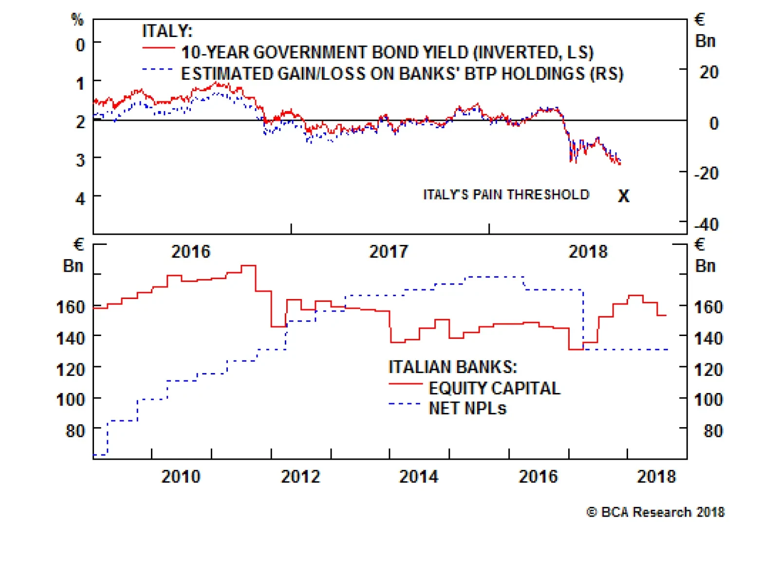
When Italian bond prices decline, it erodes the value of the €350 billion of BTPs held by Italian banks and also weakness their balance sheets. Investors start to get nervous about a bank's solvency when equity capital no longer covers net non-performing…
Highlights We remain bullish on the dollar, but no longer think that being long the greenback is the "slam-dunk" trade that it was earlier this year. A reacceleration in growth outside the U.S. and an overly dovish Fed represent the biggest risks to our constructive dollar view. China is likely to stimulate its economy, but concerns about high debt levels and malinvestment will limit the scale of any fiscal/credit stimulus. Letting the RMB slide may prove to be the preferable option. Worries about debt sustainability in Italy and EM contagion to European banks will constrain credit growth in the euro area, thus keeping the ECB in a highly dovish mode. For the time being, we favor developed market stocks over their EM peers. At the sector level, we would overweight defensives relative to deep cyclicals. U.S. stocks will outperform European stocks in dollar terms, although the performance is likely to be much more balanced in local-currency terms. The longer-term path for Treasury yields is to the upside. Nevertheless, a stronger dollar, coupled with safe-haven flows into the Treasury market, could temporarily push the 10-year yield down to 2.5% over the next few months. Feature The Dollar At A Crossroads After surging by 10% between February 1st and August 15th, the broad trade-weighted dollar has fallen by 0.9% over the past two weeks. Despite the latest setback, the greenback is still 23.2% above its 2014 lows and only 2.8% below its December 28, 2016 high (Chart 1). BCA continues to maintain a bullish view on the dollar. However, given recent market action, it is useful to stress-test our thesis in order to explore what could go wrong with it. As we discuss below, a key risk to the dollar is that global growth reaccelerates, with the U.S. once again going from leader to laggard in the global growth horserace. Global Growth And The Dollar The dollar tends to strengthen when global growth is deteriorating. Since the U.S. is a "low-beta" economy dominated by services rather than manufacturing and primary industries, an environment in which the global economy is slowing is usually one where the U.S. is outperforming the rest of the world. Chart 2 shows that there is a strong correlation between the value of the trade-weighted dollar and the difference between The Conference Board's U.S. Leading Economic Indicator (LEI) and the non-U.S. LEI. The gap between the U.S. and the non-U.S. LEI is still quite large. However, it has started to shrink recently, reflecting both a dip in the U.S. LEI as well as a small improvement in the non-U.S. LEI. The implication is that the U.S. economy is outshining the rest of the world, but the magnitude of outperformance has begun to narrow. Looking forward, the fate of the dollar will hinge on whether growth in the rest of the world can catch up with the United States. By definition, this can happen either if U.S. growth falls or non-U.S. growth rises. We examine each possibility in turn. Chart 1Despite Recent Pullback, ##br##The Dollar Is Still Close To Its 2016 High
Despite Recent Pullback, The Dollar Is Still Close To Its 2016 High
Despite Recent Pullback, The Dollar Is Still Close To Its 2016 High
Chart 2The U.S. Economy Is Still Outperforming The Rest Of The World, But The Gap Is Starting To Narrow
The U.S. Economy Is Still Outperforming The Rest Of The World, But The Gap Is Starting To Narrow
The U.S. Economy Is Still Outperforming The Rest Of The World, But The Gap Is Starting To Narrow
U.S. Growth: As Good As It Gets? The second quarter was probably the high watermark for U.S. growth for the rest of this cycle. Real GDP expanded by 4.2%, more than double most estimates of trend growth. The deceleration in payroll growth in July, a string of weak housing data releases, and the drop in the national ISM surveys alongside declines in a number of regional surveys such as the Philly Fed PMI, all point to a somewhat softer third quarter GDP growth reading. How worried should dollar bulls be? We see three reasons to downplay the negative impact on the dollar from the recent string of softer economic data. While the U.S. economy has slowed, it is still quite strong. The Bloomberg consensus forecast suggests that real GDP will increase by 3% in Q3. The Atlanta Fed's GDPNow model predicts 4.1% growth, while the New York Fed's Nowcast anticipates a more modest growth rate of 2%. The underlying drivers of aggregate demand remain supportive. U.S. financial conditions have loosened recently, thanks mainly to narrower credit spreads and higher equity prices (Chart 3). The effects of fiscal stimulus have also yet to make their way fully through the economy, especially with respect to government spending. The consumer is in great shape. The unemployment rate is near a 20-year low and the savings rate stands at a comfortable 6.7%, well above the level that the current ratio of household net worth-to-disposable income would predict (Chart 4). The housing vacancy rate is close to all-time lows, which limits the downside risk both to home prices and construction activity (Chart 5). Chart 3U.S. Financial Conditions Have Eased Recently
U.S. Financial Conditions Have Eased Recently
U.S. Financial Conditions Have Eased Recently
Chart 4The Savings Rate Has Room To Fall
The Savings Rate Has Room To Fall
The Savings Rate Has Room To Fall
Some of the apparent slowdown in U.S. growth appears to be due to intensifying supply-side constraints rather than faltering demand (Chart 6). This is important because slower growth resulting from weaker demand should, in principle, cause the Fed to moderate the pace of rate hikes, whereas slower growth resulting from an overheated economy should prompt the Fed to accelerate the pace of rate hikes. The latter is much better for the dollar than the former. Chart 5Low Housing Inventories Will ##br##Support Home Prices And Construction
Low Housing Inventories Will Support Home Prices And Construction
Low Housing Inventories Will Support Home Prices And Construction
Chart 6U.S. Economy Is Hitting Supply-Side ##br##Constraints
U.S. Economy Is Hitting Supply-Side Constraints
U.S. Economy Is Hitting Supply-Side Constraints
The Fed's Fate Is In The Stars What is true in principle, however, does not always match what happens in practice. In his Jackson Hole address, Jay Powell invoked a Draghi-esque phrase when saying that the FOMC would "do whatever it takes" to keep inflation expectations from becoming unmoored.1 Nevertheless, he also said that "there does not seem to be an elevated risk of overheating" at the moment. This is a curious statement considering the abundant evidence that U.S. firms are struggling to find qualified workers. To his credit, Powell stressed the inherent difficulty of "navigating by the stars," that is, of setting monetary policy based on highly imprecise estimates of the natural rate of unemployment, u*, and the neutral real rate of interest, r*. What he did not say is that the Fed's current estimates of these "stars" stand at record lows, which introduces a dovish bias into monetary policy should these estimates prove to be too low. Our baseline view is that the Federal Reserve will raise rates more than the market is currently discounting. We also doubt the Fed will succumb to President Trump's pressure to keep rates low or to accommodate any effort by the Treasury to intervene in the foreign exchange market with the aim of driving down the value of the dollar. That said, the risk to this view is that the Fed reacts too slowly to rising inflation. This could cause real rates to drift lower, with adverse consequences for the dollar. The China Policy Wildcard The discussion above suggests that the dollar would suffer either if U.S. growth slows significantly or if the Fed falls too far behind the curve in normalizing monetary policy. An additional risk to the dollar is that growth outside the U.S. picks up. This would suck capital away from the U.S. and into the rest of the world, with adverse consequences for the greenback. At present, the biggest question mark around the global growth outlook concerns China. The Chinese economy has struggled of late, with trade tensions adding to the misery (Chart 7). The stock market is down in the dumps. On-shore corporate yields for low-quality borrowers continue to rise. Industrial production, retail sales, and fixed asset investment all disappointed in July, following a further drop in the PMIs. The economic surprise index remains in negative territory. Only the housing market is showing renewed vigour, with both starts and sales rebounding (Chart 8). Chart 7China: Some Signs Of A Struggling Economy...
China: Some Signs Of A Struggling Economy…
China: Some Signs Of A Struggling Economy…
Chart 8...With Housing Being The Main Exception
...With Housing Being The Main Exception
...With Housing Being The Main Exception
The central bank has responded by easing liquidity. Interbank rates fell from a peak of 5.9% in late 2017 to 2.9% today. The authorities have also instructed local governments to expedite their spending plans, while ordering state-owned banks to expand lending to the export sector and for infrastructure-related projects. Fiscal/credit stimulus of the sort the authorities engaged in both 2009 and 2015 carries significant risks, however. Debt levels have reached stratospheric levels and concerns about excess capacity and malinvestment abound. We suspect these facts will cause policymakers to be more guarded than they would otherwise be. What's Next For The RMB? Letting the RMB weaken offers an alternative way to stimulate the economy - and one, crucially, that does not require piling on evermore debt. In contrast to more roads and bridges, a cheaper Chinese currency would not be welcome news for the rest of the world. A weaker RMB makes it more difficult for other economies to compete against China. A weaker currency also increases the costs to Chinese firms of importing raw materials, thus putting downward pressure on commodity prices. Despite efforts by emerging markets to diversify their economies, EM earnings remain highly correlated with industrial metals prices (Chart 9). Despite the presence of capital controls, the USD/CNY exchange rate has broadly tracked the one-year swap differential between the U.S. and China over the past few years (Chart 10). The differential has dropped from close to 300 basis points at the beginning of this year to less than 100 basis points today. Given that prospect of further Fed rate hikes, the only way the Chinese authorities will be able to keep the interest rate differential from falling even more is by tightening monetary policy themselves. This could slow credit growth and thus weaken the economy. The failure to raise rates, however, would probably cause the RMB to fall further. Both outcomes would be problematic for the rest of the world. Chart 9EM Earnings Are Correlated ##br##With Industrial Metal Prices
EM Earnings Are Correlated With Industrial Metal Prices
EM Earnings Are Correlated With Industrial Metal Prices
Chart 10USD/CNY Tracks China-U.S. ##br##Interest Rate Differentials
USD/CNY Tracks China-U.S. Interest Rate Differentials
USD/CNY Tracks China-U.S. Interest Rate Differentials
Our bet is that the authorities will ultimately choose to keep domestic monetary conditions fairly easy - leading to a weaker RMB - but will use administrative controls to prevent credit growth from accelerating too rapidly. That said, we would not rule out the possibility that the authorities succeed in stimulating the economy in a way that precludes further currency weakness. If this stimulus coincides with a thawing in trade tensions, it could lead to a burst in optimism about China specifically, and global growth in general. Such an outcome would hurt the dollar. The Euro Area: Keeping The Recovery On Track After putting in a strong performance in 2017, the economy in the euro area has struggled to maintain momentum this year. Growth is still above trend, but the overall tone of the data has been lackluster at best, with the risks to growth increasingly tilted to the downside. Weaker growth in China and other emerging markets certainly has not helped. However, much of the problem lies closer to home. The election of a populist government in Italy renewed concerns about debt sustainability in the euro area's third largest economy. The 10-year yield reached a four-year high of 3.2% this week. It is now 150 basis points above its April 2018 lows (Chart 11). The resulting tightening in Italian financial conditions will continue to weigh on growth in the months ahead. Bank credit remains the lifeblood of the euro area economy. Chart 12 shows that the 12-month credit impulse - defined as the change in credit growth from one 12-month period to the next - tends to move closely with GDP growth. Euro area credit began to moderate this year even before the Italian imbroglio and worries about the exposure of European banks to vulnerable emerging markets came on the scene. It will be difficult for euro area GDP growth to accelerate unless credit growth revives. In the absence of faster credit growth, the ECB will have little choice but to remain firmly in dovish mode. Chart 11Italian Populism Meets The Bond Market
Italian Populism Meets The Bond Market
Italian Populism Meets The Bond Market
Chart 12Euro Area Credit Growth Has Flatlined
Euro Area Credit Growth Has Flatlined
Euro Area Credit Growth Has Flatlined
The best-case scenario for the common currency is that EM stresses subside, and the Italian government reaches a friendly agreement with the European Commission over next year's budget. The thawing in Brexit negotiations would also help. We are skeptical that any of these three things will happen, but if one or a number of them did occur, this would benefit the euro at the expense of the dollar. Investment Conclusions We are not as bullish on the dollar as we were earlier this year. Sentiment towards the greenback has clearly improved (Chart 13). The narrative about a "synchronized global growth recovery" that was all the rage last year has also given way to a more sober appreciation of the problems facing emerging markets. In short, markets have moved a long way towards our view of the world. Still, we are not ready to abandon our strong dollar view. Chinese stimulus or not, the structural challenges facing emerging markets - high debt levels, poor productivity growth - will not go away. The same goes for Europe and its litany of political and economic travails. Even if the dollar did manage to weaken again, this would constitute an unwelcome easing in U.S. financial conditions at a time when the Fed wants to tighten financial conditions in order to keep the economy from overheating. From this perspective, a weaker dollar just means that the Fed would need to hike rates even more than it otherwise would. Since more rate hikes will buttress the dollar, the extent to which the dollar can weaken is self-limiting. In short, interest rate differentials between the U.S. and its trading partners should continue to favor the greenback. Assuming the dollar does strengthen from here, emerging markets will be the main casualties. While EM assets have cheapened considerably, Chart 14 shows that neither EM equities, credit, nor currencies are at levels that have marked past bottoms. Global investors should continue to favor developed market stocks over their EM peers. At the equity sector level, investors should overweight defensives over deep cyclicals. Regionally, this posture implies that U.S. stocks will outperform European stocks in dollar terms, although the performance is likely to be much more balanced in local-currency terms. Chart 13Investors Have Turned More Bullish On The Dollar
Investors Have Turned More Bullish On The Dollar
Investors Have Turned More Bullish On The Dollar
Chart 14EM Assets Are Not Very Cheap
EM Assets Are Not Very Cheap
EM Assets Are Not Very Cheap
As we recently discussed in a two-part Special Report,2 the longer-term path for Treasury yields is to the upside. Nevertheless, a broad-based appreciation in the value of the dollar, coupled with safe-haven flows into the Treasury market, could temporarily push the 10-year yield down to 2.5% over the next few months. Peter Berezin, Chief Global Strategist Global Investment Strategy peterb@bcaresearch.com 1 Jerome H. Powell, "Monetary Policy in a Changing Economy," Speech at "Changing Market Structure and Implications for Monetary Policy," a symposium sponsored by the Federal Reserve Bank of Kansas City, Jackson Hole, Wyoming, August 24, 2018. 2 Please see Global Investment Strategy Special Reports, "1970s-Style Inflation: Could It Happen Again? (Part 1)," dated August 10, 2018; "1970s-Style Inflation: Could It Happen Again? (Part 2)," dated August 24, 2018. Strategy & Market Trends Tactical Trades Strategic Recommendations Closed Trades