Europe
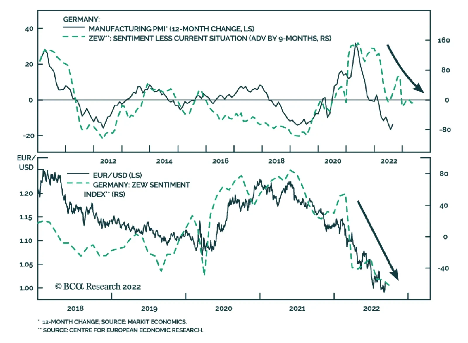
The ZEW survey of investor sentiment sent a cautionary signal on Tuesday. German investor sentiment slumped in September to the lowest level in 14 years. The current situation and expectations indices dropped by 6.6 and 12.9 points, respectively – with both…
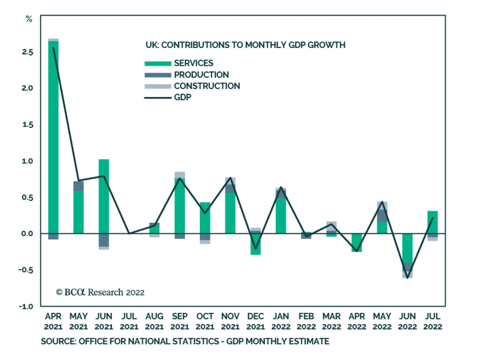
UK GDP grew by 0.2% m/m in July, up from June’s 0.6% m/m decline. A 0.4% m/m increase in services was the main contributor, though production and construction fell 0.3% and 0.8% m/m, respectively. However, July’s GDP growth missed expectations and output was…

Executive Summary Central banks are aggressively tightening policy around the world. Their ability to rein in inflation without causing a recession depends upon the level of the real neutral rates. Australia, Canada, New Zealand, and Sweden have elevated r-stars, but the picture changes drastically when their large debt loads are factored in. While real policy rates remain below r-star across DM economies for now, a more rapid decline in supply-driven inflation would correct this situation. Consequently, a global recession does not constitute our base case for the next six months, although it is a growing threat. The ECB is front-loading interest rate increases while it can, but the destination of travel is not changing significantly. Global R-Star
Neutral Rates Around The World
Neutral Rates Around The World
Bottom Line: The global r-star varies greatly around the world and debt sustainability concerns weigh on the real neutral rates of Australia, Canada, New Zealand, and Sweden. The US economy remains best capable of handling higher interest rates. Chart 1Rising Global Inflation
Rising Global Inflation
Rising Global Inflation
Inflation around G10 economies has been very strong and much more durable than originally hoped. As a result, inflation now averages 7.1% on a headline CPI basis and 4.6% based on core CPI across among G10 economies (Chart 1). Central banks are tightening policy aggressively to prevent this elevated inflation from becoming entrenched. Essentially, they are aiming to avert the emergence of the kind of inflationary mentality that prevailed in the 1970s, which caused stubborn inflation during that decade. This exercise is fraught with difficulty. The objective is to achieve a policy setting that is slightly above the neutral rate of interest, but not too much so. On the one hand, keeping policy too accommodative will increase the chances that an inflationary mentality will emerge; on the other hand, if policy is tightened too much, a recession will become unavoidable and deflationary risks will escalate. A sense of where the neutral rate for major economies lies is therefore necessary to draw that line in the sand. To do so, we estimate the real neutral rate of interest for major DM economies using the methodology we introduced seven weeks ago, when we evaluated the neutral rates for the major Eurozone economies. This exercise shows that, at the current level of interest rates and inflation, policy among major economies remains accommodative. However, if inflation decelerates sharply in the coming months in response to declining global supply constraints and lower commodity prices, the recent increase in policy rates will have already gone a long way to normalizing monetary policy around the world. A Simple Approach The methodology we use is based on the approach developed by Holston, Laubach, and Williams (HLW) to estimate the neutral real interest rate – or “r-star.” Specifically, we run regressions between the real interest rates in the US, Japan, the UK, New Zealand, Canada, Australia, Sweden, and Switzerland versus trend GDP growth and current account balances, which approximate the savings-investment balance. Mimicking the HLW methodology, the inflation expectations used to extract real interest rates from nominal short rates reflect an adaptative framework whereby inflation expectations are a function of the ten-year moving average of core CPI.1 Table 1Unadjusted R-Stars
Neutral Rates Around The World
Neutral Rates Around The World
The results are shown in Table 1. New Zealand, Australia, and Canada have the highest real-neutral rate of the major economies. They have had stronger growth over the past 20 years because of their rapid population growth caused by high immigration rates. Moreover, their commodity-based economies and their booming construction sectors pushed up investment rates, which requires high interest rates to attract sufficient savings to finance. Sweden and the US follow. These two economies have lower population growth rates than the commodity producers; nonetheless, they outperform Japan and the other European nations in the survey on that dimension. Moreover, they fare comparatively well in terms of productivity growth, which implies that their trend growth – a key driver of the neutral rate – is also higher than that of the UK, Japan, Switzerland, or the Euro Area. The US’s r-star shows up as being slightly below what would be expected based on its potential GDP growth. This surprising outcome most likely reflects the role of the dollar in global FX reserves and its standing at the core of the global financial system. These two characteristics of the greenback create an important demand for dollar-denominated assets that is dissociated from US domestic economic fundamentals. This additional demand biases downward the US real neutral rate and suggests that weak trend growth abroad and global excess savings remain important forces for US financial markets. Chart 2Japan's Dissociated Real Rates
Japan's Dissociated Real Rates
Japan's Dissociated Real Rates
Japan displays a surprisingly elevated real neutral rate of 0.1%. This result reflects the limitation of the approach. Japanese interest rates have been at zero since the late 1990s and real rates have been negatively correlated with inflation because of this nominal rigidity (Chart 2). However, while Japanese inflation has averaged a paltry 0.2% since 1997, it has nonetheless fluctuated with commodity prices and global economic activity. As a result, real rates have been essentially dissociated from Japanese domestic drivers. Hence, an empirical approach based on the evolution of domestic economic variables yields poor results for Japan. Instead, the lack of inflation when public debt has increased by 200% of GDP over the past 32 years and Japan’s large net international investment position imply that its r-star is inferior to that of the other countries in the sample, and thus should lie below -1%. For the Eurozone, we use the average result of our July study, which estimated the neutral rates of Germany, France, Italy, and Spain independently. Germany flatters this estimate since its real neutral rate stands near 0%. An average, excluding Germany, would be closer to -0.5%, or well below the US r-star. Meanwhile, the Swiss r-star is depressed by both a low population growth and the Swiss exceptional savings generation, as highlighted by its current account surplus that has averaged 8% of GDP over the past 20 years. Finally, the UK’s r-star stands at the bottom of the pack. The UK’s productivity growth has been very poor over the past ten years, averaging 0.7% per annum. This points to a weak potential GDP for that economy. Moreover, the hurdles to UK growth have only increased in recent years with the implementation of Brexit, which is hurting the availability of labor in the country, while putting the UK at an even greater disadvantage in European markets, its largest export destination. What About Debt? This approach to estimating r-star ignores a key dimension: debt sustainability. If we factor in this crucial variable, the level of interest rates causing economic activity to decelerate changes drastically for many countries. Chart 3Massive Real Estates Bubbles
Massive Real Estates Bubbles
Massive Real Estates Bubbles
Since 2000, real estate prices have surged by 280%, 220%, 170%, and 200% in New Zealand, Canada, Australia, and Sweden, respectively. These gains dwarf the house price appreciation observed in the US, the UK, Japan, or Germany (Chart 3, top panel). This outperformance of house prices is particularly problematic because it does not reflect more rapid underlying cash-flow growth from the assets. Instead, the main driver of the stronger house prices in New Zealand, Canada, Australia, and Sweden has been the explosion of their price-to-rent and price-to-income ratios (Chart 3, bottom two panels). Rising real estate prices boosted economic activity relative to the underlying trend GDP of these countries. As a result, the long-term growth numbers of these four nations potentially overstate their underlying rate of growth. Even more importantly, real estate prices and activity are extremely sensitive to interest rates. Therefore, the risk of bursting bubbles in New Zealand, Canada, Australia, and Sweden limits how high interest rates may rise there without causing growth to plunge and deflationary spirals to emerge. Chart 4Rapidly Rising Debt Loads
Rapidly Rising Debt Loads
Rapidly Rising Debt Loads
The accumulation of debt in these four countries accentuates the threats to growth created by real estate activity. The private-sector debt of New Zealand, Canada, Australia, and Sweden has risen much more quickly than has been the case in Germany and the US (Chart 4). Ultimately, these debt burdens create major headwinds against higher interest rates and suggest that the effective r-star of these nations lies well below the estimates constructed using only trend growth and the savings/investment balance. Table 2Drastic Changes Once Debt Is Accounted For
Neutral Rates Around The World
Neutral Rates Around The World
To account for the private-sector leverage, we estimated new debt-adjusted r-stars. The impact of high debt loads on r-star estimates is evident in Table 2. The average real neutral rate of New Zealand, Australia, and Canada drops from 1.9% to -1.9%. In fact, Australia and Canada would sport the lowest r-star estimates of the nations under study. Sweden’s neutral rate also experienced a big decline from 0.6% to 0.2%. The US r-star estimate is also lowered by the addition of debt metrics in its equation, declining from 0.2% to -0.4%. The Eurozone average r-star experiences a significant decrease as well, driven mostly by Spain and France. The Swiss economy also sports a large private debt load, and its r-star is therefore curtailed from -0.75% to -1.3%. Finally, Japan’s r-star estimate barely changes, which confirms that the approach does not work well for that country. The greatest drawback of the method is that it is backward-looking. The main force that has brought down the global r-star over the past 20 years is the collapse in trend growth among most advanced economies (Chart 5). Consequently, neutral rates could improve from their current low levels if trend growth were to pick up in the coming years. On the positive side, the current age of the capital stock in both Europe and the US is extremely advanced (Chart 6), which suggests that a capex upturn is likely. Such an upturn would boost productivity and lift the r-star among most major economies. On the negative side, the growth of human capital is deteriorating as educational attainment stalls among most DM nations. The decline in the growth rate of human capital is a large threat to productivity over the coming decades. These problems are magnified in the Eurozone, as its high degree of economic fragmentation, lack of common fiscal policy, and higher regulatory burden create further handicaps to trend growth. Chart 5R-star And Global Growth
R-star and Global Growth
R-star and Global Growth
Chart 6A Capex Revival?
A Capex Revival?
A Capex Revival?
Bottom Line: Estimating the real neutral rates for the global economy often relies on trend growth and the savings/investment balance. However, such an approach often misses the vulnerability to higher interest rates created by high private-sector indebtedness. If this constraint is considered, the high r-star recorded in countries like New Zealand, Australia, or Canada is reduced dramatically. The US r-star also declines but significantly less so. As we already showed seven weeks ago, the same phenomenon is also visible in the Eurozone, albeit driven by France and Spain, not Germany or Italy. Investment Implications There are three main conclusions from the analysis above. First, the risk of a financial accident in commodity-producing economies is growing increasingly large. On the one hand, economies like New Zealand, Australia, and Canada are buoyed by the recent surge in commodity prices, with agricultural prices up 90% since their 2020 lows, metal prices up 68%, and energy prices up 340% since April 2020. On the other hand, the inflationary pressures created by robust commodity sectors invite the RBNZ, the RBA, and the BoC to lift interest rates quickly, which is hurting massively indebted private sectors. Already, in response to the 275bps and 300bps of hikes implemented by the RBNZ and the BoC, house prices in New Zealand have begun to buckle, down 12% and since their more recent peaks, and they are expected to plunge by as much as 25% in Canada by the end of next year. Chart 7NZD And CAD At A Disadvantage
Neutral Rates Around The World
Neutral Rates Around The World
This suggests that non-commodity equities in Canada, Australia, and New Zealand, especially financials, could experience significant periods of underperformance, both against their domestic equity benchmark and global market averages. Additionally, while the NZD, AUD, and CAD all benefit from improving terms of trades, the potential for domestic weakness is such that these currencies are likely to lag their historical sensitivity to commodity price fluctuations. In fact, according to BCA’s foreign exchange strategist, the New Zealand and Canadian dollars are among the most expensive currencies in the G10 (Chart 7), and thus, it is likely to underperform other pro-cyclical currencies once the USD bull market reverses. Second, the neutral rate in the US has risen by 200bps relative to the rest of the world over the past seven years. The US economy has undergone a long deleveraging period in the wake of the GFC, which means that its private-debt-to-GDP ratio has declined relative to other advanced economies. Consequently, the vulnerability of the US economy to higher interest rates has decreased, even if relative US trend growth has not improved meaningfully. The market implications of this pickup in the neutral rate are manifold. To begin with, it allows US rates to rise further relative to other DM economies. BCA’s Global Fixed Income Strategy team continues to underweight US Treasurys in global fixed-income portfolios, especially relative to German Bunds (Chart 8). As a corollary, it also means that US financials are likely to continue to outperform their foreign peers, especially Canadian and Australian ones which will bear the brunt of the negative consequences of their debt bubbles. The increase in the US r-star relative to the rest of the world has been a key contributor to the dollar rally. It helps explain why the recent dollar strength has not hurt relative profit growth (Chart 9). However, the dollar is trading at a 32% premium to its purchasing power parity, or the same overvaluation as in 1985 and 2001. Thus, with the worsening US balance of payment picture, the US dollar is vulnerable to an eventual improvement in global growth next year. Chart 8US Rate Differentials Have Upside
Neutral Rates Around The World
Neutral Rates Around The World
Chart 9The US Fares Better
The US Fares Better
The US Fares Better
Chart 10Easy Or Not?
Easy Or Not?
Easy Or Not?
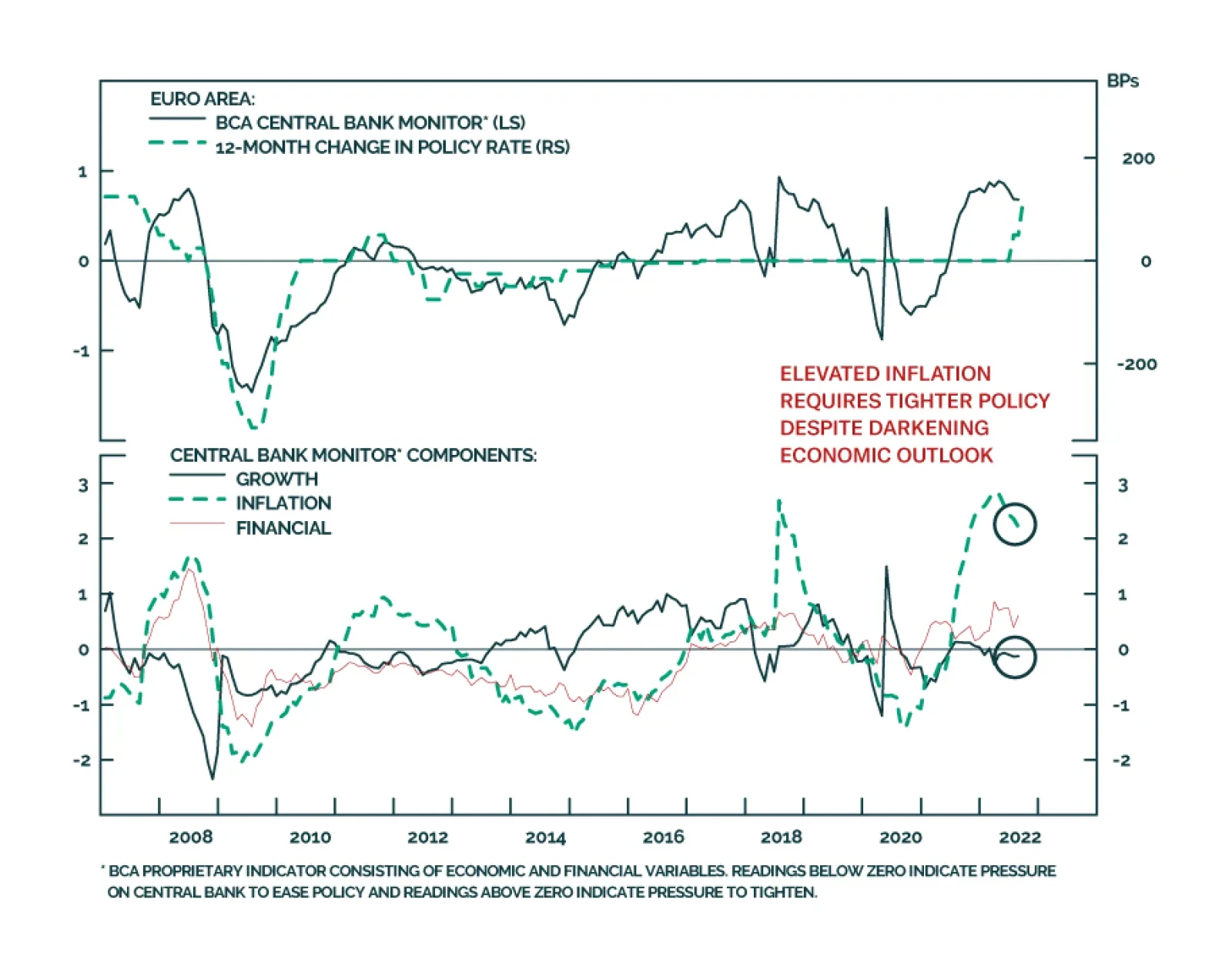
Finally, despite the recent increase in rates, the high level of inflation recorded around the world implies that real policy rates are still well below r-star for major global economies, whether one uses actual inflation or the smooth formulation recommended by the HLW paper (Chart 10). This suggests that a recession is unlikely, especially in the US. The recession threat is higher in Europe but has little to do with policy. It is mostly a consequence of the massive terms of trade shock caused by the sudden jump in European energy prices in the wake of the Ukrainian war. However, because policy remains accommodative even in Europe, it follows that the Eurozone economy will rebound quickly once the worst of the energy shock is over next spring. Some humility is required. It is hard to gauge how much of the inflation surge over the past 18 months reflects supply factors. If inflation suddenly becomes much weaker because the easing in supply constraints has a greater-than-anticipated impact on inflation, real interest rates would jump rapidly around the world. In this scenario, policy rates could rise quickly and overtake r-star. This would mean that the disinflation impulse could rapidly morph into an outright deflationary environment, which implies that the odds of a deflationary bust like the one experienced in 1921 is greater than the market currently prices in. Bottom Line: The debt-fueled real estate bubbles in the dollar-bloc economies suggests that they are at a greater risk of a financial accident than the US or the Eurozone. As a result, their financial sector looks vulnerable. Meanwhile, the higher US r-star compared to that of the rest of the world will continue to support higher yields in the US rather than in Europe or Japan. This phenomenon has been hugely positive for the US dollar, but it has likely run its course. Finally, global real interest rates remain below r-star estimates. Hence, the current slowdown is likely to prove to be a mid-cycle slowdown and Europe will rebound quickly from a potential recession caused by the recent surge in its energy prices. The ECB Joins The 75bps Club Last week, the ECB increased interest rates by 75bps, which brought its deposit rate to 0.75%. Interestingly, the euro did not rally much in response to this policy decision, even though it has not been fully discounted by the market. At first glance, the lack of responsiveness from European assets seems strange, especially since the vote for a 75bps rate hike was unanimous. The ECB is taking advantage of strong economic numbers to push up rates rapidly. The Eurozone Q2 GDP growth was robust at 0.6%, while the unemployment rate hit an all-time low of 6.6%. Meanwhile, inflation continues to beat consensus forecasts, with Eurozone core CPI and headline CPI standing at 4.3% and 9.1%, respectively in August. Chart 11Big ECB Revisions
Big ECB Revisions
Big ECB Revisions
The market believes that more rapid interest rate hikes now will not translate into a much higher terminal rate, with the expected rates for June 2023 moving from 2.2% on September 7th to 2.4% after last Thursday’s decision. The ECB may have increased its inflation forecasts for the whole horizon, but it has also brought down GDP forecasts to 0.9% and 1.9% in 2023 and 2024, respectively (Chart 11). Moreover, ECB President Christine Lagarde went out of her way to telegraph to investors that the number of upcoming hikes was finite. The jumbo hike does not spell the start of a euro rally—for now. First, the lack of major change in the ECB’s terminal deposit rate is more important than the more rapid pace of hikes for the remainder of 2022. Second, the Fed is also lifting rates faster than investors expected ahead of the Jackson Hole meeting three weeks ago. Third, the euro remains vulnerable to any flare-ups in the energy market. True, natural gas and electricity prices have recently fallen, but the situation in Ukraine continues to be highly fluid, which suggests that volatility will linger in the energy market over the coming weeks. Despite the near-term hurdles, the euro’s medium-term outlook is brightening. We are gaining confidence in our thesis that energy prices will peak once natural gas inventories have reached approximately 90% by November. Additionally, the support of the Governing Council’s doves for a 75bps hike suggests that they received something in exchange for their votes. In our view, this “something” is an activation of the Transmission Protection Instrument (TPI) before year-end. The TPI activation will allow for a normalization of the risk premia in the Italian debt market and will support the ECB’s ability to increase interest rates further down the road, despite the much lower r-star in Italy, Spain, and France than in Germany (Table 3). Table 3The Eurozone’s Different R-Stars Will Force The TPI’s Activation
Neutral Rates Around The World
Neutral Rates Around The World
Bottom Line: The ECB may have delivered a jumbo hike last week, but its market impact was muted. Investors understand full well that the ECB is taking advantage of the recent bout of robust economic activity to front-load interest rate increases ahead of a likely economic contraction in Q4 2022 and Q1 2023. As a result, the terminal rate estimates have scarcely moved. Ultimately, we expect the ECB deposit rate to settle between 1.5% and 2% in the summer of 2023. While the move may not provide much of a boost to the euro in the near term, conditions are falling into place for a euro rally later this year. Mathieu Savary, Chief European Strategist Mathieu@bcaresearch.com Footnotes 1 For the US, we opted for core PCE, since it is the benchmark inflation measure the Federal Reserve uses.
Last Thursday, the ECB raised the deposit rate by 75bps to 0.75% – in line with market expectations. The revised economic projections include an increase to the inflation forecasts with an average inflation rate of 8.1% this year (up from 6.8% in the June…
Listen to a short summary of this report Executive Summary On the eve of the pandemic, most developed economies were operating at close to full capacity – the aggregate supply curve, in other words, had become very steep (or inelastic). Not surprisingly, in such an environment, pandemic-related stimulus, rather than boosting output, simply stoked inflation. Looking out, the inverse may turn out to be true: Just as an increase in aggregate demand did more to lift prices than output during the pandemic, a decrease in aggregate demand may allow inflation to fall without much loss in production or employment. Skeptics will argue that such benign disinflations rarely occur, pointing to the 1982 recession. But long-term inflation expectations were close to 10% back then. Today, they are broadly in line with the Fed’s target. Equities will recover from their recent correction as headline inflation continues to fall and the risks of a US recession diminish. Go long EUR/USD on any break below 0.99. Contrary to the prevailing pessimistic view, Europe is heading for a V-shaped recovery. The Aggregate Supply Curve Becomes Very Steep When Spare Capacity Is Exhausted
Inelastic Supply: The Secret To A Soft Landing?
Inelastic Supply: The Secret To A Soft Landing?
Bottom Line: The US economy is entering a temporary Goldilocks period of falling inflation and stronger growth. The latest correction in stocks will end soon. Investors should overweight global equities over the next six months but look to turn more defensive thereafter. Dear Client, I will be attending BCA’s annual conference in New York City next week. Instead of our regular report, we will be sending you a Special Report written by Mathieu Savary, BCA’s Chief European Strategist, and Robert Robis, BCA’s Chief Fixed Income Strategist, on Monday, September 12. Their report will discuss estimates of global neutral interest rates. We will resume our regular publication schedule on September 16. Best Regards, Peter Berezin, Chief Global Strategist The Hawks Descend On Jackson Hole Chart 1Markets Still Think The Fed Will Start Cutting Rates Next Year
Markets Still Think The Fed Will Start Cutting Rates Next Year
Markets Still Think The Fed Will Start Cutting Rates Next Year
Jay Powell’s Jackson Hole address jolted the stock market last week. Citing the historical danger of allowing inflation to remain above target for too long, the Fed chair stressed the need for “maintaining a restrictive policy stance for some time.” Powell’s comments were consistent with the Fed’s dot plot, which expects rates to remain above 3% right through to the end of 2024. However, with the markets pricing in rate cuts starting in mid 2023, his remarks came across as decidedly hawkish (Chart 1). While Fedspeak can clearly influence markets in the near term, our view is that the economy calls the shots over the medium-to-long term. The Fed sees the same data as everyone else. If inflation comes down rapidly over the coming months, the FOMC will ratchet down its hawkish rhetoric, opting instead for a wait-and-see approach. The Slope of Hope Could inflation fall quickly in the absence of a deep recession? The answer depends on a seemingly esoteric concept: the slope of the aggregate supply curve. Economists tend to depict the aggregate supply curve as being convex in nature – fairly flat (or “elastic”) when there is significant spare capacity and becoming increasingly steep (or “inelastic”) as spare capacity is exhausted (Chart 2). The basic idea is that firms do not require substantially higher prices to produce more output when they have a lot of spare capacity, but do require increasingly high prices to produce more output when spare capacity is low. Chart 2The Aggregate Supply Curve Becomes Very Steep When Spare Capacity Is Exhausted
Inelastic Supply: The Secret To A Soft Landing?
Inelastic Supply: The Secret To A Soft Landing?
When the aggregate supply curve is very elastic, an increase in aggregate demand will mainly lead to higher output rather than higher prices. In contrast, when the aggregate supply curve is inelastic, rising demand will primarily translate into higher prices rather than increased output. In early 2020, most of the developed world found itself on the steep side of the aggregate supply curve. The unemployment rate in the OECD stood at 5.3%, the lowest in 40 years (Chart 3). In the US, the unemployment rate had reached a 50-year low of 3.5%. Thus, not surprisingly, as fiscal and monetary policy turned simulative, inflation moved materially higher. Goods inflation, in particular, accelerated during the pandemic (Chart 4). Perhaps most notably, the exodus of people to the suburbs, combined with the reluctance to use mass transit, led to a surge in both new and used car prices (Chart 5). The upward pressure on auto prices was exacerbated by a shortage of semiconductors, itself a consequence of the spike in the demand for electronic goods. Chart 3The Pandemic Began When The Unemployment Rate In The OECD Was At A Multi-Decade Low
The Pandemic Began When The Unemployment Rate In The OECD Was At A Multi-Decade Low
The Pandemic Began When The Unemployment Rate In The OECD Was At A Multi-Decade Low
Chart 4With Supply Unable To Meet Demand, Goods Prices Surged During The Pandemic
With Supply Unable To Meet Demand, Goods Prices Surged During The Pandemic
With Supply Unable To Meet Demand, Goods Prices Surged During The Pandemic
The supply curve for labor also became increasingly inelastic over the course of the pandemic. Once the US unemployment rate fell back below 4%, wages began to accelerate sharply. The kink in the Phillips curve had been reached (Chart 6). Chart 5Car Prices Went On Quite A Ride During The Pandemic
Car Prices Went On Quite A Ride During The Pandemic
Car Prices Went On Quite A Ride During The Pandemic
Chart 6Wage Growth Soared When The Economy Moved Beyond Full Employment
Inelastic Supply: The Secret To A Soft Landing?
Inelastic Supply: The Secret To A Soft Landing?
Chart 7Job Switchers Usually See Faster Wage Growth
Job Switchers Usually See Faster Wage Growth
Job Switchers Usually See Faster Wage Growth
Faster labor market churn further turbocharged wage growth. Both the quits rate and the hiring rate rose during the pandemic. Typically, workers who switch jobs experience faster wage growth than those who do not (Chart 7). This wage premium for job switching increased during the pandemic, helping to lift overall wage growth. A Symmetric Relationship? All this raises a critical question: If an increase in aggregate demand along the inelastic side of the aggregate supply curve mainly leads to higher prices rather than increased output and employment, is the inverse also true – that is, would a comparable decrease in aggregate demand simply lead to much lower inflation without much of a loss in output or employment? If so, this would greatly increase the odds of a soft landing. Skeptics would argue that disinflations are rarely painless. They would point to the 1982 recession which, until the housing bubble burst, was the deepest recession in the post-war era. The problem with that comparison is that long-term inflation expectations were extremely high in the early 1980s. Both consumers and professional forecasters expected inflation to average nearly 10% over the remainder of the decade (Chart 8). To bring down long-term inflation expectations, Paul Volcker had to engineer a deep recession. Chart 8Long-Term Inflation Expectations Are Much Better Anchored Now Than In The Early 1980s
Inelastic Supply: The Secret To A Soft Landing?
Inelastic Supply: The Secret To A Soft Landing?
Chart 9Real Long Terms Bond Yields Are Currently A Fraction Of What They Were Four Decades Ago
Real Long Terms Bond Yields Are Currently A Fraction Of What They Were Four Decades Ago
Real Long Terms Bond Yields Are Currently A Fraction Of What They Were Four Decades Ago
Jay Powell does not face such a problem. Both survey-based and market-based long-term inflation expectations are well anchored. Whereas real long-term bond yields reached 8% in 1982, the 30-year TIPS yield today is still less than 1% (Chart 9). The Impact of Lower Home Prices Chart 10Supply-Side Constraints Limited Home Building During The Pandemic, Helping To Push Up Home Prices
Supply-Side Constraints Limited Home Building During The Pandemic, Helping To Push Up Home Prices
Supply-Side Constraints Limited Home Building During The Pandemic, Helping To Push Up Home Prices
While falling consumer prices would boost real incomes, helping to keep the economy out of recession, a drop in home prices would have the opposite effect on consumer spending. As occurred with other durable goods, a shortage of building materials and qualified workers prevented US homebuilders from constructing as many new homes as they would have liked during the pandemic. The producer price index for construction materials soared by over 50% between May 2020 and May 2022 (Chart 10). As a result, rising demand for homes largely translated into higher home prices rather than increased homebuilding. Real home prices, as measured by the Case-Shiller index, have increased by 25% since February 2020, rising above their housing bubble peak. As we discussed last week, US home prices will almost certainly fall in real terms and probably in nominal terms as well over the coming years. Chart 11Despite Higher Home Prices, Households Have Not Been Using Their Homes As ATMs
Despite Higher Home Prices, Households Have Not Been Using Their Homes As ATMs
Despite Higher Home Prices, Households Have Not Been Using Their Homes As ATMs
How much of a toll will falling home prices have on the economy? It took six years for home prices to bottom following the bursting of the housing bubble. It will probably take even longer this time around, given that the homeowner vacancy rate is at a record low and reasonably prudent mortgage lending standards will limit foreclosure sales. Thus, while there will be a negative wealth effect from falling home prices, it probably will not become pronounced until 2024 or so. Moreover, unlike during the housing boom, US households have not been tapping the equity in their homes to finance consumption (Chart 11). This also suggests that the impact of falling home prices on consumption will be far smaller than during the Great Recession. Inelastic Commodity Supply While inelastic supply curves had the redeeming feature of preventing a glut of, say, new autos or homes from emerging, they also limited the output of many commodities that face structural shortages. Compounding this problem is the fact that the demand for many commodities is very inelastic in the short run. When you combine a very steep supply curve with a very steep demand curve, small shifts in either curve can produce wild swings in prices. Nowhere is this problem more evident than in Europe, where a rapid reduction in oil and gas flows has caused energy prices to soar, forcing policymakers to scramble to find new sources of supply. Europe’s Energy Squeeze At this point, it looks like both the UK and the euro area will enter a recession. In continental Europe, the near-term outlook is grimmer in Germany and Italy than it is in France or Spain. The latter two countries are less vulnerable to an energy crunch (Spain imports a lot of LNG while France has access to nuclear energy). Both countries also have fairly resilient service sectors (Spain, in particular, is benefiting from a boom in tourism). The good news is that even in the most troubled European economies, the bottom for growth is probably closer at hand than widely feared. Despite the fact that imports of Russian gas have fallen by more than 60%, Europe has been able to rebuild gas inventories to about 80% of capacity, roughly in line with prior years (Chart 12). It has been able to achieve this feat by aggressively buying gas on the open market, no matter the price. While this has caused gas prices to soar, it sets the stage for a possible retreat in prices in 2023, something that the futures market is already discounting (Chart 13). Chart 12Europe: Squirrelling Away Gas For The Winter
Europe: Squirrelling Away Gas For The Winter
Europe: Squirrelling Away Gas For The Winter
Chart 13Natural Gas Prices In Europe Will Come Back Down To Earth
Natural Gas Prices In Europe Will Come Back Down To Earth
Natural Gas Prices In Europe Will Come Back Down To Earth
Europe is also moving with uncharacteristic haste to secure new sources of energy supply. In less than one year, Europe has become America’s biggest overseas market for LNG. A new gas pipeline linking Spain with the rest of Europe should be operational by next spring. In the meantime, Germany is building two “floating” LNG terminals. Germany has also postponed plans to mothball its nuclear power plants and has approved increased use of coal-fired electricity generators. Chart 14The Euro Is Undervalued
The Euro Is Undervalued
The Euro Is Undervalued
France is seeking to boost nuclear capacity. As of August 29, 57% of nuclear generation capacity was offline. Electricité de France expects daily production to rise to around 50 gigawatts (GW) by December from around 27 GW at present. For its part, the Dutch government is likely to raise output from the massive Groningen natural gas field. All this suggests that contrary to the prevailing pessimistic view, Europe is heading for a V-shaped recovery. The euro, which is 30% undervalued against the US dollar on a purchasing power parity basis, will rally (Chart 14). Go long EUR/USD on any break below 0.99. Investment Conclusions Chart 15Falling Inflation Should Boost Real Wages And Buoy Consumer Confidence
Falling Inflation Should Boost Real Wages And Buoy Consumer Confidence
Falling Inflation Should Boost Real Wages And Buoy Consumer Confidence
On the eve of the pandemic, most developed economies were operating at close to full capacity – the aggregate supply curve, in other words, had become very steep (or inelastic). Not surprisingly, in such an environment, pandemic-related stimulus, rather than boosting output, simply stoked inflation. Looking out, the inverse may turn out to be true: Just as an increase in aggregate demand did more to lift prices than output during the pandemic, a decrease in aggregate demand may allow inflation to fall with little loss in production or employment. Will this be the end of the story? Probably not. As inflation falls, US real wage growth, which is currently negative, will turn positive. Consumer confidence will improve, boosting consumer spending in the process (Chart 15). The aggregate demand curve will shift outwards again, triggering a “second wave” of inflation in the back half of 2023. Rather than cutting rates next year, as the market still expects, the Fed will raise rates to 5%. This will set the stage for a recession in 2024. Investors should overweight global equities over the next six months but look to turn more defensive thereafter. Peter Berezin Chief Global Strategist peterb@bcaresearch.com Follow me on LinkedIn & Twitter Global Investment Strategy View Matrix
Inelastic Supply: The Secret To A Soft Landing?
Inelastic Supply: The Secret To A Soft Landing?
Special Trade Recommendations Current MacroQuant Model Scores
Inelastic Supply: The Secret To A Soft Landing?
Inelastic Supply: The Secret To A Soft Landing?
Next week, on September 7-8, is the BCA New York Conference, the first in-person version since 2019. I look forward to seeing many of you there, and if you haven’t already booked your place, you still can! (a virtual version is also available). As such, the next Counterpoint report will come out on September 15. Executive Summary The 2022-23 = 1981-82 template for markets is working well. If it continues to hold, these are the major investment implications: Bonds: The 30-year T-bond (price) will trend sideways for the next few months, albeit with a potential correction that lifts the yield to 3.5 percent. However, bond prices will enter a sustained rally in 2023, in which the 30-year T-bond yield will fall to sub-2.5 percent. Stocks: A coordinated global recession will depress profits, causing the S&P 500 to test 3500. However, once past the worst of the recession, a strong rally will lift it through 5000 later in 2023. Sector allocation: Longer duration defensive sectors (such as healthcare) will strongly outperform shorter duration cyclical sectors (such as basic resources) until mid-2023, after which it will be time to flip back into cyclicals. Industrial metals: A tactical rebound in copper could lift it to $8500/MT after which the structural downtrend will resume, taking it to sub-$7000/MT in 2023. Oil: Just as in 1981-82, supply shortages will provide near-term support. But ultimately, demand destruction will dominate, depressing the price to, at best, $85, though our central case is $55 in 2023. If 2022-23 = 1981-82, Then This Is What Happens To The Copper Price
If 2022-23 = 1981-82, Then This Is What Happens To The Copper Price
If 2022-23 = 1981-82, Then This Is What Happens To The Copper Price
Bottom Line: The 2022-23 = 1981-82 template for markets is working well, and should continue to do so. Feature History doesn’t repeat, but it does rhyme. And the period that rhymes closest with the current episode in the global economy and markets is 1981-82, a rhyming which we first highlighted four months ago in Markets Echo 1981, When Stagflation Morphed Into Recession, and then developed in More On 2022-23 = 1981-82, And The Danger Ahead. In those reports, we presented three compelling reasons why 2022-23 rhymes with 1981-82: 1981-82 is the period that rhymes closest with the current episode in the global economy and markets. First, the simultaneous sell-off in stocks, bonds, inflation protected bonds, industrial commodities, and gold in the second quarter of 2022 is uniquely linked with an identical ‘everything sell-off’ in the second quarter of 1981. It is extremely rare for stocks, bonds, inflation protected bonds, industrial commodities, and gold to sell off together. Such a simultaneous sell-off has happened in just these 2 calendar quarters out of the last 200. Meaning a ‘1-in-a-100’ event conjoins 2022 with 1981 (Chart I-1 and Chart I-2). Chart I-1A 1-In-A-100 Event: The 'Everything Sell-Off' In 2022...
A 1-In-A-100 Event: The 'Everything Sell-Off' In 2022...
A 1-In-A-100 Event: The 'Everything Sell-Off' In 2022...
Chart I-2...And The 'Everything Sell-Off' In 1981
...And The 'Everything Sell-Off' In 1981
...And The 'Everything Sell-Off' In 1981
Second, the Jay Powell Fed equals the Paul Volcker Fed. Now just as then, the world’s central banks are obsessed with ‘breaking the back’ of inflation. And now, just as then, the central banks are desperate to repair their badly battered credibility in managing inflation. Third, the Russia/Ukraine war that started in February 2022 equals the Iraq/Iran war that started in September 1980. Now, just as then, a war between two commodity producing neighbours has unleashed a supply shock which is adding to the inflation paranoia. To repeat, it is a 1-in-a-100 event for all financial assets to sell off together. This is because it requires an extremely rare star alignment. Inflation fears first morph to stagflation fears and then to recession fears. Leaving investors with nowhere to hide, as no mainstream asset performs well in inflation, stagflation, and recession. So, the once-in-a-generation star alignment conjoining 2022 with 1981 is as follows: Inflation paranoia is worsened by a major war between commodity producing neighbours, forcing reputationally damaged central banks to become trigger-happy in their battle against inflation, dragging the world economy into a coordinated recession. September 2022 Equals August 1981 If 2022-23 = 1981-82, then where exactly are we in the analogous episode? There are two potential synchronization points. One potential synchronization is that the Russia/Ukraine war which started on February 24, 2022 equals the Iraq/Iran war which started on September 22, 1980. In which case, September 2022 equals April 1981. But given that inflation is public enemy number one, a better synchronization is the Fed’s preferred measure of underlying inflation, the US core PCE deflator. Aligning the respective peaks in core PCE inflation, we can say that February 2022 equals January 1981. Meaning that our original report in May 2022 aligned with April 1981, and September 2022 equals August 1981 (Chart I-3 and Chart I-4). Chart I-3The Peak In Core PCE Inflation In ##br##February 2022
The Peak In Core PCE Inflation In February 2022
The Peak In Core PCE Inflation In February 2022
Chart I-4...Aligns With The Peak In Core PCE Inflation In ##br##January 1981
...Aligns With The Peak In Core PCE Inflation In January 1981
...Aligns With The Peak In Core PCE Inflation In January 1981
In which case, how has the template worked since we introduced it on May 19th? The answer is, very well. The template predicted that the long bond price would track sideways, which it has. The template predicted that the S&P 500 would decline from 4200 to 4000, which it has. The template predicted that the copper price would decline from $9250/MT to $8500/MT. In fact, it has fallen even further to $8200/MT. In the case of oil, the better synchronization is the starts of the respective wars. This template predicted that the Brent crude price would decline sharply from a knee-jerk peak in the $120s, which it has. Not a bad set of predictions! If 2022-23 = 1981-82, Here’s What Happens Next Assuming the template continues to hold, here are the major implications for investors: Bond prices will enter a sustained rally in 2023. Bonds: The 30-year T-bond (price) will trend sideways for the next few months, albeit with a potential tactical correction that takes its yield to 3.5 percent. However, bond prices will enter a sustained rally in 2023 in which the 30-year T-bond yield will fall to sub-2.5 percent (Chart I-5). Chart I-5If 2022-23 = 1981-82, Then This Is What Happens To Bond Prices
If 2022-23 = 1981-82, Then This Is What Happens To Bond Prices
If 2022-23 = 1981-82, Then This Is What Happens To Bond Prices
Stocks: A coordinated global recession will depress profits, causing the S&P 500 to test 3500 in the coming months. However, once past the worst of the recession, a strong rally will lift it through 5000 later in 2023 (Chart I-6). Chart I-6If 2022-23 = 1981-82, Then This Is What Happens To Stock Prices
If 2022-23 = 1981-82, Then This Is What Happens To Stock Prices
If 2022-23 = 1981-82, Then This Is What Happens To Stock Prices
Sector allocation: Longer duration defensive sectors (such as healthcare) will strongly outperform shorter duration cyclical sectors (such as basic resources) until mid-2023, after which it will be time to flip back into cyclicals (Chart I-7). Chart I-7If 2022-23 = 1981-82, Then This Is What Happens To Sector Allocation
If 2022-23 = 1981-82, Then This Is What Happens To Sector Allocation
If 2022-23 = 1981-82, Then This Is What Happens To Sector Allocation
Industrial metals: A tactical rebound in copper could lift it to $8500/MT after which the structural downtrend will resume, taking it to sub-$7000/MT in 2023 (Chart I-8). Chart I-8If 2022-23 = 1981-82, Then This Is What Happens To The Copper Price
If 2022-23 = 1981-82, Then This Is What Happens To The Copper Price
If 2022-23 = 1981-82, Then This Is What Happens To The Copper Price
Oil: Just as in 1981-82, supply shortages will provide near-term support. But ultimately, demand destruction will dominate, depressing the price to, at best, $85 (Chart I-9) though our central case is $55 in 2023. Chart I-9If 2022-23 = 1981-82, Then This Is What Happens To The Oil Price
If 2022-23 = 1981-82, Then This Is What Happens To The Oil Price
If 2022-23 = 1981-82, Then This Is What Happens To The Oil Price
But What If 2022-23 Doesn’t = 1981-82? And yet, and yet…what if the Jay Powell Fed doesn’t equal the Paul Volcker Fed? What if central banks lose their nerve before inflation is slayed? Long bond yields could gap much higher, or at least not come down, causing a completely different set of investment outcomes. In this case, the correct template would not be 1981-82, but the 1970s. If central banks lose the stomach to slay inflation, then the consequent housing market crash will do the job for them. However, there is one huge difference between now and the 1970s, which makes that template highly unlikely. In the 1970s, the global real estate market was worth just one times world GDP, whereas today it has become a monster worth four times world GDP, and whose value is highly sensitive to the long bond yield. In the US, the mortgage rate has surged to well above the rental yield for the first time in 15 years. Simply put, it is now more expensive to buy than to rent a home, causing a disappearance of would be homebuyers, a flood of home-sellers, and an incipient reversal in home prices (Chart I-10). Chart I-10If Bond Yields Don't Come Down, Then House Prices Will Crash
If Bond Yields Don't Come Down, Then House Prices Will Crash
If Bond Yields Don't Come Down, Then House Prices Will Crash
Hence, if long bond yields were to gap much higher, or even stay where they are, it would trigger a housing market crash whose massive deflationary impulse would swamp any inflationary impulse. The upshot is that the 2022-23 = 1981-82 template would suffer a hiatus. Ultimately though, it would come good, because a crash in the $400 trillion global housing market would obliterate inflation. In other words, if central banks lose the stomach to slay inflation, then the consequent housing market crash will do the job for them. Fractal Trading Watchlist As just discussed, copper’s tactical rebound is approaching exhaustion. This is confirmed by the 130-day fractal structure of copper versus tin reaching the point of extreme fragility that has consistently marked turning-points in this pair trade (Chart I-11). Chart I-11Copper's Tactical Rebound Is Exhausted
Copper's Tactical Rebound Is Exhausted
Copper's Tactical Rebound Is Exhausted
Hence, this week’s recommendation is to short copper versus tin, setting the profit target and symmetrical stop-loss at 12 percent. Chart 1Expect Hungarian Bonds To Rebound
Expect Hungarian Bonds To Rebound
Expect Hungarian Bonds To Rebound
Chart 2Copper Is Experiencing A Tactical Rebound
Copper Is Experiencing A Tactical Rebound
Copper Is Experiencing A Tactical Rebound
Chart 3US REITS Are Oversold Versus Utilities
US REITS Are Oversold Versus Utilities
US REITS Are Oversold Versus Utilities
Chart 4FTSE100 Outperformance Vs. Euro Stoxx 50 Is Vulnerable To Reversal
FTSE100 Outperformance Vs. Euro Stoxx 50 Is Vulnerable To Reversal
FTSE100 Outperformance Vs. Euro Stoxx 50 Is Vulnerable To Reversal
Chart 5Netherlands' Underperformance Vs. Switzerland Has Ended
Netherlands' Underperformance Vs. Switzerland Has Ended
Netherlands' Underperformance Vs. Switzerland Has Ended
Chart 6The Sell-Off In The 30-Year T-Bond At Fractal Fragility
The Sell-Off In The 30-Year T-Bond At Fractal Fragility
The Sell-Off In The 30-Year T-Bond At Fractal Fragility
Chart 7Food And Beverage Outperformance Is Exhausted
Food And Beverage Outperformance Is Exhausted
Food And Beverage Outperformance Is Exhausted
Chart 8German Telecom Outperformance Has Started To Reverse
German Telecom Outperformance Has Started To Reverse
German Telecom Outperformance Has Started To Reverse
Chart 9Japanese Telecom Outperformance Vulnerable To Reversal
Japanese Telecom Outperformance Vulnerable To Reversal
Japanese Telecom Outperformance Vulnerable To Reversal
Chart 10The Strong Trend In The 18-Month-Out US Interest Rate Future Has Ended
The Strong Trend In The 18-Month-Out US Interest Rate Future Has Ended
The Strong Trend In The 18-Month-Out US Interest Rate Future Has Ended
Chart 11The Strong Downtrend In The 3 Year T-Bond Has Ended
The Strong Downtrend In The 3 Year T-Bond Has Ended
The Strong Downtrend In The 3 Year T-Bond Has Ended
Chart 12A Potential Switching Point From Tobacco Into Cannabis
A Potential Switching Point From Tobacco Into Cannabis
A Potential Switching Point From Tobacco Into Cannabis
Chart 13Biotech Is A Major Buy
Biotech Is A Major Buy
Biotech Is A Major Buy
Chart 14Norway's Outperformance Has Ended
Norway's Outperformance Has Ended
Norway's Outperformance Has Ended
Chart 15Cotton Versus Platinum Has Reversed
Cotton Versus Platinum Has Reversed
Cotton Versus Platinum Has Reversed
Chart 16Switzerland's Outperformance Vs. Germany Is Exhausted
Switzerland's Outperformance Vs. Germany Is Exhausted
Switzerland's Outperformance Vs. Germany Is Exhausted
Chart 17USD/EUR Is Vulnerable To Reversal
USD/EUR Is Vulnerable To Reversal
USD/EUR Is Vulnerable To Reversal
Chart 18The Outperformance Of MSCI Hong Kong Versus China Has Ended
The Outperformance Of MSCI Hong Kong Versus China Has Ended
The Outperformance Of MSCI Hong Kong Versus China Has Ended
Chart 19US Utilities Outperformance Vulnerable To Reversal
US Utilities Outperformance Vulnerable To Reversal
US Utilities Outperformance Vulnerable To Reversal
Chart 20The Outperformance Of Oil Versus Banks Is Exhausted
The Outperformance Of Oil Versus Banks Is Exhausted
The Outperformance Of Oil Versus Banks Is Exhausted
Dhaval Joshi Chief Strategist dhaval@bcaresearch.com Fractal Trading System Fractal Trades
Markets Still Echoing 1981-82, So Here’s What Happens Next
Markets Still Echoing 1981-82, So Here’s What Happens Next
Markets Still Echoing 1981-82, So Here’s What Happens Next
Markets Still Echoing 1981-82, So Here’s What Happens Next
6-12 Month Recommendations Structural Recommendations Closed Fractal Trades Indicators To Watch - Bond Yields Chart II-1Indicators To Watch - Bond Yields - Euro Area
Indicators To Watch - Bond Yields - Euro Area
Indicators To Watch - Bond Yields - Euro Area
Chart II-2Indicators To Watch - Bond Yields - Europe Ex Euro Area
Indicators To Watch - Bond Yields - Europe Ex Euro Area
Indicators To Watch - Bond Yields - Europe Ex Euro Area
Chart II-3Indicators To Watch - Bond Yields - Asia
Indicators To Watch - Bond Yields - Asia
Indicators To Watch - Bond Yields - Asia
Chart II-4Indicators To Watch - Bond Yields - Other Developed
Indicators To Watch - Bond Yields - Other Developed
Indicators To Watch - Bond Yields - Other Developed
Indicators To Watch - Interest Rate Expectations Chart II-5Indicators To Watch - Interest Rate Expectations
Indicators To Watch - Interest Rate Expectations
Indicators To Watch - Interest Rate Expectations
Chart II-6Indicators To Watch - Interest Rate Expectations
Indicators To Watch - Interest Rate Expectations
Indicators To Watch - Interest Rate Expectations
Chart II-7Indicators To Watch - Interest Rate Expectations
Indicators To Watch - Interest Rate Expectations
Indicators To Watch - Interest Rate Expectations
Chart II-8Indicators To Watch - Interest Rate Expectations
Indicators To Watch - Interest Rate Expectations
Indicators To Watch - Interest Rate Expectations

Preliminary estimates indicate that German inflation accelerated from 7.5% y/y to 7.9% y/y in August (8.8% y/y for CPI inflation calculated according to the EU’s harmonized methodology). Higher energy prices – which surged by 35.6% y/y in August – have been…
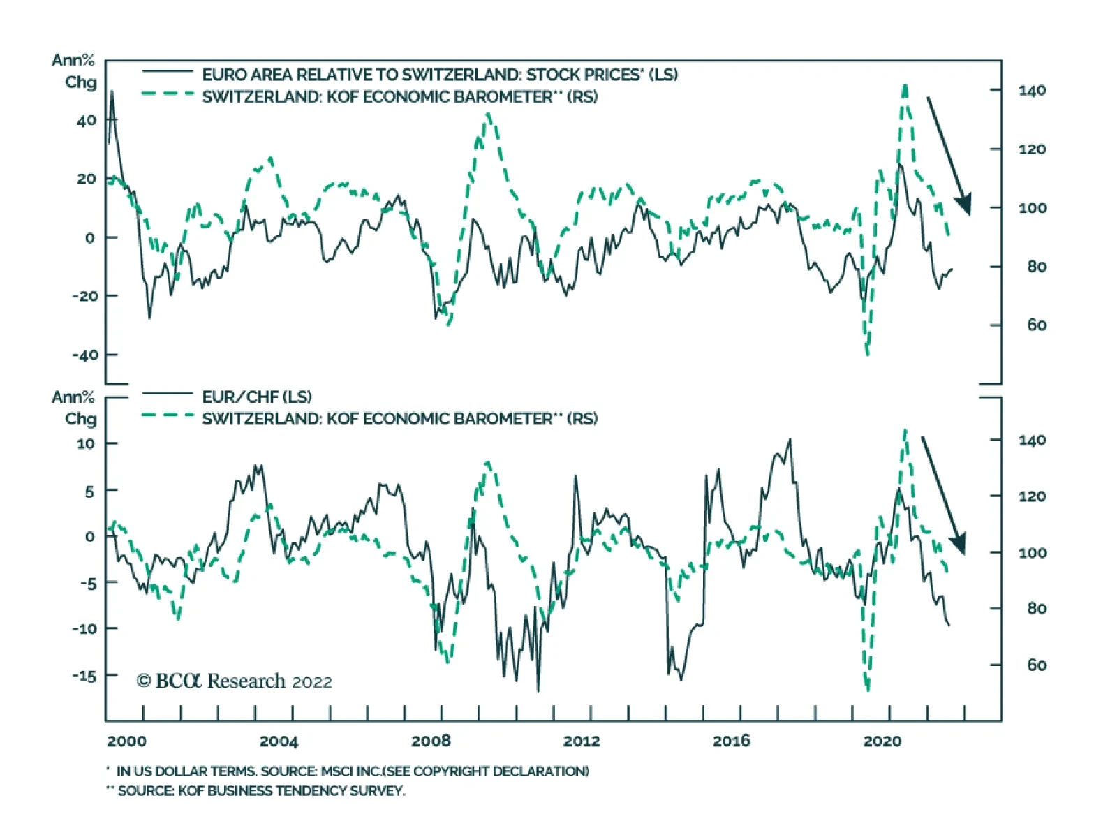
The Swiss KOF Economic Barometer continued its descent in August, falling four points to 86.5 – below its long-term average. The deterioration was broad-based with all variable groups contributing negatively to the headline index. The weak print sends a…
According to BCA Research’s European Investment Strategy service, it is still too early to overweight European equities. Euro Area stocks are much cheaper than their US counterparts, but too many headwinds continue to blow that are likely to weigh on…
Executive Summary Cheap But Challenged
Cheap But Challenged
Cheap But Challenged
European equities have bottomed in absolute terms, but they are still underperforming US ones. Eurozone equities are very cheap compared to US ones, but their profitability remains inferior. Five problems continue to hang over the relative performance of European stocks. The first problem is the Chinese and global growth outlook. The second problem is the natural gas crisis. The third problem is Europe’s expanding liquidity risk. The fourth problem is the weak euro. The fifth problem is Europe’s structural profitability weaknesses. Bottom Line: European stocks may be inexpensive, but too many problems are hanging over their profit outlook. As a result, European shares are unlikely to outperform until natural gas prices peak and the ECB activates the TPI. Until then, continue to underweight European stocks in global equity portfolios. European assets are on sale. Equities are trading at multigenerational lows against their US counterparts. Meanwhile, the euro is back below parity and embedding a 30% discount to purchasing power parity against the US dollar. These observations suggest that European stocks are very attractive relative to their US counterparts — but are they? Related Report European Investment StrategyQuestions From The Road On July 4, 2022, we turned positive on European stocks in absolute terms. Nonetheless, we expected US stocks to outperform because of their larger weighting toward defensive and growth names, which derive greater benefit from lower rates, especially when economic activity remains vulnerable. At this point, we maintain this stance. European valuations are appealing, but the entry point is still not right because the global environment continues to be hostile to the relative performance of European equities. Attractive Valuations Anyway you cut it, European stocks are much less expensive than their US counterparts. In theory, these attractive valuations imply higher long-term rates of return in European markets compared to US ones. Chart 1Cheap European Stocks
Cheap European Stocks
Cheap European Stocks
Based on the MSCI indices, the relative forward P/E ratio of Eurozone shares is 25% below that of US stocks, or the deepest discount in more than 20 years (Chart 1, top panel). European shares should naturally sport lower valuations than US ones due to sectoral biases. However, even when we adjust for those sectoral differences, European stocks stand out as exceptionally cheap. A P/E ratio calculated by giving equal weights to all the sectors in both Europe and the US reveals that, outside of the COVID-19 selloff, the European valuation discount has never been lower in the post-dotcom bubble era (Chart 1, bottom panel). Comparing individual sector performances to earnings reinforces that European stocks are uniquely inexpensive compared to US ones. Since 2018, the relative prices of most European sectors compared to their US competitors have underperformed relative earnings (Chart 2). Chart 2ABroad-based Cheapness
Broad-based Cheapness
Broad-based Cheapness
Chart 2BBroad-based Cheapness
Broad-based Cheapness
Broad-based Cheapness
The problem with valuations is that they can be misleading. If European earnings continue to underperform US ones, European equities are likely to underperform further. And, whether we adjust or not for sector composition, European earnings remain in a pronounced downtrend compared to US profits, which is driving relative performance (Chart 3). Perhaps there is hope for European earnings, but, in the short term, we doubt it. European earnings expectations have been downgraded already, with 2022 and 2023 earnings excluding the energy sector, already down 10% and 12% respectively since their February peak (Chart 4). However, five problems are likely to lead to a greater downgrade relative to the US in the coming months. They are the following: the Chinese and global growth difficulties, the energy market’s ructions, the European liquidity risk, the weakness in the euro, and Europe’s structural lack of profitability. Chart 3Earnings Are In The Driving Seat
Earnings Are In The Driving Seat
Earnings Are In The Driving Seat
Chart 4Downward Revisions Have Begun
Downward Revisions Have Begun
Downward Revisions Have Begun
Bottom Line: Compared to the US, European stocks are very cheap. However, European stocks will only begin to outperform once investors see reasons to upgrade European relative earnings. For now, too many problems continue to place Europe’s profit outlook at a disadvantage. Problem 1: Chinese And Global Growth Chart 5Europe Is More Cyclical than the US
Europe Is More Cyclical than the US
Europe Is More Cyclical than the US
The performance of European equities relative to that of US stocks tracks the evolution of the global manufacturing PMI (Chart 5). This makes sense. Europe’s economy and markets are more specialized in the manufacturing sector, whether consumer or capital goods. Consequently, European earnings are also more geared to the fluctuations of global industrial activity and Chinese imports. Today, China remains one of the major risks to European stocks. Despite efforts by Beijing to stabilize growth, the private sector continues to retrench. The zero-tolerance toward COVID creates a powerful brake on animal spirits as lockdowns shift from one city to the next. Most crucially, the real estate sectors’ woes show no end in sight. Floor spaces sold, started, and completed are contracting at double-digit paces and real estate investment is declining at a 12% annual rate (Chart 6 top and second panels). Moreover, the 47% annual contraction in land purchases indicates that the situation will not improve soon. Consequently, consumer loan growth will decelerate further (Chart 6, bottom panel). While authorities are trying to manage the economic slowdown, they are still too concerned with real estate speculation to push as aggressively as the Chinese economy needs. Even the recent 19-point package from the State Council came with a warning that, although “the foundation of economic recovery is not solid,” Beijing will avoid “resorting to massive stimulus or compromising longer-term interests.” In this context, it is likely that China’s marginal propensity to consume will remain weak, that Chinese yields will decline further, and that the CNY will experience additional weaknesses. All these developments are consistent with a deeper underperformance of European equities (Chart 7). Chart 6China's Real Estate Industry Is Sick
China's Real Estate Industry Is Sick
China's Real Estate Industry Is Sick
Chart 7Weak China = Weak Europe
Weak China = Weak Europe
Weak China = Weak Europe
Looking at the global economy offers little hope. A weak China weighs on EMs’ growth prospects. Moreover, the strong dollar invites EMs’ central banks to tighten domestic liquidity and financial conditions, which historically results in lower growth. This softer economic activity ultimately hurts European earnings more than US ones and causes Eurozone shares to underperform US ones (Chart 8). Beyond EMs, the leading indicators of global economic activity do not inspire much confidence either. Arthur Budaghyan, BCA’s Emerging Market chief strategist, often highlights the downside risk to global exports, which would generate an underperformance of European earnings relative to those of the US. In fact, Taiwanese export orders, which lead global exports, are contracting anew. So is the Global Leading Economic Indicator (Chart 9). Ultimately, the tightening in global policy rates is doing what it should do: slowing global growth. Chart 8EM FCIs Matter To Europe's Relative Performance
EM FCIs Matter To Europe's Relative Performance
EM FCIs Matter To Europe's Relative Performance
Chart 9Clouds Over The Global Economy
Clouds Over The Global Economy
Clouds Over The Global Economy
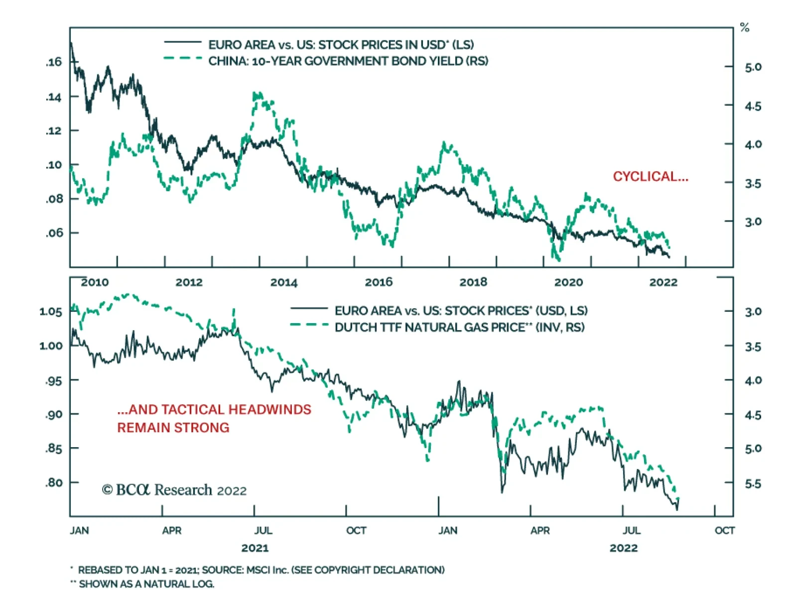
Bottom Line: The weakness in Chinese economic activity is not over yet. Global growth will also continue to suffer as global exports are set to weaken considerably in the coming months. Together, these forces will hurt the earnings prospects of Europe compared to the US. Problem 2: The Energy Market Chart 10Pricey Nat Gas And Electricity
Pricey Nat Gas And Electricity
Pricey Nat Gas And Electricity
Let’s be more specific here: natural gas continues to weigh more on Europe’s earnings prospects than those of the US. European natural gas prices have surged, even when compared to US ones. As a result, electricity prices have also increased across the Eurozone’s main economies (Chart 10). This is deeply negative for domestic economic activity and hurts the competitiveness of European businesses. Consequently, as long as natural gas prices climb higher, European profitability will deteriorate relative to that of US firms. Unsurprisingly, investors are deeply aware of these dynamics. The more natural gas prices rise, the greater European equities underperform. In fact, since mid-2021, Dutch natural gas prices have become the single best explanatory variable for the relative performance of European stocks (Chart 11). Natural gas is likely to remain a problem for European equities until the beginning of the winter. We are currently in the peak period of upward pressure on natural gas prices in Europe. Relentless inventory buildup introduced an inelastic buyer to the market, which is propelling natural gas prices to new heights even though consumption is receding (Chart 12, top panel). In response to these efforts, European natural gas inventories have hit 80% of capacity and are set to rise to 90% by November, even though Russian flows have collapsed (Chart 12, bottom two panels). However, in November, natural gas prices are likely to peak. The re-stocking effort will be completed, coal power will fill in many gaps, and selective conservation efforts will allow most industries and heating to function. Chart 11Europe vs US = Nat Gas
Europe vs US = Nat Gas
Europe vs US = Nat Gas
Chart 12The Worse Is Now
The Worse Is Now
The Worse Is Now
Bottom Line: The surge in natural gas prices is the key force currently hurting the relative performance of Eurozone equities. However, this negative dynamic is likely to fade in the winter because the current price jump reflects inventory building. By November, inventories will be at the 90% of capacity targeted by the European Commission and coal power will fill the remaining production gap. Until then, natural gas prices will continue to hurt European profit margins. Problem 3: European Liquidity Risk Chart 13Unhinged Credit Markets
Unhinged Credit Markets
Unhinged Credit Markets
European equities are also hurt by an increase in risk premia relative to the US. Italian spreads continue to show upside and European junk spreads are widening compared to US ones (Chart 13). This problem could remain saliant in the coming months. The ECB is tightening policy in an economy already fettered by a severe energy shock. This process increases risk aversion. Moreover, because European inflation is likely to prove more sticky than that of the US this fall, this development will continue to hurt the price of European assets compared to US ones. Chart 14A Key Vulnerability
A Key Vulnerability
A Key Vulnerability
The imbalances in the Euro Area create a further source of liquidity risk. The TARGET2 balances remain extremely large, which indicates that Dutch, Luxembourg, and German savings continue to finance France, Spain, and Italy (Chart 14, top panel). However, the import-boosting impact of high energy costs and the negative effects of weaker global growth on exports are likely to worsen the current account balance of the Eurozone, including that of Germany, which acts as the Eurozone’s banker (Chart 14, bottom panel). The decreasing savings of Germany and the Netherlands in conjunction with the wide difference in neutral rates between Germany and France, Italy and Spain increase the odds that peripheral spreads will widen further in the short term. However, this too is likely to be a temporary risk that ebbs after the winter. First, as we wrote four weeks ago, the differences in neutral rates will force the ECB to activate the TPI before year-end. Second, once energy prices peak, the downward pressure on European gross savings will also ease, which will restore liquidity conditions in European credit markets. Bottom Line: The combination of an ECB tightening policy in a weak economy as well as TARGET2 imbalances and declining savings increase the likelihood of a liquidity shortage in European debt markets. Tremors in the credit market would translate into further underperformance of European equities relative to US ones. Problem 4: The Weak Euro At first glance, the weak euro is positive for European equities since it subsidizes profitability. However, in a context in which costs of production are rising faster in Europe than in the US, this benefit is elusive. The weak euro is not translating into greater pricing power for European firms. The increase in producer prices supercharged by higher natural gas prices (among others) is not met by a commensurate rise in consumer prices. The same is true in the US, but to a much lesser extent; as a result, the ratio of CPI to PPI is declining in Europe relative to the US. Chart 15A Weak Euro Reflects Poor Pricing Power
A Weak Euro Reflects Poor Pricing Power
A Weak Euro Reflects Poor Pricing Power
This lack of pricing power is an important driver of the weakness in the euro. EUR/USD closely tracks the evolution of the CPI-to-PPI ratio in Europe relative to the US (Chart 15). This confirms that a weaker euro is not helping the relative performance of European shares because it indicates a problem with the comparative profitability of European businesses. It also implies that the euro will weaken as long as Dutch natural gas prices are rising (Chart 15, bottom panel). Historically, a weak euro is associated with underperforming European equities. At the most basic level, a depreciating euro arithmetically derails the common-currency performance of European shares. Moreover, because a falling euro is often linked to poor rates of return in the Euro Area, it corresponds to periods when investors prefer foreign shares to European ones. For now, we see a large left tail in short-term distributions of the EUR/USD’s returns, even if the long-term prospects of the euro are brighter. This also signifies that the euro will remain a hurdle for the relative performance of European shares in the coming weeks. Bottom Line: The lack of pricing power of European firms weighs on the profitability of Eurozone businesses compared to that of US ones and on the euro. As long as this problem persists, the euro will suffer, which implies additional weaknesses in the relative performance of European shares. Problem 5: Europe Structurally Poor Profitability Chart 16Europe's Structural Profitability Problem
Europe's Structural Profitability Problem
Europe's Structural Profitability Problem
Since 2008, the EPS of the Eurozone MSCI benchmark have collapsed 73% compared to those of the US index. Moreover, this fall has followed a nearly straight line. This poor performance reflects an underlying structural challenge to European profitability. Europe’s low profit growth follows poor returns on assets. At first glance, lower levels of stock repurchases explain some of the underperformance of European earnings. However, the lower propensity of European firms to conduct buybacks mirrors their poor profitability. As Chart 16 highlights, European firms have much lower RoEs, RoAs, profit margins, and asset utilization rates than their US counterparts. The low profitability of European shares is multifaceted. To a large degree, it corresponds to the Eurozone’s anemic growth, whereby nominal as well as real GDP per capita continue to lag those of the US (Chart 17). This weak per-capita GDP is a consequence of the meager underlying productivity of the Euro Area. Many elements cause Europe’s lower productivity growth. The two most obvious culprits are the region’s greater economic fragmentation and its heavier regulatory burden when compared to the US. But also, the return on investment is much lower in Europe (Chart 17, bottom panel). The lower European return on investment is more complex. A key driver is the greater degree of misallocated capital in Europe than in the US. Europe’s capital stocks, especially in the periphery, represents a much greater share of GDP than it does in the US (Chart 18). A larger capital stock increases the odds that some previous capex was misallocated. Moreover, the greater prevalence of small businesses in Europe compared to the US also increases the likelihood of redundant and misallocated capital. Poor capital allocation hurts investment returns and productivity. Chart 17Weak Growth = Weak ROI
Weak Growth = Weak ROI
Weak Growth = Weak ROI
Chart 18Too Much Capital
Too Much Capital
Too Much Capital
Another reason for Europe’s poor profitability has nothing to do with productivity and tepid growth. European industries are less concentrated than US ones (Chart 19). Lower concentration means higher competition between businesses, which erodes markups and returns on assets. Chart 19Smaller Profitability Moats In Europe
Too Early To Overweight Europe
Too Early To Overweight Europe
None of Europe’s structural weaknesses in relation to profitability has been addressed. Consequently, this drag on the relative performance of Euro Area equities remains firmly in place, which warrants a significant discount in European equity valuations relative to US ones. Bottom Line: The last problem for European shares is the structural under profitability of the Eurozone. Because of lower productivity, misallocated capital, and lower industry concentration, European firms offer permanently weaker returns on assets than US businesses. Their disadvantage remains unaddressed, which suggests that structural forces are unlikely to generate a re-rating of European shares any time soon. Investment Implications Conditions are still not supportive for an outperformance of European equities relative to US ones. European stocks may have already bottomed in absolute terms and they are very cheap compared to US shares, but Euro Area earnings are set to underperform further. European stocks cannot beat US stocks until most of the five headwinds impacting Europe come to pass. The deceleration in Chinese and global growth, the surge in Dutch natural gas prices, the growing liquidity risk in the Eurozone, the collapse of EUR/USD, and the structural impediments to European profitability are just too strong collectively to allow Europe’s attractive valuation to crystalize into immediate high returns. Nonetheless, we cannot be dogmatic. Before year-end, we expect three of these variables to become favorable for European stocks. Namely, we anticipate the natural gas crisis to reach its apex around November 2022, the ECB to activate the TPI, which will tackle the budding illiquidity in European credit markets, and the euro to bottom. Hence, we are in the late stage of this year’s underperformance of European equities. An opportunity to upgrade Europe is around the corner – we are just not there yet. Even after all the cyclical and short-term negatives ebb, one key hurdle for European stocks will remain intact: the structural under profitability. This force suggests that periods of outperformance of European stocks are likely to be short-lived and that, as long as the profitability gap remains open, the structural relative bear market in European stocks will persist. Bottom Line: It is still too early to overweight European equities. Euro Area stocks are much cheaper than their US counterparts, but too many headwinds continue to blow that are likely to weigh on relative performance. Only after European natural gas prices peak will Europe enjoy a period of outperformance. This is unlikely to happen until this winter. Mathieu Savary, Chief European Strategist Mathieu@bcaresearch.com Tactical Recommendations Cyclical Recommendations Structural Recommendations