Financial Markets

Highlights On a 2-3 year horizon, stay overweight the US stock market, in absolute terms and relative to the non-US stock market… …and stay overweight the US dollar. A good model for the US stock market is the 30-year T-bond price multiplied by US profits. A good model for the non-US stock market is the 2-year T-bond price multiplied by non-US profits. A major long-term risk to the US stock market comes from the blockchain, which is set to return the ownership and control of our data and digital content back to us – from Facebook, Google, and the other tech behemoths that currently control, manipulate, and monetise it… …but this risk is only likely to manifest itself on a 5-10 year horizon. Fractal analysis: The Israeli shekel is overbought. Feature Chart of the WeekThe US Stock Market = The 30-Year T-Bond Multiplied By US Profits
The US Stock Market = The 30-Year T-Bond Multiplied By US Profits
The US Stock Market = The 30-Year T-Bond Multiplied By US Profits
Fears that inflation will stay stubbornly high have lit a fuse under short-dated bond yields. But further along the curve, longer-dated bonds have remained an oasis of relative calm. Indeed, the 30-year T-bond yield stands 50 bps lower today than it stood in March. Given that long-duration bonds underpin the valuation of long-duration stocks, the relative calm of the 30-year bond yield explains the relative calm of the stock market in the face of higher short-term bond yields. The corollary is that substantially higher 30-year yields would threaten that calm. Inflation Will Crash Back To Earth In 2022 The relative calm of the 30-year bond yield is telling central banks: go ahead and hike rates if you want. You’ll just have to slash them again and, on average, keep them lower than you would if you didn’t hike them so soon. Rate hikes work by choking aggregate demand, but aggregate demand doesn’t need choking. Aggregate demand is barely on its pre-pandemic trend in the US, and remains far below its pre-pandemic trend in other major economies, such as the UK, Germany, and France. The pre-pandemic trend is important because it is our best estimate of potential supply. On this best estimate, aggregate demand is still below potential supply (Chart I-2). Chart I-2The 30-Year T-Bond Yield Sees That Aggregate Demand Is Fragile
The 30-Year T-Bond Yield Sees That Aggregate Demand Is Fragile
The 30-Year T-Bond Yield Sees That Aggregate Demand Is Fragile
If aggregate demand is below potential supply, then what can explain the recent surge in inflation? The answer is the massive and unprecedented displacement of demand from services to goods, combined with modern manufacturing processes unable to meet even a 5 percent excess demand, let alone the 26 percent excess demand for durables recently experienced in the US (Chart I-3). Chart I-3The Booming Demand For Goods Is Crashing Back To Earth While Services Remain In Shortfall
The Booming Demand For Goods Is Crashing Back To Earth While Services Remain In Shortfall
The Booming Demand For Goods Is Crashing Back To Earth While Services Remain In Shortfall
Yet as we highlighted last week in The Global Demand Shortfall Of 2022, the recent booming demand for goods is crashing back to earth while the demand for some services will remain structurally below the pre-pandemic trend. Combined with a tsunami of supply that will hit the global economy with a lag, inflation is also likely to crash back to earth by late 2022. The US Stock Market = The 30-Year T-Bond Multiplied By US Profits An important characteristic of any investment is its duration. If all an investment’s cashflows were converted into one ‘lump-sum’ cashflow, then the duration of the investment quantifies how far into the future that lump-sum cashflow would be. For a bond, the duration also equals the percentage change in its price for every 1 percent change in its yield.1 Interestingly, the durations of the US stock market and the 30-year T-bond are very similar, at around 25 years. Therefore, all else being equal, the US stock market should track the 30-year T-bond price. Of course, all else is not equal. The 30-year T-bond has fixed cashflows, whereas the stock market has cashflows that track profits. Allowing for this key difference, the US stock market should track: (The 30-year T-bond price) multiplied by (US profits) multiplied by (a constant) In which the constant connects current profits to the theoretical lump-sum payment 25 years ahead, thereby quantifying the structural growth of profits. But to the extent that the constant does not change, we can ignore it. Simplistic as this model appears, it does provide an excellent explanation for the US stock market’s evolution through the past 40 years (Chart of the Week and Chart I-4) – with deviations from the ‘fair-value’ giving a good gauge of the market’s over- or under-valuation. Chart I-4The US Stock Market = The 30-Year T-Bond Multiplied By US Profits
The US Stock Market = The 30-Year T-Bond Multiplied By US Profits
The US Stock Market = The 30-Year T-Bond Multiplied By US Profits
Looking ahead, there are three ways in which the structural bull market could end: If the overvaluation (deviation from fair-value) became so extreme that a substantial decline in price was required to re-converge with the 30-year T-bond price multiplied by profits. If the 30-year T-bond price could no longer rise to counter a substantial decline in profits. If the constant that links current profits to future profits phase-shifted down, implying that the growth rate of US stock market profits had phase-shifted down – as happened for non-US stock market profits after the dot com bust (Chart I-5). Going through each of these, the US stock market’s current overvaluation of around 10 percent is not so extreme as to be a structural impediment. Chart I-5The Valuation Of The Non-US Stock Market Phase-Shifted Down
The Valuation Of The Non-US Stock Market Phase-Shifted Down
The Valuation Of The Non-US Stock Market Phase-Shifted Down
Meanwhile, the 30-year T-bond yield has scope to decline by at least 150 bps, equating to a 40 percent counterweight to a decline in profits. Hence, this is not a structural impediment either, but will become one once the 30-year T-bond yield reaches 0.5 percent in the next deflationary shock. As for a phase-shift down in profit growth, this is a genuine long-term risk. The main risk comes from the blockchain and its threat to the pseudo-monopoly status that the US tech behemoths have in owning, controlling, manipulating, and monetising our data and the digital content that we create. The blockchain is set to return that ownership and control back to us, to the detriment of Facebook, Google, and the other behemoths of the US stock market. However, this is a long-term risk, likely to manifest itself on a 5-10 year horizon. We conclude that on a 2-3 year horizon, investors should own the US stock market. The Non-US Stock Market = The 2-Year T-Bond Multiplied By Non-US Profits We can extend the preceding analysis to the non-US stock market, with two differences. First, the non-US stock market has a much shorter duration given its much lower exposure to growing cashflows. A higher weighting to financials – which underperform when long yields are falling – further lowers the effective duration to just 2 years (empirically). Second, and obviously, the non-US stock market depends on non-US profits (Chart I-6). Chart I-6The Non-US Stock Market = The 2-Year T-Bond Multiplied By Non-US Profits
The Non-US Stock Market = The 2-Year T-Bond Multiplied By Non-US Profits
The Non-US Stock Market = The 2-Year T-Bond Multiplied By Non-US Profits
It follows that the non-US stock market tracks: (The 2-year T-bond price) multiplied by (non-US profits) We can now decompose the post dot com performance of the US and non-US stock markets into their underlying structural components. The US stock market has received a massive tailwind: a 60 percent increase in the 30-year T-bond price plus a 200 percent increase in profits (Chart I-7). While the non-US stock market has received a lesser tailwind: a 10 percent increase in the 2-year T-bond price plus a 60 percent increase in profits (Chart I-8).2 Chart I-7The US Stock Market Has A Powerful Tailwind...
The US Stock Market Has A Powerful Tailwind...
The US Stock Market Has A Powerful Tailwind...
Chart I-8...The Non-US Stock Market Has A Weak Tailwind
...The Non-US Stock Market Has A Weak Tailwind
...The Non-US Stock Market Has A Weak Tailwind
Therefore, over the past two decades, the non-US stock market has been hampered by its low duration and by its profits that are fossilised, both metaphorically and literally. Metaphorically fossilised, because the non-US stock market is over-exposed to industries that are in structural decline such as financials and basic resources. And literally fossilised, because it is also over-exposed to the dying fossil fuel industry. Looking ahead, there are three ways that non-US stocks could outperform US stocks: If the relative valuation (deviation from respective fair-values) became extreme in favour of non-US stocks. If the 2-year T-bond price outperformed the 30-year T-bond price – effectively meaning that the 30-year T-bond price would have to fall far given that the 2-year T-bond is like cash. If non-US profits outperformed US profits. Going through each of these: both the US and non-US stock markets appear similarly overvalued versus their respective fair-values; the 30-year T-bond is unlikely to fall far given that it would destabilise the global financial system; and fossilised non-US profits are unlikely to outperform those in the US in the next few years. We conclude that on a 2-3 year horizon, investors should stay overweight the US stock market relative to the non-US stock market. One final consideration is the US dollar. Successive deflationary shocks – the 2008 GFC, the 2015 EM recession, and the 2020 pandemic – have taken the greenback to new highs as capital flows have flooded into US T-bonds (Chart I-9). It follows that the ultimate high in the dollar will coincide with the ultimate low in the 30-year T-bond yield. Chart I-9Successive Deflationary Shocks Take The Dollar To New Highs
Successive Deflationary Shocks Take The Dollar To New Highs
Successive Deflationary Shocks Take The Dollar To New Highs
Stay structurally overweight the US dollar. The Israeli Shekel Is Overbought In this week’s fractal analysis, we note that the strong recent rally in ILS/GBP has reached the point of maximum fragility on its 130-day fractal structure that has signalled several previous reversals (Chart I-10). Chart I-10The Israeli Shekel Is Overbought
The Israeli Shekel Is Overbought
The Israeli Shekel Is Overbought
On this basis, a recommended trade would be short ILS/GBP, setting a profit target and symmetrical stop-loss at 4.2 percent. Dhaval Joshi Chief Strategist dhaval@bcaresearch.com Footnotes 1 Defined fully, the duration of an investment is the weighted average of the times of its cashflows, in which the weights are the present values of the cashflows. 2 From January 1, 2005. Fractal Trading System Fractal Trades 6-Month Recommendations Structural Recommendations Closed Fractal Trades Indicators To Watch - Bond Yields Chart II-1Indicators To Watch - Bond Yields ##br##- Euro Area
Indicators To Watch - Bond Yields - Euro Area
Indicators To Watch - Bond Yields - Euro Area
Chart II-2Indicators To Watch - Bond Yields ##br##- Europe Ex Euro Area
Indicators To Watch - Bond Yields - Europe Ex Euro Area
Indicators To Watch - Bond Yields - Europe Ex Euro Area
Chart II-3Indicators To Watch - Bond Yields ##br##- Asia
Indicators To Watch - Bond Yields - Asia
Indicators To Watch - Bond Yields - Asia
Chart II-4Indicators To Watch - Bond Yields ##br##- Other Developed
Indicators To Watch - Bond Yields - Other Developed
Indicators To Watch - Bond Yields - Other Developed
Indicators To Watch - Interest Rate Expectations Chart II-5Indicators To Watch - Interest Rate Expectations
Indicators To Watch - Interest Rate Expectations
Indicators To Watch - Interest Rate Expectations
Chart II-6Indicators To Watch - Interest Rate Expectations
Indicators To Watch - Interest Rate Expectations
Indicators To Watch - Interest Rate Expectations
Chart II-7Indicators To Watch - Interest Rate Expectations
Indicators To Watch - Interest Rate Expectations
Indicators To Watch - Interest Rate Expectations
Chart II-8Indicators To Watch - Interest Rate Expectations
Indicators To Watch - Interest Rate Expectations
Indicators To Watch - Interest Rate Expectations
October new home prices fell for the second consecutive month in China (see The Numbers). Given how highly leveraged the Chinese property sector is, a continued decline in home prices would be an unwelcome development for Chinese policymakers. It raises the…

BCA Research’s Global Asset Allocation and Equity Analyzer services conclude that traditional valuation metrics may no longer be an accurate measure of intrinsic value in intangible-heavy companies or industries. Intangible investment has become a much…
Highlights Why have Value stocks underperformed so much during the past decade? The rise in intangible assets is likely the most important reason since traditional valuation metrics are no longer an accurate measure of intrinsic value. Value stocks today have a larger negative tilt to Quality than they did in the past. This has hurt Value due to Quality's outperformance. Value's underperformance is not just the result of the relative performance of a few sectors or industries, although this has played a role. Falling interest rates have not been the main driver of Value’s underperformance as they can only account for a small portion of returns. “Migration”, or mean-reversion in and out of value buckets, has declined since the Great Financial Crisis, possibly because of an increase in monopoly power. But even this cannot fully account for the underperformance since 2012. We propose that investors who wish to invest in Value screen for Quality. They should also express their Value tilts in sectors with few intangibles, such as Energy or Materials. More sophisticated stock pickers can adjust earnings and book values for intangibles. Asset allocators who invest only in indices should stay away from a structural allocation to Value. Feature Chart 1No Premium From Value Stocks Over The Last Four Decades
No Premium From Value Stocks Over The Last Four Decades
No Premium From Value Stocks Over The Last Four Decades
Betting on cheap stocks has been a cornerstone of equity investing for decades. The rationale is simple: Stocks which are undervalued, according to some measure of intrinsic value, will eventually converge up to their fair value, on average, while stocks that are overvalued will converge down, on average. Historically, this bet on mean-reversion has proven successful – low price-to-book stocks have outperformed high price-to-book stocks by more than 3% per annum since 1927. However, the recent decades have put Value investing to the test. The Value factor, as defined by Fama and French, has not provided a structural premium in the US large cap space since the late 1970s (Chart 1, panel 1). Commercial Value indices haven’t been any more successful: Value aggregates by MSCI, Russell, and S&P have either underperformed or performed in line with the market benchmark over the same time frame (Chart 1, panel 2). The current situation presents a difficult dilemma. On the one hand, buying Value could be a tremendous opportunity. By several measures, Value stocks are the most undervalued they have been since the end of the tech bubble, right before they went on a historic run (Chart 2). Academic work has argued that these deep value spreads tend to be positively correlated with long-term outperformance of Value stocks.1 In a world of sky-high valuations and with equities and bonds projected to deliver very low returns over the next decade, a cheap return stream would be a fantastic addition to most portfolios. Chart 2Value Stocks Are Really Cheap
Value Stocks Are Really Cheap
Value Stocks Are Really Cheap
Chart 3
And yet, Value has become so popular, that many investors are now worried that the Value premium may no longer exist. This worry is not without merit. Several studies have shown that factors lose a sizable portion of their premium once they appear in academic literature2 (Chart 3). Other issues, such as the inability of valuation metrics to properly account for intrinsic value in the modern economy, have also led some investors to seriously question whether buying Value indices will deliver excess returns in the future. So what is the right answer? Why has Value underperformed so much? Is the beaten down Value factor a generational buying opportunity? Or will it continue its decline going forward? In this report we try to answer these questions. Using a company-level dataset from our BCA Research Equity Analyzer (EA), as well as drawing on the latest academic research, we assess the evidence behind Five Theories On Value’s Underperformance. Once we determine which explanations have merit and which do not, we conclude by providing some guidelines on how investors should consider the Value factor going forward in our Investment Implications section. A word of caution: We have constructed our sample of companies to roughly resemble the sample used by MSCI World. Thus, the conclusions from our analysis based on the EA dataset should be relevant to Value indices in general. However, be advised that the methodology that EA uses is different from other commercial Value indices. Specifically, the EA methodology is more aggressive in its positioning and uses a wider array of metrics. For clarity, Table 1 shows the metrics used by EA compared to other Value indices. If you wish to know more on how the methodology works, please refer to the Appendix. Table 1Value Factor Methodologies
Mythbusting The Value Factor
Mythbusting The Value Factor
Also, please note that our report will not deal with the cyclical outlook for Value. While it is entirely possible that a period of cyclical growth could help Value stocks outperform, the question we are trying to answer is whether buying cheap versus expensive stocks still provides a structural premium over the long term. While the Global Asset Allocation service does not use the Value versus Growth framework for equity allocation, our colleagues from our Global Investment Strategy service have written extensively on why they believe investors should pivot to Value on a cyclical basis.3 Five Theories On Value’s Underperformance Chart 4More To The Underperformance Of Value Than Sector Tilts
More To The Underperformance Of Value Than Sector Tilts
More To The Underperformance Of Value Than Sector Tilts
Theory #1: The underperformance of Value indices is purely a result of their sector composition Some investors suggest that Value stocks’ large underweight of mega-cap tech, as well as their overweight in Financials and Energy, have been responsible for Value’s woes over the past decade. However, our research suggests that this theory is not entirely correct. A Value index with the same sector and industry weightings as the Developed Markets (DM) benchmark has still underperformed by more than 15% since 2010 (Chart 4, panel 1). Sector and industry composition have been responsible for about a third of the underperformance of the DM Value index. What about excluding the FAANGM stocks? Again, the story is similar. Even when omitting these stocks from our investment universe, Value stocks have still underperformed by almost the same amount as a regular Value composite (Chart 4, panel 2). Finally, we can also look at the performance of cheap versus expensive stocks within each industry. Chart 5A shows that cheap stocks have underperformed expensive stocks in 18 and 17 out the 24 GICS Level 2 industries in DM and in the US, respectively, since 2012 (roughly corresponding to the peak in relative performance in the EA Value index). Even on an equally-weighted basis, which eliminates the effects of large companies, cheap stocks have underperformed expensive stocks in both the average and median industry (Chart 5B).
Chart 5
Chart 5
Verdict: Myth. The underperformance of cheap versus expensive stocks has been broad. While sector and industry dynamics have certainly been an important factor, Value's underperformance is not just the result of a few companies, sectors, or industries. Chart 6Value Likes Rising Yields...
Value Likes Rising Yields...
Value Likes Rising Yields...
Theory #2: The decline in interest rates is to blame for the underperformance of Value Another reason used to explain the underperformance of Value is the secular decline in interest rates. The reasoning goes as follows: Cash flows from growth stocks are set to be received further into the future, while cash flows from Value stocks are closer to the present. Using a Discounted Cash Flow model, one can show that all else being equal, a decline in the discount rate should result in a relatively higher increase in the present value for Growth stocks versus Value stocks. There is some evidence in support of this theory. While prior to 2010, Value and interest rates had an inconsistent relationship, the beta of cheap stocks to the monthly change in the 10-year US Treasury yield has increased markedly over the past 10 years (Chart 6, panel 1). On the other hand, the beta of expensive stocks to yields has become increasingly more negative. A similar situation occurs when we use the yield curve. Cheap stocks tend to exhibit higher excess returns whenever it steepens, while expensive stocks do so when it flattens (Chart 6, panel 2). Importantly, these relationships are not purely a result of Value’s exposure to banks. Value stocks excluding financials also show a strong positive relationship to both the 10-year yield and yield curve slope versus their growth counterparts (Chart 7). But while this relationship is statistically significant, it fails to be economically significant. Our analysis shows that the betas to either interest rates or the slope of the yield curve only explain a small fraction of the performance of cheap or expensive stocks (Chart 8). This result is in line with the research from Maloney and Moskowitz, which showed that the vast majority of the decline in Value in recent years could not be explained by interest rates.4 Chart 7...Even When Excluding Financials...
...Even When Excluding Financials...
...Even When Excluding Financials...
Chart 8...But Yields Don't Explain Much
...But Yields Don't Explain Much
...But Yields Don't Explain Much
Verdict: Myth. Cheap stocks have an increasingly positive beta to both the 10-year yield and the slope of the yield curve, whereas expensive stocks have an increasingly negative beta. However, while these betas are statistically significant, they can only account for a small portion of Value's underperformance. Theory #3: A decline in market mean-reversion is responsible for the underperformance of Value In a seminal paper, Fama and French describe the process of migration.5 Migration is when stocks move across different value buckets: For example, when stocks in the cheap bucket migrate to the neutral and expensive buckets, and when stocks in the expensive bucket migrate to the neutral or cheap buckets. Historically, this process of mean-reversion has provided a significant share of the Value premium. However, migration has declined significantly over the past decade (Chart 9, panel 1). The amount of market cap migrating each month as a percentage of total market cap has declined from over 12% before the GFC to less than 8% currently. Importantly, this decline in migration has been broad-based. Neither cheap, neutral, nor expensive stocks are moving to other valuation cohorts at the same rates that prevailed in the past (Chart 9, panel 2). The market has become much more ossified: Value stocks remain Value stocks, Neutral stocks remain Neutral stocks, and Growth stocks remain Growth stocks.5 Chart 9What Happens In Value Now Stays In Value
What Happens In Value Now Stays In Value
What Happens In Value Now Stays In Value
Chart 10Market Concentration Could Be The Reason Why Migration Has Declined
Market Concentration Could Be The Reason Why Migration Has Declined
Market Concentration Could Be The Reason Why Migration Has Declined
Why has migration declined? One theory is that industries have increasingly become more monopolistic, which means that it has become harder for new entrants to gain market share (Chart 10). Meanwhile market leaders are able to grow at an above-average pace thanks to their large network effects.6 What has been the role of this decreased migration in the performance of Value? A paper written by Arnott, Harvey, Kalesnik, and Linainmaa showed that while the returns attributable to migration have decreased over the past 15 years, this change is still not strong enough to explain the deep underperformance in Value.7 Our own research assigns it a relatively larger weight, with migration accounting for a little less than half of the underperformance of Value since 20128 (Table 2). Table 2Return Attribution Of Cheap And Expensive Stocks
Mythbusting The Value Factor
Mythbusting The Value Factor
Verdict: Somewhat True. Migration has declined since the GFC, possibly because of an increase in monopoly power. While this decline has certainly played a role in the underperformance of Value, it explains, at most, less than half of the drawdown since 2012. Theory #4: Value has underperformed because it is increasingly a play on junk stocks
Chart 11
It is a well-known empirical fact that cheap stocks tend to have lower Quality than expensive stocks. Conceptually this makes sense: Companies with higher profitability, more stability, and less leverage should trade at a valuation premium, whereas low income, high-debt companies should trade at a discount. However, this gap in Quality between cheap and expensive stocks is not always the same. Consider the composition of cheap and expensive stocks in 2000 – the eve of the tech bubble crash. About a third of expensive stocks were also junk (low quality), whereas 36% were quality stocks (Chart 11). Today, this composition is much different: Only about a fifth of the market capitalization of expensive stocks is junk, whereas quality stocks now make up 44% of the overall expensive cohort. On the other hand, the Quality of cheap stocks has deteriorated: Cheap junk stocks are now 37% of the cheap cohort versus 29% in 2000. Importantly, the difference in Quality between cheap and expensive stocks tends to be a good predictor for value returns (Chart 12). A big gap in the Quality factor often implies lower returns of cheap versus expensive stocks, whereas a small gap implies higher returns. These results are in line with similar research which has shown that Quality, or Quality proxies like profitability, can be used to enhance the Value factor.9 Chart 12Value Does Well When The Quality Gap Is Small
Value Does Well When The Quality Gap Is Small
Value Does Well When The Quality Gap Is Small
Why is this the case? As we have discussed in the past, Quality has been one of the best performing factors over the past 30 years - likely driven by powerful behavioral biases as well as by the incentives in the money management industry.10 As a result, taking an overly negative position on this factor over a long enough period eventually eats away at the Value premium. Verdict: True. Value stocks today have a larger negative tilt to Quality than they did in the past. This negative tilt has hurt Value as excess returns of cheap stocks tend to be dependent on their Quality gap to expensive stocks. Theory #5: Value has underperformed because traditional valuation metrics are no longer a reliable indicator of intrinsic value How exactly to measure whether a company is cheap or expensive has been a matter of debate since the very beginnings of Value investing. Benjamin Graham famously cautioned against using book value as a measure of intrinsic value, preferring a more holistic approach. Today most index providers use a combination of traditional valuation metrics like price-to-book and price-to-earnings to build Value indices. It is fair to ask if these measures are still relevant for today’s companies. Intangible investment has become a much larger part of the economy, having surpassed tangible investment in the US in the late 1990s (Chart 13). However, both US GAAP and IFRS are very restrictive on the capitalization of R&D activities, which are known to originate valuable intangible assets.11 Other types of intangible capital such as unique production processes or customer lists are normally also expensed within SG&A expenses and are never capitalized unless there is an acquisition. This means that both the book value and earnings of intangible-heavy companies could be inadequate estimates of their true intrinsic value.
Chart 13
Is there any evidence that this is the case? Using our EA dataset, we confirm that expensive companies generally have higher R&D expenditures as a percent of sales than cheap companies (Chart 14). Importantly, we see that the performance of Value within low R&D stocks is much better than the performance within high R&D stocks (Chart 15). This is line with the work of Dugar and Pozharny, who found that the value relevance for both earnings and book values has declined for high intangible companies, while it has stayed stable for low-intangible companies.12 This suggests that traditional valuation measures are losing their relevance as intangible-heavy companies become a larger part of the economy.13 Chart 14Growth Stocks Spend More On Intangibles
Growth Stocks Spend More On Intangibles
Growth Stocks Spend More On Intangibles
Chart 15Are Traditional Metrics Underestimating Intrinsic Value In High-Intangible Companies?
Are Traditional Metrics Underestimating Intrinsic Value In High-Intangible Companies?
Are Traditional Metrics Underestimating Intrinsic Value In High-Intangible Companies?
The effect of intangibles on traditional valuation metrics can also give us a clue as to why Value has performed well in some industries but not in others. Using a measure of intangible intensity derived by Dugar and Pozharny14 – which includes identifiable intangible assets, intellectual capital (as proxied by R&D spending), and organizational capital (as proxied by SG&A spending) – we can see that Value has done relatively better in industries with lower intangible intensity while it has performed relatively worse in industries with higher intangible intensity (Chart 16).
Chart 16
Verdict: True. Value performs better when considering only companies with low R&D expenses or industries with low-intangible intensity. This suggests that the rise in intangible assets might be responsible for the underperformance of cheap stocks, as traditional valuation metrics may no longer be an accurate measure of intrinsic value in intangible-heavy companies or industries. Investment Implications Chart 17Investors Can Invest In Value Within Low-Intangible Sectors
Investors Can Invest In Value Within Low-Intangible Sectors
Investors Can Invest In Value Within Low-Intangible Sectors
What does our analysis mean for investors? Aside from the most well-known practices to improve the performance of Value – for example, using a wide array of valuation metrics, exploiting value in small stocks, or using equal-weighted indices to avoid the effect of sector weightings or large companies15 – we would recommend investors first screen cheap stocks for quality to avoid Value traps. Investors should also account for the failure of traditional metrics to measure intangible assets. This can be done in two ways: The first is to take Value tilts only on intangible-light sectors such as Energy and Materials – for example, allocating only to the cheapest oil and materials stocks. For the last decade, the cheapest Energy and Materials companies have outperformed their respective sectors, even while overall Value has cratered (Chart 17). Alternatively, more sophisticated stock pickers can adjust valuation ratios to account for intangibles. There is some promise to this approach. Arnott, Harvey, Kalesnik, and Linainmaa showed that even a crude adjustment to the HML (High-Minus-Low) index consistently outperforms the regular value factor16 (Chart 18). What about asset allocators who invest only in broad indices? We would recommend that they stay away from structural allocations to commercial Value indices altogether. While it is true that sector rotations or interest-rate movements could benefit value on a short-term basis, in the long term, the negative Quality tilt of Value stocks should be a drag on returns. Additionally, it remains a big risk that indices based on traditional measures are underestimating intangible value. This underestimation will only get worse as the economy becomes more digitalized. Investors who wish to take advantage of trends like higher inflation or rising interest rates should just bet on cyclical sectors. So far this has been the right approach. Just this year, even though interest rates have increased by more than 60 basis points, and both Financials and Energy have outperformed IT by 13% and 30% respectively, Value stocks have underperformed Growth stocks (Chart 19). Chart 18Adjusting For Intangibles Improves Value
Adjusting For Intangibles Improves Value
Adjusting For Intangibles Improves Value
Chart 19Rates Rose, Financials And Energy Outperformed IT, And Yet Value Underperformed Growth
Rates Rose, Financials And Energy Outperformed IT, And Yet Value Underperformed Growth
Rates Rose, Financials And Energy Outperformed IT, And Yet Value Underperformed Growth
Appendix A Note On Methodology The Equity Analyzer service is a stock picking tool that applies a top-down approach to bottom-up stock picking. The crux of the platform is the BCA Score, which is a weighted composite of 30 cross sectionally percentile ranked factors. Within this report we focus on the value (price-to-earnings, price-to-book, price-to-cash, price-to-cash flow and price-to-sales) and quality (accruals, profitability, asset growth, and return on equity) factors used in the BCA Score model. Each of the factors are cross sectionally-percentile ranked, within the specified universe, where a score of 100% is best ranked stock according to that particular score. From here, we create the value and quality scores used in this report by equal-weighting and combining the scores from each value and quality factors. It is important to note that a high score does not mean the underlying value is high, but that it exhibits a better characteristic for forecasting future excess returns. For example, the stock with the highest value score would be considered the cheapest. The scores are re-calculated each period and applied on a one-period forward basis when calculating returns. To keep the analysis comparable the MSCI Data and relevant to our clients, we limit the universe of stocks to only those with a market capitalization greater than 1 billion USD. Also, unless otherwise specified, the scores are market-cap weighted when aggregated and all returns are in US dollars. Juan Correa-Ossa, CFA Editor/Strategist juanc@bcaresearch.com Lucas Laskey Senior Quantitative Analyst lucasl@bcaresearch.com Footnotes 1 Please see Clifford Asness, John M. Liew, Lasse Heje Pedersen, and Ashwin K Thapar, “Deep Value,” The Journal of Portfolio Management, 47-64 (11-40), 2021.2 2 Please see Andrew Y. Chen and Mihail Velikov, “Zeroing in on the Expected Returns of Anomalies,” Finance and Economic Discussion Series 2020-039, Board of Governors of the Federal Reserve. 3 Please see Global Investment Strategy Report, “Pivot To Value,” dated September 18, 2020. 4 Please see Thomas Maloney and Tobias J. Moskowitz, “Value and Interest Rates: Are Rates to Blame for Value’s Torments?” The Journal of Portfolio Management, 47-6 (65-87), 2021. 5 Please see Eugene Fama and Kenneth French, “Migration,” Financial Analyst Journal, 63-3 (48-58), 2007. 6 Please see Robert D. Arnott, Campbell R. Harvey, Vitali Kalesnik and Juhani T. Linainmaa, “Reports of Value’s death May Be Greatly Exaggerated,” Financial Analyst Journal, 77-1 (44-67), 2021. 7 Please see Robert D. Arnott, Campbell R. Harvey, Vitali Kalesnik and Juhani T. Linainmaa (2021). 8 Much like us, Lev and Srivastava assign a relatively bigger role to the decline in migration. For more details, please see Baruch Lev and Anup Srivastava, “Explaining the Recent Failure of Value Investing,” NYU Stern School of Business (2019). 9 Please see Clifford Asness, Andrea Frazzini, Ronen Israel and Tobias Moskowitz, “Fact, Fiction, and Value Investing,” The Journal of Portfolio Management, 42-1 (34-52), 2015. 10 Please see Global Asset Allocation Special Report, “Junk Disposal: The Quality Factor In Equity Markets,” dated September 8, 2020. 11 US GAAP requires both Research and Development costs to be expensed. IFRS prohibits capitalization of Research cost but allows it for Development costs provided that some conditions are met. For a further discussion on the accounting treatment of intangibles, please see Amitabh Dugar and Jacob Pozharny, “Equity Investing in the Age of Intangibles,” Financial Analyst Journal, 77-2 (21-42), 2021. 12 Please see Amitabh Dugar and Jacob Pozharny (2021). 13This also follows from research from Lev and Srivastava which showed that while capitalizing intangibles did not improve the value factor in the 1970s, it increased returns substantially after the 1990s. For more details, please see Baruch Lev and Anup Srivastava (2019). 14This measure excludes Banks, Diversified Financials, and Insurance. For more details, please see Amitabh Dugar and Jacob Pozharny (2021). 15Please see Clifford Asness, Andrea Frazzini, Ronen Israel and Tobias Moskowitz (2015). 16Please see Robert D. Arnott, Campbell R. Harvey, Vitali Kalesnik and Juhani T. Linainmaa (2021).
Highlights Despite strong economic activity throughout most of 2021, economic surprises have decreased considerably. This helped the US equity market outperform Europe. It also significantly contributed to the euro’s depreciation versus the dollar. Even though growth will slow in 2022, economic surprises should increase. Growth expectations are much lower than they were entering 2021, and some key headwinds will fade. This picture is not without risks. China’s credit slowdown and the US’s elevated inflation represent the greatest threats. Based on the outlook for economic surprises, the euro will stage a rebound next year and small-cap stocks are attractive. Feature Global economic activity has been exceptionally robust this year, boosted by the re-opening of the world economy, as well as by the considerable fiscal and monetary stimuli injected globally over the past 20 months. However, market participants also anticipated such a rebound; as a result, global economic surprises peaked in September 2020, and they are now in negative territory. Unanticipated developments have a substantial effect on market prices. Under this lens, the deterioration in economic surprises has had a strong impact on financial markets. It helps explain why the defensive US market has outperformed, why the dollar has been strong, and why bond yields have been flat since March 2021, even though inflation has risen, growth has been high by historical standards, and many major central banks have been eschewing their accommodative biases. Going forward, the evolution of economic surprises will remain crucial to market trends. While we anticipate global economic activity will decelerate in 2022, it will likely remain above trend and surprise to the upside, which will allow global economic surprises to recover. There are significant risks to this view, with large unanswered questions about the Chinese economy and the outlook for inflation in the US. In this context, despite near-term risks, we continue to expect EUR/USD to appreciate in 2022 and European small-cap stocks to outperform large-cap equities. Deteriorating Surprises Matter This year, the underperformance of global equities (both EM and Europe) relative to the US, the weakness in the euro, and the limited increase in yields have all caught investors off guard. At the beginning of 2021, investors were massively short the greenback and duration, while surveys showed a large preference for non-US equities. These views grew out of the expectation that global growth would be strong. Global growth turned out to be strong but began to disappoint expectations by the middle of the year. Expectations had become extremely lofty, suggesting that the bar had been set too high. Additionally, the tightening credit conditions in China and the growing supply constraints around the world caused growth to decelerate somewhat. The deterioration in short-term economic momentum and in surprises harmed European equities relative to the US. As Chart 1 highlights, the relative performance of European stocks is greatly affected by the earnings revision ratio of cyclicals stocks vis-à-vis defensive ones. This relationship reflects the greater pro-cyclicality of European equities compared to those of the US. Moreover, the earnings revision ratio of cyclical stocks relative to that of defensive equities mimics the fluctuations in economic surprises (Chart 1, bottom panel), as weaker-than-expected growth invites analysts to lower their relative earning expectations. The dynamics in the economic surprise index also weighed heavily on the FX market. The dollar is a highly counter-cyclical currency; therefore, it performs poorly when growth is not only increasing, but also doing so at a rate faster than anticipated. However, economic surprises did the exact opposite this year, which boosted the dollar’s appeal and pushed EUR/USD lower (Chart 2). While the strength in the dollar was accentuated by the increasingly aggressive pricing of Fed hikes in the OIS curve, relative interest rate expectations between the US and the Euro Area are also influenced by global economic activity because of the European economy’s greater cyclicality than that of the US. Chart 1Where Surprises Go, European Stocks Follow
Where Surprises Go, European Stocks Follow
Where Surprises Go, European Stocks Follow
Chart 2Surprises Matter For The Dollar And The Euro
Surprises Matter For The Dollar And The Euro
Surprises Matter For The Dollar And The Euro
Bottom Line: Global growth has been very strong in 2021, but it has begun to decelerate. Moreover, economic surprises are now in negative territory. The evolution of economic surprises this year was a key component of the strength in the dollar, the weakness of the euro, and the underperformance of European equities. Improving Surprises In 2022? We anticipate economic surprises to pick up in 2022. First, investors and analysts around the world rightfully expect a slowdown in global growth next year. This means that the bar for the economy to generate positive surprises is lower than it was in 2021. Second, we are already seeing signs that global economic surprises are trying to stabilize. A GDP-weighted aggregate of 48 countries is forming a trough at a low level, which historically precedes a pick-up in broader aggregate measures (Chart 3). Third, economic surprises move closely with the global PMI diffusion index. The diffusion index has fallen to levels historically associated with a rebound (Chart 4). Moreover, the share of countries whose Leading Economic Indicator is rising is still very depressed for a mid-cycle slowdown (Chart 4, bottom panel). As vaccination rates are improving around the world, including those in emerging markets, and as the global economy continues to re-open, we anticipate both the PMI and LEI diffusion indexes to improve next year, which will boost economic surprises. Chart 3A Budding Rebound?
A Budding Rebound?
A Budding Rebound?
Chart 4The dispersion Of Growth Matters or Surprises
The dispersion Of Growth Matters or Surprises
The dispersion Of Growth Matters or Surprises
Fourth, the global capex outlook remains very positive. Capex intentions in the US and in the Euro Area are highly elevated and cash flows are strengthening. Moreover, US and European credit standards are very loose (Chart 5). This combination suggests that companies have the desire and the wherewithal to increase their investments next year, especially as capacity constraints limit their ability to meet final demand. Additionally, companies around the world need to rebuild inventory levels, which are depressed relative to sales, while customer inventories are still woefully low (Chart 6). Chart 5Capex Tailwinds
Capex Tailwinds
Capex Tailwinds
Chart 6Not Enough Inventories
Not Enough Inventories
Not Enough Inventories
Chart 7Households Are Rich
Households Are Rich
Households Are Rich
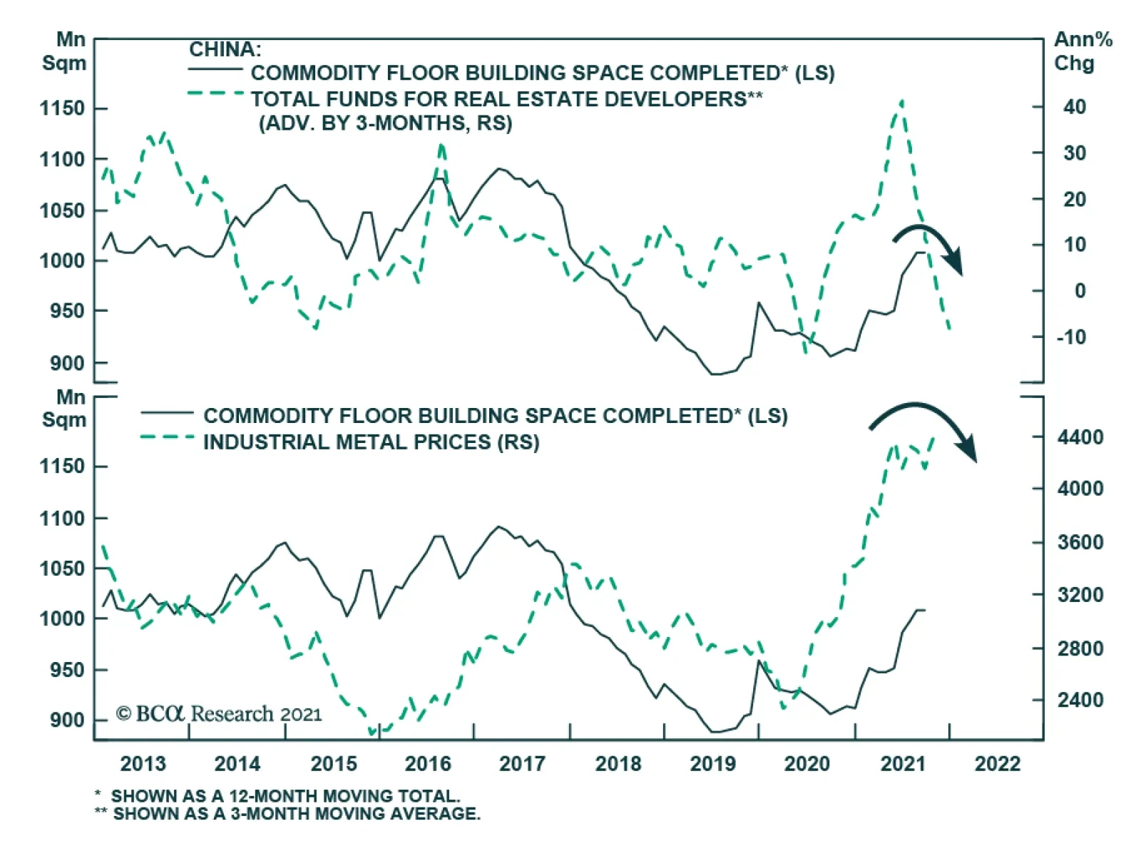
Fifth, households globally also have ample firepower to support their spending, despite some weakness in real income caused by rising inflation. As Chart 7 shows, household net worth in the US is up by 128% of GDP since December 2019. Additionally, the accumulated stocks of household excess savings have reached USD2.4 trillion in the US, EUR150 billion in German, EUR130 billion in France and GBP180 billion in the UK. With respect to the Eurozone specifically, fiscal and monetary policy will remain very accommodative. The fiscal thrust in 2022 will be negative 2.1%, which is significantly less onerous than the US’s -5.9% of GDP. Moreover, economies like Italy and Spain may have a negligible fiscal thrust because of the NGEU program’s disbursements. In addition, while the fiscal thrust will be slightly negative next year, government deficits will remain wide, which indicates that fiscal policy in Europe continues to support demand. Meanwhile, monetary policy still generates deeply negative interest rates on the continent, which sustains demand further. This view is not without risks. The first threat stems from the Chinese credit slowdown. BCA’s China strategists expect credit flows to bottom out by the second quarter of 2022, which implies that Chinese domestic activity should accelerate meaningfully in the second half of the year. Already, we are seeing tentative signs that authorities in China are trying to curb the credit slowdown. For example, Beijing cut the reserve requirement ratio last summer and excess reserves in the banking system are moving back up as liquidity injections grow (Chart 8). The problem is that, so far, Chinese credit demand is not responding to these small measures designed to ease policy. More will be needed as the tightening in financial conditions for real estate developers points to significant downside ahead in construction activity (Chart 9). For now, it is difficult for Beijing to ease policy much more than it has done so far: PPI has reached a 25-year high at 13.5%. Chart 8Not Enough...
Not Enough...
Not Enough...
Chart 9... Especially With Such A Drag
... Especially With Such A Drag
... Especially With Such A Drag
These Chinese inflationary pressures are likely to decline in the first months of 2022, which will allow Beijing to become more aggressive in its support to economic activity. First, Chinese demand is weak, unlike demand in the US. Second, the surge in the PPI is mostly driven by a 17% increase in the energy PPI and a 66% surge in the mining component. These jumps are unlikely to repeat themselves, which will reduce overall inflationary numbers in that economy. The second major risk is global inflation, which is hurting real wages. As a case in point, US real wages are contracting at a 3.2% annual rate, or their deepest cut in six decades. In Europe too, real wages are weak because of the increase in inflation. While these inflationary pressures have had limited effect on European consumer confidence so far, US consumer confidence is breaking down (Chart 10), driven by a collapse in the willingness to buy. If this trend continues, we might see a significant deceleration in global real consumer spending. Chart 10Not All Is Dark On The Inflation Front
Not All Is Dark On The Inflation Front
Not All Is Dark On The Inflation Front
We still expect the European inflationary risk to start dissipating in the first half of 2022. Unlike in the US, the spike in core CPI mostly reflects an increase in VAT and remains narrow, with trimmed-mean CPI lingering near record lows. Moreover, the 24-month rate of change of core CPI remains within the historical norm, which is not the case in the US. The US situation is more tenuous. Last week’s inflation data showed a broadening of inflationary pressures across major sectors of the economy unaffected by the pandemic, with shelter inflation being of particular concern. However, there are positives. Long-term inflation expectations, as approximated by the 5-year/5-year forward inflation breakeven rate, are still below the levels that prevailed before the oil price crash of 2014 (Chart 11, top panel). Additionally, shipping costs have started to ebb, with global container freight rates losing steam and the Baltic Dry index collapsing by 50% since beginning of October (Chart 11, bottom panel). Moreover, as health restrictions are being relaxed in Asia, Asian PMI’s are improving, while the production of semiconductors is rising again in the region (Chart 12). As a result, although there is still significant inflation risk over the next five years, 2022 is likely to witness a temporary pullback in CPI growth. Chart 11Not All Is Dark On The Inflation Front
Not All Is Dark On The Inflation Front
Not All Is Dark On The Inflation Front
Chart 12Semiconductor Production Is Picking Up
Semiconductor Production Is Picking Up
Semiconductor Production Is Picking Up
Bottom Line: Global investors are right to anticipate a decline in global growth next year. However, even if growth slows, it will remain above trend. Moreover, the considerable stimuli in the global economy and the decreased expectations of investors improve the odds that global economic surprises will increase in 2022. China’s domestic weakness and the rise in US inflation constitute the two greatest risks to this view. Investment Implications The level of the global economic surprise index as well as its evolution have important implications for many key European assets. Table 1 highlights the performance of various financial markets at three months, six months, and a year following various ranges of readings of the surprise index (the categories are based on one standard-deviation intervals from the mean). We highlight this methodology, because there remains significant uncertainty about the near-term outlook of the surprise index. Table 1Level Of Surprises And Subsequent Returns
Surprise, Surprise
Surprise, Surprise
Currently, the global economic surprise index stands at -20, or between its -1-sigma and its historical average. This level offers limited clear results for investors when it comes to the performance of the Eurozone benchmark relative to the MSCI All Country World Index (ACWI), and no clear results in terms of the performance of value stocks relative to growth. However, the current reading of the surprise index is consistent with an outperformance of growth stocks relative to momentum over both the three- and six-month horizons. It is also showing a 74% probability of small-cap equities beating large-cap ones over a 12-month basis. Table 2 shows the performance of the same assets over the same windows, following three consecutive months or more of an improving global economic surprise index. This is consistent with our main hypothesis that global economic surprises are set to increase by early next year. Table 2Surprise Upticks And Subsequent Returns
Surprise, Surprise
Surprise, Surprise
Using this method again shows no strong call for the Euro Area equity benchmark relative to the ACWI. There is a small improvement in performance, but Europe on average still underperforms, which reflects the thirteen years of a relative bear market in European equities. Similarly, results for European value stocks compared to growth equities are limited, as the sample is dominated by the structurally poor performance of value equities. However, this method highlights that the euro is likely to appreciate against the USD on both the three- and six-month investment horizon. This message is consistent with that of our Intermediate-Term Timing Model. Finally, this approach once again underscores the attractiveness of European small-cap equities on a three-, six-, and twelve-month investment horizon. Consequently, we maintain our buy recommendation on the euro. As we wrote three weeks ago, the near-term outlook for the common currency is fraught with risks and the low readings of the global economic surprise index confirm this reality. Moreover, markets might enter a phase when they aggressively discount Fed rates hikes next year, which would further hurt the euro. However, the outlook for global growth will ultimately put a floor under EUR/USD. Chart 13Small-Caps: Almost There
Small-Caps: Almost There
Small-Caps: Almost There
We also view European small-cap stocks as the premier equity vehicle in Europe over the coming 18 months because of their heightened pro-cyclicality. However, the timing around shifting toward overweighing small-cap remains risky in the near-term, as they have not fully worked out the overbought conditions we flagged four weeks ago (Chart 13). Thus, we maintain small-cap equities on an upgrade alert, and we are looking to pull the trigger very soon. Mathieu Savary, Chief European Strategist Mathieu@bcaresearch.com Tactical Recommendations
Surprise, Surprise
Surprise, Surprise
Cyclical Recommendations
Surprise, Surprise
Surprise, Surprise
Structural Recommendations
Surprise, Surprise
Surprise, Surprise
Closed Trades
Image
Currency Performance Fixed Income Performance Equity Performance
BCA Research’s Global Investment Strategy service concludes that investors need to throw the old playbook for dealing with growth slowdowns out the window. US growth will slow next year, not because demand will falter, but because supply-side constraints…
Highlights US growth will slow next year, not because demand will falter, but because supply-side constraints will prevent the economy from producing as much output as households and businesses want to buy. If aggregate demand exceeds aggregate supply, the price level will rise. We argue that the US aggregate demand curve is currently quite steep. This implies that the price level may need to rise a lot to restore balance to the economy. In fact, if the aggregate demand curve is not just steep but upward-sloping, which is quite possible, there may be no price level that brings aggregate demand in line with supply; the US economy could go supernova. When supply is the binding constraint to growth, investors need to throw the old playbook for dealing with growth slowdowns out the window. Rather than positioning for lower bond yields, investors should position for higher yields. Rather than expecting a stronger dollar, investors should expect a weaker one. Rather than favoring growth stocks, large caps, and defensives, investors should favor value stocks, small caps, and cyclicals. The Binding Constraint To Growth Is Now Supply After a post-Delta wave rebound in Q4, the US economy is expected to slow over the course of 2022. The Bloomberg consensus is for US growth to decelerate from 4.9% in 2021Q4 to 4.1% in 2022Q1, 3.9% in 2022Q2, 3.0% in 2022Q3, and 2.5% in 2022Q4. Growth in the first quarter of 2023 is expected to dip further to 2.3%. We agree that US growth will slow next year but think the market narrative around this slowdown is misguided. Chart 1Plenty Of Pent-Up Demand
Plenty Of Pent-Up Demand
Plenty Of Pent-Up Demand
The standard market playbook for dealing with an economic slowdown is to position for lower bond yields, a stronger US dollar, and a decline in commodity prices. On the equity side, the playbook calls for shifting equity exposure from cyclicals to defensives, favoring large caps over small caps, and growth stocks over value stocks. There are two major problems with this narrative. First, growth is peaking at much higher levels than before and is unlikely to return to trend at least until the second half of 2023. Second, and more importantly, US growth will slow due to supply-side constraints rather than inadequate demand. US final demand will remain robust for the foreseeable future. Households are sitting on $2.3 trillion in excess savings, equivalent to 15% of annual consumption (Chart 1). The household deleveraging cycle is over. After initially plunging during the pandemic, credit card balances are rising (Chart 2). Banks are falling over themselves to make consumer loans (Chart 3). Chart 2Revolving Credit On The Rise Again
Revolving Credit On The Rise Again
Revolving Credit On The Rise Again
Chart 3Banks Are Easing Credit Standards For Consumers
Banks Are Easing Credit Standards For Consumers
Banks Are Easing Credit Standards For Consumers
Chart 4A Record Rise In Household Net Worth
A Record Rise In Household Net Worth
A Record Rise In Household Net Worth
Household net worth has risen by over 100% of GDP since the start of the pandemic (Chart 4). As we discussed two weeks ago, the wealth effect alone could boost annual consumer spending by up to 4% of GDP. Investment demand should remain strong. Business inventories are near record low levels (Chart 5). Core capital goods orders, a leading indicator for corporate capex, have soared (Chart 6). Chart 5Business Inventories Are Near Record Low Levels
Business Inventories Are Near Record Low Levels
Business Inventories Are Near Record Low Levels
Chart 6Rise In Durable Goods Orders Bodes Well For Capex
Rise In Durable Goods Orders Bodes Well For Capex
Rise In Durable Goods Orders Bodes Well For Capex
Chart 7The Homeowner Vacancy Rate Is Signaling The Need For More Homebuilding
The Homeowner Vacancy Rate Is Signaling The Need For More Homebuilding
The Homeowner Vacancy Rate Is Signaling The Need For More Homebuilding
The Dodge Momentum Index, which tracks planned nonresidential construction, rose to a 13-year high in October. The homeowner vacancy rate is at multi-decade lows, signifying the need for more homebuilding (Chart 7). While increased investment will augment the nation’s capital stock down the road, the short-to-medium term effect will be to inflate demand. Policy Won’t Tighten Enough To Cool The Economy What is the mechanism that will push down aggregate demand growth towards potential GDP growth? It is unlikely to be policy. While budget deficits will narrow over the next few years, the IMF still expects the US cyclically-adjusted primary budget deficit to be nearly 3% of GDP larger between 2022 and 2026 than it was between 2014 and 2019 (Chart 8).
Chart 8
Chart 9The Fed And Investors Still Believe In Secular Stagnation
The Fed And Investors Still Believe In Secular Stagnation
The Fed And Investors Still Believe In Secular Stagnation
As Matt Gertken, BCA’s Chief Geopolitical Strategist, writes in this week’s US Political Strategy report, the passage of the $550 billion infrastructure bill has increased, not decreased, the odds of President Biden and the Democrats passing their social spending bill via the partisan budget reconciliation process. On the monetary side, the Federal Reserve will finish tapering asset purchases next June and begin raising rates shortly thereafter. However, the Fed has no intention of raising rates aggressively. Most FOMC members see the Fed funds rate rising to only 2.5% this cycle (Chart 9). The “dots” call for only one rate hike in 2022 and three rate hikes in both 2023 and 2024. Investors expect rates to rise even less by end-2024 than the Fed foresees (Chart 10).
Chart 10
The Inflation Outlook Hinges On The Slope Of The Aggregate Demand Curve If policy tightening will not suffice in cooling demand, the economy will overheat and inflation will rise. But by how much will inflation increase? The answer is of great importance to investors. It also hinges on a seemingly technical question: What is the slope of the aggregate demand curve? As Chart 11 illustrates, prices will rise more if the aggregate demand curve is steep than if it is flat.
Chart 11
Chart 12Wages Rose Faster Than Prices During The Inflationary Late-60s and 70s
Wages Rose Faster Than Prices During The Inflationary Late-60s and 70s
Wages Rose Faster Than Prices During The Inflationary Late-60s and 70s
It is tempting to think of the aggregate demand curve in the same way one might think of the demand curve for, say, apples. When the price of apples rises, there is both a substitution and an income effect. An increase in the price of apples will cause shoppers to substitute away from apples towards oranges. In addition, if apples are so-called “normal goods,” shoppers will buy fewer apples in response to lower real incomes. This chain of reasoning breaks down at the aggregate level. When economists say the price level has risen, they are referring to all prices; hence, there is no substitution effect. Moreover, since one person’s spending is another’s income, rising prices do not necessarily translate into lower overall real incomes. Granted, if nominal wages are sticky, as they usually are in the short run, an unanticipated increase in prices will reduce real wage income. However, this will be offset by higher business income. Over time, wages tend to catch up with prices. In fact, wage growth usually outstrips price growth during inflationary periods. For example, real wages rose during the late-1960s and 70s but fell during the disinflationary 1980s (Chart 12). Textbook Reasons For A Downward-Sloping Aggregate Demand Curve According to standard economic theory, there are three main reasons why aggregate demand curves are downward-sloping: The Pigou Effect: Higher prices erode the purchasing power of money, resulting in a negative wealth effect. The Keynes Effect: Higher prices reduce the real money supply. This pushes up real interest rates, leading to lower investment spending. The Mundell-Fleming Effect: Higher real rates push up the value of the currency, causing net exports to decline. None of these three factors are particularly important for the US these days. Chart 13Base Money Has Swollen Since The Subprime Crisis
Base Money Has Swollen Since The Subprime Crisis
Base Money Has Swollen Since The Subprime Crisis
Strictly speaking, the Pigou wealth effect applies only to “base money,” also known as “outside money.” Outside money includes cash notes, coins, and bank reserves. Inside money such as bank deposits are not included in the Pigou effect because while an increase in consumer prices decreases the real value of bank deposits, it also decreases the real value of commercial bank liabilities.1 In the US, the monetary base has swollen from 6% of GDP in 2008 to 28% of GDP as a result of the Fed’s QE programs (Chart 13). Nevertheless, even if one were to generously assume a wealth effect of 10% from changes in monetary holdings, this would still imply that a 1% increase in consumer prices would reduce spending by only 0.03% of GDP. Simply put, the Pigou effect is just not all that big.
Chart 14
In contrast to the Pigou effect, the Keynes effect has historically had a significant impact on the business cycle. However, the importance of the Keynes effect faded following the Global Financial Crisis as the Fed found itself up against the zero lower bound on interest rates. When interest rates are very low, there is little to distinguish money from bonds. Rather than holding money as a medium of exchange (i.e., for financing transactions), households and businesses end up holding money mainly as a store of wealth. In the presence of the zero bound, the demand for money becomes perfectly elastic with respect to the interest rate (Chart 14). As a result, changes in the real money supply have no effect on interest rates, and by extension, interest-rate sensitive spending. And if a decline in the real money supply does not push up interest rates, this undermines the Mundell-Fleming effect as well. Could The Aggregate Demand Curve Be Upward-Sloping? The discussion above, though rather theoretical in nature, highlights an important practical point: The aggregate demand curve may be quite steep. This means that the price level might need to rise a lot to equalize aggregate demand with aggregate supply. Chart 15US Real Bond Yields Hitting Record Lows
US Real Bond Yields Hitting Record Lows
US Real Bond Yields Hitting Record Lows
In fact, one can easily envision a scenario where a rising price level boosts spending; that is, where the demand curve is not just steep but upward-sloping. One normally assumes that higher inflation will prompt central banks to raise rates by more than inflation has risen, leading to higher real rates. However, if the Fed drags its feet in hiking rates, as it is wont to do given its concerns about the zero bound, rising inflation will translate into a decline in real rates. Lower rates will boost demand, leading to higher inflation, and even lower real rates. In addition, lower real rates will benefit debtors, who tend to have a higher marginal propensity to spend than creditors. This, too, will also boost aggregate demand. It is striking in this regard that real bond yields hit a record low this week, with the 10-year TIPS yield falling to -1.17% and the 30-year yield drooping to -0.57% (Chart 15). Black Holes Vs. Supernovas
Chart 16
In the case where the aggregate demand curve is upward-sloping, there is no stable equilibrium (Chart 16). If demand falls short of supply, demand will continue to shrink as the price level declines, leading to ever-rising unemployment. Unless policymakers intervene with stimulus, the economy will sink into a deflationary black hole. In contrast, if demand exceeds supply, demand will continue to rise as the price level increases exponentially. The economy will go supernova. Tick Tock Young stars fuse hydrogen into helium, releasing excess energy in the process. After the star has run out of hydrogen, if it is big enough, it will start fusing helium into heavier elements such as carbon and oxygen. The process of nucleosynthesis continues until it reaches iron. That is the end of the line. Fusing elements heavier than iron requires a net input of energy. Unable to generate enough external pressure through fusion, the star loses its battle to gravity. The core collapses, spewing material deep into interstellar space (a good thing since your body is mainly made from this stardust). Observing the star from afar, one would be hard-pressed to see anything abnormal until it explodes. The path to becoming a supernova is highly non-linear. The same is true for inflation. Just like a star with an ample supply of hydrogen, the Fed can burn through its credibility for a while longer. During the 1960s, it took four years for inflation to take off after the economy had reached full employment (Chart 17). By that time, the unemployment rate was two percentage points below NAIRU. Most of today’s inflation is confined to durable goods. This is not a sustainable source of inflation. The durable goods sector is the only part of the CPI where prices usually fall over time (Chart 18). Chart 17Inflation Spiked In The 1960s Only Once The Unemployment Rate Had Fallen Far Below Equilibrium
Inflation Spiked In The 1960s Only Once The Unemployment Rate Had Fallen Far Below Equilibrium
Inflation Spiked In The 1960s Only Once The Unemployment Rate Had Fallen Far Below Equilibrium
Chart 18Inflation Has Been Concentrated In Durable Goods, A Sector Where Prices Usually Fall Over Time
Inflation Has Been Concentrated In Durable Goods, A Sector Where Prices Usually Fall Over Time
Inflation Has Been Concentrated In Durable Goods, A Sector Where Prices Usually Fall Over Time
To get inflation to go up and stay up in modern service-based economies, wages need to rise briskly. While US wage growth has picked up, the bulk of the increase has been among low-wage workers, particularly in the services and hospitality sector (Chart 19). Chart 19Wage Growth Has Picked Up, But Mainly At The Bottom Of The Income Distribution
Wage Growth Has Picked Up, But Mainly At The Bottom Of The Income Distribution
Wage Growth Has Picked Up, But Mainly At The Bottom Of The Income Distribution
The most likely scenario for next year is that firms will simply ration output, fearful that raising prices too quickly will hurt brand loyalty and trigger accusations of price gouging. Shortages will persist, but this time they will be increasingly concentrated in the service sector. Such a state of affairs will not last, however. Competition for workers will cause wages to rise much more than they have so far. Keen to protect profit margins, firms will start jacking up prices. A wage-price spiral will develop. The US economy could go supernova. Investment Conclusions Chart 20Long-Term Inflation Expectations Are Near The Bottom End Of The Fed's Comfort Zone
Long-Term Inflation Expectations Are Near The Bottom End Of The Fed's Comfort Zone
Long-Term Inflation Expectations Are Near The Bottom End Of The Fed's Comfort Zone
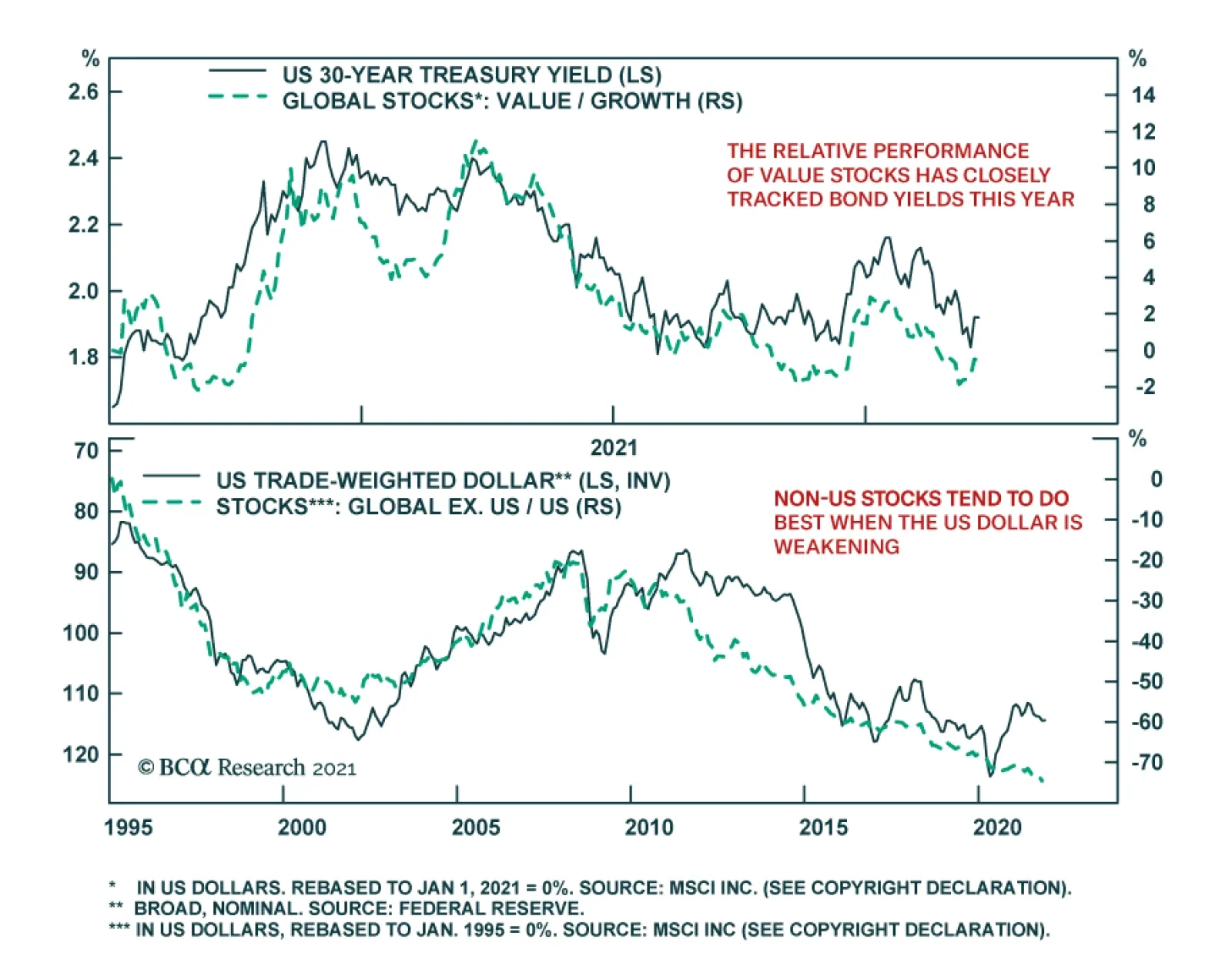
US growth will slow next year, not because demand will falter, but because supply-side constraints will prevent the economy from producing as much output as households and businesses want to buy. This means that the old playbook for dealing with growth slowdowns needs to be thrown out the window. Rather than positioning for lower bond yields, investors should position for higher yields. Rather than expecting a stronger dollar, investors should expect a weaker one. Rather than favoring growth stocks, large caps, and defensives, investors should favor value stocks, small caps, and cyclicals. While inflation expectations have recovered from their pandemic lows, the 5-year/5-year forward TIPS breakeven inflation rate is still near the bottom end of the Fed’s comfort zone (Chart 20). Rising inflation expectations will lift long-term bond yields, justifying a short duration stance in fixed-income portfolios. Higher bond yields will benefit value stocks. Chart 21 shows that there has been a strong correlation between the relative performance of growth and value stocks and the 30-year bond yield this year. Rising input prices will make the US export sector less competitive, leading to a weaker dollar. Historically, non-US stocks have done well when the dollar has been weakening (Chart 22). Chart 21The Relative Performance of Value Stocks Has Closely Tracked Bond Yields This Year
The Relative Performance of Value Stocks Has Closely Tracked Bond Yields This Year
The Relative Performance of Value Stocks Has Closely Tracked Bond Yields This Year
Chart 22Non-US Stocks Tend To Do Best When The US Dollar Is Weakening
Non-US Stocks Tend To Do Best When The US Dollar Is Weakening
Non-US Stocks Tend To Do Best When The US Dollar Is Weakening
As for the overall stock market, with the Fed still in the dovish camp, it is too early to turn negative on equities. An equity bear market is coming, but not until rising inflation forces the Fed to step up the pace of rate hikes. That will probably not happen until mid-2023. Short Gilt Trade Activated We noted last week that we would go short the 10-year UK Gilt if the yield broke below 0.85%. Our limit order was activated on November 5th and we are now short this security. Peter Berezin Chief Global Strategist pberezin@bcaresearch.com Footnotes 1 To distinguish between inside and outside money, one should ask where the liability resides. If the liability resides within the private sector, it is inside money. By convention, central bank reserves are classified as outside money. However, one could argue that since taxpayers ultimately own the central bank, an increase in the price level will benefit taxpayers by eroding the real value of the central bank’s liability. If one were to take this view, the Pigou effect would be even weaker. Global Investment Strategy View Matrix
Image
Special Trade Recommendations
Image
Current MacroQuant Model Scores
Image
EUR/USD continued to weaken on Thursday after collapsing 0.57% to a new 2021 low in the previous day. Notably, the cross breached the 1.15 technical resistance level which raises the risk that it will continue to fall over the near term. Our foreign…
Highlights The bipartisan Infrastructure Investment and Jobs Act will increase US government non-defense spending to around 3% of GDP, a level comparable to the 1980s-90s and larger than the 2010s. Democrats are increasingly likely to pass their ~$1.75 trillion social spending bill, with odds at 65%. The budget reconciliation process necessary to pass this bill is also necessary to raise the national debt limit by December 3, so Congress is unlikely to fail. The Democratic spending bills will reduce fiscal drag very marginally in 2022-24 and will occasionally increase fiscal thrust thereafter. Republicans are unlikely to repeal much of the spending in coming years. Limited Big Government is a new strategic theme. The federal government is permanently taking a larger role in the economy – but this role will still be limited by voters, who do not favor socialism. Biden’s approval rating will stabilize at a low level. Immigration, crime, and especially inflation will determine the Democrats’ fate in the 2022 midterms. Gridlock is likely. The stock market has already priced the infrastructure bill and it will continue to rally on the rumor that reconciliation will pass. But growth has outperformed value, contrary to expectations. Feature Democrats in the House of Representatives finally passed the $1.2 trillion Infrastructure Investment and Jobs Act, which consists of $550 billion in brand new spending and $650 billion in a continuation of existing levels of spending to cover the next ten years. The legislation passed with 228 votes in the House, ten more than needed, due to 13 Republican votes, making it “bipartisan” (Chart 1). The contents of the bill are shown in Table 1. Republicans supported the bill because of its focus on traditional infrastructure – roads, bridges, ports – but they also agreed to more modern elements such as $65 billion on broadband Internet and $36 billion on electric vehicles and environmental remediation. Implementation of the bill will be felt in 2023-24, in time for the presidential election, as committees will need to be set up to identify and approve projects.
Chart 1
Table 1Itemized Infrastructure Plan
Closing The Loop On Infrastructure
Closing The Loop On Infrastructure
While $550 billion is not a lot in a world of multi-trillion dollar stimulus bills, nevertheless it makes for a 34% increase in federal non-defense investment to levels consistent with the 1980s-90s (Chart 2).
Chart 2
The new government spending will amount to 3% of GDP per year over the next ten years, a non-trivial amount of stimulus even though the big picture of the budget deficit remains about the same (Chart 3).
Chart 3
The passage of the infrastructure bill will increase, not decrease, the odds of Biden and the Democrats passing their $1.75 trillion social spending bill via the partisan budget reconciliation process. Subjectively we put the odds at 65% in the wake of infrastructure, although recent events suggest that the odds could be put even higher. While left-wing Democrats failed to link the infrastructure and social spending bills, as we argued, nevertheless the passage of infrastructure was a requirement for the key swing voter in the Senate, Joe Manchin of West Virginia. Manchin is negotiating on the reconciliation bill, suggesting he will vote for it, and he will ultimately capitulate because he will not want to be blamed for a default on the US national debt. The US will hit the national debt ceiling on December 3 and the only reliable means for the Democrats to raise the ceiling is reconciliation. The other critical moderate Democratic senator, Kyrsten Sinema of Arizona, seems to have capitulated, after securing a removal of corporate and high-income individual tax hikes from the bill. Far-left senators might make a last stand, holding up reconciliation and winning some last-minute concession. Six House Democrats refused to vote for the infrastructure bill (including New York House member Alexandria Ocasio-Cortez). However, progressives lost leverage after the Democrats’ losses in the off-year elections. Moreover the debt ceiling will force the hand of the progressives as well as the moderates. Any such hurdles will ultimately be steamrolled by the president and Democratic Party leaders. Combined with infrastructure, the net deficit impact of the infrastructure and reconciliation bills will range from $461 billion to $1 trillion (Table 2). Our scenarios vary based on how much credence we give to Democratic revenue raisers, since many of these are gimmicks and accounting tricks to make the bill look more fiscally responsible than it really is. At the most the US is looking at an increase in the budget deficit of less than 0.5% of GDP per year in the coming years. Table 2Biden Administration Tax-And-Spend Scenarios
Closing The Loop On Infrastructure
Closing The Loop On Infrastructure
Investors should think of Biden’s legislative efforts as very marginally reducing fiscal drag rather than increasing fiscal thrust, at least in the short run. The budget deficit is normalizing after hitting unprecedented peacetime extremes at the height of the global pandemic and social lockdowns. The shrinking deficit subtracts from aggregate demand in 2022-2024. But the new spending bills will remove a small part of that drag during these years, as highlighted in Chart 4. More importantly the US Congress is signaling that fiscal policy is back in action and that fiscal retrenchment is a long way off. Over the long run, new spending will add marginally to fiscal thrust and aggregate demand, suggesting that the US government’s contribution to the economy will grow a bit in the latter part of the 2020s, namely if Democratic legislation survives the 2024 election. For the most part it probably will, as it is very difficult to repeal entitlements or slash government spending even with Republican majorities, as witnessed with the Affordable Care Act (Obamacare) in 2017.
Chart 4
Chart 5Polarization Of Economic Sentiment Declining
Polarization Of Economic Sentiment Declining
Polarization Of Economic Sentiment Declining
The polarization of economic sentiment – i.e. divergence in partisan views of the economy – has fallen since the pandemic and will likely continue to fall as the business cycle continues (Chart 5). Both presidential candidates offered infrastructure packages – they only differed on how to fund it. With the government taking a larger role in the economy – and yet the Republicans likely to rebound in future elections – the result is one of our new strategic themes: limited big government. The heyday of “limited government,” from President Ronald Reagan through George W. Bush, has ended. But the new popular and elite consensus in favor of “Big Government” can be overrated – the US political system is defined by checks and balances that will limit the pace and magnitude of the big government trend, and at times even seem to reverse it. Hence investors should think of US fiscal policy and government role in the economy as limited big government. Political Implications Of Bipartisan Infrastructure President Biden’s approval rating has collapsed since this summer when he suffered from perceptions of incompetence on both the delta variant of COVID-19 and the withdrawal from Afghanistan. Democratic infighting, which delayed the passage of his legislation, also hurt him (Chart 6). However, these are all passing narratives, with the exception of the incompetence narrative, which could become a lasting threat to Biden if not addressed. Biden’s signing of the infrastructure bill will stabilize his approval rating. Biden will probably end up somewhere between Presidents Obama and Trump. Voters will most likely upgrade their assessment of his handling of the economy over the coming year, at least marginally. But on foreign policy he will remain extremely vulnerable since he faces numerous immediate crises in coming years. American presidential disapproval has trended upwards since the 1950s of President Eisenhower. Disapproval peaks during recessions and wars. As the economy improves, Biden’s disapproval will fall, but foreign crises and wars are likely in today’s fraught geopolitical environment (Chart 7).
Chart 6
Chart 7
A few opinion polls suggest that Republicans have taken the lead over the Democrats in generic opinion polling regarding support for the parties in Congress. These polls are outliers and may or may not become the norm over the next year. Democrats have fallen from their peaks but Republicans still suffer from significant internal divisions (Chart 8).
Chart 8
Voters continue to identify mostly as political independents, with a notable downtrend in the share of voters who see themselves as Republicans or Democrats in recent years (Chart 9). Independent voters have marked leanings, right or left. While the leftward lean of independents has peaked, they are not leaning to the right. The infrastructure bill and even reconciliation bill will support Democratic identification. But the sharp rise in immigration, crime, and potentially persistent inflation will support Republicans. These last will become the critical political issues going forward. The democratic socialist or progressive agenda has already been checked by voters and Democrats can only double down on that agenda at their own peril. The infrastructure bill’s passage may give a boost to perceptions of Democratic odds of maintaining the Senate in the 2022 midterm elections – that question is still up in the air, even as the House is very likely to return to Republican control (Chart 10). Chart 9Independent Voters Still Rule
Independent Voters Still Rule
Independent Voters Still Rule
An under-the-radar beneficiary of the bipartisan infrastructure bill is Congress itself. Since 2014, public approval of Congress has gradually recovered from historic lows. The level is still low, at 27%, but the upward trend is notable for suggesting that a fiscally active Congress gains popular approval (Chart 11). New social spending will also increase Congress’s image, first for “doing something,” and second for expanding the social safety net, which more than half of voters will approve.
Chart 10
Chart 11
Partisan gridlock after 2022 could reverse the trend, as Republicans may find or invent a reason to impeach President Biden in retribution for President Trump’s impeachments. But our best guess is that Congress will remain above its low point as long as fiscal support – limited big government – remains intact. Aggressive tax hikes or spending cuts, or a national debt default, could reverse the recovery of this institution. Investment Takeaways The infrastructure bill’s passage may have supported the recent rally in stocks but it is not the main driver. Infrastructure stocks had largely discounted the bill’s passage by spring and our BCA Infrastructure Basket has underperformed the broad market since then. In absolute terms, infrastructure stocks have reached new highs and show a rising trajectory (Chart 12). The infrastructure bill has not delivered as expected when it comes to sectors or investment styles. Cyclicals have outperformed defensives, as expected. But value stocks have hit new lows relative to growth stocks, contrary to our expectation this year (Chart 13). Chart 12Infrastructure Was Already Priced
Infrastructure Was Already Priced
Infrastructure Was Already Priced
Chart 13Wall Street Looks Well Beyond Infrastructure
Wall Street Looks Well Beyond Infrastructure
Wall Street Looks Well Beyond Infrastructure
External factors – namely China’s policy tightening and bumps in the global recovery – weighed on cyclicals and value plays, especially relative to Big Tech (Chart 14). Growth stocks have surged yet again on low bond yields, positive earnings surprises, and secular trends like innovation and digitization. The American economy looks robust as the year draws to a close. The service sector is recovering smartly from the delta variant. Non-manufacturing business activity is surging and new orders are exploding upward relative to inventories (Chart 15). Service sector employment has suffered from shortages. Chart 14External Factors Weigh On Infrastructure Plays
External Factors Weigh On Infrastructure Plays
External Factors Weigh On Infrastructure Plays
Chart 15Service Sector Recovery Underway
Service Sector Recovery Underway
Service Sector Recovery Underway
Inflation risks are trickling into consumer and voter consciousness as Christmas approaches and prices rise at the pump (Chart 16). The Democrats’ two big bills will mitigate the damage they face in next year’s midterm elections – the Senate is still in competition. But a persistent inflation problem will overwhelm their legislative accomplishments. Voters will connect the dots between large deficit spending and inflationary surprises (not to mention any Democratic changes that reinforce the extremely dovish stance of the Fed). The normal political cycle will count heavily against the Democrats in 2022 regardless of inflation. But voters simultaneously face historic spikes in immigration and crime – and the former, at least, will get worse and not better over the next 12 months. Predicting inflation is a mug’s game but wage growth suggests it will remain a substantial risk in 2022 – and the structural shift in favor of big government, even if it is limited big government due to the political cycle, is inflationary on the margin. Chart 16Voters Awakening To Inflation
Voters Awakening To Inflation
Voters Awakening To Inflation
Matt Gertken Vice President Geopolitical Strategy mattg@bcaresearch.com Appendix
Image
Image
Image
Image
Image
Image
Image
Image
The Czech National Bank surprised markets with a massive 125 basis point rate hike on Thursday – significantly above the anticipated 75 bp increase. The central bank’s sharp move – which follows a 75 bp hike in September and is the fourth consecutive rate…