Financial Markets

Highlights Equity valuations are extremely stretched versus bonds, so there is little wiggle room for bonds to sell off before pulling down large tracts of the stock market. We estimate that bond yields can rise by no more than 30 bps, before the Fed is forced to talk them back down again. Starting from an earnings yield that is extreme versus its history, we should prudently assume that the prospective long-term real return from equities will be far below the current earnings yield of 4.6 percent, and closer to zero, even if not actually negative. In capitalist economies, gluts may or may not lead to shortages; but shortages always lead to gluts. In other words, the current inflation is sowing the seeds of its own destruction. Hence, we reiterate our structural recommendation to overweight US T-bonds versus US TIPS. Fractal analysis: Cotton, and Polish equities. Feature Chart of the WeekTech Stocks Have Been Tracking The 30-Year T-Bond Price One-For-One
Tech Stocks Have Been Tracking The 30-Year T-Bond Price One-For-One
Tech Stocks Have Been Tracking The 30-Year T-Bond Price One-For-One
Equity valuations are extremely stretched versus bonds. The upshot is that there is little wiggle room for bonds to sell off before pulling down large tracts of the stock market. This is not just an abstract hypothesis – it is an empirical fact, as recent market action is making painfully clear. Since February, the global tech sector has tracked the 30-year T-bond price almost one-for-one. The near perfect fit proves that the tech (and broader growth stock) rally has been entirely premised on the bond market rally. Hence, on the three occasions that bonds have sold off sharply – including in the last couple of weeks – tech stocks have sold off sharply too (Chart of the Week). Put simply, the performance of the tech sector is being driven by the change in its valuation, and the change in its valuation is being driven by the change in the bond yield (Chart I-2). Chart I-2Tech Stock Valuations Are Being Driven By The Bond Yield
Tech Stock Valuations Are Being Driven By The Bond Yield
Tech Stock Valuations Are Being Driven By The Bond Yield
Of course, stock prices are also premised on earnings. So, given enough time, rising earnings can make valuations less stretched, adding more wiggle room for bonds to sell off. The trouble is that a change in earnings happens much more gradually than can a change in valuation – a 10 percent rise in earnings can take a year, whereas a 10 percent fall in valuation can happen in a week. Bond Yields Remain The Dominant Driver Of The Stock Market For the next few months at least, the movement in bond yields will remain the dominant driver of the most stretched parts of the stock market and, by extension, the overall market itself. This is especially true for the growth-heavy S&P 500 which, since March, has been tracking the 30-year T-bond price one-for-one (Chart I-3). Chart I-3The S&P 500 Has Also Been Tracking The 30-Year T-Bond Price One-For-One
The S&P 500 Has Also Been Tracking The 30-Year T-Bond Price One-For-One
The S&P 500 Has Also Been Tracking The 30-Year T-Bond Price One-For-One
The key question for investors is, what is the upper limit to bond yields before stock market damage causes the Federal Reserve to talk them down again? To answer this question, our working assumption is that a 15 percent drawdown in growth stocks would damage the growth-heavy S&P 500 enough – and thereby worsen ‘financial conditions’ enough – for the Fed to change its tone. Based on this year’s very tight relationship between tech stocks and the 30-year T-bond yield, a 15 percent drawdown would occur if the 30-year T-bond yield increased to 2.4 percent from 2.1 percent today (Chart I-4). Chart I-4The Fed's 'Pain Point' Is Only 30 Basis Points Away
The Fed's 'Pain Point' Is Only 30 Basis Points Away
The Fed's 'Pain Point' Is Only 30 Basis Points Away
This confirms our view that the resistance level to long-duration bond yields is around 30 bps above current levels, equivalent to around 1.8 percent on the 10-year T-bond yield. More About The ‘Negative Equity Risk Premium’ Our recent report The Equity Risk Premium Turns Negative For The First Time Since 2002 caused quite a stir. So, let’s elaborate and clarify the arguments we made about the equity risk premium (ERP) – the estimated excess return that stocks will deliver over bonds over a long investment horizon, such as 10 years. Many investors estimate the ERP by taking the stock market’s earnings yield – currently 4.6 percent in the US1 – and subtracting the real 10-year bond yield – currently -0.9 percent on US Treasury Inflation Protected Securities (TIPS). At first glance, this presents a very generous ERP of 5.5 percent. So, equities are attractively valued versus bonds, right? Wrong. The glaring error is that the earnings yield estimates the stock market’s prospective return only if the earnings yield starts and ends at the same level. If it does not, then the prospective return could be very different to the earnings yield. For example, imagine that the stock market was trading at a bubble price-to-earnings multiple of 100, meaning an earnings yield of 1 percent. Clearly, from such a bubble valuation, nobody would expect the market to return 1 percent. Instead, as the bubble burst, and valuations normalised, the prospective return would be deeply negative. It follows that when, as now, the earnings yield is extreme versus its history, we must build in some prudent normalisation to estimate the prospective return. The question is, how? One approach is to use history to inform us of the likely normalisation. Chart I-5 does this using the ‘best-fit’ relationship between the earnings yield at each point through 1990-2011 and subsequent 10-year real return from each starting point. Using the best-fit for this specific episode, the current earnings yield of 4.6 percent implies a prospective 10-year real return not of 4.6 percent, but of -1.1 percent. Chart I-5Based On History, The Current Earnings Yield Implies A Prospective 10-Year Real Return Much Less Than 4.6 Percent
Based On History, The Current Earnings Yield Implies A Prospective 10-year Real Return Much Less Than 4.6 Percent
Based On History, The Current Earnings Yield Implies A Prospective 10-year Real Return Much Less Than 4.6 Percent
Yet this best-fit approach meets a common reproach – that the best-fit for this specific episode is massively distorted by the dot com bubble peak and the global financial crisis (GFC) trough occurring (by coincidence) almost 10 years apart. We can counter this reproach in two ways. First, the best-fit relationship is much better than the raw earnings yield even for undistorted 10-year periods such as 1995-2005 or 2011-2021. Better still, we can change the prospective return from 10 years to 7 years and thereby remove the dot com bubble peak to GFC trough distortion. Chart I-6 shows that this 7-year best-fit relationship also works much better than the raw earnings yield. Chart I-6Based On History, The Current Earnings Yield Implies A Prospective 7-Year Real Return Much Less Than 4.6 Percent
Based On History, The Current Earnings Yield Implies A Prospective 7-year Real Return Much Less Than 4.6 Percent
Based On History, The Current Earnings Yield Implies A Prospective 7-year Real Return Much Less Than 4.6 Percent
Admittedly, the best-fit comes from just one episode in history, and there is no certainty that the 10-year and 7-year relationships that applied during that one episode should apply through 2021-31 and 2021-28 respectively. Nevertheless, starting from an earnings yield that is extreme versus its history, as is the case now, we should prudently assume that the prospective long-term real return from equities will be far below 4.6 percent, and closer to zero, even if not actually negative. Will The ‘Real’ Real Yield Please Stand Up Measuring the ERP also requires an estimate of the prospective real return on bonds. This part should be easy because the yield on the US 10-year TIPS – currently -0.9 percent – is the guaranteed 10-year real return of buying and holding that investment. It is derived by taking the yield on the 10-year T-bond – currently 1.5 percent – and subtracting the market’s expected rate of inflation over the next 10 years – currently 2.4 percent. But the equivalent real return on the much larger conventional bond market could be quite different. In this case, it will be the 10-year T-bond yield minus the actual rate of inflation over the next 10 years. To the extent that the actual rate of inflation turns out less than the expected rate of 2.4 percent, the real return on the T-bond will turn out higher than that on the TIPS. In fact, this has consistently turned out to be the case. The market has consistently overestimated the inflation rate over the subsequent 10 years, meaning that the real return on T-bonds has been around 1 percent higher than that on TIPS (Chart I-7). Chart I-7Will The 'Real' Real Yield Please Stand Up
Will The 'Real' Real Yield Please Stand Up
Will The 'Real' Real Yield Please Stand Up
Yet given the current surge in inflation, and no end in sight for supply chain disruptions and bottlenecks, is it plausible that the next ten years’ rate of inflation will be lower than 2.4 percent? The answer is yes. Because, as my colleague Peter Berezin points out: in capitalist economies, gluts may or may not lead to shortages; but shortages always lead to gluts. And gluts always cause prices to collapse. In other words, the current inflation is sowing the seeds of its own destruction. Hence, we reiterate our structural recommendation to overweight US T-bonds versus US TIPS. The Cotton Is Stretched, And So Are Polish Equities Talking of shortages, cotton now adds to the list of commodities in which supply bottlenecks have raised prices to extremes. Cotton prices have reached a 10-year high due to weather conditions in the US (the world’s biggest cotton producer) combined with shipping disruptions. However, with cotton now exhibiting extreme fragility on its combined 130/260-day fractal structure, there is a high likelihood of a price reversal in the coming months when the shortage turns into a glut (Chart I-8). Chart I-8The Cotton Is Stretched
The Cotton Is Stretched
The Cotton Is Stretched
Meanwhile, the bank-heavy Polish equity market has surged on the back of the spectacular outperformance of its banks sector. This strong uptrend has now reached the point of fragility on its 130-day fractal structure that has indicated several previous reversals (Chart I-9). Chart I-9Poland's Outperformance Is Stretched
Poland's Outperformance Is Stretched
Poland's Outperformance Is Stretched
Accordingly, this week’s recommended trade is to underweight the Warsaw General Index versus the Eurostoxx 600, setting a profit target and symmetrical stop-loss at 6 percent. Dhaval Joshi Chief Strategist dhaval@bcaresearch.com Footnotes 1 Based on the 12-month forward earnings yield. Fractal Trading System Fractal Trades 6-Month Recommendations Structural And Thematic Recommendations Closed Fractal Trades Indicators To Watch - Bond Yields Chart II-1Indicators To Watch - Bond Yields ##br##- Euro Area
Indicators To Watch - Bond Yields - Euro Area
Indicators To Watch - Bond Yields - Euro Area
Chart II-2Indicators To Watch - Bond Yields ##br##- Europe Ex Euro Area
Indicators To Watch - Bond Yields - Europe Ex Euro Area
Indicators To Watch - Bond Yields - Europe Ex Euro Area
Chart II-3Indicators To Watch - Bond Yields ##br##- Asia
Indicators To Watch - Bond Yields - Asia
Indicators To Watch - Bond Yields - Asia
Chart II-4Indicators To Watch - Bond Yields ##br##- Other Developed
Indicators To Watch - Bond Yields - Other Developed
Indicators To Watch - Bond Yields - Other Developed
Indicators To Watch - Interest Rate Expectations Chart II-5Indicators To Watch ##br##- Interest Rate Expectations
Indicators To Watch - Interest Rate Expectations
Indicators To Watch - Interest Rate Expectations
Chart II-7Indicators To Watch ##br##- Interest Rate Expectations
Indicators To Watch - Interest Rate Expectations
Indicators To Watch - Interest Rate Expectations
Chart II-6Indicators To Watch ##br##- Interest Rate Expectations
Indicators To Watch - Interest Rate Expectations
Indicators To Watch - Interest Rate Expectations
Chart II-8Indicators To Watch ##br##- Interest Rate Expectations
Indicators To Watch - Interest Rate Expectations
Indicators To Watch - Interest Rate Expectations
Highlights European small-cap equities have structurally outperformed large-cap stocks. This outperformance echoes the desirable sectoral biases of small-cap stocks. It also reflects the inability of European large-cap stocks to expand their markups, unlike US large caps. The pro-cyclicality of European small-cap stocks and the limited correlation of their relative performance to the Chinese credit cycle make them an attractive play in European portfolios. The current risk-off phase in global markets suggests it is still too early to buy European small-cap stocks, but an opportunity to overweight them will emerge in the coming weeks. Feature Markets last week were volatile and corrected sharply. This fit with the view expressed in our previous strategy report, which argued that the near-term outlook for European equities was still clouded by the confluence of the coming Fed tightening and a Chinese economic slowdown. Chart 1Ebbing COVID Allows For Central Bank Repricing
Ebbing COVID Allows For Central Bank Repricing
Ebbing COVID Allows For Central Bank Repricing
The market seems especially concerned by the deterioration in liquidity conditions. The Delta wave is ebbing around the world (Chart 1) and inflation is proving to be stickier than policymakers had originally anticipated. As a result, investors appear to be pricing in the potential implications of central banks moving from being behind the curve to ahead of the curve. Moreover, surging natural gas prices in Europe, empty gas stations in the UK, labor shortages around the world, and steep automobile production cuts by major players like Toyota and GM raise the specter of stagflation. In this context, bond yields are rising and stocks are agitated. The dollar’s rally further tightens global financial conditions and adds to the systemic stress, which intensifies the very unsettling environment for investors. Consequently, seasonal October weakness remains on the table. Chart 2Tactical Vulnerabilities Remain
Tactical Vulnerabilities Remain
Tactical Vulnerabilities Remain
We continue to see this selling phase as temporary. Sentiment will be consistent with a trough in risk assets soon (Chart 2). Additionally, Chinese authorities will reflate the economy much more aggressively than they have so far, even if it probably takes more market pain first. In this context, we focus on what to buy to take advantage of the eventual rebound in cyclical plays. This week, we look at European small-cap stocks that have handsomely outperformed their larger counterparts over the past ten years. In Europe, Small Is Beautiful Chart 3Small Caps Lead In Europe
Small Caps Lead In Europe
Small Caps Lead In Europe
The underperformance of European stocks relative to the US over the past 13 years is well known by investors. Less known is that, since 2012, European small-cap stocks have performed roughly in line with their US counterparts. In other words, European small-cap stocks have massively outperformed Euro Area equity benchmarks (Chart 3). Two forces explain the ability of European small caps to beat their larger competitors by 85% since the Great Financial Crisis. The sectoral composition of European small-cap indexes helped them outperform their larger competitors. Using MSCI benchmarks, the small-cap index largest overweight are industrials and real estate, compared to financials, healthcare, and consumer staples for large caps (Table 1). Industrials have been one of the best performing sectors in the cyclicals and value categories, while financials have greatly suffered. Meanwhile, real estate equities enjoy falling yields, while financials hate them. This dichotomy explains why European small caps outperformed as European yields collapse (Chart 4). It is also why, unlike in the US, the relative performance of European small-cap equities exhibits little correlation with the slope of the yield curve. Table 1Small Caps Overweighs The Right Sectors
Small Caps Win Big?
Small Caps Win Big?
Chart 4European Small Caps Like Lower Bund Yields
European Small Caps Like Lower Bund Yields
European Small Caps Like Lower Bund Yields
The poor performance of the European large-cap stocks is the second element explaining the outperformance of European small caps. The European large-cap stocks lie at the heart of Europe’s underperformance relative to the US, not the smaller firms. According to researchers De Loecker, Eeckhout, and Unger, US firms have grown their markups massively since the 1980s (Chart 5).1 These expanding markups reflect a growing market power, which is the result of rising market concentration among the dominant players in nearly all the industries.2 In fact, Grullon, Larkin & Michaely show that industries with a greater level of concentration also display higher levels of RoA (Chart 6).3 The problem for European large firms is that they have not experienced the same increase in industry concentration as US businesses. Research by the OECD demonstrates that industry concentration rose significantly more in the US than in Europe over the past 20 years (Chart 7). This is particularly true in the service sector (Chart 7, middle panel) and the less digital-intensive industries (Chart 7, bottom panel).4 Chart 5Higher US Markups
Small Caps Win Big?
Small Caps Win Big?
Chart 6As Concentration Increases, So Do RoAs
Small Caps Win Big?
Small Caps Win Big?
Chart 7Europe Did Not Witness The Same Increase In Concentration
Small Caps Win Big?
Small Caps Win Big?
Without this increase in market power, European large caps could not experience a meaningful pick up in their RoEs relative to those of small-cap stocks. They have therefore been fully victim to their sector composition and massively underperform smaller firms as well as US large businesses. Bottom Line: The structural outperformance of European small caps relative to large-cap stocks reflects the former’s large overweight in industrials and real estate stocks compared to the latter’s overrepresentation of financials, healthcare, and consumer staples names. Additionally, the inability of large-cap European names to increase industrial concentration has prevented them from mimicking the extraordinary growth in markups and RoE witnessed in the US. As a result, European small-cap names could massively beat their larger counterparts. Can The Outperformance Continue? The structural outperformance of small caps will become challenged if Europe experiences a structural increase in yields, which will hurt real estate stocks while helping financials. This sectoral effect will result in a structural outperformance of European stocks. On a cyclical horizon, however, the outlook continues to favor small-cap over large-cap equities in Europe and the Eurozone. Chart 8The Relative Performance Of European Small Caps is Procyclical
Small Caps Win Big?
Small Caps Win Big?
As in the US, the relative performance of European small-cap stocks is pro-cyclical. As Chart 8 shows, small-cap stocks generate the largest excess returns at the beginning of business cycle upswings. They continue to outperform, as long as the business cycle points up. Only once a slowdown begins do small- cap names underperform. Similarly, the relative performance of small-cap equities correlates closely with the Euro Area Manufacturing PMI (Chart 9). It also displays a negative correlation with high-yield spreads (Chart 9, middle panel). Additionally, small-cap stocks track the evolution of inflation swaps (Chart 9, bottom panel). This behavior of small caps means that they remain an attractive bet over the next 18 to 24 months. The European economy is likely to continue to grow robustly over the coming two years and thus stay in the quadrant where small caps outperform. Moreover, the ECB’s policy will generate very accommodative monetary conditions for an extended period. Hence, European high-yield bonds will continue to outperform safe havens and the labor market will tighten further, which will help CPI swap climb up. Despite this procyclicality, the relative performance of small-cap stocks displays only a loose correlation with the European cyclical/defensive split (Chart 10). Moreover, small caps do not correlate closely with commodity prices (Chart 10 middle panel). These two observations reflect the limited relationship between the relative performance of small-cap equities and the Chinese credit impulse (Chart 10, bottom panel). The small caps’ lack of sensitivity to the Chinese economy is the consequence of their lower international bent compared to that of large-cap firms. Chart 9More Signs Of Procyclicality
More Signs Of Procyclicality
More Signs Of Procyclicality
Chart 10Low Correlation To China Plays
Low Correlation To China Plays
Low Correlation To China Plays
This low correlation with Chinese economic variables is likely to prove another asset for small-cap equities. As we have witnessed with the Evergrande saga or the rotating crackdowns from one industry to the next, China will remain a source of uncertainty for the global economy and global capital markets for the foreseeable future. Thus, a low-correlation relative performance is an attractive attribute. Chart 11Not Particularly Cheap
Not Particularly Cheap
Not Particularly Cheap
European small-cap stocks are not without blemish. Unlike in the US, they trade at a premium to large-cap stocks on many valuation metrics. For example, their price-to-forward earnings, price-to-trailing earnings, price-to-cash flow ratios and dividend yields stands at 21 vs 16, 35 vs 35, 18 vs 10 and 1.2% vs 2%, respectively. True, small-cap indexes carry a large proportion of companies with negative earnings. Adjusting for this characteristic, the forward P/E ratio falls to 15.12, which is just under the similarly adjusted forward P/E ratio of the Eurozone benchmark. Our Composite Small Cap Relative Valuation Indicator, which amalgamates this information, is directly in the neutral zone (Chart 11). The neutral relative valuation of small-cap stocks is a handicap because they sport operating metrics that are worse than their larger cousins. Their RoE are a meagre 6.3% vs 7.7%. Moreover, forward earnings have rebounded sharply already and long-term growth expectations are lofty (Chart 12). This leaves the euro as the ultimate arbiter of the path of European small caps. As Chart 13 illustrates, the trade-weighted euro closely tracks the relative performance of the Euro Area small-cap benchmark. This reflects the more domestic nature of small caps, but also, their procyclicality, which mimics that of the euro. Chart 12Some Good News In The Price
Some Good News In The Price
Some Good News In The Price
Chart 13A Play On The Euro
A Play On The Euro
A Play On The Euro
Chart 14A Weaker Yuan Could Lift The Dollar
A Weaker Yuan Could Lift The Dollar
A Weaker Yuan Could Lift The Dollar
The euro continues to face near-term hurdles, which creates a problem for small-cap stocks. The dollar is catching a bid as the Fed moves closer to its tapering and eventual rate hike. Moreover, interest rate differentials between China and the US are narrowing, which will weigh on the yuan (Chart 14). A weaker CNY often causes EM currencies to depreciate and puts downward pressure on the euro. Furthermore, if the global equity correction perdures a few more weeks, the dollar will benefit from additional risk-off flows, which will also hurt the euro. Beyond these near-term risks, BCA’s foreign exchange strategists continue to hold a positive cyclical outlook on the dollar. The greenback’s defining characteristic is its counter-cyclicality. Thus, BCA’s expectation that the period of risks to global growth is temporary also means that the dollar’s rally has a finite life. As we argued last week, Chinese policymakers are unlikely to let the economic deterioration fester for too long, as it would risk uncontrolled deleveraging pressures. Moreover, global capex and inventory trends also point toward a growth re-acceleration in the first half of 2022. In this environment, the euro—which still behaves as the anti-dollar—will be able to regain its footing. Therefore, we will not chase EUR/USD below the 1.15 - 1.12 zone. Chart 15History Rhymes
History Rhymes
History Rhymes
The near-term risks to the euro and small-cap stocks create a buying opportunity for investors with a 12- to 18-month investment horizon. A short period of small-cap underperformance will allow small-cap equities to digest completely the period of outperformance that took place between March 2020 and June 2021 (Chart 15). It will also follow the pattern of the past ten years, wherein periods of outperformance last 18 to 24 months and are followed by a short decline before resuming anew. Bottom line: Small-cap stocks are an attractive vehicle to bet on pro-cyclical assets in Europe. They have benefited from a structural outperformance as a result of their attractive sectoral profile. Moreover, their relative performance strengthens when the global business cycle is in expansion, yet it is a rare cyclical asset with a limited correlation to Chinese credit trends. European small-cap stocks are tightly correlated with the trade-weighted euro. In the near term, this could cause a period of underperformance to develop; however, this is a buying opportunity for investors with a 12- to 18-month investment horizon. Mathieu Savary, Chief European Strategist Mathieu@bcaresearch.com Footnotes 1J. De Loecker, J. Eeckhout, G. Unger, “The Rise Of Market Power And The Macroeconomic Implications,” Mimeo 2018. 2Please see The Bank Credit Analyst Section II "The Productivity Puzzle: Competition Is The Missing Ingredient," dated June 27, 2019, available at bcaresearch.com 3G. Grullon, Y. Larkin and R. Michaely, “Are Us Industries Becoming More Concentrated?,” April 2017. 4Bajgar, M., et al. (2019), “Industry Concentration in Europe and North America,” OECD Productivity Working Papers, No. 18, OECD Publishing, Paris, https://doi.org/10.1787/2ff98246-en. Tactical Recommendations
Small Caps Win Big?
Small Caps Win Big?
Cyclical Recommendations
Small Caps Win Big?
Small Caps Win Big?
Structural Recommendations
Small Caps Win Big?
Small Caps Win Big?
Closed Trades
Small Caps Win Big?
Small Caps Win Big?
Currency Performance Fixed Income Performance Equity Performance
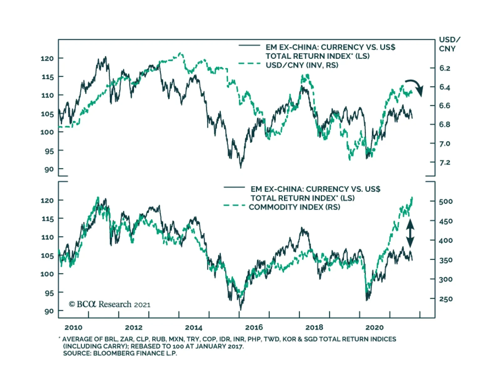
Emerging market currencies have recently rolled over in early-June and are depreciating sharply vis-à-vis the US dollar. Odds are that this downtrend will continue. On the domestic front, it is true that many Emerging Market central banks are already…
Both the ISM and Markit PMIs suggest that US manufacturing activity accelerated in September. The ISM index increased 1.2 points to a four-month high of 61.1, surprising expectations of a decline. Similarly, the Markit measure inched up 0.2 points to 60.7. …
Highlights Recommended Allocation
Quarterly Portfolio Outlook: Stay Bullish But Verify
Quarterly Portfolio Outlook: Stay Bullish But Verify
The global economy will continue to grow at an above-trend rate over the next 12 months and central banks will remove accommodation only slowly.But the second year of a bull market is often tricky: Growth slows after its initial rebound, and monetary policy starts to be tightened, amid rising inflation.Equities are likely to outperform bonds over the next 12 months, driven by improving earnings, but at a slower pace than over the past year and with higher volatility.We continue to recommend only a cautiously optimistic stance on equities, with an overweight in US equities, and underweight in Europe. Our sector overweights are a mix of cyclicals (Industrials), plays on higher rates (Financials), and selective defensives (Health Care).China is likely to announce a stimulus to cushion the impact from Evergrande, which might push up oversold Chinese stocks. We close our underweight on Chinese equities, but raise them only to neutral as the real estate sector looks vulnerable. That could be bad news for commodities and the rest of Emerging Markets, which we cut to underweight.The Fed is likely to announce tapering this quarter, and raise rates in December 2022. This is likely to push up 10-year Treasury yields to 2-2.25% by then, and so we remain underweight duration.Investment-grade credit is expensive, but B-rated high-yield bonds still look attractive as defaults continue to decline. EM corporate debt is riskier post-Evergrande, but higher-rated sovereign dollar debt offers a good spread pickup.OverviewThe second year of a bull market is often tricky. Growth starts to slow after its initial rebound, and central banks move towards tightening policy. This does not signal the end of the bull market, but equity returns in Year 2 are typically lacklustre (Table 1).That is exactly the situation markets face now. Growth has been surprising on the downside, and inflation on the upside over the past few months (Chart 1). Table 1Year 2 Of Bull Markets Often Has Only Weak Returns
Quarterly Portfolio Outlook: Stay Bullish But Verify
Quarterly Portfolio Outlook: Stay Bullish But Verify
Chart 1Growth Surprising On The Downside, Inflation On The Upside
Growth Surprising On The Downside, Inflation On The Upside
Growth Surprising On The Downside, Inflation On The Upside
Our basic investment stance remains that the global economy will continue to grow at an above-trend rate over the next 12 months (as the consensus forecasts – Chart 2), and that central banks will remove accommodation only slowly. We can see no signs of a recession on the 18-to-24-month horizon and, as Chart 3 shows, equities almost always outperform bonds except during and in the run-up to recessions. Chart 2But Growth Will Continue To Be Above Trend
But Growth Will Continue To Be Above Trend
But Growth Will Continue To Be Above Trend
Chart 3Equities Outpeform Bonds Except Around Recessions
Equities Outpeform Bonds Except Around Recessions
Equities Outpeform Bonds Except Around Recessions
This justifies a moderately pro-risk stance, with overweights in equities and (selectively) credit, and a big underweight in government bonds. But the risks to this sanguine view are rising, and the next few months could be choppy. Stay bullish, but keep a close eye on what could go wrong.The slowdown in growth is largely because manufacturing boomed last year and now simply the pace of growth is decelerating. Manufacturing PMIs are (mostly) still above 50, but have fallen from their peaks (Chart 4). Supply-chain bottlenecks have also dented production. And consumers will spend less on durables and more on services, as lockdowns are eased.We have emphasized that the $2.5 trillion of excess savings in the US will boost spending over coming quarters. But enhanced unemployment benefits have now ended and most of the savings left are with richer households who have a lower propensity to spend (see page 9 for more on this). Covid also remains a risk: Cases are stickily high in some countries and consumers are still not 100% confident about going out to dine and for entertainment (Chart 5). Chart 4PMIs Falling But Mostly Still Above 50
PMIs Falling But Mostly Still Above 50
PMIs Falling But Mostly Still Above 50
Chart 5Consumers Still A Bit Wary About Going Out
Consumers Still A Bit Wary About Going Out
Consumers Still A Bit Wary About Going Out
China is an increasing risk to growth. Its economy has been slowing all year as a result of monetary tightening (Chart 6) and this may be exacerbated by the fallout from Evergrande. The Chinese authorities are likely to announce a stimulus package to offset the slowdown (which is why we are neutralizing our underweight on Chinese equities). But the stimulus will probably be only moderate and targeted, and they will not allow a renewed boom in real estate (as we explain on page 11), which has been a significant driver of Chinese growth in recent years (Chart 7). This could hurt the economies of Emerging Markets and other commodity producers, which depend on Chinese demand. Chart 6China Has Been Slowing All Year
China Has Been Slowing All Year
China Has Been Slowing All Year
Chart 7Real Estate Has Been A Big Driver Of Chinese Growth
Real Estate Has Been A Big Driver Of Chinese Growth
Real Estate Has Been A Big Driver Of Chinese Growth
At the same time that growth is slowing, inflation is proving a little stickier and broader-based than was expected. Measures of underlying inflation pressure, such as trimmed-mean CPIs, suggest that it is no longer only pandemic-related prices that are rising in the US and some other countries (Chart 8). Rising shipping charges (container rates are up 228% this year) are pushing up the cost of imported goods. And the first signs are emerging that labor shortages, especially in restaurants and shops, are causing wage rises (Chart 9). Chart 8Inflation Is Broadening Out In Some Countries
Inflation Is Broadening Out In Some Countries
Inflation Is Broadening Out In Some Countries
Chart 9The First Signs Of Wage Rises?
The First Signs Of Wage Rises?
The First Signs Of Wage Rises?
Unsurprisingly, then, central banks are starting to wind down their asset purchases and even raise rates. Norges Bank was the first developed central bank to hike this cycle in September. New Zealand may follow in Q4. And the Fed has pretty clearly signaled that it, too, will announce tapering before year-end. And this is not to mention Emerging Market central banks, many of which have had to raise rates sharply in the face of soaring inflation (Chart 10).A shrinking of excess liquidity is another common phenomenon of the second stage of expansions, as monetary policy starts to be tightened and liquidity is directed more towards the real economy and less towards speculation. This, too, often caps the upside for risk assets, though it doesn’t usually cause them to collapse (Chart 11). Chart 10EM Central Banks Raising Rates Sharply
EM Central Banks Raising Rates Sharply
EM Central Banks Raising Rates Sharply
Chart 11Excess Liquidity Is Drying Up
Excess Liquidity Is Drying Up
Excess Liquidity Is Drying Up
Table 2Who Will Raise Rates When?
Quarterly Portfolio Outlook: Stay Bullish But Verify
Quarterly Portfolio Outlook: Stay Bullish But Verify
While there are many factors that might cause market jitters over the coming months, the underlying picture is that robust growth is likely to continue and central banks will remain cautious about tightening too quickly. Excess savings will propel consumption, companies will need to increase capex to fulfill that demand, and the impact of fiscal stimulus is still coming through (Chart 12). The big central banks won’t raise rates for some time: The Fed perhaps in late-2022, but the ECB and the Bank of Japan not over the forecast horizon (Table 2). Decent growth and easy policy remains a positive backdrop for risk assets over the 12-month horizon. Chart 12Fiscal Stimulus Is Still Coming Through
Quarterly Portfolio Outlook: Stay Bullish But Verify
Quarterly Portfolio Outlook: Stay Bullish But Verify
Garry Evans, Senior Vice PresidentChief Global Asset Allocation Strategistgarry@bcaresearch.comWhat Our Clients Are AskingHow Worried Should We Be About Inflation?Since the beginning of the year, we have argued that the current period of high inflation will be transitory. The market has adopted this view, with 5-year/5-year forward inflation expectations remaining at 2.2%. Chart 13Growing Signs That Inflation Might Not Be Transitory
Growing Signs That Inflation Might Not Be Transitory
Growing Signs That Inflation Might Not Be Transitory
However, we have grown worried about the possibility that inflation might be stickier at a higher level than we initially expected. Specifically, while it is true that prices of supply-constrained items – such as used cars – have started to ease, there are signs that higher inflation has began to broaden. Core CPI excluding pandemic-related items and cars has started to pick up, with its 6-month rate of change reaching its highest level in more than a decade (Chart 13, panel 1). Meanwhile 42% of the PCE basket grew at an annual rate of more than 5% in July, compared to just 24% in March.Currently, we are watching the behavior of prices in the housing and labor markets to check if our worries are justified. We pay particular attention to these sectors because price pressures in housing and labor can be self-sustaining, giving rise to inflationary spirals if left unchecked.What is happening to inflation in these areas? So far, the signals are mixed. Even though wage growth remains within the historical norm for now, any further advance in wages will take us to a decade high (Chart 13, panel 2). Likewise, annual growth of shelter cost remains low, though its 6-month change suggests that it will soon begin to rise to its pre-pandemic levels (Chart 13, panel 3).Our base case continues to be that high inflation is transitory. That being said, we have positioned our portfolio to hedge for the risk that this view is wrong. We have given an overweight to real estate in our alternatives portfolio and within equities. Will Consumers Really Spend All Those Savings? Chart 14Low-Income Households Did Not Save Much
Quarterly Portfolio Outlook: Stay Bullish But Verify
Quarterly Portfolio Outlook: Stay Bullish But Verify
Generous unemployment benefits and the year-long lockdown have pushed up US excess savings over the past 18 months to an estimated $2.5 trillion, and the household savings ratio to 9.6% (Chart 14, panel 1). The consensus is that these savings will bolster consumer spending and support broad economic growth over the coming quarters. However, this expectation is based on the assumption that all consumers have accumulated savings, whereas the reality is a bit different.Survey results from the US Census Bureau show that households earning under $75,000, which have the highest propensity to consume, have almost entirely spent their first stimulus checks and three-quarters of their second and third checks on expenses and paying off debt. Even for those earning over $75,000, only 50% of those stimulus receipts have gone into savings (Chart 14, panel 2).With the labor market still not back to full employment (albeit mostly because of labor supply issues), enhanced unemployment benefits coming to an end, fears of further Covid variants and lockdowns, and higher inflation, could precautionary savings rise? The years following the Global Financial Crisis suggest that they might: The savings rate rose from 3% at the onset of the GFC to 8% five years after it (Chart 14, panel 3). A similar attitude among consumers this time could put a dent in US growth, given that consumption makes up about 70% of GDP.This raises the risk that consumption might slow over the coming quarters. In our latest Monthly Portfolio Outlook, we highlighted that consumption is shifting away from goods towards services. While value added from manufacturing is only 11% of GDP, the effect on markets might be bigger, since goods producers make up about 40% of US market cap. What Is The Risk Of A Big Upside Surprise In US Employment?The recovery of the labor market remains at the center of investors’ and Fed officials’ attention. The reluctance to return to the workforce mostly reflects overly generous unemployment benefits and fears of getting infected. With the fourth wave of the pandemic showing signs of cresting and benefits expiring, the consensus is that the unemployment gap will soon shrink. We would, however, question whether the labor market can surprise significantly to the upside and recover faster than the market currently implies. A swift recovery would push up bond yields and bring forward the Fed’s liftoff date, which could hurt the outlook for risk assets. Chart 15The Labor Market Could Surprise To The Upside
The Labor Market Could Surprise To The Upside
The Labor Market Could Surprise To The Upside
The number of men not in the labor force but who want a job has fallen back to the pre-pandemic level (Chart 15, panel 1). The sharp decline in this indicator in August coincided with the expiration of unemployment benefits in some Republican states. The overall Federal pandemic benefits program expired in early September. This should push even more people to return to the workforce (Chart 15, panel 2).However, there are still close to 3.5 million women (almost half a million above the pre-pandemic level) who are not in the labor force but would like a job: Some of these are keen to return to the workplace once they deem it safe for their children to get vaccinated and return to school. With governments eager to speed up vaccination rollouts and Pfizer’s recent announcement showing positive results of its Covid vaccine in trials on children under the age of 12, more women should return to the workforce.It is also worth noting that some of the most hard-hit sectors – such as leisure & hospitality – have already recovered over 80% of the jobs lost since February 2020. For sectors yet to reach such a high recovery rate, for example education & health services, returning workers have room to choose from jobs. For every job lost since the onset of the pandemic, there are now 2.1 job openings (Chart 15, panel 3). What Is The Risk Of Contagion From Evergrande?In September, Chinese property developer Evergrande failed to make an interest payment on an overseas bond issue. What would be the consequences for the Chinese and global economy if it went bankrupt? Chart 16Chinese Companies Are Highly Indebted
Chinese Companies Are Highly Indebted
Chinese Companies Are Highly Indebted
Evergrande is big. Its debts are $306 billion, 2% of Chinese GDP. It has yet to build 1 million units that have already been paid for. It employs 200,000 people. And the issue is bigger. For years, investors have worried about China’s corporate debt, which is 160% of GDP (Chart 16). Chinese companies have issued almost $1 trillion of bonds in foreign currencies. The property market plays an outsized role in the economy: It comprises 66% of household wealth (versus 24% in the US); real estate and related industries amount to some 30% of GDP.The government will likely rescue Evergrande. But it faces a dilemma: For years it has been trying to reduce bad debt and stabilize house prices. It cannot bail out Evergrande’s creditors without undermining those efforts.It will probably aid apartment buyers, who have paid upfront for Evergrande properties, and make arrangements for domestic banks to swap their debt for equity or land holdings. But it won’t bail out equity owners or foreign bond holders. It will also not ease real-estate market restrictions, such as the “three red line” rules on property companies’ leverage. Such a package could damage Chinese individuals’ confidence in property, and foreigners willingness to provide capital to the industry.China may also announce a stimulus package to bolster the economy. But local governments are dependent on land sales for around a third of their income (Chart 17). If the property market is weak, the transmission mechanism of stimulus may be damaged. Finally, Chinese housing sales are highly correlated to global commodities prices, which may fall as a result (Chart 18). Chart 17Local Governments Depend On Land Sales
Local Governments Depend On Land Sales
Local Governments Depend On Land Sales
Chart 18A Slowdown In Housing Would Hurt Commodities
A Slowdown In Housing Would Hurt Commodities
A Slowdown In Housing Would Hurt Commodities
BCA Research’s EM and China strategists do not see Evergrande as likely to trigger a systemic crisis or crash, but it will reinforce the chronic credit tightening that has been underway in China.1Is It Time To Overweight Japanese Equities?Japanese equities staged a strong rally in the third quarter, outperforming the MSCI global equity index by about 5% in US dollar total return terms. On an absolute basis, the MSCI Japan price index in USD is near its 1989 historical high, even though the local-currency index is still more than 30% below its 1989 all-time high.We have been underweight Japanese equities in our global equity portfolio since July 2019, mainly due to unfavorable structural forces such as the aging population and chronic deflationary pressures. Japanese equities have tended to stage counter-trend bounces, some of which were quite significant in magnitude (Chart 19, panel 1). We therefore recommend clients move to the sidelines to avoid the potentially short-lived but sharp upside risk, supported by the following two considerations:First, foreign investors play a significant role in the Japanese equity market. The fact that MSCI Japan in USD terms is near its all-time high could trigger more foreign buying, given the positive correlation between the price index and price momentum (Chart 19, panels 3 and 5).Second, Japanese equities are among the cheapest globally, trading at a large discount to the global index. Currently, the discount is larger than its 3-year moving average, making it risky to underweight Japan.So why not overweight Japanese equities?The Japanese equity index is dominated by Industrials. It should benefit from our favorable view on this sector. However, Japan’s machinery and machine tool industries have heavy reliance on Asia, especially China. Orders from China have already rolled over with the Chinese PMI now in contractionary territory. In the meantime, the rolling-over of the US and European PMIs also does not bode well for orders from the other two large regions (Chart 20). Chart 19Upgrade Japanese Equities To Neutral
Upgrade Japanese Equities To Neutral
Upgrade Japanese Equities To Neutral
Chart 20Japan's Heavy External Reliance
Japan's Heavy External Reliance
Japan's Heavy External Reliance
We expect that China will eventually inject stimulus into its economy in a measured fashion such that the negative spillover to Japan and Europe may be limited. That’s why we are also taking profit in our underweight position on China after the recent sharp selloff in the offshore Chinese equity index (see page 18).Global EconomyOverview: The developed world continues to see strong growth, albeit at a slower pace than nine months ago. This is causing a more persistent – and more broad-based – rise in inflation, especially in the US, than was previously expected. However, the Fed is unlikely to raise rates for at least another 12 months, and the ECB and BOJ not on the forecast horizon. The biggest risk to global economic growth is the slowdown in China and now the troubles at Evergrande. We assume that the Chinese government will launch a stimulus to cushion the slowdown, but it may be less effective than the market expects. Chart 21US Growth Has Slowed But Remains Above Trend
US Growth Has Slowed But Remains Above Trend
US Growth Has Slowed But Remains Above Trend
US: Growth has been slowing relative to expectations all year (Chart 21, panel 1). Nonetheless, it is still well above trend. The September Markit PMIs remained high at 60.5 for manufacturing and 54.4 for services. Although consumer confidence has fallen back a little because of the third Covid wave in some southern states, retail sales in August were still up 15% year-on-year and 1.8% (ex autos) month-on-month. Growth seems set to remain above trend, as consumers spend their $2.5 trillion of excess savings, companies increase capex to ease supply-chain bottlenecks, and the government rolls out more fiscal spending. The IMF forecasts 4.9% real GDP growth in 2022, after 7.0% this year. Euro Area growth also remains robust, with the manufacturing and services PMIs at 58.7 and 56.3 respectively in September. Vaccination levels have risen (more quickly than in the US) and, as a consequence, lockdowns and international travel restrictions have been largely eased. Inflation pressures remain more restrained than in the US, with core CPI at only 1.6% (mainly pushed up by pandemic-related shortages) and the trimmed-mean CPI barely above zero. The ECB persuaded the market that its tapering, announced in September, is very dovish, and it is certainly true that – with its new 2% symmetrical inflation target – the ECB is not set to raise rates any time soon. The IMF’s forecasts are for 4.6% real GDP growth this year, and 4.3% next.Japan has generally lagged the recovery in the rest of the world, due to its structural headwinds, but it is now seeing some more robust data. Industrial production is up 12% year-on-year and exports 26%, although the PMIs still remain somewhat depressed at 51.2 for manufacturing and 47.4 for services in September. Japan’s initial slow vaccine rollout has recently accelerated and the percent of double-vaccinated adults now exceeds the US. This suggests that sluggish consumption (with retail sales up only 2% year-on-year) might start to recover. Markets got excited about the prospects for fiscal stimulus ahead of the general election, which has to be held by the end of November. We do not see new LDP leader Fumio Kishida, who is likely to win that election, making any significant change in policy. Chart 22China Is The One Market Where Growth Is Slowing Sharply
China Is The One Market Where Growth Is Slowing Sharply
China Is The One Market Where Growth Is Slowing Sharply
Emerging Markets: China’s slowdown – and the government’s possible reaction to it with a large stimulus – dominate the outlook for Emerging Markets. Both China’s manufacturing and services PMIs are now below 50 (Chart 22, panel 3), and retail sales, industrial production and fixed-asset investment all surprised sharply on the downside last month. We expect an easing of policy, but only a moderate one. Elsewhere in Emerging Markets, central banks continue to struggle with the puzzle of whether they need to raise rates (as Russia, Brazil and Mexico have done) in the face of rising inflation and falling currencies, despite continuing underlying weakness in their economies. Interest Rates: US inflation looks stickier than believed three months ago, with a broadening of inflation away from just pandemic-affected items (see “How Worried Should We Be About Inflation?" on page 8). But inflation expectations are still well under control (Chart 22, panel 4) and so the Fed is likely to begin tapering only in December and not raise rates until end-2022. This will most likely cause a moderate rise in long-term rates with the 10-year US Treasury yield rising to 1.7% by year-end and 2-2.25% by the time of the first Fed rate hike. Inflation elsewhere in developed economies looks more subdued (except in the UK and Canada), and so long-term rates are likely to rise somewhat more slowly there.Global Equities Chart 23Watch Earning Revisions
Watch Earning Revisions
Watch Earning Revisions
Global equities ended the quarter more or less flat after a very strong performance in the first eight months of the year and a volatile September. Earnings growth continued its strong trend from the first half, powered by margin improvement in both the DM and EM universes. Consequently, the forward PE multiple contracted further (Chart 23).Going forward, despite worries about the potential spillover to the global economy and global financial markets from China’s Evergrande fiasco, the “earnings-driven” theme will likely continue. BCA’s global earnings model points to over 40% earnings growth for the next 12 months, and all sectors have positive forward earnings estimates. However, net revisions by analysts seem to be cresting as the global manufacturing PMI has rolled over from a very high level. Even though valuation is less stretched than at the beginning of the year, equities are still expensive by historical standards. In addition, central banks are preparing for an eventual withdrawal of their massive liquidity injections and there is still plenty of uncertainty concerning Covid variants. GAA has been cautiously optimistic so far this year with overweights on equities and cash relative to bonds, and overweight US equities relative to Japan, Europe and China. These positions have panned out well. After adjustments made in April and July, our sector portfolio has been well positioned by overweighting Industrials, Financials, Real Estate and Healthcare, underweighting Materials, Utilities and Consumer Staples, and being neutral on Tech, Consumer Discretionary and Communication Services. We have not made any changes to our sector recommendations this quarter.In accordance with our long-held belief of “taking risk where risk will likely be rewarded the most,” we make the following adjustments to our country allocations: close the underweights in China and Japan and the overweight in the UK; and initiate one new position: Underweight EM-ex-China. Overall, our country portfolio has a defensive tilt with an overweight in the US (defensive) and underweights in the euro area and EM-ex China (cyclical), while being neutral on the UK, Japan, Australia and Canada. Country Allocation: Upgrade MSCI China And Japan, Downgrade UK And EM-ex-China. We have been underweight MSCI China and overweight the UK since April 2021, and underweight Japan since July 2019.The China underweight generated outperformance of 23% and the UK overweight -2%, while the Japanese position produced an outperformance of 7%. Chart 24Favor China vs The Rest of The EM
Favor China vs The Rest of The EM
Favor China vs The Rest of The EM
While the fate of Evergrande Group, China’s second largest property developer, remains uncertain, our view is that the government will come up with a restructuring plan to minimize damaging ripple effects on the Chinese economy. This view is supported by the behavior of the domestic A-share market and also the CNY/USD, which has diverged from the offshore equity market (Chart 24, Panel 5).BCA Research’s house view is that China will now stimulate its economy, but only at a measured pace. This means that further underperformance of MSCI China is likely to be limited relative to the global benchmark, as shown in Chart 24, panel 1. The ongoing deleveraging in the Chinese real estate sector, however, means that activity in the sector will probably slow further, reducing demand for construction materials. This may put a dent on the strength of metal prices, therefore negatively impacting the ex-China EM equity index, as shown in panel 2.Moreover, the relative performance of China vs non-China EM is approaching a very oversold level while the relative valuation measure is at an extreme (Chart 24, panels 3 and 4). As such, we switch our positioning by upgrading Chinese equities to neutral from underweight and downgrade EM ex China to underweight from neutral. This implies an overall underweight to Emerging Markets.We also close the UK overweight to support an upgrade in Japan (see more details on page 13). The UK overweight was largely based on a positive view of the GBP, which has now risen to fair value.Government Bonds Chart 25Watch Inflation In 2022
Watch Inflation in 2022
Watch Inflation in 2022
Maintain Below-Benchmark Duration. Global bond yields ignored the sharp rise in core inflation in Q3. The US 10-year Treasury yield actually declined in the first two months of the quarter in response to the muted inflation readings in non-Covid related segments of the economy. Even with the fast run-up in yields in September, the US 10-year yield finished the quarter at 1.52%, only about 5 bps higher than the level on June 30th (Chart 25).We have advised clients to focus on the jobs market to determine when the Fed will lift the Fed Funds Rate off its zero bound because of the Fed’s emphasis on “maximum employment” as a pre-condition for this. However, the Fed has not clearly defined what “maximum employment” means. According to calculations by our US bond strategists, the US unemployment rate will fall to 3.8%, with a 63% participation rate, by the end of 2022 if job creation averages a reasonably achievable 414,000 per month until then. Our bond strategists think that the Fed will be forced to clarify its definition of “maximum unemployment” over the coming months and, as we get close to it next year, the key indicator to watch will shift back to inflation. If inflation remains high, then the Fed will be quicker to declare that the labor market is at “maximum employment”, and vice versa.Currently, the overnight index swap curve indicates the first rate hike will be in January 2023 with a total rate increase of 123 bps by the end of 2024. BCA Research’s house view is that the Fed will announce its first hike in December 2022 and will hike at a faster pace than what is priced in by the market. This is based on our view that unemployment will likely reach 3.5% by end-2022 with inflation above the Fed’s target. This would suggest that long-term rates will rise too, and so bond investors should remain below benchmark duration.Corporate BondsSince the beginning of the year, investment-grade credit has provided roughly 200 basis points of excess return over duration-matched Treasurys, while high-yield bonds have generated almost 600 basis points. Chart 26Continue to Favor High-Yield Credit
Continue to Favor High-Yield Credit
Continue to Favor High-Yield Credit
We continue to have a neutral allocation to investment-grade credits within the fixed-income category. While supportive monetary policy should generally favor spread product, we believe there is much better value to be found outside investment-grade bonds, since these bonds are currently trading at historically high valuation levels (Chart 26, panel 1).We think valuations look much more attractive in the high-yield space, and as a result remain overweight within the fixed-income category. Our US Bond Strategy service expects the share of defaults in the space to fall to between 2.3% and 2.8% – below the default rate currently priced in by the market (Chart 26, panel 2). Within high yield, we prefer B-rated bonds since they offer the most attractive spread pickup on a risk-adjusted basis.What about EM debt? Currently we are cautious on EM corporate debt. The default of Chinese real estate developer Evergrande is likely to have ripple effects throughout EM credit markets and currencies. There are already signs of considerable strains, with EM corporate spreads starting to rise (Chart 26, panel 3). We recommend that investors focus on EM sovereign issuers such as Mexico, Russia, and Malaysia, given that they provide a significant yield pickup over US bonds with comparable credit ratings, and are less likely to default than their corporate counterparts.CommoditiesEnergy (Overweight): Oil prices are likely to remain close to current levels for the remainder of this year. However, recovering demand – particularly from Emerging Markets – and production discipline by the OPEC 2.0 coalition should support prices over the next two years. Given this backdrop, our Commodity & Energy strategists expect the price of Brent crude to average $75 and $80 per barrel in 2022 and 2023 respectively, with WTI trading $2-$4/bbl lower. Chart 27Limited Upside For Oil And Metals In The Short-Term
Limited Upside For Oil And Metals In The Short-Term
Limited Upside For Oil And Metals In The Short-Term
Industrial Metals (Neutral): Industrial metals’ prices have bifurcated. Those relating to alternative energy, such as copper, nickel and cobalt, continue to rise and are up 30% on average since the beginning of the year. Iron ore on the other hand has taken a colossal hit, falling over 53% from its May high. The knock-on effects of accelerating Chinese production cuts and softening economic activity, as well as Evergrande’s debt woes, will continue to put downward pressure on prices. In the short-term, we do not expect a significant rebound. However, in the longer-term, demand will recover – particularly if China implements significant stimulus – and supply will remain tight, which will help metal prices to recover.Precious Metals (Neutral): Gold prices did not react positively to the decline in US real rates over the past quarter. In fact, gold prices are slightly down, by ~1.5% since the start of July (Chart 27, panel 4). We expect real rates to rise as economic growth and the labor market recover and the Fed turns slightly more hawkish, while inflation moderates as base and pandemic effects abate. Rising real rates are a negative factor for the gold price. Nevertheless, inflation is likely to be a bit stickier than the market is currently pricing in, and we therefore maintain a neutral exposure to gold, since it is a good inflation hedge.CurrenciesUS Dollar Chart 28Do Not Underweight The Dollar Yet
Do Not Underweight The Dollar Yet
Do Not Underweight The Dollar Yet
Since we went from underweight to neutral on the dollar in April, the DXY has risen by only 1%. Our position remains the same for this quarter. On the one hand, momentum – one of the most reliable indicators for cyclical movements in the dollar – has turned firmly positive. Moreover, pain in the Chinese real-estate sector should weight on commodities and emerging markets – a development which historically has been bullish for the USD (Chart 28, panel 1). However, not all is good news for the greenback. Relative growth and inflation trends are starting to rebound in the rest of the world vis-à-vis the US (Chart 28, panel 2). Additionally, speculators are now firmly overweight the USD, and it remains expensive by 11% relative to PPP fair value. We believe that these forces could eventually be strong enough for the dollar bear market to resume. As a result, we are putting the US dollar on downgrade watch. Canadian DollarWe believe that there is upside to the Canadian dollar. Canada’s employment market is recovering faster than in the US, which should prompt the BoC to normalize interest rates before the Fed. Additionally, while many commodities are likely to suffer as China’s real estate market slows, oil should hold up relatively well since its demand is not as dependent on the Chinese economy. As a result, we are upgrading the CAD from neutral to overweight. Australian DollarWe remain underweight the AUD. While it is true that the AUD is now cheap on a PPP basis, weakness in iron ore from a slowing Chinese real-estate market should continue to weigh on the Aussie dollar. Chinese YuanWe are negative on the yuan on a cyclical basis. Interest-rate differentials should start moving against this currency (Chart 28, panel 3). While the Fed is likely to tighten policy as the labor market enters full employment, Chinese authorities will ease monetary policy to avert a full-blown crisis in their real-estate market.Alternatives Chart 29Outlook Remains Favorable For Private Equity And Real Estate
Quarterly Portfolio Outlook: Stay Bullish But Verify
Quarterly Portfolio Outlook: Stay Bullish But Verify
Return Enhancers: With public markets expensive and unlikely to provide investors with more than single-digit returns, the focus has shifted to alternative assets, particularly private equity (PE). Performance continues to be impressive, with an annualized return of 59% in Q4 2020 (Chart 29, panel 1). This supports our previous research that funds raised during recessions and early in expansions tend to outperform those raised late-cycle. Distributions from existing positions should allow limited partners (LPs – the investors who provide capital to PE funds) to commit to newer funds. Data from Preqin shows that more than $610 billion has been raised so far during 2021 (Chart 29, panel 2). We continue to favor Private Equity over Hedge Funds.Inflation Hedges: Last year’s inflationary pressures should moderate over the coming months as base effects and supply chain bottlenecks abate. Given this backdrop, we maintain our positive view on real estate versus commodity futures. Commodity prices have already shot up over the past 18 months and have limited upside from current levels: Energy prices are up by 61% since the beginning of the year, industrial metals 24%, and agriculture 17%. Over the past 15 years, REITs outperformed commodity futures when inflation was between 0% and 3% (Chart 29, panel 3). There are opportunities within the real-estate sector, despite our concerns about weaknesses in some segments of commercial real estate such as prime office property in major cities.Volatility Dampeners: We continue to favor farmland and timberland over structured products, particularly mortgage-backed securities (MBS). Farmland offers attractive yields and should continue to provide the best portfolio protection in the event of any market distress. MBS spreads, on the other hand, while wider than the pre-pandemic level, remain tight compared to the pace of mortgage refinancing (Chart 29, panel 4).Risks To Our ViewOur main scenario is based on a Goldilocks-like view of the world: That growth will be robust, but not so strong as to push up inflation further and cause central banks to turn hawkish. The risks, therefore, are that the environment turns out to be either too hot or too cold. Chart 30A Resurgence Of Covid
A Resurgence Of Covid
A Resurgence Of Covid
What could cause growth to slow? Covid remains the biggest risk. Cases are still high in many countries, and could rise again as people socialize indoors during the colder months (Chart 30). A more virulent strain is not inconceivable. Governments will be reluctant to impose lockdowns again, but consumers might become wary about going out.We have written elsewhere (see page 11) about the risks coming from a China slowdown and the aftermath of the Evergrande affair. A policy mistake is not improbable: The Chinese authorities want to stimulate the economy, but at the same time keep a lid on property prices. That will be a hard balance to achieve. Slower Chinese growth would hurt commodity producers and many Emerging Markets. Other risks to growth include fiscal tightening as employment-support schemes end and countries look to repair their budget positions (Chart 31), consumers building up precautionary savings and not spending their excess cash (see page 9), and problems caused by rising energy prices.Our view remains that the currently high inflation is transitory. But it is proving quite sticky and could remain high for a while. Inflation expectations are well anchored for the moment (Chart 32) but could rise above central banks’ comfort-zones if recorded core inflation in the US, for example, currently 3.6%, stays above 3% for another 12 months. This could bring forward the date of the first Fed rate hike (currently priced in for January 2023), raise long-term rates and, in turn, push up the dollar. A combination of rising US rates and a stronger dollar would have very negative consequences for heavily indebted Emerging Market economies. Chart 31Fiscal Drag
Fiscal Drag
Fiscal Drag
Chart 32Deanchoring Of Inflation Expectations
Deanchoring Of Inflation Expectations
Deanchoring Of Inflation Expectations
Footnotes1 Please see China Investment Strategy Report "The Evergrande Saga Continues," dated September 29, 2021 and Emerging Markets Strategy Report "On Chinese Internet Stocks, Real Estate And Overall EM," dated September 16, 2021, available at https://www.bcaresearch.com/GAA Asset Allocation
Highlights The fourth quarter will be volatile as China still poses a risk of overtightening policy and undermining the global recovery. US political risks are also elevated. A debt default is likely to be averted in the end. Fiscal stimulus could be excessive. There is a 65% chance that taxes will rise in the New Year. A crisis over Iran’s nuclear program is imminent. Oil supply disruptions are likely. A return to diplomacy is still possible but red lines need to be underscored. European political risks are comparatively low, although they cannot go much lower, Russia still poses threats to its neighbors, and China’s economic wobbles will weigh on European assets. Our views still support Mexican equities and EU industrials over the long run but we are booking some gains in the face of higher volatility. Feature Our annual theme for 2021 was “No Return To Normalcy” and events have borne this out. The pandemic has continued to disrupt life while geopolitics has not reverted to pre-Trump norms. Going forward, the pandemic may subside but the geopolitical backdrop will be disruptive. This is primarily due to Chinese policy, unfinished business with Iran, and the struggle among various nations to remain stable in the aftermath of the pandemic. Chart 1Delta Recedes With Vaccinations
Delta Recedes With Vaccinations
Delta Recedes With Vaccinations
Chart 2Global Recovery Marches On
Global Recovery Marches On
Global Recovery Marches On
Chart 3Global Labor Markets On The Mend
Global Labor Markets On The Mend
Global Labor Markets On The Mend
The underlying driver of markets in the fourth quarter will be the fact that the COVID-19 pandemic is waning as vaccination campaigns make progress (Chart 1). New cases of the Delta variant have rolled over in numerous countries and in US states that are skeptical toward vaccines. Global growth will still face crosswinds. US growth rates are unlikely to be downgraded further while Europe’s growth has been upgraded. However, forecasters are likely to downgrade Chinese growth expectations in the face of the government’s regulatory onslaught against various sectors and property sector instability (Chart 2). Barring a Chinese policy mistake, the global composite PMI is likely to stabilize. Labor markets will continue healing (Chart 3). The tug of war between unemployment and inflation will continue to give way in favor of inflation, given that wage pressures will emerge, stimulus-fueled household demand will be strong, and supply shortages will persist. Central banks will try to normalize policy but will not move aggressively in the face of any new setbacks to the recovery. Will China Spoil The Recovery? Maybe. Chinese policy and structural imbalances pose the greatest threat to the global economic recovery both in the short and the long run. The immediate risk to the recovery is clear from our market-based Chinese growth indicator, which has not yet bottomed (Chart 4). The historic confluence of domestic political and geopolitical risks in China is our key view for the year. China is attempting to make the economic transition that other East Asian states have made – away from the “miracle” manufacturing phase of growth toward something more sustainable. But there are two important differences: China is making its political and economic system less open and free (the opposite of Taiwan and South Korea) and it is confronting rather than befriending the United States. The Xi administration is focused on consolidating power ahead of the twentieth national party congress in fall 2022. Xi is attempting to stay in power beyond the ten-year limit that was in place when he took office. On one hand he is presenting a slate of socioeconomic reforms – dubbed “common prosperity” – to curry popular favor. This agenda represents a tilt from capitalism toward socialism within the context of the Communist Party’s overarching idea of socialism with Chinese characteristics. On the other hand, Xi is cracking down on the private sector – Big Tech, property developers – which theoretically provides the base of power for any political opposition. The crackdowns have caused Chinese equities to collapse relative to global and have reaffirmed the long trend of underperformance of cyclical sectors relative to defensives within Chinese investable shares (Chart 5, top panel). Chart 4China Threatens To Spoil The Party
China Threatens To Spoil The Party
China Threatens To Spoil The Party
In terms of financial distress, so far only high-yield corporate bonds have seen spreads explode, not investment grade. But current policies force property developers to liquidate their holdings, pay off debts, and raise cash while forcing banks to cut bank on loans to property developers and homebuyers. (Not to mention curbs on carbon emissions and other policies squeezing industrial and other sectors.) Chart 5Beijing Could Easily Trigger Global Market Riot
Beijing Could Easily Trigger Global Market Riot
Beijing Could Easily Trigger Global Market Riot
If these policies are not relaxed then property developers will continue to struggle, property prices will fall, credit tightening will intensify, and local governments will be starved of revenue and forced to cut back on their own spending. Yet the government’s signals of policy easing are so far gradual and behind the curve. If policy is not relaxed, then onshore equities will sell off (as well as offshore) and credit spreads will widen more generally (Chart 5, bottom panel). Broad financial turmoil cannot be ruled out in the fourth quarter. Ultimately, however, China will be forced to do whatever it takes to try to secure the post-pandemic recovery. Otherwise it will instigate a socioeconomic crisis ahead of the all-important political reshuffle in fall 2022. That would be the opposite of what Xi Jinping needs as he tries to consolidate power. Chinese households have stored their wealth, built up over decades of economic success, in the housing sector (Chart 6). Economic instability could translate to political instability. Chart 6Beijing Will Provide Bailouts And Stimulus … Or Face Political Instability
Fourth Quarter Outlook: So Much For Normalcy!
Fourth Quarter Outlook: So Much For Normalcy!
Investors often ask how the government can ease policy if doing so will further inflate housing prices, which hurts the middle class and is the opposite of the common prosperity agenda. High housing prices are the biggest of the three “mountains” that are said to be crushing the common folks and weighing on Chinese birthrates and fertility (the other two are high education and medical costs). The answer is that while policymakers want to cap housing prices and encourage fertility, they must prevent a general collapse in prices and economic and financial crisis. There is no evidence that suppressing housing prices will increase fertility or birthrates – if anything, falling fertility is hard to reverse and goes hand in hand with falling prices. Rather, evidence from the US, Japan, South Korea, Thailand, and other countries shows that a bursting property bubble certainly does not increase fertility or birthrates (Charts 7A and 7B). Chart 7AEconomic Crash Not A Recipe For Higher Fertility
Economic Crash Not A Recipe For Higher Fertility
Economic Crash Not A Recipe For Higher Fertility
Chart 7BEconomic Crash Not A Recipe For Higher Fertility
Economic Crash Not A Recipe For Higher Fertility
Economic Crash Not A Recipe For Higher Fertility
Bringing it all together, investors should not play down negative news and financial instability emerging from China. There are no checks and balances on autocrats. Our China Investment Strategy has a high conviction view that policy stimulus is not forthcoming and regulatory curbs will not be eased. The implication is that China’s government could make major policy mistakes and trigger financial instability in the near term before changing its mind to try to preserve overall stability. At that point it could be too late. Will Countries Add More Stimulus? Yes. Chart 8Global Monetary Policy Challenges
Global Monetary Policy Challenges
Global Monetary Policy Challenges
With China’s stability in question, investors face a range of crosswinds. Central banks are struggling with a surge in inflation driven by stimulus-fueled demand and supply bottlenecks. The global output gap is still large but rapid economic normalization will push inflation up further if kinks are not removed (Chart 8). A moderating factor in this regard is that budget deficits are contracting in 2022 and coming years – fiscal policy will shift from thrust to drag (Chart 9). However, the fiscal drag is probably overstated as governments are also likely to increase deficit spending on the margin. The US is certainly likely to do so. But before considering US fiscal policy we must address the immediate question: whether the US will default on national debt. Treasury Secretary Janet Yellen has designated October 18 as the “X-date” at which the Treasury will run out of extraordinary measures to make debt payments if Congress does not raise the statutory debt ceiling. There is presumably a few weeks of leeway after this date but markets will grow very jittery and credit rating agencies will start to downgrade the United States, as Standard & Poor’s did in 2011. Chart 9Global Fiscal Drag Rears Its Head
Fourth Quarter Outlook: So Much For Normalcy!
Fourth Quarter Outlook: So Much For Normalcy!
Democrats have full control of Congress and can therefore suspend the debt ceiling through a party-line vote. They can do this through regular legislation, if Republicans avoid raising a filibuster, though that requires Democrats to make concessions in a back-room deal with Republicans. Or they can compromise the filibuster, though that requires convincing moderate Democrats who support the filibuster that they need to make an exception to preserve the faith and credit of the US. Or they can raise the debt ceiling via budget reconciliation, though this would run up against the time limit and so far Senate Leader Chuck Schumer claims to refuse this option. While the odds of a debt default are not zero, the Democrats have the power to avoid it and will also suffer the most in public opinion if it occurs. Therefore the debt limit will likely be suspended at the last minute in late October or early November. Investors should expect volatility but should view it as short-term noise and buy on dips – i.e. the opposite of any volatility that stems from Chinese financial turmoil. Congress is likely to pass Biden’s $550 billion bipartisan infrastructure bill (80% subjective odds). It is also likely to pass a partisan social welfare reconciliation bill over the coming months (65% subjective odds). The full impact on the deficit of both bills should range from $1.1-$1.6 trillion over ten years. This will not be enough to prevent the fiscal drag in 2022 but it will provide for a gradually expanding budget deficit over the course of the decade (Chart 10). Chart 10New Fiscal Stimulus Will Reduce Fiscal Drag On Margin
Fourth Quarter Outlook: So Much For Normalcy!
Fourth Quarter Outlook: So Much For Normalcy!
The reconciliation package will be watered down and late in coming. Investors will likely buy the rumor and sell the news. If reconciliation fails, markets may cheer, as it will also include tax hikes and pose the risk of pushing up inflation and hastening Fed rate hikes. Elsewhere governments are also providing “soft budgets.” The German election results confirmed our forecast that the government will change to left-wing leadership that will be able to boost domestic investment but not raise taxes. This is due to the inclusion of at least one right-leaning party, most likely the Free Democrats. Fiscal deficits will go up. Germany has a national policy consensus on most matters of importance and thus can pass some legislation. But the new coalition will be ideologically split and barely have a majority in the Bundestag, so controversial or sweeping legislation will be unlikely. This outcome is positive for German markets and the euro. Looking at popular opinion toward western leaders and their ruling coalitions since the outbreak of COVID-19, the takeaway is that the Europeans have the strongest political capital (Chart 11). Governments are either supported by leadership changes (Italy, Germany) or likely to be supported in upcoming elections (France). The UK does not face an election until 2024, unless an early election is called. This seems doubtful to us given the government’s strong majority. Chart 11DM Shifts In Popular Opinion Since COVID-19
Fourth Quarter Outlook: So Much For Normalcy!
Fourth Quarter Outlook: So Much For Normalcy!
Chart 12EM Shifts In Popular Opinion Since COVID-19
Fourth Quarter Outlook: So Much For Normalcy!
Fourth Quarter Outlook: So Much For Normalcy!
After all, Canada called an early election and it became a much riskier affair than the government intended and did not increase the prime minister’s political capital. Spain is far more likely to see tumult and an early election. Japan’s election in November will not bring any surprises: as we have written, Kishidanomics will be Abenomics by a different name. The implication is that after November, most developed markets will be politically recapitalized and fiscal policy will continue to be accommodative across the board. In emerging markets, popular opinion has been much more damning for leaders, calling attention to our expectation that the aftershocks of the global pandemic will come in the form of social and political instability (Chart 12). Russia has a record of pursuing more aggressive foreign policy to distract from its domestic ills. The next conflict could already be emerging, with allegations that it is deliberately pushing up natural gas prices in Europe to try to force the new German government to certify and operate the NordStream II pipeline. The Americans are already brandishing new sanctions. Chart 13Stary Neutral Dollar For Now
Stary Neutral Dollar For Now
Stary Neutral Dollar For Now
Brazil and Turkey both face extreme social instability in the lead-up to elections in 2022 and 2023. India has been the chief beneficiary of today’s climate but it also faces an increase in political and geopolitical risk due to looming state elections and its increasing alliance with the West against China. Putting it all together, the US is likely to stimulate further and pump up inflation expectations. Europe is politically stable but Russia disrupt it. Other emerging markets, including China, will struggle with economic, political, and social instability. This is an environment in which the US dollar will remain relatively firm and the renminbi will depreciate – with negative effects on EM currencies more broadly (Chart 13). Annual Views On Track Our three key views for 2021 are so far on track but face major tests in the fourth quarter: 1. China’s internal and external headwinds: If China overtightens policy and short-circuits the global economic recovery, then its domestic political risks will have exceeded even our own pessimistic expectations. We expect China to ease fiscal policy and do at least the minimum to secure the recovery. Investors should be neutral on risky assets until China provides clearer signals that it will not overtighten policy (Chart 14). 2. Iran is the crux of the US pivot to Asia: A crisis over Iran is imminent since Biden did not restore the 2015 nuclear deal promptly upon taking office. Any disruption of Middle Eastern energy flows will add to global supply bottlenecks and price pressures. Brent crude oil prices will see upside risks relative both to BCA forecasts and the forward curve (Chart 15). Chart 14Wait For China To Relax Policy
Wait For China To Relax Policy
Wait For China To Relax Policy
Chart 15Expect A Near-Term Crisis Over Iran
Expect A Near-Term Crisis Over Iran
Expect A Near-Term Crisis Over Iran
The reason is that Iran is expected to reach nuclear “breakout” capability by November or December (i.e. obtain enough highly enriched uranium to make a nuclear device). The Biden administration is focused on diplomacy and so far hesitant to impose a credible threat of war to halt Iranian advances. Israel’s new government has belatedly admitted that it would be a good thing for the US and Iran to rejoin the 2015 nuclear deal – if not, it supports a global coalition to impose sanctions, and finally a military option as a last resort. Biden will struggle to put together a global coalition as effective as Obama did, given worse relations with China and Russia. The US and Israel are highly likely to continue using sabotage and cyberattacks to slow Iran’s nuclear and missile progress. Chart 16Pivot To Asia Runs Through Iran
Pivot To Asia Runs Through Iran
Pivot To Asia Runs Through Iran
Chart 17Europe: A Post-Trump Winner? Depends On China
Europe: A Post-Trump Winner? Depends On China
Europe: A Post-Trump Winner? Depends On China
Thus the Iranians are likely to reach breakout capability at which point a crisis could erupt. The market is not priced for the next Middle East crisis (Chart 16). Incidentally, any additional foreign policy humiliation on top of Afghanistan could undermine the Biden administration more broadly, in both domestic and foreign policy. 3. Europe benefits most from a post-pandemic, post-Trump world: Europe is a cyclical economy and is also relatively politically stable in a world of structurally rising policy uncertainty and geopolitical risk. We thought it stood to benefit most from the global recovery and the passing of the Trump administration. However, China’s policy tightening has undermined European assets and will continue to do so. Therefore this view is largely contingent on the first view (Chart 17). Investment Takeaways Strategically we maintain a diversified portfolio of trades based on critical geopolitical themes: long gold, short China/Taiwan, long developed markets, long aerospace/defense, long rare earths, and long value over growth stocks. Taiwanese equities have continued to outperform despite bubbling geopolitical tensions. We maintain our view that Taiwan is overpriced and vulnerable to long-term semiconductor diversification as well as US-China conflict. Our rare earths basket, which focuses on miners outside China, has been volatile and stands to suffer if China’s growth decelerates. But global industrial, energy, and defense policy will continue to support rare earths and metals prices. Russian tensions with the West have been manageable over the course of the year and emerging European stocks have outperformed developed European peers, contrary to our recommendation. However, fundamental conflicts remain unresolved and the dispute over the recently completed Nord Stream II pipeline to Germany could still deal negative surprises. We will reassess this recommendation in a future report. We are booking gains on the following trades: long Mexico (8%), long aerospace and defense in absolute terms (4%), long EU industrials relative to global (4%), and long Italian BTPs relative to bunds (0.2%). Matt Gertken Vice President Geopolitical Strategy mattg@bcaresearch.com Appendix: GeoRisk Indicator China
China: GeoRisk Indicator
China: GeoRisk Indicator
Russia
Russia: GeoRisk Indicator
Russia: GeoRisk Indicator
United Kingdom
UK: GeoRisk Indicator
UK: GeoRisk Indicator
Germany
Germany: GeoRisk Indicator
Germany: GeoRisk Indicator
France
France: GeoRisk Indicator
France: GeoRisk Indicator
Italy
Italy: GeoRisk Indicator
Italy: GeoRisk Indicator
Canada
Canada: GeoRisk Indicator
Canada: GeoRisk Indicator
Spain
Spain: GeoRisk Indicator
Spain: GeoRisk Indicator
Taiwan
Taiwan: GeoRisk Indicator
Taiwan: GeoRisk Indicator
Korea
Korea: GeoRisk Indicator
Korea: GeoRisk Indicator
Turkey
Turkey: GeoRisk Indicator
Turkey: GeoRisk Indicator
Brazil
Brazil: GeoRisk Indicator
Brazil: GeoRisk Indicator
Australia
Australia: GeoRisk Indicator
Australia: GeoRisk Indicator
Appendix: Geopolitical Calendar
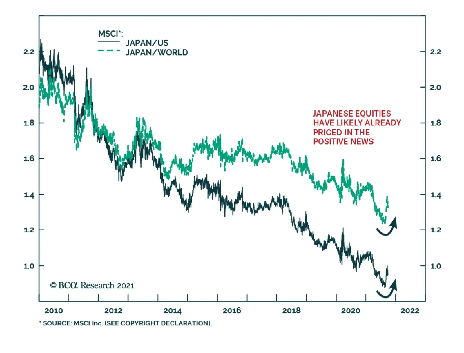
Japanese stocks have recently been one of the best performing global equity markets. MSCI Japan gained 2% in September, while the US and All Country World Indices each fell more than 4%. The outperformance reflects domestic political developments. In early…
HighlightsSince 2008, US equity outperformance versus global ex-US stocks has not been driven by stronger top-line growth. Instead, it has been caused by a narrowly-based increase in profit margins, the accretive impact of share buybacks on the EPS of US growth stocks, and an outsized expansion in equity multiples. To a lesser extent, the dollar has also boosted common currency relative performance.There are significant secular risks to these sources of US equity outperformance over the past 14 years. Elevated tech sector profit margins are likely to lead to increased competition and higher odds of regulatory action, leveraging has reduced the ability of US companies to continue to accrete EPS through changes to capital structure, relative multiples are not justified by relative ROE, and the US dollar is expensive and is likely to fall over a multi-year horizon.In absolute terms, we forecast that US stocks will earn annualized nominal total returns of between 1.8 - 4.7% over the coming decade, assuming 4-5% annual revenue growth, flat profit margins, a constant 2% dividend yield, and a constant equity risk premium. Long-maturity bond yields are below their equilibrium levels and are likely to rise in real terms over time, which will weigh on elevated equity multiples.Over the coming 6-12 months, our view that US 10-Year Treasury yields are likely to rise argues for an underweight stance toward growth versus value stocks. In turn, this implies that US stocks will underperform global stocks, especially versus developed markets ex-US.The risks that we have highlighted to the sources of US outperformance suggest that US stocks may be flat versus their global peers over the long-term, arguing for a neutral strategic allocation. It also suggests that investors should be prepared to accept more volatility in order to reduce the gap between expected and desired returns, and should look towards riskier investments and asset classes (such as real estate and alternative investments) as potential portfolio return enhancements.Feature Chart II-1The US Has Massively Outperformed Other Equity Markets Since The Global Financial Crisis
The US Has Massively Outperformed Other Equity Markets Since The Global Financial Crisis
The US Has Massively Outperformed Other Equity Markets Since The Global Financial Crisis
The US equity market has vastly outperformed its peers since the 2008/2009 global financial crisis. Chart II-1 highlights that an investment in US stocks at the end of 2007 is now worth over 4 times the invested amount, versus approximately 1.6 times for global ex-US stocks (when measured in US dollar terms). The chart also shows that USD-denominated total returns have been roughly the same for developed markets ex-US as they have been for emerging markets, highlighting the exceptional nature of US equities.In this report we provide a deep examination of the sources of US equity performance, their likely sustainability, and what this implies for long-term investor return expectations. US stocks have not outperformed because of stronger top-line (i.e. revenue) growth, and instead have benefitted from a narrowly-based increase in profit margins, active changes to capital structure that have benefitted stockholders, an outsized expansion in equity multiples relative to global stocks, and a structural appreciation in the US dollar.We conclude that there are significant risks to all of these sources of outperformance, and that a neutral strategic allocation to US equities is now likely warranted. We also highlight that, while a strategic overweight stance is still warranted toward stocks versus bonds, investors should no longer count on US stocks to deliver returns that are in line with or above commonly-cited absolute return expectations. This argues for a greater tolerance of volatility, and the pursuit of riskier investments and asset classes (such as real estate and alternative investments) as potential portfolio return enhancements.A Deep Examination Of US Outperformance Since 2008Breaking down historical total return performance is the first step in judging whether US equities are likely to outperform their global ex-US peers on a structural basis. Below we deconstruct US and global total return performance over the past 14 years into six different components, and analyze the impact of some of these components on a sector-by-sector basis. The six components presented are:Total revenue growth for each equity market, in local currency termsThe change in profit marginsThe impact of changes in capital structure and index compositionThe change in the trailing P/E ratioThe income return from dividendsThe impact of changes in foreign exchangeThe sum of the first three factors explains the total growth in earnings per share over the period, and the addition of the fourth factor explains each market’s local currency price return. Income returns are added to explain total return over the period, with the sixth factor then explaining common currency total return performance. The FX effect for US stocks is zero by construction, given that we measure common currency performance in US$ terms. Chart II-2Strong US Returns Have Not Been Due To Strong Top Line Growth
October 2021
October 2021
Chart II-2 presents the annualized absolute impact of these factors for the MSCI US index since 2008. The chart highlights that U.S. stock prices have earned roughly 11% per year in total return terms over the past 14 years, with significant contributions from revenue growth, multiple expansion, margins, and the return from dividends.Interestingly, however, Chart II-3 highlights that US equities have not significantly outperformed on the basis of the first factor, total local currency revenue growth, at least relative to overall global ex-US stocks (see Box II-1 for more details). DM ex-US stocks have experienced very weak revenue growth since 2008, but this has been compensated for by outsized EM revenue growth. It is also notable that US revenue growth has actually underperformed US GDP growth over the period, dispelling the notion that US equity outperformance has been due to strong top-line effects.Chart II-3The US Has Outperformed Due To Margins, Capital Structure, Multiples, And The Dollar
October 2021
October 2021
Box II-1Proxying The Impact Of Changes In Shares OutstandingWe proxy the impact of changes in shares outstanding (and thus the impact of equity dilution / accretion) by dividing each index’s market capitalization by its stock price. This measure is not a perfect proxy, as changes in index composition (such as the addition/deletion of index constituents) will change the index’s market capitalization but not its stock price. We also calculate total revenue for each market by multiplying local currency sales per share by the market cap / stock price ratio, meaning that the total revenue growth figures shown in Chart II-3 should best be viewed as estimates that in some cases reflect index composition effects.However, Chart II-B1 highlights that adjusting the market cap / stock price ratio for the number of firms in the index does not meaningfully change our overall conclusions. This approach would imply a larger dilution effect for DM ex-US than suggested in Chart II-3, and a smaller effect for emerging markets (due to a significant rise in the number of EM index constituents since 2008). In addition, global ex-US revenue growth is modestly lower than US revenue growth when using this approach. But this gap would account for a fraction of US equity outperformance over the period, underscoring that the US has massively outperformed global ex-US stocks due to margin, capital structure, and multiple expansion effects. Chart II-B1The US Has Not Meaningfully Outperformed Due To Revenue Growth, No Matter How You Slice It
October 2021
October 2021
Chart II-3 also highlights that global ex-US stocks have modestly outperformed the US in terms of the fifth factor, the income return from dividends. This has almost offset the negative FX return (the sixth factor) from a net rise in the US dollar over the period.What is clear from the chart is that the second, third, and fourth factors explain almost all of the difference in total return between US and global ex-US stocks since 2008. The US experienced a significant increase in profit margins versus a modest contraction for global ex-US, a modest fillip from changes in capital structure and index composition versus a substantial drag for ex-US stocks, and a sizable rise in equity multiples that has outpaced what has occurred around the globe in response to structurally lower interest rates. Chart II-4US Margin Outperformance Has Been Narrowly-Based
October 2021
October 2021
The significant rise in aggregate US profit margins over the past 14 years has often been attributed to the strong competitiveness of US companies, but Chart II-4 highlights that the aggregate change mostly reflects a narrow sector composition effect. The chart shows the change in US and global ex-US profit margins by level 1 GICS sector since 2008, and underscores that overall profit margins outside of the US have fallen mostly due to lower oil prices. Conversely, in the US, profit margins have substantially risen in only three out of ten sectors: health care, information technology, and communication services.Chart II-5 highlights that global ex-US equity multiples have risen in a majority of sectors since 2008, but not by the same magnitude as what has occurred in the US. De-rating in the resource sector partially explains the gap, but stronger US multiple expansion in the heavily-weighted consumer discretionary, information technology, and communication services sectors appears to explain most of the gap in multiple expansion.Chart II-5Multiples Have Risen Globally, But More So For Broadly-Defined US Tech Stocks
October 2021
October 2021
Finally, Charts II-6 & II-7 highlights that there has been a strong growth versus value dimension to the impact of changes in capital structure and index composition on regional equity performance. The charts show that equity dilution and other changes to index composition have caused a similar drag on the returns from value stocks in the US and outside the US. However, the charts also highlight that the more important effect has been the accretive impact of share buybacks on the EPS of US growth stocks, which has not been matched by growth stocks outside of the US. As noted in Box II-1, part of this gap may be explained by an increase in the number of companies included in the MSCI Emerging Markets index, but Chart II-8 highlights that the global ex-US ratio of market capitalization to stock price has still risen significantly over the past 14 years, in contrast to that of the US even after controlling for the number of index components. Chart II-6There Has Been A Strong Style Dimension…
There Has Been A Strong Style Dimension...
There Has Been A Strong Style Dimension...
Chart II-7…To The Impact Of Changes In Capital Structure And Index Composition
...To The Impact Of Changes In Capital Structure And Index Composition
...To The Impact Of Changes In Capital Structure And Index Composition
Chart II-8The Accretive Impact Of US Growth Stock Buybacks Has Not Been Matched Globally
The Accretive Impact Of US Growth Stock Buybacks Has Not Been Matched Globally
The Accretive Impact Of US Growth Stock Buybacks Has Not Been Matched Globally
The bottom line for investors is that there have been multiple factors contributing to US equity outperformance since 2008, but aggregate top-line growth has not been one of them. Broadly-defined technology companies (including media & entertainment and internet retail firms) have been responsible for nearly all of the relative rise in profit margins and most of the relative expansion in multiples over the past 14 years, and US growth stocks have benefitted from the accretive impact of share buybacks to a larger degree than what has occurred globally.The Relative Secular Return Outlook For US StocksWe present below several structural risks to the continued outperformance of US equities for the factors that have been most responsible for this performance over the past 14 years. In some cases, these risks speak to the potential for US outperformance to end, not necessarily that the US will underperform. But even the cessation of US outperformance along one or more of these factors would be significant, as it would imply a potential inflection point in the most consequential trend in regional equity performance since the 2008/2009 global financial crisis.Profit MarginsChart II-9 presents the 12-month trailing combined profit margin for the US consumer discretionary, information technology, and communication services sector versus that of the remaining sectors. The chart underscores the points made by Chart II-4 in time series form, namely that the net increase in overall US profit margins since 2008 has been narrowly based. Chart II-9The US Profit Margin Expansion Has Been Driven By Broadly-Defined Tech Stocks
The US Profit Margin Expansion Has Been Driven By Broadly-Defined Tech Stocks
The US Profit Margin Expansion Has Been Driven By Broadly-Defined Tech Stocks
Over a 6-12 month time horizon, the clear risk to US profit margins is an end to the COVID-19 pandemic. The profitability of broadly-defined tech stocks has surged during the pandemic, in response to a significant shift toward online goods purchases and elevated spending on tech equipment. A durable end to the pandemic is likely to reverse some of these spending patterns, which will likely weigh on margins for broadly-defined tech stocks. Chart II-10The Regulatory Risks Facing Big Tech Are Real
October 2021
October 2021
Over the longer term, the risk is that extremely elevated profit margins are likely to increase the odds of regulatory action from Washington and invite competition. On the former point, our US Political Strategy service has highlighted that a bipartisan consensus in public opinion holds that Big Tech needs tougher regulation (Chart II-10), and this consensus grew substantially over the controversial 2020 political cycle.1 This regulatory pressure is currently best described as a “slow boil,” as not all surveys show strong majorities in favor of regulation, and Republicans and Democrats disagree on the aims of regulation.But the bottom line is that Big Tech is likely to remain in the hot seat after the various controversies of the pandemic and 2016-2020 elections, just as big banks faced tougher regulation in the wake of the subprime mortgage crisis. This underscores that a “slow boil” may turn into a faster one at some point over the secular horizon, which would very likely weigh on profit margins. Elevated tech sector profit margins makes regulatory action more likely because policymakers will perceive a stronger ability for these firms to weather a “regulatory shock.”On the latter point about competition, it is true that broadly-defined tech stocks follow a “platform” business model that will be difficult to supplant. These companies benefit from powerful network effects that have taken years to accrue, suggesting that they will not be rapidly replaced by competitors.Still, the experience of Microsoft in the years following its meteoric rise in the second half of the 1990s provides a cautionary tale for broadly-defined tech stocks today. In the late-1990s, it was difficult for investors to envision how Microsoft’s near-total product dominance of the PC ecosystem could ever be displaced, but it eventually lost market share due to the rise of mobile devices and their competing operating systems.In addition, Microsoft’s fundamental performance suffered even before the rise of the modern-day smartphone & mobile device market. Chart II-11 highlights the annualized components of Microsoft’s price return from 1999-2007 versus the late-1990s period, which underscores that changes in margins, changes in multiples, and stock price returns may be persistently negative in a scenario in which revenue growth slows (even if revenue growth itself remains positive).Chart II-11Microsoft Offers A Cautionary Tale For Dominant Business Models
October 2021
October 2021
Some of the reversal of Microsoft’s fortunes during this period were self-inflicted, and the firm also suffered from an economy-wide slowdown in tech equipment spending as a result of the 2001 recession that persisted into the early years of the subsequent recovery. But the key point for investors is that company and sector dominance may wane, and the fact that broadly-defined tech sector profit margins are extremely elevated raises the risk that further increases may not materialize.Capital Structure And Index CompositionAs noted above, the beneficial impact from changes in capital structure and index composition for US equities has occurred due to the accretive impact of share buybacks on the EPS of US growth stocks, which has not been matched by growth stocks outside of the US.In our view, this accretive impact has occurred for two reasons. First, US growth stocks have taken advantage of historically low interest rates and leverage to shift their capital structure to be more debt-focused over the past 14 years. Second, this shift has been aided by the fact that US growth stocks have experienced stronger cash flows than their global peers, which have been used to service higher debt payments.However, Charts II-12 and II-13 suggest that this process may be in its late innings. Chart II-12 highlights that the US nonfinancial corporate sector debt service ratio (DSR) did indeed fall below that of the euro area following the global financial crisis, but that this reversed in 2016. At the onset of the pandemic, the US nonfinancial corporate sector DSR was rising sharply, and was approaching its early-2000 highs. During the pandemic, the corporate sector DSR has continued to rise in both regions, but this almost exclusively reflects a (temporary) decline in operating income, not a surge in corporate sector debt or a rise in interest rates.Not all of the pre-pandemic rise in the US corporate sector DSR was concentrated in broadly-defined tech stocks, but some of it likely was. The key point for investors is that the US nonfinancial corporate sector had a lower capacity to leverage itself relative to companies in the euro area at the onset of the pandemic, which implies a less accretive impact on relative earnings per share in the future. Chart II-13 reinforces this point by highlighting that the uptrend in relative cash flow for US growth stocks, versus global ex-US, appears to have ended in 2015. The uptrend has continued in per share terms, but this appears to be flattered by the impact of buybacks itself. Chart II-12Can The US Continue To Accrete EPS Through Stock Buybacks?
Can The US Continue To Accrete EPS Through Stock Buybacks?
Can The US Continue To Accrete EPS Through Stock Buybacks?
Chart II-13US Growth Companies Are No Longer Generating More Cash Than Their Global Peers
US Growth Companies Are No Longer Generating More Cash Than Their Global Peers
US Growth Companies Are No Longer Generating More Cash Than Their Global Peers
Admittedly, we see no basis to conclude that the persistent earnings dilution that has occurred in emerging markets over the past 14 years will end, or even slow, over the secular horizon. This underscores that emerging markets will need to generate stronger revenue growth to prevent the dilution effect from acting as a continued drag on EM vs. US equity performance, and it is an open question as to whether this will occur. Thus, for now, we have more conviction in the view that capital structure and index composition changes may contribute less to US equity outperformance versus developed markets ex-US over the coming several years.Equity MultiplesThere are three arguments against the idea that US equity multiples will continue to expand relative to those of global ex-US stocks. First, Chart II-14 highlights a point that we have made in previous Bank Credit Analyst reports, which is that aggressive multiple expansion in the US has now rendered US stocks to be the most dependent on low long-maturity bond yields than at any point since the global financial crisis. Chart II-14US Stocks Are The Most Dependent On Low Bond Yields In Over A Decade
US Stocks Are The Most Dependent On Low Bond Yields In Over A Decade
US Stocks Are The Most Dependent On Low Bond Yields In Over A Decade
Over the coming 6- to 12-months, we strongly doubt that US 10-year Treasury yields will rise outside of the range that would be consistent with the US equity risk premium from 2002 to 2007 (discussed in further detail in the next section). But the chart also shows that this range is now clearly below trend nominal GDP growth, suggesting that higher interest rates on a structural basis may cause outright multiple contraction for US stocks. This is particularly true for growth stocks, which have been responsible for a significant portion of US equity outperformance, given their comparatively long earnings duration. Chart II-15US Multiples Are Not Justified By Higher Return On Equity
US Multiples Are Not Justified By Higher Return On Equity
US Multiples Are Not Justified By Higher Return On Equity
Second, it has been often argued by some investors that a premium is warranted for US stocks given their comparatively high return on equity, but Chart II-15 highlights that this is not the case. The chart shows the relative price-to-book ratio for the US versus global and developed markets ex-US compared with regression-based predicted values based on relative return on equity. The chart clearly highlights that the US price-to-book ratio is meaningfully higher than it should be relative to global stocks, especially when compared to other developed markets. Versus DM ex-US, the only comparable period that saw a relative P/B – relative ROE deviation of this magnitude occurred in the late-1980s, when US stocks were meaningfully less expensive than relative ROE would have suggested. This relationship completely normalized in the years that followed, which would imply a substantial relative multiple contraction for US stocks over the coming several years were the gap shown in Chart II-15 to close.Third, Chart II-16 presents the share of US stock market capitalization accounted for by the largest 10% of stocks by size. The chart highlights that the concentration of US market capitalization has risen to an extreme level that has only been reached in two other cases over the past century. Historically, prior stock market concentration has been associated with future increases in the equity risk premium, underscoring that broadly-defined US tech sector concentration bodes poorly for future returns. Chart II-16The US Stock Market Is Now Extremely Concentrated
The US Stock Market Is Now Extremely Concentrated
The US Stock Market Is Now Extremely Concentrated
The Foreign Exchange EffectAs a final point, Chart II-17 illustrates the degree to which US relative performance has meaningfully benefitted from a rise in the US dollar since 2008. The chart highlights that an equity market-weighted dollar index has risen 20% from its late-2007 level, which has boosted US common currency relative performance.The US dollar was arguably modestly undervalued just prior to the 2008/2009 global financial crisis, but Chart II-18 highlights that it is now meaningfully overvalued versus other major currencies. Over a multi-year horizon, this argues against further relative common currency gains for US stocks from the foreign exchange effect. Chart II-17The US Dollar Has Helped US Common Currency Performance...
The US Dollar Has Helped US Common Currency Performance...
The US Dollar Has Helped US Common Currency Performance...
Chart II-18…And Is Now Expensive
October 2021
October 2021
The Absolute Secular Return Outlook For US StocksOver a secular horizon, the most common method for forecasting equity returns is to predict whether earnings are likely to grow faster or slower than nominal potential GDP growth, and whether equity multiples are likely to rise or fall.For the reasons described above, we have no plausible basis on which to forecast that US profit margins are inclined to rise further over time given how extended they have become. This suggests that a reasonable long-term earnings forecast should be closely linked to one’s forecast for revenue growth. Chart II-19S&P 500 Revenue Is Low Relative To US GDP, And May Rise Over The Next Decade
S&P 500 Revenue Is Low Relative To US GDP, And May Rise Over The Next Decade
S&P 500 Revenue Is Low Relative To US GDP, And May Rise Over The Next Decade
Chart II-19 presents S&P 500 revenue as a percent of nominal GDP, and underscores a fact that we noted above: revenue growth for US equities has underperformed US GDP since the global financial crisis. This undoubtedly has been linked to the fallout from the crisis and other exogenous shocks like the massive decline in energy prices in 2014/2015, which are unlikely to be repeated. Over the next ten years, the US Congressional Budget Office is forecasting nominal potential growth of roughly 4%; allowing for a potential rise in US equity revenue to GDP suggests that investors should expect earnings growth on the order of 4-5% per year over the coming decade, if extremely elevated profit margins are sustained. Chart II-20Multiples Seem To Predict Future Returns Well…
October 2021
October 2021
Unfortunately for equity investors, there are slim odds that US equity multiples will continue to rise or even stay at their current level. Equity valuation has been shown to have nearly zero ability to predict stock returns over a 6-12 month time horizon or even over the following 3-5 years, but 10-year regressions relating current valuations on future 10-year compound returns tend to be highly predictive (Chart II-20). Utilizing this approach, today’s 12-month forward P/E ratio would imply a 10-year future total return of just 2.9% (Chart II-21). That, in turn, would imply a annual drag of 3-4% from multiple contraction over the coming decade, given our 4-5% earnings growth forecast and a historically average dividend yield of roughly 2%.One problem with the method shown in Charts II-20 and II-21 is the fact that the relationship between today’s P/E ratio and 10-year future returns captures more than the impact of potentially mean-reverting multiples. It also includes any correlation between the starting point of valuation and subsequent earnings growth, which is likely to be spurious. This effect turns out to be important: we can see in Chart II-21 that the strong fit of the relationship is influenced by the fact that the global financial crisis occurred roughly 10-years after the equity market bubble of the late-1990s. Chart II-21...But That Depends Heavily On The Tech Bubble / GFC Relationship
...But That Depends Heavily On The Tech Bubble / GFC Relationship
...But That Depends Heavily On The Tech Bubble / GFC Relationship
Astute investors may infer a legitimate causal link between these two events, via too-easy monetary policy. But from the perspective of forecasting, predicting future returns based on prevailing equity multiples confusingly mixes together three effects: the relative timing of business cycles, the impact of changes in interest rates, and the potential mean-reverting nature of the equity risk premium.In order to disentangle these effects for the purposes of forecasting, we present a long-history estimate of the US equity risk premium based on Robert Shiller’s Irrational Exuberance dataset (Chart II-22). We define the equity risk premium as earnings per share (as reported) as a percent of the S&P 500, minus the real long-maturity interest rate. We calculate the real rate by subtracting the BCA adaptive inflation expectations model – essentially an exponentially smoothed version of actual inflation – from the nominal long-term bond yield. Chart II-22The US ERP Seems Normal Based On A Very Long Term History...
The US ERP Seems Normal Based On A Very Long Term History...
The US ERP Seems Normal Based On A Very Long Term History...
The chart highlights that this estimate of the ERP is currently exactly in line with its median value since 1872. Chart II-23 presents essentially the same conclusion, based on data since 1979, using the forward operating P/E ratio for the S&P 500 and the same definition for real bond yields.This implies that, if interest rates were at equilibrium levels, investors would have a reasonable basis to conclude that equity multiples would be unchanged over a secular investment horizon. However, as we have highlighted several times in previous reports, long-maturity government bond yields are likely well below equilibrium levels. Chart II-24 highlights that long-maturity US government bond yields have not been this low relative to trend growth since the late-1970s. Chart II-23...And Based On The Forward Earnings Yield Over The Past Four Decades
...And Based On The Forward Earnings Yield Over The Past Four Decades
...And Based On The Forward Earnings Yield Over The Past Four Decades
Chart II-24Interest Rates Are Well Below Equilibrium, And Are Likely To Rise Over Time
Interest Rates Are Well Below Equilibrium, And Are Likely To Rise Over Time
Interest Rates Are Well Below Equilibrium, And Are Likely To Rise Over Time
We presented in an April report why a gap between interest rates and trend rates of growth was indeed justified for a few years following the global financial crisis, but that a decline in the equilibrium real rate of interest (“r-star”) only appeared to be permanent due to persistent, non-monetary policy shocks to aggregate demand that occurred over the course of the last economic cycle.2In a scenario where the US output gap turns positive, inflation rises modestly above target, and where permanent damage to the labor market from the pandemic is relatively limited over the coming 6-18 months, it seems reasonable to conclude that the narrative of secular stagnation may ultimately be challenged and that investor expectations for the neutral rate may converge toward trend rates of economic growth. This would weigh on equity multiples, and thus lower equity total returns from the 6-7% implied by our earnings forecast and income return assumption. Chart II-25US Stocks Are Likely To Earn Annual Total Returns Between 1.8-4.7% Over The Next Decade
October 2021
October 2021
Were real long-maturity bond yields to rise by 100-200bps over the coming decade, this would imply annualized total returns of between 1.8 - 4.7% from US stocks, assuming 4-5% annual revenue growth, flat profit margins, a constant 2% dividend yield, and a constant ERP (Chart II-25). While this would beat the returns offered by bonds, implying that investors should still be structurally overweight equities versus fixed-income assets, it would also fall meaningfully short of the average pension fund return objective (Chart II-26), as well as the absolute return goals of many investors. Chart II-26Future Returns From US Stocks Will Greatly Disappoint Investors
Future Returns From US Stocks Will Greatly Disappoint Investors
Future Returns From US Stocks Will Greatly Disappoint Investors
Investment Conclusions Chart II-27Over The Coming Year, Favor Value And Global Ex-US Stocks
Over The Coming Year, Favor Value And Global Ex-US Stocks
Over The Coming Year, Favor Value And Global Ex-US Stocks
Over the coming 6-12 months, our view that 10-year US Treasury yields are likely to rise supports an overweight stance toward value versus growth stocks. Chart II-27 highlights that the underperformance of growth argues for an underweight stance toward US stocks within a global equity portfolio, especially versus developed markets ex-US.Over a longer-term horizon, there are two key investment implications from our research. First, the risks that we have highlighted to the sources of US outperformance over the past 14 years suggests that investors should not bank on a continuation of this trend over the next decade. We have not made the case in this report for the outperformance of global ex-US stocks, merely that the continued outperformance of US stocks now rests on an unreliable foundation. This may suggest that US relative performance will be flat over the structural horizon, arguing for a neutral strategic allocation. But even the cessation of US outperformance would be a significant development, as it would end the most consequential trend in regional equity performance in the post-GFC era.Second, investors should expect meaningfully lower absolute returns from US stocks over the next decade than what they have earned since 2008/2009, barring a continued rise in the already stretched profit margins of broadly-defined tech stocks. A structurally overweight stance is still warranted toward equities versus fixed-income, but even a 100% equity allocation is unlikely to meet investor return expectations in the high single-digits. As a consequence, global investors should be prepared to accept more volatility in order to reduce the gap between expected and desired returns, and should look towards riskier investments and asset classes (such as real estate and alternative investments) as potential portfolio return enhancements.Jonathan LaBerge, CFAVice PresidentThe Bank Credit AnalystFootnotes1 Please see US Political Strategy "Forget Biden's Budget," dated June 2, 2021, available at usps.bcaresearch.com2 Please see The Bank Credit Analyst “R-star, And The Structural Risk To Stocks,” dated March 31, 2021, available at bca.bcaresearch.com
Highlights The global fight against the Delta variant of COVID-19 continued to show progress in the month of September, but not without cost. Growth in services activity slowed meaningfully, which has likely delayed the return to potential output in the US until March of next year (at the earliest). However, even with this revised timeline, maximum employment remains a very possible outcome by next summer, barring a further extension of the pandemic in advanced economies. In this regard, the Fed’s likely decision at its next meeting to taper the rate of its asset purchases makes sense and is consistent with a first rate hike in the second half of 2022. The rise in long-maturity bond yields following this month’s Fed meeting is consistent with the view that 10-year Treasurys are overvalued and that yields will trend higher over the coming year. Fixed-income investors should stay short duration. The degree to which global shipping costs are being driven by the forces of supply versus demand will affect the Fed's criteria for liftoff next year, via changes in goods prices as well as consumer expectations for inflation. In our view, a detailed examination of shipping prices over the past 18 months points to a future pace of inflation that is not dangerously above-target, but does meet the Fed’s liftoff criteria. A mix-shift in consumer spending, away from goods and toward services, is not a threat to economic activity or S&P 500 earnings – so long as the decline in the former is not outsized relative to the rise in the latter. It will, however, disproportionately impact China, and could be the trigger for meaningful further easing by Chinese policymakers. In the interim, a catalyst for EM stocks may remain elusive. We continue to recommend an overweight stance toward value versus growth stocks and global ex-US versus the US, particularly in favor of developed markets ex-US. Investors should remain cyclically overweight stocks versus bonds, although it is possible that both assets will post negative returns for a short period at some point over the coming 12 months in response to higher long-maturity bond yields. Still, we expect both stock prices and the stock-to-bond ratio to be higher a year from today. Feature The global fight against the Delta variant of COVID-19 continued to show progress in the month of September. Chart I-1 highlights that an estimate of the reproduction rate of the disease in developed economies has fallen below one, and the weekly change in hospitalizations in both the US and UK – the two countries at the epicenter of the Delta wave that have not reintroduced widespread COVID-19 control measures – have fallen back into negative territory. In addition, we estimate that approximately 6% of the world’s population received vaccines against COVID-19 in September, with now 45% of the globe having received a first dose and 33% now fully vaccinated. Pfizer’s announcement last week that it has found a “favorable safety profile and robust neutralizing antibody responses” from its vaccine trial in children five to eleven years of age suggests that the FDA may grant emergency use authorization within weeks, which would likely raise the vaccination rate in the US (and ultimately other advanced economies) by at least 5 percentage points in fairly short order. This would also further reduce the impact of school/classroom closures on the labor market, via both an increased participation rate and increased hiring in the education sector. This fight, however, has not been without cost. US jobs growth slowed significantly in August, manufacturing and services PMIs continued to slow in September, and, as Chart I-2 highlights, the normalization in transportation use that was well underway in the first half of the year has clearly inflected in both the US and UK in response to the spread of Delta. Consensus market expectations for Q3 growth have been cut in the US, and to a lesser extent in the euro area, and the Fed reduced its forecast for 2021 real GDP growth from 7% to 5.9% following the September FOMC meeting. Chart I-1The Delta Wave Continues To Abate...
The Delta Wave Continues To Abate...
The Delta Wave Continues To Abate...
Chart I-2...But At A Cost To Economic Activity
...But At A Cost To Economic Activity
...But At A Cost To Economic Activity
The Path Toward Eventually Tighter Monetary Policy It has been surprising to some investors that the Fed has moved forward with their plans to taper the rate of its asset purchases against this backdrop of slowing near-term growth – an event that now seems likely to occur at its next meeting barring a disastrous September payroll report. In our view, this is not especially surprising, given that the Fed has expressed a desire for net purchases to reach zero before they raise interest rates for the first time. Chair Powell noted during last week’s press conference that FOMC participants felt a “gradual tapering process that concludes around the middle of next year is likely to be appropriate”, underscoring that the Fed wants the flexibility to raise interest rates in the second half of next year. The timing of the first Fed rate hike is entirely subject to the evolution of the economic data over the next year, and is not, in any way, calendar-based. But we presented in last month's Special Report why the Fed’s maximum employment criteria may be met as early as next summer,1 and the Fed’s projections for the pace of tapering are consistent with our analysis. Chart I-3Maximum Employment Remains A Very Possible Outcome By Next Summer
Maximum Employment Remains A Very Possible Outcome By Next Summer
Maximum Employment Remains A Very Possible Outcome By Next Summer
The Fed’s most recent Summary of Economic Projections (“SEP”) also seemingly confirmed Fed Vice Chair Richard Clarida’s view that a 3.8% unemployment rate is consistent with maximum employment, barring any issues with the “breadth and inclusivity” of the labor market recovery. We noted in last month’s report that these issues are unlikely in a scenario where jobs growth is sufficiently high to bring down the unemployment rate below 4%. Chart I-3 highlights that both the Fed’s forecast and Bloomberg consensus expectations imply a closed output gap by March, even after factoring in the near-term impact of the Delta variant. Consequently, maximum employment remains a very possible outcome by next summer, barring a further extension of the pandemic in advanced economies. Long-maturity bond yields rose following the Fed meeting, which is also not especially surprising given how low yields have fallen relative to the fair value implied by the Fed’s SEP forecasts even assuming a December 2022 initial rate hike. Chart I-4 highlights that the fair value of the 10-year Treasury yield today is roughly 2% using this approach, rising to 2.15% by next summer. Ironically, the September SEP update modestly lowered the fair value shown in Chart I-4 relative to what would otherwise have been the case, as it implied that the Fed is expecting to raise interest rates at a pace of approximately three hikes per year – rather than the four that prevailed prior to the pandemic. Investors should also note that the fair value for the 10-year yield is nontrivially lower based on market participant and primary dealer estimates of the terminal Fed funds rate (also shown in Chart I-4), although they still imply that long-maturity yields should trend higher over the coming year. Global Trade, Inflation, And The Fed A return to maximum employment will likely signal the onset of monetary policy tightening, as long as the Fed's inflation criteria for liftoff have been met. For now, inflation is signaling a green light for hikes next year, even after excluding the prices of COVID-impacted services and cars (Chart I-5). In fact, more recently, CPI ex-direct COVID effects has been pointing in the “non-transitory” direction, which continues to prompt questions from investors about whether the Fed will be forced to hike earlier than it currently expects for reasons other than a return to maximum employment. Chart I-4US Long-Maturity Bond Yields Are Set To Move Higher Over The Coming Year
US Long-Maturity Bond Yields Are Set To Move Higher Over The Coming Year
US Long-Maturity Bond Yields Are Set To Move Higher Over The Coming Year
Chart I-5For Now, Inflation Is Signaling A Green Light For Hikes Next Year
For Now, Inflation Is Signaling A Green Light For Hikes Next Year
For Now, Inflation Is Signaling A Green Light For Hikes Next Year
At least some portion of the current pace of increase in consumer goods prices is tied to surging import costs, which have run well in-excess of what would be predicted by the relationship with the US dollar (Chart I-6). This, in turn, is being driven by an explosion in shipping costs that has occurred since the onset of the pandemic, which is being driven both by demand and supply-side factors (Chart I-7). Chart I-6US CPI Is Being Affected By Surging Import Prices...
US CPI Is Being Affected By Surging Import Prices...
US CPI Is Being Affected By Surging Import Prices...
Chart I-7...Which Are Being Driven By An Explosion In Shipping Costs
...Which Are Being Driven By An Explosion In Shipping Costs
...Which Are Being Driven By An Explosion In Shipping Costs
The degree to which global shipping costs are being driven by the forces of supply versus demand will affect the Fed's criteria for liftoff next year, via changes in goods prices as well as consumer expectations for inflation. To the extent that demand side factors are mostly responsible, investors should have higher confidence that the recent surge in consumer prices is transitory, because a shift away from above-trend goods spending and toward below-trend services spending is likely over the coming year. If supply-side factors are mostly responsible, then it is conceivable that the global supply chain impact on consumer goods prices will persist for longer than would otherwise be the case, potentially raising the odds of a larger or more sustained rise in inflation expectations. In our view, a detailed examination of shipping prices over the past 18 months points to a mix of both demand and supply effects, even since the beginning of 2021. However, as we highlight below, several facts point toward the view that supply-side factors will be the dominant driver over the coming year, and that they are more likely to exert a disinflationary/deflationary rather than inflationary effect: Chart I-8 breaks down the cumulative change in the overall Freightos Baltic Index by route since December 2019. The chart makes it clear that shipping costs from China/East Asia to the West Coast of the US have risen far more than any other route, underscoring that US demand for goods has been an important part of the rise in shipping costs. Chart I-8US Demand For Goods Is An Important Part Of The Shipping Cost Story
October 2021
October 2021
Chart I-9US Goods Spending Has Clearly Been Boosted By US Fiscal Policy
US Goods Spending Has Clearly Been Boosted By US Fiscal Policy
US Goods Spending Has Clearly Been Boosted By US Fiscal Policy
Chart I-9 shows the level of real US personal consumption expenditures on goods relative to its pre-pandemic trendline, underscoring both that goods spending is currently well-above trend, and that there have been two distinct phases of rising goods spending: from May to October 2020 following the passage of the CARES act, and from January to March 2021 following the December 2020 extension of UI benefits and in anticipation of the passage of the American Rescue Plan. Since March, US real goods spending has trended lower, a pattern that we expect will continue over the coming year. Chart I-10 highlights that while the global supply chain struggled heavily last year in response to surging demand and the lagging effects of labor shortages and factory shutdowns during the earliest phase of the pandemic, there were some signs of supply-side normalization in the first half of 2021. The chart highlights that the number of ships at anchor at the Los Angeles and Long Beach ports declined meaningfully from February to June, and global shipping schedule reliability tentatively improved in March. The chart also shows that shipping costs from China/East Asia to the West Coast of the US continued to rise in Q2 seemingly as a lagged response to the Jan-Mar rise in goods spending, but they were still low at the end of June compared to today’s levels. Chart I-10Supply-Side Factors Seem To Have Driven A Majority Of This Year's Increase In Shipping Costs
Supply-Side Factors Seem To Have Driven A Majority Of This Year's Increase In Shipping Costs
Supply-Side Factors Seem To Have Driven A Majority Of This Year's Increase In Shipping Costs
In Q3, circumstances drastically changed. Shipping costs between China/East Asia to the West Coast of the US rapidly doubled, and the number of ships at anchor at the LA/LB ports exploded well past its peak in early February. This rise in China/US shipping costs since late-June has accounted for nearly 60% of the cumulative rise since the pandemic began, and cannot be attributed to increased demand. Instead, the increase in prices and the surge in port congestion in Q3 appears to have been caused by the one-month closure of the Port of Yantian that began in late-May, in response to an outbreak of COVID-19 in Guangdong province. Yantian is the fourth largest port in the world and exports a sizeable majority of global electronics given its close proximity to Shenzhen, underscoring the impact that its closure likely had on an already bottlenecked logistical system. There are two key points emanating from our analysis of global shipping costs. First, demand has been an important effect driving costs higher, but it does not appear to have driven most of the increase in shipping costs this year. Still, over the coming year, goods demand in advanced economies is likely to wane as consumer spending shifts from goods to services spending, which will help ease clogged global trade channels and lower shipping costs. Second, the (brief) evidence of supply-side normalization in the first half of 2021, when consumer demand was actually strengthening, suggests that the supply-side of the global trade system will turn disinflationary over the coming year if further COVID-related labor market shocks can be avoided. What does this mean for the Fed and the prospect of monetary policy tightening next year? In our view, the combination of a positive output gap, stable but normalized inflation expectations, and disinflation (or outright deflation) in COVID-related goods and services (including import prices) is likely to lead to a pace of inflation that meets the Fed’s liftoff criteria. Chart I-11 highlights that important longer-term inflation expectations measures have recently been well-behaved, despite a surge in actual inflation and shorter-term expectations for inflation. Aided by disinflation/deflation in certain high-profile COVID-related goods and services prices, this argues against meaningful upside risks to inflation. However, the current level of long-term expectations and the fact that the output gap is set to turn positive in the first half of next year argues against the notion that inflation will fall below target outside of COVID-related effects. As such, we continue to expect that the Fed will raise interest rates next year, potentially as early as next summer, driven by the progress towards maximum employment. Spending Shifts And The Equity Market We noted above, and in previous reports, that consumer spending in advanced economies is likely to continue to shift away from goods and toward services over the coming year. This raises the question of whether a contraction in goods spending will weigh disproportionately on the economy and equity earnings, given the close historical correlation between manufacturing activity and the business cycle. Chart I-12 illustrates this risk: in a hypothetical scenario in which real goods spending were to return to the trendline shown in Chart I-9 by March of next year, it would contract on the order of 10% on a year-over-year basis, on par with what occurred last year and vastly in excess of what even normally occurs during a recession. Chart I-11Longer-Term Inflation Expectations Remain Well-Behaved
Longer-Term Inflation Expectations Remain Well-Behaved
Longer-Term Inflation Expectations Remain Well-Behaved
Chart I-12A Contraction In Goods Spending Is Likely Over The Coming Year
A Contraction In Goods Spending Is Likely Over The Coming Year
A Contraction In Goods Spending Is Likely Over The Coming Year
Chart I-12 is a hypothetical scenario and not a forecast, as there is some evidence that consumers are currently deferring durable goods purchases on the expectation that prices will become more favorable. In addition, a positive output gap next year implies that goods spending may settle above its pre-pandemic trendline. Nevertheless, the prospect of a potentially significant slowdown in goods spending has unnerved some investors, even given the prospect of improved services spending. Chart I-13highlights that this fear is understandable given how the US economy normally behaves. The top panel of the chart shows the year-over-year contribution to real GDP growth from real goods and services spending, and the bottom panel shows these contributions in absolute terms to better illustrate their relative magnitudes. The chart makes it clear that goods spending is normally a more forceful driver of economic activity than is the case for services spending, which ostensibly supports concerns that a significant slowdown in the former may be destabilizing for overall activity. Chart I-13Normally, Goods Spending Predominantly Drives Activity. Not This Cycle.
Normally, Goods Spending Predominantly Drives Activity. Not This Cycle.
Normally, Goods Spending Predominantly Drives Activity. Not This Cycle.
However, Chart I-13 also highlights that the magnitude of the recent contribution to growth from services spending has been absolutely unprecedented in the post-WWII economic environment. This is not surprising given the nature of the COVID-19 pandemic, but it is important because it underscores that investors should not rely excessively on typical rules of thumb about how modern economies tend to function over the course of the business cycle. In terms of the impact on overall economic activity, investors should focus on the net impact of goods plus services spending. It is certainly possible that the former will slow at a pace that is not fully compensated by the latter, but our sense is that this is not likely to occur barring a further extension of the pandemic in advanced economies. Chart I-14Over The Past 5 Years, S&P 500 Sales Have Been More Correlated With Services Than Goods Spending
Over The Past 5 Years, S&P 500 Sales Have Been More Correlated With Services Than Goods Spending
Over The Past 5 Years, S&P 500 Sales Have Been More Correlated With Services Than Goods Spending
Chart I-14 presents a similar conclusion for the US equity market. The chart highlights the historical five-year correlation between the quarterly growth of nominal spending and S&P 500 sales per share. The chart shows that S&P 500 revenue was more sensitive to goods versus services spending prior to the 1990s, when the US was more manufacturing-oriented and goods were more likely to be produced domestically than is the case today. Another gap in the correlation emerged following the global financial crisis when the US household sector underwent several years of deleveraging. But over the past five years, Chart I-14 highlights that S&P 500 revenue growth has actually been more strongly correlated with US services spending than goods spending. Some of this increased correlation might reflect technology-related services spending which could suffer in a post-pandemic environment, but the bottom line from Chart I-14 is that there is not much empirical support for the view that US equity fundamentals will be disproportionately impacted by a slowdown in goods spending, so long as services spending rises in lockstep. China: Exacerbating An Underlying Trend Chart I-15China Will Be Disproportionately Affected By Slowing DM Goods Spending
China Will Be Disproportionately Affected By Slowing DM Goods Spending
China Will Be Disproportionately Affected By Slowing DM Goods Spending
China, on the other hand, will be disproportionately affected by slower goods spending in advanced economies, because its exports have disproportionately benefited from the surge in spending on goods over the past year. Chart I-15 highlights that Chinese export volume growth has exploded this year, and that current export growth is running at a pace of 10% in volume terms – significantly higher than has been the case on average over the past decade. Several problems in China have been in the headlines over the past few months: a regulatory crackdown by Chinese authorities on new economy companies, the situation with Evergrande and, more recently, power shortages that have forced factories in several key manufacturing hubs to curtail production as a result of China’s ban on coal imports from Australia (Chart I-16). However, the key point for investors is that these are not truly new risks to China’s growth outlook; rather, they are developments that have the potential to magnify the impact of an already established trend: the ongoing slowdown in China’s economy that has clearly been caused by a decline in its credit impulse (Chart I-17). In turn, China’s decelerating credit impulse has been caused by tighter regulatory and monetary policy. Chart I-16Power Outages: The Latest Negative Headline From China
Power Outages: The Latest Negative Headline From China
Power Outages: The Latest Negative Headline From China
Chart I-17China Is Slowing Because Policymakers Have Tightened
China Is Slowing Because Policymakers Have Tightened
China Is Slowing Because Policymakers Have Tightened
BCA’s China Investment Strategy service has provided a detailed analysis of the ongoing Evergrande saga.2 In short, our view is that the government will likely restructure Evergrande’s debt to prevent the company’s crisis from evolving into a systemic financial risk. As such, Beijing may rescue the stakeholders of Evergrande, but likely not its shareholders. However, in terms of stimulating the broader economy, it is still not clear that Chinese policymakers are willing to engage in more than gradual or piecemeal stimulus, given a higher pain threshold for a slower economy and a lower appetite for leverage. This may change once Chinese export growth slows in response to a shift in DM spending from goods to services, as policymakers will no longer be able to rely on the external sector for support. This potentially offsetting nature of eventual Chinese stimulus and global goods spending underscores both the importance of a normalization in DM services spending as an impulse for global growth, as well as the fact that a catalyst for EM stocks may remain elusive over the tactical horizon. Investment Conclusions In Section 2 of this month’s report, we explain why the performance of US stocks may be flat versus their global peers over a structural time horizon. We also highlighted that US stocks are likely to earn low annualized total returns over the coming 10 years (between 1.8 - 4.7%), which would fall well short of the absolute return goals of many investors. Chart I-18Losses From Both Stocks And Bonds Are Rare, But Are Linked To Higher Rates
Losses From Both Stocks And Bonds Are Rare, But Are Linked To Higher Rates
Losses From Both Stocks And Bonds Are Rare, But Are Linked To Higher Rates
Over the coming 6-12 month time horizon, we continue to recommend an overweight stance towards value vs. growth stocks and global ex-US vs. US, particularly in favor of developed markets ex-US. The relative performance of value vs. growth stocks is likely to benefit from the transition to a post-pandemic state and a rise in long-maturity bond yields, as monetary policy shifts towards the point of tightening. Regional equity trends have been closely correlated with style over the past two years, and the underperformance of growth strongly implies US equity underperformance. From an asset allocation perspective, investors should remain overweight stocks versus bonds over the coming year, although it is possible that both assets will post negative returns for a short period at some point over the coming 12 months. Chart I-18 highlights that outside of the context of recessions, months with negative returns from both stocks and long-maturity bonds are quite rare, but they tend to be associated with periods of monetary policy tightening (or in anticipation of such periods). Fundamentally, we do not see a rise in bond yields to any of the levels shown in Chart I-4 as being threatening to economic growth or necessarily implying lower equity market multiples. But the speed of adjustment in bond yields could unnerve equity investors, and there are open questions as to how far the equity risk premium can fall before T.I.N.A. – “There Is No Alternative” – becomes a less persuasive argument. As such, we would not rule out a brief correction in stocks at some point over the coming several months, but we expect both stock prices and the stock-to-bond ratio to be higher a year from today. Jonathan LaBerge, CFA Vice President The Bank Credit Analyst September 30, 2021 Next Report: October 28, 2021 II. The “Invincible” US Equity Market: The Longer-Term Outlook For US Stocks In Relative And Absolute Terms Since 2008, US equity outperformance versus global ex-US stocks has not been driven by stronger top-line growth. Instead, it has been caused by a narrowly-based increase in profit margins, the accretive impact of share buybacks on the EPS of US growth stocks, and an outsized expansion in equity multiples. To a lesser extent, the dollar has also boosted common currency relative performance. There are significant secular risks to these sources of US equity outperformance over the past 14 years. Elevated tech sector profit margins are likely to lead to increased competition and higher odds of regulatory action, leveraging has reduced the ability of US companies to continue to accrete EPS through changes to capital structure, relative multiples are not justified by relative ROE, and the US dollar is expensive and is likely to fall over a multi-year horizon. In absolute terms, we forecast that US stocks will earn annualized nominal total returns of between 1.8 - 4.7% over the coming decade, assuming 4-5% annual revenue growth, flat profit margins, a constant 2% dividend yield, and a constant equity risk premium. Long-maturity bond yields are below their equilibrium levels and are likely to rise in real terms over time, which will weigh on elevated equity multiples. Over the coming 6-12 months, our view that US 10-Year Treasury yields are likely to rise argues for an underweight stance toward growth versus value stocks. In turn, this implies that US stocks will underperform global stocks, especially versus developed markets ex-US. The risks that we have highlighted to the sources of US outperformance suggest that US stocks may be flat versus their global peers over the long-term, arguing for a neutral strategic allocation. It also suggests that investors should be prepared to accept more volatility in order to reduce the gap between expected and desired returns, and should look towards riskier investments and asset classes (such as real estate and alternative investments) as potential portfolio return enhancements. Chart II-1The US Has Massively Outperformed Other Equity Markets Since The Global Financial Crisis
The US Has Massively Outperformed Other Equity Markets Since The Global Financial Crisis
The US Has Massively Outperformed Other Equity Markets Since The Global Financial Crisis
The US equity market has vastly outperformed its peers since the 2008/2009 global financial crisis. Chart II-1 highlights that an investment in US stocks at the end of 2007 is now worth over 4 times the invested amount, versus approximately 1.6 times for global ex-US stocks (when measured in US dollar terms). The chart also shows that USD-denominated total returns have been roughly the same for developed markets ex-US as they have been for emerging markets, highlighting the exceptional nature of US equities. In this report we provide a deep examination of the sources of US equity performance, their likely sustainability, and what this implies for long-term investor return expectations. US stocks have not outperformed because of stronger top-line (i.e. revenue) growth, and instead have benefitted from a narrowly-based increase in profit margins, active changes to capital structure that have benefitted stockholders, an outsized expansion in equity multiples relative to global stocks, and a structural appreciation in the US dollar. We conclude that there are significant risks to all of these sources of outperformance, and that a neutral strategic allocation to US equities is now likely warranted. We also highlight that, while a strategic overweight stance is still warranted toward stocks versus bonds, investors should no longer count on US stocks to deliver returns that are in line with or above commonly-cited absolute return expectations. This argues for a greater tolerance of volatility, and the pursuit of riskier investments and asset classes (such as real estate and alternative investments) as potential portfolio return enhancements. A Deep Examination Of US Outperformance Since 2008 Breaking down historical total return performance is the first step in judging whether US equities are likely to outperform their global ex-US peers on a structural basis. Below we deconstruct US and global total return performance over the past 14 years into six different components, and analyze the impact of some of these components on a sector-by-sector basis. The six components presented are: Total revenue growth for each equity market, in local currency terms The change in profit margins The impact of changes in capital structure and index composition The change in the trailing P/E ratio The income return from dividends The impact of changes in foreign exchange The sum of the first three factors explains the total growth in earnings per share over the period, and the addition of the fourth factor explains each market’s local currency price return. Income returns are added to explain total return over the period, with the sixth factor then explaining common currency total return performance. The FX effect for US stocks is zero by construction, given that we measure common currency performance in US$ terms. Chart II-2Strong US Returns Have Not Been Due To Strong Top Line Growth
October 2021
October 2021
Chart II-2 presents the annualized absolute impact of these factors for the MSCI US index since 2008. The chart highlights that U.S. stock prices have earned roughly 11% per year in total return terms over the past 14 years, with significant contributions from revenue growth, multiple expansion, margins, and the return from dividends. Interestingly, however, Chart II-3 highlights that US equities have not significantly outperformed on the basis of the first factor, total local currency revenue growth, at least relative to overall global ex-US stocks (see Box II-1 for more details). DM ex-US stocks have experienced very weak revenue growth since 2008, but this has been compensated for by outsized EM revenue growth. It is also notable that US revenue growth has actually underperformed US GDP growth over the period, dispelling the notion that US equity outperformance has been due to strong top-line effects. Chart II-3The US Has Outperformed Due To Margins, Capital Structure, Multiples, And The Dollar
October 2021
October 2021
Box II-1 Proxying The Impact Of Changes In Shares Outstanding We proxy the impact of changes in shares outstanding (and thus the impact of equity dilution / accretion) by dividing each index’s market capitalization by its stock price. This measure is not a perfect proxy, as changes in index composition (such as the addition/deletion of index constituents) will change the index’s market capitalization but not its stock price. We also calculate total revenue for each market by multiplying local currency sales per share by the market cap / stock price ratio, meaning that the total revenue growth figures shown in Chart II-3 should best be viewed as estimates that in some cases reflect index composition effects. However, Chart II-B1 highlights that adjusting the market cap / stock price ratio for the number of firms in the index does not meaningfully change our overall conclusions. This approach would imply a larger dilution effect for DM ex-US than suggested in Chart II-3, and a smaller effect for emerging markets (due to a significant rise in the number of EM index constituents since 2008). In addition, global ex-US revenue growth is modestly lower than US revenue growth when using this approach. But this gap would account for a fraction of US equity outperformance over the period, underscoring that the US has massively outperformed global ex-US stocks due to margin, capital structure, and multiple expansion effects. Chart II-B1The US Has Not Meaningfully Outperformed Due To Revenue Growth, No Matter How You Slice It
October 2021
October 2021
Chart II-3 also highlights that global ex-US stocks have modestly outperformed the US in terms of the fifth factor, the income return from dividends. This has almost offset the negative FX return (the sixth factor) from a net rise in the US dollar over the period. What is clear from the chart is that the second, third, and fourth factors explain almost all of the difference in total return between US and global ex-US stocks since 2008. The US experienced a significant increase in profit margins versus a modest contraction for global ex-US, a modest fillip from changes in capital structure and index composition versus a substantial drag for ex-US stocks, and a sizable rise in equity multiples that has outpaced what has occurred around the globe in response to structurally lower interest rates. Chart II-4US Margin Outperformance Has Been Narrowly-Based
October 2021
October 2021
The significant rise in aggregate US profit margins over the past 14 years has often been attributed to the strong competitiveness of US companies, but Chart II-4 highlights that the aggregate change mostly reflects a narrow sector composition effect. The chart shows the change in US and global ex-US profit margins by level 1 GICS sector since 2008, and underscores that overall profit margins outside of the US have fallen mostly due to lower oil prices. Conversely, in the US, profit margins have substantially risen in only three out of ten sectors: health care, information technology, and communication services. Chart II-5 highlights that global ex-US equity multiples have risen in a majority of sectors since 2008, but not by the same magnitude as what has occurred in the US. De-rating in the resource sector partially explains the gap, but stronger US multiple expansion in the heavily-weighted consumer discretionary, information technology, and communication services sectors appears to explain most of the gap in multiple expansion. Chart II-5Multiples Have Risen Globally, But More So For Broadly-Defined US Tech Stocks
October 2021
October 2021
Finally, Charts II-6 & II-7 highlights that there has been a strong growth versus value dimension to the impact of changes in capital structure and index composition on regional equity performance. The charts show that equity dilution and other changes to index composition have caused a similar drag on the returns from value stocks in the US and outside the US. However, the charts also highlight that the more important effect has been the accretive impact of share buybacks on the EPS of US growth stocks, which has not been matched by growth stocks outside of the US. As noted in Box II-1, part of this gap may be explained by an increase in the number of companies included in the MSCI Emerging Markets index, but Chart II-8 highlights that the global ex-US ratio of market capitalization to stock price has still risen significantly over the past 14 years, in contrast to that of the US even after controlling for the number of index components. Chart II-6There Has Been A Strong Style Dimension…
There Has Been A Strong Style Dimension...
There Has Been A Strong Style Dimension...
Chart II-7…To The Impact Of Changes In Capital Structure And Index Composition
...To The Impact Of Changes In Capital Structure And Index Composition
...To The Impact Of Changes In Capital Structure And Index Composition
Chart II-8The Accretive Impact Of US Growth Stock Buybacks Has Not Been Matched Globally
The Accretive Impact Of US Growth Stock Buybacks Has Not Been Matched Globally
The Accretive Impact Of US Growth Stock Buybacks Has Not Been Matched Globally
The bottom line for investors is that there have been multiple factors contributing to US equity outperformance since 2008, but aggregate top-line growth has not been one of them. Broadly-defined technology companies (including media & entertainment and internet retail firms) have been responsible for nearly all of the relative rise in profit margins and most of the relative expansion in multiples over the past 14 years, and US growth stocks have benefitted from the accretive impact of share buybacks to a larger degree than what has occurred globally. The Relative Secular Return Outlook For US Stocks We present below several structural risks to the continued outperformance of US equities for the factors that have been most responsible for this performance over the past 14 years. In some cases, these risks speak to the potential for US outperformance to end, not necessarily that the US will underperform. But even the cessation of US outperformance along one or more of these factors would be significant, as it would imply a potential inflection point in the most consequential trend in regional equity performance since the 2008/2009 global financial crisis. Profit Margins Chart II-9 presents the 12-month trailing combined profit margin for the US consumer discretionary, information technology, and communication services sector versus that of the remaining sectors. The chart underscores the points made by Chart II-4 in time series form, namely that the net increase in overall US profit margins since 2008 has been narrowly based. Chart II-9The US Profit Margin Expansion Has Been Driven By Broadly-Defined Tech Stocks
The US Profit Margin Expansion Has Been Driven By Broadly-Defined Tech Stocks
The US Profit Margin Expansion Has Been Driven By Broadly-Defined Tech Stocks
Over a 6-12 month time horizon, the clear risk to US profit margins is an end to the COVID-19 pandemic. The profitability of broadly-defined tech stocks has surged during the pandemic, in response to a significant shift toward online goods purchases and elevated spending on tech equipment. A durable end to the pandemic is likely to reverse some of these spending patterns, which will likely weigh on margins for broadly-defined tech stocks. Chart II-10The Regulatory Risks Facing Big Tech Are Real
October 2021
October 2021
Over the longer term, the risk is that extremely elevated profit margins are likely to increase the odds of regulatory action from Washington and invite competition. On the former point, our US Political Strategy service has highlighted that a bipartisan consensus in public opinion holds that Big Tech needs tougher regulation (Chart II-10), and this consensus grew substantially over the controversial 2020 political cycle.3 This regulatory pressure is currently best described as a “slow boil,” as not all surveys show strong majorities in favor of regulation, and Republicans and Democrats disagree on the aims of regulation. But the bottom line is that Big Tech is likely to remain in the hot seat after the various controversies of the pandemic and 2016-2020 elections, just as big banks faced tougher regulation in the wake of the subprime mortgage crisis. This underscores that a “slow boil” may turn into a faster one at some point over the secular horizon, which would very likely weigh on profit margins. Elevated tech sector profit margins makes regulatory action more likely because policymakers will perceive a stronger ability for these firms to weather a “regulatory shock.” On the latter point about competition, it is true that broadly-defined tech stocks follow a “platform” business model that will be difficult to supplant. These companies benefit from powerful network effects that have taken years to accrue, suggesting that they will not be rapidly replaced by competitors. Still, the experience of Microsoft in the years following its meteoric rise in the second half of the 1990s provides a cautionary tale for broadly-defined tech stocks today. In the late-1990s, it was difficult for investors to envision how Microsoft’s near-total product dominance of the PC ecosystem could ever be displaced, but it eventually lost market share due to the rise of mobile devices and their competing operating systems. In addition, Microsoft’s fundamental performance suffered even before the rise of the modern-day smartphone & mobile device market. Chart II-11 highlights the annualized components of Microsoft’s price return from 1999-2007 versus the late-1990s period, which underscores that changes in margins, changes in multiples, and stock price returns may be persistently negative in a scenario in which revenue growth slows (even if revenue growth itself remains positive). Chart II-11Microsoft Offers A Cautionary Tale For Dominant Business Models
October 2021
October 2021
Some of the reversal of Microsoft’s fortunes during this period were self-inflicted, and the firm also suffered from an economy-wide slowdown in tech equipment spending as a result of the 2001 recession that persisted into the early years of the subsequent recovery. But the key point for investors is that company and sector dominance may wane, and the fact that broadly-defined tech sector profit margins are extremely elevated raises the risk that further increases may not materialize. Capital Structure And Index Composition As noted above, the beneficial impact from changes in capital structure and index composition for US equities has occurred due to the accretive impact of share buybacks on the EPS of US growth stocks, which has not been matched by growth stocks outside of the US. In our view, this accretive impact has occurred for two reasons. First, US growth stocks have taken advantage of historically low interest rates and leverage to shift their capital structure to be more debt-focused over the past 14 years. Second, this shift has been aided by the fact that US growth stocks have experienced stronger cash flows than their global peers, which have been used to service higher debt payments. However, Charts II-12 and II-13 suggest that this process may be in its late innings. Chart II-12 highlights that the US nonfinancial corporate sector debt service ratio (DSR) did indeed fall below that of the euro area following the global financial crisis, but that this reversed in 2016. At the onset of the pandemic, the US nonfinancial corporate sector DSR was rising sharply, and was approaching its early-2000 highs. During the pandemic, the corporate sector DSR has continued to rise in both regions, but this almost exclusively reflects a (temporary) decline in operating income, not a surge in corporate sector debt or a rise in interest rates. Not all of the pre-pandemic rise in the US corporate sector DSR was concentrated in broadly-defined tech stocks, but some of it likely was. The key point for investors is that the US nonfinancial corporate sector had a lower capacity to leverage itself relative to companies in the euro area at the onset of the pandemic, which implies a less accretive impact on relative earnings per share in the future. Chart II-13 reinforces this point by highlighting that the uptrend in relative cash flow for US growth stocks, versus global ex-US, appears to have ended in 2015. The uptrend has continued in per share terms, but this appears to be flattered by the impact of buybacks itself. Chart II-12Can The US Continue To Accrete EPS Through Stock Buybacks?
Can The US Continue To Accrete EPS Through Stock Buybacks?
Can The US Continue To Accrete EPS Through Stock Buybacks?
Chart II-13US Growth Companies Are No Longer Generating More Cash Than Their Global Peers
US Growth Companies Are No Longer Generating More Cash Than Their Global Peers
US Growth Companies Are No Longer Generating More Cash Than Their Global Peers
Admittedly, we see no basis to conclude that the persistent earnings dilution that has occurred in emerging markets over the past 14 years will end, or even slow, over the secular horizon. This underscores that emerging markets will need to generate stronger revenue growth to prevent the dilution effect from acting as a continued drag on EM vs. US equity performance, and it is an open question as to whether this will occur. Thus, for now, we have more conviction in the view that capital structure and index composition changes may contribute less to US equity outperformance versus developed markets ex-US over the coming several years. Equity Multiples There are three arguments against the idea that US equity multiples will continue to expand relative to those of global ex-US stocks. First, Chart II-14 highlights a point that we have made in previous Bank Credit Analyst reports, which is that aggressive multiple expansion in the US has now rendered US stocks to be the most dependent on low long-maturity bond yields than at any point since the global financial crisis. Chart II-14US Stocks Are The Most Dependent On Low Bond Yields In Over A Decade
US Stocks Are The Most Dependent On Low Bond Yields In Over A Decade
US Stocks Are The Most Dependent On Low Bond Yields In Over A Decade
Over the coming 6- to 12-months, we strongly doubt that US 10-year Treasury yields will rise outside of the range that would be consistent with the US equity risk premium from 2002 to 2007 (discussed in further detail in the next section). But the chart also shows that this range is now clearly below trend nominal GDP growth, suggesting that higher interest rates on a structural basis may cause outright multiple contraction for US stocks. This is particularly true for growth stocks, which have been responsible for a significant portion of US equity outperformance, given their comparatively long earnings duration. Chart II-15US Multiples Are Not Justified By Higher Return On Equity
US Multiples Are Not Justified By Higher Return On Equity
US Multiples Are Not Justified By Higher Return On Equity
Second, it has been often argued by some investors that a premium is warranted for US stocks given their comparatively high return on equity, but Chart II-15 highlights that this is not the case. The chart shows the relative price-to-book ratio for the US versus global and developed markets ex-US compared with regression-based predicted values based on relative return on equity. The chart clearly highlights that the US price-to-book ratio is meaningfully higher than it should be relative to global stocks, especially when compared to other developed markets. Versus DM ex-US, the only comparable period that saw a relative P/B – relative ROE deviation of this magnitude occurred in the late-1980s, when US stocks were meaningfully less expensive than relative ROE would have suggested. This relationship completely normalized in the years that followed, which would imply a substantial relative multiple contraction for US stocks over the coming several years were the gap shown in Chart II-15 to close. Third, Chart II-16 presents the share of US stock market capitalization accounted for by the largest 10% of stocks by size. The chart highlights that the concentration of US market capitalization has risen to an extreme level that has only been reached in two other cases over the past century. Historically, prior stock market concentration has been associated with future increases in the equity risk premium, underscoring that broadly-defined US tech sector concentration bodes poorly for future returns. Chart II-16The US Stock Market Is Now Extremely Concentrated
The US Stock Market Is Now Extremely Concentrated
The US Stock Market Is Now Extremely Concentrated
The Foreign Exchange Effect As a final point, Chart II-17 illustrates the degree to which US relative performance has meaningfully benefitted from a rise in the US dollar since 2008. The chart highlights that an equity market-weighted dollar index has risen 20% from its late-2007 level, which has boosted US common currency relative performance. The US dollar was arguably modestly undervalued just prior to the 2008/2009 global financial crisis, but Chart II-18 highlights that it is now meaningfully overvalued versus other major currencies. Over a multi-year horizon, this argues against further relative common currency gains for US stocks from the foreign exchange effect. Chart II-17The US Dollar Has Helped US Common Currency Performance...
The US Dollar Has Helped US Common Currency Performance...
The US Dollar Has Helped US Common Currency Performance...
Chart II-18…And Is Now Expensive
October 2021
October 2021
The Absolute Secular Return Outlook For US Stocks Over a secular horizon, the most common method for forecasting equity returns is to predict whether earnings are likely to grow faster or slower than nominal potential GDP growth, and whether equity multiples are likely to rise or fall. For the reasons described above, we have no plausible basis on which to forecast that US profit margins are inclined to rise further over time given how extended they have become. This suggests that a reasonable long-term earnings forecast should be closely linked to one’s forecast for revenue growth. Chart II-19S&P 500 Revenue Is Low Relative To US GDP, And May Rise Over The Next Decade
S&P 500 Revenue Is Low Relative To US GDP, And May Rise Over The Next Decade
S&P 500 Revenue Is Low Relative To US GDP, And May Rise Over The Next Decade
Chart II-19 presents S&P 500 revenue as a percent of nominal GDP, and underscores a fact that we noted above: revenue growth for US equities has underperformed US GDP since the global financial crisis. This undoubtedly has been linked to the fallout from the crisis and other exogenous shocks like the massive decline in energy prices in 2014/2015, which are unlikely to be repeated. Over the next ten years, the US Congressional Budget Office is forecasting nominal potential growth of roughly 4%; allowing for a potential rise in US equity revenue to GDP suggests that investors should expect earnings growth on the order of 4-5% per year over the coming decade, if extremely elevated profit margins are sustained. Chart II-20Multiples Seem To Predict Future Returns Well…
October 2021
October 2021
Unfortunately for equity investors, there are slim odds that US equity multiples will continue to rise or even stay at their current level. Equity valuation has been shown to have nearly zero ability to predict stock returns over a 6-12 month time horizon or even over the following 3-5 years, but 10-year regressions relating current valuations on future 10-year compound returns tend to be highly predictive (Chart II-20). Utilizing this approach, today’s 12-month forward P/E ratio would imply a 10-year future total return of just 2.9% (Chart II-21). That, in turn, would imply a annual drag of 3-4% from multiple contraction over the coming decade, given our 4-5% earnings growth forecast and a historically average dividend yield of roughly 2%. One problem with the method shown in Charts II-20 and II-21 is the fact that the relationship between today’s P/E ratio and 10-year future returns captures more than the impact of potentially mean-reverting multiples. It also includes any correlation between the starting point of valuation and subsequent earnings growth, which is likely to be spurious. This effect turns out to be important: we can see in Chart II-21 that the strong fit of the relationship is influenced by the fact that the global financial crisis occurred roughly 10-years after the equity market bubble of the late-1990s. Chart II-21...But That Depends Heavily On The Tech Bubble / GFC Relationship
...But That Depends Heavily On The Tech Bubble / GFC Relationship
...But That Depends Heavily On The Tech Bubble / GFC Relationship
Astute investors may infer a legitimate causal link between these two events, via too-easy monetary policy. But from the perspective of forecasting, predicting future returns based on prevailing equity multiples confusingly mixes together three effects: the relative timing of business cycles, the impact of changes in interest rates, and the potential mean-reverting nature of the equity risk premium. In order to disentangle these effects for the purposes of forecasting, we present a long-history estimate of the US equity risk premium based on Robert Shiller’s Irrational Exuberance dataset (Chart II-22). We define the equity risk premium as earnings per share (as reported) as a percent of the S&P 500, minus the real long-maturity interest rate. We calculate the real rate by subtracting the BCA adaptive inflation expectations model – essentially an exponentially smoothed version of actual inflation – from the nominal long-term bond yield. Chart II-22The US ERP Seems Normal Based On A Very Long Term History...
The US ERP Seems Normal Based On A Very Long Term History...
The US ERP Seems Normal Based On A Very Long Term History...
The chart highlights that this estimate of the ERP is currently exactly in line with its median value since 1872. Chart II-23 presents essentially the same conclusion, based on data since 1979, using the forward operating P/E ratio for the S&P 500 and the same definition for real bond yields. This implies that, if interest rates were at equilibrium levels, investors would have a reasonable basis to conclude that equity multiples would be unchanged over a secular investment horizon. However, as we have highlighted several times in previous reports, long-maturity government bond yields are likely well below equilibrium levels. Chart II-24 highlights that long-maturity US government bond yields have not been this low relative to trend growth since the late-1970s. Chart II-23...And Based On The Forward Earnings Yield Over The Past Four Decades
...And Based On The Forward Earnings Yield Over The Past Four Decades
...And Based On The Forward Earnings Yield Over The Past Four Decades
Chart II-24Interest Rates Are Well Below Equilibrium, And Are Likely To Rise Over Time
Interest Rates Are Well Below Equilibrium, And Are Likely To Rise Over Time
Interest Rates Are Well Below Equilibrium, And Are Likely To Rise Over Time
We presented in an April report why a gap between interest rates and trend rates of growth was indeed justified for a few years following the global financial crisis, but that a decline in the equilibrium real rate of interest (“r-star”) only appeared to be permanent due to persistent, non-monetary policy shocks to aggregate demand that occurred over the course of the last economic cycle.4 In a scenario where the US output gap turns positive, inflation rises modestly above target, and where permanent damage to the labor market from the pandemic is relatively limited over the coming 6-18 months, it seems reasonable to conclude that the narrative of secular stagnation may ultimately be challenged and that investor expectations for the neutral rate may converge toward trend rates of economic growth. This would weigh on equity multiples, and thus lower equity total returns from the 6-7% implied by our earnings forecast and income return assumption. Chart II-25US Stocks Are Likely To Earn Annual Total Returns Between 1.8-4.7% Over The Next Decade
October 2021
October 2021
Were real long-maturity bond yields to rise by 100-200bps over the coming decade, this would imply annualized total returns of between 1.8 - 4.7% from US stocks, assuming 4-5% annual revenue growth, flat profit margins, a constant 2% dividend yield, and a constant ERP (Chart II-25). While this would beat the returns offered by bonds, implying that investors should still be structurally overweight equities versus fixed-income assets, it would also fall meaningfully short of the average pension fund return objective (Chart II-26), as well as the absolute return goals of many investors. Chart II-26Future Returns From US Stocks Will Greatly Disappoint Investors
Future Returns From US Stocks Will Greatly Disappoint Investors
Future Returns From US Stocks Will Greatly Disappoint Investors
Investment Conclusions Chart II-27Over The Coming Year, Favor Value And Global Ex-US Stocks
Over The Coming Year, Favor Value And Global Ex-US Stocks
Over The Coming Year, Favor Value And Global Ex-US Stocks
Over the coming 6-12 months, our view that 10-year US Treasury yields are likely to rise supports an overweight stance toward value versus growth stocks. Chart II-27 highlights that the underperformance of growth argues for an underweight stance toward US stocks within a global equity portfolio, especially versus developed markets ex-US. Over a longer-term horizon, there are two key investment implications from our research. First, the risks that we have highlighted to the sources of US outperformance over the past 14 years suggests that investors should not bank on a continuation of this trend over the next decade. We have not made the case in this report for the outperformance of global ex-US stocks, merely that the continued outperformance of US stocks now rests on an unreliable foundation. This may suggest that US relative performance will be flat over the structural horizon, arguing for a neutral strategic allocation. But even the cessation of US outperformance would be a significant development, as it would end the most consequential trend in regional equity performance in the post-GFC era. Second, investors should expect meaningfully lower absolute returns from US stocks over the next decade than what they have earned since 2008/2009, barring a continued rise in the already stretched profit margins of broadly-defined tech stocks. A structurally overweight stance is still warranted toward equities versus fixed-income, but even a 100% equity allocation is unlikely to meet investor return expectations in the high single-digits. As a consequence, global investors should be prepared to accept more volatility in order to reduce the gap between expected and desired returns, and should look towards riskier investments and asset classes (such as real estate and alternative investments) as potential portfolio return enhancements. Jonathan LaBerge, CFA Vice President The Bank Credit Analyst III. Indicators And Reference Charts BCA’s equity indicators highlight that the “easy” money from expectations of an eventual end to the pandemic have already been made. Our technical, valuation, and sentiment indicators remain very extended, highlighting that investors should expect positive but modest returns from stocks over the coming 6-12 months. Our monetary indicator has retreated below the boom/bust line, although this mostly reflects the use of producer prices to deflate money growth. In nominal terms, the supply of money continues to grow. Still, the retreat in the indicator highlights that the monetary policy stance is likely to shift in a tighter direction over the coming year. Forward equity earnings are pricing in a substantial further rise in earnings per share, and there is no meaningful sign of waning forward earnings momentum as net revisions and positive earnings surprises remain near record highs. Bottom-up analyst earning expectations are now almost certainly too high, but stocks are likely to be supported by robust revenue growth over the coming year. Within a global equity portfolio, global ex-US equities have underperformed alongside cyclical sectors, banks, and value stocks more generally. On a 12-month time horizon, we would recommend that investors position for the underperformance of financial assets that are negatively correlated with long-maturity government bond yields. The US 10-Year Treasury yield has broken above its 200-day moving average, beginning its recovery after falling sharply since mid-March. After a decline initially caused by waning growth momentum and the impact of the Delta variant of SARS-COV-2, long-maturity bond yields appear to be responding to the interest rate guidance that the Fed has been providing. 10-Year Treasury Yields remain below the fair value implied by a late-2022 rate hike scenario, underscoring that 10-Year Yields are set to trend higher over the coming year. The extreme rise in some commodity prices over the past several months has eased. Lumber prices have almost fully normalized, whereas the pace of advance in industrial metals prices has eased. Global shipping costs have exploded due to supply-side constraints, but are likely to ease over the coming year if further COVID-related labor market shocks can be avoided. US and global LEIs remain very elevated but have started to roll over. Our global LEI diffusion index has declined very significantly, but this likely reflects the outsized impact of a few emerging market countries (whose vaccination progress is still lagging). Still-strong leading and coincident indicators underscore that the global demand for goods is robust, and that output is below pre-pandemic levels in most economies because of very weak services spending. The latter will recover significantly at some point over the coming year, as social distancing and other pandemic control measures disappear. EQUITIES: Chart III-1US Equity Indicators
US Equity Indicators
US Equity Indicators
Chart III-2Willingness To Pay For Risk
Willingness To Pay For Risk
Willingness To Pay For Risk
Chart III-3US Equity Sentiment Indicators
US Equity Sentiment Indicators
US Equity Sentiment Indicators
Chart III-4US Stock Market Breadth
US Stock Market Breadth
US Stock Market Breadth
Chart III-5US Stock Market Valuation
US Stock Market Valuation
US Stock Market Valuation
Chart III-6US Earnings
US Earnings
US Earnings
Chart III-7Global Stock Market And Earnings: Relative Performance
Global Stock Market And Earnings: Relative Performance
Global Stock Market And Earnings: Relative Performance
Chart III-8Global Stock Market And Earnings: Relative Performance
Global Stock Market And Earnings: Relative Performance
Global Stock Market And Earnings: Relative Performance
FIXED INCOME: Chart III-9US Treasurys And Valuations
US Treasurys And Valuations
US Treasurys And Valuations
Chart III-10Yield Curve Slopes
Yield Curve Slopes
Yield Curve Slopes
Chart III-11Selected US Bond Yields
Selected US Bond Yields
Selected US Bond Yields
Chart III-1210-Year Treasury Yield Components
10-Year Treasury Yield Components
10-Year Treasury Yield Components
Chart III-13US Corporate Bonds And Health Monitor
US Corporate Bonds And Health Monitor
US Corporate Bonds And Health Monitor
Chart III-14Global Bonds: Developed Markets
Global Bonds: Developed Markets
Global Bonds: Developed Markets
Chart III-15Global Bonds: Emerging Markets
Global Bonds: Emerging Markets
Global Bonds: Emerging Markets
CURRENCIES: Chart III-16US Dollar And PPP
US Dollar And PPP
US Dollar And PPP
Chart III-17US Dollar And Indicator
US Dollar And Indicator
US Dollar And Indicator
Chart III-18US Dollar Fundamentals
US Dollar Fundamentals
US Dollar Fundamentals
Chart III-19Japanese Yen Technicals
Japanese Yen Technicals
Japanese Yen Technicals
Chart III-20Euro Technicals
Euro Technicals
Euro Technicals
Chart III-21Euro/Yen Technicals
Euro/Yen Technicals
Euro/Yen Technicals
Chart III-22Euro/Pound Technicals
Euro/Pound Technicals
Euro/Pound Technicals
COMMODITIES: Chart III-23Broad Commodity Indicators
Broad Commodity Indicators
Broad Commodity Indicators
Chart III-24Commodity Prices
Commodity Prices
Commodity Prices
Chart III-25Commodity Prices
Commodity Prices
Commodity Prices
Chart III-26Commodity Sentiment
Commodity Sentiment
Commodity Sentiment
Chart III-27Speculative Positioning
Speculative Positioning
Speculative Positioning
ECONOMY: Chart III-28US And Global Macro Backdrop
US And Global Macro Backdrop
US And Global Macro Backdrop
Chart III-29US Macro Snapshot
US Macro Snapshot
US Macro Snapshot
Chart III-30US Growth Outlook
US Growth Outlook
US Growth Outlook
Chart III-31US Cyclical Spending
US Cyclical Spending
US Cyclical Spending
Chart III-32US Labor Market
US Labor Market
US Labor Market
Chart III-33US Consumption
US Consumption
US Consumption
Chart III-34US Housing
US Housing
US Housing
Chart III-35US Debt And Deleveraging
US Debt And Deleveraging
US Debt And Deleveraging
Chart III-36US Financial Conditions
US Financial Conditions
US Financial Conditions
Chart III-37Global Economic Snapshot: Europe
Global Economic Snapshot: Europe
Global Economic Snapshot: Europe
Chart III-38Global Economic Snapshot: China
Global Economic Snapshot: China
Global Economic Snapshot: China
Jonathan LaBerge, CFA Vice President The Bank Credit Analyst Footnotes 1 Please see The Bank Credit Analyst "The Return To Maximum Employment: It May Be Faster Than You Think," dated August 26, 2021, available at bca.bcaresearch.com 2 Please see China Investment Strategy "A Quick Take On Embattled Evergrande," dated September 21, 2021, and China Investment Strategy "The Evergrande Saga Continues," dated September 29, 2021, available at cis.bcaresearch.com 3 Please see US Political Strategy "Forget Biden's Budget," dated June 2, 2021, available at usps.bcaresearch.com 4 Please see The Bank Credit Analyst “R-star, And The Structural Risk To Stocks,” dated March 31, 2021, available at bca.bcaresearch.com
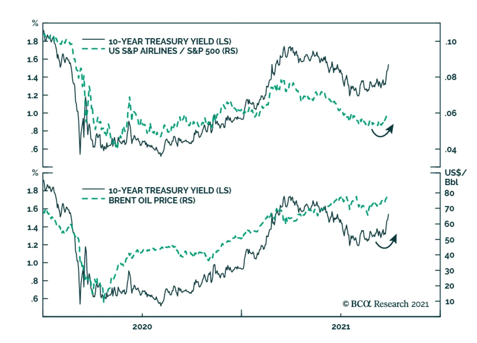
The sharp selloff in Treasurys over the past week has ignited a debate among BCA Research strategists about whether it is attributed to rising fears about inflation (see Country Focus) or is part of the reopening trade. The simultaneous rally in oil prices,…