Financial Markets

Highlights Along with momentum, quality has been the best performing factor over the past 30 years. It has also been less volatile and has exhibited milder drawdowns than other factors. There are multiple traits that are considered as signs of quality. However, profitability explains the lion’s share of the quality premium, though accounting quality and payout dilution also play a role. The reason why quality stocks outperform remains a mystery, though the preference for lottery stocks as well as the failure to account for the persistence of quality are plausible explanations. Both small caps and value stocks have negative tilts to quality. Adjusting for this tilt by buying small-cap quality indices or value indices with quality filters, can help investors exploit these factors more effectively. Feature “Investment must always consider the price as well as the quality of the security” – Benjamin Graham & David Dodd, Security Analysis, Principles and Technique, 1934 Legendary investor Benjamin Graham is one of the most significant figures in the history of finance. His two books, The Intelligent Investor and Security Analysis, stand as foundational pillars in the field of fundamental analysis. Moreover, as the mentor of the most famous investor ever, Warren Buffet, he has influenced a generation of investors into caring deeply about not overpaying for stocks. Thanks to these feats, Graham has come to be known as the “father of value investing”. And yet this moniker, though well-deserved, ignores a substantial portion of his legacy. Graham was not solely concerned with valuations.1 In fact, out of the seven criteria that he used to pick securities, only two of them focused on valuation measures. The rest, focused on metrics like profitability, leverage, and stability. These attributes encompass what is broadly known today as quality. But what exactly is quality? While certain traits have historically been associated with this factor, quality was not seen until more recently as something that you could easily define. Instead, a more holistic approach to quality was preferred.2 It wasn’t until the work of Robert Novy-Marx in the early 2010s, and US investment firm AQR thereafter, that the possibility of measuring quality, as well as systematically exploiting it, became prominent within the factor literature. Since then, quality has become a more popular strategy, with various commercial providers offering quality indices in recent years. However, much remains unknown about this newly discovered factor. Thus, in this report we take a deep dive into quality with the intent of providing some clarity on the following three issues: Definition of quality: What metrics are used to determine if a stock is a “quality” stock? Which of the many quality traits have the best track record? Characteristics of quality: What has been the historical performance of quality? What is its sector exposure? Why does it work? Implementation of quality: How can the quality factor be used in conjunction with other factors to increase returns? In order to answer these questions, we explore the historical performance of the MSCI Quality indices – though we also touch on quality indices by other providers. Moreover, we survey the academic literature around quality, and we propose a couple of ways by which investors can use this factor to exploit the value and small-cap premia more effectively. Definition Of Quality There is no universal agreement on how to measure quality, though there are some general traits that are agreed upon by the academic literature. An often used definition of quality is the “Quality Minus Junk” (QMJ) factor by AQR. In their research, Assness et al. use three traits, each of which is measured by five to six different metrics3 (Table 1). All the metrics are standardized and then averaged to arrive at a single quality measure. This quality measure is then used to build a quality portfolio. Table 1Metrics Used In AQR's Quality Minus Junk Factor (QMJ)
Junk Disposal: The Quality Factor In Equity Markets
Junk Disposal: The Quality Factor In Equity Markets
However, not all quality indices take so many measures into account. In fact, most commercial providers limit themselves to three or four variables to construct their quality indices. As an example, MSCI determines quality using three criteria: Return on equity, earnings variability, and leverage. All three variables are then winsorized,4 standardized, and then averaged to create a quality score. This quality score determines the weight of each stock within the index. Table 2 expands on the methodology of the quality benchmarks offered by various index providers. Table 2Quality Metrics For Popular Index Providers
Junk Disposal: The Quality Factor In Equity Markets
Junk Disposal: The Quality Factor In Equity Markets
The lack of a homogenous definition for quality makes performance evaluation of quality problematic. After all, the outperformance of quality could simply be a function of data mining by optimizing for a group of variables that produce excess returns in a backtest. This approach can lead to a large outperformance in-sample, but which might not necessarily replicate when applied in a real-world portfolio.5 To address this issue, some academics have tried to pinpoint which among the many quality traits truly add value in order to build a simpler and more parsimonious factor. In “What is Quality?”, Hsu et al. found that profitability is the most important quality characteristic, having a large and significant multifactor alpha6 (Table 3). Accounting quality and payout dilution have also been relatively reliable sources of excess returns. On the other hand, there is little evidence that most metrics for capital structure, profitability growth, or earnings stability, provide a premium that is not captured by other factors. Table 3Drivers Of The Quality Premium
Junk Disposal: The Quality Factor In Equity Markets
Junk Disposal: The Quality Factor In Equity Markets
Given the preponderance that profitability has in the overall performance of the quality factor, some academics have suggested that the quality factor should be reduced to profitability.7 However, not everybody agrees with this approach. In fact, other researchers have advocated for including more metrics such as ESG or corporate governance, in an effort to bring back the more holistic approach that Graham practiced.8 Overall, much disagreement about how to measure quality remains, and the subject is still an open debate. Characteristics Of Quality Historical Performance, Composition And Valuation Over the past 30 years, the MSCI Quality Index has, along with momentum, been the best performing factor in the equity markets (Chart 1, top panel). During this time frame, quality stocks have outperformed minimum volatility stocks by 2.6% per year, the global benchmark by 3.5% per year, and value stocks by 4% per year. The performance of quality has also been relatively robust, though the factor has performed better in some countries than others (Chart 1, bottom panel). Quality has performed best in European countries and Canada, while its outperformance has been more muted in Australia and Japan. Historically, quality has been the second most defensive factor after minimum volatility (Chart 2, panels 1 and 2). Moreover, it has exhibited lower volatility, and smaller drawdowns than the overall market. The defensive tilt of quality seems to arise because of the “flight to quality” phenomenon, where investors flock to higher quality assets during periods of markets stress. Interestingly, quality tends to outperform in equity markets and bond markets at the same time (Chart 2, bottom panel). This suggests that quality might be a common risk factor that is captured across asset classes. Chart 1Quality Has Outperformed Most Other Factors
Quality Has Outperformed Most Other Factors
Quality Has Outperformed Most Other Factors
Chart 2Quality Is A Defensive Factor
Quality Is A Defensive Factor
Quality Is A Defensive Factor
Chart 3Quality Overweights Expensive Sectors
Quality Overweights Expensive Sectors
Quality Overweights Expensive Sectors
What about composition? Within the global index, the quality factor currently has a large country bias to defensive markets like the US and Switzerland. This is mostly the result of its overweight to Information Technology, Consumer Staples and Health Care, and a large underweight position in Financials (Chart 3, top panel). This sector positioning also results in quality having high valuations relative to the overall market (Chart 3, bottom panel). It must be noted that valuations for quality stocks have risen significantly over the past few years. It is hard to know how this valuation compares to the past for the MSCI indices, given that valuation measures for MSCI Quality are only available starting in 2013. However, research by AQR has shown that relatively high prices for quality tend to result in lower returns.9 Thus, high valuations could pose a risk for quality going forward. Explanations For The Quality Anomaly Using a dividend-discount framework, one can show that, in theory, high-quality companies should trade at higher price-to-book values than low quality ones (for more details please see Appendix 1). Asness et at have shown that this is the case empirically – high-quality stocks trade at a valuation premium to low-quality stocks (Chart 4, top panel). Chart 4Analysts Are Most Optimistic On Low Quality Stocks
Junk Disposal: The Quality Factor In Equity Markets
Junk Disposal: The Quality Factor In Equity Markets
However, the mystery of quality lies in the fact that this premium does not appear to be as large as it should be. In other words, while analyst and market participants correctly assign higher multiples to high-quality stocks, this multiple is not large enough, and results in high-quality stocks being undervalued. Ultimately, this leads to the outperformance of high-quality stocks versus low-quality ones (Chart 4, bottom panel). Why do market participants overvalue low quality/junk stocks and undervalue high quality stocks? One reason could be a preference for lottery-like stocks. As we discussed in our January report on the low- volatility anomaly, investors tend to prefer “home-run” stocks – a result of behavioral biases as well as the incentives in the money management industry.10 Thus, distressed companies with low levels of profitability and large levels of debt, may attract some investors betting on a turnaround in the hope of a large windfall if the company survives.11 On the flip side, investors might perceive that high-quality companies – which are usually stable, profitable, and more expensive – cannot produce the same type of extreme payoff, and may even be prone to mean reversion, given that their success is evident and well known. But this last assumption is a mistake. Quality is a highly persistent characteristic, which means that a high-quality stock today is very likely to remain a high-quality stock in the future (Table 4). It is easy to see why this is the case. A company with very high levels of profitability has likely achieved this by building a moat around its business through a strong brand, proprietary technology, or network effects. It is possible that failure to take this into account results in an undervaluation of high-quality stocks. Table 4Quality Is Persistent
Junk Disposal: The Quality Factor In Equity Markets
Junk Disposal: The Quality Factor In Equity Markets
BOX 1 The Behavior Of Quality In Equity And Credit Markets Chart 5Quality Delivers A Different Premium In Different Asset Classes
Quality Delivers A Different Premium In Different Asset Classes
Quality Delivers A Different Premium In Different Asset Classes
While there is a very tight correlation between the performance of quality in credit and equity markets, the structural premium obtained from this factor in each market is very different. Over a long period, investors are rewarded for investing in high-quality equities, while the opposite occurs when investing in high-quality credit issues (Chart 5). Why would the same risk factor provide a positive premium in one market but provide a negative one in another? The exact reason remains unclear, but the behavioral explanations for the quality factor might provide a clue. As opposed to equity markets, returns in credit markets – even if very high – are naturally capped. As an example: An investor who buys a low-quality issue with a 20% yield-to-maturity, knows that in the absence of a default, the most he or she can earn from holding the issue to maturity is 20%. The fact that the maximum return is well established beforehand might prevent investors from displaying behavioral biases. Specifically, a well-defined upside might cause investors to think more rationally and mechanically about an investment. In contrast, securities where the upside is high but not well-defined might make it more likely for investors to see a very risky investment as a lottery, since extraordinary returns are technically within the realm of possibility. Whatever the reason is, the different premium that this factor offers in these two asset classes presents a potentially attractive opportunity for asset allocators. We will explore how investors could take advantage of this discrepancy in future reports on factor allocation. Implementation Of Quality Using Quality And Size Chart 6The Small-Cap Premium Is Higher When Adjusted For Quality
The Small-Cap Premium Is Higher When Adjusted For Quality
The Small-Cap Premium Is Higher When Adjusted For Quality
Historically, small-cap stocks have delivered excess returns over large cap-stocks – a well-documented phenomenon known as the size premium. However, this premium has been very unstable and extremely seasonal, occurring mostly in the month of January, and providing no excess returns in all other months. Moreover, some research has suggested that the size premium cannot be harvested easily in practice, since most of the premium is concentrated in the very smallest stocks (microcaps), which are highly illiquid.12 The issues surrounding the size premium have prompted some academics to question its existence. However, recent research on the interaction of quality and size has brought back interest to this topic. In the paper “Size Matters, If You Control Your Junk”, Assness et al show that many of the problems with the size premium are caused by the bias that small caps have to low quality. Once this low-quality bias is accounted for, the size premium becomes much larger and stable – a result that also holds when controlling for a quality proxy like profitability (Chart 6). Notably, the concentration of returns in January and in microcaps also disappears when the bias is removed.13 This bias to low quality is a significant problem in most popular small-cap indices. The profitability of indices like the S&P 600 has historically been lower than its large-cap counterparts (Chart 7, top panel). Moreover, a similar story holds for leverage: While the much maligned increase in corporate debt is evident in small-cap indices, it is virtually nonexistent when looking at large-cap indices like the S&P 500, where leverage measures stand barely above 30- year lows (Chart 7, bottom panel). How can this bias be removed? Stock-level filters for quality might be difficult to implement for many investors. Instead, an easier solution is to exploit the size premium through a small-cap quality index. S&P currently offers the S&P 600 Quality Index, which selects the 120 highest-quality stocks out of the S&P 600. Importantly, since this quality adjustment removes some of the low-quality bias from the S&P 600, the S&P 600 Quality index is able to maintain performance on the upside, while also limiting the sharp periods of underperformance that usually affect small caps during bear markets (Chart 8). Chart 7Small-Cap Stocks Have A Lot Of Junk
Small-Cap Stocks Have A Lot Of Junk
Small-Cap Stocks Have A Lot Of Junk
Chart 8Small-Cap Quality Is A Better Way To Exploit The Size Anomaly
Small-Cap Quality Is A Better Way To Exploit The Size Anomaly
Small-Cap Quality Is A Better Way To Exploit The Size Anomaly
Using Quality And Value The intersection between value and quality – a pair of factors that have a negative correlation – has been a topic of interest since quality was first discovered.14 They stand as perfect complements of each other: The value factor tries to find cheap stocks, regardless of their quality, while the quality factor tries to find quality stocks regardless of their price. Together they make for a powerful combination: Quality stocks at affordable prices. Some research has suggested that this combination of value and quality lies behind the success of Graham’s greatest student. According to the seminal paper titled “Buffet’s Alpha”, the biggest factor exposures of the Berkshire Hathaway portfolio from 1980 to 2011, outside of overall market risk, were quality and value15 (Chart 9). Exposure to these factors, along with low beta, as well as the ability of Berkshire Hathaway to obtain cheap leverage thanks to its insurance business, explained most of the excess returns that Warren Buffet was able to achieve. Chart 9Buffett's Motto: High Quality, Cheap, And Low Risk
Junk Disposal: The Quality Factor In Equity Markets
Junk Disposal: The Quality Factor In Equity Markets
Commercial providers have started to offer indices which combine value and quality. As an example, MSCI offers the Prime Value indices, where stocks are first screened for quality and then ranked according to a value score. This methodology has outperformed its normal value counterparts in both the euro area and the US (Chart 10). Chart 10Quality Adjustments By MSCI Improve Value In The Euro Area
Quality Adjustments By MSCI Improve Value In The Euro Area
Quality Adjustments By MSCI Improve Value In The Euro Area
Chart 11Stronger Quality Filters Are Needed In The US To Enhance Value
Stronger Quality Filters Are Needed In The US To Enhance Value
Stronger Quality Filters Are Needed In The US To Enhance Value
Interestingly, despite value’s recent doldrums, the quality adjustment done in the Prime Value index has helped value perform relatively well in the euro area for the past couple years. However, the same cannot be said in the US where performance of Value and Prime Value has been almost identical since 2003. This suggest a couple of options: It could be that, even when adjusting for quality, value behaves fundamentally differently in different countries. Alternatively, it could also mean that the US market is more efficient at pricing quality, which would imply that a simple quality filter would not do much, since quality at an attractive valuation would be harder to find. We suspect the reason might be the latter. In this case a stronger quality filter might be needed to substantially enhance the performance of value. The newly released Russell 1000 QARP (Quality At A Reasonable Price) Index follows this methodology. It applies a double quality filter and then compounds it by a value score. This index has substantially enhanced performance relatively to the Russell 1000 Value index (Chart 11). Moreover, it has also been able to fare better relative to the broad market and has avoided the large underperformance that value has undergone since 2018. Bottom Line Quality has been one of the most successful factors over the past three decades. But will this performance continue? While the exact reason behind the quality anomaly remains unclear, the evidence suggests that institutional incentives and behavioral biases, which are likely to persist in the future, might be responsible for the outperformance of quality in the market. Thus, investors should consider adding quality stocks to their portfolios. Moreover, quality can also be used to enhance the performance of other popular factors in the following ways: Correcting for the low-quality bias of small caps, makes the small-cap premium larger and much more stable over the long term. A practical way to correct for this low-quality bias is to buy small-cap quality portfolios such as the S&P 600 Quality Index. Value stocks also tend to have low quality. Investors can improve the performance of the value factor by using quality filters to find quality stocks that are also cheap. The quality filters in the MSCI Prime Value Index has significantly improved the performance of value in the euro area. Meanwhile, the Russell 1000 QARP index, which selects for value stocks using a stronger quality filter than MSCI, has kept pace with the overall market even amidst value’s collapse. Juan Correa Ossa, CFA Associate Editor juanc@bcaresearch.com Appendix 1
Junk Disposal: The Quality Factor In Equity Markets
Junk Disposal: The Quality Factor In Equity Markets
Footnotes 1 Robert Novy-Marx, “Quality Investing,” Working Paper, 1-28 (2014) 2 In Graham’s own words: “An indefinite and approximate measure of the intrinsic value may be sufficient. To use a homely simile, it is quite possible to decide by inspection that a woman is old enough to vote without knowing her age or that a man is heavier than he should be without knowing his exact weight.” 3 Asness, C.S., Frazzini, A. & Pedersen, L.H. “Quality minus junk,” Rev Account Stud 24, 34–112 (2019). 4 Winsorization is a way to remove the effects of outliers in the data. In this case all the values above the 95th percentile are set to the 95th percentile value and all the values below the 5th percentile are set to the 5th percentile value. 5 Robert Novy-Marx, “Backtesting Strategies Based on Multiple Signals,” NBER Working Paper No. w21329 (2015). 6 Jason Hsu, Vitali Kalesnik, Engin Kose, “What Is Quality?” Financial Analysts Journal, 75:2, 44-61 (2019). 7 Amanda White, “Quality is Explained by Profitability,” Top1000funds.com, (2015). 8 Dan Hanson and Rohan Dhanuka, “The ‘Science’ and ‘Art’ of High Quality Investing,” Journal of Applied Corporate Finance, 27:2 (2015). 9 C.S. Asness, A. Frazzini, and L.H. Pedersen, “Quality minus junk,” Rev Account Stud 24, 34–112 (2019). 10 Please see Global Asset Allocation Special Report, “Less Risk And More Reward? The Low-Volatility Factor In Equity Markets”, dated January 29, 2020. 11 This theory on the quality anomaly might explain the different performance of quality in credit and equity markets. For more details, please see Box 1. 12 Please see Global Asset Allocation Special Report, “Small Cap Outperformance: Fact Or Myth?” dated April 7, 2020. 13 Cliff S. Asness, Andrea Frazzini, Ronen Israel, and Lasse Heje Pedersen, “Size Matters, If You Control Your Junk,” CEPR Discussion Paper, No. DP12684 (2018). 14 Robert Novy - Marx, “The Other Side of Value: The Gross Profitability Premium,” Journal of Financial Economics, 108(1) , 1 - 28, (2013) and “The Quality Dimension of Value Investing,” University of Rochester, Working Paper (2014). 15 Andrea Frazzini, David Kabiller, and Lasse Heje Pedersen, "Buffett’s Alpha," Financial Analysts Journal, 74-4, 35-55 (2018).
Highlights Chart 1Permanent Job Losses Still Rising
Permanent Job Losses Still Rising
Permanent Job Losses Still Rising
The biggest event in bond markets last month was the Fed’s shift toward a regime of average inflation targeting. Treasuries sold off in the days following the announcement and, overall, the Bloomberg Barclays Treasury index underperformed cash by 111 basis points in August (Chart 1). We view this market reaction as sensible, since it seems clear that the Fed’s new commitment to tolerate an overshoot of its 2% inflation target will be bearish for bonds in the long run. However, for this bond bear market to play out the US economy must first generate some inflation. This will take time. Despite the drop in the headline U3 unemployment rate, August’s employment report showed that permanent job losses continue to rise (bottom panel). This is a clear sign that the economic recovery is not yet on a solid footing. We advise bond investors to keep portfolio duration close to benchmark for the time being. We also recommend several yield curve trades across the nominal, real and inflation compensation curves (see pages 10 & 11). Feature Investment Grade: Overweight Chart 2Investment Grade Market Overview
Investment Grade Market Overview
Investment Grade Market Overview
Investment grade corporate bonds outperformed the duration-equivalent Treasury index by 5 basis points in August, bringing year-to-date excess returns up to -356 bps. Spreads on Baa-rated corporate bonds continued their tightening trend through August, even as spreads were roughly flat for bonds rated A and above. As a result, Baa-rated bonds outperformed duration-matched Treasuries by 30 bps on the month while higher-rated credits underperformed. Valuation remains more attractive for the Baa space than for higher-rated credits (Chart 2), but spreads for all credit tiers look cheaper than they did near the end of 2019. Given the Fed’s strong support for the market through both its emergency lending facilities, and now, its extraordinarily dovish forward rate guidance, we see further room for spread compression across all credit tiers. At the sector level, we continue to recommend a focus on high-quality Baa-rated issuers. That is, Baa-rated bonds that are unlikely to face a ratings downgrade during the next 12 months. Subordinate bank bonds are a prime example of debt that falls into this sweet spot.1 We also recommend overweight allocations to Healthcare and Energy bonds2 and underweight allocations to Technology3 and Pharmaceutical bonds.4 Table 3ACorporate Sector Relative Valuation And Recommended Allocation*
The Fed’s New Framework Is Bond Bearish … But Not Yet
The Fed’s New Framework Is Bond Bearish … But Not Yet
Table 3BCorporate Sector Risk Vs. Reward*
The Fed’s New Framework Is Bond Bearish … But Not Yet
The Fed’s New Framework Is Bond Bearish … But Not Yet
High-Yield: Neutral Chart 3High-Yield Market Overview
High-Yield Market Overview
High-Yield Market Overview
High-Yield outperformed the duration-equivalent Treasury index by 121 basis points in August, bringing year-to-date excess returns up to -351 bps. All junk credit tiers delivered strong returns in August, but the lowest-rated credits performed best. Caa-rated & below junk bonds outperformed Treasuries by 255 bps on the month compared to 98 bps of outperformance for Ba-rated bonds (Chart 3). The recent strong performance of low-rated junk bonds makes us question whether our focus on the Ba-rated credit tier is overly conservative. If the economy is indeed on a quick road to recovery, then we are leaving some return on the table by avoiding the B-rated and lower credit tiers. However, we aren’t yet confident enough in the economic recovery to move down in quality. Last week’s employment report showed that permanent job losses continue to rise and Congress has still not passed a much needed follow-up to the CARES act. What’s more, current junk spreads imply a very rapid decline in the corporate default rate during the next 12 months, from its current level of 8.4% all the way to 4.4% (panel 3).5 In this regard, August’s steep drop in layoff announcements is a positive development (bottom panel), though job cuts are still running well above pre-pandemic levels. At the sector level, we advise overweight allocations to high-yield Technology6 and Energy7 bonds. We are underweight the Healthcare and Pharmaceutical sectors.8 MBS: Underweight Chart 4MBS Market Overview
MBS Market Overview
MBS Market Overview
Mortgage-Backed Securities outperformed the duration-equivalent Treasury index by 9 basis points in August, bringing year-to-date excess returns up to -37 bps. The conventional 30-year MBS index option-adjusted spread (OAS) tightened 7 bps in August, but it still offers a small spread pick-up compared to other similarly risky sectors. The MBS OAS of 77 bps is greater than the 75 bps offered by Aa-rated corporate bonds, the 67 bps offered by Agency CMBS and the 35 bps offered by Aaa-rated consumer ABS. Despite the spread advantage, we are concerned that the elevated primary mortgage spread is a warning that refinancing risk could flare later this year (Chart 4). Even if Treasury yields are unchanged, a further 50 bps drop in the mortgage rate due to spread compression cannot be ruled out. Such a move would lead to a significant increase in prepayment losses. With that in mind, we are concerned about the low level of expected prepayment losses (option cost) priced into the MBS index (panel 3). A fourth quarter refi wave would undoubtedly send that option cost higher, eating into the returns implied by the OAS. The recent spike in the mortgage delinquency rate does not pose a near-term risk to spreads as it is being driven by households that have been granted forbearance from the federal government (panel 4). The risk for MBS holders only comes into play if many households are unable to resume their regular mortgage payments when the forbearance period expires early next year. But even in that case, further government action to either support household incomes or extend the forbearance period could mitigate the risk. Government-Related: Underweight Chart 5Government-Related Market Overview
Government-Related Market Overview
Government-Related Market Overview
The Government-Related index outperformed the duration-equivalent Treasury index by 31 basis points in August, bringing year-to-date excess returns up to -295 bps. Sovereign debt outperformed duration-equivalent Treasuries by 105 bps on the month, bringing year-to-date excess returns up to -468 bps. Foreign Agencies outperformed the Treasury benchmark by 13 bps in August, bringing year-to-date excess returns up to -694 bps. Local Authority debt outperformed Treasuries by 33 bps in August, bringing year-to-date excess returns up to -337 bps. Domestic Agency bonds outperformed by 8 bps, bringing year-to-date excess returns up to -54 bps. Supranationals outperformed by 5 bps, bringing year-to-date excess returns up to -9 bps. US dollar weakness is usually a boon for Sovereign and Foreign Agency returns. However, most of the dollar’s recent depreciation has occurred against other Developed Market currencies, not Emerging Markets (Chart 5). Added to that, dollar weakness against all trading partners helps US corporate sector profits, and Baa-rated corporate bonds continue to offer a spread pick-up versus EM sovereigns (panel 4). Within the Emerging Market Sovereign space: Turkey, South Africa, Mexico, Colombia and Russia all offer a spread pick-up relative to quality and duration-matched US corporate bonds. Of those attractively priced countries, Mexico stands out as particularly compelling on a risk/reward basis.9 Municipal Bonds: Overweight Chart 6Municipal Market Overview
Municipal Market Overview
Municipal Market Overview
Municipal bonds underperformed the duration-equivalent Treasury index by 19 basis points in August, dragging year-to-date excess returns down to -492 bps (before adjusting for the tax advantage). Municipal bond spreads versus Treasuries have widened during the past month, more so at the long-end than at the short-end, and the entire Aaa muni curve remains above the Treasury curve, despite municipal debt’s tax-exempt status (Chart 6). Municipal bonds also remain attractively priced relative to corporate bonds across the entire investment grade credit spectrum, as we demonstrated in a recent report.10 The Fed reduced the pricing on its Municipal Liquidity Facility (MLF) by 50 basis points last month. Most likely, it felt pressure to act as Congress has still not passed a state & local government aid package. However, the Fed’s move will not have much impact on municipal bond spreads. Even after the reduction, municipal yields continue to run well below the cost offered by the MLF (panel 3). Extremely attractive valuation causes us to stick with our municipal bond overweight, though spreads will widen in the near-term if much needed stimulus doesn’t arrive soon. In the long-run, we remain optimistic that elevated state rainy day funds will help cushion the fiscal blow and lessen the risk of ratings downgrades (bottom panel). Treasury Curve: Buy 5-Year Bullet Versus 2/10 Barbell Chart 7Treasury Yield Curve Overview
Treasury Yield Curve Overview
Treasury Yield Curve Overview
The Treasury curve bear-steepened in August. The 2/10 and 5/30 Treasury slopes steepened 14 bps and 22 bps, reaching 58 bps and 121 bps, respectively. One easy way to think about nominal Treasury yields is as the market’s expectation of future changes in the federal funds rate.11 With that in mind, the Fed’s recent shift toward a regime of average inflation targeting will likely lead to nominal yield curve steepening. That is, the Fed will keep a firm grip on the front-end of the curve, but long-maturity yields could rise as investors price-in the possibility that the Fed will have to eventually respond to high inflation by quickly tightening policy. For this reason, we retain a core position in nominal yield curve steepeners. Specifically, we recommend buying the 5-year bullet and shorting a duration-matched 2/10 barbell. This position is designed to profit from 2/10 Treasury curve steepening, which should play out over the next 6-12 months, assuming the economic recovery is sustained. Valuation is a concern with this recommended positioning. The 5-year yield is below the yield on the duration-matched 2/10 barbell (Chart 7), and the 5-year bullet looks expensive on our yield curve models (Appendix B). However, the 5-year bullet traded at much more expensive levels during the last zero-lower-bound period between 2010 and 2013 (bottom panel). With short rates once again pinned at zero, we expect the 5-year to once again hit extreme levels of overvaluation. TIPS: Overweight Chart 8TIPS Market Overview
TIPS Market Overview
TIPS Market Overview
TIPS outperformed the duration-equivalent nominal Treasury index by 240 basis points in August, bringing year-to-date excess returns up to -76 bps. The 10-year and 5-year/5-year forward TIPS breakeven inflation rates rose 25 bps and 22 bps on the month. They currently sit at 1.67% and 1.78%, respectively. TIPS breakeven inflation rates have moved up rapidly during the past couple months, a trend that was supercharged by the Fed’s Jackson Hole announcement. In fact, the 10-year TIPS breakeven inflation rate is now right around fair value according to our Adaptive Expectations Model (Chart 8).12 TIPS will soon turn expensive if current trends continue. That is, unless stronger CPI inflation sends our model’s fair value reading higher. We place strong odds on the latter occurring during the next few months, with trimmed mean inflation measures still running well above core (panel 3). However, we cautioned in a recent report that inflation is likely to moderate in 2021 after core inflation re-converges with the trimmed mean.13 In addition to our overweight stance on TIPS, we continue to recommend real yield curve steepeners and inflation curve flatteners. With the Fed now officially targeting an overshoot of its 2% inflation goal, we would expect the cost of 2-year inflation protection to rise above the cost of 10-year inflation protection (panel 4). With the Fed also keeping a firmer grip over short-dated nominal yields than over long-dated ones, this means that short-maturity real yields will come under downward pressure relative to the long end (bottom panel). ABS: Overweight Chart 9ABS Market Overview
ABS Market Overview
ABS Market Overview
Asset-Backed Securities outperformed the duration-equivalent Treasury index by 30 basis points in August, bringing year-to-date excess returns up to +53 bps. Aaa-rated ABS outperformed the Treasury benchmark by 24 bps on the month, bringing year-to-date excess returns up to +46 bps. Non-Aaa ABS outperformed by 73 bps, bringing year-to-date excess returns up to +95 bps. Aaa ABS are a high conviction overweight, given that spreads remain elevated compared to historical levels and that the sector benefits from Fed support through the Term Asset-Backed Loan Facility (TALF). However, spreads are even more attractive in non-Aaa ABS (Chart 9) and we recommend owning those securities as well. This is despite the fact that only Aaa-rated bonds are eligible for TALF. We explained our rationale for owning non-Aaa consumer ABS in a recent report.14 We noted that the stimulus received from the CARES act caused real disposable personal income to increase significantly between February and July and, faced with fewer spending opportunities, households used that windfall to pay down consumer debt (bottom panel). Granted, further income support from fiscal policymakers is needed now that the CARES act’s enhanced unemployment benefits have expired. But given the substantial boost to savings that has already occurred, we are confident that more stimulus will arrive in time to prevent a wave of consumer bankruptcies. Non-Agency CMBS: Neutral Chart 10CMBS Market Overview
CMBS Market Overview
CMBS Market Overview
Non-Agency Commercial Mortgage-Backed Securities outperformed the duration-equivalent Treasury index by 77 basis points in August, bringing year-to-date excess returns up to -320 bps. Aaa Non-Agency CMBS outperformed Treasuries by 57 bps on the month, bringing year-to-date excess returns up to -108 bps. Non-Aaa Non-Agency CMBS outperformed by 160 bps, bringing year-to-date excess returns up to -1008 bps (Chart 10). We continue to recommend an overweight allocation to Aaa non-agency CMBS and an underweight allocation to non-Aaa CMBS. Our reasoning is simple. Aaa CMBS are eligible for TALF, meaning that spreads can still tighten even as the hardship in commercial real estate continues. Without Fed support, non-Aaa CMBS will struggle to deal with a climbing delinquency rate (panel 3).15 Agency CMBS: Overweight Agency CMBS outperformed the duration-equivalent Treasury index by 38 basis points in August, bringing year-to-date excess returns up to -4 bps. The average index spread tightened 6 bps on the month to 66 bps, still well above typical historical levels (bottom panel). The Fed is supporting the Agency CMBS market by directly purchasing the securities as part of its Agency MBS purchase program. The combination of strong Fed support and elevated spreads makes the sector a high conviction overweight. Appendix A: Buy What The Fed Is Buying The Fed rolled out a number of aggressive lending facilities on March 23. These facilities focused on different specific sectors of the US bond market. The fact that the Fed has decided to support some parts of the market and not others has caused some traditional bond market correlations to break down. It has also led us to adopt of a strategy of “Buy What The Fed Is Buying”. That is, we favor those sectors that offer attractive spreads and that benefit from Fed support. The below Table tracks the performance of different bond sectors since the March 23 announcement. We will use this to monitor bond market correlations and evaluate our strategy’s success. TablePerformance Since March 23 Announcement Of Emergency Fed Facilities
The Fed’s New Framework Is Bond Bearish … But Not Yet
The Fed’s New Framework Is Bond Bearish … But Not Yet
Appendix B: Butterfly Strategy Valuations The following tables present the current read-outs from our butterfly spread models. We use these models to identify opportunities to take duration-neutral positions across the Treasury curve. The following two Special Reports explain the models in more detail: US Bond Strategy Special Report, “Bullets, Barbells And Butterflies”, dated July 25, 2017, available at usbs.bcaresearch.com US Bond Strategy Special Report, “More Bullets, Barbells And Butterflies”, dated May 15, 2018, available at usbs.bcaresearch.com Table 4 shows the raw residuals from each model. A positive value indicates that the bullet is cheap relative to the duration-matched barbell. A negative value indicates that the barbell is cheap relative to the bullet. Table 4Butterfly Strategy Valuation: Raw Residuals In Basis Points (As Of September 3, 2020)
The Fed’s New Framework Is Bond Bearish … But Not Yet
The Fed’s New Framework Is Bond Bearish … But Not Yet
Table 5 scales the raw residuals in Table 4 by their historical means and standard deviations. This facilitates comparison between the different butterfly spreads. Table 5Butterfly Strategy Valuation: Standardized Residuals (As Of September 3, 2020)
The Fed’s New Framework Is Bond Bearish … But Not Yet
The Fed’s New Framework Is Bond Bearish … But Not Yet
Table 6 flips the models on their heads. It shows the change in the slope between the two barbell maturities that must be realized during the next six months to make returns between the bullet and barbell equal. For example, a reading of 72 bps in the 5 over 2/10 cell means that we would only expect the 5-year to outperform the 2/10 if the 2/10 slope steepens by more than 72 bps during the next six months. Otherwise, we would expect the 2/10 barbell to outperform the 5-year bullet. Table 6Discounted Slope Change During Next 6 Months (BPs)
The Fed’s New Framework Is Bond Bearish … But Not Yet
The Fed’s New Framework Is Bond Bearish … But Not Yet
Appendix C: Excess Return Bond Map The Excess Return Bond Map is used to assess the relative risk/reward trade-off between different sectors of the US bond market. It is a purely computational exercise and does not impose any macroeconomic view. The Map’s vertical axis shows 12-month expected excess returns. These are proxied by each sector’s option-adjusted spread. Sectors plotting further toward the top of the Map have higher expected returns and vice-versa. Our novel risk measure called the “Risk Of Losing 100 bps” is shown on the Map’s horizontal axis. To calculate it, we first compute the spread widening required on a 12-month horizon for each sector to lose 100 bps or more relative to a duration-matched position in Treasury securities. Then, we divide that amount of spread widening by each sector’s historical spread volatility. The end result is the number of standard deviations of 12-month spread widening required for each sector to lose 100 bps or more versus a position in Treasuries. Lower risk sectors plot further to the right of the Map, and higher risk sectors plot further to the left. Chart 11Excess Return Bond Map (As Of September 3, 2020)
The Fed’s New Framework Is Bond Bearish … But Not Yet
The Fed’s New Framework Is Bond Bearish … But Not Yet
Ryan Swift US Bond Strategist rswift@bcaresearch.com Footnotes 1 Please see US Bond Strategy Weekly Report, “The Case Against The Money Supply”, dated June 30, 2020, available at usbs.bcaresearch.com 2 Please see US Bond Strategy Special Report, “The Outlook For Energy Bonds Part 1: A Model Of Energy Bond Excess Returns”, dated July 14, 2020 and US Bond Strategy Special Report, “The Outlook For Energy Bonds Part 2: Buy The Dip In High-Yield Energy”, dated July 21, 2020, available at usbs.bcaresearch.com 3 Please see US Bond Strategy Weekly Report, “Take A Look At High-Yield Technology Bonds”, dated June 23, 2020, available at usbs.bcaresearch.com 4 Please see US Bond Strategy Weekly Report, “Assessing Healthcare & Pharma Bonds In A Pandemic”, dated June 9, 2020, available at usbs.bcaresearch.com 5 We assume a 25% recovery rate and target a spread of 150 bps in excess of default losses. For more details on this calculation please see US Bond Strategy Weekly Report, “No Holding Back”, dated June 16, 2020, available at usbs.bcaresearch.com 6 Please see US Bond Strategy Weekly Report, “Take A Look At High-Yield Technology Bonds”, dated June 23, 2020, available at usbs.bcaresearch.com 7 Please see US Bond Strategy Special Report, “The Outlook For Energy Bonds Part 1: A Model Of Energy Bond Excess Returns”, dated July 14, 2020, and US Bond Strategy Special Report, “The Outlook For Energy Bonds Part 2: Buy The Dip In High-Yield Energy”, dated July 21, 2020, available at usbs.bcaresearch.com 8 Please see US Bond Strategy Weekly Report, “Assessing Healthcare & Pharma Bonds In A Pandemic”, dated June 9, 2020, available at usbs.bcaresearch.com 9 Please see US Bond Strategy Weekly Report, “The Treasury Market Amid Surging Supply”, dated May 12, 2020, available at usbs.bcaresearch.com 10 Please see US Bond Strategy Weekly Report, “Bonds Are Vulnerable As North America Re-Opens”, dated May 26, 2020, available at usbs.bcaresearch.com 11 For more details on this forecasting framework please see US Bond Strategy Weekly Report, “Positioning For Reflation And Avoiding Deflation”, dated August 11, 2020, available at usbs.bcaresearch.com 12 For more details on our model please see US Bond Strategy Weekly Report, “How Are Inflation Expectations Adapting?”, dated February 11, 2020, available at usbs.bcaresearch.com 13 Please see US Bond Strategy Weekly Report, “Positioning For Reflation And Avoiding Deflation”, dated August 11, 2020, available at usbs.bcaresearch.com 14 Please see US Bond Strategy Weekly Report, “No Holding Back”, dated June 16, 2020, available at usbs.bcaresearch.com 15 For a deeper dive into the outlook for US commercial real estate please see Global Investment Strategy Special Report, “Working From Home, Urban Flight, And Commercial Real Estate Loans: How Bad Can Things Get?”, dated August 28, 2020, available at gis.bcaresearch.com Fixed Income Sector Performance Recommended Portfolio Specification Corporate Sector Relative Valuation And Recommended Allocation
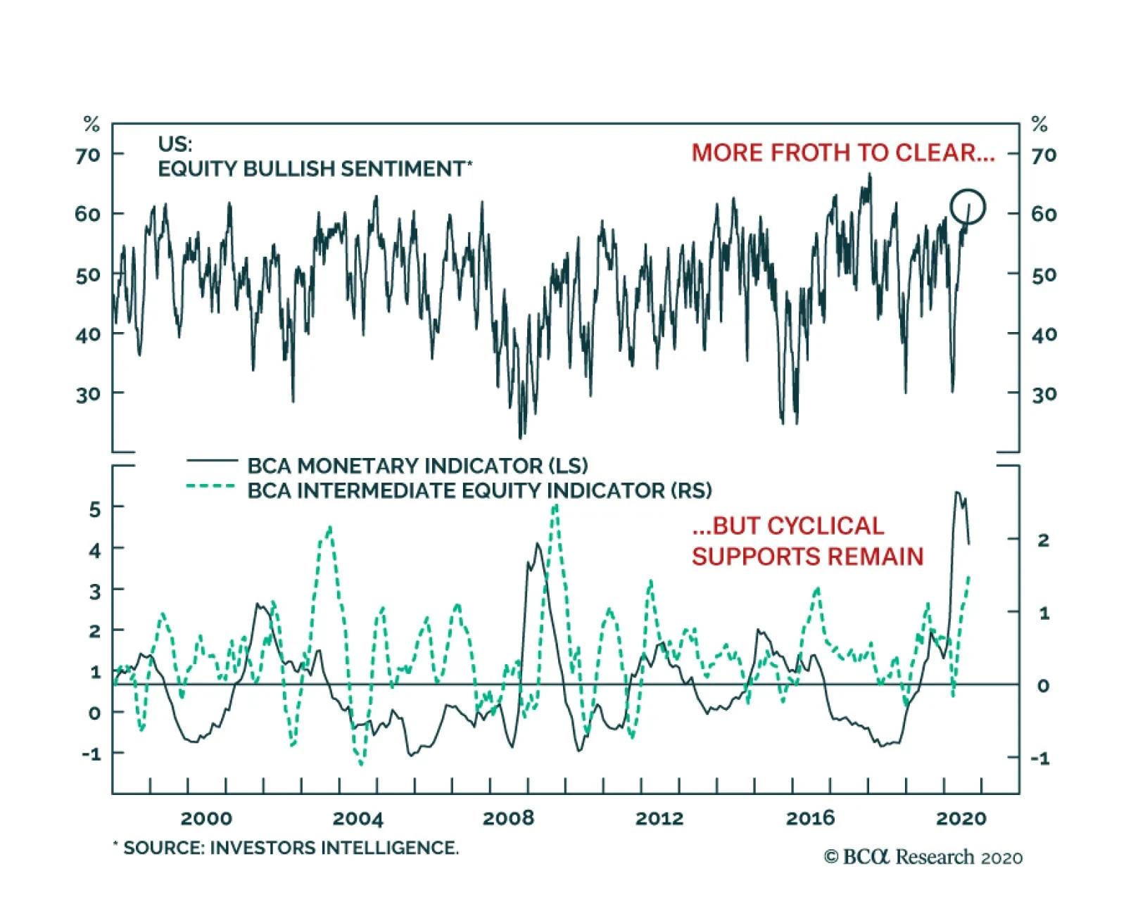
Highlights Stocks, particularly tech stocks, are technically overbought and highly vulnerable to a further correction. Nevertheless, investors should continue to overweight global equities relative to bonds on a 12-month horizon, while rotating equity allocations into cheaper sectors and regions. What should policymakers do if they wish to maximize growth and restore full employment? In the feature section of this report, we argue that the optimal course of action for most countries is to loosen fiscal policy until labor slack has been eliminated and the central bank’s inflation target has been met. Once this has been achieved, governments should trim the budget deficit to keep inflation from accelerating too much. What will policymakers actually do? While today’s budget deficits are smaller than what most economies need, they will ultimately prove to be too big once private sector demand recovers. The upshot is that inflation will increase by the middle of the decade, first in the US and then everywhere else. The secular bull market in equities will end only when central banks are forced to scramble to contain inflation. Fortunately, that day of reckoning is at least a few years away. Feature Apparently, Stocks Don’t Always Go Up After a relentless rally, stocks buckled under the pressure on Thursday. The MSCI All-Country World index lost 3%, the S&P 500 shed 3.5%, and the tech-heavy Nasdaq Composite plunged 5%. Two weeks ago, in a report titled “The Return Of Nasdog,” we argued that the leadership role was set to pivot away from tech and health care, as pandemic angst subsided and investors began to price in a recovery in the sectors of the stock market that had been crushed by lockdown measures. Chart 1A Weaker Dollar Is Generally Associated With Non-US Equity Outperformance, But Not Since The Covid Crash
A Weaker Dollar Is Generally Associated With Non-US Equity Outperformance, But Not Since The Covid Crash
A Weaker Dollar Is Generally Associated With Non-US Equity Outperformance, But Not Since The Covid Crash
Historically, non-US equities have outperformed their US peers when the dollar has weakened (Chart 1). This relationship broke down this year because of the outsized weight that tech and health care command in US indices. If the relative performance of tech and health care stocks peaks over the coming weeks, this should translate into a clear outperformance for non-US stock markets. Value stocks should also start outperforming growth stocks. Stock market leadership changes often occur within the context of broad-based equity corrections. Our near-term view on stocks, as illustrated in the view matrix at the end of this report, is more cautious than our 12-month view. Thus, we would not be surprised if the major indices sell off over the coming weeks, with tech stocks leading the way down. The same sort of technical factors that amplified the move up in stocks over the past few weeks could exacerbate the move down. Most notably, so-called delta hedge option strategies, in which an investor sells calls and hedges the risk by purchasing the underlying stock, can create a self-reinforcing feedback loop where rising call prices force investors to buy more shares, leading to even higher call prices. Once the stock market starts falling, the process goes into reverse. Nevertheless, we do not expect tech stocks to suffer the sort of crash they experienced in 2000. Tech valuations are not as stretched as they were back then, earnings growth is stronger, and balance sheets are much healthier. Moreover, unlike in 2000, when the Fed lifted rates to as high as 6.5% in May, monetary policy is at no risk of turning hawkish. All this suggests that tech stocks are more likely to go sideways than down over a 12-month horizon (albeit in a fairly volatile manner). Investors should continue to overweight global equities relative to bonds on a 12-month horizon, while tilting equity allocations towards cheaper sectors and regions. Feature: Should Versus Will Investors want to know what the future will bring. As such, our primary interest at BCA Research is in predicting what policymakers will do rather than what they should do. Sometimes, however, it is useful to ask the “should” question since the answer may shape one’s view on the “will” question. This is especially the case when a particular set of goals is aligned with both the incentives and constraints that policymakers face. With that in mind, let us ask what the optimal mix of monetary and fiscal policy should be, assuming that policymakers have the goal of maximizing growth and moving the economy towards full employment. As we argue below, this is a relevant question to ask not because we necessarily share this goal – our personal value judgments are besides the point here – but because most policymakers think this is the correct goal. Propping Up Demand Chart 2Labor Markets In Developed Economies Have Rarely Overheated Over The Past Few Decades
Labor Markets In Developed Economies Have Rarely Overheated Over The Past Few Decades
Labor Markets In Developed Economies Have Rarely Overheated Over The Past Few Decades
Maintaining full employment requires that spending match the economy’s productive capacity. In theory, this should not be a difficult objective to achieve. After all, people like to spend. Increasing demand should be easy. The hard part should be raising supply. In practice, it has not worked out that way. Even before the pandemic, unemployment rates rarely fell below their full employment level across the G7 economies (Chart 2). High Unemployment: Cyclical Or Structural? Some will argue that surplus unemployment is necessary to shift workers from sectors of the economy where they are not needed to sectors where they are. The failure to facilitate such resource reallocation could, it is alleged, stymie long-term growth. This is largely a spurious claim. As Chart 3 shows, there is always a huge amount of churn in the labor market. In 2019, a year in which total employment rose by 2.1 million, a total of 70 million people were hired in the US compared to 64 million who quit or lost their jobs. In fact, labor market churn tends to decrease during recessions as workers become reluctant to quit their jobs. Chart 3Labor Market Turnover Tends To Increase During Expansions
Labor Market Turnover Tends To Increase During Expansions
Labor Market Turnover Tends To Increase During Expansions
Chart 4Residential Construction Accounted For Less Than 20% Of The Job Losses During The Great Recession
The Outlook For Monetary And Fiscal Policy: What Should Be Done Vs. What Will Be Done
The Outlook For Monetary And Fiscal Policy: What Should Be Done Vs. What Will Be Done
Far from reflecting structural factors, the vast majority of the rise in joblessness during economic downturns is gratuitous in nature. For example, more than 80% of the jobs lost during the Great Recession were outside the residential real estate sector (Chart 4). Moreover, employment growth is highly correlated with investment spending (Chart 5). The easiest way to induce firms to boost capex – and, in the process, augment the economy’s productive capacity – is to adopt policies that raise overall employment. A stronger labor market will generate more demand for goods and services. It will also make labor more expensive in relation to capital, thereby incentivizing labor-saving capital investment. Chart 5Employment Growth And Investment Spending Go Hand-In-Hand
Employment Growth And Investment Spending Go Hand-In-Hand
Employment Growth And Investment Spending Go Hand-In-Hand
Today, unemployment is elevated once again. As was the case during prior recessions, some workers will need to transition from sectors of the economy that will be slow to recover (retail, travel, and hospitality, for example) to sectors where jobs will be more plentiful. The risk is that there will not be enough job vacancies in the latter sectors to compensate for job losses in the former. The fact that permanent job losses have been creeping higher in the US over the past few months, even as temporary layoffs have come down, is evidence that such an outcome is a clear and present danger (Chart 6). Chart 6Many Are Returning To Work, But The Number Of Permanent Layoffs Is Slowly Increasing As Well
Many Are Returning To Work, But The Number Of Permanent Layoffs Is Slowly Increasing As Well
Many Are Returning To Work, But The Number Of Permanent Layoffs Is Slowly Increasing As Well
Central Banks Can’t Do It All One does not need to refill a leaky bucket through the same hole the water escaped. As long as there is enough demand throughout the economy, workers who lose their jobs in declining sectors will eventually find new jobs in other sectors. So why has the bucket seemed chronically short of water in recent years? The answer is that monetary policy has been tasked to do more than it is realistically capable of achieving. Monetary policy operates with “long and variable lags.” When unemployment rises, the best that central banks can do is cut interest rates and hope that the more interest-rate sensitive parts of the economy eventually perk up. If the interest-rate sensitive sectors of the economy are tapped out, just as housing was following the financial crisis, or policy rates are near their lower bound, as they are now, monetary policy will be even less potent than usual. The Role Of Fiscal Policy This is where fiscal policy ought to fill the void. Even if monetary policy is exhausted, governments can cut taxes, raise transfers to households and businesses, or increase direct spending on goods and services. The extent to which fiscal policy is loosened should not be preordained. Rather, it should simply reflect the state of the economy. There is no limit to how much money governments can transfer to the public. In fact, one can easily imagine a system where governments cut taxes and increase transfer payments whenever unemployment moves up. Such a powerful system of automatic stabilizers would go a long way towards keeping the economy on an even keel. Why have governments been reluctant to embrace such a system? One key reason is that such a system would produce open-ended budget deficits. That would not be much of a problem if the red ink lasted just a few years, but what if the need for large budget deficits did not go away? The Japanese Example Consider the case of Japan. Starting in the early 1990s, Japan’s private sector became a chronic net saver, as demand for credit evaporated amid savage deleveraging (Chart 7). In order to keep the economy from falling into a full-blown depression, the government started to run continual budget deficits. Effectively, the government had to soak up persistent private savings with its own dissavings. As a result, the debt-to-GDP ratio ballooned from 64% in 1991 to 237% by 2019 and is set to rise further this year. Many people predicted a debt crisis would engulf Japan. Takeshi Fujimaki, a former banker turned politician, has been forecasting a debt crisis for more than two decades.In 2010, financial pundit John Mauldin described Japan as a “bug in search of a windshield.” He reckoned that the country would “implode within the next two-to-three years,” with the yen falling to 300 against the dollar. Kyle Bass has made similarly dire predictions.1 How was Japan able to escape what seemed like certain doom? The answer is that the same factor that necessitated persistent budget deficits, namely excess private-sector savings, also allowed interest rates to fall. Despite a rising debt-to-GDP ratio, government interest payments have been trending lower over time (Chart 8). Today, the government actually earns more interest than it pays because two-thirds of all Japanese debt bears negative yields. Chart 7The Japanese Government Runs Persistent Budget Deficits Amid The Private Sector's Desire To Save
The Japanese Government Runs Persistent Budget Deficits Amid The Private Sector's Desire To Save
The Japanese Government Runs Persistent Budget Deficits Amid The Private Sector's Desire To Save
Chart 8Japan: Ballooning Debt And Declining Interest Payments
Japan: Ballooning Debt And Declining Interest Payments
Japan: Ballooning Debt And Declining Interest Payments
If anything, Japan erred in not easing fiscal policy by enough. Had Japan run even larger budget deficits, deflationary pressures would have been less acute, and as a result, real interest rates would have fallen even more than they actually did (Chart 9). Chart 9Japanese Real Yields Are Higher Than In Many Other Major Economies
Japanese Real Yields Are Higher Than In Many Other Major Economies
Japanese Real Yields Are Higher Than In Many Other Major Economies
A Fiscal Free Lunch? The standard equation for public debt sustainability says that as long as the government’s borrowing rate is below the growth rate of the economy, the debt-to-GDP ratio will converge to a stable level no matter how large the fiscal deficit happens to be (See Box 1 for details). The caveat is that this “stable” debt-to-GDP ratio could turn out to be quite high. For example, if the government wants to run a primary budget deficit of 10% of GDP indefinitely, and GDP growth exceeds the real interest rate by two percentage points, the debt-to-GDP ratio will eventually converge to 500%. If interest rates were guaranteed to stay at zero forever, even a debt-to-GDP ratio of 500% would be no cause for alarm. But, of course, there is no such guarantee. For a country such as Italy, letting debt levels soar into the stratosphere would be highly risky. Countries that do not possess a central bank capable of acting as a lender of last resort could find themselves in a vicious spiral where rising bond yields raise the probability of default, leading to even higher bond yields (Chart 10). Chart 10Multiple Equilibria In The Debt Market Are Possible Without A Lender Of Last Resort
The Outlook For Monetary And Fiscal Policy: What Should Be Done Vs. What Will Be Done
The Outlook For Monetary And Fiscal Policy: What Should Be Done Vs. What Will Be Done
For countries that do issue debt in their own currencies, default risk is less of a problem since their central banks can set short-term rates at any level they want and, if necessary, target long-term rates with yield curve control strategies. Nevertheless, even these countries would face difficult choices if the excess savings that permitted interest rates to stay low disappeared. A decline in national savings would raise the neutral rate of interest (the rate which equalizes aggregate demand with aggregate supply). If policy rates remained unchanged, the neutral rate of interest would end up being higher than policy rates, which would eventually cause the economy to overheat. At that point, policymakers would have two options: First, they could simply let the economy overheat such that inflation rises. If inflation is very low to begin with, modestly higher inflation would be welcome, as it would make the zero lower bound constraint less of a problem.2 Higher inflation would also speed up the pace of nominal income growth, leading to a lower debt-to-GDP ratio. That said, if inflation were to rise too much, it could have destabilizing effects on the economy. Second, they could tighten fiscal policy. A smaller budget deficit would add to national savings, while giving the government more resources to pay back debt. Tighter fiscal policy would also subtract from aggregate demand, thus reducing the neutral rate of interest. This would diminish the need for central banks to raise rates in the first place. Putting it all together, the optimal course of action, at least for countries that can issue debt in their own currencies, is to loosen fiscal policy until full employment has been restored and the central bank’s inflation target has been met. Once this has been achieved, the government should trim the budget deficit to keep inflation from getting out of hand. What Will Be Done Okay, so much for the idealized strategy. What will actually happen? As was the case following the Great Recession, there is a risk that some countries will tighten fiscal policy prematurely, causing the economic recovery from the pandemic to be slower than it would otherwise be. In the US, this is already happening. Federal emergency unemployment benefits under the CARES Act expired at the end of July; funding for the small business paycheck protection program has run out; and state and local governments are facing a severe cash crunch. BCA Research’s Geopolitical Strategy team, led by Matt Gertken, expects the logjam in Washington to be resolved in September. Most voters, including the majority of Republicans, want emergency unemployment benefits to be restored (Table 1). Additional fiscal stimulus would cushion the economy in the lead up to the November election, which would arguably benefit President Trump and the Republican party. Hence, there is a good chance that Congressional Republicans will accede to a fairly generous fiscal package. Table 1The Majority Continues To Support Expanded Unemployment Insurance
The Outlook For Monetary And Fiscal Policy: What Should Be Done Vs. What Will Be Done
The Outlook For Monetary And Fiscal Policy: What Should Be Done Vs. What Will Be Done
Globally, the prevalence of negative real rates (and in some cases, negative nominal rates) should incentivize governments to run larger budget deficits than they have in the past. Increasing political populism will amplify this trend. Thus, despite some near-term hiccups, fiscal policy will remain highly stimulative. The Inflation End Game Chart 11The Ratio Of Workers-To-Consumers Is Now Falling
The Ratio Of Workers-To-Consumers Is Now Falling
The Ratio Of Workers-To-Consumers Is Now Falling
What will happen when unemployment rates return to their pre-pandemic level in three or four years? Will governments tighten fiscal policy to prevent overheating or will they let inflation run loose? Our guess is that they will let inflation rise. National savings can shrink either because the private sector is spending more or because the private sector is earning less. Looking out beyond the next few years, the latter is more likely than the former. This is because the ratio of workers-to-consumers globally will decline sharply over the coming decade as more baby boomers exit the labor force (Chart 11). Spending will decelerate, but output and income will decelerate even more by virtue of this demographic reality. It is difficult to boost tax revenue in an environment of slowing real income growth. If output falls in relation to spending, inflation will rise. At least initially, central banks will welcome the burst of inflation. They have been trying to push up inflation for years. Past inflation undershoots will be used to justify future inflation overshoots, a doctrine the Fed officially blessed at the virtual Jackson Hole symposium last week. Other central banks will be loath to raise rates if the Fed stands pat for fear that their own currencies will surge against the US dollar. The end result is that inflation will increase, first in the US and then everywhere else. A quick glance at long-term inflation expectations suggests that markets do not discount this risk at all (Chart 12). What does all this mean for investors? For the next few years, the combination of ample fiscal stimulus and easy monetary policy will foster a supportive backdrop for global equities. Despite the rally in stocks since March, the global equity risk premium remains quite elevated, especially outside the US (Chart 13). Investors should remain overweight global stocks versus bonds on a 12-month horizon. Chart 12Investors Believe Inflation Will Stay Muted In The Long Term
Investors Believe Inflation Will Stay Muted In The Long Term
Investors Believe Inflation Will Stay Muted In The Long Term
Chart 13Non-US Stocks Look Cheaper Than Their US Peers In Both Absolute Terms And In Relation To Bond Yields
Non-US Stocks Look Cheaper Than Their US Peers In Both Absolute Terms And In Relation To Bond Yields
Non-US Stocks Look Cheaper Than Their US Peers In Both Absolute Terms And In Relation To Bond Yields
Looking further out, the secular bull market in equities will end only when central banks are forced to scramble to contain inflation. Fortunately, that day of reckoning is at least a few years away. Peter Berezin Chief Global Strategist peterb@bcaresearch.com Footnotes 1 Ben McLannahan, “Japanese Bonds Defy the Debt Doomsters,” Financial Times, dated August 8, 2012; Mariko Ishikawa, Kenneth Kohn and Yumi Ikeda, “Soros Adviser Turned Lawmaker Sees Crisis by 2020,” Bloomberg News, dated September 27, 2013; and Dan McCrum, “Kyle Bass bets on full-blown Japan crisis,” Financial Times, May 21, 2013. 2 For example, if inflation is 3%, a central bank could produce a real rate of -3% by bringing policy rates down to zero. In contrast, if inflation is only 1%, the lowest that real rates could fall is -1%, which may not be stimulative enough for the economy. Box 1The Arithmetic Of Debt Sustainability
The Outlook For Monetary And Fiscal Policy: What Should Be Done Vs. What Will Be Done
The Outlook For Monetary And Fiscal Policy: What Should Be Done Vs. What Will Be Done
Global Investment Strategy View Matrix
The Outlook For Monetary And Fiscal Policy: What Should Be Done Vs. What Will Be Done
The Outlook For Monetary And Fiscal Policy: What Should Be Done Vs. What Will Be Done
Current MacroQuant Model Scores
The Outlook For Monetary And Fiscal Policy: What Should Be Done Vs. What Will Be Done
The Outlook For Monetary And Fiscal Policy: What Should Be Done Vs. What Will Be Done
The recent market selloff continues to bear the mark of a correction. A pullback had become nearly unavoidable. Growth stocks had moved vertically and reached furious valuations. Yet, bond yields were not declining anymore. The correction could run further as…

BCA Research’s Emerging Markets Strategy service concludes that increased central bank intervention may diminish the importance of fundamentals in determining asset prices. Excluding debt securities owned by the Fed and commercial banks, cash on the sidelines…
Highlights Oil-price volatility will remain subdued as markets correctly downgrade measurable risks on the supply side and upgrade financial conditions supporting demand (Chart of the Week). OPEC 2.0’s spare capacity – ~ 7mm b/d – presents the producer coalition with an opportunity to gain control of the evolution of global supply, and to restrain price volatility as global storage levels fall. Scaling production and delivery of a COVID-19 vaccine will be challenging, given limited global production and distribution capacity.1 This will slow down – but not derail – a recovery in demand. Lingering policy uncertainty will restrain a speedy return to pre-COVID-19 demand levels. Looming large are US election uncertainty and mounting geopolitical tensions. Our forecast attaches a significantly higher probability to Brent crude oil prices trading above $65/bbl next year, vs. the 15% probability the market is discounting in options for December 2021 delivery. Feature As OPEC 2.0 gains control of the evolution of the supply side, global fiscal and monetary policy accommodation will keep global financial conditions supportive of demand. Oil-price volatility will remain subdued, as market participants correctly price in continued OPEC 2.0 production discipline and cohesion within the coalition led by the Kingdom of Saudi Arabia (KSA) and Russia. In addition, the coalition’s substantial spare capacity – ~ 7mm b/d, most of which is in KSA – will, as we have argued elsewhere, present OPEC 2.0 with an opportunity to influence production moreso than in pre-COVID-19 markets: It will be able to respond to higher prices quicker than US shale oil producers, as was demonstrated in 2018 when KSA took its production from less than 10mm b/d to 11.1mm b/d between June and November (Chart 2). This means OPEC 2.0 can move quickly to capture economic rents, which will slow the recovery of the shales – already limited by parsimonious capital markets – and increase OPEC 2.0’s global market share (Chart 3).2 Chart of the WeekVol Falls As Known Unknowns Are Resolved
Vol Falls As Known Unknowns Are Resolved
Vol Falls As Known Unknowns Are Resolved
Chart 2OPEC 2.0 Quick Response Spare Capacity Advantage
OPEC 2.0 Quick Response Spare Capacity Advantage
OPEC 2.0 Quick Response Spare Capacity Advantage
Chart 3Ensures Production Restraint
Ensures Production Restraint
Ensures Production Restraint
As OPEC 2.0 gains control of the evolution of the supply side, global fiscal and monetary policy accommodation will keep global financial conditions supportive of demand (Chart 4). We expect the US Federal Reserve’s monetary policy, which will now focus on reviving the labor market and on achieving a 2% average PCE index core inflation rate, to weaken the USD, which also will be supportive of oil demand.3 Demand also will be supported by expectations – and the realization – of a COVID-19 vaccine, which is expected later this year or early next year. Limited production and logistical constraints will make it difficult to scale delivery of a vaccine globally until infrastructure is built out. This will restrain – but not derail – the recovery in demand we expect (Chart 5). Lingering policy uncertainty – particularly around the upcoming US elections and mounting geopolitical tensions – remain obstacles for the recovery. Chart 4Global Financial Conditions Will Support Demand
Global Financial Conditions Will Support Demand
Global Financial Conditions Will Support Demand
Chart 5Demand Expected To Recover Smartly
Demand Expected To Recover Smartly
Demand Expected To Recover Smartly
Well-managed supply, coupled with steadily improving demand already apparent in the data, will allow storage to draw over the next year without raising oil-price volatility, which typically occurs when spare capacity is low (Chart 6).4 Chart 6Falling Storage Will Not Spike Vol This Time
Lower Vol As OPEC 2.0 Gains Control
Lower Vol As OPEC 2.0 Gains Control
Oil Vol Will Stay Lower Volatility bursts typically are presaged by increases in implied volatility as hedgers and speculators react to new information coming into the market. As the Chart of the Week indicates, a surge in volatility caused by either a supply or demand shock typically is followed by a more tranquil period after markets adjust to the shock. These volatility bursts typically are presaged by increases in implied volatility as hedgers and speculators react to new information coming into the market.5 Following the resolution of the elevated risk conditions prompting the increased option trading, historical volatility, which is calculated using the annualized returns of the underlying assets, typically increases then tails off, as can be seen in the experience of 2019-20 – i.e., pre- and intra-COVID-19 markets (Chart 7). Chart 7Implied Vol Typically Leads Realized Vol
Lower Vol As OPEC 2.0 Gains Control
Lower Vol As OPEC 2.0 Gains Control
Ahead of meetings of OPEC and its Ministerial Monitoring Subcommittee, internet searches move upward along with implied volatilities. Increases in oil-price volatility also are accompanied by heightened interest in news specific to oil markets or OPEC. Market participants usually expect OPEC countries will adjust output as needed following swift changes in underlying global demand – e.g., the COVID-19 demand shock – and non-OPEC supply. Ahead of meetings of OPEC and its Ministerial Monitoring Subcommittee, internet searches move upward along with implied volatilities in expectation of supply adjustments from OPEC (Chart 8). The relationship actually has strengthened since 2014, following OPEC’s market-share war and the ensuing OPEC 2.0 agreement to drain the accumulated global oil inventories. Since its formation, OPEC 2.0 has played a crucial role in balancing oil markets. This makes every meeting highly relevant for markets. Moreover, when oil prices move abruptly, internet searches for “OPEC” or “OPEC MEETING” generally move higher as investors seek guidance from the producer coalition to assess where prices will go next. High levels of speculation can affect oil price volatility. Hence, the higher the interest in oil prices from retail and institutional investors, the larger the increase in implied volatility ahead of these meetings.6 Chart 8Implied Vol Follows Google Search Activity
Implied Vol Follows Google Search Activity
Implied Vol Follows Google Search Activity
Implied Volatility And Efficient Markets Implied volatility, like prices discovered in competitive trading markets, impounds all information available to market participants buying and selling options. As it is an estimate of the standard deviations of returns for the underlying asset against which options are traded, it can be used to estimate the probability market participants assign to the realization of a particular price outcome (Chart 9). As an be seen in Chart 9, the market is pricing more in line with the US EIA’s expectation Brent prices will average $50/bbl next year, as opposed to our estimate of $65/bbl. Based on the settlement values for prices and volatilities on Monday, the December 2021 Brent futures contract has a 15% probability of expiring above $65/bbl (Chart 10). Chart 9Markets Pricing To EIA Assumptions
Lower Vol As OPEC 2.0 Gains Control
Lower Vol As OPEC 2.0 Gains Control
Chart 10BCA Price Forecasts
Lower Vol As OPEC 2.0 Gains Control
Lower Vol As OPEC 2.0 Gains Control
Investment Implications Our forecast attaches a higher probability to Brent crude oil prices trading above $65/bbl next year, vs. the 15% probability the market currently is discounting in options for December 2021 delivery. Our econometric modeling gives us a higher expected value for Brent prices next year than what markets currently are pricing in, based on our assessment of the distributions derived from option implied volatilities. This means the cost of gaining exposure to the upside in the Brent market next year is low, relative to our expected value, as vol drives option prices. We remain long 2H21 Brent vs. short 2H22 Brent given our expectation. We also will be looking for opportunities to get long call options or option spreads in 2H21. Bottom Line: OPEC 2.0’s spare capacity of ~ 7mm b/d (OPEC + Russia and its allies spare capacity), will allow it to gain control of global supply growth, and to manage price volatility as global storage levels fall. Our forecast attaches a higher probability to Brent crude oil prices trading above $65/bbl next year, vs. the 15% probability the market currently is discounting in options for December 2021 delivery. We remain long Brent exposure next year and look for opportunities to buy calls and call spreads. Robert P. Ryan Chief Commodity & Energy Strategist rryan@bcaresearch.com Hugo Bélanger Associate Editor Commodity & Energy Strategy HugoB@bcaresearch.com Commodities Round-Up Energy: Overweight Brent prices remain in the $40/bbl to $46/bbl range in which it had been trading since mid-June. The Fed’s shift to an average inflation targeting regime makes inflation expectations an increasingly important variable to its monetary policy decisions. This implies commodities – oil in particular – will have a larger effect on interest rates due to their crucial influence on market-based inflation expectations (Chart 11). Base Metals: Neutral The LMEX and copper prices rose 5% and 6%, respectively, in August, supported by rising global manufacturing PMIs. At first glance, China’s manufacturing PMI disappointed last month as it fell to 51 from 51.1 in July. However, the underlying recovery in its industrial sector remains in place according to our China Investment strategists. The New Orders and Export Orders components of the index increased, indicating the demand-side of the economy is picking up. Metals’ prices also continued being supported by further declines in the US dollar index. The USD index ended the month of August below the upward trend line that has supported its lows since 2011.7 Precious Metals: Neutral Gold and silver prices are up 2% and 5%, respectively, since Jerome Powell’s Jackson Hole speech. According to our US and Global Bond strategists “The official shift to an average inflation targeting regime represents a massive structural break relative to how the Fed conducted monetary policy in the past.”8 Consequently, precious metals will benefit from a lower dollar and a prolonged period of depressed interest rates. The Fed’s decision also increased gold’s attractiveness as an inflation hedge. Ags/Softs: Underweight Soybean prices have rallied to their highest level since June 2018 (Chart 12). Crops were affected by droughty weather in the Midwest during August. The Crop Progress report listed 66% of soybeans in good or excellent condition, compared with 73% of soybeans in those categories at the beginning of the month. Strong demand from China has been supportive of prices. According to the data, for the 2019/20 marketing year, US soybean exports to China are higher than last year, but still account for only half of pre-trade war exports in volume terms. Outstanding sales to China booked for the 2020/21 marketing year are the highest since 2012/13. This is a clear indication of continued commitment to the phase one trade deal. Finally, the weak USD has been yet another tailwind for soybean prices. Chart 11Rising Oil Prices Will Revive Inflation Expectations
Rising Oil Prices Will Revive Inflation Expectations
Rising Oil Prices Will Revive Inflation Expectations
Chart 12Soybeans Prices Rising
Soybeans Prices Rising
Soybeans Prices Rising
Footnotes 1 Please see The latest in the global race for a COVID-19 vaccine published by the American Enterprise Institute August 25, 2020, which notes that 29 of the 167 vaccines under development are in human trials. Six of these candidates are in Phase III trials. 2 This outsized spare capacity also gives KSA a potent tool in enforcing production discipline within the OPEC 2.0 coalition, which was demonstrated earlier this year in the brief market-share war initiated by Russia following the breakdown in negotiations to extend the coalition’s production cuts. Please see KSA, Russia Will Be Forced To Quit Market-Share War, which we published March 19, 2020. It is available at ces.bcaresearch.com. 3 For an excellent discussion of the Fed’s policy change, which was announced by Chair Jerome Powell last week, please see A New Dawn For US Monetary Policy, a Special Report published by BCA Research’s Global Fixed Income Strategy and US Bond Strategy on September 1, 2020. It is available at gfis.bcaresearch.com. 4 For our latest view on oil fundamentals, please see The Oil Markets' Knife Edge, which we published last week. 5 Implied volatility is the estimated standard deviation of returns that solves an option pricing model. This empirical fact was explored in depth in Ogawa, Yoshiki, (1989), “Market Expectations Evident In Crude Oil Futures Options Volatility Measures Since The Opening Of The Option Trading In November 1986,” IFAC Energy Systems. Management and Economics, Tokyo, Japan, pp. 337-341. See also Feedback Loop: Spec Positioning & Oil Price Volatility, which we published May 10, 2018; and Ryan, Bob and Tancred Lidderdale (2009), “Energy Price Volatility and Forecast Uncertainty,” published by the US EIA. 6 Please see Campos, I., Cortazar, G., and Reyes, T. (2017), "Modeling and predicting oil VIX: Internet search volume versus traditional variables," Energy Economics, Elsevier, 66(C): 194-204. 7 Please see BCA Research Daily Insights A Worrying Month of August For The Dollar published August 31, 2020. 8 Please see A New Dawn For US Monetary Policy, a Special Report published by BCA Research’s Global Fixed Income Strategy and US Bond Strategy on September 1, 2020. Investment Views and Themes Recommendations Strategic Recommendations Tactical Trades Trade Recommendation Performance In 2020 Q2
Lower Vol As OPEC 2.0 Gains Control
Lower Vol As OPEC 2.0 Gains Control
Commodity Prices and Plays Reference Table Trades Closed in 2020 Summary of Closed Trades
Lower Vol As OPEC 2.0 Gains Control
Lower Vol As OPEC 2.0 Gains Control
Highlights EM domestic fundamentals, global trade and commodities prices, as well as global financial market themes are the main drivers of EM financial assets and currencies. The positive effect of improving global growth and rising commodity prices on EM currencies (ex-China, Korea and Taiwan) has been offset by these countries’ inferior domestic fundamentals. The odds of a near-term US dollar rebound are rising. This will likely produce a setback in EM currencies, fixed-income markets and equities. However, such a setback will likely prove to be a buying opportunity. Increased central bank intervention in asset markets may diminish the importance of fundamentals in determining the asset prices. Feature Chart I-1Unusual Divergences
Unusual Divergences
Unusual Divergences
EM risk assets have done well in absolute terms but have underperformed their DM counterparts. This is unusual given the substantial weakness in the US dollar and the rally in commodities prices since April (Chart I-1). Until early this year, many commentators had argued that monetary policies of DM central banks were the principal drivers of EM financial markets. Given the zero interest rates and money printing that is prevalent in DM, the underperformance of EM equities and currencies is especially intriguing. Is this underperformance an aberration or is it fundamentally justified? What really drives EM performance? Back To Basics As we have argued over the years, EM risk assets and currencies are primarily driven by their domestic fundamentals, rather than by the actions and policies of the US Federal Reserve or the ECB. The critical determinant of EM stocks’ absolute as well as relative performance versus DM equities has been corporate profits. Chart I-2 illustrates that relative equity performance and relative EPS between EM and the US move in tandem, both in common and, critically, local currency terms. Similarly, the main reason why EM share prices in absolute terms have failed to deliver positive returns over the past 10 years is that their profits have been stagnant over the same period, even prior to the pandemic (Chart I-3). Interestingly, fluctuations in EM EPS resemble those of Korea’s exports. This reflects the importance of global growth in shaping EM profit trends. Chart I-2Corporate Profits Drive EM Absolute And Relative Performance
Corporate Profits Drive EM Absolute And Relative Performance
Corporate Profits Drive EM Absolute And Relative Performance
Chart I-3EM EPS Has Been Flat For 10 Years
EM EPS Has Been Flat For 10 Years
EM EPS Has Been Flat For 10 Years
The key drivers of EM risk assets and currencies have been and remain: 1. EM domestic fundamentals that can be encapsulated by a potential risk-adjusted return on capital. The latter is impacted by both cyclical and structural growth trajectories, as well as by the quality and composition of growth. Risks to growth can be gauged based on factors such as (but not limited to): productivity, wages, inflation, fiscal and balance of payment positions, the global economic and financial environment, and the health of the banking system. In EM (ex-China, Korea and Taiwan), the fundamentals remain challenging: The business cycle recovery is slower in these economies than it is in China and advanced economies. Fiscal stimulus has not been as large as in many advanced countries, while the pandemic situation has been worse. Their banking systems were already fragile before the pandemic, and have lately been hit by defaults stemming from the unprecedented recession. These governments have less room than in DM and China, to stimulate fiscally and bail out debtors and banks. Banks in EM (ex-China, Korea and Taiwan) will continue struggling for some time, and their ability to finance a new expansion cycle will, for now, remain constrained (Chart I-4). A restructuring of non-performing loans and a recapitalization of banks will be required to kick-start a new credit cycle in many of these economies. 2. Global growth, especially relating to China’s business cycle and commodities. The recovery in China since April, along with rising commodities prices have been positive for EM (ex-China, Korea and Taiwan). Given the substantial stimulus injected into the Chinese economy, its recovery will continue well into next year (Chart I-5). As a result, higher commodities prices will benefit resource producing economies by supporting their balance of payments and enhancing income growth. Chart I-4EM ex-China: Limited Bank Support For Growth
EM ex-China: Limited Bank Support For Growth
EM ex-China: Limited Bank Support For Growth
Chart I-5China's Stimulus Entails More Upside In Commodity Prices
China's Stimulus Entails More Upside In Commodity Prices
China's Stimulus Entails More Upside In Commodity Prices
3. Global financial market themes: a search for yield and leadership of new economy stocks. Global investment themes have an important bearing on EM financial markets. For example, in recent years, the increased market cap of new economy and semiconductor stocks – due to an exponential rise in their share prices – has amplified their importance for the aggregate EM equity index. The largest six mega cap stocks in the EM benchmark are new economy and semiconductor companies, and make up about 25% of the EM MSCI market cap. The six FAANGM stocks presently account for about 25% of the S&P 500. Hence, the concentration risk in EM is as high as it is in the US. Consequently, the trajectory of new economy and semiconductor stocks globally will be essential to the performance of the EM equity index. On August 20, we published an in-depth Special Report assessing near-term and structural outlooks for global semiconductor stocks. With new economy and semiconductor share prices going parabolic worldwide, we are witnessing a full-fledged mania, as we discussed in our July 16 report. The equal-weighted US FAANGM stock index has risen by 24-fold in nominal and 20-fold in real (inflation-adjusted) terms, since January 1, 2010 (Chart I-6). Chart I-6History Of Manias Of Past Decades
History Of Manias Of Past Decades
History Of Manias Of Past Decades
In brief, with respect to magnitude and duration, the bull market in FAANGM is on par with the bubbles of previous decades (Chart I-6). Those bubbles culminated in bear markets, where prices fell by at least 50% after topping out. Chart I-7EM ex-TMT Stocks: Absolute And Relative Performance
EM ex-TMT Stocks: Absolute And Relative Performance
EM ex-TMT Stocks: Absolute And Relative Performance
We do not know when the FAANGM rally will end. Timing a reversal in a powerful bull market is impossible. Also, we are not certain about the magnitude of such a potential drawdown. Nevertheless, our message is that the risk-reward tradeoff of chasing FAANGM at this stage is very unattractive. Excluding technology, media and telecommunication (TMT) – as most growth stocks are a part of TMT– EM equities remain in a bear market (Chart I-7, top panel). In relative terms, EM ex-TMT stocks have massively underperformed their global peers (Chart I-7, bottom panel). Even with a larger weighting of mega-cap growth TMT stocks than the overall DM equity index, the aggregate EM equity index has underperformed the overall DM index. Bottom Line: EM domestic fundamentals, global trade and commodities prices, and global financial market themes are the main drivers of EM financial assets and currencies. What About The Dollar? The high correlation of the trade-weighted US dollar and EM equities is due to the following: (1) the greenback has been a countercyclical currency; and (2) the US dollar’s exchange rate against EM currencies reflects relative fundamentals in the US versus EM economies. When a global business cycle accelerates, the broad trade-weighted US dollar weakens. If this growth acceleration is led by China and other emerging economies, the greenback depreciates considerably versus EM currencies. The opposite is also true. In other words, the US dollar exchange rate’s strong negative correlation to EM equities is primarily due to the fact that the greenback’s exchange rates against EM currencies reflect both the global business cycle as well as EM growth and fundamentals. Chart I-8Divergence Between DM And EM Currencies
Divergence Between DM And EM Currencies
Divergence Between DM And EM Currencies
In recent months, the greenback has: (1) depreciated due to the global economic recovery; (2) tumbled versus DM currencies due to the still raging pandemic and the socio-political instability in the US as well as the Fed’s commitment to staying behind the inflation curve in the years to come; and (3) not fallen much against EM (ex-China, Korea and Taiwan) currencies because their fundamentals have been poor, as discussed above. Bottom Line: Exchange rates in EM (ex-China, Korea and Taiwan) have failed to appreciate versus the dollar despite the latter’s plunge versus other DM currencies (Chart I-8). The positive effect of improving global growth and rising commodities prices on EM currencies (ex-China, Korea and Taiwan) has been offset by these countries’ inferior domestic fundamentals. Flows And Cash On The Sidelines Chart I-9Cash On The Sidelines Has Been Produced By The Fed's Debt Monetization
Cash On The Sidelines Has Been Produced By The Fed's Debt Monetization
Cash On The Sidelines Has Been Produced By The Fed's Debt Monetization
What about capital flows? Aren’t they essential in driving EM financial markets? Of course, they are important. However, we view flows as resulting from and determined by fundamentals. Over the medium and long term, we assume that capital flows to regions where the return on capital is high or rising. Thus, we see ourselves as responsible for directing investors to those areas that we have identified as providing a high or rising return on capital (and cautioning investors when the opposite is true). The presumption is that beyond short-term volatility, investment flows will gravitate to countries/sectors/asset classes with high or rising returns on capital, just as they will abandon areas of low or falling returns on capital. In brief, fundamentals drive flows and flows determine asset price performance. Isn’t sizable cash on the sidelines a reason to be bullish? Yes, there is substantial cash on the sidelines. Along with zero short-term rates, this has been the potent force leading investors to purchase equities, credit and other risk assets since late March. Below we examine the case of the US, but this has also been true in many markets around the world. The top panel of Chart I-9 demonstrates that US institutional and retail money market funds – a measure of cash on the sidelines - presently stand at $4.2 trillion, having increased by $900 billion since March. Yet, the Fed and US commercial banks have increased their debt securities holdings by $2.9 trillion since March. Furthermore, the Fed and US commercial banks hold $10.6 trillion of debt securities (Chart I-9, middle panel) – amounting to 18% of the aggregate equity and US dollar fixed-income market value (Chart I-9, bottom panel). These securities, held by the Fed and US commercial banks, are not available to non-bank investors. Chart I-10Investors' Cash Holdings Ratio Is Still Elevated
Investors' Cash Holdings Ratio Is Still Elevated
Investors' Cash Holdings Ratio Is Still Elevated
Excluding debt securities owned by the Fed and commercial banks, we reckon that cash on the sidelines is equal to 8.4% of the value of equities and US dollar debt securities available to non-bank investors (Chart I-10). This is a relatively high cash ratio. Unprecedented purchases by the Fed and US commercial banks have not only removed a considerable chuck of debt securities from the market; they have also created money “out of thin air”. When central or commercial banks acquire a security from, or lend to, a non-bank entity, they are creating new money “out of thin air”. No one needs to save for the central bank and commercial banks to lend to or purchase a security from a non-bank. In short, savings versus spending decisions by economic agents (non-banks) do not affect the stock of money supply. We have deliberated on these topics at length in past reports. In sum, the Fed’s large purchases of debt securities amount to a de facto monetization of public and private debt. These operations have both reduced the amount of securities available to investors and boosted the latter’s cash balances. Hence, the Fed has boosted asset prices not only indirectly, by lowering short-term interest rates, but also directly, by printing new money and shrinking the amount of securities available to investors. We have in recent months argued that global risk assets are overpriced relative to fundamentals. However, investors have continued to deploy cash in asset markets, pushing prices higher. Given the zero money market interest rates and the still elevated cash balances, one can envision a scenario in which cash continues to be deployed in asset markets, pushing valuations to bubble levels across all risk assets. Pressure on investors to deploy their cash amid rising asset prices implies that only a major negative shock might be able to reverse this rally. There have been plenty of reasons to be cautious, including escalating US-China geopolitical tensions, the increasing odds of a contested US presidential election and, hence, elevated political uncertainty, the possibility of a US fiscal cliff, and a potential second wave of the pandemic. However, investors have so far shrugged off all of these and continue to allocate capital to risk assets. Bottom Line: Increased central bank intervention in asset markets may diminish the importance of fundamentals in determining the price of risk assets. This would also mean that the role of momentum investing and psychology may increase. Investment Strategy Currencies: The US dollar has become oversold and could stage a rebound in the near term. The euro has risen to its technical resistance (Chart I-11). The EM currency index (ex-China, Korea and Taiwan) has failed to break above its 200-day moving average (Chart I-12, top panel). The emerging Asian trade-weighted currency index (ADXY) has rebounded to the upper boundary of its falling channel (Chart I-12, bottom panel). Chart I-11A Short-Term Resistance For Euro/USD
A Short-Term Resistance For Euro/USD
A Short-Term Resistance For Euro/USD
Chart I-12EM Currencies Have Not Entered A Bull Market
EM Currencies Have Not Entered A Bull Market
EM Currencies Have Not Entered A Bull Market
Such technical profiles suggest that EM currencies have not yet entered a bull market despite the greenback’s considerable depreciation against DM currencies. This is a reflection of the poor fundamentals of EM (ex-China, Korea and Taiwan). In short, the odds of a US dollar rebound are rising. This could dent commodities prices and weigh on EM currencies. We continue recommending shorting a basket of EM currencies versus the euro, CHF and JPY. The downside in these DM currencies versus the greenback is limited. The euro could drop to 1.15, but not much below that level. Our basket of EM currencies to short includes: BRL, CLP, ZAR, TRY, PHP, KRW and IDR. Chart I-13EM Local Currency Bonds: Looking For A Better Entry Point
EM Local Currency Bonds: Looking For A Better Entry Point
EM Local Currency Bonds: Looking For A Better Entry Point
Fixed-Income Markets: We have been neutral on EM local currency bonds and EM credit markets (USD bonds) since April 23 and June 4, respectively. The strategy is to wait for a correction in these markets before going long. The rebound in the US dollar and correction in commodities will provide a better entry point for these fixed-income markets (Chart I-13). Equities: On July 30, we recommended shifting the EM equity allocation within a global equity portfolio from underweight to neutral. In the near term, EM share prices will likely continue underperforming their DM counterparts. A bounce in the US dollar, rising geopolitical tensions between the US and China, as well as the continuation of a FAANGM-driven mania in US equities will result in EM equity underperformance versus DM. However, in the medium- to long-term, the balance of risks no longer justifies an underweight allocation. Arthur Budaghyan Chief Emerging Markets Strategist arthurb@bcaresearch.com Equities Recommendations Currencies, Credit And Fixed-Income Recommendations
Over the past weeks, we have been cautioning investors not to chase the equity market higher as the risk/reward trade-off at current levels is tilted to the downside. While we maintain a 9-12 month bullish view on the broad market, a short-term correction due to technical and/or (geo)political reasons is likely in the cards. Consequently, patient investors will be rewarded with a compelling entry point likely in the coming months. Below are five reasons, in no particular order, arguing that a playable short-term pullback is in order: Reason #1: The 200-day Moving Average Moving averages are a perfect tool to put the speed of any rally in perspective and to highlight extreme investor optimism. Chart 1 shows standardized SPX and Nasdaq 100 (NDX) price ratios with respect to their 200-day moving averages. If we look at the current cycle, whenever both the SPX and NDX crossed above the one standard deviation (std) line, a sizable pullback was quick to follow. While NDX has been well above its 1 std line for some time, last week’s price action finally pushed the SPX into the overstretched column. The implication is that a correction is looming. Reason 1
Reason 1
Reason 1
Reason #2: Monthly Moving Averages For the second reason, we look at the concept of price deviations from the moving average through a different lens – Bollinger bands (BBs). A traditional (20,2) BB includes a 20-period moving average of the price, as well as 20-period 2-standard standard deviation lines. While it can be plotted on any time frame, we use monthly data as set ups in longer time frames (i.e. monthly) dictate the behavior of the shorter (i.e. daily) time frames. Chart 2 shows the S&P 500 together with its (20,2) BBs on a monthly time frame. Whenever the market spikes above the 2 std line, a sizable correction ensues. Currently, the market is squarely above the 2 std line, which has historically been a precursor to a 5-10% drawdown. Reason 2
Five Reasons Not To Chase Equities In the Near-Term
Five Reasons Not To Chase Equities In the Near-Term
Reason #3: Growth/Value Staying on the topics of extreme rallies, Chart 3 shows the year-over-year growth rate in the S&P growth / S&P value share price ratio. In the entire history of the data, never has it printed a jaw-dropping 34% growth rate, not even after the depths of GFC or to the lead up to the dotcom March 2000 peak. Such a pace is clearly not sustainable and since growth stocks are dominated by FAANG-like companies that have done all of the heavy lifting year-to-date, a reset in the S&P growth / S&P value ratio will weigh on the overall market. A selloff in the bond market will likely serve as a catalyst to boost the allure of beaten down value stocks at the expense of overvalued tech titans. Reason 3
Reason 3
Reason 3
Reason #4: Options/Volatility Markets Option and related volatility market movements reveal some vulnerabilities in the broad equity market. More specifically, the VIX and the VXN which by construction are inversely correlated with the S&P 500 and NASDAQ 100, respectively, serve as an excellent timing tool. We look at the 20-day moving correlation of those respective variables, and similarly to Reason #1, a reliable sell signal is given once both (VIX, SPX) and (VXN, NDX) 20-day moving correlations shoot into positive territory (Chart 4). While the (VXN, NDX) correlation has been going haywire over the past quarter as likely single stock call option buying has been heavily hedged by NDX put buying, the (VIX, SPX) moving correlation only slingshot higher at the end of last week - finally producing a decisive sell signal. Again, similarly to Reason #2, each sell signal resulted into a sizable correlation in the SPX, warning that a 5-10% pullback – the sixth since the March lows – is inevitable in the coming weeks. Reason 4
Reason 4
Reason 4
Reason #5: Bad Breadth Tech stocks have clearly been the work horse behind this rally pushing markets into uncharted territory in a very short period of time since the March lows. However, and as we highlighted in our previous research, it is only a handful of tech titans that propelled the markets to all-time highs. Overconcentration of returns in just a few tickers is not healthy, and a reset is only a question of time. Chart 5 highlights that today only 64% of NASDAQ Composite stocks are trading above their respective 50-day moving average, which stands in marked contrast to the all-time highs in the NASDAQ Composite. Such a divergence is unsustainable and typically gets resolved by a snap back in equity prices. While Chart 5 cannot be used as a precise timing tool, it has been consistently leading the NASDAQ Composite especially at peaks, cautioning that a healthy pullback is forthcoming. Bottom Line: While we maintain a cyclical and structural (see upcoming Weekly Report) bullish stance in the broad equity market, the shorter-term risk/reward trade-off is tilted to the downside, and presents a playable opportunity. Reason 5
Reason 5
Reason 5
Recommended Allocation
Monthly Portfolio Update: Can Monetary Policy Alone Propel The Market?
Monthly Portfolio Update: Can Monetary Policy Alone Propel The Market?
Chart 1Only Internet Stocks Have Kept On Rising
Only Internet Stocks Have Kept On Rising
Only Internet Stocks Have Kept On Rising
It has been a very strange bull market. Although global equities are up 52% since their bottom on March 23rd, the rally has been limited largely to internet-related stocks. Excluding the three sectors (IT, Consumer Discretionary, and Communications) which house the internet names, equities have moved only sideways since May (Chart 1). Moreover, the rally comes amid sporadic serious new outbreaks of COVID-19 cases, most recently in Europe (Chart 2). Fears of the pandemic and much-reduced business activity in leisure-related industries have caused consumer confidence to diverge from the stock market in an unprecedented way (Chart 3). Chart 2New Outbreaks Of COVID-19 In Europe
New Outbreaks Of COVID-19 In Europe
New Outbreaks Of COVID-19 In Europe
Chart 3Why Are Stocks Rising When Consumers Are So Wary?
Why Are Stocks Rising When Consumers Are So Wary?
Why Are Stocks Rising When Consumers Are So Wary?
The only explanation for these phenomena is the unprecedented amount of monetary stimulus, which is causing excess liquidity to flow into risk assets. Since March, the balance-sheets of major central banks have increased by $7 trillion (Chart 4), and M2 money supply growth has soared (Chart 5). Chart 4Central Banks Have Grown Their Balance-Sheets...
Central Banks Have Grown Their Balance-Sheets...
Central Banks Have Grown Their Balance-Sheets...
Chart 5...Leading To A Big Rise in Money Growth
...Leading To A Big Rise in Money Growth
...Leading To A Big Rise in Money Growth
Moreover, the Fed’s new strategic framework announced in late August represents a commitment to keep monetary policy loose even when the economy begins to overheat. The Fed will (1) target 2% inflation on average over time which means that, after a period of low inflation, it will “aim to achieve inflation moderately above 2 percent for some time”; and (2) treat its employment mandate as asymmetrical, so that when employment is below potential the Fed will be accommodative, but that a rise in employment above its “maximum level” will not necessarily trigger tightening. Historically the Fed has raised rates when unemployment approached its natural rate (Chart 6). The new policy implies it will no longer do so. The aim of the policy is to raise inflation expectations which have become unanchored, with headline PCE inflation above the Fed’s 2% target for only 14 out of 102 months since the target was introduced in February 2012 (Chart 6, panel 3). Chart 6The Fed's Behavior Will Be Different In Future
The Fed's Behavior Will Be Different In Future
The Fed's Behavior Will Be Different In Future
Chart 7More Permanent Job Losses To Come
More Permanent Job Losses To Come
More Permanent Job Losses To Come
This commitment to easier monetary policy for longer will certainly help risk assets. But will it be enough? The global economic environment remains weak. Permanent job losses continue to increase, as workers initially put on furlough or dismissed temporarily, are fired (Chart 7). A second wave of COVID-19 cases in the Northern Hemisphere winter would worsen the situation. While central banks everywhere remain committed to aggressive policy, fiscal policy decision-makers are getting cold feet, with the UK’s wage-replacement scheme due to end in October, and government support in the US set to decline absent a big new fiscal package agreed by Congress (Chart 8). Credit risks are beginning to emerge, with bankruptcies surging (Chart 9), and mortgage delinquencies starting to rise (Chart 10). As a result, banks are becoming significantly more reluctant to lend (Chart 11). Chart 8Fiscal Support Is Starting To Slide
Fiscal Support Is Starting To Slide
Fiscal Support Is Starting To Slide
Chart 9Bankruptcies Are Surging…
Monthly Portfolio Update: Can Monetary Policy Alone Propel The Market?
Monthly Portfolio Update: Can Monetary Policy Alone Propel The Market?
Chart 10...Along With Mortgage Delinquencies
...Along With Mortgage Delinquencies
...Along With Mortgage Delinquencies
Chart 11Banks Turning Increasingly Cautious
Banks Turning Increasingly Cautious
Banks Turning Increasingly Cautious
To those concerns, we should add political risk ahead of the US presidential election. President Trump is probably not as far behind as the 7-percentage point gap in opinion polls suggests: After the Republican National Convention, online betting sites give him a 46% probability of being reelected (Chart 12). Over the next two months, he could be aggressive in foreign policy, particularly towards China. A disputed election is not unlikely. Investors might be wise to hedge against that possibility: BCA Research’s Geopolitical service recommends buying December VIX futures, which are still cheaply priced, and selling January VIX futures (Chart 13). 1 Chart 12Trump Could Still Pull It Off
Trump Could Still Pull It Off
Trump Could Still Pull It Off
Chart 13Hedge Against A Disputed Election Result
Monthly Portfolio Update: Can Monetary Policy Alone Propel The Market?
Monthly Portfolio Update: Can Monetary Policy Alone Propel The Market?
Given the power of monetary stimulus, we are reluctant to bet against equities – not least since the yield on fixed-incomes assets is so low. Nonetheless, we see the risk of a sharp correction over the coming six months, driven by a second pandemic wave, a renewed downturn in the global economy, or political events. We continue to recommend, therefore, only a neutral position on global equities. We would hold a large overweight in cash, to keep powder dry for when a better buying opportunity for risk assets arises. But a warning: The long-run return from all asset classes will be poor. The global bond index is unlikely to produce a nominal return much above zero over the coming decade. While equities look more attractive, our valuation indicator points to a nominal annual return of only around 3% (Chart 14). For the US, valuation suggests a return of zero. Investors will need to become more realistic about their return assumptions. The 7% annual return still assumed by the average US pension fund might have made sense when the yield on BBB-rated corporate bonds was 8%, but it no longer does when it has fallen to 2.3% (Chart 15). Chart 14Long-Term Equity Returns Will Be Poor
Long-Term Equity Returns Will Be Poor
Long-Term Equity Returns Will Be Poor
Chart 15Investors' Return Assumptions Are Unrealistic
Investors' Return Assumptions Are Unrealistic
Investors' Return Assumptions Are Unrealistic
Chart 16Value Sectors' Profits Have Been Terrible
Value Sectors' Profits Have Been Terrible
Value Sectors' Profits Have Been Terrible
Equities: The most vigorous debate among BCA Research strategists currently is over whether growth stocks will continue to outperform, or whether value will take over leadership. The Global Asset Allocation service is on the side of growth. The poor performance of value stocks (concentrated in Financials, Energy, and Materials) is explained by the structural decline in their profits for the past 12 years (Chart 16). With the yield curve unlikely to steepen and non-performing loans set to rise, we do not see Financials’ earnings recovering. China’s economic shifts represent a long-term headwind for Materials. Internet stocks are expensively valued, but we do not see them underperforming until (1) their earnings’ growth slows sharply, (2) regulation on them is significantly tightened, or (3) long-term bond yields rise, lowering the NPV of their future earnings. This view drives our Overweight on US equities versus Europe and Japan. US stocks have continued to outperform even in the risk-on rally since March (Chart 17). We are a little more enthusiastic (with a Neutral recommendation) about Emerging Market stocks, which are very cheaply valued (Chart 18). Chart 17US Stocks Have Outperformed Even In A Risk-On Market
US Stocks Have Outperformed Even In A Risk-On Market
US Stocks Have Outperformed Even In A Risk-On Market
Chart 18EM Stocks Are Cheap
EM Stocks Are Cheap
EM Stocks Are Cheap
Chart 19Short USD Is Now A Consensus Trade
Monthly Portfolio Update: Can Monetary Policy Alone Propel The Market?
Monthly Portfolio Update: Can Monetary Policy Alone Propel The Market?
Currencies: The US dollar has depreciated by 10% since mid-March. Over the next 12 months, the trend for the USD is likely to continue to be down. The new Fed policy emphasizes that real rates will stay low, and US inflation will probably be higher than in other developed economies. Nonetheless, short-USD/long-euro positions have become consensus (Chart 19) and, given the safe-haven nature of the dollar, a period of risk-off could push the dollar back up temporarily. Chart 20IG Spreads Are No Longer Attractive
Investment Grade Breakeven Spreads IG Spreads Are No Longer Attractive
Investment Grade Breakeven Spreads IG Spreads Are No Longer Attractive
Fixed Income: We don’t expect to see a sustained rise in nominal US Treasury yields, despite the Fed’s new monetary policy framework. The Fed has an implicit yield curve control policy, and would react if yields showed signs of rising significantly. TIPS breakevens should eventually rise further to reflect the likelihood of higher inflation in the longer term, though the recent sharp rise in inflation (core CPI rose by 0.6% month-on-month in July, the largest increase since 1991) will likely subside and so the upside for breakeven yields might be limited over the next six months. We are becoming a little more cautious on credit. Investment-grade spreads are now close to historic lows and so returns are likely to be limited (Chart 20). We lower our recommendation to Neutral. Ba-rated bonds still offer attractive yields and are supported by Fed purchases. But we would not go further down the credit curve, and so stay Neutral on high yield. This by definition means that we must also be Neutral within fixed income on government bonds, which is compatible with our view that rates will not rise much. Note, though, that we remain Underweight the fixed-income asset class overall, but no longer have a preference for spread product within it. One exception is EM dollar-denominated debt, both sovereign and corporate, which offers spreads that are attractive in a world of low returns from fixed income. Chart 21Crude Prices Can Rise Further As Demand Recovers
Crude Prices Can Rise Further As Demand Recovers
Crude Prices Can Rise Further As Demand Recovers
Commodities: Industrial metals prices have further to run up, as China continues its credit stimulus, which should lead to a rise in infrastructure investment and increased imports of commodities. The outlook for crude oil will be dominated by the demand side: OPEC forecasts demand destruction this year of 9 million barrels per day (compared to consensus expectations of 8 million) and so will be cautious about loosening its supply constraints. Demand should be boosted by increased driving, as people avoid using public transport for commuting and airlines for vacations. Based on a robust demand forecast (Chart 21), BCA Research’s energy strategists see Brent crude stable at around current levels through to the end of 2020 but averaging $65 a barrel next year. Garry Evans, Senior Vice President Global Asset Allocation garry@bcaresearch.com Footnotes 1 Please see Geopolitical Strategy Special Report, “What Is The Risk Of A Contested US Election?” dated July 27, 2020. GAA Asset Allocation
GAA DM Equity Country Allocation Model Update The GAA DM Equity Country Allocation model is updated as of August 31, 2020. The country allocation model still favors the US as its largest overweight. Despite Japan’s outstanding performance in August, the model still maintains its large underweight in Japanese equities, as shown in Table 1. Table 1Model Allocation Vs. Benchmark Weights
GAA Quant Model Updates
GAA Quant Model Updates
As shown in Table 2 and Charts 1, 2 and 3, the overall model slightly underperformed the MSCI World benchmark by 7 bps in August. The Level 1 model outperformed by 19 bps because of the overweight in the US, while the Level 2 model underperformed its benchmark by 104 bps partly because of its large underweight in Japan. August was a very strange month in the sense that only the US and Japan outperformed while the rest underperformed the MSCI World benchmark. As such, except for the US and Japan bets, all other six underweight choices made positive contributions to the overall performance of the model, while all other four overweight bets made negative contributions. Since going live, the overall model has outperformed its MSCI World benchmark by 404 bps, with 604 bps of outperformance from the Level 2 model, and 111 bps of outperformance from the Level 1 model. Table 2Performance (Total Returns In USD %)
GAA Quant Model Updates
GAA Quant Model Updates
Chart 1GAA DM Model Vs. MSCI World
GAA DM Model Vs. MSCI World
GAA DM Model Vs. MSCI World
Chart 2GAA US Vs. Non US Model (Level 1)
GAA US Vs. Non US Model (Level 1)
GAA US Vs. Non US Model (Level 1)
Chart 3GAA Non US Model (Level 2)
GAA Non US Model (Level 2)
GAA Non US Model (Level 2)
For more on historical performance, please refer to our website https://www.bcaresearch.com/site/trades/allocation_performance/latest/G…. For more details on the models, please see Special Report, “Global Equity Allocation: Introducing The Developed Markets Country Allocation Model,” dated January 29, 2016, available at https://gaa.bcaresearch.com. Please note that the overall country and sector recommendations published in our Monthly Portfolio Update and Quarterly Portfolio Outlook use the results of these quantitative models as one input, but do not stick slavishly to them. We believe that models are a useful check, but structural changes and unquantifiable factors need to be considered as well when making overall recommendations. GAA Equity Sector Selection Model The GAA Equity Sector Model (Chart 4) is updated as of August 31, 2020. Chart 4Overall Model Performance
Overall Model Performance
Overall Model Performance
The model continues to maintain its pro-cyclical stance driven by an improvement in its global growth proxy, and remains exposed to cyclical sectors. Over the past month, the model outperformed its benchmark by 58 basis points. Year-to-date, the model has outperformed its benchmark by 212 basis points, and 227 basis points since going live. The model’s global growth proxy continues to signal a bullish stance – driven by its three components: Appreciating EM currencies, rising metal prices, and an improvement in broad business climate. The model therefore continues to remain positive on cyclical sectors. Global monetary easing for the coming years and low rates should keep the liquidity component favoring a mixed bag of cyclical and defensive sectors. The valuation component remains muted across all sectors except Energy. However, several sectors continue to be near the expensive and cheap zones – mainly Info Tech and Consumer Discretionary (expensive), and Real Estate and Consumer Staples (cheap). The model awaits confirming momentum signals to change recommendations for those sectors. The model upgraded Industrials this month based on an improvement in its momentum component. Table 3Overall Model Performance
GAA Quant Model Updates
GAA Quant Model Updates
Table 4Current Model Allocations
GAA Quant Model Updates
GAA Quant Model Updates
The model is now overweight five cyclical sectors in total. These are Information Technology, Consumer Discretionary, Communication Services, Materials, and Industrials. For more details on the model, please see the Special Report “Introducing the GAA Equity Sector Selection Model”, dated July 27, 2016, as well as the Sector Selection Model section in the Special Alert “GAA Quant Model Updates”, dated March 1, 2019 available at https://gaa.bcaresearch.com. Xiaoli Tang Associate Vice President xiaoliT@bcaresearch.com Amr Hanafy Senior Analyst amrh@bcaresearch.com