Sorry, you need to enable JavaScript to visit this website.
Skip to main content

Fixed Income

This week’s <i>Global Investment Strategy</i> report titled Fourth Quarter 2022 Strategy Outlook: A Three-Act Play discusses the outlook for the global economy and financial markets for the rest of 2022 and beyond.

In Section I, we note that the Fed’s new interest rate projections show that US monetary policy is set to rise soon into restrictive territory even relative to what we consider to be the neutral rate of interest, and to a level that has been consistent with the onset of recession since the 1960s. Imminent supply-side and pandemic-related disinflation is crucial for the US to avoid a recession over the coming year. Stay neutral stocks versus bonds for now, but the next shift in our recommended asset allocation stance is more likely to be a downgrade to underweight rather than an upgrade to overweight. In Section II, a guest piece from our European Investment Strategy service discusses the outlook for European assets.

Dear Client, This month’s Special Report has been written by my colleagues Mathieu Savary and Jeremie Peloso, of BCA’s European Investment Strategy service. The report was published in that service on September 26, and addressed the outlook for European assets. The EUR/USD stop buy mentioned in the report has since been triggered, meaning that our European Investment Strategy service is now long the euro with a stop loss position at 0.94. Although this is a tactical position for that service, it is consistent with the view expressed in Section 1 of our report that the dollar has significantly overshot versus the euro what currency fundamentals would imply. I trust you will find their report both interesting and insightful. Jonathan LaBerge, CFA The Bank Credit Analyst Highlights The outlook for European assets is uniquely muddled. European energy prices will remain elevated, but the worst of the adjustment is already behind us. The global economy is teetering on the edge of a recession and weak global growth is historically very negative for European assets. However, European valuations and earnings forecasts already discount an extremely severe outcome for global growth. A hawkish Fed should support the dollar, but investors increasingly realize foreign central banks are fighting inflation equally aggressively. The dollar already anticipates a global recession. Meantime, European credit offers a large spread pickup over sovereigns and even appears as a decent alternative to equities. Within a credit portfolio, we adopt a more cautious approach towards European investment grade bonds (IG) relative to their US counterpart. Instead, we recommend favoring UK IG over Euro Area IG as well as Swedish IG relative to US IG. Feature Following the hawkishness that transpired from the Fed press conference and revised forecasts last week, EUR/USD plunged below 0.99 and hit a 20-year low. Moreover, President Vladimir Putin’s announcement of a broader mobilization of the Russian army is stoking fears that the Ukrainian conflict will only be prolonged. The prospects of a lengthier war and greater energy market shock are raising further worries for Europe’s growth outlook, which weighs on European asset prices, notably the euro and the pound. The odds of a global financial accident are on the rise. Global central banks have joined the Fed and are relentlessly tightening global monetary and financial conditions. Moreover, the surging dollar is adding to global risks by raising the cost of capital around the world. This is a very fragile situation and the odds of a global recession have jumped significantly. Against this backdrop, investors should continue to overweight defensive equities at the expense of cyclical stocks. The euro also has more downside, but we are issuing a tentative stop-buy at EUR/USD 0.9650 with a stop at 0.9400. Credit remains a safer alternative to European stocks. The Evolving European Energy Backdrop Chart II-1All About The Gas All About The Gas All About The Gas The surge of natural gas and electricity prices since the fall of 2021 has been one of the main drivers of the underperformance of European assets and the fall in the euro (Chart II-1). While the medium-term outlook for European energy prices remains fraught with risk, the near-term prospects have improved. Following a surge from €77.4/MWh in June to €340/MWh on August 26, one-month forward natural gas prices at the Dutch Title Transfer Facility (TTF) have declined 45% to €187/MWh. These wild gyrations reflect the evolution of both the natural gas flows from Russia, which have fallen from 3,060Mcm to 599 Mcm today, and the rapid buildup of natural gas inventories across the European Union. The good news is that the costly efforts to rebuild European gas inventories have been successful. EU-wide inventories are at 85.6% capacity, achieving its 80% storage objective well before November. Germany has gone even further, with storage use now standing at 90% of capacity. This large stockpile, along with the re-opening of coal power plants and consumption curtailment efforts, should allow Europe to survive the winter without Russian energy imports, as long as the temperatures are not abnormally cold. The absence of a summer dip in Norwegian gas exports and the surge in LNG flows to Europe have partially replaced the missing Russian inflows, thus helping Europe rapidly rebuild its natural gas inventories (Chart II-2). This success was a consequence of elevated European natural gas prices, which have allowed Europe to absorb LNG flows from the rest of the world (Chart II-3). Chart II-2No Restocking Without LNG No Restocking Without LNG No Restocking Without LNG Chart II-3LNG Flowed Toward High Prices LNG Flowed Toward High Prices LNG Flowed Toward High Prices     So far, the European industrial sector has managed to adjust better than expected to the jump in the price of natural gas, a crucial energy input. Take Germany as an example. For the month of August, Germany’s consumption of natural gas by the industrial sector fell 22% below the 2018-2021 average (Chart II-4, top panel), while PPI moved up vertically. Yet, industrial output is only down 5% year-on-year and industrial capacity utilization stands at 85%, which is still a level that beats two thirds of the readings recorded between 1990 and this the most recent quarter (Chart II-4, bottom panel). The adjustment will be uneven across various industries, with those most voracious of natural gas likely to experience a declining share of Europe’s gross value added. Using the German example once again, we can see that the chemicals, basic metal manufacturing, and paper products sectors are the most at risk from higher natural gas prices and most likely therefore to suffer the most from gas rationing this winter (Chart II-5). Chart II-4A Surprisingly Successful Transition A Surprisingly Successful Transition A Surprisingly Successful Transition Chart II-5The Three Sectors Most At Risk October 2022 October 2022   Going forward, important changes are likely to take place that will allow the European economy to continue to survive on diminished Russian gas flows: European natural gas prices will remain elevated compared to the rest of the world to attract LNG flows to the region. Importantly, Europe’s capacity to absorb these flows keeps increasing, as more re-gasification ships are docked around the continent. Moreover, North America is building more facilities to export LNG to Europe. Chart II-6Nuclear Energy's Contribution Will Rebound Nuclear Energy's Contribution Will Rebound Nuclear Energy's Contribution Will Rebound Nuclear electricity production will rebound. Currently, the EU’s nuclear production is around 43.2TWh, well below the normal 60TWh to 70TWh winter levels, driven mostly by the collapse in French production from 35TWh to 18TWh (Chart II-6). This decline in nuclear electricity generation has accentuated the upward pressure on European natural gas and electricity prices. One of the key objectives of the nationalization of EDF by the French government is to accelerate the maintenance of France’s ageing nuclear power plants and allow a return to more normal production levels by the winter. The role of natural gas in European household’s energy mix will decline. Currently, EU households are the largest natural gas consumers and account for 41% of the bloc’s gas consumption (Chart II-7). It will be easier to replace their natural gas consumption over time with other sources of energy than it will be to cut the industrial sector’s consumption extensively. As a result, even if European natural gas imports are permanently below 2021 levels, the industrial sector will not bear the brunt of the adjustment. Chart II-7Households To Be Displaced October 2022 October 2022 These developments imply that natural gas prices have limited downside. However, we believe that the worst of the spike in prices is behind us, at least over the near term. The reason is that the inelastic buying created by the inventory re-stocking exercise since May 2022 is ending. In fact, the German Federal Minister for Economic Affairs and Climate Action, Robert Habeck, declared last week that his country would no longer purchase gas at any price. Chart II-8The Most Painful Part Of The Adjustment Is Over The Most Painful Part Of The Adjustment Is Over The Most Painful Part Of The Adjustment Is Over If prices stabilize around €200/MWh, European industrial activity will continue to face a headwind, but the worst of the adjustment process will be in the rearview mirror as natural gas inflation recedes (Chart II-8). Ultimately, capitalist systems are dynamic, and it is this rapid change in price that causes the most pain. In other words, the impoverishment of the European private sector has already happened. Steady states are easier to manage. Moreover, if natural gas prices eventually follow the future’s curve (this is a big “if”), the picture for Europe will improve considerably. One additional mitigating factor should ease the pain being experienced by the European private sector. Fiscal policy is responding very aggressively to the current energy crisis. So far, EU countries and the UK have allocated more than €500 billion to protect their private sectors against higher energy costs (Chart II-9) and the UK just announced tax cuts of £45 billion. This is in addition to the disbursement of €150 billion from the NGEU funds in 2023. Moreover, the European commission is planning to modify the EU fiscal rules to abandon annual structural deficit targets and for debt sustainability to be evaluated over a ten-year period. Bottom Line: The worst of Europe’s adjustment to higher energy prices is now behind us. However, European energy prices will remain elevated, which will continue to put Europe at a handicap compared to the rest of the world. Chart II-9Massive Fiscal Support October 2022 October 2022 Bad News From The Rest Of The World Chart II-10A Global Recession This Way Comes A Global Recession This Way Comes A Global Recession This Way Comes The worst of Europe’s energy crisis is behind us, but the world is teetering toward a recession, which will hurt the trade- and manufacturing-sensitive European economy. The tightening in global financial conditions created by the surge in the dollar and by the jump in global yields is pushing the US Manufacturing ISM and the Euro Area PMIs toward the low-40s, which is consistent with a recession (Chart II-10). The problem does not stop there. Global central banks have become solely focused on fighting inflation. For 2023, the FOMC’s dot plot forecasts both an interest rate rise to 4.6% and a 0.7% increase in the unemployment rate. This is tantamount to the Fed telling the market that it will increase interest rates as a recession emerges to repress inflation. Not to be undone, European central banks are also rapidly increasing their policy rates, even as they also forecast an imminent deterioration in domestic growth conditions. Quickly tightening policy in a slowing growth environment, especially as the dollar hits a 20-year high, is a recipe for a financial accident and a global recession. Chart II-11No Help From China No Help From China No Help From China Moreover, China’s economy is still unable to create a positive offset to the deterioration in global monetary and financial conditions. The marginal propensity of China’s private sector to consume remains in a downtrend, hampered by the country’s zero-COVID policy and the continuing meltdown in real estate activity (Chart II-11). Furthermore, the most rapid decline in the yuan exchange rate in 5 years is imparting an additional downside risk to the global economy. European stocks are uniquely exposed to these threats. Europe overweights deep cyclicals, which are currently squeezed by the deteriorating global growth outlook. The message from the collapse in FedEx’s stocks on very poor guidance is particularly ominous: this company has a much closer correlation with the Dow Jones Euro STOXX 50 than with the S&P 500 (Chart II-12). European share prices are already factoring in much of the bad news. Valuations are significantly less expensive than they once were. The Shiller P/E ratio of European equities and their equity risk premium stand at the same levels as those in the 1980s. This is in sharp contrast to the US (Chart II-13). Chart II-12FedEx's Gloomy Delivery FedEx's Gloomy Delivery FedEx's Gloomy Delivery Chart II-13Low CAPE In Europe Low CAPE In Europe Low CAPE In Europe   European forward earnings have also already done considerable work adjusting downward. Excluding energy, 2022 and 2023 forward EPS are down 11.7% and 13.3% since their peak, respectively (Table II-1). But inflation flatters earnings growth and European large-cap indices are dominated by multinational firms, which implies that looking at earnings in USD terms makes more sense. In both real and USD terms, 2022 and 2023 forward EPS, excluding energy, are already down 28.7% and 30.1%, respectively. These adjustments are in line with previous recessions. Table II-1A Deep Downgrade To European Earnings October 2022 October 2022 The counterargument is that analysts still expect positive earnings growth in 2023 relative to 2022. However, at 4%, this increase in expected earnings is still well below inflation and 6% below the average expected growth in forward earnings recorded over the past 35 years (Chart II-14). Additionally, a global recession could put further downward pressure on energy prices in Europe, which would create an additional cushion under European earnings in 2023. The implication here is that it still makes sense to be modestly long European equities in absolute terms, especially for investors with an investment horizon of twelve months or more. However, we cannot be complacent, as the risk of an additional selloff is still too large for comfort. As a result, for now investors should only garner a small exposure to European equities and do so while favoring defensive names over cyclical ones (Chart II-15). Chart II-14Weak Forward Earnings Growth Weak Forward Earnings Growth Weak Forward Earnings Growth Chart II-15Continue To Favor Defensive Names Continue To Favor Defensive Names Continue To Favor Defensive Names   
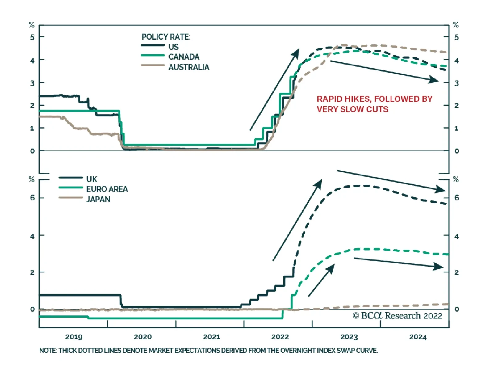
Bottom Line: European stocks must still contend with the growing threat of a global recession catalyzed by tighter financial conditions and aggressive global central banks. The good news is that they already discount considerable pessimism, as illustrated by their low valuations and downgraded forward earnings. Consequently, investors can continue to nibble at European equities, but do so to a limited degree and by favoring defensive stocks over cyclical ones, at least for now. The Euro Dilemma On the back of the very hawkish Fed meeting and the announcement of Russia’s broadened military mobilization, the EUR/USD broke below the 0.99 support level and fell under 0.98, a level we judged in the past as very attractive on a six-to-nine months basis. Obviously, Fed Chair Jerome Powell’s reaffirmation of the FOMC’s war on inflation is a major boost to the dollar. The momentum property of the greenback implies that it has room to rally further in the near term. This narrative, however, overlooks the fact that the Fed is not the only central bank intent on fighting inflation, no matter the cost. The Norges Bank, the Riksbank, the ECB, and even the SNB have all showed their willingness to move aggressively against inflation. While the BoE only increased rates by 50bps last week, its communication suggested that an at least 75bps increase would be due at the November meeting, when the MPC publishes its Monetary Policy report that will incorporate the impact of the budget measures announced by new British Prime Minister, Liz Truss. As a result, market interest rate expectations are climbing in the US, but they are rising even faster in Europe, albeit from a lower base. However, the decline in the expected rate of interest in the US relative to Europe and in the number of expected hikes in the US relative to Europe are consistent with a sharp decline in the DXY in the coming months (Chart II-16). Due to its 80% weight in European currencies, a weaker DXY implies a rebound in the EUR, GBP, CHF, NOK, and SEK against the USD. Moreover, there could be room for expected interest rate differentials to narrow further against the dollar. The analysis we published two weeks ago shows that, even when the different nonfinancial private debt loads are accounted for, the gap in the US and Eurozone r-star stands at 1%. However, the spread between the Fed funds rate’s upper bound and the ECB Deposit Rate is 2%. The gap between the July 2023 US and Eurozone OIS is 1.7%. Since European inflation may prove more stubborn than that of the US in the near term, there is scope for the expected interest rate gap to narrow further, especially as the Euro Area final domestic demand is surprisingly more robust than that of the US (Chart II-17). Chart II-16The Rest Of The World Is Catching Up To The Fed The Rest Of The World Is Catching Up To The Fed The Rest Of The World Is Catching Up To The Fed Chart II-17Surprising European Resilience Surprising European Resilience Surprising European Resilience   What about global growth? The view that the global economy is about to experience a recession is consistent with a stronger dollar, since the greenback is an extremely countercyclical currency. However, the DXY’s 25% rally since January 2021 already prices in such an outcome (Chart II-18). Similarly, the euro is trading again at 2002 levels, which is also in line with a global recession with deep negative repercussions for the Eurozone. Additionally, the Euro has fallen 21% since May 2021, which compares to the 21.4% fall in 2008, the 20% decline in 2010, the 18% plunge in 2011/12 and the 24% collapse in 2014/15; yet EUR/USD is much cheaper now than in any of those instances. Moreover, the wide difference between the competitiveness of Germany and that of the rest of the Euro Area has now faded, which means that a major handicap against the euro has disappeared (Chart II-19). Chart II-18The Dollar Already Foresees A Recession The Dollar Already Foresees A Recession The Dollar Already Foresees A Recession Chart II-19Normalizing Eurozone Internal Competitiveness Normalizing Eurozone Internal Competitiveness Normalizing Eurozone Internal Competitiveness     This does not mean that the euro is not without risk. First, since the major euro collapse began in June 2021, EUR/USD breakdowns have been followed by average declines of 3.6%, ranging from 2.7% to 4.2%. Since the dollar is a momentum currency, it is unlikely that this time will be different. Second, if the tightening in global policy does cause a financial accident, the dollar will catch one last major bid that could push EUR/USD toward 0.9. As a result, to mitigate the danger, we recommend setting a stop-buy in the euro at EUR/USD 0.965 or 2.6% below the breakdown level of 0.9904. This position comes with a stop-loss at 0.94. For now, we would view this bet as a tactical position if it were triggered. Bottom Line: While a hawkish FOMC is very positive for the dollar, markets now expect foreign central banks to catch up to some extent with the Fed. This process is dollar bearish. Additionally, while a global recession would be supportive of the greenback, the USD already discounts this scenario. Instead, Europe is proving surprisingly resilient, which could soon create a tailwind for EUR/USD. Set a stop-buy at EUR/USD 0.965, with a stop-loss at 0.94. Market Update: European Credit After Central Bank Week For investors concerned with the left-tail risk in European equities, European credit offers a credible alternative in the near term. This asset class is also attractive relative to European government bonds. Chart II-20Central Bank Week October 2022 October 2022 Taken together, the Fed, the ECB, the BoE, the Riksbank, the Norges Bank, the SNB, and the BoC have tightened policy by 475bps over the past month (Chart II-20). Moreover, the SNB’s hike closed the chapter of negative rates in Europe. But make no mistake – there will be a second chapter. Until then, European corporate bond yields have risen enough to offer attractive spreads over duration-matched government bonds and to challenge the earnings yield provided by equities (Chart II-21). Besides, the volatility observed in equity markets over the past few months makes the European corporate bond more appealing. In the Euro Area, BB-rated bonds, which are the highest credit quality and largest tranche within the high-yield space, are particularly attractive. They sport a 6.6% YTM, at a spread of 480bps over 3-year German government bond yields. This compares to an equity earnings yield of 7.4% (Chart II-21, top panel). In other European corporate bond markets, there is no need to go down in credit quality. Yields-to-maturity for investment grade corporate bonds in the UK, Sweden, and Switzerland provide appealing alternatives to equities, with shorter duration still. This is especially true in Sweden, where the equity earnings yield has collapsed and is now only 60bps above Swedish IG yield, with substantially greater risk. Meanwhile, the spread pickup offered by Swiss IG over Swiss government bonds of similar duration is at its widest in more than ten years (Chart II-21, bottom panel). This week, we turn neutral on European credit versus US credit. Back in March, we made the case that European credit would outperform its US counterpart in response to a more hawkish Fed than the ECB. Since then, European IG outperformed US IG by 1% on a total return basis. However, with the Fed funds rate at 3.25%, traders now expect more monetary policy tightening from the ECB, which often corresponds to an underperformance of Euro Area credit relative to that of the US (Chart II-22, top panel). On the other hand, Swedish IG is expected to outperform US IG over the next six months (Chart II-22, bottom panel). Chart II-21Push Back Against TINA Argument Push Back Against TINA Argument Push Back Against TINA Argument Chart II-22Heed The Message From OIS Curve Differentials Heed The Message From OIS Curve Differentials Heed The Message From OIS Curve Differentials         Mathieu Savary, Chief European Strategist Mathieu@bcaresearch.com Jeremie Peloso, Editor/Strategist JeremieP@bcaresearch.com Footnotes
Executive Summary For the first time in a decade, it is much less attractive to buy than to rent a home. In both the UK and US, the mortgage rate is now almost double the average rental yield. To reset the equilibrium between buying and renting a home, either mortgage rates must come down by around 150 bps, or house prices must suffer a large double-digit correction. Or some combination, such as mortgage rates down 100 bps and house prices down 10 percent. In the US, a 10-year upcycle in housing investment has resulted in overinvestment relative to the number of households.  Falling house prices coming hot on the heels of a combined stock and bond market crash will unleash a deflationary impulse in 2023, which will return economies to 2 percent inflation. This reiterates our ‘2022-23 = 1981-82’ template for the markets. A coordinated global recession will cause bond prices to enter a sustained rally in 2023, in which the 30-year T-bond yield will fall to sub-2.5 percent. Meanwhile, the S&P 500 will test 3500, or even 3200, before a strong rally will lift it through 5000 later in 2023. It Now Costs Twice As Much To Buy Than To Rent A UK Home! It Now Costs Twice As Much To Buy Than To Rent A UK Home! It Now Costs Twice As Much To Buy Than To Rent A UK Home! Bottom Line: Falling house prices coming hot on the heels of a combined stock and bond market crash will unleash a deflationary impulse in 2023, which will return economies to 2 percent inflation. Feature Mortgage rates around the world have skyrocketed. The UK 5-year fixed mortgage rate which started the year at under 2 percent has more than doubled to over 5 percent. And the US 30-year mortgage rate, which began the year at 3 percent, now stands at an eyewatering 7 percent, its highest level since the US housing bubble burst in 2008. This raises a worrying spectre. Is the recent surge in mortgage rates about to trigger another housing crash? (Chart I-1 and Chart I-2). Chart I-1UK Mortgage Rate Has Doubled UK Mortgage Rate Has Doubled UK Mortgage Rate Has Doubled Chart I-2US Mortgage Rate Has Doubled US Mortgage Rate Has Doubled US Mortgage Rate Has Doubled A good way to answer the question is to compare the cashflow costs of buying versus renting a home. This is because home prices are set by the volume of homebuyers versus home-sellers. If would-be homebuyers decide to rent rather than to buy – because renting gets them ‘more house’ – then it will drag down home prices. Here’s the concern. For the first time in a decade, it is much less attractive to buy than to rent a home. In both the UK and US, the mortgage rate is now almost double the average rental yield. Put another way, whatever your monthly housing budget, you can now rent a home worth twice as much as you can buy (Chart I-3 and Chart I-4). Chart I-3It Now Costs Twice As Much To Buy Than To Rent A UK Home! It Now Costs Twice As Much To Buy Than To Rent A UK Home! It Now Costs Twice As Much To Buy Than To Rent A UK Home! Chart I-4It Now Costs Twice As Much To Buy Than To Rent A US Home! It Now Costs Twice As Much To Buy Than To Rent A US Home! It Now Costs Twice As Much To Buy Than To Rent A US Home! The Universal Theory Of House Prices Buying and renting a home are not the same thing, so the head-to-head comparison between the mortgage rate and rental yield is a simplification. Buying and renting are similar in that they both provide you with somewhere to live, a roof over your head or, in economic jargon, the consumption service called ‘shelter’. But there are two big differences. First, unlike renting, buying a home also provides you with an investment whose value you expect to increase in the long run. Second, unlike renting, buying a home incurs you the costs of maintaining it and keeping it up-to-date. Studies show that the annual cost averages around 2 percent of the value of the home.1 So, versus renting, buying a home provides you with an expected capital appreciation, but incurs you a ‘depreciation’ cost of around 2 percent a year. Which results in the following equilibrium between buying and renting: Mortgage rate = Rental yield + Expected house price appreciation - 2 But we can simplify this. In the long run, the price of any asset must trend in line with its income stream. Therefore, expected house price appreciation equates to expected rental growth. Also, rents move in lockstep with wages (Chart I-5). Understandably so, because rents must be paid from wages. And wage growth itself just equals consumer price inflation plus productivity growth, which averages around 1 percent (Chart I-6). Pulling all of this together, the equilibrium simplifies to: Chart I-5Rents Track Wages Rents Track Wages Rents Track Wages Chart I-6Rent Inflation = Wage Inflation = Consumer Price Inflation + 1 Rent Inflation = Wage Inflation = Consumer Price Inflation + 1 Rent Inflation = Wage Inflation = Consumer Price Inflation + 1 Mortgage rate = Rental yield + Expected consumer price inflation - 1 So, here’s our first conclusion. Assuming central banks achieve their long-term inflation target of 2 percent, the equilibrium becomes: Mortgage rate = Rental yield + 1 Under this assumption, to justify the current UK rental yield of 3 percent, the UK mortgage rate must plunge to 4 percent. But given that the government has just triggered an incipient balance of payments and currency crisis, the mortgage rate is likely to head even higher. In which case the rental yield must rise to at least 4 percent. Meaning either house prices falling 25 percent, or rents rising 33 percent. Meanwhile, to justify the current US rental yield of 3.7 percent, the US mortgage rate must plunge to 4.7 percent. Alternatively, to justify the current mortgage rate of 7 percent, the rental yield must surge to 6 percent. Meaning either house prices crashing 40 percent, or rents surging 60 percent. More likely though, all variables will correct. The equilibrium between buying and renting will be re-established by some combination of lower mortgage rates, lower house prices, and higher rents. The Housing Investment Cycle Is Turning Down The relationship between buying and renting a home raises an obvious counterargument. What if central banks cannot achieve their goal of price stability? In this case, expected inflation in the equilibrium would be considerably higher than 2 percent. This would justify a much higher mortgage rate for a given rental yield. Put differently, it would justify rental yields to stay structurally low (house prices to stay structurally high), even if mortgage rates marched higher. In an inflationary environment, houses would become the perfect foils against inflation. In an inflationary environment, houses would become the perfect foils against inflation because expected rental growth would track inflation – allowing rental yields to stay depressed versus much higher mortgage rates. This is precisely what happened in the 1970s. When the US mortgage rate peaked at 18 percent in 1981, the US rental yield barely got above 6 percent (Chart I-7). Chart I-7In The Inflationary 70s, The Rental Yield Remained Well Below The Mortgage Rate... In The Inflationary 70s, The Rental Yield Remained Well Below The Mortgage Rate... In The Inflationary 70s, The Rental Yield Remained Well Below The Mortgage Rate... If the market fears another such inflationary episode, would it make the housing market a good investment? In the near term, the answer is still no, for two reasons. First, even if rental yields do not track mortgage rates higher point for point, the yields do tend to move in the same direction – especially when mortgage rates surge as they did in the 1970s (Chart I-8). Some of this increase in rental yields might come from higher rents, but some of it might also come from lower house prices. Chart I-8...But Even In The 70s, The Rental Yield And Mortgage Rate Moved Directionally Together ...But Even In The 70s, The Rental Yield And Mortgage Rate Moved Directionally Together ...But Even In The 70s, The Rental Yield And Mortgage Rate Moved Directionally Together Second, based on the US, it is a bad time in the housing investment cycle. Theoretically and empirically, residential fixed investment tracks the number of households in the economy. But there are perpetual cycles of underinvestment and overinvestment – the most spectacular being the overinvestment boom that preceded the 2007-08 housing crisis. US housing investment has just experienced a 10-year upcycle in which it has overshot its relationship with the number of households. Therefore, contrary to the popular perception, there is not an undersupply of homes, but a marked oversupply relative to the number of households. (Chart I-9). This is important because, as the cycle turns down now – as it did in 1973, 1979, 1990, and 2007 – the preceding overinvestment always weighs down housing valuations (Chart I-10). Chart I-9The US Housing Investment Cycle Has Moved Into Overinvestment The US Housing Investment Cycle Has Moved Into Overinvestment The US Housing Investment Cycle Has Moved Into Overinvestment Chart I-10A Housing Investment Downcycle Always Weighs On Housing Valuations A Housing Investment Downcycle Always Weighs On Housing Valuations A Housing Investment Downcycle Always Weighs On Housing Valuations The Investment Conclusions Let’s sum up. If the market believes that economies will return to price stability, then to reset the equilibrium between buying and renting a home, either mortgage rates must come down by around 150 bps, or house prices must suffer a large double-digit correction. Or some combination, such as mortgage rates down 100 bps and house prices down 10 percent. If the market believes that economies will not return to price stability, then house prices are still near-term vulnerable to rising mortgage rates – especially in the US, as a 10-year upcycle in housing investment has resulted in overinvestment relative to the number of households.  US housing investment has just experienced a 10-year upcycle in which it has overshot its relationship with the number of households. Falling house prices coming hot on the heels of a combined stock and bond market crash will unleash a deflationary impulse in 2023, which will return economies to 2 percent inflation – even if the markets do not believe it now. This reiterates our ‘2022-23 = 1981-82’ template for the markets, as recently explained in Markets Still Echoing 1981-82, So Here’s What Happens Next. In summary, a coordinated global recession will cause bond prices to enter a sustained rally in 2023, in which the 30-year T-bond yield will fall to sub-2.5 percent. Meanwhile, the S&P 500 will test 3500, or even 3200, before a strong rally will lift it through 5000 later in 2023. Analysing The Pound’s Crash Through A Fractal Lens Finally, the incipient balance of payments and sterling crisis triggered by the UK government’s unfunded tax cuts has collapsed the 65-day fractal structure of the pound (Chart I-11). This would be justified if the Bank of England does not lean against the fiscal laxness with a compensating tighter monetary policy. But if, as we expect, monetary policy adjusts as a short-term counterbalance, then sterling will experience a temporary, but playable, countertrend bounce. Chart I-11The Pound Usually Turns When Its Fractal Structure Has Collapsed The Pound Usually Turns When Its Fractal Structure Has Collapsed The Pound Usually Turns When Its Fractal Structure Has Collapsed On this assumption, a recommended tactical trade, with a maximum holding period of 65 days, is to go long GBP/CHF, setting a profit target and symmetrical stop-loss at 4 percent. Chart 1Hungarian Bonds Are Oversold Hungarian Bonds Are Oversold Hungarian Bonds Are Oversold Chart 2Copper's Tactical Rebound Maybe Over Copper's Tactical Rebound Maybe Over Copper's Tactical Rebound Maybe Over Chart 3US REITS Are Oversold Versus Utilities US REITS Are Oversold Versus Utilities US REITS Are Oversold Versus Utilities Chart 4FTSE100 Outperformance Vs. Euro Stoxx 50 Is Vulnerable FTSE100 Outperformance Vs. Euro Stoxx 50 Is Vulnerable FTSE100 Outperformance Vs. Euro Stoxx 50 Is Vulnerable Chart 5Netherlands' Underperformance Vs. Switzerland Has Ended Netherlands' Underperformance Vs. Switzerland Has Ended Netherlands' Underperformance Vs. Switzerland Has Ended Chart 6The Sell-Off In The 30-Year T-Bond At Fractal Fragility The Sell-Off In The 30-Year T-Bond At Fractal Fragility The Sell-Off In The 30-Year T-Bond At Fractal Fragility Chart 7Food And Beverage Outperformance Is Exhausted Food And Beverage Outperformance Is Exhausted Food And Beverage Outperformance Is Exhausted Chart 8German Telecom Outperformance Has Started Is Fragile German Telecom Outperformance Has Started Is Fragile German Telecom Outperformance Has Started Is Fragile Chart 9Japanese Telecom Outperformance Vulnerable To Reversal Japanese Telecom Outperformance Vulnerable To Reversal Japanese Telecom Outperformance Vulnerable To Reversal Chart 10The Strong Trend In The 18-Month-Out US Interest Rate Future Is Fragile The Strong Trend In The 18-Month-Out US Interest Rate Future Is Fragile The Strong Trend In The 18-Month-Out US Interest Rate Future Is Fragile Chart 11The Strong Downtrend In The 3 Year T-Bond Is Fragile The Strong Downtrend In The 3 Year T-Bond Is Fragile The Strong Downtrend In The 3 Year T-Bond Is Fragile Chart 12The Outperformance Of Tobacco Vs. Cannabis Is Fragile The Outperformance Of Tobacco Vs. Cannabis Is Fragile The Outperformance Of Tobacco Vs. Cannabis Is Fragile Chart 13Biotech Is A Major Buy Biotech Is A Major Buy Biotech Is A Major Buy Chart 14Norway's Outperformance Has Ended Norway's Outperformance Has Ended Norway's Outperformance Has Ended Chart 15Cotton Versus Platinum Has Reversed Cotton Versus Platinum Has Reversed Cotton Versus Platinum Has Reversed Chart 16Switzerland's Outperformance Vs. Germany Is Exhausted Switzerland's Outperformance Vs. Germany Is Exhausted Switzerland's Outperformance Vs. Germany Is Exhausted Chart 17USD/EUR Is Vulnerable To Reversal USD/EUR Is Vulnerable To Reversal USD/EUR Is Vulnerable To Reversal Chart 18The Outperformance Of MSCI Hong Kong Versus China Has Ended The Outperformance Of MSCI Hong Kong Versus China Has Ended The Outperformance Of MSCI Hong Kong Versus China Has Ended Chart 19US Utilities Outperformance Vulnerable To Reversal US Utilities Outperformance Vulnerable To Reversal US Utilities Outperformance Vulnerable To Reversal Chart 20The Outperformance Of Oil Versus Banks Is Exhausted The Outperformance Of Oil Versus Banks Is Exhausted The Outperformance Of Oil Versus Banks Is Exhausted Dhaval Joshi Chief Strategist dhaval@bcaresearch.com Footnotes 1 The Rate of Return on Everything, 1870–2015 (frbsf.org) Fractal Trading System Fractal Trades Will Surging Mortgage Rates Crash House Prices? Will Surging Mortgage Rates Crash House Prices? Will Surging Mortgage Rates Crash House Prices? Will Surging Mortgage Rates Crash House Prices? 6-12 Month Recommendations 6-12 MONTH RECOMMENDATIONS EXPIRE AFTER 15 MONTHS, IF NOT CLOSED EARLIER. Structural Recommendations Closed Fractal Trades Indicators To Watch - Bond Yields Chart II-1Indicators To Watch - Bond Yields - Euro Area Indicators To Watch - Bond Yields - Euro Area Indicators To Watch - Bond Yields - Euro Area Chart II-2Indicators To Watch - Bond Yields - Europe Ex Euro Area Indicators To Watch - Bond Yields - Europe Ex Euro Area Indicators To Watch - Bond Yields - Europe Ex Euro Area Chart II-3Indicators To Watch - Bond Yields - Asia Indicators To Watch - Bond Yields - Asia Indicators To Watch - Bond Yields - Asia Chart II-4Indicators To Watch - Bond Yields - Other Developed Indicators To Watch - Bond Yields - Other Developed Indicators To Watch - Bond Yields - Other Developed   Indicators To Watch - Interest Rate Expectations Chart II-5Indicators To Watch - Interest Rate Expectations Indicators To Watch - Interest Rate Expectations Indicators To Watch - Interest Rate Expectations Chart II-6Indicators To Watch - Interest Rate Expectations Indicators To Watch - Interest Rate Expectations Indicators To Watch - Interest Rate Expectations Chart II-7Indicators To Watch - Interest Rate Expectations Indicators To Watch - Interest Rate Expectations Indicators To Watch - Interest Rate Expectations Chart II-8Indicators To Watch - Interest Rate Expectations Indicators To Watch - Interest Rate Expectations Indicators To Watch - Interest Rate Expectations  
BCA Research’s Global Fixed Income Strategy service recently shifted to a below-benchmark overall global duration stance. The path for monetary policy rates outside the US shows a similar profile as in the US, with a “front loading” of rate hikes to…
BCA Research’s US Bond Strategy service expects one more move higher in US Treasury yields before the end of the cyclical bear market. The Fed will continue to lift rates for the next few months, before pausing in Q1 or Q2 of next year. After that, our…
Executive Summary Upward Repricing Of Bond Yields Continues Upward Repricing Of Bond Yields Continues Upward Repricing Of Bond Yields Continues In this report, we discuss our move last week to shift to a below-benchmark overall global duration stance in more detail. Our strongest conviction view on developed market government bonds is underweighting US Treasuries. The outcome of last week’s FOMC meeting, where the Fed committed to a rapid shift to restrictive US monetary policy, supports that position. Our strongest conviction overweight is on Japan, with the Bank of Japan both willing and able to maintain its cap on longer-term JGB yields. We are also overweight countries where it will be difficult for central banks to lift rates as much as markets expect – core Europe, Australia and Canada. The explosion in UK bond yields, and collapse of the British pound, seen after last week’s UK “mini-budget” shows that investors have not lost the power to punish fiscal and monetary policies that are non-credible - like a massive debt-financed tax cut at a time of high inflation. As a result, the Bank of England will now be forced to raise rates much more than we had been expecting, and Gilts will remain extremely volatile in the near-term. Bottom Line: Maintain a below-benchmark overall duration stance in global bond portfolios. Stay underweight US Treasuries. Upgrade exposure to government bonds in Japan and Canada to overweight, but tactically downgrade UK Gilts to underweight until a more market-friendly policy mix leads to greater stability of the British pound. Feature We shifted our recommended stance on overall global portfolio duration to below-benchmark in a Special Alert published last week. In this report, we go into the rationale for that move in more detail, and present specific details of that shift in terms of allocations by country across the various yield curves. Related Report  Global Fixed Income StrategyReduce Global Portfolio Duration To Below-Benchmark The global inflation and monetary policy backdrops remain toxic for bond markets. Last week saw interest rate increases from multiple developed economy central banks, including the Fed and Bank of England (BoE). The magnitudes of the rate hikes unnerved bond investors, with even the likes of perennial low yielders like the Swiss National Bank and Riksbank lifting rates by 75bps and 100bps, respectively. The Fed followed up its own 75bp hike by digging in its heels on the need for additional policy tightening after the 300bps of hikes already delivered this year (Chart 1). Fed Chair Jerome Powell strongly hinted that a policy-induced US recession is likely the only way to return overshooting US inflation back to the Fed’s 2% target. This triggered a breakout of the benchmark US 10-year Treasury yield above 3.5%. But the real fireworks in global bond markets occurred after the UK government announced its “mini-budget” last Friday that included massive tax cuts to be funded by debt issuance, triggering a sharp decline in the British Pound and spike in UK Gilt yields – a move that spilled over into other bond markets, pushing government bond yields to cyclical highs in the US and euro area. Chart 1Central Banks Keep Trying To “Out-Hawk” Each Other The Global Bond Bear Market Continues The Global Bond Bear Market Continues Chart 2Yields Are Now Driven By Rate Hike Expectations, Not Inflation Yields Are Now Driven By Rate Hike Expectations, Not Inflation Yields Are Now Driven By Rate Hike Expectations, Not Inflation We had been anticipating another move upward in global bond yields for this cycle, and we shifted to a below-benchmark overall global duration stance in advance of the Fed and BoE meetings last week. We see this next move higher in yields as being driven not by rising inflation expectations but by an upward repricing of interest rate expectations, leading to additional increases in real bond yields (Chart 2). Trying to pick a top in bond yields has now become a game of forecasting the level to which policy rates must rise in the current global monetary tightening cycle. On that front, there is still scope for rate expectations, and bond yields, to move higher in most developed market countries, justifying our downgrade of our recommended overall duration exposure to below-benchmark. Shifting rate expectations also lead to the changes in country bond allocations we announced last week. Rate Expectations And Country Bond Allocations Our proxy for medium-term nominal terminal rate expectations in developed market countries, the 5-year/5-year forward overnight index swap (OIS) rate, has been tracking 10-year bond yields very closely in the US and UK and, to a lesser extent, Europe (Chart 3). In those regions, the OIS curves are pricing in an increasing medium-term level of policy rates, leading to markets repricing government bond yields higher. In the US, the OIS curve is pricing in a 2023 peak for the fed funds rate of 4.67%, but with only a modest path of rate cuts in 2024 and 2025, leading to a 5-year/5-year OIS projection of 3.36% as of Monday’s market close. After the Gilt market rout, the UK OIS curve is now pricing in a 2023 peak Bank Rate over 6%, with our medium-term nominal rate proxy settling at 3.69%. In the euro area, the OIS curve is discounting a 2023 peak in the ECB policy rate of 3.22%, with a 5-year/5-year forward OIS rate of 2.7%. For all three of those regions, the market is now pricing in the highest peak in rates for the current tightening cycle. That is not the case in Canada or Australia, where rate expectations and longer-term bond yields are still below cyclical peaks (Chart 4). Japan remains the outlier, with the Bank of Japan’s yield curve control keeping 10-year JGB yields capped at 0.25%, even with the Japan OIS curve pricing in a medium-term terminal rate of 0.75%. Chart 3Rising Yields Reflect Higher Terminal Rate Expectations Rising Yields Reflect Higher Terminal Rate Expectations Rising Yields Reflect Higher Terminal Rate Expectations Chart 4Our High-Conviction Government Bond Overweights Our High-Conviction Government Bond Overweights Our High-Conviction Government Bond Overweights After looking at all the repricing of interest rate expectations and bond yields, we can determine our preferred government bond allocations within our strategic model bond portfolio framework. The US Remains Our Favorite Government Bond Underweight The new set of interest rate forecasts (“the dots”) presented at last week’s Fed meeting showed that the median FOMC member was forecasting the fed funds rate to rise to 4.4% by the end of 2022 and 4.6% by the end of 2023, before falling to 3.9% and 2.9% and the end of 2024 and 2025, respectively. Those are all significant increases from the June dots, where the expectations called for the funds rate to hit 3.4% by end-2022 and 3.8% by end-2023. The median Fed forecasts are now broadly in line with the pricing in the US OIS curve for 2022-2024, although the market expects higher rates than the FOMC in 2025 (Chart 5). Chart 5USTs Still Vulnerable To Additional Fed Hawkish Surprises The Global Bond Bear Market Continues The Global Bond Bear Market Continues There has been a lot of back and forth between the Fed and the markets this year, but the market has generally lagged the Fed interest rate projections for 2023 and 2024 before last week. Market pricing is now in line with the Fed dots, as investors have adjusted to the increasingly hawkish message from Fed officials that are focused solely on slowing growth, and tightening financial conditions, in an effort to bring US inflation down. We see the US Treasury curve as still vulnerable to additional hawkish messaging from the Fed, and a potentially higher-than-anticipated peak in the funds rate versus the FOMC dots. The US consumer is facing a lot of headwinds from higher interest rates and rising food and gasoline prices. However, the latter has fallen 26% from the June 13/2022 peak and is acting as a “tax cut” that also helps reduce US inflation expectations (Chart 6). Consumer confidence measures like the University of Michigan expectations survey have already shown improvement alongside the fall in gas prices, which has boosted real income expectations according to the New York Fed’s Consumer Survey (bottom panel). Even a subtle improvement in consumer confidence due to some easing of inflation expectations can help support a somewhat faster pace of consumer spending at a time of robust labor demand and accelerating wage growth. The Atlanta Fed Wage Tracker is now growing at a year-over-year pace of 5.7%, while the ratio of US job openings to unemployed workers remains near a record high (Chart 7). Fed Chair Powell has noted that the Fed must see significant weakening of the US jobs market for the Fed to consider pausing on its current rate hike path. So far, there is little evidence pointing to a loosening of US labor market conditions that would ease domestically-generated inflation pressures. Chart 6Lower Gas Prices Can Provide A Lift To US Consumer Spending Lower Gas Prices Can Provide A Lift To US Consumer Spending Lower Gas Prices Can Provide A Lift To US Consumer Spending Chart 7A Tight US Labor Market Will Keep The Fed Hawkish A Tight US Labor Market Will Keep The Fed Hawkish A Tight US Labor Market Will Keep The Fed Hawkish Chart 8Stay Underweight US Treasuries Stay Underweight US Treasuries Stay Underweight US Treasuries We expect overall US inflation to decelerate next year on the back of additional slowing of goods inflation, but will likely settle in the 3-4% range in 2023 given stubbornly sticky services inflation and wage growth. The Fed should follow through on its current interest rate projections, with a good chance that rates will need to be pushed up even higher in response to resilient labor market conditions in the first half of 2023. The risk/reward still favors higher US Treasury yields over at least the next 3-6 months, particularly with an improving flow of US data surprises and with bond investor duration positioning now much closer to neutral according to the JPMorgan client survey (Chart 8). Bottom Line: The US remains our highest conviction strategic government bond underweight in the developed markets. Recommended Allocations In Other Countries The path for monetary policy rates outside the US shows a similar profile as in the US, with a “front loading” of rate hikes to mid-2023 followed by modest rate cuts over the subsequent two years (Chart 9). The OIS-implied path for the level of rates is nearly identical in the US, Australia and Canada. On the other hand, markets are discounting much lower of levels of policy rates in Europe and Japan compared to the US, and a considerably higher path for rates in the UK (more on that in the next section). Chart 9Markets Priced For Global 'Front-Loaded' Rate Hikes Markets Priced For Global 'Front-Loaded' Rate Hikes Markets Priced For Global 'Front-Loaded' Rate Hikes We would lean against the US-like pricing of interest rates in Australia and Canada. Based on work we published in a recent Special Report along with our colleagues at BCA Research European Investment Strategy, the neutral real interest rate (“r-star”) is estimated to be deeply negative in Australia and Canada after adjusting for the high level of non-financial debt in those countries (Table 1). That financial fragility makes it much less likely that the Bank of Canada and Reserve Bank of Australia can raise rates as much as the Fed. Table 1Some Big Swings In Our R* Estimates When Including Debt The Global Bond Bear Market Continues The Global Bond Bear Market Continues US-like interest rates would almost certainly trigger a major downturn in house prices and household wealth given the inflated housing values in those two countries – the growth of which is already slowing rapidly in response to rate hikes delivered in 2022. We are maintaining our overweight recommendation on Australian government bonds, while we upgraded Canada to overweight from neutral after last week’s duration downgrade. Chart 10Move To Overweight Japan Move To Overweight Japan Move To Overweight Japan We are also staying overweight on German and French government bonds, as the ECB is unlikely to deliver the full extent of rate increases discounted in the European OIS curve. Our estimated debt-adjusted r-star is also quite negative in the euro area, suggesting that financial fragility issues (due to high government debt in Italy and high corporate debt in France) will likely limit the ECB’s ability to continue with recent chunky rate increases for much longer. In Japan, we continue to view JGBs as an “anti-duration” instrument, given the Bank of Japan’s persistence in maintaining negative interest rates and yield curve control. That makes JGBs a good overweight when global bond yields are rising and a good underweight when global bond yields are falling (Chart 10). Given our decision to reduce our recommended duration exposure to below-benchmark, the logical follow through decision is to upgrade JGBs to overweight. The only remaining country to consider is our view on UK Gilts, which has now become more complicated. Anarchy In The UK The selloff in the UK Gilt market has been stunning in its ferocity. Dating back to last Thursday’s 50bp rate hike by the BoE, the 10-year UK Gilt yield has jumped 120bps and now sits at 4.52%. The increase in yields was identical at the front-end of the Gilt curve, with the 2-year yield jumping 120bps to 4.68%.  The surge in longer-term Gilt yields stands out to the rise in bond yields seen outside the UK, as it also incorporates an increase in our estimate of the UK term premium – a move that was not matched in other countries (Chart 11). The rise in Gilt yields was also much more concentrated in real yields compared to inflation expectations (Chart 12), as markets aggressively repriced the path for UK policy rates after the UK government’s announced debt-financed fiscal package, including £45bn of tax cuts. Chart 11Upward Repricing Of Bond Yields Continues Upward Repricing Of Bond Yields Continues Upward Repricing Of Bond Yields Continues Chart 12The Gilt Market Becomes Unhinged The Gilt Market Becomes Unhinged The Gilt Market Becomes Unhinged The UK’s National Institute for Economic And Social Research (NIESR) estimates that the combined impact of the tax cuts and additional spending measures would increase the UK government deficit by a whopping £150bn, or 5% of GDP. The NIESR also estimated that the fiscal measures, including the previously-announced plan for the UK government to cap energy price increases, would result in positive UK GDP growth in the 4th quarter and also lift annual real GDP growth to 2% over 2023-24. The UK government now faces a major credibility issue with markets on its announced fiscal plans. The sheer size of the package, coming at a time when the US economy was already operating at full employment with high inflation, invites a greater than expected monetary policy tightening response from the BoE. The UK OIS curve now forecasts a peak in rates of 6.3% in October 2023, up from the current 2.25%. That would be a massive move in rates in just one year from a central bank that has been relatively gun shy in lifting rates since the 2008 financial crisis, even during the current inflation overshoot. New UK Prime Minister Liz Truss, and her new Chancellor of the Exchequer Kwasi Kwarteng, have both noted they would prefer a mix of looser fiscal policy (aimed at boosting the supply side of the economy to lift potential growth) with tighter monetary policy that would prevent asset bubbles and inflation overshoots. While there is certainly merit in any plan designed to boost medium-term growth by lifting anemic UK productivity through supply-side reforms, the timing of the announcement could not have been worse. Just one day earlier, the BoE announced a plan to go forward with the sale of Gilts from its balance sheet accumulated during quantitative easing. The Truss government needs to find buyers for all the Gilts that must be issued to pay for the tax cuts and stimulus, but the BoE will not be one of them. In the end, however, the BoE’s expected path for interest rates matters more than the increase in Gilt supply in determining the level of Gilt yields and the slope of the Gilt curve. The NIESR estimates that the UK public debt/GDP ratio will rise to 92% by 2024-25, versus its pre-budget forecast of 88%. While that is a meaningful increase, the correlation between the debt/GDP ratio and the slope of the Gilt curve has been negative for the past few years (Chart 13, top panel). The stronger relationship is between the slope of the curve and the level of the BoE base rate (bottom panel), which is pointing to an inversion of the 2-year/30-year curve if the BoE follows market pricing and lifts rates to 6%. Our view dating back to the early summer was that a low neutral interest rate would prevent the BoE from lifting rates as much as markets were discounting without causing a deep recession, lower inflation and, eventually, a quick reversal of rate hikes. The huge UK fiscal stimulus package changes that calculus, as the nominal neutral rate that will be needed to bring UK inflation back to target is likely now much higher. We have always believed that when a thesis underlying an investment recommendation is challenged by new information, it is best to adjust the recommendation to reflect the new facts. Thus, this week, we are tactically downgrading UK Gilts to underweight in our model bond portfolio framework. We still see a significant medium-term opportunity to go overweight Gilts, as UK policy rates pushing into the 4-6% range are not sustainable. However, the BoE will likely have no choice to begin lifting rates at a much more aggressive pace to restore UK policy credibility, especially with the British pound under immense selling pressure (Chart 14). Despite rumors of an inter-meeting rate hike by the BoE this week to try and support the pound, that is likely too risky a step for the BoE to take as it would invite a battle with investors and currency speculators. Such a battle would be difficult to win without a more credible and market-friendly medium-term fiscal policy from the Truss government. Chart 13The BoE Matters More Than Debt Levels For Gilts The BoE Matters More Than Debt Levels For Gilts The BoE Matters More Than Debt Levels For Gilts Chart 14Tactically Move To Underweight UK Gilts Tactically Move To Underweight UK Gilts Tactically Move To Underweight UK Gilts   Bottom Line: We will review our UK Gilt stance once there are more clear signals of stability in the pound, but for now, we will step aside and limit our recommended exposure to Gilts – even after the huge selloff seen to date, which likely has more to go. Summarizing All The Changes In Our Model Bond Portfolio All the changes to our recommended duration exposure and country allocations after the past week, including the new weightings in our model bond portfolio, are shown in the tables on pages 14-16. To summarize: We moved the overall recommended global duration exposure to below-benchmark, and shifted the model bond portfolio duration to 0.9 years below that of the custom benchmark index. We increased the size of the US Treasury underweight, and moved Canada and Japan to overweight. We moved the UK to underweight, on top of the reduction in UK duration exposure that was part of last week’s move to reduce overall portfolio duration. We are also cutting exposure to UK investment grade corporates to underweight, as part of an overall move to reduce UK risk in the portfolio. We slightly increased the overweight in Germany. In next week’s report, we will present the quarterly performance review of our model bond portfolio and, more importantly, we will present out scenario-based return expectations after all the changes made this week. Robert Robis, CFA Chief Fixed Income Strategist rrobis@bcaresearch.com     GFIS Model Bond Portfolio Recommended Positioning     Active Duration Contribution: GFIS Recommended Portfolio Vs. Custom Performance Benchmark The Global Bond Bear Market Continues The Global Bond Bear Market Continues The GFIS Recommended Portfolio Vs. The Custom Benchmark Index Global Fixed Income - Strategic Recommendations* Cyclical Recommendations (6-18 Months) The Global Bond Bear Market Continues The Global Bond Bear Market Continues
As expected, the Bank of England raised the Bank Rate by 50bps to 2.25% on Thursday. Three of the nine MPC members preferred a more aggressive 75bp hike, while one member favored a more modest 25bp increase. The BoE noted that the recently announced Energy…
Executive Summary The Chinese Economy Is Facing Deflationary Pressures The Chinese Economy Is Facing A Risk of Deflation The Chinese Economy Is Facing A Risk of Deflation China’s economy is facing a deflationary threat. Core consumer price inflation is below 1%, and producer (ex-factory) price inflation has decelerated rapidly and will soon deflate. Bank loan growth remains subdued due to the deepening property market slump and lackluster credit demand in the private sector. In view of the reluctance of households and enterprises to spend, invest and hire, the multiplier of stimulus in this cycle will be lower than in previous ones. China’s property market woes continued in August and a turnaround is not likely in the near term. China’s overseas shipments are set to contract in the months ahead. China needs to reduce interest rates and weaken its exchange rate to battle deflationary pressures and reflate the system. Thus, Chinese authorities will not prevent a further depreciation in the yuan versus the US dollar - as long as the decline is orderly and gradual. Bottom Line: The risk-reward profile remains unattractive for Chinese stocks in absolute terms. For global equity portfolios, we recommend a neutral allocation to Chinese onshore stocks and an underweight stance in investable stocks. Escalating deflationary pressures mean that onshore asset allocators should continue to favor government bonds over stocks.     Recovery prospects for China’s economy remain dim. Despite August’s better-than-expected growth in industrial output and retail sales, economic activity in the months ahead will be weighed down by a lingering real estate slump, recurring disruptions linked to Covid and a budding contraction in exports. Related Report  China Investment StrategyThe Party Congress And Beyond As discussed in our previous report, China’s transition from zero Covid tolerance to a managed approach to living with the virus will be a measured but protracted process. The conditions are not yet in place for a pivotal change in the country’s dynamic zero-Covid strategy. Thus, the risk of outbreaks and ensuing lockdowns still constitute a major hurdle for private domestic demand in the near term. China’s exports are set to shrink in the coming months due to a relapse in global demand for consumer goods (ex-autos). Domestic and external headwinds confronted by China underscore that the primary economic risk is deflation. Chinese policymakers need to lower interest rates and allow the currency to depreciate to battle deflationary pressures. Odds are high that the PBoC will cut rates further. However, the efficacy of reflationary efforts is doubtful due to three factors: uncertainty over the dynamic zero-Covid policy and the outlook for Omicron; persistent real estate woes; and the downbeat sentiment among corporates and households. Chart 1Upsides In Chinese Equity Prices Are Capped Without Aggressive Stimulus Upsides In Chinese Equity Prices Are Capped Without Aggressive Stimulus Upsides In Chinese Equity Prices Are Capped Without Aggressive Stimulus Therefore, our outlook for China’s business cycle remains a U-shaped recovery with risks skewed to the downside in the next few months.  Consistently, the risk-reward of Chinese stocks remains poor. Their absolute performance is also at risk from a further selloff in US/global equities as discussed in the latest Emerging Markets Strategy report. We continue to recommend a neutral stance on Chinese onshore stocks and underweight allocation for Chinese offshore stocks within a global equity portfolio (Chart 1). Depressed Credit Demand And Low Stimulus Multiplier Demand for credit from China’s private sector remains depressed, reflected by a very muted credit impulse when local government bond issuance is excluded (Chart 2). Critically, banks have been unable to accelerate the pace of lending even after the PBoC cut rates and urged them to boost lending (Chart 3). Chart 2The Credit Impulse Remains Muted The Credit Impulse Remains Muted The Credit Impulse Remains Muted Chart 3Subdued Loan Growth Despite Lower Interest Rates Subdued Loan Growth Despite Lower Interest Rates Subdued Loan Growth Despite Lower Interest Rates The growth rate of medium-to-long-term consumer loans, which are primarily composed of residential mortgages, continues to plunge (Chart 4, top panel). New household loan origination is contracting (Chart 4, bottom panel). Our proprietary measure of marginal propensity to spend for households dropped to an all-time low, mirroring consumers’ downbeat sentiment (Chart 5).  Chart 4Household Loan Demand Is Depressed... Household Loan Demand Is Depressed... Household Loan Demand Is Depressed... Chart 5...And Sentiment Remains in The Doldrums ...And Sentiment Remains in The Doldrums ...And Sentiment Remains in The Doldrums Corporate credit flow improved slightly with medium-to-long-term corporate loan growth ticked up in August (Chart 6). While it is difficult to quantify, it is likely that the recent modest improvement in corporate loan growth was mainly due to state-owned banks’ lending to local government financing vehicles (LGFV) to purchase land. The latter is de-facto bailing out local governments that heavily depend on land sales. Land transfer revenues made up 23% of local government aggregate expenditure in the past 12 months (Chart 7). Chart 6Corporate Loan Growth Slightly Improved In August Corporate Loan Growth Slightly Improved In August Corporate Loan Growth Slightly Improved In August Chart 7Land Sales Are Critical For Local Government Financing Land Sales Are Critical For Local Government Financing Land Sales Are Critical For Local Government Financing Chart 8Corporates' Investment Sentiment Is Worsening Corporates' Investment Sentiment Is Worsening Corporates' Investment Sentiment Is Worsening Consistent with poor business sentiment, enterprises’ investment expectation deteriorated in August (Chart 8). Given private-sector’s reluctance to borrow, the multiplier of stimulus will be lower than that in previous cycles. Consequently, China’s policymakers have no choice but to bump up fiscal stimulus and cut interest rates even more. Property Market: No Turnaround In Sight Yet China’s property market woes continued in August with a further weakening in housing market indicators (Chart 9). Home sales tumbled by 25% in August from a year ago. Real estate investment shrinkage deepened and home price deflation accelerated. Property market indicators probably will begin to show a rate-of-change improvement in the coming months due to a more favorable base effect. However, their annual growth rates will remain deeply negative, probably posting a double-digit retrenchment from a year ago. In brief, the level of housing sales will continue withering (Chart 10, top panel). Chart 9Housing Market Activity And Prices Housing Market Activity And Prices Housing Market Activity And Prices Chart 10Shrinking Sales = Less Funding Shrinking Sales = Less Funding Shrinking Sales = Less Funding Shrinking home sales mean a scarcity of funding for real estate developers who heavily rely on advance payments from homebuyers to finance their projects (Chart 10, middle and bottom panels). Hence, a contraction in property investment will remain intact for the next three to six months and housing construction activities will stay depressed (Chart 11). Chart 11Less Funding = Reduced Completions And Investments Less Funding = Reduced Completions And Investments Less Funding = Reduced Completions And Investments Chart 12Households Are Reluctant To Buy When House Prices Are Falling Households Are Reluctant To Buy When House Prices Are Falling Households Are Reluctant To Buy When House Prices Are Falling Interestingly, to revive housing sales, Guangzhou (a southern Chinese metropolis) plans to loosen price controls to allow new house prices to drop up to 20%. Other provinces might follow suit. This would eventually make housing more affordable, but homebuyers might be reluctant to buy until house prices bottom (Chart 12). Therefore, an imminent rebound in home sales is unlikely. Overseas  Shipments Are Set To Shrink China’s export growth, in both value and volume terms, slowed noticeably in August. The global demand for goods continues to dwindle, which does not bode well for Chinese overseas shipments. Imports for processing trade,1 which historically led China’s exports growth by three months, sank in August (Chart 13). In addition, Shanghai’s export container freight index has plummeted sharply (Chart 14). Both signal an impending shrinkage in the country’s exports volume. Chart 13Plummeted Processing Imports Herald A Downtrend In Exports Plummeted Processing Imports Herald A Downtrend In Exports Plummeted Processing Imports Herald A Downtrend In Exports Chart 14A Sign Of Exports Relapse A Sign Of Exports Relapse A Sign Of Exports Relapse Notably, the country’s exports to the US began to wither in August and this trend will only accelerate in the months ahead. We elaborated on the reasons for the global trade contraction in a previous report. Consistently, the continued underperformance of global cyclical stocks versus defensives, which historically has been a good leading indicator of global manufacturing cycles, points to a worldwide manufacturing downturn (Chart 15). This will be bad news for China, which is the largest manufacturing hub in the world. Deflationary Pressures Will Intensify The Chinese economy is facing a deflationary threat with core consumer inflation below 1% and producer (ex-factory) price inflation falling sharply (Chart 16). Chart 15Global Manufacturing Is Heading Into A Contraction Global Manufacturing Is Heading Into A Contraction Global Manufacturing Is Heading Into A Contraction Chart 16The Chinese Economy Is Facing A Risk of Deflation The Chinese Economy Is Facing A Risk of Deflation The Chinese Economy Is Facing A Risk of Deflation As weaknesses in domestic demand, real estate price and exports deepen, deflationary pressures in the mainland economy will likely intensify. Producer prices will begin deflating in the coming months. Manufactured goods prices have already deflated modestly, which will dampen investment in the industrial sector (Chart 17). Deflationary pressures are set to proliferate given that manufacturing output accounts for one-third of China’s GDP and manufacturing investment accounts for 32% of the nation’s overall fixed-asset investment. Investment in the real estate sector deteriorated severely in August. The downtrend in manufacturing and property investments will cap China’s overall capital spending growth through the end of this year, despite the ongoing rebound in infrastructure investment (Chart 18). Chart 17Manufacturing Prices Are Deflating Manufacturing Prices Are Deflating Manufacturing Prices Are Deflating Chart 18Weakness In Property And Manufacturing Investments Will Cap Overall Capital Spending Weakness In Property And Manufacturing Investments Will Cap Overall Capital Spending Weakness In Property And Manufacturing Investments Will Cap Overall Capital Spending Chart 19Sluggish Household Consumption Sluggish Household Consumption Sluggish Household Consumption Weak income growth and an unwillingness by consumers to spend have taken a heavy toll on retail sales and the service sector since early this year. The growth in goods sales volume edged up in August but remains lackluster and well below pre-pandemic levels (Chart 19). In addition, online retail sales of services continued to shrink (Chart 19, bottom panel). More Downside In The RMB  China needs to reduce its interest rates and weaken its exchange rate to battle deflationary pressures. Therefore, Chinese authorities will not mind more deterioration in the yuan versus the US dollar as long as it is gradual. The PBoC lowered the banks’ foreign exchange (FX) deposit reserve requirement ratio (RRR) from 8% to 6%, effective September 15. However, this will have little impact on altering the current weakening trend of the RMB. The balance of FX deposits at commercial banks was US$910 billion at the end of August. A 2% decrease in the FX deposit reserve ratio will only free about US$18 billion in FX liquidity, which is not large compared with US$80 billion in China’s net portfolio outflows through bond and stock connects so far this year. Capital outflows from China will likely persist for the next few months due to the disappointing economic recovery and widening interest rate differential relative to the US (Chart 20). Moreover, slumping exports will heighten selling pressures on the yuan and increase the government’s tolerance for a weaker currency. The FX settlement rate by banks on behalf of clients has continued to drop, which reflects the reluctance of exporters to sell their foreign currency receipts to banks on the expectation that the RMB will weaken even more (Chart 21).   Chart 20China-US Rate Differentials Indicate RMB Depreciation China-US Rate Differentials Indicate RMB Depreciation China-US Rate Differentials Indicate RMB Depreciation Chart 21Contracting Exports Will Weigh On The RMB Contracting Exports Will Weigh On The RMB Contracting Exports Will Weigh On The RMB Furthermore, despite a 12% depreciation against the US dollar since this March, the RMB remains strong in trade-weighted terms (Chart 22). Finally, the RMB is modestly cheap, which does not constitute sufficient conditions for the exchange rate reversal, especially when macro fundamentals warrant a weaker currency (Chart 23). In short, we expect that the RMB has another 5% to fall versus the US dollar. Chart 22RMB Is Strong In Trade-Weighted Terms RMB Is Strong In Trade-Weighted Terms RMB Is Strong In Trade-Weighted Terms Chart 23The RMB Is Modestly Cheap But Might Undershoot The RMB Is Modestly Cheap But Might Undershoot The RMB Is Modestly Cheap But Might Undershoot Stay Cautious On Chinese Equities Deflationary pressures confronted by the Chinese economy suggest that onshore asset allocators should continue to favor government bonds over stocks (Chart 24). Chart 24China's Onshore Stock-To-Bond Ratio Will Continue Relapsing China's Onshore Stock-To-Bond Ratio Will Continue Relapsing China's Onshore Stock-To-Bond Ratio Will Continue Relapsing Chart 25A-Shares Have Broken Below Their 6-Year Moving Average A-Shares Have Broken Below Their 6-Year Moving Average A-Shares Have Broken Below Their 6-Year Moving Average The onshore CSI 300 stock index had broken through its 6-year moving average technical support, which will become new resistance for the index (Chart 25). The Hang Seng Tech index, which tracks Chinese offshore tech stocks/platform companies, has failed to break above its 200-day moving average (Chart 26). The above tell-tale signs raise the odds of cyclical new lows in these indexes. Within Chinese equities, we continue to recommend overweighting interest rate sensitive sectors, such as consumer staples, utilities and autos (Chart 27). Chart 26Chinese Tech Stocks Still Appear Brittle Chinese Tech Stocks Still Appear Brittle Chinese Tech Stocks Still Appear Brittle Chart 27Interest Rate Sensitive Sectors Benefit From Loosening Monetary Conditions Interest Rate Sensitive Sectors Benefit From Loosening Monetary Conditions Interest Rate Sensitive Sectors Benefit From Loosening Monetary Conditions Finally, we reiterate our long A-share index / short MSCI Investable stock index recommendation, a position we initiated in March 2021. Qingyun Xu, CFA Associate Editor qingyunx@bcaresearch.com   Table 1China Macro Data Summary China: Battling Deflationary Pressures China: Battling Deflationary Pressures Table 2China Financial Market Performance Summary China: Battling Deflationary Pressures China: Battling Deflationary Pressures Footnotes 1     Processing trade refers to the business activities of importing raw materials, components and accessories, and then re exporting the finished products after processing or assembly. Strategic Themes Cyclical Recommendations
Executive Summary There’s Value In TIPS There's Value In TIPS There's Value In TIPS A survey of economic and financial market indicators suggests that we are not yet close to the end of the Fed’s tightening cycle. This argues for a continued flattening of the yield curve and one more push higher in bond yields before the end of the cyclical bond bear market. While headline inflation has rolled over, there is so far little indication of a slowdown in core price appreciation. We see core CPI reaching 3.6% during the next 12 months, driven by decelerating goods prices but sticky wage growth and services inflation. The TIPS market is discounting an overly sanguine view of headline inflation for the next 12 months, and there is value in owning TIPS versus nominal Treasuries. Bottom Line: Investors should reduce portfolio duration to ‘below-benchmark’ and hold a position in 5-year/30-year Treasury curve flatteners. Investors should also overweight TIPS versus nominal Treasuries and own 2-year/10-year TIPS breakeven inflation curve flatteners. Feature US bond yields continued their ascent last week, spurred on by August’s surprisingly high core CPI print and the perception that the Fed will have to tighten policy even more quickly to bring inflation back down. Currently, the market is discounting that the Fed will lift the funds rate to 4.61% by April of next year and then bring it back down to 4.26% by the end of 2023 (Chart 1). Chart 1Rate Expectations Rate Expectations Rate Expectations This market-implied interest rate path would involve 225 bps of tightening at the next 5 FOMC meetings, or an average rate increase of +45 bps per meeting. With a 75 basis point rate increase looking like a lock for this week, market pricing is consistent with additional 50 basis point increases at the final two meetings of this year (November and December) and then two more 25 basis point rate hikes in Q1 2023. After that, the market anticipates that the tightening cycle will be over. Our view continues to be that the peak in the fed funds rate will occur later than April 2023 and that, while a pause in the Fed’s tightening cycle is likely at some point next year, inflation will be strong enough to preclude outright rate cuts. In terms of investment strategy, last week’s report presented empirical evidence showing that, on average, Treasury yields peak 1-2 months before the last rate hike of the cycle.1 In fact, in the seven Fed tightening cycles that we analyzed, the 10-year Treasury yield always peaked within a window spanning four months before the last rate hike and four months after (Table 1). This analysis suggests that even if the fed funds rate peaks in April, as is implied by the market, bond yields likely have one more leg higher before the end of the cyclical bear market. Table 1Timing Fed Tightening Cycles One Last Hurrah For Bond Bears One Last Hurrah For Bond Bears While we have been consistently highlighting that the market is not pricing-in a sufficiently high average fed funds rate for 2023, we have been recommending an ‘at benchmark’ portfolio duration stance on the view that falling inflation could briefly send bond yields lower in the near term. The 10-year Treasury yield did fall back to 2.60% on August 1, but it then rebounded quickly and has continued to head higher since. With Treasury yields unlikely to re-test those depths anytime soon, we recommend shifting to a ‘below-benchmark’ portfolio duration stance to play the final leg higher in bond yields before a US recession ends the cyclical bond bear market. The next section of this report surveys nine cyclical economic indicators and argues that the balance of evidence suggests that the fed funds rate’s peak will occur later than April 2023. Then, the final section of this report discusses our recommended TIPS investment strategy in light of last week’s CPI report and our outlook for inflation. Tracking The Tightening Cycle One of the most useful tools in our arsenal for assessing the state of the interest rate cycle is our Fed Monitor. The Fed Monitor is a composite of 47 economic and financial market variables that has been designed to output a positive value when the data recommend interest rate hikes and a negative value when rate cuts are required. Historically, the Monitor does a good job of lining up with the actual path of the fed funds rate (Chart 2). Chart 2Fed Monitor Says More Tightening Required Fed Monitor Says More Tightening Required Fed Monitor Says More Tightening Required The Fed Monitor is currently down off its highs, but at 1.03 it is well above the zero line. Looking at past tightening cycles, we find that the Monitor has averaged 0.41 on the day of the last rate hike of a cycle, with a range of outcomes spanning -0.49 to +0.93. Notably, the +0.93 upper-end of that range occurred in 1995, a time when the Fed only delivered a modest amount of policy easing before pivoting back to tightening in 1999. The variables in our Fed Monitor can be grouped into three categories: (i) economic growth variables, (ii) inflation variables and (iii) financial market variables. Interestingly, we observe that the Economic Growth component of our Monitor has dipped into negative territory while the Inflation and Financial Conditions components continue to argue for tighter policy (Chart 2, bottom 3 panels). A negative Economic Growth component suggests that we are getting closer to the end of the tightening cycle, but the Fed will likely stay hawkish and tolerate an even deeper negative reading from Economic Growth as long as inflation remains high. In addition to our Fed Monitor, we have identified nine economic indicators (some included in the Fed Monitor and some not) that are particularly relevant for the Fed’s policy stance. In this week’s report, we look at the message these indicators were sending on the day of the last rate hike of seven past tightening cycles. The indicators are: The Sahm Rule: Economist Claudia Sahm has noted that a recession always occurs when the 3-month moving average of the unemployment rate rises by more than 0.5% off its trailing 12-month low.2 We include the unemployment rate’s deviation from its 12-month low as a measure of labor market utilization. Employment Momentum: We look at the 6-month growth rate in nonfarm payrolls as a measure of momentum in the labor market. Inflation: We use 12-month core PCE as a measure of inflation that is most closely related to the Fed’s target. Inflation Momentum: To measure momentum in inflation we look at the difference between 3-month core PCE and 12-month core PCE. Labor Market Tightness: Using responses from the Conference Board’s Consumer Confidence Survey, we look at the number of people who describe jobs as “plentiful” minus the number who describe jobs as “hard to get”. Economic Growth: We use the ISM Manufacturing PMI as a simple measure of the trend in aggregate demand in the US economy. Housing: To assess trends in the housing market we look at the 12-month moving average in housing starts minus the 24-month moving average. Financial Conditions: We use the Goldman Sachs Financial Conditions Index to assess whether financial conditions are accommodative or restrictive. The Yield Curve: We look at the 2-year/10-year Treasury slope to ascertain whether the bond market perceives the monetary policy stance as accommodative or restrictive. Table 2A lists the nine indicators described above and shows their values on the day of the last rate hike of seven past tightening cycles. We also include the current reading from each indicator. Finally, we shade in red every cell that we deem consistent with the Fed stopping its tightening cycle. To make this determination we compare the value on the day of the last rate hike to the median value witnessed on the day of the last hike across all seven tightening cycles. We don’t use median values for the Goldman Sachs Financial Conditions Index or the Treasury slope. Rather, we say that an inverted yield curve and a Financial Conditions reading above 100 are both consistent with the end of rate hikes. Table 2AEconomic Indicators At The End Of Fed Tightening Cycles One Last Hurrah For Bond Bears One Last Hurrah For Bond Bears The last column of Table 2A simply adds up the number of red cells in each row. As of today, we see that only 2 out of nine indicators are consistent with the end of the tightening cycle. The end of a tightening cycle has never occurred with less than four indicators flashing red. Table 2B takes a slightly more sophisticated approach to the same exercise. Rather than simply comparing above or below the median, we rank each indicator as a percentile relative to its value on the day of the last rate hike across seven different tightening cycles. We then combine those percentile ranks with an equal weighting to get an “End of Tightening Score”. Larger values are consistent with a greater likelihood that the tightening cycle will end and lower values are consistent with a lower likelihood. Currently, the End of Tightening Score stands at 28%, lower than on the day of the last rate hike in all of the cycles we analyzed. Table 2BEconomic Indicators At The End Of Fed Tightening Cycles: Percentile Ranks One Last Hurrah For Bond Bears One Last Hurrah For Bond Bears As is the case with our Fed Monitor, the closest End of Tightening Score to today’s occurred in 1995. One key difference between 1995 and today is that core inflation was running much closer to target in 1995. This gave the Fed scope to fine tune its policy stance without risking its inflation fighting credibility. That flexibility is not available to the Fed in today’s high inflation environment. Bottom Line: A survey of economic and financial market indicators suggests that we are not yet close to the end of the Fed’s tightening cycle. This argues for a continued flattening of the yield curve and one more push higher in bond yields before the end of the cyclical bond bear market. Investors should set portfolio duration to ‘below benchmark’ and maintain a position in 5-year/30-year Treasury curve flatteners.3 The TIPS Market Is Too Complacent August’s month-over-month core CPI print came in well above expectations at +0.57%, sending bond yields higher and risk assets lower last week. Zooming out, while falling gasoline prices appear to have shifted the trend in headline inflation, there is so far little evidence of a meaningful move down in core or trimmed mean measures of CPI (Chart 3). Chart 3No Slowdown In Core CPI No Slowdown In Core CPI No Slowdown In Core CPI Chart 4Core CPI Forecast Core CPI Forecast Core CPI Forecast In a recent Special Report, we went through the five major components of CPI (energy, food, shelter, goods and services) and came up with 12-month forecasts for both core and headline inflation.4  For core inflation, we forecast that it will fall to 3.6% during the next 12 months (Chart 4). The main driver of the drop will be a return of goods inflation to pre-pandemic levels (Chart 4, panel 3). We anticipate only a minor pullback in shelter inflation (Chart 4, panel 2) and that services inflation will remain elevated, driven by strong wage growth (Chart 4, bottom panel). Recently, we have seen some evidence that home prices and rents on new leases are decelerating, no doubt a response to high and rising mortgage rates. That said, we don’t anticipate much pass through from those trends into shelter inflation during the next 12 months. First, home price appreciation leads shelter CPI by 18 months (Chart 5A). This means that we shouldn’t expect falling home prices to meaningfully impact shelter inflation until the end of 2023. Second, rental growth on new leases as measured by Zillow and Apartment List has clearly decelerated, but it is still running much hotter than shelter CPI (Chart 5B). Given the limited historical track record, it’s very difficult to say how much (if any) of the recent deceleration in rental growth will ultimately pass through to the CPI. Chart 5AHome Prices & Shelter CPI Home Prices & Shelter CPI Home Prices & Shelter CPI Chart 5BDecelerating Rents Decelerating Rents Decelerating Rents In our research, we have found that measures of labor market utilization are the most important variables to include in any model of shelter inflation. For ease of forecasting, the model shown in Chart 4 and in the top panel of Chart 6 uses the unemployment rate as its measure of labor market tightness. This model works well, but it arguably understates shelter inflation because it doesn’t include a variable capturing wage growth. If we replace the unemployment rate in our model with the more comprehensive aggregate weekly payrolls measure, then we get a much tighter fit and a model that does a better job explaining the recent surge in shelter CPI (Chart 6, bottom panel).5 All in all, we conclude that our expectation that shelter inflation will fall from 6.3% to 4.7% during the next 12 months may wind up being a tad optimistic. When we combine our forecast for 3.6% core inflation with two scenarios for the oil price – a benign one based on what is priced into the futures curve and another based on the forecasts of our commodity strategists – we get an expected range of 2.1% to 4.7% for headline CPI during the next 12 months (Chart 7). According to our Golden Rule of TIPS Investing, if 12-month headline CPI comes in above the current 1-year CPI swap rate then TIPS will outperform nominal Treasuries during the 12-month investment horizon.6 Chart 6Modeling Shelter Inflation Modeling Shelter Inflation Modeling Shelter Inflation Chart 7There's Value In TIPS There's Value In TIPS There's Value In TIPS At present, the 1-year CPI swap rate is 2.76%, near the bottom of our expected range of outcomes for 12-month headline CPI. It seems to us that a lot of things will have to go right for inflation to come in below market expectations during the next year. For this reason, we think it makes sense for investors to overweight TIPS versus nominal Treasuries in US bond portfolios. Chart 8Own Inflation Curve Flatteners Own Inflation Curve Flatteners Own Inflation Curve Flatteners Additionally, we see a lot of value in owning TIPS breakeven curve flatteners (Chart 8). The 2-year and 10-year TIPS breakeven inflation rates are both currently 2.38%, meaning that the 2-year/10-year TIPS breakeven slope is at zero. Higher-than-expected inflation during the next 12 months will put more pressure on the front-end of the breakeven curve than the long end, flattening the curve. Further, logic dictates that an inverted inflation curve is more consistent with an environment where the Fed is fighting above-target inflation than a positively sloped one. There will come a time when it makes sense for the inflation curve to move back into positive territory, but that won’t be until the Fed has brought inflation down much closer to its target. Bottom Line: The inflation outlook priced into markets for the next 12 months is too benign. Investors should overweight TIPS versus nominal Treasuries and own TIPS breakeven inflation curve flatteners.   Ryan Swift US Bond Strategist rswift@bcaresearch.com Footnotes 1  Please see US Bond Strategy Weekly Report, “A Brief History Of Fed Tightening Cycles”, dated September 13, 2022. 2  https://www.brookings.edu/wp-content/uploads/2019/05/ES_THP_Sahm_web_20190506.pdf 3  For more details on this curve trade please see US Bond Strategy Weekly Report, “The Great Soft Landing Debate”, dated August 9, 2022. 4  Please see US Bond Strategy Special Report, “The Golden Rule Of TIPS Investing”, dated August 23, 2022. 5  Aggregate weekly payrolls = nonfarm employment x average weekly hours x average hourly earnings 6   Please see US Bond Strategy Special Report, “The Golden Rule Of TIPS Investing”, dated August 23, 2022. Recommended Portfolio Specification Other Recommendations Treasury Index Returns Spread Product Returns