Fixed Income

Please note that there will no US Bond Strategy publication next week. Our regular publishing schedule will resume on September 6th with our Portfolio Allocation Summary for September. Executive Summary This report describes a framework for implementing long/short positions in the TIPS market relative to duration-matched nominal Treasuries. The framework is modeled after the Golden Rule of Bond Investing that we use to implement portfolio duration trades. The TIPS Golden Rule states that investors should buy TIPS versus nominal Treasuries when their 12-month headline inflation expectations are above those priced into the market, and vice-versa. We demonstrate a method for forecasting headline CPI inflation and conclude that it will fall into a range of 2.4% to 4.8% during the next 12 months, with risks to the upside. This suggests a high likelihood that headline inflation will exceed current market expectations. The TIPS Golden Rule’s Track Record
The TIPS Golden Rule's Track Record
The TIPS Golden Rule's Track Record
Bottom Line: We see value in TIPS on a 12-month investment horizon but anticipate that an even better entry point to get long TIPS versus nominal Treasuries will emerge during the next couple of months as headline CPI weakens. We recommend a neutral allocation to TIPS for now, though we are looking for a good opportunity to increase exposure. Feature Regular readers will no doubt be familiar with our Golden Rule Of Bond Investing, the framework we use to think about our portfolio duration recommendations. In brief, the Golden Rule states that investors should set their overall bond portfolio duration based on how their own 12-month fed funds rate expectations differ from the expectations that are priced into the market. Our research shows that this investment strategy has a strong historical track record.1 The thing we like most about the Golden Rule framework is that it provides us with a good method for filtering incoming information. Does this new piece of news or economic data change our 12-month rate expectations? If not, then we probably don’t want to assign much weight to it when setting our portfolio duration. In this Special Report we demonstrate that the same Golden Rule logic that we apply to duration trading can also be applied to the TIPS market. Specifically, it can be applied to long/short positions in TIPS versus duration-matched nominal Treasuries. Developing The TIPS Golden Rule Before diving into the TIPS Golden Rule, it’s worth running through the logic that underpins this investment strategy. The logic starts with the Fisher Equation – the well-known formula that relates nominal bond yields to real bond yields. Simply, the Fisher Equation can be stated as follows: Nominal Yield = Real Yield + The Cost Of Inflation Protection In financial market terms, we can re-write the equation as: Nominal Treasury Yield = TIPS Yield + TIPS Breakeven Inflation Rate Two of the three variables in this equation have what we call valuation anchors. The nominal Treasury yield’s valuation is anchored by expectations about the future path for the federal funds rate. Put differently, if you buy a 5-year Treasury note and hold it until maturity, your excess returns versus a position in cash are purely determined by the path of the federal funds rate over that 5-year investment horizon. Similarly, the TIPS breakeven inflation rate’s valuation is anchored by expectations about CPI inflation. If held to maturity, the profits from an inflation protection position (long TIPS/short nominals or short TIPS/long nominals) are purely determined by the path of CPI inflation during the investment horizon. It’s worth noting that, unlike the nominal Treasury yield and the TIPS breakeven inflation rate, the TIPS yield has no independent valuation anchor. Within our framework, the best way to forecast the TIPS yield is to follow a 3-step process: Forecast the nominal yield based on a view about the fed funds rate. Forecast the TIPS breakeven inflation rate based on a view about inflation. Use the Fisher Equation to combine the results from steps 1 and 2 into a forecast for the TIPS yield. As an aside, while our framework relies on viewing the nominal Treasury yield and the TIPS breakeven inflation rate as reflective of expectations for the fed funds rate and CPI inflation respectively, we do not argue that those bond yields can be used to accurately forecast the fed funds rate or CPI inflation. In fact, history tells us that bond markets are usually poor predictors of future outcomes for the fed funds rate and for CPI inflation. Chart 1 shows that there is only a loose correlation (R2 = 22%) between 12-month bond-market implied expectations for the change in the fed funds rate and the actual change in the fed funds rate. Similarly, Chart 2 shows that there is hardly any correlation (R2 = 3%) between market-implied inflation expectations and the 12-month rate of change in headline CPI. Chart 1Market Prices Are A Poor Predictor Of The Fed Funds Rate
The Golden Rule Of TIPS Investing
The Golden Rule Of TIPS Investing
Chart 2Market Prices Are A Poor Predictor Of Inflation
The Golden Rule Of TIPS Investing
The Golden Rule Of TIPS Investing
In other words, it’s more advisable to view the expectations priced into bond markets as a breakeven threshold for trading, not as a tool for forecasting. Stating The TIPS Golden Rule To apply the TIPS Golden Rule, investors should follow these three steps: Calculate market-implied expectations for what headline CPI inflation will be over the next 12 months. This can be done by looking at the 1-year CPI swap rate or the 1-year TIPS breakeven inflation rate.2 Develop an independent forecast for 12-month headline CPI inflation. We demonstrate one method for doing this later in the report.3 Compare your own headline CPI forecast with the forecast that is priced in the market. If your own forecast is higher, then you should go long TIPS/short nominal Treasuries. If your own forecast is lower, then you should go short TIPS/long nominal Treasuries. Testing The TIPS Golden Rule Chart 3 shows the historical track record of the TIPS Golden Rule going back to 2005.4 The top panel shows 12-month excess returns from the Bloomberg Barclays TIPS index relative to a duration-matched position in nominal Treasuries. The bottom panel shows whether inflation surprised market expectations to the upside or to the downside during the investment horizon. We can see that, visually, it looks as though TIPS tend to outperform nominal Treasuries when there is an inflationary surprise and underperform when there is a deflationary surprise. Chart 3The TIPS Golden Rule's Track Record
The TIPS Golden Rule's Track Record
The TIPS Golden Rule's Track Record
Chart 4 shows the same relationship in a little more detail. The 12-month inflation surprise is placed on the x-axis and 12-month TIPS excess returns are on the y-axis. For the TIPS Golden Rule to be useful, we would need to see most of the datapoints in the top-right and bottom-left quadrants of the chart, and indeed this is the case. Chart 412-Month TIPS Excess Returns Vs. Inflation Surprises
The Golden Rule Of TIPS Investing
The Golden Rule Of TIPS Investing
Finally, Table 1 shows the relationship in even more detail. It shows that inflationary surprises coincide with positive TIPS excess returns 73% of the time for an average excess return of 2.6%. It also shows that deflationary surprises coincide with negative TIPS excess returns 80% of the time, for an average excess return of -3.2%. Table 112-Month TIPS Excess Returns* And Inflation Surprises (2005 – Present)
The Golden Rule Of TIPS Investing
The Golden Rule Of TIPS Investing
Please note that all the above return calculations are performed on the overall Bloomberg Barclays TIPS Index relative to a duration-matched position in nominal Treasuries. However, the TIPS Golden Rule also performs well when applied to TIPS of any maturity. The Appendix of this report replicates the above analysis for every point along the TIPS curve and shows that the results are consistently excellent. Applying The TIPS Golden Rule Now that we have stated the TIPS Golden Rule and demonstrated its effectiveness as an investment strategy, it is time to apply it to the current market. To do that, we first determine 1-year market-implied inflation expectations by looking at the 1-year CPI swap rate. As of last Friday’s close, the 1-year CPI swap rate is 3.16%. This means that if we think headline CPI inflation will be above 3.16% during the next 12 months, then we should go long TIPS versus duration-matched nominal Treasuries. If we think headline CPI inflation will come in below 3.16% during the next 12 months, then we should go short TIPS versus duration-matched nominal Treasuries. Next, we must build up our own forecast of headline CPI inflation for the next 12 months. To do this, we follow a bottom-up approach where we split the CPI basket into five components (energy, food, shelter, core goods, and core services ex. shelter) and model each one individually. Energy Inflation (9% Of Headline CPI) Chart 5Modeling Energy Inflation
Modeling Energy Inflation
Modeling Energy Inflation
Energy accounts for roughly 9% of headline CPI, though its often violent price swings mean that this component usually accounts for a much larger percentage of the volatility in headline CPI. In practice, we can accurately model Energy CPI using the prices of retail gasoline, natural gas, and heating oil (Chart 5). To get a 12-month forecast for Energy CPI we therefore need forecasts for the prices of retail gasoline, natural gas, and heating oil. In this analysis, we will consider two possible scenarios for energy prices. First, a benign ‘low oil price’ scenario where we assume that the prices of retail gasoline, natural gas and heating oil follow the paths discounted in their respective futures curves. Second, we consider a ‘high oil price’ scenario that incorporates the view of our Commodity & Energy Strategy service that a drop in Russian oil supply, among other factors, will cause the Brent crude oil price to reach $119 per barrel by the end of this year and average $117 per barrel in 2023.5 To incorporate this outlook into our model, we regress the prices of retail gasoline, natural gas and heating oil on the Brent crude oil price and extrapolate forward using our commodity strategists’ forecasts. The ‘low oil price’ scenario has Energy CPI inflation falling from its current 32.9% level all the way down to -9.9% during the next 12 months. In contrast, our ‘high oil price’ scenario has it falling to just 15.8%. Food Inflation (13% Of Headline CPI) Chart 6Modeling Food Inflation
Modeling Food Inflation
Modeling Food Inflation
Our Food CPI model is based on the cost of fertilizer, agricultural commodity prices and diesel prices. This model has done a reasonably good job explaining trends in Food CPI inflation over time, but the last few months have seen food inflation jump well above the levels suggested by our model (Chart 6). Given that the inputs to our Food CPI model are highly correlated with the oil price, we also apply the ‘low oil price’ and ‘high oil price’ scenarios discussed above to our Food CPI forecast. Using this method, the ‘low oil price’ scenario has Food CPI inflation falling to 3.8% during the next 12 months and the ‘high oil price’ scenario has it coming down to 4.2%. One key risk to these forecasts is that they both assume that the current gap between food inflation and our model’s fair value will close. It’s possible that other factors not included in our model could prevent the gap from closing. We therefore consider our Food CPI forecast to be quite optimistic. Core Goods Inflation (21% Of Headline CPI) Chart 7Modeling Goods Inflation
Modeling Goods Inflation
Modeling Goods Inflation
Core goods inflation, currently running at 6.9%, appears to have already peaked following its post-pandemic surge. We model Core Goods CPI using the New York Fed’s Global Supply Chain Pressure Index, as it is the supply chain constraints that arose during the pandemic that explain the bulk of the movement in core goods prices since that time (Chart 7).6 To forecast Core Goods CPI, we assume that global supply chain constraints continue to ease and that the New York Fed’s index reverts to its pre-pandemic level during the next 12 months. This gives us a forecast for 12-month Core Goods CPI inflation of 0%. Shelter Inflation (32% Of Headline CPI) Chart 8Modeling Shelter Inflation
Modeling Shelter Inflation
Modeling Shelter Inflation
We model shelter inflation, currently running at 5.6%, using the unemployment rate, rental vacancy rate and home prices (Chart 8). Except for the unemployment rate, all our model’s independent variables enter with a lag of at least 12 months. In other words, we wouldn’t expect any near-term change in home prices to impact Shelter CPI for at least a year. To forecast Shelter CPI, we assume that the unemployment rate rises to 4% during the next 12 months. This results in a shelter inflation forecast of 4.7% for the next 12 months. Much like with food inflation, we tend to view this forecast as relatively optimistic as it assumes a large reversion from the current rate of shelter inflation back to our model’s fair value. It’s conceivable that other factors not included in our model, such as rapid wage growth, could prevent this reversion from occurring. Services ex. Shelter Inflation (24% Of Headline CPI) Chart 9Modeling Services Inflation
Modeling Services Inflation
Modeling Services Inflation
This final component of CPI is a bit of a hodgepodge of different service industries that may not have much in common. However, we find that wage growth does a good job of tracking its trends (Chart 9). We therefore model Services ex. Shelter CPI using the Employment Cost Index, which enters our model with a 10 month lag. To forecast Services ex. Shelter CPI, we assume that the Employment Cost Index holds steady at its current growth rate. This gives us a Services ex. Shelter CPI inflation forecast of 5.5% for the next 12 months. Combining Our Bottom-Up Inflation Forecasts & Investment Conclusions Combining our bottom-up forecasts, we calculate a 12-month headline CPI inflation rate of 2.4% for the ‘low oil price’ scenario and a rate of 4.8% for the ‘high oil price’ scenario. For core CPI inflation, we calculate a 12-month forecast of 3.6%. Given the optimistic assumptions that we incorporated into our forecasts, particularly the large reversions of food and shelter inflation back to our estimated fair value levels, we view the risks to our forecasts as heavily tilted to the upside. We also acknowledge that the re-normalization of global supply chains may not proceed as smoothly as the scenario that is baked into our forecasts. Any hiccup in that process would cause our goods inflation forecast to be too low. Chart 10Inflation Forecasts
Inflation Forecasts
Inflation Forecasts
Chart 10 shows our 12-month headline and core CPI forecasts alongside the market-implied forecast from the CPI swap curve, currently 3.16%. Notice that the market-implied inflation forecast is much closer to the bottom-end of our range of headline CPI estimates, and we have already acknowledged that a lot of things will have to go right for our estimates to pan out. In other words, we see a high likelihood that 12-month headline CPI will be above 3.16% for the next 12 months which, according to our TIPS Golden Rule, tells us that we should go long TIPS versus duration-matched nominal Treasuries. While we acknowledge that there is likely some value in going long TIPS versus nominal Treasuries today, we are inclined to maintain our recommended neutral allocation to TIPS versus nominals for now. Given the recent drop in oil prices, we anticipate further weakness in headline inflation during the next couple of months. This could push TIPS breakeven inflation rates even lower in the near term, creating even more value. The bottom line is that we see attractive value in TIPS versus nominal Treasuries on a 12-month investment horizon. While we maintain a neutral allocation to TIPS for now, we anticipate turning more bullish in the near future, hopefully from a better entry point after one or two more weak CPI prints. Appendix Chart A112-Month TIPS Excess Returns Vs. Inflation Surprises (1-3 Year Maturities)
The Golden Rule Of TIPS Investing
The Golden Rule Of TIPS Investing
Table A112-Month TIPS Excess Returns* And Inflation Surprises (1-3 Year Maturities)
The Golden Rule Of TIPS Investing
The Golden Rule Of TIPS Investing
Chart A212-Month TIPS Excess Returns Vs. Inflation Surprises (3-5 Year Maturities)
The Golden Rule Of TIPS Investing
The Golden Rule Of TIPS Investing
Table A212-Month TIPS Excess Returns* And Inflation Surprises (3-5 Year Maturities)
The Golden Rule Of TIPS Investing
The Golden Rule Of TIPS Investing
Chart A312-Month TIPS Excess Returns Vs. Inflation Surprises (5-7 Year Maturities)
The Golden Rule Of TIPS Investing
The Golden Rule Of TIPS Investing
Table A312-Month TIPS Excess Returns* And Inflation Surprises (5-7 Year Maturities)
The Golden Rule Of TIPS Investing
The Golden Rule Of TIPS Investing
Chart A412-Month TIPS Excess Returns Vs. Inflation Surprises (7-10 Year Maturities)
The Golden Rule Of TIPS Investing
The Golden Rule Of TIPS Investing
Table A412-Month TIPS Excess Returns* And Inflation Surprises (7-10 Year Maturities)
The Golden Rule Of TIPS Investing
The Golden Rule Of TIPS Investing
Chart A512-Month TIPS Excess Returns Vs. Inflation Surprises (10-15 Year Maturities)
The Golden Rule Of TIPS Investing
The Golden Rule Of TIPS Investing
Table A512-Month TIPS Excess Returns* And Inflation Surprises (10-15 Year Maturities)
The Golden Rule Of TIPS Investing
The Golden Rule Of TIPS Investing
Chart A612-Month TIPS Excess Returns Vs. Inflation Surprises (15+ Year Maturities)
The Golden Rule Of TIPS Investing
The Golden Rule Of TIPS Investing
Table A612-Month TIPS Excess Returns* And Inflation Surprises (15+ Year Maturities)
The Golden Rule Of TIPS Investing
The Golden Rule Of TIPS Investing
Ryan Swift US Bond Strategist rswift@bcaresearch.com Robert Timper Research Analyst robert.timper@bcaresearch.com Footnotes 1 Please see US Bond Strategy Special Report, “The Golden Rule Of Bond Investing”, dated July 24, 2018. 2 In this report we use the 1-year CPI swap rate because it is easier to access. 3 To make the TIPS Golden Rule easy to implement, we use seasonally adjusted headline CPI for all our calculations even though TIPS are technically linked to the non-seasonally adjusted index. We also ignore the fact that TIPS coupons adjust to CPI releases with a lag. Our analysis shows that the rule works very well even without incorporating these complications. 4 CPI swap rates are only available from 2004 onwards, so this is the largest historical sample we can use. 5 Please see Commodity & Energy Strategy Weekly Report, “EU Russian Oil Embargoes, Higher Prices”, dated August 18, 2022. 6 For more details on the Global Supply Chain Pressure Index: https://www.newyorkfed.org/research/policy/gscpi#/overview Recommended Portfolio Specification Other Recommendations Treasury Index Returns Spread Product Returns
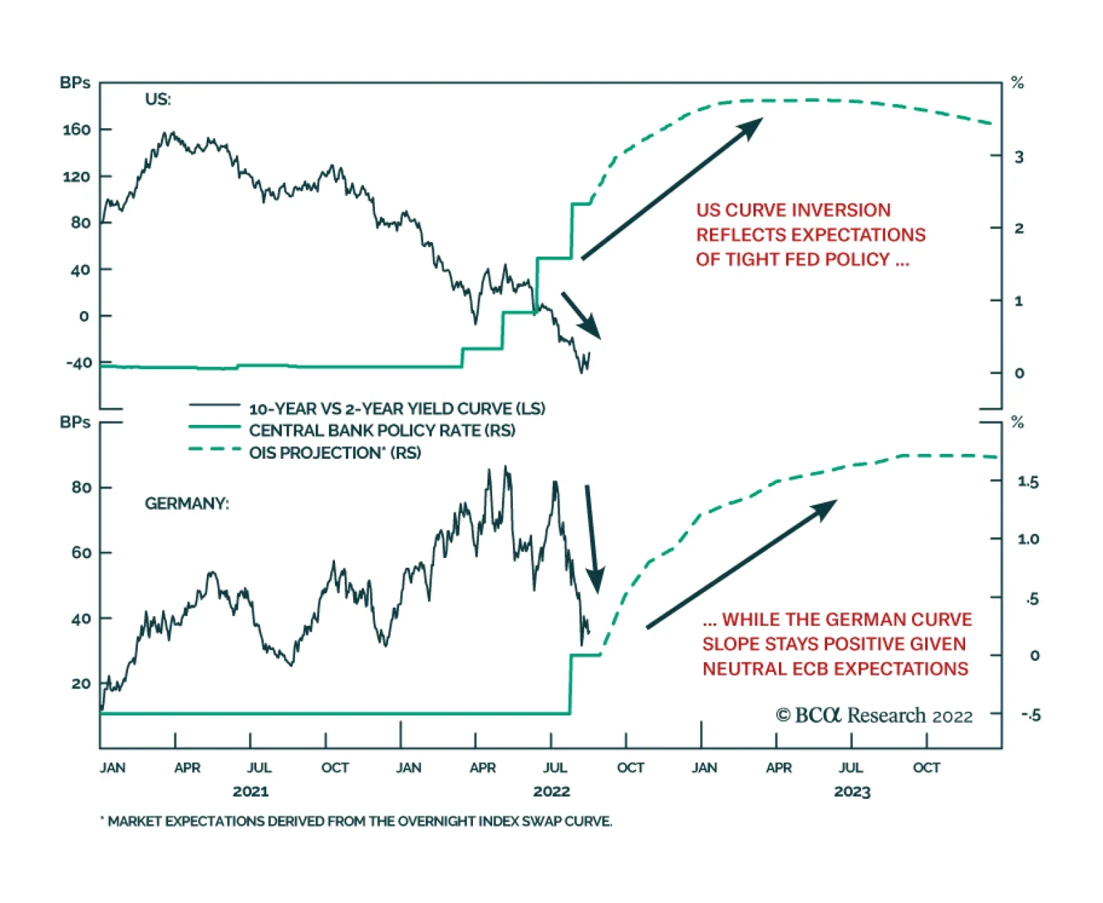
As of Thursday’s close, the 2-year/10-year US Treasury curve is inverted, with the 10-year yield trading -35bps below the 2-year yield. In Europe, there is no inversion, with the 10-year German yield trading 37bps above the 2-year yield. Why the…
Dispatches From The Future: From Goldilocks To President DeSantis
Listen to a short summary of this report. Executive Summary Back From The Future: An Investor’s Almanac
Dispatches From The Future: From Goldilocks To President DeSantis
Dispatches From The Future: From Goldilocks To President DeSantis
Stocks will rally over the next six months as recession risks abate but then begin to swoon as it becomes clear the Fed will not cut rates in 2023. A second wave of inflation will begin in mid-2023, forcing the Fed to raise rates to 5%. The 10-year US Treasury yield will rise above 4%. While financial conditions are currently not tight enough to induce a recession, they will be by the end of next year. In the past, the US unemployment rate has gone through a 20-to-22 month bottoming phase. This suggests that a recession will start in early 2024. The US dollar will soften over the next six months but then get a second wind as the Fed is forced to turn hawkish again. Over the long haul, the dollar will weaken, reflecting today’s extremely stretched valuations. Bottom Line: Investors should remain tactically overweight global equities but look to turn defensive early next year. Somewhere in Hilbert Space I have long believed that anything that can possibly happen in financial markets (as well as in life) will happen. Sometimes, however, it is useful to focus on a “base case” or “modal” outcome of what the world will look like. In this week’s report, we do just that, describing the evolution of the global economy from the perspective of someone who has already seen the future unfold. September 2022 – Goldilocks! US headline inflation continues to decline thanks to lower food and gasoline prices (Chart 1). Supply-chain bottlenecks ease, as evidenced by falling transportation costs and faster delivery times (Chart 2). Most measures of economic activity bottom out and then begin to rebound. The surge in bond yields earlier in 2022 pushed down aggregate demand, but with yields having temporarily stabilized, demand growth returns to trend. The S&P 500 moves up to 4,400. Chart 1ALower Food And Gasoline Prices Will Drag Down Headline Inflation (I)
Lower Food And Gasoline Prices Will Drag Down Headline Inflation (I)
Lower Food And Gasoline Prices Will Drag Down Headline Inflation (I)
Chart 1BLower Food And Gasoline Prices Will Drag Down Headline Inflation (II)
Lower Food And Gasoline Prices Will Drag Down Headline Inflation (II)
Lower Food And Gasoline Prices Will Drag Down Headline Inflation (II)
October 2022 – Europe’s Prospects of Avoiding a Deep Freeze Improve: Economic shocks are most damaging when they come out of the blue. With about half a year to prepare for a cut-off of Russian gas, the EU responds with uncharacteristic haste: Coal-fired electricity production ramps up; the planned closure of Germany’s nuclear power plants is postponed; the French government boosts nuclear capacity, which had been running at less than 50% earlier in 2022; and, for its part, the Dutch government agrees to raise output from the massive Groningen natural gas field after the EU commits to establishing a fund to compensate the surrounding community for any damage from increased seismic activity. EUR/USD rallies to 1.06. November 2022 – Divided Congress and Trump 2.0: In line with pre-election polling, the Democrats retain the Senate but lose the House (Chart 3). Markets largely ignore the outcome. To no one’s surprise, Donald Trump announces his candidacy for the 2024 election. Over the following months, however, the former president has trouble rekindling the magic of his 2016 bid. His attacks on his main rival, Florida governor Ron DeSantis, fall flat. At one rally in early 2023, Trump’s claim that “Ron is no better than Jeb” is greeted with boos. Chart 2Supply-Chain Pressures Are Easing
Supply-Chain Pressures Are Easing
Supply-Chain Pressures Are Easing
Chart 3Democrats Will Lose The House But Retain The Senate
Dispatches From The Future: From Goldilocks To President DeSantis
Dispatches From The Future: From Goldilocks To President DeSantis
December 2022 – China’s “At Least One Child Policy”: The 20th Party Congress takes place against the backdrop of strict Covid restrictions and a flailing housing market. In addition to reaffirming his Common Prosperity Initiative, President Xi stresses the need for actions that promote “family formation.” The number of births declined by nearly 30% between 2019 and 2021 and all indications suggest that the birth rate fell further in 2022 (Chart 4). Importantly for investors, Xi says that housing policy should focus not on boosting demand but increasing supply, even if this comes at the expense of lower property prices down the road. Base metal prices rally on the news. Chart 4China's Baby Bust
China's Baby Bust
China's Baby Bust
January 2023 – Putin Declares Victory: Faced with continued resistance by Ukrainian forces – which now have wider access to advanced western military technology – Putin declares that Russia’s objectives in Ukraine have been met. Following the playbook in Crimea and the Donbass, he orders referenda to be held in Zaporizhia, Kherson, and parts of Kharkiv, asking the local populations if they wish to join Russia. The legitimacy of the referenda is immediately rejected by the Ukrainian government and the EU. Nevertheless, the Russian military advance halts. While the West pledges to maintain sanctions against Russia, the geopolitical risk premium in oil prices decreases. February 2023 – Credit Spreads Narrow Further: At the worst point for credit in early July 2022, US high-yield spreads were pricing in a default rate of 8.1% over the following 12 months (Chart 5). By late August, the expected default rate has fallen to 5.2%, and by January 2023, it has dropped to 4.5%. Perceived default risks decline even more in Europe, where the economy is on the cusp of a V-shaped recovery following the prior year’s energy crunch. Chart 5The Spread-Implied Default Rate Has Room To Fall If Recession Fears Abate
The Spread-Implied Default Rate Has Room To Fall If Recession Fears Abate
The Spread-Implied Default Rate Has Room To Fall If Recession Fears Abate
March 2023 – Wages: The New Core CPI? US inflation continues to drop, but a heated debate erupts over whether this merely reflects the unwinding of various pandemic-related dislocations or whether it marks true progress in cooling down the economy. Those who argue that higher interest rates are cooling demand point to the decline in job openings. Skeptics retort that the drop in job openings has been matched by rising employment (Chart 6). To the extent that firms have been converting openings into new jobs, the skeptics conclude that labor demand has not declined. In a series of comments, Jay Powell stresses the need to focus on wage growth as a key barometer of underlying inflationary pressures. Given that wage growth remains elevated, market participants regard this as a hawkish signal (Chart 7). The 10-year Treasury yield rises to 3.2%. The DXY index, having swooned from over 108 in July 2022 to just under 100 in February 2023, moves back to 102. After hitting a 52-week high of 4,689 the prior month, the S&P 500 drops back below 4,500. Chart 6Drop In Job Openings Is Matched By Rise In Employment
Drop In Job Openings Is Matched By Rise In Employment
Drop In Job Openings Is Matched By Rise In Employment
Chart 7Wage Growth Remains Strong
Wage Growth Remains Strong
Wage Growth Remains Strong
April 2023 – Covid Erupts Across China: After successfully holding back Covid for over three years, the dam breaks. When lockdowns fail to suppress the outbreak, the government shifts to a mitigation strategy, requiring all elderly and unvaccinated people to isolate at home. It helps that China’s new mRNA vaccines, launched in late 2022, prove to be successful. By early 2023, China also has sufficient supplies of Pfizer’s Paxlovid anti-viral drug. Nevertheless, the outbreak in China temporarily leads to renewed supply-chain bottlenecks. May 2023 – Biden Confirms He Will Stand for Re-Election: Saying he is “fit as a fiddle,” President Biden confirms that he will seek a second term in office. Little does he know that the US will be in a recession during most of his re-election campaign. Chart 8Consumer Confidence And Real Wages Tend To Move Together
Consumer Confidence And Real Wages Tend To Move Together
Consumer Confidence And Real Wages Tend To Move Together
June 2023 – Inflation: The Second Wave Begins: The decline in inflation between mid-2022 and mid-2023 sows the seeds of its own demise. As prices at the pump and in the grocery store decline, real wage growth turns positive. Consumer confidence recovers (Chart 8). Household spending, which never weakened that much to begin with, surges. The economy starts to overheat again, leading to higher inflation. After having paused raising rates at 3.5% in early 2023, the Fed indicates that further hikes may be necessary. The DXY index strengthens to 104. The S&P 500 dips to 4,300. July 2023 – Tech Stock Malaise: Higher bond yields weigh on tech stocks. Making matters worse, investors start to worry that many of the most popular US tech names have gone “ex-growth.” The evolution of tech companies often follows three stages. In the first stage, when the founders are in charge, the company grows fast thanks to the introduction of new, highly innovative products or services. In the second stage, as the tech company matures, the founders often cede control to professional managers. Company profits continue to grow quickly, but less because of innovation and more because the professional managers are able to squeeze money from the firm’s customers. In the third stage, with all the low-lying fruits already picked, the company succumbs to bureaucratic inertia. As 2023 wears on, it becomes apparent that many US tech titans are entering this third stage. August 2023 – Long-term Inflation Expectations Move Up: Unlike in 2021-22, when long-term inflation expectations remained well anchored in the face of rising realized inflation, the second inflation wave in 2023 is accompanied by a clear rise in long-term inflation expectations. Consumer expectations of inflation 5-to-10 years out in the University of Michigan survey jump to 3.5%. Whereas back in August 2022, the OIS curve was discounting 100 basis points of Fed easing starting in early 2023, it now discounts rate hikes over the remainder of 2023 (Chart 9). The 10-year yield rises to 3.8%. The 10-year TIPS yield spikes to 1.2%, as investors price in a higher real terminal rate. The S&P 500 drops to 4,200. The financial press is awash with comparisons to the early 1980s (Chart 10). Chart 9The Markets Expect The Fed To Cut Rates By Over 100 Basis Points Starting In 2023
The Markets Expect The Fed To Cut Rates By Over 100 Basis Points Starting In 2023
The Markets Expect The Fed To Cut Rates By Over 100 Basis Points Starting In 2023
Chart 10The Early-1980s Playbook
The Early-1980s Playbook
The Early-1980s Playbook
October 2023 – Hawks in Charge: After a second round of tightening, featuring three successive 50 basis-point hikes, the Fed funds rate reaches a cycle peak of 5%. The 10-year Treasury yield gets up to as high as 4.28%. The 10-year TIPS yield hits 1.62%. The DXY index rises to 106. The S&P 500 falls to 4,050. November 2023 – Housing Stumbles: With mortgage yields back above 6%, the US housing market weakens anew. The fallout from rising global bond yields is far worse in some smaller developed economies such as Canada, Australia, and New Zealand, where home price valuations are more stretched (Chart 11). Chart 11Rising Rates Will Weigh On Developed Economies With Pricey Housing Markets
Rising Rates Will Weigh On Developed Economies With Pricey Housing Markets
Rising Rates Will Weigh On Developed Economies With Pricey Housing Markets
January 2024 – Unemployment Starts to Rise: After moving sideways since March 2022, the US unemployment rate suddenly jumps 0.2 percentage points to 3.6%, with payrolls contracting for the first time since the start of the pandemic. The 22-month stretch of a flat unemployment rate is broadly in line with the historic average (Table 1). Table 1In Past Cycles, The Unemployment Rate Has Moved Sideways For Nearly Two Years Before A Recession Began
Dispatches From The Future: From Goldilocks To President DeSantis
Dispatches From The Future: From Goldilocks To President DeSantis
February 2024 – The US Recession Begins: Although there was considerable debate about whether the US was entering a recession at the time, in early 2025, the NBER would end up declaring that February 2024 marked the start of the recession. The 10-year yield falls back below 4% while the S&P 500 drops to 3,700. Lower bond yields are no longer protecting stocks. March 2024 – The Fed Remains in Neutral: Jay Powell says further rate hikes are unwarranted in light of the weakening economy, but with core inflation still running at 3.5%, the Fed is in no position to ease. April 2024 – The Global Recession Intensifies: The US unemployment rate rises to 4.7%. The economic downdraft is especially sharp in America’s neighbor to the north, where the Canadian housing market is in shambles. Back in June 2022, the Canadian 10-year yield was 21 basis points above the US yield. By April 2024, it is 45 basis points below. Europe and Japan also fall into recession. Commodity prices continue to drop, with Brent oil hitting $60/bbl. May 2024 – The Fed Cuts Rates: Reversing its position from just two months earlier, the Federal Reserve cuts rates for the first time since March 2020, lowering the Fed funds rate from 5% to 4.5%. The Fed funds rate will ultimately bottom at 2.5%, below the range of 3.5%-to-4% that most economists will eventually recognize as neutral. August 2024 – Republican National Convention: Unwilling to spend much of his own money on the campaign, and with most donations flowing to DeSantis, Trump’s bid to reclaim the White House fizzles. While the former president never formally bows out of the race, the last few months of his primary campaign end up being a nostalgia tour of his past accomplishments, interspersed with complaints about all the ways that he has been wronged. In the end, though, Trump makes a lasting imprint on the Republican party. During his acceptance speech, in typical Trumpian style, Ron DeSantis attacks Joe Biden for “eating ice cream while the economy burns” and declares, to thunderous applause, that “Americans are sick and tired of having woke nonsense hurled in their faces and then being dared to deny it at the risk of losing their jobs.” Chart 12The Dollar Is Very Overvalued
The Dollar Is Very Overvalued
The Dollar Is Very Overvalued
October 2024 – The Stock Market Hits Bottom: While the unemployment rate continues to rise for another 12 months, ultimately reaching 6.4%, the S&P troughs at 3,200. The 10-year Treasury yield settles at 3.1% before starting to drift higher. The US dollar, which began to weaken anew after the Fed starts cutting rates, enters a prolonged bear market. As in past cycles, the dollar is unable to defy the gravitational force from extremely stretched valuations (Chart 12). November 2024 – President DeSantis: Against the backdrop of rising unemployment, uncomfortably high inflation, and a sinking stock market, Ron DeSantis cruises to victory in the 2024 presidential election. Unlike Trump, DeSantis deemphasizes corporate tax cuts and deregulation during his presidency, focusing instead on cultural issues. With the Democrats still committed to progressive causes, big US corporations discover that for the first time in modern history, neither of the two major political parties are willing to champion their interests. Peter Berezin Chief Global Strategist peterb@bcaresearch.com Follow me on LinkedIn & Twitter Global Investment Strategy View Matrix
Dispatches From The Future: From Goldilocks To President DeSantis
Dispatches From The Future: From Goldilocks To President DeSantis
Special Trade Recommendations Current MacroQuant Model Scores
Dispatches From The Future: From Goldilocks To President DeSantis
Dispatches From The Future: From Goldilocks To President DeSantis
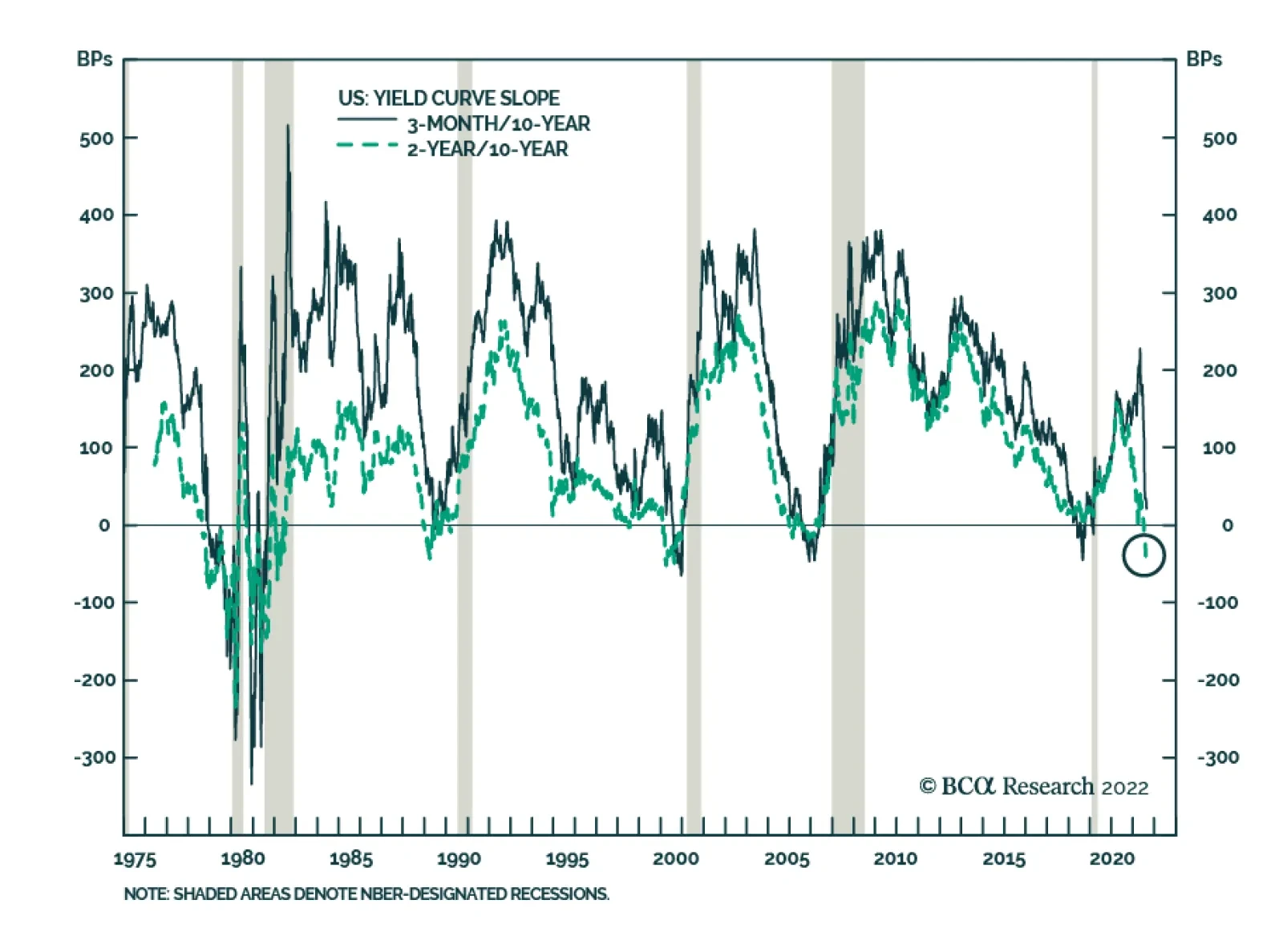
Despite all the worries, the most reliable yield curve slope measure, the 3-month/10-year segment, is not yet sending a recessionary signal. At 14bps, it is very flat, but recessions only follow an actual inversion, not a mere flattening episode. However, the…
Executive Summary More Regional Divergences Within Our Global LEI
More Regional Divergences Within Our Global LEI
More Regional Divergences Within Our Global LEI
The BCA global leading economic indicator (LEI) is still in a downtrend, but its diffusion index – which tends to lead the overall global LEI at major cyclical turning points – has crept higher since bottoming in January. The diffusion index is rising in part because of very marginal increases in the LEIs of a few countries, but there have been more decisive increases in the LEIs of two major countries outside the developed world – China and Brazil. There is not yet enough evidence pointing to a true bottoming of the BCA global LEI anytime soon, but an improvement in the LEI diffusion index above 50 (i.e. a majority of countries with a rising LEI) would be a more convincing signal that global growth momentum is set to rebound. Bottom Line: Given the uncertain message on growth from our global LEI, and with inflation rates still too high for central banks to pivot dovishly, we recommend staying close to neutral on overall global fixed income duration and modestly defensive on overall spread product exposure. Feature Investors can be forgiven for being a bit confused by some conflicting messages in recent global economic data. For example, US real GDP contracted in both the first and second quarter of this year – a so-called “technical recession” – and consumer confidence is at multi-decade lows, yet the US unemployment rate fell to 3.5%, the lowest level since 1969, in July. A similar story is playing out across the Atlantic, where a historic surge in energy prices was supposed to have already tipped the euro area into recession, yet real GDP expanded in both Q1 and Q2 at an above-trend pace and unemployment continues to decline. At times like the present, when market narratives do not always line up with hard data, we always believe it important to look within our vast suite of indicators to help clear the fog. One of our most trusted growth indicators, the BCA Global Leading Economic Indicator (LEI), is still falling and, thus, signaling a continued deceleration of global growth over at least the next 6-9 months. However, there are some signs of more optimistic news embedded within our global LEI stemming from outside the developed economies, which could be a potential early sign of a bottoming in global growth momentum. In this report, we dig deeper into the guts of our global LEI to assess the odds of an imminent turning point in the LEI and, eventually, global growth. This has important implications for global bond yields, which are likely to remain rangebound until there is greater clarity on global growth momentum (and inflation downside momentum). What Leads The Leading Indicator? The BCA global LEI is a composite index that combines the LEIs of 23 individual countries using GDP weights. The underlying list of countries differs from that of the widely followed OECD LEI, which is comprised of data from 33 countries but with a heavy weighting on developed market economies. The overall OECD LEI excludes important exporting countries such as Taiwan and Singapore, which are highly sensitive to changes in global growth. Most importantly, the OECD LEI omits the world’s largest economy, China. For our global LEI, we prefer to use a smaller set of countries but one that includes China and a bigger weighting on emerging market (EM) economies. For most of the nations in our global LEI, we do use the country-level LEIs produced by the OECD.1 That also includes several large and important non-OECD EM countries for which the OECD calculates LEIs - a list that includes China, Brazil, India, Russia, Indonesia and South Africa. For a few selected countries, however, we use the following data: US, Korea, Taiwan and Singapore: LEIs produced by national government data sources or, in the case of the US, the Conference Board. Argentina, Malaysia and Thailand: LEIs are produced in-house at BCA, a necessary step given the lack of domestically-produced LEIs in those countries at the time our global LEI was first constructed. We find that our global LEI leads global real GDP growth by around six months, and leads global industrial production growth by around twelve months (Chart 1). Chart 1A Gloomy Message From Our Global LEI
A Gloomy Message From Our Global LEI
A Gloomy Message From Our Global LEI
The latest reading on the global LEI from July is pointing to a further deceleration of global GDP into a “growth recession” where GDP is expanding slower than the pace of potential global GDP growth (less than 2%). The global LEI is also pointing to an outright contraction of global industrial production, a path also signaled by the JPMorgan global manufacturing PMI index which hit a two-year low of 51.1 – closing in on the 50 level that signifies expanding industrial activity – in July. Chart 2A Ray Of Hope On Global Growth?
A Ray Of Hope On Global Growth?
A Ray Of Hope On Global Growth?
The momentum of our global LEI is largely influenced by its breadth. Specifically, we have found that when a growing share of countries within the global LEI have individual LEIs that are rising, the overall LEI will eventually follow suit. Thus, the diffusion index of our global LEI, which measures the percentage share of countries with rising individual LEIs, is itself a fairly good leading indicator of the global LEI at major cyclical turning points. We may be approaching such a turning point, as our global LEI diffusion index has increased from a low of 9 back in January of this year to the level of 30 in July (Chart 2). In past business cycles, the diffusion index has tended to lead the global LEI by around 6-9 months, which suggests that a bottom in the actual global LEI could occur sometime in the next few months – although that outcome is conditional on the magnitude of the rise in the diffusion index. In the top half of Table 1, we list previous episodes since 1980 where the global PMI diffusion index followed a similar path to that seen in 2022 – bottoming out below 10 and then rising to at least 30. We identified nine such episodes. In the table, we also show the subsequent change in the level of the global LEI after the increase in the diffusion index. Table 1Global LEI Diffusion Index Greater Than 50 Typically Signals LEI Uptrend
A Hint Of Recovery In The BCA Global Leading Economic Indicator?
A Hint Of Recovery In The BCA Global Leading Economic Indicator?
The historical experience shows that an increase in the diffusion index to 30 was only enough to trigger a decisive rebound in the global LEI over a 6-12 month horizon in the 2000-01 and 2008 episodes. In several episodes, the global LEI actually contracted despite the pickup in the diffusion index. Related Report Global Fixed Income StrategyDovish Central Bank Pivots Will Come Later Than You Think In the bottom half of Table 1, we run the same analysis but define the episodes as when the diffusion index rose from a low below 10 to at least 50. Unsurprisingly, periods when at least half of the countries have a rising LEI tend to result more frequently in the overall global LEI entering an uptrend within one year – although the two most recent episodes in 2010 and 2018-19 were notable exceptions. Bottom Line: After looking at past experience, the latest pickup in the global LEI diffusion index has not been by enough to confidently forecast a rebound in the LEI – and, eventually, faster global growth. No Broad-Based Improvement In Our Global LEI When grouping the countries within our global LEI by geographical region, it is clear that there is still no sign of improvement in North America or Europe, but some signs of bottoming in Asia and Latin America (Chart 3). Typically, the regional LEIs tend to be very positively correlated during major cyclical moves in the overall LEI, with no one region being particularly better than the others at consistently leading the global business cycle. Chart 3More Regional Divergences Within Our Global LEI
More Regional Divergences Within Our Global LEI
More Regional Divergences Within Our Global LEI
Table 2Country Weightings In Our Global LEI
A Hint Of Recovery In The BCA Global Leading Economic Indicator?
A Hint Of Recovery In The BCA Global Leading Economic Indicator?
Of course, the global LEI is a GDP-weighted index that is dominated by the US and China (Table 2). When looking at individual country LEIs, the recent improvement in the LEI diffusion index looks less impressive. Some countries, like the UK and Korea, have only seen a tiny fractional uptick in the most recent LEI reading – moves small enough to qualify as statistical noise, even though the tiniest of positive moves still register as an “increase” when calculating the diffusion index. When looking at all the individual country LEIs within our global LEI, only two countries stand out as having meaningful increases over the past few months – China and Brazil (Chart 4). In the case of China, the idea that there could be signs of improving growth runs counter to the broad swath of recent data that highlight slowing momentum of Chinese consumer spending, business investment and residential construction. However, the production-focused components of the OECD’s China LEI, which we use in our global LEI, have shown some improvement of late (Chart 5). For example, motor vehicle production grew at a 32% year-over-year rate in July according to the OECD’s data, while total construction activity (based on OECD aggregates of production by industry) rose 9% year-over-year. Chart 4LEI Improvement In China & Brazil, Sluggish Elsewhere
LEI Improvement In China & Brazil, Sluggish Elsewhere
LEI Improvement In China & Brazil, Sluggish Elsewhere
Chart 5Improvement In Some Components Of The OECD's China LEI
Improvement In Some Components Of The OECD's China LEI
Improvement In Some Components Of The OECD's China LEI
The OECD’s LEI methodology is designed to include the minimum number of data series to optimize the fit of the LEI to the growth rate of each country’s industrial production index, which does lead to some peculiar series being included in the LEIs. However, there are signs of a potential rebound in Chinese economic growth evident in indicators preferred by our emerging market strategists, like the change in overall credit and fiscal spending as a share of GDP, a.k.a. the credit and fiscal impulse (Chart 6). The latter has shown a modest improvement that is hinting at faster Chinese growth in 2023, similar to the OECD’s China LEI. Turning to Brazil, the improvement in the OECD’s LEI there is focused on more survey-based data, like confidence among manufacturers and expectations on the demand for services. However, some hard data that the OECD includes in its Brazil LEI, namely net exports to Europe, have also shown clear improvement (Chart 7). Chart 6China Credit/Fiscal Impulse Signaling A Growth Rebound
China Credit/Fiscal Impulse Signaling A Growth Rebound
China Credit/Fiscal Impulse Signaling A Growth Rebound
Bottom Line: The modest improvement in our global LEI diffusion index is even less than meets the eye, as only China and Brazil have seen LEI increases that are meaningfully greater than zero. Chart 7Improvement In Many Components Of The OECD's Brazil LEI
Improvement In Many Components Of The OECD's Brazil LEI
Improvement In Many Components Of The OECD's Brazil LEI
Investing Around The Global LEI Chart 8Global Financial Conditions Not Signaling An LEI Rebound
Global Financial Conditions Not Signaling An LEI Rebound
Global Financial Conditions Not Signaling An LEI Rebound
Investors spend a sizeable chunk of their time focused on the future growth outlook to make investment decisions. This would, presumably, give leading economic indicators a useful role in any investment process. However, when looking at the relationship between our global LEI and the returns on risk assets like equities and corporate credit, the correlation is highly coincident (Chart 8). In other words, risk assets are themselves leading indicators of future economic growth – so much so that equity indices are often included as a component of the leading indicators of individual countries. On that front, the recent rebound in global equity markets, and the pullback in global credit spreads from the mid-June peak, could be signaling a more stable growth outlook that would be reflected in a bottoming of our global LEI. However, the monetary policy cycle matters, as evidenced by the correlation between the shape of government bond yield curves and our global LEI (bottom panel). That relationship is less strong than that of the LEI and equity/credit returns, but there are very few examples where yield curves are flat, or even inverted as is now the case in the US, and leading indicators are rising. Chart 9Stay Neutral On Overall Duration Exposure
Stay Neutral On Overall Duration Exposure
Stay Neutral On Overall Duration Exposure
In the current environment where more central banks are worrying more about overshooting inflation than slowing growth, a turnaround in our global LEI will be difficult to achieve until inflation is much closer to central bank target levels, allowing policymakers to loosen policy and steepen yield curves. We do not expect such a scenario to unfold over at least the next 12-18 months, given broad-based entrenched inflation pressures in global services and labor markets. While leading indicators may not be of much value in forecasting risk assets, we do find value in using them to forecast moves in government bond yields. Regular readers of BCA Research Global Fixed Income Strategy will be familiar with our Global Duration Indicator, comprised of growth-focused measures that have historically had a leading relationship to the momentum (annual change) in developed market bond yields (Chart 9). The Duration Indicator contains both the global LEI and its diffusion index, as well as the ZEW expectations indices for the US and Europe. Three of those four indicators remain at depressed levels suggesting waning bond yield momentum. Overshooting global inflation has weakened the correlation between bond yield momentum and our Duration Indicator over the past year. However, with global commodity and goods inflation now clearly decelerating, we expect bond momentum to begin tracking growth dynamics more closely again. This leads us to expect bond yields to remain trapped in ranges over at least the balance of 2022, defined most prominently by the 10-year US Treasury yield trading between 2.5% and 3%. Bottom Line: Given the uncertain message on growth from our global LEI, and with inflation rates still too high for central banks to pivot dovishly, we recommend staying close to neutral on overall global fixed income duration and modestly defensive on overall spread product exposure. Robert Robis, CFA Chief Fixed Income Strategist rrobis@bcaresearch.com Footnotes 1 Details on how the OECD calculates the individual country leading economic indicators can be found here: http://www.oecd.org/sdd/leading-indicators/compositeleadingindicatorsclifrequentlyaskedquestionsfaqs.htm\ GFIS Model Bond Portfolio Recommended Positioning Active Duration Contribution: GFIS Recommended Portfolio Vs. Custom Performance Benchmark
A Hint Of Recovery In The BCA Global Leading Economic Indicator?
A Hint Of Recovery In The BCA Global Leading Economic Indicator?
The GFIS Recommended Portfolio Vs. The Custom Benchmark Index Global Fixed Income - Strategic Recommendations* Cyclical Recommendations (6-18 Months)
A Hint Of Recovery In The BCA Global Leading Economic Indicator?
A Hint Of Recovery In The BCA Global Leading Economic Indicator?
Dear Client, This week, the US Bond Strategy service is hosting its Quarterly Webcast (August 16 at 10:00 AM EDT, 15:00 PM BST, 16:00 PM CEST). In addition, we are sending this Quarterly Chartpack that provides a recap of our key recommendations and some charts related to those recommendations and other areas of interest for US bond investors. Please tune in to the Webcast and browse the Chartpack at your leisure, and do let us know if you have any questions or other feedback. To view the Quarterly Chartpack PDF please click here. Best regards, Ryan Swift, US Bond Strategist Treasury Index Returns Spread Product Returns
Executive Summary Unit Labor Costs, Not Oil Prices, Are The Key To US Core Inflation
Unit Labor Costs, Not Oil Prices, Are The Key To US Core Inflation
Unit Labor Costs, Not Oil Prices, Are The Key To US Core Inflation
Inflation is not about oil, food or used car prices. Looking at prices of individual components of a consumer basket is akin to missing the forest for the trees. Despite the latest drop in US headline inflation, various core CPI measures continue trending up and registered considerable month-on-month rises in July. Wages and, more specifically, unit labor costs are the true measure of genuine and persistent inflation. US wage growth is very elevated, and the pace of unit labor cost gains has surged to a 40-year high. The conditions for sustainable and persistent disinflation in the US are not yet present. US inflation will prove to be much stickier and more entrenched than many market participants presently believe. The recovery in China will be U- rather than V-shaped, with risks tilted to the downside. The mainland’s property market breakdown is structural, not cyclical. Excesses are very large, and problems are snowballing, rendering the enacted policy stimulus insufficient. Bottom Line: US core inflation lingering above 4% and easing financial conditions will compel the Fed to continue hiking rates. This will cap global risk asset prices and put a floor under the US dollar. We continue to recommend an underweight allocation to EM in global equity and credit portfolios. Consistently, we are also reluctant to chase EM currencies higher. Feature The bullish macro narrative circulating in the investment community is that conditions for a cyclical rally in global risk assets have fallen into place. Specifically: US inflation will drop sharply as US growth has crested and commodity prices have plunged; The Fed is nearing the end of a tightening cycle; China has stimulated sufficiently, and its economy is about to recover, which will boost economic conditions among its trading partners in general and EM in particular. These assumptions along with the fact that the S&P 500 index has found support at a 3-year moving average – a proven line of defense – suggest that US share prices have likely bottomed (Chart 1). Are we witnessing déjà vu of the 2011, 2016, 2018 and 2020 market bottoms? Chart 1Déjà Vu? Is 2022 Like The 2011, 2016 And 2018 Bottoms In The S&P 500?
Déjà Vu? Is 2022 Like The 2011, 2016 And 2018 Bottoms In The S&P 500?
Déjà Vu? Is 2022 Like The 2011, 2016 And 2018 Bottoms In The S&P 500?
We have reservations about all of the above fundamental conjectures. We elaborate on these reservations in this report. On the whole, we contend that the current environment is different, and the roadmaps of all post-2009 equity market bottoms are not necessarily currently applicable. BCA’s Emerging Markets Strategy team believes that (1) US consumer price inflation is much more entrenched and will prove stickier than is commonly believed; and (2) the Chinese property market’s breakdown is structural, not cyclical; hence, the recovery will not gain traction easily. Is This The End Of The US Inflation Problem? Not Quite This week’s US inflation data confirmed that headline CPI inflation has probably peaked: prices in several categories plunged. However, inflation is not about oil, food or used car prices. Chart 2 reveals that historically there have been several episodes whereby core inflation remains elevated despite plunging oil prices. Chart 2US Core Inflation Does Not Always Follow Oil Prices
US Core Inflation Does Not Always Follow Oil Prices
US Core Inflation Does Not Always Follow Oil Prices
Looking at price dynamics among the individual components of the CPI basket is akin to missing the forest for the trees. Inflation is a very inert and persistent phenomenon. Underlying inflation does not change its direction often and/or quickly. That is why we believe that it is premature to celebrate the end of the US inflation problem. A few observations on this matter: Despite the drop in US headline inflation, various core CPI measures − like trimmed-mean CPI, median CPI and core sticky CPI − all continue trending up and registered substantial month-on-month rises in July (Chart 3). The range of core inflation based on these annual and month-month annualized rates is between 4-7%. In brief, the rate of genuine/sticky inflation is well above the Fed’s 2% target. Given its unconditional commitment to bringing inflation down to 2%, the Fed will continue hiking interest rates ceteris paribus. Chart 3US Core CPI Measures Are Still Very High
US Core CPI Measures Are Still Very High
US Core CPI Measures Are Still Very High
Chart 4US Wages Growth Has Been Surging
US Wages Growth Has Been Surging
US Wages Growth Has Been Surging
We continue to emphasize that wages and, more specifically, unit labor costs are the true measures of persistent and genuine inflation. We have written at length about why wages and unit labor costs are more important to inflation than oil or food prices. US wage growth is very elevated and is accelerating (Chart 4). Unit labor costs, calculated as hourly wages divided by productivity, have also been surging to a 40-year high (Chart 5, top panel). Chart 5Unit Labor Costs, Not Oil Prices, Are The Key To US Core Inflation
Unit Labor Costs, Not Oil Prices, Are The Key To US Core Inflation
Unit Labor Costs, Not Oil Prices, Are The Key To US Core Inflation
The reason for this very strong wage growth and swelling unit labor costs is the very tight labor market. The bottom panel of Chart 5 demonstrates that labor demand is still outpacing labor supply by a wide margin. Hence, wage inflation will not subside until the unemployment rate rises meaningfully. Bottom Line: Conditions for sustainable and persistent disinflation in the US are not yet present. Inflation will prove to be much stickier and more entrenched than many market participants presently believe. Core inflation lingering above 4% and easing financial conditions will compel the Fed to continue hiking rates. This will cap risk asset prices and put a floor under the US dollar. China: Is This Time Different? If one believes that China’s current business cycle is similar to all previous ones seen since 2009, odds are that a buying opportunity in China-related financial markets is at hand. Chart 6 illustrates that the credit and fiscal spending impulse leads the business cycle by about nine months. Given that this impulse bottomed late last year, a trough in the Chinese business cycle is due. Chart 6Is A Recovery In China's Business Cycle Imminent?
Is A Recovery In China's Business Cycle Imminent?
Is A Recovery In China's Business Cycle Imminent?
It is always risky to suggest that this time is different. Nevertheless, at the risk of being wrong, we contend that a combination of (1) property markets woes, (2) an impending export contraction, and (3) the dynamic zero-COVID policy will reduce the multiplier effect of current stimulus measures. Hence, a meaningful recovery in economic activity will likely fail to materialize in the coming months. The challenges facing the mainland property market are now well known. Yet, excesses are very large, and problems are snowballing, making policy stimulus insufficient. In particular: Authorities are contemplating bailout funds for property developers in the range of RMB 300-400 billion to enable them to complete housing that has been pre-sold. This is not sufficient financing for overall property construction. Table 1How Large Are Property Developers Bailout Funds?
Déjà Vu?
Déjà Vu?
Table 1 illustrates that these amounts are equal to just 3-4% of annual fixed-asset investment in real estate excluding land purchases, 1.5-2% of total financing of developers, and 3-4% of the advance payments that property developers received for pre-sold housing in 2021. Property developers will not be receiving any cash upon the completion and delivery of presold housing units because they were paid in advance. Hence, without liquidating their other assets, homebuilders cannot repay the bailout financing. Consequently, only state financing can work here because, from the viewpoint of providers of this financing, this scheme de-facto means throwing good money after bad. The property industry in China is extremely fragmented. This makes bailouts difficult to organize and execute. There are officially about 100,000 property developers in China. The overwhelming majority of them are not state-owned companies. Plus, the two largest property developers, Evergrande (before defaulting) and Country Garden, had only 3.8% and 3.3% of market share respectively in 2020. The failure of homebuilders to complete and deliver pre-sold housing units could unleash a death spiral for them. In recent years, 90% of housing units have been pre-sold, i.e., buyers made advance payments/prepayments, often taking out mortgages (Chart 7, top panel). Witnessing the inability of developers to deliver on presold units, a rising number of people may decide to wait to buy. The largest source of developers’ financing – advance payments for pre-sold housing units – might very well dry up. This source has accounted for 50% of real estate developers’ total financing in recent years (Chart 7, bottom panel). In brief, a vicious cycle is possible. The lack of financing for homebuilders bodes ill for construction activity (Chart 8). Chart 7China: Housing Presales And Pre-Payments Are Critical To Developers
China: Housing Presales And Pre-Payments Are Critical To Developers
China: Housing Presales And Pre-Payments Are Critical To Developers
Chart 8Lack Of Homebuilder Financing = Shrinking Construction Activity
Lack Of Homebuilder Financing = Shrinking Construction Activity
Lack Of Homebuilder Financing = Shrinking Construction Activity
Chart 9Chinese Property Developers Are Extremely Leveraged
Chinese Property Developers Are Extremely Leveraged
Chinese Property Developers Are Extremely Leveraged
Besides, property developers are very leveraged with an assets-to-equity ratio close to nine (Chart 9). They have grown accustomed to borrowing heavily to accumulate real estate assets. They have been starting but not completing construction (Chart 10, top panel). We have been referring to this phenomenon as the biggest carry trade in the world. The bottom panel of Chart 10 shows two different measures of residential floor space inventories held by property developers. One measure subtracts completed floor space from started floor space, and another one deducts sold floor space from started floor space. On both measures, residential inventories are enormous. In theory, they could raise funds by selling their real estate assets. However, if they all try to sell simultaneously, there will not be enough buyers, and asset prices will plunge, which could lead to a full-blown debt deflation spiral. The last time the real estate market was similarly distressed in 2014-15, the central bank launched the Pledged Supplementary Lending (PSL) facility. This was effectively a QE program to monetize housing. This was the reason why housing recovered strongly in 2016-2017. There is currently no such program up for discussion. On the whole, odds are that the current property market breakdown is structural, not cyclical. Financial markets – the prices of stocks and USD bonds of property developers – convey a similar message and continue to plunge (Chart 11). Chart 10Excessive Property Inventories
Excessive Property Inventories
Excessive Property Inventories
Chart 11No Green Light From Property Stocks And Corporate Bond Prices
No Green Light From Property Stocks And Corporate Bond Prices
No Green Light From Property Stocks And Corporate Bond Prices
Chart 12There Has Been No Recovery In China Without A Revival in Real Estate
There Has Been No Recovery In China Without A Revival in Real Estate
There Has Been No Recovery In China Without A Revival in Real Estate
Without an improvement in the housing market, a meaningful business cycle recovery is unlikely in China. Chart 12 illustrates that all recoveries in the Chinese broader economy since 2009 occurred alongside a revival in property sales. The importance of the property market goes beyond its size. Rising property prices lift household and business confidence, boosting aggregate spending and investment. The sluggish housing market and falling house prices will impair consumer and business confidence. This, along with uncertainty related to the dynamic zero-COVID policy, will dent consumer spending and private investments. Finally, the upcoming contraction in Chinese exports will dampen national income growth. Taken together, the multiplier effect of stimulus in the upcoming months will be lower than it has been in previous periods of stimulus. There are two areas that will see meaningful improvement in the coming months: infrastructure spending and autos. BCA’s China Investment Strategy service discussed the outlook for auto sales in a recent report. Chart 13Green Shoots In China's Infrastructure Investment
Green Shoots In China's Infrastructure Investment
Green Shoots In China's Infrastructure Investment
On the infrastructure front, there has been mixed evidence of an improvement in activity. The top and middle panels of Chart 13 demonstrate that Komatsu machinery’s operational hours and the number of approved infrastructure projects might be bottoming. However, the installation of high-power electricity lines has fallen to a 15-year low (Chart 13, bottom panel). As we elaborated in last month’s report, the new financing/stimulus for infrastructure development will not result in new investments. Rather, it will by and large offset the drop in local government (LG) revenues from land sales this year. In short, there is little new stimulus for infrastructure beyond what was approved in the budget plan earlier this year. Bottom Line: The recovery in China will be U- rather than V-shaped, with risks tilted to the downside. Investment Recommendations Our bias is that the rebound in global risk assets could last for a few more weeks. The basis is that investor positioning in risk assets was very light when this rebound began. Plus, falling oil prices could reinforce the idea among investors that US inflation is no longer a problem. Looking beyond the next several weeks, the outlook for global and EM risk assets is dismal. Markets will realize that the Fed cannot halt its tightening with core inflation well above 4-5%. Hawkish Fed policy and contracting global trade will boost the US dollar and weigh on cyclical assets. We continue to recommend an underweight allocation to EM in global equity and credit portfolios. Consistently, we are also reluctant to chase EM currencies higher. EM local bonds offer value, as we have argued over the past couple of months, but for now we prefer to focus on yield curve flattening trades. We continue betting on yield curve flattening/inversion in Mexico and Colombia and are long Brazilian 10-year domestic bonds while hedging the currency risk. In addition, we recommend investors continue receiving 10-year swap rates in China and Malaysia. Arthur Budaghyan Chief Emerging Markets Strategist arthurb@bcaresearch.com Strategic Themes (18 Months And Beyond) Equities Cyclical Recommendations (6-18 Months) Cyclical Recommendations (6-18 Months)
Executive Summary Realized Real Interest Rates Must Rise
Realized Real Interest Rates Must Rise
Realized Real Interest Rates Must Rise
Policymakers must continue engineering higher real interest rates, and tighter financial conditions, to help cool off growth and bring down overshooting inflation. This will inevitably lead to inverted yield curves across most of the developed world, following the recent trend of US Treasuries. US growth expectations remain overly pessimistic, which opens up the potential for more near-term bond-bearish upside data surprises like the July employment and ISM Services reports. The Bank of England – under increasing political pressure for its relatively timid response to the massive UK inflation overshoot – is now forecasting a long policy-induced recession as the only way to tame UK inflation expected to reach 13% by year-end. Expect UK Gilts to be a relative outperformer within developed bond markets over the next 12-18 months. Bottom Line: Stay overweight UK Gilts versus US Treasuries in global bond portfolios, but increase exposure to yield curve flattening in both countries. The Fed and Bank of England are both on course to push monetary policy into restrictive, growth-damaging territory. Don’t Get TOO Comfortable Taking Risk In a bit of a summer surprise, global financial markets have been staging a mild recovery from the stagflationary doom that prevailed during the first half of 2022. In the US, the S&P 500 index is up 14% from the year-to-date intraday low reached on June 16, with the VIX index back down to low-20s zone last seen in April (Chart 1). High-yield corporate bond spreads in the US and euro area are down 97bps and 36bps, respectively, since that mid-June trough in US equities. Even emerging market equities and credit – the most unloved of asset classes in 2022 – have stabilized. Related Report Global Fixed Income StrategyIt’s Time To Flip The Script - Upgrade UK Gilts Some of this risk rally is surely short-covering, but there are some valid reasons to be less pessimistic on growth-sensitive risk assets. In the US, where the back-to-back contractions in GDP in the first two quarters of the year have stoked recession fears, the latest data releases have seen upside surprises suggesting an expanding, not contracting, economy (Chart 2). The July ISM non-manufacturing (services) index rose +1.4 points in July to 56.7, a broad-based move that included increases in Production, New Orders and New Export Orders. Core durable goods orders rose +0.5% in June for the second straight month. The biggest surprise was the July Payrolls report, which showed a whopping +528,000 increase in employment – over twice the expected gain of +250,000 – with a downtick in the unemployment rate to 3.5%. Chart 1Stepping Back From The Recessionary Abyss
Stepping Back From The Recessionary Abyss
Stepping Back From The Recessionary Abyss
Chart 2The US Recession Talk May Have Been Premature
The US Recession Talk May Have Been Premature
The US Recession Talk May Have Been Premature
Chart 3Goods Inflation Pressures Easing
Goods Inflation Pressures Easing
Goods Inflation Pressures Easing
There was also some good news on the inflation front in the latest US data. The Prices Paid components of both the ISM manufacturing and non-manufacturing indices showed big declines, 18.5pts and 7.8pts respectively, in July, continuing the downtrends that began in the latter half of 2021 (Chart 3). This is not just a US story. The Prices Paid components of the S&P Global manufacturing PMIs in the euro area, the UK, Japan and China have also been falling. Lower global commodity prices, particularly for oil, are playing a large role in the pullback in reported business input costs. The Supplier Deliveries components of both ISM reports also fell on the month, continuing a trend seen throughout 2022 as global supply chain pressures have eased. Combined with the drop in the Prices Paid data, global PMIs are sending a strong message - inflationary pressures on the traded goods side of the global economy are finally easing. Slower goods inflation, however, does not provide an all-clear for risk assets on a cyclical basis. Non-goods price pressures are showing little sign of peaking across most of the developed world. Labor markets remain tight, and both wage inflation and services inflation rates continue to accelerate in the major economies of the US, UK and euro area at a pace well above central bank inflation targets (Chart 4). Until these domestic sources of inflation show signs of peaking, central banks will continue to push up policy rates to slow growth, generate higher unemployment and, eventually, bring domestically driven inflation back down to central bank targets. Expect the so-called Misery Index, summing headline inflation and the unemployment rate, to remain elevated across the major developed economies until negative real interest rates begin to rise through a combination of more nominal rate hikes and, eventually, slower inflation (Chart 5). Chart 4Domestic Inflation Pressures Accelerating
Domestic Inflation Pressures Accelerating
Domestic Inflation Pressures Accelerating
Chart 5Realized Real Interest Rates Must Rise
Realized Real Interest Rates Must Rise
Realized Real Interest Rates Must Rise
As we discussed in last week’s report, bond markets were getting way ahead of themselves in pricing in aggressive rate cuts in 2023, especially in the US. This was setting up for a potential move higher in yields on any positive data news. Within the “Big 3” developed economies, US Treasuries look most vulnerable to a rebound in bond yield momentum, judging by what looks like a true bottom in the mean-reverting Citigroup US Data Surprise Index (Chart 6). The flow of data surprises is more mixed in the euro area and UK and is not yet at the stretched extremes that would signal a sustainable increase in bond yields. Taken at face value, this fits with our current recommendation to underweight the US, and overweight core Europe and the UK, within global government bond portfolios. With central banks now on track to push policy rates into restrictive territory, there is the potential for additional flattening of already very flat yield curves across the Big 3. Forward rates are not priced for additional curve flattening in those markets, looking at both the 2-year/10-year and 5-year/30-year government bond curves (Chart 7). This makes positioning for more curve flattening in the US, UK and euro area a positive carry trade by leaning against the pricing of forward rates. Chart 6Greater Potential For Bond-Bearish Data Surprises In The US
Greater Potential For Bond-Bearish Data Surprises In The US
Greater Potential For Bond-Bearish Data Surprises In The US
Chart 7Increase Exposure To Curve Flattening In The 'Big 3'
Increase Exposure To Curve Flattening In The 'Big 3'
Increase Exposure To Curve Flattening In The 'Big 3'
We are adjusting the positioning within the BCA Research Global Fixed Income Strategy Model Bond Portfolio this week to benefit from the trend towards additional curve flattening in the US, the UK and core Europe (Germany and France). With the 2-year/10-year curve already inverted by -45bps in the US, we see better value by adding flattening exposure between the 5-year and 30-year points – a curve segment that is not yet in inversion. In the UK and euro area, we see a case for positioning for flattening across the entire yield curve. Bottom Line: Stay overweight both UK Gilts and core European government bonds versus US Treasuries in global bond portfolios, but increase exposure to yield curve flattening in all countries. The Fed and Bank of England are both clearly on course to push monetary policy into restrictive, growth-damaging territory, and the ECB may be forced to do the same. Painful Honesty From The Bank Of England The Bank of England (BoE) delivered its largest rate hike since 1995 last week, raising Bank Rate by 50bps to 1.75%. Planned sales of UK Gilts accumulated by the BoE during the quantitative easing phase of pandemic stimulus, at a pace of £10bn per quarter starting in September, were also announced. While those moves were largely expected by markets, the BoE’s new set of economic forecasts contained quite a shocker – an expectation of recession starting in Q4 of this year, running through the end of 2023 (Chart 8). The UK unemployment rate is expected to rise substantially from the current 3.8% to 6.3% by Q3/2025. Chart 8Brutal Honesty In The Latest BoE Forecasts
Brutal Honesty In The Latest BoE Forecasts
Brutal Honesty In The Latest BoE Forecasts
Chart 9Energy Prices Driving BoE Inflation Forecasts
Energy Prices Driving BoE Inflation Forecasts
Energy Prices Driving BoE Inflation Forecasts
We are hard pressed to remember the last time a major central bank announced a forecast of a prolonged economic downturn as part of its baseline scenario to bring inflation to its target. Such is the predicament that the BoE finds itself in, with headline UK inflation expected to soar to 13% by the end of 2022 – a mere 11 percentage points above the central bank’s inflation target. The BoE has been forced to sharply ratchet up that expected peak in UK inflation at both the May and August policy meetings this year. This is largely due to the massive increase in UK energy prices with the Energy component of the UK CPI index up over 50% in year-over-year terms. According to analysis published in the BoE August 2022 Monetary Policy Report, the direct impact of higher energy prices was projected to account for roughly half of that expected 13% peak in UK inflation this year (Chart 9). At the same time, falling energy prices embedded into futures curves are expected to full unwind that effect in 2023. The BoE’s recession call is also conditioned on a market-implied path for interest rates, with a 2023 peak in Bank Rate of just over 3% priced into the UK OIS curve. Looking beyond the energy price surge, there are signs that the BoE will not have to tighten as aggressively as interest rate markets are currently expecting. Our BoE Monitor, constructed using growth, inflation and financial market variables that would typically pressure the central bank to tighten or loosen monetary policy, has clearly peaked (Chart 10). All three components of the Monitor have rolled over, although inflation pressures remain the strongest contributor to the elevated absolute level of the Monitor. From a growth perspective, there are many reasons to expect the UK economy to enter a recession without much more prodding from BoE rate hikes (Chart 11): Chart 10Our BoE Monitor Sees Easing Cyclical Pressure To Raise Rates
Our BoE Monitor Sees Easing Cyclical Pressure To Raise Rates
Our BoE Monitor Sees Easing Cyclical Pressure To Raise Rates
Chart 11A Broad-Based Slowing Of UK Growth
A Broad-Based Slowing Of UK Growth
A Broad-Based Slowing Of UK Growth
Both the S&P Global manufacturing and services PMIs are on target to soon fall below the 50 level that indicates positive growth (top panel) Consumer confidence has collapsed as surging inflation has overwhelmed household income growth, leading to a contraction in retail sales volume growth (middle panel) The BoE’s Agents’ Survey of individual businesses shows a sharp deterioration in business investment spending plans (bottom panel). Yet even with growth clearly slowing already, the sheer magnitude of the inflation overshoot is forcing markets to discount a fairly aggressive path for UK interest rates over the next year. This is not only evident in the OIS curve, but also in the BoE’s own Market Participants Survey (MPS) of UK investors. According to the just released August MPS, the median expectation is for Bank Rate to peak at 2.5% next year (Chart 12). This is a sizeable increase from the previous expected peak of 1.75% from the last MPS in May, but is still below the discounted peak in rates from the OIS curve of 3.1%. The bigger news is that the, according to the August MPS, the median survey participant now believes that the neutral range for Bank Rate is now 2-2.5%, up from the 1.5-2.0% range in the May MPS. Therefore, the August MPS forecasted peak Bank Rate of 2.5% is only at the high end of neutral and not restrictive. Yet both the OIS curve and the August MPS expect the BoE to immediately pivot from rate hikes to rate cuts in the second half of 2023. Chart 12UK Interest Rate Markets Have Adjusted Neutral Rate Expectations
UK Interest Rate Markets Have Adjusted Neutral Rate Expectations
UK Interest Rate Markets Have Adjusted Neutral Rate Expectations
Chart 13The BoE Is Facing Severe Public Scrutiny
The BoE Is Facing Severe Public Scrutiny
The BoE Is Facing Severe Public Scrutiny
The notion that the BoE would pivot so quickly next year, when their own forecasts still call for UK inflation to be over 9% in the third quarter of 2023, seem somewhat optimistic. Especially with the BoE under tremendous public and political pressure because of runaway UK inflation. The leading candidate to become the next UK Prime Minister, Foreign Secretary Liz Truss, has already gone on record stating that she would look to change the BoE’s remit as Prime Minister to focus solely on keeping inflation low. Meanwhile, the latest BoE Inflation Attitudes Survey shows more respondents are now dissatisfied with the BoE than satisfied (Chart 13). 1-year-ahead inflation expectations from that same survey are now at 4.6%, while 5-year/5-year forward breakevens from UK index-linked Gilts are still at 3.8%. With inflation expectations still so elevated, and with the BoE’s own forecasts calling for headline UK inflation to not fall back to the 2% BoE target until Q3/2024, it is unlikely that the BoE will revert to rate cuts as quickly as markets expect – especially given the accelerating wage dynamics in the UK labor market. According to the BoE’s measure of “underlying” wage growth, which adjusts headline wage inflation data for pandemic effects from furloughs and shifting labor composition, wages are growing at a 4.2% year-over-year rate (Chart 14). The BoE’s own modeling work indicates that 2.9 percentage points of that wage growth is due to the level of short-term inflation expectations, with only 0.9 percentage points coming from productivity growth. Thus, the BoE cannot let its foot off the monetary brake until short-term inflation expectations fall substantially from current elevated levels – especially with employment indicators still pointing to a very tight supply-constrained, post-COVID UK labor market. Chart 14A Wage-Price Spiral In The UK?
Misery Loves Company
Misery Loves Company
Given that interplay of rising headline inflation, elevated inflation expectations and tight labor markets, the BoE will likely be forced to begin unwinding the current rate hiking cycle later than markets expect. This will eventually lead to an inversion of the UK Gilt yield curve as the BoE pushes policy rates to restrictive territory and the UK economy falls into recession faster than other countries (like the US). Chart 15Stay Overweight UK Gilts, With A Curve Flattening Bias
Stay Overweight UK Gilts, With A Curve Flattening Bias
Stay Overweight UK Gilts, With A Curve Flattening Bias
We still believe that the Fed is more likely than the BoE to fully follow through on market-discounted rate hikes over the next year, which was a major reason why we upgraded our cyclical recommendation on UK Gilts to overweight back in May. However, with the BoE now under more pressure to wring high inflation out of the UK economy by keeping policy tighter for longer, we also see value in positioning for that eventual inversion of the UK Gilt curve (Chart 15). We see the sequencing as being inversion first, and relative Gilt outperformance later, although we do not expect the relative performance of Gilts to worsen with the UK economy set to enter recession before other major economies. Importantly, the forward rates in the Gilt curve are still priced for a somewhat steeper yield curve, making curve flattening trades along the entire curve attractive as positive carry trades that pay you to wait for the eventual policy driven inversion. The 2-year/10-year and 2-year/30-year flatteners look particularly attractive from that carry-focused perspective. Bottom Line: The BoE– under increasing political pressure for its relatively timid response to the massive UK inflation overshoot – is now forecasting a long policy-induced recession as the only way to tame UK inflation expected to reach 13% by year-end. Expect UK Gilts to be a relative outperformer within developed bond markets over the next 12-18 months, and enter positive carry Gilt curve flatteners now to benefit from the inevitable inversion of the curve. Robert Robis, CFA Chief Fixed Income Strategist rrobis@bcaresearch.com GFIS Model Bond Portfolio Recommended Positioning Active Duration Contribution: GFIS Recommended Portfolio Vs. Custom Performance Benchmark
Misery Loves Company
Misery Loves Company
The GFIS Recommended Portfolio Vs. The Custom Benchmark Index Global Fixed Income - Strategic Recommendations* Cyclical Recommendations (6-18 Months)
Misery Loves Company
Misery Loves Company
Executive Summary High profile economists Larry Summers and Olivier Blanchard have recently cast doubt on the Federal Reserve’s claim that a soft landing is possible for the US economy. We explore the arguments from both sides of the debate and conclude that the economic data will likely support the Fed’s soft landing thesis during the next six months. However, the unemployment rate will rise more significantly as we move deeper into 2023 and the Fed continues to run a restrictive monetary policy. This report also provides an update on our recommended portfolio duration and high-yield positioning, and suggests a tweak to our recommended positioning across the Treasury curve. Specifically, we advise clients to enter a duration-matched position long the 5/30 barbell and short the 10-year bullet. The Beveridge Curve
Peak Fed Funds?
Peak Fed Funds?
Bottom Line: Investors should keep portfolio duration close to benchmark and maintain a neutral (3 out of 5) allocation to high-yield bonds. Investors should also exit positions long the 2-year bullet versus a duration-matched cash/5 barbell and enter a position long a 5/30 barbell versus the 10-year bullet. Feature This week’s report digs into a recent macro debate between two high profile economists – Larry Summers and Olivier Blanchard – and the Federal Reserve about whether a “soft landing” is possible for the US economy. We summarize the debate below and offer our own thoughts on its implications for investment strategy. But first, we provide a quick update on our recent thinking about US bond portfolio construction, including a change to our recommended yield curve positioning. Positioning Update Portfolio Duration In recent reports we have written that we would reduce our recommended portfolio duration stance from “at benchmark” to “below benchmark” if the 10-year Treasury yield falls to 2.5% or if core inflation converges to our 4%-5% estimate of its underlying trend (Chart 1).1 The 10-year yield came close to hitting our 2.5% trigger last week but then quickly reversed course. It moved even higher after Friday’s extremely strong employment report, and it now sits at 2.78%. We are sticking with our plan. Despite July’s blockbuster job gains, trends in both initial and continuing jobless claims suggest that the unemployment rate is more likely to rise than fall during the next few months (Chart 2). Supply chain indicators also point toward falling inflation (Chart 2, bottom panel). Against this backdrop, it wouldn’t be too surprising to see bond yields experience another downleg. Chart 1Stay Neutral For Now
Stay Neutral For Now
Stay Neutral For Now
Chart 2Unemployment Has Bottomed
Unemployment Has Bottomed
Unemployment Has Bottomed
High-Yield Turning to credit, we continue to recommend an underweight allocation to spread product (including investment grade corporate bonds) versus Treasuries, but with a slightly higher allocation (neutral) to high-yield. We think that high-yield spreads can tighten in the near-term as recession fears are allayed and inflation rolls over. However, the medium-to-long run macro environment is negative for spread product and we will be quick to reduce junk exposure if spreads reach their 2017-19 average (Chart 3) or if core inflation converges with our 4%-5% estimate of trend. Chart 3Tracking The Junk Rally
Tracking The Junk Rally
Tracking The Junk Rally
Treasury Curve Chart 4Buy A 5/30 Flattener
Buy A 5/30 Flattener
Buy A 5/30 Flattener
Finally, this week we tweak our recommended yield curve positioning by closing our prior recommendation: long 2-year bullet versus duration-matched cash/5 barbell, and by initiating a new trade: long 5/30 barbell versus a duration-matched 10-year bullet. We only initiated that 2 over cash/5 trade a couple weeks ago on the view that 2/5 Treasury curve inversions don’t tend to last very long.2 However, it has since become clear that our timing was premature. In fact, we probably shouldn’t anticipate a significant 2/5 steepening until the Fed’s tightening cycle is near its end, which we do not believe to be the case. Instead, we recommend that investors shift into a duration-matched position that is overweight a 5/30 barbell versus the 10-year bullet. This trade offers a positive yield differential of 16 bps (Chart 4) and will profit from a flattening of the 5-year/30-year Treasury slope. The 5/30 slope has steepened in recent weeks, but further steepening is only likely to occur near the end of a Fed tightening cycle. Given that we see significant further tightening ahead, it’s much more likely that the 5/30 slope will fall to zero or even turn negative (Chart 4, top panel). The Battle Of The Beveridge Curves Our battle begins with a speech from Fed Governor Christopher Waller that was given back in May.3 In that speech, Waller made the case for why the large number of job vacancies gave him “reason to hope that policy tightening in current circumstances can tame inflation without causing a sharp increase in unemployment.” Waller’s argument was based on the historical relationship between the job vacancy rate and the unemployment rate, a relationship known as the Beveridge Curve (Chart 5). In essence, Waller’s argument for a “soft landing” boils down to the observation that the Beveridge Curve shown in Chart 5 has shifted up since the pandemic. That is, since March 2020 we have consistently seen more job vacancies for any given unemployment rate. His contention is that, as economic activity slows, rather than moving to the right along the Beveridge Curve, the curve will shift down toward its pre-pandemic level. In other words, the job vacancy rate will decline significantly without a large uptick in the unemployment rate. Chart 5The Beveridge Curve
The Great Soft Landing Debate
The Great Soft Landing Debate
Objection! In a paper published this month, Olivier Blanchard, Alex Domash and Larry Summers (BDS) take issue with Waller’s claims from two different angles, a theoretical one and an empirical one.4 First, from a theoretical perspective, BDS describe three factors that lead to either movements along the Beveridge Curve or shifts in the curve itself. 1) Economic Activity. Stronger economic activity leads to more job vacancies and a lower unemployment rate. In other words, a shift to the left along the Beveridge Curve, illustrated as the journey from point A to point B in Chart 6. Chart 6An Illustrated Beveridge Curve
The Great Soft Landing Debate
The Great Soft Landing Debate
2) Matching Efficiency. If available jobs are a worse match for the skills of the unemployed labor force, then it will lead to a higher job vacancy rate for any given unemployment rate. In other words, a shift up in the Beveridge Curve from point B to point C in Chart 6. 3) Reallocation Intensity. If people switch jobs more frequently, then there will also tend to be more vacancies for any given level of unemployment. Again, this would shift the Beveridge Curve up from point B to point C in Chart 6. Using a model and data from the JOLTS survey, BDS attempt to decompose how much of these three factors have contributed to the current positioning of the Beveridge Curve. The authors estimate that economic activity has increased significantly since the end of 2019, but also that the labor market’s matching efficiency has declined, and that reallocation intensity has increased (Chart 7). Chart 7An Illustrated Beveridge Curve
An Illustrated Beveridge Curve
An Illustrated Beveridge Curve
While monetary tightening can weaken economic activity, it cannot change the labor market’s matching efficiency or its reallocation intensity. Therefore, the authors argue, unless matching efficiency and reallocation intensity naturally revert to their pre-COVID levels, weaker economic activity will manifest as a movement to the right along the post-2020 Beveridge Curve, leading to a higher unemployment rate. This, in our view, is the crux of the “soft landing” debate. Are the recent changes in labor market matching efficiency and reallocation intensity temporary or permanent? Next, we move to BDS’ empirical arguments. The authors construct a time series of the job vacancy rate going back to the 1950s and then examine changes in both the job vacancy rate and the unemployment rate following cyclical peaks in the vacancy rate. Their results show that a falling job vacancy rate almost always coincides with a rising unemployment rate (Table 1). In other words, if history is any guide, it is very unlikely that the Fed will be able to push the job vacancy rate down without seeing an increase in unemployment. Table 1Average Change In The Unemployment Rate And The Vacancy Rate After A Peak In The Vacancy Rate
The Great Soft Landing Debate
The Great Soft Landing Debate
That said, the authors’ results also reveal a dynamic known as the Beveridge Loop. Notice in Table 1 that a drop in the vacancy rate leads to a much smaller increase in the unemployment rate during the first six months following the vacancy rate peak than it does during the first 12 months or first 24 months. In other words, there is some empirical validity to Fed Governor Waller’s argument that the early impact of Fed tightening will be felt primarily through a falling job vacancy rate. The 2018/19 Example We can illustrate the Beveridge Loop with a recent example, one that interestingly was not included in BDS’ empirical analysis. The job vacancy rate peaked in November 2018 and then trended lower until the pandemic struck in early 2020. Interestingly, this 2018-19 drop in the job vacancy rate occurred alongside a modest decline in the unemployment rate. Chart 8 shows what the Beveridge Curve looked like during this period. Notice that, rather than moving back to its January 2018 point in a straight line, the Beveridge Curve formed a loop after peaking in November 2018. Chart 8The 2018/19 Beveridge Loop
The Great Soft Landing Debate
The Great Soft Landing Debate
What allowed the labor market to achieve this “soft landing” in 2018/19? The most likely answer is that labor force participation rose significantly during this period (Chart 9). The influx of workers into the labor force allowed the unemployment rate to keep falling even as continuing unemployment claims bottomed out. Chart 9The 2018/19 Soft Landing
The 2018/19 Soft Landing
The 2018/19 Soft Landing
The BCA Verdict Our view is that the incoming economic data will appear to validate the Fed’s “soft landing” view during the next six months, but that the unemployment rate will start to rise more significantly as we move deeper into 2023. As we have stated in prior reports, a significant increase in the unemployment rate will eventually be required to tame inflation, but that increase likely won’t occur as soon as many market participants expect.5 In essence, we anticipate a large Beveridge Loop. A loop that, in fact, appears to already be forming (Chart 5). We have shown that the empirical evidence supports the idea that a Beveridge Loop will occur during the early stages of a slowdown. Further, theory and empirical evidence demonstrate that the Beveridge Curve is convex. This suggests that the Beveridge Loop could be particularly large in this cycle given that the vacancy rate is starting from such a high level. Perhaps the bigger question, though, is whether the Beveridge Curve will re-converge with its pre-pandemic level during the next 6-12 months. On this question we side more with Blanchard, Domas and Summers. While we think that matching efficiency can continue to improve along its current trend (Chart 7, panel 2), the widespread adoption of work-from-home suggests that the labor market has probably experienced a permanent increase in reallocation intensity. On matching efficiency, the best evidence for continued improvement comes from a breakdown of employment by industry (Table 2). Notice that the three sectors (other than government) that have experienced the greatest job losses since the pandemic – Health Care, Leisure & Hospitality and Other Services – also have three of the highest job openings rates. This suggests that there shouldn’t be a permanent friction between matching those missing workers to available jobs. Table 2Employment By Industry
The Great Soft Landing Debate
The Great Soft Landing Debate
Finally, working from our 2018/19 example, we can assess the likelihood that an increase in labor force participation will cushion the upside in the unemployment rate. Here, we see some potential for the prime age participation rate to rise back to its pre-COVID level, but the re-entry of recently retired workers over the age of 55 is more in doubt. Overall, it’s highly unlikely that the overall participation rate will re-gain its pre-pandemic level (Chart 10). Chart 10Labor Force Participation
Labor Force Participation
Labor Force Participation
The bottom line is that the next six months will likely look more like a soft landing than a hard one. The job vacancy rate will fall quickly and the unemployment rate will stay relatively low, causing the Beveridge Curve to form a large loop. However, the Beveridge Curve will not revert to its pre-COVID level any time soon. As we move deeper into 2023, the Beveridge Curve will stop looping and the unemployment rate will rise significantly. Ryan Swift US Bond Strategist rswift@bcaresearch.com Footnotes 1 Please see US Bond Strategy Weekly Report, “Recession Now Or Recession Later?”, dated July 26, 2022. 2 Please see US Bond Strategy / Global Fixed Income Strategy Weekly Report, “A Low Conviction US Bond Market”, dated July 12, 2022. 3https://www.federalreserve.gov/newsevents/speech/files/waller20220530a.pdf 4https://www.piie.com/publications/policy-briefs/bad-news-fed-beveridge-space#:~:text=The%20Federal%20Reserve%20seeks%20to,together%20and%20remain%20unlikely%20now. 5 Please see US Bond Strategy Weekly Report, “Three Conjectures About The US Economy”, dated July 19, 2022. Recommended Portfolio Specification Other Recommendations Treasury Index Returns Spread Product Returns
Counterpoint’s August schedule: Next week, I am travelling to see clients in Australia, New Zealand, and Singapore, so we will send you a report on China’s 20th National Party Congress written by our Chief Geopolitical Strategist, Matt Gertken. Given that the outlook for the $100 trillion Chinese real estate market is crucial for the global economy and markets, Matt’s insights will be very interesting. Then on August 18, I will host the monthly Counterpoint webcast, which I hope you can join. We will then take a week’s summer holiday and return with a report on September 1. Executive Summary In the topsy-turvy recession of 2022, real wages have collapsed. This means profits have stayed resilient and firms have not laid off workers. Making this recession a ‘cost of living crisis’ rather than a ‘jobs crisis’. If inflation comes down slowly, then the ‘cost of living crisis’ will persist. But if inflation comes down quickly while wage inflation remains sticky, firms will lay off workers to protect their profits, turning the ‘cost of living crisis’ into a ‘jobs crisis’. Either way, this will keep a choke on consumer spending, and particularly the spending on goods, which is likely to remain in recession. Meanwhile, until mortgage rates move meaningfully lower, housing investment will also remain in recession. The double choke on growth means that the bear market in the 30-year T-bond is likely over. This suggests that the bear market in stock market valuations is also over, but that ‘cyclical value’ is now vulnerable to profit downgrades. Hence, equity investors should stick with ‘defensive growth’, specifically healthcare and biotech. Fractal trading watchlist: GBP/USD and Hungarian versus Polish bonds. In The 2008 Recession, Real Wage Rates ##br##Went Up So Employment Went Down…
In The 2008 Recession, Real Wage Rates Went Up So Employment Went Down...
In The 2008 Recession, Real Wage Rates Went Up So Employment Went Down...
…But In The 2022 Recession, Real Wage Rates##br##Went Down So Employment Went Up!
...But In The 2022 Recession, Real Wage Rates Went Down So Employment Went Up!
...But In The 2022 Recession, Real Wage Rates Went Down So Employment Went Up!
Bottom Line: The bear market in the 30-year T-bond and stock market valuations is likely over, but equity investors should stick with ‘defensive growth’, specifically healthcare and biotech. Feature The US economy has just contracted for two consecutive quarters, meeting the rule-of-thumb definition of a recession. Other major economies are likely to follow. Yet many economists and strategists are in denial. This cannot be a ‘proper’ recession, they say, because the economy remains at full employment. But the recession-deniers are wrong. It is a recession, albeit it is a ‘topsy-turvy’ recession in which employment remains high (so far) because real wage rates have collapsed, circumventing the need for lay-offs. This contrasts with a typical recession when real wage rates remain high, forcing the need for lay-offs.1 The Topsy-Turvy Recession Of 2022 When do firms lay off workers? The answer is, when they need to protect their profits. Profits are nothing more than revenues minus costs, and in a typical recession revenues slow much faster than the firms’ biggest cost, the wage bill. In this event, the only way that firms can protect their profits is to lay off workers. Chart I-1 confirms that every time that nominal sales have shrunk relative to wage rates, the unemployment rate has gone up. Without exception. Chart I-1Unemployment Goes Up Whenever Firms' Wage Rates Rise Faster Than Their Revenues...
Unemployment Goes Up Whenever Firms' Wage Rates Rise Faster Than Their Revenues...
Unemployment Goes Up Whenever Firms' Wage Rates Rise Faster Than Their Revenues...
But what happens during a recession in which nominal sales do not shrink relative to wage rates? In this event, profits stay resilient, so firms do not need to lay off workers. Welcome to the topsy-turvy recession of 2022! In the topsy-turvy recession of 2022, there has been much greater inflation in consumer prices and nominal sales than in nominal wage rates (Chart I-2). The result is that real wage rates have collapsed, profits have stayed resilient, and firms have not needed to lay off workers… so far. Chart I-2...But In The 2022 Recession, Wage Rates Have Risen Slower Than Revenues, So Unemployment Hasn't Gone Up
...But In The 2022 Recession, Wage Rates Have Risen Slower Than Revenues, So Unemployment Hasn't Gone Up
...But In The 2022 Recession, Wage Rates Have Risen Slower Than Revenues, So Unemployment Hasn't Gone Up
In a typical recession, the pain falls on the minority of workers who lose their jobs, as well as on profits. Paradoxically, for the majority that keep their jobs, real wages go up. This is because sticky wage inflation tends to hold up more than collapsing price inflation. For example, in the 2008 recession, the real wage rate surged by 4 percent (Chart I-3), and in the 2020 recession it rose by 2 percent. Chart I-3In The 2008 Recession, Real Wage Rates Went Up So Employment Went Down...
In The 2008 Recession, Real Wage Rates Went Up So Employment Went Down...
In The 2008 Recession, Real Wage Rates Went Up So Employment Went Down...
Yet in the 2022 recession, the real wage rate has shrunk by 4 percent, meaning that the pain of the recession has fallen on all of us (Chart I-4). In one sense therefore, this recession is ‘fairer’ because ‘we’re all in it together’. This is confirmed by the current malaise being characterised not as a ‘jobs crisis’, but as a ‘cost of living crisis’. In another sense though, the recession is unfair because the pain has not been shared by corporate profits, which have remained resilient… so far. Chart I-4...But In The 2022 Recession, Real Wage Rates Went Down So Employment Went Up!
...But In The 2022 Recession, Real Wage Rates Went Down So Employment Went Up!
...But In The 2022 Recession, Real Wage Rates Went Down So Employment Went Up!
The crucial question is, what happens next? Using the US as our template, wage rates are growing at 5-6 percent, and this growth rate is typically stickier than sales growth. Assuming inflation drifts lower, nominal sales growth will also drift lower from its current 7 percent clip, meaning that it could soon dip below sticky wage growth. Once the growth in firms’ revenues has dipped below that in nominal wage rates, profits will finally keel over. To repeat, profits are nothing more than revenues minus costs, where the biggest cost is the wage bill (Chart I-5).2 Chart I-5Profits Are Nothing More Than Revenues Minus Costs
Profits Are Nothing More Than Revenues Minus Costs
Profits Are Nothing More Than Revenues Minus Costs
At this point, the downturn will become more conventional. To protect profits, firms will be forced to lay off workers who will bear the pain of the downturn alongside falling profits. Meanwhile, with inflation easing, real wage growth for the majority that keep their jobs will turn positive. But to repeat, this is the typical pattern in a recession. Accelerating real wage rates are entirely consistent with a contracting economy as we witnessed in both 2008 and 2020. As Two Huge Imbalances Correct, Demand Will Be Pegged Back All of this assumes that real demand will remain under pressure, so the question is what is pegging back real demand? The answer is: corrections in two huge imbalances in the global economy. A breakdown of the -1.3 percent contraction in the US economy reveals these two corrections:3 Spending on goods, which contributed -1.2 percent Housing investment, which contributed -0.7 percent. These corrections are not over. As we presciently explained back in February in A Massive Economic Imbalance, Staring Us In The Face: “The pandemic overspend on goods constitutes one of the greatest imbalances in economic history. An overspend on goods is corrected by a subsequent underspend; but an underspend on services is not corrected by a subsequent overspend. The pandemic overspend on goods constitutes one of the greatest imbalances in economic history. This unfortunate asymmetry means that the recent overspend on goods at the expense of services makes the economy vulnerable to a recession. And the risk is exacerbated by central banks’ intentions to hike rates in response to inflation” (Chart I-6). Chart I-6The Pandemic Overspend On Goods Constitutes One Of The Greatest Imbalances In Economic History
The Pandemic Overspend On Goods Constitutes One Of The Greatest Imbalances In Economic History
The Pandemic Overspend On Goods Constitutes One Of The Greatest Imbalances In Economic History
Then, in The Global Housing Boom Is Over, As Buying Becomes More Expensive Than Renting, we identified a second major imbalance that is starting to correct. Specifically, the global housing boom of the past decade, which has doubled the worth of global real estate to $370 trillion, was predicated on ultra-low mortgage rates that made buying a home more attractive than renting. But in many parts of the world now, buying a home has become more expensive than renting (Chart I-7). Disappearing US and European homebuyers combined with a flood of home-sellers will weigh on home prices and housing investment – at least until policymakers are forced to bring down mortgage rates (Chart I-8 and Chart I-9). Chart I-7Buying A Home Has Become More Expensive Than Renting!
Buying A Home Has Become More Expensive Than Renting!
Buying A Home Has Become More Expensive Than Renting!
Chart I-8Homebuyers Have Disappeared...
Homebuyers Have Disappeared...
Homebuyers Have Disappeared...
Chart I-9...While Home-Sellers Are Flooding The Market
...While Home-Sellers Are Flooding The Market
...While Home-Sellers Are Flooding The Market
Meanwhile, as Chinese policymakers try and gently let the air out of the $100 trillion Chinese real estate market, a collapse in Chinese property development and construction activity will have negative long-term implications for commodities, emerging Asia, and developing countries that produce raw materials. More Investment Conclusions In addition to the long-term investment conclusions just described, we can draw some shorter-term conclusions: If inflation comes down slowly, then the current ‘cost of living crisis’, which is pummelling everyone’s real incomes, will persist. But if inflation comes down quickly while wage inflation remains sticky, firms will be forced to lay off workers to protect their profits, turning the ‘cost of living crisis’ into a ‘jobs crisis’. Either way, this will keep a choke on consumer spending, and particularly the spending on goods, which is likely to remain in recession. Meanwhile, until mortgage rates move meaningfully lower, housing investment will also remain in recession. Equityinvestors should stick with ‘defensive growth’, specifically healthcare and biotech. This double choke on growth is likely to keep a lid on ultra-long bond yields, even if central banks need to hike short-term rates more than expected to slay inflation. Our proprietary fractal analysis confirms that the sell-off in the 30-year T-bond is likely over (Chart I-10). Chart I-10The Bear Market In The 30-Year T-Bond Is Likely Over
The Bear Market In The 30-Year T-Bond Is Likely Over
The Bear Market In The 30-Year T-Bond Is Likely Over
For the stock market, this suggests that the valuation bear market is now over, but that ‘cyclical value’ sectors are now vulnerable to profit downgrades. Hence, equity investors should stick with ‘defensive growth’, specifically healthcare and biotech. Fractal Trading Watchlist This week we noticed that the sudden 20 percent collapse of Hungarian versus Polish 10-year bonds, has reached the point of short-term fractal fragility that suggests an imminent rebound. Hence, we are adding this to our watchlist. Go long GBP/USD. But our trade is GBP/USD. UK political risk is diminishing, the BoE is likely to be as, or more, hawkish than the Fed, and the 260-day fractal structure of GBP/USD is at the point of fragility that has signalled major turning points in 2014, 15, 16, 18 and 21 (Chart I-11). Accordingly the recommendation is long GBP/USD, setting the profit target and symmetrical stop-loss at 5 percent. Chart I-11Go Long GBP/USD
Go Long GBP/USD Go Long GBP/USD
Go Long GBP/USD Go Long GBP/USD
Expect Hungarian Bonds To Rebound
Expect Hungarian Bonds To Rebound
Expect Hungarian Bonds To Rebound
Chart 1CNY/USD At A Potential Turning Point
CNY/USD At A Potential Turning Point
CNY/USD At A Potential Turning Point
Chart 2Expect Hungarian Bonds To Rebound
Expect Hungarian Bonds To Rebound
Expect Hungarian Bonds To Rebound
Chart 3Copper's Selloff Has Hit Short-Term Resistance
Copper's Selloff Has Hit Short-Term Resistance
Copper's Selloff Has Hit Short-Term Resistance
Chart 4US REITS Are Oversold Versus Utilities
US REITS Are Oversold Versus Utilities
US REITS Are Oversold Versus Utilities
Chart 5CAD/SEK Is Reversing
CAD/SEK Is Reversing
CAD/SEK Is Reversing
Chart 6Financials Versus Industrials Has Reversed
Financials Versus Industrials Has Reversed
Financials Versus Industrials Has Reversed
Chart 7The Outperformance Of Resources Versus Biotech Has Ended
The Outperformance Of Resources Versus Biotech Has Ended
The Outperformance Of Resources Versus Biotech Has Ended
Chart 8The Outperformance Of Resources Versus Healthcare Has Ended
The Outperformance Of Resources Versus Healthcare Has Ended
The Outperformance Of Resources Versus Healthcare Has Ended
Chart 9FTSE100 Outperformance Vs. Euro Stoxx 50 Is Vulnerable To Reversal
FTSE100 Outperformance Vs. Euro Stoxx 50 Is Vulnerable To Reversal
FTSE100 Outperformance Vs. Euro Stoxx 50 Is Vulnerable To Reversal
Chart 10Netherlands' Underperformance Vs. Switzerland Has Ended
Netherlands' Underperformance Vs. Switzerland Has Ended
Netherlands' Underperformance Vs. Switzerland Has Ended
Chart 11The Sell-Off In The 30-Year T-Bond At Fractal Fragility
The Sell-Off In The 30-Year T-Bond At Fractal Fragility
The Sell-Off In The 30-Year T-Bond At Fractal Fragility
Chart 12The Sell-Off In The NASDAQ Is Approaching Fractal Fragility
The Sell-Off In The NASDAQ Is Approaching Fractal Fragility
The Sell-Off In The NASDAQ Is Approaching Fractal Fragility
Chart 13Food And Beverage Outperformance Is Exhausted
Food And Beverage Outperformance Is Exhausted
Food And Beverage Outperformance Is Exhausted
Chart 14German Telecom Outperformance Has Started To Reverse
German Telecom Outperformance Has Started To Reverse
German Telecom Outperformance Has Started To Reverse
Chart 15Japanese Telecom Outperformance Vulnerable To Reversal
Japanese Telecom Outperformance Vulnerable To Reversal
Japanese Telecom Outperformance Vulnerable To Reversal
Chart 16ETH Is Approaching A Possible Capitulation
ETH Is Approaching A Possible Capitulation
ETH Is Approaching A Possible Capitulation
Chart 17The Strong Trend In The 18-Month-Out US Interest Rate Future Has Ended
The Strong Trend In The 18-Month-Out US Interest Rate Future Has Ended
The Strong Trend In The 18-Month-Out US Interest Rate Future Has Ended
Chart 18The Strong Downtrend In The 3 Year T-Bond Has Ended
The Strong Downtrend In The 3 Year T-Bond Has Ended
The Strong Downtrend In The 3 Year T-Bond Has Ended
Chart 19A Potential Switching Point From Tobacco Into Cannabis
A Potential Switching Point From Tobacco Into Cannabis
A Potential Switching Point From Tobacco Into Cannabis
Chart 20Biotech Is A Major Buy
Biotech Is A Major Buy
Biotech Is A Major Buy
Chart 21Norway's Outperformance Has Ended
Norway's Outperformance Has Ended
Norway's Outperformance Has Ended
Chart 22Cotton Versus Platinum Has Reversed
Cotton Versus Platinum Has Reversed
Cotton Versus Platinum Has Reversed
Chart 23Switzerland's Outperformance Vs. Germany Is Exhausted
Switzerland's Outperformance Vs. Germany Is Exhausted
Switzerland's Outperformance Vs. Germany Is Exhausted
Chart 24USD/EUR Is Vulnerable To Reversal
USD/EUR Is Vulnerable To Reversal
USD/EUR Is Vulnerable To Reversal
Chart 25The Outperformance Of MSCI Hong Kong Versus China Has Ended
The Outperformance Of MSCI Hong Kong Versus China Has Ended
The Outperformance Of MSCI Hong Kong Versus China Has Ended
Chart 26A Potential New Entry Point Into Petcare
A Potential New Entry Point Into Petcare
A Potential New Entry Point Into Petcare
Chart 27US Utilities Outperformance Vulnerable To Reversal
US Utilities Outperformance Vulnerable To Reversal
US Utilities Outperformance Vulnerable To Reversal
Chart 28The Outperformance Of Oil Versus Banks Is Exhausted
The Outperformance Of Oil Versus Banks Is Exhausted
The Outperformance Of Oil Versus Banks Is Exhausted
Dhaval Joshi Chief Strategist dhaval@bcaresearch.com Footnotes 1 The best measure of wage rates is the employment cost index (ECI) because it includes all forms of compensation including benefits and bonuses. 2 In fact, stock market profits are even more cyclical because, as well as wages, there are other sticky deductions from revenues such as interest and taxes. 3 All expressed as annualised rates. Fractal Trading System Fractal Trades
Welcome To The Topsy-Turvy Recession Of 2022!
Welcome To The Topsy-Turvy Recession Of 2022!
Welcome To The Topsy-Turvy Recession Of 2022!
Welcome To The Topsy-Turvy Recession Of 2022!
6-12 Month Recommendations Structural Recommendations Closed Fractal Trades Indicators To Watch - Bond Yields Chart II-1Indicators To Watch - Bond Yields - Euro Area
Indicators To Watch - Bond Yields - Euro Area
Indicators To Watch - Bond Yields - Euro Area
Chart II-2Indicators To Watch - Bond Yields - Europe Ex Euro Area
Indicators To Watch - Bond Yields - Europe Ex Euro Area
Indicators To Watch - Bond Yields - Europe Ex Euro Area
Chart II-3Indicators To Watch - Bond Yields - Asia
Indicators To Watch - Bond Yields - Asia
Indicators To Watch - Bond Yields - Asia
Chart II-4Indicators To Watch - Bond Yields - Other Developed
Indicators To Watch - Bond Yields - Other Developed
Indicators To Watch - Bond Yields - Other Developed
Indicators To Watch - Interest Rate Expectations Chart II-5Indicators To Watch - Interest Rate Expectations
Indicators To Watch - Interest Rate Expectations
Indicators To Watch - Interest Rate Expectations
Chart II-6Indicators To Watch - Interest Rate Expectations
Indicators To Watch - Interest Rate Expectations
Indicators To Watch - Interest Rate Expectations
Chart II-7Indicators To Watch - Interest Rate Expectations
Indicators To Watch - Interest Rate Expectations
Indicators To Watch - Interest Rate Expectations
Chart II-8Indicators To Watch - Interest Rate Expectations
Indicators To Watch - Interest Rate Expectations
Indicators To Watch - Interest Rate Expectations