Fixed Income

Listen to a short summary of this report. Executive Summary Higher Real Yields Have Weighed On Equity Valuations
Higher Real Yields Have Weighed On Equity Valuations
Higher Real Yields Have Weighed On Equity Valuations
I had the pleasure of visiting clients in Saudi Arabia, Bahrain, and Abu Dhabi last week. In contrast to the rest of the world, the mood in the Middle East was very positive. While high oil prices are helping, there is also a lot of optimism about ongoing structural reforms. Petrodollar flows are increasingly being steered towards private and public equities. EM assets stand to benefit the most. Producers in the region are trying to offset lost Russian output, but realistically, they will not be able to completely fill the gap in the near term. Today’s high energy prices have largely baked in this reality, as reflected in strongly backwardated futures curves. There was no consensus about how high oil prices would need to rise to trigger a global recession, although the number $150 per barrel got bandied about a lot. Given that most Middle Eastern currencies are pegged to the dollar, there was a heavy focus on Fed policy. Market estimates of the neutral rate in the US have increased rapidly towards our highly out-of-consensus view. Nevertheless, we continue to see modest upside for bond yields over a multi-year horizon. Over a shorter-term 6-to-12-month horizon, the direction of bond yields will be guided by the evolution of inflation. While US CPI inflation rose much more than expected in May, the details of the report were somewhat less worrying, as they continue to show significant supply-side distortions. Bottom Line: Inflation should come down during the remainder of the year, allowing the Fed to breathe a sigh of relief and stocks to recover some of their losses. A further spike in oil prices is a major risk to this view. Dear Client, Instead of our regular report next week, we will be sending you a Special Report written by Chester Ntonifor, BCA Research’s Chief Foreign Exchange Strategist, discussing the outlook for gold. We will be back the following week with the GIS Quarterly Strategy Outlook, where we will explore the major trends that are set to drive financial markets in the rest of 2022 and beyond. As always, I will hold a webcast discussing the outlook the following week, on Thursday, July 7th. Best regards, Peter Berezin Chief Global Strategist Peter in Arabia I had the pleasure of visiting clients in Saudi Arabia, Bahrain, and Abu Dhabi last week. This note summarizes my impressions and provides some commentary about recent market turmoil. The Mood in the Region is Very Positive In contrast to the rest of the world, the mood in the Middle East was upbeat. Obviously, high oil prices are a major contributor (Chart 1). Across the region, stock markets are still up for the year (Chart 2). Chart 1Oil Prices Have Shot Up
Oil Prices Have Shot Up
Oil Prices Have Shot Up
Chart 2Middle Eastern Stock Markets Are Doing Relatively Well This Year
Middle Eastern Stock Markets Are Doing Relatively Well This Year
Middle Eastern Stock Markets Are Doing Relatively Well This Year
That said, I also felt that investors were encouraged by ongoing structural reforms, especially in Saudi Arabia where the Vision 2030 program is being rolled out. The program seeks to diversify the Saudi economy away from its historic reliance on petroleum exports. A number of people I spoke with cited the Saudi sovereign wealth fund’s acquisition of a majority stake in Lucid, a California-based EV startup, as the sort of bold move that would have been unthinkable a few years ago. I first visited Riyadh in May 2011 where I controversially delivered a speech entitled “The Coming Commodity Bust” (oil was $120/bbl then and copper prices were near an all-time high). The city has changed immensely since then. The number of restaurants and entertainment venues has increased exponentially. The ban on women drivers was lifted only four years ago. In that short time, it has become a common-day occurrence. Capital Flows Into and Out of the Region are Reflecting a New Geopolitical Reality In addition to high oil prices and structural reforms, geopolitical considerations are propelling significant capital inflows into the region. The freezing of Russia’s foreign exchange reserves sent a shockwave across much of the world, with a number of other EM countries wondering if “they are next.” Ironically, the Middle East has emerged as a neutral player of sorts in this multipolar world, and hence a safer destination for capital flows. On the flipside, the region’s oil exporters appear to be acting more strategically in how they allocate their petrodollar earnings. Rather than simply parking the proceeds of oil sales in overseas US dollar bank accounts, they are investing them in ways that further their economic and political goals. One clear trend is that equity allocations to both overseas public and private markets are rising. Other emerging markets stand to benefit the most from this development, especially EMs who have assets that Middle Eastern countries deem important – assets tied to food security being a prime example. Assuming that the current level of oil prices is maintained, we estimate that non-US oil exports will rise to $2.5 trillion in 2022, up from $1.5 trillion in 2021 (Chart 3). About 40% of this windfall will flow to the Middle East. That is a big slug of cash, enough to influence the direction of equity markets. Chart 3Oil Exporters Reaping The Benefits Of High Oil Prices
An Oasis Of Optimism: Notes From The Middle East
An Oasis Of Optimism: Notes From The Middle East
Middle Eastern Energy Producers Will Boost Output, But Don’t Expect Any Miracles in the Short Term Russian oil production will likely fall by about 2 million bpd relative to pre-war levels over the next 12 months. To help offset the impact, OPEC has already raised production by 200,000 barrels and will almost certainly bump it up again following President Biden’s visit to the region in July (Chart 4). The decision to raise production to stave off a super spike in oil prices is not entirely altruistic. The region’s oil exporters know that excessively high oil prices could tip the global economy into recession, an outcome that would surely lead to much lower oil prices down the road. There was not much clarity on what that tipping point is, but the number $150 per barrel got bandied around a lot. Politics is also a factor. A further rise in oil prices could compel the US to make a deal with Iran, something the Saudis do not want to see happen. Still, there is a practical limit to how much more oil the Saudis and other Middle Eastern producers can bring to market in the near term. Today’s high energy prices have largely baked in this reality, as reflected in strongly backwardated futures curves (Chart 5). Chart 4Output Trends In The Major Oil Producers
Output Trends In The Major Oil Producers
Output Trends In The Major Oil Producers
Chart 5Energy Prices On Both Sides Of The Atlantic
An Oasis Of Optimism: Notes From The Middle East
An Oasis Of Optimism: Notes From The Middle East
Data on Saudi’s excess capacity is notoriously opaque, but I got the feeling that an extra 1-to-1.5 million bpd was the most that the Kingdom could deliver. The same constraints apply to natural gas. Qatar is investing nearly $30 billion to expand its giant North Field, which should allow gas production to rise by as much as 60%. However, it will take four years to complete the project. The share of Qatari liquefied natural gas (LNG) going to Europe has actually declined this year. About 80% of Qatar’s LNG is sold to Asian buyers under long-term contracts that cannot be easily adjusted. And even if those contracts could be rewritten, this would only bring limited benefits to Europe. For example, Germany has no terminals to accept LNG imports, although it is planning to build two. While there was plenty of sympathy to Europe’s plight in the region, there was also a sense that European governments had been cruising for a bruising by doubling down on strident anti-fossil fuel rhetoric over the past decade without doing much to end their dependence on Russian oil and gas. In that context, few in the region seemed willing to bend over backwards to help Europe. In the meantime, the US remains Europe’s best hope. US LNG shipments to Europe have tripled since last year. The US is now sending nearly three quarters of its liquefied gas to Europe. This has pushed up US natural gas prices, although they still remain a fraction of what they are in Europe. Huge Focus on the Fed Chart 6Most Of The Increase In Bond Yields Has Been In The Real Component
Most Of The Increase In Bond Yields Has Been In The Real Component
Most Of The Increase In Bond Yields Has Been In The Real Component
Most Middle Eastern currencies are pegged to the dollar, and hence the region effectively imports its monetary policy from the US. Not surprisingly, clients were very focused on the Federal Reserve. Many expressed concern about the abrupt pace of rate hikes. One of our high-conviction views is that the neutral rate of interest in the US has risen as the household deleveraging cycle has ended, fiscal policy has become structurally looser, and a growing number of baby boomers have transitioned from working (and saving) to retirement (and dissaving). The markets have rapidly priced in this view over the course of 2022. The 5-year/5-year forward Treasury yield – a proxy for the neutral rate – has increased from 1.90% at the start of the year to 3.21% at present. Most of this increase in the market’s estimate of the neutral rate has occurred in the real component. The 5-year/5-year forward TIPS yield has climbed from -0.49% to 0.84%; in contrast, the implied TIPS breakeven inflation rate has risen from only 2.24% to 2.37% (Chart 6). Implications of Higher Bond Yields on Equity Prices and the Economy Chart 7Higher Real Yields Have Weighed On Equity Valuations
Higher Real Yields Have Weighed On Equity Valuations
Higher Real Yields Have Weighed On Equity Valuations
As both theory and practice suggest, there is a strong negative correlation between real bond yields and equity valuations. Chart 7 shows that the S&P 500 forward P/E ratio has been moving broadly in line with the 5-year/5-year forward TIPS yield. The bad news is that there is still scope for bond yields to rise over the long haul. Our fair value estimate of 3.5%-to-4% for the neutral rate is about 25-to-75 basis points above current pricing. The good news is that a high neutral rate helps insulate the economy from a near-term recession. Recessions typically occur only when monetary policy turns restrictive. A few clients cited the negative Q1 GDP reading and the near-zero Q2 growth estimate in the Atlanta Fed GDPNow model as evidence that a US recession is either close at hand or has already begun (Chart 8). Chart 8Underlying US Growth Is Expected To Be Solid In Q2
An Oasis Of Optimism: Notes From The Middle East
An Oasis Of Optimism: Notes From The Middle East
We would push back against such an interpretation. In contrast to the -1.5% real GDP print, real Gross Domestic Income (GDI) rose by 2.1% in Q1. Conceptually, GDP and GDI should be equal, but since the two numbers are compiled in different ways, there can often be major statistical discrepancies. A simple average of the two suggests the US economy still grew in the first quarter. More importantly, real final sales to private domestic purchasers rose by 3.9% in Q1. This measure of economic activity – which strips out the often-noisy contributions from inventories, government expenditures, and net exports – is the best predictor of future GDP growth of any item in the national accounts (Table 1). Table 1A Good Sign: Real Final Sales To Private Domestic Purchasers Rose By 3.9% In Q1
An Oasis Of Optimism: Notes From The Middle East
An Oasis Of Optimism: Notes From The Middle East
As far as Q2 is concerned, real final sales to private domestic purchasers are tracking at 2.0% according to the Atlanta Fed model – a clear deceleration from earlier this year, but still consistent with a generally healthy economy. Growth will probably slow in the third quarter, reflecting the impact of higher gasoline prices, rising interest rates, and lower asset prices. Nevertheless, the fundamental underpinnings for the economy – low household debt, $2.2 trillion in excess savings, a dire need to boost corporate capex and homebuilding, and a strong labor market – remain in place. The odds of a recession in the next 12 months are quite low. Gauging Near-Term Inflation Dynamics A higher-than-expected neutral rate of interest implies that bond yields will probably rise from current levels over the long run. Over a shorter-term 6-to-12-month horizon, however, the direction of yields will be guided by the evolution of inflation. While the core CPI surprised on the upside in May, the details of the report were somewhat less worrying, as they continue to show significant supply-side distortions. Excluding vehicles, core goods prices rose 0.3% in May, down from a Q1 average of 0.7% (Chart 9). Recent commentary from companies such as Target suggest that goods inflation will ease further. Chart 9Goods Inflation Is Moderating, While Service Price Growth Is Elevated
An Oasis Of Optimism: Notes From The Middle East
An Oasis Of Optimism: Notes From The Middle East
Stripping out energy-related services, services inflation slowed slightly to 0.6% in May from 0.7% in April. A deceleration in wage growth should help keep a lid on services inflation over the coming months (Chart 10). Chart 10A Deceleration In Wage Growth Should Help Keep Services Inflation Contained
An Oasis Of Optimism: Notes From The Middle East
An Oasis Of Optimism: Notes From The Middle East
During his press conference, Fed Chair Powell described the rise in inflation expectations in the University of Michigan survey as “quite eye-catching.” Although long-term inflation expectations remain a fraction of what they were in the early 1980s, they did rise to the highest level in 14 years in June (Chart 11). Powell also noted that the Fed’s Index of Common Inflation Expectations has been edging higher. The Fed’s focus on ensuring that inflation expectations remain well anchored is understandable. That said, there is a strong correlation between the level of gasoline prices and inflation expectations (Chart 12). If gasoline prices come down from record high levels over the coming months, inflation expectations should drop. Chart 11Consumer Long-Term Inflation Expectations Keep Rising, But Are Still Not At Historically High Levels
Consumer Long-Term Inflation Expectations Keep Rising, But Are Still Not At Historically High Levels
Consumer Long-Term Inflation Expectations Keep Rising, But Are Still Not At Historically High Levels
Chart 12Lower Gasoline Prices Would Help Soothe Consumer Fears Over Inflation
Lower Gasoline Prices Would Help Soothe Consumer Fears Over Inflation
Lower Gasoline Prices Would Help Soothe Consumer Fears Over Inflation
The Fed expects core PCE inflation to fall to 4.3% on a year-over-year basis by the end of 2022. This would require month-over-month readings of about 0.35 percentage points, which is slightly above the average of the past three months (Chart 13). Our guess is that the Fed may be highballing its near-term inflation projections in order to give itself room to “underpromise and overdeliver” on the inflation front. If so, we could see inflation estimates trimmed later this year, which would provide a more soothing backdrop for risk assets. Chart 13AUS Inflation Will Fall By More Than The Fed Expects If The Monthly Change In Core PCE Is Less Than 0.35% (I)
US Inflation Will Fall By More Than The Fed Expects If The Monthly Change In Core PCE Is Less Than 0.35% (I)
US Inflation Will Fall By More Than The Fed Expects If The Monthly Change In Core PCE Is Less Than 0.35% (I)
Chart 13BUS Inflation Will Fall By More Than The Fed Expects If The Monthly Change In Core PCE Is Less Than 0.35% (II)
US Inflation Will Fall By More Than The Fed Expects If The Monthly Change In Core PCE Is Less Than 0.35% (II)
US Inflation Will Fall By More Than The Fed Expects If The Monthly Change In Core PCE Is Less Than 0.35% (II)
Concluding Thoughts on Investment Strategy According to Bank of America, fund managers cut their equity exposure to the lowest since May 2020. Optimism on global growth fell to a record low. Meanwhile, bears outnumbered bulls by 39 percentage points in this week’s AAII poll (Chart 14). If the stock market is about to crash, it will be the most anticipated crash in history. In my experience, markets rarely do what most people expect them to do. Chart 14Sentiment Towards Equities Is Pessimistic
Sentiment Towards Equities Is Pessimistic
Sentiment Towards Equities Is Pessimistic
Chart 15Global Equities Are More Attractively Valued After The Recent Sell-Off
Global Equities Are More Attractively Valued After The Recent Sell-Off
Global Equities Are More Attractively Valued After The Recent Sell-Off
Chart 16US And European EPS Estimates Have Been Trending Higher This Year
US And European EPS Estimates Have Been Trending Higher This Year
US And European EPS Estimates Have Been Trending Higher This Year
US equities are trading at 16.3-times forward earnings, with non-US stocks sporting a forward P/E ratio of 12.1 (Chart 15). Despite the decline in share prices, earnings estimates in both the US and Europe have increased since the start of the year (Chart 16). The consensus is that those estimates will fall. However, if our expectation that a recession will be averted over the next 12 months pans out, that may not happen. A sensible strategy right now is to maintain a modest overweight to stocks while being prepared to significantly raise equity exposure once clear evidence emerges that inflation has peaked. Peter Berezin Chief Global Strategist peterb@bcaresearch.com Follow me on LinkedIn Twitter View Matrix
An Oasis Of Optimism: Notes From The Middle East
An Oasis Of Optimism: Notes From The Middle East
Special Trade Recommendations Current MacroQuant Model Scores
An Oasis Of Optimism: Notes From The Middle East
An Oasis Of Optimism: Notes From The Middle East
Executive Summary Was FAANGM A Bubble?
Was FAANGM A Bubble?
Was FAANGM A Bubble?
US inflation has become broad-based, and the labor market is very tight. Wages are a lagging variable, and they will be rising rapidly in the coming months, even as the economy slows. Although US growth will be slowing and global trade will be contracting, the Fed will remain hawkish over the coming months. This is an unprecedented environment and is negative for global and EM risk assets. The US trade-weighted dollar will continue to appreciate as long as the Fed sounds and acts in a hawkish manner and global trade contracts. Consistent with a US dollar overshoot, EM financial markets will undershoot. Even though EM equity and local bond valuations have become attractive, their fundamentals are still negative. A buying opportunity in EM will occur when the Fed makes a dovish pivot and China stimulates more aggressively. We reckon that these conditions will fall into place sometime in H2 this year. Bottom Line: For now, we recommend that investors stay defensive in absolute terms and underweight EM within global equity and credit portfolios. The dollar has more upside in the near term but a major buying opportunity in EM local currency bonds is approaching. Feature Last week, after a two and a half year hiatus, I travelled to Europe to visit clients. I also took the opportunity catch up with Ms. Mea, a global portfolio manager and a long-standing client. Prior to the pandemic, we met regularly to discuss global macro and financial markets. She was happy to resume our in-person meetings, and we met in Amsterdam over dinner last Friday. This report provides the key points of our conversation for the benefit of all clients. Ms. Mea: I am very happy that we are again able to meet in person. Video meetings are good, but in-person meetings are better. One’s body language often gives away their level of confidence regarding investment recommendations. Answer: Agreed. My meetings with clients this week have reminded me of the value of in-person meetings. Chart 1Our Calls On Various EM Asset Classes
Our Calls On Various EM Asset Classes
Our Calls On Various EM Asset Classes
Ms. Mea: Before our meeting I reviewed the evolution of your investment views since the pandemic erupted. Let me try to summarize them, and correct me if I miss something. Even though you upgraded your medium-term view on Chinese growth in May 2020 due to the stimulus, you remained skeptical of the rally in global risk assets. In Q2 2020, you upgraded your stance on EM bonds and in July 2020 you lifted the recommended allocation to EM equities and currencies from underweight to neutral (Chart 1). In the summer and fall of 2020, you were still wary of a deflationary relapse in developed economies. However, since January 2021, your outlook for the US shifted drastically to overheating and inflation. Since then, you have been very vocal about inflation risks in the US. At the same time, you have been warning about a major slowdown in Chinese growth. Regarding financial markets, in March 2021, you downgraded EM stocks and bonds to underweight and recommended shorting select EM currencies versus the US dollar (Chart 1). I should say that your call on US inflation and China’s slowdown have played out very well over the past 18 months. Let’s zero in on US inflation. It was just last year that many investors and analysts claimed that inflation is good for stocks because it helps their top line growth. Why then have global markets panicked? Chart 2Record Wealth Destruction In US Stocks And Bonds
Record Wealth Destruction In US Stocks And Bonds
Record Wealth Destruction In US Stocks And Bonds
Answer: Not many people have a deep understanding of inflation and its impact on financial markets because most investors lack experience in navigating financial markets during an inflation era. In fact, the US equity and bond market selloffs of the past 12 months have wiped out about $12 trillion and $3.5 trillion off their respective market value. This adds up to a combined $15.5 trillion or about 60% of US GDP and already exceeds the wipeouts during the March 2020 crash and all other bear markets (Chart 2). The way we think about macro and markets must change in an inflation regime. In our seminal February 25, 2021 Special Report titled A Paradigm Shift In The Stock-Bond Relationship, we made the case that the US economy and its financial markets were about to enter a new paradigm of higher inflation. We argued that US core CPI would spike well above 2% and US share prices and US government bond yields would become negatively correlated. A similar paradigm shift occurred in 1966 (Chart 3). In short, we argued that the era of low US inflation was over, and as a result, equities and bonds would selloff simultaneously. This will remain the roadmap for investors as long as core inflation is high. Chart 3A Paradigm Shift: US Stock Prices And Bond Yields Correlation Over Decades
A Paradigm Shift: US Stock Prices And Bond Yields Correlation Over Decades
A Paradigm Shift: US Stock Prices And Bond Yields Correlation Over Decades
Ms. Mea: Do you think the Fed is behind the curve? Answer: Yes, the Fed has fallen behind the curve, and, as we have repeatedly argued over the past 12 months, the US inflation genie is out of the bottle. There is a lot of confusion in the global investment community about how we should think about inflation, and about how and when the various measures of inflation matter. As consumers, we care about headline inflation because it affects our purchasing power. So, changes in all goods and service prices, including energy and food, matter to consumers. However, this does not mean that central banks should target and set policy based on headline inflation. Rather, central banks should target genuine broad-based inflation in the economy before it becomes entrenched. Ms. Mea: Can you explain why in certain cases a surge in energy, food and other prices leads to entrenched inflation but in other cases it does not? Answer: Let me give you an example. When consumers experience rapidly rising food and energy prices, they will likely demand faster wage growth from their employers. If businesses are enjoying strong demand for their goods/services and facing a tight labor market, they might have little choice but to agree to pay raises to sustain their business. Companies will then attempt to protect their profit margins by hiking their selling prices. Households may accept higher prices given their incomes are rising. This dynamic could cause inflation to become broad-based and entrenched. In this case, central banks should lift rates to slow the economy materially and cool off the labor market to end the wage-price spiral. If employees fail to negotiate hefty pay raises, odds are that inflation will not become broad-based. The more households spend on energy and food, the less income they will have to spend on other items, causing their discretionary spending to contract. In this case, there is no rush for central banks to tighten policy. If monetary authorities tighten materially, the economy will experience a full-fledged recession. In short, wage dynamics will determine whether inflation becomes broad-based. Labor market conditions will ultimately dictate this outcome. Ms. Mea: But why are wages more important than the price of fuel or food in determining whether inflation becomes broad-based? Answer: To be technically correct, unit labor costs, not wages, are key to inflation dynamics. Unit labor cost = (wage per hour) / (productivity). Productivity is output per hour. Given that labor is the largest cost component of US businesses, unit labor costs will swell and profit margins will shrink when salaries rise faster than productivity. CEOs and business owners always do their best to protect the their profit margins. Thus, accelerating unit labor costs will lead them to raise their selling prices. In the wake of wage gains, consumers might accept higher goods and service prices. If they do and go on to demand even higher wages, the economy will enter a wage-price spiral. This is why wage costs, more specifically unit labor costs, are the most important variable to monitor. If high energy and food prices lead employees to demand faster wage growth from their employers, and if they are granted wage increases above and beyond their productivity advances, inflation will become more broad-based and genuine. If consumers push back against higher prices, i.e., reduce their spending, corporate profits will plunge, and companies will freeze investment and lay off employees. Wages will slow and inflation will wane. Ms. Mea: Are all economies currently experiencing a wage-price spiral? Answer: The US and some other countries have been experiencing a wage-price spiral over the past 12 months. In other countries, including many developing economies, a wage-price spiral is currently absent. In the US, labor demand exceeds supply by the widest margin since 1950 (Chart 4). The upshot is that wages will continue to rise in response to persistently high inflation (Chart 5). Chart 4US Labor Demand Is Exceeding Labor Supply By The Widest Margin Since 1950
US Labor Demand Is Exceeding Labor Supply By The Widest Margin Since 1950
US Labor Demand Is Exceeding Labor Supply By The Widest Margin Since 1950
Chart 5US Wage Growth Is Already Very High
US Wage Growth Is Already Very High
US Wage Growth Is Already Very High
Wages in the US are currently rising at a rate of 6-6.5% or so. US productivity growth is around 1.5%. As a result, unit labor costs are rising at a 4.5-5% annual rate, the fastest rate for corporate America in the past 40 years (Chart 6). As Chart 6 demonstrates, unit labor costs have been instrumental in defining core CPI fluctuations over the past 70 years in the US. Chart 6US Unit Labor Costs Are Rising At The Fastest Rate Since 1982
US Unit Labor Costs Are Rising At The Fastest Rate Since 1982
US Unit Labor Costs Are Rising At The Fastest Rate Since 1982
Chart 7US Core Of Core Inflation Is High And Not Falling
US Core Of Core Inflation Is High And Not Falling
US Core Of Core Inflation Is High And Not Falling
In short, both surging unit labor costs and the acceleration of super core CPI measures like trimmed-mean CPI and median CPI suggest that US inflation has become broad-based and a wage-inflation spiral has taken hold in the US (Chart 7). Critically, wages are a lagging variable and are not reset all at once for all employees. American employees will continue to demand substantial wage hikes both to offset the last 12 months of lost purchasing power and to protect their purchasing power for the next 12 months. Hence, we will be witnessing faster wage growth in the coming months even as the economy slows. For many continental European economies and for several EM economies, wage growth is still weak. Chart 8 illustrates that nominal wage growth in India, Indonesia, China and Mexico are very subdued. Sluggish wage gains in emerging economies are consistent with the profile of their domestic demand. Domestic demand in these large developing economies remains extremely weak. In many cases, the level of domestic demand in real terms is still below its pre-pandemic level (Chart 9). Chart 8EM Wages Are Very Tame
EM Wages Are Very Tame
EM Wages Are Very Tame
Chart 9EM Domestic Demand Is Depressed
EM Domestic Demand Is Depressed
EM Domestic Demand Is Depressed
In China, deflation, rather than inflation, is the main economic threat. Headline and core inflation are within a 1-2% range (Chart 10), domestic demand is very weak, and the unemployment rate has risen in the past 12 months. Chart 10China's Inflation Is Subdued
China's Inflation Is Subdued
China's Inflation Is Subdued
Ms. Mea: Do you expect the US economy to contract? Answer: US growth will decelerate substantially, and certain segments of the economy could shrink for a couple of quarters. My expectation is that US corporate profits will contract materially. Slowing top line growth, narrowing profit margins, shrinking global trade and a strong dollar are all major headwinds for the S&P 500 EPS. EM EPS are also heading towards a major contraction. This is why I view EM fundamentals as negative even though EM valuations have become attractive. Ms. Mea: You have recently written that global trade volumes are about to contract. What is your rationale and is there any evidence that this is already happening? Answer: US and EU demand for consumer goods ex-autos has been booming over the past two years. Households have overspent on goods ex-autos (Chart 11). Given that their disposable income is contracting in real terms and a preference to spend on services, households will markedly curtail their purchases of consumer goods in the coming months. This will hurt global manufacturing in general, and emerging Asia in particular. Some forward-looking indicators are already signaling a contraction in global trade: US retail inventories (in real terms) have swelled (Chart 12, top panel). US retailers will dramatically reduce their orders. Chart 11Global Trade Volumes Will Shrink In H2 2022
Global Trade Volumes Will Shrink In H2 2022
Global Trade Volumes Will Shrink In H2 2022
Chart 12US Import Volumes Are Set To Contract
US Import Volumes Are Set To Contract
US Import Volumes Are Set To Contract
Besides, US railroad carload is already shrinking, signaling reduced goods shipments (Chart 12, bottom panel). Taiwanese shipments to China lead global trade and they point to an impending slump (Chart 13, top panel). Also, the Taiwanese manufacturing shipments-to-inventory ratio has dropped below 1 (Chart 13, bottom panel). Finally, industrial metal prices are breaking down despite easing lockdowns in China and continued sanctions on Russia (Chart 14). This is a sign of downshifting global manufacturing. Chart 13A Red Flag For Global Trade
A Red Flag For Global Trade
A Red Flag For Global Trade
Chart 14Industrial Metal Prices Are Breaking Down
Industrial Metal Prices Are Breaking Down
Industrial Metal Prices Are Breaking Down
Ms. Mea: Won’t a global trade contraction push down goods prices and help US inflation? Answer: Correct, it will bring down US goods inflation but not services inflation. Importantly, as we discussed above, US inflation has already spilled into wages and has become broad-based. Plus, it is hovering well above the Fed’s target. Hence, the Fed cannot dial down its hawkishness now, even if goods price inflation drops significantly. In brief, even though US growth will be slowing and global trade will be contracting over the coming months, the Fed is likely to remain hawkish. This is an unprecedented environment and is negative for global and EM risk assets. Ms. Mea: What are the financial market implications of entrenched inflation in the US and the lack of genuine inflationary pressures in many emerging economies? Answer: As long as the Fed sounds and acts in a hawkish manner and/or global trade contracts, the US trade-weighted dollar will continue to appreciate. The greenback is a countercyclical currency and rallies when global trade slumps. On the whole, the USD will likely overshoot in the near run. Consistent with a US dollar overshoot, EM financial markets will undershoot. Even though investor sentiment on EM equities and USD bonds is very low (Chart 15), a final capitulation selloff is still likely. In short, EM valuation and positioning are positive for future potential returns yet their fundamentals (business cycle, profits, return on capital, etc.) are still negative. A buying opportunity in EM will emerge when the Fed makes a dovish pivot, China stimulates more aggressively, and EM equity and bond valuations improve further. We reckon that these conditions will fall into place sometime in H2 this year. If the Fed turns dovish early without taming US inflation, it will fall behind the inflation curve and the US dollar will begin its bear market. Investors will respond by embracing EM financial assets. EM local currency bonds in particular offer value (Chart 16). Prudent macro policies and the lack of wage pressures entail a good medium-to-long term opportunity in EM local currency bonds. Chart 15Investor Sentiment On EM Stocks And USD Bonds Is Low
Investor Sentiment On EM Stocks And USD Bonds Is Low
Investor Sentiment On EM Stocks And USD Bonds Is Low
Chart 16US TIPS Yields Should Roll Over For EM Local Bond Yields To Decline
US TIPS Yields Should Roll Over For EM Local Bond Yields To Decline
US TIPS Yields Should Roll Over For EM Local Bond Yields To Decline
As EM currencies put in a bottom, local yields will come down. This will help their equity markets. Ms. Mea: Speaking of a capitulation selloff, how far can it go? Both for EM stocks as well as the S&P 500? Chart 17S&P500: Where Is Technical Support Line?
S&P500: Where Is Technical Support Line?
S&P500: Where Is Technical Support Line?
Answer: As long as US bond yields and oil prices do not start falling on a consistent basis, the S&P 500 will remain under selling pressure. Technicals can help us gauge the likely magnitude of the move. The S&P 500 has dropped to a major technical support, but it will likely be broken. The next support is around 3100-3200 (Chart 17). The EM equity index is sitting on a technical support now (Chart 18). The next support level is 15-17% below the current one. Chart 18EM Stocks in USD Terms Could Drop Another 15%
EM Stocks in USD Terms Could Drop Another 15%
EM Stocks in USD Terms Could Drop Another 15%
Critically, US equity investors should also consider whether the US equity bull market that has been in place since 2009 is over. If it is, then the S&P 500 bear market could last long, and prices could drop significantly. Chart 19Was FAANGM A Bubble?
Was FAANGM A Bubble?
Was FAANGM A Bubble?
A few observations that investors should keep in mind: First, over the past 12 years, FAANGM stocks have followed the profile of the Nasdaq 100 (Chart 19). In short, FAANGM stocks have risen as much as the Nasdaq 100 index did in the 1990s. Second, when retail investors rush into an asset class, it often signals the final phase of the bull market. Once the bull market ends, the ensuing bear market is vicious. The behavior of tech/internet stocks and the broader S&P 500 fits this profile extremely well. For several years after the Lehman crash, individual investors were hesitant to buy US stocks. However, the resilience of US equities led to a buy the dip mentality in 2019-20. Retail investors joined the equity party en masse in early 2020. The post retail frenzy hangover is usually very painful and prolonged. Based on this roadmap, it seems that the 2020-21 retail-driven rally was the final upleg in the S&P 500 bull market. By extension, we have entered a bear market that could be vicious and extended. All the excesses of the 10-year FAANGM and S&P500 bull markets will need to be worked out before a new bull market emerges. Finally, a high inflation regime raises the bar for the Fed to rescue the stock market. This also entails lower equity multiples than we have in the S&P500 now. Ms. Mea: What do you make of EM’s recent outperformance versus DM stocks? When will you upgrade EM versus DM? Answer: Indeed, EM stocks have recently outperformed DM stocks. We might be witnessing a major transition in global equity market leadership. We have held for some time that an equity leadership change from the US to the rest of the world and from TMT stocks to other segments of the global equity market would likely take place during or following a major market selloff. The ongoing equity bear market seems to be exactly that catalyst. Chart 20For EM Equities To Outperform, USD Needs To Weaken
For EM Equities To Outperform, USD Needs To Weaken
For EM Equities To Outperform, USD Needs To Weaken
If the S&P 500 bull market is over, the global equity leadership will also change away from US and TMT stocks to other stock markets and sectors. That said, to upgrade EM stocks, we need to change our view on the USD because EM relative equity performance versus DM closely tracks the inverted trade-weighted US dollar (Chart 20). In the near term, we believe the greenback has more upside potential. In particular, Asian currencies and equity markets cannot outperform when the Fed is hawkish and global trade is contracting. Latin American currencies have benefited since early this year from the spike in commodity prices. However, worries about a US recession, a strong dollar and a lack of strong recovery in the Chinese economy will push industrial metal prices lower. As shown in Chart 14 above, industrial metal prices are breaking down. This is a bad omen for Latin American markets. On the whole, we will likely be upgrading EM versus DM later this year. For now, we recommend that investors stay defensive and underweight EM within global equity and credit portfolios. We also continue to short the following currencies versus the USD: ZAR, COP, PEN, PLN, PHP and IDR; as well as HUF vs. CZK, and KRW vs. JPY. A major buying opportunity in local currency bonds is approaching. Arthur Budaghyan Chief Emerging Markets Strategist arthurb@bcaresearch.com
Executive Summary
Does Powell Need To Channel His Inner Volcker?
Does Powell Need To Channel His Inner Volcker?
Economic growth is now a casualty, and not a driver, of monetary policy choices. Inflation is dictating where central banks are taking interest rates. Our baseline view remains that core US inflation will cool by enough on its own without the need for the Fed to deliver a policy-induced recession. However, the odds of the latter have increased after the upside surprise in the May US CPI report. The ECB has been dragged into the same morass as other major central banks – tightening policy because of soaring inflation, despite broad-based signs of sluggish economic growth. We still see the pricing of cumulative rate hikes in the euro area as being too aggressive, even after last week’s clear announcement from the ECB that a string of future rate hikes was coming. With the ECB also announcing an end to its QE program, but offering no details on a replacement, markets have been given the green light to push Italian yields/spreads higher (and the euro lower) until there is an ECB response to market fragmentation in European sovereign debt. Bottom Line: The Fed is still more likely than the ECB to follow through on rate hikes discounted in US and European interest rate curves - position for renewed widening of the Treasury-Bund spread. Italian bond yields will remain under upward pressure until the contours of an ECB plan to stabilize Peripheral Spreads alongside rate hikes are revealed – tactically position for a wider BTP-Bund spread. Central Bankers Cannot Worry About Growth … Or Your Investment Portfolio The US consumer price index (CPI) report for May was yet another bond-bearish shock in a year full of them. With US headline US inflation hitting an 41-year high of 8.6%, the Treasury market adjusted bond yields upward to reflect both higher inflation expectations and even more aggressive Fed tightening. Coming only a day after the June European Central Bank (ECB) meeting that provided guidance that a series of rate hikes would begin in July, that could include a 50bp hike at the September meeting, financial markets worldwide moved to price in the risk that policy-induced recessions were the only way to bring down soaring global inflation. The result: global bond yields soared to new highs for the year, while risk assets of all shapes and sizes were hammered. We have our doubts that today’s class of policymakers – especially the Fed - has the stomach to repeat the actions of former Fed Chair Paul Volcker, who famously pushed US interest rates above the double-digit inflation rates of the late 1970s to engineer a deep recession to crush inflation. The starting point of the current tightening cycle is even further behind the curve than during the Volcker era, in terms of “realized” real interest rates, with the 10-year US Treasury yield now over five percentage points below headline US CPI inflation (Chart 1). Related Report Global Fixed Income StrategyAssessing The Risks To Our Main Views Central bankers are now faced with the no-win scenario of pushing nominal policy rates higher to chase soaring inflation in a bid to maintain inflation fighting credibility, regardless of the spillover effects on financial market stability or economic growth expectations. More worryingly, the rate hikes needed to establish that credibility are not only becoming more frequent but larger. 50bps has become the “standard” size for developed market rate hikes. The Fed may have upped the ante with the 75bp hike at yesterday's FOMC meeting. Such is the reality of a funds rate still only at 1.75% but with US inflation pushing toward 9%. The timing of the latest hawkish shifts from the Fed, ECB and others is surprising, looking purely from a growth perspective. The OECD leading economic indicators for the US, euro area and China are slowing, alongside depressed consumer confidence and deteriorating business sentiment (Chart 2). Similar readings are evident in comparable measures in other major economies, both in developed and emerging economies. This would normally be the type of backdrop that would entice central banks to consider easing monetary policy - IF inflation was subdued, which is clearly not the case today. Chart 1Does Powell Need To Channel His Inner Volcker?
Does Powell Need To Channel His Inner Volcker?
Does Powell Need To Channel His Inner Volcker?
In fact, high inflation is the reason why economic sentiment has worsened. Chart 2Worrying Signs For Global Growth
Worrying Signs For Global Growth
Worrying Signs For Global Growth
Consumers see income growth that is lagging inflation, especially for everyday items like gasoline and food. Businesses are seeing input costs rising, especially for labor in an environment of tight job markets. Inflation has become broad-based, across goods, services and wages. This is true for countries that are more advanced in their monetary tightening cycles - the US, Canada and the UK - where inflation rates are remarkably similar (Chart 3). But it is also now true in countries with lower (but still accelerating) inflation rates and where central banks have been slower to tighten monetary conditions, like the euro area and Australia (Chart 4). Chart 3Inflation Turning More 'Domestic' (Services / Wages) Here
Inflation Turning More 'Domestic' (Services / Wages) Here
Inflation Turning More 'Domestic' (Services / Wages) Here
Chart 4Still No Major Services/Wage Inflation Overshoots Here
Still No Major Services/Wage Inflation Overshoots Here
Still No Major Services/Wage Inflation Overshoots Here
For the Fed, assessing the underlying momentum of US inflation, and setting monetary policy accordingly, has become a bit trickier. While headline inflation continues to accelerate in response to rising energy and food prices, core inflation ticked lower in both April and May and now sits at 6.1%, down from 6.5% in March. Longer-term survey-based measures of inflation expectations have been moving steadily higher, with the University of Michigan 5-10 year consumer inflation expectations survey now up to a 14-year high of 3.3% (Chart 5). Yet longer-term market-based inflation expectations have been more stable, with the 10-year TIPS breakeven now at 2.66%, down from the late April peak of 3.02%. There are also some mixed signals visible within the US inflation data. Core goods CPI inflation clocked in at 8.5% in May, down from the recent peak of 12.4% in February 2022, while core services CPI inflation accelerated to a 14-year high of 5.2% in May (Chart 6). A similar divergence can be seen when looking at the Atlanta Fed’s measures of “sticky” and “flexible” price inflation. Core flexible CPI inflation – measuring prices that adjust more rapidly – has fallen from a peak of 19% to 12.3% in May. At the same time, core sticky CPI inflation for prices that are slower to adjust sped up to an 31-year high of 5% in May. Chart 5Some Mixed Inflation Messages For The Fed
Some Mixed Inflation Messages For The Fed
Some Mixed Inflation Messages For The Fed
Chart 6US Inflation Will Eventually Be Lower, But 'Stickier'
US Inflation Will Eventually Be Lower, But 'Stickier'
US Inflation Will Eventually Be Lower, But 'Stickier'
Chart 7Stick With UST-Bund Spread Widening Trades
Stick With UST-Bund Spread Widening Trades
Stick With UST-Bund Spread Widening Trades
In terms of the Fed’s next policy moves, the acceleration of core services (and sticky) inflation means underlying inflation momentum remains strong enough to make it difficult for the Fed to tighten by less than markets are discounting over the next year. Yet the deceleration of core goods (and flexible) inflation, if it continues, can lead to an eventual peak in overall US inflation. This would ease pressure on the Fed to tighten policy more aggressively than markets are expecting to slam the brakes on US economic growth. For nervous markets worried about Fed-induced recession risks, the clear peak in US inflation that we had been expecting has likely been pushed out further into the latter half of 2022. Thus, a significant fall in US Treasury yields that would provide relief to stressed risk assets is unlikely in the near term. Our preferred way to play that upward pressure on US Treasury yields is through an underweight stance on US Treasuries in global bond portfolios, rather than a below-benchmark duration stance. That is particularly true versus German Bunds - the 10-year UST-Bund yield spread is now well below the fair value level from our fundamental valuation model (Chart 7). Bottom Line: It is not clear that the Fed needs to “pull a Volcker” and generate a policy-induced recession to cool off US inflation. However, the Fed is far more likely to hike rates in line with market expectations than the ECB over the next 6-12 months. Stay underweight US Treasuries versus core Europe in global bond portfolios. The ECB Takes The Patient Off Life Support The ECB is finally coming to grips with surging European inflation. At last week’s policy meeting, the ECB Governing Council voted to end new bond buying via the Asset Purchase Program, while also signaling that a 25bp rate hike was on the way in July, with more hikes to follow – perhaps as much as 50bps in September if inflation remains elevated. Chart 8Markets Pricing In A Highly Aggressive ECB
Markets Pricing In A Highly Aggressive ECB
Markets Pricing In A Highly Aggressive ECB
The central bank provided a new set of quarterly economic projections that, unsurprisingly, included significant upward revisions to the inflation forecasts. The 2022 headline HICP inflation forecast was bumped from 5.1% to 6.8%, the 2023 forecast from 2.1% to 3.5% and the 2024 forecast was nudged higher from 1.9% to 2.1%. The projections for core HICP inflation were also increased to 3.3% for 2022, 2.8% for 2023 and 2.3% for 2024. The central bank now expects euro area inflation to stay above its 2% inflation target throughout its forecast period – even with a 20% decline in oil prices, and 36% fall in natural gas prices, built into the projection between 2022 and 2024. A move towards tighter monetary policy has been heralded by our ECB Monitor, which remains elevated largely due to its inflation component (Chart 8). By contrast, the growth component of the Monitor has rolled over and is now at levels consistent with unchanged monetary policy. Yet in the current environment of very elevated inflation, concerns about the economy are taking a back seat to maintaining the ECB’s inflation-fighting credibility. In the relatively young history of the ECB, dating back to the inception of the euro in 1998, there have only been three true hiking cycles that involved multiple interest rate increases: 2000, 2006-08 and 2011. In each case, both growth and inflation were accelerating in a broad-based way across the majority of euro area countries. Today, inflation is surging, with the headline HICP inflation rate hitting 8.1% in May, while core inflation (ex energy and food) is a more subdued but still high 4.4%. Economic growth is decelerating, however, with leading economic indicators now slowing in a majority of euro area countries (Chart 9). Chart 9Coming Up: An Unusual ECB Tightening Cycle That Ignores Growth
Coming Up: An Unusual ECB Tightening Cycle That Ignores Growth
Coming Up: An Unusual ECB Tightening Cycle That Ignores Growth
The ECB’s updated economic growth forecasts were downgraded for this year and next, with real GDP growth now expected to reach 2.8% in 2022 and 2.1% in both 2023 and 2024. Cutting growth forecasts for the current year was inevitable given the uncertainties stemming from the Ukraine war and soaring European energy prices. However, the projected growth rates do seem optimistic in the face of deeply depressed readings on economic sentiment from reliable measures like the ZEW index or the European Commission consumer confidence index, both of which have fallen sharply to levels last seen during the 2020 pandemic shock (Chart 10). Demand for European exports is also sluggish, particularly exports to China which are now flat in year-over-year terms. A similar pattern can be seen in the ECB’s inflation forecasts, which seem too optimistic in projecting lower wage growth and core inflation through 2024, even with the euro area unemployment rate forecasted to stay below 7% - under the OECD’s full employment estimate of 7.7% over the same period (Chart 11). Chart 10Overly Optimistic ECB Growth Forecasts
Overly Optimistic ECB Growth Forecasts
Overly Optimistic ECB Growth Forecasts
Chart 11Overly Optimistic ECB Inflation Forecasts?
Overly Optimistic ECB Inflation Forecasts?
Overly Optimistic ECB Inflation Forecasts?
The ECB is facing the same communications problem as other central banks at the moment. There is a fear of forecasting a major growth slowdown that would scare financial markets, even though that is a necessary condition to help bring down elevated inflation. At the same time, projections of a big decline in inflation that would limit the need for economy-crushing monetary tightening are not credible in the current environment of historically elevated headline inflation with very low unemployment rates. Interest rate markets understand the bind that the ECB finds itself in, and have moved to price in a very rapid jump in policy rates over the next 1-2 years. The 1-month OIS rate, 2-years forward is now at 2.5%, a high level compared to estimates of the neutral ECB policy rate, which lies between 1-1.5%. Core European bond yields have moved up alongside those rising rate expectations, with the 10-year German bund yield now at 1.64%, a far cry from the -0.18% yield at the start of 2022. Additional German yield increases will prove to be more difficult in the months ahead. There has already been a major upward adjustment in the inflation expectations component of yields, with the 10-year euro CPI swap rate now up to 2.6% compared to 2% at the start of this year (Chart 12). Importantly, those inflation expectations have stabilized of late, even in the face of high oil prices. Meanwhile, real bond yields, while still negative, have also moved up substantially and are now back to levels that prevailed before the ECB introduced negative policy rates in 2014 (bottom panel). With so much bond-bearish news now priced into core European bond yields, additional yield increases from here would require a more fundamental driver – an upward repricing of terminal interest rate expectations. On that note, the German yield curve is signaling that the terminal rate in the euro area is not much above 1.75%, as that is where bond yield forwards have converged to for both long and short maturity bonds (Chart 13). Chart 12How Much Higher Can Bund Yields Realistically Go?
How Much Higher Can Bund Yields Realistically Go?
How Much Higher Can Bund Yields Realistically Go?
Chart 13Markets Signaling A 1.75% Terminal Rate
Markets Signaling A 1.75% Terminal Rate
Markets Signaling A 1.75% Terminal Rate
Given our view that the neutral rate in Europe is, at best, no more than 1.5%, ECB rate hikes much beyond that level would likely invert a Bund curve that is priced for only a 1.75% terminal rate. An inverted Bund curve would also raise the odds that Europe enters a policy-induced recession – turning a bond bearish outcome into a bond bullish one. Even with the relatively aggressive policy expectations priced into European bond yields, it is still too soon to raise European duration exposure with inflation still accelerating. We prefer maintaining a neutral duration stance until there is a clear peak in realized European inflation – an outcome that would also favor a shift into Bund curve steepeners as the markets price out rate hikes and, potentially, begin to discount future rate cuts. Does The ECB Even Have A Plan For Italian Debt? The ECB seems to have a clear near-term plan on the timing, and even the potential size, of rate hikes. There is far less clarity on how it will deal with stabilizing sovereign bond yields post-APP in the countries that benefitted from ECB asset purchases, most notably Italy. By offering no details on a replacement to APP buying of riskier European debt at last week’s policy meeting, markets were given the green light to test the ECB’s resolve by pushing Italian bond yields higher (and the euro lower). Volatility in both markets will continue until there is a credible ECB response to so-called “market fragmentation” in European sovereign debt (i.e. higher yields and wider spreads versus Bunds in the Periphery). With the benchmark 10-year Italian BTP yield pushing above 4%, the ECB tried to calm markets yesterday by announcing an emergency meeting of the Governing Council to discuss “anti-fragmentation” policy options. The announcement triggered a relief rally in BTP prices, likely fueled by short covering. But the ECB statement was again light on concrete details, only noting that: a) reinvestments from maturing bonds from the now-completed Pandemic Emergency Purchase Program (PEPP) could be used “flexibly” to support stressed parts of the European bond market b) the timeline for ECB researchers to prepare proposals for a “new anti-fragmentation instrument” would be accelerated. We expect the ECB to eventually produce a credible bond buying plan to support Peripheral European bond markets – but only after an “iterative” trial-and-error process where trial balloon proposals are floated and skeptical financial markets respond. Chart 14Stay Cautious On Italian Government Bonds
Stay Cautious On Italian Government Bonds
Stay Cautious On Italian Government Bonds
There is almost certainly some serious horse trading going on within the ECB Governing Council, with inflation hawks demanding more rate hikes in exchange for their support of new plans to deal with market fragmentation. Details such as the size of any new program, the conditions under which it would be activated, and country purchase limits (if any) will need to be ironed out. Internal ECB debates will prolong that trial-and-error process with financial markets, keeping yield/spread/FX volatility elevated in the short-term. On a strategic (6-18 month) time horizon, we see a neutral allocation to Italy in global bond portfolios as appropriate, given the tradeoff between increasingly attractive yields and the uncertain timing of effective ECB market stabilization proposals. On a more tactical horizon (0-6 months), we expect Italian yields and spreads versus Germany to remain under upward pressure until a viable anti-fragmentation program is announced (Chart 14). To play for that move, we are introducing a new position in our Tactical Overlay Trade portfolio, selling 10-year Italy futures and buying 10-year German Bund futures. The details of the new trade, including the specific futures contracts and weightings for the two legs of the trade to make it duration-neutral, can be found in the Tactical Trade table on page 18. As we monitor and discuss this trade in future reports, we will refer to the well-followed 10-year Italy-Germany spread (currently 225bps) to determine targets and stop levels of this bond futures spread trade. We are setting a stop-out on this trade if the 10-year Italy-Germany spread has a one-day close below 200bps, while targeting a potential widening to 275-300bps (the 2018 peak in that spread). Bottom Line: The ECB’s lack of conviction on designing a plan to support Peripheral bond markets during the upcoming period of interest rate hikes will keep upward pressure on Peripheral yields/spreads over the next few months. Robert Robis, CFA Chief Fixed Income Strategist rrobis@bcaresearch.com GFIS Model Bond Portfolio Recommended Positioning Active Duration Contribution: GFIS Recommended Portfolio Vs. Custom Performance Benchmark
Volcker's Ghost
Volcker's Ghost
The GFIS Recommended Portfolio Vs. The Custom Benchmark Index Global Fixed Income - Strategic Recommendations*
Volcker's Ghost
Volcker's Ghost
Tactical Overlay Trades
In lieu of next week’s report, I will host a Webcast on Monday, June 27 to explain the recent market turmoil and how to navigate it through the second half of 2022. Please mark the date, and I do hope you can join. Executive Summary The recent sharp underperformance of the HR and employment services sector presages an imminent rise in the US unemployment rate. Central banks have decided that a recession is a price worth paying to slay inflation. In this sense, the current setup rhymes with 1981-82, when the Paul Volcker Fed made the same decision. The correct investment strategy for stocks, bonds, sectors and FX is to follow the template of 1981-82. In a nutshell, an imminent recession will require a defensive strategy for most of 2022, before a strong recovery in markets unfolds in 2023. Go long the December 2023 Eurodollar (or SOFR) futures contract. While interest rates are likely to overshoot in the near term, the pain that they will unleash will require a commensurate undershoot in 2023-24. Cryptocurrencies will rally strongly once the Nasdaq reaches a near-term bottom, which in turn will depend on a peak in long bond yields. Fractal trading watchlist: Czechia versus Poland, German telecoms, Japanese telecoms, and US utilities. The Underperformance Of Human Resources Warns That The US Jobs Market Is Rolling Over
The Underperformance Of Human Resources Warns That The US Jobs Market Is Rolling Over
The Underperformance Of Human Resources Warns That The US Jobs Market Is Rolling Over
Bottom Line: An imminent recession will require a defensive strategy for most of 2022, before a strong recovery in markets unfolds in 2023. Feature Financial markets have collapsed in 2022, but jobs markets have held firm, at least so far. For example, the US economy has added an average of 500 thousand jobs per month1, and the unemployment rate, at 3.6 percent, remains close to a historic low. But now, an excellent real-time indicator warns that cracks are appearing in the US jobs market. The excellent real-time indicator of the jobs market is the performance of the human resources (HR) and employment services sector. After all, with its role to place and support workers in their jobs, what better pulse for the jobs market could there be than HR? What better pulse for the jobs market could there be than the human resources sector? Worryingly, the recent sharp underperformance of the HR and employment services sector warns that the pulse of the jobs market is weakening, and that consumers will soon be reporting that jobs are becoming less ‘plentiful’ (Chart I-1). In turn, consumers reporting that jobs are becoming less plentiful presages an imminent rise in the unemployment rate (Chart I-2). Chart I-1The Underperformance Of Human Resources Warns That The US Jobs Market Is Rolling Over
The Underperformance Of Human Resources Warns That The US Jobs Market Is Rolling Over
The Underperformance Of Human Resources Warns That The US Jobs Market Is Rolling Over
Chart I-2Jobs Becoming Less 'Plentiful' Presages Higher Unemployment
Jobs Becoming Less 'Plentiful' Presages Higher Unemployment
Jobs Becoming Less 'Plentiful' Presages Higher Unemployment
2 Percent Inflation Will Require A Sharp Rise In Unemployment The health of the jobs market has a huge bearing on the big issue du jour – inflation. Specifically, in the US, the unemployment rate (inversely) drives the inflation of rent and owners’ equivalent rent (OER) because, to put it simply, you need a steady job to pay the rent. Furthermore, with rent and OER comprising almost half of the core CPI basket, the ‘rent of shelter’ component is by far the most important long-term driver of core inflation.2 Shelter inflation at 3.5 percent equates to core inflation at 2 percent. For the past couple of decades, full employment has been consistent with rent of shelter inflation running at 3.5 percent, which itself has been consistent with core inflation running at 2 percent (Chart I-3). Hence, the Fed could achieve the Holy Grail of full employment combined with inflation running close to 2 percent. Chart I-3Core Inflation At 2 Percent = Shelter Inflation At 3.5 Percent...
Core Inflation At 2 Percent = Shelter Inflation At 3.5 Percent...
Core Inflation At 2 Percent = Shelter Inflation At 3.5 Percent...
But here’s the Fed’s problem. In recent months, there has been a major disconnect between the jobs market and rent of shelter inflation. The current state of full employment equates to rent of shelter inflation running not at 3.5 percent, but at 5.5 percent (Chart I-4). Chart I-4...But Full Employment Now = Shelter Inflation At 5.5 Percent
...But Full Employment Now = Shelter Inflation At 5.5 Percent
...But Full Employment Now = Shelter Inflation At 5.5 Percent
This means that to bring rent of shelter and core inflation back to 3.5 percent and 2 percent respectively, the unemployment rate will have to rise by 2 percent. In other words, to achieve its inflation goal, the Fed will have to sacrifice its full employment goal. Put more bluntly, if the Fed wants to reach 2 percent inflation quickly, it will have to take the economy into recession. The cracks appearing in the HR and employment services sector suggest this process is already underway. There Are Two ‘Neutral Rates Of Interest’. Which One Will Central Banks Choose? The ‘neutral rate of interest rate’, also known as the long-run equilibrium interest rate, the natural rate and, to insiders, r-star or r*, is the short-term interest rate that is consistent with the economy at full employment and stable inflation: the rate at which monetary policy is neither contractionary nor expansionary. But here’s the subtle point that many people miss. The neutral rate is defined in terms of stable inflation without stating what that stable rate of inflation is. Therein lies the Fed’s problem. The near-term neutral rate that is consistent with inflation at 2 percent is much higher than the near-term neutral rate that is consistent with full employment. The near-term neutral rate that is consistent with inflation at 2 percent is much higher than the near-term neutral rate that is consistent with full employment. Now let’s add a third goal of ‘financial stability’, and the message from the ongoing crash in stock, bond, and credit markets is crystal clear. The near-term neutral rate that is consistent with inflation at 2 percent is also much higher than the near-term neutral rate that is consistent with financial stability (Chart I-5 and Chart I-6). Chart I-5Markets Have Crashed Because Valuations Have Crashed. Profits Have Held Up… So Far
5. Markets Have Crashed Because Valuations Have Crashed. Profits Have Held Up... So Far
5. Markets Have Crashed Because Valuations Have Crashed. Profits Have Held Up... So Far
Chart I-6When The Mortgage Rate Exceeds The Rental Yield, It Spells Trouble For House Prices
When The Mortgage Rate Exceeds The Rental Yield, It Spells Trouble For House Prices
When The Mortgage Rate Exceeds The Rental Yield, It Spells Trouble For House Prices
This leaves the Fed, and other central banks, with a major dilemma. Which neutral rate goal to pursue – full employment and financial stability, or inflation at 2 percent? In the near term, the answer seems to be inflation at 2 percent. This is because the lifeblood of central banks is their credibility. With their credibility as inflation fighters in tatters, this may be the last chance to repair it before it is shredded forever. Taking this long-term existential view, central banks have decided that a recession is a price worth paying to slay inflation and repair their credibility. In this important sense, the current setup rhymes with 1981-82 when the Paul Volcker Fed made the same decision. Therefore, the correct investment strategy for stocks, bonds, sectors and FX is to follow the template of 1981-82, which we detailed in More On 2022-2023 = 1981-82, And The Danger Ahead. In a nutshell, an imminent recession will require a defensive strategy for most of 2022, before a strong recovery in markets unfolds in 2023. Eventually, the central banks’ major dilemma between inflation and growth will resolve itself. The triple whammy of a recession in asset prices, profits, and jobs will unleash a strong disinflationary – or even outright deflationary – impulse, causing inflation to collapse to well below 2 percent in 2023-24. And suddenly, there will be no conflict between the neutral rate that is consistent with full employment and financial stability, and that which is consistent with inflation at 2 percent. Both neutral rates will be ultra-low. Hence, while interest rates are likely to overshoot in the near term, the pain that they will cause will require a commensurate undershoot in 2023-24. On this basis, go long the December 2023 Eurodollar (or SOFR) futures contract (Chart I-7). Chart I-7Go Long The Dec 2023 Eurodollar (Or SOFR) Future
Go Long The Dec 2023 Eurodollar (Or SOFR) Future
Go Long The Dec 2023 Eurodollar (Or SOFR) Future
Cryptos Will Bottom When The Nasdaq Bottoms The turmoil across financial markets has naturally engulfed cryptocurrencies, and this has generated the usual Schadenfreude among the crypto-doubters. But in the short-term, cryptocurrencies just behave like leveraged tech stocks, meaning that as the Nasdaq has fallen sharply, cryptos have fallen even more sharply (Chart I-8). Chart I-8In the Short Term, Cryptos = A Leveraged Nasdaq
In the Short Term, Cryptos = A Leveraged Nasdaq
In the Short Term, Cryptos = A Leveraged Nasdaq
Most cryptocurrencies are just the tokens that secure their underlying blockchains, so their long-term value hinges on whether their underlying blockchain technologies will succeed in displacing the current ‘trusted third party’ model of intermediation. In this sense, blockchain tokens are the ultimate long-duration growth stocks, whose present values are highly sensitive to the performance of the blockchain technology sector, which in turn is highly sensitive to the long-duration bond yield. Hence, while the bear markets in bonds, Nasdaq, and cryptos appear to be separate stories, they are just one massive correlated trade! Given that nothing fundamental has changed in the outlook for blockchains, long-term investors should treat this crypto crash, just like all the previous crypto crashes, as a buying opportunity. Cryptos will rally strongly once the Nasdaq reaches a near-term bottom, which in turn will depend on a peak in long bond yields. Fractal Trading Watchlist Amazingly, while most markets have crashed, the financial-heavy Czech stock market is up by 20 percent this year, in sharp contrast to its neighbouring Polish stock market which is down by 25 percent. In fact, over the last year, Czechia has outperformed Poland by 100 percent. From both a fundamental and technical perspective, this outperformance is now vulnerable to reversal (Chart I-9). Accordingly, a recommended trade is to underweight Czechia versus Poland, setting the profit target and stop-loss at 15 percent. Elsewhere, the outperformances of German telecoms, Japanese telecoms, and US utilities are all at, or close, to points of fractal fragilities which make them vulnerable to reversals. As such, these have entered out watchlist. The full watchlist of 27 investments that are at, or approaching turning points, is available on our website: cpt.bcaresearch.com Chart I-9Czechia's Spectacular Outperformance Is Vulnerable To Reversal
Czechia's Spectacular Outperformance Is Vulnerable To Reversal
Czechia's Spectacular Outperformance Is Vulnerable To Reversal
Fractal Trading Watchlist: New Additions German Telecom Outperformance Vulnerable To Reversal
German Telecom Outperformance Vulnerable To Reversal
German Telecom Outperformance Vulnerable To Reversal
Japanese Telecom Outperformance Vulnerable To Reversal
Japanese Telecom Outperformance Vulnerable To Reversal
Japanese Telecom Outperformance Vulnerable To Reversal
US Utilities Outperformance Vulnerable To Reversal
US Utilities Outperformance Vulnerable To Reversal
US Utilities Outperformance Vulnerable To Reversal
Chart 1BRL/NZD At A Resistance Point
Higher Unemployment Is Coming, Says This Indicator
Higher Unemployment Is Coming, Says This Indicator
Chart 2Homebuilders Versus Healthcare Services Has Turned
Higher Unemployment Is Coming, Says This Indicator
Higher Unemployment Is Coming, Says This Indicator
Chart 3CNY/USD At A Potential Turning Point
Higher Unemployment Is Coming, Says This Indicator
Higher Unemployment Is Coming, Says This Indicator
Chart 4US REITS Are Oversold Versus Utilities
Higher Unemployment Is Coming, Says This Indicator
Higher Unemployment Is Coming, Says This Indicator
Chart 5CAD/SEK Is Vulnerable To Reversal
Higher Unemployment Is Coming, Says This Indicator
Higher Unemployment Is Coming, Says This Indicator
Chart 6Financials Versus Industrials Has Reversed
Higher Unemployment Is Coming, Says This Indicator
Higher Unemployment Is Coming, Says This Indicator
Chart 7The Outperformance Of Resources Versus Biotech Has Ended
Higher Unemployment Is Coming, Says This Indicator
Higher Unemployment Is Coming, Says This Indicator
Chart 8The Outperformance Of Resources Versus Healthcare Has Ended
Higher Unemployment Is Coming, Says This Indicator
Higher Unemployment Is Coming, Says This Indicator
Chart 9FTSE100 Outperformance Vs. Euro Stoxx 50 Is Vulnerable To Reversal
Higher Unemployment Is Coming, Says This Indicator
Higher Unemployment Is Coming, Says This Indicator
Chart 10Netherlands' Underperformance Vs. Switzerland Is Ending
Higher Unemployment Is Coming, Says This Indicator
Higher Unemployment Is Coming, Says This Indicator
Chart 11The Sell-Off In The 30-Year T-Bond At Fractal Fragility
Higher Unemployment Is Coming, Says This Indicator
Higher Unemployment Is Coming, Says This Indicator
Chart 12The Sell-Off In The NASDAQ Is Approaching Fractal Fragility
Higher Unemployment Is Coming, Says This Indicator
Higher Unemployment Is Coming, Says This Indicator
Chart 13Food And Beverage Outperformance Is Exhausted
Higher Unemployment Is Coming, Says This Indicator
Higher Unemployment Is Coming, Says This Indicator
Chart 14German Telecom Outperformance Vulnerable To Reversal
Higher Unemployment Is Coming, Says This Indicator
Higher Unemployment Is Coming, Says This Indicator
Chart 15Japanese Telecom Outperformance Vulnerable To Reversal
Higher Unemployment Is Coming, Says This Indicator
Higher Unemployment Is Coming, Says This Indicator
Chart 16The Strong Downtrend In The 18-Month-Out US Interest Rate Future Is Fragile
Higher Unemployment Is Coming, Says This Indicator
Higher Unemployment Is Coming, Says This Indicator
Chart 17The Strong Downtrend In The 3 Year T-Bond Is Fragile
Higher Unemployment Is Coming, Says This Indicator
Higher Unemployment Is Coming, Says This Indicator
Chart 18A Potential Switching Point From Tobacco Into Cannabis
Higher Unemployment Is Coming, Says This Indicator
Higher Unemployment Is Coming, Says This Indicator
Chart 19Biotech Is A Major Buy
Higher Unemployment Is Coming, Says This Indicator
Higher Unemployment Is Coming, Says This Indicator
Chart 20Norway's Outperformance Has Ended
Higher Unemployment Is Coming, Says This Indicator
Higher Unemployment Is Coming, Says This Indicator
Chart 21Cotton Versus Platinum Is At Risk Of Reversal
Higher Unemployment Is Coming, Says This Indicator
Higher Unemployment Is Coming, Says This Indicator
Chart 22Switzerland's Outperformance Vs. Germany Has Ended
Higher Unemployment Is Coming, Says This Indicator
Higher Unemployment Is Coming, Says This Indicator
Chart 23USD/EUR Is Vulnerable To Reversal
Higher Unemployment Is Coming, Says This Indicator
Higher Unemployment Is Coming, Says This Indicator
Chart 24The Outperformance Of MSCI Hong Kong Versus China Has Ended
Higher Unemployment Is Coming, Says This Indicator
Higher Unemployment Is Coming, Says This Indicator
Chart 25A Potential New Entry Point Into Petcare
Higher Unemployment Is Coming, Says This Indicator
Higher Unemployment Is Coming, Says This Indicator
Chart 26GBP/USD At A Potential Turning Point
Higher Unemployment Is Coming, Says This Indicator
Higher Unemployment Is Coming, Says This Indicator
Chart 27US Utilities Outperformance Vulnerable To Reversal
Higher Unemployment Is Coming, Says This Indicator
Higher Unemployment Is Coming, Says This Indicator
Dhaval Joshi Chief Strategist dhaval@bcaresearch.com Footnotes 1 Based on the nonfarm payrolls. 2 Rent of shelter also includes lodging away from home, but the two dominant components are rent of primary residence and owners’ equivalent rent of residences. Fractal Trading System Fractal Trades
Higher Unemployment Is Coming, Says This Indicator
Higher Unemployment Is Coming, Says This Indicator
Higher Unemployment Is Coming, Says This Indicator
Higher Unemployment Is Coming, Says This Indicator
6-Month Recommendations Structural Recommendations Closed Fractal Trades Indicators To Watch - Bond Yields Chart II-1Indicators To Watch - Bond Yields - Euro Area
Indicators To Watch - Bond Yields - Euro Area
Indicators To Watch - Bond Yields - Euro Area
Chart II-2Indicators To Watch - Bond Yields - Europe Ex Euro Area
Indicators To Watch - Bond Yields - Europe Ex Euro Area
Indicators To Watch - Bond Yields - Europe Ex Euro Area
Chart II-3Indicators To Watch - Bond Yields - Asia
Indicators To Watch - Bond Yields - Asia
Indicators To Watch - Bond Yields - Asia
Chart II-4Indicators To Watch - Bond Yields - Other Developed
Indicators To Watch - Bond Yields - Other Developed
Indicators To Watch - Bond Yields - Other Developed
Indicators To Watch - Interest Rate Expectations Chart II-5Indicators To Watch - Interest Rate Expectations
Indicators To Watch - Interest Rate Expectations
Indicators To Watch - Interest Rate Expectations
Chart II-6Indicators To Watch - Interest Rate Expectations
Indicators To Watch - Interest Rate Expectations
Indicators To Watch - Interest Rate Expectations
Chart II-7Indicators To Watch - Interest Rate Expectations
Indicators To Watch - Interest Rate Expectations
Indicators To Watch - Interest Rate Expectations
Chart II-8Indicators To Watch - Interest Rate Expectations
Indicators To Watch - Interest Rate Expectations
Indicators To Watch - Interest Rate Expectations
Executive Summary Bonds sold off dramatically in response to Friday’s surprisingly high CPI number. Markets are now pricing in a much more rapid increase in the fed funds rate, with some probability of a 75 bps move this week. We think a 75 bps rate hike at any one FOMC meeting is possible, but unlikely. Rather, we see the Fed continuing to hike by 50 bps per meeting until inflation shows signs of rolling over. The guts of the CPI report were less concerning than the headline figure, and it is still more likely than not that core CPI will trend down during the next 6-12 months. Contribution To Month-Over-Month Core CPI
No Relief From High Inflation
No Relief From High Inflation
Bottom Line: Investors should maintain benchmark portfolio duration as it is unlikely that the Fed will deliver a more aggressive pace of tightening than what is already in the price. Investors should also underweight TIPS versus nominal Treasuries as a play on a hawkish Fed and moderating consumer prices. The May CPI Print Ensures An Ultra-Hawkish Fed The “peak inflation” narrative took a blow last week when core CPI came in well above expectations for May. While the annual rate ticked down due to base effects, monthly core CPI saw its largest increase since last June (Chart 1). The bond market reacted to the news with an abrupt bear-flattening of the Treasury curve. The 2-year Treasury yield rose above 3% for this first time this cycle and the 10-year yield hit 3.27% on Monday morning (Chart 2). The 2-year/10-year Treasury slope flattened sharply, and it now sits at just 5 bps (Chart 2, bottom panel). Chart 1Strong Inflation In May
Strong Inflation In May
Strong Inflation In May
Chart 2A Big Bear-Flattening
A Big Bear-Flattening
A Big Bear-Flattening
With core inflation not showing any signs of slowing, the Fed will maintain its ultra-hawkish tone when it meets this week. While there’s an outside chance that the Fed will try to shock markets with a 75 basis point rate hike, we think it’s more likely that it will deliver the 50 basis point rate increase that Jay Powell teased at the last meeting while signaling that further 50 basis point rate increases are likely at both the July and September FOMC meetings. While inflation is not falling as quickly as either we or the Fed had previously anticipated, a look through the guts of the CPI report still leads to the conclusion that core inflation is more likely to fall than rise in the second half of this year. The main reason for this conclusion is that we aren’t seeing much evidence that inflation is transitioning from the goods sectors that were most heavily impacted by the pandemic to non-impacted service sectors. Rather, the main issue is that core goods inflation remains stubbornly high. Chart 3 shows the breakdown of core CPI into its three main components: (i) goods, (ii) shelter, and (iii) services excluding shelter. We can see that after only one month of decline in March, core goods prices accelerated to +0.69% in May, the largest monthly increase since January. The bulk of the May increase in goods inflation came from new and used cars (Chart 4), a sector where we should see price declines in the second half of this year now that motor vehicle production is ramping back up. Chart 3Contribution To Month-Over-Month Core CPI
No Relief From High Inflation
No Relief From High Inflation
Chart 4Contribution To Month-Over-Month Core Goods CPI
No Relief From High Inflation
No Relief From High Inflation
Turning to services, we observe a deceleration in May relative to April (Chart 3), and also notice that airfares continue to account for an outsized chunk of services inflation (Chart 5). Excluding airfares, core services inflation was just 0.36% in May. Chart 5Contribution To Month-Over-Month Core Services CPI (Excluding Shelter)
No Relief From High Inflation
No Relief From High Inflation
Finally, we see that shelter CPI increased by 0.61% in May, up from 0.51% in April. Shelter is the most cyclical component of CPI and as such it tends to closely track the unemployment rate. The unemployment rate has been flat at 3.6% for three consecutive months and it is more likely to rise than fall going forward. Therefore, we don’t anticipate further acceleration in shelter inflation during the next 6-12 months. Monetary Policy & Investment Implications At the last FOMC meeting, Chair Powell went out of his way to guide market expectations toward 50 basis point rate hikes at both the June and July FOMC meetings. After which, Powell hinted that the Fed would re-assess the economic outlook and would likely continue to lift rates at each meeting in increments of either 50 bps or 25 bps, depending on the outlook for inflation. Powell clearly wanted to set a firm marker down for the pace of rate hikes so that Fed policy doesn’t “add uncertainty to what is already an extraordinarily uncertain time.”1 For this reason, we don’t expect the Fed to lift rates by more than 50 basis points at any single meeting. However, May’s elevated CPI number will likely cause Powell to tease an additional 50 basis point rate hike for September. After September, if inflation finally does soften, the Fed will likely downshift to a pace of 25 bps per meeting. Taking a look at market expectations, we see that fed funds futures are fully priced for a 50 bps rate hike this week and are even discounting a small chance of a 75 bps hike (Chart 6A). Meanwhile, the market is almost fully priced for 125 bps of tightening by the end of the July FOMC meeting, i.e., one 50 bps hike and one 75 bps hike (Chart 6B). Looking out to the September FOMC meeting, we see the market priced for 180 bps of cumulative tightening (Chart 6C). This is consistent with a little more than two 50 basis point rate increases and one 75 basis point rate increase at the next three FOMC meetings. Chart 6AJune FOMC Expectations
June FOMC Expectations
June FOMC Expectations
Chart 6BJuly FOMC Expectations
July FOMC Expectations
July FOMC Expectations
Chart 6CSeptember FOMC Expectations
September FOMC Expectations
September FOMC Expectations
Looking even further out, we find the market priced for the fed funds rate to hit 3.28% by the end of the year and to peak at 3.88% in June 2023 (Chart 7).2 Chart 7Rate Expectations
Rate Expectations
Rate Expectations
Our own expectation is that the Fed will deliver three or four more 50 basis point rate increases this year, followed by a string of 25 basis point hikes. This will bring the fed funds rate up to a range of 2.75% to 3.25% by the end of 2022, slightly below what is currently priced in the yield curve. As for portfolio duration, we recommend keeping it close to benchmark for the time being. Many indicators – such as economic data surprises, the CRB Raw Industrials/Gold ratio and the relative performance of cyclical versus defensive equities – suggest that bond yields are too high.3 That said, with inflation surprising to the upside and the Fed in a hawkish frame of mind, it is not wise to bet too aggressively on bonds. We also reiterate our view that investors should underweight TIPS versus nominal Treasuries. It’s notable that long-maturity TIPS yields moved higher and that the 10-year TIPS breakeven inflation rate was close to unchanged on Friday, despite the surprisingly high CPI number. This tells us that the market is not pricing-in a scenario where the Fed is losing control of long-dated inflation expectations. Rather, the market is discounting a scenario where the Fed does what is necessary to bring inflation back down. Softish Or Volckerish? Chart 8The Everything Selloff
The Everything Selloff
The Everything Selloff
Of course, the big question for financial markets is whether the Fed will be forced to cause a recession to bring inflation down, or whether it will achieve what Jay Powell called a “softish” landing.4 The Fed’s hoped for “softish landing” scenario is one where inflation recedes naturally as we gain further distance from the pandemic. This outcome would limit the speed at which the Fed is forced to lift rates and push back the expected start date of the next recession. Unfortunately, trends in financial markets suggest that investors are putting less faith in the softish landing scenario. Our BCA Counterpoint Strategy recently observed that stocks, bonds, industrial metals and gold have recently all sold off in concert (Chart 8).5 It is rare for all four of these assets to sell off at the same time, but they did in 1981 when Paul Volcker was in the midst of dramatically lifting rates to conquer inflation. If we truly are on the cusp of the Fed tightening the economy into recession, then it makes sense for all four of those assets to perform poorly. Bond yields rise because the Fed is hiking much more quickly than was previously anticipated. Stocks and industrial metals sell off because of an increase in recession fears. Finally, gold sells off because of rising expectations that the Fed will do what it takes to bring inflation back down. And it’s not just financial markets that are warning that the Fed will be forced to repeat Chairman Volcker’s aggressive tightening. Two influential macroeconomists, Larry Summers and Olivier Blanchard, recently put out papers suggesting that the Fed needs another Volcker moment.6 Summers’ paper (with two co-authors) notes that changes in how the Bureau of Labor Statistics calculates shelter inflation make historical comparisons using CPI problematic. The authors estimate what core CPI would look like prior to 1983 if the current methodology had been employed and find that year-over-year core CPI peaked at 9.9% in 1980 well below the originally published figure of 13.6% and much closer to today’s 6% (Chart 9). The implication is that inflation is already almost as out of control now as it was in the early-1980s, and it will take a similar amount of monetary policy tightening to conquer it. In his paper, Olivier Blanchard makes a similar point by noting that the gap between the real fed funds rate and 12-month core CPI is as wide today as it was in 1975. The implication is that the Fed must play a similar amount of catch-up to bring inflation back down. Chart 9Properly Measured, Core CPI Was Much Lower In 1980
Properly Measured, Core CPI Was Much Lower In 1980
Properly Measured, Core CPI Was Much Lower In 1980
We think comparisons to the early-1980s are mistaken for three reasons. First, the Fed targets PCE inflation not CPI and PCE inflation does not suffer from the methodological inconsistencies that Summers et al identified. If we look at core PCE inflation, of which data only go to April, we see that 12-month core PCE inflation is currently 4.9% compared to a peak of 9.8% in 1980 (Chart 10). In other words, there is still a fair amount of distance between today’s PCE inflation and what was seen in the early 1980s. Chart 10The Fed Targets PCE Inflation
The Fed Targets PCE Inflation
The Fed Targets PCE Inflation
Second, inflation was more broadly distributed in the 1970s/80s than it is today. At different points in the 1970s and early-1980s all three of the major components of core inflation – goods, shelter and services excluding shelter – were above 10% in year-over-year terms (Chart 11). Today, only core goods inflation has moved above 10% and year-over-year shelter and services ex. shelter inflation sit at 5.4% and 4.8%, respectively. Chart 11Inflation Is Less Broad-Based Than In The 1970s/80s
Inflation Is Less Broad-Based Than In The 1970s/80s
Inflation Is Less Broad-Based Than In The 1970s/80s
Finally, wages had been accelerating rapidly for a full decade before inflation peaked in 1980 and this led to the emergence of a wage/price spiral (Chart 12). Firms increased prices to compensate for rising labor costs and then employees demanded further wage gains to compensate for rising consumer prices. Today, the evidence of a wage/price spiral is far less convincing. Wage growth has just recently moved above 5%, and we have seen recent indications that it is already starting to moderate.7 Typically, it takes a prolonged period of rapid wage growth for long-dated inflation expectations to rise and for a wage/price spiral to take hold. At present, we have seen only a modest move up in long-dated inflation expectations (Chart 13) and, as noted above, market-based measures of long-dated inflation expectations barely budged in response to last Friday’s inflation report. Chart 12No Wage/Price Spiral Yet
No Wage/Price Spiral Yet
No Wage/Price Spiral Yet
Chart 13Inflation Expectations
Inflation Expectations
Inflation Expectations
The bottom line is that inflation is still more likely to fall than rise during the next 6-12 months, and this will prevent the Fed from tightening more quickly than what is already priced in the yield curve. That said, while inflation is likely to dip, it will remain above the Fed’s 2% target and a recession will eventually be required to restore price stability. That recession, however, may not occur until late-2023 and it will likely be preceded by far less aggressive monetary tightening than what Paul Volcker delivered in the early-1980s. Ryan Swift US Bond Strategist rswift@bcaresearch.com Footnotes 1 For more details on the Fed’s forward guidance please see US Bond Strategy Weekly Report, “On A Dovish Hike And A 3% Bond Yield”, dated May 10, 2022. 2 These numbers are as of last Friday’s close. 3 For details on these indicators please see US Bond Strategy Webcast, “Will The Fed Get Its Soft Landing?”, dated May 17, 2022. 4 https://www.federalreserve.gov/mediacenter/files/FOMCpresconf20220504.pdf 5 Please see BCA Counterpoint Weekly Report, “Markets Echo 1981, When Stagflation Morphed Into Recession”, dated May 19, 2022. 6 Please see Bolhius, Cramer, Summers, “Comparing Past and Present Inflation”, June 2022. https://www.nber.org/papers/w30116. And also Blanchard, “Why I worry about inflation, interest rates, and unemployment”, March 2022. https://www.piie.com/blogs/realtime-economic-issues-watch/why-i-worry-about-inflation-interest-rates-and-unemployment. 7 Please see US Bond Strategy Portfolio Allocation Summary, “The Case For A Soft Landing”, dated June 7, 2022. Recommended Portfolio Specification Other Recommendations Treasury Index Returns Spread Product Returns
Executive Summary ECB & Inflation: Whatever It Takes?
Pricey Industrials
Pricey Industrials
Inflation is the European Central Bank’s single focus. This single-mindedness heightens the risks to Euro Area growth, especially because wider peripheral spreads do not seem to worry the ECB yet. Italian spreads will widen further, which will contribute to weaker financials, especially in the periphery. The money market curve already prices in the path of the ECB; the upside in Bund yields is therefore capped. Cyclical assets, including stocks, are vulnerable to the confluence of weaker growth and tighter monetary policy. Industrials are fragile. Downgrade to neutral for now. German industrials will outperform Italian industrials. Bottom Line: The ECB will do whatever it takes to slow inflation, which will further hurt an already brittle European economy. This backdrop threatens European stocks and peripheral bonds. Downgrade industrials to neutral and go long German / short Italian industrials. Feature Last week, the European Central Bank’s Governing Council sided with the hawks. The doves have capitulated. This development creates mounting risks this summer for European assets, especially when global growth is slowing. Worryingly, the ECB has given speculators the green light to widen peripheral and credit spreads in the near term. Cyclical assets remain at risk. We are downgrading industrials and financials. Hawkish Chart 1Higher Inflation Forecast = Hawkish ECB
Don’t Fight The ECB
Don’t Fight The ECB
The ECB’s forward guidance proved more hawkish than anticipated by the market, as highlighted by the 16bps increase in the implied rate of the December 22 Euribor contract following the press conference. The ECB also refused to sooth investors’ nerves regarding fragmentation risk in the periphery. A large part of the ECB move was already anticipated. The ECB will lift its three interest rate benchmarks by 25bps at its July meeting. It also increased its headline inflation forecasts to 6.8% from 5.1% in 2022, to 3.5% from 2.1% in 2023, and most importantly, it raised its long-term HICP forecast to 2.1% from 1.9% (Chart 1). The ECB now expects medium-term inflation to be above its 2% target. The true hawkish shock came in response to the higher-than-target medium-term inflation forecast. By September, if the 2024 inflation forecast does not fall back below 2%, then a 50bps hike that month will be inevitable. The whole interest rate curve moved up in response to that guidance. The most concerning part of the statement was the lack of clarity about the fragmentation fighting tool. The ECB specified that it will re-invest the principal of its holdings under the APP and PEPP until 2024, at least. However, the program to prevent stress in peripheral bond markets was not revealed and was presented as an eventuality to be deployed only if market conditions deteriorate further. Investors may therefore assume that the ECB is still comfortable with Italian bond yields above 3.5% and high-yield spreads of 464bps (Chart 2). Ultimately, the ECB’s single-minded focus is inflation, even though it is mostly an imported shock. The ECB cares little for the effect of its actions on growth. It will therefore remain very hawkish until it sees enough evidence that the medium-term inflation outlook will fall back below 2%. Before the ECB can tabulate a decline in the inflation outlook, the following developments must take place: The economy must slow in order to extinguish domestic inflationary pressures. The labor market, to which President Christine Lagarde referred often in the press conference, must cool. Specifically, the very elevated number of vacancies must decline relative to the low number of unemployed persons (Chart 3). A weaker economy will cause this shift. Energy inflation must recede to choke secondary effects on prices. Chart 2Tight But Not Tight Enough For The Hawks
Tight But Not Tight Enough For The Hawks
Tight But Not Tight Enough For The Hawks
Chart 3The Labor Market Must Cool
The Labor Market Must Cool
The Labor Market Must Cool
The good news is that the decline in commodity inflation is already underway. Last week, we argued that if energy prices remain at their current levels, (or if Brent experiences the additional upside anticipated by BCA’s Commodity and Energy strategists), then energy inflation will decelerate significantly. Already, the inflationary impact of commodities is dissipating (Chart 4). European growth has not slowed enough to hurt the labor market, but it will decline further. Real disposable income is falling, and the manufacturing sector is decelerating globally. Moreover, European terms of trade are tumbling, which hurts the Euro Area’s growth outlook, especially compared to the US where the terms of trade are improving (Chart 5). Chart 4Dwindling Commodity Impulse
Dwindling Commodity Impulse
Dwindling Commodity Impulse
Chart 5Europe's Terms-of-Trade Problem
Europe's Terms-of-Trade Problem
Europe's Terms-of-Trade Problem
The European periphery, especially Italy, faces particularly acute problems. We argued two months ago that Italian yields of 4.5% would not cause a sovereign debt crisis if economic activity were strong. As we go to press, Italian yields stand at 3.7%, or higher than those in Canada and Australia. Yet, Italy suffers from poor demographic and productivity trends; its neutral rate of interest is lower than that of both Canada and Australia. Moreover, Canada and Australia today enjoy robust terms-of-trades. Meanwhile, Italy is among the European economies most hurt by surging energy prices. Consequently, a vicious circle of higher yields and lower growth is likely to develop. Chart 6The BTP-EUR/USD Valse
The BTP-EUR/USD Valse
The BTP-EUR/USD Valse
Italy’s economic problems imply that investors will continue to push Italian spreads higher until the ECB provides a clear signal of support for BTPs, which could happen after spreads reach 300bps over German 10-year yields. Italy’s weakness is a major handicap for the monetary union as well. The higher Italian spreads widen, the weaker the euro will be (Chart 6). However, a depreciating euro is inflationary, which invites higher rates for the Euro Area and tighter financial conditions. The great paradox is that, if the ECB were more pro-active about the fragmentation risk, it could fight inflation with less danger to the economy and thus, the Eurozone could achieve higher rates down the road. Weaknesses in global and European growth, risks of higher Italian and peripheral spreads, and an ECB solely focused on inflation will harm European risk assets further. Specifically, credit spreads will widen more and cyclical stocks will remain vulnerable. Within cyclical stocks, Italian and Spanish financials are the most exposed to the fragmentation threat in Euro Area bond markets. We have held an overweight recommendation on industrial equities. We maintain a positive long-term bias toward this sector, but a neutral stance is warranted in the near term. Finally, Bund yields have limited upside from here. The curve already anticipates 146bps of tightening by the end of this year and 241bps by June 2023. The ECB is unlikely to increase rates more than is anticipated, which caps German yields. Instead, the ECB is likely to undershoot the €STR curve pricing if it increases interest rates once a quarter after the September 50bps hike. Bottom Line: Don’t fight the ECB. The Governing Council is single-mindedly focused on fighting inflation. Growth must slow significantly to cool the labor market and allow the ECB to cut back its medium-term inflation forecast to 2%. Therefore, European assets will remain under stress in the coming months as global growth deteriorates. Italian and peripheral spreads are particularly vulnerable, which will also weigh on financials because of Spanish and Italian banks. Chart 7Pricey Industrials
Pricey Industrials
Pricey Industrials
Neutral On Industrials Industrials stocks have outperformed other cyclicals and have moved in line with the Euro Area broad market. However, relative forward EPS have not tracked prices; industrials are now expensive and vulnerable to shocks (Chart 7). The increase in the relative valuations of industrials reflects their robust pricing power. Normally, the economic weakness pinpointed by the Global Growth Expectations component from the ZEW Survey results in falling valuations for industrials, since it is a growth-sensitive sector (Chart 8). However, this year, the earnings multiples of industrials relative to the broad market have followed inflation higher (Chart 8, bottom panel). This paradox reflects the strong pricing power of the industrial sector, which allows these firms to pass on a greater share of their increasing input-costs and protect their profits (Chart 9). Chart 8Ignore Growth, Loving Inflation
Ignore Growth, Loving Inflation
Ignore Growth, Loving Inflation
Chart 9Pricing Power Is The Savior
Pricing Power Is The Savior
Pricing Power Is The Savior
The ability of industrials to weather a growth slowdown is diminishing: European inflation will peak in response to the decline in commodity inflation (see Chart 4, on page 4). Already, the waning inflation of metal prices is consistent with lower relative multiples for industrials (Chart 10) Last week, we argued that global PMIs have greater downside because of the tightening in global financial conditions. Weaker global manufacturing activity hurts the relative performance of industrials. Capex in advanced economies is likely to drop in the coming quarters. US capex intentions are rapidly slowing, which has hurt European industrials. European capex intentions have so far withstood this headwind; however, the outlook is worsening. European final domestic demand is weakening, and European inventories are growing rapidly (Chart 11). Capex is a form of derived demand; the challenges to European growth translate into downside for investment. Chart 10The Commodity Paradox
The Commodity Paradox
The Commodity Paradox
Chart 11The Inventory Buildup Threat
The Inventory Buildup Threat
The Inventory Buildup Threat
The Euro Area Composite Leading Economic Indicator is already contracting and will fall further. The ECB’s focus on inflation and its neglect of financial conditions will drag the LEI lower. Moreover, central banks across the world are also tightening policy, which will filter through to weaken global and Europe LEIs. A declining LEI hurts industrials (Chart 12). The relative performance of European industrials is positively correlated to that of US industrials (Chart 13). BCA’s Global Asset Allocation has recently downgraded industrials to neutral from overweight. Chart 12Weaker LEIs Spell Trouble
Weaker LEIs Spell Trouble
Weaker LEIs Spell Trouble
Chart 13Where the US Goes, So Does Europe
Where the US Goes, So Does Europe
Where the US Goes, So Does Europe
Despite these risks, we are reluctant to go underweight industrials because financials are more exposed to the ECB’s neglect of financial conditions. Moreover, the headwinds against the industrial complex are temporary, especially when it comes to China. Chinese authorities have greatly stimulated their economy, and Beijing is softening its stance on the tech sector. A loosening of the regulatory crackdown would revive animal spirits and credit demand. Moreover, the aerospace and defense industry, which is a large component of the industrial sector, still offers attractive prospects. Instead, we express our concerns for industrials via the following pair trade: Long German industrials / short Italian Industrials. This is a relative value trade. German industrials have underperformed their relative earnings, while Italian ones have moved significantly ahead of their earning power. Thus, German industrials are very cheap and oversold relative to their southern neighbors (Chart 14). Interestingly, this derating took place despite the widening in Italian government bond spreads, which normally explains this price ratio well (Chart 15). This disconnect presents a trading opportunity. Chart 14A Relative Value Trade
A Relative Value Trade
A Relative Value Trade
Chart 15An Unusual Disconnect
An Unusual Disconnect
An Unusual Disconnect
Chart 16German Industrials And Growth Expectations
German Industrials And Growth Expectations
German Industrials And Growth Expectations
While global growth has yet to bottom, the performance of German relative to Italian industrials fluctuates along growth expectations (Chart 16). Germany seats earlier in the global supply chain than Italy. The Global Growth Expectations component from the ZEW Survey is extremely depressed and approaching levels where a rebound would be imminent. German industrials suffer more from the energy crunch than Italian ones. They will therefore benefit more from the decline in energy inflation. Historically, German industrials outperform Italian ones when commodity prices rise, but this relationship normally reflects the strong global demand that often lifts natural resource prices (Chart 17). Today, commodities are skyrocketing because of supply constraints, not strong demand. Therefore, they are hurting rather than mimicking growth. This inversion in the relationship between the performance of German compared to Italian industrials and natural resources prices is particularly evident when looking at European energy prices (Chart 18). Consequently, once the constraint from commodities and global supply chains ebb, German industrials will outshine their Italian counterparts. Chart 17Commodities: From Friends To Foes
Commodities: From Friends To Foes
Commodities: From Friends To Foes
Chart 18Energy: From Friend To Foe
Energy: From Friend To Foe
Energy: From Friend To Foe
German industrials suffer when stagflation fears expand (Chart 19). The ECB’s focus on inflation will assuage the apprehension of entrenched inflation in Europe. The recent improvement in our European Stagflation Sentiment Proxy will continue to the advantage of German industrials. Additionally, a firm ECB stance will push European inflation expectations lower, which will help German industrials compared to their Italian competitors (Chart 20). Chart 19Stagflation Hurts Germany More
Stagflation Hurts Germany More
Stagflation Hurts Germany More
Chart 20The ECB"s Inflation Focus Helps German Industrials
The ECB"s Inflation Focus Helps German Industrials
The ECB"s Inflation Focus Helps German Industrials
German PMIs are improving relative to Italian ones. The trend in Germany’s industrial activity compared to that of Italy dictates the evolution of industrials relative performance between the two countries (Chart 21). The tightening in financial conditions in Italy due to both wider BTP spreads and their negative impact on the Italian banking sector will accentuate the outperformance of Germany’s manufacturing sector. German industrials are more sensitive than Italian ones to the gyrations of the Chinese economy. BCA’s Geopolitical Strategy service anticipates an improvement in China’s economy for the next 18 months or so in response to previous stimuli and the easing regulatory burden. The close link between the performance of German industrials relative to Italian ones and the yuan’s exchange rate indicates that a stabilizing Chinese economy will undo most of the valuation premium of Italian industrials (Chart 22). An improvement in China’s economy will also lift its marginal propensity to consume (which the spread between the growth rate of M1 and M2 approximates). A rebound in Chinese marginal propensity to consume will boost comparative rates of returns in favor of Germany (Chart 22, bottom panel). Chart 21Relative Growth Matters
Relative Growth Matters
Relative Growth Matters
Chart 22The China Factor
The China Factor
The China Factor
Bottom Line: Industrials have become expensive relative to the rest of the market, but they are still too exposed to the global economy’s downside risk. This tug-of-war warrants a downgrade to neutral for now. Going long German industrials / short Italian industrials is an attractive pair trade within the sector. German industrials are cheap and they will benefit from both the ECB’s policy tightening and the upcoming decline in European inflation. Mathieu Savary, Chief European Strategist Mathieu@bcaresearch.com Tactical Recommendations Cyclical Recommendations Structural Recommendations Closed Trades
Executive Summary The Efficient Market Hypothesis (EMH) is flawed. This Holy Grail of financial economics assumes that investors are a homogenous bunch with identical investment horizons, when the reality is that investors have a wide spectrum of time horizons. The alternative but less well-known Fractal Market Hypothesis (FMH) recognizes that investors with different time horizons interpret the same facts and information differently. The key conclusion of the FMH is that when the different investment horizons are all active in the market, the price reflects all available information, meaning that the market is efficient, liquid, and stable. But when the different investment horizons start to converge and coalesce, the market becomes inefficient, illiquid, and vulnerable to a trend reversal. Using the FMH over the past six months, 5 structured recommendations were closed in profit: Short ILS/GBP, Short Coffee versus Cocoa, Short World Basic Resources versus Market, Long EUR/CHF, and Short Semiconductors versus Tech. Against this, 3 structured recommendations were closed in loss: Short Nickel versus Silver, Long Polish Bonds versus US Bonds, and Short World Semiconductors versus Biotech. Within the 10 open trades, 3 are in healthy profit, 4 are flat, and 3 are in loss. The Efficient Market Hypothesis Does Not Describe The Truth; The Fractal Market Hypothesis Does
Fractal Trading Update - June 2022
Fractal Trading Update - June 2022
Bottom Line: As few investors are aware of the Fractal Market Hypothesis, it gives a competitive advantage to those that use it to identify potential trend reversals. Feature For nations and societies, disagreement and conflict are unhealthy. But for financial markets, the opposite is true – it is the lack of disagreement and conflict that is unhealthy. This is because the market needs disagreement to generate liquidity, the ability to trade quickly and in large volume without destabilizing the market price. If I want to buy a share, then somebody must sell me that share. It follows that I and the seller must disagree about the attractiveness of the share at the current price. Likewise, if I and like-minded individuals want to buy ten million shares, it follows that lots of market participants must disagree with us. If lots of market participants do not disagree with us, there will be insufficient liquidity to complete the transaction without a price change. And if too many people are engaged in groupthink, the price change could be extreme. Markets Become Inefficient When There Is Not Enough Disagreement How can there be major disagreement about the attractiveness of an investment when we all have access to the same facts and information? According to the Efficient Market Hypothesis (EMH) there cannot be, because asset prices always reflect all available information.1 Unfortunately, the Efficient Market Hypothesis is flawed. This Holy Grail of financial economics assumes that investors are a homogenous bunch with identical investment horizons, when the reality is that investors have a wide spectrum of time horizons – ranging from the milliseconds of momentum-driven high-frequency trading (HFT) to the decades of a value-driven pension fund. The market is efficient only when a wide spectrum of investment horizons is setting the price, signified by the market having a rich fractal structure. The alternative but less well-known Fractal Market Hypothesis (FMH) recognizes the reality of different time horizons. Crucially, the FMH acknowledges that investors with different time horizons interpret the same facts and information differently. In other words, they disagree (Box I-1). Box 1-1The Efficient Market Hypothesis Does Not Describe The Truth; The Fractal Market Hypothesis Does
Fractal Trading Update - June 2022
Fractal Trading Update - June 2022
For example, the momentum-based high frequency trader might interpret a sharp one-day sell-off as a sell signal, but the value-based pension fund might interpret the same information as a buying opportunity. This disagreement will create liquidity without requiring a big price adjustment. Thereby it also fosters market stability. The key conclusion of the Fractal Market Hypothesis is that when the different investment horizons are all active in the market, the price does reflect all available information, meaning that the market is efficient, liquid, and stable. But when the different investment horizons start to converge and coalesce, the market becomes inefficient, illiquid, and vulnerable to a trend reversal. Buy and sell orders will no longer match without a price change, possibly extreme. Can we measure the loss of efficiency in a specific investment, and thereby anticipate a potential trend reversal? The answer is yes, by monitoring its fractal dimension, using the expression in the Appendix. Although many readers may find the concept of a fractal dimension intimidating, the idea is simple and intuitive. It just measures the complexity – or information content – in an object or structure. Thereby, when an investment’s fractal dimension reaches its lower limit, it warns that the information content of longer-term investors is missing from the price. When the longer-term investors do ultimately re-enter the price setting process, the question is: will they endorse the recent trend because of some major change in the fundamentals – such as the start of the Russia/Ukraine war? Or will they reject it, as an unjustified deviation from a fundamental anchor. In most cases, it is the latter: a rejection and a trend reversal. As few investors are aware of the Fractal Market Hypothesis, it gives a competitive advantage to those that use it to identify potential trend reversals. Fractal Trading Update Using the Fractal Market Hypothesis over the past six months, 5 structured recommendations were closed in profit: Short ILS/GBP, Short Coffee versus Cocoa, Short World Basic Resources versus Market, Long EUR/CHF, and Short Semiconductors versus Tech. A fragile fractal structure warns of a crowded trade. One structured recommendation was closed flat: Short Personal Goods versus Consumer Services. Against this, 3 structured recommendations were closed in loss: Short Nickel versus Silver, Long Polish Bonds versus US Bonds, and Short World Semiconductors versus Biotech. Within the 10 open trades, 3 are in healthy profit, 4 are flat, and 3 are in loss. As for the unstructured recommendations, for which we do not define profit targets or expiry dates, we are pleased to report that out of 31 recommendations, only 2 failed to experience a countertrend reversal. Wins 1) November 18th: Short ILS/GBP Achieved its profit target of 4.2 percent. 2) November 25th: Short Coffee versus Cocoa (Chart I-1) Achieved almost half of its 30 percent profit target at expiry. Chart I-1Fractal Analysis Correctly Predicted A Reversal In Coffee Versus Cocoa
Fractal Analysis Correctly Predicted A Reversal In Coffee Versus Cocoa
Fractal Analysis Correctly Predicted A Reversal In Coffee Versus Cocoa
3) January 20th: Short World Semiconductors versus Tech (Chart I-2) Achieved its profit target of 6 percent. Chart I-2Fractal Analysis Correctly Predicted A Reversal In World Semiconductors Versus Technology
Fractal Analysis Correctly Predicted A Reversal In World Semiconductors Versus Technology
Fractal Analysis Correctly Predicted A Reversal In World Semiconductors Versus Technology
4) March 10th: Long EUR/CHF Achieved its profit target of 3.6 percent. 5) April 14th: Short World Basic Resources versus Market (Chart I-3) Achieved its profit target of 11.5 percent. Chart I-3Fractal Analysis Correctly Predicted A Reversal In World Basic Resources Versus Market
Fractal Analysis Correctly Predicted A Reversal In World Basic Resources Versus Market
Fractal Analysis Correctly Predicted A Reversal In World Basic Resources Versus Market
In addition, Short World Personal Goods versus Consumer Services which was opened on December 9th reached a high-water mark of 10.5 percent but expired flat. Losses 1) December 2nd: Short World Semiconductors versus Biotech Hit its stop loss of 9.5 percent. 2) January 13th: Long Poland versus US: 10-Year Government Bonds Reached a high-water mark of 3.7 percent, but then reversed to hit its stop loss of 8 percent. In the current geopolitical crisis, Poland has been a casualty due to its lengthy border with Ukraine. 3) February 3rd: Short Nickel versus Silver (Chart I-4) Hit its stop loss at 20 percent following an explosive short-squeeze rally in the Nickel price. Chart I-4Nickel's Short-Squeeze Rally Forced A Price Trend Prolongation
Nickel's Short-Squeeze Rally Forced A Price Trend Prolongation
Nickel's Short-Squeeze Rally Forced A Price Trend Prolongation
Open Trades 1) January 27th: Long MSCI Korea versus All-Country World (Chart I-5) Open, in profit, having reached a high-water mark of 6 percent (versus an 8 percent target). Chart I-5Fractal Analysis Correctly Predicted A Rebound In Korea Versus All-Country World
Fractal Analysis Correctly Predicted A Rebound In Korea Versus All-Country World
Fractal Analysis Correctly Predicted A Rebound In Korea Versus All-Country World
2) February 24th: Long US Biotech versus US Tech Open, in profit, having reached a high-water mark of 10.5 (versus a 17.5 percent target). 3) March 3rd: Short World Banks versus Consumer Services Reached a high-water mark of 7.3 percent (versus a 12 percent target), but then reversed and is in loss. 4) March 24th: Long 5-Year T-bond Open, in modest loss. 5) April 7th: Short World Non-Life Insurance versus Homebuilders (Chart I-6) Open, in profit having reached a high-water mark of 12.4 percent (versus a 14 percent target). Chart I-6Fractal Analysis Correctly Predicted A Reversal In World Non-Life Insurance Versus Homebuilders
Fractal Analysis Correctly Predicted A Reversal In World Non-Life Insurance Versus Homebuilders
Fractal Analysis Correctly Predicted A Reversal In World Non-Life Insurance Versus Homebuilders
6) April 7th: Long JPY/CHF Reached a high-water mark of 3.4 percent versus a 4 percent target, but then reversed into modest loss. This suggests that the trade needed a narrower profit target. 7) April 28th: Short High Dividend ETF versus US 10-Year T-bond Open, in modest loss, having reached a high-water mark of 2.9 percent (versus a 6 percent target). 8) May 19th: Short FTSE 100 versus STOXX Europe 600 Open, and flat. 9) June 2nd: Long JPY/USD (Chart I-7) Open, and flat. Chart I-7The Sell-Off In JPY/USD Has Reached A Potential Turning Point
The Sell-Off In JPY/USD Has Reached A Potential Turning Point
The Sell-Off In JPY/USD Has Reached A Potential Turning Point
10) June 2nd: Short Australia Basic Resources versus World Market (Chart I-8) Open, and flat. Chart I-8The Australian Basic Resources Sector Is Vulnerable To Reversal
The Australian Basic Resources Sector Is Vulnerable To Reversal
The Australian Basic Resources Sector Is Vulnerable To Reversal
Our full watchlist of 29 investments that are at, or approaching turning points, is available on our website: cpt.bcaresearch.com Appendix: Calculating The Fractal Dimension Of A Financial Market
Fractal Trading Update - June 2022
Fractal Trading Update - June 2022
Chart 1AUD/KRW Is Vulnerable To Reversal
AUD/KRW Is Vulnerable To Reversal
AUD/KRW Is Vulnerable To Reversal
Chart 2Canada Versus Japan Is Reversing
Canada Versus Japan Is Reversing
Canada Versus Japan Is Reversing
Chart 3Canada's TSX-60's Outperformance Might Be Over
Canada's TSX-60's Outperformance Might Be Over
Canada's TSX-60's Outperformance Might Be Over
Chart 4US Healthcare Providers Vs. Software At Risk of Reversal
US Healthcare Providers Vs. Software At Risk of Reversal
US Healthcare Providers Vs. Software At Risk of Reversal
Chart 5BRL/NZD At A Resistance Point
BRL/NZD At A Resistance Point
BRL/NZD At A Resistance Point
Chart 6Homebuilders Versus Healthcare Services Has Turned
Homebuilders Versus Healthcare Services Has Turned
Homebuilders Versus Healthcare Services Has Turned
Chart 7CNY/USD Has Reversed
CNY/USD Has Reversed
CNY/USD Has Reversed
Chart 8CAD/SEK Is Vulnerable To Reversal
CAD/SEK Reversal Has Started
CAD/SEK Reversal Has Started
Chart 9Financials Versus Industrials To Reverse
Financials Versus Industrials To Reverse
Financials Versus Industrials To Reverse
Chart 10The Outperformance Of Resources Versus Biotech Has Started To Reverse
The Outperformance Of Resources Versus Biotech Has Started To Reverse
The Outperformance Of Resources Versus Biotech Has Started To Reverse
Chart 11The Outperformance Of Resources Versus Healthcare Is Vulnerable To Reversal
The Outperformance Of Resources Versus Healthcare Is Vulnerable To Reversal
The Outperformance Of Resources Versus Healthcare Is Vulnerable To Reversal
Chart 12FTSE100 Outperformance Vs. Euro Stoxx 50 Is Reversing
FTSE100 Outperformance Vs. Euro Stoxx 50 Is Reversing
FTSE100 Outperformance Vs. Euro Stoxx 50 Is Reversing
Chart 13Netherlands Underperformance Vs. Switzerland Is Ending
Netherlands Underperformance Vs. Switzerland Has Been Exhausted
Netherlands Underperformance Vs. Switzerland Has Been Exhausted
Chart 14The Sell-Off In The 30-Year T-Bond Is Approaching Fractal Fragility
The Sell-Off In The 30-Year T-Bond Is Approaching Fractal Fragility
The Sell-Off In The 30-Year T-Bond Is Approaching Fractal Fragility
Chart 15The Sell-Off In The NASDAQ Is Approaching Fractal Fragility
The Sell-Off In The NASDAQ Is Approaching Fractal Fragility
The Sell-Off In The NASDAQ Is Approaching Fractal Fragility
Chart 16Food And Beverage Outperformance Exhausted
Food And Beverage Outperformance Has Been Exhausted
Food And Beverage Outperformance Has Been Exhausted
Chart 17The Strong Trend In The 18-Month-Out US Interest Rate Future Is Fragile
The Strong Trend In The 18-Month-Out US Interest Rate Future Is Fragile
The Strong Trend In The 18-Month-Out US Interest Rate Future Is Fragile
Chart 18The Strong Trend In The 3 Year T-Bond Is Fragile
The Strong Trend In The 3 Year T-Bond Is Fragile
The Strong Trend In The 3 Year T-Bond Is Fragile
Chart 19A Potential Switching Point From Tobacco Into Cannabis
A Potential Switching Point From Tobacco Into Cannabis
A Potential Switching Point From Tobacco Into Cannabis
Chart 20Biotech Is A Major Buy
Biotech Is A Major Buy
Biotech Is A Major Buy
Chart 21Norway's Outperformance Could End
Norway's Outperformance Could End
Norway's Outperformance Could End
Chart 22Cotton Versus Platinum Is Reversing
Cotton Versus Platinum Is Reversing
Cotton Versus Platinum Is Reversing
Chart 23Switzerland's Outperformance Vs. Germany Has Ended
Switzerland's Outperformance Vs. Germany Has Started To End
Switzerland's Outperformance Vs. Germany Has Started To End
Chart 24The Rally In USD/EUR Has Ended
The Rally In USD/EUR Has Ended
The Rally In USD/EUR Has Ended
Chart 25The Outperformance Of MSCI Hong Kong Versus China Is Vulnerable To Reversal
The Outperformance Of MSCI Hong Kong Versus China Is Vulnerable To Reversal
The Outperformance Of MSCI Hong Kong Versus China Is Vulnerable To Reversal
Chart 26A Potential New Entry Point Into Petcare
A Potential New Entry Point Into Petcare
A Potential New Entry Point Into Petcare
Chart 27Czech Outperformance Near Exhaustion
Czech Outperformance Near Exhaustion
Czech Outperformance Near Exhaustion
Chart 28US REITS Are Oversold Versus Utilities
US REITS Are Oversold Versus Utilities
US REITS Are Oversold Versus Utilities
Chart 29GBP/USD At A Turning Point
GBP/USD At A Turning Point
GBP/USD At A Turning Point
Dhaval Joshi Chief Strategist dhaval@bcaresearch.com Hadi Elzein Research Associate hadi.elzein@bcaresearch.com Footnotes 1 Strictly speaking, the EMH assumes there is some disagreement, but that this disagreement is random and follows a standard Gaussian (bell-curve) distribution. Therefore, the EMH assumes that a share price just follows a random walk until new (unpredictable) fundamental information arrives. Fractal Trades
Fractal Trading Update - June 2022
Fractal Trading Update - June 2022
6-Month Recommendations Structural Recommendations Closed Fractal Trades Indicators To Watch - Bond Yields Chart II-1Indicators To Watch - Bond Yields - Euro Area
Indicators To Watch - Bond Yields - Euro Area
Indicators To Watch - Bond Yields - Euro Area
Chart II-2Indicators To Watch - Bond Yields - Europe Ex Euro Area
Indicators To Watch - Bond Yields - Europe Ex Euro Area
Indicators To Watch - Bond Yields - Europe Ex Euro Area
Chart II-3Indicators To Watch - Bond Yields - Asia
Indicators To Watch - Bond Yields - Asia
Indicators To Watch - Bond Yields - Asia
Chart II-4Indicators To Watch - Bond Yields - Other Developed
Indicators To Watch - Bond Yields - Other Developed
Indicators To Watch - Bond Yields - Other Developed
Indicators To Watch - Interest Rate Expectations Chart II-5Indicators To Watch - Interest Rate Expectations
Indicators To Watch - Interest Rate Expectations
Indicators To Watch - Interest Rate Expectations
Chart II-6Indicators To Watch - Interest Rate Expectations
Indicators To Watch - Interest Rate Expectations
Indicators To Watch - Interest Rate Expectations
Chart II-7Indicators To Watch - Interest Rate Expectations
Indicators To Watch - Interest Rate Expectations
Indicators To Watch - Interest Rate Expectations
Chart II-8Indicators To Watch - Interest Rate Expectations
Indicators To Watch - Interest Rate Expectations
Indicators To Watch - Interest Rate Expectations
Executive Summary Competing Forces On Global Bond Yields
Competing Forces On Global Bond Yields
Competing Forces On Global Bond Yields
Bond yields in the developed world have ticked higher recently, due to a renewed increase in oil prices and the spillover effect from more hawkish policy expectations out of Europe. The competing forces of slowing global growth momentum and geopolitical uncertainty on one side, and high inflation with tightening monetary policies on the other, will keep global government bond yields rangebound over the next several months. UK investment grade corporate bonds now offer an intriguing combination of higher yields, attractive spread valuations and strong financial health. By maturity, shorter-maturity corporates offer the best value. At the industry level, spreads look most attractive for Financials. A hawkish Bank of England, both through rate hikes and upcoming outright sales of corporate debt the central bank has purchased via quantitative easing, remains a major headwind to UK corporate bond returns. Sectors most at risk to central bank sales are Water, Consumer Cyclicals and Consumer Non-Cyclicals. Bottom Line: Stay neutral on overall duration exposure in global bond portfolios. Maintain a neutral stance on UK corporates, favoring shorter-maturity bonds and Financial names, but look to upgrade once UK inflation peaks and the Bank of England pauses on tightening. Trendless, Friendless Bond Markets Chart 1Recovering From The Ukraine War Shock...
Recovering From The Ukraine War Shock...
Recovering From The Ukraine War Shock...
Although it may not feel like it given the ferocity of some daily price swings, many important financial markets have not moved all that much, cumulatively, since the first major shock of 2022 – the start of the Russian invasion of Ukraine on February 24. For example, the S&P 500 is only down around -2% from the pre-invasion level, while the VIX index of equity option volatility is at 24, seven points below the closing level on February 23 (Chart 1). The Bloomberg US investment grade corporate bond index spread is only 12bps above its pre-invasion level, down 20bps from the peak seen in mid-May. More recently, even US bond yields have shown signs of stabilization. The 10-year US Treasury yield has traded in a 2.70-3.15% range since the start of April, while the MOVE index of US Treasury option volatility has fallen by one-quarter since its most recent peak in early May. Not all markets, however, have seen this kind of relative stability. Global oil prices are trading close to post-invasion highs, as are government bond yields in Germany and the UK. High-yield credit spreads in the US and Europe are both still around 50bps above where they were pre-invasion. The DXY US dollar index is 6% above the pre-invasion level, led by the USD/JPY currency pair that has appreciated to levels last seen in 2002. Given the mix of slowing global growth momentum and ongoing geopolitical uncertainty, but with persistent high inflation and tightening global monetary policy, it is unsurprising that financial markets are having a difficult time formulating a consistent message. This is especially true for global government bond yields. Chart 2Competing Forces On Global Bond Yields
Competing Forces On Global Bond Yields
Competing Forces On Global Bond Yields
Even as market-based inflation expectations have eased a bit in recent weeks, bond yields across the developed world have been unable to decline because markets continue to discount more rate hikes (Chart 2). Yet with such a significant amount of monetary tightening now priced in across all countries, global bond yields are more likely to stay rangebound over the next 3-6 months than begin a new trend. Chart 3DM Bond Yields Discounting Tight Monetary Policy
DM Bond Yields Discounting Tight Monetary Policy
DM Bond Yields Discounting Tight Monetary Policy
10-year government bond yields and 2-year-ahead interest rate expectations in overnight index swap (OIS) curves are trading in lockstep in the US, Europe, UK, Canada and Australia (Chart 3). This correlation indicates that longer-term bond yields have become a pure play on future policy rate expectations, rather than a reflection of rising inflation expectations as was the case in 2021. However, both yields and rate expectations are now trading close to, or even well above, plausible estimates of neutral nominal policy rates in all regions - including estimates provided by central bankers themselves. For example, in Australia, where the RBA just delivered a 50bp rate hike this week, markets are pricing in a peak Cash Rate between 3.5-4%, even with RBA Governor Philip Lowe stating that the neutral rate is likely in the 2-3% range – a view that we agree with. The situation is even more extreme in the euro area, with the euro area OIS curve now pricing in a peak policy rate between 1.5-2%, with most of that increase coming over the next 12 months. While we expect the ECB to fully exit the negative (deposit) rate era by September, rate hikes beyond that are far less likely given slowing euro area growth momentum and still-moderate euro area inflation beyond the spillover effects from energy costs. Only in the US are markets potentially underestimating the potential peak in the fed funds rate for this tightening cycle. Estimates of the longer-run (neutral) funds rate from the latest set of FOMC projections back in March ranged from 2.0-3.0%. Thus, the current level of 10-year bond yields, and 2-year-ahead rates discounted in the US OIS curve, are only at the top end of that range. It is possible that the Fed will have to raise rates to restrictive levels (i.e. above 3%) given the size of the current US inflation overshoot. More importantly, the US neutral rate is likely higher than the Fed thinks it is, possibly as high as 4% according to BCA Research’s Chief Global Strategist, Peter Berezin. We continue to see the US as the one major government bond market where there is a risk that markets are underestimating the neutral policy rate. For that reason, we remain underweight US Treasuries in the BCA Research Global Fixed Income Strategy model bond portfolio. Don’t Dismiss The QT Effect One other factor that has likely kept global bond yields elevated, even as global growth has softened, has been the shift away from central bank asset purchases towards quantitative tightening (QT). As policymakers have moved to slow, or even stop, the buying of government bonds, the term premium component of longer-term bond yields has risen. The moves have been quite large. Using our own in-house estimates, the term premium on 10-year government bond yields have jumped by about 100bps on average in the US, UK, Canada, Australia and Europe since the lows seen during the 2020 COVID global recession (Chart 4). The jump in term premiums is occurring at the same time as markets have moved to price in more rate hikes and a higher path for real interest rates (bottom panel). Chart 4Yields Repricing As QE Moves To QT
Yields Repricing As QE Moves To QT
Yields Repricing As QE Moves To QT
Chart 5Stay Neutral Global Duration Exposure
Stay Neutral Global Duration Exposure
Stay Neutral Global Duration Exposure
That combined effect of the upward repricing of term premiums – especially as more price-sensitive private investors replace the demand for bonds from price-insensitive central banks - but with less upward movement in already elevated interest rate expectations will keep longer-term bond yields in trading ranges during the “Global QT Phase” over at least the next six months and likely longer. That message is reinforced by our Global Duration Indicator, which is heralding a peak in global bond yield momentum over the latter half of 2022 (Chart 5). Bottom Line: Stay neutral on overall duration exposure in global bond portfolios, with yields in the major developed markets likely to stay rangebound over the next few months. Assessing The Value In UK Investment Grade Corporates Chart 6A Big Jump In UK Investment Grade Corporate Yields
A Big Jump In UK Investment Grade Corporate Yields
A Big Jump In UK Investment Grade Corporate Yields
Global credit markets have had a rough time in 2022, and UK corporate debt is no exception. The Bloomberg UK Corporate index of investment grade corporate debt has delivered a year-to-date total return of -11%, as the index yield-to-maturity rose 174bps to 4% - the highest level since 2014 (Chart 6). Relative to UK Gilts, the results have also been grim as corporate credit spreads have widened, with the Bloomberg UK corporate index realizing an excess return of -3% since the start of the year. We have maintained a neutral stance on UK corporate bond exposure in our global model bond portfolio during the selloff. This was the result of a relative value opinion, as we have concentrated our more defensive view on global investment grade corporate debt with an underweight to US corporates. However, after the significant repricing of UK investment grade credit, it is now a good time to reassess our opinion on the asset class. Spread Valuation From a pure spread valuation perspective, UK investment grade now looks more attractive. Our preferred valuation metric – 12-month breakeven spreads - shows that the UK investment grade corporate index spread, on a duration-adjusted basis, is now in the 75th percentile of its history over the past 25 years (Chart 7). Chart 7UK Corporate Spreads Now Offer Some Value
UK Corporate Spreads Now Offer Some Value
UK Corporate Spreads Now Offer Some Value
We find 12-month breakevens to a useful spread valuation measure, as they show how much spreads would need to widen to make the expected one-year-ahead return on a credit product equal to that of a duration-matched position in government bonds. In other words, breakevens measure the spread “cushion” against excess return losses from spread widening. What makes the current attractive reading on UK investment grade spread valuation so interesting is that the absolute level of spreads is still relatively low. The Bloomberg UK investment grade corporate index spread is currently 170bps, but during previous episodes where the 12-month breakeven as near the top quartile ranking – as is currently the case – the index spread ranged from 200-350bps. The reason for that relates to the index duration which, at 7.3 years, is down 1.5 years from the 2020 peak and at the lowest level since 2011. Some of that lower duration is related to the convexity effect from higher corporate bond yields. But there has also been a reduction in the average maturity of the UK investment grade corporate bond universe, with the index average maturity now at 10.4 years, down a full year lower over the past 12 months and the lowest average maturity since 1999. UK companies appear to have shortened up the maturity profile of their bond issuance, which helped reduce the riskiness (duration) of corporate bond returns to rising yields. Thus, the message from the 12-month breakevens is correct – UK investment grade corporate bond yields are attractive from a historical perspective, on a duration-adjusted basis. Chart 8UK Credit Curves Are Relatively Flat
UK Credit Curves Are Relatively Flat
UK Credit Curves Are Relatively Flat
When looking within the UK investment grade universe, the messages on valuation are a bit more mixed. The UK credit curve is not particularly steep, when looking at the spread differences by credit rating within the benchmark index universe (Chart 8). There is a similar message when looking at 12-month breakevens broken down by credit rating, where there is little difference between the percentile rankings (Chart 9). However, the 12-month breakeven percentile rankings broken down by maturity buckets show that shorter-maturity bonds have noticeably higher percentile rankings than longer-maturity UK corporates (top panel). From a cross-country perspective, UK corporate breakeven percentile rankings are much higher than equivalent rankings for US corporates, but are lower than those of the euro area. Chart 9Shorter-Maturity UK Spreads Are More Attractive
Mixed Messages & Range-Bound Bond Yields
Mixed Messages & Range-Bound Bond Yields
Corporate Financial Health Our top-down UK Corporate Health Monitor (CHM) - which uses data on non-financial corporate sector revenues, expenses and balance sheets taken from GDP accounts – has shown a very strong improvement in UK corporate financial health over the past few years (Chart 10). The biggest improvements are in the categories related to debt service, with interest coverage at the highest level since 2002 and debt coverage is at the highest level since 1999. Chart 10UK Corporates Can Withstand Higher Borrowing Rates
UK Corporates Can Withstand Higher Borrowing Rates
UK Corporates Can Withstand Higher Borrowing Rates
Chart 11Stay Neutral UK Corporates Until The BoE Is Done
Stay Neutral UK Corporates Until The BoE Is Done
Stay Neutral UK Corporates Until The BoE Is Done
The message from our top-down UK CHM is similar to the conclusions from an October 2021 BoE report that analyzed the UK corporate sector from a financial stability perspective. In that report, the BoE used a bottom-up sample of 500 UK companies and concluded that corporate borrowing rates could rise as much as 400bps before the share of companies with a “distressed” interest coverage ratio below 2.5 would rise to the past historical peak. Within our top-down UK CHM, relatively wide corporate profit margins are also contributing to the strong reading on UK corporate health. Like the interest/debt coverage ratios, those margins provide some cushion to profits in the current environment of high inflation and elevated input costs for businesses. The all-in message from our UK CHM is that financial health is a fundamental tailwind for UK corporate bond performance. Monetary Policy Attractive spread valuations and strong financial health metrics would normally justify an overweight stance on any corporate bond market. However, the monetary policy cycle is also an important factor that drives corporate bond performance. Currently, with the BoE not only hiking rates but also moving to QT on asset purchases, monetary policy is a severe headwind to UK corporate bond returns. Related Report Global Fixed Income StrategyIt’s Time To Flip The Script - Upgrade UK Gilts The annual growth rate of the BoE’s balance sheet has proven to be a reliable leading indicator of UK corporate bond annual excess returns. With the growth in the balance sheet set to turn negative in the latter half of 2022 (Chart 11), it will prove difficult for UK credit spreads to narrow in a way that will boost excess returns. The BoE’s aggressive (by its standards) rate hiking cycle, in response to UK inflation that is nearing 10% alongside a very tight labor market, remains a threat to UK economic growth that is already losing some momentum. As we discussed in a recent Special Report, the UK neutral interest rate is likely no more than 1.5-2%. If the BoE were to follow current market pricing and push Bank Rate toward 2.5%, this would be a restrictive policy stance that would likely result in a sharp growth slowdown if not a full-blown recession. Importantly, our UK Central Bank Monitor is showing signs of peaking (bottom panel), due to signs of slower economic growth and tightening financial conditions. A peak in UK inflation would help reduce the Monitor even further, and would likely correspond to a pause on BoE rate hikes – a necessary condition before we would upgrade our recommended stance on UK investment grade corporates to overweight. Some Final Thoughts On Industry Sector Valuation Our UK investment grade corporate sector valuation model is a cross-sectional analysis of individual industry/sector corporate credit spreads, after controlling for differences in duration, convexity and credit rating. The model is currently signaling that there are few compelling valuation stories with positive “risk-adjusted” spreads (Chart 12). Only Financials look cheap, while Consumer Cyclicals, Consumer Non-Cyclicals and Capital Goods are all trading at expensive risk-adjusted spreads. Chart 12Not Many Compelling Values Within UK Corporates By Industry
Mixed Messages & Range-Bound Bond Yields
Mixed Messages & Range-Bound Bond Yields
An additional risk to UK corporate bond performance relates to the BoE’s decision to unwind its corporate bond portfolio. The BoE has announced that there will be outright sales from the corporate holdings accumulated over the past couple of years, with a goal of having the stock of debt fully unwound by the end of 2023. This is important for much of the UK investment grade corporate bond universe, where the BoE holds between 8-10%, on average, of outstanding debt (Chart 13).1 Chart 13The BoE Has Become An Important Corporate Bondholder
Mixed Messages & Range-Bound Bond Yields
Mixed Messages & Range-Bound Bond Yields
When we compare our risk-adjusted spreads versus the BoE ownership share by sector, we conclude that Consumer Cyclicals, Consumer Non-Cyclicals and Other Utilities offer the most unattractive combination of expensive spreads and high BoE concentration (Chart 14). We recommended underweight allocations to those sectors within an overall neutral allocation to UK corporates. Chart 14BoE Asset Sales Are A Major Risk For Some UK Corporate Sectors
Mixed Messages & Range-Bound Bond Yields
Mixed Messages & Range-Bound Bond Yields
Bottom Line: Maintain a neutral stance on UK corporates, given the mix of attractive valuations but tighter monetary policy. Favoring shorter-maturity bonds and Financial names, but look to upgrade once UK inflation peaks and the Bank of England pauses on tightening. Robert Robis, CFA Chief Fixed Income Strategist rrobis@bcaresearch.com Footnotes 1 In Chart 13, we use the market capitalization of each sector from the Bloomberg UK corporate bond index in the numerator of all ratios shown, as a proxy for outstanding debt. GFIS Model Bond Portfolio Recommended Positioning Active Duration Contribution: GFIS Recommended Portfolio Vs. Custom Performance Benchmark
Mixed Messages & Range-Bound Bond Yields
Mixed Messages & Range-Bound Bond Yields
The GFIS Recommended Portfolio Vs. The Custom Benchmark Index Global Fixed Income - Strategic Recommendations* Cyclical Recommendations (6-18 Months)
Mixed Messages & Range-Bound Bond Yields
Mixed Messages & Range-Bound Bond Yields
Highlights Chart 1Wage Growth Is Cooling
Wage Growth Is Cooling
Wage Growth Is Cooling
In a speech last week, Fed Governor Christopher Waller presented the theoretical underpinnings for how the Fed plans to achieve a soft landing for the US economy.1 The Fed’s hope is that tighter monetary policy will slow demand enough to reduce the number of job openings – of which there are currently almost two for every unemployed person – without leading to a significant increase in layoffs and the unemployment rate. A reduction in the ratio of job openings to unemployed will lead to softer wage growth and lower inflation. The May employment report – released last Friday – provides some evidence that the Fed’s plan may be working. In May, an increase in labor force participation led to strong employment gains and kept the unemployment rate flat. We also saw continued evidence of a deceleration in average hourly earnings (Chart 1). Fifty basis point rate hikes are all but assured at the June and July FOMC meetings, but softer wage growth and falling inflation make it more likely that the Fed will downshift to a pace of 25 bps per meeting starting in September. Feature Table 1 Recommended Portfolio Specification Table 2Fixed Income Sector Performance
The Case For A Soft Landing
The Case For A Soft Landing
Investment Grade: Underweight Chart 2Investment Grade Market Overview
Investment Grade Market Overview
Investment Grade Market Overview
Investment grade corporate bonds outperformed the duration-equivalent Treasury index by 79 basis points in May, bringing year-to-date excess returns up to -215 bps. The average index option-adjusted spread tightened 5 bps on the month and it currently sits at 131 bps. Similarly, our quality-adjusted 12-month breakeven spread downshifted to its 45th percentile since 1995 (Chart 2). A recent report made the case for why investors should underweight investment grade corporate bonds on a 6-12 month horizon.2 The main rationale for this recommendation is that the slope of the Treasury curve is very flat, signaling that we are in the mid-to-late stages of the credit cycle. Corporate bond performance tends to be weak during such periods unless spreads start from very high levels. Despite our underweight 6-12 month investment stance, we see a high likelihood that spreads will narrow during the next few months as inflation falls and the Fed tightens by no more than what is already priced in the curve. That said, the persistent removal of monetary accommodation and flatness of the yield curve will limit how much spreads can compress. Last week’s report dug deeper into the corporate bond space and concluded that investment grade-rated Energy bonds offer exceptional value on a 6-12 month horizon.3 That report also concluded that long maturity investment grade corporates are attractively priced relative to short maturity bonds. Table 3A Corporate Sector Relative Valuation And Recommended Allocation* Table 3BCorporate Sector Risk Vs. Reward*
The Case For A Soft Landing
The Case For A Soft Landing
High-Yield: Neutral Chart 3High-Yield Market Overview
High-Yield Market Overview
High-Yield Market Overview
High-Yield underperformed the duration-equivalent Treasury index by 35 basis points in May, dragging year-to-date excess returns down to -316 bps. More specifically, high-yield sold off dramatically early in the month – the junk index lagged Treasuries by 368 bps between May 1 and May 20 – but then staged a rally near the end of May, outperforming Treasuries by 333 bps between May 20 and May 31. The 12-month spread-implied default rate – the default rate that is priced into the junk index assuming a 40% recovery rate on defaulted debt and an excess spread of 100 bps – moved higher in May. It currently sits at 5.1% (Chart 3). Last week’s report reiterated our view that investors should favor high-yield over investment grade within an overall underweight allocation to spread product versus Treasuries.4 Our main rationale for this view is that there are historical precedents for high-yield bonds outperforming investment grade during periods when the yield curve is very flat but when corporate balance sheet health is strong. The 2006-07 period is a prime example. With that in mind, our outlook for corporate profit and debt growth is consistent with a default rate of 2.7% to 3.7% during the next 12 months, well below the 5.1% that is currently priced in the index. MBS: Underweight Chart 4MBS Market Overview
MBS Market Overview
MBS Market Overview
Mortgage-Backed Securities outperformed the duration-equivalent Treasury index by 70 basis points in May, bringing year-to-date excess returns up to -109 bps. We discussed the outlook for Agency MBS in a recent report.5 We noted that MBS’s poor performance in 2021 and early-2022 was driven by duration extension. Fewer homeowners refinanced their loans as mortgage rates rose, and the MBS index’s average duration increased (Chart 4). But now, the index’s duration extension is at its end. The average convexity of the MBS index is close to zero (panel 3), meaning that duration is now insensitive to changes in rates. This is because hardly any homeowners have the incentive to refinance at current mortgage rates (panel 4). The implication is that excess MBS returns will be stronger going forward. That said, we still don’t see enough value in MBS spreads to increase our recommended allocation. The average index spread for conventional 30-year Agency MBS remains close to its lowest level since 2000 (bottom panel). At the coupon level, we observe that low-coupon MBS have much higher duration than high-coupon MBS and that convexity is close to zero for the entire coupon stack. This makes the relative coupon trade a direct play on bond yields. Given that we see some potential for yields to fall somewhat during the next six months, we recommend favoring low-coupon MBS (1.5%-2.5%) within an overall underweight allocation to the sector.ext 12 months, well below the 5.1% that is currently priced in the index. Emerging Market Bonds (USD): Underweight Chart 5Emerging Markets Overview
Emerging Markets Overview
Emerging Markets Overview
Emerging Market (EM) bonds outperformed the duration-equivalent Treasury index by 29 basis points in May, bringing year-to-date excess returns up to -565 bps. EM sovereigns outperformed the Treasury benchmark by 125 bps on the month, bringing year-to-date excess returns up to -664 bps. The EM Corporate & Quasi-Sovereign Index underperformed by 28 bps, dragging year-to-date excess returns down to -501 bps. The EM Sovereign Index underperformed the duration-equivalent US corporate bond index by 27 bps in May. The yield differential between EM sovereigns and duration-matched US corporates remains negative (Chart 5). As such, we continue to recommend a maximum underweight allocation to EM sovereigns. The EM Corporate & Quasi-Sovereign Index underperformed duration-matched US corporates by 109 bps in May, but it continues to offer a significant yield advantage (panel 4). As such, we maintain our neutral allocation (3 out of 5) to the sector. Despite modest weakness in the trade-weighted US dollar in May, EM currencies continue to struggle (bottom panel). If the Fed tightens no more quickly than what is already priced in the curve for the next six months – as we expect – it could limit the upward pressure on the US dollar and benefit EM spreads in the near term. Municipal Bonds: Overweight Chart 6Municipal Market Overview
Municipal Market Overview
Municipal Market Overview
Municipal bonds outperformed the duration-equivalent Treasury index by 61 basis points in May, bringing year-to-date excess returns up to -78 bps (before adjusting for the tax advantage). We view the municipal bond sector as better placed than most to cope with the recent bout of spread product volatility. As we noted in a recent report, state & local government revenue growth has been strong and yet governments have also been slow to hire.6 The result is that net state & local government savings are incredibly high (Chart 6) and it will take some time to deplete those coffers even as economic growth slows and federal fiscal thrust turns to drag. On the valuation front, munis have cheapened up relative to both Treasuries and corporates during the past few months. The 10-year Aaa Muni/Treasury yield ratio is currently 83%, up significantly from its 2021 trough of 55%. The yield ratio between 12-17 year munis and duration-matched corporate bonds is also up significantly off its lows (panel 2). We reiterate our overweight allocation to municipal bonds within US fixed income portfolios, and we continue to have a strong preference for long-maturity munis. The yield ratio between 17-year+ General Obligation Municipal bonds and duration-matched corporates is 85%. The same measure for 17-year+ Revenue bonds stands at 92%, just below parity even without considering municipal debt’s tax advantage. Treasury Curve: Buy 5-Year Bullet Versus 2/10 Barbell Chart 7Treasury Yield Curve Overview
Treasury Yield Curve Overview
Treasury Yield Curve Overview
The Treasury curve bull-steepened in May. The 2-year/10-year Treasury slope steepened 13 bps on the month and the 5-year/30-year slope steepened 22 bps. The 2/10 and 5/30 slopes now stand at 30 bps and 16 bps, respectively. In a recent Special Report we noted the unusually large divergence between flat slopes at the long end of the curve and steep slopes at the front end.7 For example, the 5-year/10-year Treasury slope is currently 1 bp while the 3-month/5-year slope is 178 bps. The divergence is happening because the market has moved quicky to price-in a rapid near-term pace of rate hikes. However, so far, the Fed has only delivered 75 bps of tightening and this is holding down the very front-end of the curve. The oddly shaped curve presents us with an excellent trading opportunity. Specifically, we recommend buying the 5-year Treasury note versus a duration-matched barbell consisting of the 2-year and 10-year notes. This trade looks attractive on our model (Chart 7) and will profit if the rate hike cycle moves more slowly than what is currently priced but lasts longer. We also continue to recommend a position long the 20-year bullet versus a duration-matched 10/30 barbell as an attractive carry trade. TIPS: Underweight Chart 8TIPS Market Overview
TIPS Market Overview
TIPS Market Overview
TIPS underperformed the duration-equivalent nominal Treasury index by 144 basis points in May, dragging year-to-date excess returns down to +237 bps. The 10-year TIPS breakeven inflation rate fell 25 bps last month, but it remains above the Fed’s 2.3% - 2.5% comfort zone (Chart 8). Our TIPS Breakeven Valuation Indicator shows that TIPS remain “expensive”, but not as expensive as they were a month ago (panel 2). While TIPS have become less expensive during the past month, we think TIPS breakeven inflation rates will continue to fall during the next few months as inflation moves lower. This will be particularly true at the front-end of the curve where breakevens remain disconnected from the Fed’s target (panel 4) and where breakevens exhibit a stronger correlation with the incoming inflation data. To take advantage of falling inflation between now and the end of the year, investors should position for a steeper TIPS breakeven curve (bottom panel) and/or a flatter real (TIPS) curve. We also recommend that investors hold outright short positions in 2-year TIPS. ABS: Overweight Chart 9ABS Market Overview
ABS Market Overview
ABS Market Overview
Asset-Backed Securities underperformed the duration-equivalent Treasury index by 26 basis points in May, dragging year-to-date excess returns down to -63 bps. Aaa-rated ABS underperformed by 26 bps on the month, dragging year-to-date excess returns down to -59 bps. Non-Aaa ABS underperformed by 22 bps on the month, dragging year-to-date excess returns down to -88 bps. During the past two years, substantial federal government support for household incomes caused US households to build up an extremely large buffer of excess savings. Nowhere is this more evident than in the steep drop in the amount of outstanding credit card debt that was witnessed in 2020 and 2021 (Chart 9). In 2022, consumers have started to re-lever. The personal savings rate was just 4.4% in April, the lowest print since September 2008, and the amount of outstanding credit card debt has almost recovered its pre-COVID level. But while household balance sheets are starting to deteriorate, they remain exceptionally strong in level terms. In other words, it will be some time before we see enough deterioration to cause a meaningful uptick in consumer credit delinquencies. Investors should remain overweight consumer ABS and should take advantage of the high quality of household balance sheets by moving down the quality spectrum, favoring non-Aaa rated securities over Aaa-rated ones. Non-Agency CMBS: Overweight Chart 10CMBS Market Overview
CMBS Market Overview
CMBS Market Overview
Non-Agency Commercial Mortgage-Backed Securities underperformed the duration-equivalent Treasury index by 105 basis points in May, dragging year-to-date excess returns down to -189 bps. Aaa Non-Agency CMBS underperformed Treasuries by 84 bps on the month, dragging year-to-date excess returns down to -152 bps. Non-Aaa Non-Agency CMBS underperformed by 165 bps on the month, dragging year-to-date excess returns down to -290 bps. CMBS spreads remain wide compared to other similarly risky spread products. However, after several quarters of easing, commercial real estate lending standards shifted closer to ‘net tightening’ territory in Q1 (Chart 10). This trend will bear monitoring in the coming quarters. Agency CMBS: Overweight Agency CMBS outperformed the duration-equivalent Treasury index by 19 basis points in May, bringing year-to-date excess returns up to -23 bps. The average index option-adjusted spread tightened 2 bps on the month. It currently sits at 49 bps, not that far from its average pre-COVID level (bottom panel). Agency CMBS spreads also continue to look attractive compared to other similarly risky spread products. Stay overweight. Appendix A: The Golden Rule Of Bond Investing We follow a two-step process to formulate recommendations for bond portfolio duration. First, we determine the change in the federal funds rate that is priced into the yield curve for the next 12 months. Second, we decide – based on our assessments of the economy and Fed policy – whether the change in the fed funds rate will exceed or fall short of what is priced into the curve. Most of the time, a correct answer to this question leads to the appropriate duration call. We call this framework the Golden Rule Of Bond Investing, and we demonstrated its effectiveness in the US Bond Strategy Special Report, “The Golden Rule Of Bond Investing”, dated July 24, 2018. Chart 11 illustrates the Golden Rule’s track record by showing that the Bloomberg Barclays Treasury Master Index tends to outperform cash when rate hikes fall short of 12-month expectations, and vice-versa. At present, the market is priced for 251 basis points of rate hikes during the next 12 months. Chart 11The Golden Rule's Track Record
The Golden Rule's Track Record
The Golden Rule's Track Record
We can also use our Golden Rule framework to make 12-month total return and excess return forecasts for the Bloomberg Barclays Treasury index under different scenarios for the fed funds rate. Excess returns are relative to the Bloomberg Barclays Cash index. To forecast total returns we first calculate the 12-month fed funds rate surprise in each scenario by comparing the assumed change in the fed funds rate to the current value of our 12-month discounter. This rate hike surprise is then mapped to an expected change in the Treasury index yield using a regression based on the historical relationship between those two variables. Finally, we apply the expected change in index yield to the current characteristics (yield, duration and convexity) of the Treasury index to estimate total returns on a 12-month horizon. The below tables present those results, along with excess returns for a front-loaded and a back-loaded rate hike scenario. Excess returns are calculated by subtracting assumed cash returns in each scenario from our total return projections.
The Case For A Soft Landing
The Case For A Soft Landing
Appendix B: Butterfly Strategy Valuations The following tables present the current read-outs from our butterfly spread models. We use these models to identify opportunities to take duration-neutral positions across the Treasury curve. The following two Special Reports explain the models in more detail: US Bond Strategy Special Report, “Bullets, Barbells And Butterflies”, dated July 25, 2017, available at usbs.bcaresearch.com US Bond Strategy Special Report, “More Bullets, Barbells And Butterflies”, dated May 15, 2018, available at usbs.bcaresearch.com Table 4 shows the raw residuals from each model. A positive value indicates that the bullet is cheap relative to the duration-matched barbell. A negative value indicates that the barbell is cheap relative to the bullet. Table 4Butterfly Strategy Valuation: Raw Residuals In Basis Points (As Of May 31, 2022)
The Case For A Soft Landing
The Case For A Soft Landing
Table 5 scales the raw residuals in Table 4 by their historical means and standard deviations. This facilitates comparison between the different butterfly spreads. Table 5Butterfly Strategy Valuation: Standardized Residuals (As Of May 31, 2022)
The Case For A Soft Landing
The Case For A Soft Landing
Table 6 flips the models on their heads. It shows the change in the slope between the two barbell maturities that must be realized during the next six months to make returns between the bullet and barbell equal. For example, a reading of -51 bps in the 5 over 2/10 cell means that we would expect the 5-year to outperform the 2/10 if the 2/10 slope flattens by less than 51 bps during the next six months. Otherwise, we would expect the 2/10 barbell to outperform the 5-year bullet. Table 6Discounted Slope Change During Next 6 Months (BPs)
The Case For A Soft Landing
The Case For A Soft Landing
Appendix C: Excess Return Bond Map The Excess Return Bond Map is used to assess the relative risk/reward trade-off between different sectors of the US bond market. It is a purely computational exercise and does not impose any macroeconomic view. The Map’s vertical axis shows 12-month expected excess returns. These are proxied by each sector’s option-adjusted spread. Sectors plotting further toward the top of the Map have higher expected returns and vice-versa. Our novel risk measure called the “Risk Of Losing 100 bps” is shown on the Map’s horizontal axis. To calculate it, we first compute the spread widening required on a 12-month horizon for each sector to lose 100 bps or more relative to a duration-matched position in Treasury securities. Then, we divide that amount of spread widening by each sector’s historical spread volatility. The end result is the number of standard deviations of 12-month spread widening required for each sector to lose 100 bps or more versus a position in Treasuries. Lower risk sectors plot further to the right of the Map, and higher risk sectors plot further to the left. Chart 12Excess Return Bond Map (As Of May 31, 2022)
The Case For A Soft Landing
The Case For A Soft Landing
Ryan Swift US Bond Strategist rswift@bcaresearch.com Footnotes 1 https://www.federalreserve.gov/newsevents/speech/waller20220530a.htm 2 Please see US Bond Strategy / Global Fixed Income Strategy Special Report, “Turning Defensive On US Corporate Bonds”, dated April 12, 2022. 3 Please see US Bond Strategy / Global Fixed Income Strategy Special Report, “Looking For Opportunities In US & European Corporates After The Recent Selloff”, dated May 31, 2022. 4 Please see US Bond Strategy / Global Fixed Income Strategy Special Report, “Looking For Opportunities In US & European Corporates After The Recent Selloff”, dated May 31, 2022. 5 Please see US Bond Strategy Weekly Report, “The Bond Market Implications Of A 5% Mortgage Rate”, dated April 26, 2022. 6 Please see US Bond Strategy Weekly Report, “Echoes Of 2018”, dated May 24, 2022. 7 Please see US Bond Strategy / US Investment Strategy / US Equity Strategy Special Report, “The Yield Curve As An Indicator”, dated March 29, 2022. Recommended Portfolio Specification Other Recommendations Treasury Index Returns Spread Product Returns
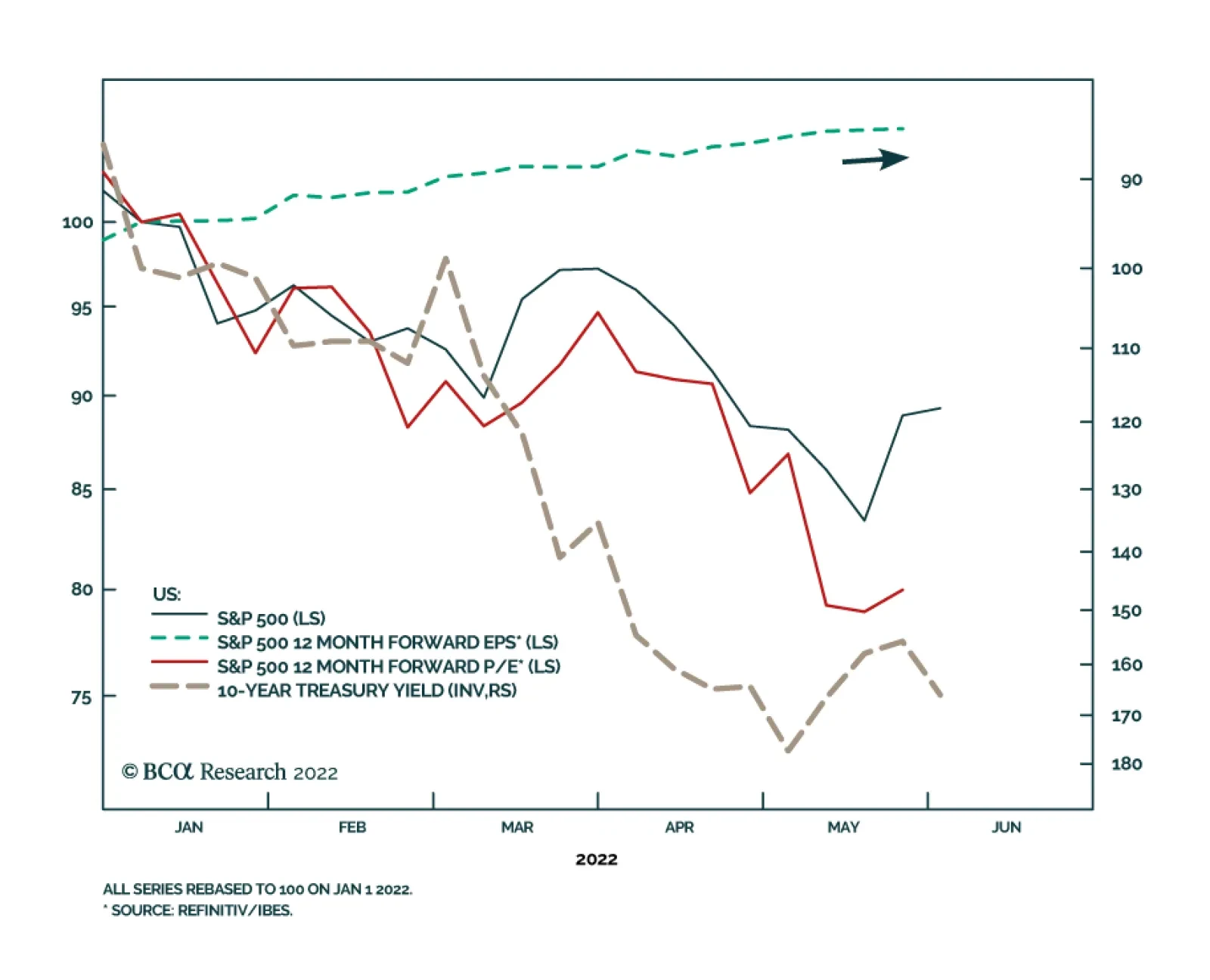
The S&P 500 has shed 13.8% since the beginning of the year on worries of a Fed-induced US recession, accelerating commodity prices and global growth slowdown. The selloff has been entirely valuation-driven. To the extent that Treasury yields provide…